Articles

Websites as we know them are going to change very soon. The days of text, images, and basic interactions in a 2D browser window have served us well, but virtual, augmented, and mixed reality experiences are getting better all the time. Developers and designers need to think beyond the browser window and prepare for an immersive future.

Many have been very skeptical about VR and AR in the past because despite grand promises about what they would achieve, they’ve mostly failed to deliver on the scale that the industry hoped for.

But it’s different this time: industry leaders like Meta, Apple, and Microsoft are pursuing a range of different mixed reality projects; they see the opportunity and are dropping hints about what’s next.

In a survey from Perkins Coie LLP and the XR Association, nearly 9 in 10 respondents said that by the year 2025, immersive technologies—including augmented reality, virtual reality, and mixed reality — will be as ubiquitous as mobile devices.

That’s a bold prediction, but it could be our new reality.

Use Cases

VR and AR aren’t a logical fit for every website, and that’s fine. There’s no need to force an immersive experience on something better suited to a standard viewing experience.

But when they’re done right, 3D experiences can add a lot to your website. Check out the demo experience from Mozilla, the 3D tours from Matterport, and the immersive storytelling from Within.

Here are a few areas where these technologies shine:

  • Retail – VR can be used to provide a virtual showroom where customers browse through products. AR can even bring the products into your home by showing you how a piece of furniture will fit in your room, what a painting will look like on your wall, or in Apple’s case, how a product will look on your desk.
  • News – Coverage of events can be enriched by providing a 360-degree view and placing viewers in the center of the story.
  • Training – AR can generate virtual overlays over physical equipment so employees can have hands-on training that’s more effective.

Define Your Platform

Adding immersive experiences to your website will require various skills based on what you’re trying to create. Whether you’re new to web development or are a seasoned developer with many years of experience, the main difference from classic web development is that you’re switching from a 2D to a 3D experience. Development in VR/AR is much closer to developing 3D video games than creating web applications.

First of all, you need to decide on the hardware that you’re building for. Are your viewers mainly using computers, smartphones, or a headset like the Oculus Quest? Each hardware category offers a different set of capabilities for what’s possible.

Next, when we look at 3D engines and frameworks on the market, some big names like Unity, Unreal Engine, and CRYENGINE stand out. Most of these engines were spun out of game development and are based on programming languages like C, C++, or C#. While very powerful, they’re overkill for anyone trying to create a basic immersive web experience.

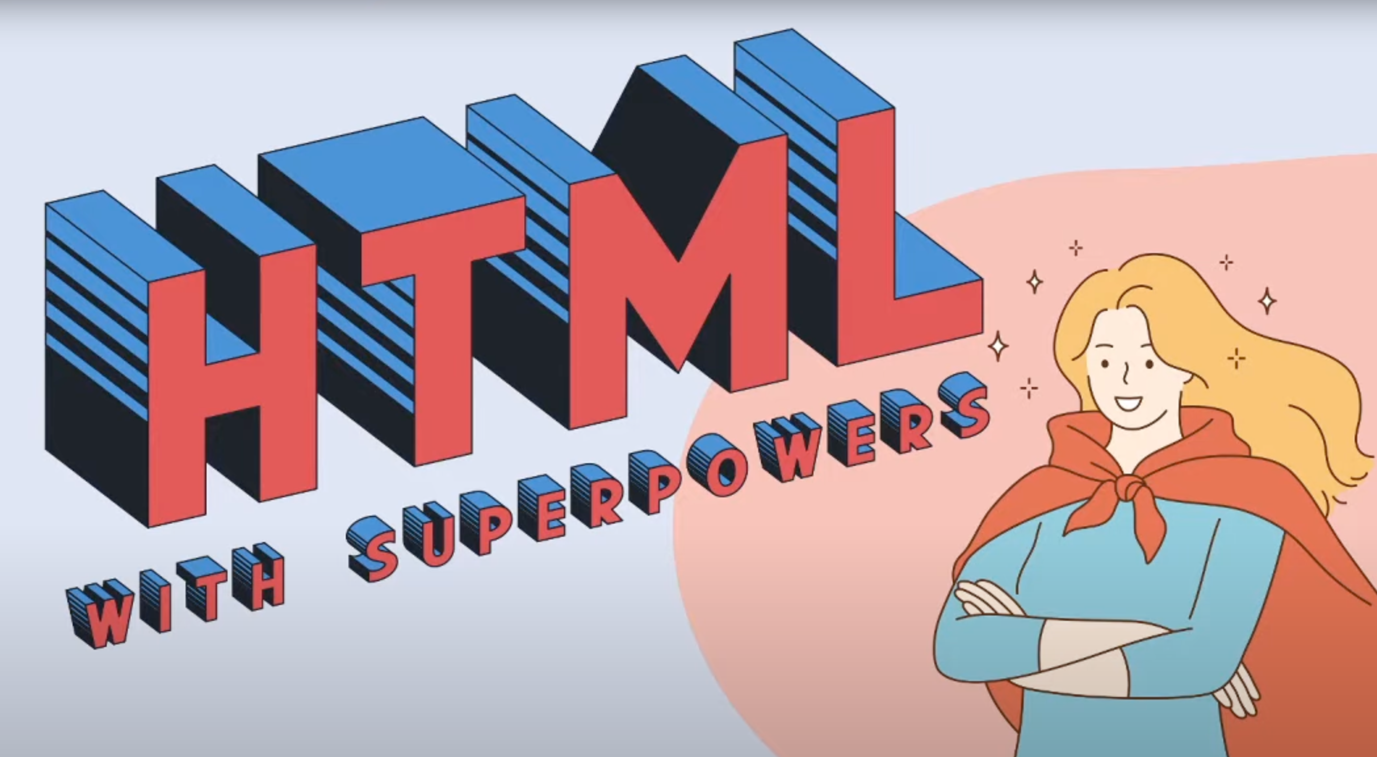
The good news for web developers is that the WebXR Device API is an open standard specified by the W3C with a JavaScript API that makes immersive experiences possible in the browser. So if you already have a background in web development, you can use your knowledge of JavaScript to get started.

There are some useful frameworks and platforms that make working with WebXR more convenient:

  • A-Frame – A web framework for building 3D experiences.
  • React 360 – A framework for the creation of interactive 360-degree experiences that run in the web browser. As the name already suggests, it builds on React and reuses the concepts you already know.
  • Amazon Sumerian – A managed service that lets you create and run 3D, AR, and VR applications. Since it’s integrated into the AWS ecosystem, it’s also possible to add AI-enabled elements into your generated world.

Create Your Content

No one wants to read long blocks of text in 3D. Since we’re talking about visual experiences, it’s logical that the emphasis should be on creating content that is pleasing to the eye and interesting to look at. What works on a normal website probably isn’t going to feel natural in a 3D environment, so you need to decide what visuals you should create to suit the format.

What high-resolution images and assets do you need? Can you add videos? How about 360-degree videos? Will viewers just be looking at something, or will they be able to interact with it?

You also can’t forget about sound because it’s a critical part of immersive experiences. What music and sounds should you create to make the content come alive?

Not everyone is going to have the latest and greatest device or 5G coverage. The requirements for bandwidth and transmission quality are much higher with 3D content. A few milliseconds of latency can go unnoticed on a typical website, but in a VR/AR setting, it can make the experience laggy or unusable.

Try to optimize your content to be the highest quality it can be within a reasonable file size. If the experience starts to suffer from too many assets downloading at the same time, it’s better to create a more streamlined experience that maintains a high performance rate.

It’s important to consider your hosting infrastructure, as well. This shouldn’t be a big problem, but it is worth mentioning that you need to add new content types to your configurations, and your CDN needs to support these new types, too.

Make Your Content Flexible

When we’re talking about getting your website ready for immersive experiences, we’re not just talking about having people scroll through your regular website in VR. That isn’t compelling for your audience.

The idea is to take some content that’s already on your website and separate it from the presentation layer so you can use it in a 3D environment or any other platform that you want. Classic content management takes place in silos, which means you cannot easily reuse the content from your website.

This separation can be achieved by using a classic database, but if you want developers and content teams to collaborate, a headless CMS is front-end agnostic and more user friendly.

Start Experimenting Today

Building 3D content experiences may seem intimidating, but as we’ve seen, you likely already have the web development skills necessary to get started and try out some different ideas.

What you build today will prepare you for the 3D future of tomorrow.


Featured image via Pexels.

Source

The post How to Prepare for the Immersive Web first appeared on Webdesigner Depot.

Source de l’article sur Webdesignerdepot

Every day design fans submit incredible industry stories to our sister-site, Webdesigner News. Our colleagues sift through it, selecting the very best stories from the design, UX, tech, and development worlds and posting them live on the site.

The best way to keep up with the most important stories for web professionals is to subscribe to Webdesigner News or check out the site regularly. However, in case you missed a day this week, here’s a handy compilation of the top curated stories from the last seven days. Enjoy!

CSS Squid Game

Alter 3D Illustrations – Hundreds of 3D Illustrations for your Designs

25 Quirky & Highly Creative Free Fonts for Designers

HTML with Superpowers

Smart CSS Solutions for Common UI Challenges

Expandable Sections Within a CSS Grid

Bright Color Palette: How and When to Use One

Everything Apple Announced at its 2021 MacBook Pro Event

UX Design has a Dirty Secret

Building a Multi-select Component

Source

The post Popular Design News of the Week: October 18, 2021 – October 24, 2021 first appeared on Webdesigner Depot.


Source de l’article sur Webdesignerdepot


3D buttons

Recently I was toying with the idea of a 3D button that moves as the user moves their mouse around it. To further this effect, I added some 3D shadows which move in tandem to give the illusion of a 3D button that is sitting off the page and moves with the user’s mouse movements.

Demo


How Does It Work?

The fundamental concept behind these buttons is that we need to track when the user mouses over the button, moves, and mouses out. On mouseover, we will move the button so it appears 3D. On mouse out, we will reset it.

Source de l’article sur DZONE

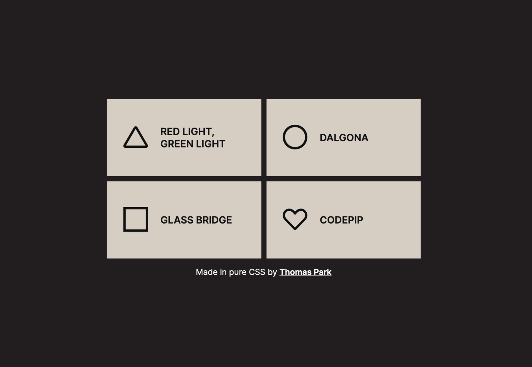
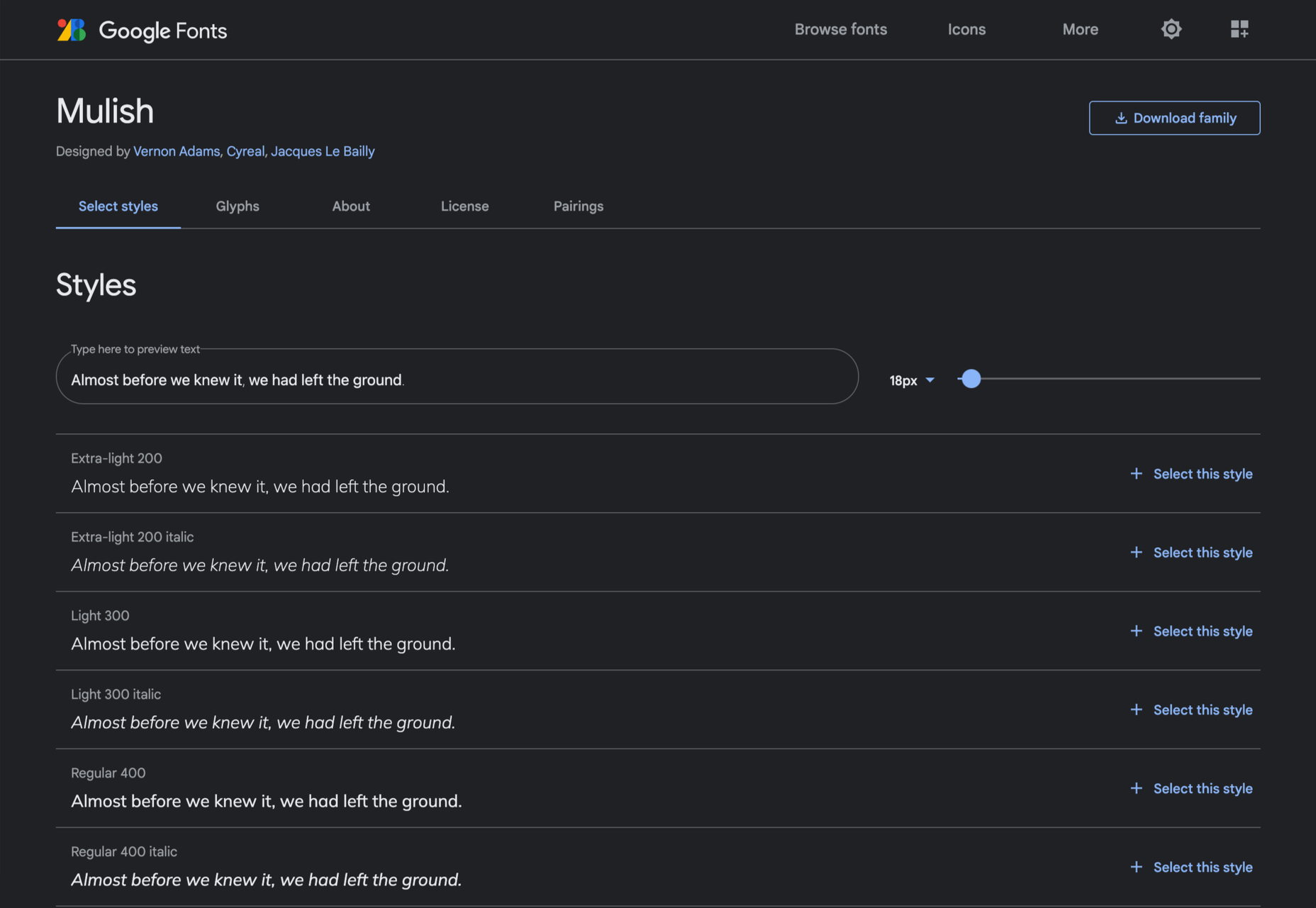
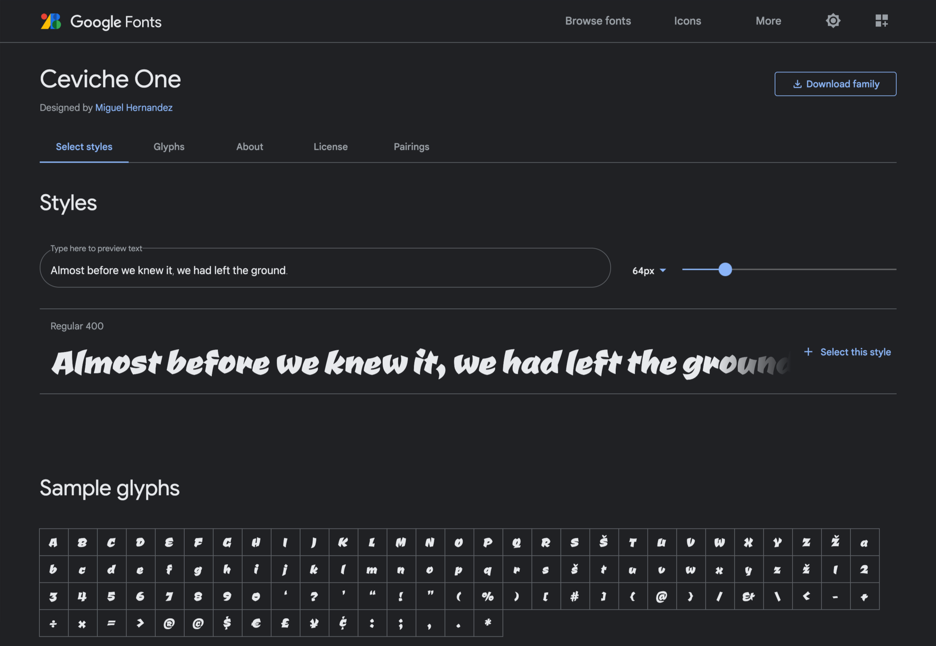
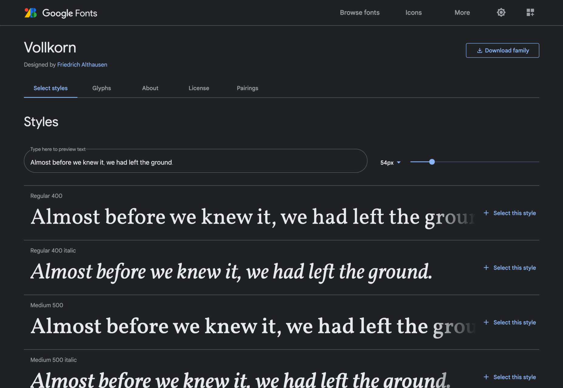
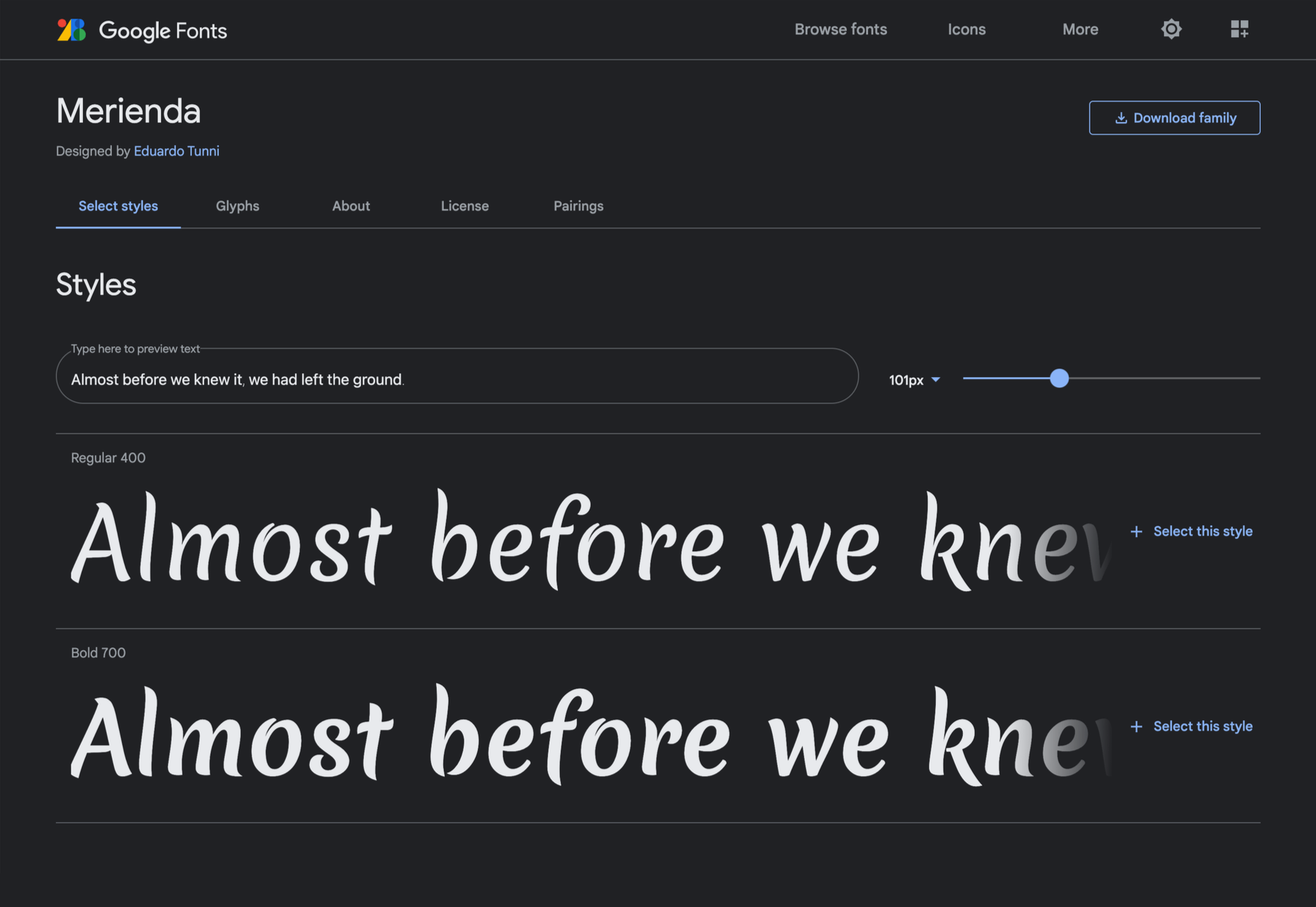
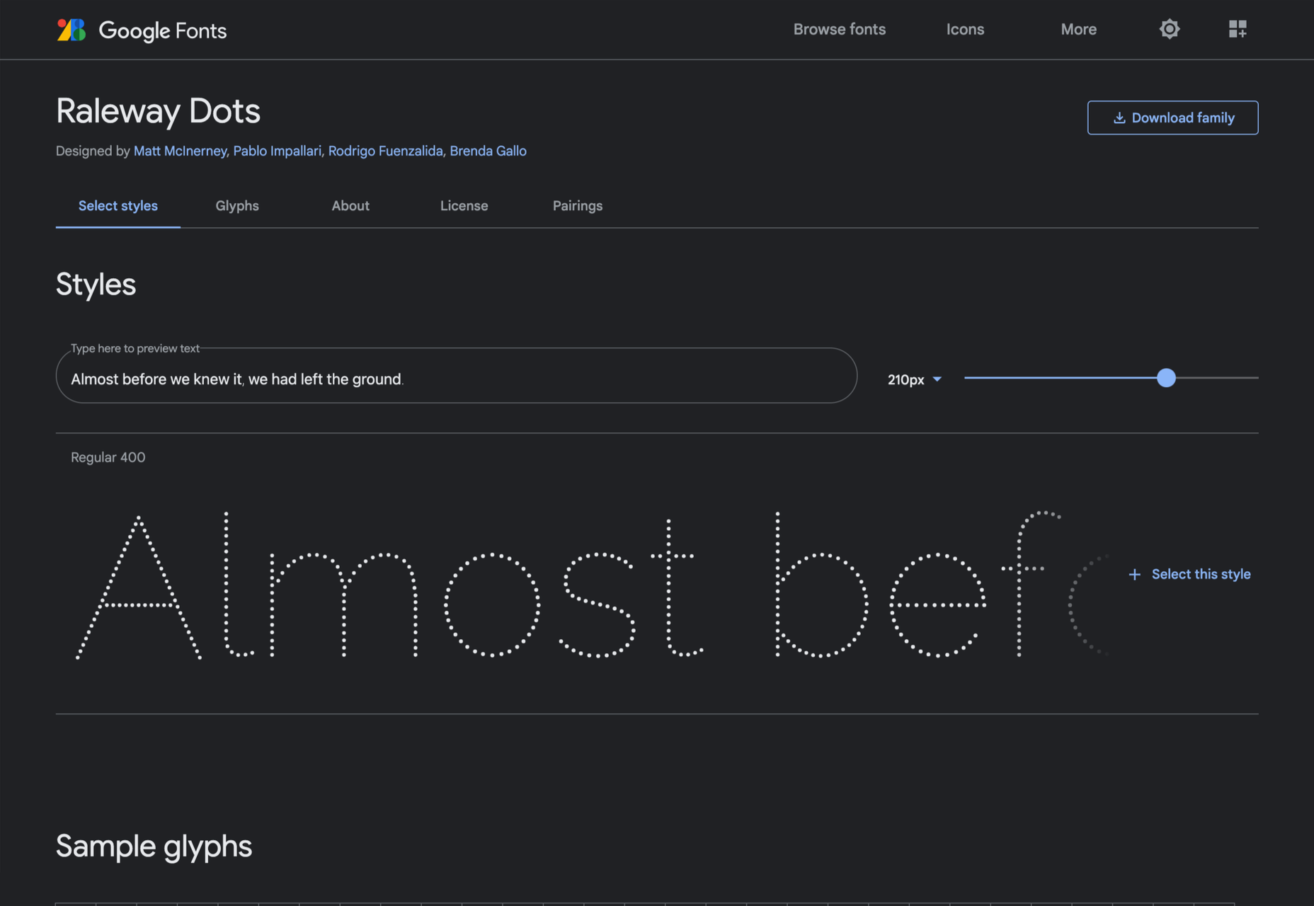
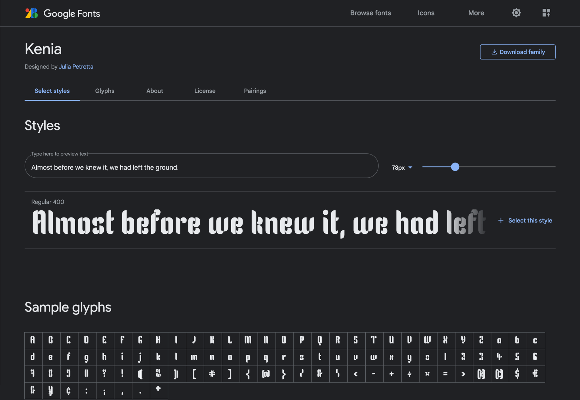
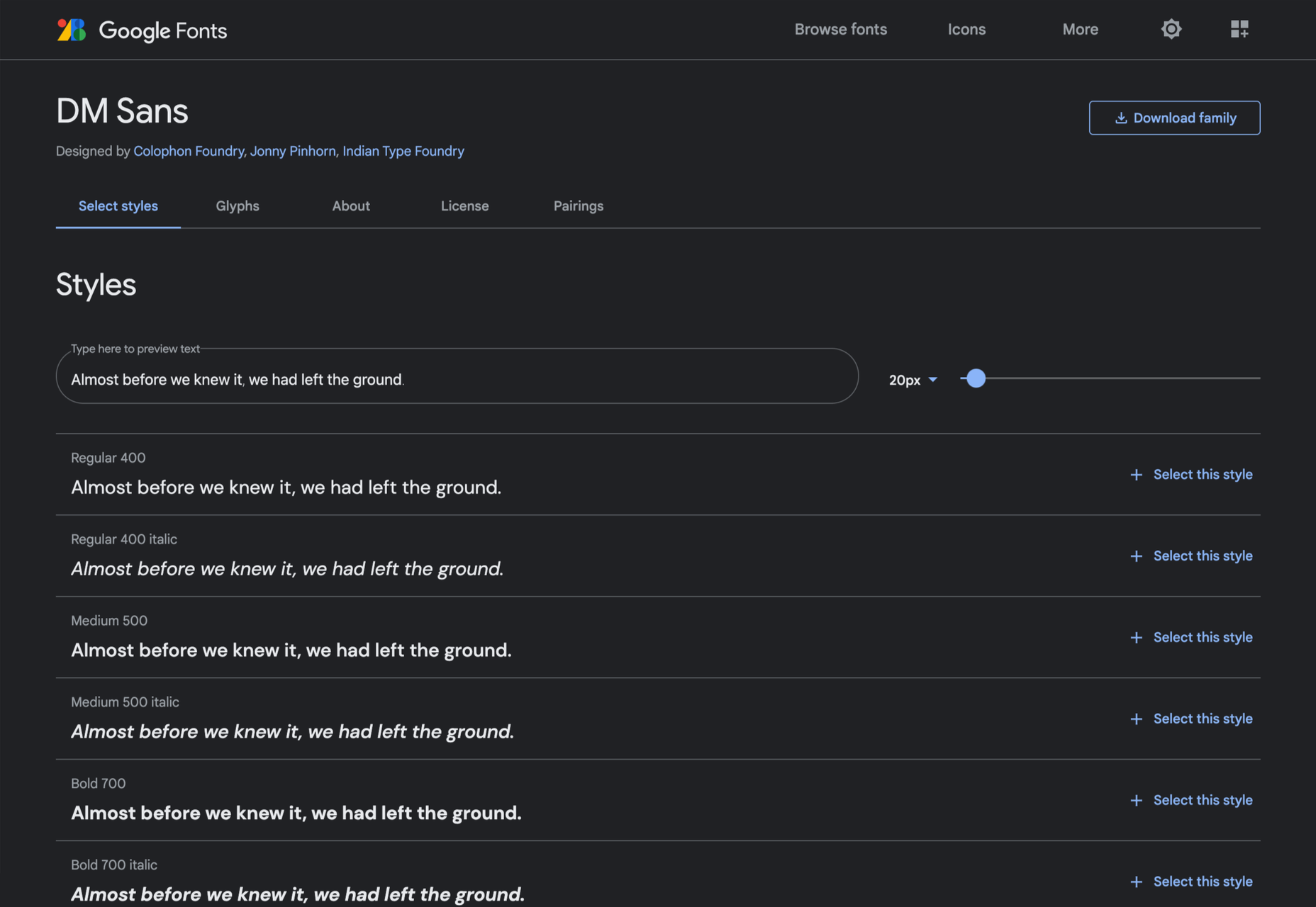
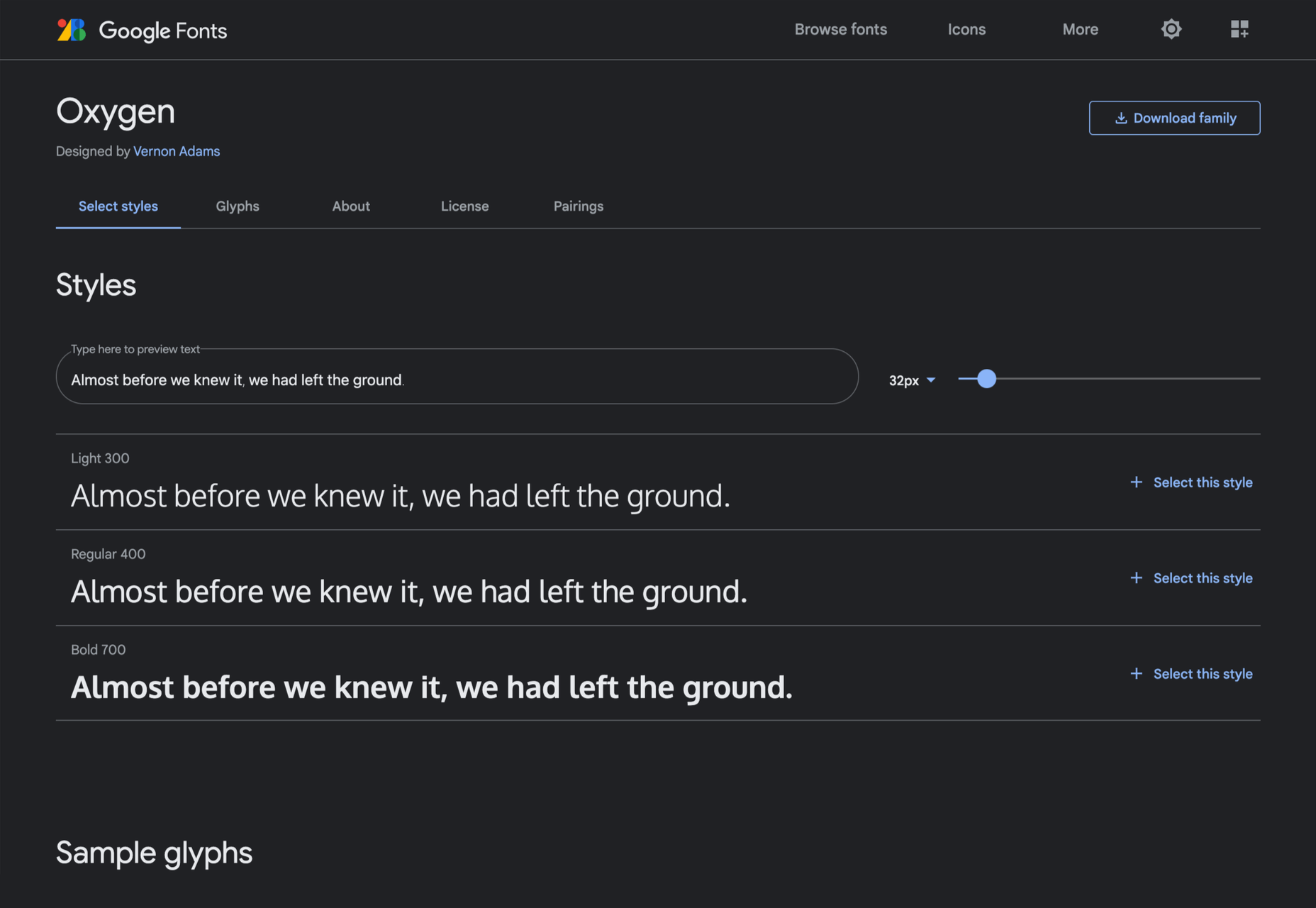
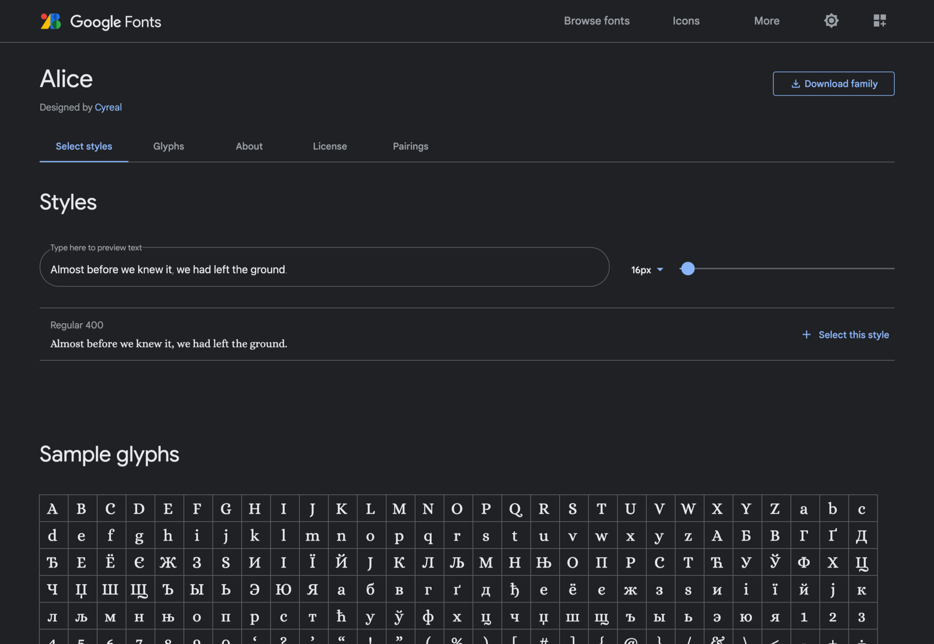
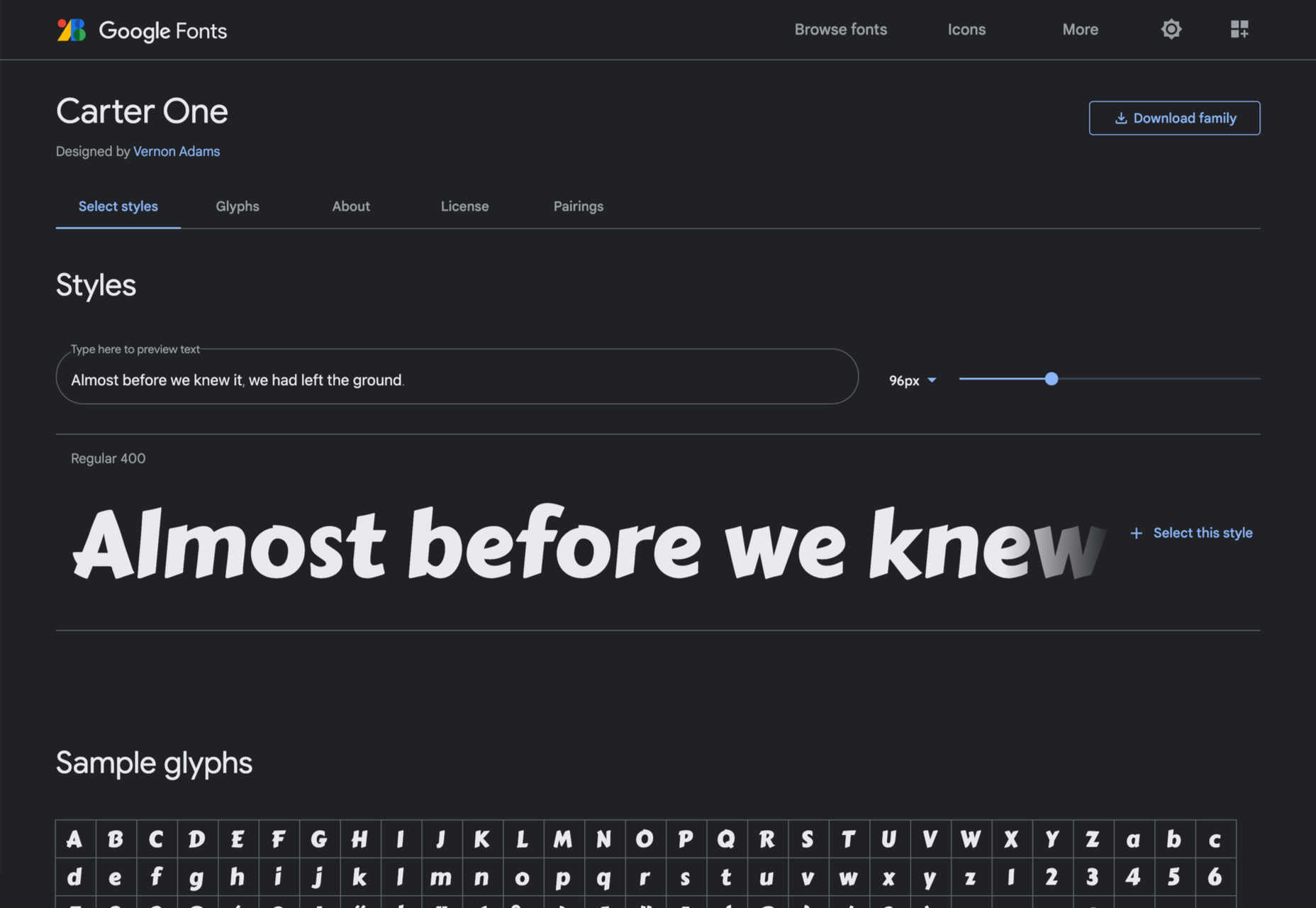
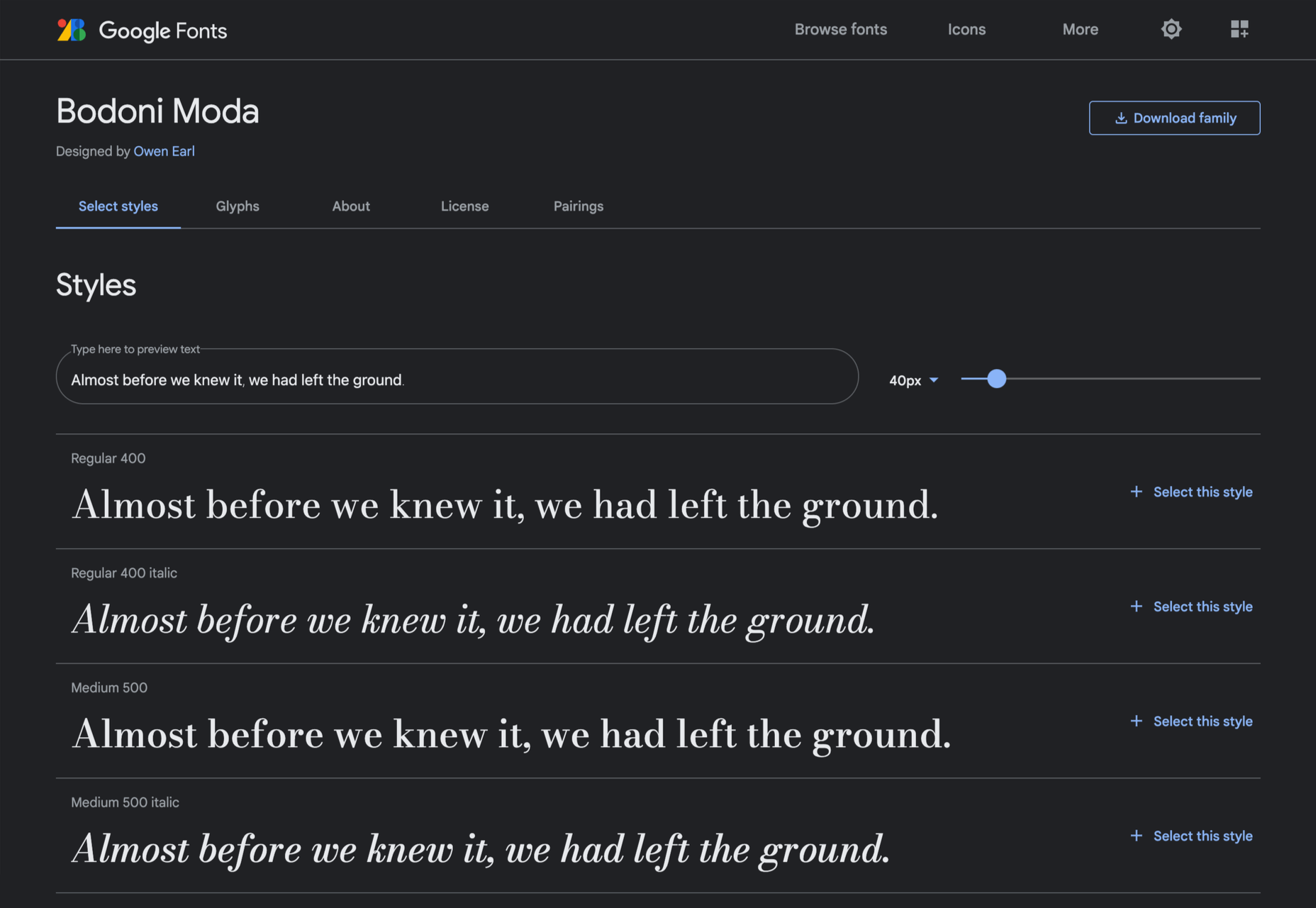
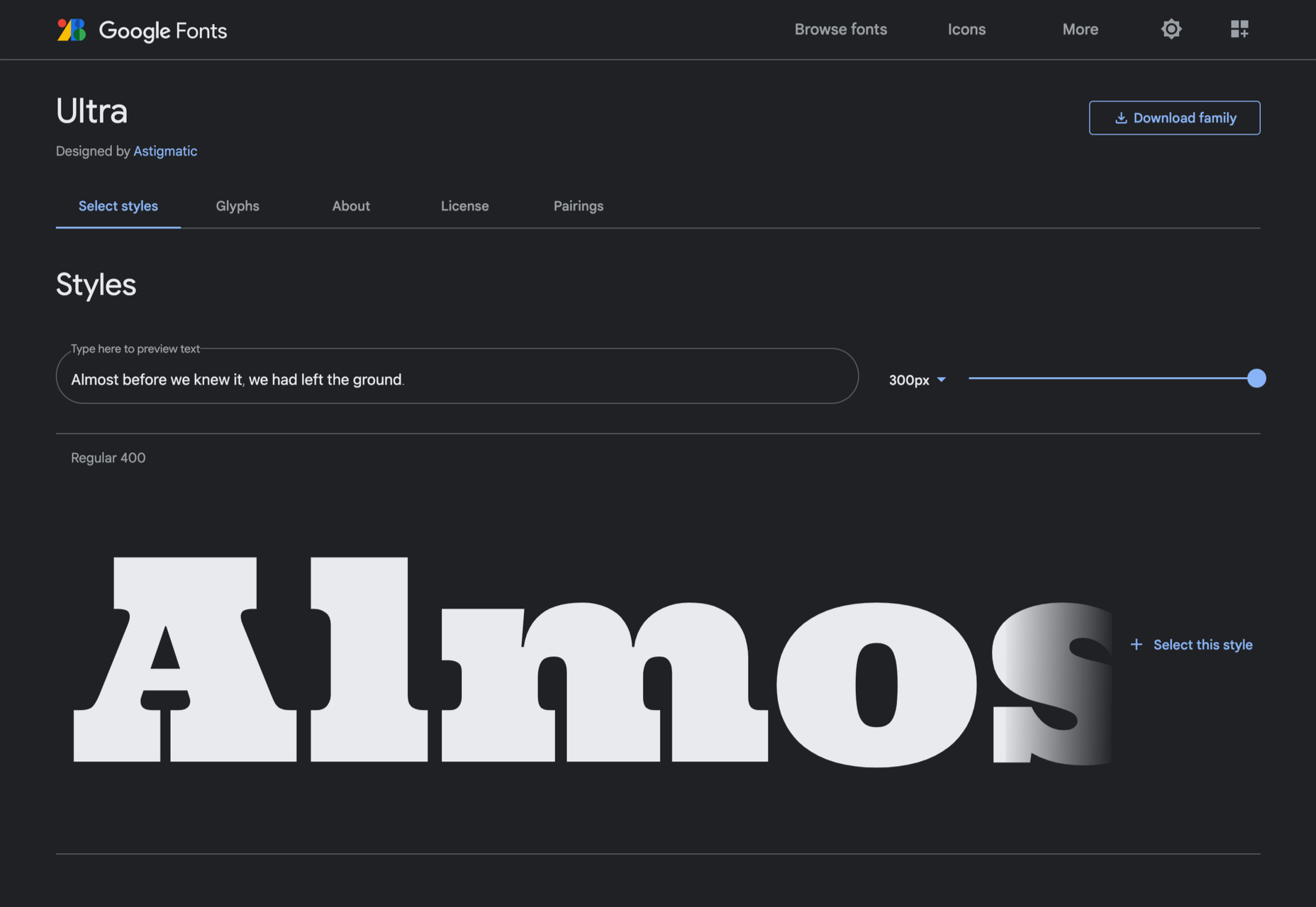
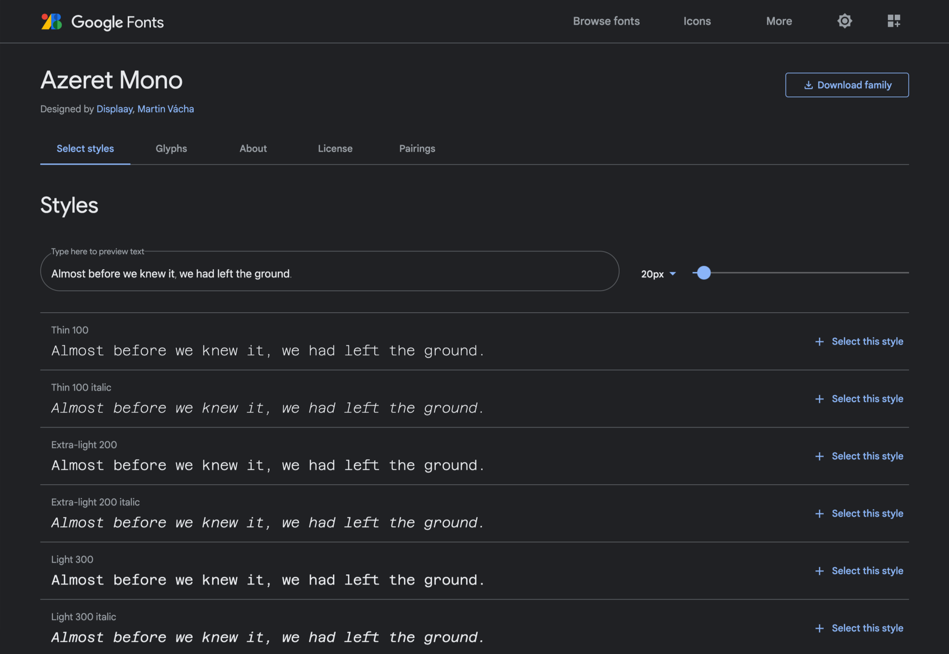
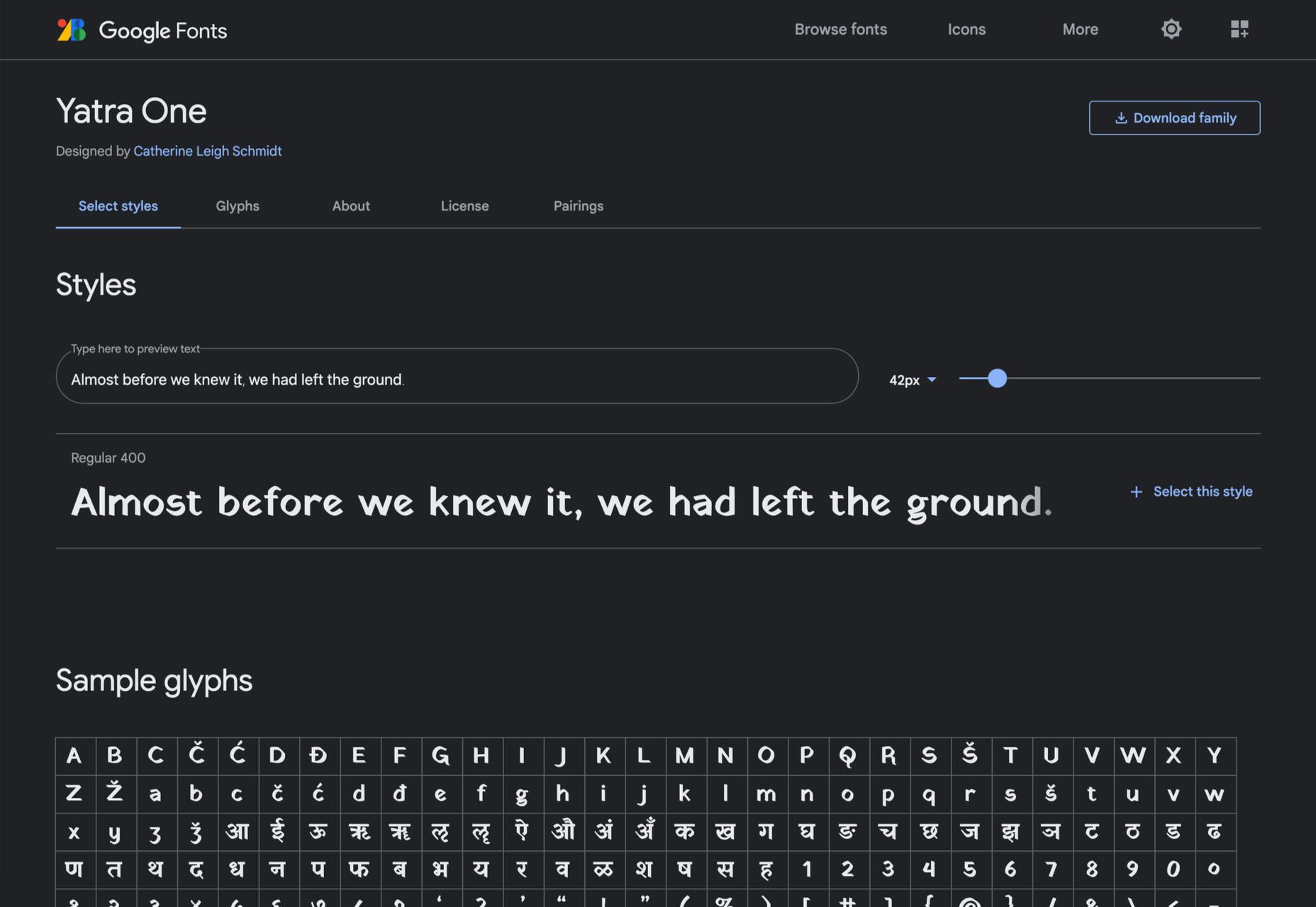
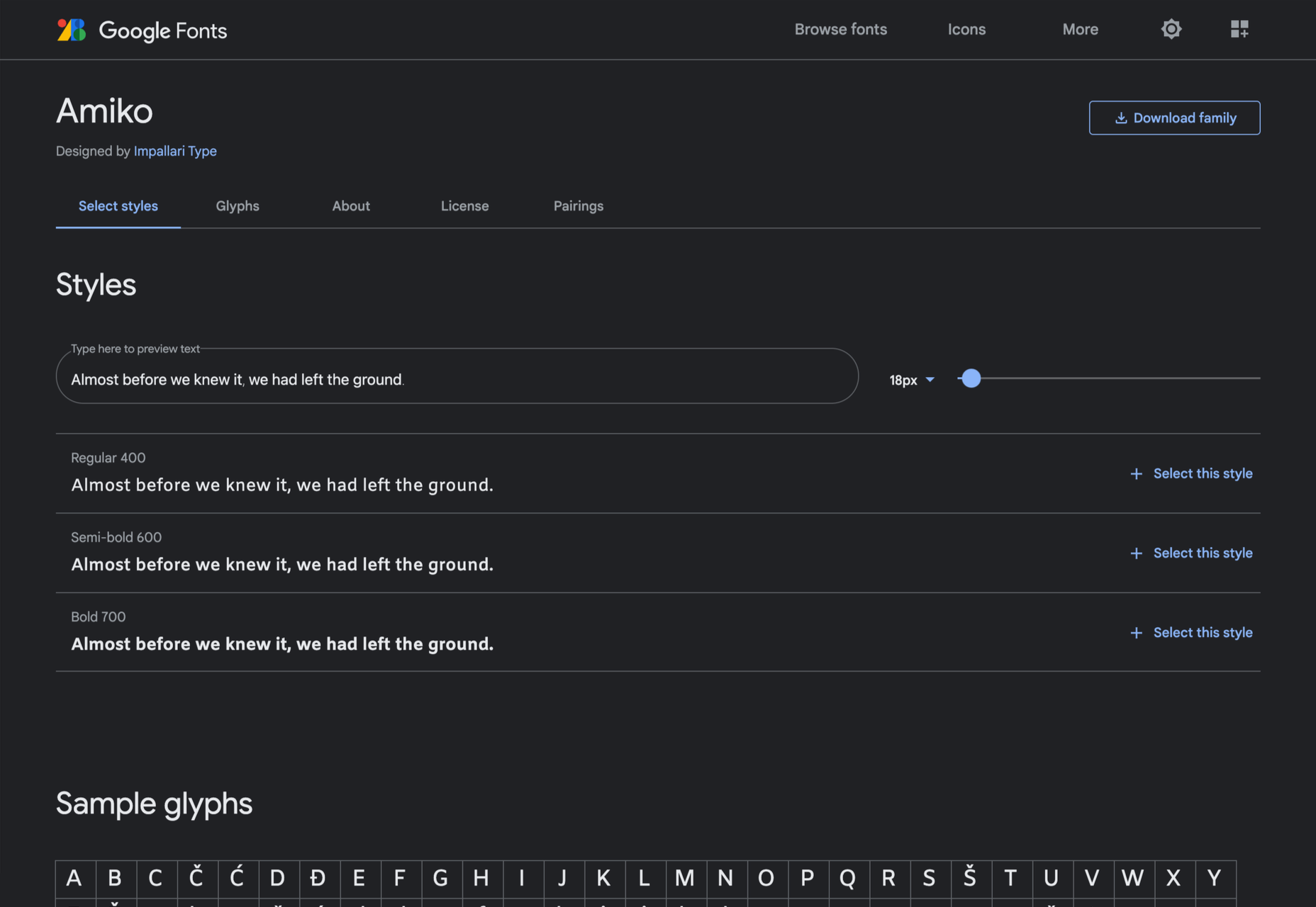
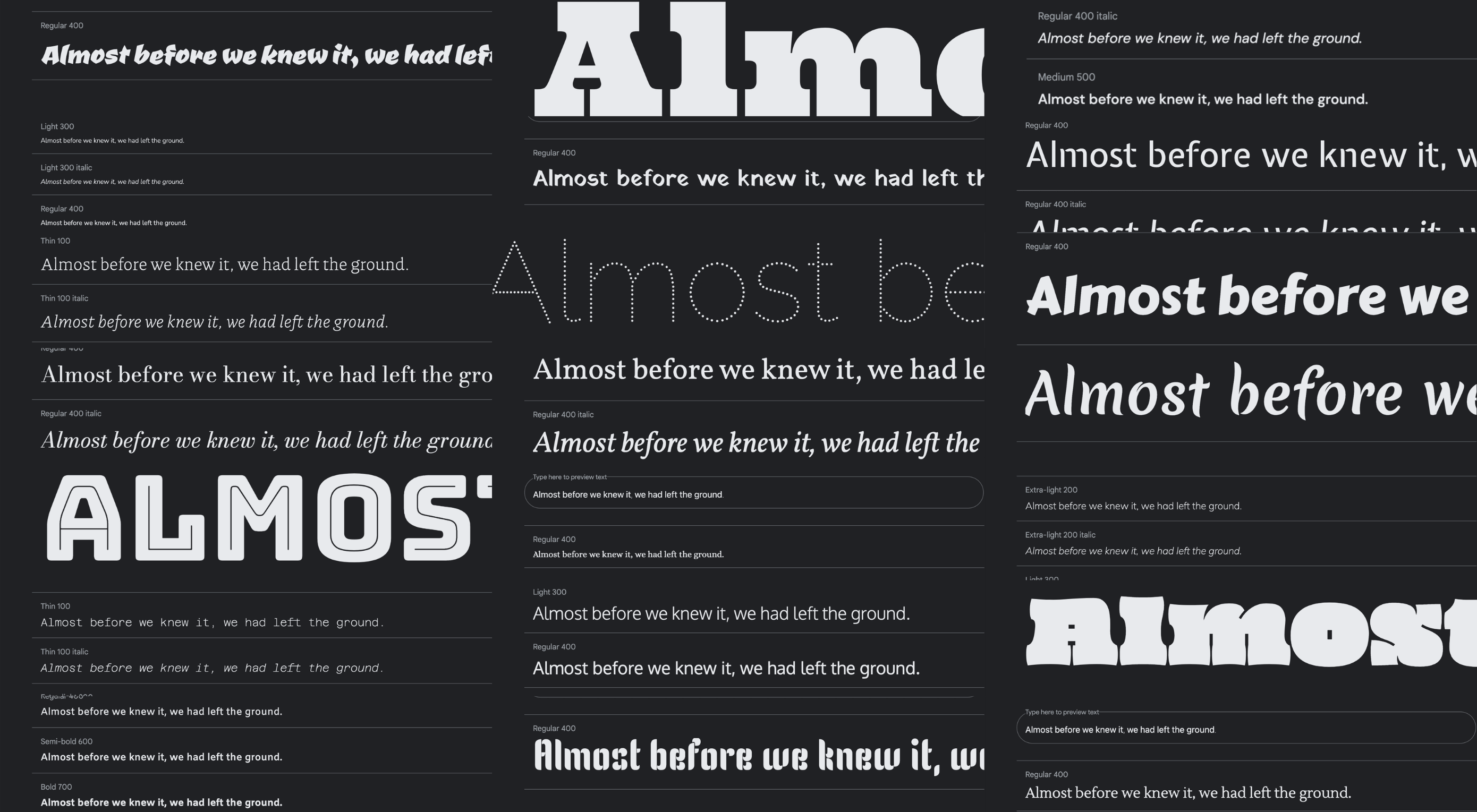
Google Fonts may be the single most significant contribution Google has made to the evolution of the web — yes, more significant than search, advertising, or analytics.

Google Fonts gives every business access to a visual voice with which to distinguish itself. Fonts can be downloaded for use in design software and then embedded using best practices for a consistent experience on the web.

If there’s anything wrong with Google Fonts, it’s that its default listings are based on “Trending,” a self-fulfilling criterion that keeps Noto Sans high up the list, destined to be over-used.

But if you spend a little time lower down the listings, you’ll find some exceptional typefaces that are hardly used. Yes, some of them are highly stylized, but there are also usable sans, serifs, and display fonts worthy of your consideration.

All you have to do is scroll; here’s a selection of some of the treasures you’ll find if you do…

Piazzolla

Piazzolla features dramatic and expressive angular shapes when previewed in large sizes, but its real strength is in setting large amounts of body text.

Mulish

If you’re looking for a solid workhorse sans, look no further than Mulish. Halfway between a humanist and geometric sans, there’s even a variable font version.

Ceviche One

Reminiscent of the cool lettering of 60s advertising, Ceviche One is packed with energy, thanks to the dramatic zig-zag formed along its baseline.

Vollkorn

Released by Friedrich Althausen in 2005, Vollkorn is an excellent typeface for body copy, excelling at small sizes. It now boasts a variable font option.

Merienda

Merienda is a delightfully energetic display script. The bold weight feels more confident, but both weights have a dancing rhythm that brings the page alive.

Raleway Dots

Raleway is a hugely popular — and perhaps overused font — but this dotted version is less known. It’s a simple geometric sans that functions as a display face.

Kenia

Kenia is a wonderful, uncategorizable typeface. The stencil forms result in entirely original letter constructions, and the lowercase s is magnificent.

DM Sans

DM Sans is a low-contrast geometric sans-serif that performs wonderfully well at smaller sizes. It only has three weights, but each comes with a matching italic.

Oxygen

Designed by Vernon Adams as part of the KDE project for GNU+Linux, Oxygen is a very readable sans-serif, with a generous x-height and a hint of pen stroke.

Alice

Ksenia Erulevich’s Alice was inspired by Lewis Carrol’s novel Alice’s Adventures in Wonderland. It presents itself as an Edwardian serif with fanciful flourishes.

Carter One

Carter One uses bold strokes, with a medium amount of contrast, to create a sans-style script. It has dozens of beautiful details like the notch on the lowercase o.

Bodoni Moda

Bodoni Moda is a didone-style serif with strong vertical strokes and high-contrast slab-like serifs. It’s the best variable font in this genre that I’ve found.

Ultra

Ultra is a slab-serif that you won’t even consider for body text. Its sculptural shapes are almost American-western. The counter on the lowercase n is charming.

Azeret Mono

Most mono-spaced fonts fail to inspire; practical they can be, charming they are not. But Azeret Mono bucks that trend, its bold weights being particularly fantastic.

Nunito

It’s tough to find a serious sans-serif with rounded terminals, but Nunito is it. There’s also a Nunito Sans with square terminals, but I love the rounded tips.

Bungee Inline

Designed for signage, Bungee is great for display sizes and works well vertically. There are several versions, but my favorite is this classy inline version.

Oi

Oi is unapologetically loud. A slab-serif that swallows its own detail, the counters and ink traps give it a 3D quality, and the curves feel almost nautical.

Expletus Sans

One of the significant trends in typography is the angled clip of adjoining strokes, creating the effect of shadow. This effect is brilliantly achieved in Expletus Sans.

Lustria

It’s comparatively unusual to find a serif face designed to work well at display sizes. At large sizes, Lustria’s rounded terminals evoke ink spread delightfully.

Yatra One

Yatra One is a Devanagari and Latin typeface that uses the Devanagari brush angle for its strokes, giving the Latin text an unusually slanted, stand-out character.

Amiko

Amiko is a highly legible typeface and excellent at tiny font sizes. It’s perfect as a secondary font if your main font is too fancy for elements like legal notices.

Keep Scrolling

It’s always tempting to leap at the first typeface you find that meets your needs, but if you dig a little deeper into Google Fonts, you’ll find a vast range of typefaces that offer both practicality and character.

Source

The post 21 Exceptional Google Fonts You Probably Haven’t Discovered Yet first appeared on Webdesigner Depot.


Source de l’article sur Webdesignerdepot

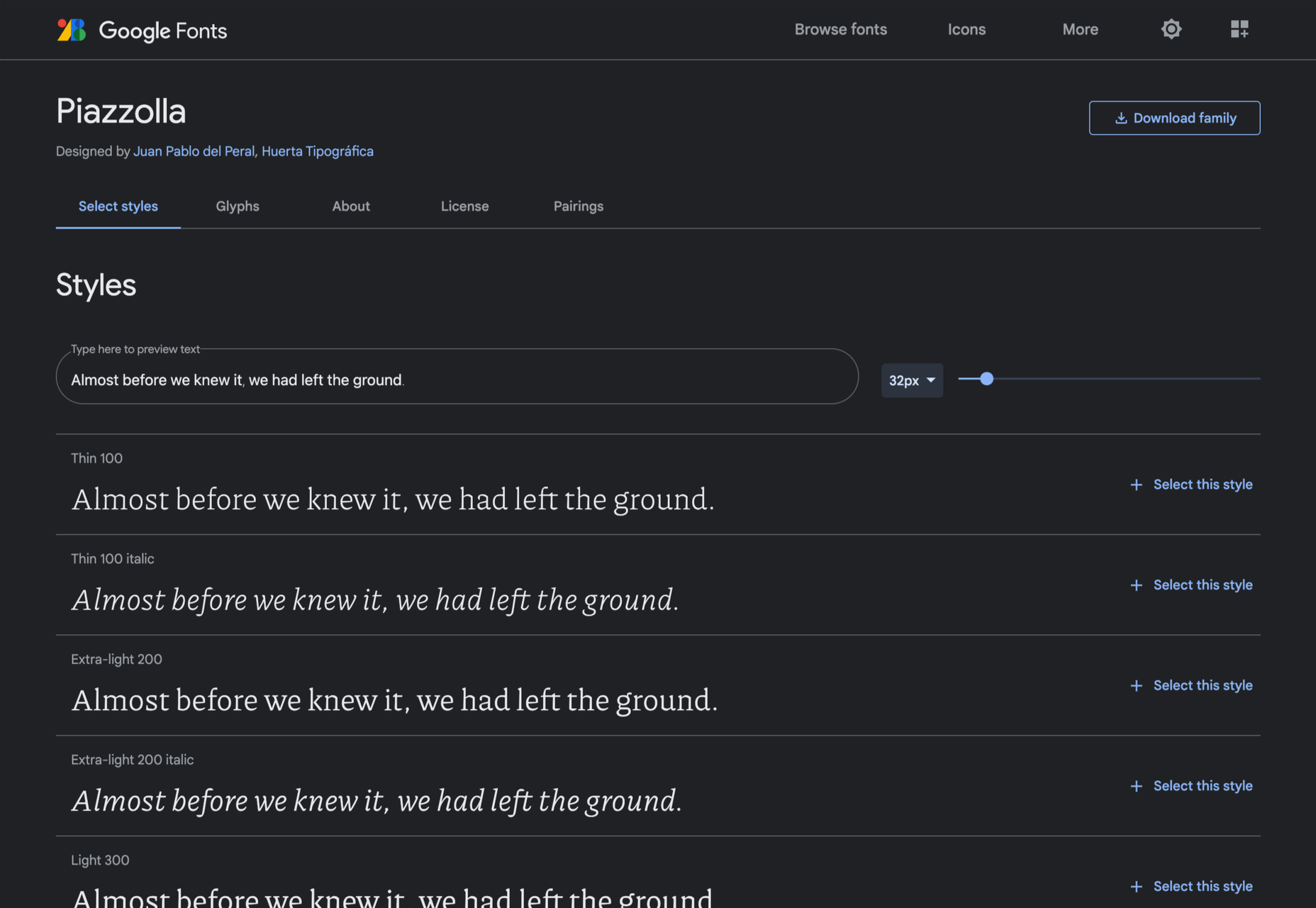
Do you ever get bored with design projects? Feel like you keep designing the same things on repeat?

This collection of trends – from fun angles to illustrations where you wouldn’t expect them to cool three-dimensional concepts – is sure to help you think a little more out of the box. It might be just the right inspiration to cure some of that design boredom.

Here’s what’s trending in design this month.

1. Angles for Attention

Working with angles is a fun technique because you can essentially point website visitors to what you want them to see on the screen.

Angles can be aggressive and have an obvious visual goal. They can also have an easier feel without so much direct intent. This trend can look a lot of different ways, making it a versatile option for designers.

Each of the three examples here takes a different approach to angles.

Bake Inc. uses various angles with imagery and whitespace to draw the eye past the visual elements to the brand name at the bottom of the screen. If you click through to the design, you’ll see that there isn’t just one angle-image design, but it’s a collection of changing images and angles that work beautifully in concert.

Instabase uses a collection of animated geometric shapes as the main visual element on the screen. Note the directional pull of the triangle in the bottom left of the group of shapes. It helps lead the user to the “Request a Demo” call to action on the other side of the screen.

Readymag’s Custom Cursor is one of those aggressive angles. The giant cursor is what the design is about, but because of the size and shape of the object, users are directed to the word “cursor” as well. That adds extra emphasis to what the design is about. With the combination and the oversized element and giant angle that are so in your face, you can’t help but get a quick understanding of what the design is about.


2. Unexpected Illustrations

This might be the most fun we’ve seen with a website design trend in a while – projects and companies are using illustrations in some of the most unexpected places.

The design surprise happens when an industry that you don’t expect uses this type of imagery. A simple illustration takes the design to another level, or illustrations mix with other elements to paint a whimsical overall scene. Those are the things you can find with each of these three examples.

Krivitzky is a website for a business law firm. This is not at all the type of website where you’d expect illustrations (including a dragon). While the design is fun to interact with, it’s hard to say if it works. If you needed representation, would this appeal to you? In terms of legal websites, this is a total disruptor and forces your attention. That could be a good thing.

Studio Mesmer is one of those simply understated designs that’s almost perfect. The stark black background makes the simple illustration that much more striking. The eye also has a nice hover animation effect for an added surprise.

Kenn & Kitt mixes an illustration with real imagery to paint a more whimsical scene. What’s nice about the illustrated elements of the website design is that it helps connect the website to the product packaging, which uses illustrations while feeling “real” with the photo of a dog. It’s a bright and sunny combination of photos and illustrations that feels whimsical but has the right vibe for the product category.


3. 3D Depth

The three-dimensional website design trend keeps ebbing and flowing. And right now, it is flowing with full-screen 3D elements for maximum depth that makes you feel like you can almost dive into the screen.

While most of these designs use illustration with animation to create the 3D scene, you don’t have to abide by this example. The goal is to create something that looks and feels immersive so that users will want to take part in the experience.

The Match Maker has an 80s gamer vibe where you can feel yourself going down the tunnel on the screen. Additional hover animations move the screen, even more to help you get into the game.


Hafele Discoveries uses a wide-angle style animation with back and forth motion. The fish-eye style of the design adds an element of depth, which is further magnified by the foreground box with text and call to action elements. The design concept is attention-getting, but the motion can be a little dizzying if you leave it on the screen too long.

FiveT Hydrogen takes a more “traditional” approach to a three-dimensional website design with an illustration/animation that includes elements of depth. This is magnified on the scroll action of the design with shadows and layers and a variety of elements – real and illustrated – that make you feel like part of what’s happening on the screen. It’s an immersive learning experience about clean hydrogen that almost forces users to keep scrolling. The 3D effect is what takes it to another level.


Conclusion

Not every design trend is right for every project. Take a good look at what you are trying to accomplish and match it with a design concept.

If you want to try one of these trends, but they are a little too out there, experiment with a small area of the design or a landing page first. That’s a good place to test ideas and conversion rates to see if the design technique will work for your audience.

Source

The post 3 Essential Design Trends, September 2021 first appeared on Webdesigner Depot.


Source de l’article sur Webdesignerdepot

It’s almost time for another season of change. Although the temperatures might not reflect it, this is the time of year where most of us start thinking about what’s next.

This collection of tools and resources for designers is just the spark to propel you forward with work as you think ahead. Here’s what’s new for designers this month.

Gradient.Art

Gradient.Art is a CSS-based gradient generator that’s packed with functionality and customization options. It’s more than just a color selector and is an actual gradient editor that allows you to work with a variety of controls to get just the color variations you want for projects. Create illustrations, patterns, icons, and more with this layer-based tool that’s still in beta.

Wicked Backgrounds

Wicked Backgrounds takes some of the headaches out of creating just the right background for website design projects. It’s another easy and customizable generator designed to help create backgrounds with great color, depth, and balance for various project types. The makers promise more features in the future as well.

Typedream

Typedream is not what you might expect from the name; it’s actually a website-building tool. It’s designed to help put the focus on the words of a design with a simple interface that most people can figure out. You can connect your own domain and then optimize for search with built-in SEO tags. It’s a zippy tool for simple sites.

Orbital

Orbital is a zero-friction, super-interactive, customizable place to gather online. Pop in for meetings, quick chats, open-door office hours, or cowork together through the day – all using the same link. This premium tool has super fun backgrounds and meeting spaces.

Access Guide

Access Guide is your one-stop guide to accessibility information for the web. It’s packed with articles and information to help you understand parts and all of the WCAG 2.1 guidelines, the official standard for accessibility online. (Plus, content is sorted into neat cards that make things easy to search and find.)

InLine

InLine is a free JavaScript library built to create a simple text editor for web applications and mobile apps. The tool claims to be the smallest WYSIWYG editor designed to fit into any layout. The plugin allows you to edit and customize text elements practically anywhere.

3D Bay

3D Bay is a collection of free three-dimensional stock images that you can use for various projects. Collections are searchable. Most of the images are actually 3D scene illustrations, a popular design element with many SaaS website designs.

MeisterNote

MeisterNote is a writing tool for teams. (It’s perfect for the new remote working world.) The interface is sleek and intuitive, and you can create customer workspaces for notes and teams to collaborate. One of the best functions might be the search feature, allowing you to find information in notes easily.

Shapecatcher

Shapecatcher solves an interesting problem. Have you ever visualized an element but don’t know what it is called or how to find it? This tool has a “drawbox” where you can sketch the element, and then it visually searches a database of 11,000-plus Unicode characters in multiple languages to find a close match that you can use online.

Batch Image Processing

Batch Image Processing allows you to edit, crop, and style or add watermarks groups of images all at once. It’s a web-based tool that does everything in a flash and allows you to redownloaded processed images for quick use. (It’s great if you need multiple photos with the same crop or size!)

Integrately

Integrately is an integration automation tool designed to help your apps, tools, and web elements talk back and forth. Connect apps to make tasks run on their own in ways that native software might not do alone. (Pro tip: Use it to connect with your email to send notifications or reports automatically.)

Vechai UI

Vechai UI is a set of high-quality, accessible React UI components with built-in dark mode using Tailwind CSS. Components include pre-designed headless UI and Radix UI.

Style Free HTML Bootstrap 4 Template

Style Free HTML Bootstrap 4 Template is a simple and minimally styled website template for a variety of project types. It’s a great website starter if you need to get a site up and running quickly.

Glass UI CSS Generator

Glass UI CSS Generator helps you create trending neumorphism/soft UI/glass UI style elements. The tool is a CSS generator that allows you to add some of your own elements and then pick styling options while outputting CSS and HTML.

Lineicons

Lineicons is a collection of more than 5,000 line icons that you can use for various projects. Every icon comes with free CDN, regular and light variations, an editor, and more to make it browsable and easy to use. The set has high legibility, and the free set of icons includes more than 500 options.

Carrd

Carrd is a simple, free, and responsive one-page website builder that you can do pretty much anything with. It’s perfect for personal profiles, landing pages, or one-page websites. All it takes is a little imagination.

AdonisJS

AdonisJS includes everything you need to create a fully functional web app or an API server. So stop wasting hours in downloading and assembling hundreds of packages and do it all with this framework for Node.js.

Eastman Condensed

Eastman Condensed is a beautiful and functional sans serif that’s easy to read. The demo version is free for personal use, but a commercial license for the full family is available.

Peachy Rose Font

Peachy Rose Font is a fun novelty option that is fun and light. Plus, it is free for any use, even commercial. The set is fairly large for a free option, with 233 characters.

Selga

Selga is an expressive and complex display font with a retro feel. The swashes and tails are especially nice on this typeface, which is free for personal use.

Source

The post Exciting New Tools For Designers, August 2021 first appeared on Webdesigner Depot.


Source de l’article sur Webdesignerdepot

Every day design fans submit incredible industry stories to our sister-site, Webdesigner News. Our colleagues sift through it, selecting the very best stories from the design, UX, tech, and development worlds and posting them live on the site.

The best way to keep up with the most important stories for web professionals is to subscribe to Webdesigner News or check out the site regularly. However, in case you missed a day this week, here’s a handy compilation of the top curated stories from the last seven days. Enjoy!

22 Exciting New Tools for Designers, June 2021

7.css

Does the Hamburger Menu Make Mincemeat of UX Design?

Top 15 Tools and Resources for Designers and Agencies

Loaf Animation SVG Library

WordPress 5.8 Introduces Support for WebP Images

Star Trek + Design

11 Landing Page Design Tips You Should Follow Today

Isometrica 3D Constructor

HTML Semantic Tags Cheat Sheet

What is a Design System?

Source

The post Popular Design News of the Week: June 14 2021 – June 20, 2021 first appeared on Webdesigner Depot.


Source de l’article sur Webdesignerdepot

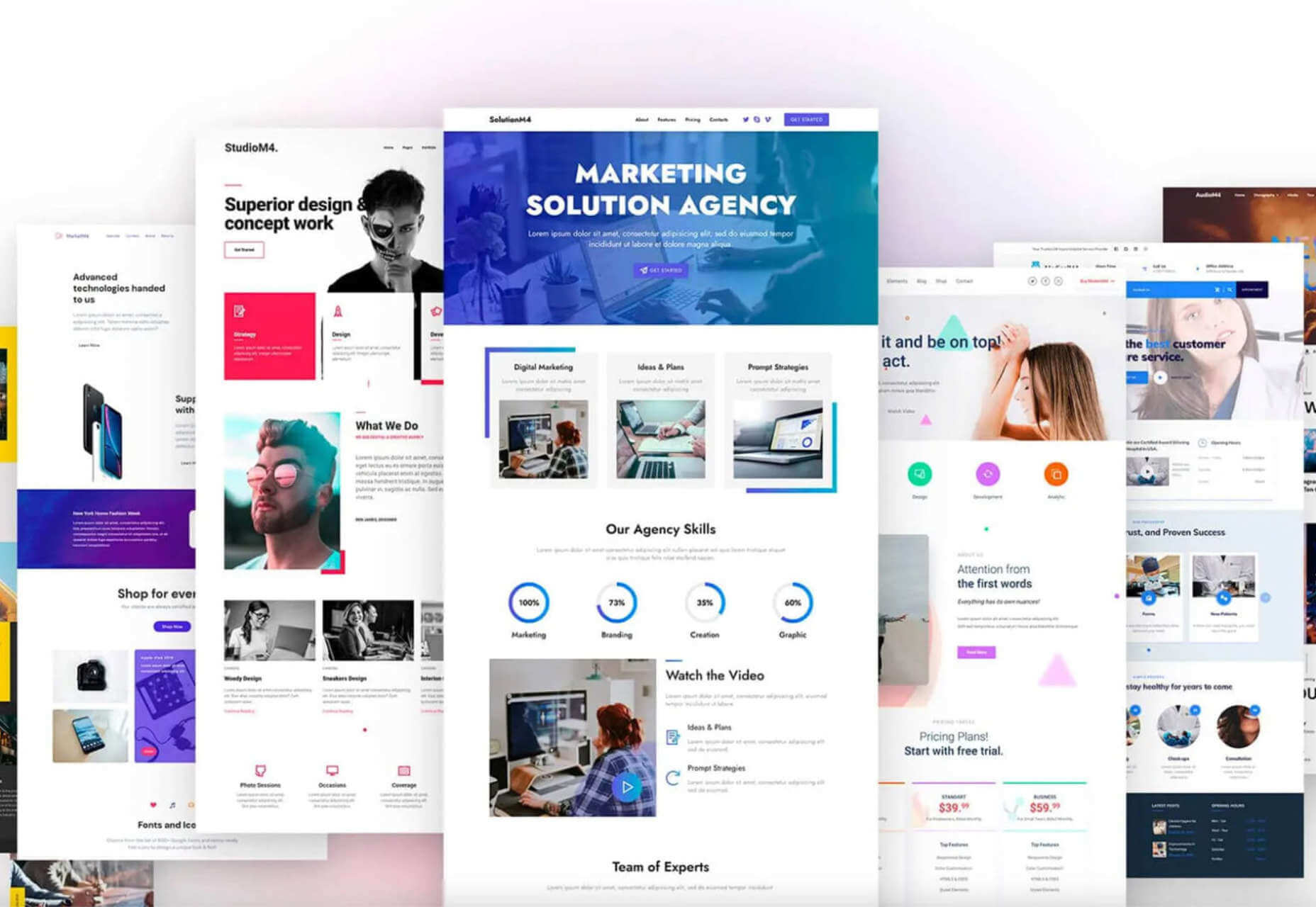
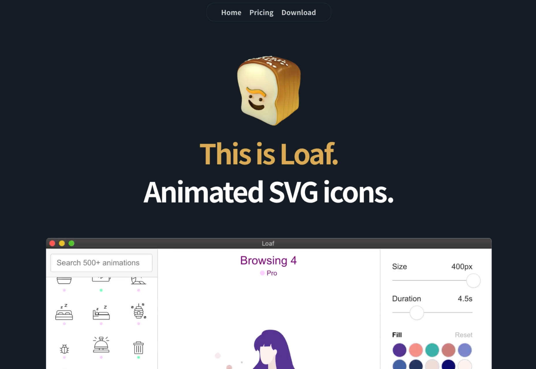
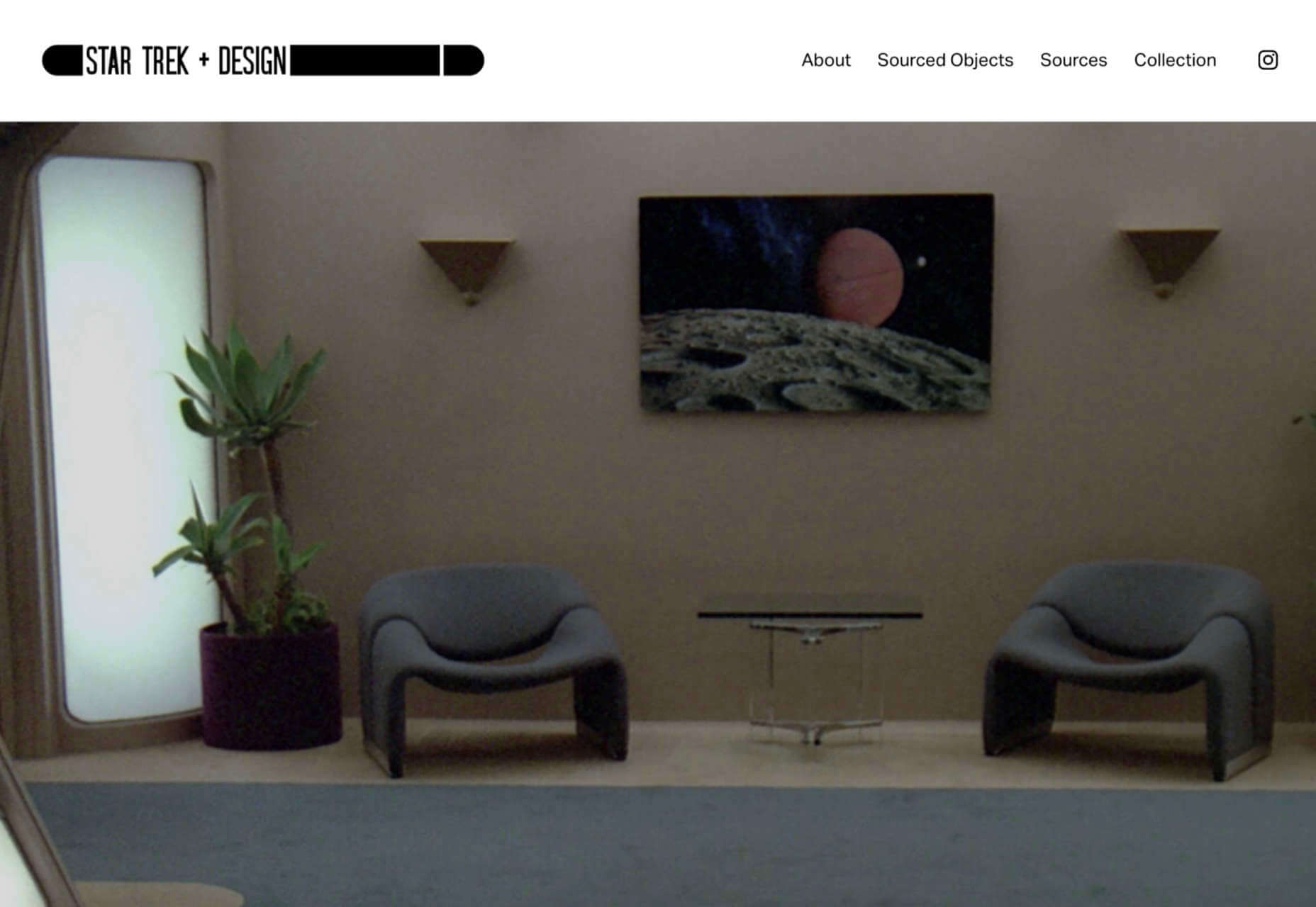
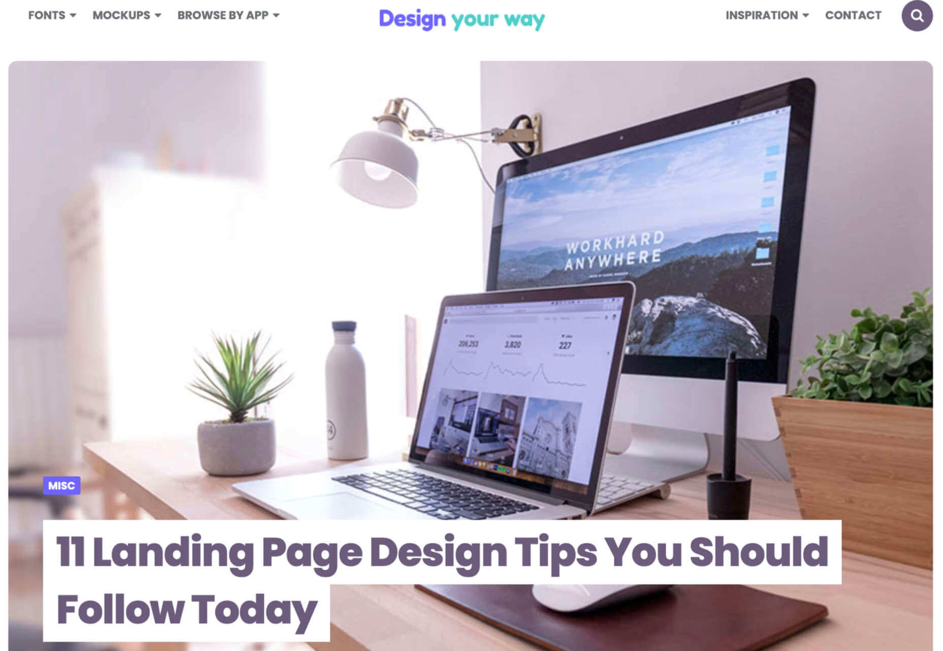
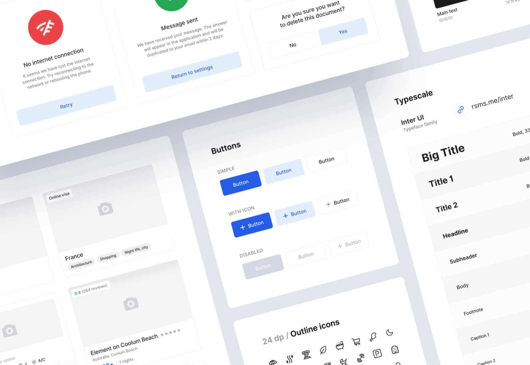
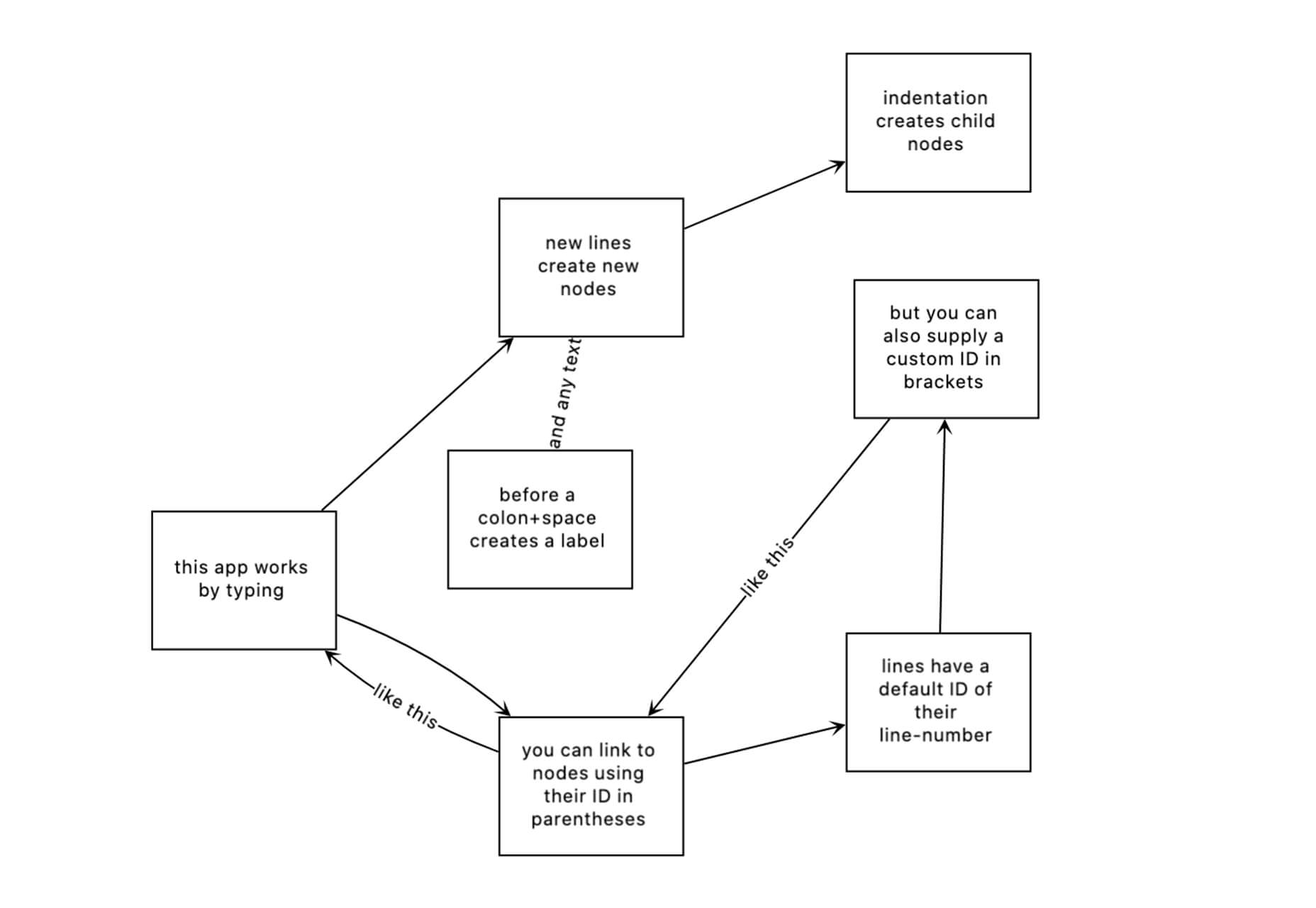
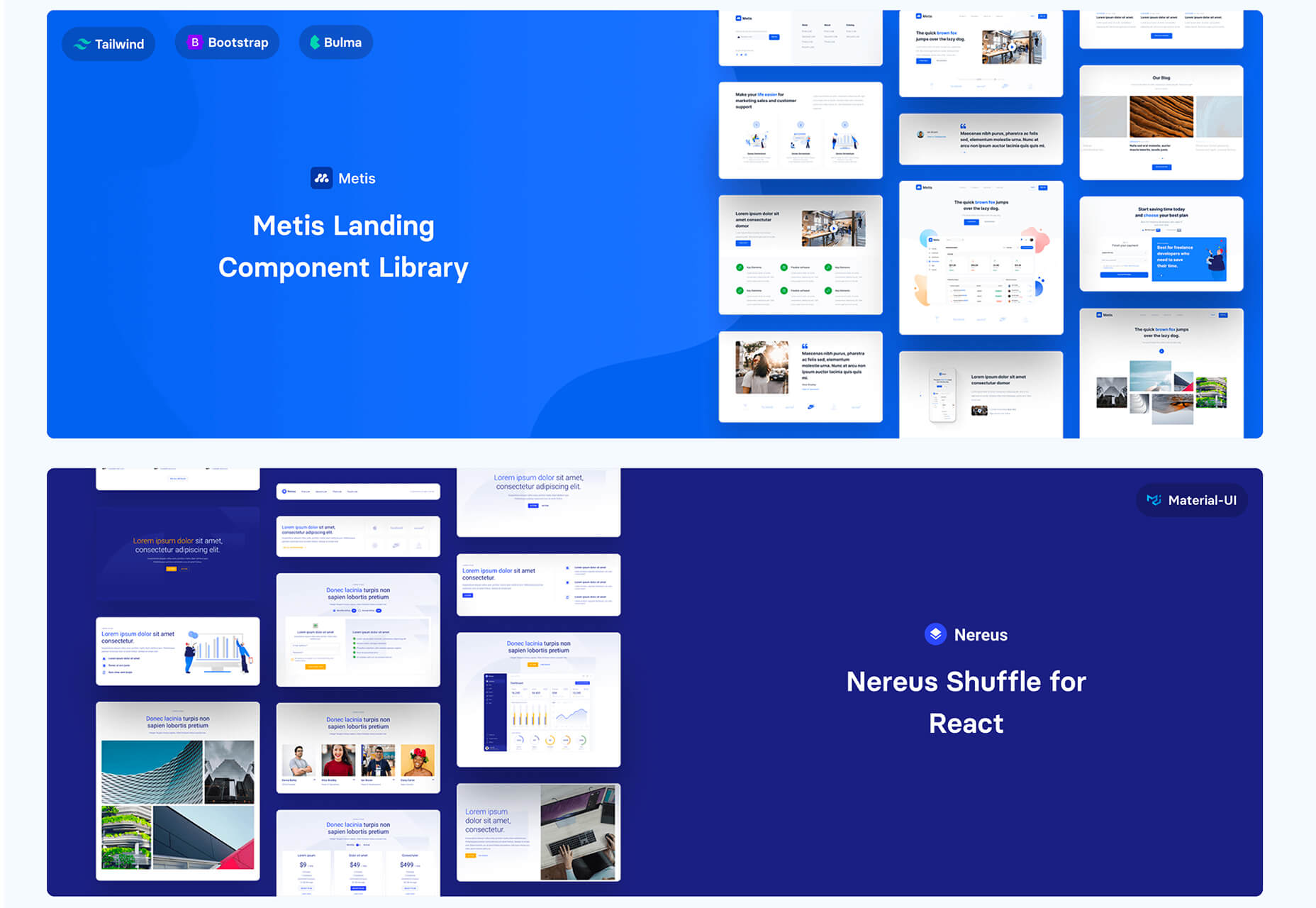
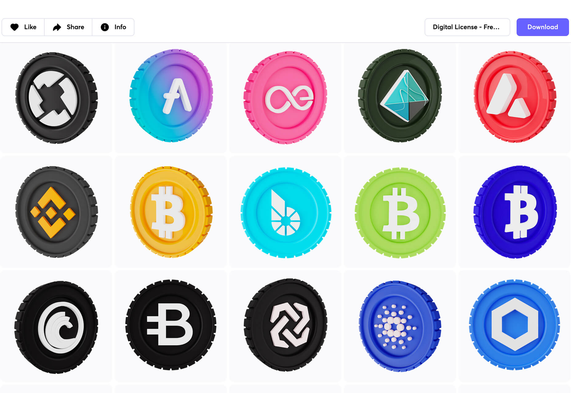
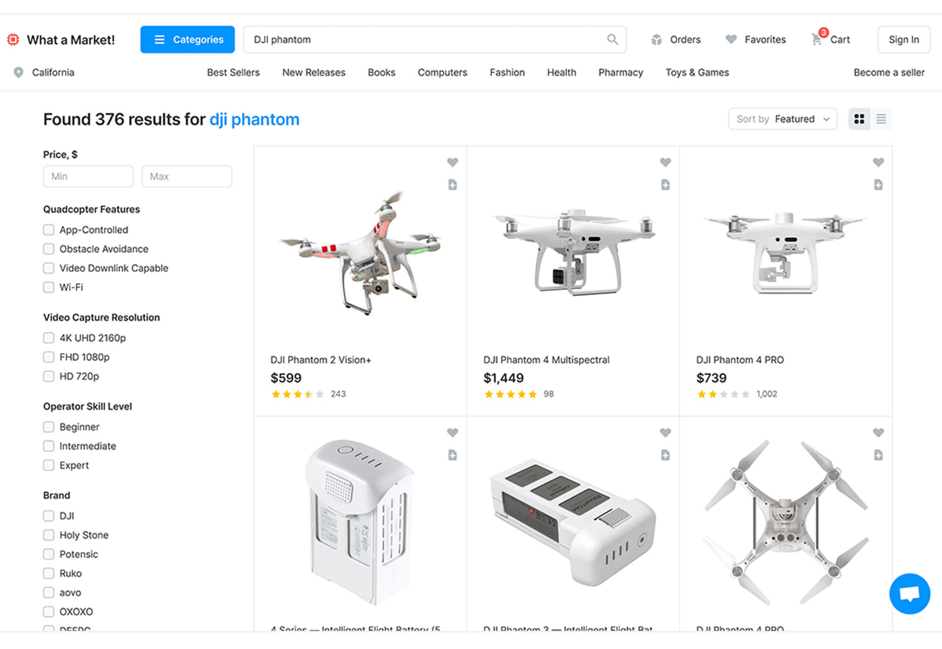
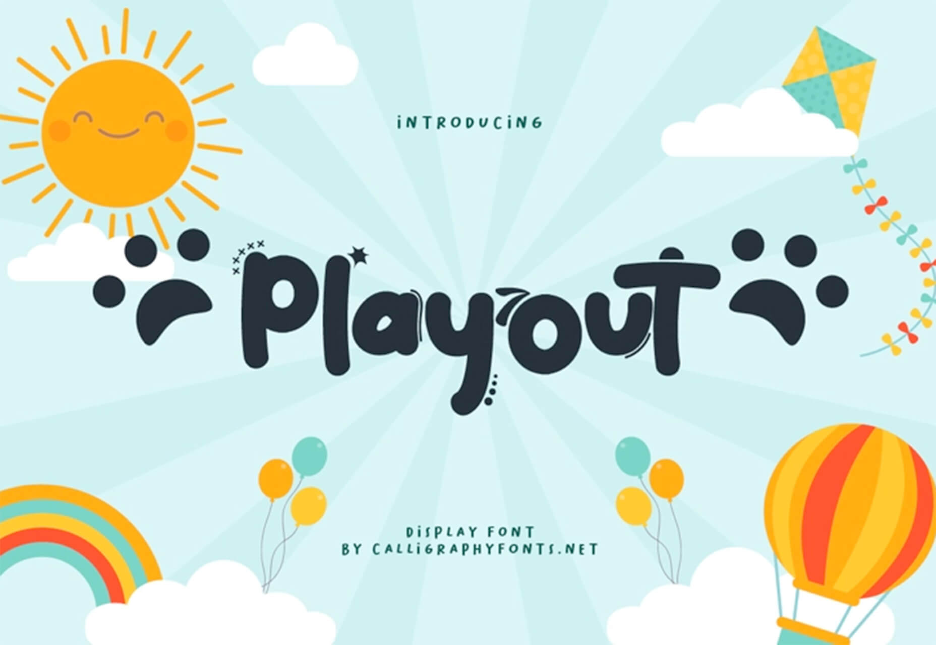
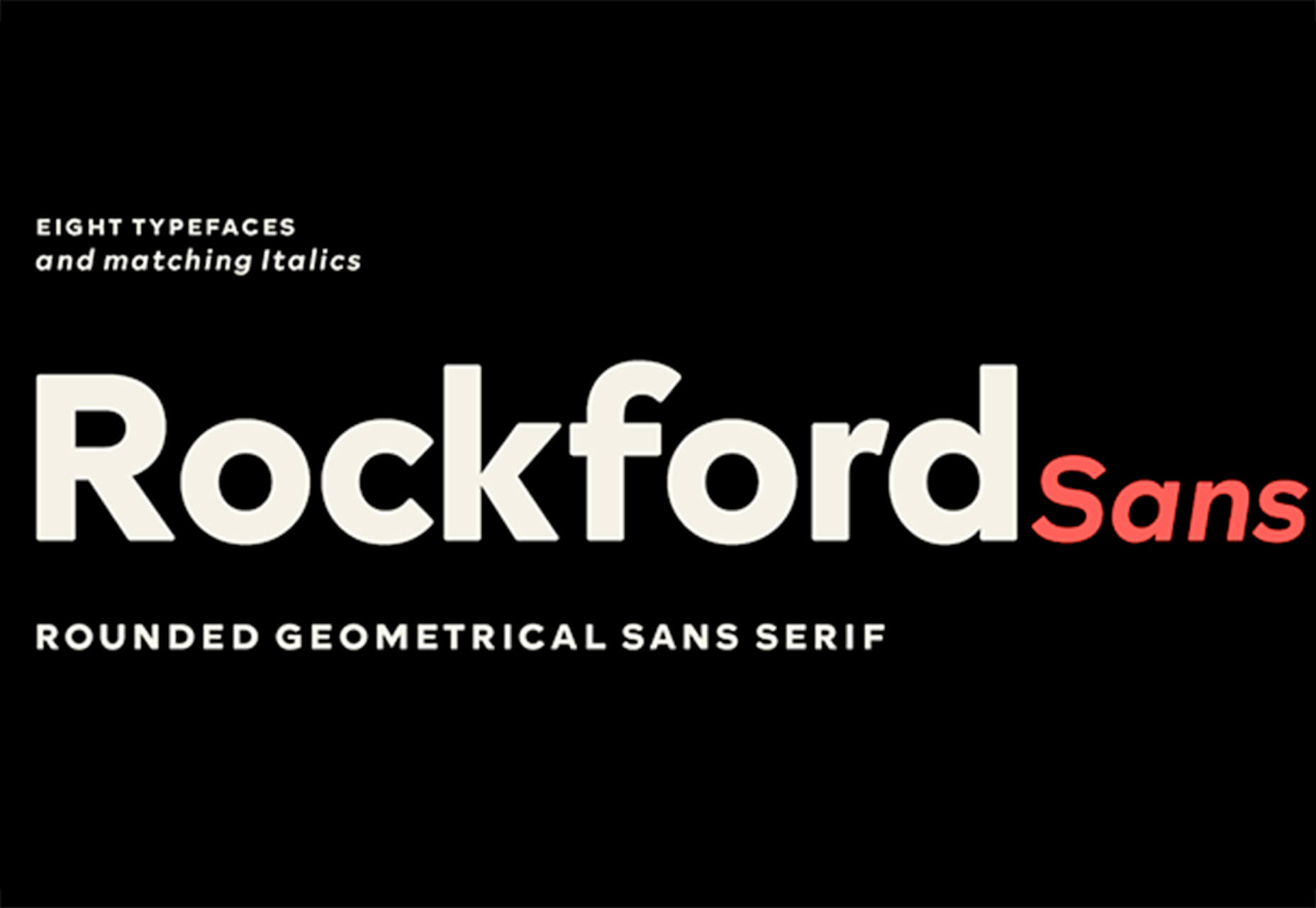
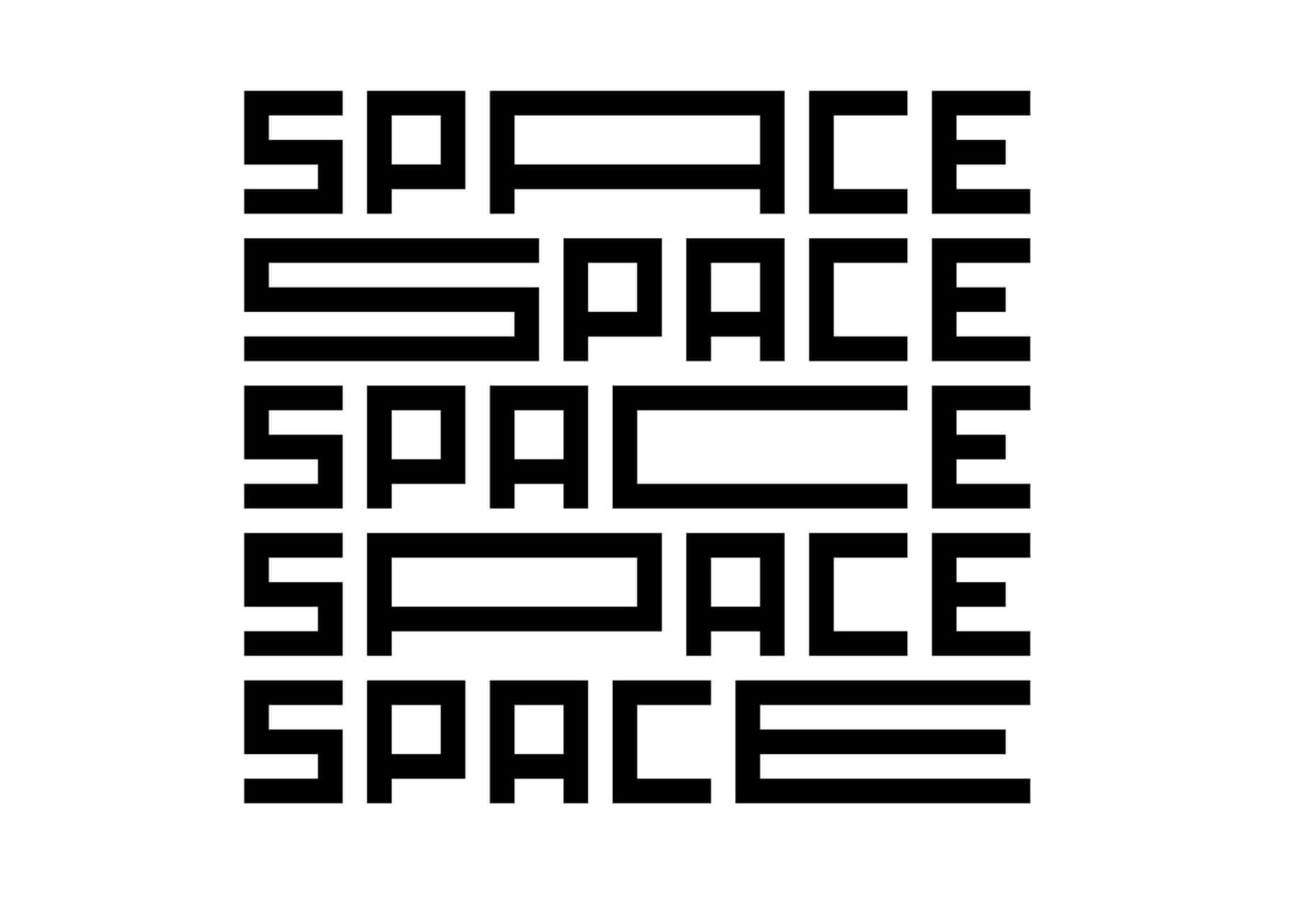
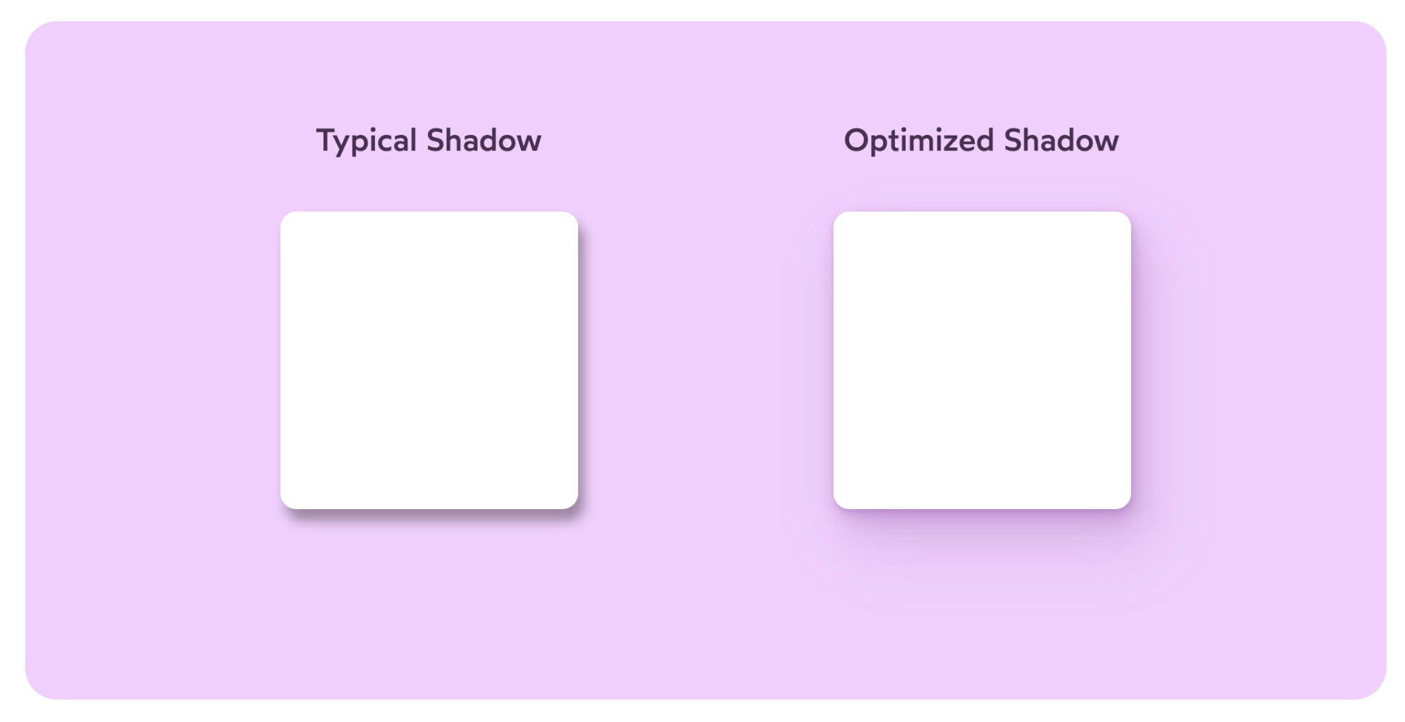
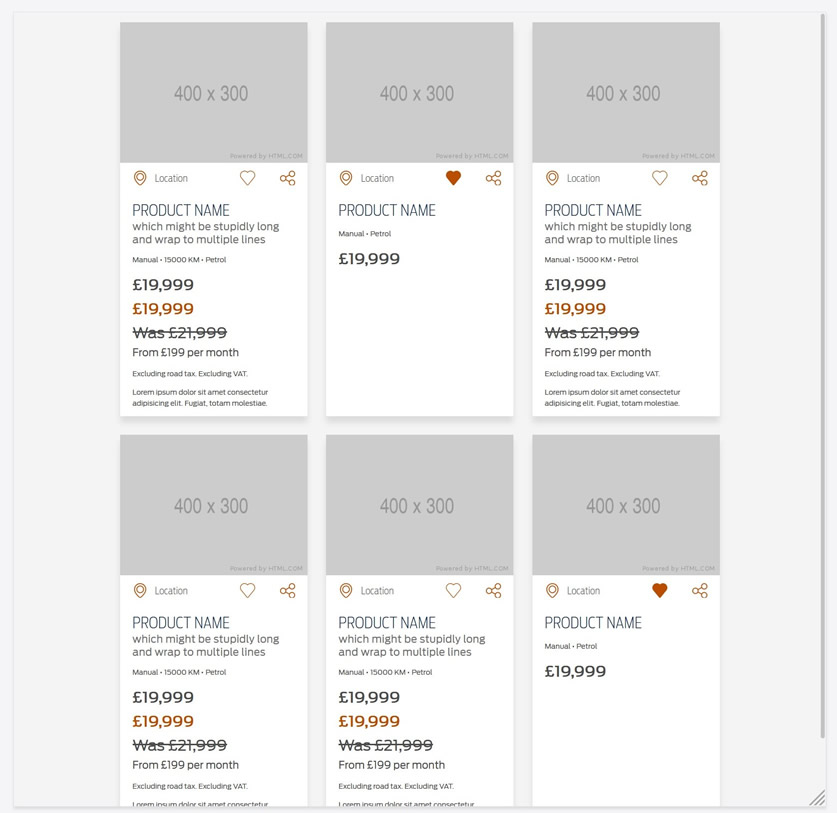
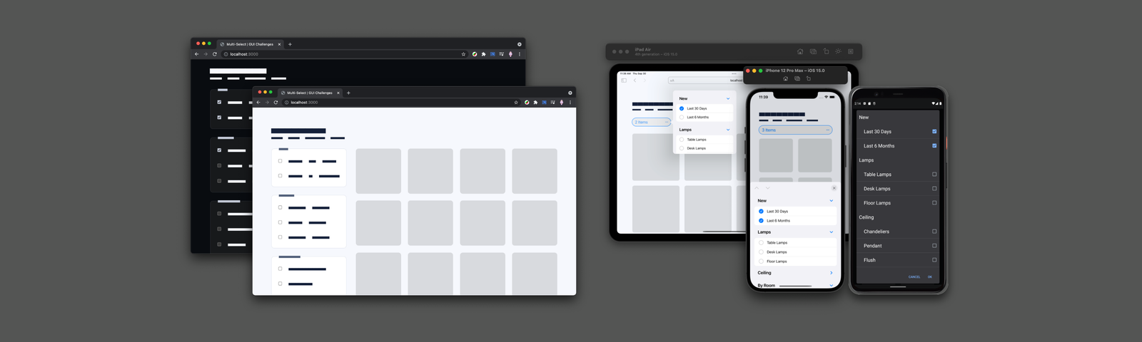
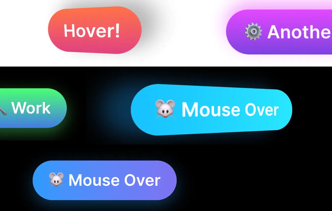
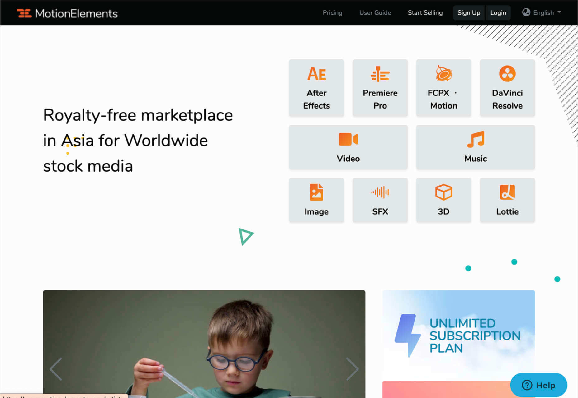
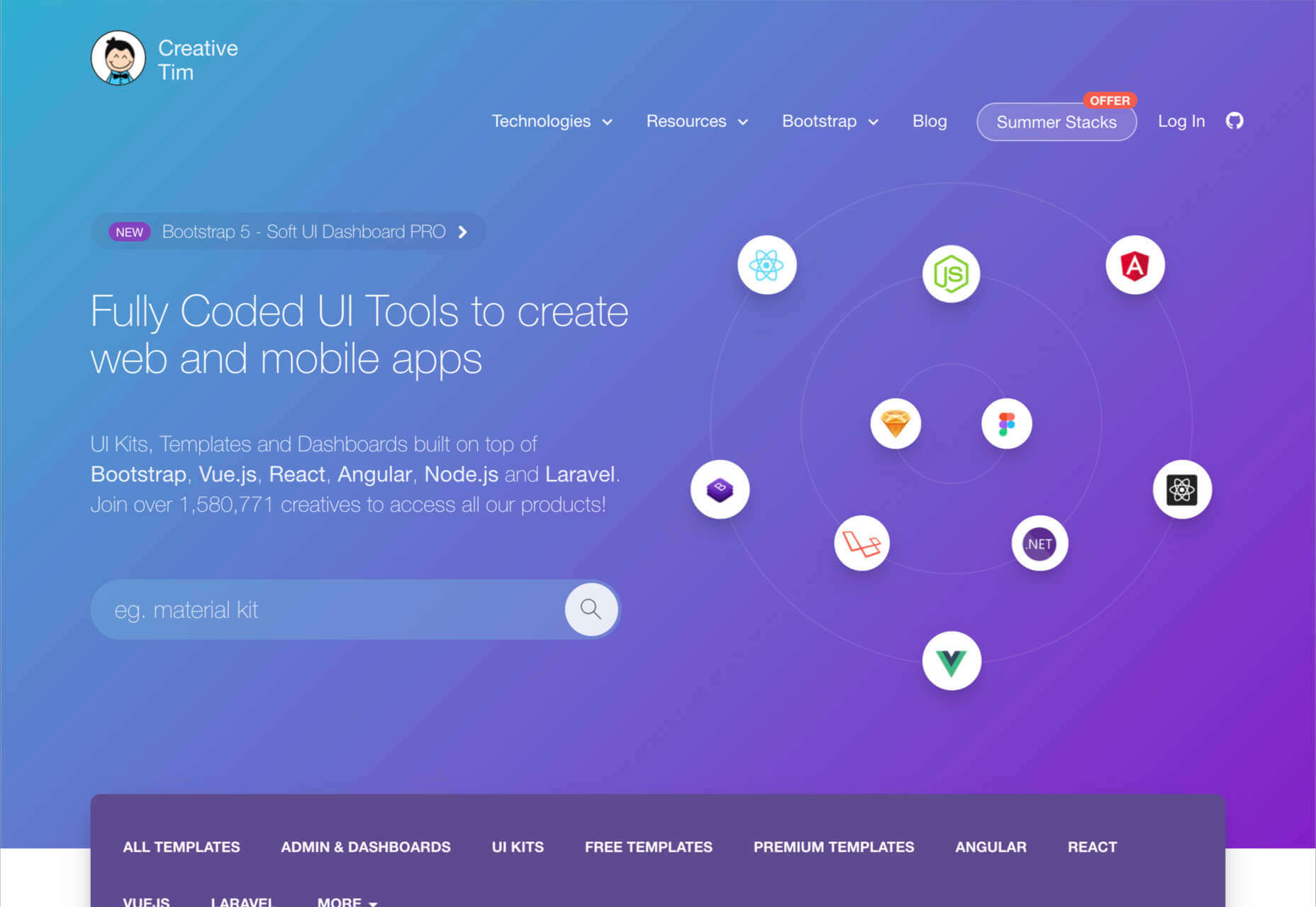
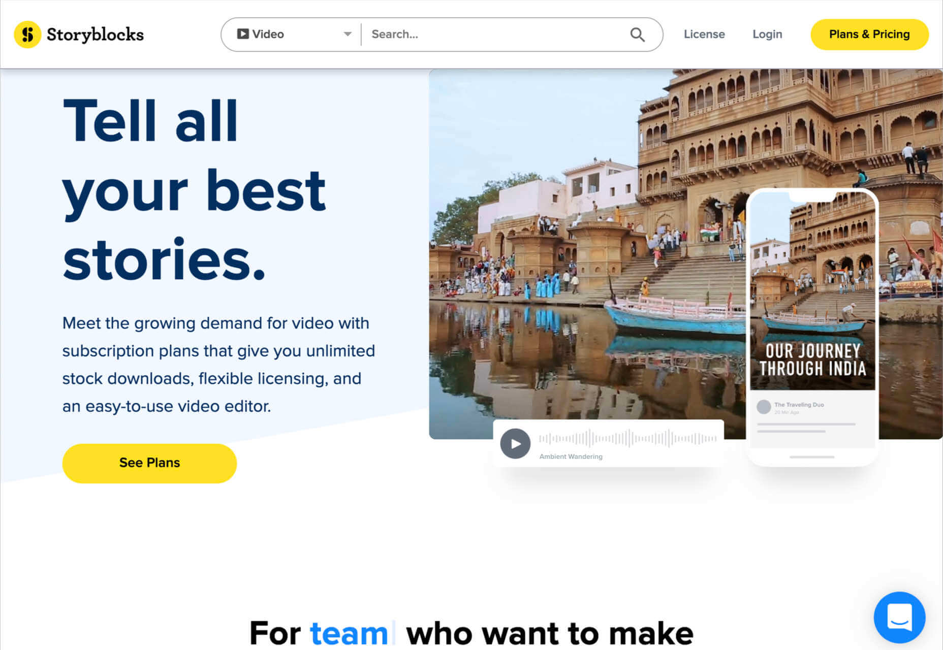
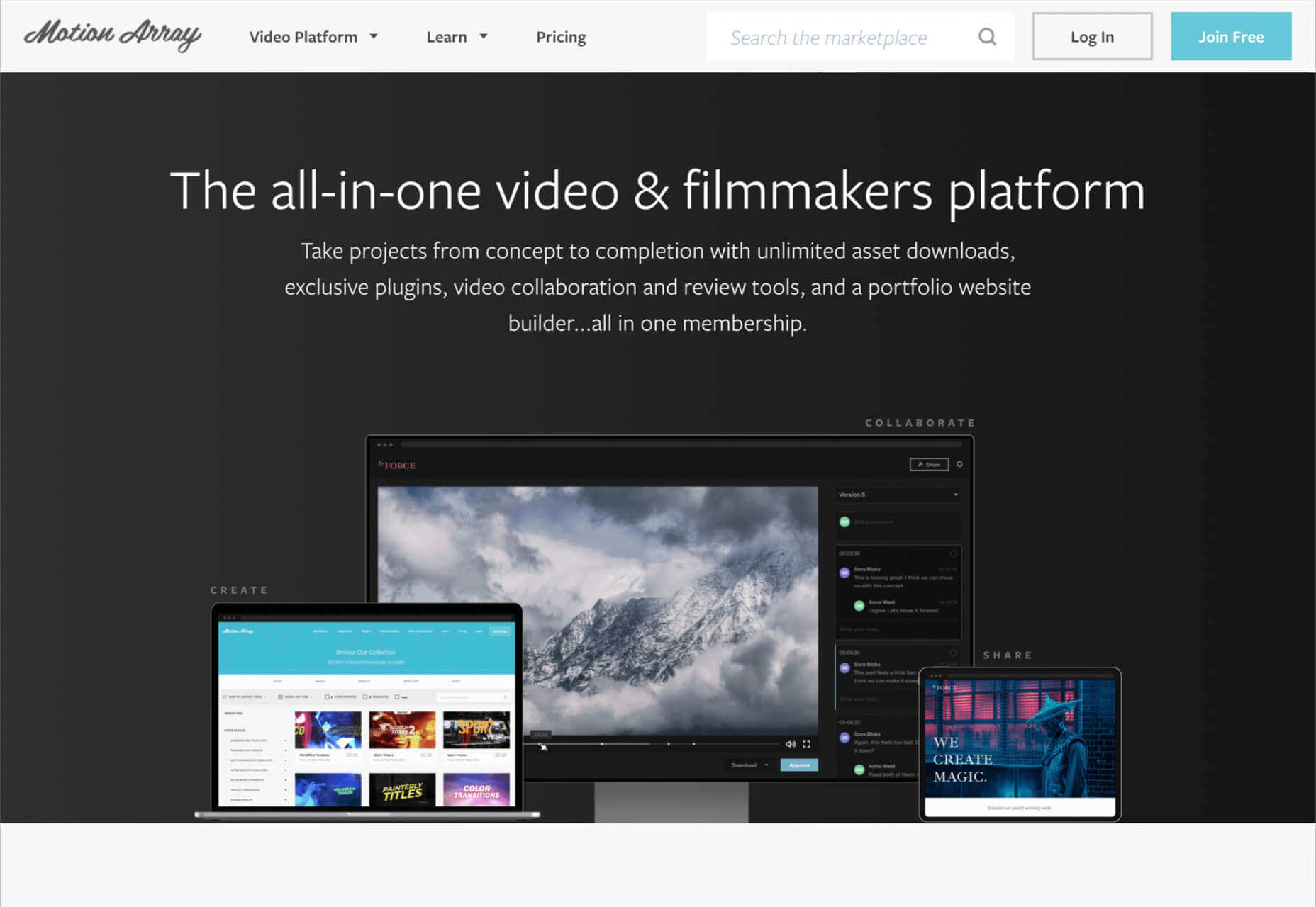
Every designer has their own preferred strategy for collecting resources. Some pluck brushes, fonts, and templates from different “stock photo sites” and public marketplaces. Others collect graphics from swipe files and forums around the web.

The never-ending desire for themes, visual content, and graphical components has prompted an influx of “design packages” to appear around the web. These all-in-one bundles, ranging from Envato Elements to Elegant Themes, promise a selection of valuable creative content in exchange for a single fee or monthly subscription. 

If you’ve been planning to seek out a few of these high-value subscriptions yourself, you’re in the right place! Today, we’re going to talk about some of the top designer resources available on the market. 

1. Envato Elements

Probably the best-known of all the designer resource marketplaces, Envato Elements advertises itself as the unlimited creative subscription. On this website, you’ll be able to access around 54 million creative assets through a single subscription. There are endless resources to unlock here, ranging from templates for your graphics to video templates, audio, and stock photos. 

Unlike most marketplaces, Envato gives you peace of mind by promising only the highest quality designs and graphics. Your content comes with quality assurance, and there are many PSD elements on the site, too, including stationery and web design templates, mock-ups, and more. Categories for your creative content include:

  • Stock photos
  • Video templates
  • Music
  • Sound effects
  • Graphic templates
  • Graphic designs
  • Presentation templates
  • Fonts
  • Photos
  • Web templates
  • Add-ons
  • CMS templates
  • WordPress resources
  • 3D content

Pricing: Pricing starts at only $16.50 per month, and this gives you unlimited access to everything on the site, including millions of digital assets and stock photos. You’ll also be able to use various courses and tutorials on the website too.

2. Elegant Themes

Elegant Themes is an all-in-one creative resource for website themes. The solution offers you access to some of the most popular WordPress themes worldwide. 

You’ll also get access to a visual page builder as part of the kit. When you sign up for the Elegant Themes subscription, you get access to all of the resources within, including the Divi page builder and WordPress theme, Extra, Monarch, Bloom, and more. If you’re a site builder or work on building pages for clients, this is a must-have subscription. 

Elegant themes are currently the go-to resource for more than 750,000 people. It’s also home to some of the highest-rated themes around. Features include:

  • Divi WordPress page builder
  • Endless WordPress themes
  • Page editing tools
  • Monarch, Bloom, and Extra 
  • Hundreds of website packs
  • Lifetime premium support
  • Unlimited website usage

You can either pay for yearly access with Elegant Themes or pay a one-off price for lifetime access. For most, the lifetime option is likely to be a pretty appealing one. You don’t have to worry about renewing your subscription this way.

3. Template Monster

Template Monster offers the “ONE” web development membership, perfect for creative professionals. The MonsterONE offering is a complete unlimited subscription for all of your creative needs, with access to unlimited downloads, new weekly items, and simple licensing. You also get plenty of support from the Template Monster Team. 

A goldmine for anyone who needs to upgrade their selection of video and photo assets, graphic templates, HTML templates, or anything else, Template Monster is packed full of amazing resources for any project. You can also find new products from fresh contributors all the time, so the value of your membership is constantly increasing. 

Features include:

  • HTML templates
  • Presentation templates
  • CMS templates
  • Graphic templates
  • Video assets
  • 3D models
  • Audio assets
  • WordPress themes and plugins

Pricing starts at a tiny $6.90 per month, with a slight discount if you pay yearly. The lowest-cost package gives you access to all of your graphic and design assets, but you won’t get any eCommerce or WordPress themes. However, if you upgrade to the all-in-one package at $14.95 per month, you get a more extensive range of resources.

4. Creative Market

Creative Market is another one of those amazing all-in-one environments for creatives and designers. This marketplace is supplied by thousands of independent artists from around the globe, each offering a host of top-quality designs and resources. You’ll find photos, graphics, templates, fonts, web themes, and countless other tools on the Creative Market. 

If you’re looking for sheer size, it’s hard to find another company that competes with the Creative Market package. There are literally millions of ready-to-use products available, including Instagram templates, textures, and procreate brushes. 

You’ll have access to 3D content for your immersive website designs and a host of purchasing products. Although there’s no “subscription model” per-se for this marketplace, you can invest in a credit plan that allows you to set how much you spend on your assets each month. 

Features include:

  • Millions of creative products
  • Huge selection of independent designers
  • Brushes, textures, templates 
  • Fonts and web content available
  • Huge selection of stock photos
  • Convenient credit plan

The individual purchasing plan is likely to appeal more to people just beginning to test Creative Market for the first time. However, if you want a subscription experience, we’d recommend using the credit plan to estimate how many credits you’ll need each month.

5. Adobe Stock

All web designers know Adobe. The chances are that no matter what kind of creative work you do, you’ve developed a few skills with an Adobe product, from Photoshop to Lightroom. Adobe Stock is also one of the leading platforms for images on any topic. 

Although Adobe Stock doesn’t compete with other marketplaces in terms of versatility, it still stands out as one of the main resources for designers. There are hundreds of millions of stock images, videos, editorial content, and vectors. You can also access a premium collection of custom content and 3D resources too. The great thing about Adobe stock is that you can easily create your own libraries and download content into your Adobe software. Resources include:

  • Stock photos
  • Premium images
  • 3D content
  • Vectors and brushes
  • Stock video footage
  • Royalty-free templates
  • Vector art and illustrations
  • Stock music and audio
  • Integration with Adobe software

Adobe Stock is a little pricier than some of the other marketplaces available today, but it’s still pretty impressive. You’ll pay around $29.99 per month for 10 assets per month, or you can access a full annual plan at $199.99 per month. The amount you pay will depend on the quality of the resources that you want to download.

6. Motion Elements

If Elegant Themes is the go-to resource for designers searching for WordPress themes and web design solutions, Motion Elements is the top choice for “motion” content. Here, you’ll find videos, SFX content, images, music, 3D solutions, and so much more. 

Though it’s located in Asia, Motion Elements is available worldwide. The marketplace offers a monthly subscription plan wherever you can download unlimited products to suit your needs. There are tons of resources to choose from here, including After Effects elements, tools for Lottie, Premiere Pro, FCPX motion, DaVinci Resolve, and more. 

Features include:

  • After Effects elements
  • Premier Pro resources
  • FCPX Motion
  • DaVinci Resolve
  • Video and audio content
  • Stock images
  • SFX resources
  • 3D content

Pricing starts at $16.50 per month for an unlimited annual plan. This means that you can download as much as you like without having to pay any more. There is a small discount if you pay for a full year of access in one go.

7. Creative Tim

Simple but effective, Creative Tim is an amazing resource for front-end and back-end content bundles. You get fully coded UI tools here that can help you create various mobile and web apps and a huge selection of dashboards and templates. If you’re the kind of designer who likes working on top of things like Bootstrap, React, Angular, Laravel, Node.js, and more, then Creative Tim has you covered. 

This is one of the more technical creative resource packages that we’ve looked at so far, but it has a lot of value to offer. That’s probably why there are already more than 1.5 million people using the service. You can search through administration dashboards, UI kits, premium templates, free content, and design systems. Of course, everything is easy to access too. Features include:

  • Frontend design technologies for endless platforms
  • Soft design, light design, paper design, and more
  • Bootstrap content 
  • Resources and third-party tools
  • Complete design and web kits
  • UI kits and templates
  • Admin and dashboard templates

There’s a free version of Creative Tim available for beginners if you want to keep your costs low, but it’s generally much better to sign up for the premium subscription. You can also purchase kits and templates on a one-off basis if you prefer to start small. However, the best prices generally come from buying the bundles from Creative Tim’s subscription side. 

8. Storyblocks

Similar in style to Motion Elements, Storyblocks is a creative design resource for any designer getting involved with the video world. This website is home to some of the best free-to-use videos around, with simple licensing available at a click. Aside from high-quality videos and templates, you also get audio and sound effects as part of your subscription and images or illustrations. 

The unlimited access pass gives you all the resources you might want, from 4K and HD footage to music and sound effects, After Effects templates, and photos, vectors, or illustrations. You can also export a host of your own video projects with access to the Maker video editor, which allows you to make various changes to your custom video content. Features include:

  • HD and 4K video footage
  • After Effects Templates
  • Sound Effects and Music
  • Photos, Illustrations, and Vectors
  • Unlimited video exports
  • Video editor access
  • Licensing support

The standard all-access plan from Storyblocks starts at a very affordable £39 per month for all of the content you might want. In addition, everything you get here is unlimited, so you don’t have to worry about running out of credits. There’s also an enterprise option available if you want to share access to resources with your team.

9. Motion Array

Motion Array is an all-in-one video creation platform for those with an eye for visual content. This fantastic resource center is packed full of valuable tools, from Da Vinci Resolve templates to Adobe Premier Pro Content. As part of your subscription payment, you’ll get endless presets, audio effects, plugins, video footage, tutorials, and more. 

Though a little more expensive than some of the other premier subscription services on the market, Motion Array does offer a lot of content that you can’t get anywhere else. There’s an unlimited marketplace constantly updating with access to royalty-free footage, stock photos, music, and sound effects. You also get plugins built for Premiere Pro. Features include:

  • Adobe Exchange elements
  • Final Cut Pro and DaVinci resolve templates
  • Royalty-free music and sound effects
  • Stock footage and video
  • Photos and images
  • Time-saving integrations with your favorite apps
  • Portfolio site builder
  • Stock media requests

There’s a free subscription option for Motion Array, which you won’t find from most alternatives. This only gives you access to some basic stock photos and assets, but it’s a nice way to start. When you are ready to upgrade, you can pay $29.99 per month for the full stock media library, as well as requests for custom media assets and exclusive plugins.

Start Stocking Up on Designer Resources

As a designer or creative professional, keeping a constant stack of resources available is crucial to your ongoing productivity. Fortunately, there are tons of premium marketplaces out there today, making it easier to access everything you need. 

Whether you’re looking for full UI kits and templates, or you want some free-to-use images and videos for the website content you’re creating, there’s something for everyone. With most monthly subscription services available at a highly affordable price, you could even sign up for multiple sites at once. 

Source

The post 9 Amazing Design-Resource Package Sites first appeared on Webdesigner Depot.


Source de l’article sur Webdesignerdepot

SAP Manufacturing Execution s’invite sur les lignes d’assemblage du géant Airbus. Une solution qui permet de faciliter le travail des opérateurs, tout en améliorant les performances des lignes de production.

Airbus est un acteur bien connu dans le monde de l’aviation civile, avec plus de 12.600 avions livrés à ses clients. C’est aussi un acteur majeur dans le monde des hélicoptères (plus de 12.000 appareils assemblés), de la défense et de l’espace.

Avant la crise sanitaire, les livraisons étaient en forte croissance (+37 % sur 5 ans) et le carnet de commandes promettait du travail aux usines d’Airbus pour les 8,5 années à venir. L’arrivée du Coronavirus et son impact massif sur les déplacements par avion ont provoqué une chute massive des activités de la société. Si l’entreprise travaille déjà sur les avions de demain, avec par exemple des modèles à l’impact carbone réduit de 25 %, elle doit aussi optimiser sa production.

« Dans ce contexte d’adaptation rapide au changement, l’introduction d’un système de pilotage de la production (MES, pour Manufacturing Execution System) va être un élément clé de notre transformation », explique Alexandre Sizaret, Head of Production System Efficiency & Manufacturing Digitalisation, Airbus. Le projet a été lancé fin 2016, mais l’arrivée de la crise lui a donné un nouvel élan.

SAP et Sopra Steria à la manœuvre

SAP Manufacturing Execution (SAP ME) est aligné avec les principes du système d’information d’Airbus, AOS (Airbus Operating System) : standardisation des processus, management visuel, suivi et amélioration continus. Il vient naturellement compléter l’ERP et le PLM au sein des usines. Enfin, son interface utilisateur simple est adaptée aux opérateurs travaillant sur des chaînes de production.

Airbus veut répondre à plusieurs challenges au travers de SAP ME : l’organisation de la production (organisation des effectifs, allocation des ressources…) ; le pilotage de l’activité (lignes de production, séquences à exécuter et avancement des séquences) ; l’interfaçage avec l’opérateur (au travers de tablettes, voire de smartphones) ; le support (détection des problèmes et alerte du manager, de la maintenance ou d’autres fonctions support).

Un core model pour toutes les usines Airbus

Pour son projet, Airbus a opté pour une approche core model associant une équipe pluridisciplinaire et multifonctionnelle. « Nous avons mis tout le monde autour de la table – opérateurs, management, intervenants métiers et techniques – afin de mettre au point une unique solution adaptée à toutes les usines, dans tous les pays », explique Alexandre Sizaret.

Après les phases de cadrage et de maquettage, la construction de la solution a été réalisée, avec une mise en place des différentes fonctionnalités de manière incrémentale. Une première version a été déployée sur des usines pilotes volontaires. L’organisation a souhaité ensuite prendre un peu de recul pour identifier les sources d’irritation. Dans le même temps, une analyse a été menée sur l’utilisation du MES et l’adhésion aux processus proposés. « Nous avons voulu vérifier que l’outil répondait bien aux besoins exprimés et qu’il était correctement utilisé. » Une importante phase de consolidation avant le déploiement à grande échelle de SAP ME.

La solution est aujourd’hui présente sur l’ensemble des sites européens du groupe : 10 usines et 2 lignes d’assemblage final. Soit un total de 279 stations de production. 7700 personnes ont été formées, dont 5500 sont des utilisateurs réguliers de SAP Manufacturing Execution. Plus de 2,4 millions d’opérations ont été effectuées sur SAP ME au cours de l’année 2020. Pour tenir cette charge, le système est réparti sur quatre sites, selon un même core model.

Au sein des sites de production, des écrans géants ont été déployés, secondés par des tablettes, smartphones et équipements IoT (scanners, lecteurs de badges…). SAP ME interagit directement avec l’ERP SAP, que ce soit pour la qualité, la conformité, la gestion des aléas, la maintenance ou encore la logistique. Il interagit aussi avec le PLM. Il est ainsi possible de visualiser pièces et maquettes en 3D et de disposer d’instructions de montage détaillées.

Plus d’efficacité au quotidien

SAP Manufacturing Execution est vu par Airbus comme un facilitateur du travail des opérateurs. Mais aussi comme un élément clé pour mesurer, soutenir et améliorer les performances des lignes de production. « Parmi les bénéfices les plus visibles, nous constatons une réduction des temps de production, des déplacements des opérateurs, de la documentation de production et plus généralement du recours aux documents papier, constate Alexandre Sizaret. Un autre bénéfice, moins facilement mesurable, est l’amélioration des performances des lignes de production, au travers d’un meilleur pilotage et d’une meilleure réactivité face aux aléas. »

Le MES est un élément clé pour épauler la production au quotidien, mais aussi un socle qui va aider  à la démocratisation de nouvelles technologies, comme les jumeaux numériques ou la maintenance prédictive. « Nous souhaitons aller vers l’opérateur 4.0 en le connectant à la bonne information, au bon moment, au travers de technologies comme la réalité virtuelle, la réalité augmentée ou l’interaction vocale avec les solutions numériques. Nous voulons également nous servir de la puissance de la data pour améliorer les processus, détecter les bonnes pratiques et prévenir les aléas. C’est un changement de paradigme qui nous permettra de basculer de la réaction à l’anticipation. »


The post Airbus place SAP Manufacturing Execution au cœur de sa production appeared first on SAP France News.

Source de l’article sur sap.com

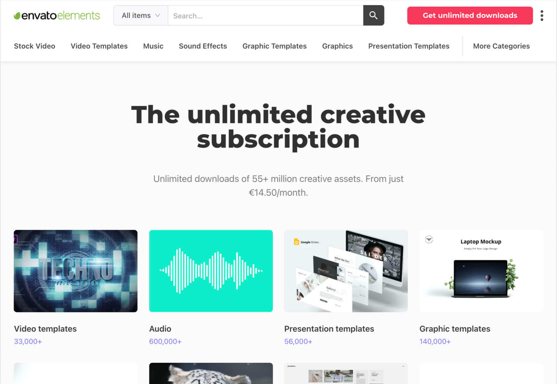
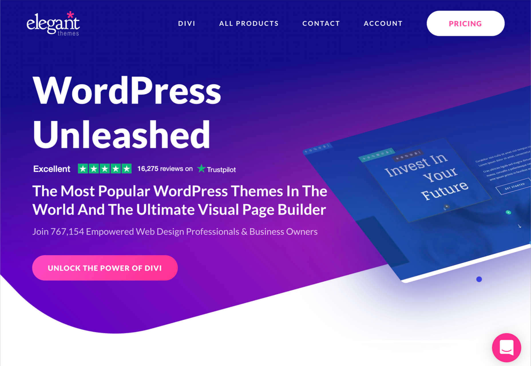
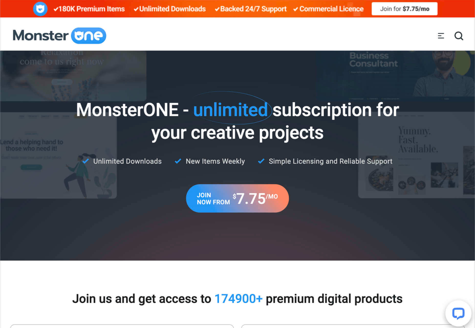
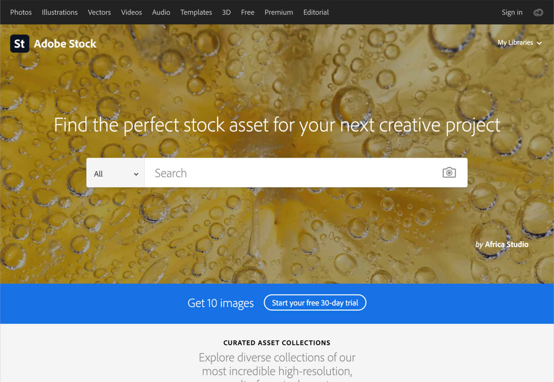
Rather than spring cleaning, do some spring “shopping” for tools that will make your design life easier. Packed with free options this month, this list is crammed full of tools and elements that you can use in your work every day.

Here’s what new for designers this month:

April’s Top Picks

Charts.css

Charts.css makes creating beautiful online charts that much easier. It’s a modern CSS framework that uses CSS utility classes to style HTML elements as charts. It’s accessible, customizable, responsive, and open source. There’s a quick start option and available source code to work with.

Haikei SVG Generator

Haikei is a web app that helps you generate SVG shapes, backgrounds, and patterns in all types of shapes to use in projects. Everything can be exported into the tools you are already using for easy integration, and every element is customizable. The tool is free right now – no credit card needed – and you get access to 15 generators and can export in SVG and PNG format. A premium option is on the way, and you can sign up to get notified for access.

Fluid Space Calculator

Fluid Space Calculator helps you create a related space system and export the CSS to implement it. The calculator allows you to add space value pairs and multipliers and see the impact on the screen before snagging the related code. It’s great for determining how things will look in different viewports and for creating custom space pairs.

Night Eye WordPress Plugin

Night Eye WordPress Plugin helps you create a dark mode option for your WordPress website with ease. It’s completely customizable, schedulable, and one of those things that users are starting to expect. The plugin has free and paid versions – the only difference is a link to credit the developer.

3 Productivity Boosters

Macro

Macro is a supercharged checklist app for recurring processes. It’s designed to help teams document, assign, track, and automate for maximum efficiency. Now is the time to test this tool because it is free in public beta.

Writex.io

Writex.io is a free writing app that uses AI and smart features to help you write more efficiently. It can check readability as you write, make suggestions, check spelling, and allows you to work with versioning. All the settings are customizable, so you can get help and suggestions when you want them and avoid things you don’t want.

Taloflow

Taloflow, which is in beta, is a tool that helps you find the top cloud and dev tools for your use case. This is designed to be a time-saving solution to finding the right infrastructure and API products for your work.

8 Kits with Illustrations and User Interface Elements

Skribbl

Skribbl is a collection of free, hand-drawn illustrations in a light and fun style. The black and white sketches are friendly, and the collection keeps growing. Plus, the illustrators are allowing them to be used free for any use.

Mobile Chat Kit

Mobile Chat Kit is a free starter kit for building apps in Figma, Sketch, and Adobe XD. It includes more than 50 screen options with mapped-out flows for a quick-start project.

Flowchart.fun

Flowchart.fun is exactly what the name implies. The app allows you to type, create nodes, and link elements to develop simple flow charts quickly. Then you can alter shape and size with drag and drop. Export it for use as an SVG, JPG, or PNG.

Shuffle

Shuffle is a marketplace packed with UI libraries to help you with a variety of digital projects. There are more than 1,500 pre-built components to choose from with professional designs. This premium tool comes with a monthly subscription or lifetime license.

Cryptocurrency 3D Pack

Cryptocurrency 3D Pack is a set of icons with fun colors in three-dimensional shapes that you can use to represent different crypto elements. The pack includes 55 #D icons in PNG and BLEND formats.

Stratum UI Kit for Figma

Stratum UI Kit for Figma includes nine free screens that are ready to use. Options include API documentation, Kanban, document, data dashboard, ecommerce product list, ecommerce product options, payments spreadsheet, cloud storage, and newsfeed.

Conic.css

Conic.css is a collection of simple gradients that you can browse and then click to copy the code into your CSS to use them in projects. It’s quick and easy while using trendy color options.

Artify Illustrations

Artify Illustrations is a Figma plugin that allows you to access more than 5,000 SVG and PNG illustrations within the app. It’s got a built-in search feature, everything is high-resolution, and the huge library includes various styles.

2 Tutorials

A Complete Guide to Accessible Front-End Components

A Complete Guide to Accessible Front-End Components is an amazingly comprehensive guide from Smashing Magazine with everything you need to know about accessible components. From tabs to tables to toggles to tooltips, you’ll find it all here and learn how to use it the right way.

Grid CheatSheet in 2021

Grid CheatSheet in 2021 is a useful guide of everything you can do with CSS Grid. Plus, it has plenty of fun illustrations and an accompanying video.

8 Fresh and Fun Fonts

Athina

Athina is a modern display serif with beautiful connector strokes. The free version is a demo, and there’s a full family that you can buy.

Brique

Brique is a free (personal and commercial) display font with a wide stance and uppercase character set. The letters have a lot of personality and a readable configuration.

Code Next

Code Next is a great geometric sans serif with a full family of styles. Including two variable fonts. It’s highly readable and would work for almost any application.

Inter

Inter is a simple and functional sense serif family with everything from extra light to heavy weights. The extra character personality makes this a fun and functional font option.

Nothing Clean

Nothing Clean is a fun grunge-type option. It’s an all uppercase character set with alternates.

Playout

Playout is a fun, hand-drawn style typeface with interesting glyphs and alternate characters. The most fun feature might be the pawprint characters in the demo set.

Rockford Sans

Rockford Sans is a geometric typeface with subtly rounded edges. It has eight weights and italics. With its large x-height and round features, it’s legible and friendly. It’s suited to cover a wide variety of tasks from editorial to brand design and advertising.

SpaceType

SpaceType is a fun and funky typeface in regular and expanded styles. The stretched letterforms make interesting alternates for display purposes.

Source

The post 25 Exciting New Tools For Designers, April 2021 first appeared on Webdesigner Depot.


Source de l’article sur Webdesignerdepot