Articles

Customer reviews are incredibly valuable to your company. Around 95% of customers say they read reviews before they make a purchase. Another 72% say that they won’t even consider buying your items until they’ve read the reviews associated with your business or product. 

No matter how good your marketing and promotion strategies might be, your audience will always turn to other customers for a credible insight into what buying from your brand is really like. That’s why it’s so important to leverage as much social proof as you can.

Unfortunately, gathering reviews and displaying them correctly on your website can be challenging.

In this article, we’re going to look at what you can do to make your reviews stand out when you’re ready to display them online. 

The Different Kinds of Review

Before we get into looking at all the different ways you can effectively display your reviews on your website, let’s get the basics out of the way. 

There’s more than one type of review. Some are simply comments left on the bottom of your product pages by customers that were impressed by whatever you sold. Other reviews are available in the form of videos or badges. When you want your website to look as credible as possible, the best thing you can do is decide which types of reviews will have the most impact. 

Ideally, you’ll want a combination of different review types to add depth to your site. Putting various kinds of reviews on your website increases your credibility while also boosting your SEO

Here are your main options:

The Testimonial

Testimonials are one of the most common types of review. Essentially, these are the messages shared by your customers that highlight the things they liked and didn’t like about your product. Testimonials often include a picture of the person leaving the message, and their name, to give them a greater sense of authenticity. You might also include a link to a website or case study with a testimonial to give it more depth. 

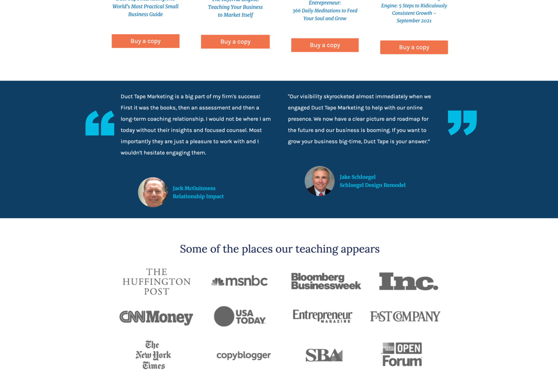
Most testimonials go at the bottom of pages. You can showcase these reviews on your home page to start generating credibility as soon as someone interacts with your brand. Alternatively, you could allow users to place their reviews on product pages. Here’s an example of what a testimonial might look like from ducttapemarketing.com:

Review Badges and Widgets

If your customers tend to leave reviews about your company on other sites, like Angie’s List or Yelp, then you can add a widget or badge to your website that makes it easier for other customers to find them. Sometimes, you’ll just include a small button on the bottom of a website pay that says, “find us on Yelp.” Other times, you can add your star rating too.

Some review sites will also give you the option to showcase the actual reviews in a widget that frequently updates with new messages. 

If you’re only showing reviews from one third-party site on your website, it’s best to focus on Google reviews, as it’s one of the most recognizable options. 

Provided that you’re using them correctly, badges and review widgets shouldn’t slow your website down too much, and many can be customized to suit the style of your site too. However, it’s essential to ensure that you don’t add too many widgets to your site if you want to avoid performance issues. 

Case Studies

Case studies go beyond the basics of the standard review and provide potential leads with a tremendous amount of information about how you’ve previously interacted with other companies. With a case study, you’ll often create a structured document that demonstrates a customer’s problem and your strategies to overcome those issues. 

Case studies often exist on their own pages, so you can go in-depth with sharing valuable information. For example, you’ll include an overview that introduces the customer you worked with and details on the outcomes you achieved together. 

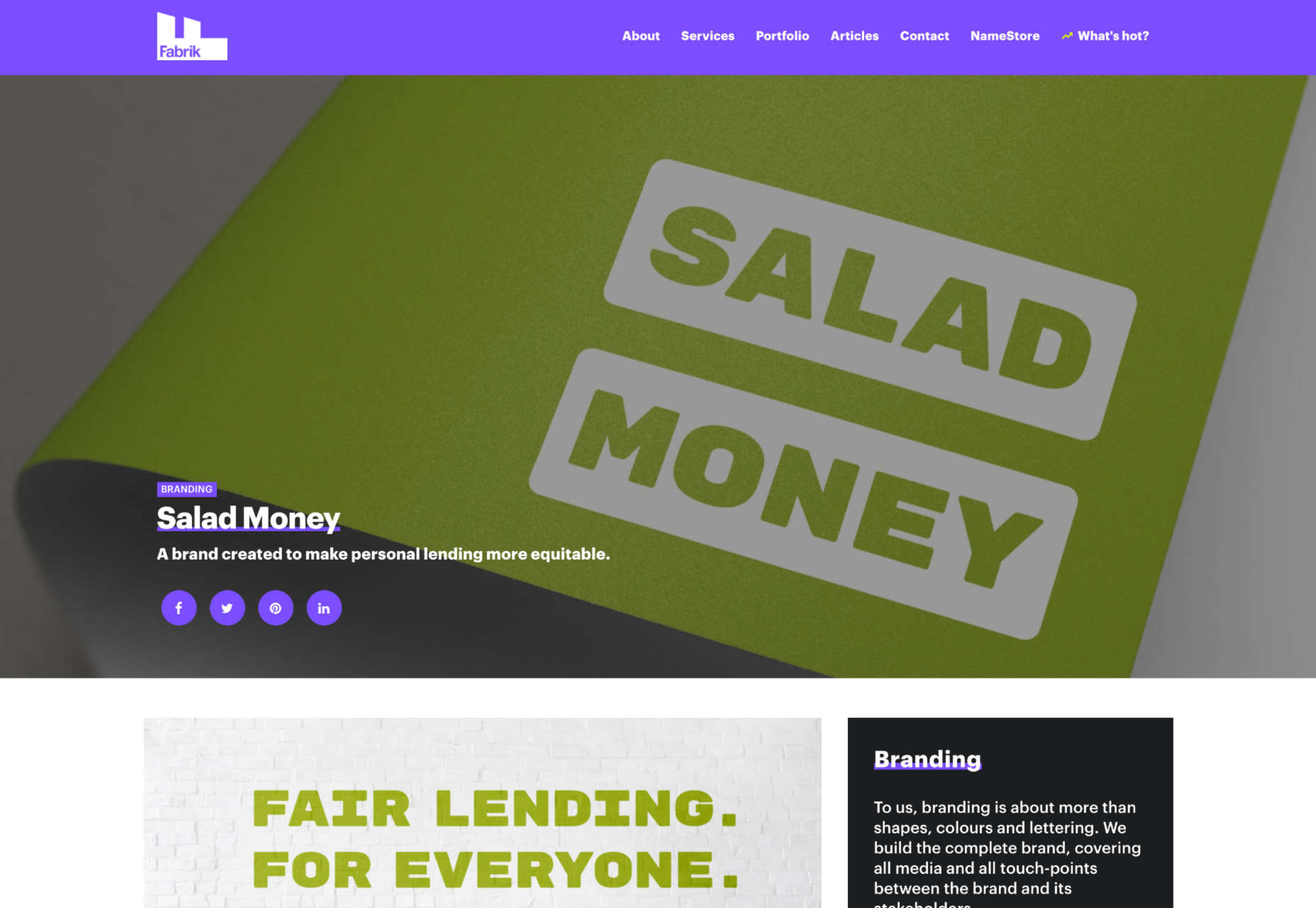
Although it’s much harder to interview customers for complete case studies and get all the statistics and numbers that make these reviews appealing, it’s often worth the effort. Particularly if you’re running a B2B company, case studies demonstrate the effort you go through to support your customers. They also act as proof of your success and set valuable expectations for customers. Here’s an example of a case study page by Fabrikbrands.com:

The Rating

If you’re just posting basic five-star ratings on your website or asking your customers to give you a number between one and ten for how positively they’d rate your service, then you can use a few handy automation tools to create one of these visuals. 

All you need to do is add a little basic CSS to your website or use a star rating widget that automatically calculates your average score based on all of the reviews that you collect from customers. 

Just make sure that your star ratings are positive not just on your website but on other review sites too. For instance, if you give yourself five stars by adjusting the CSS and then get three stars from Yell, customers will begin questioning your authenticity. 

Notably, while star ratings grab customer attention, they are a little basic if you’re trying to convert people and convince them to buy an expensive product. Most customers will often need more information than a basic star rating can provide. 

How to Display Reviews on Your Website

Now that you know what kind of reviews customers can leave about your product or brand, you can start exploring ways to display them on your website. 

You could decide to let your reviews show up on other third-party sites and leave it at that. For instance, if you’re a hotel manager, you may know that your customers are already leaving reviews on Booking.com and TripAdvisor. However, leaving your audience to seek your reviews out for themselves means that they spend less time where you want them – on your website. 

There’s also a risk that failing to add reviews to your site will make you look less credible. If you don’t own your rating or score, customers might wonder what you have to hide. 

Fortunately, we’ve got some great options to help you get started.

1. Create a Testimonials Page

The first and perhaps most accessible option for showcasing your reviews and testimonials is to design a page where your customers can easily find all the information they need about your brand. Having a dedicated testimonials page can be a great way to demonstrate transparency as a brand and show your customers that you’re not hiding anything. 

You could even add a form at the bottom of your testimonials page that allows other customers to leave their reviews and information. Just make sure that you have a CAPTCHA or another security measure in place to prevent people from spamming your site. 

It makes sense to showcase some of your most positive reviews at the top of your page, so your customers see those first. However, it could also be a good idea to showcase some negative reviews alongside them. That’s because customers generally expect to see at least some negativity associated with your brand. If all your reviews are positive, they might assume that you’re hiding something.

When displaying your negative reviews, make sure you also show that you’ve responded to them and are working hard to address any issues. You can even publish the “thank you” you get from an unhappy customer after rectifying the problem. 

2. Show Reviews in Your Website Header

The great thing about using reviews and testimonials on your website is that if you have a little coding knowledge and the correct information, you can display them wherever you choose. Most companies leave the reviews at the bottom of the website, but this could mean you’re missing out on an excellent opportunity to connect with your audience as soon as they visit you. 

Having a positive review highlighted at the top of your page could immediately boost your credibility and give your audience a reason to keep reading. Remember that a picture of the person sharing the review and their name can make them look a lot more credible when you’re trying to build trust. 

3. Add Some Reviews to Your About Us Page

It’s best not to hide your reviews somewhere your customers will have to search for them, but that doesn’t mean that you can’t scatter a few testimonials around other pages. A great way to give more credibility to your brand and your website is to create a sidebar on your “About Us” page or just showcase a handful of reviews underneath the description of your business. 

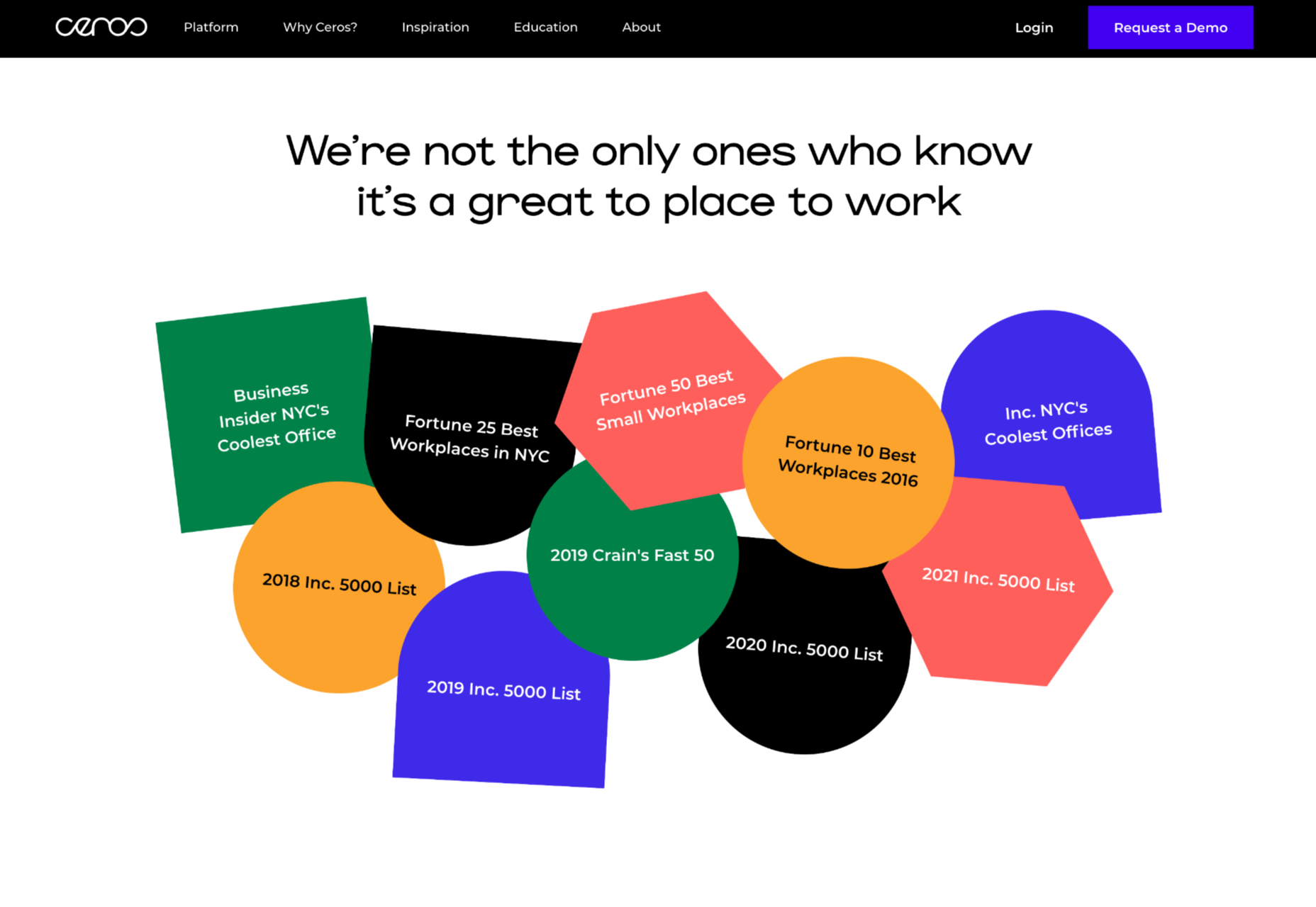
Suppose you don’t want to show customer testimonials on your About Us page. In that case, you could always show different kinds of reviews, like badges that show your certification with certain industry bodies or awards and recognition you’ve received.

Showing that you’re connected with major industry groups and that you’ve been recognized in your sector is a kind of review in itself. It indicates that other people have already assessed your business and see you in a positive light. 

Every review doesn’t necessarily have to come from your customers. Any business or person who can give more credibility to your business deserves some representation too!

4. Embed a Carousel on Your Site

As your business begins to grow, the number of regular reviews and testimonials you get from happy customers should start to skyrocket too. You might even get to a point where you’re not sure how to fit all the reviews you want to showcase onto the same page of your website. If you already have a dedicated “reviews” page where people can go to get more insights into your growing collection of social proof, try a carousel. 

Carousels are a great and dynamic way to showcase customer reviews while getting your audience more involved with your website. Give them a button they can click so that they can browse through a broader range of reviews after they’ve seen the ones that show up straight away on your carousel. It’s also worth including a link nearby the carousel widget that the user can click to visit your review page or your company’s page on a dedicated review website. 

If you want to go beyond putting carousels on your home page, remember that you can add them to your product pages and menus too. Online reviews impact around 67.7% of purchasing decisions, so it makes sense to put them somewhere your customers will see them when they’re figuring out whether or not they should hit the buy button. 

5. Add Reviews to Your Social Media Ads

Reviews can be an excellent way to add an extra spark to your advertisements elsewhere in the digital landscape. Telling your audience on Facebook that you have the best steaks in the country is great – but it’s not going to make a significant impact on most of them. That’s because every business claims to be the best. Most of your clients expect you to speak well of yourself. 

However, if you can combine an attractive image on social media with a quoted review from one of your happy customers, your ads will make more of an impact. You can include the quote from your customer in the text above your Facebook ad or create an image to display it instead.

Remember to add any hashtags and extra information that might make your ad more appealing and share it as often as you can with the right audience. Targeting your audience carefully towards people who are in the “consideration” stage of the buyer journey may help you to get more conversions. 

While customers usually scroll past dozens of social media ads every day, a genuine statement from a real person still shakes up the status quo and grabs attention. Include a button below the ad so your customer can learn more about the product the customer is talking about. 

6. Link to Reviews in Email Signatures

Finally, social media ads aren’t the only way to bring attention to your reviews outside of your website. If you want to get more external customers to go and check out your products or rediscover what your business is all about, you can add review links to your email signature too. These links can go directly to the case study or review pages on your website, reminding customers what it is that makes your service or product special. Alternatively, you can get dedicated signatures for your email that link to specific review sites too. 

Showing your clients how many ratings you have on Yelp or how many stars your products have earned with Google Reviews gives every message you send a lot more credibility. Most email marketing software solutions make it relatively easy to add information like this to the footer of your email.

Remember, your signature shouldn’t take up too much space in your email, so don’t add any specific reviews from customers. A star rating and a link back to a page where consumers can get more information will spruce up your content without weighing down your emails. 

Show Off Your Social Proof

Successfully collecting positive reviews that show your prospects how much customers love your company can be challenging enough. However, that’s just the first piece of the puzzle. Once you’ve got all those great reviews, you also need to show them off in the most effective way. From dedicated pages on your website to scrolling carousels and Facebook ads, there are a million ways to prove your credibility to your customers with testimonials.


Featured image via Pexels.

Source

The post How To Leverage Social Proof Successfully first appeared on Webdesigner Depot.


Source de l’article sur Webdesignerdepot

Tilda website builder combines everything we liked so much about constructors when we were kids – you can experiment, test out and build myriads of new creative ideas out of ready-to-use blocks. Tilda is that type of constructor that allows you to own your creative process and create pretty much any website: landing page, business website, online store, online course with members area, blog, portfolio, or event promo page.

Founded seven years ago, Tilda is a website builder that completely revamped the way we create websites. Tilda has been the first website builder to introduce block mechanics that allows users to create websites out of pre-designed pieces. This breakthrough technology allowed all users – not only designers – to create professional-looking websites. Just like in kid constructors, you can drag-and-drop and mix-and-match blocks on Tilda to let your creativity flow and build a dazzling website, at extraordinary speed. 

When you ask designers why they love Tilda, they usually say it’s because the platform provides the ultimate balance between choosing from templates and being able to fully customize and create from scratch to bring any creative idea to life. Here’s what else they say:

Tilda has been a game-changer for us. It allows our team to quickly spin up new web pages, make edits, and ship new programs. We left WordPress for Tilda and after being with Tilda for 2 years, I don’t ever want to go back.

~ Andy Page, Executive Director, Forge.

I built my first website in 2001. Since then I’ve used countless platforms and website builders for customer websites and my own business. Tilda is the perfect combination of ease of use with powerful features at an unbeatable value.

~ Robby Fowler, Branding and Marketing Strategist, robbyf.com & The Brand ED Podcast.

Let’s dive deeper into core functionalities you can leverage on Tilda. 

#1 Cut Corners With 550+ Pre-Designed Blocks And 210+ Ready-Made Templates

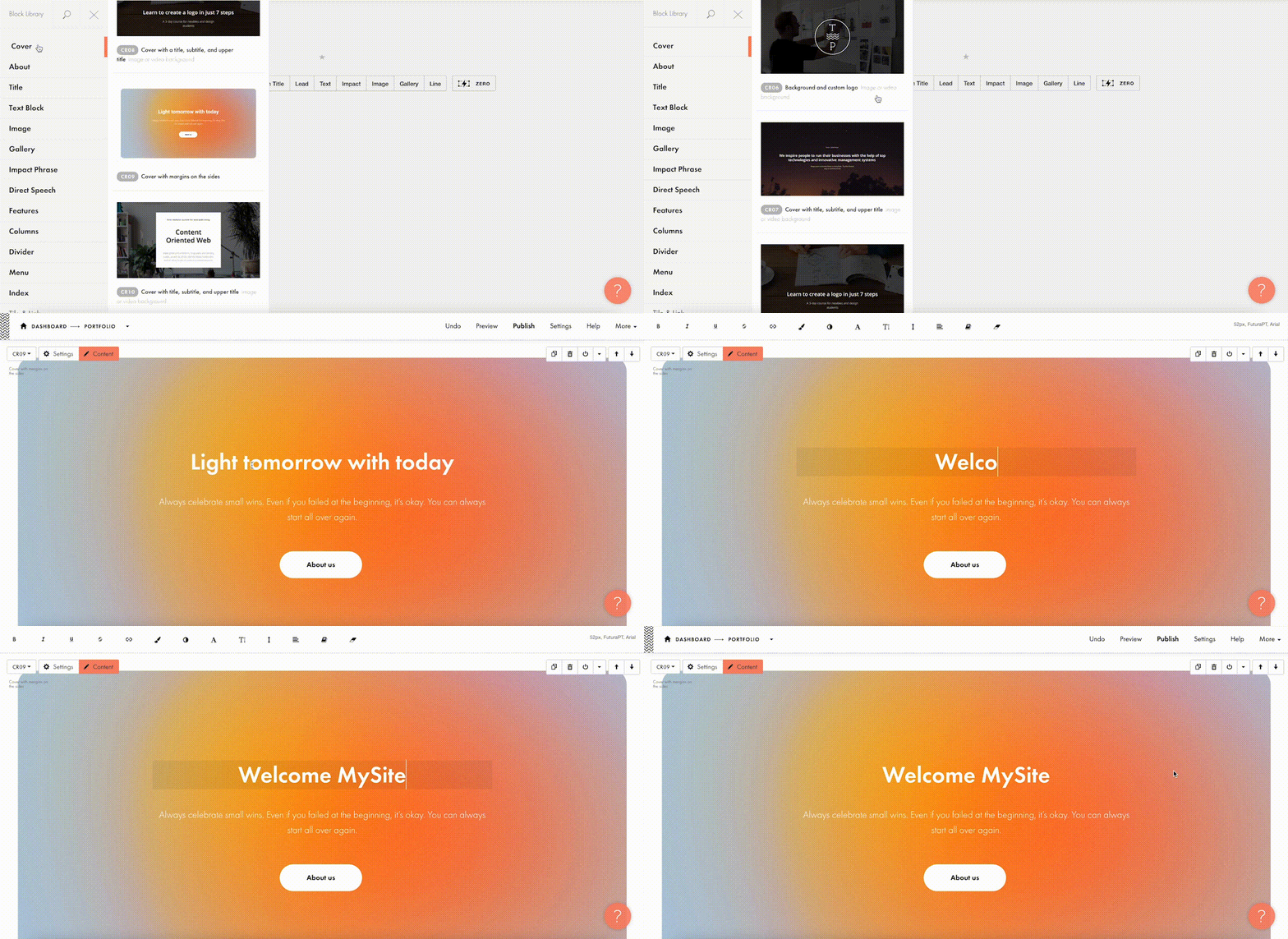
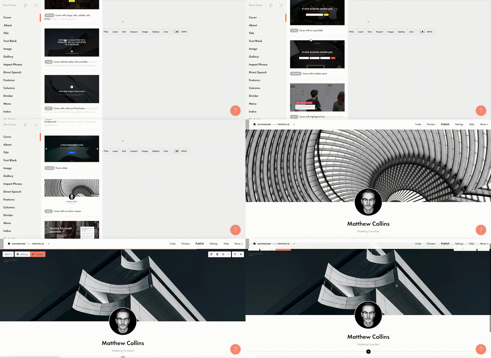
The beauty of Tilda is that it provides 550+ blocks in the ever-growing Block Library designed by professional designers. Thus, you can quickly build a website out of pre-designed blocks that encompass virtually all elements you might need for your website: menu, about us page, features, contact, pricing, etc. 

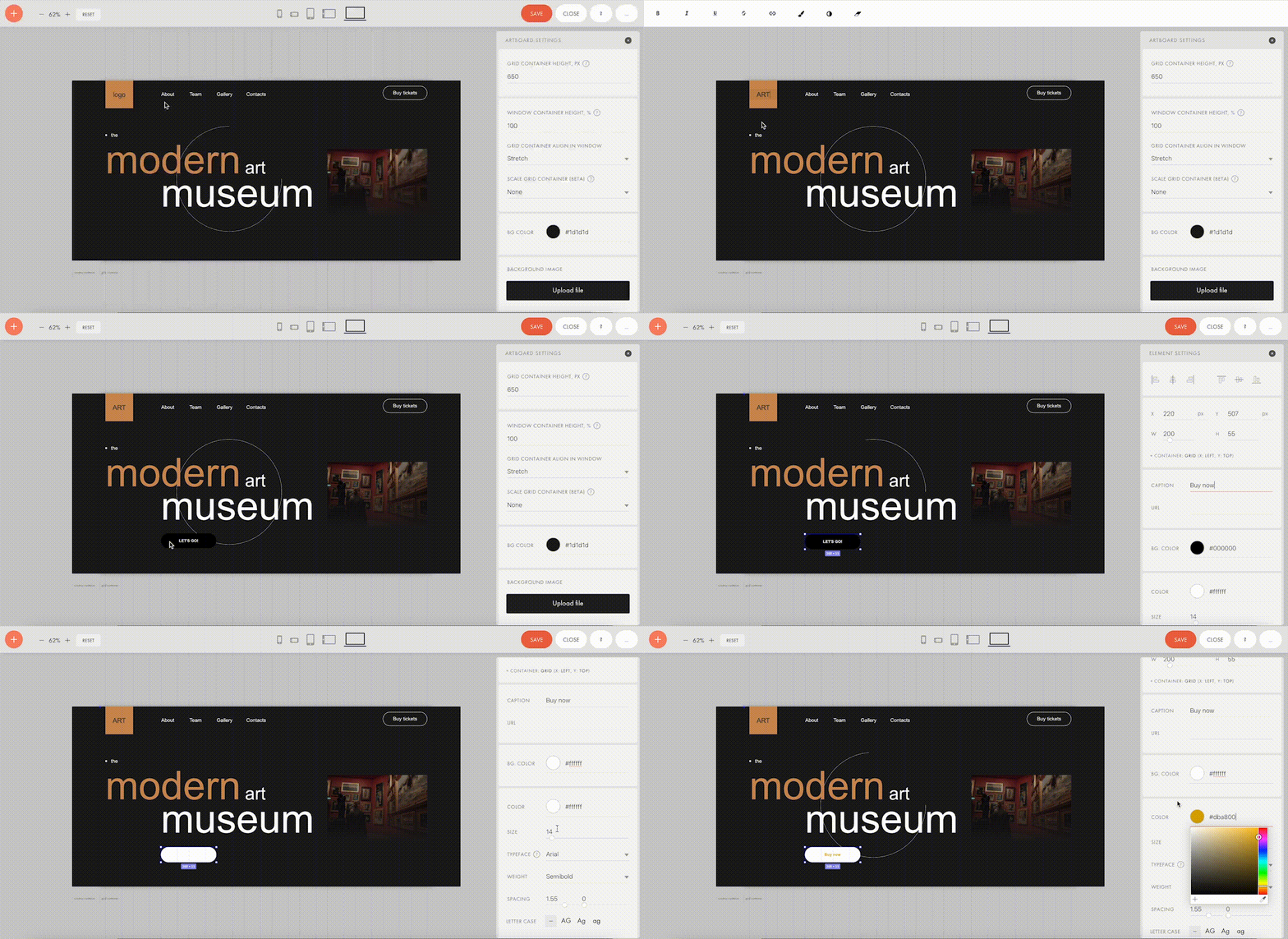
Customizing each block is a breeze with Tilda: You can drag-and-drop images, edit text right in the layout, alter block height, background color, padding, select the style of buttons, use custom fonts, and assign ready-made animation effects to specific parts of it. Also, Tilda provides a built-in free image library with 600K+ images, so you can find images that are just right for you without leaving Tilda, add them to your website with just one click, and use them for free.

Finally, all blocks fit together so well that it’s almost impossible to create a bad design on Tilda – even if you are a stranger to website building.

For a quick take-off, you can use 210+ ready-made templates for different kinds of websites and projects: online stores, landing pages, webinar promo pages, multimedia articles, blogs, and more. Each template is a sample of modern web design and consists of blocks. It means that templates don’t limit your creativity: you can modify them to your liking by playing with settings, adding extra or removing existing blocks, and embedding images and text. 

Each of the templates and blocks covers over 90% of use cases you’ll ever require and is mobile-ready, meaning that your website will look great on desktop computers, tablets, and smartphones by default.

#2 Jazz Up Your Site With Zero Block: Professional Editor For Web Designers 

To better meet the demands of a creative brief and unleash your creativity, you can use Tilda’s secret weapon called Zero Block. It is a tool for creating uniquely designed blocks on Tilda.

You can control each element of the block, including text, image, button, or background, and decide on their position, size, and screen resolution on which they’ll appear. For example, you can work with layers to create depth with overlay and opacity techniques or set a transparency level on any element and shadow effects below them. Additionally, you can also insert HTML code to add more complex elements, such as calendars, paywall, comments, social media posts, and so much more.  

Finally, Zero Block allows you to fool around with basic and more advanced step-by-step animation for a more individual look. Here’re some animation examples that you can make on Tilda:

Animation on scroll (position of elements is changing on scroll).

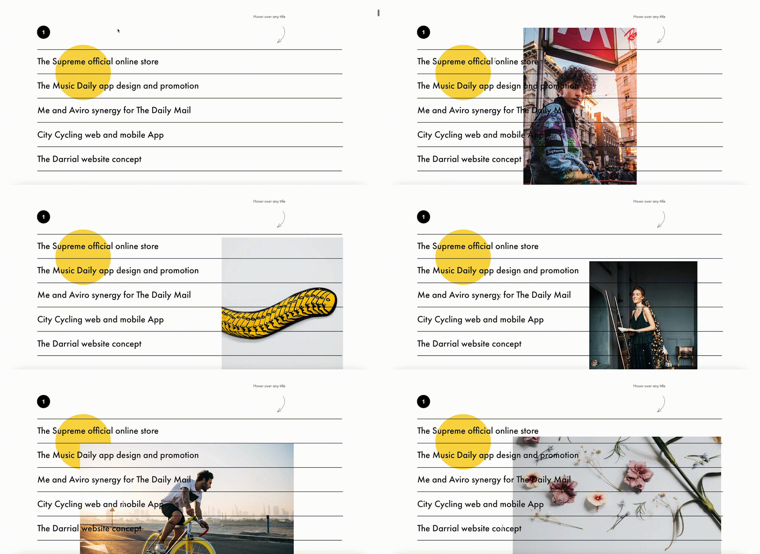
Trigger animation (animation is triggered when pointing at or clicking on an object).

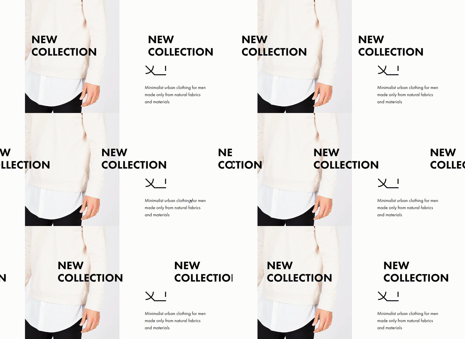
Infinite scrolling text.

#3 Import Designs From Figma To Tilda In Minutes

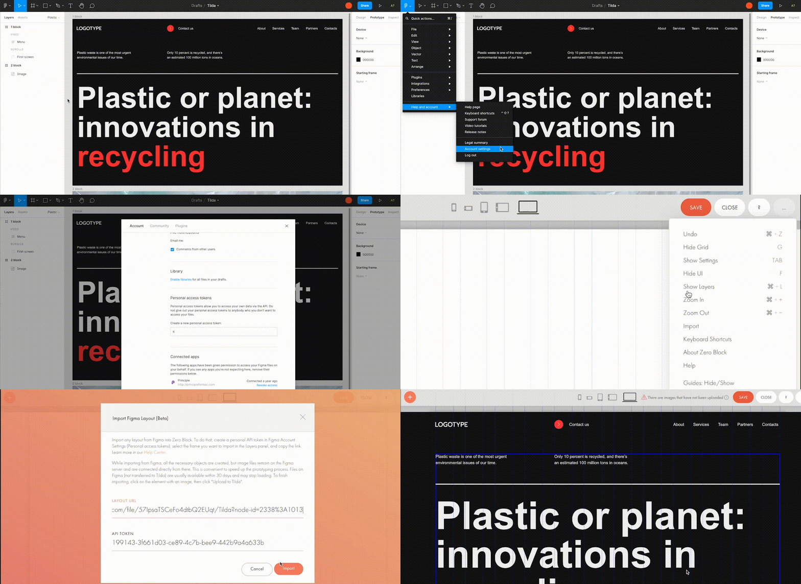
Creators love using Figma for prototyping, but when you have to transfer every element and rebuild your website design from scratch – that’s what’s killing the party. With Tilda, you can easily turn your static designs into an interactive website in no time. 

All it takes is to prepare your Figma design for import with a few easy steps, paste the Figma API token and your layout URL to Tilda, click import and let the magic happen. Once your design is imported, you can bring your project online just by clicking publish.

#4. Make Search Engines Love Your Website With Built-In SEO Optimization

Thanks to the consecutive positioning of blocks on the page, websites designed on Tilda are automatically indexed well by search engines. There is also a set of SEO parameters you can fine-tune right inside the platform to ensure that your web pages rank high even if you don’t have an SEO specialist in-house. These parameters include the title tag, description and keywords meta tags, reader-friendly URLs, H1, H2, and H3 header tags, alt text for images, and easily customizable social media snippets. 

As an additional value, Tilda provides an SEO Assistant that will show you what errors are affecting the indexing of your website and will help test the website for compliance with the search engines’ main recommendations.

#5. Turn Visitors Into Clients

Tilda gives you the power to set up data capture forms and integrate them with 20+ data capture services, such as Google Sheets, Trello, Notion, Salesforce, Monday.com, etc., to ensure seamless lead generation.

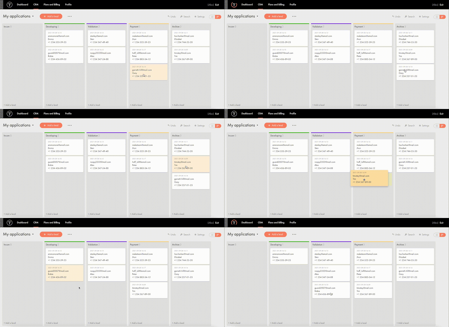
For more fun, Tilda developed its CRM to manage your leads better and keep your business organized right inside of a website builder. This is a very easy-to-use tool that automatically adds leads from forms and allows you to manually add leads you captured outside of the website. There is a kanban board that gives you an overall view of how leads are moving through your sales funnel and allows you to move leads between stages easily.

#6. Build A Powerful Online Store In One Day

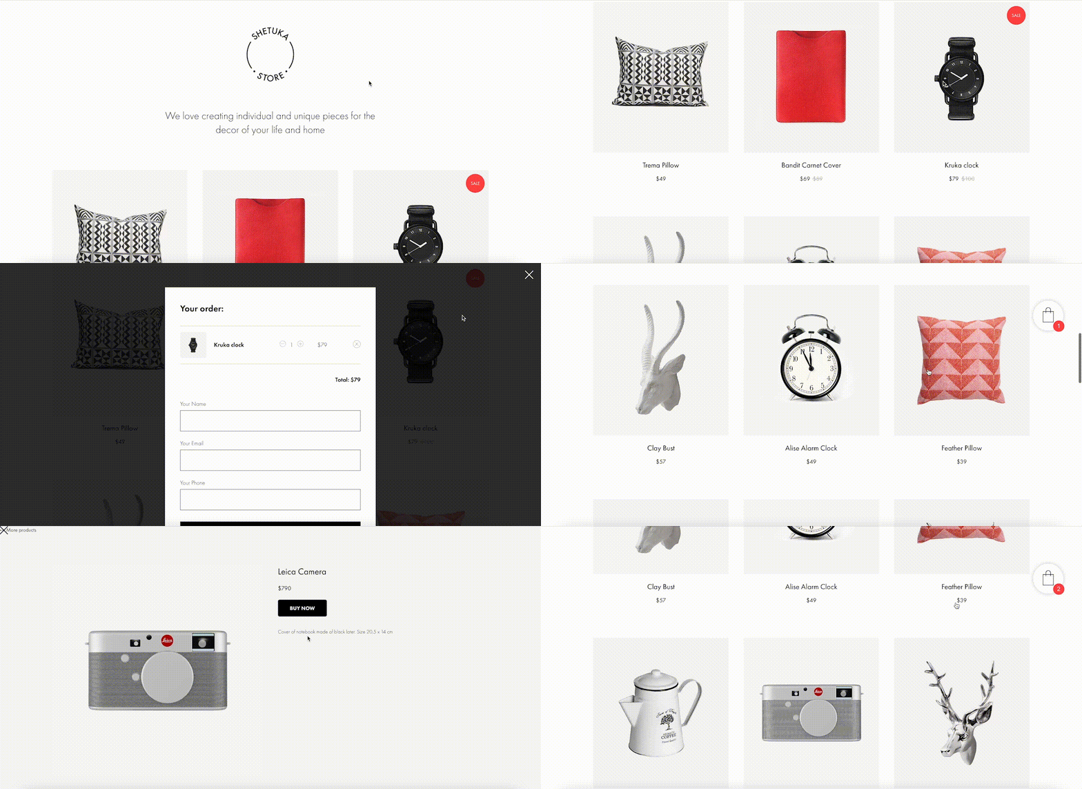
Tilda provides a set of convenient features to create a remarkable online shopping experience. The platform gives you the power to sell online using ready-made templates or build an online store completely from scratch, add a shopping cart and connect a payment system of choice — Stripe, PayPal, 2Checkout, etc. — to accept online payments in any currency.

If you are looking to run a large ecommerce business, you should also consider Tilda. Thanks to the built-in Product Catalog, you can add up to 5000 items, import and export products in CSV files, easily manage stock, orders, and keep track of store stats.

And thanks to adaptive design, your store will look good across all devices, including tablets and smartphones. 

#7. Bring Your Project Online For Free

Tilda offers three subscription plans: Free, Personal ($10/month with annual subscription), and Business ($20/month with annual subscription). When you sign up for Tilda, you get a lifetime free account. It allows you to publish a website with a free subdomain and gives you access to a selection of blocks and a limited number of features that offer enough to create an impressive website. 

Personal and Business tariffs allow more advanced options, such as connecting custom domains, adding HTML code, receiving payments, and embedding data collection forms. The business plan also allows users to export their website and create five websites (while personal and free plans allow one website per account). 

To discover all features and templates on Tilda, activate a two-week free trial – no credit card required.

Source

The post Tilda – The Website Builder That Disrupted The Way We Create Websites first appeared on Webdesigner Depot.

Source de l’article sur Webdesignerdepot

Creating an incredible brand experience for an end-user is about more than just designing the right home page or lining up a series of great product pages. 

Effective website design conveys crucial information about a company, through everything from font styles, to image choices. Nowhere is this representation of brand identity more important than on the about page. 

People frequently confuse the about page with the contact page or fail to leverage it correctly simply because they don’t know what to say. However, creating an about page that speaks to an audience can be immensely powerful. 

What is an About Page?

The first step in designing a great about page is understanding the purpose of the space. This isn’t just a page on a website explaining what a company does. 

The about page is an introduction to a company’s story, its brand essence, and personality. 

Done correctly, this page will demonstrate a crucial sense of affinity between a business and its customers. It will highlight values that resonate with a customer and make it easier for clients to trust businesses.

The Yellow Leaf hammocks company starts its about page with a video.

As you scroll through the interactive site, you discover new elements of the company’s tale, including what prompted the birth of the business to begin with and the brand’s mission. 

Yellow Leaf lets its visitors know what the company is all about by using authentic images of real people to external content and bold quotes. 

There are even snippets from customer case studies for social proof. 

About pages are relevant because they give customers a way to build a real human connection with a business. Harvard professors say that 95% of purchasing decisions are emotional; we don’t buy things just because we need them. Instead, we look for companies that we feel connections with to solve problems. 

Using an about page to convey an attitude, personality, or just what makes a business special is how designers can ensure that end-users will care more about the business. 

How to Make an About Page Stand Out

So, how do you make an about page stand out?

Since every company is different, there’s no one-size-fits-all strategy for everything.  However, there are a few essential steps to consider as you move through the design process. 

Here are some pro tips for successfully attracting attention with the about page…

Step 1: Decide What to Include

It’s tempting to assume that a complicated about page will lead to a stronger relationship between a brand and its customers. After all, the longer the story, the more the customer knows about the company – right?

While it’s essential to include plenty of valuable information in an about page, it’s also worth remembering that today’s customers are short on time. They don’t want to spend hours scrolling through one part of a website. Instead, they want access to quick, convenient snippets of information. 

The Joseph Payton about page is effective because it cuts the story down into bite-sized chunks. Each piece of information highlights valuable insights for the customer. Plus, hand-drawn images and animations make the experience feel like you’re getting to know Joe on a deeper level. 

Before you begin designing, ask yourself:

  • How much text does the page need? How much space does there need to be for copy? How can you spread the content out in a visually engaging way?
  • What sections should the page include? For example, does there need to be a link to the contact us page or a contact form somewhere?
  • How does the page connect to the rest of the website? For example, can you link to things like case studies and reviews with quotes to tie more of the website together?

Step 2: Make the Mission Statement Clear

In a world where emotion influences buyer behavior, clients and customers want to buy from companies they believe in. It’s not enough to have the right product or price point anymore. People want to know that they have a human connection with a business. 

On some about pages, it’s difficult to pinpoint the real mission of the company. It seems like you have to scroll through endless paragraphs of text to make your own assumptions about what matters to the company. However, a well-designed about page puts this crucial info front and center. 

For instance, on the Apptopia about us page, the subheading tells you everything you need to know about the brand. This heading instantly tells the audience whether it’s worth reading on to find out more. 

The best about us pages often include a lot more than just a single sentence of text. But it’s worth pinpointing some of the essential details from these pages and drawing extra attention to them. A larger font or a different font color could be perfect for this purpose. 

Alternatively, if it’s difficult to refine the company’s mission down into one message, it might be worth creating a whole segment at the top of the page dedicated to this information. That’s what the Toms shoe company does.

Step 3: Invest in the Right Trust Elements

People aren’t always sure who they can trust these days. 

There are millions of websites out there and billions of companies. Not all of them are going to appeal to every customer. Since an about page is all about making a crucial human connection between a business and its client, it’s important to implement as much trust as possible. 

The good news is that there are many trust elements you can embed into an about page to make it more reputable. Star ratings taken straight from companies like Trusted Reviews and Google are a great way to show that a company is already impressing its followers. 

Quotes plucked from your customers or segments of case studies that you can place throughout the About Page copy is another great way to show your authenticity. 

You could even take the same approach as Aja Frost here and embed genuine data and graphs into the about page.

One particularly helpful way to make a website’s about page more trustworthy without eating up too much space is to implement trust stickers. Badges that show all the right groups and regulators approve a company are a great start. 

Even showcasing the logos of companies that the business worked for before on a slideshow could be an excellent opportunity to add depth to their authority. 

Step 4: Convey Brand Personality

Brand personality is reflected in the tone of voice that a company uses for its content. You can see a company’s personality in the choice of colors it has on its website. It’s in the fonts that convey a message, and the videos, images, and other unique strategies that each business uses. 

Although a brand personality needs to shine through in everything the company does, it’s imperative on the about page. This is the environment where a customer is getting to know a business for the first time. As a result, the consumer should instantly recognize what kind of brand archetype they’re working with. 

Take a look at the Eight Hour Day about page, for instance. The first thing you see is a picture of two people laughing. That means you instantly get a sense of friendliness.

As you scroll through the page, you’re greeted by friendly, informal copy combined with bright colors and snippets of useful information. Everything feels comfortable and reassuring. 

When you reach the bottom of the page, you find a bunch of data that makes the company seem more trustworthy. There are links to its social media pages and a partial client list showcasing brands like JCPenny, Wired, and Purina.

Using the right combination of font, copy, and imagery, this About page tells you exactly what to expect before you begin interacting with the company. 

Step 5: Take Visitors on a Journey Through Time

Showing customers where a business is going with things like brand mission statements and values are great. However, it’s also worth giving people an insight into where a brand has already been. 

Many of today’s shoppers aren’t comfortable buying from brands that haven’t spent much time in their chosen industry. They want to see that the people they’re working with have experience, heritage, and plenty of background knowledge. 

What better way to demonstrate all of these things than with a timeline of accomplishments? Here’s an example of how Marshall showcases its history by mentioning various crucial historical milestones.

A timeline of events doesn’t have to be this complex, however. If you don’t want to overwhelm visitors with a wall of text, an actual timeline that offers quick and easy insights into what the business has done over the years could be a better option. 

Another option could be to have a few key statements from the company’s timeline, then link out to a separate “History” page for people who want to find out more. 

Step 6: Show the Human Side

People don’t buy from businesses; they buy from other people. 

An about page isn’t just a chance to show customers what a company does. It’s also an introduction to the people behind that organization. Showcasing the team members that contributed to the growth and continued development makes that organization more attractive. 

Obviously, if there are hundreds or thousands of employees in a team, you might not be able to mention them all on an about page. However, the page should generally include some insights into the c-suite and significant members of staff. 

A selection of company photos is a good way to introduce your team. However, you can consider other options too. For instance, to maintain their unique brand, the Tunnel Bear team designed to draw their own bear icons that represented their personalities.

The design is adorable, and it’s a wonderful way to showcase what makes the company so unique. At the same time, using this kind of illustration means you can avoid the hassle of trying to get all of your business photos to look consistent. 

Step 7: Show Values with Visuals

Finally, as we’ve mentioned frequently throughout this guide, an about page is an essential place to showcase the values of your business. These are the core principles that guide you in everything that you do. They help tell customers what matters most to you and prevent you from moving in the wrong direction. 

However, you’re not restricted to highlighting your values through copy and nothing else. You can also introduce customers to the things that matter most to you through visuals too. Graphics or illustrations that highlight important aspects of your business are a great way to share information without relying too heavily on text. 

Videos are another brilliant option, particularly if you have a lot to say but not a lot of time to say it in. That’s what Ben & Jerrys does.

You can also find a stream of “issues” the company cares about on the website too. This means that people can get more information on things like Democracy, Racial Justice, Fair trading, and what Ben & Jerry’s is doing about all of those things. 

Visual elements like this are a great way to give an about page more pizazz. Plus, they appeal to people who want to learn about your company but don’t want to spend forever reading through the text. 

Create Better About Pages

An about page shouldn’t be an afterthought. 

It’s a crucial part of showcasing a company’s unique style and personality. Used correctly, these pages convey crucial information about everything a business stands for. 

Use the tips above to give more meaning to your about page design, and remember to pay attention to how much your traffic and conversions evolve with every update you make. A better about page could even help you to drive more conversions.

Source

The post 7 Essential Design Tips for a Killer “About Us” Page first appeared on Webdesigner Depot.

Source de l’article sur Webdesignerdepot