Rather than spring cleaning, do some spring “shopping” for tools that will make your design life easier. Packed with free options this month, this list is crammed full of tools and elements that you can use in your work every day.
Here’s what new for designers this month:
April’s Top Picks
Charts.css
Charts.css makes creating beautiful online charts that much easier. It’s a modern CSS framework that uses CSS utility classes to style HTML elements as charts. It’s accessible, customizable, responsive, and open source. There’s a quick start option and available source code to work with.
Haikei SVG Generator
Haikei is a web app that helps you generate SVG shapes, backgrounds, and patterns in all types of shapes to use in projects. Everything can be exported into the tools you are already using for easy integration, and every element is customizable. The tool is free right now – no credit card needed – and you get access to 15 generators and can export in SVG and PNG format. A premium option is on the way, and you can sign up to get notified for access.
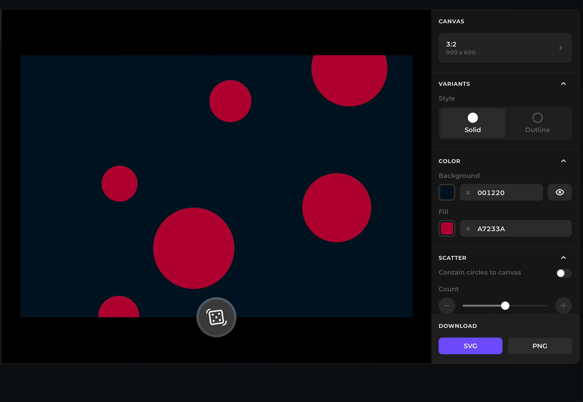
Fluid Space Calculator
Fluid Space Calculator helps you create a related space system and export the CSS to implement it. The calculator allows you to add space value pairs and multipliers and see the impact on the screen before snagging the related code. It’s great for determining how things will look in different viewports and for creating custom space pairs.
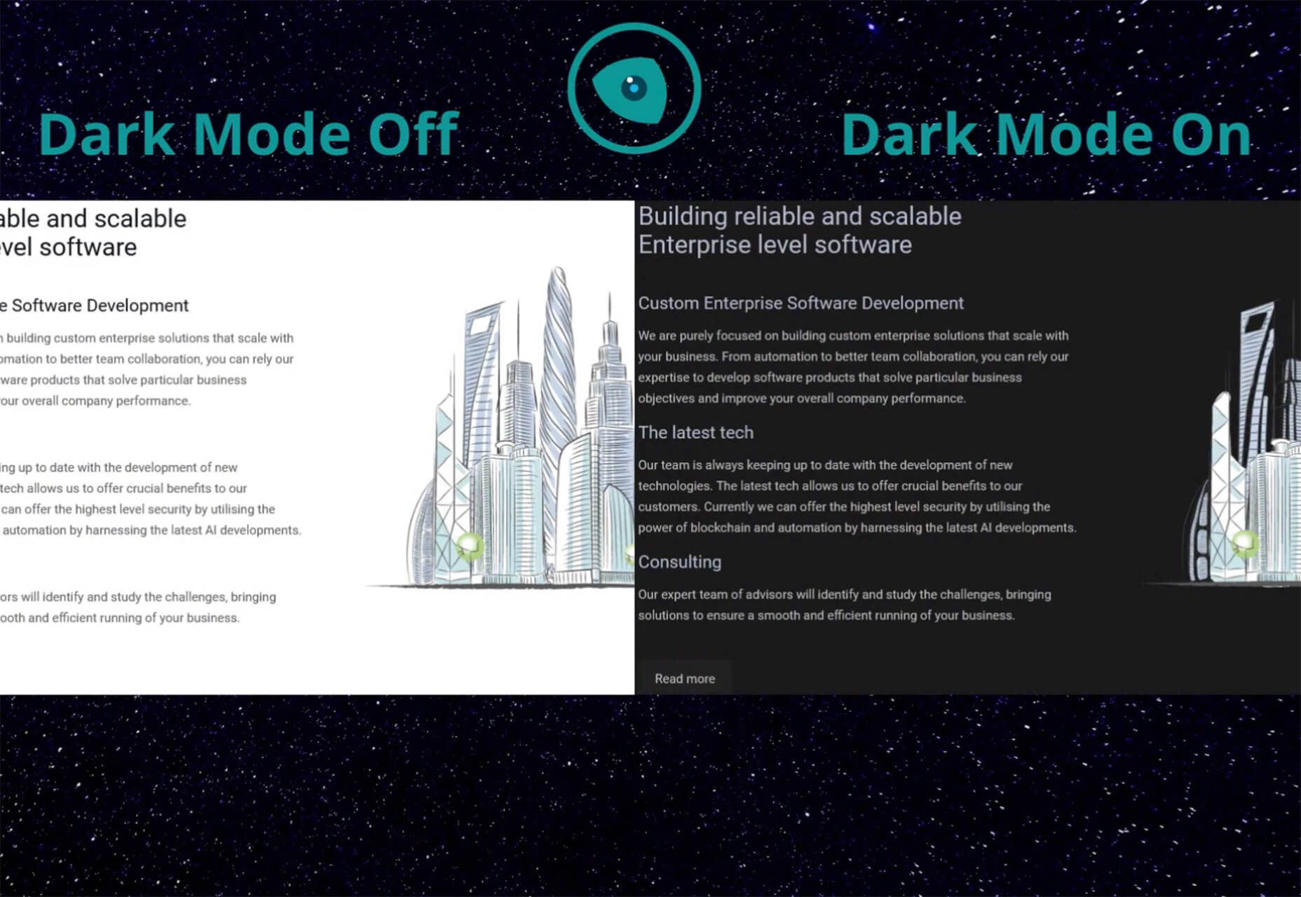
Night Eye WordPress Plugin
Night Eye WordPress Plugin helps you create a dark mode option for your WordPress website with ease. It’s completely customizable, schedulable, and one of those things that users are starting to expect. The plugin has free and paid versions – the only difference is a link to credit the developer.
3 Productivity Boosters
Macro
Macro is a supercharged checklist app for recurring processes. It’s designed to help teams document, assign, track, and automate for maximum efficiency. Now is the time to test this tool because it is free in public beta.
Writex.io
Writex.io is a free writing app that uses AI and smart features to help you write more efficiently. It can check readability as you write, make suggestions, check spelling, and allows you to work with versioning. All the settings are customizable, so you can get help and suggestions when you want them and avoid things you don’t want.
Taloflow
Taloflow, which is in beta, is a tool that helps you find the top cloud and dev tools for your use case. This is designed to be a time-saving solution to finding the right infrastructure and API products for your work.
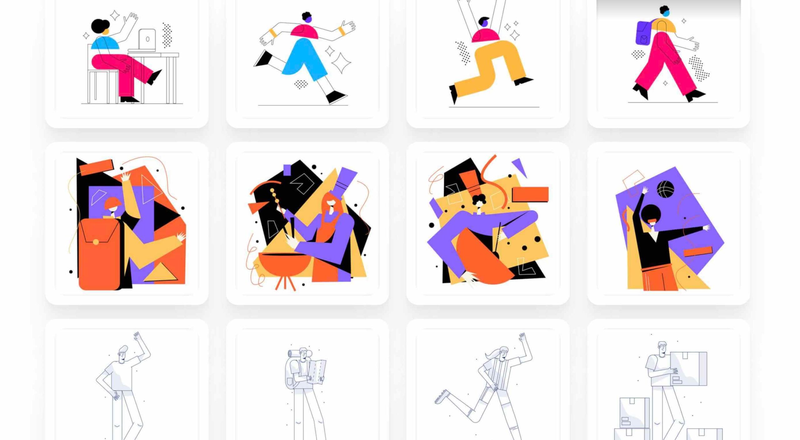
8 Kits with Illustrations and User Interface Elements
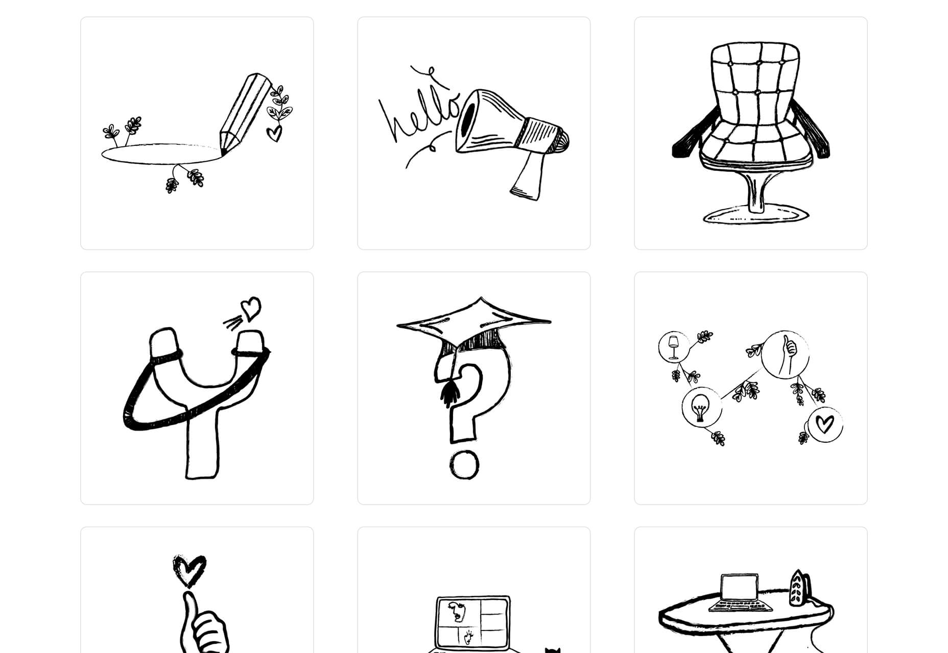
Skribbl
Skribbl is a collection of free, hand-drawn illustrations in a light and fun style. The black and white sketches are friendly, and the collection keeps growing. Plus, the illustrators are allowing them to be used free for any use.
Mobile Chat Kit
Mobile Chat Kit is a free starter kit for building apps in Figma, Sketch, and Adobe XD. It includes more than 50 screen options with mapped-out flows for a quick-start project.
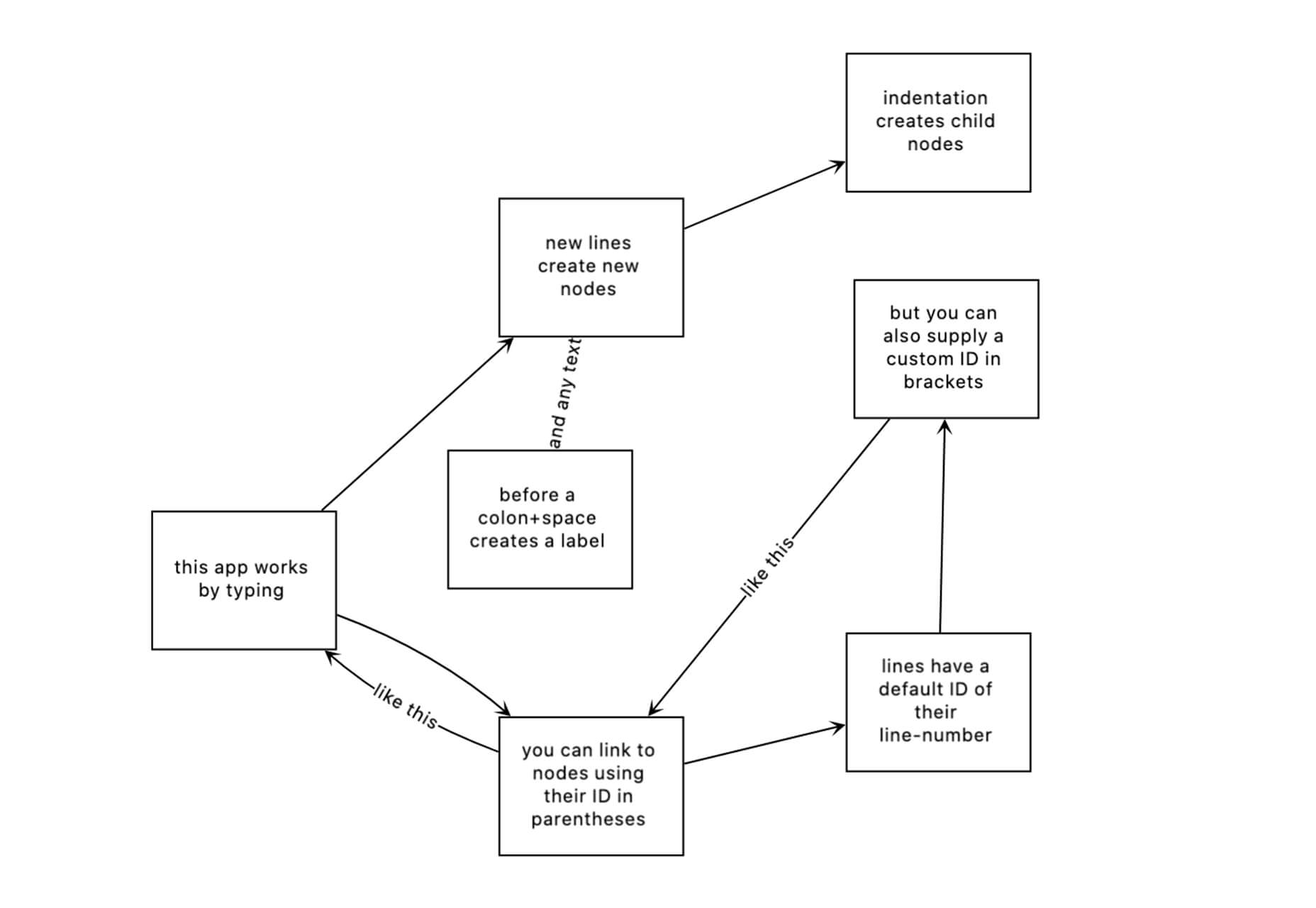
Flowchart.fun
Flowchart.fun is exactly what the name implies. The app allows you to type, create nodes, and link elements to develop simple flow charts quickly. Then you can alter shape and size with drag and drop. Export it for use as an SVG, JPG, or PNG.
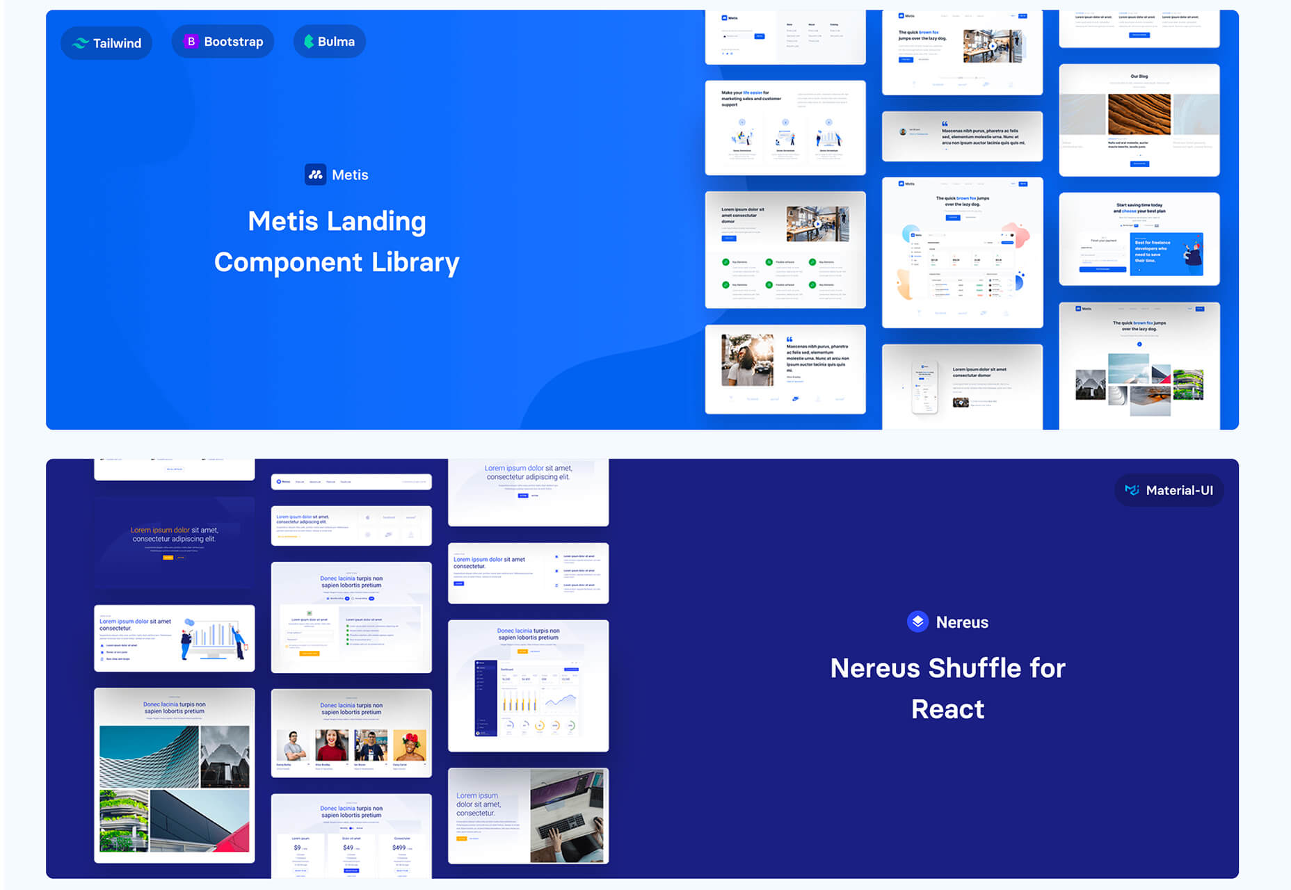
Shuffle
Shuffle is a marketplace packed with UI libraries to help you with a variety of digital projects. There are more than 1,500 pre-built components to choose from with professional designs. This premium tool comes with a monthly subscription or lifetime license.
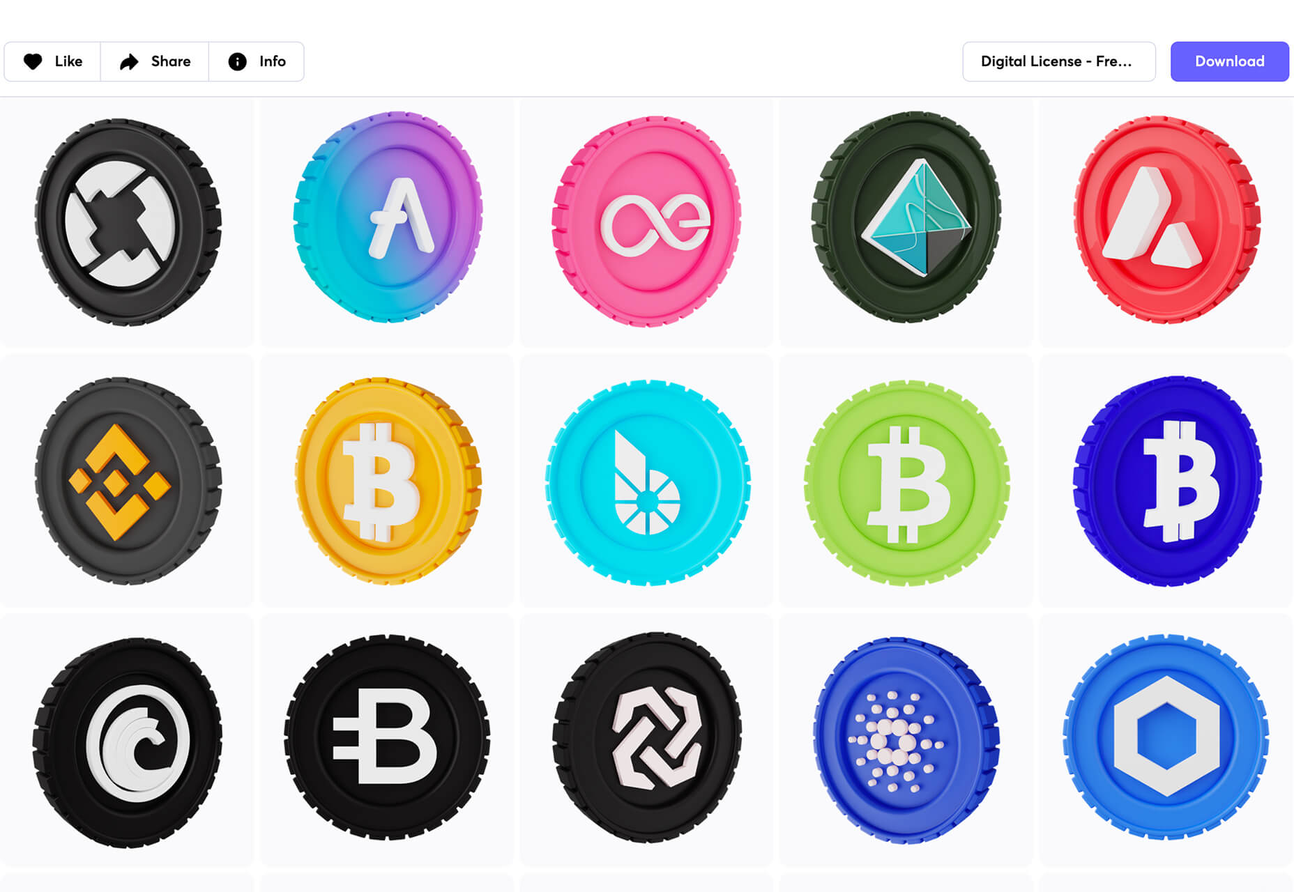
Cryptocurrency 3D Pack
Cryptocurrency 3D Pack is a set of icons with fun colors in three-dimensional shapes that you can use to represent different crypto elements. The pack includes 55 #D icons in PNG and BLEND formats.
Stratum UI Kit for Figma
Stratum UI Kit for Figma includes nine free screens that are ready to use. Options include API documentation, Kanban, document, data dashboard, ecommerce product list, ecommerce product options, payments spreadsheet, cloud storage, and newsfeed.
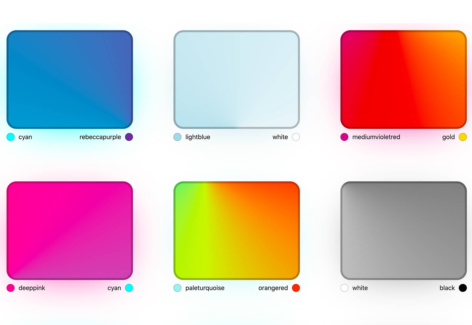
Conic.css
Conic.css is a collection of simple gradients that you can browse and then click to copy the code into your CSS to use them in projects. It’s quick and easy while using trendy color options.
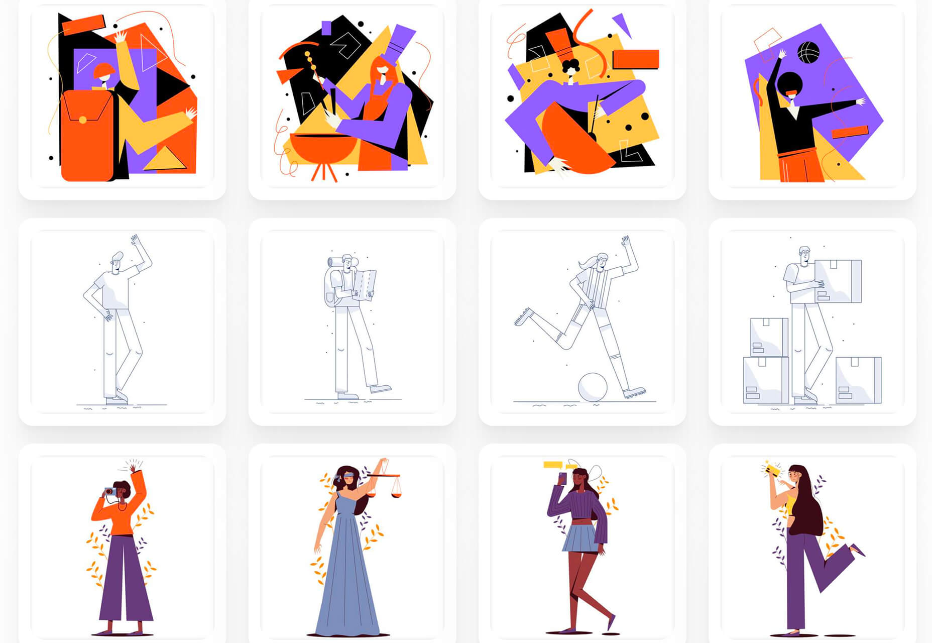
Artify Illustrations
Artify Illustrations is a Figma plugin that allows you to access more than 5,000 SVG and PNG illustrations within the app. It’s got a built-in search feature, everything is high-resolution, and the huge library includes various styles.
2 Tutorials
A Complete Guide to Accessible Front-End Components
A Complete Guide to Accessible Front-End Components is an amazingly comprehensive guide from Smashing Magazine with everything you need to know about accessible components. From tabs to tables to toggles to tooltips, you’ll find it all here and learn how to use it the right way.
Grid CheatSheet in 2021
Grid CheatSheet in 2021 is a useful guide of everything you can do with CSS Grid. Plus, it has plenty of fun illustrations and an accompanying video.
8 Fresh and Fun Fonts
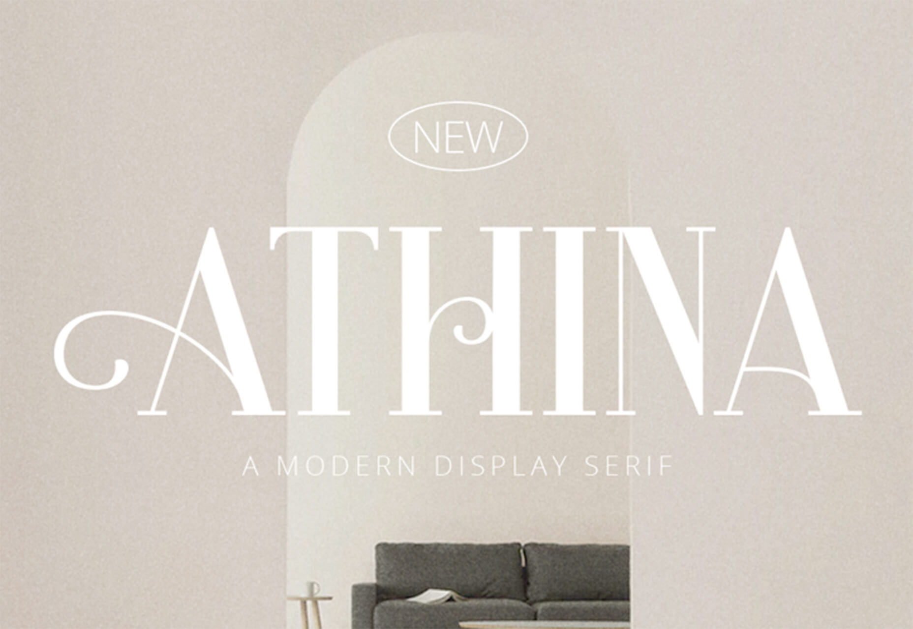
Athina
Athina is a modern display serif with beautiful connector strokes. The free version is a demo, and there’s a full family that you can buy.
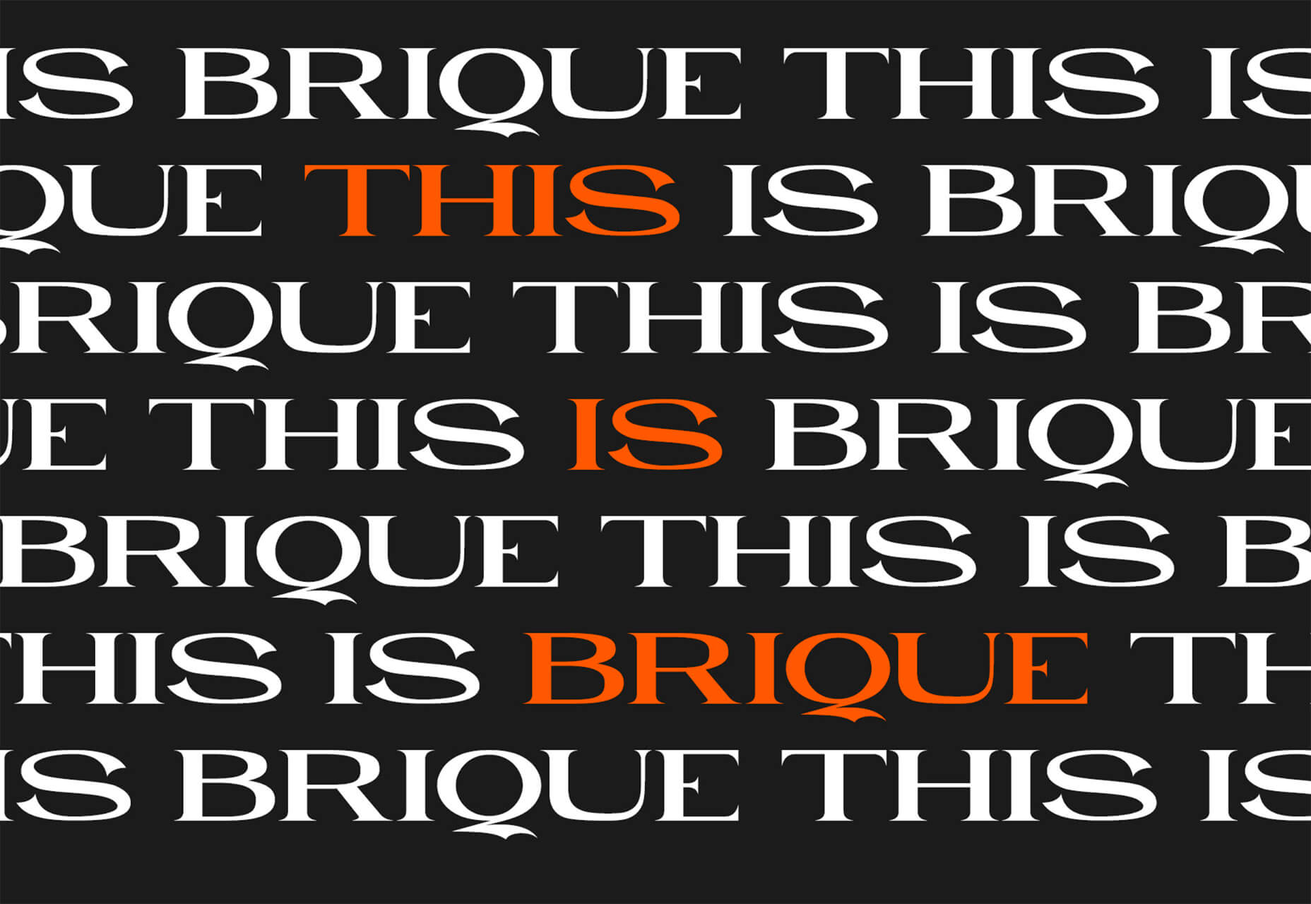
Brique
Brique is a free (personal and commercial) display font with a wide stance and uppercase character set. The letters have a lot of personality and a readable configuration.
Code Next
Code Next is a great geometric sans serif with a full family of styles. Including two variable fonts. It’s highly readable and would work for almost any application.
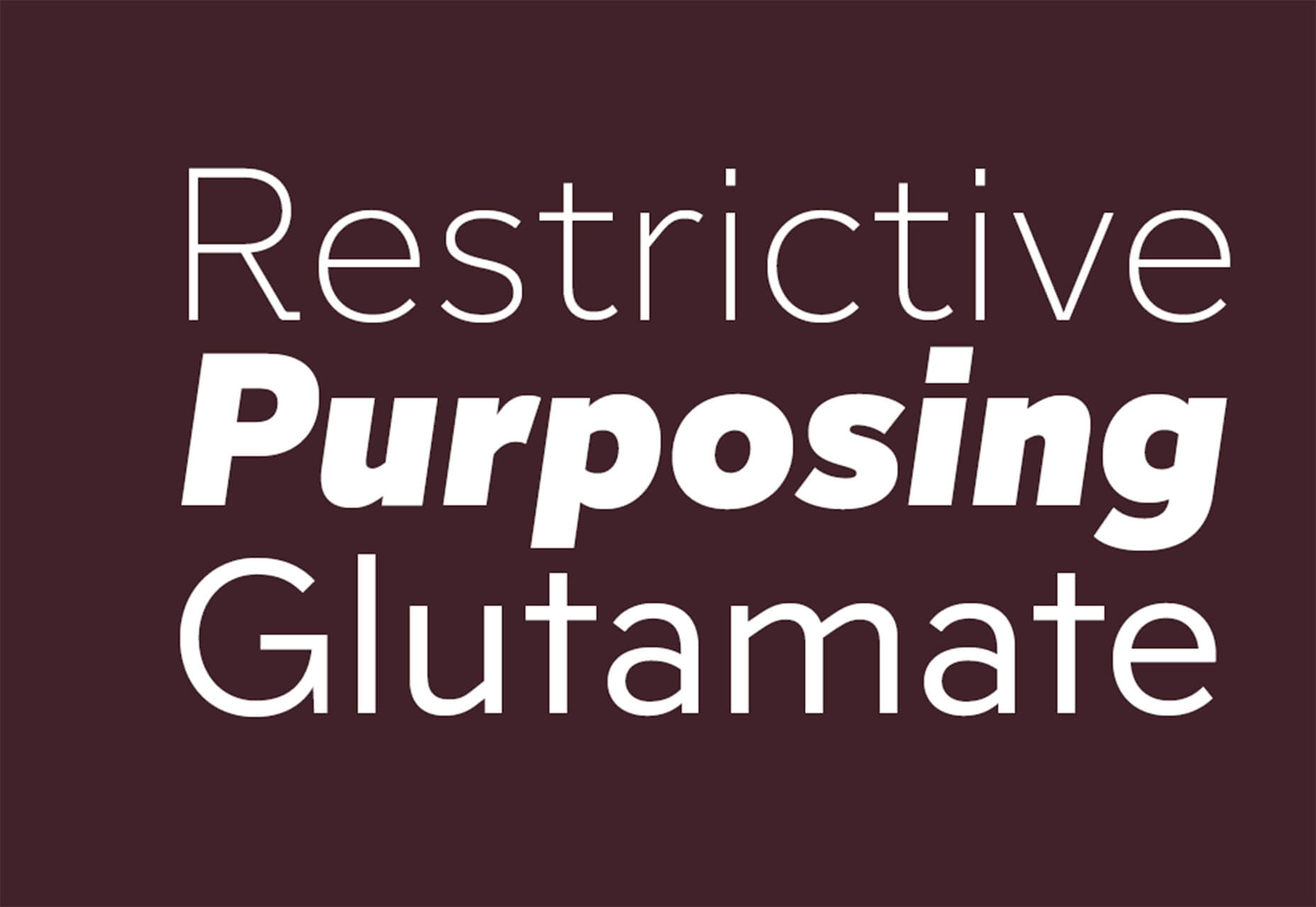
Inter
Inter is a simple and functional sense serif family with everything from extra light to heavy weights. The extra character personality makes this a fun and functional font option.
Nothing Clean
Nothing Clean is a fun grunge-type option. It’s an all uppercase character set with alternates.
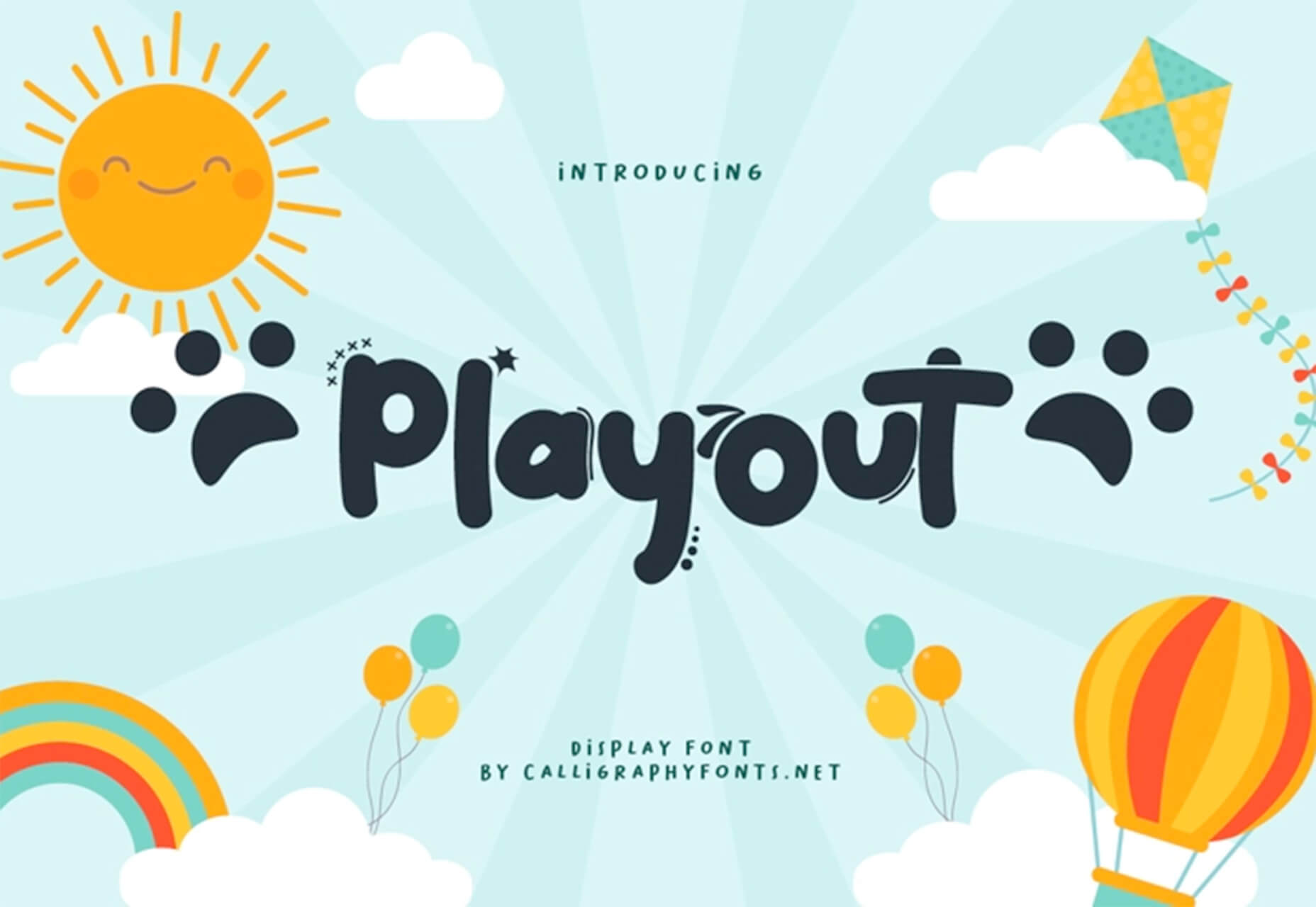
Playout
Playout is a fun, hand-drawn style typeface with interesting glyphs and alternate characters. The most fun feature might be the pawprint characters in the demo set.
Rockford Sans
Rockford Sans is a geometric typeface with subtly rounded edges. It has eight weights and italics. With its large x-height and round features, it’s legible and friendly. It’s suited to cover a wide variety of tasks from editorial to brand design and advertising.
SpaceType
SpaceType is a fun and funky typeface in regular and expanded styles. The stretched letterforms make interesting alternates for display purposes.
https://ankaa-pmo.com/wp-content/uploads/2021/04/25-exciting-new-tools-for-designers-april-2021.jpg14082560Service comm.https://ankaa-pmo.com/wp-content/uploads/2017/04/Logo-Ankaa-engineering.pngService comm.2021-04-19 16:45:302021-04-19 16:45:3025 Exciting New Tools For Designers, April 2021
Have you ever wondered why we’re so amazed by motion? A moving image is more likely to grab your attention than a static one. Motion is exciting and attention-grabbing – plus, it allows us to access more information in a short space of time.
For a while now, companies have been experimenting with all kinds of motion and animation in their design choices. We’ve seen the rise of animated website backgrounds or live-playing videos instead of images on a home page. There are videos and 360-degree pictures on product pages to help people get a better view of certain items and immersive AR experiences on apps.
So why has the power of motion not made its way into the logo design landscape yet?
Sure, there are a few examples of animated logos out there, but they haven’t had the same long-lasting impact as animated websites. Perhaps that’s because people don’t have the right tools to bring their animated logos to life?
Today, we’re going to cover some top tips for live logo design.
1. Understand What “Live Logo” Means
An animated logo or live logo can be a powerful tool in a company’s branding strategy. Although there’s more to a company’s identity than its logo, it’s fair to say that logos make a huge difference to how we feel about brands and their identity.
A powerful logo can make an emotional connection with your target audience and help your brand to thrive in virtually any environment. Live logos, or animated logos, bring more attention to the brand image, by helping a customer to focus on the logo’s action. A live logo might tell a story about what the business does through motion, or just be eye-catching.
The level of animation varies depending on the designer, but it can go all the way from a short video presentation to a few simple moves. The Skype logo is an excellent example of something simple, that multiple designers have played with to great effect.
Today, there are plenty of open-access tools helping to create more immersive animated graphics in the logo design world. Additionally, the types of animation available are becoming more impressive all the time.
2. Explore the Types of Logo Animation
The next stage of properly leveraged live logos, is knowing what kinds of logo animation are available. There are plenty of different styles of animation to explore today, depending on the kind of impact you want to have.
For instance, sometimes the animation you choose will be connected to your business. A vehicle company might have a logo that seems to “drive” into the central space on the screen. An electricity company might choose a logo that pulses like an electric charge. This animated FedEx logo is an excellent example of how animation can show what a business does.
Options for animation might include:
Rotation: Make an emblem stand out by moving it to the sides or allowing it to move on its axis. Rotation gives a logo a sense of 3D space.
Appearance/Disappearance: You can make a logo grow on the screen by bringing to life one pixel at a time, or have it dissolve and disappear in a similar way.
Transformation: Your logo doesn’t have to start out in the shape it’s going to achieve. You might start with a seed that gradually grows into a tree-shaped logo for a gardening company, for example.
Replacement: Another great way to tell a story is to replace a graphic related to the company in question with the logo through an immersive animated experience.
3. Set Goals for the Live Logo
If you’re not sure what kind of animations to experiment with, then it’s a good idea to start with some solid goals. Your goals will give you a direction to move in with your logo choices. An animated logo can be a dynamic and modern way to present a brand to an audience, but it’s only going to be effective when implemented carefully.
Let’s look at some of the goals you can choose for your live logo:
Differentiation: While it’s true that animation and live content is gaining more attention lately, it’s still relatively new as an overall concept. With an animated logo, you could help a brand to create a more unique image for themselves, which sets them apart from the other organisations in the same space.
Storytelling: As mentioned above, animated logos can tell a story about what the company or product actually does. In this example for Firefox, for instance, the logo mimics a loading wheel to demonstrate a speedy internet browser.
Brand awareness: Dynamic logos and animations are more likely to capture your audience’s attention than static images. They’re also more of a novel experience, which means that customers might want to share them with other people too.
Memorability: Today’s customers are bombarded by hundreds, if not thousands of logos all the time. They need something special to convince them that one image deserves a spot at the front of their mind. Animation can help to make a business more memorable.
4. Do Your Research
Doing your own research is an excellent way to get some inspiration for a live logo or animation. Ideally, you’ll want to focus on the industry you’re already working in, as this will give you some guidance as to the kind of movement that can attract the most attention from the correct audience.
Watch as intros to brand videos and check out as many live logos as you can. Check out the kind of animations that people use in their videos when they’re showcasing products online. You can learn a lot about what works just by evaluating what other people have done before. Just be careful not to simply copy what you’ve found elsewhere.
The aim of your live animation should be to tell a unique story about the company
The aim of your live animation should be to tell a unique story about the company in question. If you’re not sure how to start with differentiating the image, check out the brand guidelines for the company in question. The guidelines that the company used to choose the right brand colors, fonts, and other visual assets can work just as well for your animation strategy.
Remember, the aim here is to tell a specific story, send a message, or evoke a certain emotion. Don’t make the mistake of designing something that looks cool but doesn’t have much of a purchase. Most human beings will naturally look for the meaning behind the content that they see. If there isn’t anything there, it’ll just lead to confusion.
5. Use Live Logos on Brand Websites
The most obvious way to begin experimenting with animated logos in web design, is to implement live logos into a client’s website. Some companies have a “welcome screen” for their site which uses an animation to introduce visitors to the home page and other navigation options. There are also brands out there who love the impact that animation can have but want to use it more subtly.
In these cases, live logos can be an excellent way to draw the eye to a specific spot on a website, perhaps the area just above the “contact” button that encourages a client to reach out. Crucially, to avoid weighing down the website and distracting visitors, companies and designers will need to make some important choices.
Although it might be tempting to keep the animation looping at all times, just in case someone misses the first round, this requires a lot of extra processing power. Too much animation also makes it harder for businesses to push the focus of their visitors to other points on the website, like landing pages for products, or testimonial pages.
Often, as with most innovative decisions in web-design, the best bet is usually to start small and work your way up. Don’t over-do it with animation on day one. See how the visitors to the website respond first.
6. Find the Right Balance
Animations in a live logo are there to grab attention quickly, and effectively. They shouldn’t go on for too long, or you risk overwhelming your audience before they have a chance to browse the rest of the website or check out other content. A live logo should only be active for a few seconds at most, and in that time, it needs to say something valuable.
Often, the best strategy is to start by building up curiosity, and getting your viewer engaged so that they’re keen to see more. Every frame will count to pull the customer in and make them feel connected to the brand in question.
Make sure that the logo animation is dynamic so that it doesn’t just capture the attention of the viewer but maintain their interest for the full time required. During the motion, the viewer’s brain should be working to figure out what’s going to happen next.
Just like most logo design and graphic animation strategies, the key to success is finding the right balance between clever experiences, and simplicity. You want to do something meaningful that earns your viewer’s attention, but you need to compete with the fact that attention spans are plummeting all the time.
7. Explore Logo Animation in Video
One of the best ways to use logo animation, is to draw interest for a company at the beginning of a video. Video is gaining incredible levels of popularity lately, particularly in a world where you can view video content almost anywhere. Companies are adding videos to their product pages, social media accounts, applications, websites, and so much more .
For the majority of companies, a live logo at the start of a video can help their brand to seem more professional. It’s a reminder to viewers of the brand that they’re learning about with that video content. Plus, a logo at the beginning of a piece of video content can also build on the consistency that companies attempt to create by using the same brand assets in various mediums online.
(Starting a video with an animated logo is great for presentation, but it can also be frustrating to customers in certain pieces of content where they’re looking for quick answers to questions. If an animated logo is more than a couple of seconds long, it may be better placed at the back of a video instead.)
With videos for news reports or announcements where you want to get straight to the point and generate excitement about a new product or service, it can be better to jump straight into action. Ending a video with a live logo keeps the brand image front of mind for the customer for longer, even after the message has ended. On the other hand, ending a video with a logo could increase the chances that customers miss the animation, because they click away from the content too quickly.
If you’re new to adding live logos into videos, consider experimenting with different strategies to see which works best. Different companies might get unique results.
8. Bring Logo Animation to the Real World
Another interesting option for live logo design, could be to step outside of the computer screen for a while. In today’s digitally transforming landscape, it’s becoming more common to see the real and digital worlds converging. Most events and trade-shows come with presentations that rely on digital content, like animated presentations and slide shows.
Depending on the signage solutions available at industry events, companies could even use an animated logo above their booth to draw attention in a cluttered environment. Around 48% of exhibitors agree that a more eye-catching stand or booth is often the most effective way to attract visitors and customers at an event.
Animation and live logos may have started life on the computer screen, but they can appear in much more diverse environments today. Offices could use a live logo in the reception room or lobby to make their on-premises environment more appealing. Retail locations could display ads on digital signage, followed by live logos that work to both separate messages, and keep shoppers entertained when they’re enjoying the bricks-and-mortar experience.
9. Include Live Logos in Brand Signatures
Remember, a live logo doesn’t just have to sit on a company’s app or website until someone discovers it. Sometimes, the right logo can also be a powerful way to “sign off” on a message from a brand or its management team. For instance, email remains to be one of the most valuable tools for business marketing and customer relationship building today.
It’s the third most influential source of content and news for a lot of B2B audiences, and yet, most companies aren’t taking full advantage of what their email marketing software solutions are capable of. If you can display gifs and animated videos in an email (which most software solutions can), then you can also add a live logo to the brand signature.
The important thing to remember is that if you’re going to be adding a signature to a lightweight thing, like an email, it needs to be lightweight too. Don’t make the live logo too long and complicated, or it might prevent the email from loading properly.
Outside of email, don’t forget to consider options for live logos in things like social media profile pictures too. According to experts, around 80% of companies use visual assets in their social media marketing. A live logo is a great way to go beyond the basics with a company’s imagery. Motion grabs attention, and video content is quickly gaining steam on a lot of social media platforms.
Embracing a New World of Live Animation
Designers are only just beginning to scratch the surface of what’s possible with animated logos. For many companies, live logos are an excellent way to capture audience attention and encourage engagement with a brand.
A live logo at the beginning of a video, at the start of an app loading screen, or even at the top of a website can differentiate a company and make them stand out. As technology continues to evolve, and customer expectations continue to expand, the options for live animation could continue to grow. You might even be able to infuse live logos with elements of VR and AR, to impart brand essence in a brand-new digital world.
If you haven’t begun experimenting with live logo design yet, now could be the time to start.
https://ankaa-pmo.com/wp-content/uploads/2021/04/9-tips-for-better-live-logo-design.png15292780Service comm.https://ankaa-pmo.com/wp-content/uploads/2017/04/Logo-Ankaa-engineering.pngService comm.2021-04-14 16:45:092021-04-14 16:45:099 Tips for Better Live Logo Design
Google has been talking about the Core Web Vitals tool and the Page Experience Update for about a year now.
With the update scheduled to roll out in May 2021, now is the time to make sure your websites are prepared for it. It’s taking a lot of the best practices Google has recommended over the years and making them an official part of the search algorithm, so not taking this seriously could negatively impact your sites’ rankings.
Today, we’re going to look at everything Google has told us about the update and how to use the Core Web Vitals tool to ensure your site rankings don’t drop once it rolls out.
What We Know About the Google Page Experience Update
Google first told us about the page experience update back in May 2020. Here’s what we know about the upcoming update:
Google’s Search Algorithm Will Change in May 2021
Although there’s no specific day given, we do know that the page experience update will go live sometime in May 2021.
The Goal is to Reduce Friction on the Web
It’s not as though user experience is something that designers and developers overlook when building websites. Heck, there’s an entire disciple of UX design dedicated to it.
That said, Google hasn’t taken too hard line of an approach in enforcing its page experience suggestions, like mobile-first design, removing intrusive pop-ups, or improving page speed. With this update, though, Google is now telling every site owner that performance, accessibility, technical best practices, and SEO must be built into their websites.
Of course, the goal isn’t to create more work on your side of things. Google believes that by encouraging developers to build better web experiences that consumers will experience less friction and businesses will be more profitable as a result.
The Update Will Include Older Signals
According to Google, the page experience update is going to combine a bunch of older signals with the new Core Web Vitals:
The Core Web Vitals tool will now merge all of that data we once had to gather from various Google apps. That’ll make it more convenient for designers and developers to improve the on-page experience across a variety of areas.
The Page Experience Algorithm Will Change Over Time
Per Google:
Because we continue to work on identifying and measuring aspects of page experience, we plan to incorporate more page experience signals on a yearly basis to both further align with evolving user expectations and increase the aspects of user experience that we can measure.
So, don’t expect this to be a one-and-done thing. You’ll have to rely on the Core Web Vitals tool, and pay close attention to updates out of Google, to ensure your sites are keeping up with Google’s page experience standards.
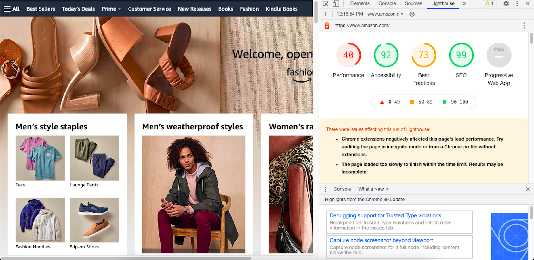
Your Other Google Apps Have Already Been Updated with Core Web Vitals
If you hadn’t noticed, Google has already updated its other apps in anticipation of the page experience update.
Here’s an example of how Lighthouse’s report on the Amazon website now looks:
By including these metrics within the tools you’re already using, you don’t necessarily have to add the Core Web Vitals tool to your growing toolbox. That said, there are some really valuable reports in there, so I’ll show you why you may want to add it anyway.
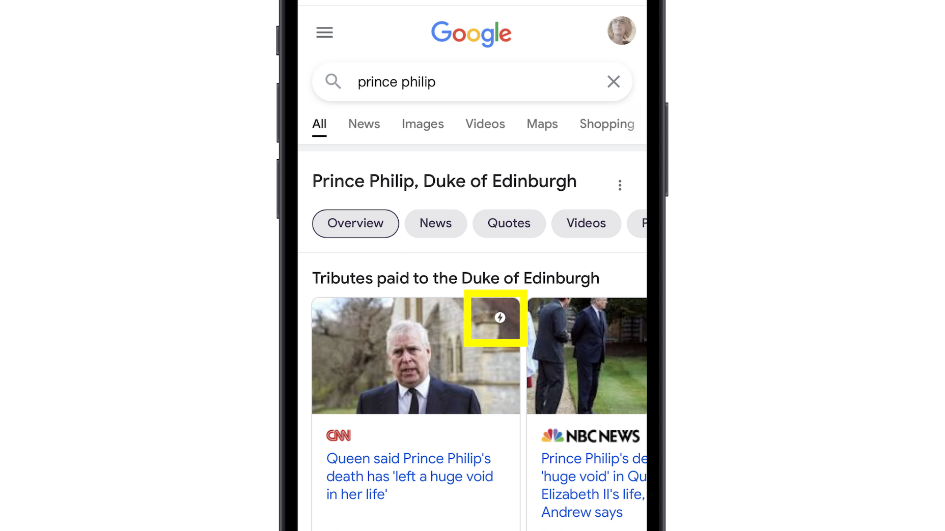
Google’s Top Stories Will Be Affected
In the past when someone did a news-related search on Google, they’d see “Top Stories” results like this one:
Until now, the only pages shown here were AMP-enabled ones.
Once the page experience update goes live, though, the AMP requirement is going away. So long as a page meets the page experience criteria along with Google News content policies, it can now rank in this section.
Google Search Results May Show a Page Experience Indicator
In the Top Stories example above, notice the AMP indicator I highlighted in yellow. Google is thinking about adding something similar to any search result that fulfills its page experience criteria.
While I think a small, eye-catching icon might draw a little more attention from Google users, I’m not sure if it’ll be that big of a deal to them. People working in this industry certainly know what that lightning bolt means, and we’ll also be the ones who recognize the page experience indicator, but I’m not convinced it’ll matter to users.
That said, this is something Google is thinking about rolling about, so it’s something to be aware of. At the very least, you can consider it a badge of honor when showing your websites to clients and prospects who want to see what you can do for them.
Content Is Still More Important Than Page Experience
Even if a website checks off all the page experience boxes, there’s no guarantee that it’ll start to rank better than websites that haven’t. The quality and value of the content on the page still matters greatly.
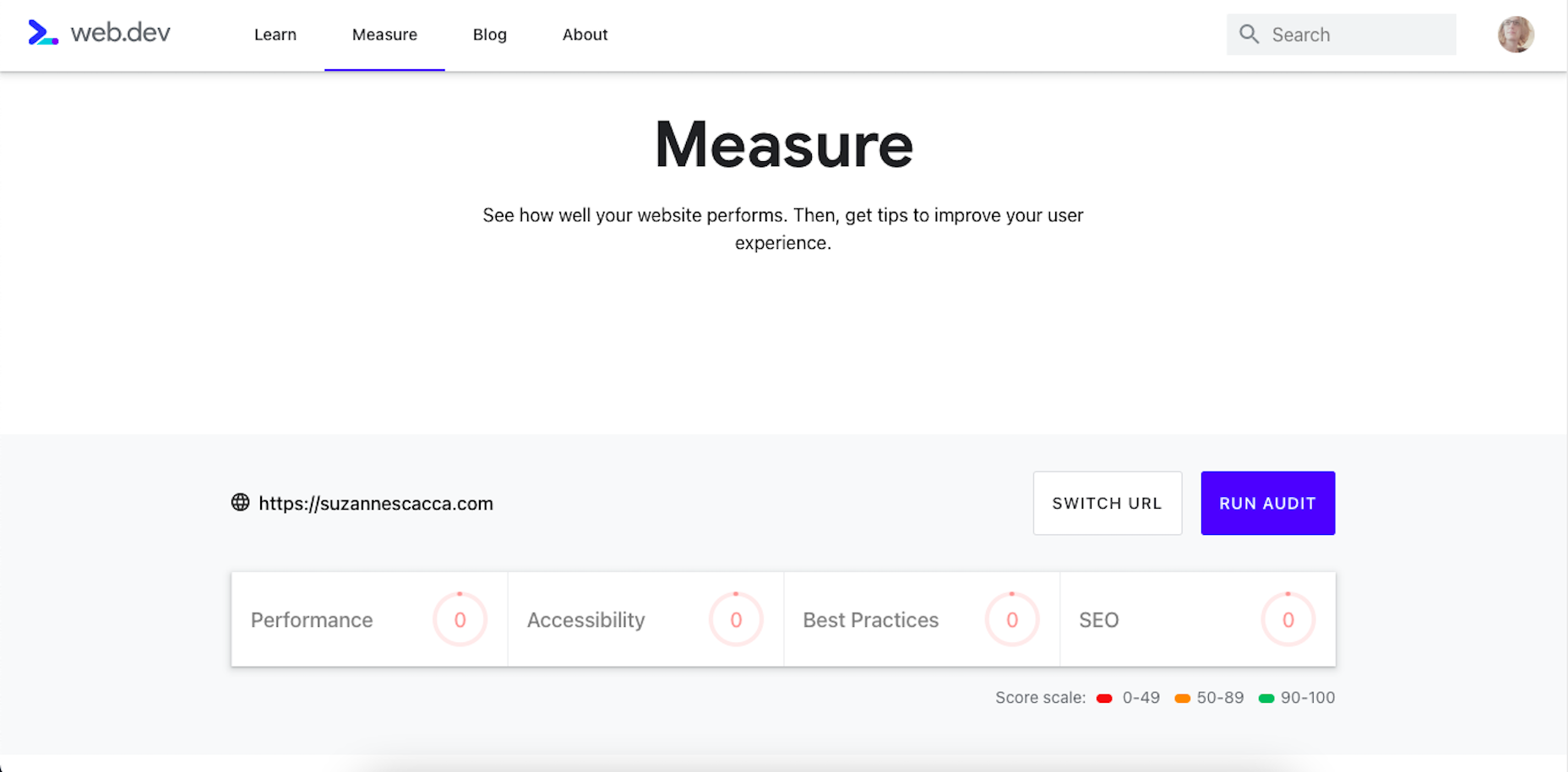
Using Core Web Vitals to Measure Page Experience
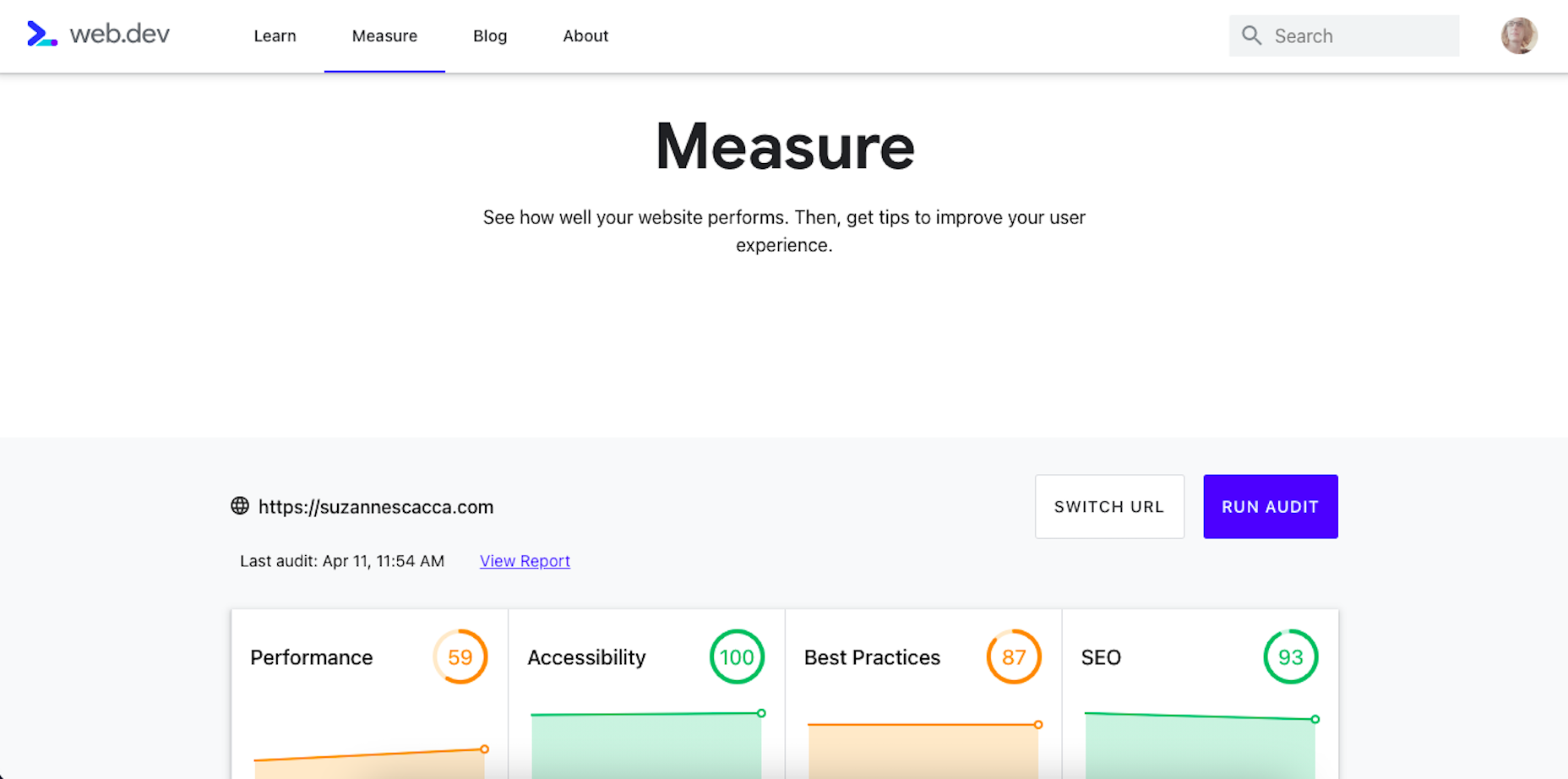
Alright, so let’s take a look at this Core Web Vitals tool. Here’s what the tool looks like when you enter the “Measure” tab:
It’s like most other Google analyzer tools. You enter the URL you want to audit and let the tool run. The results then spit out something that looks like this:
Core Web Vitals are graded on four categories:
Performance measures the loading speed, interactivity, and stability of the page.
Best Practices focus on the technical aspects of the page, including things like having an SSL certificate and making sure images fit within the parameters of the mobile screen.
SEO checks on the typical SEO signals like metadata, structured data, and so on.
Accessibility reports any issues with visitors not being able to see or access parts of the page.
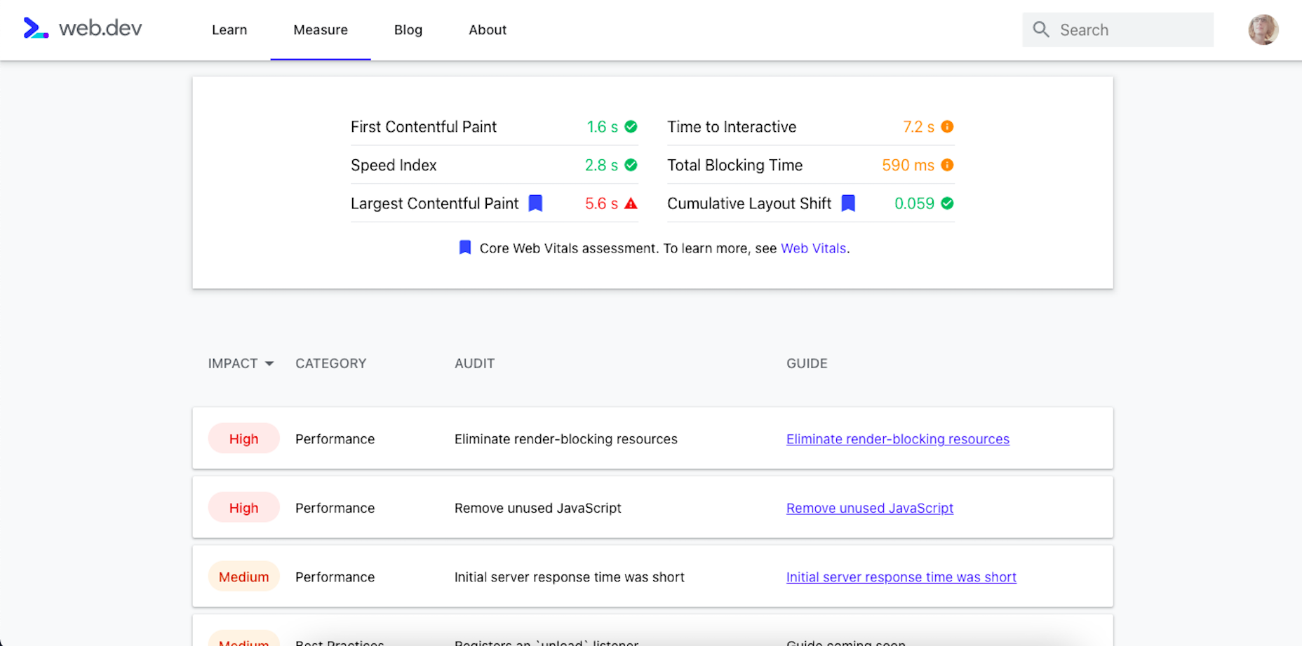
If you scroll down just a little bit on the page, there’s more data available. It mainly has to deal with the technical stuff, like page speeds and unoptimized code:
Now, this isn’t really anything new. We can get this data about load time, interactivity, and content stability from Google’s other apps.
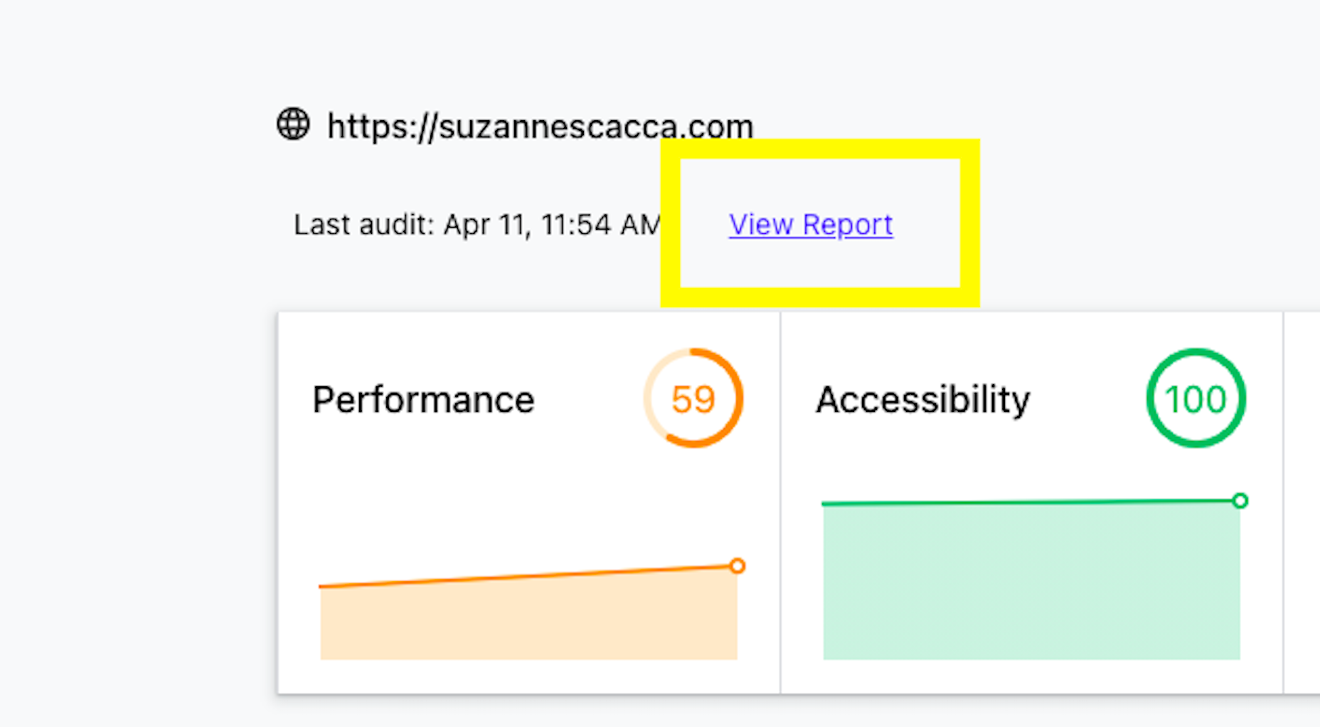
The real value is in the report, which you can access up top next to the date of your audit.
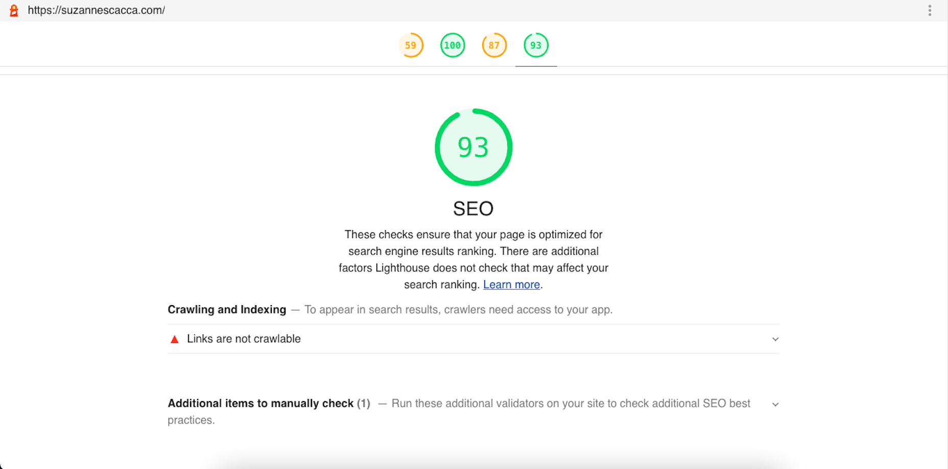
Open the report and you’ll find specific suggestions and pro tips to optimize each part of the page experience, like this SEO report:
Just like other Google tools, this one can teach you a lot about what makes one site more rankable than another. So, make sure you update your web design strategy going forward to integrate all of these ranking signals.
While you’ll have to do annual audits on your sites to see how much Google has changed the page experience signals, you’ll create less work for yourself if this baseline set of criteria are met with every site you build.
https://ankaa-pmo.com/wp-content/uploads/2021/04/get-ready-for-next-months-google-shakeup.png15292780Service comm.https://ankaa-pmo.com/wp-content/uploads/2017/04/Logo-Ankaa-engineering.pngService comm.2021-04-12 12:45:202021-04-12 12:45:20Get Ready For Next Month’s Google Shakeup
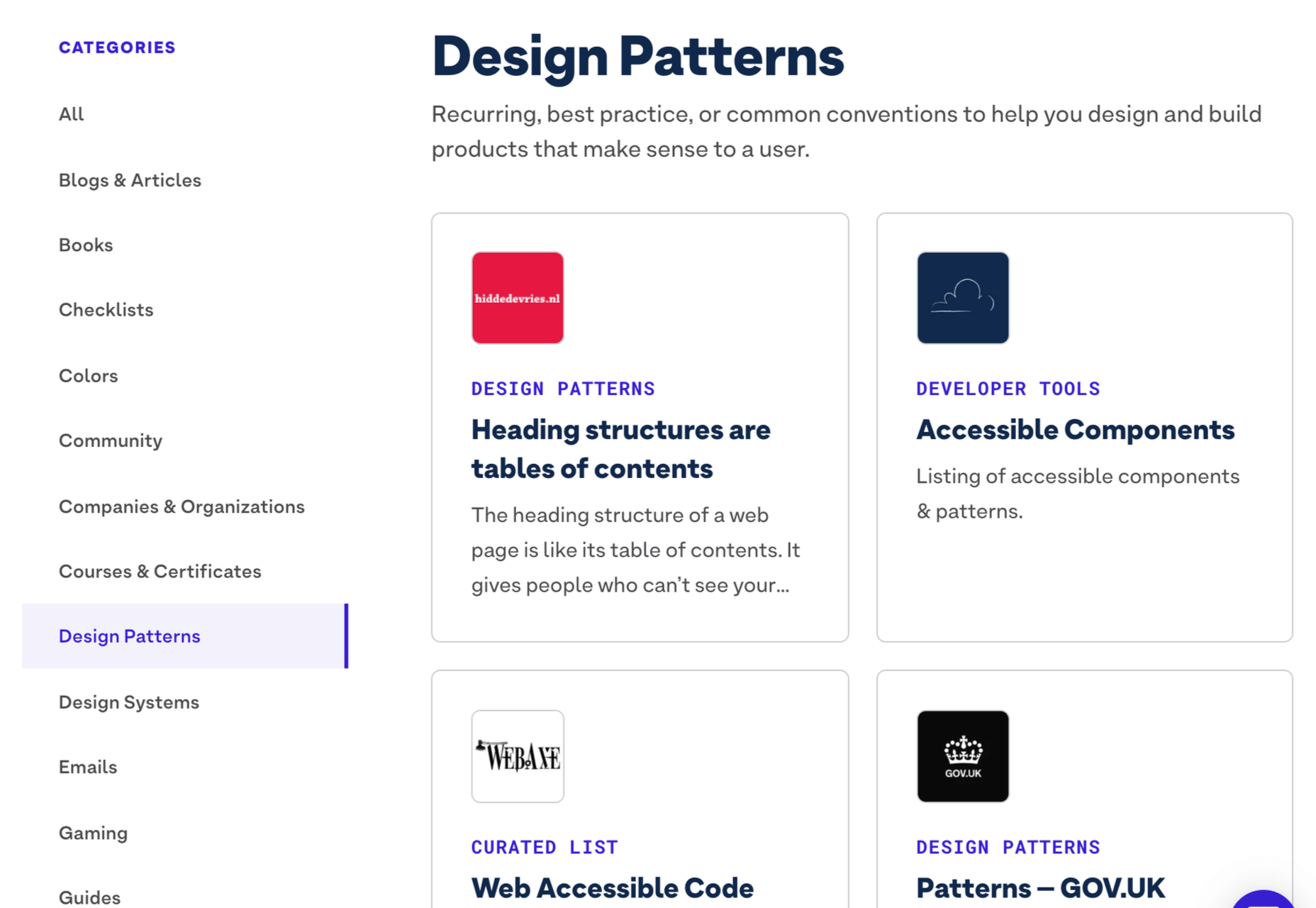
Inclusive design is all about designing sites with everyone in mind instead of designing for your own preferences. It’s an essential component in a professional-grade site and the cornerstone of a successful project.
Accessibility (A11y for short) is the technical branch of inclusive design. Accessibility is a science: it knows what markup is required to make the text available to the visually impaired; it knows the minimum button size for someone with limited motor control; it knows how complex navigation can be for someone with cognitive dysfunction. Accessibility is the engine that powers an inclusive design.
Because accessibility is so complex, it takes a huge wealth of knowledge to do it well. Luckily for you and me, there’s now a free resource you can use to brush up on your skills and improve the ROI of your site.
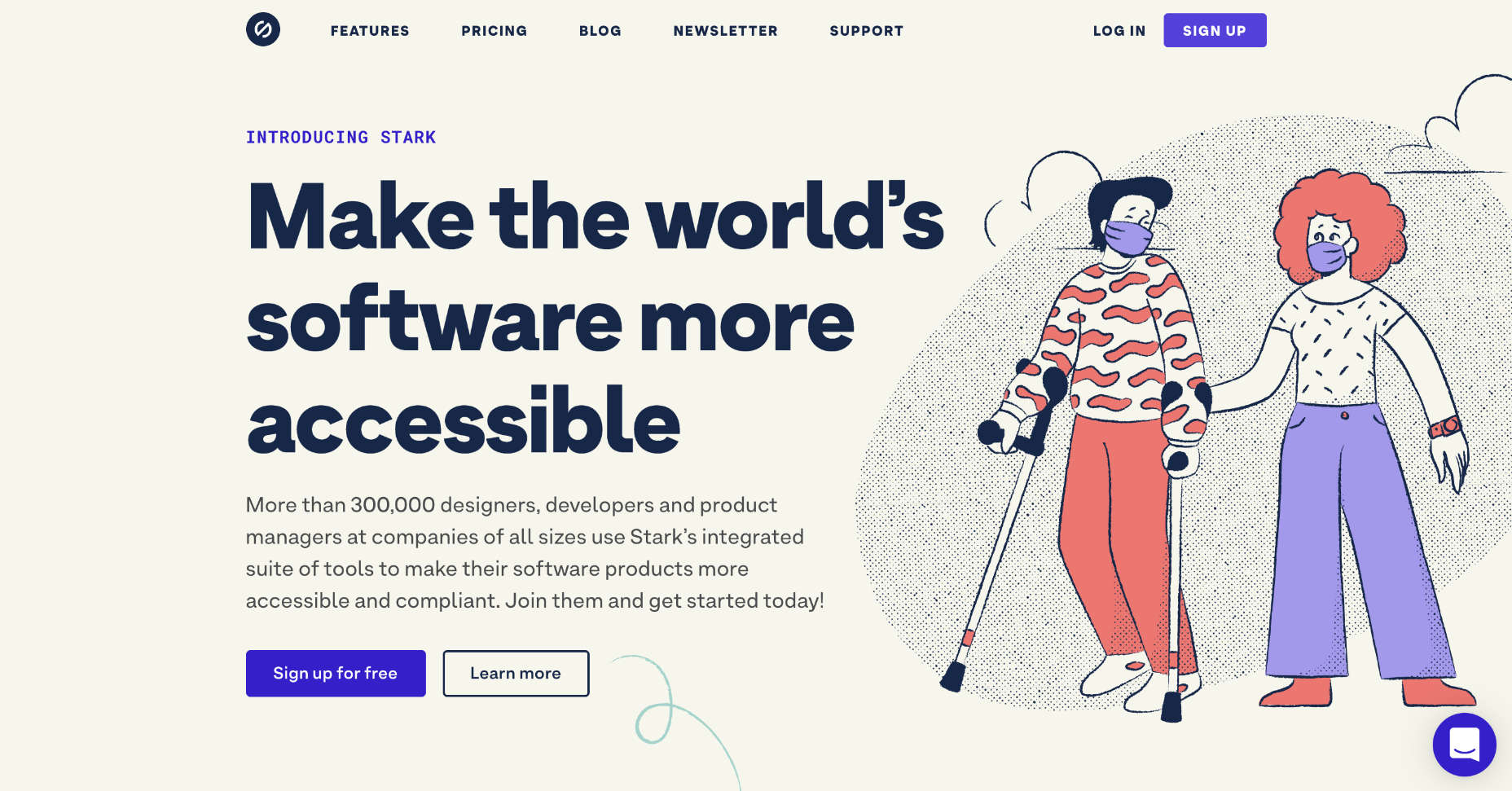
Stark has just acquired a11yresource and relaunched it as the Stark Public Library — reportedly the largest accessibility resource on the web. The library contains around a thousand different resources. You’ll find blog articles, checklists, formal courses, tools, links to web standards, and a whole lot more. As the library grows, the expectation is that Stark will add new features aimed at fostering a community.
Stark is a suite of accessibility tools for designers that integrates with XD, Sketch, and Figma. It’s free to use the basic package, and the commercial plan is $60 per year. The Public Library is free for everyone to access.
https://ankaa-pmo.com/wp-content/uploads/2021/04/stark-launches-public-library-for-accessibility.jpg14082560Service comm.https://ankaa-pmo.com/wp-content/uploads/2017/04/Logo-Ankaa-engineering.pngService comm.2021-04-09 20:45:232021-04-09 20:45:23Stark Launches Public Library For Accessibility
A key part of designing successful websites for clients is making sure that as many end-users as possible can access and enjoy that site.
So, what if you discovered that around 1 billion people couldn’t enjoy your designs? Even if those people manage to click on a link and visit the website that you create, they might not be able to understand what’s being sold or navigate to the checkout page.
According to statistics from the World Bank, there are 1 billion people with disabilities worldwide. That’s 15% of the total population of the globe.
Despite this, many designers fail to consider customers with differing abilities when creating an engaging app or website. Unless your client explicitly tells you that they’re supporting customers with disabilities, you might even not think about those users at all.
Learning how to embrace the concept of inclusive web design means that you deliver better results to your clients; the more customers your clients can reach, the more praise and positive reviews your designs will get.
So, how do you introduce accessibility in your design choices?
What Is Website Accessibility?
In broad terms, inclusivity refers to activities or behaviors that empower marginalized people in society. Designing for inclusivity means making your content more accessible to anyone dealing with a mental or physical issue that may make it harder for them to use a traditional site.
Ultimately, accessibility is one of the main goals of an inclusive design strategy. When you make websites or applications more accessible, you tweak aspects of your UI and code to make the site as approachable and usable as possible to people with certain limitations.
According to the Web Accessibility Initiative, many modern sites and web tools are designed without the needs of those with disabilities in mind. This creates accessibility barriers that make websites almost impossible for some people to use.
Here are just some of the different types of disability that can affect the way end-users interact with a website or app:
Cognitive issues: Affecting understanding and making it harder to navigate sites;
Auditory issues: Preventing customers from listening to videos and audio content;
Neurological issues: Making certain terms and actions more difficult on your site;
Physical issues: Making it hard to swipe or tap certain tools;
Speech problems: A common issue with voice UI designs;
Visual issues: Preventing a positive experience on highly visual sites.
Web accessibility can also be about making life easier for people who encounter problems in particular situations. For instance, those with muscular problems might have a harder time using buttons and links on a small screen.
So, how do you make your designs more accessible?
Know Your Audience
There’s more to inclusive web design than making your fonts a little bigger and hoping for the best. To deliver a truly accessible experience, you need to know the people and groups that your client is targeting. Spending some time going through your customer’s user personas and asking them questions about those with a disability can help you make informed decisions.
For instance, the Microsoft Inclusive Design toolkit asks designers to recognize exclusion, examining the parts of their website that might be inaccessible, and learn from diversity.
Before designing anything, ask yourself whether you can:
Address any unique needs, like sight issues or hearing problems;
Replace traditional solutions with something more unique. For instance, rather than relying on colors to highlight a portion of text, could you use font-weight instead? This might be ideal for someone with color blindness;
Create something that appeals to both customers with and without disabilities.
Design a Clean and Clear Layout
Any website design should be focused on clarity first.
Whether you’re designing for inclusivity or not, the aim should be to deliver as much of a simple and straightforward experience as possible, avoiding any web design sins along the way.
For instance, no-one likes a messy design full of unreasonable navigational signs. You need a site full of understandable links, buttons that are easy to click on any screen, and large fonts that are easy to read.
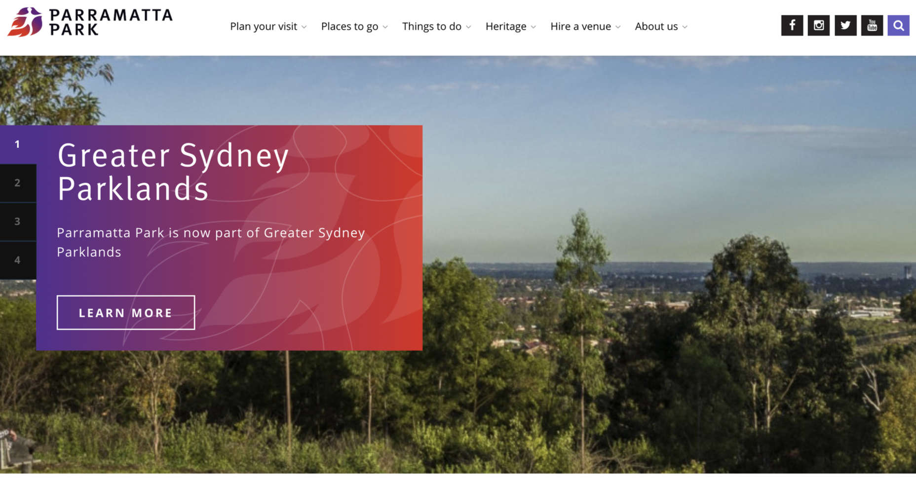
Whenever you’re creating a new element for a website or app, ask yourself how you can make life easier for customers from all backgrounds. For instance, Parramatta park uses excellent contrast, clear fonts, and ideal element sizing to ensure that its website feels as easy to use as possible for customers.
Notice how the buttons are clear and easy to press. The colors are bright and engaging on any screen, and the navigation is simple to follow too. Remember, when you’re designing an inclusive prototype:
Test navigation options and ensure they’re easy to use;
Don’t overcrowd the screen, remember that less is more when reducing cognitive load;
The visual elements on an inclusive website need to be as simple and easy to understand as possible. However, it’s important not to forget about the way that you handle the written word too.
Using simple terms instead of complex industry jargon can make a massive difference to those with reading issues. There’s also typography to think about, from the color and contrast of your words against your chosen background to the font’s clarity.
Remember, suboptimal design with both imagery and language affects those without disabilities too. Following basic rules for simplicity delivers a better experience for anyone that visits your site.
Make sure you:
Underline, bold, or re-size links for visual contrast;
Enforce proper line spacing with around 1.5x the font size;
Enable consistent paragraph spacing;
Use simple language to reduce cognitive load;
Describe abbreviations when using them;
Use clearly-worded headings to structure content logically;
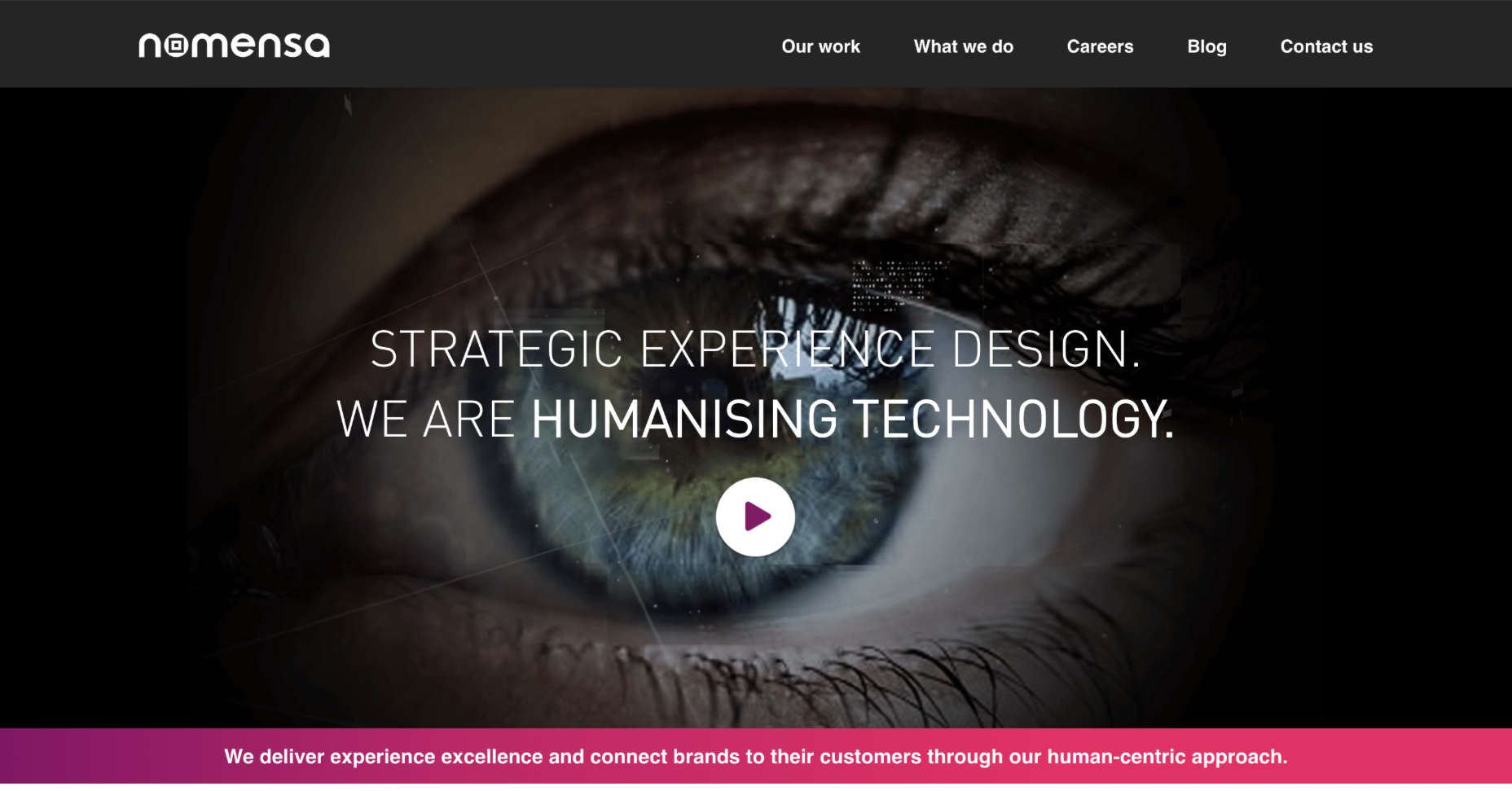
Look at the design choices for text on the Nomensa website, for instance. Plenty of white space makes content easier to read. Simple words are understandable and engaging. Even the font choice mimics the logo while offering readability.
Optimize Web Design Colors
Inclusive web design trends will come and go. However, color and contrast will always be essential to your decisions.
By making sure that your design elements meet the minimum color contrast ratios defined by the WCAG means that you’re supporting readability for visually-impaired users and improving experiences for customers that aren’t visually impaired as well.
For designers who need extra help in this area, tools like Stark help measure color contrast. This tool also offers a range of other tools intended to support accessibility too.
Remember, the minimum ratio you need to access will depend on the element that you’re designing. The WCAG recommends the following guidelines:
3:1 ratio for graphical objects (charts);
3:1 ratio for focus, active states, and hover;
3:1 ratio for clickable items and form components.
While you’re working on your color contrast strategies with apps like Stark, make sure that you consider the needs of users with color blindness too. 4.5% of the world doesn’t see color the same way as everyone else. If you’re finding it difficult to achieve the right contrast while sticking to your customer’s brand guidelines, try underlining and bolding elements too.
Consider Video and Audio Elements
Finally, these days, more companies are opting to embed video and audio content into their sites. These visual and auditory tools can offer useful information about a brand and what it does. However, you could struggle to deliver vital information to some customers through video and audio alone.
Captions for video content could be essential for those with hearing loss. You may need to think about adding transcripts to pre-recorded videos that people with hearing impairments can access. These transcripts and captions are also helpful for anyone who doesn’t have access to audio on smartphones or computers.
Transcripts can also help those with visual impairments by giving a text-to-speech tool something to describe to your user. That way, everyone gains useful information. Look at this captioned video from the University of Washington, for instance. It ensures that everyone can understand what’s going on in the content. If you add transcripts to your website pages for clients, you could also help them benefit from improved SEO too. Transcripts deliver more keyword-ranking opportunities than videos and podcasts on their own.
Design for Accessibility First
For designers to excel at delivering truly inclusive UI environments, they need to become as good at creating websites for people with disabilities as they are at creating interfaces for people like themselves. As designers, we try to be as inclusive as possible, but it’s easy to get caught up thinking about making a website easier to use for us.
If you can step into the shoes of someone that isn’t like you, and think about uncommon needs first, then you may find that you deliver a stronger, more engaging experience for every user.
For instance, rather than designing a website for someone with the same visual needs as you, then thinking about making tweaks for those with color blindness or vision issues, think about the needs of those with disabilities first.
You can learn more about putting uncommon needs first by checking out Vasilis Van Gemert’s blog post on the “Method of Crisis.”
Accessibility is Good for Business
Inclusive web design, or designing for accessibility, is all about maximizing the potential audience that your clients can earn. Whatever situation end-users find themselves in, you should ensure that you’re taking advantage of inclusive design.
If you can prove to your clients that you can deliver for all customers’ needs, you can unlock a much larger audience and many more opportunities.
https://ankaa-pmo.com/wp-content/uploads/2021/03/getting-started-with-inclusive-web-design.png15292780Service comm.https://ankaa-pmo.com/wp-content/uploads/2017/04/Logo-Ankaa-engineering.pngService comm.2021-03-15 11:45:082021-03-15 11:45:08Getting Started With Inclusive Web Design
Developing a mobile application involves several tasks. There are only two major platforms of mobile applications- Android and iOS. Developers use kotlin and Java to build Android applications while use Objective C and Swift to develop iOS applications. The native development process offers premium performance and API integration and easy to access hardware devices and much more.
One thing you need to keep in mind while doing native app development is that it’s costly, and it depends on the number of platforms you want to cover. This means different applications from different platforms, two codebases, two separate development projects, double the expenses.
https://ankaa-pmo.com/wp-content/uploads/2021/03/ionic-app-development-over-other-frameworks-is-it-hyped.jpg375600Service comm.https://ankaa-pmo.com/wp-content/uploads/2017/04/Logo-Ankaa-engineering.pngService comm.2021-03-14 01:05:462021-03-14 01:05:46Ionic App Development Over Other Frameworks: Is It Hyped?
RingCentral APIs use OAuth 2.0 for authorization. But which grant flow is the best practice for client-side apps, such as desktop, mobile app, and web (Single Page Apps)? The answer to that is authorization code with Proof Key for Code Exchange. In this article, I will introduce and show you how to implement authorization code with PKCE flow in Single Page Apps.
We can get the full steps of authorization code grant flow in the following diagram. A third-party app will need the RingCentral client ID and client secret to exchange and refresh the access token. The third-party app will stay authorized if it refreshes the RingCentral access token before the refresh token has expired, and will get a new refresh token and access token when it refreshes.
https://ankaa-pmo.com/wp-content/uploads/2021/03/use-authorization-code-and-pkce-for-ringcentral-api-for-client-app.jpg375600Service comm.https://ankaa-pmo.com/wp-content/uploads/2017/04/Logo-Ankaa-engineering.pngService comm.2021-03-12 00:33:342021-03-12 00:33:34Use Authorization Code and PKCE for RingCentral API for Client App
We tend not to think about it, but the Internet has a physical dimension. It’s a complex network of wires, cables, servers, and technical odds and ends — if you really want to, you can track it down; doing so is particularly easy on small islands because there tends to be a single cable tethering the region to the wider world.
Those physical cables run all the way to your building, and although an ISP manages them, they are normally rented from public bodies as part of your national infrastructure.
Beyond the physical, international bodies govern protocols like ARP, IEEE, HTTP, NTP, FTP, and others, which control how data is transmitted through the network and keep everything playing nice.
Then, at the other end of the equation, there’s your device. It may be a phone, a tablet, a notebook, a desktop. It’s probably several of these. And because it’s your device, everything on it feels like yours. We tend to think of it as our method of accessing the Internet instead of being part of the Internet — in reality, it’s both.
On your device, the software you use to access the Internet is your browser. For 65% of people, that’s Chrome. Even if you’re reading this on Edge, it’s created with the Blink engine, an extension of Chromium, which is the basis for Chrome. In fact, almost every browser is built using a variation of Chromium, except those on Apple devices that require Apple’s own WebKit to be used instead.
Chromium is ostensibly open-source. WebKit is not, but both are geared towards their primary contributors’ business goals; neither Chromium nor WebKit will make a change that negatively impacts Alphabet or Apple.
Your browser is just a copy of a pre-compiled set of source files sat in a Git repo somewhere. You may have installed a few plugins in your browser. You may have bookmarked a few pages. You’ve probably moved it to your dock or your home screen. Those features are just nice add-ons for the GUI; what really matters is what decisions are made about how to render web technologies.
Imagine a world in which every single car used the same mid-range Ford engine. Add in a stereo, and paint it any color you like, you can even pick your own tires, but under the hood, it has to be that mid-range Ford engine. And the only justification is that it’s too much work to create an alternative.
The 2020s are going to be a time of enormous change. You can smell the panic in traditional banking sectors every time Cryptocurrency is mentioned. Real estate billionaires are desperately trying to get us back into offices we don’t want to return to. And yes, I’m sorry, but the climate crisis is looming, and it will force our hand. The values of a whole generation have been rapidly reassessed. Innovation and the potential for innovation are rife, except, ironically, on the Internet, where we’re still chugging away with the mid-range Ford engine under the hood.
The web has reached the point at which the browser engines we choose define real-world infrastructure. There’s a fork in the road: either browser engines are part of an infrastructure that should be rationalized into a single browser protocol, or alternative browser engines need to be nurtured, encouraged, and accessible by choice.
https://ankaa-pmo.com/wp-content/uploads/2021/03/poll-is-it-time-to-merge-browser-engines-into-a-browser-protocol.jpg14082560Service comm.https://ankaa-pmo.com/wp-content/uploads/2017/04/Logo-Ankaa-engineering.pngService comm.2021-03-11 11:45:042021-03-11 11:45:04Poll: Is It Time to Merge Browser Engines Into a Browser Protocol?
When photographers take images to sell commercially, like every other business, they want to maximize their returns, so they adapt their ideas to meet commercial trends. As a result, stock always looks like stock, and that minor deception introduces a small amount of doubt in users.
But the rise of camera phones, and the increasing affordability of DSLRs, has led to a growth in people who aren’t monetizing every shot. What that means is if you know where to look, you can find images that are less posed, more natural, less clichéd, and far more diverse.
Here are ten places to look for engaging, and trust-building stock images, all free to use…
1. Pexels
Pexels has a huge collection of high-quality images that would not feel out of place on a ‘premium’ site. You’ll also find a ton of free videos. Pexels’ search feature is particularly well-tuned. Pexels also runs regular challenges, with cash prizes for photographers; reviewing the past competitions is a great shortcut to finding original images.
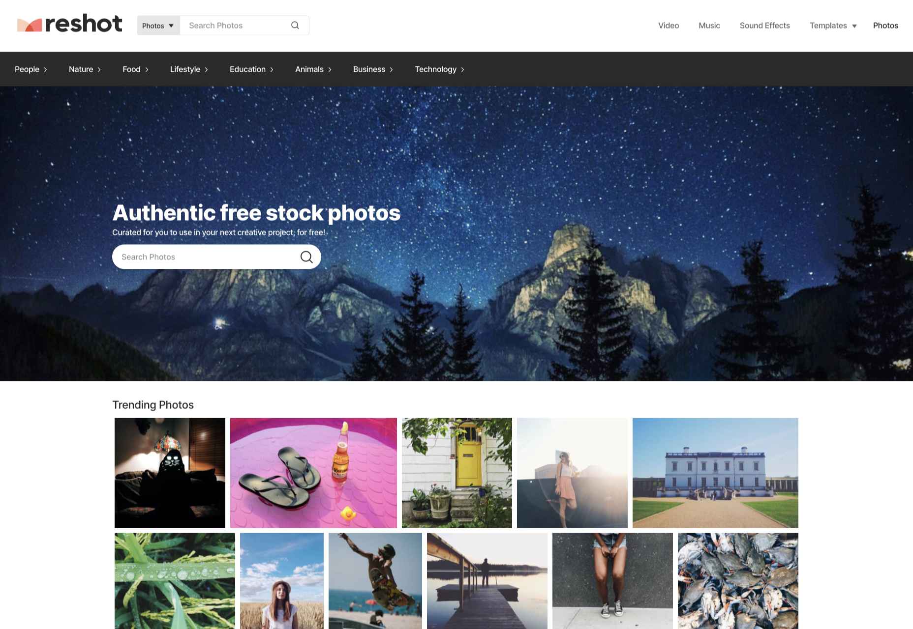
2. Reshot
Reshot is one of the better stock sites on the web, with a wide selection of curated images. There’s a distinctly Instagram feel to the images on Reshot; they don’t feel staged, in many cases, they don’t look like stock at all. That gives them an authentic feel that many ‘premium’ stock sites fail to deliver.
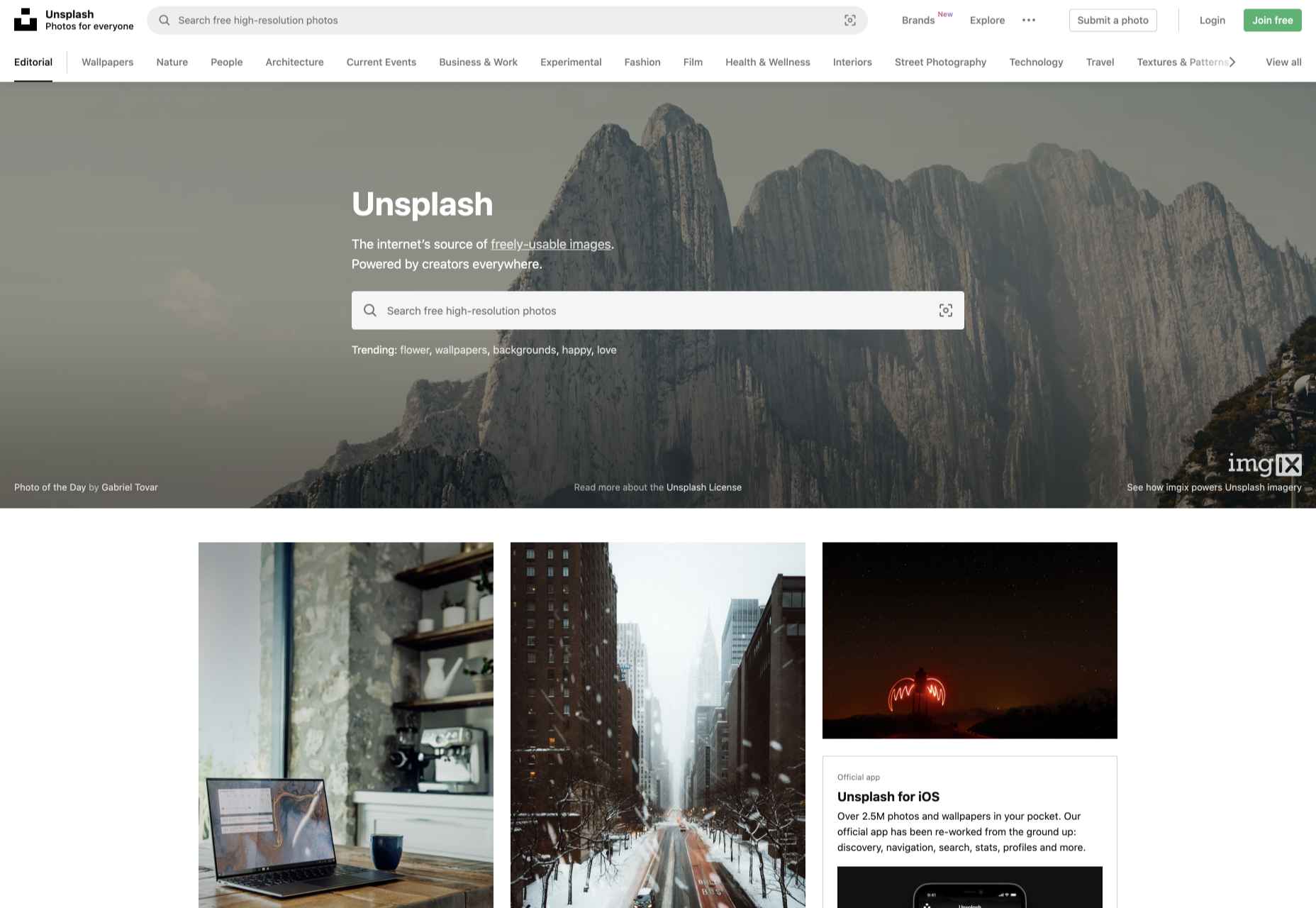
3. Unsplash
Unsplash is one of the largest collections of free images on the web. It has a good collection of standard stock and a growing collection of more creative, experimental images. Its free-forever approach is backed by product placement instead of adverts or premium sections, which means you may find the more marketable images include easily identifiable brands.
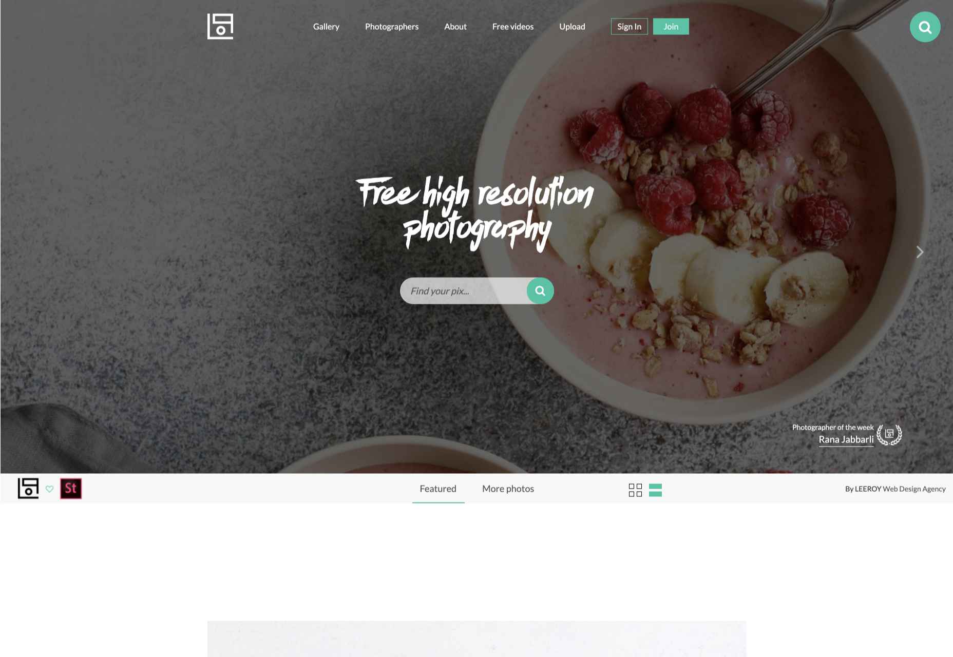
4. Life of Pix
Life of Pix highlights one photographer per week to feature ten images; that adds a competitive angle to the site as photographers submit premium shots to get noticed. Unless you’re very fortunate, the ideal shot for you isn’t going to be found in the current set, but click the ‘Gallery’ link, and you’ll have access to all the shots that have previously been uploaded.
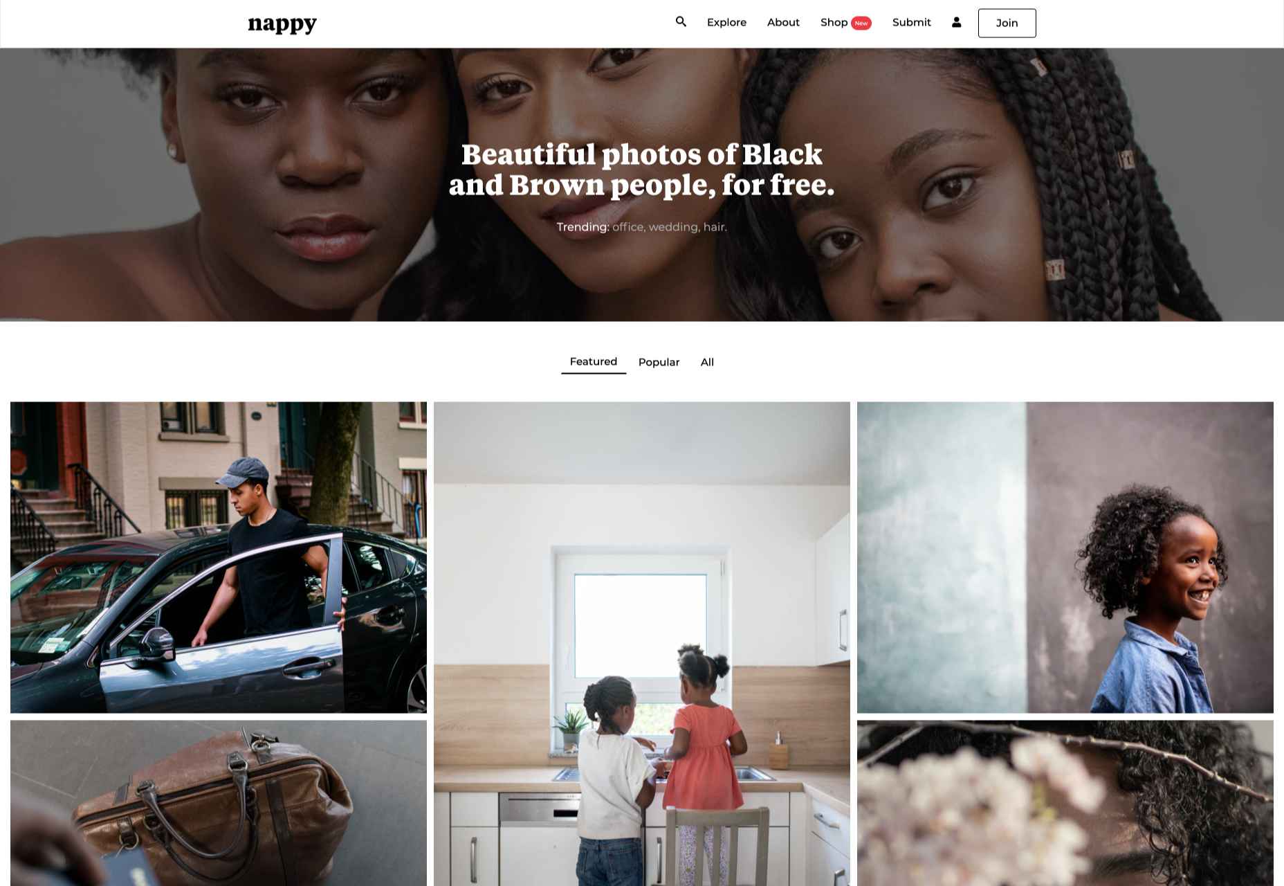
5. Nappy
Unlike ‘premium’ sites that are set up to turn a profit, free stock sites often set out to address a hole in the market. Nappy was set up to redress the underrepresentation of black and brown people on many stock sites. At least some of your users fall into this demographic, and it’s a great idea to show them they’re valued by using images like these.
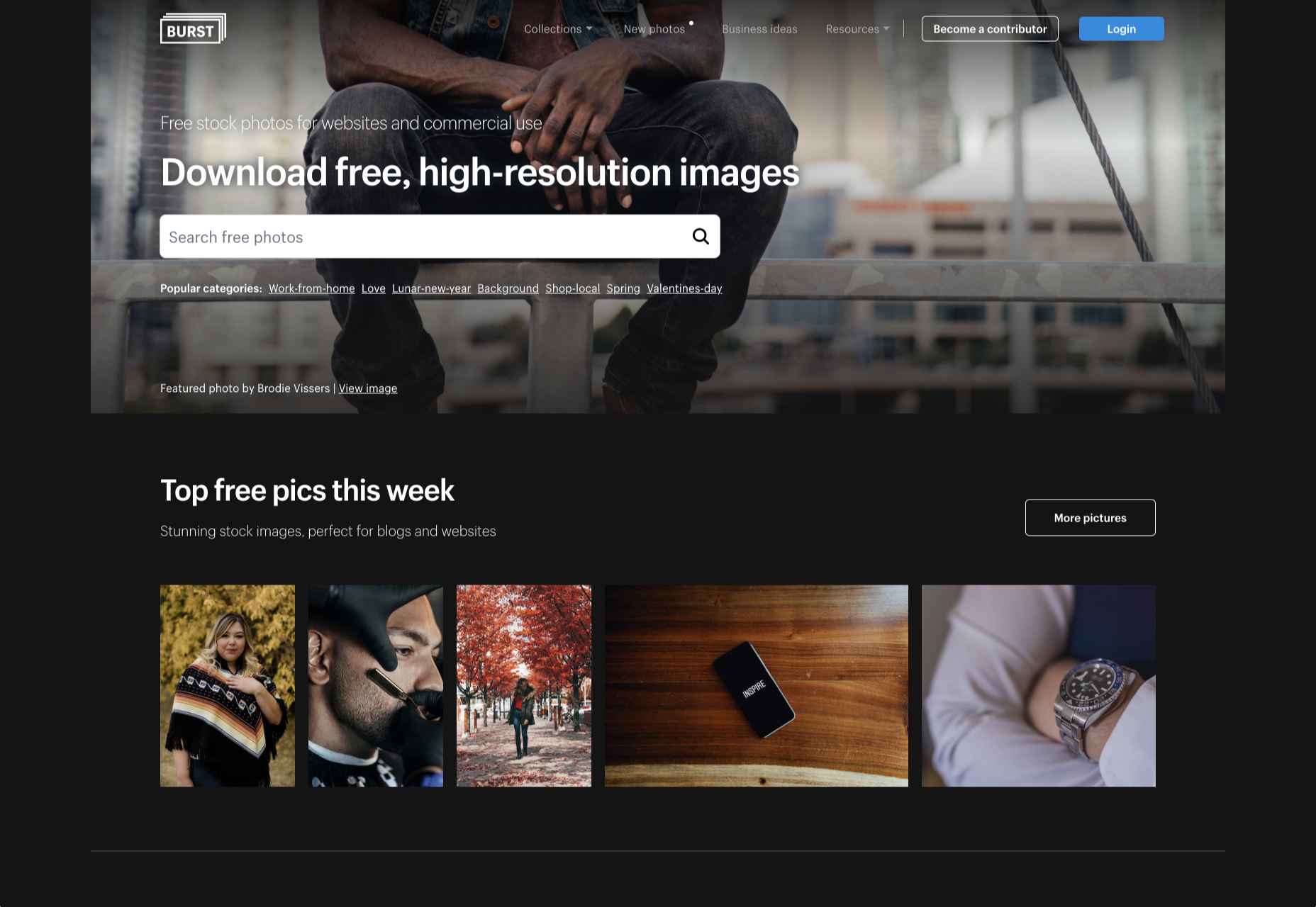
6. Burst
Burst is a stock site provided by Shopify to help new entrepreneurs find stock to help them sell products. Anyone can use the shots, but there is a natural inclination towards commercial rather than editorial images. There’s a good mix that rivals many paid sites and some less obvious shots.
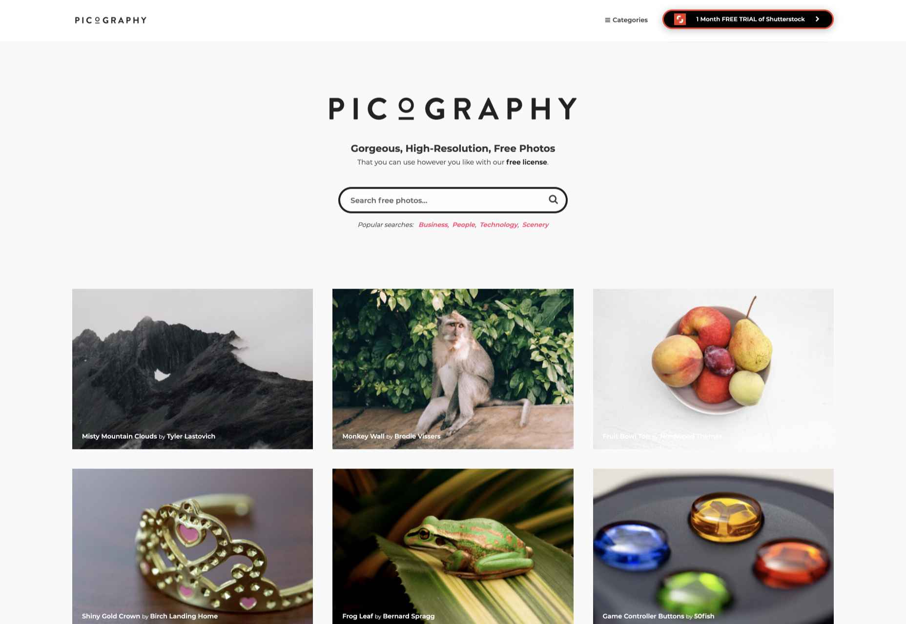
7. Picography
If quirky and offbeat isn’t right for your project — and it may very well not be — then check out Picography for a more middle-of-the-road collection of free stock images. There’s a wide selection, but they do tend to feel more stock-like than many other collections.
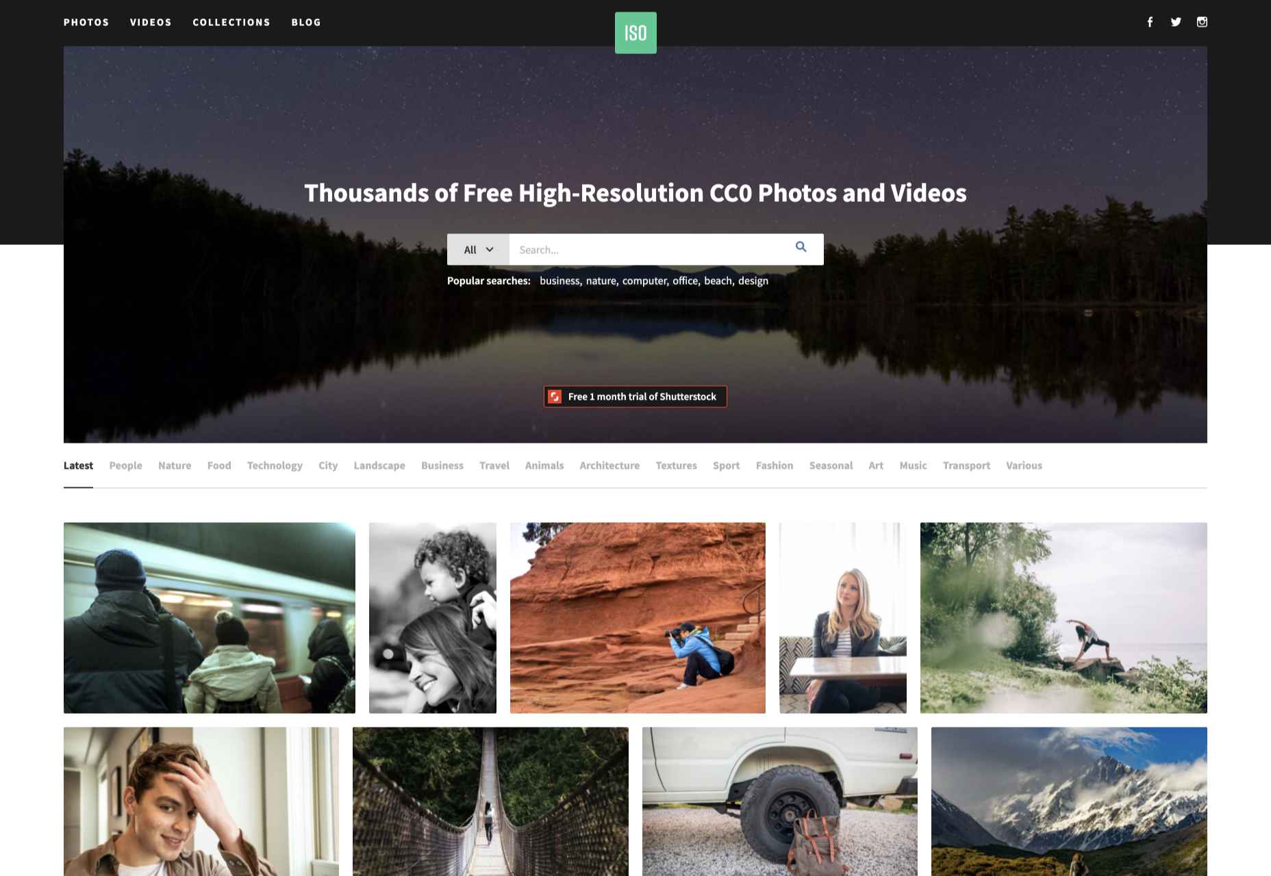
8. ISO Republic
ISO Republic has a broad range of images and videos to choose from. Again, the images tend to be more stock-like than some other options, and you do have to dig around to find the best. ISO Republic is a good place to search when you want to swap like-for-like with a ‘premium’ stock source.
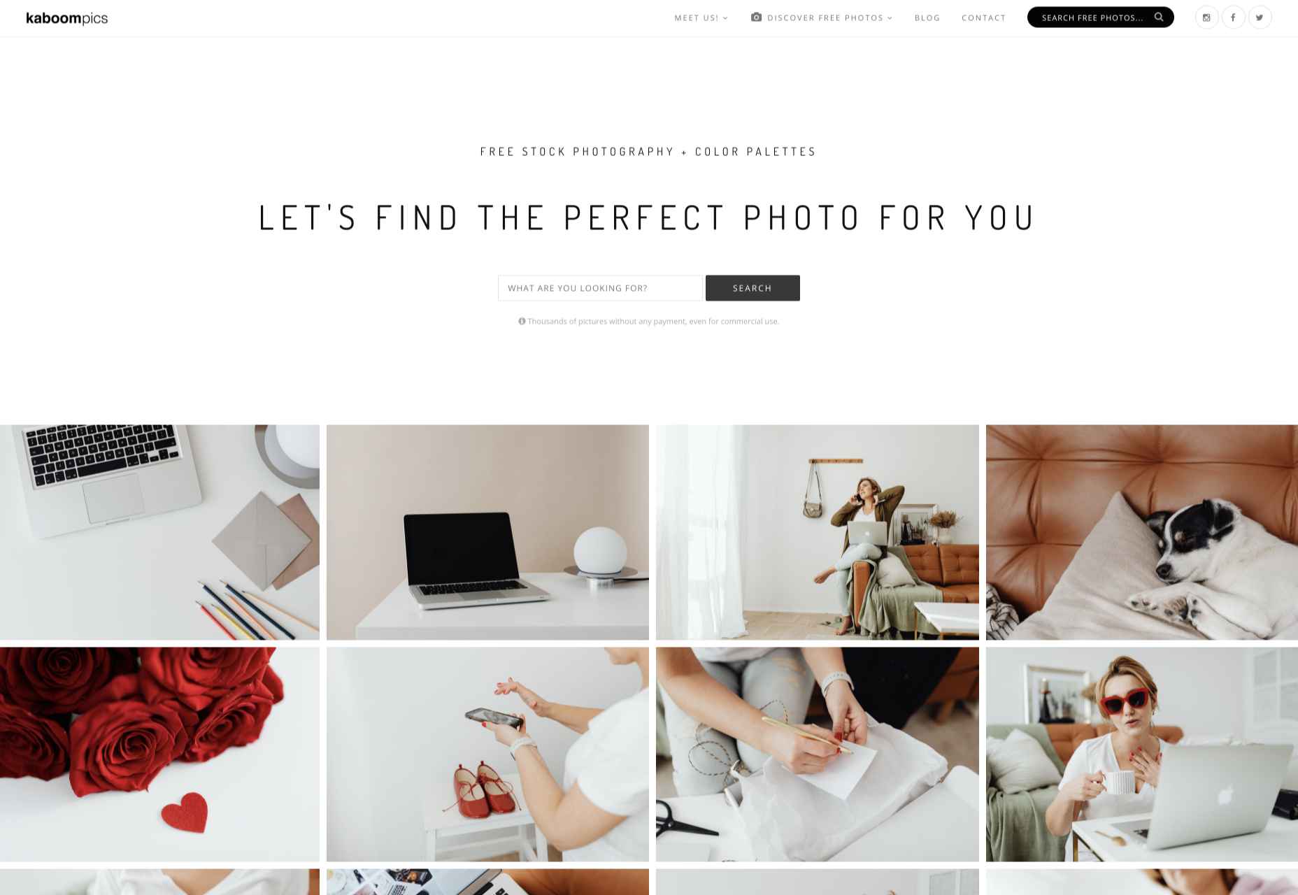
9. Kaboompics
Kaboompics specializes in lifestyle images. If you’re hoping for a woman sipping a frappuccino while making commanding business decisions, you’re in the right place. Kaboompics is a one-woman show, so the perspective is a little narrower than the ideal, but the free images are consistently high-quality.
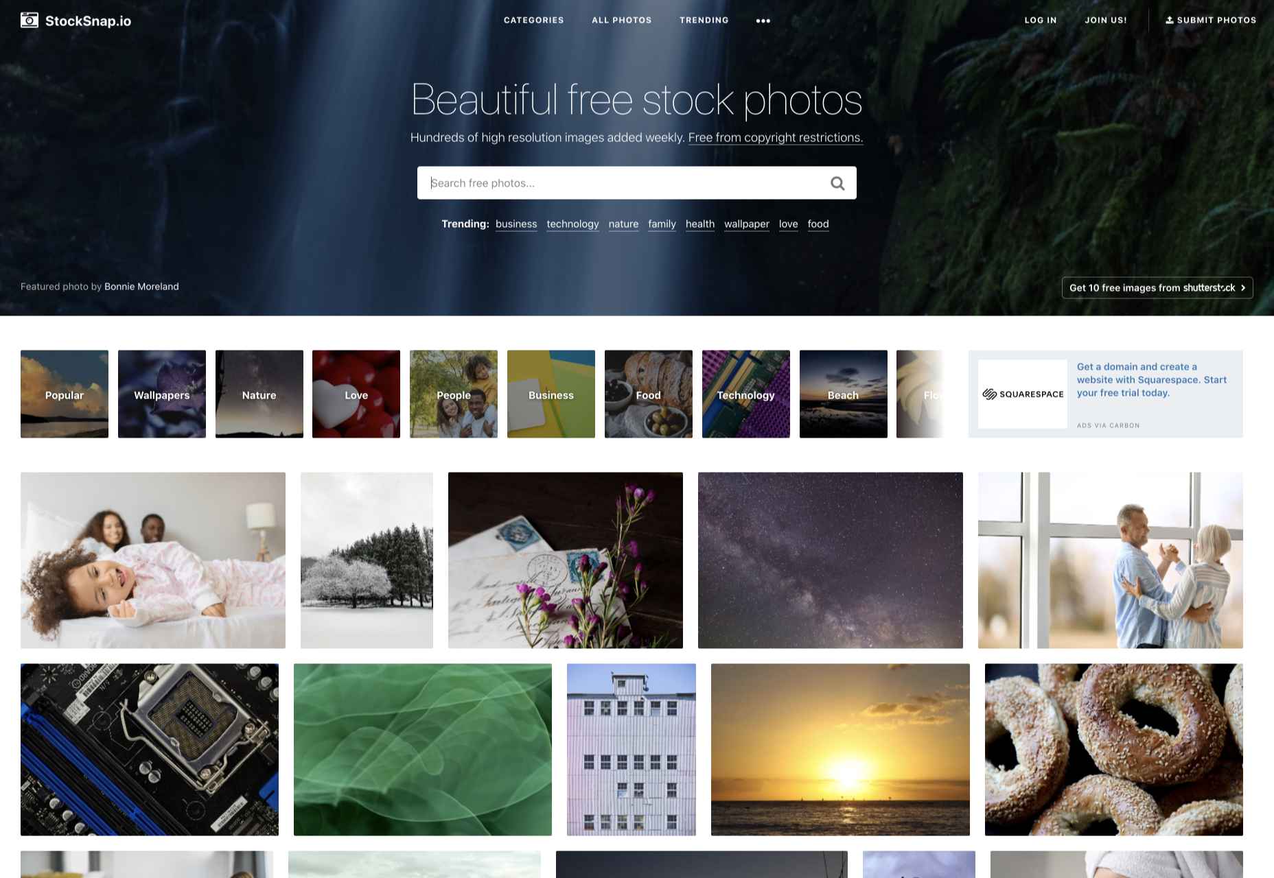
10. StockSnap
StockSnap has a good balance of images. Many professional photographers use sites like StockSnap to upload the images they choose not post to ‘premium’ sites for one reason or another, so you’ll often find premium-quality shots for absolutely nothing.
When you think of installing analytics, you probably reach for Google Analytics. And you wouldn’t be alone. The platform’s tight integration with SEO and the implication that using Google products is beneficial to ranking means that Google Analytics is the most commonly installed analytics solution globally.
Google Analytics isn’t a bad choice: it’s free, it’s fairly comprehensive, and it does indeed tie most SEO efforts up with a nice bow.
But Google Analytics is also slow, extremely bad for privacy — both yours and your users’ — and for many people, it’s too unwieldy, having grown organically over the years into a relatively complex UI.
Some alternatives are fast, privacy-friendly, and geared towards different specialisms. Today we’re rounding up the best…
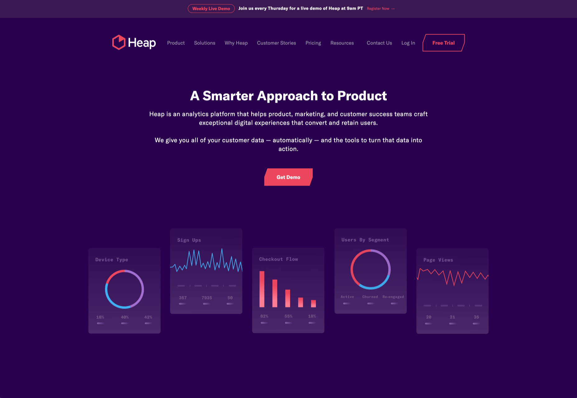
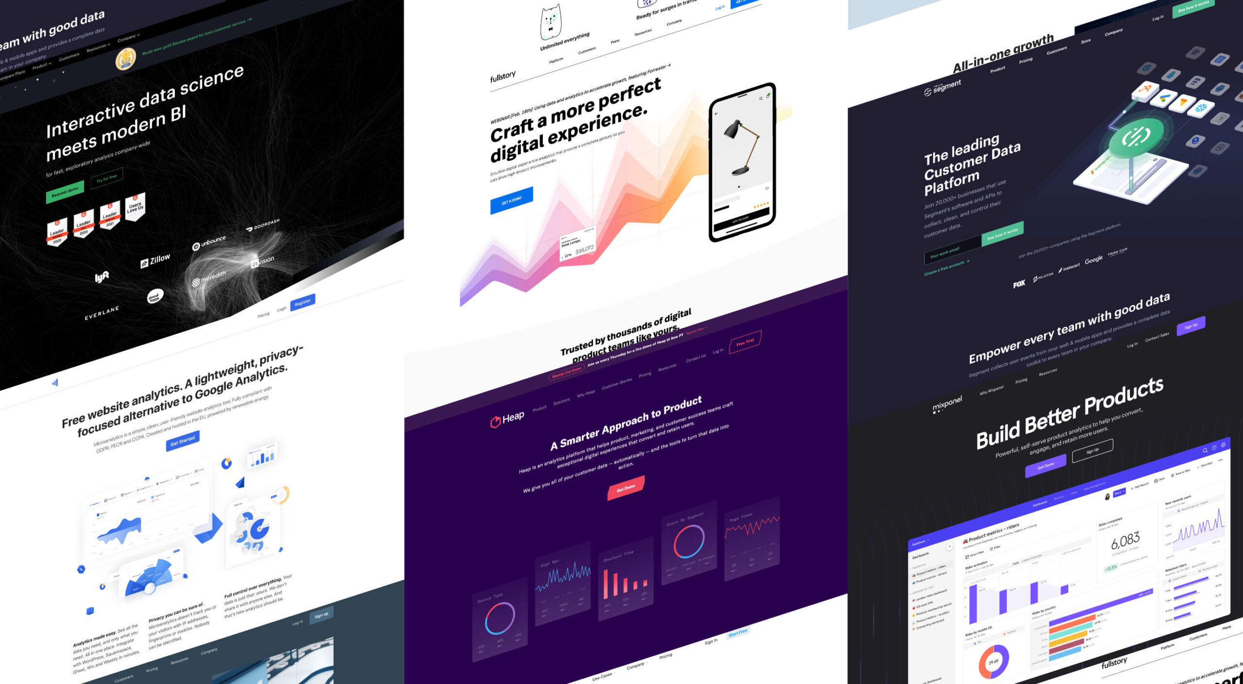
1. Heap
Heap is an event-based analytics platform. That means you can tell not just how many people visited your site but what actions they took when they were there. This isn’t a unique proposition, but Heap is one of the best implementations.
Heap offers an auto-track tool, which is ideal for new installations because you can get up and running immediately and fine-tune the details later. That makes it great for startups, although it’s also the choice of major corporations like Microsoft.
Heap’s free plan includes 60k sessions per year and 12 months of data history, but when you outgrow that, the business plans start at $12,000/year.
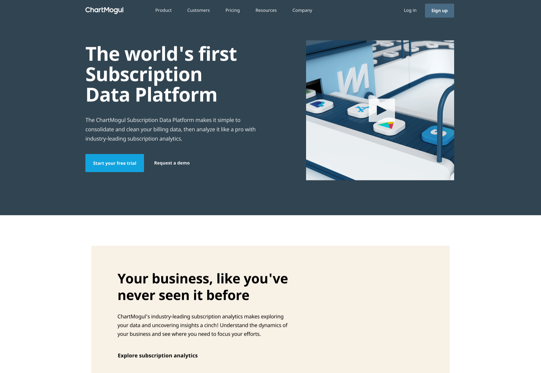
2 ChartMogul
ChartMogul is geared towards SaaS that offer subscription plans, staking a claim as the world’s first subscription data platform.
Services like Buffer and Webflow use ChartMogul to monitor their revenue and analyze the ROI of changes to their features, design, and user experience.
Ideally suited for startups, ChartMogul pricing is based on monthly recurring revenue; it has a free plan for up to $10,000 MMR; after that, pricing starts at $100/month.
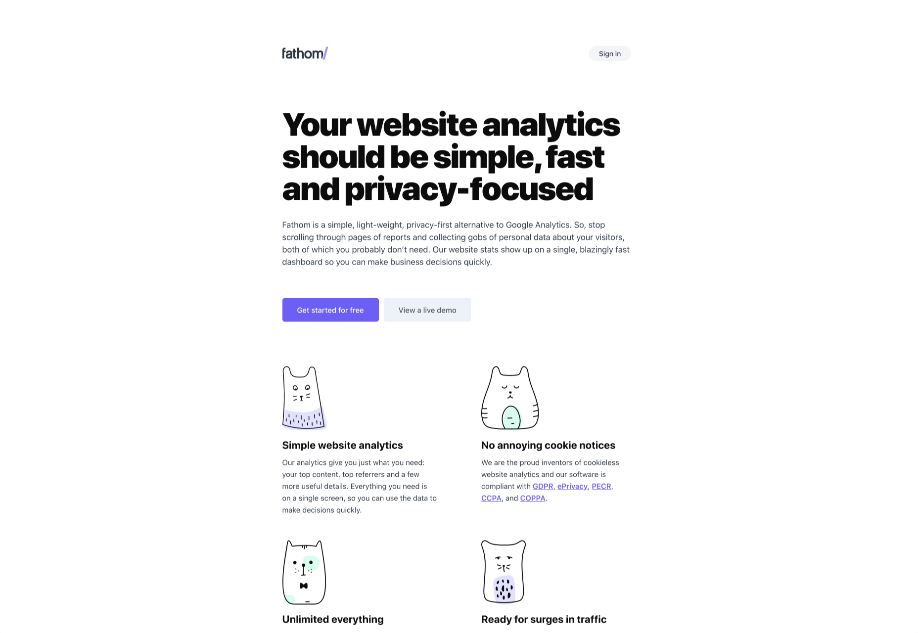
3. Fathom
Fathom is an awesome, privacy-first analytics solution. It offers a simple dashboard and is ideal for anyone looking for simple analytics information to verify business decisions.
Fathom is ideally suited to freelancers, or entrepreneurs with multiple projects, as it allows you to run multiple domains from a single account. Fathom is entirely cookieless, meaning you can ditch that annoying cookie notice. It’s GDPR, ePrivacy, PECR, CCPA, and COPPA compliant.
There’s a seven-day free trial; after that, Fathom starts at $14/month.
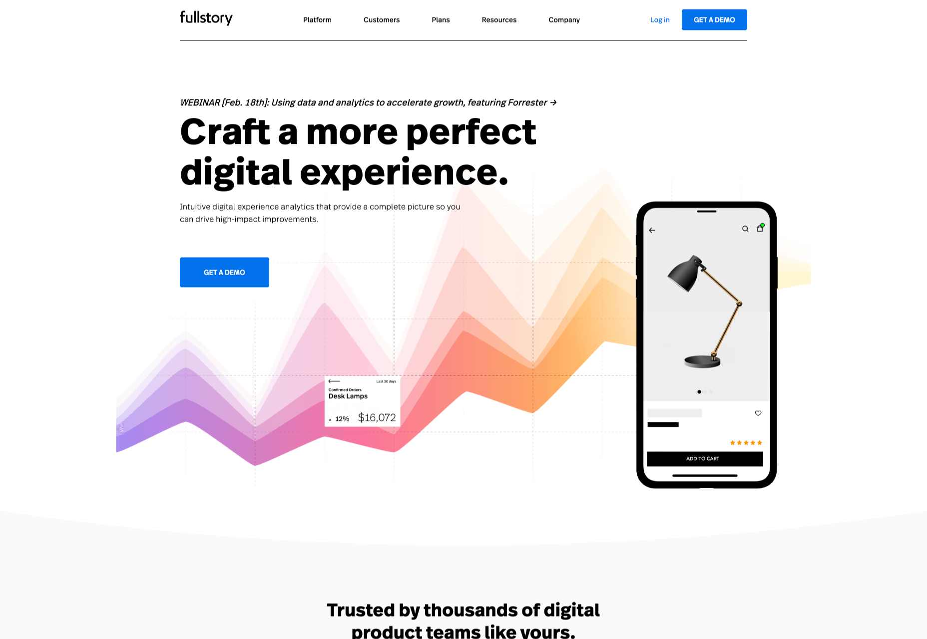
4. FullStory
FullStory is designed to help you develop engaging online products with an emphasis on user experience.
FullStory is a set of tools, making it ideal for large in-house teams or in-house teams working with outside agencies or freelancers. It pitches itself as a single source of truth from which everyone from the marketing department to the database engineers can draw their insights, helping digital teams rapidly iterate by keeping everyone in the same loop.
FullStory uses AI to track and interpret unexpected events, from rage clicks to traffic spikes, and breaks those events down to a dollar-cost, so you can instantly see where your interventions will have the most impact.
There’s a free plan for up to 1k sessions per month; once you outgrow that, you need to talk to the sales team for a quote.
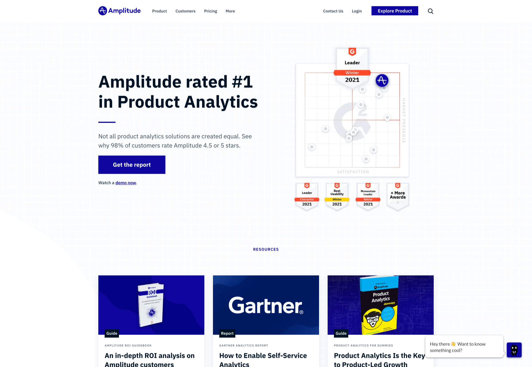
5. Amplitude
Amplitude has one of the most user-friendly dashboards on this list, with tons of power behind it. For project managers trying to make science-based decisions about future development, it’s a godsend.
The downside with Amplitude is that to make the most of its powerful data connections, you need to pump a lot of data in. For that reason, Amplitude is best suited to sites that already have a substantial volume of traffic — among those customers are Cisco and PayPal.
Amplitude provides a free plan, with its core analytics and up to 10m tracked actions per month. For premium plans, you have to contact their sales team for a quote.
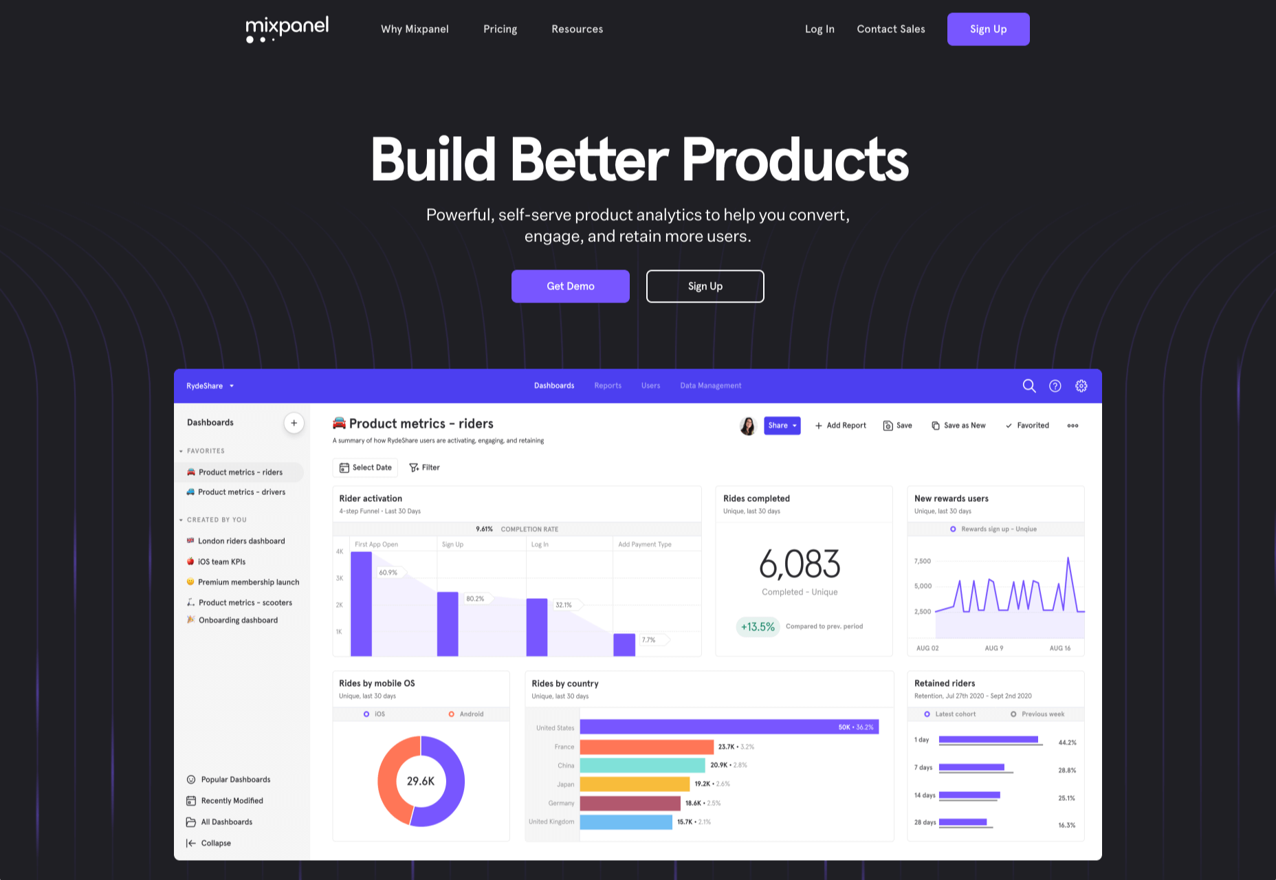
6. Mixpanel
Mixpanel is a little bit more than an analytics program, aiming to be a whole suite of web tools it has ventured into split testing and notifications.
Mixpanel is laser-focused on maximizing your sales funnel. One look at the dashboard, and you can see that Mixpanel, while very well designed, has too many features to present them simply; Mixpanel is ideally suited to agencies and in-house development teams with time to invest — you probably want to keep the CEO away from this one.
Mixpanel has a generous free plan for up to 100k monthly users, with its business plans starting at $25/month.
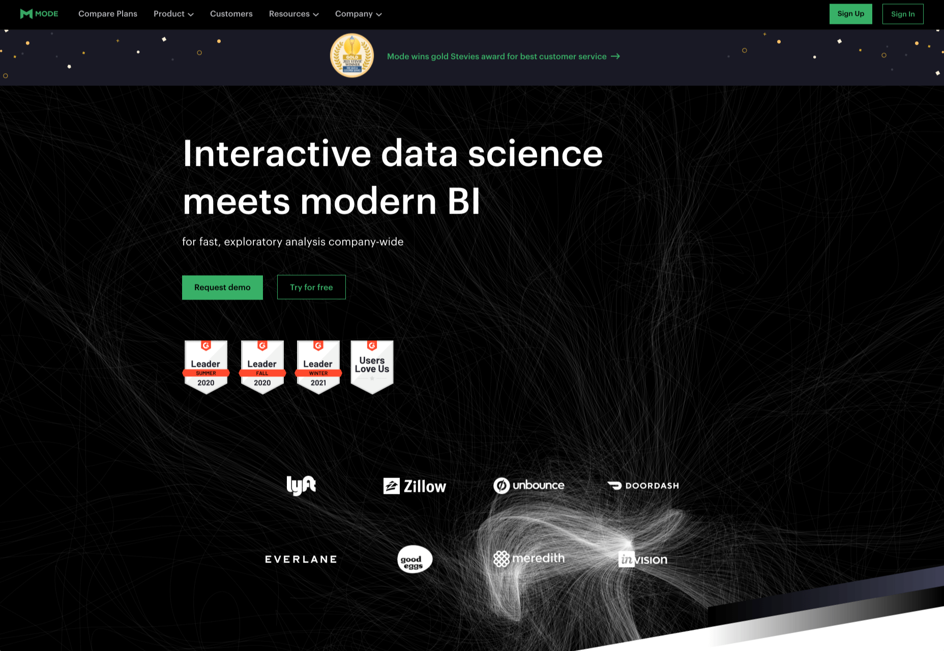
7. Mode
Mode is a serious enterprise-level solution for product intelligence and decision making.
Ideally suited to in-house teams, Mode allows you to monitor financial flow and output the results in investor-friendly reports. You can monitor your entire tech stack and, of course, understand how users are interacting with your product. Wondering who handles the analytics for Shopify? That would be Mode.
Mode has a free plan aimed at individuals, but this tool’s scope is really beyond freelancers, and the free plan’s only likely to appeal to high-price consultants and tech trouble-shooters. For the full business plan, you need to contact Mode’s sales team for a quote.
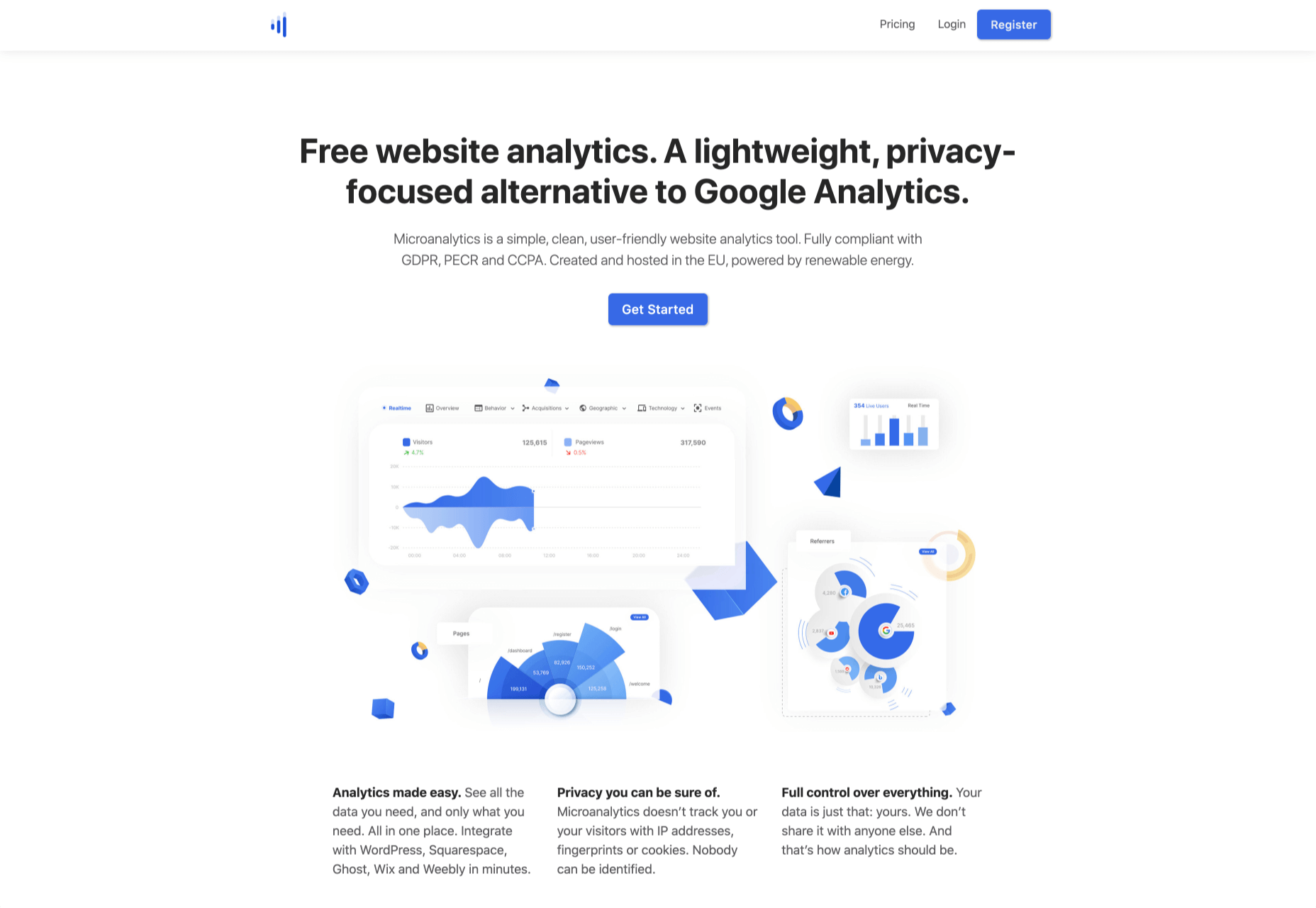
8. Microanalytics
Microanalytics is a relatively new analytics program with a lightweight, privacy-focused approach.
Microanalytics provides a simple dashboard with acquisitions, user location, technology, and the all-important event tracking to monitor user behavior. Microanalytics is compliant with the web’s most stringent privacy laws, including GDPR, PECR, and CCPA. The tracking code is just 1kb in size, meaning that you’ll hardly notice its footprint in your stats.
Microanalytics is free for up to 10k pageviews/month; after that, the monthly plan starts at $9.
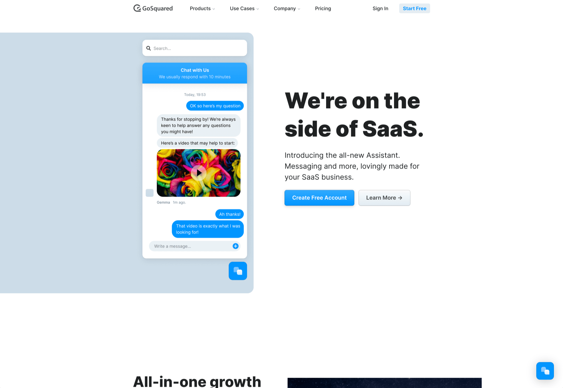
9. GoSquared
GoSquared is another suite of tools, this time aimed at SaaS. Its primary product is its analytics, but it also includes live chat, marketing tools, and a team inbox.
If you’re tired of comparing multiple tools to help make the most of your startup, GoSquared kills several birds with one stone. Perhaps most importantly, if you’re beginning to build a team and don’t have any engineers onboard yet, GoSquared has an award-winning support team and an idiot-proof setup process.
GoSquared has a free plan that’s fine for evaluating the suite and integrating data from day one. As you begin to grow, paid plans start at $40/month.
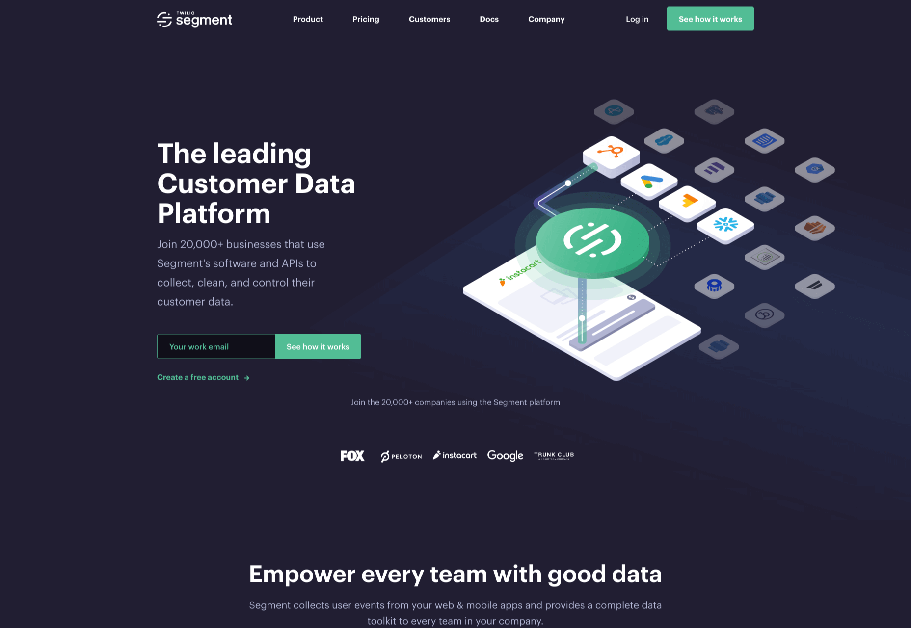
10. Segment
Segment is a little different from the other analytics tools on this list; Segment is a layer that sits between your site and your analytics. It integrates with many of the tools on this list.
There are several benefits to this approach. The main one is that different teams within your enterprise can access analytics data in a form that suits them — designers can access complex data, and management can stick to revenue flow. It also means that you can switch analytics programs with a single setting in Segment and even migrate historical data into new apps. If you’re an enterprise that wants to future-proof its customer intelligence gathering, Segment is worth considering.
Segment is trusted by some of the web’s best-known names, from IBM to Levis, and…ahem…Google.
Segment is free for up to 1k visitors per month, and after that, the team plan starts at $120/month.
https://ankaa-pmo.com/wp-content/uploads/2021/02/10-best-alternatives-to-google-analytics-in-2021.jpg14082560Service comm.https://ankaa-pmo.com/wp-content/uploads/2017/04/Logo-Ankaa-engineering.pngService comm.2021-02-10 11:45:362021-02-10 11:45:3610 Best Alternatives to Google Analytics in 2021
Paramètres des cookies et politique de confidentialité
Comment nous utilisons les cookies
Nous utilisons les cookies pour nous faire savoir quand vous visitez nos sites Web, comment vous interagissez avec nous, pour enrichir votre expérience utilisateur et pour personnaliser votre relation avec notre site Web.
Cliquez sur les différents titres de catégories pour en savoir plus. Vous pouvez également modifier certaines de vos préférences. Notez que le blocage de certains types de cookies peut avoir un impact sur votre expérience sur nos sites Web et les services que nous sommes en mesure d'offrir.
Cookies essentiels sur ce site
These cookies are strictly necessary to provide you with services available through our website and to use some of its features.
Because these cookies are strictly necessary to deliver the website, you cannot refuse them without impacting how our site functions. You can block or delete them by changing your browser settings and force blocking all cookies on this website.
Cookies Google Analytics
Ces cookies recueillent des renseignements qui sont utilisés sous forme agrégée pour nous aider à comprendre comment notre site Web est utilisé ou l'efficacité de nos campagnes de marketing, ou pour nous aider à personnaliser notre site Web et notre application pour vous afin d'améliorer votre expérience.
Si vous ne voulez pas que nous suivions votre visite sur notre site, vous pouvez désactiver le suivi dans votre navigateur ici :
Autres services
Nous utilisons également différents services externes comme Google Webfonts, Google Maps et les fournisseurs externes de vidéo. Comme ces fournisseurs peuvent collecter des données personnelles comme votre adresse IP, nous vous permettons de les bloquer ici. Veuillez noter que cela pourrait réduire considérablement la fonctionnalité et l'apparence de notre site. Les changements prendront effet une fois que vous aurez rechargé la page.
.
Paramètres de Google Webfont Settings :
Google Map :
Vimeo et Youtube :
Politique de confidentialité
Vous pouvez lire nos cookies et nos paramètres de confidentialité en détail sur la page suivante
 Rather than spring cleaning, do some spring “shopping” for tools that will make your design life easier. Packed with free options this month, this list is crammed full of tools and elements that you can use in your work every day.


 Google has been talking about the Core Web Vitals tool and the Page Experience Update for about a year now.
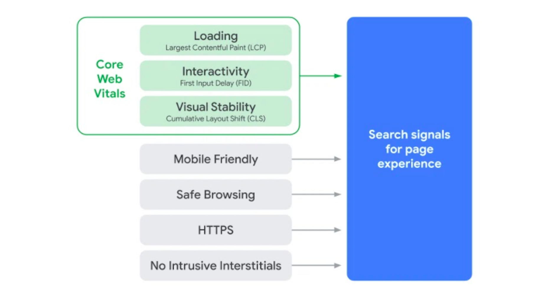

 Inclusive design is all about designing sites with everyone in mind instead of designing for your own preferences. It’s an essential component in a professional-grade site and the cornerstone of a successful project.
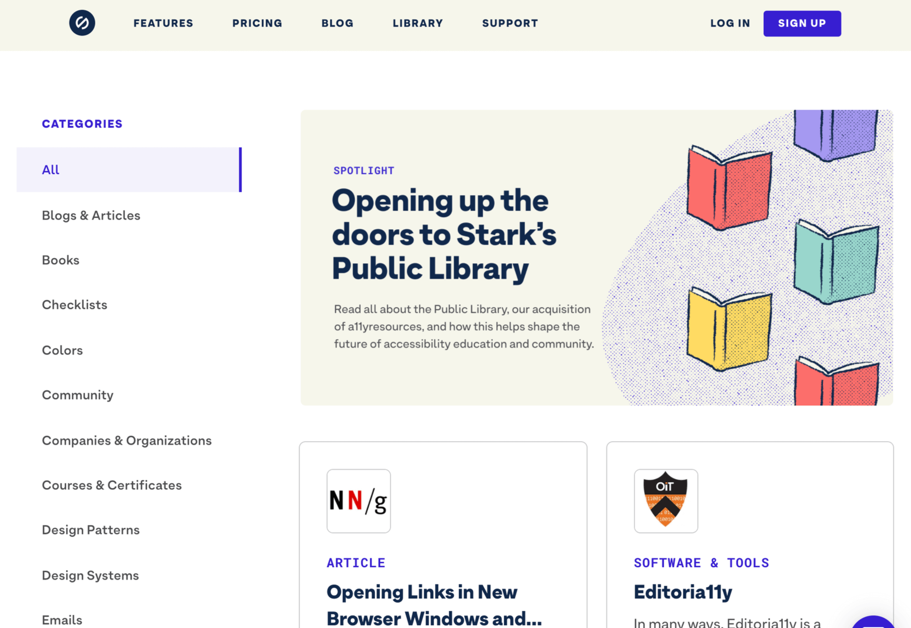

 A key part of designing successful websites for clients is making sure that as many end-users as possible can access and enjoy that site.
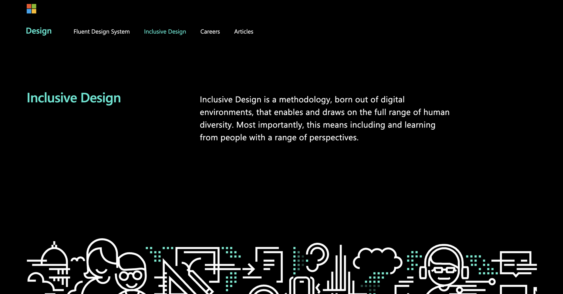


 We tend not to think about it, but the Internet has a physical dimension. It’s a complex network of wires, cables, servers, and technical odds and ends — if you really want to, you can track it down; doing so is particularly easy on small islands because there tends to be a single cable tethering the region to the wider world.
 When photographers take images to sell commercially, like every other business, they want to maximize their returns, so they adapt their ideas to meet commercial trends. As a result, stock always looks like stock, and that minor deception introduces a small amount of doubt in users.
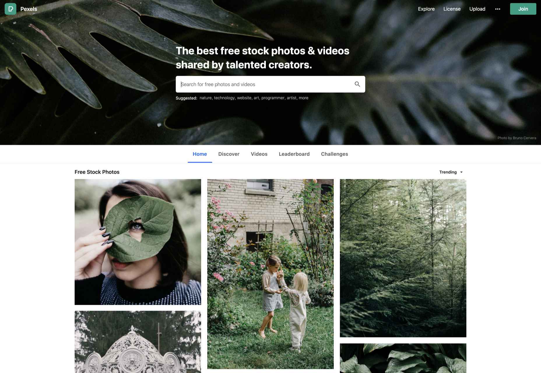
 When you think of installing analytics, you probably reach for Google Analytics. And you wouldn’t be alone. The platform’s tight integration with SEO and the implication that using Google products is beneficial to ranking means that Google Analytics is the most commonly installed analytics solution globally.