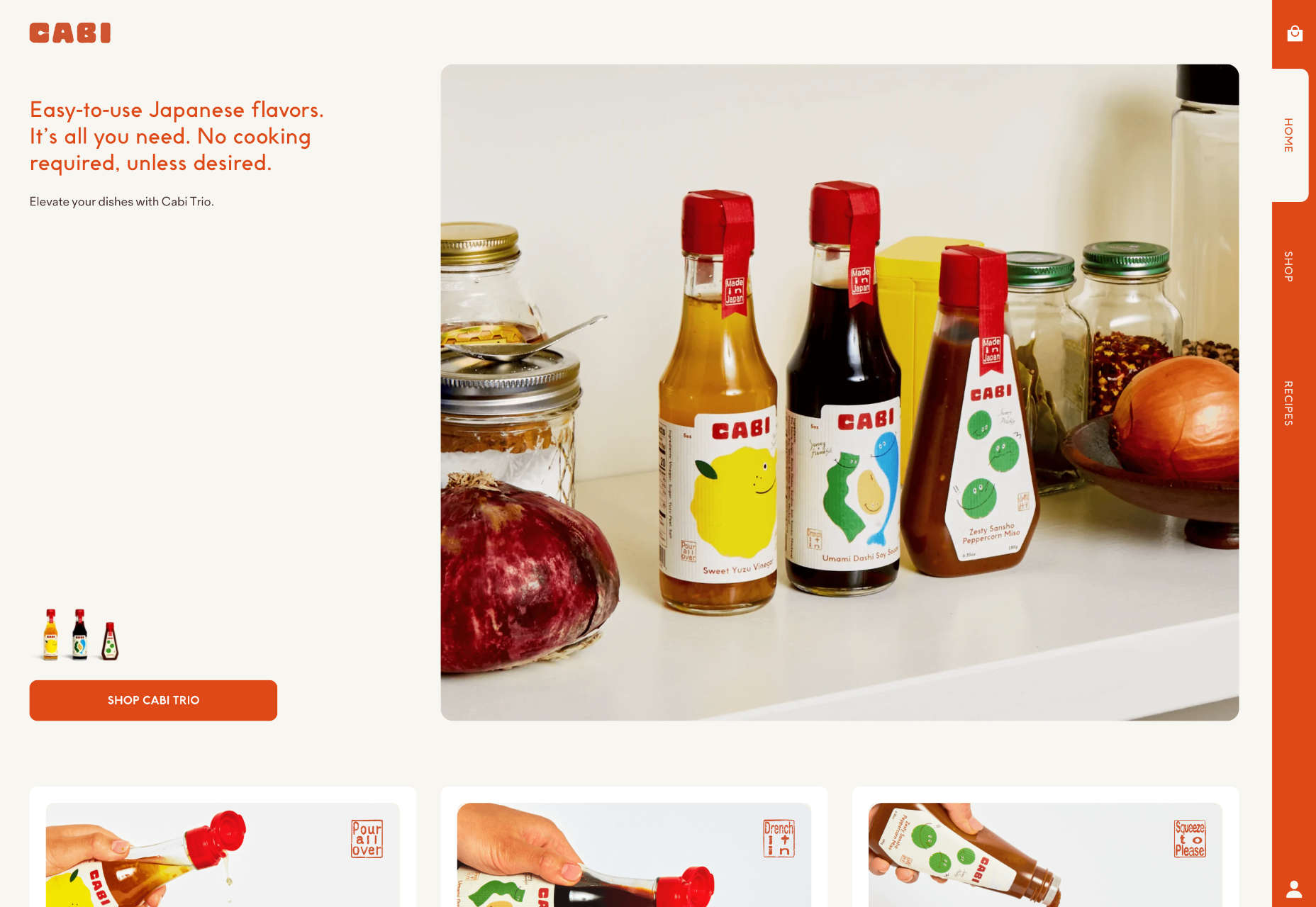
 Color and depth are key themes this month as we look at what design trends are happening across websites. Red is the primary color of choice, and you can see it almost everywhere; the new thing is that it’s being used in backgrounds and as more than an accent color. Additionally, 3D elements and depth of field are making significant impressions.
Here’s what’s trending in design this month.
1. Red Backgrounds
Red is the color of power, passion, and attention, but until recently, it wasn’t the go-to choice for website backgrounds. Now trending is red as a background color.
These designs are bold and in-your-face with bright color, an almost brash feel in some cases, and a lot of impact.
But it works.
In the projects below, red is a powerful tool to help convey the message of the website design. The color demands that you engage with the design to see what’s happening and the content therein, and in the case of Pentel, it’s part of the brand color.
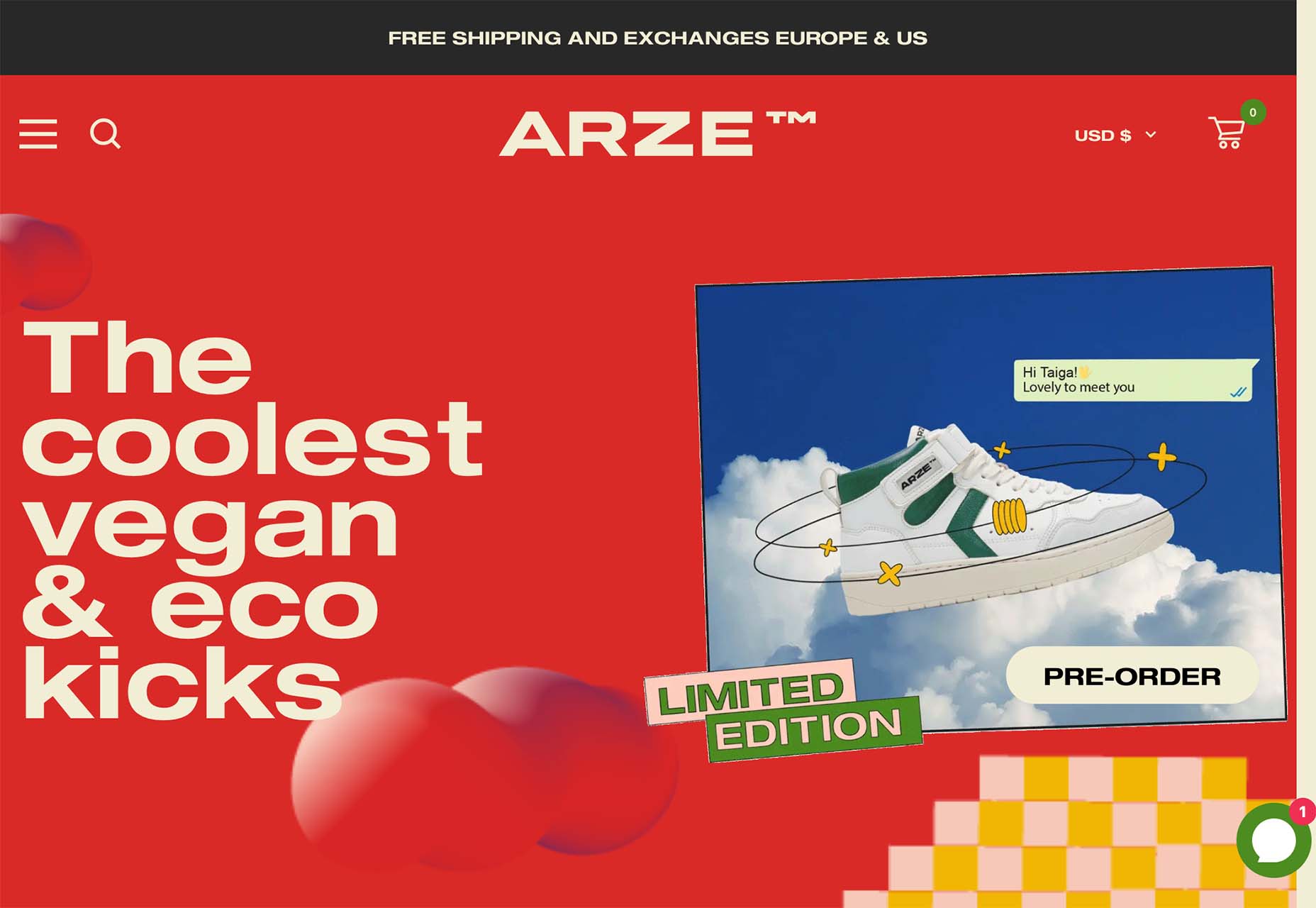
Arze uses a bold red background with a smaller inset of contrasting color to show items on the site. It’s an interesting and quite bold choice. The red background carries through the scroll as well. This is a use of color that verges on off-putting but still gets the point across and helps show products thanks to a lot of contrast.
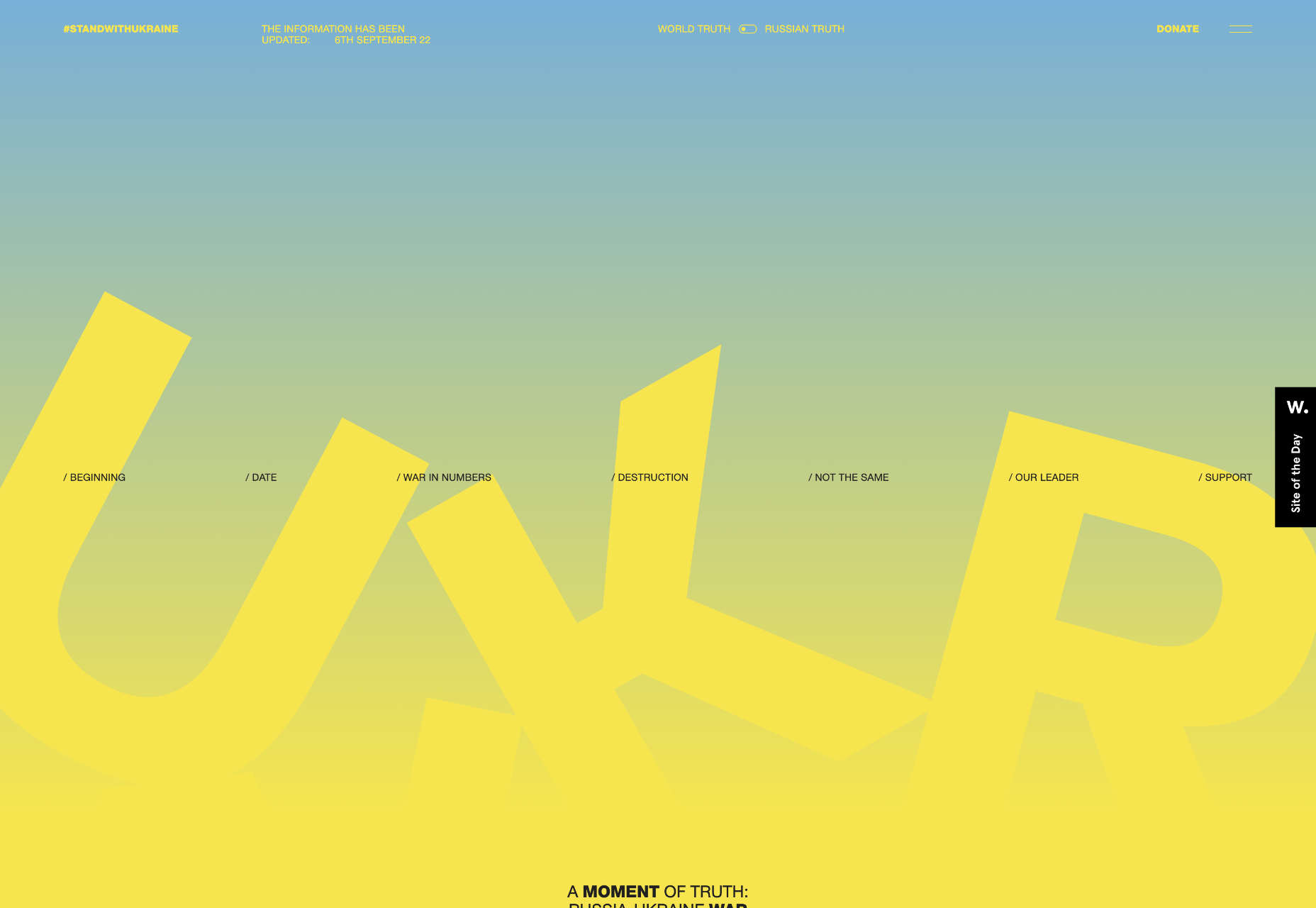
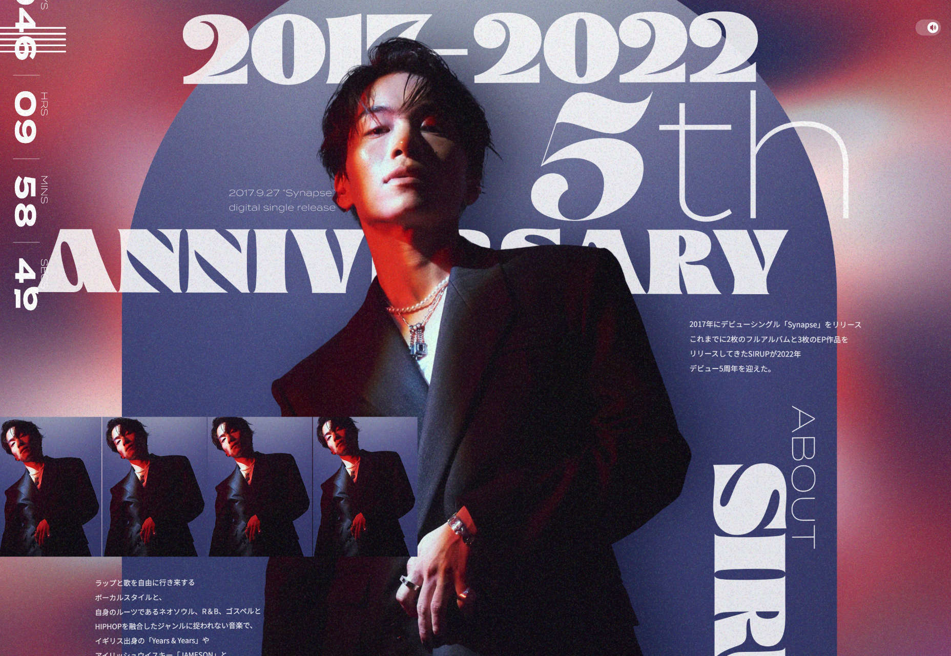
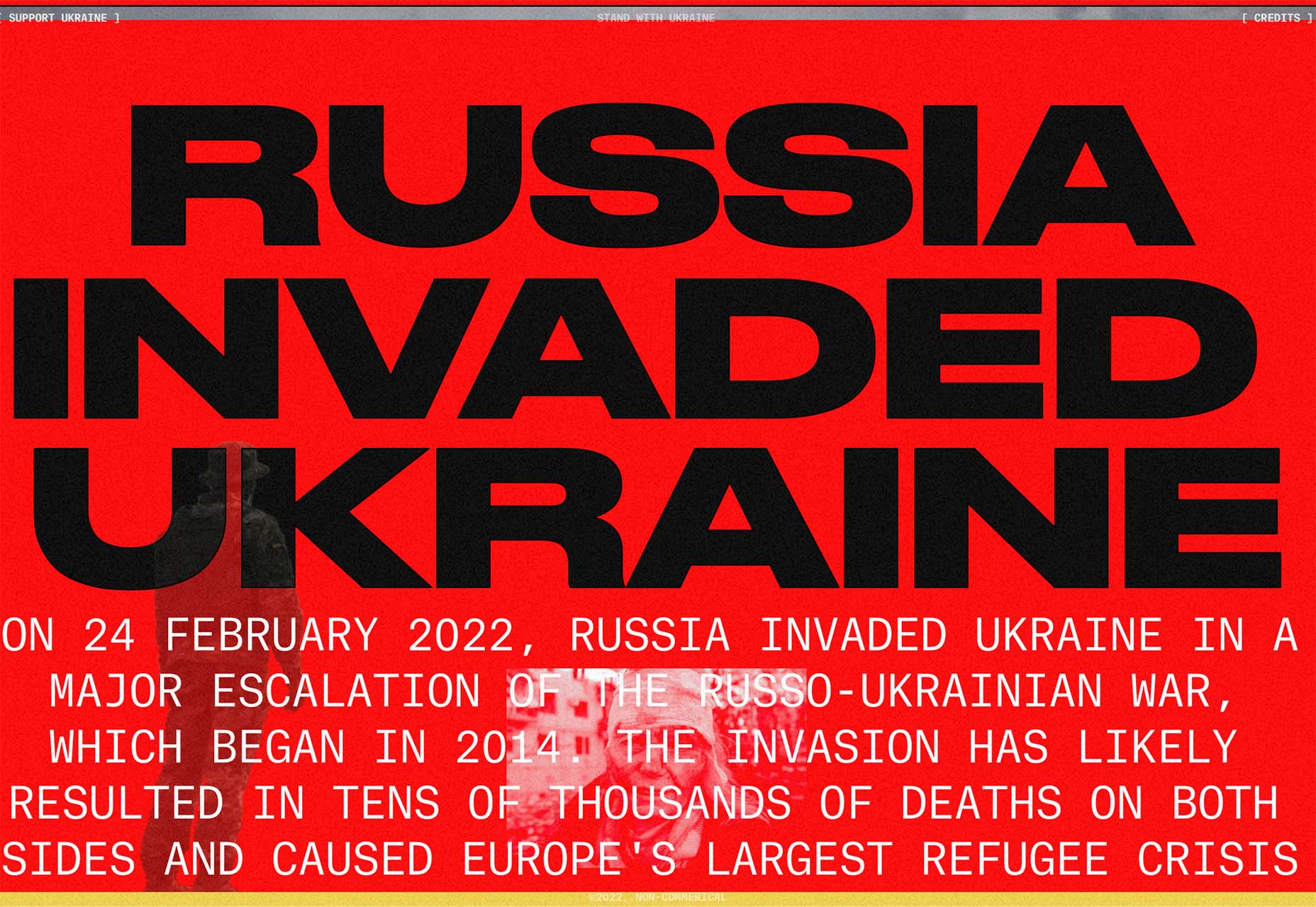
Russia Invaded Ukraine is a perfect use of red as a color that invokes feelings of passion with content to explain the conflict. Red can be a charged color; here, that’s precisely the intent.
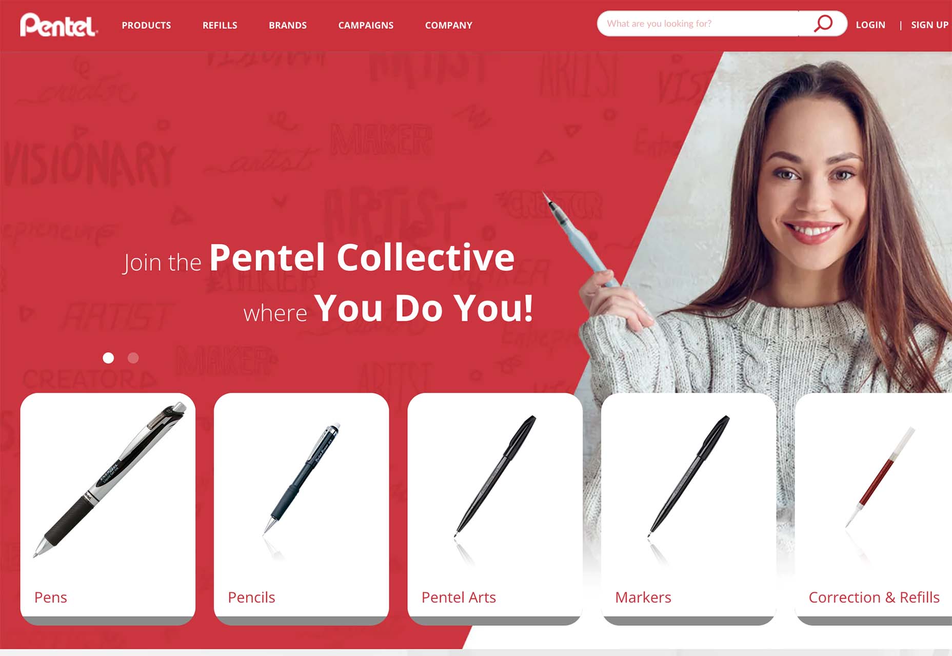
Pentel uses a red background that’s a little softer than the previous examples. Here, red is a brand color, and they use the background to help draw attention to items and elements on the site. The red carries below the scroll as well to keep the theme moving.
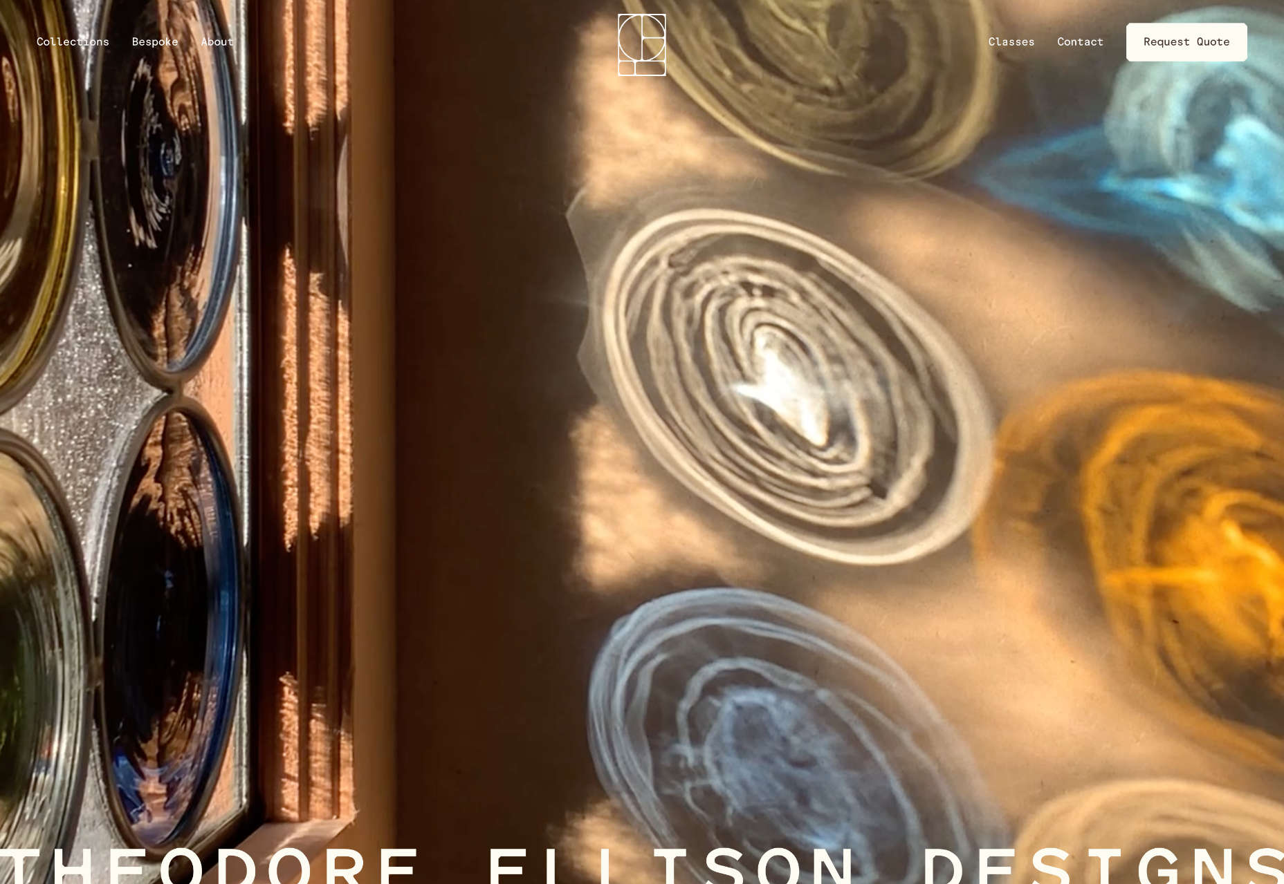
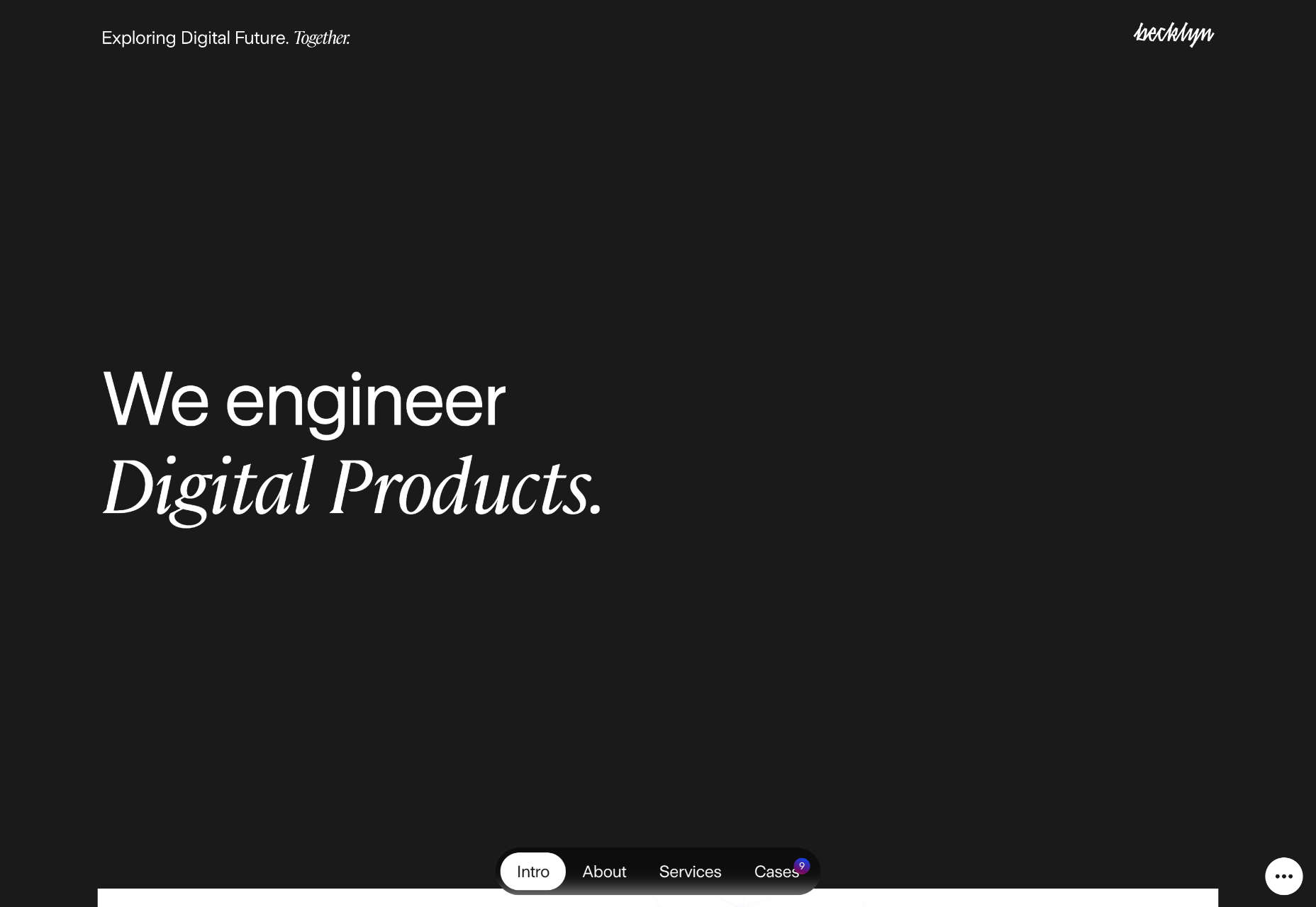
2. 3D Icons and Graphics
Three-dimensional elements seem to keep ebbing and flowing with designers. We see a lot of 3D in projects, and then it seems to vanish again. It’s like we haven’t really figured out how to use it well or in a way that works with the content of various designs.
Admittedly, 3D icons, graphics, and illustrations can be difficult to create and use. Often they look a bit light and don’t go with all kinds of content. Therefore, they don’t get used that often.
Each of these projects takes a different approach:
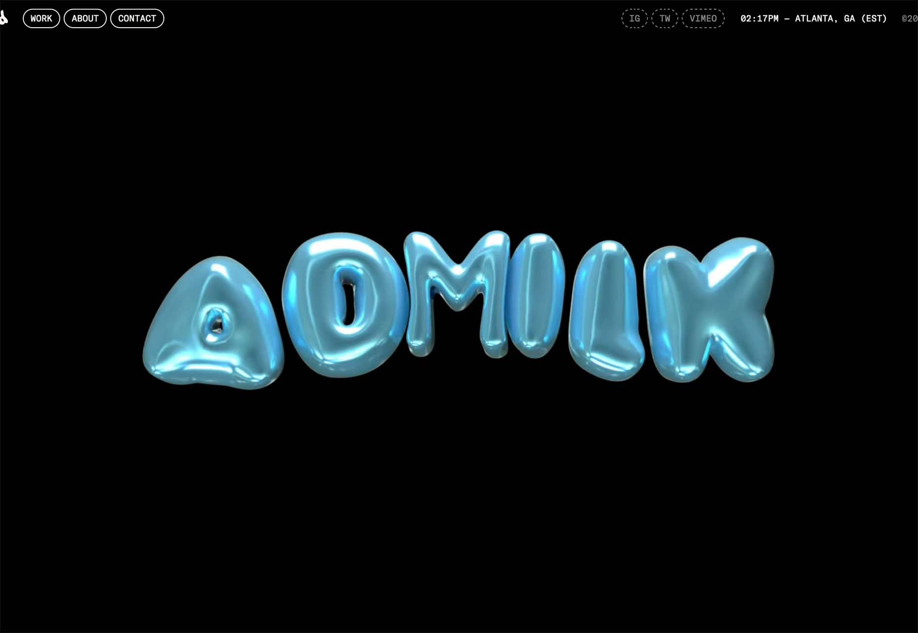
Admilk goes all in with a series of 3D animations featuring the brand name. They are fun, light, and a bit unexpected. The graphics include objects that look like balloons, milk and cereal, and grass with flowers. (Click through to see each one.)
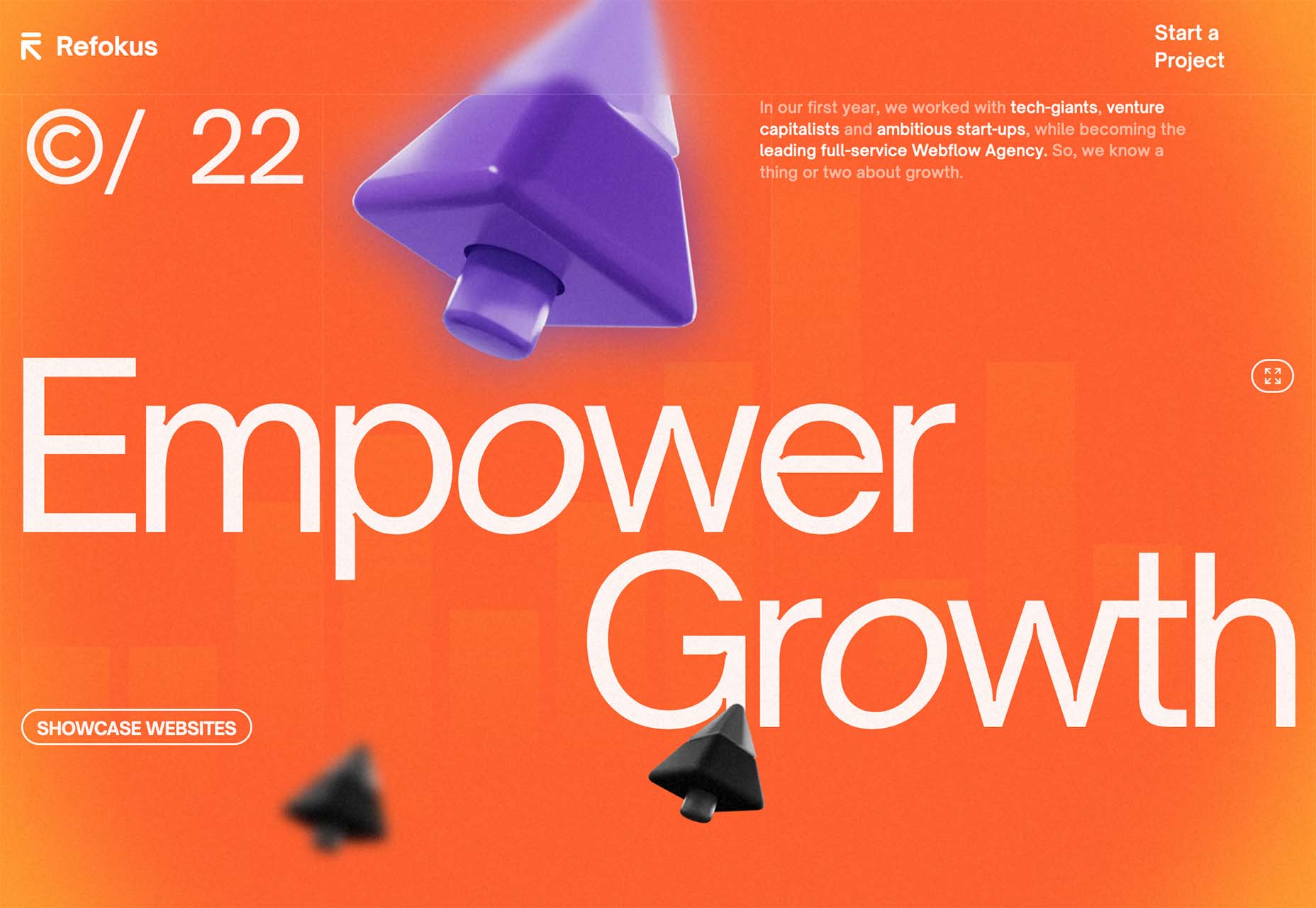
Refokus uses three-dimensional objects that move on a scroll to create directional flow and visual interest in a space where there’s not much else in terms of art. The objects stick with the aesthetic on the scroll and create an interesting element that carries you through the design without overwhelming you with tricks.
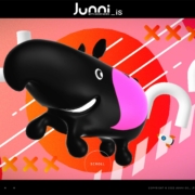
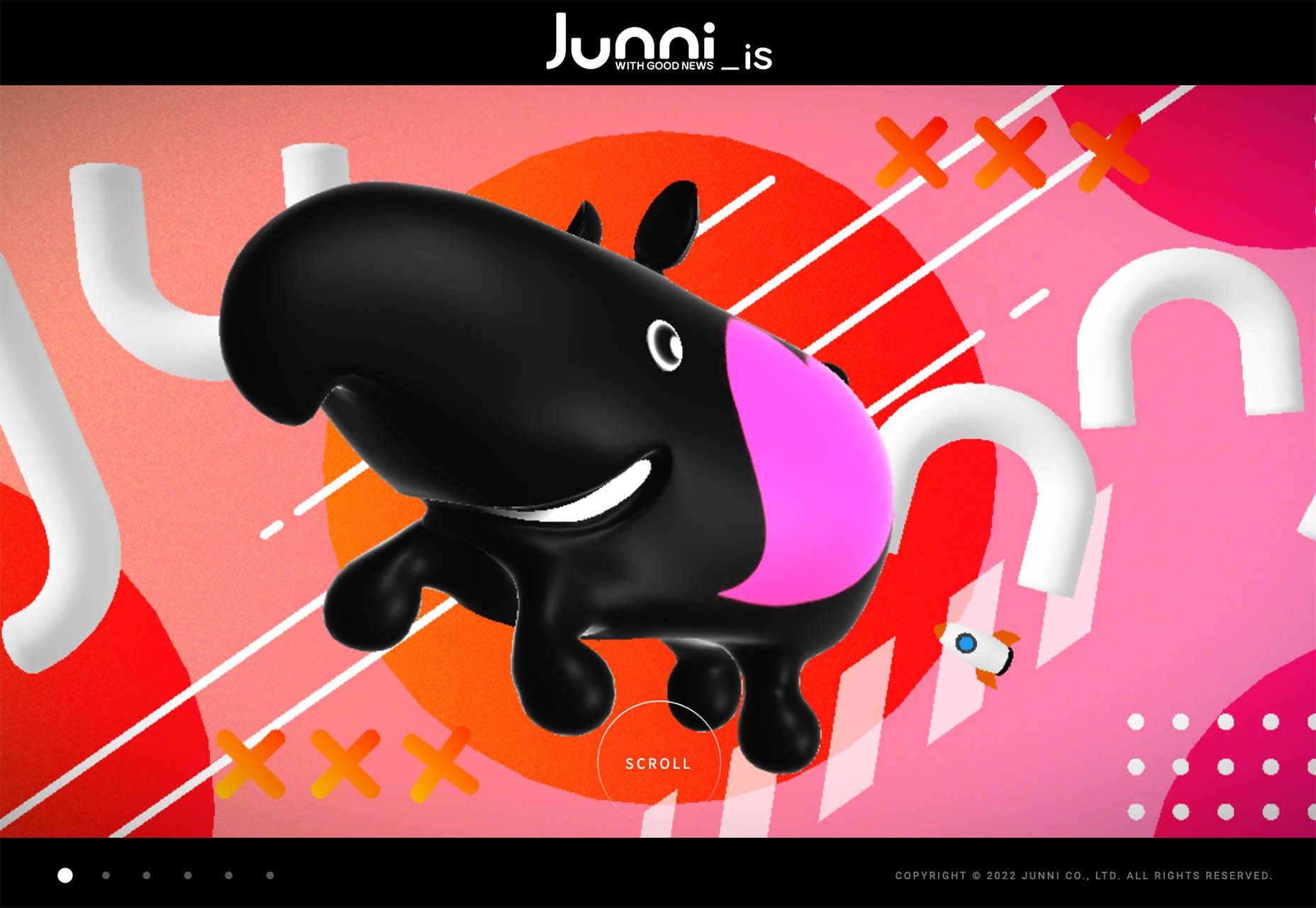
Junni is one of those website designs that goes all in with 3D. This illustrated bubble style of graphics is beginning to be a 3D trend in itself as a style that’s being used more and more with icons and even emojis. It has a light feel, and the animation almost makes it seem silly and somewhat childish.
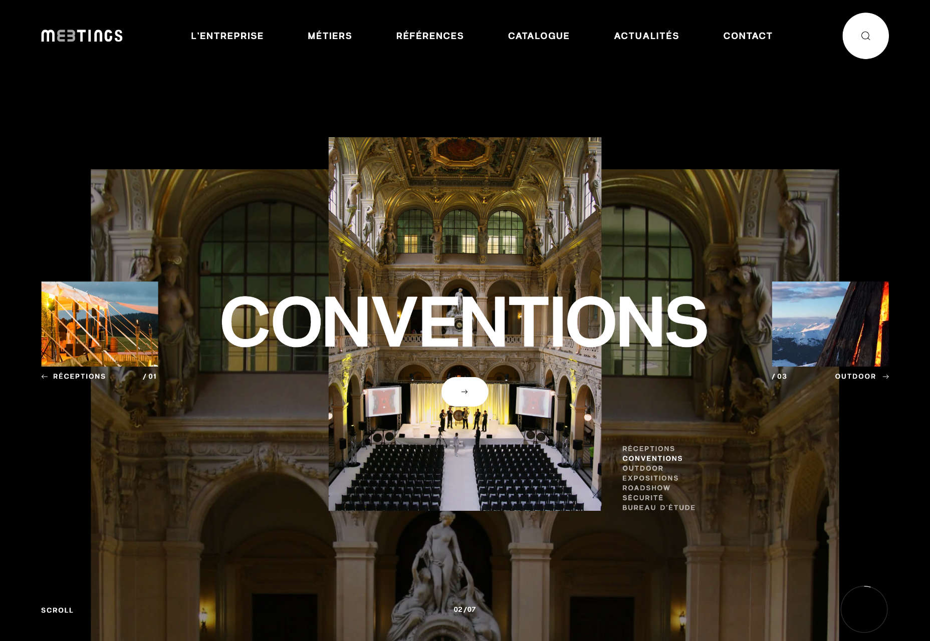
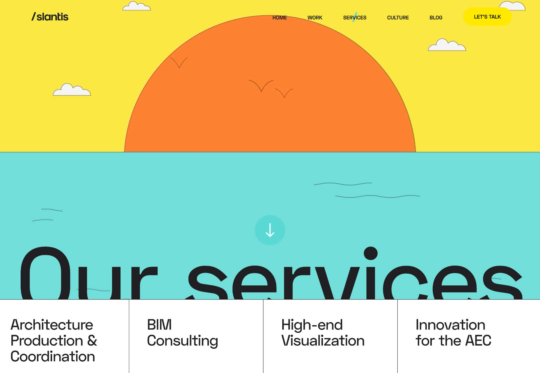
3. Long Focal Depth
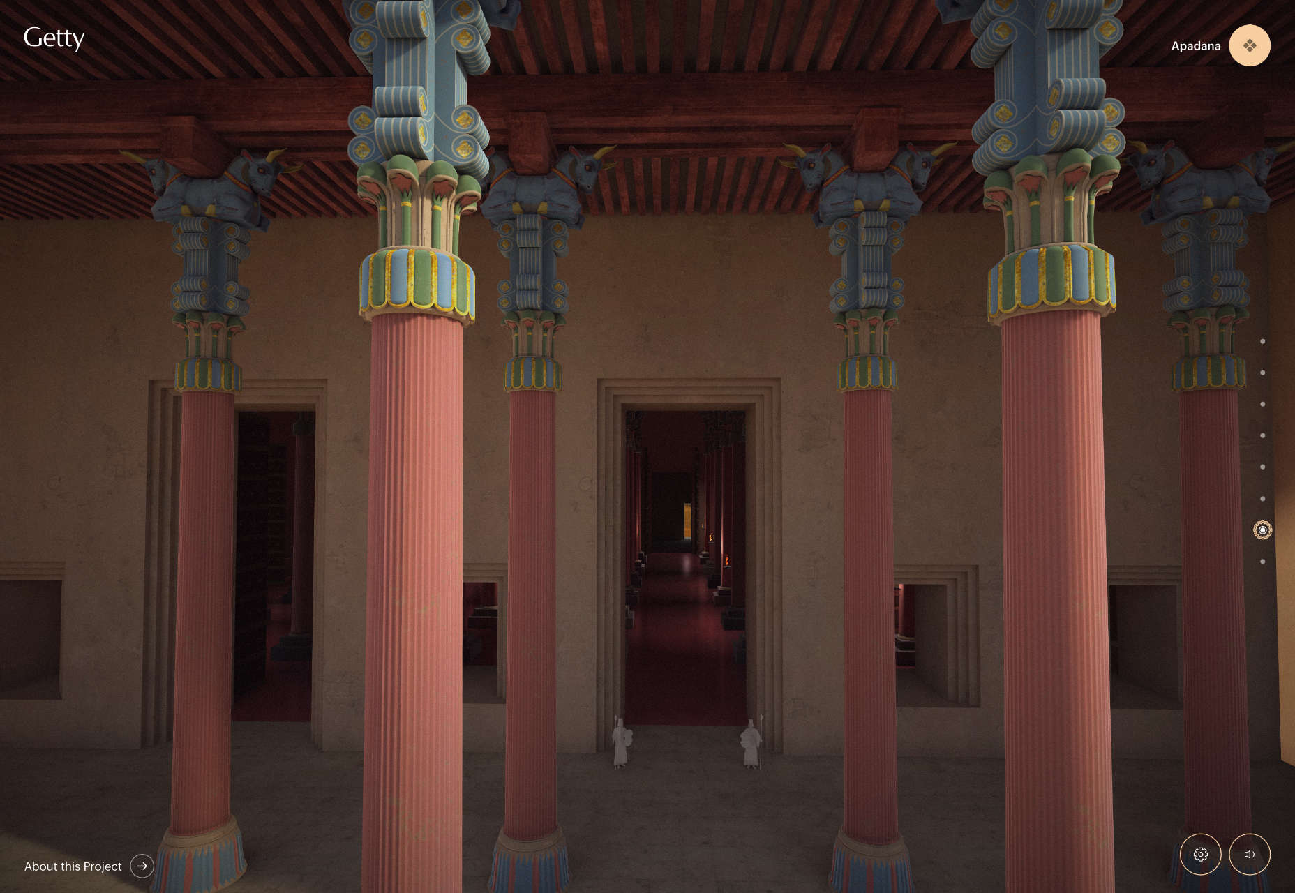
It’s been a while since a true photography or videography trend made this roundup, but there are so many instance of this image/video style in projects it can’t be ignored. Long focal depth is almost everywhere, from travel sites to architecture to e-commerce.
Long focal depth or depth of field allows the image to show a lot of space in an image in a way that’s sharp and viewable. Depth of field, in photography terms, is the distance between the closest and farthest objects in an image that are acceptably sharp.
In this trend, each website features a strong image with plenty of depth of field. The image can be still or moving, and the image is the thing that really draws you into the design.
What’s great about this trend is that you can see a lot of a scene and even feel like you are part of it. It’s an engaging visual concept that can work for a variety of purposes.
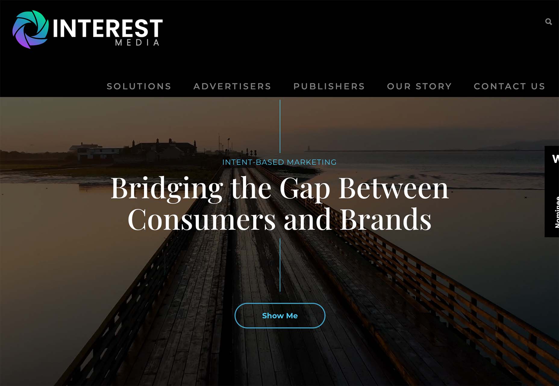
Interest Media uses a video reel that slowly zooms even further out. The image is lovely, and with the text overlay is easy to read and understand. It almost feels like you are walking backward on the bridge in the video.
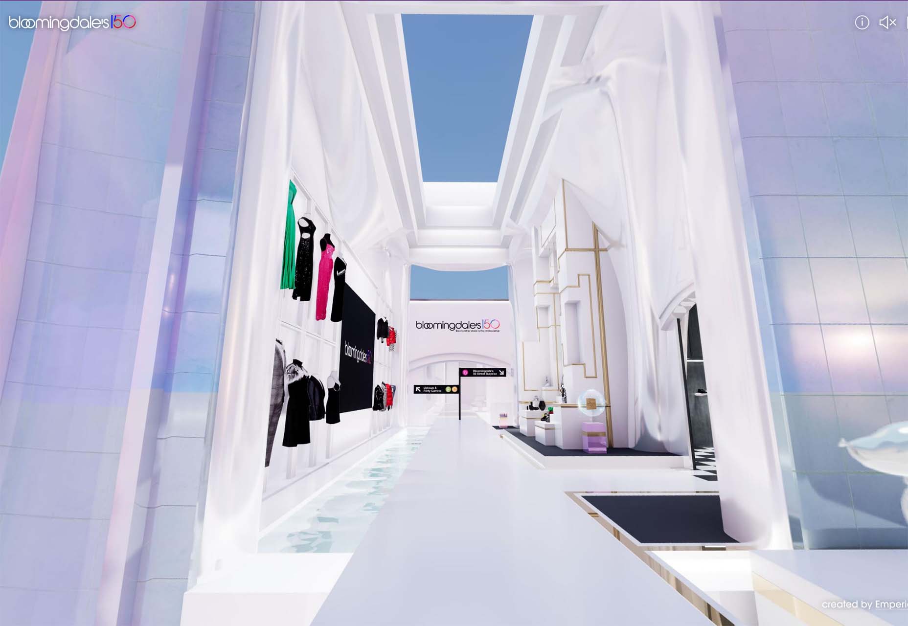
Bloomingdales uses an immersive video with plenty of depth and virtual reality elements to create an immersive shopping experience. It makes you feel like you are in the store via the website and encourages shopping. It’s a fun way for the retailer to showcase its 150th anniversary.
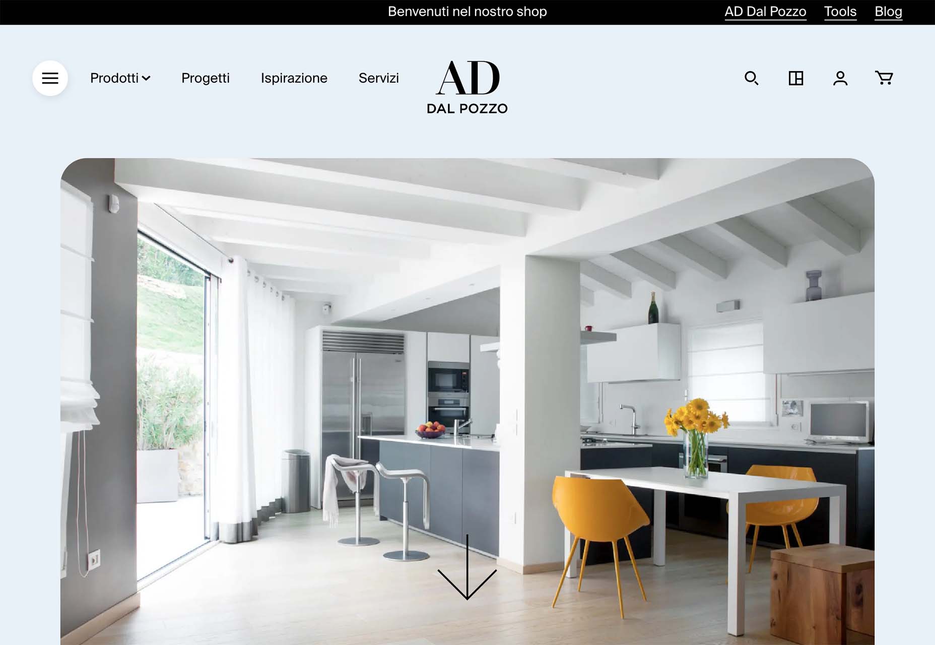
Arredamento Design uses a photo with a wide focal area to provide interior design inspiration. Note the crisp lines and ease of which you find yourself engaging with the image, or even imagining a room like the one pictured. The effect used in the design, with a zoom on scroll, pulls the user into the image even more. Depth here keeps the motion and zoom from being too much and almost allows you to see more and feel even closer to objects that are further away in the image.
Conclusion
There are two trends here that tend to cross over into one another: The color red is everywhere and having a major emergence this fall as a dominant hue and depth, and three-dimensional focus is everywhere.
Both are highly usable design elements that can be incorporated easily, making them even more likely to continue to gain prominence in projects.
The post 3 Essential Design Trends, November 2022 first appeared on Webdesigner Depot.
 The design world fluctuates back and forth, swerving between love and hate for different design trends. Sometimes we see a wide range of approaches, and sometimes designers all hop on the same idea.