 So here we are, in a brand spanking new year—time for looking forward with fresh ideas and renewed hope for the year ahead. We are kicking off 2022 with a mixed bag and, we hope, something for everyone.
Whether you’re looking for inspiration to update your site or a fresh approach to work for a new client or want to spend a little while browsing around some corners of the internet you might not usually, welcome to the first collection of the year. Enjoy!
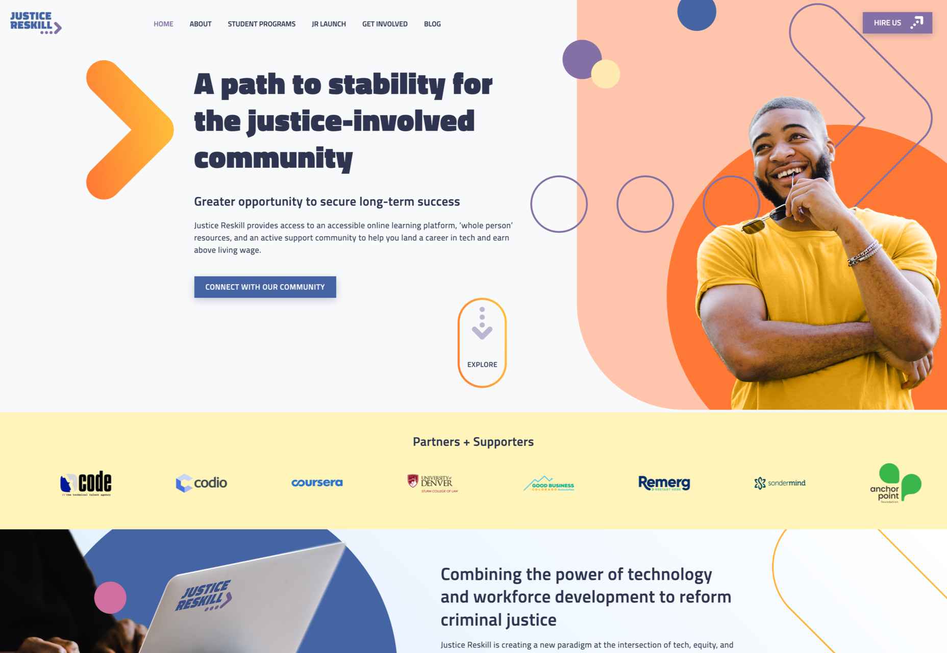
Justice Reskill
Justice Reskill offers a learning platform and support for people who have been through the justice system. Information is presented clearly in a positive, uplifting tone, emphasized by a bright color scheme and friendly type.
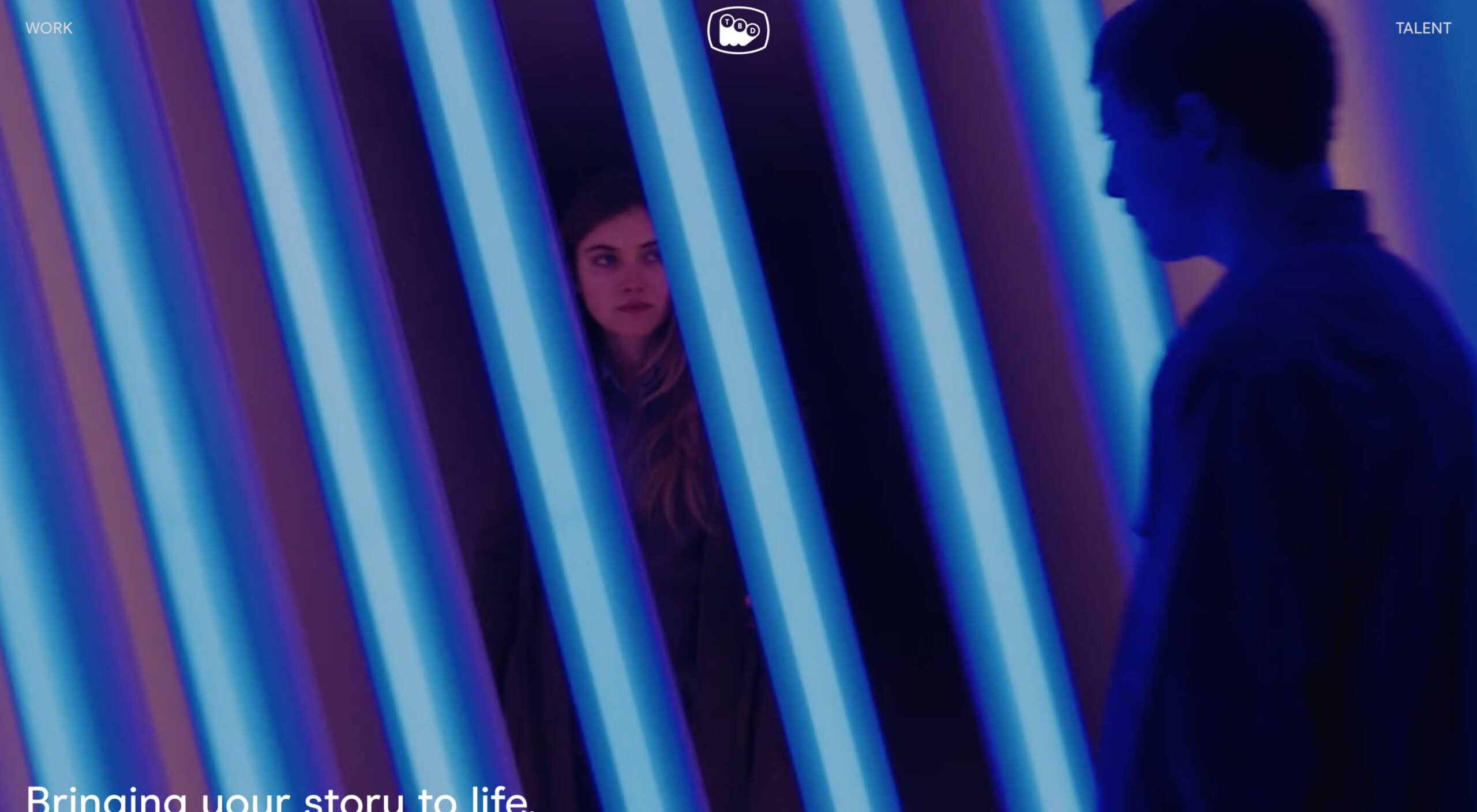
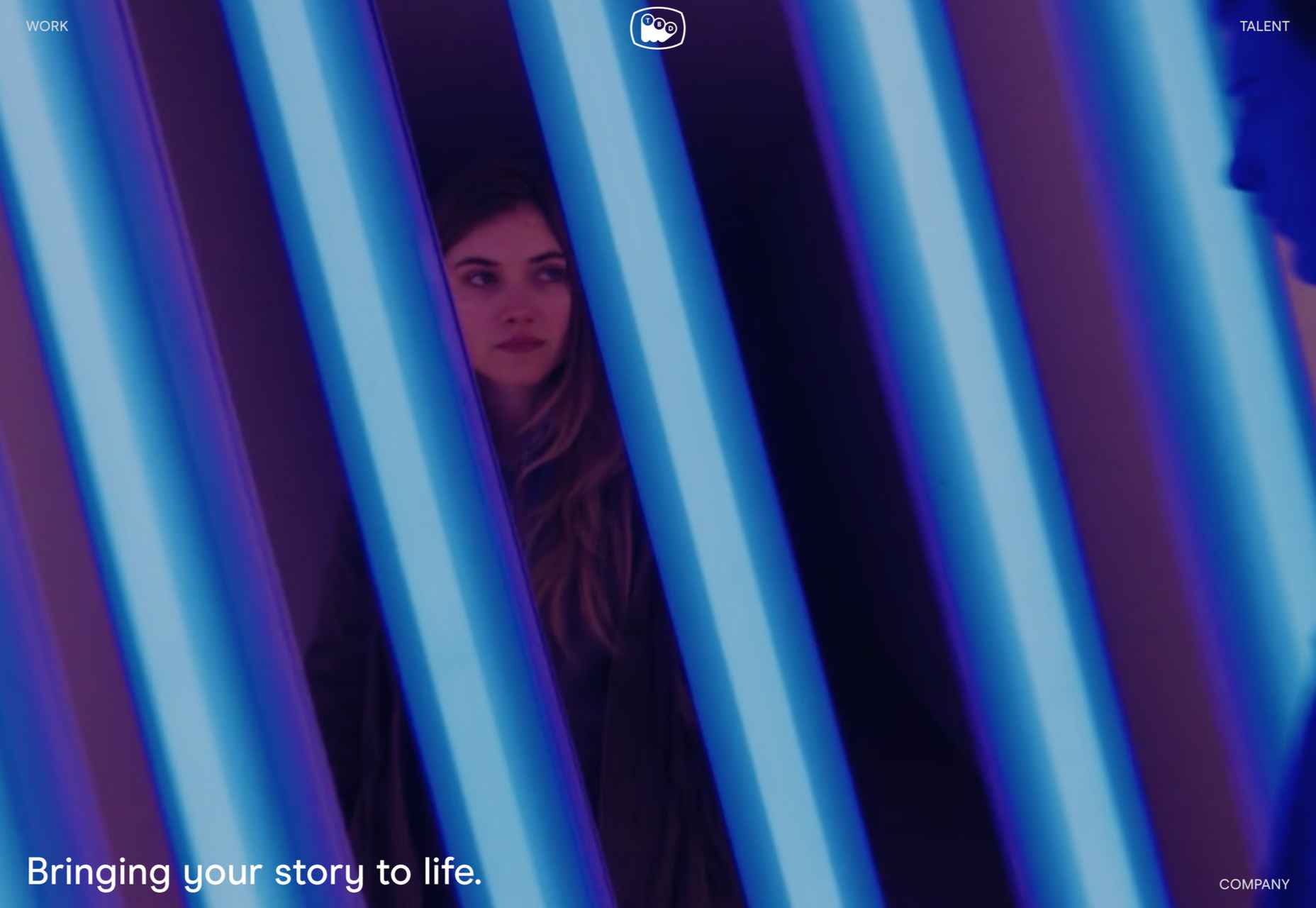
TBD Post
TBD Post’s site is fuss-free, clean, and pleasant to navigate. Work is well presented, in an organized way, with just the right amount of supplementary information.
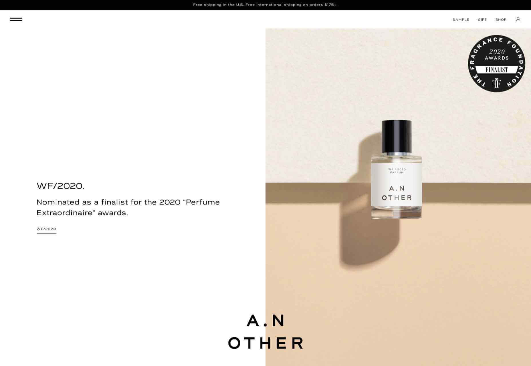
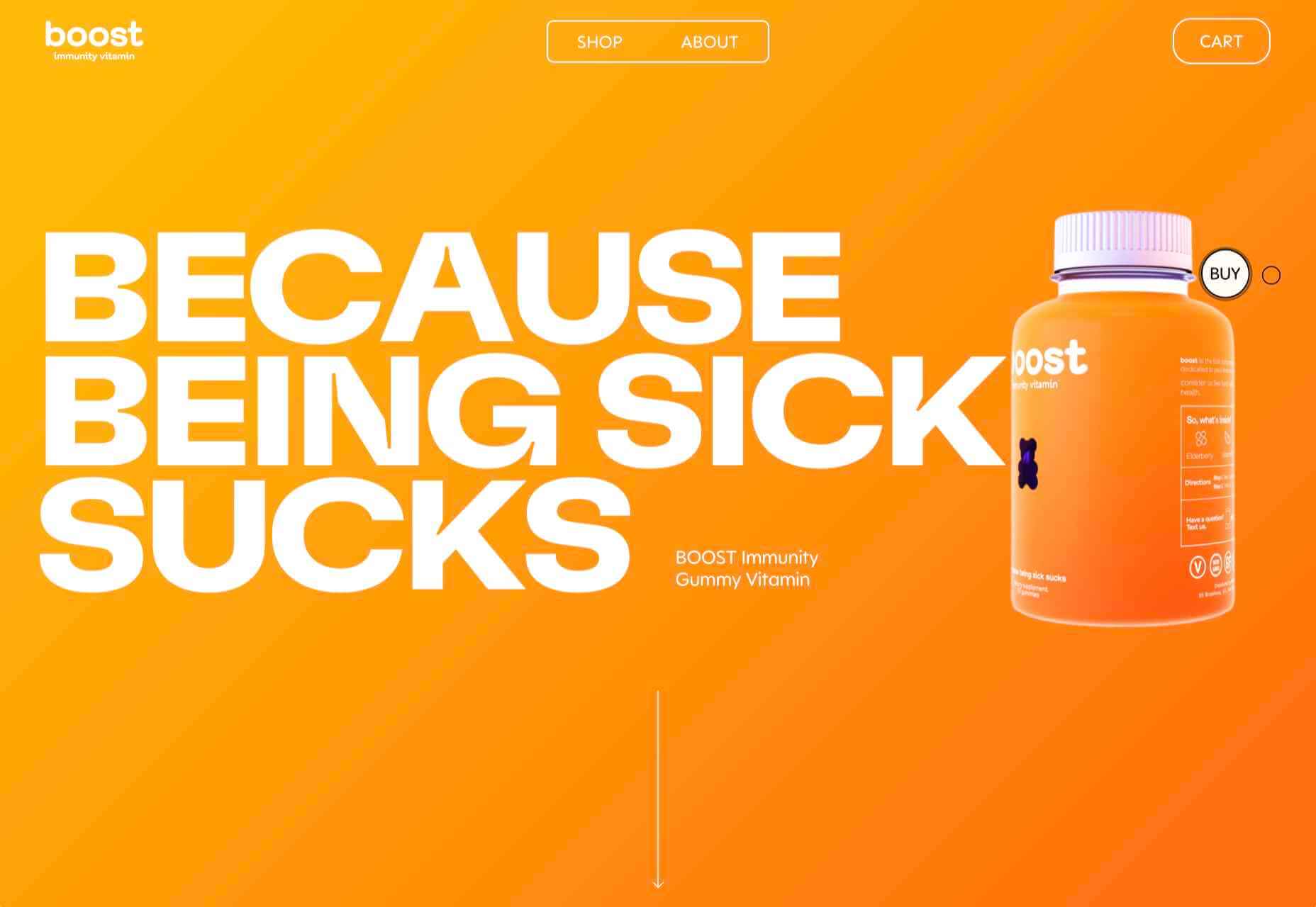
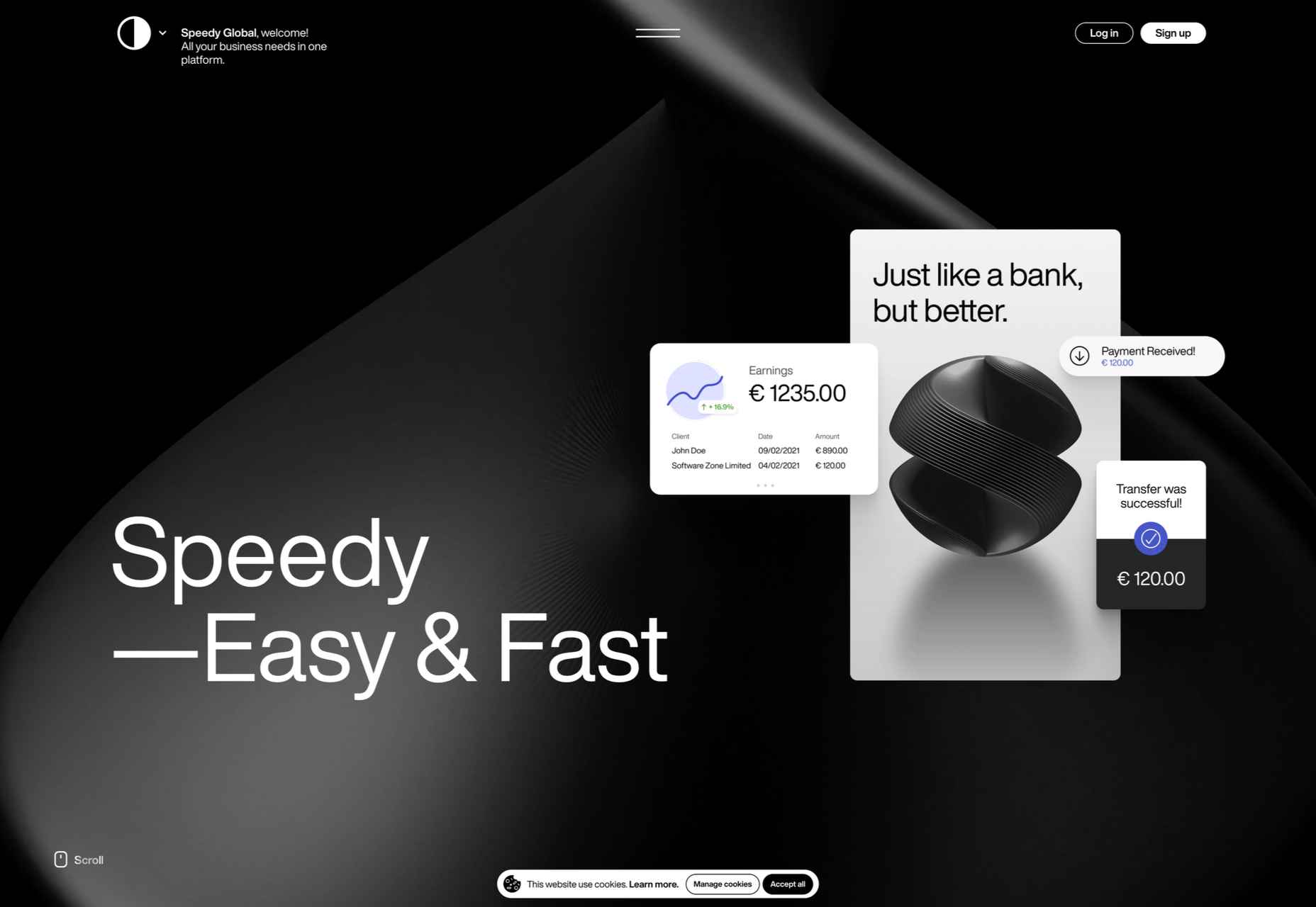
Speedy
Speedy is an online business bank, and this is a pretty standard, slick fin-tech site for the most part. The added extra is that the five versions of the site–with the same content in each–have different color accents based on the flag of the specific country listed.
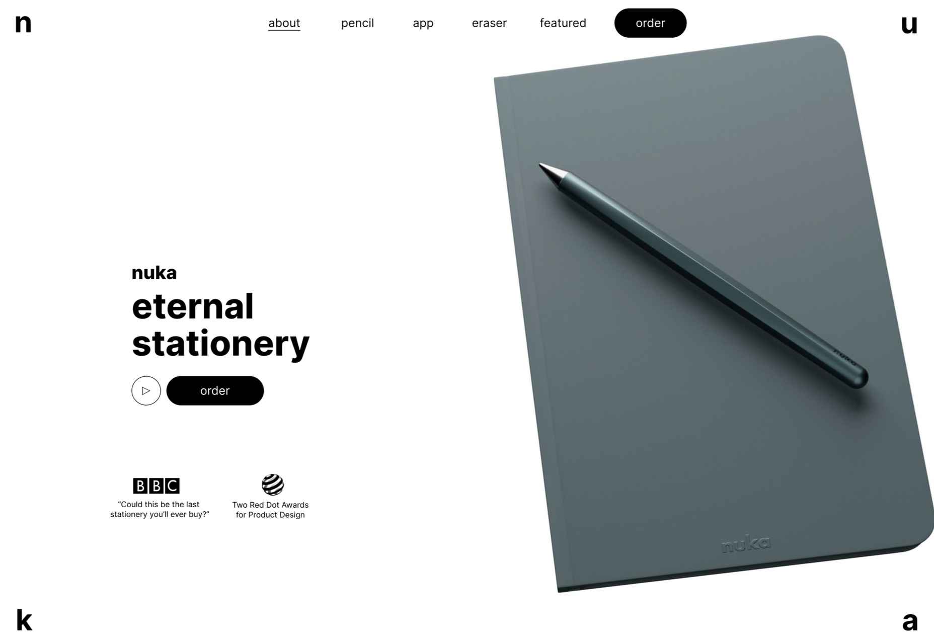
Nuka
This site for Nuka eternal stationery is a beautifully simple single page. The use of handwritten type in places adds an intimacy while emphasizing the nature of the products.
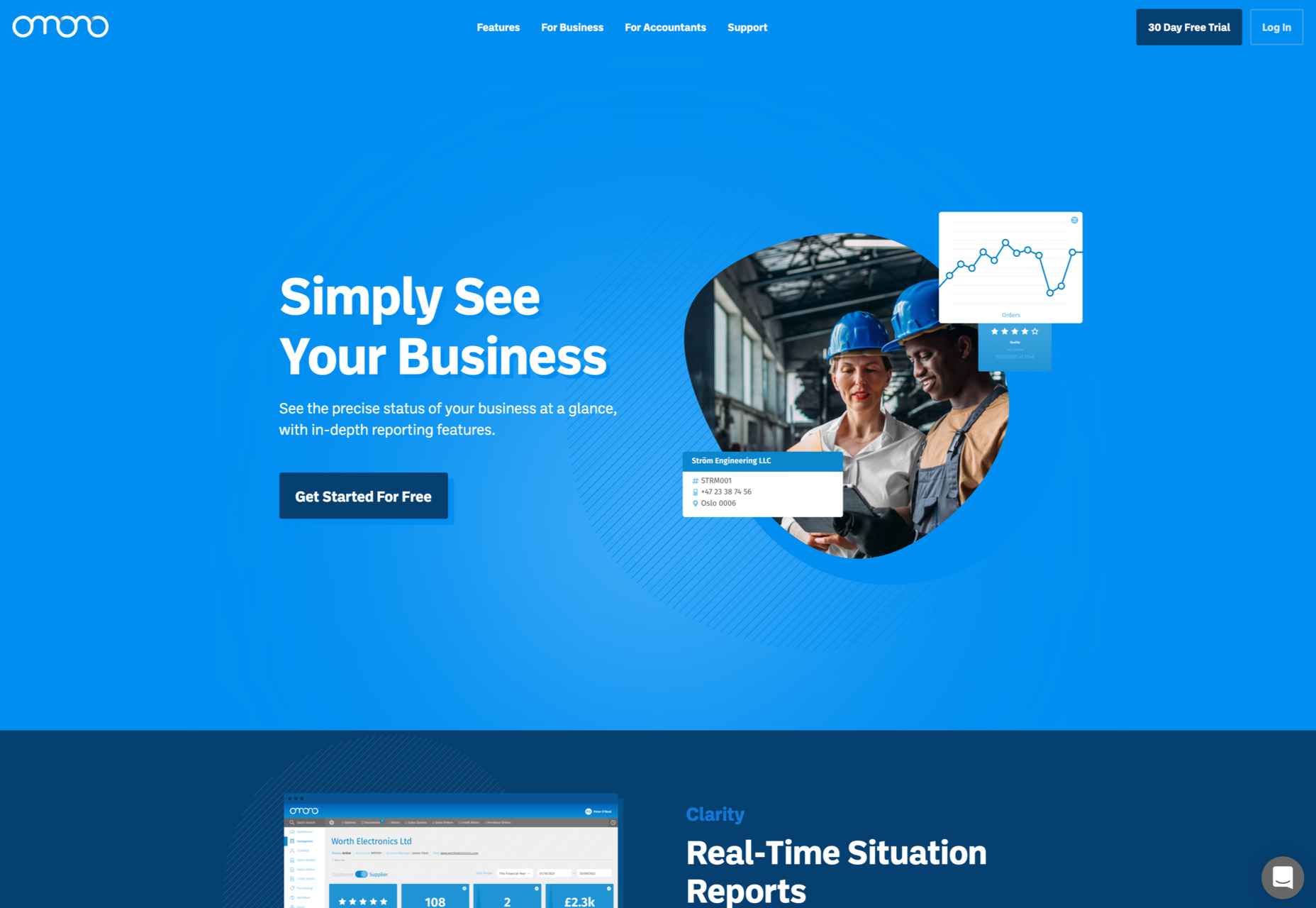
Omono
This site for online business management app Omono presents a lot of information clearly, and with a calmness projected by the use of blues and greys and subtle animation.
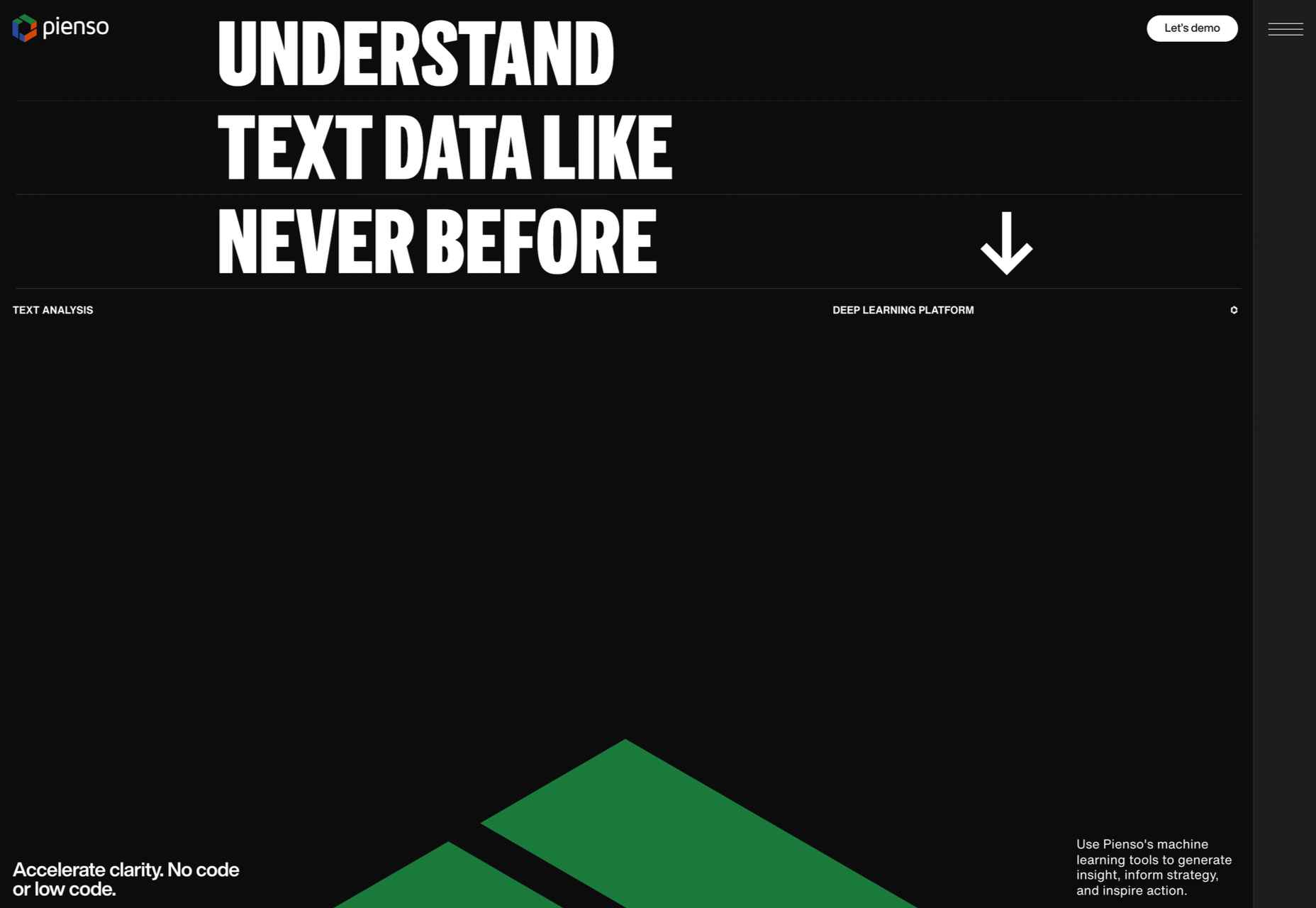
Pienso
A combination of bold type, a slightly tweaked red, green, and blue color scheme, and on-scroll animations makes this site for Pienso pop.
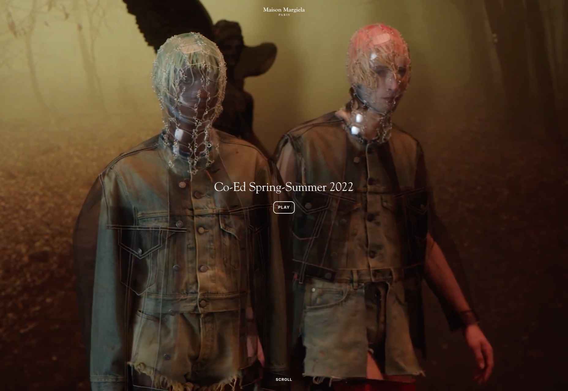
Maison Margiela
Maison Margiela fully embraces the digital alternative to a live catwalk with this blend of single video and edited clips.
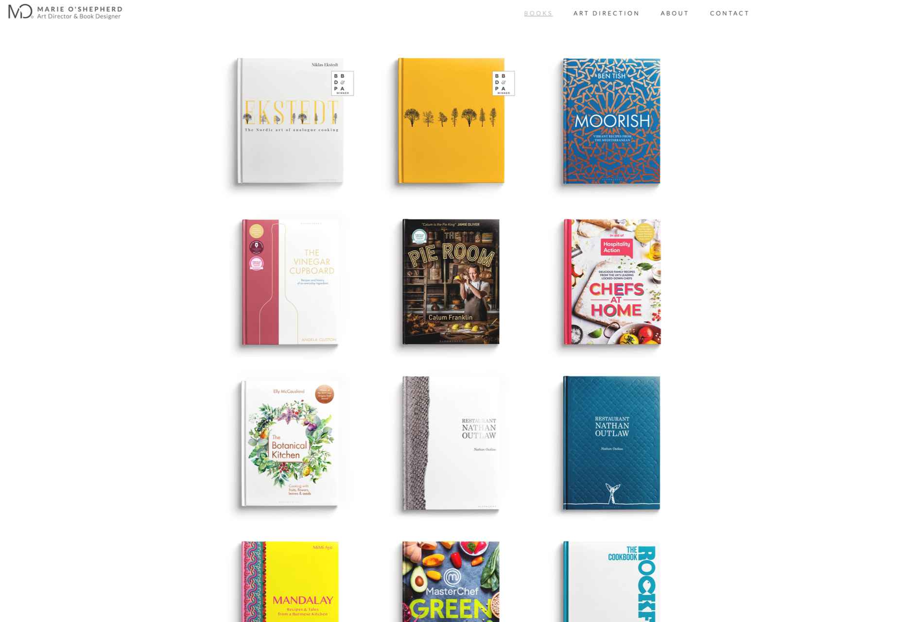
Marie O’Shepherd
This portfolio site for book designer and art director Marie O’Shepherd takes a minimal approach and allows the work to take center stage.
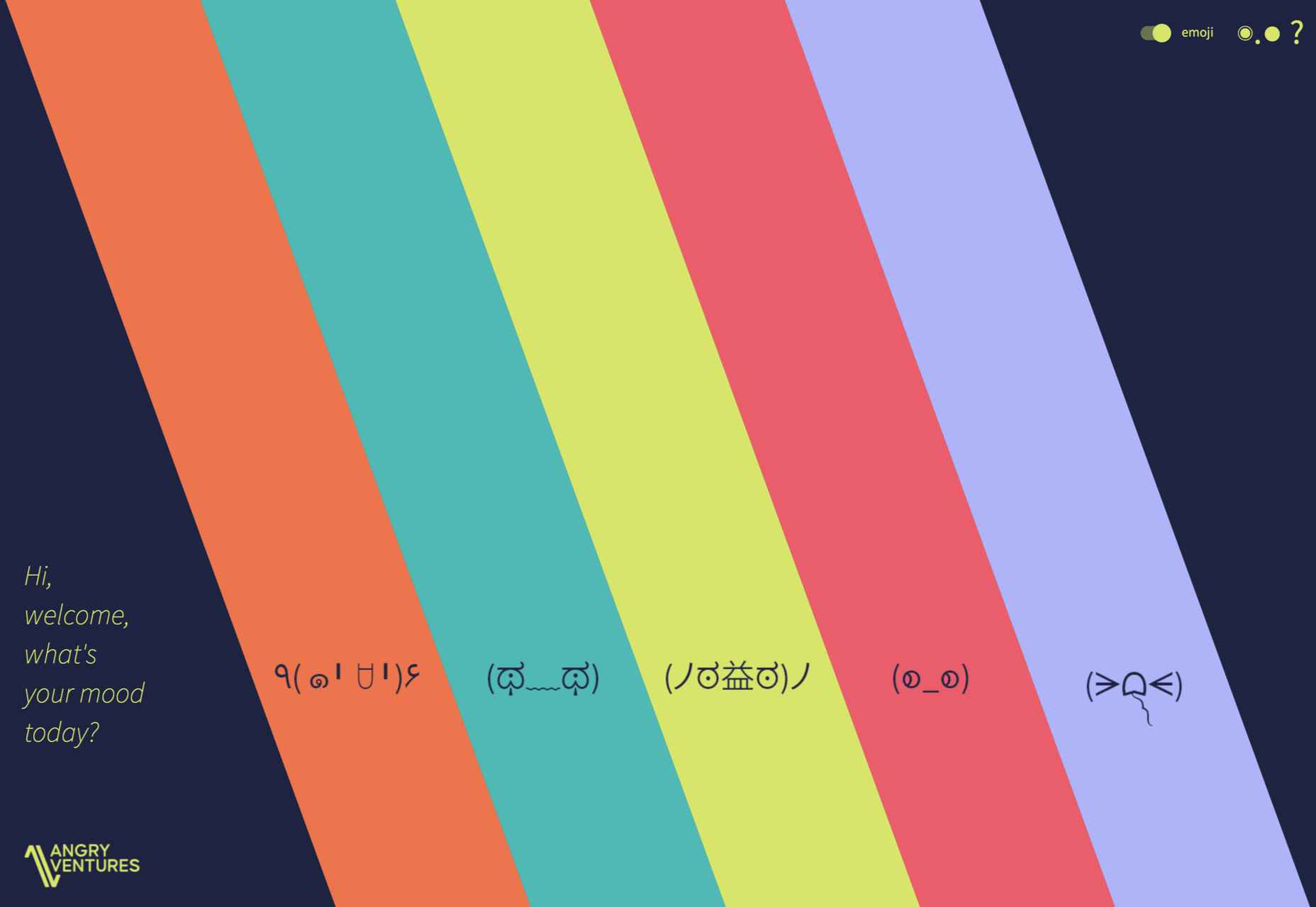
Angry Ventures
Angry Ventures add personality and humor to their site to draw the user in and entertain, while their actual portfolio is only available on request.
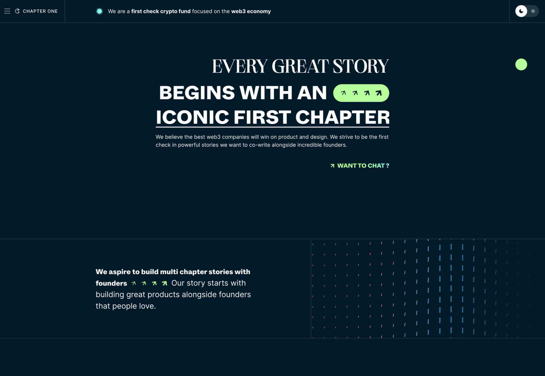
Chapter One
Chapter One’s site has light and dark theme options and some engaging animated graphics.
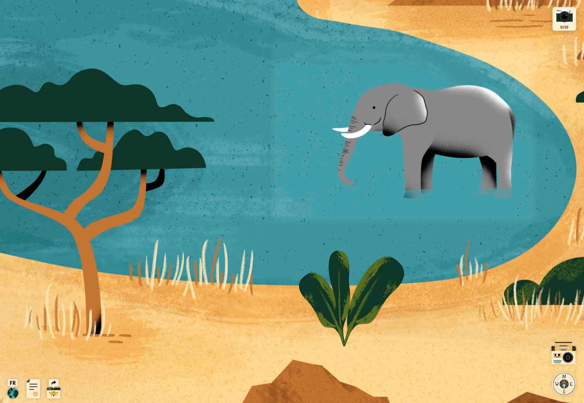
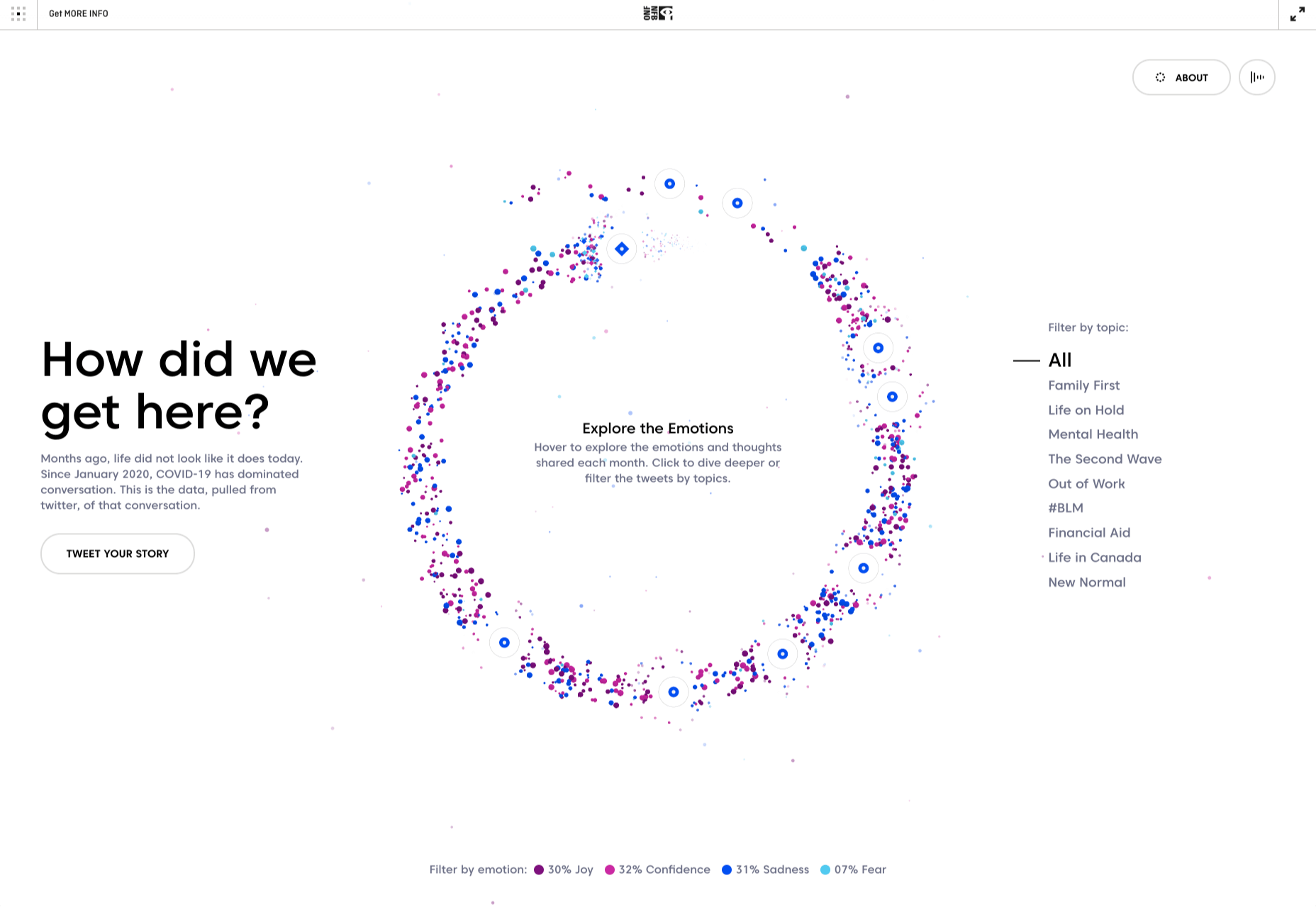
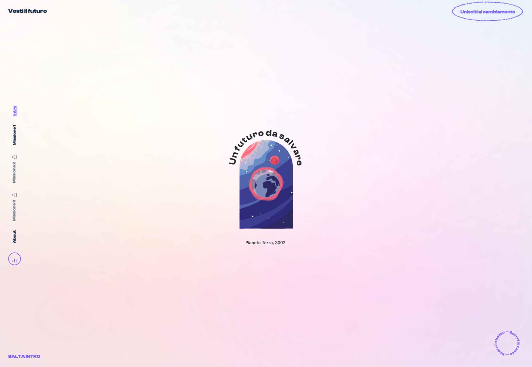
Vesti il Futuro
Vesti il Futuro for Mani Tese uses comic book-style interactive graphics to raise awareness of issues surrounding the environment and fast fashion.
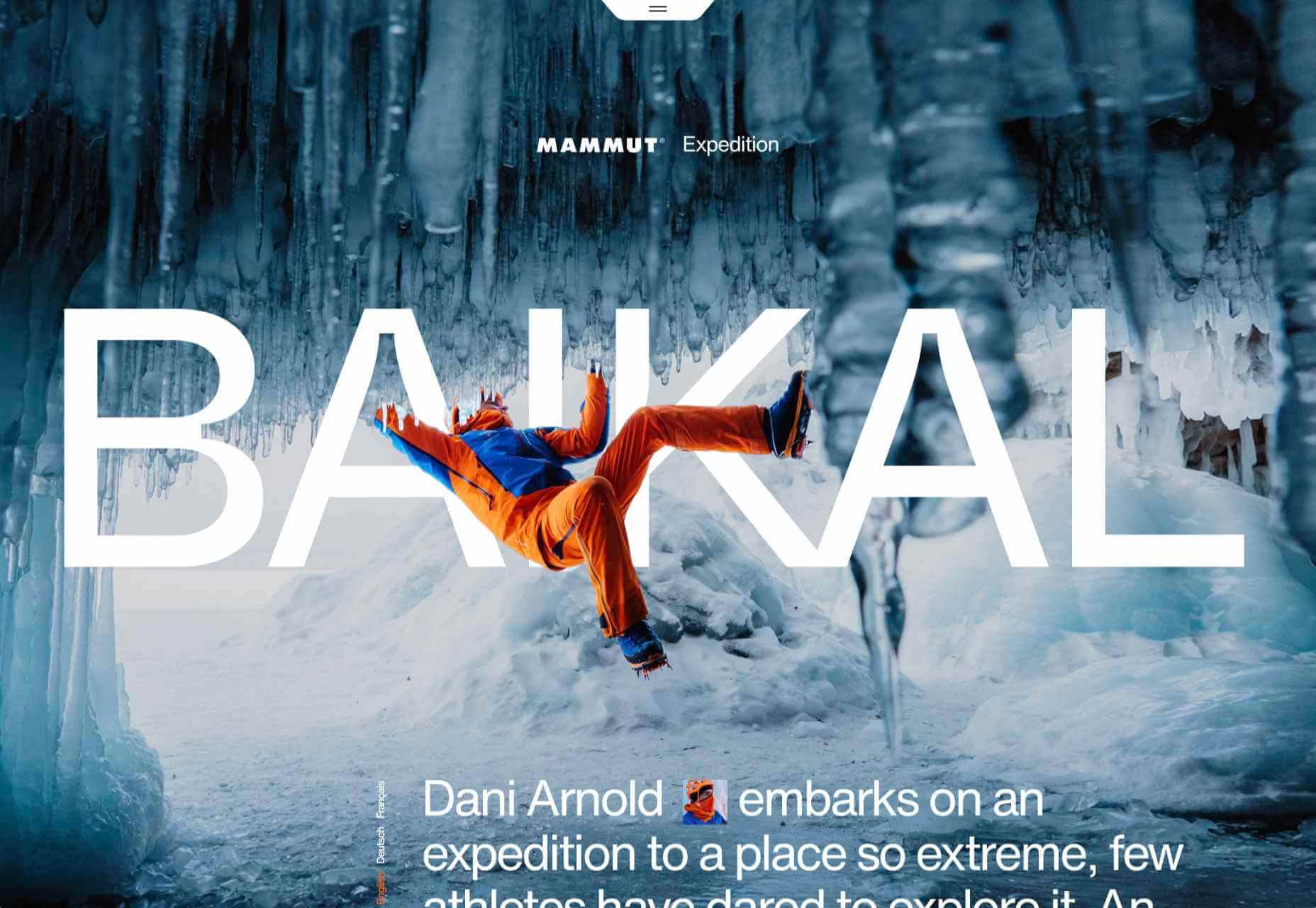
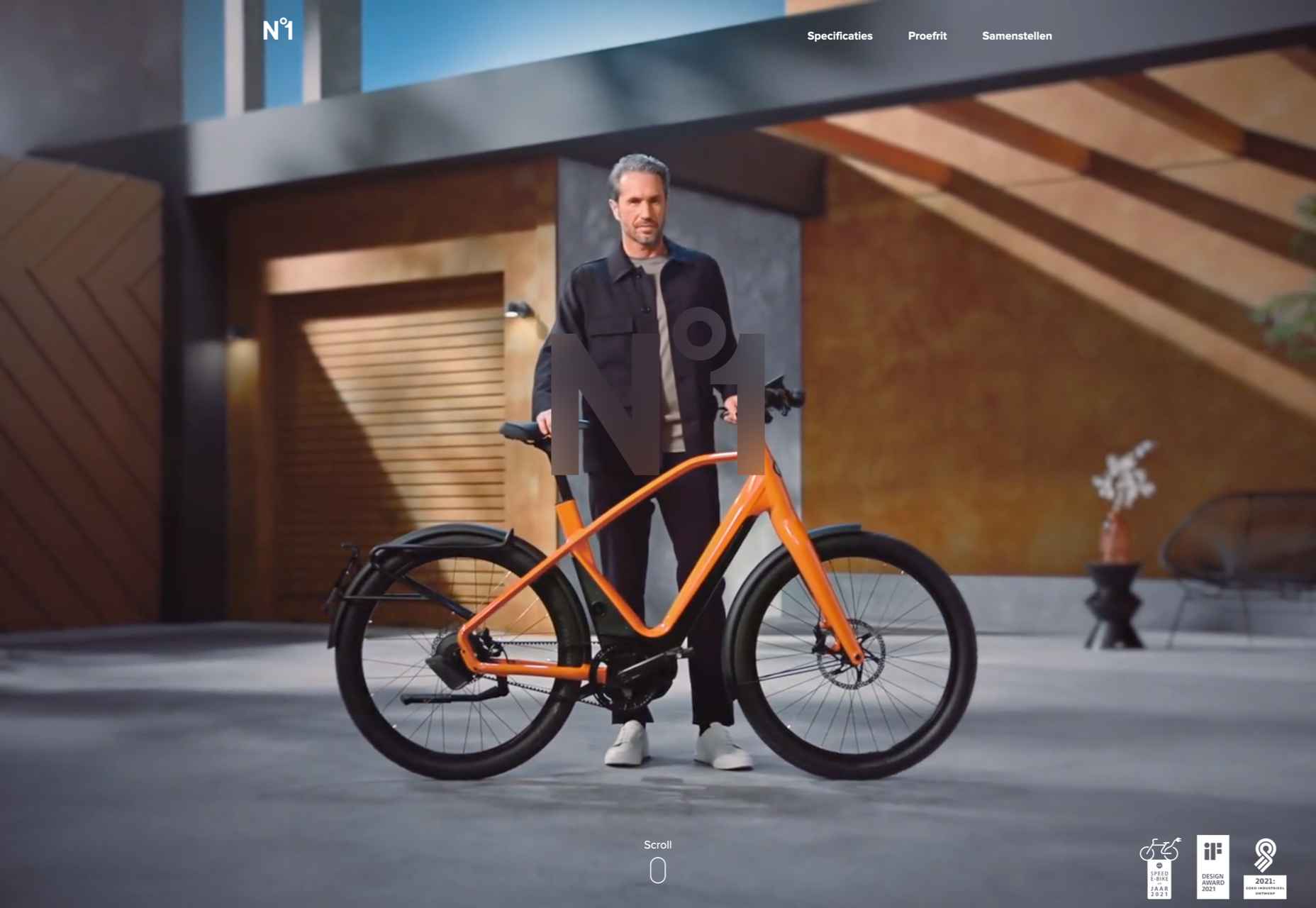
Gazelle No.1
Some scroll-activated video enlivens this single-page site for Gazelle’s No.1 model.
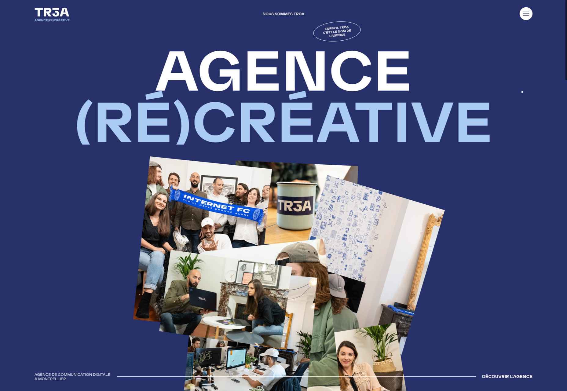
TROA
This site for creative agency Troa is an excellent example of the effectiveness of a monochrome color scheme, and there are some pleasing transitions too.
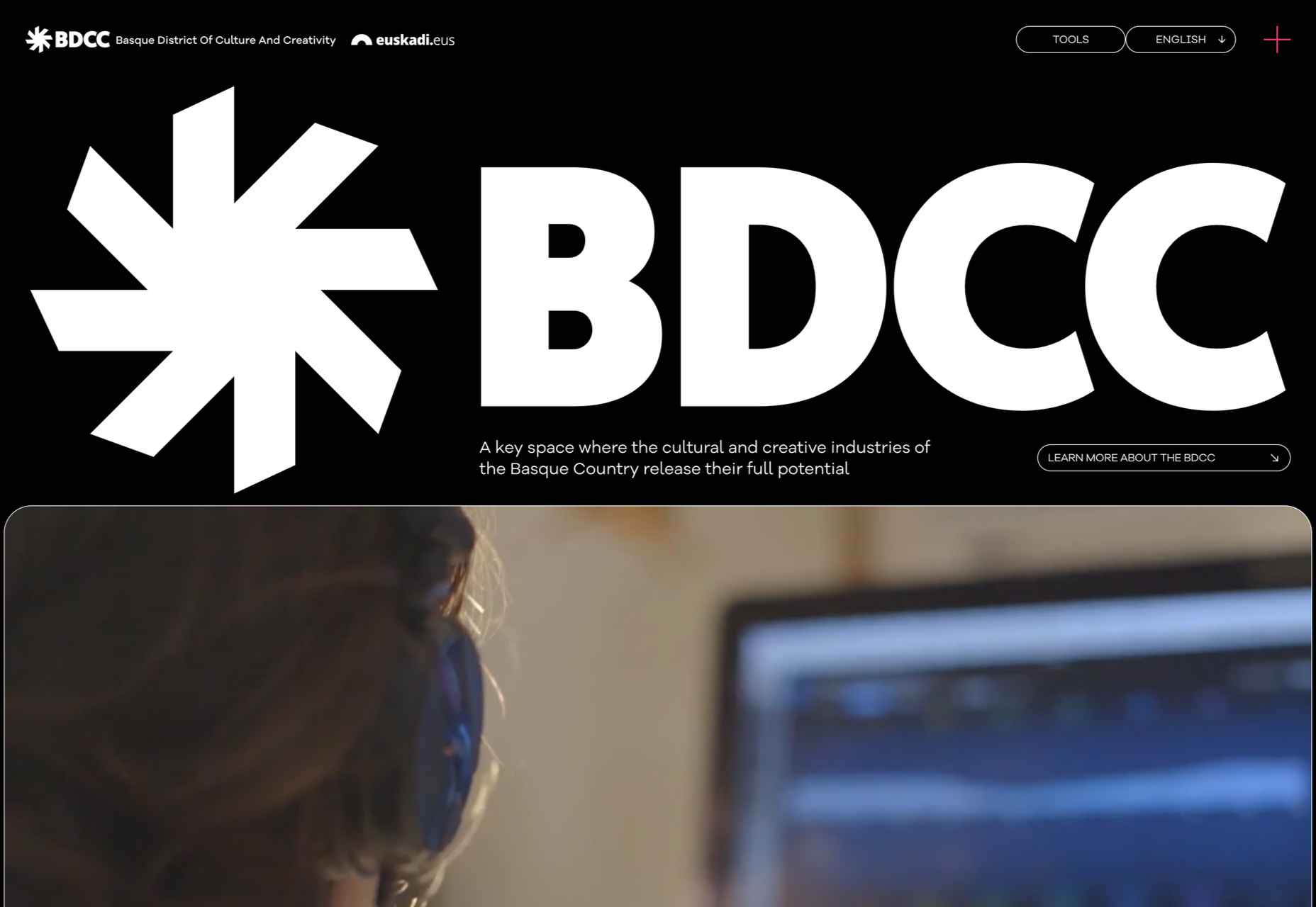
BDCC
BDCC’s site has a bold, slightly jumbled feel that works really well. The falling lozenge menu items are a nice feature.
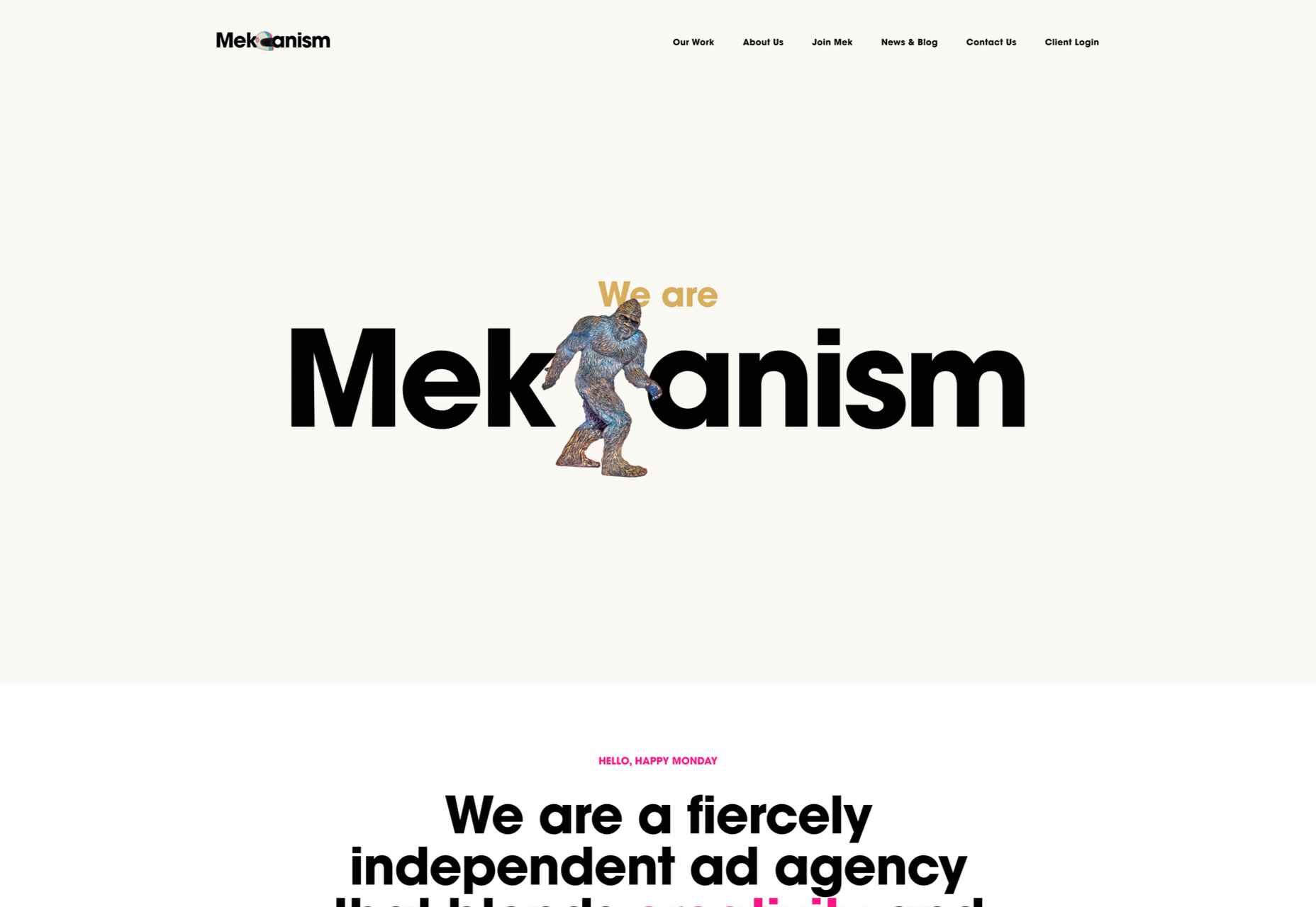
Mekanism
This is a great example of a stylish website for an agency portraying itself as well-established and super polished.
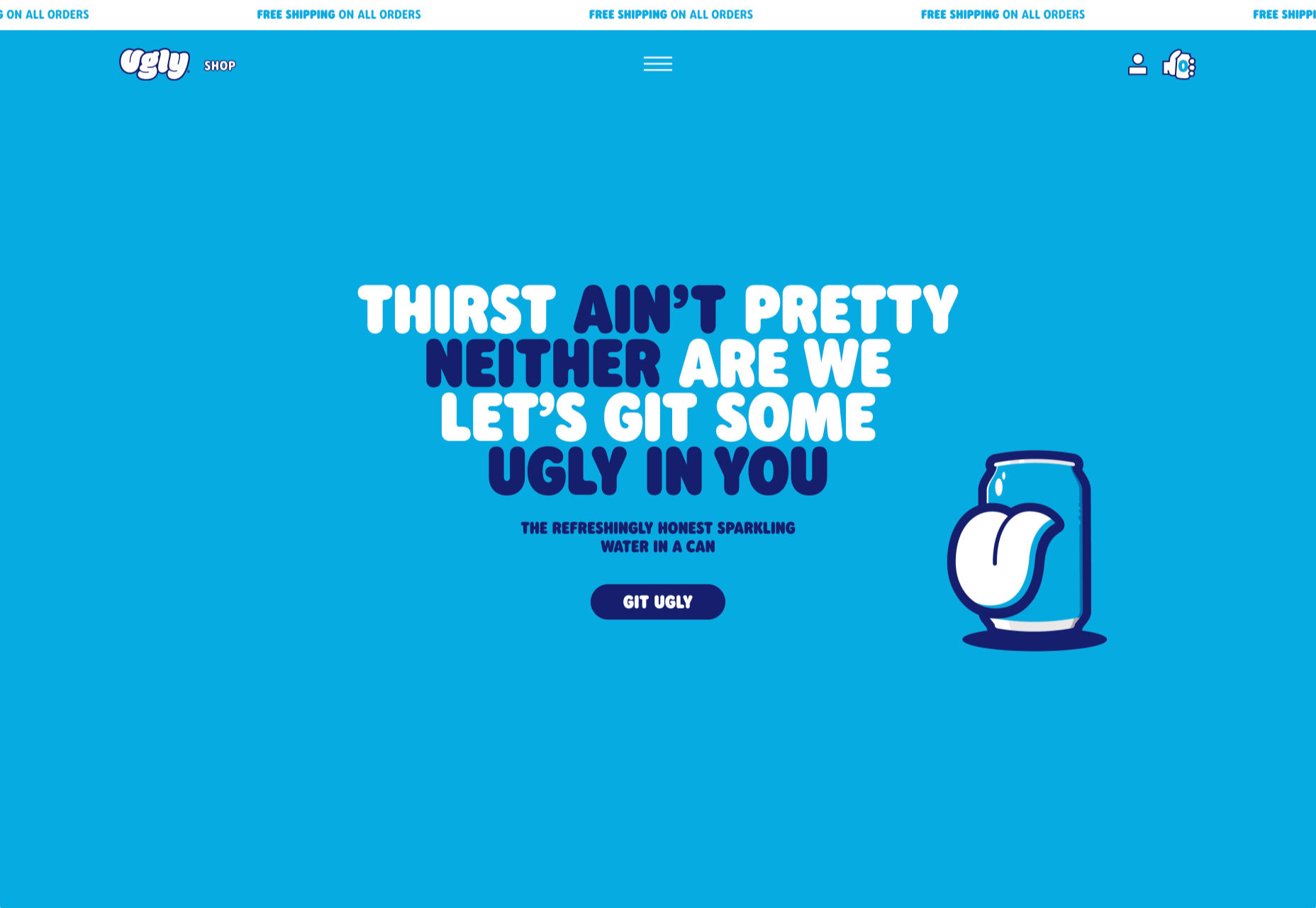
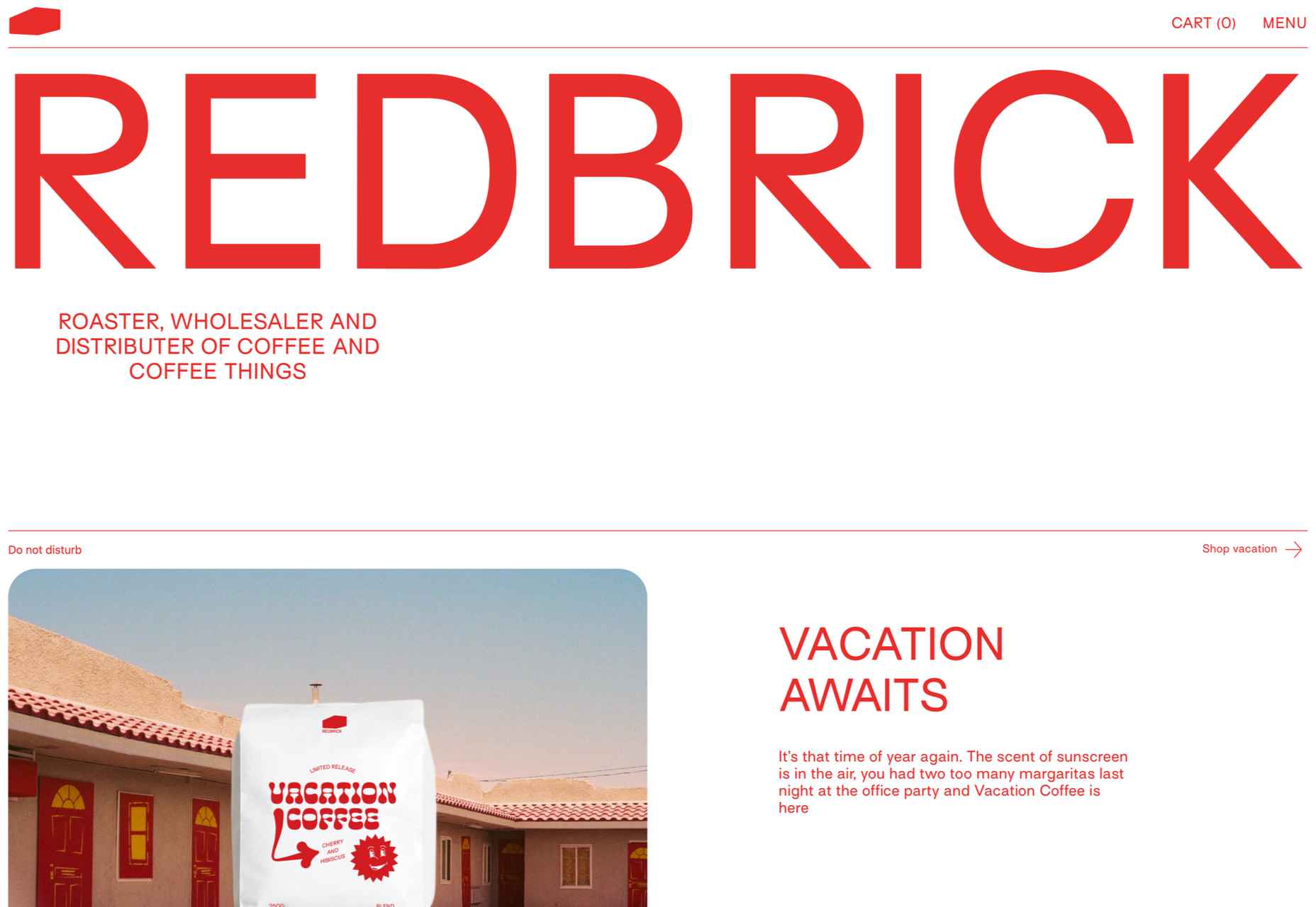
Redbrick
Redbrick’s site has a youthful, vibrant feel with colors that change to match the product branding.
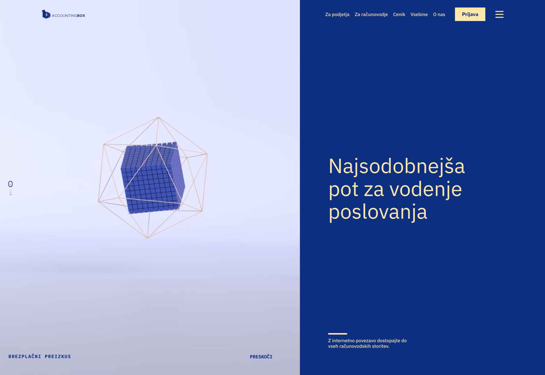
Accounting Box
This site for Accounting Box makes good use of split-screen swapping from a vertical split on desktop to a horizontal split on mobile. The animations are pleasing too.
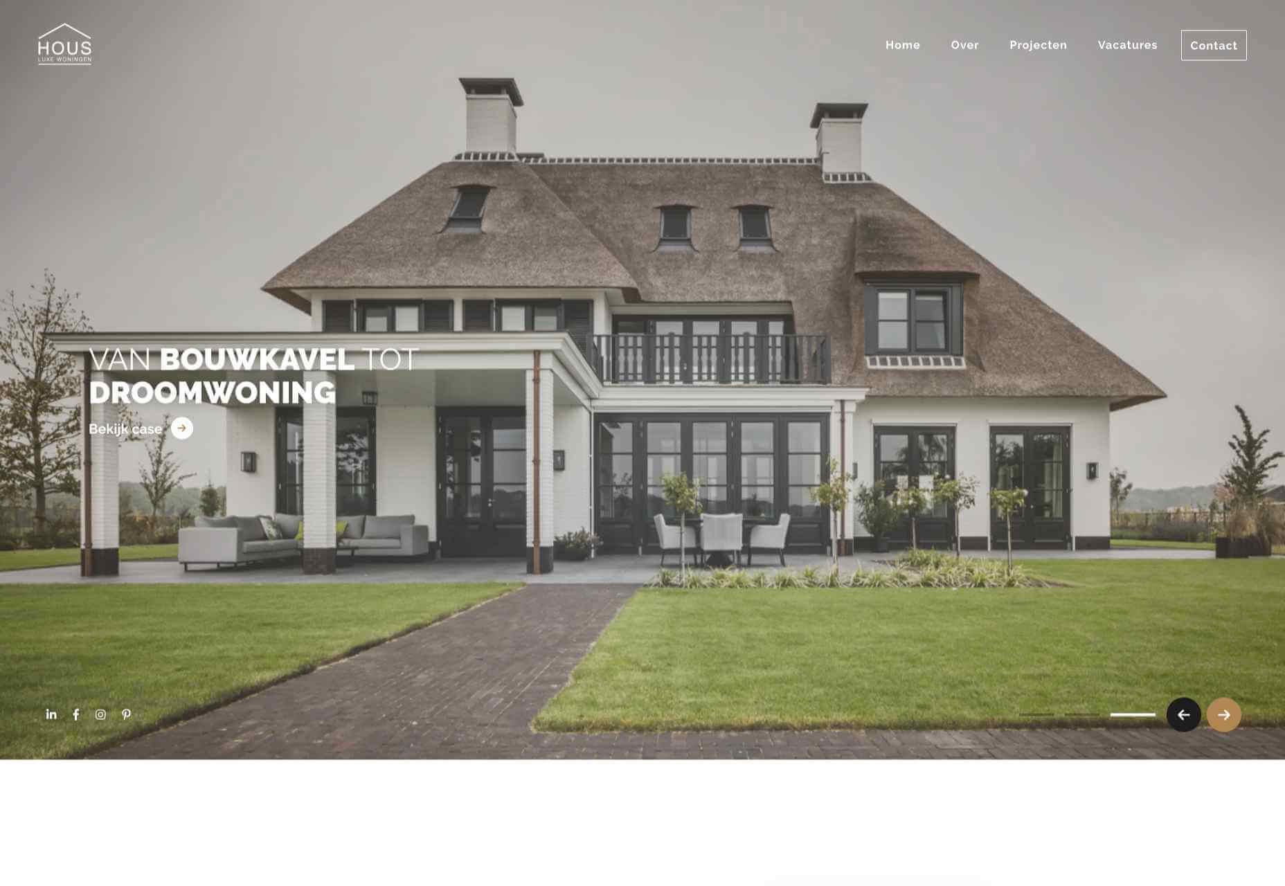
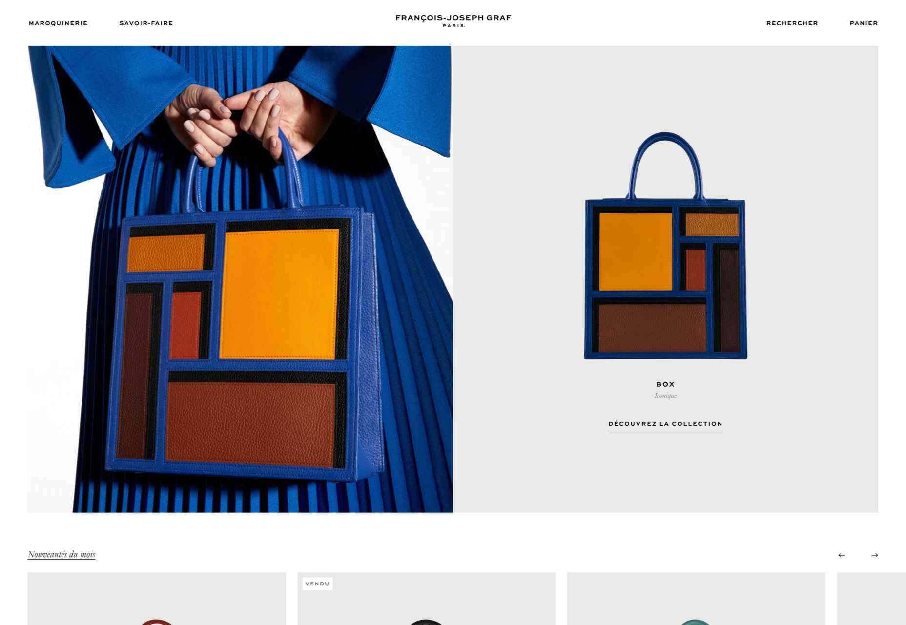
François-Joseph Graf
The design for François-Joseph Graf’s site does the right thing by getting out of the way to avoid competing with the rather stunning products on show.
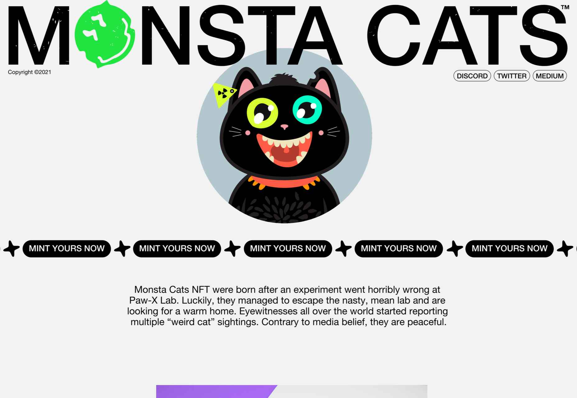
Monsta Cats
Monsta Cats is a site dedicated to community focussed NFTs. The site is suitably anarchic and fun to browse.
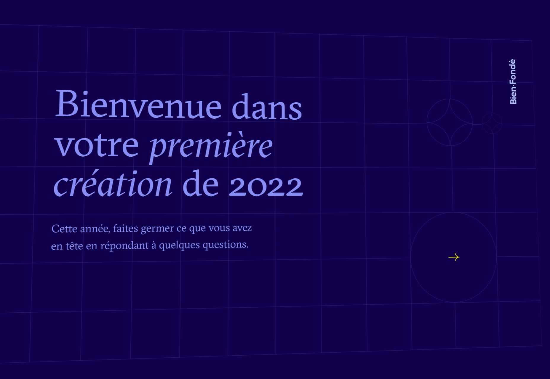
Bien Fondé
And finally, some customizable good wishes for the year ahead from digital agency Bien Fondé.
The post 20 Best New Websites, January 2022 first appeared on Webdesigner Depot.

 As we approach our first winter holiday season since the pandemic set in, the world could feel like a very scary place; there is a great deal of uncertainty about the future for businesses, for young people in education, for jobs, for travel. Celebrations are certainly going to be a lot quieter this year.