 Do you ever look at a website and think, why did they do that? Sometimes with website design trends, that’s the exact thought that can come to mind. What about an element works (or doesn’t) and why did it get so popular so fast? That’s the theme of this month’s roundup.
Here’s what’s trending in design this month.
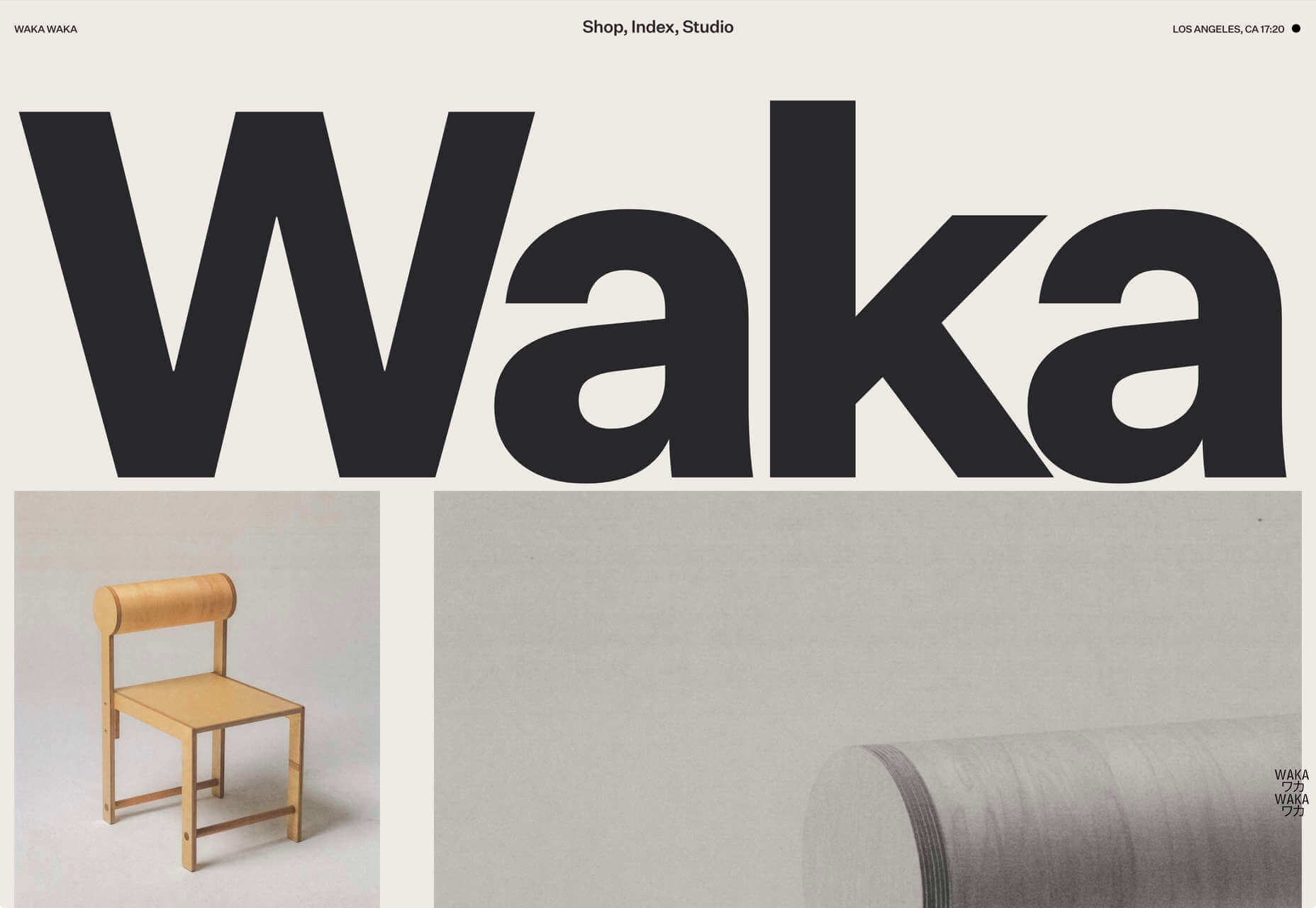
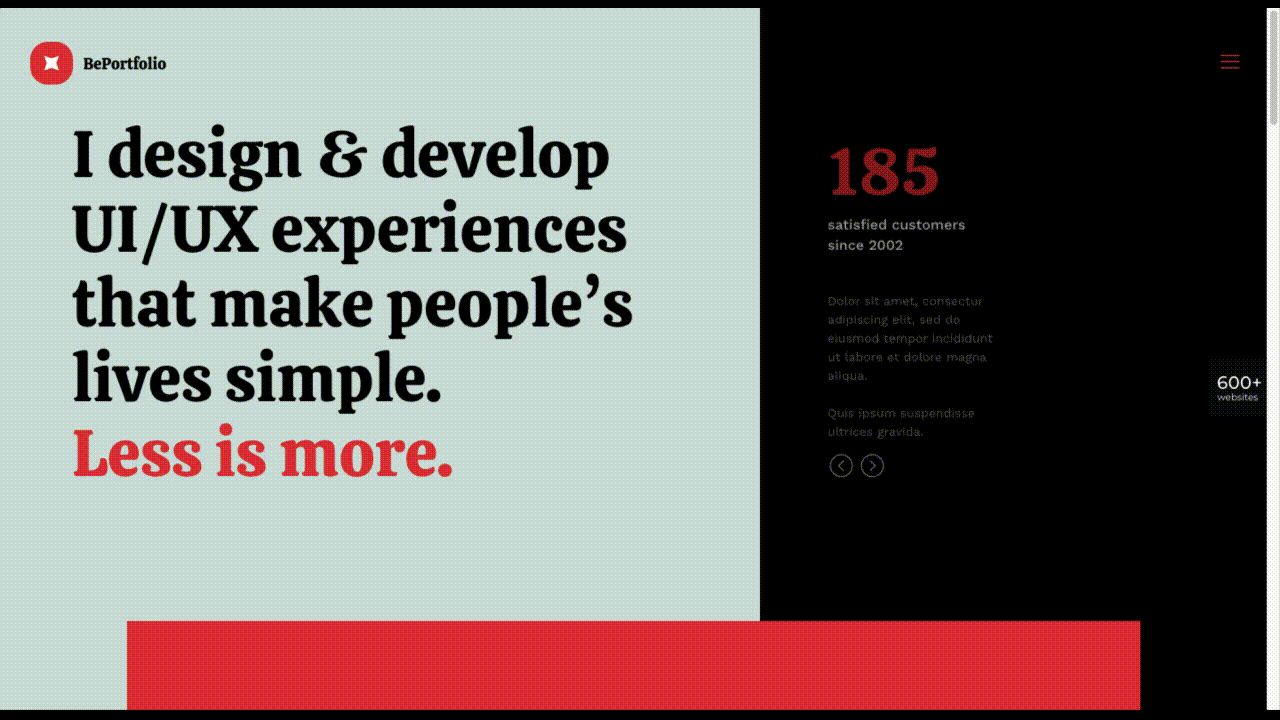
1. Light and Whimsical Design
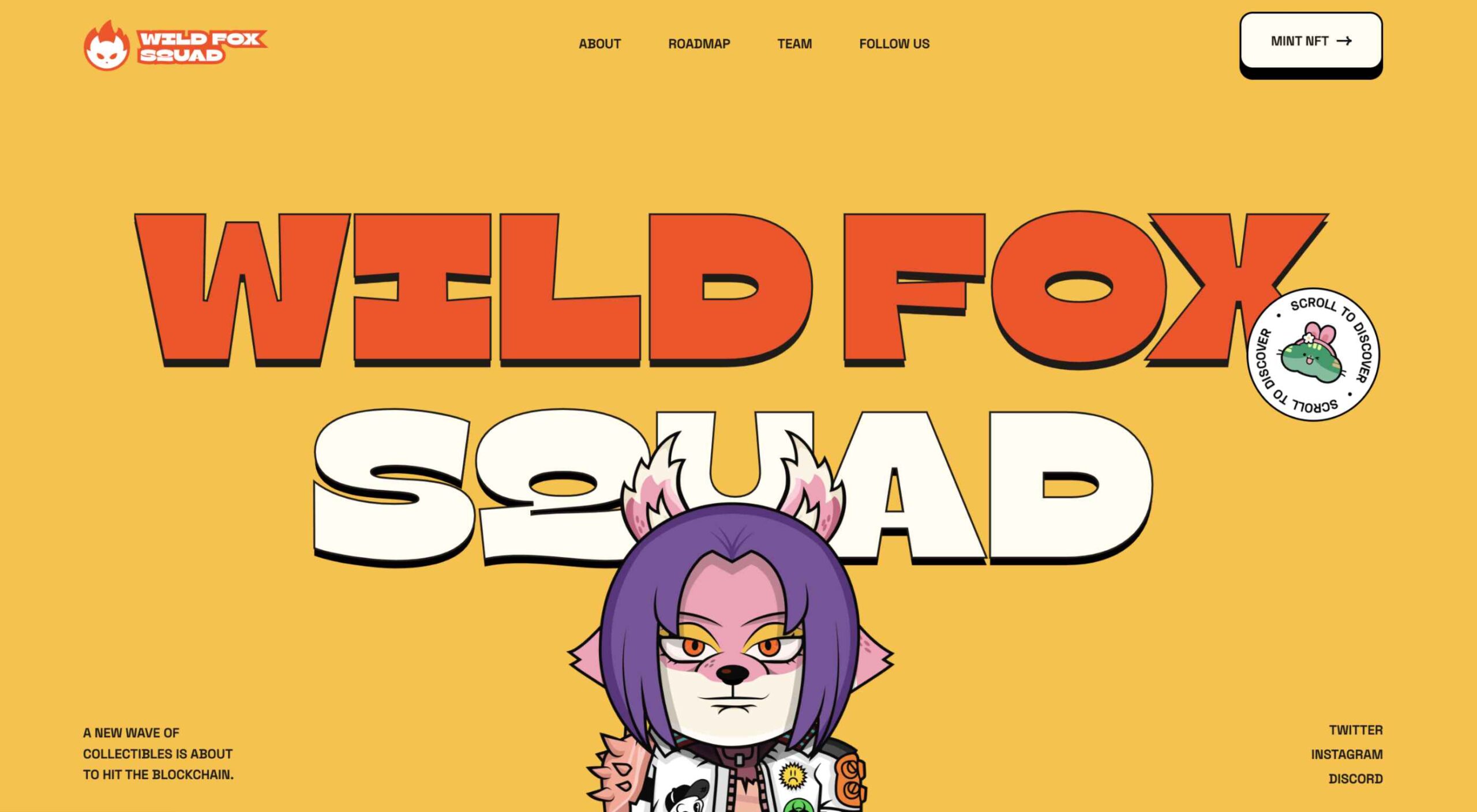
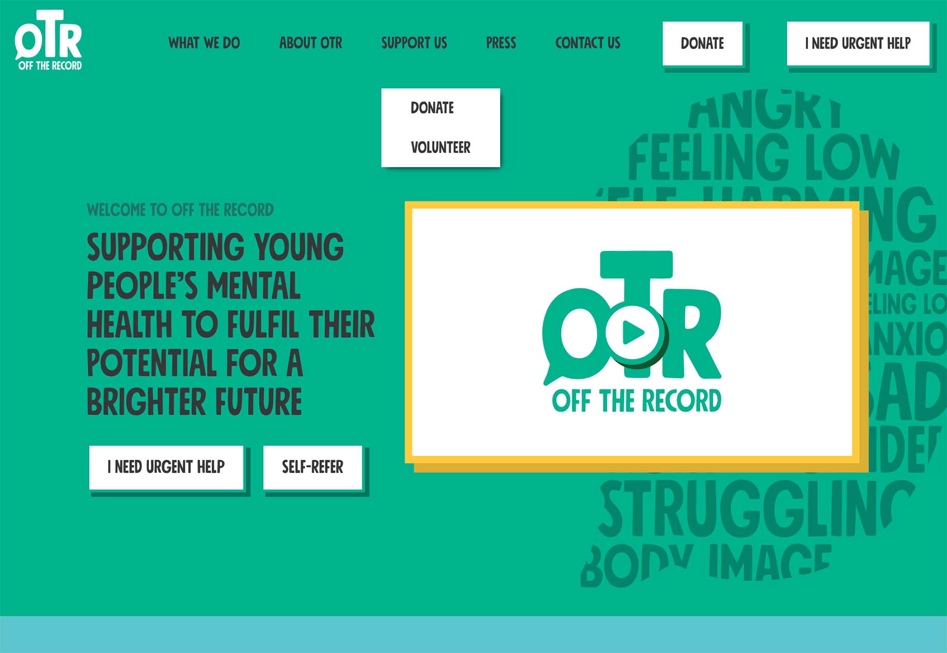
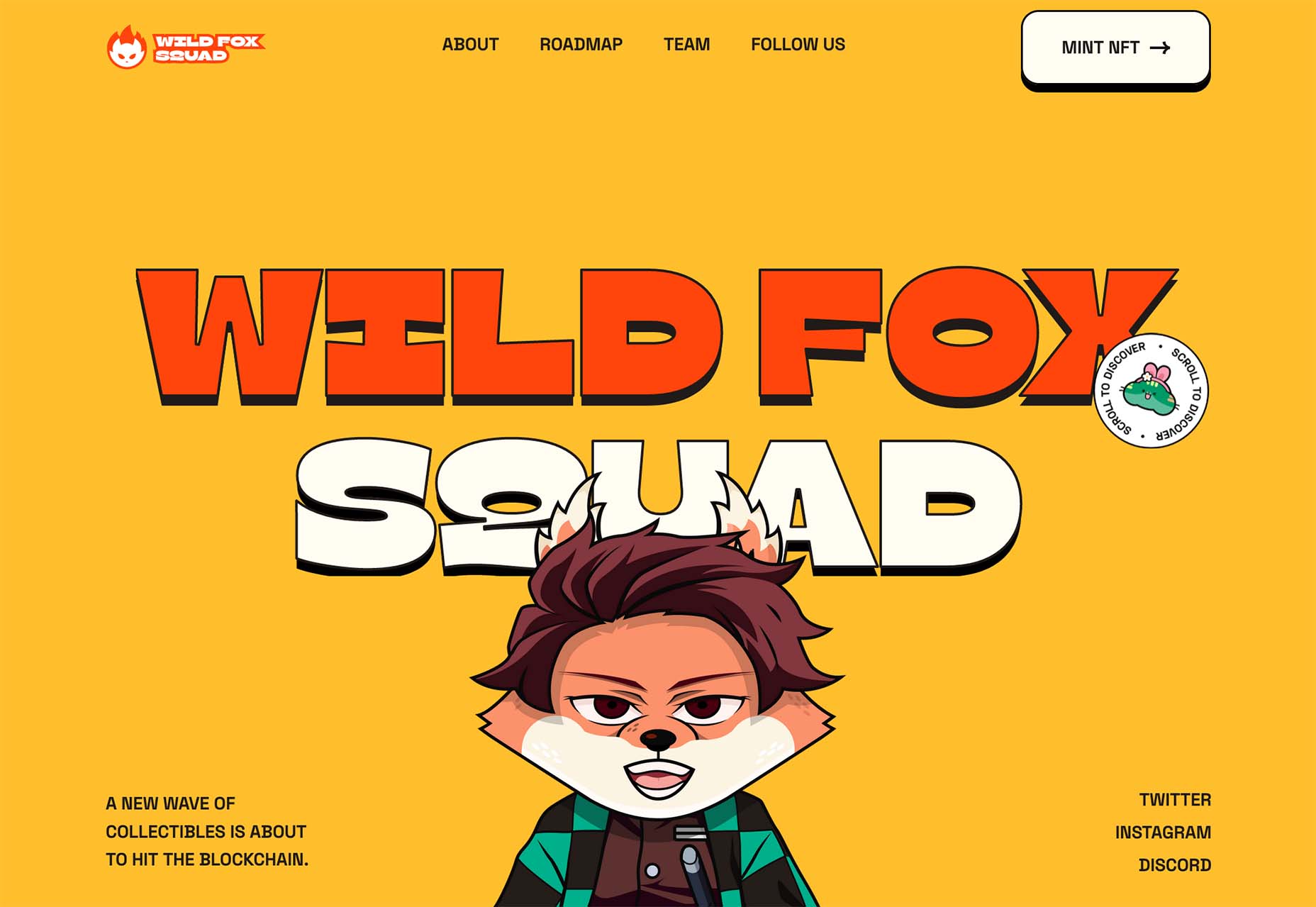
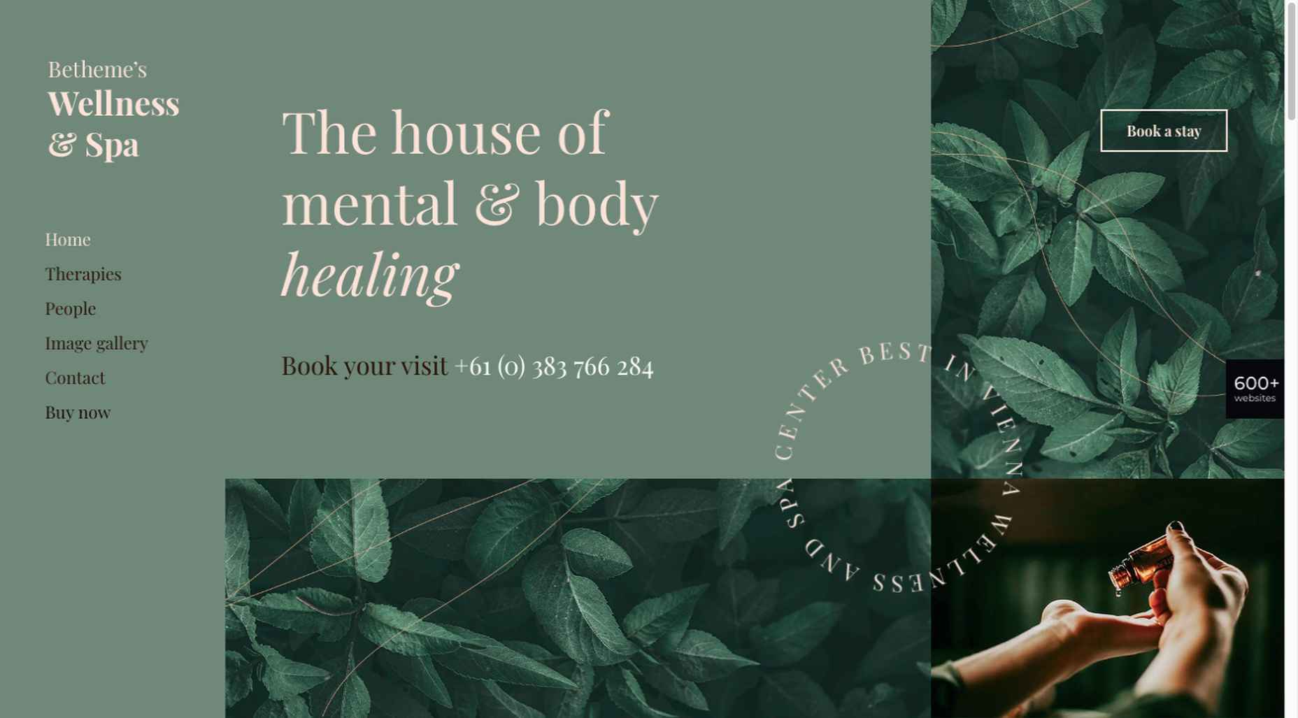
Even for content that’s important or heavy, lighter more whimsical designs are trending. It’s a somewhat strange juxtaposition of design and content, and one that we don’t typically see that often.
Designs that have “weighty content” and information with a light aesthetic tend to have these elements:
- Lighter color palettes
- Atypical font selections that might be experimental
- Movement and animation
- Cartoon shapes or characters
- Almost child-like feel to the overall design
- No photos or videos that show people
- Serious content once you start reading
That last item is the part of this design trend that’s most surprising. From the design alone, you’d expect light content or information design for kids. But in these examples, it is not at all.
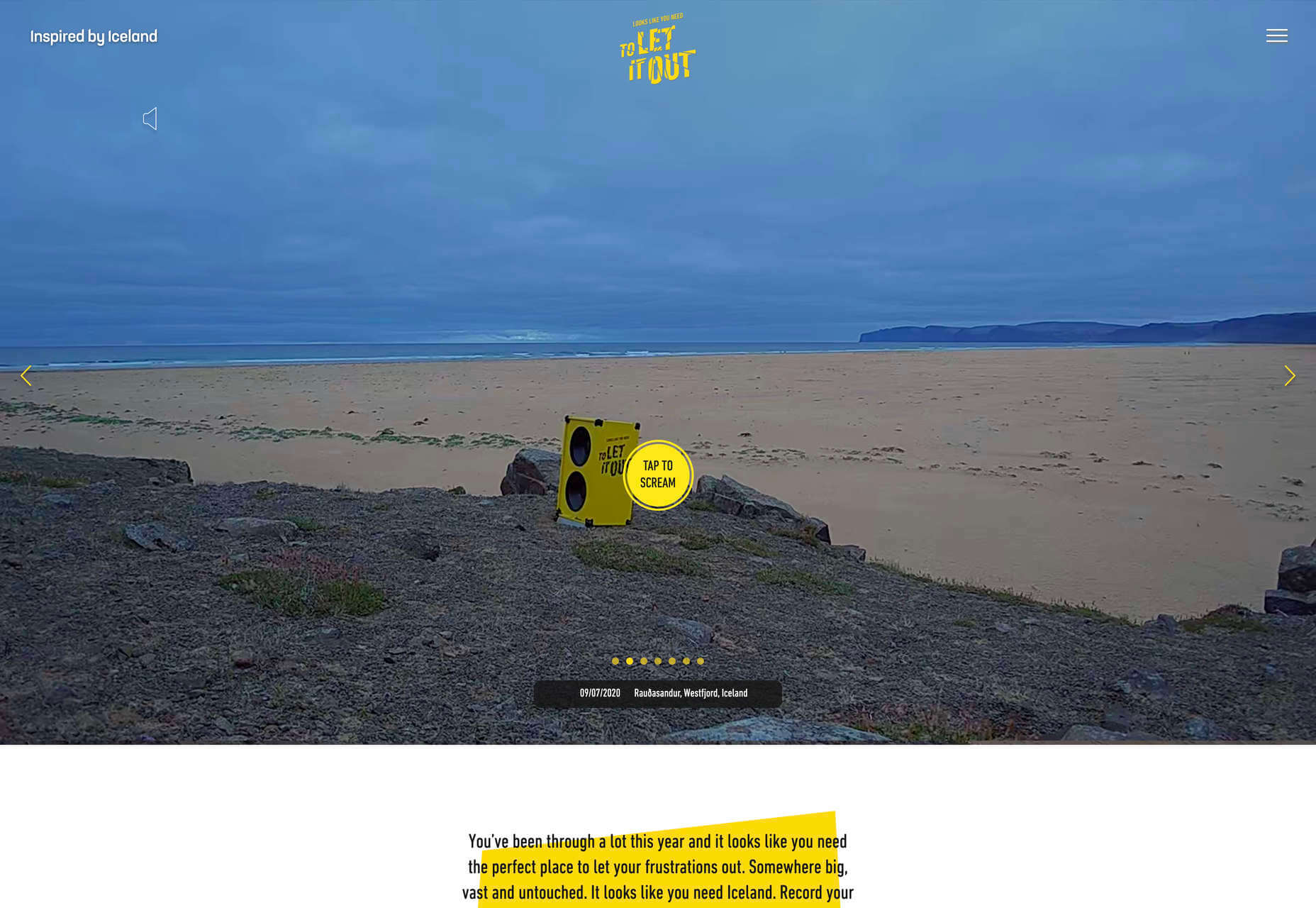
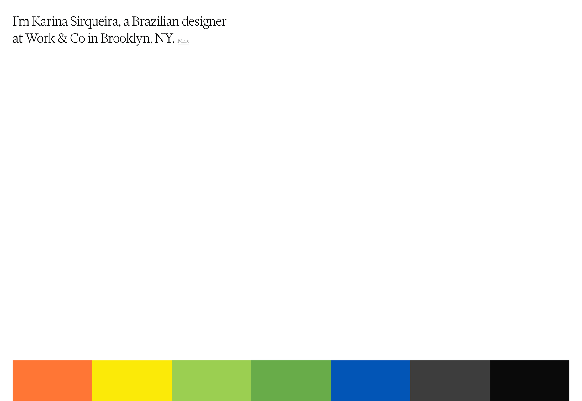
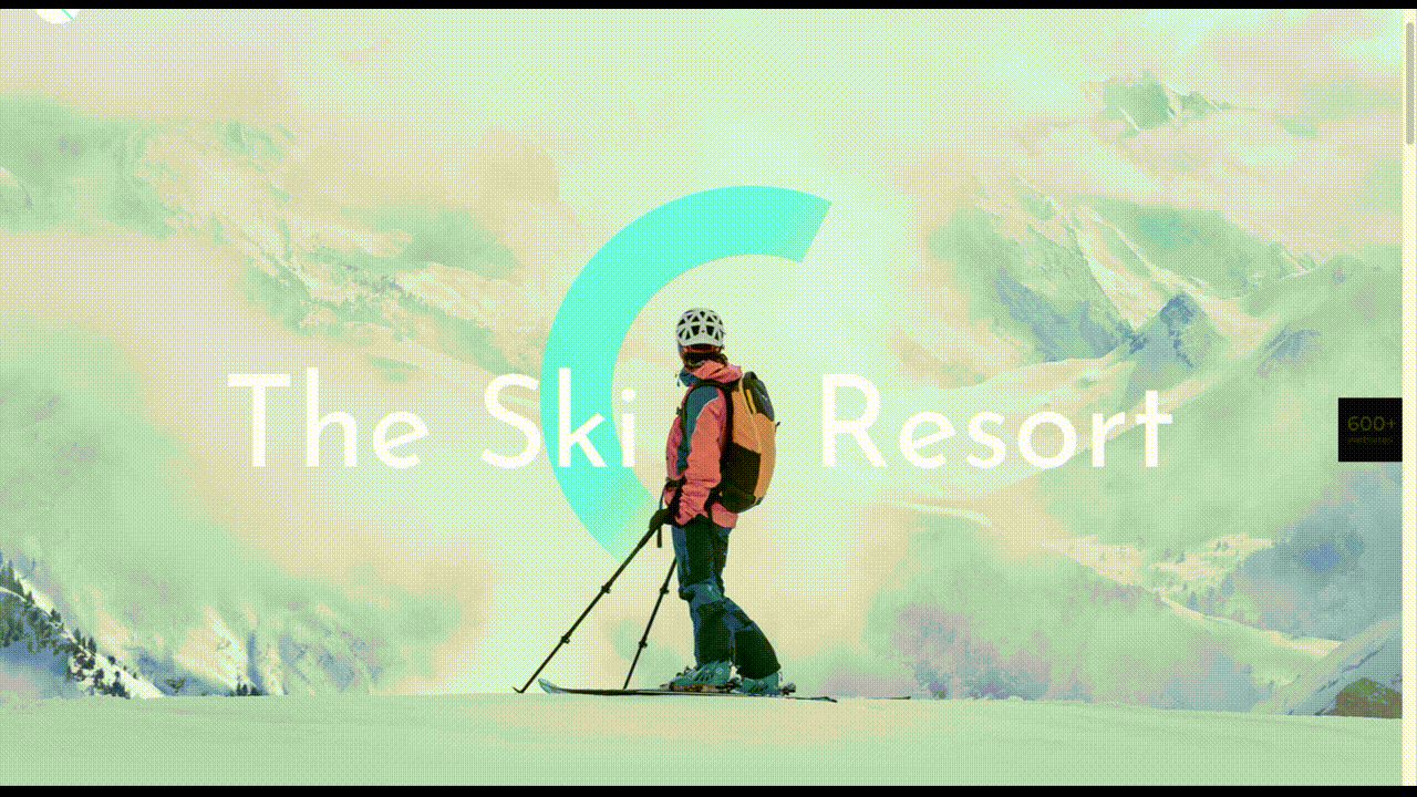
OTR South is for mental health resources for youth. Note that the design does have a youthful feel, but the content and topic are quite heavy.
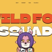
Wild Fox Squad is a prelaunch site that will ask you to buy NFTs.
Chia Studios is a website design agency.
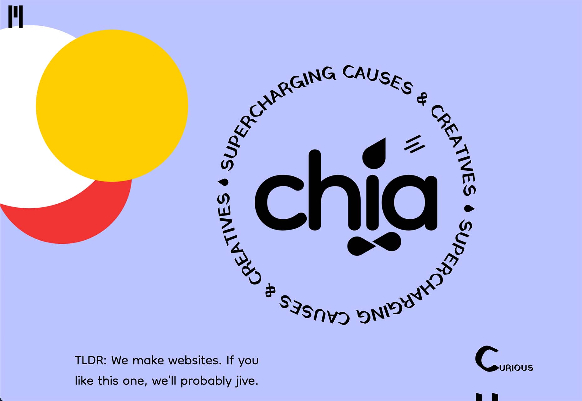
The question this trend leaves you with is does the visual tone mesh enough with the content to create the right vibe or credibility to engage with the website, do business with the company, or even buy something online?
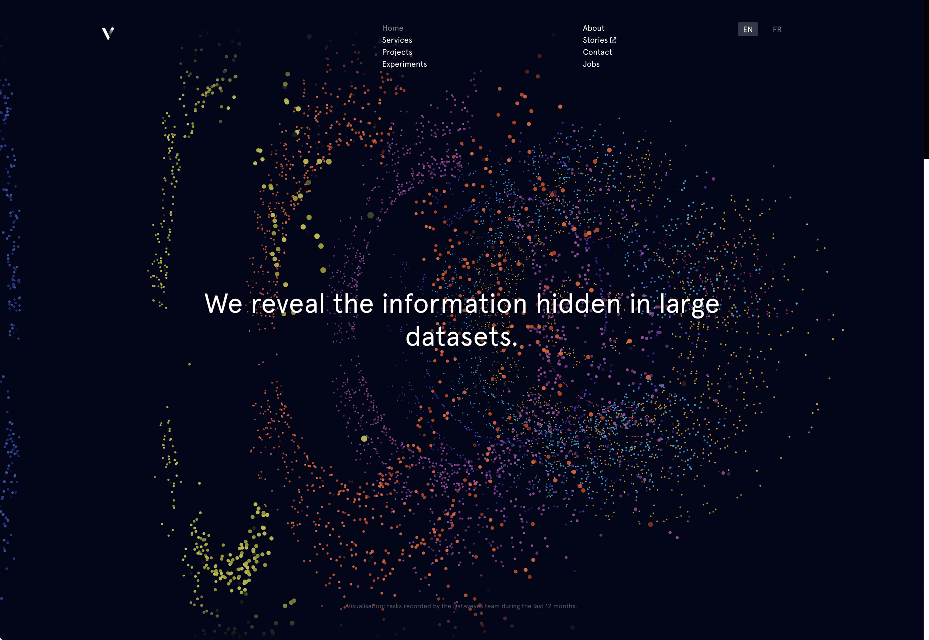
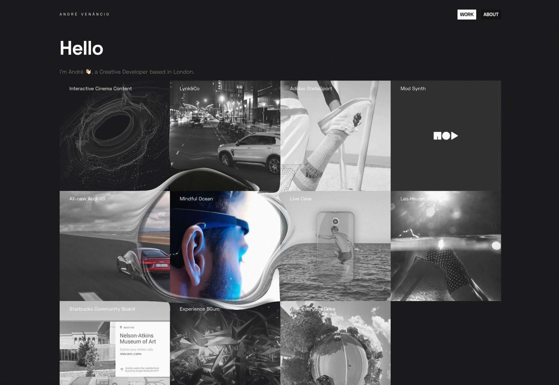
2. Long Scroll with Animation
At first glance, you might not think there’s a lot going on with any of these website design examples. But as you begin to engage with the sites, there’s an obvious trend – they all have long scrolls with animation from the top to bottom of the homepages.
Long scrolling is one of those website design topics – and trends – that people often feel strongly about. Some people love it. Others loathe it.
Here’s the challenge with long scrolling. If something seems long to scroll at desktop size, it takes forever to scroll on smaller screens unless you eliminate a lot of content. That begs the question: will users see and read everything you need them to on the homepage if it is exceptionally long?
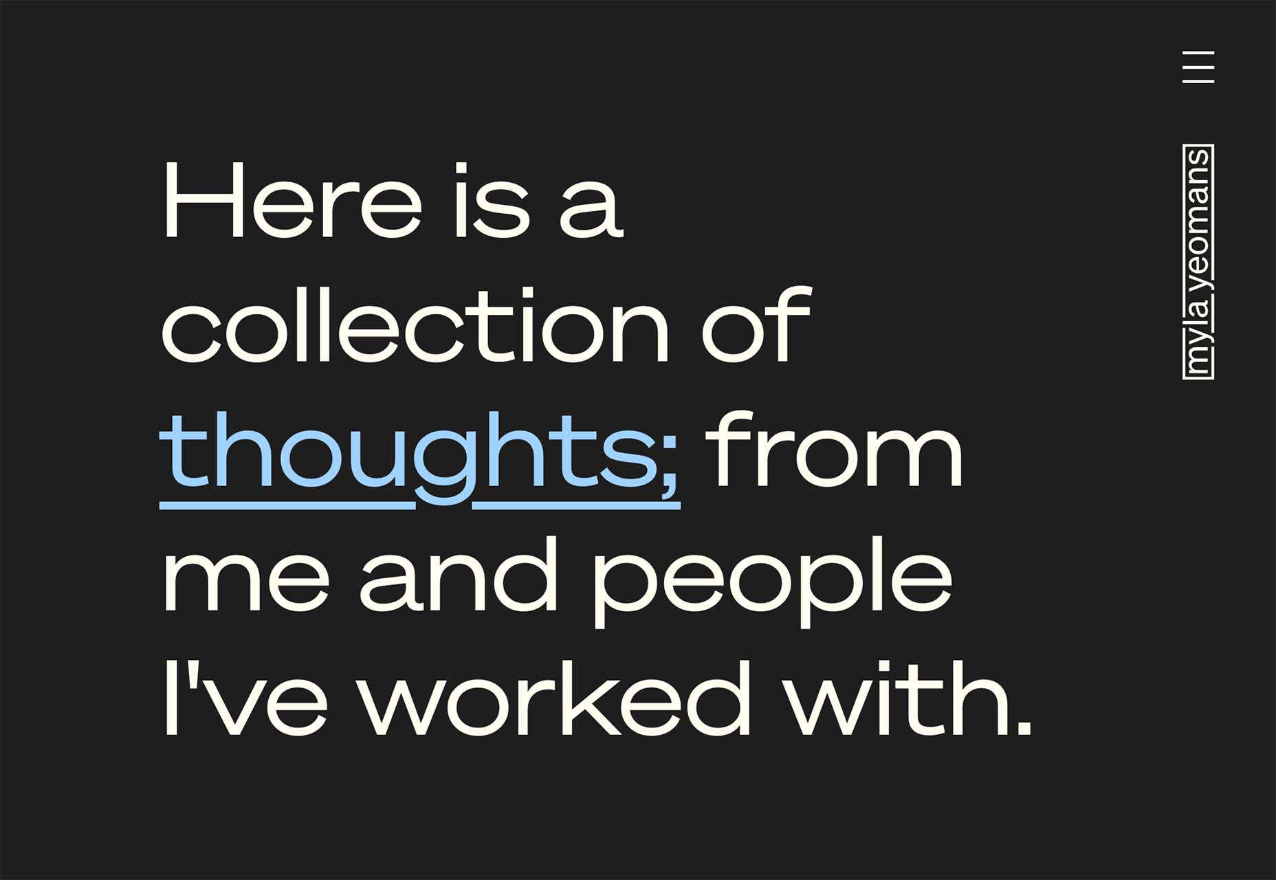
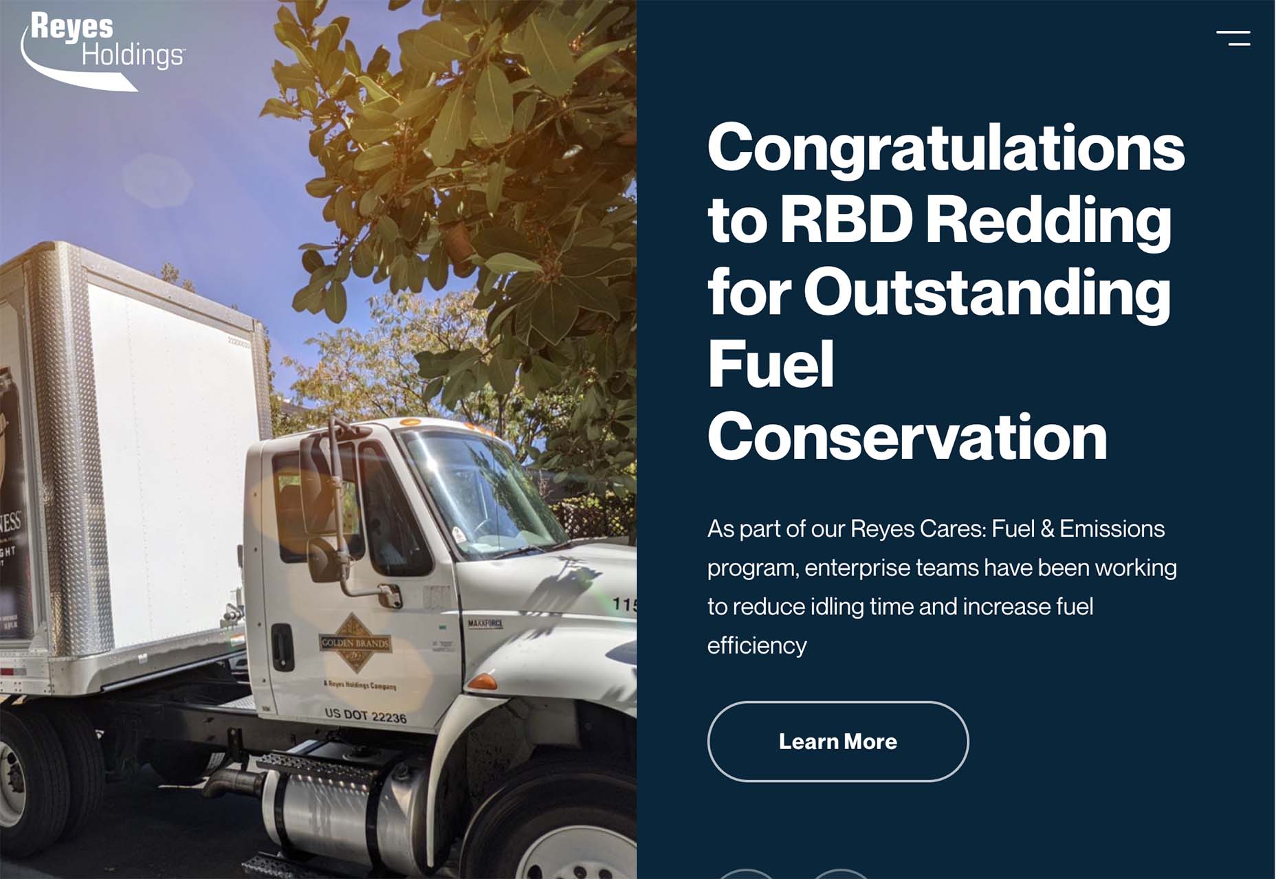
Here’s how each of these examples uses long scrolling and animation together.
Match Artists opens with animation as the site loads and then flips to a static home screen. As you scroll, photos expand in the frame with a subtle animation. The more quickly you scroll, the more animated this website appears to be. There’s not a lot to read, which makes the image-scroll-animation combination easier to digest.
Myla Yeomans has an almost empty home scroll, that moves into a text-heavy scroll (shown below) with every scroll screen changing color with animation. The effects aren’t harsh but can give you a bit of motion sickness unless you scroll slowly because of the size and volume of text in the design.
Reyes Holdings might have the busiest animated scroll of this set of examples. There are slider animations that move left to right for content in the hero area as well as parallax and loading scroll animation down the page as elements seem to come in from almost every direction.
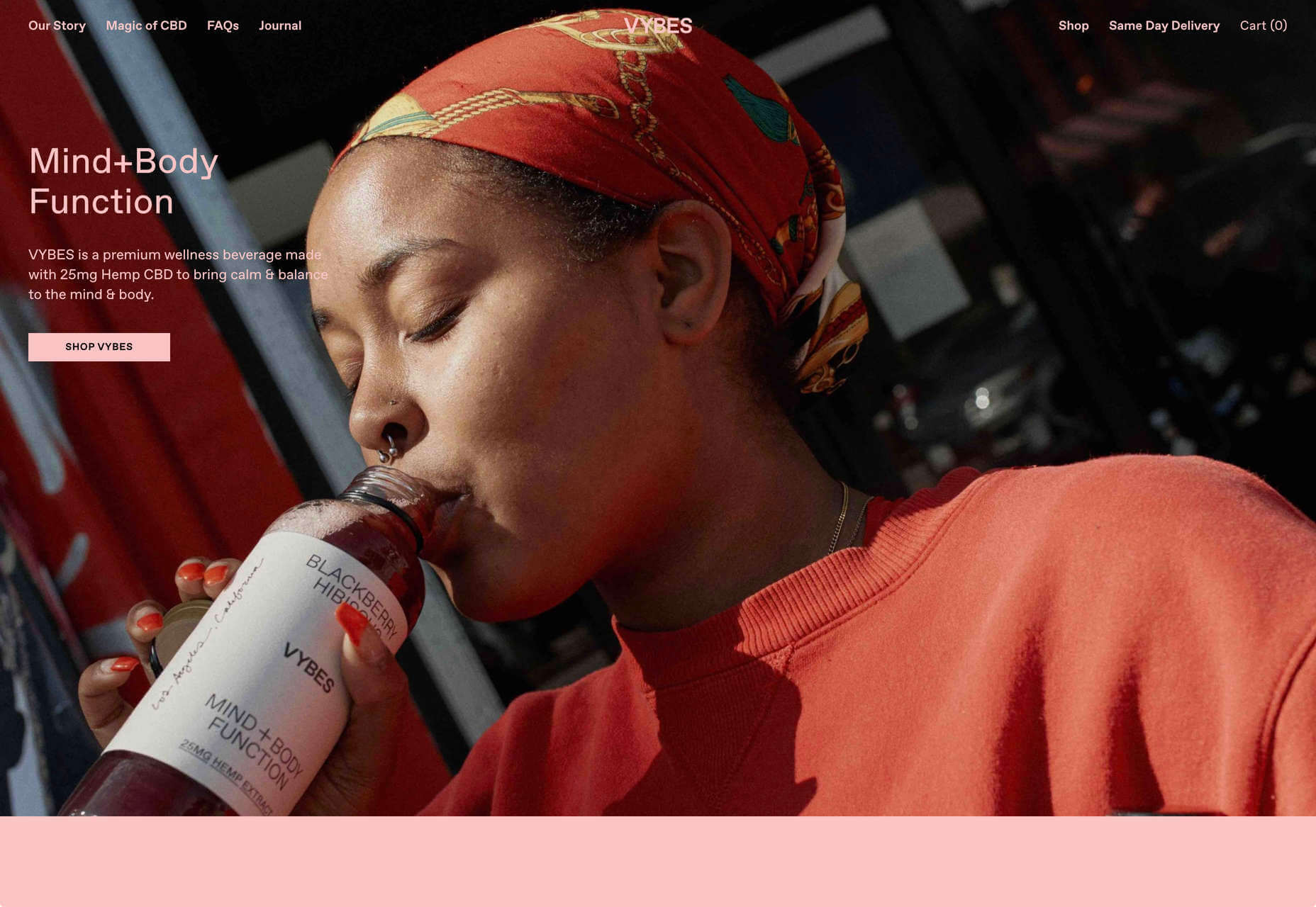
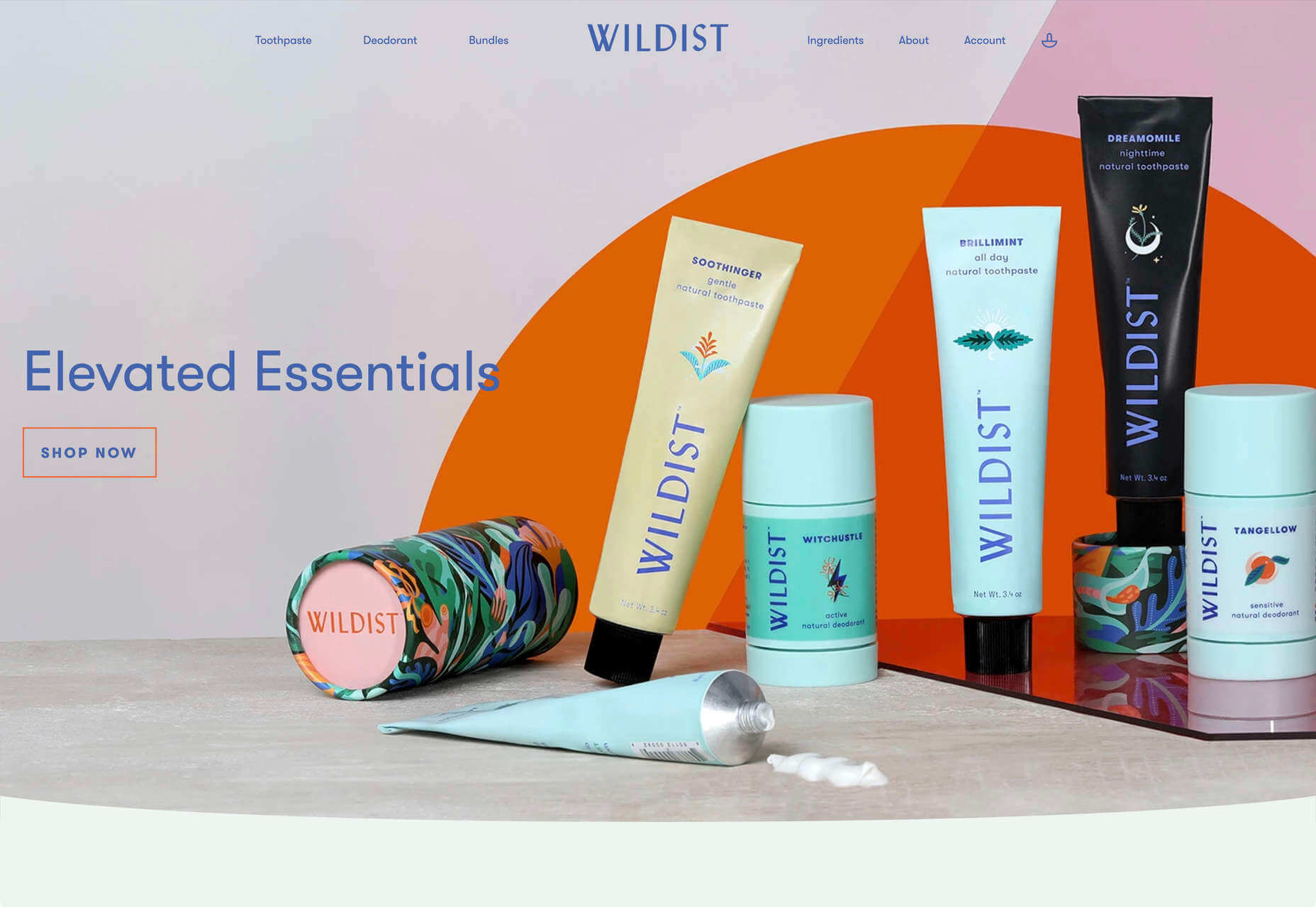
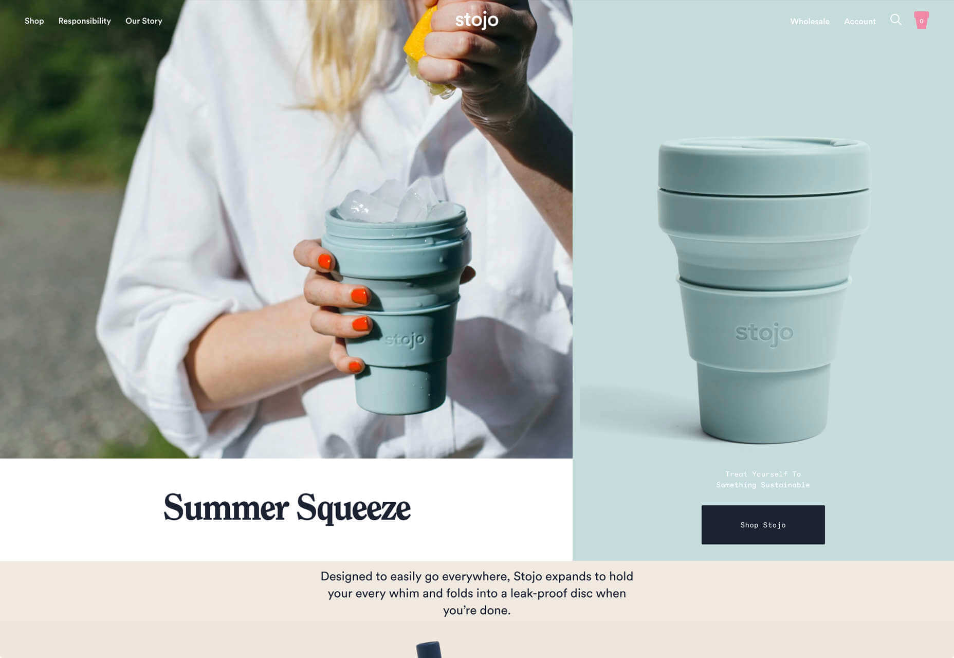
3. Pink
Pink is a color trend that has a lot of strong feelings attached to it. The color alone can create assumptions about the website design or content before a user even starts engaging with the site.
Whenever you design with a color like this, you have to consider the baggage that might come with it, whether you agree with it or not.
Pink is often associated with femininity, the pale pink in some of these examples is connected with babies, and it’s not often seen as a strong hue. Common meanings and associations with the color pink include sweetness, health, romanticism, and innocence. All of those concepts should be taken into consideration when this color is part of your design plan. With that in mind, each of these websites uses the pink color trend in quite different ways.
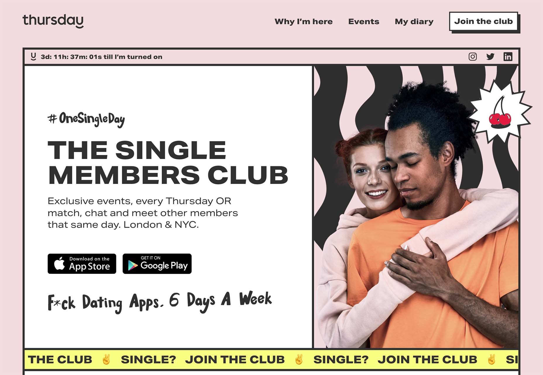
Thursday is a singles website/app. It has a modern vibe and the pink here is muted in a way that almost has a beige tone. The question for users is, does it have enough of a vibe to appeal to all types of people? Something that would seem important for a dating app.
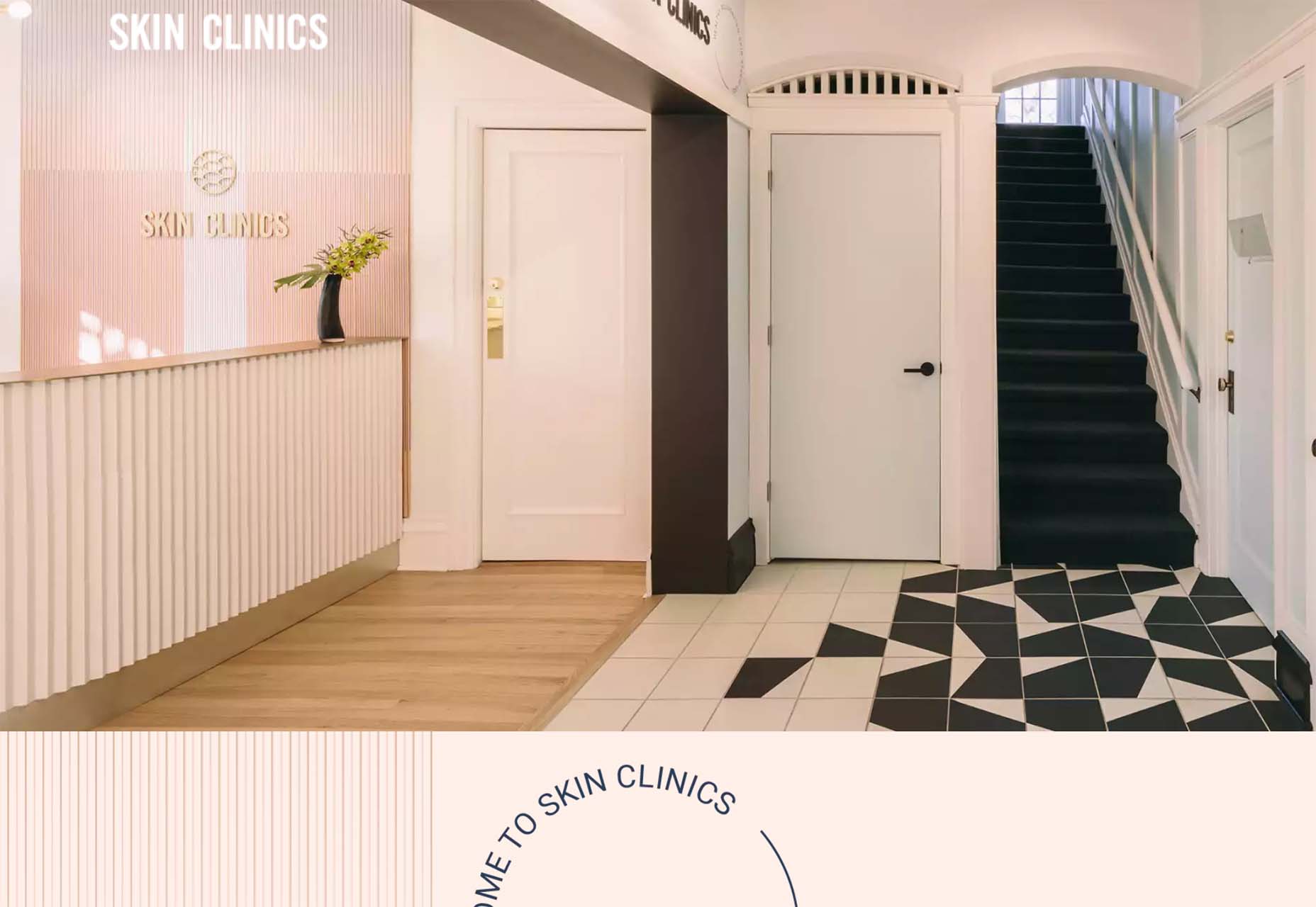
Skin Clinics goes all-in with pink tones on the website and, it appears, in their offices. This is an instance when it is hard to quite figure out how I feel about the color. It’s nice that it doesn’t feel as clinical as all white, but all skin isn’t this color either. It can create an odd tug for how you feel about the design and facility as a whole.
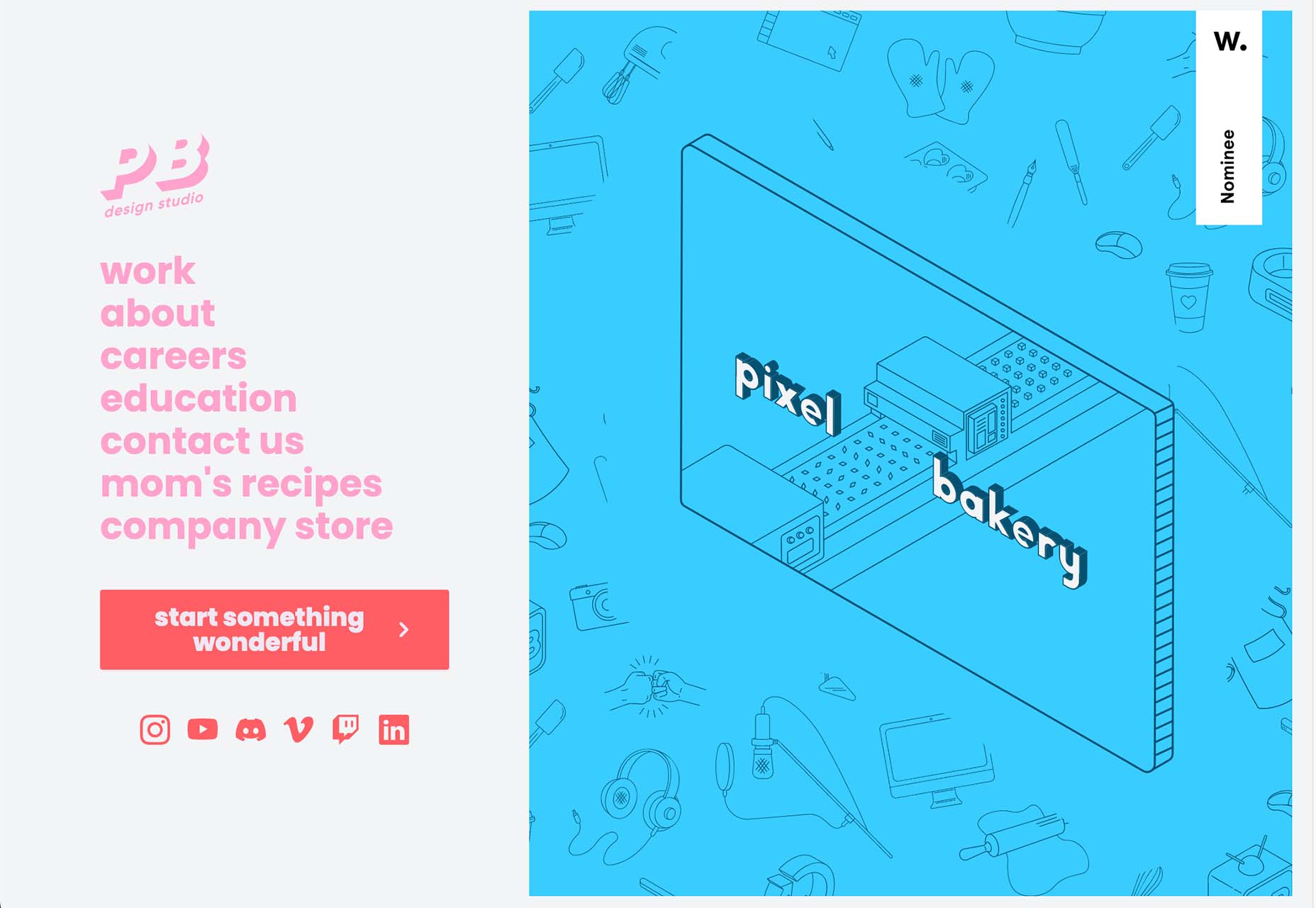
Pixel Bakery uses a few shades of pink for its design that feels oddly childlike. Maybe it’s the yin and yang contrast combination with the almost baby blue. Then there’s this – nothing seems to “match” from a design perspective. Pale pink background, deeper pink logo and text, almost red pink calls to action. There’s a lot to visually digest here.
Conclusion
How do you feel about all of the trending designs featured this month? Do they seem like things that you might try? Web design trends are interesting in that way because they almost seem to catch fire – someone tries something new and then others keep using the design idea and iterations of it. Sometimes these ideas work brilliantly and sometimes they fall rather flat.
It’s a good exercise to think about trends without jumping to the conclusion that you need to use them; sometimes that can also be a lesson in what not to try with your own design.
The post 3 Essential Design Trends, May 2022 first appeared on Webdesigner Depot.
 One of the few bright spots in 2020 has been the creativity companies and individuals alike have exhibited in dealing with what, at times, seemed to be overwhelming problems.

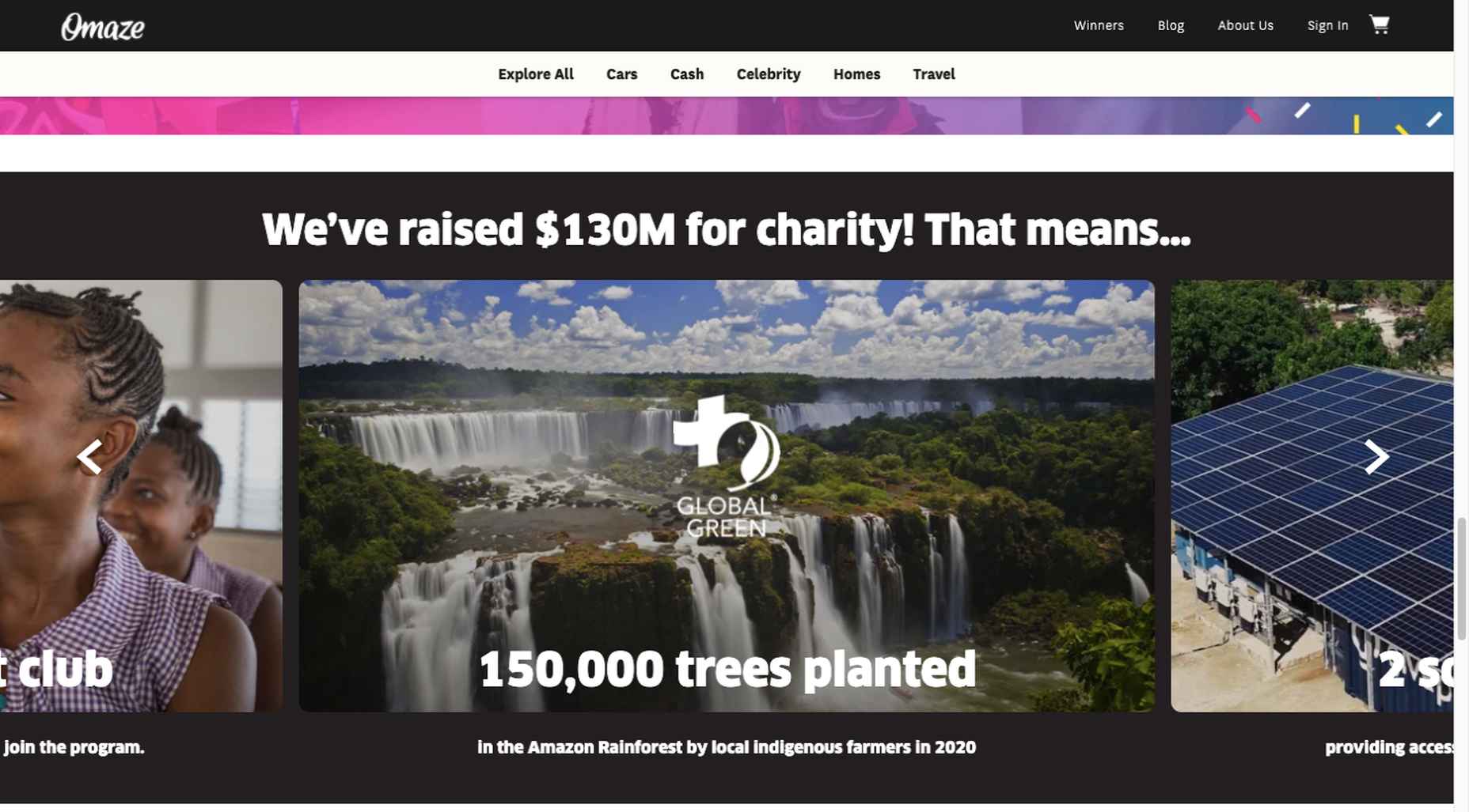
 After six months of uncertainty 2020 is finally beginning to find a style of its own. There are nods to Brutalism, a delightful blending of 80s pastels with 90s primaries, and the font style of choice is anything but geometric sans-serif.