Articles

Google Fonts is one of the most useful tools designers have, with hundreds of amazing fonts provided for free. But if you just grab one of the top ten suggestions, you’re missing out on a vast wealth of typographic gems.

Just about every font on Google Fonts is worth trying out, but the very best designs — designs that engage, inspire, and delight — combine two or more fonts. It’s the same principle as sweet and sour; two competing tastes that are both familiar and surprising; that’s a good font combination.

But how do you pick out those flavors? How do you know what complements and what clashes? Does Inter work okay with Open Sans? Does Merriweather look good with Roboto?

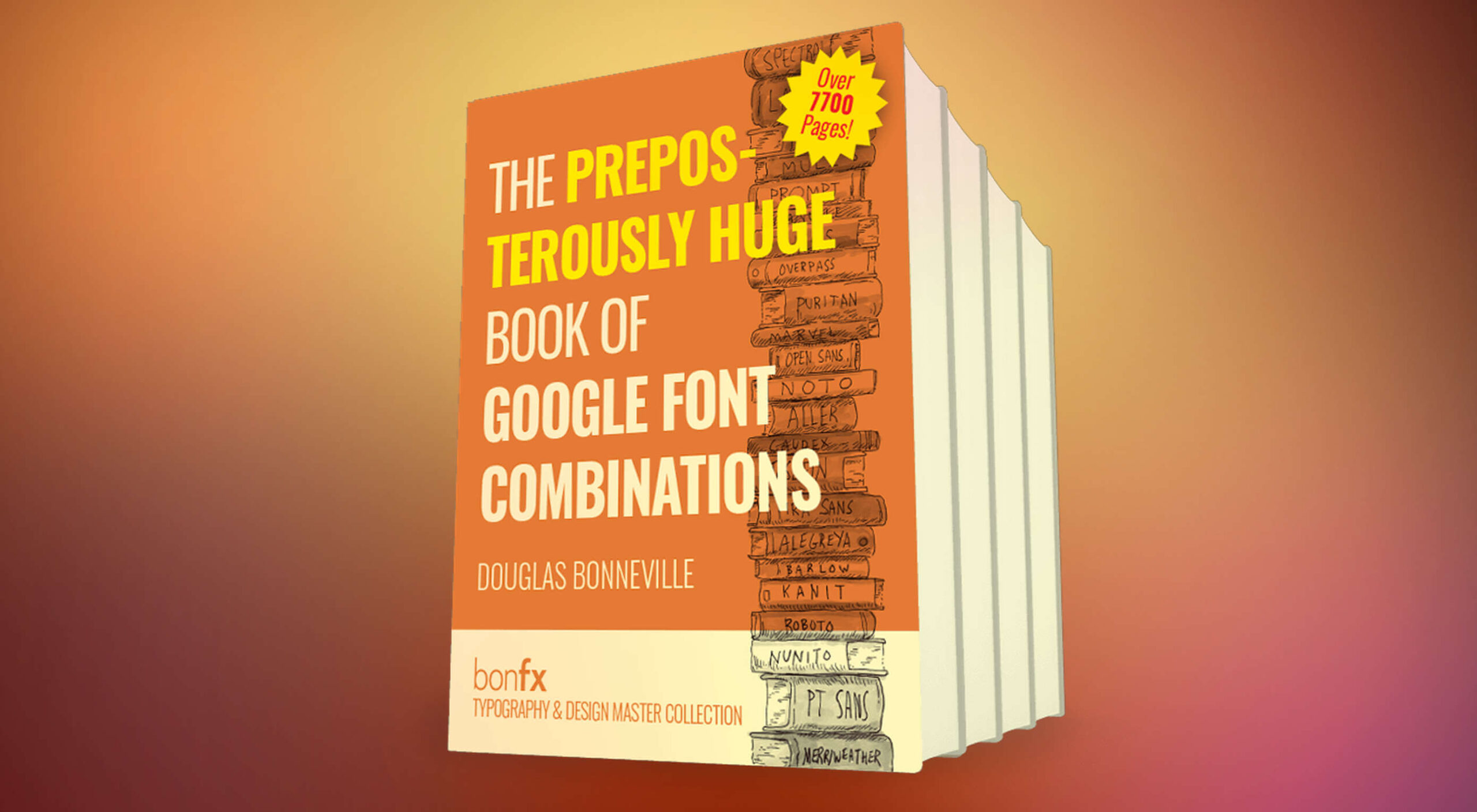
Well, today we’ve got a deal for you that will answer those questions and more. Our sister site, MightDeals.com, has arranged an extraordinary discount on The Preposterously Huge Book of Google Font Combinations. To date, it’s the single largest collection of Google font combinations ever produced.

Read on to find out how the PHBGFC will save you time, update your design choices, and keep you inspired throughout 2021 and beyond…

What’s Preposterous About the PHBGFC?

The Preposterously Huge Book of Google Font Combinations is almost 8,000 pages long. If you use one of the suggested font combinations every week, it will take you 125 years to exhaust it.

We think you’ll agree that that’s a truly preposterous number of design options.

What Exactly is the PHBGFC?

When you visit Google Fonts, you see a nice clean interface, with some dropdowns. You can pick a font. And then maybe pick another. But there’s no real way of discovering, trying out or otherwise selecting font combinations.

The Preposterously Huge Book of Google Font Combinations changes that by lining up all the possible combinations in an easy-to-browse package.

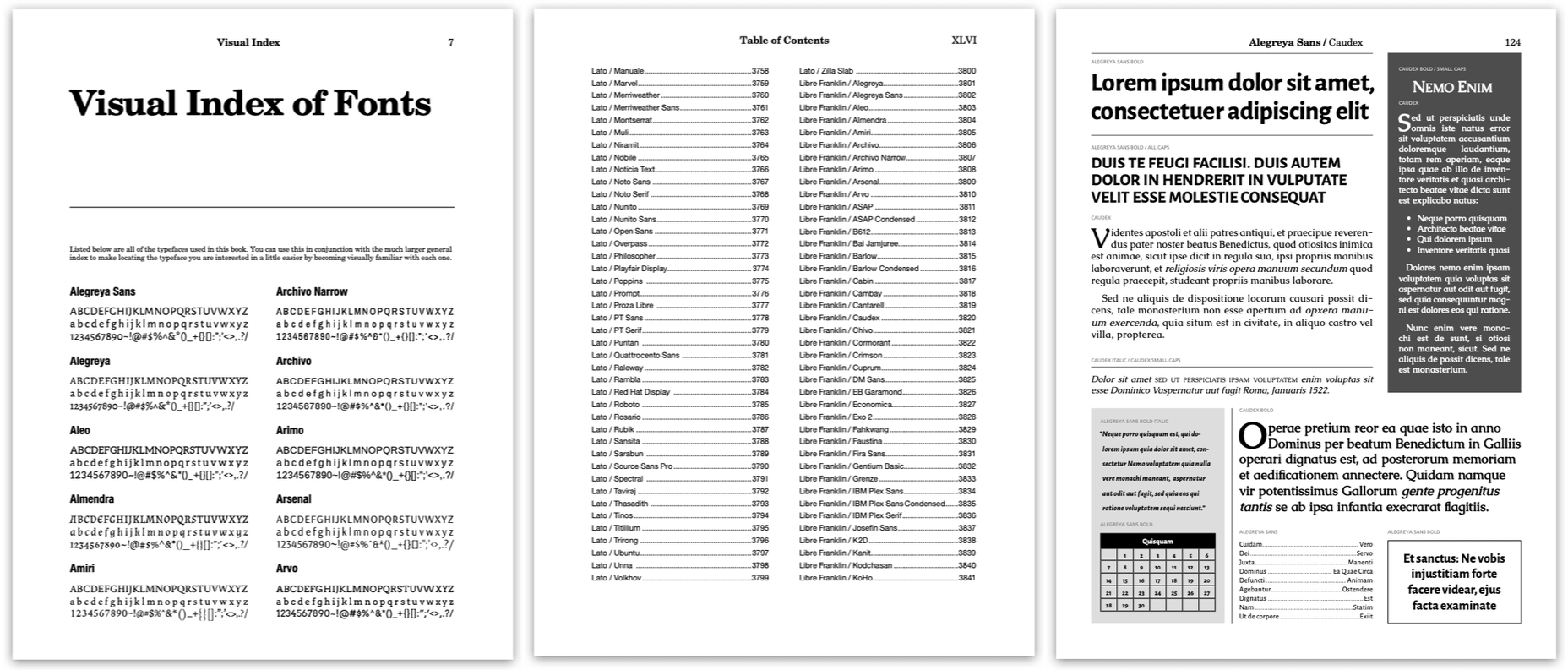
Step 1: Navigate to the index at the front of the book.

Step 2: Locate a font you’re interested in, in the index.

Step 3: Click the font name to navigate to the corresponding page in the book.

Step 4: Scroll back and forth through the pages to review the possible combinations for your font.

It’s that easy!

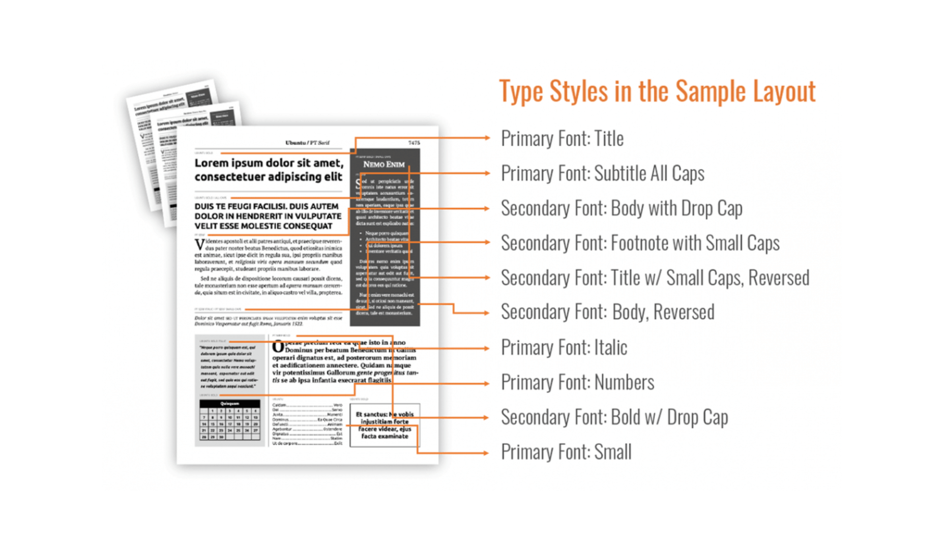
The Preposterously Huge Book of Google Font Combinations lays out all the best Google Font combinations for you — every font included has a regular, bold, italic, and bold italic version — saving you days of hunting through the site hoping to hit upon a combination that works.

What If I Don’t Like the Suggestions?

The Preposterously Huge Book of Google Font Combinations isn’t a set of rules or guidelines; it’s a tool to help you make the best design decisions you can make in the shortest possible time.

The Preposterously Huge Book of Google Font Combinations purposefully doesn’t exclude any combinations — even ugly combinations are deliberately included — so you’re free to compare an unredacted list of font options.

Every design decision you take is yours, but instead of spending hours downloading, installing, and comparing prospective fonts, you can review a combination in seconds.

Who Should Use the PHBGFC?

The Preposterously Huge Book of Google Font Combinations is an essential purchase for anyone working with Google Fonts. It will save you time and improve your familiarity with one of the web’s best resources.

If you like fonts, then you’re going to enjoy just scrolling through the Preposterously Huge Book of Google Font Combinations. It’s a beautifully realized catalog of font options.

Whether you’re a design student, a web developer curious about design, or a seasoned design professional, The Preposterously Huge Book of Google Font Combinations won’t just save you time; it will help develop your eye for great font combinations.

Grab The Preposterously Huge Book of Google Font Combinations Today!

This incredible resource, designed to help you maximize your use of Google Fonts, will save you hours of fruitless hunting through Google’s UI.

The Preposterously Huge Book of Google Font Combinations normally sells for $69, but thanks to our sister-site MightyDeals.com, WebDesignerDepot readers can grab it for just $24! That’s a suitably preposterous 65% off the full retail price.

Head over to MightyDeals today to download your copy of The Preposterously Huge Book of Google Font Combinations and start making Google Fonts work for you.

Source


Source de l’article sur Webdesignerdepot

The end of the year tends to be busy for a variety of reasons and it can limit some of the freshness we see in designs during much of the year. Regardless, there are a few trending design elements.

What we are seeing right now is rooted in deep simplicity with a focus on the message.

Here’s what’s trending in design this month…

Activism and Engagement

Websites with a focus on societal issues have moved to the forefront. While the look and design techniques used for these websites can vary greatly, there’s a common theme of activism, community engagement, and support.

What’s great about this movement – and what it reflects – is that people can take to the digital space to help amplify their message or find support with people who are going through the same things they are.

While some of these efforts are backed by people and brands you may know, that’s not always the case.

The designs also work best when they reflect the personality of the spokesperson or mood of the issue at hand. Note the vast differences in the three examples.

The I Weigh Community uses bright color with a black and white image of promoter and celebrity Jameela Jamil to bring attention to mental health issues.

Wear the Waste by retailer H&M uses simple typography in a natural environment to set the stage for more eco-friendly clothing options.

Wavering Stripes uses an illustrative approach to bring attention to the stories of immigrants in detention.

Each design is vastly different but all are striking and draw attention to the causes therein. The common thread is that each design is simple enough to draw you in and help you better understand the message and not get lost in tricks or design effects.


In Your Face Products

’Tis the season for product promotion.

Designers are opting for larger-than-life product images that allow shoppers to see every detail before making a purchase. (Seems like a good plan in a socially-distanced pandemic world.)

It can work in a number of ways:

  • With an oversized image and ability to use on-screen controls to take a closer look;
  • With video and animation effects to see the product in action;
  • With super high-resolution and zoomed in photography.

Pair these visuals with strong descriptive language and you’ve got a winning combination.

The variance in the examples is a good showcase of how to do this well, while not over-doing effects.

The Fitbit Charge 4 website uses an opening image of the device that’s way larger in scale than reality (especially if you are on a large desktop screen). Users control using click and scroll to get more views and details of the device. Zoom and animation aren’t overwhelming, providing a solid look at the product.

The Nest Thermostat opens with a video animation of the device moving into the forefront of the screen. (It’s rather quick.) From there, if you want more detail, there’s a video to watch that provides deeper product information in a digestible manner.

The final example isn’t really a product at all, but rather an art installation. What’s interesting is that it uses these same oversized options to show the art in detail. This is a great way to handle seeing something that you may not be able to experience in person. What makes it work so well is that the angles of the photography mimic how you would view it, looking up toward the piece hanging from the ceiling.


Simple Motion for Impact

Carrying on the theme of big, bold, and oversized designs, this trend focuses on simple animation for maximum impact.

While all-out cinematic animation can be fun to watch, it can be a little overwhelming at times. This more subtle approach is easier to digest and helps put the focus on the content at hand rather than the effect on the display.

There are plenty of ways to use simple animated effects, including scrolling animations, hover actions, and constantly moving elements. (You can see each of these if you click through the examples.)

The Patrick Mahomes store, 2PM, uses a single line of moving text that tells you what the website is about. It differentiates the retail store website from information about the athlete or his other efforts. White text on a black background is classic and easy to read. The most important thing of note may be the speed of the animation; it’s timed in a way that’s scannable but not dizzying. Sometimes the hardest part of nailing an animation is getting the speed right.

The resume-style website for Naomi Niko is striking and simple, but neat hover effects and a simple scroll animation for her resume only – and not the photo or details on the left side of the screen – make the design intriguing. The almost awkward crop and directional pull of her image also creates interest and makes you want to get further into the design.

Guilbo uses layered hover animation to make it look like he’s blowing a glittery-dust off the screen and at the user. The rugged detail of his face with the sparkle of the animation is a fun contrast. The design uses layering with dots in the foreground and background for an additional depth effect. It’s also especially nice that the objects are made to stay off his face for a realistic effect.


Conclusion

While 2020 has been an interesting year, designers have continued to find new ways to evolve the craft and create visual experiences that are inspiring. These trends are no exception.

It shows that even in unusual circumstances or with odd constraints, that amazing work and creativity can thrive. Stay creative everyone, and keep those new designs – and potential trends – coming!

Source


Source de l’article sur Webdesignerdepot