Articles

Every month we put together this collection of the best new websites we’ve seen appear on the web in the previous four weeks.

In this month’s collection, you’ll find lots of daring interactions, some inventive portfolio sites, florescent yellow colors, and even some old-school mouse trails. Enjoy!

Joshua’s World

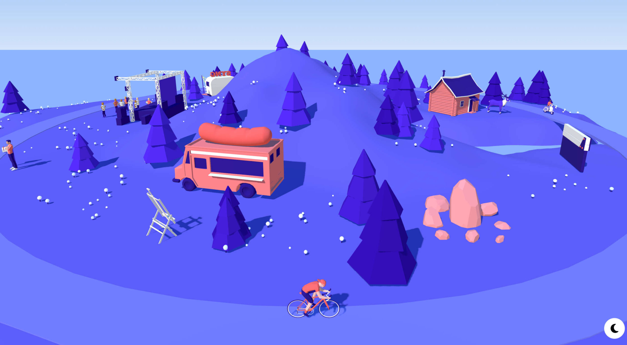
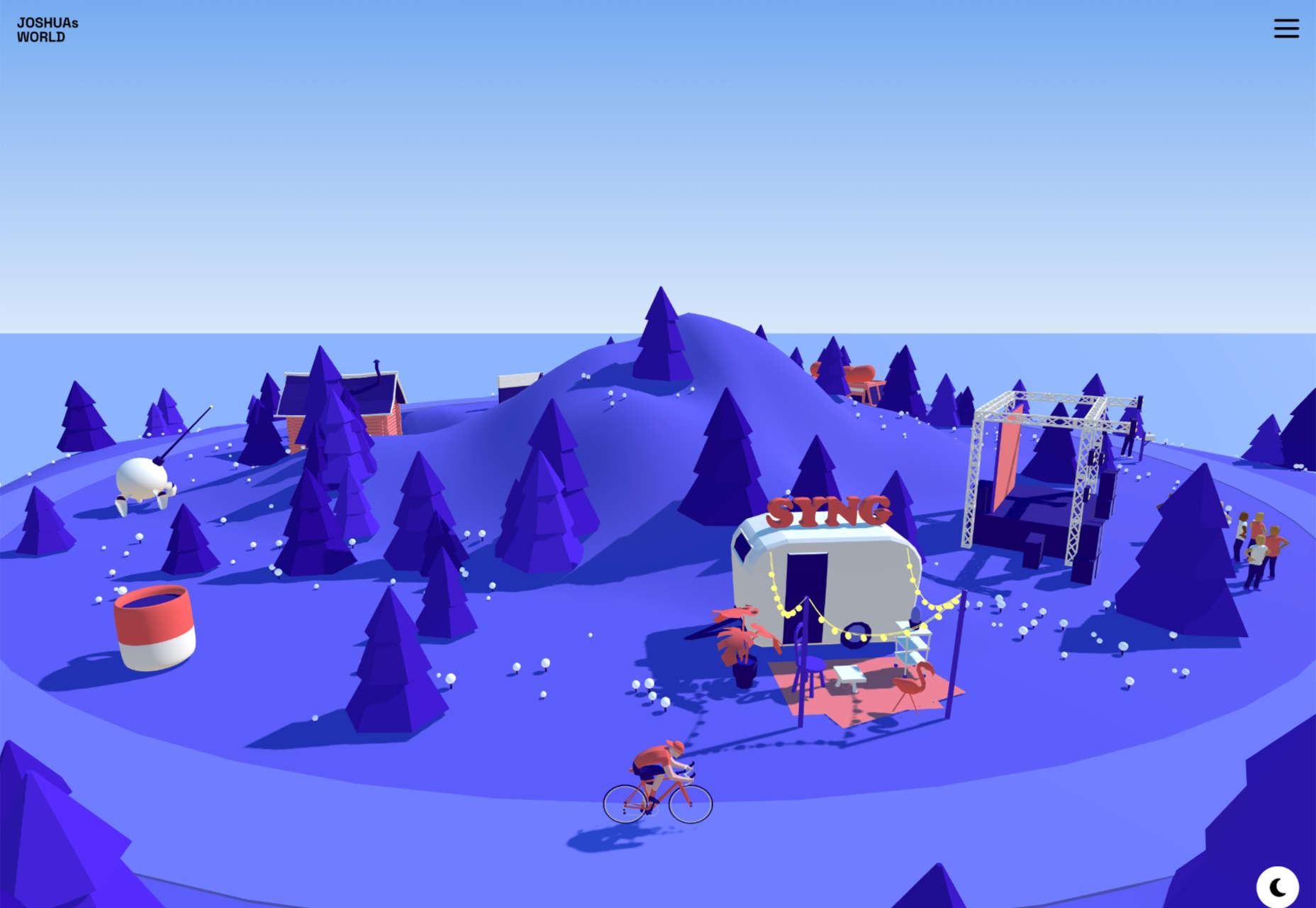
Joshua’s World is a fantastic animated site. Grab and drag to tilt and rotate the island and watch the little cyclist power past important links to milestones in his creative career.

Vana

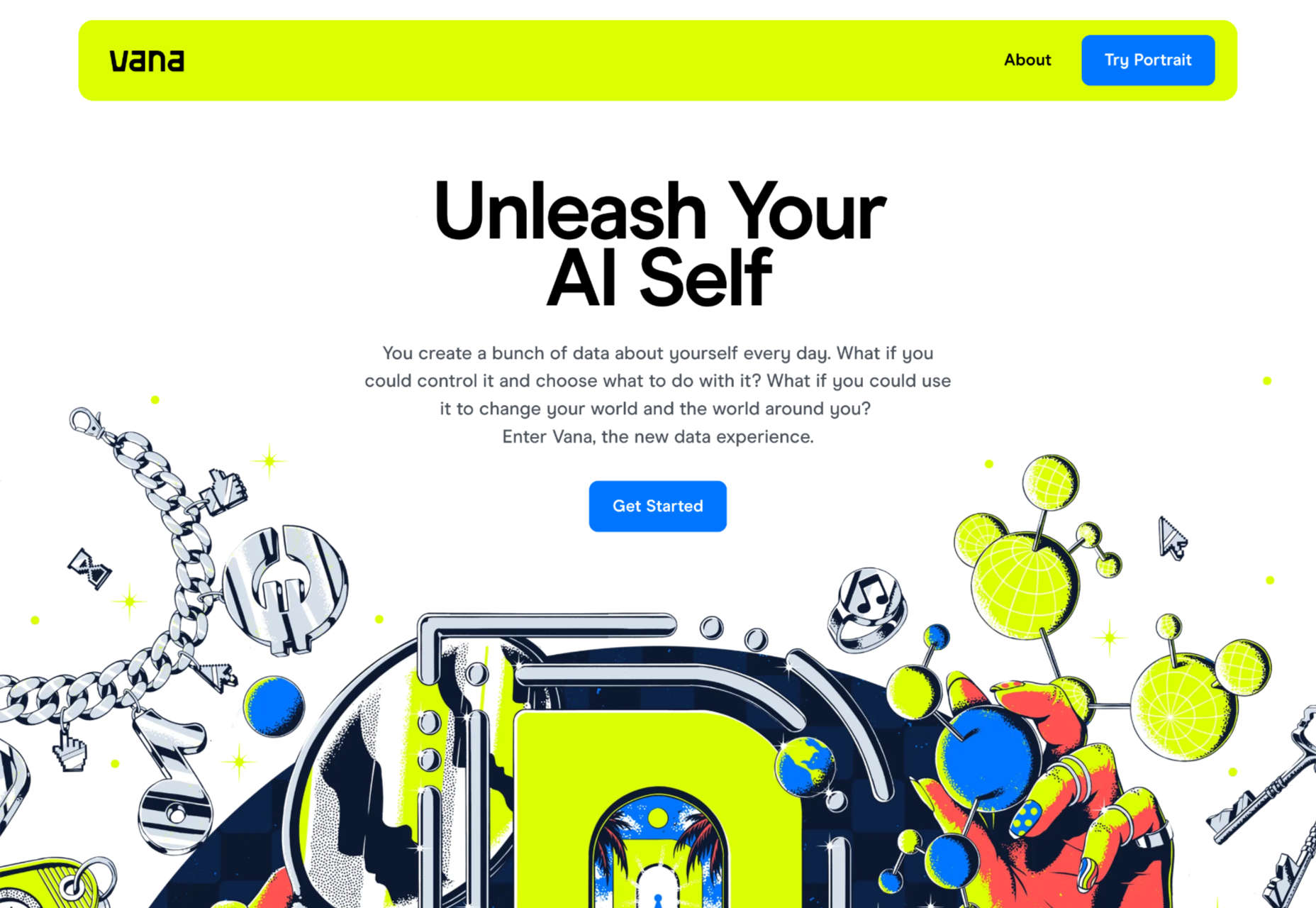
Vana is a new service aiming to help you take control of your data. Its site is modern and lively and uses some great retro-illustrations to bring its features to life.

Velocity Nitro 2

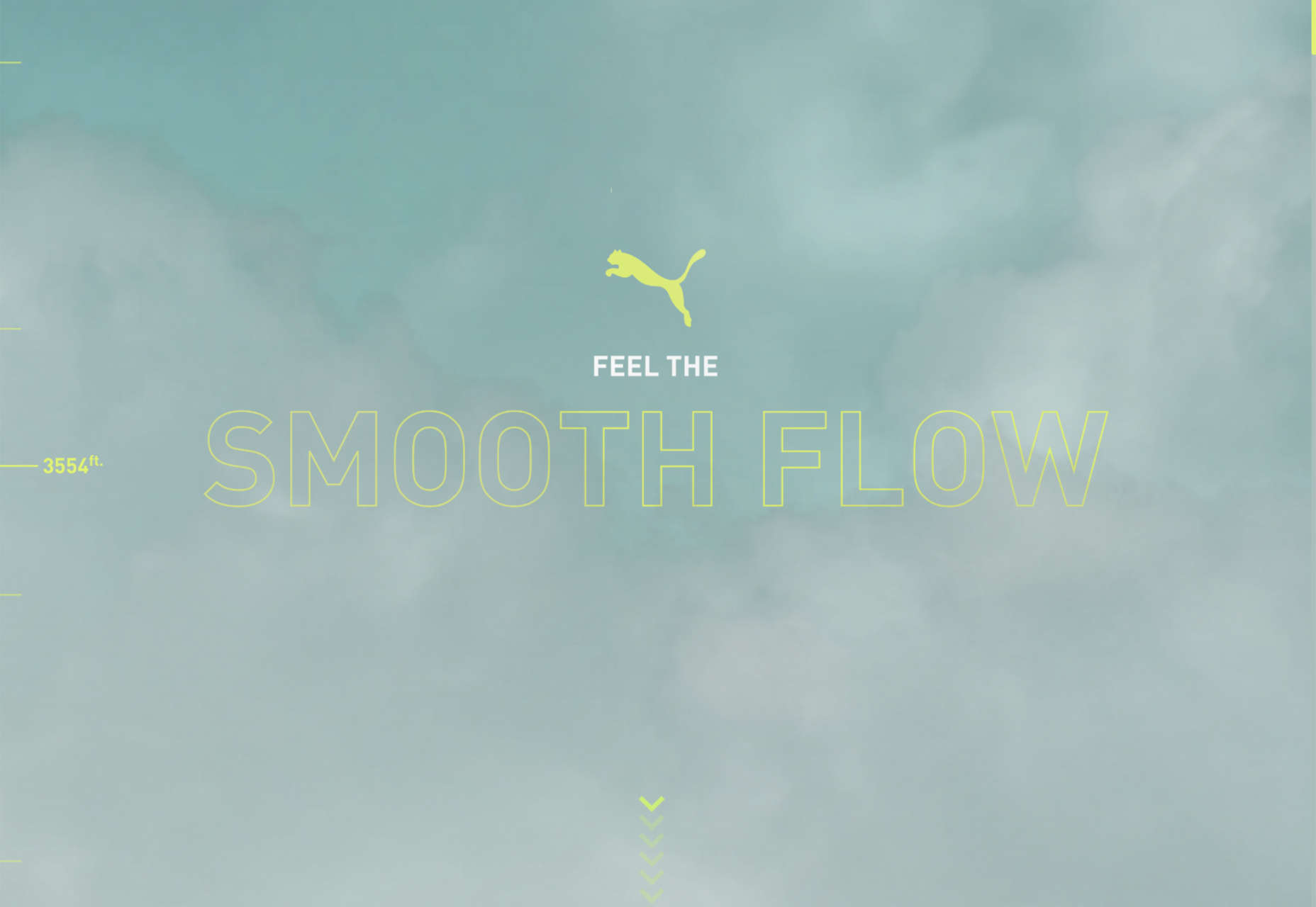
This slick site has some incredible 3D renders for the Puma Velocity Nitro 2 running shoe. The scrollable animation guides you through each feature in a thrillingly engaging fashion.

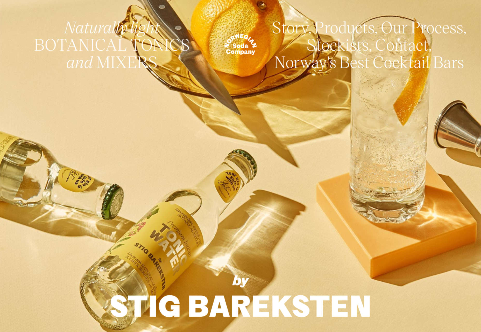
Norwegian Soda Co.

The Norwegian Soda Co. uses beautifully shot photographs to capture the zest of its products. It’s an excellent example of how a one-page site can be rich and engaging.

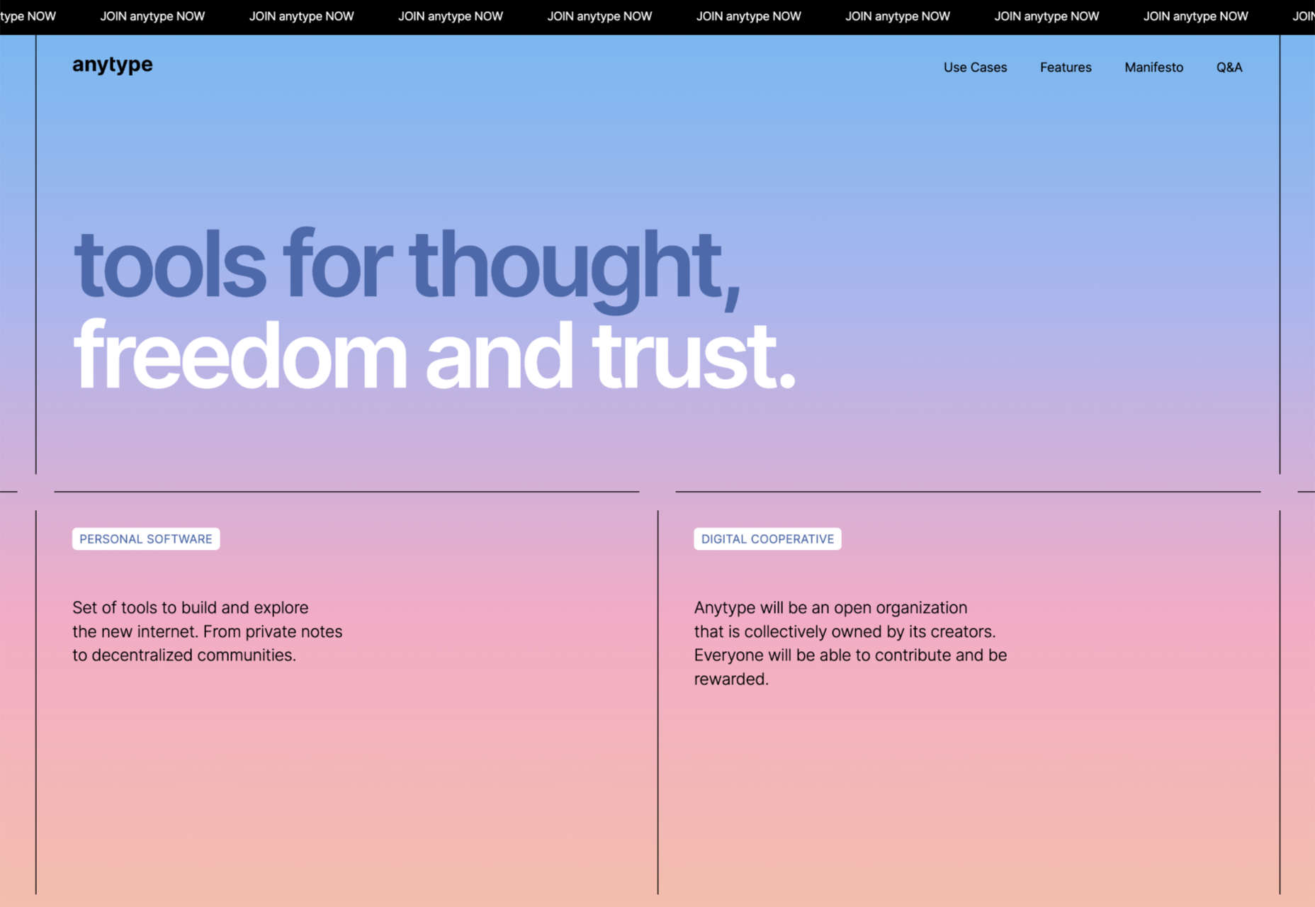
Anytype

Anytype is a collaborative platform pitching itself to creative thinkers. It uses a lovely gradient animation to create a sense of power and technological evolution.

Dash

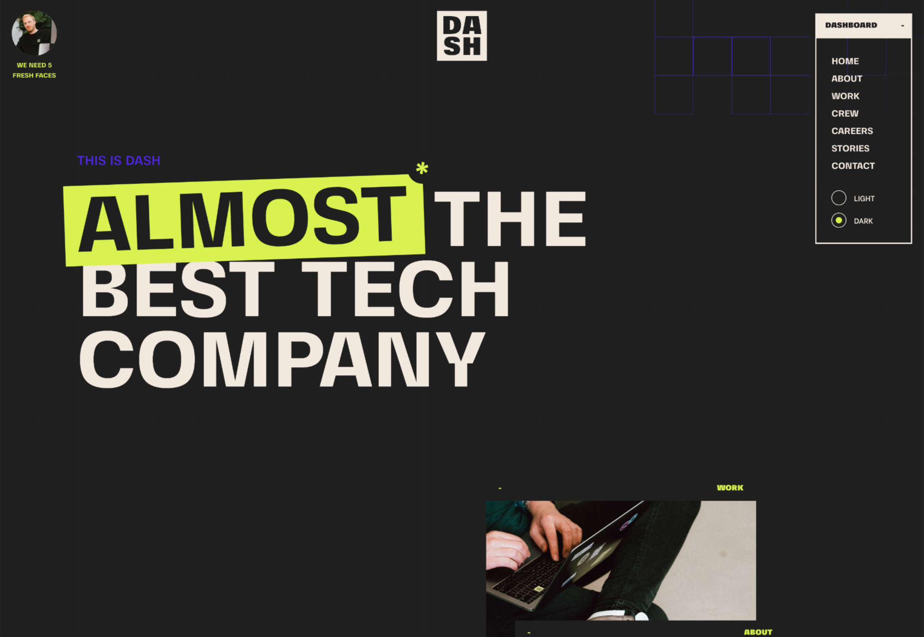
Dash claims to be almost the best tech company, and its modest site does a great job of expelling the tedium from HR. Plus, it has an old-school mouse trail!

Sileon

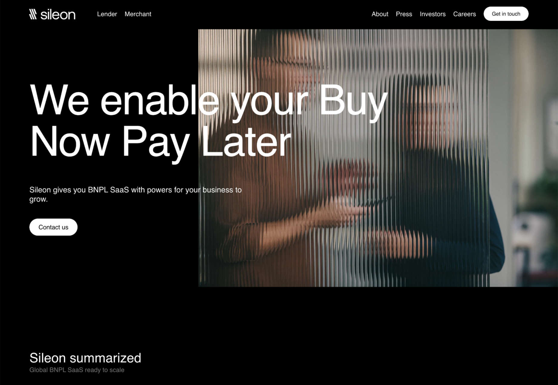
Sileon is a site packed with clever details. For example, the hover effect on text links is pleasingly minimal, and the photography shot through distortion is a simple but effective technique.

Karina Sirqueira

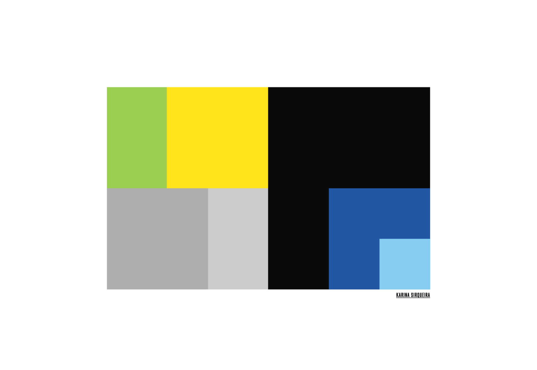
Karina Sirqueira’s portfolio is a joy to browse through. The morphing shapes add interest to a collection of case studies that are engaging and beautifully presented.

Hotel Santa Caterina

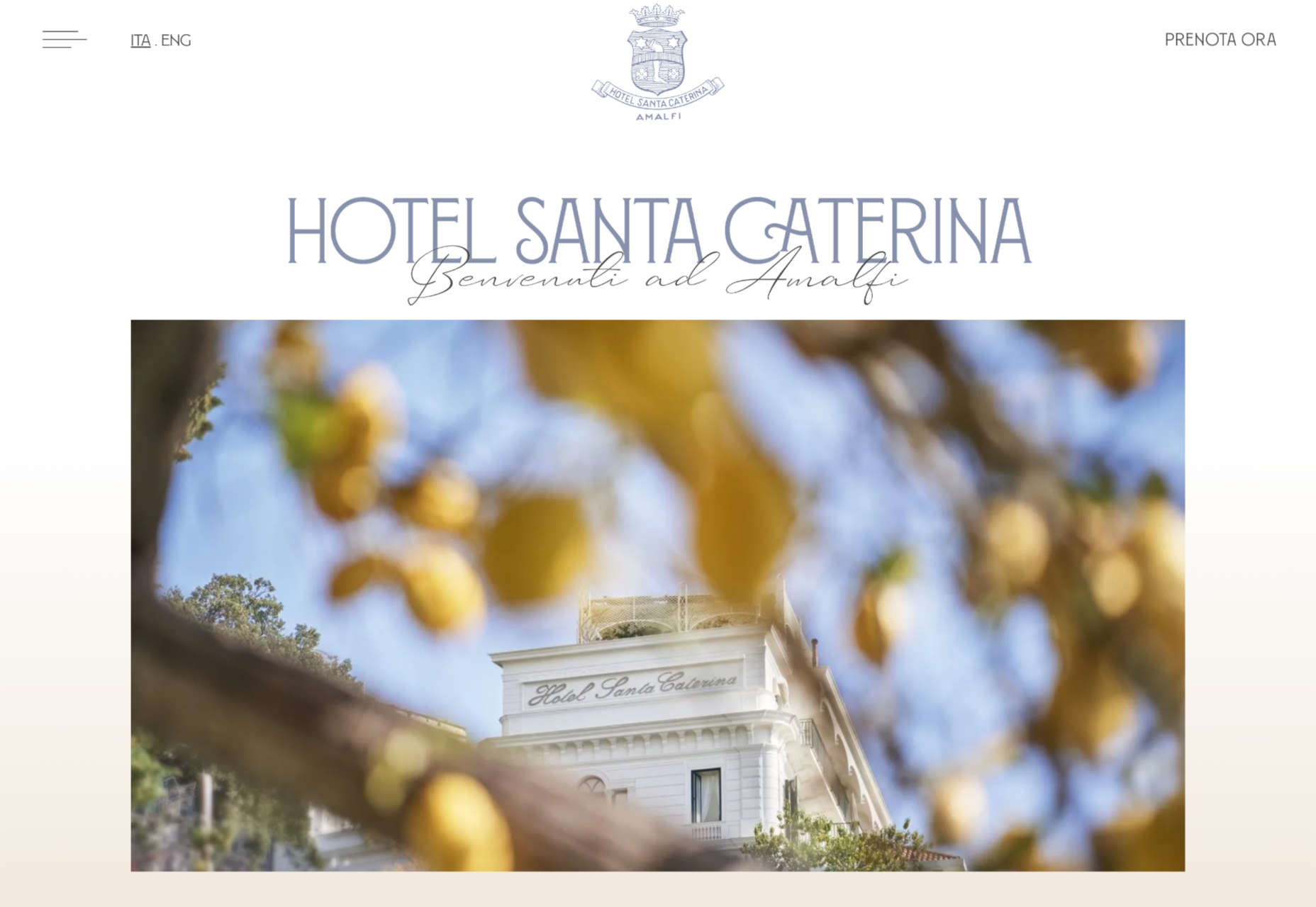
This beautiful website for the Hotel Santa Caterina on the Amalfi Coast captures the light and wonder of the region with a muted color palette and stunning photography.

La Lulu

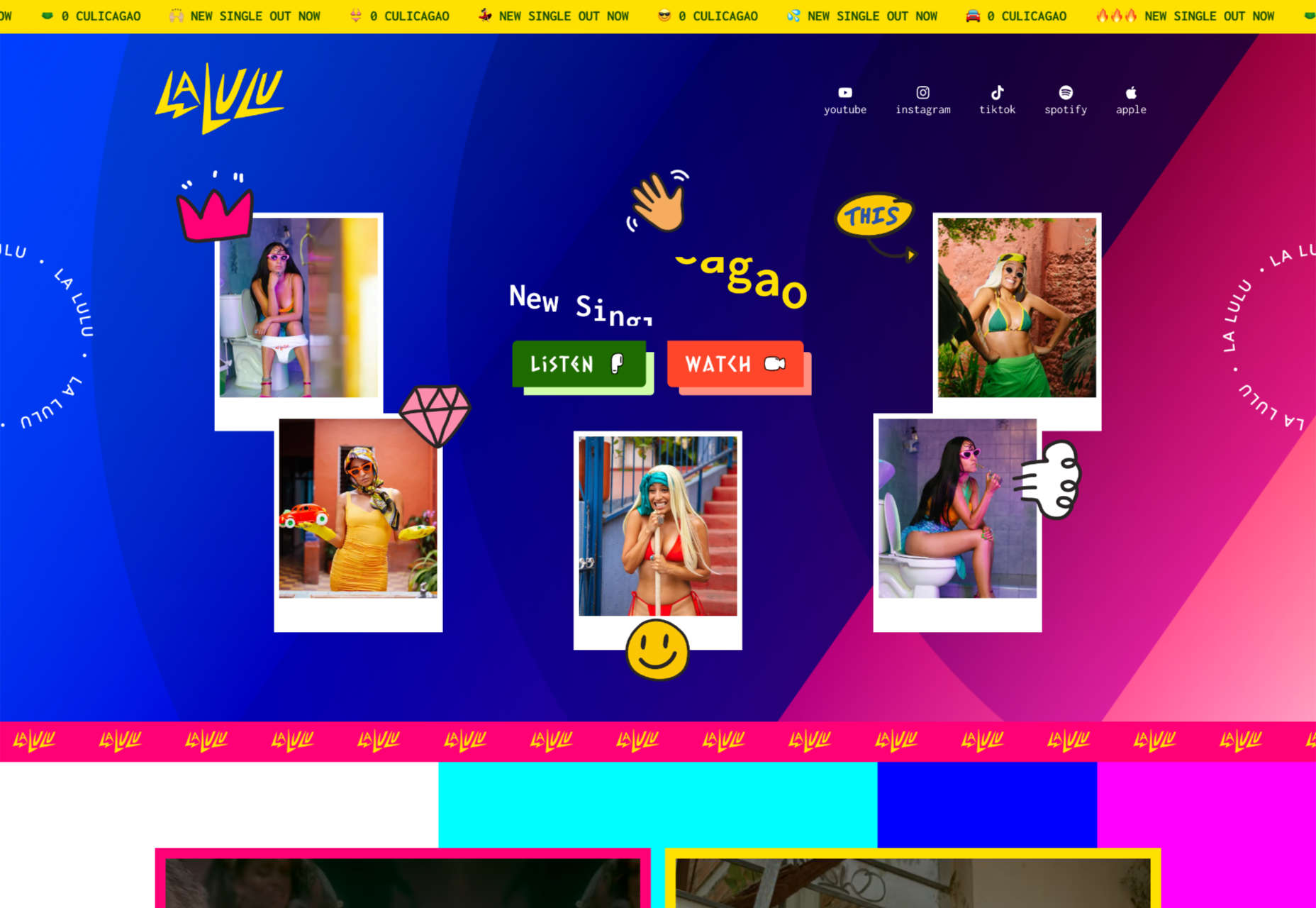
La Lulu is a Columbian-American singer, dancer, and musician. Her site uses color to disrupt a fairly standard layout and infuse it with amazonian, psychotropic, South American vibes.

International Magic

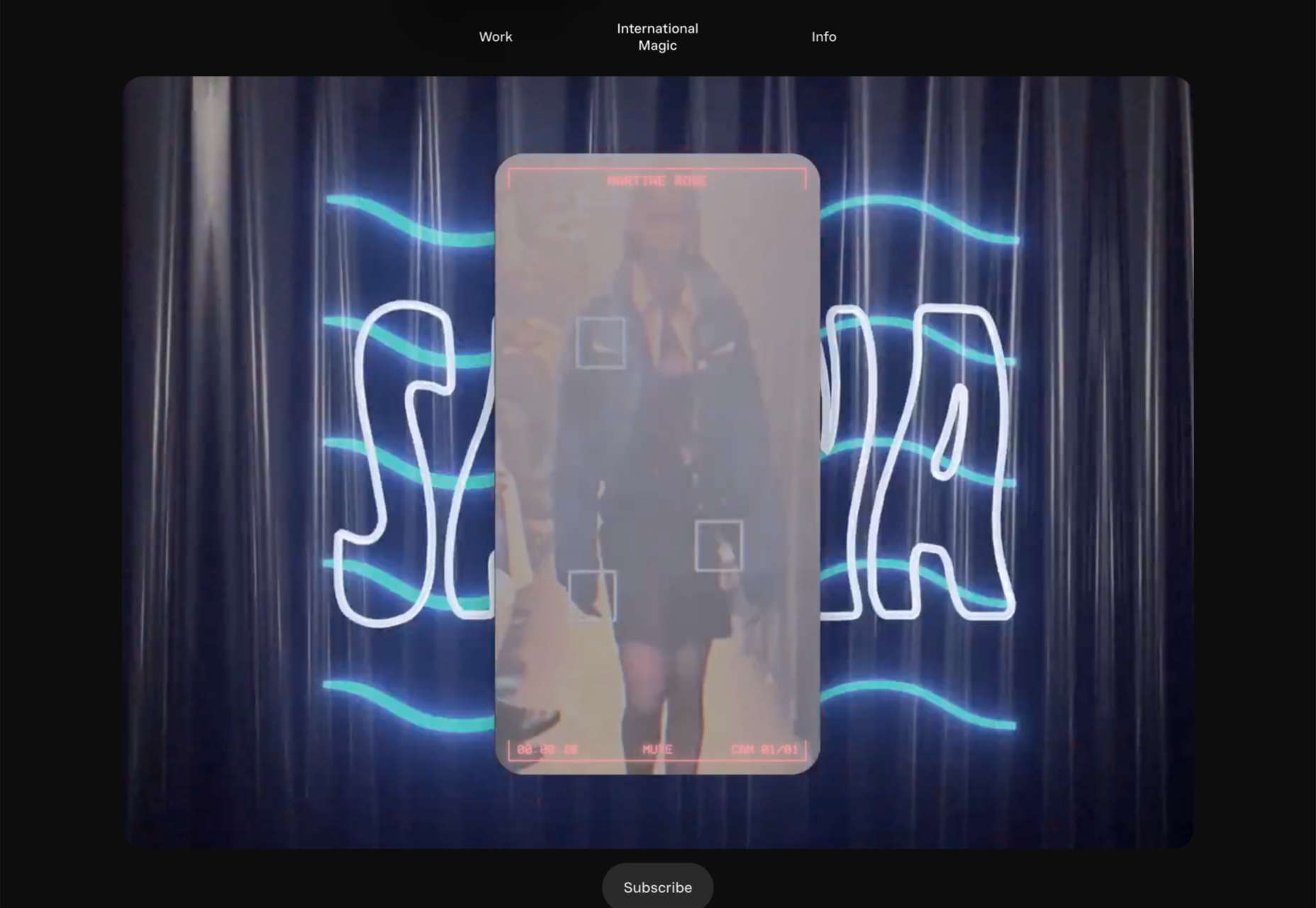
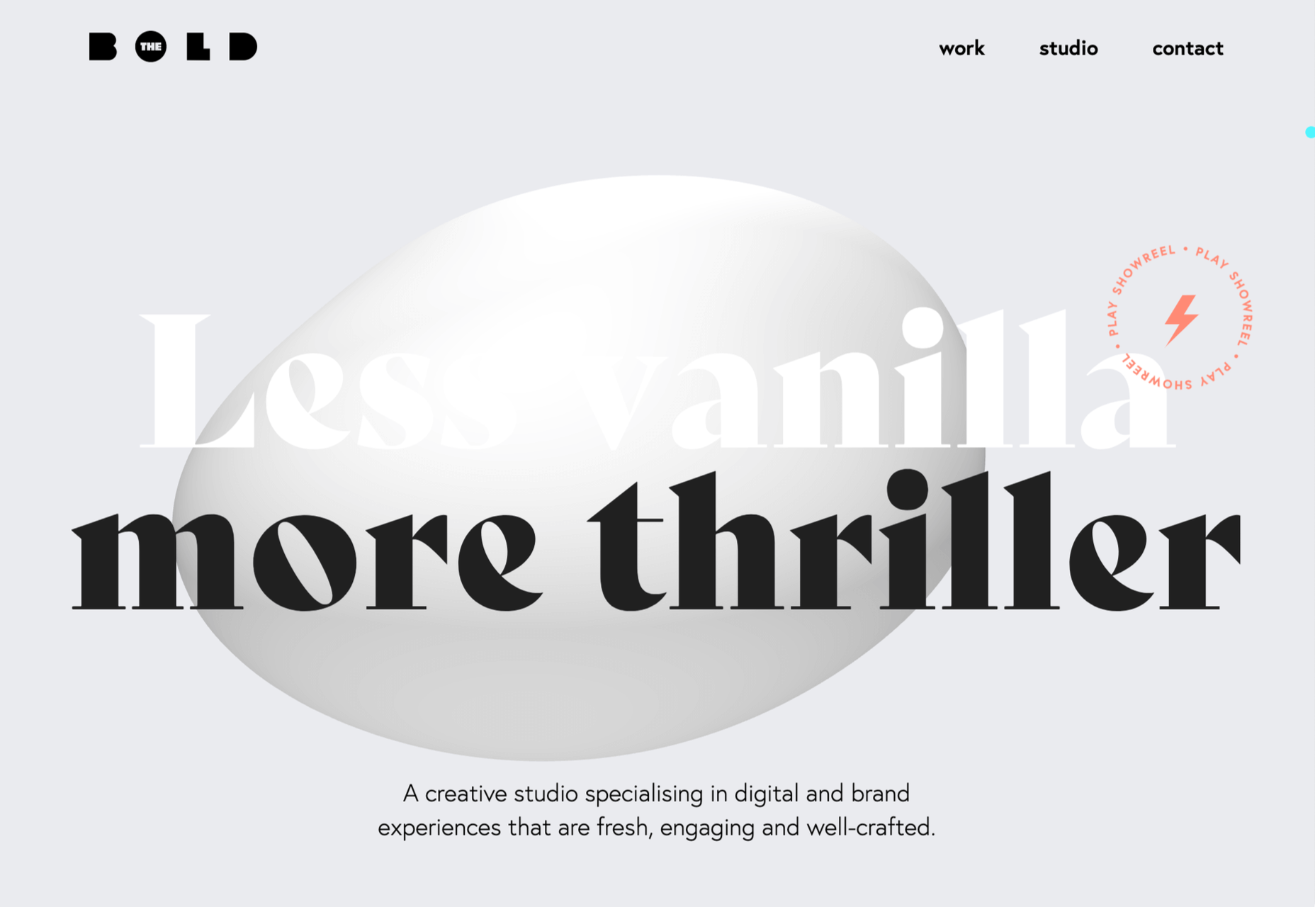
International Magic is a design agency that boasts some impressive clients, from Maison Margiela to Nike. Its scroll-to-browse portfolio is a masterful example of selling design.

OAD

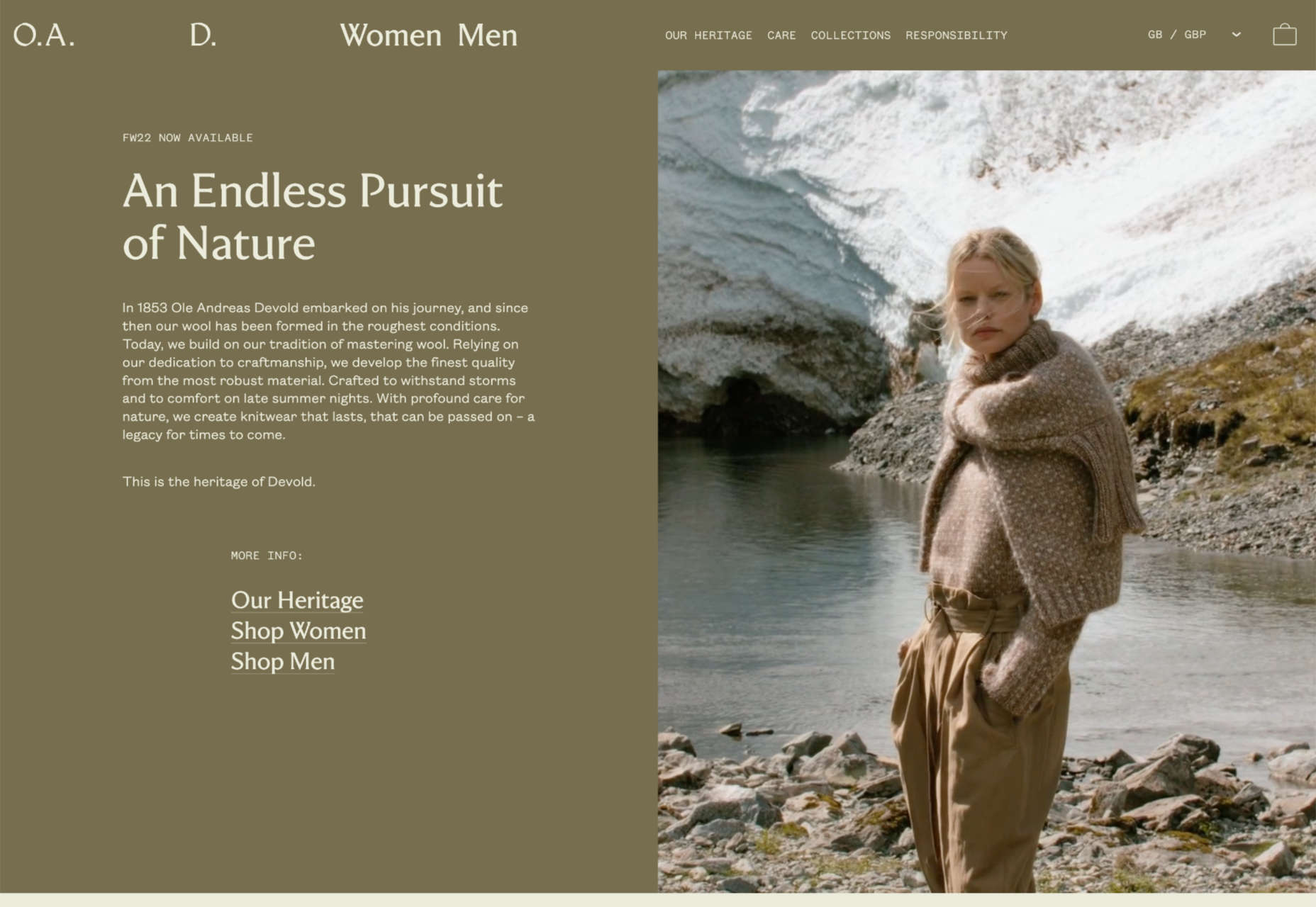
OAD uses color expertly to convey contrasting temperatures. At this time of year, who doesn’t want a pullover crafted to withstand the Norwegian weather?

También

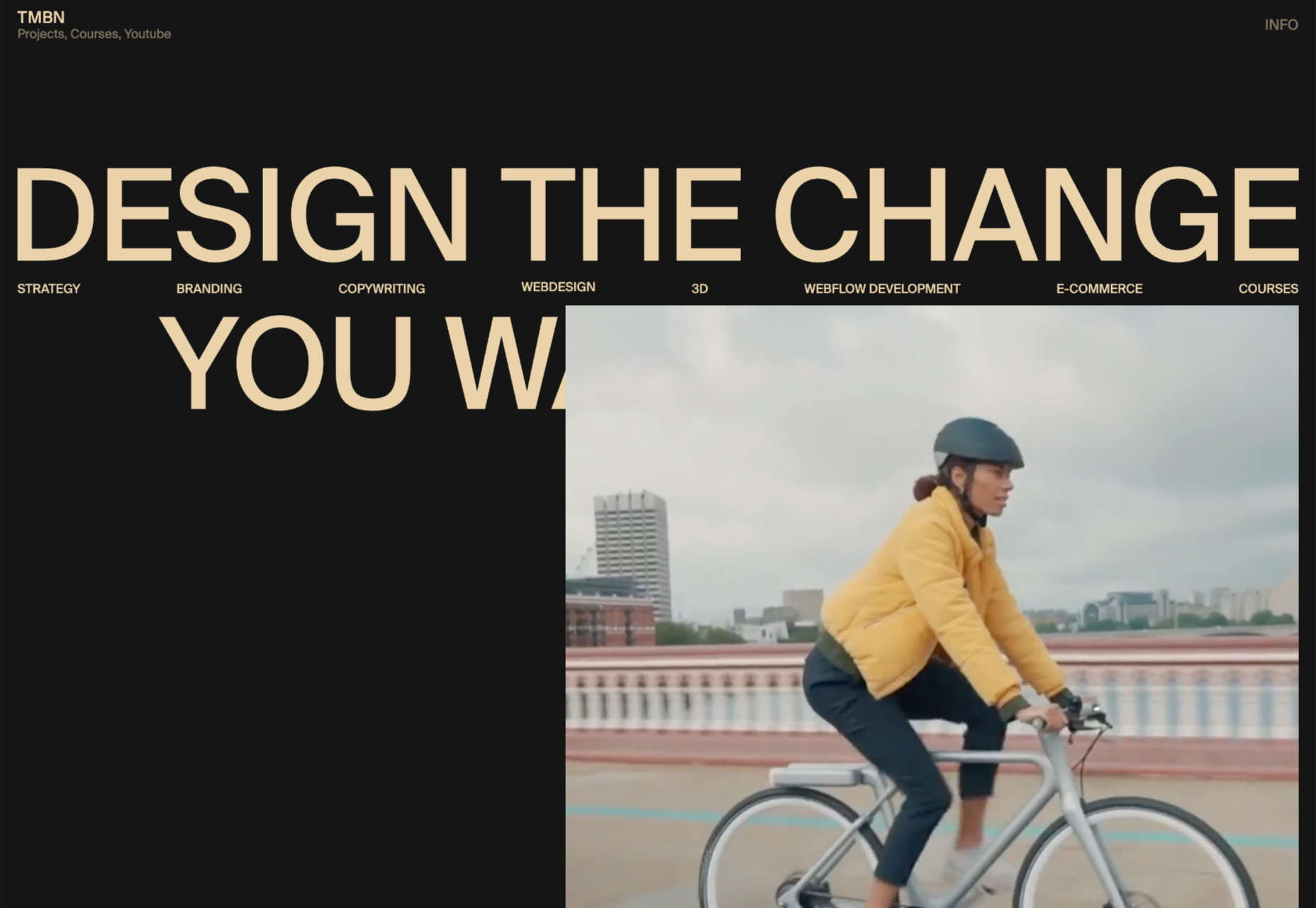
También is a creative agency specializing in organizations that positively impact the world. Its scrolling collage of client projects is one of the best examples of this type of portfolio.

Dragonfly

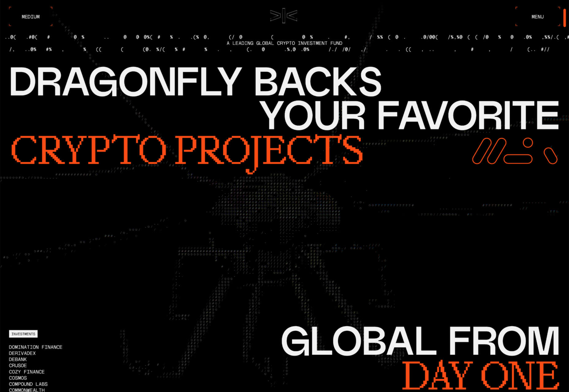
If you were designing a website to be used in a 90s film about the internet, you’d create Dragonfly’s site. It’s packed with glitches, code references, and awesome pixelated imagery.

Elva

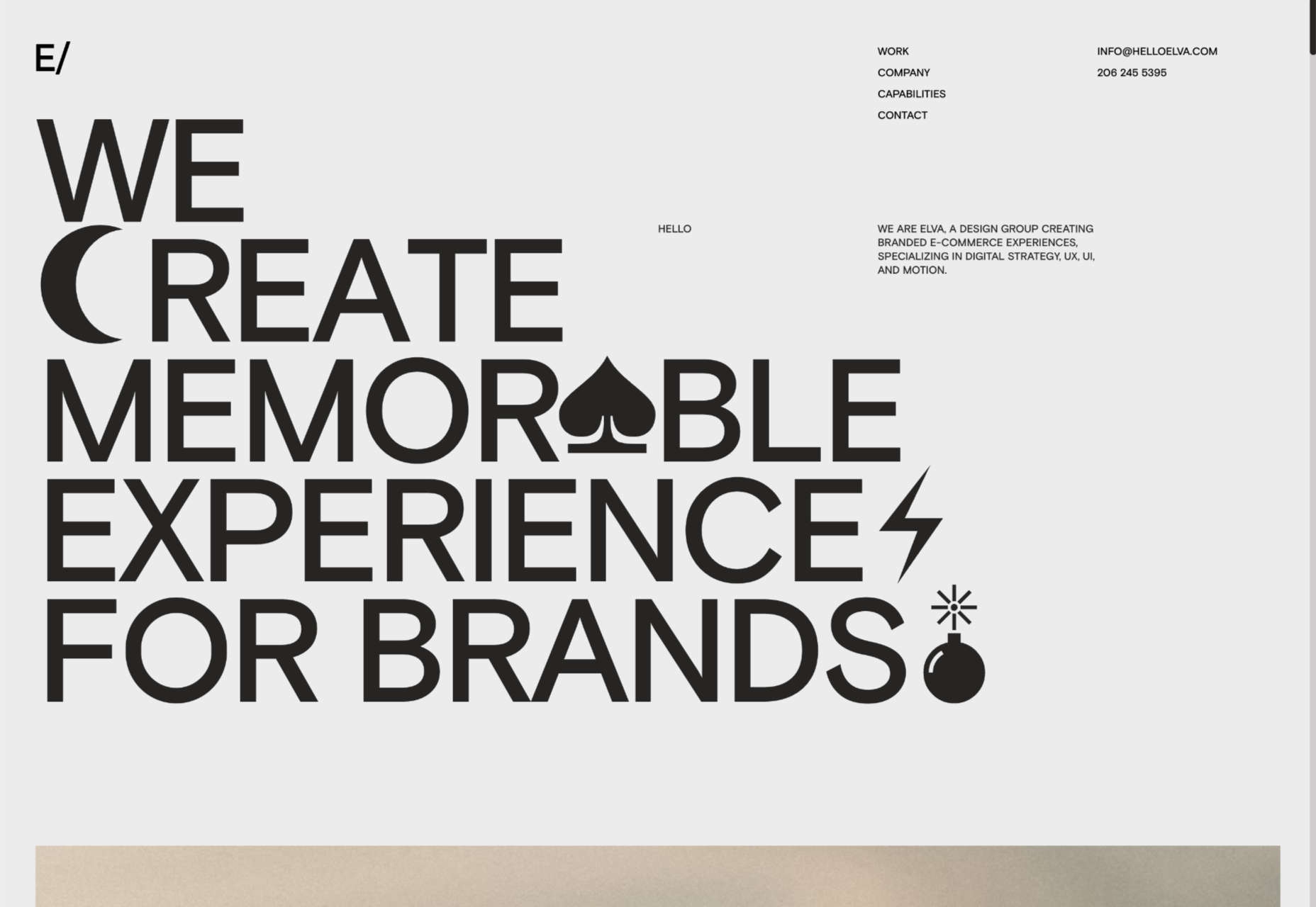
There’s a lot of distortion entering the design lexicon at the moment, and one of the best examples is Elva’s portfolio site, which uses it to enliven its black-and-white site.

Sussex Taps

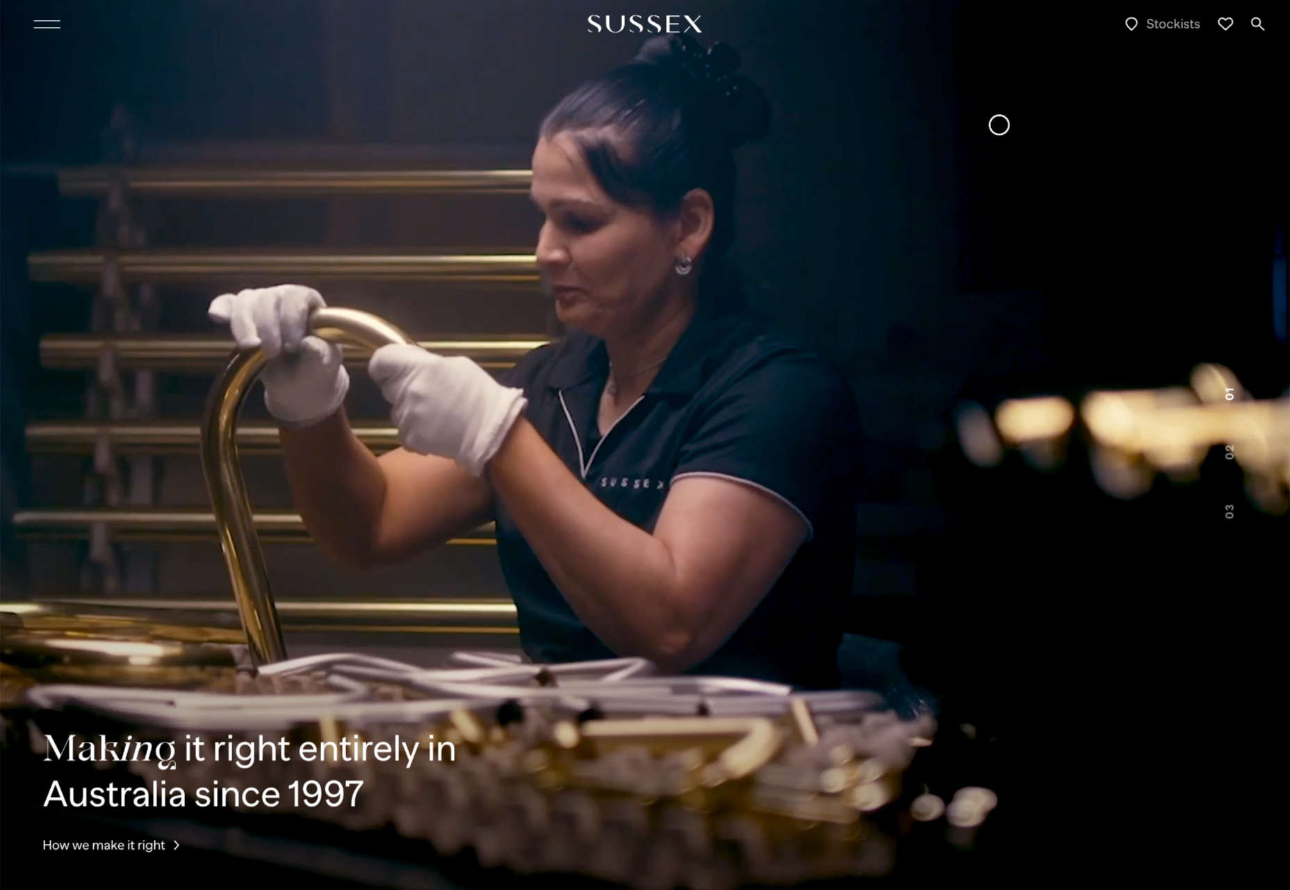
Sussex Taps uses multiple full-screen video clips to sell its carbon-neutral tapware range, but it’s the horizontal scrolling product videos that really make this site stand out.

Angello Torres

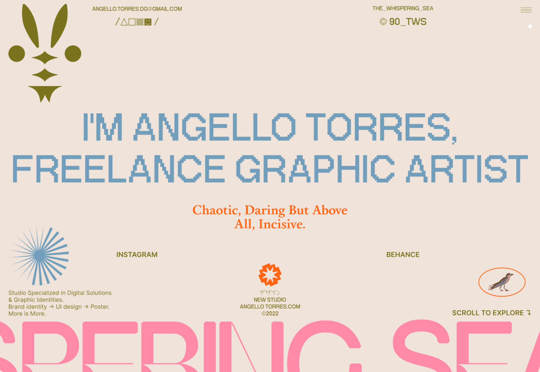
Angello Torres’ portfolio is packed with daring typography that breaks pretty much all the rules and yet still manages to work somehow to convey energy and creativity.

Repeat

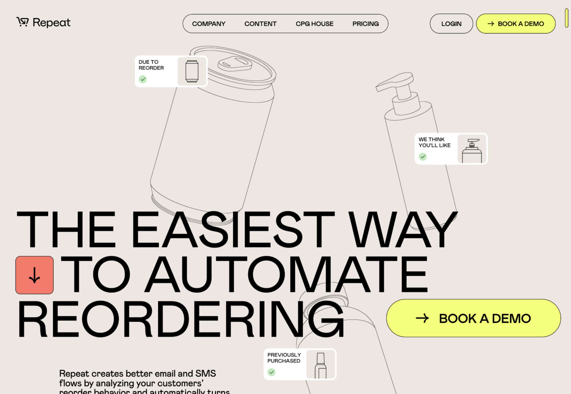
Repeat is an excellent service for upselling customers with repeat orders. It uses simple illustrations to represent generic products with an attention-grabbing yellow for interactions.

High Five Strategies

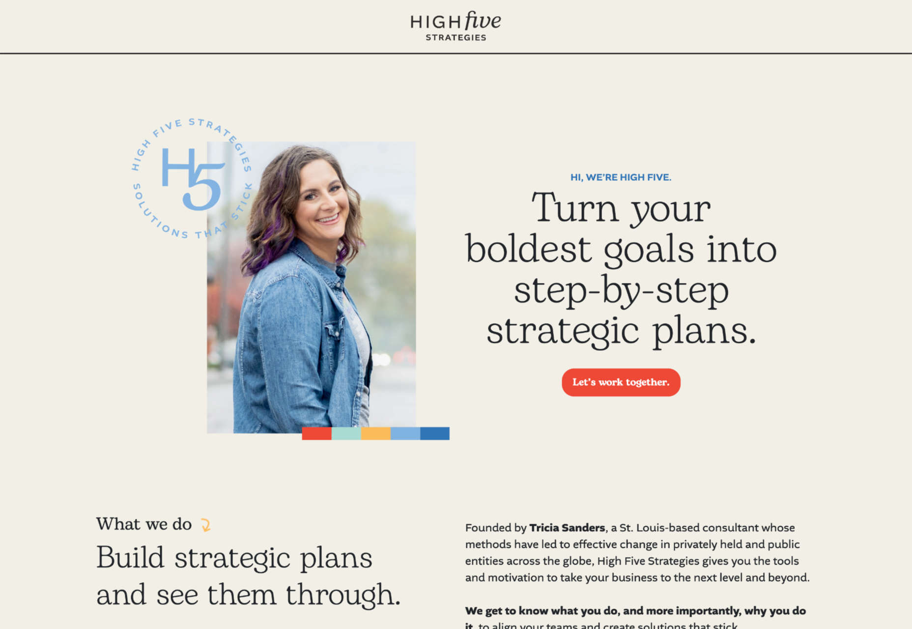
High Five Strategies eschew the formality of most business pitches to deliver a positive message with bold colors and typography that makes you feel ready to move forward.

Delight

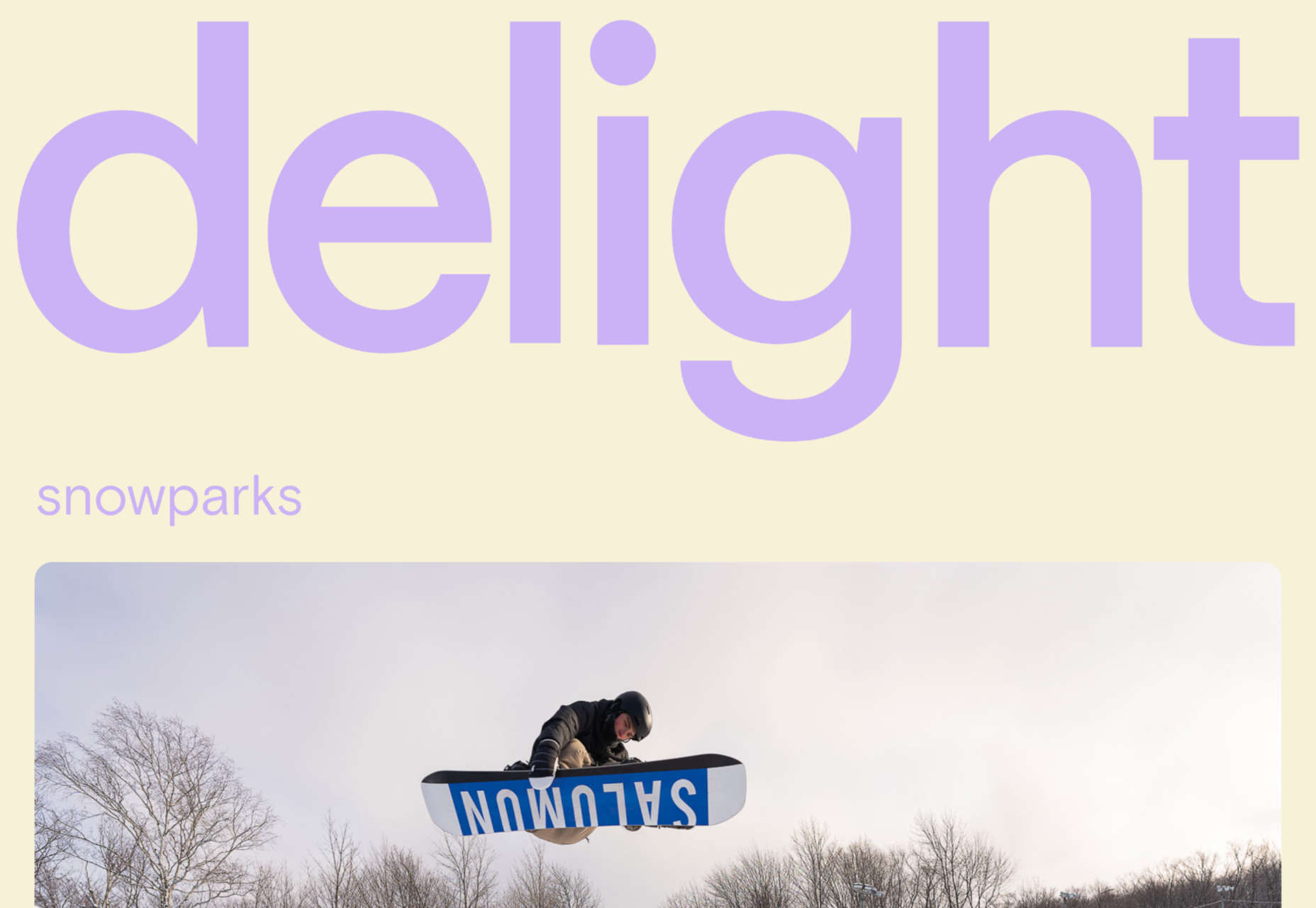
Delight Snowparks employs a questionable lilac color, but its fantastic imagery and video framing more than makes up for that. Plus, there’s another super-old-school mouse trail!

Source

The post 20 Best New Websites, November 2022 first appeared on Webdesigner Depot.
Source de l’article sur Webdesignerdepot

Welcome to our guide to the best new websites this month. If subtle, minimal sites are your thing, either look away now or prepare to have your preconceptions challenged because this month, we are going maximalist.

Lots of elements fill up the screen, lots of color, lots of big fonts, lots of illustration, and plenty of in-your-face personality. This is a tricky style to get right: if elements are not chosen and placed well, the result is simply annoying clutter. If done well, the result can be impactful and memorable.

[And Happy Independence Day to all of our American readers!]

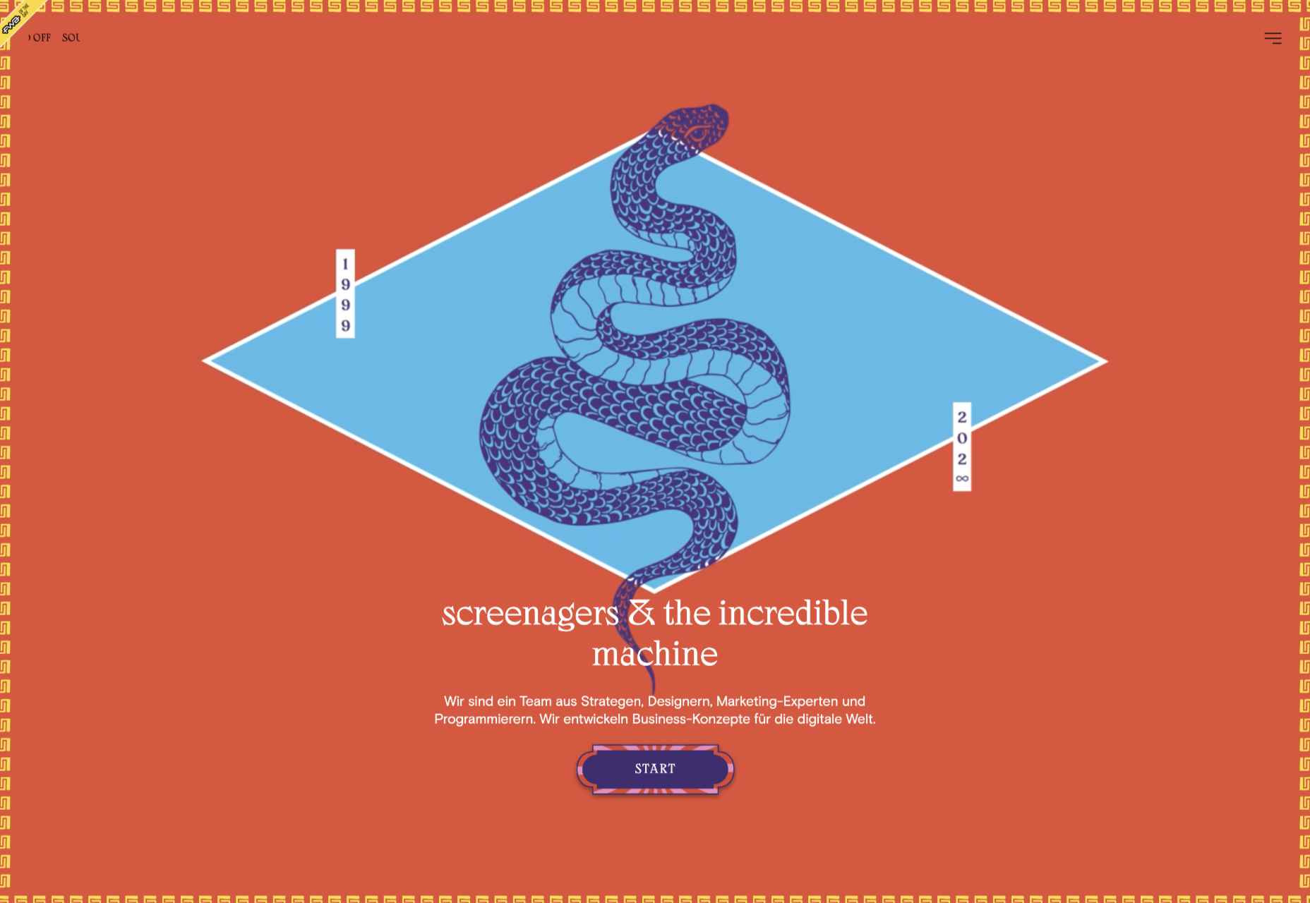
screenagers & the incredible machine

screenagers & the incredible machine’s site puts illustration front and center, creating a look that evokes various mystic ideas. It sounds strange, but it works.

Anna Jóna

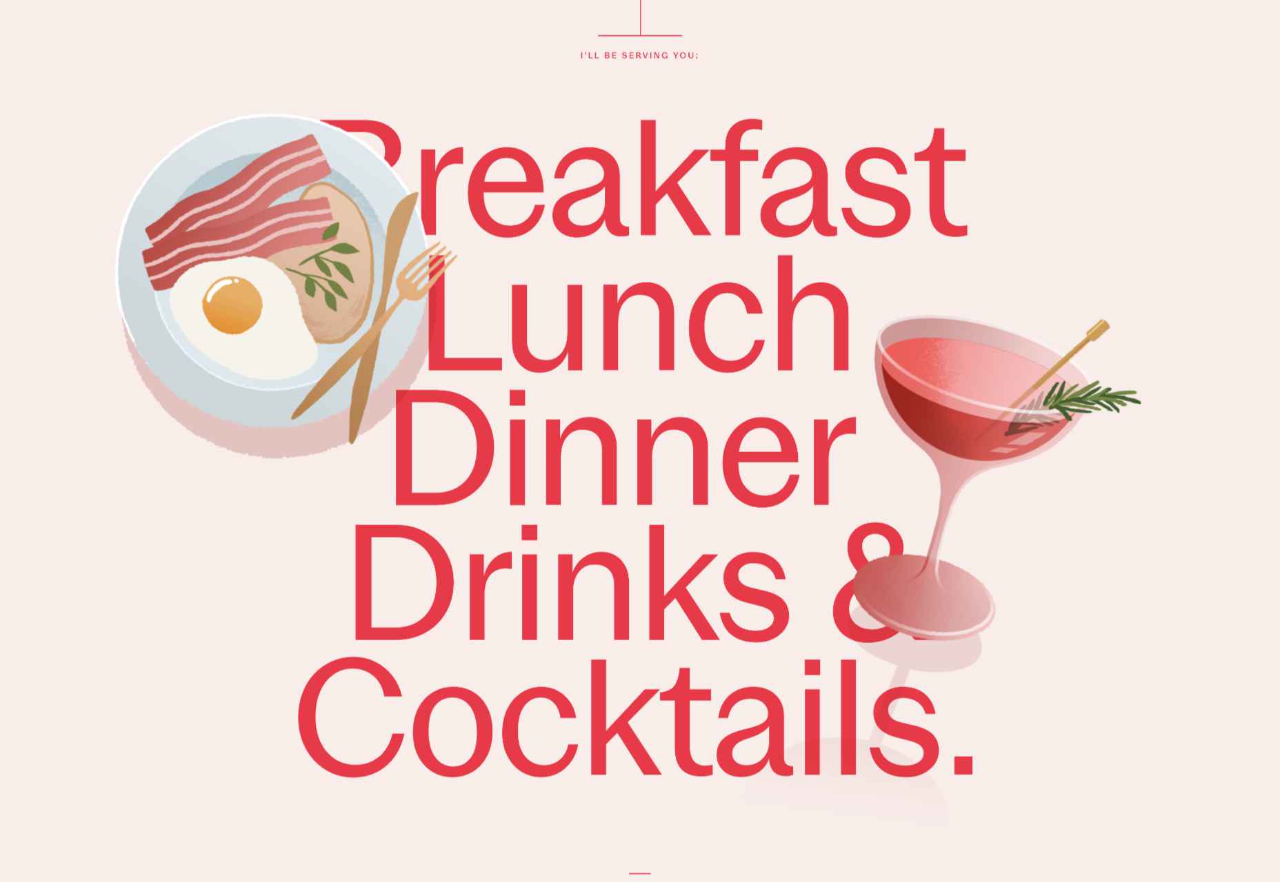
This prelaunch teaser site for Anna Jóna café and cinema has an elegant yet modern feel.

Hardpops

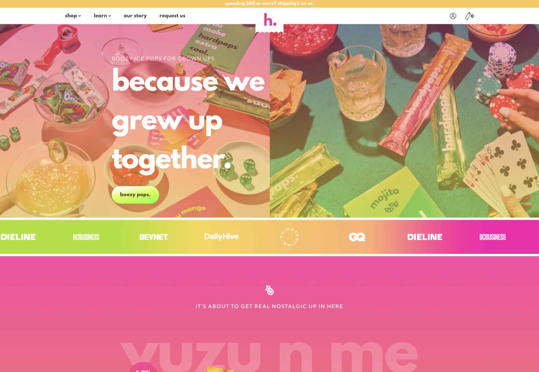
This site for Hardpops (alcoholic) ice pops takes its cue from the product flavors, and the bright, fruity colors give it a real zing.

Daniel Spatzek

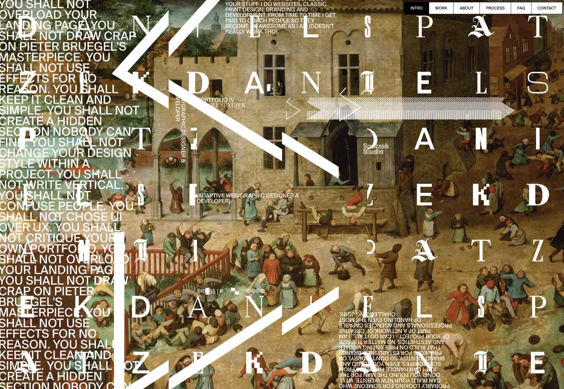
Daniel Spatzek’s portfolio site takes the rules-are-made-to-be-broken approach. The result has attitude and a nice touch of humor.

Ander Agency

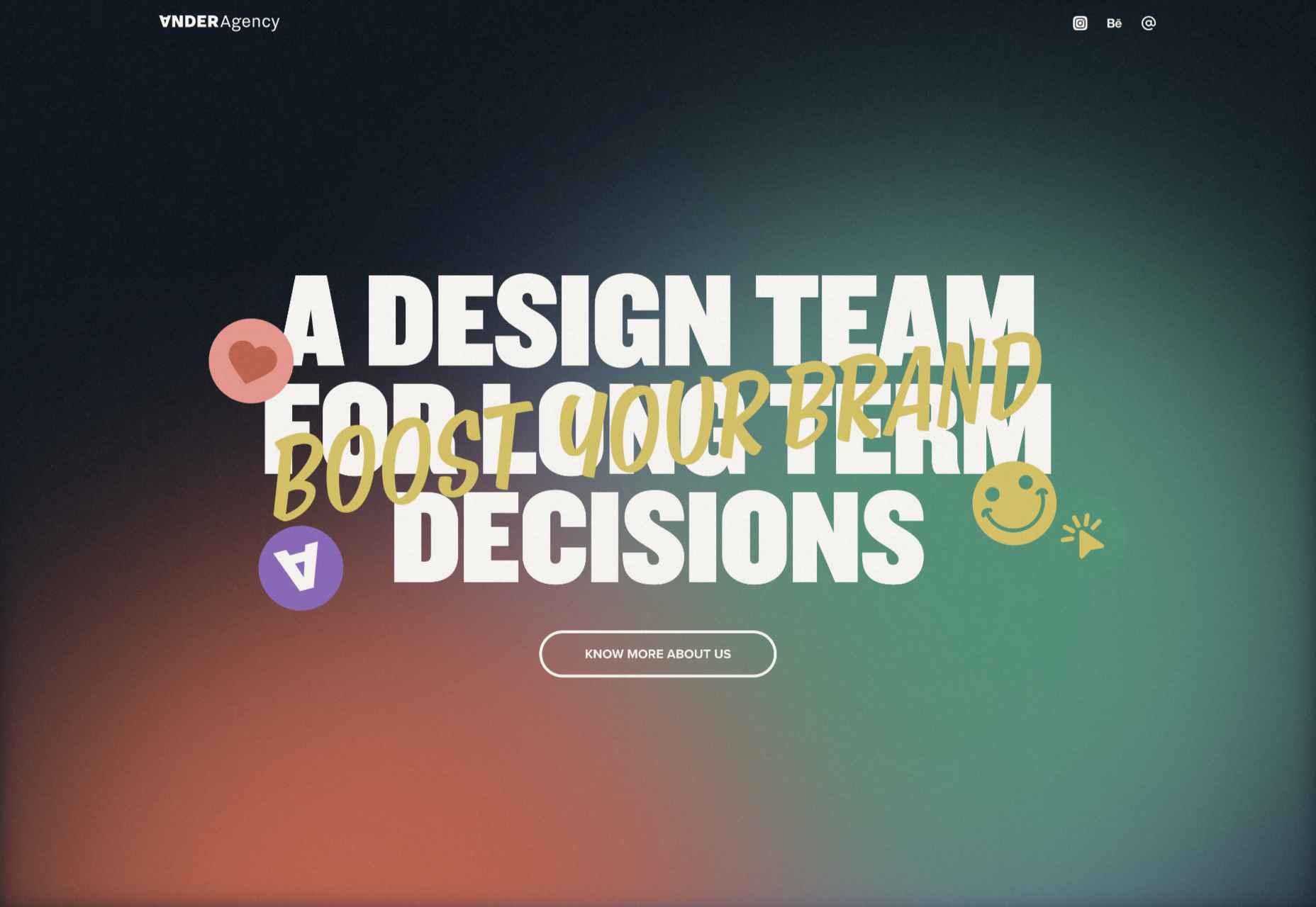
Plenty of color, large type, and illustration make a bold statement for Ander Agency’s single-page site.

Pretty Damn Quick

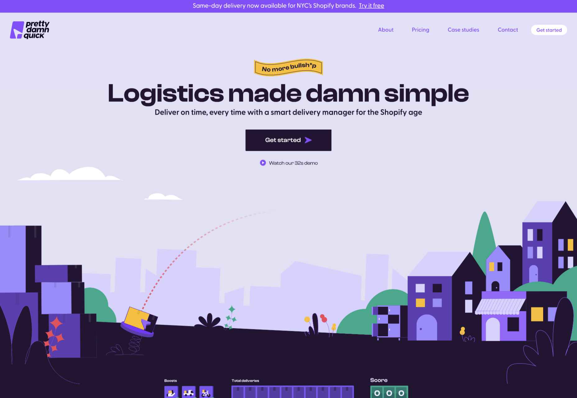
Colorful illustration on this site for Pretty Damn Quick’s Shopify app creates an impression of friendliness about the company and ease of use of the product itself.

Know Your Beetle

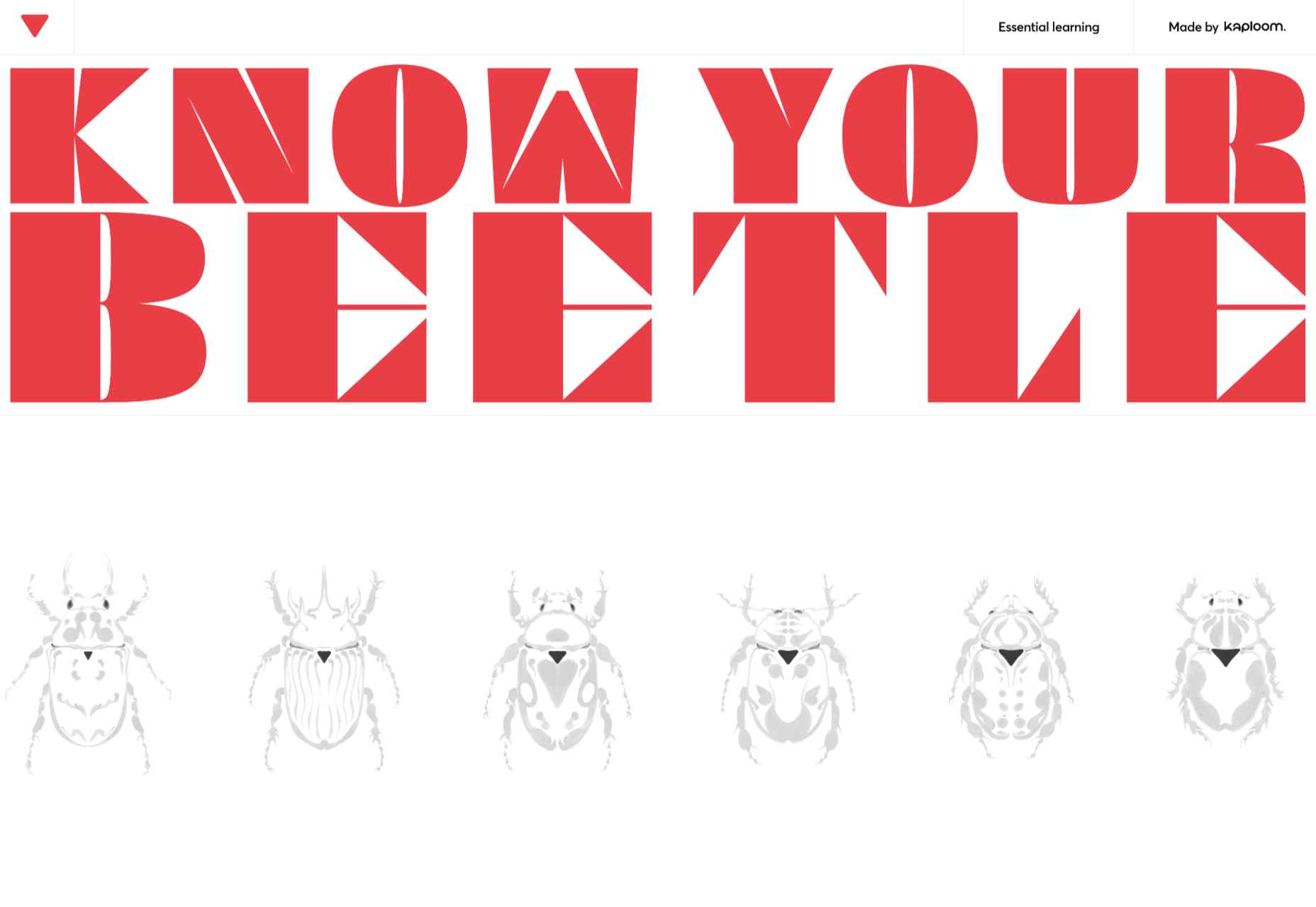
Know Your Beetle is a showcase page for Kaploom creative studio. Color and type combinations make a big impact.

WTFFF

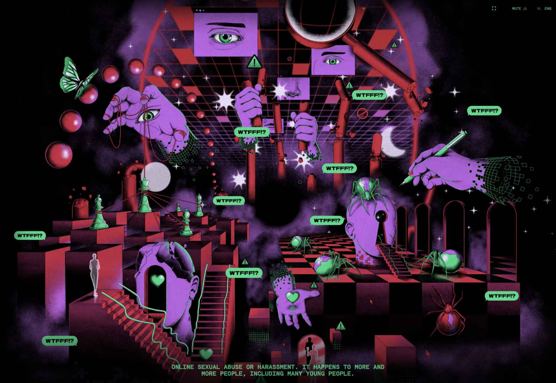
While many of the sites featured here have a sense of fun about them, WTFFF tackles a somber subject: online sexual abuse and harassment. Artwork and audio create an immersive experience in which five young people share their experiences with the aim of helping others.

BelArosa Chalet

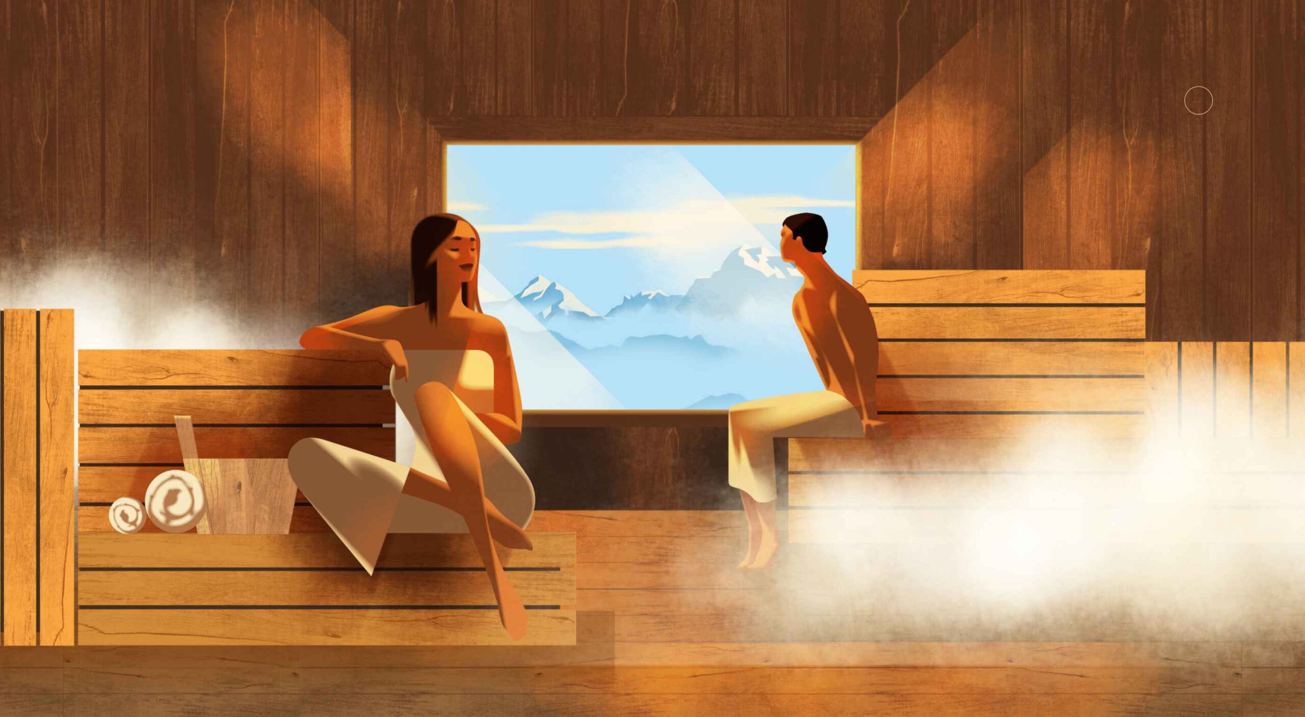
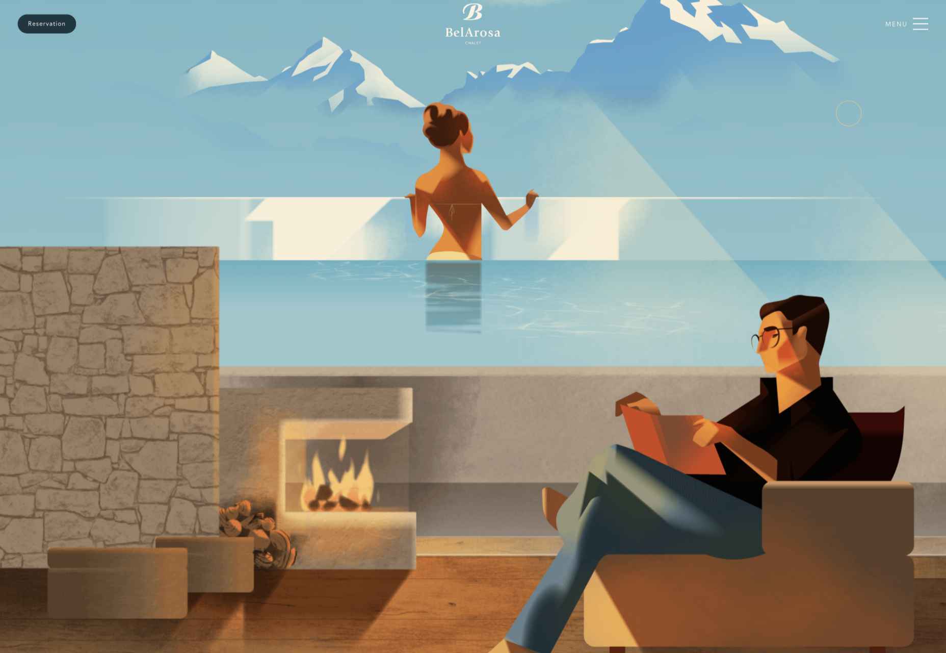
Full-screen illustrations with a hint of vintage style create an ideal impression of what future guests can expect from the currently under construction BelArosa Chalet.

Paradam

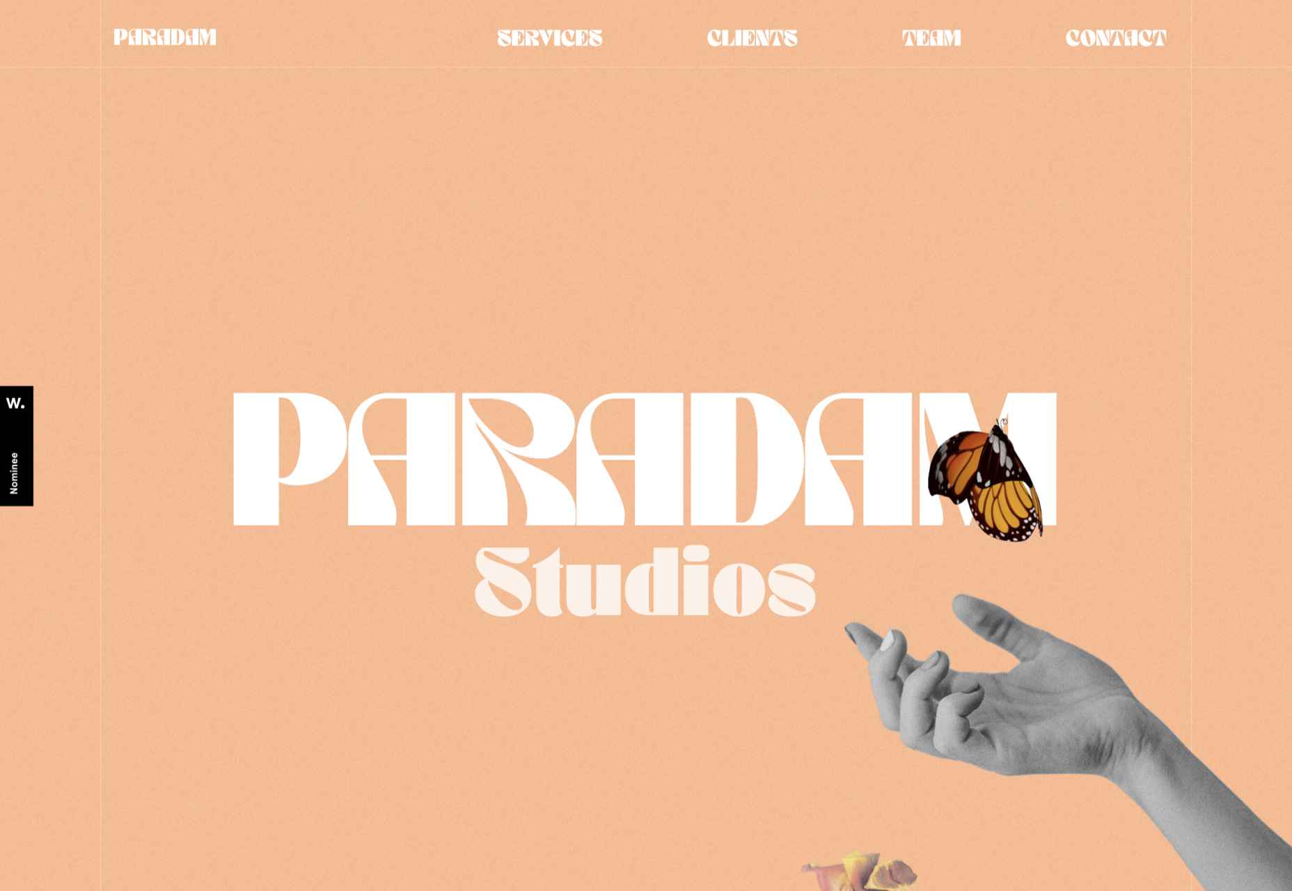
The color scheme on the Paradam site is on the pastel end of the scale, but there is still lots going on to entrance the eye.

Tilton Group

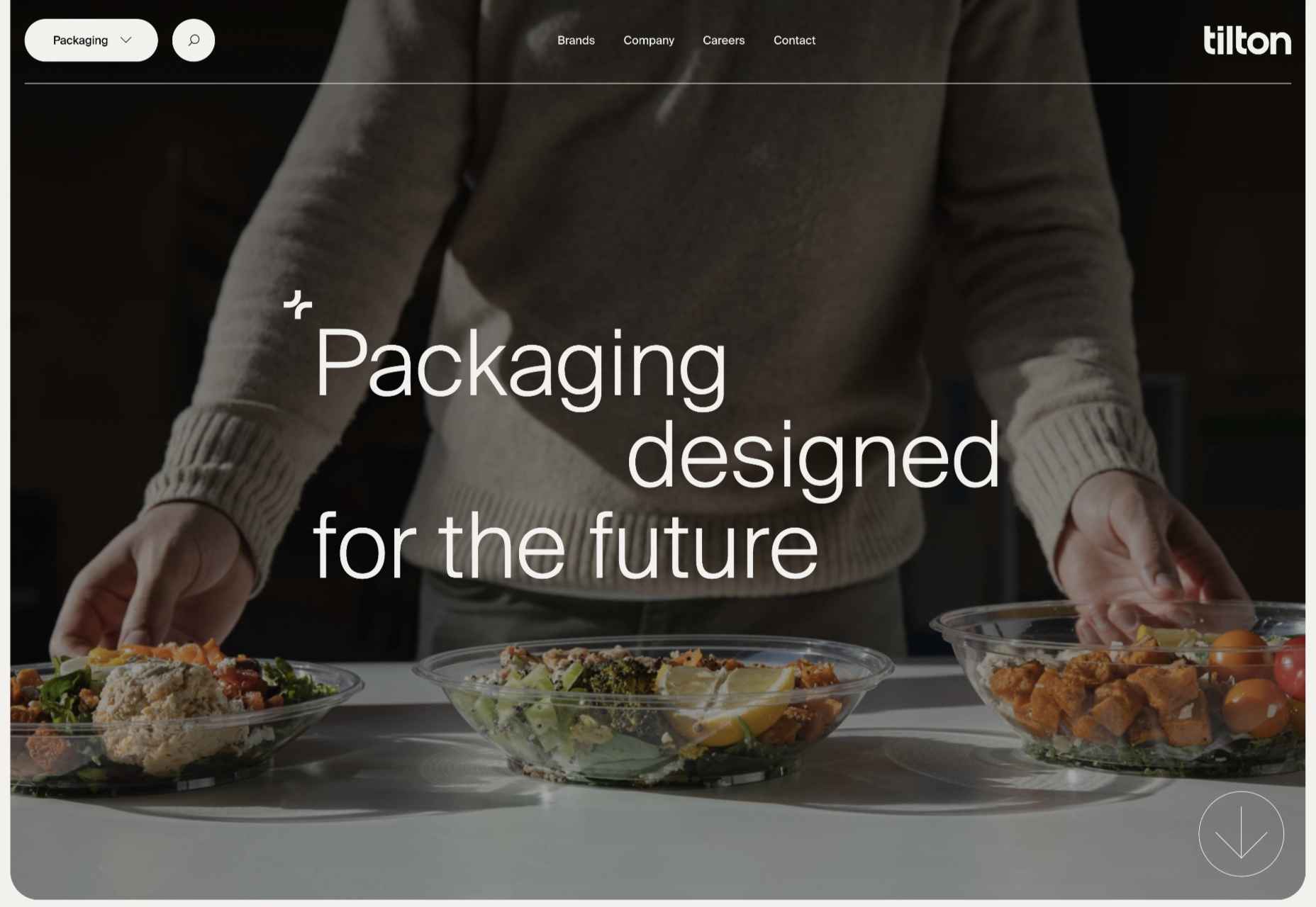
The scrolling color panels on the Tilton Group site are a thing to behold.

Fresco

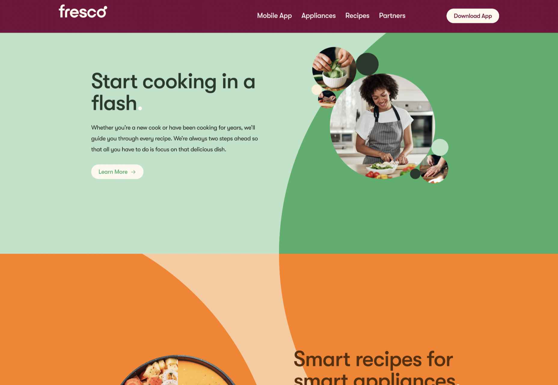
Fresco uses a standard layout design, but the colors and quarter-circles instantly lift it.

Museum of Pink Art

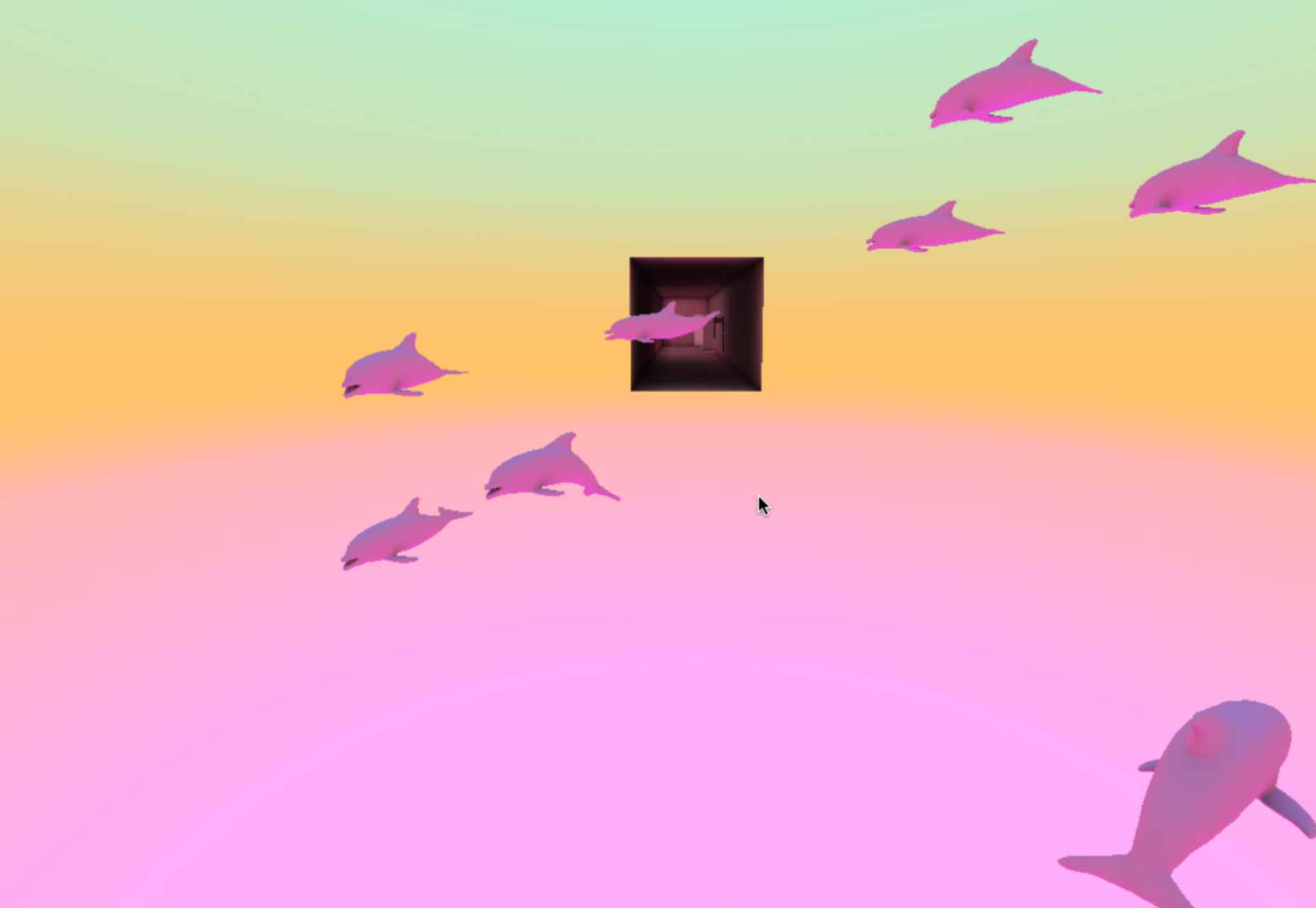
Museum of Pink Art is an immersive experience celebrating the color pink. Undoubtedly worth a virtual wander around.

Icons by Menu

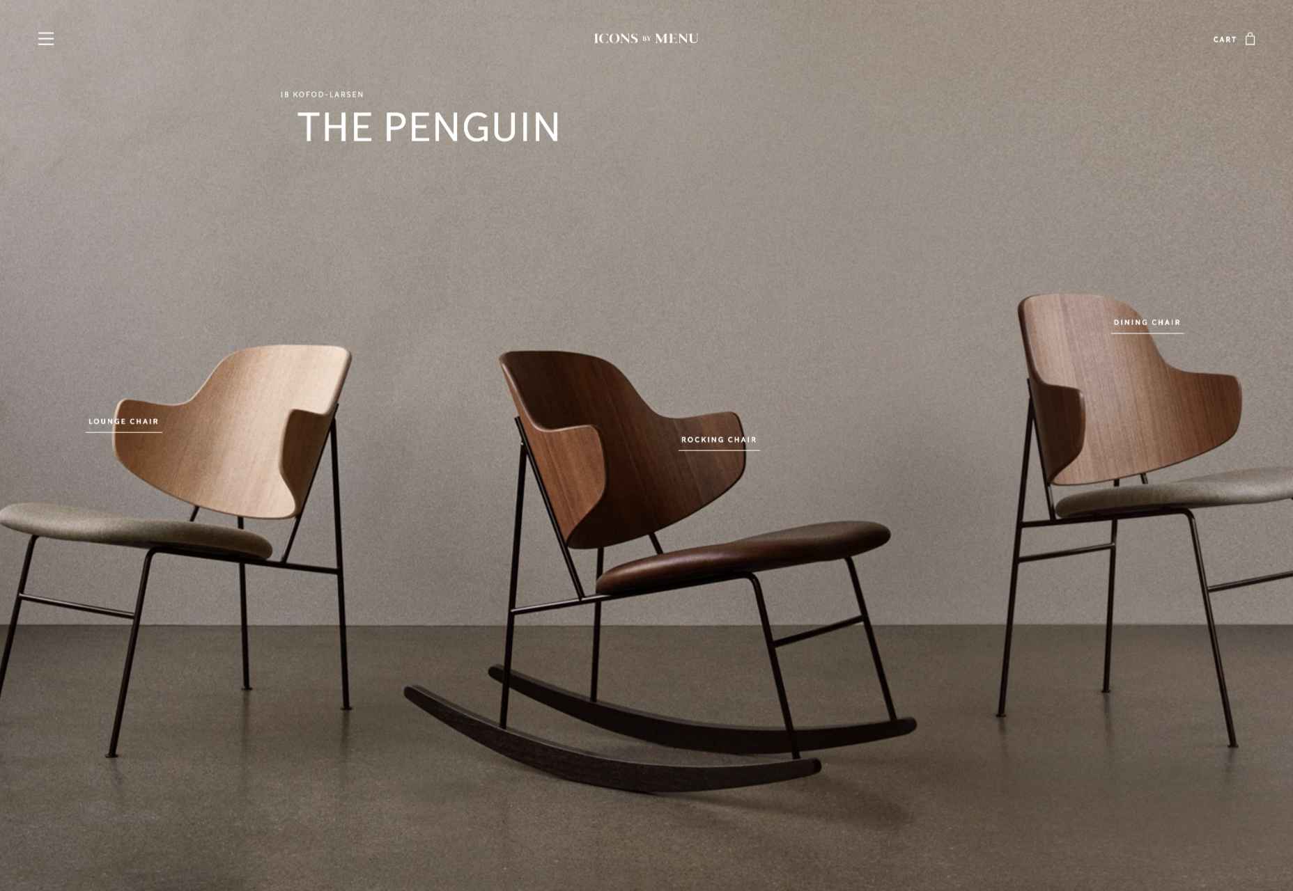
OK, this somewhat more minimalist site slipped through the net, but Icons by Menu is so pleasing to look at and use that we had to include it.

GlareDB

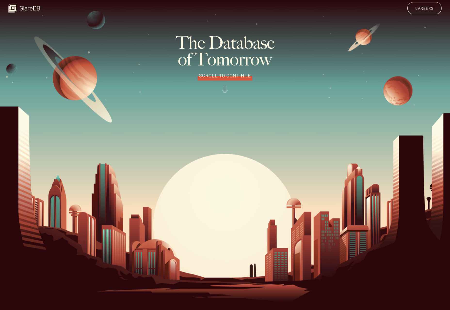
With an illustration that could be ideally at home on an Arthur C. Clarke book jacket and that rich, deep red background, this site for Glare DB is a world away from what might be expected.

Alex Beige

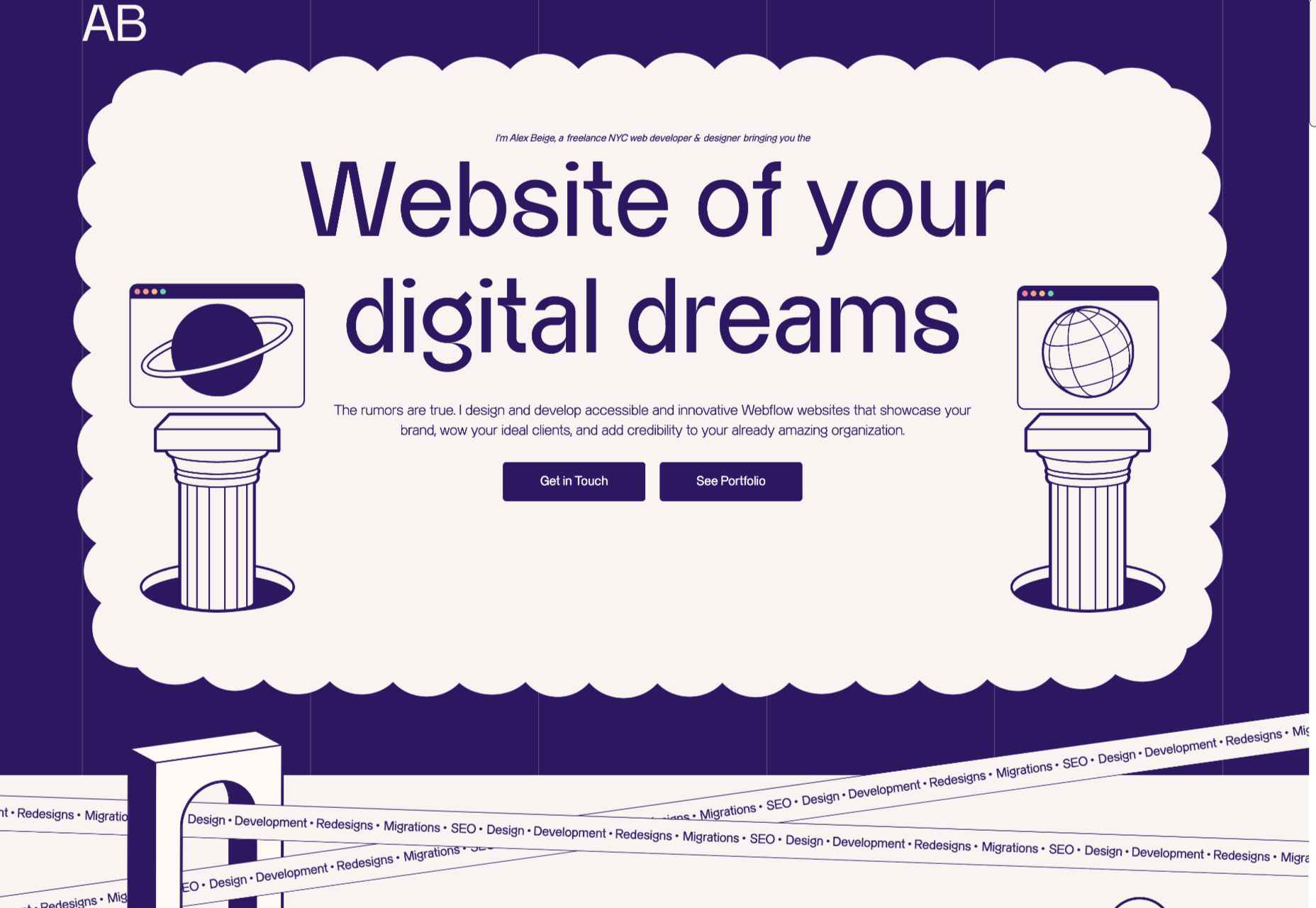
While the overall style and accent illustrations are pleasing on Alex Beige’s site, the Our Team section is guaranteed to raise a smile and stick in the user’s mind.

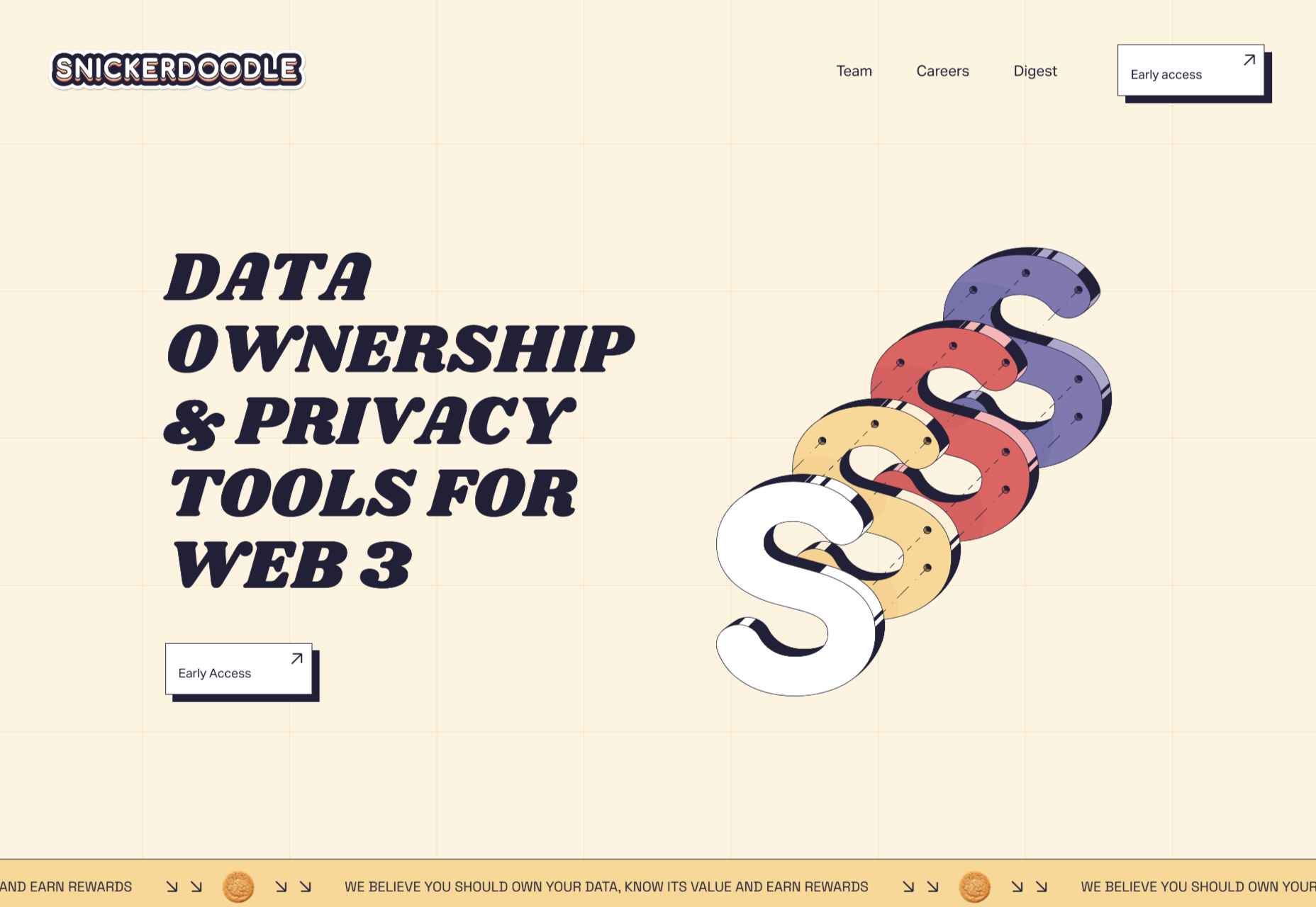
Snickerdoodle

Careful spacing means busy elements (like on scroll animated illustrations) don’t become overwhelming on the Snickerdoodle site.

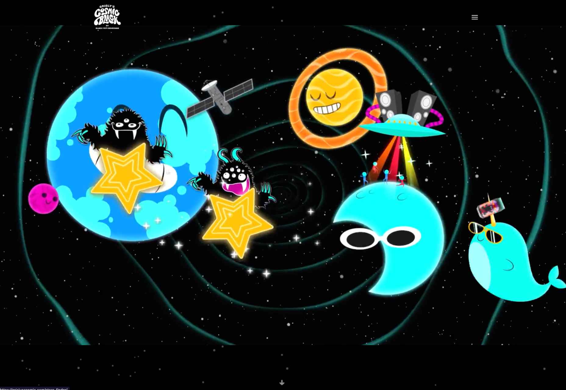
Grisly’s Cosmic Black

The site for Grisly’s Cosmic Black is fun, bright, and joyful. Plus, it’s nice to see an alcohol site going a bit further than the usual ‘drink responsibly’ and actually providing helpful links.

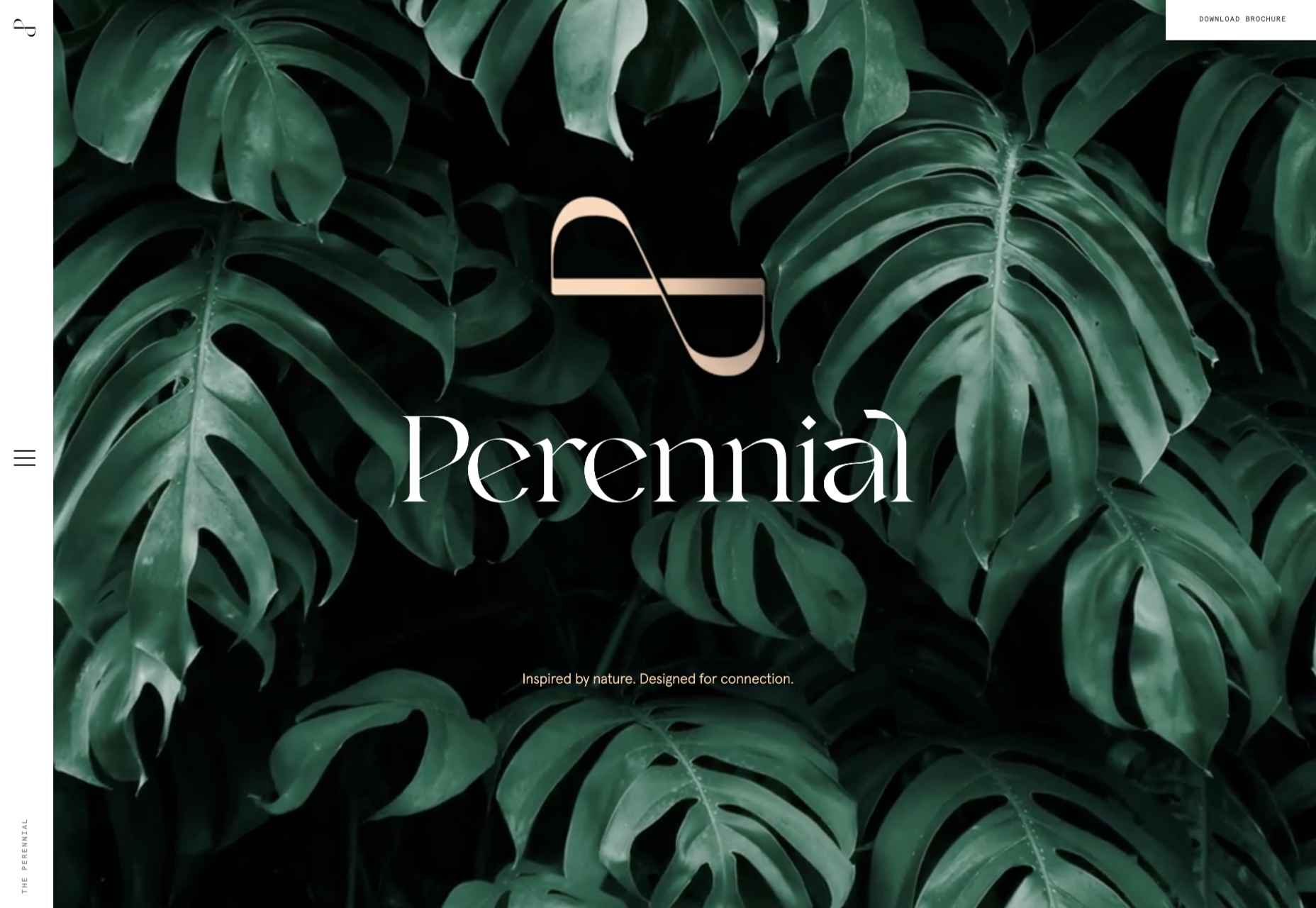
The Perennial

Not just floorplans and (lots of) images, but virtual walkthroughs too. The Perennial doesn’t feel like a standard office building.

Source

The post 20 Best New Websites, July 2022 first appeared on Webdesigner Depot.
Source de l’article sur Webdesignerdepot

Sometimes it’s easy to feel like the world is going to pieces all around us, especially when we’re doom scrolling Twitter between news alerts every few minutes. But if we step back a little, things may not seem so bad.

On the web, we see companies and individuals taking a positive stand, making changes, and carrying on despite challenging circumstances. So in this month’s collection, we celebrate confidence and accentuate the positive, as the song says. Enjoy!

Plastic Bionic

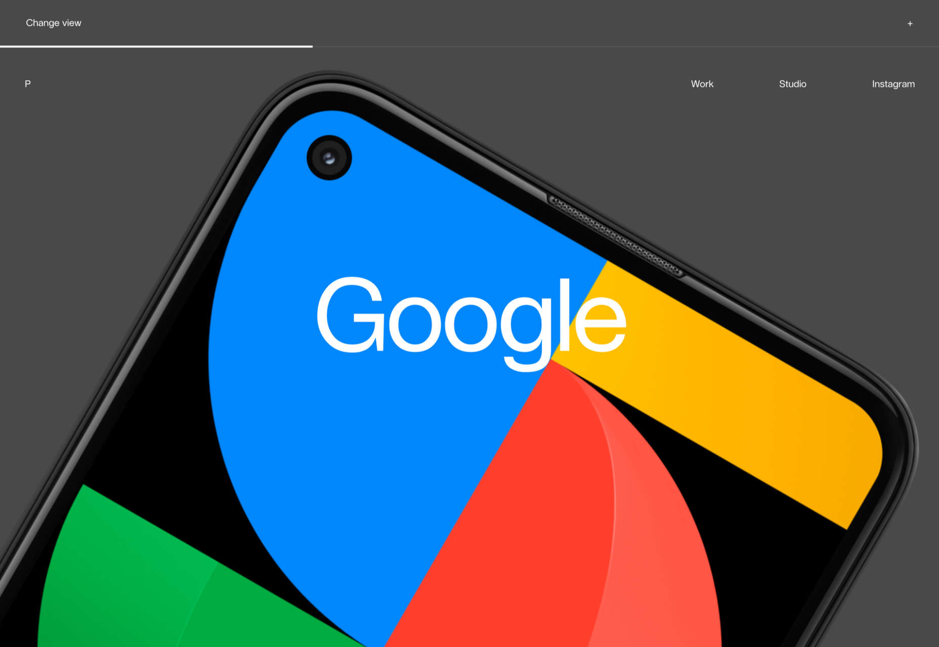
The ‘change view’ option is well used in this portfolio site for Plasticbionic design studio. The grid view is especially pleasing.

Fabricca

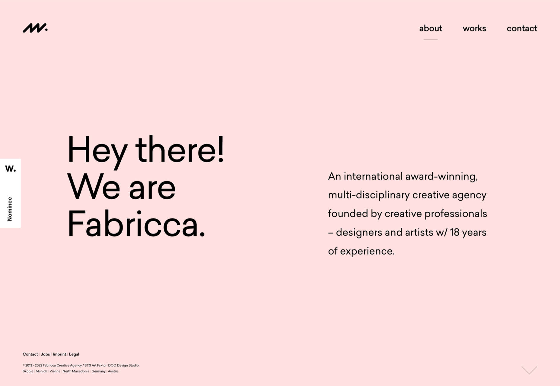
Creative agency Fabricca has gone for a simple look, with some appealing illustrations and custom icons.

Normand

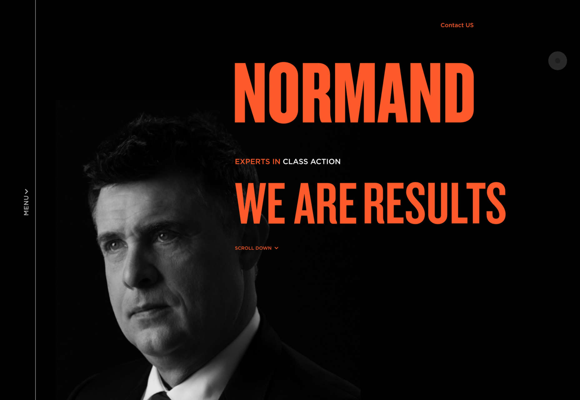
The color scheme and display font choice (Knockout) make a strong statement here for law firm Normand.

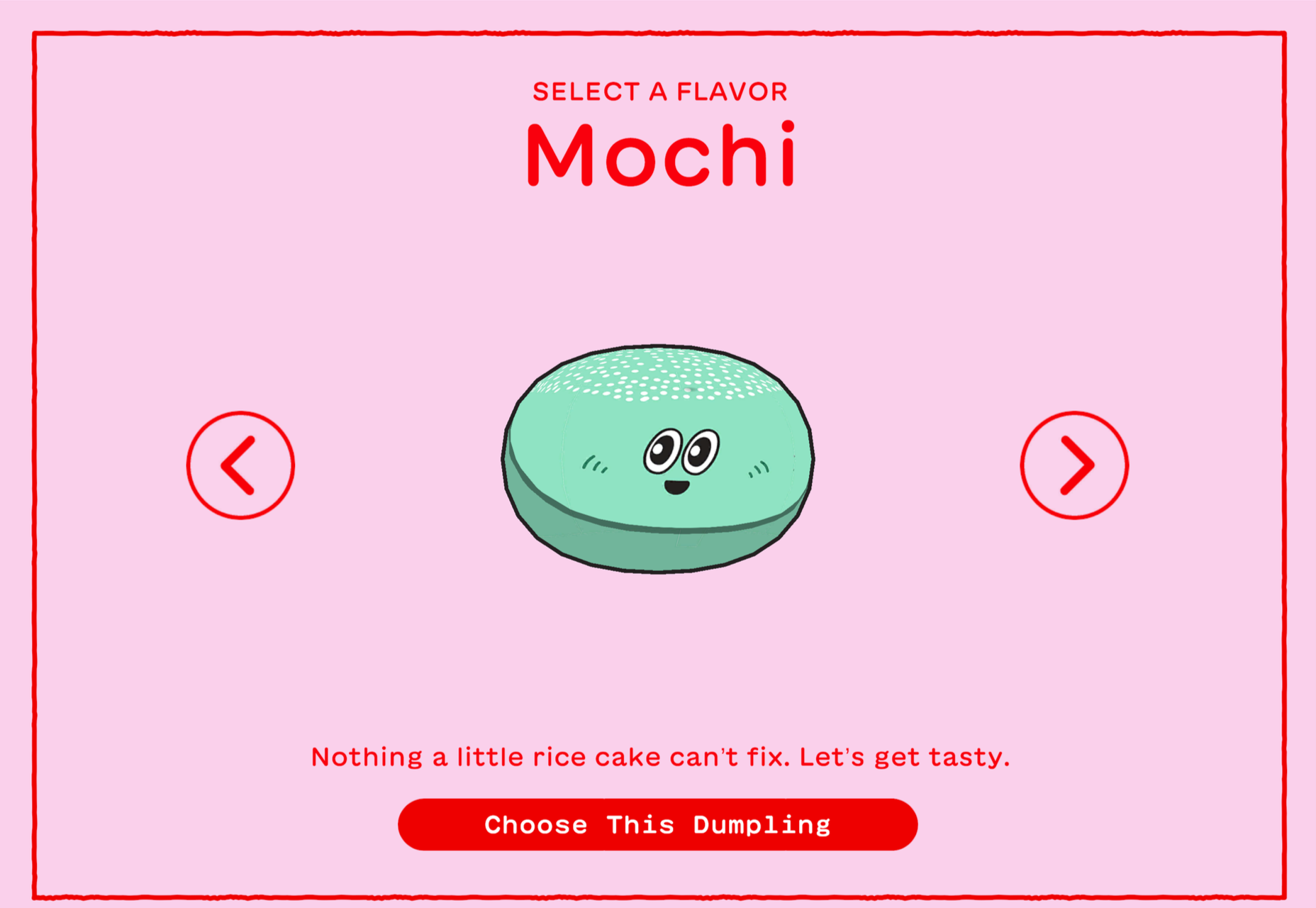
Dumpling Delivery

We all need some bored-on-a-slow-friday-afternoon distraction from time to time, and Mailchimp delivers the goods here.

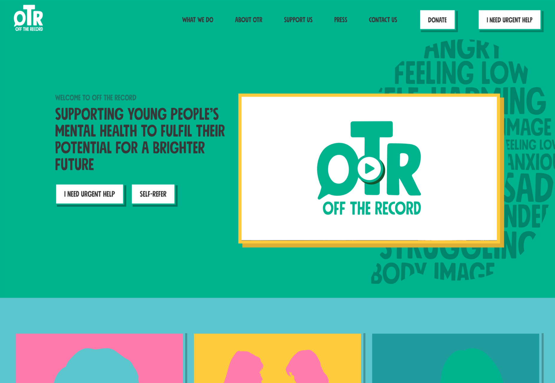
OTR

OTR is a mental health service for young people aged 11-25. The site does a great job of feeling approachable and friendly to younger users while not being condescending, cutesy, or childish.

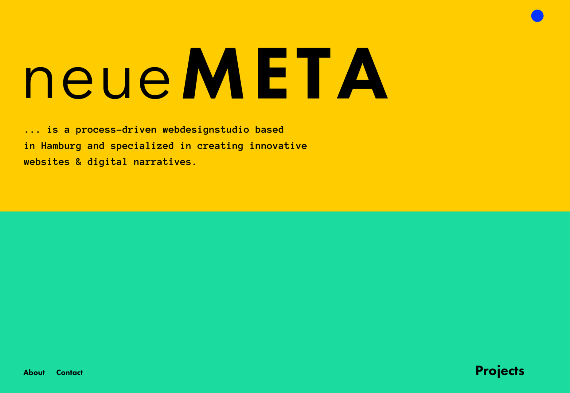
neueMeta

Good use of block color adds extra depth to this otherwise brutalist portfolio site for neueMeta design studio.

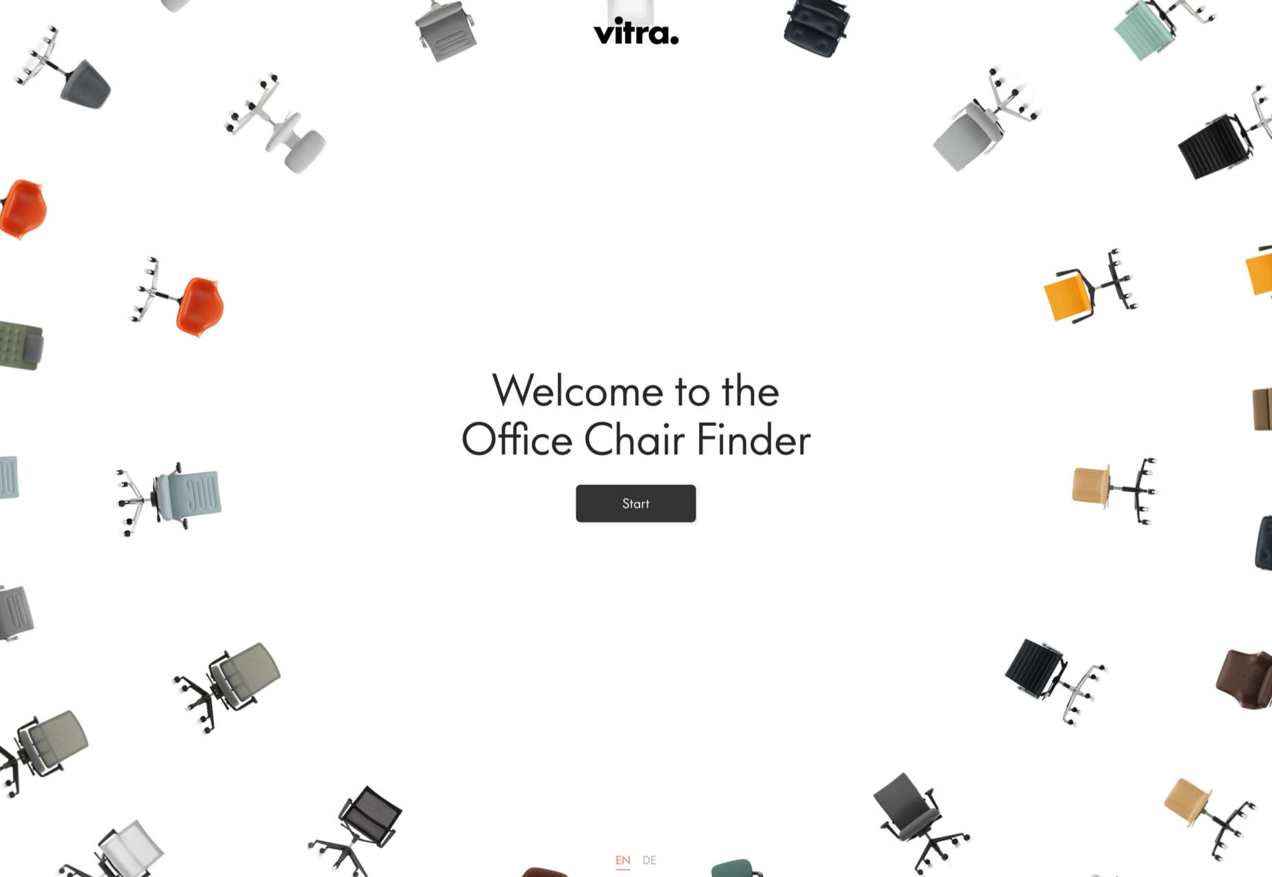
Vitra Chair Finder

This interactive questionnaire helps the customer identify the best chair for their needs. The animation is done well here, and a page of swirling Vitra chairs is a lovely thing to see.

Chia Studios

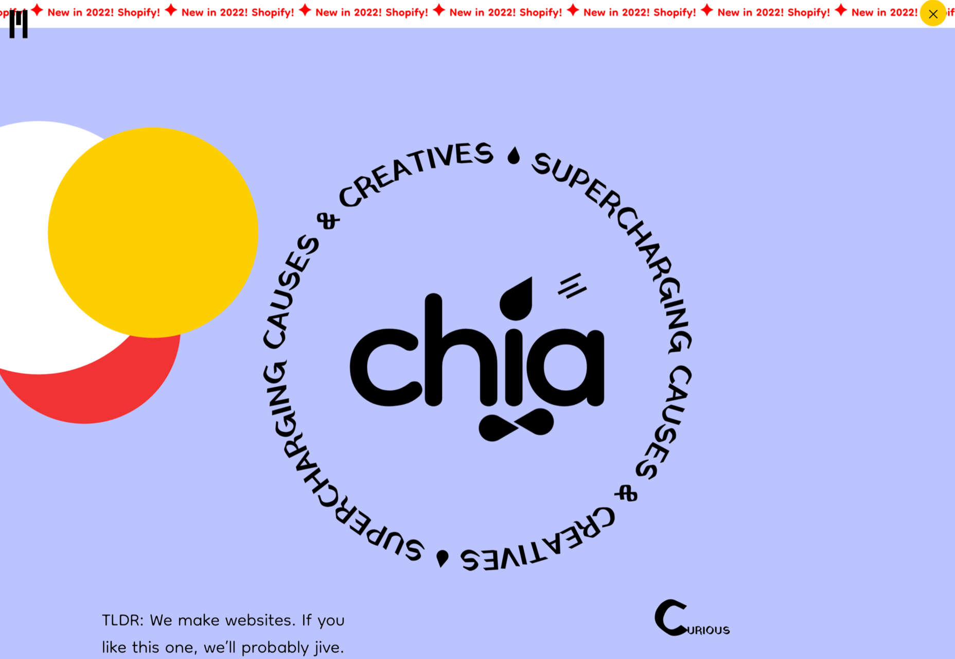
A good balance here of serious and fun in Chia Studio’s portfolio site, professional but friendly.

Sagmeister 123

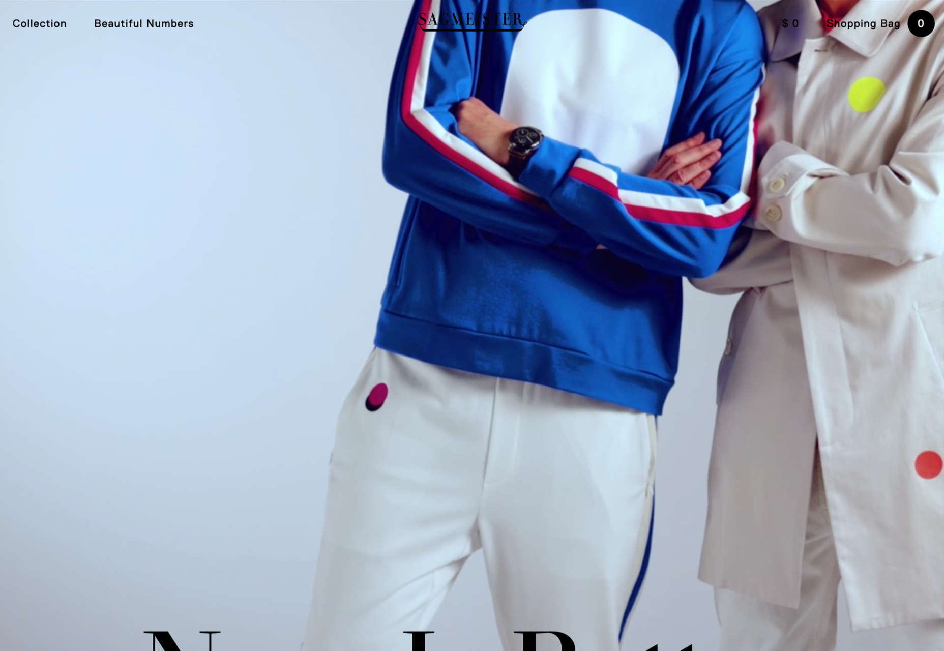
The concept behind this limited clothing range designed by Stefan Sagmeister is that, taking the long-term view, the world is actually getting better. As such, the Sagmeister 123 site has an overall feeling of quiet positivity. And a koala.

RecPak

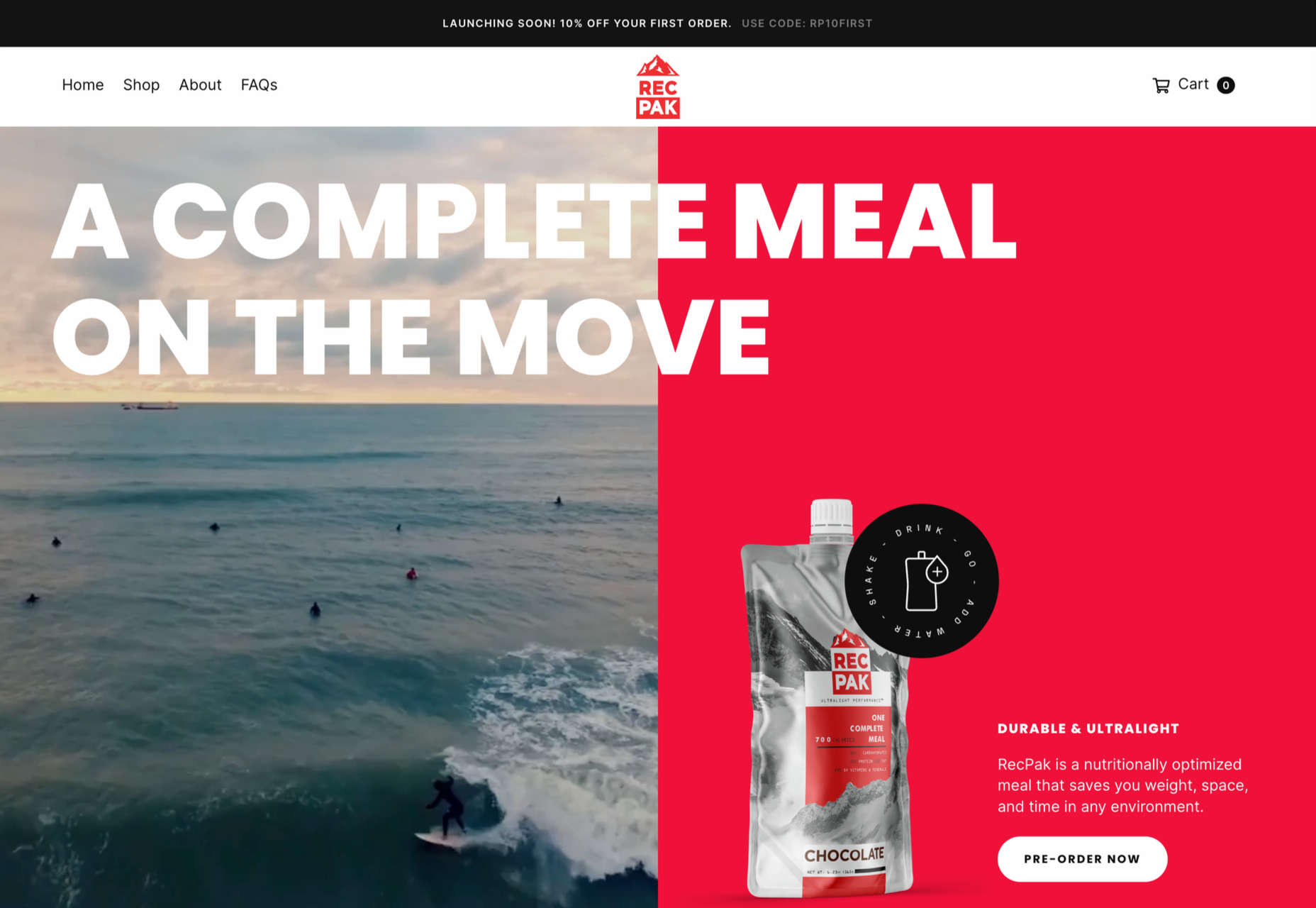
RecPak is a meal replacement shake designed for taking during outdoor activities. The site has an active, dynamic feel that works well to convey a sense of rugged outdoor adventure.

Alicia Moore

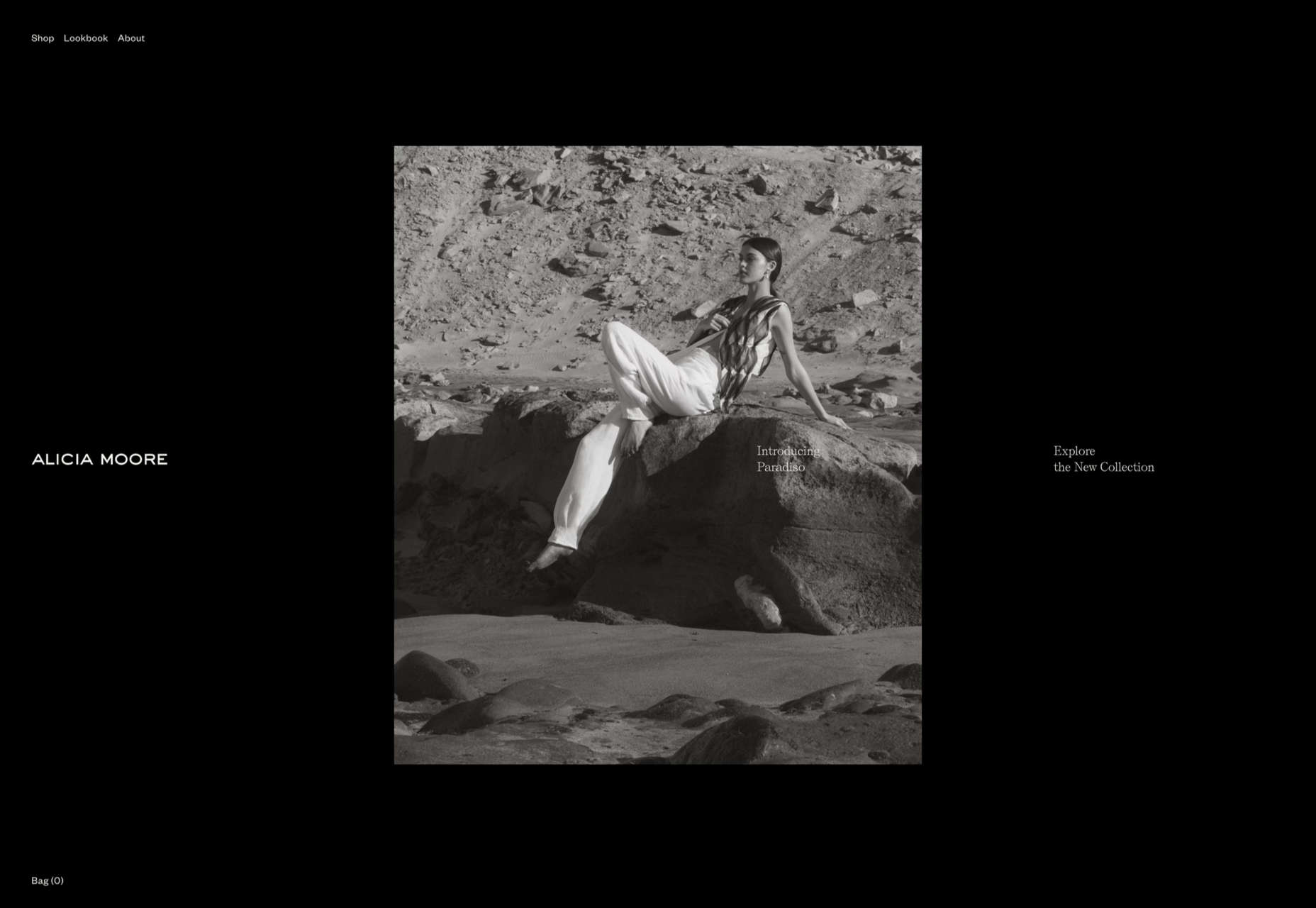
This site for Alicia Moore clothing brand oozes style and sophistication with soft colors and beautiful fashion photography.

Think Packaging

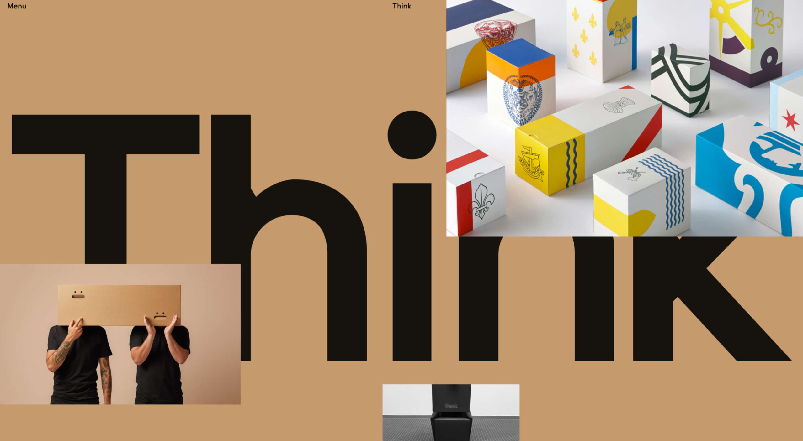
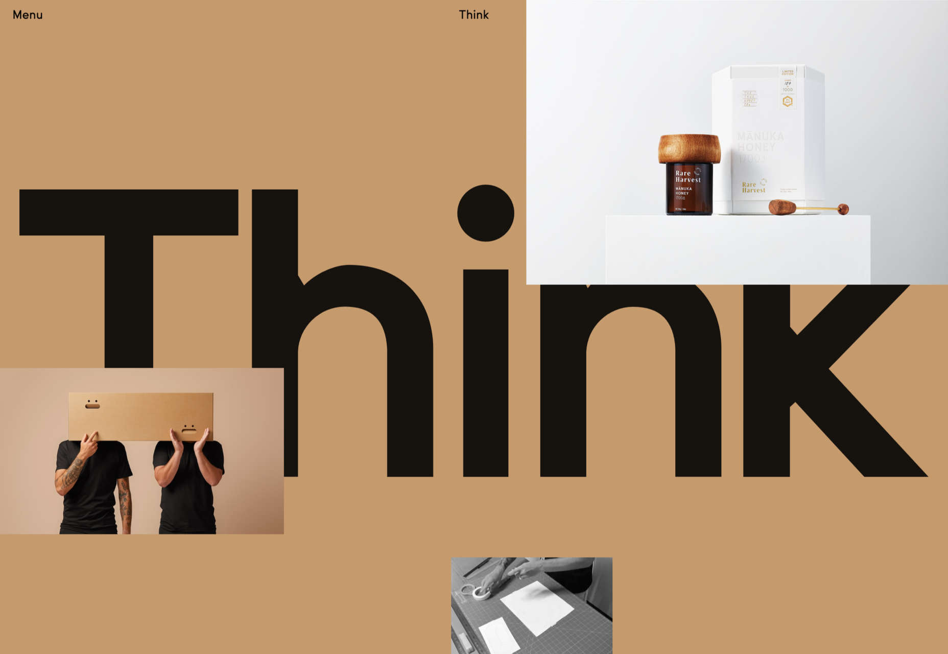
Think Packaging’s website has a bright, bold, fun feel. Case studies are well presented visually but keep text to a minimum.

BP&O

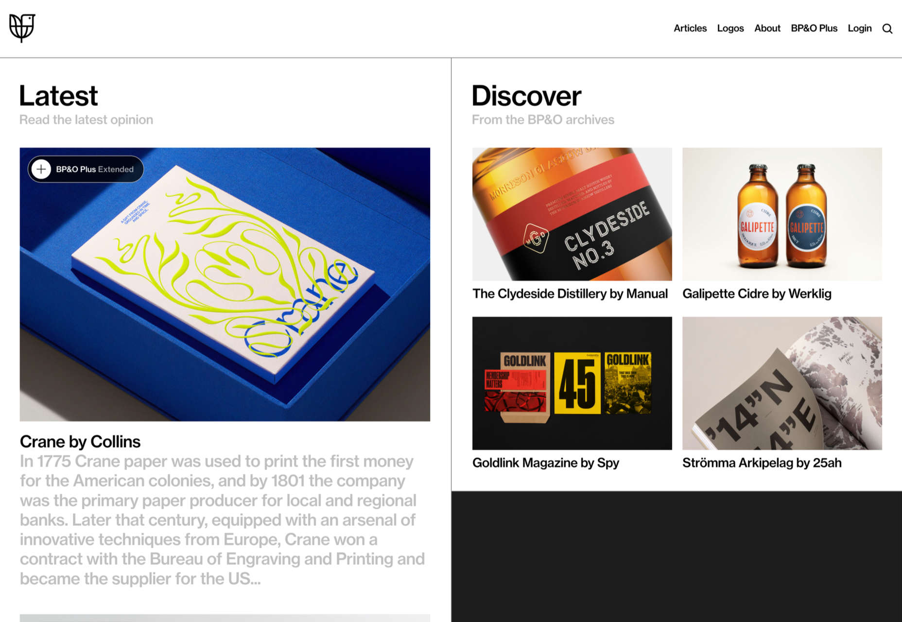
Brand design and packaging blog BP&O has added extended content for subscribers, and their new site is a pleasure to browse.

The Future Factory

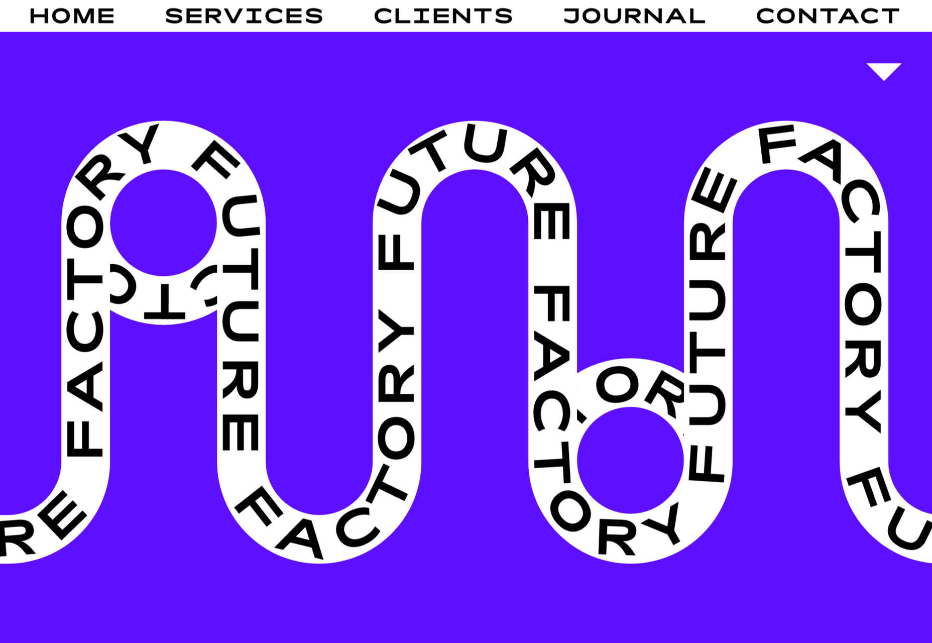
The Future Factory is a business lead generation agency, which doesn’t sound, well, a bit dull. But, some funky animation and slightly quirky type certainly do not convey dullness.

Polybion

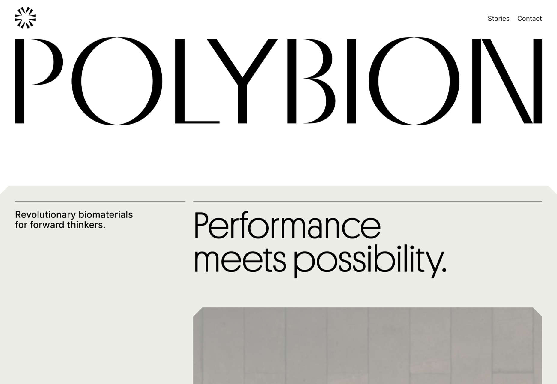
Polybion’s new website has a spacious feel with a rich color scheme adding a sense of confidence and brand maturity.

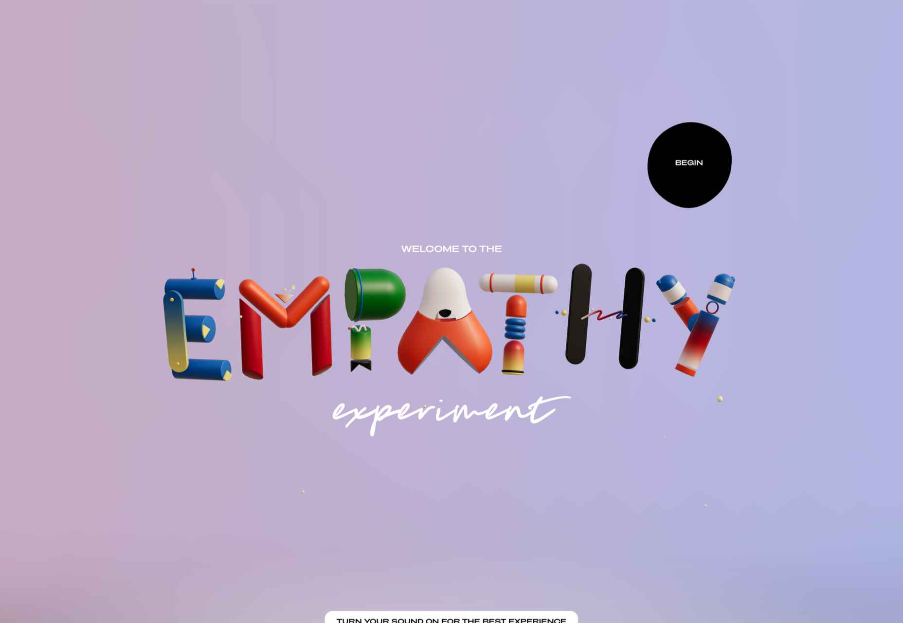
The Empathy Experiment

The Empathy Experiment is an interactive ‘game’ from digital agency media.monks that examines empathy and inclusivity in the workplace while at the same time showcasing some technical skills.

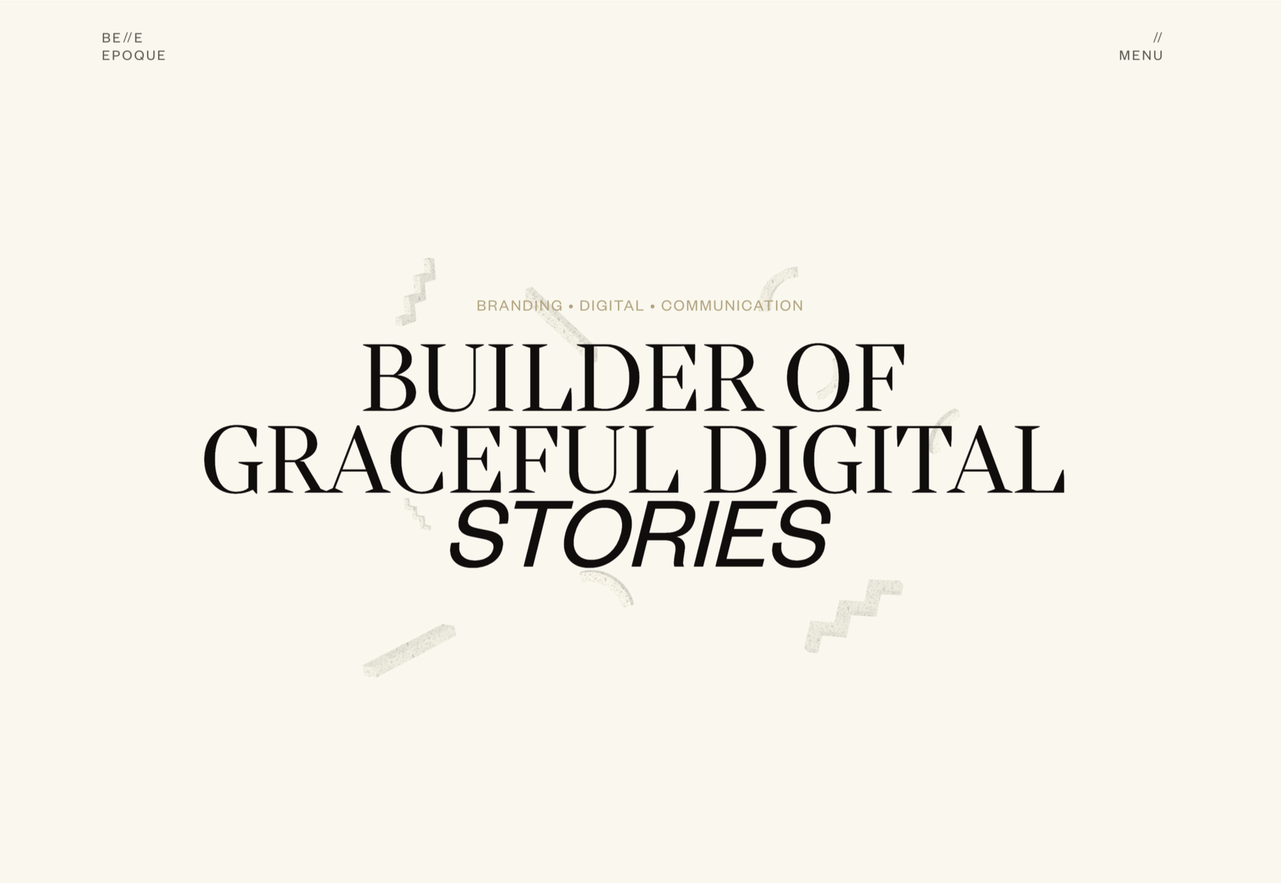
Belle Epoque

The opening scroll on Belle Epoque’s site is really pleasing, and the random floating shapes are intriguing.

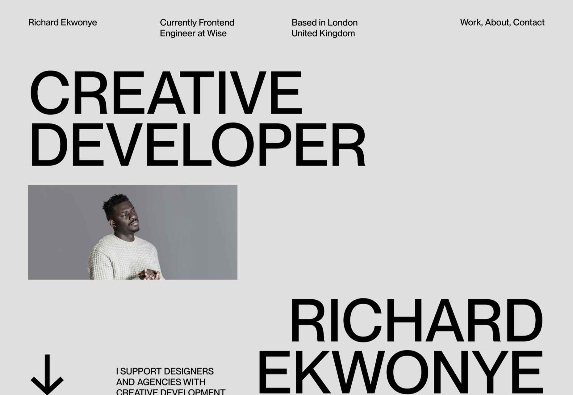
Richard Ekwonye

Richard Ekwonye’s portfolio site is clean and straightforward. Skills are on display, but without intruding on the content.

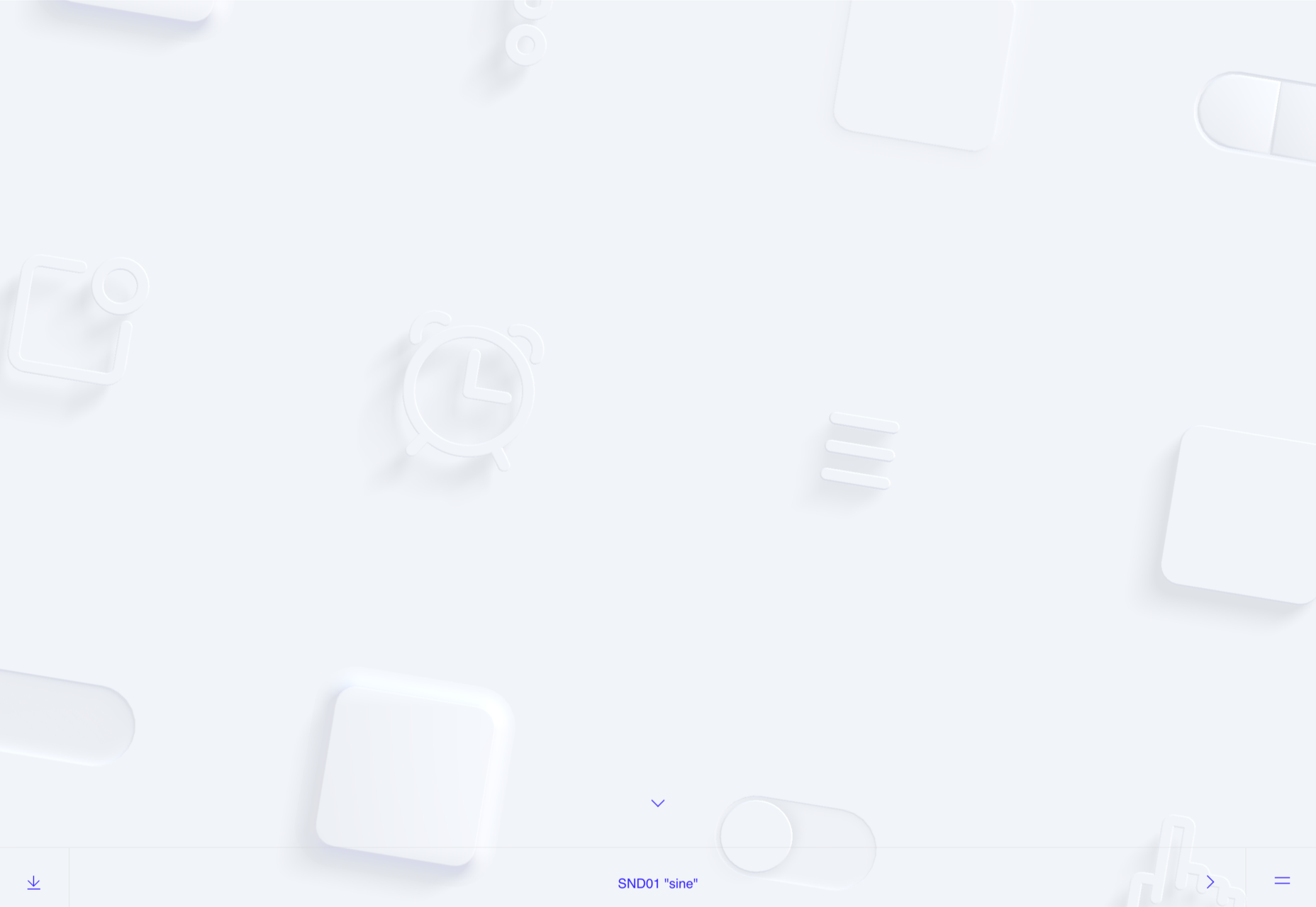
SND

SND has created UI sound kits. The site is as simple as it could possibly be, and yet it is impossible not to investigate all the sounds and start imagining where you could use them.

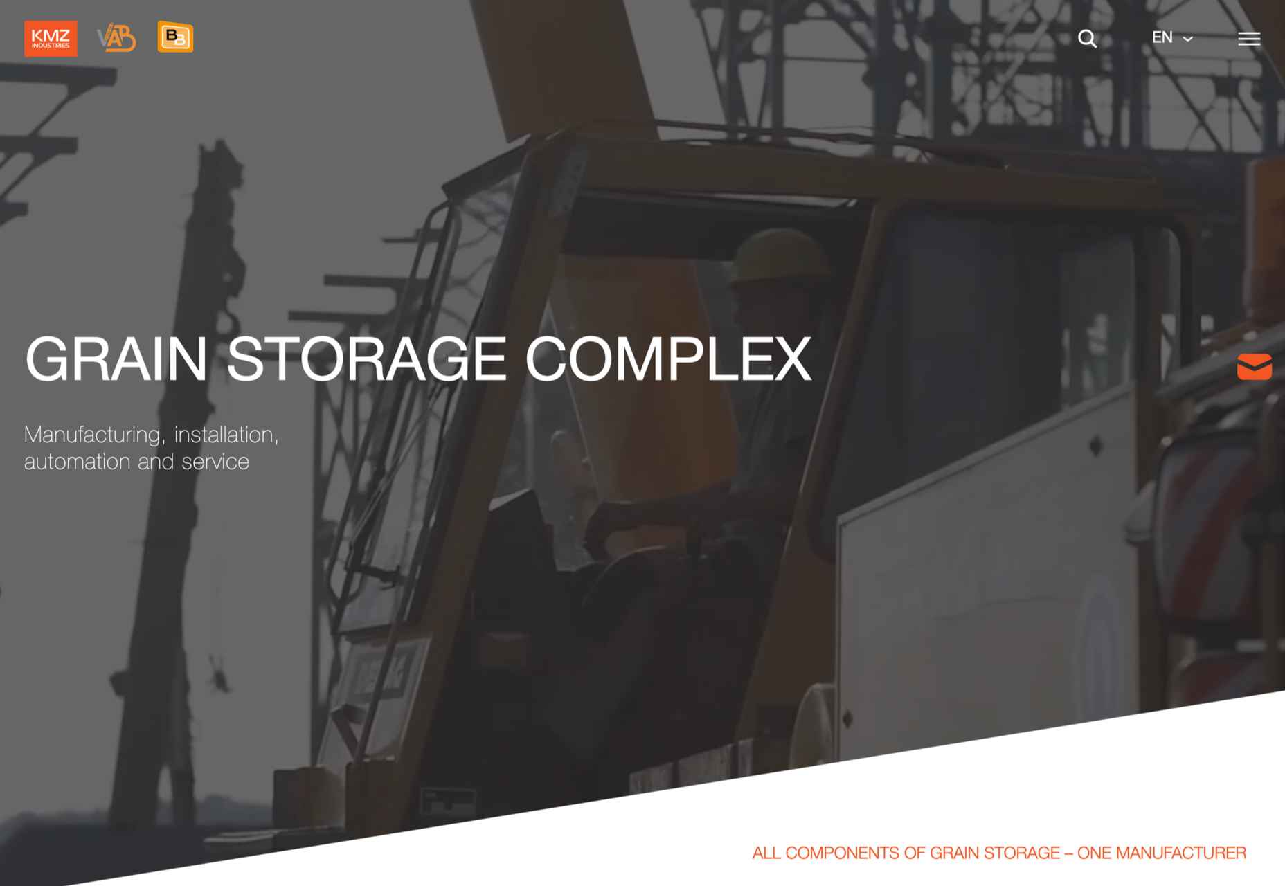
KMZ Industries

Regular readers will know how much we like technical/industrial-made-interesting sites, and this one for KMZ grain storage systems is a perfect example.

Source

The post 20 Best New Sites, May 2022 first appeared on Webdesigner Depot.
Source de l’article sur Webdesignerdepot

This month’s collection of the best new sites released in the previous four weeks might seem like a mixed bag, but if you look carefully you’ll see distinct themes emerging. Full-page images and videos are back with a vengeance, and designers are embracing large-scale 20th century-inspired typography from Art Nouveau to ’80s corporate.

Here are the sites that grabbed us this month. Enjoy!

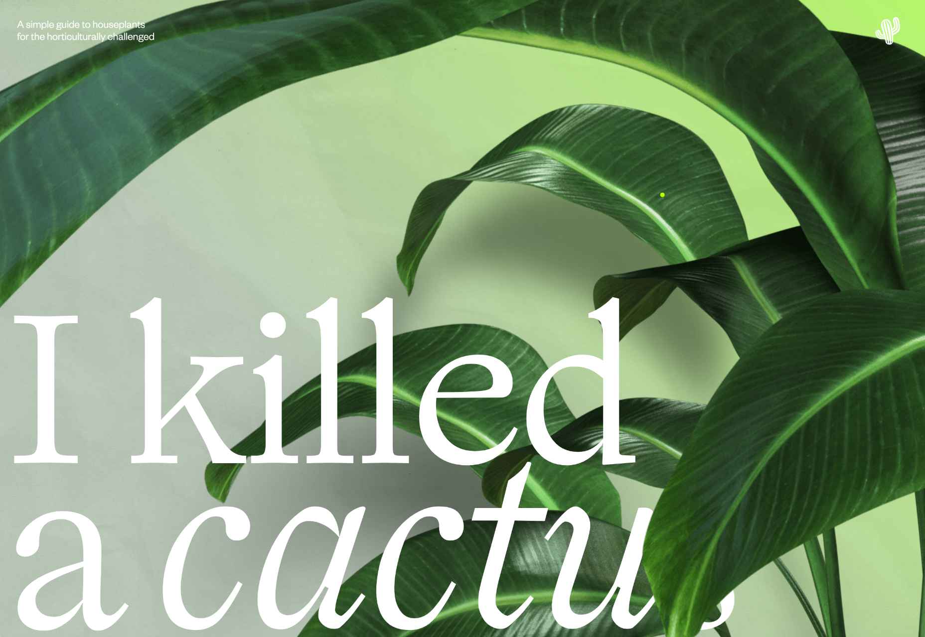
I Killed a Cactus

I Killed a Cactus is a beautifully rendered 3D site that guides the less-horticulturally inclined of us in the best ways to care for our houseplants.

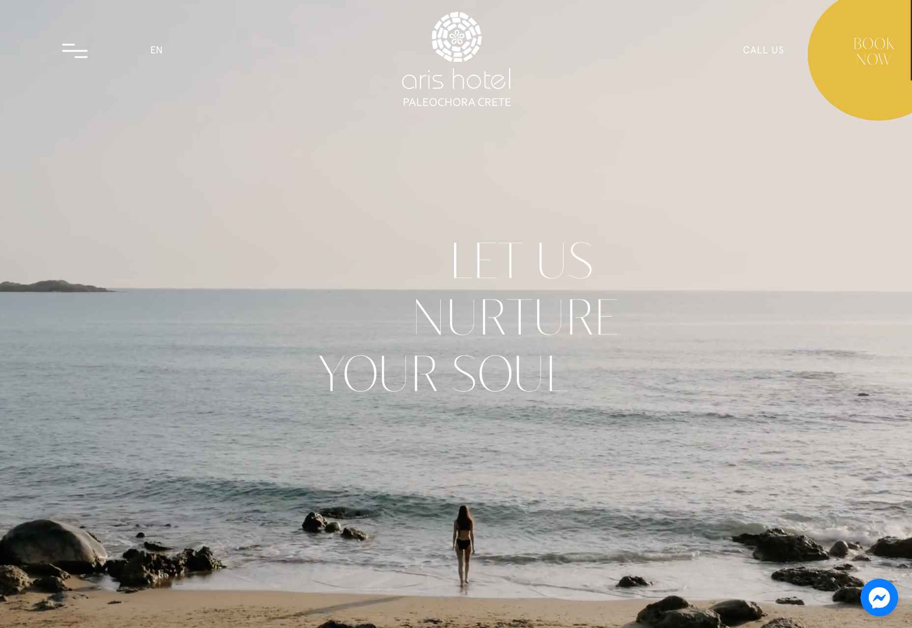
Aris Hotel

After a couple of years in which travel has been restricted, we’re itching to get moving again, and this elegant site for Aris Hotel is steering us in the direction of Crete.

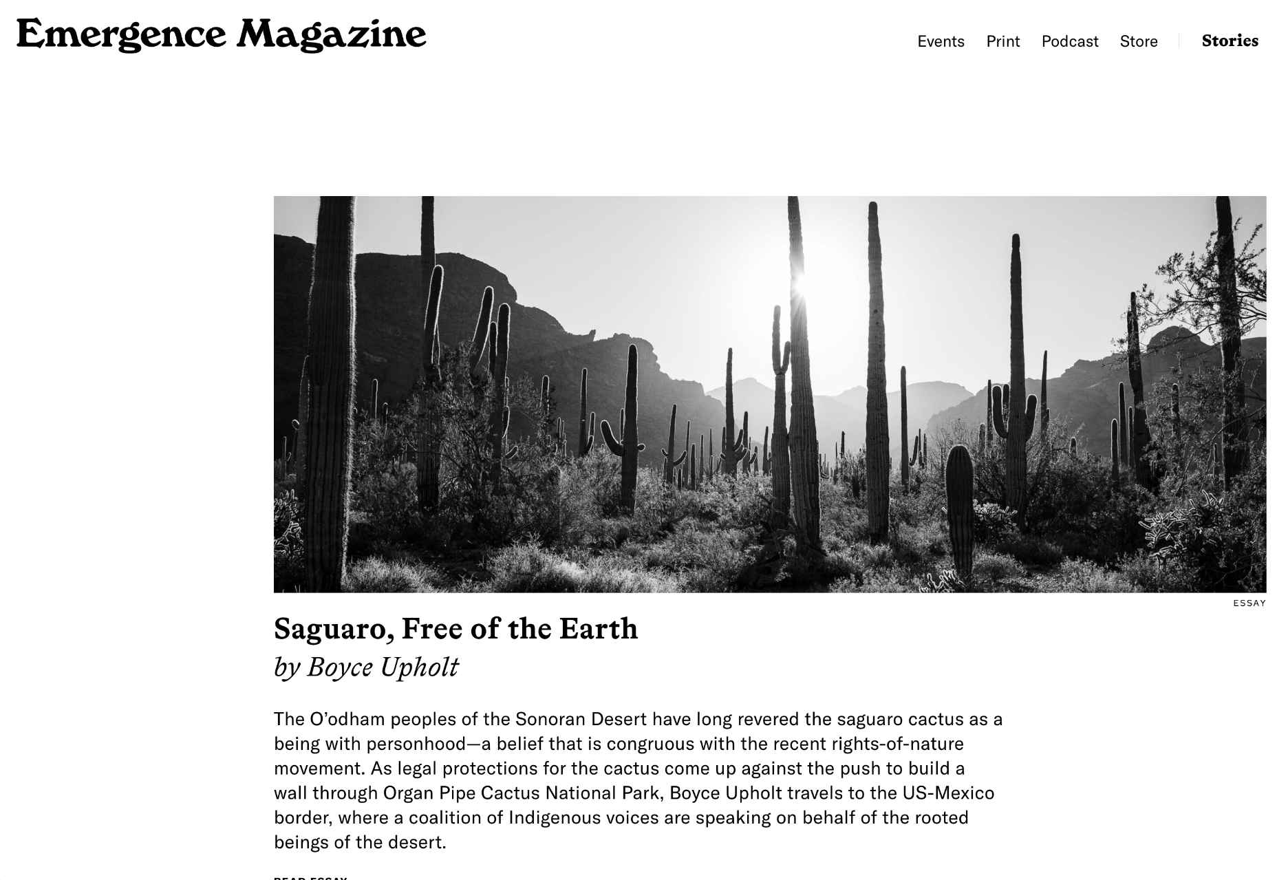
Emergence Magazine

With excellent writing and great photography, Emergence Magazine is dedicated to stories that intertwine ecology and spirituality. Its bold typography epitomizes its ethos.

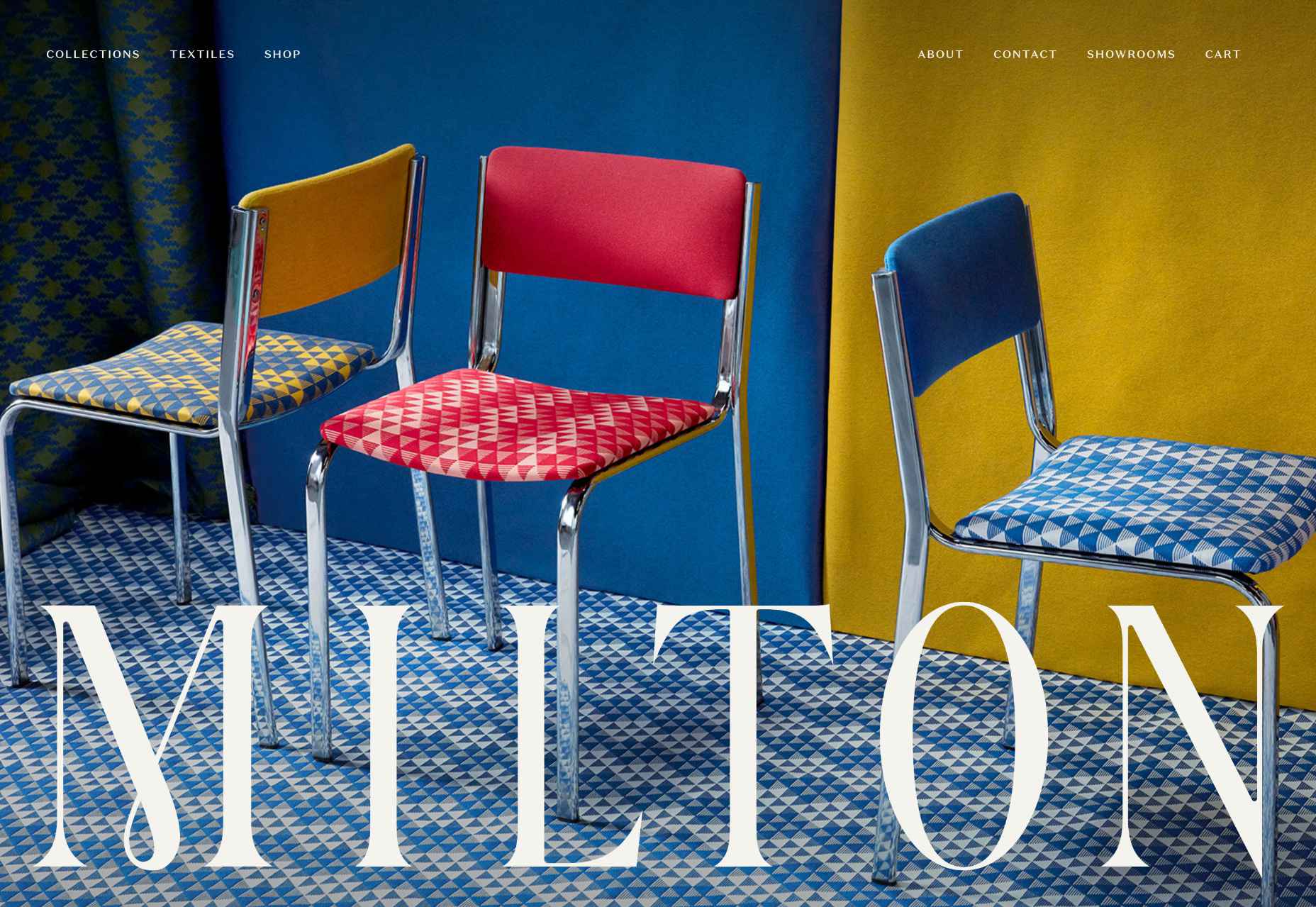
Milton Textiles

Milton is a textiles manufacturer with an eye for design. Its site showcases its art-inspired collection with big, bold, colorful photography.

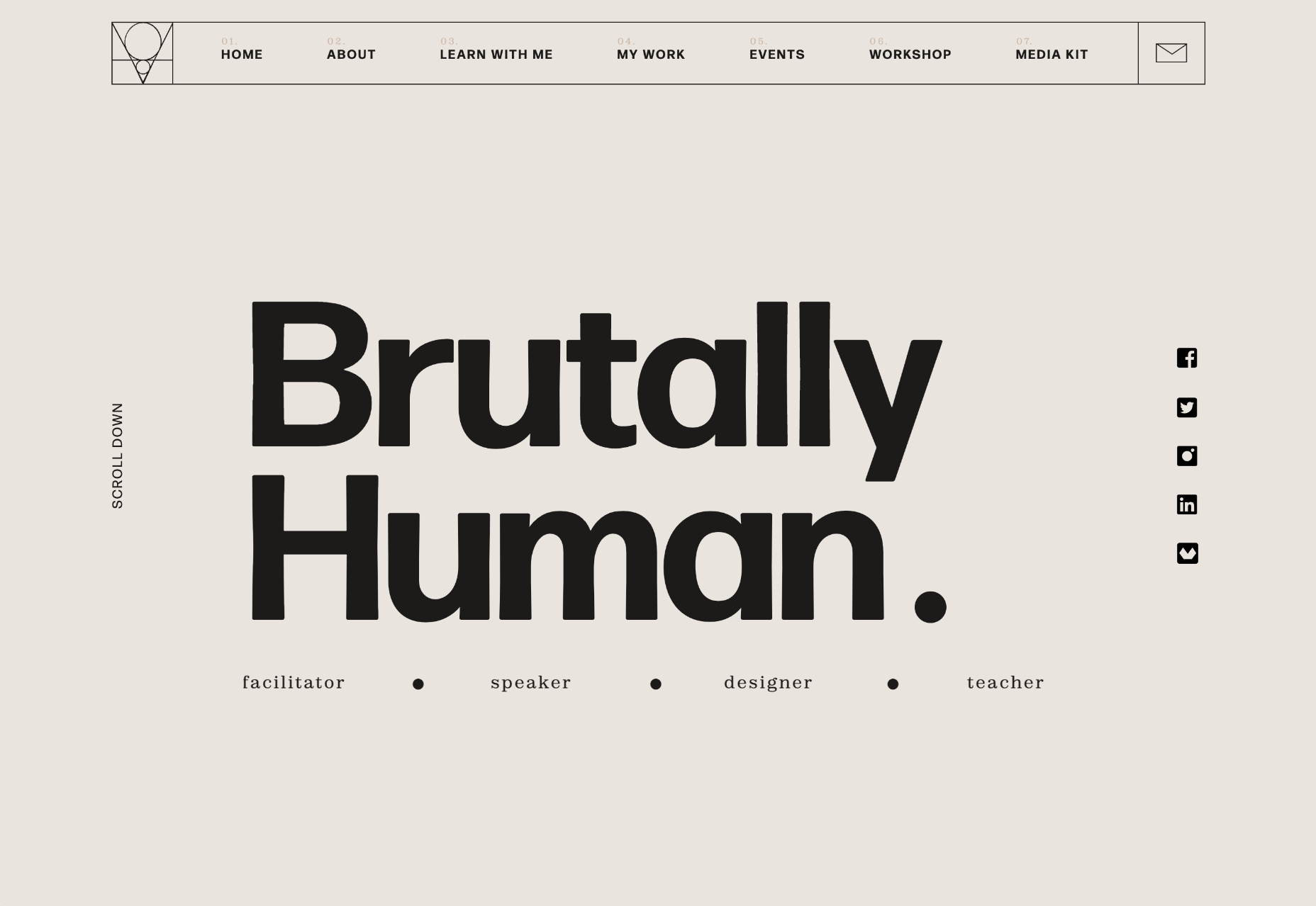
Brutally Human

Brutally Human is the one-page portfolio/pitch of designer Stanley Vaganov. He has an impressive client list, and his site exudes the confidence that comes with that.

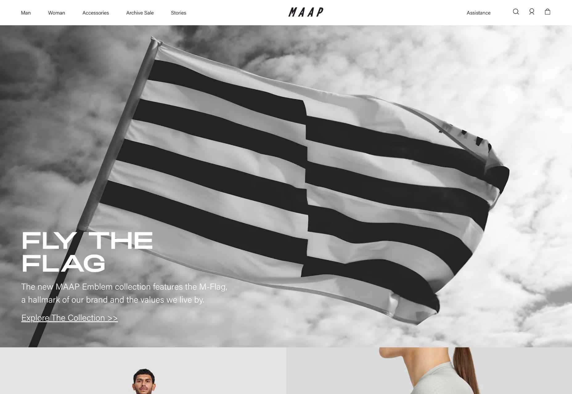
MAAP

MAAP uses a billowing flag to grab your attention as soon as you land on the site. The whole site is clean, efficient, and cool; exactly what you’d expect from a cycling apparel company.

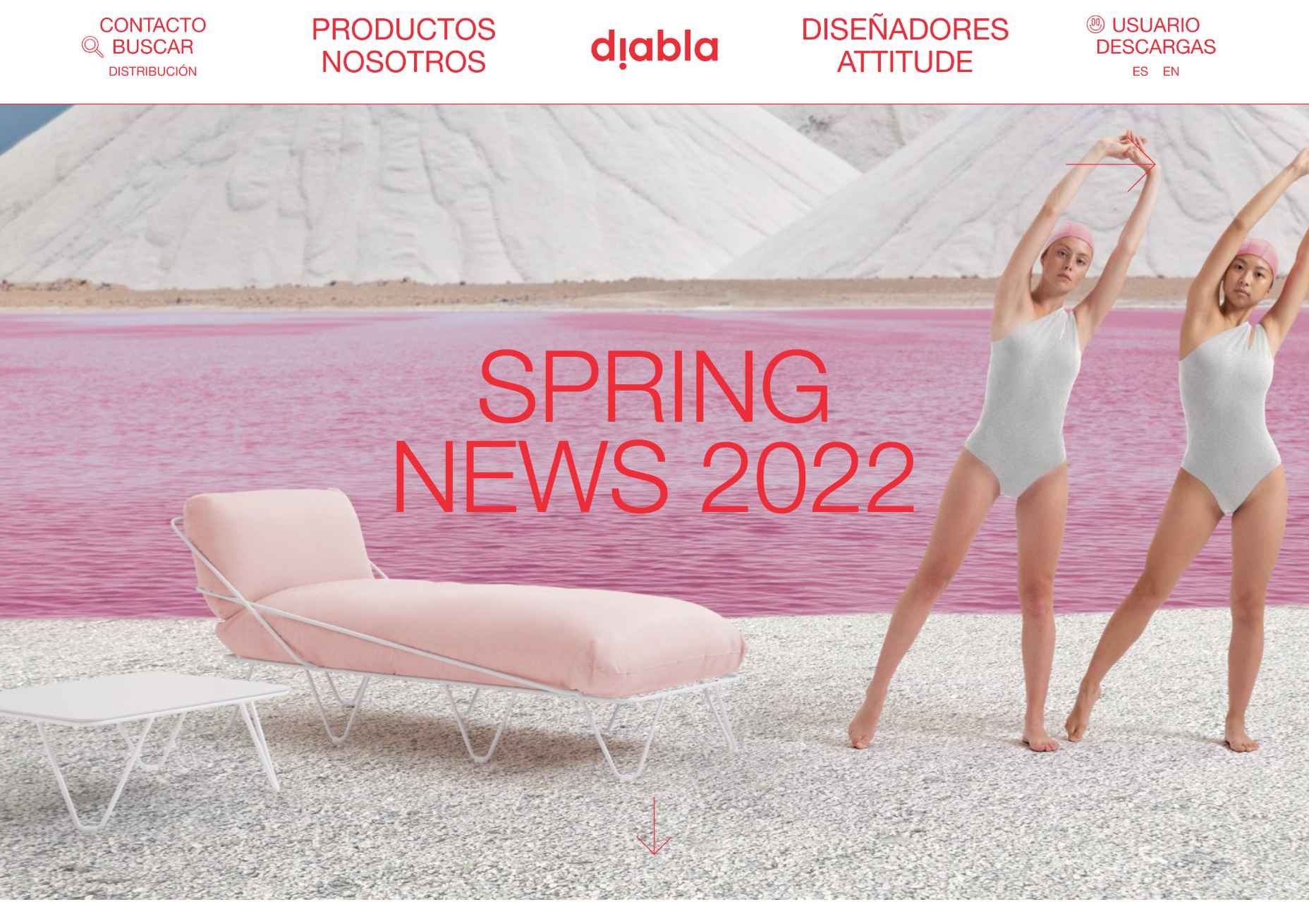
Diabla

Outdoor furniture is typically presented as minimal and sophisticated. Diabla throws surrealism into the mix by introducing brand colors to its large-scale photography.

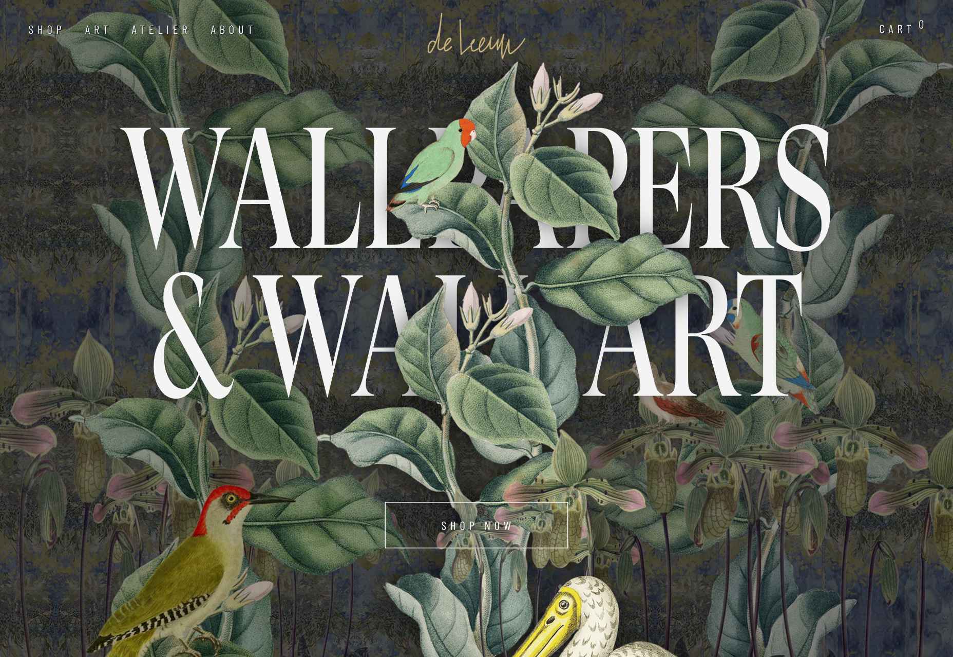
Steffie de Leeuw

The site for designer and artist Steffie de Leeuw features large typography that appears to be woven through layers of intricate illustration.

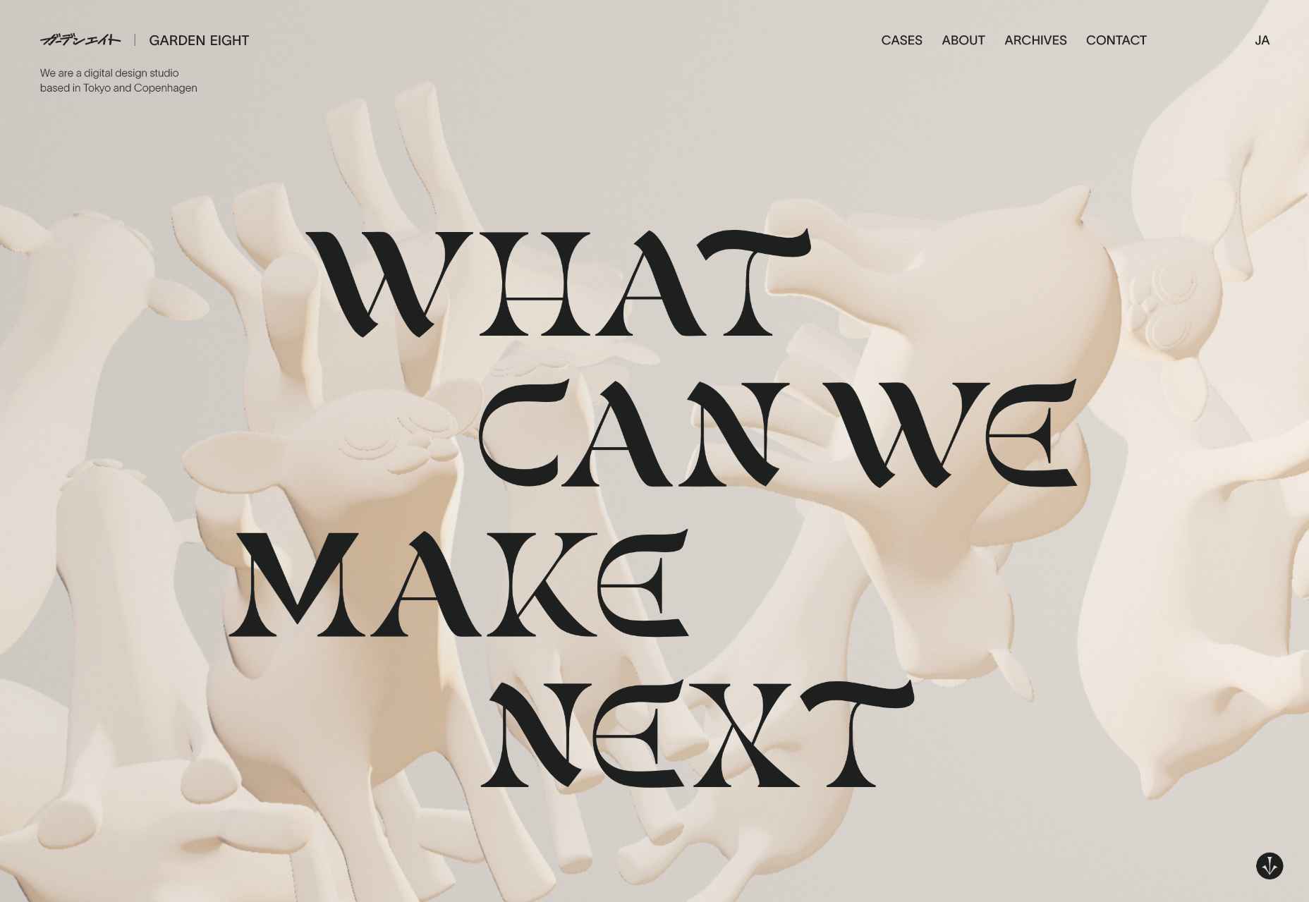
Garden Eight

What could be better than Garden Eight’s gaggle of 3D-rendered cartoon creatures floating around a page, twisting and transforming into new shapes?

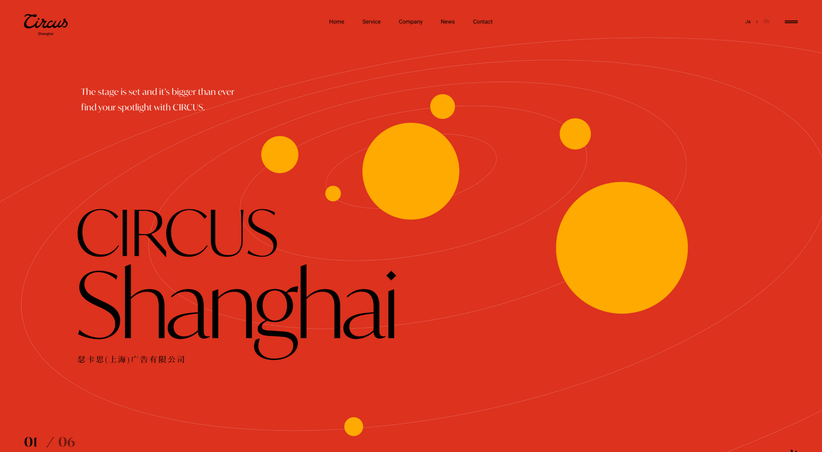
Circus Shanghai

The site for Circus Shanghai uses a rich mid-century illustration to reference both the solar system and the Chinese flag; it’s an arresting combination.

Moooi

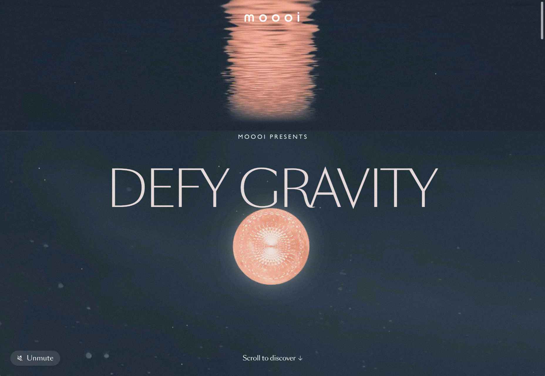
Ever inventive, the new micro-site for Moooi asks you to defy gravity with an engaging scroll through collages based on its product range.

Josephmark

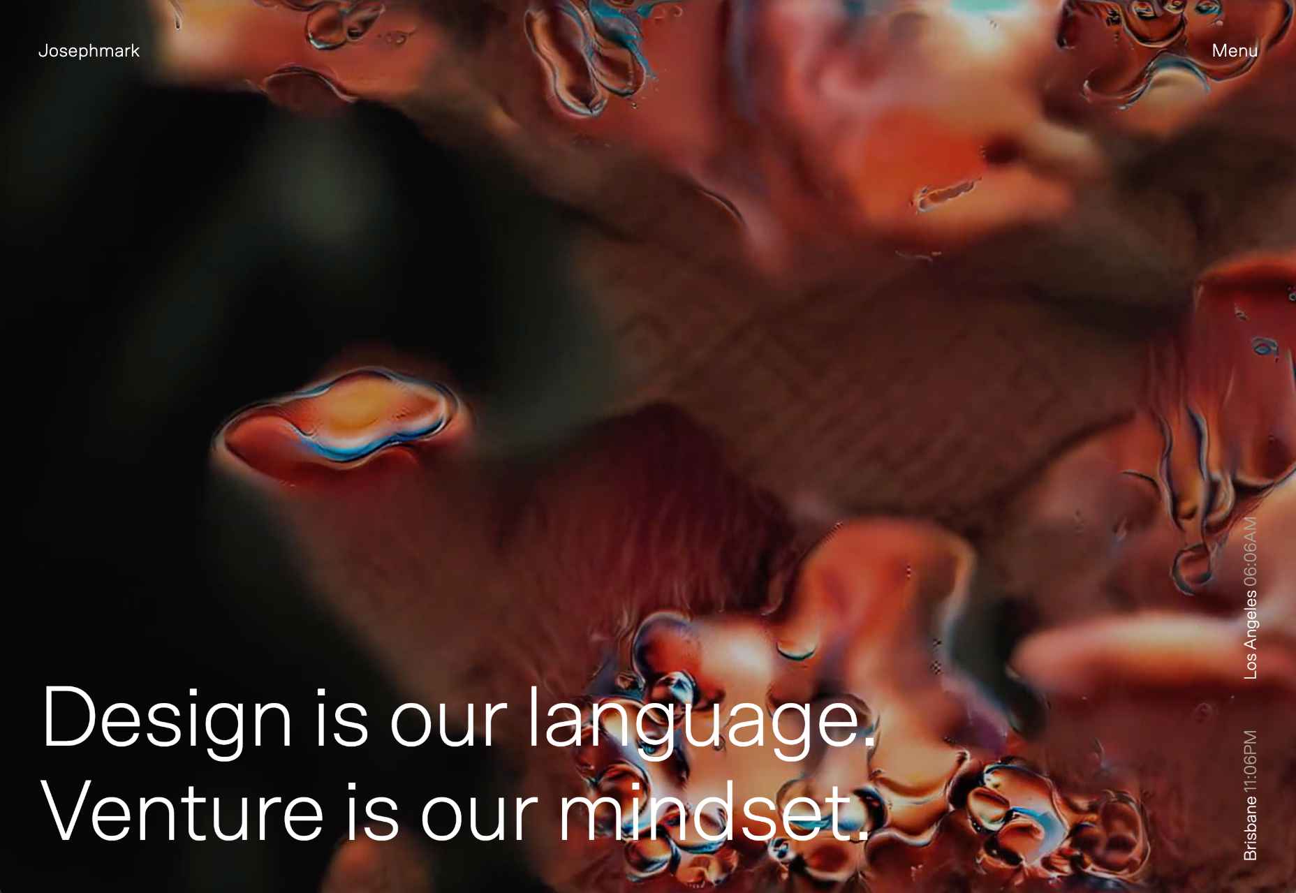
More full-page motion, this time for design studio Josephmark. The site blends rich colors with a brutalist layout and minimalist typography to create its own identity.

Tony G

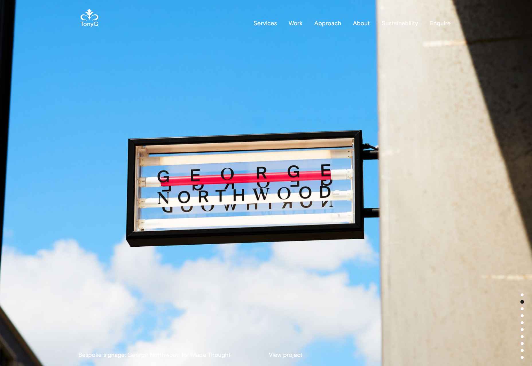
We love the infinite scroll on the homepage for creative agency Tony G. It’s a great way to add a slideshow to your homepage without the flaws of slideshows.

Estudio Piedras

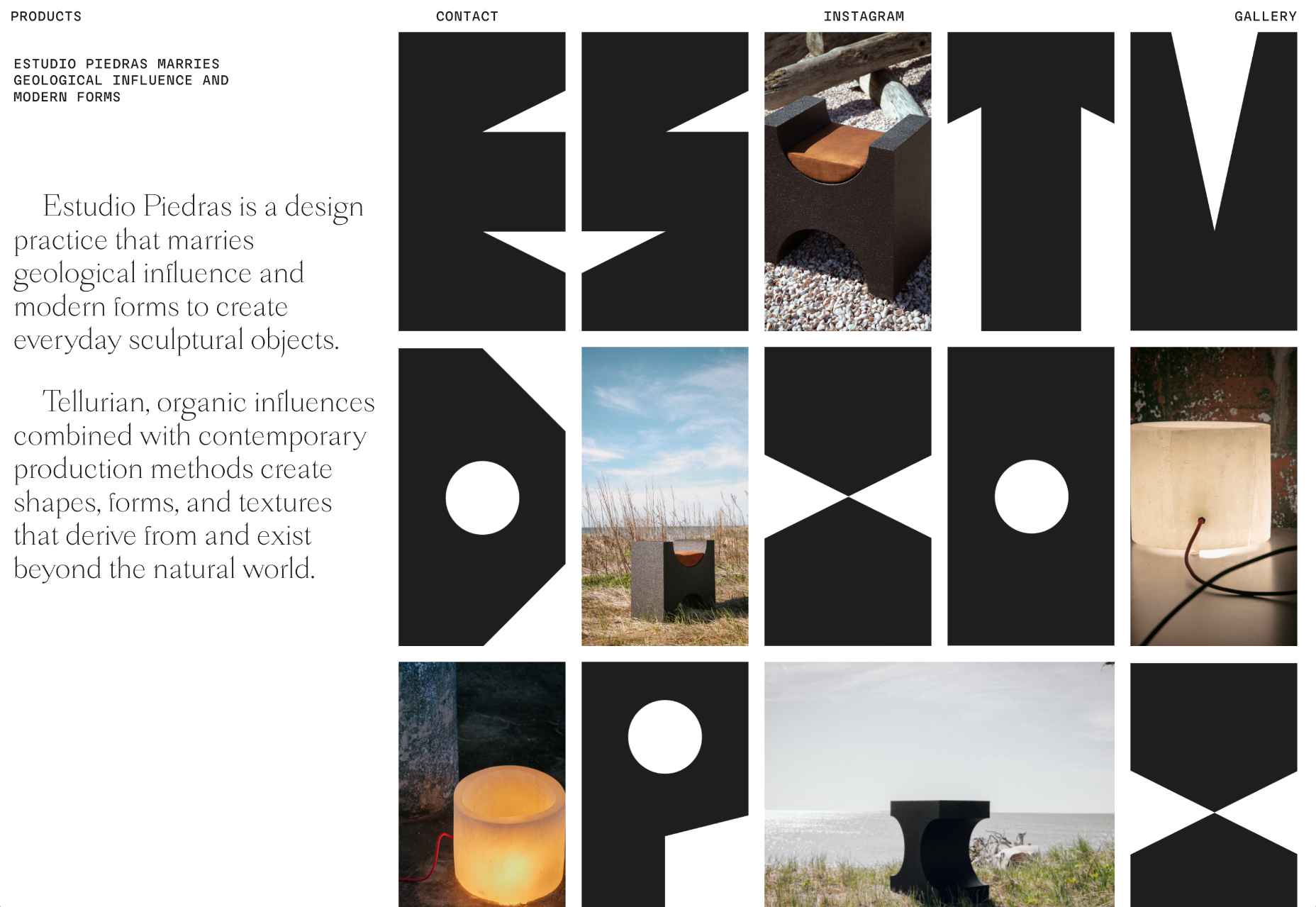
This site for furniture design studio Estudio Piedras uses bold lettering mixed with product shots. The straightforward site is punchy and mimics the solidity of the materials used.

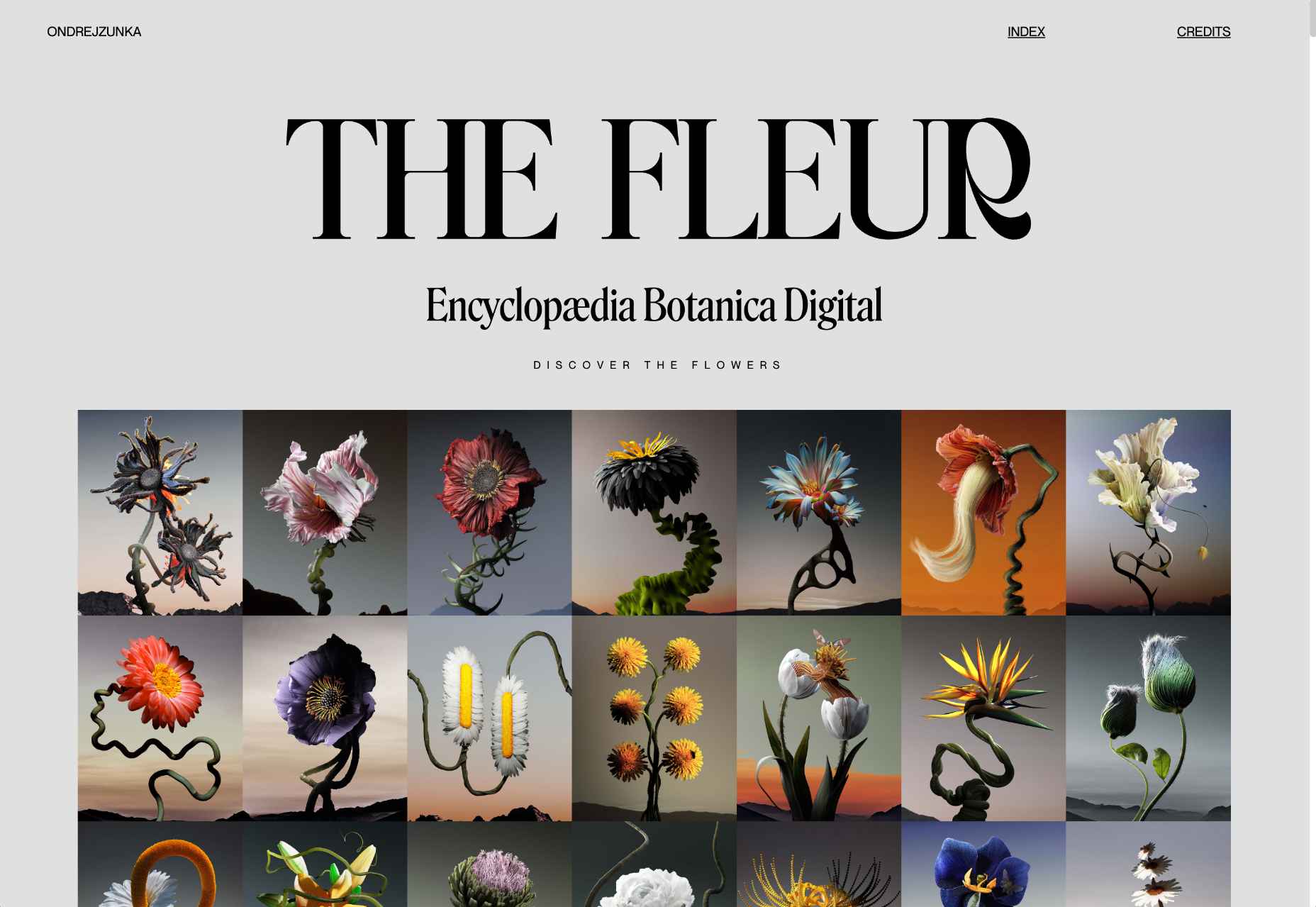
The Fleur

The Fleur is a botanical encyclopedia of fictional flowers that Ondre Jzunka has created as NFTs on the Ethereum blockchain.

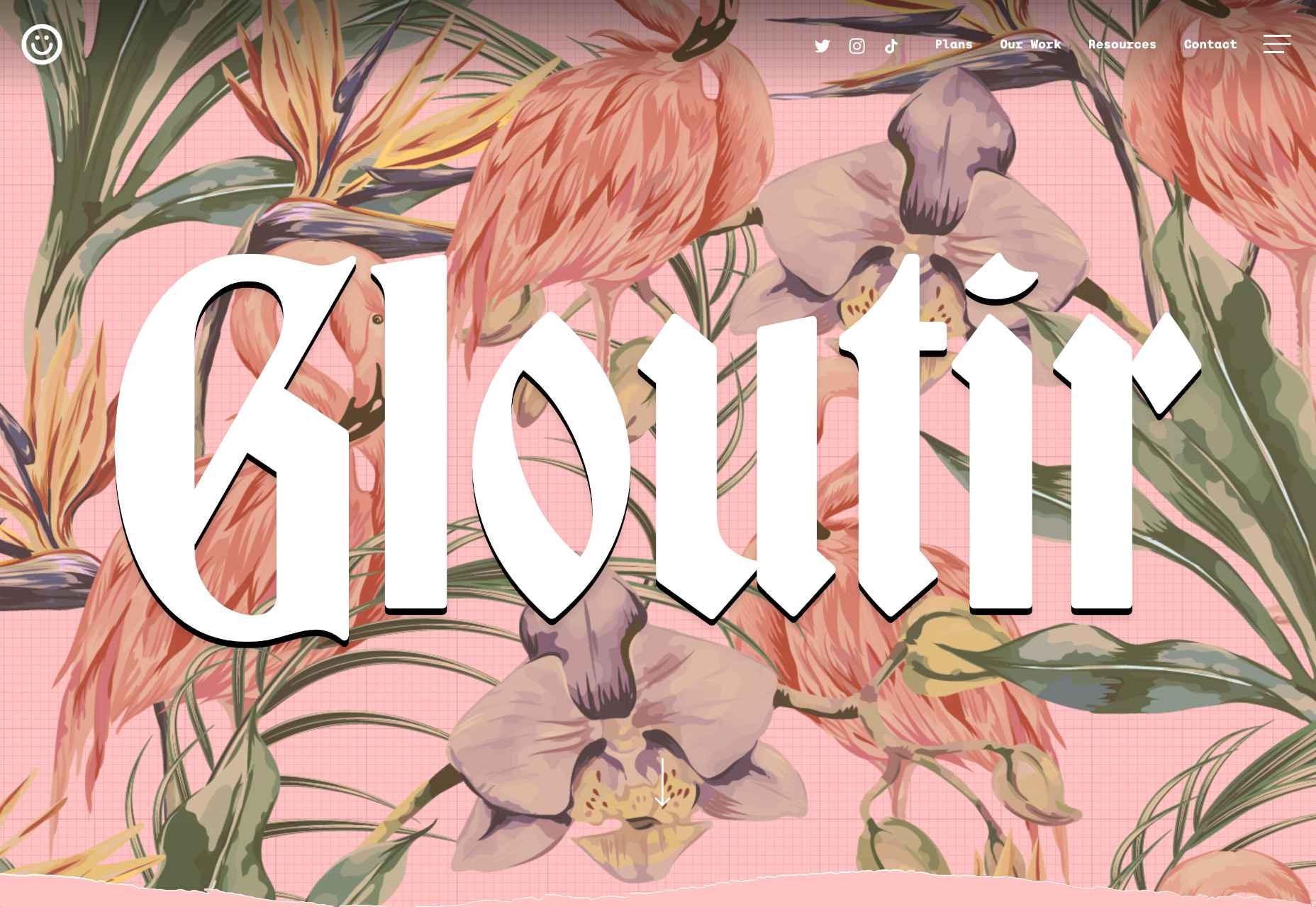
Gloutir

Gloutir is the site for a “subscription-based workhorse design and development studio” that breaks all the rules of typography, and yet somehow it works.

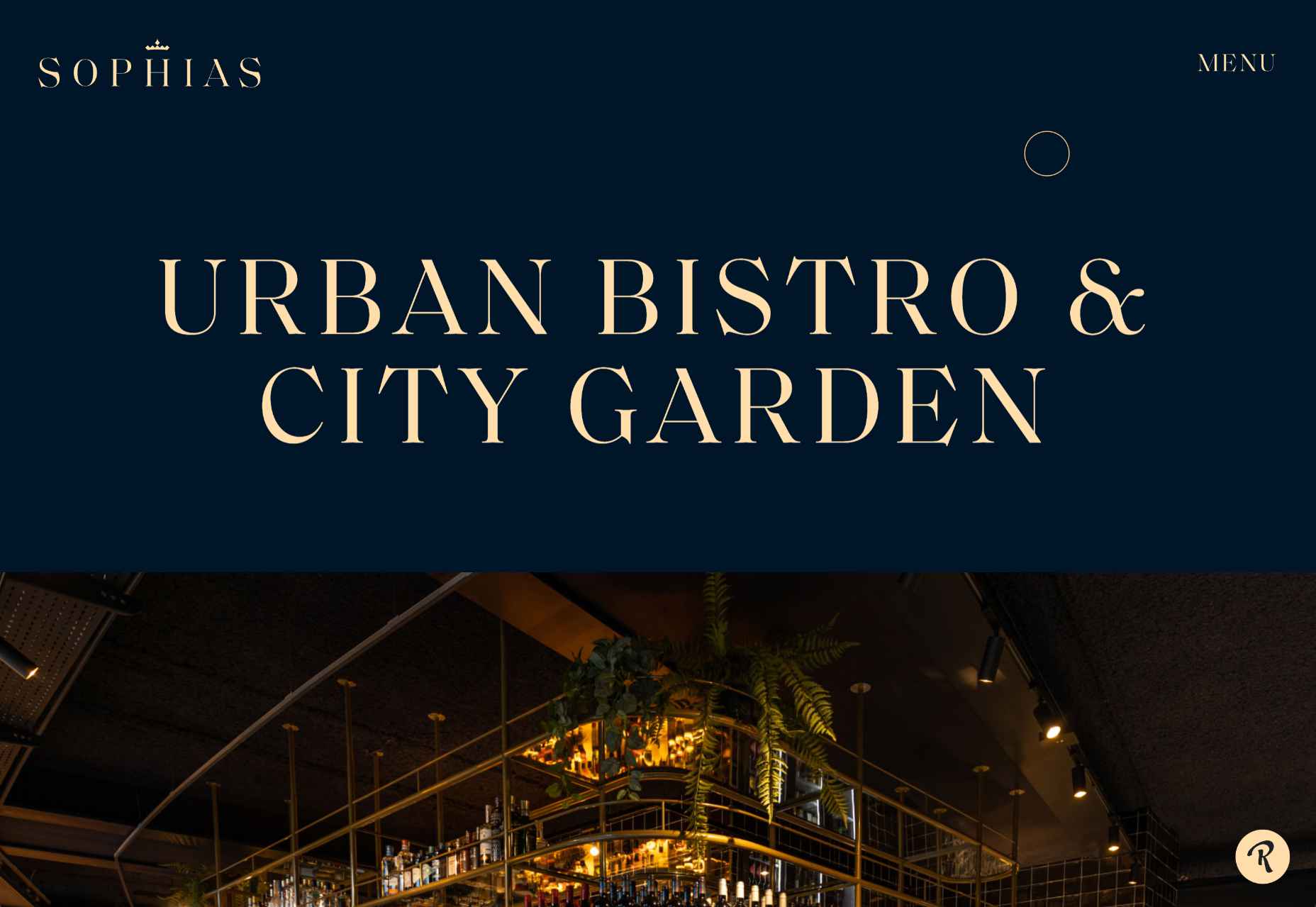
Sophias

The rich blue and bright cream of the site for Sophias urban bistro and city garden echoes the welcoming real-world interiors and ties the brand together.

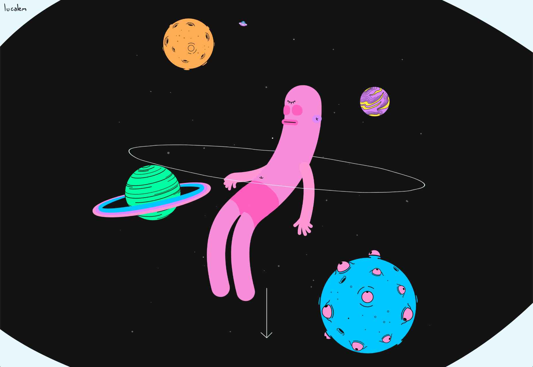
Lucalem

Lucalem is the portfolio site of designer and developer Lucas De Melo. A little more fun than the typical freelancer’s site, it features a disturbingly phallic character.

Soft Power

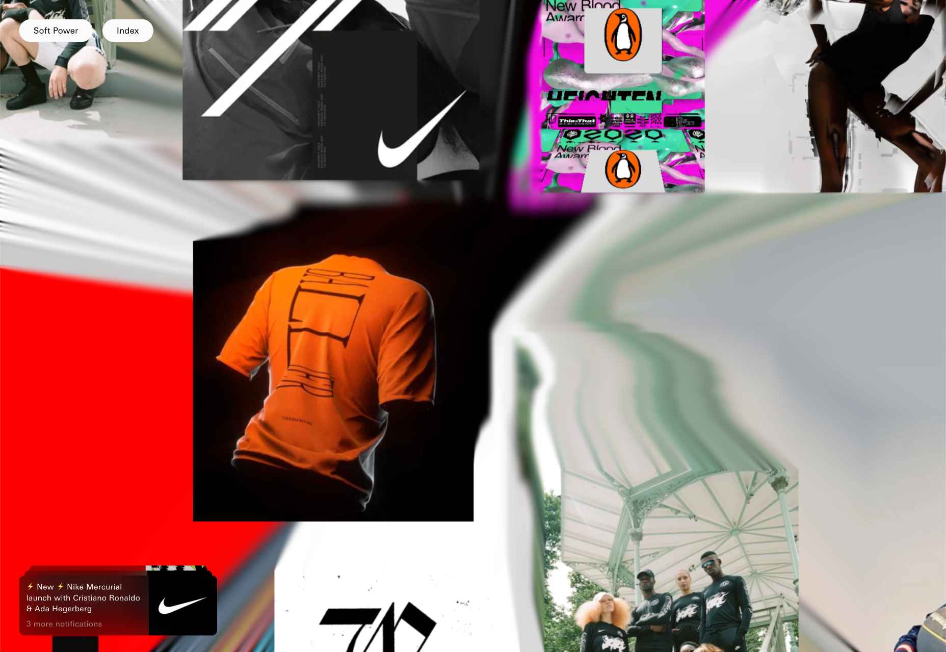
Soft Power is a creative design studio with an eye-popping list of international clients. Its advertising-style site uses a trendy glitch effect expertly.

Aather

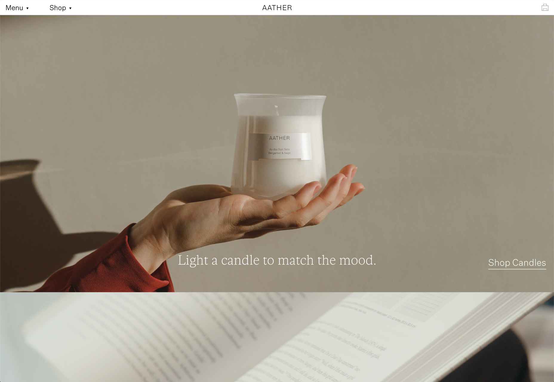
Pastel colors and subtle textures evoke a calm mood, ideal for candle company Aather. It’s challenging to visually present smell, but this site does it well.

Source

The post 20 Best New Sites, April 2022 first appeared on Webdesigner Depot.
Source de l’article sur Webdesignerdepot

This month we have a variety pack for you. There are all sorts, from the most conservative layouts and structures to more experimental navigation. And we see how even the most traditional and functional websites can connect with users through mood-enhancing color schemes, clever font choices, and illustrations.

Non-functional–that is, purely decorative–details can really improve the user’s reaction to a site when applied sparingly. Constant movement gets tiring, and adding too many elements can feel fussy and unfocused. Getting the balance right so that things are kept simple but not bare and boring can be difficult, but it is a skill worth mastering.

Enjoy!

Laboratorio Permanente

The site for this multi-disciplinary architecture studio makes very nice use of a scrolling concertina effect.

Sometimes Always 

Wine sellers Sometimes Always have gone for a retro vibe with their color scheme and type.

Empty State 

Split-screen contraflow scrolling and the pop of bright blue against neutrals give Empty State’s home page impact, while the clean layout and clear navigation make the rest of the site pleasant to use.

Kibana 

Quirky display type and illustrations give this single-page site for Kibana lodge a friendly, welcoming feel.

For Good Design Lab

For Good Design Lab’s site is simple and bold; it makes a strong statement. And its design works even better on mobile.

Levitate

Levitate is a sports brand that makes an affordable running blade. Their site has a clean minimal feel, contrasting spaciousness with a sense of movement in the photography used.

Sunst-studio 

Multidisciplinary creative agency Sunst Studio keeps things simple but impactful with oversized black type on white and smaller images.

Made By Nacho 

Strong colors and illustrations, with the occasional subtle animation, work well for Made By Nacho.

Flexe 

Flexe are logistics experts, not the first industry that springs to mind when we think of great website potential, but this one is very appealing.

Friesday 

This site for Friesday restaurant/takeaway is lively, colorful, and fun.

Go out{side}

This offshoot site from B.A.S.S. (Bass Anglers Sportsman Society) aims to promote angling as part of an outdoor lifestyle. Earthy colors and a lively visual rhythm create energy.

Protos Car Rentals

Illustration brings a touch of personality to this site for Protos Car Rentals, while attention to detail pays off in the usability.

21wallpaper 

21wallpaper offers downloadable screen savers from different illustrators (7 artists, 3 designs each) regularly, which at the same time acts as a showcase for the artists.

Elon’s Toilet 

This is a brilliant and vital piece of marketing that succeeds in presenting a serious subject in a lighthearted and engaging way. You’ll have to find out for yourself what it’s about.

Pa’lais

A fresh feeling color scheme, a distinct lack of straight lines, and a scattering of illustration work well for the site for this vegan food producer.

Benjamin Righetti

Using a primarily visual medium to effectively promote an artist whose medium is sound is not always easy. This website for organist Benjamin Righetti does an outstanding job.

Wavemaker

Wavemaker is a creative media agency. Their site is strong and confident but with a playfulness that is engaging for the user.

Dpt.

This site for Dpt. throws out the usual menu concept and has its navigation arranged around the screen. It can be a risky strategy, but here it works well.

Plunt.co

Plúnt sells mix and match plant and planter combinations. The site’s core functionality is the combination chooser, which is pleasingly reminiscent of an animal flipbook.

Kingdom & Sparrow

Branding agency Kingdom & Sparrow have gone for a fairly standard approach, but the little hand-drawn details here and there add just enough individuality without overdoing it.

Source

The post 20 Best New Websites, July 2021 first appeared on Webdesigner Depot.

Source de l’article sur Webdesignerdepot

Here we are into a brand new year, and although we’re far from out of the woods yet, there is a feeling of renewed hope on many fronts.

In this first collection of the year, we have a mix of retrospectives, brand new ventures, and business as usual. There is an eclectic mix of styles on offer, from glossy and slick to minimalist and brutalist, but all confident and looking to a better world in the year ahead.

Clar

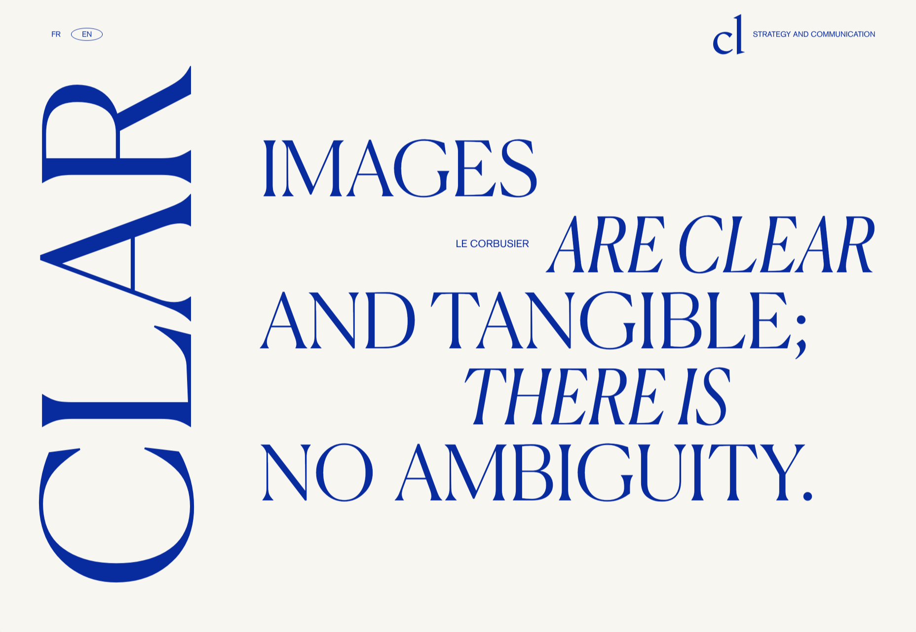
Brand strategists Clar have a simple but strong site. Aside from a few personnel profile shots and the odd bit of line animation, it is all text. The typography is good, and the use of color holds interest.

Ebb Dunedin

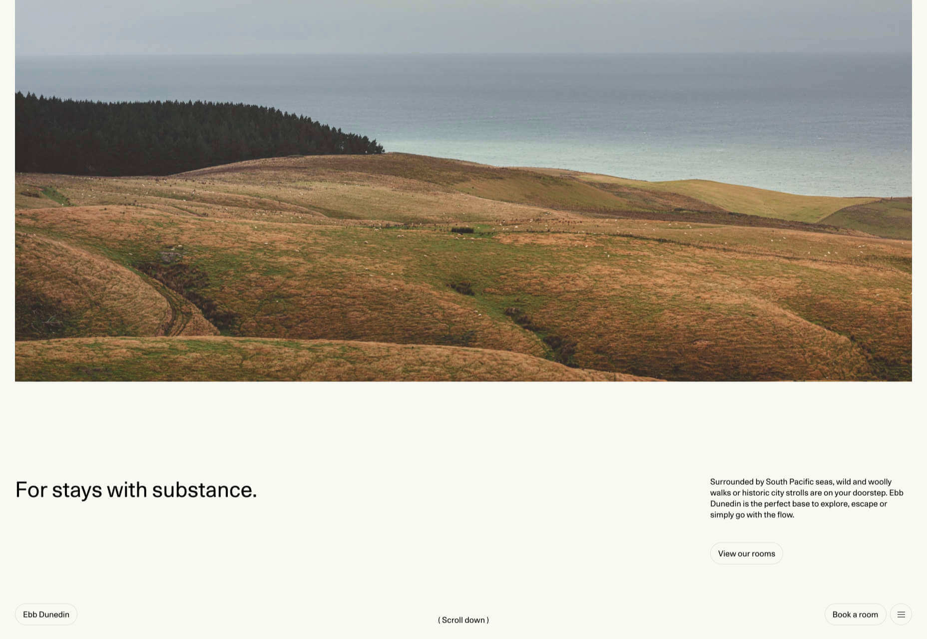
This boutique hotel, opening in March 2021 (COVID permitting), has bucked the usual luxury hotel trend and bravely gone for a more minimal design style to complement its interiors.

Aplós

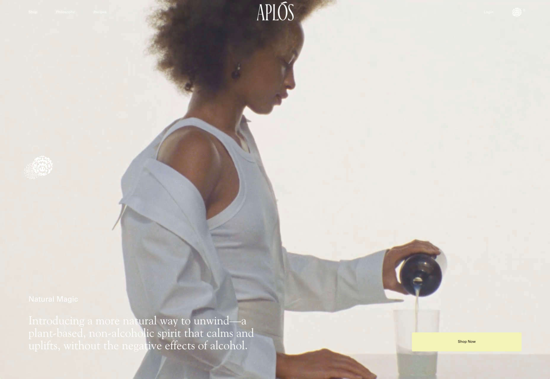
Perfect for Dry January, Aplós is a new, non-alcoholic spirit that can be drunk on its own, with a mixer or in a cocktail. The site design and branding aesthetic is sophisticated calm.

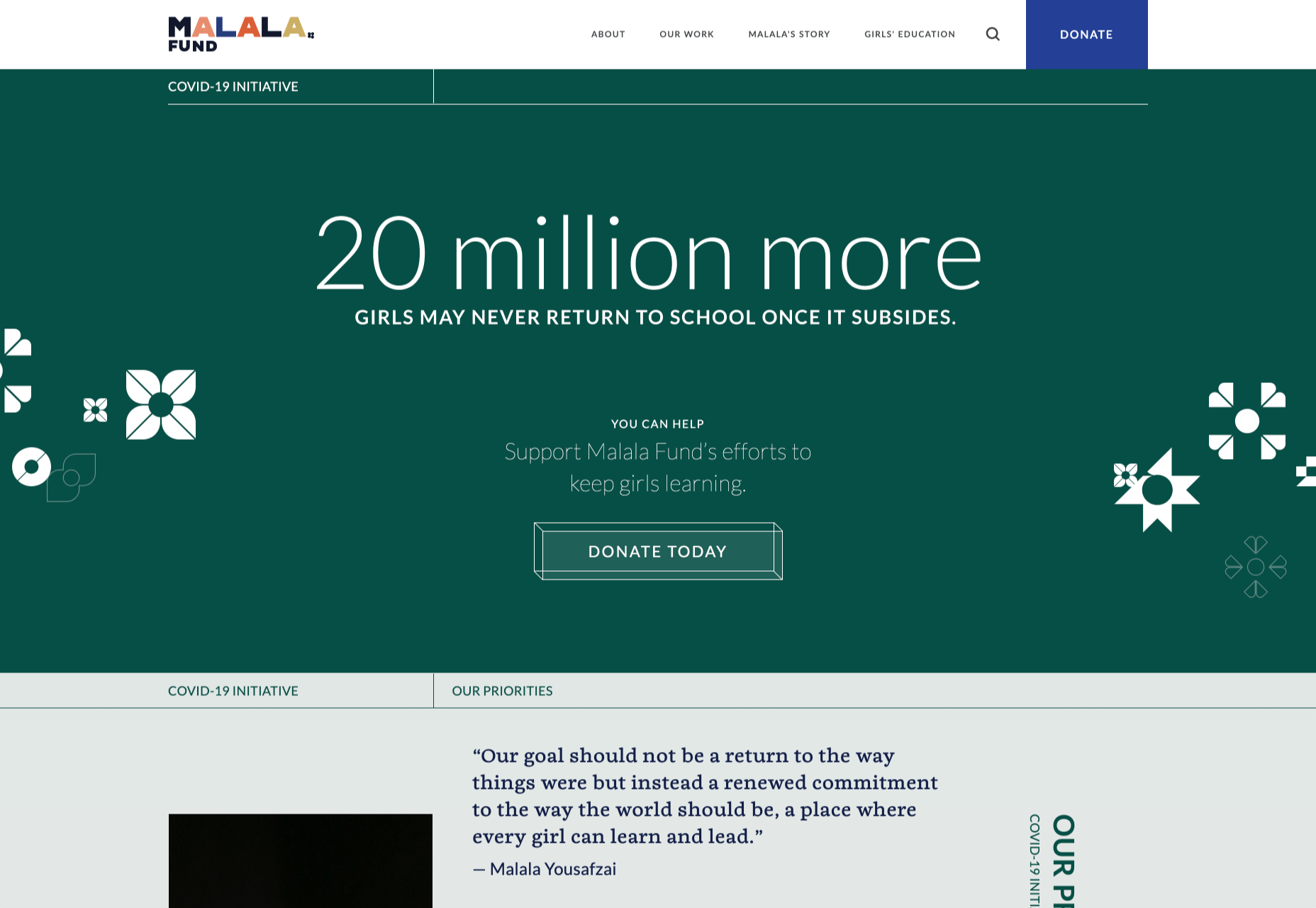
Malala Fund COVID Initiative

Subtle color and simple line decorations keep this site for the Malala Fund’s COVID Initiative clean but warm and appealing.

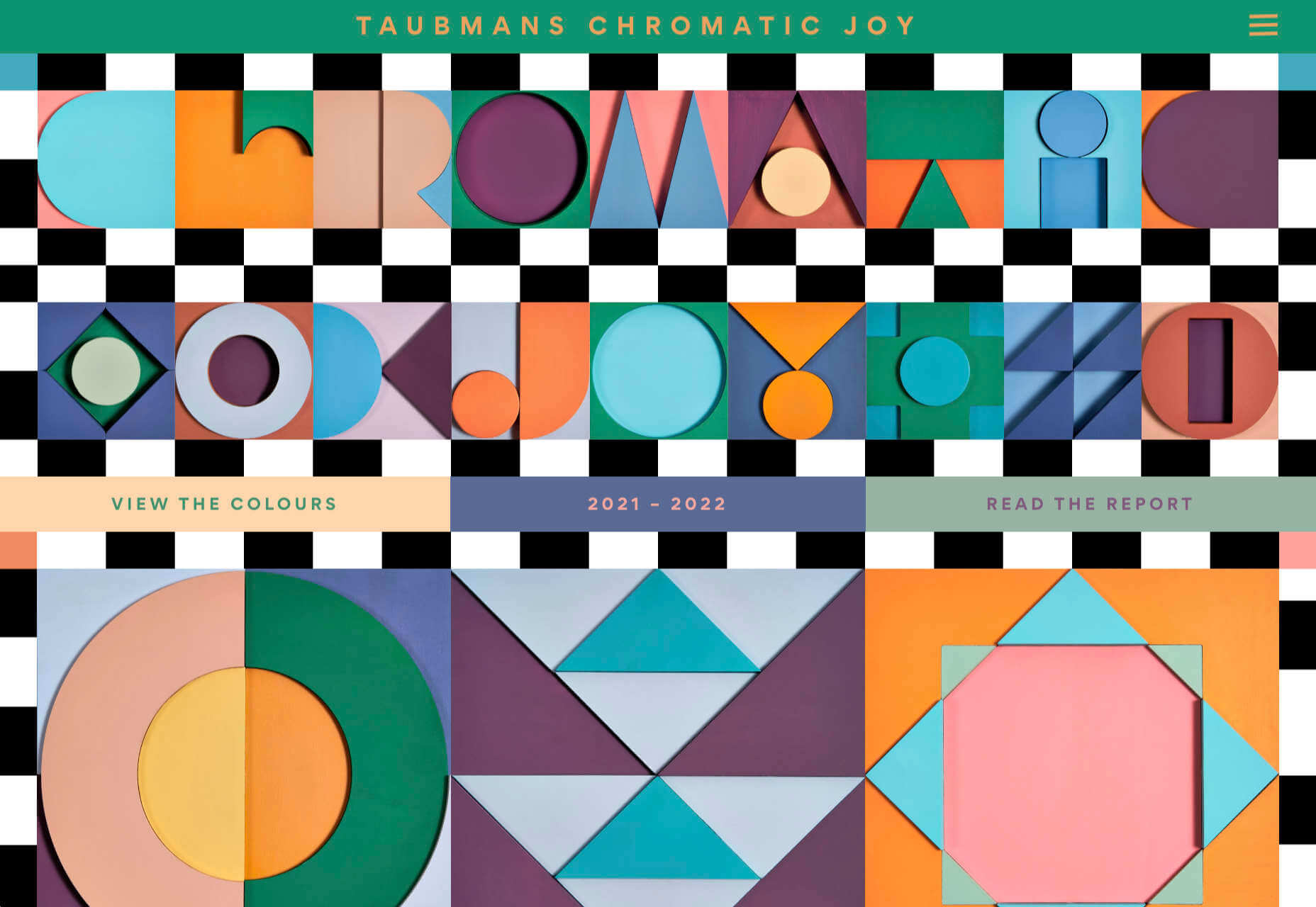
Taubmans Chromatic Joy

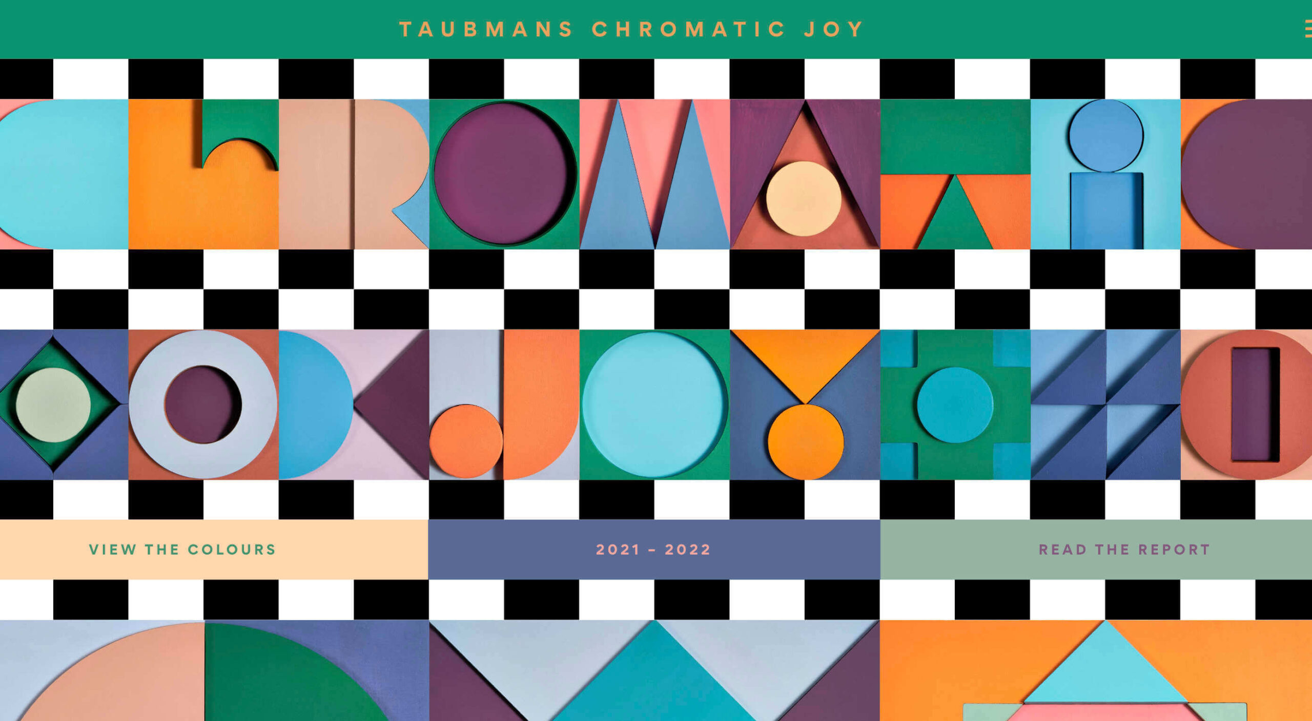
This micro-site promoting Taubmans’ new paint color collection is bursting with color and makes a big nod to the Memphis style of the 1980s.

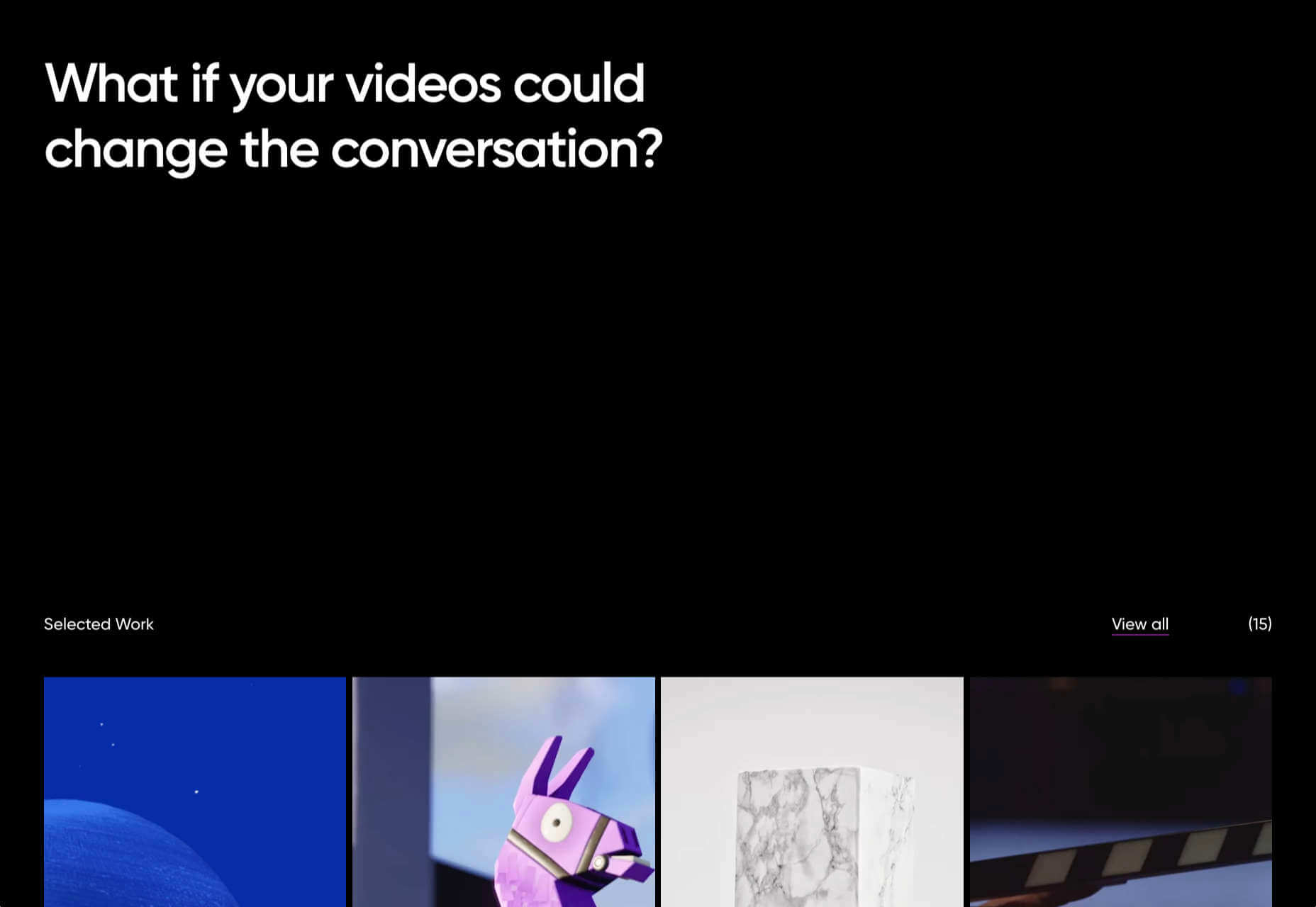
Myriad

Myriad video production agency’s site uses small amounts of bright colors really well. And they quote Eleanor Shellstrop.

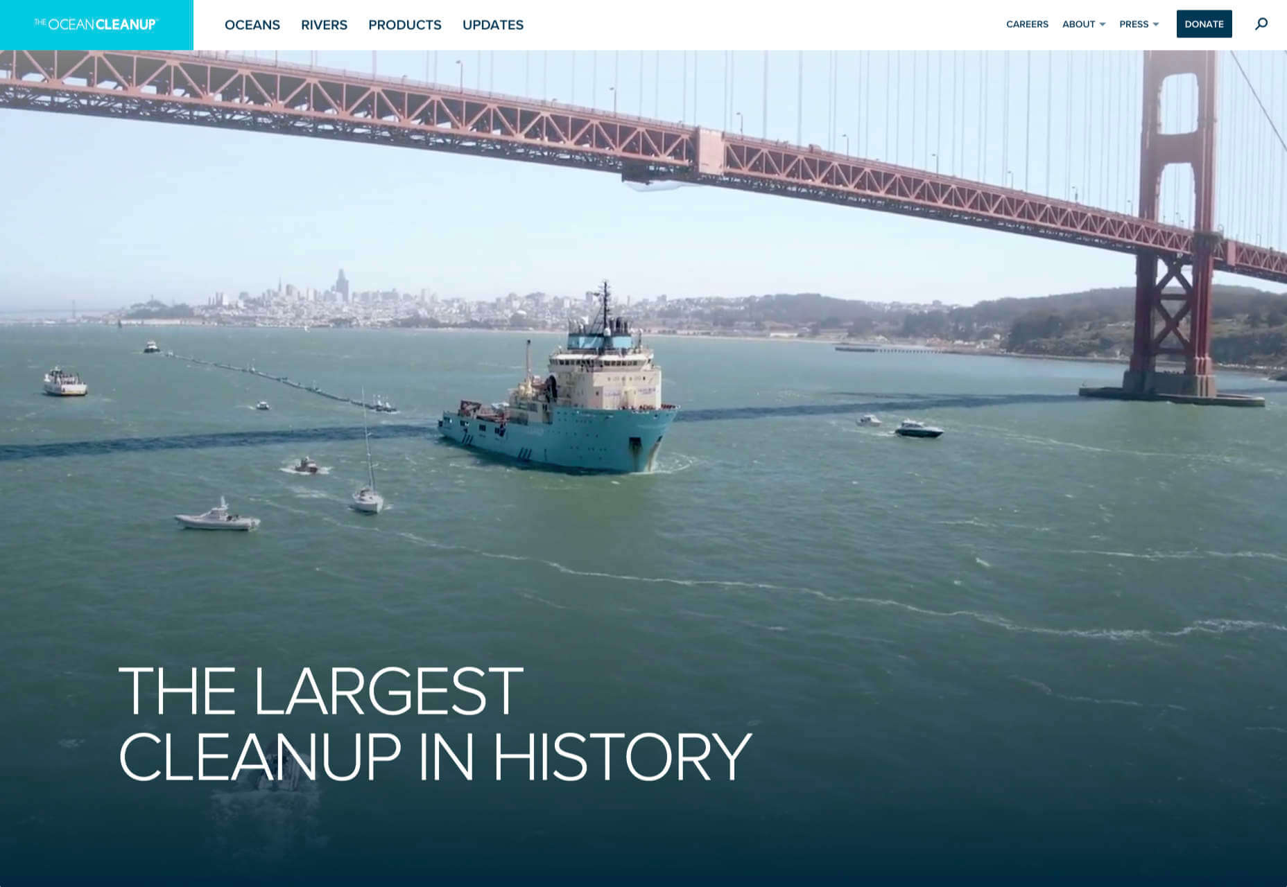
The Ocean Cleanup

Cleaning all the plastic crap out of the oceanic garbage patches is a grim job, but it’s getting done, and The Ocean Cleanup site explains how and why in a not grim way.

Photo Vogue Festival

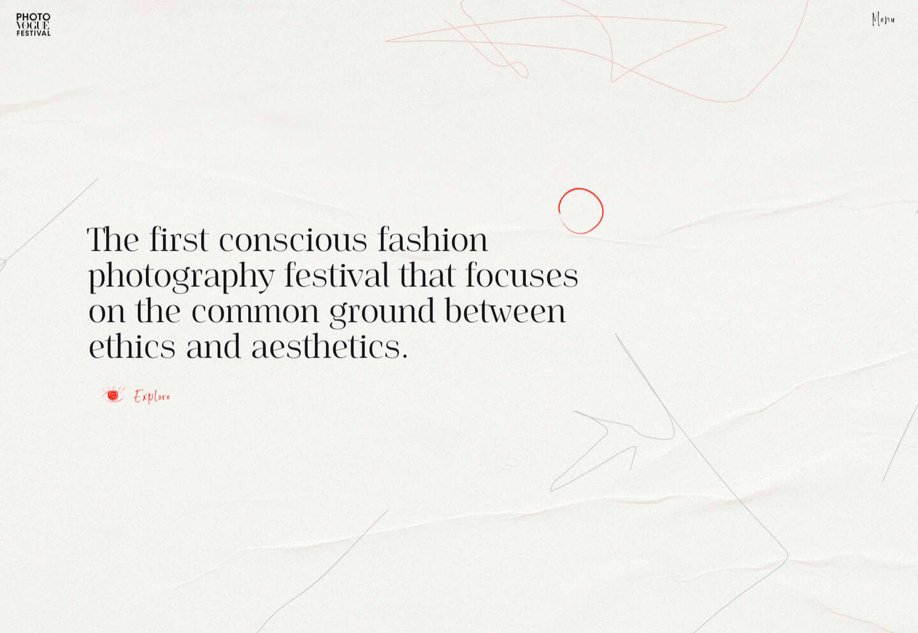
This site displaying the work and talks from Vogue Italia’s 2020 Photo Festival mixes a hand-drawn style with clean type and a strong grid.

Zero

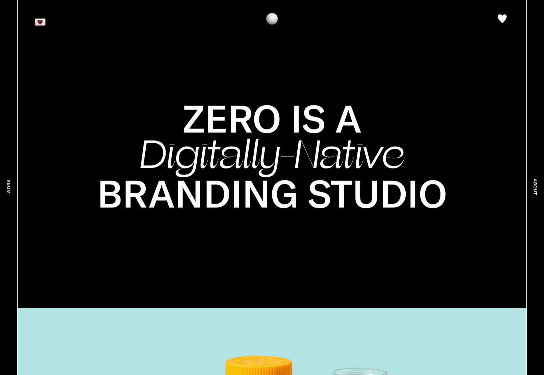
Zero is a digital branding agency. Their site is glossy with lots of high-quality images, smooth transitions, and a clear structure. The background options are a fun touch.

Fluff

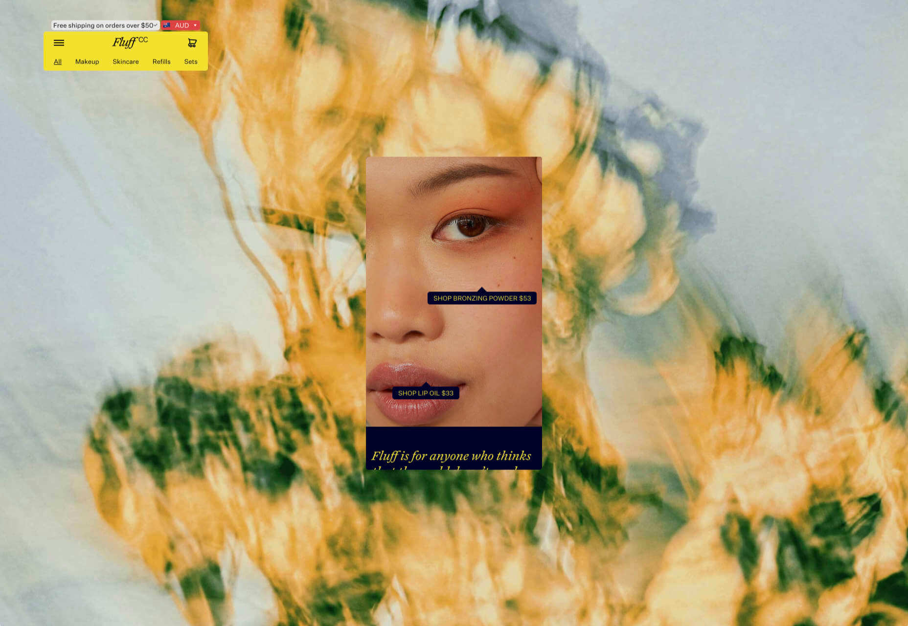
This site for cosmetics brand Fluff takes an old school approach to designing for different viewports — sticking a fullscreen background behind your mobile view for desktop sounds like a terrible idea, but here it works.

Patricia Urquiola

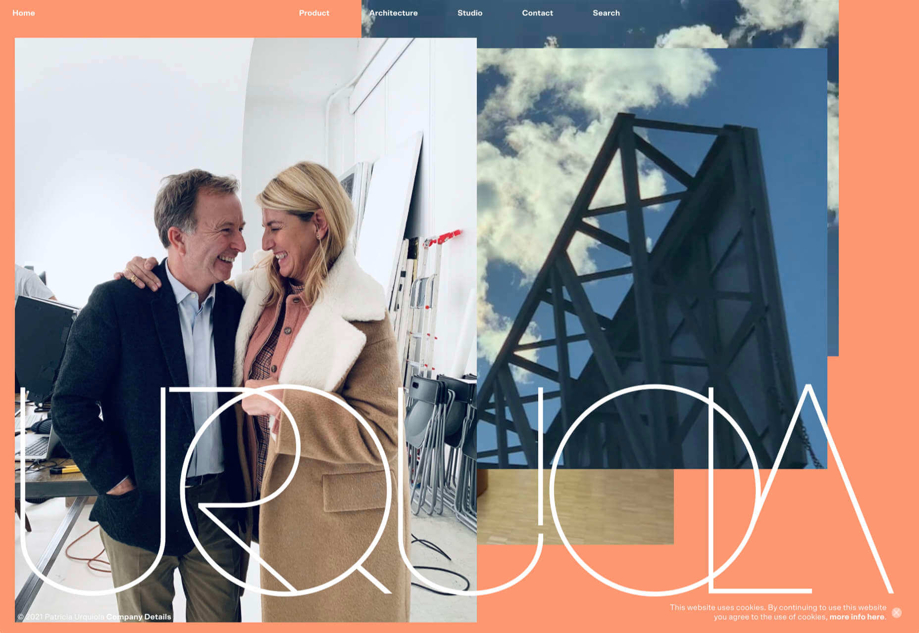
The new site for Patricia Urquiola design studio is bright, bold, and assured, inspiring confidence.

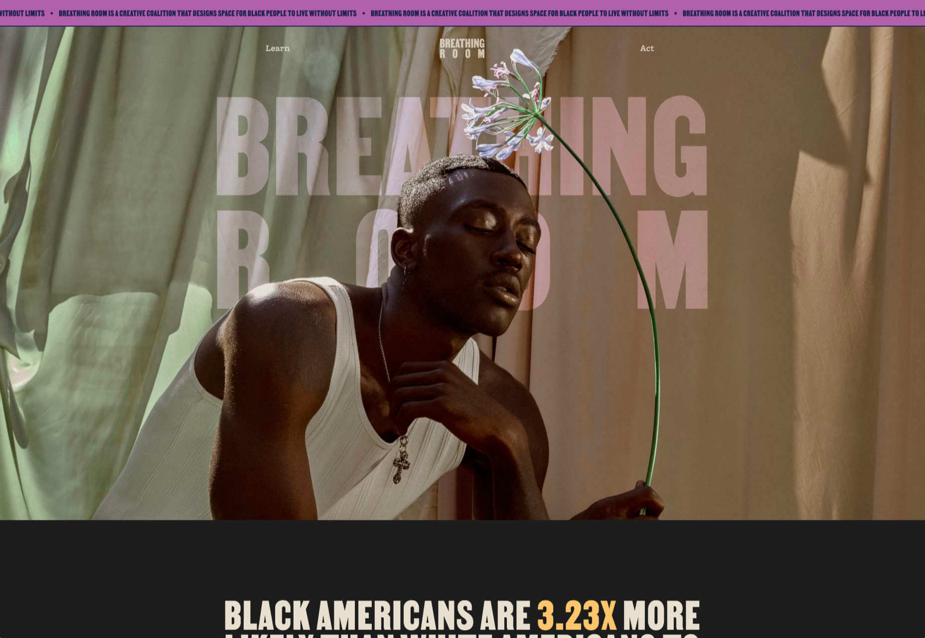
Breathing Room

Breathing Room describes itself as a volunteer creative coalition that designs spaces for black people to live without limits through art, design, and activism. The design radiates confidence and optimism.

A Year in Review

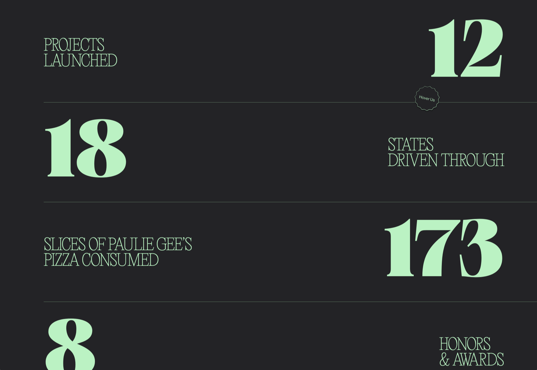
A microsite from Milkshake Studio, highlighting their work over the past year. Some good scrolling animation.

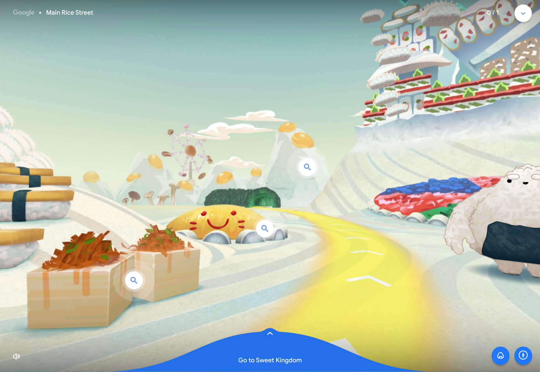
Umamiland

Umamiland is an animated interactive introduction to Japanese food, with links to Google search results for individual items or where to get them.

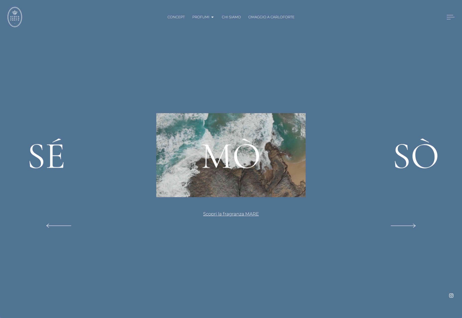
Acqua Carloforte

Carloforte is the town on the island of San Pietro, near Sardinia, and the scents of the island inspire the perfumes of Acqua Carloforte. Cue beautiful photography.

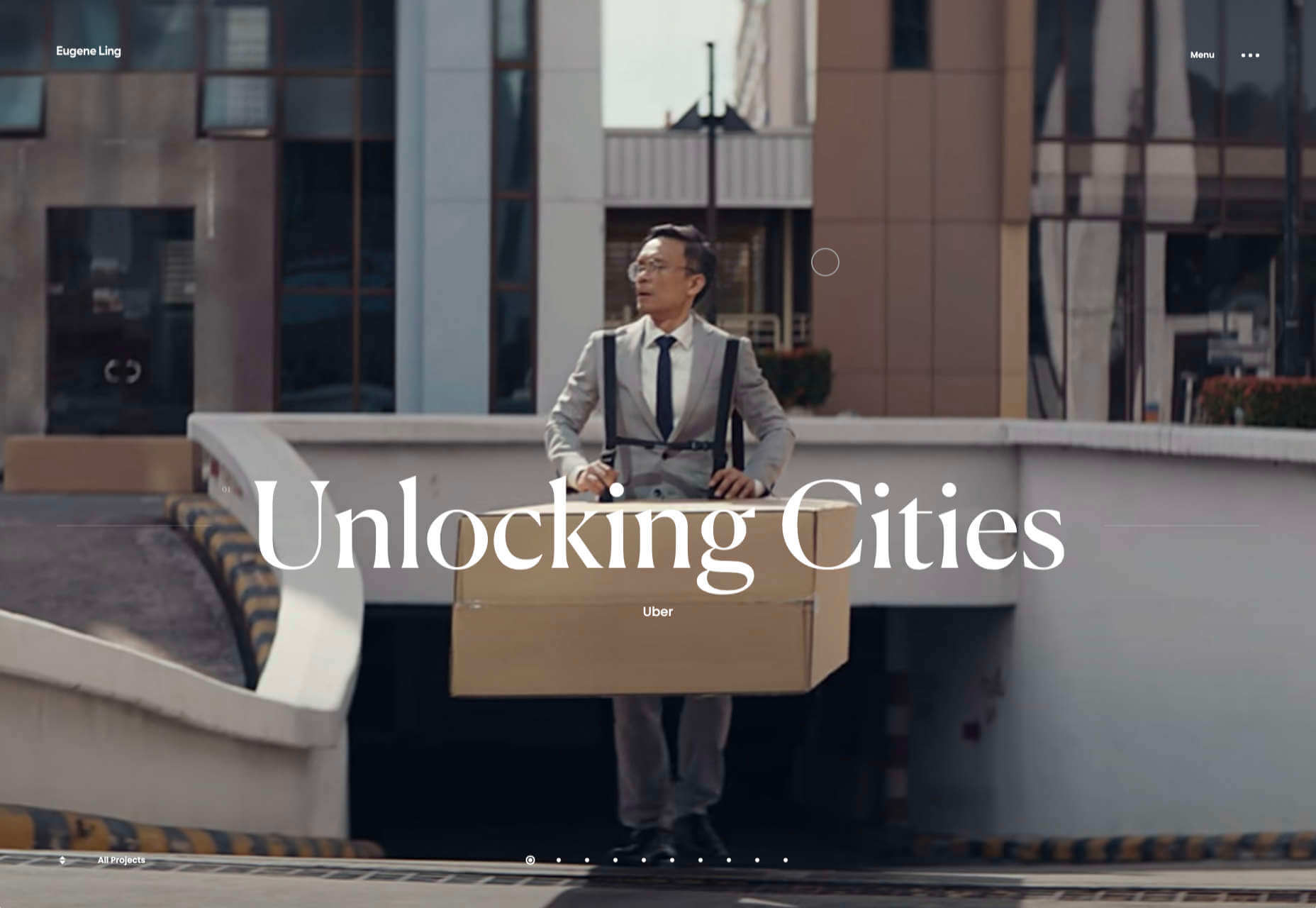
Eugene Ling

Eugen Ling’s portfolio site is simple and straightforward with little or no marketing-speak and a lovely, understated slider transition.

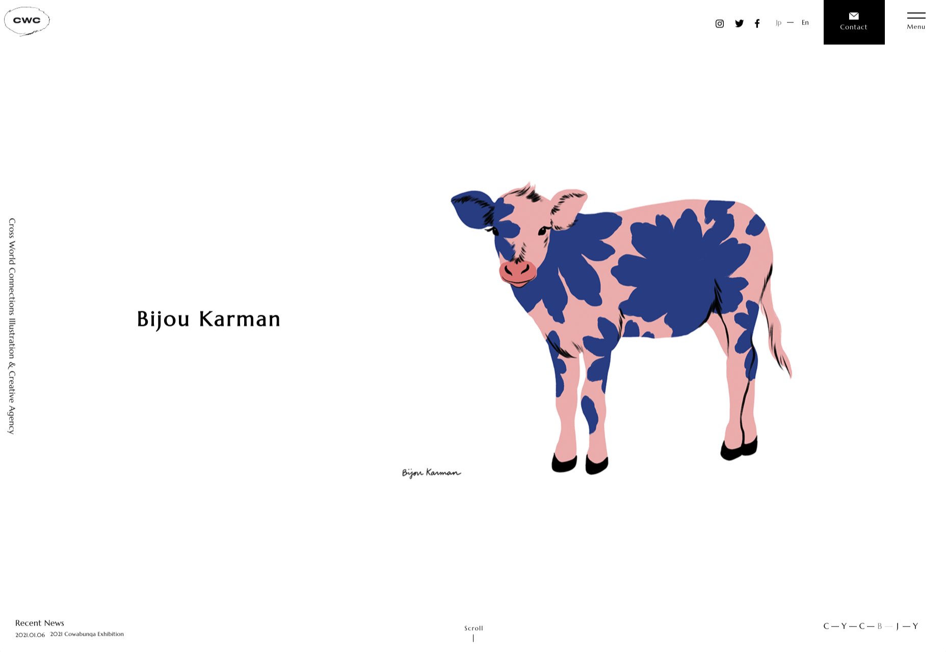
CWC Tokyo

Cross World Connections is an Illustration and Creative Agency based in Japan and represents illustrators from all over the world.

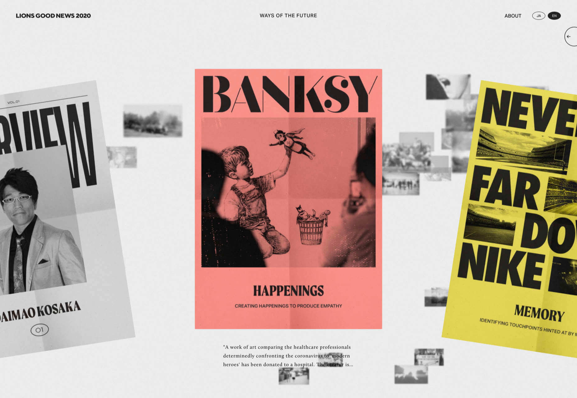
Lions Good News

Following the cancellation of the Cannes Lions Festival of Creativity in 2020, this site was set up to highlight good news in creativity during the pandemic. A carousel of paper flyers forms the main navigation and creates a lo-fi, DIY feel.

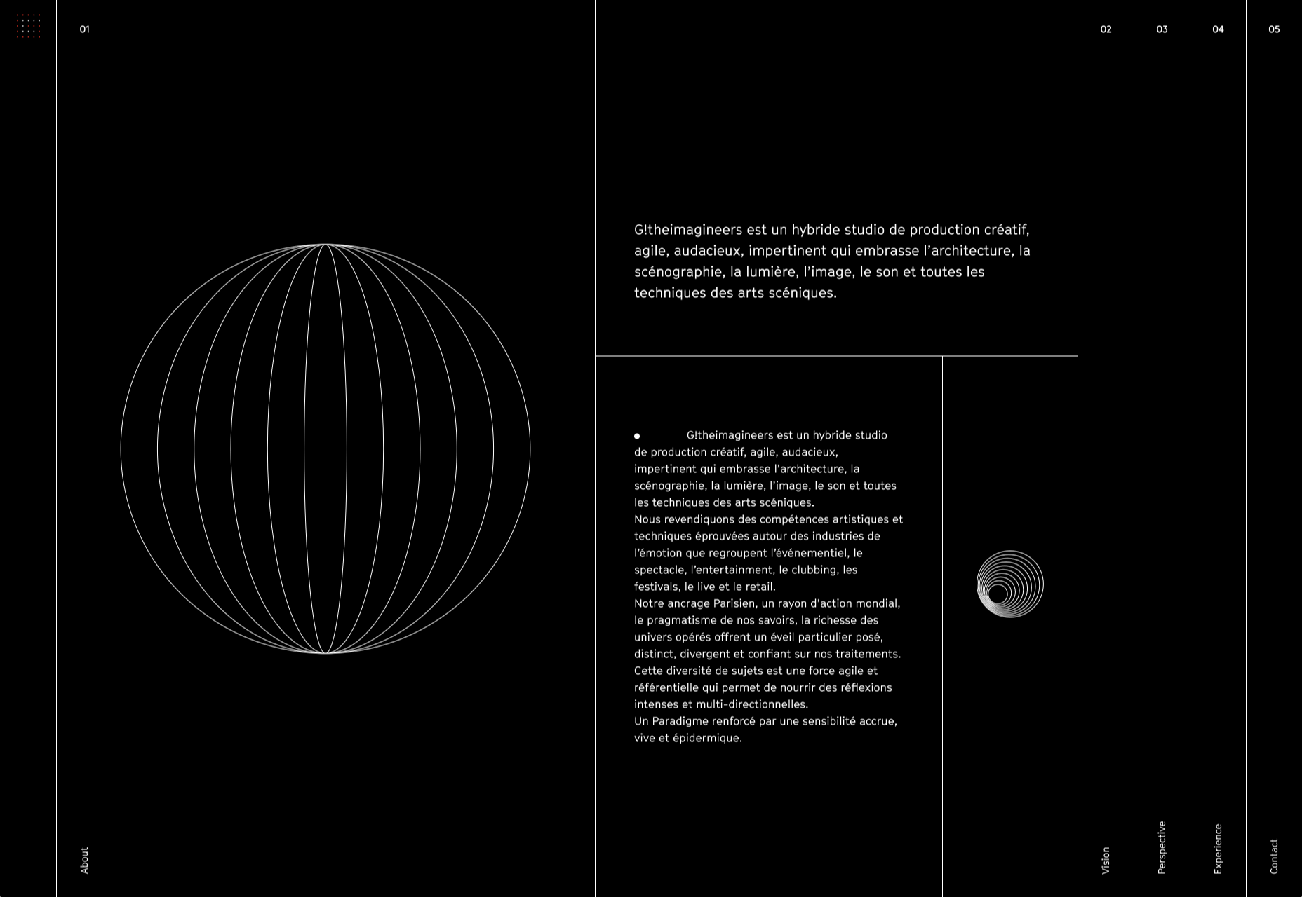
G!theimagineers

G!theimagineers is a production studio for events and entertainment. White lines on black, horizontal concertina navigation, and lots of circles.

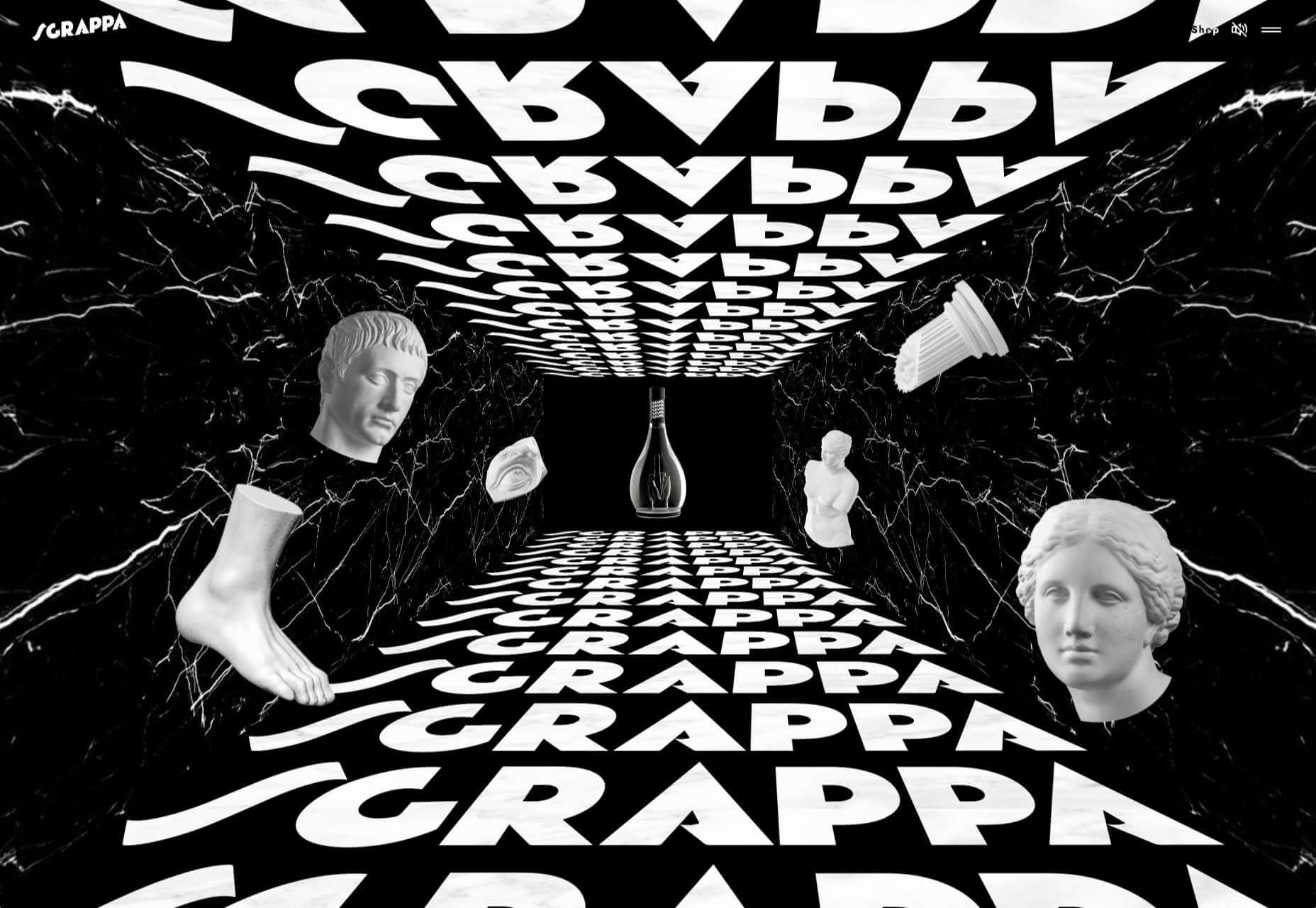
Sgrappa

Sgrappa is handmade grappa with attitude, and this site has an uncompromising, in your face vibe.

Source

The post 20 Best New Websites, January 2021 first appeared on Webdesigner Depot.

Source de l’article sur Webdesignerdepot

We have become so used to using web sites just to buy stuff that it is easy to forget that the web has more to offer. So this month we’ve included some because-it’s-interesting sites, some micro-sites and some just-for-the-sake-of-it projects.
Many of these are about selling or promoting products and services too, but in a more oblique way that is frequently more engaging than a straightforward sales site.

Micro sites can be a great way of including content that doesn’t fit in neatly with the rest of the main site, or is temporary, or to show a lighter, more fun side of a brand. And a well thought out micro site can act as a gateway to pull in even more visitors to its ‘parent’ site.

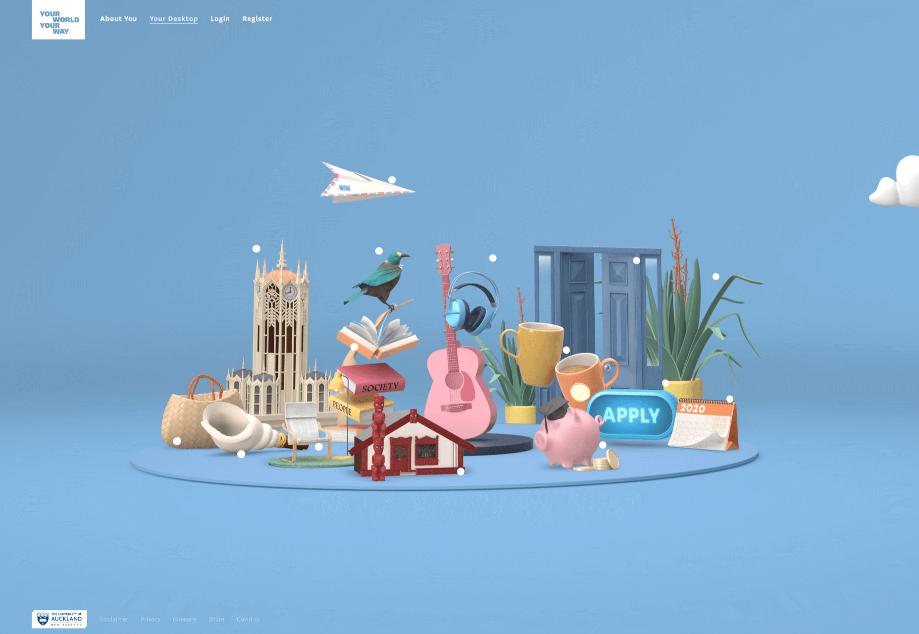
Your World Your Way

Your World Your Way is an interactive portal for the University of Auckland. An optional questionnaire customizes the experience, and clearly a lot of effort has gone into this in terms of the questions and possible answers, and the presentation. It is engaging and enjoyable to use, and the information provides links to the main University of Auckland website.

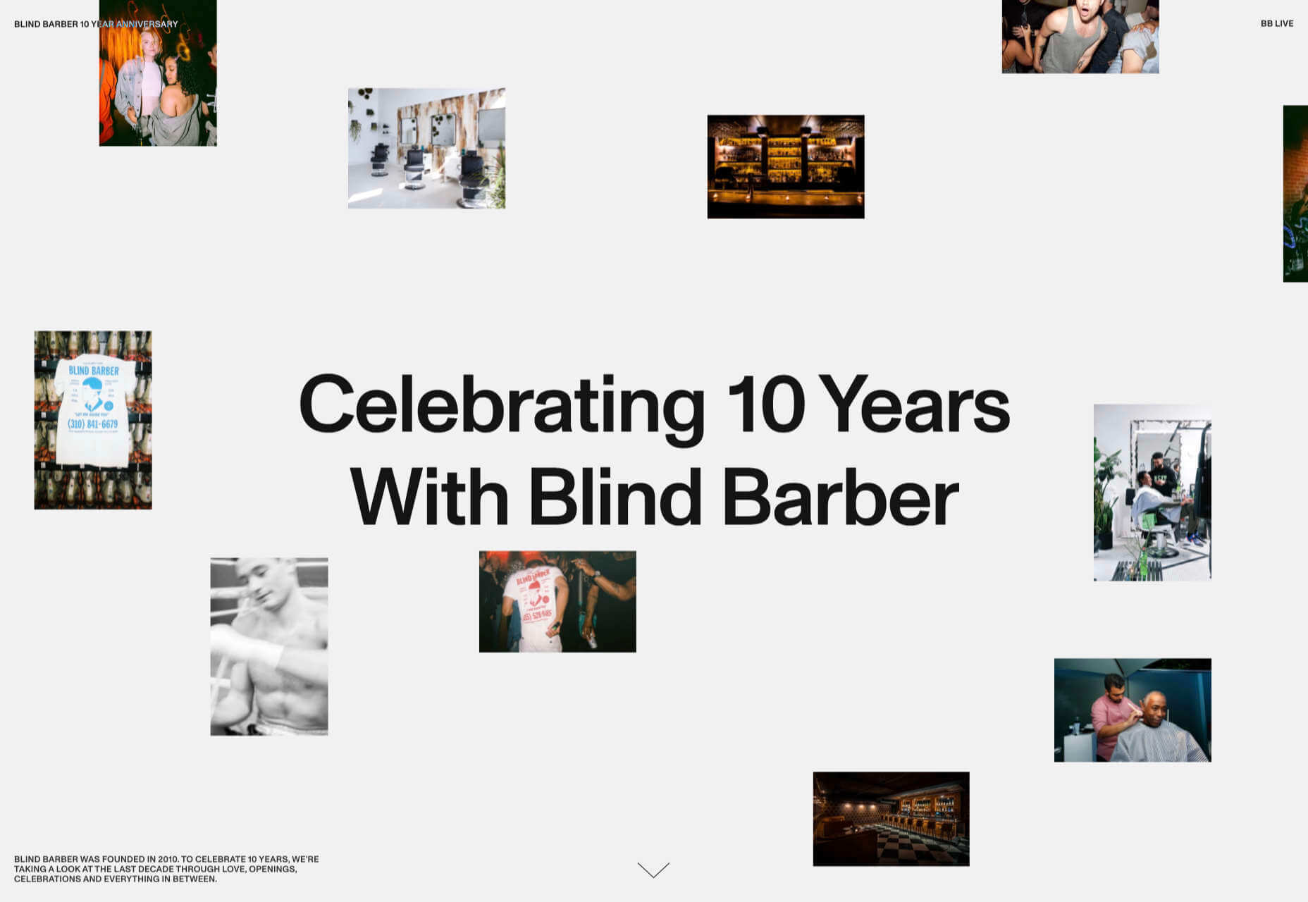
Blind Barber

This micro site is to celebrate 10 years of barber shop chain Blind Barber, which started as one shop with a bar in the back room, in New York’s East Village. An entirely black and white design provides a clean backdrop for color photos and videos, and some great scrolling animations give a pleasing flow to the content.

Brews & Grooves

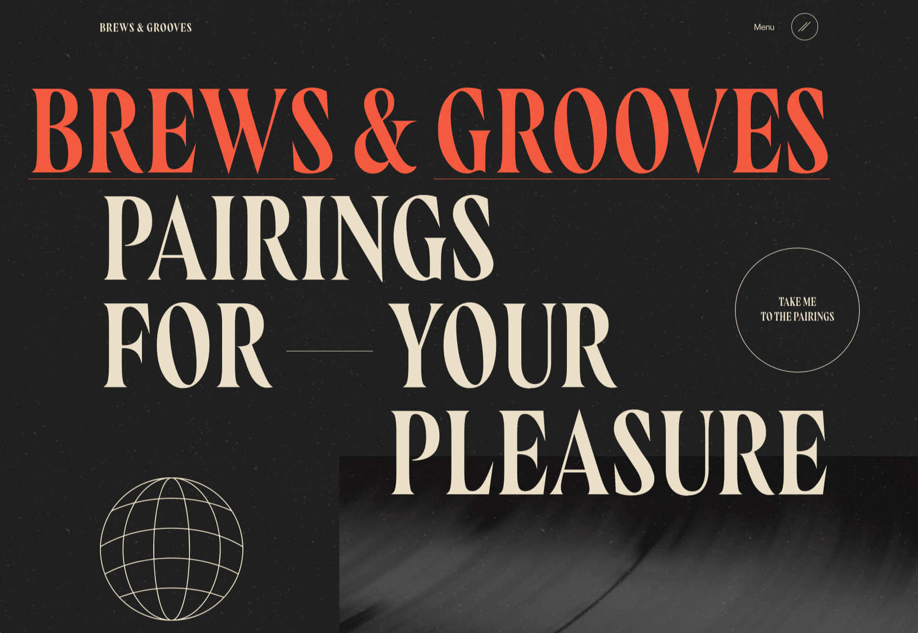
Brews & Grooves pairs records with different beer. Although a ‘fun’ project, it is still a well designed piece of work with some vintage style typography and some pleasing rollover animation effects. It is an effective advert for those involved in creating it, as listed in on its ‘credits’ page.

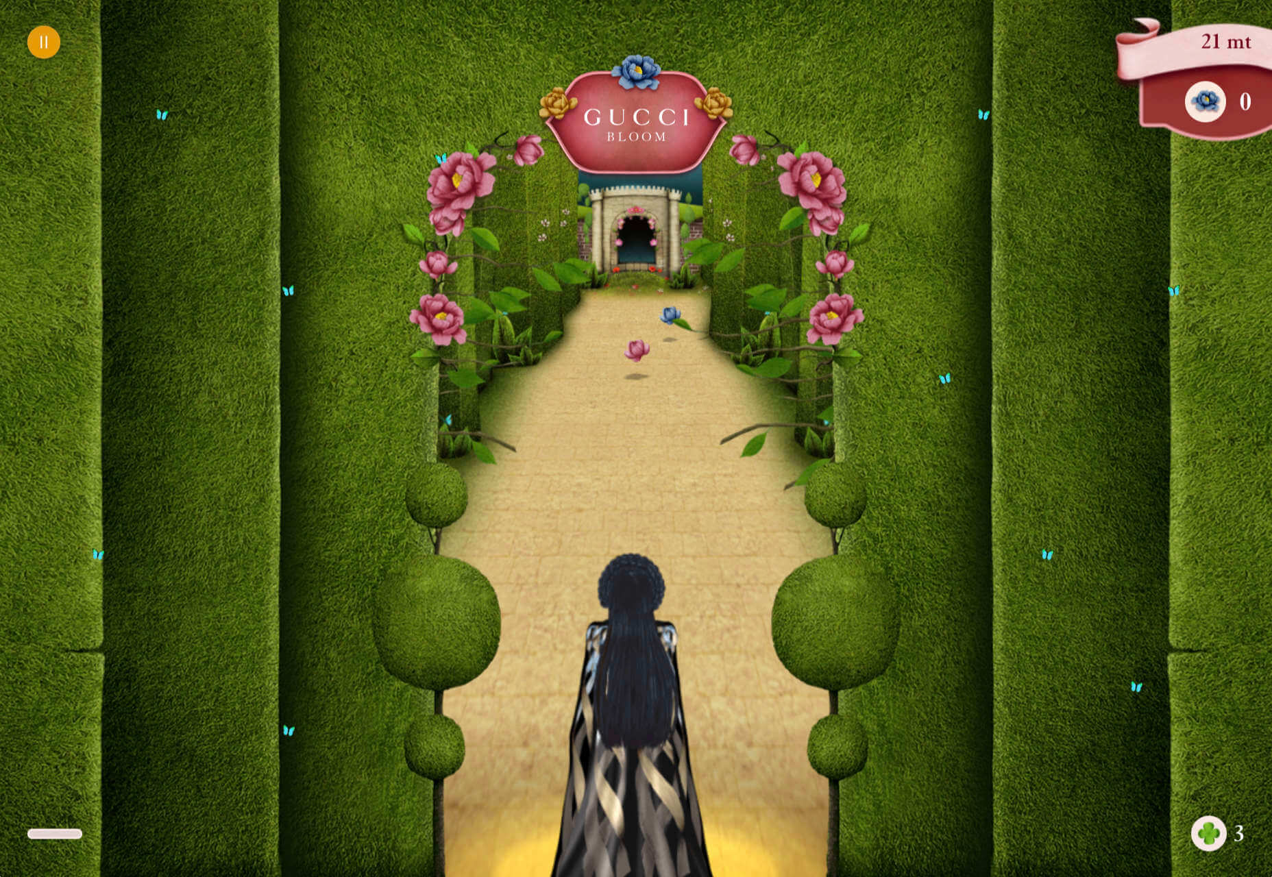
Gucci Bloom

As part of a new campaign to promote it’s ‘Bloom’ perfumes, Gucci have created a Gucci Bloom game. The player has to pick up flowers and perfume bottles, but miss a flower and the vines get in your way.

808303Studio

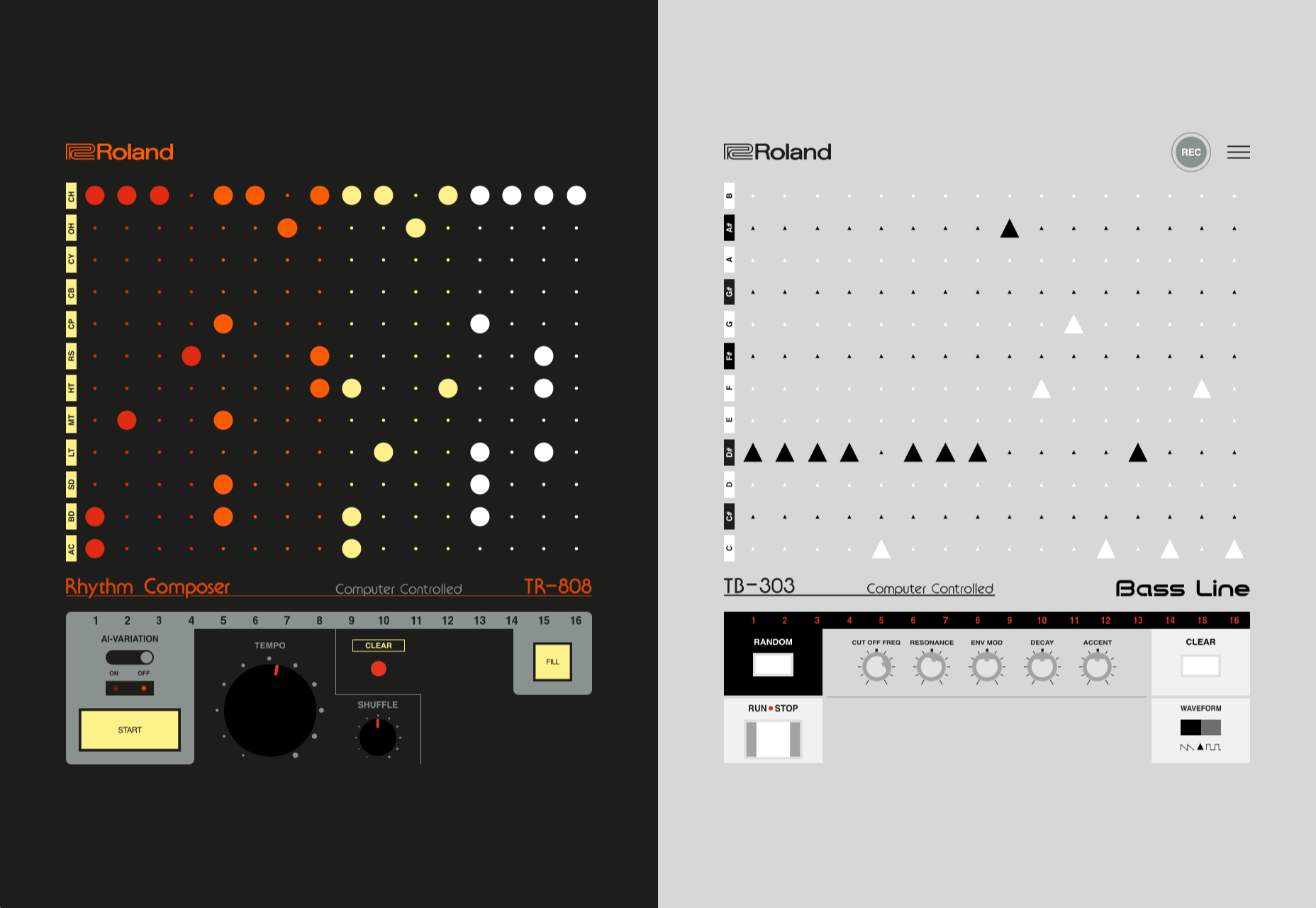
808303Studio is a digital musical instrument that emulates a Roland TR-808 drum machine and TB-303 bass synthesizer, created in conjunction with the Design Museum (London). It’s fully programmable and there is even short video tutorial with A Guy Called Gerald on how to use it.

Aelfie

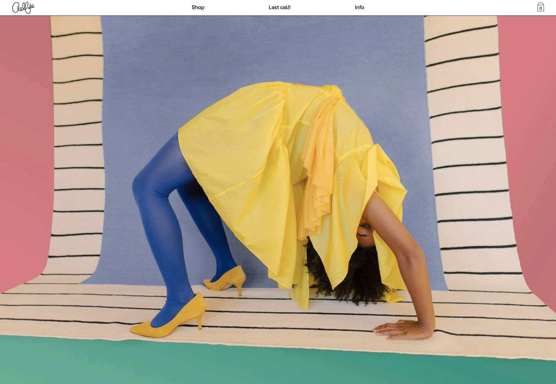
Aelfie is a home furnishings brand with a focus on bold patterns and bright color. Their site reflects this with its use of block color, irregular grid, drawings, and type that feels a little off-kilter. It creates a hand-made feel that embodies the brand aesthetic rather well.

Media Election 2020

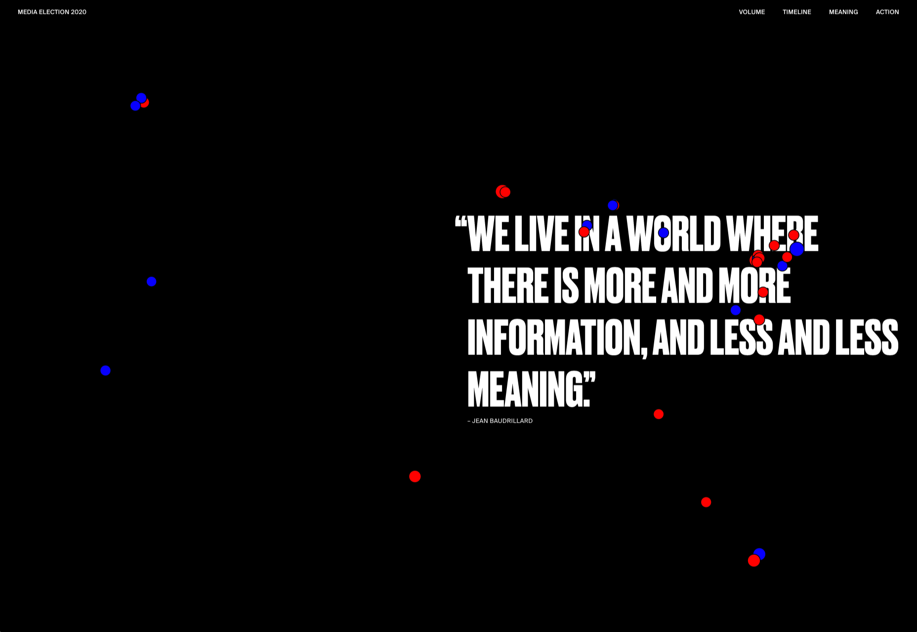
As we approach one of the most significant, not to mention acrimonious, elections in US history, Media Election 2020 uses AI to analyze the volume of media attention each candidate receives, in real time.

Curbed

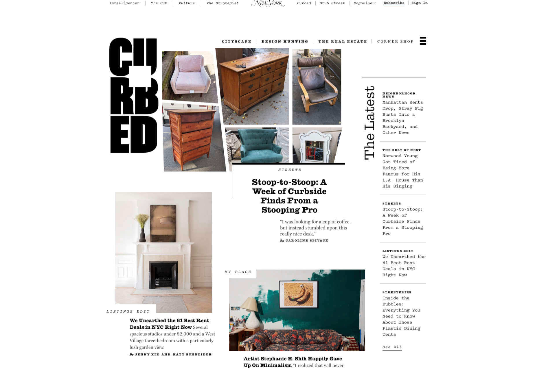
Magazine website Curbed has now become a part of New York magazine, and had a redesign in the process. It follows a discernible grid, but distorts it just enough to create an edge. The highlighter color frames, and underlines on rollover, add movement and ‘cool’.

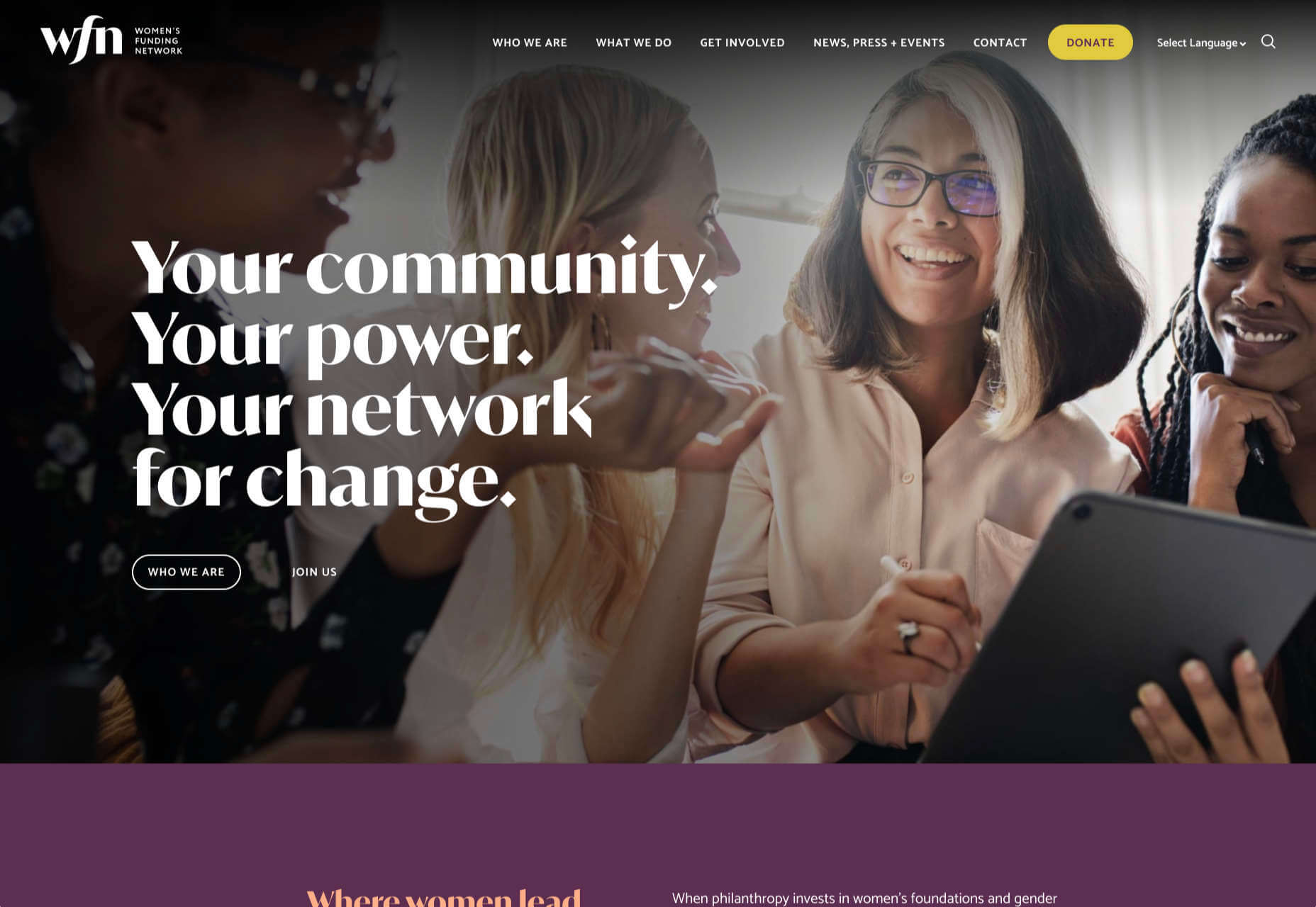
WFN

The WFN (Women’s Funding Network) is an alliance of funds and foundations working to promote gender equity and social change internationally. The site is clean, with strong typography and a sophisticated color palette.

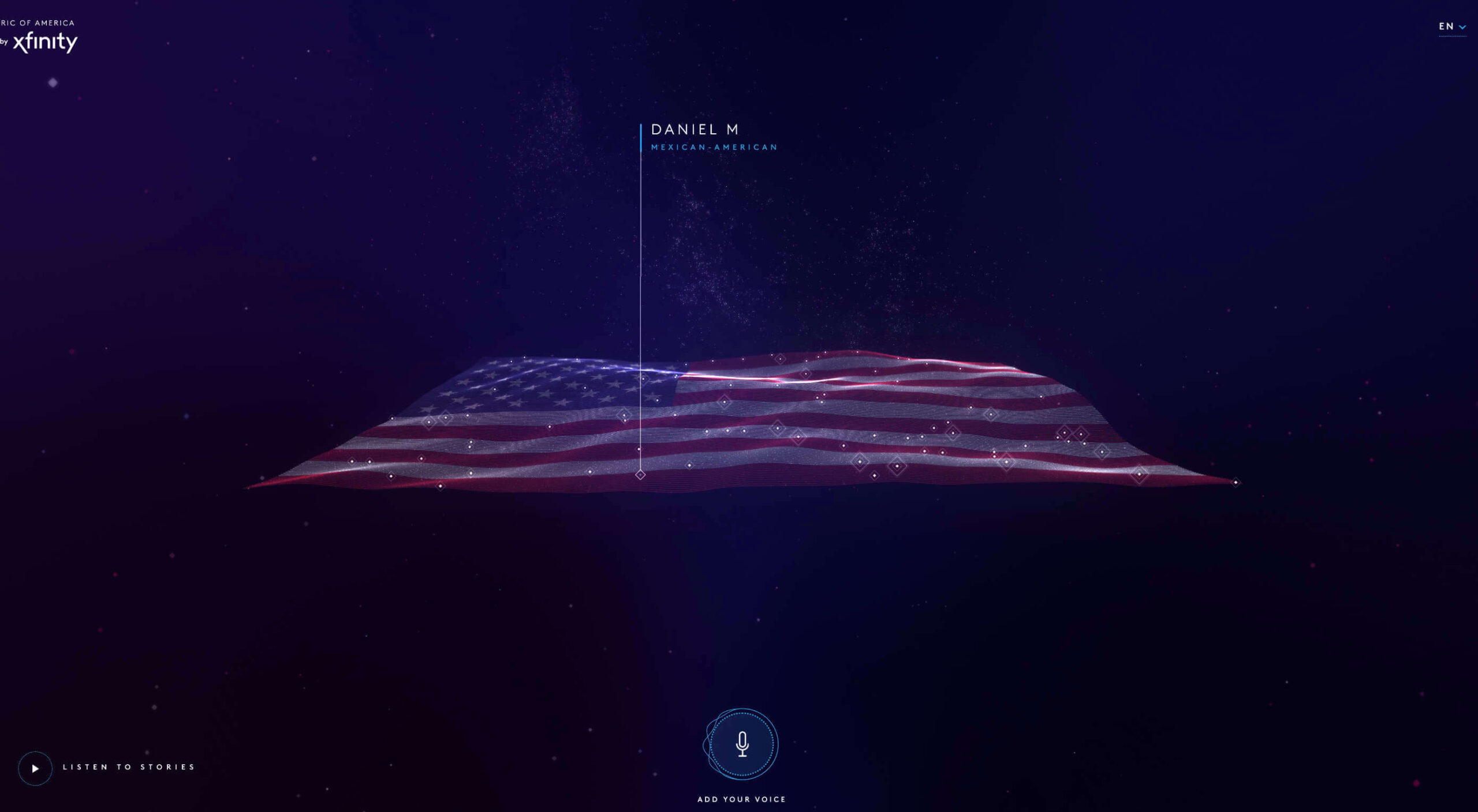
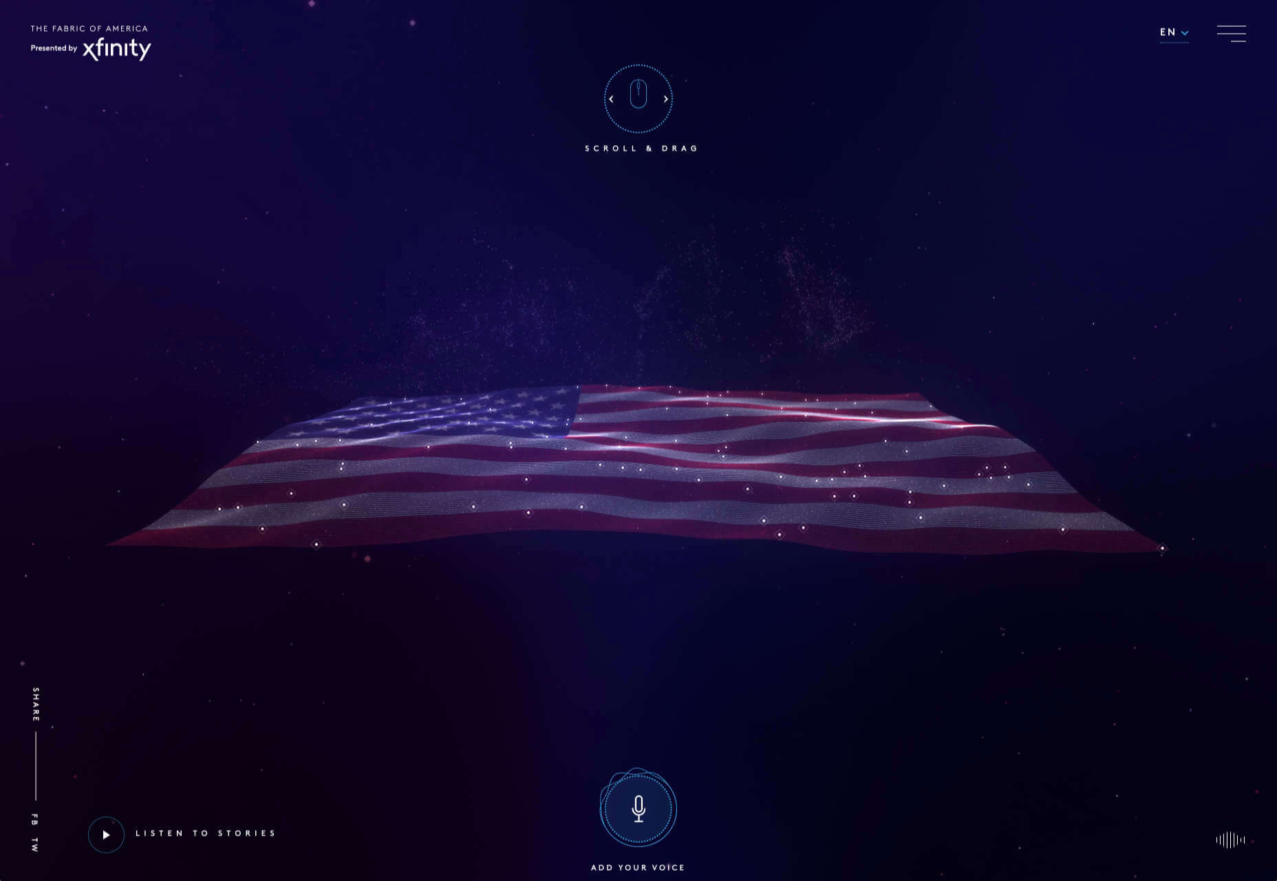
The Fabric of America

Internet, telephone and TV service provider Xfinity is behind the Fabric of America project. It is a collection of voice recordings, the idea being that each voice, and each person’s story, is a thread that makes up the flag that we see on the screen.

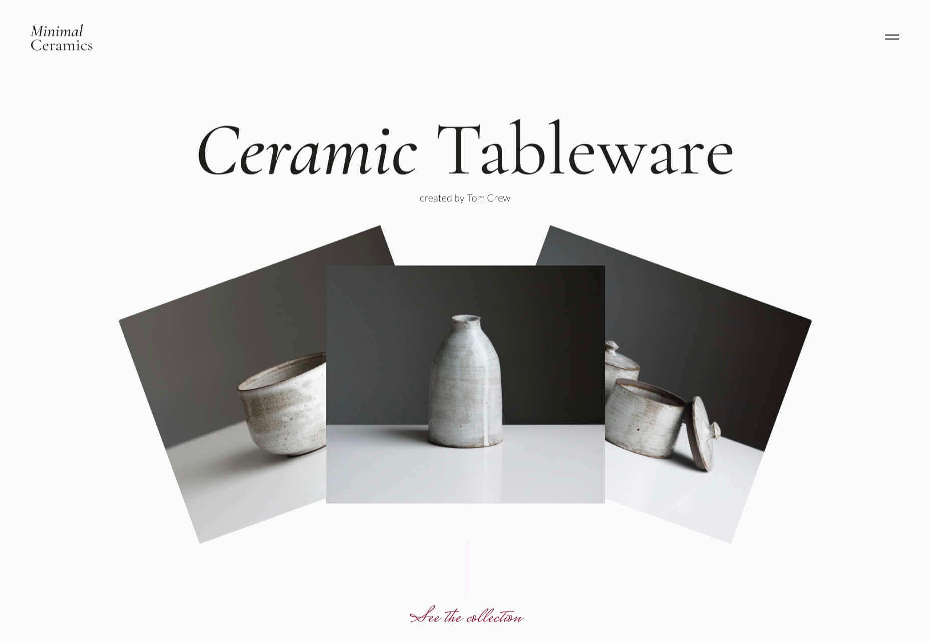
Minimal Ceramics

Minimal Ceramics is a concept site, showcasing the work of London based potter, Tom Crew. The design of the site reflects the simplicity of the showcased work, using great photography and simple typography.

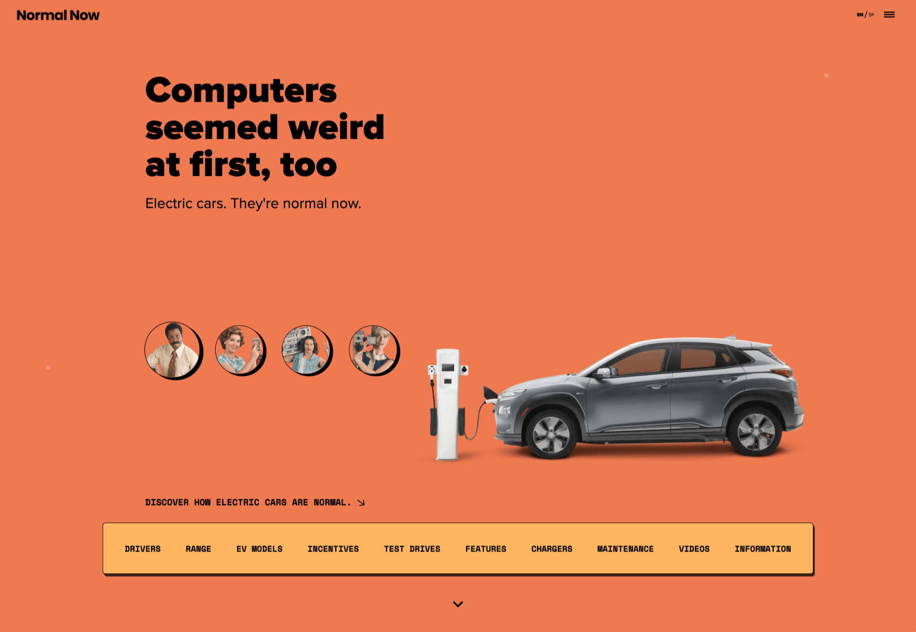
Normal Now

Normal Now is part of an awareness campaign to highlight to consumers the positives of electric cars. Taking a fun approach to engage consumers in a serious subject, it uses a fake retro tech style.

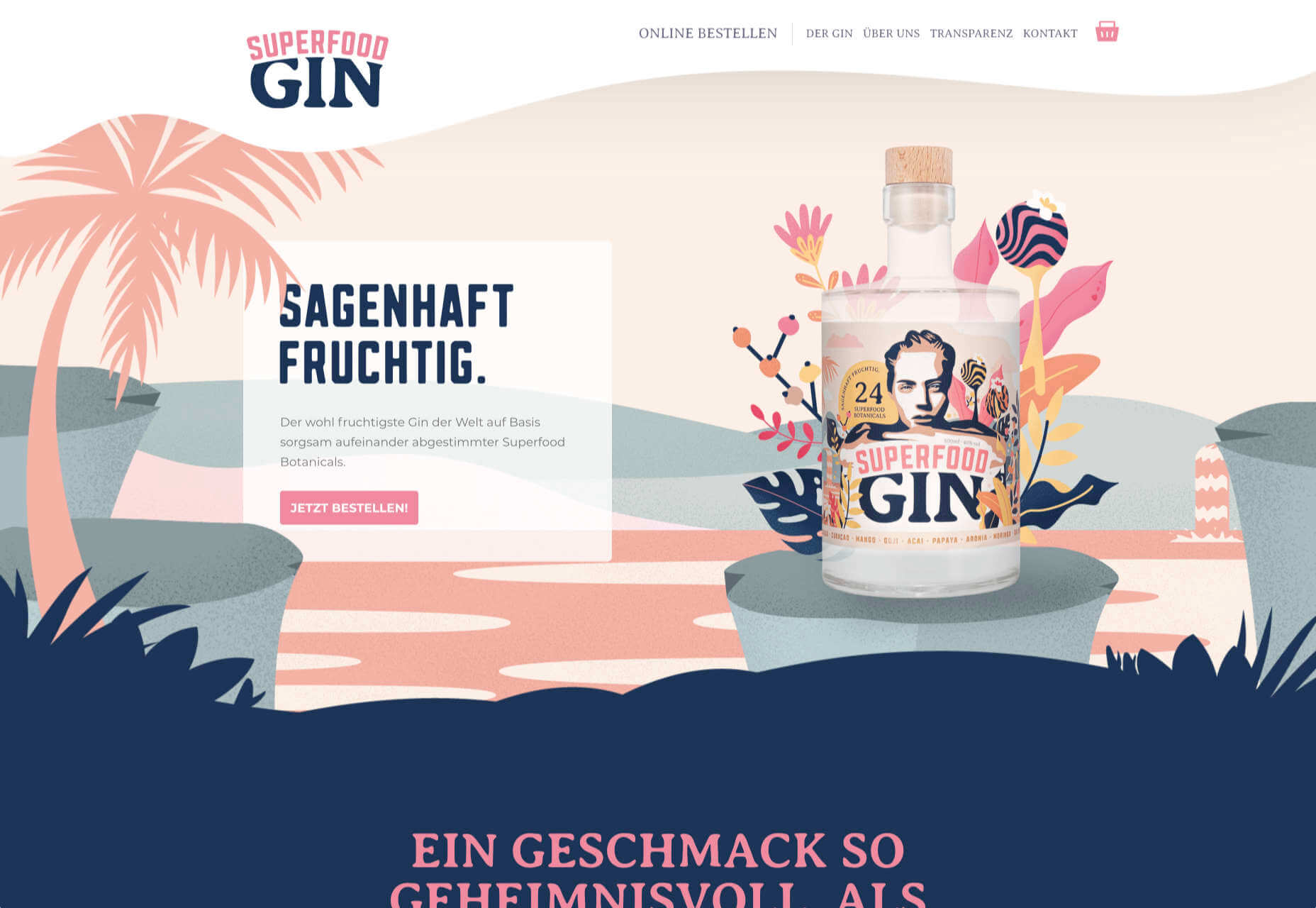
Superfood Gin 

Superfood Gin is a gin made using superfood botanicals, that claims to be fruity and fresh rather than crisp and peppery. The soft color palette, along with the soft lines and curves in the background illustrations, reflect this well.

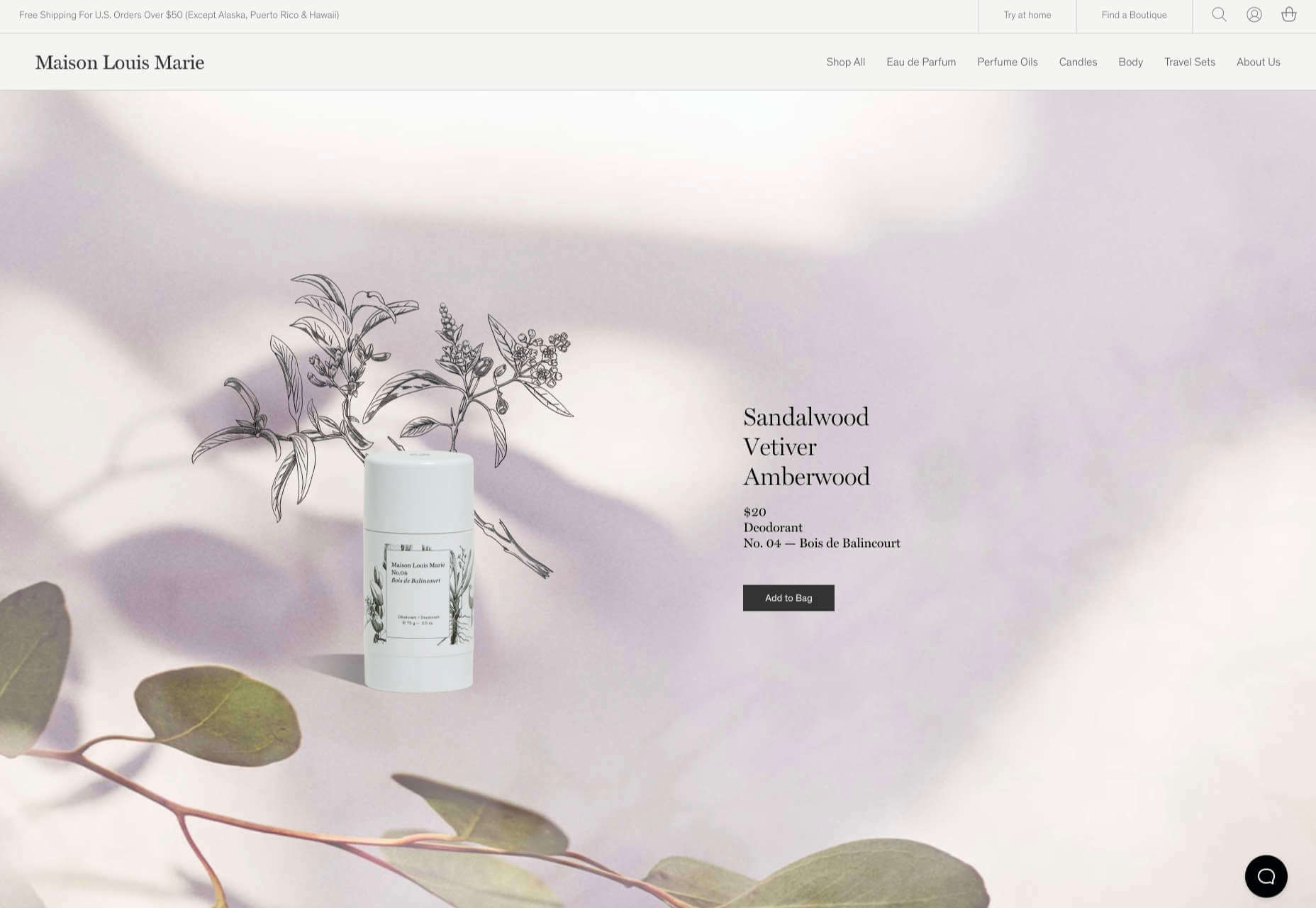
Maison Louis Marie

Maison Louis Marie is a natural fragrance company. While this site does nothing really groundbreaking, it does it well. Botanical drawings on a white background, along with clean typography, help create a refined, luxury feel.

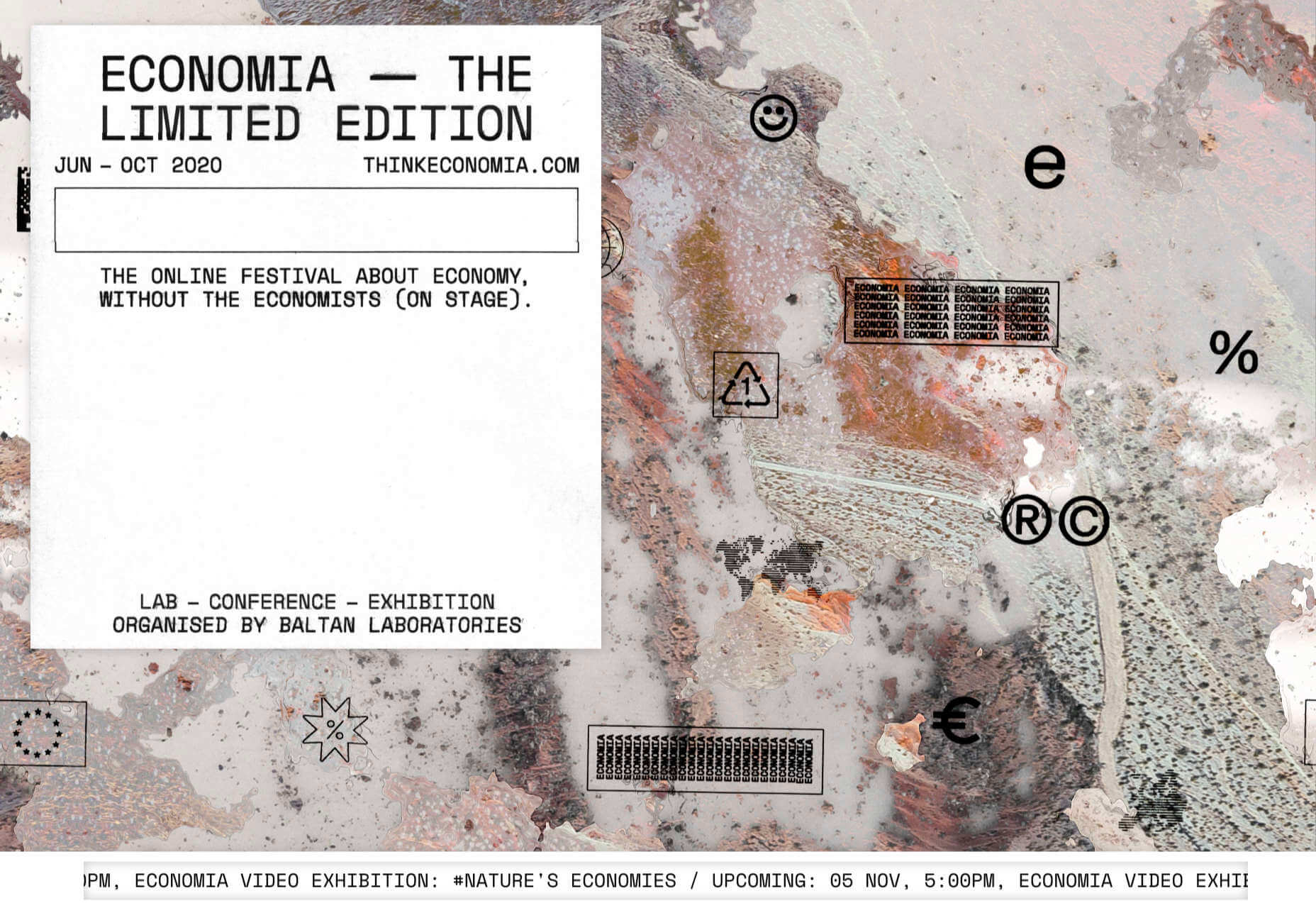
Think Economia

Think Economia is a platform taking a fresh look at economics and the future of economic growth. It doesn’t sound like the most exciting subject, but it is presented here in a playful and intriguing way.

Chernobyl

From Uprock, a Russian design studio that also offers courses in web design, Chernobyl is a thought provoking exposition of the Chernobyl disaster. The design aesthetic is muted, allowing the images their deserved impact, and the brief sections of text to be absorbed.

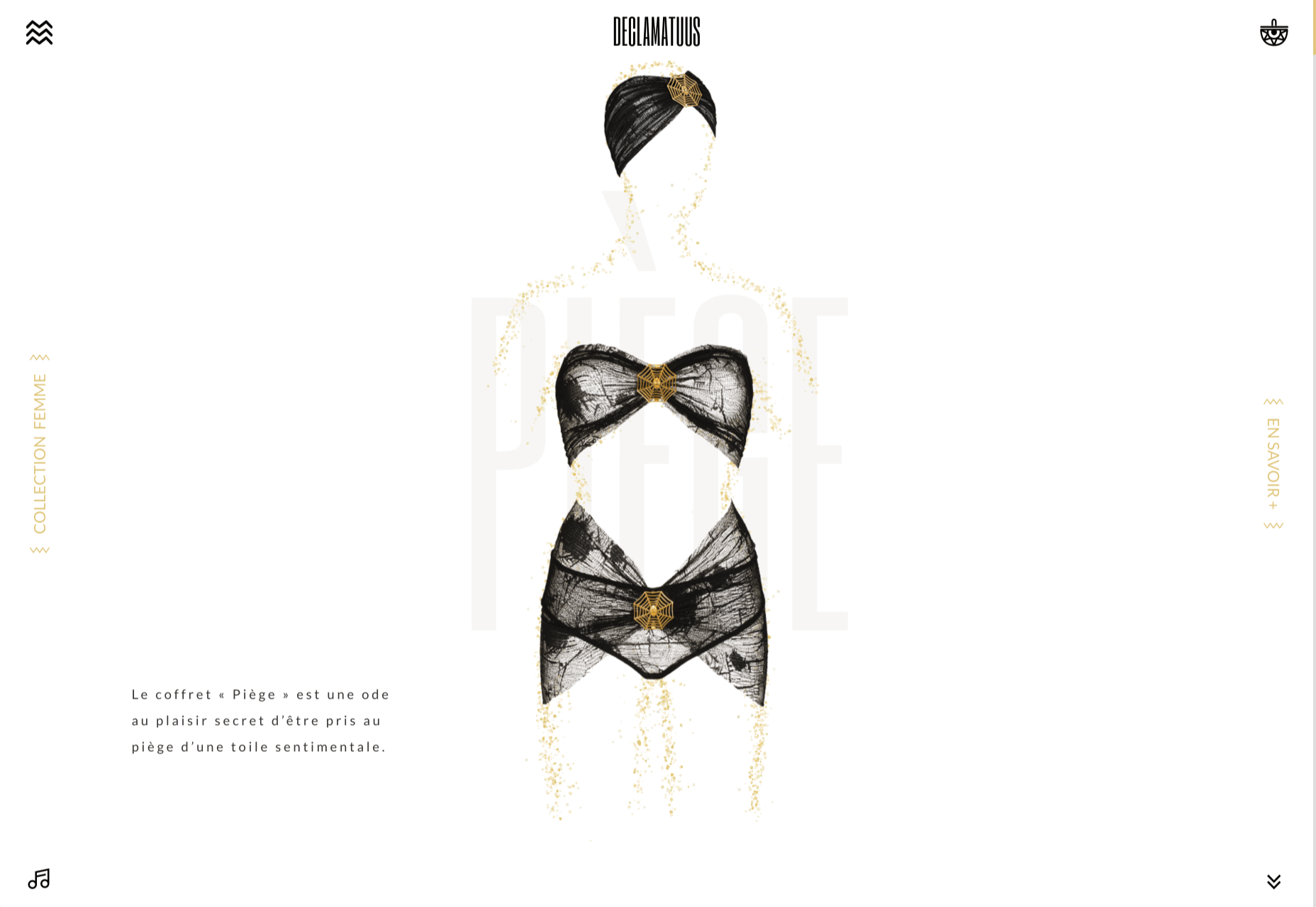
Declamatuus

Declamatuus is a lingerie company selling gift sets. What stands out here is what you don’t see — live models in underwear. Instead the outline of the body is created with animated particles.

Odisea

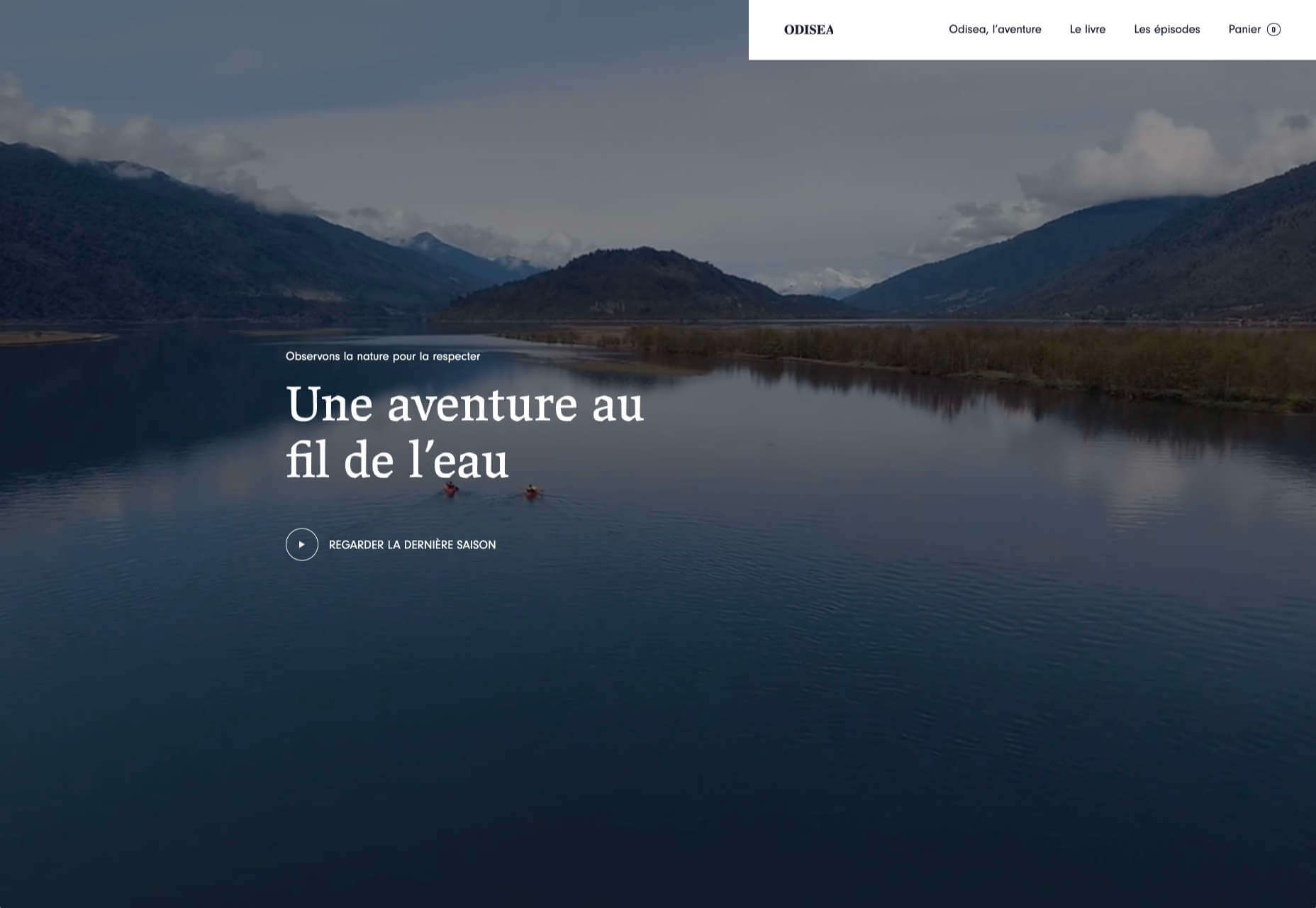
Odisea Expedition is a documentary series following two friends, a surfer and a snowboarder, as they explore remote parts of the world. The photographs and video are everything here, and all other elements are kept minimal to avoid detracting from them.

Riffyn

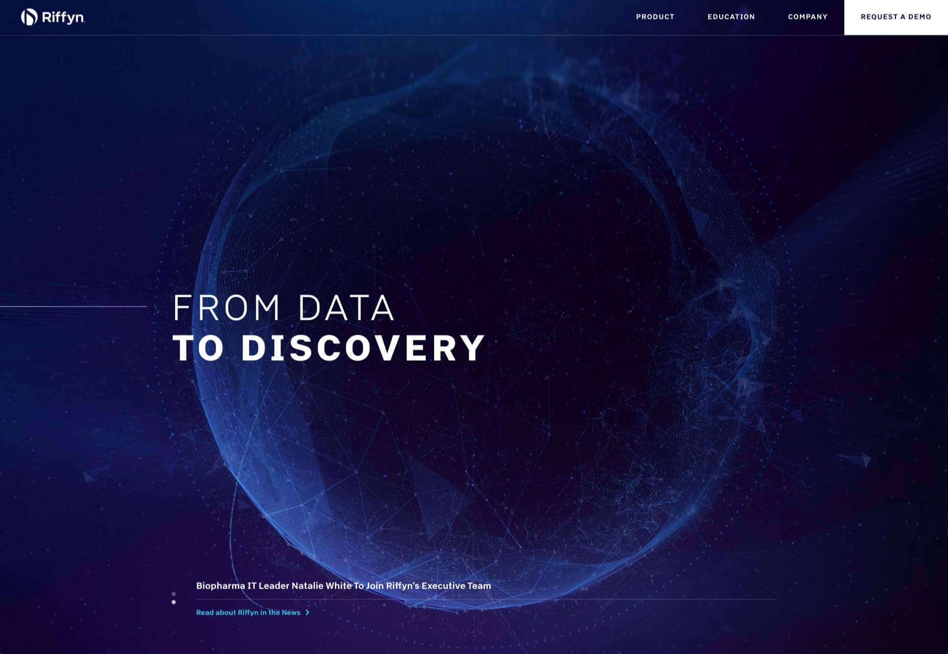
Riffyn Nexus is a ‘Process Data System’ for storing and analyzing scientific data for laboratories. It is a very corporate site and yet it is put together in such a way that doesn’t feel dull.

Maison du Net

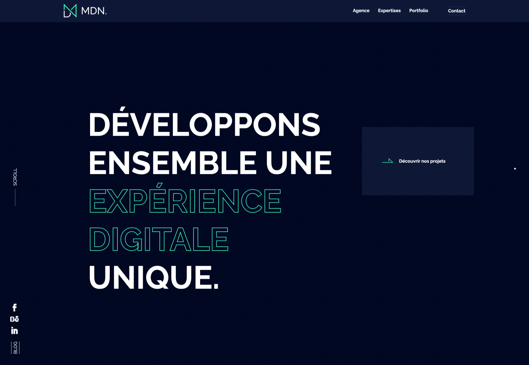
This site for digital design agency Maison du Net takes a risk mixing corporate with cutesy, but it works. Offset frames and underlines create interest without overdoing it, and the very bright green is used sparingly enough to liven things up without being overwhelming.

Source


Source de l’article sur Webdesignerdepot