Articles

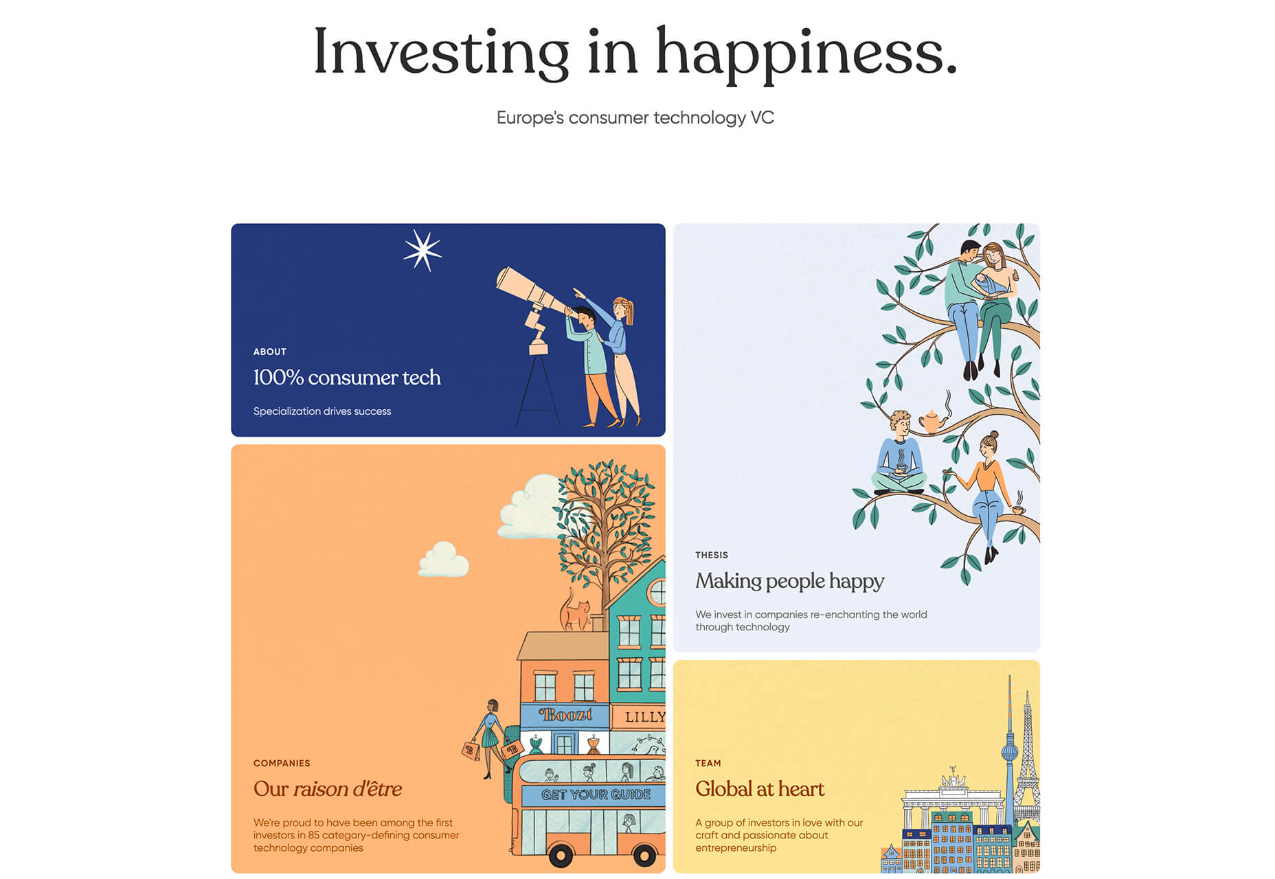
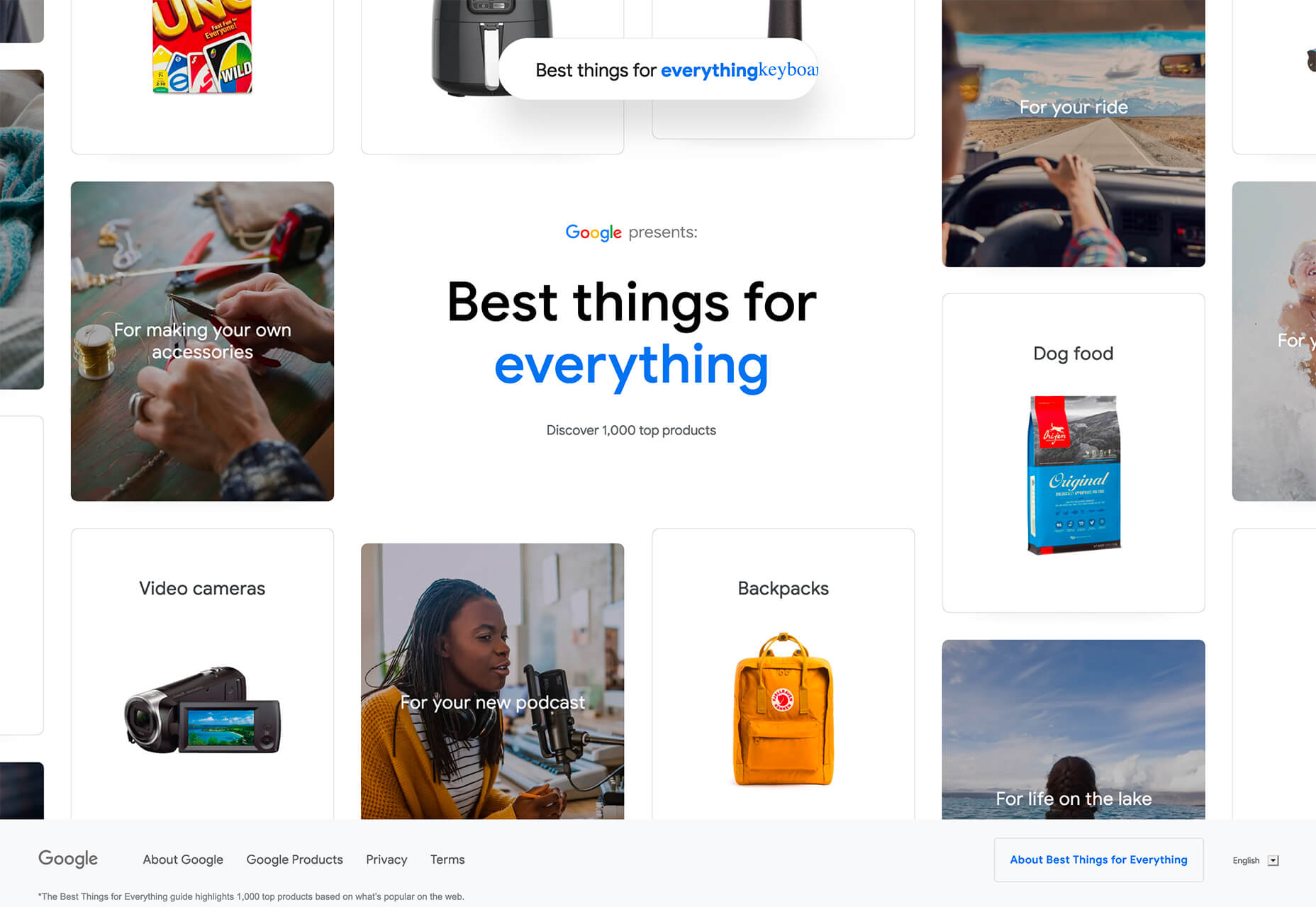
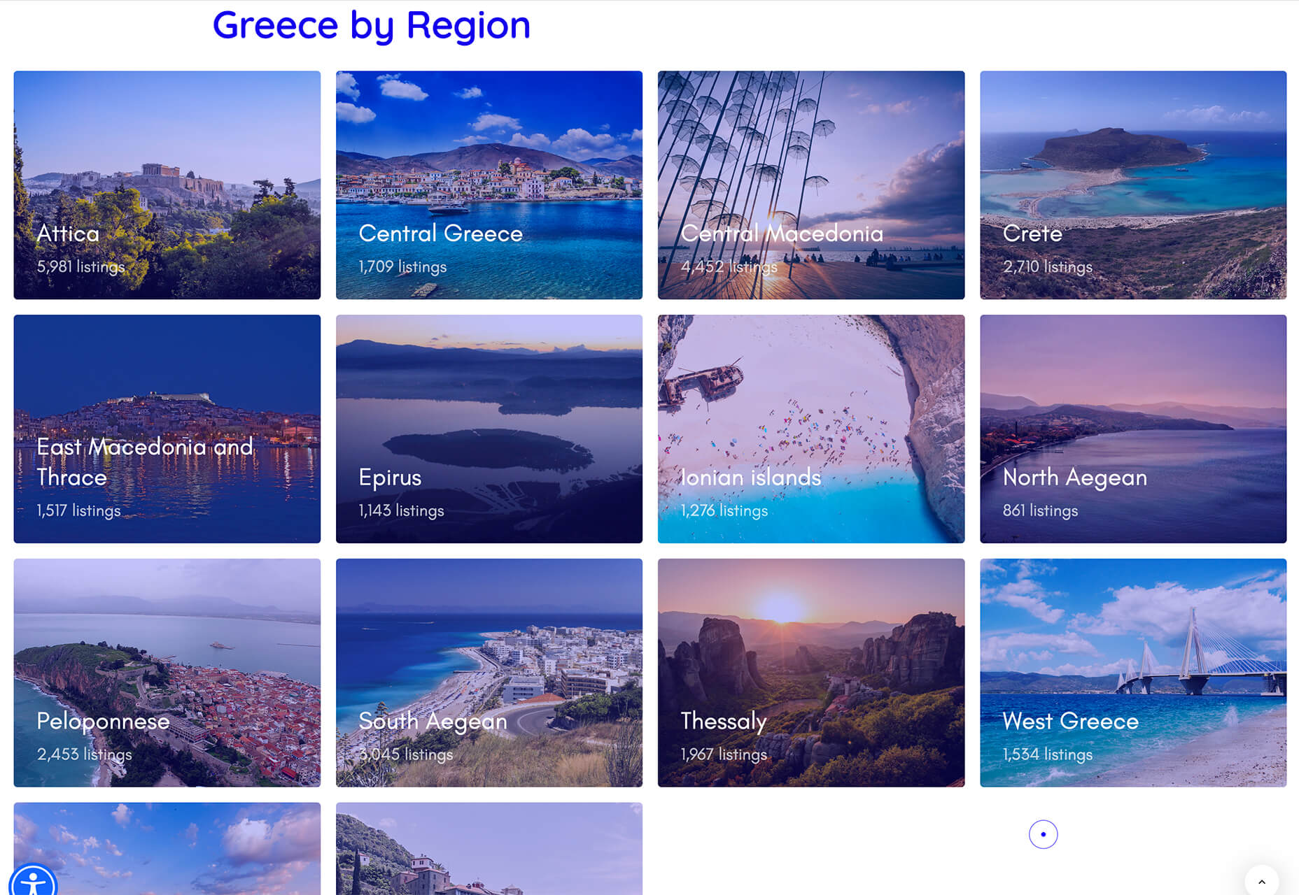
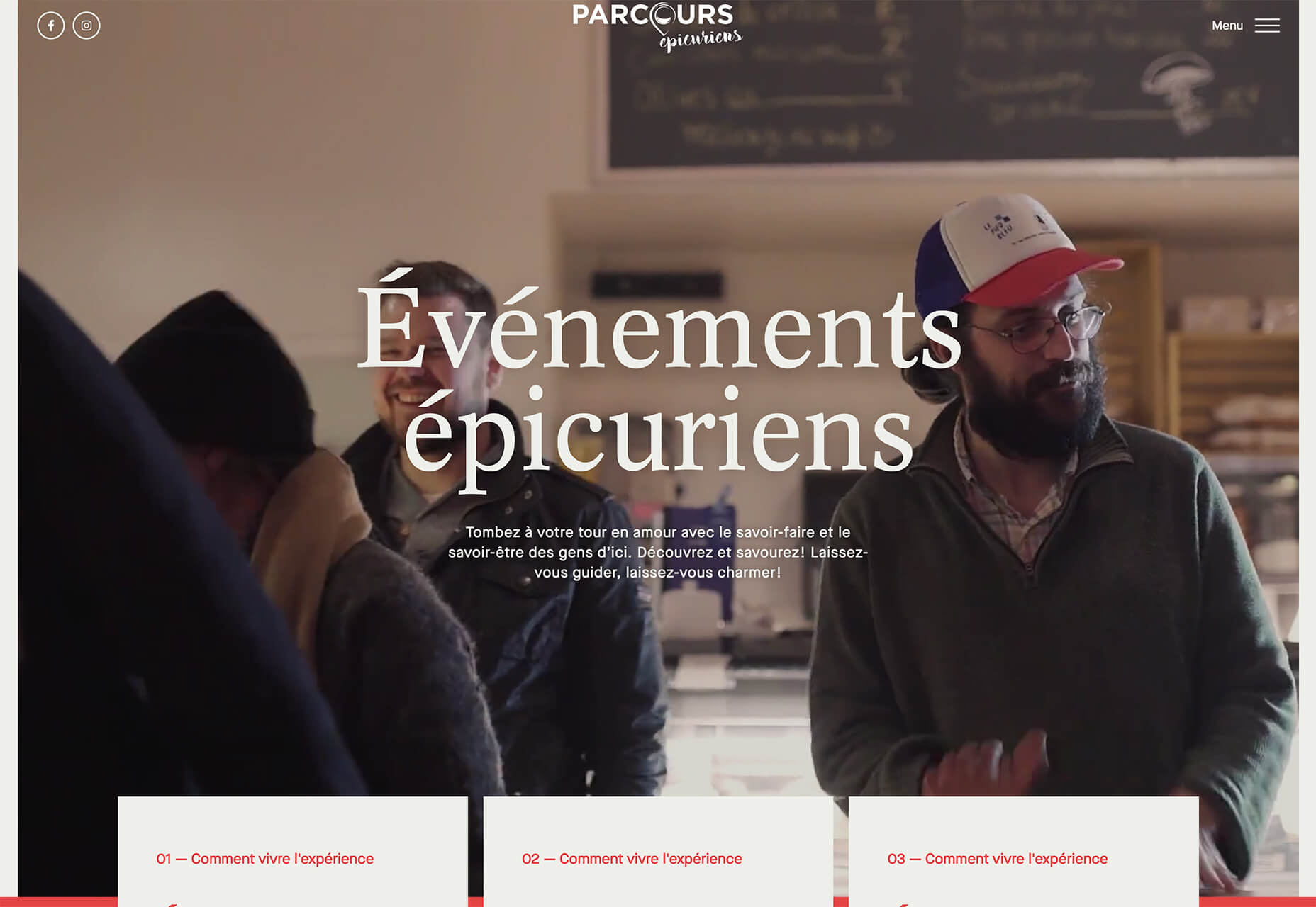
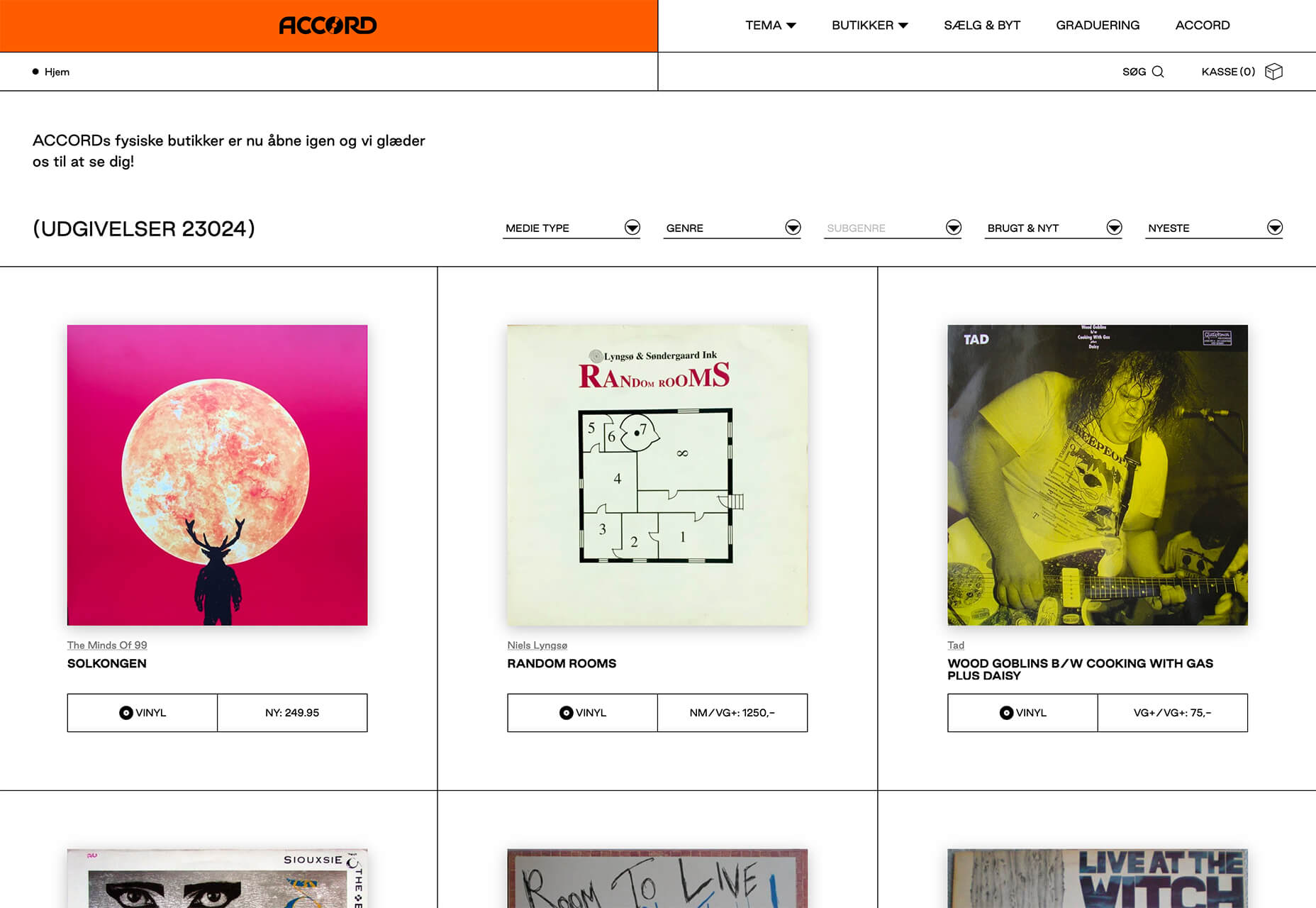
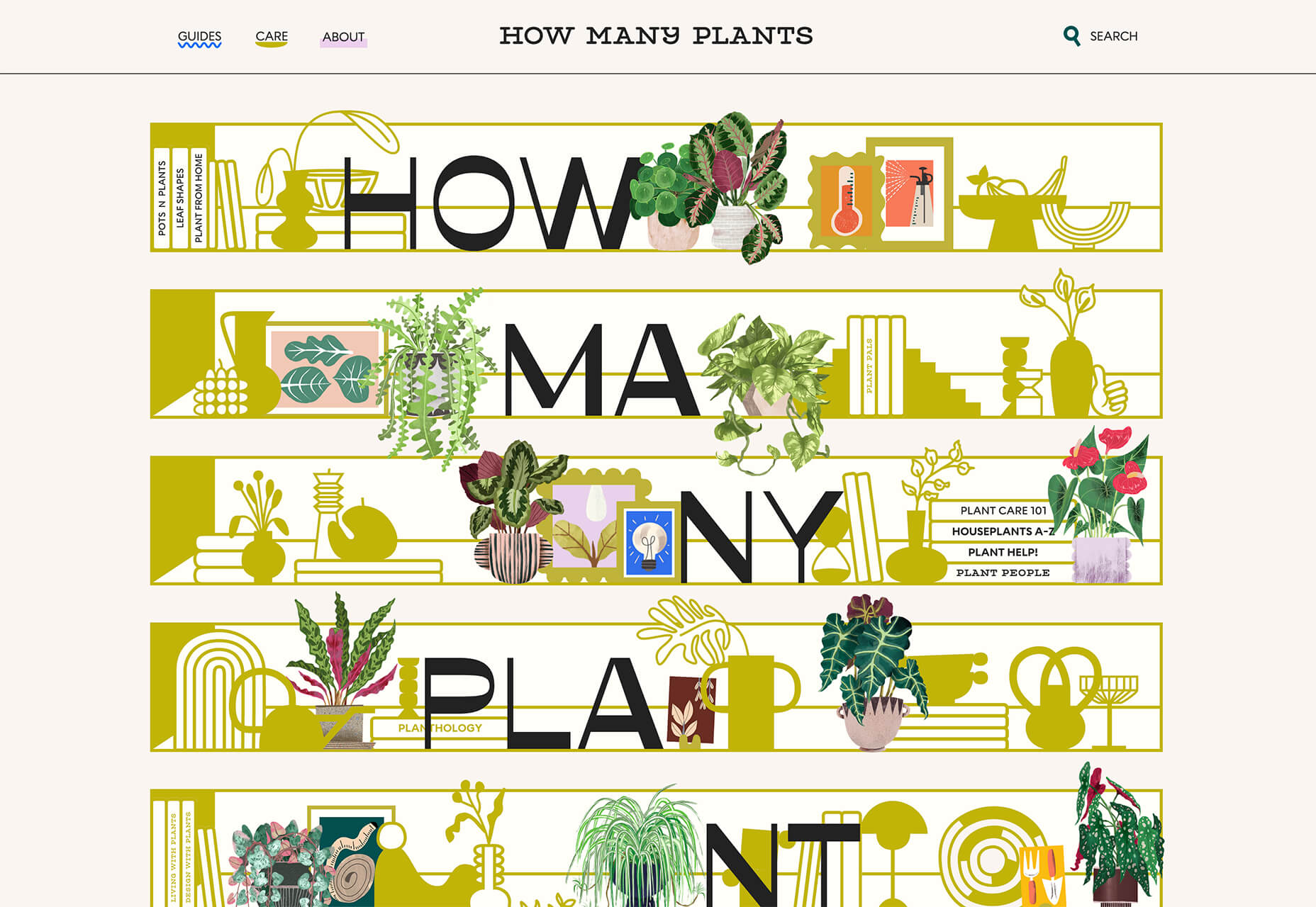
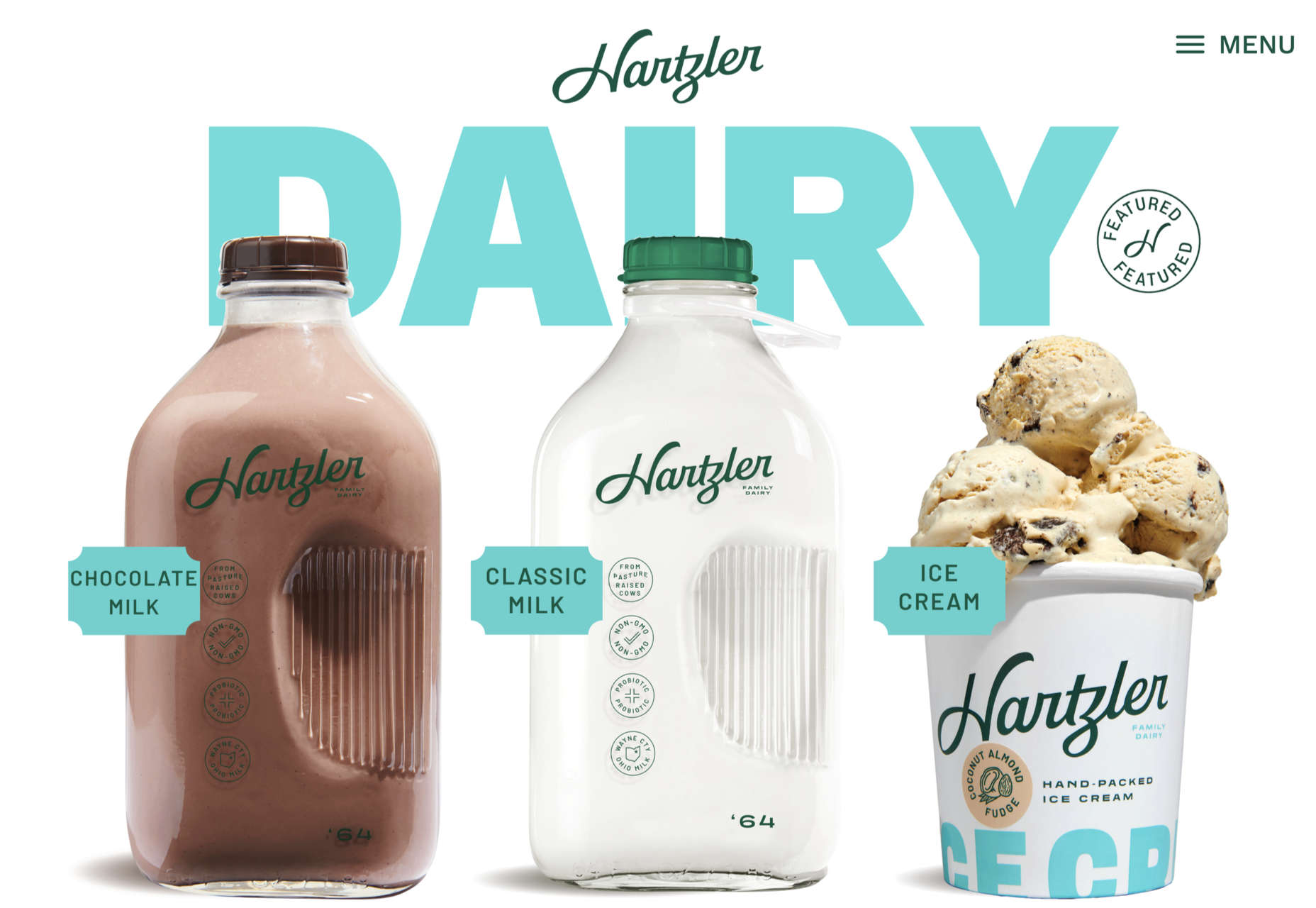
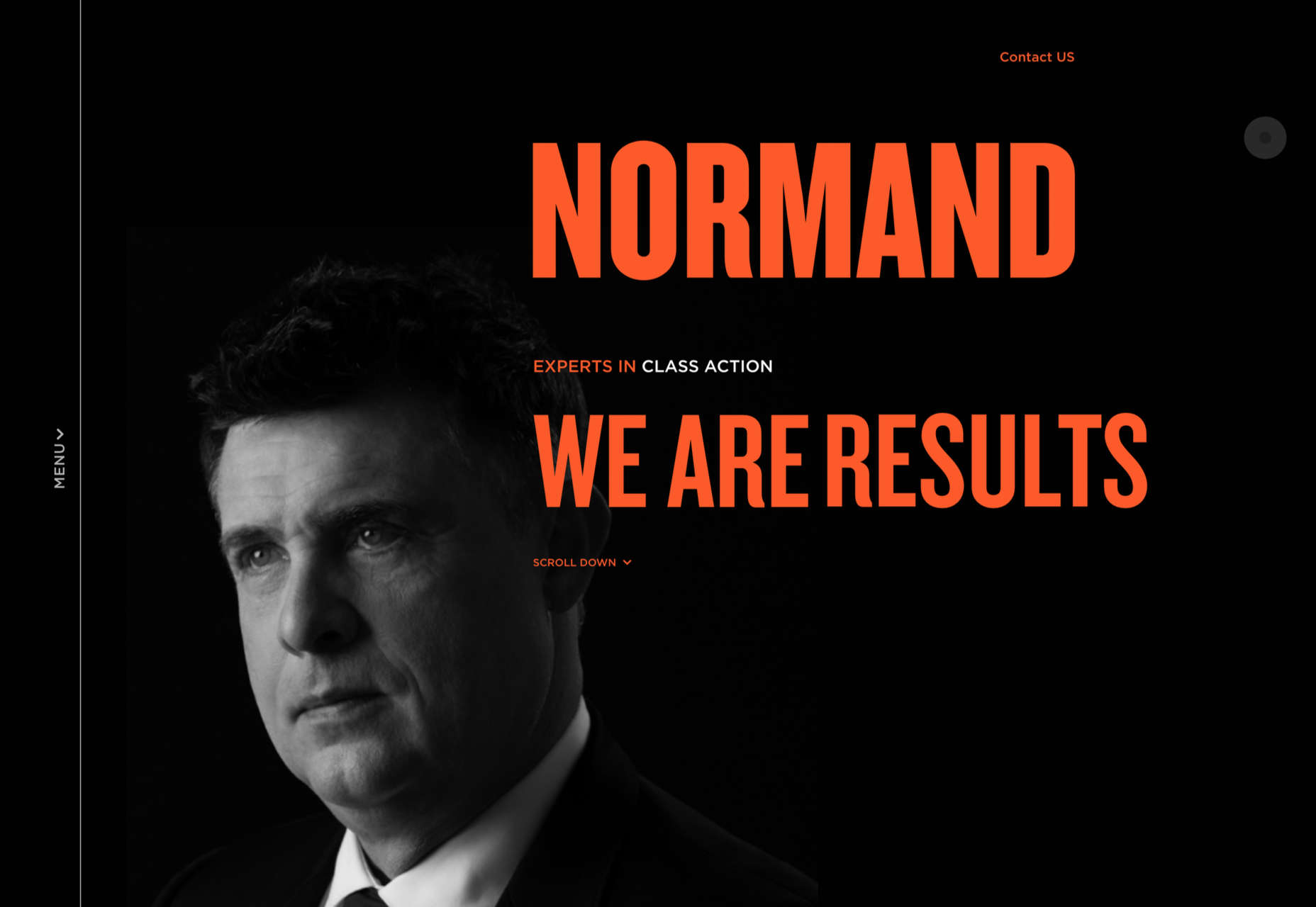
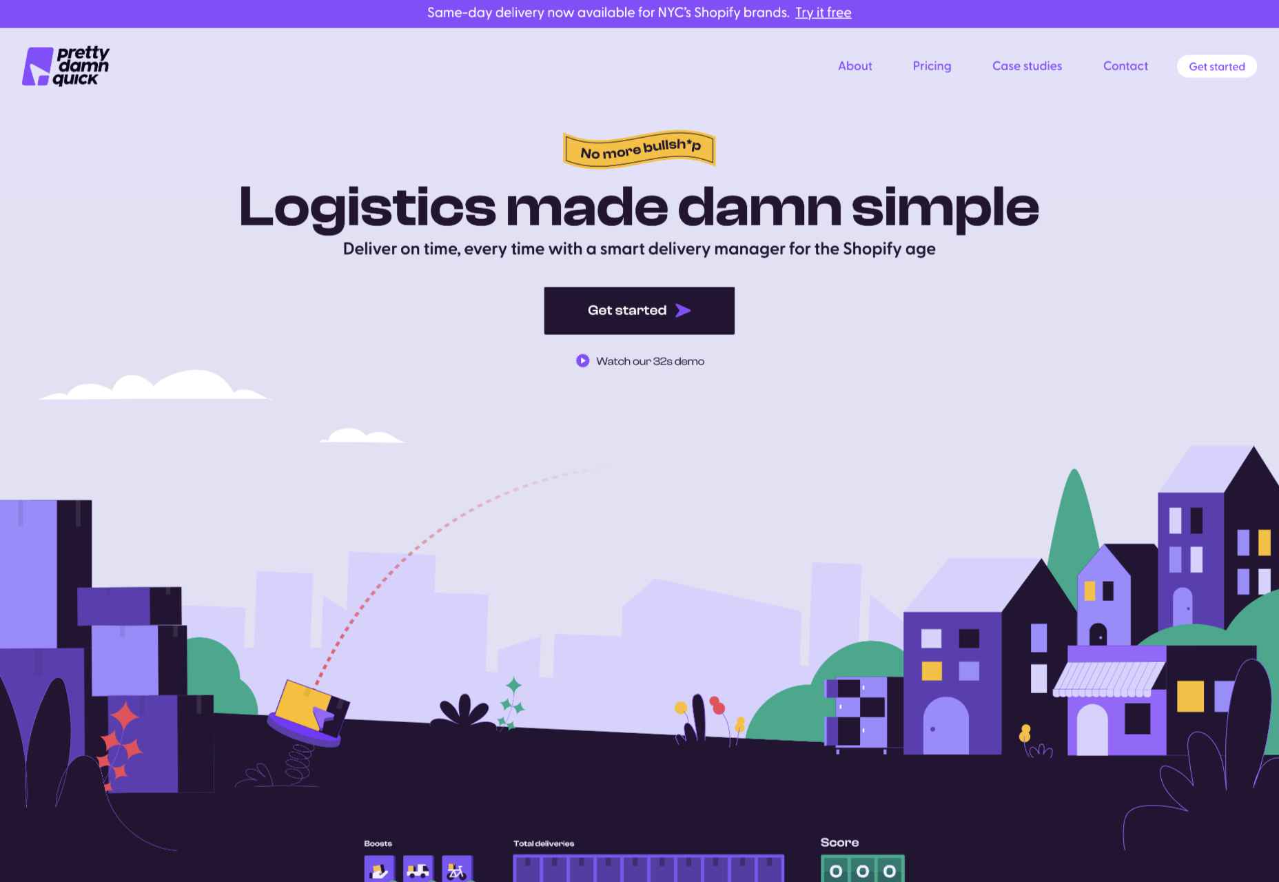
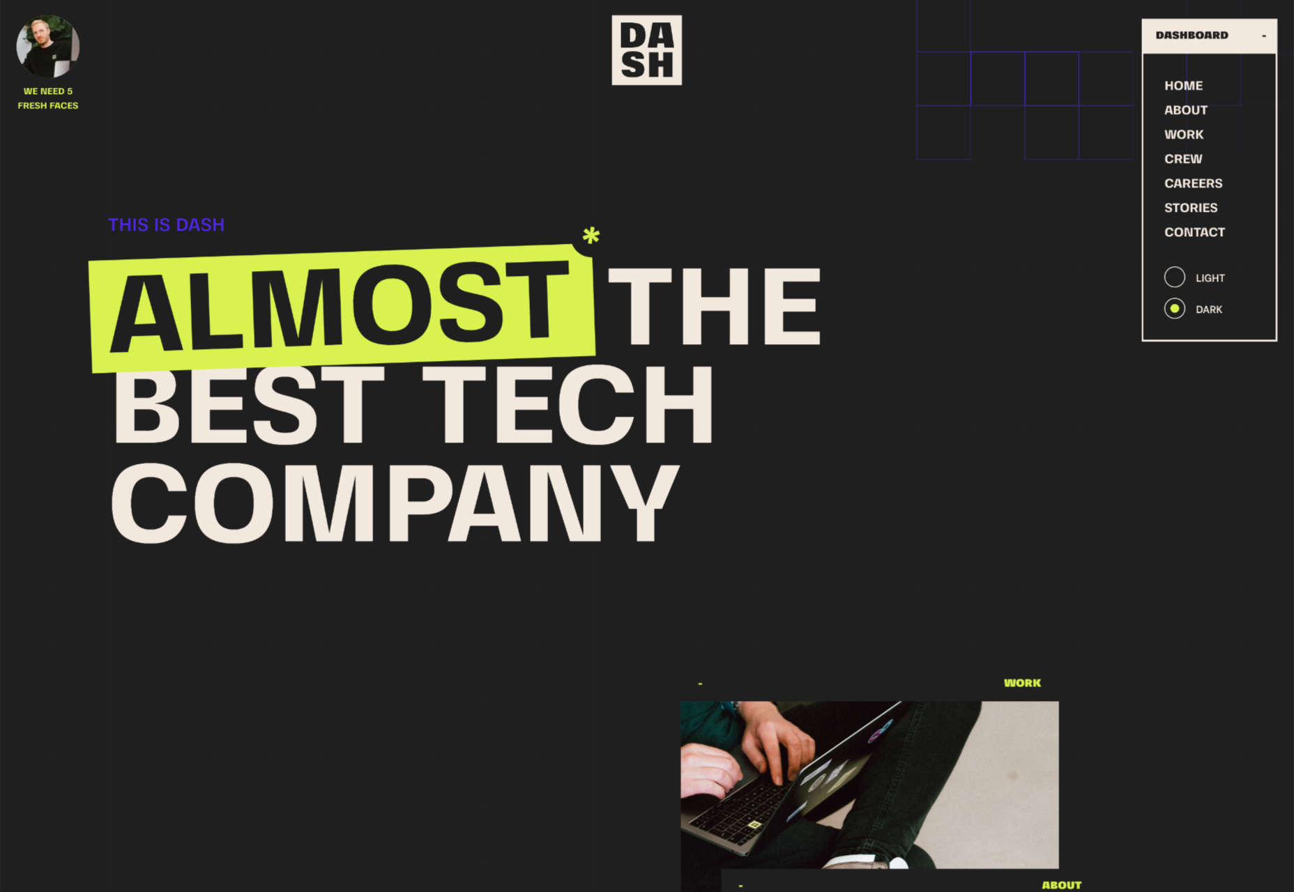
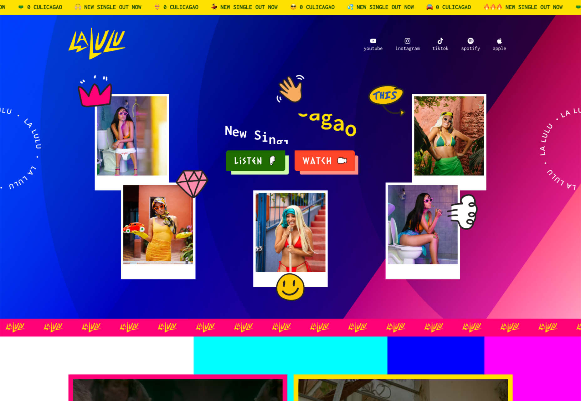
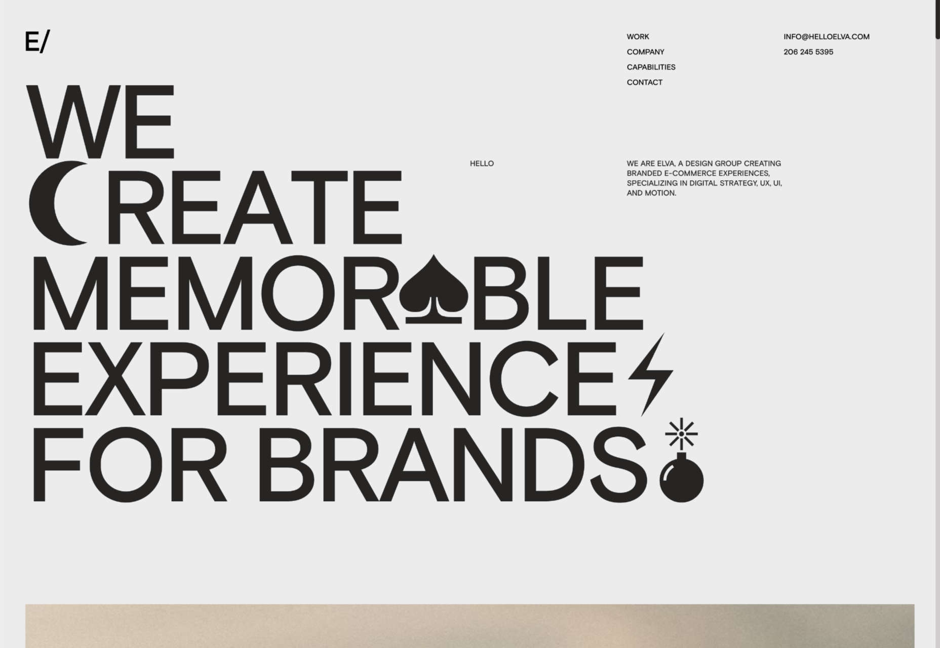
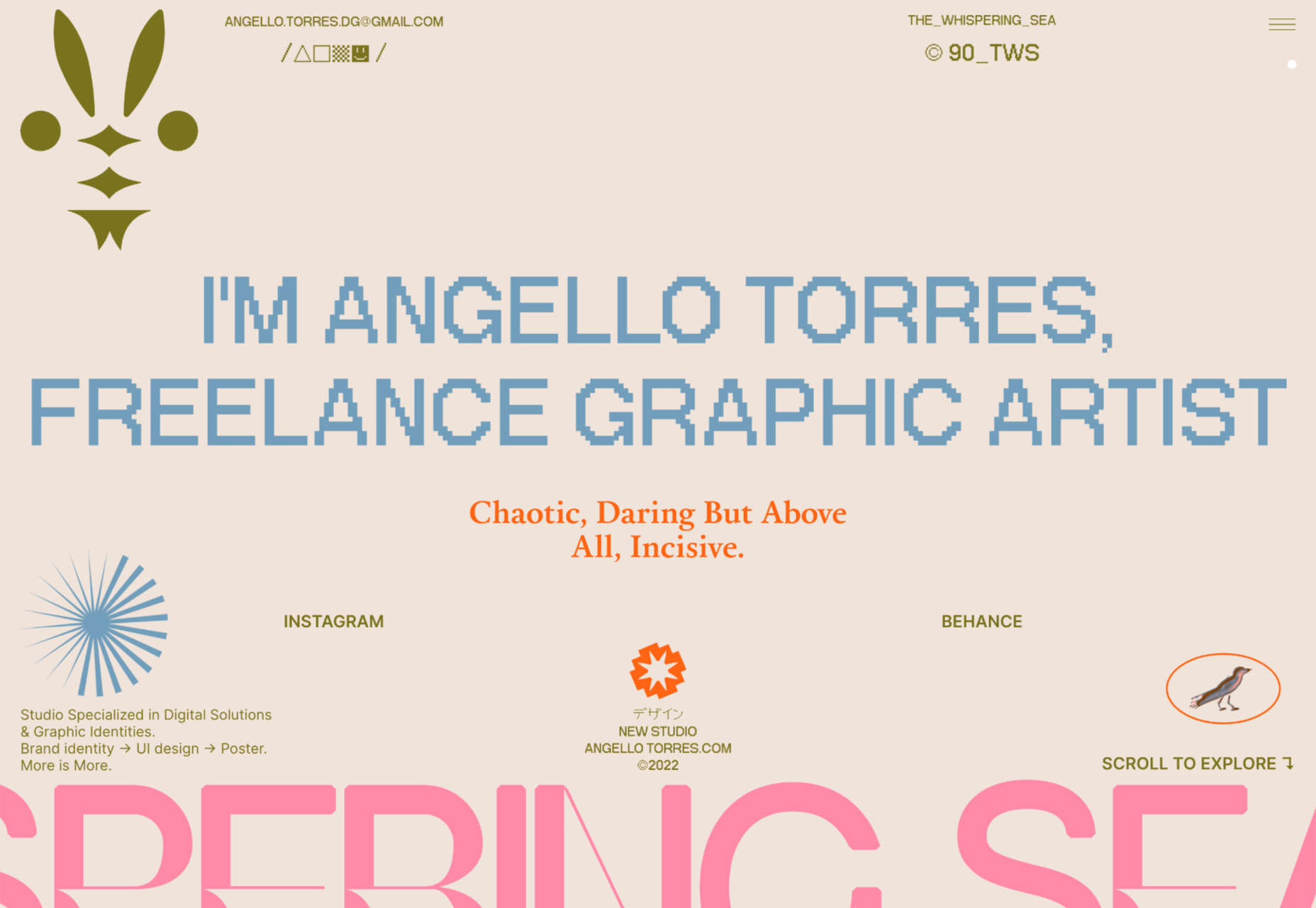
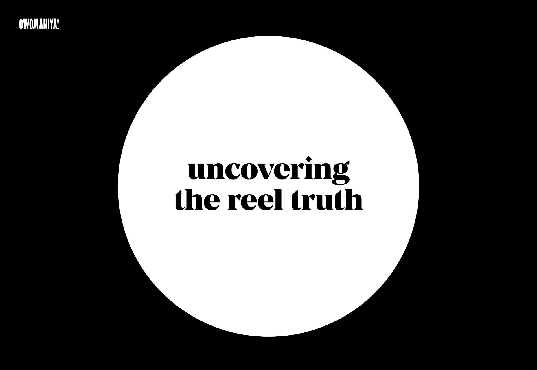
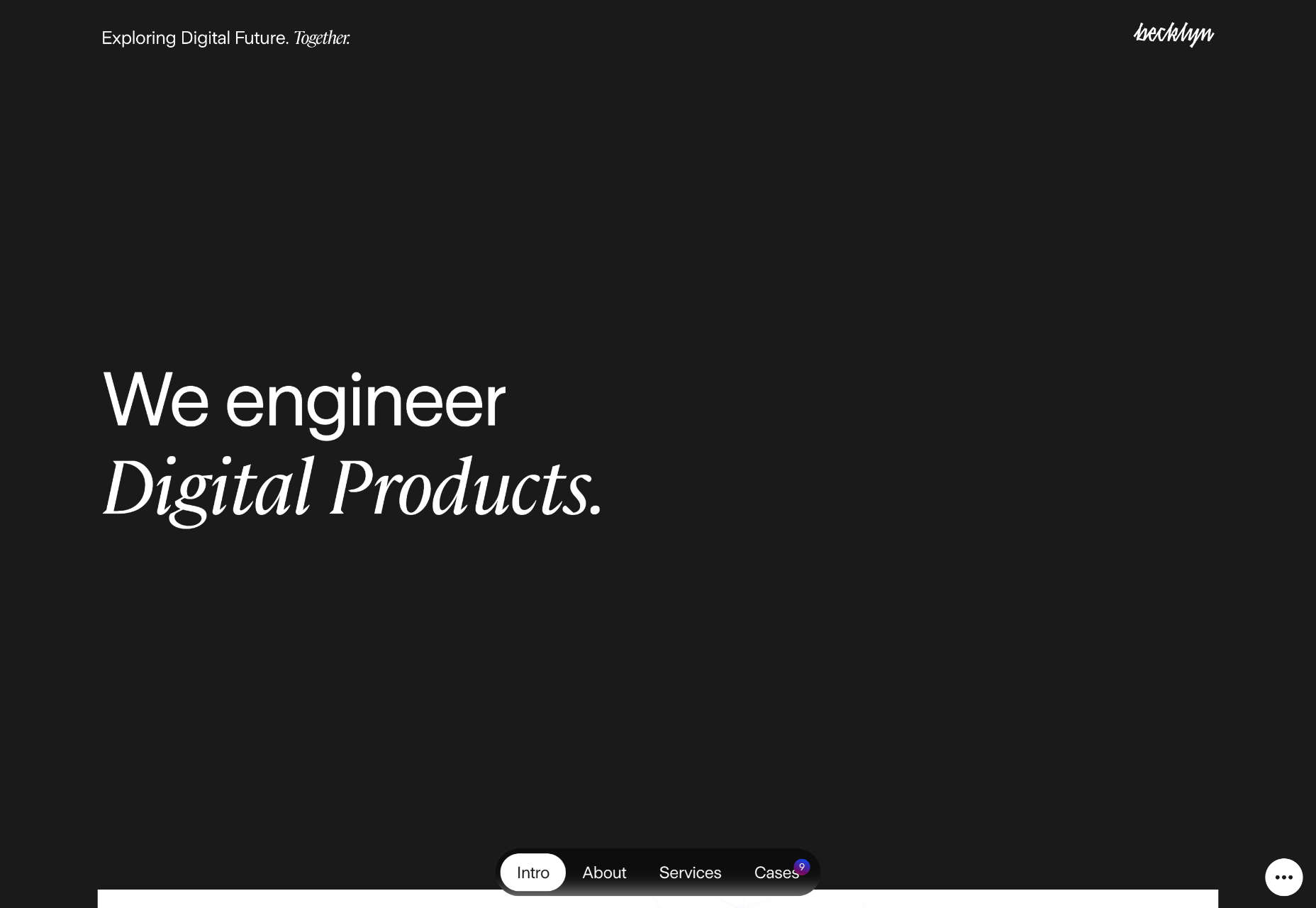
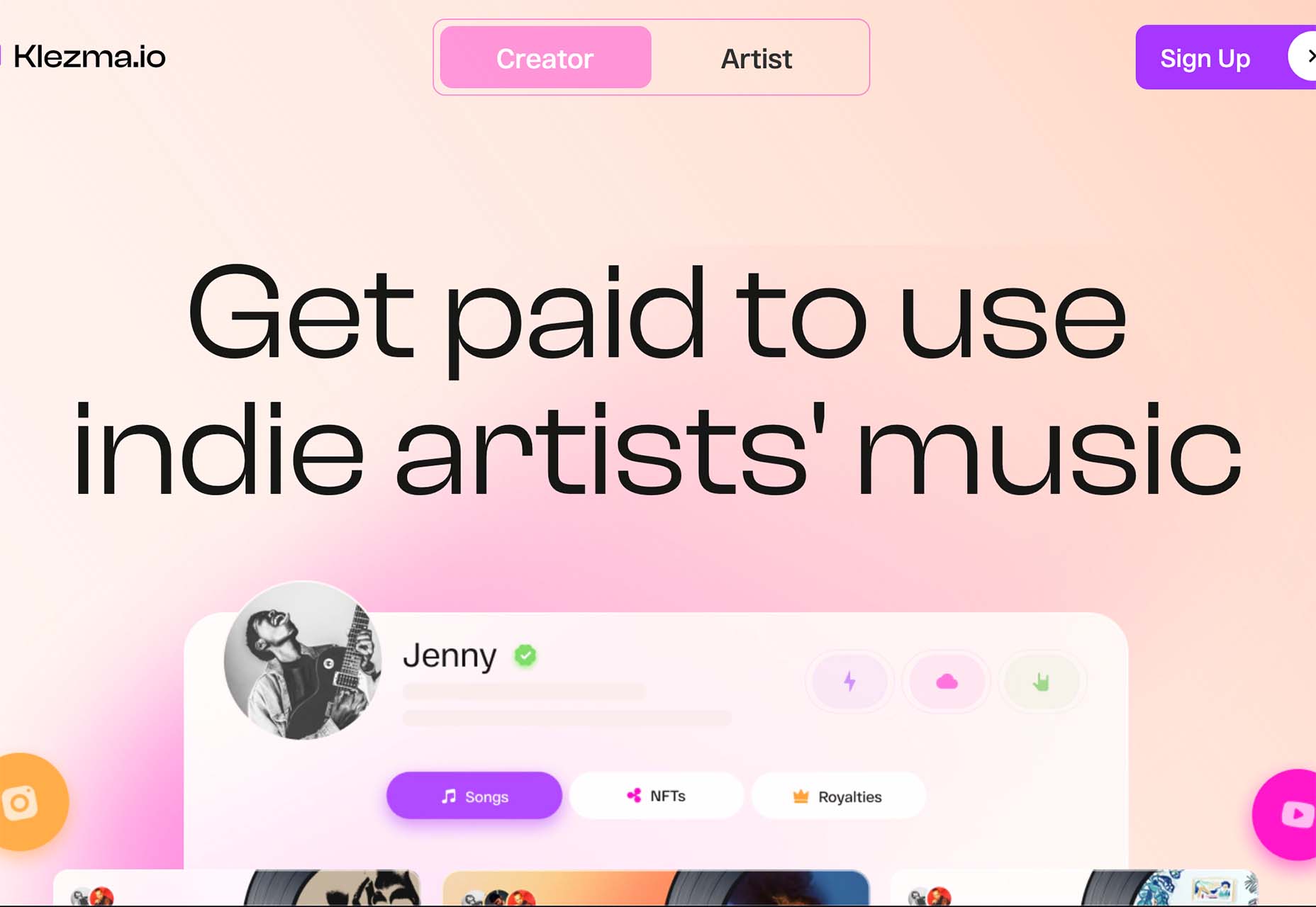
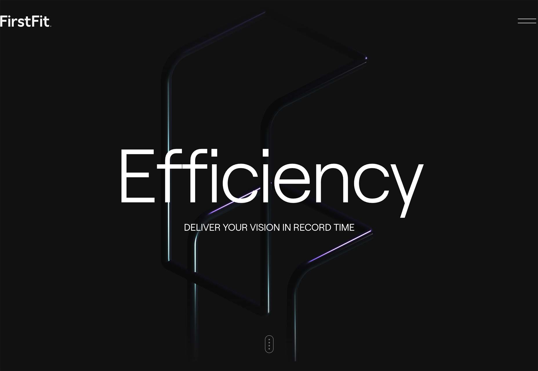
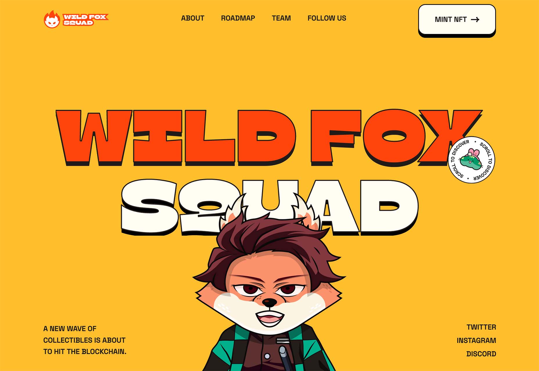
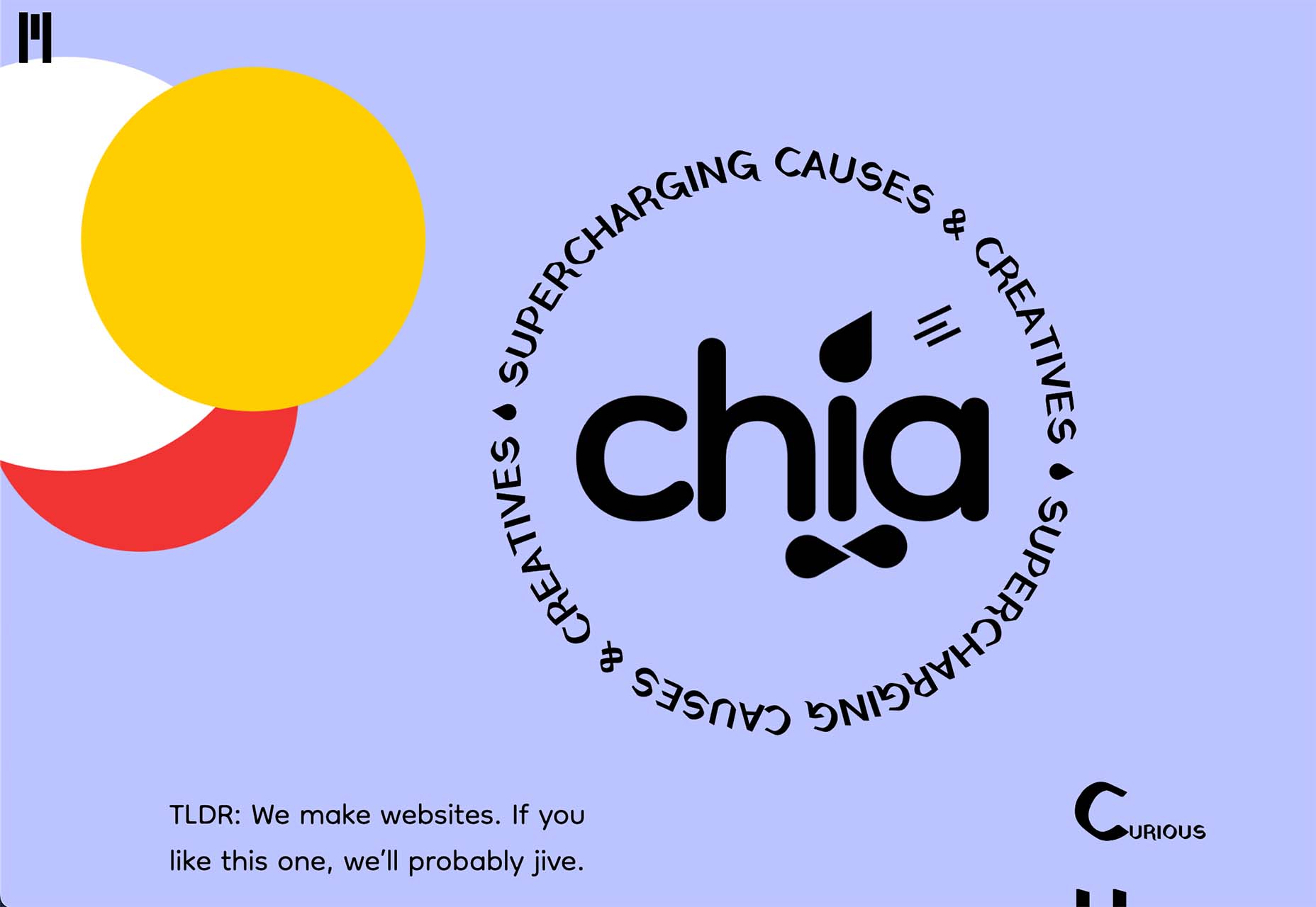
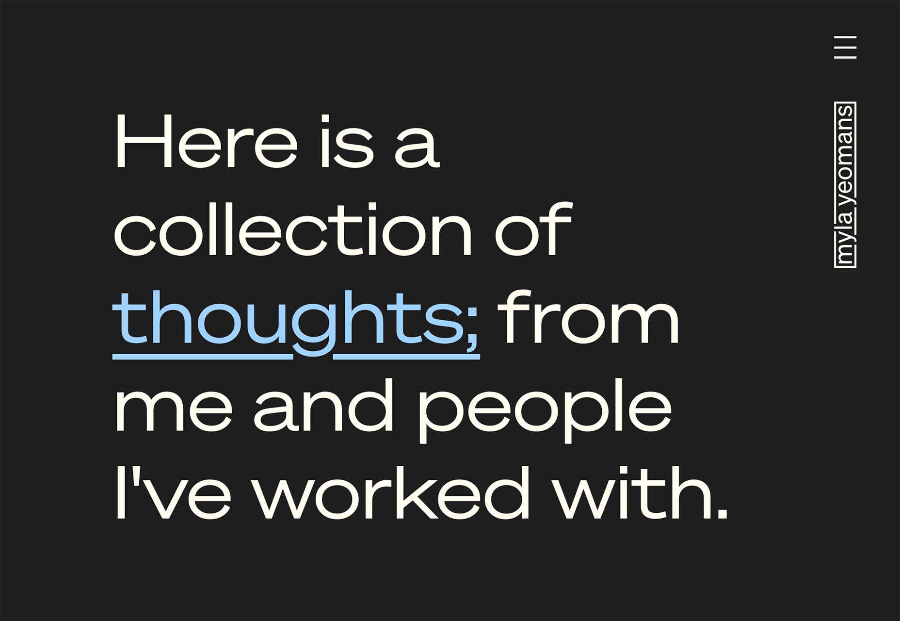
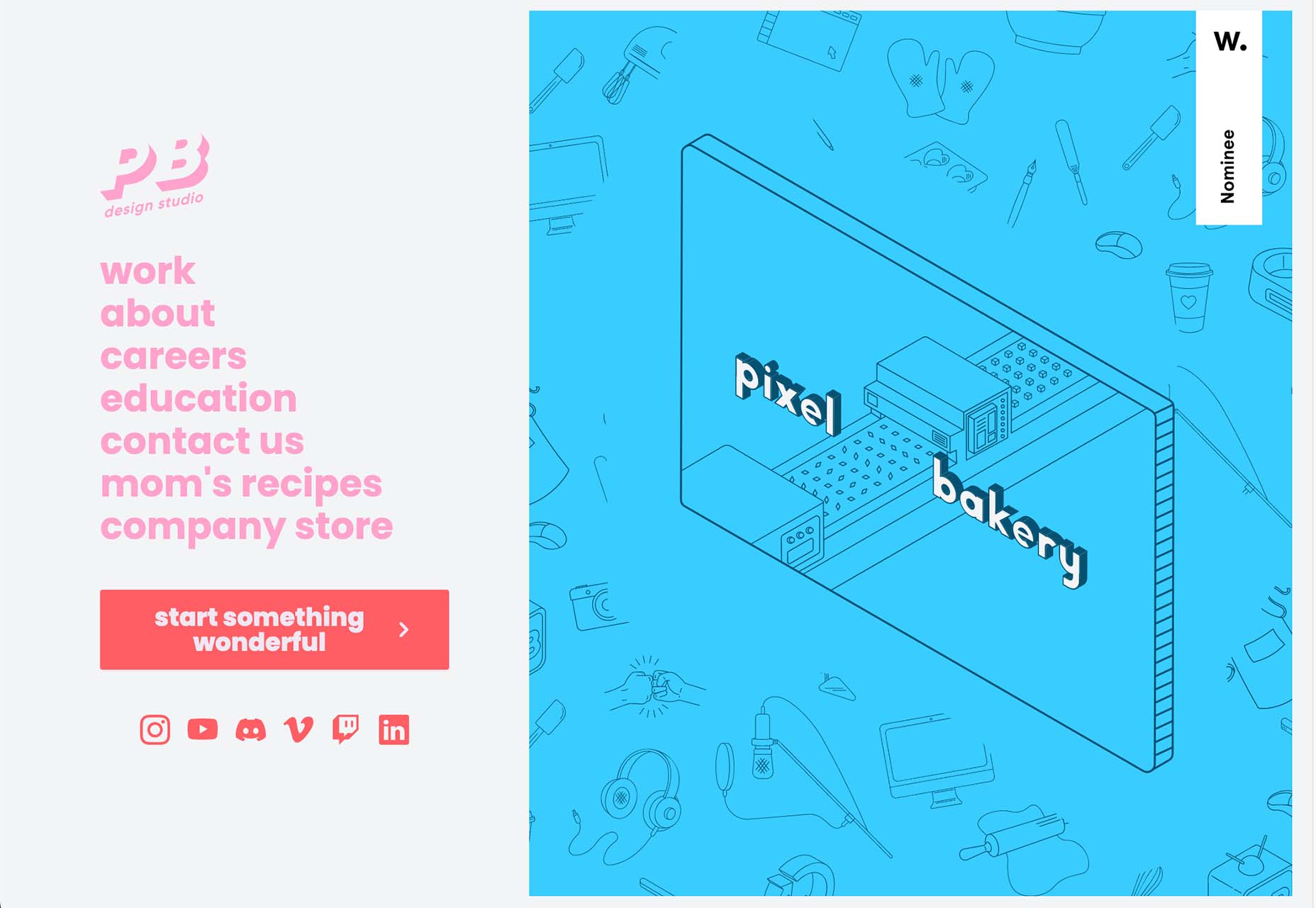
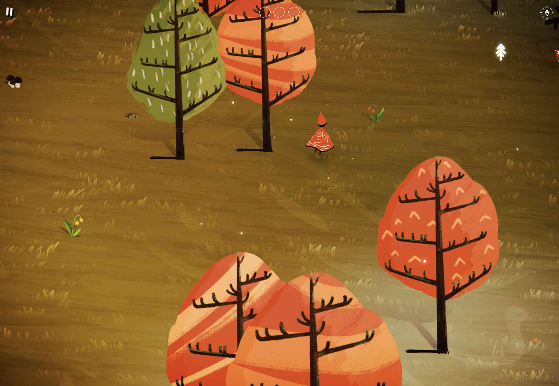
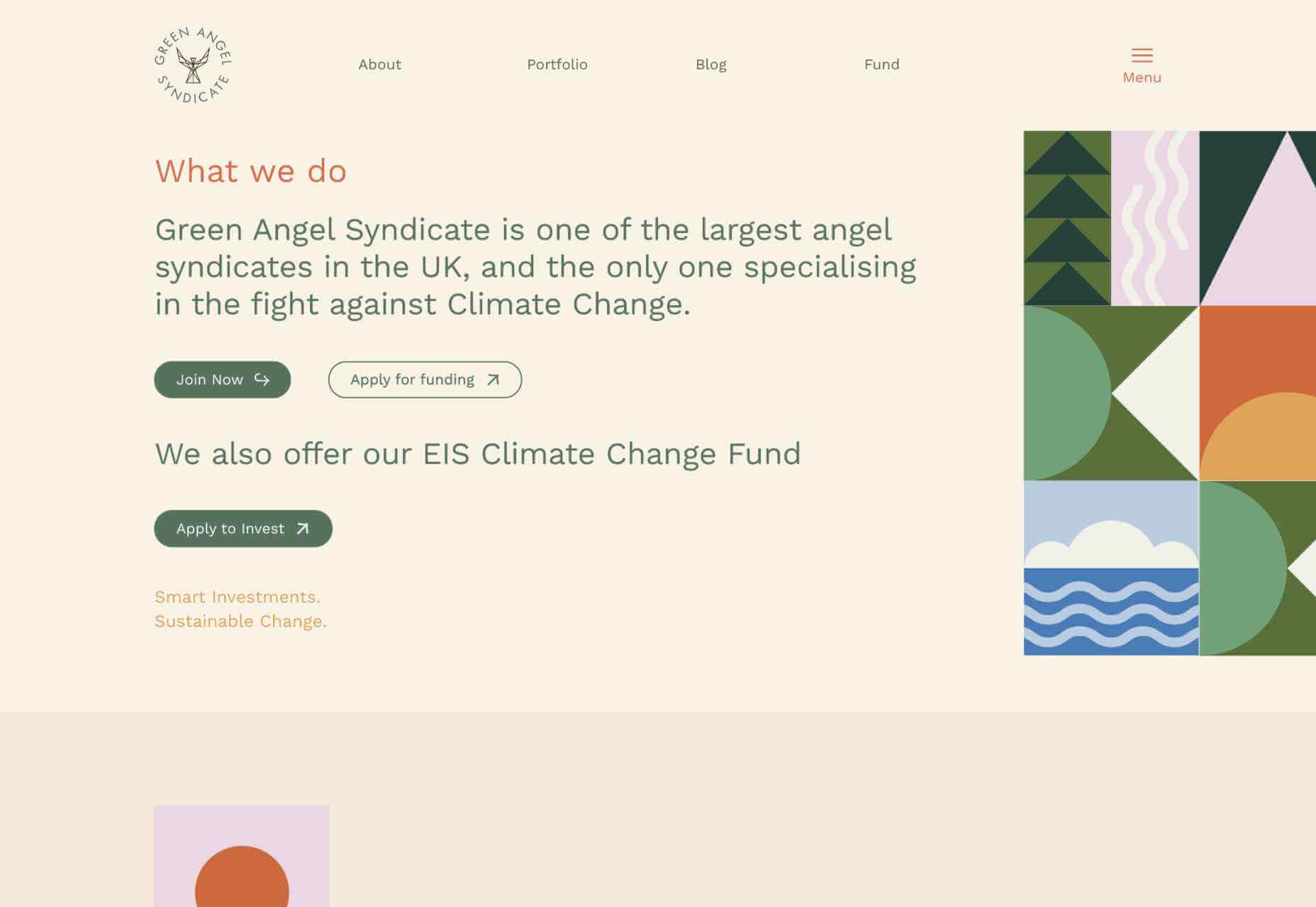
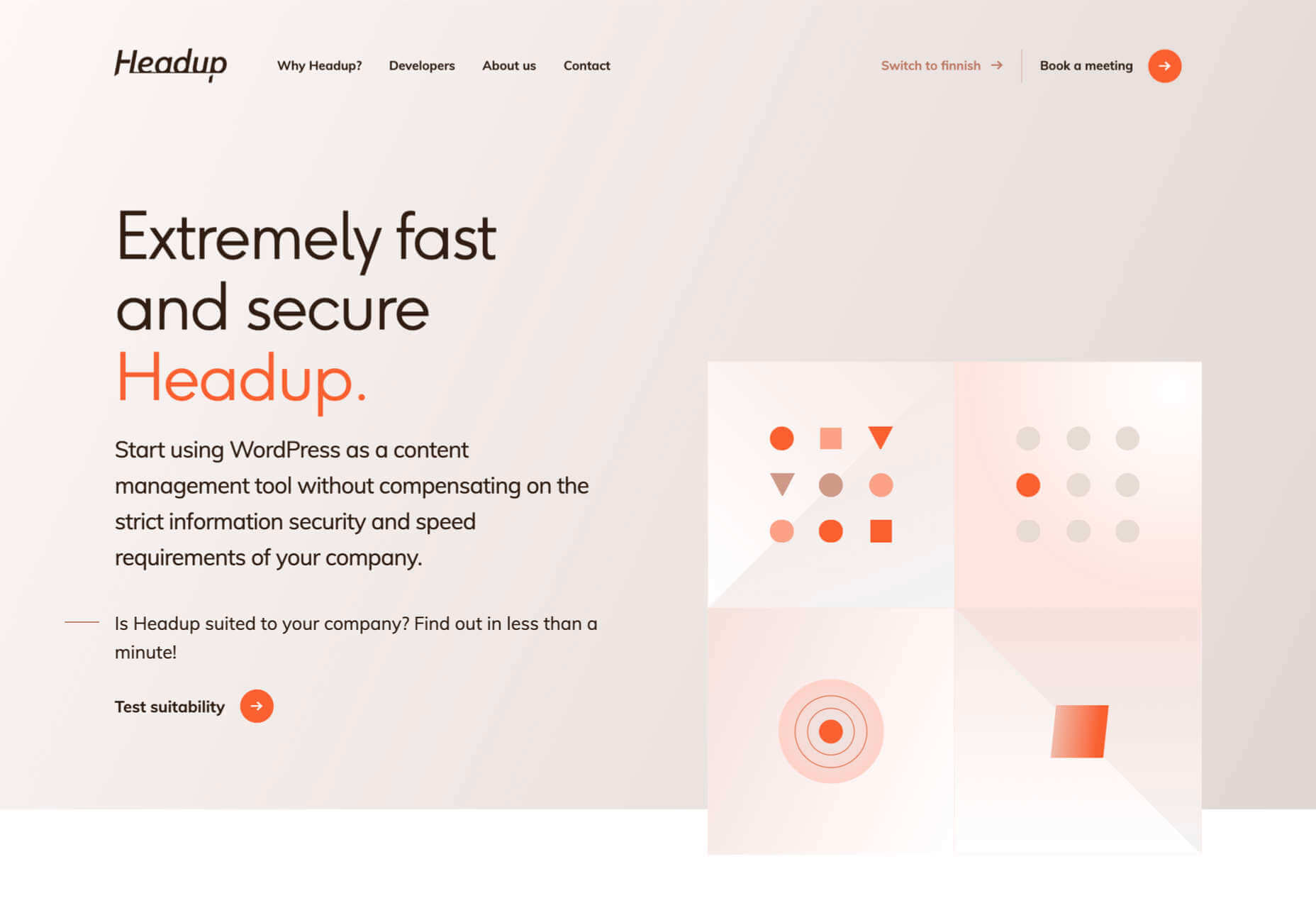
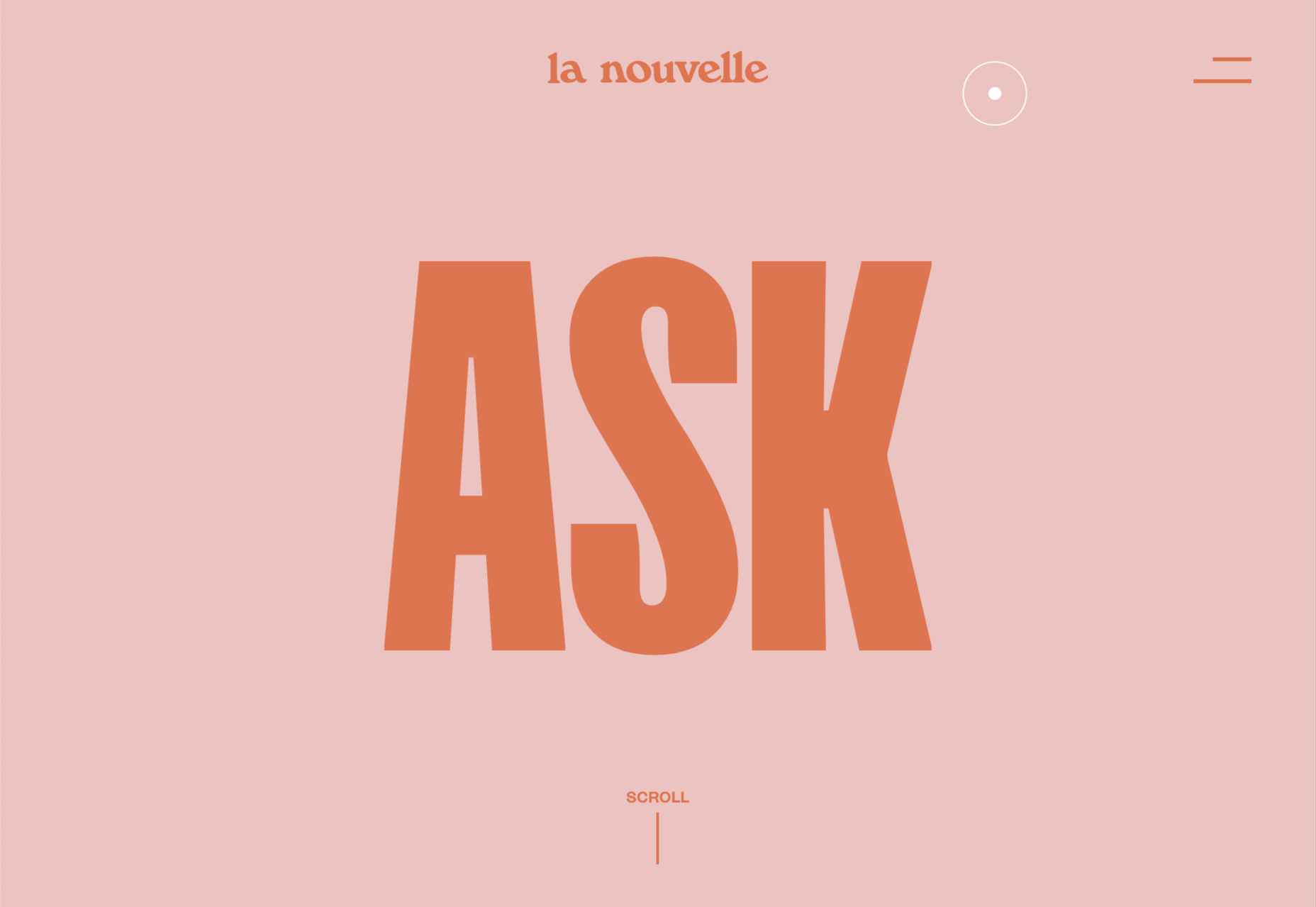
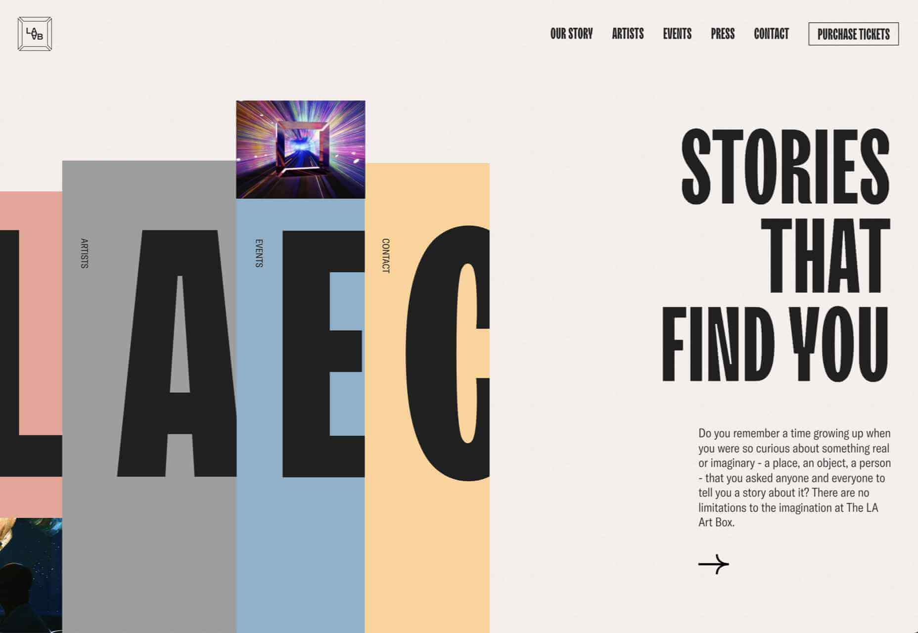
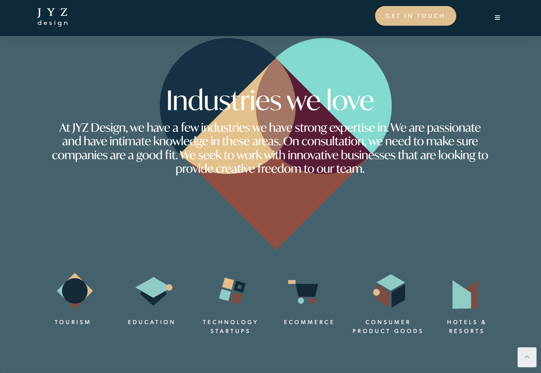
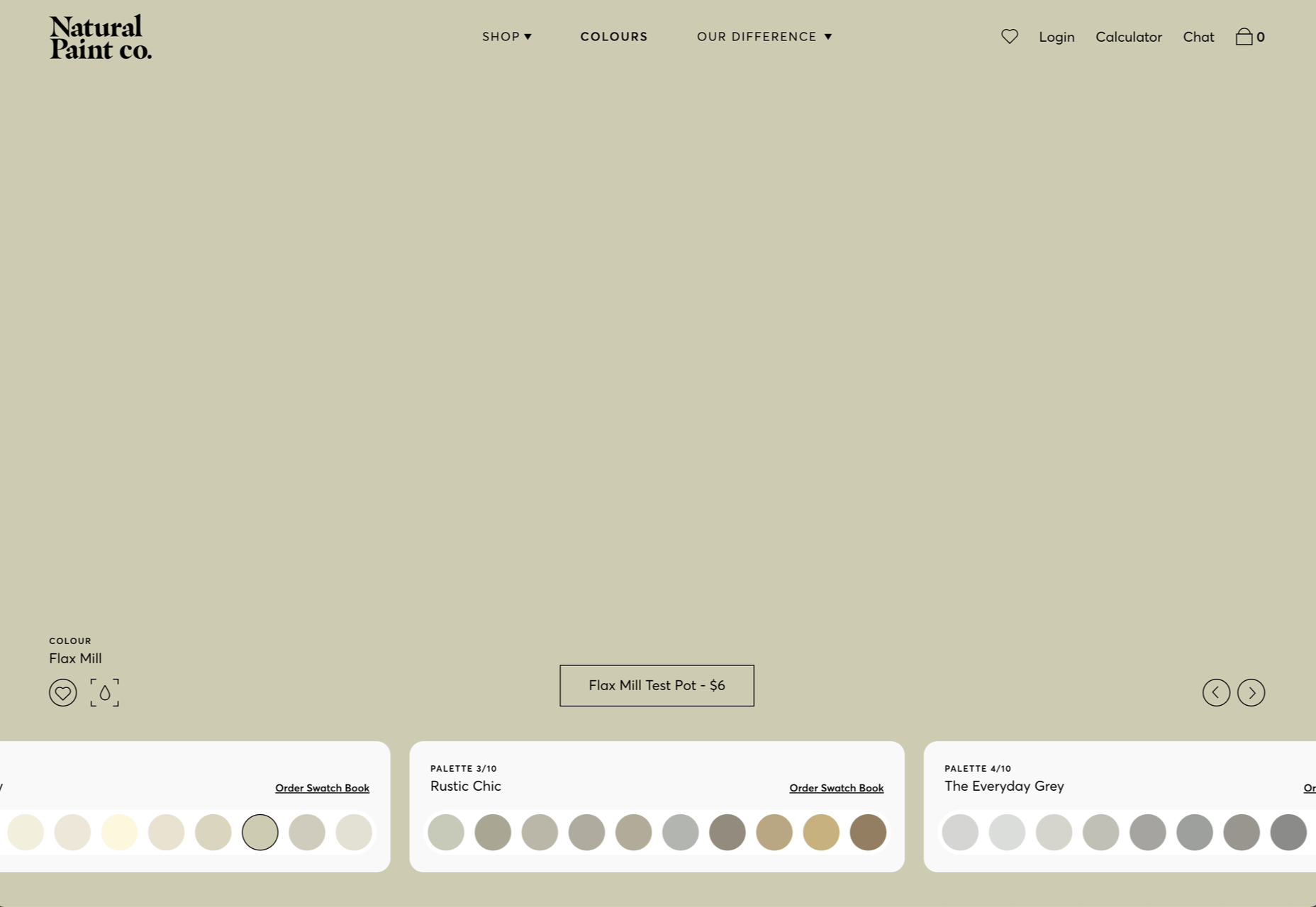
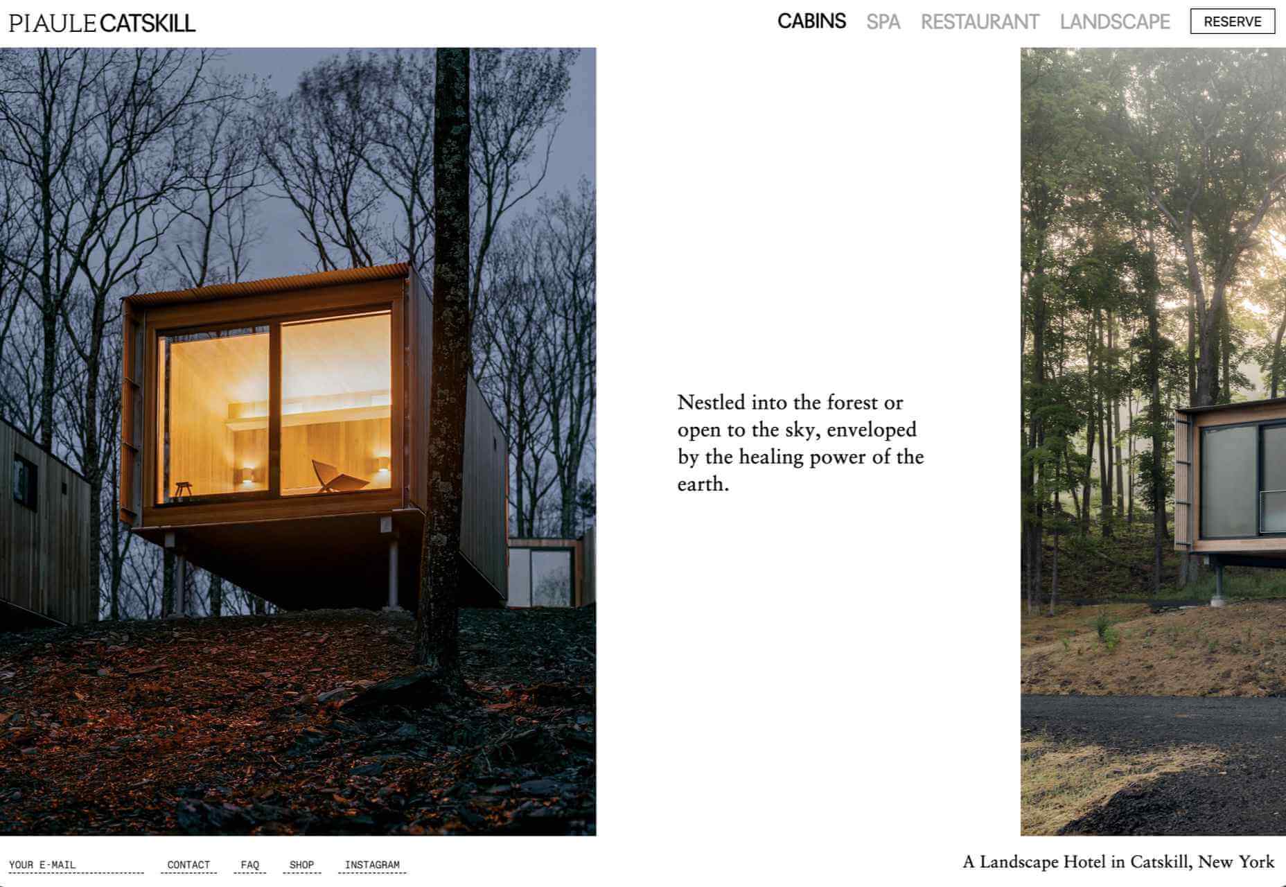
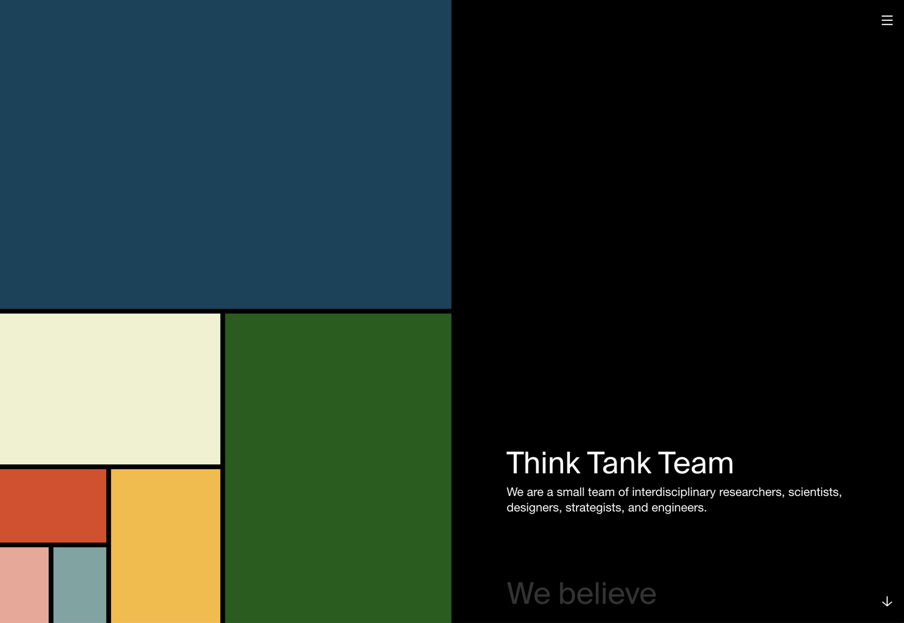
We’ve seen some incredible websites in 2022. There have been more than the usual number of sites with a political mission, and plenty that made us want to travel. The big design trends were brutalism, huge typography, and bold positive color. We’re looking forward to what the web will bring in 2023, but in the meantime, take a look back at the best 50 websites of 2022. Enjoy!

Justice Reskill

Justice Reskill used bright colors and positive, uplifting artwork to create a supportive platform for people who’ve been through the justice system.

Pienso

Bold type and plenty of on-scroll animation made this site for Pienso stand out back in January.

Gazelle No.1

The promotional site for Gazelle No.1 used innovative scroll-activated video to sell the electric bike.

Mekanism

Mekanism’s site was the first agency redesign to impress us in 2022. Super-polished then, super-polished now.

Redbrick

Redbrick was well ahead of the trend for brutalism with a twist when it released this site promoting its coffee.

SOS Foods

Ethical and sustainable goods were top of the sales charts in 2022, and SOS Foods did a great job capitalizing on the style.

Hartzler Dairy

Hartzler Dairy embraced its mid-20th-century branding with a nostalgia-infused site.

Engineered Floors

Even in 2022, designers are still paying mobile short shrift, but this site for Engineered Floors is excellent on mobile.

Emi Ozaki

We loved the quirkiness of Emi Ozaki’s phone-style interface for her portfolio back in February.

I Killed A Cactus

I Killed A Cactus is a beautiful 3D site designed to help people care for houseplants.

Aris Hotel

We were tempted in the direction of Crete by this stunning luxury site for Aris Hotel on the island.

Milton Textiles

Milton Textiles is a big, bold site for a product that is usually an afterthought in the interior design world.

MAAP

The site for MAAP is predictably excellent, modern, and efficient. It encapsulated the apparel brand’s values perfectly.

Garden Eight

The promotional site for Garden Eight, a digital design studio in Tokyo and Copenhagen, was suitably standout eccentric.

Circus Shanghai

Circus Shanghai used a mid-century illustration style to reference the solar system and the Chinese flag.

Normand

Normand took the bold decision to step away from the typical law firm design strategy.

SND

Designing a site for UI sound kits is challenging, but SND pulled it off perfectly with this minimal site.

Polybion

We saw lots of brutalism in 2022, and Polybion’s site was a standout example of how to make the trend work.

neueMeta

Bold block coloring added depth and interest to this portfolio site for design studio neueMeta.

Dumpling Delivery

OK, we confess we spent waaay too much time playing this dumpling delivery game from Mailchimp back in May.

Nowhere Bakery

Nowhere Bakery succeeded in making vegan, paleo, gluten-free cookies seem appealing.

Triniti

We were mesmerized by the perpetual motion video for the pan-Baltic law firm Triniti.

Kim Kniepp

Kim Kniepp’s site impressed us with interconnected navigation and a superbly coded masonry grid.

Feed The 300

Feed The 300 is one of dozens of great sites to combat Russia’s invasion of Ukraine. In this case, it was aimed at feeding zoo animals.

Icons By Menu

Icons By Menu is a stunning minimalist site that is a pleasure to browse.

Museum Of Pink Art

The Museum of Pink Art is an immersive experience celebrating the color pink. It was easy to lose hours wandering around.

BelArosa Chalet

2022 was the year of illustrations, and BelArosa Chalet’s site used them to significant effect to sell a venue still under construction.

WTFFF

Online sexual abuse and harassment are particularly appalling when directed at young people. WTFFF tackled the issue sensitively.

Pretty Damn Quick

Logistics aren’t the most engaging topic, but this friendly, illustrated site for Pretty Damn Quick grabbed us immediately.

Norwegian Soda Co.

This site for the Norwegian Soda Co. uses beautiful photography to create an engaging one-page site.

Fornasetti Profumi

Fornasetti Profumi wowed us with its long-form videos used to emphasize stillness and calm.

Laesk Kombucha

We were convinced this site for Laesk Kombucha had been produced by Wes Anderson.

Cased In Time

Single-product sites are often underwhelming, but this excellent ecommerce site bucks that trend.

DS & Durga

Eschewing the well-trod approach of flowers and pretty models, this perfume site for DS & Durga fully embraces the brutalist trend.

Daniel Spatzek

We loved the way Daniel Spatzek’s portfolio site broke all the rules and still managed to be informative and engaging.

Aro

Aro kept minimalism alive with a simple site that exudes luxury while selling a simple concept.

Think Packaging

Think Packaging took a case study approach to present its products, and it worked really well.

Steffie de Leeuw

Giant typography intertwined with botanical illustrations created a memorable site for Steffie de Leeuw.

Anna Jóna

The prelaunch teaser site for the Ana Jóna café and cinema was elegant and modern and had us eyeing a long weekend in Reykjavik.

Das Salz

More wanderlust courtesy of the fresh, enticing site for the Das Salz hotel and café.

Jono Pandolfi

This simple-to-use site for US tableware and cookware brand Jono Pandolfi sold us on hand-made ceramics.

LolaVie

We still can’t get over the fact that it took until 2022 for Jennifer Aniston to produce a haircare range.

Nathan Riley

Another big trend in 2022 was masonry-style sites, and this portfolio for Nathan Riley was one of our favorites.

Capsul’in Pro

With the excellent application of animation and careful use of color, this site for Capsul’in Pro transformed coffee pods into luxury items.

Seen

Seen is an essential site that explores themes of prejudice and racism in creative fields. It’s a strong approach to a difficult subject.

Glasfurd & Walker

Glasfurd and Walker’s superb portfolio site sets itself apart by over-extending the viewport. It’s a highly original idea.

The Other Side Of Truth

The Other Side of Truth is the standout site of 2022. It used the web expertly to present two interpretations of the facts surrounding the Russian invasion of Ukraine.

Bannach

Back in October, we fell in love with the pixel-block animation loading for the Bannach furniture brand.

Karina Sirqueira

Karina Sirqueira’s portfolio was a joy to browse through. The morphing shapes imposed simplicity on a series of beautifully presented case studies.

Joshua’s World

We were amazed by Joshua’s World, a little island that can be titled and rotated to power the little cyclist along his career.

Source

The post 50 Best Websites of 2022 first appeared on Webdesigner Depot.

Source de l’article sur Webdesignerdepot

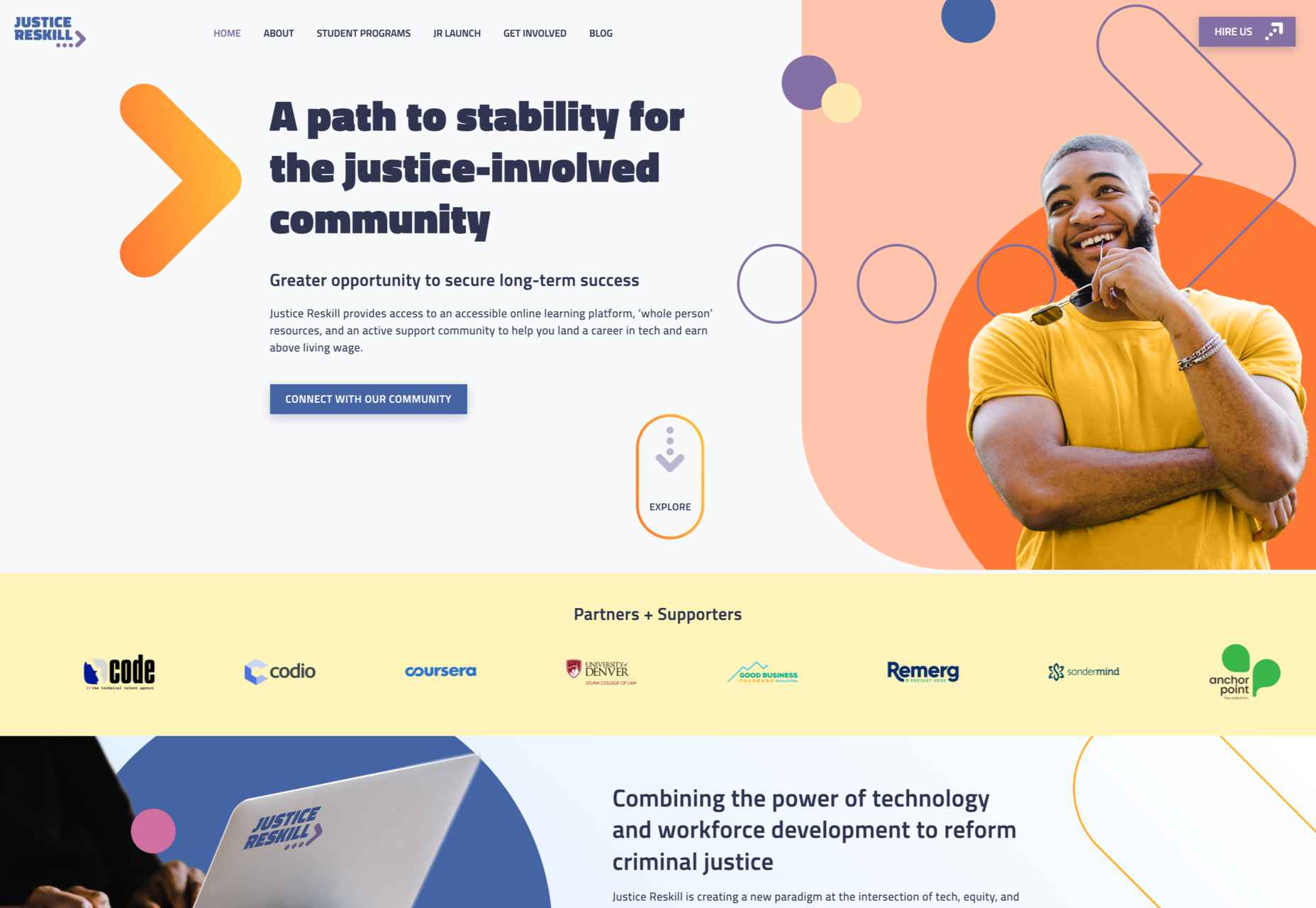
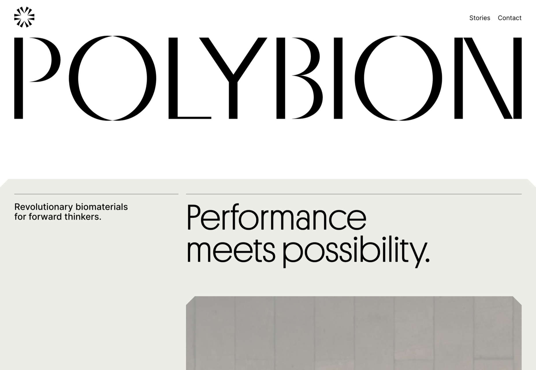
Every month we put together this collection of the best new websites we’ve seen appear on the web in the previous four weeks.

In this month’s collection, you’ll find lots of daring interactions, some inventive portfolio sites, florescent yellow colors, and even some old-school mouse trails. Enjoy!

Joshua’s World

Joshua’s World is a fantastic animated site. Grab and drag to tilt and rotate the island and watch the little cyclist power past important links to milestones in his creative career.

Vana

Vana is a new service aiming to help you take control of your data. Its site is modern and lively and uses some great retro-illustrations to bring its features to life.

Velocity Nitro 2

This slick site has some incredible 3D renders for the Puma Velocity Nitro 2 running shoe. The scrollable animation guides you through each feature in a thrillingly engaging fashion.

Norwegian Soda Co.

The Norwegian Soda Co. uses beautifully shot photographs to capture the zest of its products. It’s an excellent example of how a one-page site can be rich and engaging.

Anytype

Anytype is a collaborative platform pitching itself to creative thinkers. It uses a lovely gradient animation to create a sense of power and technological evolution.

Dash

Dash claims to be almost the best tech company, and its modest site does a great job of expelling the tedium from HR. Plus, it has an old-school mouse trail!

Sileon

Sileon is a site packed with clever details. For example, the hover effect on text links is pleasingly minimal, and the photography shot through distortion is a simple but effective technique.

Karina Sirqueira

Karina Sirqueira’s portfolio is a joy to browse through. The morphing shapes add interest to a collection of case studies that are engaging and beautifully presented.

Hotel Santa Caterina

This beautiful website for the Hotel Santa Caterina on the Amalfi Coast captures the light and wonder of the region with a muted color palette and stunning photography.

La Lulu

La Lulu is a Columbian-American singer, dancer, and musician. Her site uses color to disrupt a fairly standard layout and infuse it with amazonian, psychotropic, South American vibes.

International Magic

International Magic is a design agency that boasts some impressive clients, from Maison Margiela to Nike. Its scroll-to-browse portfolio is a masterful example of selling design.

OAD

OAD uses color expertly to convey contrasting temperatures. At this time of year, who doesn’t want a pullover crafted to withstand the Norwegian weather?

También

También is a creative agency specializing in organizations that positively impact the world. Its scrolling collage of client projects is one of the best examples of this type of portfolio.

Dragonfly

If you were designing a website to be used in a 90s film about the internet, you’d create Dragonfly’s site. It’s packed with glitches, code references, and awesome pixelated imagery.

Elva

There’s a lot of distortion entering the design lexicon at the moment, and one of the best examples is Elva’s portfolio site, which uses it to enliven its black-and-white site.

Sussex Taps

Sussex Taps uses multiple full-screen video clips to sell its carbon-neutral tapware range, but it’s the horizontal scrolling product videos that really make this site stand out.

Angello Torres

Angello Torres’ portfolio is packed with daring typography that breaks pretty much all the rules and yet still manages to work somehow to convey energy and creativity.

Repeat

Repeat is an excellent service for upselling customers with repeat orders. It uses simple illustrations to represent generic products with an attention-grabbing yellow for interactions.

High Five Strategies

High Five Strategies eschew the formality of most business pitches to deliver a positive message with bold colors and typography that makes you feel ready to move forward.

Delight

Delight Snowparks employs a questionable lilac color, but its fantastic imagery and video framing more than makes up for that. Plus, there’s another super-old-school mouse trail!

Source

The post 20 Best New Websites, November 2022 first appeared on Webdesigner Depot.

Source de l’article sur Webdesignerdepot

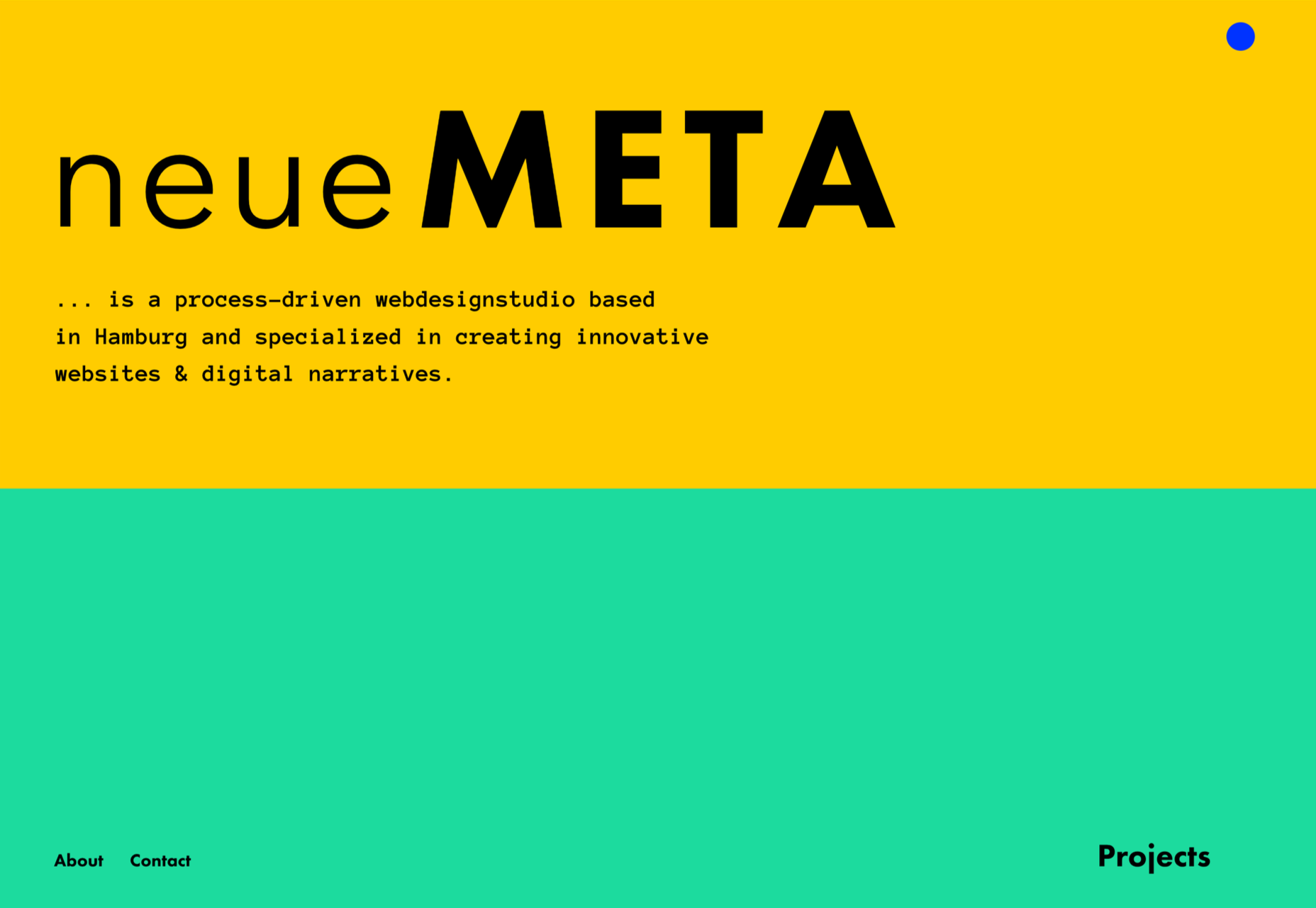
The design world fluctuates back and forth, swerving between love and hate for different design trends. Sometimes we see a wide range of approaches, and sometimes designers all hop on the same idea.

This month, the web is dominated by animation. Designers are cramming in motion in unexpected ways. And it’s fun to explore. Here are 20 of the best new sites on the web this month. Enjoy!

Bannach

Bannach is a German furniture brand. Its products are colorful and geometric, so it makes sense that when you scroll down to the collection, the thumbnails begin as pixel blocks and animate into product photography.

Fornasetti Profumi

Fornasetti Profumi takes a different approach to motion. It uses video to emphasize stillness to promote the calming qualities of its candle products.

The Other Side of Truth

The Other Side of Truth is a superb exercise in utilizing the web for a cause. It presents facts on the Russia-Ukraine war, but the standout feature is the toggle switch that, instead of light mode-dark mode, toggles facts and Russian state propaganda.

Glasfurd & Walker

Glasfurd & Walker is a portfolio site for a design agency. So far, so standard. However, it sets itself apart because it’s slightly bigger than the browser and swerves left and right with your mouse movement.

Sirup 5th Anniversary

Sirup is a Japanese singer-songwriter, and to celebrate the fifth anniversary of his first hit single, his record company has put together this awesome maximalist micro-site that uses type, motion, and art direction to capture his style.

Fitzjohn’s

Fitzjohn’s is a slick site for a new apartment complex in the Hampstead area of London. It uses a refreshing modern color palette and calming animation to take the edge off the frankly ludicrous price tag.

Persepolis Reimagined

Persepolis Reimagined is an awe-inspiring WebGL tour through one of the most important cities in ancient Iran. Make sure you tour it on a large screen. It’s hard not to be wide-eyed with wonder.

JaM Cellars

JaM Cellars is a Californian wine brand that’s pitching to bachelorette parties. With names like Butter, and Sugar, it’s not the most sophisticated tipple, but yellow, we love a yellow site.

Danielle Levitt

This portfolio site for film director and photographer Danielle Levitt features samples of her best work scrolling past the viewport. There’s a clever switch of thumbnail and background color when you scroll down to the contact details.

Propel

From total color energy to Apple-levels of minimalism: Propel is a slick, animate-on-scroll site for a marine motor brand selling an outboard and inboard motor. The animated masks on the images are a nice subtle touch.

Standards

Standards is a site for a SaaS that helps organizations create, maintain, and share brand guidelines. It uses subtle animation, video of its UI, and compelling copy to sell its approach.

Chris Carruthers

The portfolio site for Chris Carruthers is deliberately self-indulgent with scrolling text, clipped images, and scroll-jacking, but it’s also delightful to peruse.

Theodore Ellison Designs

We don’t often see colored glass in real life, but the play of light on stained glass is beautiful. This site for Theodore Ellison Designs uses video to bring the effect to the web.

Owomaniya!

The Owomaniya report for 2022 uncovers the state of gender diversity in the Indian entertainment industry. Presented in the style of infographics, the information is brought to life by animation.

Meetings

Meetings is a French events company. Its site uses an animated collage approach to showcase its services, and animated text to pull you into its content.

Blakeney

Blakeney invests in African companies on behalf of institutional investors. Its site is typical of the financial industry, but it uses animation to lift it to a higher level of interest.

Becklyn

Becklyn is a digital design agency. Its portfolio site uses animated text, expanding image masks, and video to guide us through its site and app design approach.

Cabi

Cabi is a brand of Japanese condiments with a typically Japanese feeling site. Bright colors, a slowly scrolling slideshow of dishes, and editorial to pack shot hover effects are a great introduction to the brand.

Slantis

Slantis provides building information modeling to architecture and infrastructure providers. Its site uses animation to showcase the types of content it produces for clients.

July Fund

July Fund is a venture capital project. It takes an entirely different approach than its competitors by adopting a chaotic but enjoyable card-based design.

Source

The post 20 Best New Websites, October 2022 first appeared on Webdesigner Depot.

Source de l’article sur Webdesignerdepot

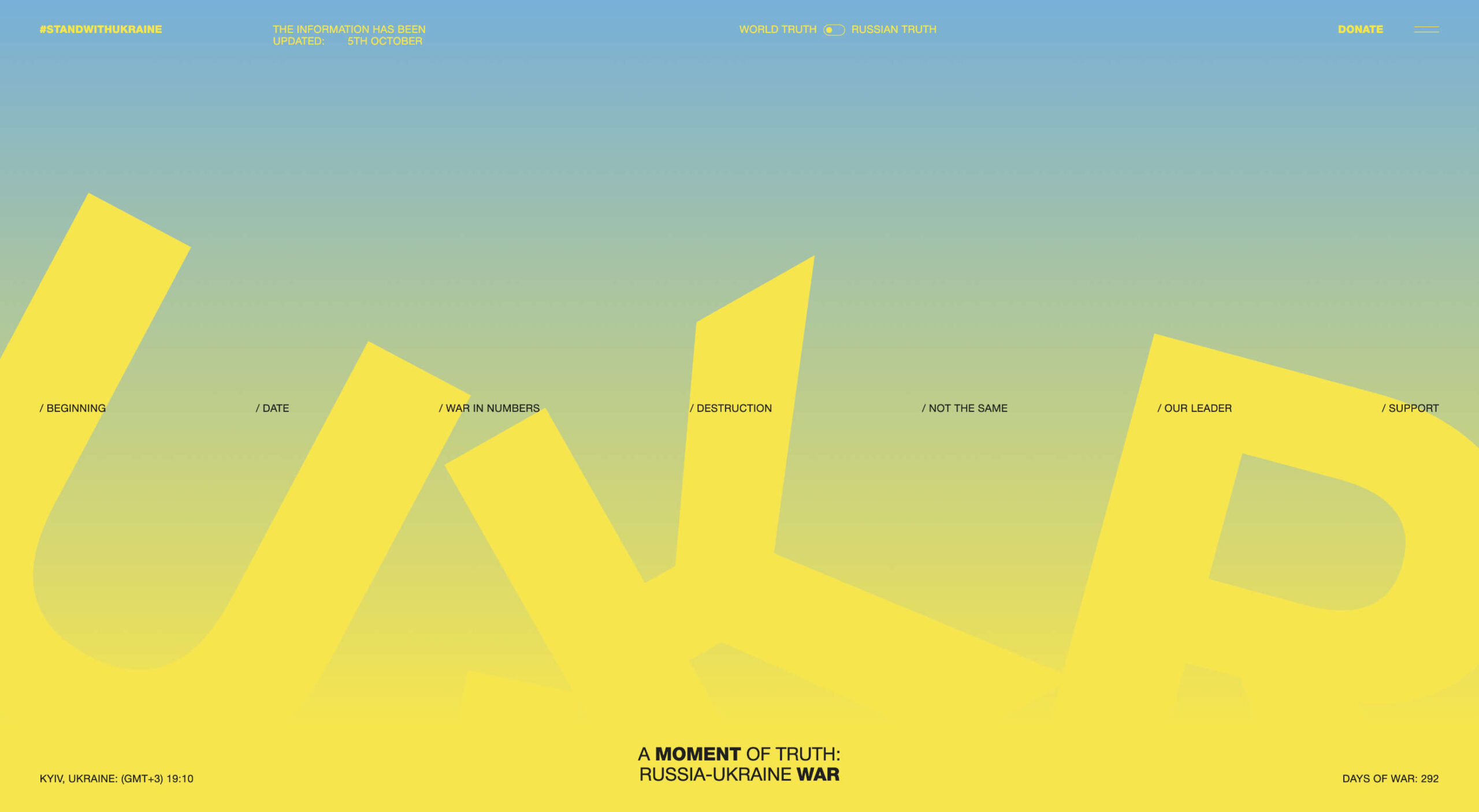
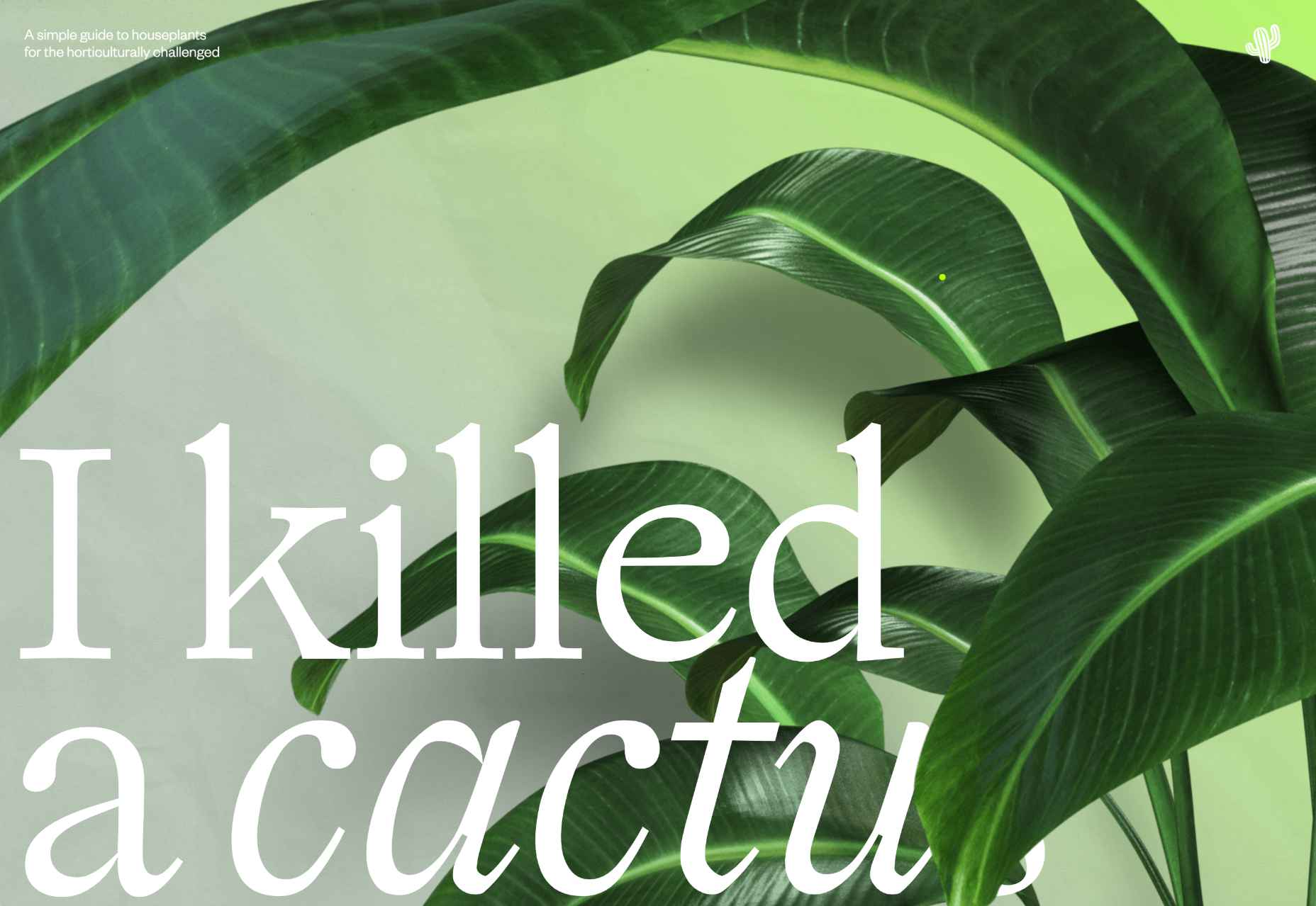
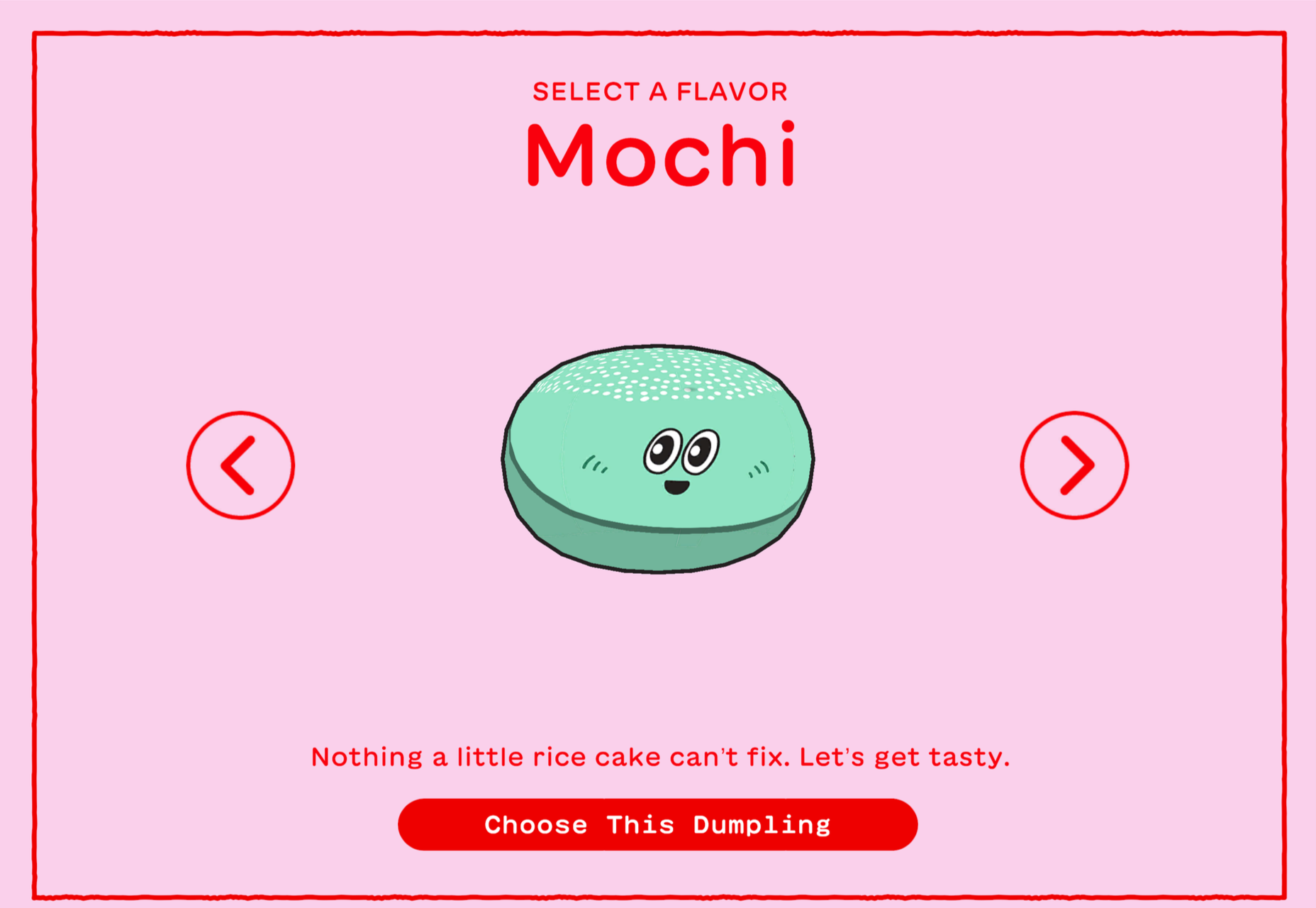
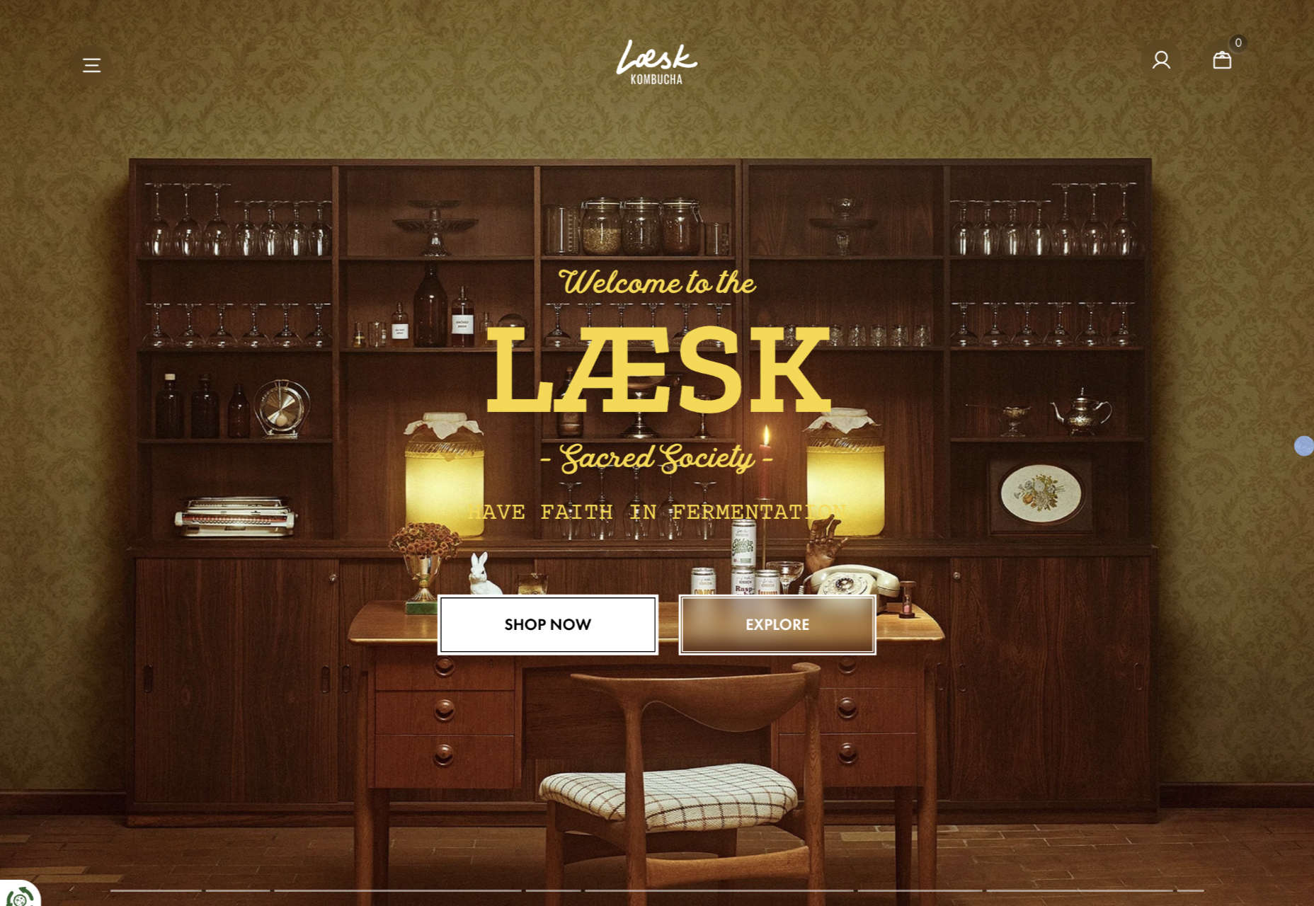
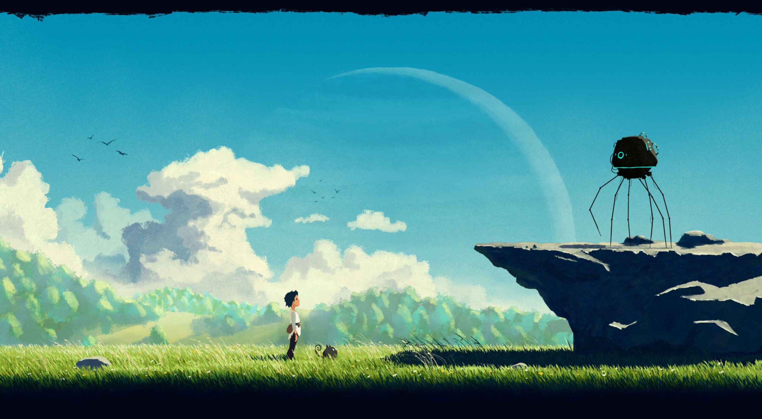
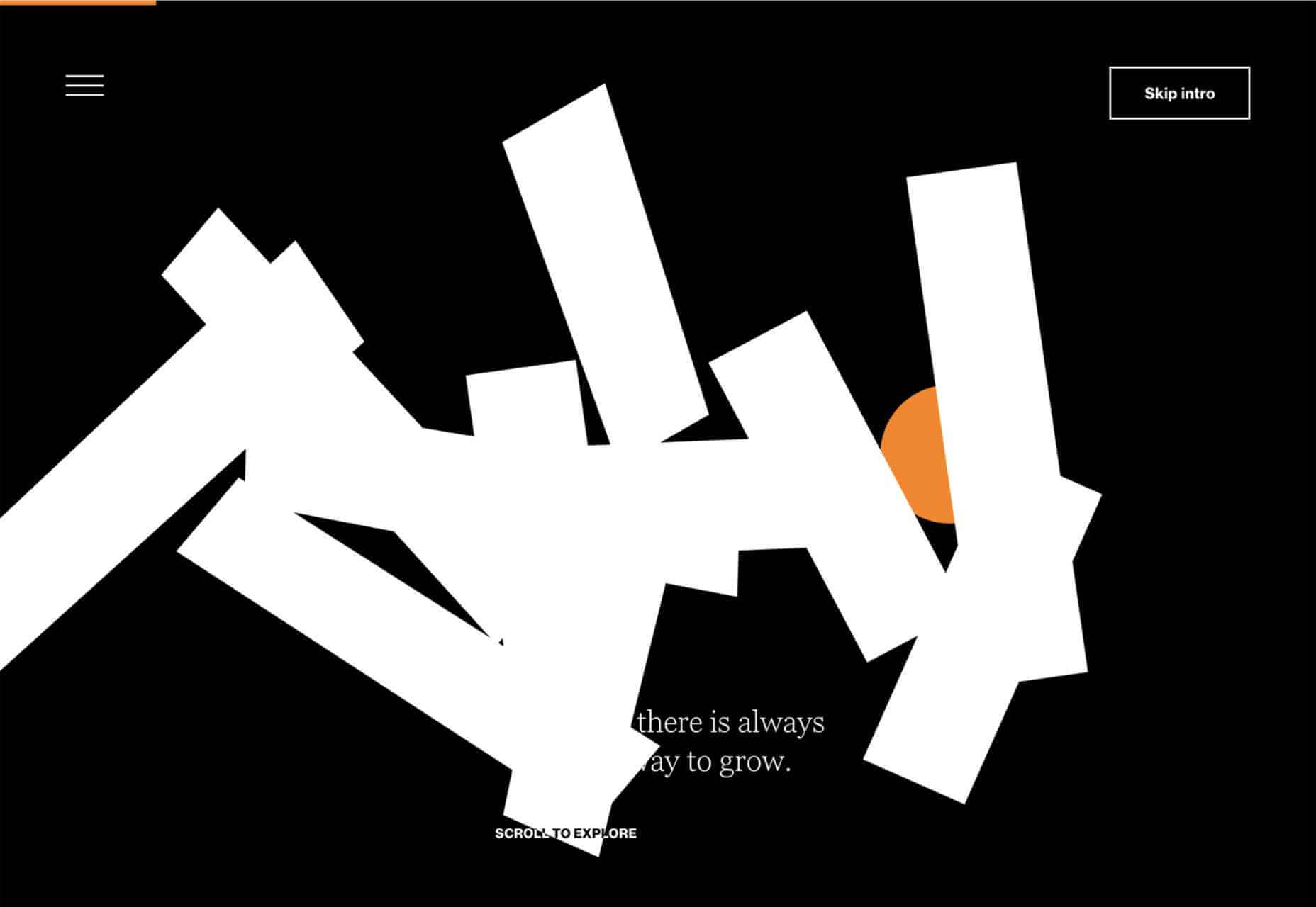
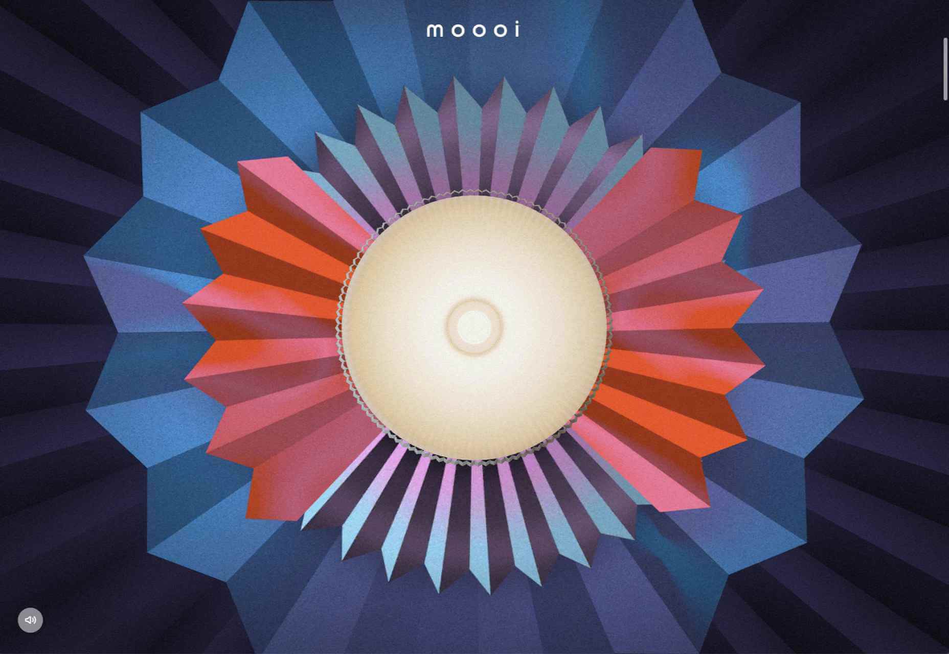
There are a lot of dark, retro vibes trending in website design right now. Although there are still some light projects popping up – including a pastel trend below – a lot of what we are seeing has a quite moody feel.
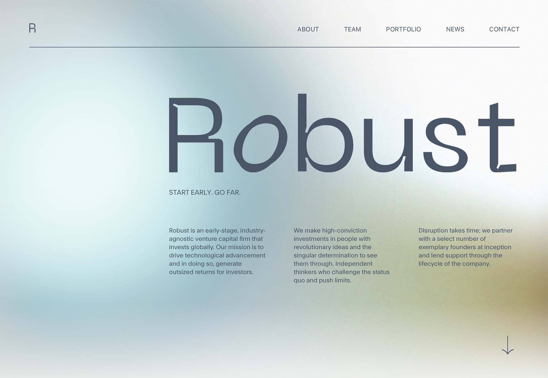
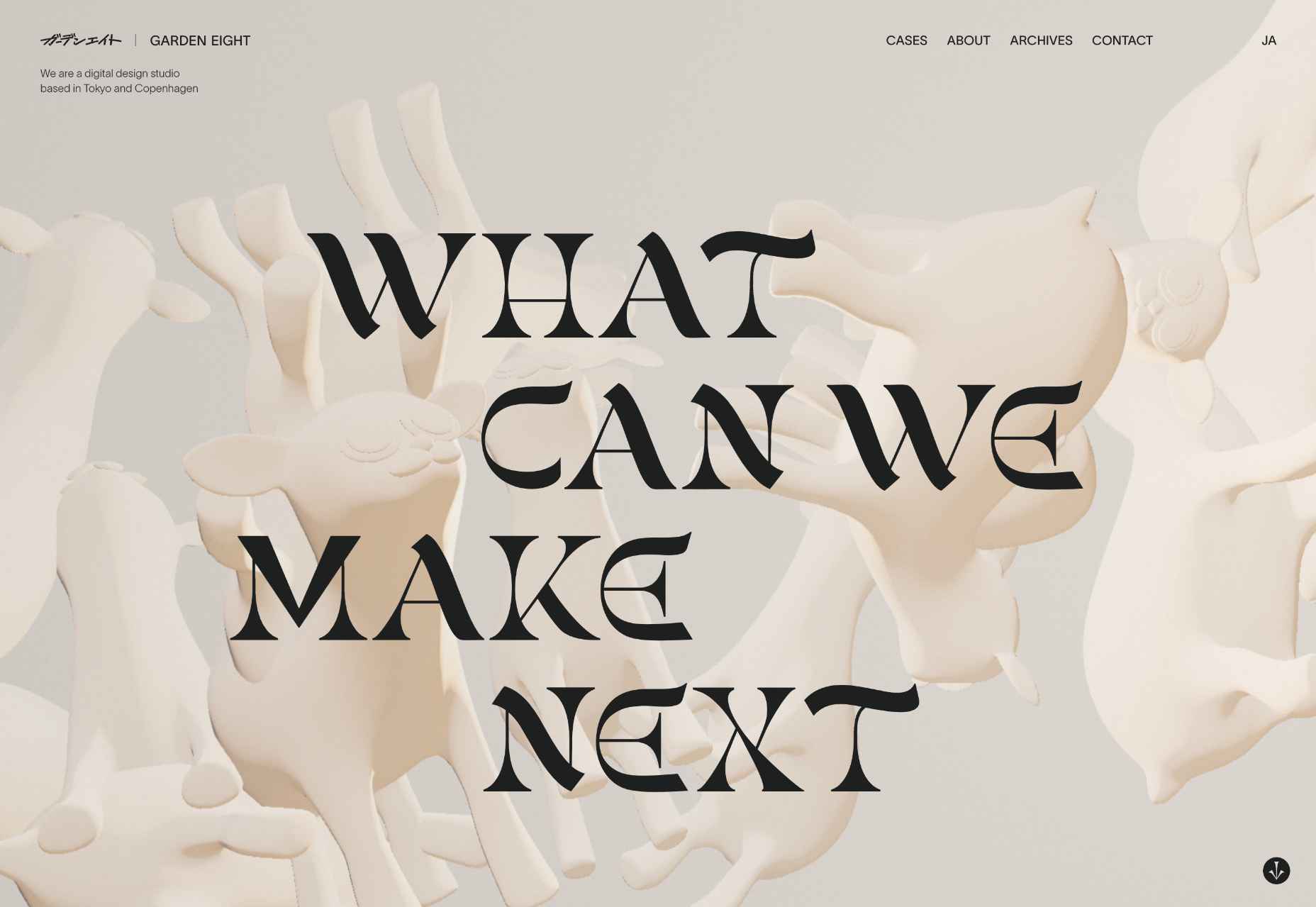
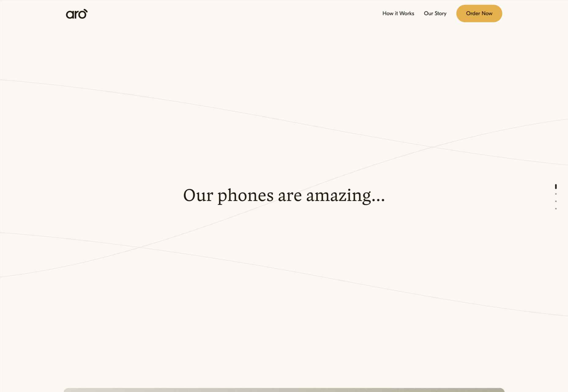
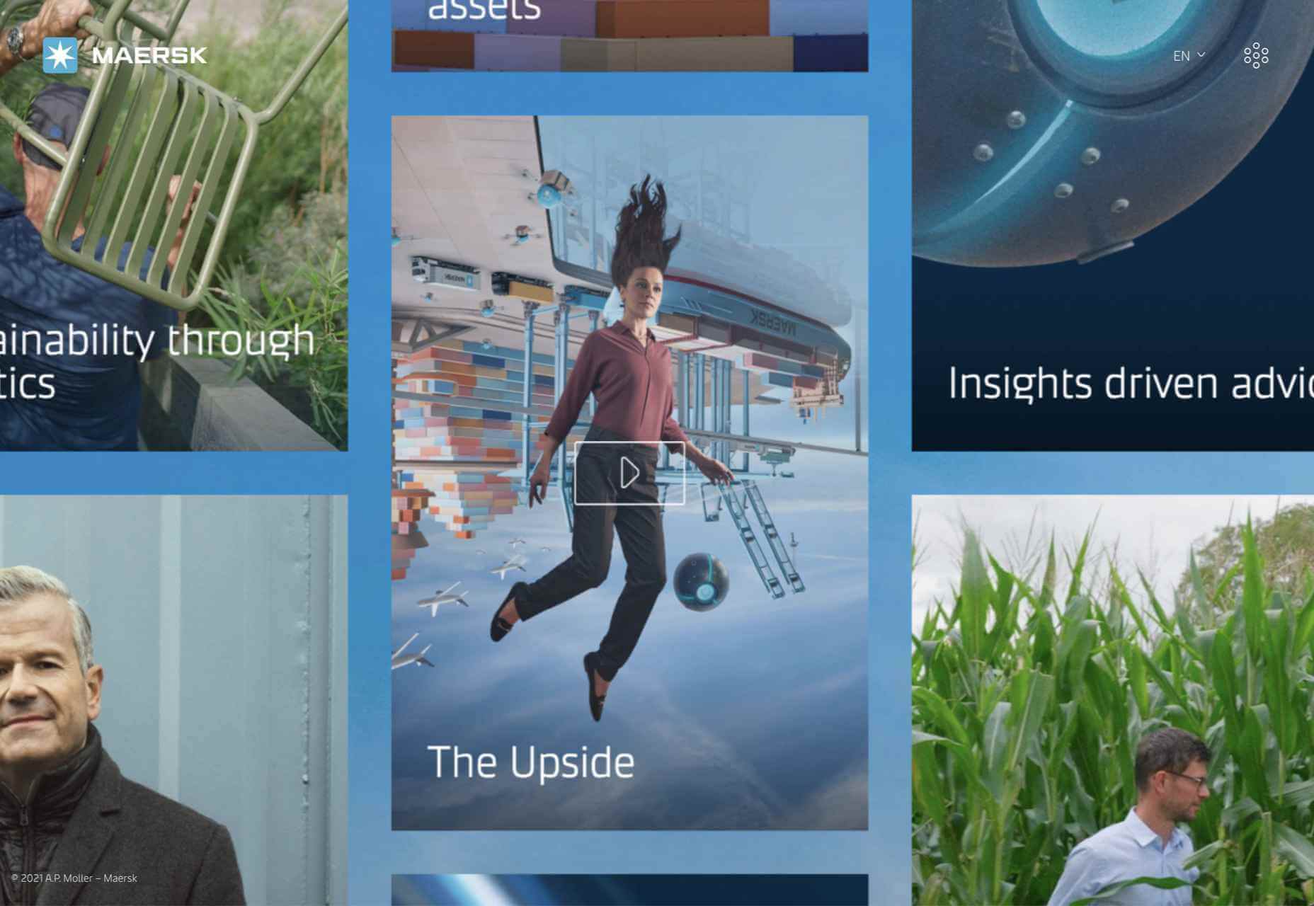
Here’s what’s trending in design this month.

Pastel Color Palettes

Let’s start with the trend with a lighter feel – pastel color palettes. While much of the web is trending toward dark aesthetics, there’s a segment that’s going in the exact opposite direction. Those sites feature soft, pastel color palettes that serve as a balance to all the super dark websites out there.

One thing about this website design trend is that it jumps out because of the stark contrast with all of the dark color palettes out there.

Each of these designs seems to use a pastel color palette as the basis for a background. A blur effect is paired with the colors to use pastels in a way that has a natural feel without appearing too feminine or light.

Robust uses blue and earth tones for a pastel background that feels modern and strong when paired with the hard-edged headline font.

Atmos uses a light pastel theme that takes you through the clouds with blues, and pinks, and purples. The pastel color scheme works well with the content which is airline-themed and makes you feel like you are flying through the sky. The colors are also soft enough to provide an easy reading experience.

Klezma is another design with the same pastel background with graduated color. The peach tones are fairly neutral and give plenty of room to the content.

Fonts with a Distinct Retro Look

Every one of these websites uses a typeface with a similar look and feel. This retro headline style is trending in a major way.

The best way to use this design element is for short words. This typeface design isn’t meant for a lot of words or when readability is a high priority.

This style is all about creating a specific kind of vibe for your website. The typefaces in this trend have a quite retro look and feel with an almost 1960s or ’70s feel to them. The rest of the design mimics this feel as well with colors and surrounding elements that contribute to the overall look.

A couple of common elements here include the use of all capitals font sets and letterforms that include odd shapes and lines.

Sretks not only uses a retro typeface but bends and twists it a bit too to add to the old-school feel. The background color helps add to the groovy vibe.

Barge 166 uses a retro typeface with the same design feel as the other examples but with a sharper, more serif-style edge. It’s easier to read but still carries a retro look and feel. Use a typeface similar to this if you want to capture that retro font style for a trending look while maintaining as much readability as possible. This option works best for multiple lines of words in a large size.

Picky Joe uses a retro typeface with rounded letters and a bit of a tilt to the characters to create a distinct feel. This is definitely a style that has to be used sparingly but can be a fun option, depending on the content of your website design.

Dark “Product” Sites

Dark mode design is probably the biggest design trend of 2022. Everywhere you look, websites are using dark color palettes and styles. Designers are creating more projects with a dark/light toggle so users can control their experience.

This visual concept is carried over to website designs that feature products as well. This is one of the last places the dark aesthetic had not touched. It’s been a bit of an unwritten rule that product images should be on white or light backgrounds to help make them easy to see and inspect digitally.

This design trend bucks that idea and features products on dark backgrounds – some with so little contrast that you almost have a hard time seeing the products. (Maybe these brands are banking on the idea that you already know them or are selling a lifestyle product.)

HQBC sells bike accessories such as glasses and helmets and the site has a sleek look and feel. You know it is cool from the second you land on it. The question though – is there enough visual information with the dark background to help you make a purchase? This design probably works because it only encourages you to find a physical location to make a purchase rather than buy online.

Doggystyle Shop also banks on the idea of you knowing the shopping experience or brand when you arrive. What the design does do though is put products on white backgrounds after you have clicked through far enough to make a commitment to buy. This helps you see the product well one final time before making a purchase. (The challenge is that it is three to four clicks in for the most part.)

FirstFit uses the design trend in a way that’s similar to the first example. They are showing a product, but not actually trying to convert sales on the website. Other links take you to more product information and content – using a lighter background and color scheme – and the dark background with the product serves mostly as a highly visual landing page that will help entice users to learn more. When it comes to dark mode and products, this seems to be the best option for most website designs.

Conclusion

The state of the world around us and our emotions can play hard into websites and other design projects. Some of the darker elements that are popular now may be a reflection of that or it could be more of a lean into dark mode schemes.

Either way, the web has a pretty dark feel right now.

Source

The post 3 Essential Design Trends, July 2022 first appeared on Webdesigner Depot.

Source de l’article sur Webdesignerdepot

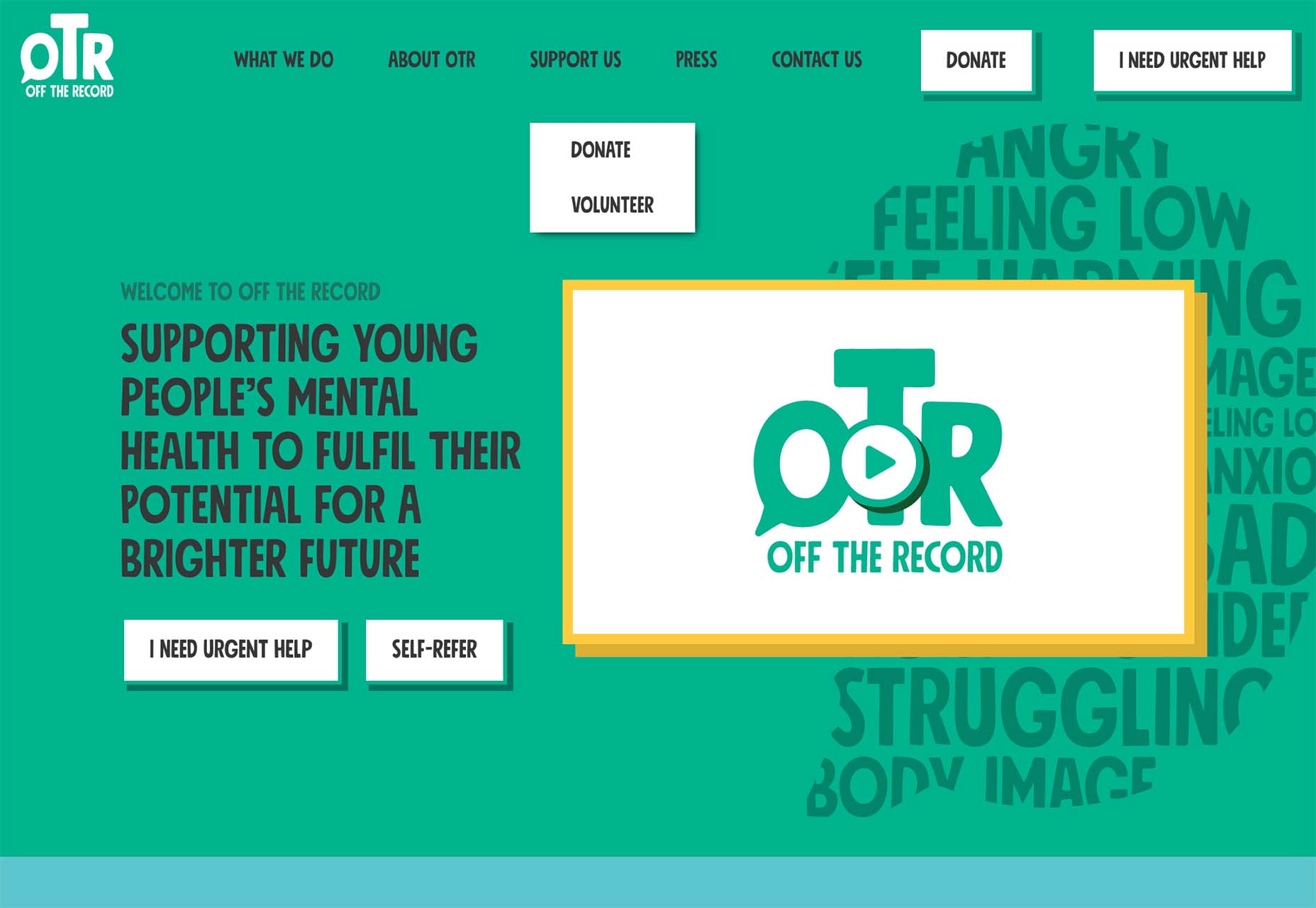
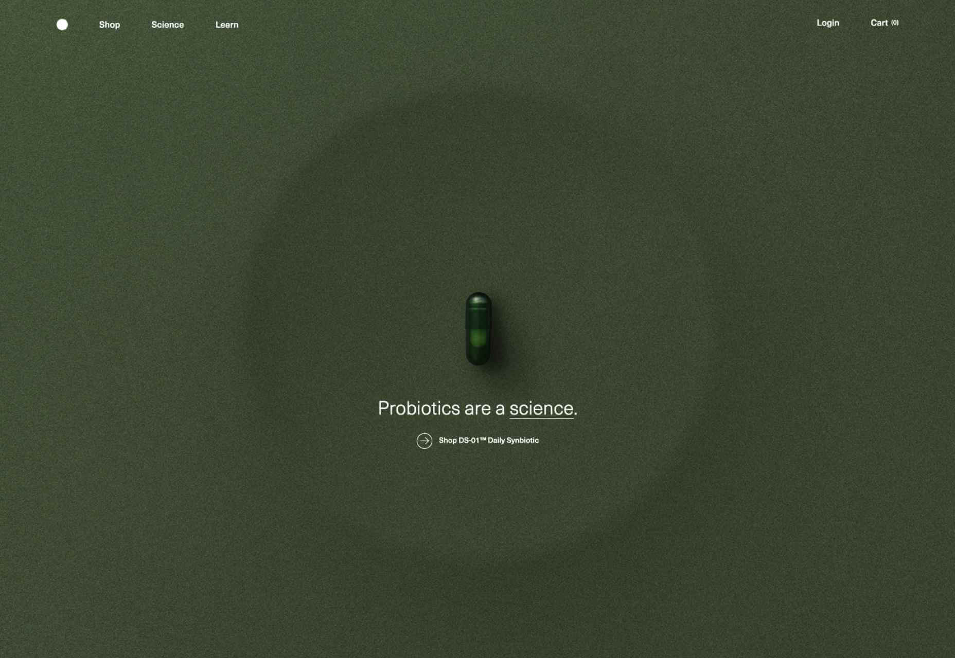
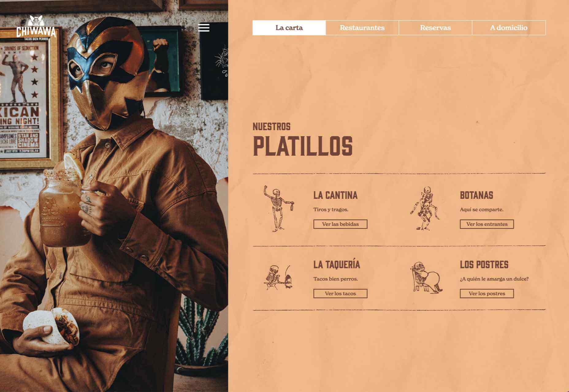
2021 has been both memorable and instantly forgettable. Pop stars were freed from modern-day servitude, some people tried to overthrow democracy, and we all vacationed at home.

Despite the weirdness of the times, the web kept growing, kept changing, and kept on pushing boundaries. We saw a wealth of new sites launch or relaunch with significant updates.

Here are the 50 best sites launched on the web this year. Enjoy!

Crusta C

In April, seafood company Crusta C cleverly used the simple logomark ‘C’ to apply a cutout video effect.

Slow

Slow is a collective of creatives aiming to implement slow movement principles. Its site reflects those aims, creating a sense of calm and deliberation.

hnst

2021 saw tons of brutalist-inspired design. hnst’s take on the style works thanks to the bright red in place of the standard black.

Marram

This site for boutique hotel Marram uses a soft color palette to create an impression of soft golden light and calm.

Levitate

In July, we loved this site for running-blade brand Levitate. The site is clean and light, with a sense of inherent motion in the photography.

Niarra Travel

There’s some beautiful photography on this site for eco-conscious, bespoke travel agency Niarra Travel.

Plunt.co

The core of this site for Plúnt is a combination chooser which feels pleasingly reminiscent of an animal flipbook.

Moth Drinks

Moth makes classic cocktails in a can. The striking black and white graphics and masking effects for its holding page stunned us back in March.

Seed

Selling supplements is hard; people are understandably skeptical. So this site for Seed packs in research and scientific information and avoids the hard-sell.

Wavemaker

Another excellent portfolio site in 2021, this time for creative media agency Wavemaker. The site is uber-confident while still being playful.

Wild Souls

Wild Souls makes nut butters, tahini, and other Greek delicacies. Its site is colorful and warm, and the site typography is soft and appealing.

JUST Egg

JUST Egg produces egg-like food from plant material. The huge photography and bold typography do a great job of making a new concept appealing.

Aalto University

One of the most popular designs of 2021 was Aalto University’s site with its in-depth campus tour. The simple navigation inspired several imitators.

Wisr

Scroll interactions were big in 2021, and Wisr features a Heath Robinson-style machine that ‘runs’ as the user scrolls down the page.

Cevitxef

This site for Cevitxef ceviche restaurant in Bilbao does a great job of making us hungry. Drama is created by oversized text, heavily-styled photography, and lots of movement.

On

The best digital agencies keep their own sites simple, like this site for On digital technology studio that uses black on light blue and adds infinite scrolling.

Acayaba + Rosenberg

We found Acayaba + Rosenberg’s use of architectural photography and subtle scrolling a pleasing browsing experience.

Madre

This site for home linen company Madre uses extraordinary fine-art style still-life photography to enrich a very simple site.

Hyperframe

“Show, don’t tell” is a well-worn mantra. Hyperframe’s site implements it by demonstrating the product’s major selling point on scroll.

Gemini

This exceptional WebGL experiment was built to show what’s possible in the technology. Have a play with the car; it’s a ground-breaking demo.

Felt

In 2021, collaborative mapping tool Felt launched in private beta. Its excellent site does a great job of creating interest while doubling as a recruitment notice.

imNativ

Not every project is exciting, but this excellent site for imNativ uses macro photography to great effect to promote upholstery fabric.

Websmith Studio

Excellently named Websmith Studio uses color to highlight, and the noise effect applied to the background adds subtle interest.

Singita

High-quality photography and a terracotta-based color scheme create an inviting ambiance for Singita, an African eco-tourism and conservation brand.

Fluff

A fullscreen background behind a mobile view for desktop? It sounds like a horrible idea, but this site for cosmetics brand Fluff pulls it off.

Chiwawa

This great site for Chiwawa cantina features wrestling masks, skeletons, and tone-on-tone color to create a lively and distinctly Mexican site.

Nothing

This site for Nothing’s ear(1) earbuds is packed with confidence. Appropriately, it looks even better on mobile.

Chérie Healey

Lots of experts have tried to tell us how to live our lives in the last couple of years, but Chérie Healey’s site manages to stay on the right side of positive without slipping into clichés.

Wayfinder

Wayfinder, a game about our connection to nature using generative code, AI, machine learning, and data mining, could not have been more 2021 if it tried.

Green Angel Syndicate

Not too many investment groups are thought of as ethical, but Green Angel Syndicate specializes in funding companies fighting climate change.

Tether

As the days got darker in the Northern hemisphere, we were wowed by this site for Tether, a cycle safety system using video and illustration to explain its clever approach to bike safety.

Patricia Urquiola

Back in January, we loved the new site for Patricia Urquiola design studio, thanks to its bright, bold colors that we thought inspired confidence.

Headup

Headup’s businesslike approach is created thanks to a pleasing color palette and geometric graphics.

Redwood Empire

For Earth Day on April 22nd, Redwood Empire Whiskey created a microsite promoting a competition styled to match their bottle labels.

GT Super

The one-pager for GT Super has a certain drama in keeping with the font itself and allows you to play around with the size, weight, and style.

Planet of Lana

Due for release in 2022, Planet of Lana is a game from Wishfully Studios, and its teaser page launched back in June has kept us intrigued ever since.

The Longest Road Out

This charming site for The Longest Road Out is a travel map and journal based on the creators’ road trip around Britain, Ireland, and the outlying islands.

Made Thought

Made Thought has a bold aesthetic and approach that explains its outstanding client list.

Miti Navi

Miti Navi makes extraordinary sailing boats. We were attracted to how its site presented a luxury product in an original way.

La Nouvelle

Another powerful digital design agency site was La Nouvelle’s, which used a combination of contrasting and complementary color combinations to catch the eye.

Caleño

Caleño makes non-alcoholic distilled spirits. They relaunched their website in March with bright, joyful colors that reflect the character of the brand.

Capsul’in — Aluminium

This demo site for a coffee pod manufacturer isn’t a site as such, but it demonstrates that even in 2022, there’s room for parallax scrolling.

How Many Plants

Everyone needs a few more houseplants, and How Many Plants is a great guide to how to own and look after them. The illustration style is friendly but efficient.

How & How

One of the most approachable design agency sites of 2021 was How & How’s. It keeps things light and clean, and effective.

The Hiring Chain

Part of a campaign encouraging businesses to employ talented people with Down Syndrome, The Hiring Chain website dispels myths with clearly presented facts.

Virgile Guinard

Back in February, we couldn’t get enough of photographer Virgile Guinard’s portfolio site. Blocks of color pulled from each image hide the image allowing you to focus on one image at a time.

Studio Nanna Lagerman

Studio Nanna Lagermann’s site excels at creating a sense of space and calm. The color palette is soft and neutral. The type is large but clean and sophisticated.

GOOD Meat

Veganism is a growing trend, and one of the sites promoting it with gorgeous colors is this site for lab ‘grown’ meat.

Mama Joyce Peppa Sauce

This one-page site for Mama Joyce Peppa Sauce is big and bold. Click almost anywhere, and two bottles of sauce go into your cart.

Ebb Dunedin

The site bucks the trend for luxury hotel design and instead is styled to complement its interiors. We could have done with time at this boutique hotel in 2021, maybe next year…

Source

The post 50 Best Websites of 2021 first appeared on Webdesigner Depot.

Source de l’article sur Webdesignerdepot

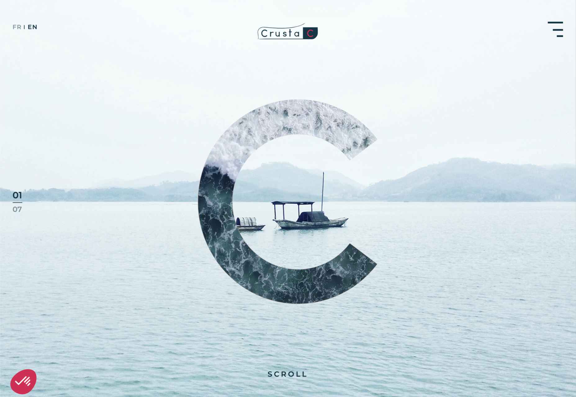
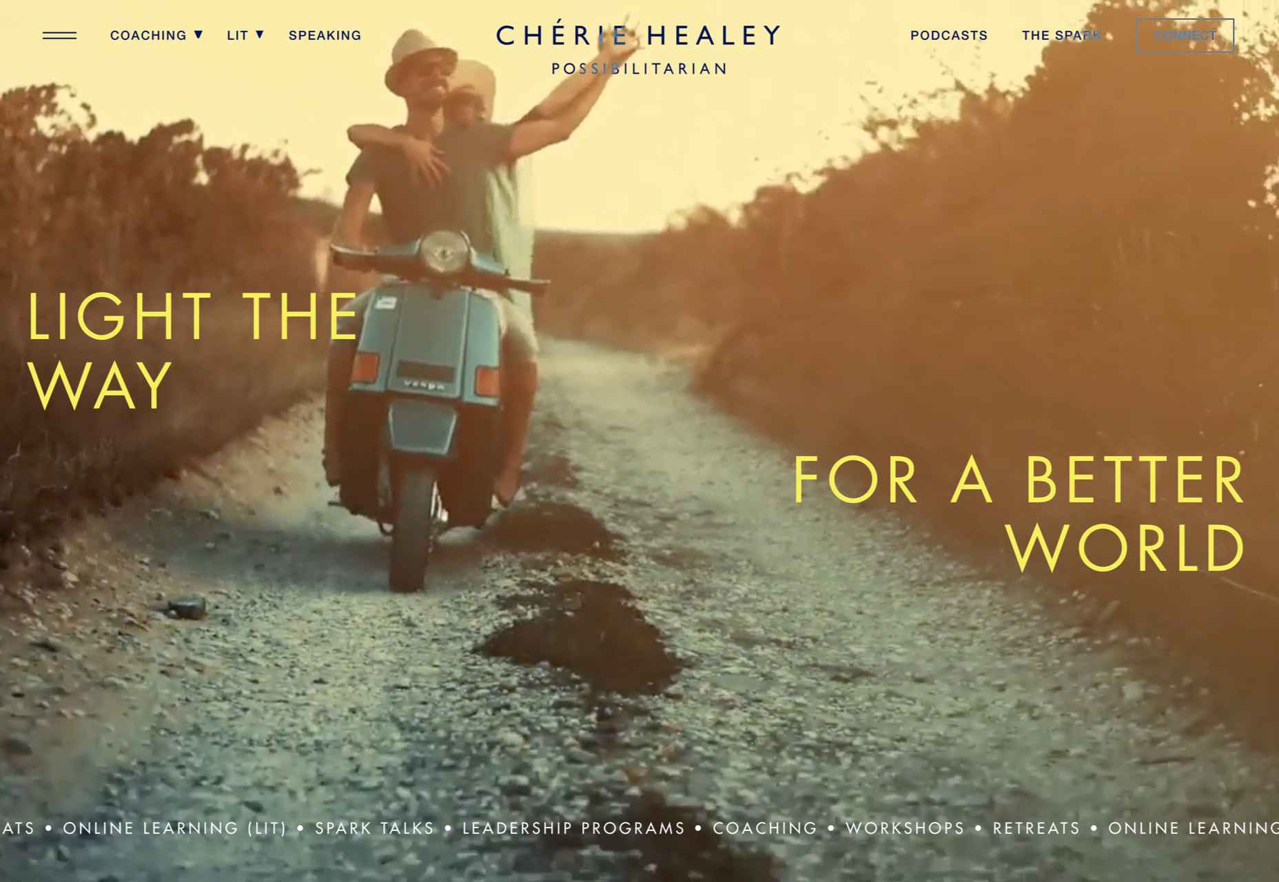
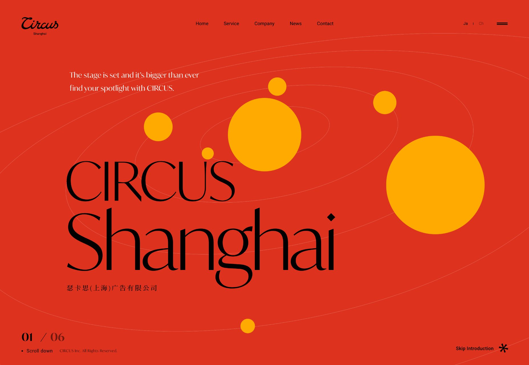
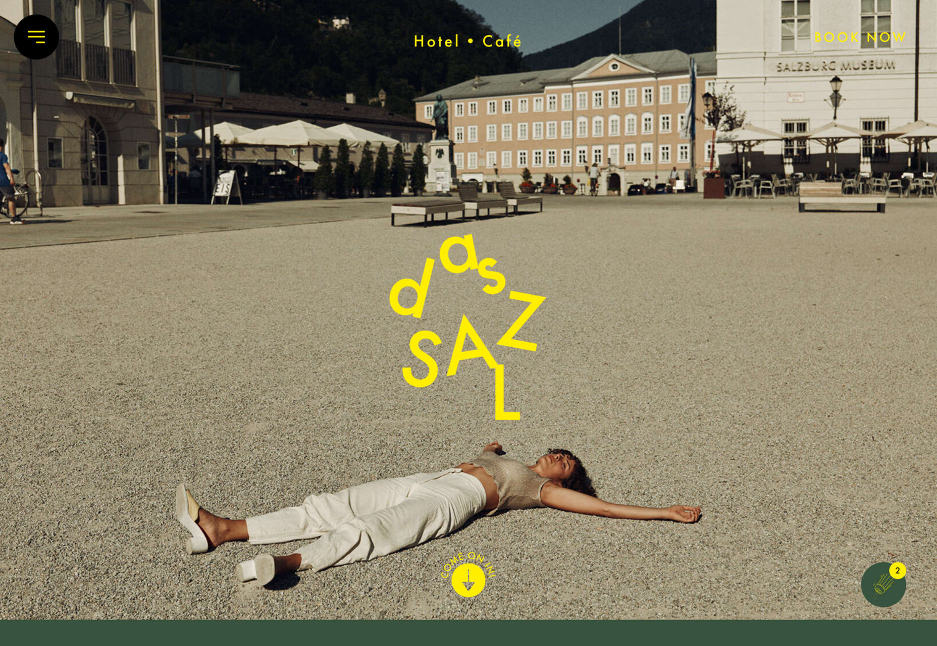
Welcome to this month’s round up of what has caught our eye on the web. As it’s November we’re going to help chase those winter blues away with some color.

Color does so much of the heavy lifting in visual design. It can create a mood, reinforce a brand identity, establish a hierarchy, differentiate sections, highlight type or reduce it; color even makes a statement by its absence.

Good use of color isn’t just about getting the most appropriate color scheme for the subject, it’s also about how much color to use, and where to use it. In this collection we’ve included a range of use examples from bright and full of color, to restrained with subtle tones. Enjoy!

Toboggang

There’s a pleasing UPA cartoon feel to the colors and type in this compact portfolio site.

On

On digital technology studio keep things simple with a black on light blue, and infinite scrolling.

re_

A pleasing mix of reds, greens, pinks, and golds liven up a simple grid layout for re_ package free grocery store.

LA Art Box

This site for LA Art Box makes great use of horizontal scrolling and animated transitions.

JYZ Design

Strong color and geometric shapes create a vibrant feel for JYZ Design’s company site.

Hyperframe

Hyperframe’s site takes on board the ‘show, don’t tell’ theory by cleverly using on scroll animation to demonstrate its product’s major selling point.

Rebecca Atwood

Rebecca Atwood’s site combines product shots with a color scheme that reflects the aesthetic of her designs.

Natural Paint Co.

For any paint company, displaying the available colors is a central function of their site. Natural Paint Co. do a really nice job of this with an interactive picker that changes the background color of the window.

Piaule Catskill

Beautiful photography and minimal text do a great job of selling the experience of Piaule Catskill cabins, and the horizontal scrolling on desktop adds extra focus. I found myself looking up flights to New York…

Rose Delights

There is a vintage, hand made quality to the mix of video and photographs on Rose’s home page, that creates a sense of warmth. The transparent mail list sign up is nicely non-invasive.

Voila

This site for Voila instant coffee creates a modern feel with fresh pastel colors balanced by a grounding dark blue.

Chiwawa

Wrestling masks, skeletons and lots of tone on tone color makes this a lively and appealing site for Chiwawa cantina.

HI(NY)

Keeping the rest of the design elements minimal here allows the movement of content areas not become cluttered and fussy feeling.

Think Tank Team

The divided square motif on the Think Tank Team homepage is a nice visual metaphor for building blocks coming together to create a whole.

Just Egg

Lots of yellow, and food close ups in the what part of Just Egg’s site is bold and confident. But the how section with its scrolling animation is the really good bit.

Moooi Paper Play

Although not a standalone site, this is a very pleasing animation centred around a particular product from Moooi.

Maersk Upside

Logistics giant Maersk have added a more user-friendly and visually engaging section to their corporate site, with use cases and real case studies.

Sol’ace

The color palette for Sol’ace furniture is has been carefully chosen to reflect the idea of luxury and natural materials.

Terra

A good mixture of standalone product shots and styled photographs works well here. The navigation options–shop by type, material or collection–have been well thought out too.

Thanxiety

And finally, for our readers in the US, Thanxiety is a carefully chosen collection of conversation topics to help avoid any uncomfortable silences, or family rows, around the dinner table at Thanksgiving. (And maybe the rest of us could use it on other holidays…)

Source

The post 20 Best New Websites, November 2021 first appeared on Webdesigner Depot.

Source de l’article sur Webdesignerdepot

The best free online coding websites for beginners are hubs of education and insight, designed to take your knowledge and career to the next level.

For years, technical careers have been gaining more attention among innovative individuals. In a digital world, people capable of speaking computer language often have the widest selection of job opportunities. However, before you can start leveraging the blossoming job market, you need to hone your skills. That’s where free coding websites come in.

A free online coding website is an environment where you can develop your understanding of various kinds of code, update your programming prowess, and even earn certifications. Today, we’re going to be looking at some of the most impressive coding websites on the market.

Coding Careers: Opportunities in 2021 and Beyond

Before we leap into our overview of the best free coding websites, let’s examine why it’s so important to invest in your coding role. Looking at the US Bureau of Labor Statistics, we see that coders earn an average of $89,190 per year.

Elsewhere, CompTIA notes that technology hiring has accelerated since the end of 2020, with up to 391,000 new positions opening in the US during December.

Though coding careers have been popular for some time now, they have particularly high value following the pandemic, as companies worldwide adapt to the changes associated with remote workforces, digital customer service, and ecommerce. The pandemic has made us more reliant on technology than ever before, as a result:

  • Coding skills are in high demand: Coding skills are essential for the newly digital world. Studies find that the pandemic has accelerated digital transformation by around 7 years. Companies need coding professionals to stay ahead of the curve.
  • Coding knowledge is becoming more versatile: Companies are looking for coding skills in more than just programmers. They want their data analysts, IT workers, artists, designers, and other professionals to have these talents too.
  • People with coding talent can earn more: Jobs requiring coding skills tend to pay more than those that don’t. This reveals the growing need for coding knowledge in the digital ecosystem.

Coding skills provide an avenue to tech professionals for higher-income jobs, and these careers are growing faster on average than other job opportunities.

The Best Websites for Learning to Code

Learning to code or developing your existing coding skills can help you to unlock a host of new opportunities. Today, you can learn coding online for free, just by visiting the right websites.

Even a basic knowledge of coding can drive a range of results, such as helping to support the better management of websites, reducing reliance on outside developers, and opening the door to app development. So whether you want to start a new career or upgrade your existing knowledge, these sites will help:

BitDegree

BitDegree is a wonderful website for anyone interested in web development, coding, data science, and programming. There are various courses to choose from, depending on the career path you want to take. For instance, you can learn about the AWS cloud or start your journey into gaming development. For coding, BitDegree covers languages like:

  • CSS
  • HTML
  • PHP
  • SQL
  • JavaScript
  • jQuery

The best thing about BitDegree is how it makes learning so fun. There are gamified courses and sections where you can really dive into the essentials of coding. In addition, the online coding course collection often features hundreds of discounted options for people on a budget.

CodeAcademy

One of the most popular sites for learning how to code for free, CodeAcademy is home to over 24 million students who have built their skills. The interactive learning approach lets you apply what you’ve learned immediately. Over 300 million hours of free coding content are available to check out at your leisure. Like most coding platforms, you can learn languages such as:

  • CSS
  • JavaScript
  • HTML
  • PHP
  • jQuery
  • Python
  • PHP
  • Ruby

CodeAcademy is particularly effective for beginners because you get instant feedback after submitting your coding efforts. When you make mistakes, you’ll find out exactly where you went wrong, allowing you to avoid similar mistakes in the future.

Codewars

Codewars by Qualified is definitely one of the most versatile free platforms for learning how to code. There are dozens of languages you can learn – too many to list right here. Options range from C++ and C# to Ruby, Python, Lean, Java, PHP, Scala, and countless others.

Codewars teaches you your programming language in-depth by selecting challenges designed to put your mind to the test. The goal for each challenge is to help you sharpen your knowledge over time, with tasks that get progressively more difficult over time.

The cool thing about Codewars is it allows you to see how you respond to challenges compared to how other coders have tackled the same issues.

Code.Org

Designed for a younger community of would-be coders, Code.org is an engaging and highly accessible introduction to coding. With around 60 million students worldwide, the Code.org platform gives you access to a wide range of different learning opportunities intended to suit different needs and learning levels.

The Code.org environment is built on a desire to bring coding into the standard curriculum. You can dive into full one-hour tutorials, or you can experiment with a more structured approach to learning, which is ideal for people with different learning styles. There’s also a huge catalog of courses extending from basic coding for younger kids all the way to University-level education.

Free Code Camp

A diverse option in our free coding website list, Free Code Camp is all about developing your coding knowledge while simultaneously networking with other like-minded people in the industry. The solution allows you to learn coding by participating in challenges – which is ideal if you want to put your skills to the test as soon as possible.

To help you jump in, you’ll have access to a range of courses and tutorials designed to help you understand and overcome each challenge. You can even code for non-profits on the platform and build tradeable projects in languages like:

  • HTML5
  • Javascript
  • Node.JS
  • CSS3
  • React.JS
  • Databases
  • Git

If you’re a little nervous about the concept of coding alone, you’ll have a full community to work within the Free Code Camp. You might even meet someone you can work with in the years ahead.

Code Conquest

Code Conquest is less of a course website and more of a comprehensive guide for beginners diving into the world of code. This amazing platform will help you understand all of the basics of coding in no time – even if you’re brand-new to the landscape. You can find out what coding is all about, learn which languages are best to learn for your needs, and more.

The website is full of resources for all kinds of coders, including comprehensive tutorials, reviews, a knowledge center, training packs, and more. You can even choose from a range of languages like:

  • CSS
  • HTML
  • PHP
  • jQuery
  • Ruby
  • JavaScript
  • Python
  • MySQL

To help you figure out where you should get started, the Code Conquest website also gives you recommendations on which tutorials to take next.

W3Schools

One of the better-known free websites for coding on the market today, W3Schools is an environment packed full of example codes, resources, tutorials, exercises, and libraries to help you learn how to code. The site is one of the largest in the world for developers.

To begin coding with W3 Schools, you’ll need to choose the programming language that’s right for you, then either jump into the program immediately or select from a range of learning options. The site comes with a handy quiz to help you define your knowledge level.

Languages range from CSS to SQL, JavaScript, HTML, Python, Java, C++, and many more.

Code Avengers

Code Avengers offers a fun and interactive approach to learning how to program and code. There are various course options to teach you how to create everything from games and apps to entire websites. The good thing about the Code Avengers website is you don’t need a lot of spare time to start learning. Each course takes around 12 hours to complete.

You can choose from languages like HTML, CSS, Python, jQuery, JavaScript, and more, and connect with a wide selection of similar coding enthusiasts, just like you. The biggest downside is that the free trial only lasts for seven days before you’ll need to pay to use the full program.

The Code Player

A simple and effective website for learning how to code and building your existing skills. There are tons of videos and demos to walk you through the process of learning how to code from scratch. All you need to do is click on one of the things you want to learn how to do, like creating a simple web page, and the site will give you a video walkthrough.

Though a little simple compared to other coding resources, the Code Player still has a lot of great video guidance to help beginners jump into various languages. For example, you can learn about CSS and HTML or check out various tools to help you make a more effective website.

CodeGym

If you’re particularly interested in learning about Java, the CodeGym is probably the website for you. This online Java programming course teaches you the basics of Java by allowing you to dive into various tasks. You can get involved with various exercises depending on your existing skill level and play around with games designed to teach you more about the coding landscape.

This website is fantastic for people in all stages of the coding journey. Whenever you suggest a solution to a challenge, the website will give you immediate feedback to learn from. There are more than 500 hours of Java coding exercises and educational resources to explore.

The Odin Project

One of the better-known free coding websites on the market, the Odin Project aims to take the headaches and frustration out of learning web development. If you’re a beginner looking to develop a career in coding, then the Odin Project will give you all the pieces of the puzzle required to decide exactly where you want to go and build the appropriate skills.

This site offers a full-stack curriculum of coding education options, with tons of challenges, tasks, and exercises to help you put your newly gained knowledge to the test. You’ll learn how to program in languages like CSS and HTML, explore the basics of JavaScript and Ruby, and even get tips on how to get hired when your skills are maxed out.

Plural Sight

Previously known as Code School, Plural Sight is a fantastic online learning platform that allows you to build your knowledge through a range of paid and free courses. The comprehensive platform is organized into a wide selection of different learning paths. You can choose how you want to develop your skills based on your chosen language and your existing skillset.

You choose an education path created by professional instructors to achieve specific outcomes, and Plural Sight gives you all the material you need. You can also practice what you’ve learned during the course in your browser and get immediate feedback on what you need to work on. There’s even a gamification aspect that allows you to earn points for every course level you complete.

MIT Open Courseware

Imagine how amazing it would be to get accepted to MIT to learn your new coding skills? What if you didn’t have to go through the headache of an official application. If you have a computer and internet access, you can explore MIT’s course material easily through the MIT Open Courseware website. This dedicated website gives you an insight into all of the courses and materials learned by students at MIT.

You can browse through all the courses available in the programming landscape and filter through results based on things like course features. For instance, you might specifically look for courses with their own online textbook, lecture notes, and videos. It’s a great way to get an insight into how one of the most reputable universities in the world offers coding education.

Web Fundamentals

We’ve already looked at a website offering coding resources specifically for Java, now let’s take a look at one designed for HTML5. Launched about 11 years ago as HTML5 Rocks, the Web Fundamentals website is packed full of tutorials, resources, and insights into the most recent updates to HTML5. This open-source environment allows developers and programmers to really get active with their skills.

You can play around with some of the code already available on the website, and explore tutorials authored by a range of amazing individuals. Although these courses are very comprehensive, it’s worth noting that they might not be the perfect choice for true beginners, as the tutorials can be more complex than most.

Dash General Assembly

If you’re keen to learn the essentials of coding in some of the most popular languages, like CSS, JavaScript, and HTML, then Dash General Assembly is the site for you. This website offers fun and free courses which will guide you through the basics of web development. You even get interactive tasks and challenges you can leverage within your browser, with no downloads required.

Users learn how to do a range of amazing things with this website, including how to code HTML5, build a beautiful website, and balance your layouts for aesthetic appeal and usability. You can even design dynamic interfaces where you can add aminations and effects. Dash General Assembly is a fantastic tool for anyone keen to get started in the world of coding.

Codeasy.net

Finally, Codeasy.net promises beginners a fast and simple way to start learning how to code, while having plenty of fun. This exciting website immerses you within a digital story which takes you on an adventure through the basics of coding. You’ll need to learn real-life coding skills to navigate your way through the rest of the story, which means you can develop your C# knowledge as you go.

This is one of the more unique tools for learning how to code that we’ve found so far. It’s a great way to discover the basics of C# without being bogged down in boring lectures. Remember, though, this website is intended for complete beginners, so you might find it a little basic if you already know some of the coding essentials.

Free Websites for Learning to Code

Free coding websites are an excellent way to develop your skills and unlock new opportunities in the world of coding. If you’re keen to jump into a new career as a programmer or coding developer, make sure you check out some of the options above. There’s no doubt you’ll find a site capable of giving you the boost you need.


Featured image via Unsplash.

Source

The post 16 Free Websites for Learning to Code in 2021 first appeared on Webdesigner Depot.


Source de l’article sur Webdesignerdepot

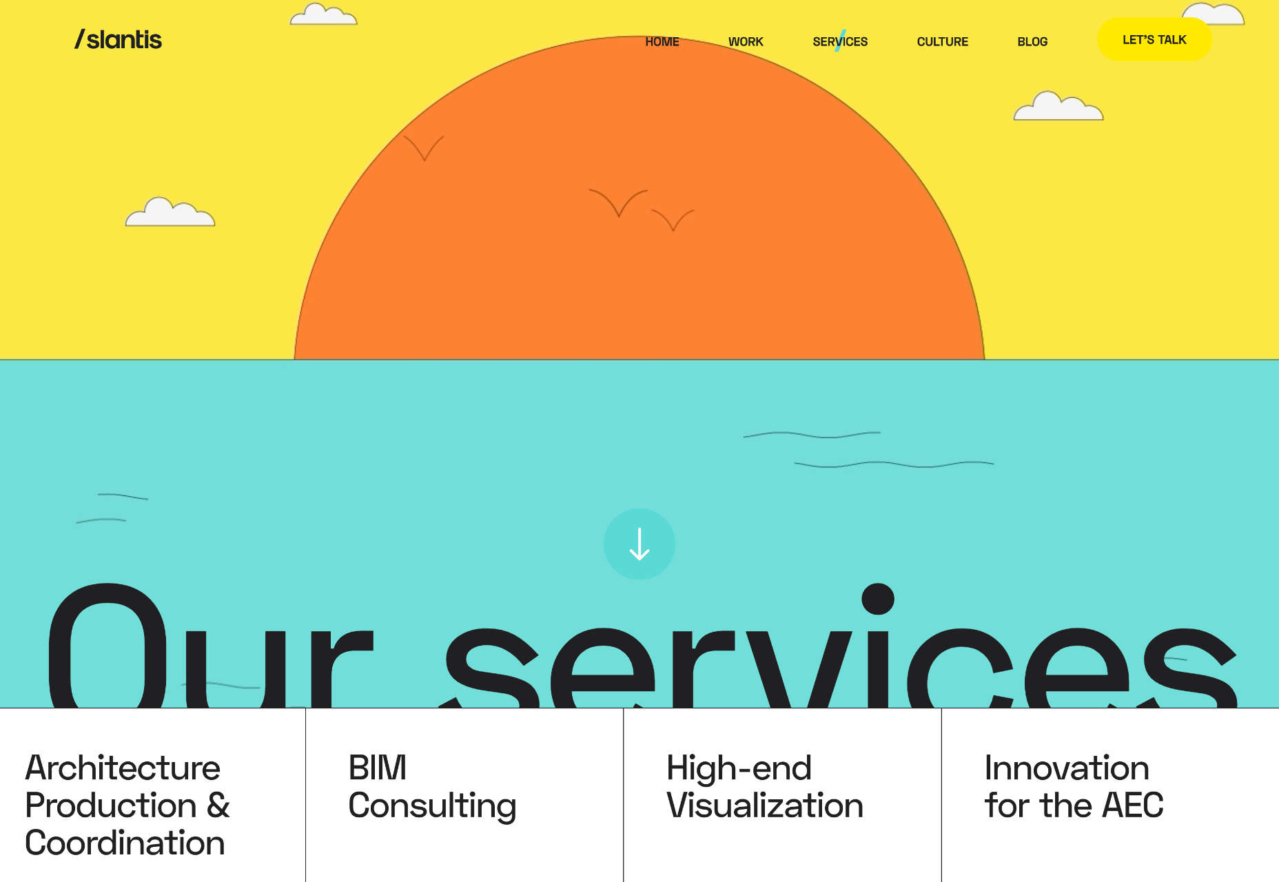
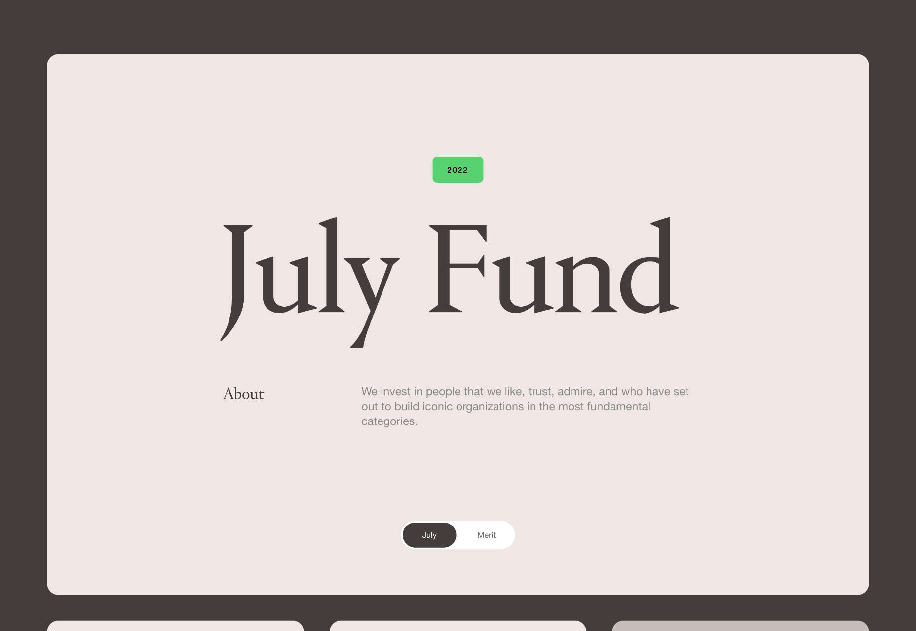
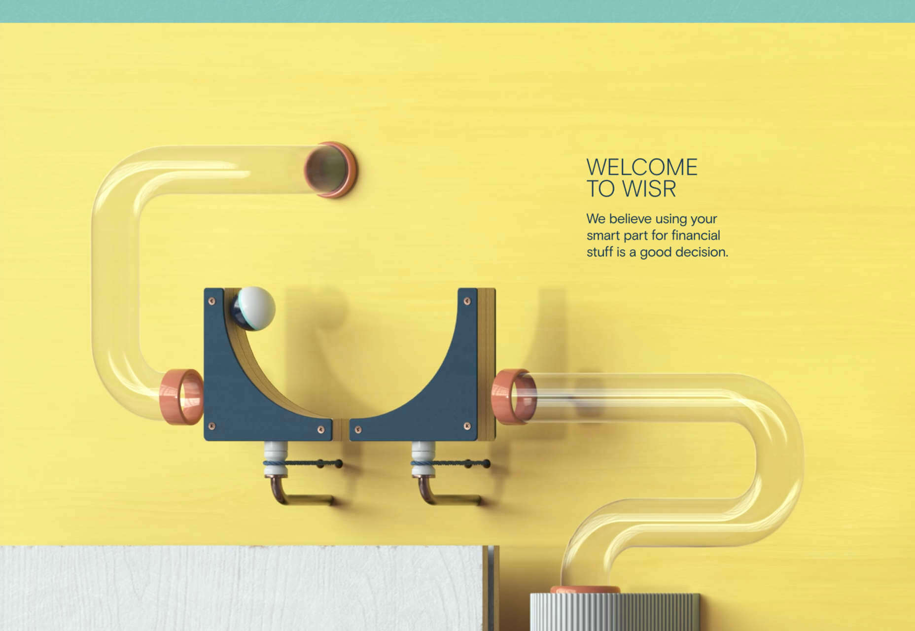
Spring and fresh designs are in the air. This month, it’s obvious that designers are feeling creative with new and interesting concepts that range from a new style for cards, homepage experimentation with multiple entry points or calls to action, and risky typography options.

Here’s what’s trending in design this month.

1. “Flat” Cards

Card-style design elements that allow users to click through to other content aren’t new, but the design of these cards is fresh and interesting.

Rather than more heavily designed cards with shadows and layers of content, flat styles are trending. Expect this trend to explode thanks to usage by Google for a shopping experience page.

The Google example below is interesting because Google’s Material Design guidelines are what helped card-style elements grow in popularity previously. However, those cards did include more layers, color options, buttons inside the cards, and shadows.

Today’s trending cards are completely flat. And beautiful.

Each of these websites does it in a slightly different way.

Heartcore, a consumer technology VC company, uses a series of flat cards as a navigation element to help users find their way through the website. Each features a bright color background with an illustration and a simple text block.

Each card has a nice hover state where only the illustration zooms inside the card frame. This is an interesting effect because it is exactly the opposite of the previous iteration of cards, which zoomed the entire card as a hover state.

Google Shopping uses that whole card bounce hover state (plus a not-so-flat shadow) for each card. The initial design is sleek with the pairing of white and image cards with simple text in each. You are enticed to click around to see what happens.

Click on Greece is a travel website design that uses simple cards with a minimal color and text overlay. The consistency of these cards makes the design pop and the beauty of the images draw you in. Each card also has a hover state with a darker color mask to guide navigation and make text elements easier to read.

2. Multiple Homepage Entry Points

For a long time, designers have been working off the philosophy that the homepage should have one direct entry point, creating a direct funnel for the user experience.

These designs throw that idea out the window, with multiple entry points and click elements.

You can think of it as the “create your own adventure” option for these designs.

It can be a risky concept if you are diving into analytics to pay attention to user paths. You want to make sure you know what choices users are making so that you can help them on the journey to the content and information that you want them to get from the visit.

But this type of design scheme does feel somewhat personalized, putting the user in more control.

Parcouse Epicuriens uses three flat card-style elements to help users pick what they want to see from the home page. There’s no other button or direct call to action, which is somewhat uncommon in today’s website design landscape. Users have to pick from one of the cards, scroll, or enter using the hamburger menu icon.

Tasty Find uses search options to help users start their journey. What’s interesting here are the choices – search for the food you want, pick something random, or (in the small print) find even more options. Users get three choices to begin their journey with the website.

What’s interesting is how simple this complex user journey looks. The design is easy to digest, but so many options could overwhelm users. This is one of those situations where you have to watch return search data and information and weigh the risk versus the reward of so much choice. It’ll be interesting to watch this design over time and see if the options decrease in number.

Accord also has several levels of user engagement opportunity. Option 1: Every block contains a click element. Option 2: Use the search at the top to narrow choices. This is an interesting configuration as the homepage for an e-commerce website because they get right to product selection and shopping without a softer sell or introduction.

3. Risky Typography

Typographic risk has been an ongoing theme for a little while. Designers are embracing experimental and novelty typefaces to stand out in the cluttered website space. Sometimes it works beautifully, and other times, it can fall short.

Here, each of these trending website designs uses a risky typography treatment. The risks are a little different for each design, from readability to comprehension to font delivery.

How Many Plants has duel typography risks: A funky typeface paired with odd word breaks. Interestingly enough, readability isn’t as big of a concern as you might think. This is likely because there aren’t many words, and they are short. Plus, the imagery ties in nicely.

Do you notice a similarity between How Many Plants and The Great Lake? The typography has the same style with a blocky, slab, sans serif with alternating thick and thin strokes. (It’s the same font.)

The risk in the typography design for The Great Lake isn’t in the homepage display, although you might wonder what the design is about. It is carrying this font throughout the design. While it looks great large and with only a few words, it gets a little more difficult the more you see it. This type of mental reading weight can be difficult for visitors over time, creating an element of risk.

Zmaslo uses an interesting typeface with a liquid effect on top of an unusual word. That combination of text elements makes you think hard to read the homepage, despite its neat looks. The risk here is weighing visual interest against comprehension. Depending on the audience, this risk can be worth the chance.

Conclusion

Spring always seems to be that time of year where designers start thinking about new, fresh design elements. That might explain some of the “riskier” design choices and experimentation here.

Regardless of the motivation, it is always fun to see the creative stretch happen. It can be even more interesting to see what elements from these trends continue to grow in the coming months.

Source

The post 3 Essential Design Trends, May 2021 first appeared on Webdesigner Depot.


Source de l’article sur Webdesignerdepot