 Dark themes are everywhere these days.
As human beings continue to spend more of their time interacting with technology, dark themes provide a more relaxing way to engage with the digital world. More often than not, these themes are easier on the eyes, more attractive, and perfect for the dedicated user.
Throughout 2020, countless leading brands have debuted their own version of the dark theme. Google has a solution for your Drive, while Apple and Android have built dark theme performance right into their operating systems.
If you haven’t learned how to make the most out of dark mode yet, then you could be missing out on an excellent opportunity to differentiate your design skills, and earn more clients going forward.
Why Dark Mode?
Before we dive too deeply into the possibilities of creating your own dark theme, let’s examine what dark mode is, and why it’s so effective.
Ultimately, dark themes are created to reduce the amount of luminance emitted by everything from your desktop and laptop, to your smartphone and smartwatch. Dark themes help to improve the visual ergonomics of design, by reducing eye strain, adjusting brightness to suit current lighting conditions, and more. Additionally, many dark mode offerings are also fantastic at conserving battery life.
Here are some of the main benefits of adding dark themes to your design portfolio.
- Better user experience: A focus on user experience is one of the most important trends of the digital age. You need to be willing to deliver incredible experiences to everyone who visits your website if you want to stand out today. Dark mode reduces everything from eye strain, to battery power consumption. This helps to keep customers on a website for longer.
- Innovation and cutting edge appeal: Most companies want to prove that they can stay on the cutting edge of their industry. The ability to offer an opt-in dark mode version of a website theme or appearance can help your clients to stand out from the crowd. As the environment becomes more mobile-focused, more companies will be looking for designers that can provide the best mobile experiences.
- Support for universal design: Dark mode isn’t just great for people who have light sensitivity at night. This solution could be more comfortable for visually-impaired users who would struggle with eye strain when visiting your websites otherwise. If you want your content to be more inclusive for a wider range of viewers, then learning how to design for dark mode is a good way to start.
Best Practices When Designing for Dark Mode
Designing for dark mode is easier than you’d think. Most of the time, it involves simply thinking about how you can replace some of the brighter, more overwhelming aspects of your site, with something deeper and darker.
Here are some useful tips that will get you moving in the right direction.
1. Experiment with Colors
A big issue for a lot of web designers when it comes to developing a dark mode solution is that they get too caught up with things like pure white text against pure black backgrounds. However, this high-contrast option can be a little much after a while.
It’s often much easier to use a dark grey as your primary surface color, instead of a true black. Additionally, rather than using bright white, think about slightly off-white alternatives that will be warmer to the eye.
Experiment with surfaces and color combinations that are unlikely to cause too much eye strain. Dark grey foundations often offer a wider range of depth, too, because you can demonstrate shadows on grey.
Additionally, when you are experimenting with colors, remember that saturated colors often vibrate painfully against very dark surfaces, making them harder to read. Desaturating your colors will help to reduce the contrast and make your websites more welcoming.
Lighter tones in the 200-50 range will have better readability on dark themes. However, you can always experiment with your choices. Google Material Design recommends using a contrast level of around 15:8:1 between your background and text.
2. Consider the Emotional Impact
Much of the effort involved with dark mode design is figuring out how certain colors work together. It’s easy to get carried away with stark contrasts, particularly when you’re used to working with a white background. However, you need to remember that you’re designing for a user that’s primarily looking for an easier and more subdued browsing experience.
While you’re working, remember to consider the emotional aspect of the design too. The emotion in colors can make or break a buyer’s journey in any environment. However, an often overlooked-aspect of color psychology, is that people perceive shades differently when they’re on a black background.
For instance, think of the color green. On a light background, it conveys nature and even financial wealth. However, on a dark background, the same green could come across as something venomous, toxic, or even sickly. It’s important to think about the kind of impressions end users are going to get when they arrive on your site.
3. Give Users the Freedom to Choose
One of the biggest mistakes you can make when you begin designing for dark mode, is thinking that you should focus entirely on your dark themes, and nothing else. This lines you up for a problem if you interact with users who want the best of both worlds. If you’re designing for apps in particular, you’re going to need web pages that can switch naturally between light and dark themes.
Learning how to implement both a dark mode and a light mode option into the desks you create will help you to reach a wider selection of customers. Remember, you’ll need to test the performance and impact of your designs in both themes, to check that they deliver the same kind of experience, no matter how your user chooses to browse.
Although dark mode should offer a different experience to end-users, it still needs to feel as though they’re browsing on the same website. That means that you’re going to need to experiment with the most natural combination of light and dark mode options.
4. Remember the Basics
Remember, although the three tips above will help you to get on the right path for dark mode design, you’ll also need to consider the opportunities and limitations of the platforms that you’re designing for. The kind of dark mode experience you can deliver for Google Chrome websites is going to be very different to what you can create for something running on iOS.
Examining the documentation provided by the system that you’re designing for will help you to develop something with a close insight into what’s actually possible.
Other top tips for dark mode design include:
- Focus on your content: Make sure that your content stands out on the page, without being too overwhelming.
- Test your design: In both light and dark appearances, you need to make sure everything is working as it should be.
- Adopt vibrancy for your interfaces: Vibrancy helps to improve the contrast between your background and foreground.
- Use semantic colors: Semantic colors adapt to the current appearance of a website automatically. Hard-coded color values that don’t adapt can seem more aggressive.
- Desktop tinting: Try experiment with things like transparency and filters to give your websites and apps a slightly warmer tint – ideal for late-night browsing
- Icons: Use individual glyphs and icons for dark and light modes if necessary.
Ready to Design for Dark Mode?
Preparing your web development and design portfolio for an era addicted to dark mode can be a complex experience. You need to think carefully about how people are going to browse through your websites and apps when they’re searching for something more subtle, and less visually overwhelming than the websites that we’re used to making.
The most important thing to remember is that everything on your website or application should look just as beautifully tailor-made in dark mode as it does in light mode. Simply adding a dynamic black background when people want to switch settings in an app isn’t enough. You need to go in-depth with your designs and examine how different fonts, colors, and images work together.
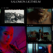
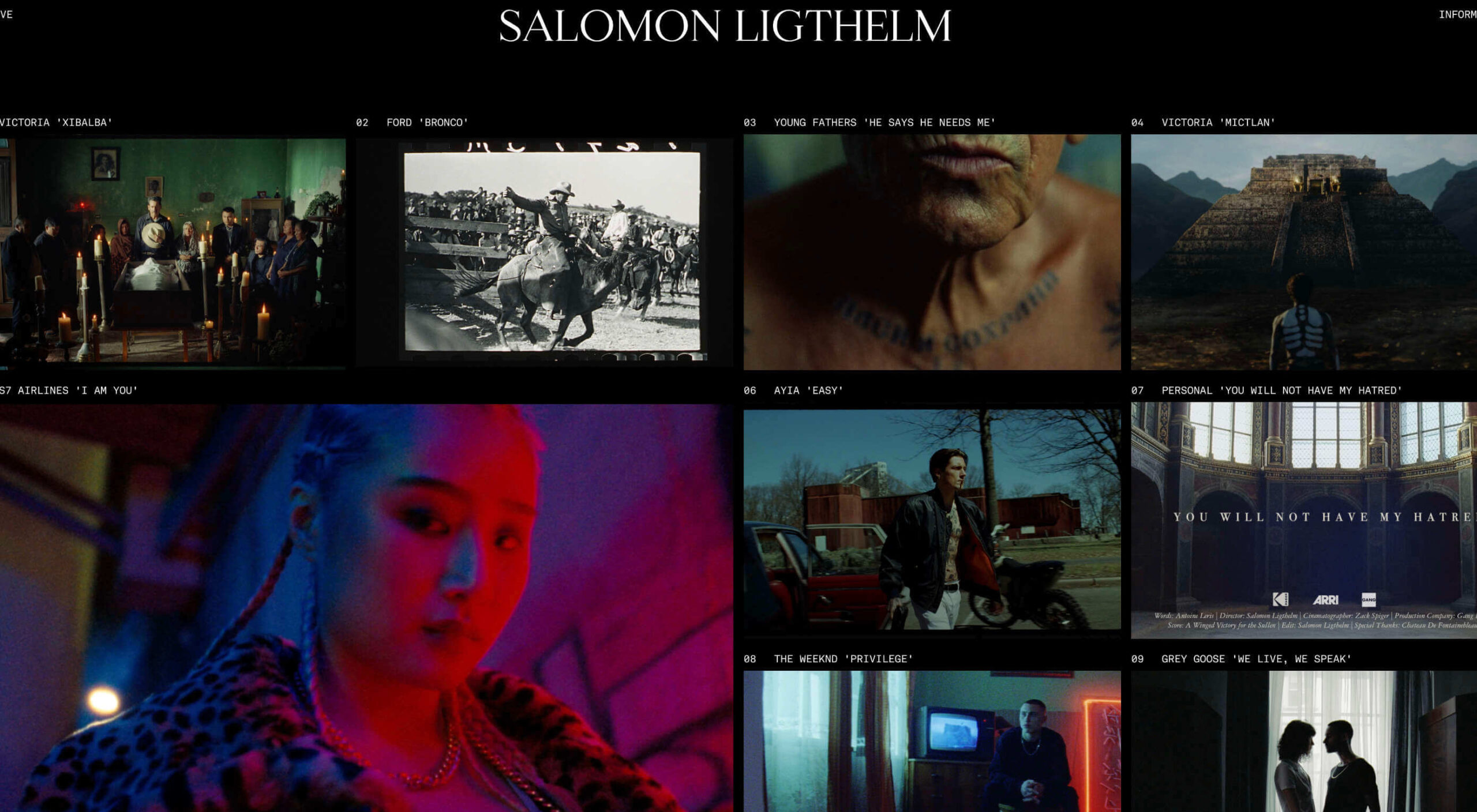
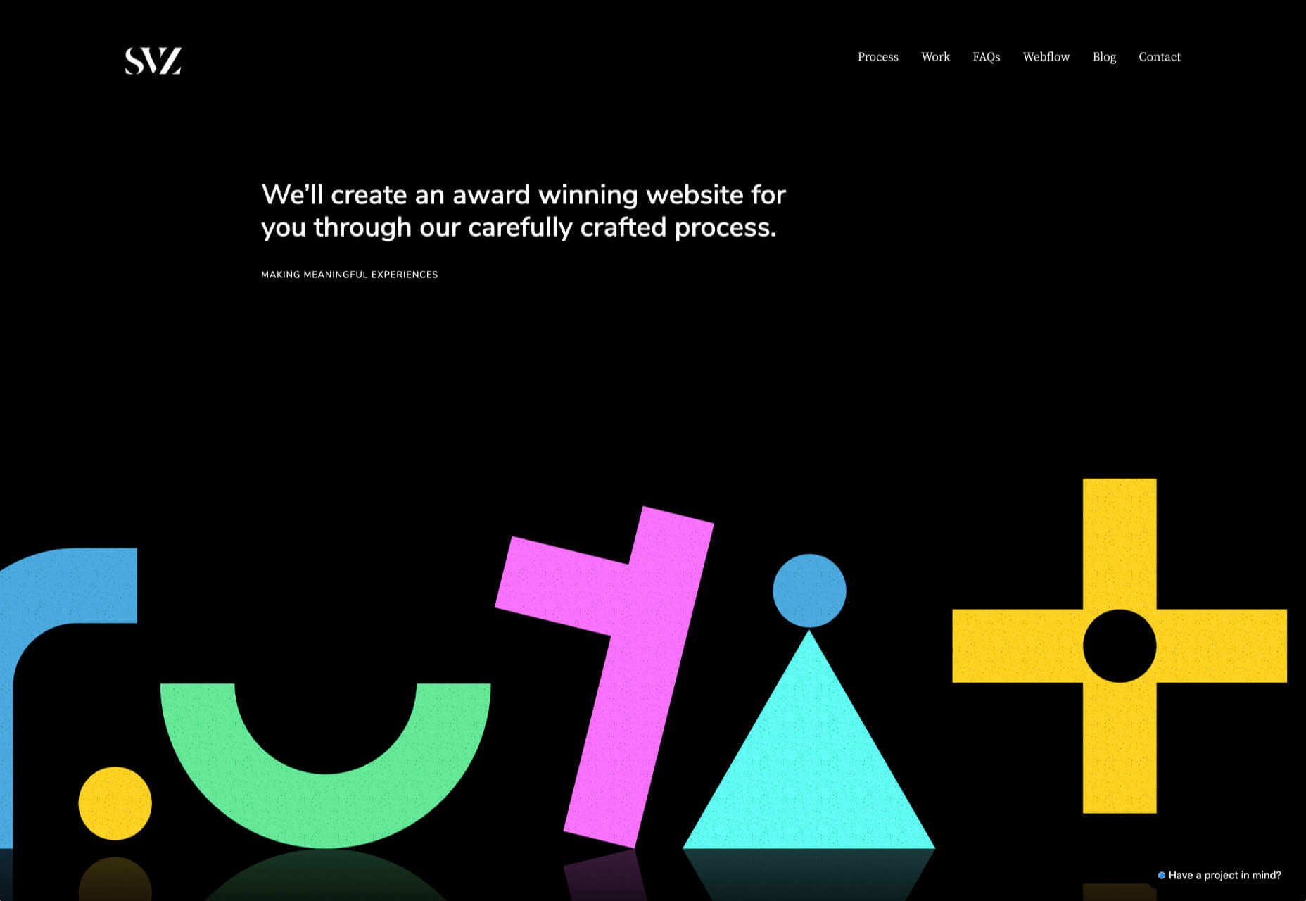
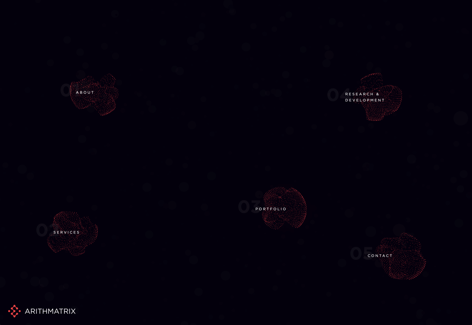
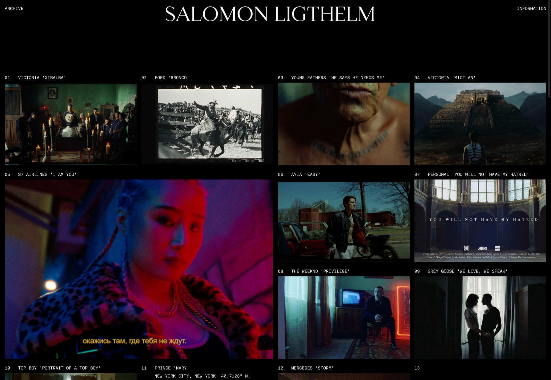
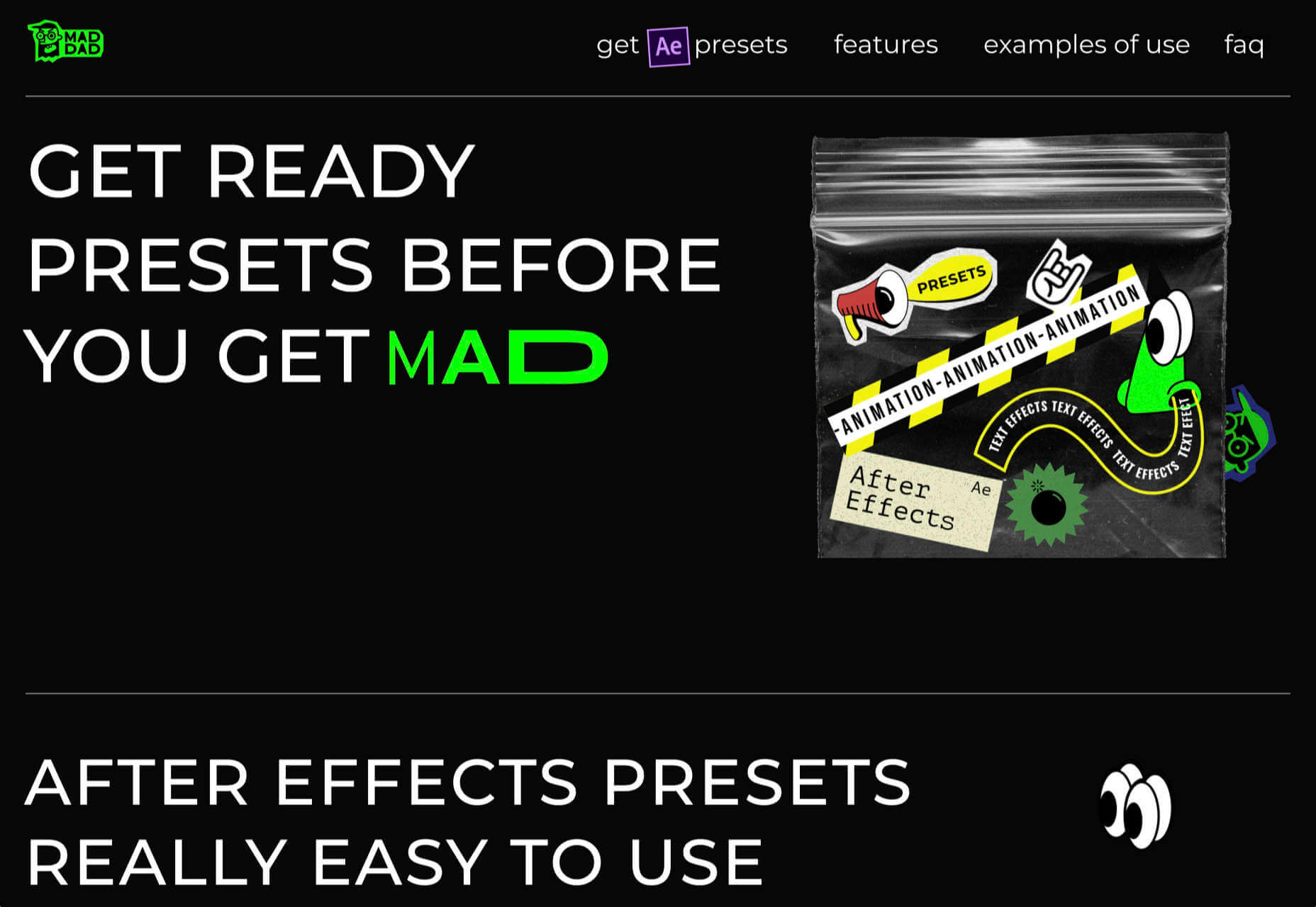
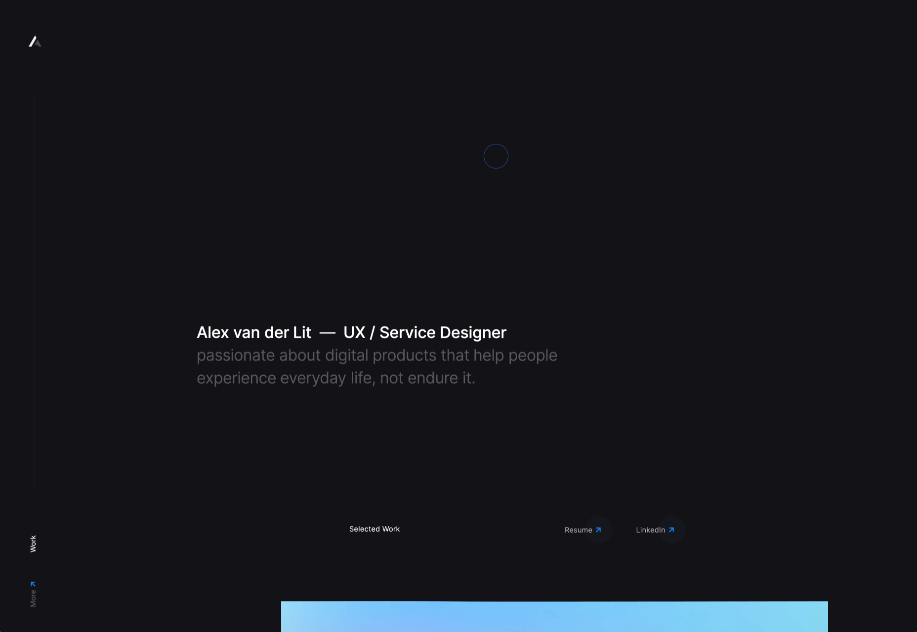
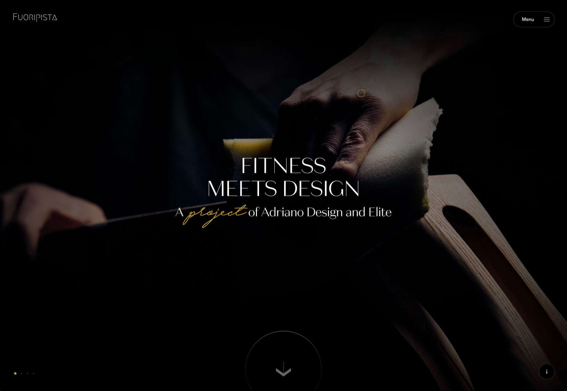
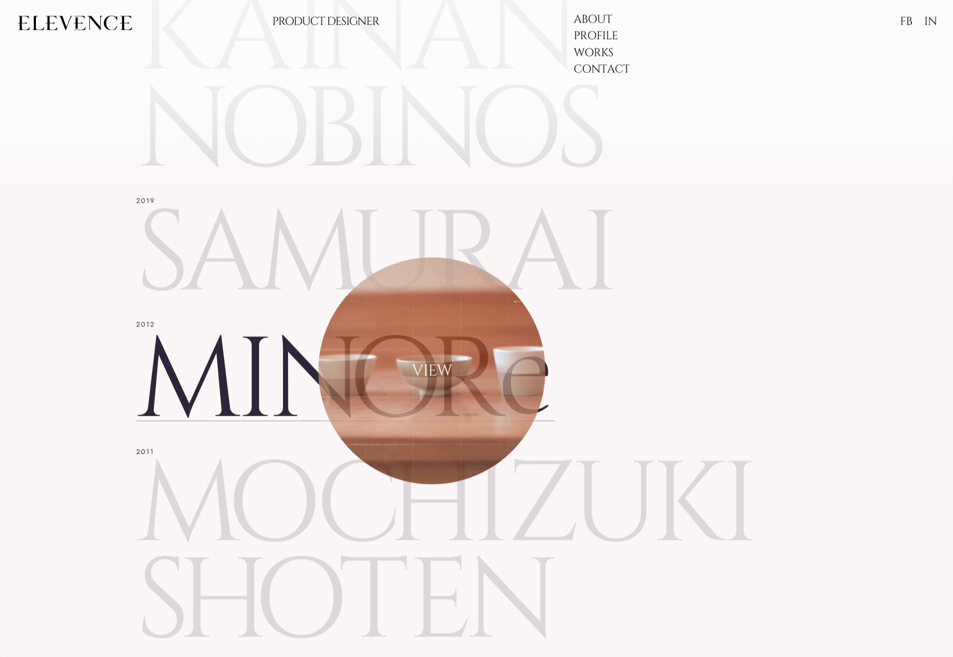
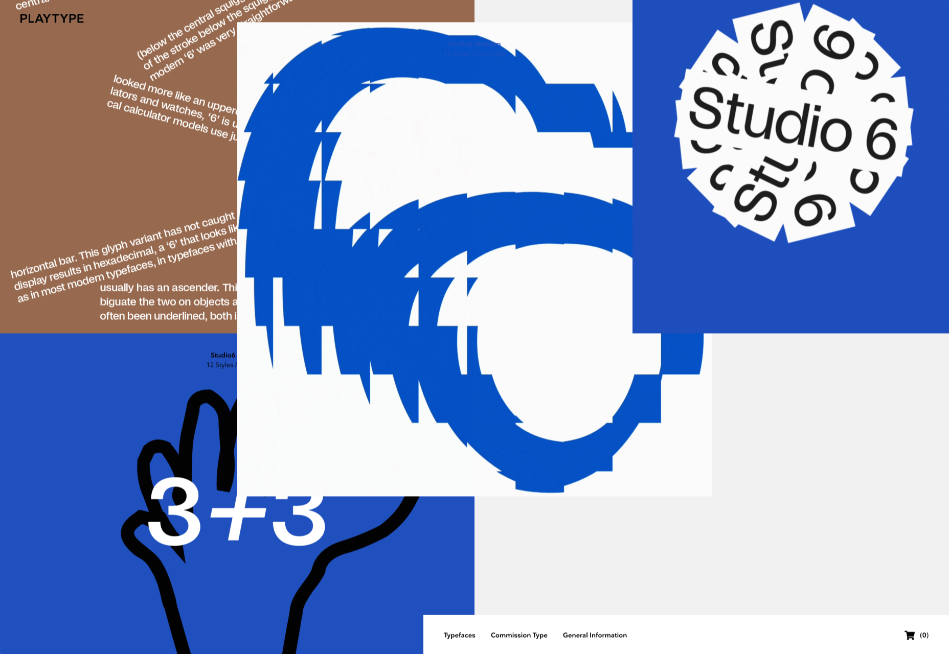
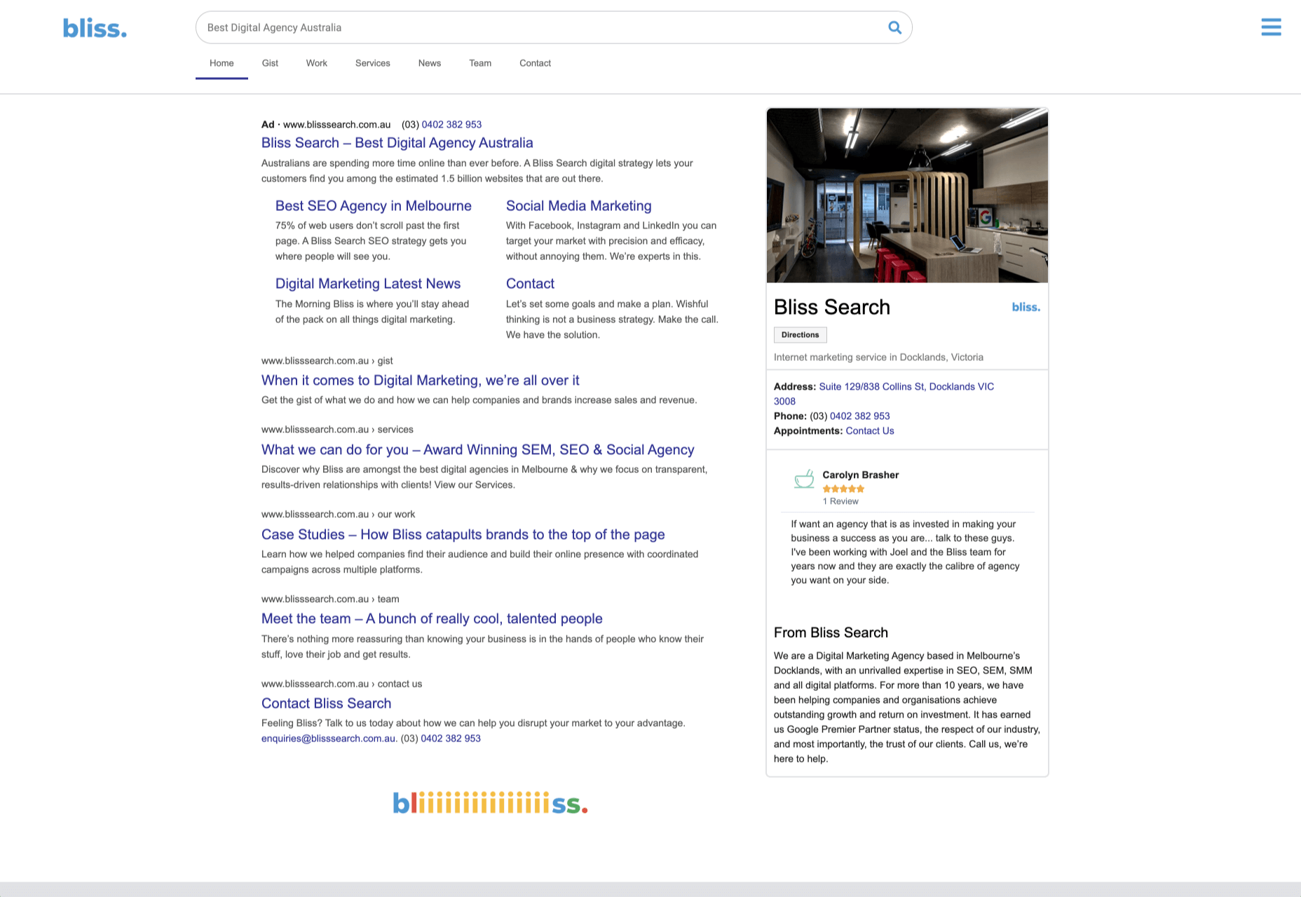
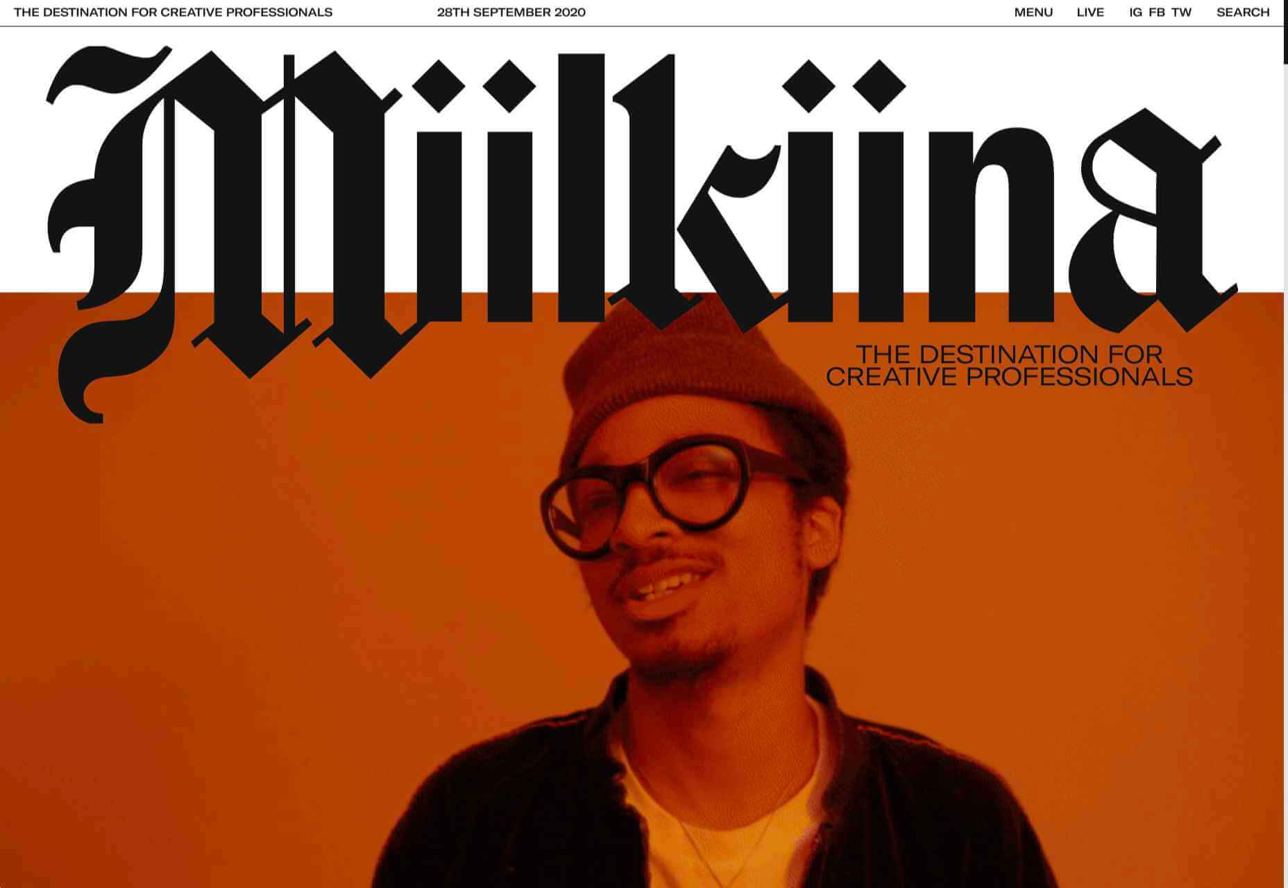
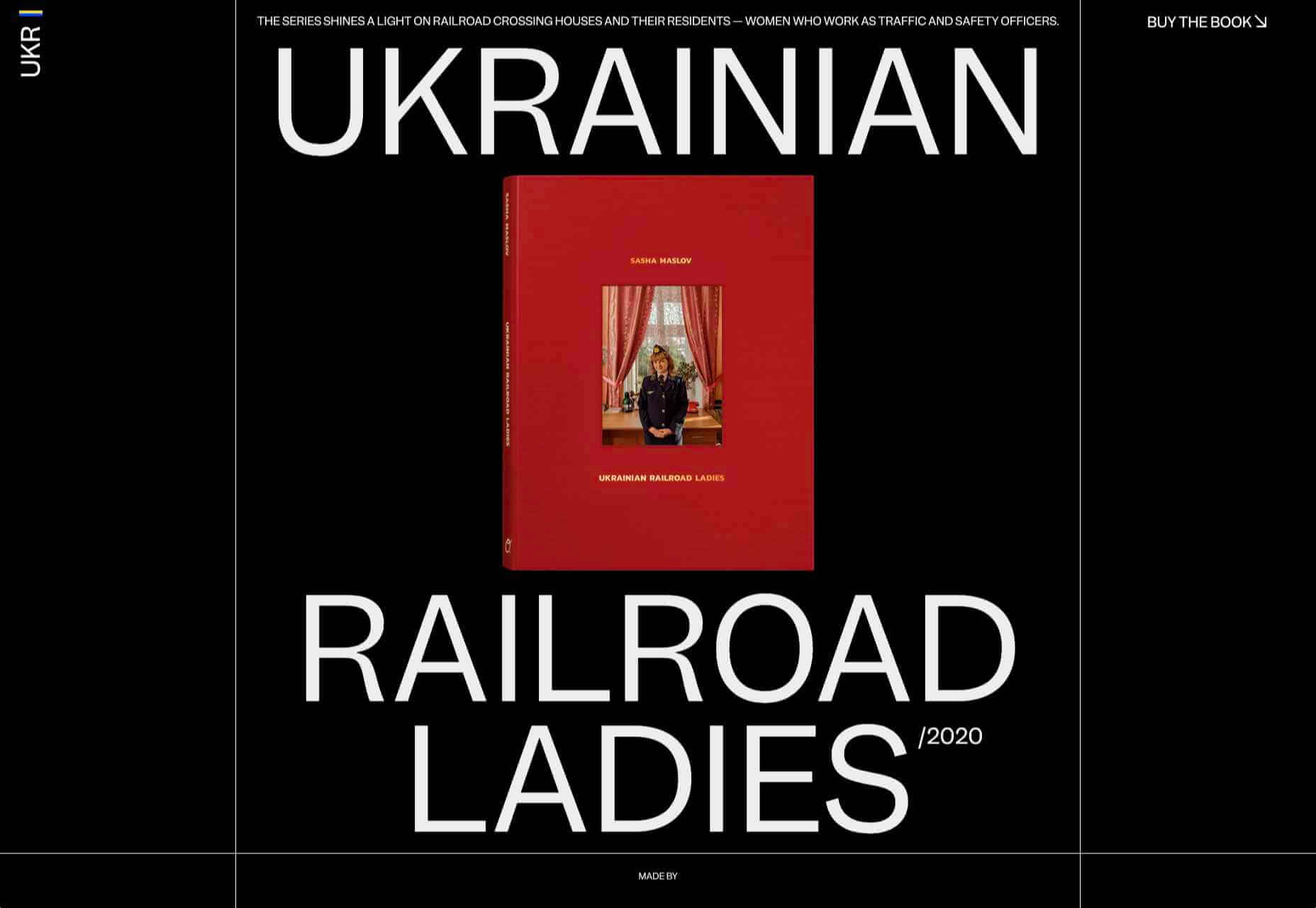
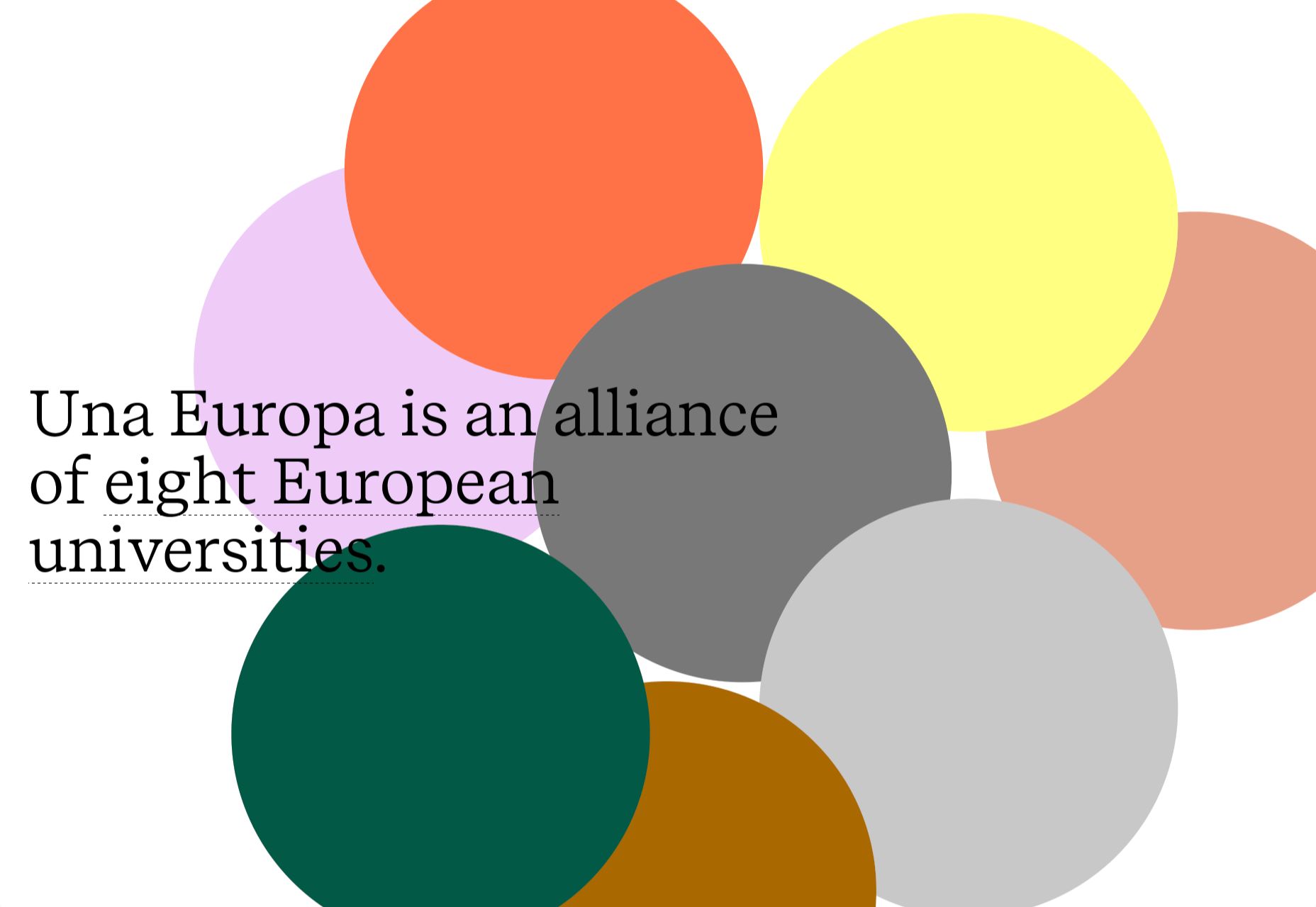
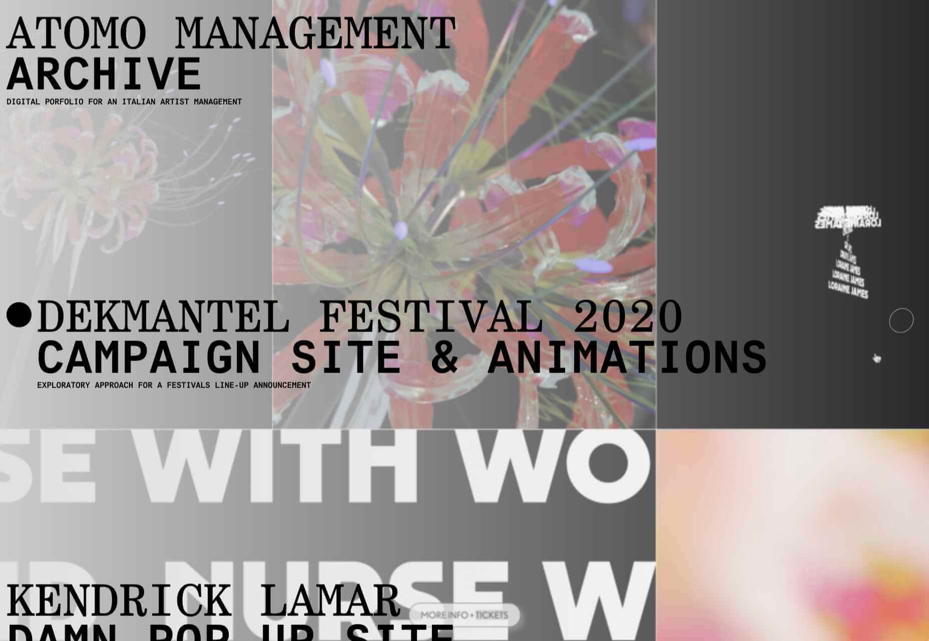
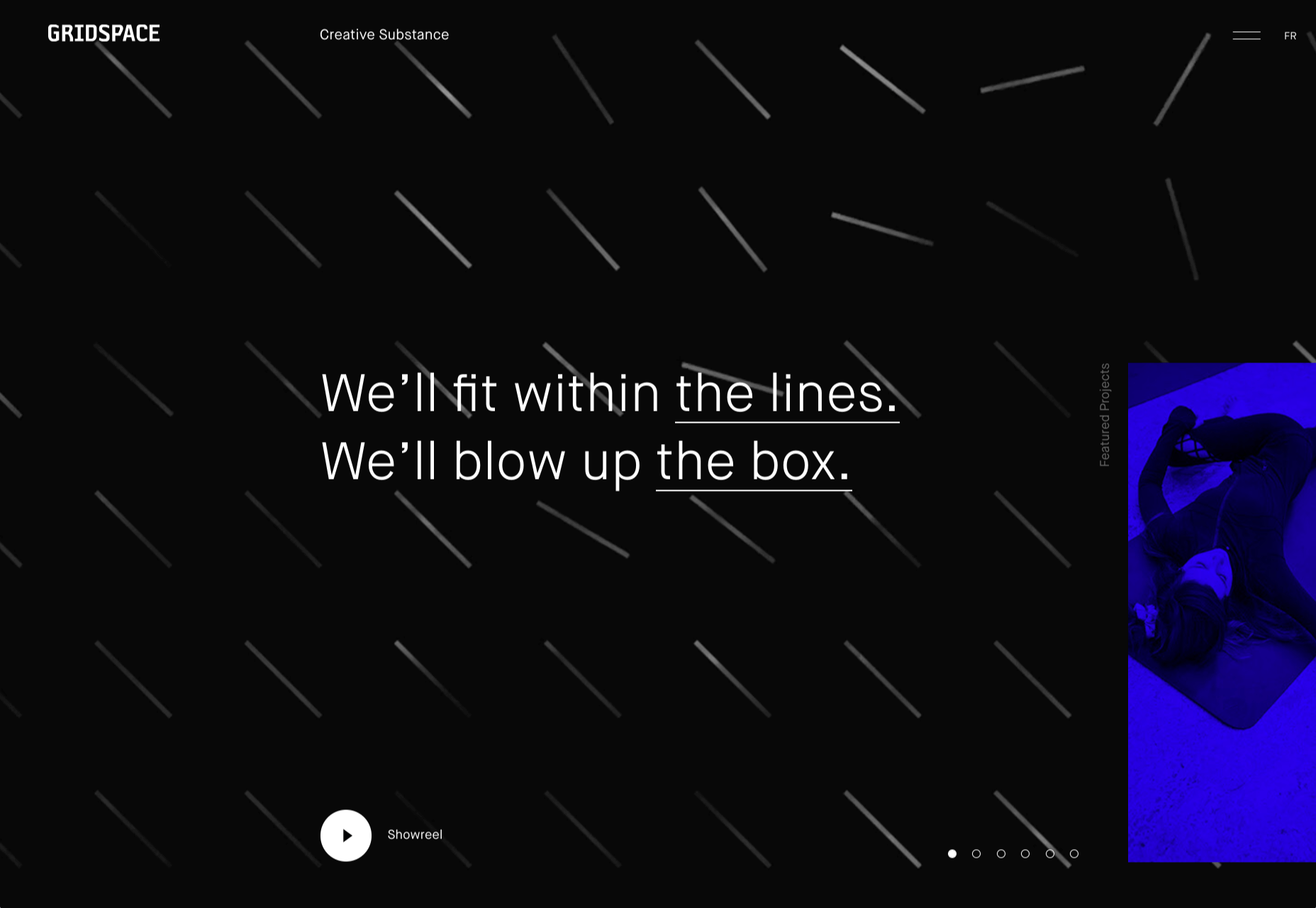
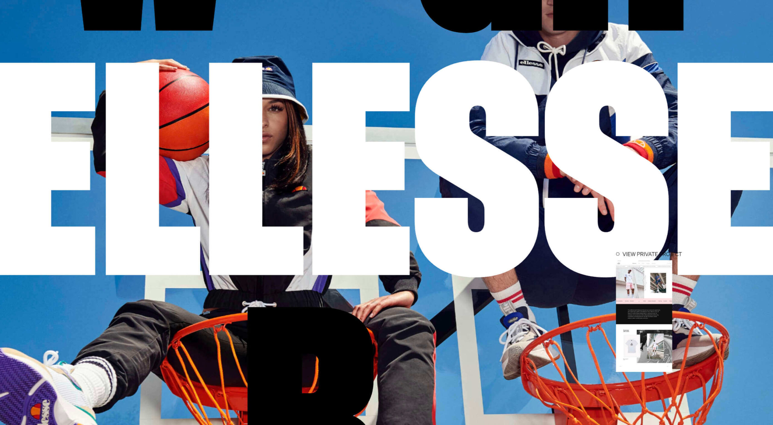
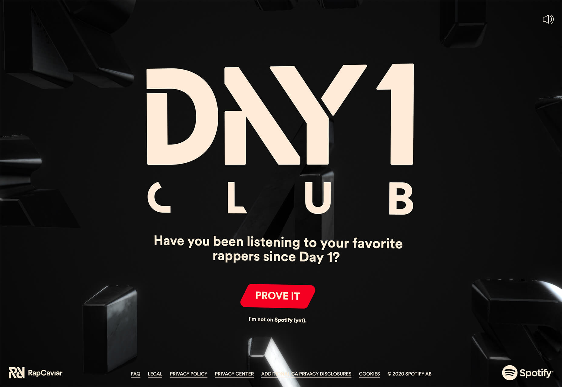
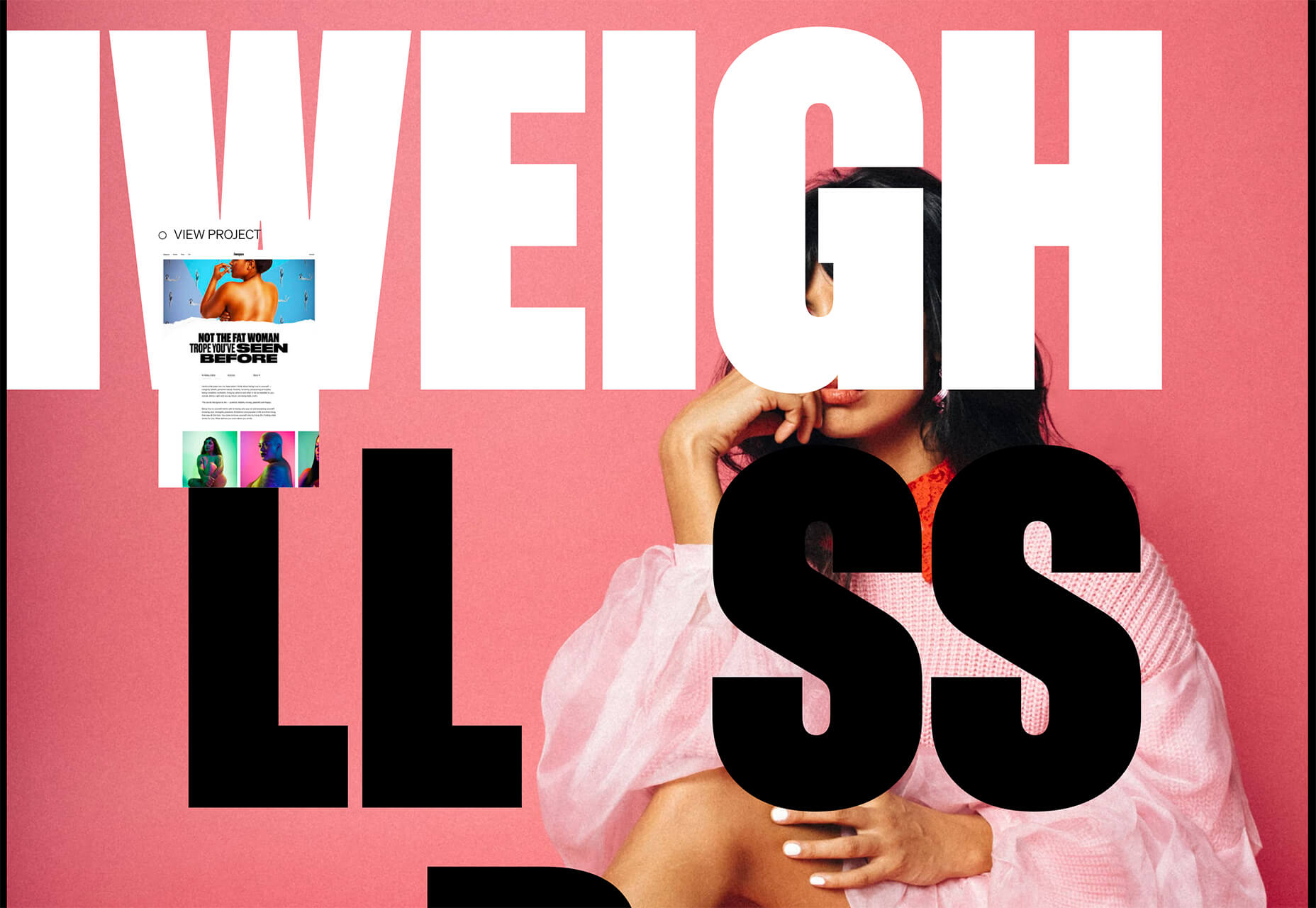
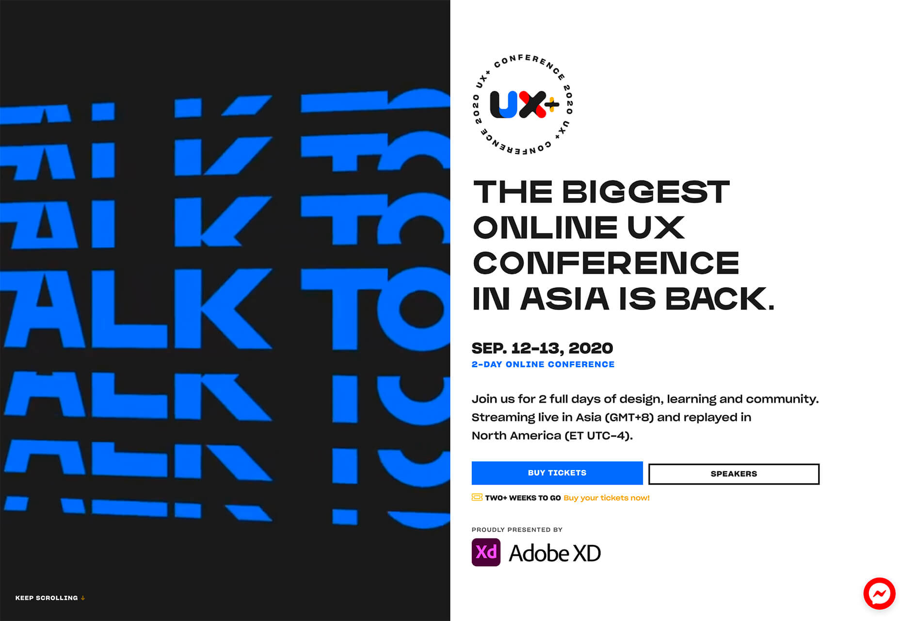
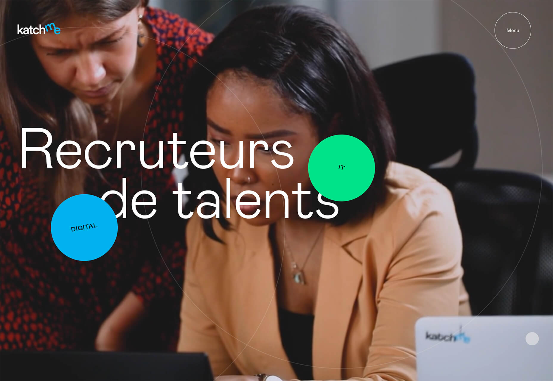
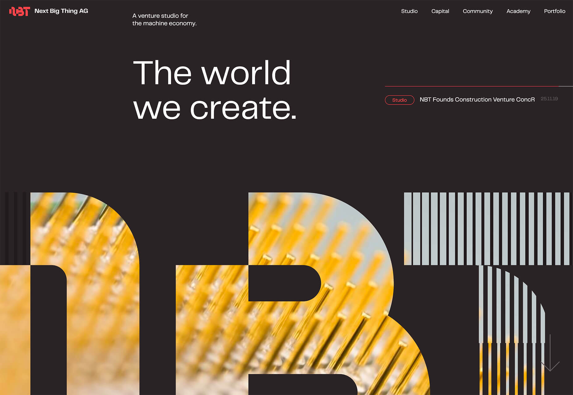
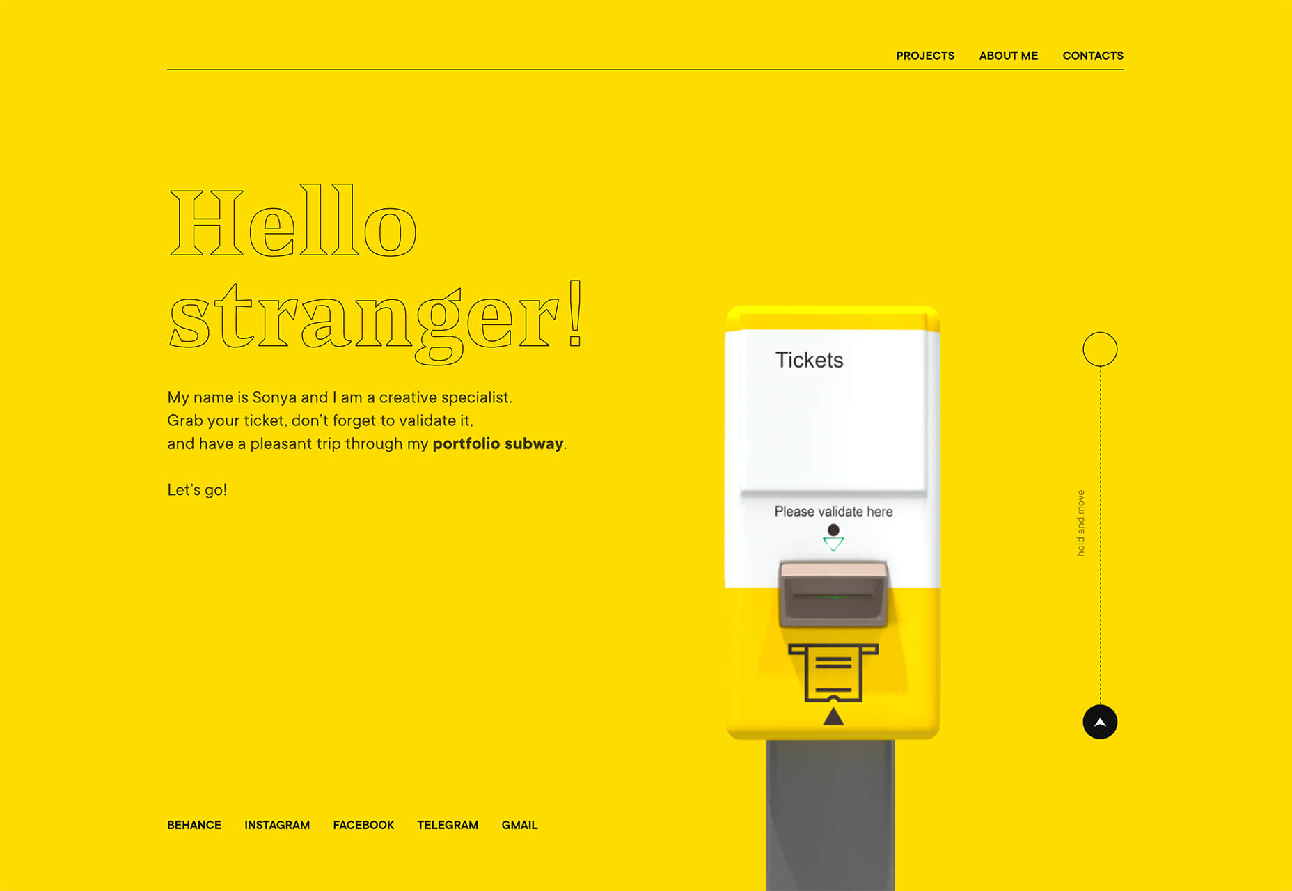
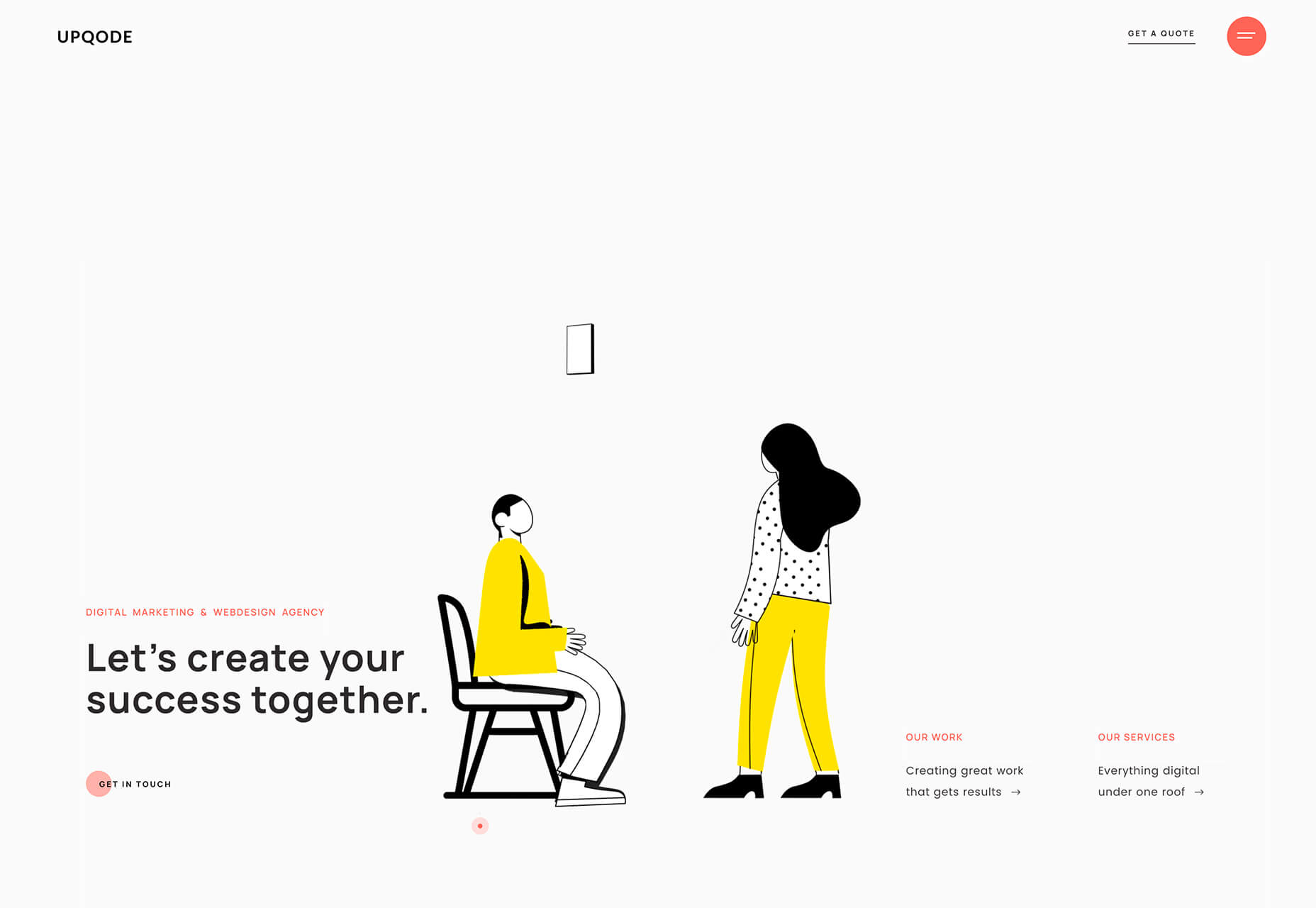
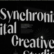
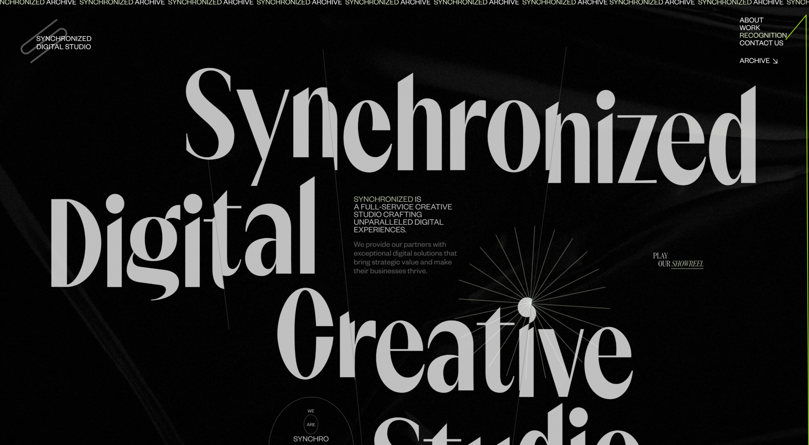
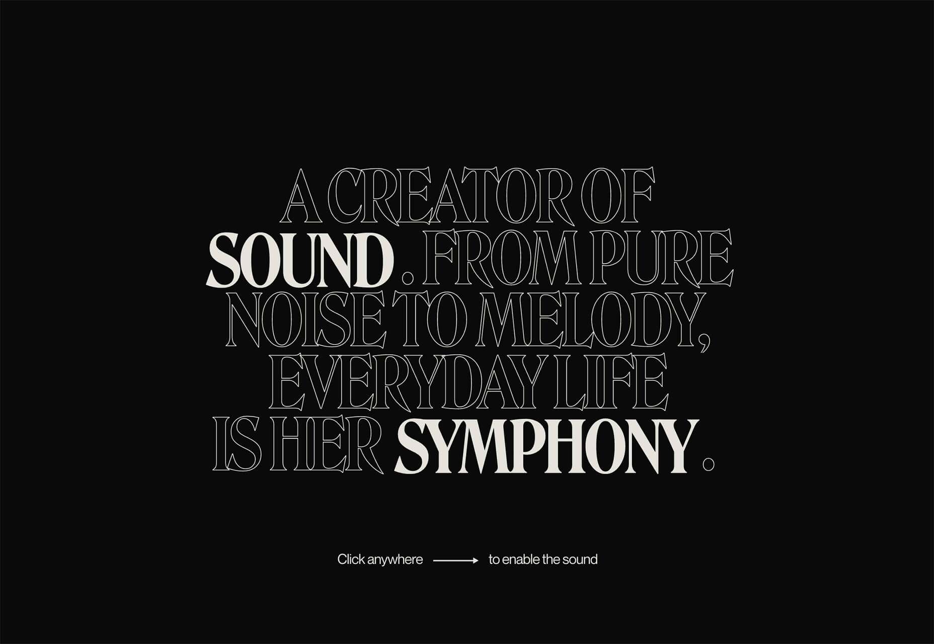
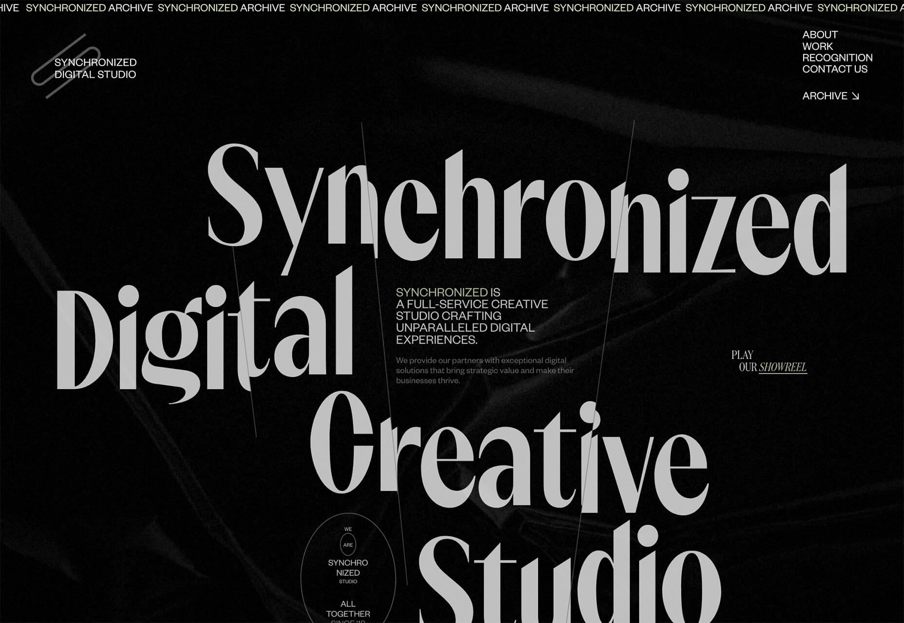
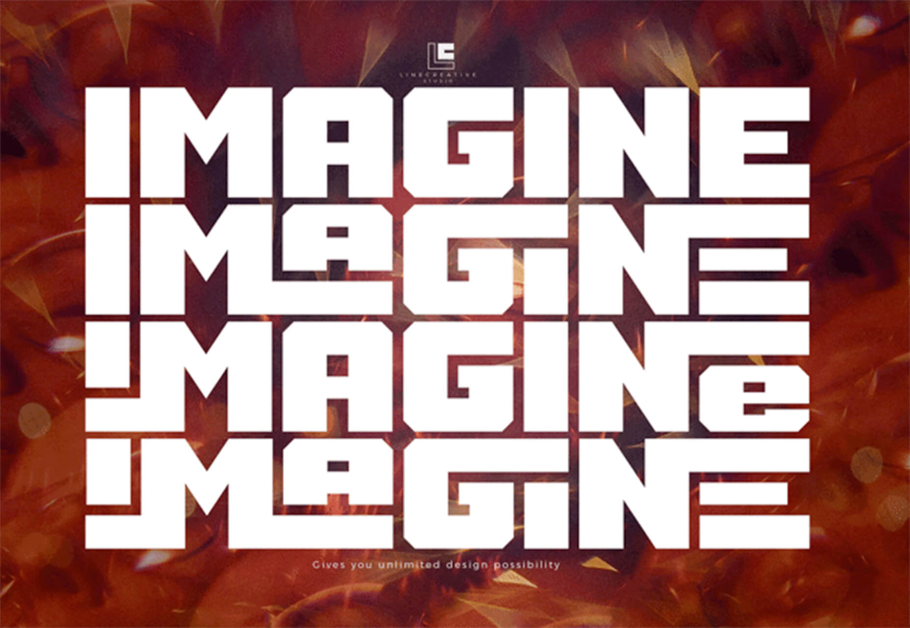
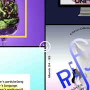
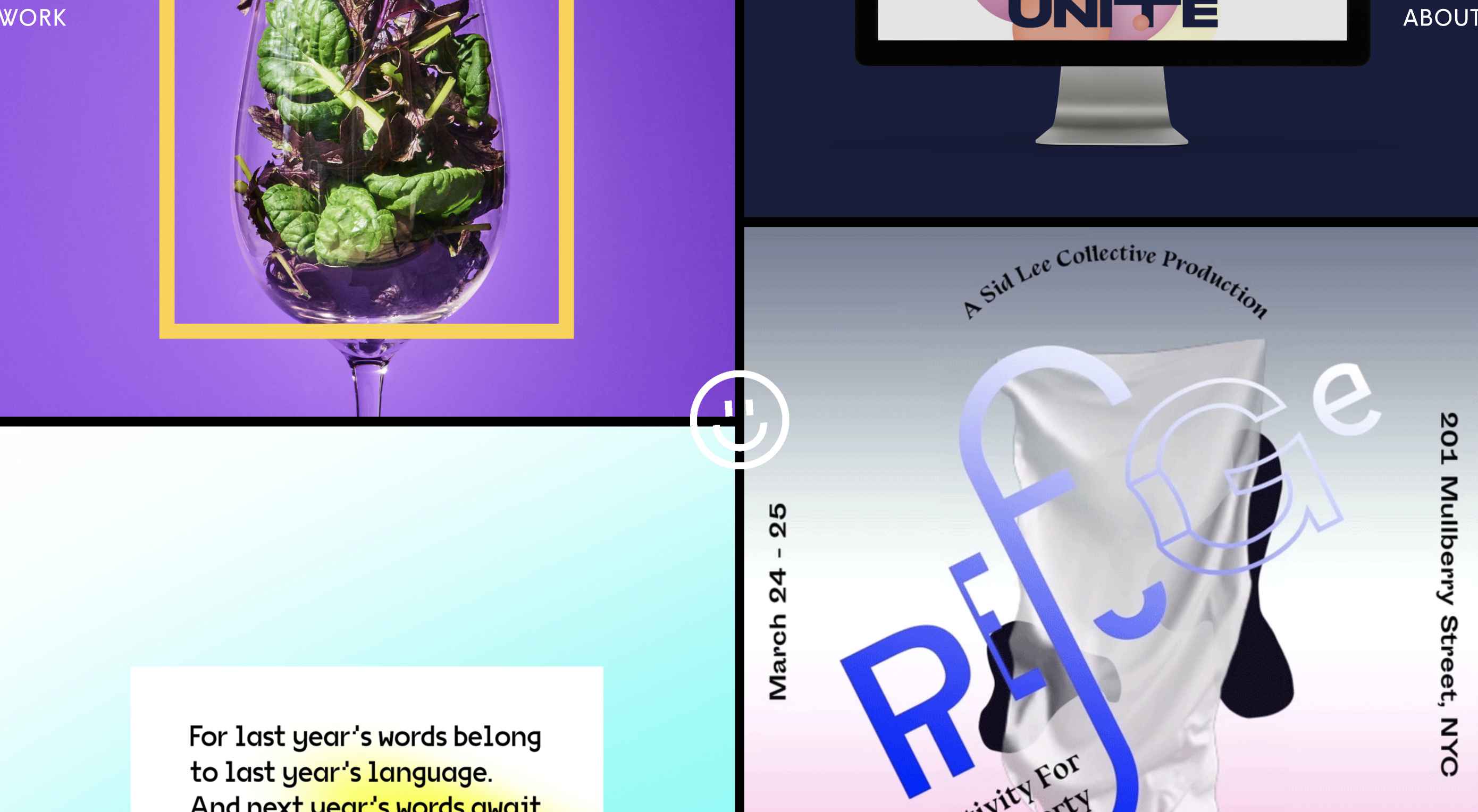
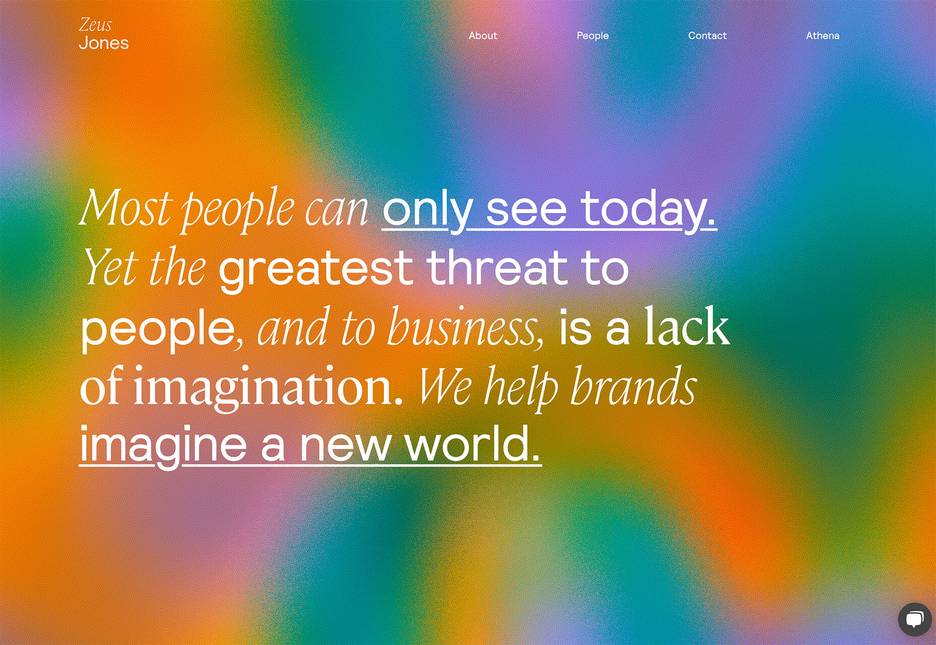
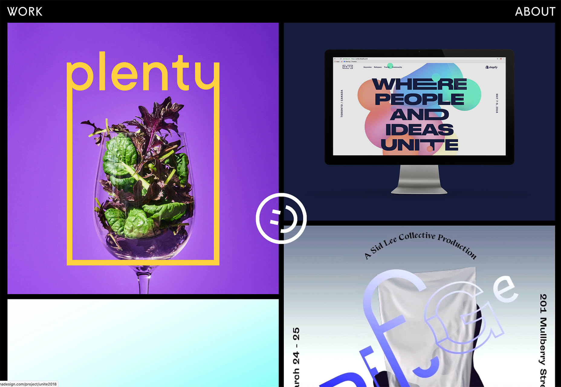
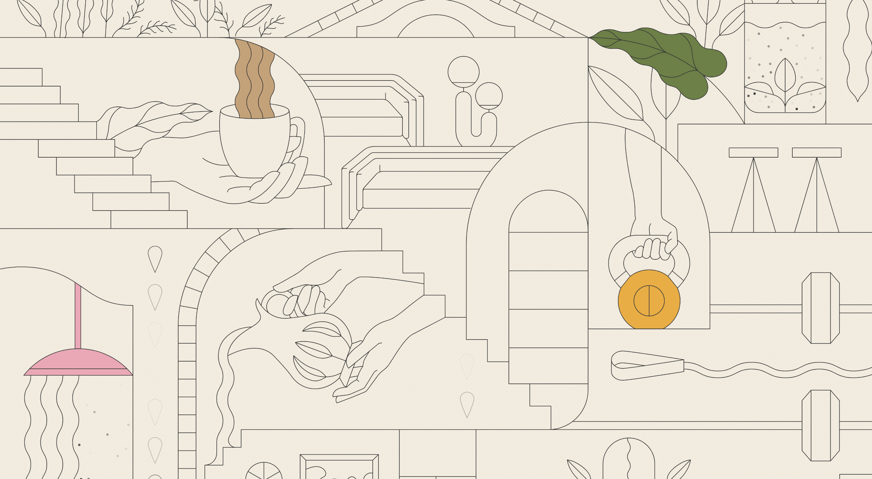 This month we’re going big and bold. Oversized type, strong colors, in-your-face layouts, and little touches of playfulness exude confidence and make a statement. There are some quieter moments too, with thoughtful illustration and more gentle use of color. Animation still features strongly in the details, with circles proving popular in rollover effects. Enjoy.
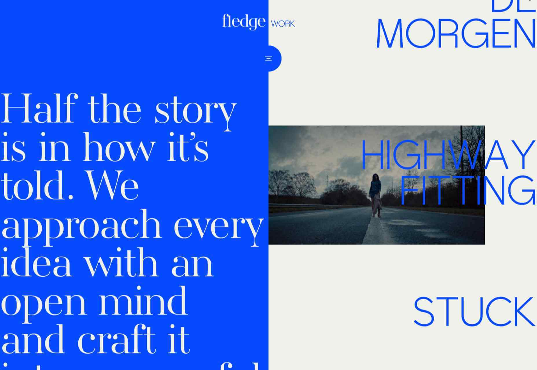
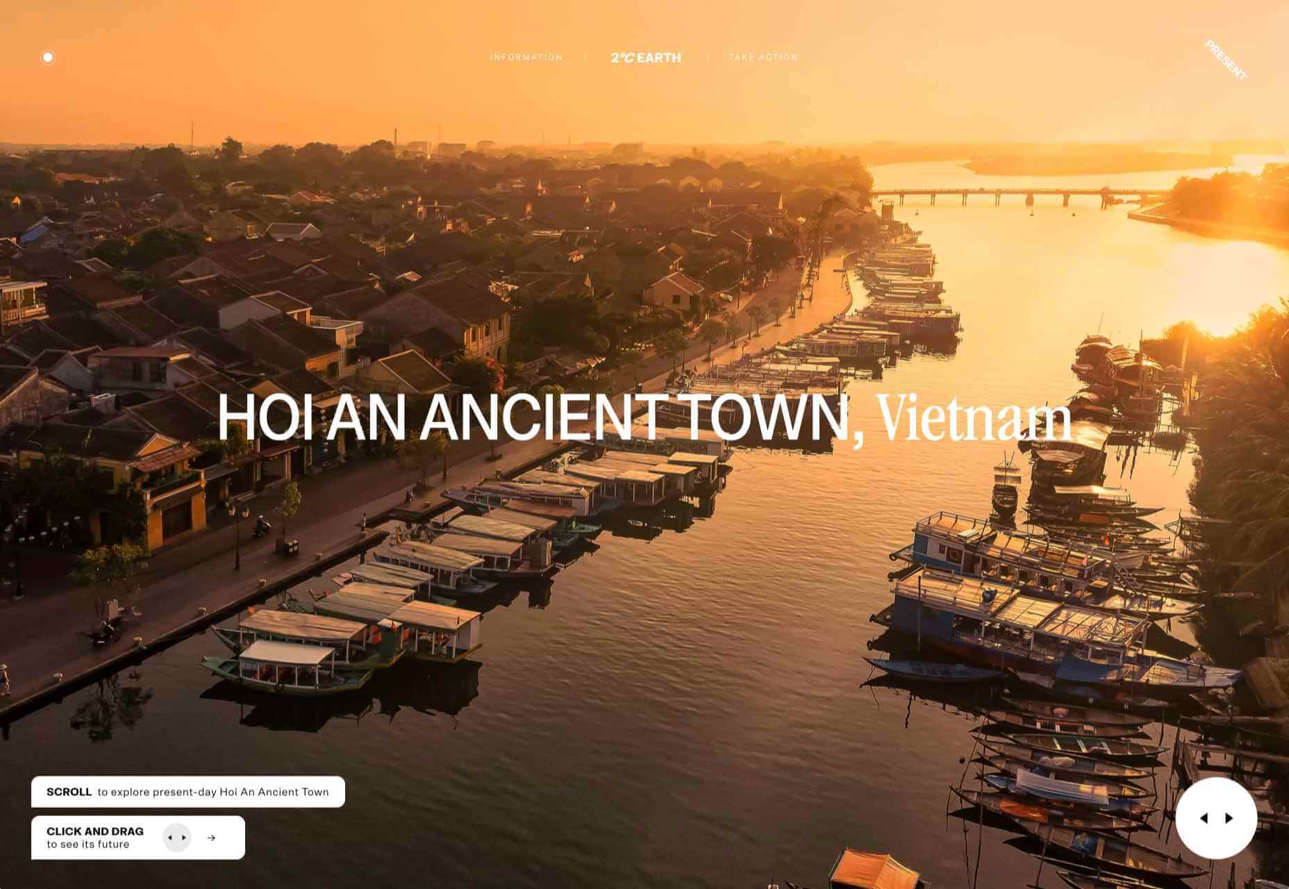


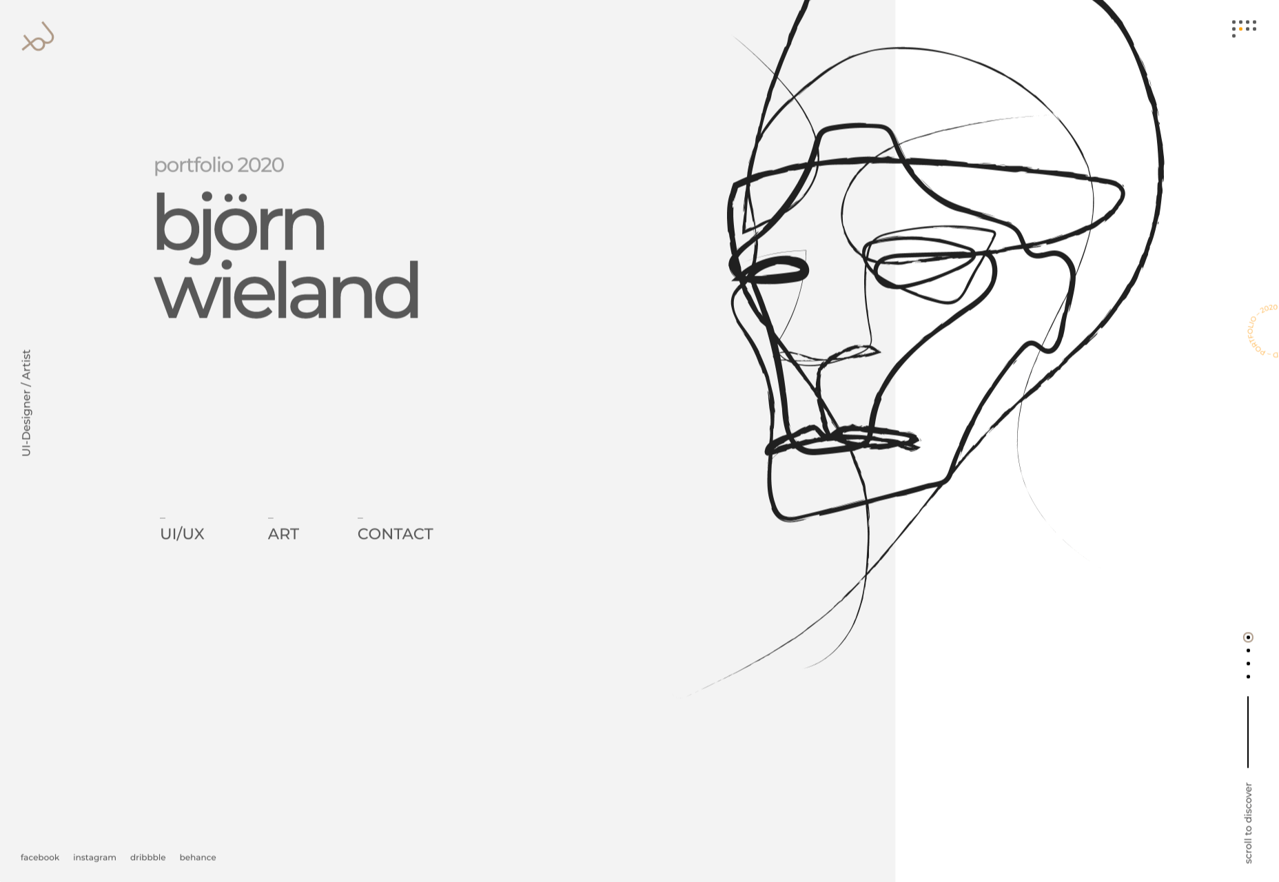
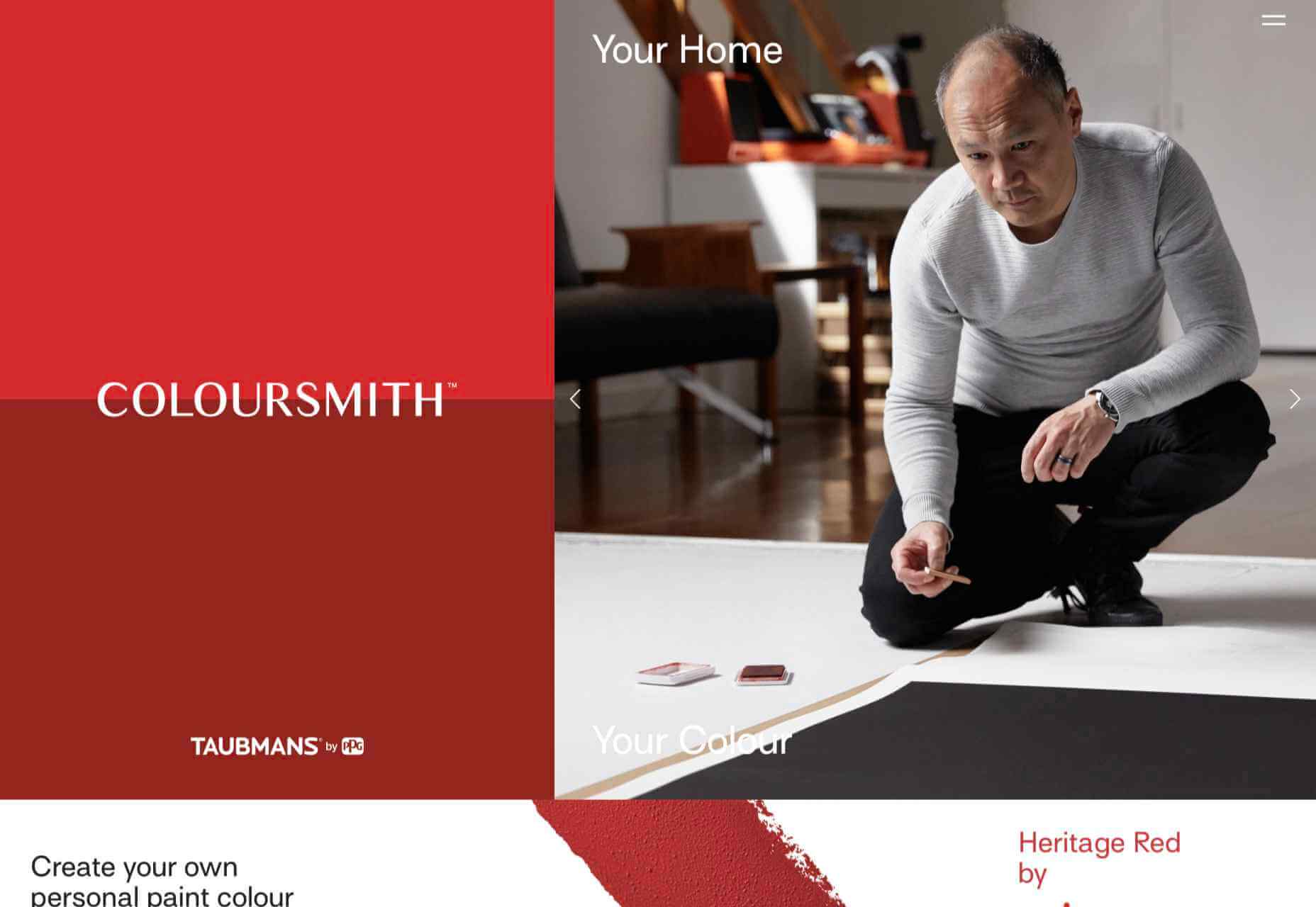
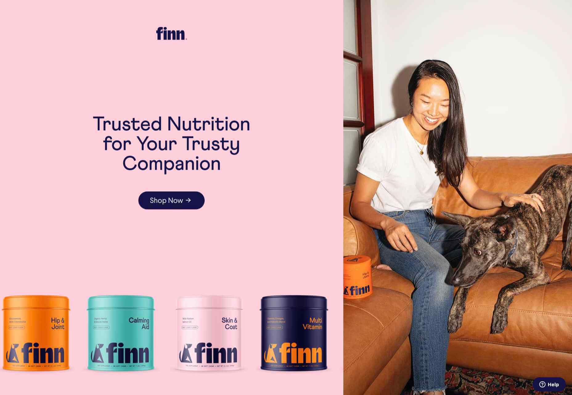
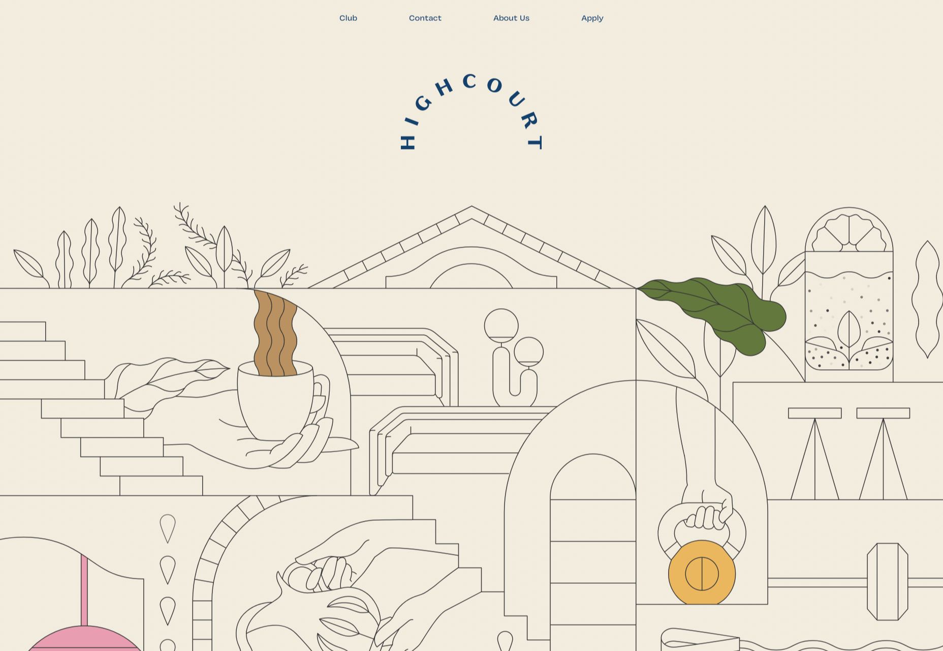
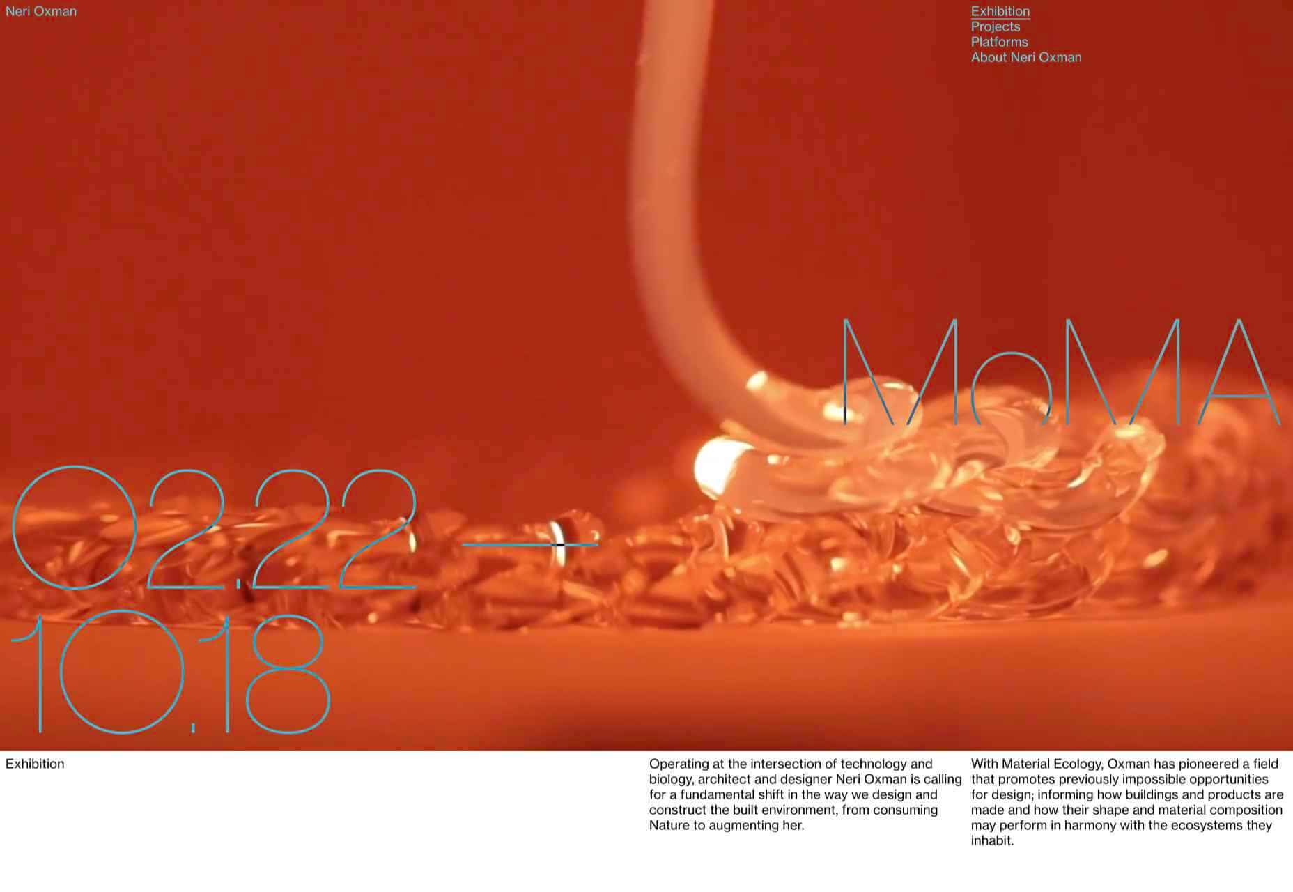
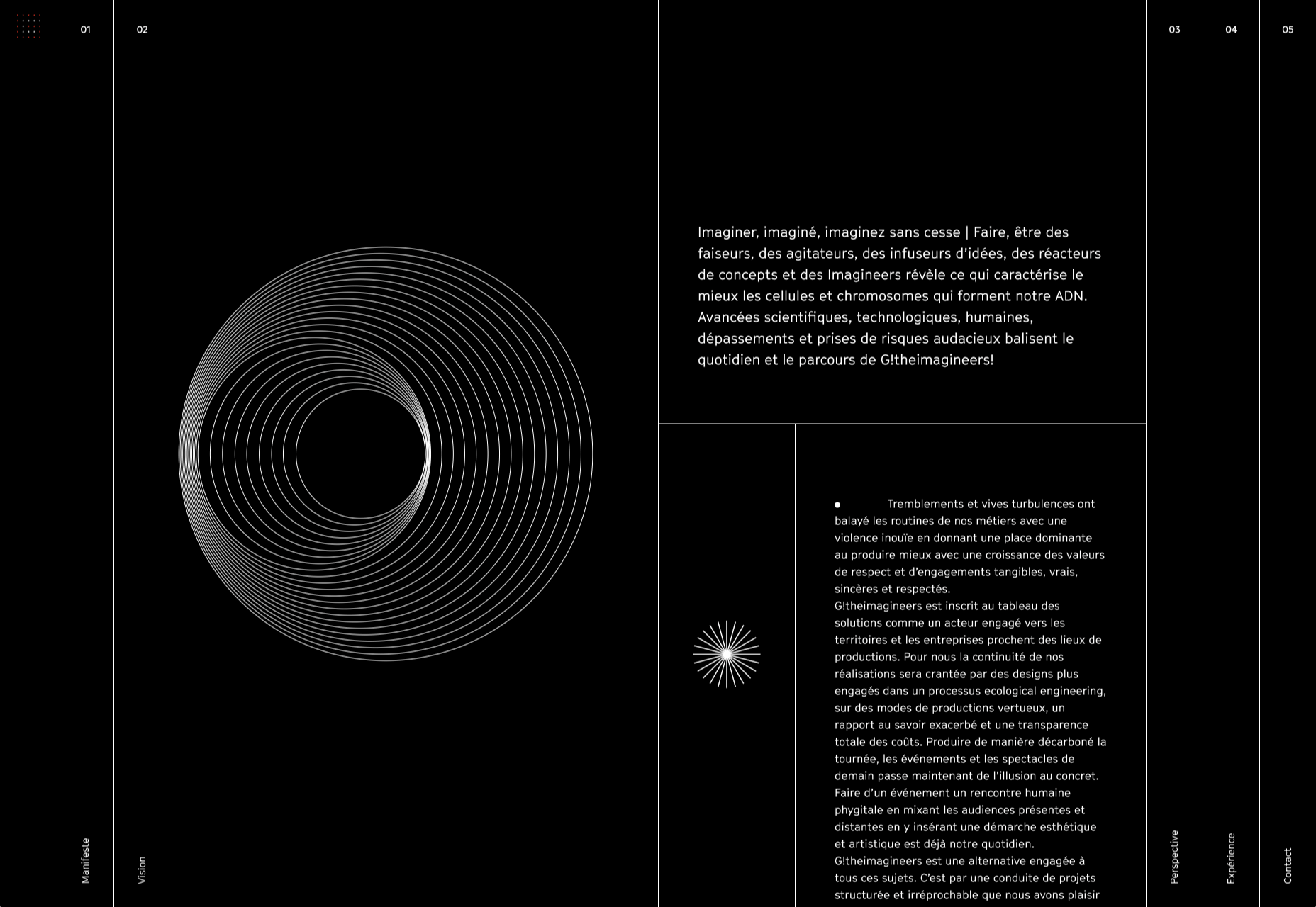
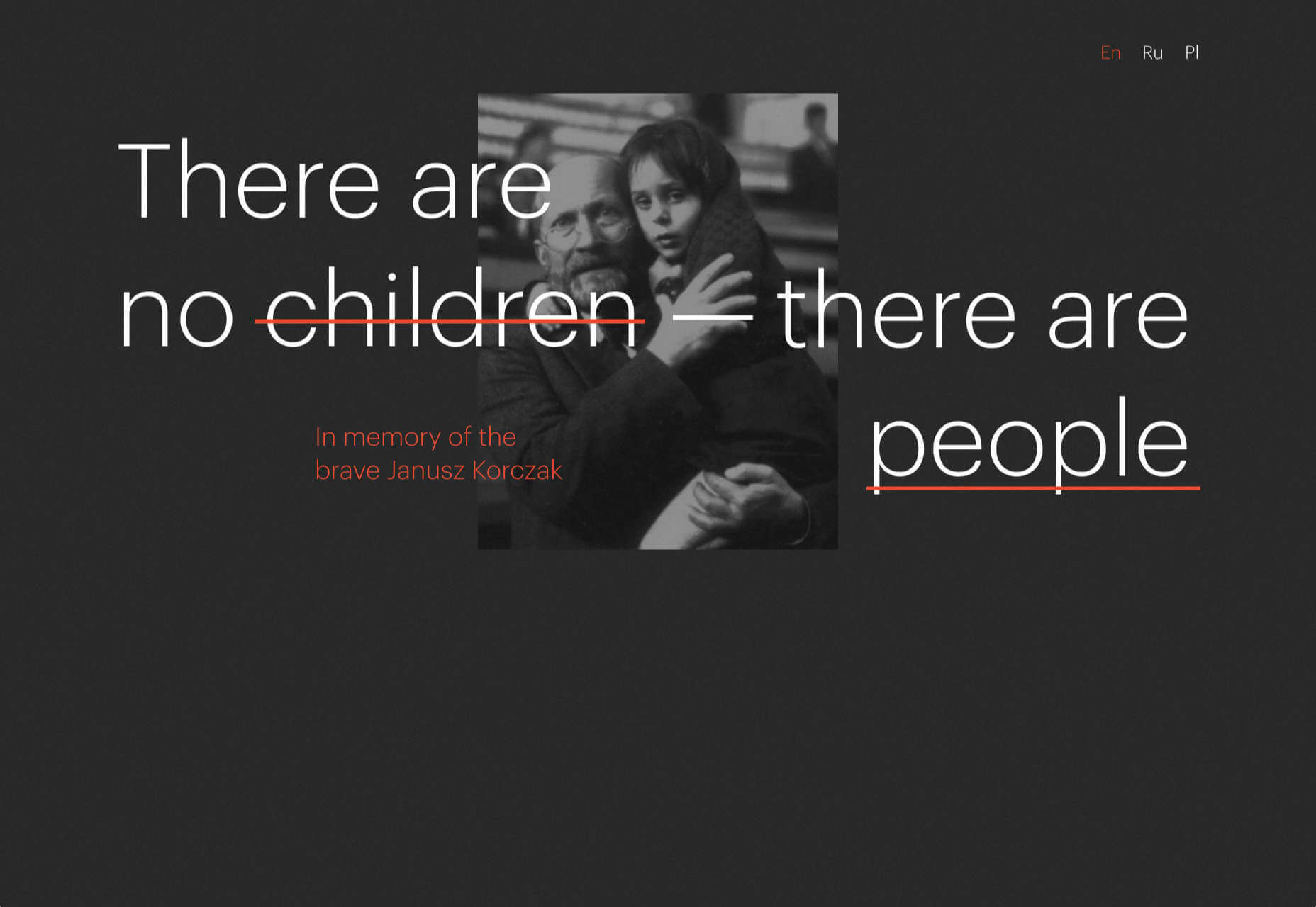
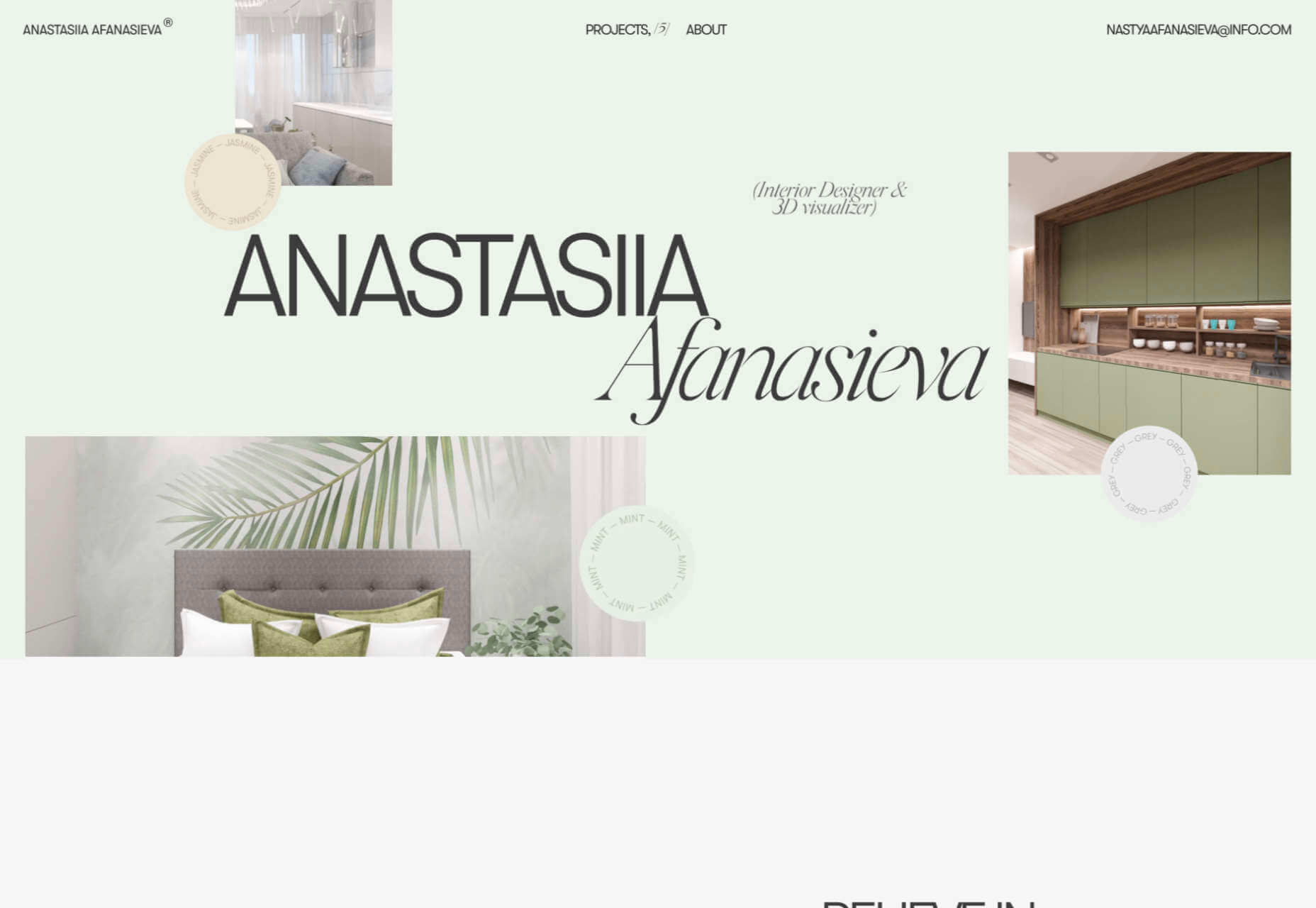
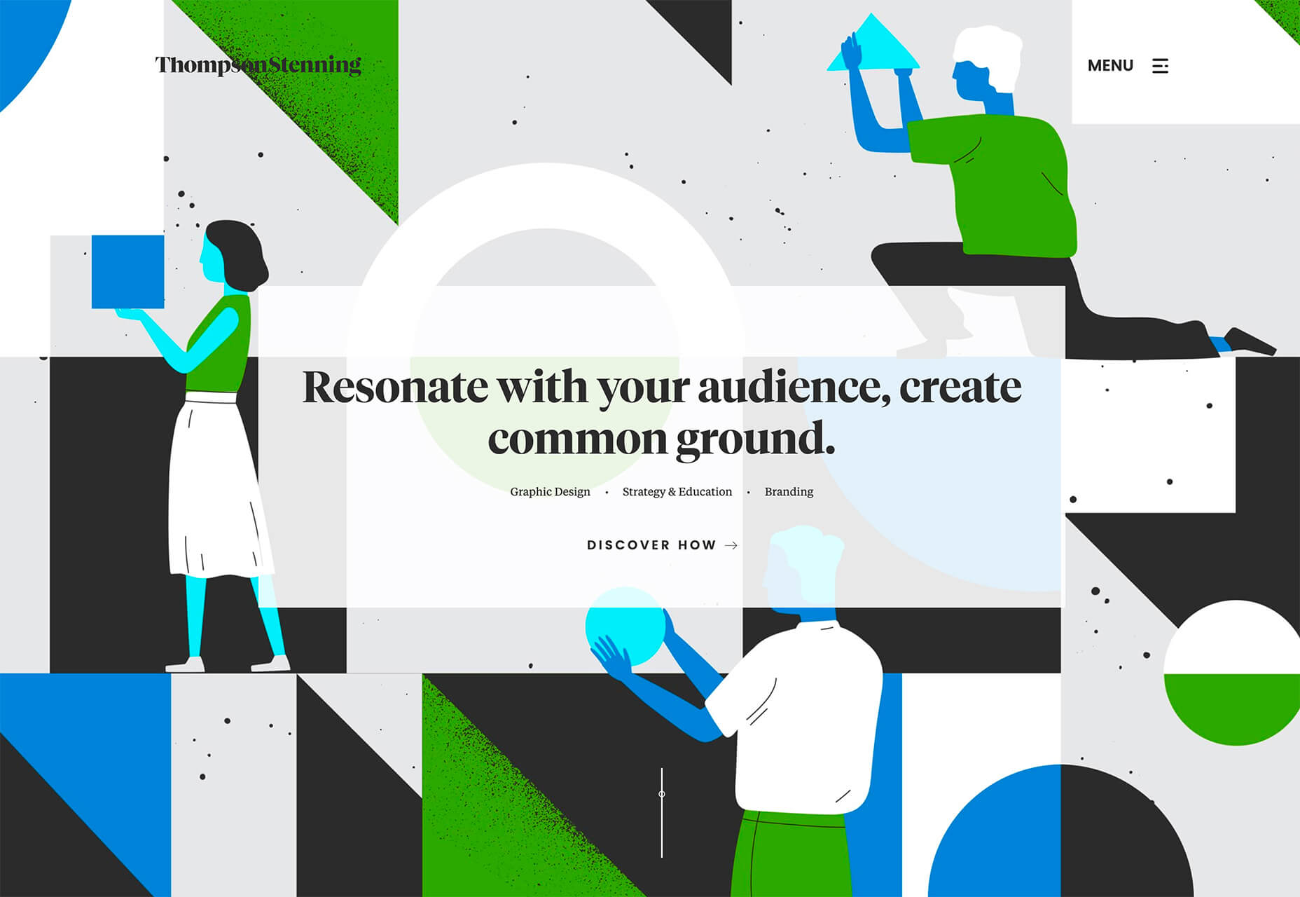
 A seasonal change is on the horizon and that always has me looking to refresh projects. This month’s design trends provide a few different ways to do that without ripping up your entire website.
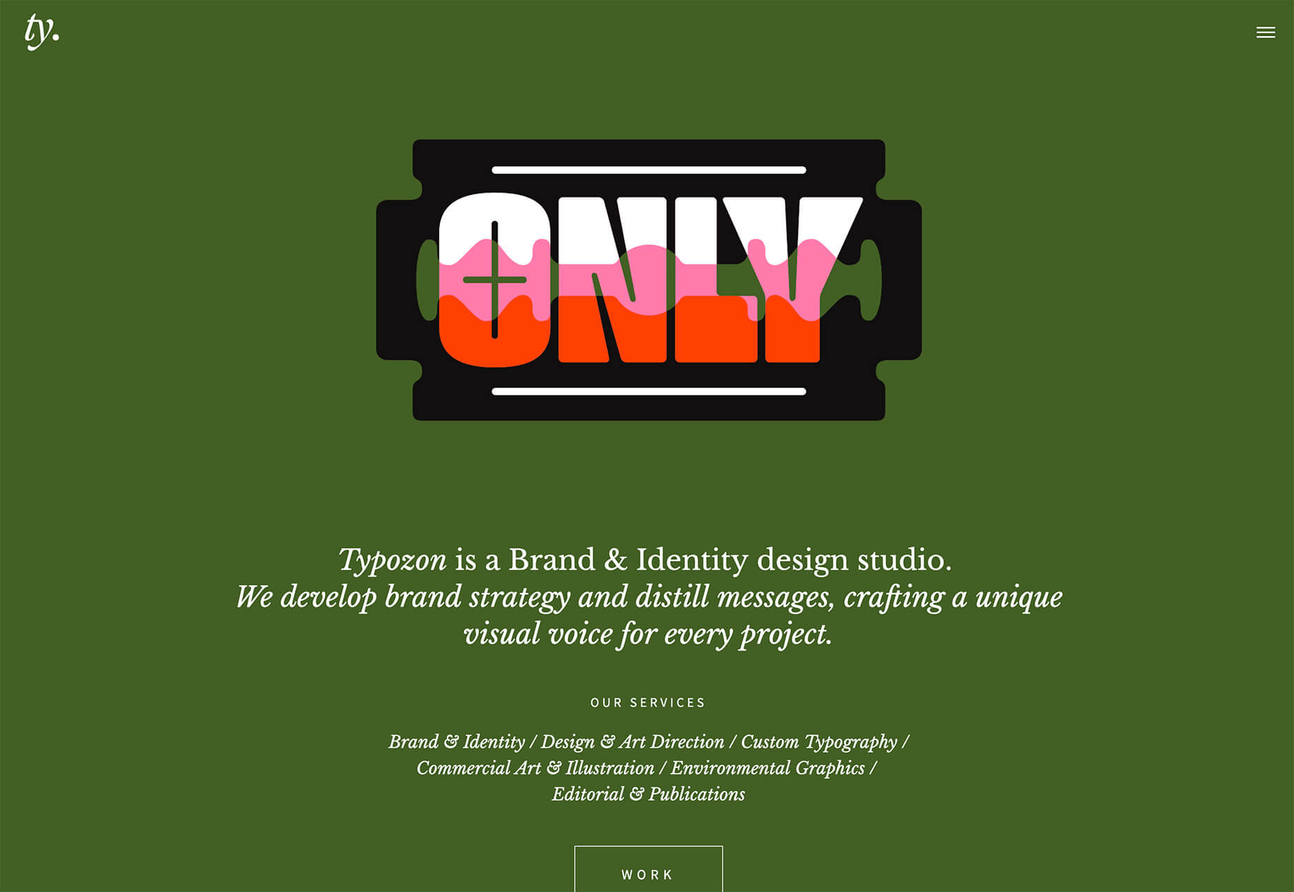
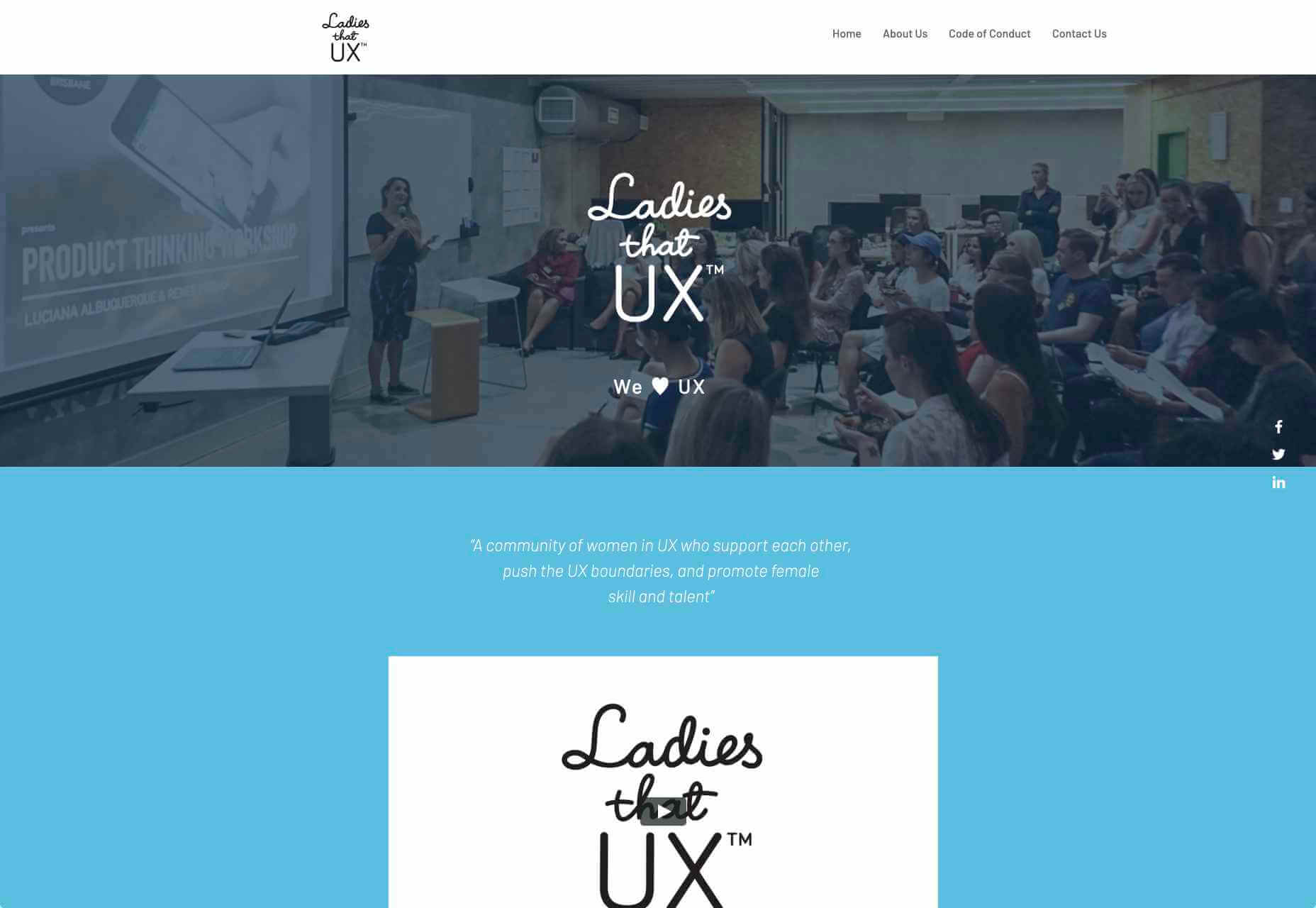
 Every week users submit a lot of interesting stuff on our sister site Webdesigner News, highlighting great content from around the web that can be of interest to web designers.

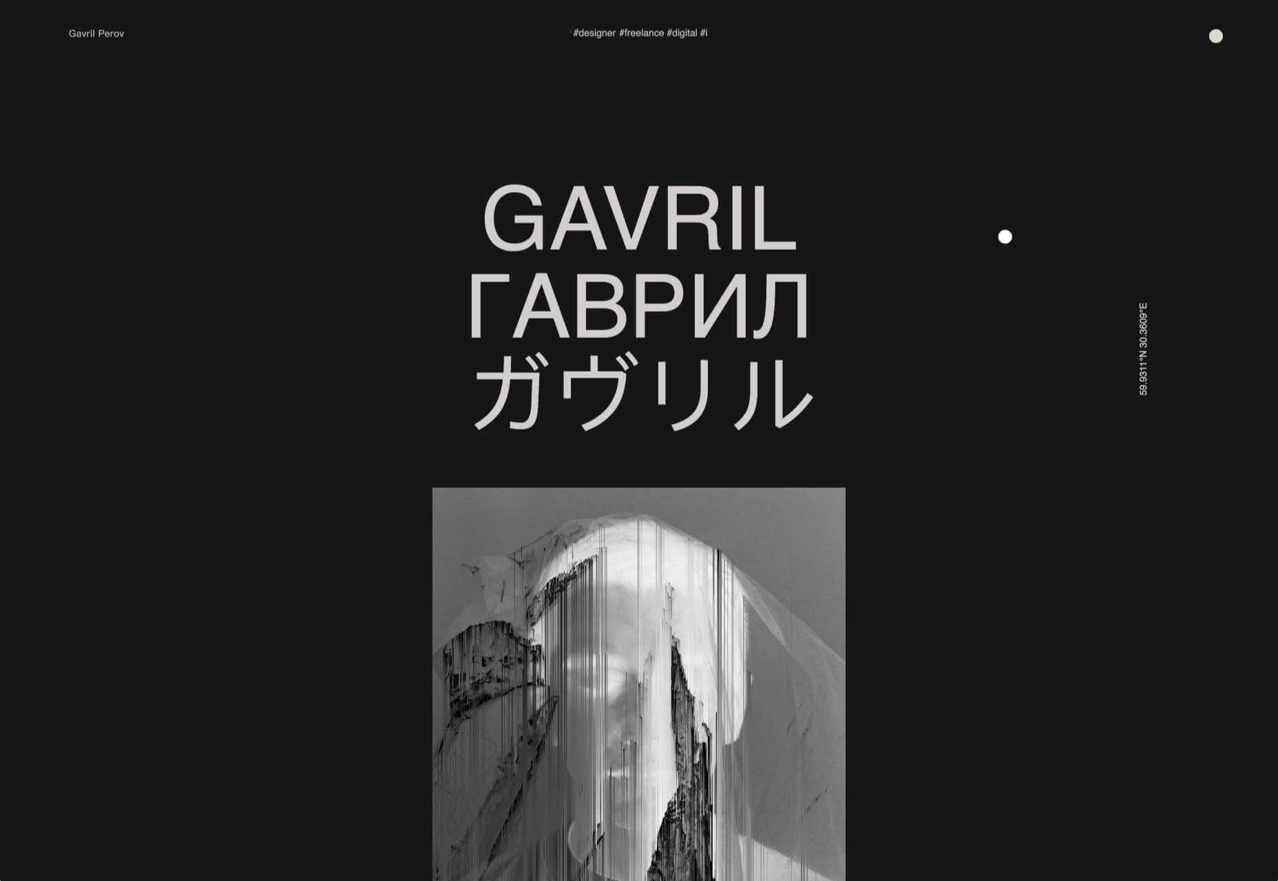
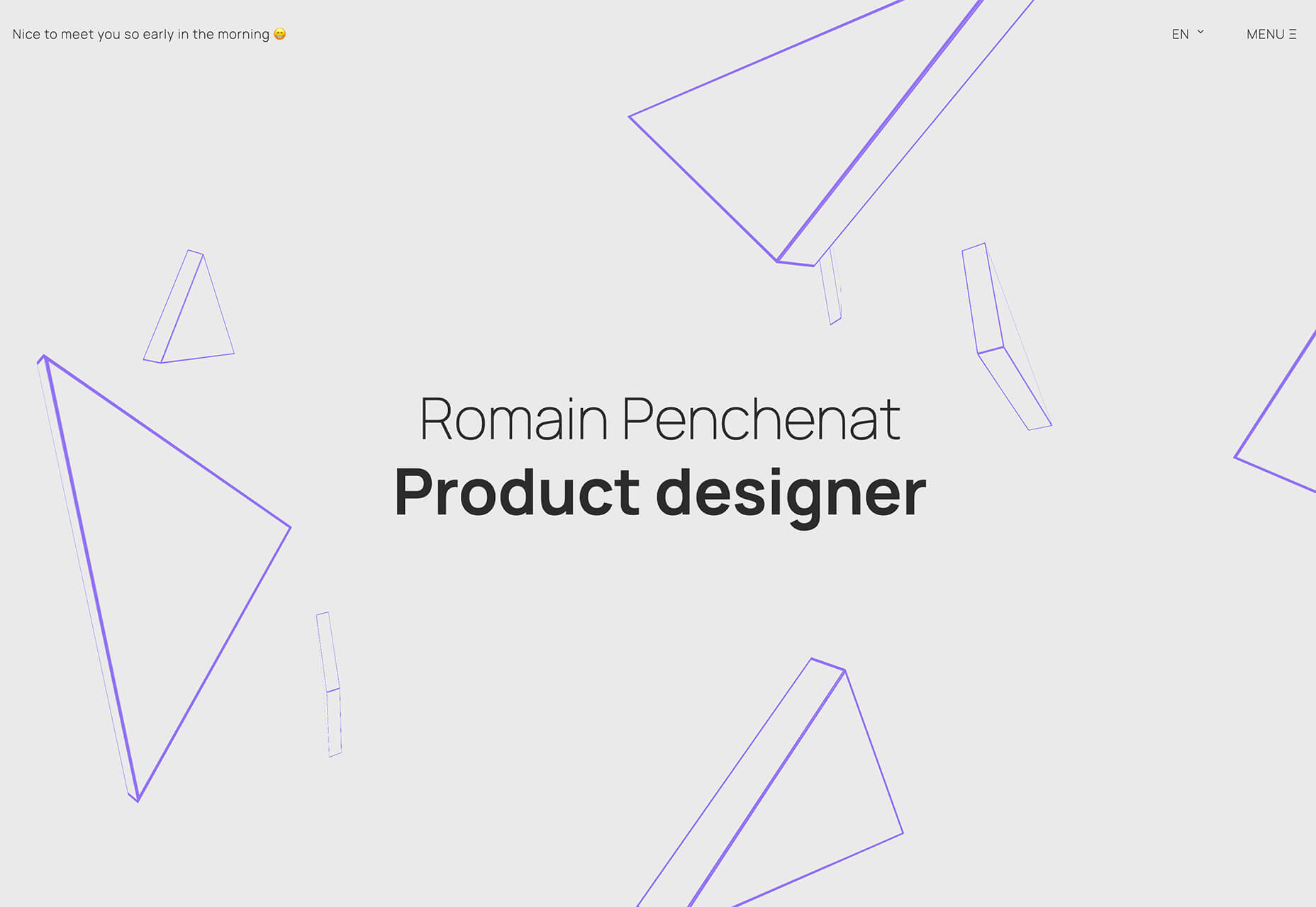
 Do the lazy days have you longing for a new design technique to try? You are in luck.
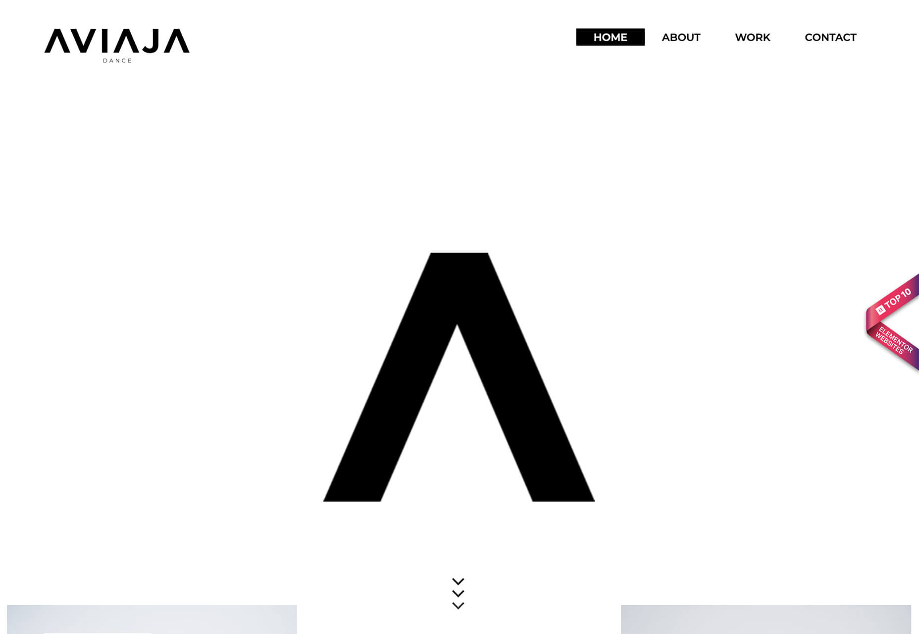

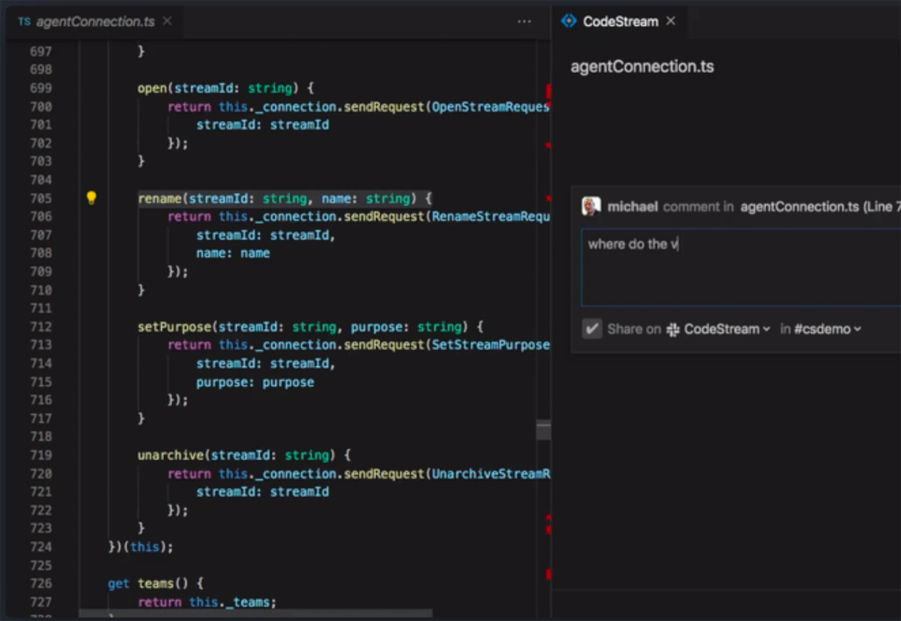
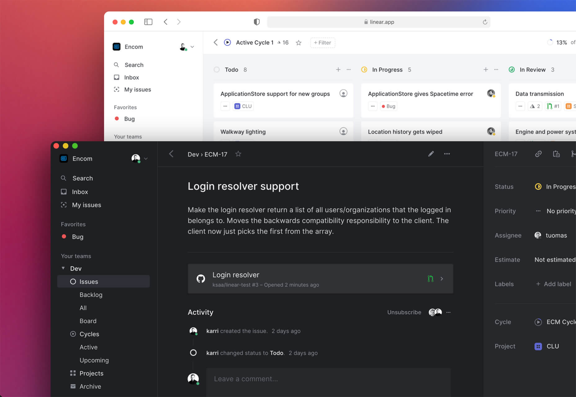
 Some of the changes we are seeing with where we work are starting to pop up in the type of new tools made for designers and developers. More tools with remote collaboration as a key feature are increasing in popularity. (You’ll find a few of those here.)
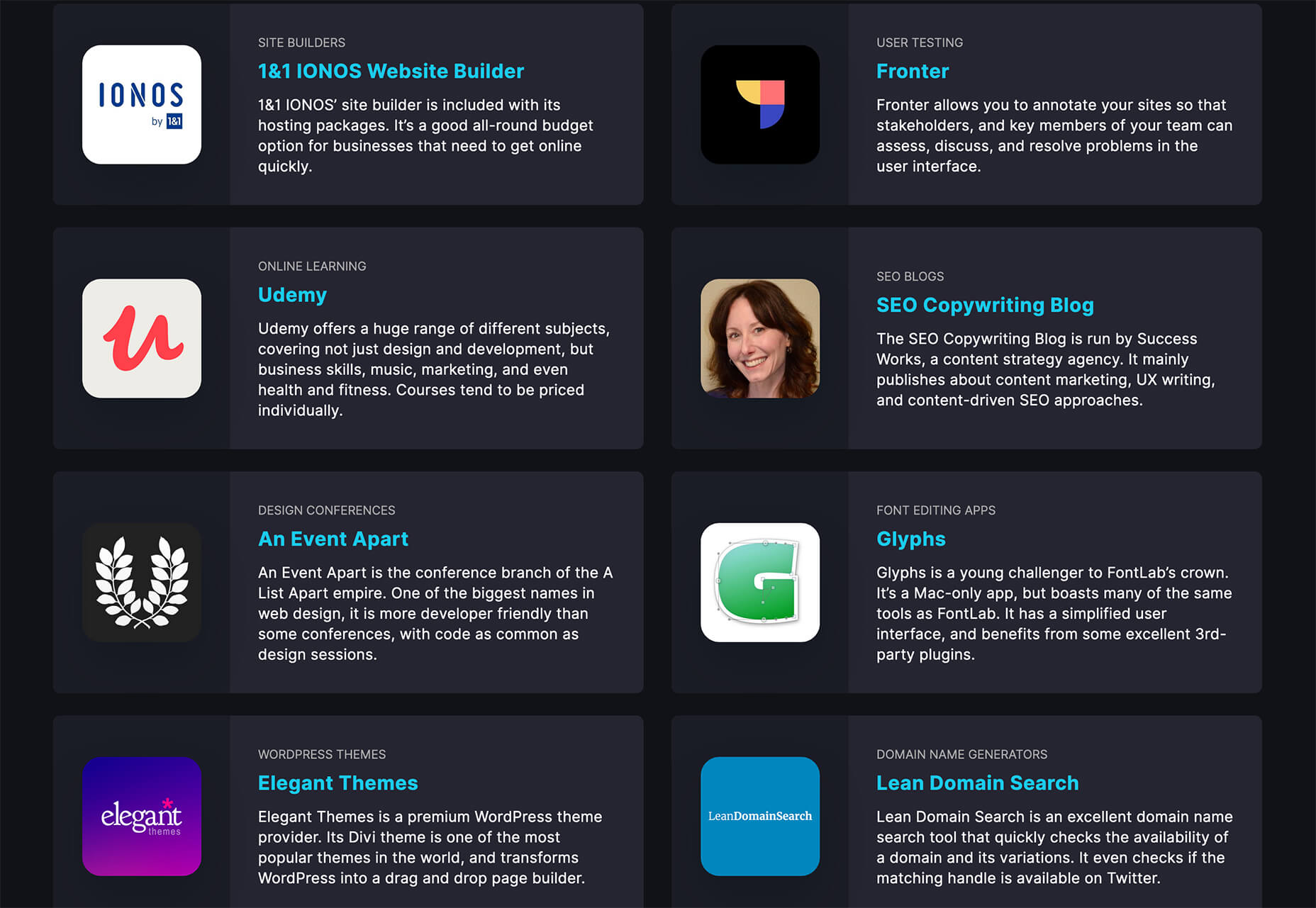
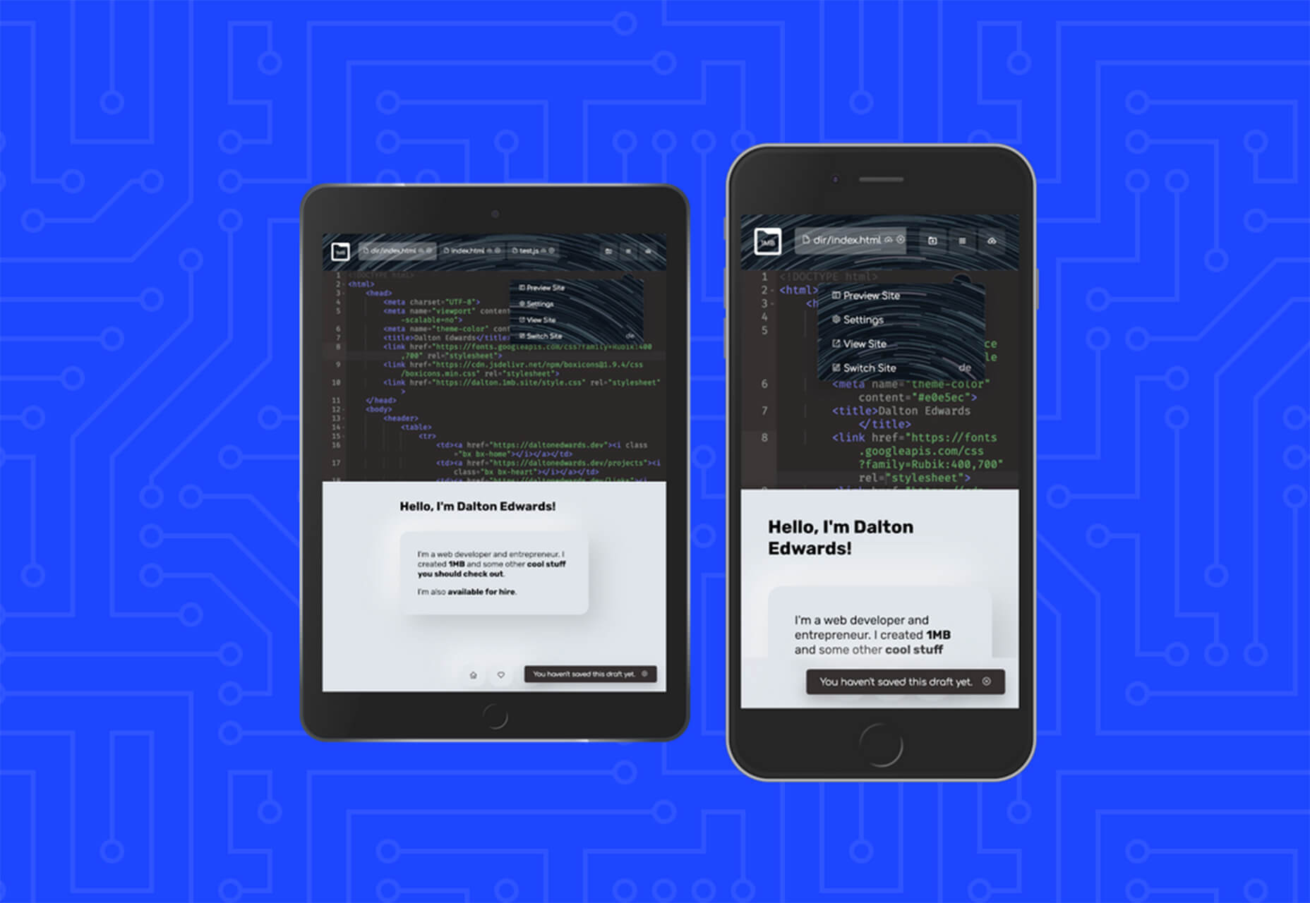

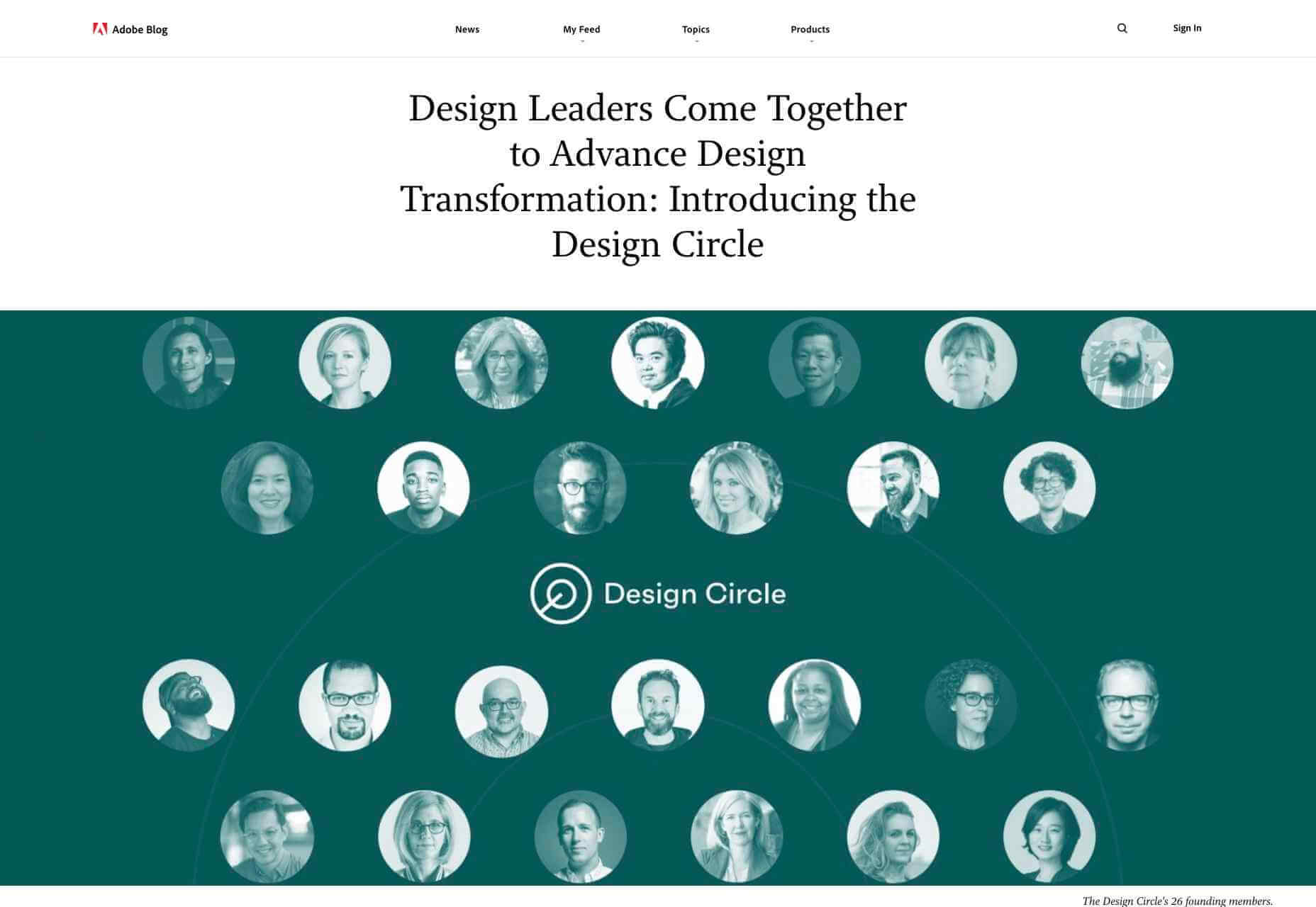
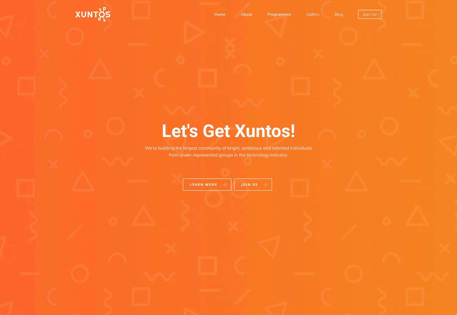
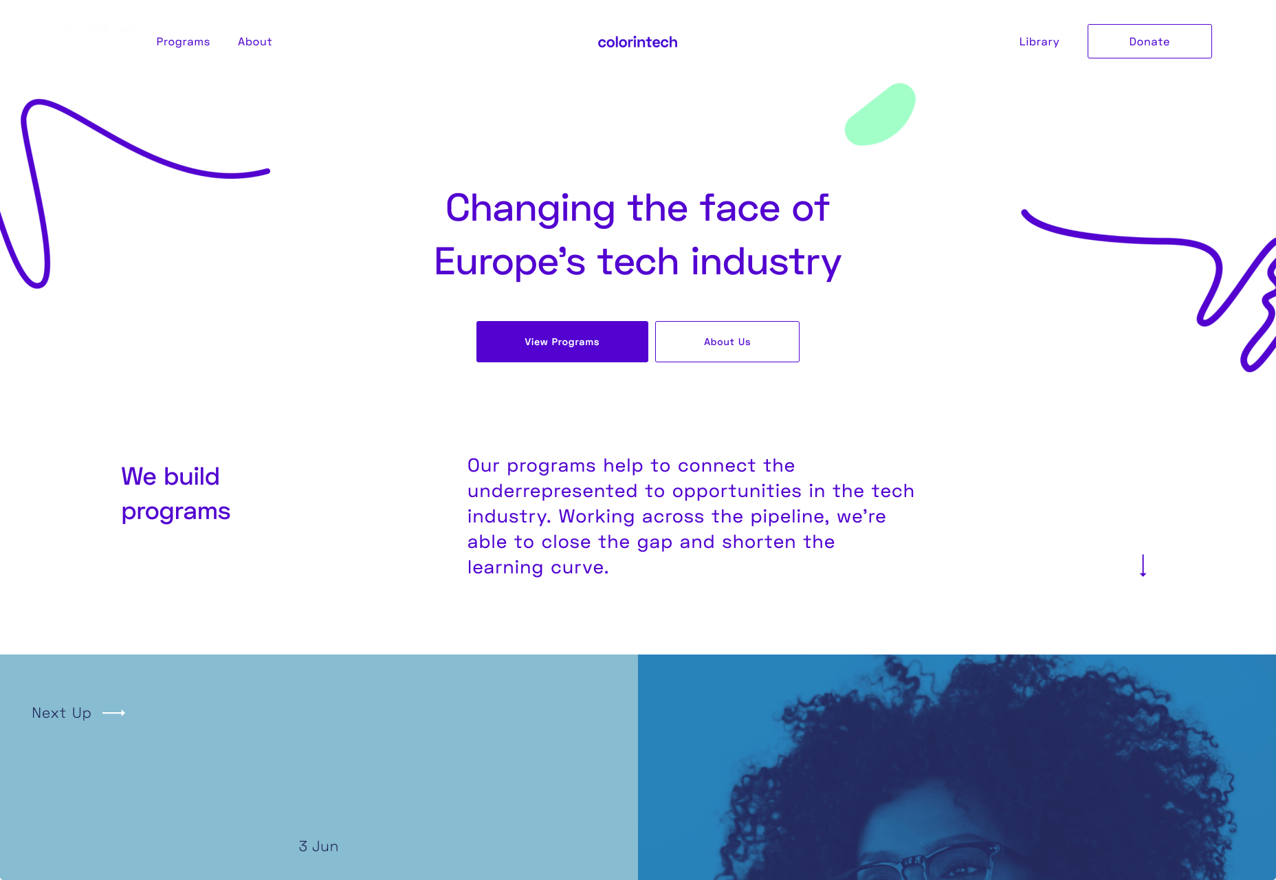
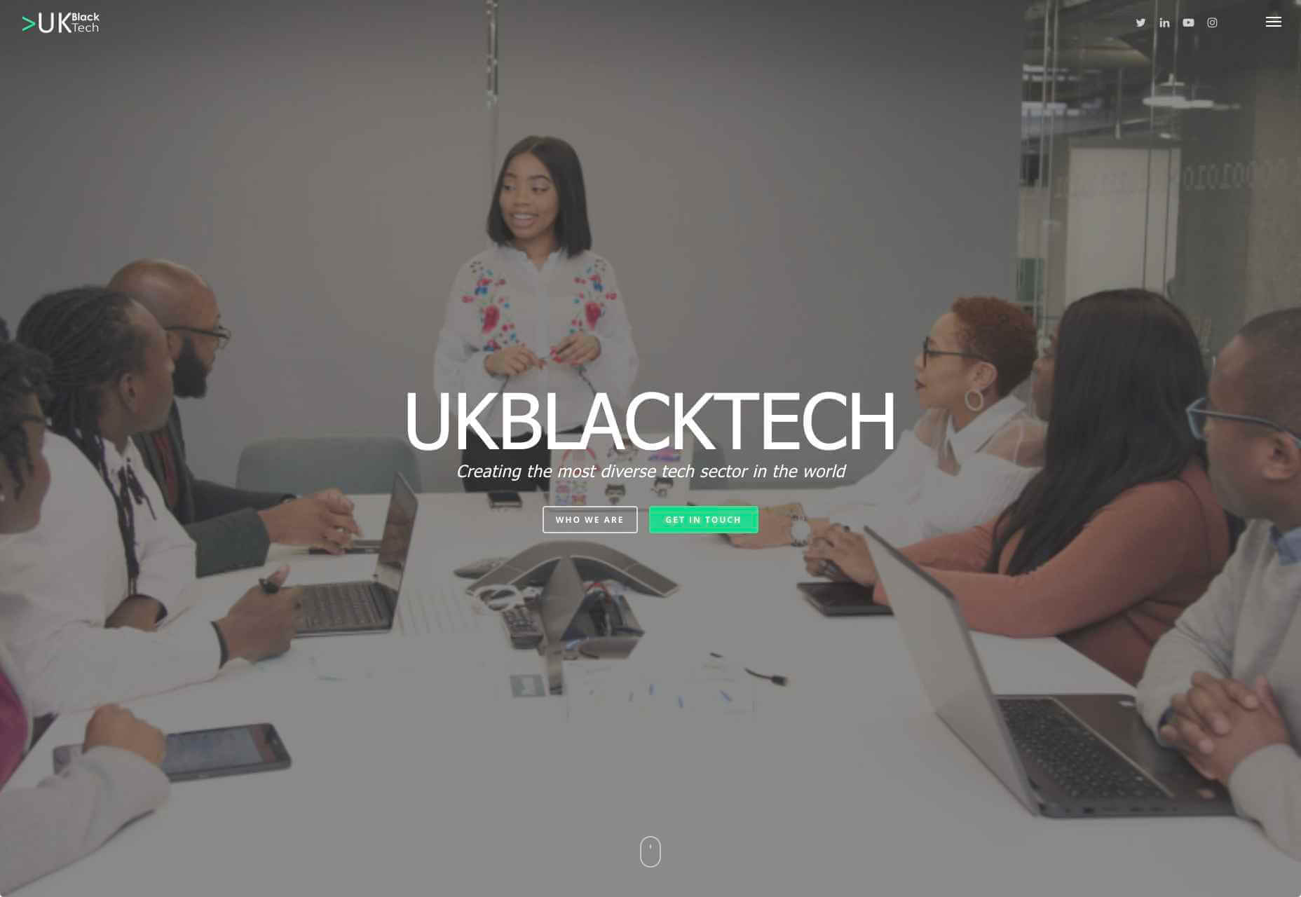
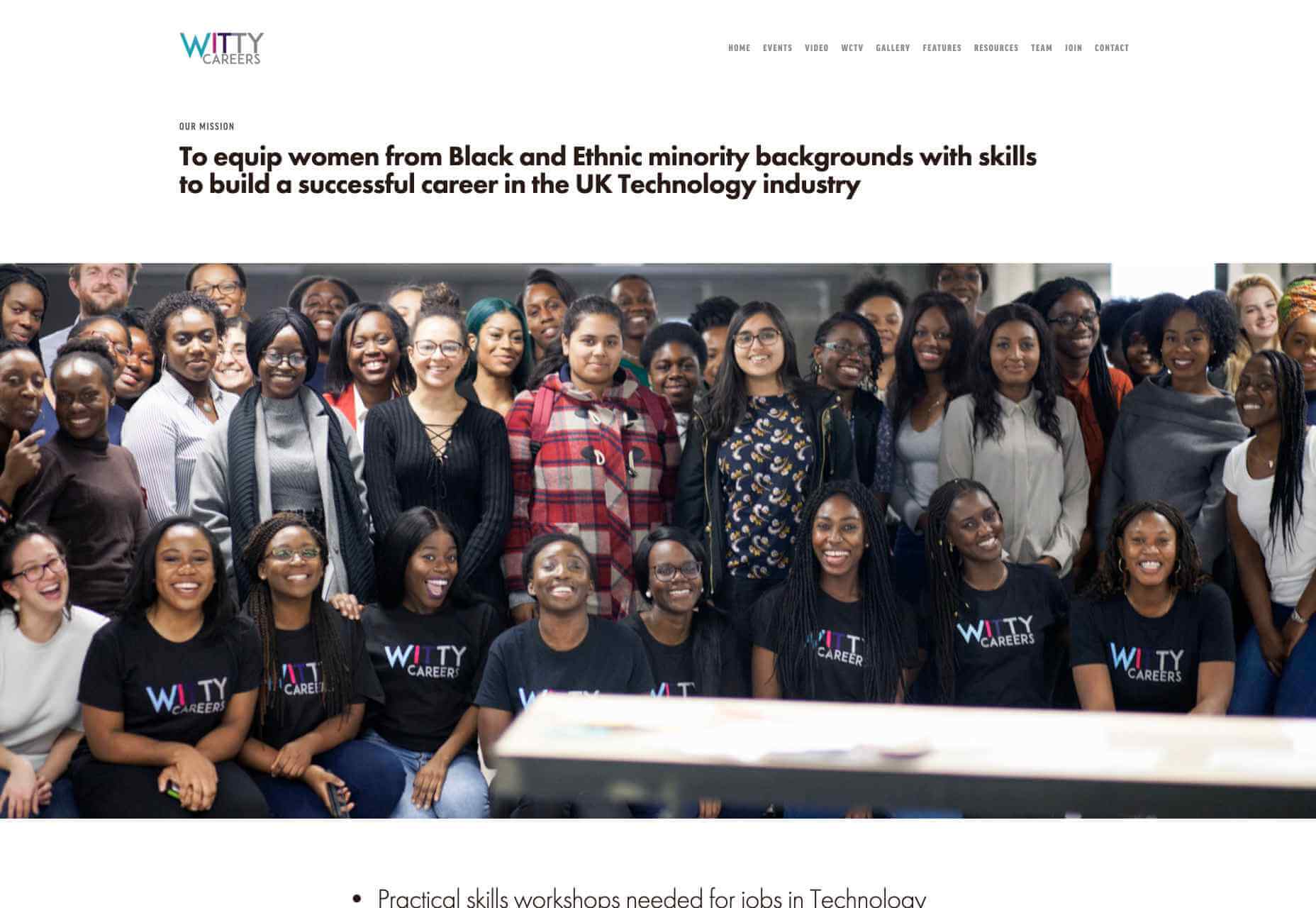
 Web developers have been the bedrock of any company’s business strategy for some time, and the industry is continuing to thrive and grow at a rapid pace. This is why it’s surprising that it is so lacklustre when it comes to diversity.
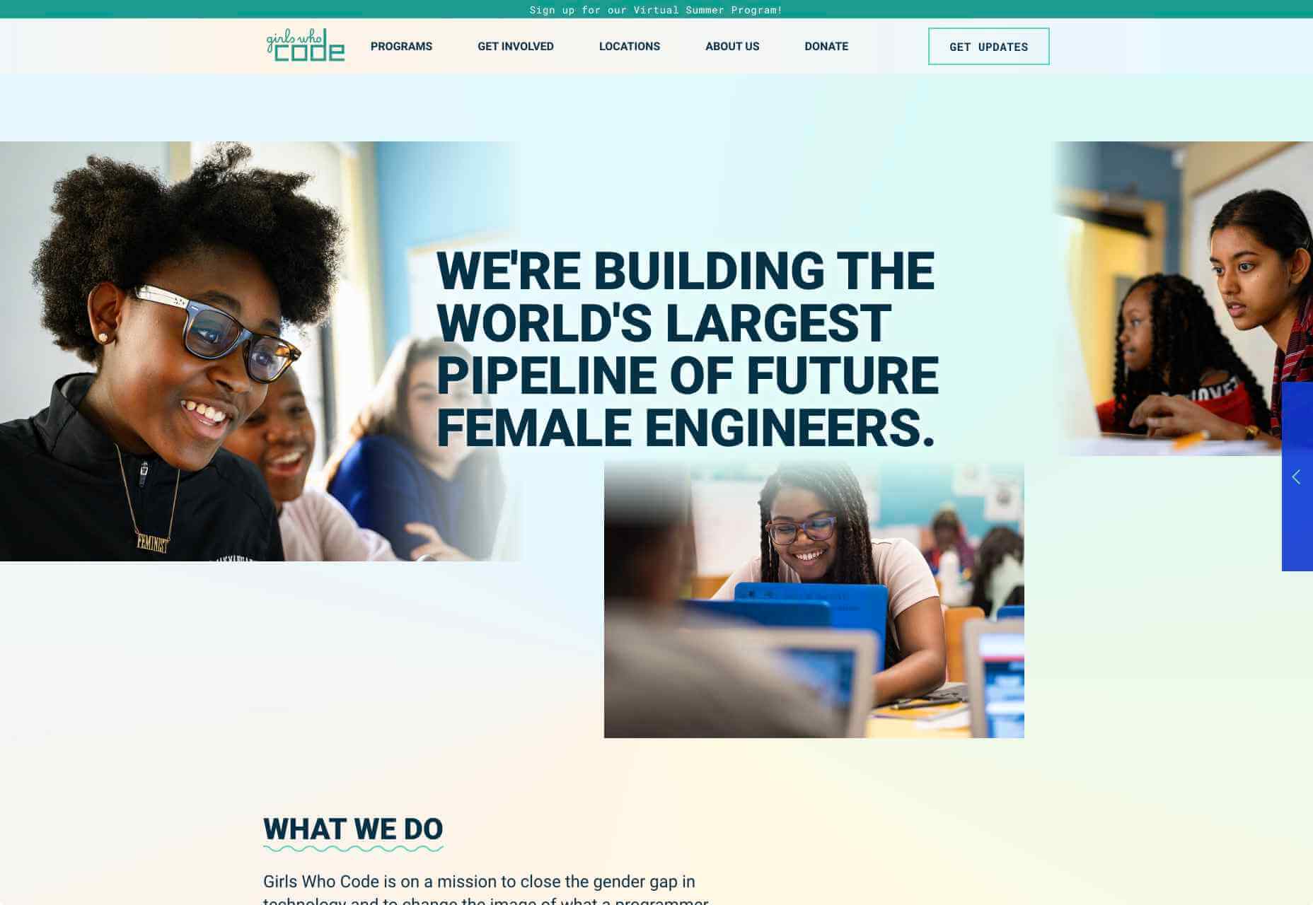
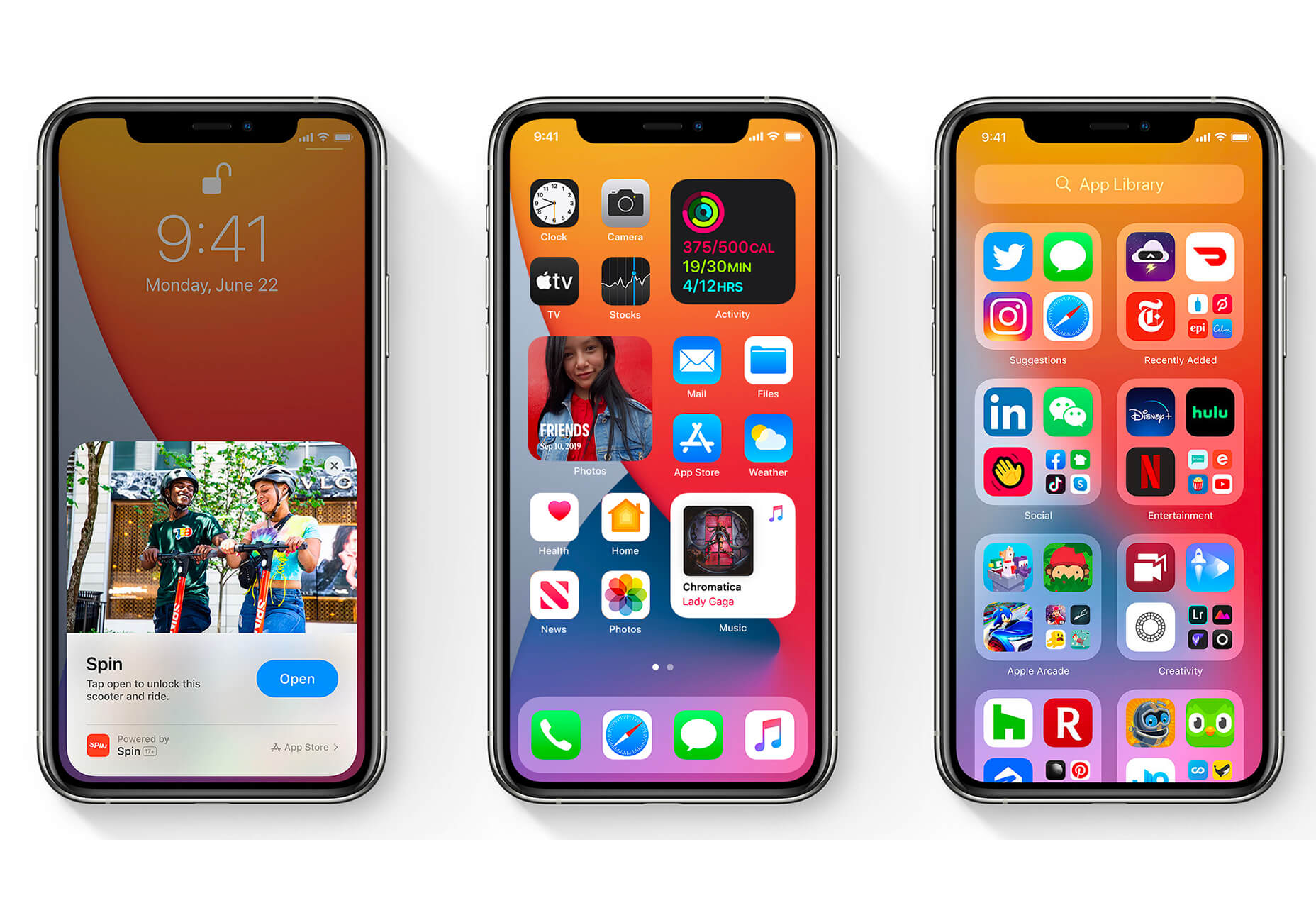
 The biggest trend we’re talking about this month started at WWDC as Apple provided a glimpse of what’s coming next for their operating systems. This time around there’s a distinct design element. Did you catch it?

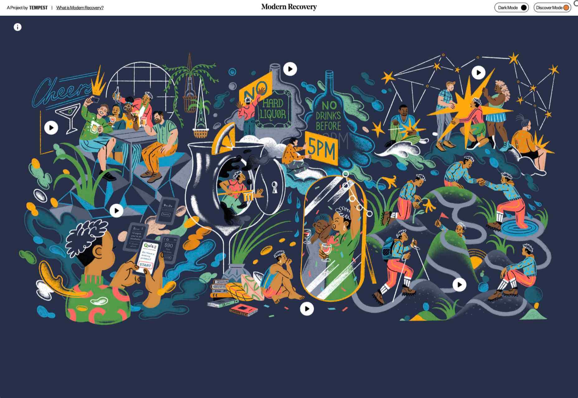
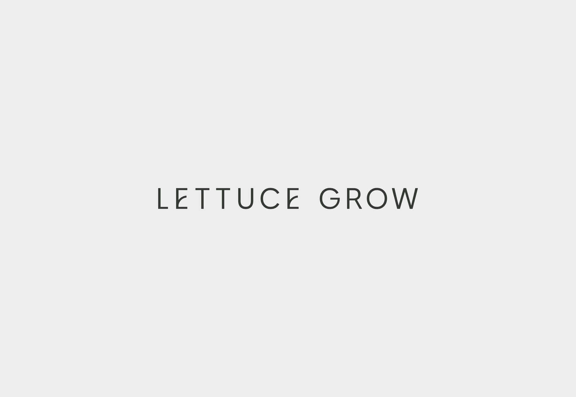
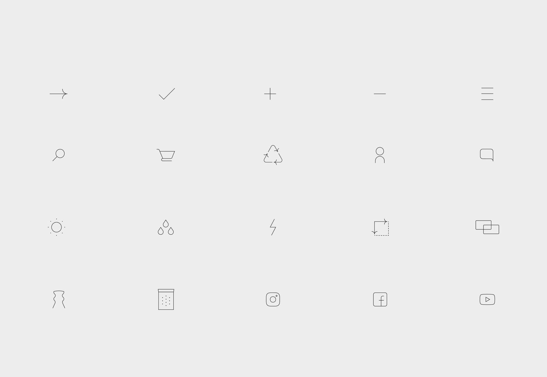
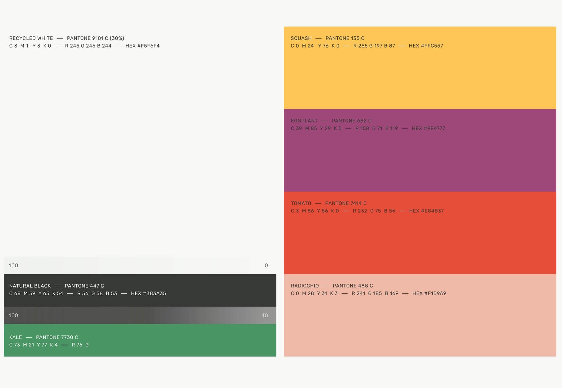
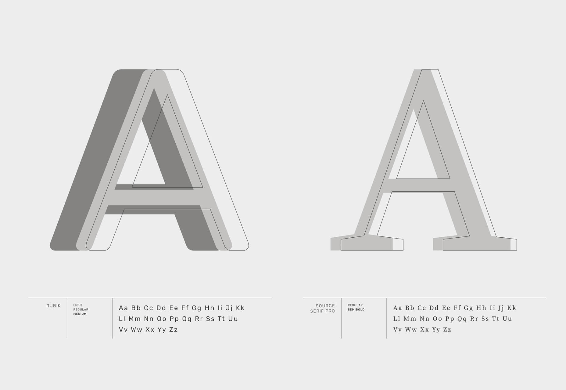
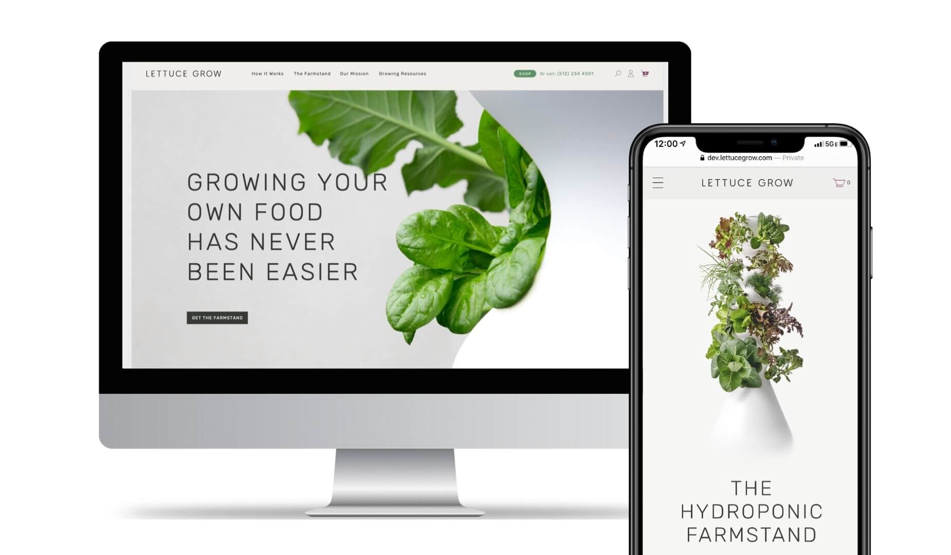
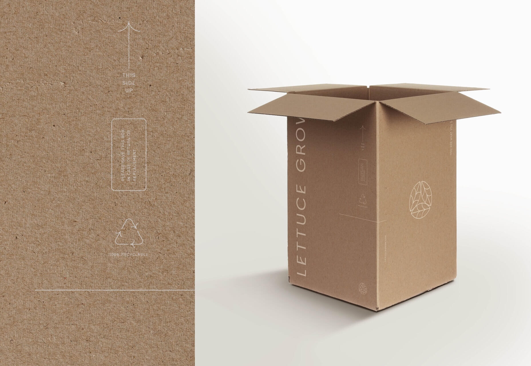
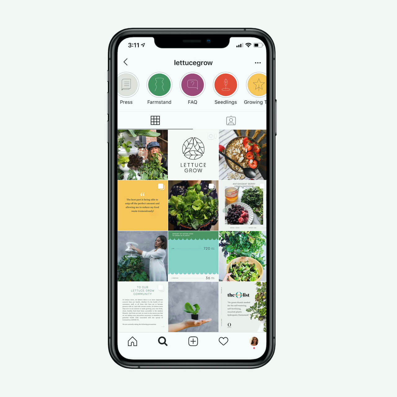
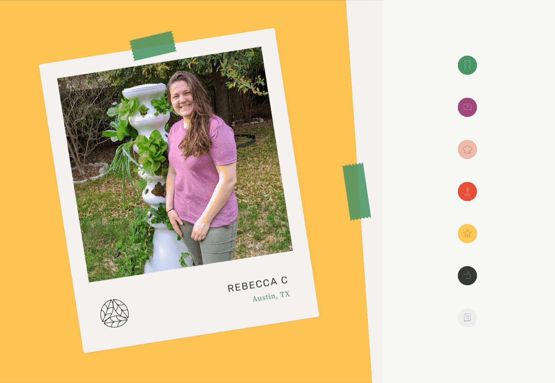
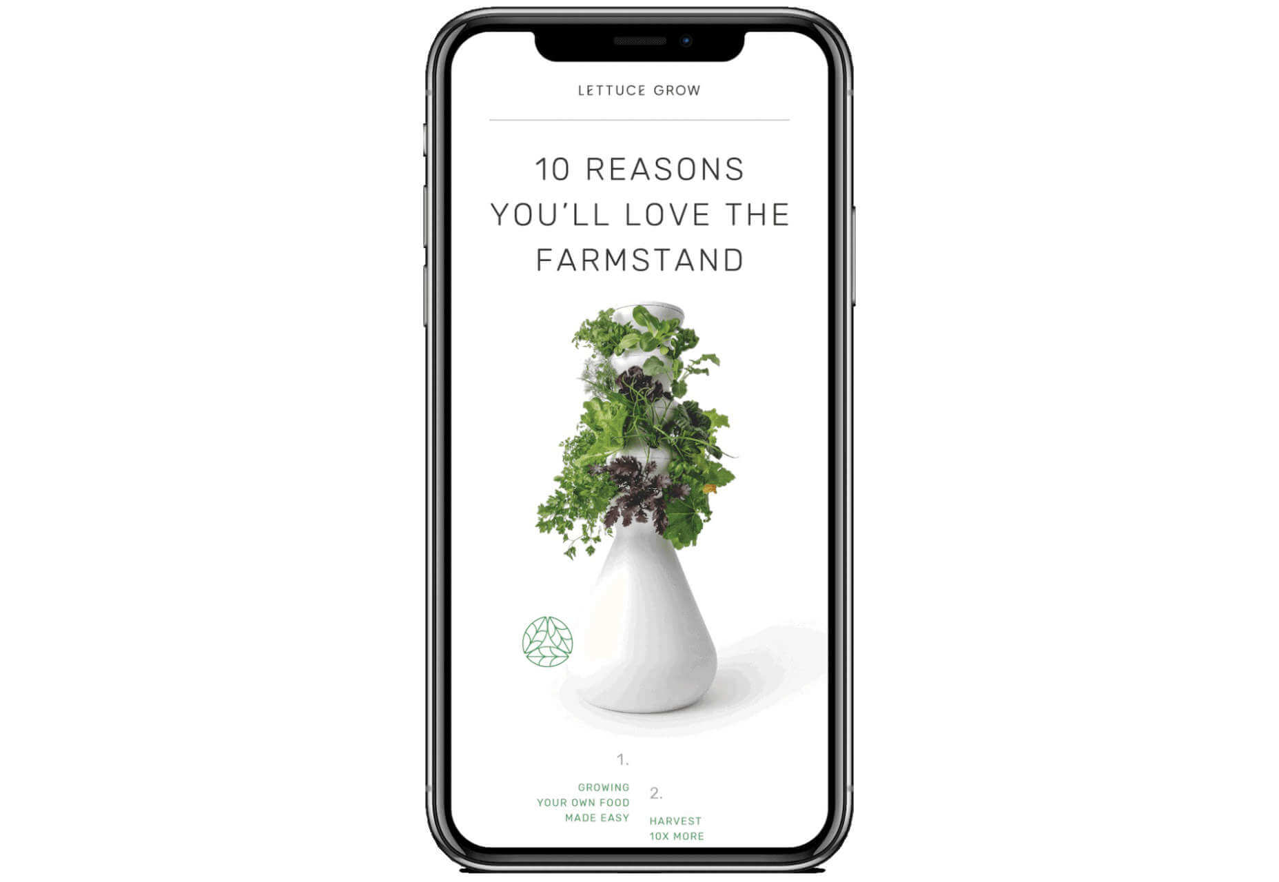
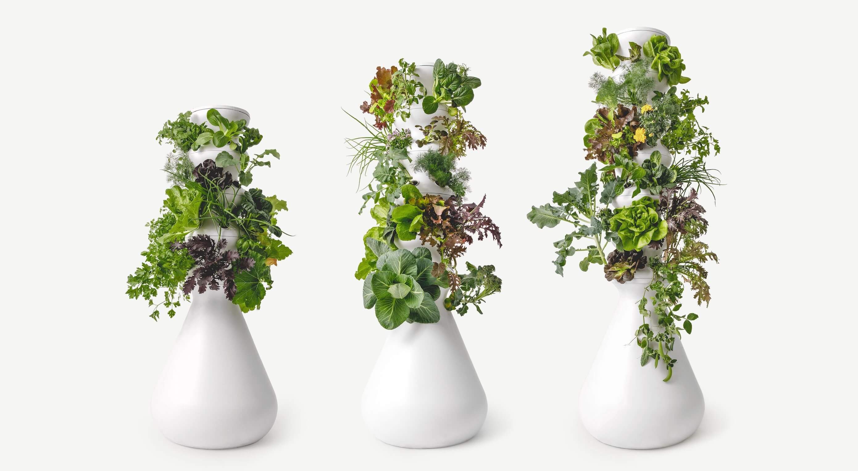 A successful rebrand goes far beyond flashy graphics and high-res photos. It tells a story. It positions a product to fulfill the wants and needs of the consumer. Following the rebrand journey of Lettuce Grow, take a look at how visual elements can enforce the mission of your brand, engage your consumer and cultivate incredible results.
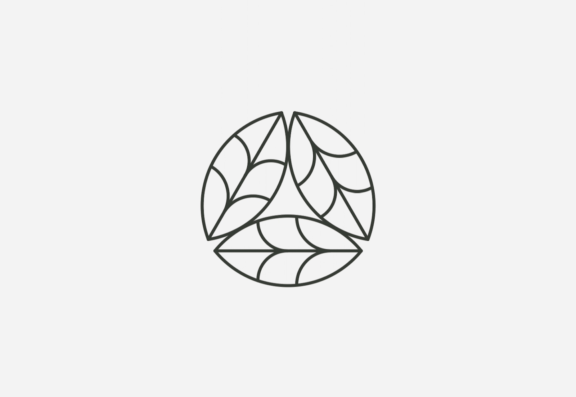

