Articles

The WordPress themes and plugins you choose for your clients’ sites don’t just impact how the interface looks or how well it works. They also impact your ability to build them.

The point in using WordPress themes and plugins is to make your life easier, not to create more work for yourself or limit what you’re able to do. If you’ve struggled to find WordPress tools you can rely on from job to job, BeTheme might just be the total package you’ve been looking for.

BeTheme has it all:

  • A backend builder
  • A frontend builder
  • A WooCommerce builder
  • 600+ pre-built websites

There’s nothing extra to pay with BeTheme. One fee gets you all the tools you need to easily build professional-grade websites for your clients.

Get to Know BeTheme’s All-In-One WordPress Solution

Want to see how the BeTheme powerhouse works? Check it out:

1. Build and Manage the Backend With Muffin Builder 3

Let’s be honest, WordPress page builder plugins leave something to be desired. While they all have their strengths, it’s hard to find one that offers different tools for how you want to work.

Many of them offer a visual drag-and-drop builder, leaving designers with little flexibility in how they build websites. With BeTheme, you don’t have to compromise.

Muffin Builder 3 is the intuitive backend editor that gives you full control. And if you want to code it all by hand? You can. If you’d prefer to tap into BeTheme’s wide array of templates, pre-built sections, and predefined settings? You can do that as well.

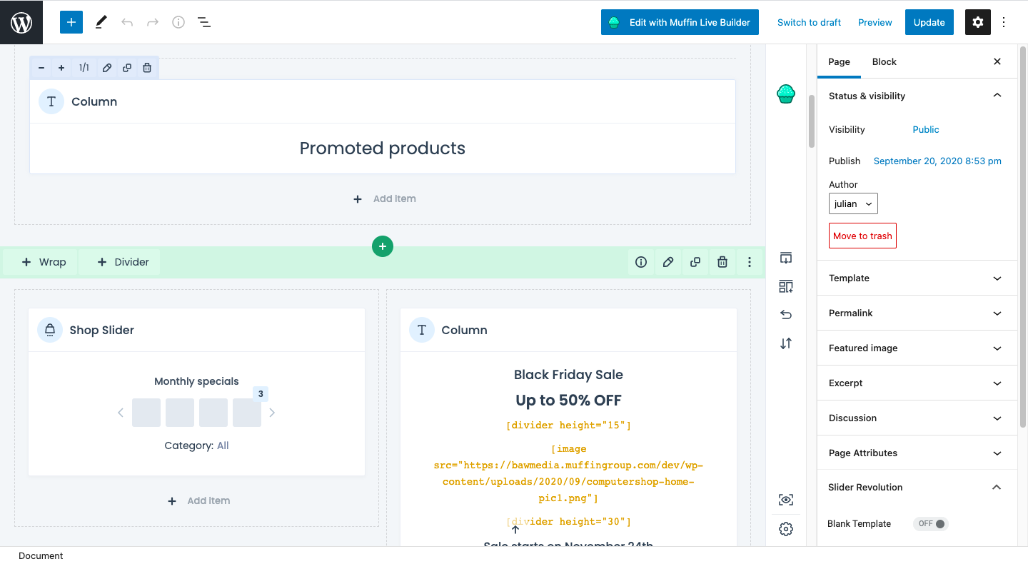
What’s more, the backend builder makes it easy to add sliders to your website, optimize your pages for search, and more.

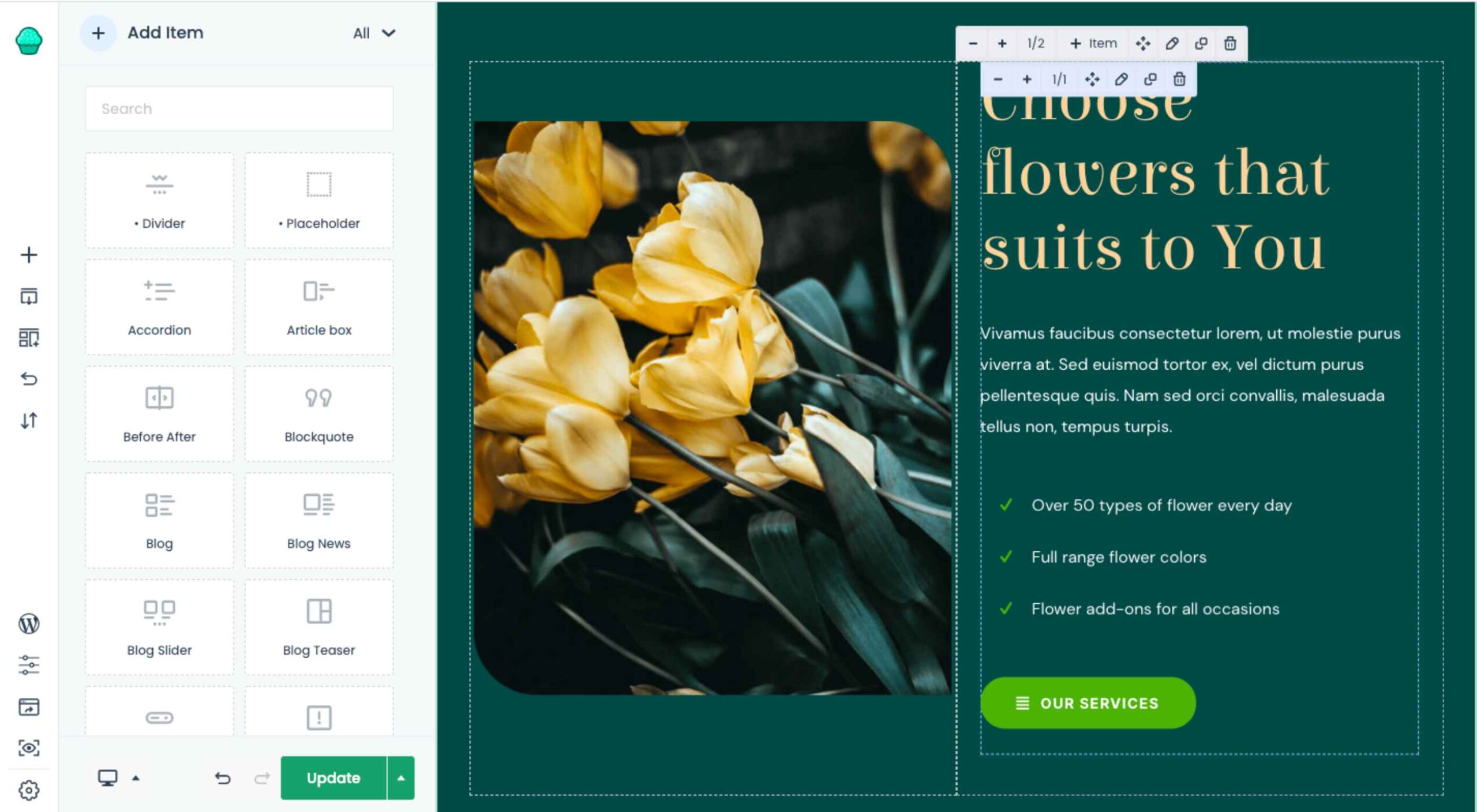
2. Design and Perfect Your Site on the Frontend with Muffin Live Builder

One of the reasons why drag-and-drop website builders have become so popular in recent years is because they empower everyone — from the DIY business owner to the professional web designer — to build websites visually. There’s just one problem:

While it’s great that developers both inside and outside of the WordPress ecosystem are creating these intuitive builders, they sometimes come at a cost.

One thing that tends to get sacrificed is speed. Because they take the editing out of the WordPress dashboard and onto the frontend of the website, many of them can take a while to load. (Some of them are known for stalling out on occasion, too.)

Another thing that gets sacrificed is how much you’re allowed to customize. You either have to design your website with the features and settings available from your page builder plugin or you have to do all the work inside of WordPress.

Muffin Live Builder doesn’t suffer from these issues.

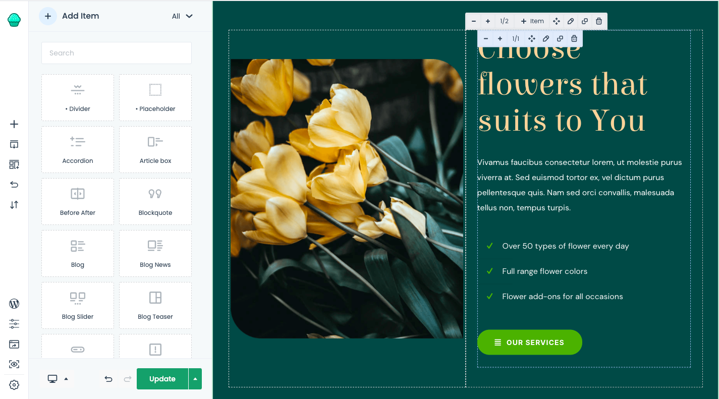
For starters, the visual builder is lightweight, so it won’t keep you waiting around for pages to load or changes to reflect on the frontend.

Also, you don’t have to choose which builder you want to use. If you want to primarily build sites with the backend editor and then perfect the designs on the frontend, you can. With BeTheme, you don’t have to pick-and-choose which editor you want to use.

3. Create Great Looking Monetized Sites with the Muffin Woo Builder

Many page builders are built for one purpose: To help WordPress users visually design websites so they can see their work reflected on the site in real-time.

That said, many page builder plugins haven’t accounted for the ecommerce piece.

Users can design and customize the regular pages on their websites with the visual builder, like the Home, About, and Contact pages. However, their ecommerce pages — Shop, Products, Cart, Checkout, and more — have to be managed through WooCommerce’s interface.

WooCommerce is a great ecommerce plugin. However, it’s not ideal having to design different parts of your site with different tools.

Be now has a solution for this: Muffin Woo Builder.

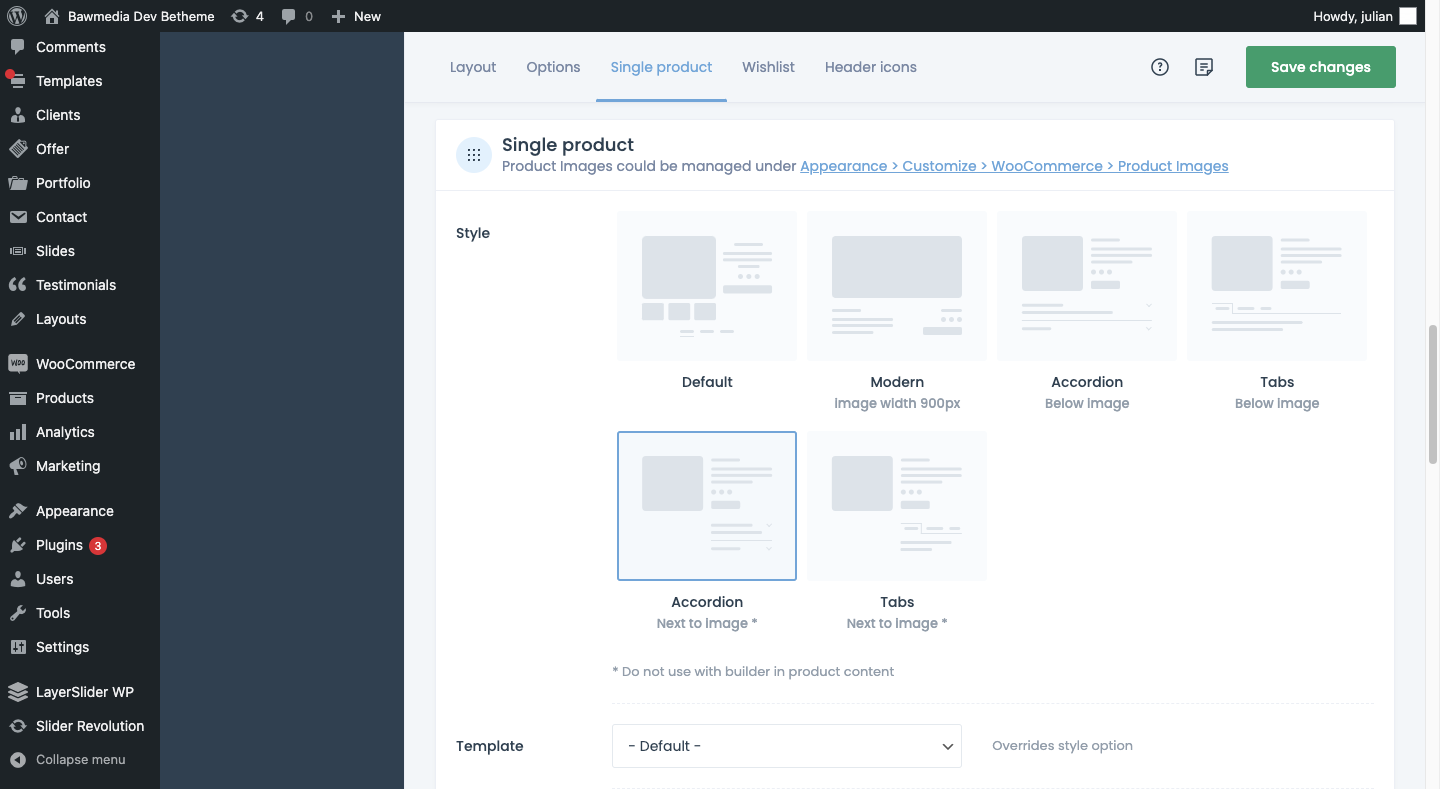
The Muffin Woo Builder allows designers to build their own single product and shop templates instead of just customizing the default ones provided by WooCommerce or the theme.

It also gives you design editing capabilities that no other page builder plugin can. For example:

  • Create design rules for your ecommerce pages
  • Choose from 11 product gallery styles
  • Switch between Shop and Catalogue mode
  • Set custom variation swatches
  • Show or hide the cart button
  • Add a sidebar
  • Configure settings for how product images render
  • Enable a Wishlist
  • Pick and choose which icons appear in the header

If you want this level of control over the layout and look of your ecommerce pages, you have to install other plugins or custom-code those changes into the backend. So, this is definitely a unique feature amongst page builders.

4. Instantly Design an Attractive Website With One of 600+ Pre-Built Sites

BeTheme isn’t just the fastest WordPress builder because it’s lightweight or because there are various builder options that allow you to work the way that’s best for you.

BeTheme also comes jam-packed with 600+ pre-built websites, with new ones released every week.

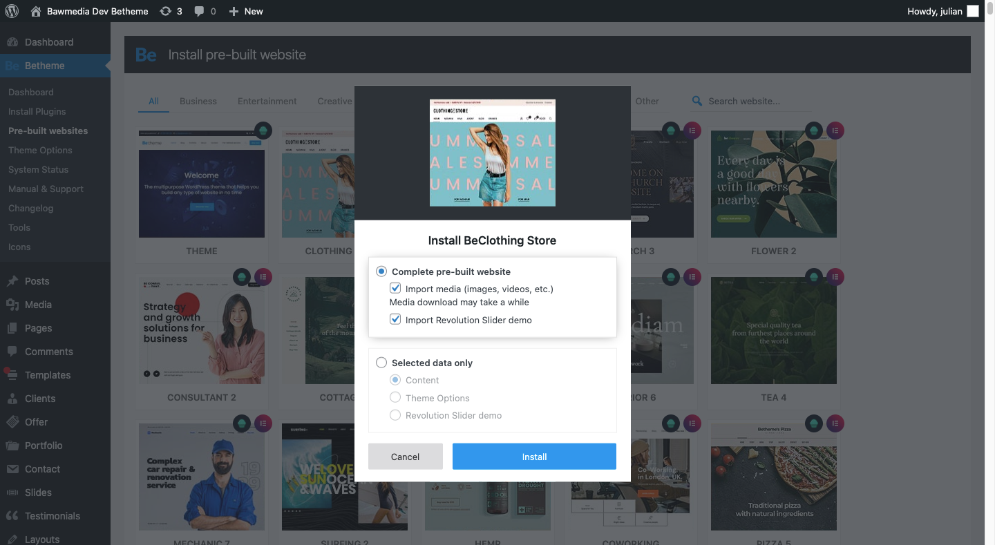
When you install a pre-built site, BeTheme is going to do a number of things for you:

  • Install all the specific plugins you need for the site
  • Load a fully designed and fully functioning website into your WordPress installation
  • Add placeholder content and imagery throughout so you can easily swap in your own

That’s going to save you a lot of time. Think about the cost savings, too. You get access to more than 600 pre-built websites without having to pay anything extra for them.

Is BeTheme the total design package? You bet it is!

It can’t be overstated what a game-changer BeTheme is for WordPress designers. Two page builders, one WooCommerce builder, and 600+ pre-built sites all rolled into one?

Everything you need to design high-quality websites is baked in.

That’s something you rarely see in any product or service, let alone in WordPress.

If you’re ready to say “Goodbye!” to page builder plugins and transform the way you work, get the BeTheme powerhouse now.

Source

The post Design Faster & Smarter with BeTheme’s 3 Builders & 600+ Pre-Built Sites first appeared on Webdesigner Depot.


Source de l’article sur Webdesignerdepot

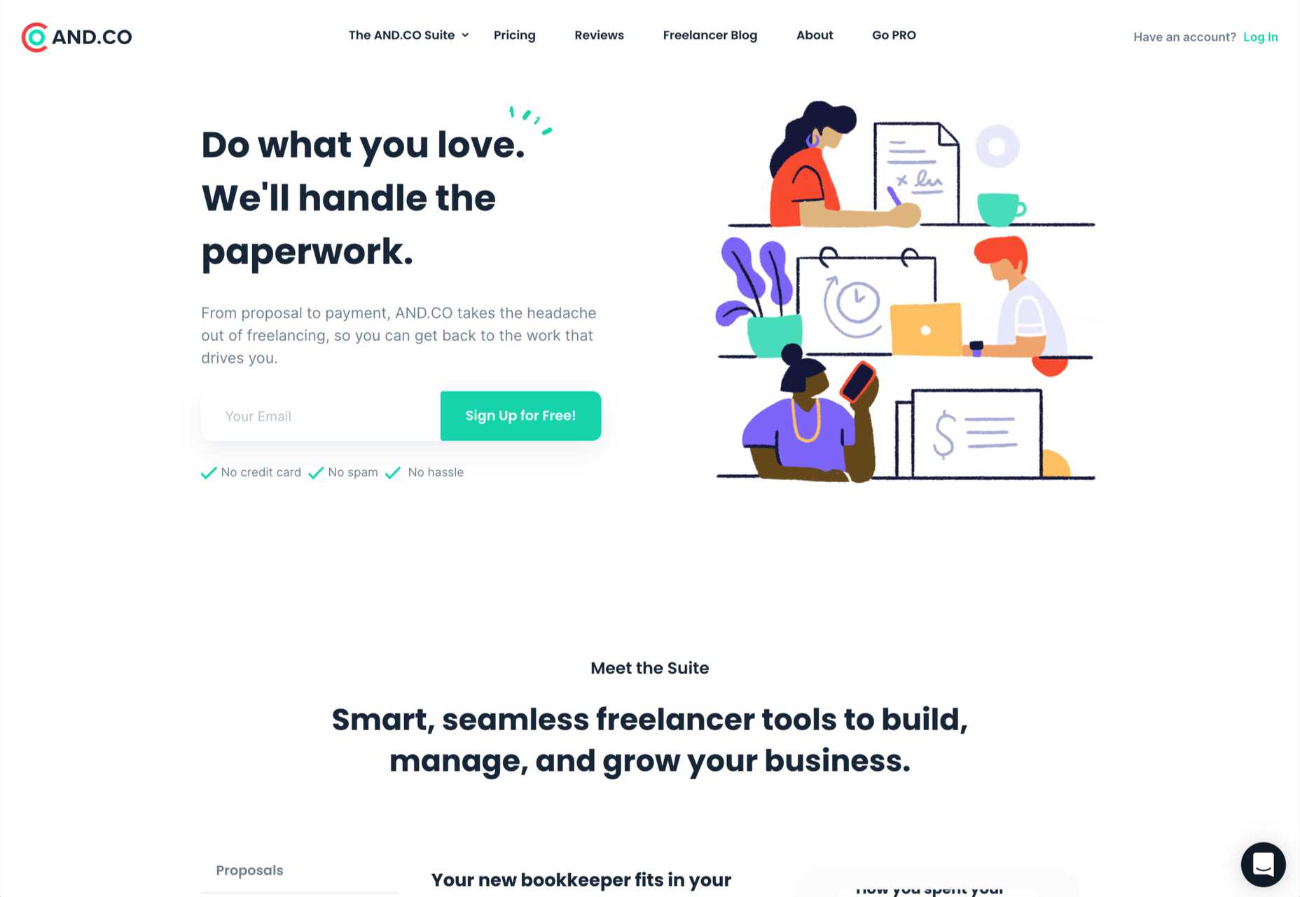
In my experience, the biggest challenge that freelancers face — more than winning clients or setting prices — is project management; take on too much work, and you’ll start missing deadlines, take on too little, and you’ll start missing your rent.

Some people are naturally organized; they rock up at their desk at 08:59, fully confident in what they will spend the next 8–12 hours working on. Let’s be kind and say that I am not one of them, and leave it at that. The only way I have managed to survive the industry is by self-consciously micro-managing my schedule on a daily basis.

When I worked in an agency, I knew what I would be working on days in advance. Now, I know 90% of what I’ll be working on, weeks in advance.

That level of organization requires very, very, very careful planning. I hold team meetings at the end of the day, yes, “team” meetings of one person. To do that I use a number of tools that suit me.

How to Choose a Project Management App

The most important aspect of any project is the end. That’s when the client will assess your work, and that’s when you get paid. So when you choose a project management solution, make sure it gives you a clear path to the project conclusion.

I know one freelancer who sets himself a hard stop at 7 pm every day. At 7 pm, he downs tools switches off, and walks away. I once heard him end a client call at 7 pm because he’d reached his cut-off point. It made me wince — I would have stayed on until the call concluded — but it hasn’t affected his business.

I know another successful freelancer who works on a budget. When she has earned the money she needs for that day, she stops. She bills by the hour to make this work, so when she sits down in the morning, she knows exactly what time she’ll finish.

Personally, I prefer a task-based approach. I know what I have to get done; if I can get ahead, then great, but my main focus is ensuring I don’t fall behind. I believe that if you hit your deadlines, everything else will take care of itself. Admittedly, there have been a few late-nights (and all-nights) over the years, but thankfully they’re less common these days.

No one style of project management suits everyone. And it doesn’t matter what approach you take, provided you take an approach.

8 Best Project Management Apps for Freelancers

As a freelancer, the most important thing characteristic you can have is reliability. Cultivate a reputation for delivering on your promises, and you’ll become invaluable to your clients. The best project management app is the one that helps you keep your promises.

There are some excellent tools on the market that facilitate project management, but most are aimed at SMEs, or project managers running a team of freelancers.

The tools here are listed from least, to most useful for the average freelancer. I’ve avoided too many time-tracking apps because I find these tend to encourage billing by the hour, which is potentially damaging to your business long term. If you do need pure time-tracking, check out Harvest. I’ve also avoided solutions that are too large-scale to benefit freelancers. If you’re looking for a project management tool for teams, then Basecamp, Jira, Project.co, and Redbooth are all worth considering.

Sadly none of these apps are perfect, and there’s a good chance you’ll need to use two or three to manage your projects.

8. Todoist

Todoist is hands down the best to-do app on the market. The downside is that its feature set is minimal.

Todoist really excels at lists. You can break down tasks into sub-tasks, and sub-sub-tasks. The downside is there’s no real scheduling or comparison of multiple projects in a single view.

The mobile apps are great, and Todoist recently introduced boards, a form of kanban board that gives you a good overview of everything. If it introduces a gantt chart, I can see myself relying on it more.

Todoist has a free forever plan that is fine for most freelancers, and the paid plans start at just $3 per month.

7. Bonsai

Bonsai is an excellent service for freelancers that grew from a simple invoicing app to include proposals, contracts, time-tracking, and more.

I used Bonsai for invoicing for a couple of years, and it does everything it claims to do. However, there are a couple of significant areas where it falls down. Firstly, its invoicing is super-aggressive and cannot be customized — make sure you’re on friendly terms with any client you send a Bonsai invoice to. Secondly, while it does a good job of tracking what you have done, it doesn’t help you plan what needs to be done beyond a formal proposal.

If you’re running a few simple projects, then it’s possible Bonsai is right for you. Pricing starts at $19 per month.

6. Monday

Monday is one of the biggest players in the project management market. It offers a dizzying array of options, and if this list were aimed at project management for agencies, Monday would be further along our countdown. Monday may suit freelancers, particularly those who have migrated from agency work, but for most, it’s more than we need.

There is a free-forever plan that covers almost everything you could want. However, if you need to view your projects as a gantt chart — and I strongly suggest you do — then you’ll need to update to the standard plan, which starts at $8 per user per month, with a minimum of three seats, meaning at least $24 per month when billed annually.

5. AND.CO

AND.CO stands out as a slick, easy-to-use option for managing a freelance business. Like Bonsai, it allows you to manage proposals, invoicing, time-tracking, expenses, and more.

AND.CO also has extremely well-liked customer support. An underestimated consideration when you don’t have your own accounts team to resolve problems.

As with other solutions of this type, the task-management is lacking. It does include a simple to-do list, but in my opinion, it’s not sufficient, and you’ll need to supplement it with something that supports gantt charts.

There’s a free forever plan, but it’s barely more than a free trial. Pricing for full-featured access starts at $18 per month when billed annually.

4. ClickUp

ClickUp is a SaaS that aims to replace just about everything else you could need. Unlike some options on this list, it includes a CRM, which is a bonus because there’s nothing worse than relying on the search function in your email to track down someone’s contact details.

ClickUp also offers a genuinely free-forever account with enough features to make it usable. If you choose to upgrade to a paid plan, it’s just $5 per user per month, which is excellent value.

If anything, there’s just too much in here. If you’re someone who considers themselves a power-user who enjoys digging into every nuance of a UI, then ClickUp could be for you. But, if, like me, you favor a simple tool that does what it’s told and gets out of the way, then there are better options.

3. Asana

Asana is probably the best-known project management tool on the market. It offers a tremendous number of options and is flexible enough for any style of project management.

There’s a free forever plan that is ideal for getting started and offers you most — you may be sensing a theme here — of the features you’ll need. But Asana’s best feature is its excellent timeline implementation of the gantt chart, for which you’ll need to upgrade to a premium plan costing $10.99 per user per month, with a minimum number of 2 seats that translates to a rather expensive $21.98 per month.

2. Trello

Trello is famous for its kanban boards, and many people prefer them to gantt charts, which has helped the app grow rapidly in the last few years.

If you’re prepared to pay $10 per user per month, Trello actually offers gantt charts as well, in the form of its timeline feature.

Trello is mainly designed for teams, not freelancers. However, if you do have the budget for a premium plan, Trello gives you an enviable ability to switch project management styles on a whim.

1. Toggl

Toggl is perhaps the perfect balance of time-tracking and gantt chart that is ideal for freelance projects.

As with most tools, Toggl is designed for teams, with billing starting at $8 per user per month. However, it offers a solo plan, designed for freelancers, that is free forever.

The main thing you miss out on with Toggl’s Solo plan is team timelines, which you won’t need unless you’re outsourcing work. One other obvious omission is unlimited planning boards, which you may find yourself paying for sooner or later.

But for a mixture of simplicity and powerful features available for $0, Toggl is hard to beat.


Featured image via Pexels

Source

The post 8 Freelance Project Management Apps for 2021+ first appeared on Webdesigner Depot.


Source de l’article sur Webdesignerdepot

J’ai récemment eu une conversation avec le responsable produits d’un grand fabricant d’équipements industriels. Chaque machine comporte de  multiples variantes, est vendue à des centaines de clients, ce qui représente des milliers d’installations à travers le monde et peut être utilisée pendant des décennies. Mon interlocuteur m’expliquait qu’il avait reçu un appel d’un de ses clients  pour la mise à niveau d’une de ses machines pour en augmenter la productivité et optimiser. De ce fait, les équipes de ce responsable produits  vont être très occupées pour répondre à cette demande au cours des prochaines semaines, voire des prochains mois. Imaginez maintenant le nombre de ressources et le temps qui seraient nécessaires s’il avait à répondre à plusieurs demandes similaires en parallèle.

Voyons quelles sont les tâches les plus importantes qui sont requises pour élaborer un plan de réponse complet à destination de ce client :

  • évaluer le potentiel de revenus de la demande de mise à niveau ;
  • analyser la réplicabilité de la solution auprès d’autres clients ;
  • vérifier l’état de fonctionnement de l’équipement ;
  • évaluer le mode d’utilisation de la machine ;
  • valider la compatibilité de la dernière configuration proposée par l’ingénierie ;
  • comprendre les nouvelles exigences applicatives ;
  • effectuer une analyse des risques ;
  • analyser les perturbations de la chaîne d’approvisionnement ;
  • collaborer avec les fournisseurs et les partenaires pour élaborer le plan d’exécution ;
  • et probablement bien plus encore…

Il est également important de noter le nombre de systèmes, de processus et de partenaires requis pour construire et appliquer ce plan d’intervention.

Tout est question de stratégie globale

Nous voyons de nombreux clients de tous secteurs, en particulier dans la haute technologie, l’énergie, les équipements industriels, la santé, l’aérospatiale et le pétrole et le gaz, cherchant à tirer une part croissante de leurs revenus de services stratégiques. C’est un objectif commun aux fabricants d’équipements d’origine (OEM) recherchant des marges plus élevées, une proximité accrue avec leurs clients et des revenus récurrents.

Pour y parvenir, les entreprises doivent élaborer une stratégie globale, en intégrant les services d’ingénierie à la gestion des actifs, afin de rapprocher les OEM des opérateurs.

Dans cet article, je vous expose les éléments stratégiques liés à l’intégration du monde de l’ingénierie et de l’opérationnel, qui permettront aux OEM et aux opérateurs de maximiser la valeur de leur collaboration et de mettre en place une base permettant d’explorer de nouveaux business models, tel que le Product as a Service.

Éléments stratégiques d’une intégration des services d’ingénierie à la gestion des actifs

Ne serait-il pas intéressant de disposer d’un package de solutions prêt à l’emploi permettant de gérer tous les actifs installés, prenant en compte leur durée de vie et leur état ?

Comment y parvenir ?

Voyons quelques-uns des éléments stratégiques qui permettront de briser les silos fonctionnels, pour bénéficier d’une vue à 360 degrés du cycle de vie des produits et des actifs.


  • Tout d’abord, un OEM doit savoir déterminer la configuration d’un actif existant à partir des spécifications du produit issues de l’ingénierie. Il s’agit ici de la capacité à suivre et à gérer entièrement l’actif lors son installation, puis tout au long de son cycle de vie et jusqu’à sa mise hors service. L’un des aspects importants est de comparer dynamiquement l’actif en fonctionnement avec les configurations d’ingénierie les plus récentes, afin de prendre les bonnes décisions de maintenance ou de mise à niveau.
  • Le deuxième élément est la façon dont les partenaires collaborent et partagent des données. En créant un écosystème collaboratif de nouvelle génération basé sur le cloud, les équipementiers, les opérateurs, les fournisseurs et les partenaires de service vont disposer d’une plate-forme commune. Elle permettra de rassembler l’ensemble des partenaires, de partager du contenu, des données, et même d’étendre les processus métiers au-delà des murs de l’entreprise. L’objectif est de permettre aux OEM et aux opérateurs de déterminer quelles mesures doivent être prises et à quel moment.
  • Le troisième aspect est l’efficacité avec laquelle nous utilisons les données d’ingénierie en amont pour améliorer la gestion des actifs. Avec une ingénierie de service efficace, nous pouvons établir une nomenclature des services, des conceptions de services, identifier des systèmes critiques, définir des caractéristiques de performance, planifier des stratégies de service, créer des aides visuelles et bien plus encore. Les données de l’ingénierie de service peuvent être utilisées efficacement dans plusieurs flux de gestion des actifs, tels que la planification de la demande, les services sur le terrain, la gestion des garanties, les plans de maintenance et les stratégies d’actifs. En activant une continuité numérique de bout en bout, il est possible de connecter les données tout au long de la chaîne de valeur d’un service, de sa conception à son utilisation.
  • Enfin, l’un des éléments clés est de permettre aux entreprises de capturer et d’analyser les données transactionnelles et de performance des actifs opérationnels. Une fois restituées sous forme exploitable, ces informations permettront de générer des plans de service dynamiques, mais aussi d’identifier les modifications de conception à apporter, ainsi que les mises à niveau possibles afin de maximiser la valeur d’un actif. Cette boucle de rétroaction continue reposant sur l’ensemble de la base installée permettra aux OEM de proposer de meilleurs produits, plus durables.

Afin de répondre à cette évolution des besoins métiers sur le terrain de l’intégration des services d’ingénierie à la gestion des actifs, SAP et Siemens Digital Industries Software ont récemment annoncé  une extension de leur partenariat qui leur permettra de fournir de nouvelles solutions de gestion du cycle de vie intelligent des services et des actifs. Il est essentiel que tous ces éléments stratégiques soient liés aux processus métiers de la chaîne d’approvisionnement et qu’ils soient accessibles sur une plate-forme unique pour que les équipementiers et les opérateurs puissent en tirer une valeur commerciale.


Découvrez la valeur stratégique qu’il y a à gérer le cycle de vie de produits intelligents et connectés avec des technologies numériques à travers l’ensemble de votre entreprise et de l’entreprise étendue.

Demandez le livre blanc PLM 2021 de CIMdata.


The post Que se passe-t-il lorsque l’ingénierie et la gestion des actifs convergent ? Place au rapprochement ! appeared first on SAP France News.

Source de l’article sur sap.com

We all want a little more fun and games in our lives. So, why not add some gamification to your next interactive content campaign?

By 2025, the gamification market is expected to witness a massive 30.1% growth rate, with global sales revenue reaching around $32 billion

That’s because gamification adds more entertainment to the website experience and gets audiences engaged. The idea behind gamification is to bring game mechanics into the design of a website or piece of content. There are many different ways to do this. 

Some companies add hidden achievements and bonuses to their blogs that customers can collect by visiting every page and reading their content. Others allow readers to collect points for leaving comments or play games to win potential prizes. 

Used correctly, gamification is a fantastic way to connect with your audience and increase engagement levels. So, how can you use gamification in interactive content?

The Evolution of Gamification 

Elements of gamification have appeared in everything from marketing campaigns to web design and even eCommerce strategies. 

In 2014, an Apple App Store review of more than 100 health apps even found that gamification elements in applications led to greater participation and higher user ratings. In other words, customers are more likely to get involved with an activity that includes gamification components. 

While gamification can take on many different forms, the aim for most companies is to create an environment where customers can feel more invested in their interactions with the website. For example, if you win a point every time you comment on a blog post, and you can trade those points in for prizes, you have more of a desire to keep commenting. 

The promise of being able to “accomplish” things with pieces of interactive content and websites also appeals to the competitive part of our psychology that pushes us to keep doing things in exchange for the promise of a kind of reward. 

Many companies have generated a lot of enthusiasm for their brands through leaderboards, time events, and similar experiences. For example, just look at how popular McDonalds becomes each year when the monopoly game rolls out as part of the purchasing experience. 

People buy more items than they usually would during McDonald’s Monopoly just for the opportunity to win. This same boost in engagement benefits your content strategy too. 

6 Ways to Add Gamification to Your Content

There’s no one right way to gamify your website or your marketing content. The method you choose will depend heavily on your audience and the kind of experience they respond best to. 

The key to success is finding a way to grab your customer’s attention and hold onto it. Here are some of the tried and tested strategies to explore:

1. Create an Actual Game Experience 

When it comes to incorporating gamification into your website design and content, you don’t necessarily need to be clever. You can be extremely straightforward and just design an actual game. For instance, to help attract more people to the American Army, the US created a war simulator that potential applicants could play on Steam. 

The game aimed to introduce young people who might consider a career in the military to what that job might be like. If the kids liked what they saw on Steam, they could visit the military website and learn more. 

For companies who can’t afford to build an entire fully-featured game, something a little smaller can be just as engaging. For instance, rather than using a standard pop-up with a discount code to entice customers to buy the rental service, Gwynnie Bee created a scratch card. People could scratch the spaces using their smartphone or computer cursor and win money off. 

The great thing about the interactive content from Gwynnie Bee is that it encouraged potential visitors to connect with the business in a lucrative way. To use the scratch card, you first had to give your email address. This meant the company could build its email list while delighting consumers. 

When designing a game experience for your marketing campaign, remember:

  • Get the right support: Designing a great game is tough, particularly if you want something more complicated than a scratch card. Don’t take the risk of creating something that doesn’t work properly; hire a developer. 
  • Promote the experience: Make sure everyone knows about your new game. Share screenshots on social media and talk about it in your email campaigns. 
  • Focus on fun: Remember, games are supposed to be fun. Measure the reactions of your audience to ensure they’re having a good time. 

2. Design a Loyalty or Reward Program

Loyalty is one of the most valuable things your audience can give you. So why not reward them for it? Loyalty programs are fantastic tools for business growth and engagement. They give you a way to turn one-off clients into repeat customers and advocates for your brand. 

How you choose to reward your customers (and when) is up to you. Some companies might give customers points every time they share a post on social media or comment on a blog. This encourages more engagement with your brand. 

On the other hand, you might just let your customers earn rewards for every purchase they make. This is a strategy that Starbucks uses with its reward program.

As customers increase their spending with Starbucks, they get the reward of extra points that they can put towards future purchases. This keeps customers coming back for more and may even entice some clients to buy Starbucks when they otherwise wouldn’t. 

The oVertone company is another excellent example of a brand using gamified rewards with its marketing strategy. The loyalty program breaks down into tiers, where users can see how much they need to spend to ascend to the next level. New rewards and perks appear with each level. 

Remember, when building a loyalty program:

  • Make your customers feel special: Ensure that your audience feels good about being one of the lucky few in your loyalty program. Give discounts and offers they can’t get elsewhere.
  • Keep them informed: Make it easy for your customers to see what they need to do to get their next reward, so they keep coming back for more. 
  • Mix things up sometimes: To stop the experience from getting boring, roll out things like “double points” days and bonuses for your most active customers. 

3. Encourage Customer Interaction

The biggest benefit of gamification is that it encourages and increases customer interaction. You can give rewards to participants that comment on your blog posts, for instance, or share your posts on social. The customer benefits from the reward, while you get the advantage of a better business presence. 

Samsung drives interaction with gamification with a function on its website that allows customers to discuss issues and watch videos. The most active participants get a badge for their efforts. 

If your business structure requires a lot of engagement from your audience, then using gamification elements can encourage them to stick with you for longer rather than losing interest. For instance, language learning software Duolingo has a four-point gamification strategy for its users.

Duolingo knows that learning a new language takes a lot of time, so it asks users to set small specific goals instead. The smaller tasks bring users back regularly, and consistent users gain rewards. There’s even a progress bar to help you track your progress compared to other customers. 

Gamification gives your customers another reason to keep coming back and connecting with your brand. That makes a lot of sense for companies that rely on long-term relationships with customers, like Duolingo and other teaching brands, for instance. Remember:

  • Make it simple: People will only want to interact with your brand if it’s easy to do so. Make it clear what you want your customer to do and what they need to do next. 
  • Reward every action: Keep people coming back for more by rewarding them for their actions, even if it’s just with a gold star or digital sticker. 
  • Nudge inactive customers: If a client gets involved in your interactive content, then stops participating, send an email reminding them why they should come back. 

4. Run Contests and Offer Prizes

Probably one of the easiest ways to use gamification in your advertising campaigns is with a competition. Contests and competitions have been around since the dawn of business. They’re a useful way for companies to collect information from customers, particularly if you ask your clients to sign up to your site with an email address to get involved. 

Competitions are also a way to push your audience into doing positive things for your company. For instance, you could run a competition where consumers share a social media post and tag a friend to enter. Or you could have a competition that asks your clients to refer a friend to get involved. 

When KIND, a healthy snack company, wanted to connect with its customers and create a new product, it didn’t just do market research. Instead, the company created the “Raise the Bar” contest to let customers cast a vote for which flavor they wanted to see next.

When 123ContactForm wanted to engage its audience, it gave people the chance to win one of three platinum subscriptions for 6 months. 

Contests are naturally exciting and fun to take part in. They’re an opportunity to get your audience excited, and you don’t need to give anything huge away either. Just make sure that the prize you offer is something that your audience will be interested in. 

A few more pro tips include:

  • Generate hype first: Don’t just launch a contest out of nowhere; get people excited about the idea with announcement blogs, social media posts, and emails. 
  • Give people a lot of ways to get involved: If people can’t take part in the competition on social media, let them do something on your website instead. 
  • Follow up after the win: When someone does win something from your website, follow up with that winner and post pictures in the form of a blog/case study. This will generate more hype for your brand and get people excited about the next event. 

5. Get Your Audience Feeling Competitive

No matter how much they might deny it, most people are at least a little competitive. So when you’re implementing a gamification campaign into your content and marketing efforts, it pays to tap into that sense of competition. All you need to do is find a way to encourage your followers to compete. 

The best example of a company that did this particularly well is Nike. Nike and the Run Club app teamed up to motivate people to get involved with healthy activities. The app allowed users to customize and build their ideal training program based on their athletic level. 

At the same time, you could also win badges and trophies to share with your running community. The more you took part in challenges on the app, the more you could potentially win. 

The Fitbit application has a similar way of keeping customers engaged. When you download Fitbit, you can access information about your exercise strategies and potentially track your progress towards your goals. However, there are also measurable achievements to earn – like a badge when you first walk 500 miles. 

Users on Fitbit can also find their friends using the same app and compete with them in various challenges. 

To successfully add a competition to your gamification strategy, remember:

  • It needs to be social: People will be more inclined to get involved if they show off their achievements. So make sure that people can showcase their accomplishments. 
  • Make people want to win: There needs to be a reason to get to the top of the leaderboard. You might offer people discounts or exclusive prizes if they accomplish certain goals. 
  • Show progress: Prompt people to keep working on reaching their targets by showing them how close they are to success. 

6. Make Boring Content Seem More Interesting

Some content is naturally more engaging than others. If you want to showcase some important information or data, you might create a whitepaper or a report. Unfortunately, the result can be a relatively bland piece of content.

With elements of gamification, you can make the experience a lot more engaging and interesting. Sites like Daytum.com allow users to turn personal stats and information into charts that showcase information in engaging ways. You can allow your users to track their progress through the report and rack up points as they go. 

Adding subtle elements to otherwise clinical and less interesting information is a wonderful way to make the experience more exciting. The more enticed your customers are by your content, the more likely it is that you’ll sell them on your business. 

Gamify Your Marketing Strategy

Gamification isn’t a new concept, but it’s one that many companies and designers can begin to take advantage of these days. Thanks to more advanced browsers and smartphones, customers can more fully enjoy the interactive elements of websites and content campaigns. 

As your audience dives deeper into the digital world, they expect more unique experiences from you. Gamification can make any website or marketing experience more memorable. It’s time to take advantage. 

Source

The post 7 Ways to Use Gamification in Marketing Campaigns  first appeared on Webdesigner Depot.


Source de l’article sur Webdesignerdepot

Sept ans après l’annonce du lancement de son programme de mobilité électrique, SAP Labs France renforce ses équipes R&D pour répondre au succès grandissant de sa solution de supervision SAP E-Mobility. Le vecteur reste le même : stimuler, soutenir et accompagner l’innovation du Groupe.

Une équipe renforcée au sein du SAP Labs France qui confirme la capacité de SAP à aller au-delà de son cœur de métier

Aux prémices du projet, uniquement deux développeurs de SAP Labs France dans le développement du logiciel open source SAP e-mobility. Aujourd’hui, l’équipe R&D dédiée à cette solution, compte 18 talents en IoT, croisant hardware et software, répartis à Mougins (15) et Caen (3). Une première pour SAP !

Le logiciel SAP E-Mobility permet de combiner et de connecter les bornes de recharges des véhicules électriques à d’autres modules SAP tels que des modules de pricing, d’itinérance, de smart charging, d’ERP, tout en prenant en considération les sources de production et de consommation d’électricité de l’infrastructure. Son développement rapide s’explique entre autres par le soutien du Groupe à travers l’investissement global de deux milliards d’euros. Mais, aussi par l’attrait de son offre qui a séduit rapidement les partenaires et clients de SAP.

Aujourd’hui SAP Labs France propose sa solution aux entreprises de toutes tailles. Par exemples, Proviridis, ChargeX GmbH en Allemagne et Zeplug à Paris. L’objectif est de répondre à la demande de recharge (charge at work /charge at home).

Cette solution offre à ses clients la possibilité de :

  • gérer 20 000 à 30 000 bornes de recharges ;
  • réduire leur impact carbone ;
  • réaliser des économies en termes de total cost of ownership (tco), tout en répondant à leur objectif de développement durable.

“Si demain tous les véhicules en France, soit environ 40 millions de voitures, devenaient des véhicules 100% électriques, nous ne rencontrerions aucun problème d’un point de vue électrique. Mais plutôt des difficultés au niveau gestion. Pour cela nous avons besoin d’outils qui savent gérer toute cette énergie, pour appliquer une charge intelligente “smart charging”, prenant en compte l’électricité qui circule dans le réseau. De plus, toutes les entreprises ont besoin d’intégrer ces informations à leurs systèmes existants pour connaître les avantages en nature.” Hanno Klausmeier, Président SAP Labs France

Des perspectives d’avenir toujours plus durables et innovantes

SAP se positionne progressivement sur d’autres domaines plus éloignés de la borne de recharge électrique. Par exemples, les panneaux solaires et l’IA en collaboration avec l’institut Vedecom pour à terme proposer une solution allant au-delà de la supervision des bornes. Ainsi, l’objectif est de les rendre plus autonomes pour trouver les erreurs ou encore gérer les pannes automatiquement.

“Grâce à l’intelligence artificielle nous souhaitons rendre les bornes plus autonomes et accessibles. Dans un futur proche nous espérons pouvoir activer la borne de recharge dès son branchement sans avoir recours à la SAP charge card.” Hanno Klausmeier Président SAP Labs France.

Cette solution est pour l’instant uniquement proposée par SAP Labs France. Cependant, SAP a pour ambition de la commercialiser à l’échelle globale du Groupe d’ici le troisième trimestre 2021.


The post SAP Labs France renforce ses équipes R&D pour répondre au succès de son logiciel SAP E-Mobility appeared first on SAP France News.

Source de l’article sur sap.com

Creating an incredible brand experience for an end-user is about more than just designing the right home page or lining up a series of great product pages. 

Effective website design conveys crucial information about a company, through everything from font styles, to image choices. Nowhere is this representation of brand identity more important than on the about page. 

People frequently confuse the about page with the contact page or fail to leverage it correctly simply because they don’t know what to say. However, creating an about page that speaks to an audience can be immensely powerful. 

What is an About Page?

The first step in designing a great about page is understanding the purpose of the space. This isn’t just a page on a website explaining what a company does. 

The about page is an introduction to a company’s story, its brand essence, and personality. 

Done correctly, this page will demonstrate a crucial sense of affinity between a business and its customers. It will highlight values that resonate with a customer and make it easier for clients to trust businesses.

The Yellow Leaf hammocks company starts its about page with a video.

As you scroll through the interactive site, you discover new elements of the company’s tale, including what prompted the birth of the business to begin with and the brand’s mission. 

Yellow Leaf lets its visitors know what the company is all about by using authentic images of real people to external content and bold quotes. 

There are even snippets from customer case studies for social proof. 

About pages are relevant because they give customers a way to build a real human connection with a business. Harvard professors say that 95% of purchasing decisions are emotional; we don’t buy things just because we need them. Instead, we look for companies that we feel connections with to solve problems. 

Using an about page to convey an attitude, personality, or just what makes a business special is how designers can ensure that end-users will care more about the business. 

How to Make an About Page Stand Out

So, how do you make an about page stand out?

Since every company is different, there’s no one-size-fits-all strategy for everything.  However, there are a few essential steps to consider as you move through the design process. 

Here are some pro tips for successfully attracting attention with the about page…

Step 1: Decide What to Include

It’s tempting to assume that a complicated about page will lead to a stronger relationship between a brand and its customers. After all, the longer the story, the more the customer knows about the company – right?

While it’s essential to include plenty of valuable information in an about page, it’s also worth remembering that today’s customers are short on time. They don’t want to spend hours scrolling through one part of a website. Instead, they want access to quick, convenient snippets of information. 

The Joseph Payton about page is effective because it cuts the story down into bite-sized chunks. Each piece of information highlights valuable insights for the customer. Plus, hand-drawn images and animations make the experience feel like you’re getting to know Joe on a deeper level. 

Before you begin designing, ask yourself:

  • How much text does the page need? How much space does there need to be for copy? How can you spread the content out in a visually engaging way?
  • What sections should the page include? For example, does there need to be a link to the contact us page or a contact form somewhere?
  • How does the page connect to the rest of the website? For example, can you link to things like case studies and reviews with quotes to tie more of the website together?

Step 2: Make the Mission Statement Clear

In a world where emotion influences buyer behavior, clients and customers want to buy from companies they believe in. It’s not enough to have the right product or price point anymore. People want to know that they have a human connection with a business. 

On some about pages, it’s difficult to pinpoint the real mission of the company. It seems like you have to scroll through endless paragraphs of text to make your own assumptions about what matters to the company. However, a well-designed about page puts this crucial info front and center. 

For instance, on the Apptopia about us page, the subheading tells you everything you need to know about the brand. This heading instantly tells the audience whether it’s worth reading on to find out more. 

The best about us pages often include a lot more than just a single sentence of text. But it’s worth pinpointing some of the essential details from these pages and drawing extra attention to them. A larger font or a different font color could be perfect for this purpose. 

Alternatively, if it’s difficult to refine the company’s mission down into one message, it might be worth creating a whole segment at the top of the page dedicated to this information. That’s what the Toms shoe company does.

Step 3: Invest in the Right Trust Elements

People aren’t always sure who they can trust these days. 

There are millions of websites out there and billions of companies. Not all of them are going to appeal to every customer. Since an about page is all about making a crucial human connection between a business and its client, it’s important to implement as much trust as possible. 

The good news is that there are many trust elements you can embed into an about page to make it more reputable. Star ratings taken straight from companies like Trusted Reviews and Google are a great way to show that a company is already impressing its followers. 

Quotes plucked from your customers or segments of case studies that you can place throughout the About Page copy is another great way to show your authenticity. 

You could even take the same approach as Aja Frost here and embed genuine data and graphs into the about page.

One particularly helpful way to make a website’s about page more trustworthy without eating up too much space is to implement trust stickers. Badges that show all the right groups and regulators approve a company are a great start. 

Even showcasing the logos of companies that the business worked for before on a slideshow could be an excellent opportunity to add depth to their authority. 

Step 4: Convey Brand Personality

Brand personality is reflected in the tone of voice that a company uses for its content. You can see a company’s personality in the choice of colors it has on its website. It’s in the fonts that convey a message, and the videos, images, and other unique strategies that each business uses. 

Although a brand personality needs to shine through in everything the company does, it’s imperative on the about page. This is the environment where a customer is getting to know a business for the first time. As a result, the consumer should instantly recognize what kind of brand archetype they’re working with. 

Take a look at the Eight Hour Day about page, for instance. The first thing you see is a picture of two people laughing. That means you instantly get a sense of friendliness.

As you scroll through the page, you’re greeted by friendly, informal copy combined with bright colors and snippets of useful information. Everything feels comfortable and reassuring. 

When you reach the bottom of the page, you find a bunch of data that makes the company seem more trustworthy. There are links to its social media pages and a partial client list showcasing brands like JCPenny, Wired, and Purina.

Using the right combination of font, copy, and imagery, this About page tells you exactly what to expect before you begin interacting with the company. 

Step 5: Take Visitors on a Journey Through Time

Showing customers where a business is going with things like brand mission statements and values are great. However, it’s also worth giving people an insight into where a brand has already been. 

Many of today’s shoppers aren’t comfortable buying from brands that haven’t spent much time in their chosen industry. They want to see that the people they’re working with have experience, heritage, and plenty of background knowledge. 

What better way to demonstrate all of these things than with a timeline of accomplishments? Here’s an example of how Marshall showcases its history by mentioning various crucial historical milestones.

A timeline of events doesn’t have to be this complex, however. If you don’t want to overwhelm visitors with a wall of text, an actual timeline that offers quick and easy insights into what the business has done over the years could be a better option. 

Another option could be to have a few key statements from the company’s timeline, then link out to a separate “History” page for people who want to find out more. 

Step 6: Show the Human Side

People don’t buy from businesses; they buy from other people. 

An about page isn’t just a chance to show customers what a company does. It’s also an introduction to the people behind that organization. Showcasing the team members that contributed to the growth and continued development makes that organization more attractive. 

Obviously, if there are hundreds or thousands of employees in a team, you might not be able to mention them all on an about page. However, the page should generally include some insights into the c-suite and significant members of staff. 

A selection of company photos is a good way to introduce your team. However, you can consider other options too. For instance, to maintain their unique brand, the Tunnel Bear team designed to draw their own bear icons that represented their personalities.

The design is adorable, and it’s a wonderful way to showcase what makes the company so unique. At the same time, using this kind of illustration means you can avoid the hassle of trying to get all of your business photos to look consistent. 

Step 7: Show Values with Visuals

Finally, as we’ve mentioned frequently throughout this guide, an about page is an essential place to showcase the values of your business. These are the core principles that guide you in everything that you do. They help tell customers what matters most to you and prevent you from moving in the wrong direction. 

However, you’re not restricted to highlighting your values through copy and nothing else. You can also introduce customers to the things that matter most to you through visuals too. Graphics or illustrations that highlight important aspects of your business are a great way to share information without relying too heavily on text. 

Videos are another brilliant option, particularly if you have a lot to say but not a lot of time to say it in. That’s what Ben & Jerrys does.

You can also find a stream of “issues” the company cares about on the website too. This means that people can get more information on things like Democracy, Racial Justice, Fair trading, and what Ben & Jerry’s is doing about all of those things. 

Visual elements like this are a great way to give an about page more pizazz. Plus, they appeal to people who want to learn about your company but don’t want to spend forever reading through the text. 

Create Better About Pages

An about page shouldn’t be an afterthought. 

It’s a crucial part of showcasing a company’s unique style and personality. Used correctly, these pages convey crucial information about everything a business stands for. 

Use the tips above to give more meaning to your about page design, and remember to pay attention to how much your traffic and conversions evolve with every update you make. A better about page could even help you to drive more conversions.

Source

The post 7 Essential Design Tips for a Killer “About Us” Page first appeared on Webdesigner Depot.


Source de l’article sur Webdesignerdepot

SAP NEWSBYTE – 16 août, 2021 – SAP SE (NYSE: SAP) a annoncé aujourd’hui avoir acquis la propriété intellectuelle de SwoopTalent, un leader de la gestion des données sur les talents, dans le cadre d’une acquisition d’actifs.

L’intégration des données et de la technologie d’apprentissage automatique de SwoopTalent aux solutions SAP® SuccessFactors® renforcera la vision de SAP en matière de gestion de l’expérience humaine (HXM), qui donne la priorité aux expériences individuelles des employés et aux opportunités dynamiques qui stimulent l’engagement, améliorent l’agilité organisationnelle, permettant ainsi d’alimenter la transformation de l’entreprise.

« L’individualisation à grande échelle nécessite une plateforme de données sophistiquée et puissante qui s’étend sur plusieurs systèmes « , explique Meg Bear, directrice des produits SAP SuccessFactors. « En rendant les données plus fiables et plus accessibles, nous pouvons aider nos clients à acquérir des connaissances approfondies sur la main d’oeuvre afin d’améliorer, de renouveler et de redéployer efficacement les compétences et de préparer l’avenir de leur entreprise. Les fondateurs de SwoopTalent sont des leaders d’opinion de l’industrie avec une expertise avérée dans l’utilisation des données, l’apprentissage automatique et l’analyse visant à perfectionner la gestion des ressources humaines et rendre les organisations plus compétitives. Nous sommes ravis de les voir rejoindre SAP pour faire avancer notre stratégie HXM. »

Fondée en 2012, SwoopTalent a développé une plateforme alimentée par l’IA qui combine, analyse et entraîne les données provenant de différents systèmes et flux de travail RH. SAP prévoit d’utiliser la technologie de SwoopTalent pour renforcer ses capacités d’IA et fournir aux clients un regard holistique et continuellement mis à jour sur leurs main d’oeuvre – des compétences et capacités aux intérêts et préférences d’apprentissage – afin qu’ils puissent mettre en accord les compétences de chacun aux emplois internes, aux projets, aux formations, aux tuteurs et bien plus encore. Plusieurs employés de l’ingénierie de SwoopTalent rejoindront également l’équipe SAP SuccessFactors.

« Les organisations sont à un moment charnière, car le travail est redéfini autour de l’agilité, de l’objectif et de la culture« , a déclaré Stacy Chapman, PDG et fondatrice de SwoopTalent. « Avec le HXM, SAP a la bonne vision et la bonne stratégie pour fournir une technologie qui permet aux individus de se perfectionner et de construire une carrière en phase avec leurs intérêts et leurs compétences. SAP et SwoopTalent sont en parfaite adéquation culturelle et partagent les mêmes valeurs. Nous sommes ravis de continuer à faire progresser le HXM ensemble« .

SAP et SwoopTalent ont convenu de ne pas divulguer le prix d’achat ou d’autres détails financiers de cette transaction.

Pour en savoir plus, lisez « Empowering a Future-Ready Workforce : Why Data and Our Latest Asset Acquisition Are Key » et notez bien la date de l’événement SuccessConnect le 13 octobre 2021.

À propos de SAP

La stratégie de SAP vise à aider chaque organisation à fonctionner en “entreprise intelligente”. En tant que leader du marché des logiciels d’application d’entreprise, nous aidons les entreprises de toutes tailles et de tous secteurs à opérer au mieux : 77 % des transactions commerciales mondiales entrent en contact avec un système SAP®. Nos technologies de Machine Learning, d’Internet des objets (IoT) et d’analytique avancées aident nos clients à transformer leurs activités en “entreprises intelligentes”. SAP permet aux personnes et aux organisations d’avoir une vision approfondie de leur business et favorise la collaboration afin qu’elles puissent garder une longueur d’avance sur leurs concurrents. Nous simplifions la technologie afin que les entreprises puissent utiliser nos logiciels comme elles le souhaitent – sans interruption. Notre suite d’applications et de services de bout en bout permet aux clients privés et publics de 25 secteurs d’activité dans le monde de fonctionner de manière rentable, de s’adapter en permanence et de faire la différence. Avec son réseau mondial de clients, partenaires, employés et leaders d’opinion, SAP aide le monde à mieux fonctionner et à améliorer la vie de chacun.

Pour plus d’informations, visitez le site www.sap.com .

Contacts presse SAP

Anne Le Bacon-Gaillard : SAP, Directeur de la Communication EMEA North – anne.le.bacon-gaillard@sap.com
Mathilde Thireau: Publicis Consultants 06 49 68 42 72 – presse-sap@publicisconsultants.com
SAP News Center. Suivez SAP sur Twitter : @SAPFrance.

Veuillez tenir compte de notre politique de confidentialité. Si vous avez reçu cette alerte de presse dans votre courriel et que vous souhaitez vous désabonner de notre liste d’envoi, veuillez communiquer avec presse-sap@publicisconsultants.com et écrire Désabonnement dans la ligne Objet.

The post SAP acquiert la propriété intellectuelle de SwoopTalent pour renforcer ses capacités d’analyse des données sur les talents appeared first on SAP France News.

Source de l’article sur sap.com

In the information age, time is a valuable commodity and something people don’t want to spend too much of. As a result, the average visitor only reads about 20% of the content of a page

For web designers and developers, that means a few things: first, you need to ensure that the web pages you create are as engaging as possible; secondly, you need to find a way of making the critical information on any page stand out; thirdly, every modern designer needs to create assets that are easy for today’s fast-paced customers to use. 

Making websites more scannable is how you do your part as a designer to ensure that the customers who come to a page get the quick and convenient experiences they need. 

So, how do designers embrace scannability?

Designing for Scannability: An Introduction

At first glance, the concept of creating a website for scannability is strange. 

Most designers start their projects with the aim of making customers stay on a page for as long as possible. So it’s odd to think that you would want to make it simple for end-users to skip from one page to another on a website in a matter of seconds. 

However, scannability isn’t just about delivering information and getting users off a page. When sites are scannable, they make it quicker and easier for customers to slide down the purchasing funnel. A quicker and more convenient customer journey leads to a stronger user experience and more conversions. 

Look at Netflix, for instance. It doesn’t give interested users a ton of information on its homepage. Instead, the key USPs of the product are laid out bright and bold in the middle of the screen, along with one simple call to action: Get Started.

Designing for scannability means making it easy for users on a page to glance at a screen and instantly access all the information they need to take the next step in their buyer journey. 

There’s no needless scrolling or wondering what to do next. 

According to analyst Jacob Nielsen, scannability is essential because people look for specific things on every page they visit. 

Customers don’t read through web pages word by word. Instead, they scan through the content, plucking information out that serves their requirements. 

Questions to Ask When Designing for Scannability

So, how do you know if your web pages are scannable?

Start by asking the following questions:

  • What’s the intent of the people who arrive on this page?
  • What kind of information needs to be conveyed instantly?
  • Can the visitor see the next step in their journey immediately?

For instance, when someone arrives on the Evernote homepage, you can assume that they want to:

  • Find out about Evernote
  • Learn how to sign up
  • Jump to other pages to find out about features, and contact details

That’s why the designer behind the Evernote website placed an immediate piece of useful information at the top of the page: “Tame your work, organize your life” tells customers exactly what the entire product is all about. The brief paragraph of information underneath can provide a few more details if customers need it, then there’s an immediate call to action: Sign up for free. 

Not only does the call to action tell users what to do next, but it tells them the most important information they need straight away: it’s free. 

Scannable pages like this are useful because:

  • They help users complete their tasks quicker: Whether you want to sign up or learn more about the product, everything you need is available instantly, with no scrolling required. 
  • The bounce rate is reduced. Customers don’t get confused and hit the back button. That’s good for your client’s SEO and their bottom line. 
  • The website looks and feels more credible: Because customers get all the answers to their questions immediately, they’re more likely to trust the website. 

So, what are some of the best things you can do to make your sites as scannable as possible?

Use Visual Hierarchy

Visual hierarchy is a way of organizing the content on your website in a way that adheres to how people use the website. For instance, if you land on a blog page, you expect to see the headline first, maybe some information about the writer, and any other essential information, followed by the body content. 

Although it’s tempting for designers to try and surprise users with new visual strategies, the best way to make your content more scannable is to give end-users precisely what they expect. 

If you’re not sure what a page should look like, try checking out the competition. 

One of the most obvious visual hierarchy rules is that the main navigation should always go at the top of the page. 

Customers will expect to look at the top of the page to find navigation. They don’t want to have to scroll through your website, searching for a way to get to another page. If you want to make it as easy as possible for end-users to jump from one page to another, you can pin the navigation bar to the page so that it stays with users as they scroll. 

Maintain Negative Space

White space, negative space, or whatever you call it – is the part of your design that’s left empty. 

White space is crucial because it gives all of the objects on your page some much-needed breathing room. Without enough negative space on your pages, it’s impossible to embrace scannability because there’s too much information for a customer to take in at once. 

For instance, notice how there are big gaps of space between every element on a Forbes website post. A proper amount of negative space on your site ensures that users can quickly take in chunks of information and use that information to decide what to do next. 

To ensure there’s enough negative space on your website pages, ask yourself what the key elements visitors will notice when they come to a website. The essential items should be:

  • A title or header to confirm that the user is in the right place
  • A CTA that shows your user what to do next
  • A navigation header or menu
  • Critical information includes an introduction to what a page is about or an excerpt from the blog post they’re about to read. 
  • A visual component: A picture or image that gives context to the page. 

Anything else can usually be removed. So, for instance, if Forbes wanted to make the page above more scannable, they could easily remove the ads and social media sharing buttons.

Make the Next Step Obvious

Every page on a website exists in a hierarchy within the customer journey. 

A homepage leads customers to product pages, which leads to a checkout page, which connects to a thank-you page that sends the visitor back to another product page, and so on. 

When designing for scannability, it’s crucial to make the next step in the journey as obvious as possible. Usually, this means placing the call to action “above the fold,” where the customer can see it immediately.

Ideally, scannable pages should have just one CTA. This will stop your audience members from being confused or overwhelmed by choice. 

However, if you’ve got multiple CTAs, think about the average customer’s journey and what they’ll want access to first.

If those buttons don’t appeal to the customer, they can scroll a little further and see other “next step” options, like shopping for “self-isolation essentials” or browsing other popular product categories:

Test Every Page

Testing for scannability means examining every page and making sure that it’s as easy as possible for customers to move through the buying process as fast as they want to. 

Visit each page you design in a buyer journey and ask how quickly it would take end-users to get from point A to point B and beyond. Here are some of the common issues that might slow the customer’s journey and harm scannability:

  • Readability: Is the font legible? Is it large enough to read on all screens, including mobile devices? Legibility in the design world measures how quickly and intuitively your users can distinguish what’s going on any page. Remember that the color of the background, the amount of negative space around copy blocks, and even font pairing can impact the readability of the content. Show your pages to multiple people and time how long it takes for them to grasp the message that you’re trying to convey. 
  • Fluff: Fluff and extra features can make your pages more intriguing, but they can also slow users down. For instance, one picture at the top of a blog page can add context to the article. A slideshow of pictures stops the customer from progressing and keeps them stuck at the top of the page for longer. 
  • Words instead of numbers: According to Nielsen, eye-tracking studies show that numerals often stop the wandering eye. Numbers are compact and more regularly associated with statistics and facts, so they’re more likely to grab attention. If you want to get important points across to end users fast, use numbers, not words. 

Creating Scannable Pages

Scannability is becoming an increasingly important concept in today’s busy landscape. 

Now that more customers are browsing websites from their smartphones or checking out products on the move, designers need to think more carefully about adjusting to this agile environment. 

Scannable pages that move visitors along the buying cycle and into the next stage of the funnel will deliver better results for your clients, and therefore better outcomes for you. 

Source

The post Quick Ways to Make a Webpage More Scannable first appeared on Webdesigner Depot.


Source de l’article sur Webdesignerdepot

Choosing to work for free, pro bono, gratis, without charge is something that most of us find ourselves doing at one time or another. Whether we’re filling a hole in our portfolio, there’s a friend or relative we feel beholden to, or because there’s an opportunity to aid a cause we value.

Recently, I agreed to take on some work, free of charge, for a charity whose goals I share. Because it’s a cause I believe in, I enjoyed the idea of being able to contribute in a more meaningful way than donating money. But my initial goodwill rapidly diminished as the project spiraled out of control, leaving me resenting the time I spent on it.

No one should feel obliged to give away their time for free, but if you do choose to, there are rules you can apply to ensure that everything runs smoothly and you’re left with a positive experience.

1. Be Specific in What You’re Donating

The most obvious problem with working pro bono is that there is no correlation between cost and value.

Budget reins in project ambitions in a regular designer-client relationship; the more you ask for, the more it costs. Everyone encounters clients who want an ecommerce store “just like Amazon,” only to then rapidly downscale their plans when the actual development cost of a site on that scale is made clear.

working pro bono…there is no correlation between cost and value

But when there is no development budget, ambitions quickly escalate. Clients do not necessarily understand the work involved, and if they’re not footing the bill, there’s no incentive to learn.

As the professional, you need to guide them. Set limits on what you’re expecting to donate, and use that to frame what is reasonably achievable.

“I’m donating 40 hours of my time, which normally costs $3000.” Or, “I’m donating my SEO package, which is enough to meet your initial goals as discussed.” They are both perfectly fine.

The purpose is not to highlight your generosity; it’s to establish clear boundaries to prevent scope creep.

2. They’re Not Doing You a Favour

Any client who suggests that their project will be good for your portfolio or gain you “exposure” knows they’re underpaying you. When you hear it from a pro bono client, walk away immediately.

The client needs to understand you are donating your expertise, not because you need to, not because you’re expecting something in return, but because you’re an awesome human being who wants to make the world a little better.

A client who thinks you’re getting something out of the arrangement does not understand your commercial value and will treat you as a novice. Your evidence will become guesses, your decisions will become suggestions, and the client will have little faith in the project outcome.

Clients, whether paying or not, need guidance. If they don’t respect you and believe in your guidance, they will start to cast around for other opinions to the detriment of the project outcome and your relationship.

This brings us neatly on to…

3. Everyone’s an Expert

Q. What’s the difference between an amateur and a professional? A. Professionals get paid.

You’re not getting paid, so in the client’s eyes, you’re now an amateur. Hey, guess what? Their 12-year-old daughter is an amateur too, and her views are now equally valid.

When you’re working pro bono, you can expect a lot of “help.” You’ll find that someone’s niece is planning to major in graphic design…when she graduates high school…in four years. You’ll find that someone’s partner has a hiking blog, read an SEO article, and is happy to “give it a try.” You may even find that the client themselves fancies a career switch to web design and doesn’t think it looks too hard.

Shut that **** down immediately. Smile, be gracious. Explain that, of course, you’re happy for contributions, and then avoid them like the coronavirus.

You’re donating a professional service that you’ve spent years developing, and you’re donating it to a cause that you value. You’re not there to increase someone’s chance of getting into college or to distract someone from their boring day job. If you do want to mentor people, there are places you can do that.

Everyone Actually Is An Expert

The nature of pro bono work is that more often than not, the people involved actually are experts. The simple truth is that people who aren’t experts in something tend to be in low-paying employment and are too busy trying not to be in low-paying employment to donate their time.

Like you, the people volunteering their time are doing so because they can afford to. For example, you may find that the organization’s head of accounts spends Monday–Friday as a tax advisor; the head of outreach is a project manager at a construction firm; the head of safeguarding is a school teacher.

People bring transferable skills to pro bono roles. Be sensitive to the fact that just as you are an expert in your professional context, so may they be. Simply not being an expert in design does not make them an idiot.

4. Do Not Foot the Bill

It’s tempting to simply donate everything to do with the project: the domain name’s going to cost $10? Well, it’s only $10; hosting’s $5/month? Well, it’s not too arduous to set up a small space on your own server.

imparting your experience sets the organization up for future success

However, when you give everything away, the client doesn’t understand the cost or value they’re receiving. As a professional, it’s part of your job to educate the client on the costs of a project like this; imparting your experience sets the organization up for future success.

Be clear at the start of the project that the client will be responsible for all expenses.

If you wish to — and you should not feel obliged — you are always free to make a financial donation equivalent to the expenses.

5. Stick to Office Hours

When you agree to do pro bono design work, the chances are that you know the person or organization you’re doing the work for. There’s almost always a personal connection of some kind, which means that the person or organization doesn’t see you in the professional context that normal clients see.

All good clients will respect the fact that you don’t answer emails on a Sunday morning. Not so the charity client. Not only will the charity client assume that you’re available outside of office hours, they may even think they are doing you a favor by not disturbing you during your regular office hours.

It’s important that you find some downtime outside of work to live your life. If you don’t want your evening out with friends to descend into an impromptu planning meeting (you don’t), set clear boundaries about when and how you’re prepared to work on the project.

Unless you’re self-employed, you can’t donate time when you should be working; what you can do is append pro bono work to your paid employment — do an hour after work, on weekday evenings, for example.

If you are literally doing this in your spare time, then allocate a specific time slot, such as a Saturday afternoon, and stick to it.

7. Stick to the Plan, and the Deadline

It is a universal truth that projects run better when there’s a structured approach. It doesn’t matter if it’s lean, agile, waterfall, or whatever you want to dub it. What matters is that you have a plan that works for you and is suitable for the project goals.

A structured approach, especially one that includes a timeline, will combat most disruptions. On the project I was working on recently, I was preparing for final sign-off when one volunteer announced it was time to “start thinking about what pages we need on the site.” 🤨

Discipline is crucial in pro bono work because different stakeholders will have different levels of commitment; some people will be full-time volunteers, others will be donating an hour per week. What matters is that the project that you are responsible for runs on your schedule.

8. You Have Zero Availability

Non-profits tend to talk to one another. When your friends and family see what you’ve done for Joe’s startup, they will start having ideas of their own. The client you’re completed the project for will have other projects lined up. When you aren’t charging, there’s no shortage of clients.

be prepared to say, “no,” at some point

Before you agree to do any pro bono work at all, be prepared to say “no,” at some point.

The simplest way out is to say you have zero availability: you’re already booked up with paying work, or your boss has let you know she needs you for overtime next month.

Don’t feel bad about it. It’s probably true. There are only so many hours in the day, and even if you do have some time to spare, doesn’t your partner, dog, or social life deserve some attention?

There’s No Profit In Non-Profits

Working for free is not transactional. It probably won’t benefit your portfolio. It definitely won’t lead to paying work. Any skills or experience you acquire probably won’t be transferable. (It might give you the topic for a blog post.)

If the work were meant to benefit you, it would be called personalis bono.

Nevertheless, many of us will find ourselves agreeing to do pro bono work, either out of obligation or idealism. It’s not something to shy away from; changing the world — whether for a group or an individual — is a noble pursuit.

The key is that while you will not profit, neither should you suffer a loss. Volunteering your time, skills, and experience should be a sustainable process. One that you will not come to regret.


Featured image via Unsplash.

Source

The post How to Work for Free Without Wrecking Your Career first appeared on Webdesigner Depot.


Source de l’article sur Webdesignerdepot