Articles

Web design is often stagnant because designers look at the same work and follow the same trends. Unfortunately, algorithms promote work that is liked, and designers produce content to get likes, which leads to a self-feeding cycle.

We’ve been talking about the dribbblization of design for years, but Behance is just as guilty of promoting and encouraging homogenous design.

It’s not that Dribbble and Behance don’t have value; they are both excellent resources for designers. But they’re victims of their own success, and it’s healthier for them, designers, and the industry if we broaden our sources of design inspiration.

And so, today, we’re presenting this list of the best places to find design inspiration for web designers that aren’t Dribbble or Behance. (OK, you can check them out too, if you really want to!)

Awwwards

Awwwards is the top site for web design inspiration. The best agencies in the world post here, and a ‘Site of the Day’ award is a coveted accolade. So if you’re looking for design inspiration, this should be your first stop.

Admire The Web

Admire The Web is an excellent collection of curated sites. It’s more selective than sites like Awwwards, so you don’t have to dig through so much to find the best web design.

One Page Love

One Page Love is one of the best resources for designers seeking inspiring new ideas. It’s devoted to one-pagers, which means it leans towards apps, tech start-ups, and smaller independent projects.

Godly

Godly is another excellent collection of web design inspiration. Godley uses animated thumbnails, so you can get a sense of a site before you look at it in detail. As such, it’s perfect for animated landing pages.

Hoverstat.es

Hoverstat.es is a collection of curated websites that often finds little gems other sites miss. Unlike most roundups, it doesn’t go into much detail on each site, and new sites are infrequent, but it’s always worth a browse.

Siteinspire

Siteinspire is one of the most established design inspiration sites. The collection is carefully divided into different styles; if you find your own site listed, you can add your contact details.

Land-book

Land-book is a curated collection of the best sites on the web. The site does a great job of presenting screenshots clearly, and the similar sites feature is great for browsing a particular mood.

Savee

Savee is a fantastic site for browsing all kinds of design inspiration. It’s like Pinterest for designers as it leans towards art direction and photography. It’s easy to scan for mood boards.

UIJar

UIJar is a nicely designed collection of hand-picked websites. Unlike most other sites on this list, UIJar also features a collection of branding that’s great for identity designers.

Brutalist Websites

Brutalist Websites is the perfect inspiration site if you’re a fan of the Brutalist design trend. There are plenty of designs that show why Brutalism is so popular right now, but the site itself is probably short-lived.

Minimal Gallery

Minimal Gallery is a collection of sites that embrace minimalism. Like Brutalist Websites, the quality of the collection is very high, but the site’s lifespan is probably short-lived thanks to being tied to one trend.

Ello

Ello is a platform for showcasing excellent design work. It’s solid on illustration and artwork. There’s also a great deal of photography on show. You’ll also find regular opportunities tied to creative briefs.

DeviantArt

DeviantArt is still the largest, and arguably the best, showcase for illustration, with dozens of styles from Anime to classicism. It’s easy to lose a few hours browsing DeviantArt.

Figma Community

Figma Community is a collection of the best work from the Figma community. But you don’t need to be a Figma user to grab some inspiration from the UI work on show.

Lapa

Lapa is a collection of 5000+ landing pages. The collection is headhunted from around the web, so if you only have time to check out one site, Lapa could be a good choice.

Source

The post 15 Inspiring Alternatives to Dribbble & Behance first appeared on Webdesigner Depot.

Source de l’article sur Webdesignerdepot

There’s nothing like a new font or two to breathe new life into your designs. And so, every month, we put together this collection of the fonts that have caught our eye in the past few weeks.

This month we’ve got traditional slab-serifs, some original scripts, a couple of workhorses, and plenty of characterful display faces. Enjoy!

Canora

There are plenty of calligraphic typefaces available, but Canora is a little different. Alongside Canora Frente, which leans to the right, Canora Verso leans to the left for an original look.

Fisterra

Fisterra is an informal serif in two styles. Morte emphasizes the pair’s curves, and Fora accentuates the sharp lines; both share the same elegant skeleton.

King of August

King of August is a single-weight script that’s packed with energy. The extra cut beneath the stroke on characters like the lowercase s and p add a delightful wet-paint feel.

Lithops

This poster-worthy font is Lithops. The pattern forming the letter shapes is reminiscent of seaweed, fine jewelry, and acid flashbacks. Just don’t try setting body text in it.

Sangbleu

Sangbleu is a super-family of typefaces with five complementary voices: Empire, Kingdom, Republic, Versailles, and Sunrise. It’s ideal for demanding editorial work.

Kohinoor One

Kohinoor One claims to be the thinnest font ever produced, with strokes just one unit thick. It’s perfect for those occasions when you need light typographic color at extra large sizes.

Firelli

Firelli is a warm, contemporary slab serif with a range of weights from thin up to a chunky, retro-feeling Black. It works amazingly for both headlines and body text.

UCity

Ideal for signage, branding, and headline text, UCity Pro is a geometric sans-serif with ten styles and a variable font version.

Artex

Artex is an excellent sans-serif with simplified forms that work best when embracing its vast number of styles and weights. It’s also available as a variable font.

Colroy

Colroy is an excellent early-style slab-serif that is superb for setting large runs of text. It was begun in 2009, released in 2014, and has just been re-released with new weights and a variable font.

Fabbrica

Fabbrica is a solid, functional sans-serif that performs exceptionally well at small sizes, including on screen. It has rounded and sharp variations and different weights.

Mule

As the name suggests, Mule is a flexible, hard-working serif with mixed lineage. Its round shapes are friendly and engaging, and its vertical rhythm makes it ideal for extended text passages.

Romano

Romano is a distinctly Roman font. Subtle flares and abrupt angles call to mind carved letterforms and the formal scripts of the renaissance.

Kosmos

Kosmos is an experimental typeface in which multiple horizontal shapes make up the letters. The finest weights are barely visible, and the thicker weights overlap the shapes to create cloud-like forms.

Precise Sans

Precise Sans is an excellent font for dashboards and other complex UI designs. It is clean and modern with simplified shapes. It’s currently in beta.

Source

The post 15 Best New Fonts, Aug 2022 first appeared on Webdesigner Depot.

Source de l’article sur Webdesignerdepot

In application development, microservices is an architectural style where larger applications are structured as a collection of smaller, independent, yet interconnected services. While this allows for highly maintainable and testable applications (as each service can be maintained independent of the larger application), the problem with this method is the inherent complexity of interactions between microservices. It can be difficult for developers and team members to visualize how these microservices are connected to each other. We have been looking for ways to produce architectural diagrams that illustrate these interactions. We found that GraphViz helped us to solve part of this problem, as it can take the microservices structure of an application in the DOT language and convert it into a PNG format. However, we wanted this process to be even more user-friendly and more automatic, so that the user would not have to manually generate a DOT file of their microservices architecture. 

In-Browser Tool

As we could not find such a tool, we decided to create one ourselves. We decided that the most user-friendly interface would be to create an in-browser tool that allows the user to upload a jar  file containing a packaged service, and to have an image automatically rendered. This article discusses how we went about creating this tool and includes an example of what happens « behind the scenes » of this interface. 

Source de l’article sur DZONE

Today no less than 60% of companies are either exploring the possibilities of adopting artificial intelligence or trying to realize its potential to transform the way they do business. The problem is that a significant portion of them (one-third) struggle to produce substantial change with AI.

The lifecycle of an AI solution usually consists of problem definition, data collection, model building, model fine-tuning, and applying the solution to solve a specific problem. Various experts build the solution to solve business problems. Still, a problem solved by a data scientist does not automatically translate into a constant stream of actual value for the business. Once deployed to production, the AI solution cannot be left as-is. Like any other system, it requires continuous maintenance. However, any AI solution’s maintenance differs significantly from the maintenance of other systems (e.g., microservice-based applications). The performance of any AI solution can be affected by many factors, and if the maintenance work is not done, the solution will cause problems instead of solving them.

Source de l’article sur DZONE

Every day design fans submit incredible industry stories to our sister-site, Webdesigner News. Our colleagues sift through it, selecting the very best stories from the design, UX, tech, and development worlds and posting them live on the site.

The best way to keep up with the most important stories for web professionals is to subscribe to Webdesigner News or check out the site regularly. However, in case you missed a day this week, here’s a handy compilation of the top curated stories from the last seven days. Enjoy!

Advanced CSS Tricks that You Have to Know

Nnneon – SVG Generator for Futuristic-looking Glowing Shapes

The Best New CSS Features for 2022

Avatarg – Generate Beautiful Types of Avatar in One Click

I Just Spent $35,000 on a Domain. Here is Why!

10 Useful CSS Layout Generators (Grid & Flexbox)

Fffuel – A Mighty Collection of SVG Generators

Raindrop.io — All in One Bookmark Manager

My Wonderful HTML Email Workflow

3 Essential Design Trends, July 2022

My Dumbest CSS Mistakes

Source

The post Popular Design News of the Week: June 27, 2022 – July 3, 2022 first appeared on Webdesigner Depot.

Source de l’article sur Webdesignerdepot

Personalized marketing is when you attune your marketing efforts based on customer data. This data can be anything from the first and last name to purchase intent, concerns, and history.

Personalized marketing has revolutionized the way businesses market their product and service to their audience. It brings value to people’s lives, spiking the sales graph for brands and businesses. So it’s a win-win situation for both the company and the consumer.

Even big companies do this for their campaigns. They do so because it gives them great results and ROI for their marketing initiatives. If these multinational businesses do this, it’s a good idea to incorporate this strategy and learn from a top resource on digital marketing.

This article aims to explain every nook and cranny of personalized marketing. By the end of this 5-minute read, you will know the impact of personalized marketing on our lives. And how you can integrate this into your marketing strategy to benefit your business.

What Is Personalized Marketing?

Have you ever encountered a business that knows what you’re going through? Or did you see an ad online that you closely relate to? Chances are, you were one of the target markets of those marketing materials. And if you could associate yourself with the ad, their marketing strategy worked.

That is what personalized marketing does to your audience, market, or particular demographic. This style of advertising leverages personalization in your marketing materials. The details of your marketing content are tailored to a specific audience and address the issues or real-time problems of a particular segment in your market.

Personalized marketing has become popular because more people demand it from businesses. Once the people have experienced what it felt like, they want to feel more of it.

To objectively see the demand for personalization, here are some statistics to back it up.

Accenture reported that 91% of consumers are likelier to shop with businesses that offer them relevant content. This shows that the right product recommendations can increase the chances of shopping with you.

Salesforce mentioned that 66% of consumers expect companies to understand their individual needs. This statement proves that a generalized way of marketing isn’t as effective as before. The consumer mindset has already developed, and they demand more personalization from businesses.

A striking piece of data from Statista showed that 90% of consumers in the US find the idea of personalization appealing. If that figure is accurate, almost all businesses should start incorporating this into their strategies. There’s no reason for them not to try this out.

Given the high positive demand for personalized marketing, it’s no secret why more and more businesses are doing this. However, not every company out there is doing this right. A wrong way of doing this can bring a loss of clients and a negative ROI.

To help you go on the right track of using personalization in your marketing, read up on the next section of this article.

Know These 6 Tips To Correctly Do Personalized Marketing

You’d agree that knowing your customer’s first and last name is essential. But with the dynamically changing strategies, personalized marketing is going beyond that. It’s actually about understanding what your targeted consumers need, merging with a way to convey the message that your business is the solution.

To help you achieve this, take note of the things below:

1. Leverage Your Customer Data

The foundation of personalized marketing is laid on customer data. The best marketing professionals and strategists emphasize gathering relevant data if you want to scale. Excellent digital marketing courses will teach you that customer data will help you build a solid foundation for your content and campaigns.

Consumer behavior has always been the most important detail for target marketing. With every click, it has become easier to gather data about individual customers, their interests, hobbies, purchase history, buying behavior, and more.

You’ll be able to get this information if you’ve practiced data management and collecting customer data throughout the years of your operation. However, it’s not too late to begin if you haven’t started with this yet. There is a lot of marketing automation software that aids marketing teams in doing this. For example, many businesses use lead scoring software to gain insight into their clients’ needs and categorize them appropriately.

For your personalization efforts, you can use questionnaires, surveys, and feedback forms to capture personal data on the internet. A customer will happily fill out a survey form if a reward in return entices him. This reward can be in any form– a voucher, a first buy discount, free shipping, or more.

This initiative will help you get more data in a shorter time frame.

2. Understand Your Customer’s Needs

Hoarding data will be a complete waste of marketing efforts, capital, and efficiency if you do not extract consumer behavior from it. When you have access to a rich set of data, you have the privilege to understand your customers’ trending needs deeply. After gaining insights from the data, create a marketing strategy based on those findings to target your audience.

Doing this doesn’t just apply to B2C; it also works for B2B companies, which is why the demand for custom software development, tailored services, personalized packages, and B2B data providers have been on the rise in these recent years.

It is a two-way road. While you are on the lookout for your target market, at the same time, the customers expect businesses to know what they need. The market you’re currently serving expects you to know what products or services are fit for them.

So this is where it gets crucial: you have to dig deeper into your niche and find the specs of your audience’s needs. Having a general idea about the needs of your target audience and personalized marketing usually don’t go harmoniously.

Planning a better-personalized marketing strategy will not be a piece of cake but will be much more rewarding for every aspect of your business. May it be sales, return on investments, customer relationships, or personalized marketing campaigns.

3. Personalize Every Stage Of The Customer Journey

The first rule of business is convincing the customer that you are their best friend. Now that you know what they want, you pledge to provide them with whatever best you can. Limiting personalization to marketing is not the solution. You have to be vigilant in meeting these individual requirements at every stage. And remember that consistency is the name of the game. That is how you bring your business into the running.

You can integrate CRM automation, email marketing tools and deploy other content marketing strategies to help make this process a lot simpler. Personalized live chat and chatbots, such as those offered by ThriveDesk, allow businesses to personalize their offerings and build their brand reputation.

As a customer, my requirement would be reading content, browsing, and experiencing products that would hit home. A personalized experience is what every consumer demands. And this is what makes them want to go back and do business with you again.

By creating helpful and relevant content, recommending the right products to them, and giving out convenient payment options, you are setting your business apart from the rest. Doing this allows you to have personalized every touchpoint that your customers do with your business.

4. Present In An Engaging Way

Consider customer engagement as absolutely necessary. Having the best data set and knowing what your customers want is not enough. In the competitive space of business and marketing, everyone is trying to get the attention of one another. And this is what you are supposed to do. This helps in building consumer-brand relations.

When a consumer engages, meaningful things happen. Engaging content pushes the consumer through the funnel and hence promotes conversions. Your content should be creative and eye-catching.

Engaging content blended with personalization boosts the brand experience. Increased loyalty, trust-building, and improved customer experience enhance the conversion and sales speed.

A great way to use personalization in an engaging manner that most businesses overlook would be through exit-intent popups.

5. Be Where Your Customers Are

This is an element that some businesses miss out on. They have created excellent social media marketing content but only distributed it on the wrong channel. For personalized marketing to be effective, it needs to be seen by people.

Are you questioning your marketing techniques because all you see is stagnancy? You have set up an engaging online store on Shopify or Wix, collected all the relevant data, your content is engaging enough, and your marketing strategy is top-notch. But you are still unable to reach your clientele.

You start wondering what you are missing out on. Your content and your strategies will not be prolific if you are on the wrong channel. Remember: the message of your content has to reach the right people for it to be effective.

Should you be on social media? If so, which one? Do you get more traction with email campaigns? Or do you have more engagements on forums?

Find out where your market is, then spend your focus there. Now the next step is how to know where they spend most of their time?

This is where we go back in the loop. And hence we again emphasize that data collection is the foundation of any great marketing strategy.

6. Improve Marketing Content

Don’t rest on your laurels when you’ve gotten everything down to a tee and have attained your desired marketing analytics behind your personalized marketing content. Always think of ways how you can improve.

Evolving at every step will keep you in the running. Don’t be misguided into thinking that your work is done if you feel like you have reached the pinnacle. Keep looking for ways to get better. Set bigger goals and status for your business.

Always go back to the drawing board and brainstorm with your team on how you can change and strive with the dynamically changing world and mindsets. In the end, all you want is to build better relationships with your customers, new and existing.

For enhanced productivity, your marketing team should always look for new strategies. This is how fresh and great marketing ideas are made.

See How You Can Benefit From Personalized Marketing

Irrelevant information can waste energy and time for both customers and the business. Personalized marketing hits the bull’s eye 99% of the time. It brings immeasurable value to the company as well as the customer.

Here are some of the top benefits of personalized marketing:

1. Better Engagement

The first target personalized marketing aims at is grabbing an individual’s attention. And this results in better engagement eventually. If you are presenting your customer with something that wows them, needless to say, it will grab their attention.

This will help bridge the gap between your customer and your brand. Identifying customers’ needs and then giving them what they want will help improve customer interaction with your brand.

It can even be enough for them to follow your call to action. The next thing you know, they will be checking your website, signing up for a list, or even purchasing a product right then and there.

2. Higher Conversions

Are you there for your customer at the right time and place? One-on-one marketing provides easy solutions to customers because you hit them with just what they are looking for at the right time.

When potential customers realize that you understand what they’re going through and provide the solution, most won’t hesitate to try your business out.

Personalization isn’t just focused on content. It can also be integrated into your processes. This results in aiding the increase of higher conversion rates.

3. Improved Customer Experience

Offering personalization will significantly improve the user experience. Once you provide the products, services, and content that meet their needs, their opinion of your business automatically improves.

Considering the statistics about personalized experiences, it is evident that consumers demand personalization strategies from companies. And if you offer such an experience, you increase the chance of making them do more business with you. Personalization helps businesses in reducing cart abandonment rates, better customer journey, increased customer satisfaction, and many more.

4. Customer Retention

Retaining persisting customers is equally important to your business as bringing new ones. Most businesses face low customer retention. It’s also a factor that some companies overlook. You must understand that it’s not all about converting prospects into paying customers. Your focus should also be on retaining those customers to make them loyal advocates of your brand.

One of the major benefits of consistent personalization is an improved customer retention rate. Consumers tend to stay with a business that understands their needs and provides solutions to their problems.

Once you can transfer a customer to a loyal advocate, you can also receive a ton of benefits. These are people that are going to defend your brand from critics. These are the same people who will give you free marketing via word of mouth and positive reviews.

5. Better Customer Relationships

Personalized experience leads to customer retention, eventually building better relationships with your nurtured customers. These entities are connected in a loop.

Customer relationships are an aspect of business that significantly helps with scalability and higher revenue. So connecting with your customers and building a relationship with them is as important as the product you are selling. This is why strengthening customer relationships should be a top priority for businesses.

Personalization makes you an expert on your target market trends. You get to know your audience deeper, which helps you build a foundation for creating a great customer relationship. And this requires marketing and customer experience teams to work together in a symphony.

For this, you can use team collaboration software which aids in the optimization of content and your approach toward the market. You’ll have a better strategy in getting their attention, providing what they want, and recommending things they’ll be interested in.

All of these things help in building customer rapport. When a customer feels that you treat them as more than just a paying customer, their customer loyalty goes to your business.

Best Examples Personalization Marketing

To inspire you to integrate this marketing strategy into your operations, below are different personalization marketing campaigns done exceptionally by various businesses. Grab inspiration, ideas, and motivation from these examples.
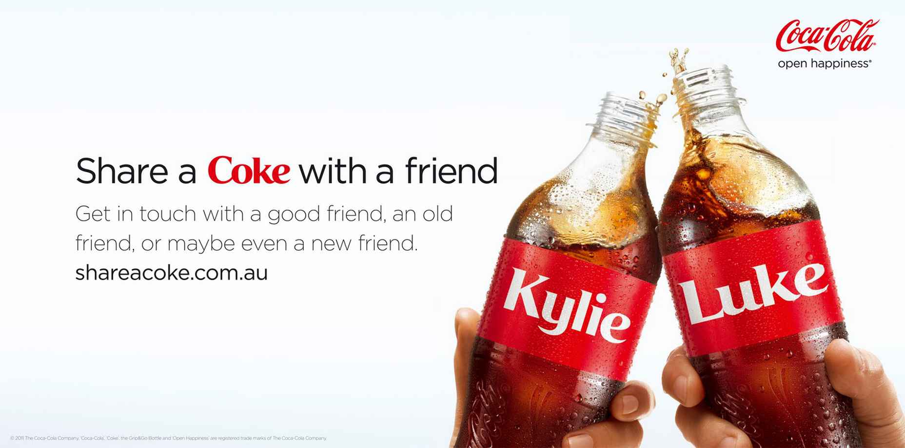
1. Coca-Cola

We all know the most basic form of personalization is addressing your customers’ names, but Coca-Cola took this simple idea into a massive global campaign. Their “Share a Coke” campaign started in 2011, wherein they printed different popular names on their Coke bottles and cans.

It seemed like a regular campaign at first, but it started getting traction as more customers wanted to get the name of their family, friends, and themselves. Coca-Cola said the campaign’s purpose was “to create a more personal relationship with consumers and inspire shared moments of happiness.”

The soft drinks giant used personalization and tied such a strategy with its mission: to bring memories and happiness to its consumers. You, too, can do the same – combine your mission and personalization strategy to create a unique campaign.
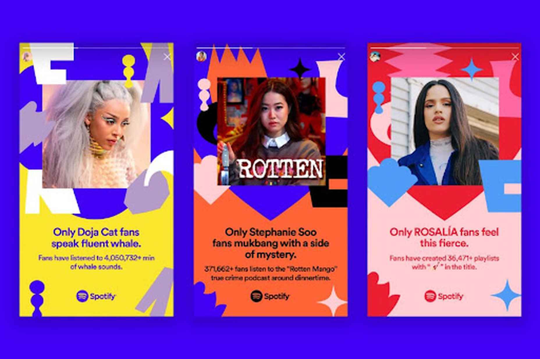
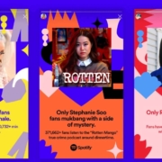
2. Spotify

Spotify leverages user data in its marketing strategy. They have several campaigns that make users want to use their application more often because it gives out a more tailored experience.

Other than their year-end campaign( #spotifywrapped), where they show the most played songs and podcasts their users listen to (which was a viral hit), they now also have an #OnlyYou campaign that shows your unique listening taste partnered with a musical astrology reading.
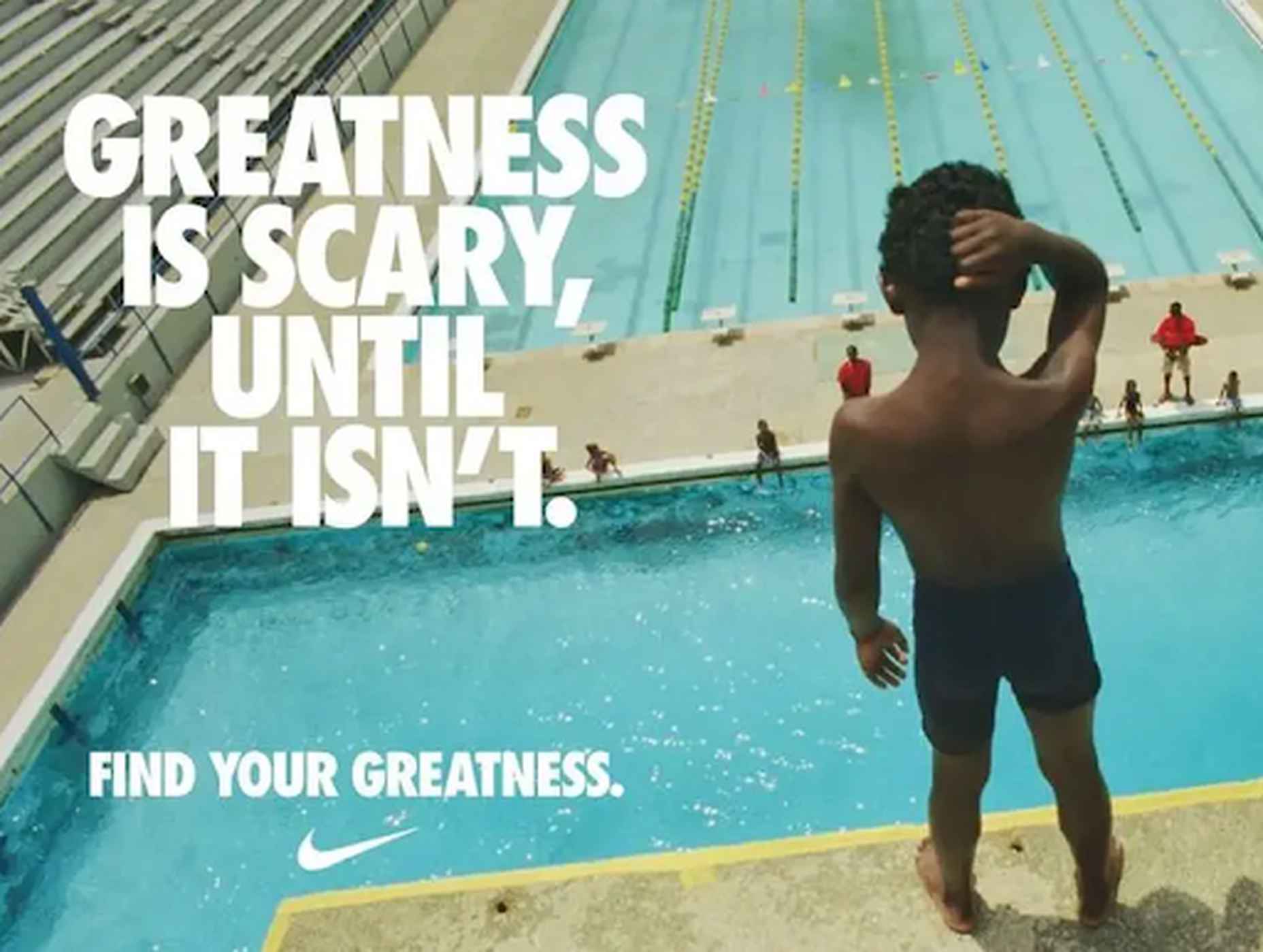
3. Nike

Nike has consistently been recognized for authentic, personalized, and heartfelt ad campaigns. This personalization always makes them capture an audience who can relate and those who start connecting to the brand. So Nike isn’t new to personalization. Their aim is robust community engagement.

Their highly inspirational campaigns with real-life heroes induce inspiration in their audience. Nike is great at converting people because of its excellent storytelling ability while adding personalization to the mix.

Nike’s just launched a new app that offers personalized content and rewards for committed fans. They tackle challenges and issues head-on, but they always make their marketing messages relatable to their audience. That is why they “just do it.”

Conclusion

Personalized marketing is the secret sauce to thriving businesses in the world today. However, incorporating this marketing strategy and finding success is not as simple as you might think. You will face challenges, but with enough perseverance and brainstorming, you can surpass them and successfully create a great campaign.

Remember, this marketing approach can be a hit or a miss. The first step to making it a success is relevant data collection followed by judicious implementation. This isn’t an overnight activity that you can do. It requires months of diligence in the right direction with the proper guidance. And you can gain valuable insights into this guidance via the content marketing strategies outlined in this article. But remember, once you start rolling, there is no looking back.

Source

The post The Complete Guide To Personalized Marketing first appeared on Webdesigner Depot.

Source de l’article sur Webdesignerdepot

UX laws are an invaluable tool, providing guidelines for designers that ensure we don’t have to continually reinvent the wheel when crafting experiences for the web.

However, UX laws tend to be devised by scientists and psychologists — people who are more than comfortable with the exceptions and allowances of academic language. By the time they filter down to us in the trenches, the language has invariably been over-simplified, and the wisdom behind the idea diluted.

Today we’re going to look at seven well-known and commonly cited rules of UX design that too many designers get wrong.

1. Jakob’s Law

Jakob’s Law, named for the UX researcher Jakob Nielsen, states that users spend most of their time on other sites and as a result prefer sites that work the same way as the sites they already know.

Jakob’s Law has often been used to limit experimentation and encourage the adoption of common design patterns in the name of usability.

However, the word ‘prefer’ is hugely loaded. While it’s true that a user will more easily understand a familiar design pattern, they do not necessarily prefer familiar experiences.

It has been widely proved that new experiences boost our mood and that new experiences improve our memory. If your goal is a memorable site that leaves users with a positive impression, introducing novelty is a sound decision.

2. Goal Gradient Hypothesis

The Goal Gradient Hypothesis assumes that the closer users are to their goal, the more likely they are to complete it.

It’s an attractive theory, especially in e-commerce, where it is often used to justify simplifying the initial purchase process and postponing complexity to move users along the funnel — a typical example is leaving shipping charges until the final step.

However, anyone who has studied e-commerce analytics will know that cart abandonment is a huge issue. In North America, shopping cart abandonment is as high as 74%.

We don’t always know what the user’s goals are, and they may not match ours. It may be that users are treating your shopping cart as a bookmark feature, it may be that they have a last-minute change of heart, or they may be horrified by the shipping charges.

While providing a user with an indication of their progress is demonstrably helpful, artificially inflating their proximity to your preferred goal may actually hinder conversions.

3. Miller’s Law

Never in the whole of human history has any scientific statement been as misunderstood as Miller’s Law.

Miller’s Law states that an average person can only hold seven, plus or minus two (i.e., 5–9) items in their working memory. This has frequently been used to restrict UI navigation to no more than five items.

However, Miller’s Law does not apply to items being displayed. While it’s true that too many options can lead to choice paralysis, a human being is capable of considering more than nine different items.

Miller’s Law only applies to UI elements like carousels, which have been widely discredited for other reasons.

4. Aesthetic-Usability Effect

Edmund Burke once said, “Beauty is the promise of happiness.” That belief is central to the Aesthetic-Usability Effect, which posits that users expect aesthetically pleasing designs to be more usable.

Designers often use this as a justification for grey-on-grey text, slick animations, and minimal navigation.

Critical to understanding this is that just because users expect a design to be usable does not mean that it is or that they will find it so. Expectations can quickly be dashed, and disappointment often compounds negative experiences.

5. Peak-End Rule

The Peak-End Rule states that users judge an experience based on how they felt at the peak and the end, rather than an average of the experience.

Designers commonly use the Peak-End Rule to focus design resources on the primary goal of each experience (e.g. adding an item to a cart) and the closing experience (e.g. paying for the item).

However, while the Peak-End Law is perfectly valid, it cannot apply to open experiences like websites when it is impossible to identify a user’s starting or ending point.

Additionally, it is easy to see every interaction on a website as a peak and even easier to make assumptions as to which peak is most important. As such, while designing for peaks is attractive, it’s more important to design for exceptions.

6. Fitts’ Law

In the 1950s, Paul Fitts demonstrated that the distance to, and size of a target, affect the error rate of selecting that target. In other words, it’s harder to tap a small button and exponentially harder to tap a small button that is further away.

UX designers commonly apply this law when considering mobile breakpoints due to the relatively small viewport. However, mobile viewports tend not to be large enough for any distance to affect tap accuracy.

Fitts’ Law can be applied to desktop breakpoints, as the distances on a large monitor can be enough to have an impact. However, the majority of large viewports use a mouse, which allows for positional corrections before tapping.

Tappable targets should be large enough to be easily selected, spaced sufficiently, and tab-selection should be enabled. But distance has minimal impact on web design.

7. Occam’s Razor

No collection of UX laws would be complete without Occam’s Razor; unfortunately, this is another law that is commonly misapplied.

Occam’s Razor states that given any choice, the option with the least assumptions (note: not necessarily the simplest, as it is often misquoted) is the correct choice.

In an industry in which we have numerous options to test, measure, and analyze our user interfaces, you shouldn’t need to make assumptions. Even when we don’t need extensive UX testing, we can make decisions based on other designers’ findings.

Occam’s Razor is a classic design trap: the key to avoiding it is to recognize that it’s not your assumptions that matter, it’s the users’. As such, Occam’s Razor applies to a user’s experience, not a design process.

Source

The post 7 UX Laws You’Re Probably Getting Wrong first appeared on Webdesigner Depot.

Source de l’article sur Webdesignerdepot

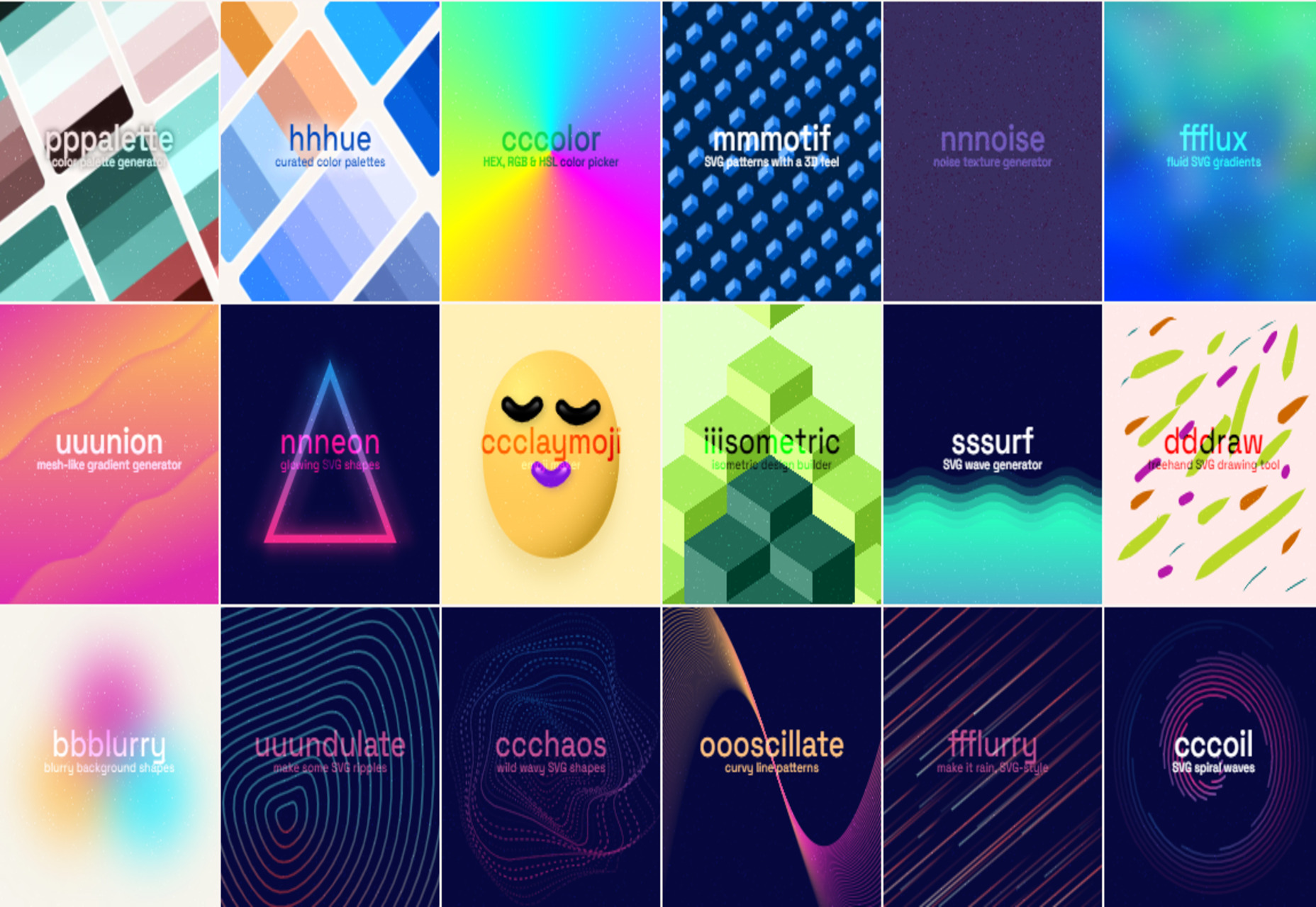
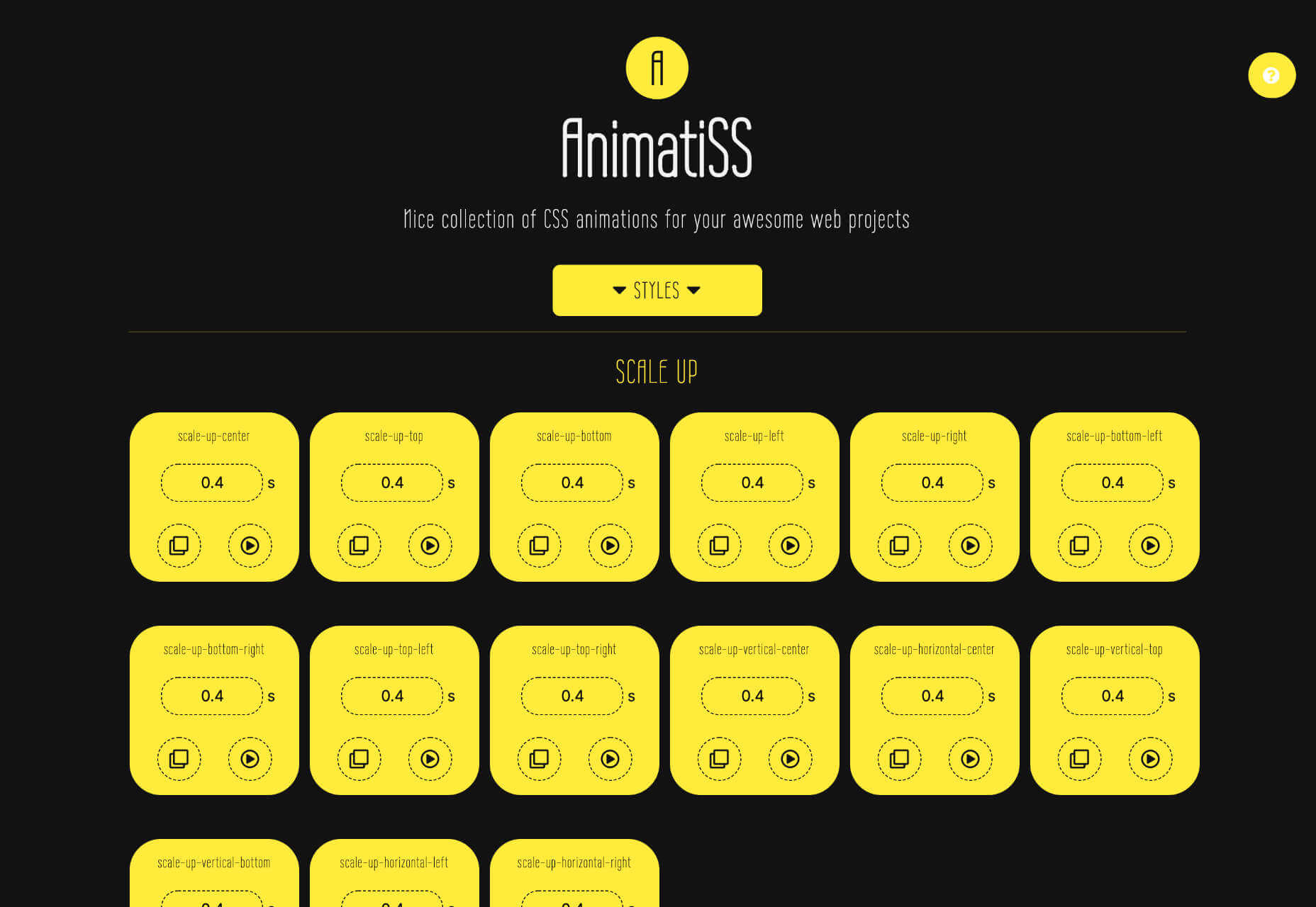
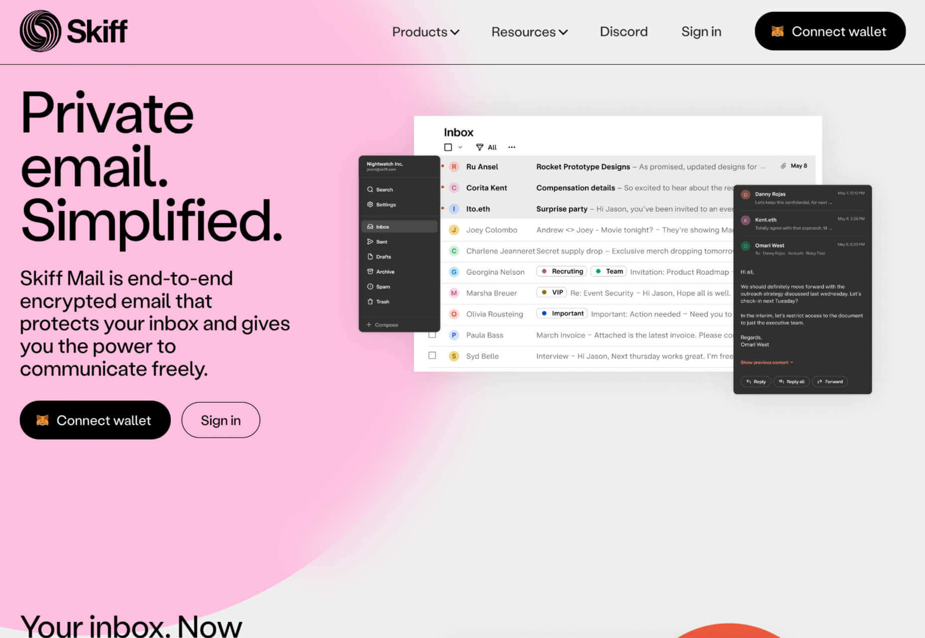
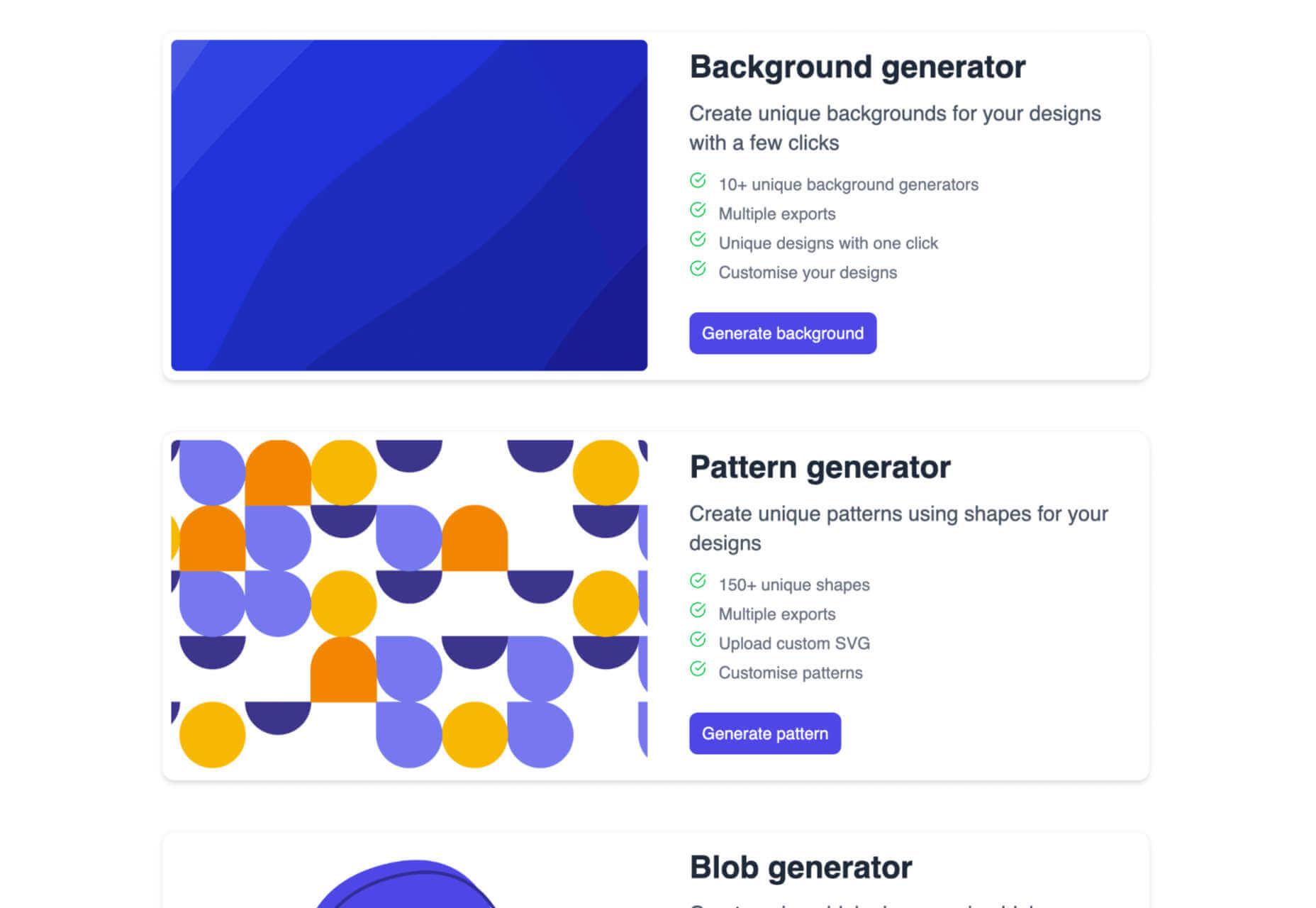
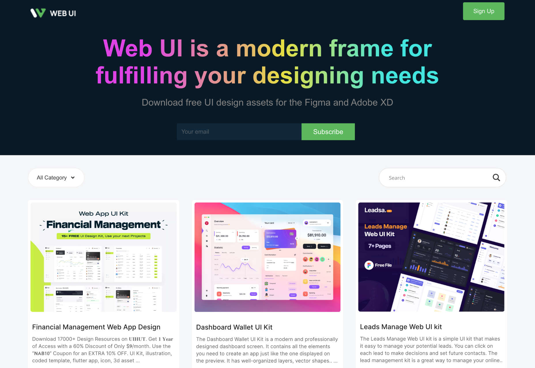
Automation is the theme of this month’s collection of exciting new tools for designers and developers. There are tools to make your images better, tools to create illustrations, and tools to make your workflow more efficient. Plus, a whole host of tools that are just plain fun.

Here’s what is new for designers this month…

designstripe

designstripe lets you create beautiful illustrations with no design skills. Drag and drop different elements into place, then customize them for your brand.

DesignMaestro

DesignMaestro is a free keyboard extension app that lets you automate the tasks you repeat daily. Set up a macro with a keyboard shortcut, and tap the shortcut to perform the action.

Ghost 5.0

Ghost is one of the best personal blogging platforms around, and version 5 enhances it with custom code, support for video, and performance upgrades.

Yep

Yep is a new search engine from the makers of Ahrefs. Built from the ground up, Yep will give 90% of its ad revenue to content creators.

The CTO Field Guide

The CTO Field Guide is a free ebook for anyone newly promoted to a technology officer role or looking for a tech leadership role. It’s a simple guide to making the most of your first 90 days on the job.

ASCII Art Paint

ASCII Art Paint is a free, open-source web app for creating images made up of text characters and hieroglyphs. It’s a great way to add pictures to text-only formats.

Effekt

Make your own fun, wallpaper art at up to 8k resolution using Effekt, a mix between an image editor and a visual toy.

Animatiss

Animatiss is a fantastic collection of CSS animations that you can use for free. Tailor the speed of the animation, preview it, then copy and paste the code into your project.

Skiff

Skiff Mail is an email app that features end-to-end encryption. This means your email stays private and secure, so you’re free to discuss sensitive matters.

Super Designer Tools

Super Designer is a collection of design tools for performing simple tasks. There’s a background generator, a pattern generator, a blob generator, and more—all free to use.

Web UI

Web UI is a collection of UI kits and templates for Figma and Adobe XD. Most designs are free to download and use for projects, and some require payment.

Free Online Background Remover

Use this free online background remover to quickly and easily delete the background of photos, leaving you free to paste the foreground over flat colors, gradients, or even different backgrounds.

Untitled UI Icons

Untitled UI Icons is a set of clean, consistent, and neutral icons made for Figma in Figma. There are 3,500 icons in total. The line style is free to download.

OS

Turn your Mac or iPhone into an old-school Macintosh with this retro wallpaper and icon set, and transport yourself back to 1984. OS is a premium download.

Shrink.media

Shrink.media is a free app for web, iOS, and Android that lets you reduce the size of your image file size and dimensions to reduce its footprint.

3D Avatars

This big library of 3D avatars is perfect for any project that needs staff images. There are different ethnicities, clothing, facial expressions, and accessories, so you never run out of options.

Felt

Felt is a modern map maker for the web that gives you more control, more design options, and easier sharing than Google maps.

SureScan

SureScan is a helpful app that hunts through terms and conditions for dubious conditions on your behalf, so you can spend your time doing something less boring.

Reform

Reform is a no-code form builder that you can use to create clean, branded forms for your business without any design or code skills.

Copy Foundry

Discover how the best brands evolve their messaging over time with Copy Foundry, a brand positioning, and copywriting library to help your products stand out.

Source

The post Exciting New Tools for Designers, June 2022 first appeared on Webdesigner Depot.

Source de l’article sur Webdesignerdepot

Are you bored with some of your current design projects? This month’s collection of website design trends can help break you out of that rut with some fun and funky alternatives.
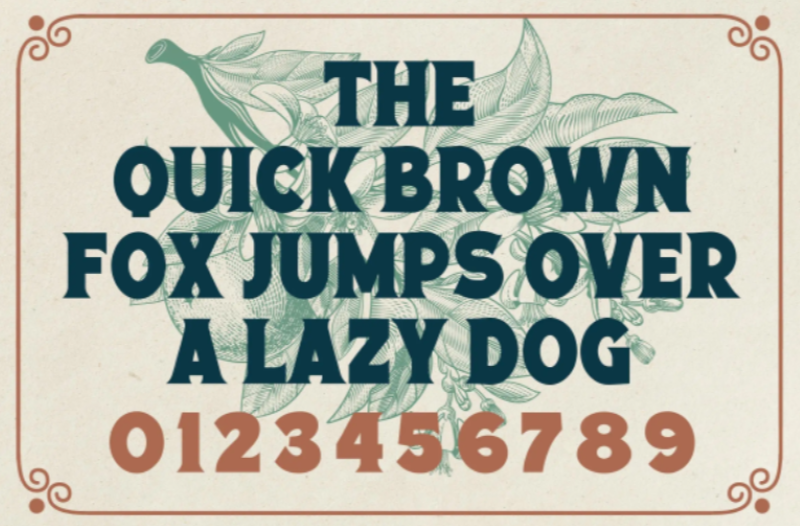
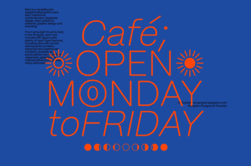
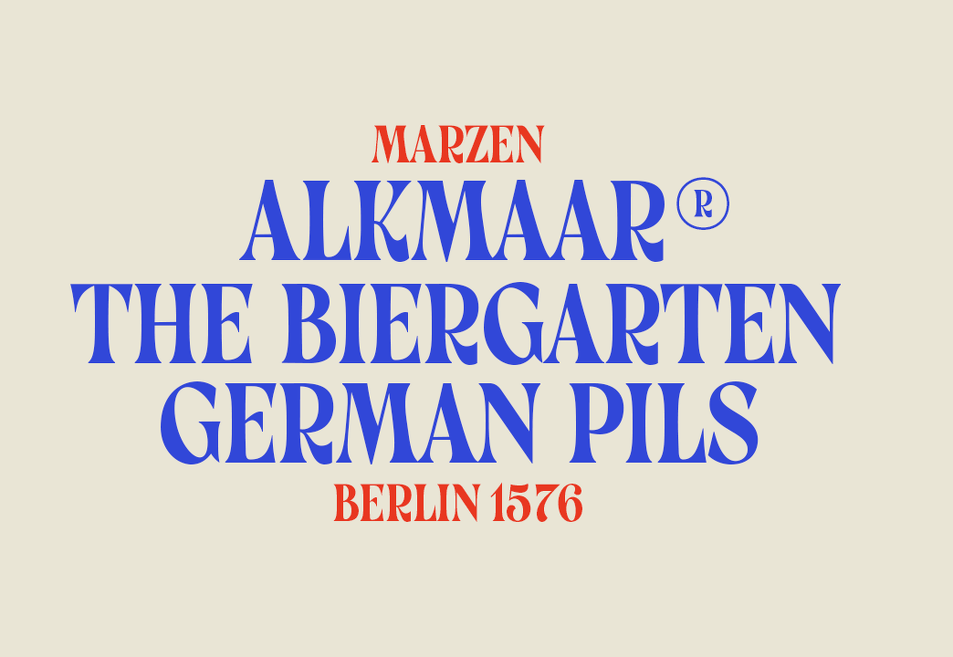
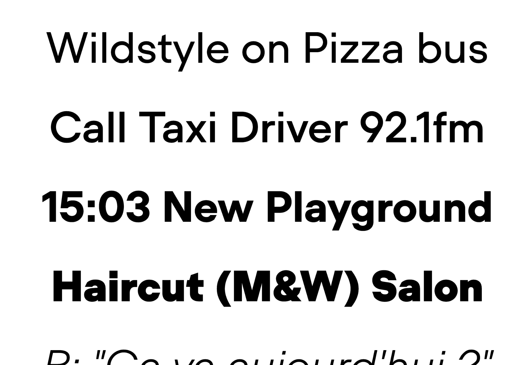
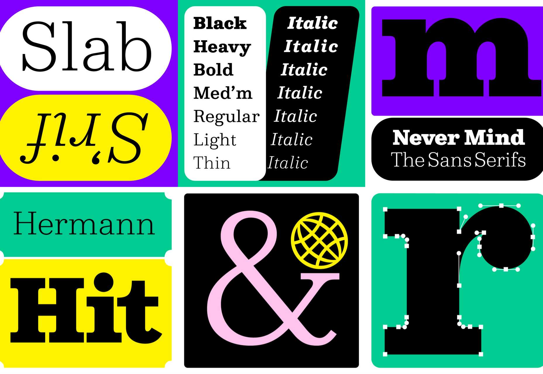
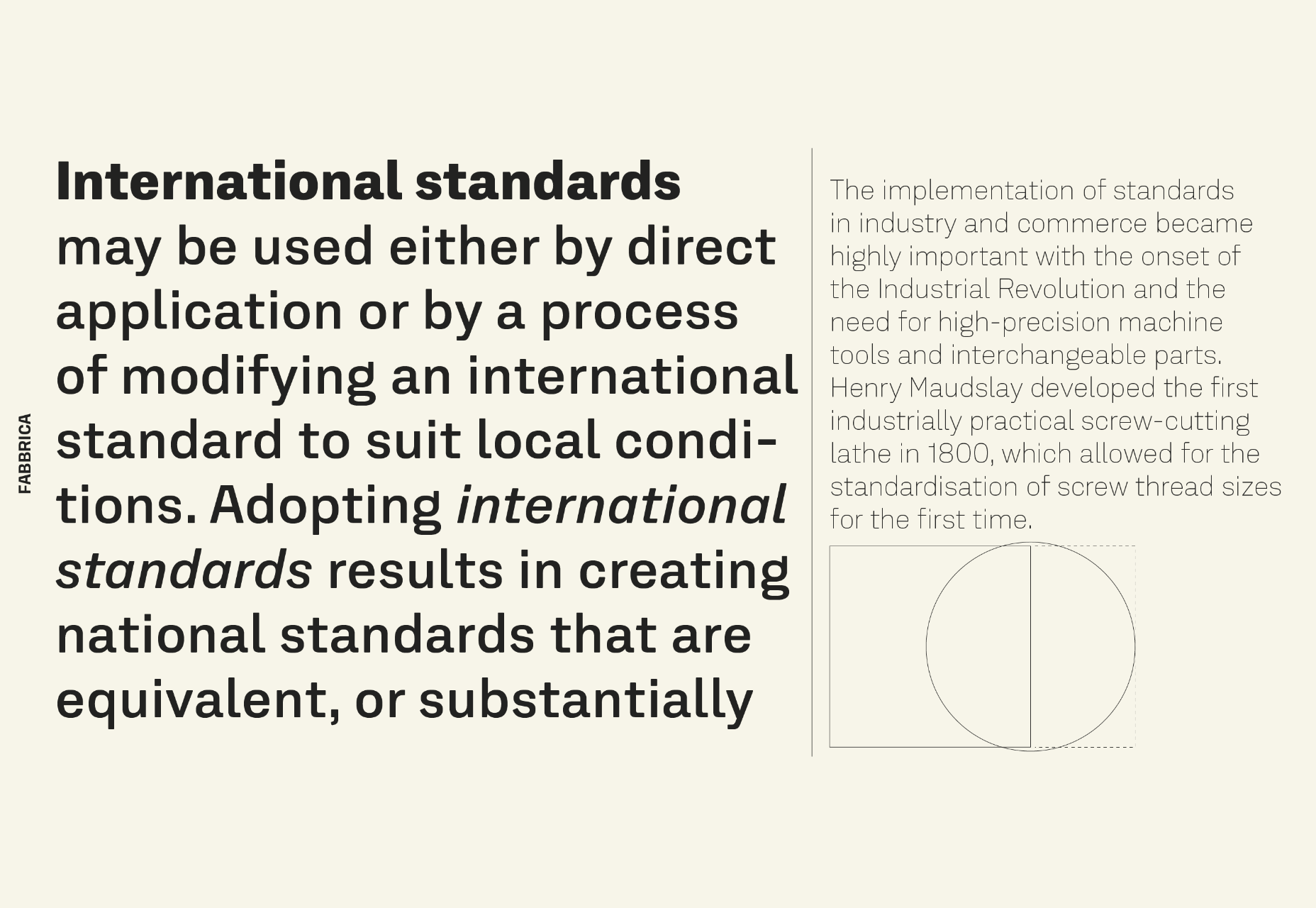
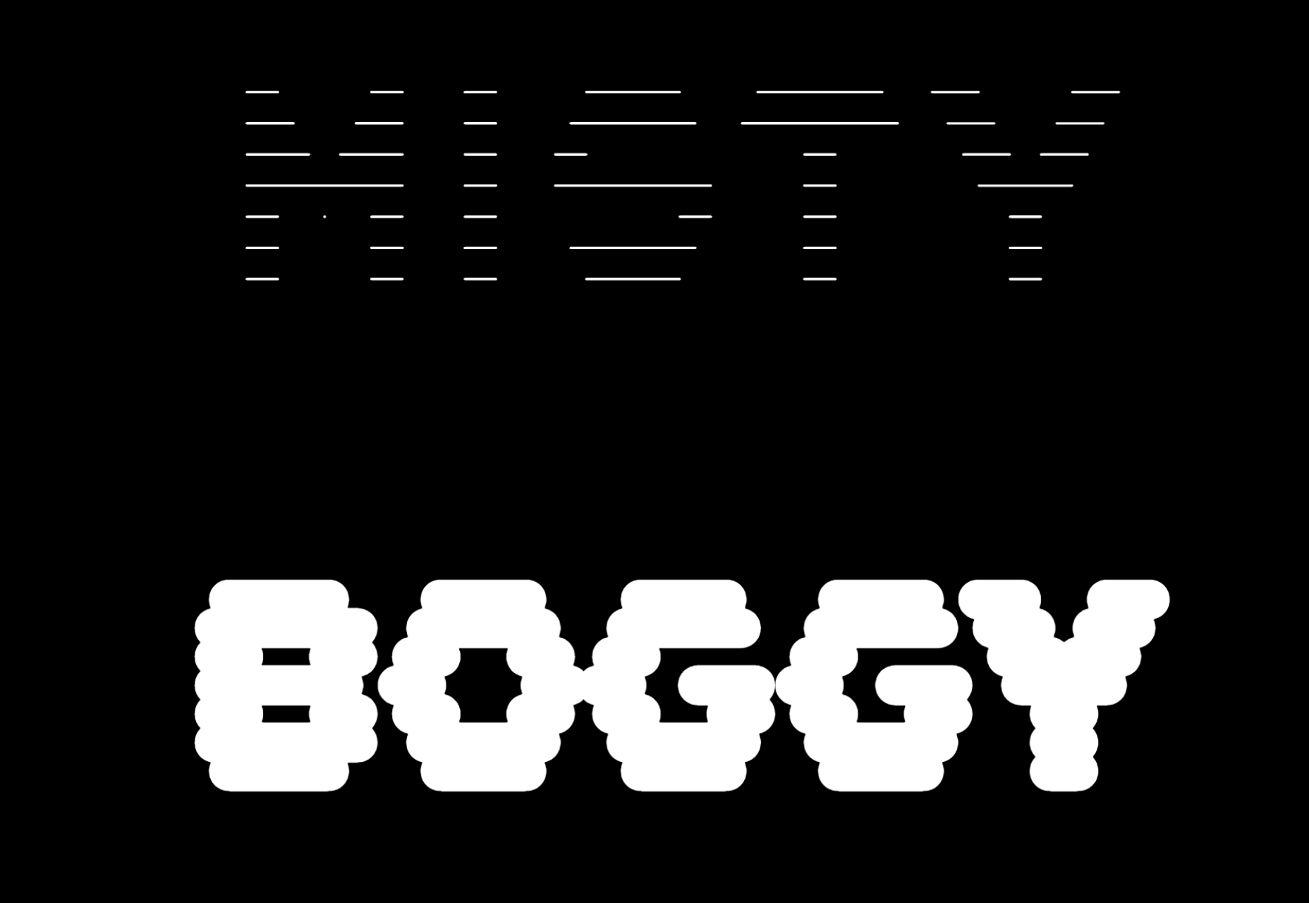
And all of these options are anything but boring. From visual display to technique, these trends present a different set of challenges.

Here’s what’s trending in design this month.

1. Layers on Layers

These website designs have so many layers of information that you almost don’t know where to look or where the design elements start and stop.

This can be a complex technique to make work because of the number of elements competing for the same attention in the design.

What you are likely to see with this design tend includes an image or video background with some motion but not anything that truly demands attention. Then add on a few still images in smaller frames throughout the design. Layer on text as well for a three-deep effect.

If you interact with these designs, you’ll find that they are not flat either. They all include animated elements, hover states, and interactions that help direct you through the layers of what can be a somewhat complex design.

Western National Parks Association uses a background image, middle images with animations, and multiple text layers (some on the pictures and some on the background). There’s also scroll animation to help build the design. A lot is going on, but it does not feel too busy.

WIP Architects is another design with layers that interact with each other and include motion. With a lot of scroll animation and layers that go in front of and behind other elements, engagement helps this site work.

The Shipwreck Survey uses the same basic layer outline with a little more overlap between elements and less overall animation. The primary animated effect on the homepage is the scroll bar.


2. Directed Click Actions

This interesting website design trend can be incredibly useful or a wasted element – directed click actions. These are buttons, icons, and animations that tell you to click somewhere in the design to move to the next stage of interaction.

The direct approach ensures that users see and have the best possible chance of doing what the design is intended for. On the other hand, if you need this much instruction, is the design too complicated? Or is there a middle ground where this trend looks great and is usable?

In each of the examples below, these directed click actions are a bit different.

HUG Co has a big circle to click in the bottom third of the screen. It’s almost designed like a bullseye, and you can’t miss it. The thing that is interesting here is that most of the video falls below the scroll. The click action also has two emojis to denote action – a smiling face or pointer when you are ready to click. (The click extends the video to full screen.)

ThinkOvery also uses a similar circular click icon. It also takes you to the next screen in a single movement so that you can continue to explore the design.

Living with OCD has a different approach with scroll and back-to-top icons paired in the bottom right corner. The scroll option includes words to help create direction and instruction. It consists of a small animation and an interactive hover state when you get close to the interactive element. The interesting thing here is that it is not actually a button, and you use a traditional scroll to interact.


3. Word Breaks

If you are a stickler for readability, this design trend might make you cringe.

In each of these designs, words are broken across lines – some with and some without hyphens. For the most part, there’s not much confusion about what the words are, but it does make you pause and think during the page experience.

Why would this be a design trend?

It’s a combination of using large typography, long words, and figuring out a solution to create a common experience between large and small screens. Many of these words would not fit on mobile screens, for example, with the same weight, scale, and impact as the desktop counterparts.

Hence, the word break solution. It creates a consistent user experience across devices.

This technique should be used only if you think your audience is savvy enough to understand what you are trying to communicate with the word break. It can be a tricky proposition!

Plantarium breaks at “plant” with a word that’s made up. But with the imagery and supporting terms, you still know immediately what the design is about.

Michelle Beatty takes a common word and breaks it. Because “photog” and “rapher” are the only letters on the screen, it’s pretty easy to figure out. What’s interesting is that the word break is not on the syllable, but the letters do stack nicely with this break visually.

Wreel Collective breaks a word with a hyphen in giant letters – something we rarely see in website design. Hyphens are not often used in this medium. Because of this, it gets your attention and makes you think about the words and the design.


Conclusion

There are a lot of rule-breaking trends in this month’s collection. They are interesting, fun, and require a certain level of risk to execute.

Could you see yourself (or your clients) opting for a design that features one of these trends? Time will tell if these visual compositions grow in popularity or begin to fade fast.

Source

The post 3 Essential Design Trends, June 2022 first appeared on Webdesigner Depot.

Source de l’article sur Webdesignerdepot