 Every month we put together this collection of the best new websites we’ve seen appear on the web in the previous four weeks.
In this month’s collection, you’ll find lots of daring interactions, some inventive portfolio sites, florescent yellow colors, and even some old-school mouse trails. Enjoy!
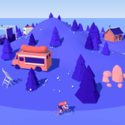
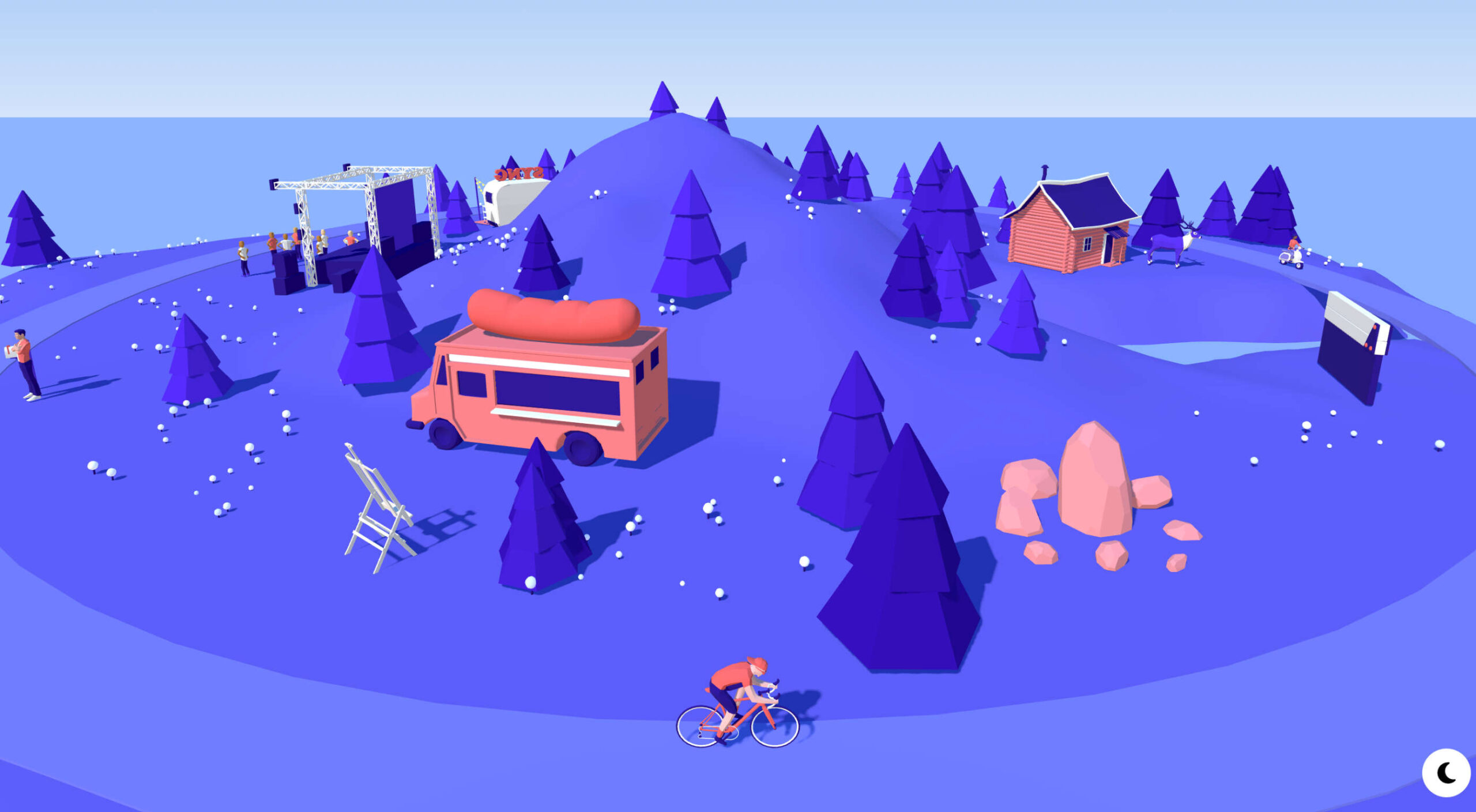
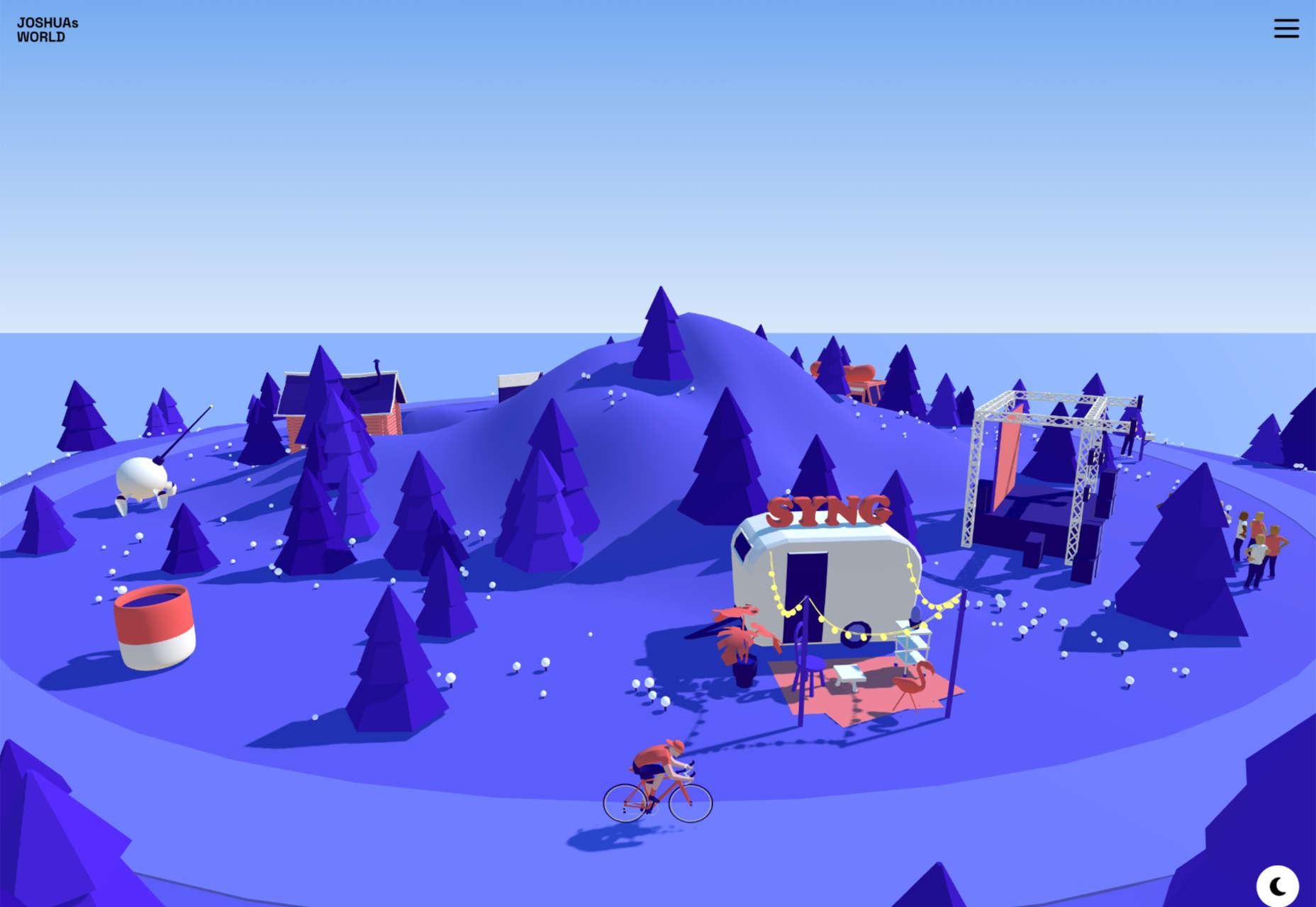
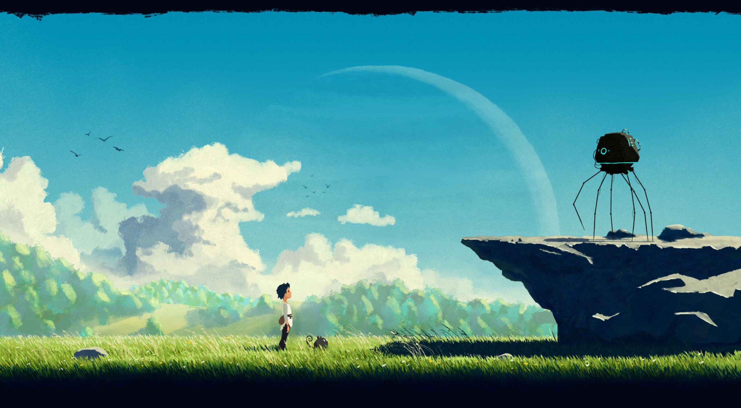
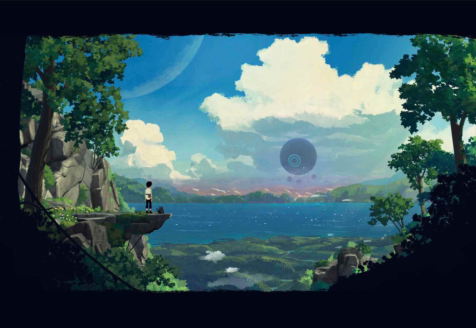
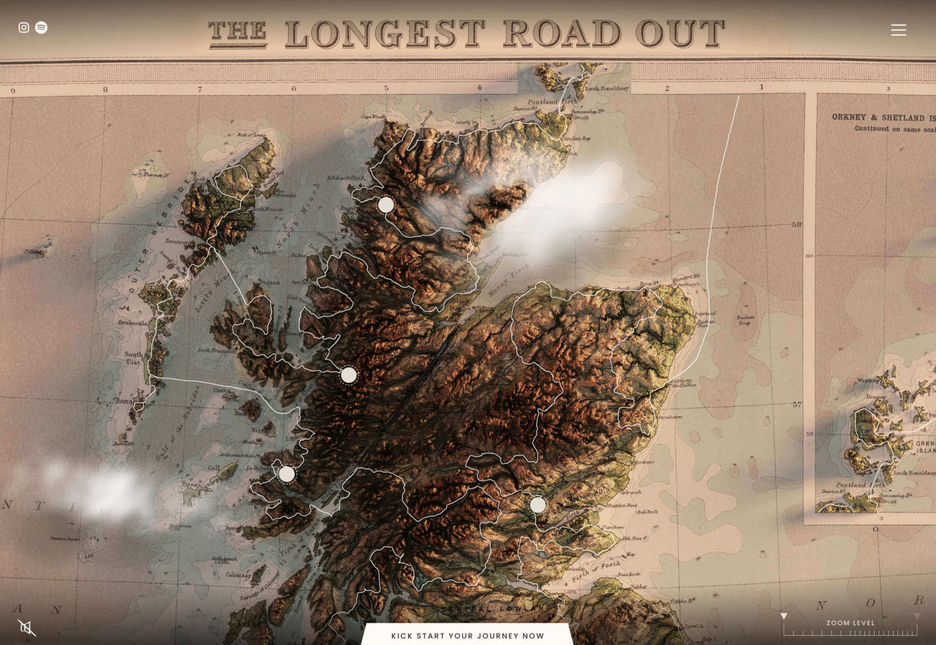
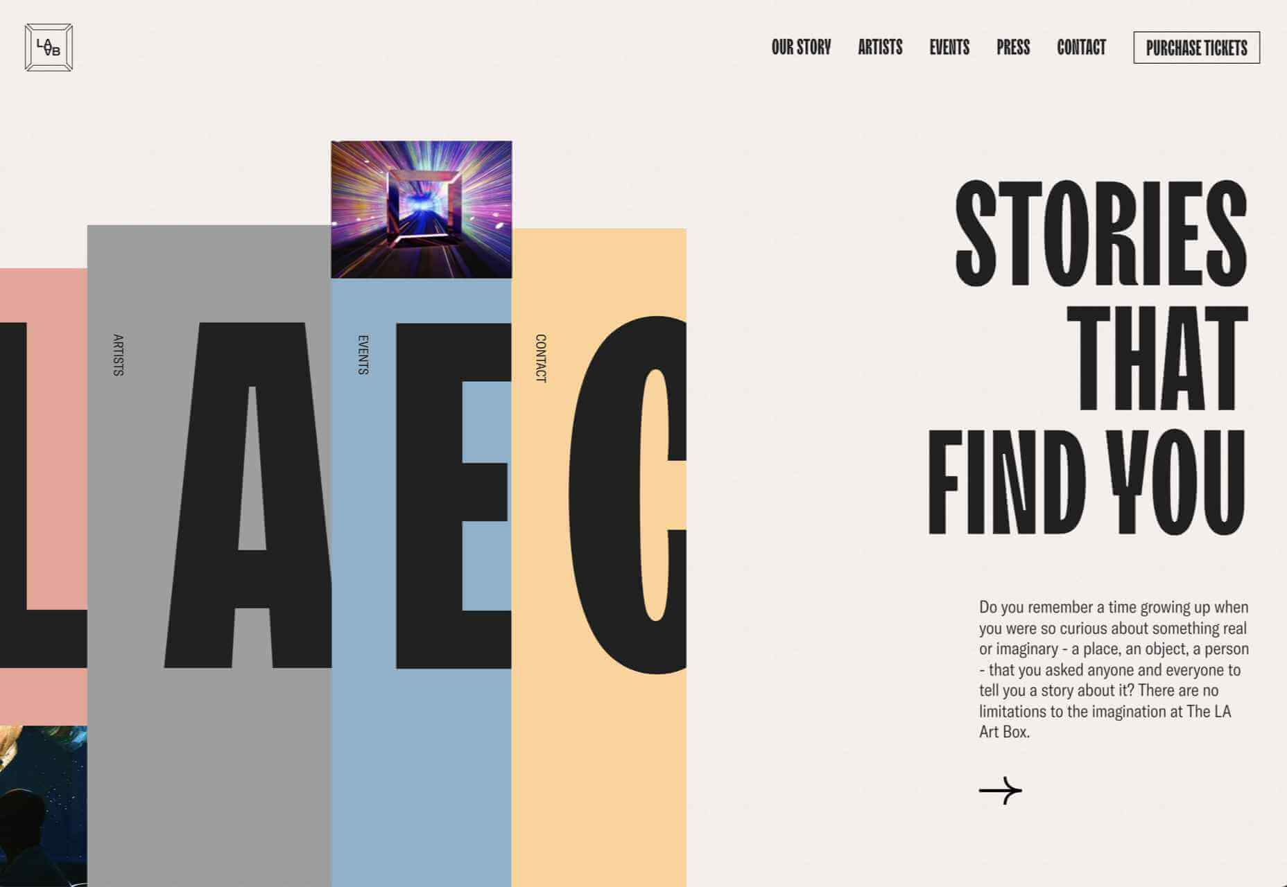
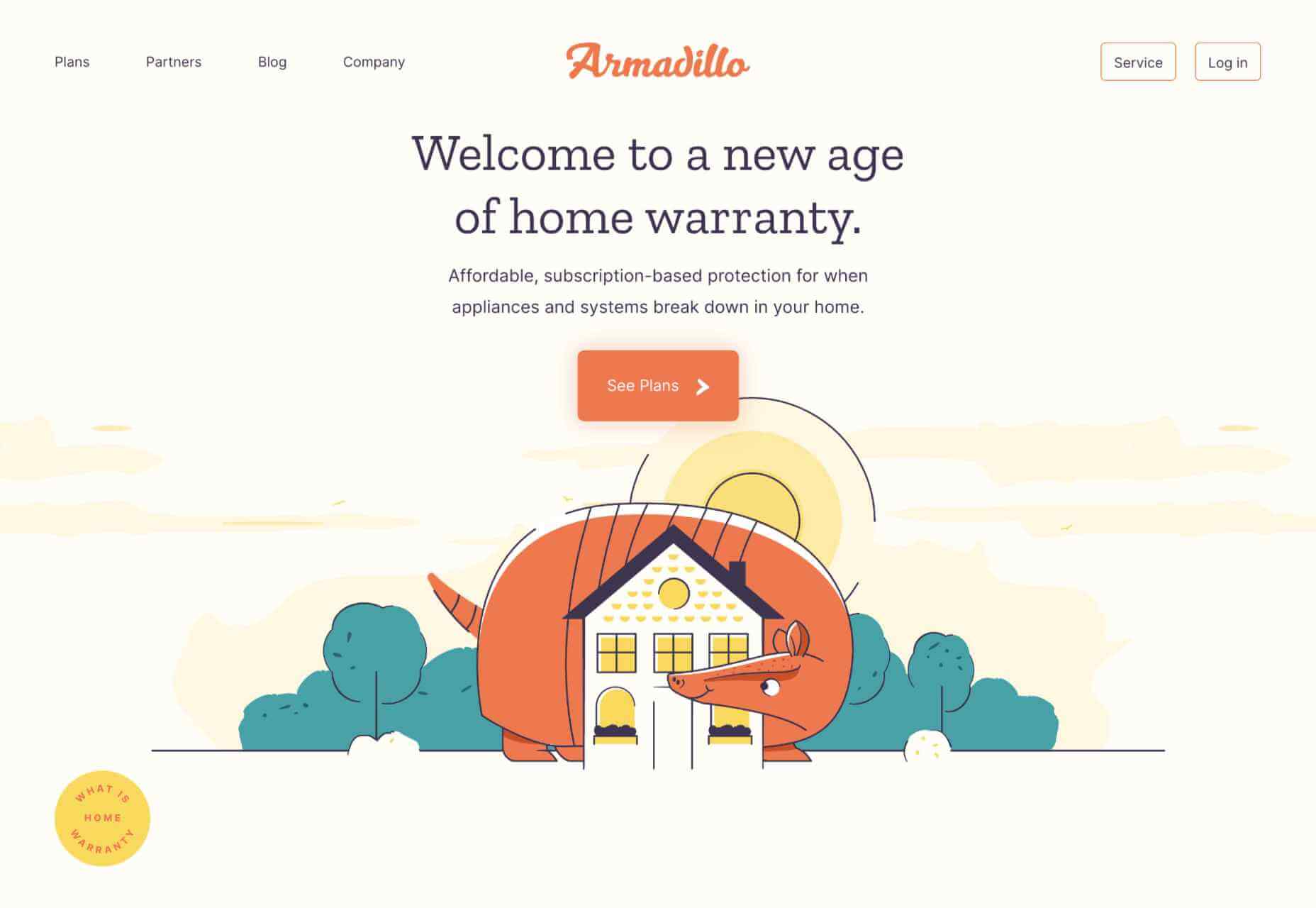
Joshua’s World
Joshua’s World is a fantastic animated site. Grab and drag to tilt and rotate the island and watch the little cyclist power past important links to milestones in his creative career.
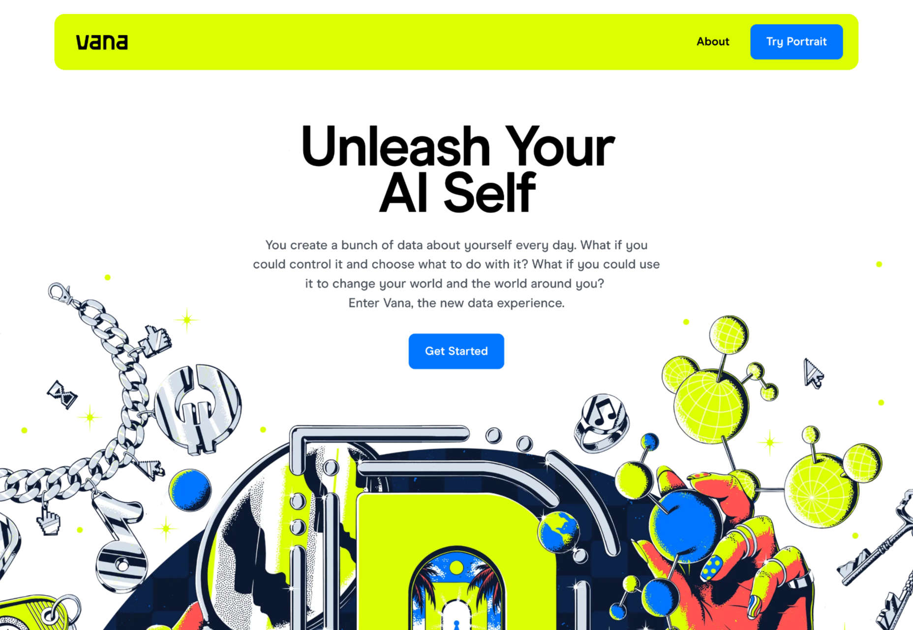
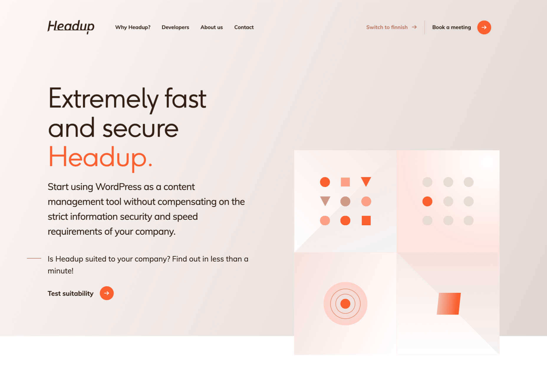
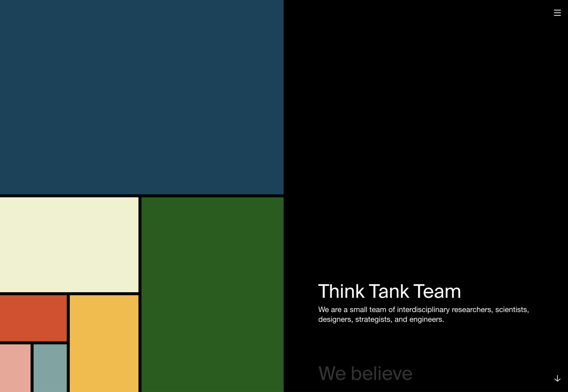
Vana
Vana is a new service aiming to help you take control of your data. Its site is modern and lively and uses some great retro-illustrations to bring its features to life.
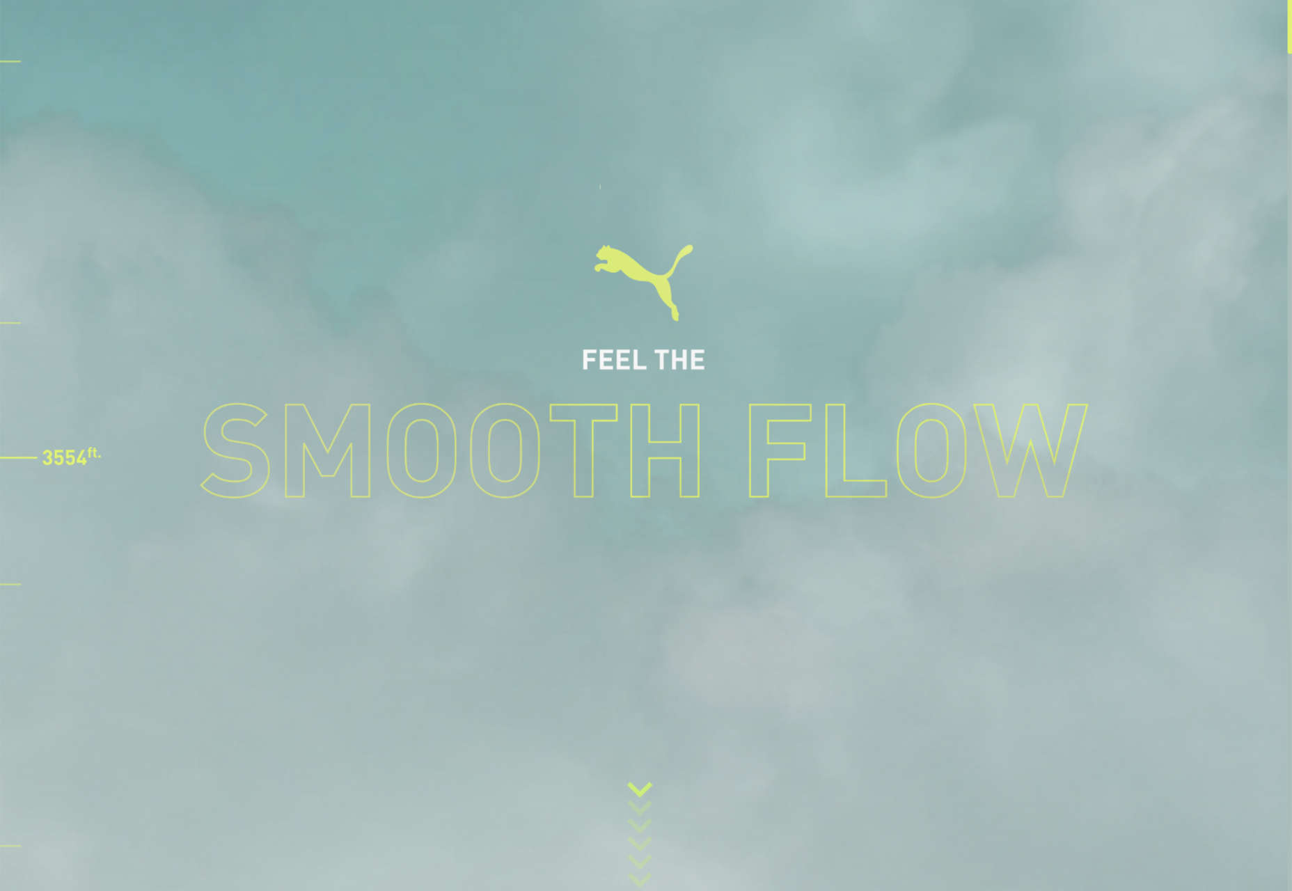
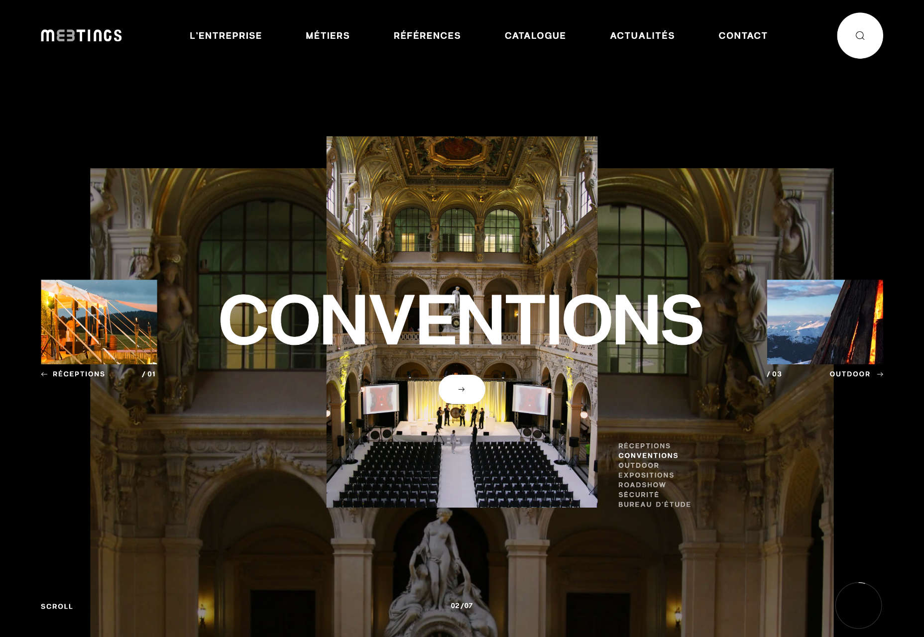
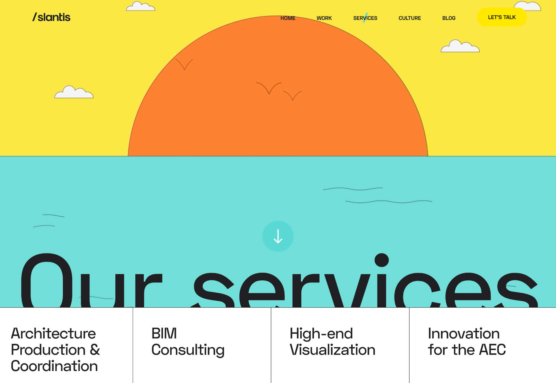
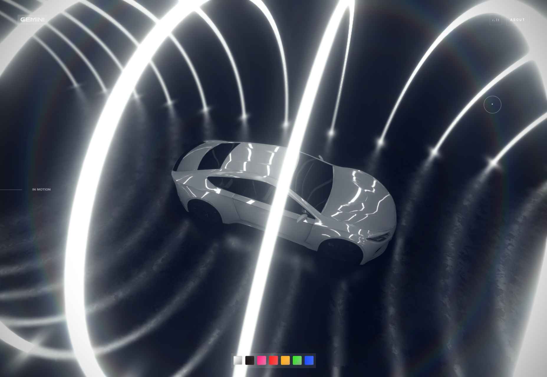
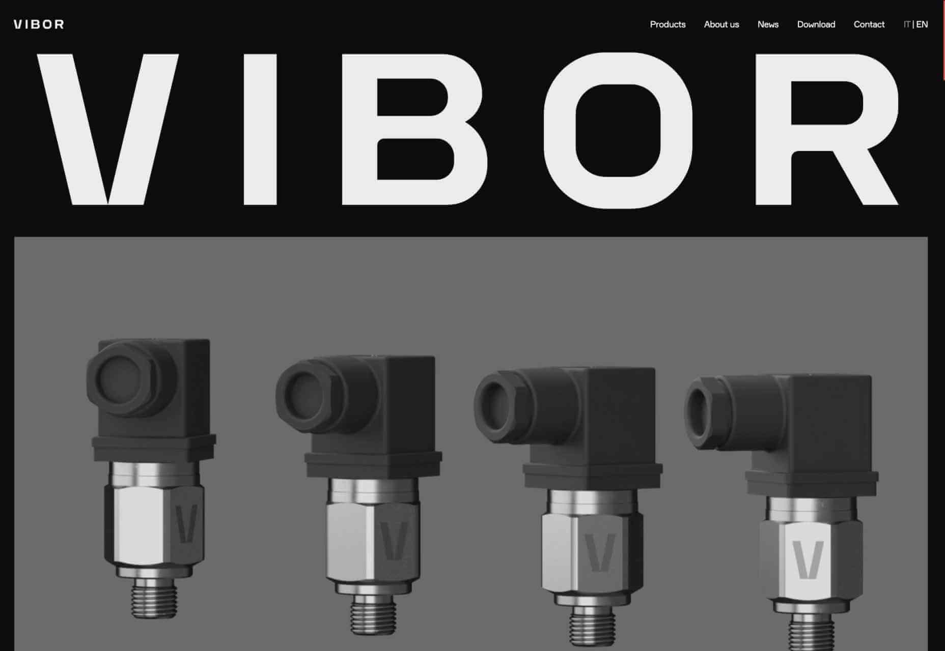
Velocity Nitro 2
This slick site has some incredible 3D renders for the Puma Velocity Nitro 2 running shoe. The scrollable animation guides you through each feature in a thrillingly engaging fashion.
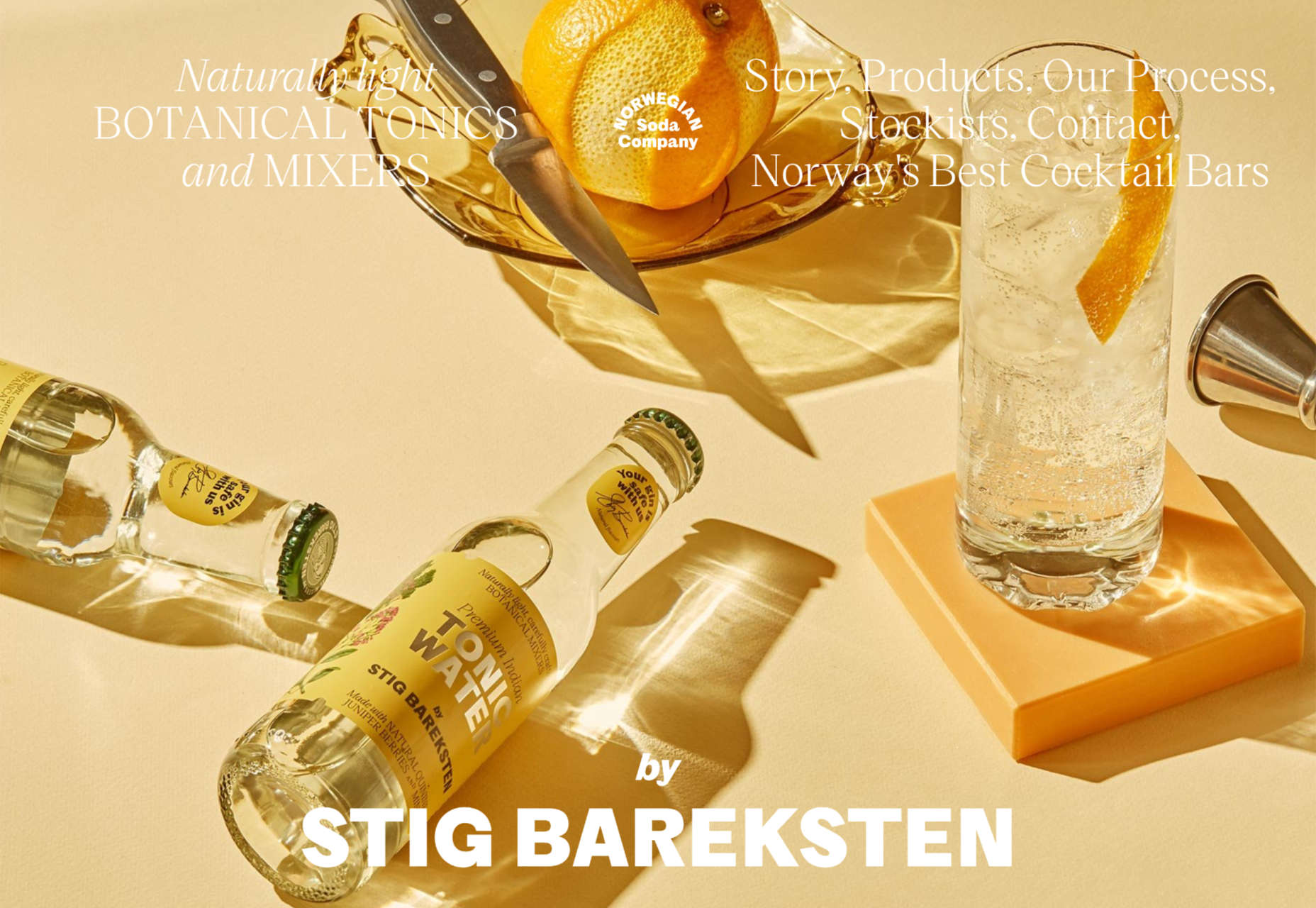
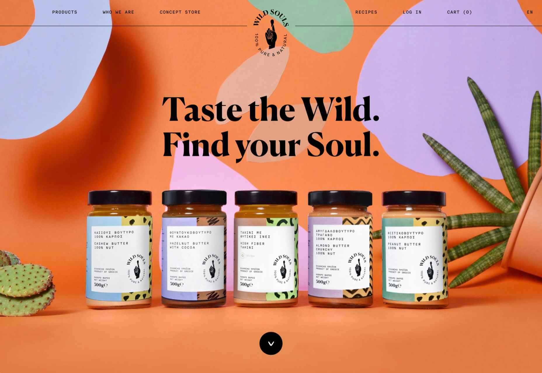
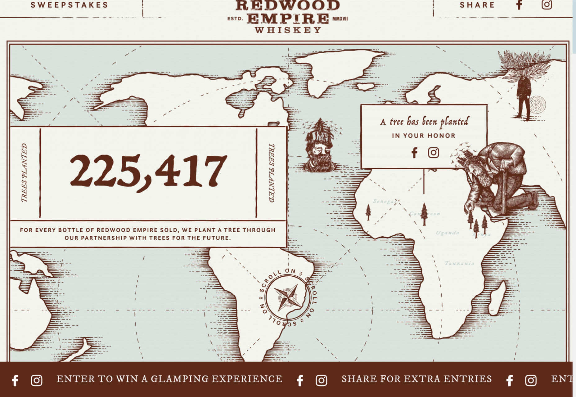
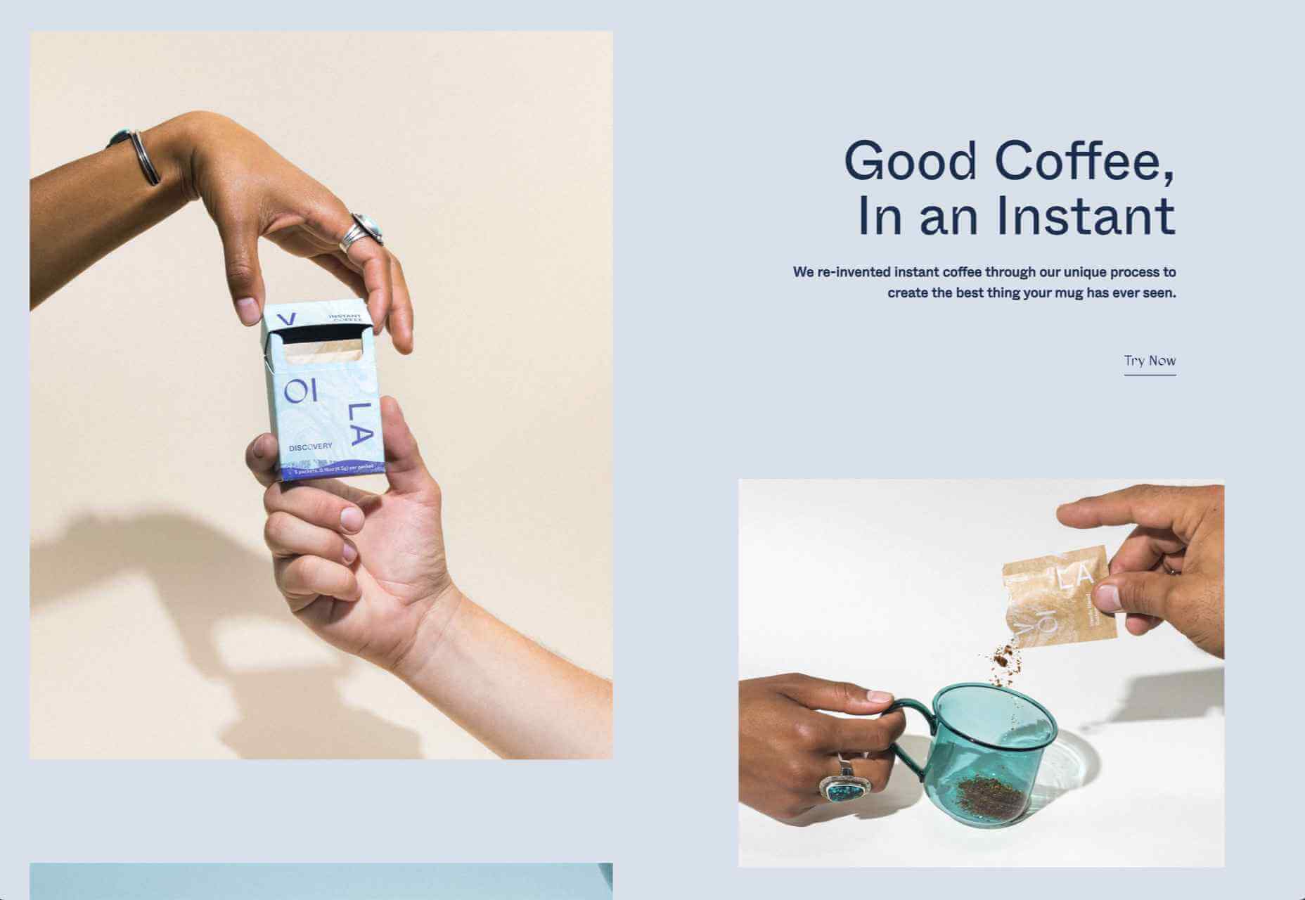
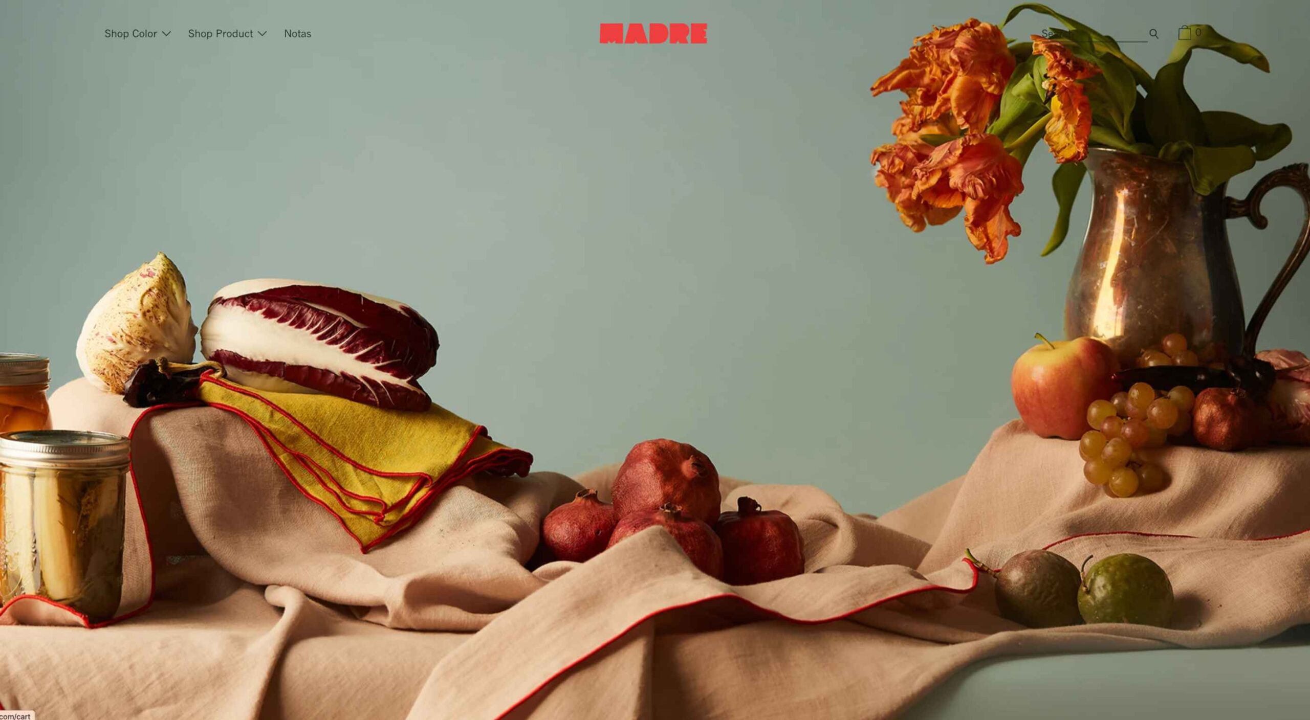
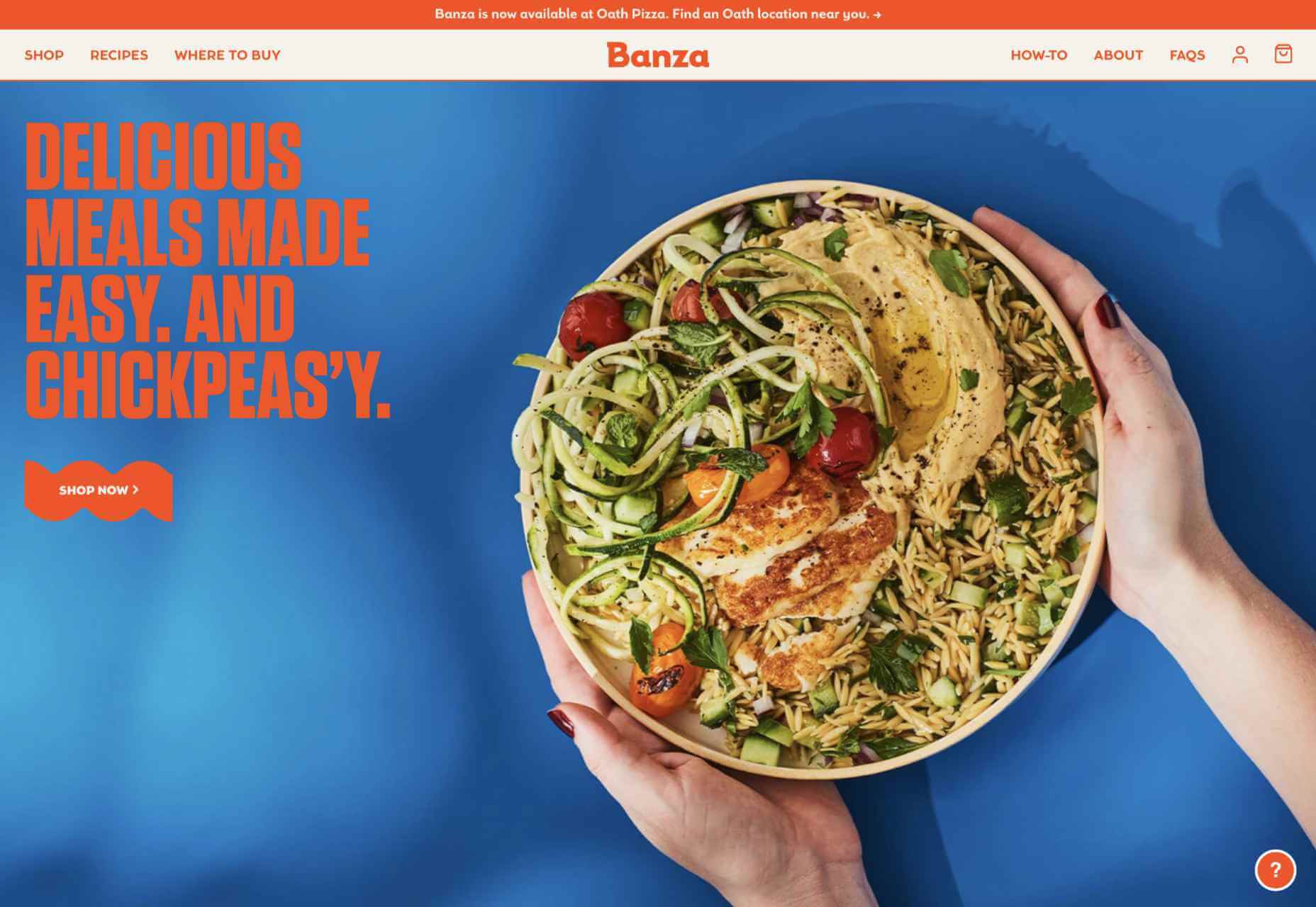
Norwegian Soda Co.
The Norwegian Soda Co. uses beautifully shot photographs to capture the zest of its products. It’s an excellent example of how a one-page site can be rich and engaging.
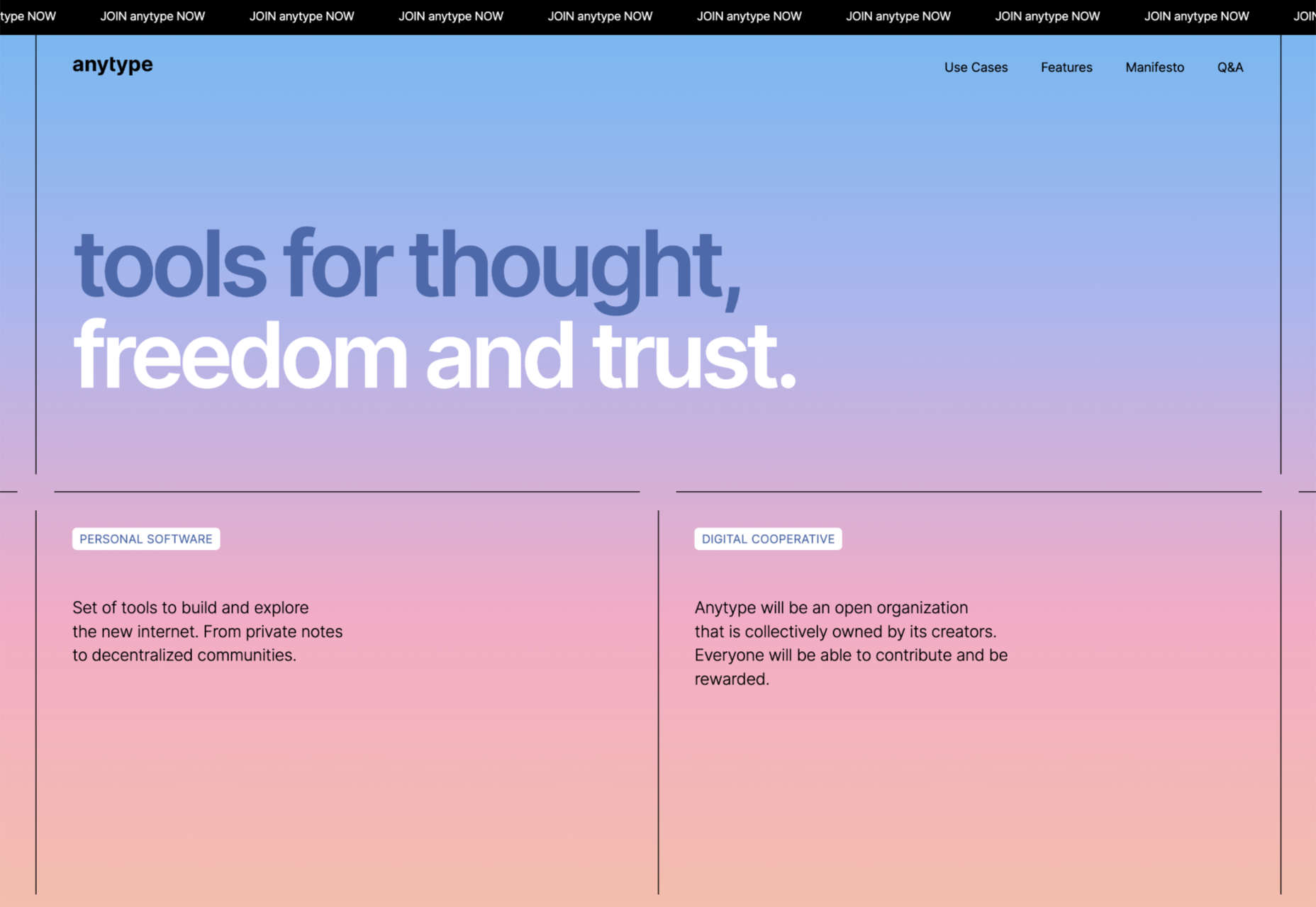
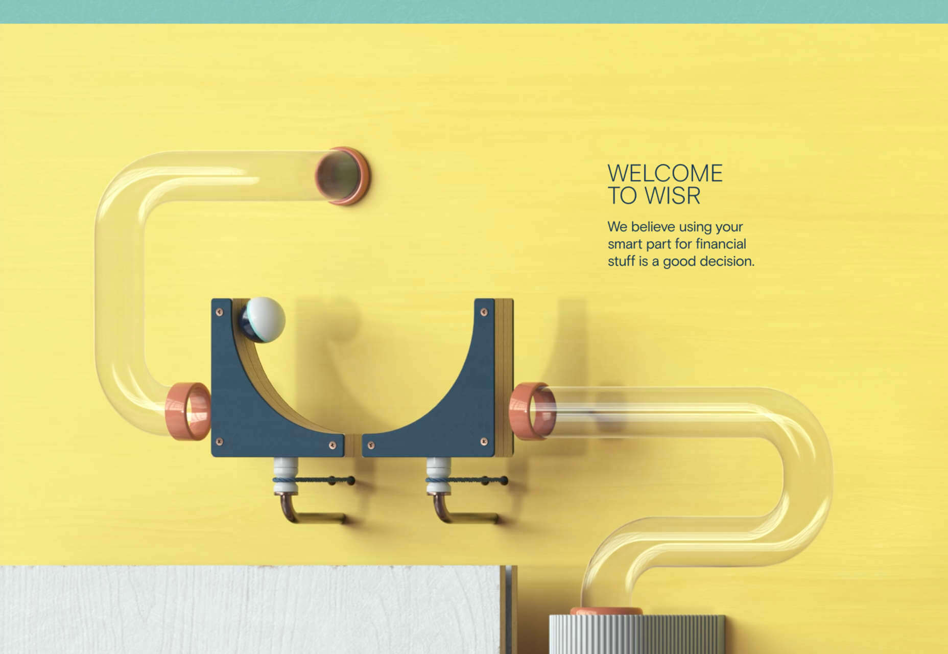
Anytype
Anytype is a collaborative platform pitching itself to creative thinkers. It uses a lovely gradient animation to create a sense of power and technological evolution.
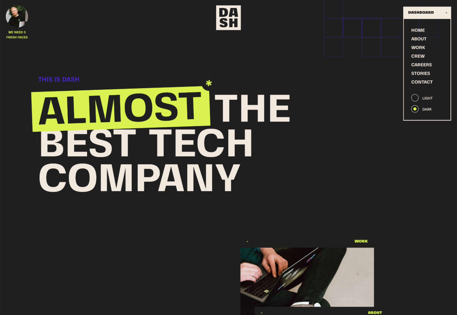
Dash
Dash claims to be almost the best tech company, and its modest site does a great job of expelling the tedium from HR. Plus, it has an old-school mouse trail!
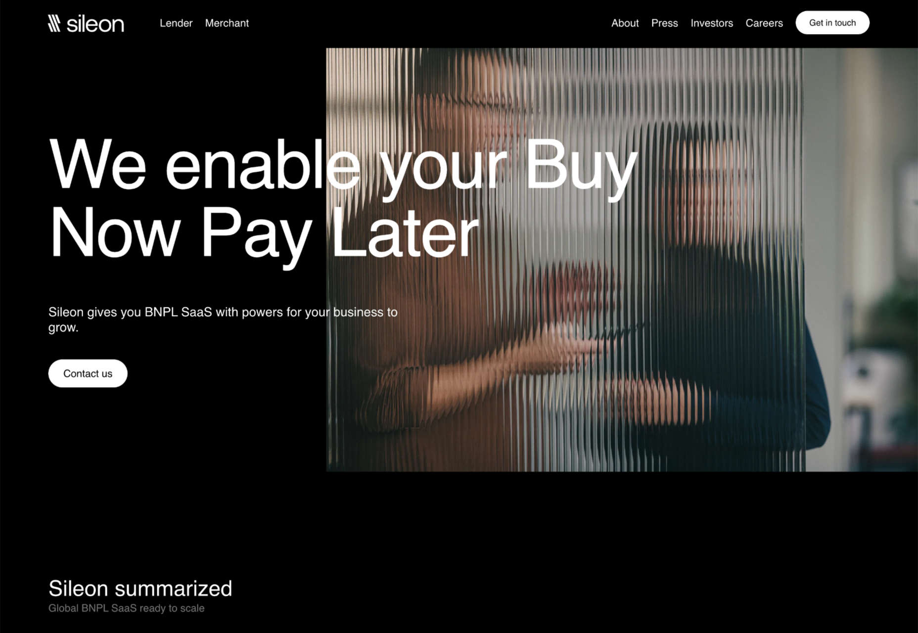
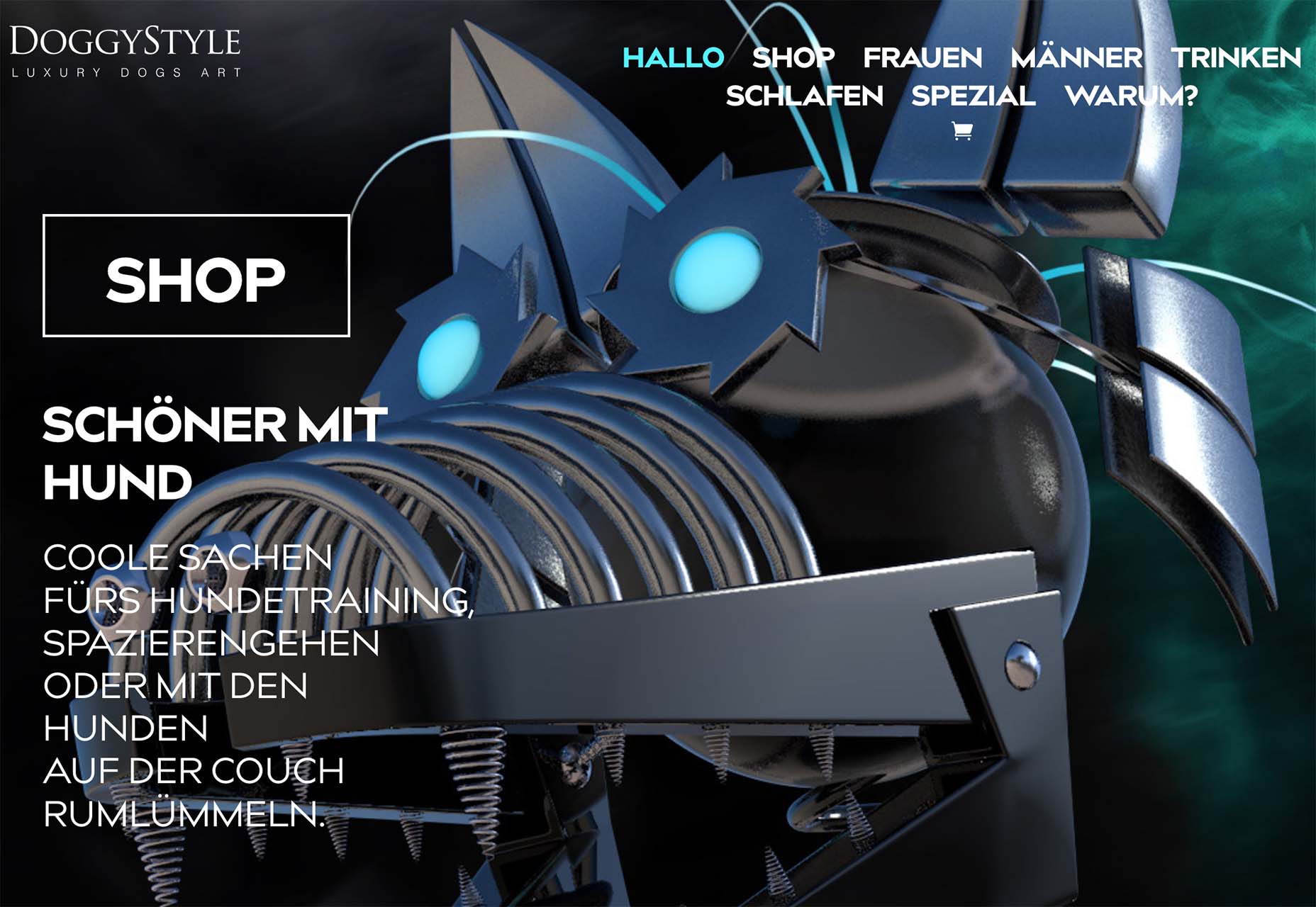
Sileon
Sileon is a site packed with clever details. For example, the hover effect on text links is pleasingly minimal, and the photography shot through distortion is a simple but effective technique.
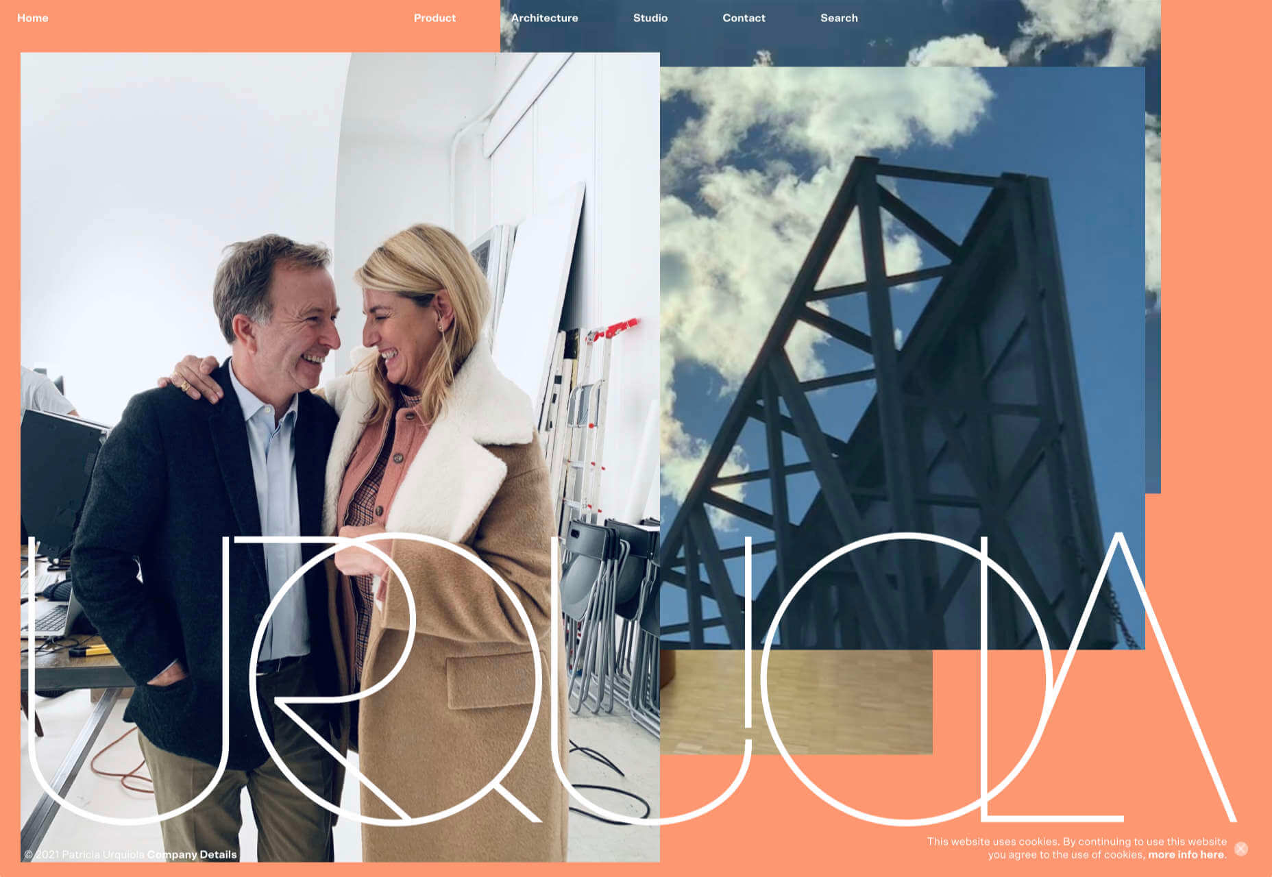
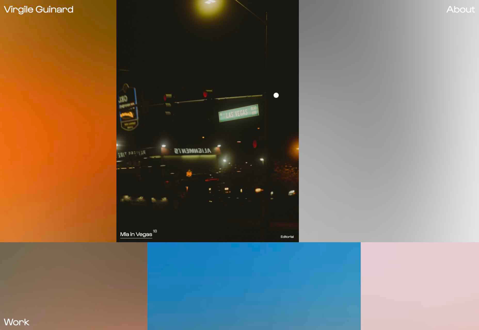
Karina Sirqueira
Karina Sirqueira’s portfolio is a joy to browse through. The morphing shapes add interest to a collection of case studies that are engaging and beautifully presented.

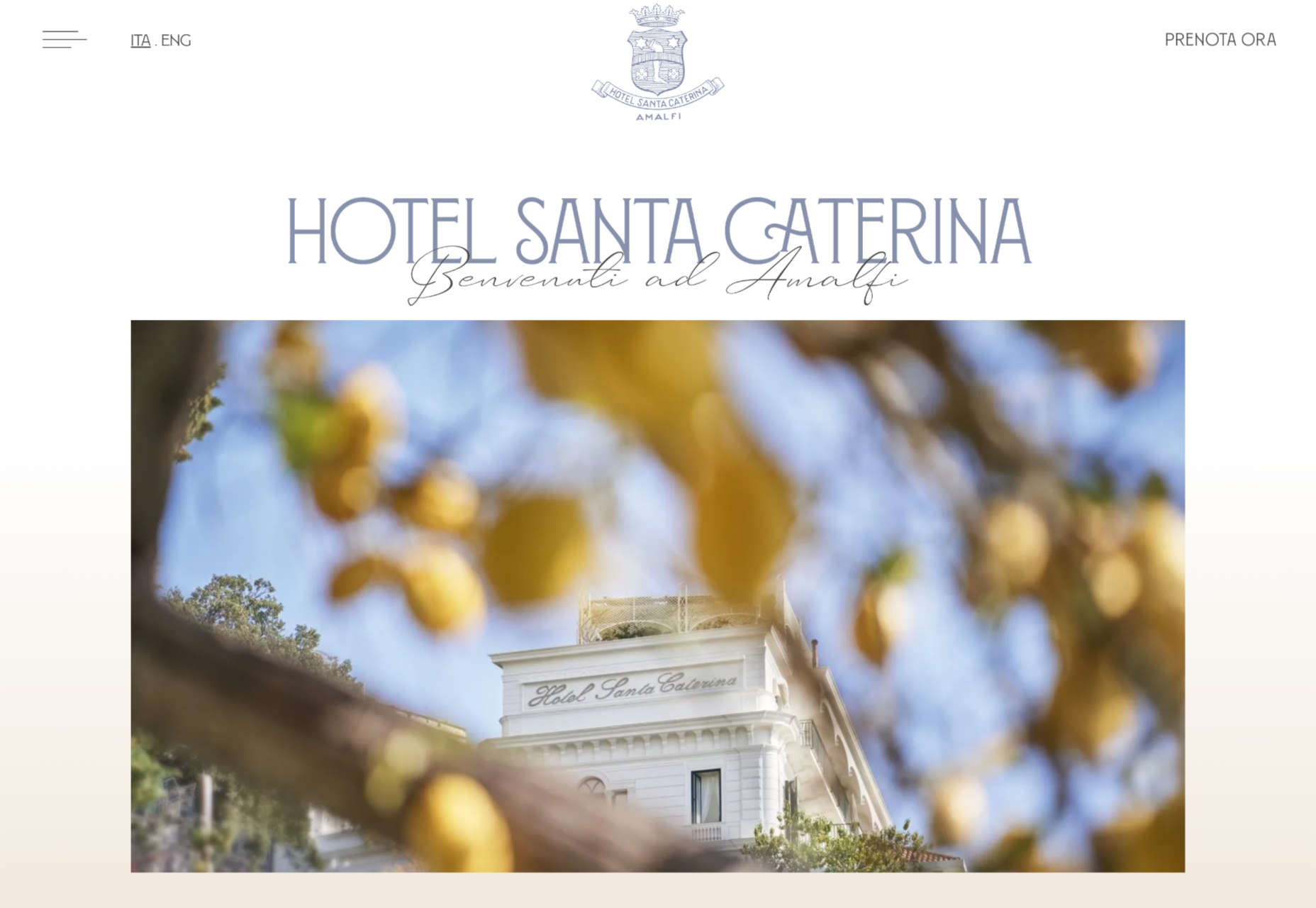
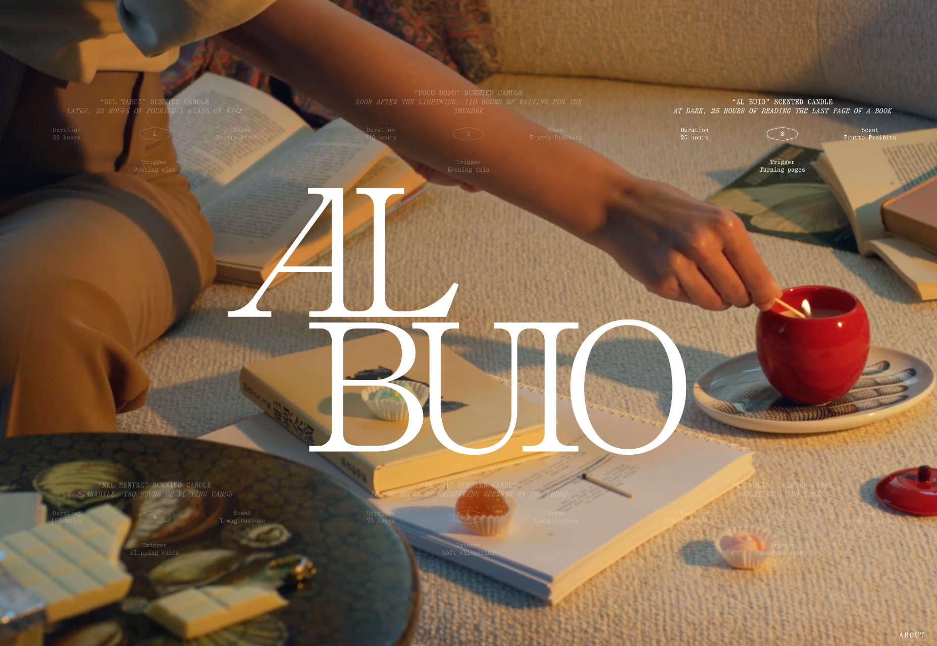
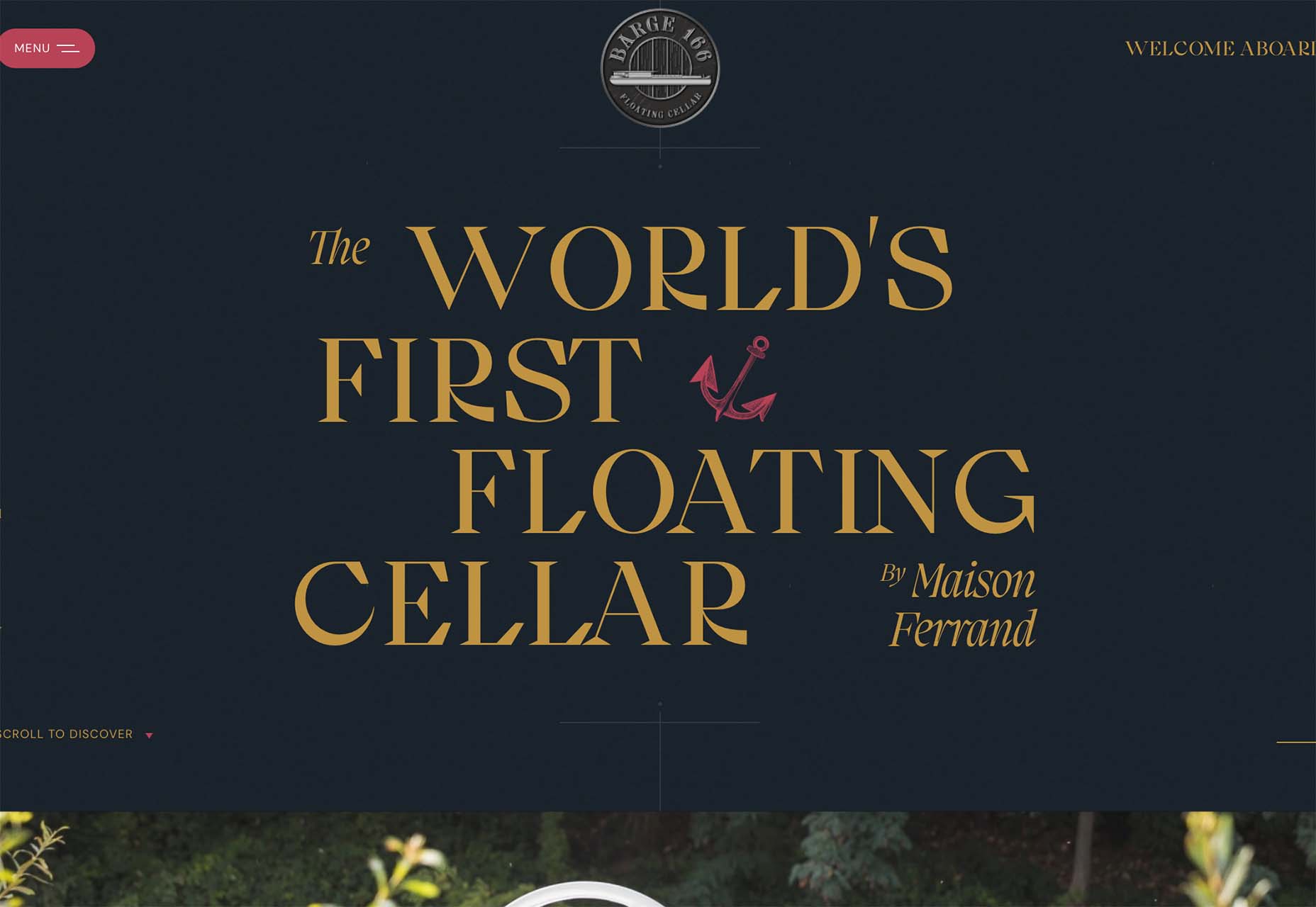
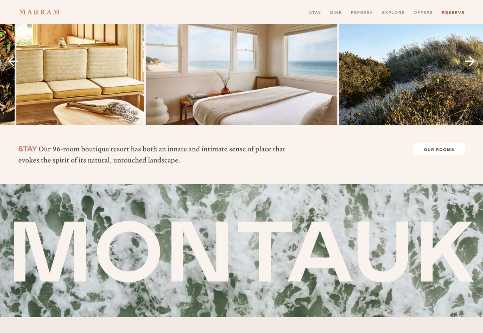
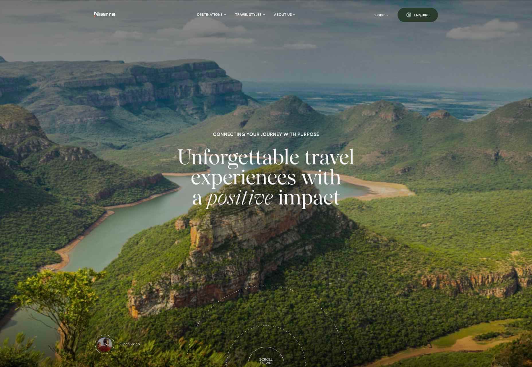
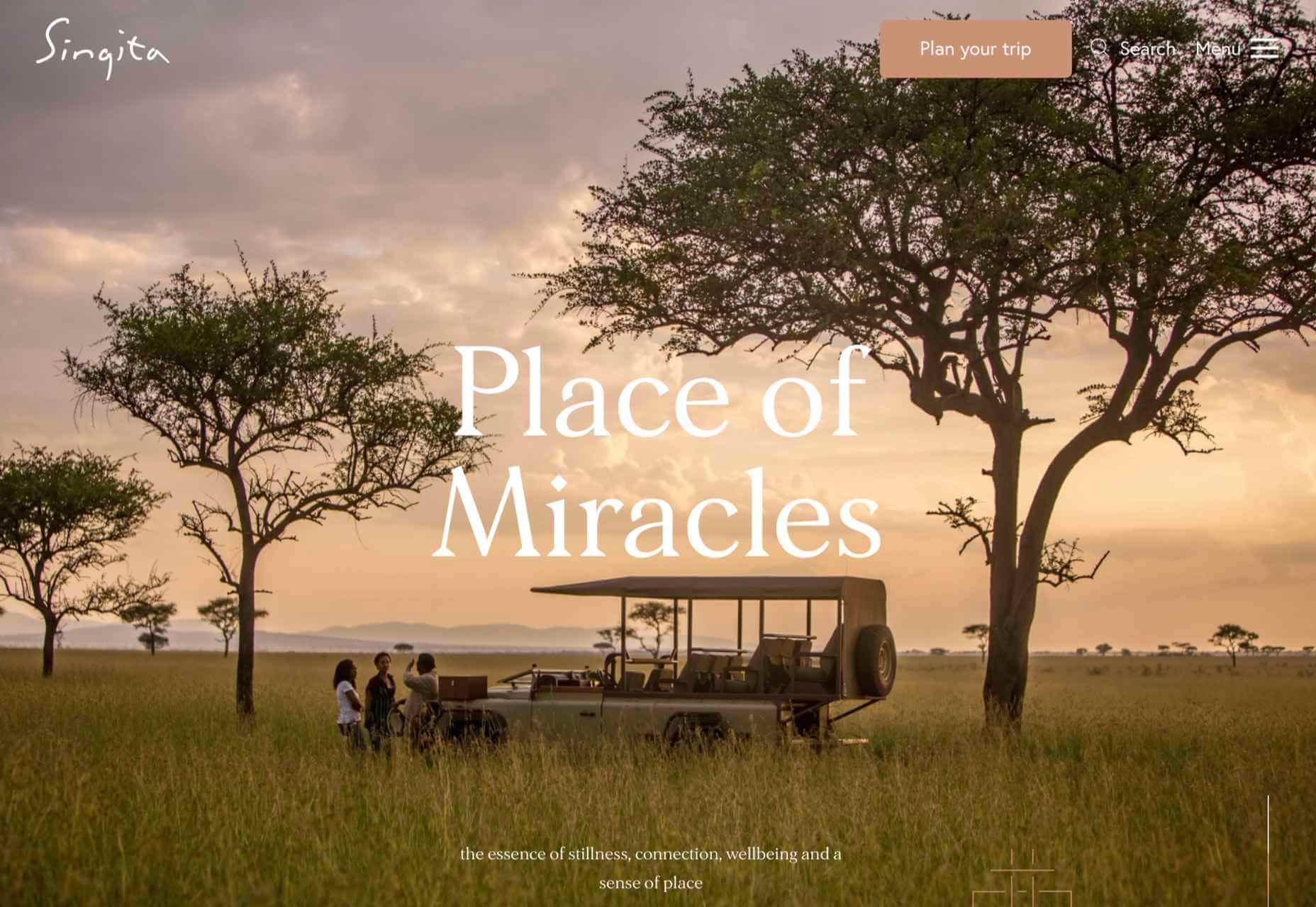
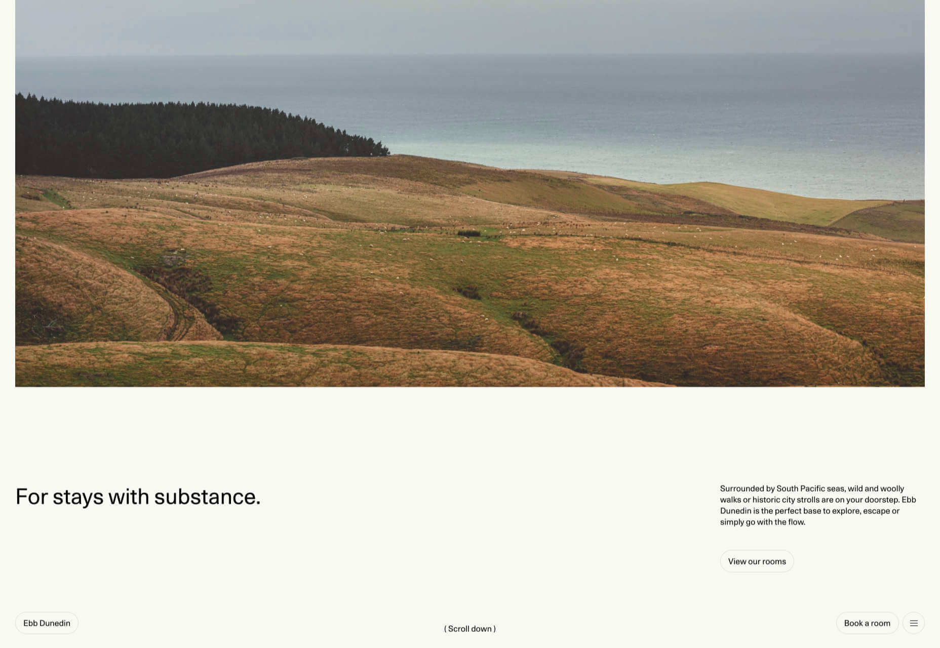
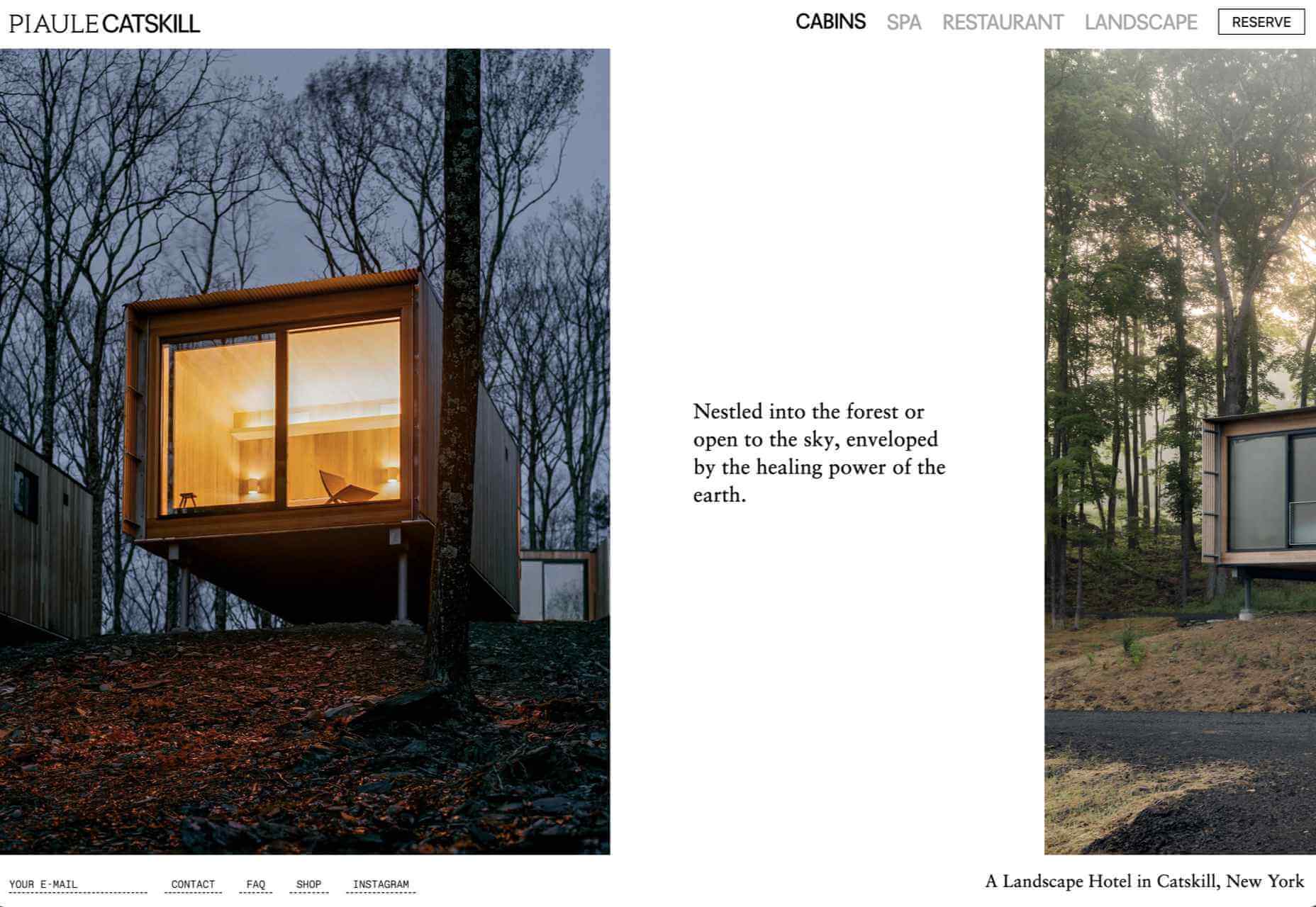
Hotel Santa Caterina
This beautiful website for the Hotel Santa Caterina on the Amalfi Coast captures the light and wonder of the region with a muted color palette and stunning photography.
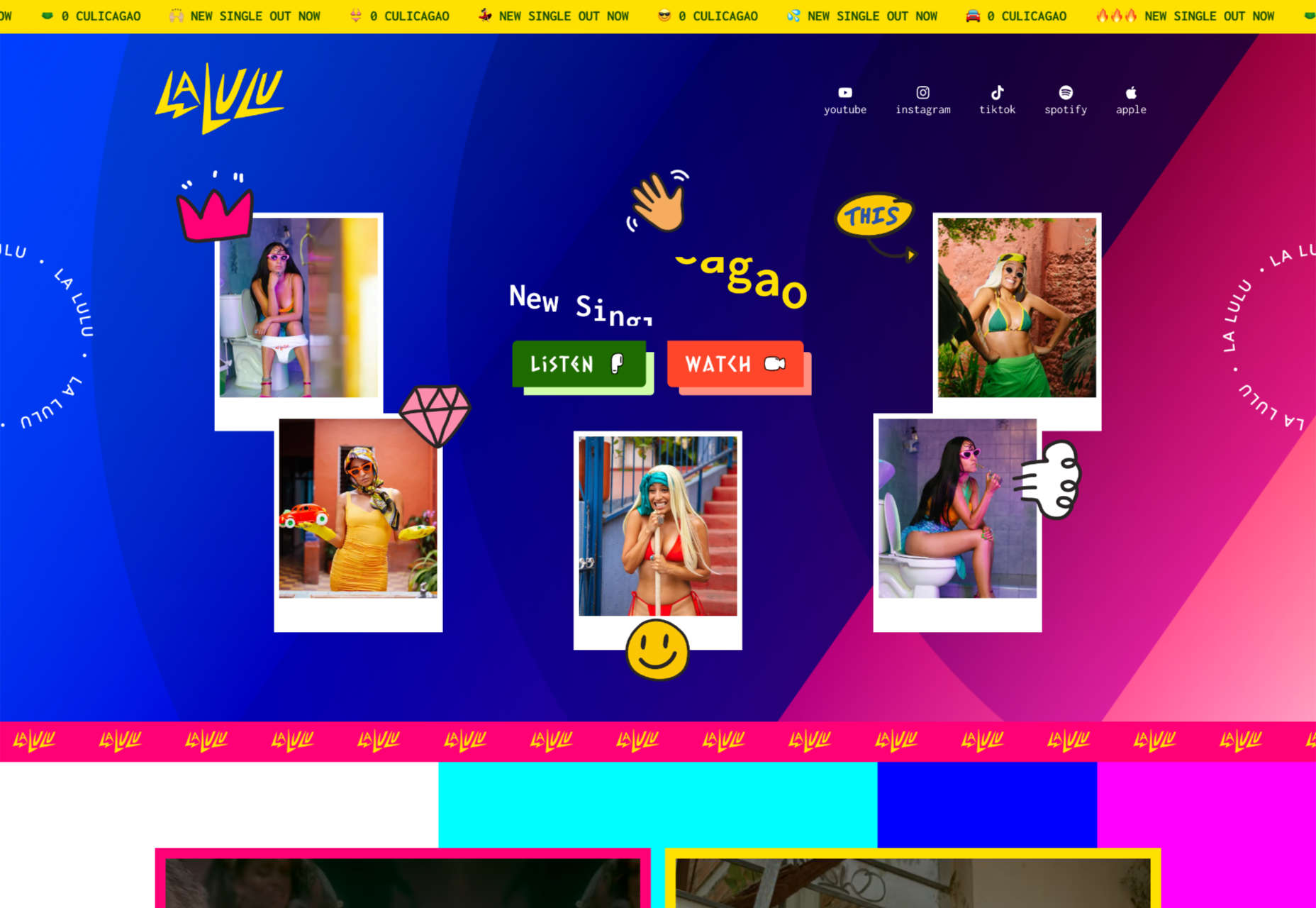
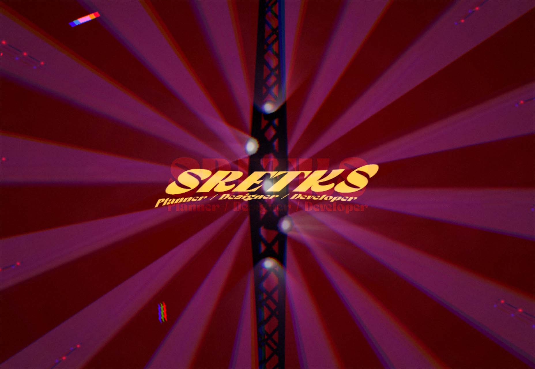
La Lulu
La Lulu is a Columbian-American singer, dancer, and musician. Her site uses color to disrupt a fairly standard layout and infuse it with amazonian, psychotropic, South American vibes.
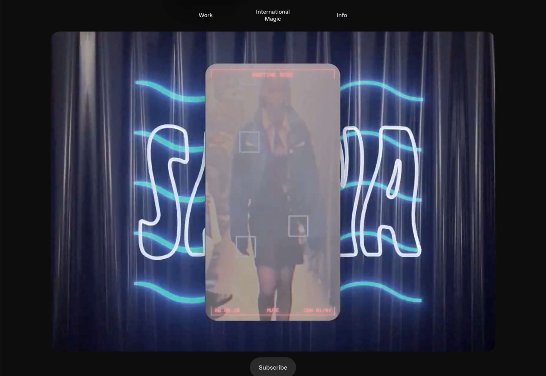
International Magic
International Magic is a design agency that boasts some impressive clients, from Maison Margiela to Nike. Its scroll-to-browse portfolio is a masterful example of selling design.
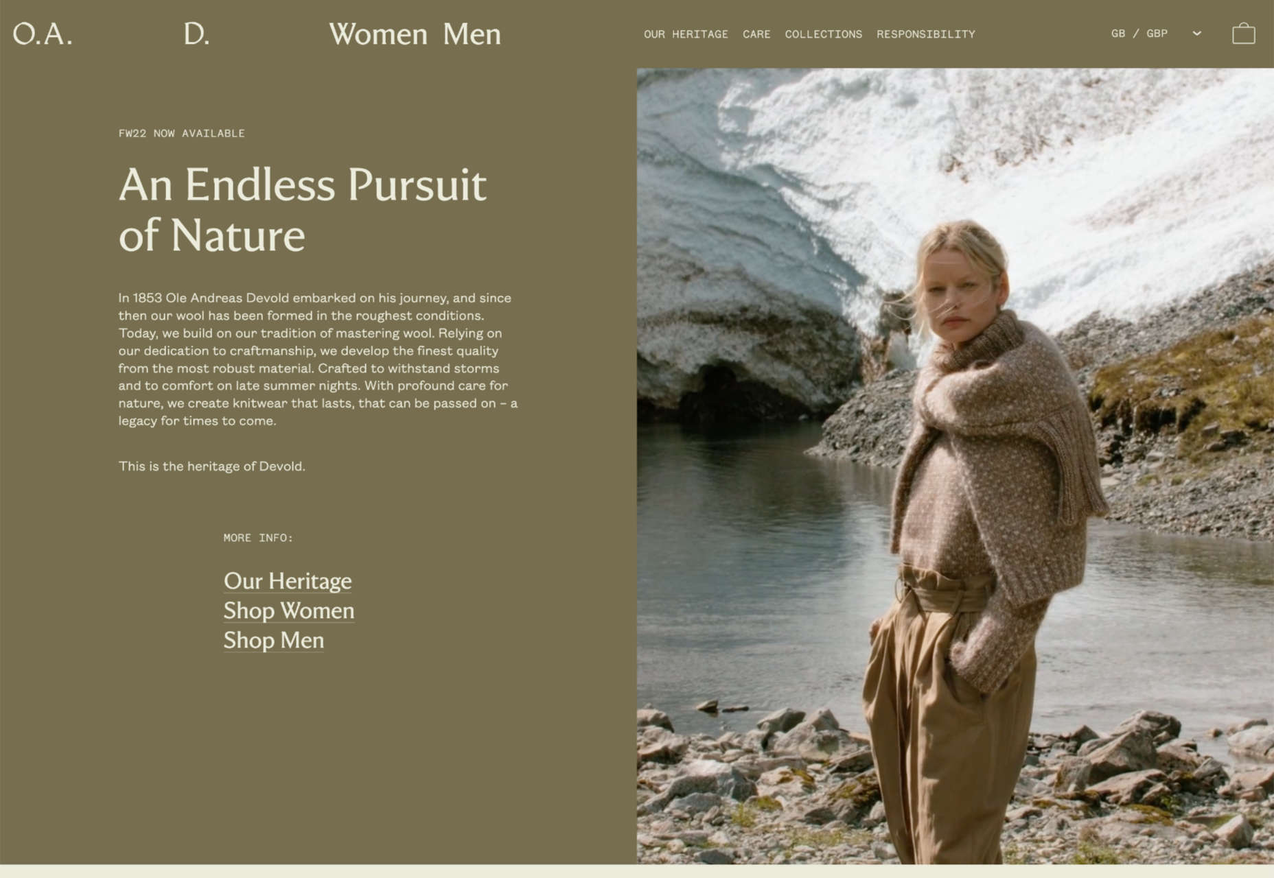
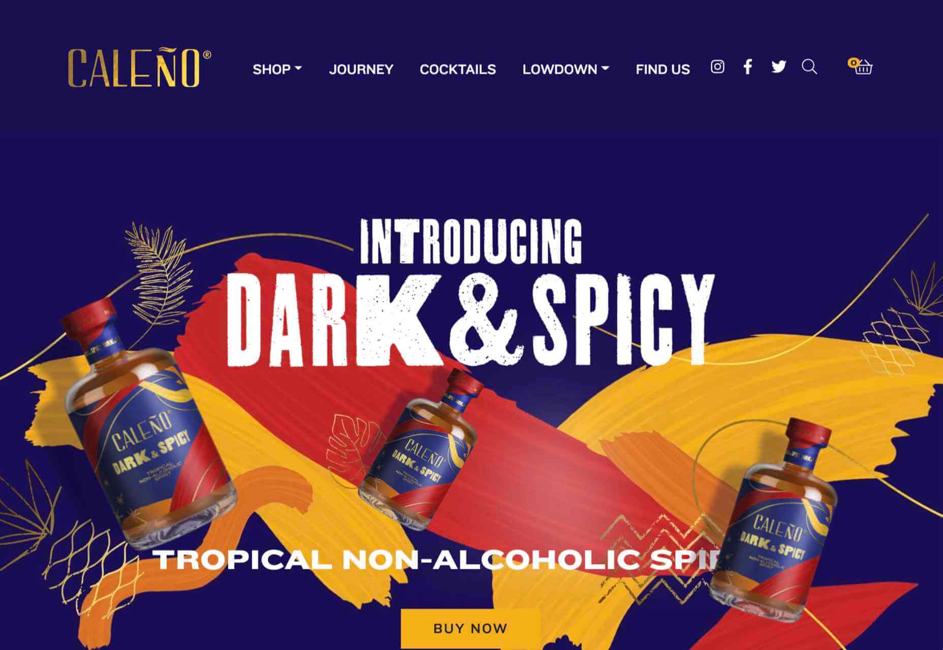
OAD
OAD uses color expertly to convey contrasting temperatures. At this time of year, who doesn’t want a pullover crafted to withstand the Norwegian weather?
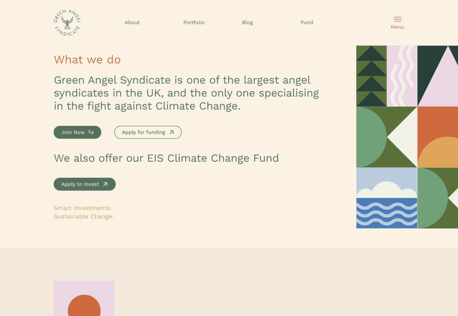
También
También is a creative agency specializing in organizations that positively impact the world. Its scrolling collage of client projects is one of the best examples of this type of portfolio.
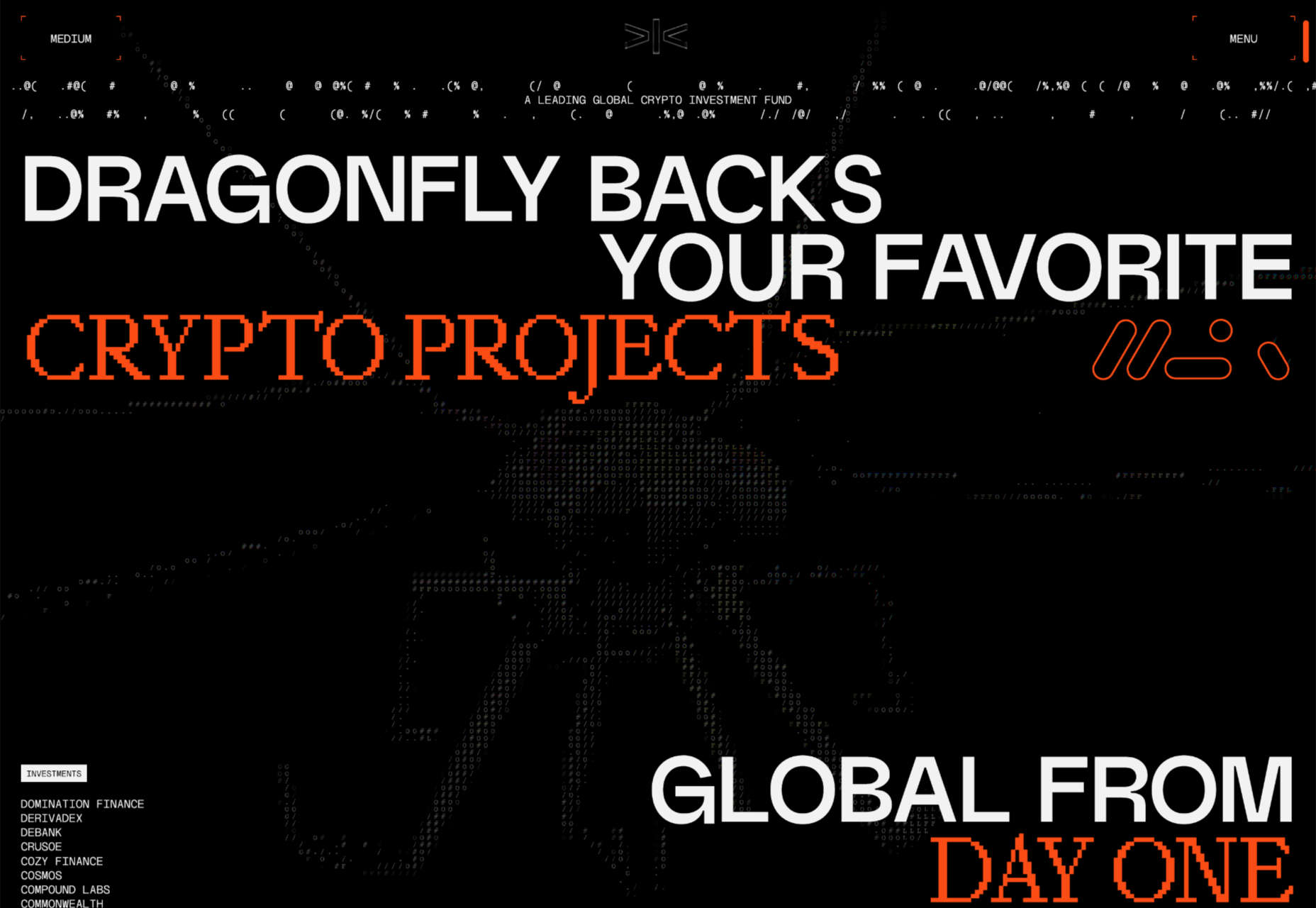
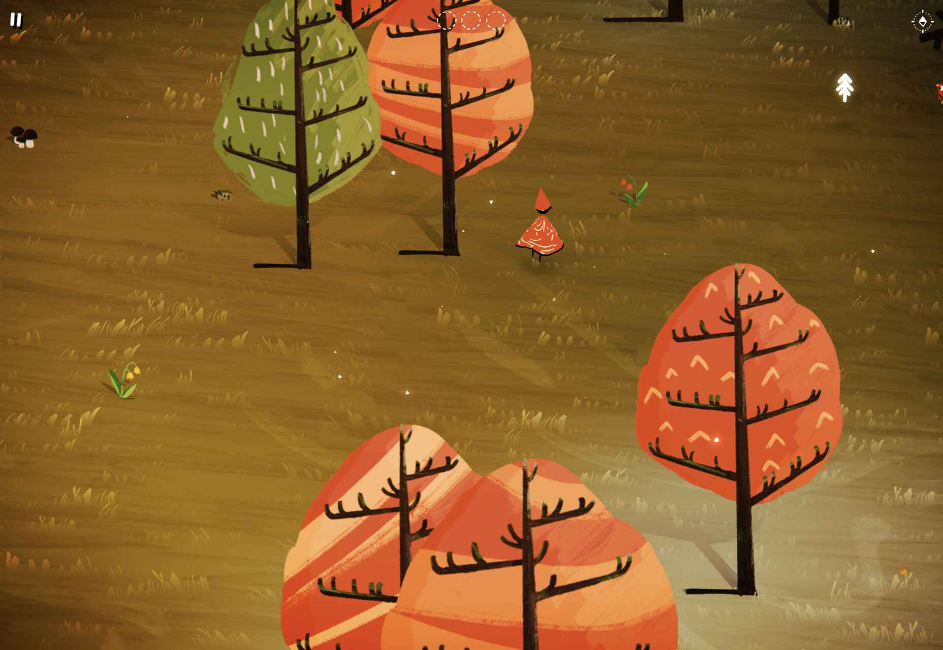
Dragonfly
If you were designing a website to be used in a 90s film about the internet, you’d create Dragonfly’s site. It’s packed with glitches, code references, and awesome pixelated imagery.
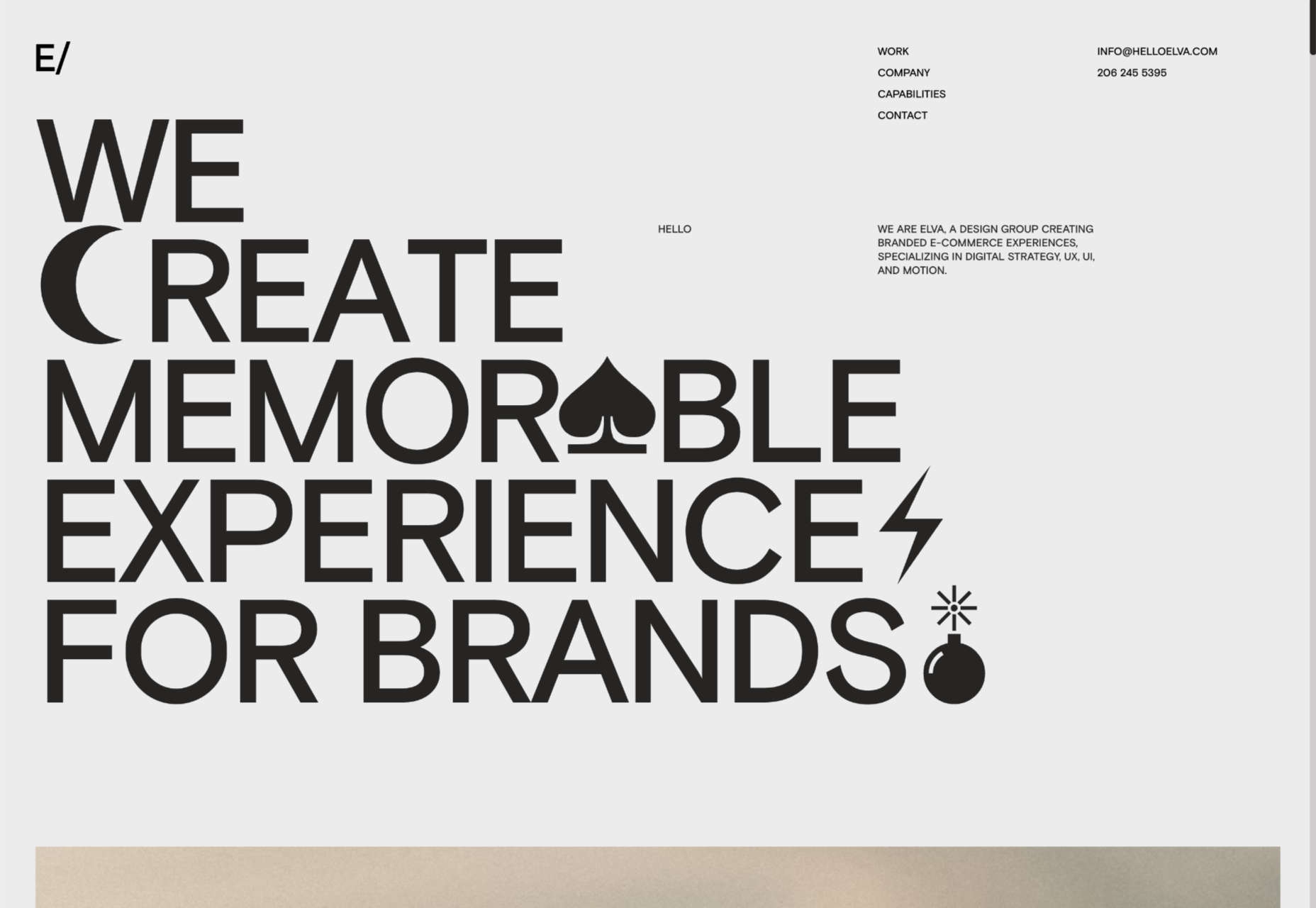
Elva
There’s a lot of distortion entering the design lexicon at the moment, and one of the best examples is Elva’s portfolio site, which uses it to enliven its black-and-white site.
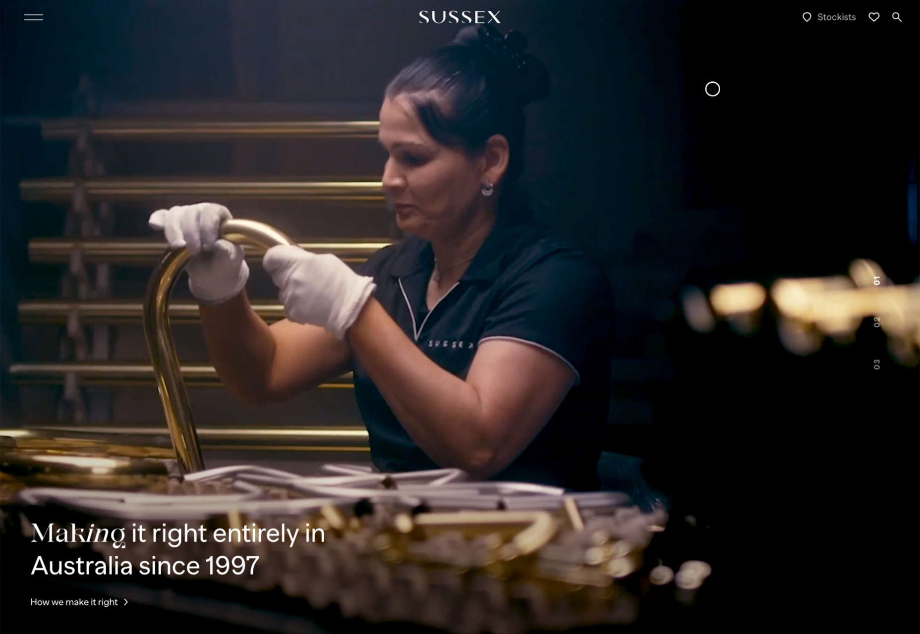
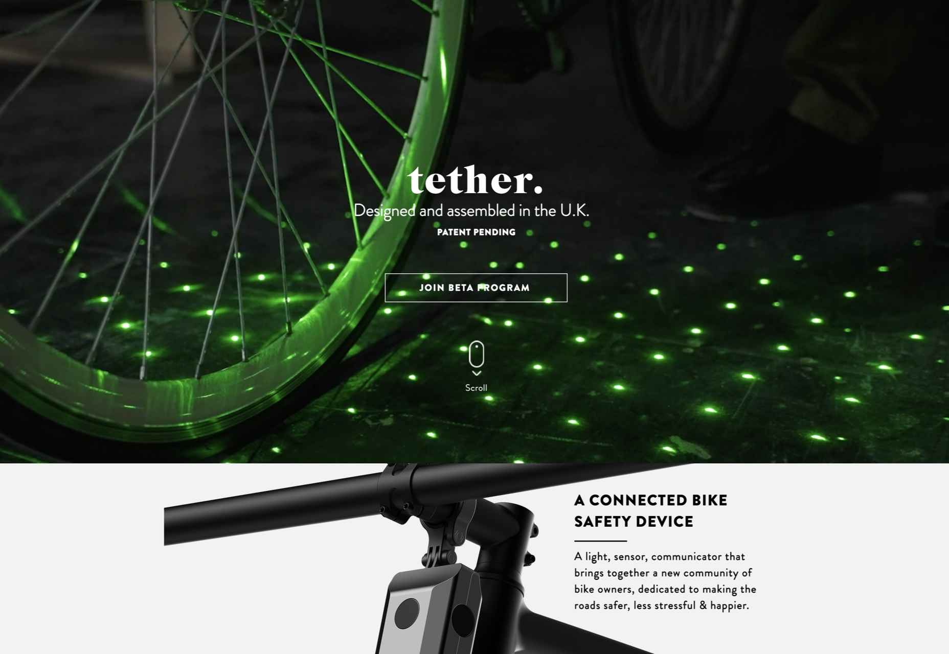
Sussex Taps
Sussex Taps uses multiple full-screen video clips to sell its carbon-neutral tapware range, but it’s the horizontal scrolling product videos that really make this site stand out.
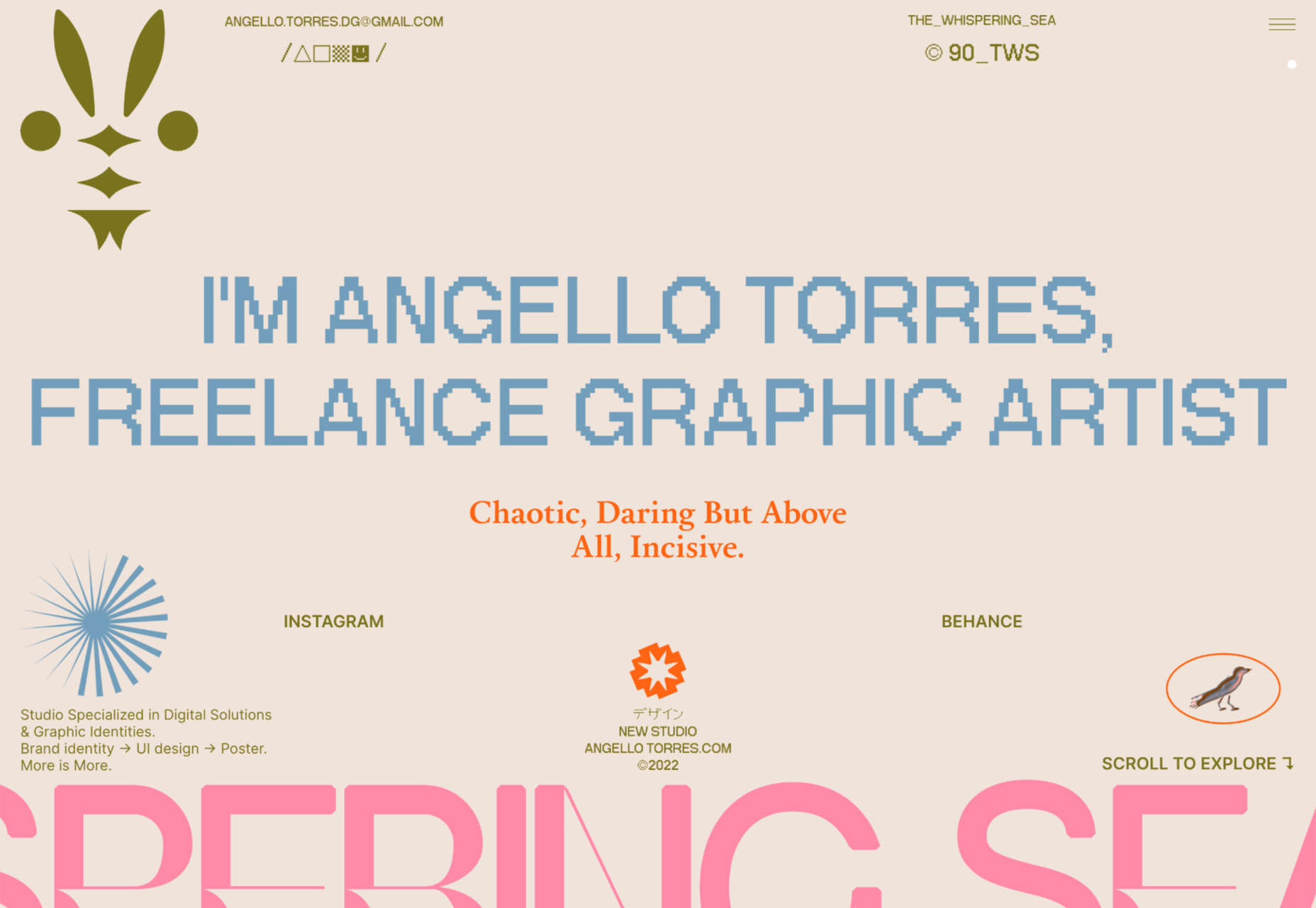
Angello Torres
Angello Torres’ portfolio is packed with daring typography that breaks pretty much all the rules and yet still manages to work somehow to convey energy and creativity.
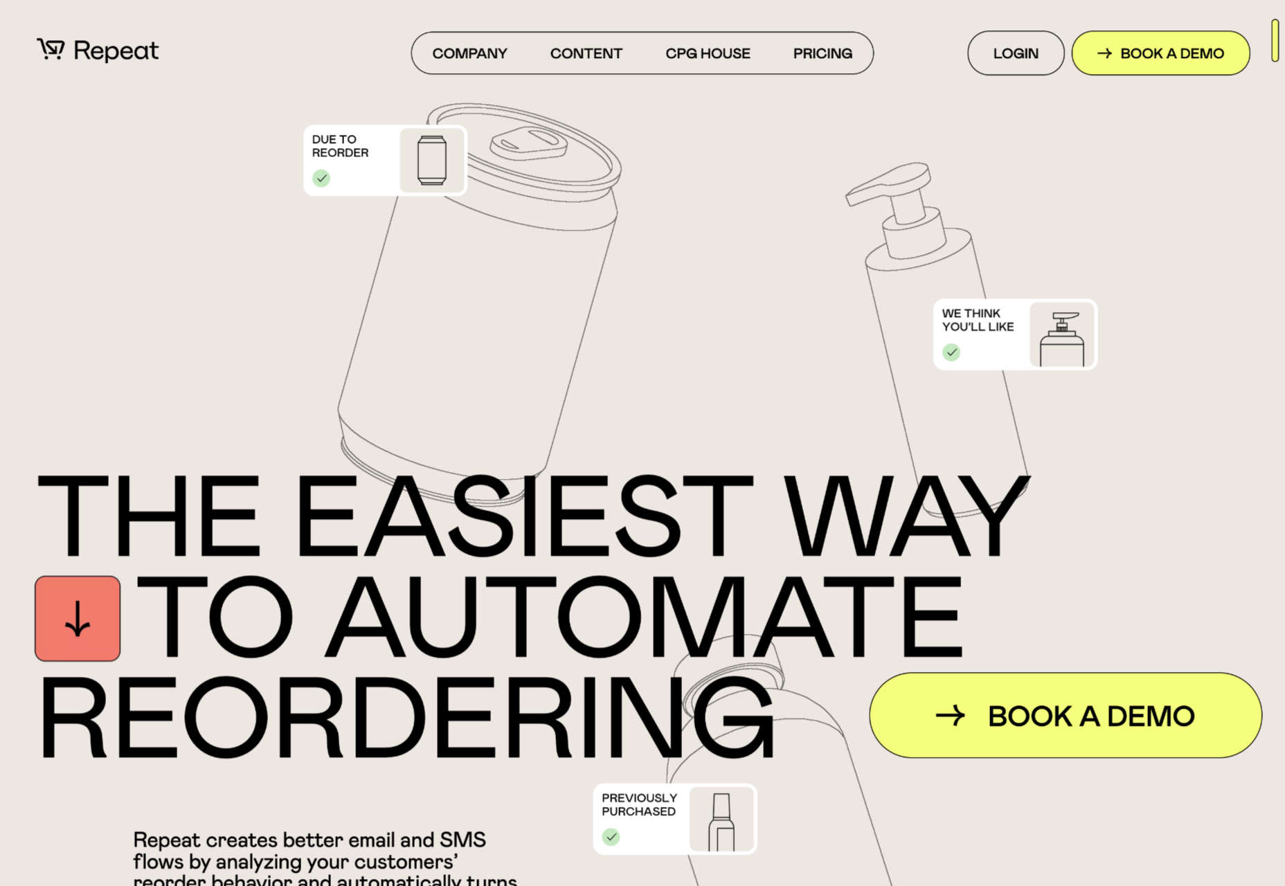
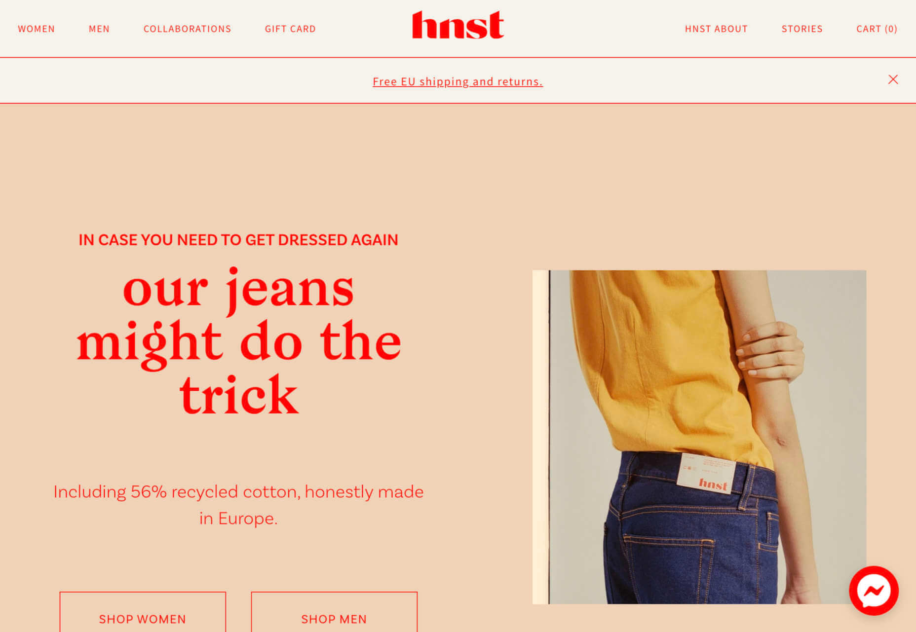
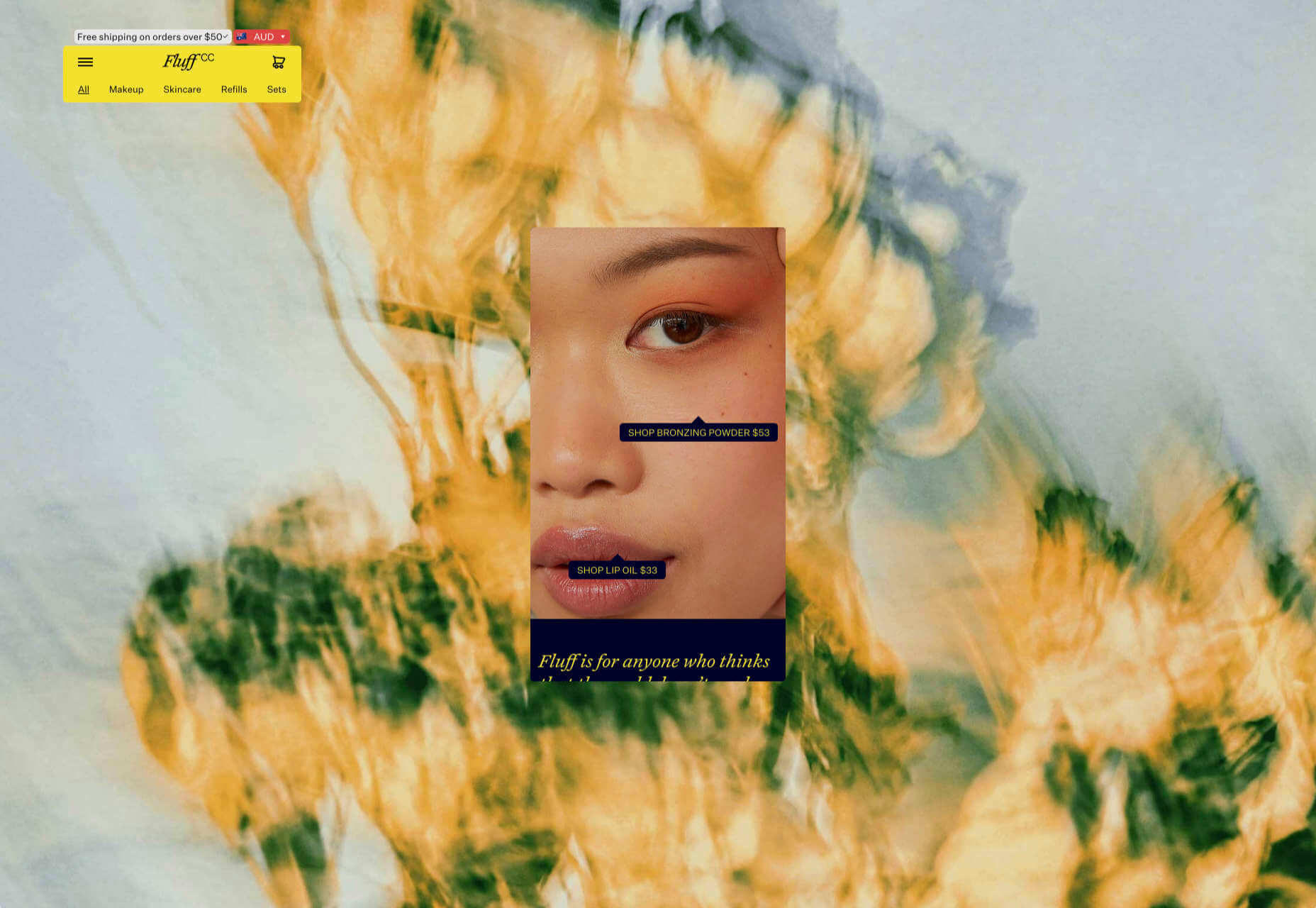
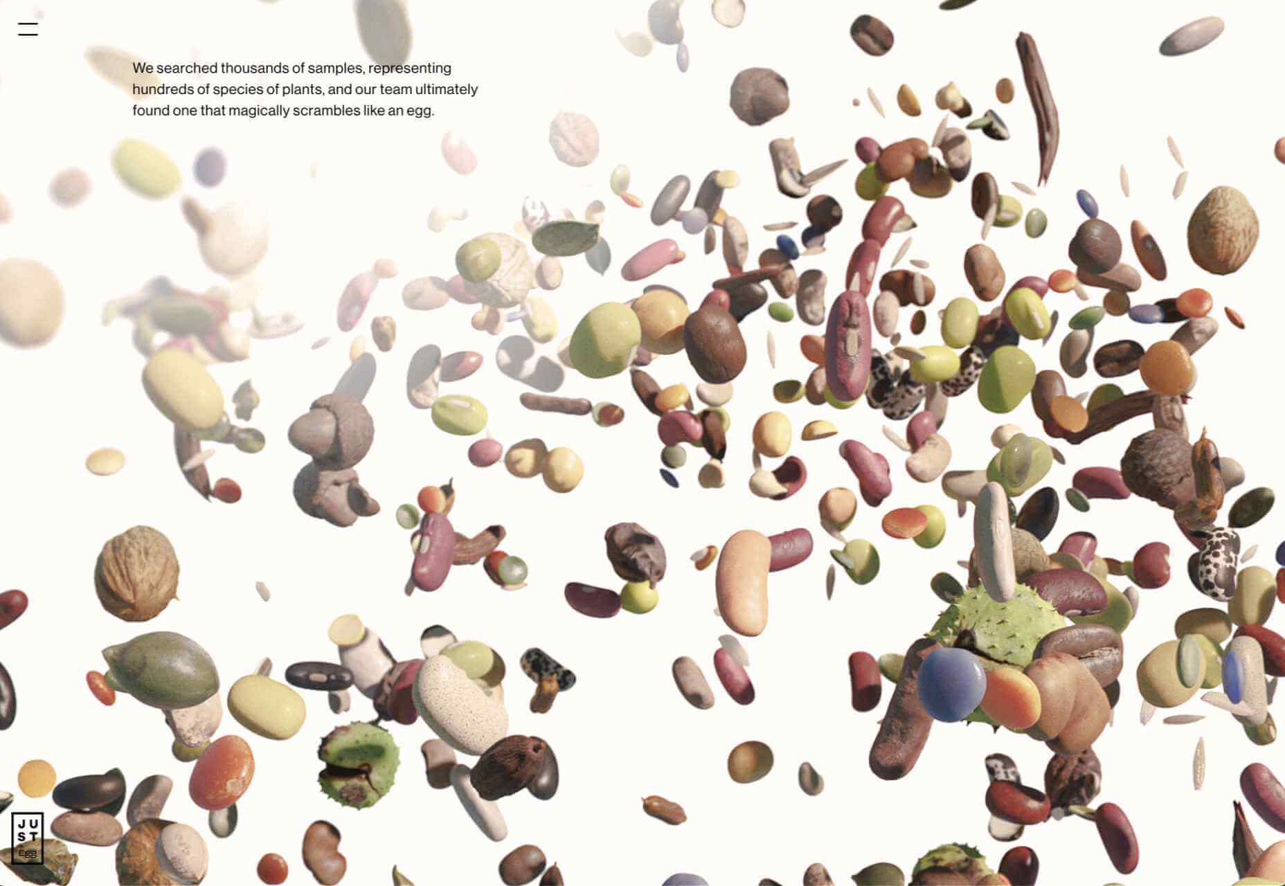
Repeat
Repeat is an excellent service for upselling customers with repeat orders. It uses simple illustrations to represent generic products with an attention-grabbing yellow for interactions.
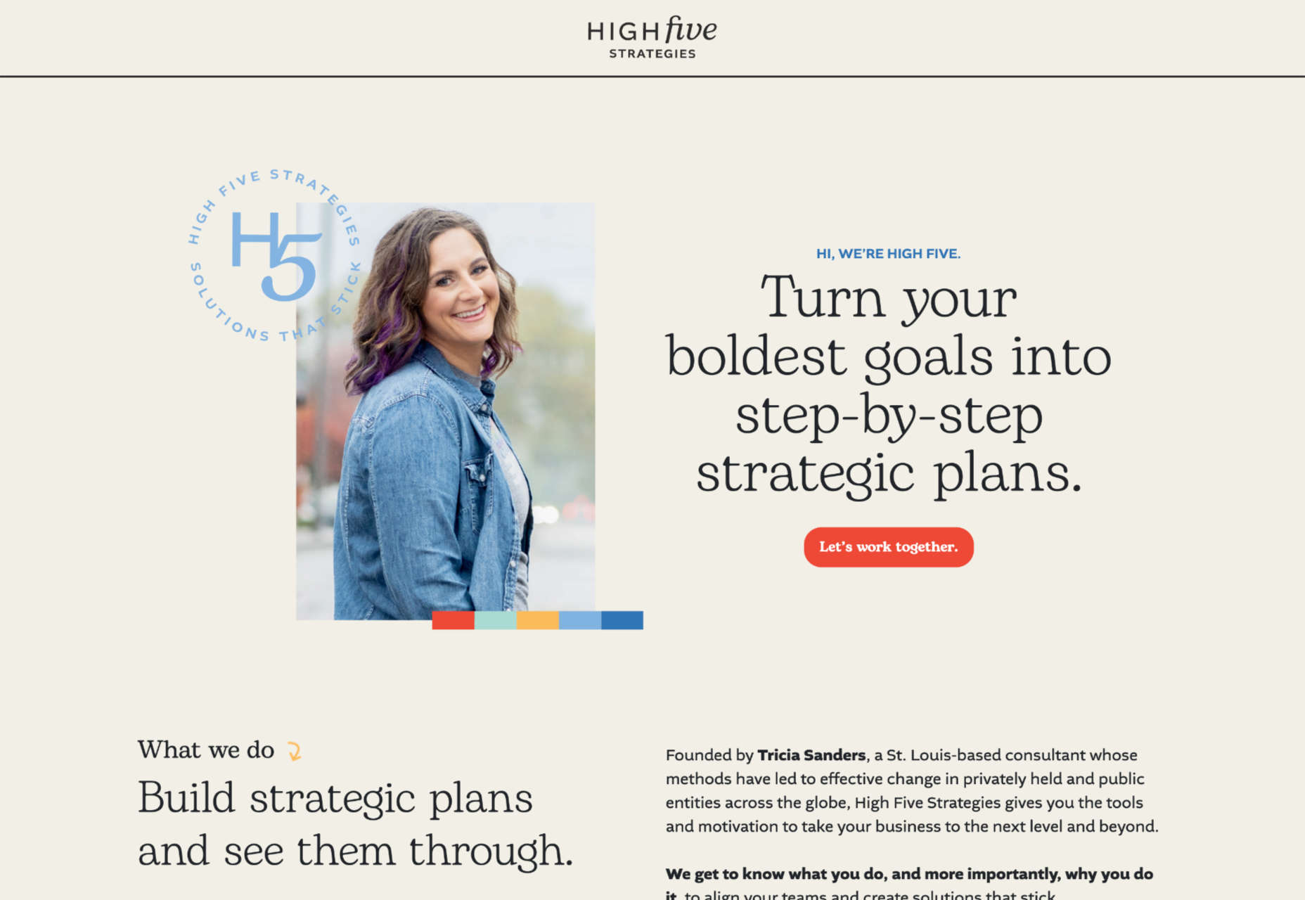
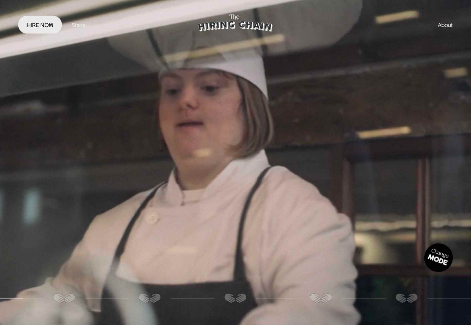
High Five Strategies
High Five Strategies eschew the formality of most business pitches to deliver a positive message with bold colors and typography that makes you feel ready to move forward.
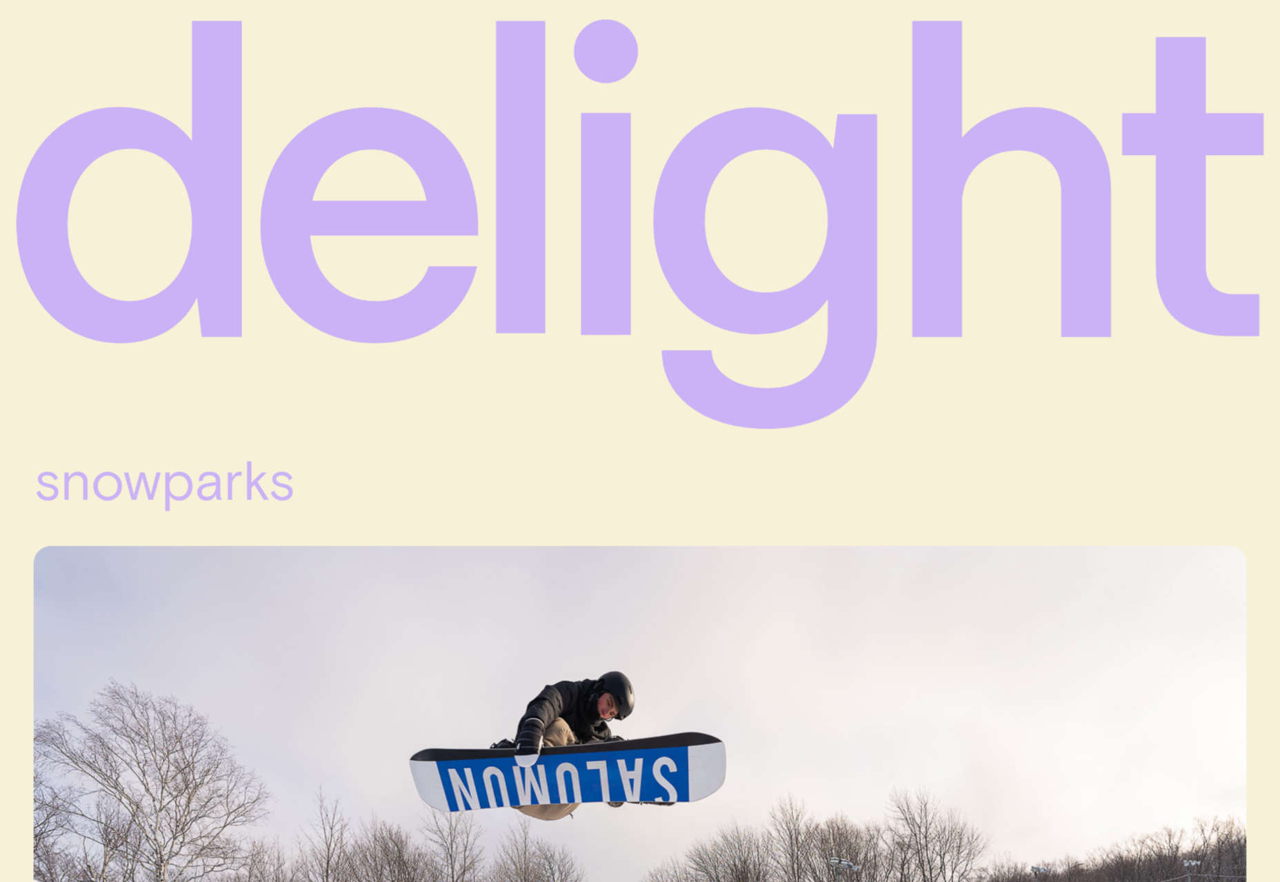
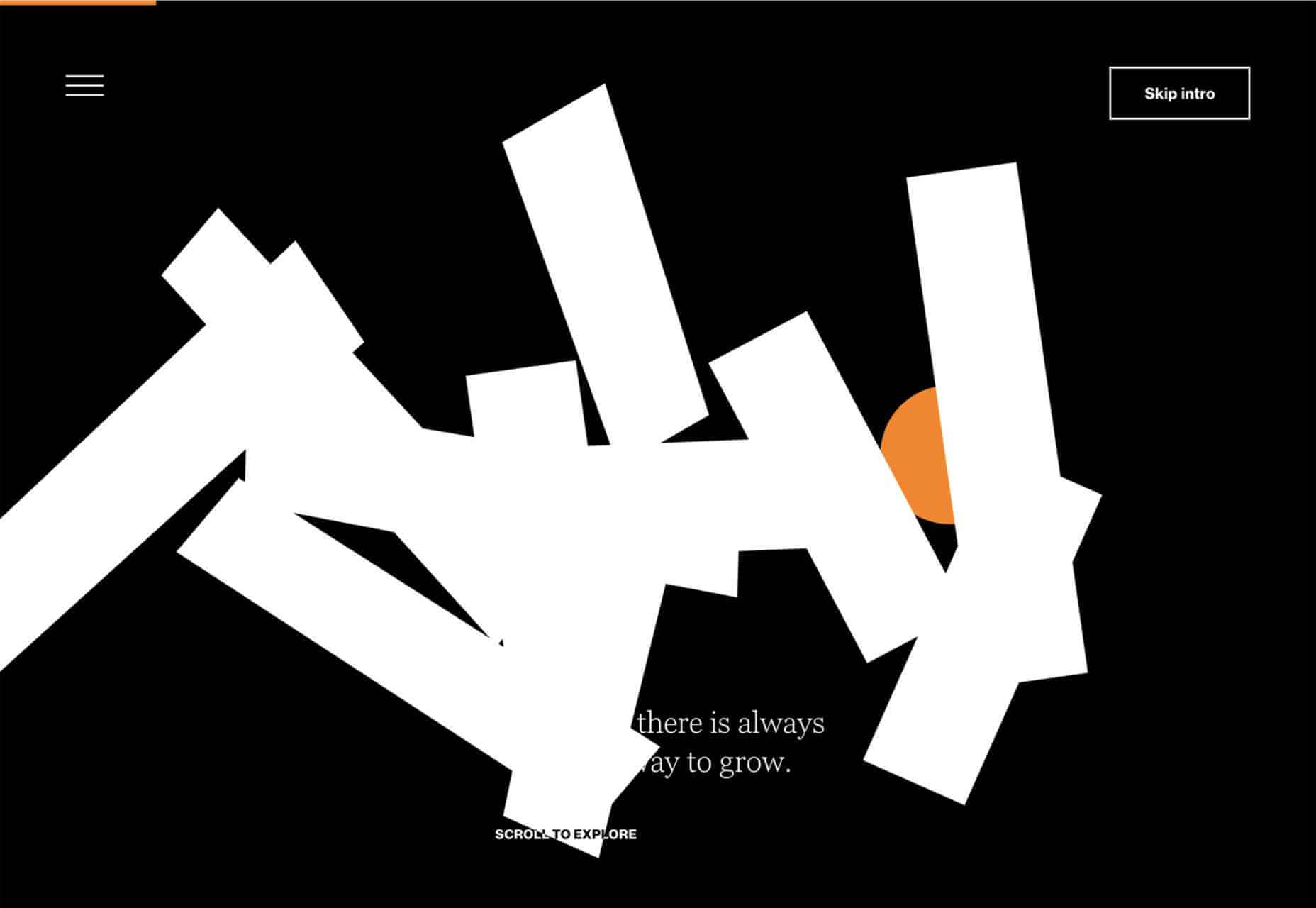
Delight
Delight Snowparks employs a questionable lilac color, but its fantastic imagery and video framing more than makes up for that. Plus, there’s another super-old-school mouse trail!
The post 20 Best New Websites, November 2022 first appeared on Webdesigner Depot.
 The design world fluctuates back and forth, swerving between love and hate for different design trends. Sometimes we see a wide range of approaches, and sometimes designers all hop on the same idea.


 The purpose of a website is to reach new customers and keep current ones engaged. Therefore, customer-first should be at the top of your list for design features. After all, without your clients, your business won’t grow or succeed.
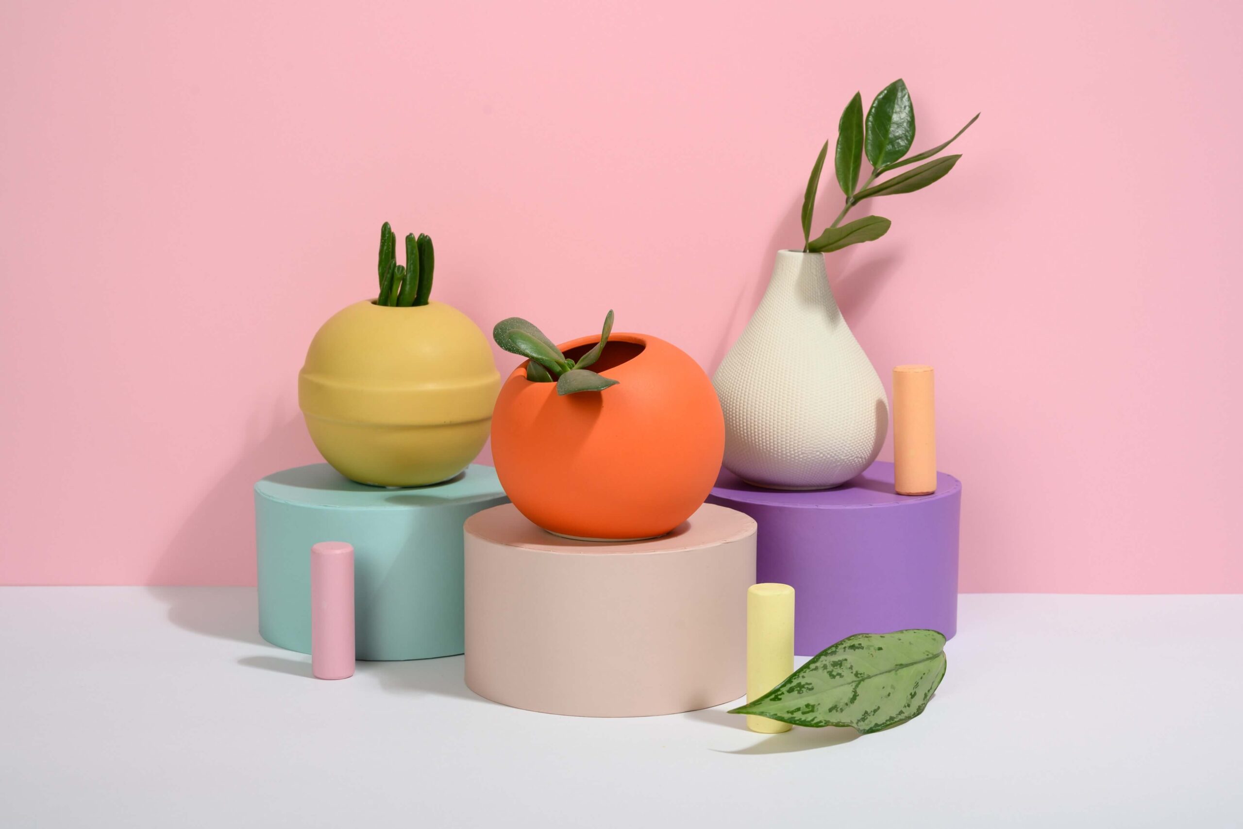
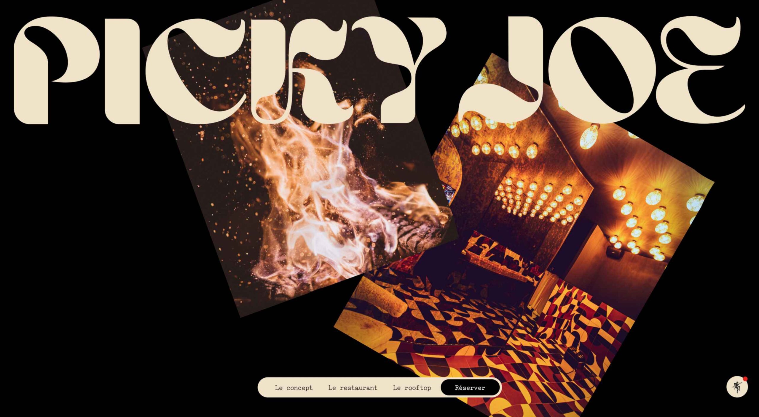 There are a lot of dark, retro vibes trending in website design right now. Although there are still some light projects popping up – including a pastel trend below – a lot of what we are seeing has a quite moody feel.


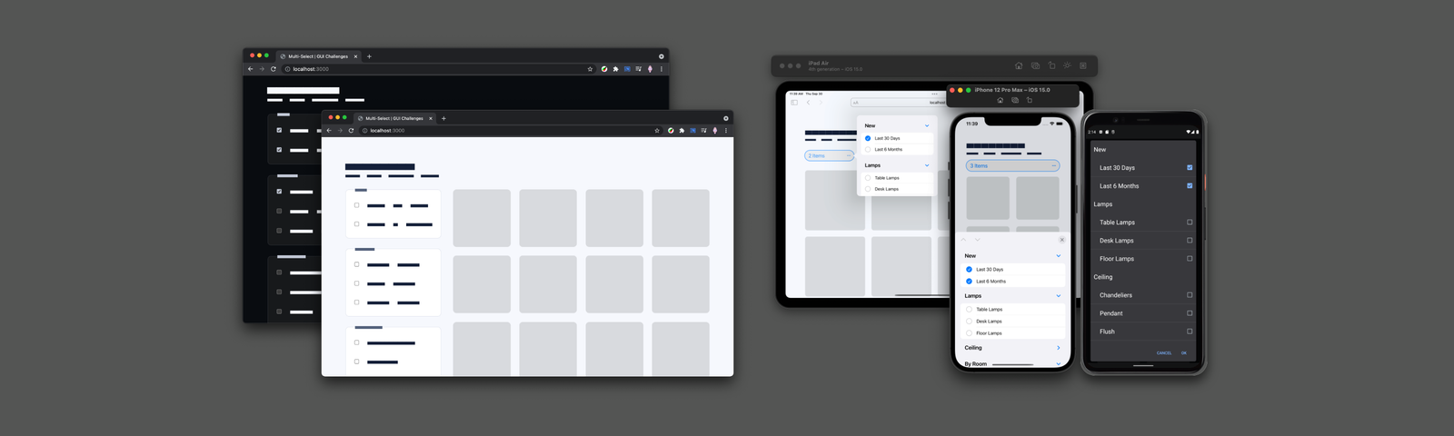
 User Experience (UX) design and User Interface (UI) design are two terms people sometimes mistakenly use interchangeably. While aspects of each are interconnected, there are distinct differences between UI/UX design.
 2021 has been both memorable and instantly forgettable. Pop stars were freed from modern-day servitude, some people tried to overthrow democracy, and we all vacationed at home.
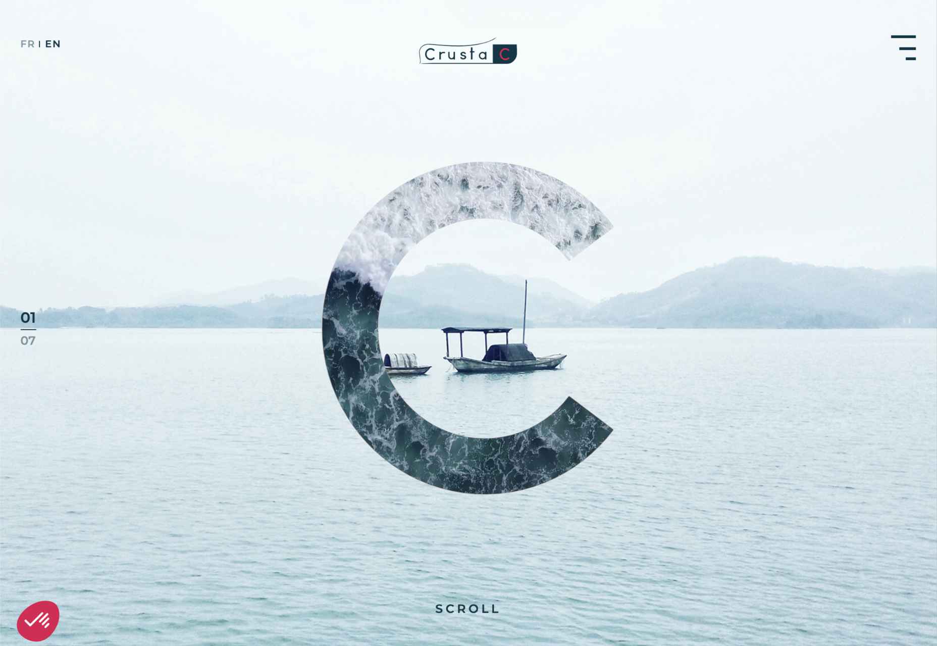


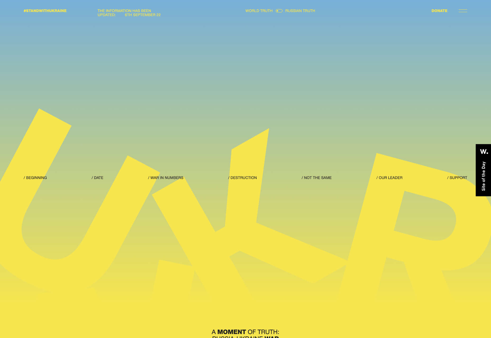
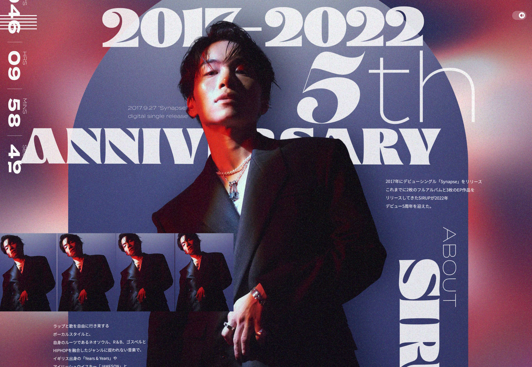
 Welcome to this month’s round up of what has caught our eye on the web. As it’s November we’re going to help chase those winter blues away with some color.


 Every day design fans submit incredible industry stories to our sister-site,


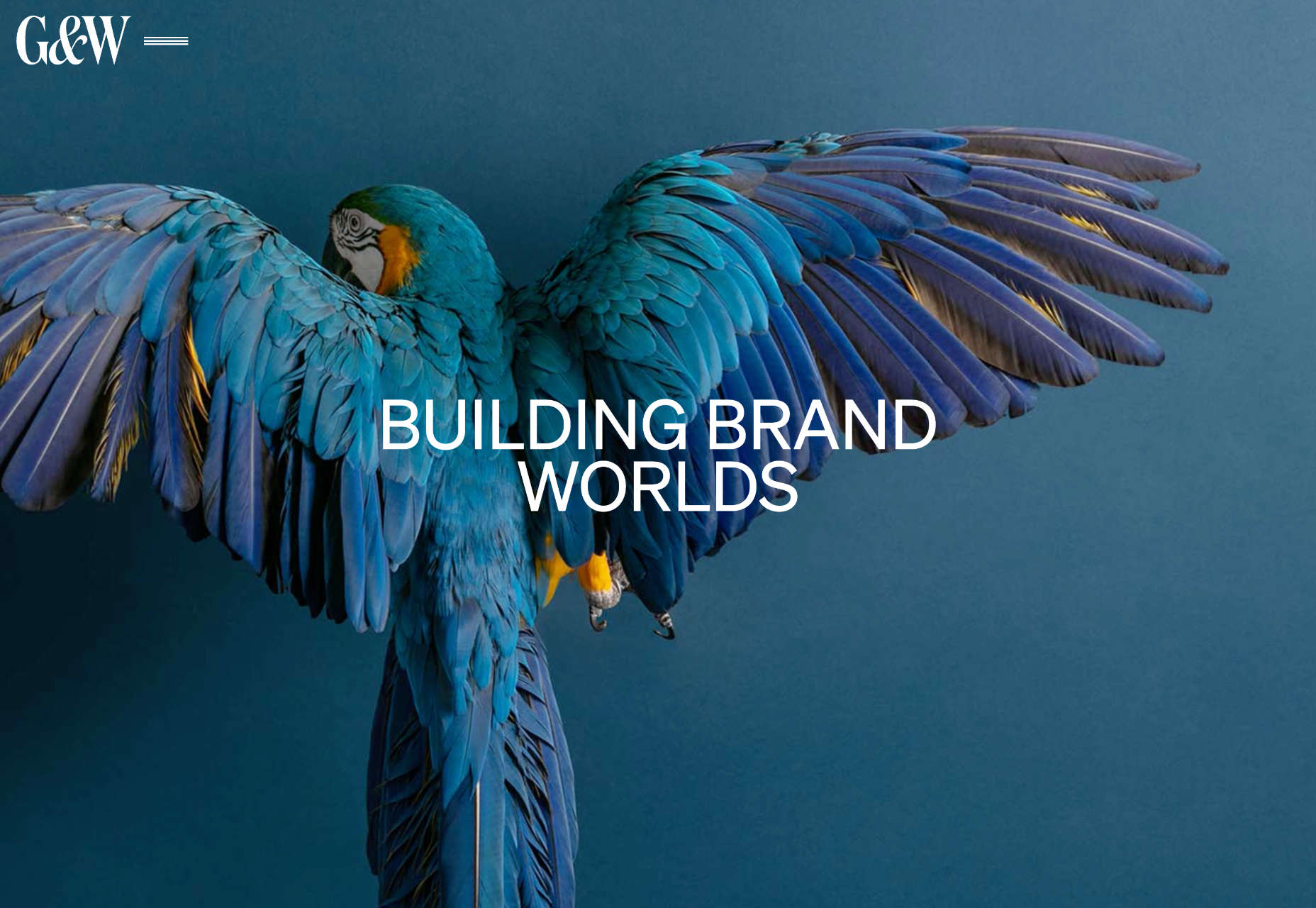
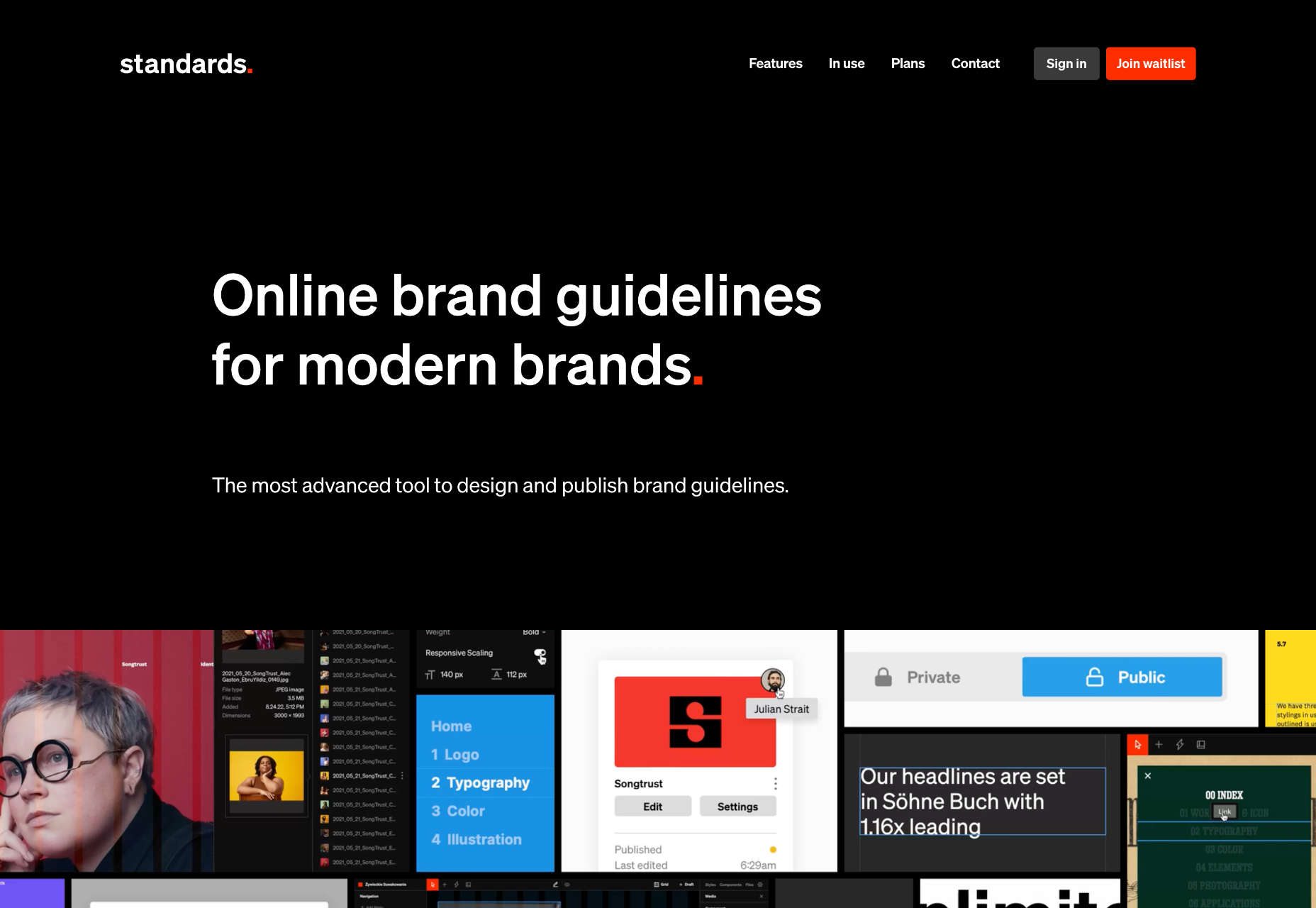
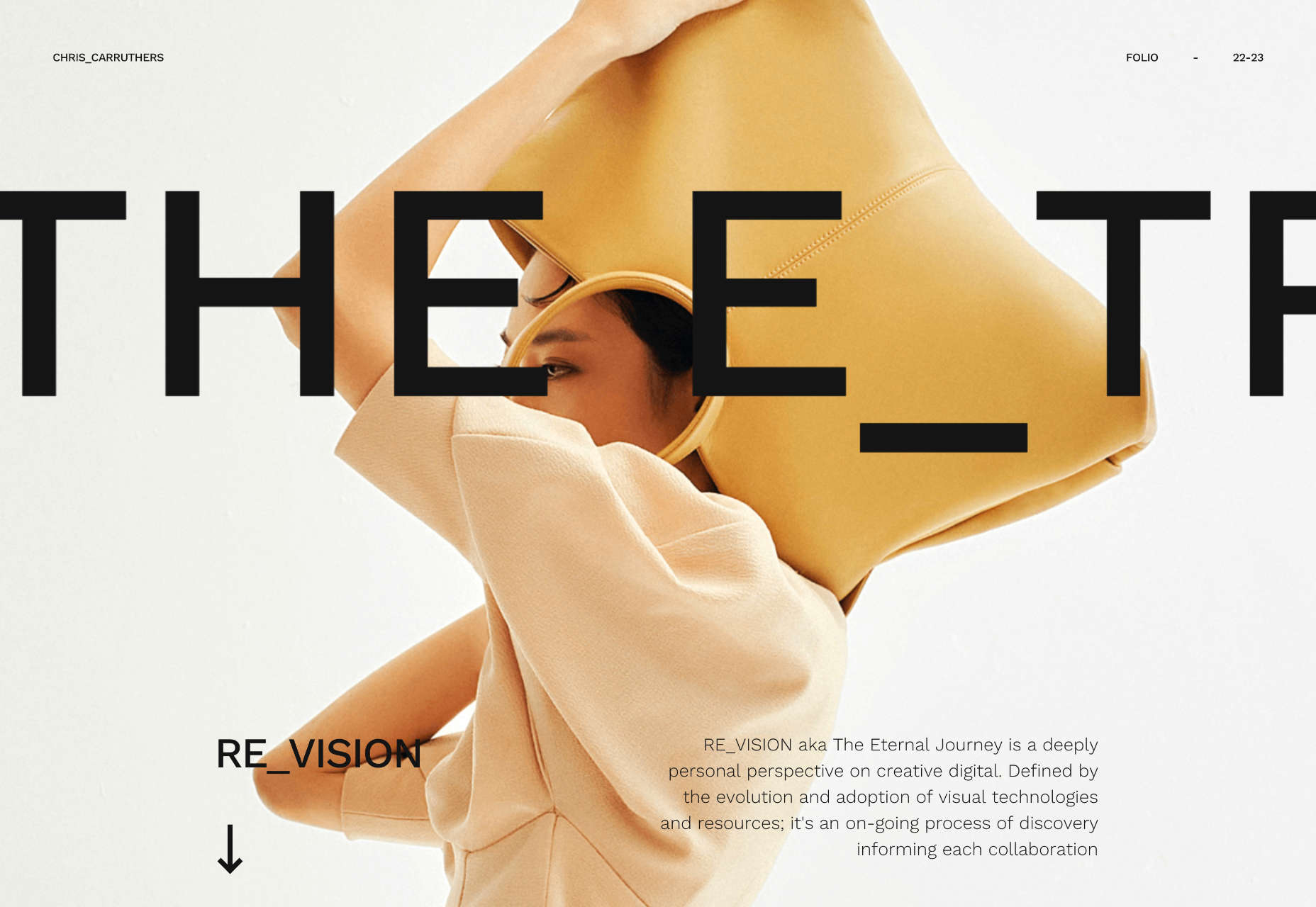
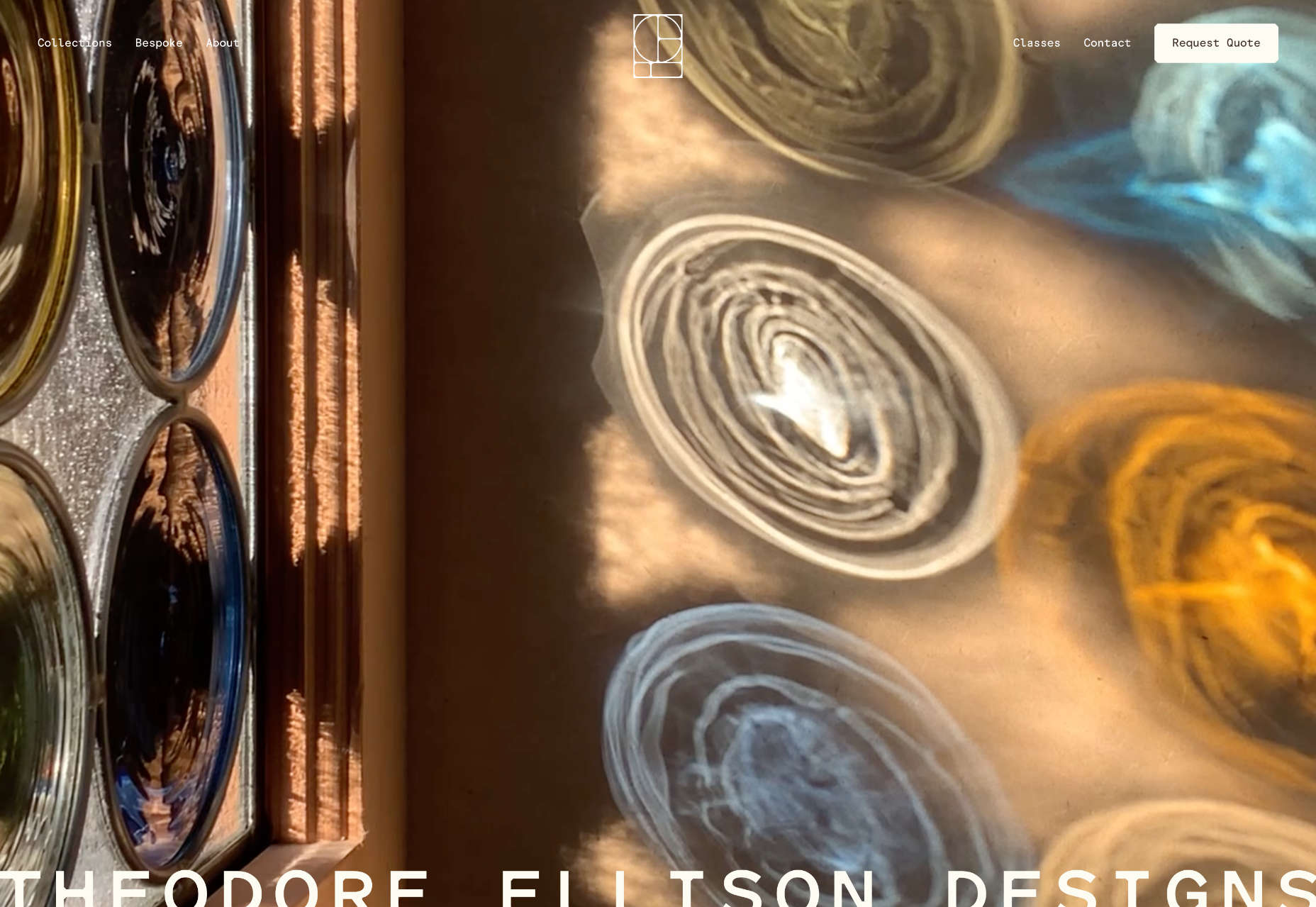
 Welcome to this month’s collection of what’s making the web look good. This time out we’ve got some new brands and some rebrands, and we’ve got some good examples of branding continuity across media.
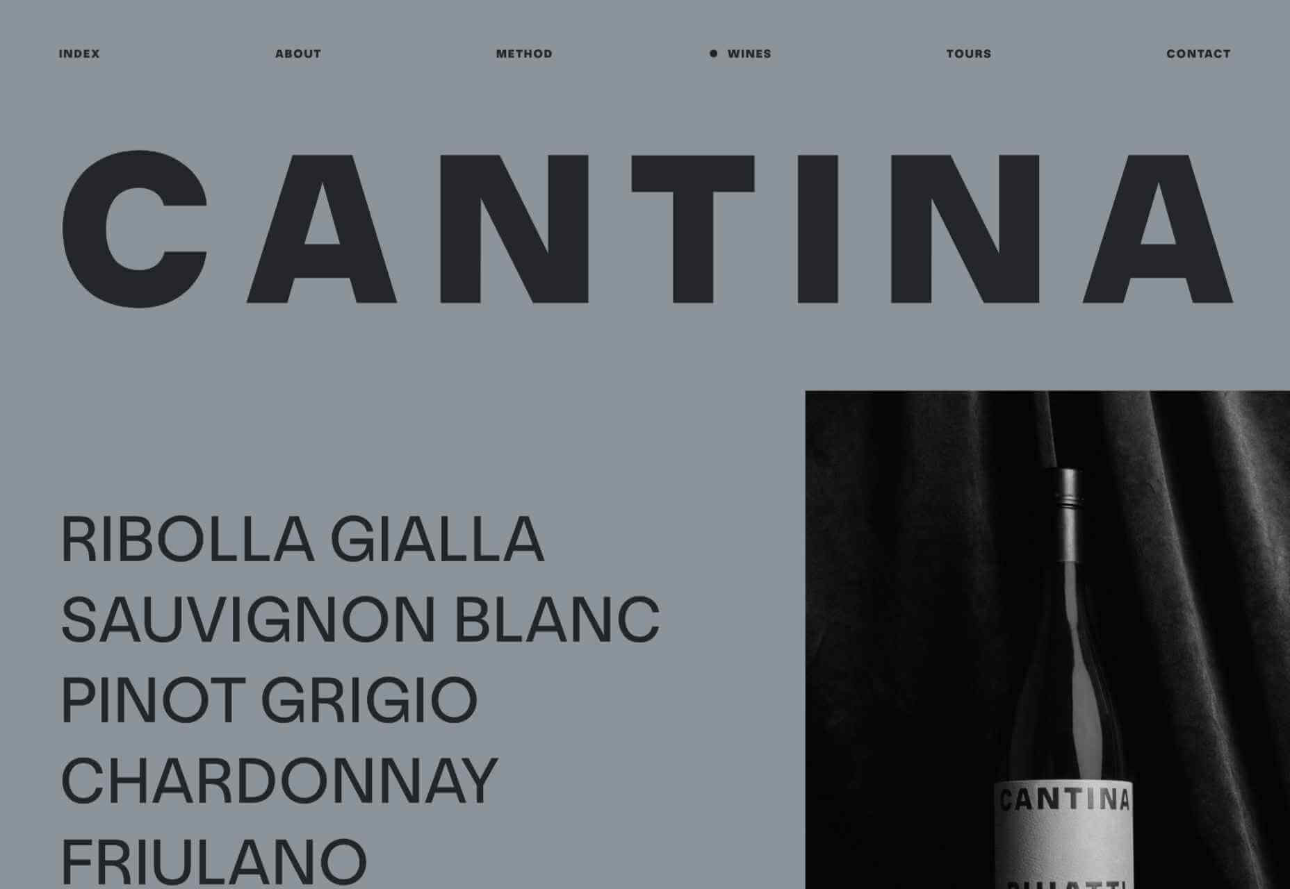

