Articles

There are a lot of dark, retro vibes trending in website design right now. Although there are still some light projects popping up – including a pastel trend below – a lot of what we are seeing has a quite moody feel.

Here’s what’s trending in design this month.

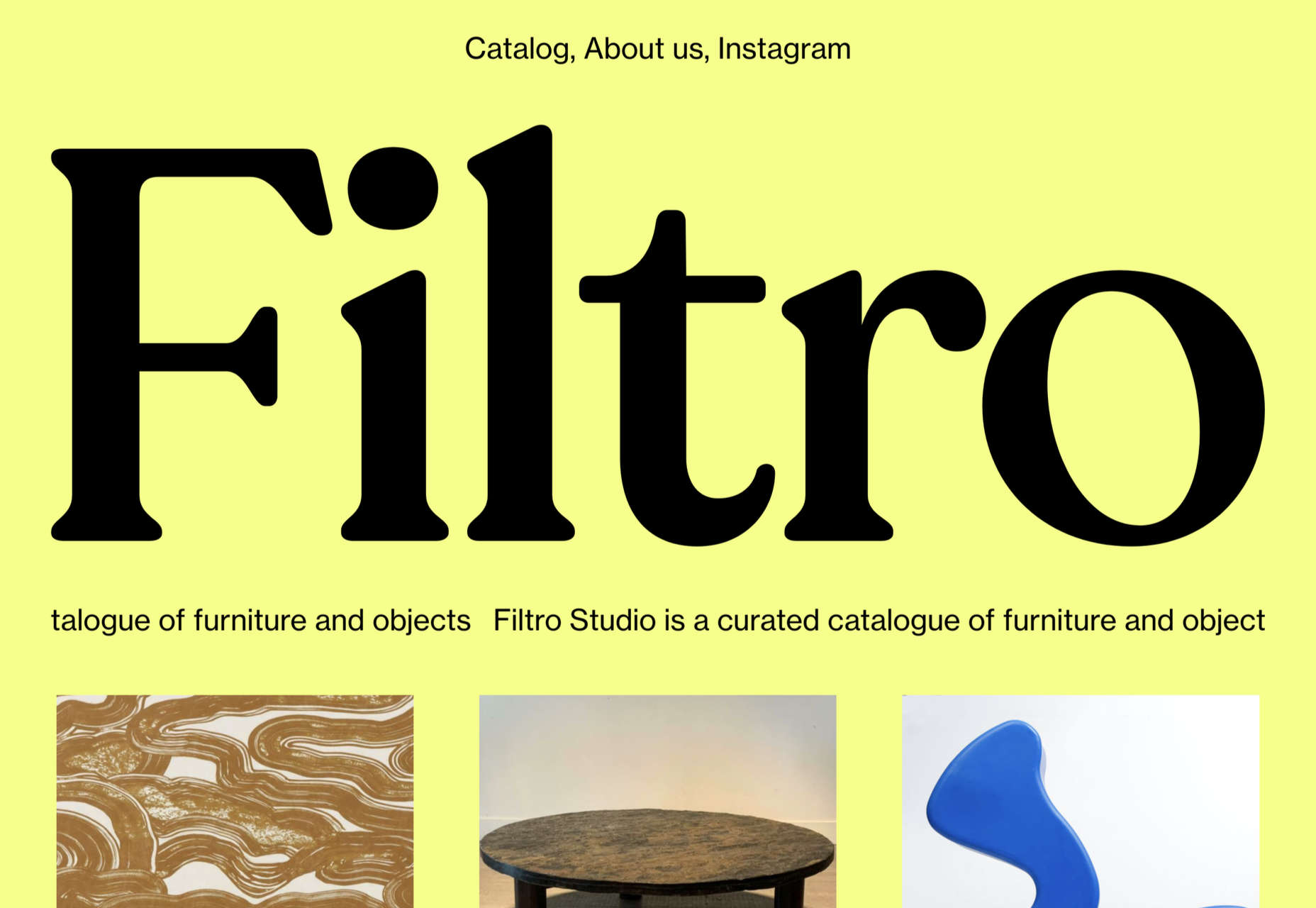
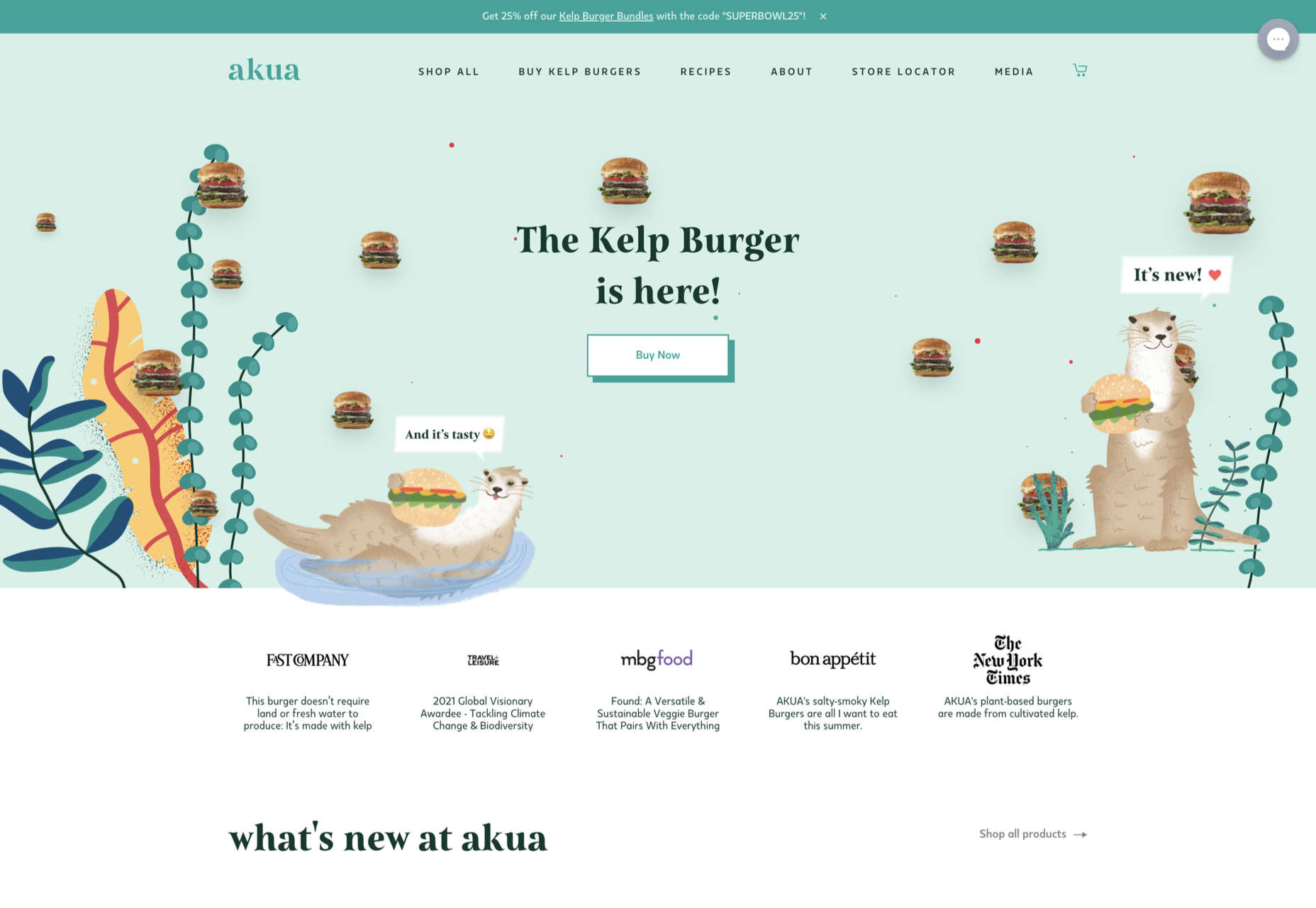
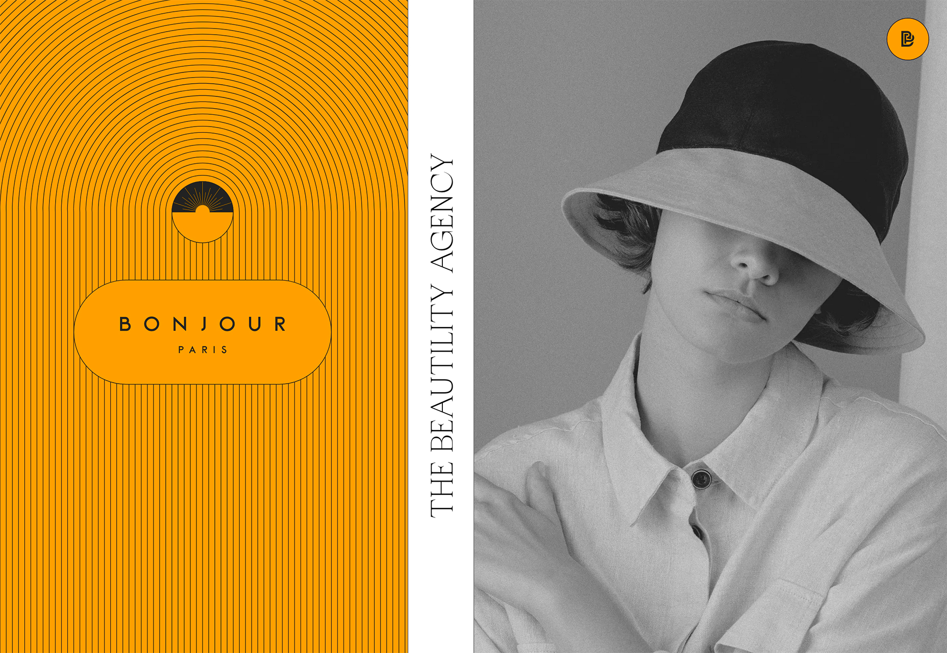
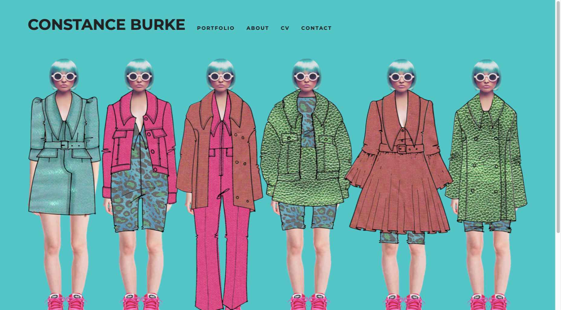
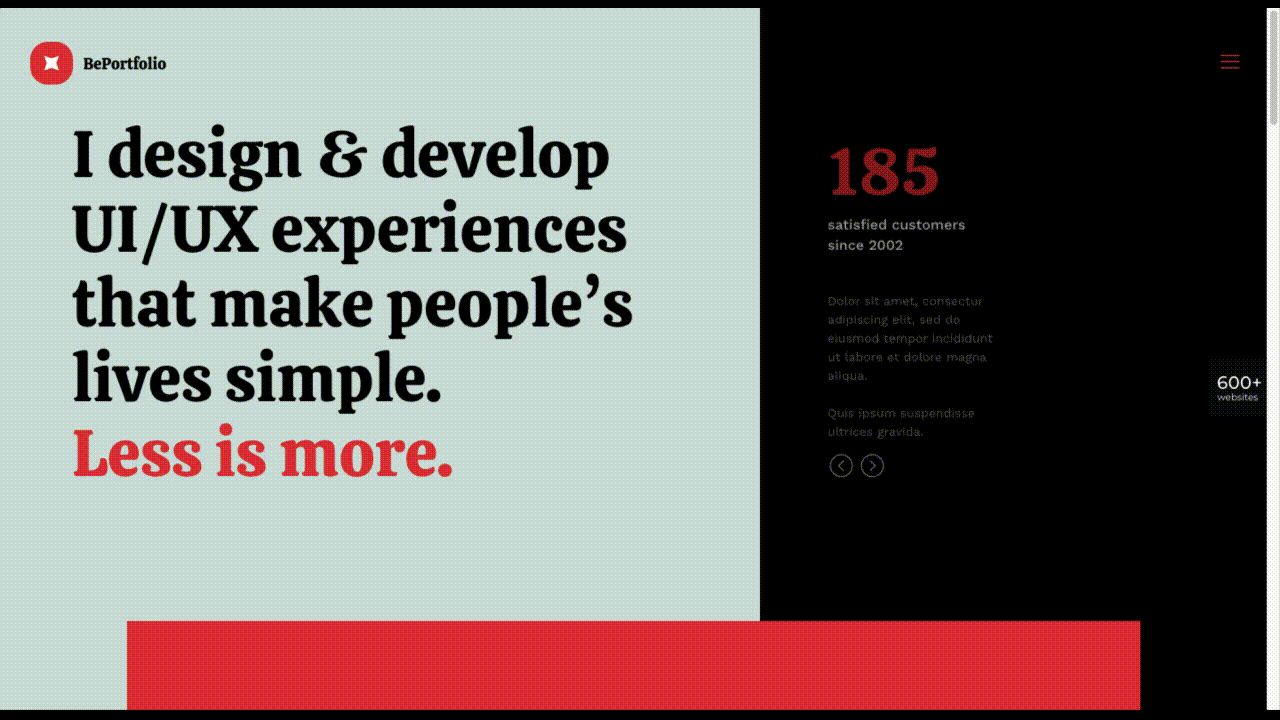
Pastel Color Palettes

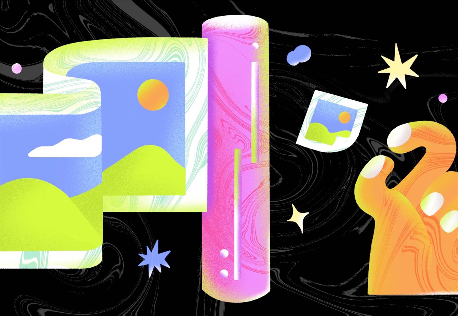
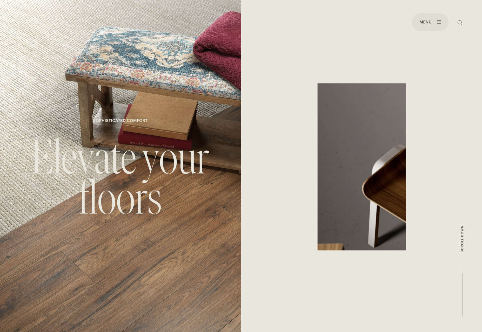
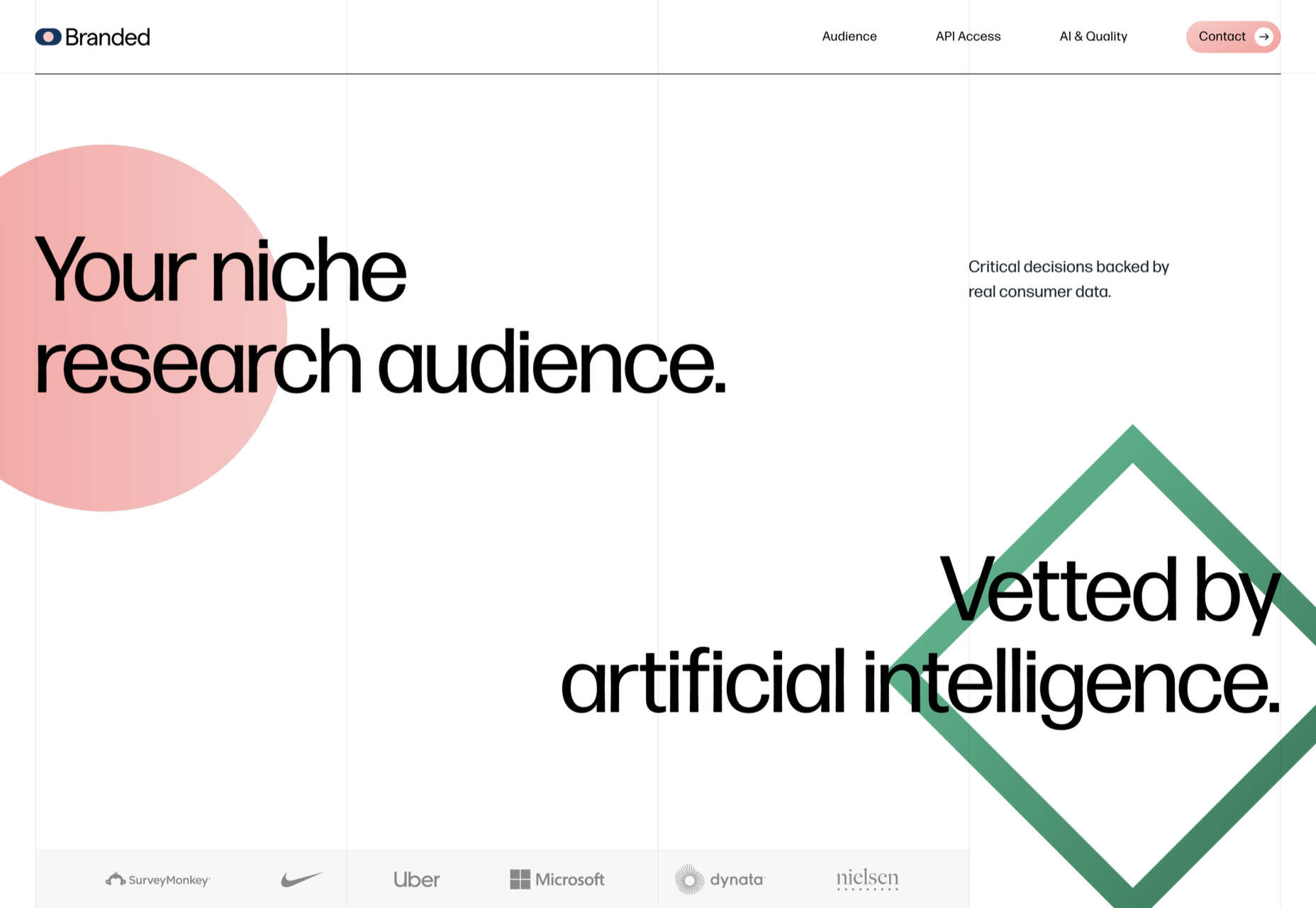
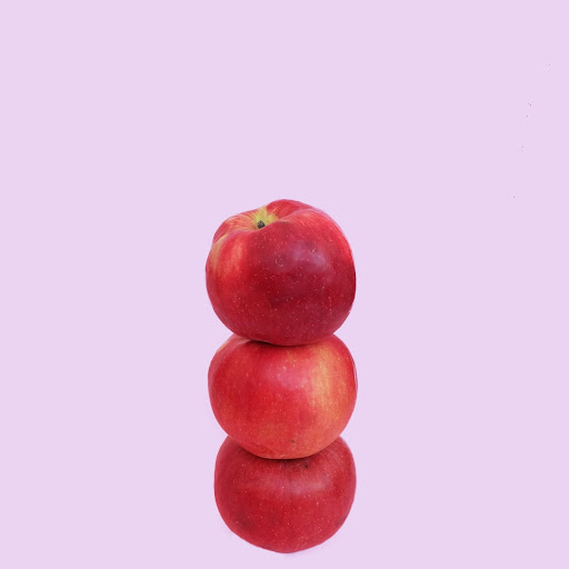
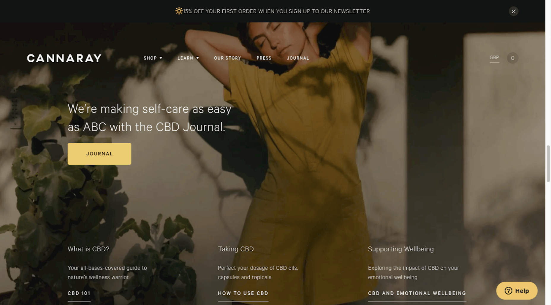
Let’s start with the trend with a lighter feel – pastel color palettes. While much of the web is trending toward dark aesthetics, there’s a segment that’s going in the exact opposite direction. Those sites feature soft, pastel color palettes that serve as a balance to all the super dark websites out there.

One thing about this website design trend is that it jumps out because of the stark contrast with all of the dark color palettes out there.

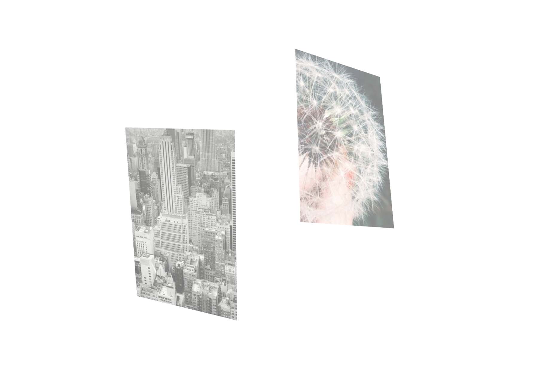
Each of these designs seems to use a pastel color palette as the basis for a background. A blur effect is paired with the colors to use pastels in a way that has a natural feel without appearing too feminine or light.

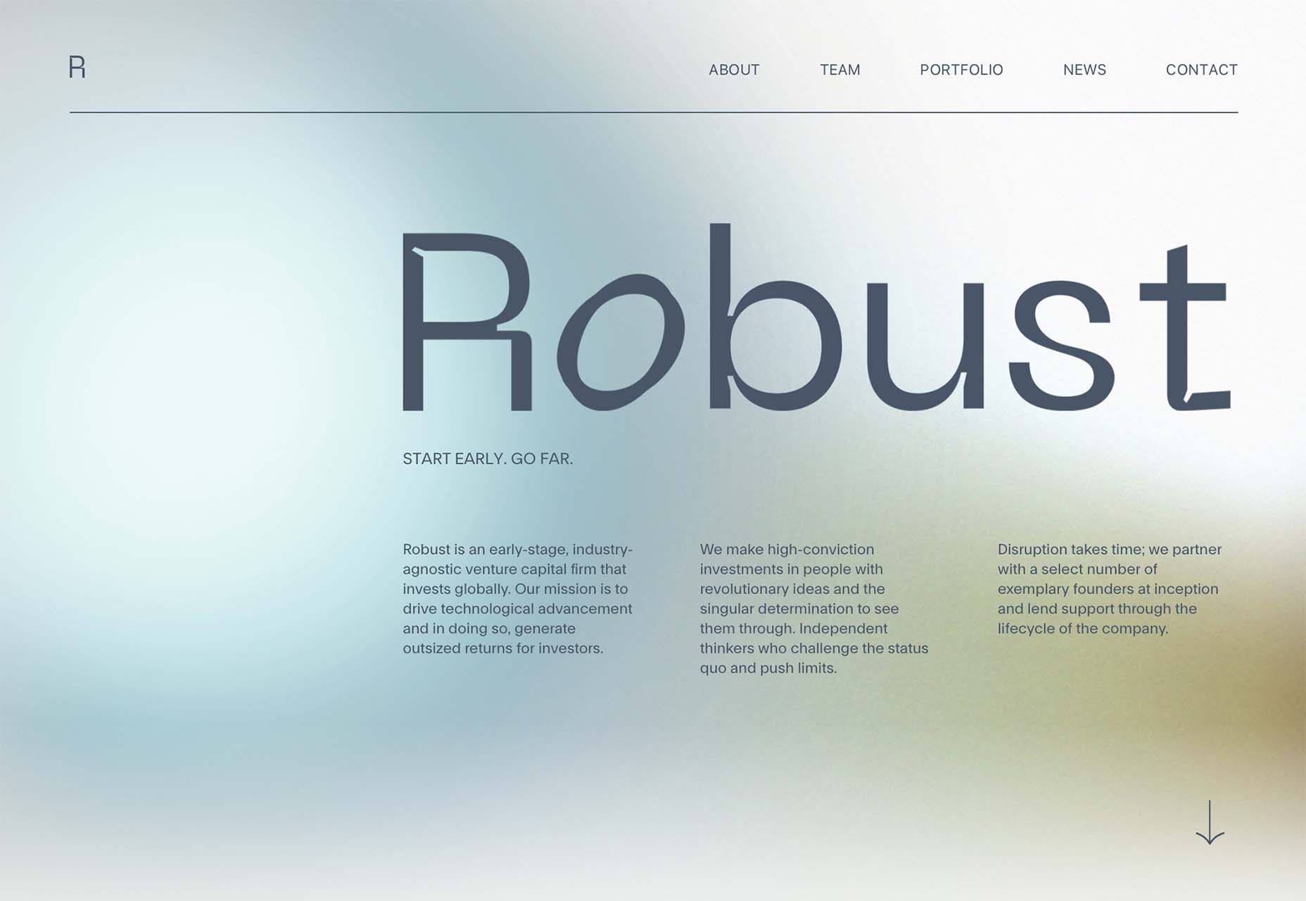
Robust uses blue and earth tones for a pastel background that feels modern and strong when paired with the hard-edged headline font.

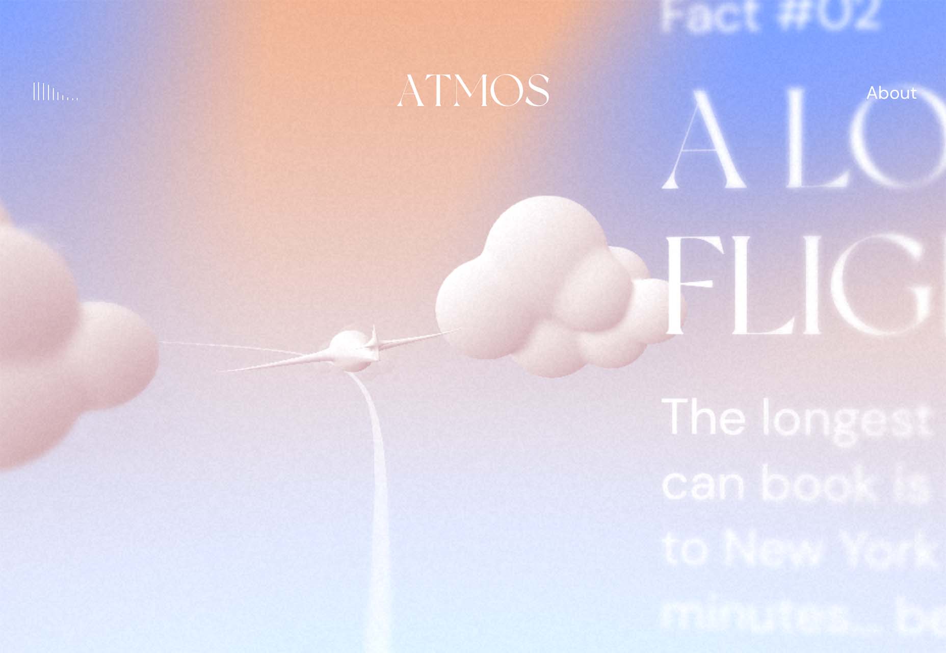
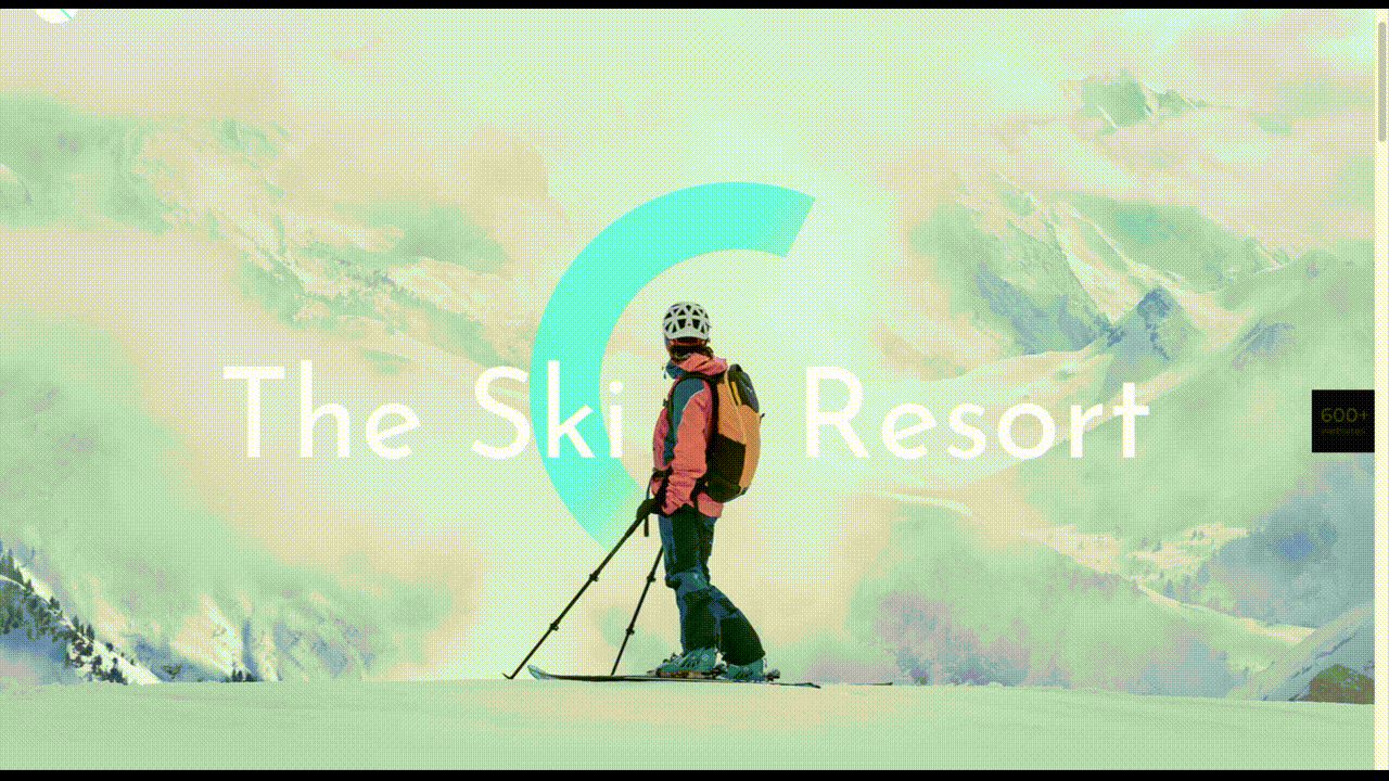
Atmos uses a light pastel theme that takes you through the clouds with blues, and pinks, and purples. The pastel color scheme works well with the content which is airline-themed and makes you feel like you are flying through the sky. The colors are also soft enough to provide an easy reading experience.

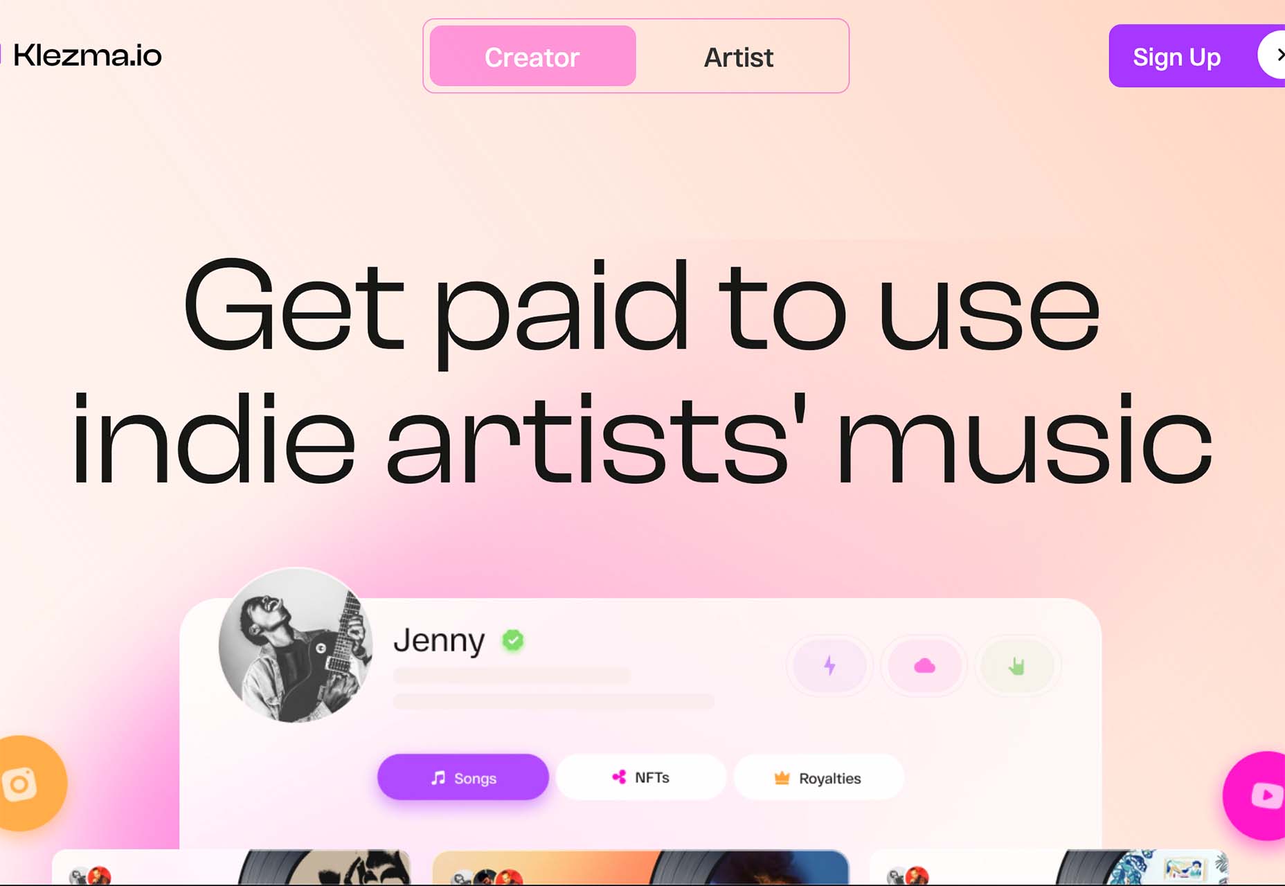
Klezma is another design with the same pastel background with graduated color. The peach tones are fairly neutral and give plenty of room to the content.

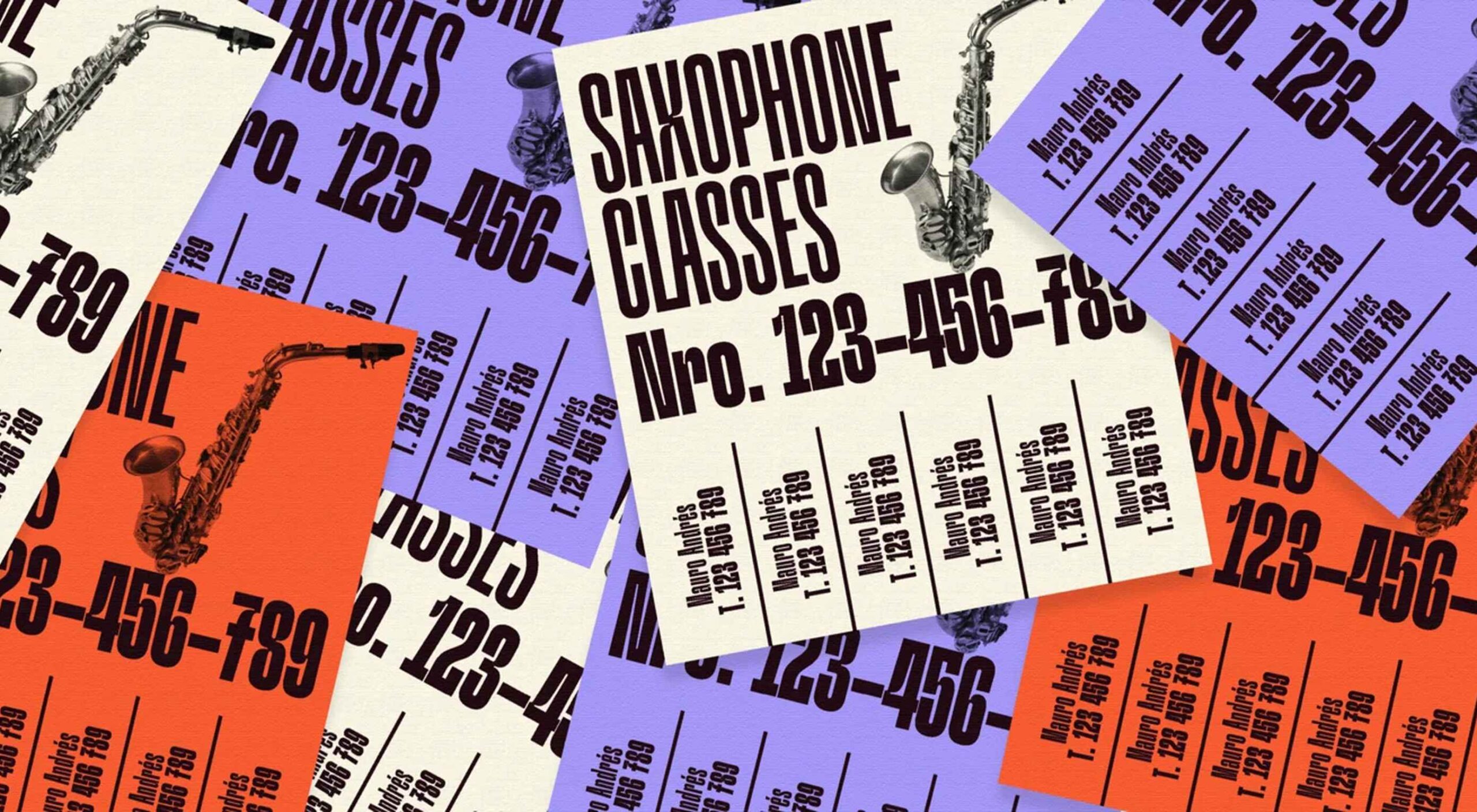
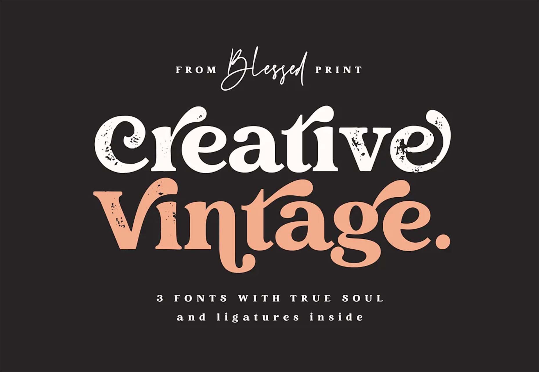
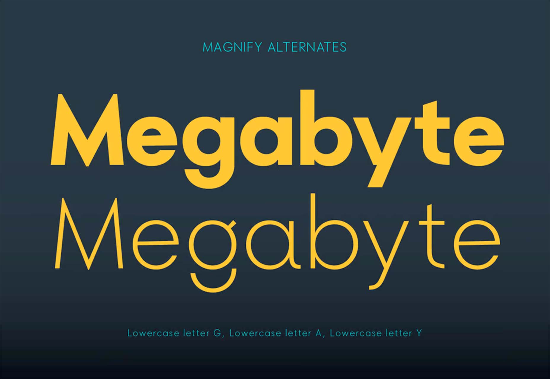
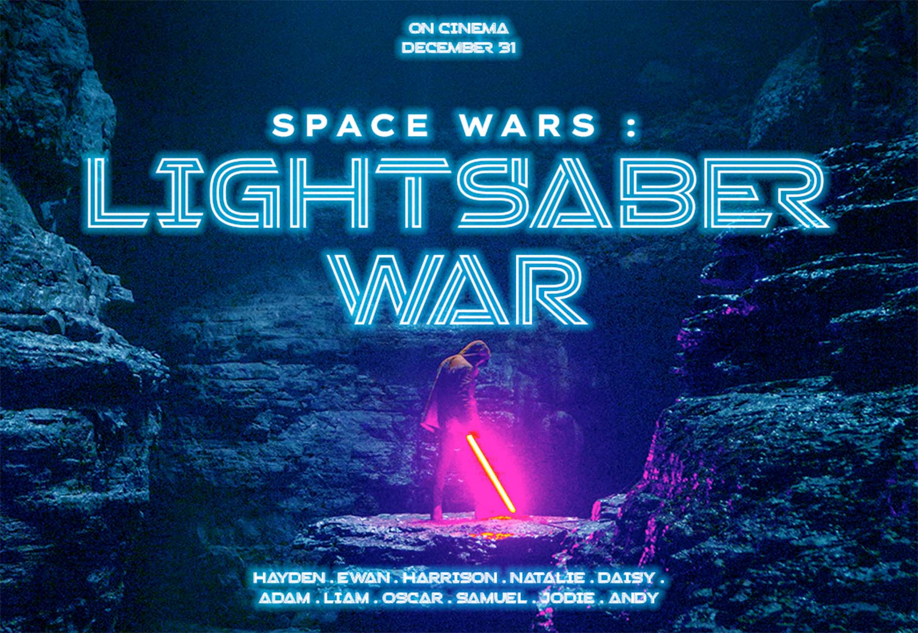
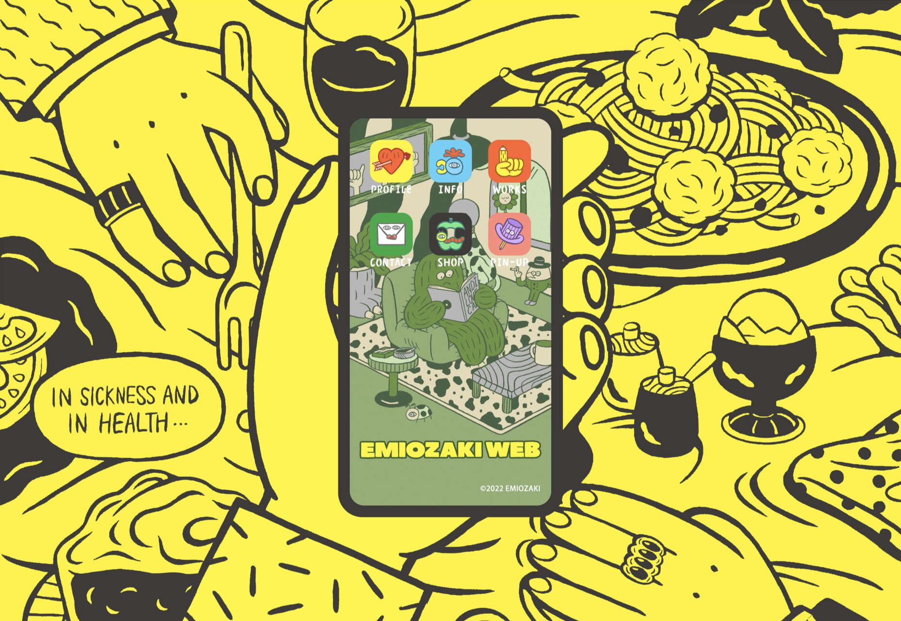
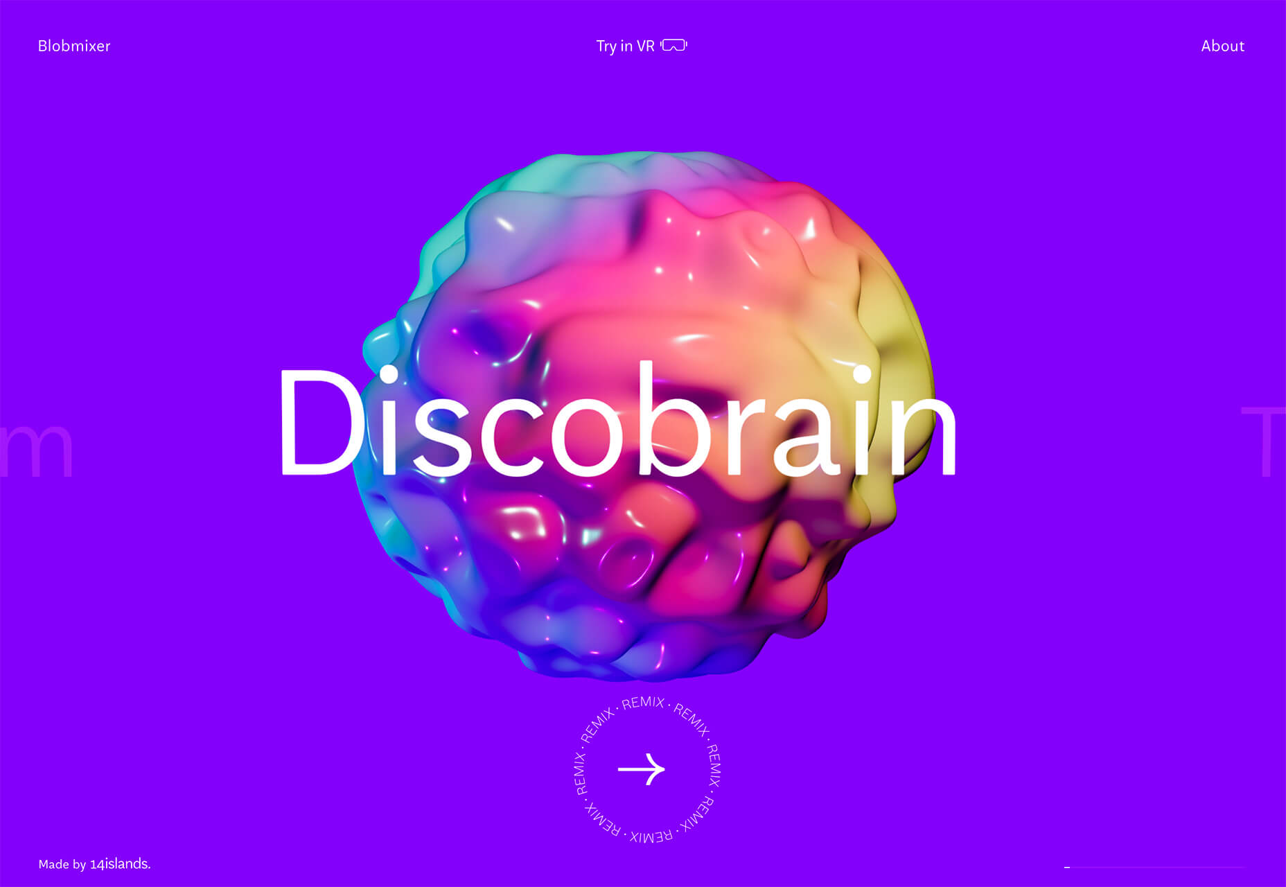
Fonts with a Distinct Retro Look

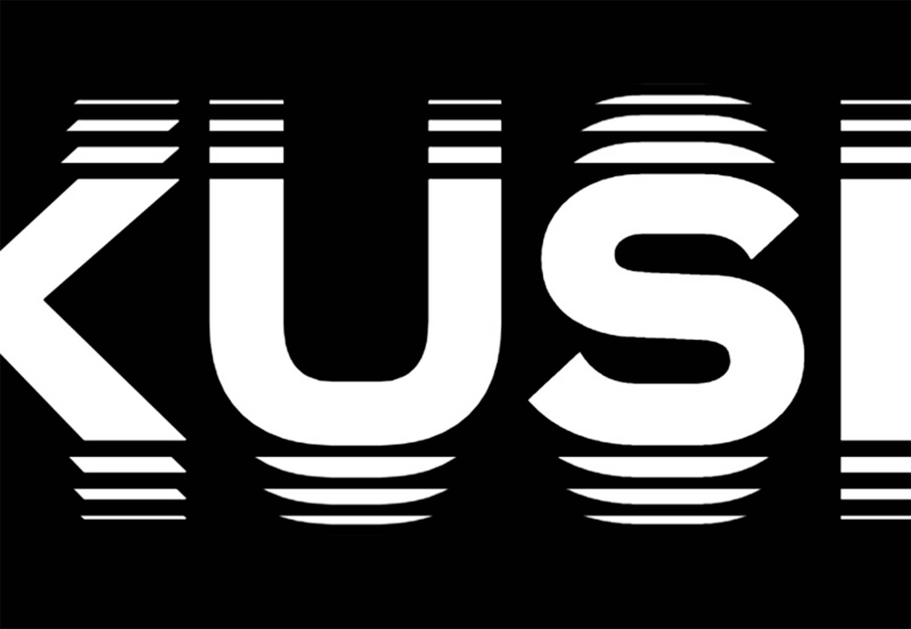
Every one of these websites uses a typeface with a similar look and feel. This retro headline style is trending in a major way.

The best way to use this design element is for short words. This typeface design isn’t meant for a lot of words or when readability is a high priority.

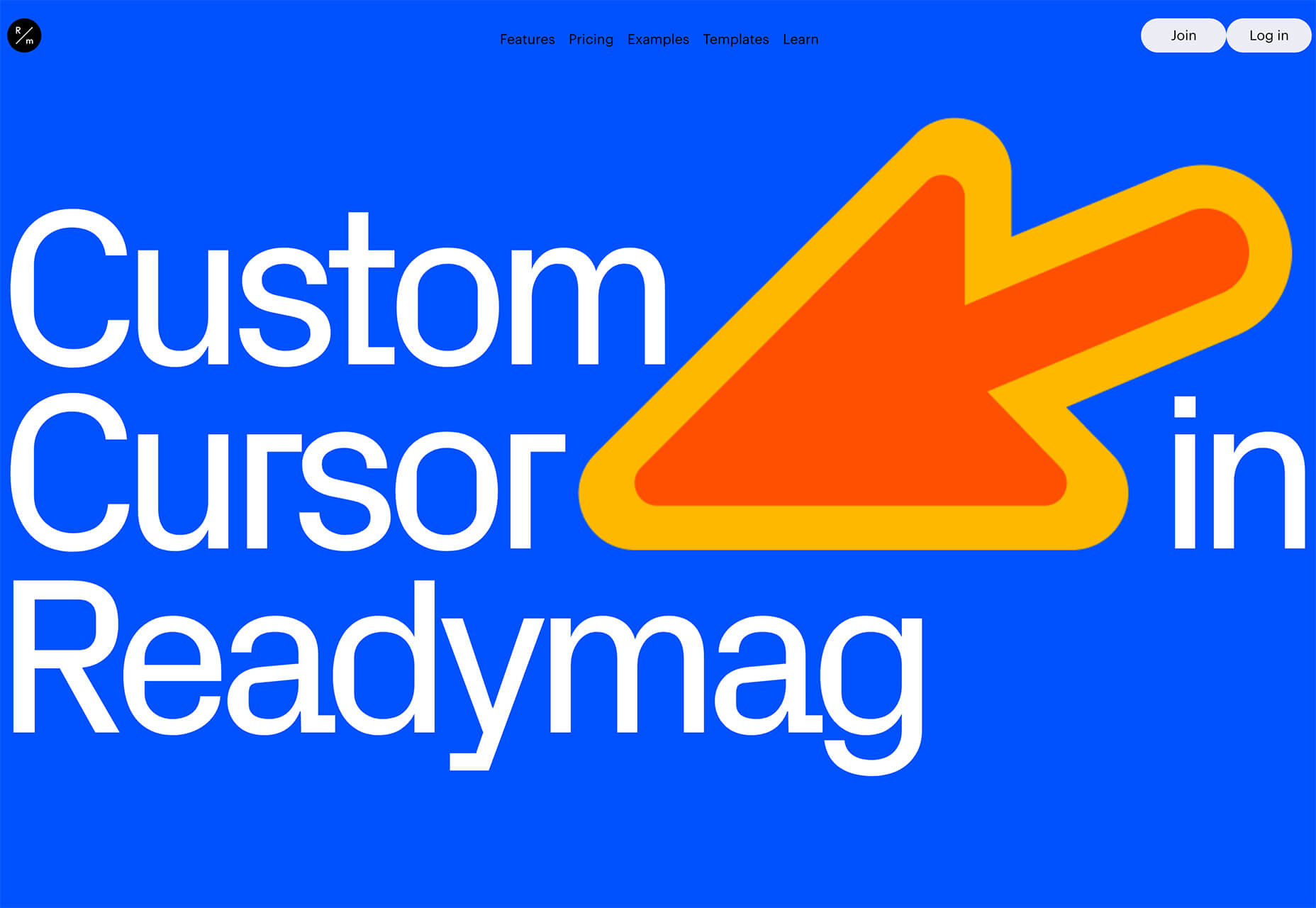
This style is all about creating a specific kind of vibe for your website. The typefaces in this trend have a quite retro look and feel with an almost 1960s or ’70s feel to them. The rest of the design mimics this feel as well with colors and surrounding elements that contribute to the overall look.

A couple of common elements here include the use of all capitals font sets and letterforms that include odd shapes and lines.

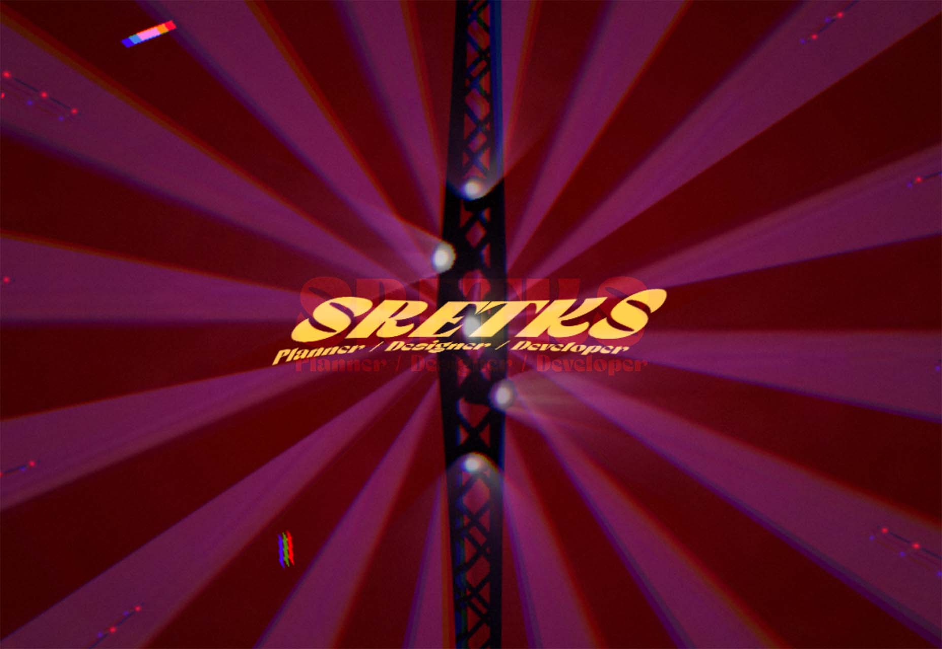
Sretks not only uses a retro typeface but bends and twists it a bit too to add to the old-school feel. The background color helps add to the groovy vibe.

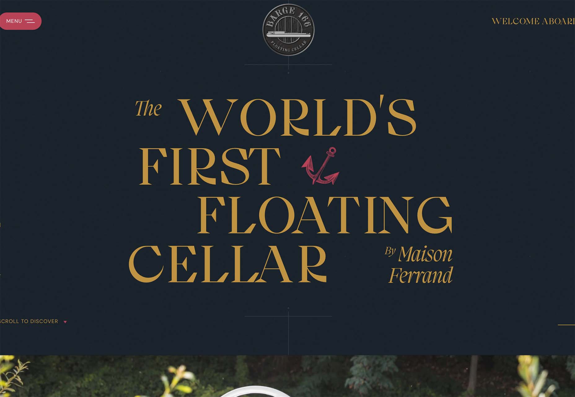
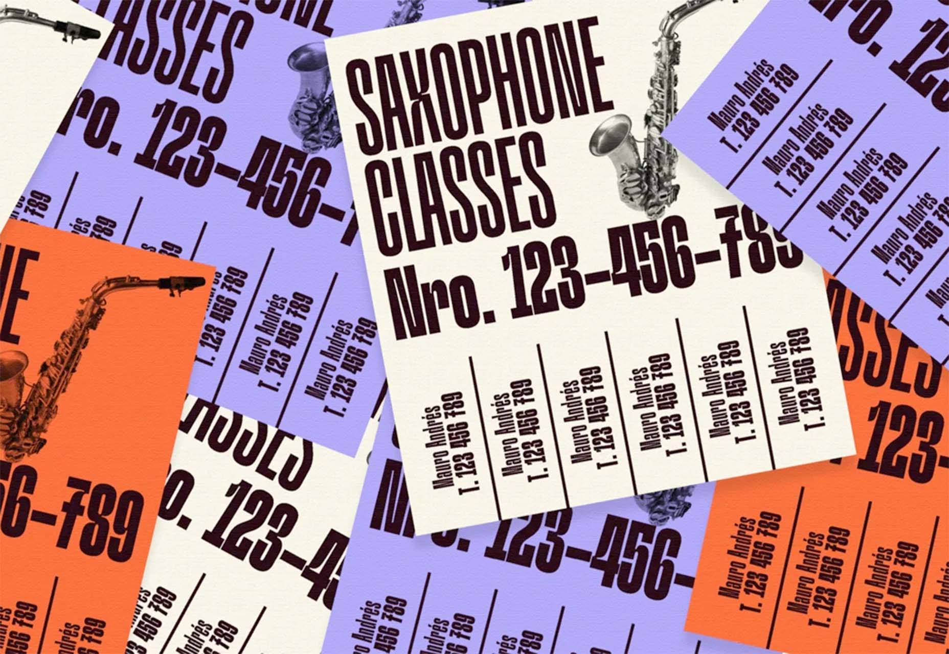
Barge 166 uses a retro typeface with the same design feel as the other examples but with a sharper, more serif-style edge. It’s easier to read but still carries a retro look and feel. Use a typeface similar to this if you want to capture that retro font style for a trending look while maintaining as much readability as possible. This option works best for multiple lines of words in a large size.

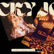
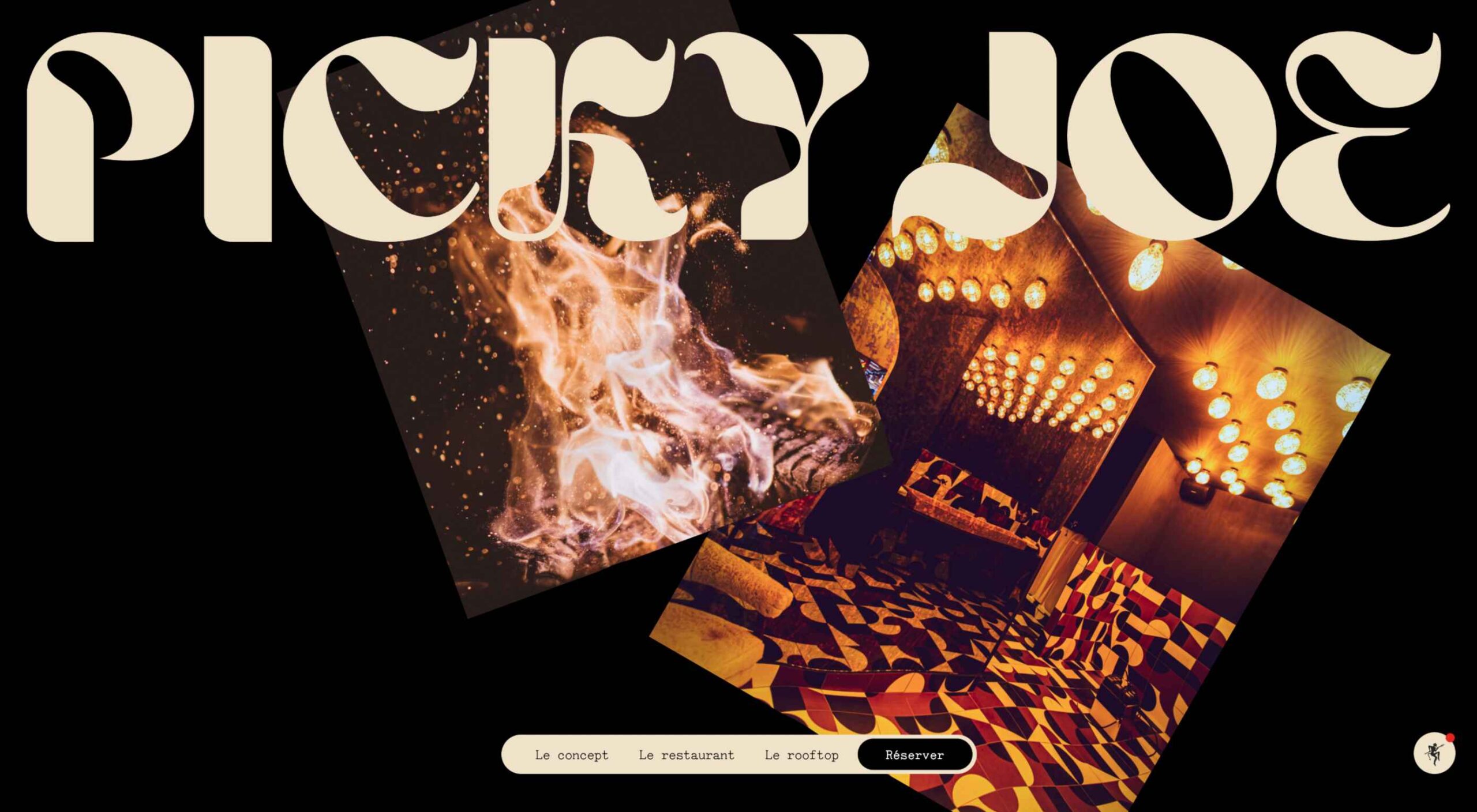
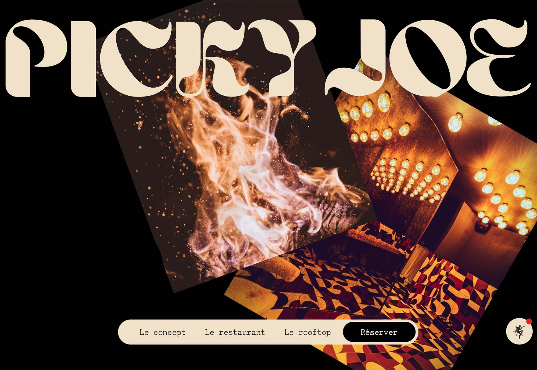
Picky Joe uses a retro typeface with rounded letters and a bit of a tilt to the characters to create a distinct feel. This is definitely a style that has to be used sparingly but can be a fun option, depending on the content of your website design.

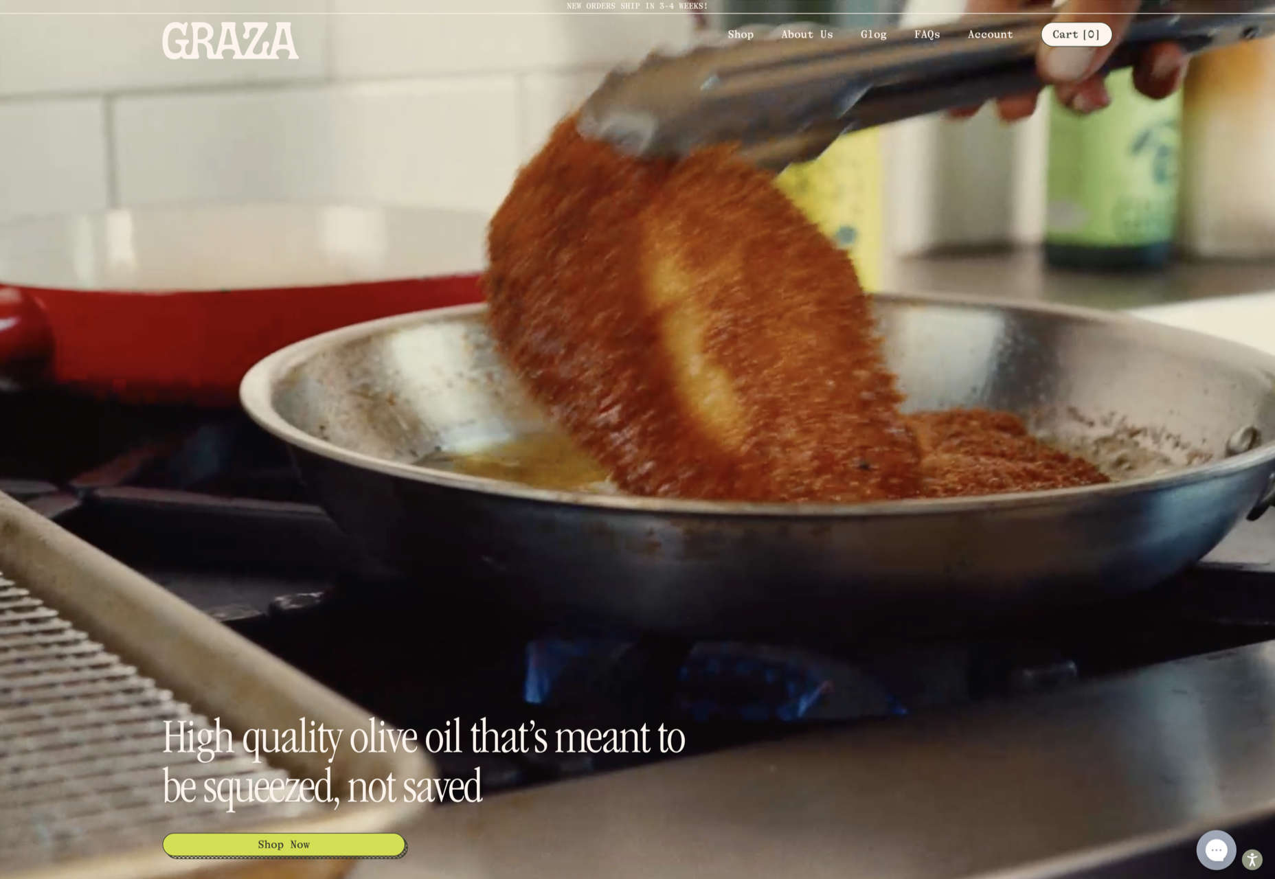
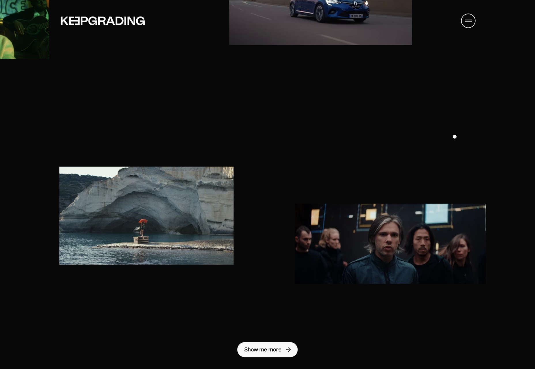
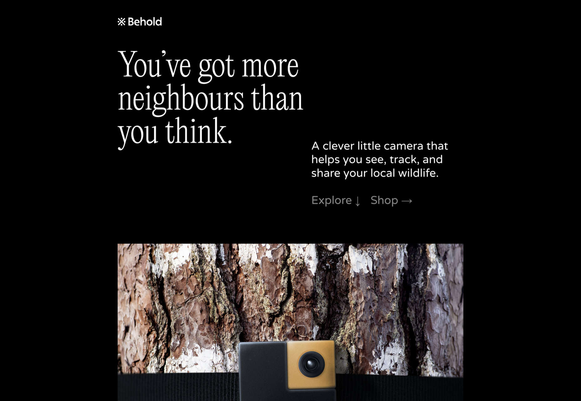
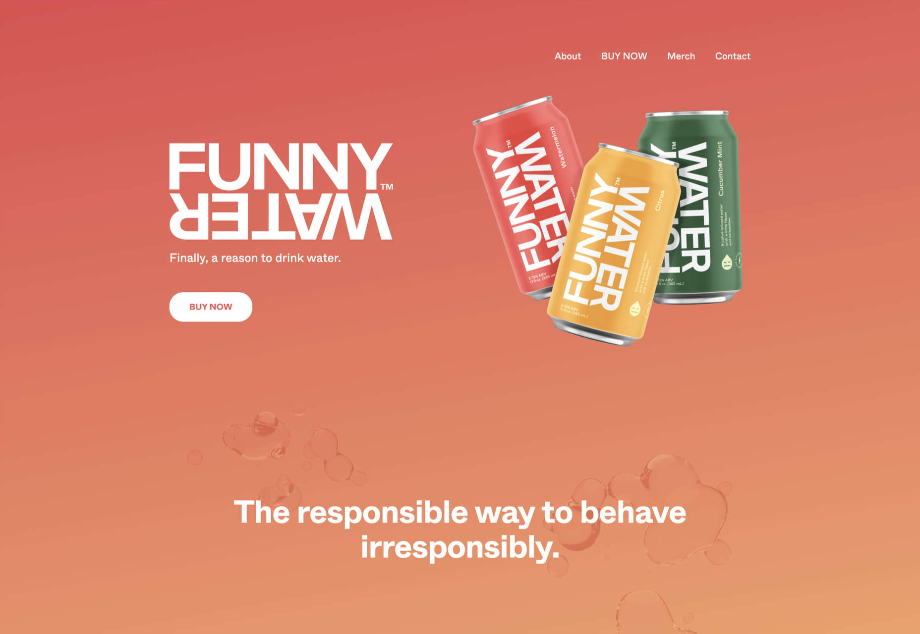
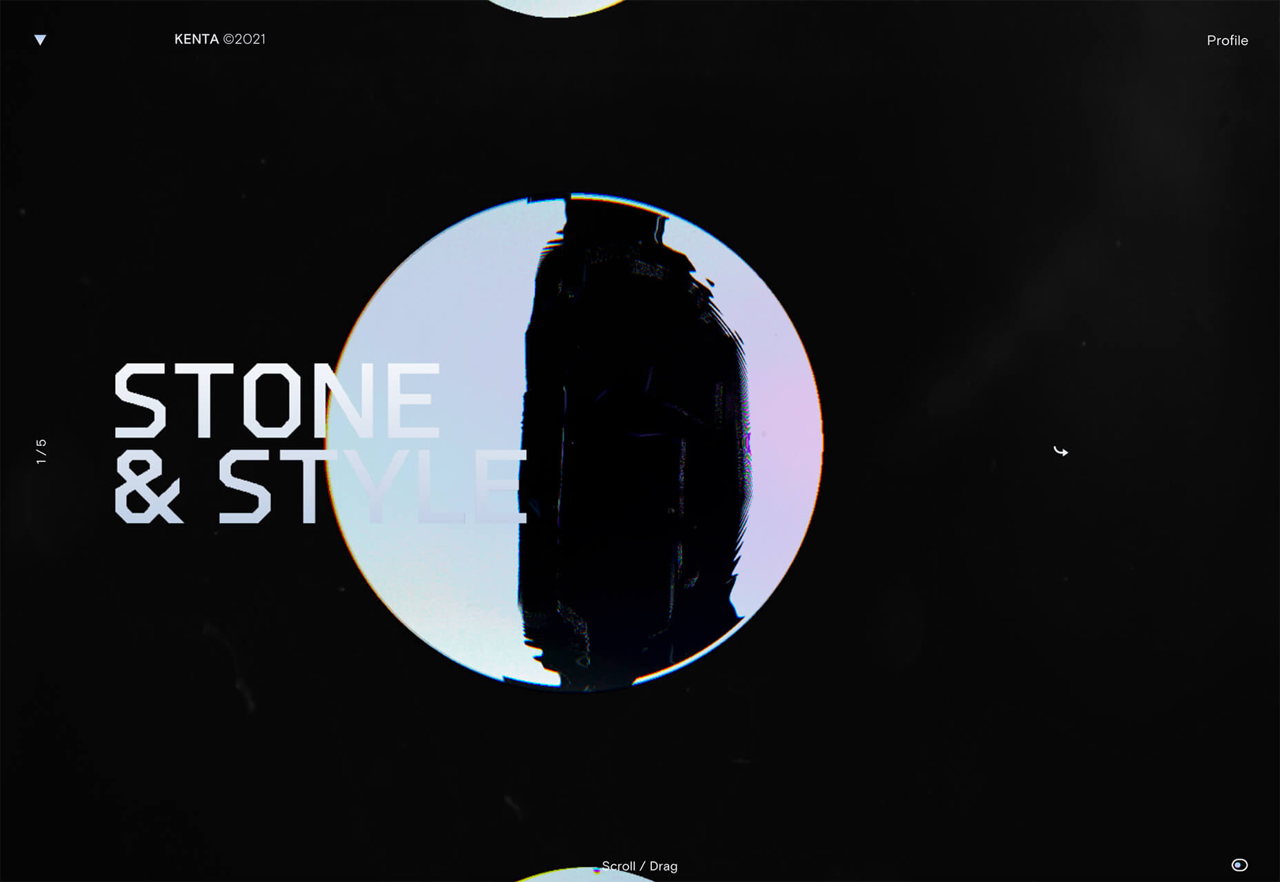
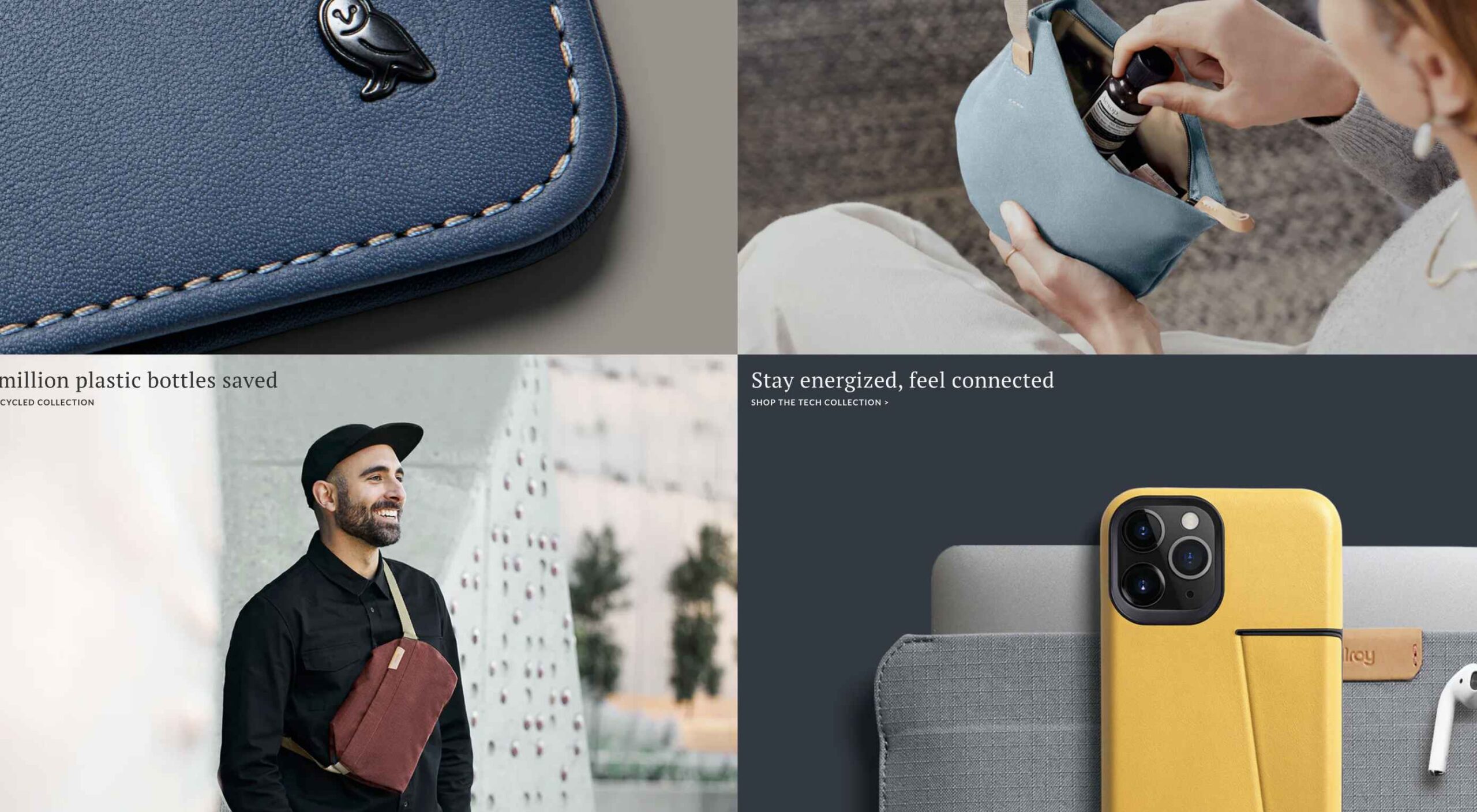
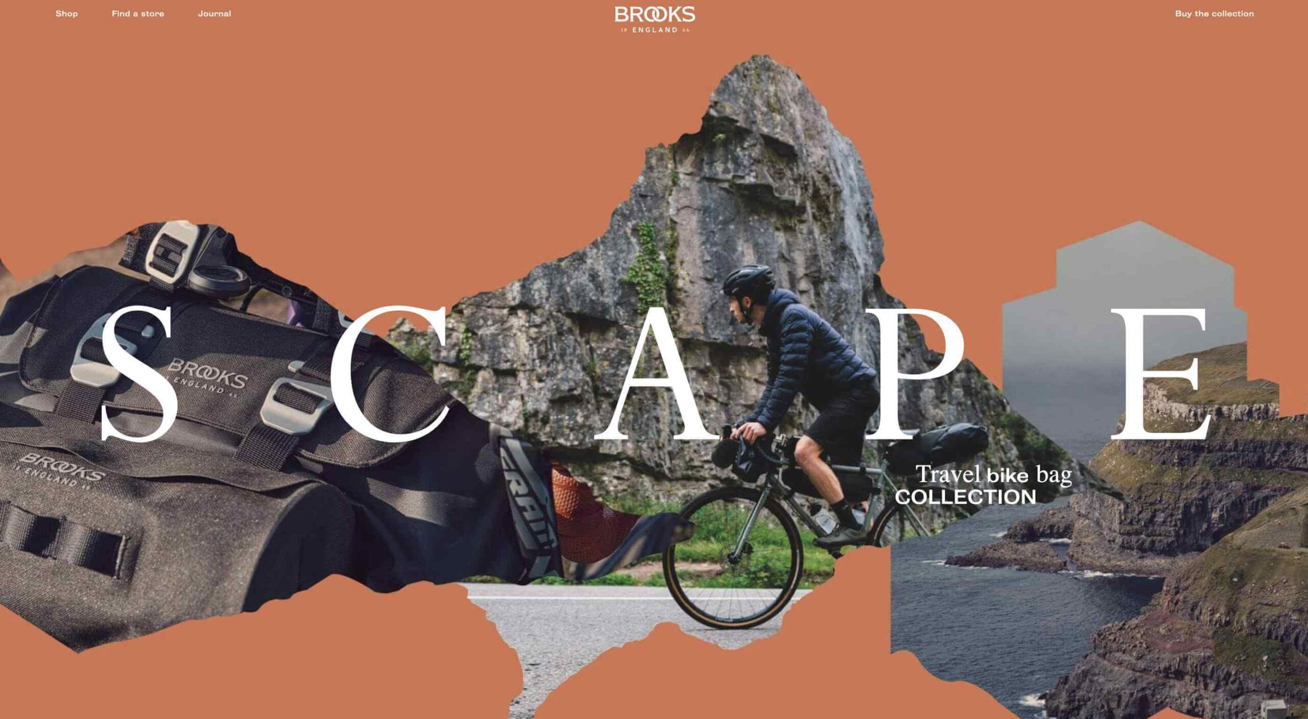
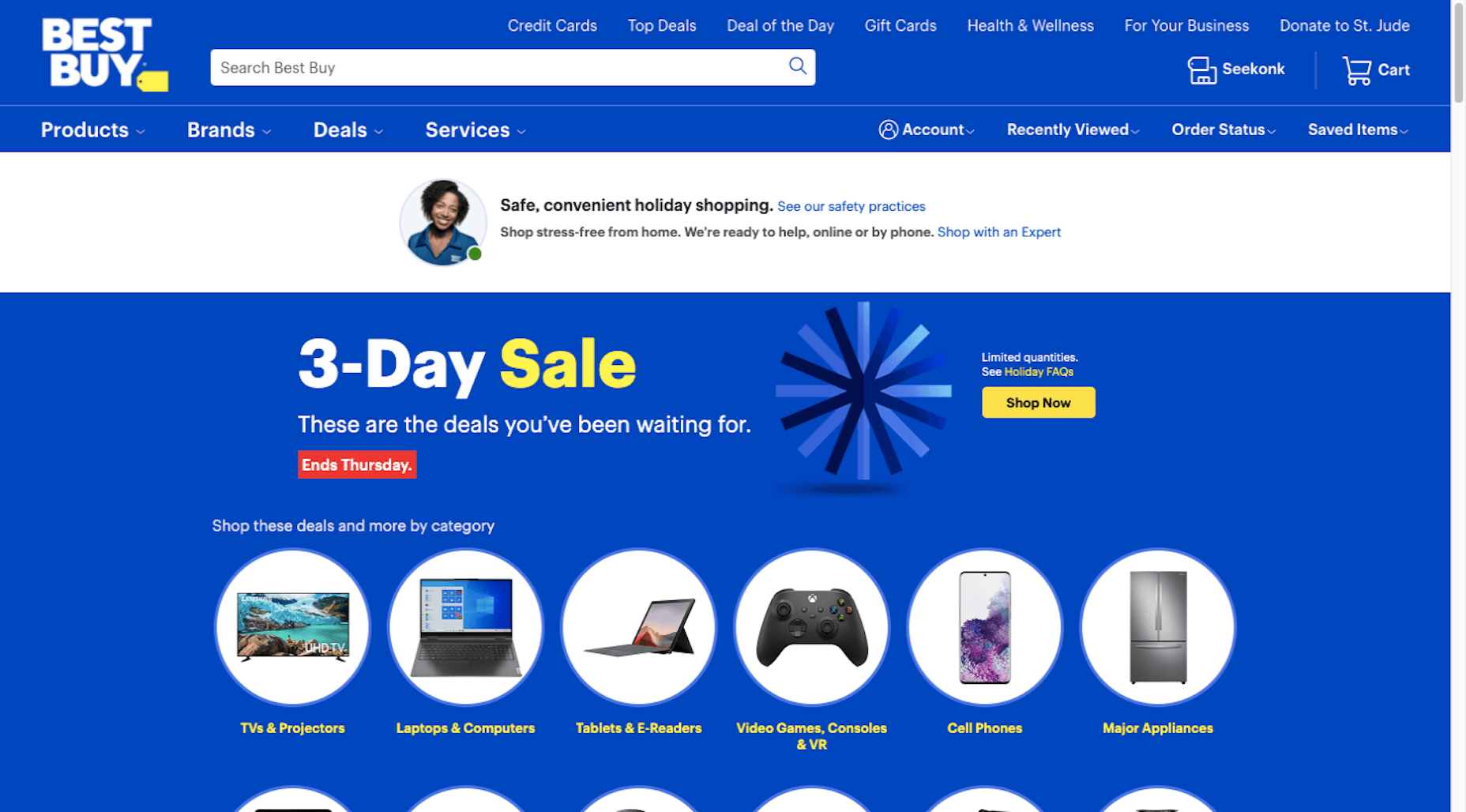
Dark “Product” Sites

Dark mode design is probably the biggest design trend of 2022. Everywhere you look, websites are using dark color palettes and styles. Designers are creating more projects with a dark/light toggle so users can control their experience.

This visual concept is carried over to website designs that feature products as well. This is one of the last places the dark aesthetic had not touched. It’s been a bit of an unwritten rule that product images should be on white or light backgrounds to help make them easy to see and inspect digitally.

This design trend bucks that idea and features products on dark backgrounds – some with so little contrast that you almost have a hard time seeing the products. (Maybe these brands are banking on the idea that you already know them or are selling a lifestyle product.)

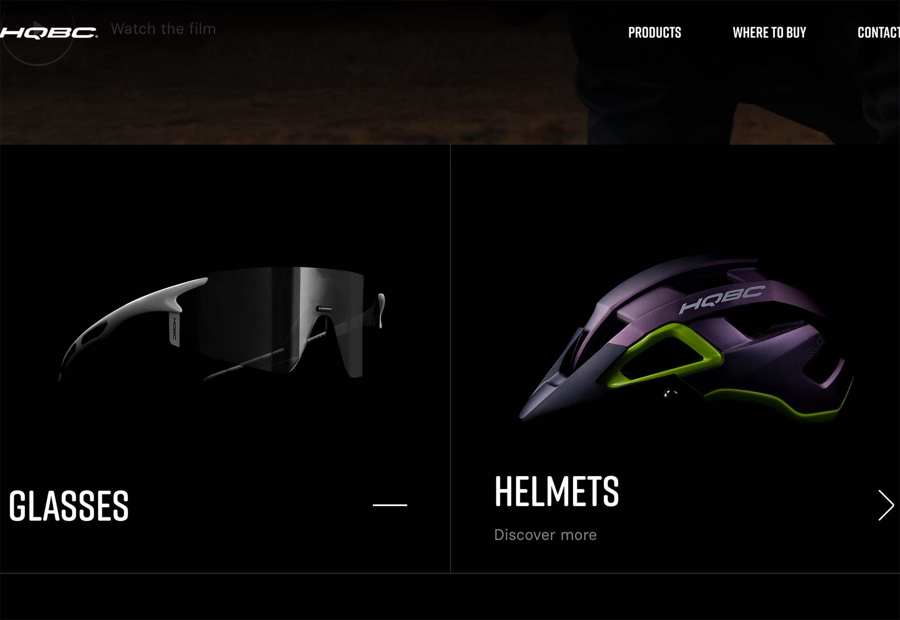
HQBC sells bike accessories such as glasses and helmets and the site has a sleek look and feel. You know it is cool from the second you land on it. The question though – is there enough visual information with the dark background to help you make a purchase? This design probably works because it only encourages you to find a physical location to make a purchase rather than buy online.

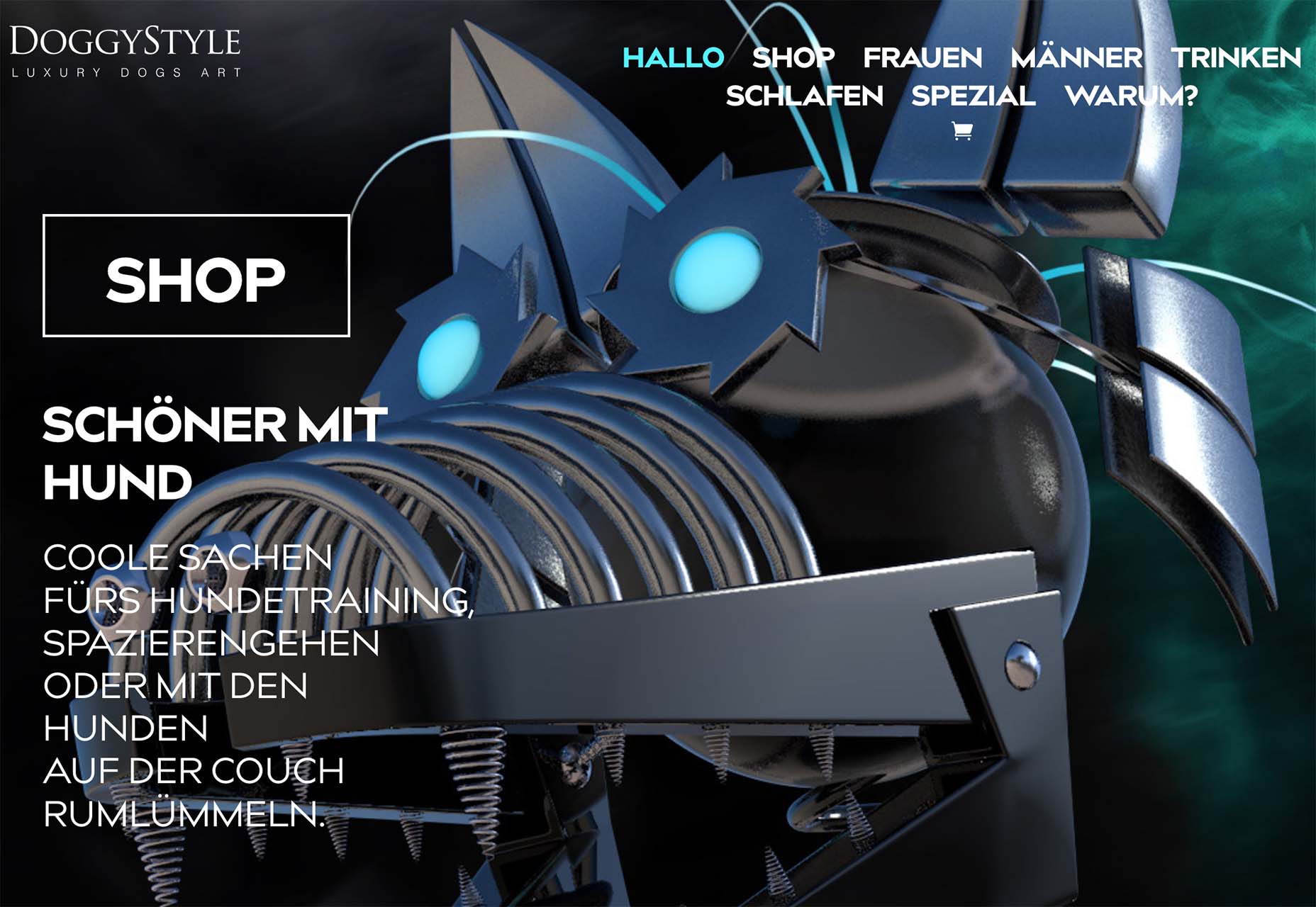
Doggystyle Shop also banks on the idea of you knowing the shopping experience or brand when you arrive. What the design does do though is put products on white backgrounds after you have clicked through far enough to make a commitment to buy. This helps you see the product well one final time before making a purchase. (The challenge is that it is three to four clicks in for the most part.)

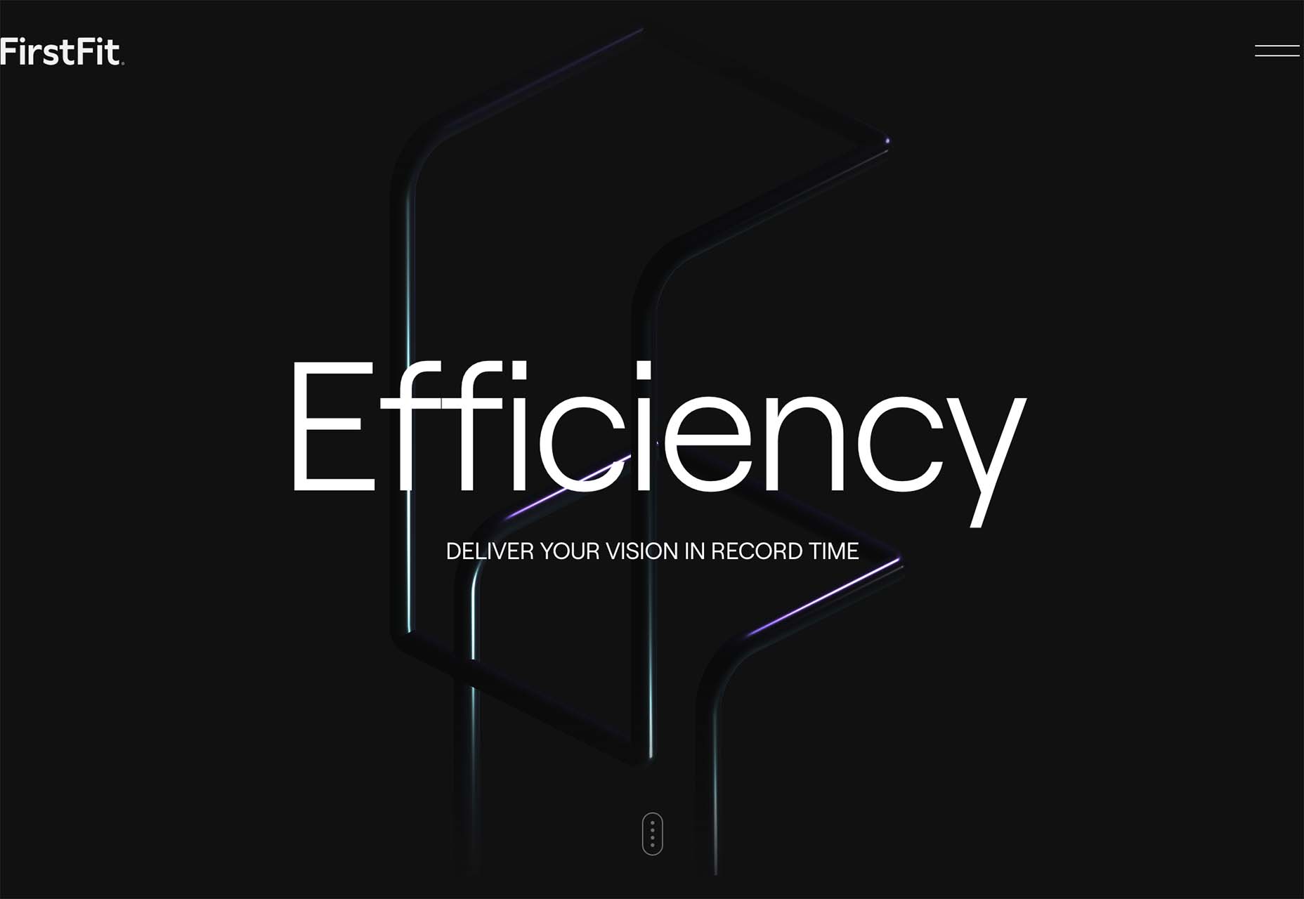
FirstFit uses the design trend in a way that’s similar to the first example. They are showing a product, but not actually trying to convert sales on the website. Other links take you to more product information and content – using a lighter background and color scheme – and the dark background with the product serves mostly as a highly visual landing page that will help entice users to learn more. When it comes to dark mode and products, this seems to be the best option for most website designs.

Conclusion

The state of the world around us and our emotions can play hard into websites and other design projects. Some of the darker elements that are popular now may be a reflection of that or it could be more of a lean into dark mode schemes.

Either way, the web has a pretty dark feel right now.

Source

The post 3 Essential Design Trends, July 2022 first appeared on Webdesigner Depot.

Source de l’article sur Webdesignerdepot

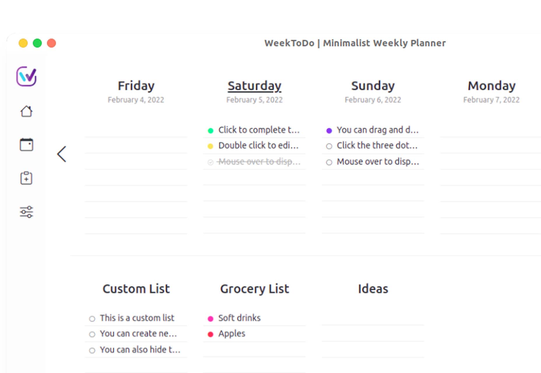
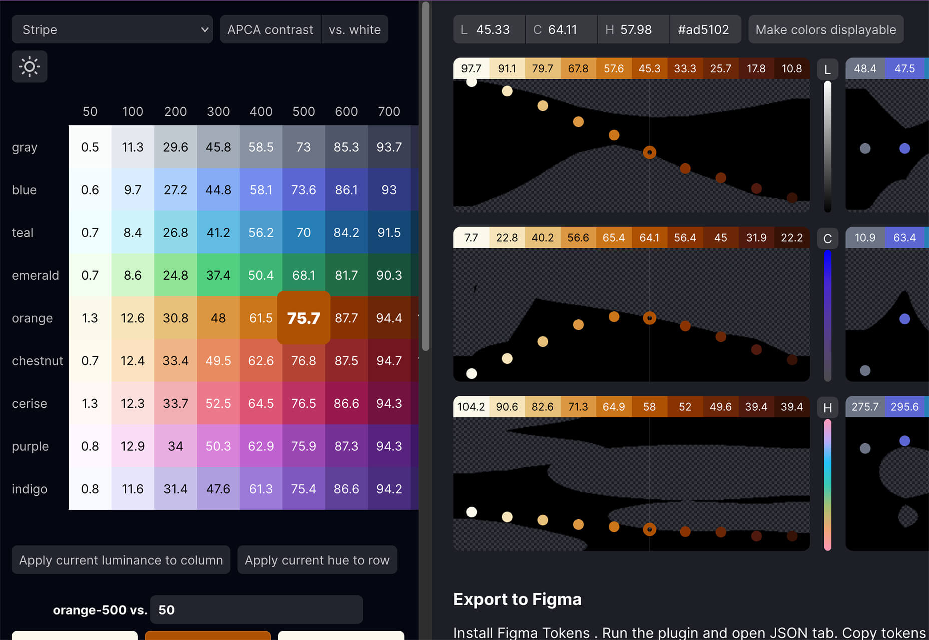
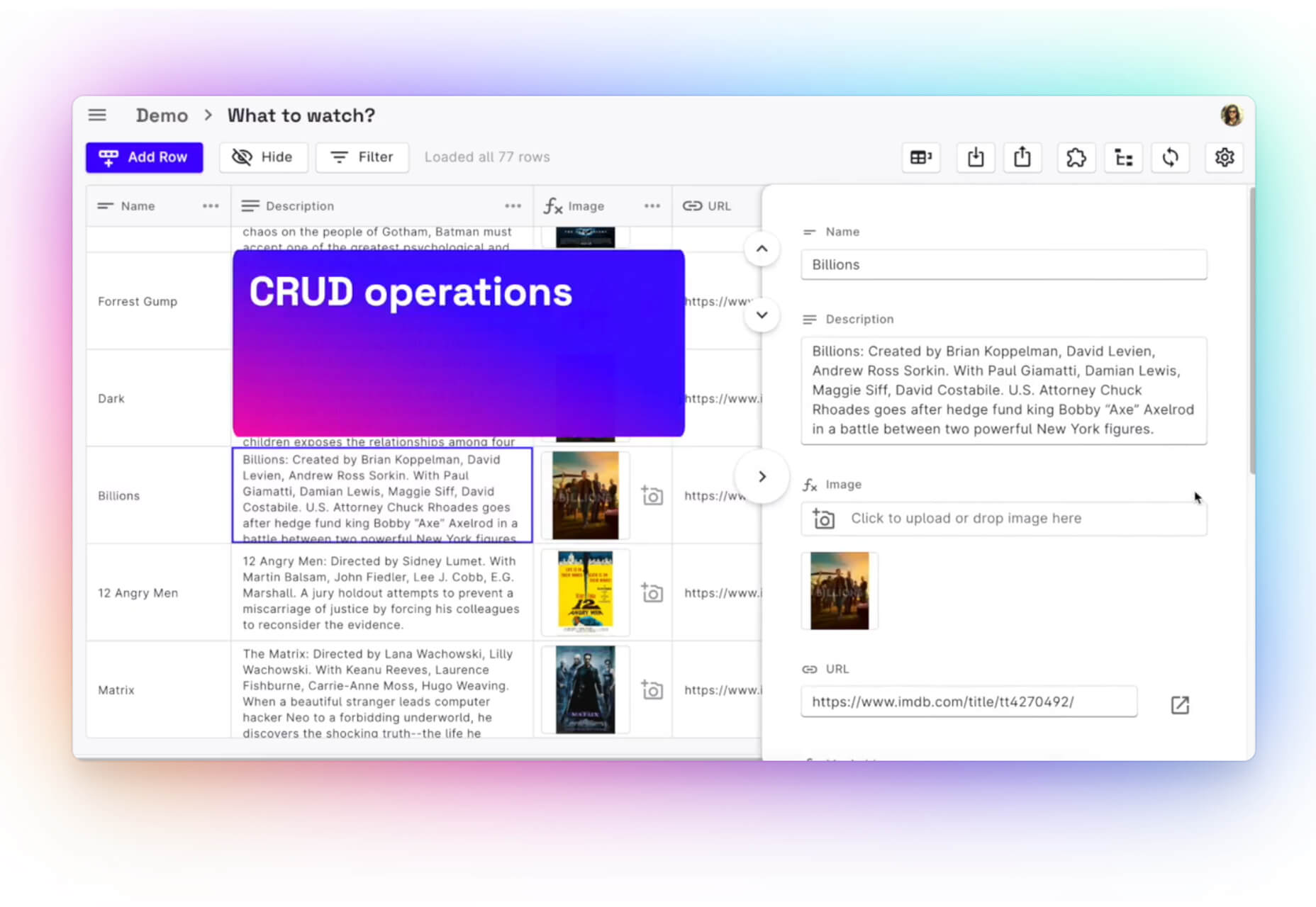
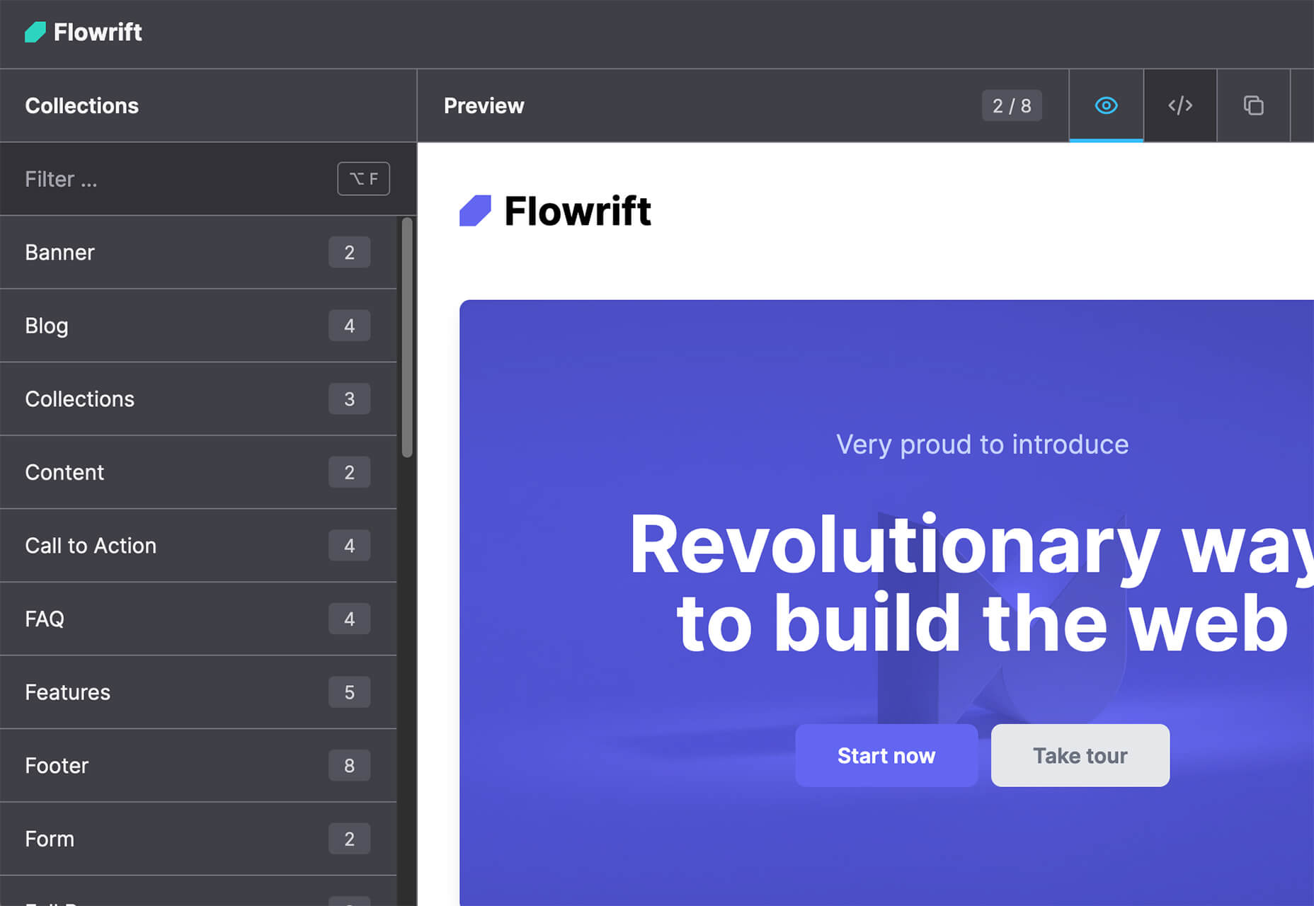
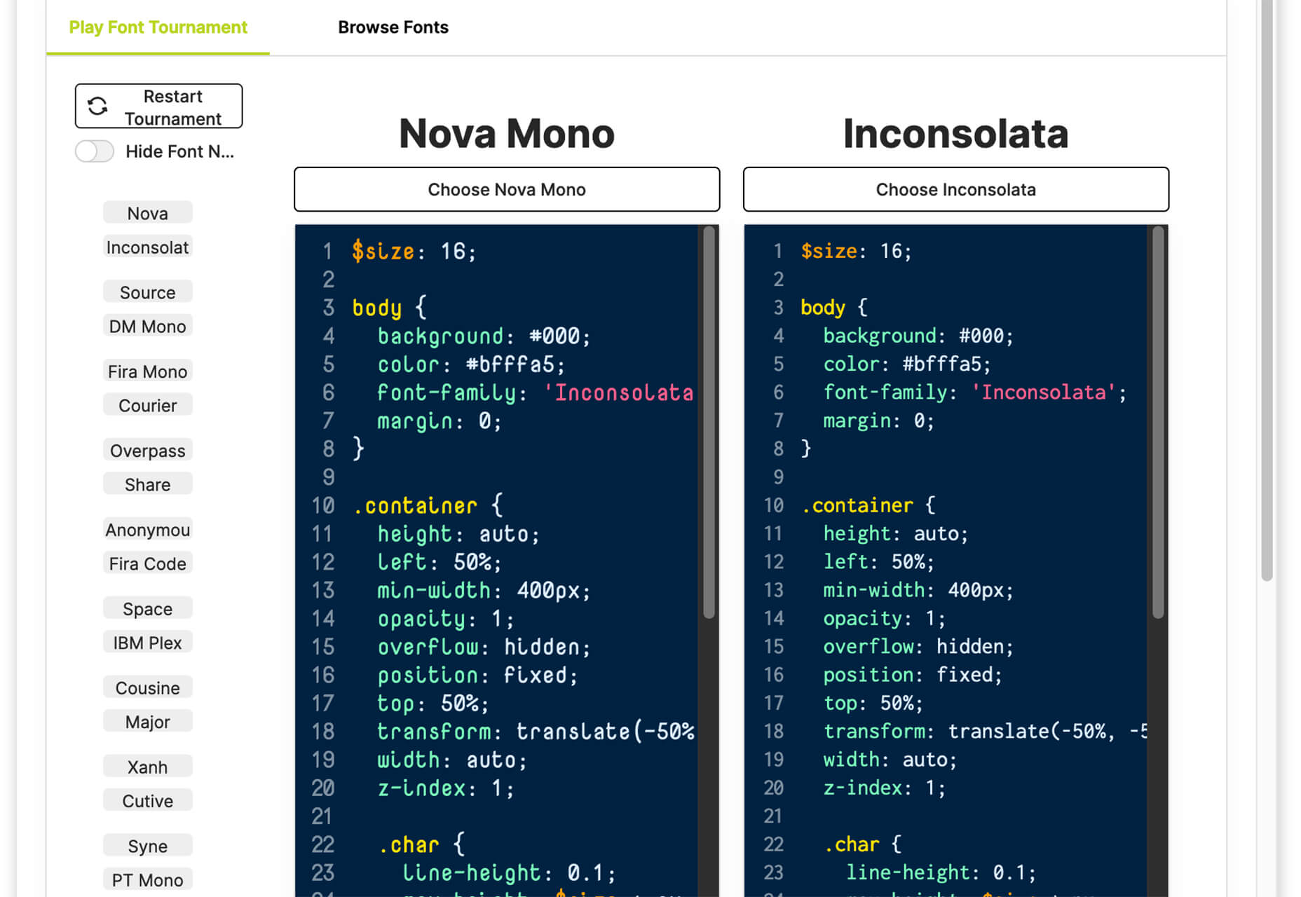
The underlying theme of this month’s collection of new tools and resources is development. Almost every tool here makes dev a little easier, quicker, or plain fun. There are a few great tutorials in the mix to help you get into the spirit of trying new things and techniques.

Here’s what is new for designers this month…

Cryptofonts

Cryptofonts is a huge open-source library of icons that represent cryptocurrencies. There are more than 1,500 CSS and SVG elements in the collection. Cryptofonts includes all scalable vector icons that you can customize by size, color, shadow, or practically anything else. They work with Sketch, Photoshop, Illustrator, Adobe XD, Figma, and Invision Studio, and there’s no JavaScript.


Reasonable Colors

Reasonable Colors is an open-source color system for building accessible and beautiful color palettes. Colors are built using a coded chart. Each color comes in six numbered shades. The difference between their shade numbers can infer the contrast between any two shades. The differences correspond to WCAG contrast ratios to help you create an accessible palette. This is a smart project and a valuable tool if you work on projects where color contrast and accessibility are essential (which is all of them).


Chalk.ist

Chalk.ist is a fun tool to make your code snippets look amazing. Add your code (there’s a vast language selector), pick some colors and backgrounds, and then download it as a shareable image. Your code has never looked so beautiful!


WeekToDo

WeekToDo is a free minimalist weekly planner. Improve productivity by defining and managing your week and life easily and intuitively. Plus, this tool is focused on privacy with data that is stored on your computer (in your web browser or the application). The only person who has access to it is you.


Bio.Link

Bio.Link is a tool that collects all your links – from social media to blog posts to any other kind of link you want to share. It’s free to use, includes 15 design themes, visitor stats, and is super fast.


Spacers

Spacers are a set of three-dimensional space characters that you can use in projects. Characters are in multiple poses and ultra high-def formats to play with.

11ty

11ty is a super simple, static website generator. Try it for small projects and read the documentation to see everything you can do with this tool.

Scrollex

Scrollex is a react library that lets you build beautiful scroll experiences using minimal code. You can create scroll animations in all kinds of combinations – vertical, horizontal, almost anything you want to try. The documentation is fun and easy to understand if you’re going to see how it works.

GetCam

GetCam is an app that lets you turn your smartphone into a webcam for your computer. It works with any iPhone and a Mac or Windows computer. It works with most video conference and streaming tools as well as browser-based apps.

Flatfile

Flatfile is a data onboarding platform that intuitively makes sense of the jumbled data customers import and transforms it into the format you rely on. You won’t have any more messy spreadsheets or have to build a custom tool.

Loaders

Loaders is a collection of free loaders and spinners for web projects. They are built with HTML, CSS, and SVG and are available for React and copypasta.

Lexical

Lexical is an extensible JavaScript web text-editor framework emphasizing reliability, accessibility, and performance. It’s made for developers, so you can easily prototype and build features with confidence. Combined with a highly extensible architecture, Lexical allows developers to create unique text editing experiences that scale in size and functionality.

Picture Perfect Images with the Modern img Element

This tutorial is a primer on why the img element is such a powerful tool in your development box. Images are so prominent that they are part of the most important content in over 70% of pages on both mobile and desktop, according to the largest contentful paint metric. This post takes you through how to better optimize and improve core web vitals simultaneously.

Building a Combined CSS-Aspect-Ratio-Grid

Building a Combined CSS-Aspect-Ratio-Grid provides two solutions for creating the title effect. You can define an aspect ratio for the row or use Flexbox with a little flex grow magic. Learn how to try it both ways.

QIndR

QIndR is a QR code generator made for events and appointments. The form is designed to capture your event information so you can quickly build and use a QR code for listings and even allow users to add it to their calendars! It’s super quick and easy to use.

On-Scroll Text Repetition Animation

On-Scroll Text Repetition Animation shows you how to create an on-scroll animation that shows repeated fragments of a big text element. This is a fun and easy lesson that you can use right away.

Eight Colors

Eight Colors won’t do anything for your productivity, but it is a fun game that you may not be able to stop playing. It is a block-shifting game with the goal to shift circular blocks to reach the target given.

Creative Vintage

Creative Vintage is a pair of typefaces including a thin script and vintage slab serif (with rough and smooth styles). The pair is designed to work together for various uses or can be used independently.

Hardbop

Hardbop is a vintage-style typeface with a lot of personality. It would work great for display, and the family includes seven full-style character sets.

Kocha

Kocha is a funky ligature-style typeface perfect for lighter design elements, including logos or packaging. It includes clean and rough versions.

Magnify

Magnify is a large font family with 16 styles and plenty of fun alternates. You can use it straight or with the more funky styles that create less traditional character forms.

Stacker

Stacker is a fun and futuristic style font with a triple outline style. Use it for display when you really want to make an impression.

Source

The post Exciting New Tools for Designers, May 2022 first appeared on Webdesigner Depot.

Source de l’article sur Webdesignerdepot

Welcome to the latest edition of our top 20 sites of the month. In this February’s collection, the overall feel is lighthearted and optimistic, as we are seeing the positivity of a new year persisting across the web.

There is a continued inclination towards warmth and personableness and away from a more corporate, impersonal feel. We see this most in the color palettes used and in the use of illustrations as accents to add character and charm. Of course, as always, type plays a big part too. Enjoy!

Woset

Woset has a simple aesthetic and features a charming illustration style on this site for its creative toys. The interactive ‘play’ section is a nice touch.

Graza

This site for Graza olive oil has a fun feel, with comic style illustration and bright splashes of color while making a serious sales pitch.

KeepGrading 

KeepGrading is a post-production color studio. Their portfolio site showcases a lot of work but keeps it well organized and pleasing to navigate.

Englobe

By using soft colors and slightly rounded type, Englobe has managed to portray a warm, friendly, and human aspect with this website, despite being a huge company.

Filtro

Filtro’s design is about as basic as it gets, and yet it has a certain charm to it.

Behold

Behold is a wildlife camera that is currently in development. This landing page does an excellent job of creating interest with just enough information.

Akua

Some rather sweet illustration work creates a good balance with technical information on this site for Akua kelp burgers.

National Museum of Mexican Art

A color scheme of warm, earthy tones and a carefully thought-out type pairing create an inviting presence for the National Museum of Mexican Art.

Ubac

This site for Ubac trainers feels clean and modern with some nice and mostly functional, scroll-activated animation.

Funny Water

The background gradient is really nicely done on Funny Water’s otherwise very minimal site.

DA

DA is a strategic branding, design, and advertising studio, and this site is a good, polished example of a site for such an agency. What stands out is the clever menu text.

Phil’s Finest

Phil’s Finest makes good use of color, oversized type, and occasional illustration mixed in among the well-styled photography.

Vaayu 

Grey and black are enlivened by neon yellow in Vaayu’s minimalist, single-page presentation.

Emi Ozaki

Artist and illustrator Emi Ozaki has created a stylized phone interface for her portfolio site, which showcases her illustration aesthetic.

Engineered Floors 

The home page scrolling is the centerpiece of Engineered Floors’ site, and it works especially well on mobile.

Hartzler Dairy

Hartzler Dairy goes for a nostalgic feel to match the company’s classic mid-20th century style branding.

Chubby Snacks

Chubby Snacks is PB&J in your pocket; it sells itself! Having said that, the site is pretty appealing in its own right.

Branded

Market research company Branded goes down the flat design road for this site, which could feel a little dated but actually works quite nicely here.

SOS Foods 

SOS Foods is an excellent example of a responsible/sustainable goods site, with a design aesthetic aimed at the ethical consumer.

Crystal Construction Engineering

Some nice use of masonry-style layout and overlapping elements create space, but also a pleasing flow in this site for Crystal Construction Engineering.

Source

The post 20 Best New Websites, February 2022 first appeared on Webdesigner Depot.

Source de l’article sur Webdesignerdepot

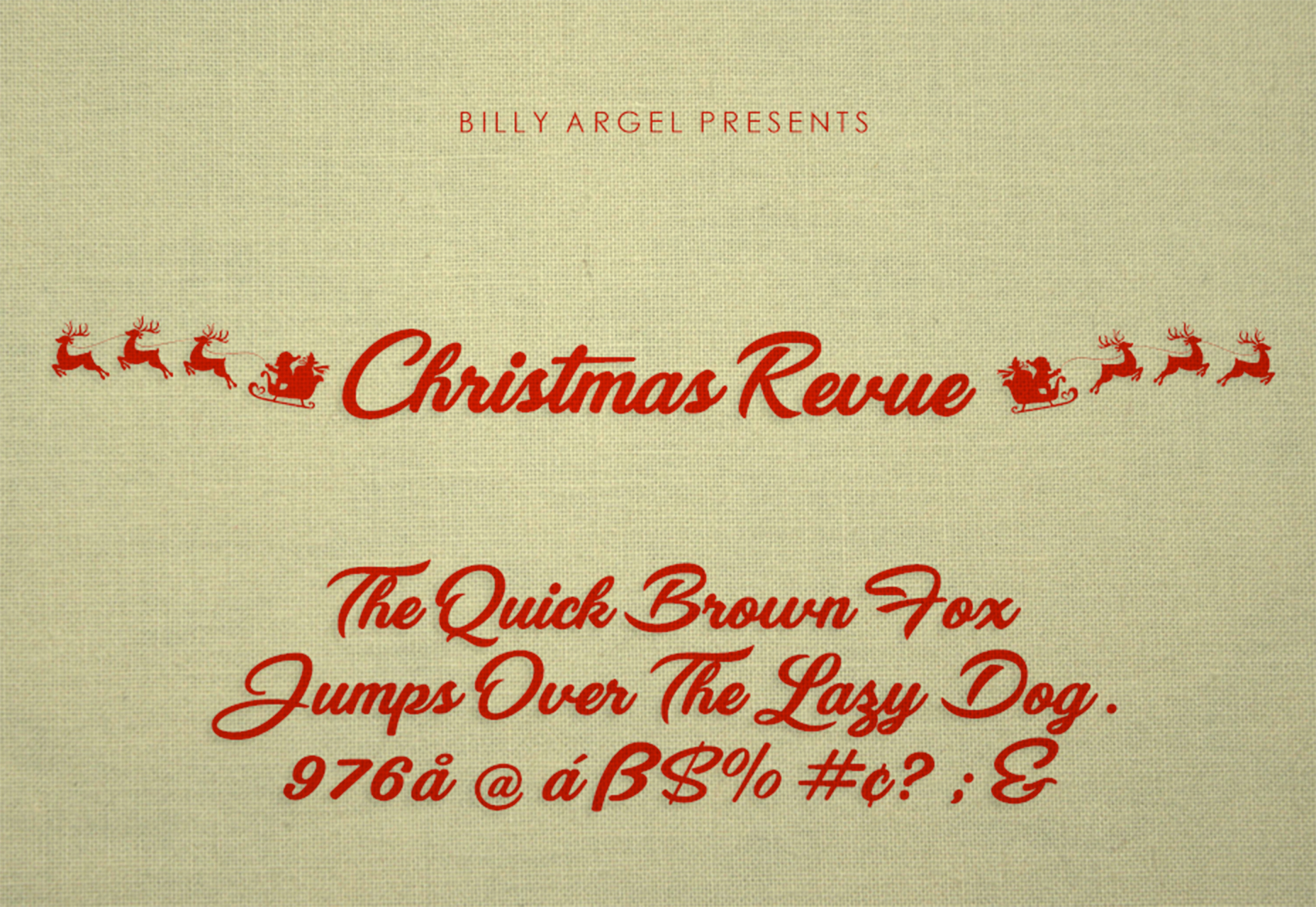
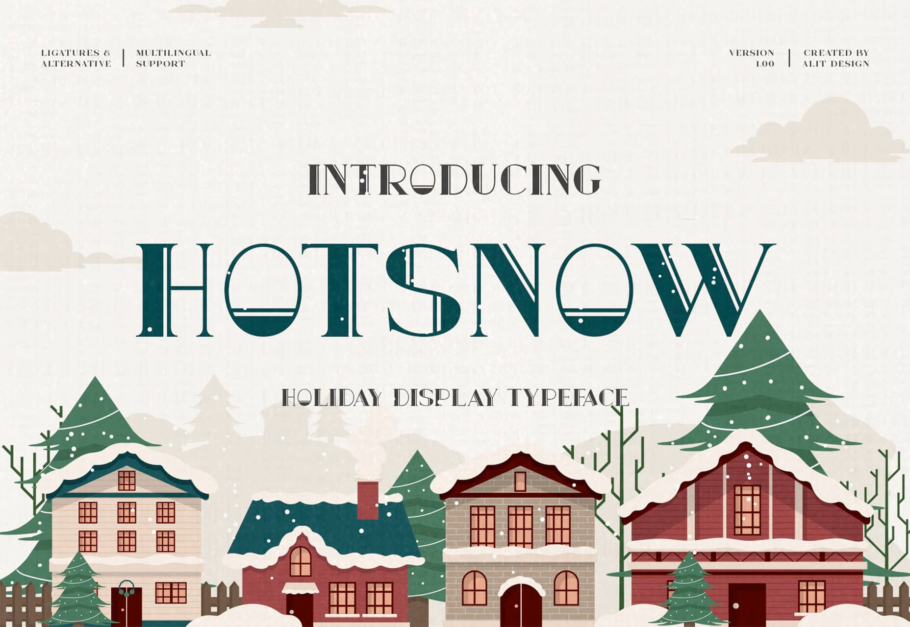
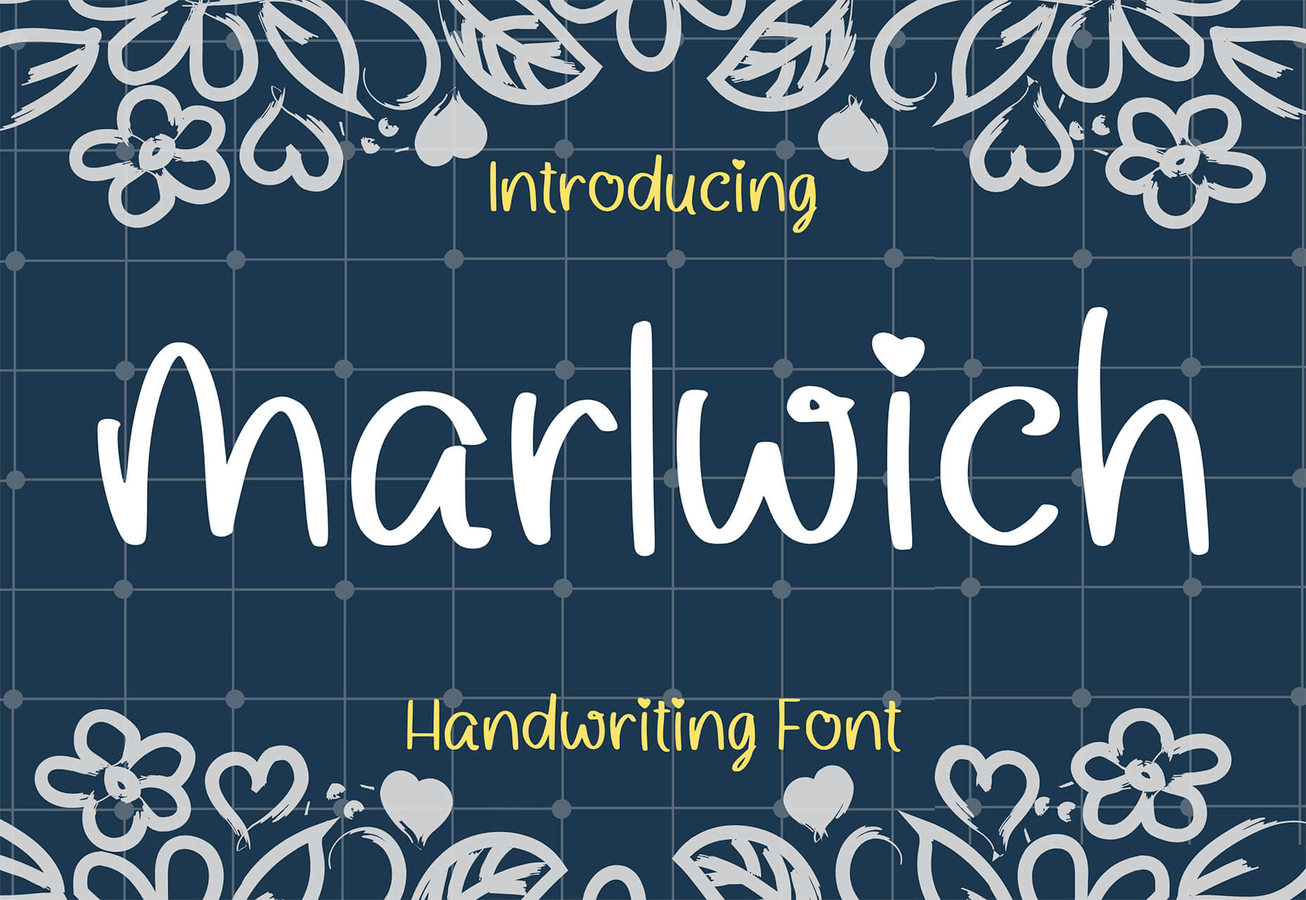
With the holidays fast approaching, there are plenty of fun gifts for you in this roundup of new tools and resources for web designers. Make sure to share anything you find helpful with others to spread additional holiday cheer.

Here’s what is new for designers this month…

Volley

Volley, billing itself as Snapchat for work, is a new way to collaborate with remote teams. The tool addresses the two main problems of remote teams (lack of communication and loneliness) with an async video messaging app with interactive transcriptions neatly organized into workspaces. Volley emphasizes talking over typing (76% of volleys sent are video), doesn’t require you to coordinate schedules (it’s 100% asynchronous), and lives in a threaded conversation with context that’s neatly organized. Plus, the tool is free to use.

Upnext

Upnext is a new type of reading list. It’s designed to help you save, organize, and focus on fantastic content while expanding your knowledge on your favorite topics. You can create playlists with almost any type of content that you can refer to later and follow “thinkers” that you love. Search and filter content, focus on reading, integrate videos, and even highlight and note specific content in your customized library. This brand-new web app has a waitlist that you can join to get access soon.

Startup 5

Startup 5 is a new version of the popular website builder, and it’s a perfect tool to create your online presence. With Startup, it’s fast and easy to get your business online with pre-designed blocks. It includes a visual editor with 150+ blocks with pre-designed and pre-coded elements and styles you can easily customize in a drag and drop interface. It’s an easy tool for building a website quickly without a coding background. Most users can publish a website quickly and easily.

Flatmap

Flatmap generates Mapbox Vector Tiles from geographic data sources like OpenStreetMap. It is memory-efficient so that you can build a map of the world in a few hours on a single machine without any external tools or database. Vector tiles contain raw point, line, and polygon geometries that clients like MapLibre can use to render custom maps in the browser, native apps, or a server. Flatmap packages tiles into an MBTiles (SQLite) file that can be served using tools like TileServer GL or even queried directly from the browser.

Cleanup.Pictures

Cleanup.Pictures is a web-based tool to remove objects, people, text, or other defects from your images before using them in projects. It’s an AI-based alternative to other photo-editing software.

Linkz.ai

Linkz.ai helps you make smart link preview popups for your website to help encourage greater engagement and interaction for links. It works with a line of code you can install quickly and easily, and then you get smart link previews (in two style options) for every link on your site.

Llline

Llline is an SVG generator that helps you create smooth and organic lines and strokes with plenty of customization options for almost any application. This tool helps create graphic elements in just a few clicks, allowing you to add a few points to a canvas and then draw a smooth curve using these points. You can then tweak the resulting SVG graphic by rotating it, changing its color, giving it a gradient, making it a dashed line, and then you can download or copy the SVG markup.

Lorem.Space

Lorem.Space is a valuable placeholder image tool. With just a little bit of code, you can pop cool placeholder images – from movie posters to shoes – right in your website mockup so that the design is easier to visualize. It’s a great solution that’s fun and keeps you from having to put empty boxes throughout the design. And everything can be randomized, so you don’t spend time looking for placeholders.

Huetone

Huetone can help you create more accessible color palettes by making use of the Advanced Perceptual Contrast Algorithm. The contrast ratios and color combinations show on one screen to help you quickly develop palettes and combinations. Plus, the tool has hotkeys that make it easy to change hues, toggle, and adjust quickly. Then you can export everything to Figma.

Rowy

Rowy is an open-source tool to build on the Google Cloud Platform. You can manage Firestore data in a spreadsheet-style user interface, write Cloud Functions in the browser, and connect to third-party platforms.

AdCreative.ai

AdCreative.ai uses artificial intelligence to help create better ad creative. To get started, you upload logos and color files, connect social and other accounts, pick the sizes you need, write text, pick a background, and upload product images, and let the AI do the work. Once you have the creative you like, you can connect to your online ad accounts for easy use. This is a premium tool that’s free to try.

Flowrift

Flowrift is a tool to browse and then copy and customize Tailwind CSS blocks in groups of collections. Filter by block type and then experiment with the options. It even has e-commerce blocks.

Layout Patterns

Layout Patterns is a collection of layout patterns built using modern CSS APIs to help you build common interfaces such as cards, dynamic grid areas, and full-page layouts.

You.com

You.com is a new private search engine that summarizes the web. The tool is in open beta and includes superior privacy choices, actionable results, extensible apps, and personalization through preferred sources.

3D Icons

3D Icons is a fun set of three-dimensional, full-color icons that are free for all uses. (Donations are accepted.) They integrate with pretty much any web design tool you are using and come in four color styles – clay, gradient, color, and premium – so you can get just the right look for your project. Each icon also includes three rendering views – dynamic, side, and isometric.

Arco Design

Arco Design is a comprehensive React UI components library based on the Arco Design system. It includes a customizable theme and more than 60 crafted components that you can use out of the box.

Seekvectors.com

Seekvectors.com is a search tool to find free resources in five different formats, PNG, SVG, JPG, EPS, and AI.

Outline to Single Stroke

Outline to Single Stroke is a tool in the Figma community that works just like the name implies. Select a filled vector on the canvas, and then you can outline it to a single stroke and adjust the line weight if you like.

Codeamigo

Codeamigo is a new self-paced platform to help you learn coding skills. It’s packed with various lessons for different languages and templates and has something for every level from beginner to advanced.

Sizze

Sizze is a Figma to React Native export tool to create app prototypes and instantly export to code.

CodingFont

CodingFont is an excellent game that can help you pick a font to use for coding that you like! If you spend a lot of time looking at code each day, the right font can help reduce eye strain and make the work a little easier to see.

Christmas Revue

Christmas Revue is the first in a trio of holiday typefaces that you can use this season. This SCG color font is fun and perfect for the holidays with exciting glyphs. It is free for personal use only.

Hotsnow

Hotsnow is a fun display font that has interesting fills and shapes in an all-caps character set. It is free for personal use.

Marlwich

Marlwich is a feminine handwriting-style typeface that has the feel of signing a holiday letter or card. It contains upper- and lower-case characters and is only for non-commercial use for free. (A paid option is available for commercial projects.)

Source

The post Exciting New Tools For Designers, December 2021 first appeared on Webdesigner Depot.

Source de l’article sur Webdesignerdepot

Every day design fans submit incredible industry stories to our sister-site, Webdesigner News. Our colleagues sift through it, selecting the very best stories from the design, UX, tech, and development worlds and posting them live on the site.

The best way to keep up with the most important stories for web professionals is to subscribe to Webdesigner News or check out the site regularly. However, in case you missed a day this week, here’s a handy compilation of the top curated stories from the last seven days. Enjoy!

Next.js and Drupal Go Together Like PB & Jelly

Couleur.io – Harmonizing Color Palettes for Your Web Projects

11 Open-Source Static Site Generators You Can Use to Build Your Website

Buttons Generator – 100+ Buttons You Can Use In Your Project

3 Essential Design Trends, September 2021

12 CSS Box Shadow Examples

The Fixed Background Attachment Hack

The Internet ‘Died’ Five Years Ago

Media Queries in Responsive Design: A Complete Guide (2021)

The 7 Core Design Principles

Source

The post Popular Design News of the Week: August 30 2021 – September 5, 2021 first appeared on Webdesigner Depot.


Source de l’article sur Webdesignerdepot

This month, you will either love or hate the featured design trends.

The common theme among them is a strong design element that can create distinct emotional connections. They range from interesting monotone color choices to brutalist examples to AI-inspired faces and design elements.

Here’s what’s trending in design this month.

1. Interesting Monotone Color Palettes

Monotone color palettes aren’t something that we usually call a trending design theme because mono patterns are almost always in style. What makes these monotone website designs interesting is color choice.

The trend is to use a pretty unconventional color choice for monotone color palettes. For example, would you start the design process thinking of an all-mauve, canary yellow, or purple aesthetic?

For most designers, those probably aren’t the first choices. But, conversely, the outcome of those decisions is rather stunning in each of the examples below, whether you love the color choices or not.

What works (and what might fall short) with each of these trending examples:

Wookmama: This mauve color scheme might be the first one you’ve encountered? It uses varying hues that are pretty in-your-face. It works because the concept behind the website is to create custom color schemes. The challenge lies in contrast and that there’s not a lot of distinction between hues in the mono scheme.

BBC Storyworks: The deep purple color palette with pinkish highlights is bright and readable, despite the dark background. White text and elements with smooth animation bring out the regality of the color choice. The challenge with this color is that purple often has strong emotional associations for individuals (good and bad), and you don’t know what “baggage” users might bring to the design.

Yellow Pony: This design is incredibly bright and has some brutalist undertones. What makes this color choice work is that it stops you in your tracks. You can’t help but look at the bright yellow and oddly-colored pony. The challenge, like with Wookmama, is contrast. There’s also a lot going on here with the bright color.


2. Fairly Brutal Black and White

Brutalism and brutalist design themes seem to keep ebbing and flowing. Understandably, it seems like, as a whole, designers can’t quite decide how they feel about this overall visual theme.

This trio of fairly brutal designs shares more than starkness in technique. They also feature distinct black and white color schemes and animation.

Put it all together, and the overall theme is maybe more “fairly brutal” than straight brutalist, re-emphasizing the hesitancy with the trend.

What’s nice about each of these designs is that they feel special and content-focused. This is a little in contrast with some other brutalist designs that are so stark and harsh that it can be hard to figure out what you are supposed to do with the website or what information is most important.

The other interesting thing here is that while all three websites have a similar design theme, they are nothing alike. (Personally, I find this type of brutalism and the included animation a lot easier to understand and digest. It uses the harsh feeling that you want to associate with the style but adds an element of comprehension that’s incredibly valuable.)

Callshop Radio uses an almost magazine theme style, block design with big buttons, a simple animation, and flash of color.

BCKDRP features a more subtle richer, almost black background with blocky type and accented color without the harshness often associated with brutal styles.

Vision Get Wild may be the closest to true brutalism, but the animated element in the center of the screen has a simple softness that lightens the entire feel.


3. Futuristic Faces

The final trending design element this month is a fun take on faces. There’s a movement happening with a futuristic or artificial intelligence/cyborg-inspired look to the people featured in the designs.

It’s hard to say where this design inspiration is coming from, but it is fun to look at with so many ways to play the style. The other commonality seems to be the dominant use of female faces.

These computer-generated images start with photos that are brightened and smoothed so that all imperfections are lost. The faces have no lines, color that might not look 100% natural, and enhanced features that may or may not be realistic.

You aren’t quite sure if you are looking at a face from a video game or image in many instances.

The types of websites that are using this design trend are similar in content and fashion, art, gaming, portfolios, and AI themes, among the most popular.

The true common thread is imagination. This type of design element can’t come to fruition without a strong vision and the ability to see the vision through creation.

These examples use progressively more futuristic variations of the trend:

HueLe Museum: The least AI-looking of the examples, has imagery with super bright light on faces to remove lines and imperfections so that the models almost the look of mannequins.

Jenny Lin: The portfolio design shows the designer in a style representing her work with a headshot that features an augmented reality, or digital design feel with an almost plastic-looking, on-the-verge of cartoon style.

Ruby9100m: The imagery here is full-on futuristic. From coloring to facial features to an almost Frankenstein-pieced-together look, nothing about this image insists on reality. (Did you notice the blue hand?)


Conclusion

This month’s design trends are a lesson in experimentation and evolution of other visual concepts. They also create an immediate impact on you in terms of emotion because of strong design choices.

Trends like these tend to come and go quickly; nevertheless, it will be interesting to see how they evolve.

Source

The post 3 Essential Design Trends, July 2021 first appeared on Webdesigner Depot.


Source de l’article sur Webdesignerdepot

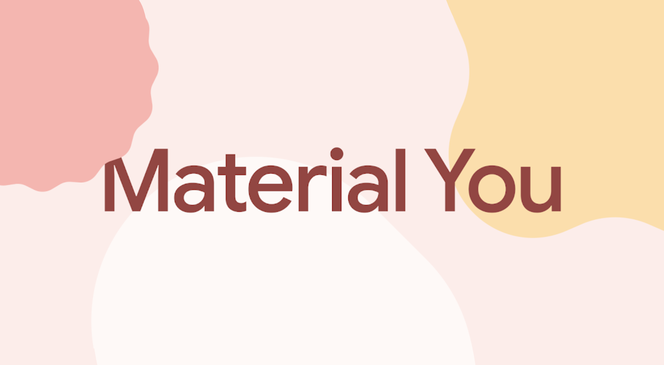
This week at I/O, Google unveiled the latest version of its Material Design design system, Material You.

Initially presented as an upgrade for Android 12, Material You is the biggest revision to Material Design since its launch in 2014 and will be rolling out across all Google products in the coming year.

Material You is an adaptable system that takes the building blocks of Material Design — the spacing and component approach — and skins it to allow a more personal design language, albeit a distinctly Google personal design language.

Google isn’t shy about its intention to define what constitutes good UI design, even if its efforts have so far fallen short of its ambition. Material You potentially leads us back to that undesirable state where every new site looks like a Google clone. The more cynical might suggest that Google actually does perceive all websites as Google products — a view that’s not entirely without merit given the source of most web traffic — so a homogenous approach is warranted.

Material You will certainly make its way into web design. Expect a rash of Material You ‘updates’ to popular themes and site builders that will consist mainly of pastel color palettes.

Hopefully, two major benefits of Material You will not be overlooked: firstly, Material You introduces far more emotion than Material Design allowed; secondly, Material You is flexible enough to ensure accessible design is harder to ignore.

Fundamentally, Material You is still Material Design. The basic approach remains, but it’s less rigidly enforced. Think of it less as a rulebook and more as a disapproving parent who, despite their better judgment, is willing to let you make your own mistakes.

Material Design has looked dated for a few years now, and it’s possible that Material You is just Google hoping to nail down a trend that’s escaping them. But it’s equally possible that Material You is a step closer to what Material Design was meant to be: an invisible design system that feels natural to all seven billion individuals on the planet.

Source

The post Poll: Will You Adopt Google’s Material You? first appeared on Webdesigner Depot.


Source de l’article sur Webdesignerdepot

March is that time of year where the feeling of newness starts, from the first Spring days to fresh design projects. These trends are no exception, with fun new takes on some classic concepts.

Circles are always popular, but the top trend is an animated take on the traditional element; plus, fun pink and purple color palettes and a few faux split screen designs round out trending styles.

Here’s what’s trending in design this month.

Circle Animations

Circles are one of those shapes that never leave the design sphere. They have a lot of classical meaning and are flexible in terms of design options.

Designers are having a lot of fun with this shape right now. From animations to text circles to image frames, they seem to be all over the place.

More recently trending is more circle-shaped animations. This trend maintains a circle’s properties as a unified and harmonious element with movement to create more engagement and make you look at the design just a little bit more.

Each of these examples uses circles in a different but equally interesting – and animated – way.

Universal Favourite uses a circular blob. It’s almost like a giant bubble. It wiggles and flows, and stretches within the space without any help from the user. It has a smoothly quality that makes you want to stare at it. The color here helps, with the circle and background not having an immense amount of contrast. Also, note the cute little circle button in the bottom corner.

Kenta Toshikura put most of the subtle animation for this design inside the circle. With a hover state, the entire circle moves on the screen with a second layer of animation, and the cursor is also a circle that hops around the black background.

Kffein takes a totally different approach with a circle made from the primary test elements. Identifying website information rotates in a circle around another geo shape on the main plane. Not only is there a circular animation, but an almost three-dimensional effect that happens due to the way elements are layered here.


Pink and Purple Palettes

The prevalent pink and purple color combination isn’t for everyone – although you wouldn’t know it from the number of designs using similar colors.

This bright combination almost screams “spring” and has a lightness to it that almost seems to lift the mood of any project. (Maybe color selection is a reflection of how we all want to feel.)

What’s nice about these colors is that they flow into one another nicely. They can also be expanded to fall into neighboring hues on the color wheel, such as red from pink and blue from purple.

Maybe the most popular use of this color pair is as a gradient. You can find pink to purple everywhere, from background gradients to image overlays to buttons and user interface elements. There’s no lack of use here.

Each of these examples shows opportunities with this color combination.

SMU uses bright pink, blue, and purple to create a giant “road sign” in the design that jumps out from the rest of the project. The sign almost seems out of place and doesn’t fit as part of the normal color palette. This is what draw you right to it.

USA Volleyball uses the popular gradient option and extends the pink to the purple palette to hints of blue and red. What’s great about this design is that it uses a super trend element and color option and makes it work with their current color palette. You can almost imagine the design conversation when someone wanted to use a pink to purple gradient for a brand that features red, white, and blue. The gamble paid off, and it works beautifully without being off-brand.

Blobmixer uses purple, pink, and a few other bright colors – note the animated circles, too – to draw users into the design. The entire project is a fun, customizable experience that you can play with, and the color choices are what make you interested enough to try. This design also offers a great example of tactile animation and elements that feel real even when you interact with them using a mouse on the screen.


Faux Split Screens

Split-screen designs were a huge trend for about two years. The aesthetic was also functional for content that required a this or that choice on the part of users.

Now, we see the design elements but without the function. (Maybe because it just looks nice and creates a sense of balance without a symmetrical design.)

These projects look like they might offer multiple gateways to content, but there is only one call to action on the dual-screen aside from navigation elements.

What this design option does is help draw the eyes across the screen. One side will immediately appeal to you, and when done well, you’ll feel a subtle push of pull from the color, text, and images to look at the other side as well.

Renaissance TV does it with heavy animation with “dancing dots” from an old TV that doesn’t work. But then you need to look at the green text to understand what is happening.

Yacht uses text weight and space to push the eyes across the screen. Almost everyone will go to the heavier areas first and then gaze across the screen through blocks of space to the final small text on the right side. And it all happens in a fraction of seconds.

Bonjour Paris pairs bold color with black and white images. You may look at either side first, depending on personal preference, but the other half of the screen is necessary for a complete understanding of the website.


Conclusion

While all of these design trends are evident in new and recent projects, the use of pink and purple color palettes – particularly with a gradient – seems to be everywhere you look. These color choices are popular and come in a lot of forms.

Maybe the most obvious is with brighter pink and purple gradients, but other variations are also trending. It’s definitely one to watch in the longer term.

Source

The post 3 Essential Design Trends, March 2021 first appeared on Webdesigner Depot.


Source de l’article sur Webdesignerdepot

One of the few bright spots in 2020 has been the creativity companies and individuals alike have exhibited in dealing with what, at times, seemed to be overwhelming problems.

The world of web design was no different. Designers and agencies had to adapt and implement new color schemes or design new shopping experiences, which made some of the previous design trends not fit for the current design problems.

We’ll take a look at these newest design trends and the rationale behind them. As we do so, we’ll also take a look at some of BeTheme’s 600+ pre-built sites that have already put them to good use.

1. Comforting Color Palettes Lighten the Load

In years past, bolder color schemes were one of the hallmarks of web design trends. Their purpose was to quickly engage a visitor and prompt him or her to respond emotionally.

Given all the drama and turmoil we were subjected to through most of 2020, we’ve come to welcome the use of toned-down colors in marketing instead of the bolder, brasher, and more “in-your-face” color schemes. 

Bellroy’s website puts toned-down colors to good use. This company’s product line of wallets, bags, and the like, are designed to keep people’s belongings organized, safe, and secure. A wild color scheme simply wouldn’t be fitting.

How, then, are brightly-colored products dealt with? Thanks to judicious uses of white space and background photos, this website still emphasizes a toned-down color palette.

The BeSpa pre-built website is another example of a color scheme that almost immediately puts the mind at ease.

Calm and soothing? Yes.

Boring? Definitely not.

Comfort and security are the emotional drivers in this example.

2. Seamlessly Intermingle and Balance Physical and Digital Imagery

People confined to their homes because of Covid-based restrictions spent many more hours looking at their screens in 2020. Online programming began to take on the appearance of a reality show that blurred the boundaries between the real and the digital.

Whereas web designers tended in the past to rely on either photos or illustrations in their designs, these same designers have started to integrate these blurring effects into their designs, with results that range from amusing and quirky to highly informative.

Check out this example from fashion designer Constance Burke

It’s not every day you see real models wearing hand-drawn fashion sketches. But it’s just one example of how the physical can be blended with the digital.

The BeSki pre-built site does the same blending of the two, but in a totally different way:

The sections’ designs switch from predominantly physical to largely digital and back again, an excellent approach that provides a maximum amount of useful information.

It’s also worth noting how snowbanks are effectively used to seamlessly transition from one section to the next.

3. Create Well-Organized and Helpful Shopping Experiences

More people spending more time at home has created a surge in online shopping. As a result, many online store owners are now feeling the effects of increased competition.

Consumers look for brands they believe they can trust. At the same time, they want their online shopping experiences to be as quick and painless as possible. They look for (and expect) quick and effective product search capabilities, helpful and effective product displays, one-page product descriptions, and the like.

Walgreen’s product page design is especially well-suited for 2021 ecommerce shoppers: 

Everything shoppers usually need to know is presented above-the-fold. They can easily proceed to the next step or scroll down for reviews or additional product specifications. 

BePestControl’s pre-built website uses a similar product design approach: 

In this example, the main selling points are up-front and are kept short and sweet. The shopper can either hit the ‘Add to Cart’ button or look below the button for additional information.

In both examples, a visitor doesn’t have to mull over what step to take next since one of the design objectives is to make the shopping experience as easy and as satisfying as possible.

4. Take Advantage of the Benefits of User-Controlled Video Content

Once upon a time, video content was “the thing” to incorporate in a website. Hero background videos proved to be particularly engaging, and “how-to” videos presented much more useful information than illustrations or blocks of text could.

On the other hand, Auto-play videos, those that started on their own, all too often had a tendency to irritate rather than inform, especially when their content didn’t address a visitor’s immediate concern.

Thanks to Zoom and similar video platforms that came into widespread use in 2020 and to website designs that include video “Play” buttons, users have become much more comfortable with the medium. As an example, Shoppers have been given total control over if or when they want to view a given video. 

This is the design approach Payoneer has taken: 

The white “Pay” button is impossible to miss, and while it is designed to encourage a visitor to watch a testimonial, doing so is completely optional.

The BeOptics pre-built website cleverly slips in a video play option as well: 

In this example, when visitors hover over the “See More” button, it lets them know that they have the option to watch the video if they want to learn more.

5. Trust Builders Should be Non-Negotiable Web Design Elements

There are various ways in which products are organized or showcased in brick and mortar businesses to instill trust. Helpful and friendly staff also contribute to instilling trust.

Some of these trust-builders are easily incorporated into eCommerce designs. Others, though more difficult to fit in, can usually be satisfactorily addressed.

Digital trust builders can include.

  • Logos (familiar, whimsical, innovative, engaging)
  • Portfolios and/or product pages
  • Customer reviews, product ratings, and client testimonials
  • Case studies and product or price comparisons
  • Safety and security seals, e.g., Better Business Bureau, PayPal checkout
  • Charts, graphs, counters, and other data visualization techniques
  • Proof of social, charitable, or community-related actions and contributions

Put, trust-building content will beat hard-sell techniques every time, especially if you would like your customer base to include referred and repeat customers.

Omaze, for example, gives people entries for prizes based on their donations while at the same time highlighting the good things it and its donors have brought about.

To help build trust, the site devotes space to highlighting publications that have featured Omaze and the work it has done and is doing.

Plus, it puts data visualization and non-profit testimonials into play to give visitors an added insight into what is going on behind the scenes: 

As you can see, it doesn’t have to be difficult to incorporate genuine trust-building content into your website designs.

BePortfolio is a great example of how you might go about doing this for a portfolio site, whether it’s your own or a site for a client:

The home page alone has plenty of space for including trust-building content:

  • A satisfied customer counter
  • Product usage case studies and testimonial
  • Portfolio highlights
  • Client and partnership logos

And it can only get better as a visitor moves through the site, but only if you’ve chosen to make that happen.

Have You Started to Take These New Web Design Trends to Heart?

We’re not suggesting that you throw the baby out with the bathwater, but some trends will need to be discarded to enable you to adjust to a new normal. Other 2020 design trends, like minimalism and headline topography, are likely to remain popular for years to come.

New trends that incorporate calming color palettes, image blending, more efficient eCommerce UX designs, user-controlled video, and trust-building elements should give your customers the feeling of comfort and security they will be seeking in 2021.

If you want to implement some or all of these new trends in your 2021 website designs, BeTheme’s 600+ pre-built sites make doing so an easy task.


[– This is a sponsored post on behalf of BeTheme –]

Source

The post 5 Web Design Trends and Ideas for 2021 first appeared on Webdesigner Depot.


Source de l’article sur Webdesignerdepot

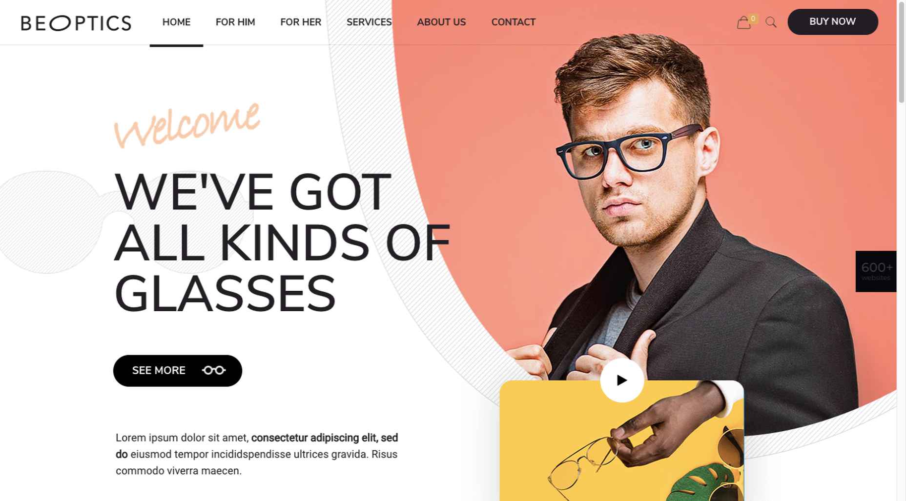
Ecommerce design may seem fairly straight-forward; you build an online store that showcases a company’s products or services and gives customers a quick and pain-free way to purchase them.

While that formula will always hold true, ecommerce is undergoing some big changes, and web designers need to be prepared to keep up with them. This monthly ecommerce trends roundup will explore these new and evolving design, sales, and marketing trends.

1. Calmer Color Palettes

Although we’re not likely to see this trend go near the sites for big box stores, it’s something smaller ecommerce companies are adopting. And with good reason.

As consumers become wary about how much money they’re spending, they don’t need to feel pressured or rushed into a purchase. And ecommerce sites that employ calmer color palettes — like pastels and earth tones — will do a better job of putting their customers at ease.

Bicycle saddle manufacture Brooks England shows how this trend plays out in ecommerce design:

It’s not just outdoors or sporting goods companies that can use more natural-looking colors, either. CBD product vendor Cannaray is another company that uses a more subdued color palette:

Really, any store that wants to do a better job creating satisfying experiences for customers and gaining their long-time loyalty should consider toning things down with color.

2. No-rush Shipping Rewards

For years, we’ve seen consumers go crazy for brands that offer free and fast shipping. But thanks to the surge in online shopping in 2020, ecommerce companies, their shipping partners, and delivery service providers just haven’t been able to keep up with the pace.

When customers are unhappy with slow deliveries, they’re going to go to social media and review sites to bombard brands with complaints, as has been happening with Loft since November:

Although many ecommerce stores still don’t inform customers ahead of time about these delays, we’re starting to see a new checkout trend.

Here’s how Gap is encouraging and rewarding customers for choosing no-rush shipping:

Amazon is another ecommerce site that encourages no-rush shipping at checkout with a reward:

Not only does this set better expectations for customers before they finish their purchases, but it encourages everyone to slow down a bit so that ecommerce companies and their shipping/delivery partners can keep up.

3. More Human and Empathetic Assistance

Each year, design trend roundups suggest that AI will play a greater role in web design.

While that may be true for things like the search bar or personalized recommendations, ecommerce sites are pulling back the reins on automated support and assistance.

Best Buy, for instance, offers customers the option to “Shop with an Expert”:

After shoppers go through a quick survey, they’re given a variety of options — based on their own level of comfort and convenience — to work with the expert:

Something that might’ve been left in the hands of a self-service quiz or automated chatbot is being given the human touch once more.

We’re seeing a similar trend with retailers like Warby Parker. While it still offers a virtual AR try-on, the main navigation actually emphasizes the home try-on option:

Again, this is another example of ecommerce companies becoming less reliant on automated support to give their customers a better and more confident shopping experience.

Wrap-Up

Ecommerce trends are always evolving. Sometimes it’s due to new technologies. Other times it has to do with what’s happening in the world around us. And sometimes it’s simply to keep up with changing consumer expectations.

Stay tuned as we explore new and emerging ecommerce trends in the coming months…

Source

The post What’s New in Ecommerce, January 2021 first appeared on Webdesigner Depot.


Source de l’article sur Webdesignerdepot