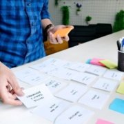
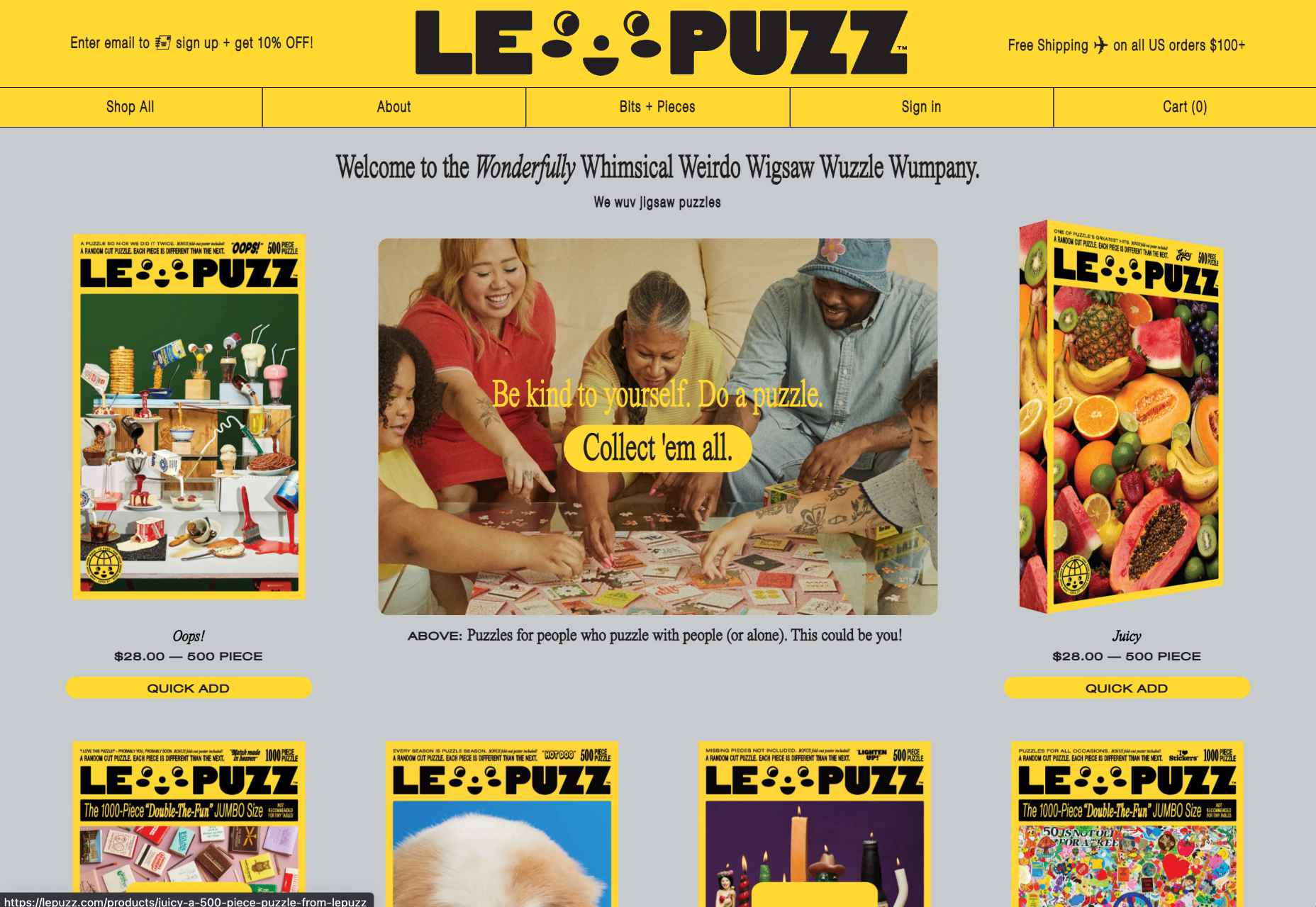
 We’re going to have some fun this month. There are so many new tools and resources out there for designers that make life easier, and others are simply enjoyable.
Here’s what is new for designers this month …
Polka Dot Generator
Polka Dot Generator is exactly what you think. Adjust colors, dot size, shadow, and fuzziness, and then export the CSS for use in your projects. This could make for fun effects or backgrounds.

Design Memes
Design Memes is just a lot of fun. It’s a collection of memes based on design culture updated daily. It’s a little silly and a little reflective. Yes, it’s completely ok to laugh at yourself.
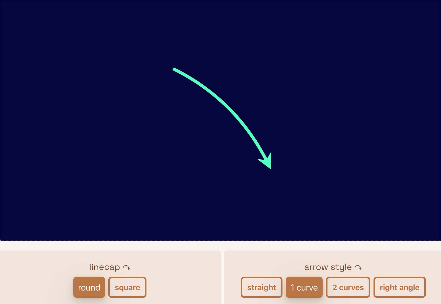
Pppointed
Pppointed is an SVG arrow-making tool that helps you create cool pointers without a lot of effort. Just pick a color, shape, and style, and you are ready to go. Save your custom arrows as SVG files or copy the code and use them on the web whenever you want to point at things visually.
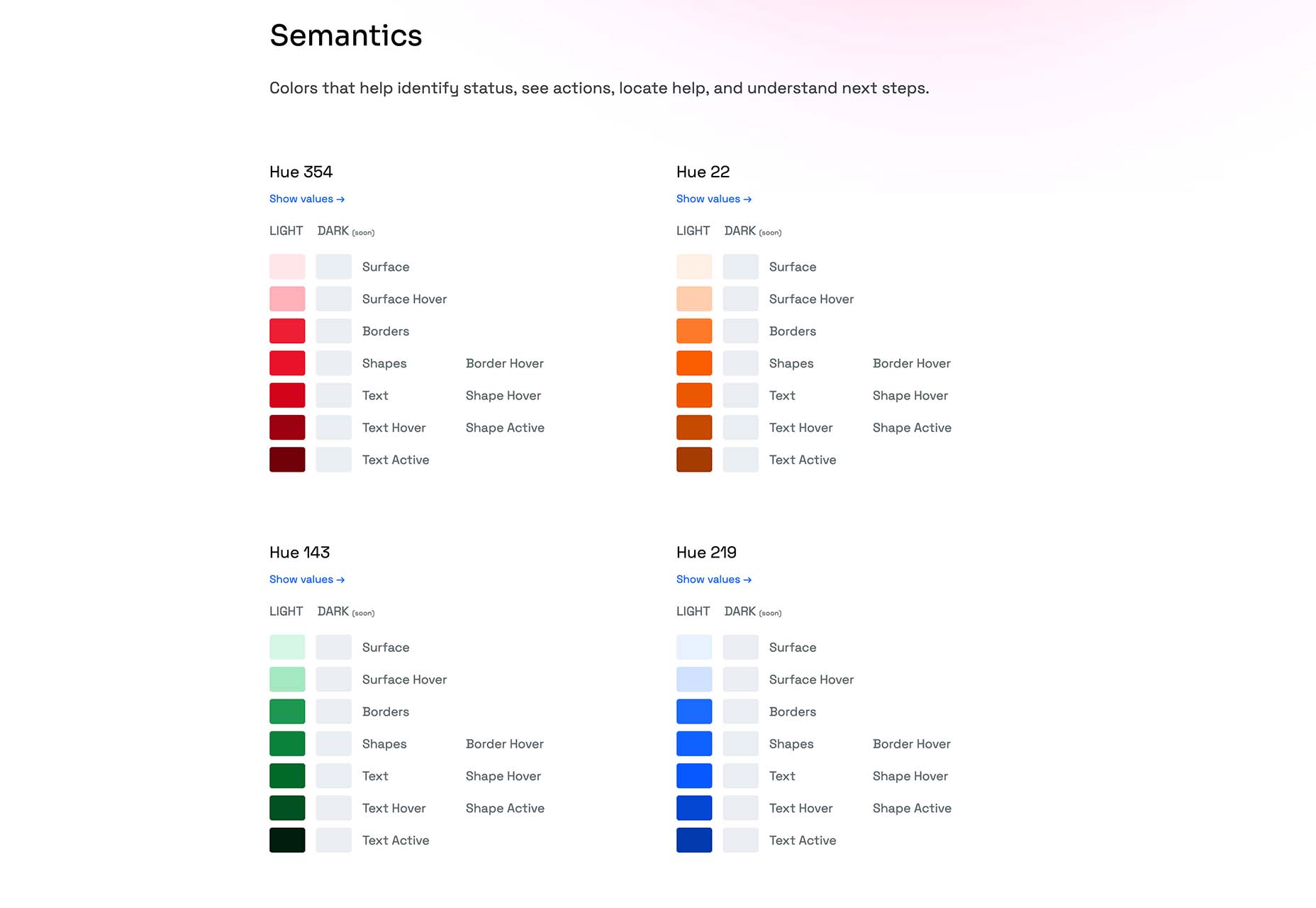
Open Source Color System
Open Source Color System is a set of palettes that include carefully picked colors to help you overcome interface challenges. For example, it is one of the only color tools out there that includes palettes for light and dark modes. It’s also designed with accessibility in mind to help you create a complete and usable system.
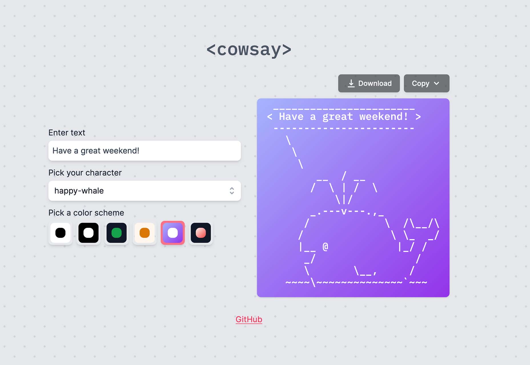
Cowsay
Cowsay is a nifty little web interface of the same name made with Svelte and HTML Canvas. Play with it and then copy your art as ASCII or an image.
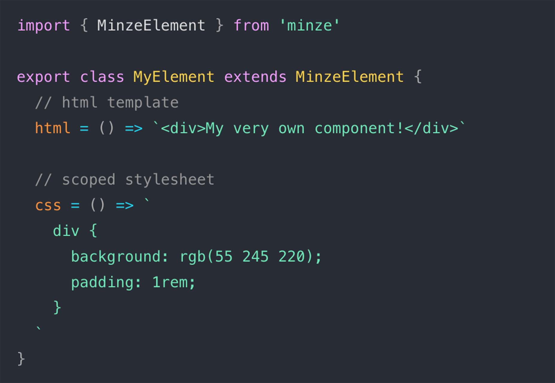
Minze
Minze is a simple JavaScript framework for native web components. It’s tiny and fast, modern, shareable, framework agnostic, and uses TypeScript to scale your component library. Plus, you can get started with it right away.
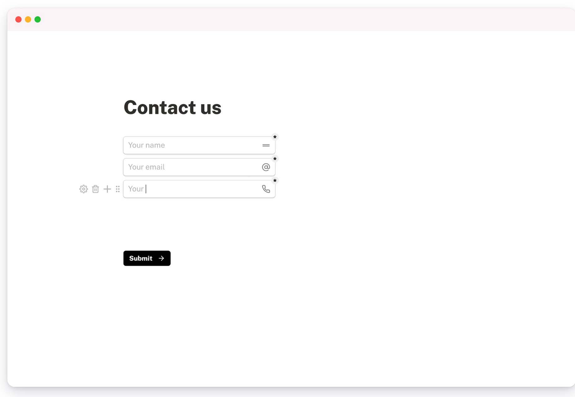
Tally
Tally is a simple – and free – online form builder. You can use it without coding, and it works like a document file, so there’s no learning curve. You can create unlimited forms, integrate with other tools, set logic, collect payments, and more. There’s a pro version as well if you need even more features.
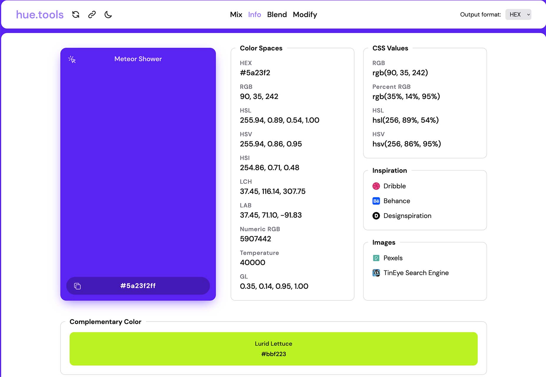
Hue.Tools
Hue.Tools is another color tool to help you maximize effort when creating palettes. Generate a color you like, see specs and values in all the different color spaces, inspiration from design sites, and colors that work with it. It’s fun and functional.
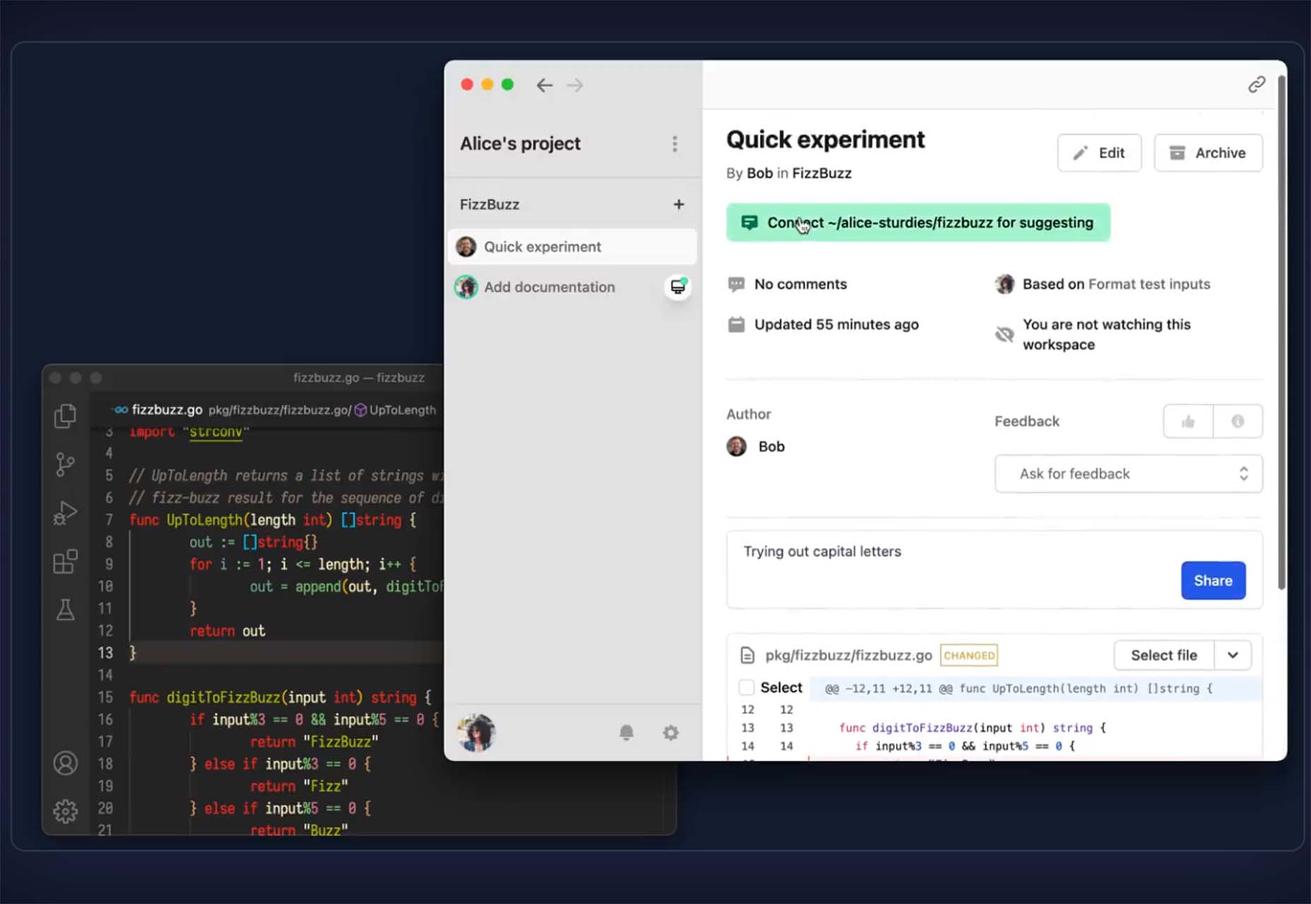
Sturdy
Sturdy is a low overhead code collaboration platform for fast-moving teams. With Sturdy, you work in the open with your team. Discover and interact with draft code as it is written. Those team drafts are like live pull requests (Figma or Google Docs) but using your local editor.
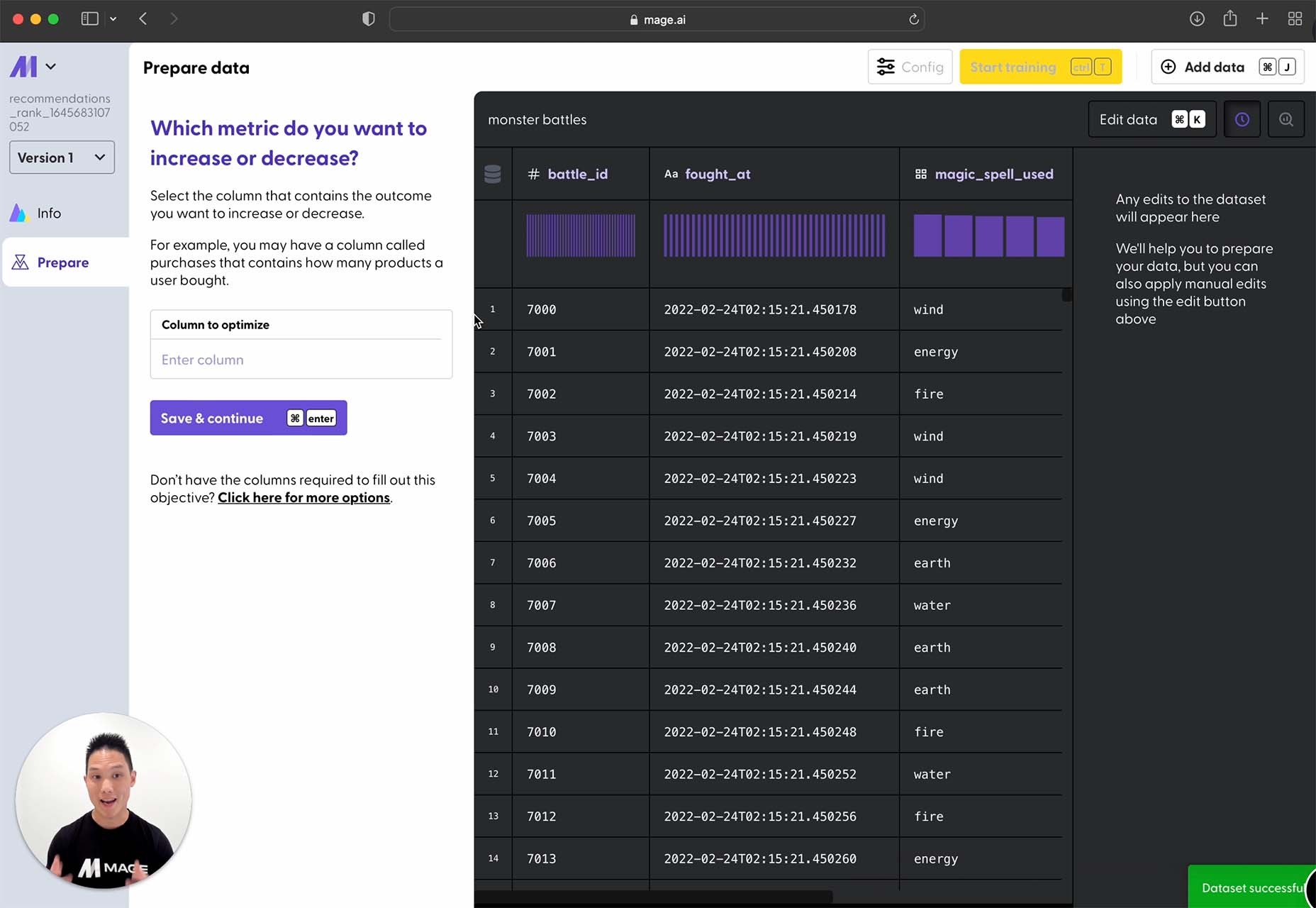
Mage
Mage is a tool that transforms your data into predictions. Build, train, and deploy predictive models in minutes with no AI experience required. This is a premium tool, but you can try it for free.
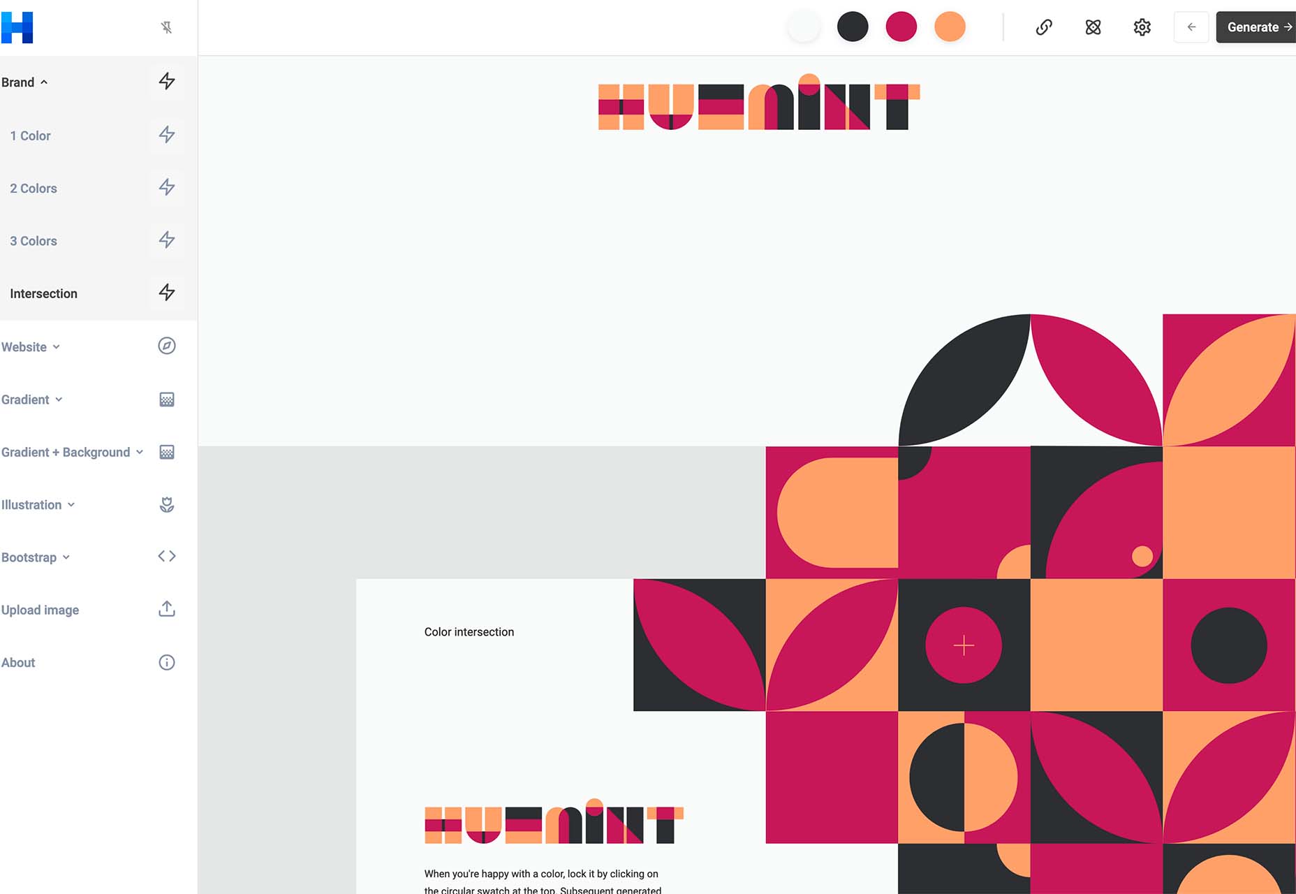
Huemint
Huemint is a machine-learning-based color scheme generator for websites, graphics, and branding. There are many options to play with, and you can generate some pretty interesting combinations that ordinarily you might not think of.
CSSUI
CSSUI is another tool you’ll love because it includes pure CSS interactive components without any JavaScript. It’s easy to customize, uses standard HTML, is easy for all levels to use, is tiny and fast, and supports pretty much all modern browsers. It’s an open-source tool that you can download and use immediately.
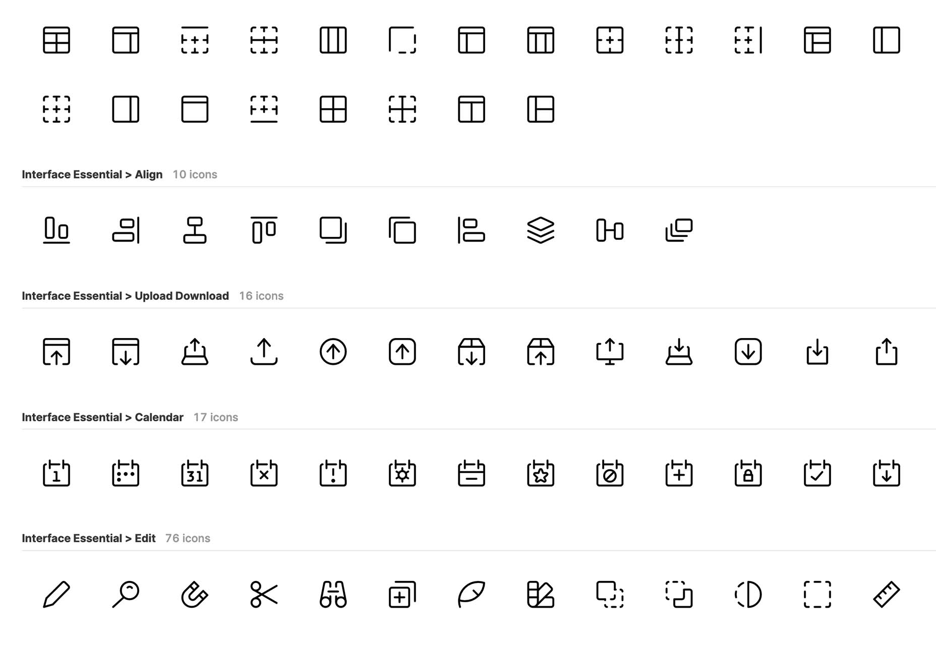
UI Icons Line – Free
UI Icons Line – Free is a set of 1,000 free vectors for use in your projects. Who doesn’t need a robust set of icons?
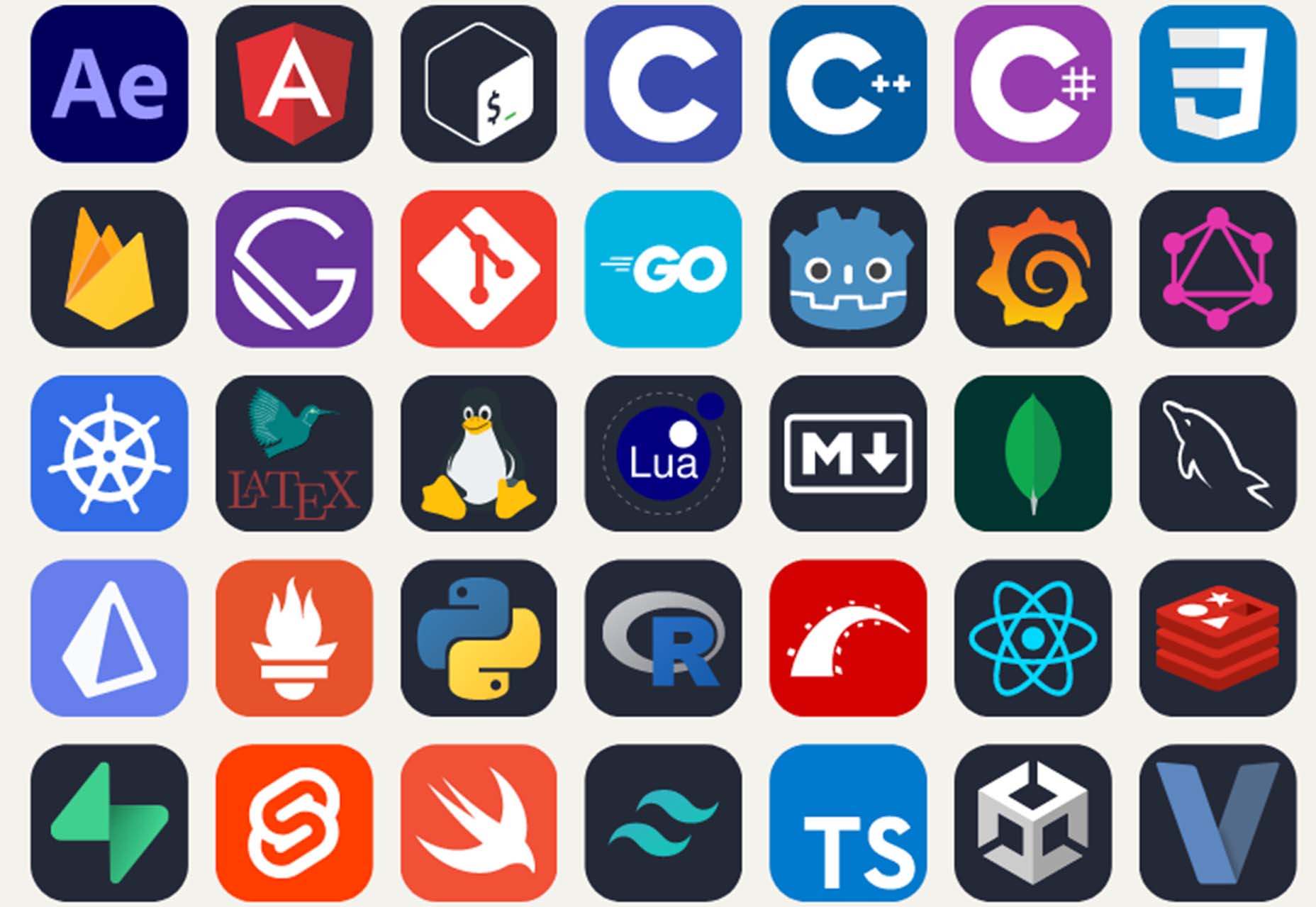
Skill Icons
Skill Icons is a set of icons to help you showcase your design and development skills on your resume or GitHub. They all look great and match.
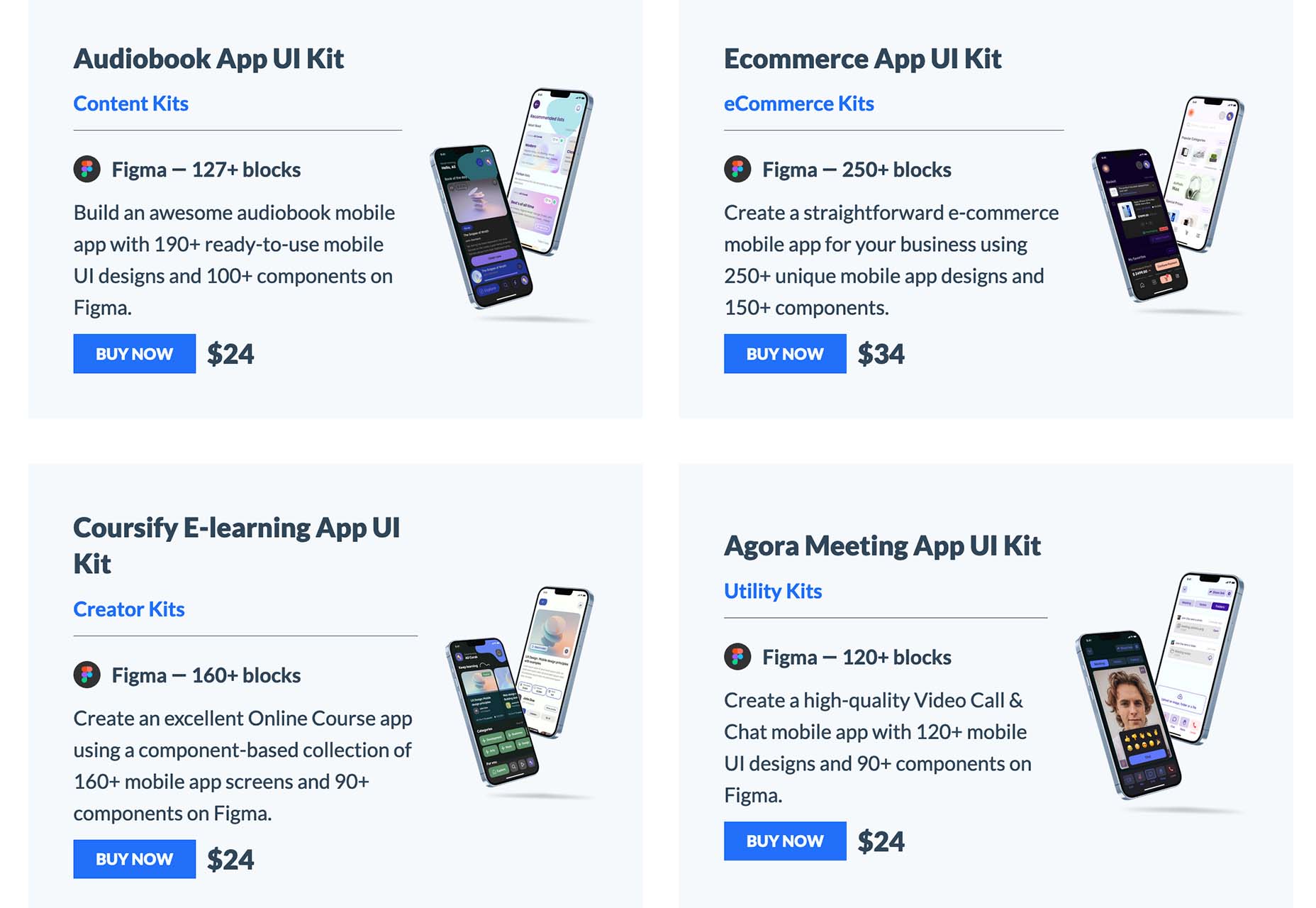
Ambient Design
Ambient Design is a mobile app design market where you can get mobile UI kits for Figma. Purchase kits separately, or buy quarterly or yearly plans to access all current and future UI kits.
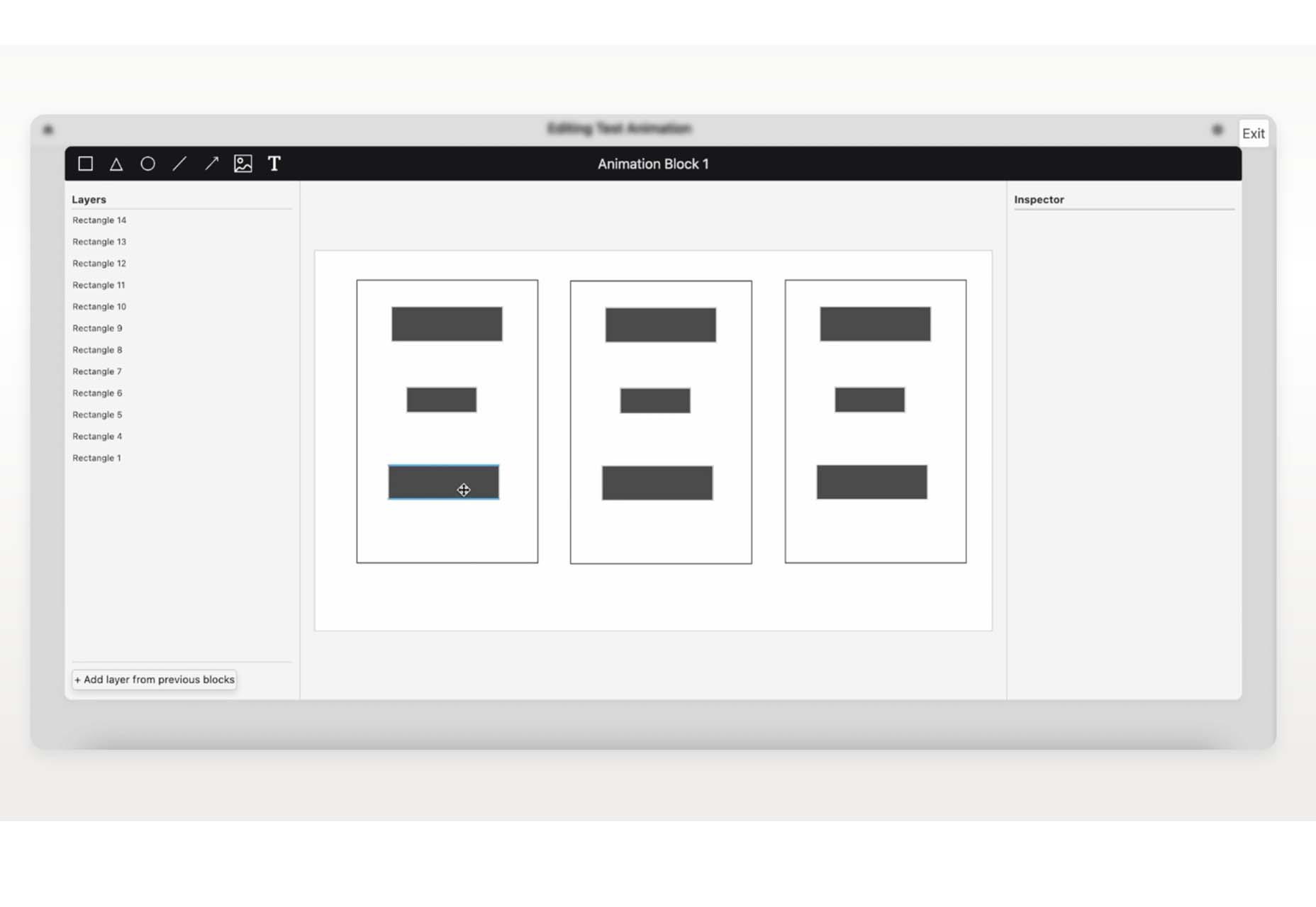
TextFrame
TextFrame lets you create animated tutorials for your users to get the help they need. It integrates directly with WordPress or any other website with just a couple of lines of code and includes plenty of customizable options to make it easy for you to help others understand how to use the website. The tool is free for one site and just a few bucks per month for additional sites.
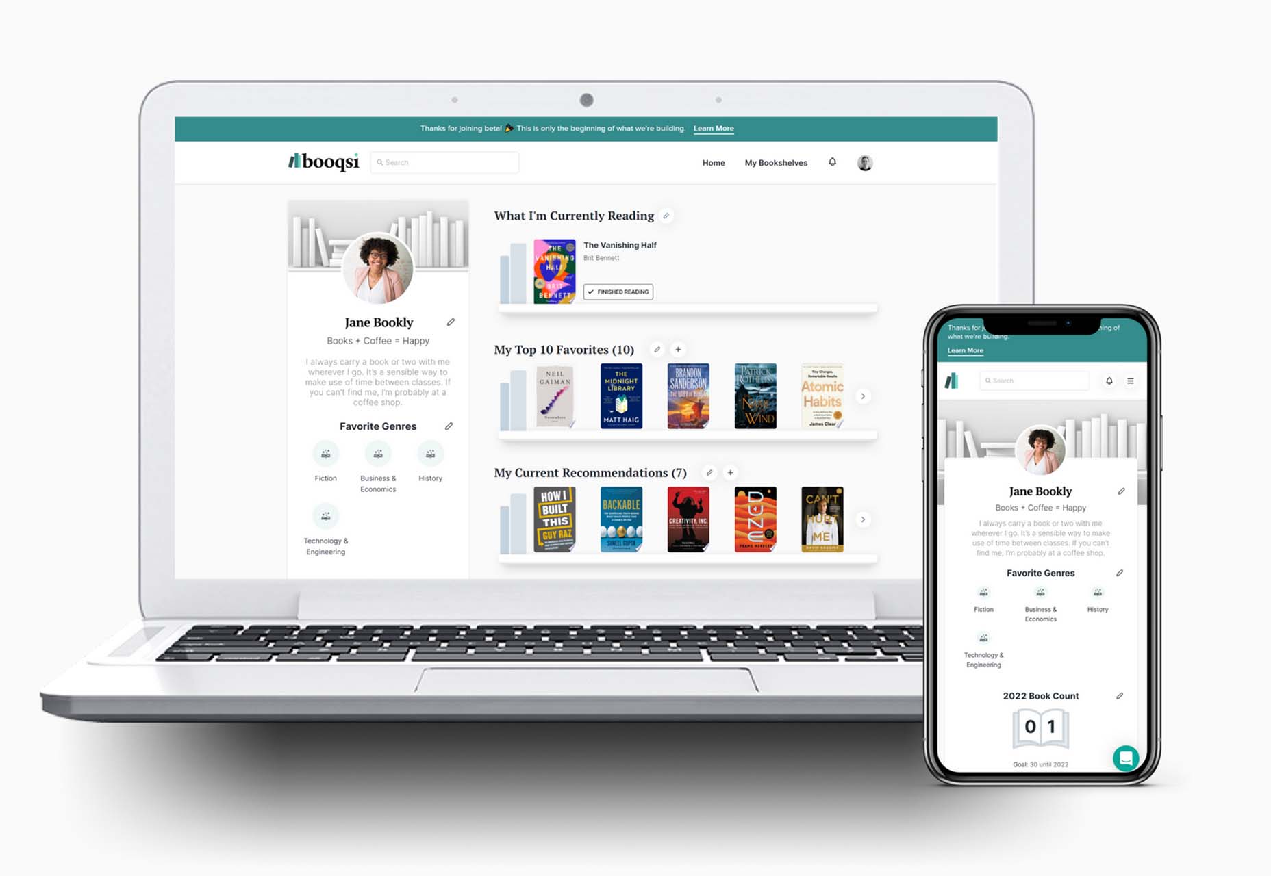
Booqsi
Booqsi is a fun new social media network for book lovers. The platform is still in beta and lets you save and share books, create shelves for reading, and doesn’t force a connection to Amazon. It’s just all about the books. And there’s a bonus: every link from the site goes back to bookshop.org to help you find and support local bookstores.
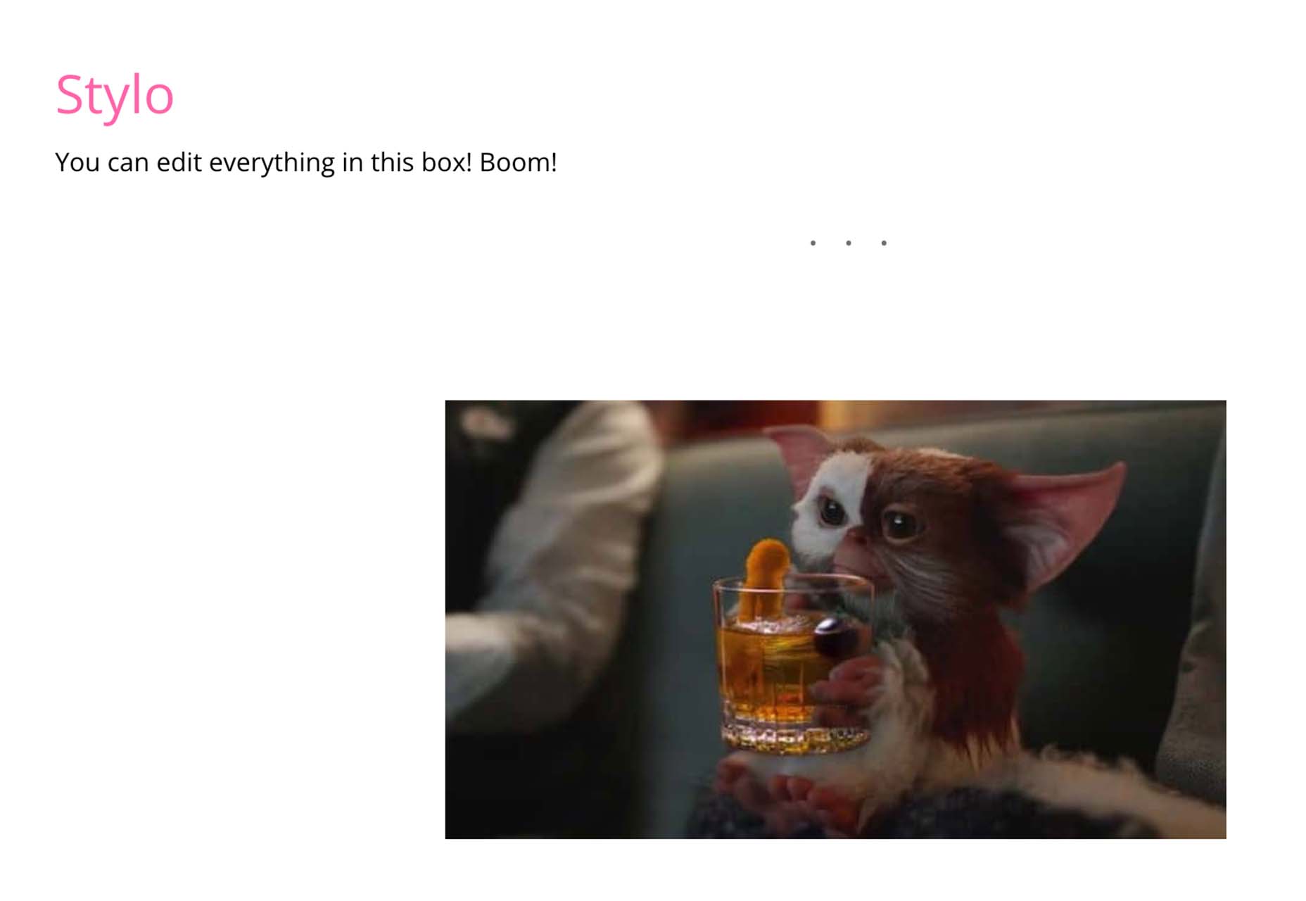
Stylo
Stylo is an open-source WYSIWYG interactive editor for JavaScript. It is made to bring great user experience and interactivity to the web, for everyone, with no dependencies. It has an interactive design, is customizable, and is future-proof.
Tutorial: How to Favicon in 2022
How to Favicon in 2022 is an excellent lesson on the five icon files every website needs (plus one JSON file). If you are creating more than that, this is a must-read.

Tutorial: Creating Generative SVG Grids
Creating Generative SVG Grids is an in-depth, step-by-step tutorial for anyone who wants to create a more artistic SVG. It uses a handful of tools, including SVG.js, Generative Utils, TinyColor, and GSAP.
Fromage
Fromage is a new and beautiful premium typeface family from Adam Ladd. It includes 14 styles with an interesting serif and alternative sans option. The high-contrast design is great for a variety of projects.

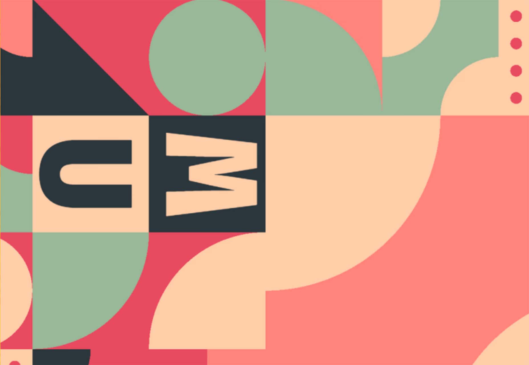
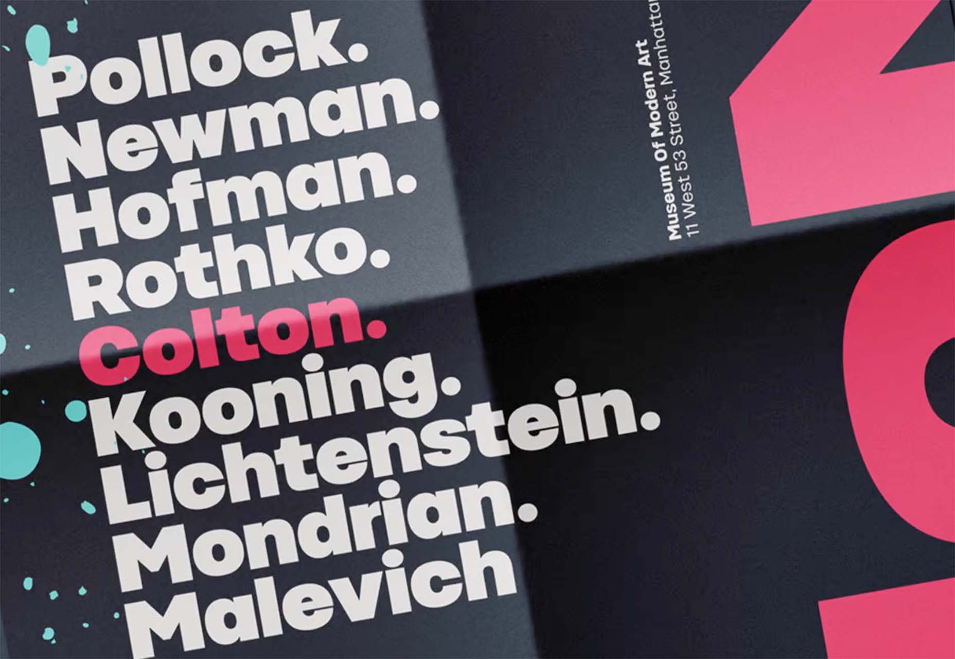
HD Colton
HD Colton is a premium super sans serif typeface with a whopping 91 styles and family package options. It would make a bold statement as a display option.
The post Exciting New Tools For Designers, March 2022 first appeared on Webdesigner Depot.


 Micro-interactions effectively communicate brand identity and ethos while strengthening ties with the customer. These habit-forming tools make for a fun and seamless user experience. Facebook’s ‘likes’ and Tinder’s ‘swipes’ are two classic examples.
 Every day design fans submit incredible industry stories to our sister-site, Webdesigner News. Our colleagues sift through it, selecting the very best stories from the design, UX, tech, and development worlds and posting them live on the site.


 What stands out as an incredible web design project for you? Do you count your creation as a success if it’s modern,


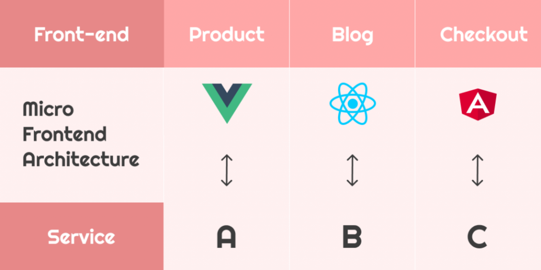
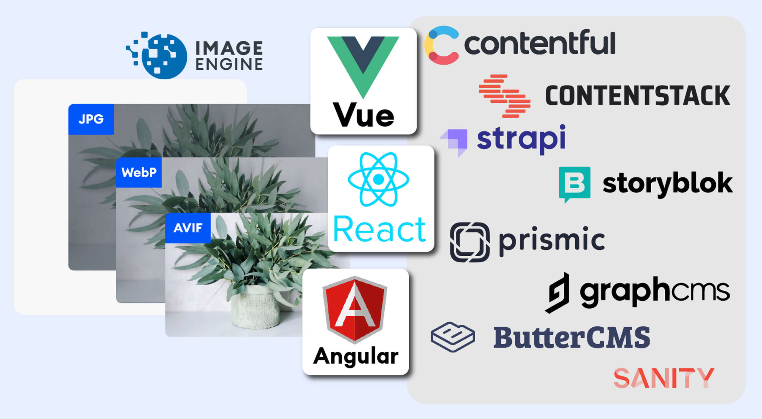 The headless CMS trend is gaining traction growing at over 20% annually. The driving force behind the headless CMS trend is developer’s increasing need for flexibility and control. Using the headless CMS’s API, front-end developers can use JavaScript frameworks like React, Vue, or Angular to quickly deploy content and designs in various web pages and apps.