 Bored with the same old design tools? There are plenty of new toys to experiment with, from fun divots to functional design tools that could become your new go-to’s.
Here’s what is new for designers this month…
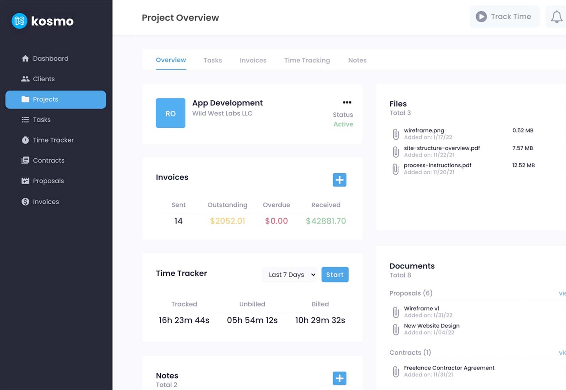
Kosmo
Kosmo is a new project management and invoicing system designed just for freelancers. Designers and developers will love it because the interface is sleek and modern. The tool lets you send invoices, track time, manage projects, send proposals and contracts, and manage billing. You can customize everything from your brand to colors so that your invoices reflect your business style. The platform has a free option as well, making it easy to have the tools you need to run your business. (Plus, there’s a very affordable premium plan if you want more features.)
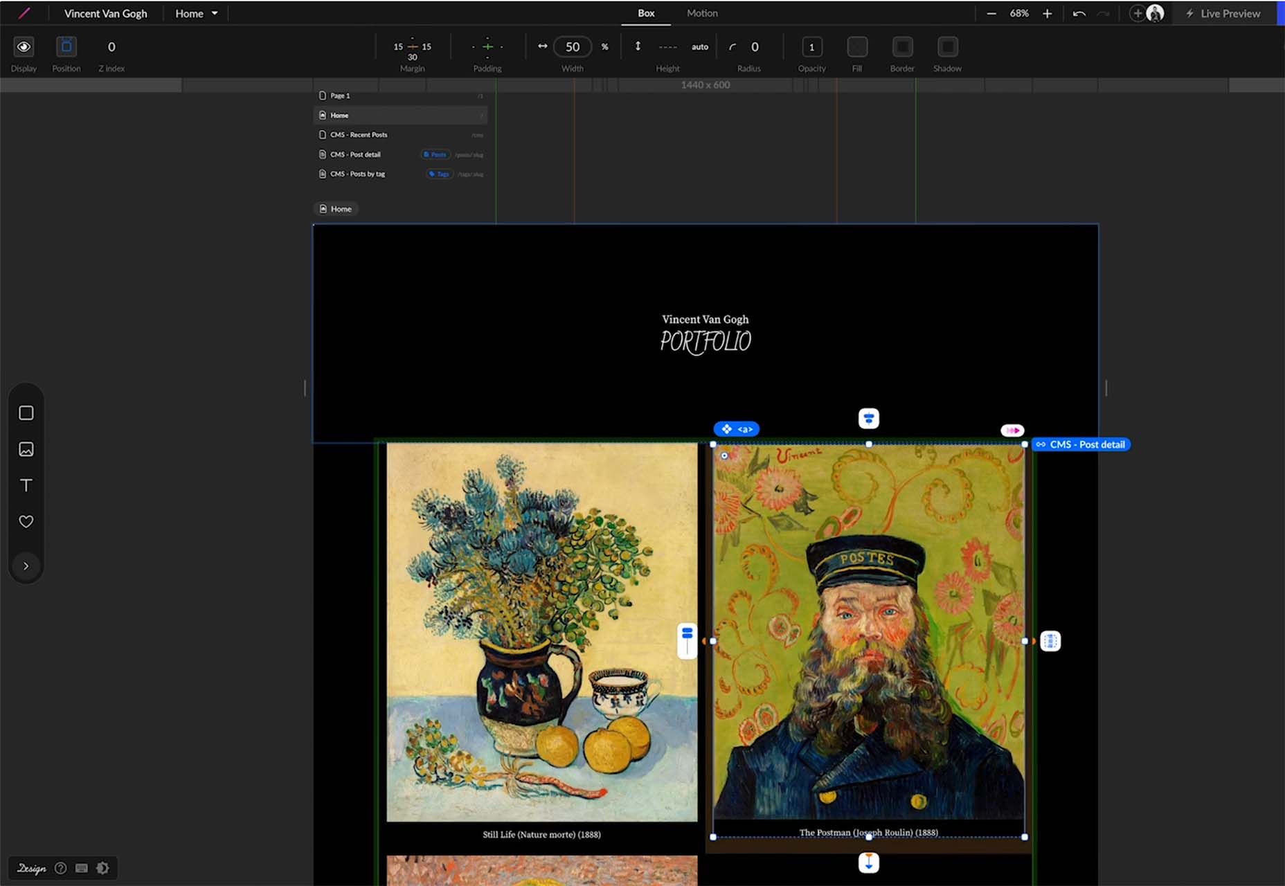
STUDIO
STUDIO lets designers layout and publish responsive websites, including the ability to connect to backend data, all with a low learning-curve GUI and no coding knowledge prerequisites. You can publish to a free URL with free hosting on the cloud. The free version also includes forms. STUDIO also has premium plans if you like the tool for websites of all sizes and bandwidth needs.
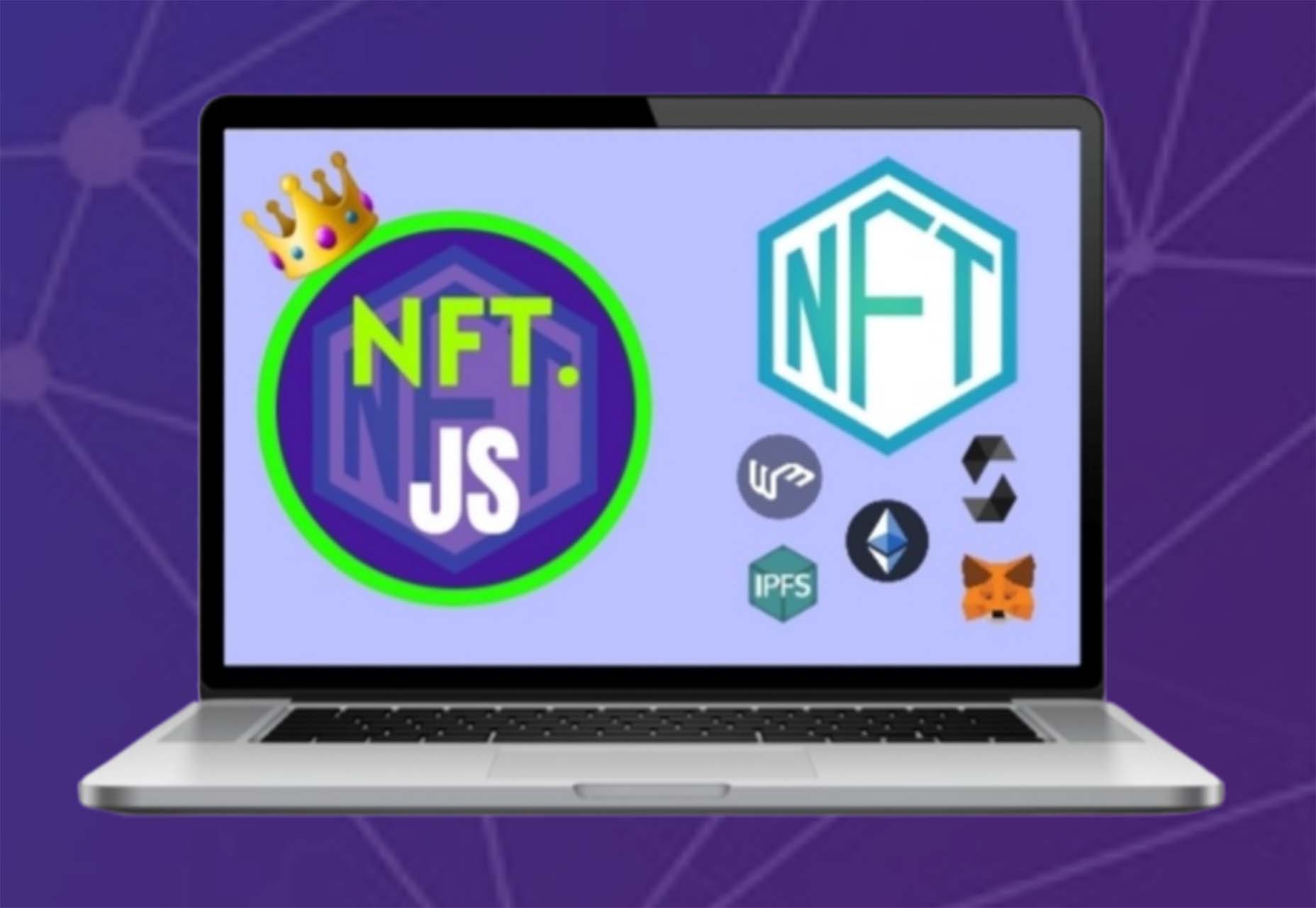
NFT.js
NFT.JS allows you to deploy an ERC721 contract that can perform all the required functions without writing a single line of code. Interact with the contract by calling functions and sending transactions to the contract with a couple of lines of NFT.JS. Provide the input file into the metadata object, and NFT.JS uploads all the files provided in the metadata to IPFS as well as uploads the metadata.json file to IPFS and mints the NFT.
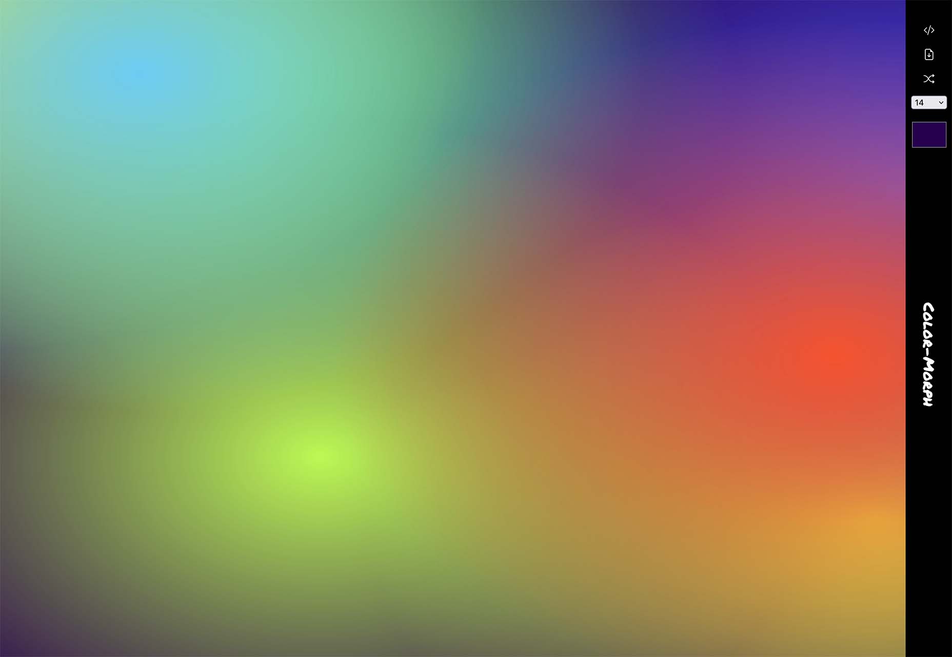
Color Morph
Color Morph is a fun little tool to help you generate mesh gradients in SVG format, or generate CSS, that you can snag and use in projects. The patterns are trendy and fun to use.
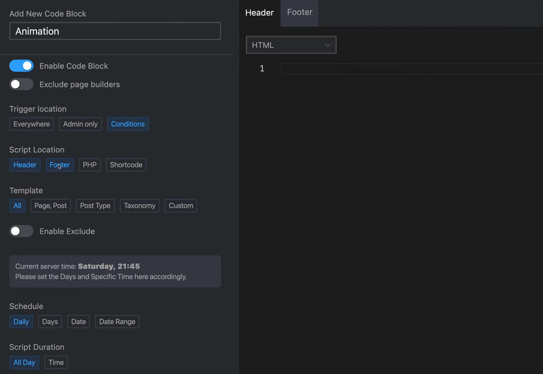
Scripts Organizer
Scripts Organizer is an advanced code editor for WordPress. This premium tool helps you make workflow scripts work for you with scheduling, advanced functionality, live previews, safe mode, SCSS partials, code injections, import and export, and more.
Texture
Texture is a fun web project that creates generative art that you can use for backgrounds or pretty much anything else. Preview the textures, pull the JavaScript or CSS or even edit and continue to play with them on CodePen.

Avvvatars
Avvvatars are a set of unique placeholder avatars that are free. The tool is easy to use, includes 40 colors, is accessible and lightweight, comes with 60 shapes, and is customizable. You can grab it on GitHub or as a Figma file.

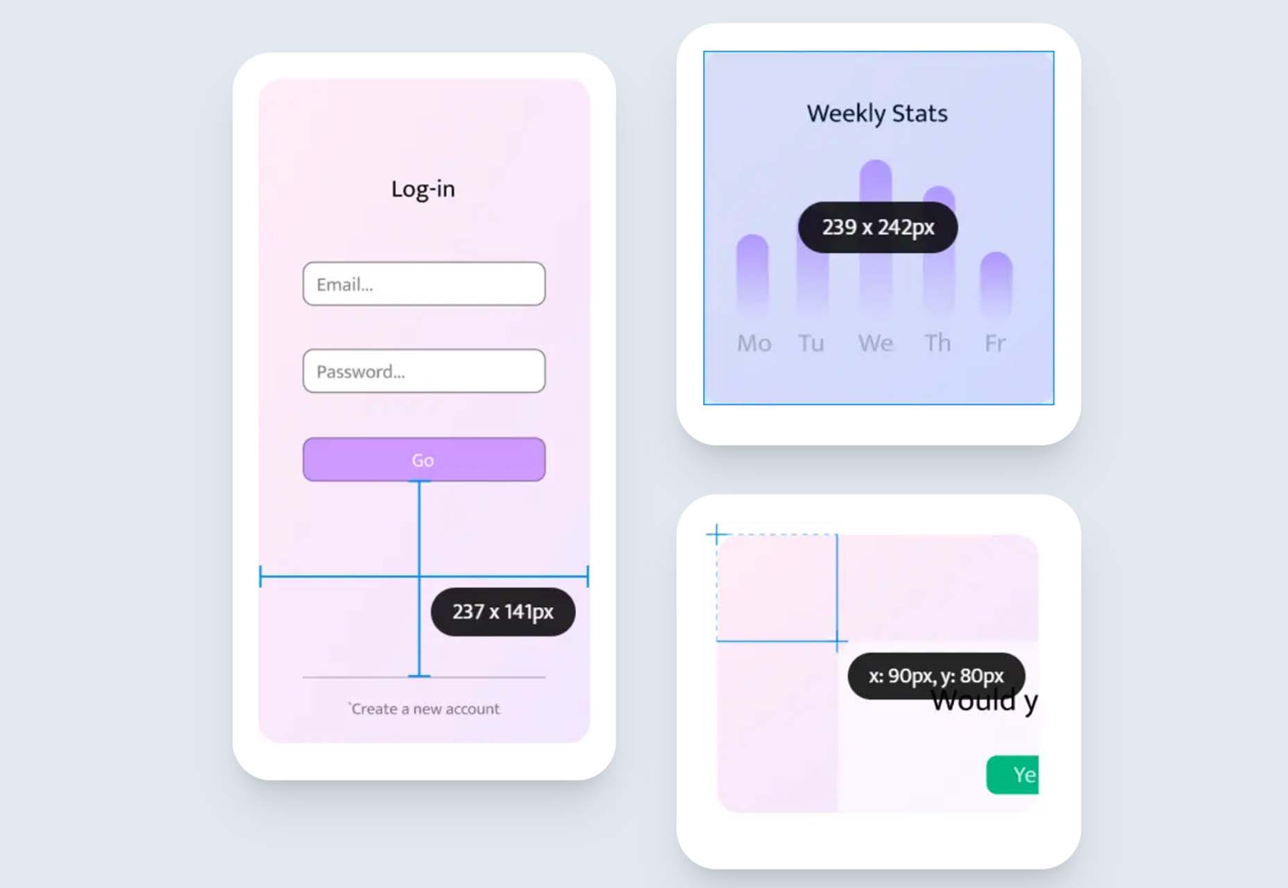
Epic Ruler
Epic Ruler is a premium design utility tool that measures distance, dimensions, position, pick colors, test contrast, and align on-screen elements anywhere on your screen. You can also create alignments, and it comes with a great color picker that helps you pinpoint hues down to the pixel.
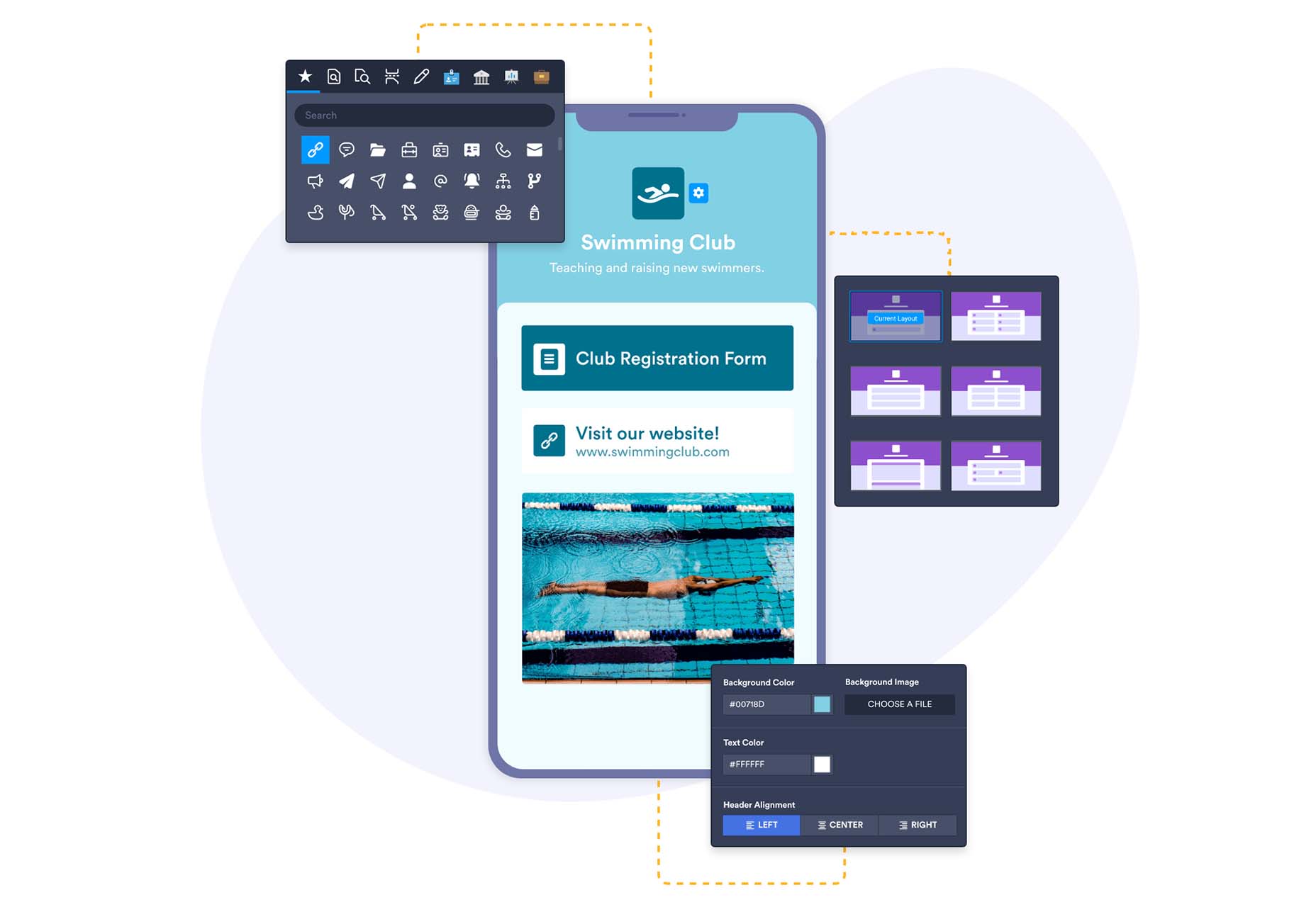
Jotform Apps
Jotform Apps is a new set of app tools from the company you may know for form-building tools. The free no-code app builder lets you add forms, links, widgets, and branding to one fully customized app that can be downloaded onto any smartphone, tablet, or computer. Get started with a template to jumpstart projects.
Spruce
Spruce is an open-source, lightweight CSS design system that’s built on Sass. The tool, which is in beta, is designed to help you start with a solid foundation for projects. It includes structure and code, typography, tables, and buttons.

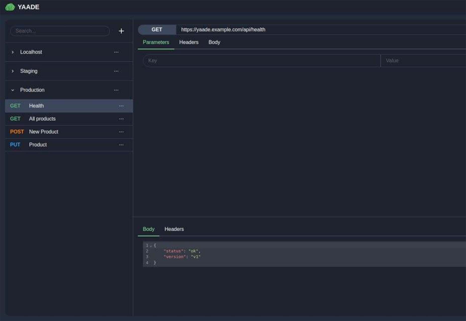
Yaade
Yaade is an open-source, self-hosted, collaborative API development environment. It’s made for those who want self-hosting in security – if you don’t know the password, there’s no way in! You can import OpenAPI v3 files, there’s data import and export, and a dark mode default.
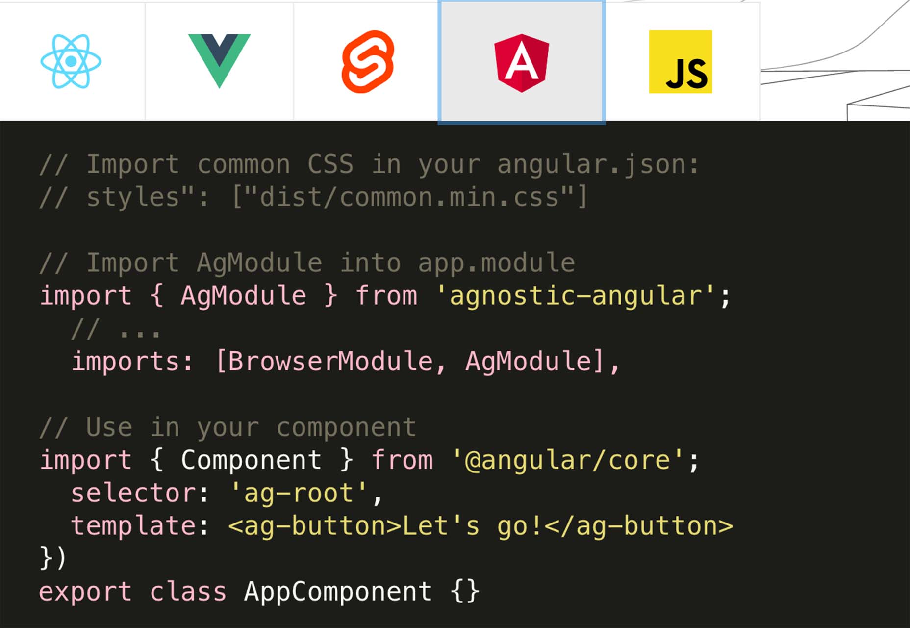
Agnostic UI
Agnostic UI is one stylesheet that works with multiple frameworks. The user interface components work in React, Vue 3, Svelte, and Angular. It includes semantic and accessible HTML with unprocessed CSS so you can code on the platform to get ahead of web standards.
Turbulent Buttons
Turbulent Buttons is a button-and-hover animation that goes the extra mile. This is a fun button and animation that is anything but boring.
Never Install
Never Install is a cloud platform that allows you to run any application from the browser without installing it on your device. It is an alternative to traditional desktop application usage and enables people to stream applications over the web. The developers are working on a next-generation cloud platform to bring any GUI application regardless of the operating system, device, and system requirements to the browser. The tool is free to use.
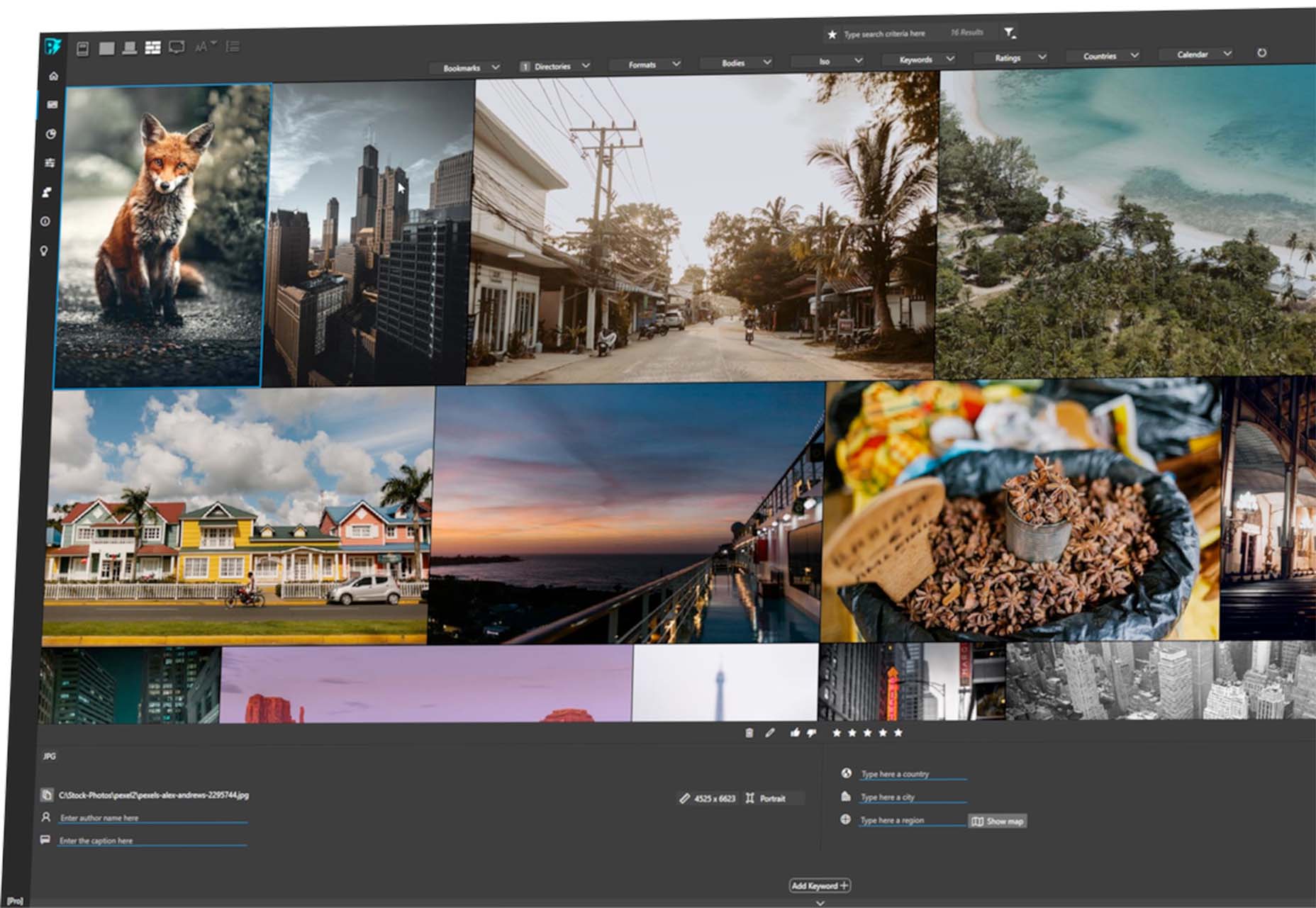
Photoinsight
Photoinsight is a tool (free and paid) to manage digital assets, including photos, videos, and 3D elements, in one place. You can search, filter, and group views based on your preferences. Plus, there are tools such as batch renaming and statistics and trends to help you manage files.
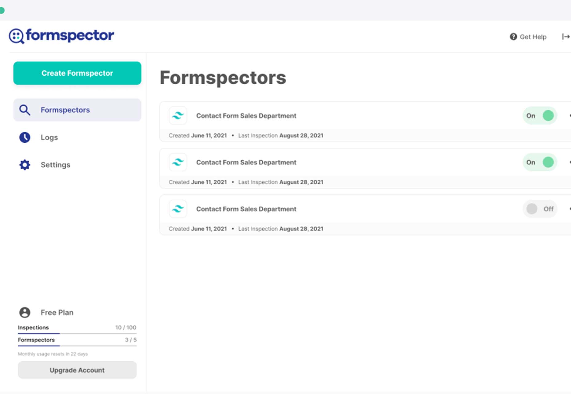
Formspector
Formspector answers that nagging question – are my forms working? Use the tool to set automated tests that will notify you if anything stops working, from newsletter signups to contact forms to support requests.
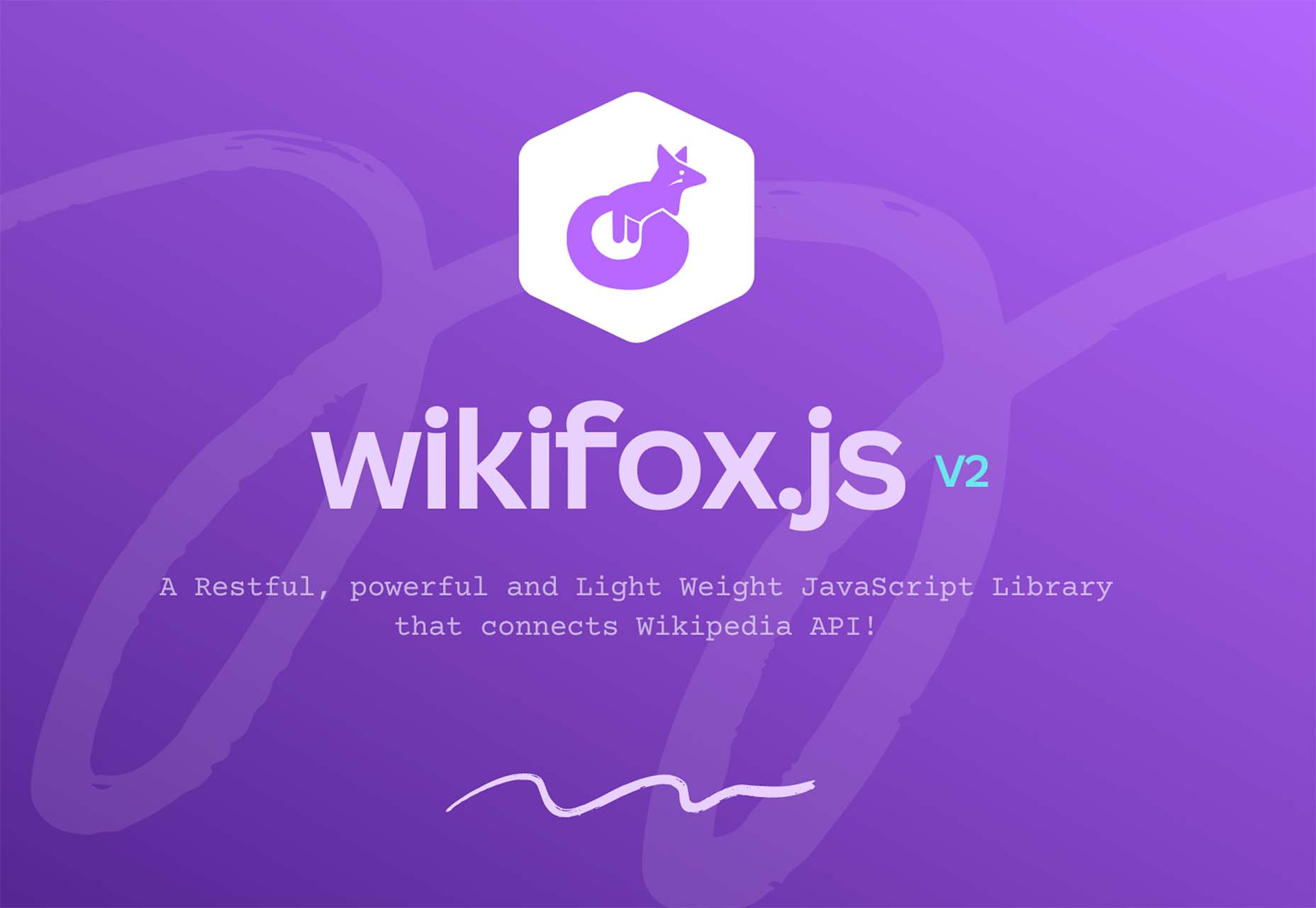
Wikifox.js
Wikifox.js is a lightweight, powerful, and restful JavaScript library that connects to the Wikipedia API. This library can be used to get content from Wikipedia.
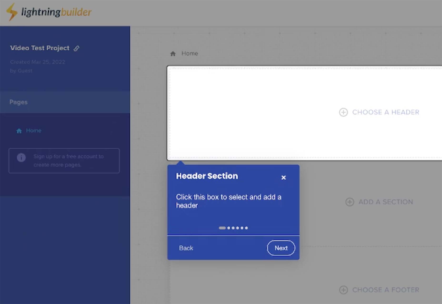
Lightning Builder
Lightning Builder is a free browser-based drag and drop website builder. You can design a mockup in minutes so that you can show developers or writers what you are thinking when you are planning a new design or website project. Use it to ease communication for teams with new project builds.
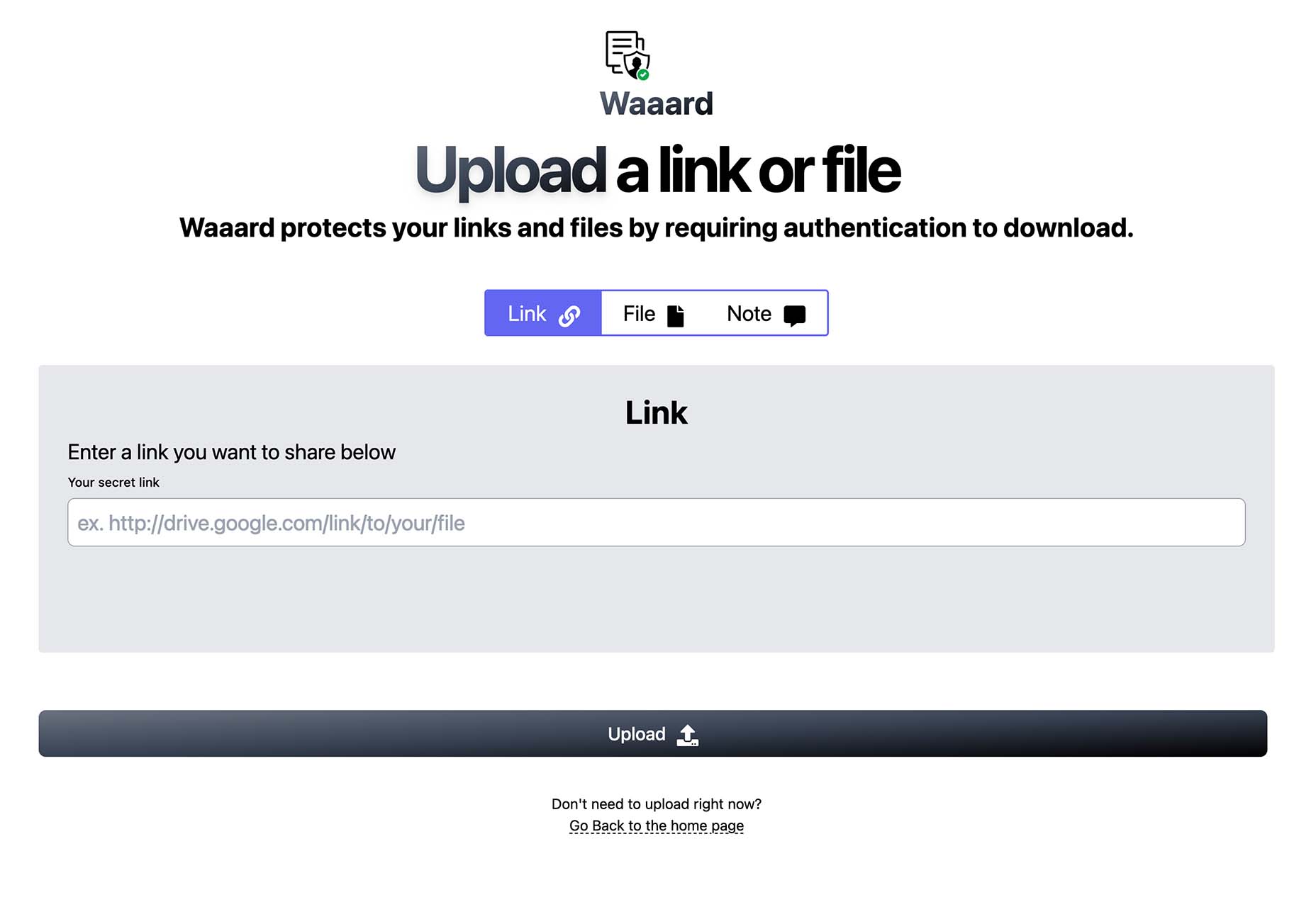
Waaard
Waaard is a tiny tool with a lot of practical applications. Use it to create a protected link or file that only people you want to access it can open. With plenty of verification methods, you’ll know your links are safe.
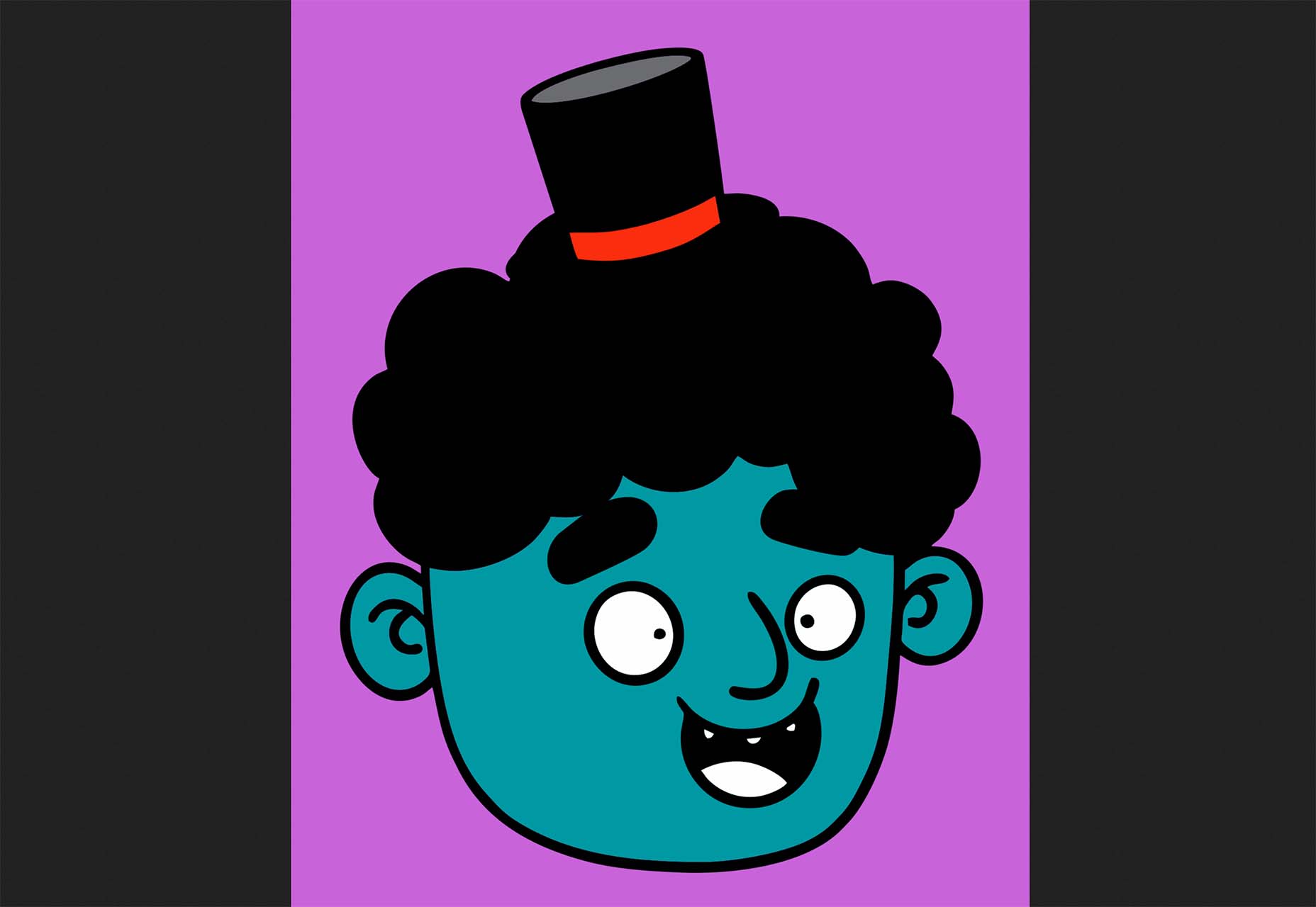
Doodle Ipsum
Doodle Ipsum is the lorem ipsum of illustrations. Customize doodles, grab the code, and use them on web prototypes, landing pages, or no-code tools.
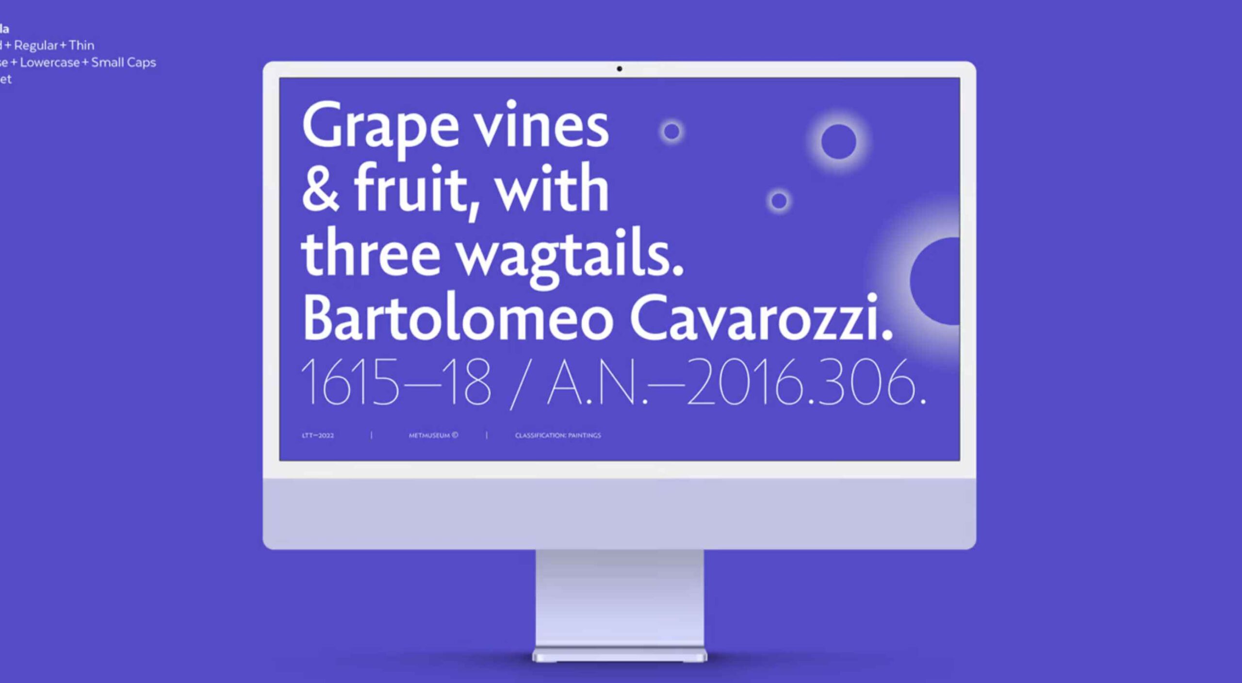
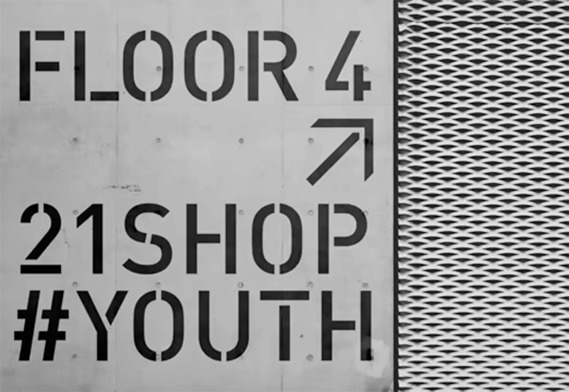
FF Din Stencil
FF Din Stencil is a fun display typeface for just the right application with a distinct style. It comes in a variety of weights and styles and is part of a greater FF Din family.
Fontanella
Fontanella is a typeface designed by Coto Mendoza, which emerged from calligraphy and manual drawing exploring the skeleton and classic proportions of Roman capital letters. It has an easy-to-read style with interesting sans serif characters.
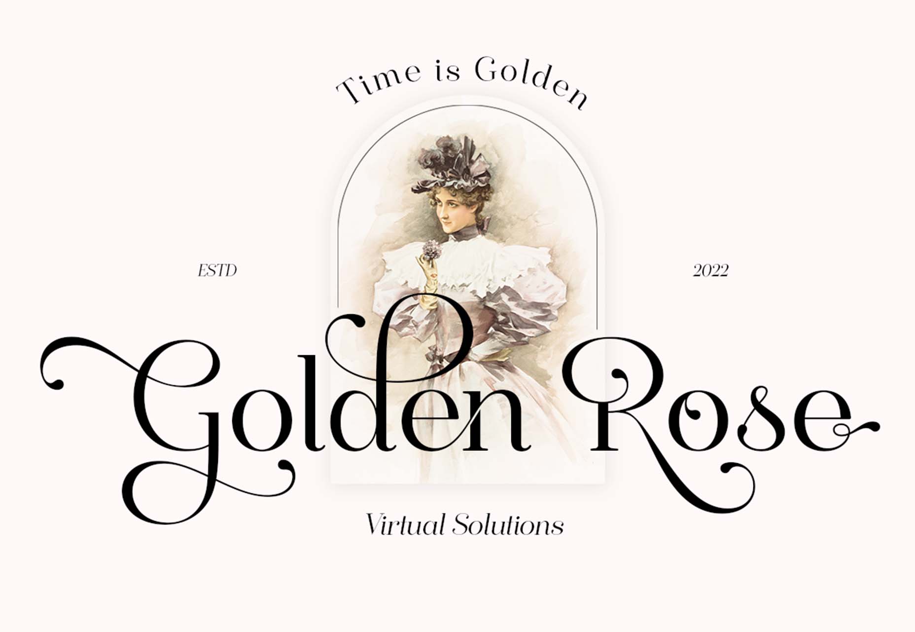
Sarlotte
Sarlotte is a statuesque typeface with long tails, swashes, and flourishes. From the type designer: It seduces your eyes with its curves yet still manages to maintain its classy serenity, it’s perfect for branding, logos, invitations, and more.
Source
The post Exciting New Tools For Designers, April 2022 first appeared on Webdesigner Depot.
Source de l’article sur Webdesignerdepot


 Designing for user experiences is what all designers do. UX is often thought of as the preserve of app or web designers; however, even a print designer laying out a magazine anticipates reader reaction to the scale of type, the placement of adverts, and the art direction of successive stories.