 Many firms’ design and development decisions are increasingly oriented toward human-centered innovation. Instead of rushing goods to market, these firms are using a user-centered design approach.
Design and development teams build high-performing digital products or websites that uniquely meet customers’ demands by concentrating on the user experience. After all, a good web design is helpful in boosting the business reputation or user experience.
This post will define user-centered design, discuss its fundamental principles, and describe the user-centered design process.
What Is User-Centered Design?
To create an enjoyable solution to a problem, user-centered design is a collection of iterative design processes concentrating on the user’s needs at each step. In UCD, the expectations, objectives, and preferences of the user significantly impact design decisions.
Additionally, users are actively involved in the entire process from start to finish. User-centered design principles encourage designers to create products with users rather than just for them. This strategy typically includes user research, interviews, usability testing, and a massive amount of feedback gathering.
UCD Requires Four Fundamental Components:
- Visibility: Can people see what your website is about and how to utilize it the moment they land on your page?
- Availability: Is your website user-friendly? Can they swiftly locate information? They should be able to find call-to-action buttons, menus, filters, and search choices with ease.
- Legibility: Is the text simple to read for users?
- Language: Is the language simple to grasp for users? Do you avoid using industry jargon in your UX authoring, which might lead to confusion and hesitation?
What Is The Significance Of UCD?
User experience is important in product design, especially in digital products such as app design, web and interface design, and marketing. Customers want their lives to be simplified. A website, app, or product exists to fulfill a consumer. Hence its success is determined by their interaction with it.
The following are some of the advantages of a user-centered design strategy for a business:
- Customers keep coming back for more
- There would be an increase in sales
- Creating polished, efficient, and widely available goods
- Understanding challenges thoroughly to provide suitable solutions
- Customers and teams working together
- Avoiding typical blunders
- Enhancing Competitiveness
- Assisting them in comprehending their market
It offers consumers the following advantages:
- Making their life easier
- Fulfilling their desires
- Companies making them feel heard and understood
- Making them feel important in the creation of things they use
- Providing answers to challenges they were unaware they had or could not imagine solutions to
Let’s dig in to learn more about the advantages of UCD.
Businesses can benefit from using the user-centered design approach in various ways. As you incorporate this into your web development, you can enjoy the following four main advantages.
1. Prevent Project Failure
Your company might find it simpler to incorporate improvements and ensure your product is in line with actual user needs if you have a continuous feedback process assessing how customers react to your product, like a website.
Customers feel like their needs are better represented in the finished product, which can increase engagement and strengthen the bond with the company.
2. Improve ROI
This method produces products that more accurately reflect user expectations. The procedure also lessens mistakes made by website users, for instance. When combined, these factors motivate users to convert from leads to paying clients, boosting return on investment.
3. Increase Development Efficiency
In user-centered design, the objectives of the various team members are aligned. This can help clarify the best course of action for all parties involved. A more targeted, goal-oriented development process may be encouraged by the regular evaluation process.
Additionally, businesses can engage stakeholders and explain how their efforts and methodologies will improve customer interactions by using an iterative life cycle during product development.
4. Up The Level Of Competition
Customers will more fully appreciate what you offer, improve their engagement with your product or website, and be more likely to purchase from you if your product is created with their needs and expectations in mind.
As a result, this may increase your ability to compete in your sector.
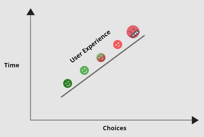
5. KPIs Are Included
Given your user needs and business objectives, how do you move from the first to the second? You can measure key performance indicators with this in mind once you know what user needs are essential for the overall goals.
For instance, productivity may be the focus of office software, shopper activity may be the focus of sales tools, and retention rates may be the focus of other apps. All of these are necessary steps toward achieving business values like profit and revenue.
Human-Centered Design Versus User-Centered Design
There is a significant difference between humans and users. Simply put, all users are humans; however, not all humans will use your product. Therefore, you must thoroughly understand your target market to produce a successful user-centered design.
Detailed research should be done on the problems and goals of your users. Then, talk to them and give them several chances to offer feedback. By doing this, you’ll create a user persona that is complete and that you can use to determine the priorities for your design.
It’s critical to understand that different user groups may have additional requirements, levels of technical expertise, and expectations for using products like the one you’ve made.
What crucial guidelines or principles should designers consider when adopting a user-centric design?
The Process Of User-Centered Design
Certain fundamental principles underpin user-centered design. While the development process is always iterative, no explicit methods for implementation are specified. The approach can be implemented in either a waterfall or an agile environment.
1. Contextualization
The first step is to analyze the environment in which users will use the product. What are the intended applications of the product for future users? Teams working on projects can get answers by watching and talking to potential users.
2. Outlining The Prerequisites
Specifying the requirements for the new product is the second step. In this step, user requirements are described while considering corporate needs.
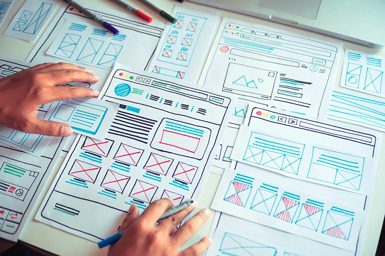
3. Design
Once the requirements are established, the actual design process can begin. Designers typically start by producing a straightforward prototype, like one made of paper, then move on to digital wireframes and a finished prototype.
4. Analysis
The project team solicits feedback from potential users after creating a prototype. This is typically done for digital applications through in-depth user testing and qualitative research.
Do surveys and tests evaluate user satisfaction, effectiveness, and efficiency? With the new information, the project team goes back to step 2 or step 3 of the design process to improve the product. Once the user feedback is satisfied, these iterations continue while taking into account corporate frameworks (time and costs).
Top 10 User-Centered Design Principles
Principles of user-centered design attempt to guarantee that usability is the primary priority throughout the development process. These principles, if successfully followed, will ensure that user experience is fulfilled not just during the initial introduction of a product but also during its use.
Furthermore, each of the following principles may be tailored to match the specific requirements and interaction demands of any product.
1. Use Simple Language
Professional Web Designer strives to provide the most readable discourse for the user while creating a product. This involves clarifying vocabulary, eliminating jargon, and simply providing information pertinent to the work.
Presenting users with irrelevant information throughout their use of the product taints its usefulness. Furthermore, basic language helps the user finish the work without being overwhelmed or confused.
2. Feedback
Users expect a reaction to all of their actions. This might involve modifying the look of the screen after completing an activity. If the job is finished after some time, it should display a loading page to notify the user that the task is in process.
Keeping the user informed throughout the process reassures them and keeps them on track with their job.
3. Maintaining Consistency
Keeping the product consistent is essential in ensuring an ideal user experience. Consistency affects how customers approach a product, and the time it takes to learn how to use it.
From the start of the project until its completion, the consistent philosophy underpinning the UCD process should be maintained. If the interface design needs to be updated, it is critical to maintaining consistency across new features to stay beneficial to the user.
4. Give The Complete User Control
Consumers are already aware of their requirements. They should be able to use a product with minimal effort and depend on the product’s help to accomplish the rest.
By removing the effort from the job, the user can do it quickly while keeping control of their activities.
5. Describe The Situation
Before developing a product, the designer must first investigate the ideal user and their wants. The designers can gain a comprehensive sense of some of the issues these people experience by studying their lifestyles.
Many of these observations are conducted through interviews. These interviews provide the designer with information on the exact goals that users want to attain and how they want to achieve them.
6. Examine the Design
Designers undertake usability testing with actual users of their product at this stage in the UCD process. This stage provides designers with insight into how consumers will interact with the product and how to modify it to suit them better.
It is advised that this stage be completed as quickly as feasible. The sooner customers provide input, the faster designers can comprehend their product from the user’s perspective.
7. Create Designs That Are Specific To The Needs Of The User
The design team must examine the distinctive features of their intended demographic as well as frequent real-world activities while beginning the design process. Furthermore, the product should be appropriate for the environment in which it will be utilized the most.
Making a product that needs a lot of work from the user reduces its usability and usefulness, ultimately defeating the objective of UCD.
8. The Design Process Is Iterative
Because user-centered design is based on putting the user first, the product team should constantly be working to improve the user experience. By introducing changes gradually, you will gain a better understanding of your target audience.
9. Adequate Navigational Tools
An essential component of the user experience is the capability to navigate between pages of your website and return to the previous one. Make sure users know where they are on your website and how to leave any pages they don’t want to see.
Customers can better understand how to navigate your page by giving them features like a navigation map, for instance. Make it simple for customers to change their order without leaving the current page if they buy clothing and discover they need a different size once they reach the checkout page.
10. Unflawed System
Customers should find it easy to navigate between your website’s pages and accomplish their goals. If they make a mistake, be there to help them fix it so they can achieve their goal.
The form may ask for specific, essential fields, such as the square footage, and may also include a gentle reminder or an alert that appears if the user accidentally leaves a required field blank.
Customers may feel more comfortable responding to your prompts and participating in a conversation if you ask questions one at a time and offer automated responses for each response.
Wrapping Up
User-centered design is more than just making a good product. It goes further than that. You demonstrate your motivations and intentions by putting your users in the spotlight. You’re demonstrating that it’s not all about meeting deadlines or turning a profit. Instead, you’re telling your users that you understand what they want and prioritize their needs.
It should come as no surprise that the most effective teams are user-centric. Knowing your customer is essential for success in any industry, including design. Create products that put the user first, and you will create products that people will love.
You can build a more robust, user-friendly website that is better equipped to respond to user needs and expectations by incorporating the User Centered Design process into your product design. However, it’s crucial to collaborate with a specialist who can apply these techniques and produce the result you’ve envisioned.
Featured image by pch.vector on Freepik
The post 10 Key Principles of User-Centered Design first appeared on Webdesigner Depot.
 Every day design fans submit incredible industry stories to our sister-site, Webdesigner News. Our colleagues sift through it, selecting the very best stories from the design, UX, tech, and development worlds and posting them live on the site.


 Every day design fans submit incredible industry stories to our sister-site, Webdesigner News. Our colleagues sift through it, selecting the very best stories from the design, UX, tech, and development worlds and posting them live on the site.


 We all know that psychology is a powerful tool. When used correctly, it can influence and persuade people to take action. In the world of web design, this is extremely important.


 Designing for user experiences is what all designers do. UX is often thought of as the preserve of app or web designers; however, even a print designer laying out a magazine anticipates reader reaction to the scale of type, the placement of adverts, and the art direction of successive stories.
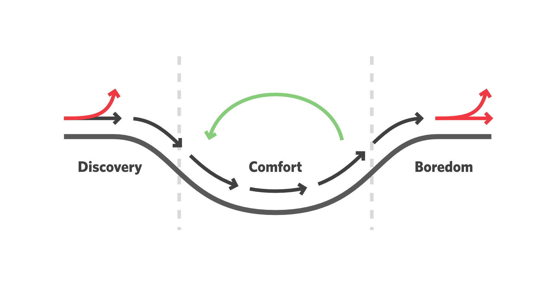

 Every day design fans submit incredible industry stories to our sister-site,


 Maps are a fascinating method for delivering content. At their best, they can create an intuitive way of presenting information and interacting with it. This is the advantage that digital maps, through mobile apps and websites, have over print maps and images where no interactivity is possible.
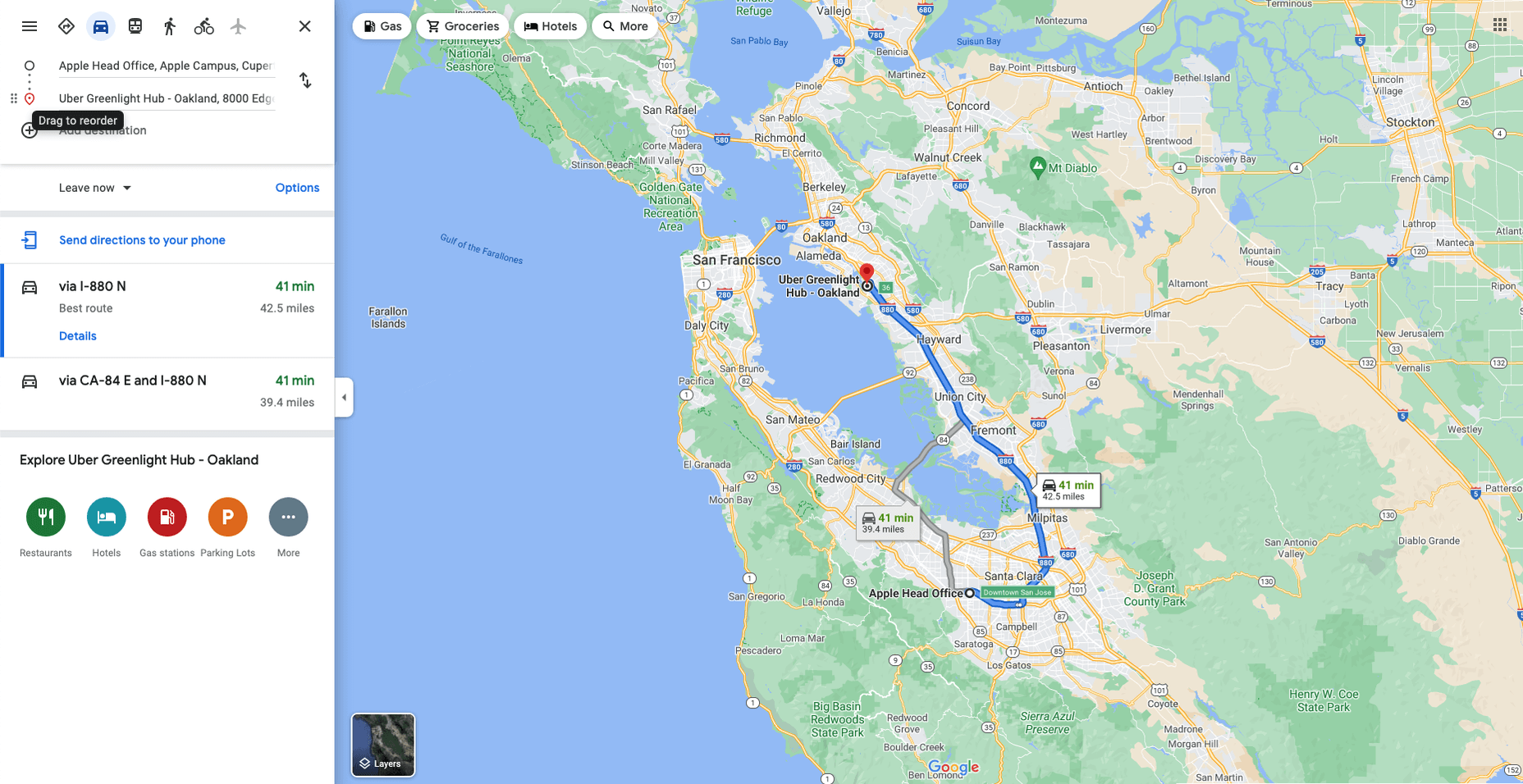


 Need inspiration for an upcoming web design project? Want to learn how to add live chat functionality to your site, or which trends you should be aware of as you pursue new projects? Leading web design blogs could be the solution to your problems.

 Every day design fans submit incredible industry stories to our sister-site,