Articles

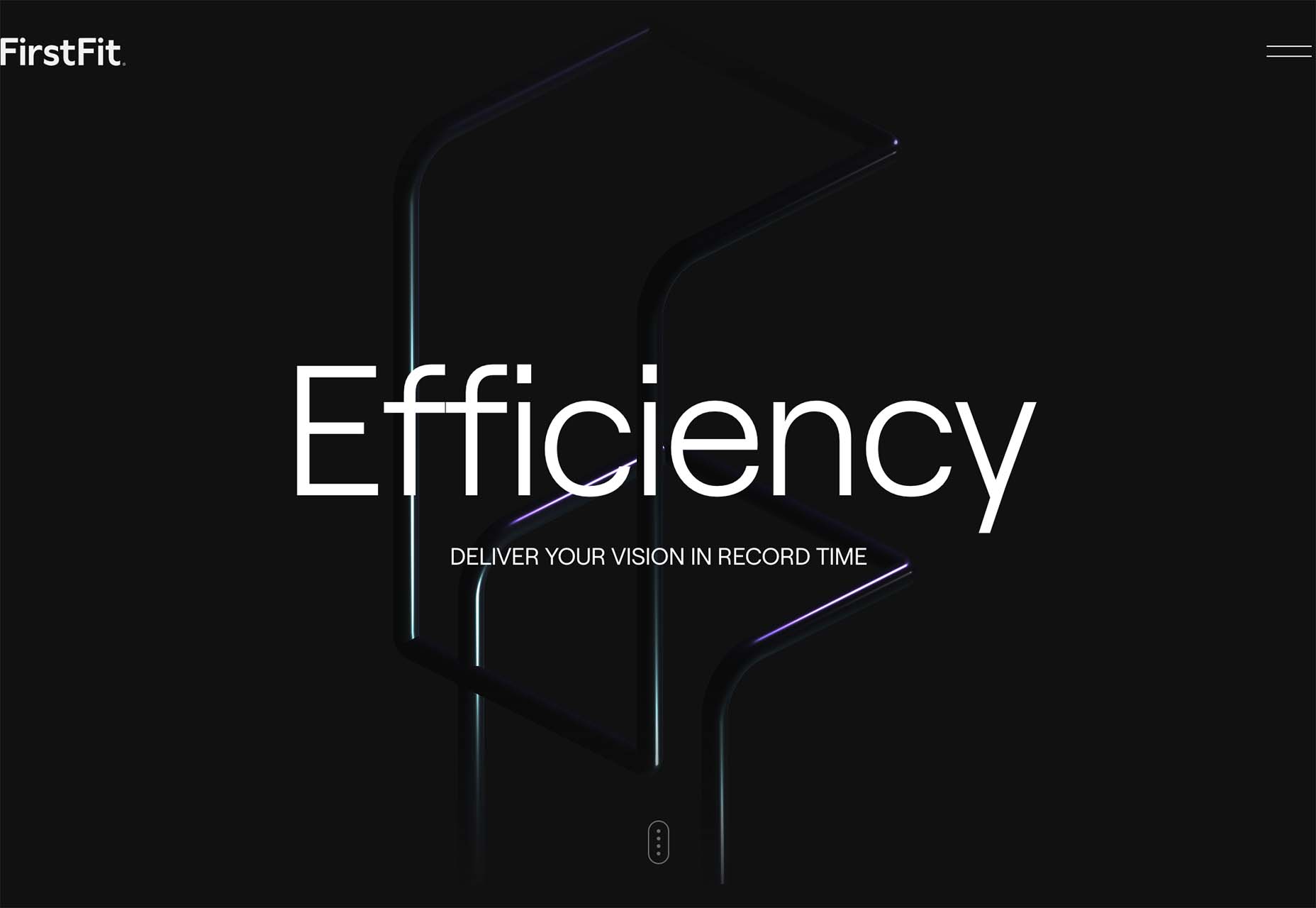
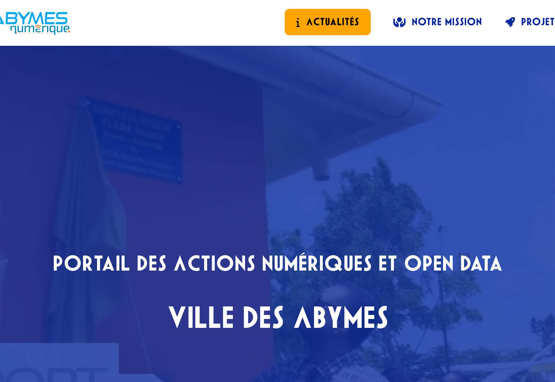
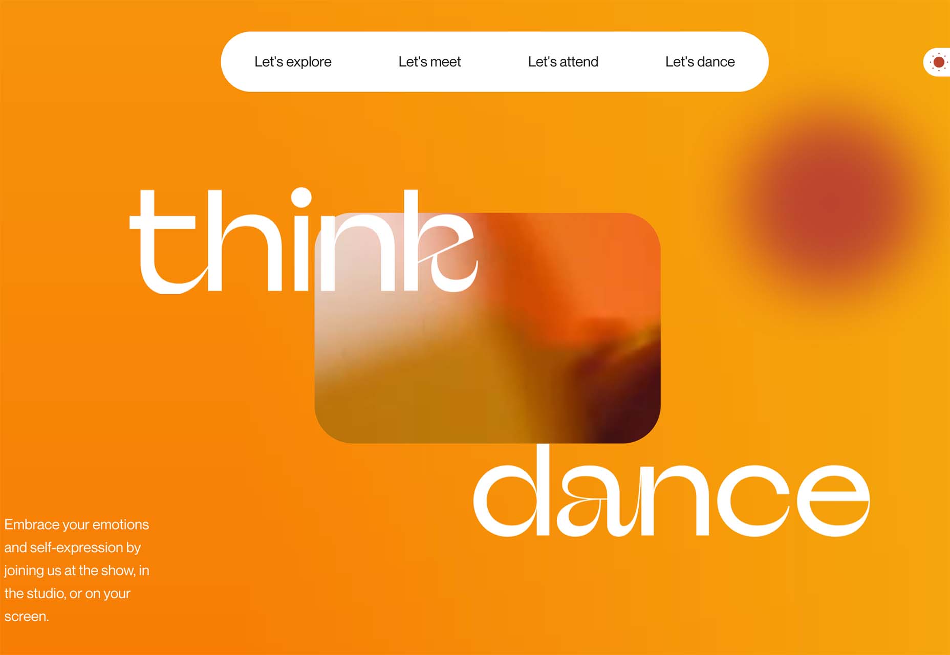
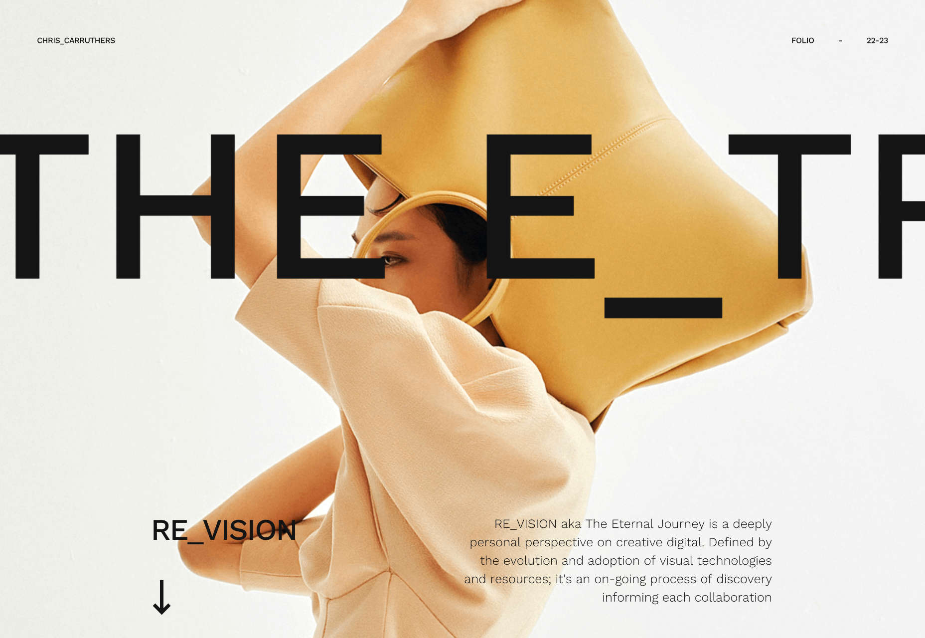
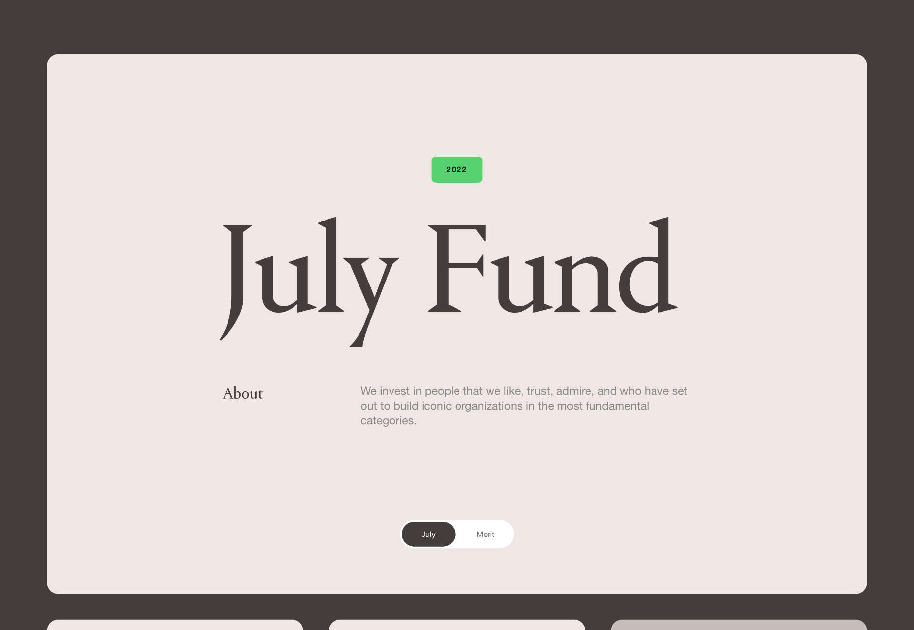
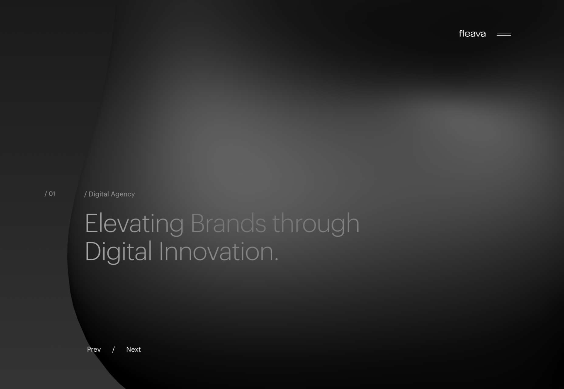
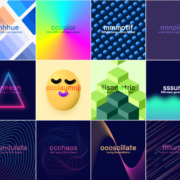
We’ve seen some incredible websites in 2022. There have been more than the usual number of sites with a political mission, and plenty that made us want to travel. The big design trends were brutalism, huge typography, and bold positive color. We’re looking forward to what the web will bring in 2023, but in the meantime, take a look back at the best 50 websites of 2022. Enjoy!
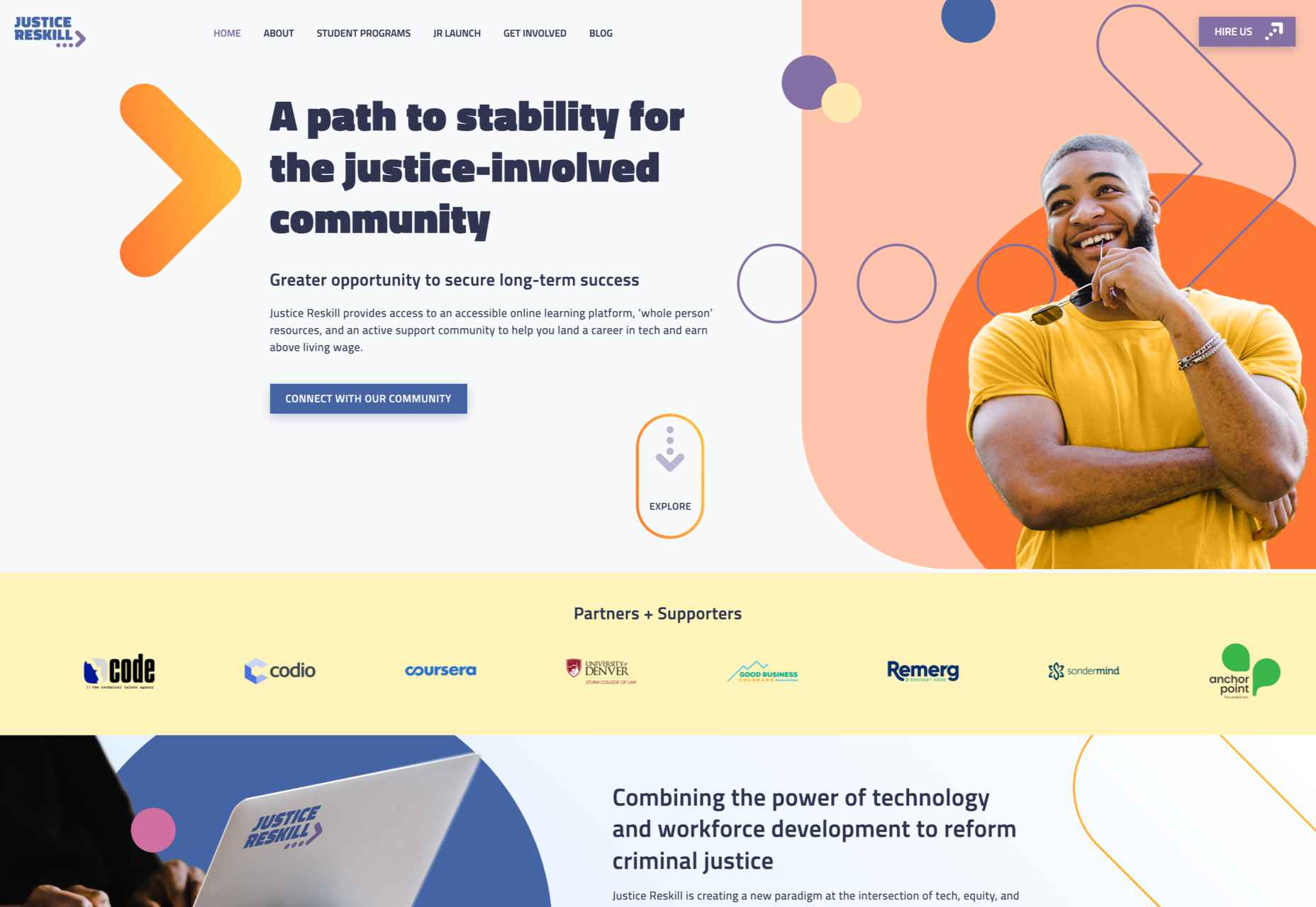
Justice Reskill

Justice Reskill used bright colors and positive, uplifting artwork to create a supportive platform for people who’ve been through the justice system.
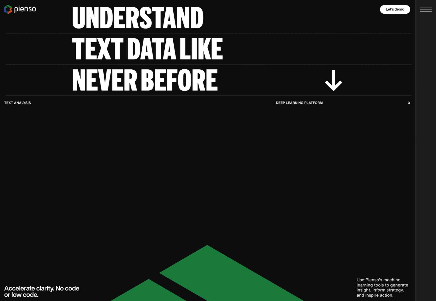
Pienso

Bold type and plenty of on-scroll animation made this site for Pienso stand out back in January.
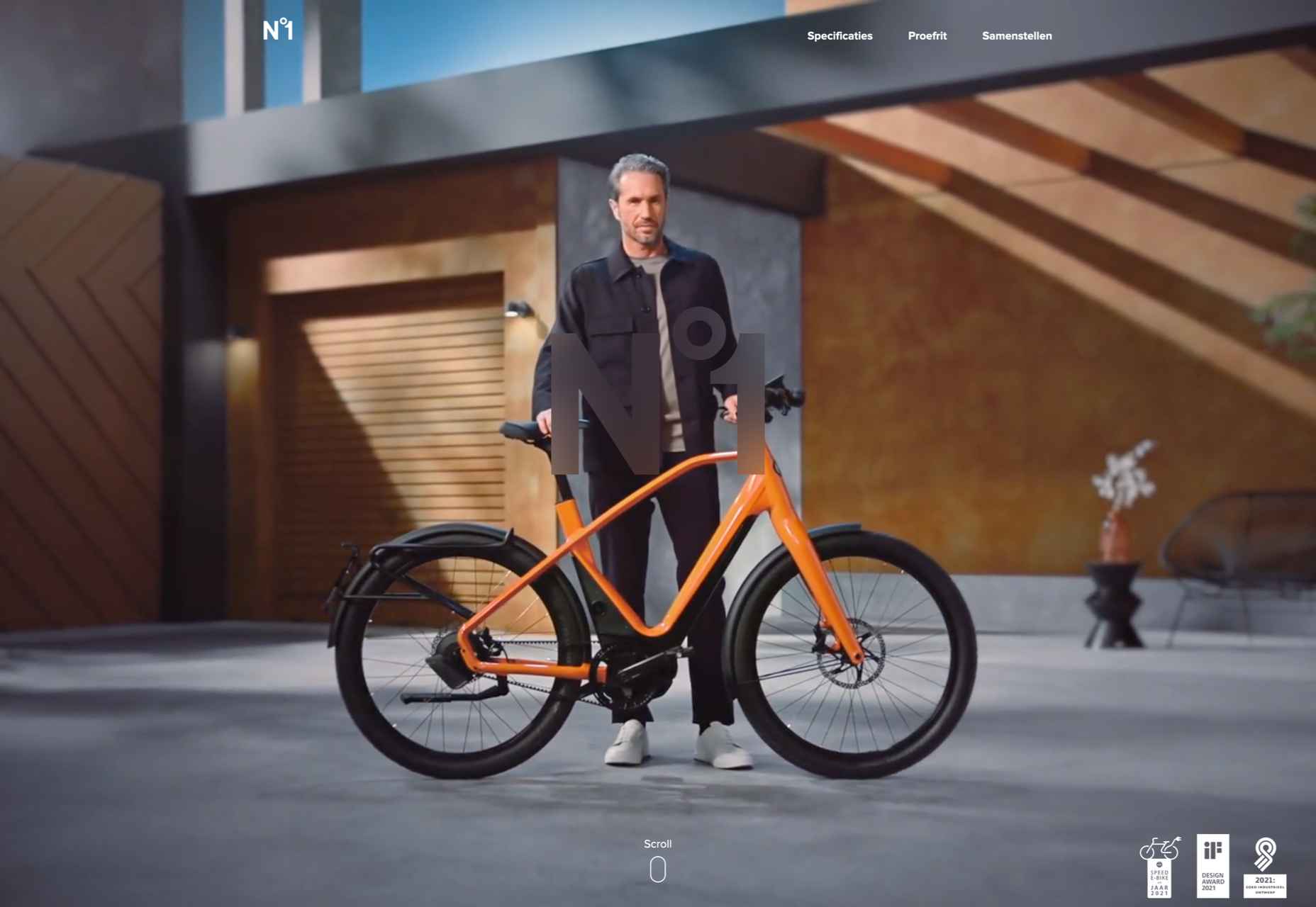
Gazelle No.1

The promotional site for Gazelle No.1 used innovative scroll-activated video to sell the electric bike.
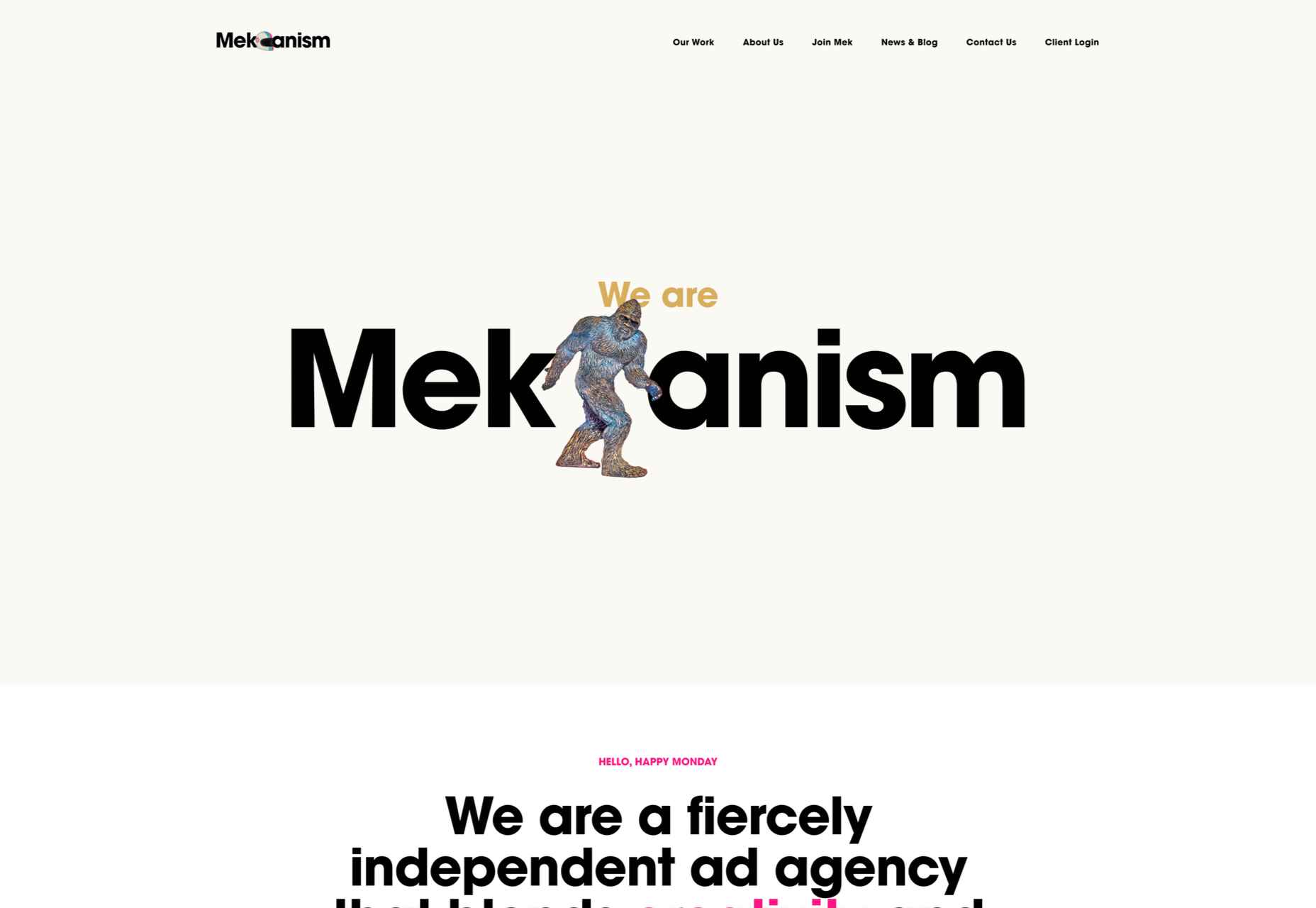
Mekanism

Mekanism’s site was the first agency redesign to impress us in 2022. Super-polished then, super-polished now.
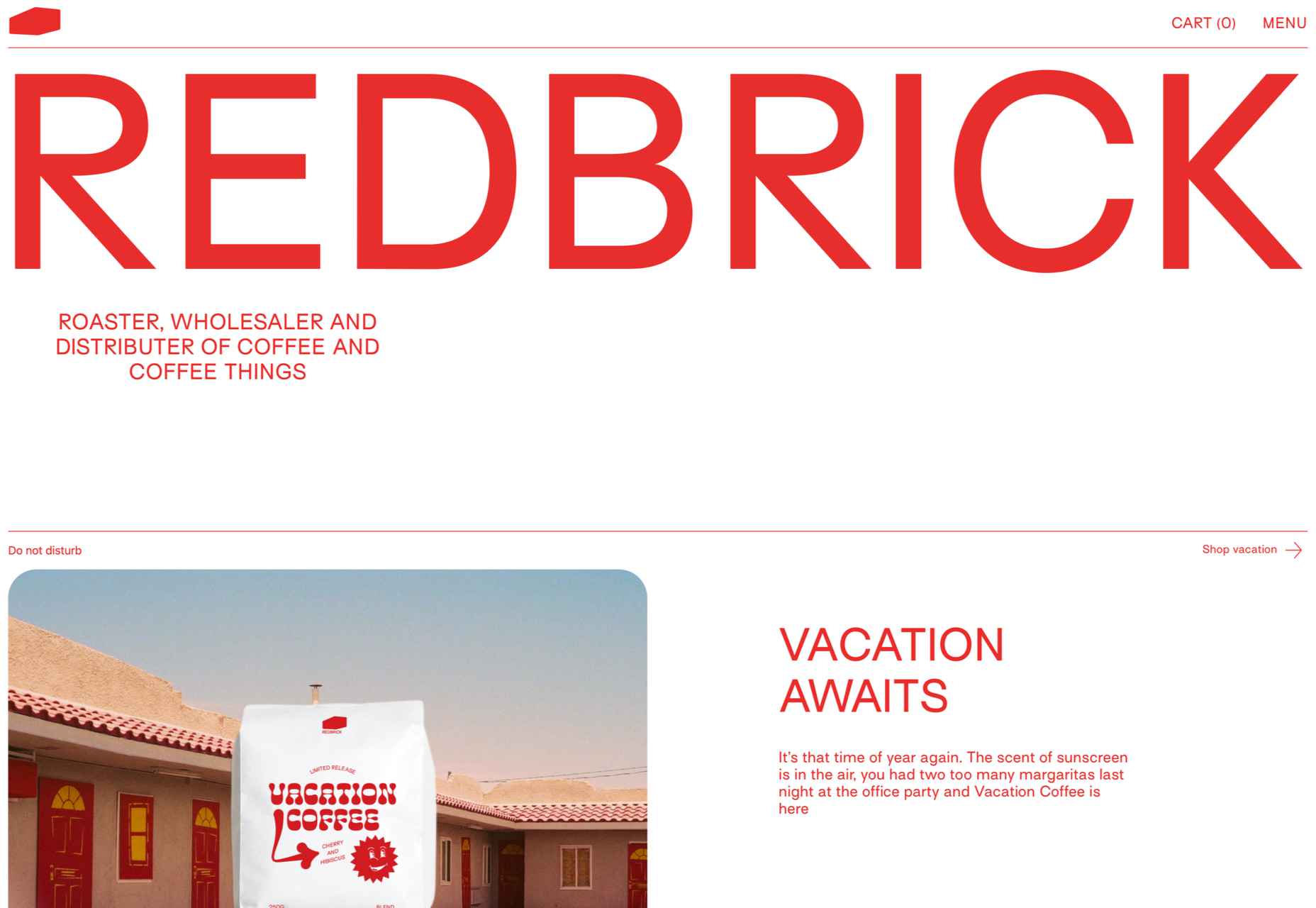
Redbrick

Redbrick was well ahead of the trend for brutalism with a twist when it released this site promoting its coffee.
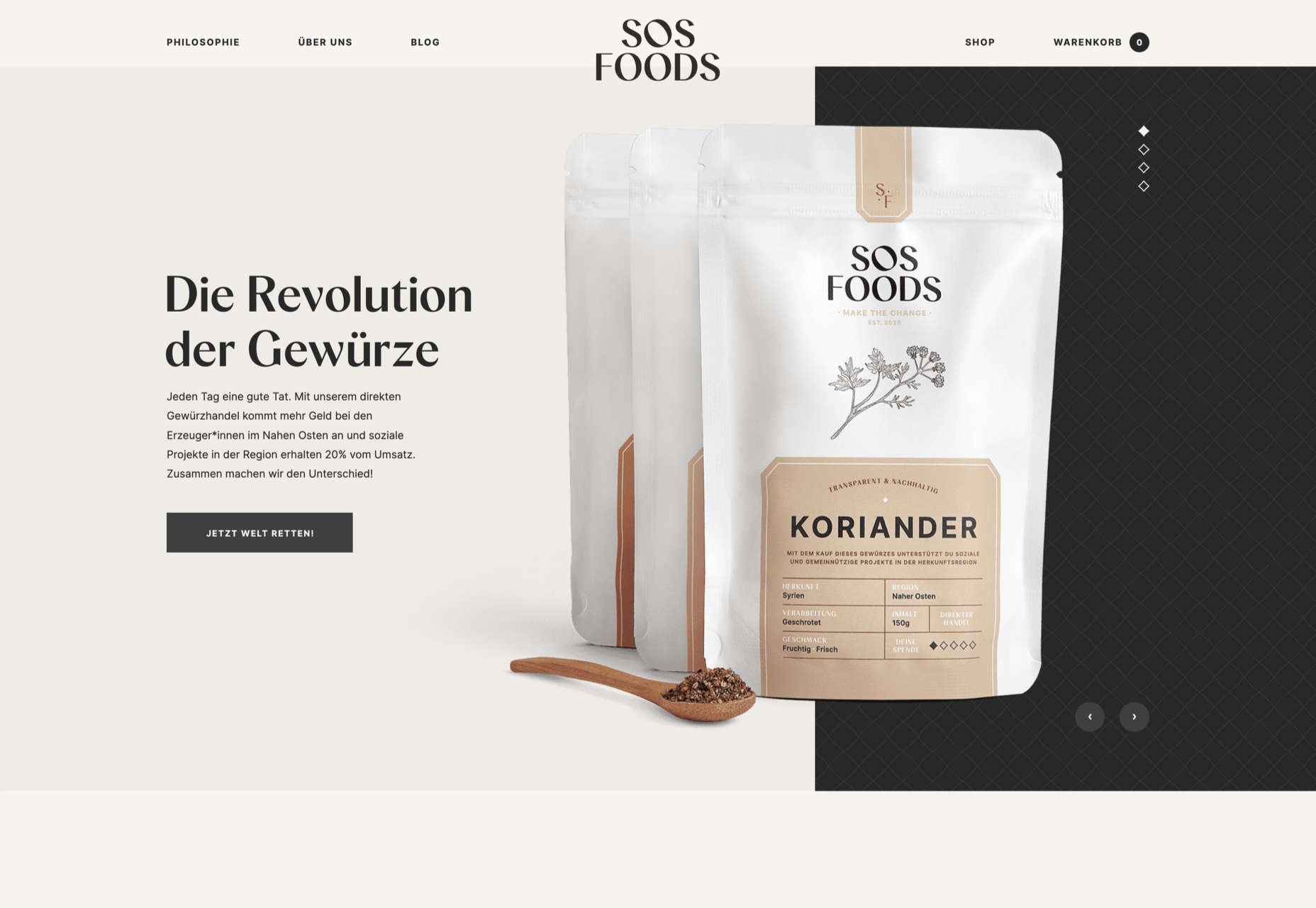
SOS Foods

Ethical and sustainable goods were top of the sales charts in 2022, and SOS Foods did a great job capitalizing on the style.
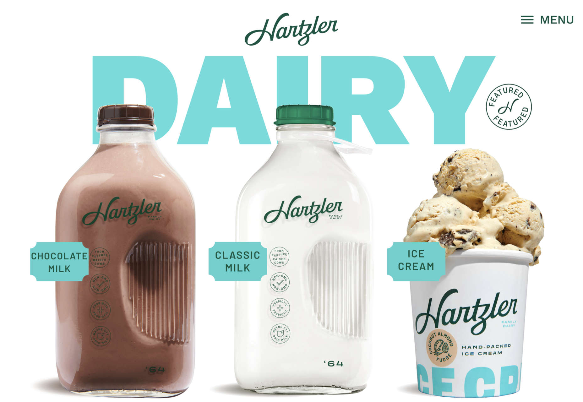
Hartzler Dairy

Hartzler Dairy embraced its mid-20th-century branding with a nostalgia-infused site.
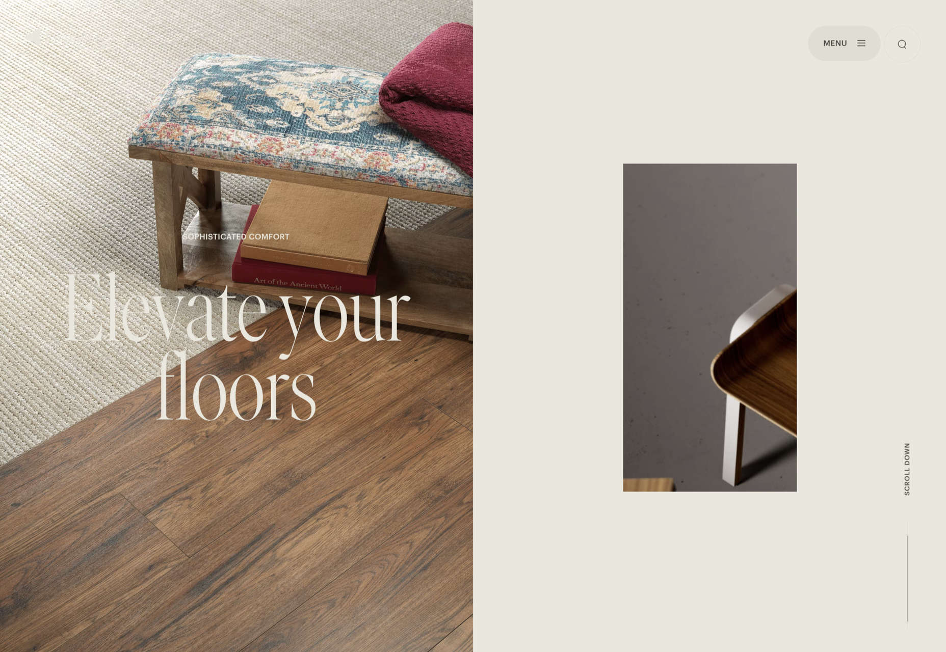
Engineered Floors

Even in 2022, designers are still paying mobile short shrift, but this site for Engineered Floors is excellent on mobile.
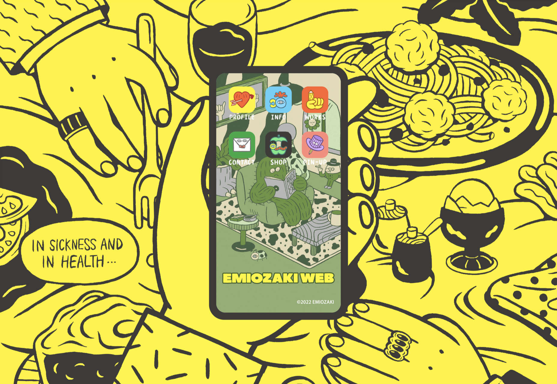
Emi Ozaki

We loved the quirkiness of Emi Ozaki’s phone-style interface for her portfolio back in February.
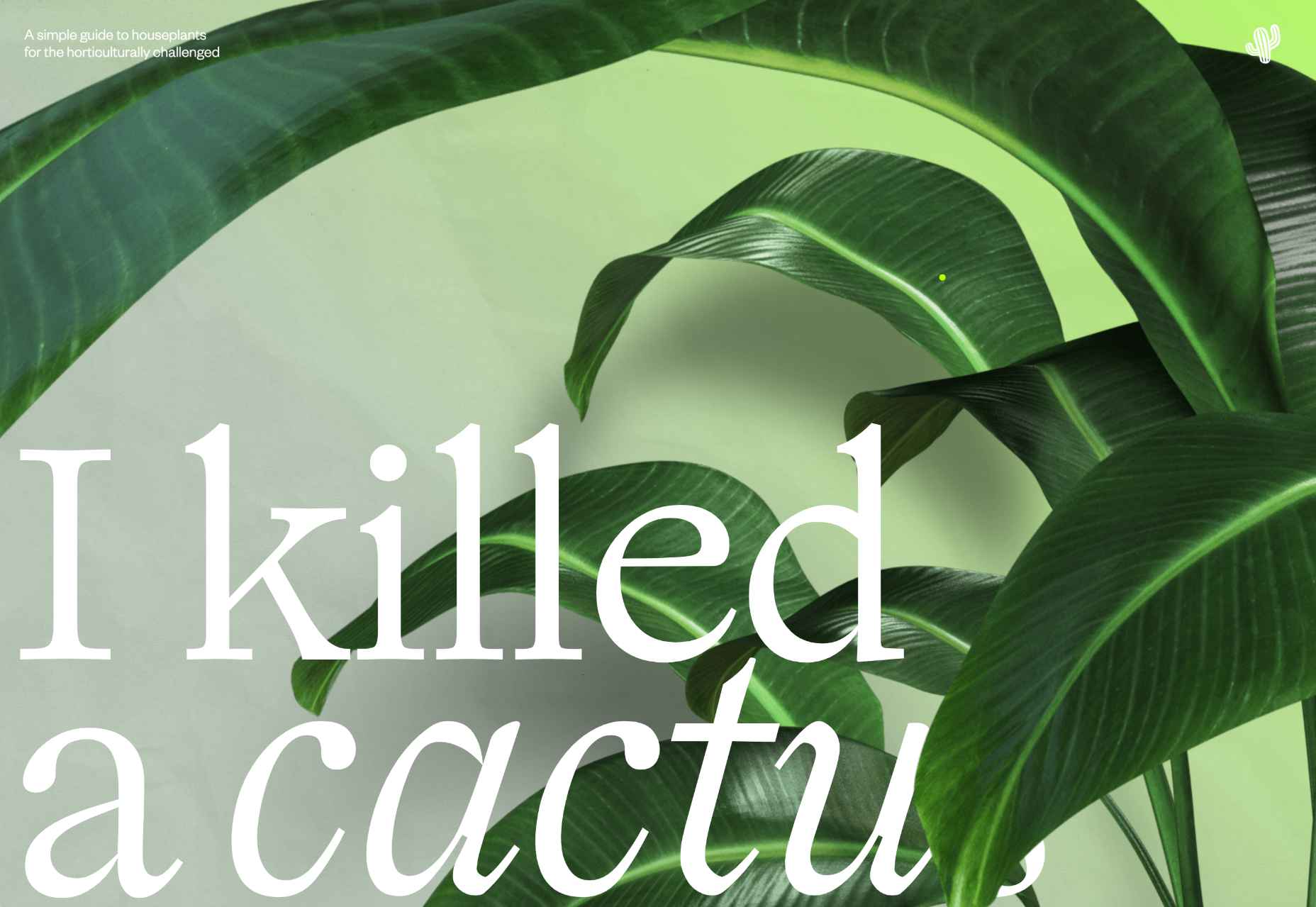
I Killed A Cactus

I Killed A Cactus is a beautiful 3D site designed to help people care for houseplants.
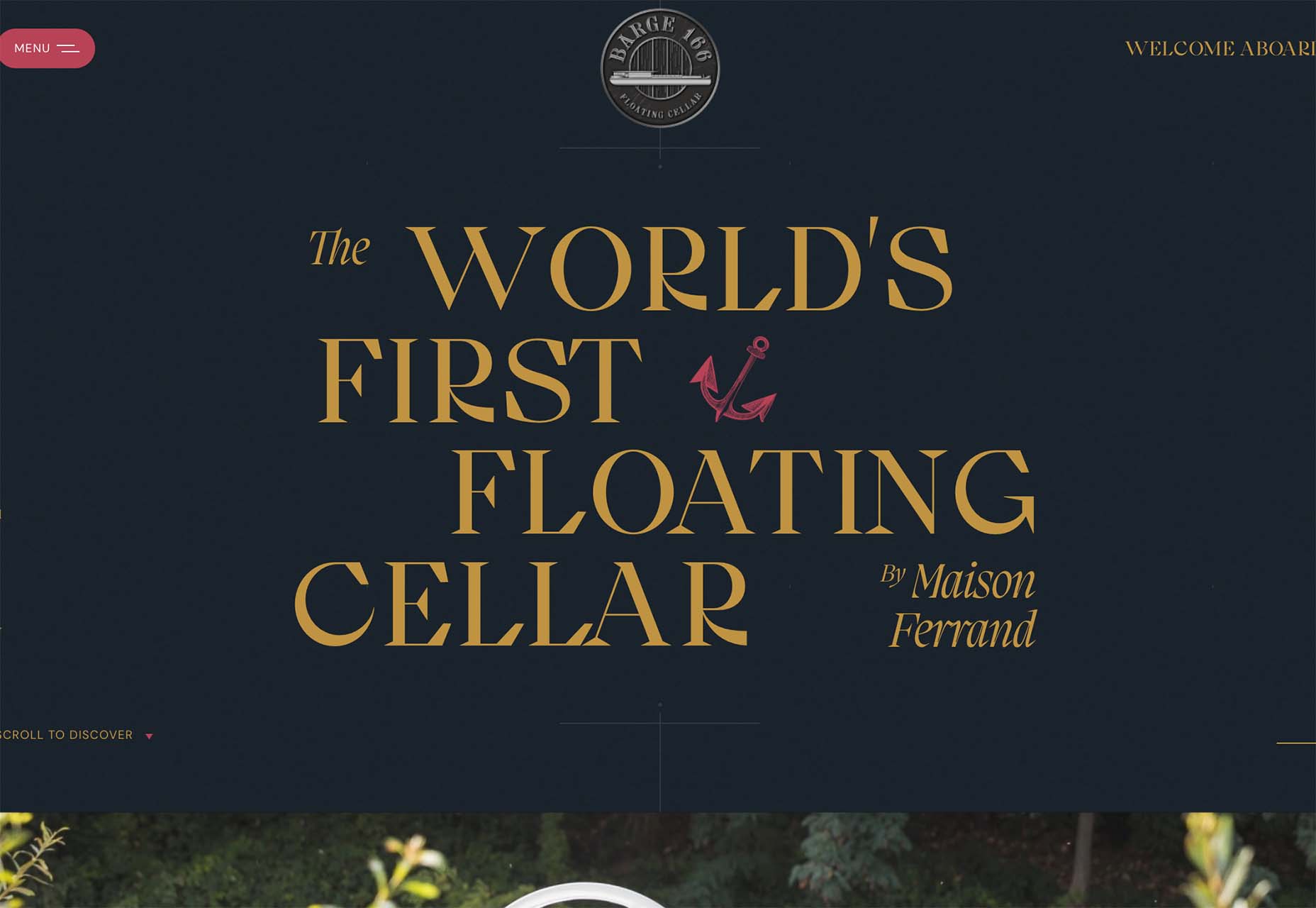
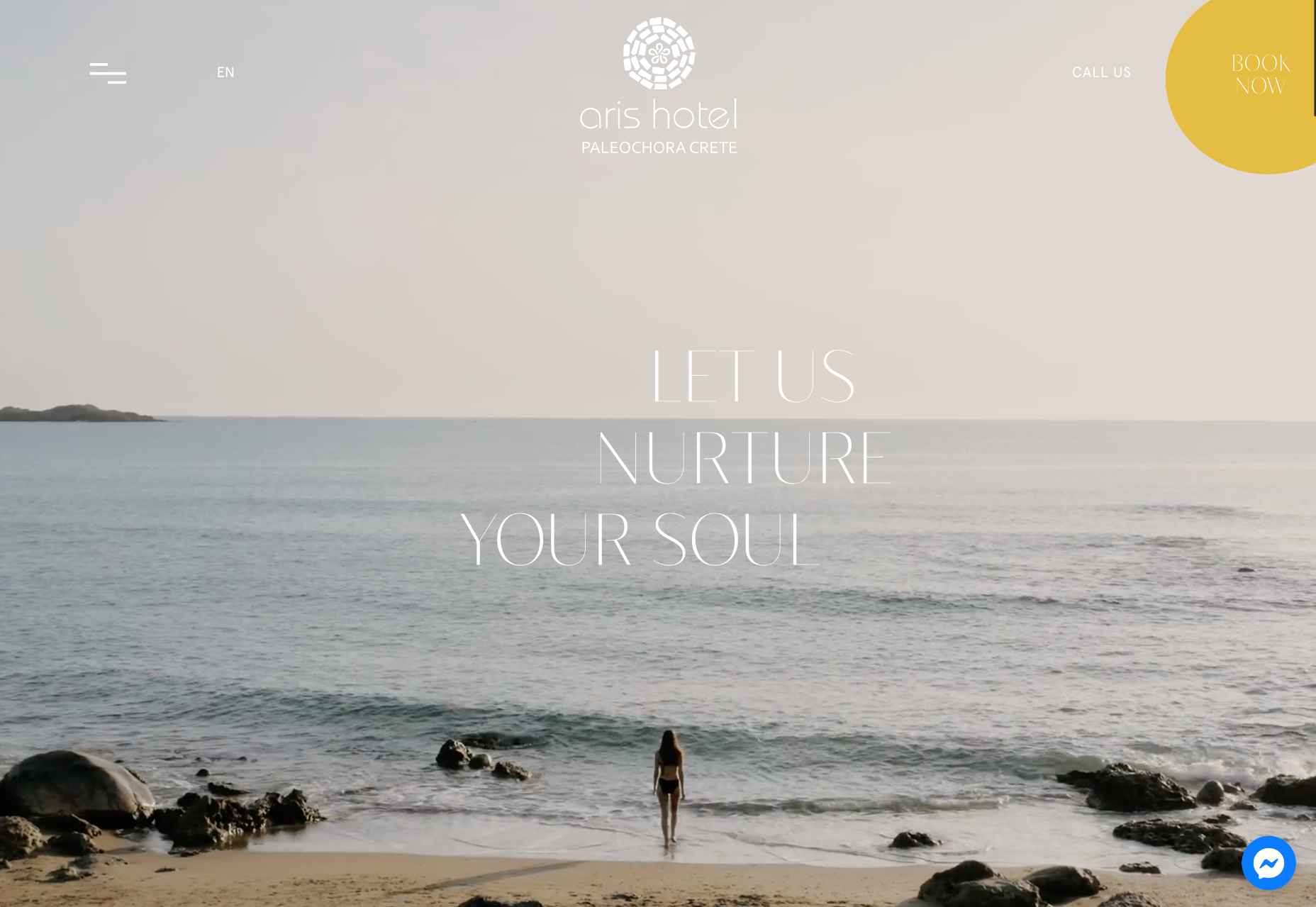
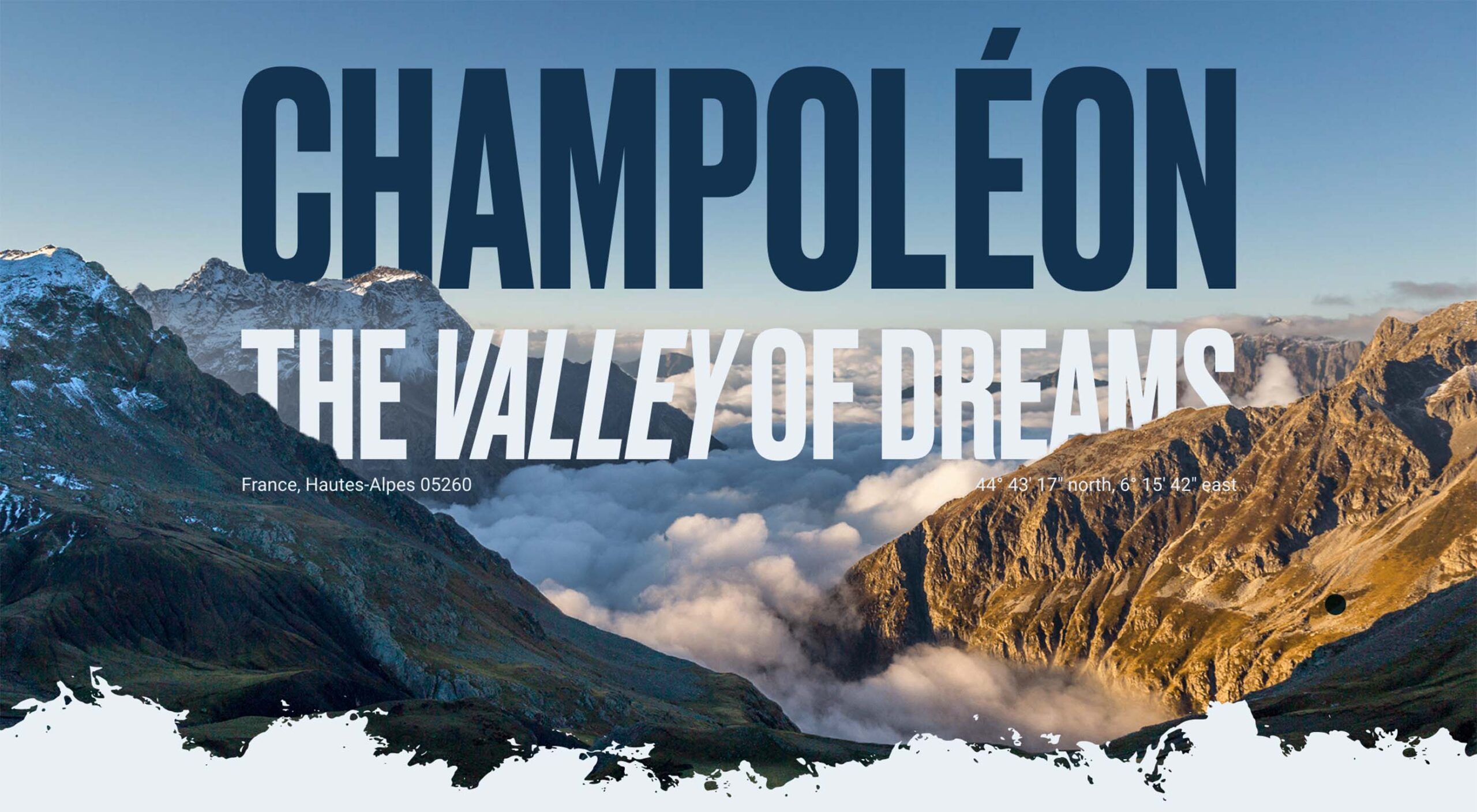
Aris Hotel

We were tempted in the direction of Crete by this stunning luxury site for Aris Hotel on the island.
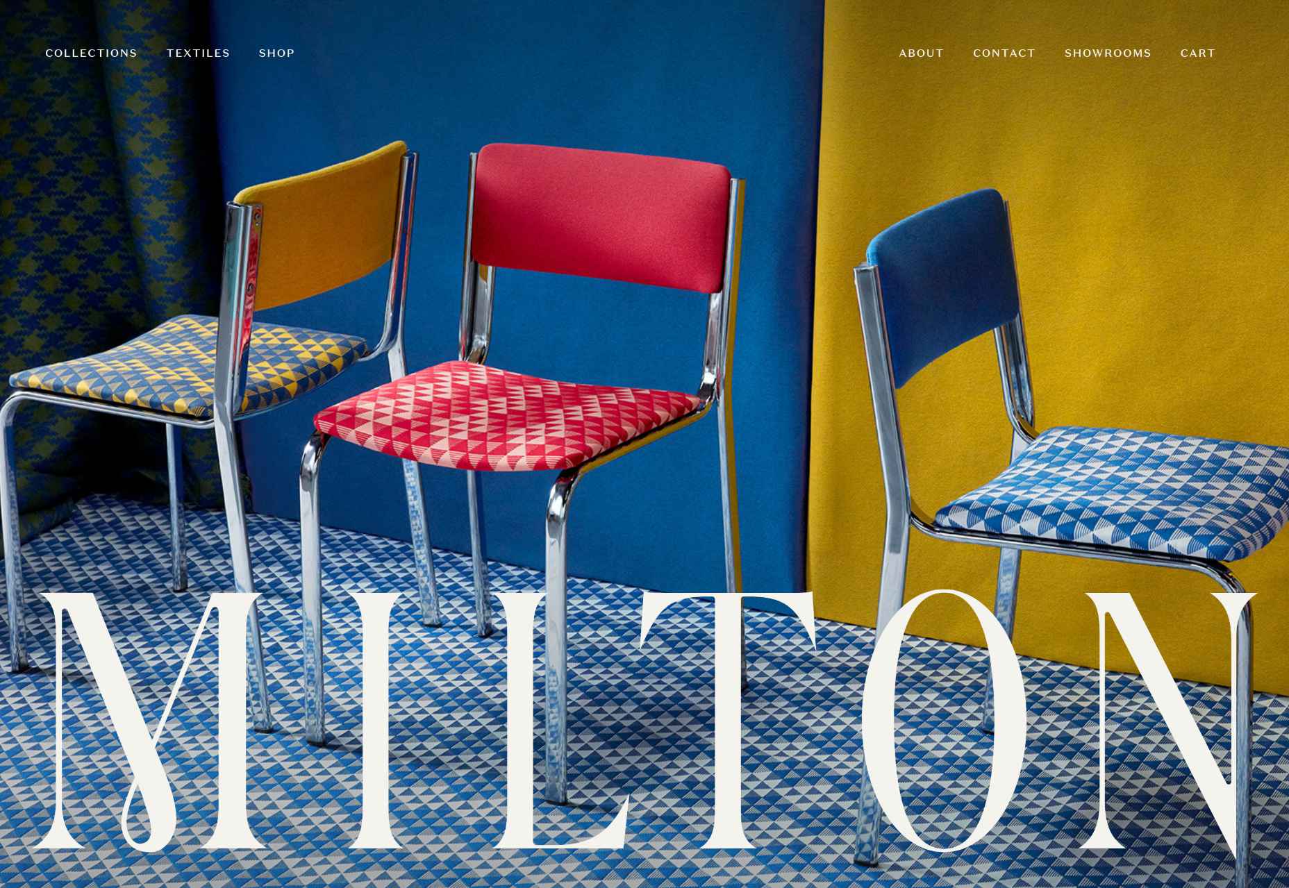
Milton Textiles

Milton Textiles is a big, bold site for a product that is usually an afterthought in the interior design world.
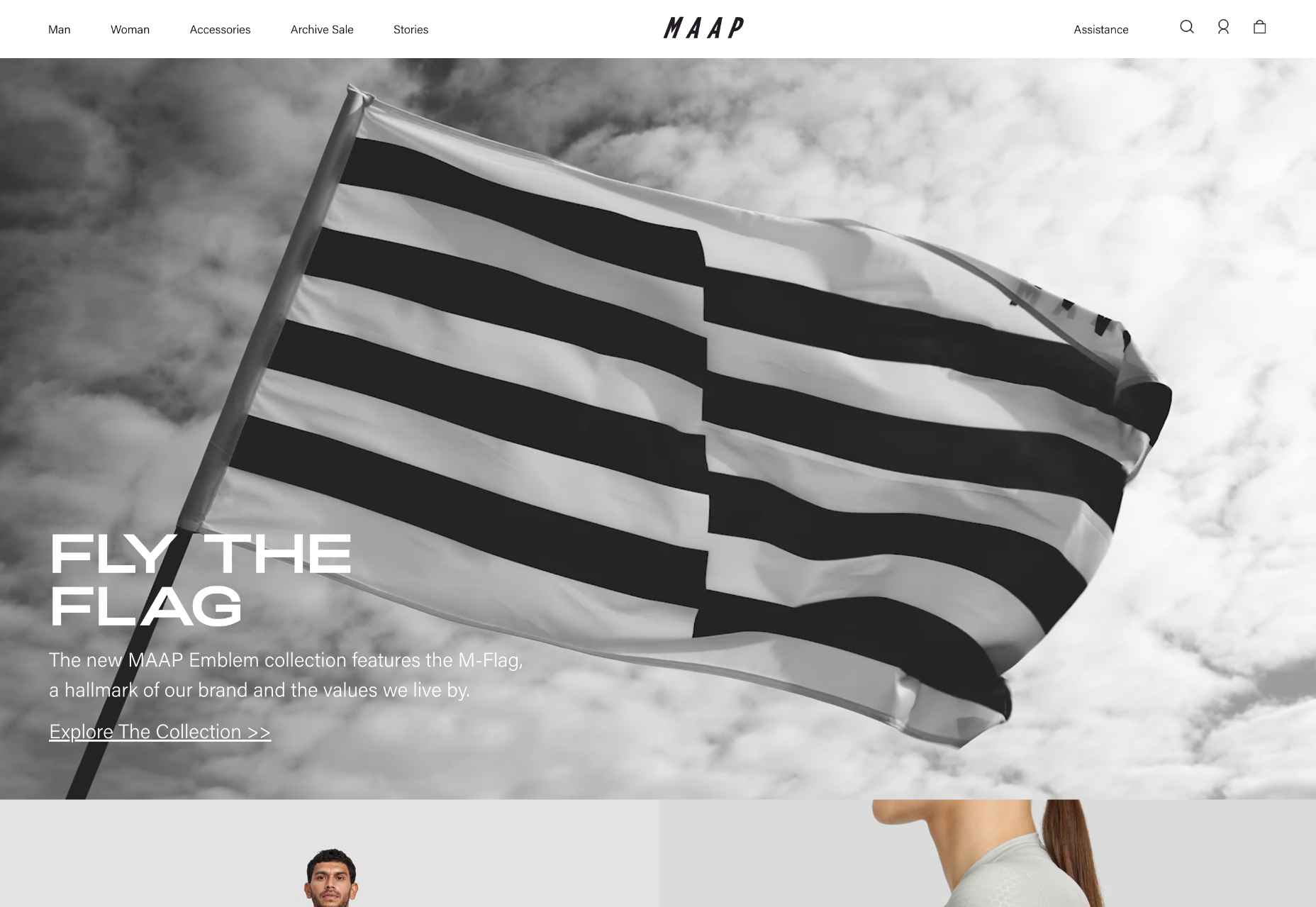
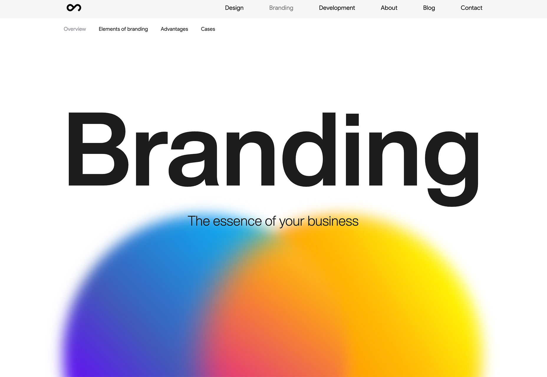
MAAP

The site for MAAP is predictably excellent, modern, and efficient. It encapsulated the apparel brand’s values perfectly.
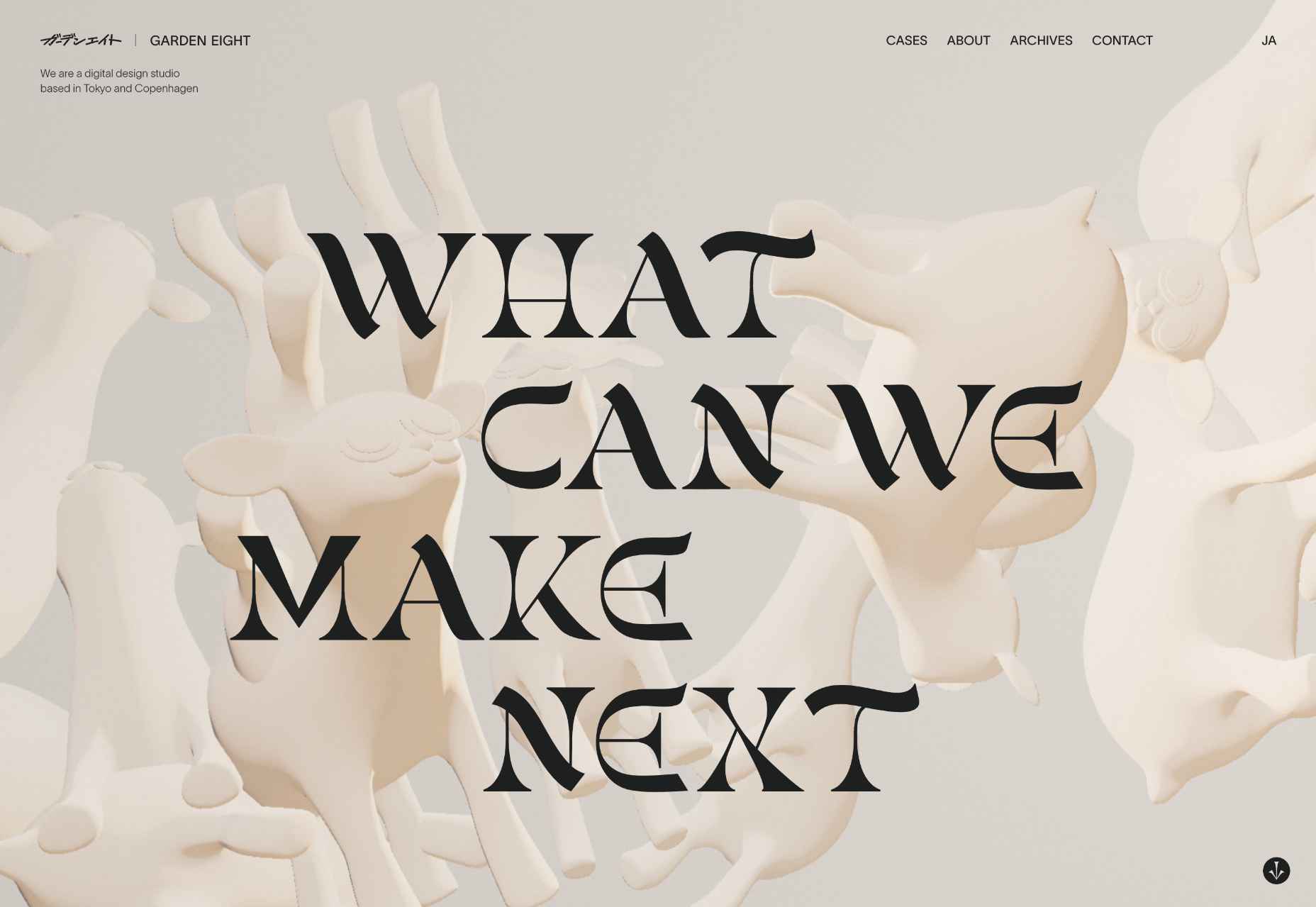
Garden Eight

The promotional site for Garden Eight, a digital design studio in Tokyo and Copenhagen, was suitably standout eccentric.
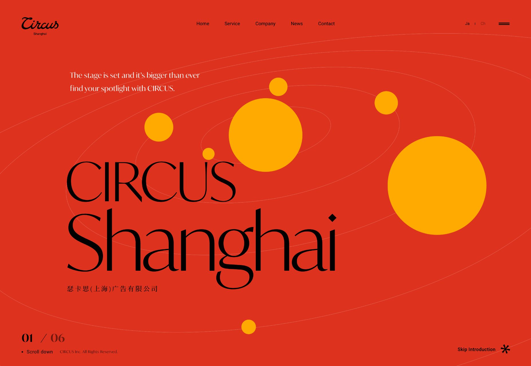
Circus Shanghai

Circus Shanghai used a mid-century illustration style to reference the solar system and the Chinese flag.
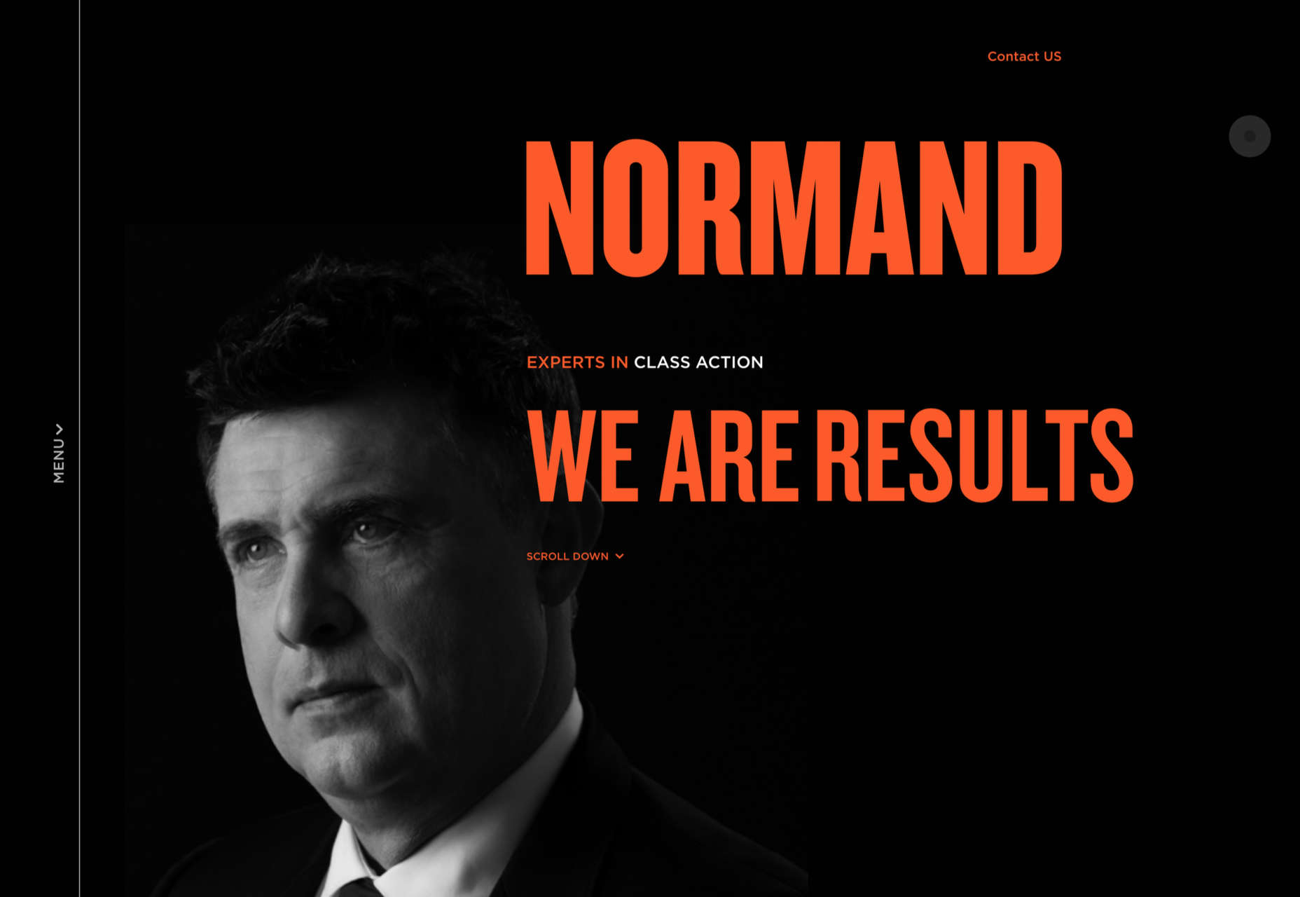
Normand

Normand took the bold decision to step away from the typical law firm design strategy.
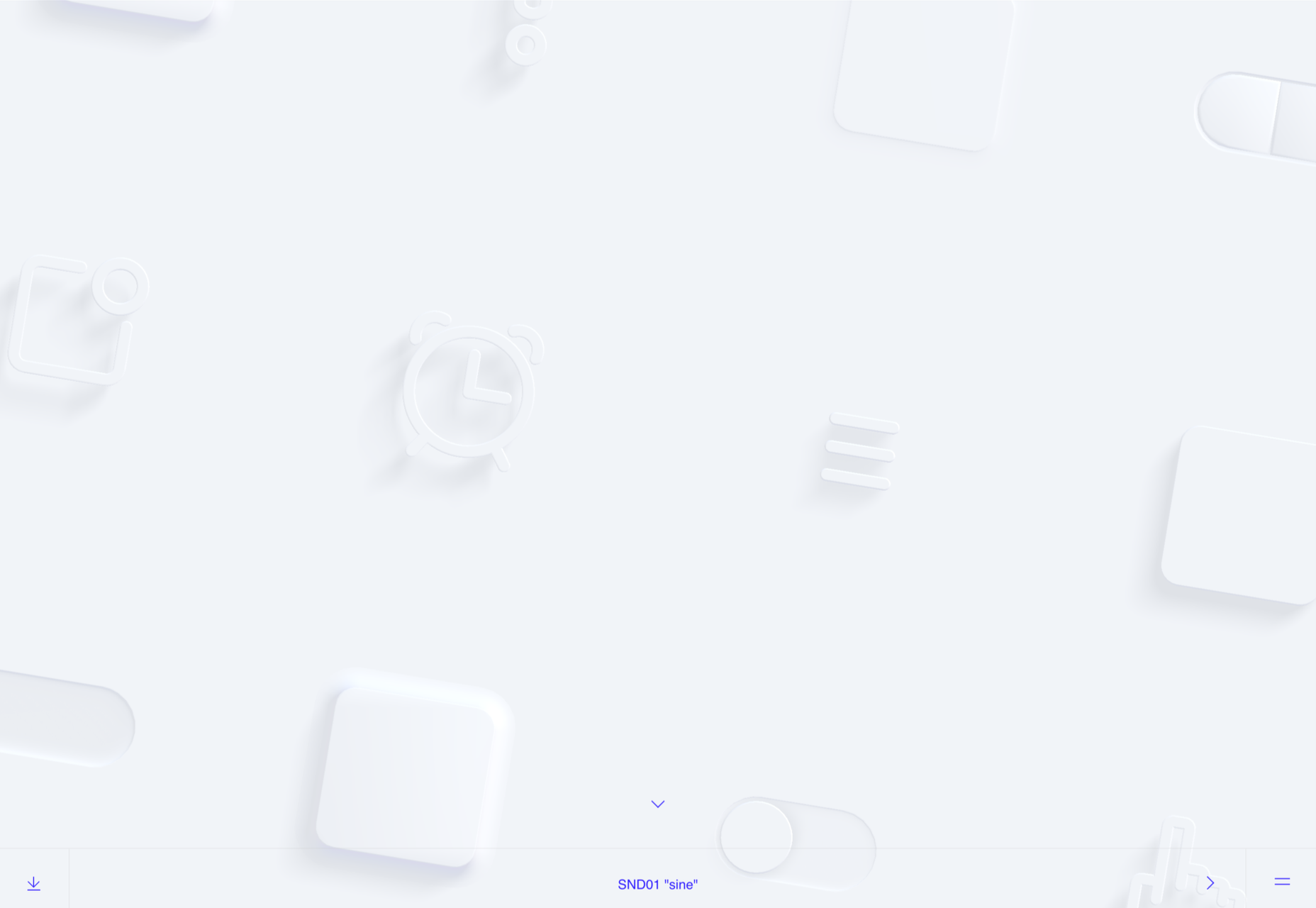
SND

Designing a site for UI sound kits is challenging, but SND pulled it off perfectly with this minimal site.
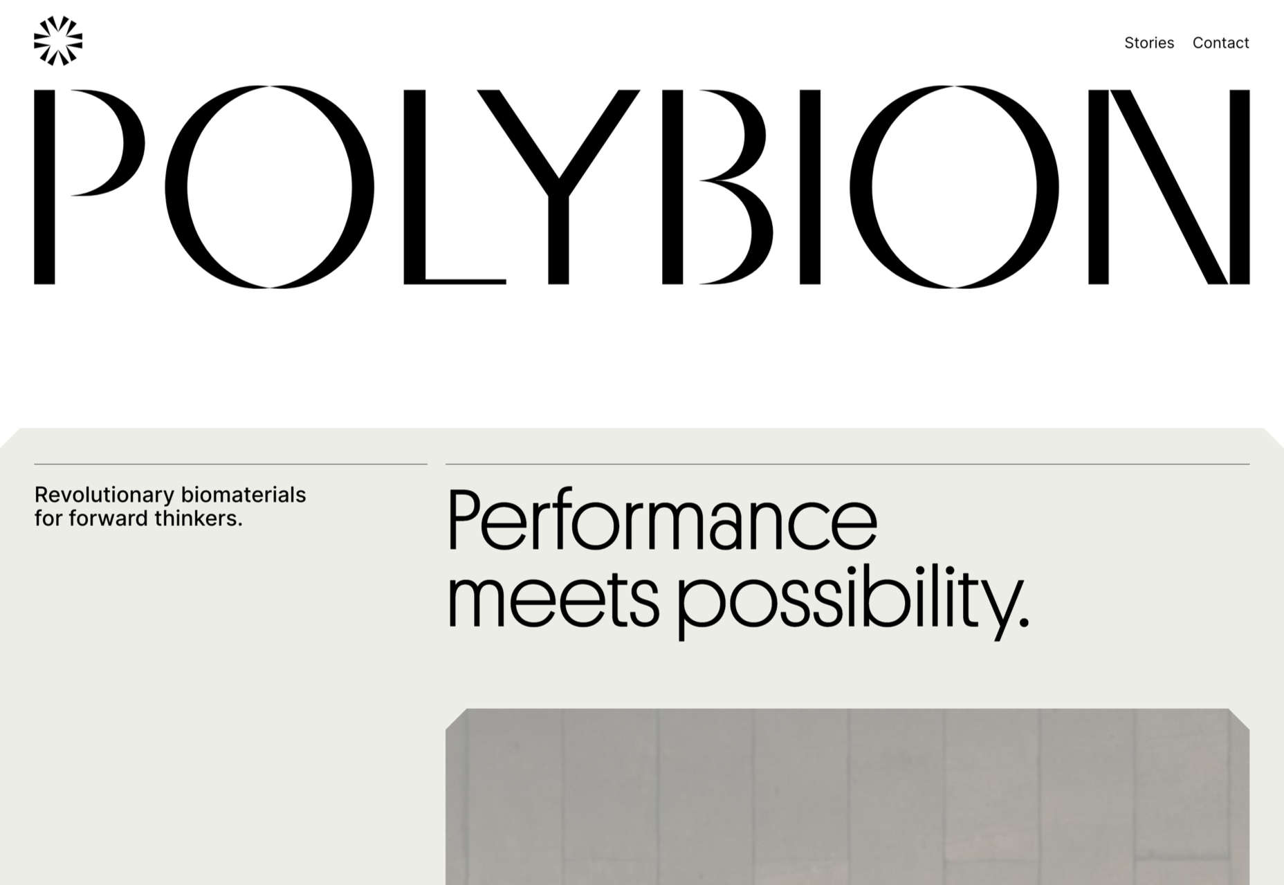
Polybion

We saw lots of brutalism in 2022, and Polybion’s site was a standout example of how to make the trend work.
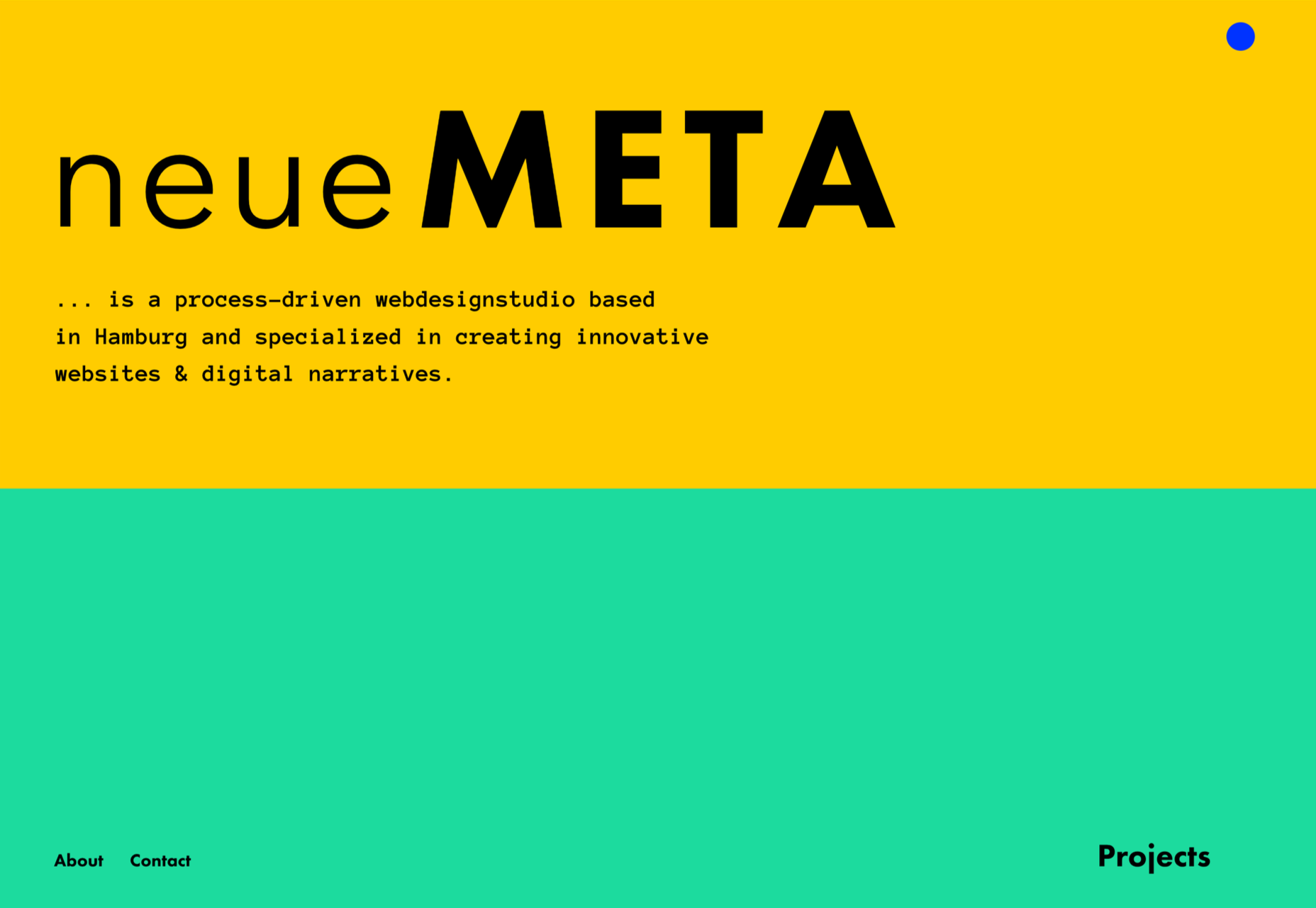
neueMeta

Bold block coloring added depth and interest to this portfolio site for design studio neueMeta.
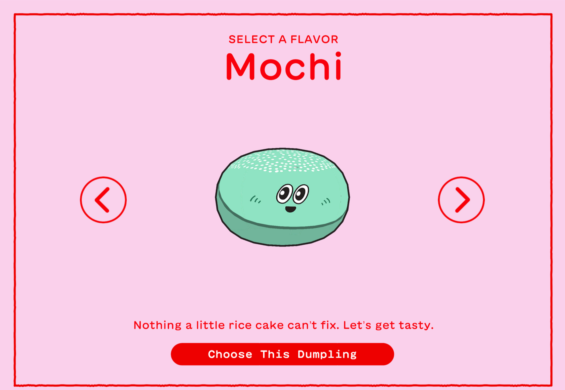
Dumpling Delivery

OK, we confess we spent waaay too much time playing this dumpling delivery game from Mailchimp back in May.
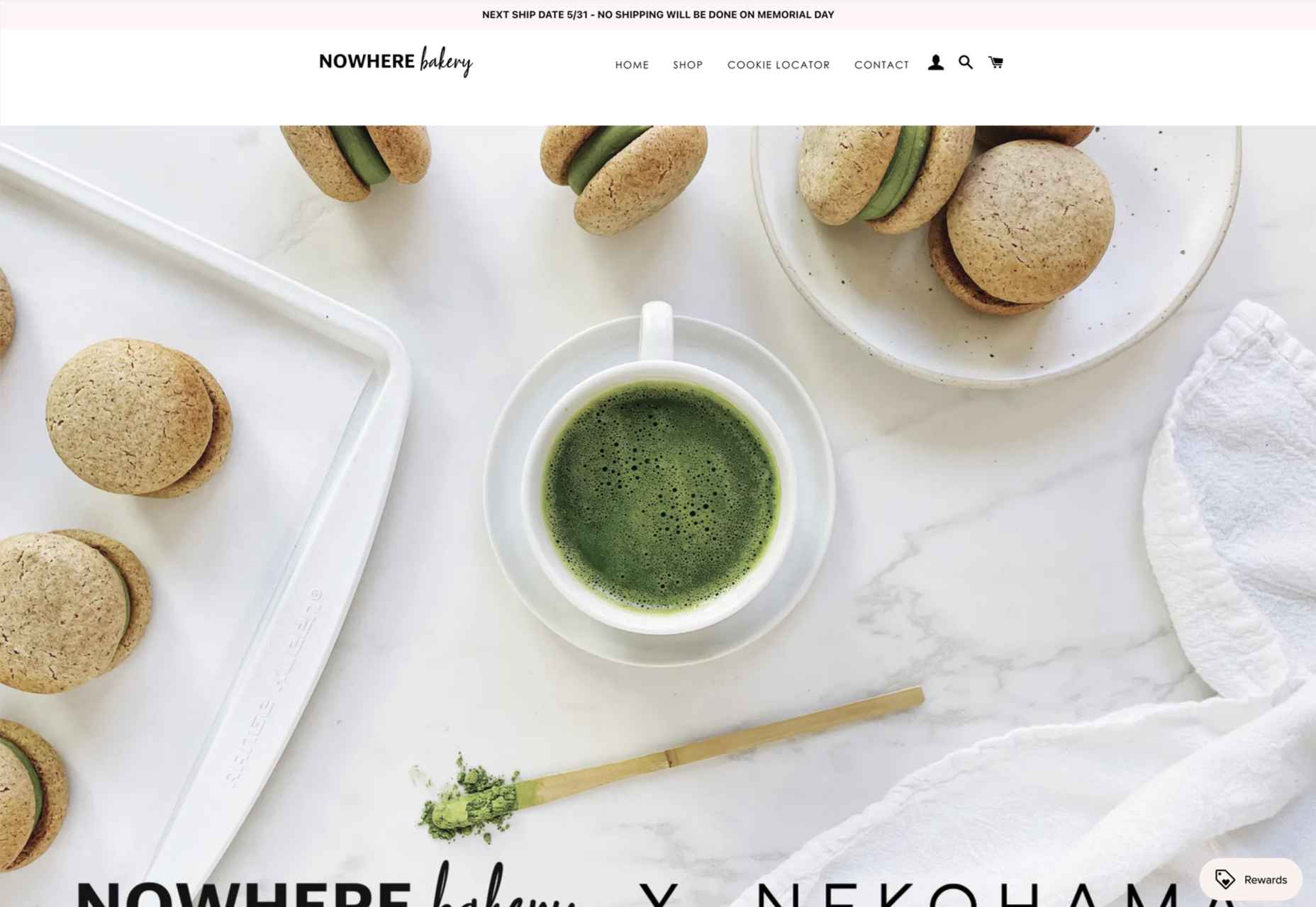
Nowhere Bakery

Nowhere Bakery succeeded in making vegan, paleo, gluten-free cookies seem appealing.
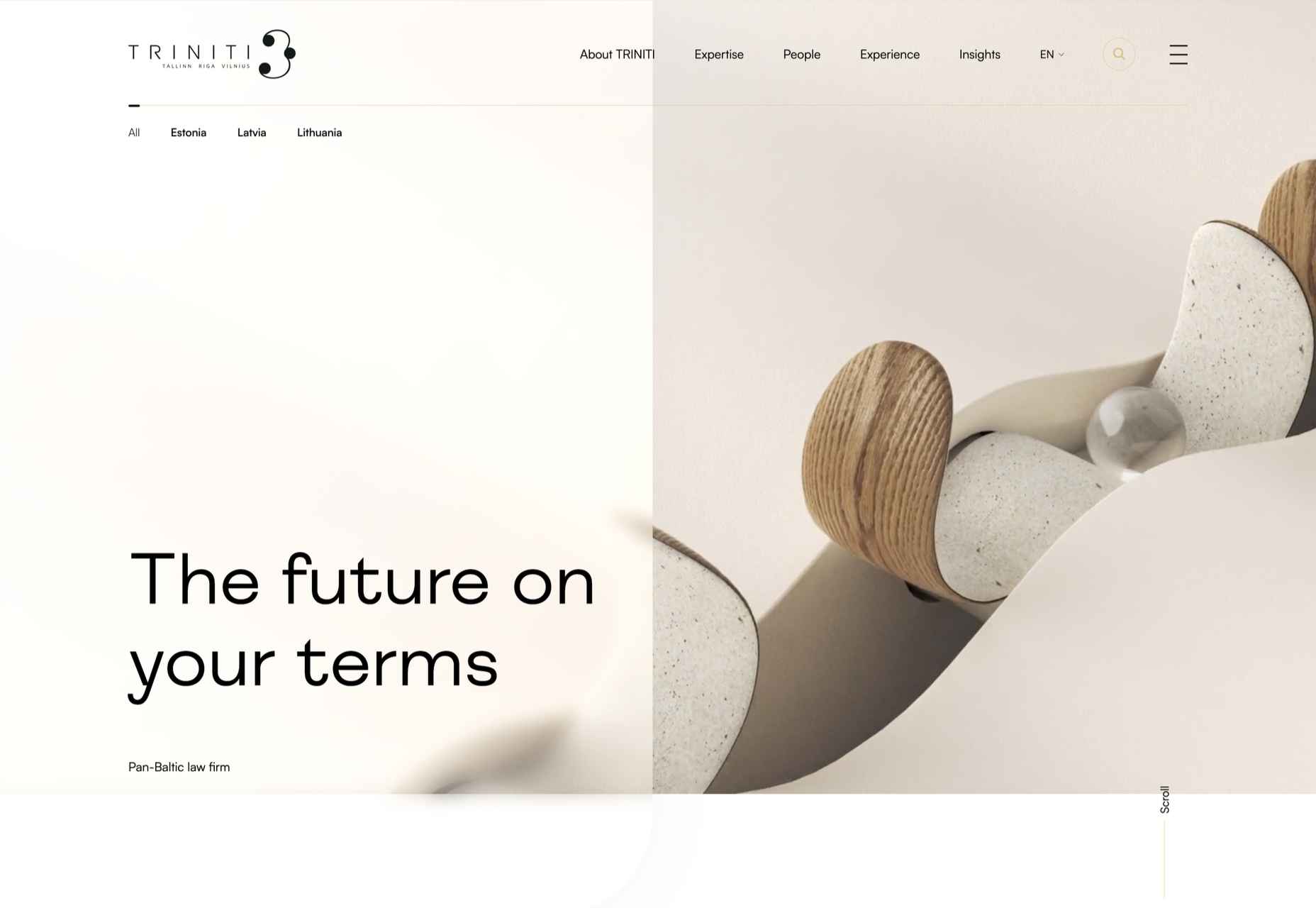
Triniti

We were mesmerized by the perpetual motion video for the pan-Baltic law firm Triniti.
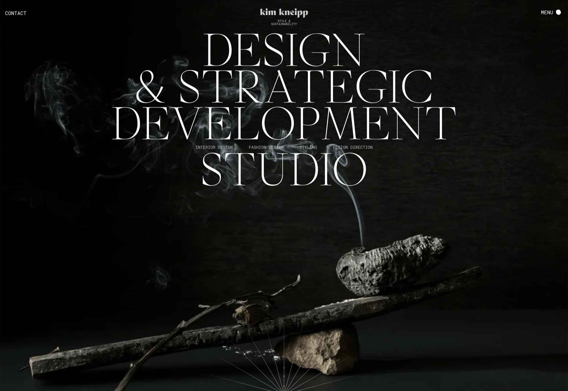
Kim Kniepp

Kim Kniepp’s site impressed us with interconnected navigation and a superbly coded masonry grid.
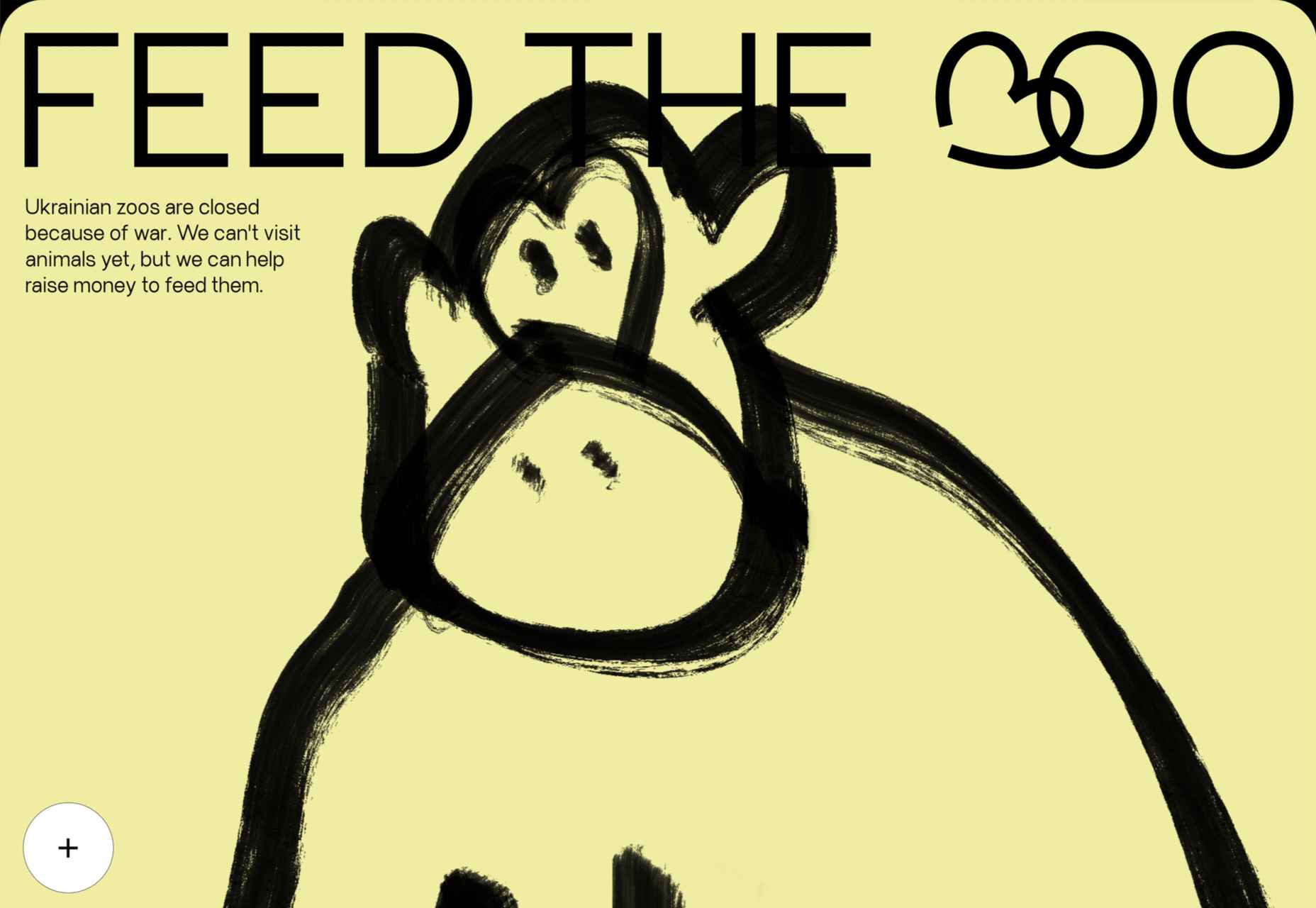
Feed The 300

Feed The 300 is one of dozens of great sites to combat Russia’s invasion of Ukraine. In this case, it was aimed at feeding zoo animals.
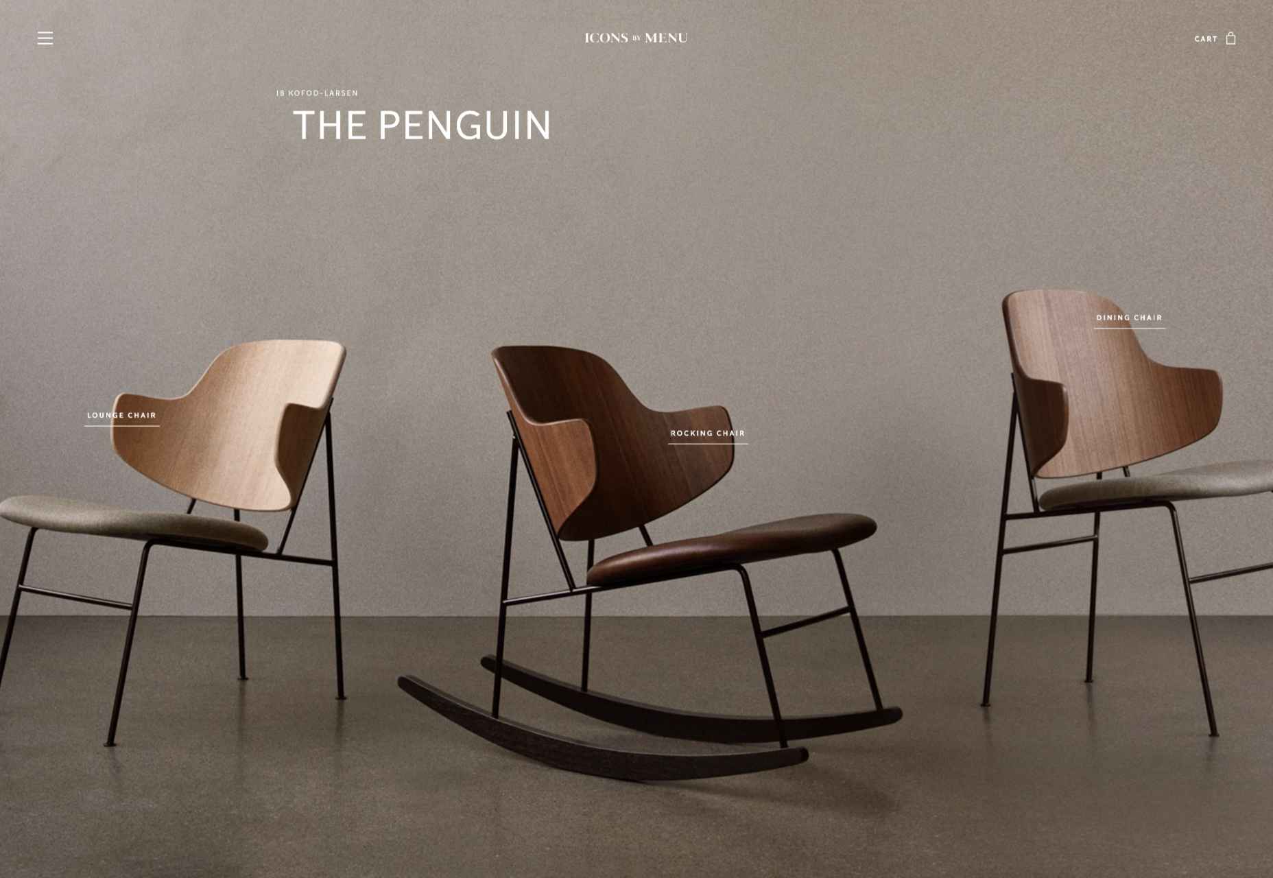
Icons By Menu

Icons By Menu is a stunning minimalist site that is a pleasure to browse.
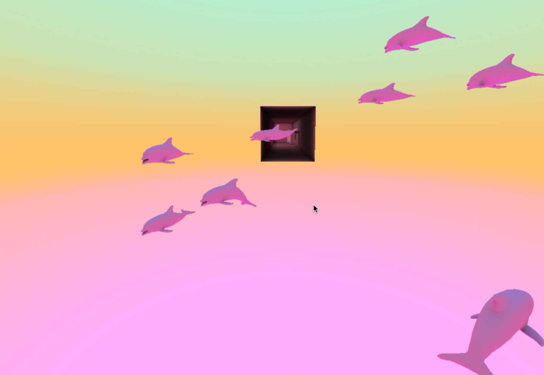
Museum Of Pink Art

The Museum of Pink Art is an immersive experience celebrating the color pink. It was easy to lose hours wandering around.
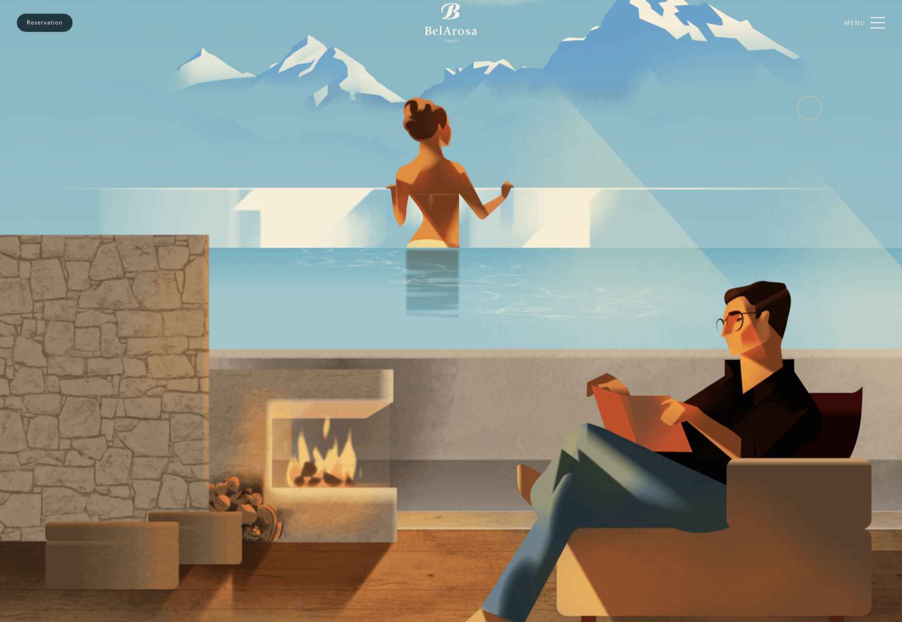
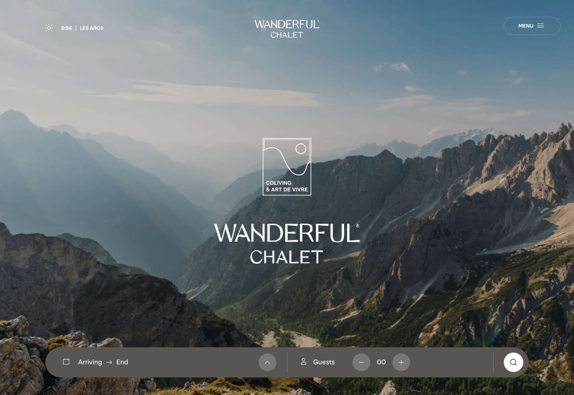
BelArosa Chalet

2022 was the year of illustrations, and BelArosa Chalet’s site used them to significant effect to sell a venue still under construction.
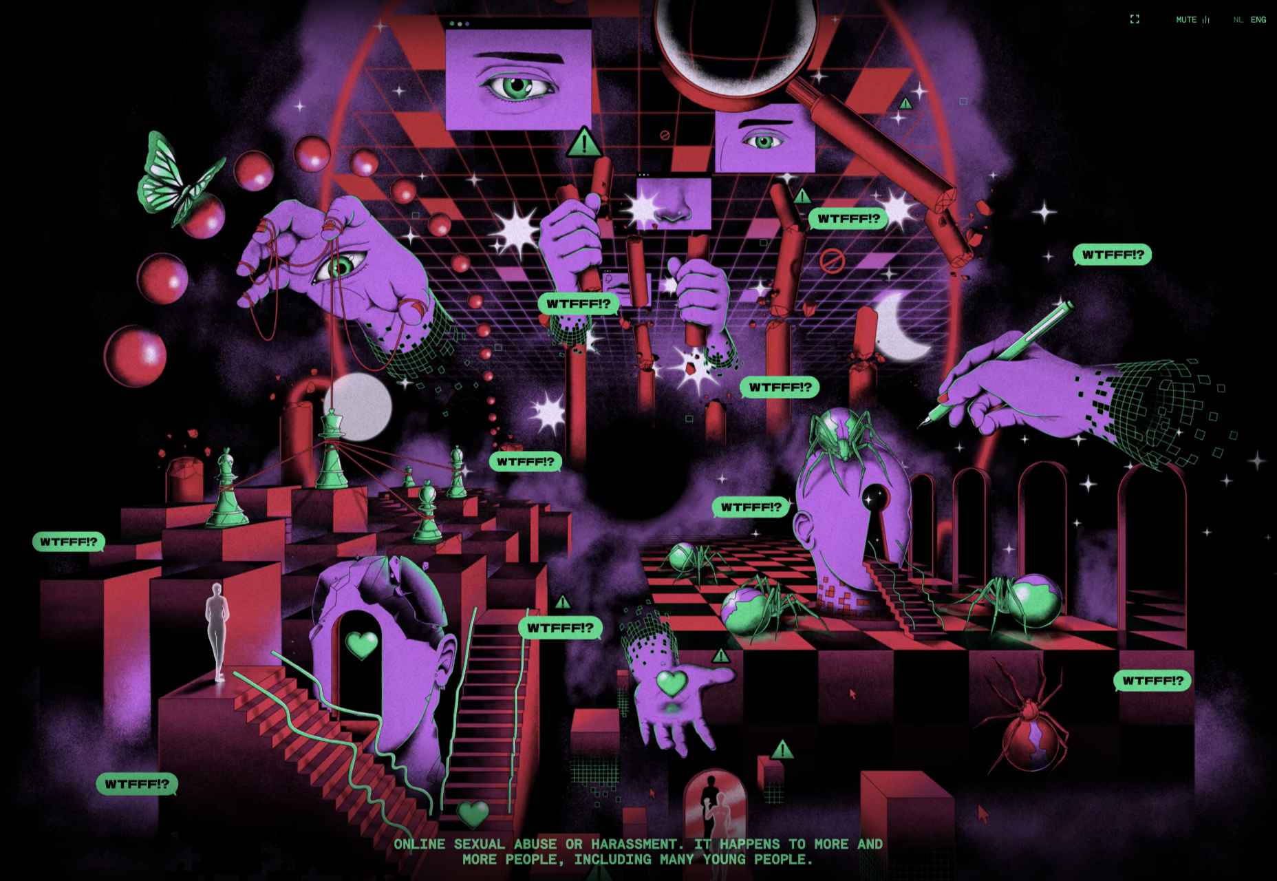
WTFFF

Online sexual abuse and harassment are particularly appalling when directed at young people. WTFFF tackled the issue sensitively.
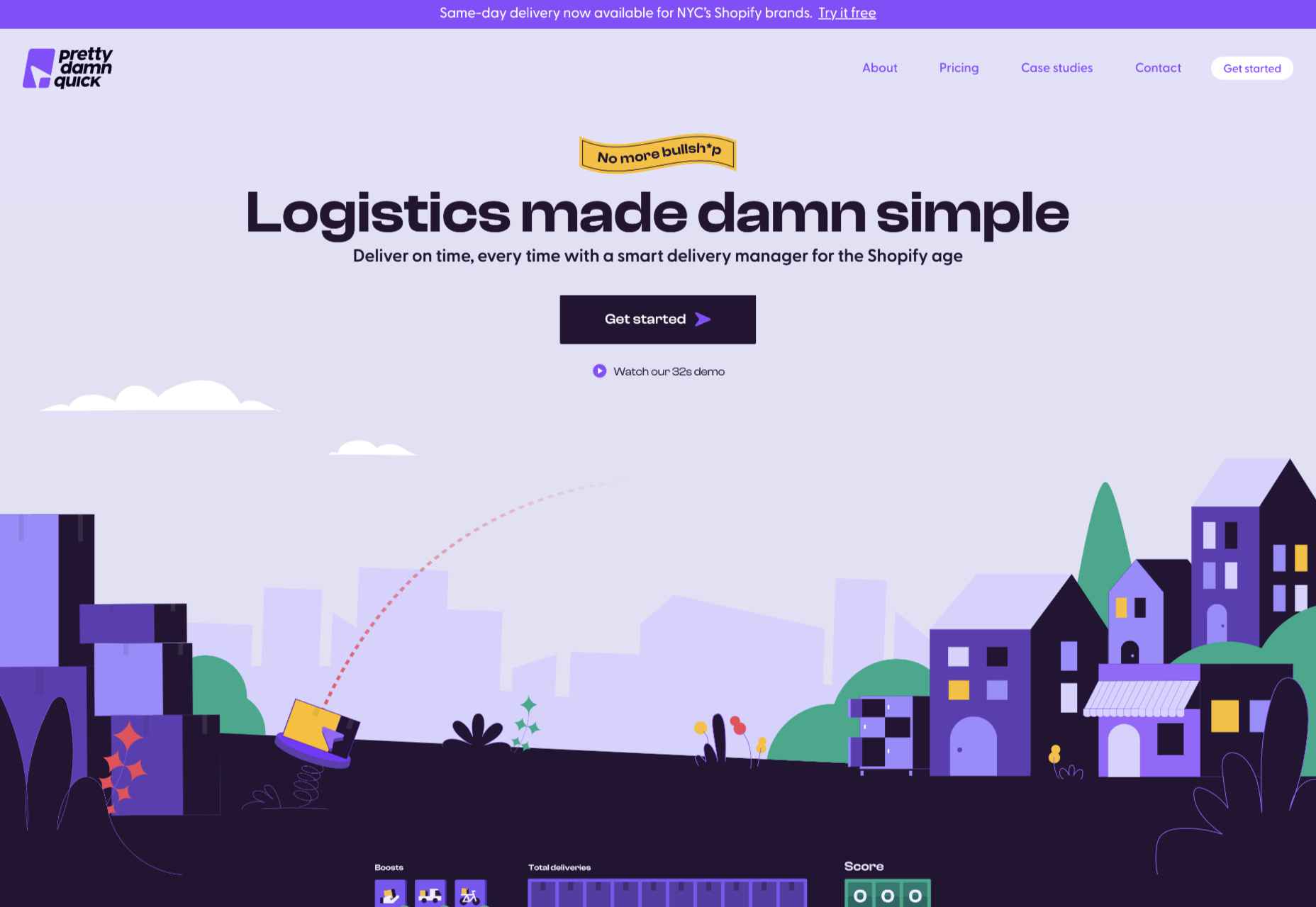
Pretty Damn Quick

Logistics aren’t the most engaging topic, but this friendly, illustrated site for Pretty Damn Quick grabbed us immediately.
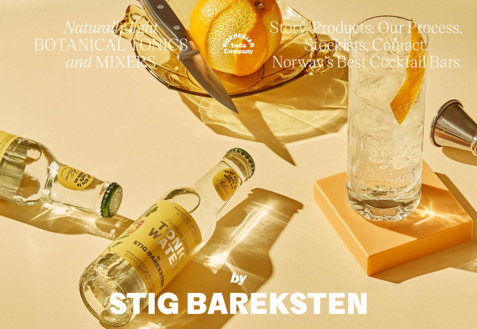
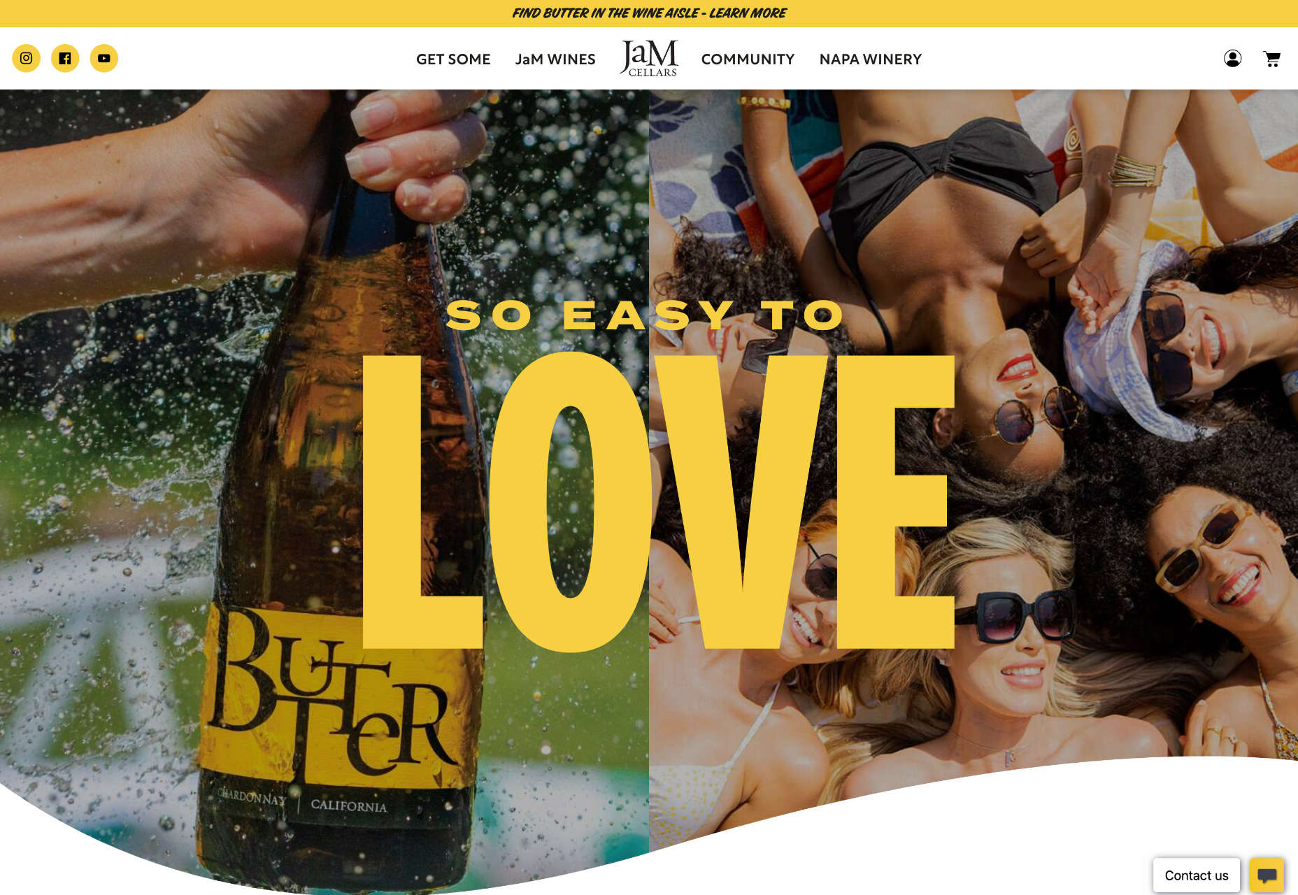
Norwegian Soda Co.

This site for the Norwegian Soda Co. uses beautiful photography to create an engaging one-page site.
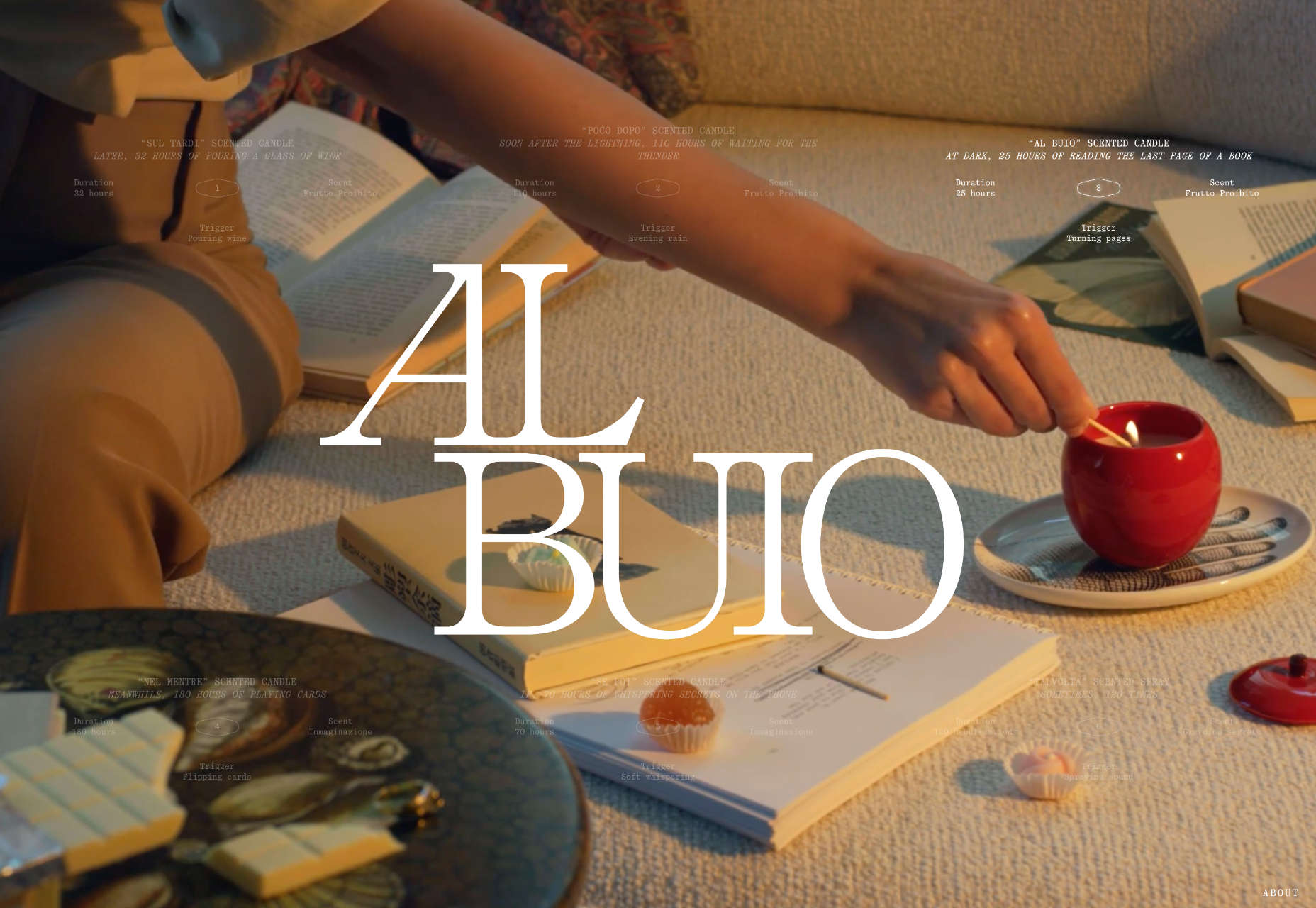
Fornasetti Profumi

Fornasetti Profumi wowed us with its long-form videos used to emphasize stillness and calm.
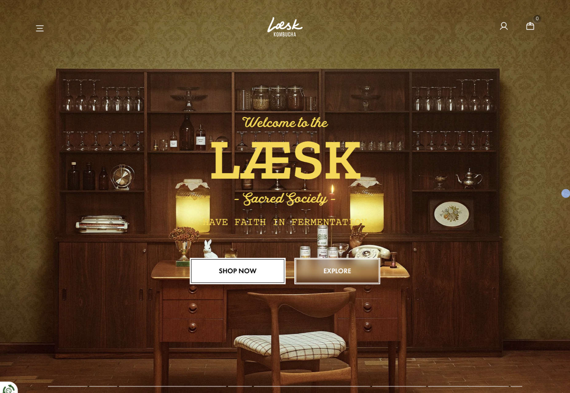
Laesk Kombucha

We were convinced this site for Laesk Kombucha had been produced by Wes Anderson.
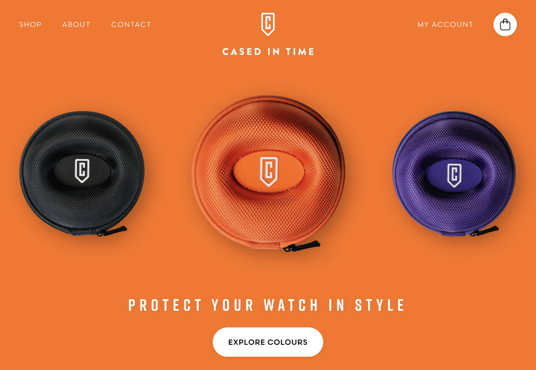
Cased In Time

Single-product sites are often underwhelming, but this excellent ecommerce site bucks that trend.
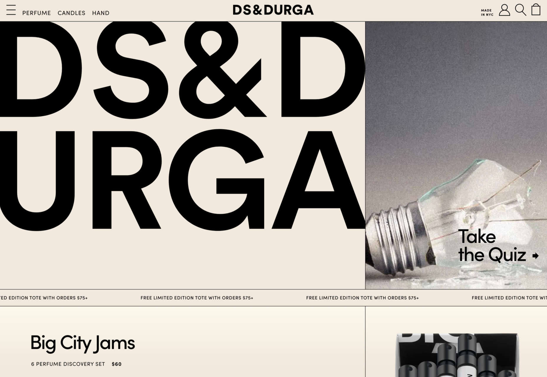
DS & Durga

Eschewing the well-trod approach of flowers and pretty models, this perfume site for DS & Durga fully embraces the brutalist trend.
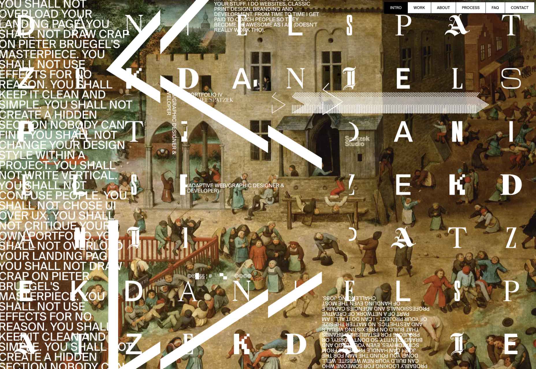
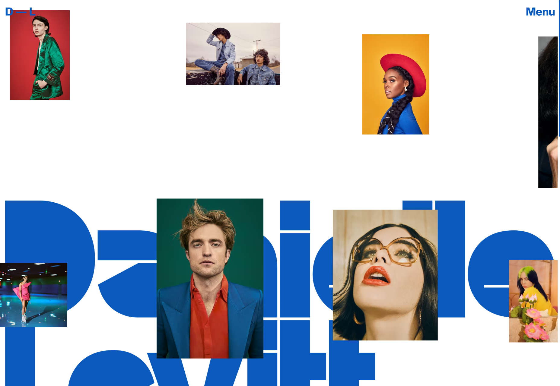
Daniel Spatzek

We loved the way Daniel Spatzek’s portfolio site broke all the rules and still managed to be informative and engaging.
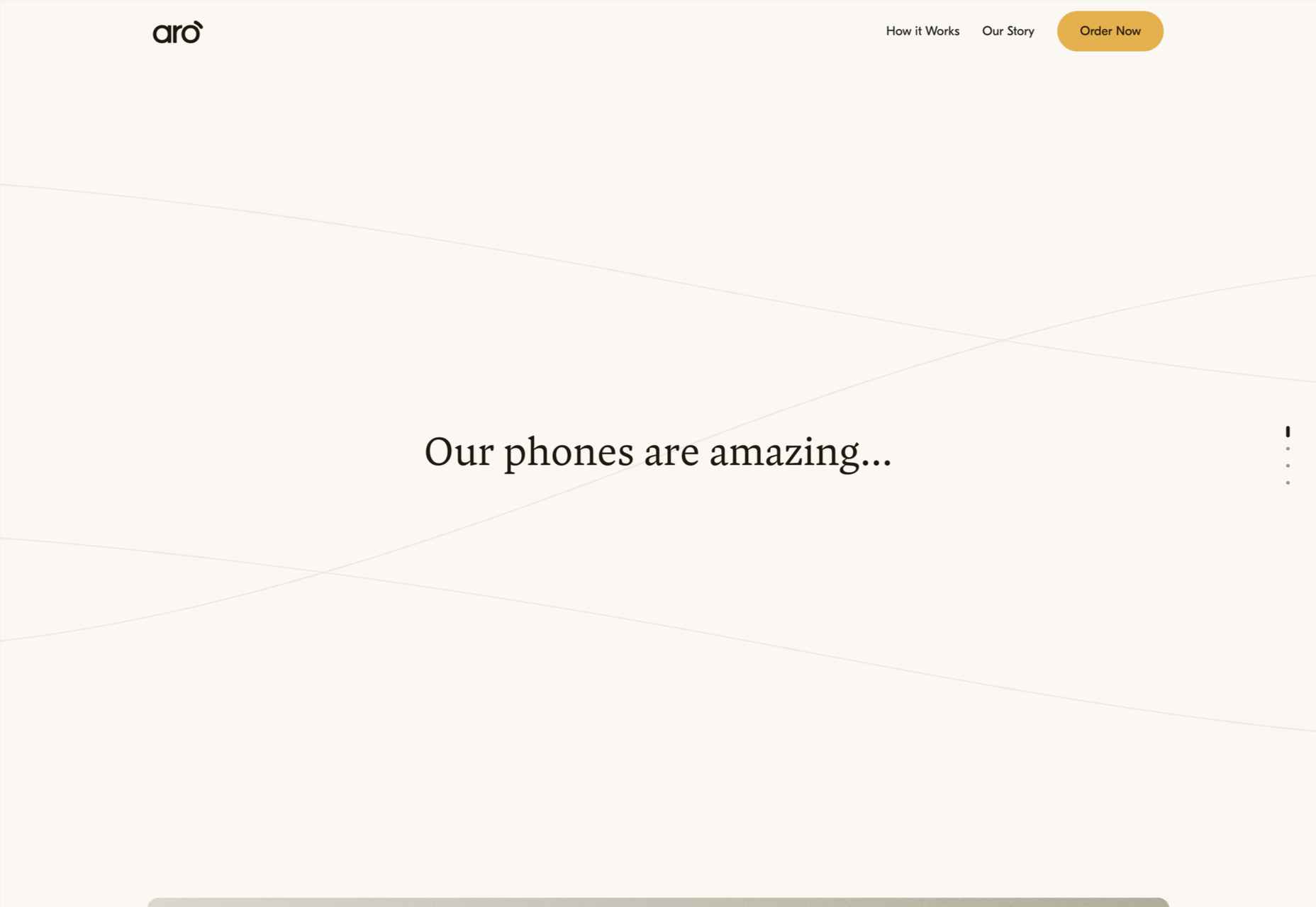
Aro

Aro kept minimalism alive with a simple site that exudes luxury while selling a simple concept.
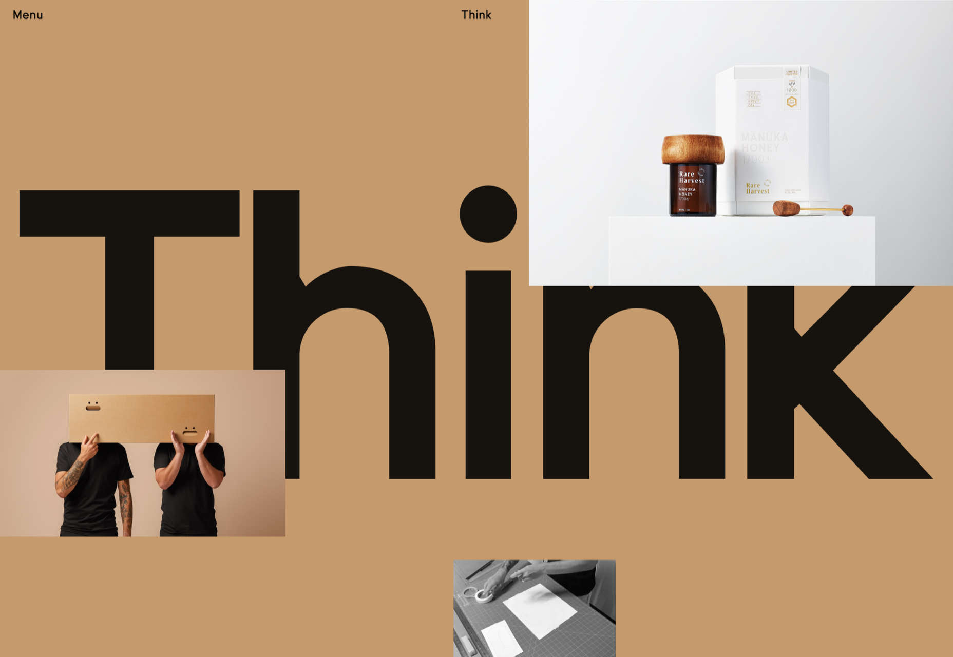
Think Packaging

Think Packaging took a case study approach to present its products, and it worked really well.
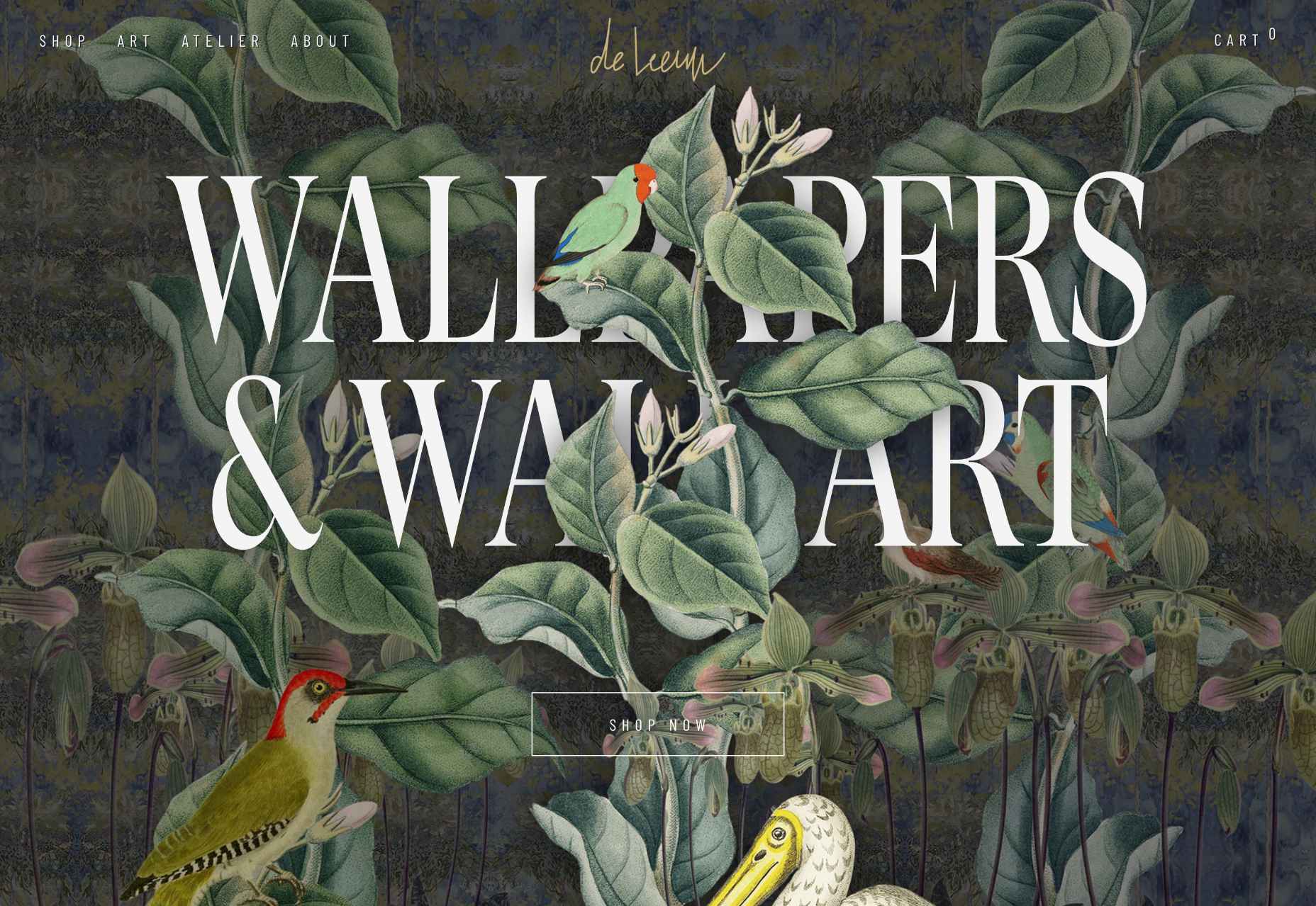
Steffie de Leeuw

Giant typography intertwined with botanical illustrations created a memorable site for Steffie de Leeuw.

Anna Jóna

The prelaunch teaser site for the Ana Jóna café and cinema was elegant and modern and had us eyeing a long weekend in Reykjavik.
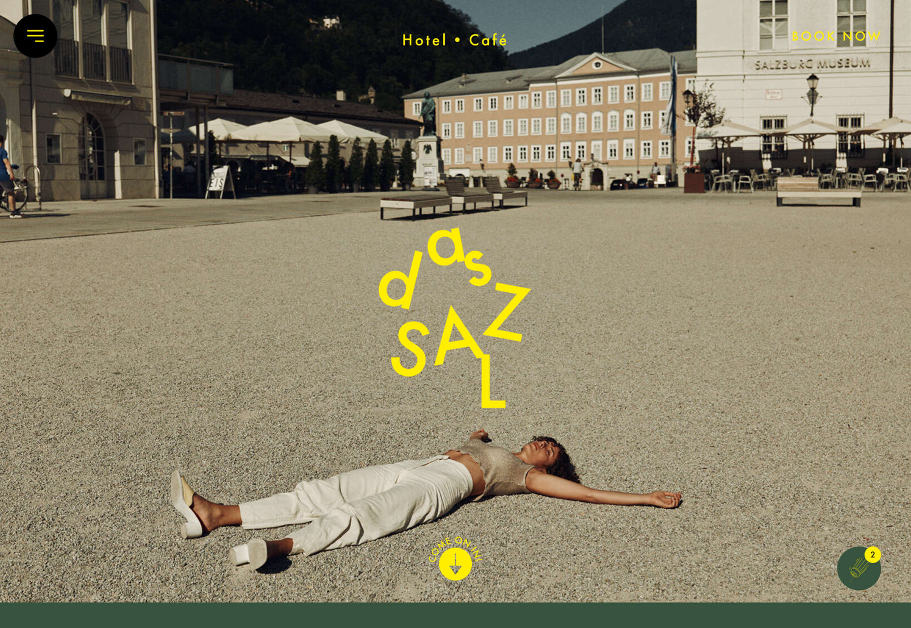
Das Salz

More wanderlust courtesy of the fresh, enticing site for the Das Salz hotel and café.
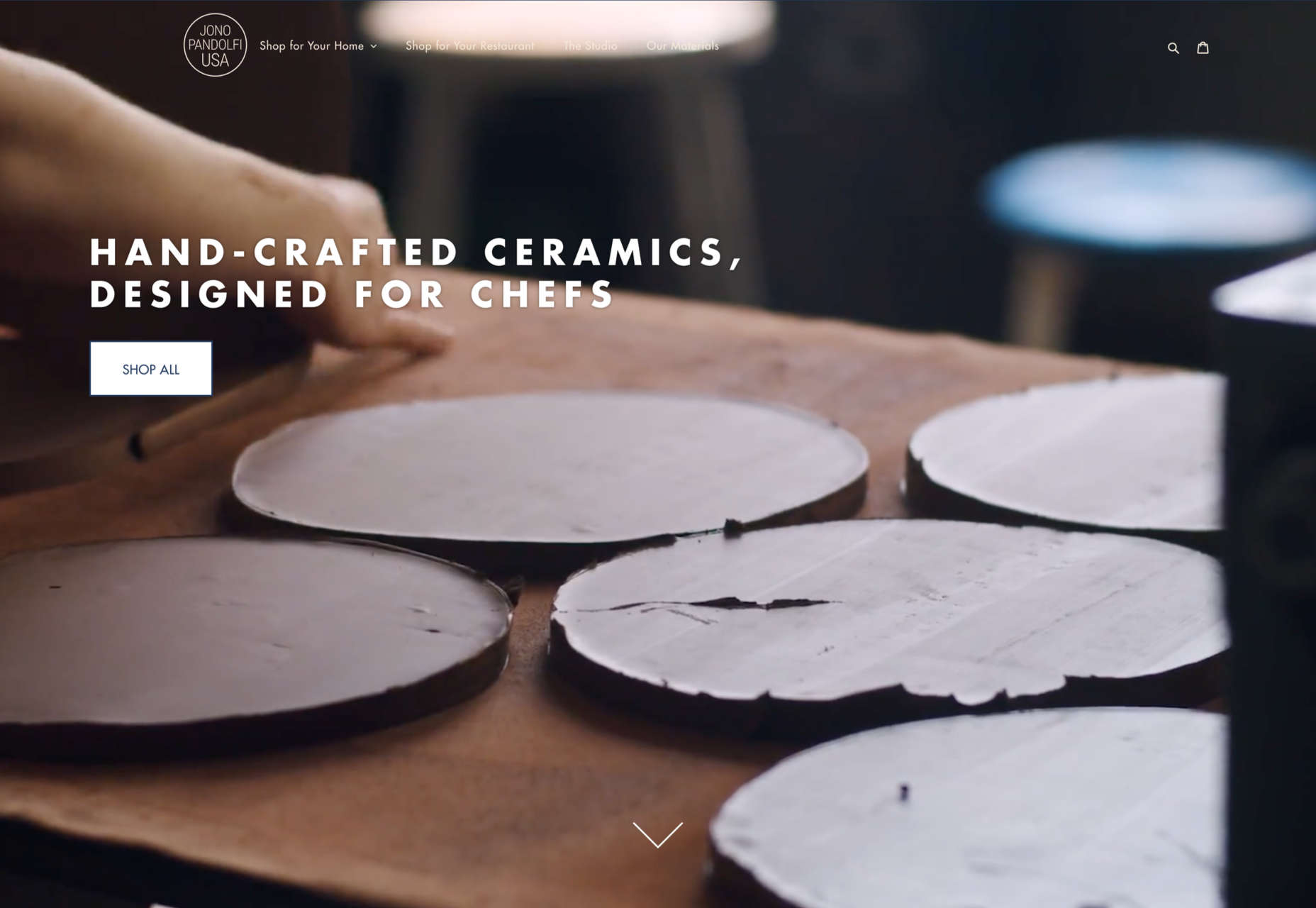
Jono Pandolfi

This simple-to-use site for US tableware and cookware brand Jono Pandolfi sold us on hand-made ceramics.
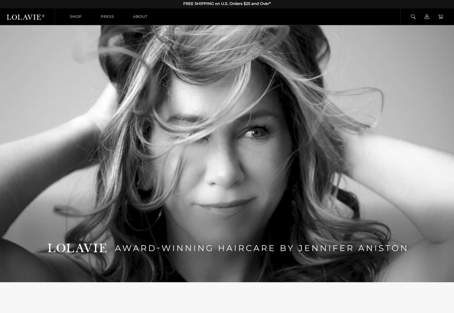
LolaVie

We still can’t get over the fact that it took until 2022 for Jennifer Aniston to produce a haircare range.
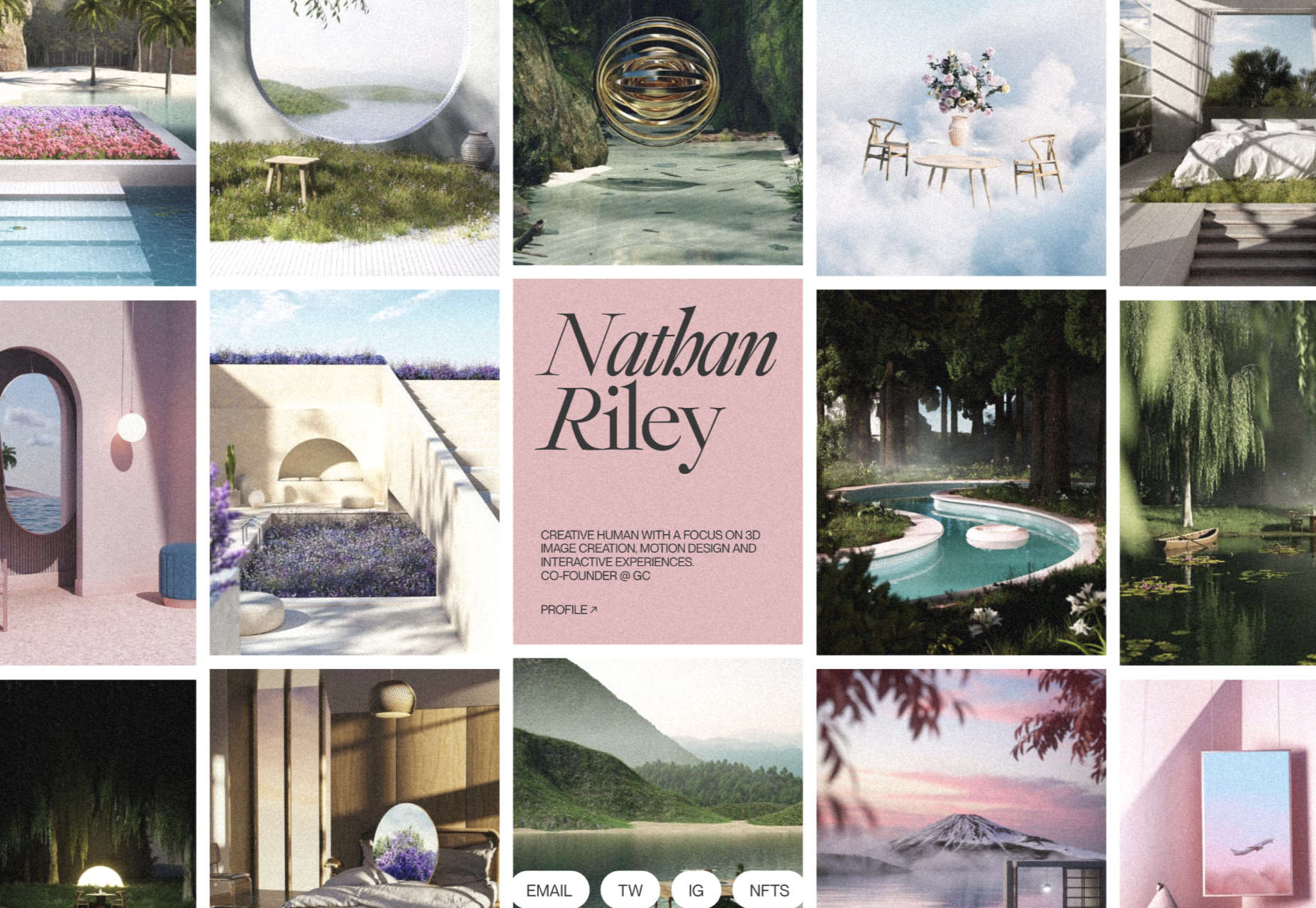
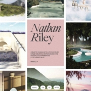
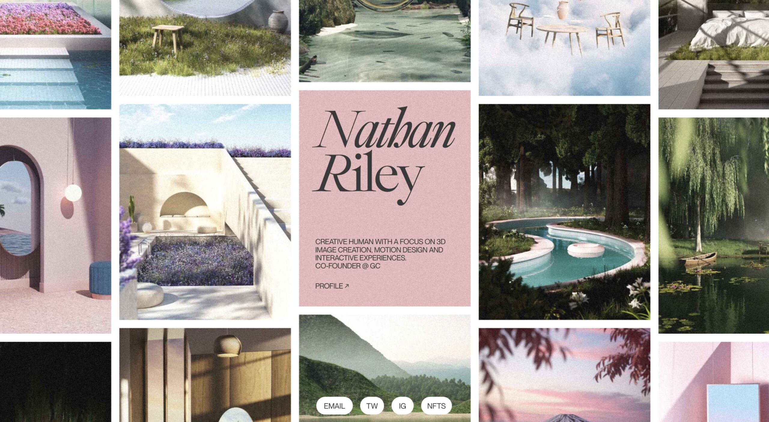
Nathan Riley

Another big trend in 2022 was masonry-style sites, and this portfolio for Nathan Riley was one of our favorites.
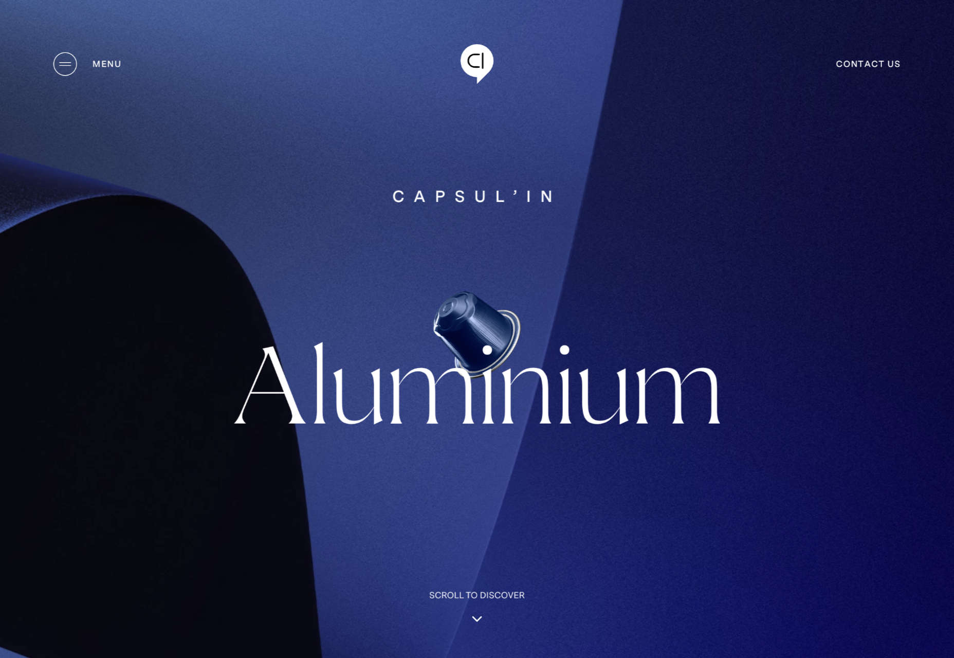
Capsul’in Pro

With the excellent application of animation and careful use of color, this site for Capsul’in Pro transformed coffee pods into luxury items.

Seen

Seen is an essential site that explores themes of prejudice and racism in creative fields. It’s a strong approach to a difficult subject.
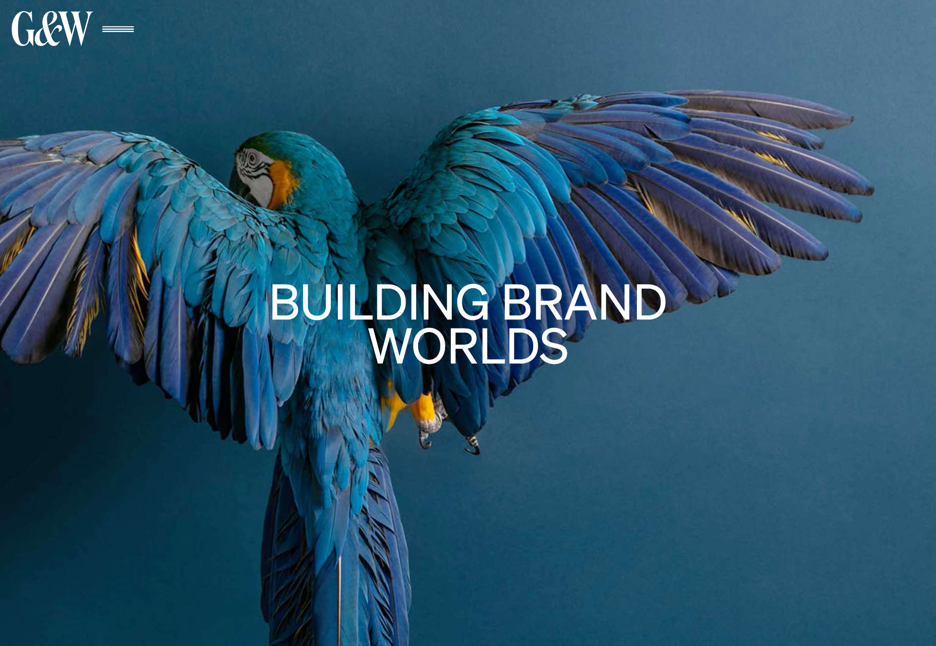
Glasfurd & Walker

Glasfurd and Walker’s superb portfolio site sets itself apart by over-extending the viewport. It’s a highly original idea.

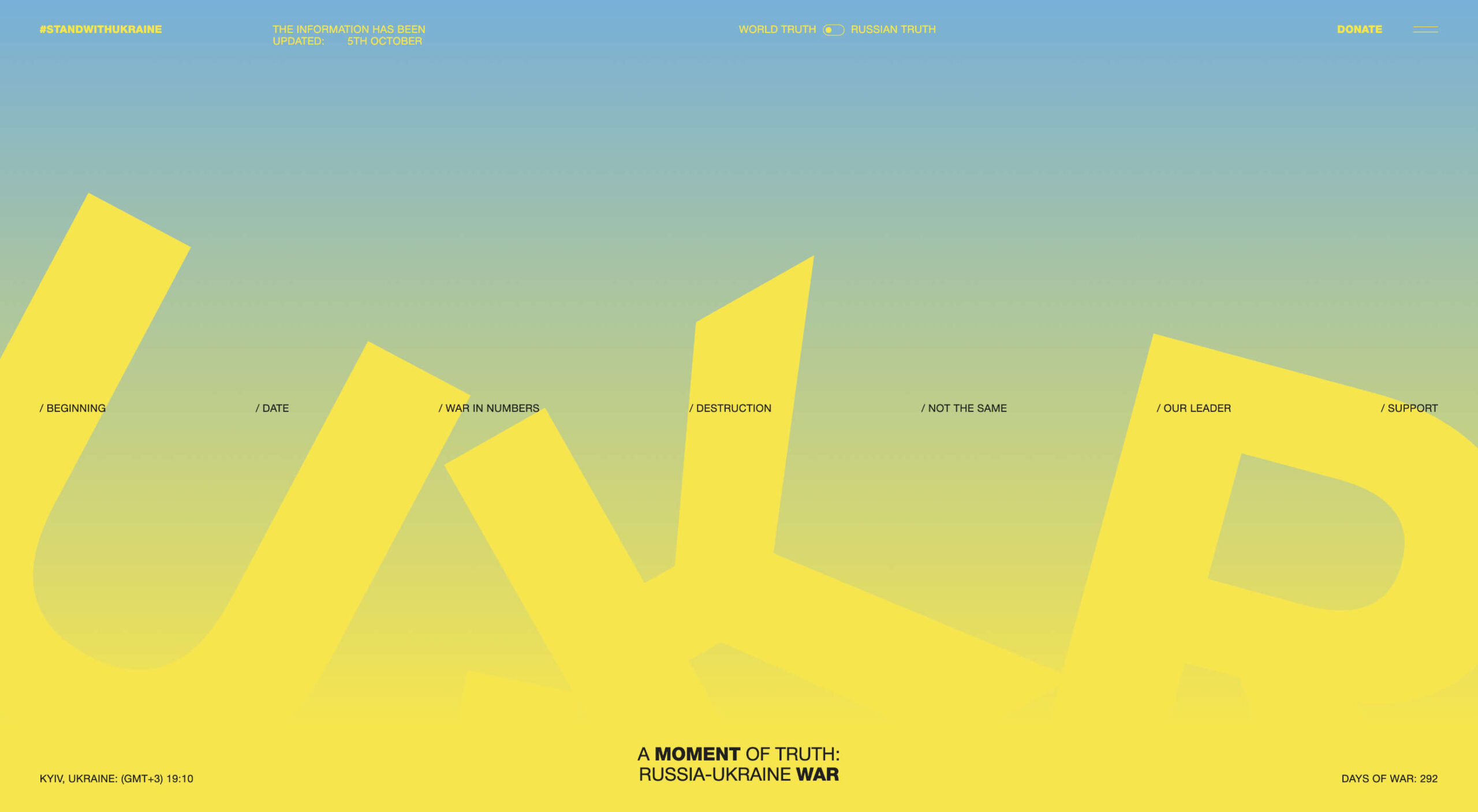
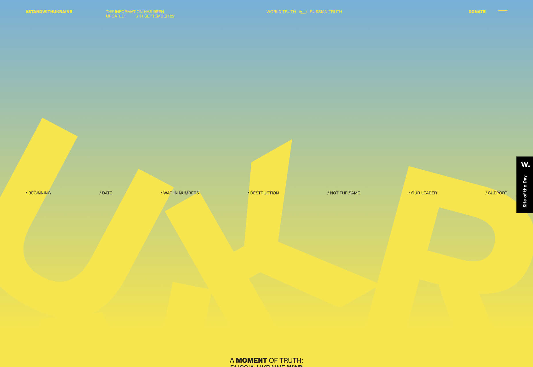
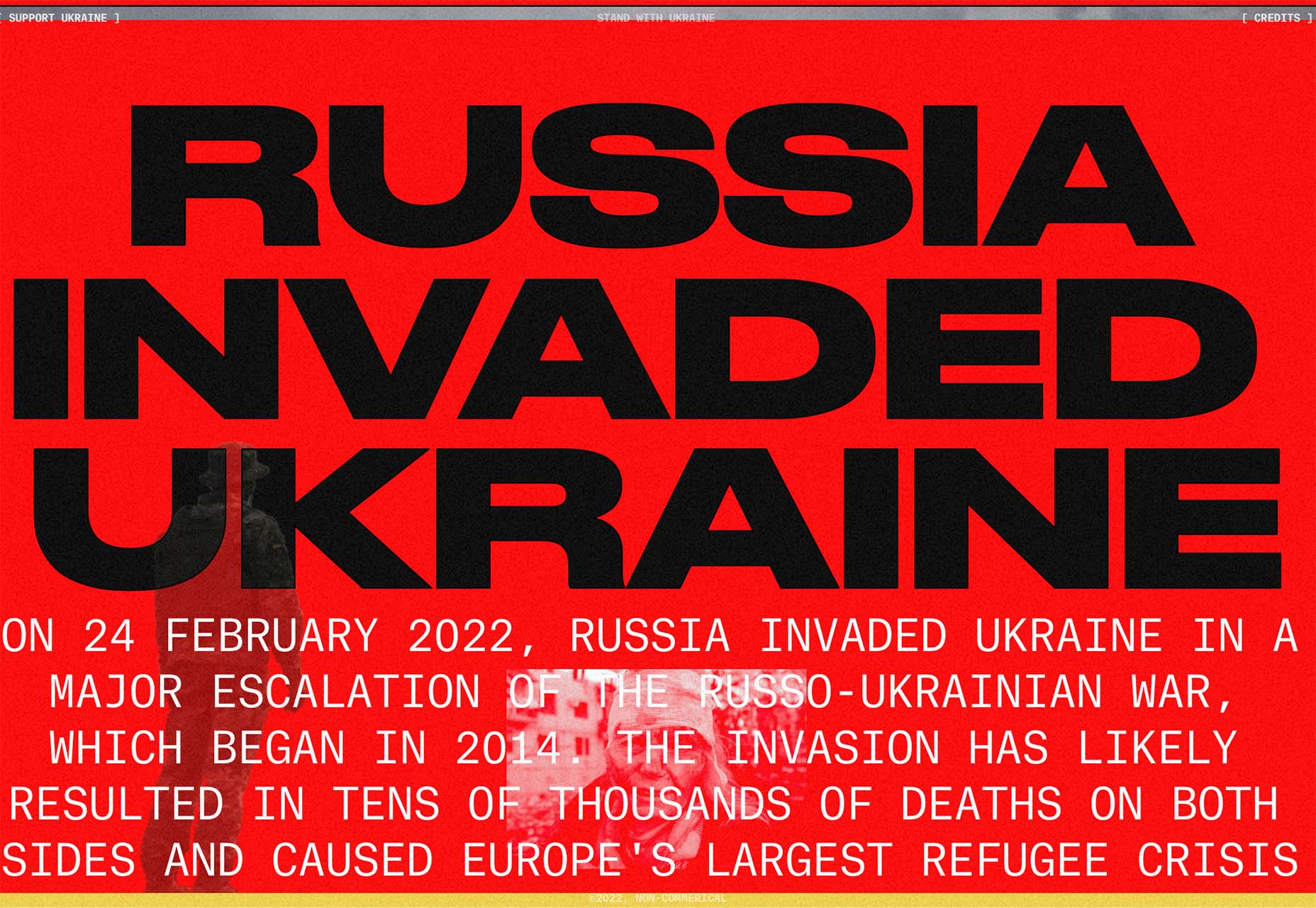
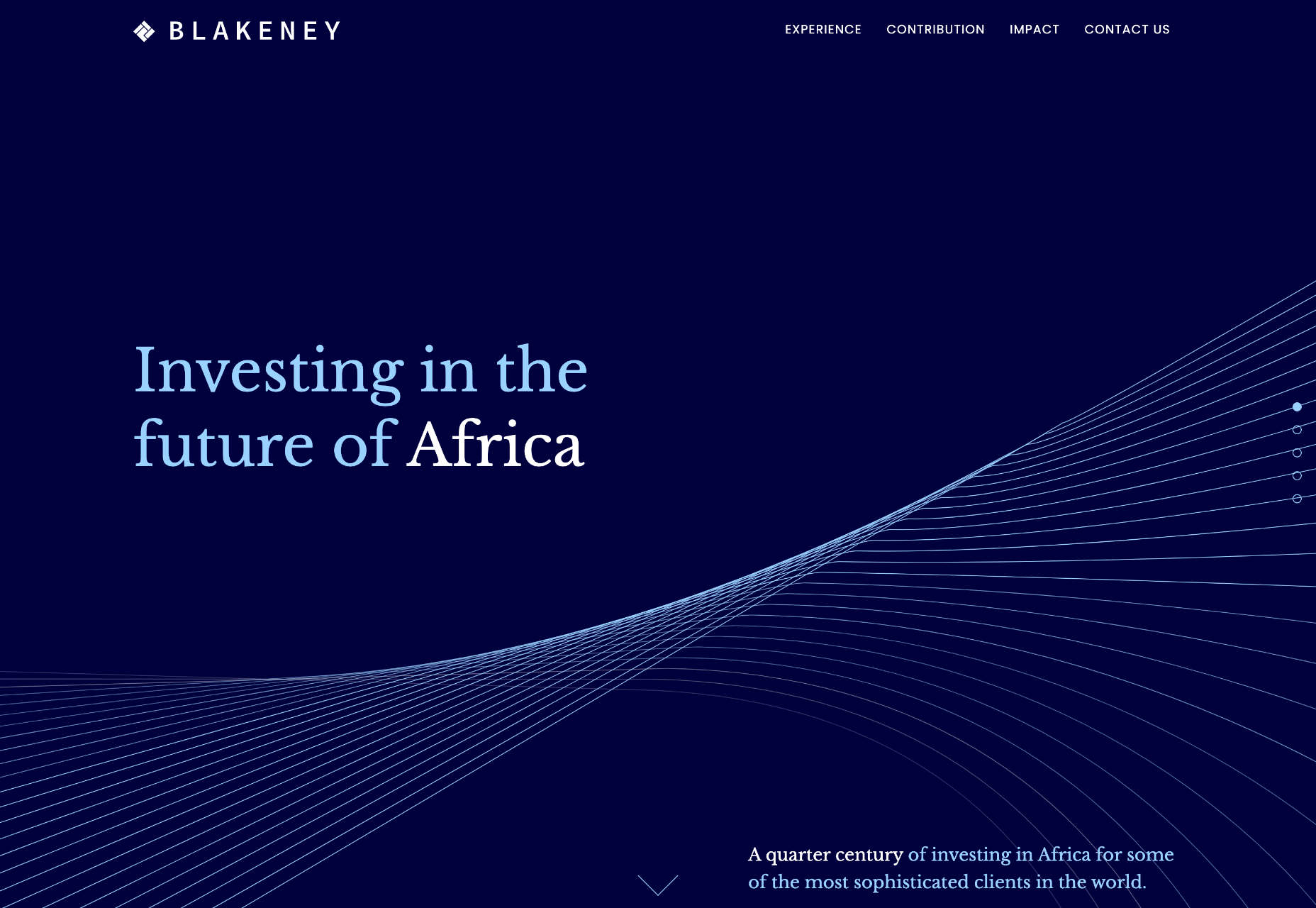
The Other Side Of Truth

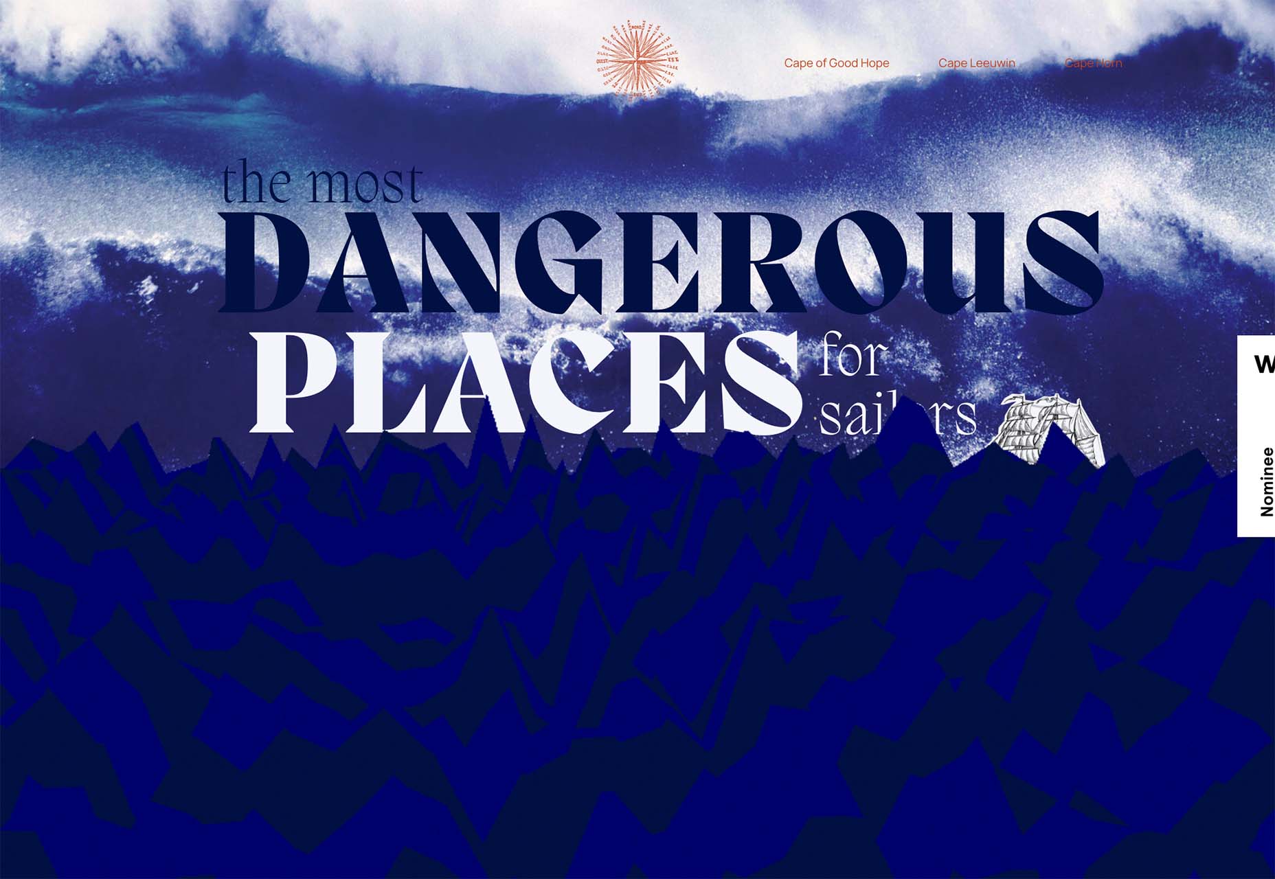
The Other Side of Truth is the standout site of 2022. It used the web expertly to present two interpretations of the facts surrounding the Russian invasion of Ukraine.
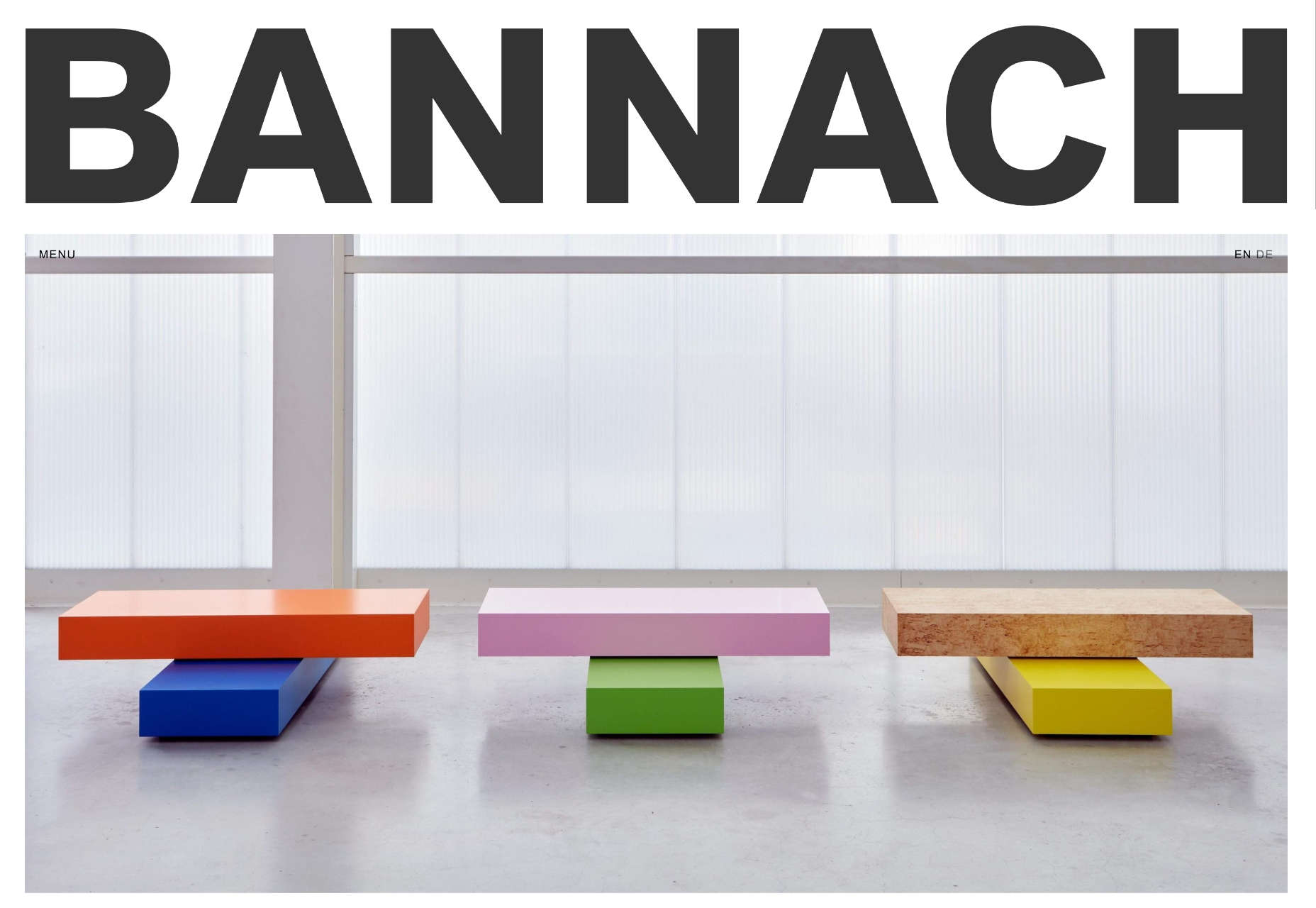
Bannach

Back in October, we fell in love with the pixel-block animation loading for the Bannach furniture brand.
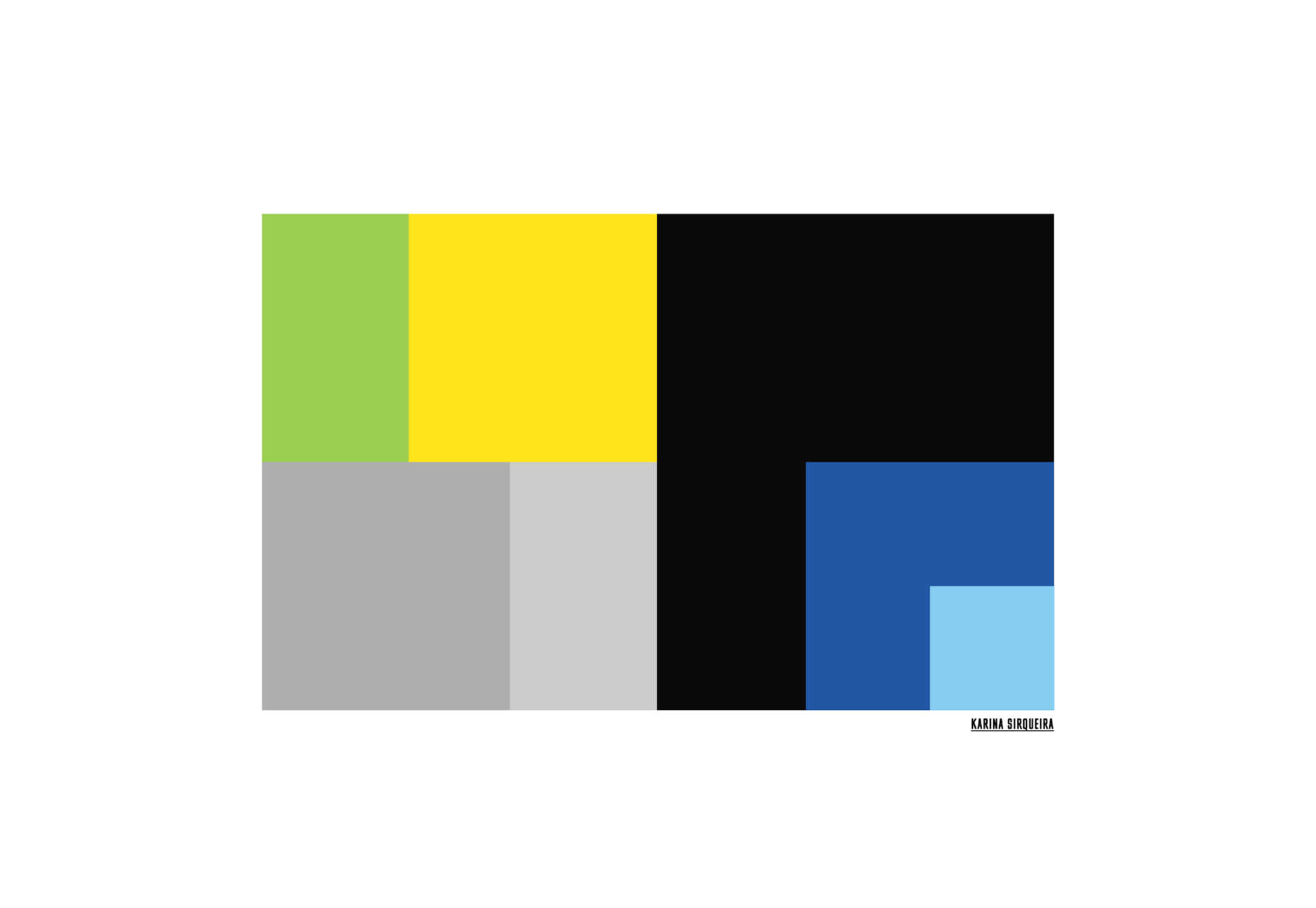
Karina Sirqueira

Karina Sirqueira’s portfolio was a joy to browse through. The morphing shapes imposed simplicity on a series of beautifully presented case studies.
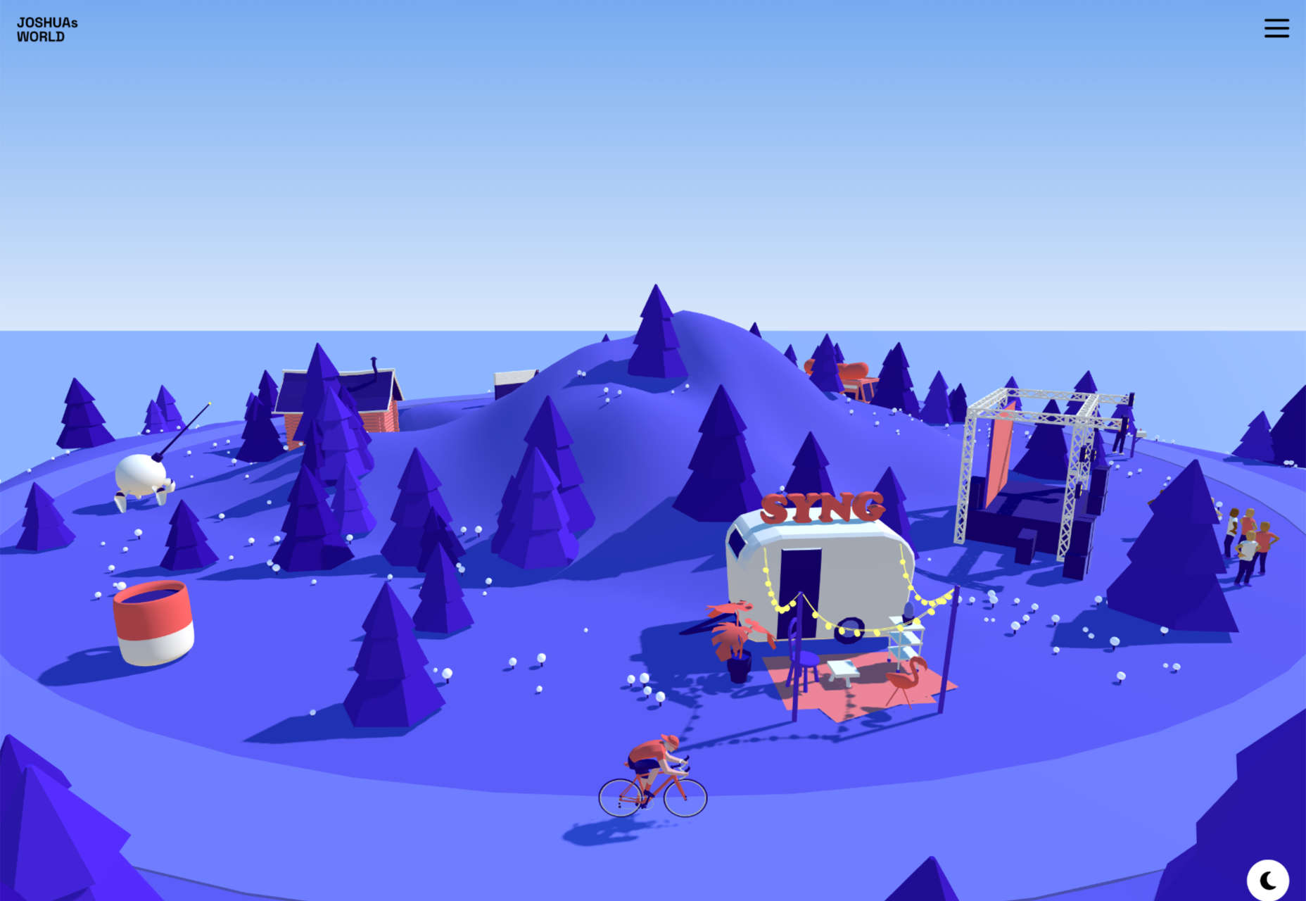
Joshua’s World

We were amazed by Joshua’s World, a little island that can be titled and rotated to power the little cyclist along his career.

Source

The post 50 Best Websites of 2022 first appeared on Webdesigner Depot.

Source de l’article sur Webdesignerdepot

As we head into the final month of 2022, plenty of new ideas and website design trends are still emerging. The evolution throughout the year has been exciting and designed to help website designers and developers create greater engagement and interactivity while pushing the envelope. These trends are no exception.

Here’s what’s trending in design this month.

1. Video Game Inspiration

That space where reality and virtual reality merge is popular for website design. Trending are design elements and themes with a pseudo-video game style that looks interactive, somewhat real, and much imagined.

These websites can have a variety of looks and themes but have a few key elements in common:

  • Plenty of animation
  • Interactive elements, real or perceived
  • Fast motion that puts the user in the scene
  • ”Unreal elements” such as the bat-skull for Mythical Games
  • Dark color schemes
  • Often lack traditional navigation or calls to action so that the “game” is the whole screen
  • Leading text or design elements to help you move through interactions

Each of these examples takes a similar but different approach with their video-game-inspired design styles.

Adidas uses a three-dimensional trio of people in flight to get you interested in jobs at their animation studio. The point of view makes you feel part of the action, but traditional design elements, such as navigation, help you know what to do next.

Mutant Stand looks like an old-school video game and moves between a home screen with navigational elements to more of an in-game experience. The motion creates an interactive feel even before you dive into the design.

Mythical Games is an actual gaming website design, so you would expect video game inspiration here. Interestingly, this site takes the most subtle approach, although the design elements of fantasy are strong here.

2. Difficult Typography

Sometimes website design trends can be tough to explain. That’s the case with this one, where designers are experimenting with very difficult typography styles. What’s difficult about the text in these projects is readability.

Difficult typography is somewhat subjective but is emphasized by designs that have a lot of words. The reading challenge extends to mobile design, particularly when these fonts are smaller and can present even greater readability issues.

There are a lot of different styles and combinations of typefaces that can cause readability challenges. Some of the most common for website design include:

  • Condensed or thin typefaces
  • Unusual character styles or strokes
  • Modern or thick serifs
  • Old world styles
  • Scripts or cursive styles

All of this, though, is somewhat in the eye of the beholder. While these examples all present some reading challenges, the designs are still interesting and visually sound. Whether to make these font choices is a personal choice, but you should pay attention to your audience base and website analytics to make sure it works for you.

Here’s where you probably see a lot of this trend outside of website design. Pay attention to the typefaces used for World Cup broadcasts. Difficult typefaces are paired for all on-screen text elements.

Kakeru Yagou uses an interesting modern serif with a bit of a tilted style. As a logotype, the typography works pretty well. It is when there’s a lot to read that the challenge comes into play.

Abymes Numerique uses a condensed typeface in an all-caps style. Either of these options alone might create less of a readability concern than when paired.

Think Dance uses an incredibly interesting but difficult typeface for the two keywords on its website. They do an excellent job by using only two words and pairing them with easy-to-read options everywhere else. But it still takes a minute to think about and comprehend the words, so you can argue the effectiveness of the font choice.

3. Avatars

Already popular on social media platforms such as Snapchat and Facebook, avatars are having a pretty big moment in website design as well. The big difference is that website avatars aren’t just cartoon heads, they can include full-body designs and animated effects.

Avatars can have an extremely personal look and feel, such as when they are used for portfolio websites or be more character-oriented. Both are an excellent way to use faces and incorporate somewhat of a personal element when you don’t have the right photography for the job or want a greater element of whimsy in the design.

Simona Nikolova uses an oversized avatar for her portfolio site. She pairs it with her name to create a connection with users, and the style shows her creativity as well. An avatar is a good way to “show yourself” in a portfolio without the privacy concerns that might come with an actual photo.

Byte Trading uses “Lego-style” avatars to get you interested enough to “enter” the website. Each avatar moves and changes clothing to get you ready to enter the website for the crypto marketplace. Avatars are a popular option for crypto and NFT websites.

Pomelo Paradigm uses three-dimensional avatars to create scenes throughout its website. These created characters help explain what the company does and interactions people should have with the design. They have very human looks, and you almost don’t miss that they aren’t actual photographs.

Conclusion

As we head into a new year, what website design trends are you most excited for? Do you plan to try new things with projects in the new year? Hopefully, these trends give you some ideas and jumpstart that inspiration heading into 2023.

Source

The post 3 Essential Design Trends, December 2022 first appeared on Webdesigner Depot.

Source de l’article sur Webdesignerdepot

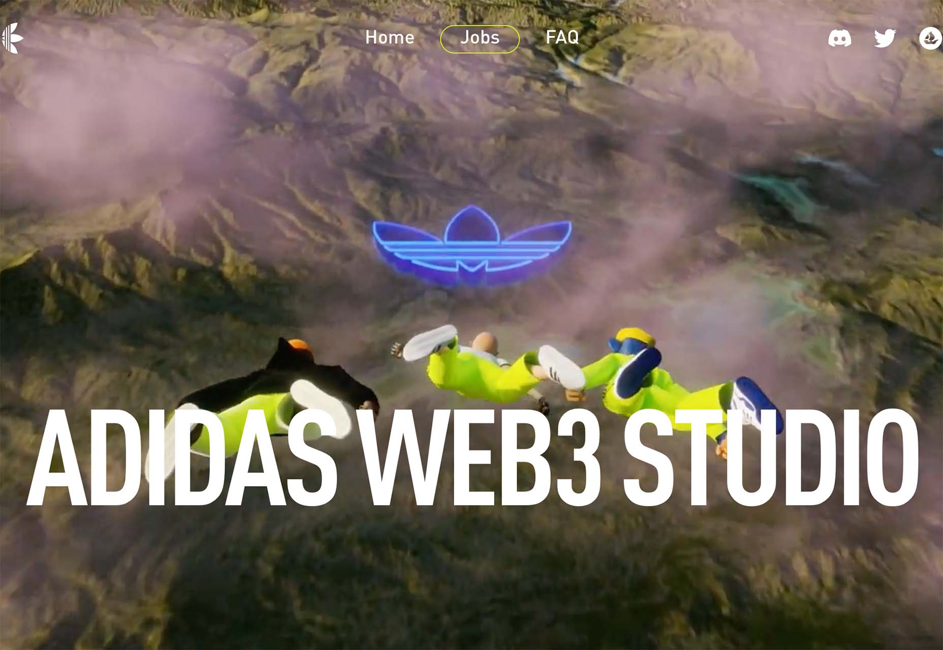
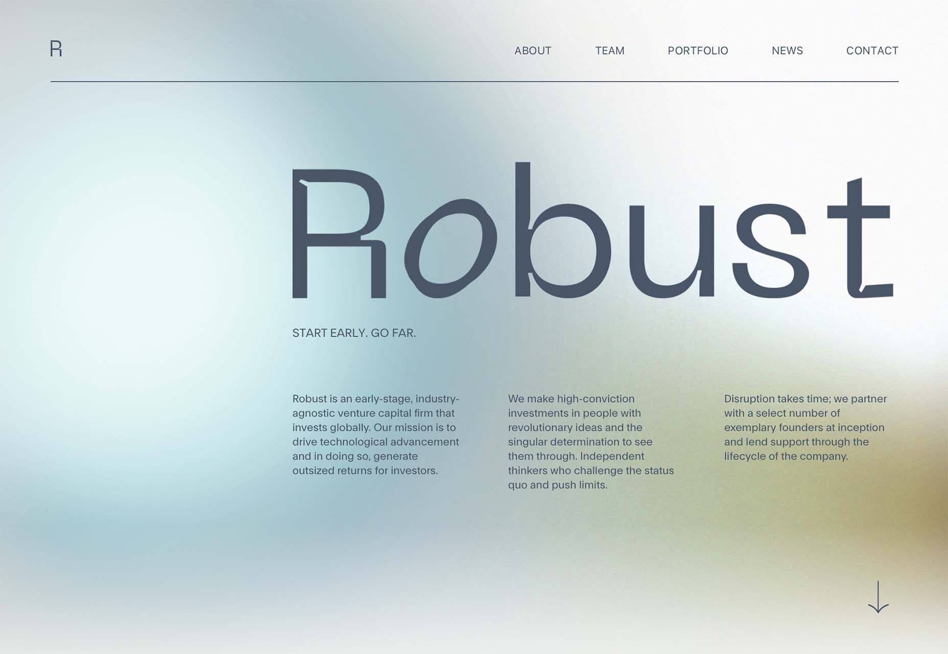
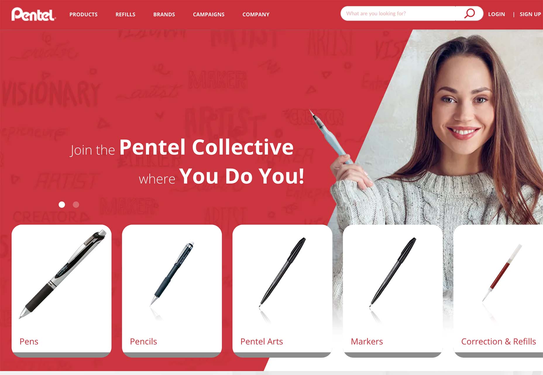
Color and depth are key themes this month as we look at what design trends are happening across websites. Red is the primary color of choice, and you can see it almost everywhere; the new thing is that it’s being used in backgrounds and as more than an accent color. Additionally, 3D elements and depth of field are making significant impressions.

Here’s what’s trending in design this month.

1. Red Backgrounds

Red is the color of power, passion, and attention, but until recently, it wasn’t the go-to choice for website backgrounds. Now trending is red as a background color.

These designs are bold and in-your-face with bright color, an almost brash feel in some cases, and a lot of impact.

But it works.

In the projects below, red is a powerful tool to help convey the message of the website design. The color demands that you engage with the design to see what’s happening and the content therein, and in the case of Pentel, it’s part of the brand color.

Arze uses a bold red background with a smaller inset of contrasting color to show items on the site. It’s an interesting and quite bold choice. The red background carries through the scroll as well. This is a use of color that verges on off-putting but still gets the point across and helps show products thanks to a lot of contrast.

Russia Invaded Ukraine is a perfect use of red as a color that invokes feelings of passion with content to explain the conflict. Red can be a charged color; here, that’s precisely the intent.

Pentel uses a red background that’s a little softer than the previous examples. Here, red is a brand color, and they use the background to help draw attention to items and elements on the site. The red carries below the scroll as well to keep the theme moving.


2. 3D Icons and Graphics

Three-dimensional elements seem to keep ebbing and flowing with designers. We see a lot of 3D in projects, and then it seems to vanish again. It’s like we haven’t really figured out how to use it well or in a way that works with the content of various designs.

Admittedly, 3D icons, graphics, and illustrations can be difficult to create and use. Often they look a bit light and don’t go with all kinds of content. Therefore, they don’t get used that often.

Each of these projects takes a different approach:
Admilk goes all in with a series of 3D animations featuring the brand name. They are fun, light, and a bit unexpected. The graphics include objects that look like balloons, milk and cereal, and grass with flowers. (Click through to see each one.)

Refokus uses three-dimensional objects that move on a scroll to create directional flow and visual interest in a space where there’s not much else in terms of art. The objects stick with the aesthetic on the scroll and create an interesting element that carries you through the design without overwhelming you with tricks.

Junni is one of those website designs that goes all in with 3D. This illustrated bubble style of graphics is beginning to be a 3D trend in itself as a style that’s being used more and more with icons and even emojis. It has a light feel, and the animation almost makes it seem silly and somewhat childish.


3. Long Focal Depth

It’s been a while since a true photography or videography trend made this roundup, but there are so many instance of this image/video style in projects it can’t be ignored. Long focal depth is almost everywhere, from travel sites to architecture to e-commerce.

Long focal depth or depth of field allows the image to show a lot of space in an image in a way that’s sharp and viewable. Depth of field, in photography terms, is the distance between the closest and farthest objects in an image that are acceptably sharp.

In this trend, each website features a strong image with plenty of depth of field. The image can be still or moving, and the image is the thing that really draws you into the design.

What’s great about this trend is that you can see a lot of a scene and even feel like you are part of it. It’s an engaging visual concept that can work for a variety of purposes.

Interest Media uses a video reel that slowly zooms even further out. The image is lovely, and with the text overlay is easy to read and understand. It almost feels like you are walking backward on the bridge in the video.

Bloomingdales uses an immersive video with plenty of depth and virtual reality elements to create an immersive shopping experience. It makes you feel like you are in the store via the website and encourages shopping. It’s a fun way for the retailer to showcase its 150th anniversary.


Arredamento Design uses a photo with a wide focal area to provide interior design inspiration. Note the crisp lines and ease of which you find yourself engaging with the image, or even imagining a room like the one pictured. The effect used in the design, with a zoom on scroll, pulls the user into the image even more. Depth here keeps the motion and zoom from being too much and almost allows you to see more and feel even closer to objects that are further away in the image.


Conclusion

There are two trends here that tend to cross over into one another: The color red is everywhere and having a major emergence this fall as a dominant hue and depth, and three-dimensional focus is everywhere.

Both are highly usable design elements that can be incorporated easily, making them even more likely to continue to gain prominence in projects.

Source

The post 3 Essential Design Trends, November 2022 first appeared on Webdesigner Depot.

Source de l’article sur Webdesignerdepot

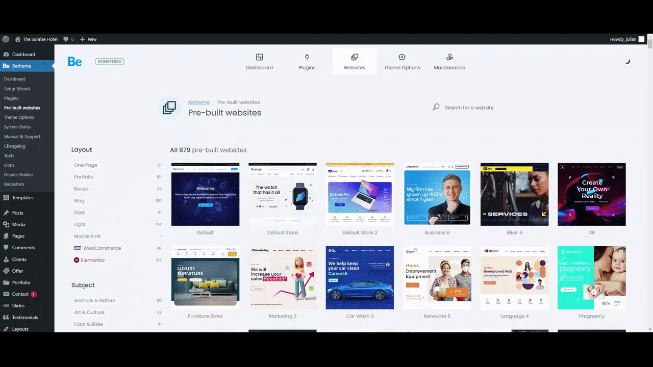
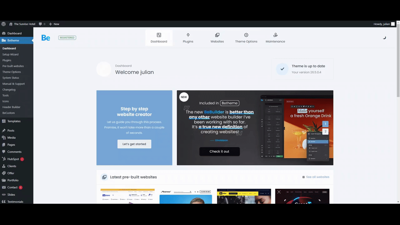
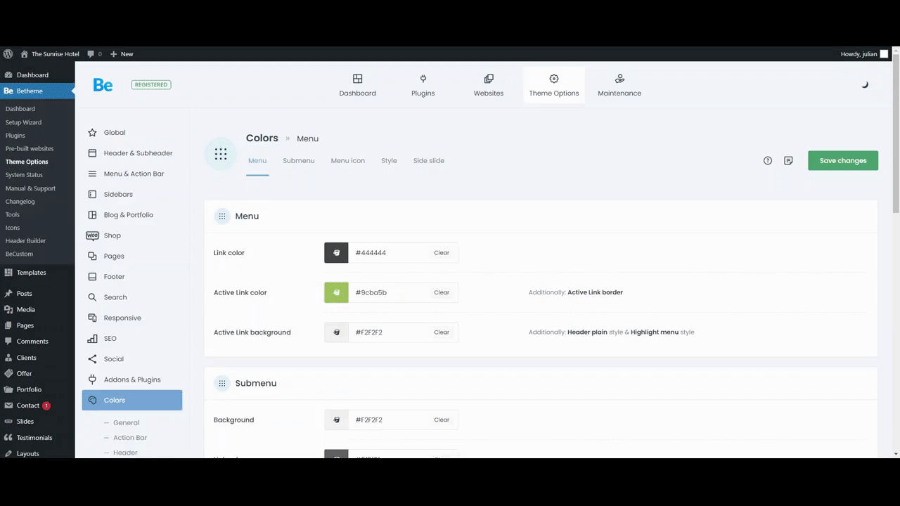
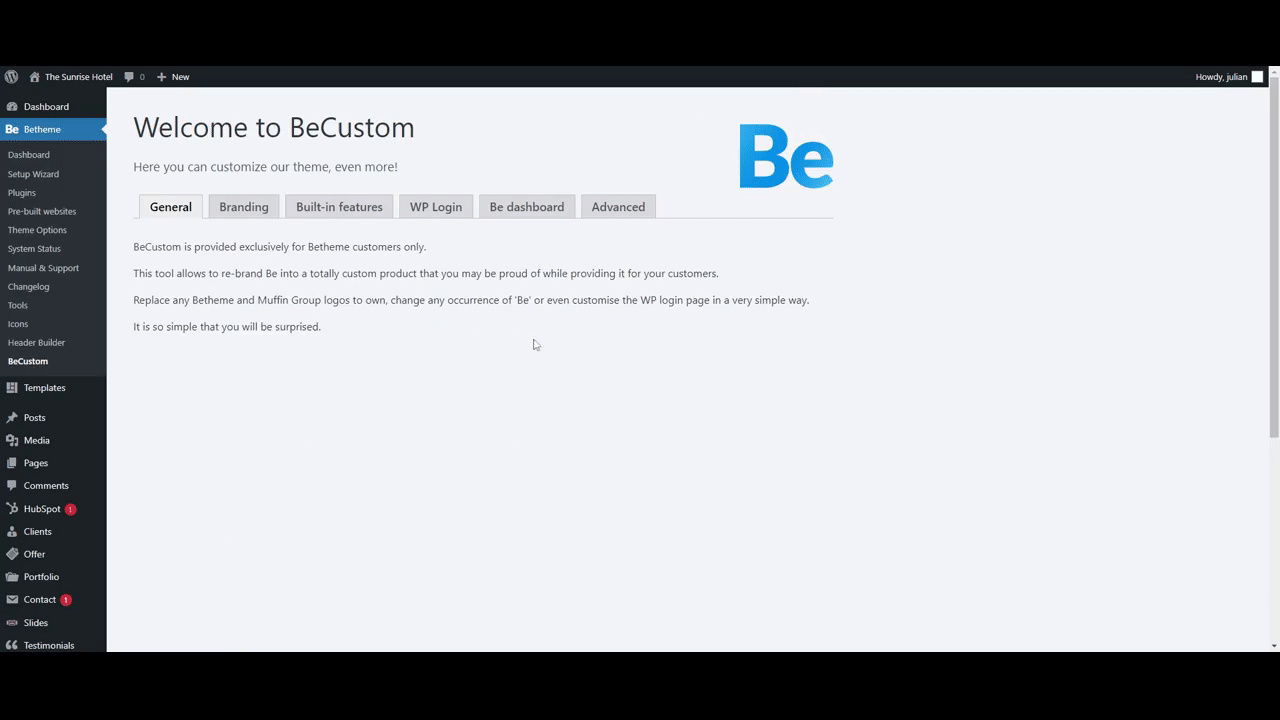
Whether you’ve worked with a few WordPress themes to design websites or worked with many of them, you’ll no doubt agree that plenty of WordPress themes that are visually gorgeous on the front end can be terribly unattractive and extremely awkward to use on the backend. 
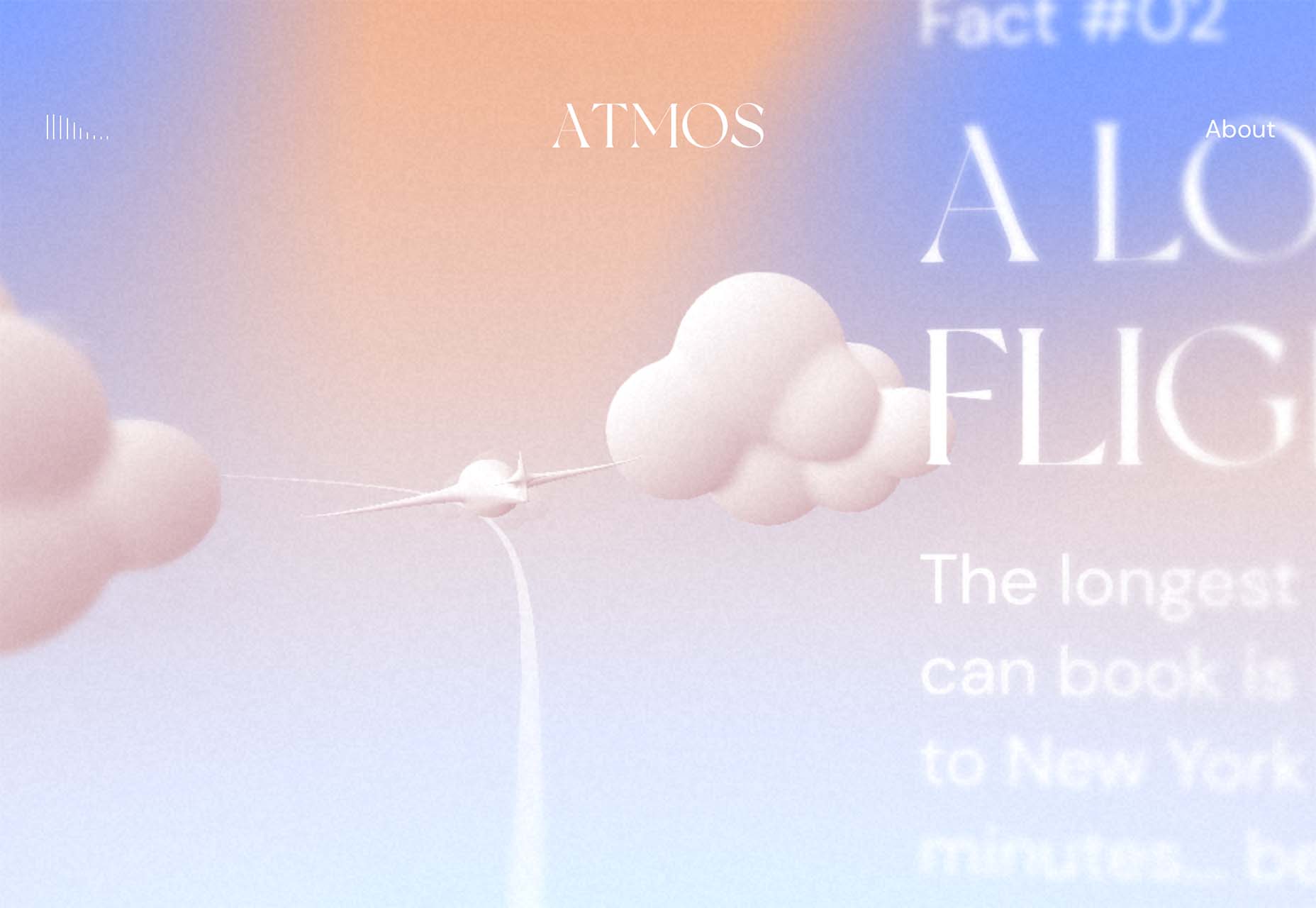
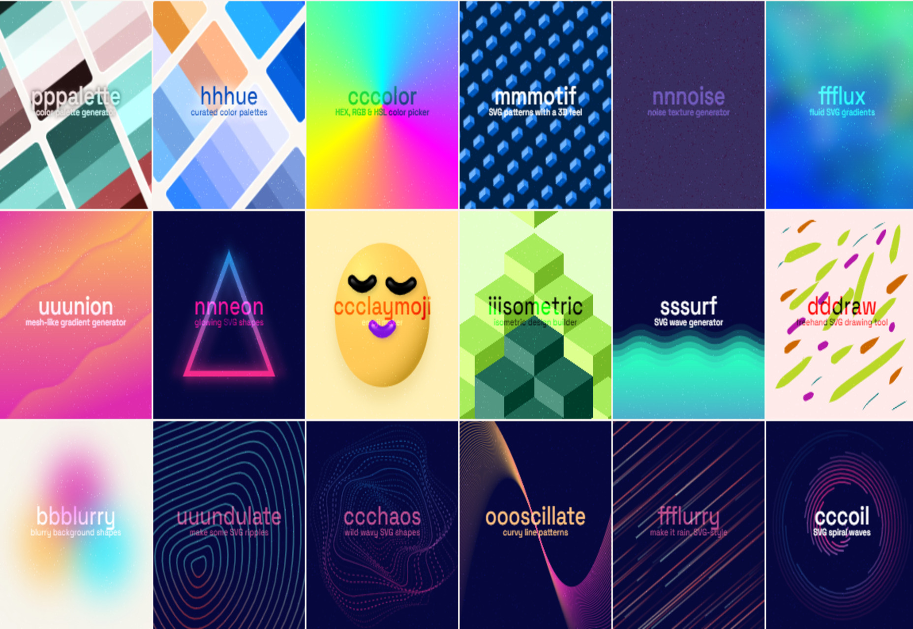
Working with a WordPress theme can sometimes be difficult, but it can be different.

Want proof? Look no further than with BeTheme. 

BeTheme, with 260,000+ sales and counting and a 4.83-star user rating, is one of the top 5 best-selling WordPress themes of all time.

In this article, we’ll show you one of the many reasons why this is the case by focusing on how BeTheme’s backend is designed to make web design tasks more manageable.

Enhance your workflow experience with a WordPress theme backend that won’t stress you out 

Once you install BeTheme, you’ll almost immediately notice it’s different. Instead of a drab and often unintuitive WordPress backend, you’ll suddenly be confronted with a clean, well-organized dashboard and toolset.

You haven’t actually lost anything. WordPress, with its impressive assortment of content management tools, is still there. Be’s backend is a visually appealing space in which you will take pleasure to work.

If only the rest of WordPress could follow suit.

If you haven’t worked with BeTheme recently (or at all), why not let us walk you through several of its most helpful backend features.

Starting with:

1. Dashboard Design

BeTheme’s dashboard is conveniently located directly beneath the main WordPress Dashboard link. So you won’t waste time sifting through the sidebar trying to find your theme’s settings, and everything displayed in the dashboard is designed to help you get the most out of your WordPress theme. 

Clicking on the BeTheme or the Dashboard link gives you immediate access to the following: 

  • Theme registration information
  • BeTheme’s step-by-step website creator
  • A Navigation bar that directs you to BeTheme’s frequently used tools
  • Plugin status and updates and new features announcements
  • The latest additions to BeTheme’s ever-growing library of pre-built websites
  • Beloved BeTheme integrations

It takes a minute to fully appreciate how helpful this dashboard will be. 

BeTheme

2. Dark/Light Mode

Research on dark mode benefits is inconclusive. But since so many people seem to like it, it is offered as an option in many popular apps and devices.

Dark mode users will tell you that they experience less eye strain, they sleep better, and their device’s batteries last longer than is the case with light mode.

BeTheme’s backend offers a dark mode option, and you are encouraged to try it.

If you feel it beneficial, so much the better, and you needn’t concern yourself with what the research indicated, or didn’t indicate.

BeTheme

3. Step-by-Step Website Creator

When you first install a WordPress theme, it’s not uncommon to spend some time trying to figure out what to do next. The theme’s advertisements may highlight a selection of impressive demos, but where are they more exactly?

Of course, you’ll eventually find them, but is whatever difficulty you may have encountered necessary?

BeTheme removes that impediment. 

You will notice the Setup Wizard under BeTheme (and in the dashboard as well.) Click on the wizard, and with its step-by-step website, you can: 

  • Give your website a name.
  • Select the page builder you want to work with and choose your preferred editing mode.
  • Pick an ideal pre-built website based on your new website’s industry or niche.
  • Easily replace existing content with your own.

The entire process of loading your brand-new site and page builder into WordPress takes a minute (or more like 30 seconds once you are used to it).

BeTheme

4. Pre-Built Site Previews

With BeTheme, you can choose from more than 650 pre-built websites. New ones are being added as we speak, and they’re delightfully easy to find. Just look under the dashboard’s Websites link or Pre-built Websites in BeTheme’s sidebar menu, and there they are!

You’ll be familiarized with the available design aids and options in no time, and you’ll find it easy to incorporate the latest design trends into your websites. BeTheme has even placed previews of its newest pre-built websites in your dashboard to help you along.

You may choose one of the latest pre-built websites to work with, or you might find one or more others you particularly like. Pre-built sites you do not plan to work with can still be sources of inspiration.

Whatever your choices, you’ll find it easy to incorporate the latest trends into website designs.

BeTheme

5. Plugin Manager

BeTheme’s Plugins area differs from what you see in the WordPress plugins area. You’ll find several of these differences to be particularly helpful in that BeTheme’s plugins manager enables you to: 

  • View the active plugins you’ve installed.
  • Update plugins when necessary.
  • Install and activate plugins only when it’s required.

The last item is essential in that plugins do not appear in the WordPress plugin manager until you have installed them. Not having to install plugins you will not need will help keep your website operating at a high level of performance.

BeTheme

6. BeTheme Support

WordPress is a powerful content management system and an extremely popular one. It may, in fact, be the most powerful and popular system of its type.

WordPress is also community-driven to a considerable extent, which can sometimes create user inconvenience. As a user, you might sometimes have to dig to find answers to your questions or get help when needed.

You don’t have to experience that inconvenience to get support from BeTheme.

To gain access to BeTheme’s support center, you need go no further than BeTheme’s sidebar or dashboard to access self-support options or open a ticket for direct assistance.

BeTheme

7. Theme Options

Plenty of well-known WordPress themes have theme settings customization capabilities. With BeTheme, it’s easy to set brand colors, choose custom fonts, and establish global layouts. The same holds for configuring responsiveness, performance, and accessibility, all of which are essential for optimizing UX and search engine functionalities.

The problem with most theme options is that they can only be modified from the main WordPress dashboard. So if, while designing on a page, you suddenly realize a portion of its design hasn’t been configured correctly, or you’re dissatisfied with any design segment, you’ll have to save your changes and go to your theme’s backend to make the necessary fixes.

From the BeTheme dashboard inside the BeBuilder BeTheme, you can modify your Theme Options without having to interrupt your workflow.

BeTheme

8. White-Label Mode

A final feature of the BeTheme WordPress theme’s backend you should become familiar with is BeCustom. This critical feature is located under BeTheme in the sidebar.

BeCustom enables you to access some white-label regions in BeTheme. 

  You can use BeCustom to:

  • Substitute Be’s branding with your business’s branding to reinforce your name with your clients.
  • Disable any features your clients have no use for and deny access to any features you do not want them to modify while at the same time making the WordPress theme’s backend easier to work with.
  • Create an extra user-friendly and secure WordPress login.
  • Customize the dashboard’s “Welcome” message.

BeTheme

Make Your WordPress Design Projects Simple to Handle With BeTheme

Is there anything BeTheme doesn’t do?

Most likely, but nothing that would adversely impact your design effort.

This multipurpose WordPress theme’s hundreds of pre-built websites will help you get virtually any website project off to a rapid start and headed in the right direction.

BeTheme features the fastest and most powerful page builder for WordPress.

You will have total control over every feature and facet of your website’s UI.

In short, BeTheme offers the finest way to manage any web design project within WordPress.


[- This is a sponsored post on behalf of BeTheme -]

Source

The post Why Do WordPress Theme Backends Have to Suck? (Hint: They Don’t!) first appeared on Webdesigner Depot.

Source de l’article sur Webdesignerdepot

The design world fluctuates back and forth, swerving between love and hate for different design trends. Sometimes we see a wide range of approaches, and sometimes designers all hop on the same idea.
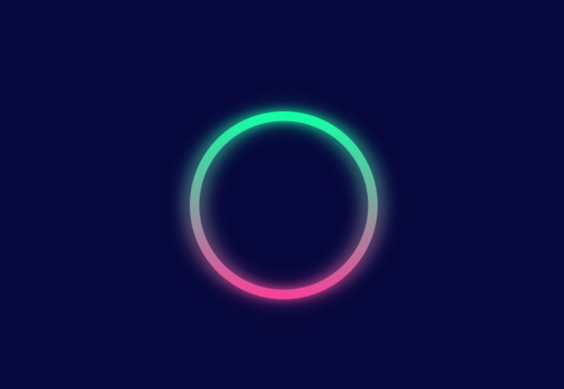
This month, the web is dominated by animation. Designers are cramming in motion in unexpected ways. And it’s fun to explore. Here are 20 of the best new sites on the web this month. Enjoy!

Bannach

Bannach is a German furniture brand. Its products are colorful and geometric, so it makes sense that when you scroll down to the collection, the thumbnails begin as pixel blocks and animate into product photography.

Fornasetti Profumi

Fornasetti Profumi takes a different approach to motion. It uses video to emphasize stillness to promote the calming qualities of its candle products.

The Other Side of Truth

The Other Side of Truth is a superb exercise in utilizing the web for a cause. It presents facts on the Russia-Ukraine war, but the standout feature is the toggle switch that, instead of light mode-dark mode, toggles facts and Russian state propaganda.

Glasfurd & Walker

Glasfurd & Walker is a portfolio site for a design agency. So far, so standard. However, it sets itself apart because it’s slightly bigger than the browser and swerves left and right with your mouse movement.

Sirup 5th Anniversary

Sirup is a Japanese singer-songwriter, and to celebrate the fifth anniversary of his first hit single, his record company has put together this awesome maximalist micro-site that uses type, motion, and art direction to capture his style.

Fitzjohn’s

Fitzjohn’s is a slick site for a new apartment complex in the Hampstead area of London. It uses a refreshing modern color palette and calming animation to take the edge off the frankly ludicrous price tag.

Persepolis Reimagined

Persepolis Reimagined is an awe-inspiring WebGL tour through one of the most important cities in ancient Iran. Make sure you tour it on a large screen. It’s hard not to be wide-eyed with wonder.

JaM Cellars

JaM Cellars is a Californian wine brand that’s pitching to bachelorette parties. With names like Butter, and Sugar, it’s not the most sophisticated tipple, but yellow, we love a yellow site.

Danielle Levitt

This portfolio site for film director and photographer Danielle Levitt features samples of her best work scrolling past the viewport. There’s a clever switch of thumbnail and background color when you scroll down to the contact details.

Propel

From total color energy to Apple-levels of minimalism: Propel is a slick, animate-on-scroll site for a marine motor brand selling an outboard and inboard motor. The animated masks on the images are a nice subtle touch.

Standards

Standards is a site for a SaaS that helps organizations create, maintain, and share brand guidelines. It uses subtle animation, video of its UI, and compelling copy to sell its approach.

Chris Carruthers

The portfolio site for Chris Carruthers is deliberately self-indulgent with scrolling text, clipped images, and scroll-jacking, but it’s also delightful to peruse.

Theodore Ellison Designs

We don’t often see colored glass in real life, but the play of light on stained glass is beautiful. This site for Theodore Ellison Designs uses video to bring the effect to the web.

Owomaniya!

The Owomaniya report for 2022 uncovers the state of gender diversity in the Indian entertainment industry. Presented in the style of infographics, the information is brought to life by animation.

Meetings

Meetings is a French events company. Its site uses an animated collage approach to showcase its services, and animated text to pull you into its content.

Blakeney

Blakeney invests in African companies on behalf of institutional investors. Its site is typical of the financial industry, but it uses animation to lift it to a higher level of interest.

Becklyn

Becklyn is a digital design agency. Its portfolio site uses animated text, expanding image masks, and video to guide us through its site and app design approach.

Cabi

Cabi is a brand of Japanese condiments with a typically Japanese feeling site. Bright colors, a slowly scrolling slideshow of dishes, and editorial to pack shot hover effects are a great introduction to the brand.

Slantis

Slantis provides building information modeling to architecture and infrastructure providers. Its site uses animation to showcase the types of content it produces for clients.

July Fund

July Fund is a venture capital project. It takes an entirely different approach than its competitors by adopting a chaotic but enjoyable card-based design.

Source

The post 20 Best New Websites, October 2022 first appeared on Webdesigner Depot.

Source de l’article sur Webdesignerdepot

This month we’re seeing websites that are very conscious of the design trends they’re following. Designers are making conscious choices to adopt styles, and opting out when it doesn’t suit the site. What we end up with is a crop of sophisticated, well-designed websites that use style as a technique to further their aims.

Here are the sites that caught our eye this month, enjoy!

Seen

Seen uses conversations to explore themes surrounding ethnicity and racism in creative fields. Displaying these conversations as online chats creates a sense of intimacy.

Baboon to the Moon

There is a lot of color in Baboon to the Moon’s product shots, so the rest of the site is kept simple, with good clear navigation too.

Fleava

There is a strong sense of luxury to digital agency Fleava’s glossy brochure portfolio site.

Baunfire Portfolio Review 2022

This site for Baunfire digital agency’s creative networking event is bold, personable, and fun.

Laesk Kombucha

There is more than a touch of Wes Anderson’s style to this site for Laesk Kombucha; somewhere just out of sight is Bill Murray in a red beanie.

Viso Haus

Viso Haus doesn’t do anything hugely groundbreaking here with their brutalist-style portfolio site, but they do it very well.

Mario Carillo

Artist/programmer Mario Carillo has opted for a minimal approach, allowing the work to do the talking.

Symbol

There is a warmth to Symbol’s site, created by the color tones and combinations used here.

Contekst

Interior architects Contekst favor a brutalist visual style for their site, but with some nice little animated extras.

Arcane Type Fair

No, you haven’t missed the font lover’s answer to Comic Con: the Arcane Type Fair is fictitious and a clever showcase for Rain Foundry’s Conacher typeface.

Capsul’in Pro

With lovely scrolling animation and soothing colors, this site for Capsul’in Pro manages to turn coffee pods into objects of desire.

Wanderful Chalet

Random illustrations and a quirky display type add character to Wanderful Chalet’s brochure site.

Stone Cycling

Bricks made from rubbish don’t sound like the most exciting thing ever, but this site evokes a lovely clean feel: like an old building gleaming in the sunlight after all the soot has been scraped off it.

Lazarus Forms

Lazarus Forms is an API for AI document processing. This site succeeds in being transparent in its explanation without being overly technical and pleasing visually.

Nathan Riley

An excellent example of masonry combined with variable scrolling speeds creates tension in digital artist Nathan Riley’s portfolio.

Evi O. Studio

Sometimes the simplest things, like this full-screen image transition for Evi O. Studio’s portfolio, can be so well done it’s an absolute pleasure to scroll through.

Sundo

Sundo has created SMOTSpots – smart sunscreen dispensers for public areas. The tone of the site is suitably utilitarian with a soft edge.

Blue

The Blue experience from Rossinavi luxury boat builders is a pleasing immersive microsite showcasing their new hybrid-electric boats.

Cased in Time

This site is an excellent example of how to make a single product commerce site that doesn’t feel lacking in content.

Educated Guess

Educated Guess is a podcast for creatives by creatives. The accompanying website is pleasing to use, easy to navigate, and allows the user to focus on the content.

Source

The post 20 Best New Websites, September 2022 first appeared on Webdesigner Depot.

Source de l’article sur Webdesignerdepot

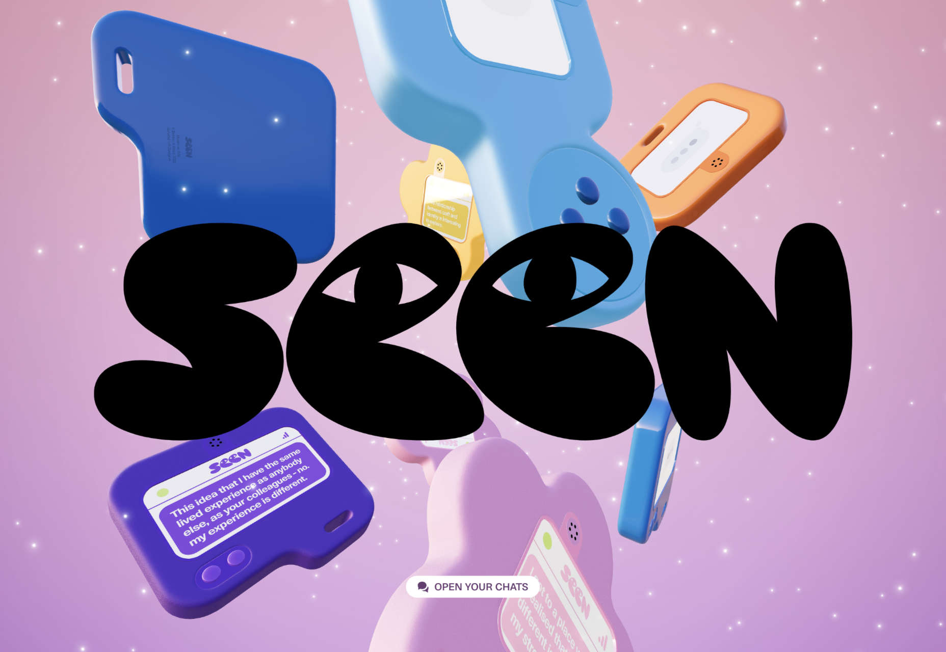
Every day design fans submit incredible industry stories to our sister-site, Webdesigner News. Our colleagues sift through it, selecting the very best stories from the design, UX, tech, and development worlds and posting them live on the site.

The best way to keep up with the most important stories for web professionals is to subscribe to Webdesigner News or check out the site regularly. However, in case you missed a day this week, here’s a handy compilation of the top curated stories from the last seven days. Enjoy!

Advanced CSS Tricks that You Have to Know

Nnneon – SVG Generator for Futuristic-looking Glowing Shapes

The Best New CSS Features for 2022

Avatarg – Generate Beautiful Types of Avatar in One Click

I Just Spent $35,000 on a Domain. Here is Why!

10 Useful CSS Layout Generators (Grid & Flexbox)

Fffuel – A Mighty Collection of SVG Generators

Raindrop.io — All in One Bookmark Manager

My Wonderful HTML Email Workflow

3 Essential Design Trends, July 2022

My Dumbest CSS Mistakes

Source

The post Popular Design News of the Week: June 27, 2022 – July 3, 2022 first appeared on Webdesigner Depot.

Source de l’article sur Webdesignerdepot

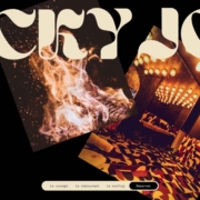
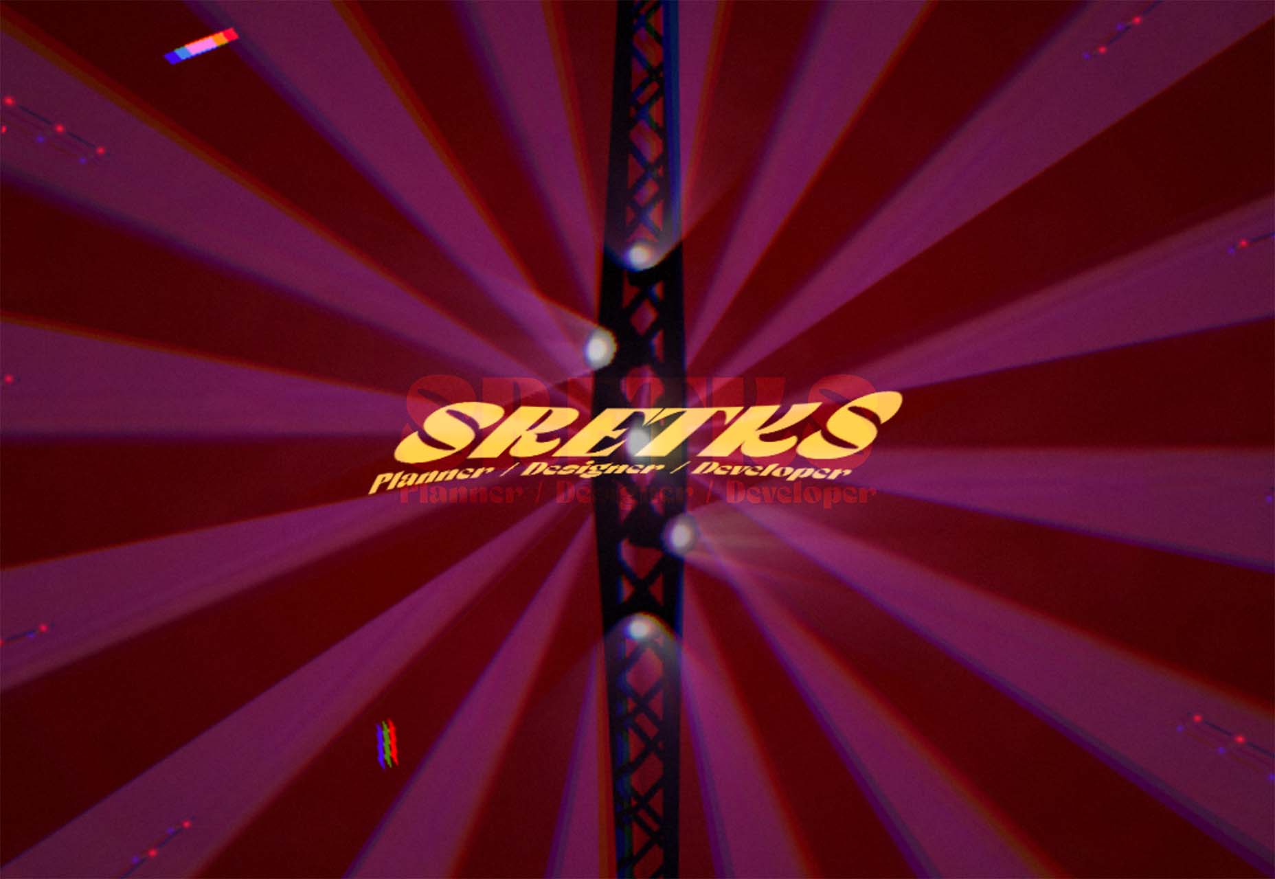
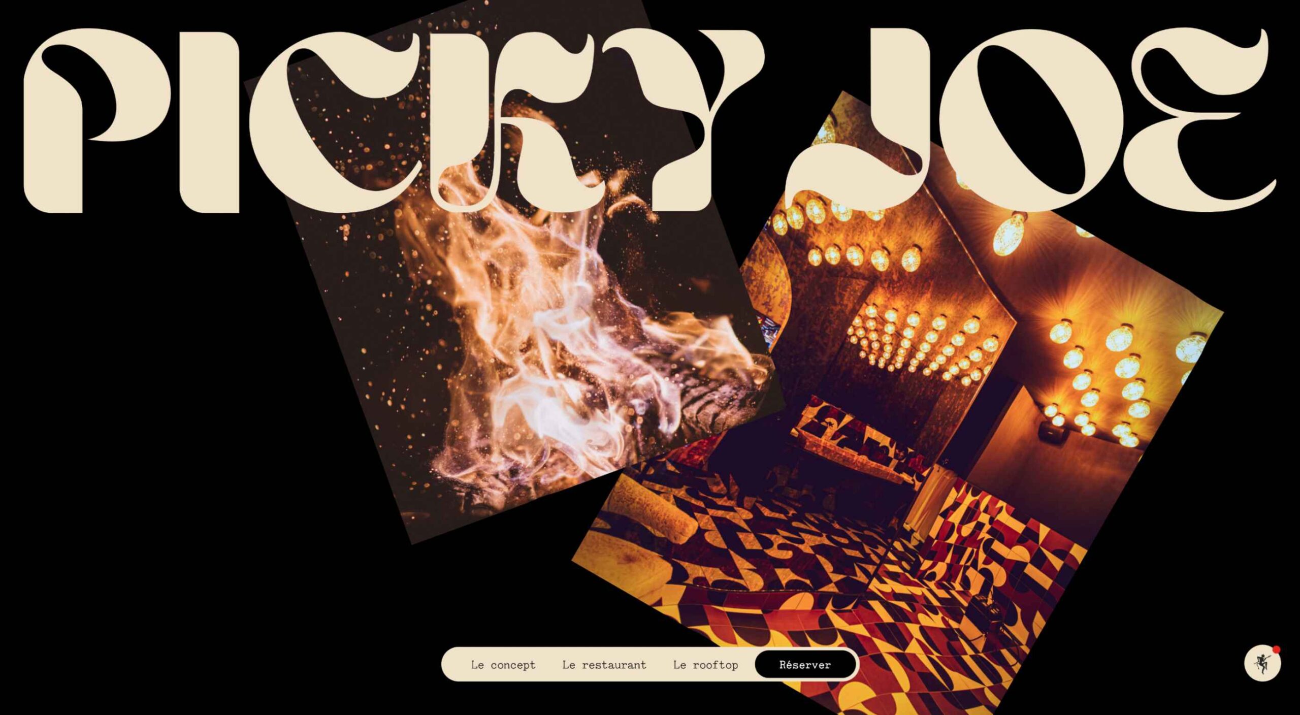
There are a lot of dark, retro vibes trending in website design right now. Although there are still some light projects popping up – including a pastel trend below – a lot of what we are seeing has a quite moody feel.

Here’s what’s trending in design this month.

Pastel Color Palettes

Let’s start with the trend with a lighter feel – pastel color palettes. While much of the web is trending toward dark aesthetics, there’s a segment that’s going in the exact opposite direction. Those sites feature soft, pastel color palettes that serve as a balance to all the super dark websites out there.

One thing about this website design trend is that it jumps out because of the stark contrast with all of the dark color palettes out there.

Each of these designs seems to use a pastel color palette as the basis for a background. A blur effect is paired with the colors to use pastels in a way that has a natural feel without appearing too feminine or light.

Robust uses blue and earth tones for a pastel background that feels modern and strong when paired with the hard-edged headline font.

Atmos uses a light pastel theme that takes you through the clouds with blues, and pinks, and purples. The pastel color scheme works well with the content which is airline-themed and makes you feel like you are flying through the sky. The colors are also soft enough to provide an easy reading experience.

Klezma is another design with the same pastel background with graduated color. The peach tones are fairly neutral and give plenty of room to the content.

Fonts with a Distinct Retro Look

Every one of these websites uses a typeface with a similar look and feel. This retro headline style is trending in a major way.

The best way to use this design element is for short words. This typeface design isn’t meant for a lot of words or when readability is a high priority.

This style is all about creating a specific kind of vibe for your website. The typefaces in this trend have a quite retro look and feel with an almost 1960s or ’70s feel to them. The rest of the design mimics this feel as well with colors and surrounding elements that contribute to the overall look.

A couple of common elements here include the use of all capitals font sets and letterforms that include odd shapes and lines.

Sretks not only uses a retro typeface but bends and twists it a bit too to add to the old-school feel. The background color helps add to the groovy vibe.

Barge 166 uses a retro typeface with the same design feel as the other examples but with a sharper, more serif-style edge. It’s easier to read but still carries a retro look and feel. Use a typeface similar to this if you want to capture that retro font style for a trending look while maintaining as much readability as possible. This option works best for multiple lines of words in a large size.

Picky Joe uses a retro typeface with rounded letters and a bit of a tilt to the characters to create a distinct feel. This is definitely a style that has to be used sparingly but can be a fun option, depending on the content of your website design.

Dark “Product” Sites

Dark mode design is probably the biggest design trend of 2022. Everywhere you look, websites are using dark color palettes and styles. Designers are creating more projects with a dark/light toggle so users can control their experience.

This visual concept is carried over to website designs that feature products as well. This is one of the last places the dark aesthetic had not touched. It’s been a bit of an unwritten rule that product images should be on white or light backgrounds to help make them easy to see and inspect digitally.

This design trend bucks that idea and features products on dark backgrounds – some with so little contrast that you almost have a hard time seeing the products. (Maybe these brands are banking on the idea that you already know them or are selling a lifestyle product.)

HQBC sells bike accessories such as glasses and helmets and the site has a sleek look and feel. You know it is cool from the second you land on it. The question though – is there enough visual information with the dark background to help you make a purchase? This design probably works because it only encourages you to find a physical location to make a purchase rather than buy online.

Doggystyle Shop also banks on the idea of you knowing the shopping experience or brand when you arrive. What the design does do though is put products on white backgrounds after you have clicked through far enough to make a commitment to buy. This helps you see the product well one final time before making a purchase. (The challenge is that it is three to four clicks in for the most part.)

FirstFit uses the design trend in a way that’s similar to the first example. They are showing a product, but not actually trying to convert sales on the website. Other links take you to more product information and content – using a lighter background and color scheme – and the dark background with the product serves mostly as a highly visual landing page that will help entice users to learn more. When it comes to dark mode and products, this seems to be the best option for most website designs.

Conclusion

The state of the world around us and our emotions can play hard into websites and other design projects. Some of the darker elements that are popular now may be a reflection of that or it could be more of a lean into dark mode schemes.

Either way, the web has a pretty dark feel right now.

Source

The post 3 Essential Design Trends, July 2022 first appeared on Webdesigner Depot.

Source de l’article sur Webdesignerdepot