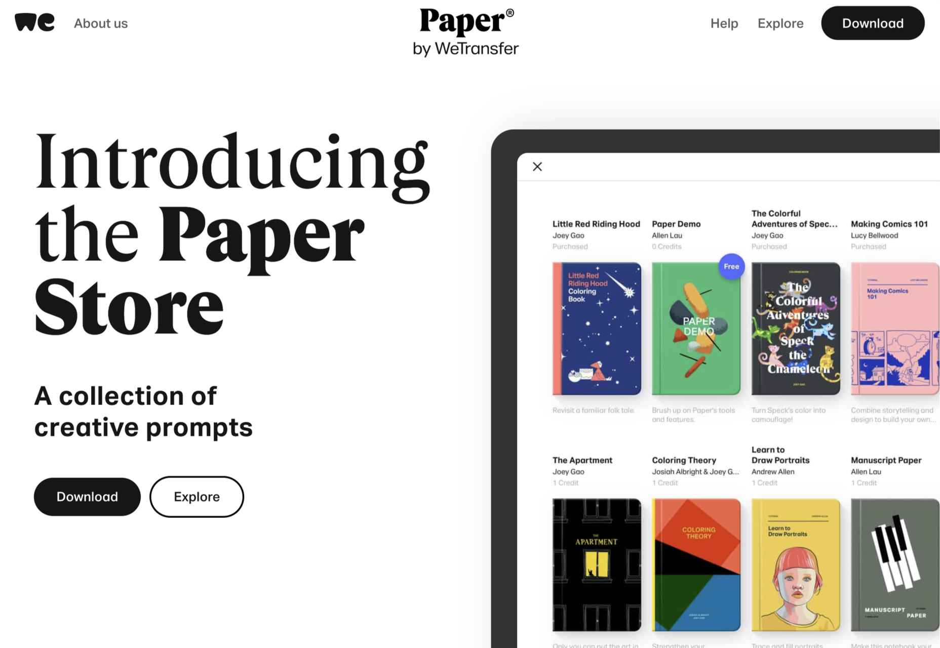
 The best thing about writing about website design trends each month is looking at all the great sites that are being developed. Designers are stretching creatively and exploring new techniques and ways of doing things all the time.
It’s refreshing and inspiring. This month, some of those trends include a style that nods to brutalism, slide scrolling that’s interesting and fresh, and animated typography.
Here’s what’s trending in design this month…
1. Almost Brutalism
Brutalism can be a lot to handle and only really works for certain types of projects. That being said, some of the elements of brutalism can be the foundation for an interesting aesthetic.
So, it’s not surprising that an “almost brutalism” trend has emerged.
Designers are working with some of the design elements – slab fonts, simple color schemes with a lot of contrast, twitchy animation, mono typefaces, and overall design patterns that are almost over-simplified.
The result is a striking design that isn’t so harsh that it turns users away. It’s the right combination of brutalism and usability to create something with a harder-edge feel that people understand.
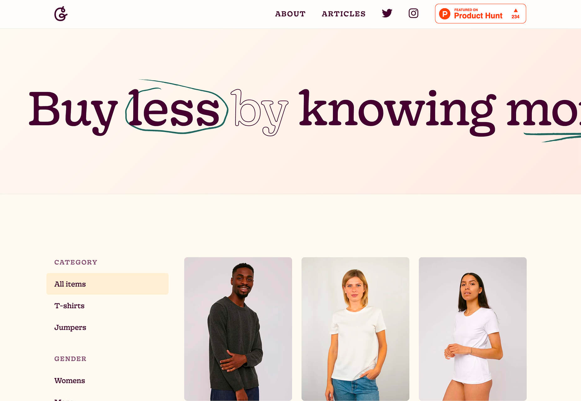
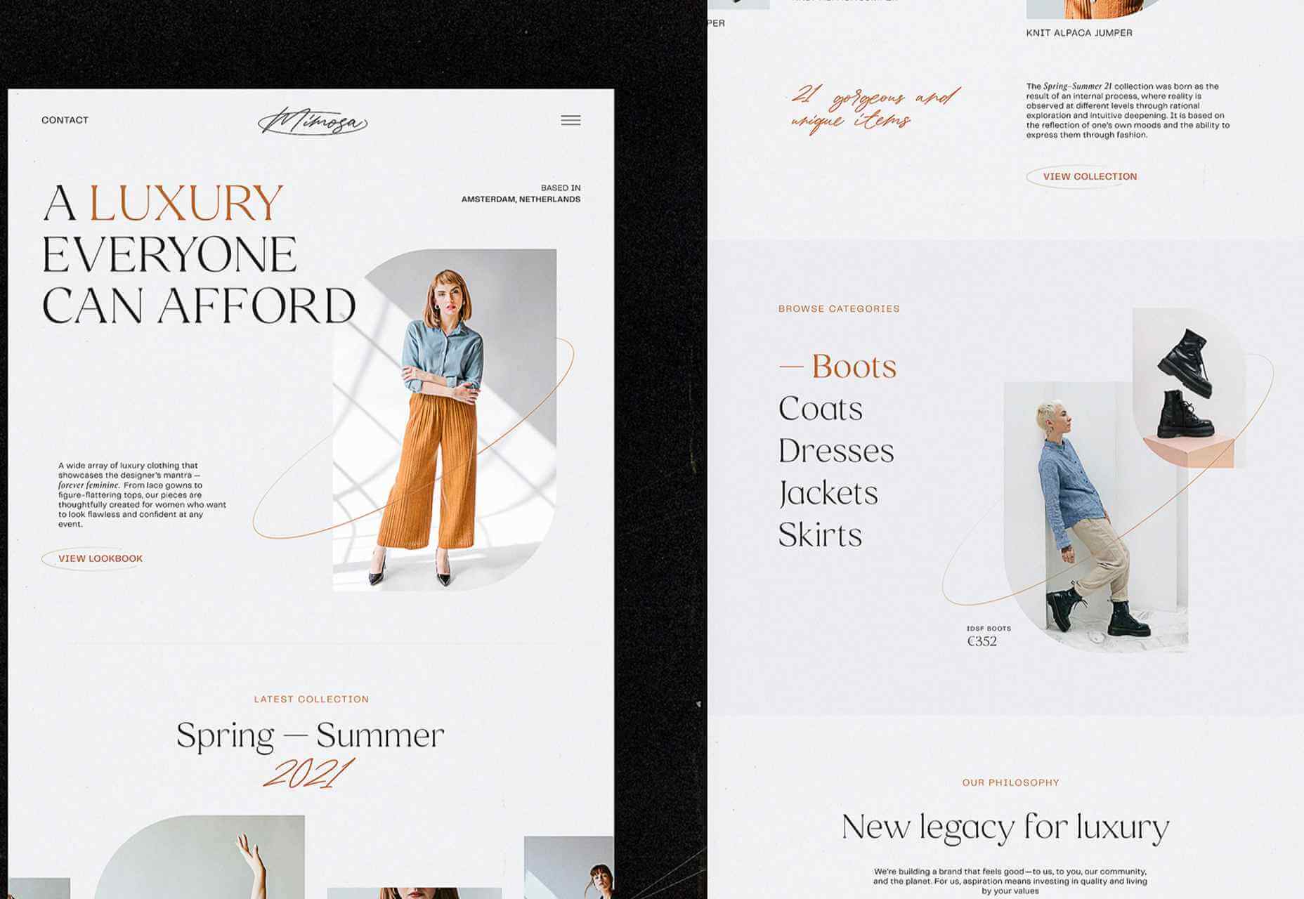
Good Garms uses a typewriter-style typeface, simple patterns, and one of the most streamlined designs you might find for an ecommerce store. It’s effective and makes you look because it is different.
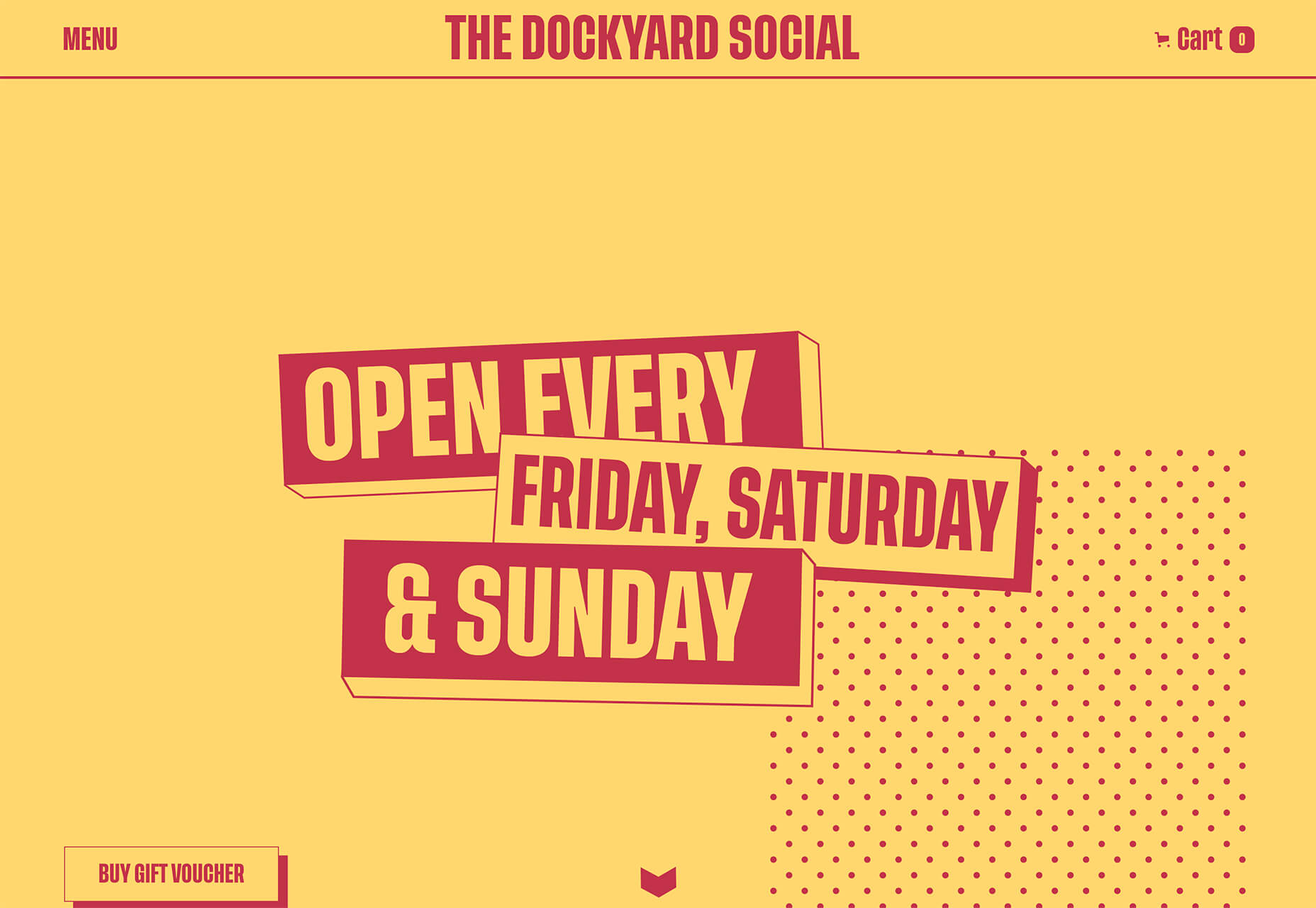
Dockyard Social uses an unexpected color combination with high contrast, sharp shapes, and design elements, and bold slab typography to grab your attention right away. The theme continues on the scroll with new color combinations with equally brutal design elements. It feels a little tight and uncomfortable in places but still highly usable – exactly what almost-brutalism intends to do.
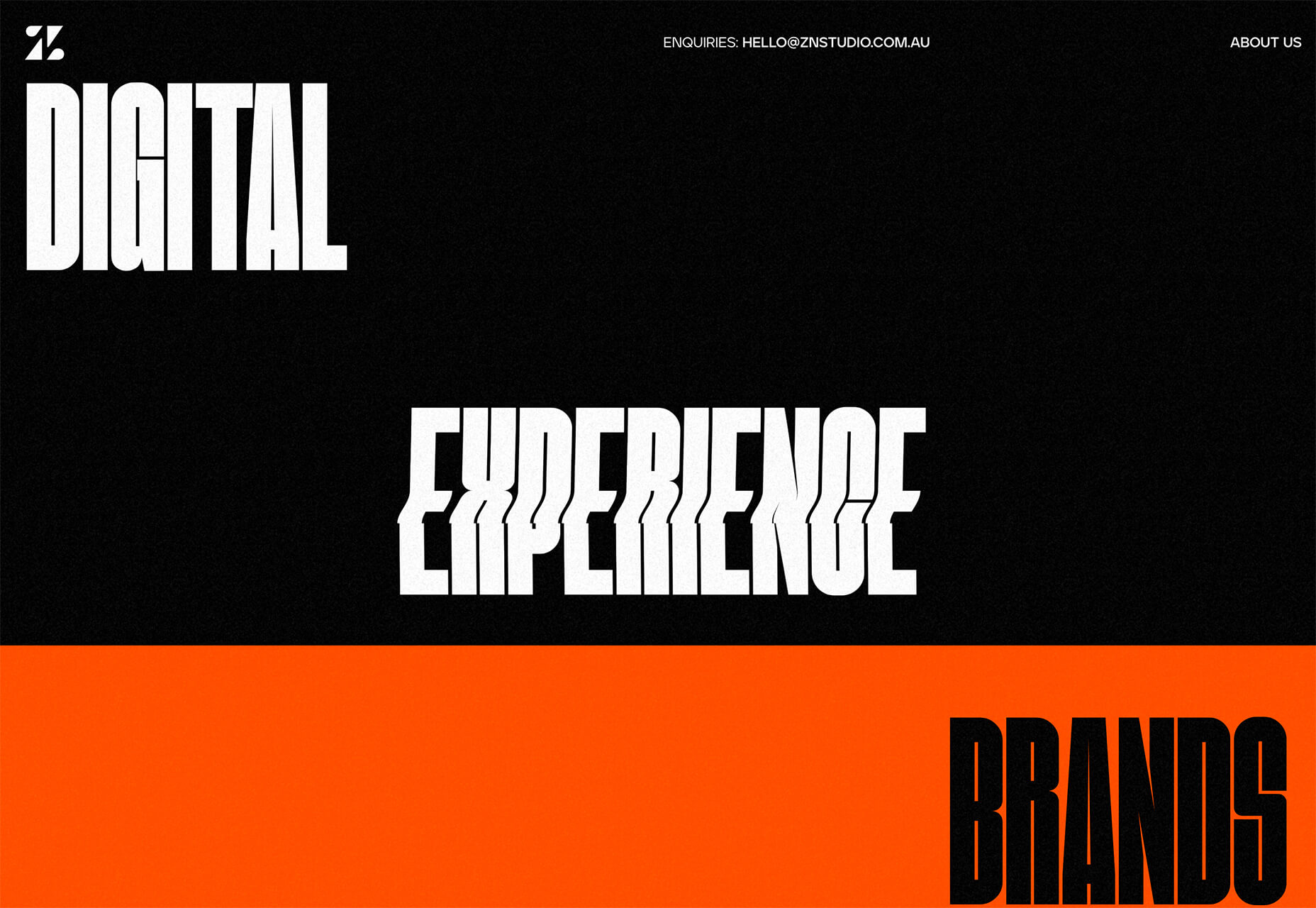
ZN Studio uses the same big, bold type elements as the previous example with a twitchy-style animation to draw you into the design. The entire design uses clever animation effects with a brutal aesthetic to keep you scrolling.
2. Beautiful Slide Scrolling
You can argue the value – or lack thereof – of website sliders as long as you want to. The reality, though, is that, for the most part, they are clunky and get in the way of the content. It’s a lazy option that keeps you from having to make a content choice.
Not with these beautiful slide-scrolling website designs.
Each of these designs uses side-scrolling as a design asset. Here’s the trick that makes it work: Slide scrolling isn’t a “feature” above a bunch of other content. It is how the content is featured.
These examples show you how to use the trend well and should get you excited about slide (or side) scrolling.
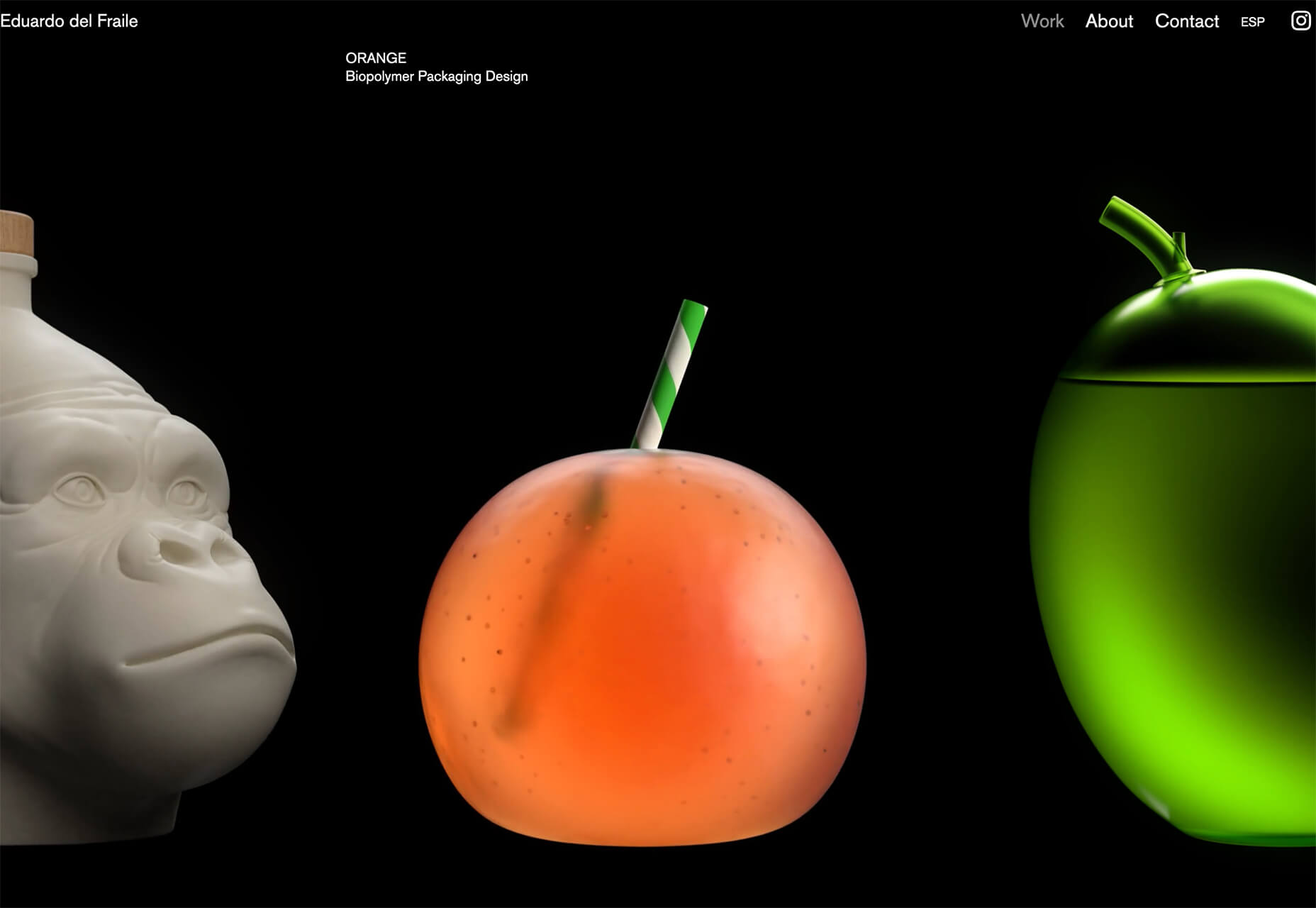
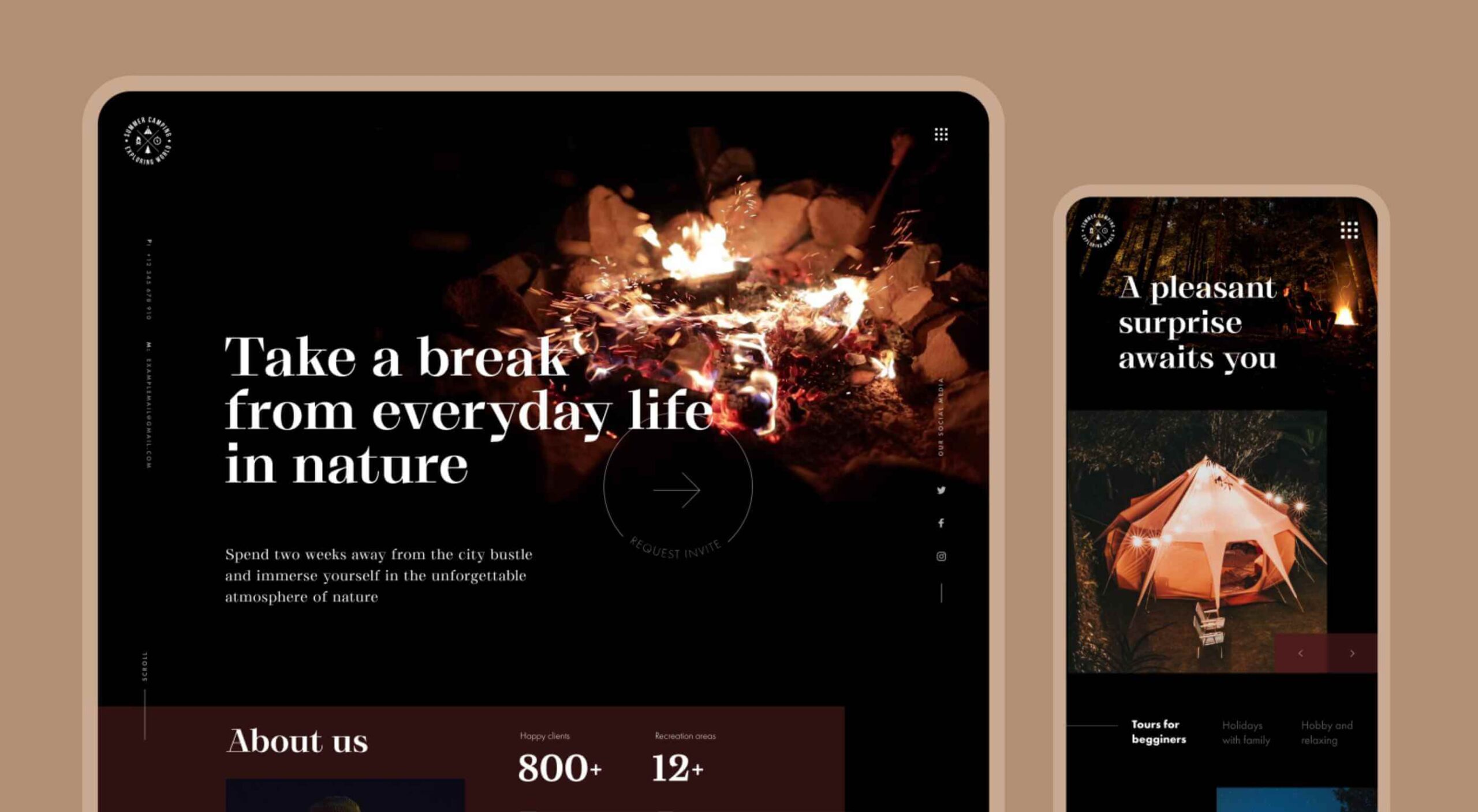
Eduardo del Fraile uses a side scroll to show different projects in his portfolio. In addition to scroll, each element also has a simple and beautiful animation that allows you to see each product he has designed. Everything about the scrolling motion is intuitive, and the site never scrolls vertically, which is where many side scrollers go wrong.
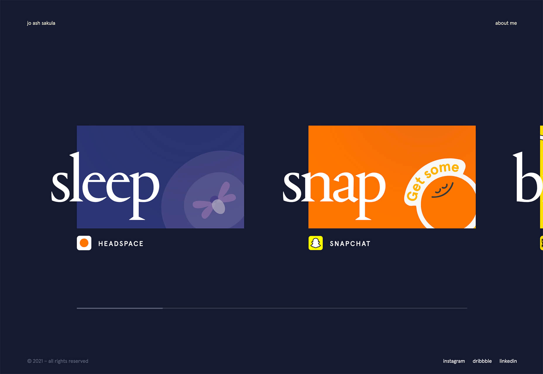
Jo Ash Sakula uses a similar concept for the side scroll here but with different design elements. The bold card elements are striking in terms of color, contrast, and design. You know the scroll will move horizontally because a third element sneaks into your field of vision on the right side. It’s simple, clean, and highly usable.
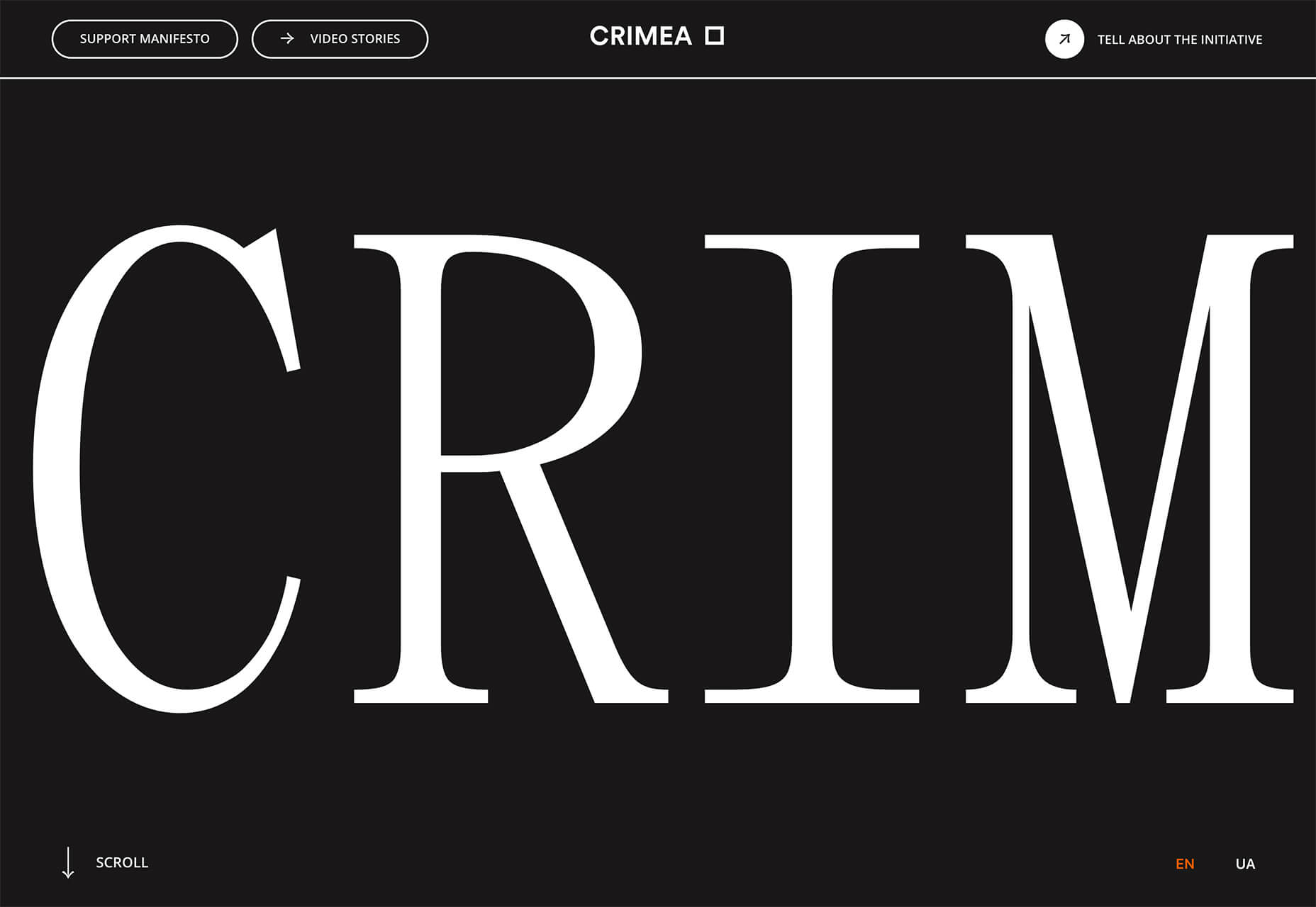
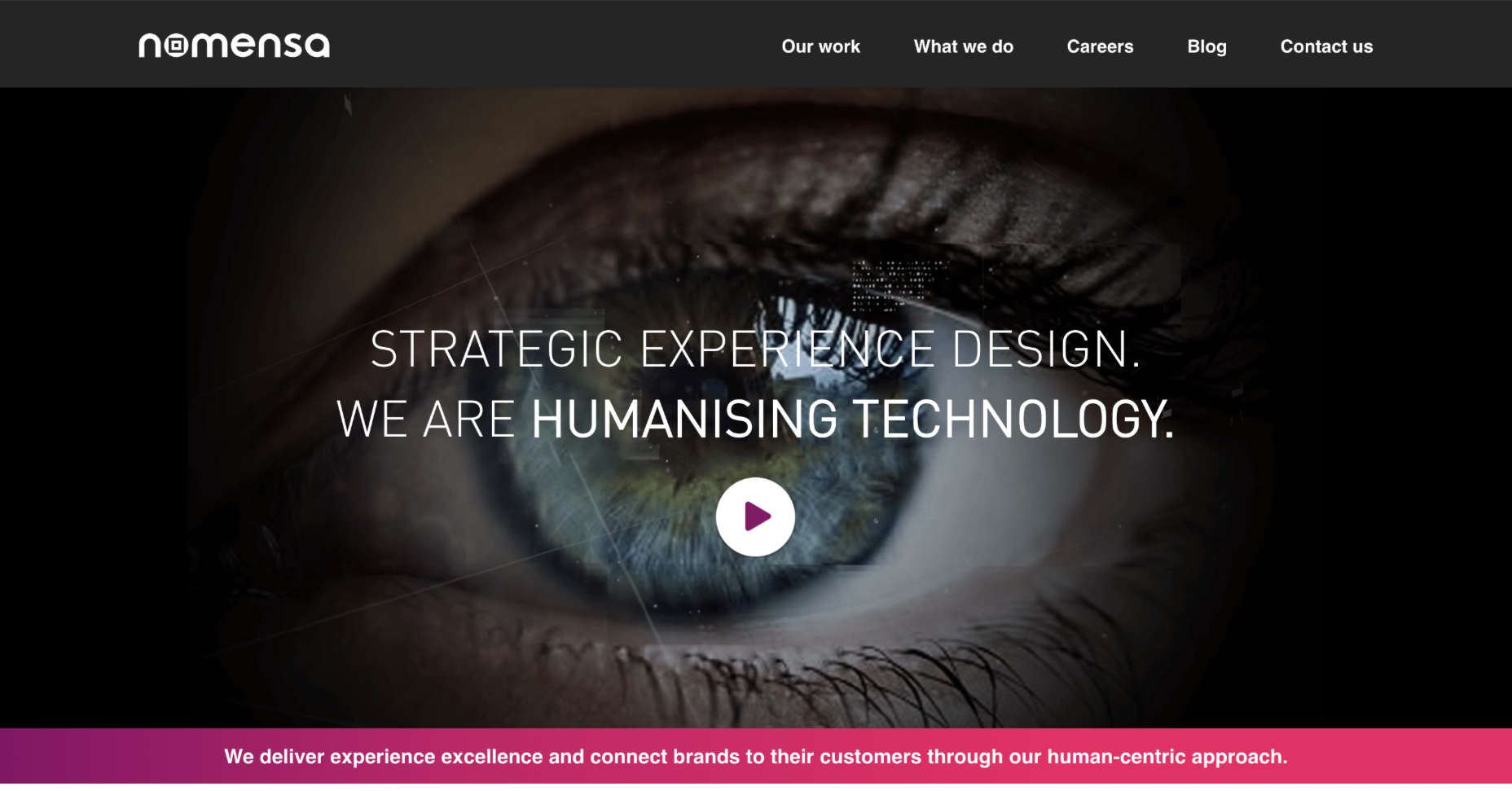
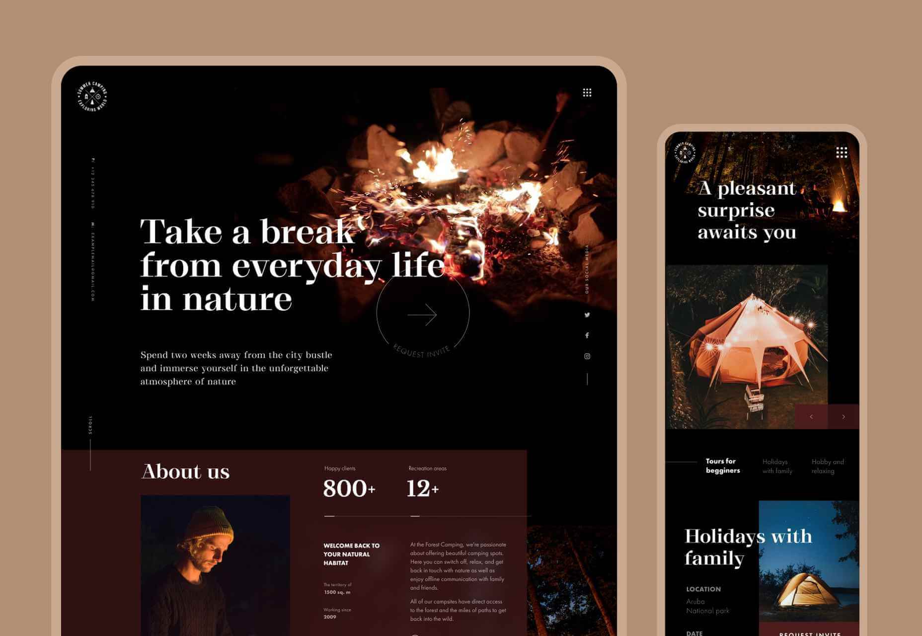
Crimea is interesting because it has an “almost brutalism” style design and uses a side-scrolling pattern. The design is bold and almost overwhelming, but the scroll works to tell a nice story with visuals and content.
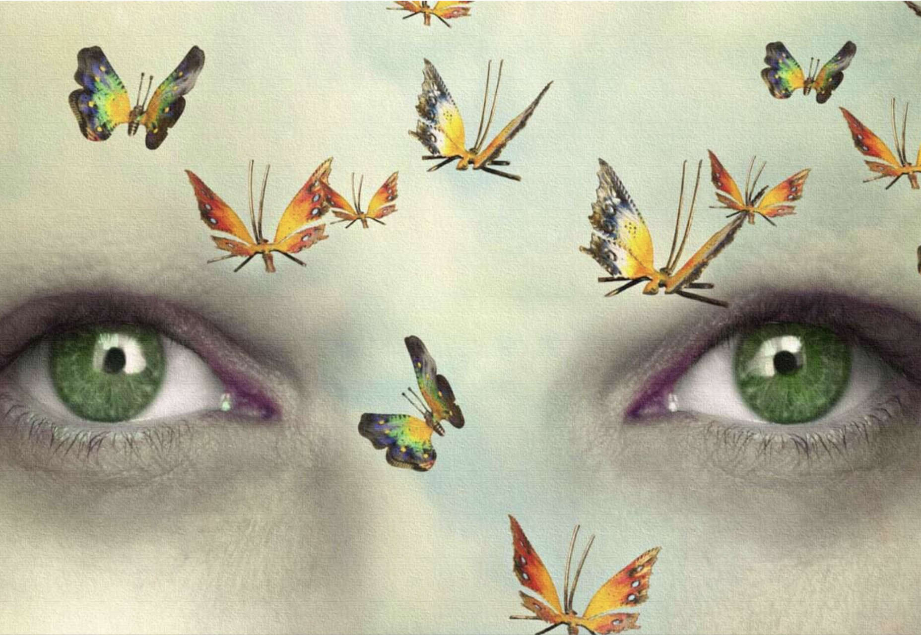
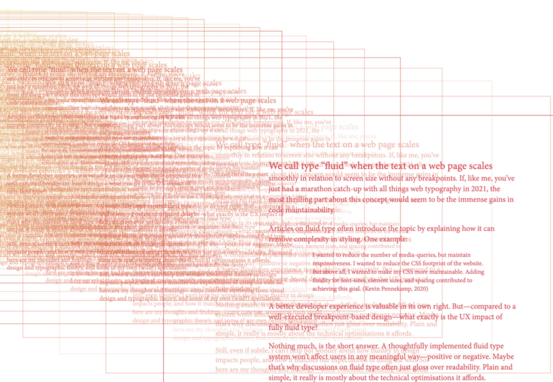
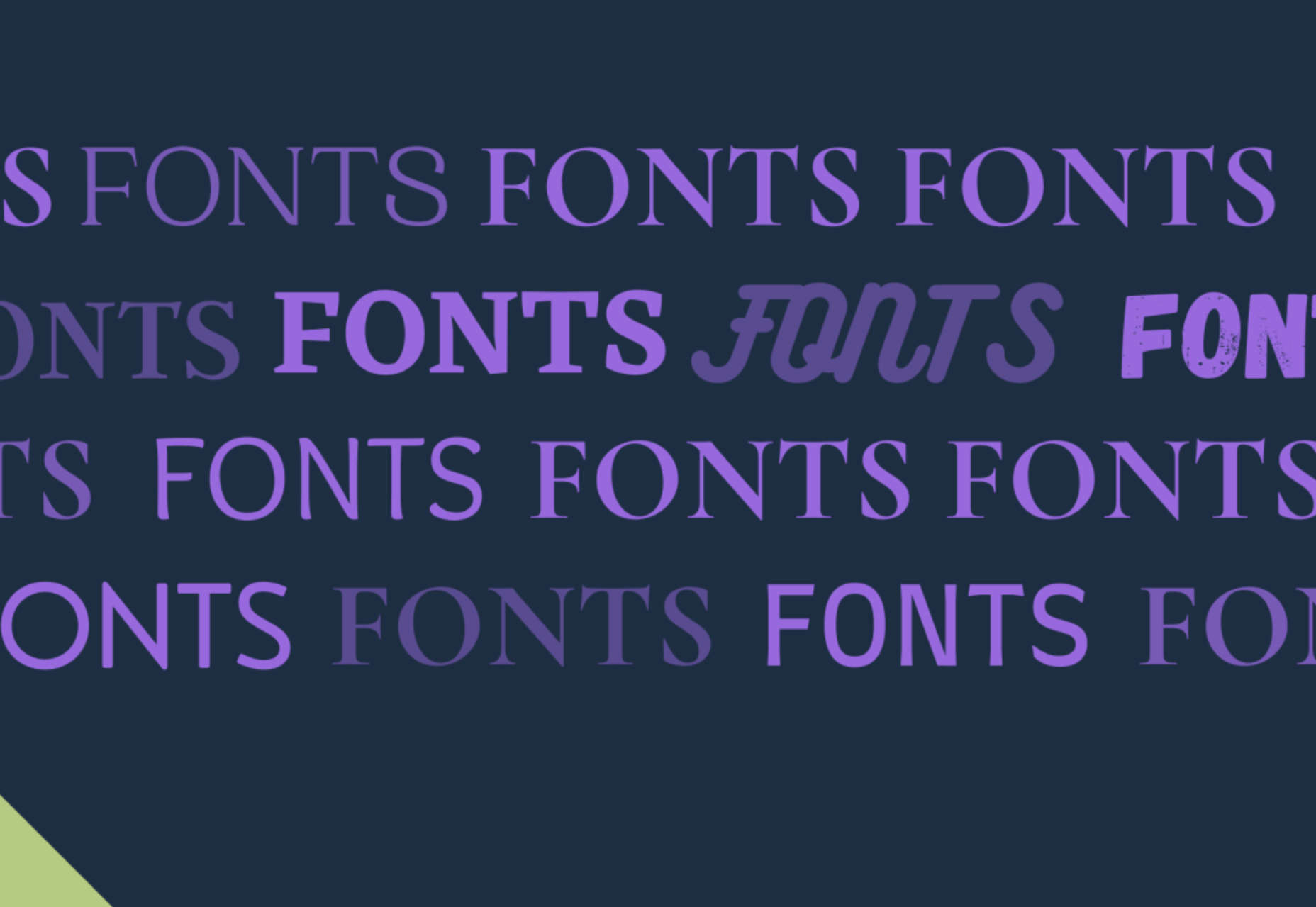
3. Typography Animations
Web typography can make or break a design from font choice to size and color to animation, every detail with text elements matters.
This trend explores and pushes the boundaries of animation with text elements in website design. And it is so tricky. The difference between an amazing result and a design fail is a thin line that can be quite subjective.
Each of these examples does something unique with text and animation together to create just the right feel. The flow for each is seamless and text elements – while incorporating movement – maintain readability.
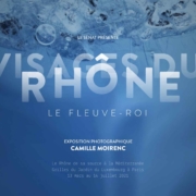
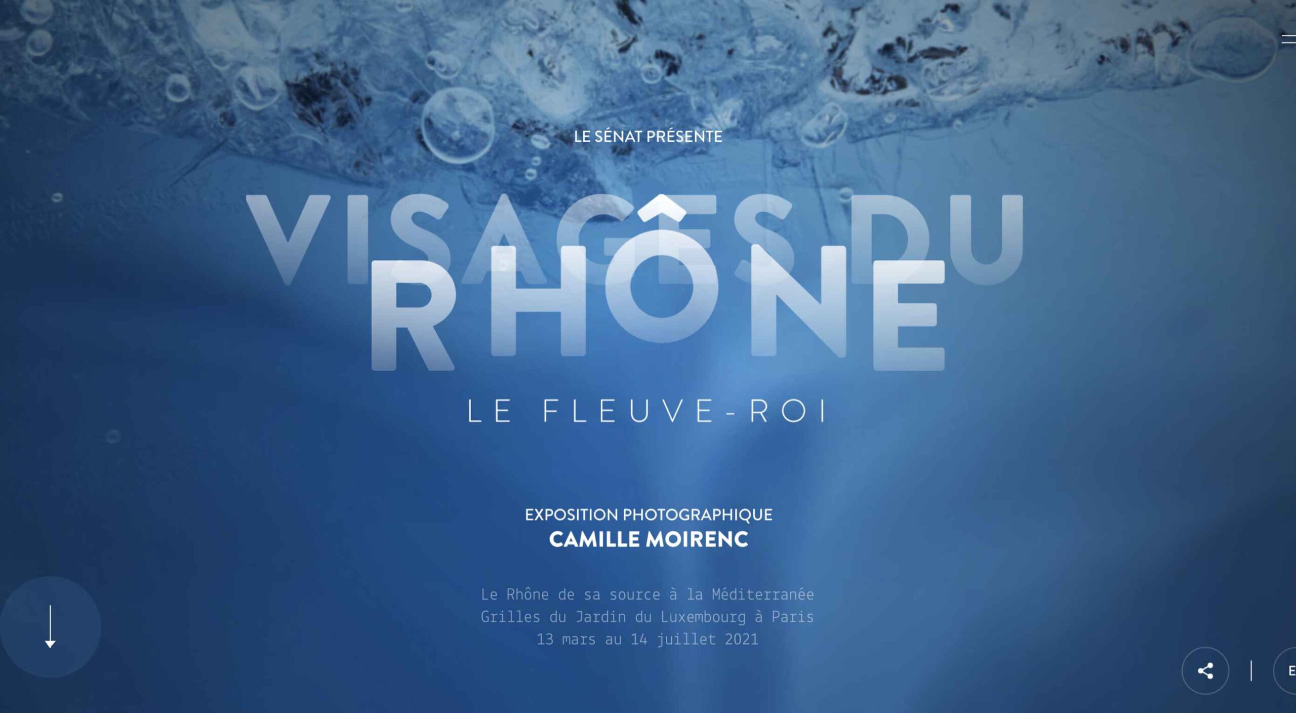
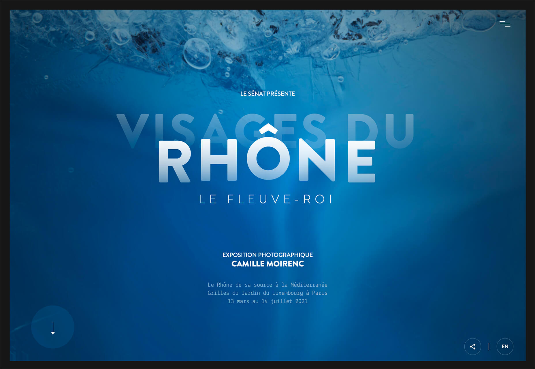
Visages Du Rhone has two layers of animation. The first happens as the words come onto the screen as the color and fade change within the letters. The second is a subtle hover state with a fluid feel for the letters that match the design’s underwater theme. What’s special about the typography animation is that it happens without distorting the letters, something many other liquid text animations do.
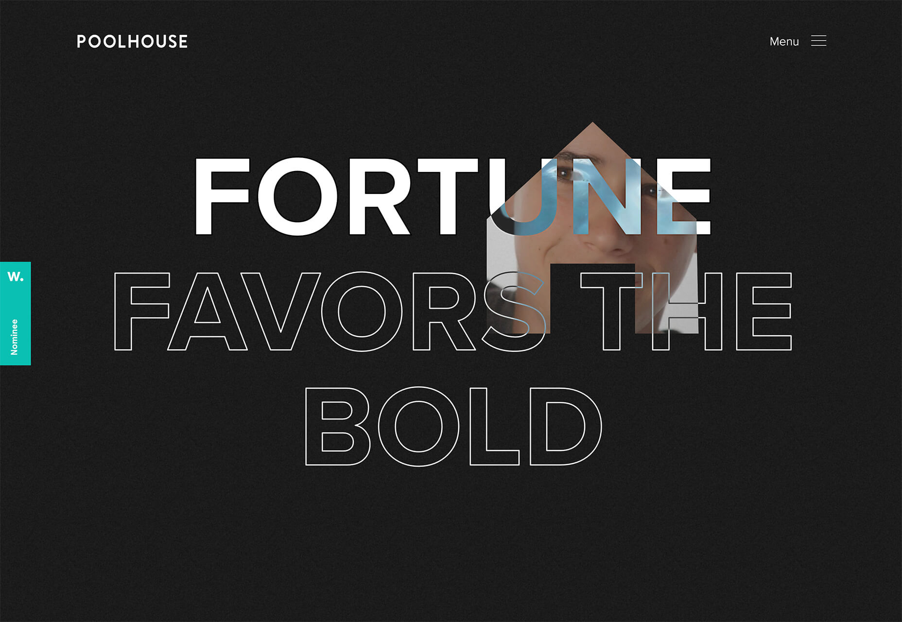
Poolhouse uses transparent letters with movement in a layer behind the words. What’s very neat here is the additional filtering so that the background motion still works while maintaining the integrity of each letterform. Again, the focus on keeping text readable is what sets this design apart and makes it trend-worthy.
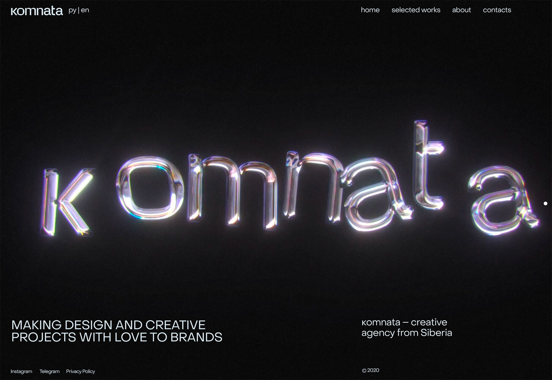
Komnata takes a wholly different approach with letters that float and look like balloons. The motion mimics what you would expect from an element that looks and feels like something in the real world. The user doesn’t have to do anything for this motion to take place. The animation might be even more effective if the scroll and pointer did not have a tail that “draws” on the screen as a distracting element.
Conclusion
The good thing about looking at variations of different trends is that you can see the practical application and apply it to your projects. While you might not move to a full sliding scroll on your website homepage, you could use that concept in another part of the design.
Experiment, have fun and draw inspiration from trending website designs.
The post 3 Essential Design Trends, April 2021 first appeared on Webdesigner Depot.
 Everyday design fans submit incredible industry stories to our sister-site,
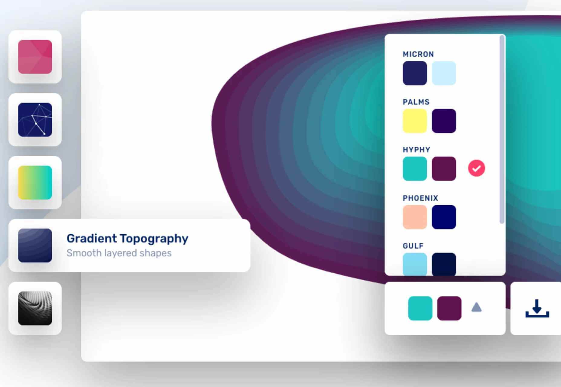
 As a web designer, you face plenty of challenges, both good and bad. One of the bad ones is to suddenly find out that you’re either in danger of missing a client’s deadline or will be unable to meet it at all.
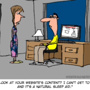
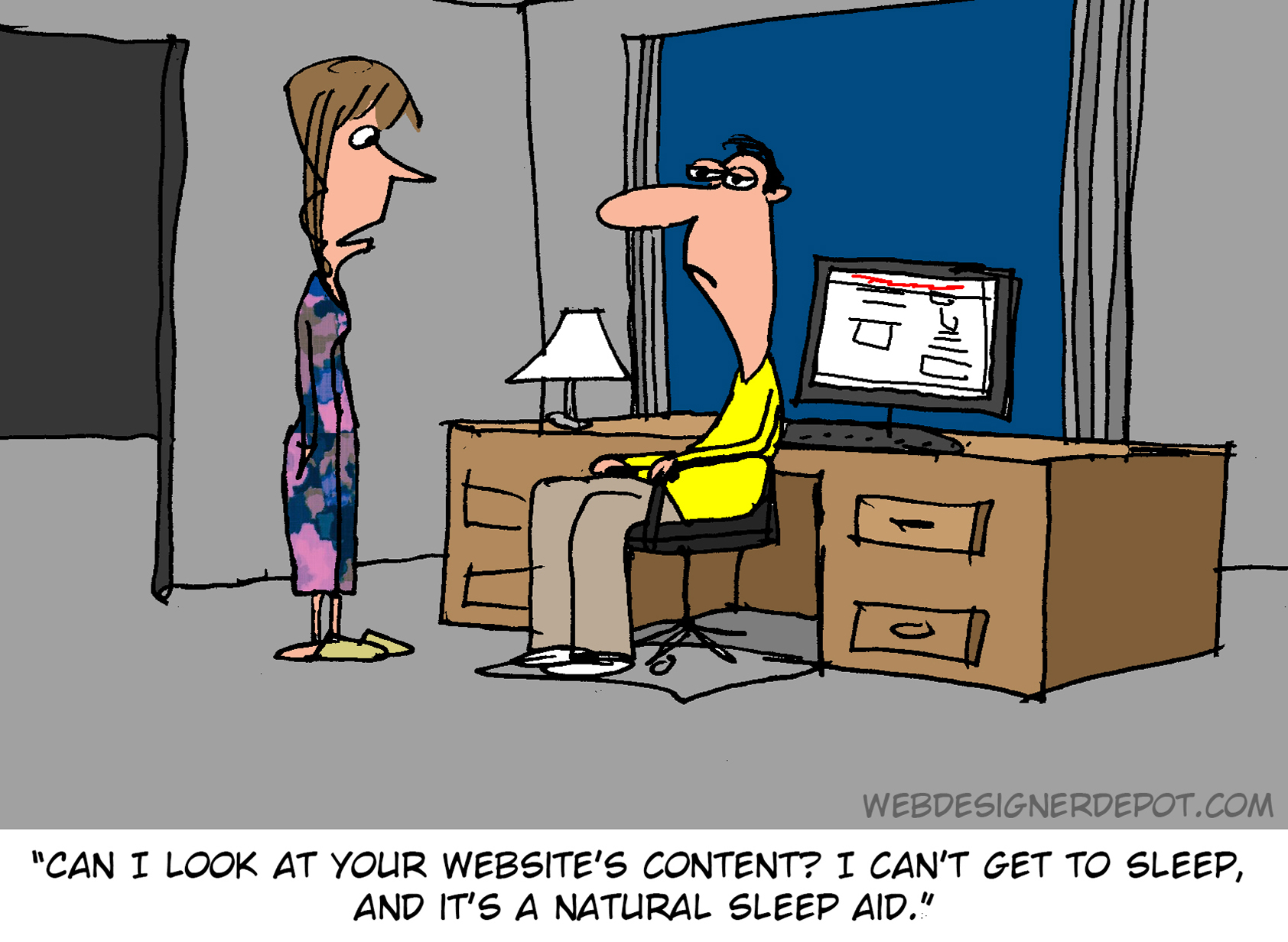
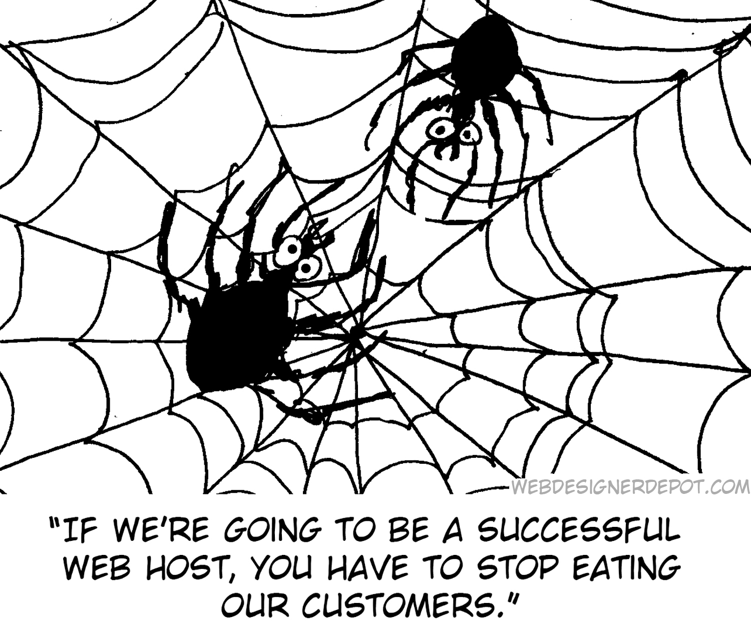
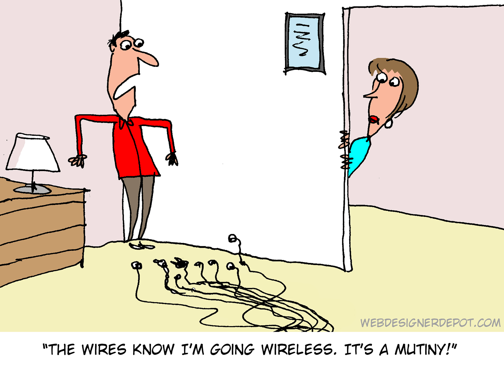
 Illustration is a big trend in 2021. Every designer should have some ability to illustrate, whether that’s producing icons, creating lettering, mocking up layouts, or crafting full-blown illustrations.
 Everyday design fans submit incredible industry stories to our sister-site,
 So, really, you’re in the business of designing websites for your clients’ audiences.
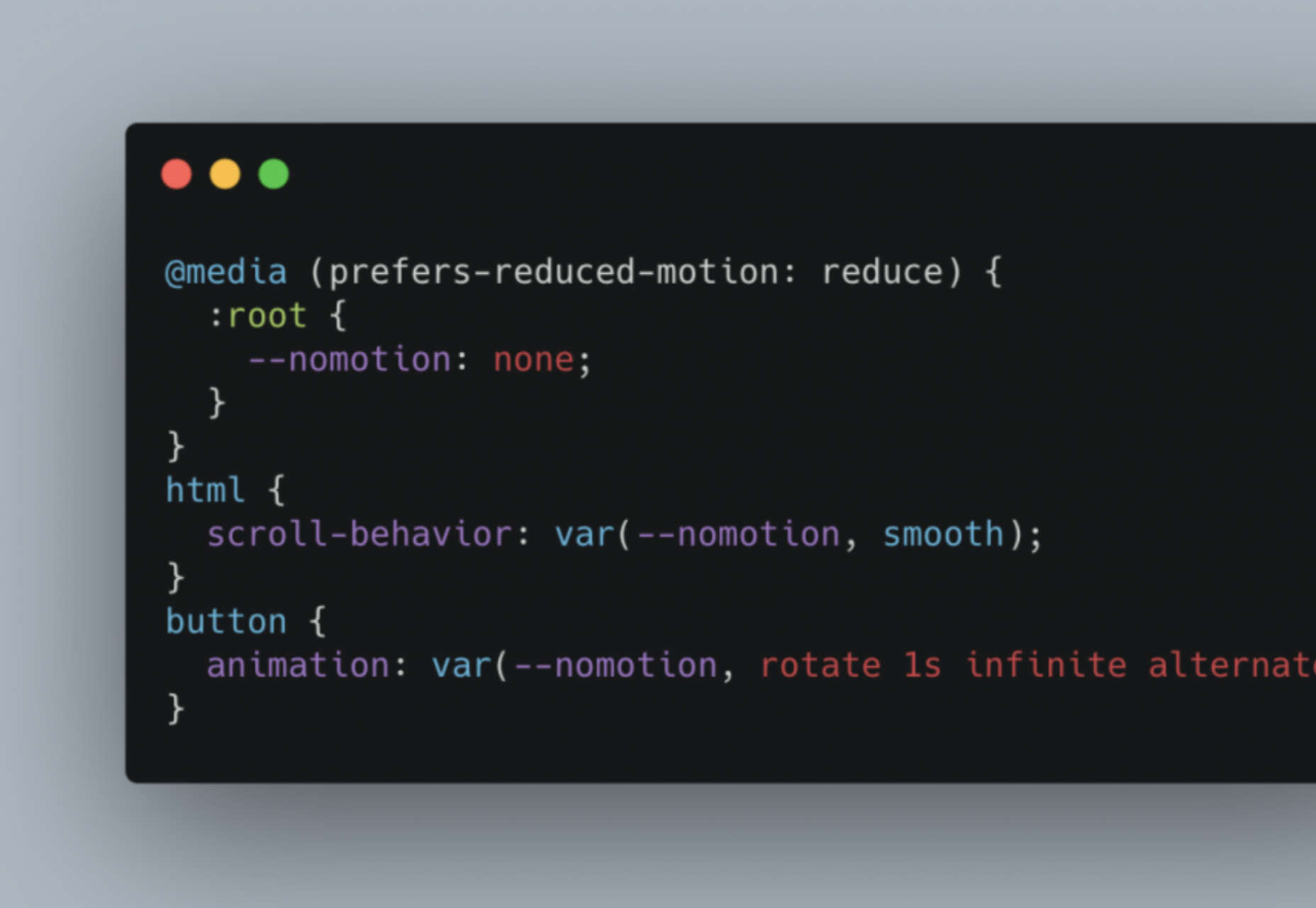
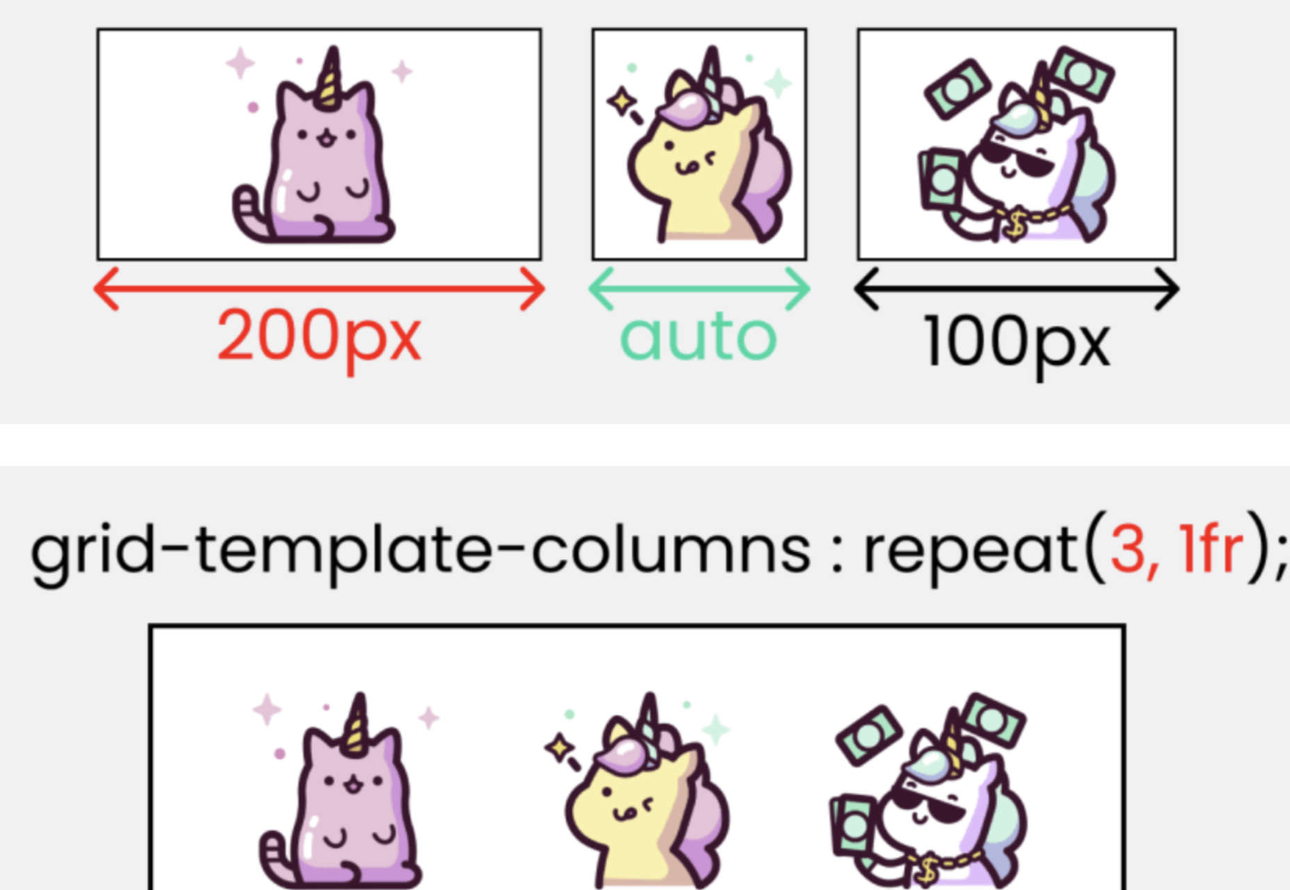
 A key part of designing successful websites for clients is making sure that as many end-users as possible can access and enjoy that site.
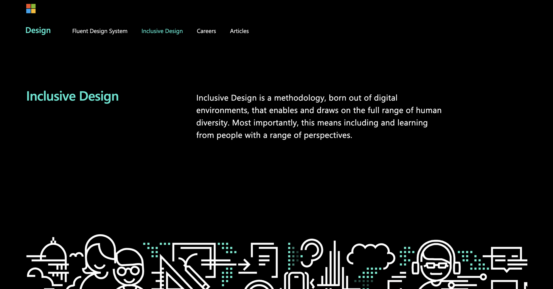
 Everyday design fans submit incredible industry stories to our sister-site,
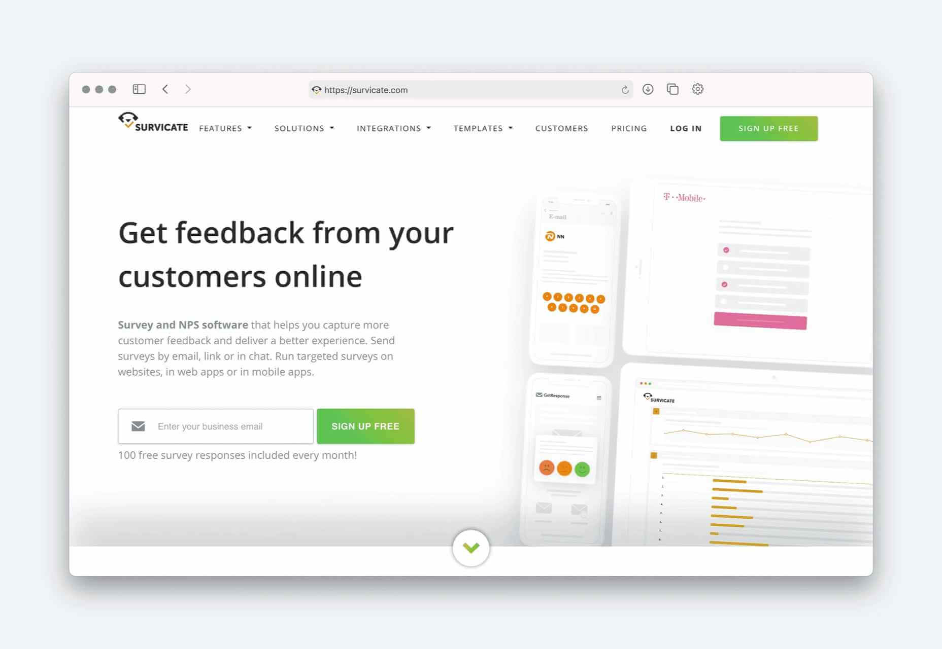

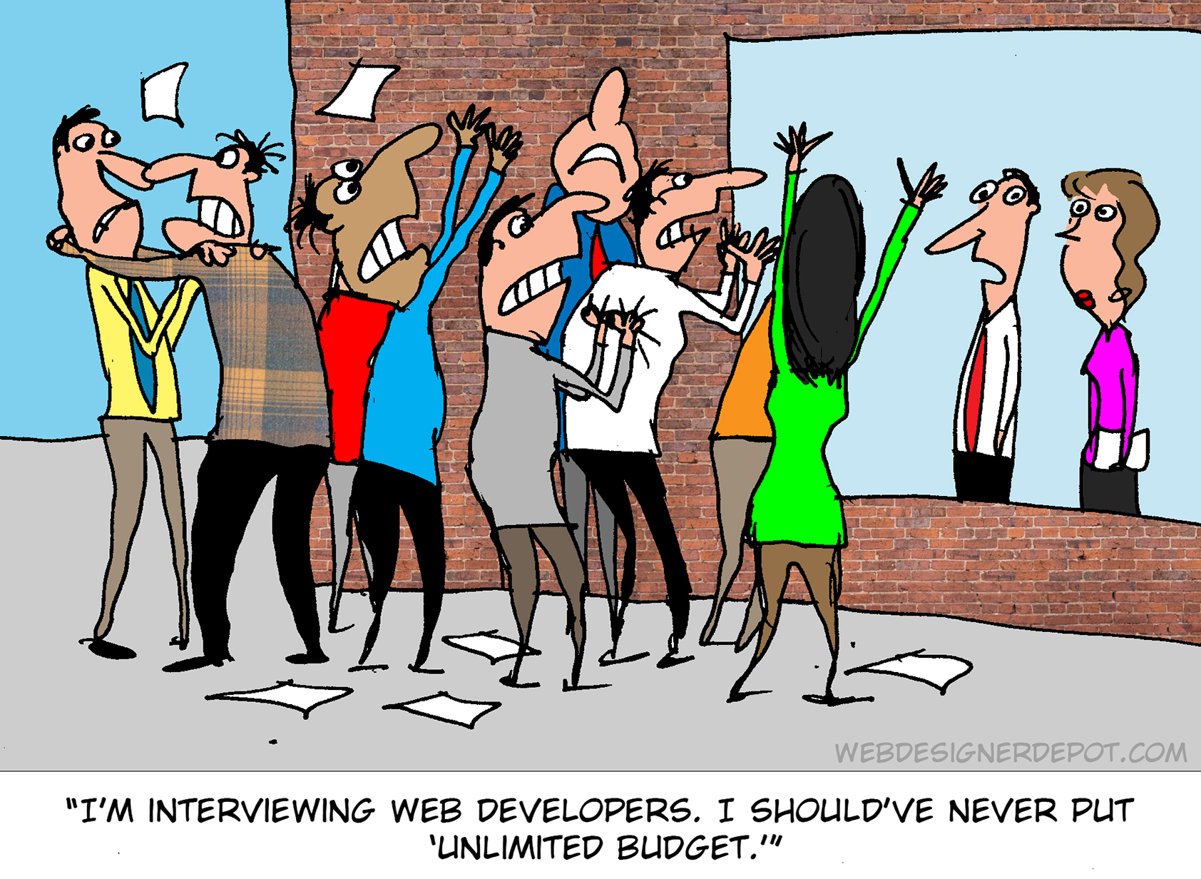
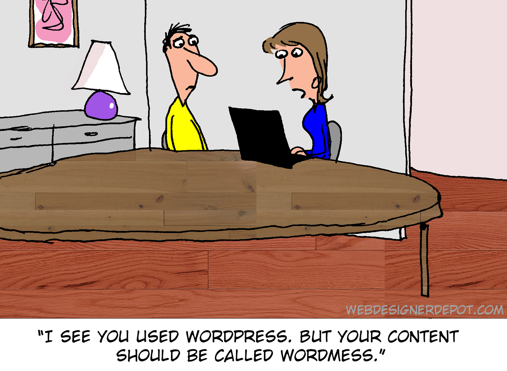
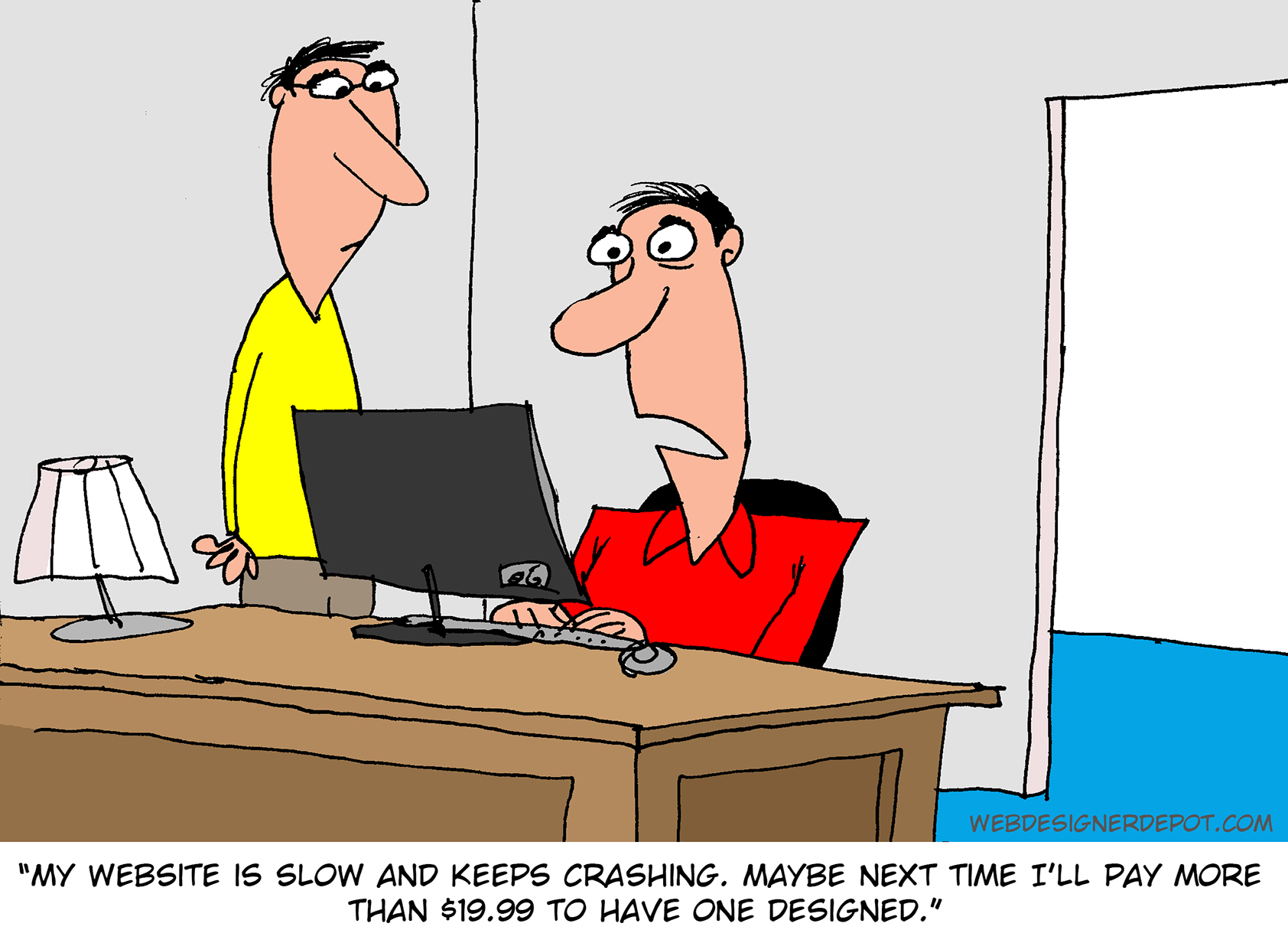
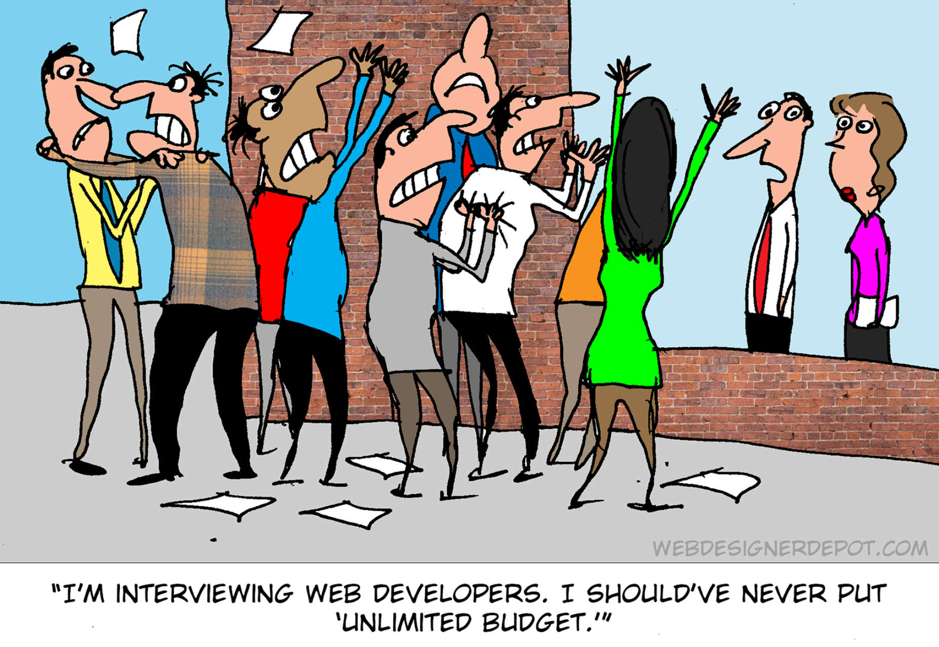
 Every month we feature a set of comics created exclusively for WDD.