 An unreliable, semi-broken and unresponsive website is an excellent way to lose leads and visitors — regardless of how aesthetically pleasing or well-designed, the visual elements are.
Over the past decade, we’ve seen more initiative to deliver faster internet to regions of the world that were previously devoid of it. With online communities expanding and more people becoming receptive to online shopping, ensuring your site’s dependability is now more important than ever.
One way to achieve this is by employing uptime and downtime monitoring tools. This guide will examine the best ways to get alerts when something goes wrong and your website falters.
Why Is Website Uptime Monitoring Important?
Downtime is bound to occur occasionally. Nonetheless, the goal is to minimize it. The longer the downtime occurs, the more traffic and potential clients you lose. A dysfunctional website is also detrimental to your credibility and reputation. People may associate your website’s unreliability with your real-world products or services.
With web developers charging an average of $200 per hour, high-quality websites can be expensive to build and maintain. Nevertheless, it’s often worth the investment. However, an unreliable website can backfire on you. Instead of attracting more customers, it could potentially repel them. This can result in lost revenue.
An uptime monitoring solution can help you prevent or reduce these losses. It verifies if your website is up and functional and notifies you if it’s not. This allows you to troubleshoot the issue and get your website back up and running as soon as you’re alerted. The most common issues behind your website’s downtime include:
- Server faults;
- Network outages;
- Power outage;
- Traffic spikes;
- Cyberattacks;
- Domain name issues;
- An erroneous web application deployment;
- Increased server loads;
- DNS Resolve issues;
- Human error.
Thus, you must employ a dependable tool that detects downtime or any interruptions related to your website as soon as they occur. They are must-have tools for web designers, developers, and network administrators. However, not all of them are built the same. So how do you identify the best uptime monitoring tools?
Essential Features of Uptime Monitoring Tools
Uptime monitoring tools typically detect interruptions by running network tests such as pings and trace routes. You could practically monitor your website’s uptime by constantly running these tests yourself.
However, this isn’t an efficient way to monitor your website’s uptime. A comprehensive uptime monitoring tool will automatically monitor your website’s uptime in the background. It will then alert you through various channels as soon as it senses that your website may be down.
Furthermore, high-quality uptime monitoring solutions tend to offer additional information regarding your website’s uptime/downtime and its performance. These tools commonly feature dashboards, status pages, badges, exportable records, etc., to help you keep track of your site’s overall health.
9 Best Features of an Uptime Monitoring Solution
The ideal uptime monitoring tool or service should feature:
- Website security features that notify of and repel potential cyber attacks;
- 24/7 uninterrupted background website monitoring;
- Multi-channel alerts (email, SMS, push notifications, instant messages, social media, etc.);
- Report generation;
- 24/7 customer support available through different channels (email, phone, chat, etc.);
- Be capable of monitoring multiple websites and proxies at the same time;
- Offer insights and suggestions to improve your website’s performance;
- Be affordable;
- High customizability should allow you to choose which features to enable and disable.
Another optional feature to look out for is public status pages that your clients can access to determine if all your services are up and running. GetWeave is an excellent example of this. The website features a well-organized systems status page where customers can check if all of Weave’s services are functional.
Nevertheless, you can use the above information as a buying guide when assessing potential uptime monitoring tools. The rest of this guide will supply a few suggestions as to which tools you should use for your website.
3 Best Website Uptime Monitoring Tools
Some of the best uptime monitoring tools for website downtime alerts include:
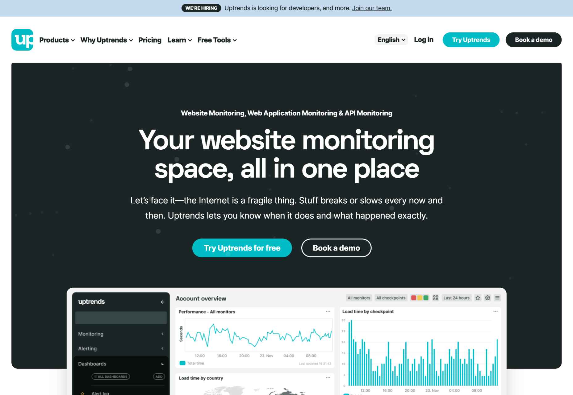
1. Uptrends
Uptrends isn’t just a downtime detection tool; it’s a complete web performance monitoring solution. It will notify you as soon as it detects any disturbance in your website’s performance. It features highly customizable checks. For instance, you can set performance check limits for load times. Uptrends will notify you instantly if your website takes too long to load.
You can also configure from which locations you want it to monitor your website. Uptrends will then point you to where your website usually suffers performance dips in the real world.
The service uses multiple communication channels to send users notifications: email, phone calls, and SMS. Alternatively, you can download one of Uptrend’s mobile applications and receive push notifications. Additionally, you can integrate Uptrends with messaging and communication applications such as PagerDuty, Slack, and Microsoft Teams.
Another impressive Uptrend feature is its ability to emulate your website’s performance on different browsers. It runs Google Chrome, Mozilla Firefox, and Microsoft Edge on its servers. Thus, you can compare how your website runs on these web browsers without installing them on your servers or computer.
Uptrends supplies users with various charts, reports, and graphs to help identify sudden spikes or dips. Waterfall reports display the complete page-load from the initial request to the last download. This allows you to compare the history of your website’s performance element by element. It comes with three price plans whose costs depend on the number of monitors you would like. Starting at $16.21 (at the time of writing) the Starter Plan is the most affordable.
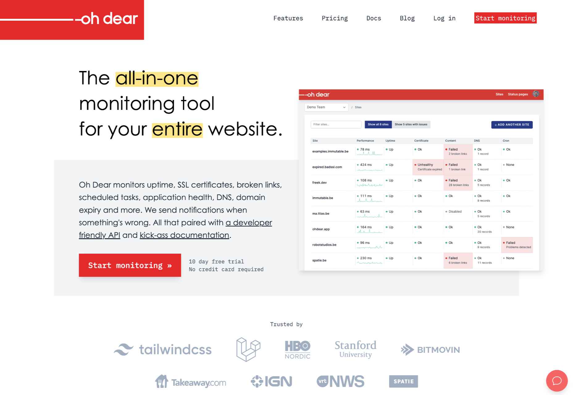
2. Oh Dear
Oh Dear is a slightly cheaper option than Uptrends, with the most affordable plan starting at $12 per month (at the time of writing). However, while Uptrends offers a 30-day free trial, Oh Dear only provides a 12-day trial period. Nevertheless, Oh Dear’s interface is a lot cleaner and more minimal.
Since Oh Dear runs servers in different locations across the globe, it can track how your website performs in various regions. Oh Dear will scan through your website and index all the pages. If it detects any issues, it will alert you immediately.
Oh Dear also features a continuous certificate monitoring function. Site owners who are concerned with their website’s security may find this feature to be especially useful. It will verify your SSL certificate expiration dates and alert you of any changes.
Oh Dear’s public status page enables your clients to keep track of your website’s availability.
Oh Dear uses email and SMS text messages to alert site owners of any issues. It also features integrations with communications and social media applications such as Telegram, Discord, Slack, Microsoft Teams, etc. Oh Dear ensures that messages are as detailed and user-friendly. This makes it easier to troubleshoot and find the origin of your problem. Oh Dear is more than a worthy alternative to Uptrends.
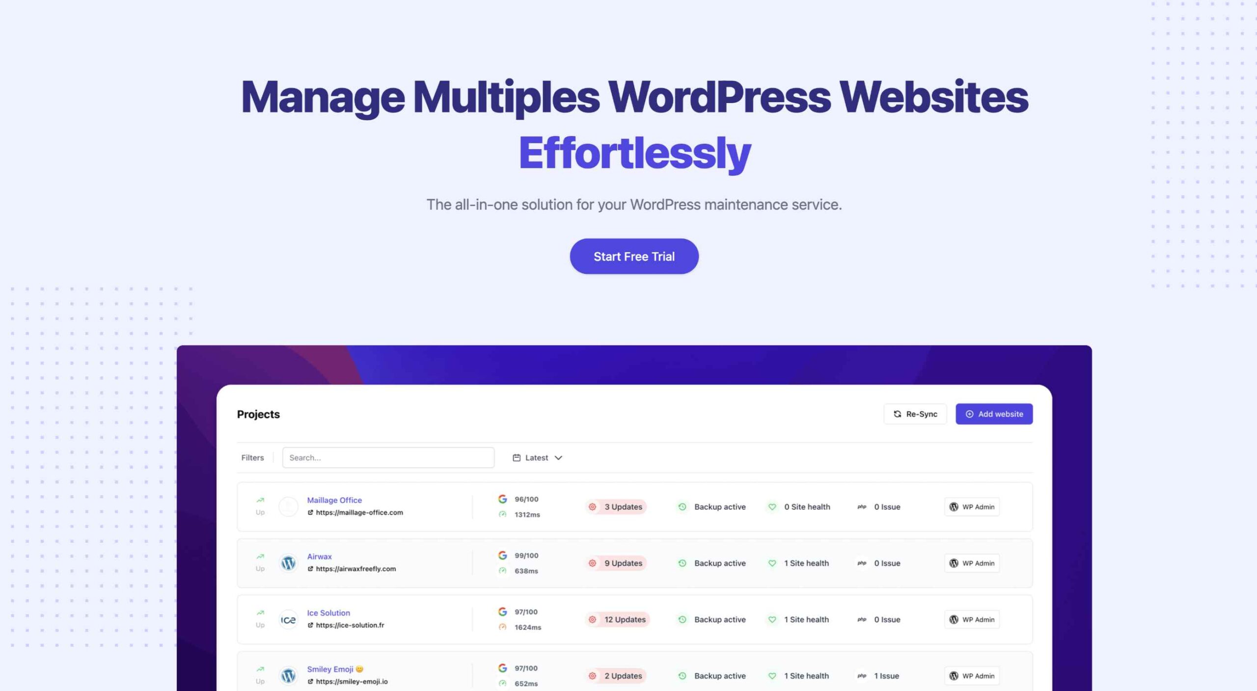
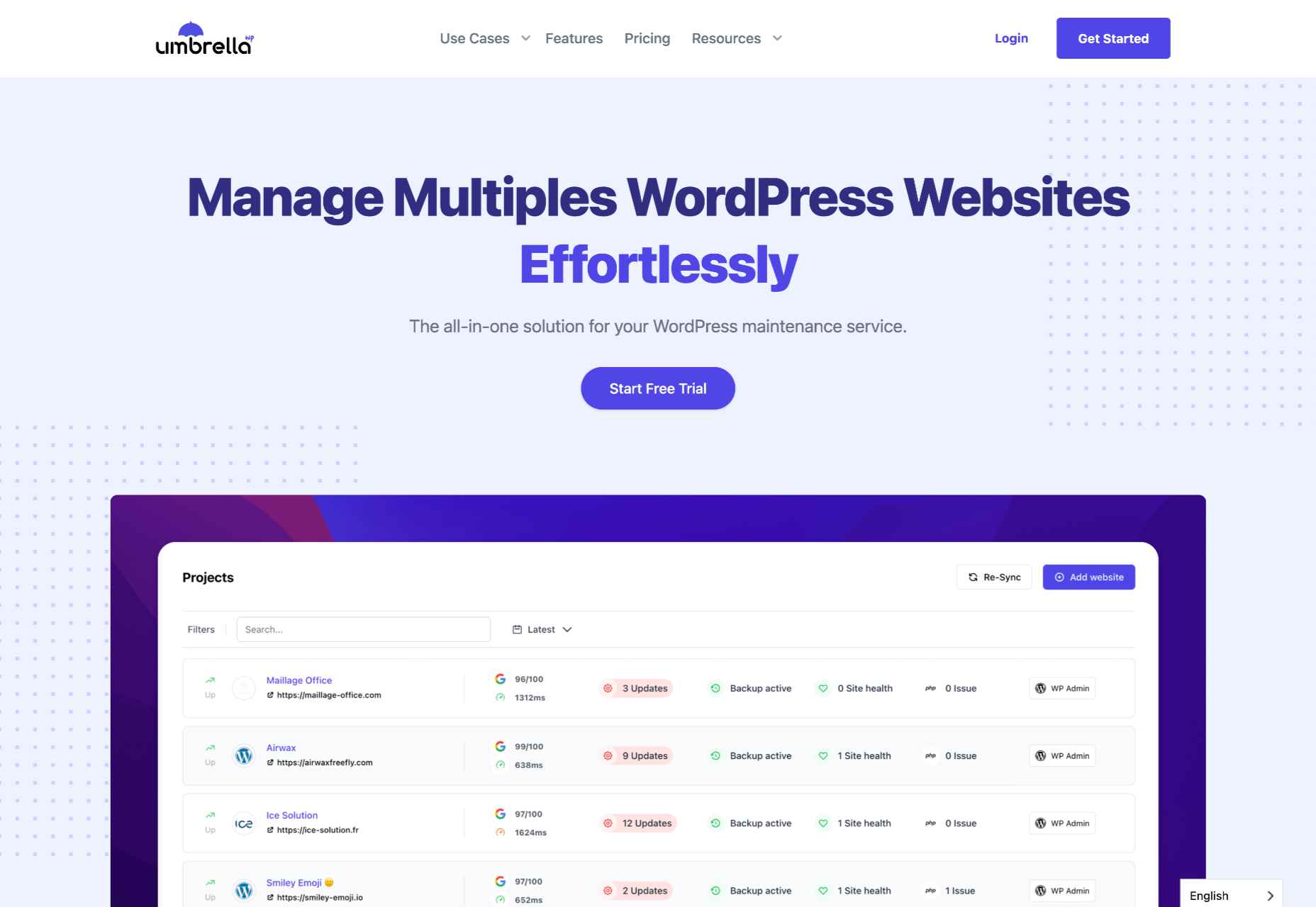
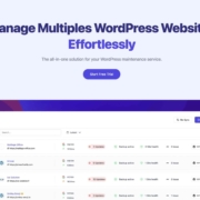
3. WP Umbrella
WP Umbrella is a little different from the previous entries. It’s intended to help users manage and monitor multiple WordPress sites. Thus, it is far more particularized in its approach to website uptime monitoring. Again, as is the primary function of the uptime monitoring tool, it offers a real-time alert system that will contact you through email, SMS, Slack, etc.
WP Umbrella employs a simple minimal UI. Its main screen consists of a dashboard that allows you to view all your WordPress websites. By default, this dashboard features four columns: Site, Uptime, Speed, and Issues.
WP Umbrella will alert you of any outdated or erroneous plugins or themes. While it doesn’t offer dedicated public status pages, it does have a client report generation feature. You can automatically send these reports to your various subscribers or clients when your website is down.
WP Umbrella is the most affordable option on this list. Users are charged $1.99 per month (at the time of writing) for each website monitored. In addition, WP Umbrella offers a 14-day trial and does not require your credit card details. It’s an excellent option for anyone running a WordPress website or two.
Conclusion
This guide has only explored three possible uptime monitoring solutions. They won’t only assist you in detecting downtimes, they can also help you find the reason your site may be slow.
These solutions are an excellent place to start. But there are many other options coming to market all the time. You may find that this is the first step to converting more leads and reducing your bounce rate.
Source
The post 3 Best Website Uptime Monitoring Tools first appeared on Webdesigner Depot.
Source de l’article sur Webdesignerdepot

 There were mixed reactions on Thursday morning when Adobe announced it had acquired Figma.
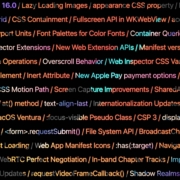
 Apple has released an OS update. Packaged in with it is the latest version of Safari, 16.
 The Summer’s over, and we’re back at our desks to discover that the web’s best app builders, font designers, asset creators, and developers have been hard at work to deliver this bumper collection of exciting new tools for designers and developers.


 Modals, a nifty little feature that allows you to display different messages at the top of your website, have been touted as extremely useful. Some even claim that they are helpful enough to completely replace the banner ads we all hate so much. But are modals in web design a UX disaster?


 As the season starts to change, so do some of the trends that web designers are using in projects. From a return of blur to interesting frame edges for images to neon color, there’s a lot to get excited about.


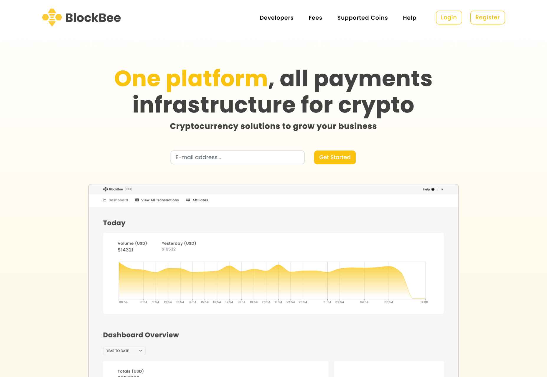
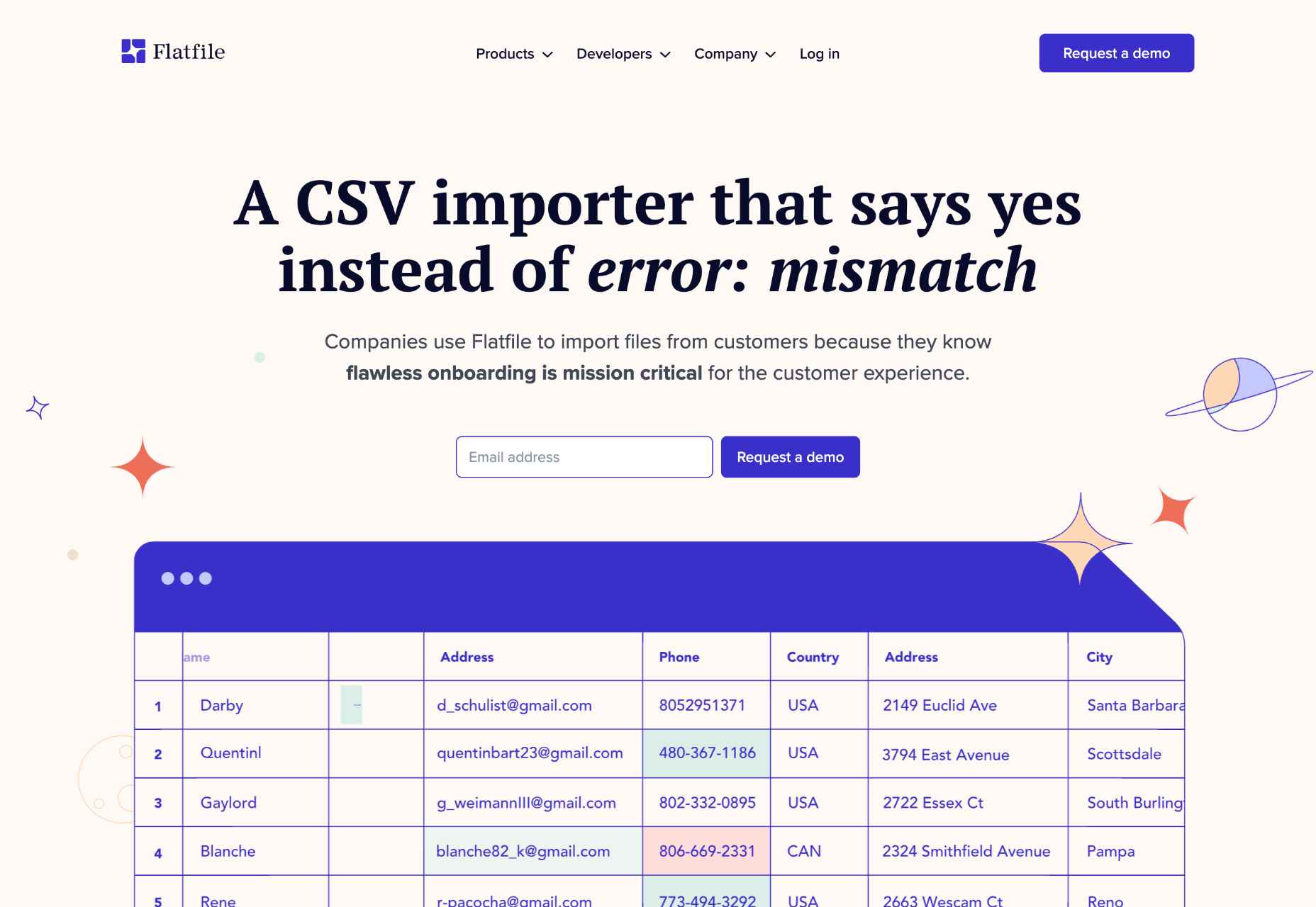
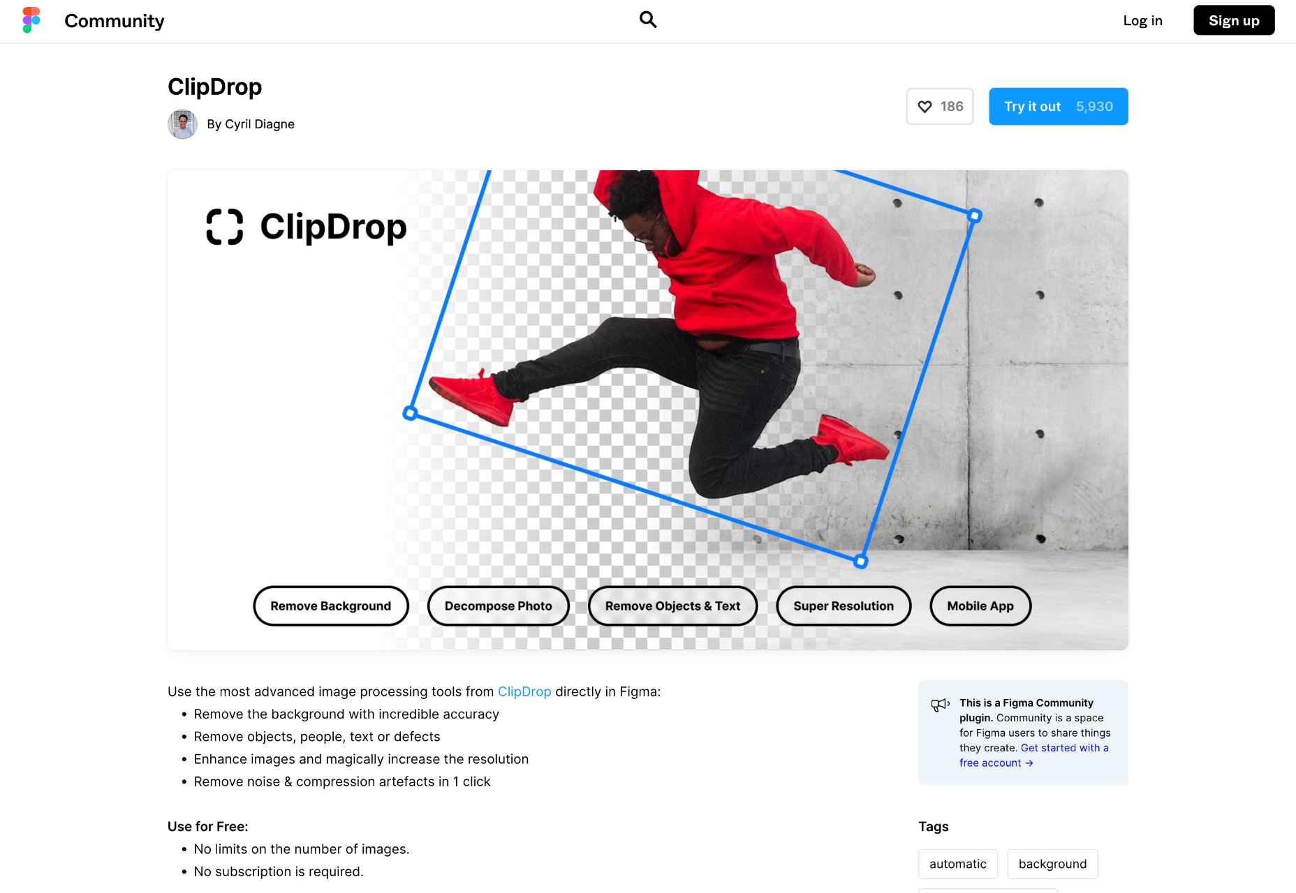
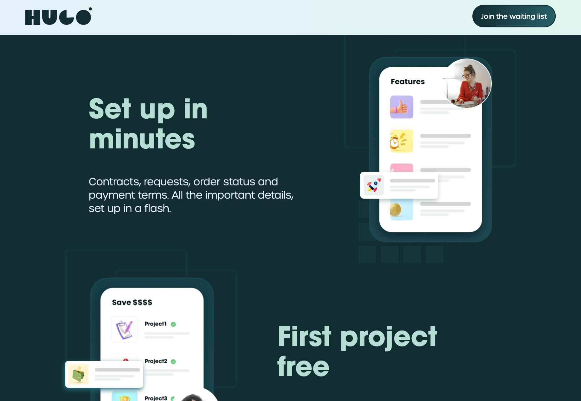
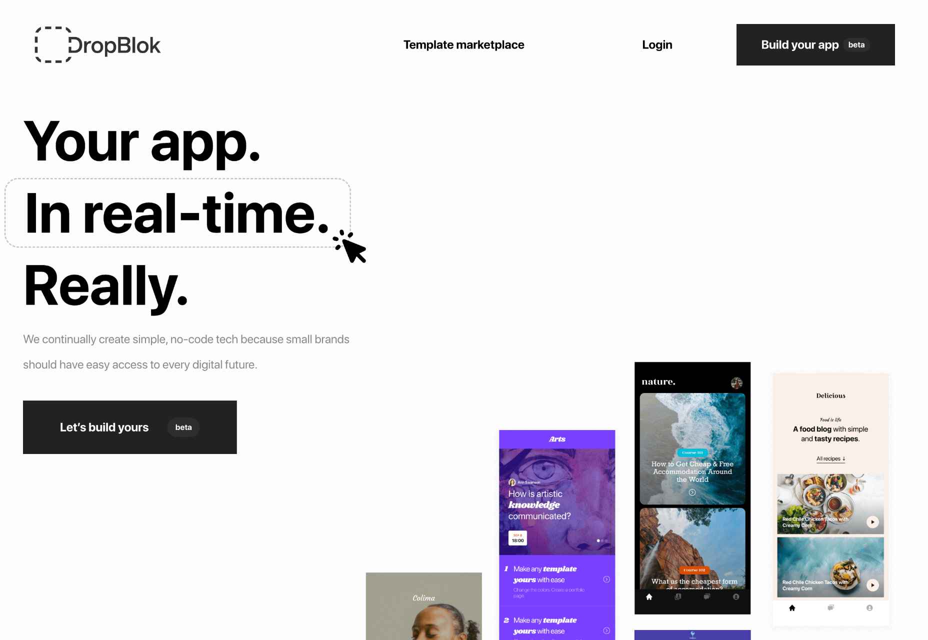
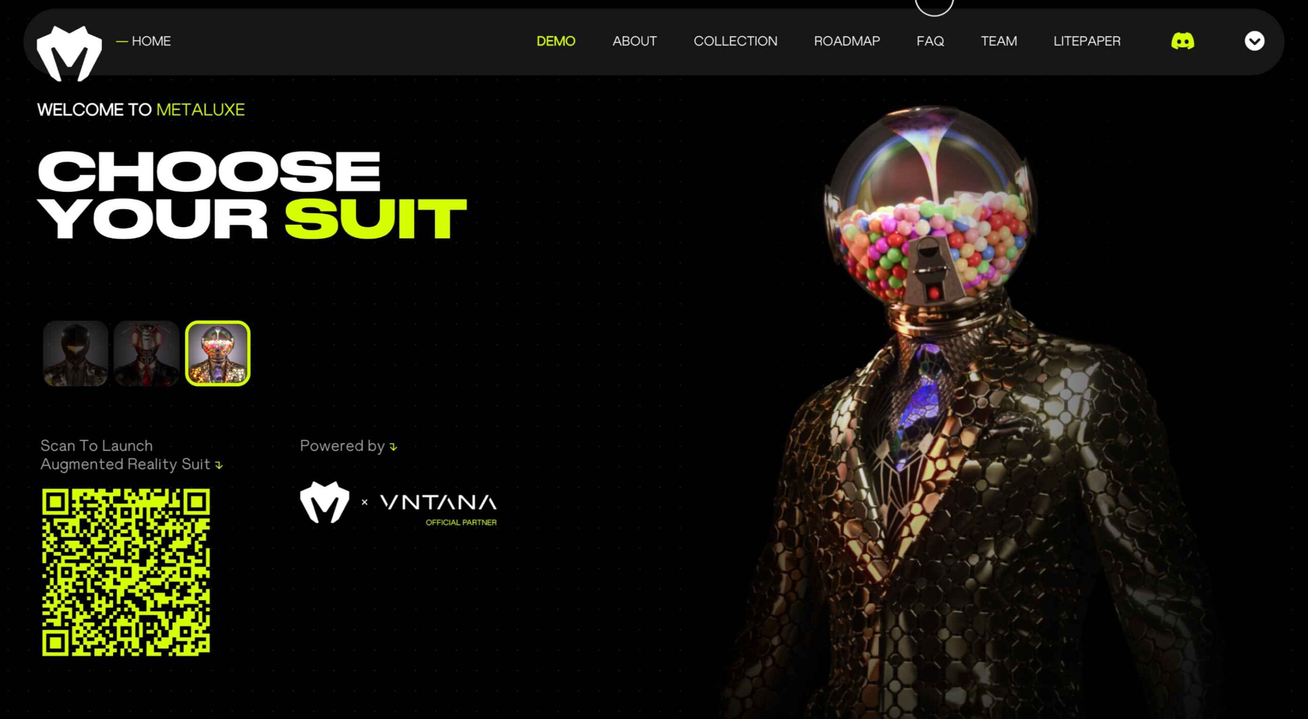
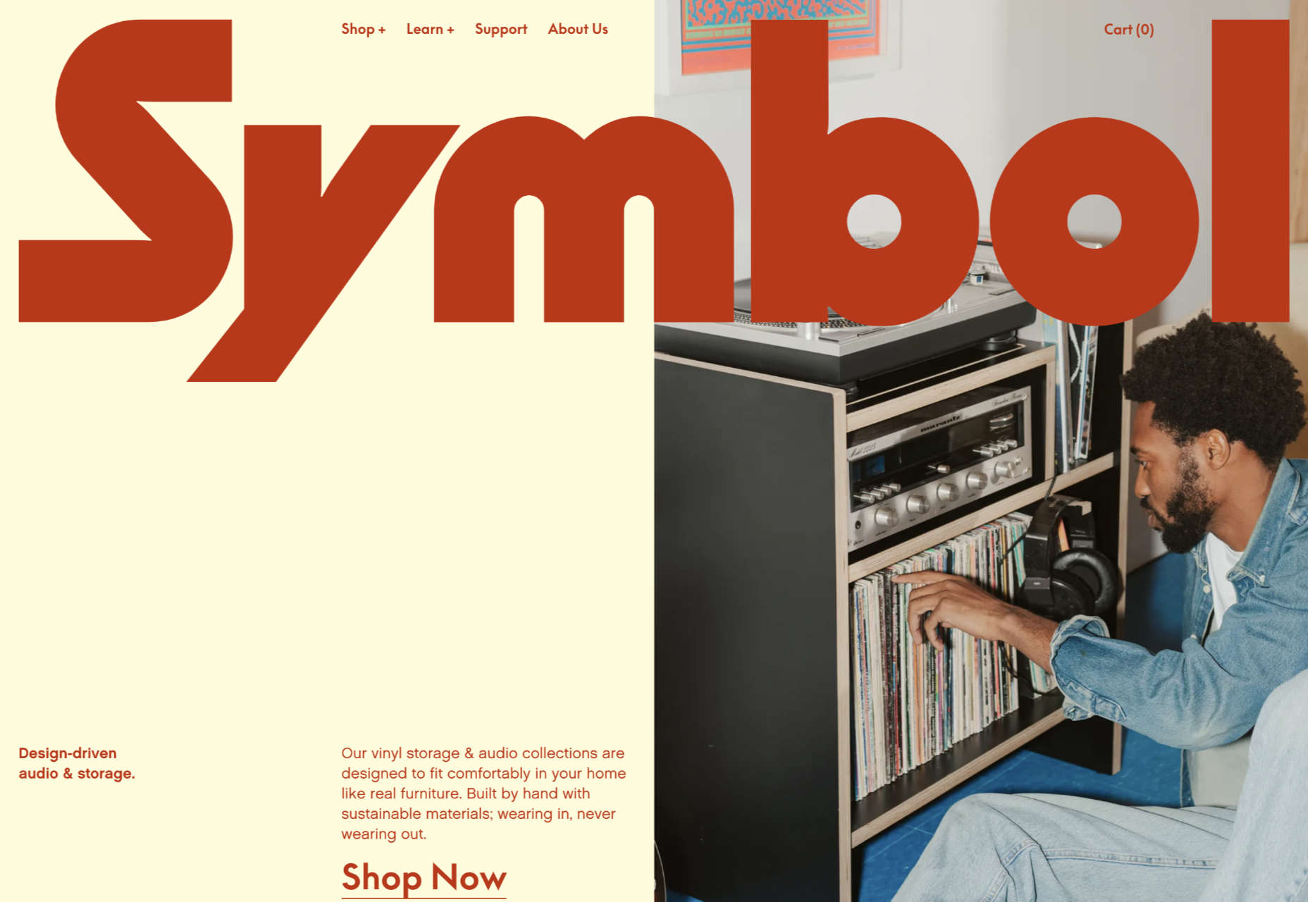
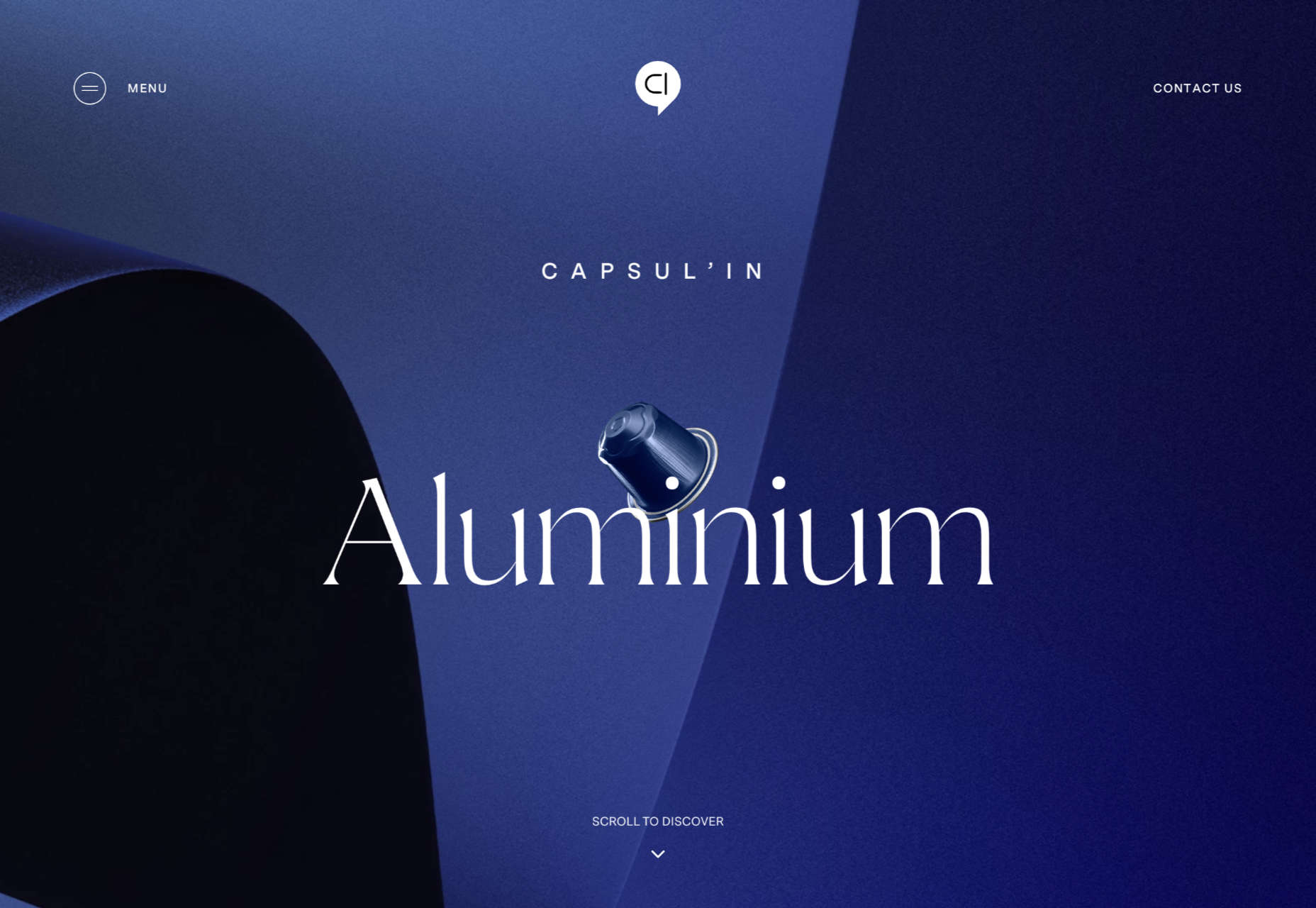
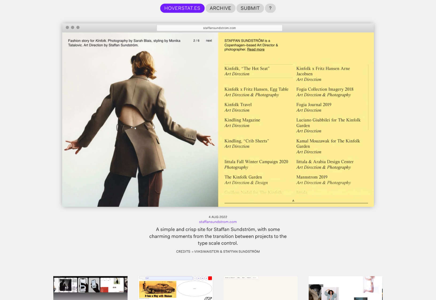
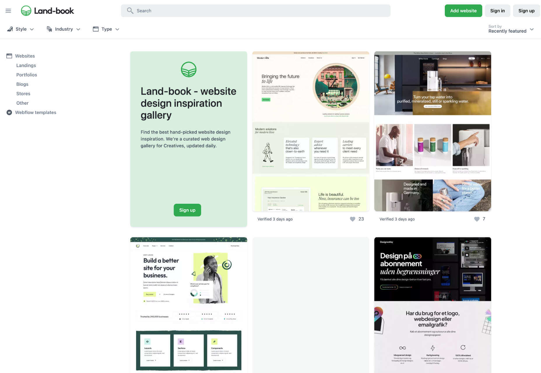
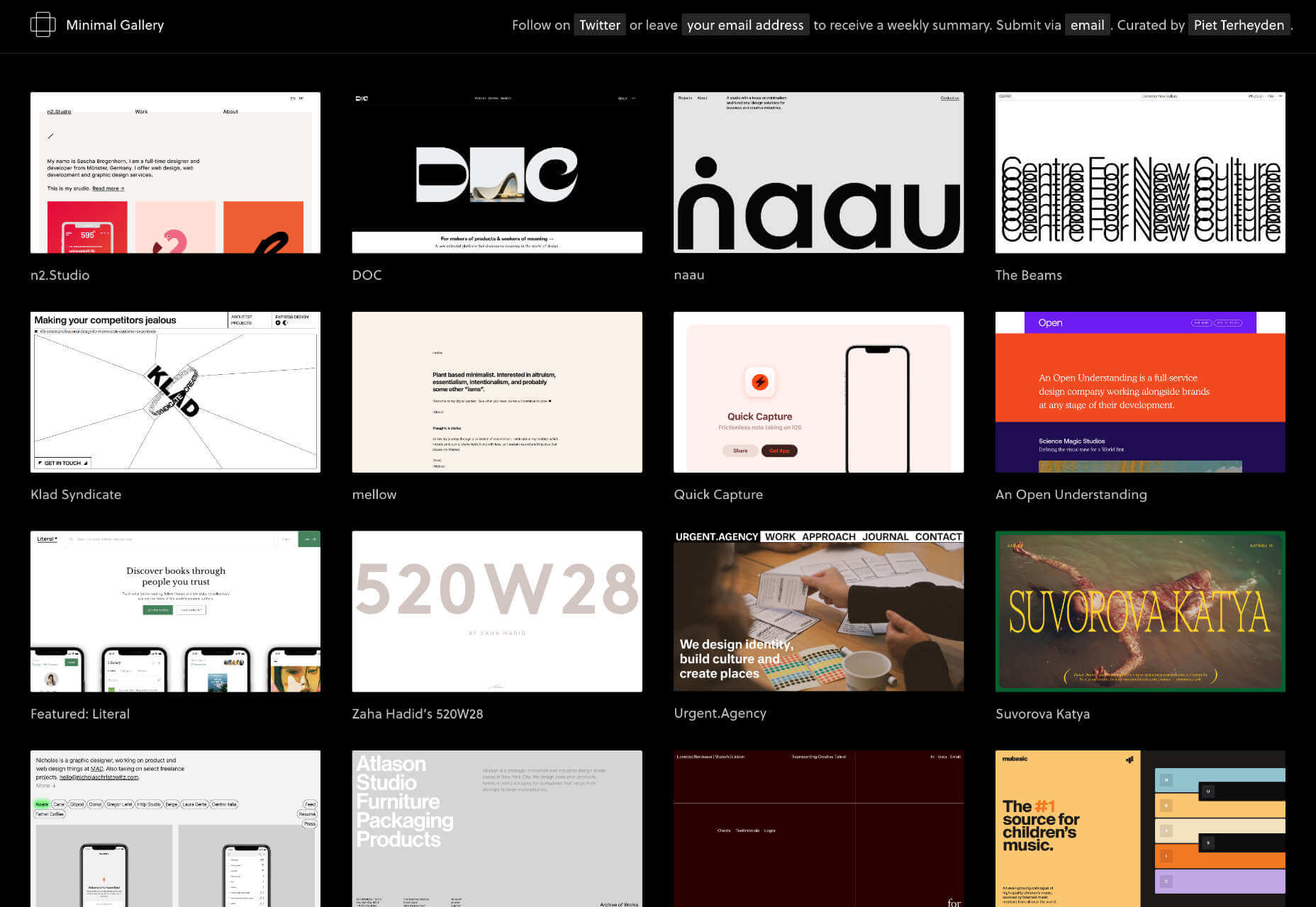
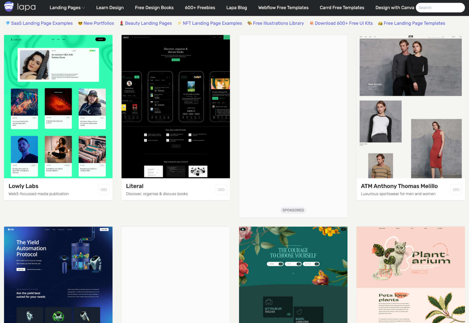
 This month we’re seeing websites that are very conscious of the design trends they’re following. Designers are making conscious choices to adopt styles, and opting out when it doesn’t suit the site. What we end up with is a crop of sophisticated, well-designed websites that use style as a technique to further their aims.


 Learning how to design an MVP webpage or website could be one of the best things you can do as a site creator in today’s digital world.
 Web design is often stagnant because designers look at the same work and follow the same trends. Unfortunately, algorithms promote work that is liked, and designers produce content to get likes, which leads to a self-feeding cycle.
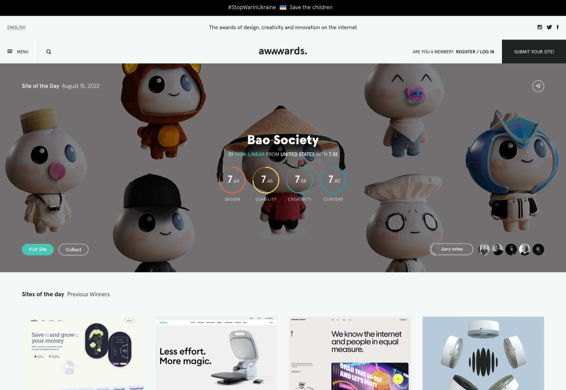


