Articles

If you were paying close attention to your IT department around the 8th of December, you might have heard some quiet sobbing and the occasional wail of, “Why? Why?! WHY?!” Now, it was the year 2020, so this might have seemed normal to you, but it’s actually something of a problem that could affect your business: CentOS is pretty much dead.

For the non-total-nerds among us, here’s the skinny: CentOS is a Linux-based operating system, typically used on servers. CentOS has been incredibly popular, and quite a few businesses run on it. But now, that’s changing.

CentOS is a Linux-based operating system, typically used on servers…But now, that’s changing

CentOS used to be released in thoroughly tested versions, the latest being CentOS 8. CentOS 8 was released in September of 2019 and was supposed to be supported for ten years. Now, it’s been decided that CentOS will no longer have versioned releases, opting for a rolling-release style of updates. That means there’ll be one version that constantly gets new software.

That’s cool in theory, but it means the operating system will be less stable overall. Essentially, it’s going to be used as a development branch of / testing ground for Red Hat Enterprise Linux and is no longer its own OS. If you have CentOS-based servers, you should migrate to another OS sooner rather than later.

And I just got my own CentOS-based VPS set up the way I wanted it.

Wait, What Does Red Hat Have To Do With This?

Here’s the short, short version of the history of CentOS: Red Hat (an OS developer) has two Linux distributions of its own and has had for a long time. There’s the free and community-focused Fedora and the business-focused highly expensive Red Hat Enterprise Linux (AKA RHEL).

Funny story: RHEL, despite its expensive licenses, is still mostly made from open source code, which anyone can access and use. And it’s a good OS, particularly for people who like stability.

In 2004, some smart people took all the open-source parts of RHEL and made a brand new, nearly identical operating system with it: the Community Enterprise Operating System, or CentOS. Basically, people could download and use an enterprise-level server OS for free. All the documentation for RHEL was compatible, and you could get support from the community.

It was the perfect alternative for anyone who didn’t have the budget for expensive software licenses.

In 2014, Red Hat offered to partner with the CentOS community. The idea was basically this: “It’s pretty much the same software. If our company and your community work together, both our products will be better! We make our money from enterprise customers, anyway.”

Most importantly, with Red Hat doing a lot of the heavy lifting in terms of updates and support, the CentOS community could focus on growing in other ways.

Red Hat pinky swore [citation needed] that they were in this for the long haul, and CentOS did continue to flourish. You know, until 2020.

Well, So Much For Pinky Swearing

Red Hat must have eventually decided that having a popular free version of its own enterprise software and managing it themselves no less — wasn’t that good for business. So they all but shut the project down.

Well, technically, they just changed how it operated. Instead of producing tested, production-ready versions, CentOS is merely a testing ground for RHEL. It is no longer, in my opinion, a good option for anyone who wants to run a stable server.

Current and Future CentOS Alternatives

So if you jumped on the CentOS 8 bandwagon, what should you put on your physical and virtual servers now? Well, you’ve got options.

Debian / Ubuntu

For those who don’t mind going to a very different kind of Linux, Debian has been the picture of OS stability and sysadmin-friendliness for a long time. If you want more frequent software updates, the Debian-based Ubuntu Server is popular and pretty good.

Oracle Linux

Yes, that Oracle has a RHEL-compatible Linux distribution of its own. But it’s not a clone, exactly. I mean, this is Oracle. It’s set up to use their tools and ecosystem, so I hope you like Oracle products. But hey, the OS itself is free!

ClearOS

ClearOS is another RHEL-compatible OS that’s mostly doing its own thing, though I’m not entirely sure what that thing is. Does the company have some deal with Hewlett-Packard? Anyway, they do have a free community edition and paid editions for home and business use.

The CloudLinux RHEL Fork

This is an upcoming release from the makers of CloudLinuxOS. It looks like they intend to load the new RHEL-based OS with some of their own tools, such as reboot-less server update tech. The first release is intended to be a more or less drop-in replacement for CentOS 8.

Rocky Linux

So the community that made and loved CentOS in the first place is, to say the least, ticked. They are so ticked that Greg Kurtzer (a co-founder of CentOS) has decided to do it all over again by making Rocky Linux and keep it in the community this time.

Again, the goal is to make a re-build of RHEL, a drop-in replacement for CentOS (at least for now). Eventually, the goal is to migrate from CentOS to Rocky Linux as easy as using a single, one-line command. The ETA for initial release isn’t quite set in stone, but I can personally vouch for how hard the community is working.

[See, full disclosure here… after writing this article, I joined the Rocky Linux documentation team.]

So Yeah, You Have Options

Some are out now, and others will be soon. Again, CentOS 8 will be supported until the end of 2021. CentOS 7, weirdly, will be supported until June 2024.

Migration shouldn’t be too complicated. Still, a pain in the rear that we have to do this at all, though.

Source

The post How CentOS Became 2020’s Final Victim first appeared on Webdesigner Depot.


Source de l’article sur Webdesignerdepot

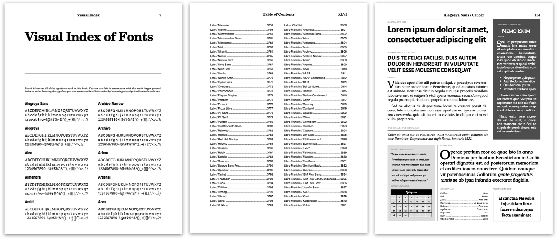
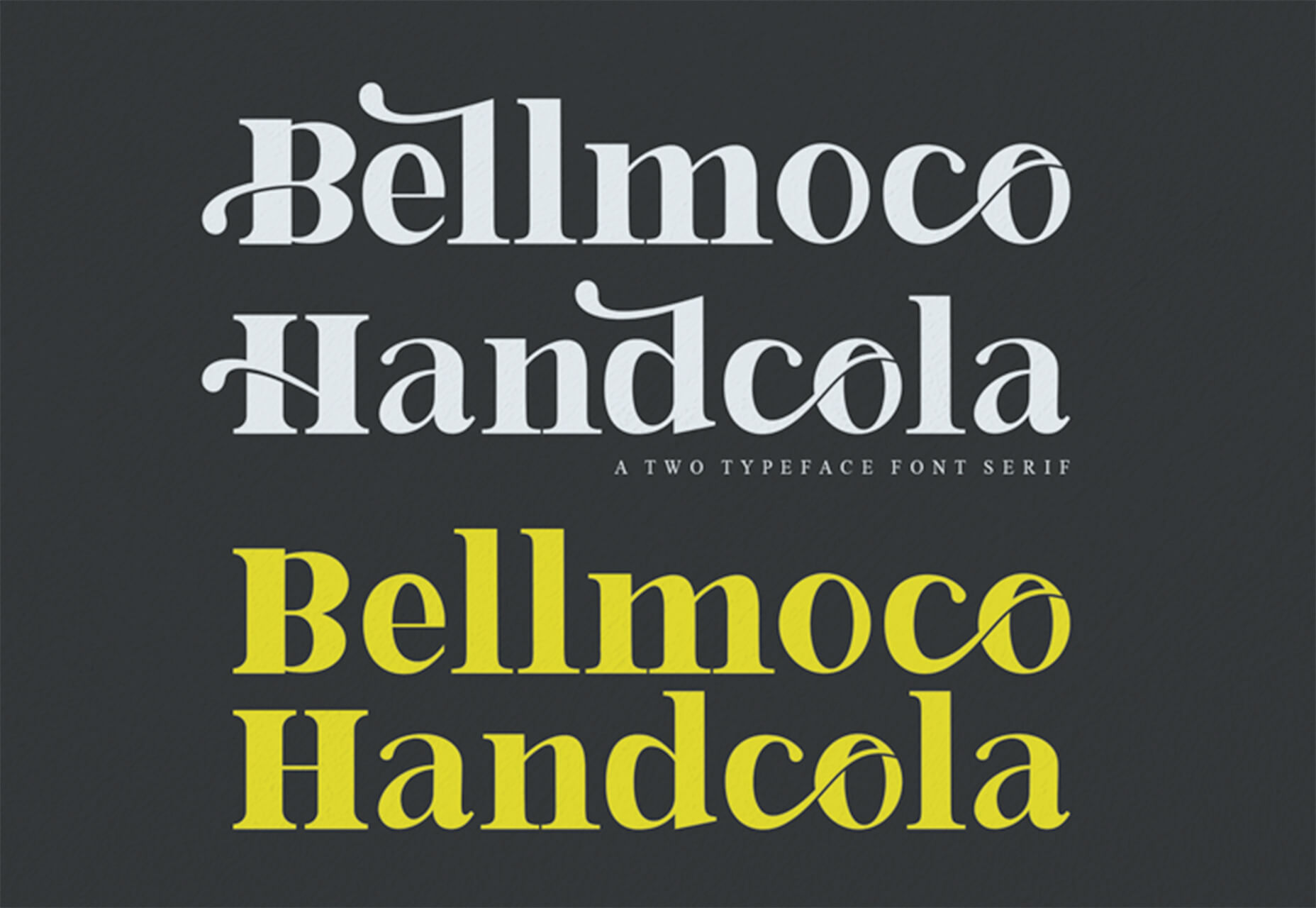
Google Fonts is one of the most useful tools designers have, with hundreds of amazing fonts provided for free. But if you just grab one of the top ten suggestions, you’re missing out on a vast wealth of typographic gems.

Just about every font on Google Fonts is worth trying out, but the very best designs — designs that engage, inspire, and delight — combine two or more fonts. It’s the same principle as sweet and sour; two competing tastes that are both familiar and surprising; that’s a good font combination.

But how do you pick out those flavors? How do you know what complements and what clashes? Does Inter work okay with Open Sans? Does Merriweather look good with Roboto?

Well, today we’ve got a deal for you that will answer those questions and more. Our sister site, MightDeals.com, has arranged an extraordinary discount on The Preposterously Huge Book of Google Font Combinations. To date, it’s the single largest collection of Google font combinations ever produced.

Read on to find out how the PHBGFC will save you time, update your design choices, and keep you inspired throughout 2021 and beyond…

What’s Preposterous About the PHBGFC?

The Preposterously Huge Book of Google Font Combinations is almost 8,000 pages long. If you use one of the suggested font combinations every week, it will take you 125 years to exhaust it.

We think you’ll agree that that’s a truly preposterous number of design options.

What Exactly is the PHBGFC?

When you visit Google Fonts, you see a nice clean interface, with some dropdowns. You can pick a font. And then maybe pick another. But there’s no real way of discovering, trying out or otherwise selecting font combinations.

The Preposterously Huge Book of Google Font Combinations changes that by lining up all the possible combinations in an easy-to-browse package.

Step 1: Navigate to the index at the front of the book.

Step 2: Locate a font you’re interested in, in the index.

Step 3: Click the font name to navigate to the corresponding page in the book.

Step 4: Scroll back and forth through the pages to review the possible combinations for your font.

It’s that easy!

The Preposterously Huge Book of Google Font Combinations lays out all the best Google Font combinations for you — every font included has a regular, bold, italic, and bold italic version — saving you days of hunting through the site hoping to hit upon a combination that works.

What If I Don’t Like the Suggestions?

The Preposterously Huge Book of Google Font Combinations isn’t a set of rules or guidelines; it’s a tool to help you make the best design decisions you can make in the shortest possible time.

The Preposterously Huge Book of Google Font Combinations purposefully doesn’t exclude any combinations — even ugly combinations are deliberately included — so you’re free to compare an unredacted list of font options.

Every design decision you take is yours, but instead of spending hours downloading, installing, and comparing prospective fonts, you can review a combination in seconds.

Who Should Use the PHBGFC?

The Preposterously Huge Book of Google Font Combinations is an essential purchase for anyone working with Google Fonts. It will save you time and improve your familiarity with one of the web’s best resources.

If you like fonts, then you’re going to enjoy just scrolling through the Preposterously Huge Book of Google Font Combinations. It’s a beautifully realized catalog of font options.

Whether you’re a design student, a web developer curious about design, or a seasoned design professional, The Preposterously Huge Book of Google Font Combinations won’t just save you time; it will help develop your eye for great font combinations.

Grab The Preposterously Huge Book of Google Font Combinations Today!

This incredible resource, designed to help you maximize your use of Google Fonts, will save you hours of fruitless hunting through Google’s UI.

The Preposterously Huge Book of Google Font Combinations normally sells for $69, but thanks to our sister-site MightyDeals.com, WebDesignerDepot readers can grab it for just $24! That’s a suitably preposterous 65% off the full retail price.

Head over to MightyDeals today to download your copy of The Preposterously Huge Book of Google Font Combinations and start making Google Fonts work for you.

Source


Source de l’article sur Webdesignerdepot

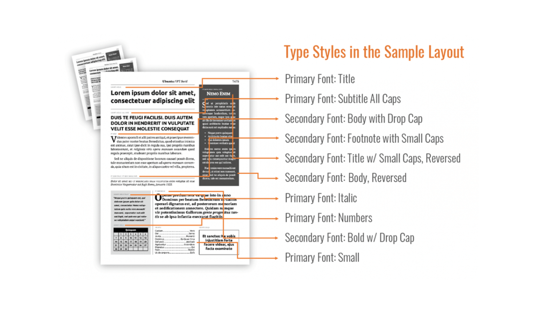
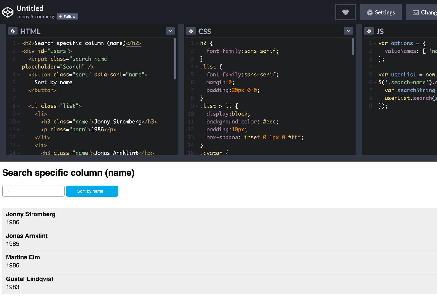
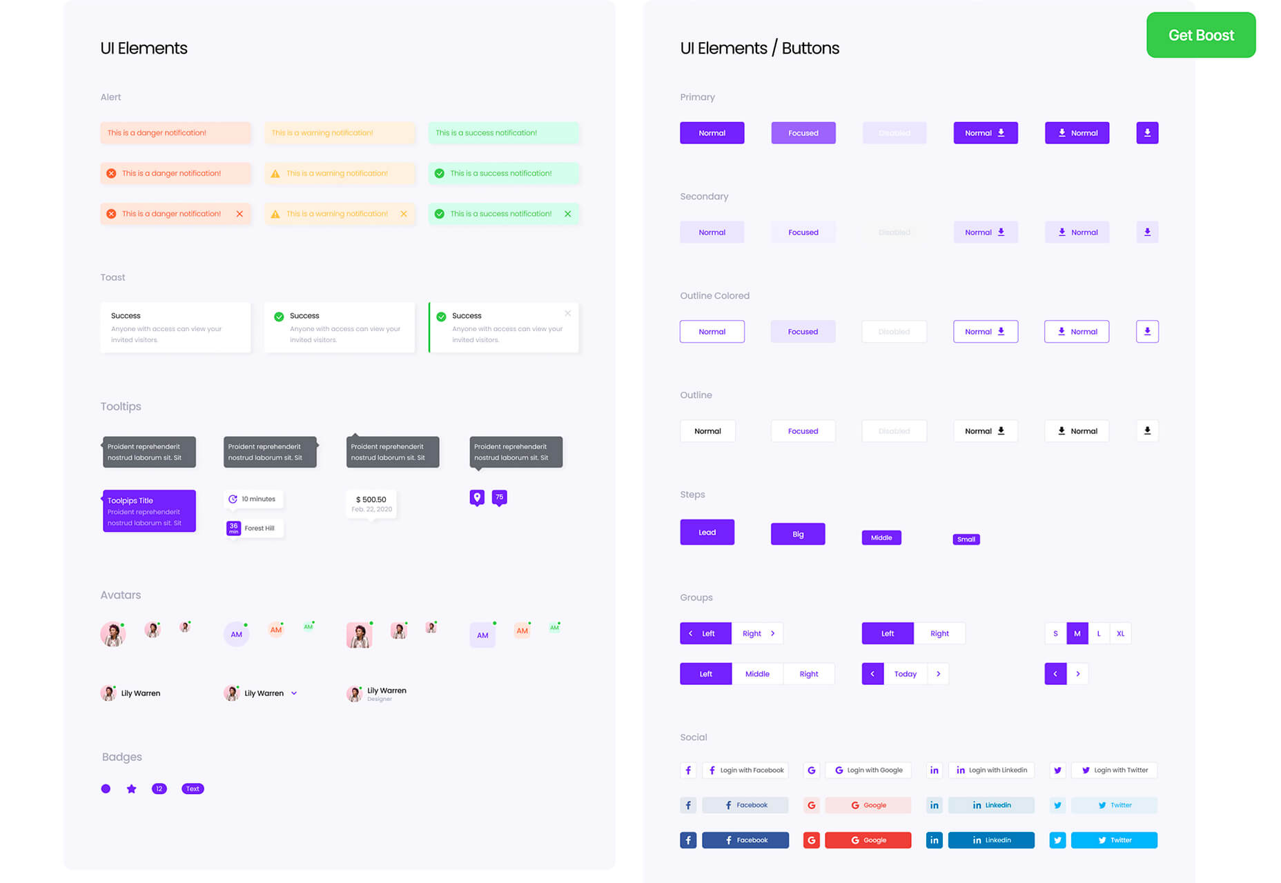
Jumpstart your next design project or speed up a workflow with some of these new tools and resources. With so many new tools being developed all the time, you are almost certain to find something that can help you with projects.

Here’s what new for designers this month.

Everypixel Patterns

Everypixel Patterns solves a common design problem: Creating seamless patterns with graphic editors is such a long and exhausting process. That’s why some people choose to get patterns from stock websites but that can be a challenge too (and difficult to search). This tool makes getting patterns less time-consuming. It includes a gallery of well-designed content, which you can customize and edit as needed.

Multiavatar

Multiavatar is a free and open-source multicultural avatar maker. Type something in the input field and generate one of 12 billion avatars. (Everything is randomly generated and free to use.)

Lobe

Lobe is a machine learning app from Microsoft that helps you create and train models. Start by showing the app examples of what you want it to learn and it will train a model for you. The tool is pretty easy to understand and you don’t need or experience or code knowledge to use it and you can train an app for free on your computer.

Laser Cat

Laser Cat is a silly and fun Google Chrome extension that adds a cartoon cat to your browser that allows you to zap away anything you want to remove in the browser window. It’s light and fun. Go play!

Pattern Collect

Pattern Collect is a curated gallery of patterns by various designs and illustrators. You can download patterns for use in projects or submit your own to share with the design community. The library is searchable and you can get new patterns via email if you subscribe.

FarbVelo

FarbVelo is a color palette generator that shows a new and random scheme with every refresh. The color choices are fresh and could work for a variety of projects, too.

CSS Clip Path Editor

CSS Clip Path Editor is a cool little pen by Mads Stoumann that puts an image inside of almost any clip path you can imagine. There are presets to choose from or you can adjust the settings and paths to create your own image shape.

Responsive & Configurable SVG Waves

Responsive & Configurable SVG Waves is a soothing pen by Jhey. Change the background and wave elements for a simple and cool animation in SVG.

Veed

Veed lets you host, edit, and deliver videos in the cloud using a REST API. It works on any browser, device, and bandwidth, and keeps your website light, even when delivering heavy video content.

Overlay

Overlay is a plugin for Figma or Sketch that transforms components and symbols into clean and reusable React, Vue, or HTML code. The benefit? Use it to create more consistent websites and design systems more quickly and in a pixel-perfect manner.

List.js

List.js is a library for adding search, sort, filters, and flexibility to tables, lists, and other HTML elements. It is built so that it will work on existing HTML and be invisible. Plus, it is simple to install and use.

What Are Design Tokens?

Design tokens are a “hot term” says Andy Bell. So, he wrote an explainer that breaks down what they are and how they might look in a standard data format like JSON. Read the explainer and you’ll be able to identify design tokens and understand them.

SVG Path Editor

SVG Path Editor makes it easy to manipulate paths for any SVG element. The grid – if you choose to use it – helps edits stay symmetrical and easy to manage.

Operator Lookup

Operator Lookup is a practical and fun tool. Enter a JavaScript operator in the search box to learn more about what it does. (You can also choose from a “keyboard” of options.) Thanks for the tutorial, Josh W. Comeau.

Beacon

Beacon is a tool designed to help you write, run, and share SQL in Slack. It makes collaboration easy so you can work on and run queries, debug, and resolve issues all in a single platform.

Plaiceholder

Plaiceholder transforms your images into lightweight placeholders using pure CSS or SVG.

Machine Translation

Machine Translation is available as Cloud API, on-premise translation server, and SDK that can be easily integrated into lots of business cases. Both solutions work with 110 languages.

Draggable Blend Generator

Draggable Blend Generator does just what the name implies. Change the blend mode of a background and foreground using a draggable tool so that you can see the changes in real time. Just enter the URL of a background image or pattern and color swatch and you are ready to go.

Jam Wand

Jam Wand is a “magic wand” for making changes on your website, starting with copy. Click on any text, edit it, and submit the change to GitHub to be merged into the code. Copy changes as easy as click, type, and click again. (This tool is still in beta.)

Boost UI Kit

Boost UI Kit is a collection of elements and components that will help you finish website design projects using a bright and airy style. It works with Figma for easy integration.

Romanizer

Romanizer is a fun game that tests your knowledge of Roman numerals. With two modes – a randomizer and a challenge you can participate in – you’ll learn to convert numbers visually in minutes.

Itmeo Market

Itmeo Market is a new online graphics marketplace with exclusive and ready-to-use templates for a variety of projects. Templates include elements for logos, UI kits, graphic elements, Instagram templates, landing pages, and more. (This is a paid/subscription-based resource.)

Bellmoco Handcola

Bellmoco Handcola is a beautiful decorative typeface with fun swashes and serifs. The free version is for personal use only.

Bondie

Bondie is a handmade brush typeface with fills in many of the letterforms. It contains 106 characters and is free for personal use.

Bovino

Bovino has multiple weights that can work for display or body text. The modern serif is free for personal use.

Estilistica

Estilistica is a thin modern style sans serif with smooth lines and a vertical profile. It is best suited for display use and is free for personal use.

Source


Source de l’article sur Webdesignerdepot

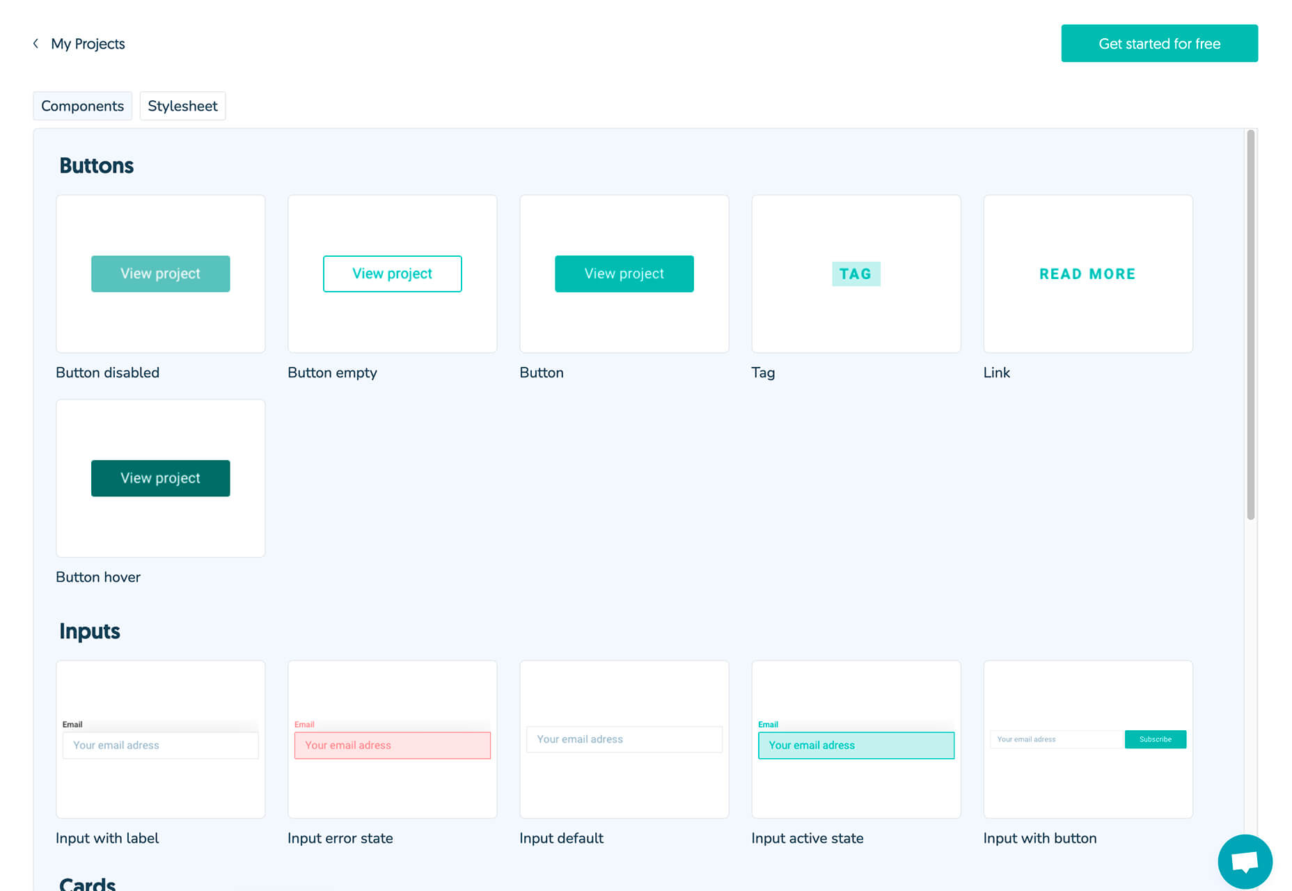
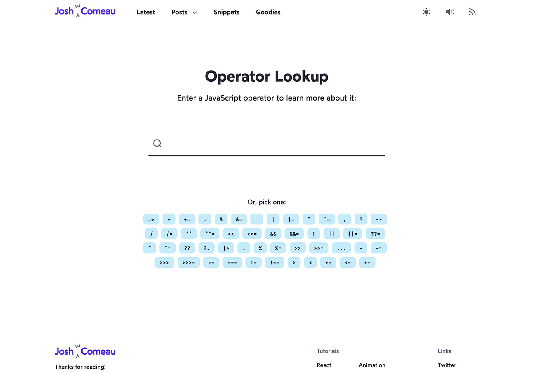
Sass – the extended arm of CSS; the power factor that brings elegance to your code.

With Sass, it is all about variables, nesting, mixins, functions, partials, imports, inheritance, and control directives. Sass makes your code more maintainable and reusable.

And now, I will show you how to make your code more structured and organized.

The organization of files and folders is crucial when projects expand. Modularizing the directory is necessary as the file structure increases significantly. This means structuring is in order. Here is a way to do it.

  • Divide the stylesheets into separate files by using Partials
  • Import the partials into the master stylesheet – which is typically the main.sass file.
  • Create a layout folder for the layout specific files

Types of Sass Structures

There are a few different structures you can use. I prefer using two structures — a simple one and a more complex one. Let’s have a look.

Simple Structure

The simple structure is convenient for a small project like a single web page. For that purpose, you need to create a very minimal structure. Here is an example:

  • _base.sass — contains all the resets, variables, mixins, and utility classes
  • _layout.sass — all the Sass code handling the layout, which is the container and grid systems
  • _components.sass — everything that is reusable – buttons, navbars, cards, and so on
  • _main.sass — the main partial should contain only the imports of the already mentioned files

Another example of the same simple structure is the following:

  • _core.sass — contains variables, resets, mixins, and other similar styles
  • _layout.sass — there are the styles for the header, footer, the grid system, etc
  • _components.sass — styles for every component necessary for that project, including buttons, modals, etc.
  • _app.sass — imports

This is the one I usually use for smaller projects. And when it comes to making a decision of what kind of structure to be used, the size of the project is often the deciding factor.

Why Use This Structure?

There are several advantages why you should use this organisational structure. First of all, the CSS files cache and in doing so, the need to download a new file for every new page visit is decreased. In this way, the HTTP requests decrease as well.

Secondly, this structure is much easier to maintain since there is only one file.

Thirdly, the CSS files can be compressed and thus decrease their size. For a better outcome, it is recommended to use Sass/Less and then do concatenation and minification of the files.

In case files become disorganized, you would need to expand the structure. In such a case, you can add a folder for the components and break it further into individual files. If the project broadens and there is a need for restructuring the whole Sass structure, consider the next, more complex pattern.

The 7-1 Patterned Structure

The name of this structure comes from 7 folders, 1 file. This structure is used by many, as it is considered to be a good basis for projects of larger sizes. All you need to do is organize the partials in 7 different folders, and one single file (app.sass) should sit at the root level handling the imports. Here is an example:

sass/
|
|- abstracts/
| |- _mixins // Sass Mixins Folder
| |- _variables.scss // Sass Variables
|
|- core/
| |- _reset.scss // Reset
| |- _typography.scss // Typography Rules
|
|- components/
| |- _buttons.scss // Buttons
| |- _carousel.scss // Carousel
| |- _slider.scss // Slider
|
|- layout/
| |- _navigation.scss // Navigation
| |- _header.scss // Header
| |- _footer.scss // Footer
| |- _sidebar.scss // Sidebar
| |- _grid.scss // Grid
|
|- pages/
| |- _home.scss // Home styles
| |- _about.scss // About styles
|
|- sections/ (or blocks/)
| |- _hero.scss // Hero section
| |- _cta.scss // CTA section
|
|- vendors/ (if needed)
| |- _bootstrap.scss // Bootstrap
|
- app.scss // Main Sass file

In the Abstract partial, there is a file with all the variables, mixins, and similar components.

The Core partial contains files like typography, resets, and boilerplate code, used across the whole website. Once you write this code, there is no further overwriting.

The Components partial contains styles for all components that are to be created for one website, including buttons, carousels, tabs, modals, and the like.

The Layout partial has all styles necessary for the layout of the site, i.e., header, footer.

The Pages partial contains the styles for every individual page. Almost every page needs to have specific styles that are to be used only for that particular page.

For every section to be reusable and the sass code to be easily accessible, there is the Section/Blocks partial. Also, it is important to have this partial so that you don’t need to search whether particular code is in the home.sass or about.sass files in the Pages partial.

It is a good idea to put each section in a separate .sass file. Thus, if you have two different hero sections, put the code in the same file to know that there you can find the code for the two sections. And if you follow this pattern, you will have the majority of files in this folder.

The Vendors partial is intended for bootstrap frameworks so, if you use one in your project, create this partial.

I recommend you use app.sass as the main folder. Here is how it should look:

// Abstract files
@import "abscracts/all"; // Vendor Files
@import "vendor/bootstrap.scss"; // Core files
@import "core/all"; // Components
@import "components/all"; // Layout
@import "layout/all"; // Sections
@import "sections/all"; // Pages
@import "pages/all";

Instead of having a lot of imports in the file, create an all.sass file in every folder. Each all.sass file should contain all the imports for that folder — and to make it more visible and understandable, create a main file.

Organisation

The biggest benefit of this structure is organisation.You always know where to check if you need to change something specific. For example, if you want to change the spacing on a Section/Block you go directly to the Sections/Blocks folder. That way, you don’t need to search in the folder to find the class in a file.

Facilitation

When the code is structured, the processes are promptly facilitated. They are streamlined and every segment of the code has their own place.

Final Words

Organizing code is essential for developers and together with all other skills, it is the most effective way to improve the functioning of the site. And even though there are multiple ways of organisation and different strategies, opting for simplicity helps you avoid the dangerous pitfalls. And finally, there is no right or wrong choice since everything depends on the developer’s work strategies.


Featured image via Reshot.

Source


Source de l’article sur Webdesignerdepot

By the end of the year, the number of global smartphone users is expected to reach 3.5 billion. That’s a significant 9.3% increase over the last 12 months.

In a world where everyone is constantly connected to their mobile devices, it makes sense that web developers and designers would need to consider new rules for how they create engaging experiences. After all, most of us find browsing from our smartphones to be much more convenient than sitting down at a laptop each day.

With a little luck, you’re already taking steps to mobile optimize your website but standards are changing all the time. To make sure your website is up to scratch, here’s your guide to prioritizing your site for mobile, ready for the new year.

Understanding Mobile-First Design

The first step in updating your web design and development principles, is understanding the concept of mobile first design, and how it’s changed.

With a responsive website, you create something that adjusts to the screen size of any device; with a mobile-first site, you’re focusing first-and-foremost on the user experience that people get when they’re on mobile, taking that as your starting point, and building from there. Instead of building your website for the desktop and using mobile as an afterthought, you start with a consideration of mobile.

Even Google is highlighting the demand for this process lately, with the mobile-first indexing algorithm. If you can’t design for mobile-first, then you could risk your clients being unable to rise up the search engine ranks.

So, how do you get started?

1. Start With the Right Tools

Web developers and designers are nothing without a great toolkit.

The good news is that there are solutions out there that can help you to master the right skills for a mobile-focused user experience. For instance, Skeleton is excellent for small-scale projects that require fluid grids and minimal compiling.

Alternatively, Bootstrap can offer a one-size-fits-all solution for the front-end development for mobile devices. There’s a default grid system available, plenty of components, and JavaScript plugins to work with.

With the right tools, you can minimize and prioritize the content that’s most valuable for your website projects. This is crucial for maximizing website speed and creating clarity when it comes to content and imagery.

For instance, check out the ESPN website; it’s split into very easy-to-follow categories of content that are perfect for scrolling on a smartphone. The grid of videos makes it feel like you’re using a tool like YouTube.

2. Prioritize Mobile-First Elements

Once you have the right tools to assist you, it’s time to begin building your mobile-first website from the ground up. Rather than jumping straight into considerations of the latest design trends, it’s important to start with the foundations.

For instance, navigation within a mobile page is usually hidden under a hamburger button. However, you can take this concept to the next level too. For example, the Shojin mobile website only demonstrates the most important website options within the navigation bar to avoid overwhelming users.

The key here is to keep things as simple as possible, without restricting what your audience can do when they visit your website. Although you want to keep the number of interactive elements on your site small, you also need to ensure that those elements are easy to find and use.

All buttons and CTAs should be clear and tappable. Fonts need to be large enough to read from any screen, and your navigation system needs to be 100% simple, without slowing anything down.

On average, we recommend making all clickable elements at least 48 pixels in height.

3. Use Responsive Imagery and SVGs

Images are a crucial part of any website. They add context and appeal to your design. However, they can also seriously slow down your website if you’re not careful.

Remember, different devices have different demands when it comes to imagery. A desktop page may need a 1200px wide image, while a mobile-only needs the image to be 400px wide at most. The old way of making your images work was to load a large resolution image and use the same file on every platform. Unfortunately, this slows downloading time significantly.

Instead, it’s better to have at least two different versions of the same image for your mobile and desktop solutions. You can also consider SVG.

SVGs are incredibly scalable – more so than bitmaps. With SVG, you can ensure any icon or graphic continues to look sharp and clickable across all devices. Because these files are often smaller, your site loads quicker too! Hubspot is great at using SVGs.

Intricate illustrations are a massive component of HubSpot’s brand. If those images were saved as PNGs or other alternative files, then they would take forever to load. Because they’re all SVGs, you can enjoy the same consistent experience across desktop and mobile.

4. Get the Typography Right

It’s not just the big graphics and images that make a huge difference to your website when it comes to mobile-first design. You also need to think about the legibility and clarity of your website across all devices and platforms. If people can’t read the value proposition of the company that you’re designing for, you’re going to have a major problem.

Focus on making your content as easy to read as possible. Look into the typefaces that seem most appealing on a range of devices.

Remember to balance the body and heading font sizes for the device size too. You’ll need to ensure that the experience feels consistent and smooth as your users scroll through each page. Just take a look at the mobile version of the IMPACT website, for instance.

The headings aren’t as huge as they are on the desktop version of the website, and they’re displayed below, rather than above the featured image. However, this helps to give a more immediately eye-catching and structured experience to mobile users.

There’s even a handy “Search Engine Optimization” tag included, that users can click on if they want to find more related articles.

When it comes to typography, remember that it’s not just size and clarity that matter, but how things are structured throughout your website too. Your type should naturally guide your visitors along the page.

5. Master Available Device Features

Finally, on smartphones, you can accomplish a range of amazing things that you might not be able to do when using a desktop device. Your users can make calls, open apps, send messages, and more, all from within their mobile browser. They can also move their smartphone around a room, taking advantage of concepts like AR and VR.

Taking advantage of the unique capabilities that smartphone design can offer gives you a chance to get unique with your user experience.

Making the most of the mobile experience can be much simpler than you’d think. For instance, on a desktop site, you could list your phone number on a contact page. On a mobile site, the number can begin a call when clicked. You can also take the same approach with email addresses, and social media icons too.

Depending on how experimental you feel, there’s also plenty of opportunities to go above and beyond with your mobile features. You may decide to create a mobile app version of a website that your customers can download onto their phones.

Alternatively, you can look into things like AR technology. This could allow your users to practice placing items of furniture that they may be thinking of buying from an online retailer into their house, so they can see how well they work with their other interior design choices.

Making the Most of Mobile-First Design

Ultimately, having a responsive website that works on both mobile and desktop devices is mandatory in the modern world. However, going above and beyond with mobile-first design is a great way to get ahead of the game.

If you can focus on building a website that puts the experiences of mobile users first, then you can create something that’s much more likely to grab audience attention and deliver amazing experiences.

If nothing else, showing your clients that you have what it takes to design for mobile is an excellent way to ensure that you can gain as many new project opportunities as possible.

Source


Source de l’article sur Webdesignerdepot

If you’re interested in a sneak peek of this year’s best Black Friday deals, stick around. You’ll find a few web designers’ favorites, including a stellar deal or two.

This year, more than a few of the popular retail outlets are shifting away from the traditional “camp out all night and bust open the doors when the store opens” shopping model. You might just prefer this less chaotic, ecommerce approach.

All of us are trying to adjust to what may eventually become a “new normal”. We may not like some aspects of this new normal, but there are bright spots as well.

More shoppers are likely going to shop online because of the coronavirus. That means you don’t have to fight the crowds while desperately attempting to socially distance. The shelves aren’t as apt to go bare, and shopping is easy, convenient, and safe.

1. Slider Revolution

You will find the Slider Revolution plugin incorporated in a host of WordPress theme tools and products. This premium plugin can in fact boast of more than 7 million users around the globe.

What you may not be aware of is that it is much more than just a WordPress slider. With it in your web design toolbox, you can in fact create just about anything you can imagine.

Expect to find:

  • A stunning selection of elements including sliders and carousels;
  • Attention-getting hero sections designed to make your home pages really stand out;
  • Single-page websites with layouts unlike anything you’ve seen before;
  • Modular structuring that allows you to rearrange and reuse sections however you choose and the ability to mix and match modules with any WordPress content;
  • Add-ons whose cutting edge features push the boundaries of web design possibilities.

There’s more of course. To celebrate Black Friday and Cyber Monday you can NOW get any Slider Revolution subscription plan or one-time payment at a 33% discount.

Just click on the banner and use the BLACKFRIDAY code at checkout.

2. Amelia

When done manually, booking and managing appointments can be tedious and subject to mistakes and errors. Amelia provides an automated booking process that is oh-so easy to work with and is error free; just what you need to help you acquire more happy customers.

Key features of Amelia’s fully responsive design include:

  • A dashboard system that enables you to track approved and pending appointments, booking changes, and revenue;
  • Zoom Integration, Google Calendar, and Outlook Calendar sync;
  • The ability to accept and easily manage recurring appointments that customers can schedule;
  • Front-end customer and employee appointment and event managing and backend appointment adding, editing, and rescheduling;
  • Email notifications for pending and approved appointments and events.

And much more that will save you loads of energy and a ton of time. Give Amelia a try, and if you like what you see (and you will), take advantage of the 30% Black Friday discount.

3. wpDataTables

wpDataTables 3.0, with its fresh, new look, gives you a host of different ways to generate attractive, customizable, and responsive tables and charts, and a host of different ways to present them.

  • Tables can be created from most data sources, the most common being MySQL query, PHP array, Google Spreadsheet, Excel files CSV files, and JSON and XML inputs;
  • A working knowledge of SQL is not required!
  • Addons include Gravity Forms, Formidable Forms, Report Builder, and Powerful Filter;
  • wpDataTables users can generate Tables and Charts quickly from massive amounts of data (saving hours of effort);
  • Tables and charts are customizable and maintainable (editable once placed in use);
  • Tables can be created manually if you wish.

Click on the banner now and take advantage of wpDataTables 30% Black Friday discount on all licenses and addons.

4. TheGem – Creative Multi-Purpose High-Performance WordPress Theme

In TheGem, the ultimate WordPress multipurpose toolbox, you will find:

  • A rich selection of 400+ premium pre-built multi-page and one-page websites, all available for Elementor and WPBakery page builders;
  • The ability to mix and match any of this demos, layouts and page sections to create your own unique look;
  • Extended WooCommerce layouts & tools for making online shops, which convert better;
  • TheGem Blocks: an ultimate tool for building webpages at the speed of light.

And much more. Just click on the banner and check this 5-star product out.

5. Mobirise Website Builder

Creating a Google-friendly can take time, unless you have Mobirise at your fingertips, in which case you have a number of helpful tools to speed things up.

  • No coding, it’s all drag and drop;
  • 3,600+ website templates are at your disposal plus sliders, popups, forms, and more;
  • Many eCommerce features, including a shopping cart;
  • Latest Google Amp and Bootstrap4;
  • You can download Mobirise for free.

And, because it’s Black Friday, everything is yours at a 94% discount!

6. Get Illustrations

Get Illustrations offers royalty free and landing page Illustrations ready to drag and drop into your web design. You’ll have access to:

  • An extensive library of 4000+ illustrations with more added every week;
  • A wealth of design formats, including AI, PNG, SVG, Figma, Adobe XD, and Sketch;
  • Free updates and new illustrations weekly (included in the bundle).

Click on the banner and use the Coupon Code BLACKDEAL for your 30% discount.

7. XStore | Responsive Multi-Purpose WooCommerce WordPress Theme

For anyone planning on creating an eCommerce store, the XStore name says it all. Key features you’ll find in this powerful and flexible WooCommerce theme include:

  • More than 95 good-to-go-shops plus a full AJAX shop to get you started;
  • 300+ pre-defined shop/page sections, a header builder, and a single product page builder;
  • Elementor, WPBakery and $510+ worth of premium plugins.

Click on the banner and sign up to become one of XStore’s 55,000+ happy customers.

8. Kalium – Creative Theme For Multiple Uses

Kalium is an easy-to-use, easily maintainable multipurpose theme for WordPress users that is always updated to use the latest WordPress standards.

  • Kalium provides its users with a host of professionally-designed pre-built demos and elements;
  • Many plugins such as: Slider Revolution, WPBakery, Elementor, Layer Slider, Advanced Custom Fields PRO, Product Filter for WooCommerce, Product Size Guide,WooCommerce and other premium plugins are included.

Kalium is responsive, GDPR compliant, and gives you full eCommerce and top-quality customer support. It has a 5-star rating after 36k sales on ThemeForest – seriously impressive!

***** 

If you hit the retail stores remember to social distance.

Or, if you would rather take a brief break from the demands of Covid-19, take advantage of one or more of the above ecommerce sales. As you can see, there are some excellent ones!


[– This is a sponsored post –]

Source


Source de l’article sur Webdesignerdepot

Every week users submit a lot of interesting stuff on our sister site Webdesigner News, highlighting great content from around the web that can be of interest to web designers.

The best way to keep track of all the great stories and news being posted is simply to check out the Webdesigner News site, however, in case you missed some here’s a quick and useful compilation of the most popular designer news that we curated from the past week.

15 Best Illustration Tools in 2020


Slidepage 1.0 – Create Engaging and Swipeable Stories-on-the-Web, for Free


Notion Timeline – More than Gantt, for all your Projects


Unslack


UX Lessons from Big Sur


Pattern Collect


Apple Silicon M1 Chips and Docker


Difference Between UI and UX Design


How Many WordPress Plugins Should You Install?


5 Things I Wish I’d Known Before Starting a Design System at Spotify


8 Pure CSS Games You Can Play in your Browser


We Can do Better than DuckDuckGo


Fulljar – Simple and Privacy Focused Analytics


Accessibility in User Experience: How to Include People with Disabilities


9 Common WordPress Myths Debunked and Explained


Impressive Pure CSS Drawings


I Took 21 Online Courses, Here’s What I Learned


User Experience: Insights into Consistency in Design


How to Use Emotion to Make your Brand’s Content More Compelling


25 Free Icon Sets You Can Download and Use Today


6 Ways 2020 has Changed the Landscape of Design


25 Inspirational Quotes for Web Designers


9 Tips to Keep You Sane When Working with Multiple Clients


Write Code like You Write a Recipe


UI Coach – UI Design Challenge Generator


Want more? No problem! Keep track of top design news from around the web with Webdesigner News.

Source


Source de l’article sur Webdesignerdepot

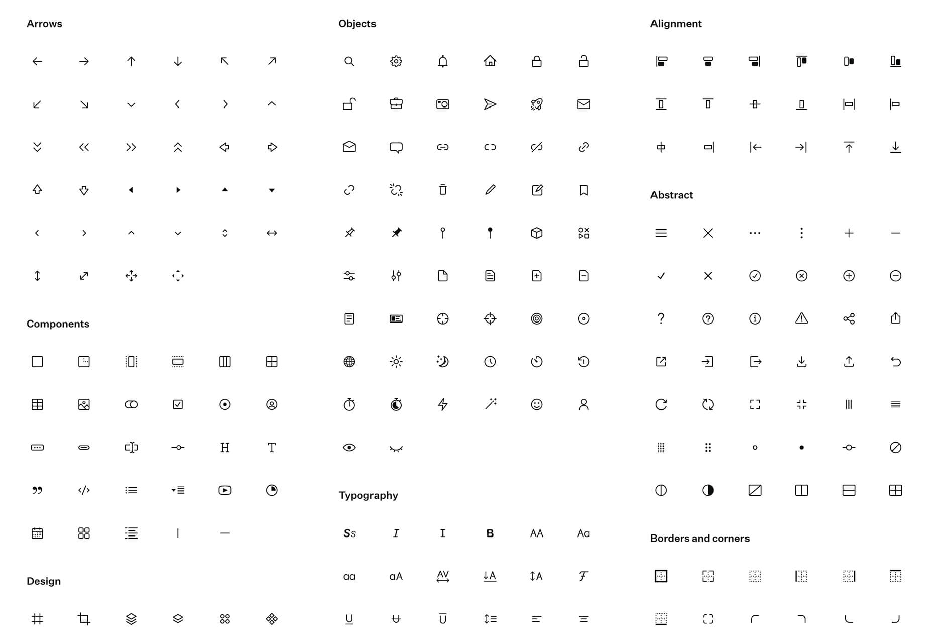
Since there are so many CMS plugins out there, it can be overwhelming to choose the best ones for your website. We’ve done the research for you; this list contains the top new CMS plugins for November 2020. You’ll find useful plugins for WordPress, Craft, Shopify, and Joomla.

Let’s get started…

WordPress

404 Page Editor

404 Page Editor is a simple WordPress plugin that helps you add custom text to the default 404 page on your website. The plugin comes with seasonal and industry-related 404 templates. One useful feature of the plugin is that it backups your current 404 page before changing it. So you can restore the backup page anytime you choose. The plugin duplicates your current 404.php page to wp-content/uploads/404-page-editor/ so you can easily find it. You can also change the text on the plugin to fit your local dialect. 

UnusedCSS Power-Up

Most WordPress themes and plugins load their CSS in the wrong areas of your website. This can slow down your site. A slow website will reduce user experience and lead to increased bounce rates.

UnusedCSS will help reduce the size of your website’s CSS files by up to 95%. The best part is that the plugin works automatically. It will remove any unused CSS when visitors view any page on your website. UnusedCSS will automatically reduce your website’s load times by reducing your CSS files and page size. The plugin also optimizes the performance of other WordPress plugins and extensions. UnusedCSS also works with WooCommerce themes and plugins.

Simple Redirects

Simple Redirects is a WordPress plugin that helps you to automatically redirect requests to another page on your site or any other place on the web. The plugin allows you to easily redirect users from your old web pages to new pages using 301 or 302 redirects. You don’t have to worry about losing backlinks or page rank. Any incoming links to the old web page will be automatically passed along to the new page. The page rank on the old page is also transferred to the new page. The plugin is useful when migrating a WordPress site when don’t want to retain the URL structure. 

HTML Validation

HTML Validation plugin helps you identify any HTML validation errors on your website. The plugin works automatically in the background of your website and will send you regular reports. There is a progress bar on the report screen to show you the progress of the scan. The plugin uses WordPress Cron to scan the content of your website. There is also an option for the plugin to automatically fix any HTML validation issues on your website. You can also choose to fix the issues manually. 

Just Highlight

Just Highlight is a simple WordPress plugin that helps you highlight text in your posts or pages. You can use this plugin to highlight any portion of the page you want to draw the reader’s attention to. You can highlight the background of the page and also add animation to the highlighted text. In the WordPress admin area, you can change the speed and color of the animation. The plugin is compatible with Gutenberg, and the WordPress classic editor. 

DeviantArt Embed

DeviantArt Embed is a simple plugin that helps you embed any work from Deviant Art into a post. The plugin provides a block for the WordPress block editor so you can easily embed the image. It uses a DeviantArt oEmbed API to pull the images and their descriptions, and creates an embedded image. 

Static Optimizer

Static Optimizer is a static file optimization plugin that serves and optimizes static files on your website. The plugin will help you increase your website speed by automatically compressing your static files. It is easy to set up, you just need an API key to get started. Other useful features that the plugin offers include automatic JS and CSS minification, automatic image optimization, and processing of responsive images. You don’t have to worry about losing your files if their server is down. The plugin automatically backs up your files and will load your original files when their servers are down (either because of an upgrade, maintenance, or outage).  By default, only images are compressed when you activate the plugin; you can also choose to optimize fonts, CSS, and JS files. 

RankBear

RankBear is a keyword rank tracker plugin that helps you analyze your SEO efforts. With RankBear, you can track the keywords for each of the posts and pages on your site. While the plugin has a paid plan, you can track up to five keywords for free. On the free plan, you will receive weekly reports on each keyword you are tracking. You can search for the rank and volume of a keyword in every location supported by the Google search engine. RankBear is a lightweight software-as-a-service plugin hosted by Amazon Cloud Services. The plugin also offers the option to download the keyword reports to CSV. 

Table of Contents Block

Table of Contents Block is a plugin that allows you to easily create a Table of Contents for your WordPress posts. The plugin is lightweight and will automatically add a Table of Content in your website’s posts and pages. You can select the heading tags you want to add to the Table of Content. It also has a dedicated support team to assist you. The plugin works fine with all standard WordPress themes. 

Markease For WooCommerce

Markeaze is an all-in-one communication plugin that allows you to add live chat to your online stores. The plugin will help you improve your customer service by decreasing your response times. With the plugin, you can collect your visitor’s contact information via a widget. This feature is useful in building a subscriber database. You can also use the plugin to track customer behavior on your site, inform customers about new products, help customers with active orders, and collect customer feedback. You can also use the auto-reply function to answer commonly asked questions. 

Craft CMS

Image Toolbox

Image Toolbox is a Craft CMS plugin that offers image-related tools for your templates. The plugin will automatically create a WebP variant of the images you upload. It also has a fallback for browsers that do not support WebP images. Other useful features the plugin offers include automatic creation of placeholder images and generation of responsive images with multiple variants. The plugin also supports Imager-X (or old Imager). 

Element Panel

Element Panel plugin allows you to add elements and an eager-loading panel to the debug toolbar. This feature will help you benchmark your templates in Craft CMS. For elements, the panel has a dashboard that shows how many elements are populated. It also shows how many elements are duplicates. The plugin also shows you how many eager-loading elements are detected. Duplicate elements are grouped by field name. 

Shopify 

VStore Shoppable Videos

VStore Shoppable Videos is a Shopify plugin that allows your customers to shop directly from your videos. The plugin allows you to embed your products into any video. Since videos have a high engagement rate, this plugin will significantly improve your store’s conversion rates. 

ProofMotion Video Testimonials

ProofMotion Video Testimonials plugin helps you to easily collect video testimonials. The plugin sends an automated email or SMS requests to customers asking for their satisfaction feedback after making a purchase. The responses are analyzed to determine whether the customer had a negative or positive experience. Customers that offer negative feedback are sent to customer care to help them with the problem they encountered. Happy customers are prompted to make video testimonials of their positive shopping experience. ProofMotion guides the customer through the interview so they can give the best testimonial. They also offer an on-site widget so you can easily share your testimonials. 

Real ID

Real ID is a Shopify plugin that allows you to verify customers’ real identity using a photo ID and facial biometrics. The plugin is perfect for orders that have an age restriction, verifying flagged fraud goods, and selling expensive goods. Real ID will help you identify whether a government-issued-ID is fake during fulfilment. All the customer needs to do is take a selfie on their phone. This way, even if a customer has access to a stolen physical ID, they won’t still be able to make any purchase. The plugin can verify documents such as passports, visas, national IDs, driver licenses, and more. Real ID will help you handle GDPR compliance. The plugin is available in hundreds of countries around the world. 

Joomla

Accessibility

Accessibility is a Joomla plugin that allows your website visitors to easily access your website content. The plugin will remove any barrier between the visitor and your Joomla site. There is no coding required and you can customize the plugin directly from the module manager. The plugin has a useful feature called Dyslexic Readability; this feature allows your visitors to set the entire document font to a dyslexic-friendly font. Visitors can also grayscale the page, resize the fonts, and resize the word space. From the backend module, you can add any custom CSS and JS. The plugin is also available in 12 different languages. 

Reading Time

Reading Time is a simple plugin that will help you easily show the reading time of your Joomla articles. The plugin is easy to set up and does not require any coding. You can customize every parameter, including the text, in minutes. You can also choose to exclude categories, articles, and menu items. Reading Time also allows you to easily add custom CSS code from the plugin parameters. 


Featured image via Pexels.

Source


Source de l’article sur Webdesignerdepot

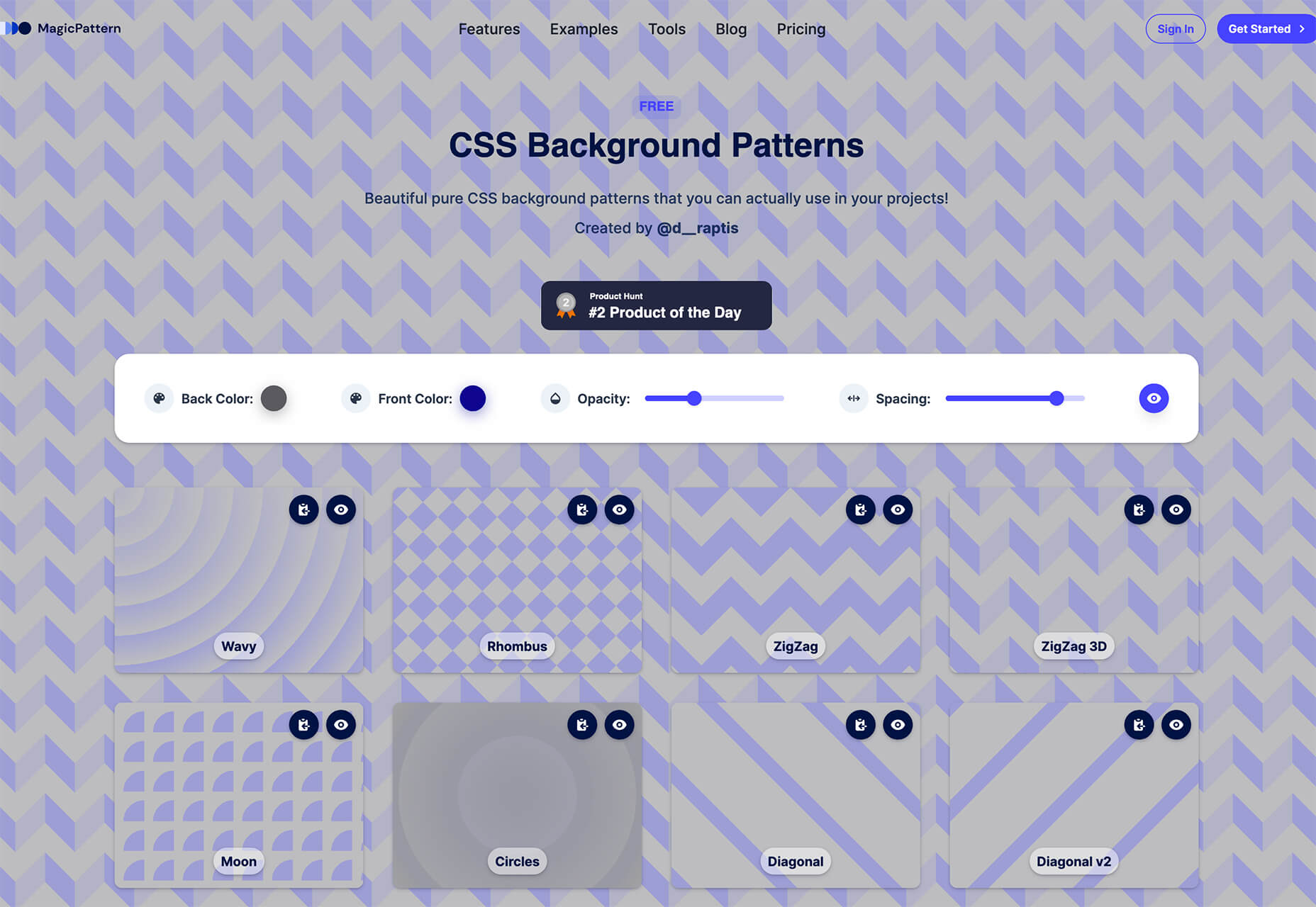
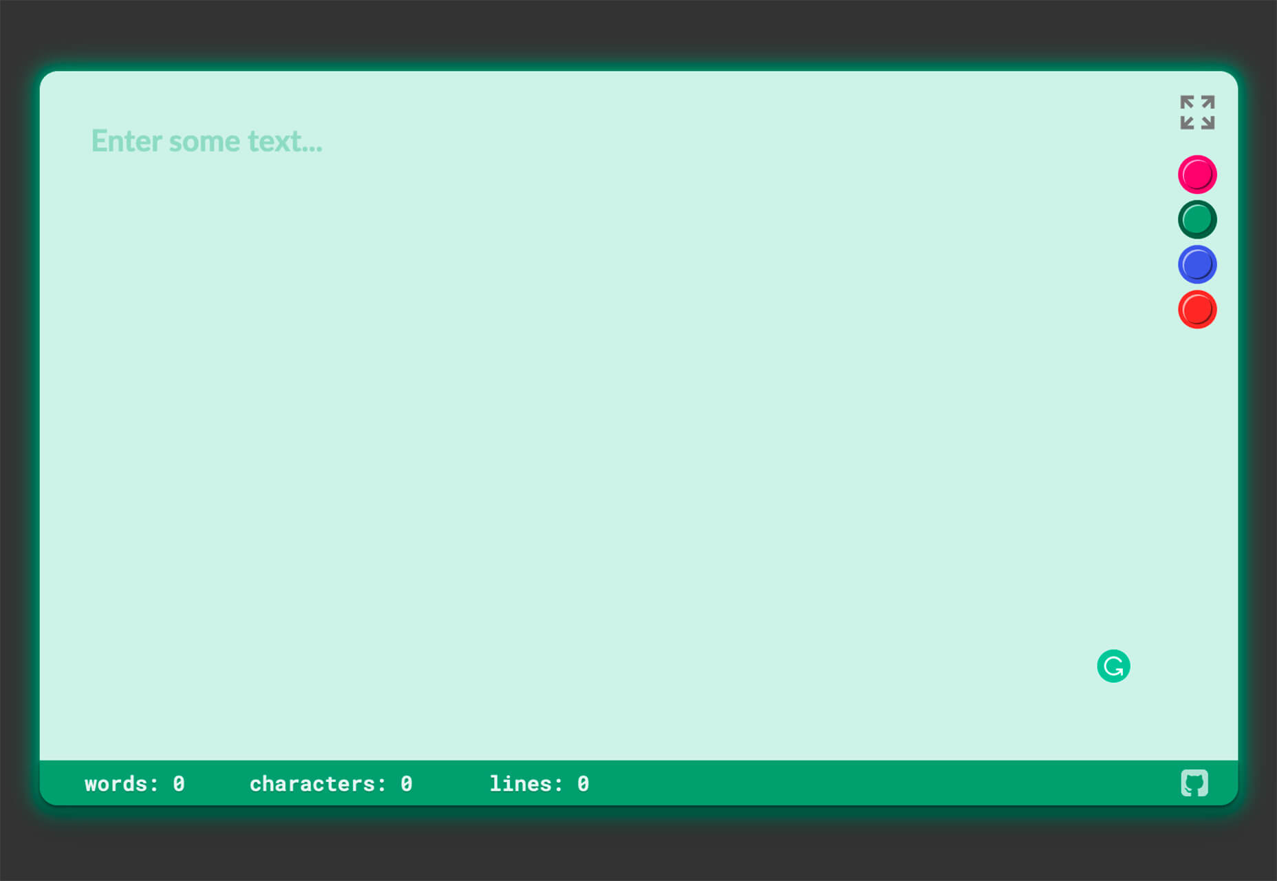
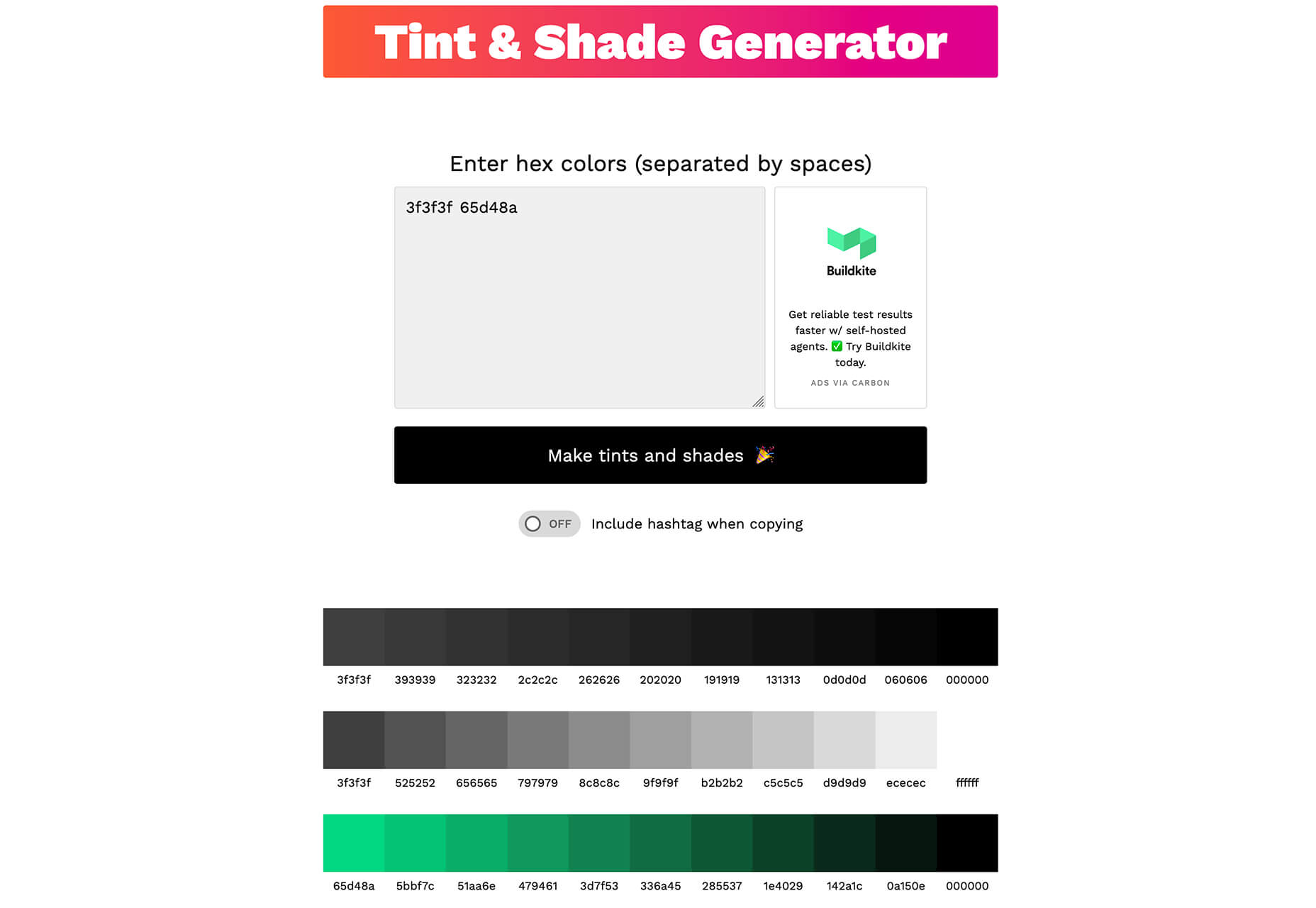
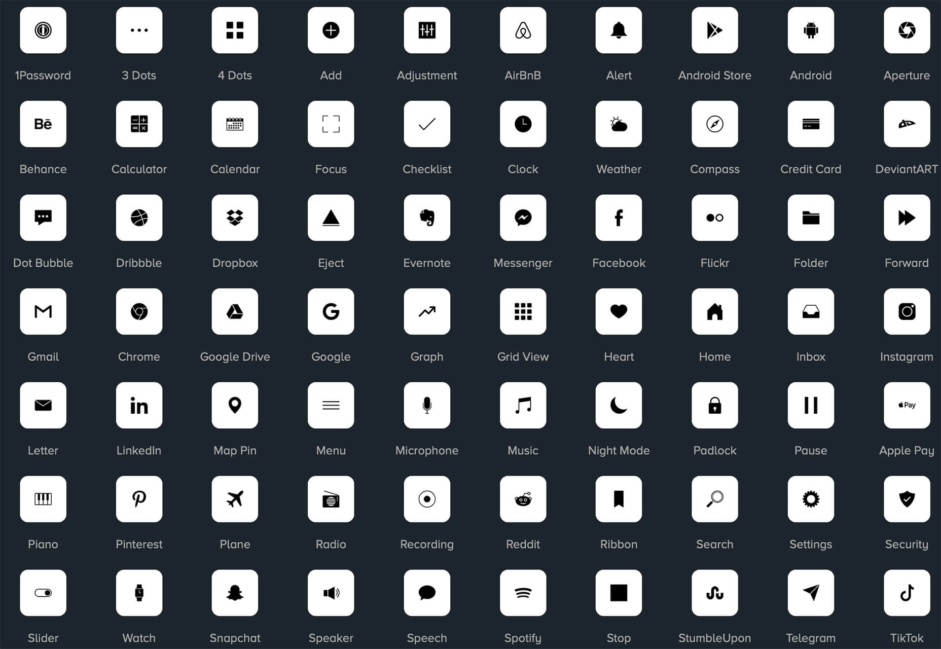
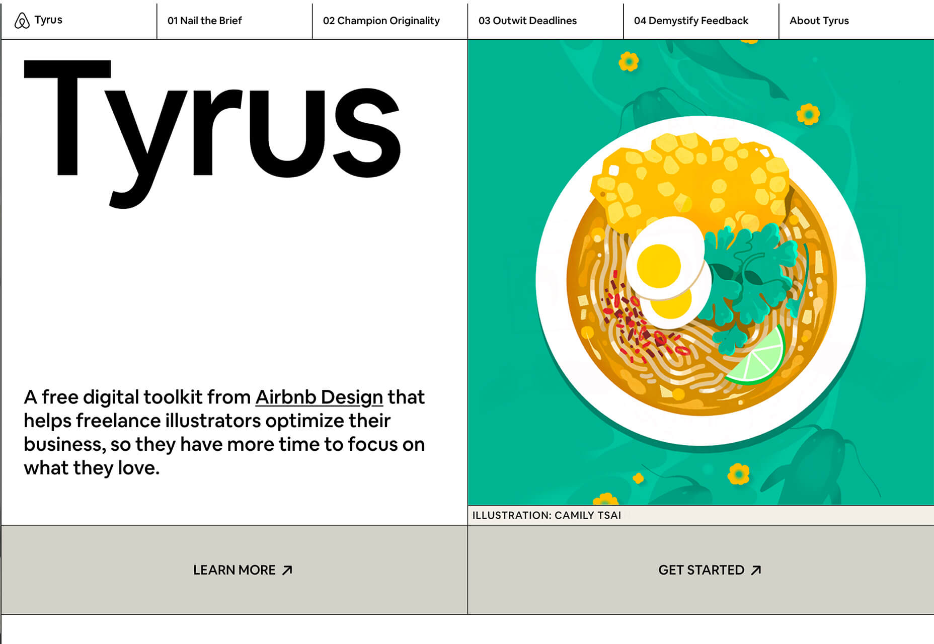
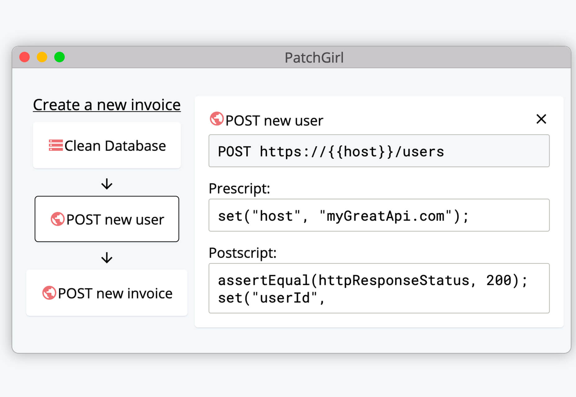
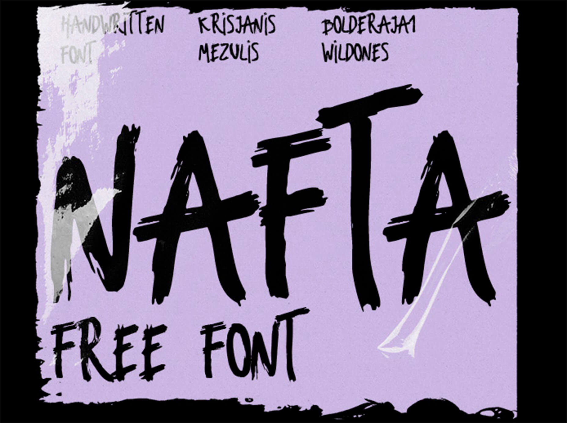
In the spirit of fall feasts, this month’s collection of tools and resources is a smorgasbord of sorts. You’ll find everything from web tools to icon libraries to animation tools to great free fonts. Let’s dig in.

Here’s what new for designers this month.

The Good Line-Height

The Good Line-Height is the tool you won’t be able to live without after using it a few times. The tool calculates the ideal line-height for every text size in a typographic scale so that everything always fits the baseline grid. Set the font size, multiplier, and grid row height to get started.

Link-to-QR

Link-to-QR makes creating quick codes a breeze. Paste in your link and the tool creates an immediate QR code that you can download or share. Pick a color and transparency, plus size, and you are done.

Quarkly

Quarkly allows you to create websites and web apps both using a mouse and typing code – you get all the pros of responsive editing, but can also open the code editor at any time and manually edit anything and it all synchronizes. The tool is built for design control and is in beta.

UnSpam.email

Unspam.email is an online spam tester tool for emails. Improve deliverability with the free email tester. The service analyzes the main aspects of an email and returns a spam score and predicts results with a heat map of your email newsletter.

Filmstrip

Filmstrip allows you to create or import keyframe animations, make adjustments, and export them for web playback. It’s a quick and easy tool for modern web animation.

CSS Background Patterns

CSS Background Patterns is packed with groovy designs that you can adjust and turn into just the right background for your web project. Set the colors, opacity, and spacing; then pick a pattern; preview it right on the screen; and then snag the CSS. You can also submit your own patterns.

Neonpad

Neonpad is a simple – but fun – plain text editor in neon colors. Switch hues for a different writing experience. Use it small or expand to full browser size.

Link Hover Animation

Link Hover Animation is a nifty twist on a hover state. The animation draws a circle around the link!

Tint and Shade Generator

Tint and Shade Generator helps you make the most of any hex color. Start with a base color palette and use it to generate complementary colors for gradients, borders, backgrounds, or shadows.

Pure CSS Product Card

Pure CSS Product Card by Adam Kuhn is a lovely example of an e-commerce design that you can learn from. The card is appealing and functional.

Free Favicon Maker

Free Favicon Maker allows you to create a simple SVG or PNG favicon in a few clicks. You can set a style that includes a letter or emoji, font and size, color, and edge type and you are ready to snag the HTML or download the SVG or PNG file.

Ultimate Free iOS Icon Pack

The Ultimate Free iOS Icon Pack is a collection of 100 minimal icons in an Apple style. With black and white version of each icon and original PSD files, you can create sleek icons for your iPhone screen in minutes. And it’s completely free! No email address or registration required.

Phosphor Icon Family

Phosphor is a flexible icon family for all the things you need icons for including diagrams and presentations. There are plenty of arrows, chats, circles, clocks, office elements, lists, business logos, and more. Everything is in a line style, filled, or with duotone color. Everything is free but donations are accepted.

3,000 Hands

3,000 Hands is a kit of hands that includes plenty of gestures and style in six skin tones and with 10 angles of every gesture. They have a 3D-ish shape and are in an easy to use PNG format. This kit has everything you need from a set of hand icons.

Radix Icons

Radix Icons is a set of 15px by 15px icons for tiny spaces. They are in a line style and are available in a variety of formats including Figma, Sketch, iconJar, SVG, npm installation, or GitHub.

Deepnote

Deepnote is a new kind of data science notebook. It is Jupyter-compatible with real-time collaboration and running in the cloud and designed for data science teams.

ZzFXM Tiny JavaScript Music Generator

ZzFXM is a tiny JavaScript function that generates stereo music tracks from patterns of note and instrument data. Instrument samples are created using a modified version of the super-tiny ZzFX sound generator by Frank Force. It is designed for size-limited productions.

Image Tiles Scroll Animation

Image Tiles Scroll Animation is a different type of scrolling pattern using Locomotive Scroll. The grid creates a smooth animation in a fun and modern style.

Bubbles

Bubbles is a Chrome extension that allows you to collaborate by clicking anywhere on your screen and then dropping a comment to start a conversation with anyone. This is a nice option for work from home teams.

Tyrus

Tyrus is a toolkit from the design team at Airbnb to help illustrators make the most out of their design businesses. It is broken into sections to help you with design briefs, originality, deadlines, and feedback.

PatchGirl

PatchGirl is an automated QA tool for developers. You can combine SQL and HTTP queries to build any possible state of your database.

Apparel

Apparel is a beautiful premium typeface family with plenty of versatility in a modern serif style. It is a contemporary, classy, and fresh serif typeface with a laid-back. Its medium-large x-height makes it ideal for headlines and brand identity design.

Christmas Story

Christmas Story is a nice solution if you are already starting to think ahead to holiday projects or cards. The long swashes and tails are elaborate and fun.

Nafta

Nafta is a fun handwriting style font that has a marker-style stroke. It’s a modern take on the popular Sharpie font. It includes all uppercase letters.

Safira

Safira is a wide and modern sans with ligatures and a stylish feel. The rounded ball terminals are especially elegant.

Shine Brighter Sans

Shine Brighter Sans is a super-thin sans-serif with a light attitude. The limited character set combined with its light weight is best for display use.

Source


Source de l’article sur Webdesignerdepot

A hacked WordPress site is as damaging as having your home burgled. It can completely shatter your peace of mind and adversely impact your online business. 

Why do hackers target WordPress sites? The answer is relatively simple: WordPress is the single biggest platform for website creation these days, so there’s a larger base to attack; this attracts the attention of online criminals. 

So, how can a hack impact your website? 

Depending on the type of attack, your website could suffer any of the following:

  • It could be defaced completely;
  • It could load or operate very slowly on any device;
  • It could completely crash and malfunction;
  • It could display the dreadful “White Screen of Death”;
  • Its incoming visitors could be redirected to other suspicious websites;
  • It could lose all your valuable customer data.

This list is not exhaustive but you get the idea.

Now that we know how a successful hack can impact your website and online business, let us look at the top 10 reasons behind WP hacks and prevent them.

1. An Insecure Web Host 

Like any website, WordPress is hosted on a web host or server. Unfortunately, most site owners do not pay much attention to the web host they select and choose the cheapest they can find. For example, it is more affordable to host a website on a shared hosting plan — one that shares its server resources with many other websites like yours.

This can make your site vulnerable to hackers as a successful hack into any website on the shared server. A single hacked site can consume the overall server bandwidth and impact all the other sites’ performance.

The only way to fix this problem is to opt for a reliable host and a virtual or dedicated server.

Pro tip: If you’re already using a shared hosting plan, check with your hosts if they offer VPS hosting and make the switch.

2. Use of Weak Passwords

Weak passwords are the main reason behind successful brute force attacks that target your account. Even to this day, users continue to use weak and common passwords like “password” or “123456”; if you’re one of them, your website could land in trouble!

Guessing weak passwords allows hackers to enter the admin accounts where they can inflict the maximum damage.

How do you fix this problem? Simple, ensure all your account users (including admin users) configure strong passwords for their login credentials. With at least 8 characters, passwords must be a mix of upper- and lower-case alphabets, numbers, and symbols. 

For added safety, install a password management tool that can automatically generate and store strong passwords.

Pro tip: You can use a plugin to reset passwords for all your users.

3. An Outdated WP Version

Outdated software is among the most common reasons why websites get hacked. Despite being free to download, most site users defer updating their site to the latest version, for fears of updates causing their site to crash.

Hackers take advantage of any vulnerability or bug in an older version and cause issues like SQL Injections, WP-VCD Malware, SEO Spam & other major issues like website redirecting to another site.

How do you solve this problem? When you see a notification about an update on your dashboard, update your site as soon as possible.

Pro tip: If you are worried about updates crashing your live website, you can first test the updates on a staging site.

4. Outdated WP Plugins and Themes

Similar to the previous point, hackers also take advantage of outdated, unused, or abandoned plugins and themes installed on websites. With over 55,000 plugins and themes that are available, it is easy to install a plugin or theme, even from unsafe or untrusted websites. 

Plus, many users do not update their installed plugins/themes to the latest version or do not find the updated version. This makes it easier for hackers to do their job & infect sites.

How do you avoid this problem? As with the core WP version, update each of your installed plugins/themes on your site regularly. Take stock of all the unused ones and remove them or replace them with better alternatives.

You can update your plugins/themes from your hosting account.

Pro tip: We suggest setting aside time every week to run updates. Test them on a staging site and then update your site.

5. Common Admin Usernames 

In addition to weak passwords, users also create common usernames that are easy to guess. 

This includes common usernames for admin users like – “admin”, “admin1”, or “admin123”. Common admin usernames make it easier for hackers to get into admin accounts and control backend files in your WP installation.

How do you avoid this problem? If you are using any such usernames that are easy to guess, change them immediately to a unique username. The easiest way of doing it is through your hosting account’s user management tool, by deleting the previous admin user and creating a new admin user with a unique username.

As the first step, change the default username of your admin user and limit users who have administrator privileges.

Pro tip: WordPress has 6 different user roles with limited permissions. Only grant admin access to users who really need it.

6. Use of Nulled Plugins/Themes 

Coming back to the importance of plugins/themes, users have access to many websites that sell nulled or pirated copies of popular and paid plugins and themes. While these are free to use, they are often riddled with malware. They can compromise your website’s overall security and make it easier for hackers to exploit. 

Being a pirated copy, nulled plugins/themes do not have any available updates from its development team, hence will not have any security fixes.

How do you fix this problem? Simple, for a start, only download original plugins and themes from trusted websites and marketplaces.

Pro tip: If you don’t wish to pay for paid or premium plugins and themes, opt for a free version of the same tools that will have limited features but are still safer to use than the nulled version. 

7. Unprotected Access to wp-admin Folder

To take control of your site, hackers often try to break into and control your wp-admin folder in your installation. As the website owner, you must take measures to protect your wp-admin directory.

How can you protect your wp-admin folder? First, restrict the number of users having access to this critical folder. Additionally, apply for password protection as an added layer of security for access to the wp-admin folder. You can do this using the “Password Protection Directories” feature of the cPanel in your web host account.

Pro tip: Besides these fixes, you can also implement Two Factor Authentication (or 2FA) protection for all your admin accounts.

8. Non-SSL Website

You can easily migrate your HTTP website to HTTPS by installing an SSL certificate on your site. SSL (or Secure Socket Layer) is a secure mode of encrypting any data transmission between your web server and the client browser.

Without this encryption, hackers can intercept the data and steal it. Plus, a non-secure website can have many negative implications for your business – lower SEO ranking, loss of customer trust, or a drop in incoming traffic.

How do you fix this problem? You can quickly obtain an SSL certificate from your hosting company or SSL providers. It encrypts all data that is sent from and received by your website. 

Pro tip: You can get a free SSL certificate from places like Let’s Encrypt, but these provide limit protection that will only be sufficient for a starter site or small site.

9. No Firewall Protection

Lack of firewall protection is another common reason why hackers can bypass website security measures and infiltrate the backend resources. Firewalls are the last line of defence against hackers and work like the security alarm installed on your house. Firewalls monitor web requests coming from various IP addresses, including the suspicious (or bad) ones. 

They can identify and block requests that are known to be malicious in the past, thus preventing easy access for hackers to your website domain. Web application firewalls can thwart various attacks, including brute force attacks, XSS, and SQL injections.

Pro tip: A firewall provides much-needed security and is  your first line of defence. But it’s important to also have a malware scanner installed.

10. Lack of WordPress Hardening Measures

Typically, hackers target the most vulnerable areas or weaknesses within a WP installation, to illegally access or damage the website. The WordPress team has identified these vulnerable areas and has devised a list of 12 hardening measures recommended for every website.

A few of these include:

  • Disabling the File Editor;
  • Preventing PHP execution in untrusted folders;
  • Changing the security keys;
  • Disallowing plugin installations;
  • Automatic logout of inactive users;

How do you implement these hardening measures? While some steps are easy to understand, others require the technical expertise of how WordPress works. 

Pro tip: You can implement hardening measures on your own. However, some measures require technical expertise so in these cases, it’s much easier and safer to use a plugin.


Featured image via Pexels.

Source


Source de l’article sur Webdesignerdepot