Articles

User Experience is a crucial consideration for any web developer or designer; the only way to ensure that you’re delivering a successful website is to ensure that the end-user or customer will feel comfortable using it. 

A strong user experience increases your client’s chances of successful audience engagement and conversions.

What you might not realize, however, is that the strategies you use to enhance UX as a web developer or designer can also influence how the search engines respond to a website. 

Though many designers assume that SEO (Search Engine Optimization) is the work of a copywriter or content producer, there are design elements to consider too. 

After all, the definition of optimization is “the action of making the best version of a resource.”

So, how are UX and SEO connected?

Adding UX to a Successful SEO Strategy

SEO used to be easy. To stand out on the search results, you just needed to stuff a page full of as many keywords and phrases as possible. Now, it’s a little more complicated. 

Leaders in search engine development, like Google and Bing, know that they need to offer their customers excellent experiences to keep them. In this new experience-focused landscape, SEO and UX share common goals. 

Search engines don’t just want to provide customers with any answers to their questions. Instead, Google and its competitors are using everything from artificial intelligence to machine learning algorithms to ensure that search results are accurate, relevant, and engaging. 

In the same way, user experience is about providing users with easy access to the information and resources they want. 

Now that SEO is a multi-disciplined approach, UX is just one of the essential tools that makes it possible for developers to optimize their websites properly. 

Where UX Developers Influence SEO 

There are plenty of connections between UX and site indexability

We all know that since 2018, site speed has become a crucial ranking factor for companies in search of better search results. As a developer, it’s up to you to ensure that there aren’t too many elements weighing a website down that would prevent it from delivering fast results. 

Bounce rate is another critical factor in search engine ranking algorithms. When customers click on a website, Google wants to see that they get the answers they want. If your navigation is difficult to understand, or the correct information isn’t easy to see on a page, end-users will just hit the back button. 

Let’s take a closer look at how developers can influence SEO with their UX strategies. 

1. Site Navigation and Ease of Use

It’s no secret that today’s digital consumers crave easy-to-use sites.

A complex website with pages ranking for different terms might seem like an excellent idea for SEO. However, from a UX perspective, the easier it is to navigate your website, the more your end-users will benefit. 

According to a study from Ahrefs, well-optimized pages that rank for several keywords can be more beneficial than dozens of pages ranking for similar terms. At the same time, if the search engines have difficulty crawling all your pages due to a poor site navigation strategy, then some pages won’t get indexed. 

So, how do you improve navigation and SEO at once? Follow the proper structure for your site first, categories and subcategories on the retail page help customers find exactly what they need. A solid internal linking structure allows the crawlers to examine your website and index each essential page individually.

Keep navigation simple when designing a website for both UX and SEO potential. 

2. User-Friendly Page Layouts

There are countless cases where poor layout design and formatting disrupts SEO potential. For example, cluttering a page with too much information makes it tougher to read and index. At the same time, if your pages aren’t attractive and easy to navigate, customers are more likely to hit the back button. 

If customers come to a website and immediately leave it again, this tells the search engines that they’re not finding what they need on those pages. That means Google will bump you to a lower position on the SERPs. 

So, how do you make your layouts more UX and SEO-friendly?

  • Get your category pages right: Say you’re creating a blog page for your client. They want to list all of their blogs on one main page while linking to separate locations for each article. A design that puts a large chunk of content from each blog on the main page can be problematic for UX and SEO. It means your customers have to scroll further to find what they need. At the same time, the search engines never know which words to rank that main page for. On the other hand, listing blogs on smaller cards, as Fabrik does in this example, makes sorting through content easier. 
  • Leverage headers and tags: Your customers and the search engines habitually “scan” your pages. When trying to improve UX and SEO simultaneously, you must ensure that it’s easy to find crucial information quickly. Header 1 or H1 tags can help by showing your audience your website’s critical sections. Title tags also give search engines more information on the term you want to rank for. Organizing your content into a structure that draws the eye down the page also means your customers are more likely to stay on your website for longer. That shows the search engines that you have quality, relevant content. 
  • Make the most of images and videos: Visual media isn’t just an excellent way to engage your audience. With videos and pictures, you can convey more vital information in a quick and convenient format. This leads to greater satisfaction from your audience from a UX perspective. However, visual content is also great for SEO. You can optimize every image with alt text and meta descriptions. That means you have a higher chance of ranking both in the main search results and the image searches on Google. 

3. Using Search Data to Inform Site Architecture

Today, SEO is less about building hundreds of landing pages for individual queries. Now, it’s more important to take a simple, de-cluttered approach with your website. SEO can determine what kind of architecture you need to create for a successful website. 

For instance, say you wanted to rank for eCommerce SEO. There are tons of related words that connect to that primary search term. Rather than making dozens of different pages that try to rank for distinct phrases, you can cover a lot of other ideas at once with a larger, more detailed piece of content. 

If a topic is too big to cover everything on a single page, then you might decide to create something called “pillar” content out of your main terms. This involves using one main page where you discuss all of the topics you will cover. Then, you design several smaller sub-pages that link back to that central pillar. 

Once again, this helps the search engines to navigate your website and index your pages while assisting the customers in finding the correct information. At the same time, you combine more pages on a website and remove anything that might be detracting from your site’s authority or not offering enough value. 

4. Improving Website SERP Listings

It’s easy to forget as a developer that a customer’s first experience with a website won’t always happen on that site’s homepage. Usually, when your customers are looking for solutions to a problem, they’ll find your website on the search engine results instead. 

This means that you need to ensure that you make the right impression here:

There are a few ways that developers can ensure the search engine listings they create for their clients are up to scratch. For instance, a reasonable title tag for each page that includes appropriate keywords is excellent for SEO and UX. A title tag lets your customers know they’re in the right place and helps them find the information they need. 

Remember, around eight out of ten users on search engines say that they’ll click a title if it’s compelling. 

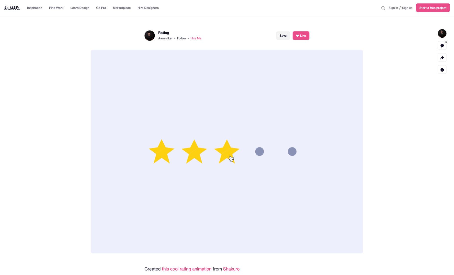
Another component you have control over as a developer or designer is the “rich snippet.” Rich snippets are the informative chunks of content that Google adds to a search listing to help it stand out. You can use rich snippet plugins on a website to tell Google what kind of extra information you want to include on a page. 

For instance, you might want a company’s ratings to show up on your search results, so customers can see how trustworthy they are:

5. Local Business Rankings

When you’re creating a website for a company, it’s easy to forget about local rankings. We see the digital world as a way of reaching countless people worldwide. Local orders are easier to overlook when you have a global scope to work with. 

However, as a developer, you can boost a company’s chances of attracting the right local audience and boosting its credibility. For instance, you can start by ensuring that the correct directory information appears on your client’s website and social media profiles.

Another option is to create dedicated location pages for each area the company serves. This will make it easier for clients to find the contact details they need for their specific location. 

At the same time, pages that have been carefully optimized to rank for specific locations will earn more attention, specifically from search engines. The more of the search engine landscape your client can cover, the more chances they have to attract new customers and leads. 

Combing SEO and UX

In a world where experience is crucial for every business, it’s no wonder that UX and SEO are blending more closely together. There are a lot of areas where SEO and UX work in harmony together if you know where to find them. Improving your client’s SEO ranking with UX doesn’t just mean ensuring that their pages load quickly anymore. 

Simple strategies, like making sure a call-to-action button is clickable on a mobile page, can simultaneously boost a website’s UX potential and SEO performance. At the same time, adding images and alt text to a website provides search engines with more information while adding context to your content. 

The key to success is understanding how SEO and UX work together. If you look at SEO and UX as part of the same comprehensive strategy to give end-users a better online experience, achieving the right design goals is much easier. 

Of course, just like any strategy, it’s also worth making sure that you take the time to track the results of your UX and SEO campaigns. Examine which systems help you, and examine customers from an SEO perspective with design and development strategies.


Features image by gstudioimagen on Freepik

Source

The post 5 Ways That UX Developers Influence SEO  first appeared on Webdesigner Depot.

Source de l’article sur Webdesignerdepot

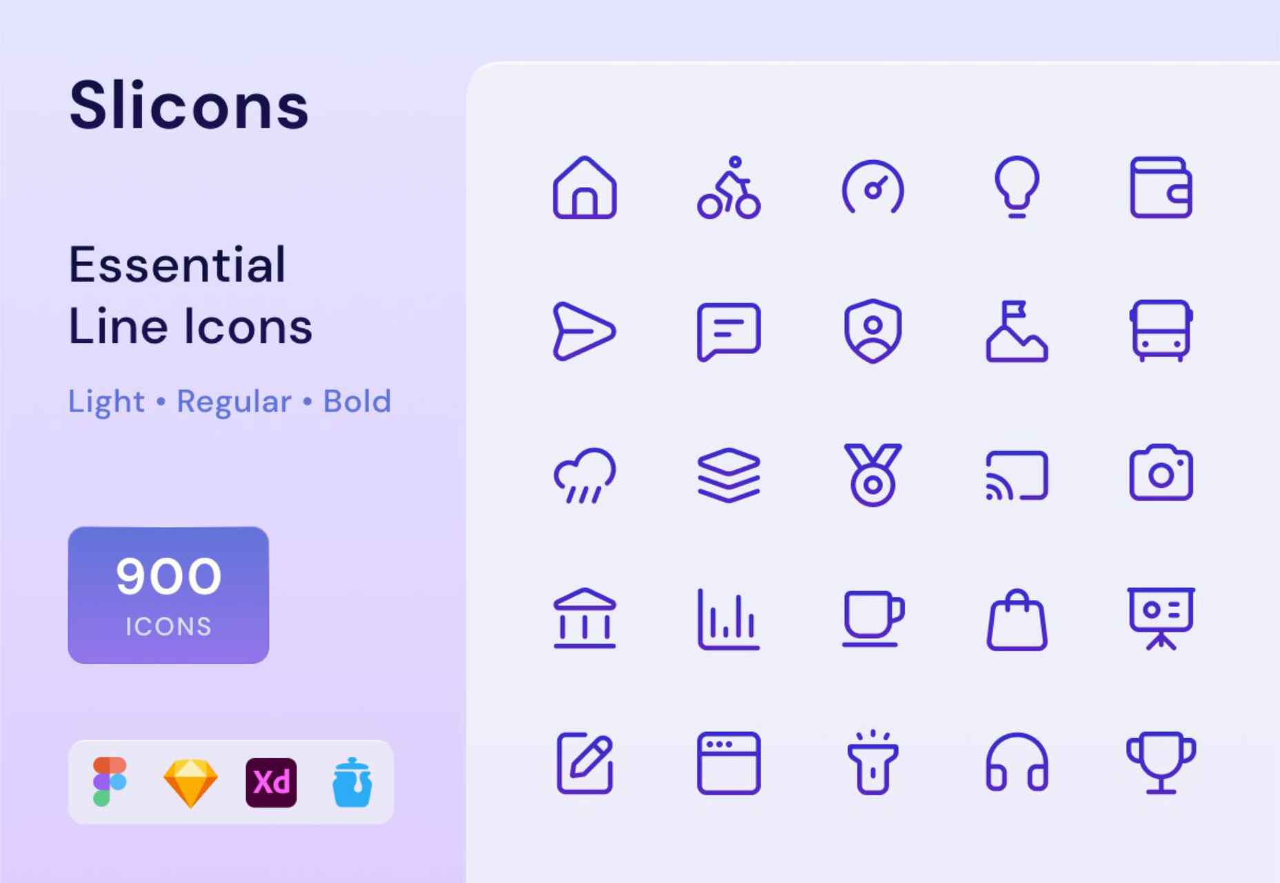
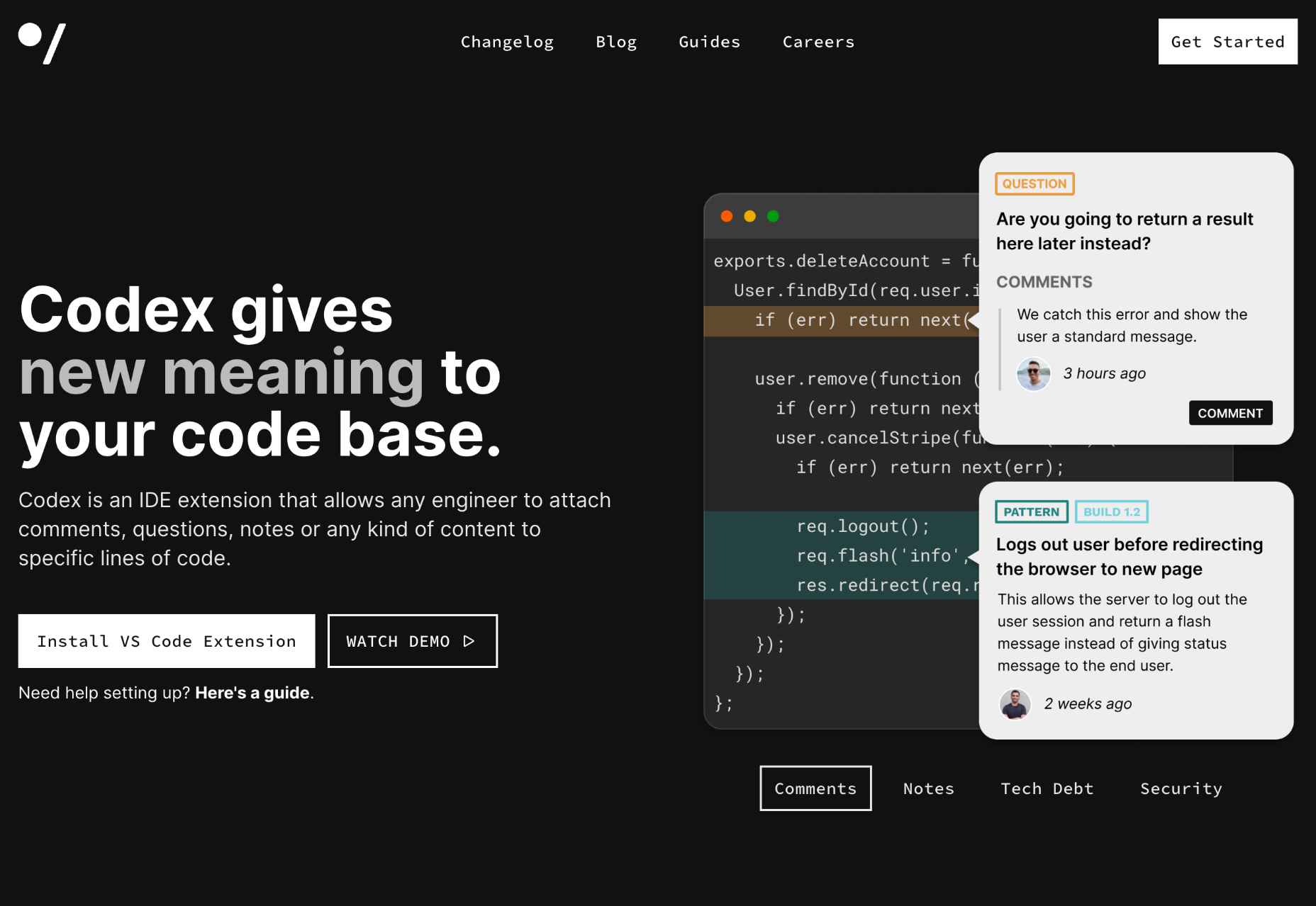
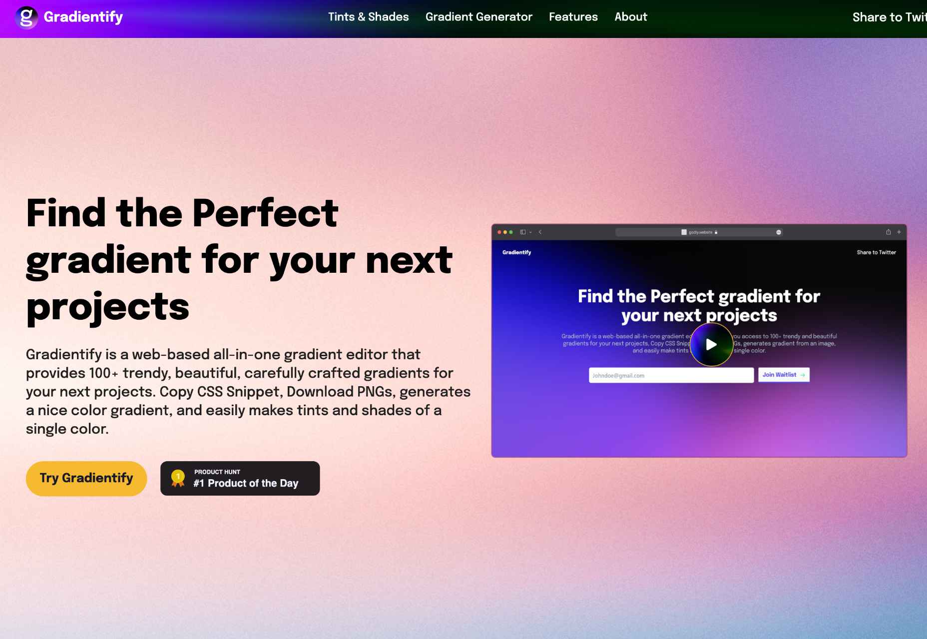
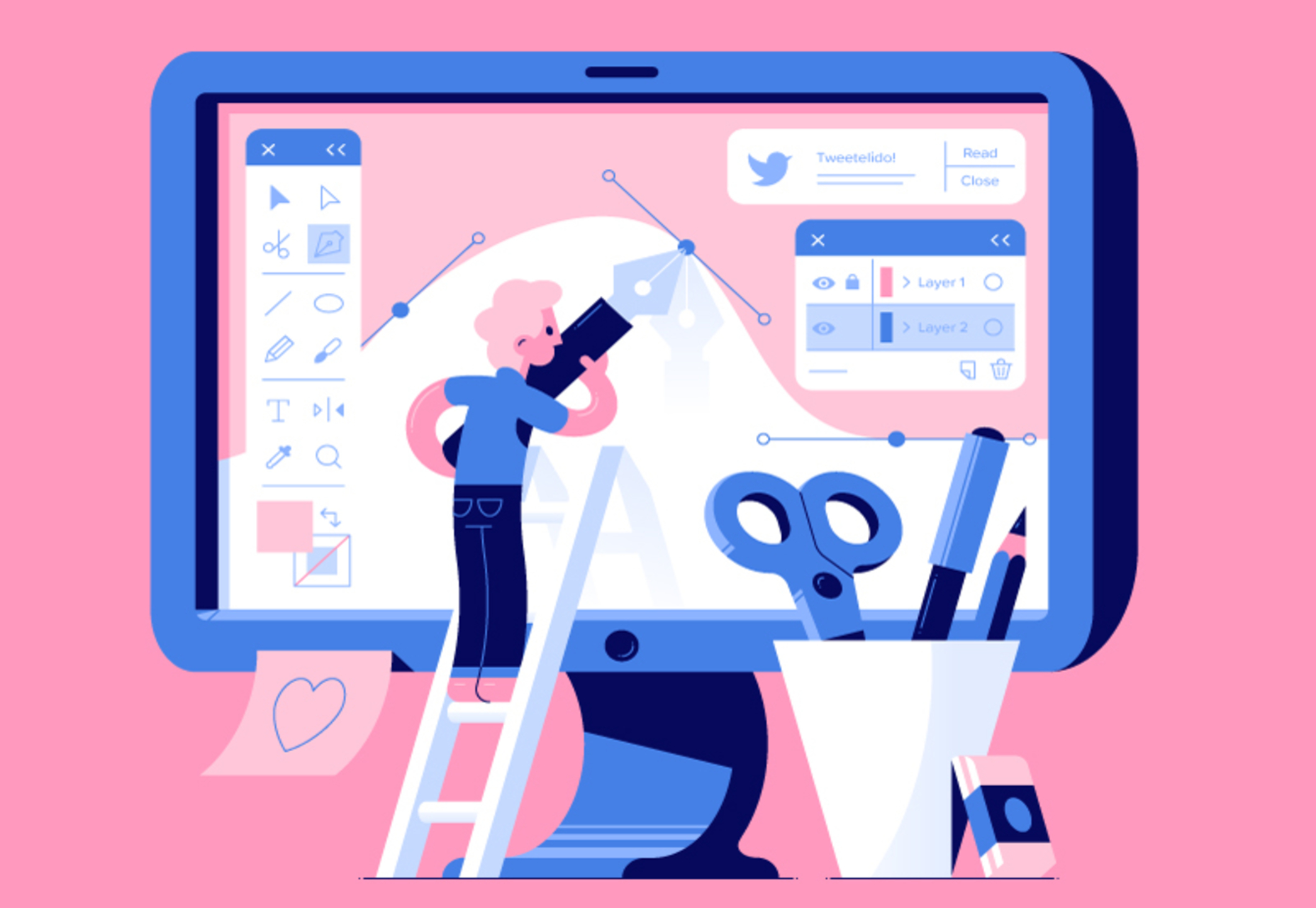
The Summer’s over, and we’re back at our desks to discover that the web’s best app builders, font designers, asset creators, and developers have been hard at work to deliver this bumper collection of exciting new tools for designers and developers.

Below you’ll find productivity apps, icons, gradients, AI, and some awesome new fonts. Enjoy!

CSS Scan

Forget right-clicking on a website to see how it’s coded. CSS Scan is a browser extension that lets you view the CSS styles of any element and copy them to your clipboard.

Slicons

Create stand-out UI designs with Slicons, a set of 300+ pixel-perfect icons. Light, regular, and bold versions match your typography and work with Figma, Sketch, XD, and Iconjar.

Codex

Codex is an IDE extension that lets you comment on your code like a pro. Anyone on your team can add comments, questions, or notes to any lines of code.

Gradientify

You too can leap aboard the gradient design trend using Gradientify, a collection of 100+ beautiful, human-designed gradients. Copy the CSS, or download PNGs for free.

90 Bitmap Shapes

Create unique logos, social media assets, apparel, and abstract icons using this editable set of 90 Bitmap Shapes in vector form for Photoshop, Sketch, and Figma.

BlockBee

Get paid in crypto using BlockBee. The Web 3.0 payments infrastructure integrates with the best ecommerce carts, including PrestaShop, Opencart, Magento, and WooCommerce.

Flatfile

Banish the woes of importing CSV data with Flatfile, a CSV importer that formats human-edited data files to eliminate errors and speed up B2B onboarding.

ClipDrop

Effortlessly clip the backgrounds from images in Figma with the ClipDrop plugin. One-click removes backgrounds, objects, people, text, or defects.

Craiyon

Craiyon is an AI drawing tool based on a stripped-down version of DALL-E. You can generate any image you like using a simple text prompt.

Google Headline Tool

Use Poll the People’s powerful Google Headline Tool to optimize your headlines for more effective search ads and clickable blog post titles.

Retro Postcard Effect

Embrace the trend for retro images using this Retro Postcard Effect for Adobe Photoshop. Easily drop your custom images into the placeholder layer for an instant vintage style.

Hugo

Hugo is an admin suite for freelancers that takes care of business with intelligent contracts, audit trails, and an integrated wallet, so you can focus on being creative.

CTA Examples

CTA Examples is a database of call-to-action examples for every possible scenario. So no matter what you want to persuade your users to do, you’ll find the best prompt here.

Superhuman

Create unique 3D characters to wow your customers using Superhuman. You can customize clothes, hair, and poses using 1500+ elements or choose from 500 pre-made characters.

PostHog

PostHog is an extensive set of tools built on a modern data stack. You can do more with your data by creating your own app or using one of the 50+ that are included for free.

Radix UI

There’s no need to reinvent UI components for React when you can use Radix UI. The high-quality, accessible components are perfect for web apps and dashboards.

KB Clip

Now you can create a searchable wiki for your business with a fraction of the effort thanks to KB Clip. Just highlight a Slack conversation, and transform it into an article in one click.

DropBlok

A great way to monetize your followers is with a custom app. DropBlok is a no-code tool that will build the app for you.

Blofishing Font

Blofishing is a gorgeous handwriting font that adds personality to your layouts. It’s ideal for wedding stationery, social media marketing, and anything that needs a personal touch.

Haratte Font

Haratte is an elegant font with graceful curves and a modern aesthetic. It’s perfect for logos, magazine design, social media assets, and more.

Source

The post Exciting New Tools for Designers, September 2022 first appeared on Webdesigner Depot.

Source de l’article sur Webdesignerdepot

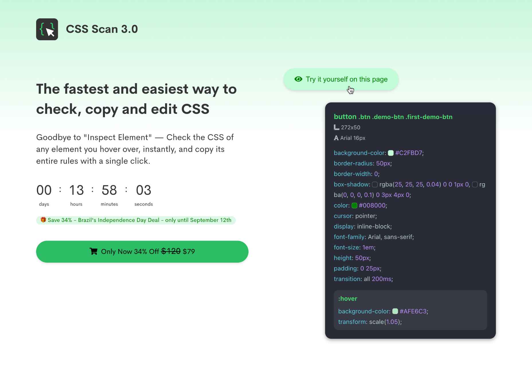
Modals, a nifty little feature that allows you to display different messages at the top of your website, have been touted as extremely useful. Some even claim that they are helpful enough to completely replace the banner ads we all hate so much. But are modals in web design a UX disaster?

If you are unfamiliar with the term, a modal is a dialogue window appearing when a visitor clicks on a hyperlink or hover image.

Suppose you want to collect on-site subscribers or you want visitors to sign up for a freebie. In that case, you can use modals.

However, many web designers – and some website visitors – are against using modals in web design. The main argument is that it affects the user experience. But are modals in web design a UX disaster? Read on to find out.

What Do Modals Do?

Modals often appear as pop-up windows on a web page, requesting a visitor to take action. Most times, they appear following a click on a page element.

Also known as lightboxes, modals isolate the page’s main content. The user will have to complete the action requested by the modal or close it before reassessing the page.

Web designers use modals to capture a visitor’s attention. Since other page contents are inaccessible, a visitor must interact with the modal.

Cons Of Modals In UX

While there are different cons of modals in UX, they all sum up to one con – interruption. When modals appear, they interrupt whatever the user is doing.

Unlike regular pop-ups, users cannot simply ignore the modal and continue browsing. As a result, modals demand immediate attention. 

A user may be interested and decide to interact with the modal. However, if the modal’s content differs from the page’s, the user could forget what they were doing after interacting with the modal.

Furthermore, sometimes modals require action related to information on the page. For example, suppose the user wants to review the information before taking action. In that case, they’ll have to close the modal since the main page is inaccessible.

Statistics show that up to 82% of users dislike pop-ups. Most website visitors aren’t knowledgeable about the technicalities of web design. As a result, they won’t be able to differentiate between regular pop-ups and modals.

After all, modals are a type of pop-up. Some users may consider modals worse since they darken the page’s primary content, making it inaccessible.

Furthermore, people want to visit a website and get what they want immediately. Hence, time is significant. Therefore, modals that require actions that take time can make a website lose visitors.

With all of these cons, you can understand why many web designers say modals are a UX disaster in web design.

Can Modals Be Useful in UX?

In some situations, modals are helpful, and they can improve UX. Many web designers swear on the usefulness of modals, and it’s not difficult to understand why.

Firstly, modals can help simplify a website’s content. For example, a user can immediately exit the page if your website is relatively complex, with lots of content and elements.

You can use a modal to explain the content on the page so that the user doesn’t get confused. Perhaps the modal can display when the user clicks on the back button. The modal can highlight the most critical content on the page and tell the user what to do next.

Secondly, modals are invaluable if you must capture your user’s attention. For example, perhaps you want to display a warning or pass any crucial information that users must know before they continue browsing.

As mentioned before, a user can easily ignore a pop-up, especially if it opens in a new window. However, with modals, the user must at least view the content before they proceed.

Thirdly, a modal can make a web page easier to navigate. It sounds ironic considering the cons, but it’s true if properly implemented. Rather than packing different elements on a web page, you can set some to display as modals.

For example, you can have a page with just text to improve readability. Then, users can click to view visual elements like images and videos as modals.

How To Use Modals the Right Way

Using modals correctly is key to ensuring they don’t negatively affect UX. Here are some ideal situations when you can use modals:

1. Display Warnings

Using modals to give users crucial warnings is ideal, especially if their subsequent actions have serious consequences.

For example, most websites display modals when users click the delete button. Deletion is always critical because, in most cases, it’s irreversible.

A practical example would be an eCommerce website where a user opts to delete items from their cart. You can use a modal to ask the user to confirm before deleting.

2. Input or Collect Information

Modals are effective in prompting users to input information. Sometimes, users must enter specific details before they continue browsing.

A practical example would be a review site where a user wants to submit a review. Before submitting the review, you can use a modal to request the user’s name and other necessary information.

3. Simplify Navigation

As mentioned before, modals can simplify a complex website. In addition, it will help a user navigate better, which is a UX boost.

A practical example would be a news site with many stories and updates. You can use a modal to highlight the day’s trending news stories so that users can visit the web pages with one click.

Conclusion: Are Modals a Disaster in UX?

In conclusion, modals affect a site’s user experience since visitors must interact with them. However, it doesn’t always have to be a negative effect.

Modals become a UX disaster in web design when wrongly used. However, if you follow good practices, modals can improve your website’s user experience.

Generally, only use modals when necessary and in a way that won’t frustrate the users.


Featured image by Freepik.

Source

The post Are Modals In Web Design A UX Disaster? first appeared on Webdesigner Depot.

Source de l’article sur Webdesignerdepot

Learning how to design an MVP webpage or website could be one of the best things you can do as a site creator in today’s digital world.

In a fast-paced landscape, where customer preferences and technology are constantly changing, most companies don’t have time to dedicate months or years to each web project. The longer you take to complete your website, the more likely your creation will be outdated by the time you hit “publish.” That’s why countless creators are beginning to take a different approach.

To avoid wasting time, money, and effort on something that doesn’t deliver a significant return on investment, designers are now building “Minimum Viable Products,” or “MVPs.”

Here’s what you need to know about creating your MVP webpage.

What is MVP Web Design?

Typically, the “MVP” development process is most common in the app or software creation world. It refers to when a developer builds the simplest version of a technology capable of achieving specific goals. For instance, if a company wanted to create an ecommerce app, they would design a simple tool capable of listing products, enabling payments, and tracking orders.

After launching the MVP product, the company or developer would check to ensure it had the right impact on the target market and generated positive results. Using feedback and analytics, the developer would then begin to add new features one at a time.

MVP design aims to ensure you’re developing the best, most valuable product for your audience while getting your solution to market as quickly as possible.

The same strategy in MVP app and software design can also apply to website creation. Rather than building a highly complicated website with multiple features straightaway, the designer would focus on creating a single page equipped with the essential elements.

For instance, instead of building an entire site for your online course, you may develop a single-page website where customers can learn about the system, sign up, and pay for their membership. The great thing about an MVP web page is it allows companies to start advertising their solution, product, or service quickly, with the minimum initial investment.

How to Create an MVP Web Page

Creating an MVP web page is similar to designing any Minimum Viable Product. Throughout the project, the focus will be on keeping the development process simple while collecting as much feedback as possible.

Here’s how you’d get started with an MVP web page.

Step 1: Planning

Planning is an important stage in any web design project. It’s particularly crucial in the MVP landscape, where you need to define the most critical features of your webpage or website to ensure it’s “viable” for your needs. The initial planning stage can sometimes be the lengthiest part of the process, depending on the amount of research you need to do.

For the most part, web designers and companies will begin by conducting market research. This means examining crucial concepts intended to drive your strategy, such as:

  • Your target audience: Who are you trying to target with this web page, and what will they need from your site? A user persona can be helpful if you don’t already have one.
  • Competitors: Who are your main competitors in this space, and what do their web pages offer? Which features do you need to replicate or avoid?
  • Goal setting: What is the main objective of this web page? What do you need it to do, and what might it need to accomplish in the future?

The key to MVP web page planning is ensuring you look holistically at your project without thinking too far ahead. The site you create should be capable of scaling and expanding in the future, but it shouldn’t have too many features from day one.

Step 2: Creating Your Feature List

Once you’ve done your research and formed the foundations of your plan, it’s time to list all the features your MVP web page needs to have. Unfortunately, this is where the process can get a little complicated. It’s easy to start adding capabilities and components that aren’t necessary to make your site more exciting or competitive.

As worrying as it can feel to release a very basic web page, remember your focus is on rapid growth and development. With this in mind, concentrate on narrowing your feature lists down into:

  • Initial must-have capabilities: First, decide what your web page can’t thrive without. If the primary goal of your page is to sell software subscriptions, then you’ll need to implement tools for collecting member information and payments.
  • Next stage functionality: Consider the features you might add once you’ve confirmed your webpage is effective. This will allow you to ensure you’re creating a platform that can expand to suit future needs.
  • Possible future requirements: You can also list features that might be helpful in the future but don’t necessarily need to be implemented immediately. For instance, if you’re selling an online course, you might create a separate page where people can sign up to learn about future lessons.

Step 3: Finding the Right Software

Next, you’ll need to decide how to build your web page. There are several options available to today’s designers. An open-source solution is usually the best route for designers who need to create something specific from scratch. However, if the factor that makes your solution “viable” is unique, you may need access to code to bring your idea to life.

Alternatively, if you’re building a basic webpage capable of something like collecting customer email addresses or facilitating transactions, you might be able to use an off-the-shelf tool. CMS services for web designers can reduce the work and expense involved in creating a minimum viable product.

For instance, you might use a tool like Wix or Squarespace to edit a pre-existing template and simply drag-and-drop the features you need into the right places. On the other hand, if you’re planning on adding more functionality to your site down the line, it’s worth checking if any builder you will use has the right level of flexibility. Many tools will allow you access to code, advanced features, and essential module-based building functions.

Step 4: Implement Your Analytics

One of the essential parts of an MVP workflow is feedback. When you roll out your MVP, you’ll be looking for insights, guidance, and analytics to help you decide what your next steps are going to be. As a result, MVP workflows are based heavily on experimentation.

This means you’re going to need the right analytical tools in place to track crucial information. You can implement tools for collecting customer feedback directly. It’s also worth having a system in place for tracking metrics like:

  • Conversion rate;
  • Traffic numbers;
  • User behavior;
  • Most used/least used features;
  • Technical site performance;
  • Bounce rate;
  • Average time spent on the page.

While Google Analytics is one of the most popular tools for collecting insights in the MVP website design world, various other options are available. You can even find tools with in-built heatmaps to see how people navigate your site more effectively.

It’s also worth having A/B testing components in place. This will allow you to test the different “new” features you add to your web pages over time and examine how they influence your conversions and support your goals. For example, you can use A/B testing to explore the impact of everything from CTA button colors to webpage copy and offers.

Creating Your MVP Web Page

In the fast-paced web development and design world, the old-fashioned and slow approach to designing web pages is growing increasingly less common. Instead, an MVP strategy may be the best bet for companies looking to go to market faster, collect insights from their target audience, and accelerate growth.

Though getting used to this design strategy initially can be challenging, it can save you significant time, resources, and money in the long term.


HTML vector created by vectorjuice – www.freepik.com

Source

The post How to Design an MVP Web Page first appeared on Webdesigner Depot.

Source de l’article sur Webdesignerdepot

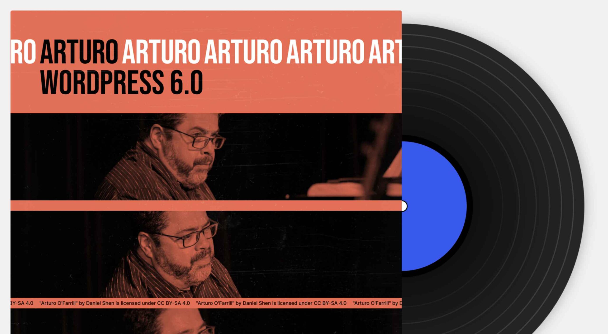
WordPress 6.0 has been released, and another niche jazz musician will be enjoying extra Spotify royalties next month.
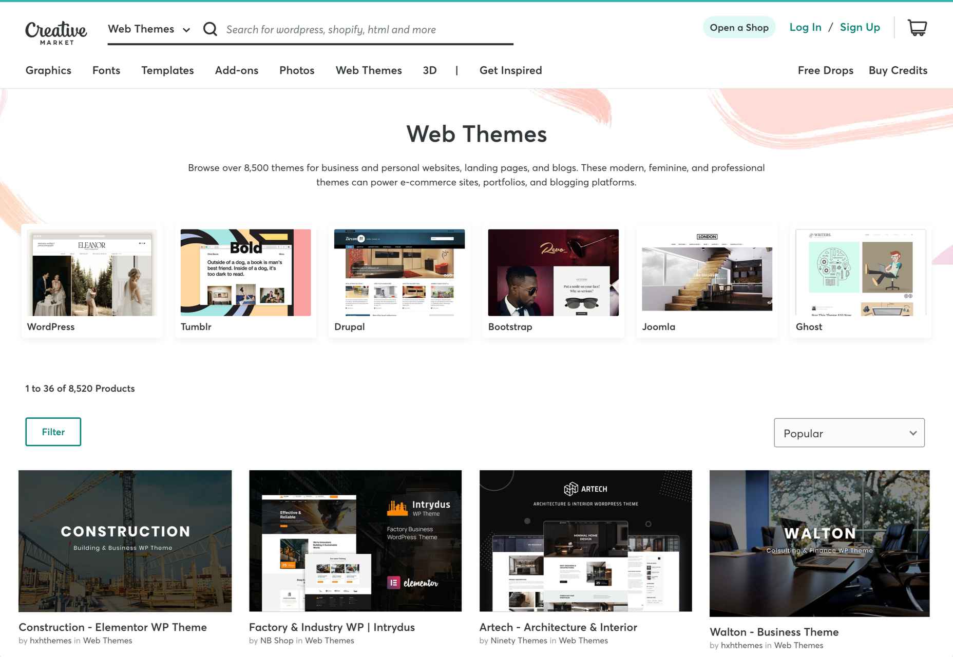
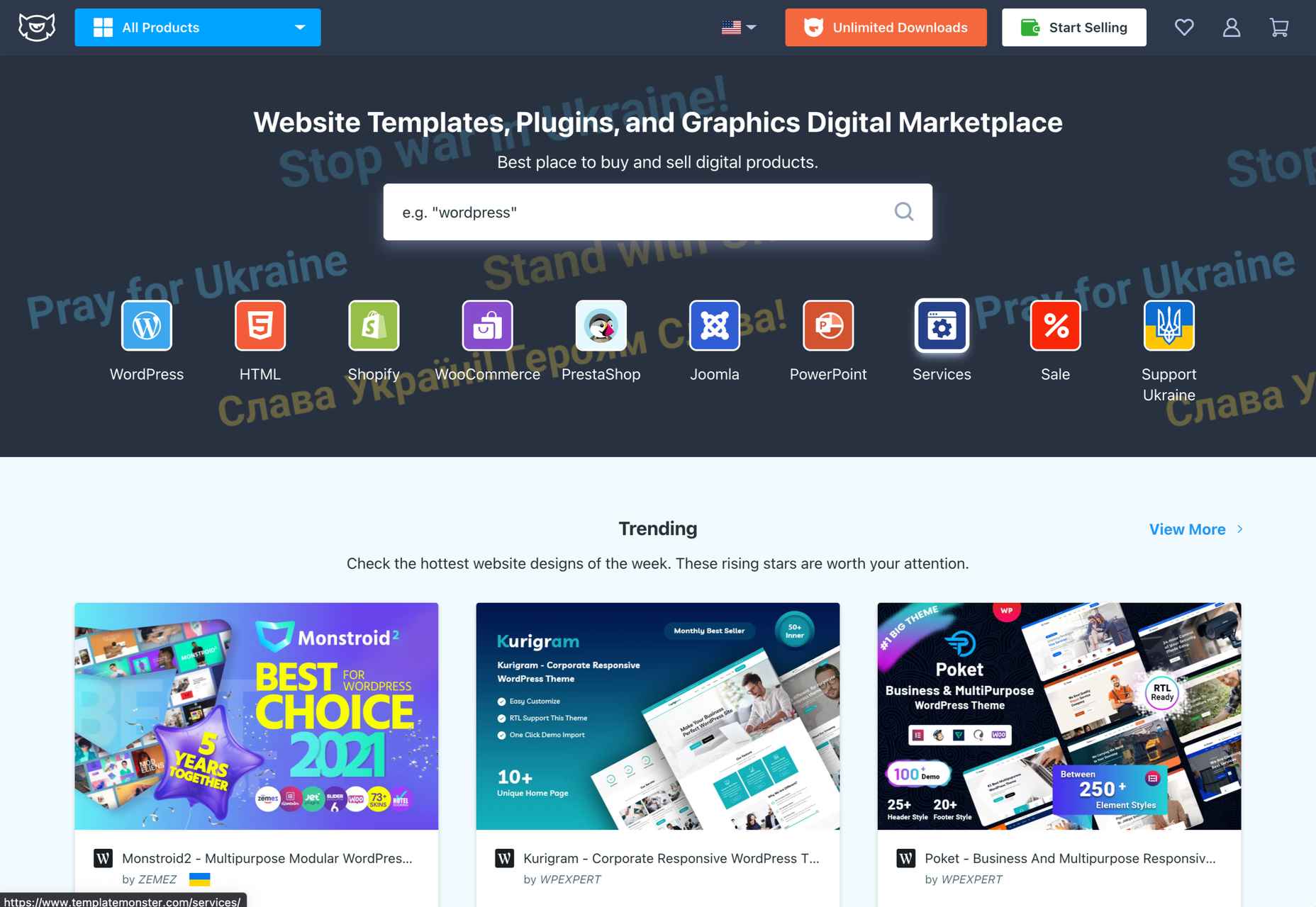
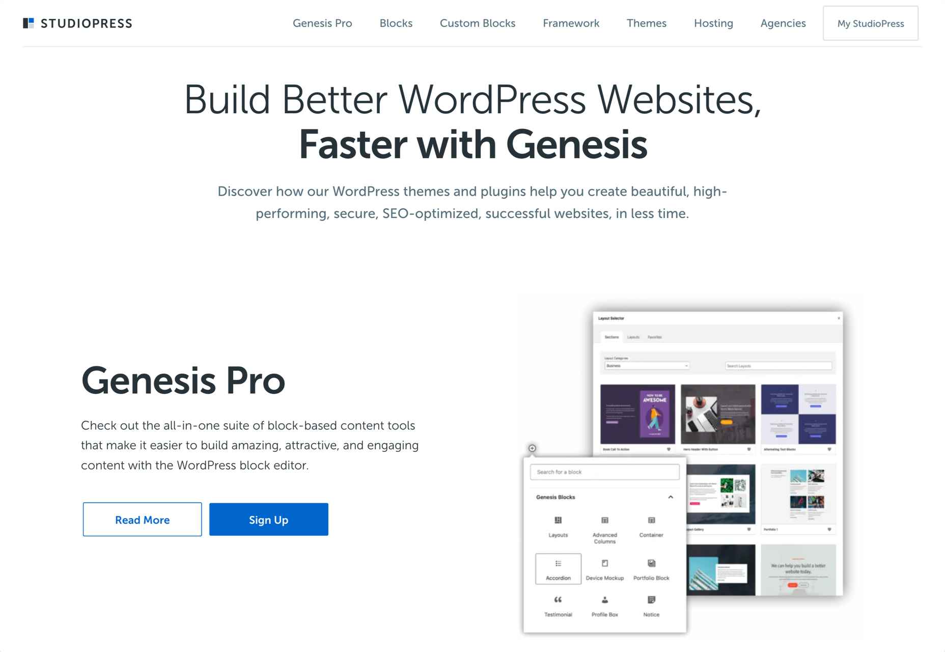
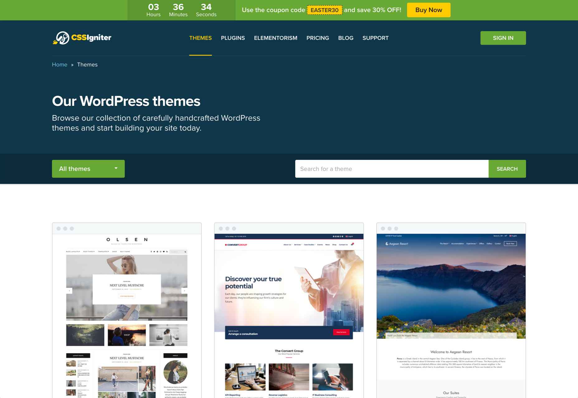
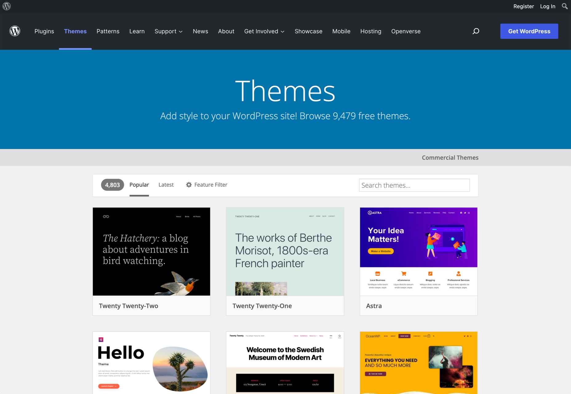
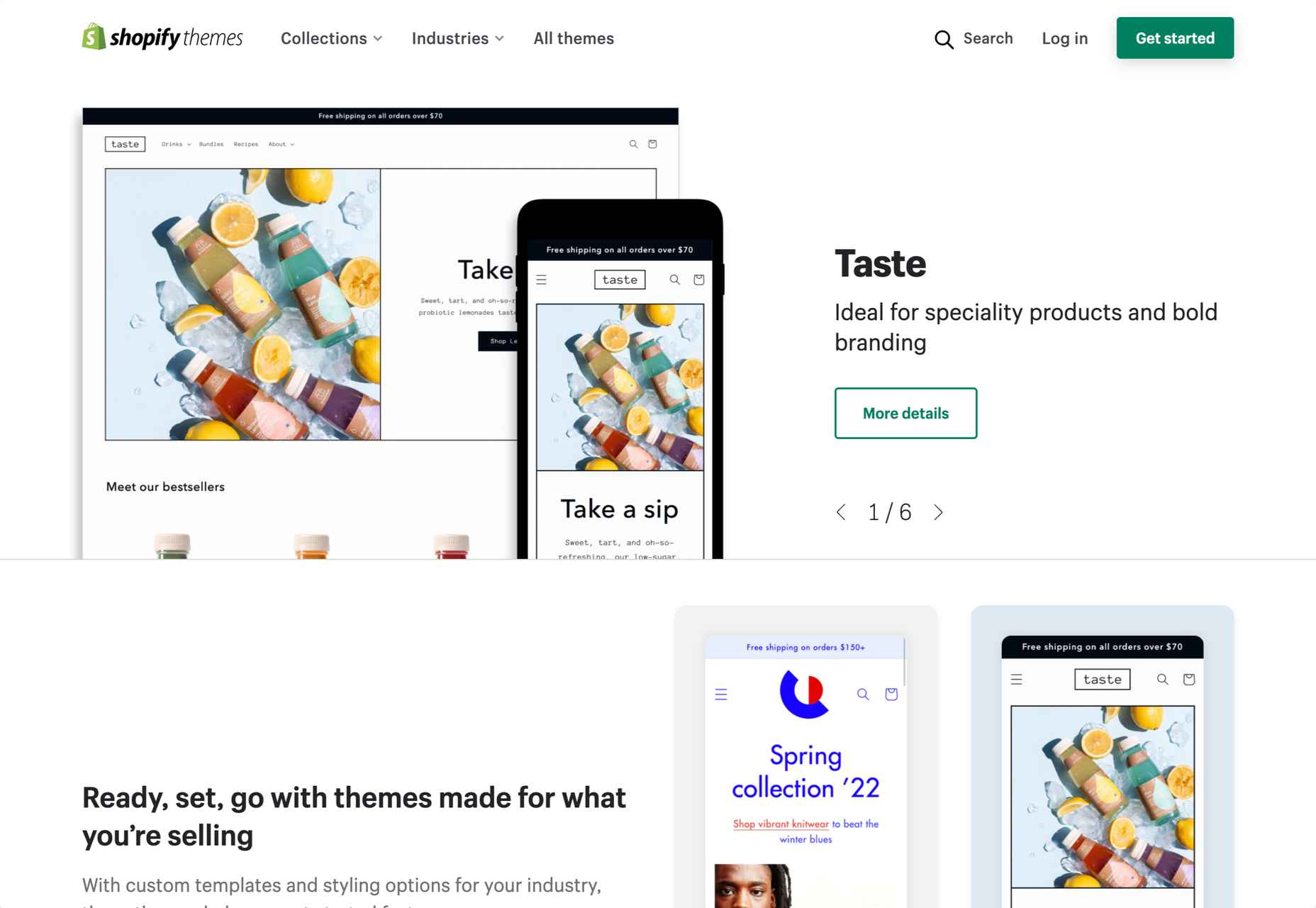
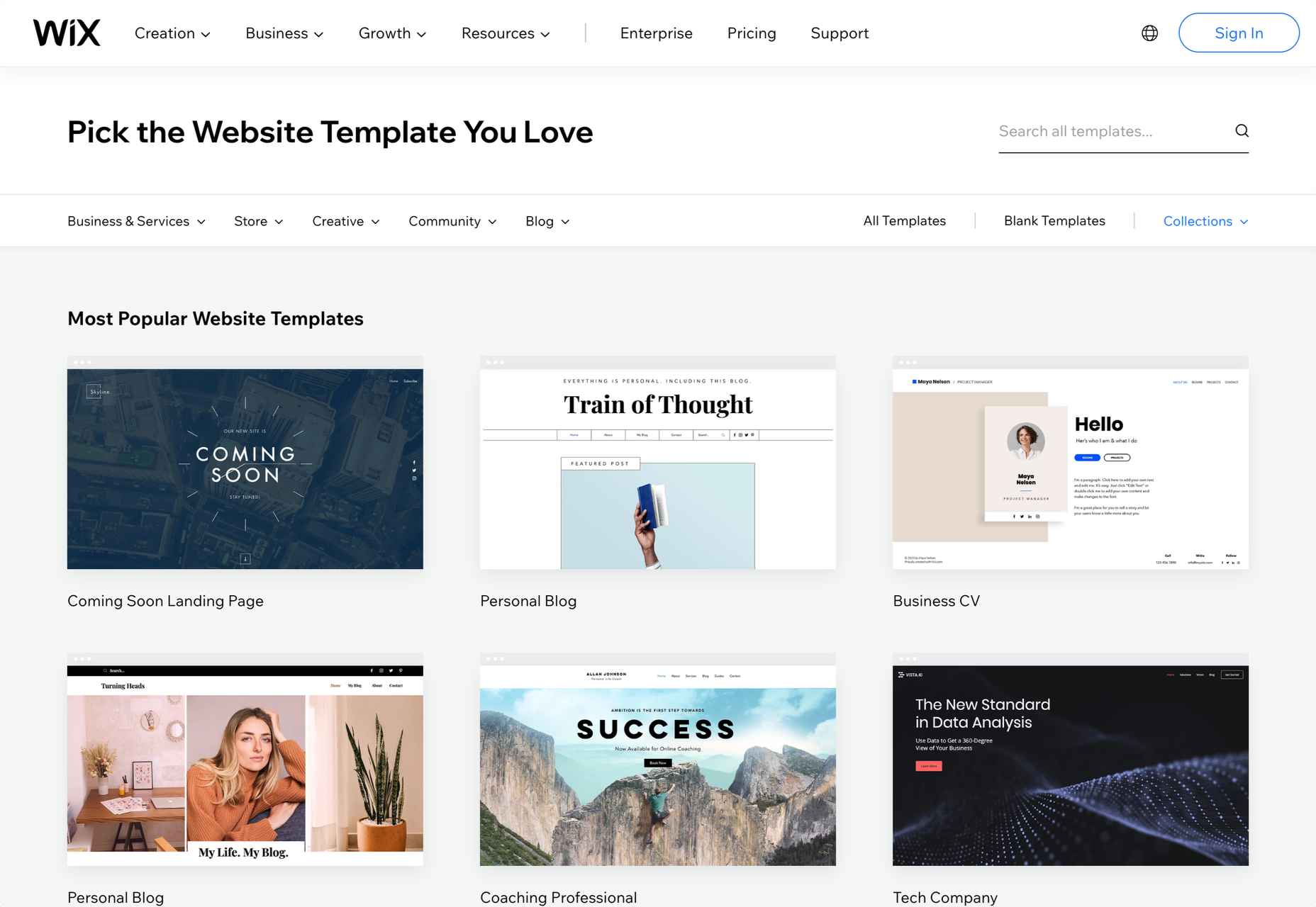
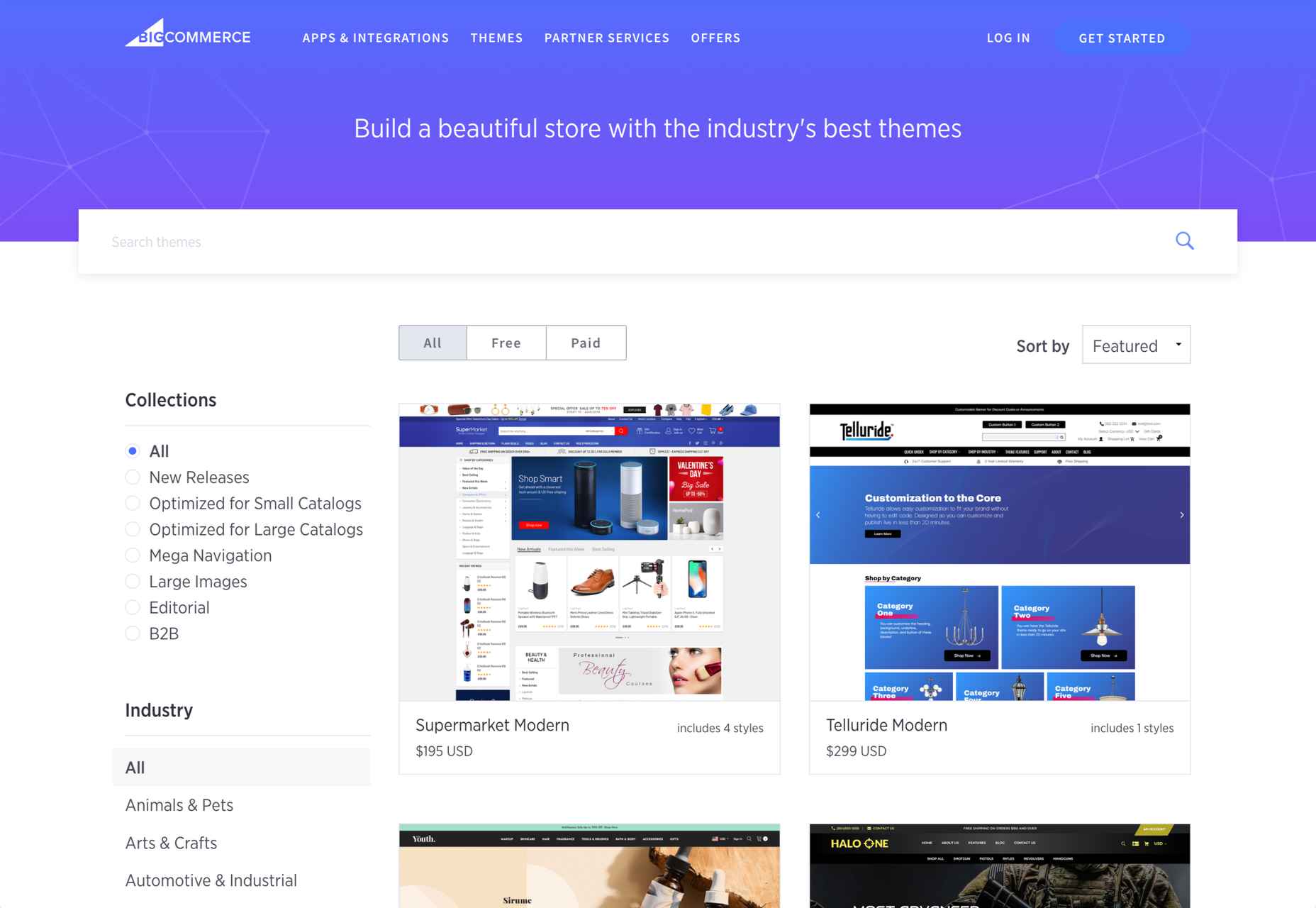
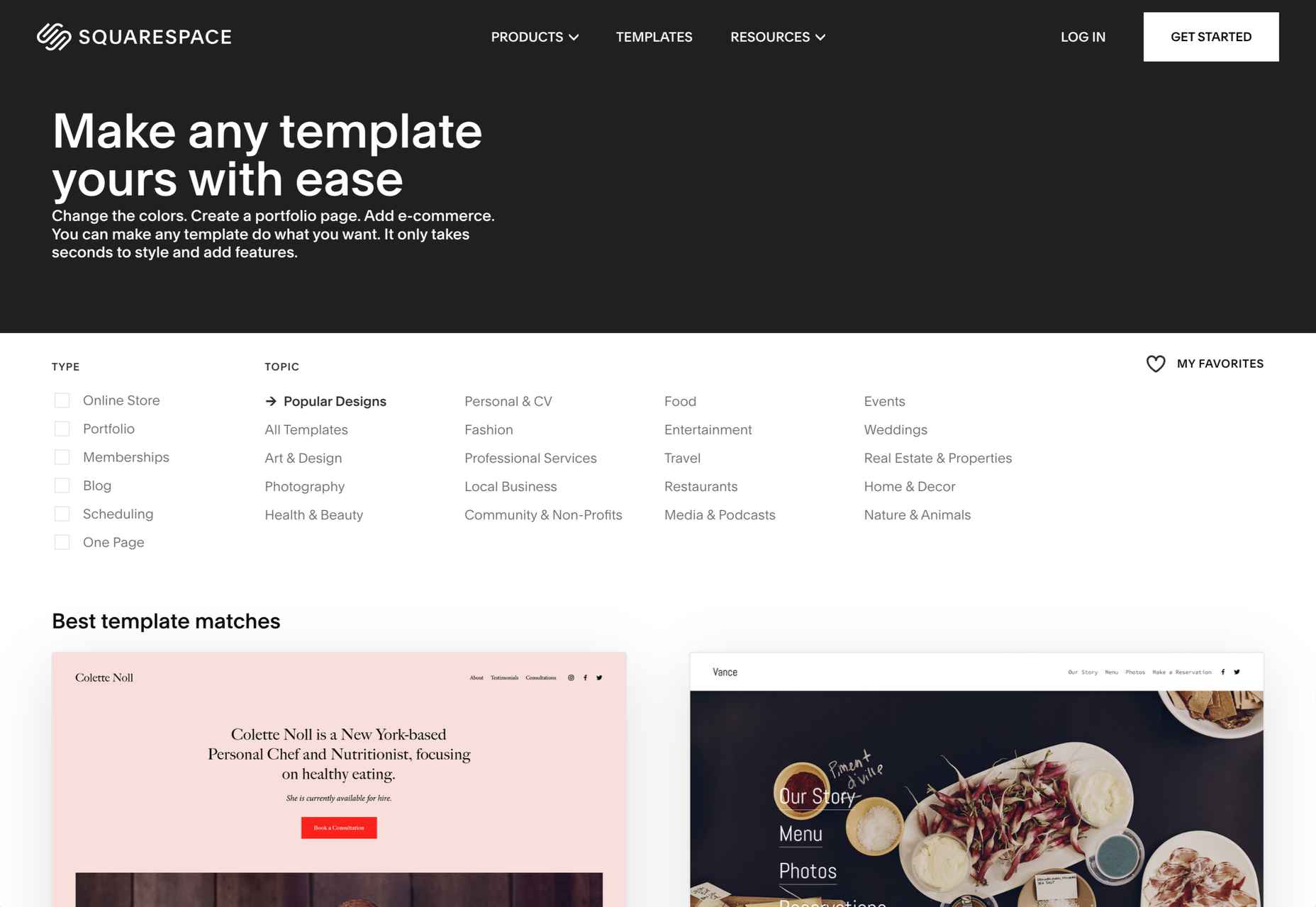
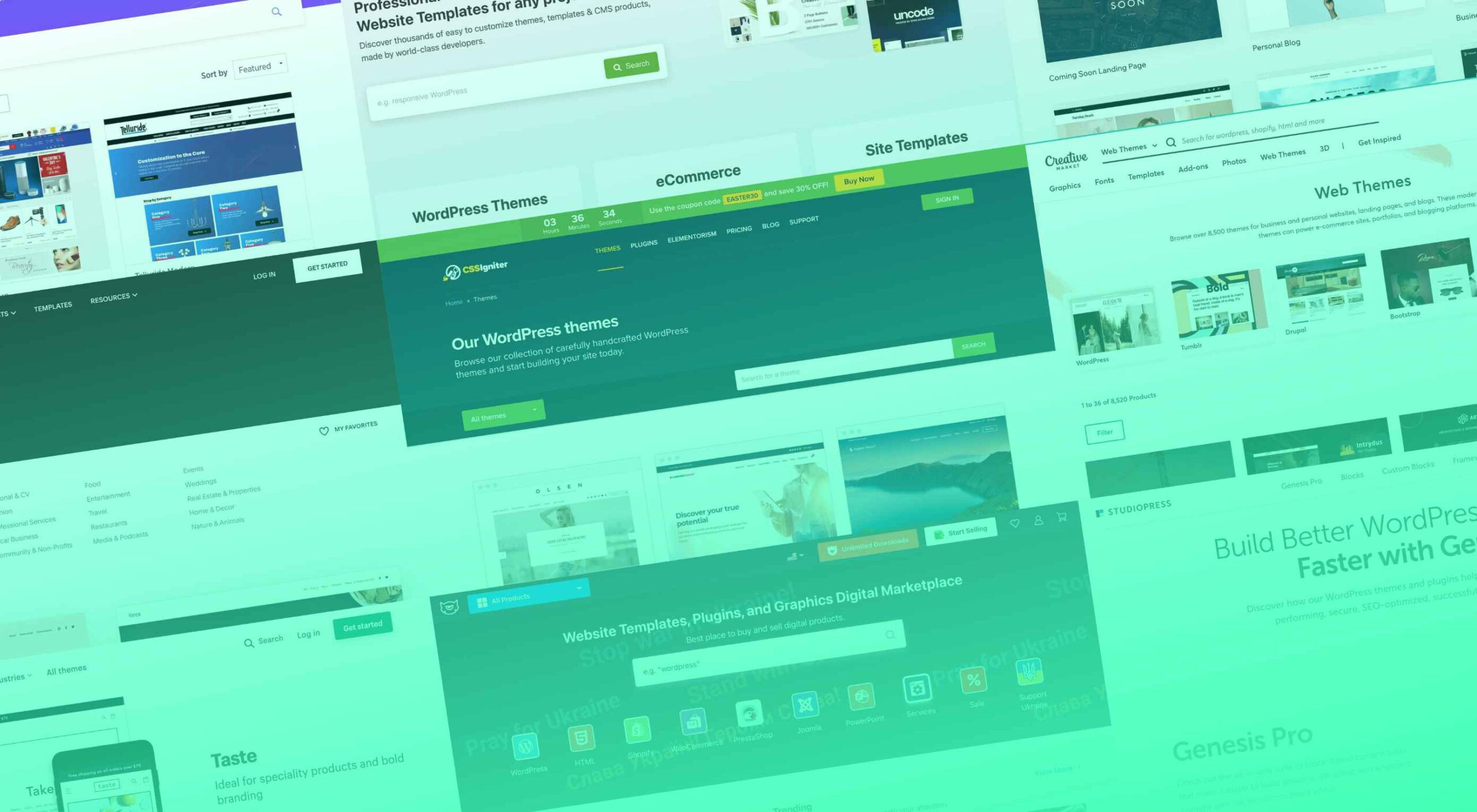
WordPress 6, named for latin-jazz musician Arturo O’Farrill, is the realization of a change of direction the WordPress Foundation adopted several years ago.

All versions of WordPress now power around 42% of the web. That’s approximately 810,000,000 sites. If you looked at each site for a single second, without pausing to blink, it would take you over 25 years to see the home page of each one — of course, if you factor in how long a typical WordPress site takes to load it would take well over a century.

Some people (i.e., me) have been predicting the decline of WordPress for so long that sooner or later, we were bound to be correct. And, despite its astonishing reach, there are some signs that its market share may now be in decline. Even the W3C abandoned it in favor of Craft.

Of the 1,930,000,000 sites that currently make up the web, only around 400,000,000 are active. WordPress’s long-term dominance, coupled with a stalling market share, means that a disproportionate number of abandoned sites are WordPress. With site builders like Wix, Squarespace, and Shopify taking huge chunks of WordPress’ share of new sites, WordPress is facing something of a cliff edge.

What the ill-informed naysayers (i.e., me) hadn’t counted on was that WordPress had already seen the writing on the wall and formulated a plan…

WordPress’s problem has always been its legacy code; supporting out-of-date ideas and a spaghetti-like codebase has meant a great deal of work to do anything new. As a result, the last few releases have seen great ideas stifled by labored implementation. Even the most loyal WordPress user has to admit that Gutenberg, while filled with potential, doesn’t work the way it should. However, with WordPress 6, all the work may be starting to pay off.

With version 6, the block editor in WordPress is starting to feel like a design tool that, if not perfect, is at least usable. Editing content no longer feels like you’re fighting against the UI. Most importantly, the bar for creating a site is much, much lower. WordPress 6 also offers improved performance and accessibility, both areas that have traditionally been lacking. Security is still something of an issue, but that is mainly due to the ROI for hackers that massive market shares generate.

WordPress, it seems, has arrived at two conclusions: its main competition isn’t other CMS but other site builders. To maintain its market dominance, it needs to cater not to professionals but to amateurs.

Don’t get me wrong; the WordPress ecosystem will benefit from WordPress 6, at least reputationally. New sites run by amateurs eventually become established sites run by, if not professionals, then at least knowledgeable amateurs.

OK, so WordPress probably isn’t a good choice for enterprise sites. And there are certainly better options for ecommerce. And as for SEO, well, probably best not mentioned.

But in WordPress 6, we have a free, open-source site builder that lowers the bar for making a new site. It’s a credit to the community that has persevered to produce it.

Source

The post WordPress 6.0 Lives Up To The Hype first appeared on Webdesigner Depot.

Source de l’article sur Webdesignerdepot

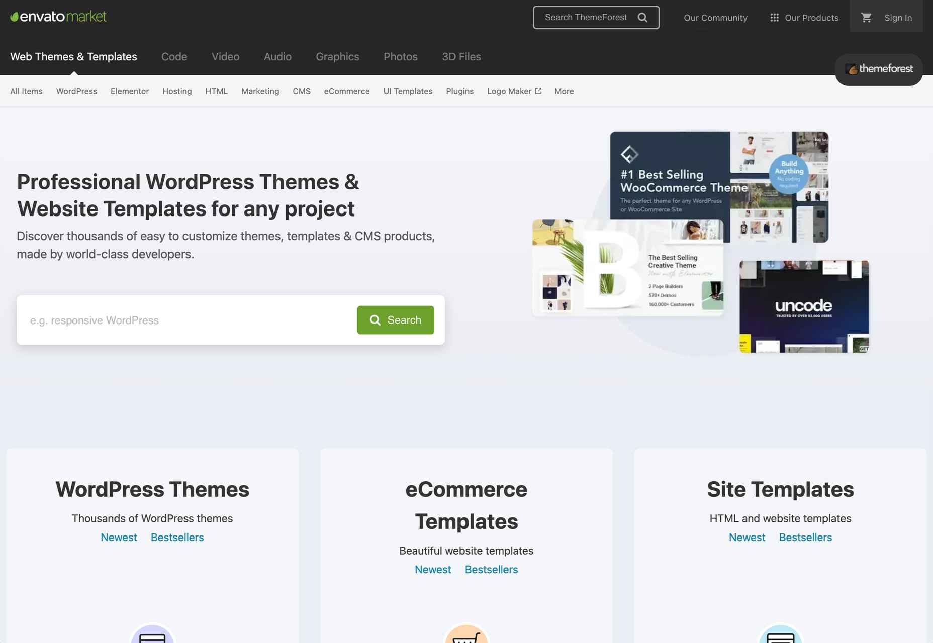
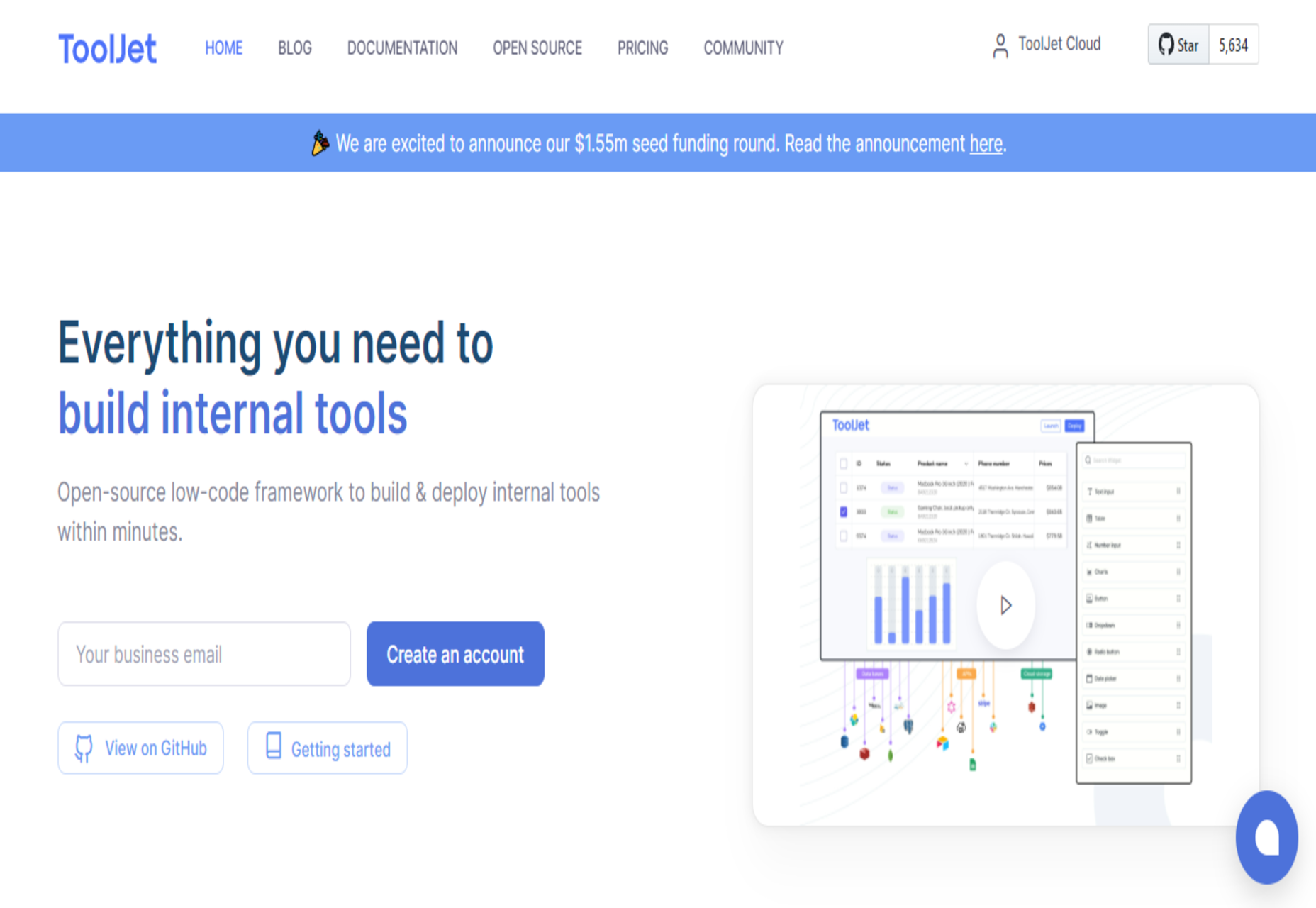
Experienced web designers are always on the lookout for tools or resources that will (1) introduce them to the latest design trends, (2) enable them to incorporate features and functionalities that will make their products more competitive, (3) allow them to improve their workflows or all the above.

Apply one or more of these new design tools and resources. Then you could realize anything from incremental to game-changing improvements. The better the tool or resource, the more you are apt to realize your investment.

The 15 tools and website design resources selected for this article are the best in their respective categories. The degree of improvement you can realize when using one or more of them may depend on your own business needs. Or on the actual needs and wants of your clients as opposed to what you are currently able to deliver.

Browse the list, and you should be able to put your finger on one or more of these products or services. They could lead to improvement in one or more areas of your work. Look closer, and you might come across a genuine game-changer.

Happy shopping!

1. Be – The Biggest WordPress and Portfolio WordPress Theme

If your website design activities are proving to be exercises in tediousness, or you’re tired of working around a design tool’s limitations, you need BeTheme.

BeTheme can be a game-changer in that it gives you the flexibility to design what you want. Be makes building a complex high-performance website quick, smooth, and easy.

  • BeTheme’s 650+ customizable pre-built websites are designed to get your website-building project off to a rapid start. They are responsive, UX-ready, importable with a single click, and incorporate the latest design trends.
  • You’ll love working with the recently launched BeBuilder, the fastest and most flexible page builder for WordPress with which you can import from Be’s pre-built website’s 1000+ pages.
  • There’s an absolute gem of a BeBuilder Woo you can work with to create your shop or single product layouts.
  • BeTheme features a wealth of design aids, options, and settings to work with.

BeTheme is Elementor ready and is regularly updated. Click on the banner to find out more about Be’s 40+ powerful core features.

2. Total WordPress Theme

Put Total to work, and 2022 could be a very good year for your website design undertakings.

Total has it all insofar as design aids and options, website-building tools, and design flexibility are concerned regardless of the type or style of website you plan to build:

  • Pick any of Total’s 45+ customizable quick import theme demos, and you are off to a quick start.
  • 90+ section templates, 75+ pre-styled post entry cards, and more than 500 live customer settings give you more design flexibility than you are ever likely to need. 
  • The page builder of choice is an extended version of WPBakery. With it at your fingertips, you can easily drag and drop your way to building precisely the website you have in mind.

Click on the banner to discover everything Total can do for you.

3. LayerSlider

What could LayerSlider do for you to help make 2022 a banner year? Look over any of your past website designs to see if any of them could profit from adding a little spice or pizzazz because that’s what LayerSlider does best. 

LayerSlider is an animation and website-building tool that can be used on any website to transform its look & feel with modern graphics, eye-catching animations, and interactive features. LayerSlider is one of the most established and popular products with millions of active monthly users.

  • LayerSlider has 150+ website, slider, and popup templates. Templates are a great way to learn as well as an ideal starting point for new projects.
  • LayerSlider comes with a very easy-to-use and modern editor interface similar to professional desktop applications. Anyone can use it without prior experience.
  • LayerSlider is not just for sliders. It can also create image galleries, popups, landing pages, animated page blocks, or even full websites.

Click on the banner to see what LayerSlider could do for you.

4. wpDataTables

Most table or chart building table plugins on the market either limit the amount of data that can easily be processed or the types of tables or charts that can be produced. wpDataTables has neither of these limitations.

With the wpDataTables premium WordPress plugin, you can –

  • create responsive, interactive, and frontend editable tables and charts
  • process huge amounts of data from various sources and in various formats
  • highlight or color code key data.

5. Uncode – Creative & WooCommerce WordPress Theme

Uncode is a top-selling pixel-perfect creative and WooCommerce theme. More than 80,000 sales have been made to date to freelancers, bloggers, agencies, and small businesses.

Uncode’s key features include –

  • a suped-up Frontend Page Builder.
  • an advanced WooCommerce builder with supporting capabilities that include a Single Product builder and a host of customer-centric design elements and options.
  • a Wireframes Plugin and 550+ section templates.
  • a gallery of inspirational user-created websites.

6. Trafft

With Trafft, you can schedule meetings, events, on-site and virtual appointments, manage staff schedules, send reminders, and accept payments — all from a single platform.

  • Special features include custom domains, coupons, and custom fields.
  • Trafft also manages group bookings and can serve multiple locations.

This game-changer integrates seamlessly with Google Calendar, Google Meet, Outlook Calendar, Apple Calendar, Zoom, and Mailchimp.

7. WHATFONTIS 

WHATFONTIS is a hidden gem in the world of font identifiers that allows you to find a font from your uploaded image in a matter of seconds.

  • Powerful AI algorithms and a database of 850K+ fonts provide the basis for this app’s impressive search capabilities.
  • Positive identification is achieved 90% of the time. Premium support is on hand should AI yield an awkward result.
  • Cursive fonts can be identified once the letters are separated.

8. Mobirise Website Builder Software

Mobirise is fast, easy to use, and the best offline website builder on the market.

  • Mobirise does not tie you to a specific platform; you can edit your site locally and host it wherever you want.
  • Full access to HTML allows you to code.
  • 4,000+ website blocks and 300+ elegant home page templates are guaranteed to make your website-building adventures short and sweet.

The Mobirise website builder is free for both personal and commercial use.

9. GetIllustrations’ Stock Illustrations Bundle

Downloads from this library of premium illustrations can change the way you go about designing your websites, apps, and presentations.

  • GetIllustrations, with its 10,000+ illustrations library, is the biggest of its kind.
  • Featured formats include Vector AI, PNG, Sketch, SVG, Figma, and Adobe XD.

Illustrations you download come with a commercial license and are yours to keep without limitations.

10. Slider Revolution

If you have trouble bridging the gap between what your clients want and what you can provide, Slider Revolution could be exactly what you need to fix the problem.

Slider Revolution is THE cutting-edge WordPress plugin for addressing today’s over-the-top web designs. It features –

  • 200+ awesome website and slider templates.
  • eye-catching WebGL slide animations.
  • 25+ powerful addons.
  • the ability to import dynamic content from social media outlets.

11. Amelia

Amelia offers an automated, highly customizable solution to any business that relies on a manual or semi-automated operation for booking client appointments.

  • Amelia is an excellent choice for beauty, healthcare and fitness, and educational and training enterprises.
  • Clients can make or change appointments online 24/7.
  • Amelia can manage individual and group bookings, events, and employee schedules at multiple locations.
  • Amelia integrates seamlessly with Google Calendar, WooCommerce, and Zoom.

12. 8bio – Link in Bio Tool 

Many social media platforms allow you to include a link that allows followers to visit your website or an important landing page. With 8bio, you can create a link that a visitor can’t resist clicking on.

Your link can – 

  • Present a brief biographical profile of your business or yourself.
  • Feature an image or catchy animated background.
  • Showcase your product or service at no cost.
  • Use your existing domain or a “yourname” .8b.io domain.

13. Essential Grid

The premium Essential Grid WordPress gallery plugin developers assembled a collection of aesthetic, easy-to-customize plug-and-play templates that make creating a breathtaking portfolio gallery a fun and easy task.

  • Your galleries will load lightning fast.
  • They will display perfectly on all devices.
  • You can choose from a variety of layouts and mix and match adjustable grids to get precisely what you want.

14. Pixpa – Portfolio Websites for Designers

Pixpa provides an all-in-one platform from which creatives can manage their online portfolios, blogs, galleries, and eCommerce sites.

  • Choose among Pixpa’s beautiful and mobile-friendly customizable templates and customize them to achieve exactly what you want. 
  • Put Pixpa’s drag and drop website builder into play to tie everything together, exactly as you want.
  • Add content, connect with your custom domain, and into your social profiles, and you are good to go.

15. XStore – Best WordPress WooCommerce Theme for eCommerce

XStore is a feature-packed Envato WooCommerce theme that is incredibly simple to work with has acquired more than 30,000 enthusiastic customers.

  • XStore’s 110+ customizable shops make creating your own shop as easy as can be.
  • XStore integrates seamlessly with the premium Elementor and WPBakery page builders.
  • $510 worth of carefully handpicked “must-have” premium plugins are included.

There are plenty of tools and resources for designers on the market. You could use them to create websites that are a little better than the ones you have already built or are using.

What you should really be looking for is a special design tool or resource. When using it for a small investment could markedly improve both your productivity and your design efforts to make 2022 by far your best year ever.

That’s the reasoning for publishing this selection of top 15 design tools and resources. Selecting one or more could make your day.


[- This is a sponsored post on behalf of Be -]

Source

The post 15 Instantly Helpful Tools and Resources for Designers and Agencies (Updated for 2022 ) first appeared on Webdesigner Depot.

Source de l’article sur Webdesignerdepot

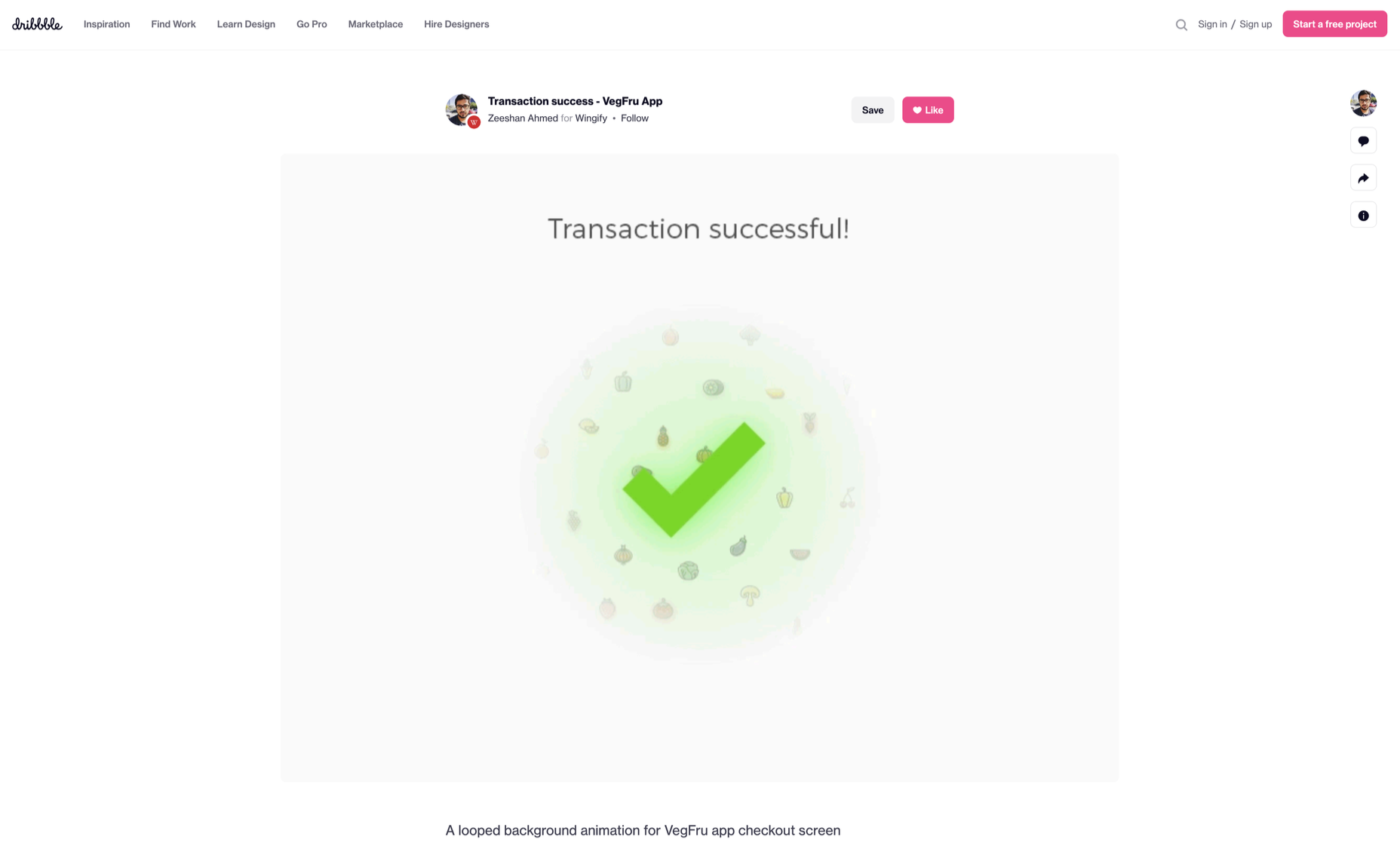
Micro-interactions effectively communicate brand identity and ethos while strengthening ties with the customer. These habit-forming tools make for a fun and seamless user experience. Facebook’s ‘likes’ and Tinder’s ‘swipes’ are two classic examples. 

Micro-interactions originated with the need to guide customers who had hit a snag while using a service or a product. The goal was to ease customers into being more product-savvy via subtle reassurance and feedback. Micro-interactions are now employed by everything from washing machines, to coffee makers.

Along with feedback, prompts, and recommendations, they can also present customers with an appealing visual reward upon finishing a task. When used optimally, micro-interactions drastically enhance the navigation and simplify how users interact with sites and apps.

How Micro-Interactions Work

Here are the four structural elements to a simple micro-interaction: triggers, rules, feedback, and loops. Every micro-interaction has a significant component to organize the operational cycle. It lets you control feedback and runs, so the users understand the consequences of their performance and feel motivated to follow through.

Triggers

This feature begins micro-interactions of both the user-initiated (prompted by user) and system-initiated (driven by the system) kind. For example, a click, scroll, swipe, tap, and pull are common triggers that users carry out. So making a payment, booking a cab, and clicking or tapping on the hamburger menu all fall under this category. On the flip side, the user’s alert prompt upon entering a wrong password is a classic system-generated trigger. 

Rules

This element determines what happens after the user sets a prompt into motion via tapping, clicking, scrolling, or swiping. Rules refer to the fact that apps decide the triggers that users employ — Tinder’s ‘swipe’ feature illustrates this point. These rules gradually become a habit-forming action that users get accustomed to while regularly engaging with an app.

Feedback

During this process stage, the system informs the user via auditory, visual, or haptic cues. It engages the users and encourages them to proceed further in their process. For example, the progress bar of a download, the visual representation of steps cleared in a circle, or the visual, aural, and tactile indication upon the success or failure of payment are all a part of the feedback mechanism.

Loop/Modes

This final stage entails tiny meta-rules of the process and determines the frequency and duration. A classic example from an ecommerce app is the ‘Buy Now’ transformed to ‘Buy Another’ Before the user loses interest in the app, the app typically uses such a loop to get them to re-engage with the app. 

How to Use Micro-Interactions

We’ve established that micro-interactions are fabulous, but not every UX interaction on your app or site needs one throughout the wireframe. Overusing this tool could saturate the overall creative experience your design may want to offer. Worse, it might even end up confusing the information hierarchy. It undermines the design and unbalances the user experience of discomfort and irritability. So it’s crucial to know when exactly to use them.

Let’s find out how few quick tips on micro-interactions can elevate and humanize your mobile user experience:

  • Swipe right or left: A signature move made entirely on swiping micro-interaction featured in the famous Tinder app. Swiping is an easier action than clicking or tapping.
  • Call-to-action:  As part of the last step during payment or order, place a ‘Confirm Order’ or ‘Book Now’ prompt, which gives the task a sense of urgency. As a result, having acted on it feels like a minor achievement. 
  • System status: Your app user wants to know what’s happening. System status lets them know they are moving in the right direction and helps avoid confusion. Sometimes, users even run out of patience while uploading a picture, downloading a file, or filling up the registration form.
  • Classic notifications: Users need a quick reminder of products selected/wishlist in their abandoned cart with a reduced attention span. A simple notification can nudge them toward finalizing the purchase. 
  • Button animation: Animated buttons are not only cute, but they also help users navigate the mobile app swiftly. Try out attractive colors, fonts, sizes, shapes, and clipart elements corresponding to the animation and create that cool button to pop up when tapped or hovered on. 
  • Animated text inputs:  A simple process of a likable element like zooming in while entering data into a form or filling up card details for payment can enhance the user experience.
  • Reward an achievement:  Especially true for educational and health apps, micro-interactions celebrating big and small milestones with a badge or a compliment of encouragement can strengthen a user’s engagement with the app. 

Benefits of Micro-Interactions

  • Brand communication: A successful brand ensures that the transmission to the buyer is engaging, positive, and hassle-free. When micro-interactions show a process status clearly, it creates and reinforces a positive image for your brand.
  • Higher user engagement: Experts say micro-interactions engage users better. These tiny elements subconsciously create the urge to keep interacting with your app. For example, each push or nudge notification acts toward redirecting your customers back to your app.
  • Enhanced user experience: From shopping to banking to traveling to learning to staying healthy, there’s an app for everything. A wide range of activities elevates the overall user experience and stays ahead in the game. Micro-interactions can work that magic for your brand. 
  • Prompt feedback: It’s frustrating not to know what’s happening behind the blank screen, especially during a purchase. Instant feedback via visual, sound, or vibrating notifications makes for a pleasant user experience. 
  • Visual harmony: Micro-interactions initiated even with a tap, swipe, typing, or scrolling are all a part of the UX design’s overall appeal. The trick is to keep all the interface elements in perfect sync with the app’s visual features.

Micro-Interaction Best Practices

Here are a few basic principles you should follow when you introduce a micro-interaction to the user experience.

1. Keep it simple, stupid (KISS)

KISS is a famous design principle that becomes even more important in the case of micro-interactions. The goal is to make the user journey delightful and not be a distraction.

2. Keep it Short

It has ‘micro’ in the name itself. But, again, micro-interactions aren’t supposed to be show stars, and a lengthy micro-interaction only distracts the user. 

3. Pick the Right Place

You should always consider the options carefully before choosing the spot for any micro-interaction. The widely used user-interaction designs are popular for a reason. Many people have already approved them, so you can safely continue with them. The use of micro-interaction should also sit well with your brand image. 

See also if the placement of a micro-interaction is reaching your ideal customer or not. And even consider whether you need a micro-interaction to begin with. 

And That’s a Wrap!

As UX designers, we can profoundly impact the overall design of sites and apps, the user’s journey, their interactions with our product/service, their connection with the brand, and the ease of doing a transaction.

We want customers to connect to our brand, love our products, and experience our exceptional customer service. But most of all, we want to earn their trust and loyalty.


Featured image via Pexels.

Source

The post Using Micro-Interactions to Drive UX first appeared on Webdesigner Depot.

Source de l’article sur Webdesignerdepot

“Minimum Viable Product,” or “MVP,” is a concept of agile development and business growth. With a minimum viable product, you focus on creating the simplest, most basic version of your product, web application, or code possible.

Minimum viable products include just enough features to attract early adopters and validate your idea in the early stages of the development lifecycle. Choosing an MVP workflow can be particularly valuable in the software environment because it helps teams receive, learn from, and respond to feedback as quickly as possible.

The question is, how exactly do you define the “minimum” in MVP? How do you know if your MVP creation is basic enough while still being “viable”?

Defining the Minimum Viable Product: An Introduction

The concept of “Minimum Viable Product” comes from the Lean Start-up Methodology, introduced by Eric Ries. The purpose of MVP is to help companies quickly create versions of a product while collecting validated insights from customers for each iteration. Companies may choose to develop and release minimum viable products because they want to:

  • Introduce new products into the market as quickly as possible;
  • Test an idea with real users before committing a large budget to product development;
  • Create a competitive product with the use of frequent upgrades;
  • Learn what resonates with the target market of the company;
  • Explore different versions of the same product.

Aside from allowing your company to validate an idea for a product without building the entire concept from scratch, an MVP can also reduce the demand on a company’s time and resources. This is why so many smaller start-ups with limited budgets use the MVP and lean production strategy to keep costs as low as possible.

Defining an MVP: What your Minimum Viable Product Isn’t

When you’re building a Minimum Viable Product, you’re concentrating on developing only the most “essential” features that need to be in that product. For instance, you might be building a shopping app for a website. For the app to be “viable,” it would need to allow customers to search through products and add them to a basket or shopping cart. The app would also need a checkout feature and security components.

However, additional functionality, like the ability to send questions about an item to a customer service team or features that allow clients to add products to a “wish list,” may not be necessary straight away. Part of defining a minimum viable product is understanding what it isn’t. For instance, an MVP is not:

  • A prototype: Prototypes are often mentioned alongside MVPs because they can help with early-stage product validation. However, prototypes are generally not intended for customers to use. The “minimum” version of a viable product still needs to be developed enough for clients and users to put it to the test and provide feedback.
  • A minimum marketable product: An MVP is a learning vehicle that allows companies to create various iterations of an item over time. However, a minimum marketable product is a complete item, ready to sell, with features or “selling points” the company can highlight to differentiate the item from the competition.
  • Proof of concept: This is another similar but distinct idea from MVP. Proof of concept items test an idea you have to determine whether it’s attainable. There usually aren’t any customers involved in this process. Instead, companies create small projects to assess business solutions’ technical capabilities and feasibility. You can sometimes use a proof of concept before moving on to an MVP.

Finding the Minimum in your MVP

When finding the “minimum” in a minimum viable product, the primary challenge is ensuring the right balance. Ideally, you need your MVP to be as essential, cost-effective, and straightforward as possible so that you can create several iterations in a short space of time. The simpler the product, the easier it is to adapt it, roll it out to your customers, and learn from their feedback.

However, developers and business leaders shouldn’t get so caught up focusing on the “Minimum” part of Minimum Viable Product that they forget the central segment: “Viable”; your product still needs to achieve a specific purpose.

So, how do you find the minimum in your MVP?

1. Decide on Your Goal or Purpose

First, you’ll need to determine what your product needs to do to be deemed viable. What goal or target do you hope to achieve with your new product? For instance, in the example we mentioned above, where you’re creating an ecommerce shopping app, the most basic thing the app needs to do is allow customers to shop for and purchase items on a smartphone.

Consider the overall selling point of your product or service and decide what the “nice to haves” are, compared to the essential features. For instance, your AR app needs to allow people to interact with augmented digital content on a smartphone, but it may not need to work with all versions of the latest AR smart glasses.

2. Make a List of Features

Once you know the goal or purpose of your product, the next step is to make a list of features or capabilities you can rank according to importance. You can base your knowledge of what’s “most important” for your customers by looking at things like:

  • Competitor analysis: What do your competitors already offer in this category, and where are the gaps in their service or product?
  • User research: Which features or functionalities are most important to your target audience? How can you make your solution stand out from the crowd?
  • Industry knowledge: As an expert in your industry, you should have some basic understanding of what it will take to make your product “usable.”

3. Create Your Iterations

Once you’ve defined your most important features, the next stage is simply building the simplest version of your product. Build the item according to what you consider to be its most essential features and ask yourself whether it’s serving its purpose.

If your solution seems to be “viable,” you can roll it out to your target audience or a small group of beta testers to get their feedback and validate the offering. Use focus groups and market interviews to collect as much information as possible about what people like or dislike.

Using your feedback, you can begin to implement changes to your “minimum” viable product to add more essential features or functionality.

Understanding the “Minimum Viable Product”

Minimum viable products are evident throughout multiple industries and markets today – particularly in the digitally transforming world. For instance, Amazon might be one of the world’s most popular online marketplaces today, but it didn’t start that way. Instead, Jeff Bezos began purchasing books from distributors and shipping them to customers every time his online store received an order to determine whether the book-selling landscape would work.

When Foursquare first began, it had only one feature. People could check-in at different locations and win badges. The gamification factor was what made people so excited about using the service. Other examples include:

  • Groupon: Groupon is a pretty huge discount and voucher platform today, operating in companies all around the world. However, it started life as a simple minimum viable product promoting the services of local businesses and offering exclusive deals for a short time. Now Groupon is constantly evolving and updating its offerings.
  • Airbnb: Beginning with the use of the founders’ own apartment, Airbnb became a unicorn company giving people the opportunity to list places for short-term rental worldwide. The founders rented out their own apartment to determine whether people would consider staying in someone else’s home before eventually expanding.
  • Facebook: Upon release, Facebook was a simple social media tool used for connecting with friends. Profiles were basic, and all members were students of Harvard University. The idea quickly grew and evolved into a global social network. Facebook continues to learn from the feedback of its users and implement new features today.

Creating Your Minimum Viable Product

Your definition of a “minimum viable product” may not be the same as the definition chosen by another developer or business leader. The key to success is finding the right balance between viability – and the purpose of your product, and simplicity – or minimizing your features.

Start by figuring out what your product simply can’t be without, and gradually add more features as you learn and gain feedback from your audience. While it can be challenging to produce something so “minimalistic” at first, you need to be willing to release those small and consistent iterations if you want to leverage all the benefits of an MVP.

Suppose you can successfully define the meaning of the words “Minimum” and “Viable” simultaneously with your new product creations. In that case, the result should be an agile business, lean workflows, and better development processes for your entire team.


Featured image via Pexels.

Source

The post What is the “Minimum” in Minimum Viable Product? first appeared on Webdesigner Depot.

Source de l’article sur Webdesignerdepot

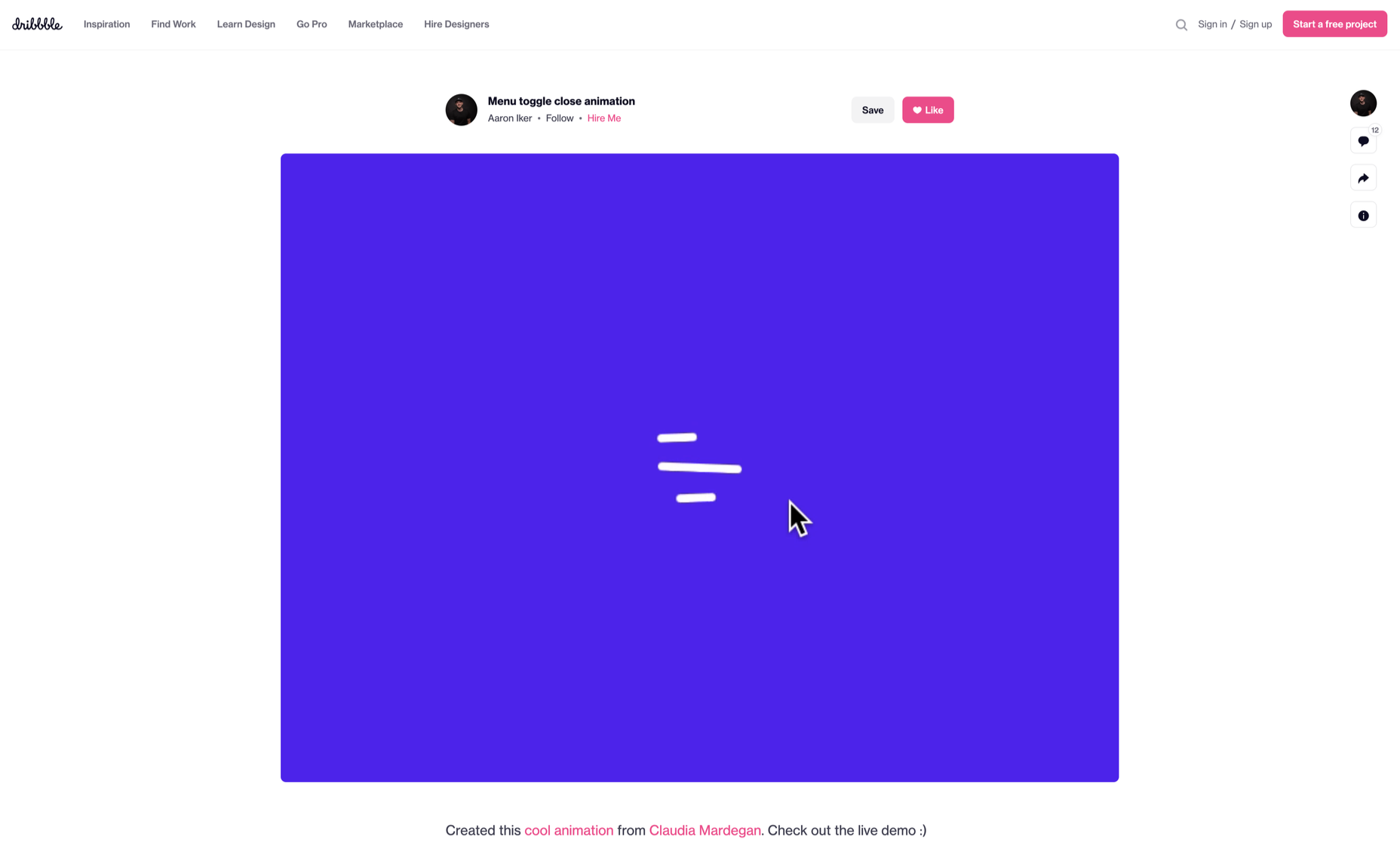
Every day design fans submit incredible industry stories to our sister site, Webdesigner News. Our colleagues sift through it, selecting the very best stories from the design, UX, tech, and development worlds and posting them live on the site.

The best way to keep up with the most important stories for web professionals is to subscribe to Webdesigner News or check out the site regularly. However, in case you missed a day this week, here’s a handy compilation of the top curated stories from the last seven days. Enjoy!”

4 Examples of Headless WordPress ECommerce Websites

Laravel 9 is Now Released

Free Web Development Courses for Beginners

15 Best New Fonts, February 2022

Illustrator Tutorial: Sketch to Vector Character Illustration

Replace JavaScript Dialogs with the New HTML Dialog Element

Pixel Editor – Generate Dynamic Pixel Grid

ToolJet – Open-source Low-code Platform to Build Internal Tools

Why do We Round Corners?

Design Memes!

9 Web Design Trends to Watch in 2022 [Infographic]

Top 10 Graphic Design Trends to Inspire your Work in 2022

Source

The post Popular Design News of the Week: February 7, 2022 – February 13, 2022 first appeared on Webdesigner Depot.

Source de l’article sur Webdesignerdepot