
 Looking for the best new CMS plugins to take your website to the next level? Well look no further.
In this post, we’ll cover a list of the best new CMS plugins for December 2020. This article will include useful plugins for WordPress, Shopify, Craft, and Joomla. Let’s get started…
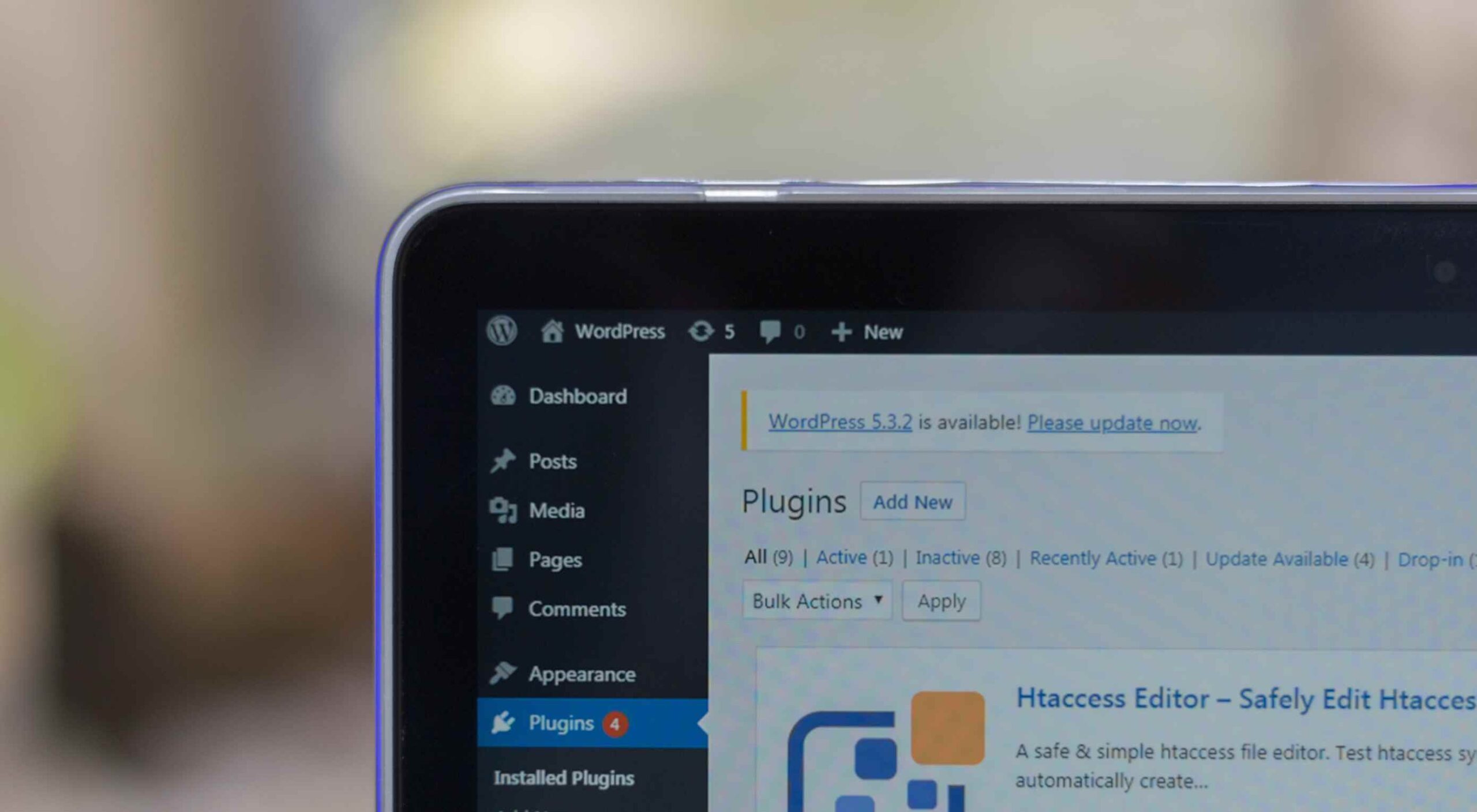
WordPress
OptiPic images optimization
OptiPic is a simple WordPress plugin that allows users to easily optimize and compress images.
The plugin also returns the WebP versions of images if the web browser supports it; if the web browser does not support WebP images, OptiPic will return a compressed version of the image. It also returns responsive images on mobile screens when the website is opened on a smaller device.
The image compression and WebP conversions occur in the background, so images load fast. The plugin takes advantage of caching to speed up load times.
Haglit for WooCommerce
Haglit is an AI-powered sales chatbot plugin for WooCommerce stores. The plugin allows customers to negotiate the price of products on your online store.
Haglit enables customers to haggle with a chatbot to get a personalized discount directly on the product page. In physical brick and mortar stores, conversation and haggling help to increase conversion rates and sales. Haglit allows you to bring that same interaction to your WooCommerce store. Customers can negotiate discounts and sellers can increase sales using Haglit’s discount algorithm.
The plugin is very easy to set up. All you need to do is sync Haglit to your WooCommerce store and set the maximum discount that will be allowed for a particular product. After publishing your settings, Haglit will take care of turning visitors into customers.
Brosix Live Chat
Brosix Live Chat plugin allows you to easily add live chat support to your WordPress site. It provides instant communication with your site’s visitors.
The plugin is easy to set up and use. All messages between customers and customer agents are encrypted. There is also a dedicated chat room on Brosix for your agents. Brosix has a mobile application for phones/tablets, a web application that works on all web browsers, and desktop applications for computers. The plugin comes in three availability options for agents and several color icon options.
Brosix offers two plans; a free plan that allows only one agent and a premium plan with more collaboration and administrative features.
Rankchecker.io
Rankchecker.io is a free tool from Google that allows you to monitor your website’s ranking on search engines. The plugin allows you to check search engine rankings for multiple keywords on Google’s SERPs. Rankchecker.io can check keyword rankings for any country or language.
Bitcoin Widgets
Bitcoin Widgets is a payment gateway plugin for WordPress users. It allows your customers to pay for goods using bitcoin.
You can receive the bitcoin payments directly to your crypto-wallet. Customers can also pay for goods with a bank card. These are the currencies that are supported: USD, RUR, EUR, UAH, INR. KRW, TRY, GBP, BRL, AUD, HKD, and TWD.
To collect bitcoin payments, just add your wallet address for payout. The payment transfers usually happen within 30 – 60 minutes depending on the network. There is also no processing fee.
Remove Emoji CSS and JS
Remove Emoji CSS and JS is a simple plugin that allows you to remove emoji CSS and JS from your WordPress website. Removing these CSS and JS scripts will help improve the performance and speed of your website.
Using the plugin is straight forward. Just install and activate the plugin to remove emoji CSS and JS from your website.
GuardGiant
GuardGiant is a security plugin that stops hackers from logging into a WordPress website. The plugin uses a modern approach to make sure that genuine users are not locked away from their website. When a genuine user successfully logs into a device for the first time, the plugin treats the device as trusted. So if a user has failed login attempts on a trusted device, they are directed to ‘Lost Password’ forms instead of being completely locked out of their account.
Users will receive alerts when someone logs into their account from an unrecognized browser or device. Some of its features include brute force protection and detailed logging of all login attempts. The plugin also obscures login errors so that hackers cannot detect valid account names.
The plugin is easy to use and the default settings are already optimized to keep hackers away.
Schema Integration
Schema Integration is a lightweight plugin that makes it easy to add schema markup to WordPress websites.
The plugin will automatically add the structured schema.org data markup in the recommended JSON-LD format to your website in seconds. The plugin supports multiple schema.org types. You can add the schema types anywhere on your site. All the schema types in the plugin are valid when tested on Google Structured Data Testing Tool.
Setting up schema using the plugin is easy. All you need to do is select the schema type you want and fill in the desired fields. The plugin will take care of the rest.
Promo Video Maker
Promo Video Maker is an effective WordPress plugin for creating professionally designed videos for your business. The plugin allows you to turn static images into videos.
Some of the features in the plugin include free video templates, licensed audio tracks, and a free library with over 1.4M assets. The plugin comes with an easy to use editor. It easily integrates with Facebook, Instagram, Twitter, and YouTube. You can also manually embed the videos on any web page. With Promo Video Maker, you can easily create advertisements and testimonial videos to promote your products and services.
Backup Migration
Backup Migration is a WordPress plugin for creating a backup of your site. All you need to do is install the plugin and click on “Create backup now”. The plugin allows you to schedule backups. You can also determine which exact files or databases you want to backup. The plugin is free to use.
Joli FAQ SEO
Joli FAQ SEO is an easy-to-use plugin for creating multiple FAQs pages.
The plugin comes with a one-page drag-and-drop FAQ builder for creating fully responsive and mobile-friendly FAQ pages. The plugin is very great for SEO. It does not use jQuery in the front end. The plugin’s JavaScript file size is 4kb minified and the CSS file size is 6kb minified. You can customize the FAQ page to fit your website’s theme. The pro version integrates with WooCommerce and has an instant search bar.
Shopify
QuizToAction
QuizToAction is a simple Shopify plugin that allows you to catch the attention of your store visitors using interactive quizzes. At the end of each quiz, you can add a call to action. Currently, the plugin only allows email subscriptions as the call to action.
UGC Shoppable Customer Content
UGC Shoppable Customer Content plugin makes it easy to get user-generated content from your customers. With the plugin, you can invite your customers to share photos of their purchases through an on-site upload or email submissions.
The plugin comes with a widget so that you can display the UGC on your store. You can review the photos before they are uploaded. During the uploading process, the customer is asked if their photo can be shared on social media. If their answer is “Yes”, you can share the photo on social media through a shareable icon on the platform.
Checkify
Checkify is a simple Shopify plugin that makes it easy to add a terms and conditions checkbox to your cart page. You can also add age verification and any customer agreements required by your store. No code is required to install the plugin. It uses a one-click install and will appear immediately after installation.
It is compatible with all browsers and Shopify themes. Checkify will show a warning if a customer tries to check out without checking the checkbox.
Craft CMS
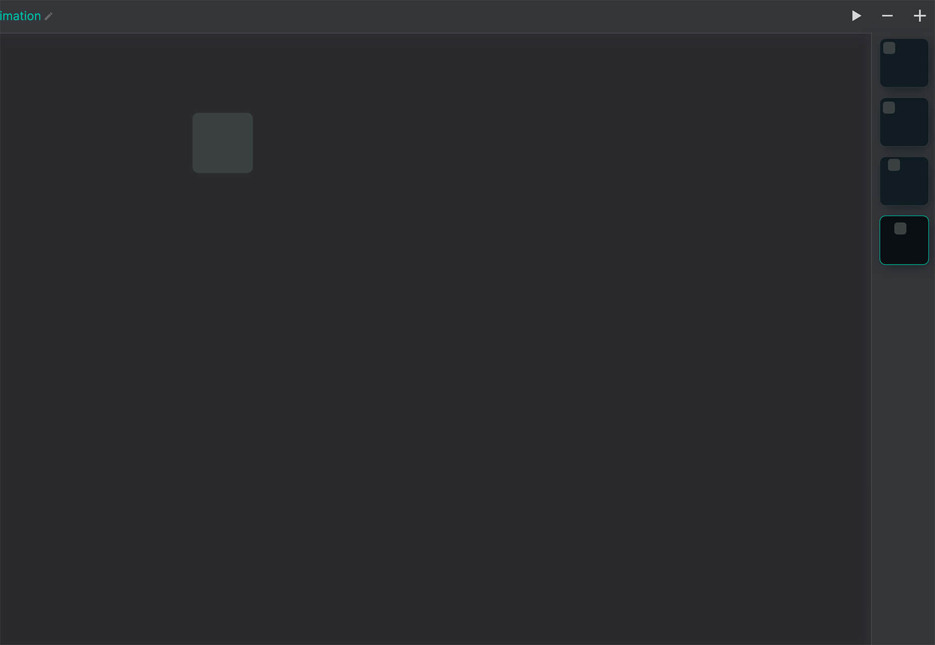
Hop Reveal
Hop Reveal plugin gives Craft site editors a quick visual cue on which server-side they are working on, development, staging, or production. You can choose what to name or color the labels. The plugin also allows you to view key environment variables that will be useful during development.
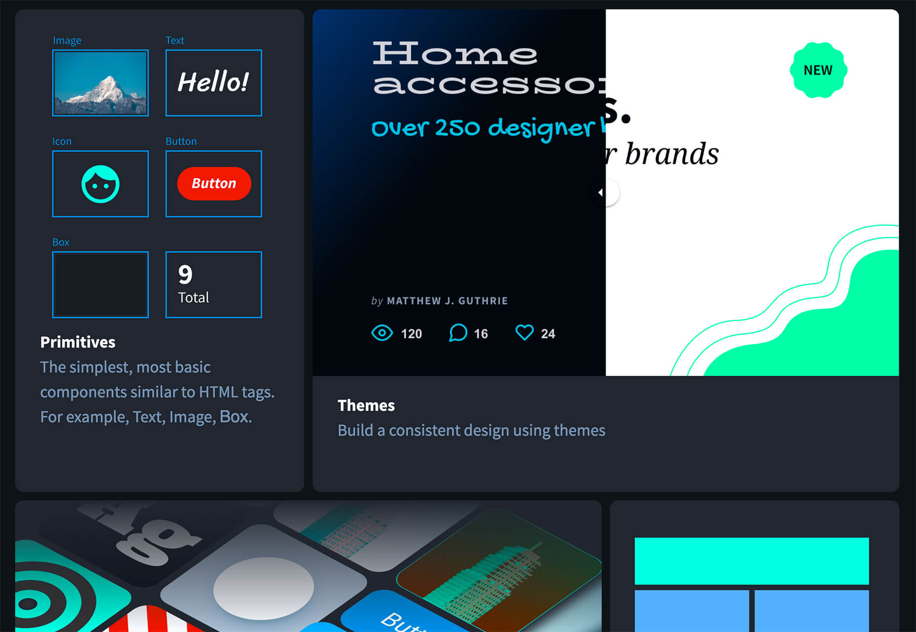
Donkeytail
Donkeytail is a field type in Craft that allows you to quickly and easily content manage points on images.
Donkeytail is compatible with GraphQL. It also works with all content types including entries, categories, assets, users, variants, and products. You can use Donkeytail to showcase multiple products within an image.
Joomla
Ol Content Modal
Ol Content Modal is a Joomla module that allows users to display articles, K2, or custom items on a popup modal. The extension also allows users to show full articles in a popup window; use a navigation arrow to move from one article to the next.
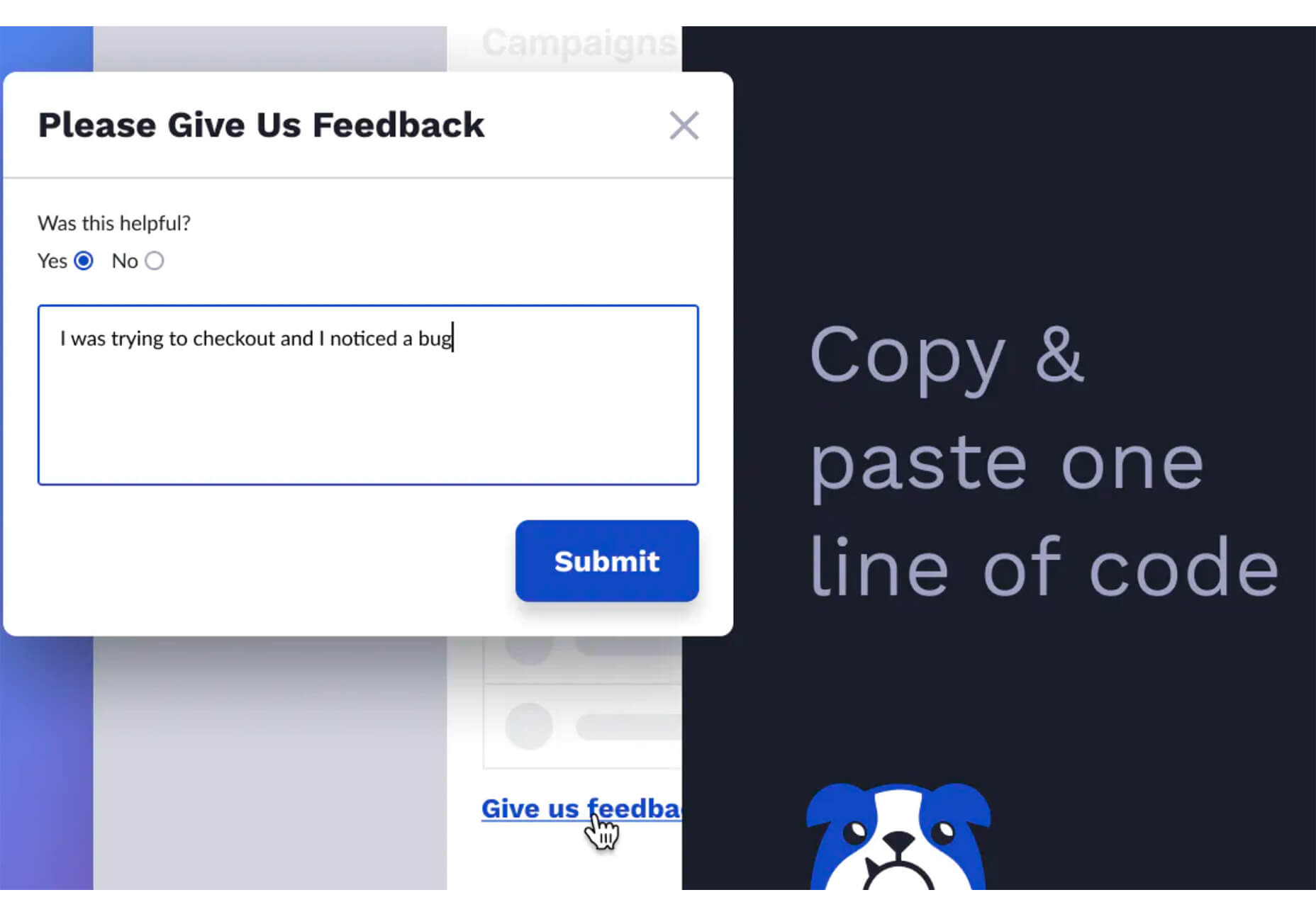
Mx contact
Mx contact is a responsive Joomla module that allows you to add a custom contact form to any page on your website. The extension is great for collecting customer feedback and contact details. The contact form can either appear on a wall or as a popup.
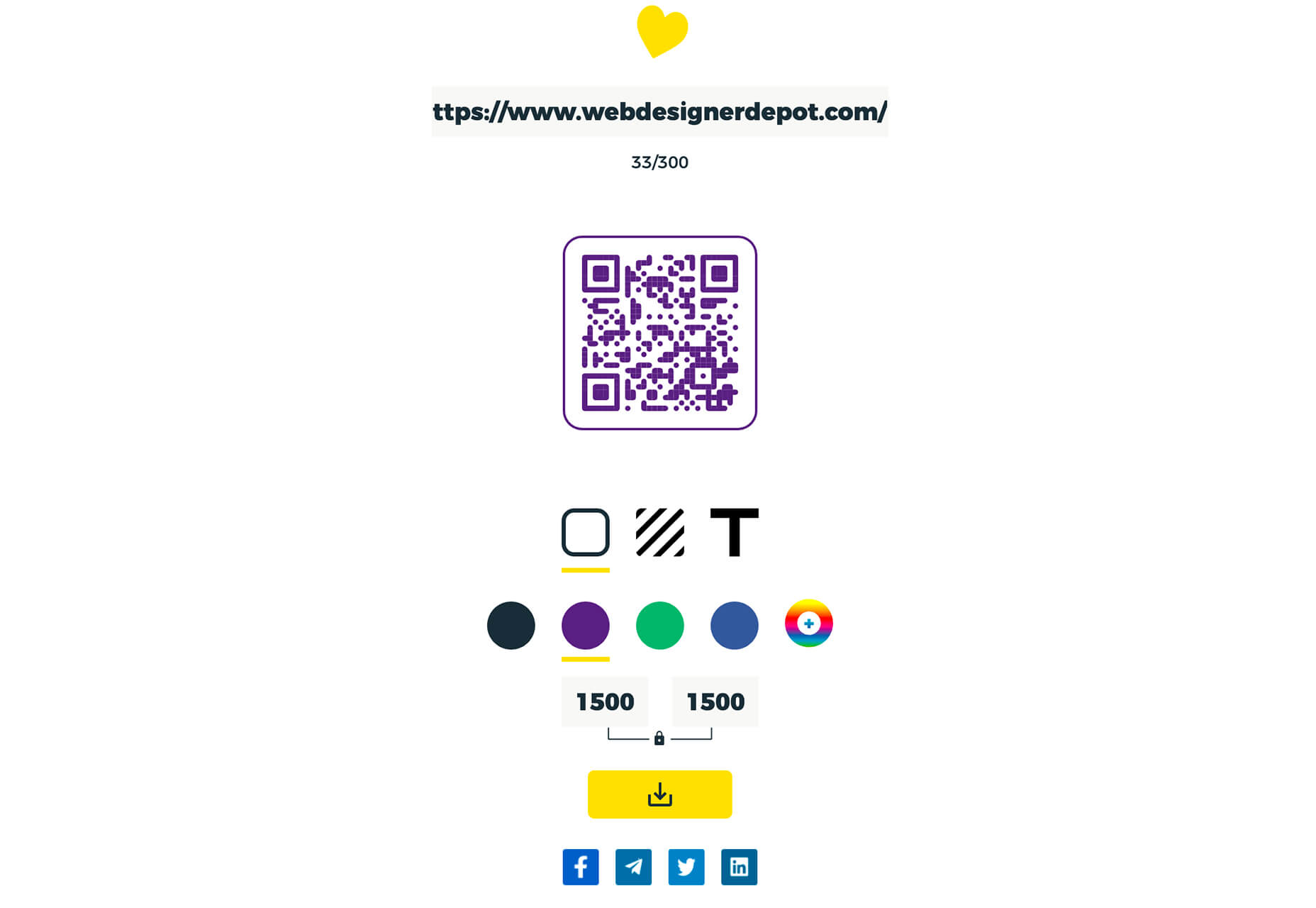
Ruxin QR Code
Ruxin QR Code allows you to add QR codes to your Joomla website. The extension allows you to set your QR size, display custom links, set the background color and put a footer label. You can also show your logo or label in the center of the QR code.
Featured image via Unsplash.

 Animation is a fun and interesting way to bring life to a website. Used correctly, it can capture audience attention, make your website more engaging, and even improve your chances of delivering conversions for your clients.


 Since there are so many CMS plugins out there, it can be overwhelming to choose the best ones for your website. We’ve done the research for you; this list contains the top new CMS plugins for November 2020. You’ll find useful plugins for WordPress, Craft, Shopify, and Joomla.
 In the spirit of fall feasts, this month’s collection of tools and resources is a smorgasbord of sorts. You’ll find everything from web tools to icon libraries to animation tools to great free fonts. Let’s dig in.


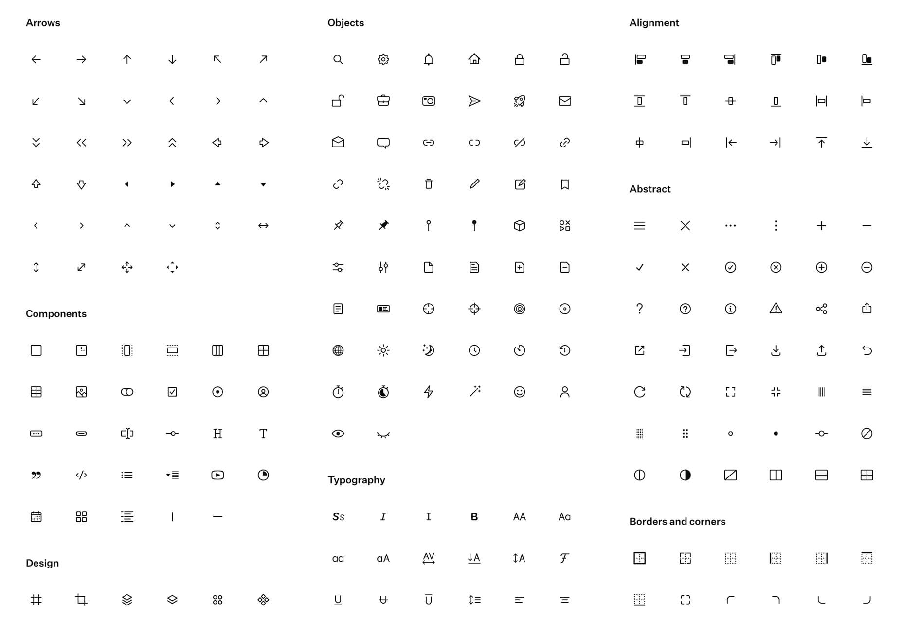
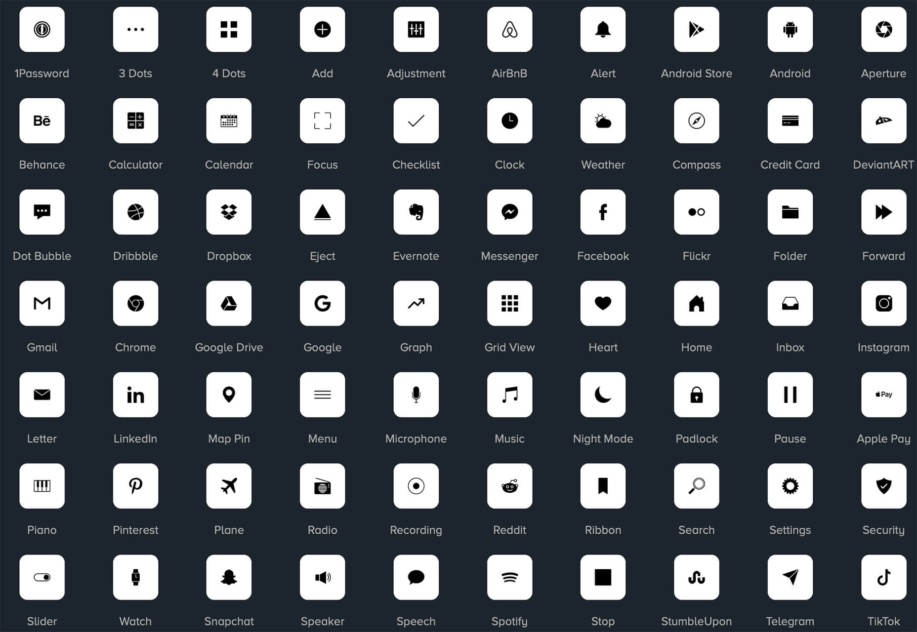


 Plugins offer a ton of benefits to developers and website administrators; from flexibility, to saving time in development, the right plugin is priceless to a project.

 It’s fun to see new website design tools that reflect current times and the state of the world. That’s very true this month with new databases devoted to diversity and women in technology, as well and resources to make your design life easier.


 When analysts for professional sports teams noticed that marketing promotions that included the team’s logo vastly outperformed similar creative assets that featured player imagery — something which, to the casual observer, this may simply sound like good analyst work — it showed something significant: creatives rarely receive an analytical assessment of their work.
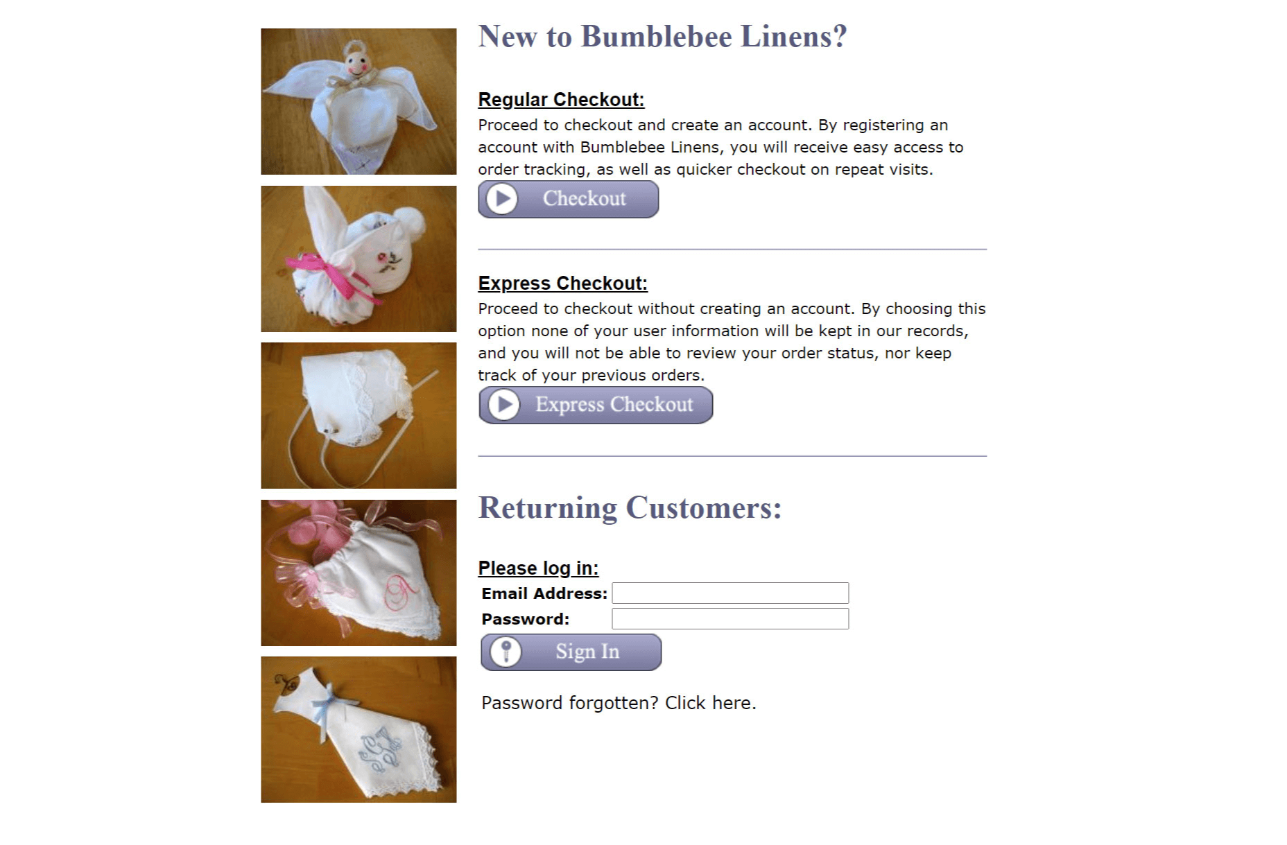
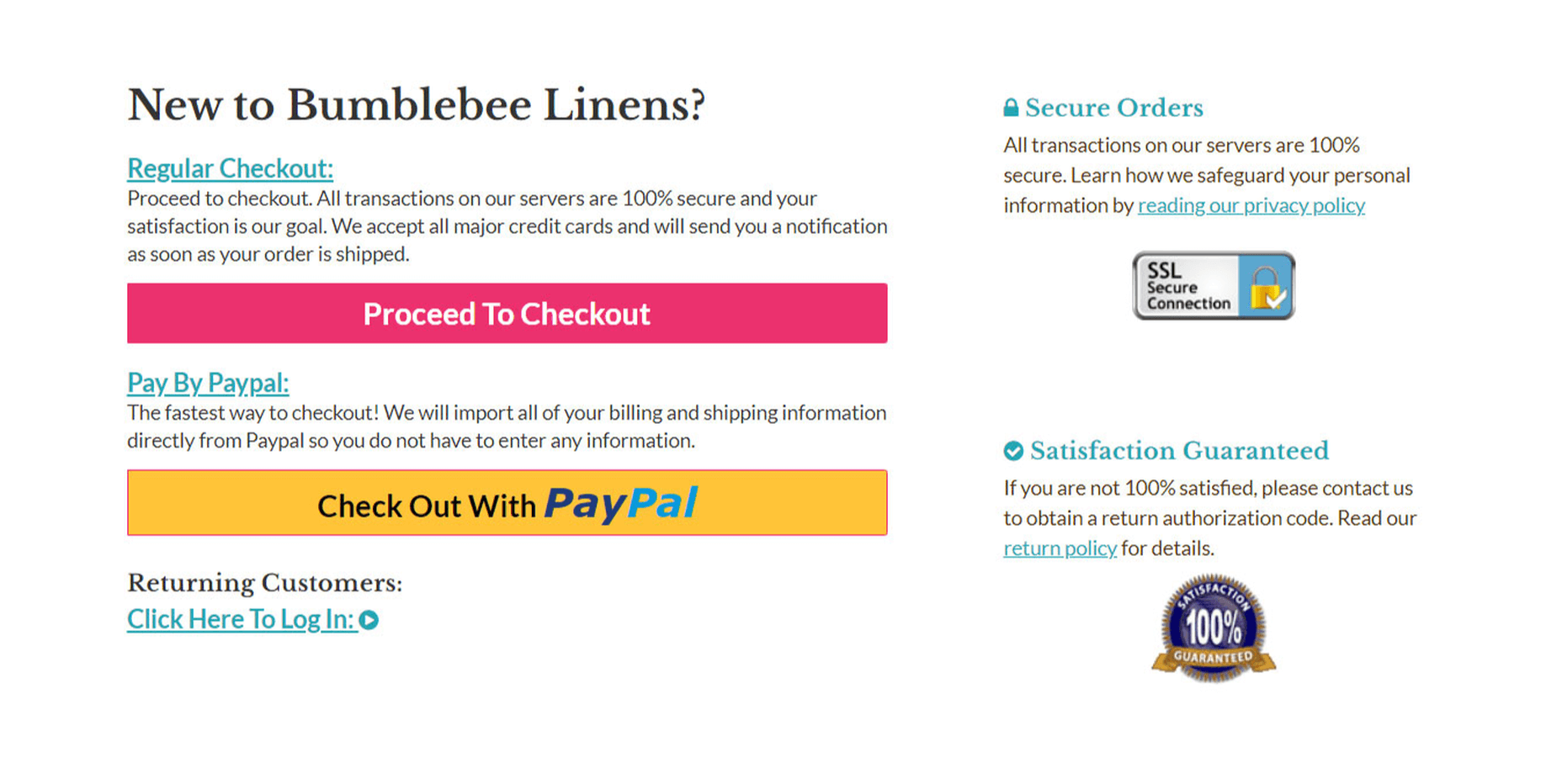
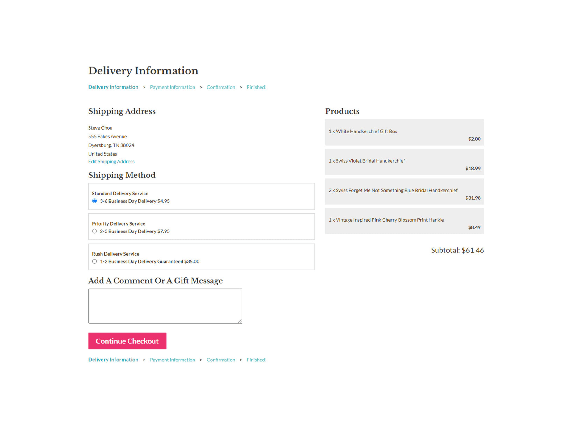
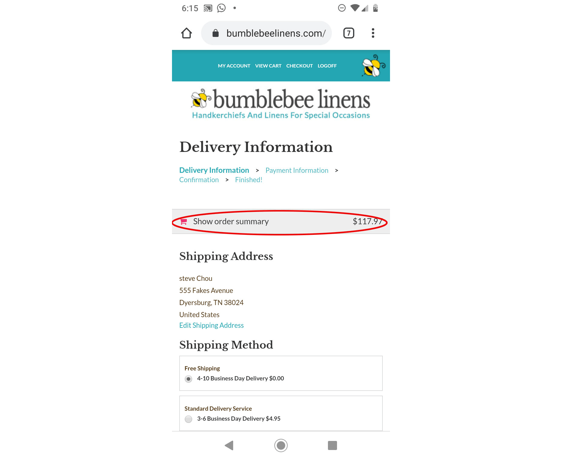
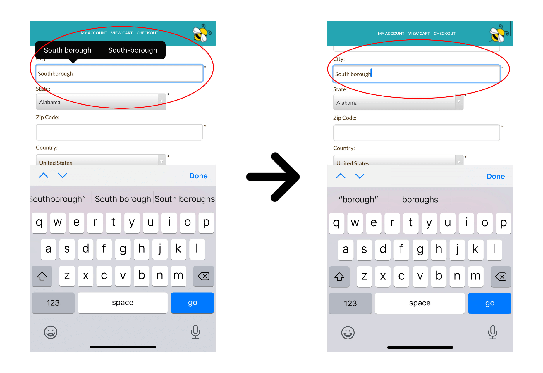
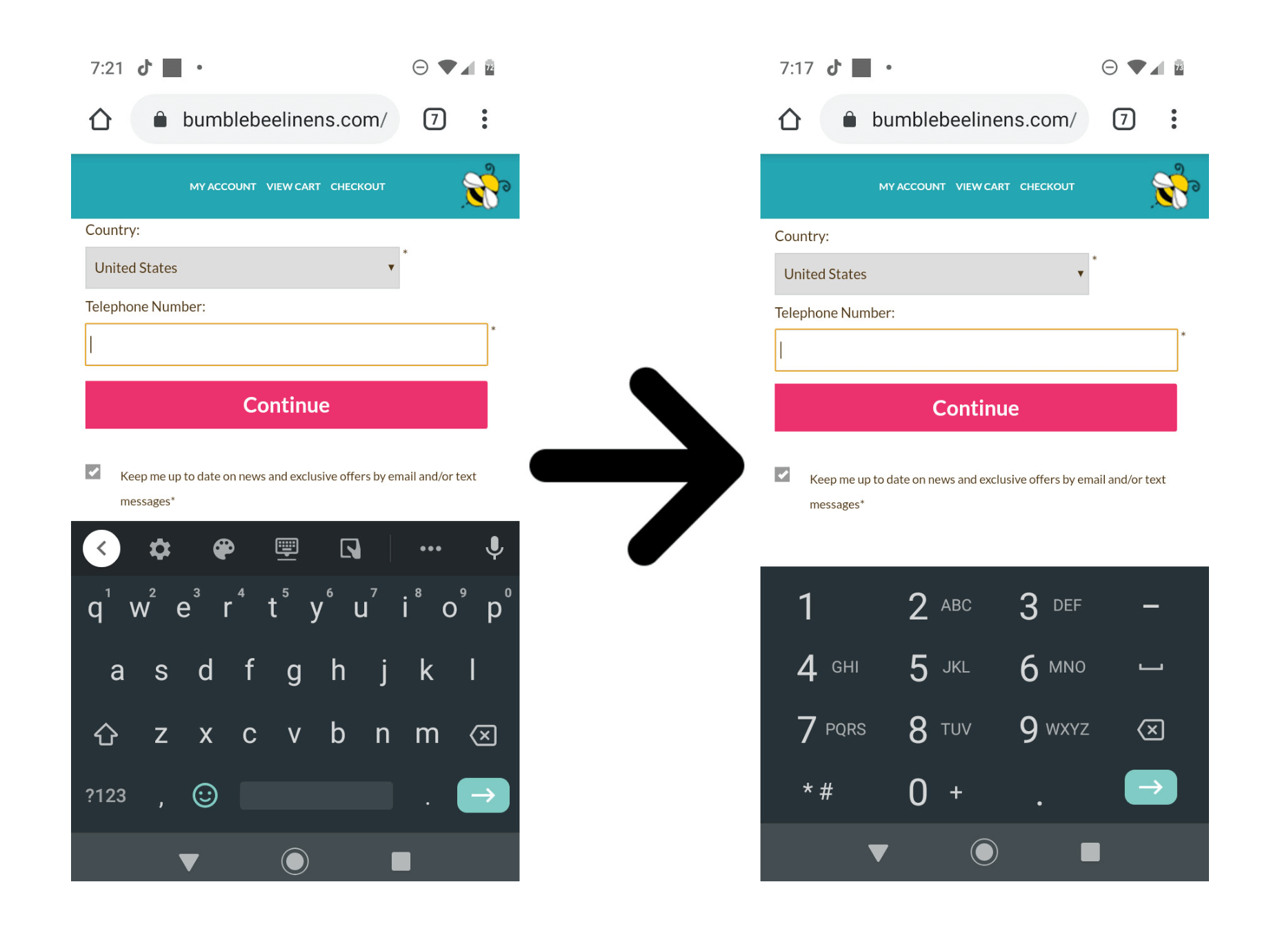
 When it comes to increasing sales for your ecommerce store, there are 3 levers you can pull: You can increase your average order value; You can increase the amount of traffic to your site; You can increase your conversion rate.


