
While this blog post refers to AWS services, in particular, the best practices are mostly the same for any other IAM framework.
« Security is job zero. »
When it comes to security in AWS, this is the de facto culture and standard.
While this blog post refers to AWS services, in particular, the best practices are mostly the same for any other IAM framework.
« Security is job zero. »
When it comes to security in AWS, this is the de facto culture and standard.

In scanning the IT landscape, the call for DevOps engineers remains toward the top of many companies’ priorities. A nationwide search through various job posting sites returns literally thousands of DevOps opportunities. However, reviewing these job postings shows that the skillsets required are widely varied. In comparison, software development job descriptions and requirements tend to have a narrower focus – broadly speaking, a language and a particular framework. DevOps job descriptions and requirements range from implementing continuous integration and continuous delivery (CI/CD) processes, to building infrastructure, to configuration management, to cloud operations, to writing code in any number of languages, and so on. It’s an impressive and intimidating list. Have you considered joining the DevOps wave but have been challenged in getting a clear picture of what DevOps is or means? If so, you’re not alone.
While many organizations have DevOps teams, even within a single organization, there are likely to be multiple roles within a DevOps team. Why is that? The reason is that DevOps is a process, and various roles within a DevOps team each contribute to the process. The DevOps process is a product of the evolution of Agile development processes. With Agile, production-quality software is iteratively delivered, which drives the need to deploy software more often. The process of getting software into production needed to be streamlined, thus the DevOps movement and process was born.
“At regular intervals, the team reflects on how to become more effective, then tunes and adjusts its behavior accordingly” — Agile Manifesto
Self-reflection within teams is fundamental to enabling Agile ways of working. Let’s take the most common Agile methodology, Scrum. This framework prescribes five events, one of which is the retrospective.
 The underlying theme of this month’s collection of new tools and resources is development. Almost every tool here makes dev a little easier, quicker, or plain fun. There are a few great tutorials in the mix to help you get into the spirit of trying new things and techniques.
Here’s what is new for designers this month…
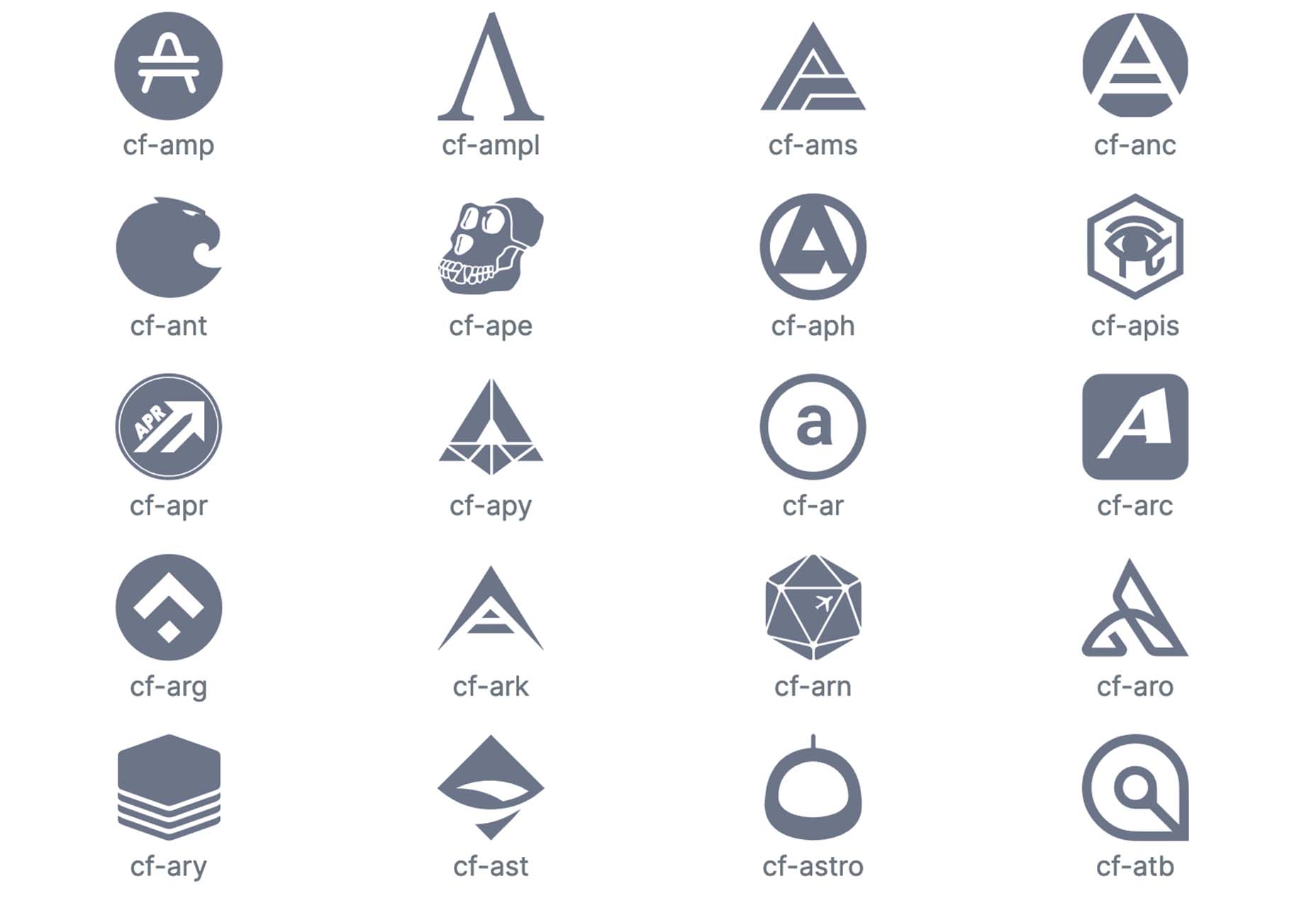
Cryptofonts is a huge open-source library of icons that represent cryptocurrencies. There are more than 1,500 CSS and SVG elements in the collection. Cryptofonts includes all scalable vector icons that you can customize by size, color, shadow, or practically anything else. They work with Sketch, Photoshop, Illustrator, Adobe XD, Figma, and Invision Studio, and there’s no JavaScript.
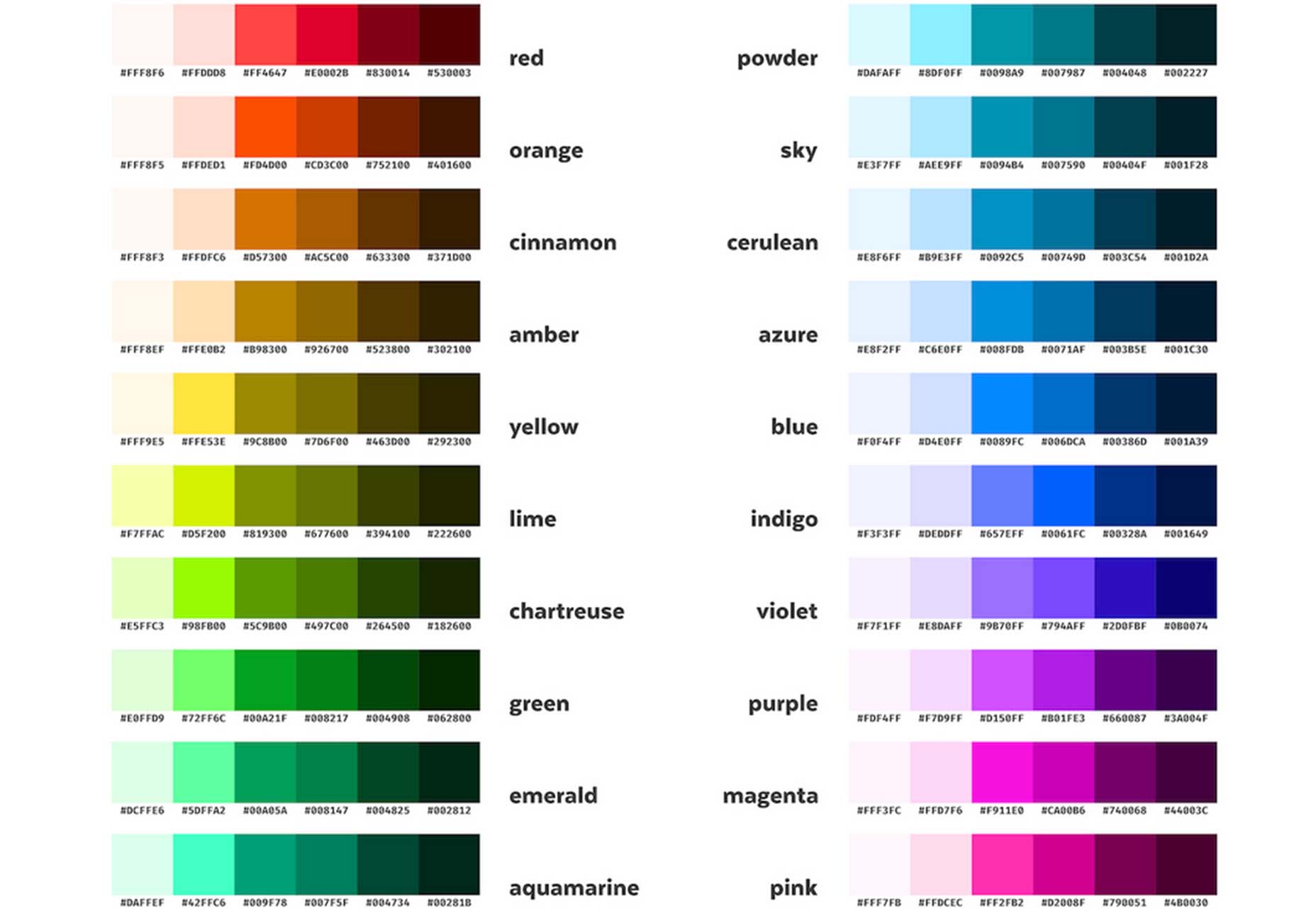
Reasonable Colors is an open-source color system for building accessible and beautiful color palettes. Colors are built using a coded chart. Each color comes in six numbered shades. The difference between their shade numbers can infer the contrast between any two shades. The differences correspond to WCAG contrast ratios to help you create an accessible palette. This is a smart project and a valuable tool if you work on projects where color contrast and accessibility are essential (which is all of them).
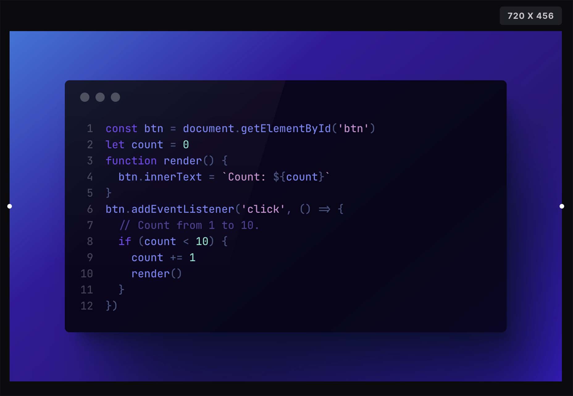
Chalk.ist is a fun tool to make your code snippets look amazing. Add your code (there’s a vast language selector), pick some colors and backgrounds, and then download it as a shareable image. Your code has never looked so beautiful!
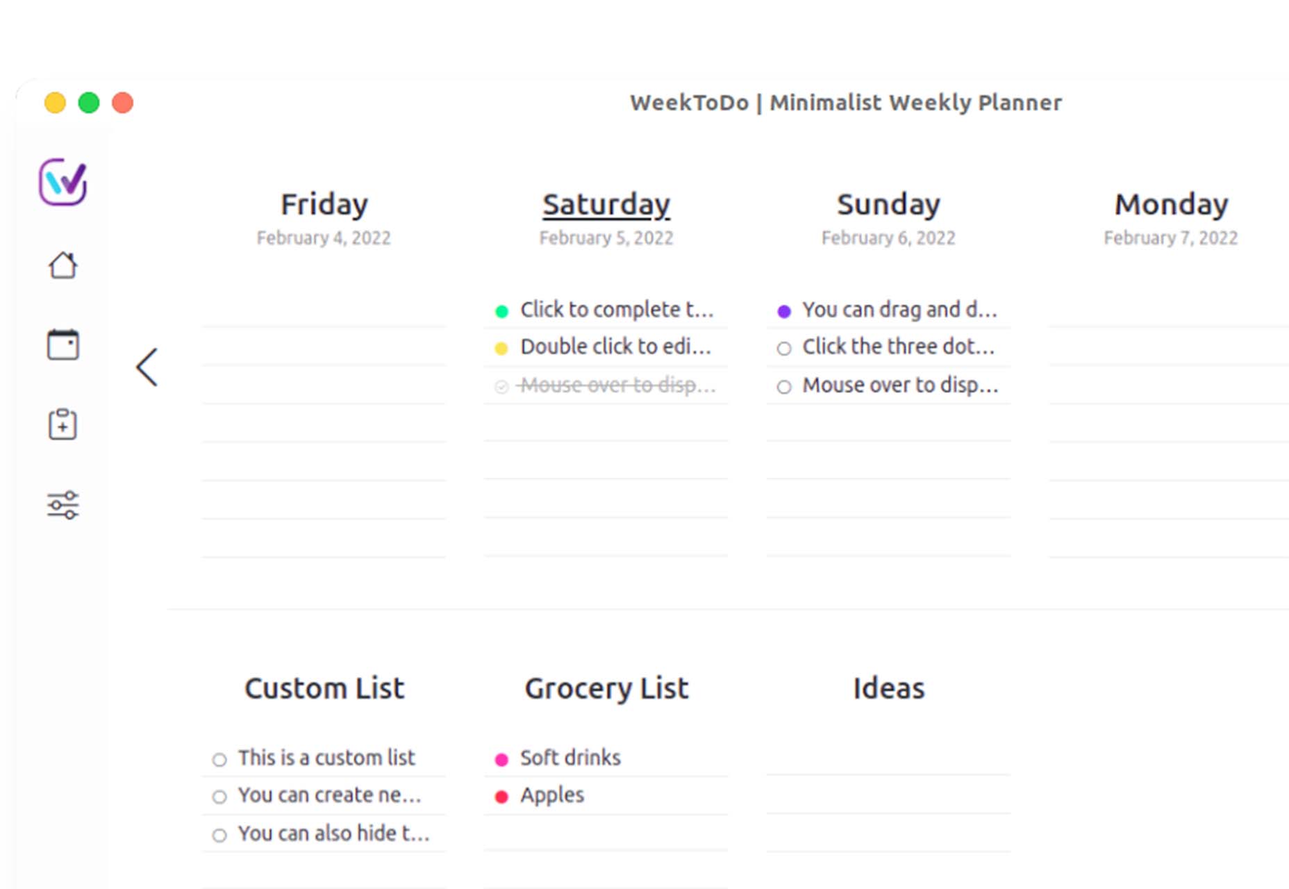
WeekToDo is a free minimalist weekly planner. Improve productivity by defining and managing your week and life easily and intuitively. Plus, this tool is focused on privacy with data that is stored on your computer (in your web browser or the application). The only person who has access to it is you.
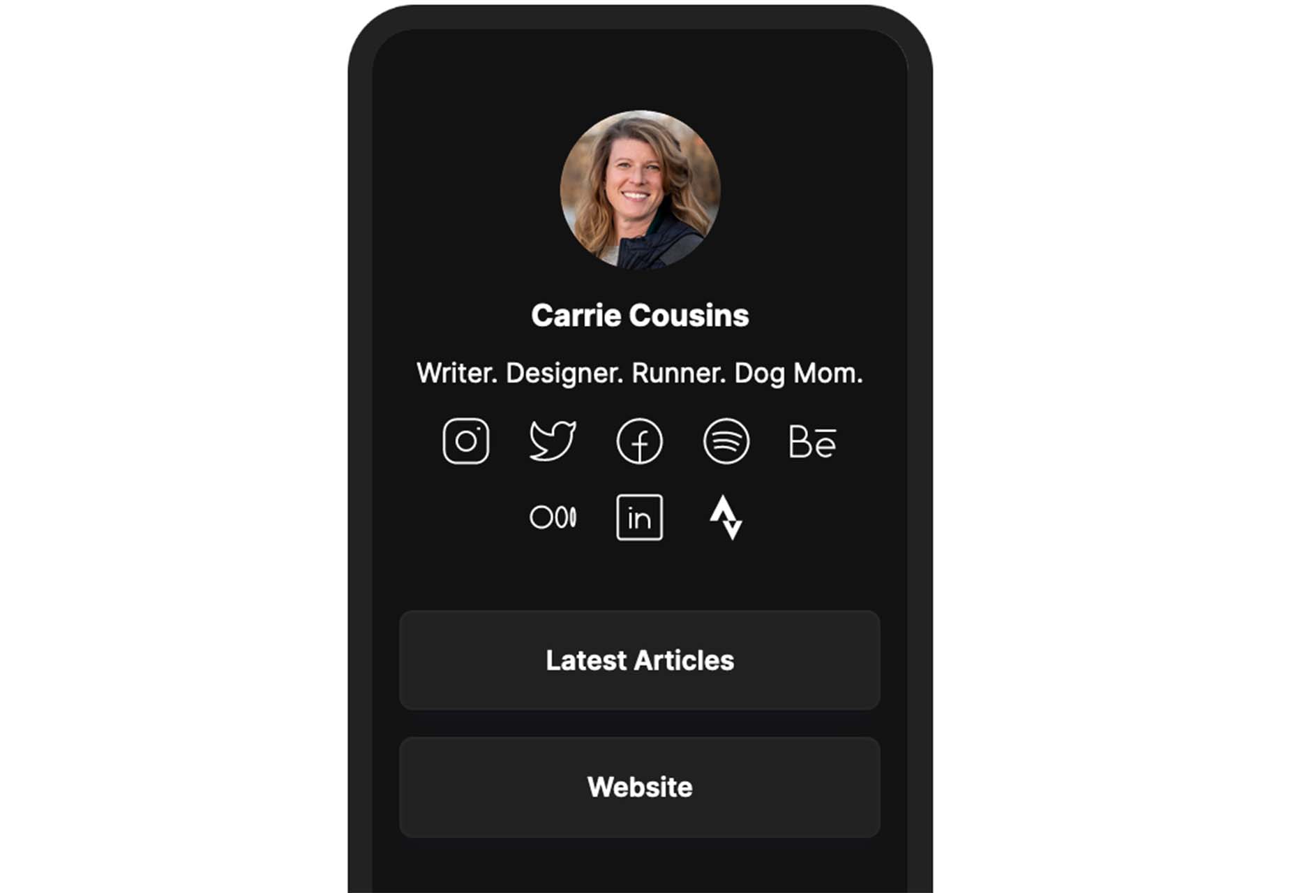
Bio.Link is a tool that collects all your links – from social media to blog posts to any other kind of link you want to share. It’s free to use, includes 15 design themes, visitor stats, and is super fast.
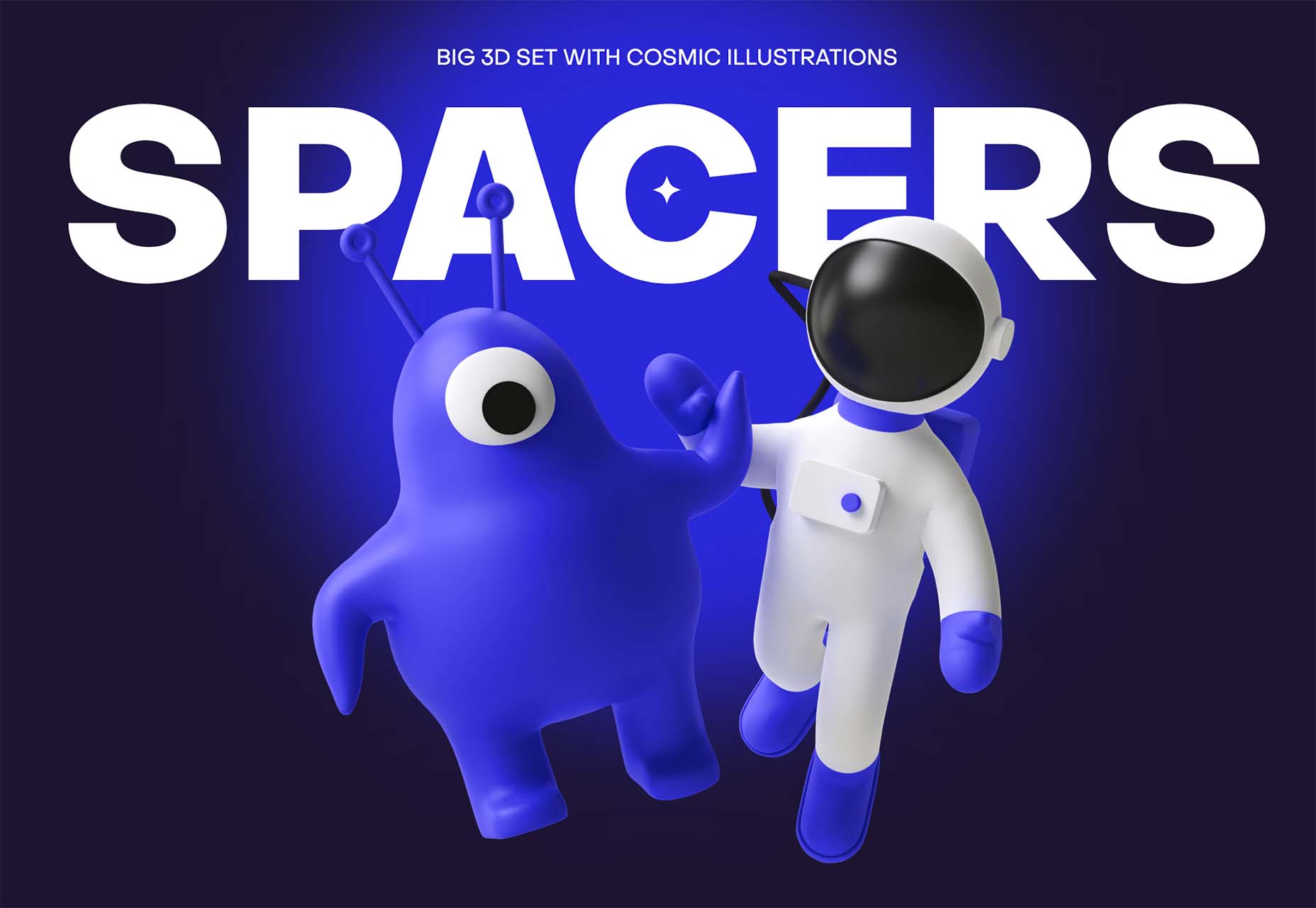
Spacers are a set of three-dimensional space characters that you can use in projects. Characters are in multiple poses and ultra high-def formats to play with.
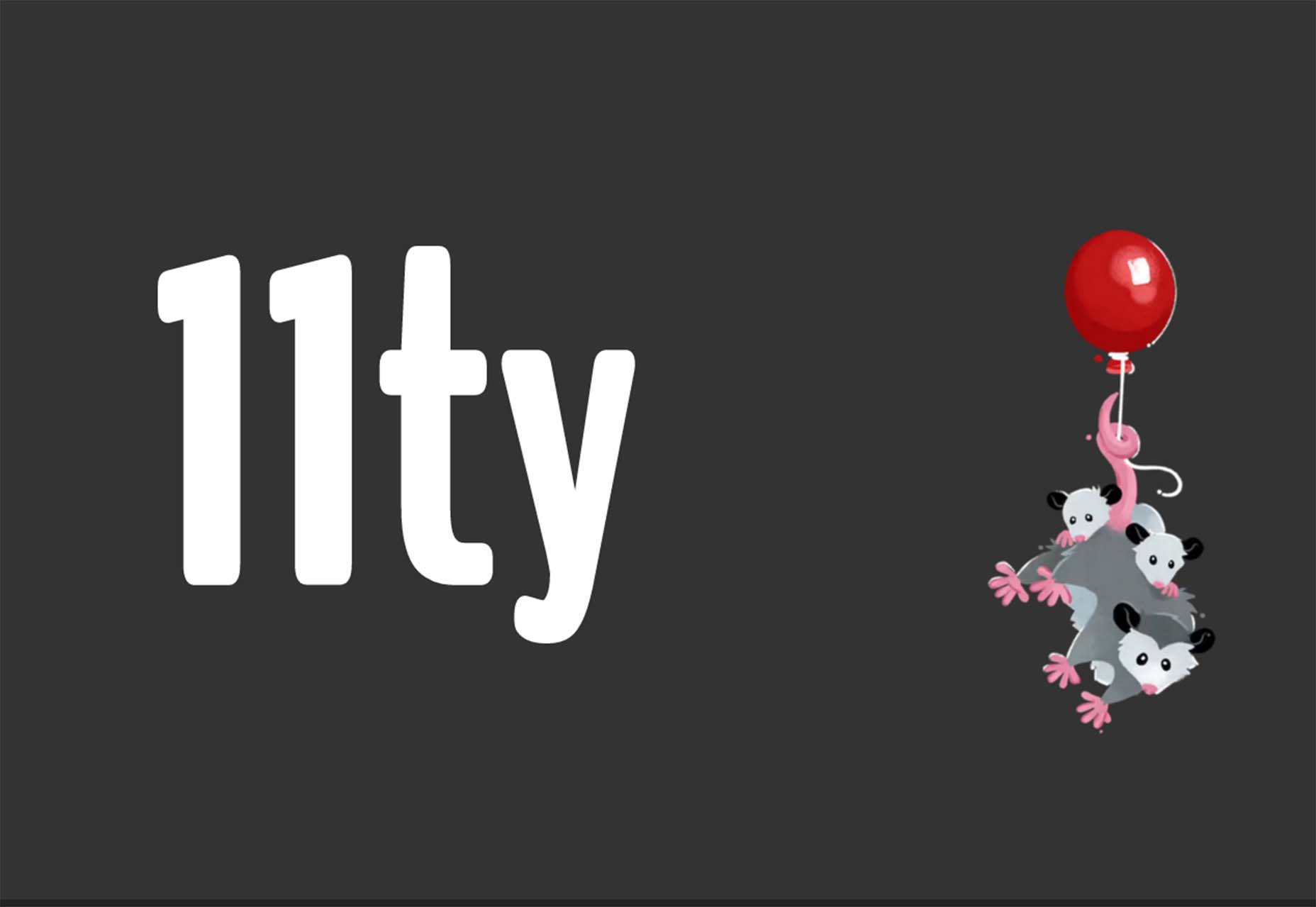
11ty is a super simple, static website generator. Try it for small projects and read the documentation to see everything you can do with this tool.
Scrollex is a react library that lets you build beautiful scroll experiences using minimal code. You can create scroll animations in all kinds of combinations – vertical, horizontal, almost anything you want to try. The documentation is fun and easy to understand if you’re going to see how it works.
GetCam is an app that lets you turn your smartphone into a webcam for your computer. It works with any iPhone and a Mac or Windows computer. It works with most video conference and streaming tools as well as browser-based apps.
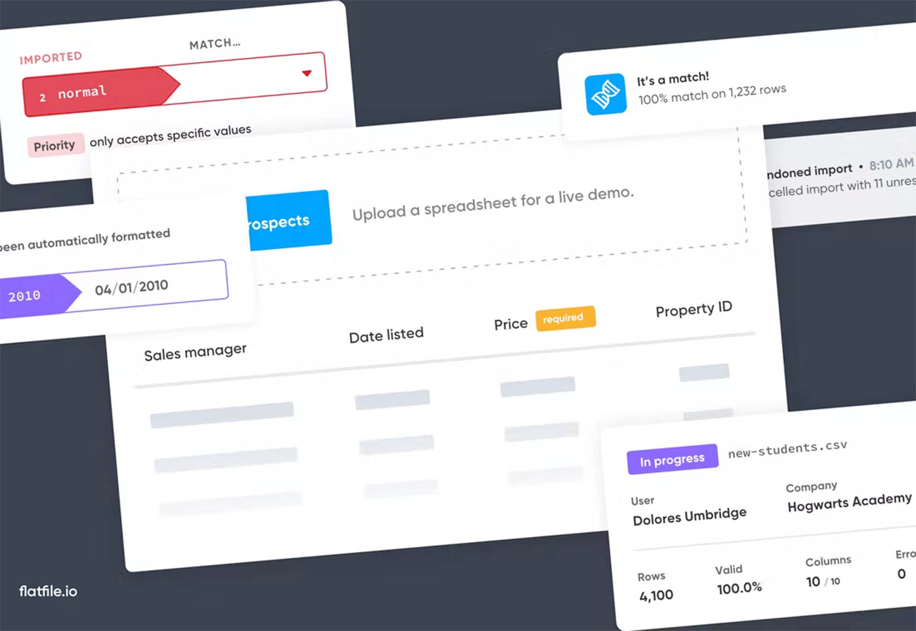
Flatfile is a data onboarding platform that intuitively makes sense of the jumbled data customers import and transforms it into the format you rely on. You won’t have any more messy spreadsheets or have to build a custom tool.
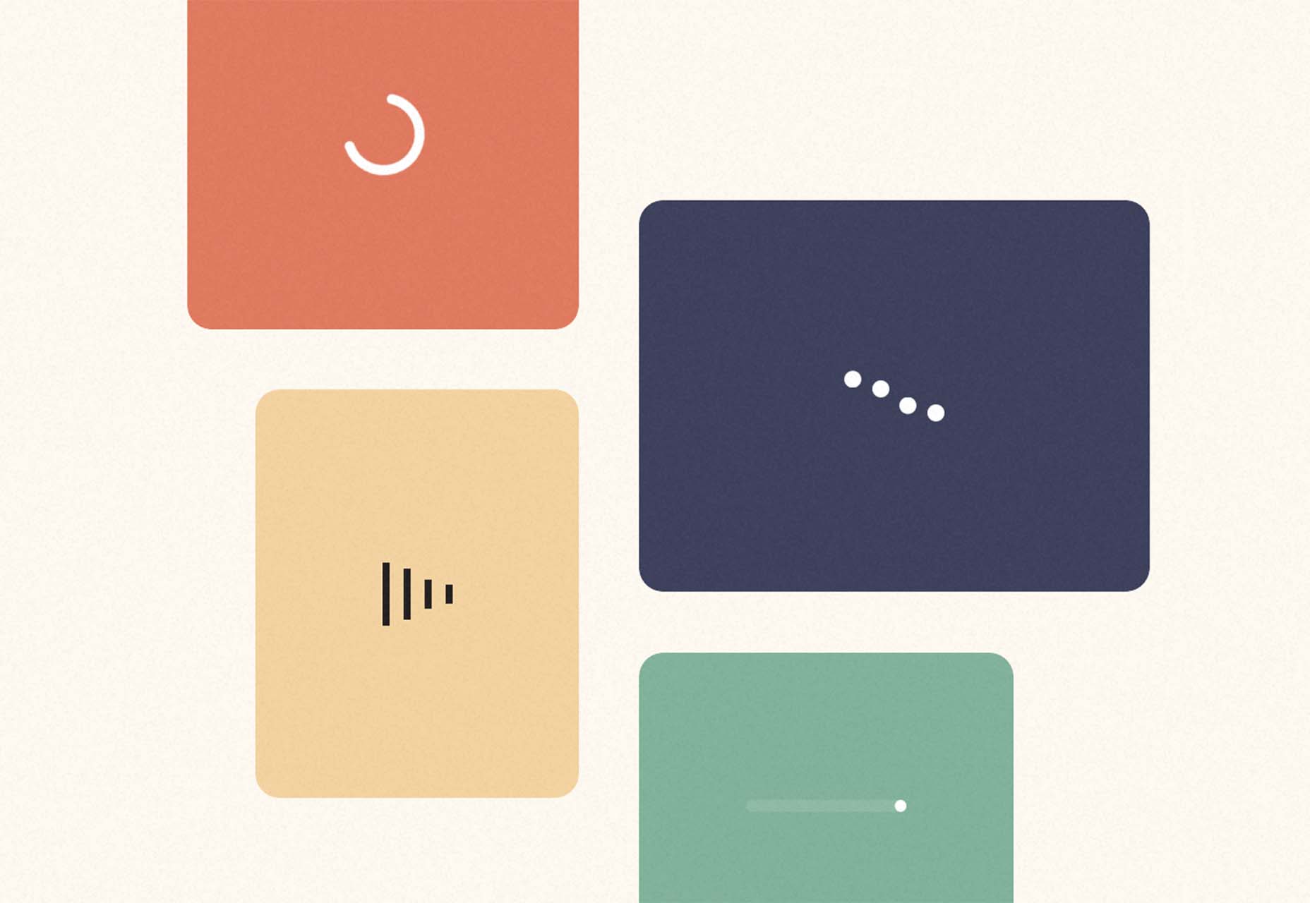
Loaders is a collection of free loaders and spinners for web projects. They are built with HTML, CSS, and SVG and are available for React and copypasta.
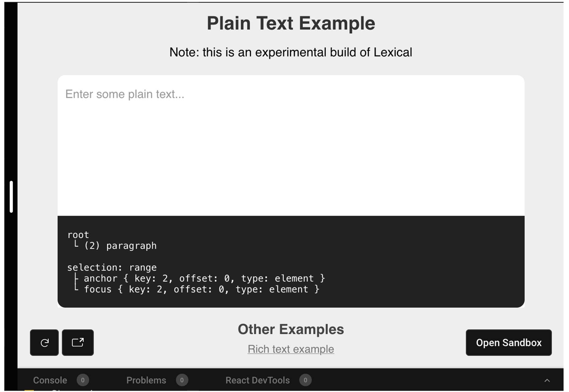
Lexical is an extensible JavaScript web text-editor framework emphasizing reliability, accessibility, and performance. It’s made for developers, so you can easily prototype and build features with confidence. Combined with a highly extensible architecture, Lexical allows developers to create unique text editing experiences that scale in size and functionality.
This tutorial is a primer on why the img element is such a powerful tool in your development box. Images are so prominent that they are part of the most important content in over 70% of pages on both mobile and desktop, according to the largest contentful paint metric. This post takes you through how to better optimize and improve core web vitals simultaneously.
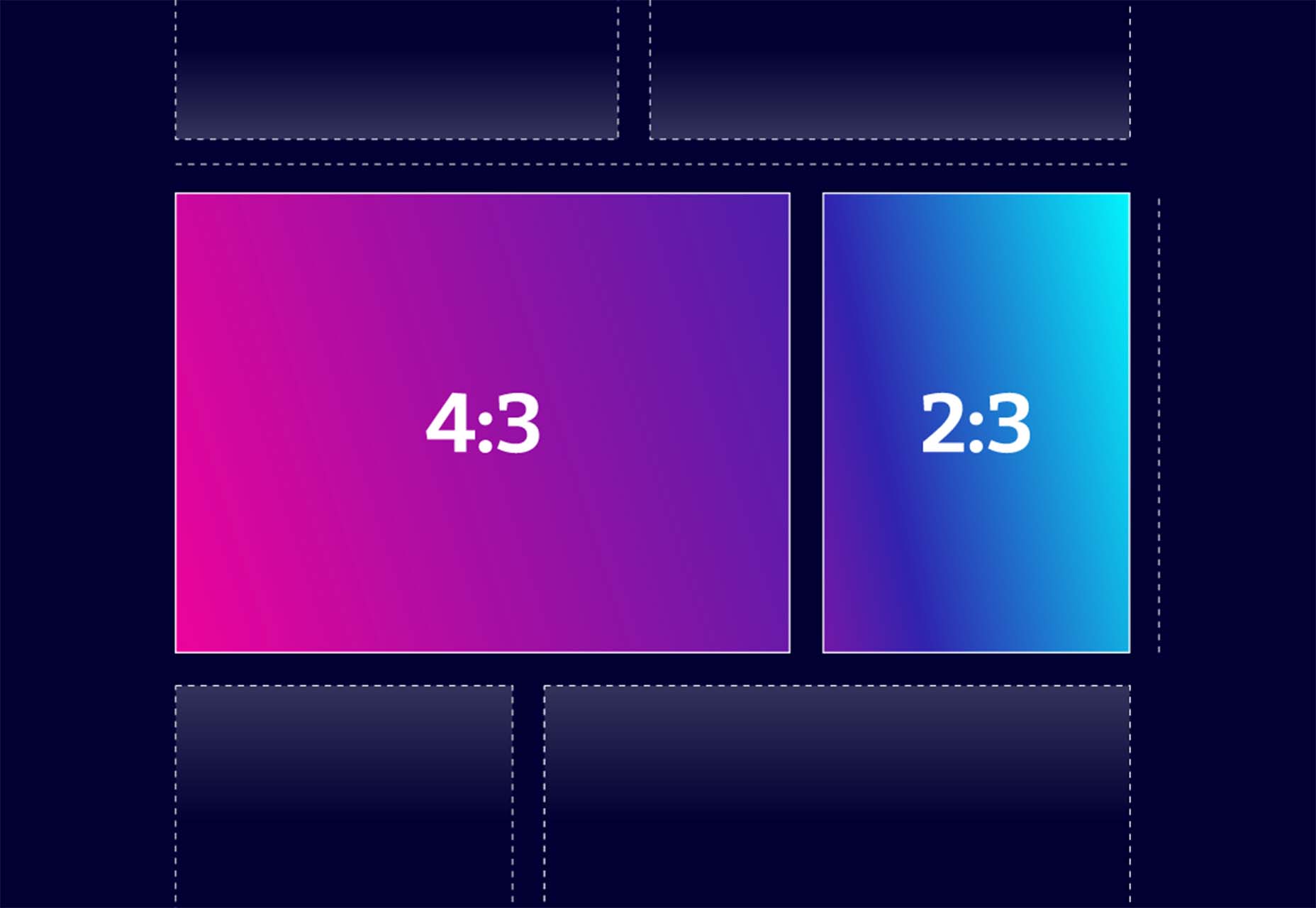
Building a Combined CSS-Aspect-Ratio-Grid provides two solutions for creating the title effect. You can define an aspect ratio for the row or use Flexbox with a little flex grow magic. Learn how to try it both ways.
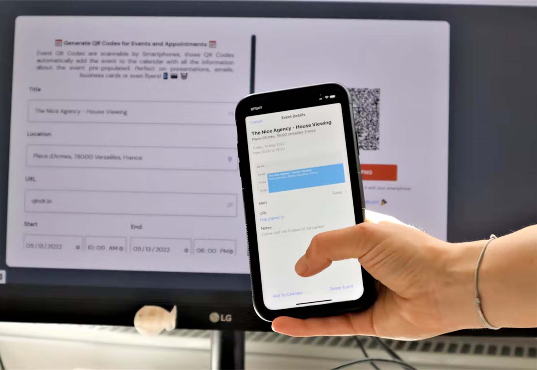
QIndR is a QR code generator made for events and appointments. The form is designed to capture your event information so you can quickly build and use a QR code for listings and even allow users to add it to their calendars! It’s super quick and easy to use.
On-Scroll Text Repetition Animation shows you how to create an on-scroll animation that shows repeated fragments of a big text element. This is a fun and easy lesson that you can use right away.
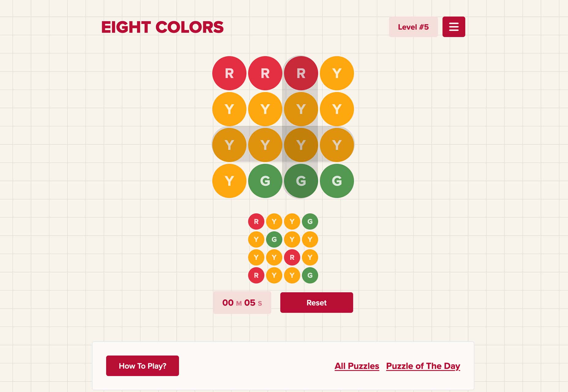
Eight Colors won’t do anything for your productivity, but it is a fun game that you may not be able to stop playing. It is a block-shifting game with the goal to shift circular blocks to reach the target given.
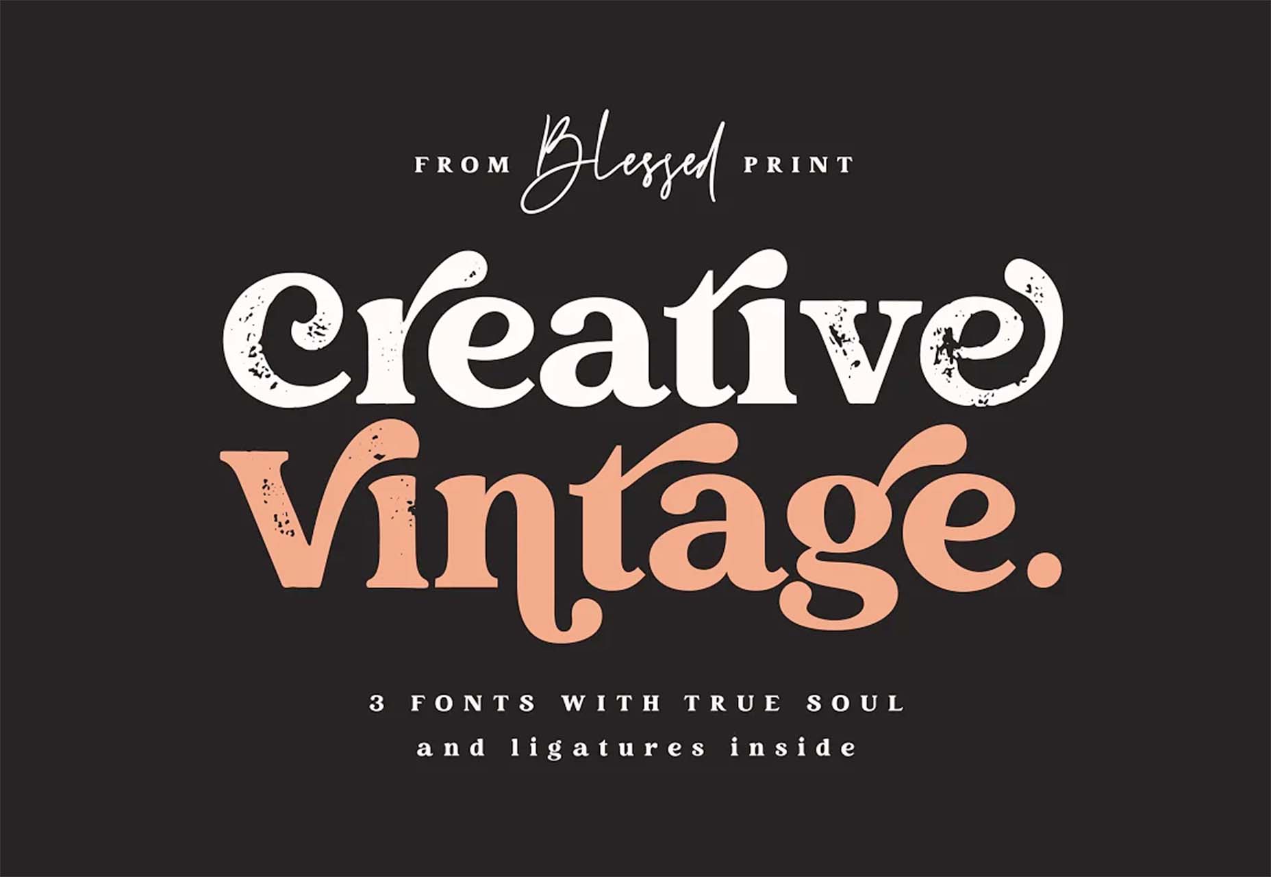
Creative Vintage is a pair of typefaces including a thin script and vintage slab serif (with rough and smooth styles). The pair is designed to work together for various uses or can be used independently.
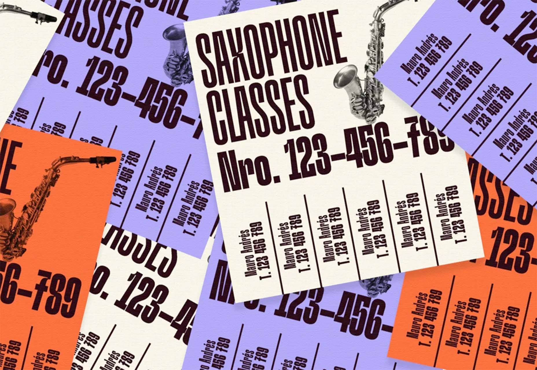
Hardbop is a vintage-style typeface with a lot of personality. It would work great for display, and the family includes seven full-style character sets.
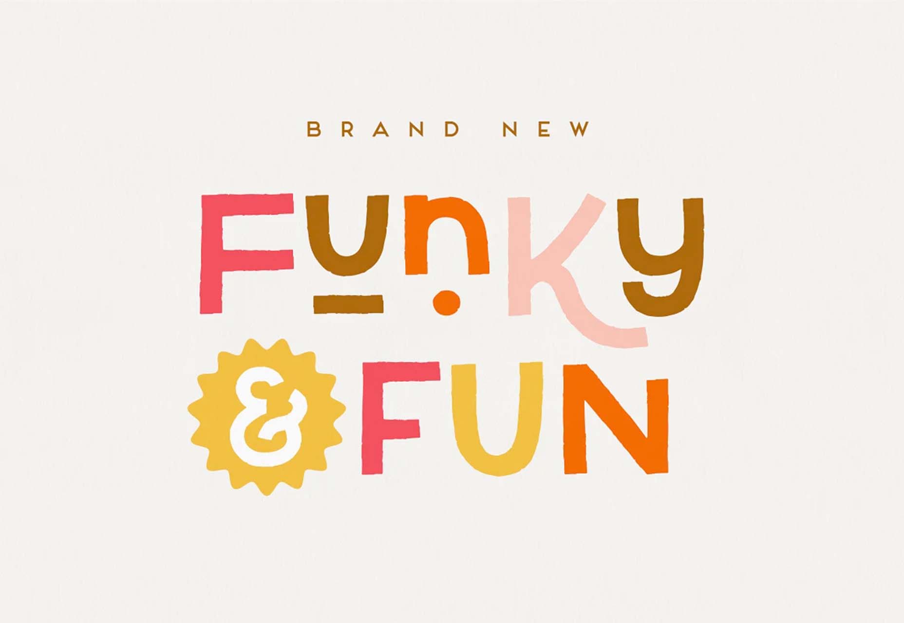
Kocha is a funky ligature-style typeface perfect for lighter design elements, including logos or packaging. It includes clean and rough versions.
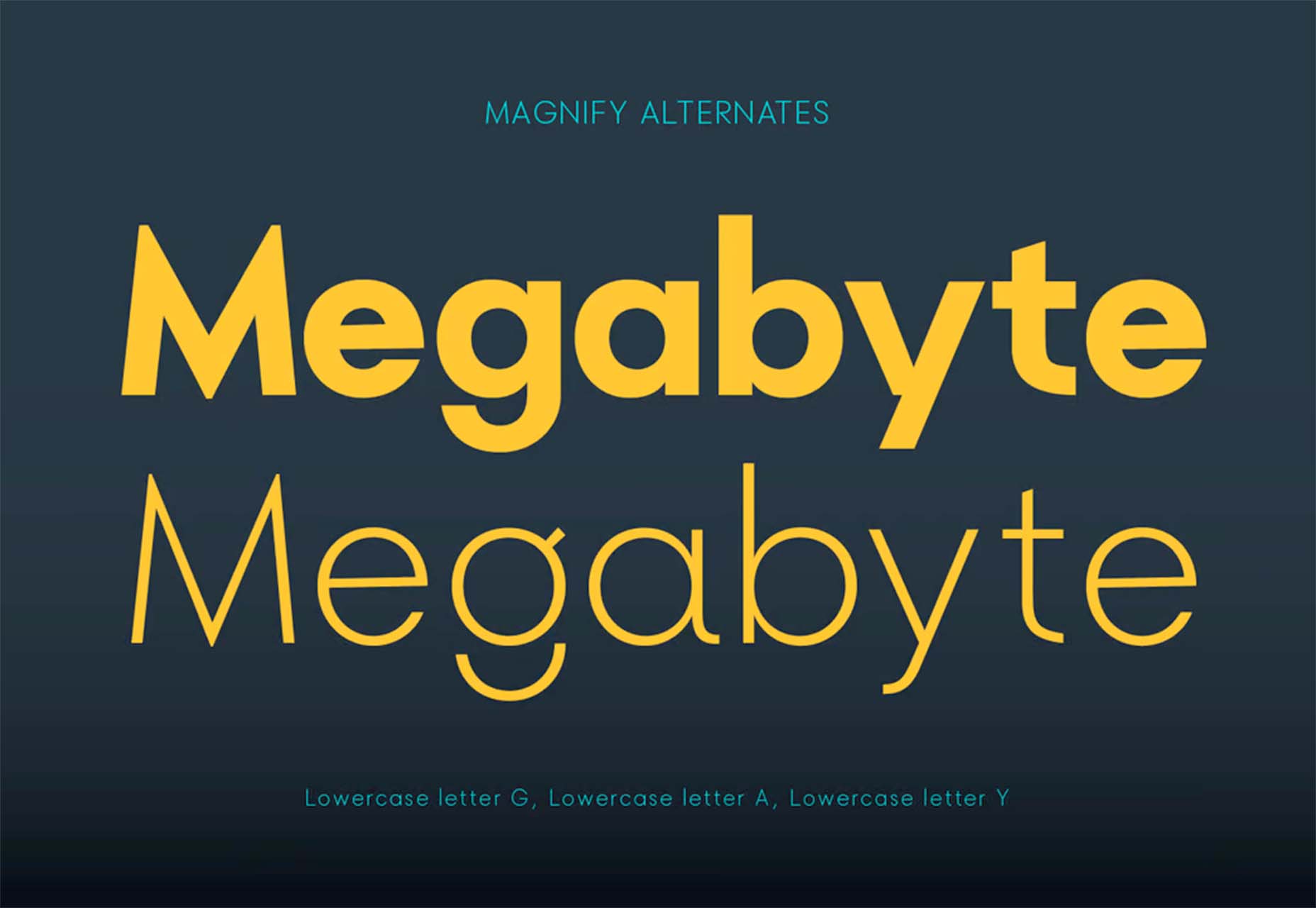
Magnify is a large font family with 16 styles and plenty of fun alternates. You can use it straight or with the more funky styles that create less traditional character forms.
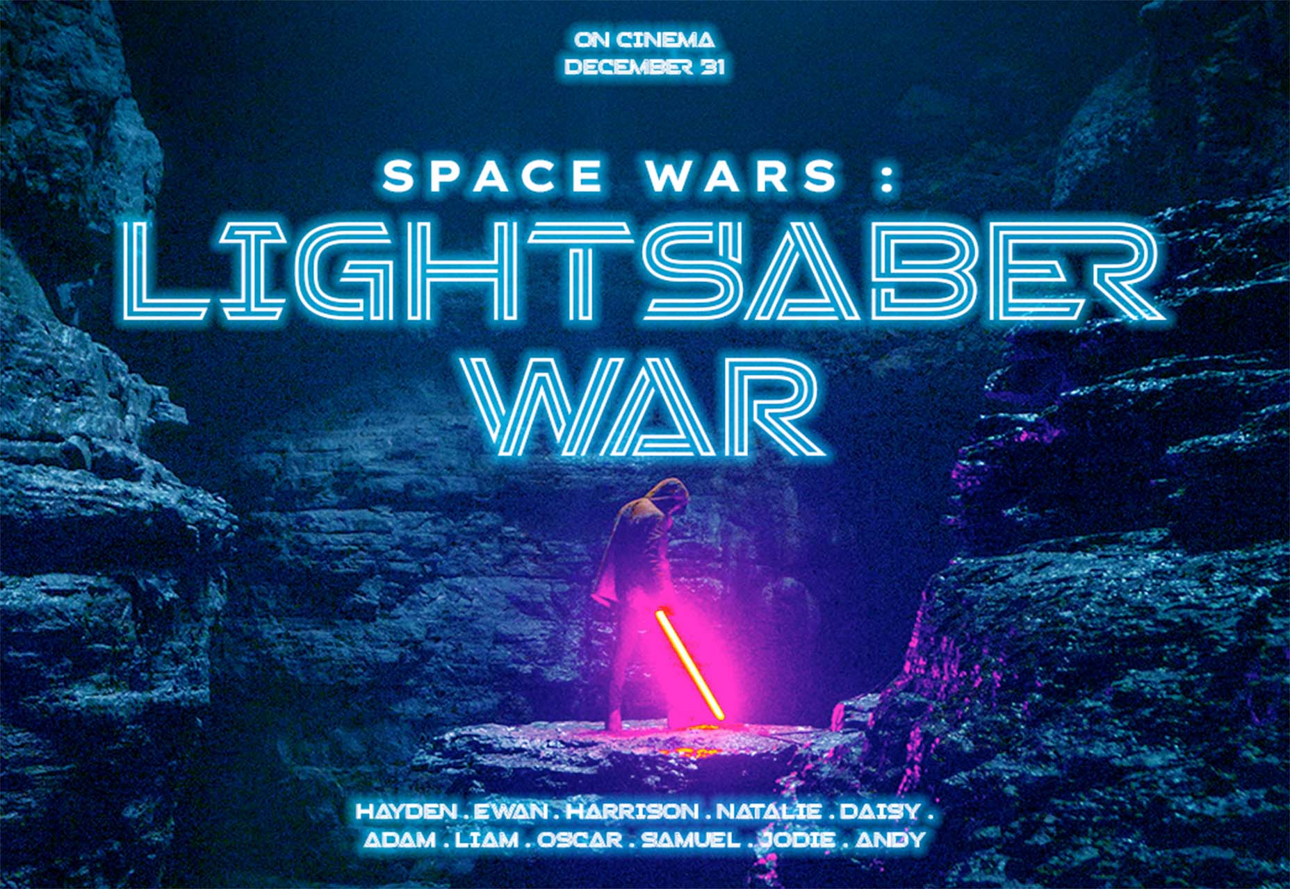
Stacker is a fun and futuristic style font with a triple outline style. Use it for display when you really want to make an impression.
The post Exciting New Tools for Designers, May 2022 first appeared on Webdesigner Depot.

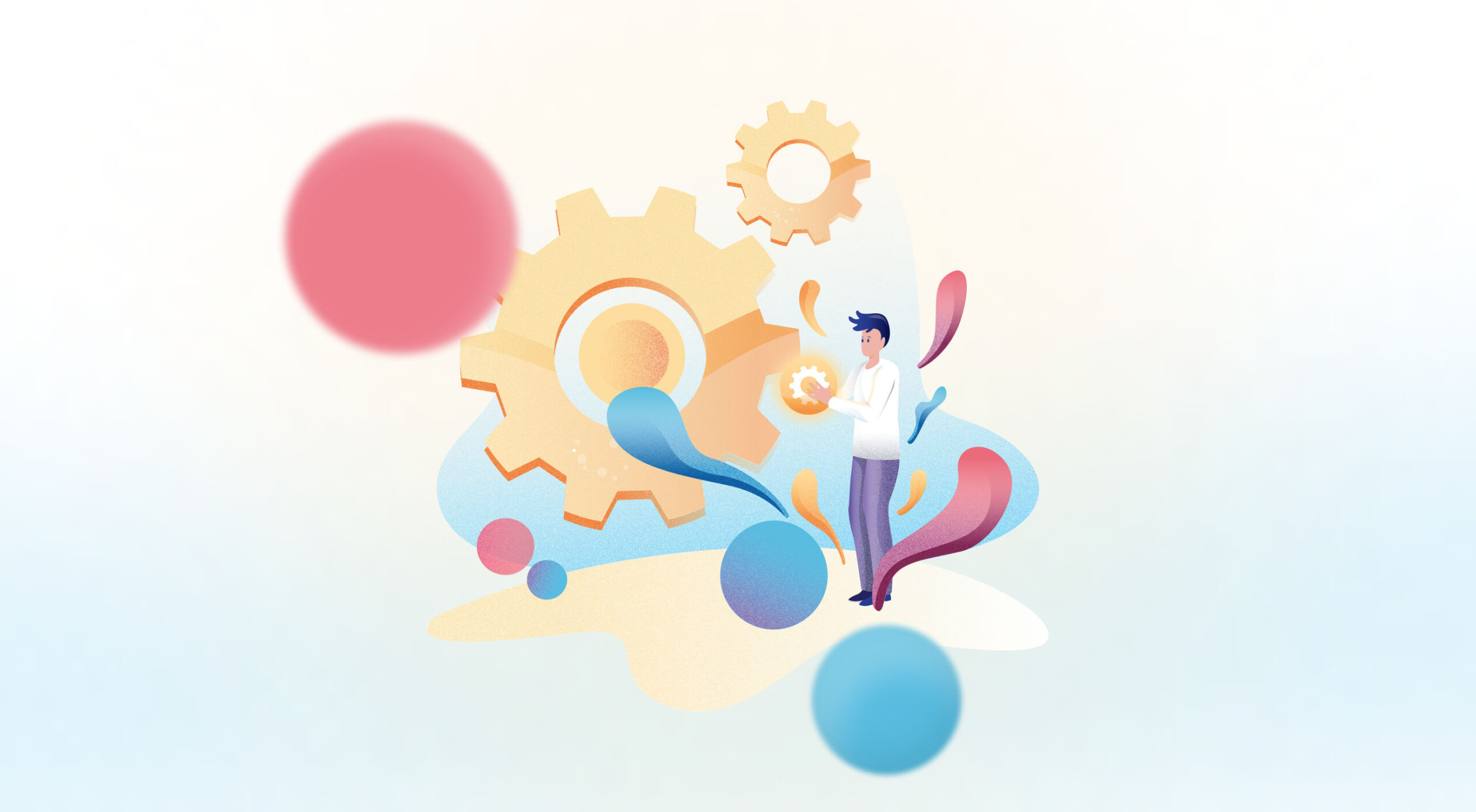 A breakdown of a simple app, from UI design to deployment, that shows off why coding is a magic tool for designers.
Figma, Adobe XD, Photoshop, Wacom Tablet, sketchbook… all tools for interfaces and web designers, yes? Take 2 minutes, and try to remember why you want to become a designer and why you enjoy designing stuff.
Chances are it’s because you like to create; you’re a creative person. Maybe you started with artistic experiences as a child, then turned that creative energy into problem-solving while continuing to express it visually: You became a designer, a creative problem solver.
Today, I’ll try to show you how coding is an underrated tool to express your creative problem-solving mindset by building a real SVG generator from scratch. So let’s get into it!
We didn’t go into deep business considerations here, but seeing problems you face and deciding to solve them yourself is a great way to start.
During client work, I needed some SVG waves for illustrations. So I looked for a wave generator: There were a ton of wavy colorful wave generators with parametric inputs but no simple, perfect sine waves generator. I decided to draw it on my math tool GeoGebra and then export it to SVG.
Okay, but not fast. And we like to get our jobs done quickly. But wait… Why don’t we create a perfect sine waves generator? Without equations & boring math software to open, just a curve and an export button. You got it, now let’s design it.
Quick tips: If you are looking for a problem, look for memes in your field. They always show a deep, painful, well-known problem.
Two main rules: First rule, think about who will use it; the second rule, predict what they expect from how it works. So who? Front-end developers. What are they waiting for? A curve that can be edited with direct feedback and an export button.
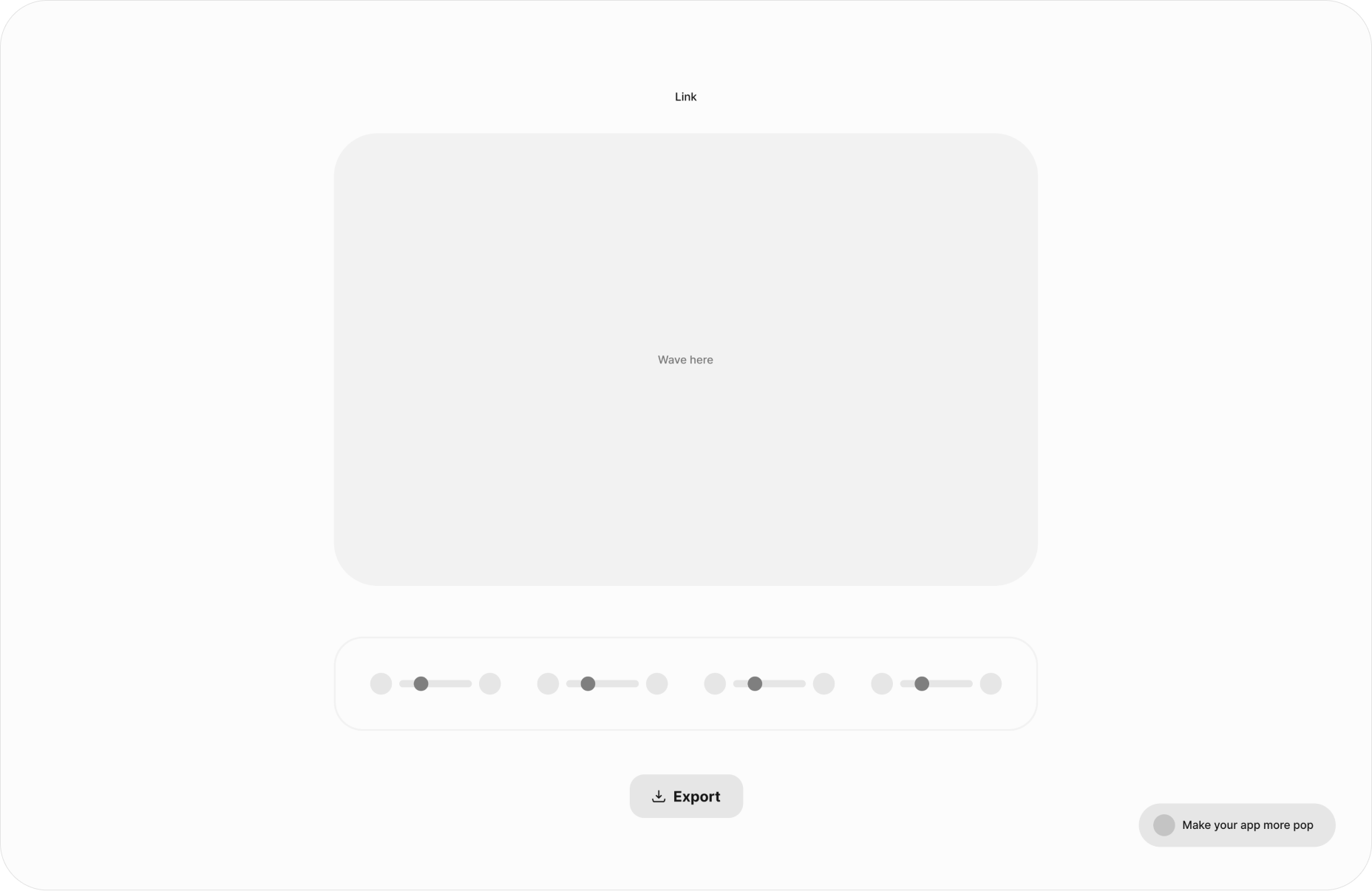
Wireframe design
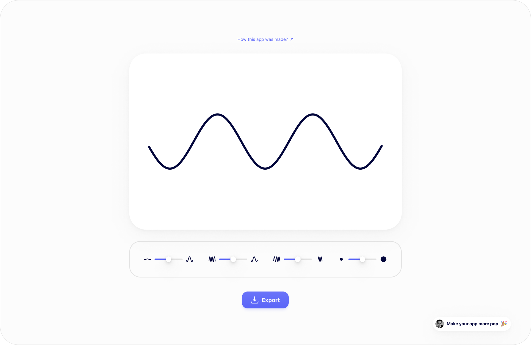
High-Fi design
A quick tip: You can grab the Figma design of the app for more technical tips on the design.
As a designer, stopping at step two is perfectly fine. But imagine if you could build what you design! You already know you can create everything you want.
You can see coding as a way to translate your UI that will surely end with a .com application that is usable by everyone. This is why “best languages” don’t matter; coding is just a tool to express your creativity and build stuff for others. And as a designer, a creative person, this might sound…interesting.
UI to functional app
Every web app interface can be translated from UI design to code with HTML/CSS/JS. There is how we can see the role of each of those 3 “languages”:
HTML: I want a button.
CSS: I want my button to look rounded.
JS: I want something to happen when I click on my button.
To build our app, I’ll use Svelte. Svelte is a JavaScript compiler that allows us to use all those three “languages” in one place. So, let’s see how code can translate our UI to functional things.
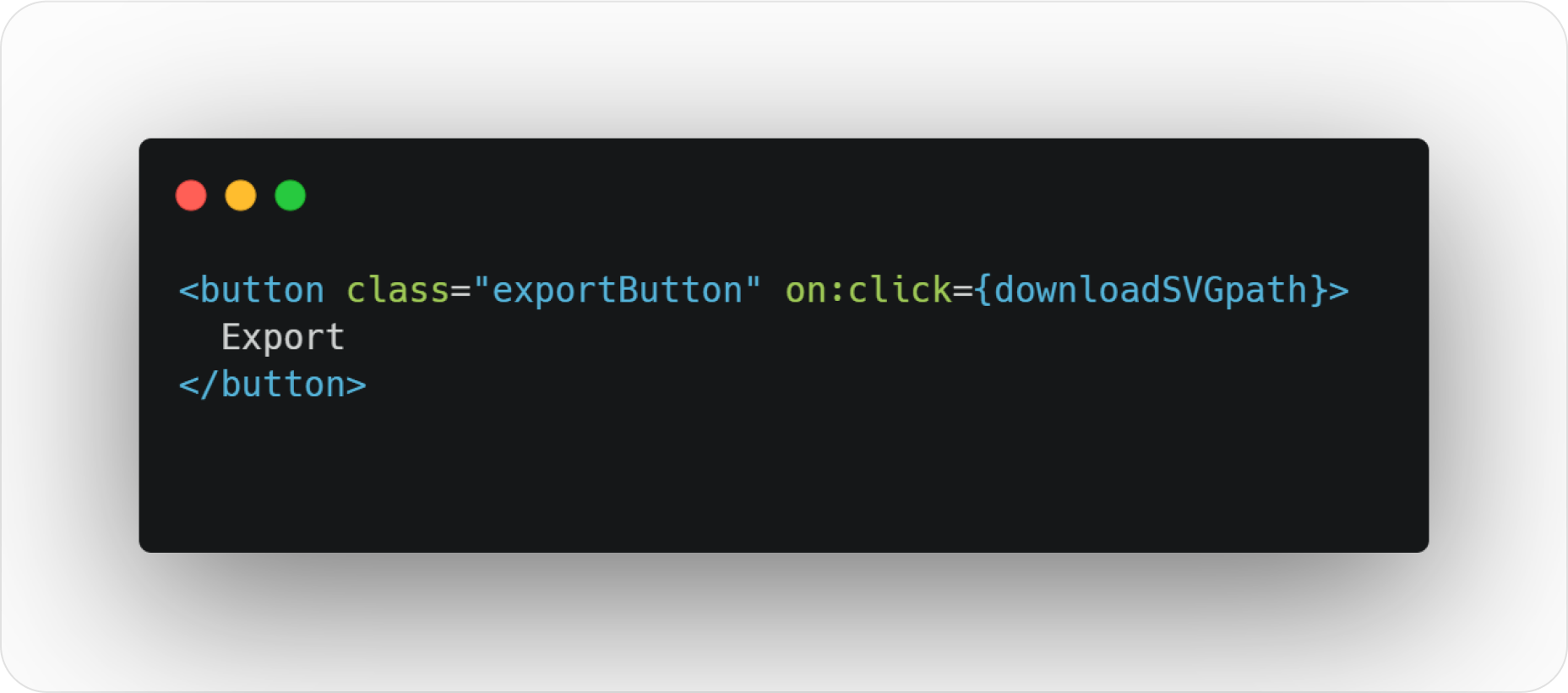
HTML button code
“Hey web browser, I want a button named “exportButton” and everything in a function named “downloadSVGpath” to be carried out when someone clicks on the button :) Thanks”
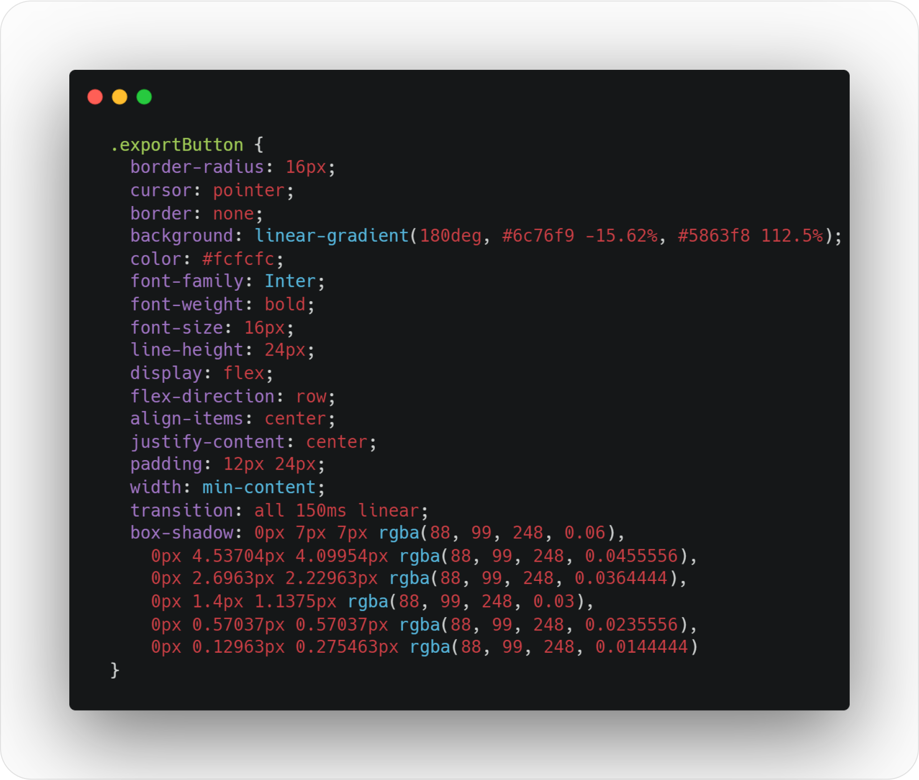
CSS style button code
“Hey web browser, I want you to apply these style rules to my basic HTML button: I want a beautiful rounded corner at 16px, a mouse pointer when we hover it, I don’t want any borders, but I want a cool color gradient as a background color. Then, I want the font inside the button to have its color set to #fcfcfc and use the Inter typeface (bold, please). Like my Figma design, I also want to center stuff in the button and add padding. Oh, and add a subtle shadow :) Thanks.”
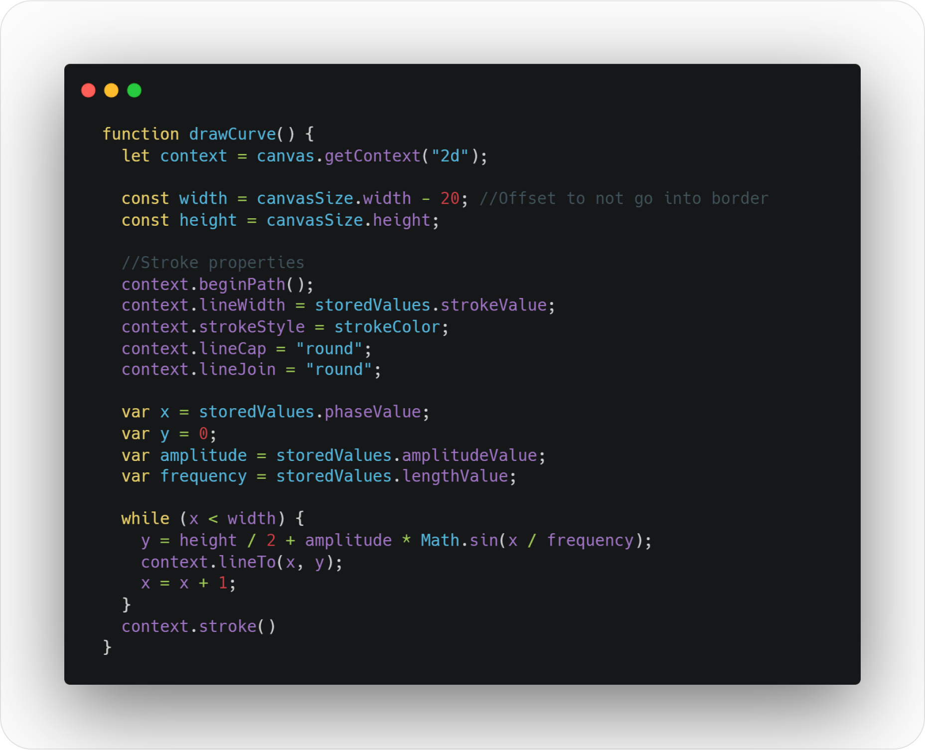
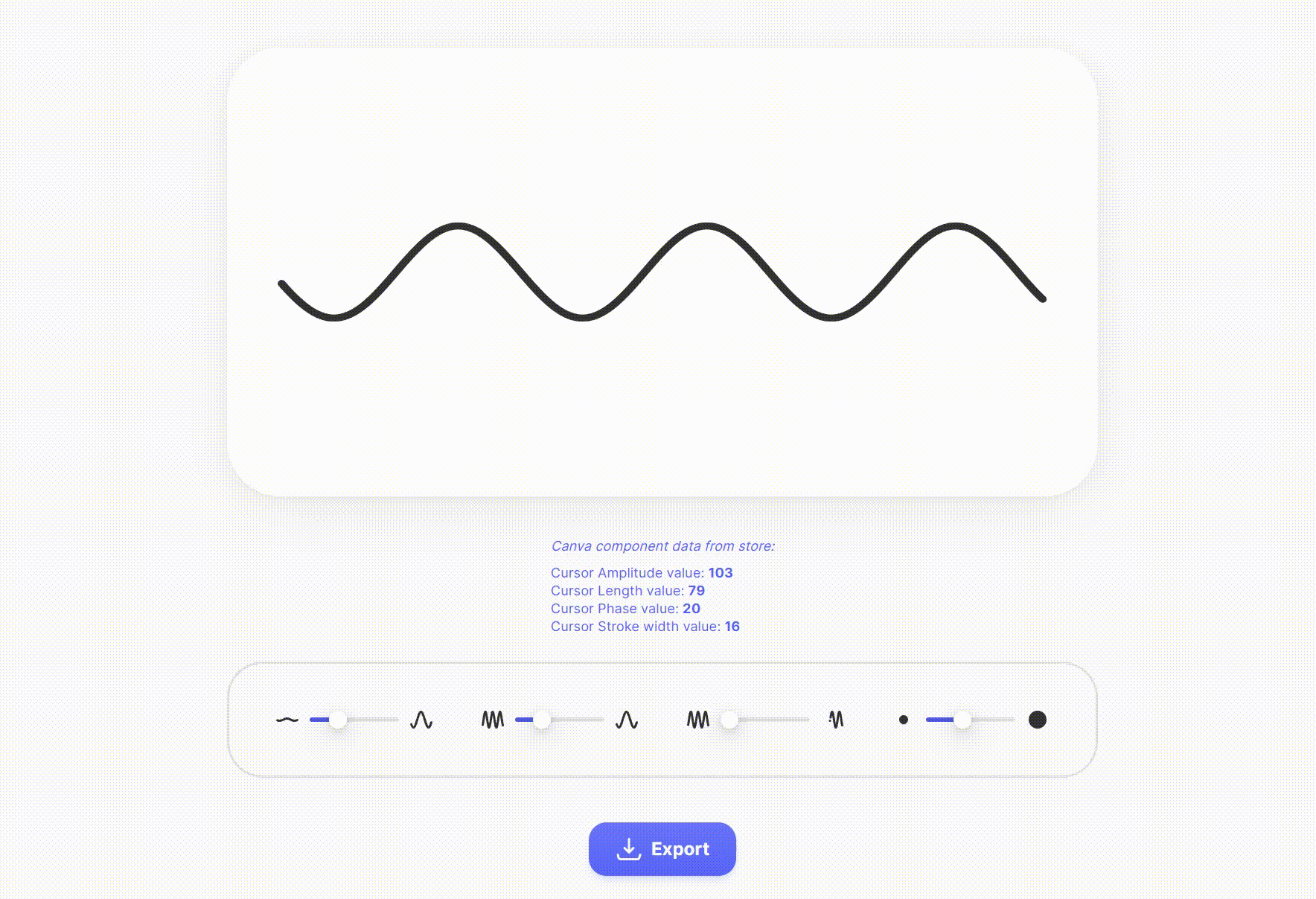
Drawing SVG curve function
“Hey, web browser, each time our slider moves, I want to run this function: I want you to draw a curve inside a frame that I have defined inside my HTML code. I also want my curve stroke to look rounded at each cap and have a color and width I’ve defined inside variables. You will take the sine function parameters from the stored values of the sliders. Finally, while your x variable hasn’t reached the total width in the x-axis of our frame, you will solve the y-axis point position of the sine equation and draw the curve :) Thanks.”
Quick tips: You can grab the source code files of the app to explore them.
The post Designers Should Code: Build an App From Scratch first appeared on Webdesigner Depot.
 Every day design fans submit incredible industry stories to our sister-site, Webdesigner News. Our colleagues sift through it, selecting the very best stories from the design, UX, tech, and development worlds and posting them live on the site.
The best way to keep up with the most important stories for web professionals is to subscribe to Webdesigner News or check out the site regularly. However, in case you missed a day this week, here’s a handy compilation of the top curated stories from the last seven days. Enjoy!”


The post Popular Design News of the Week: April 18, 2022 – April 24, 2022 first appeared on Webdesigner Depot.

Kubernetes offers developers tremendous advantages… if they can overcome the platform’s inherent complexities. It can be a big « if. » Without additional tooling, developers aren’t able to simply develop their applications on Kubernetes, but must also become experts in writing complex YAML templates to define Kubernetes resources. A relatively new tool called Shipa provides an application management framework that largely relieves developers of this burden, enabling dev teams to ship applications with no Kubernetes expertise required.
Having recently put the tool to the test, this article will demonstrate how to install and utilize Shipa to simplify Kubernetes and ease some common developer frustrations.
Ask any seasoned web app developer about their choice of programming language, and they are sure to mention PHP. PHP is a widely-used general-purpose scripting language that is especially suited for Web development and can be embedded into HTML. As per Builtwith, 3,090,319 live websites are still using PHP. However, when it comes to developing massive projects without lag or stability issues, developers tend to use frameworks, and PHP has two remarkable frameworks: 1) Laravel and 2) Yii. Both frameworks have a lot of followers in terms of full-grown communities globally, and there may be questions arising about which to choose.
Laravel is a simple PHP framework frequently used for web-based or web application development initially created as a better alternative to Codeigniter. It is known for MVC Support, articulated ORM systems, reliability, modularity, and uncomplicated coding rules. Some of the key features of Laravel Framework are:
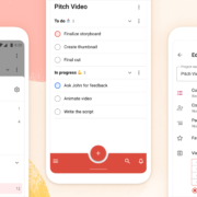
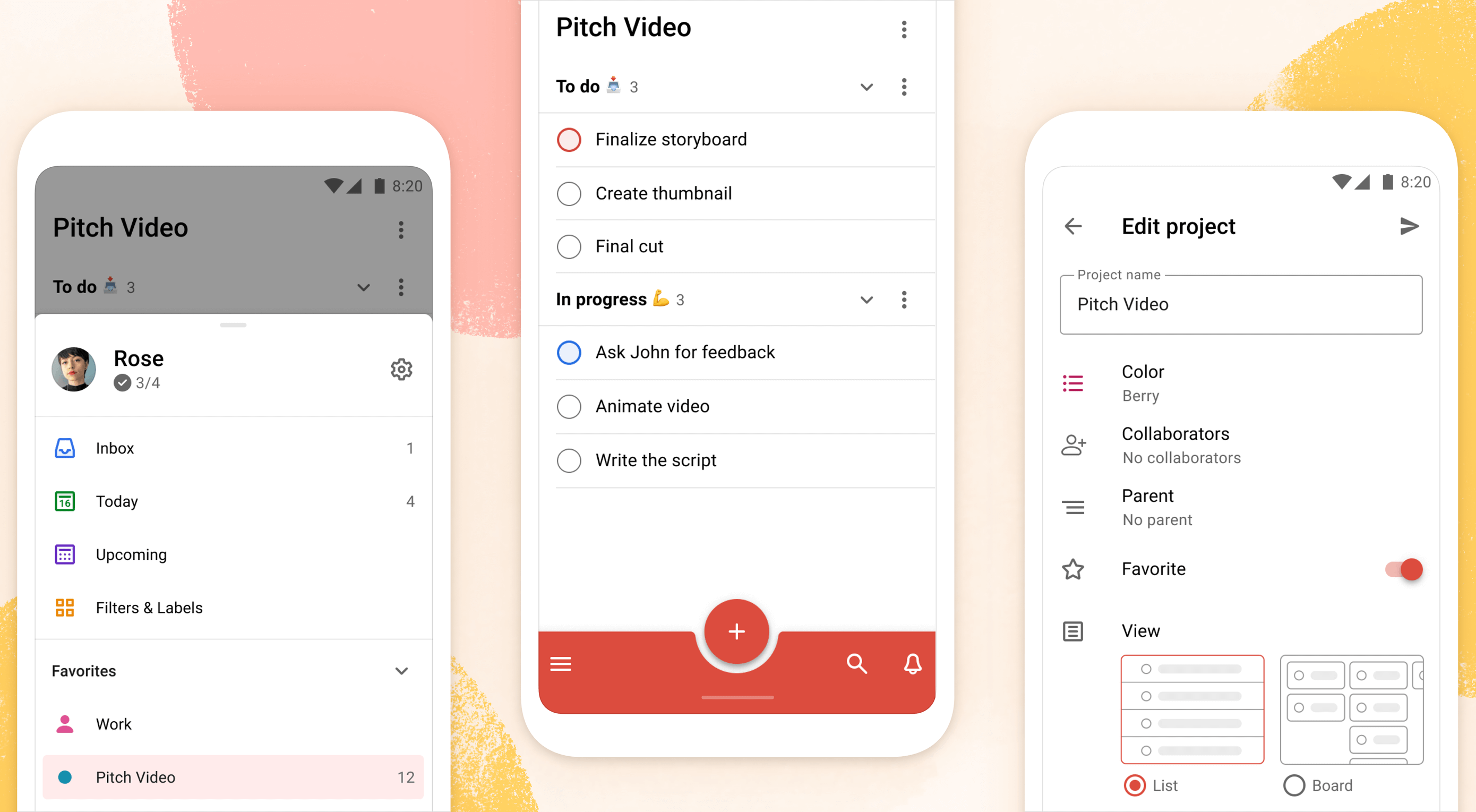 Todoist is a to-do list app that 25 million people rely on every day to keep their lives organized. As part of the Doist design team’s goals for 2021, we aimed to redesign the Todoist Android app to take advantage of the latest Google Material Design guidelines.
In this post, we cover the design decisions and processes behind redesigning the Todoist Android app for Material Design. We explore the Design and Android team’s collaboration practices that brought the app update to life, which resulted in winning the Material Design Award 2021 in the large screen category. Let’s get started!
When we started the project, our design implementation on Android was ready for a major overhaul. The last milestone redesign on Android was initiated after the release of the first Material Design guidelines in 2016. Since then the team successfully worked on continuous improvements to the Android app, but we saw the opportunity to improve Todoist on Android on a more holistic level.
We set out to clean up instances of older UI components, colors, and text styles and update them with the latest Material Design components. We observed that some interactions and navigational patterns had become inconsistent with what users were expecting on newer Android devices and were eager to modernize this experience. With new hardware and software changes in mind, we set out to make the experience on larger phones and tablets even better, so Todoist could take full advantage of the latest generation of devices. Material 2 and 3 provided an incredible new framework to rethink the current app experience. With this in mind, we set out to challenge what a modern Android app should look like and innovate on top of the default user experience.
The team set itself the goal of redesigning our Todoist Android app and aspiring to make it the best-designed productivity app on Android. The project was ambitious and scheduled to take several months to complete. We set ourselves the following targets while working on the project:

The project was kicked off by reviewing the current Todoist Android app implementation, noting down what areas needed to be fixed and what was up to date. While reviewing, we took screenshots of the app implementation for reference. This way we could easily see the current state of the app and compare it to the new design proposals that would be created. Once the review process was finalized, we had a comprehensive overview of the current state of the app and the layout, component, and styling changes we wanted to make.

We continued the project by studying the latest Material Design Guidelines, assessing the components and practices that were most relevant to Todoist.
When the project kicked off in February 2021, Material 2 was the most recent version of their design system. Since Material 2 had already been released for quite some time, we anticipated that design changes to Material would be announced soon at the Google I/O event in May 2021. Rather than wait, because we expected the changes to be iterative, we pushed ahead with our work.
We identified 25 components and UI patterns that we wanted to change across the app. The changes included buttons, forms, menus, sheets, navigation drawer, app bar, system bars, text and color styles, and more. We started by creating a table view in a Dropbox Paper document with the component changes and references links to Google’s Material Design Guidelines.
This components list was a starting point for discussion to plan the scope and complexity of the changes. Close async discussions between the design and development team in Twist and Dropbox Paper comments helped us make decisions about scope and complexity early on and set a solid foundation for the project.

In the initial Material Design study, we also researched inspiring Material Design apps, Material studies, Play Store apps, and Google Workspace apps to learn from their execution.
We started out by studying the Material Design Award Winners 2020 and tested out the products that were showcased. The showcased winners struck a good balance between implementing the Material Design Guidelines while maintaining their own product’s brand within the system. This balance between Google’s guidelines and the Todoist brand was also key for us to get right and so we strived to find this mix across the work we created and implemented in the project.
Along with the MDA winners, we researched the Material Studies that Google produced to showcase what apps could look like with branding and Material Design guidelines applied. It was a great reference to see how far components could be customized while maintaining the core platform principles. The Reply case study in particular offered valuable insight to us as its content type and layout came closest to Todoist. It showcased how components like the app bar, navigation drawer, and large screen layouts worked while being customized.
We continued our research by searching the Google Play store for inspiring app examples. Google Tasks, Press, Periodic Table, and Kayak stood out to us as the level of polish and quality of the apps were on par with the experience we were aspiring to create.
Sometime later in the project when Material You was released (more on that later), we stumbled upon the Google Workspace apps blog post which previewed Material 3 changes that Google was introducing to their own products. It offered a great glimpse at what was to come before the Material 3 Design Guidelines were officially released. This post sparked new internal discussions and further design explorations that we considered for future Todoist Android updates.

As we started to define the new Todoist Android app design language and document the changes, we opted to create a design framework, focusing on creating components rather than designing every screen in the app. This allowed us to consistently apply the design system in the app. We did so by using the previously defined component list that we created during the review and study process.
Core screens from different areas of the app were chosen to demonstrate how the components could be applied. We chose to mock up the Todoist project view, navigation drawer menu, project view edit screen, settings, and project detail view, among others. These screens gave us a good overview of how buttons, forms, drawers, lists, and other components would work together and in different states; selected, pressed, disabled, etc.

During the project, we were transitioning our Doist design system to Figma and started creating our first components in the new Doist Product Android Library. We started by using some components from the Material Design UI kit – Components library from the official Google Figma resource file and added them to our Doist design system. We then continued to build up the Product Android Library file with our Todoist-specific components such as task list & board views, detail views, sheets, colors, typography, etc.

We continued by documenting color and typography changes that were based on the Material Design guidelines. The design team opted to implement a new Design Token framework that would share the same values between our design system and the development implementation. The development team would output the values they had in the current implementation and the design team would analyze which values were needed and which could be merged, changed, or deleted. This informed the new Design Token color and typography system which we then documented and discussed with the team to implement. Later in the project, we were happy to see a similar token system introduced by Material 3 in the latest guidelines which validated our thinking and principles behind the new design system.
The design documentation expanded to hold other edge-case mockups that could sit alongside the design system. We documented different responsive screen experiences between phones and tablets against the previous implementation. Additional sections were created to document the motion that should be used for certain components and screens by referencing existing Material Design guidelines examples or prototyping custom motion in Principle and After Effects. The design spec also touched on haptic feedback that should appear on touch targets, how dark mode should work across the new components, documenting Todoist themes within the new design language, and more.

At Doist, the benefit of the squad is that cross-team collaboration is built into the make-up of the team. Designers, developers, support, and product managers work together in a squad to deliver the project. This close collaboration from the start is key to bridging the gap between scope, estimations, design, development, and delivery. The squad discussed their findings on a daily basis and came up with the best plan of action together.
Designers started by creating components in Figma and shared them with developers in Dropbox Paper. We used screenshots to document the current implementation next to the new designs and linked to the default Google Material Design components. This allowed the team to compare all references in one place. Developers shared their feedback, adjustments would be brainstormed together as the designs were iterated.
Designers on the project would share their work in progress on a weekly basis with the rest of the design team in a design review Twist thread. Here details about the designs were discussed, alternatives mocked up and bigger picture plans made. Design reviews brought up topics like FAB (Floating Action Button) placement, theme options, accent color usage on components, consistency with other platforms, navigation options, and shadow elevation. After thorough discussions and alternative mockups were presented, the design team aimed to find the right balance between Material Design and Todoist brand guidelines. The development team, also part of the design reviews, gave their feedback on the solution and raised technical complexities early on.
Eventually, the design was stabilized and consistencies updated across components and mockups. The design spec was kept up to date so the development team could always review the latest designs in Figma.
As soon as the development process started, the Android team provided early screenshots and videos in Twist threads while they were implementing the design spec. This practice allowed us to review the app implementation early and often. Designers could review the development work and share feedback in Twist, which resulted in getting the implementation to a high quality. Alongside Twist discussions, the team set up a Todoist project to track ongoing issues and fix bugs. Designers logged new issues, developers would solve them and share the new implementation for designers to review.

When the team had the first stable version of the Android app, we shared it internally at Doist to get more insight and feedback. Other Doisters could access the redesign via a feature flag that could be turned on in the app settings and test the new version for however long they wanted. The feature flag system allowed people to give us early feedback on the design decisions we made and report bugs. Feedback was submitted by the wider team through a dedicated Twist thread and designers and developers could discuss how best to address the feedback during the active project implementation.
After we refined the app implementation further and addressed early feedback we opened up the app update to our beta users. Here users had access to the new Android redesign and were able to give us feedback. Our support team gathered feedback and shared it with us in a dedicated Twist thread. The squad aimed to analyze every comment and looked for patterns where we could make tweaks and improvements to the user experience.

As part of these tweaks, we made changes to how the bottom bar and navigation drawer worked. Some users reported frustrations with the way the new bottom navigation and menu drawer worked. In its first implementation, the drawer was half raised when opened and had to be swiped up to be raised again to see the full content list. This was an issue for some users as it was slower to get to the content below the list. So we decided to fully raise the drawer by default when opening. We also made it easier to open the navigation drawer by sliding up from the bottom app bar. This was a small shortcut but it enabled users to get to their content faster.
While we were in the testing phase and about to wrap up the project, Google unveiled Material You, and sometime later the Material 3 Guidelines were published. With the newly announced resources, we went back to study the latest guidelines and references we could find to see where the Todoist Android app redesign fits in and which adjustments we might need to make now or in the future.

Dynamic Color was a big new feature that was announced as part of the Material You update. As Todoist supports many different themes the Material You Dynamic Color feature seemed like a good fit for our product. We decided to prioritize this feature and implement Dynamic Color light and dark themes as part of our Todoist theme settings options.
To implement Dynamic Color, the development team started off by creating a demo prototype that utilized the Dynamic Color system and showcased how we could select from a range of color choices that the system defined based on the wallpaper choice. From there, we tried to incorporate system behavior in our design mockups. We designed a range of different color mockups and components to see which ones could fit with which components. We then came up with a color system that worked for the Todoist app and the new themes. These new Dynamic Color themes would sit alongside our current theme options in the Todoist app settings. From here users could choose between Dynamic Color Light and Dark themes.

Along with Dynamic Color, the team also created a customizable bottom app bar, allowing users to set up the app in a way that’s most convenient to their workflow. The location of the Dynamic Add Button can be changed to the center, left, or right corner of the screen. The order of the Menu, Search, and Notification buttons can be rearranged to best fit the ergonomics of the user’s dominant (left or right) hand and optimize their navigation patterns.
As critical beta feedback was addressed and stability tweaks were made, the squad felt ready to release the new Todoist Android app to the public. The team logged the issues that could not immediately be addressed for future reviews and updates.
The design and marketing team readied the launch by creating What’s New banner artwork and copy that are displayed within the app when launching the update. The Doist marketing team also created release notes and shared the app update announcements on our social channels. The brand and product design team worked together to create custom image assets and copy that summarised the project work in a simple and beautiful way.
After a successful launch of the redesigned Todoist for Android app, Google contacted Doist to announce that Todoist was selected as the Material Design Award 2021 winner in the Large Screen category. The team was excited to be recognized for their hard work and it felt like we achieved the goal we had set out to accomplish.
Internally, designers and developers continued to study and discuss the Material 3 updates. The design team started exploring mockups and design changes inspired by Material 3 and Google’s Workspace app updates. Some of our current Todoist explorations include changing the FAB styling, updating the app bar, further removing elevation shadows, and more. Here is a preview of what a future Todoist update could look like.

We hope these insights into Doist’s design process and collaboration practices have sparked your interest. Thank you for reading and stay tuned for future design updates!
The post Case Study: Redesigning Todoist for Android first appeared on Webdesigner Depot.
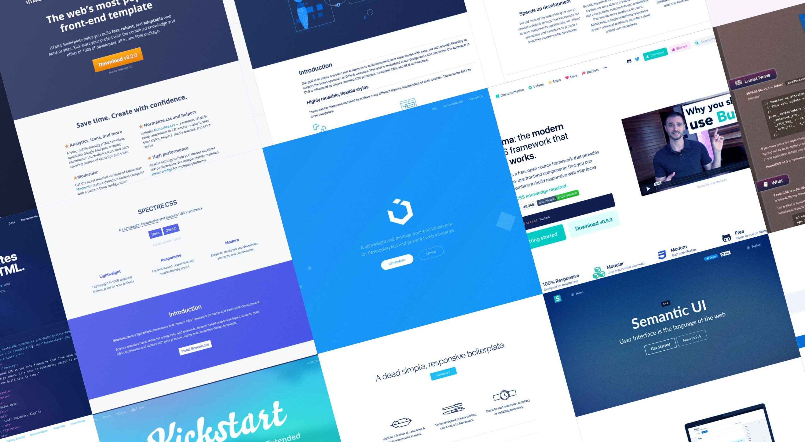 Whether you are a CSS expert or a front-end beginner, using the right CSS framework is crucial for your daily tasks. There are numerous frameworks whose ultimate goal is the same: helping developers target multiple screens, in the simplest possible way.
This is why Bootstrap is by far the most popular framework on the market. All developers have heard of Bootstrap, and more than 80% of them say they are happy using it.
But that doesn’t mean that there aren’t some great alternatives if you’re willing to shop around. Bootstrap won’t be top dog forever, and there are numerous new lightweight and powerful CSS frameworks.
If you are bored of coding with Bootstrap and Foundation and tired of using complex CSS rules, this list is for you.
From frameworks that take a pure CSS approach to minimalist frameworks with fully customizable themes, nothing is left out. Let’s get started…
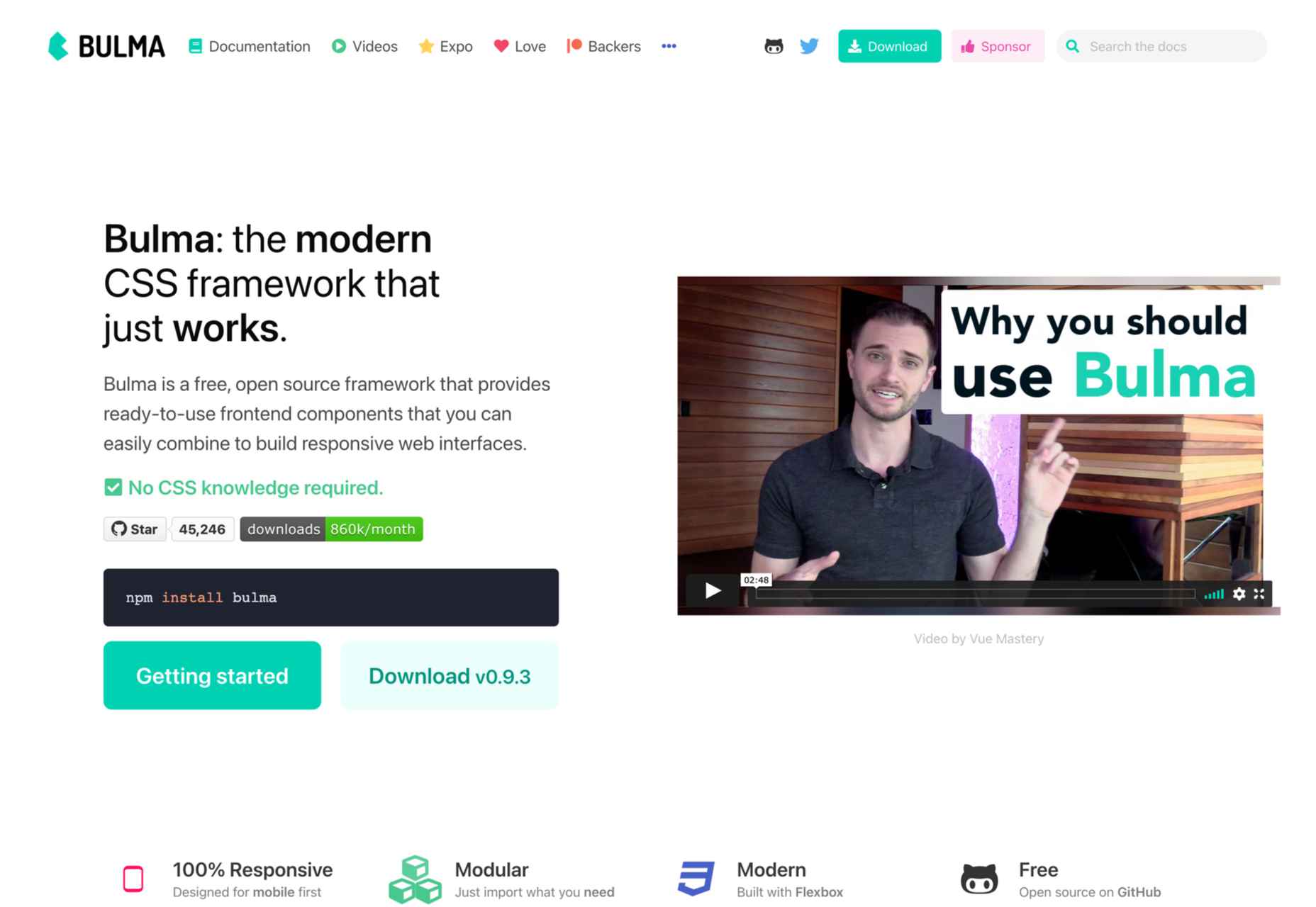
Bulma is one of the most popular alternatives to Bootstrap and Foundation. It is an entirely free, open-source CSS framework that does not have a steep learning curve. No prior CSS knowledge is required to use Bulma.
When you add the variety of colors, responsiveness, and clean flexbox-based grid it offers, it’s no wonder Bulma is becoming more popular every day. Bulma is a well-documented framework that you should definitely try out.
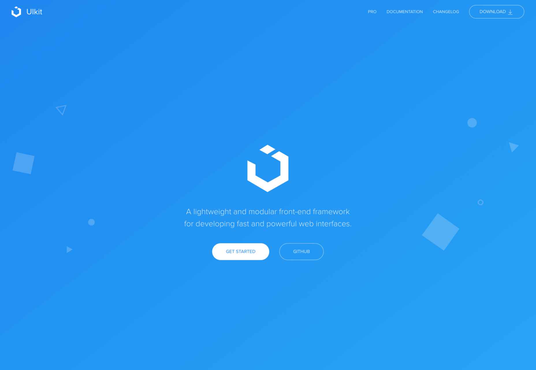
If you’re looking for a lightweight yet powerful CSS framework that can be wired with HTML and JS, Ulkit is for you. It fully supports right to left languages and has one of the best icon libraries out there.
Keep in mind that Ulkit is also easy to use. All in all, Ulkit is an excellent Bootstrap alternative that is perfect for designing web layouts for desktop and mobile screens.
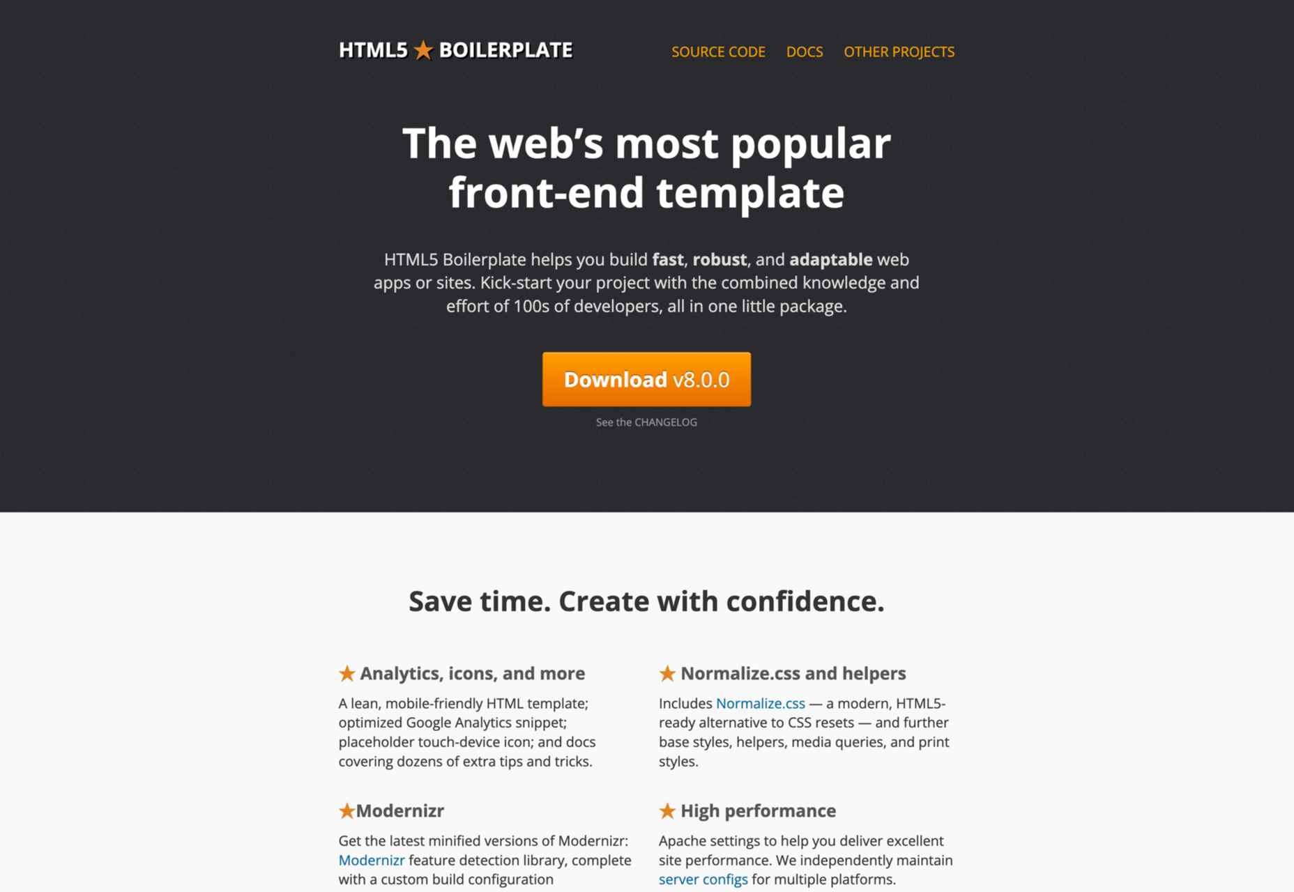
Even though Bootstrap is relatively easy to learn, it is much more than just a front-end template. So what if you need a fully compatible JavaScript, CSS3, and HTML5 template? In this case, HTML5 Boilerplate is a good choice.
Of course, since it’s a template, this framework does not include layouts and component modules. However, if you need a reliable CSS template that offers extensive documentation, HTML5 Boilerplate is a great solution.
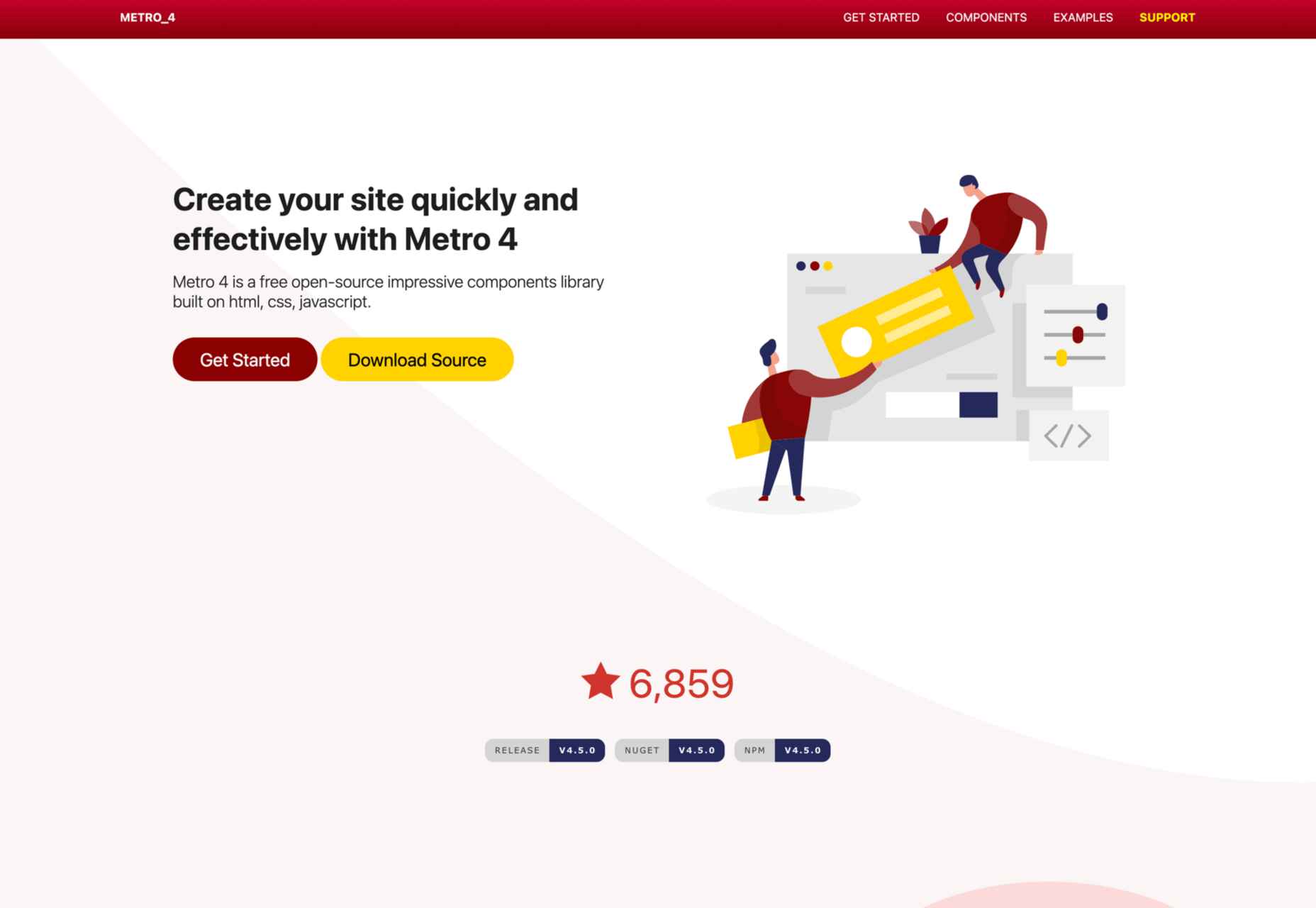
Metro UI is one of the most flexible CSS frameworks on the market. This front-end framework can be easily combined with JavaScript-based frameworks like Angular, React, etc.
We found Metro UI to be an excellent open-source CSS framework and a great alternative to Foundation during our testing.
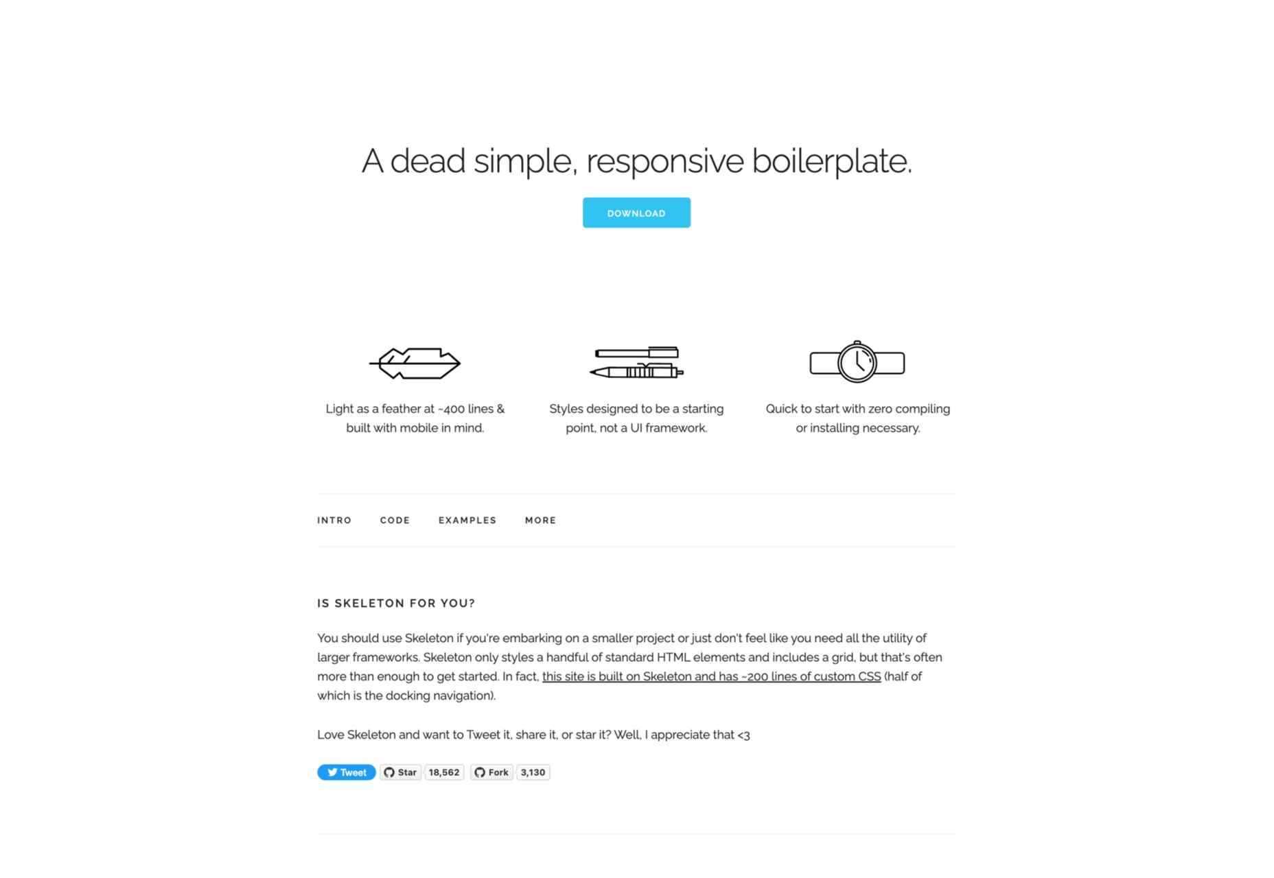
As a two-in-one solution, Skeleton quickly made it on our list. This is both a boilerplate and a comprehensive CSS framework. We enjoyed customizing its 12-column grid during our testing, and we found out that it has virtually no learning curve.
The automatic width resizing works like a charm, and the syntax is fully responsive. This is why we consider Skeleton to be an excellent Bootstrap alternative.
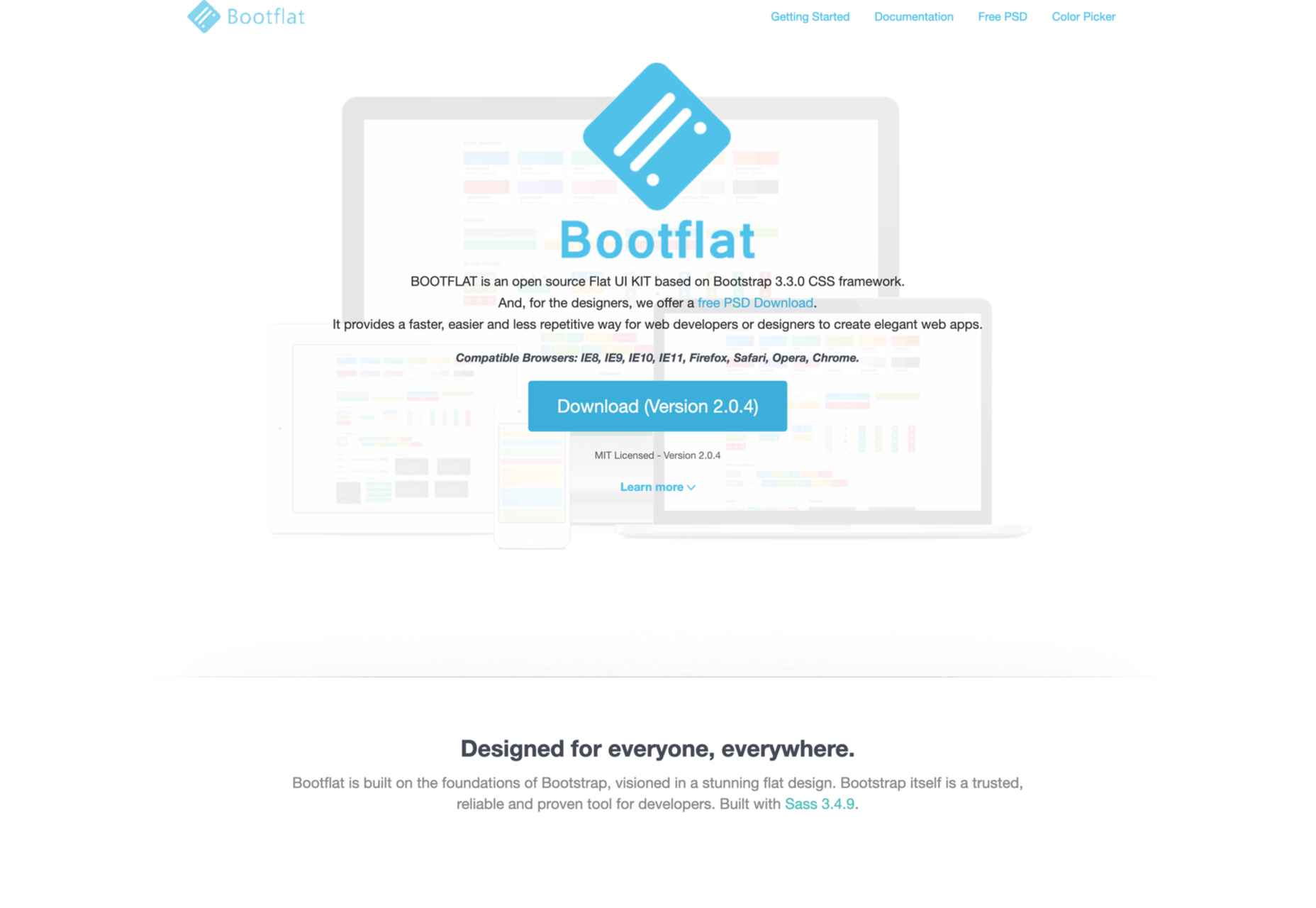
If you are looking for a quick way to create a web app, Bootflat is the framework you need. Bootflat’s components are built with CSS3 and HTML5, and the framework offers a comprehensive panel of color schemes for you to choose from.
Bootflat looks and acts like a simplified version of Bootstrap. However, that doesn’t mean that this CSS framework isn’t scalable and robust. On the contrary, you can fully manipulate the size and performance of the web designs you create.
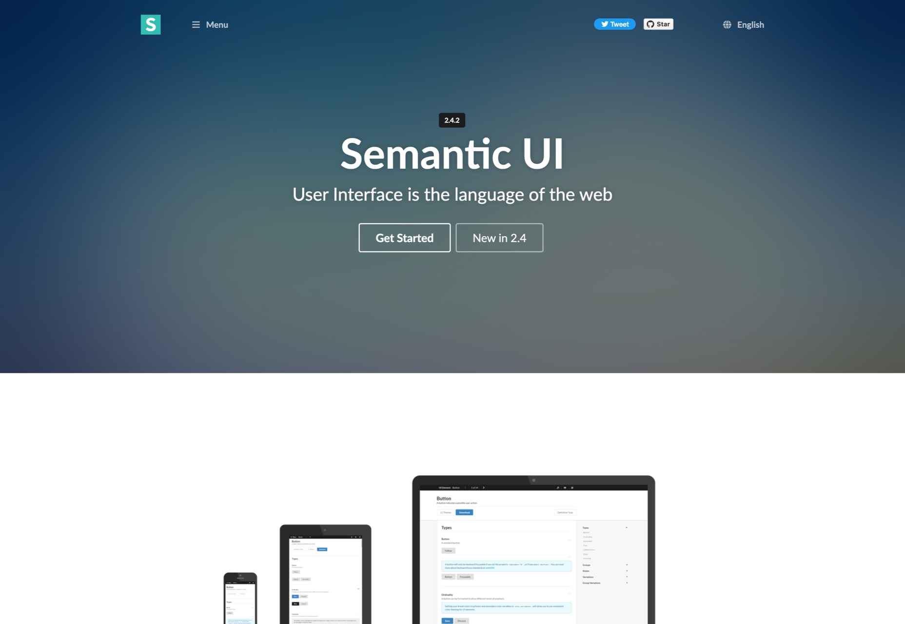
If you exclude the fact that Semantic UI doesn’t have the utility classes Bootstrap offers, it is a comprehensive CSS framework that you should try. The best Semantic feature allows you to write HTML code without using BEM methodologies.
So, if you need a framework that will help you write readable codes in minutes, Semantic is the one for you.
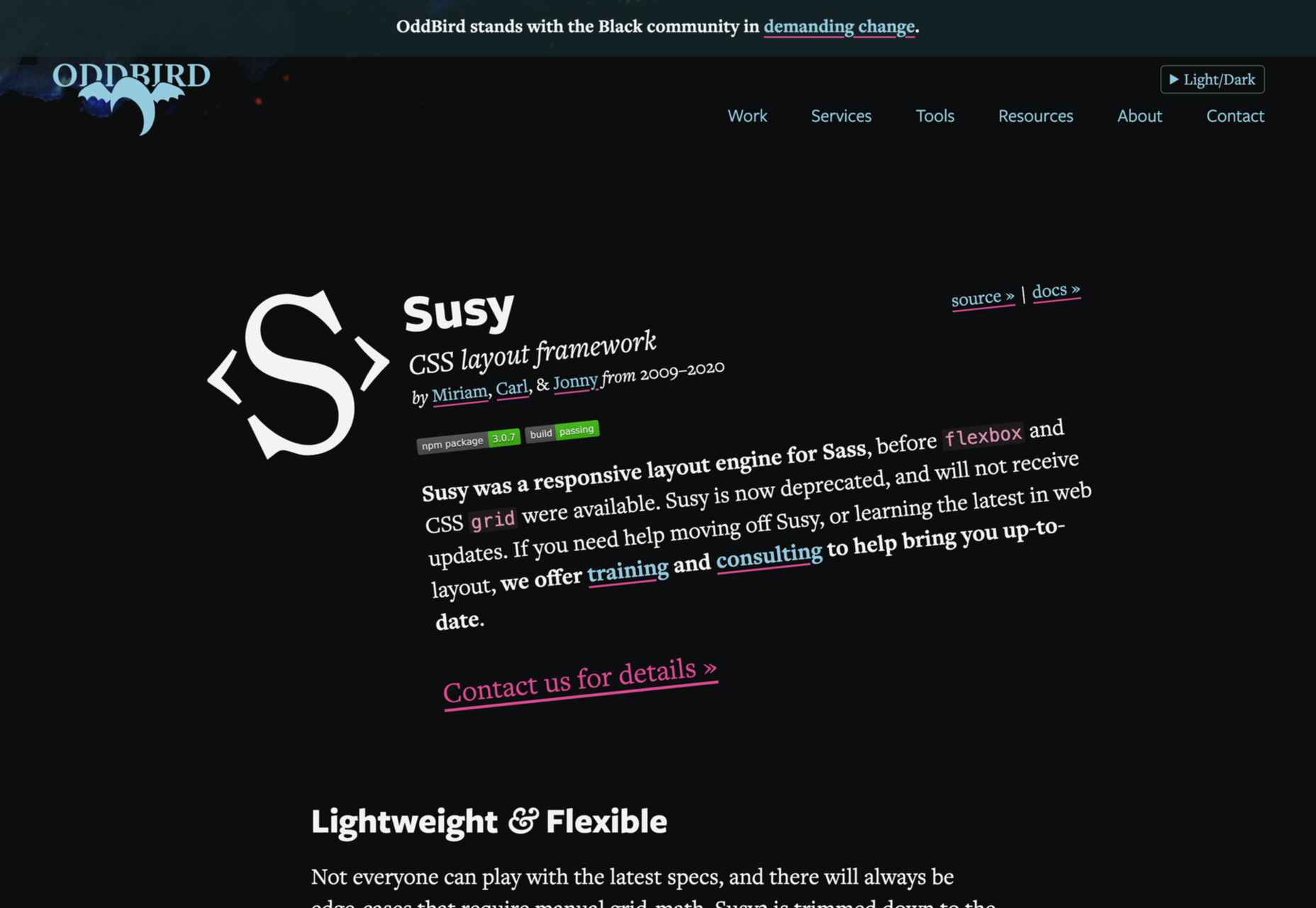
We know that most developers nowadays use flexbox and native CSS grids. Still, there’s nothing better than Susy if you need a grid system that supports legacy browsers. Although Susy is no longer maintained, it is one of the most flexible old-school grid systems.
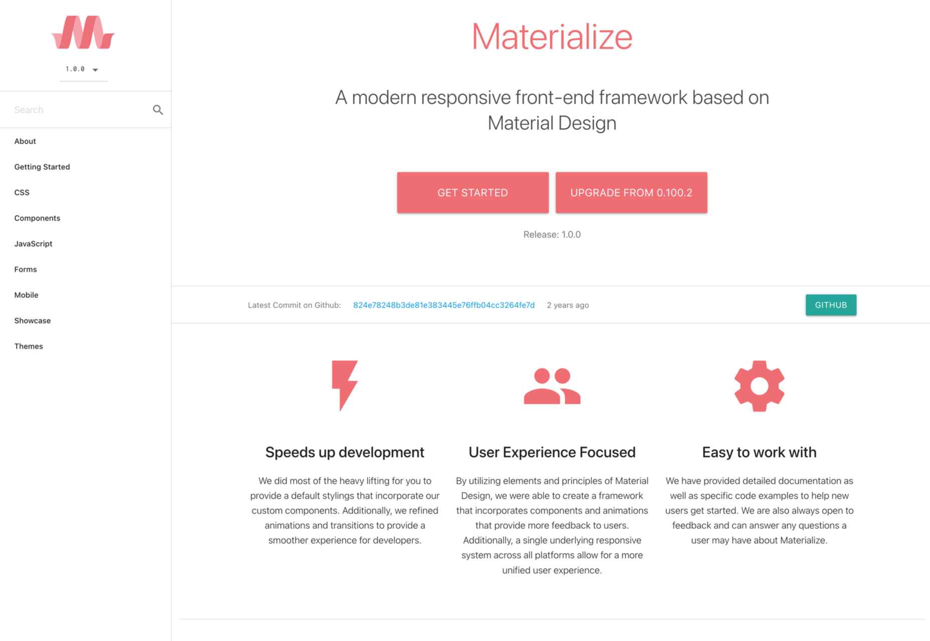
Like most CSS frameworks on this list, Materialize is built with HTML, CSS, and JavaScript.
It’s specifically designed to help you develop faster using a standard template and customizable components. As the name suggests, Materialize is based on the basic principles of Material Design.
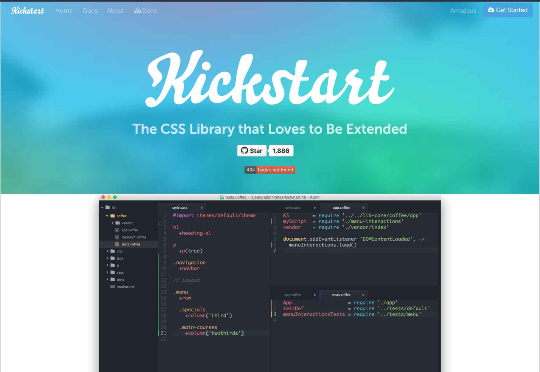
If you need a lightweight alternative to Bootstrap, Kickstart is the CSS library for you. A great thing about Kickstart is that it doesn’t require jQuery which makes it very small.
Of course, like a pruned version of Bootstrap, this CSS framework isn’t as robust. Still, this is an excellent choice for those who need a UI framework and a comprehensive boilerplate library.
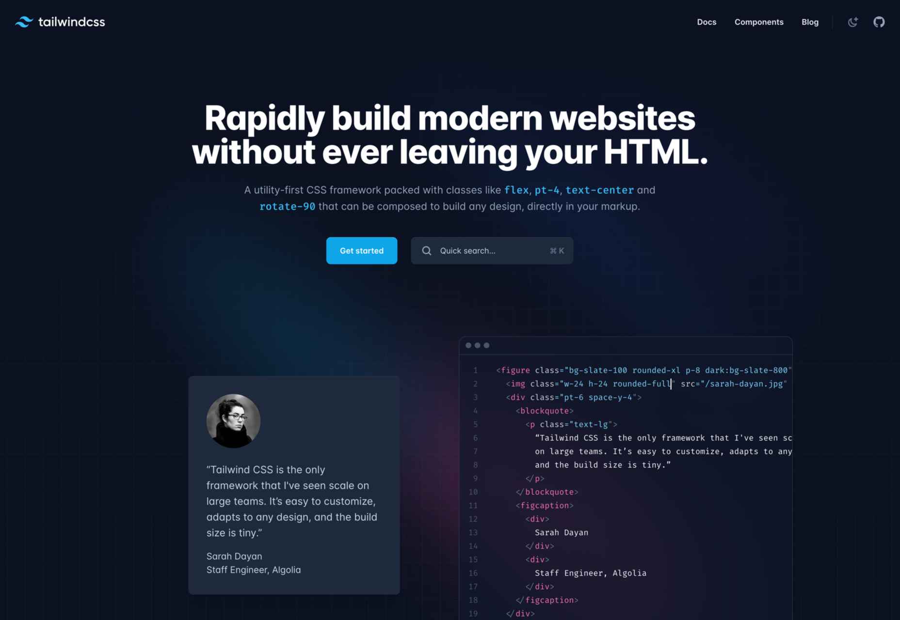
With a fast styling process and the ultimate freedom it provides, Tailwind is extremely popular among some developers. This is a utility-first, front-end framework that is fully responsive and stable.
Unfortunately, Tailwind CSS requires some time to learn, and it is not the most flexible choice when it comes to revising CSS rules.
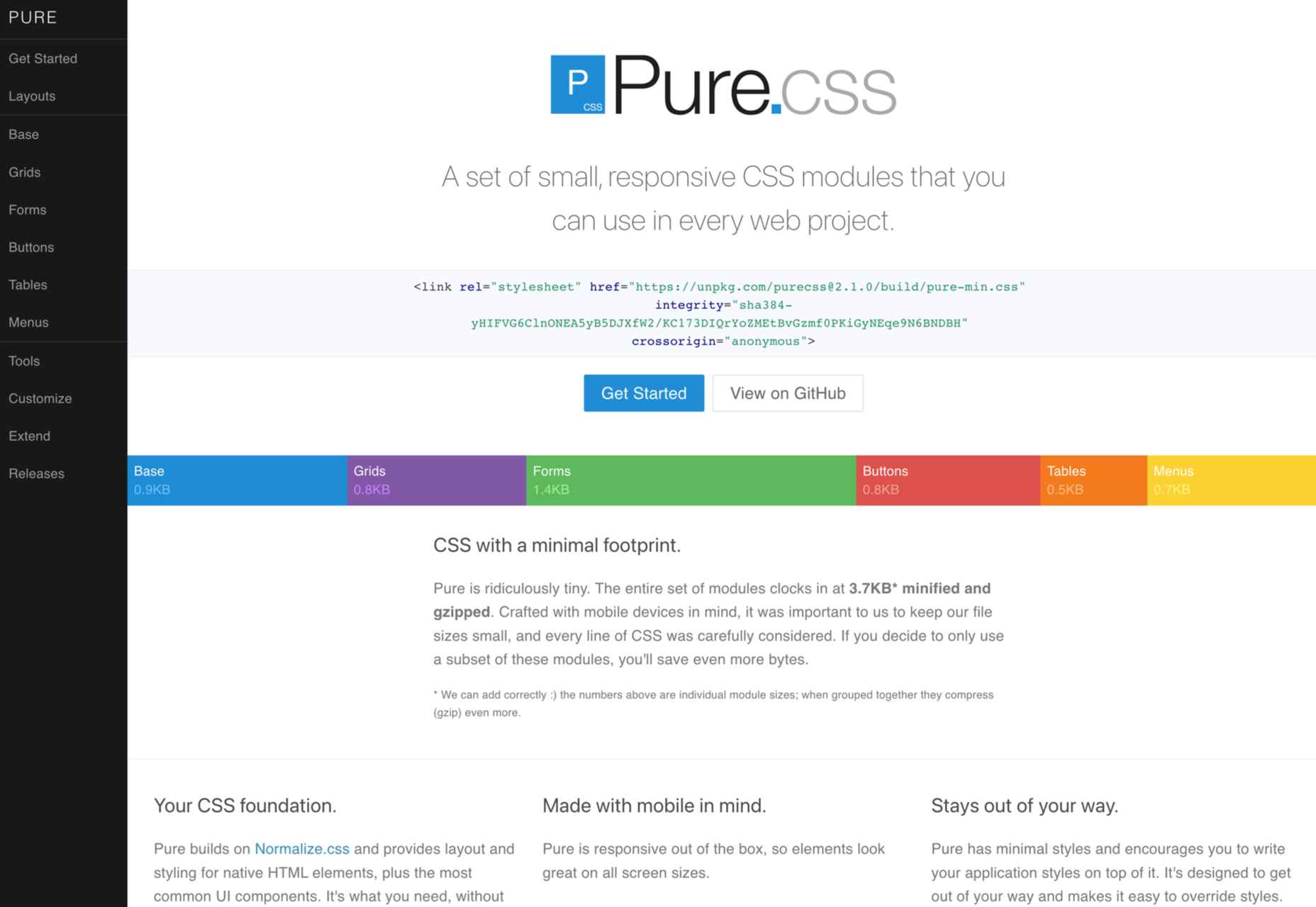
Yahoo specially developed Pure CSS to help developers create fully responsive web pages.
We consider Pure a minimalist alternative to Bootstrap that offers every module a beginner needs (navigation menu, grid, tables, etc.).
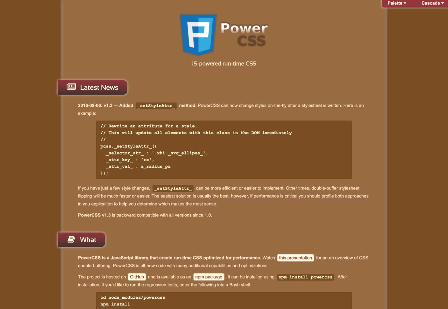
PowertoCSS is on this list for a good reason. This is an ultimately responsive CSS framework that you can use to create grids and scale web apps on any platform.
PowertoCSS is based on Modular Architecture and Scalable when it comes to design.
Unlike other CSS frameworks, PowertoCSS is very lightweight, beginner-friendly, and comes with detailed documentation.
The coding process is simple, and we found the learning curve to be shallow.
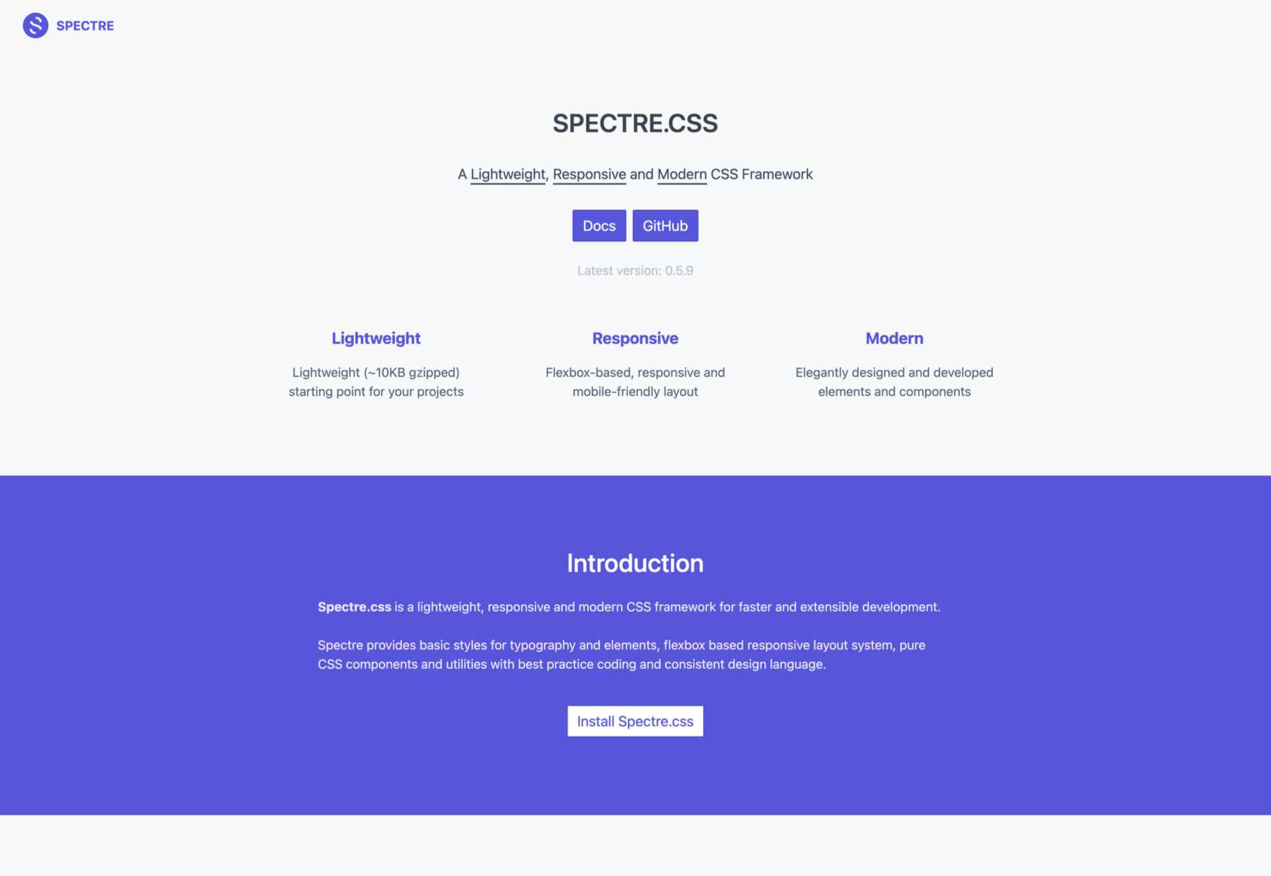
Spectre is one of the most flexible and lightweight CSS frameworks we tested for this article.
It has a modern (flexbox) layout system; it is fully customizable and allows you to get quick, attractive results.
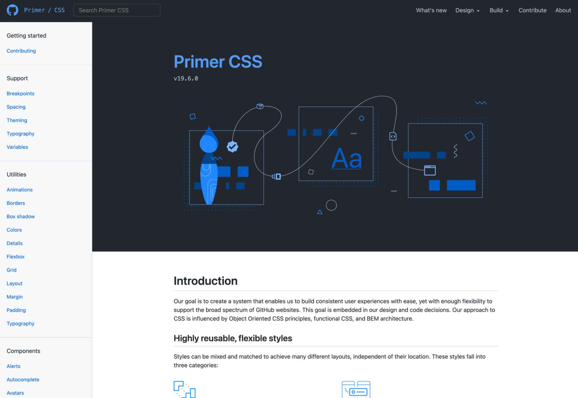
Our last suggestion is Primer, a great open-source CSS framework.
To be precise, Primer is more of a design system that lets you use a BEM CSS framework and create your projects quickly and efficiently.
So, even though Primer is not a CSS framework in the strict sense, it will help you use React and Figma components, icons, and advanced documentation to unify all of that.
Choosing the right CSS framework is not easy. It all depends on your personal needs and preferences as a front-end developer.
Although Bootstrap and Foundation are still the most popular frameworks, many of the alternatives presented above will continue to gain popularity for good reasons.
The post 15 Best CSS Frameworks: Professional Bootstrap and Foundation Alternatives first appeared on Webdesigner Depot.