Articles

When it comes to compliance, website developers need to keep their eyes on more than just ADA regulations and Section 508. Privacy laws are a big consideration and decisions on how to build privacy into a website start with architects. 

And that’s exactly what website developers (and designers!) are. They build up attractive, functional websites and apps for their clients. Yes, they work closely with clients, copywriters, vendors, and other professionals to get the job done, but the developers are the ones who put it all together. 

That’s why it’s critical that website developers are well-versed in marketing privacy laws — these regulations directly impact the end results of their work. But how does a website architect create a digital platform that honors both user privacy and the needs of their clients? 

What Privacy Laws Are Important For Web Developers?

The two biggest privacy laws that web developers need to keep tabs on are the General Data Protection Regulations (GDPR) and the California Consumer Privacy Act (CCPA). Each law has its own unique scope and provisions, but they both shifted the landscape in defining an individual’s rights to their personal data and set mechanisms for how these rights would be protected and enforced.

Each regulation also carries with it fines, fees, and legal measures for non-compliance. These can be substantial. And if that’s not enough, there’s an ever-increasing consumer demand for websites that prioritize privacy and security. Consider these statistics:

  • 82% of Americans surveyed say they are concerned about the security of their online data
  • 79% of adults claim they are very or somewhat worried about how companies use the data they collect about them
  • 63% of Americans believe they understand very little or nothing at all about privacy laws and regulations that are intended to protect their data

How Can Developers Implement These Laws?

Privacy by Design is Critical for Websites

Under GDPR, web developers are required to adopt the Privacy by Design framework, which is a multi-point methodology intended to standardize data protection measures. 

Building privacy into websites shouldn’t happen at the end stages. It should start with how the websites are conceptualized in the first place. Here are points to prioritize:

  • Minimize that data you’re collecting and pseudonymize it to protect data privacy
  • Are you capturing consent? How? Where?
  • Integrating security measures to protect data — anytime you capture data or implement a third party product, a security risk is born.
  • Knowing where you’re introducing privacy and data sharing notices
  • Implement just-in-time notices to provide consumers transparency and build trust 
  • Giving your users the opportunity to manage their personal data

Let’s look at these a little more closely…

Data Minimization is the Goal

Data minimization is an important principle embedded in GDPR. Data minimization itself is a pretty straightforward concept: organizations should limit how much personal data they collect and only process the information necessary to accomplish their business purposes. Once the data is no longer useful, it should be deleted. 

For web developers, this means several things. When it comes to building websites, forms, cookies, and other methods should only ask for essential information. For example, if you are creating a pop-up to collect email addresses, don’t ask for their location unless it’s relevant to the email list and better serving their needs.

How and Where Do You Introduce Privacy Policies and Notices?

Let’s say you take data minimization seriously. That’s great! Now you need to put those data collection practices into words and share them with your customers. 

Privacy policies and notices are a big part of both GDPR and CCPA. Both the CCPA and the GDPR mandate that your privacy policy detail why you’re collecting information and how it will be used, as well as what the individual’s rights are and how they can exercise them. 

CCPA takes a slightly different angle, requiring privacy policies to disclose if the business sells personal data and what third parties have access to the data. CCPA also dictates that privacy policies and notices are current, updated at least annually.  (Nota bene: GDPR also asks for updated privacy documents, but doesn’t specify frequency.) 

How does this translate from policy into web development?

  • If you’re collecting data to improve user experience, allow for targeted ads, or sharing information with third-parties, this information will need to be included in a privacy notice. Remember, CCPA works with a broad definition of selling data, so you may need to account for a “Do Not Sell” link on your home page. 
  • Considering using data beyond these purposes? Plan to obtain explicit user consent for each additional purpose.
  • What’s your plan for the data after the user gives it to you? Where is it stored? Who has access to it? How long are you keeping it? These are all questions that a website developer should consider, and that needs to go into a privacy notice. 

Just-in-Time Notices for Transparency and Trust

Part of Privacy by Design is the use of individual components of your website to create transparency and support compliance. From a development and design perspective, this means you should always be looking for ways to communicate the hows and whys of data collection. 

Yes, your privacy policies and notices aid in this, but going beyond these pieces is important. Customers recognize when businesses go the extra mile for them, after all. 

So consider implementing just-in-time notices at points where users enter their information. These notices are a chance to share your data collection practices with your users. It’s transparent! It’s open! It aids in consumer awareness! 

Keep Users in the Loop

Want to win over your customers? Make it as easy as possible for them to manage their personal data and how it’s being used. This starts with making sure they are aware of why you’re requesting their information and how you’re planning on using it for the website. You should also:

  • Get user consent — clear and unambiguous user consent — prior to gathering any data at all. This includes cookies.  
  • Don’t pre-tick boxes for consent. Just don’t. (It’s bad practice AND it’s against GDPR.)
  • Link to all legal documents on the site. Users should be required to agree to them before using the service. 
  • Want to send marketing communications like email newsletters to your customers? Make sure they agree to this. Expressly. 

One helpful tool for keeping users in the loop is a marketing preference center. A marketing preference center allows users easy access to their information. From there, they can manage, edit, and delete their information at their discretion.  

Bonus? A marketing preference center is an excellent point at which to communicate a business’ commitment to privacy. While users will pick up this through all the discrete elements of privacy on your website, putting it all into one hub that also allows users control over their data really reinforces this message. 

Remember, it’s not just on the consumer to manage their data. Web developers should commit to managing the data in their systems. This means they should:  

  • Maintain accurate and clean records of users’ data consent preferences
  • Send regular reminders to users to update their personal information in your system
  • If a user deletes their account, promptly delete all of their personal information  
  • If your client goes out of business or is sold, they should delete all personal information in their system

Make it User Friendly

A final point: making your websites user friendly is important regardless of privacy compliance. Users expect websites that don’t make them think deeply about, or worry about, their privacy. Make it accessible and easy. Don’t make people figure it out on their own.

Give them value for sharing their data

Your users don’t have to share their data. They’re choosing to. So in exchange for their personal information, make sure you’re using it to provide a user-friendly website. Offer them a secure, enjoyable experience.  

But don’t ask for more than you need

Let’s loop back around to this point again. While consumer data can help you build a better website, don’t plan your websites around it and don’t demand data to create a good experience. 

Usability, web design, and website security; all of these things benefit from consumer data. But privacy laws should always guide how any personal data is collected and used, and respect for consumers’ individual rights, and honoring their privacy should be top-of-mind for web developers. 


Featured image via Pexels.

Source


Source de l’article sur Webdesignerdepot

With billions of internet users worldwide spending several hours online each day, the online presence of brands is now a necessary avenue for building, boosting, and maintaining positive value and attracting and interacting with customers. 
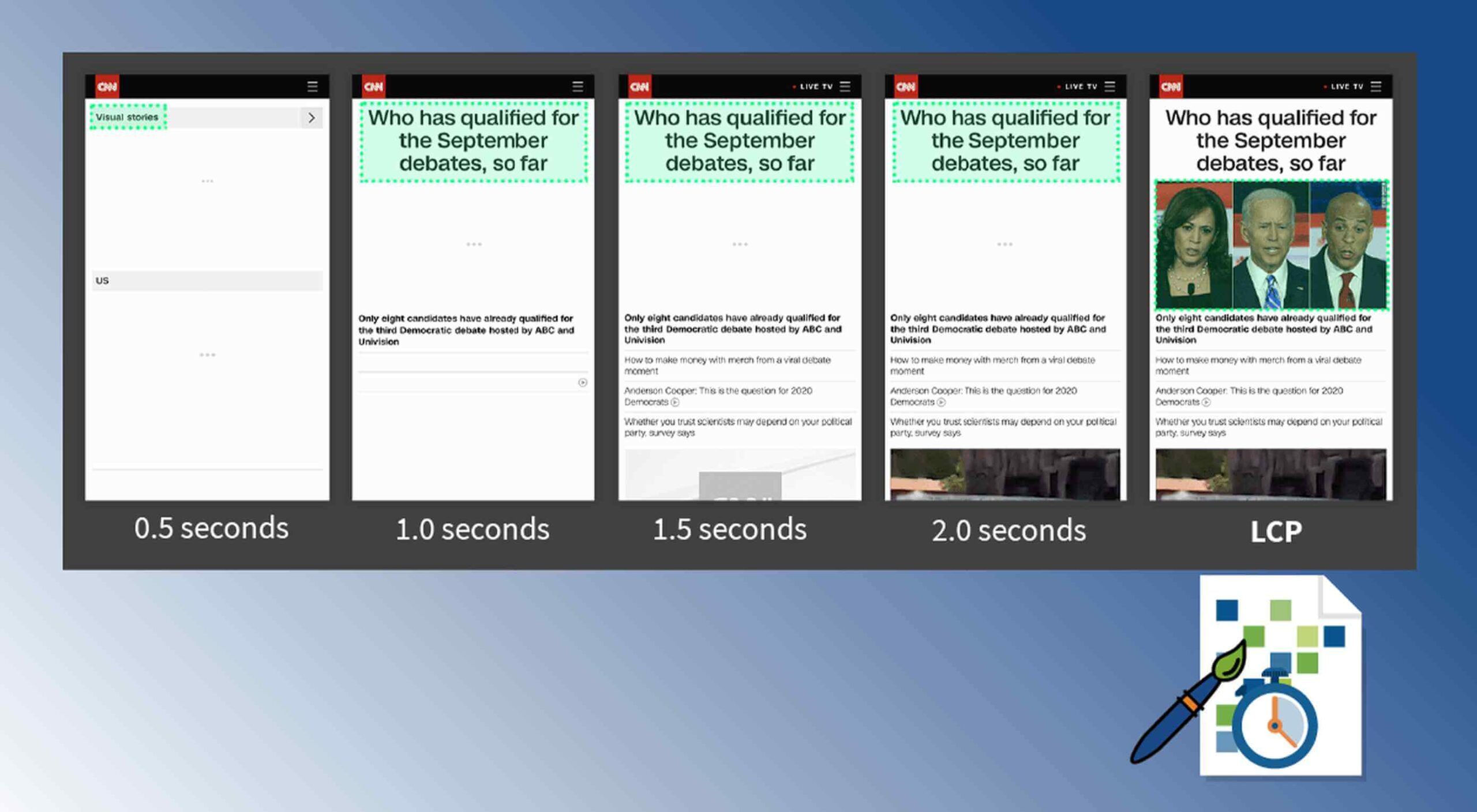
This has created increasing pressure for web design agencies when creating and managing websites. This pressure is multiplied by all the projects that web design agencies have to handle at one time. This is because different clients demand different things for their websites, whether it’s a signature feature or specialized functionality. 

Hence, it’s vital that the tools the agencies use to work are simple enough and suited to the tasks they have to accomplish in order to build and maintain these projects. Having the right tools can increase efficiency and effectiveness in managing websites.

Challenges in Modern Web Design

Building a website with all the essentials in mind is always easier said than done. Websites have to be both functional and easy on the eyes to invite traffic, disseminate information, or appeal a product or service to a target audience, and all while having an attractive and convenient interface.

The good news is that it’s perfectly possible to design a quality website and without spending a fortune to do so. Below are some of the challenges that web design agencies face when trying to deliver and reconcile efficient user experience and effective user interface in web design.

1. Appealing User Experience

Designing a good website means ensuring that the user experience is appealing to a general audience, but this is one of the most difficult parts of web design. Agencies must be careful not to turn off users with a confusing user experience. For instance, making important information difficult to find on web pages, using technical jargon that ordinary users wouldn’t understand, and focusing too much on the design rather than the overall experience are a few big mistakes that no designer should ever commit.

Instead, web design agencies should focus not only on making the design look good but also on making the experience smooth and fast for the regular site visitor. This includes improving design elements to make navigation easier as well as optimizing webpage load speeds.

2. Working With a Budget

It’s common for the client and the web design agency’s budgets to not line up at all times. Either the client will find the project quote too high, or the designer will find the client’s budget too low. The cost of a web design project can vary greatly, depending on what needs to be done. 

Although having to build a good website on a budget may be difficult, it’s important for both parties to come up with a set amount before the project even starts. The client should always specify what they want to achieve and how much they’re willing to pay to get it, and the agency should let the client know beforehand if this is possible.

3. Integrating Third-Party Functionality

Sometimes, clients may make requests for third-party functions that may not be easily integrated into the site. To prevent this, web design agencies should always consider integration when building a site. Most businesses and companies now have at least one social media account, so it doesn’t make sense for their site to remain disconnected.

When a website visitor shares an excerpt on a social media site like Facebook, Pinterest, or Twitter, other people who can see their posts may become interested in visiting the original post on the website. Properly integrating third-party applications and functions into a website can get it more online presence and popularity.

4. Suitability to Different Devices

There are many devices that people can use to access the web. From smartphones to desktop computers, from cars to game consoles, and even wristwatches and digital cameras, all of these can be web-enabled as long as there’s an available internet connection. 

Websites nowadays should always be compatible with any of the devices people might use to go to the website. They should look pleasing and load fast regardless of what device a visitor is using.

5. Security of Personal Information

Most websites require personal or financial information, whether for account verification, for website subscription, or something else. Websites should be designed with personal security in mind, which is even more important since hacking has been on the rise since the coronavirus hit.

One of the biggest threats that websites face today is phishing, or when an attacker will pretend to be a trusted contact and attempt to compel you to click a malicious link. Another is ransomware, or where cybercriminals hold customer data for ransom and attempt to extort online business owners. Yet one more is SQL injections, or where hackers will attempt to execute malicious SQL commands in your website’s database. 

The best practices in regards to web design to mitigate these risks include third-party plugins and themes, keeping all of your software up to date, setting your web applications so they run the fewest privileges possible, and utilizing SSL certificates and HTTPS protocols. 

Adopting Site-Building Platforms

Gone are the days where you had to be technologically gifted to design a website from scratch, usually through manual HTML codes. Back then, you had to know your way around the web if you wanted to set-up and manage a site of your own.

Now, there are a lot of good website builders that allow you to create websites in a faster period of time. Even web design agencies now make use of such builders in order to make the job easier and more convenient. Not to mention, it allows agencies to focus on the design alone.

Although these platforms offer predesigned templates based on the most common purposes of websites, they normally allow the user to white label the website into the branding specific to the business or agenda of the website owner. The text styles, colors, and sizes coordinated to the website’s theme, and colors can be designed specifically to match the business or organization’s image and identity. 

Simply put, creating websites through a web builder platform can provide web design agencies with easy-to-understand tools that their teams and members can all uniformly use to more effectively and more efficiently handle all their projects.

With services that allow mobile optimization, site management, and even drag-and-drop editing, web design agencies can now better manage their projects and finish with their tasks more quickly.

Not only that, by using white labelling, services can conserve their time and energy into focusing on creating the best website for their client. With all the website builders currently available on the market today, just picking the right one can give web design agencies the best tools to use when creating, designing, and maintaining websites. 


Featured image via Pexels.

Source


Source de l’article sur Webdesignerdepot

If you read my previous article, it’s easy to become frustrated. HttpClient is at the core of everything we as software developers normally do when we integrate our stuff with other people’s stuff. Somebody sounding the alarm, telling you that it’s fundamentally broken, might result in everything ranging from a general concern about ones own code, to flat out panic attacks. Hence, I figured I’d be an asshole unless I also showed you an alternative.

Paradoxically, fixing HttpClient is very easy, it’s just to cut away everything in it that’s dangerous, and encapsulate everything that’s beautiful about it into a much safer API, making it impossible for developers to retrieve the instance to the HttpClient you’re using internally. Basically, treat most of HttpClient’s API as if it was cancer, and salvage the rest. Here’s a much safer version in case you care. For the record, to understand this class, you have to read my previous article here at DZone.

Source de l’article sur DZONE

Les clients accordent de plus en plus d’importance à l’expérience qu’ils reçoivent plutôt qu’au prix ou au produit. C’est pourquoi l’expérience client est rapidement devenue une priorité absolue pour toutes les entreprises. En 2020, avec les livraisons à domicile et les mesures de distanciation sociale mises en place en réponse à la COVID-19, les consommateurs sont passés à la commande sur smartphone pour acheter de tout, de la soupe aux noix.

De plus en plus de personnes utilisent des applications mobiles pour faire venir de la nourriture à leur porte. Les consommateurs savent à quel point il est important d’utiliser ces applications, que ce soit dans le confort de leur propre maison ou sur le trajet domicile-travail. Avec des options de personnalisation pour enregistrer leurs préférences, des informations précises sur les prix et des offres à portée de main, les attentes des consommateurs en matière de rapidité et d’absence de friction pour passer leurs commandes n’ont jamais été aussi grandes.

Bien entendu, pour pouvoir offrir une excellente expérience au client à ce niveau, il faut investir dans des technologies et des processus intelligents.

Renforcer les capacités du commerce électronique

Ce n’est pas seulement un dépanneur et un détaillant de carburant typique, mais Casey’s General Stores Inc. (Casey’s) est la cinquième plus grande chaîne de pizzas d’Amérique, avec plus de 19 millions de pizzas servies chaque année. En développant des liens communautaires solides, la marque est intégrée au tissu des petites villes du Midwest, offrant un service de proximité 24 heures sur 24, soutenant des causes importantes et célébrant les héros locaux.

Si la marque a su gagner des adeptes, Casey’s devait faire plus avec ses systèmes de commande et de paiement en ligne. Ils ont été construits sur des logiciels vieillissants qui n’ont pas su suivre le rythme de l’époque, ce qui a eu pour conséquence une expérience client en ligne qui n’était pas à la hauteur de l’essence de la marque, hyper pratique et axée sur la communauté.

Ainsi, dans le cadre de sa transformation numérique, il était non seulement essentiel pour Casey’s de renforcer ses capacités en matière de commerce électronique, mais il lui fallait aussi mettre l’expérience du client au premier plan et répondre plus rapidement aux changements du marché.

Pour ce faire, elle a dû utiliser des technologies intelligentes pour créer une application pratique pour smartphone et un site Web mobile afin de rationaliser les commandes par téléphone portable, ce qui a permis aux habitants de ces villes du Midwest de prendre leurs pizzas préférées très facilement et rapidement. En même temps, dans le but de l’aider à atteindre de nouveaux niveaux de confort, Casey’s a conçu un programme de fidélisation des clients.

citation de Art Sebastian, VP de Casey's

Rationalisation des processus de commande et de paiement

Pour rationaliser le processus de commande et de paiement en permettant aux clients de payer en ligne, Casey’s a déployé les solutions SAP Commerce Cloud et SAP Customer Data Cloud du portefeuille SAP Customer Experience. L’application mobile permet aux clients de passer des commandes de ramassage ou de livraison, de définir une carte de crédit par défaut pour le paiement, de personnaliser les commandes de pizza, de trouver un magasin, de parcourir le menu, de suivre les commandes, de réorganiser les favoris et de vérifier le prix du carburant.

Dans les cinq mois qui ont suivi son lancement, Casey’s a généré environ 65 % de ses revenus numériques grâce à l’application et 30 % supplémentaires grâce au Web mobile.

En lançant son premier programme de fidélité numérique, Casey’s Rewards, sur SAP Customer Data Cloud, Casey’s a organisé les données, le consentement et les préférences des clients et les a reliés directement à ses applications sur SAP Commerce Cloud. D’un seul coup, Casey’s est en mesure de récompenser sa légion de fans avec des offres à valeur ajoutée, tout en l’aidant à mieux connaître leurs besoins – ce qui lui permet en fin de compte de proposer des expériences qui dépassent ces besoins.

Une évolution rapide à l’époque de COVID-19

L’investissement de Casey dans les technologies intelligentes a également permis à ses magasins de rester ouverts pendant la période de COVID-19 et à l’entreprise d’avancer plus rapidement que jamais. Pour répondre aux attentes des clients pendant cette période, Casey’s a donné la priorité aux livraisons sans contact, s’est associé à un service de livraison tiers, a élargi la gamme de produits de marchandises générales disponibles en ligne et a lancé un service de livraison en bordure de trottoir.

Pour en savoir plus sur la transformation numérique de Casey’s, nous avons rencontré Art Sebastian, vice-président de Digital Guest Experience chez Casey’s à SAPPHIRE NOW Converge. Dans cette interview de quatre minutes, il décrit comment le détaillant de la supérette a fait de l’expérience client un avantage concurrentiel. Pour en savoir plus, consultez l’étude sur la transformation de l’entreprise, « Casey’s : Building True Customer Loyalty Over Pizza ».

Article publié en anglais sur blogs.sap.com


The post Faire de l’expérience client un avantage concurrentiel appeared first on SAP France News.

Source de l’article sur sap.com

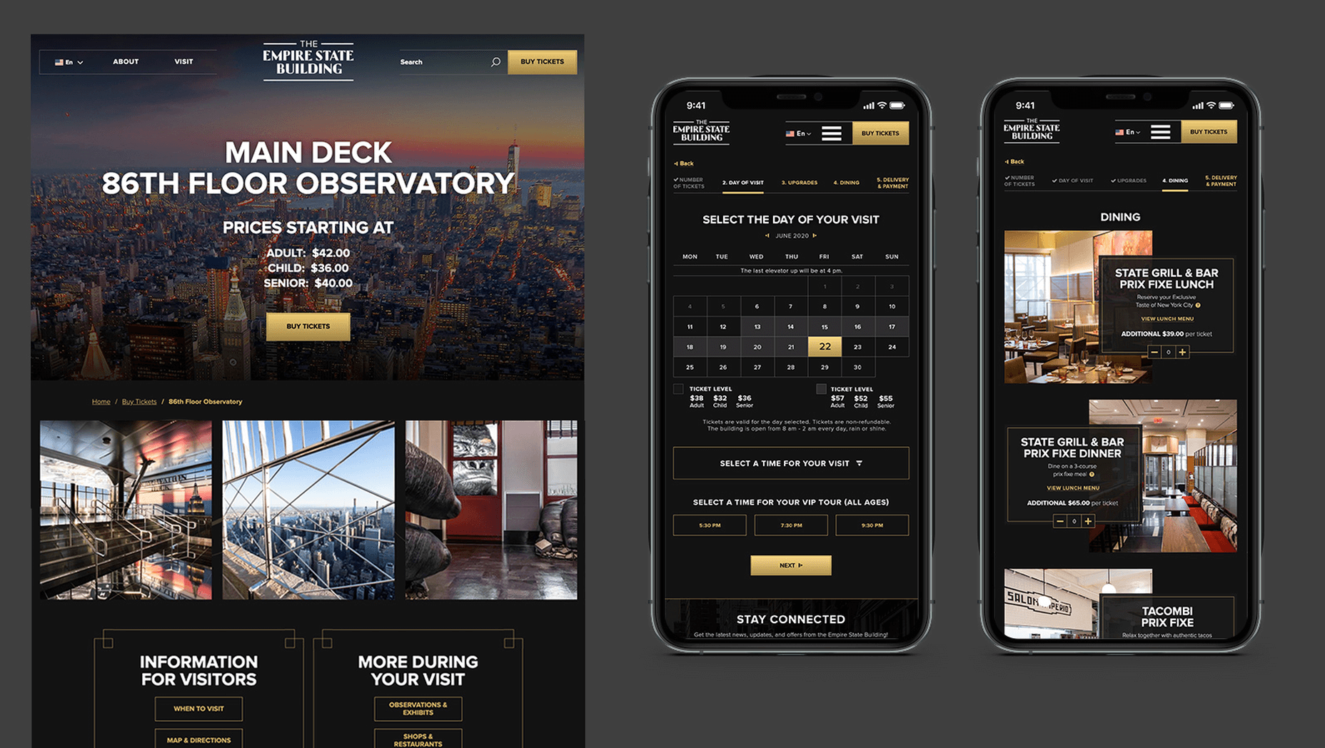
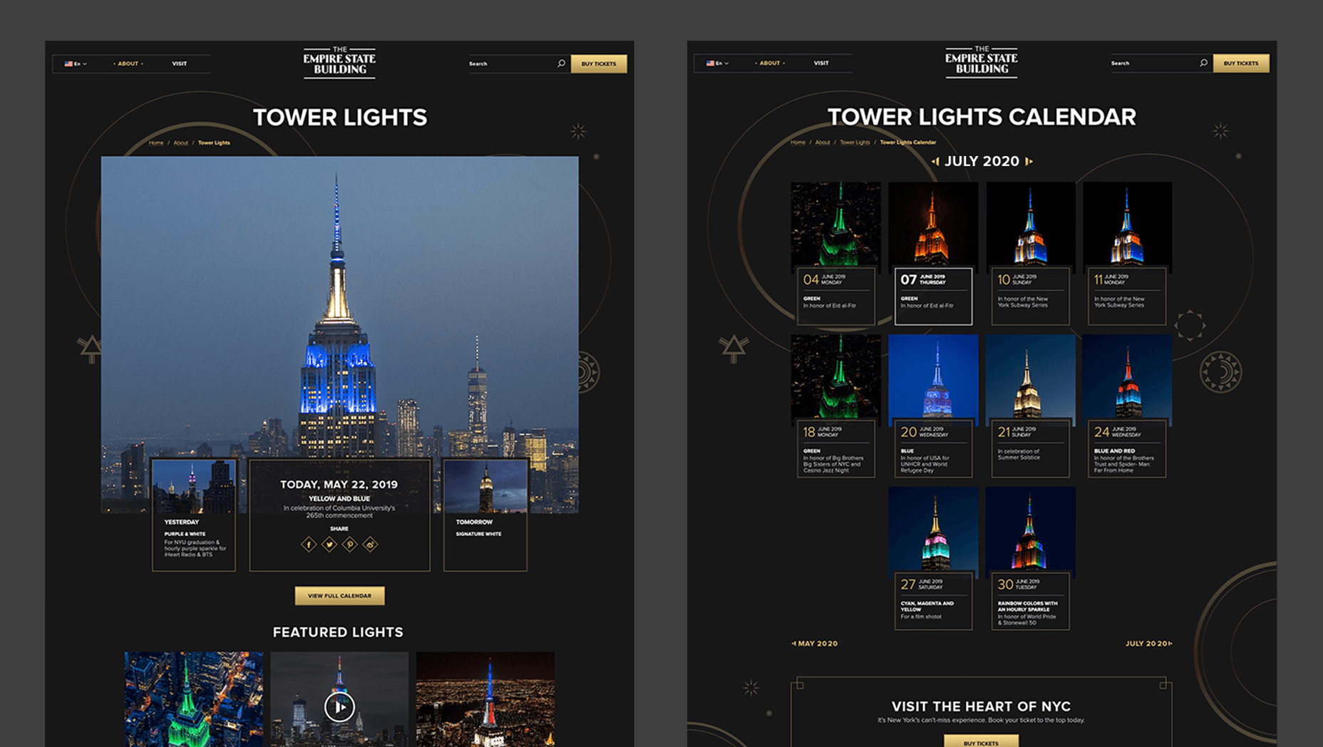
In 2019, to keep pace with an interior redesign of its visitor experience, the Empire State Building decided to redesign its website. Blue Fountain Media were engaged to deliver the project. With the new site launching, we spoke to Head of Design, Tatyana Khamdamova about designing for the world’s most famous building.

Webdesigner Depot: The Empire State Building is probably the most iconic building in America, if not the world. Were there any points at which you thought, “Oh God, this is too much pressure”?

Tatyana Khamdamova: Yes, of course, it was a lot of pressure knowing that people all over the world will be looking at your work. But with the pressure, we also felt excitement and pride that we got to work on such an iconic project. Just thinking that we are doing the site for Empire State Building made us feel proud of all that other work we did during our whole life that gave us the opportunity to be a part of this project.

WD: Blue Fountain Media is a large agency. Did you utilize the whole company, or was there a smaller, dedicated team tasked with creating the site?

TK: On a project like this one, you need the expertise of the team members from all departments in the agency. You want people to work together from the beginning to ensure that their knowledge helps to shape the project and produce the best possible outcome. It’s important for designers and marketers, for example, to be a part of the strategy and UX phase to provide their input which minimizes tunnel vision and generates more ideas. You can only achieve the best results if every single detail from strategy to design to development is done right.

WD: That’s a lot of people to coordinate. Did any roles naturally come to the fore, or is design leadership a quality that varies from person to person?

TK: Some people are natural leaders in their fields. But, sometimes a certain project requires people to take responsibility and show their leadership skills within the team. So I would say that it’s a quality that varies from person to person and doesn’t depend on a role or a title at all.

WD: What were the central aims of the redesign?

TK: ESB’s previous website did not reflect the level of design to match their iconic brand, UX was not user friendly, the content was outdated, and they wanted to grow online individual and group ticket sales. In addition to competing with global and NYC based tourist attractions, ESB was also faced with growing competition in the NYC Observatory market with Top of The Rock, One World Observatory, and Edge at Hudson Yards.

While the building underwent a $165 million renovation, BFM was tasked with creating a best in class website that reclaimed their iconic brand identity while providing an intuitive, and enjoyable user experience for both domestic and international visitors looking to learn about the building, exhibits, and the many ticket experience packages that they offer to visitors.

WD: How do you approach researching a unique project like this?

TK: We went to the source! First, we spoke to visitors of the Empire State Building while they were in line. What was their experience, did they use the website, what made them choose to visit the observatory instead of or in addition to some of the other competing observatories in the city. We then looked at other key tourist towers worldwide to see how they are positioning themselves globally to draw inspiration. We did in-depth stakeholder interviews that included folks working at the building every day and the types of interaction and questions they field from visitors. We conducted surveys of international travelers to understand their motivations and concerns. Finally, we dug into the website itself by testing using various protocols and platforms to understand the visitor paths, what they were able to easily do, and what tasks they may have found challenging. Drawing from all of those insights, we planned and designed the site using an iterative process.

WD: ESB visitors come from all over the world; how did you tackle designing for an international audience?

TK: People across the globe speak different languages, have different cultures and needs. Our goal was to learn about the audience and give them a site that looks and feels like it was created for them. Luckily we were working for the iconic building that is well known internationally and capturing the design aesthetic of the building itself already made the site recognizable across the globe. When working on the project we also were making sure that all users can see the information in their local language when they land on the site and have easy access to the language selector in case they want to change it. When you translate from one language to another the number of words and characters is not always the same. It was important to make sure that the site is designed and developed with an understanding of how the content will be displayed in other languages. With the localization help of our parent company Pactera EDGE we successfully translated the site in several languages and tested it to ensure that it looks right for the local and international audience.

WD: The famous view of the ESB is the external view, but your design feels more in keeping with the experience of the building’s interior. Was that a conscious decision?

TK: It was a conscious decision to create a site that makes you feel like you are visiting the building. Our goal was to make the visitor excited to buy a ticket and see all that beauty with their own eyes. But, if someone doesn’t have an opportunity to come to NY we wanted to make that online experience as close to the real one as possible. We understand that nothing will replace the actual visit to the Empire State Building but we wanted the website to feel real and by using the great photography and amazing Art Deco design elements, we were able to do so.

WD: How did you interpolate such a complex style as Art Deco into a functional site?

TK: Fortunately for us, our office is located a couple blocks away from the building and we had the opportunity to go there and see some of the details. We also had access to the great photos of the renovated hallways, exhibits, and observatory decks, which gave us the idea of how the Art Deco elements were used in the interior design of the building. We all know that interior design and web design have different needs and goals so it was an interesting challenge to design a site that makes you feel like you are inside the building without overwhelming users and that content is easy to read and the ticket purchasing process is simple and clean. We re-created a lot of design elements used on the ceiling, walls, and floor of the building simplified those elements and made them part of the website design. A lot of those elements were used in the background, call to actions, icons, and maps, and combined with the brand colors used in both interior and web designs we were able to give the site the Art Deco look.

WD: There’s been speculation in the design community recently that Art Deco may re-emerge as a trend in the 2020s. Having worked with the style, do you think it could benefit the wider web?

TK: This was a very specific design approach for a very specific project that takes us back to the 1920’s and emphasizes that era through modern twists in web design. I do not see how it can be applied on the web in general unless the client specifically asks for it, for example, architecture website, real estate, or furniture site. Every project is unique and has its own goals and style and there is no one solution that will fit all. As of today, The ESB is Art Deco in a sense and it truly owns that style.

WD: Can you share some details on the technology stack you employed?

TK: The site was built on the Drupal CMS, integrates with Empire’s partner Gateway Ticketing System, and is hosted on Acquia.

WD: Why Drupal? Does it have qualities that suit a project of this scale, or is it simply the case that BFM had the pre-existing expertise of Drupal to facilitate the build?

TK: BFM is a dev-agnostic production team and we always ensure we’re making the best recommendation to our clients. In this case, the previous website was built on Drupal, so in order to decrease the effect of a new platform rollout that would be unfamiliar to the internal ESB teams, we decided to keep the site on the Drupal platform. Luckily, Drupal is an extremely flexible CMS and the needs of the site perfectly align with what Drupal provides.

WD: With visitors from around the world, the range of browsers and devices you had to consider was vastly larger than most projects. Did you draw a line for support? If so, where was it?

TK: BFM constantly updates our list of supported browsers and devices to stay in line with changing technology trends and device usage around the world. We’re extremely lucky that our larger organization, Pactera EDGE, has deep roots in globalization and localization, so we leveraged their team to help us with all aspects of website visitors from the many regions around the world, including translation services and testing. Since this was a complete overhaul, we ensured the baseline standard for all devices was met and will continue to enhance as the future technology needs become apparent.

WD: The Empire State Building gets millions of visits each year, what sort of server resources do you need to throw at it to guarantee uptime?

TK: BFM is a partner of Acquia, and Empire State Building is hosting their new site with them. Acquia is a wonderful ecosystem built specifically for high performing drupal websites and provide many tools for their hosted sites to be able to handle fluctuations in visitors, traffic surges, and with the 24/7 support offered, they can easily manage the changing needs of worldwide visitors.

WD: Now it’s live, how does the new ESB site relate to its real world presence?

TK: The Empire State Building defines the New York City skyline. The world’s most magnificent Art Deco skyscraper, it’s a living piece of New York history and an instantly recognizable symbol of city culture today. The old site did not reflect the amazing interior and exterior design of the building and we had a chance to showcase the redesigned interior and bring more attention to the beautiful Art Deco design elements. We wanted to create the site to make you feel like you are visiting the building. By showcasing the exhibits, renovated halls, and observatories through compelling photography and architectural details, our goal is to make the visitor excited to buy a ticket and see all that beauty with their own eyes.

We’d like to thank Tatyana for taking the time out of her day to talk to us.

Source


Source de l’article sur Webdesignerdepot

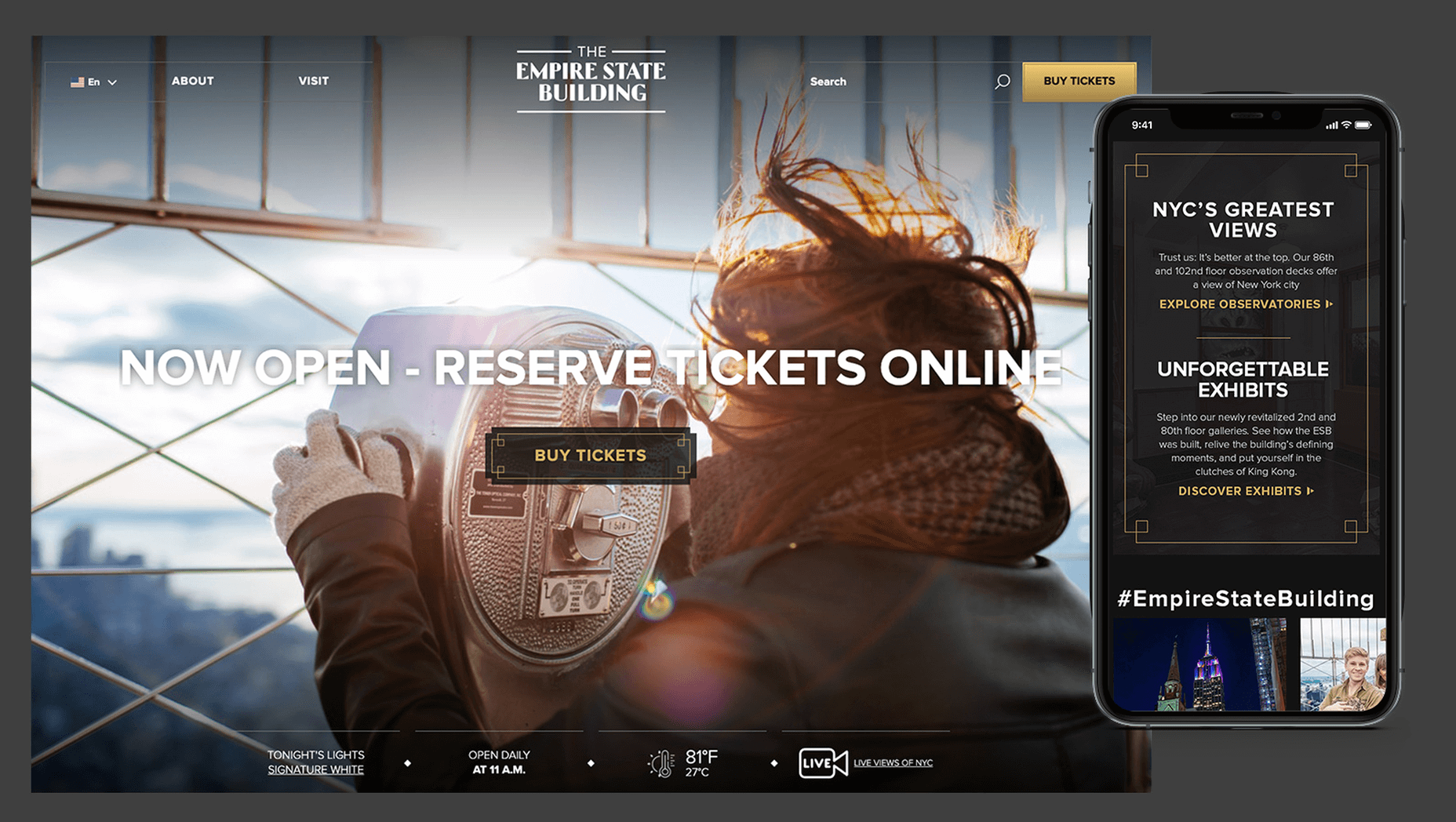
As a web designer, you’re constantly being bombarded with messages that tell you to acquire new skills, try new tools, and keep on hustling.

But if you’re constantly changing things up, does it do the opposite of what you originally set out to do? In other words, if you always have to start over, is it possible to ever really achieve anything?

I think it ultimately depends on why you’re making the change.

When Change Is the Right Move for Web Designers

One of the reasons I despise New Year’s resolutions is because it’s change for the sake of change:

It’s a new year, so it’s time to get all hyped up about this one thing I need to change about myself!

There’s a reason why so many resolutions fail by February. When you force a change, it’s really hard to stay invested in it, especially if it’s something you’ve chosen to do because everyone else has.

Change should be driven by necessity.

That said, when it comes time to make changes as a web designer, is it ever really necessary? Or are you learning new skills, trying new tools, or switching up your client list simply because it’s what you believe you have to do?

It’s important to be open to change, but you should only invest your time, money, or effort when it’s the absolute right move for you. Here are some ways you’ll know when that’s the case:

Learn New Skills To…

…Round Out the Basics

If you’re a new designer and there are gaps in your education and training (and I don’t mean formally, just in general), then there’s no reason to hesitate in spending time to acquire those skills.

This doesn’t just go for basic skills as a web designer or as a coder. This also goes for skills you need to become a successful freelancer.

…Add Evergreen Skills to Future-Proof Your Position

As you move up in your career, you’ll eventually find other skills worth learning. Just make sure they’ll help you move the needle.

The best way to do that is to focus on acquiring evergreen skills that’ll always be useful to you, no matter what stage you’re at in your career or how the design landscape changes. They should also go beyond the average skill set of a designer, so they help you stand out further from the pack.

… Create a Better Situation for Yourself

The web is constantly evolving, which means that your responsibilities and skills as a web designer will have to change in order to adapt. Whenever one of these shake-ups occurs, you should either be ready to master the needed skill right away or, better yet, have been working on it beforehand.

Take, Google’s mobile-first indexing, for instance. It announced it was going to be making this shift years before website rankings were impacted. Designers had plenty of time to not only learn what was needed to design for the mobile-first web, but to get all their existing clients’ sites in shape for it.

Adopt New Tools When…

…Your Existing Ones Are Slowing You Down

If you’re doing a lot of things from-scratch (like writing emails to clients or creating contracts), that’s a good sign your toolbox needs some improvement.

As a web designer, you should be focused on creating, not on the tedious details involved in running a business or communicating with clients. That’s just not a good use of your time. A lot of this stuff can easily be automated with tools and templates.

…You’re Turning Down Business

In some cases, it’s the right thing to say “no” to prospective clients — like when they’re a bad fit or can’t afford your rates. However, there are other times when you desperately want to be able to say “yes”, but you don’t have the capacity for the job or you’re unable to cover the full scope of what they need.

This is where new tools come in handy. For instance, let’s say you’ve been approached by a ecommerce company that not only wants you to build a new store, but also needs it fully optimized for search (it’s not the first time this has happened either). Rather than turn something like that down, you may find that the addition of an SEO tool to your toolbox is all you need to be able to say “yes”.

…You Have Extra Room in Your Budget

Obviously, you don’t want to throw away money on a bunch of tools simply because a ton of people are talking about them. But you’ll eventually get to a point where the tools that served you well in the first year of business need to be replaced.

If you get to a point where you have extra time to experiment and there’s room in your budget for upgraded tools, go ahead and assess what you currently have and test out replacement solutions that will help you work better, faster, and smarter.

Look for New Business Opportunities If…

…You’re Not Doing Well

“Well” here is subjective. For instance:

  • If you’re not doing well financially, you probably need to look for more clients;
  • If you’re not doing well in terms of how you get along with clients, you should explore a niche that’s a better fit;
  • If you’re not happy with your job because burnout and stress have overtaken your life, then you might consider exploring other avenues of work.

When something has been amiss for awhile, the last thing you should do is lean into it and hope it gets better.

…The Web is Changing

Notice a trend here? Each of these changes (skills, tools, and now business opportunities) is often driven by the fact that the web is always changing. And as the web changes, you have to be ready to evolve.

In terms of business opportunities, what you’ll realistically need to do is look for new kinds of design work as technologies make your job obsolete. Take website builders like Wix or Shopify, for example. As business owners and entrepreneurs take it upon themselves to build their own websites, more and more web designers will need to find other kinds of clients and jobs to take on.

…You Want to Diversify Your Income

This is something many web designers are doing already as they’ve discovered how beneficial it is to have predictable recurring revenue streams.

But even if you’ve already found one way to diversify and stabilize your income (like by offering website maintenance services), you may become interested in exploring other opportunities along the way. If you have the capacity to pursue them, then go for it.

Is Change a Good Idea?

As you can see, change can be a very good thing for a web designer, their business, and their clients. However, there should be a very good reason for the change and you need to prepare yourself for how it’s going to impact what you’re doing now before implementing it. No amount of change can happen without some level of sacrifice.


Featured image via Unsplash.

Source


Source de l’article sur Webdesignerdepot

On July 16, 2020, the European Court of Justice got rid of the four-year-old Privacy Shield agreement struck between the U.S. and the EU that had exposed Europeans to possible U.S. surveillance. The agreement had also allowed U.S. companies like Facebook and Google to store data about European residents outside of the region. 

This move is yet another great example of the EU doing “right” by their constituents and holding tech companies responsible for their users’ data privacy. The news also builds on the EU’s General Data Protection Regulation (GDPR) leadership, extending its consumer protections and providing a model for the rest of the world to work from as global data privacy policies continue to evolve.

Source de l’article sur DZONE

Contentful; Webster’s Dictionary defines “contentful” as… not found. Clearly someone made up this word, but that is not necessarily a bad thing.

The world of user experience metrics is moving quickly, so new terminology is needed. Largest Contentful Paint (LCP) is one of a number of metrics measuring the render time of content on a web page.

What is Largest Contentful Paint?

Google defines LCP as “the render time of the largest content element visible within the viewport.” For what we are talking about in this blog, we will consider “content” to be an image, typically a JPEG or PNG file. In most cases, “largest” points to a hero image that is “above the fold” and is one of the first images people will notice when loading the page. Applying optimization to this largest content is critical to improving LCP.

It is probably more instructive to view LCP relative to other metrics. For example, First Contentful Paint (FCP) and Visually Complete book end LCP.

Each metric has its pros and cons, but LCP is a happy medium. LCP marks when web page loading starts to have a substantial impact on user experience.

In Google’s opinion, to provide a good user experience, LCP should occur within 2.5 seconds of when the page first starts loading. Poor values are anything greater than 4 seconds.

How Does Largest Contentful Paint Impact Lighthouse Scores and SEO?

LCP is now part of several “Core Web Vitals” scores that Google will measure in its ranking algorithm. Each of the Core Web Vitals represents a distinct facet of the user experience, is measurable in the field, and reflects the real-world experience of a critical user-centric outcome.

In the case of the overall Google Lighthouse score, LCP represents 25% weighting on the performance score of Lighthouse version 6.0. This makes LCP the most important Core Web Vitals metric in determining the performance score.

While Google has indicated that content is still the most important factor in SEO ranking, a better user experience (as measured by Core Web Vitals) will generate higher rankings in a crowded field. If there are many websites competing for the top search engine spots, then Largest Contentful Paint will play a critical factor in rankings.

How to Improve Largest Contentful Paint

Now that you know that LCP is important, what can you do to improve it by making content load faster? Google provides a number of suggestions, but the most effective technique is to optimize content for the device requesting it.

For example, a website includes an 800kb JPEG image that is intended for high resolution desktops. On a smartphone, that would be optimized down to less than 100kb, with no perceptible impact on quality. LCP can improve by more than 60% — or several seconds — through this single optimization.

Find Savings in Largest Contentful Paint by using Image Speed Test

Image Speed Test is a great tool offered by ImageEngine.io that provides an analysis of LCP improvement opportunities. Just paste in the URL of the web page you are interested in optimizing, and the test will show you:

  • Image Payload Reduction
  • Speed Index
  • Largest Contentful Paint
  • Page Load Time (Visually Complete)

It also provides a video of the web page loading with and without optimizations. Finally, it analyses each image to provide an estimate of payload savings. In this case, the “largest content” on the page is this image. With optimizations, the image payload is reduced by 94%. That delivers a huge improvement in LCP.

How Does ImageEngine Improve LCP

ImageEngine is an image content delivery network (CDN) service that makes image optimization simple. Basically, for each image on the page, the image CDN will:

  1. Detect the device model requesting the web page;
  2. Optimize the image in terms of size, compression, image format;
  3. Deliver via a CDN edge server that is geographically closest to the user.

ImageEngine improves web performance for every image on the page, including the largest. You can learn more about ImageEngine here, and also sign up for a free trial.

Best Practices: Preconnect

In addition to using an image CDN like ImageEngine, a few other best practices can improve LCP. Using the resource hints to provide a preconnect for your content can streamline the download process.

For example, putting the following link statement in the HTML will accelerate the download process. The link statement will make the browser connect to the third party as early as possible so that download can start sooner. ImageEngine’s optimizations make each image download smaller and faster, but preconnect save time in the connection phase.

Best Practices: Minimize Blocking JavaScript and CSS

When JavaScript or CSS is “blocking” it means that the browser needs to parse and execute CSS and JavaScript in order to paint the final state of the page in the viewport.

Any website today relies heavily on both JavaScript and CSS, which means that it is almost impossible to avoid some render blocking resources. On a general note: be careful with what kind of CSS and JavaScript is referenced inside the <head> element. Make sure that only the strictly necessary resources are loaded in <head>. The rest can be deferred or loaded asynchronously.

When looking to improve the LCP specifically, there are some practices worth looking into more deeply.

Inline Critical CSS

It is not an easy task, but if the browser can avoid making a request to get the CSS needed to render the critical part of the page – usually the “above the fold” part – the LCP is likely to occur earlier. Also you will avoid content shifting around and maybe even a Flash of Unstyled Content (FOUC).

The critical CSS — the CSS needed by the browser to set up the structure and important styles of the part of the page shown above the fold — should in-inlined. This inlined CSS may also refer to background images, which of course should also be served by an Image CDN.

Do Not Use JavaScript to (lazy) Load Images

Many modern browsers natively support lazy loading, without the use of JavaScript. Because images usually are heavily involved in the performance of LCP, it is best practice to leave image loading to the browser and avoid adding JavaScript in order to lazy load images.

Lazy loading driven by JavaScript will add additional latency if the browser first has to load and parse JavaScript, then wait for it to execute, and then render images. This practice will also break the pre-parser in the browser.

If an image CDN is used to optimize images, then the benefits of lazy loading become much smaller. Especially large hero images that are above the fold have a large impact on LCP and will not benefit from being lazy loaded with JavaScript. It is best not to make JavaScript a blocking issue for rendering images, but rather rely on the browser’s own ability to select which images should be lazy loaded.


[– This is a sponsored post on behalf of ImageEngine –]

Source


Source de l’article sur Webdesignerdepot

Web design clients come from a wide variety of backgrounds. One day, you’ll be designing a portfolio website for a voiceover artist, the next you’ll be creating a comprehensive ecommerce site for a leading retailer. In an ideal world, you’ll get to a point where you eventually specialize in a niche. However, you’ll need to master both avenues first.

The more time you spend in this industry, the more you’ll learn that every client comes with their own unique requirements and challenges to consider. However, there’s a particularly huge divide between the kind of web design projects you do for B2B clients, and the ones you do for B2C customers.

Both B2B (Business to Business) and B2C (Business to Consumer) websites need to be clear, concise, and aesthetically pleasing. They should always have a strong focus on user experience, and they need to work consistently across devices. However, being aware of the difference between B2B and B2C projects will help you to deliver better results to your customers.

Defining the Differences Between B2B and B2C Sites

Some web design trends remain consistent in any environment.

Whether you’re creating a site for a hairdresser, or a leading SaaS company, you’ll need to deliver responsive design, intuitive navigation, and excellent site security.

Your process is unlikely to differ from B2B to B2C much in terms of project milestones, phases, prototyping and wire-framing. The differences that arise between B2B and B2C projects often come in the approach you take to building certain elements.

Let’s take a closer look at the things you might need to consider:

1. The Target Audience

In any design project, it’s always important to keep the end customer in mind. Knowing your client’s target audience will help you to create both an image and a tone of voice that appeals to the right people.

B2B Websites

With B2B websites, you’ll be speaking to a range of highly-educated individuals who already have a general knowledge of your service. The aim here will be to show the end-user how you can help them achieve better results. For instance, m.io highlights “syncing communication” so you can “effortlessly chat” with your team.

The language and content of the website is all about highlighting the key benefits of the products, and the kind of outcomes that they can deliver. The Nielsen Norman Group reports that there’s often a lot of discussion between decision-makers when they’re checking out a B2B website.  

Designers need to work harder at convincing B2B buyers that they’re making the right decision. This is particularly true when you’re selling something like a software subscription that requires a lot of long—term investment.

B2C Websites

On the other hand, while B2B customers make decisions based on logic, information, and well-explained benefits, B2C customers are more influenced by emotion. They want quick solutions to their problems, and the opportunity to purchase from a brand that “understands” them.

Look at the Firebox website, for instance. It instantly highlights an ongoing sale at the top of the homepage, addressing any concerns a customer might have about price. That combined with a quirky layout full of authentic photos and bright colors means that customers are more inclined to take action.

2. The Purpose

Another factor that can vary from B2C to B2B websites, is the motive behind a customer’s purchase. Knowing what’s pushing a target audience to interact with a brand will help you to create a website that appeals to specific goals.

B2B Websites

B2B websites often aim to solve expensive and time-consuming problems for companies. To sell a decision-maker on the validity of a solution, it’s important to thoroughly explain what the solution is, how it works, and how it addressees a specific pain point.

Look at the Zoom website for instance, they don’t just tell people that they offer video conferencing, they address the practical applications of the platform:

B2C Websites

Consumers are a lot easier to appeal to in terms of emotional impact, because many of them come to a website looking to fulfill an urgent need. Because of this, many web designers can take advantage of things like urgency and demand to encourage conversions. For instance, look at this website from TravelZoo. It takes advantage of a customer’s desire to get away:

A B2B website needs to focus on providing information that helps companies to make more confident decisions. What’s more, with B2B sites, decisions are often made by several stakeholders, while B2C sites ask a single person to make a choice. A B2C website needs to address immediate concerns and connect with customers on an emotional level. B2C buyers still want to do their research on products or services, but the turnaround is much quicker, and often requires less information.

3. The Design Elements (Visual Appearance)

Just as the focus of your website design and the audience that you’re creating the experience for can differ from B2B to B2C websites, the visual elements of the design might change too.

B2B Websites

In most cases, B2B websites are all about presenting a highly professional and respectable image. You’ll notice a lot of safe and clear choices when it comes to typography and imagery. It’s unusual to see a B2B website that takes risks with things like illustrations and animations.

Look at the Green Geeks website for instance. Everything is laid out to encourage clarity and understanding. Information is easy to find, and there are no other issues that might distract a customer.

B2C Websites

On the other hand, B2C websites can be a little more daring. With so many different options to choose from, and most customers buying out of a sense of urgency or sudden demand, designers are under pressure to capture attention quick. This means that it’s much more likely to see large pieces of eye-catching imagery on B2C sites, with very little text.

Movement, like slideshows and animations often play more of a role here. Additionally, there’s a good chance that you’ll be able to experiment more aggressively with color. Take a look at the Yotel website, for instance. There’s very little textual information here, but the appeal of the website is conveyed through sliding images:

4. Website Content

The way that information is conveyed on a B2B website is very different to the messages portrayed on a B2C site. Usually, everything from the language, to the amount of content that you use for these projects will differ drastically.

B2B Websites

When designing for a B2B website, you’ll need to be careful with content, as you’ll be speaking to a very mixed audience. If your site caters to different industries, you’ll need to ensure that you show authority, without using too much jargon. Some companies even create different pages on their site for specific customers. The aspin.co.uk website covers the benefits from a company, sale and integration perspective:

Rather than try to talk to all business owners about their differing communication pains, G-Suite anticipates its audience and creates pages for each.

B2C Websites

Alternatively, B2C websites can make things a little simpler. For instance, on glossybox.co.uk, there’s no need to provide a ton of information for different types of shopper, designers can appeal to one audience, i.e. the “beauty addict”:

In both B2B and B2C websites, the aim of the content should always be to answer any questions that the end user might have.

5. CTA Buttons

Call to Action buttons are often a crucial part of the web design journey. However, it’s sometimes difficult to determine where they should be placed, or how many buttons you need.

B2B Websites

Because the decision to buy something won’t always happen immediately with a B2B website, these kinds of sites often use a variety of CTAs. For instance, you might have a “Request a Quote” button at the top of a page, as well as a Sign in button.

On the Klaviyo site, for instance, you can request a demo, sign up or log in:

You can place CTAs lower on the page with B2B websites too, as it’s more likely that your customers will be scrolling through the site to collect more information before they decide to buy.

B2C Websites

On the other hand, with B2C websites, you usually don’t need to give your visitors as many options. A single option to “Add to Cart”, or perhaps an extra choice to “Add to Favorites” is all your user will need. Customers need to instantly see what they need to do next as soon as they arrive on a page:

On the Evil Hair website, you immediately see how to add a product to your cart.

Remember, the sales process is a lot quicker with B2C customers. This means that you need your CTA buttons to be front and center as soon as someone clicks on a page.

6. Contact Forms

In a similar vein, the way that you design your contact forms will also depend on the end-user that the website wants to appeal to. There’s a very different process for getting in touch on a B2B website, compared to a B2C site.

B2B Websites

B2B websites often require longer contact forms, as clients need to collect additional information about a prospect’s position in a company, and what that company does. B2B companies need to share things like what they’re looking for in a service, and how many users they have, so a sales team knows what kind of demonstration to give.

As with any strategy for contact form design, you should always only include the fields that your client needs and no more. If you demand too much from any client, you could send them running in the opposite direction. Check out this straightforward option from Ironpaper, for instance:

The form addresses as many relevant questions as possible without overwhelming the customer. Because the site handles things like design, it makes sense that they would ask for a link to the company’s existing website.

B2C Websites

On a B2C website, there are very different approaches to contact forms. You may have a dedicated contact form on your website where people can get in touch if they have any questions. A FAQ page where customers can serve themselves is another great way to help your client stand out from the competition. Check out this option from River Island, for instance:

On the other hand, you might implement pop-up contact forms into a website if your client wants to collect emails for email marketing. In that case, it’s important to make sure that you’re only asking for the information you need, and nothing more.

The easier it is to sign up for a newsletter, the more likely it is that customers will do it. Being able to enter their name and email address and nothing else will make the signup seem less tasking.

7. Search Bars and Navigation

Whether you’re designing for B2B or B2C companies, navigation will always be a critical concern. End users need to find it easy to track down the information that they need about a company, whether they’re looking for a particular product or a blog.

B2B Websites

On a B2B website, the search bar often takes up a lot less prominence than it does on a B2C site. That’s because all of the information that a client needs, and the buttons they need to take their next steps, are already visible front-and-center.

As a designer, it will be your job to push as many people to convert as possible, by making the purchasing journey the most appealing path for visitors. For instance, on the Copper website, the “Try Free” buttons are much easier to see than “Continue with Google” or “Login”:

With B2B sites, the focus is on a very specific goal. Although navigation still needs to be available, it doesn’t need to be as obvious as it is on a B2C site.

B2C Websites

On the other hand, most B2C websites offer a wide range of products, and they’re perfectly happy for their customers to purchase anything, as long as they eventually convert. Because of this, they make navigation a much more significant part of the customer journey.

The search bar is often presented at the very top of the screen where customers can see it immediately. Additionally, there may be multiple pages within certain product categories, so that customers can browse through the items they’re most interested in. For instance, look at the homepage on the IWoot website:

The navigation elements in B2C websites need to be a lot more obvious, because consumers are more likely to use them when they’re searching through their options.

8. Social Proof and Testimonials

Finally, social proof is one of the things that will work well for improving conversions on any kind of website. When your customers aren’t sure whether or not they should buy from you, a review or testimonial could be just the thing to push them over the edge.

B2B Websites

On a B2B website, the decision-making process takes a lot longer. Because of this, it’s worth including as much social proof as possible in every part of the website. Client testimonials, reviews and ratings, and even high-profile company logos make all the difference. Many B2B websites include a page dedicated to case studies highlighting the success of other brands.

Your client might even go as far as to ask for a page that highlights their awards and recognition or showcases comparison tables that pit their products against the competition.

For instance, Authority Hacker has a “what the pros say about us” section as social proof:

B2C Websites

With a consumer website, you can include consumer ratings and reviews wherever you like. However, it’s most likely that you’ll want to have a place where customers can see the reviews of other clients on the product pages themselves. On the EMP website the company gives users the option to click on the star review section to jump to a different space on the page where testimonials are listed. This ensures that customers don’t have to scroll through a lot of excess information if they just want to add an item straight to their cart.

Designing for B2B vs B2C

In the world of web design, no two customers are ever the same. While you’ll need to adapt your processes to suit each customer you interact with, you can set your expectations in advance by learning the differences between B2B and B2C strategies.


Featured images by Chris Ross Harris and Mike Kononov.

Source

p img {display:inline-block; margin-right:10px;}
.alignleft {float:left;}
p.showcase {clear:both;}
body#browserfriendly p, body#podcast p, div#emailbody p{margin:0;}

Source de l’article sur