Articles

Illustration is a big trend in 2021. Every designer should have some ability to illustrate, whether that’s producing icons, creating lettering, mocking up layouts, or crafting full-blown illustrations.

Designers’ workflows are as varied as their work, and one designer’s favorite tool is a frustrating mess to the next designer. Most design apps have a free trial, so it’s worth trying out a few before committing.

Counting down to the best illustration app for designers in 2021, all of the apps on this list are worthy of at least a second glance:

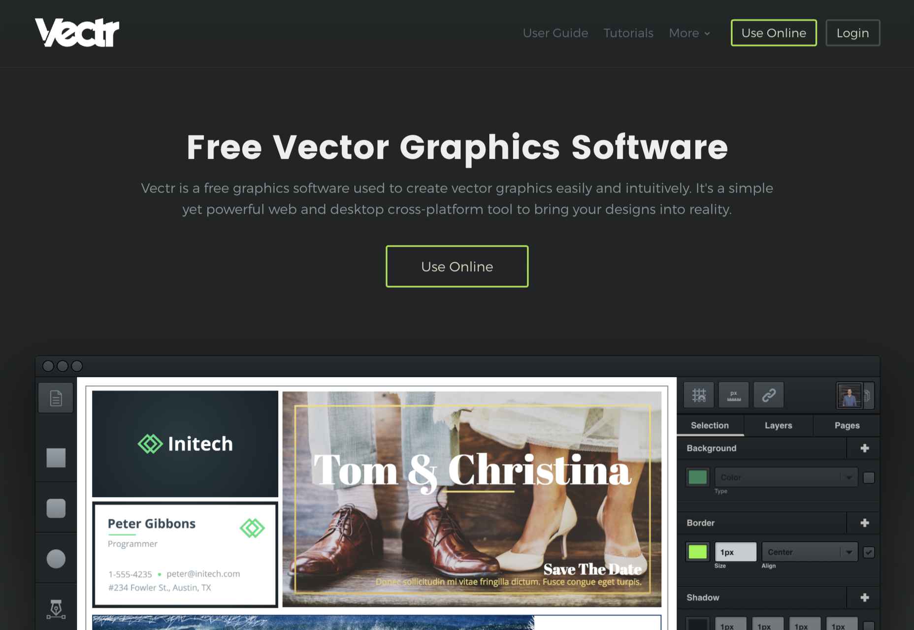
10. Vectr

Vectr is a simple vector design tool. It is heavily geared towards layout and even product design. It’s difficult to use it for many illustration jobs, but simple icon and UI creation are possible. It scrapes into our top ten thanks to the fact that it’s free to use.

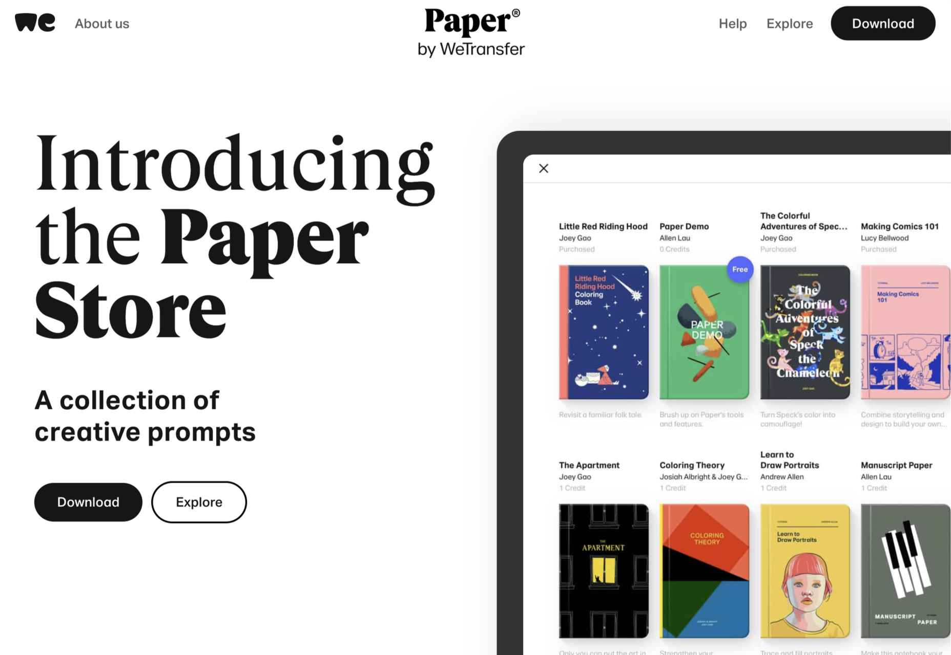
9. Paper

Paper is a sketching app developed by WeTransfer. It grabs number nine in our top ten thanks to its simplified interface that is perfect for generating ideas. It may not be the most flexible app, but it’s free to download, making illustration accessible to anyone with an iOS device.

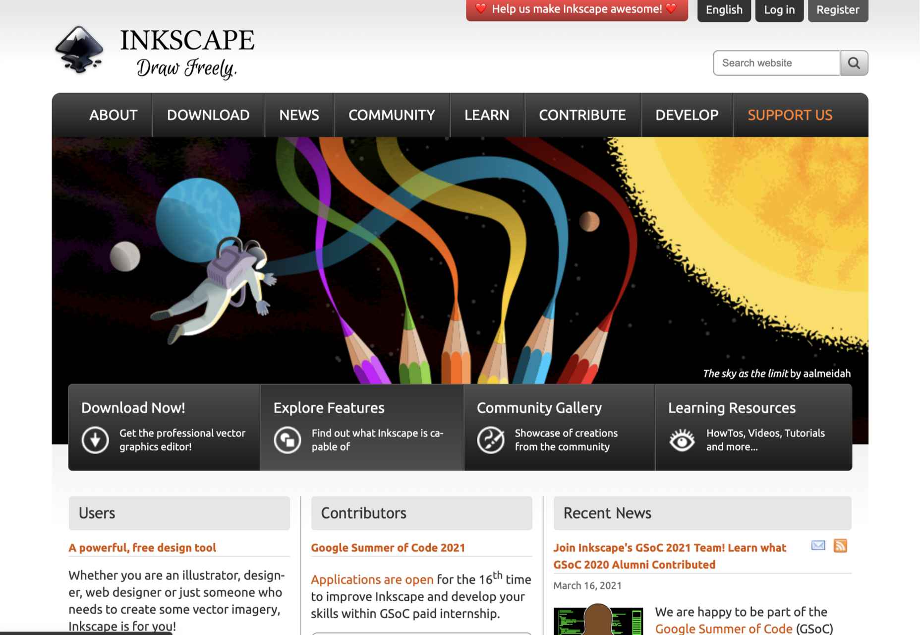
8. Inkscape

We love the fact that there’s someone out there producing a professional-grade artwork app for free. Inkscape is available for GNU/Linux, Windows, and macOS. If you’re interested in exploring this design area without signing up for a subscription or buying an iPad, Inkscape is a great place to start.

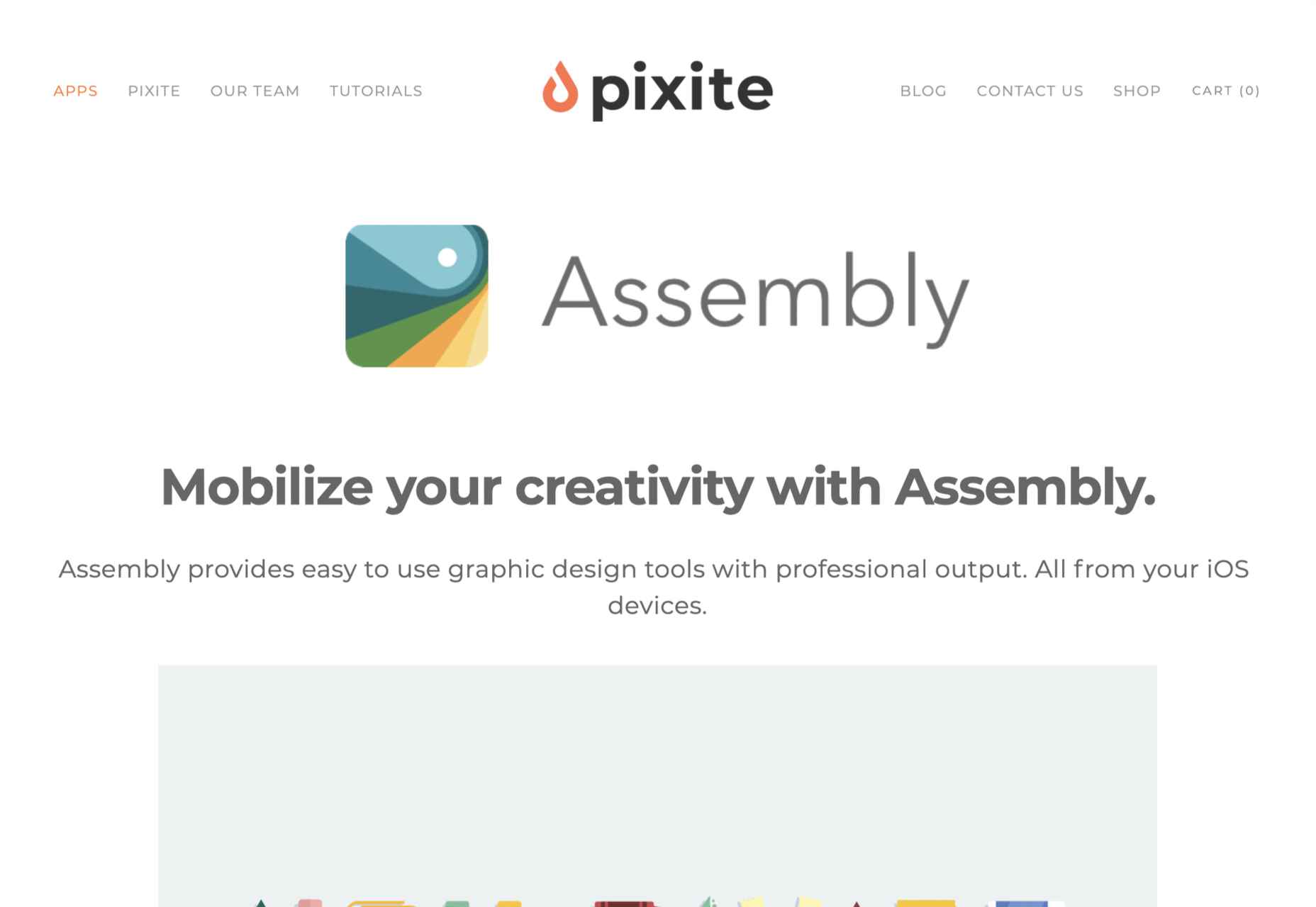
7. Assembly

Assembly is another app that’s dependent on the transition of illustrators from desktop machines to mobile devices and is available for iOS. Assembly does things a little differently; instead of manipulating boolean curves, Assembly builds illustrations out of shapes. If you’re someone who thinks they can’t draw (spoiler alert: everyone can draw), this is the app for you.

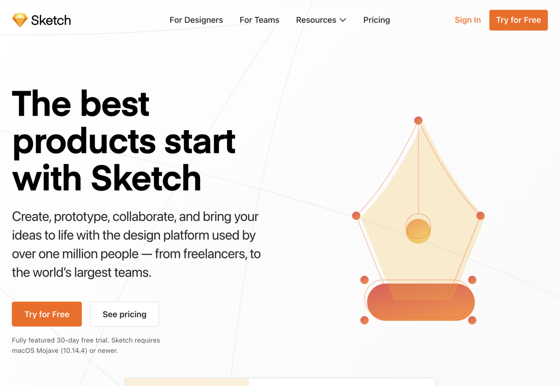
6. Sketch

It’s a shock low-rating for Sketch, the highly popular product design app doesn’t make it out of the bottom half of our list. The reason for the lower ranking? Sketch is an incredible design app, but its greater investment in prototyping features has come at the cost of drawing innovation. It’s still a great choice for crisp icon design, but it’s not flexible enough to take a higher spot in our list.

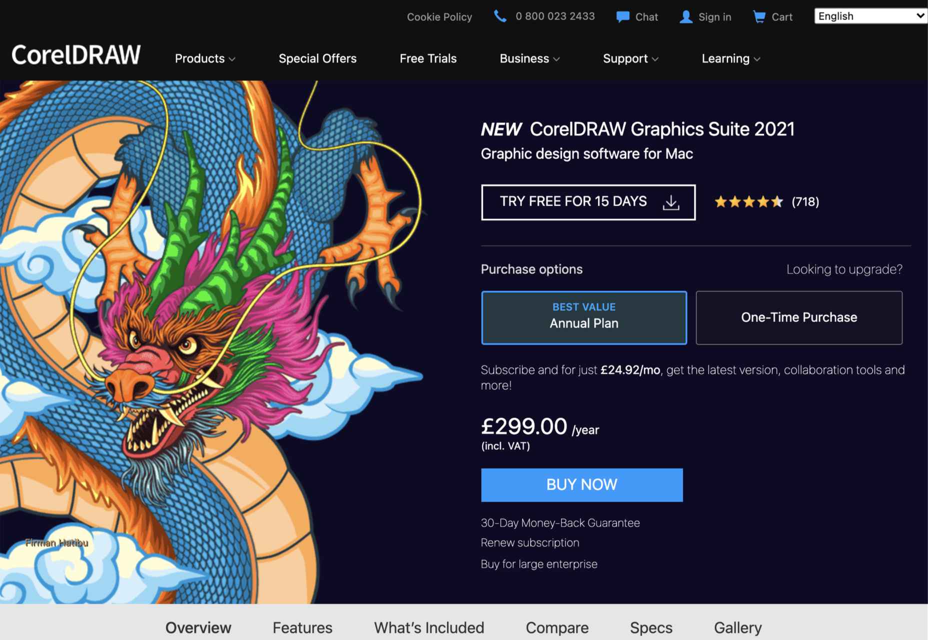
5. CorelDRAW

If you’re getting the impression that design apps are mostly for macOS or iOS, then you’d not be alone. CorelDRAW Graphics Suite is one of the few that began its life on Windows before being rebuilt for Mac. CorelDRAW is a premium option, but like Adobe’s offering, it is a suite of tools that cover everything you’ll need to create any form of design work you could ever need.

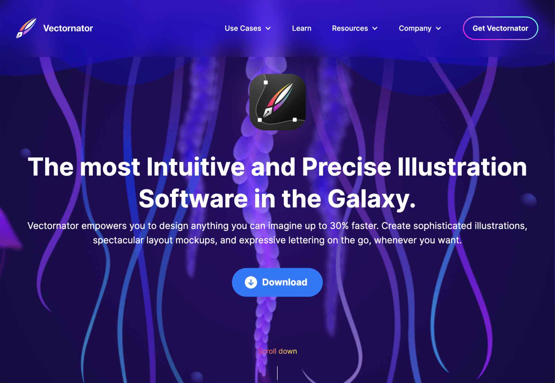
4. Vectornator

Moving closer to the top spot, Vectornator is an up-and-coming tool. Like many other apps further up our chart, Vectornator does a lot more than simply illustration. Its underlying tools provide a solid foundation for a flexible set of tools that you can use for any artwork. Vectornator does an awful lot, awfully well. 

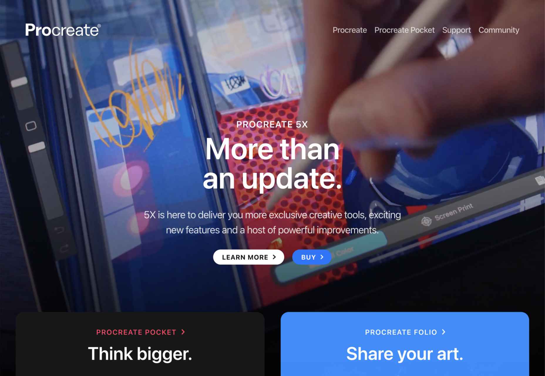
3. Procreate

Procreate is one of the finest apps on this list, thanks in main to its incredible brush studio; being able to edit the marks you make is essential for any expressive artwork. Procreate enables expressive illustration, typography, and simple sketches. The only downside to this app is that it’s iOS only; if available on more platforms, it might have been even further up the list.

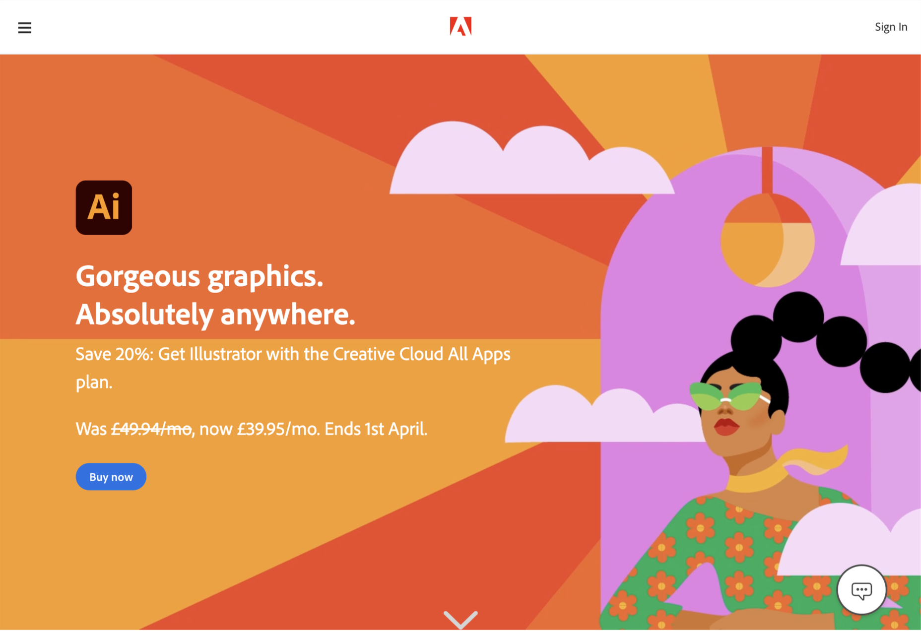
2. Adobe Illustrator

That’s right; we don’t think design giant Adobe’s illustration app Illustrator is worthy of the number one spot.

Illustrator is an excellent tool and arguably deserves to be considered Adobe’s flagship product. Since Adobe relented and allowed individual app subscriptions, it is also reasonably priced. It does everything you could want in an illustration app, from designing icons to creating original artwork.

So why not the top spot? It wasn’t so much that Illustrator fell down anywhere, as a different app pipped it to the post…

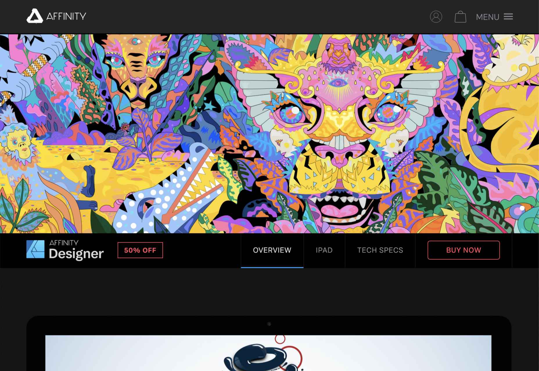
1. Affinity Designer

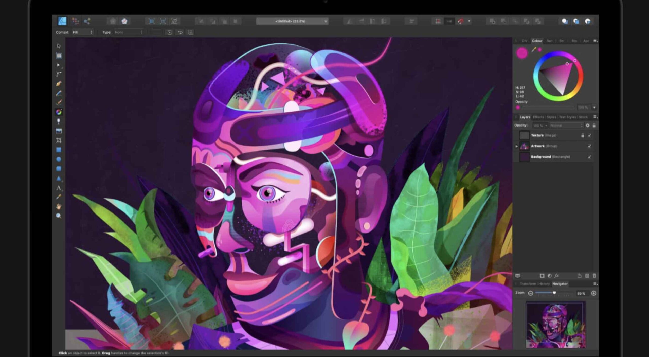
The best app for illustration in 2021 is Affinity Designer. We’ve been fans since its first beta version, and we’ve watched it go from underdog to champion.

On top of being an excellent vector app, Designer is comfortable with raster graphics. Although it certainly can’t compete with Photoshop (Affinity built Photo for that), Designer is more than adequate for many image tasks, making it a great all-around design app. Designer was also the first design app to support macOS’ new M1 chip natively.

The knockout blow is that Affinity Designer is available as a desktop app and an iOS app; the two apps have minor differences in their interfaces; what matters is that both apps use the exact same file format. You can seamlessly switch between desktop, iPad, and back to desktop, taking advantage of the precision of a mouse and the expression of a stylus.

It’s this kind of flexibility that bends Affinity Designer to your workflow instead of the other way around, and that’s why it’s top of our list.

Source

The post Ranked: Top 10 Illustration Apps in 2021 first appeared on Webdesigner Depot.

Source de l’article sur Webdesignerdepot

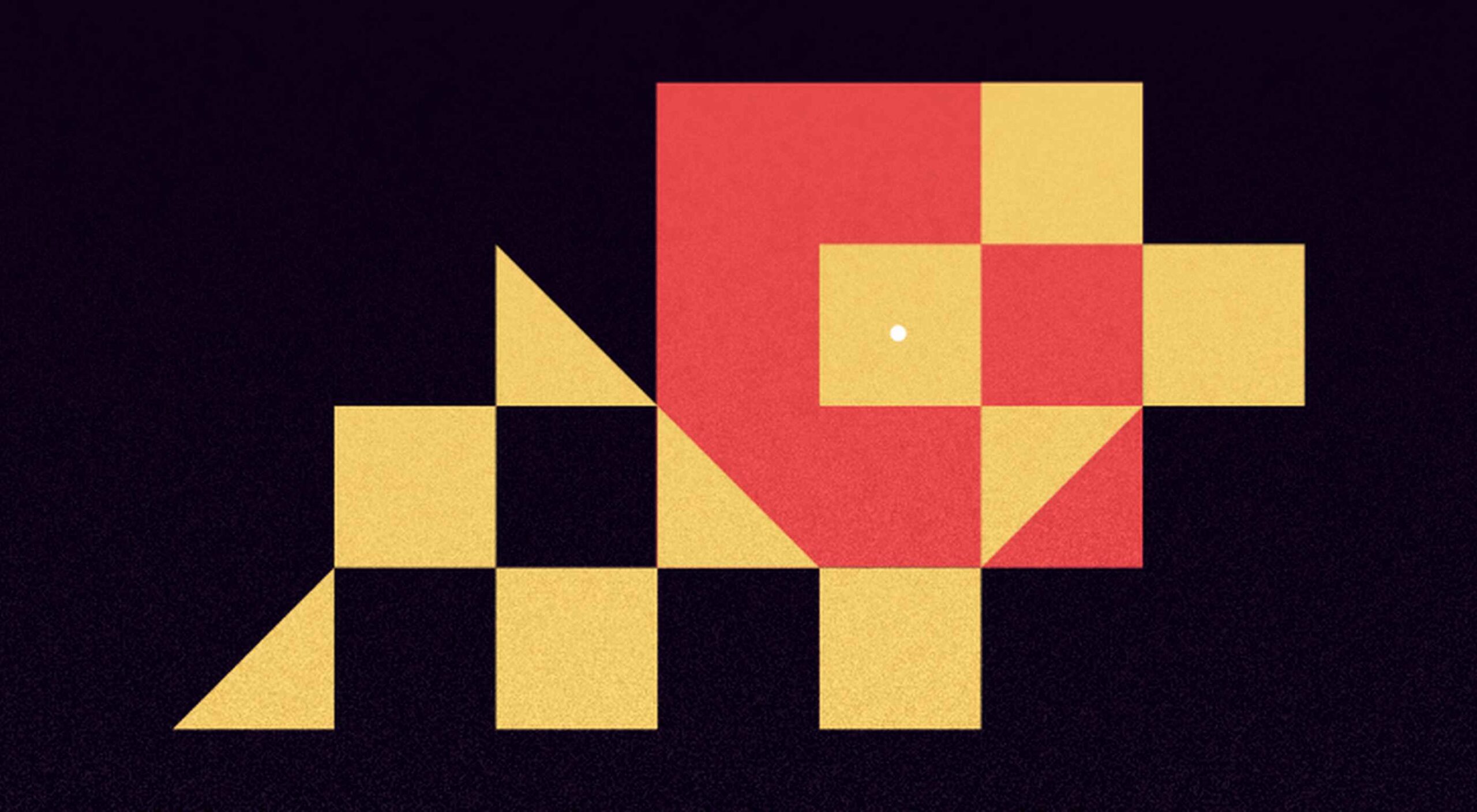
It’s Friday, and we wanted to have a little fun with a design test that might make you go cross-eyed.

Here are ten images, each with a dot in the middle of another shape — a square, a circle, or maybe something trickier. Can you tell with a glance if the dot is in the exact center of the shape? See how many you can get right; pathetically easy or fiendishly difficult? You decide!

Source

The post Quiz: Can You Spot The Center Of These Shapes? first appeared on Webdesigner Depot.


Source de l’article sur Webdesignerdepot

March is that time of year where the feeling of newness starts, from the first Spring days to fresh design projects. These trends are no exception, with fun new takes on some classic concepts.

Circles are always popular, but the top trend is an animated take on the traditional element; plus, fun pink and purple color palettes and a few faux split screen designs round out trending styles.

Here’s what’s trending in design this month.

Circle Animations

Circles are one of those shapes that never leave the design sphere. They have a lot of classical meaning and are flexible in terms of design options.

Designers are having a lot of fun with this shape right now. From animations to text circles to image frames, they seem to be all over the place.

More recently trending is more circle-shaped animations. This trend maintains a circle’s properties as a unified and harmonious element with movement to create more engagement and make you look at the design just a little bit more.

Each of these examples uses circles in a different but equally interesting – and animated – way.

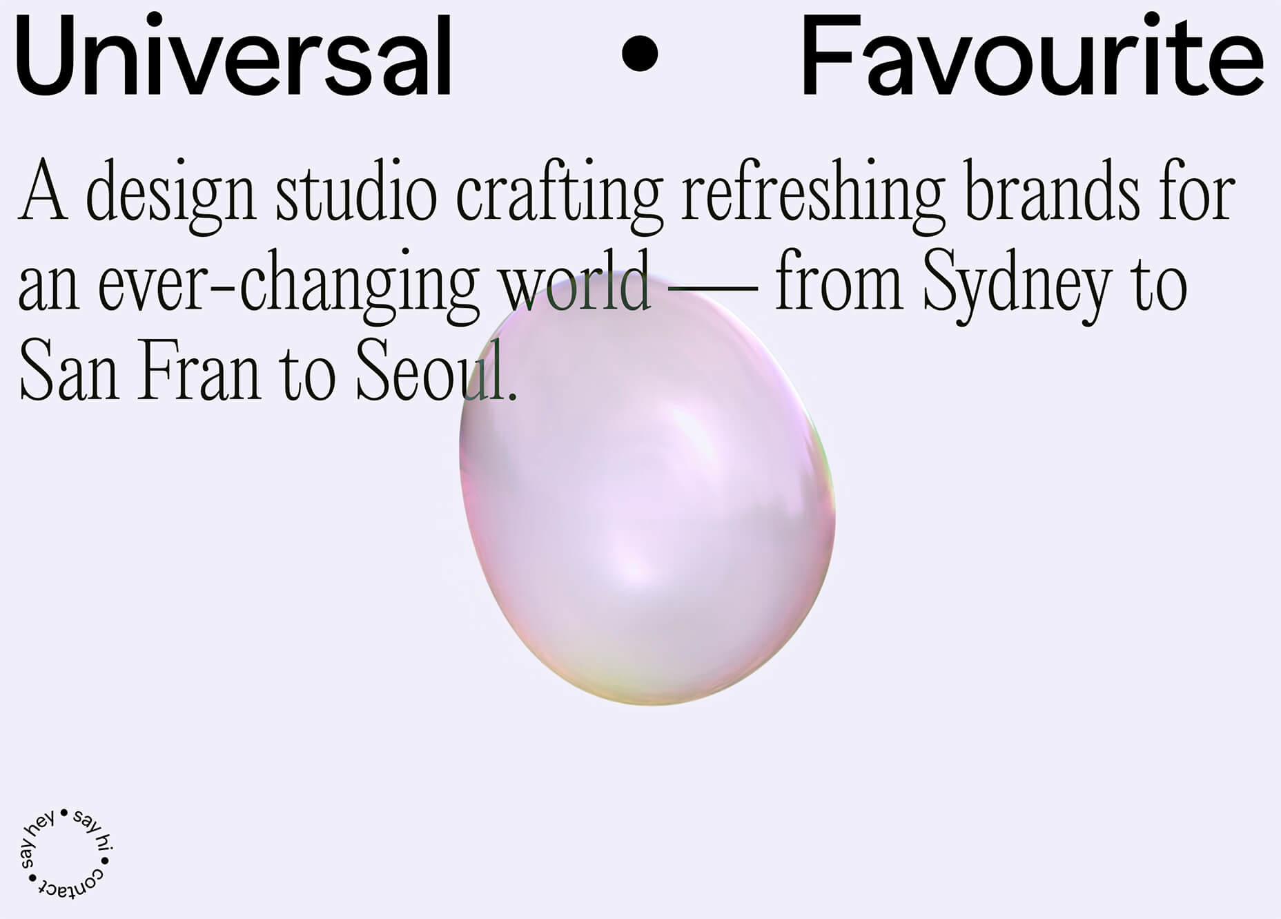
Universal Favourite uses a circular blob. It’s almost like a giant bubble. It wiggles and flows, and stretches within the space without any help from the user. It has a smoothly quality that makes you want to stare at it. The color here helps, with the circle and background not having an immense amount of contrast. Also, note the cute little circle button in the bottom corner.

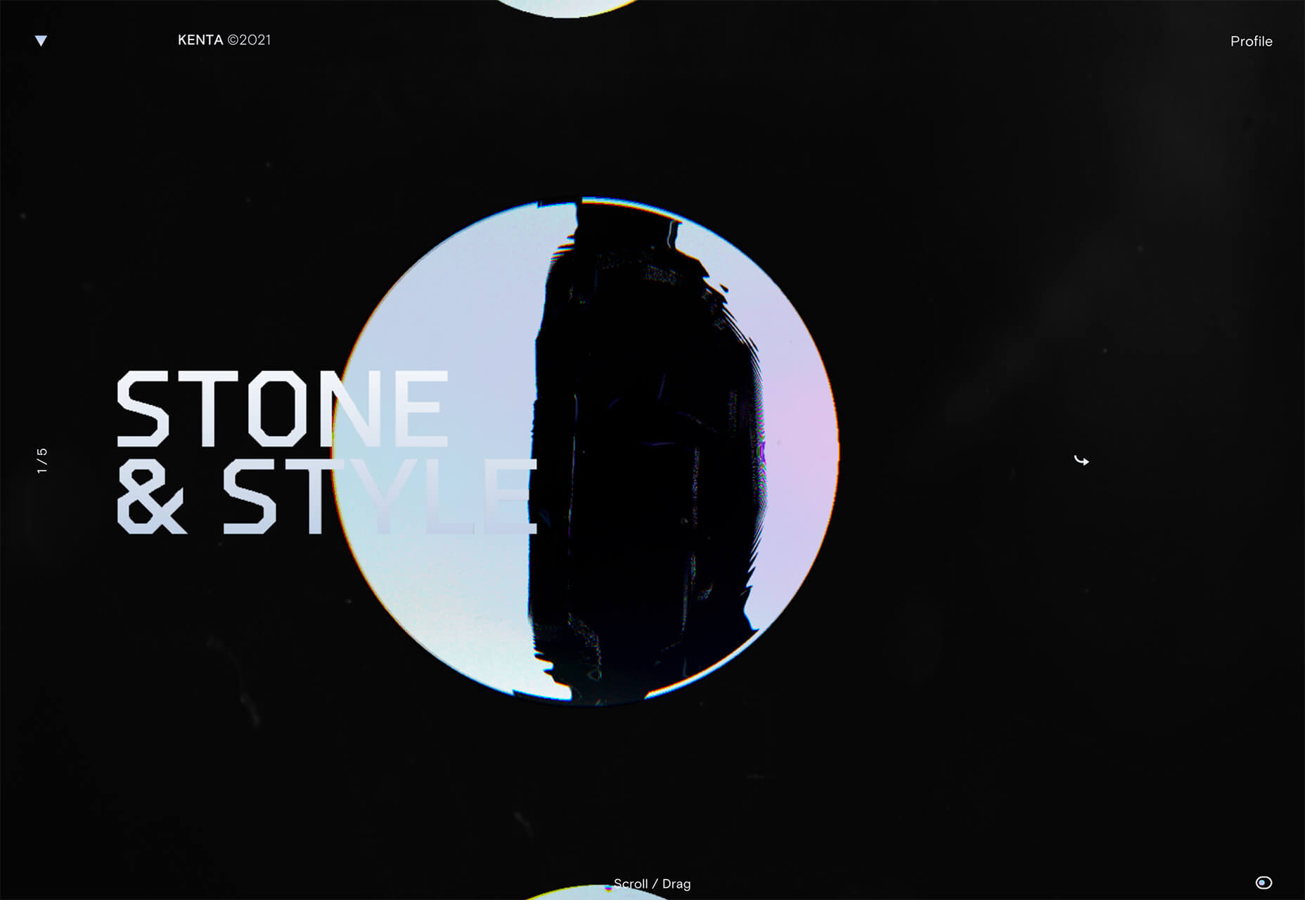
Kenta Toshikura put most of the subtle animation for this design inside the circle. With a hover state, the entire circle moves on the screen with a second layer of animation, and the cursor is also a circle that hops around the black background.

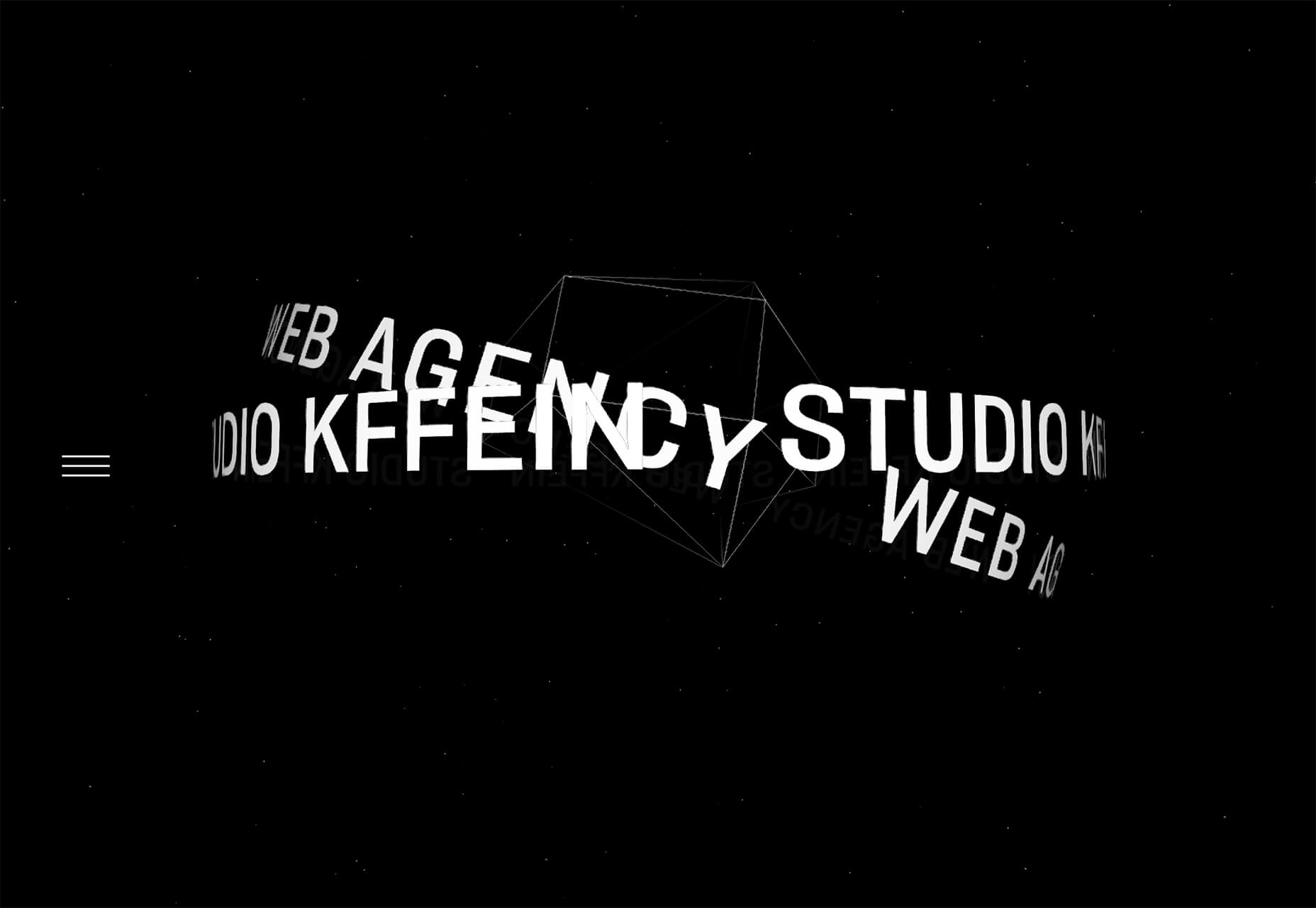
Kffein takes a totally different approach with a circle made from the primary test elements. Identifying website information rotates in a circle around another geo shape on the main plane. Not only is there a circular animation, but an almost three-dimensional effect that happens due to the way elements are layered here.


Pink and Purple Palettes

The prevalent pink and purple color combination isn’t for everyone – although you wouldn’t know it from the number of designs using similar colors.

This bright combination almost screams “spring” and has a lightness to it that almost seems to lift the mood of any project. (Maybe color selection is a reflection of how we all want to feel.)

What’s nice about these colors is that they flow into one another nicely. They can also be expanded to fall into neighboring hues on the color wheel, such as red from pink and blue from purple.

Maybe the most popular use of this color pair is as a gradient. You can find pink to purple everywhere, from background gradients to image overlays to buttons and user interface elements. There’s no lack of use here.

Each of these examples shows opportunities with this color combination.

SMU uses bright pink, blue, and purple to create a giant “road sign” in the design that jumps out from the rest of the project. The sign almost seems out of place and doesn’t fit as part of the normal color palette. This is what draw you right to it.

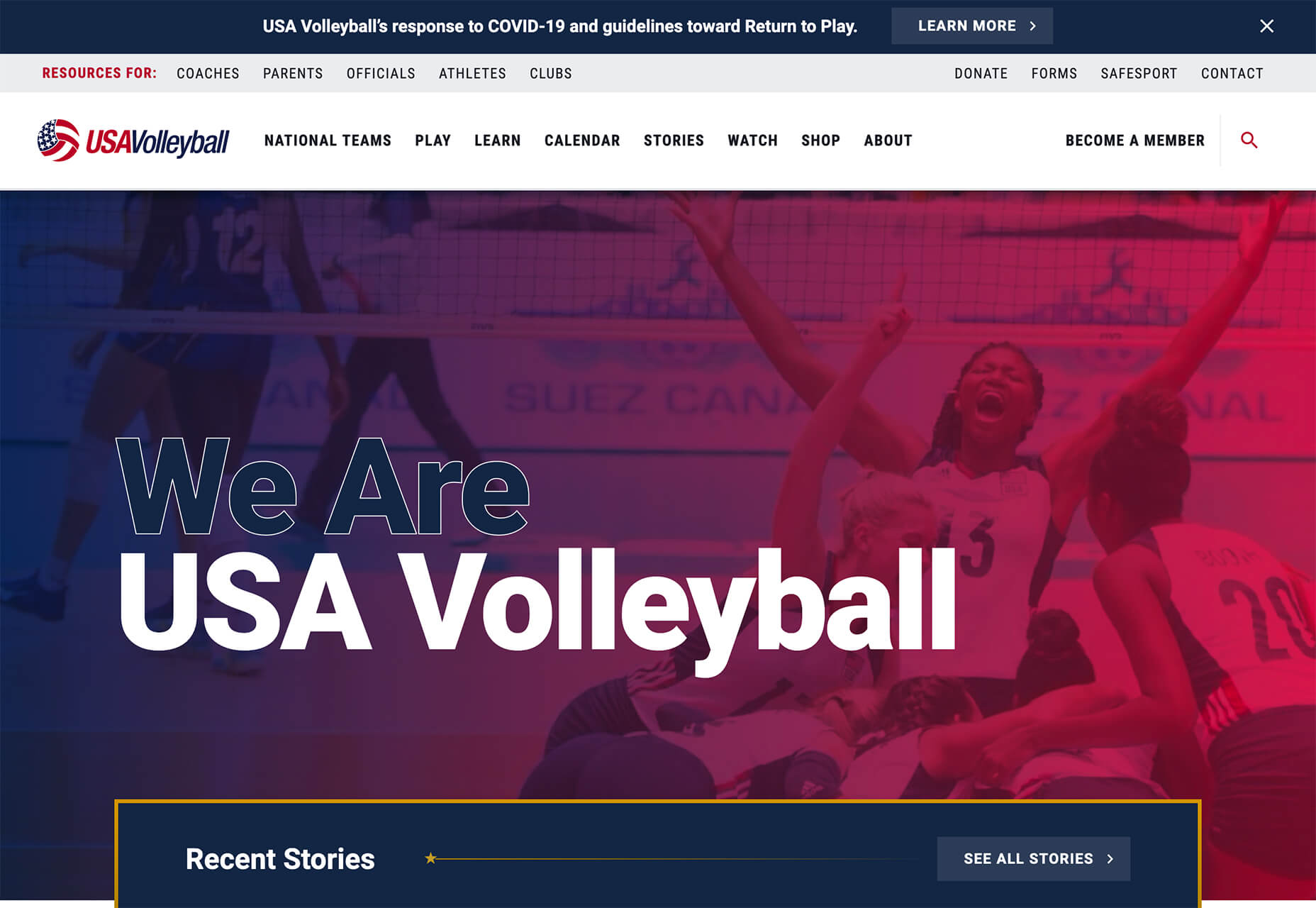
USA Volleyball uses the popular gradient option and extends the pink to the purple palette to hints of blue and red. What’s great about this design is that it uses a super trend element and color option and makes it work with their current color palette. You can almost imagine the design conversation when someone wanted to use a pink to purple gradient for a brand that features red, white, and blue. The gamble paid off, and it works beautifully without being off-brand.

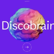
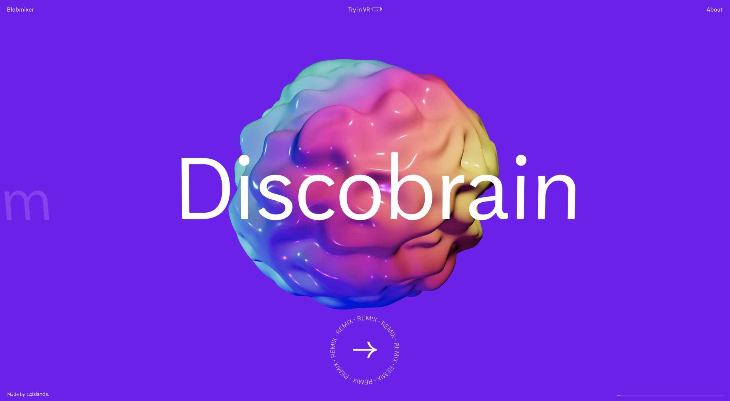
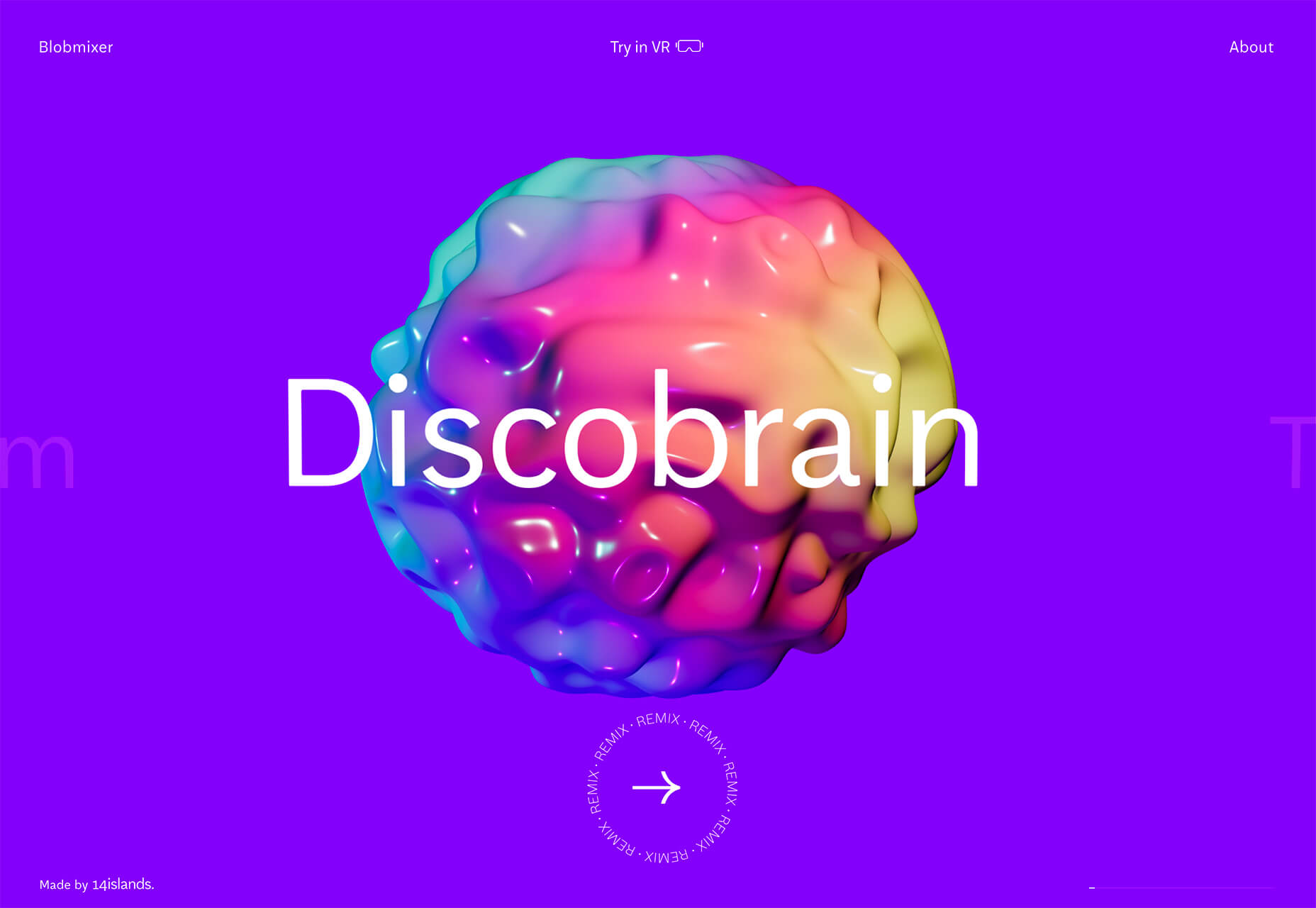
Blobmixer uses purple, pink, and a few other bright colors – note the animated circles, too – to draw users into the design. The entire project is a fun, customizable experience that you can play with, and the color choices are what make you interested enough to try. This design also offers a great example of tactile animation and elements that feel real even when you interact with them using a mouse on the screen.


Faux Split Screens

Split-screen designs were a huge trend for about two years. The aesthetic was also functional for content that required a this or that choice on the part of users.

Now, we see the design elements but without the function. (Maybe because it just looks nice and creates a sense of balance without a symmetrical design.)

These projects look like they might offer multiple gateways to content, but there is only one call to action on the dual-screen aside from navigation elements.

What this design option does is help draw the eyes across the screen. One side will immediately appeal to you, and when done well, you’ll feel a subtle push of pull from the color, text, and images to look at the other side as well.

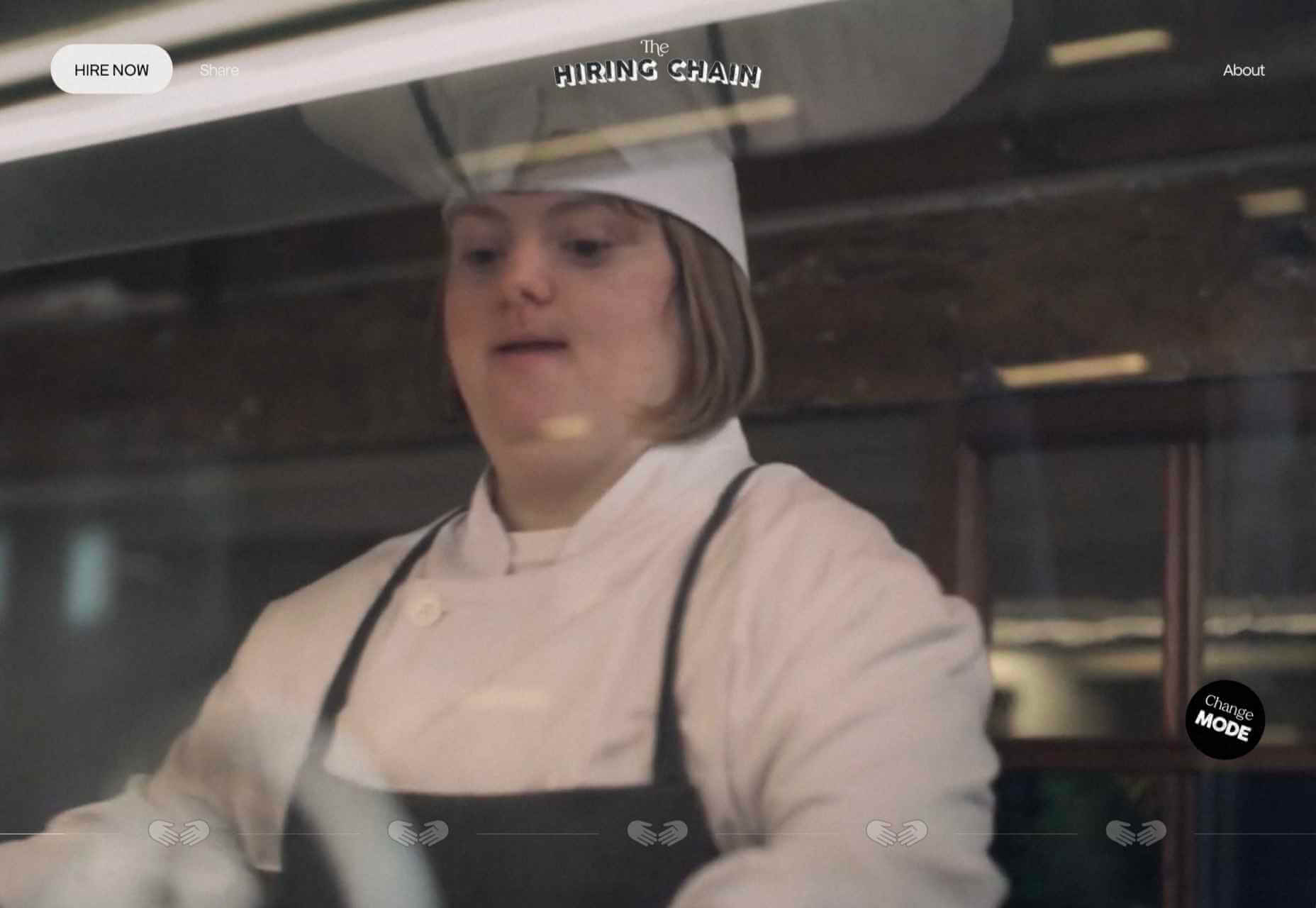
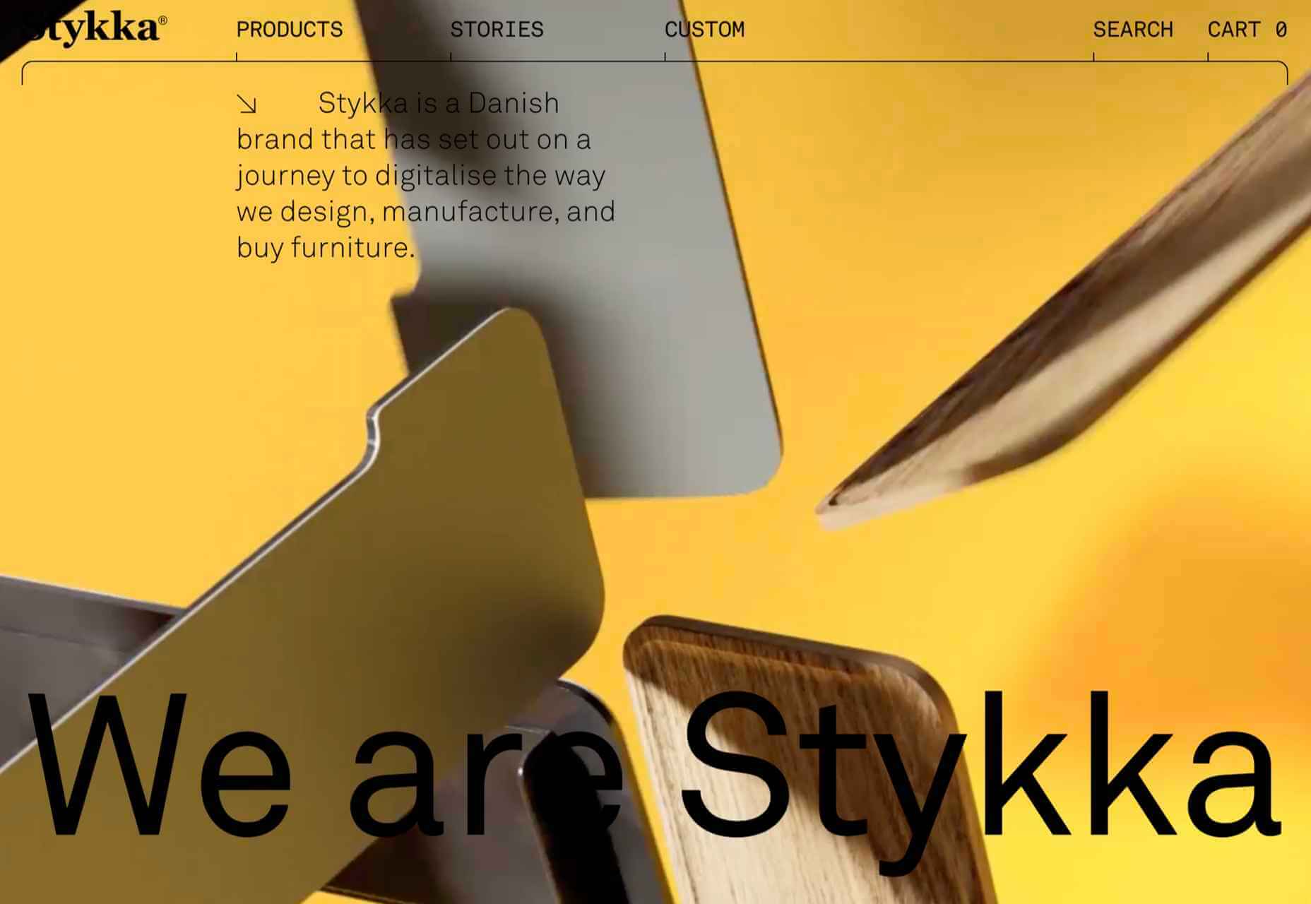
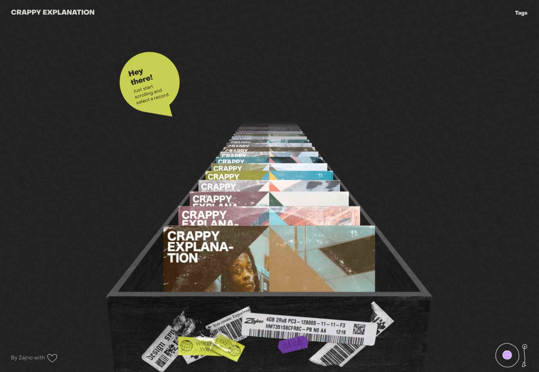
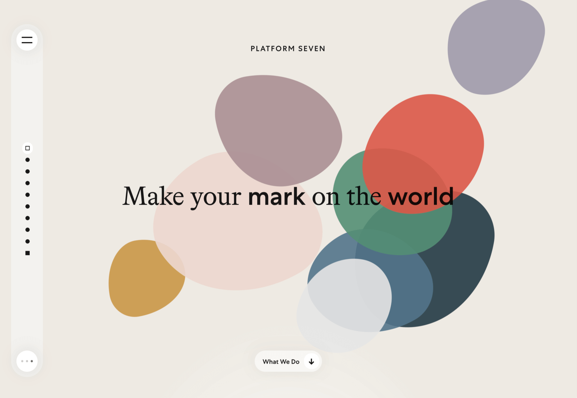
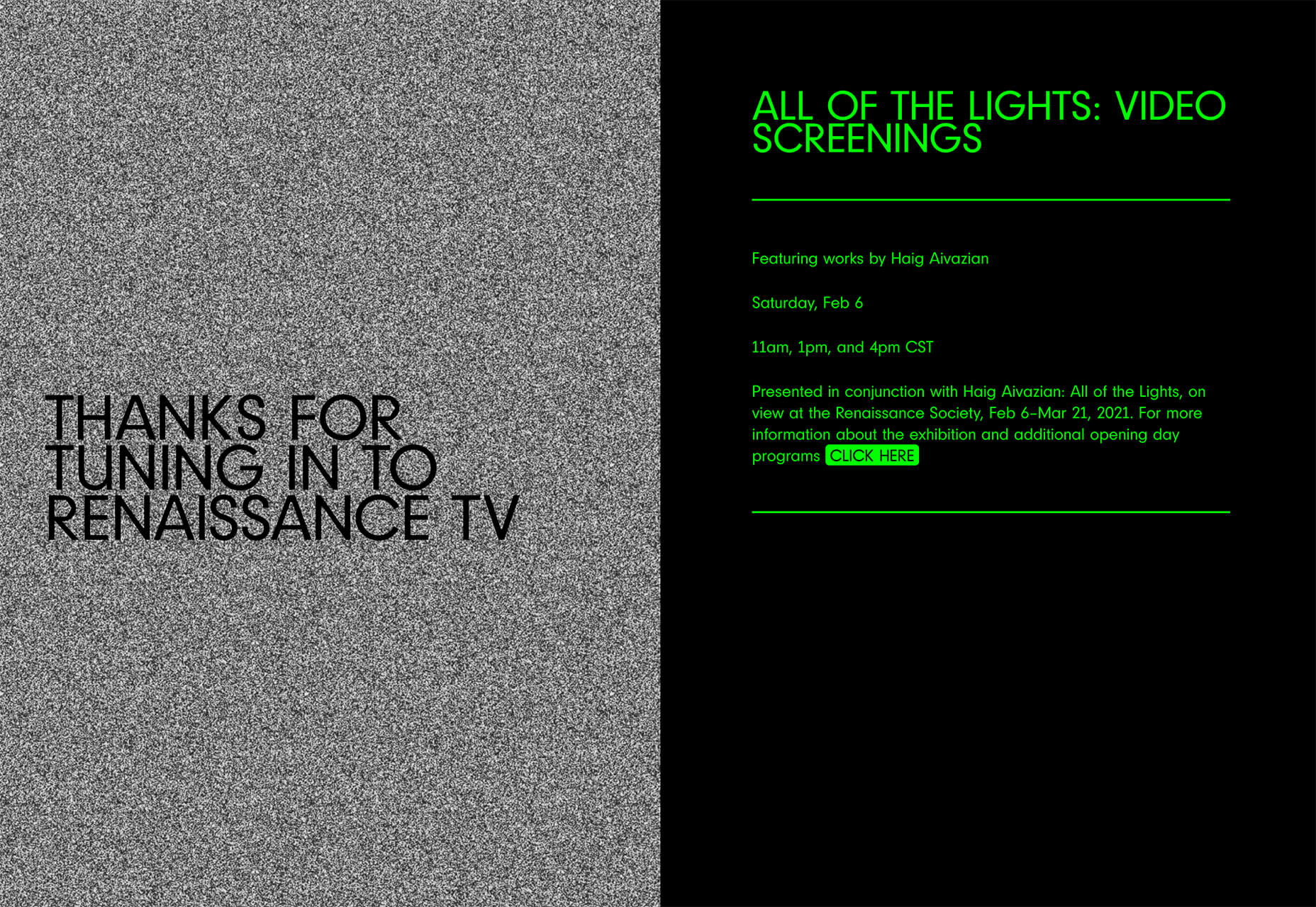
Renaissance TV does it with heavy animation with “dancing dots” from an old TV that doesn’t work. But then you need to look at the green text to understand what is happening.

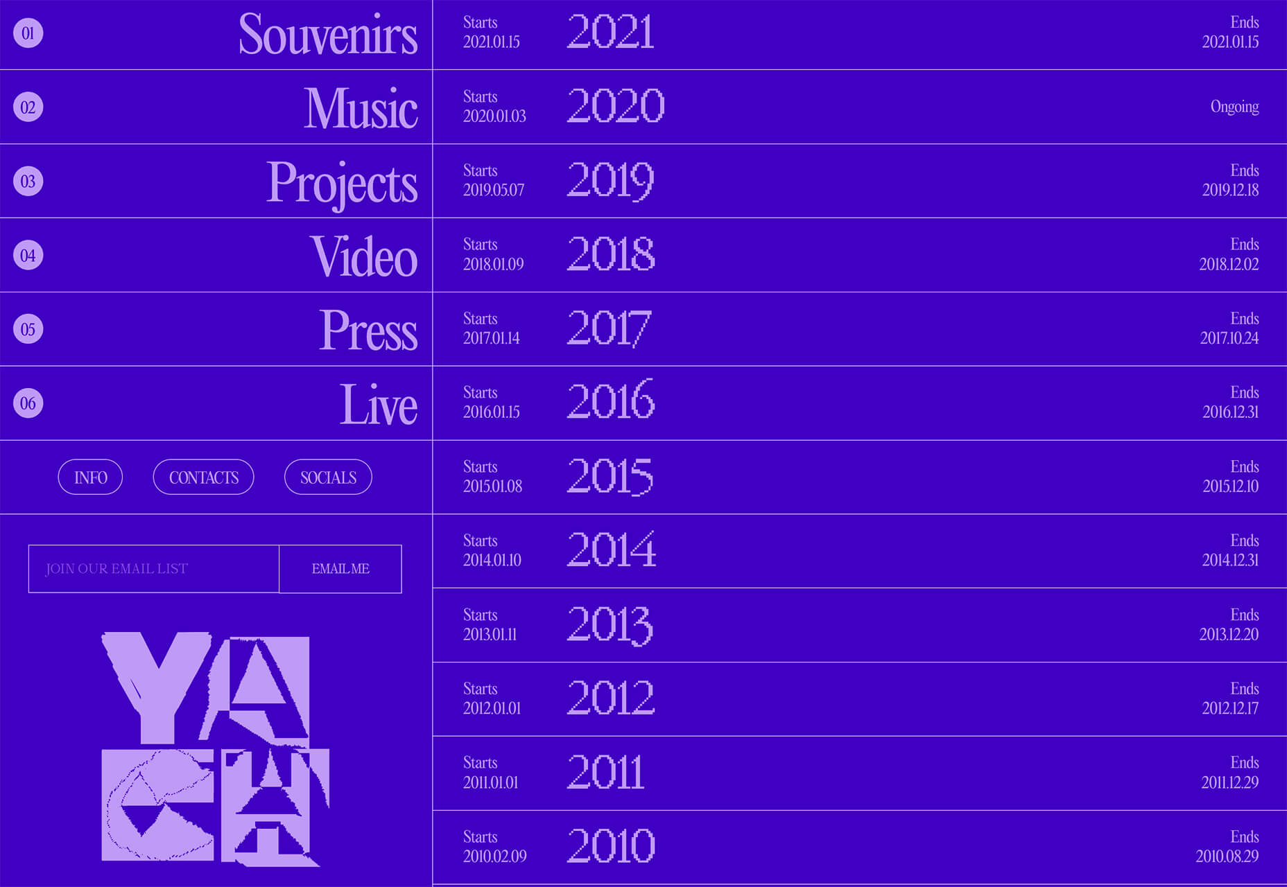
Yacht uses text weight and space to push the eyes across the screen. Almost everyone will go to the heavier areas first and then gaze across the screen through blocks of space to the final small text on the right side. And it all happens in a fraction of seconds.

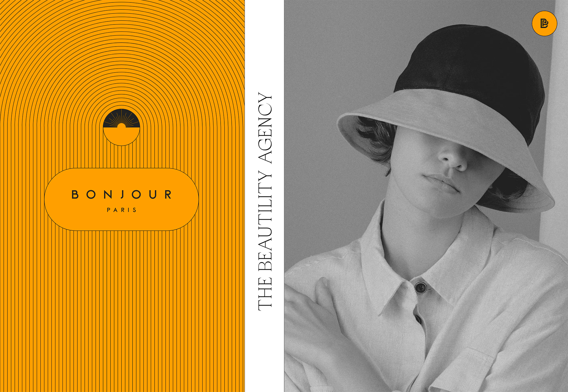
Bonjour Paris pairs bold color with black and white images. You may look at either side first, depending on personal preference, but the other half of the screen is necessary for a complete understanding of the website.


Conclusion

While all of these design trends are evident in new and recent projects, the use of pink and purple color palettes – particularly with a gradient – seems to be everywhere you look. These color choices are popular and come in a lot of forms.

Maybe the most obvious is with brighter pink and purple gradients, but other variations are also trending. It’s definitely one to watch in the longer term.

Source

The post 3 Essential Design Trends, March 2021 first appeared on Webdesigner Depot.

Source de l’article sur Webdesignerdepot

There are many reasons you might be wanting to improve your design skills this year. Perhaps you have extra time on your hands and want to put it to good use. Or maybe you’re new to web design and finding that there’s a lot you still don’t know how to do. It could also be that you recognize that the web is changing, and your skills could use some refreshing to keep up.

Whatever the reason, there are many ways to level up your web design skills in 2021. Here are 12 ideas to get you started:

Tip 1: Niche Down If You Haven’t Already

Jack-of-all-trades designers might be able to say “yes” to everyone. However, they’re going to be stretched very thin as they attempt to strengthen every skill needed to keep up with demand.

It’s much easier to become a trusted designer and to improve your skills if you have a smaller and more specific skill set to develop.

Just keep in mind that niching down doesn’t necessarily mean focusing on a particular industry. For instance, you might choose to be a UX designer instead of a web designer. Or you might specialize in designing ecommerce websites instead of monetized blogs. Just find something that you’re passionate about and will be good at doing, and zero-in on the skills needed for it.

Tip 2: Play Around in the Sandbox

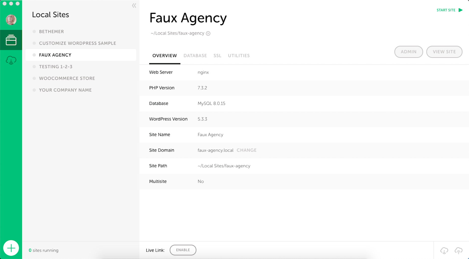
Local development environments are useful for staging websites, doing redesigns, and testing updates safely away from live sites. But you can also use them for experimenting with new design techniques, trends, templates, plugins, and more.

Local by Flywheel is the one I prefer to use:

Here’s a good exercise to start with:

Take a website you like — something you’ve looked at in awe and couldn’t imagine ever building on your own. Then, put yourself to the test. See if you can recreate it in your sandbox.

Don’t be hard on yourself if you don’t figure it out right away. Consult your resources and give yourself time to make sense of what’s going on and implement it with the available skills and tools.

Tip 3: Redesign One of Your First Projects

There’s always a clear evolution in a designer’s skill set, from the day they begin designing to the present day. And that’s a good thing. If your work doesn’t improve or change with time, then you’re going to have a lot of catching up to do when the stagnation begins to hurt your business.

Want to see how much progress you’ve made so far? Revisit one of your first projects and look at it with fresh eyes. I bet you’ll see a big change in how you design today from how you designed that site then.

Now, ask yourself what you would do differently. And then, go to your sandbox and do the redesign.

Tip 4: Work on a Passion Project

A friend of mine is taking a UX design course and needed some users to run through a prototype he created for the class. He could create anything he wanted, so he designed an app related to his other love: Music.

While he could’ve easily thrown together some carbon copy of Spotify or SoundCloud, he came up with a completely new concept. And it was really impressive, to the point where I urged him to put it into production and see if he could list it in the app stores.

I think it’s when we’re really passionate about something that we’re willing to push past our limits. So, carve out some time to tackle that passion project you’ve been toying around with and see where it takes you.

Tip 5: Share Your Designs on Dribbble and Ask for Feedback

One of the reasons UX designers do user testing is how valuable users’ raw input is. While it would be nice to think that design is a completely subjective matter, that isn’t really the case when usability becomes compromised due to design choices.

Understanding what users like and dislike is an important part of taking your design skills to the next level. And a good way to do that is to share your designs on Dribbble.

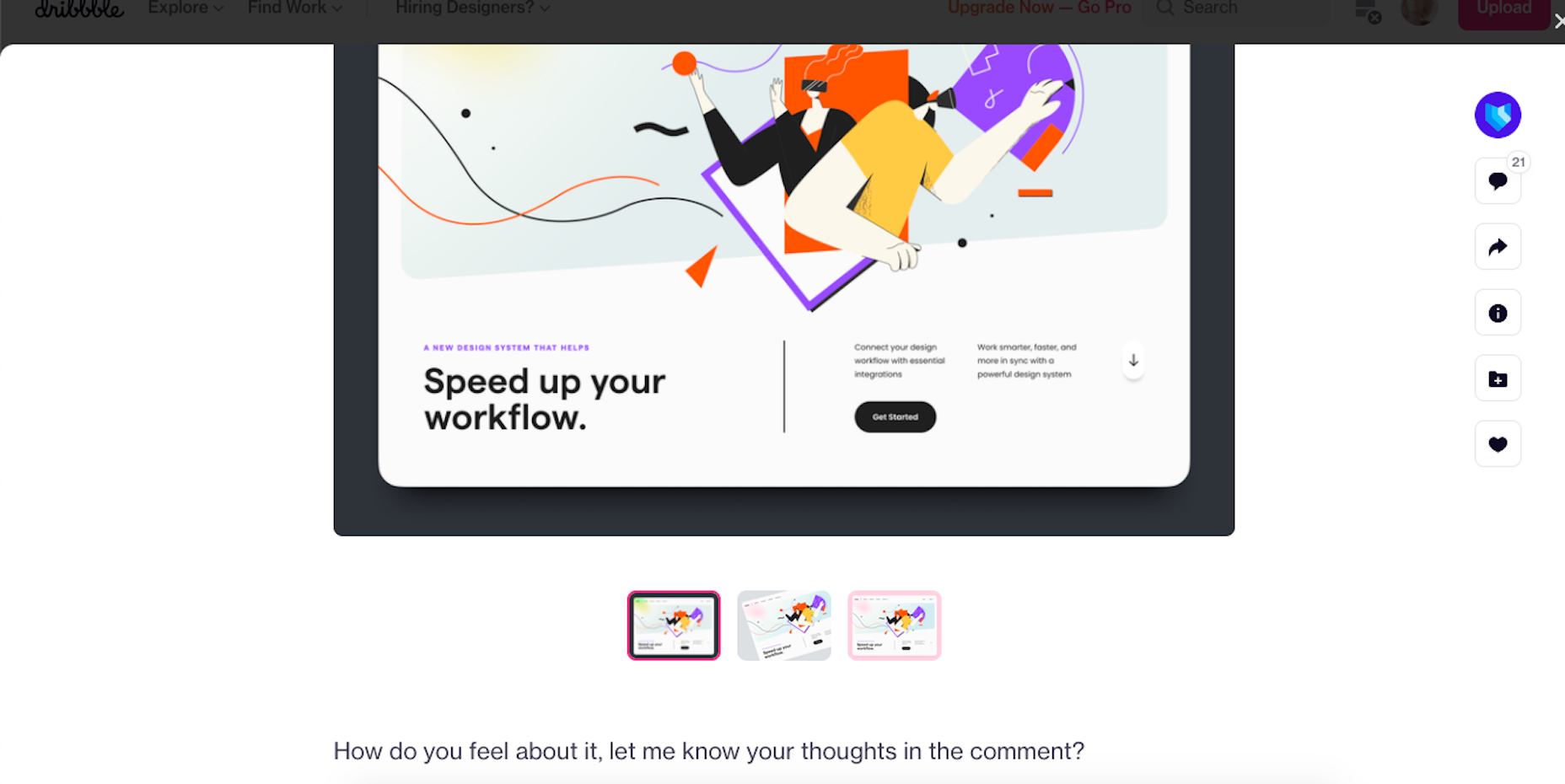
Here’s an example of UI8 asking for feedback:

Tip 6: Create a Design Toolbox

I’m a huge fan of automation and shortcuts powering things behind the scenes in business.

After all, one of the reasons you become a web designer is so you can design, right? When you’re bogged down with administrative and logistical tasks, that’s time spent away from doing what you enjoy.

One way in which you can streamline your backend processes is by putting together a design toolbox. Your preferred CMS. Flexible templates or apps you use from project to project. Website testing tools. And so on.

As you do this, it’ll force you to examine how you build websites. Are you really working as efficiently as possible? Are there newer apps or systems that’ll help you design better sites? And as you improve your design toolbox, you’ll improve your design skills.

Tip 7: Subscribe to Your Favorite Blogs

I have a hard time recommending this one, only because I’m reluctant to sign up for yet another newsletter. That said, I do see the value in subscribing to some blog newsletters as I don’t always remember to revisit their websites and check out the latest content.

What I’d suggest you do is pick one or two design blogs that have a good variety of content and publish regularly. And then pick one small business or freelance blog.

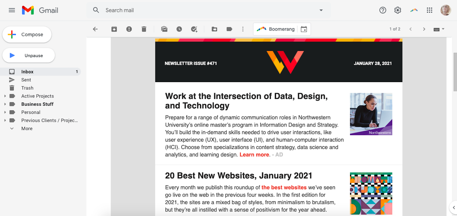
WebdesignerDepot, of course, is a good one to start with as it comes at a good frequency, recommends great reads from all around the web, and is fluff-free:

I’d also recommend signing up for one that’s focused on your niche as well as one for business.

As a freelancer, I’d vote for the Freelancers’ Union newsletter. There’s always something timely and useful in there.

Tip 8: Listen to a Podcast

I just adopted a second dog, so I’ve spent a lot more time on walks while house-training her. At first, I was stressed about it because it was time spent away from work. However, I started to fill that time with podcasts and found that it helped me work better for the rest of the day.

One reason is that I’ve been listening to work-related podcasts, which are always chock full of helpful tips. Another reason is that it gives my eyes a rest from looking at the screen so that when I come back 15 or so minutes later, I feel refreshed and ready to go.

Rebekah Carter has a good set of web design podcast recommendations to get you started.

Tip 9: Take a Free Online Design Course

There’s an overabundance of information online. If you want to brush up on CSS, there are hundreds of YouTube courses that cover it. If you want to learn how to use a new WordPress plugin, you’ll find dozens of great tutorials across various online course platforms, YouTube channels, and even people’s blogs.

There’s no need to go back to school to become a better designer. Here are five places where you’re bound to find free courses for web designers.

Tip 10: Read a Book on Design Principles or Theory

It’s easy to lose sight of design principles when your clients are clamoring for a website that will make them a lot of money, get them a lot of readers, and so on. Sure, you can design a UI and UX that works, but do you remember why the design choices you made are effective?

Choose a book — just one to start — that’ll help you reconnect with the roots of good web design. Not only will you get a good refresher on web design principles or design theory, but you might learn something brand new.

Here are some of my favorite books for web designers:

Tip 11: Find Your People

Now more than ever, finding a community of like-minded web designers, developers, or freelancers is important. It’s not just about having a group of people to vent to when clients drive you nuts (though that’s great, too).

It’s about finding a group that brings something new to the table and enriches your understanding of web design and what it means to be a web designer.

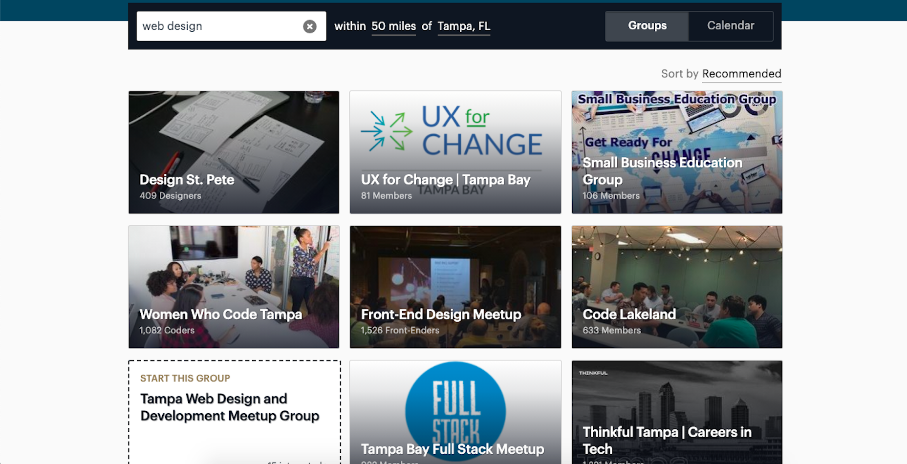
If you’re on Facebook or LinkedIn, start there. There are tons of web design and freelance groups that have productive discussions every day. If you prefer to meet up with local designers and developers, check out Meetup.

You may be surprised by how many groups there are and the kinds of meetups they have planned.

Tip 12: Attend a Virtual Conference

Did any of you attend a design conference last year? I did. I virtually attended Adobe MAX — from the comfort of my home, in my pajamas, for three days.

I scheduled my assignments around the sessions I wanted to attend and didn’t have to pick one over the other (i.e., “Do I make money or do I learn something new?”).

Some of the sessions showed us how to do more with Adobe’s tools, while some of them featured design and business leaders who shared personal insights on how to work more effectively. It was a great way to shake up my normal routine and to get a ton of information about the future of web design in a short period of time.

Which of These Tips Will You Use to Improve Your Design Skills?

Like I said before, there’s a lot you can do to improve your design skills. Just be careful not to overdo it.

Pick one or two things on this list to start with. If you have more time in your schedule and you’re excited about what you’ve learned so far, add a couple more.

Just take it slowly. Your brain will only be able to absorb so much at once. Plus, the last thing you want is to burn yourself out on skills training and not have the energy to complete your work.


Featured image via Unsplash.

Source

The post 12 Tips to Improve Your Web Design Skills in 2021 first appeared on Webdesigner Depot.

Source de l’article sur Webdesignerdepot

If you like to build websites with WordPress, then you’re in for a treat.

Now, for the first time, you don’t need to know how to code to use Google’s popular Material Design system on your WordPress website; the web giant has released a WordPress plugin and theme to import its colors, icons, UI elements, and typography straight into your CMS.

Google already provided a set of tools for generating Material Design themes, but until now you needed to know how to copy that code across to your site files. With this latest plugin and theme, all you need to do is click and go.


You need to install both the plugin and theme to take advantage of Material Design for WordPress. Using the add-ons, you can tweak your typography via Google Fonts, add-in MD color, and even choose your own icons. If even that’s too much, pick one of the pre-built themes. One of the best features is that the plugin warns you if your customizations break accessibility guidelines, saving you a do-over when you discover it later on.

Google calls it “an experimental plugin and theme,” which means it’s subject to change. And Google has been quick to emphasize that the plugin is very much a work in progress, asking for feedback to help them direct future development efforts.

It’s a really great option for anyone who’s starting on the web, building their first site, or who really wants a nice reliable design system that they can build on in the future.

It’s yet another automation tool that has driven WordPress to the top of the technology pile and made it the CMS of choice for 40% of the web. As tech hots up and AI continues to develop, it’s hard to dismiss the idea that one day soon, our only contribution to websites will be paying the hosting bill!

Source

The post Try the New Material Design Capabilities for WordPress first appeared on Webdesigner Depot.

Source de l’article sur Webdesignerdepot

Every week users submit a lot of interesting stuff on our sister site Webdesigner News, highlighting great content from around the web that can be of interest to web designers.

The best way to keep track of all the great stories and news being posted is simply to check out the Webdesigner News site, however, in case you missed some here’s a quick and useful compilation of the most popular designer news that we curated from the past week.

Google’s Next Big Chrome Update Will Rewrite the Rules of the Web

10 Best Alternatives to Google Analytics in 2021

Gamification in UX Design: Designing Fun Experiences for Serious

UI Design Trends for Web and Mobile We Start 2021 With

Getting The Most Out Of Git

Appreciating the Unsung Heroes of WordPress

Simple CSS Line Hover Animations for Links

How to Kill a Unicorn

Animating a CSS Gradient Border

Color Spark – A Color Scheme Plugin for Figma

QuickLens – Inspect the UI Like a Pro

6 Important WordPress Gutenberg Updates to Be Aware Of

23 Exciting New Tools for Designers, February 2021

A UX Guide to Optimize Conversions

13 UX Tips That Will Improve Your Website’s SEO

Don’t Offer a Free Plan

The 25 Best Single Page Web Designs

Illustration Kit – Premium Open Source Illustrations Updated Daily

DesignOps: Just a New Buzzword?

Bilgge – a Privacy-paranoid Free Service for your Notes and Secrets

How to Deal With Designers in 10 Easy Steps

Website Optimization Checklist: Your Go-To Guide to SEO

JavaScript Minification Benchmarks

Framer is Dead · A Love Letter to my Prototyping Tool of Choice

The Differences in Web Hosting (Go with the Happy Path)

Pixelplace.io – One Giant Pixel Canvas That Anyone Can Draw On

Source

The post Popular Design News of the Week: February 8, 2021 – February 14, 2021 first appeared on Webdesigner Depot.

Source de l’article sur Webdesignerdepot

One of the few bright spots in 2020 has been the creativity companies and individuals alike have exhibited in dealing with what, at times, seemed to be overwhelming problems.

The world of web design was no different. Designers and agencies had to adapt and implement new color schemes or design new shopping experiences, which made some of the previous design trends not fit for the current design problems.

We’ll take a look at these newest design trends and the rationale behind them. As we do so, we’ll also take a look at some of BeTheme’s 600+ pre-built sites that have already put them to good use.

1. Comforting Color Palettes Lighten the Load

In years past, bolder color schemes were one of the hallmarks of web design trends. Their purpose was to quickly engage a visitor and prompt him or her to respond emotionally.

Given all the drama and turmoil we were subjected to through most of 2020, we’ve come to welcome the use of toned-down colors in marketing instead of the bolder, brasher, and more “in-your-face” color schemes. 

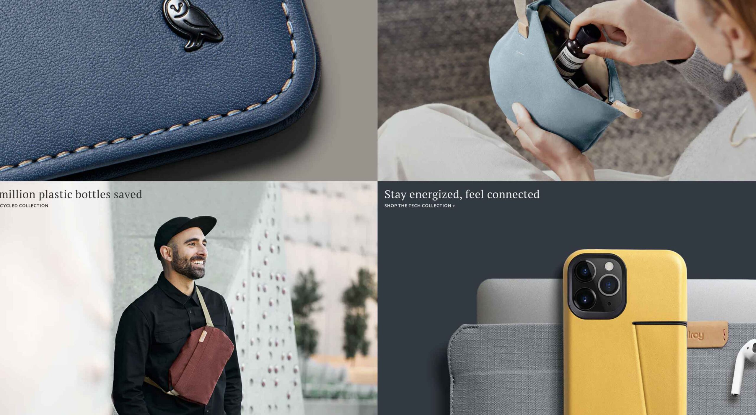
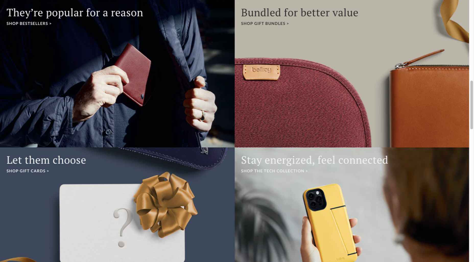
Bellroy’s website puts toned-down colors to good use. This company’s product line of wallets, bags, and the like, are designed to keep people’s belongings organized, safe, and secure. A wild color scheme simply wouldn’t be fitting.

How, then, are brightly-colored products dealt with? Thanks to judicious uses of white space and background photos, this website still emphasizes a toned-down color palette.

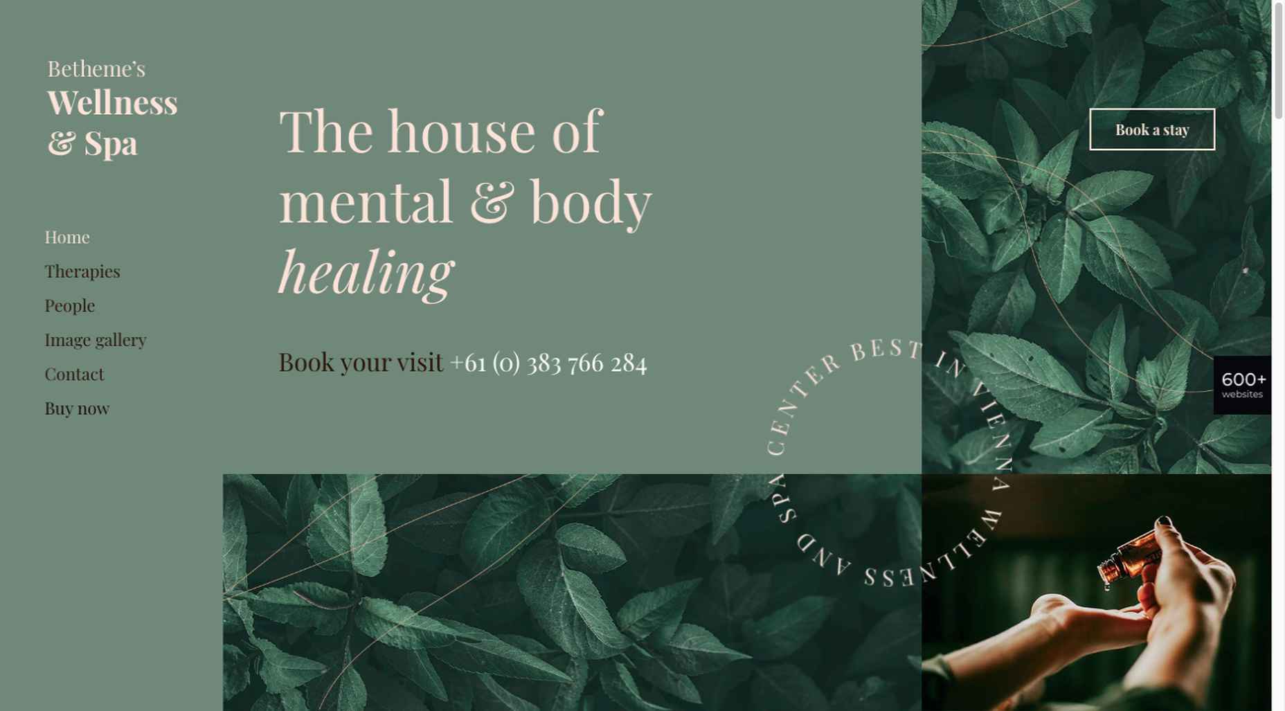
The BeSpa pre-built website is another example of a color scheme that almost immediately puts the mind at ease.

Calm and soothing? Yes.

Boring? Definitely not.

Comfort and security are the emotional drivers in this example.

2. Seamlessly Intermingle and Balance Physical and Digital Imagery

People confined to their homes because of Covid-based restrictions spent many more hours looking at their screens in 2020. Online programming began to take on the appearance of a reality show that blurred the boundaries between the real and the digital.

Whereas web designers tended in the past to rely on either photos or illustrations in their designs, these same designers have started to integrate these blurring effects into their designs, with results that range from amusing and quirky to highly informative.

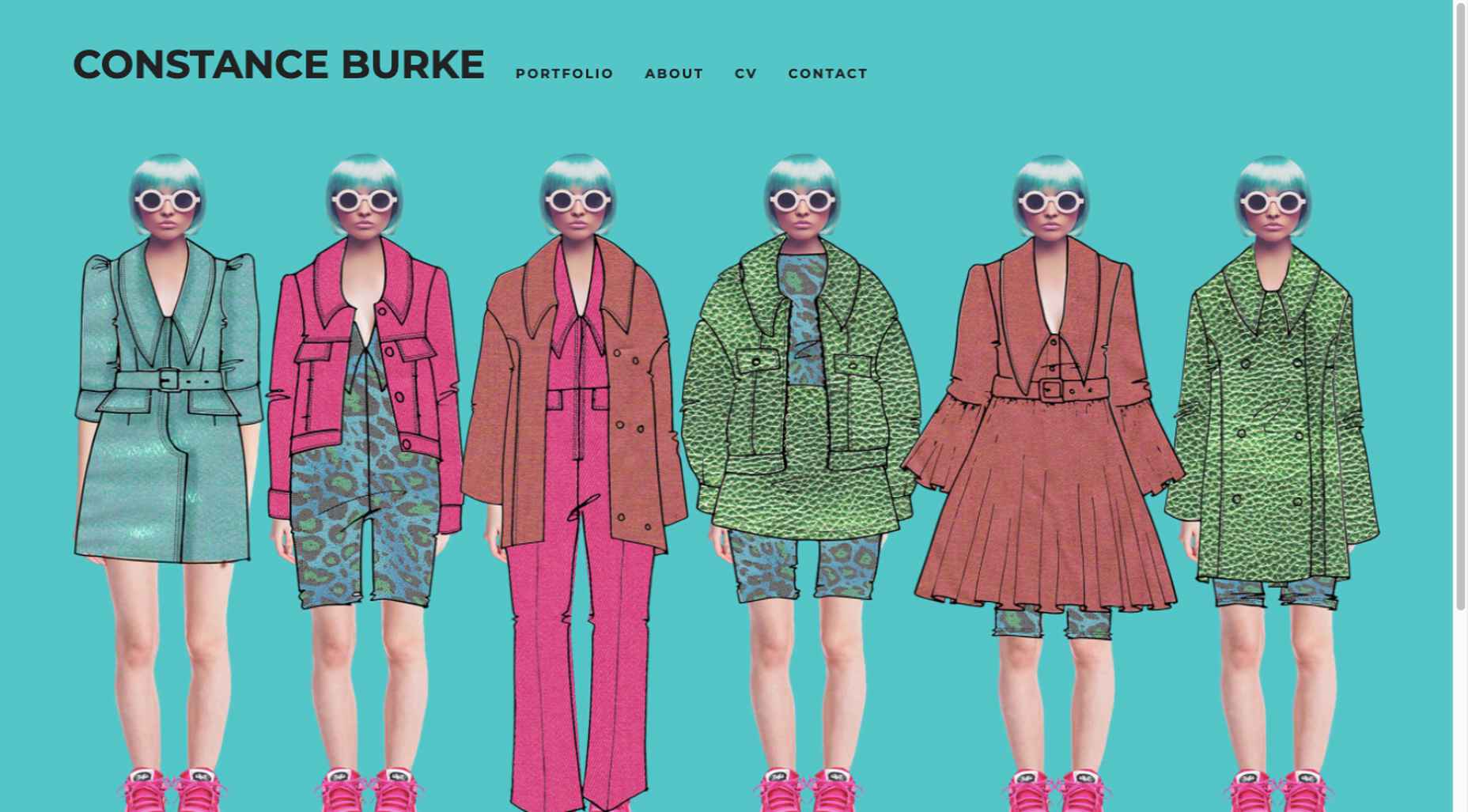
Check out this example from fashion designer Constance Burke

It’s not every day you see real models wearing hand-drawn fashion sketches. But it’s just one example of how the physical can be blended with the digital.

The BeSki pre-built site does the same blending of the two, but in a totally different way:

The sections’ designs switch from predominantly physical to largely digital and back again, an excellent approach that provides a maximum amount of useful information.

It’s also worth noting how snowbanks are effectively used to seamlessly transition from one section to the next.

3. Create Well-Organized and Helpful Shopping Experiences

More people spending more time at home has created a surge in online shopping. As a result, many online store owners are now feeling the effects of increased competition.

Consumers look for brands they believe they can trust. At the same time, they want their online shopping experiences to be as quick and painless as possible. They look for (and expect) quick and effective product search capabilities, helpful and effective product displays, one-page product descriptions, and the like.

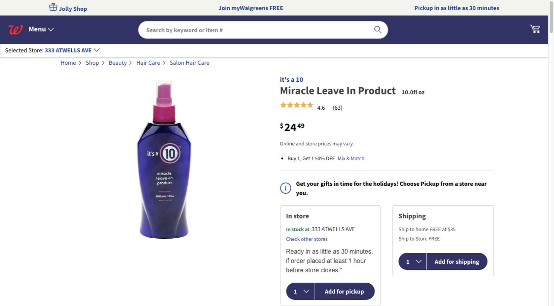
Walgreen’s product page design is especially well-suited for 2021 ecommerce shoppers: 

Everything shoppers usually need to know is presented above-the-fold. They can easily proceed to the next step or scroll down for reviews or additional product specifications. 

BePestControl’s pre-built website uses a similar product design approach: 

In this example, the main selling points are up-front and are kept short and sweet. The shopper can either hit the ‘Add to Cart’ button or look below the button for additional information.

In both examples, a visitor doesn’t have to mull over what step to take next since one of the design objectives is to make the shopping experience as easy and as satisfying as possible.

4. Take Advantage of the Benefits of User-Controlled Video Content

Once upon a time, video content was “the thing” to incorporate in a website. Hero background videos proved to be particularly engaging, and “how-to” videos presented much more useful information than illustrations or blocks of text could.

On the other hand, Auto-play videos, those that started on their own, all too often had a tendency to irritate rather than inform, especially when their content didn’t address a visitor’s immediate concern.

Thanks to Zoom and similar video platforms that came into widespread use in 2020 and to website designs that include video “Play” buttons, users have become much more comfortable with the medium. As an example, Shoppers have been given total control over if or when they want to view a given video. 

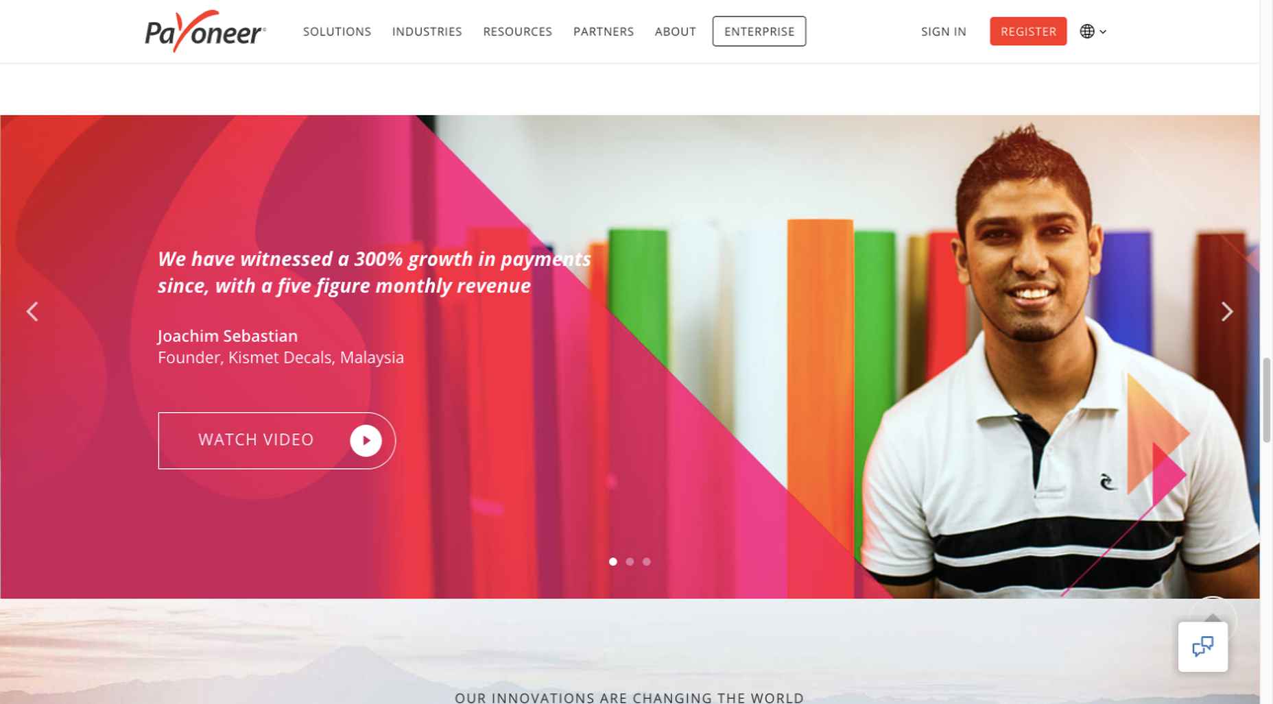
This is the design approach Payoneer has taken: 

The white “Pay” button is impossible to miss, and while it is designed to encourage a visitor to watch a testimonial, doing so is completely optional.

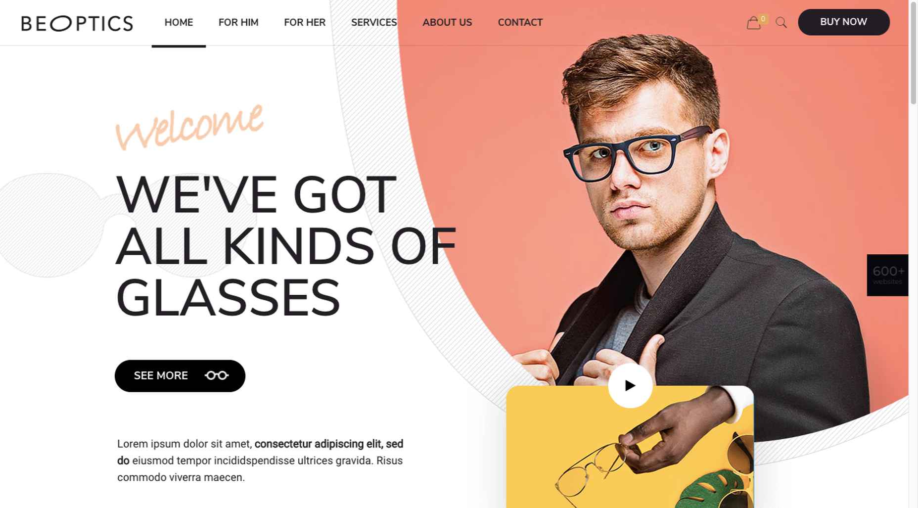
The BeOptics pre-built website cleverly slips in a video play option as well: 

In this example, when visitors hover over the “See More” button, it lets them know that they have the option to watch the video if they want to learn more.

5. Trust Builders Should be Non-Negotiable Web Design Elements

There are various ways in which products are organized or showcased in brick and mortar businesses to instill trust. Helpful and friendly staff also contribute to instilling trust.

Some of these trust-builders are easily incorporated into eCommerce designs. Others, though more difficult to fit in, can usually be satisfactorily addressed.

Digital trust builders can include.

  • Logos (familiar, whimsical, innovative, engaging)
  • Portfolios and/or product pages
  • Customer reviews, product ratings, and client testimonials
  • Case studies and product or price comparisons
  • Safety and security seals, e.g., Better Business Bureau, PayPal checkout
  • Charts, graphs, counters, and other data visualization techniques
  • Proof of social, charitable, or community-related actions and contributions

Put, trust-building content will beat hard-sell techniques every time, especially if you would like your customer base to include referred and repeat customers.

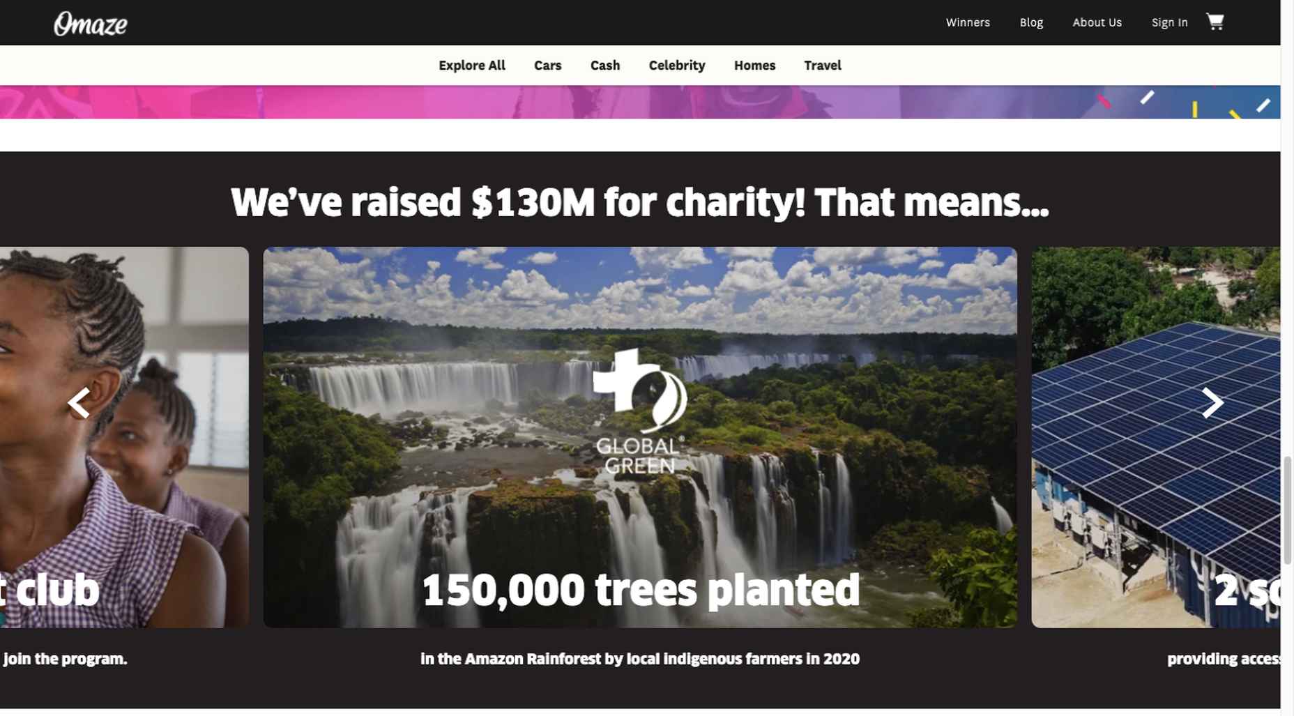
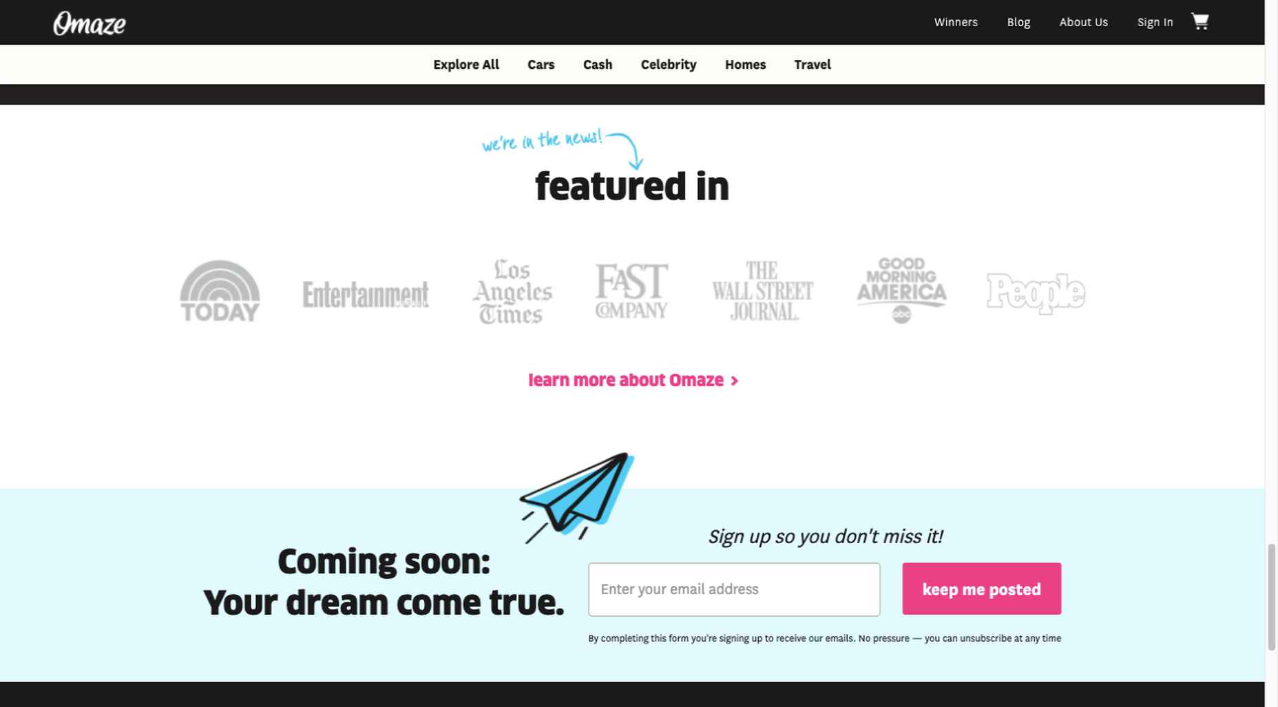
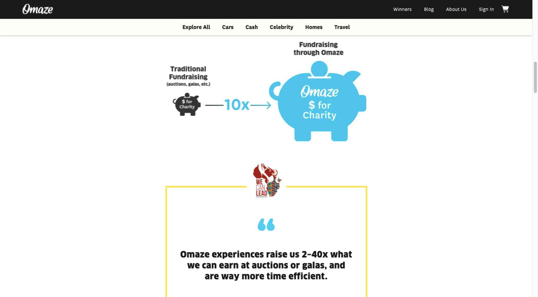
Omaze, for example, gives people entries for prizes based on their donations while at the same time highlighting the good things it and its donors have brought about.

To help build trust, the site devotes space to highlighting publications that have featured Omaze and the work it has done and is doing.

Plus, it puts data visualization and non-profit testimonials into play to give visitors an added insight into what is going on behind the scenes: 

As you can see, it doesn’t have to be difficult to incorporate genuine trust-building content into your website designs.

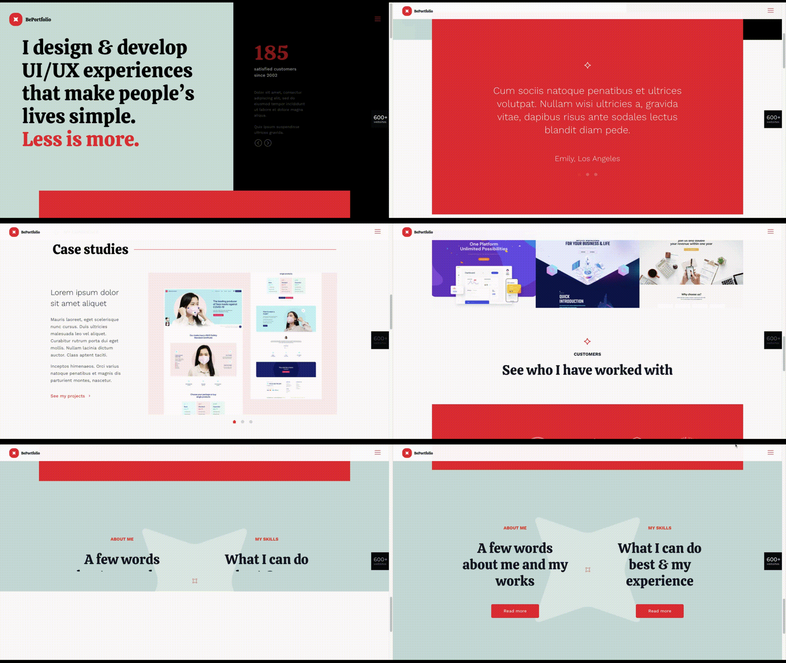
BePortfolio is a great example of how you might go about doing this for a portfolio site, whether it’s your own or a site for a client:

The home page alone has plenty of space for including trust-building content:

  • A satisfied customer counter
  • Product usage case studies and testimonial
  • Portfolio highlights
  • Client and partnership logos

And it can only get better as a visitor moves through the site, but only if you’ve chosen to make that happen.

Have You Started to Take These New Web Design Trends to Heart?

We’re not suggesting that you throw the baby out with the bathwater, but some trends will need to be discarded to enable you to adjust to a new normal. Other 2020 design trends, like minimalism and headline topography, are likely to remain popular for years to come.

New trends that incorporate calming color palettes, image blending, more efficient eCommerce UX designs, user-controlled video, and trust-building elements should give your customers the feeling of comfort and security they will be seeking in 2021.

If you want to implement some or all of these new trends in your 2021 website designs, BeTheme’s 600+ pre-built sites make doing so an easy task.


[– This is a sponsored post on behalf of BeTheme –]

Source

The post 5 Web Design Trends and Ideas for 2021 first appeared on Webdesigner Depot.

Source de l’article sur Webdesignerdepot

We’re going to try something a little different this month; with this roundup of tools and resources for designers, we’re going to pick a few of our favorites and group everything else in a manner that makes it even easier to find elements that will work for you, and your projects, right now.

Here’s what’s new for designers this month…

February’s Top Picks

Pika

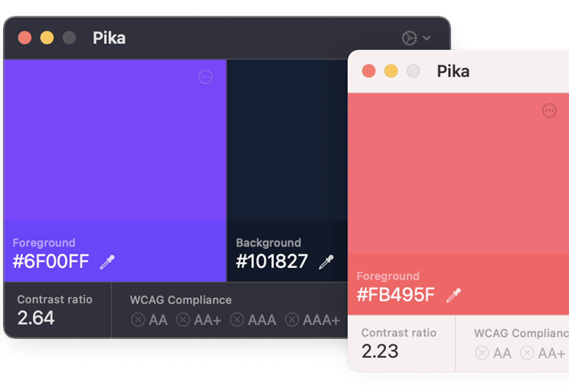
Pika is a new Mac app that is an open-source color picker. It helps you find color swatches on-screen, saving time and design headaches. Plus, it’s packed with bonuses such as the ability to confirm accessibility compliance for colors, compact size and style, easy to access from your desktop, and format-friendly with plenty of color code options.

Iconduck

Iconduck is a searchable database of more than 100,000 icons in one place. (No more searching various marketplaces!) The goal of the project is to make open-source icons and illustrations more accessible. So, everything you find here is free! The site does all the heavy lifting for you by collecting icon sets, tagging them, and making them searchable.

Descript

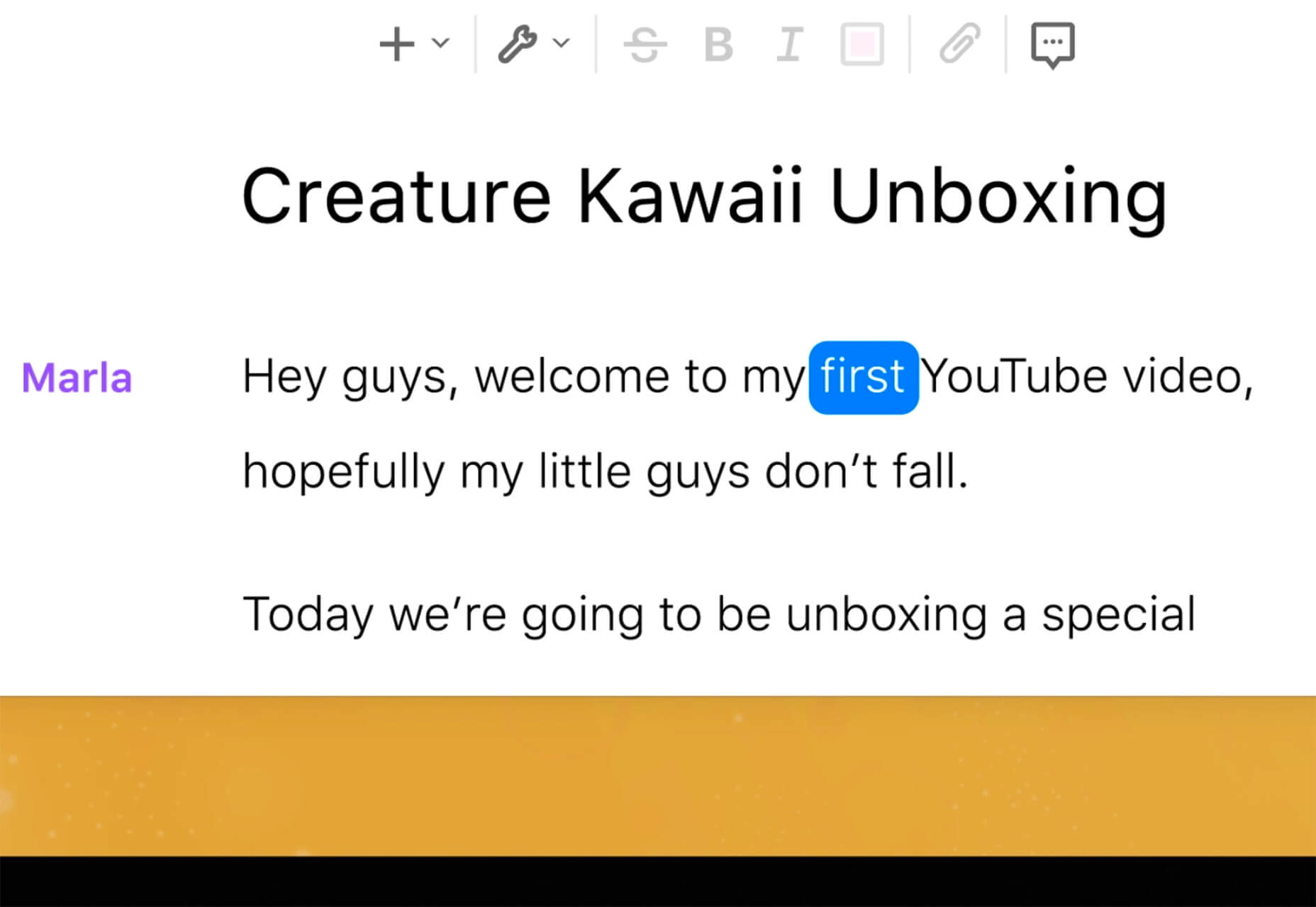
Descript is a premium tool that eliminates some of the intimidation factors with audio and video editing. With a design that functions as a word document and allows you to transcribe, record the screen, publish, and edit, all with some cool AI features.

Persona

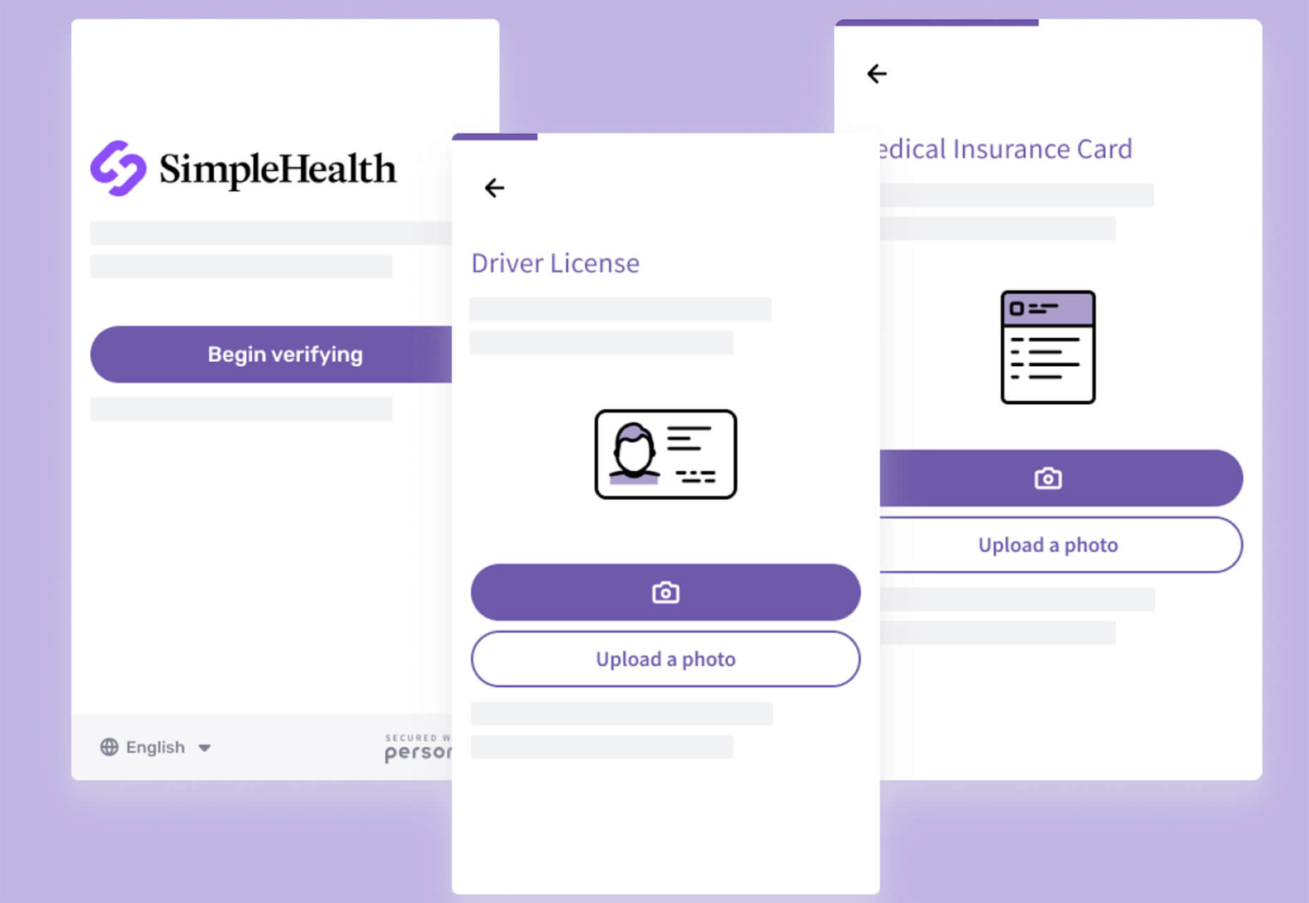
Persona is an all-in-one identity infrastructure that allows you to collect, verify, manage, and decide customer identities from a single dashboard. Everything is fully automated, and most users can be up and running in about 10 minutes. The premium tool does have a free version for small-scale verifications.

6 Productivity Boosters

Peekalink

Peekalink turns standard links into rich content that users will be delighted to share and engage in. And it’s easy to use. Just send a request to the API with a link and get a response back to use, including a rich link for your project.

LinkAce

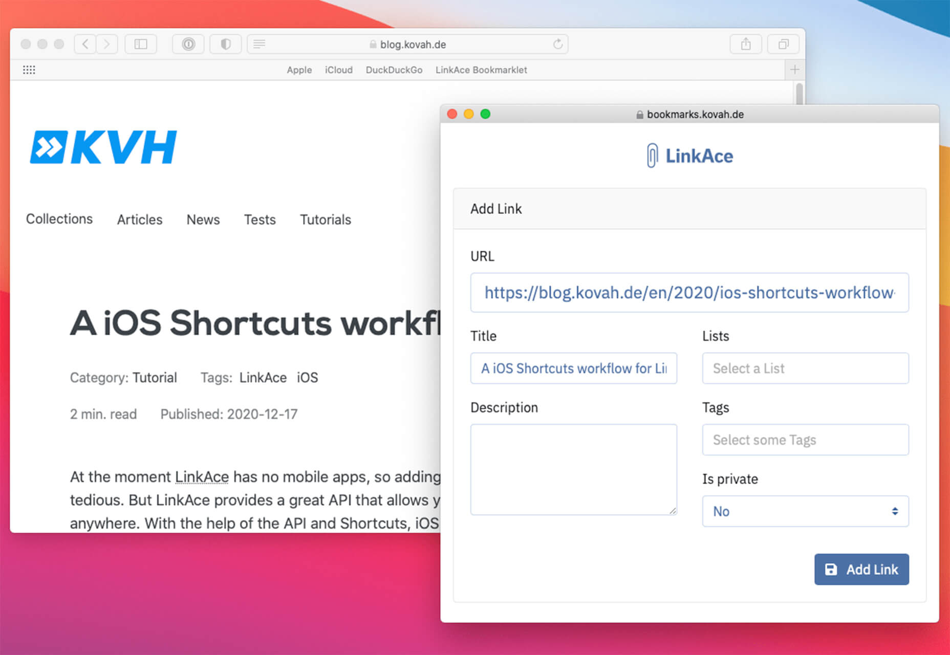
LinkAce is an open-source and self-hosted archive to store and organize links that you want to save. You can search thanks to tags and lists, and all of the content is available thanks to automated backups and monitoring. There’s a demo you can try before installing it yourself.

Formality

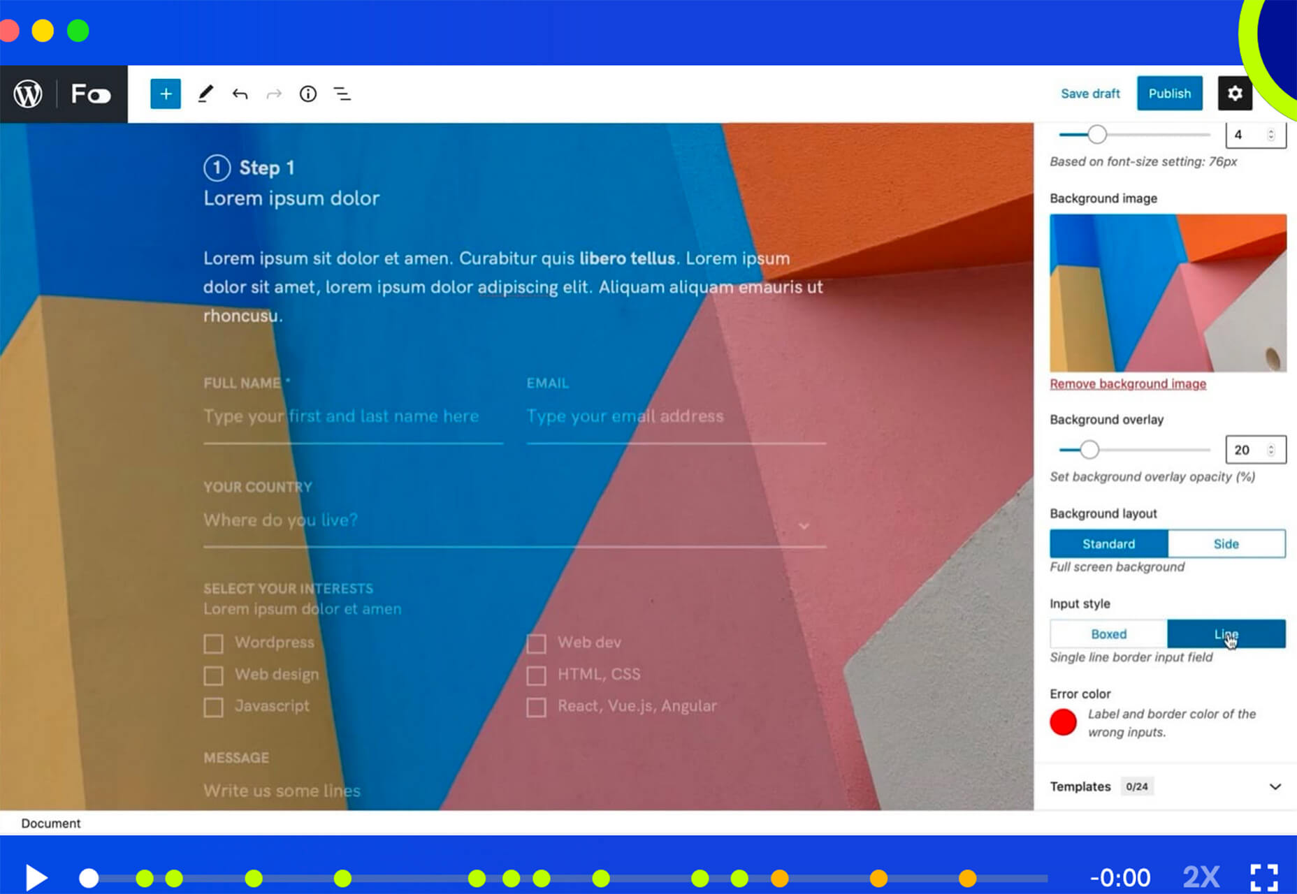
Formality is a WordPress plugin that helps you make forms a little bit easier. It’s made to work with the Gutenberg-based form builder with a single block format to control the form. The plugin has a theme-agnostic design that works with any layout style and includes customizations to make it feel a little more personal.

Wondercall

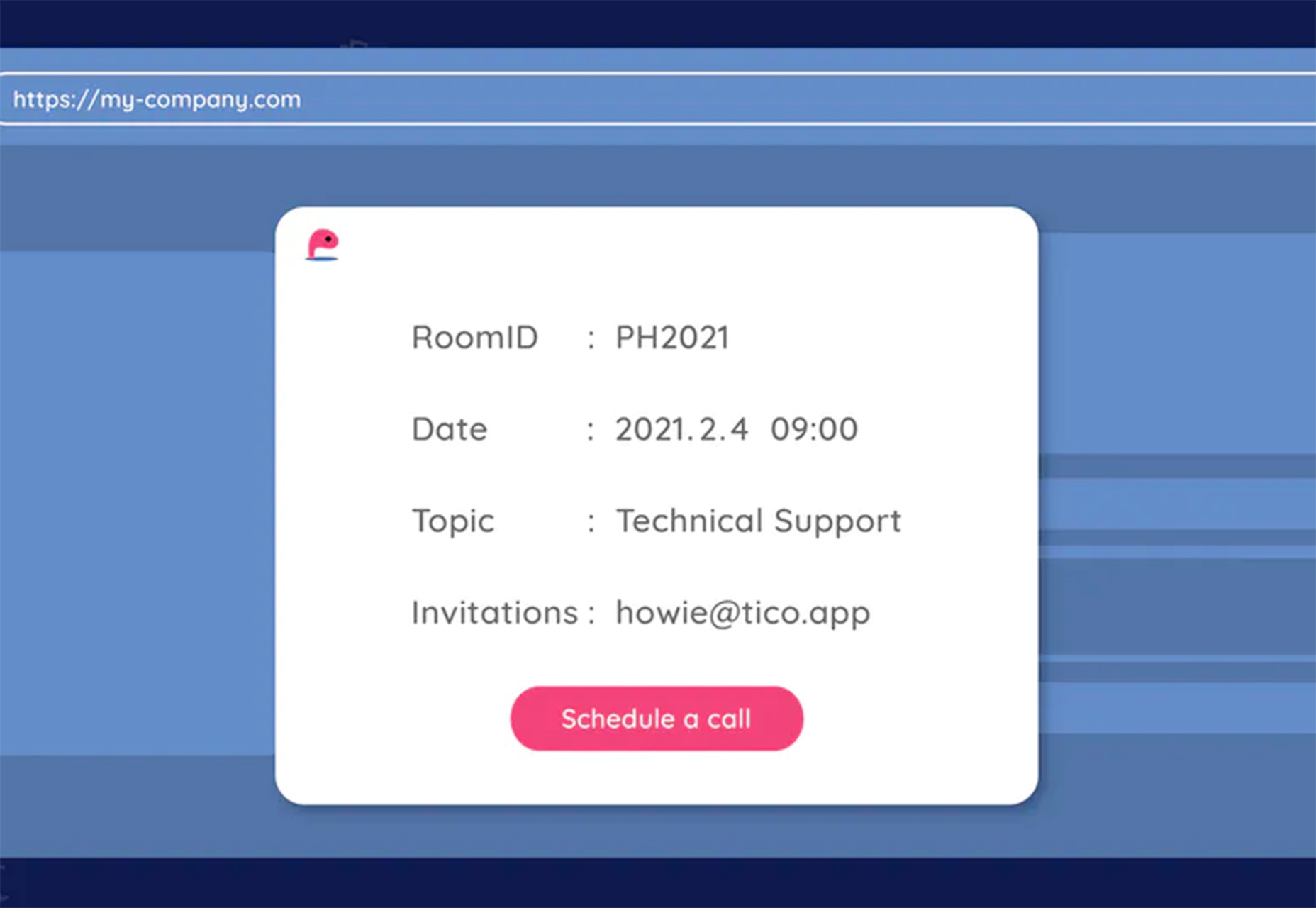
Wondercall is an embeddable video call system for any website or app. You can make calls and schedule them with a widget you can embed right into your design.

Editor X

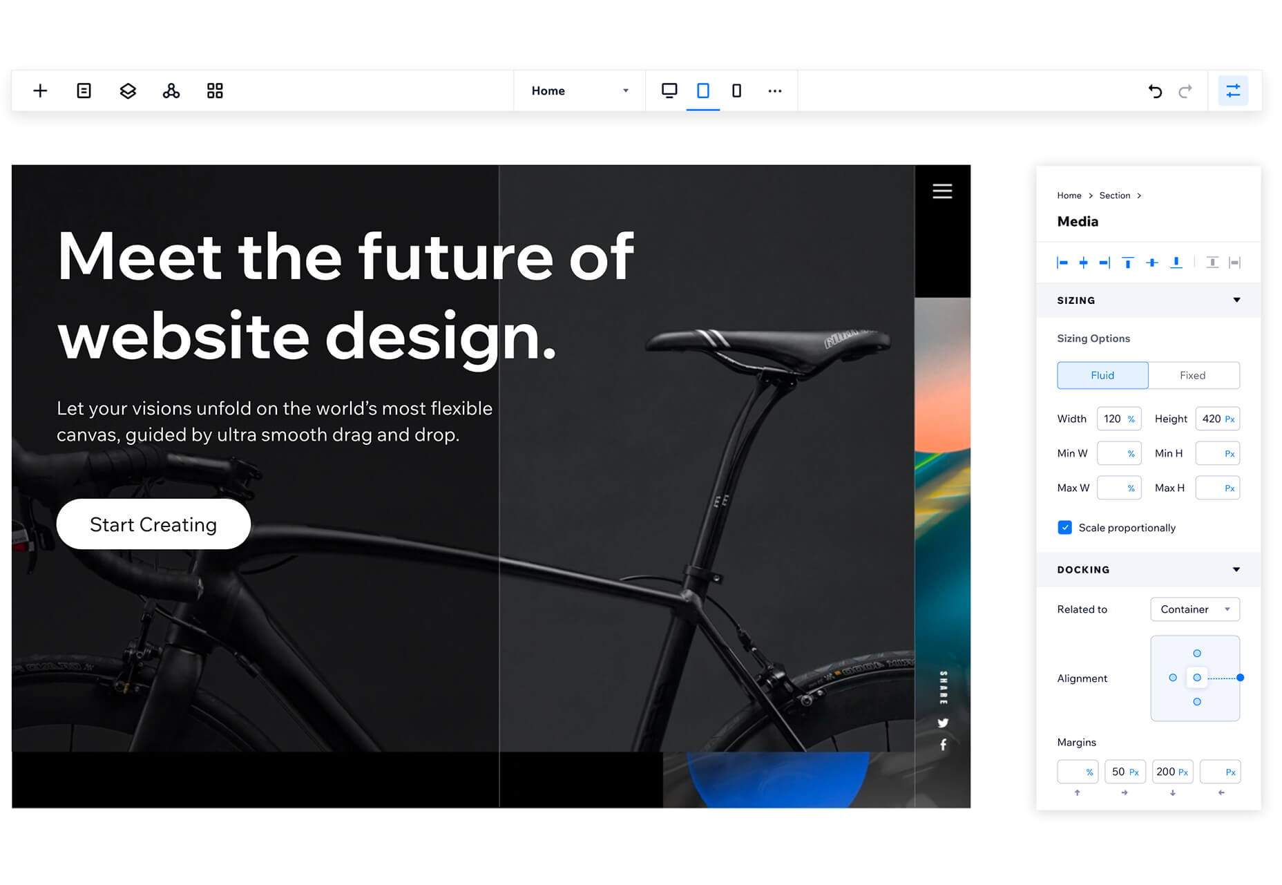
The Editor X website builder is out of beta and ready for mainstream use. The platform is designed for designers and agencies to create websites collaboratively and quicker. Features include live commenting, roles and permissions, and shared design libraries. Plus, the platform offers code-free interactions.

Shareful/h2>

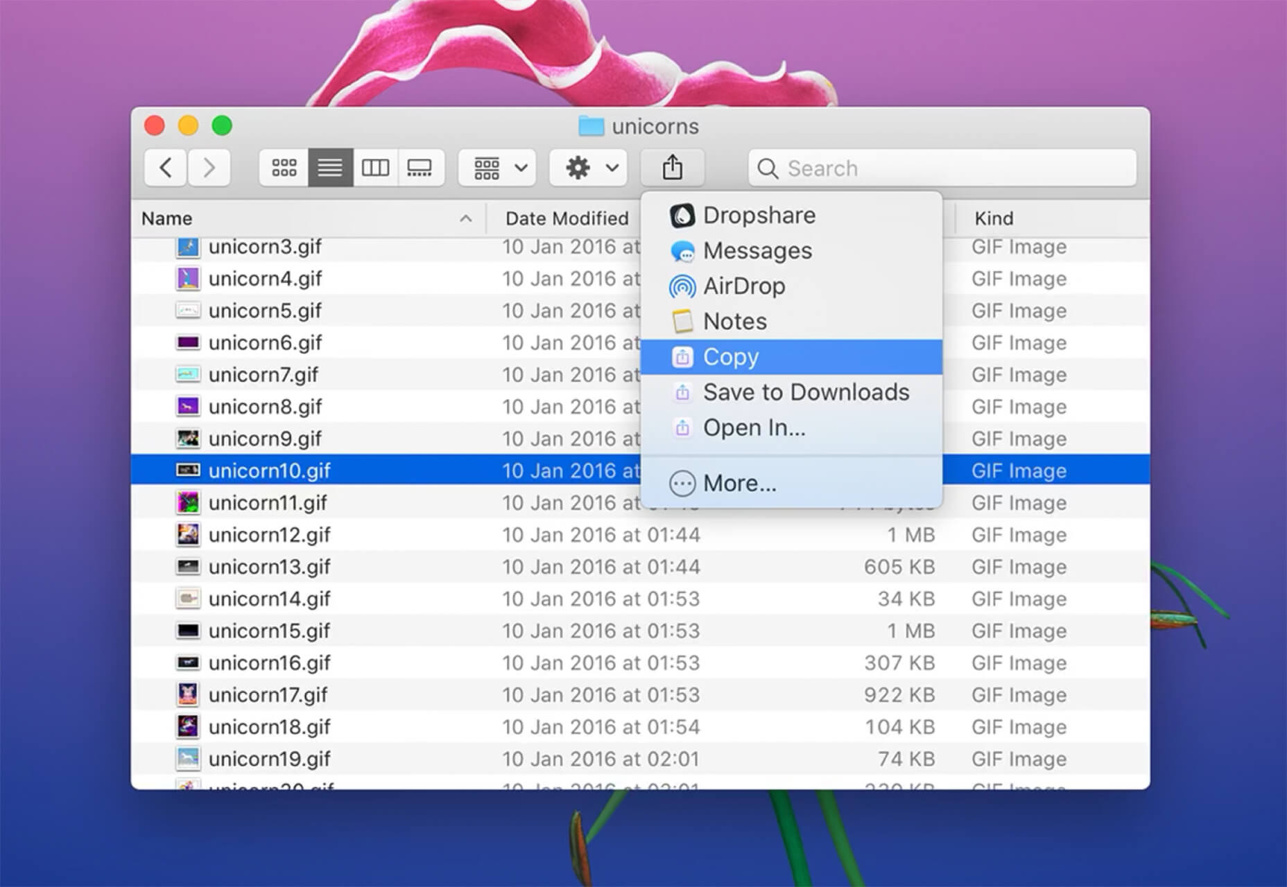
Shareful is a Mac app that makes the system share menu more powerful. You can copy, save as, and open indirectly from the system share menu.

2 Icon Sets

Supercons

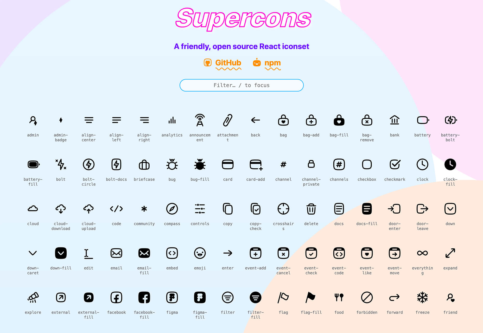
Supercons is a giant set of icons in React. They are all open-source, and there are plenty of choices to help you propel projects forward.

Plumpy Icons

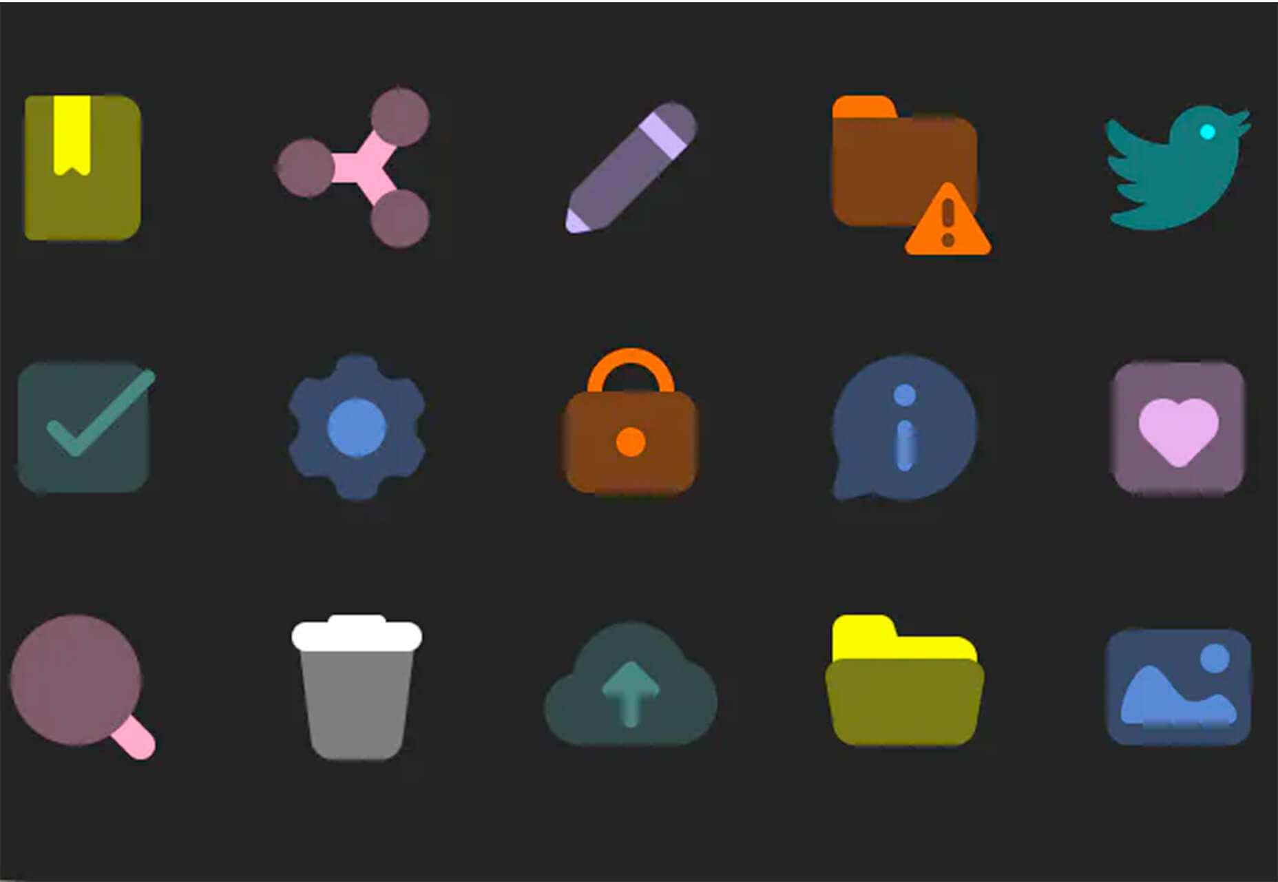
Plumpy Icons are packed with style. The set of icons has a fun design, comes in duotone colors, and scales to any size. Plus, there are more than 4,000 icons in the collection. There are free and paid options depending on the file type and use.

3 Tutorials and Demos

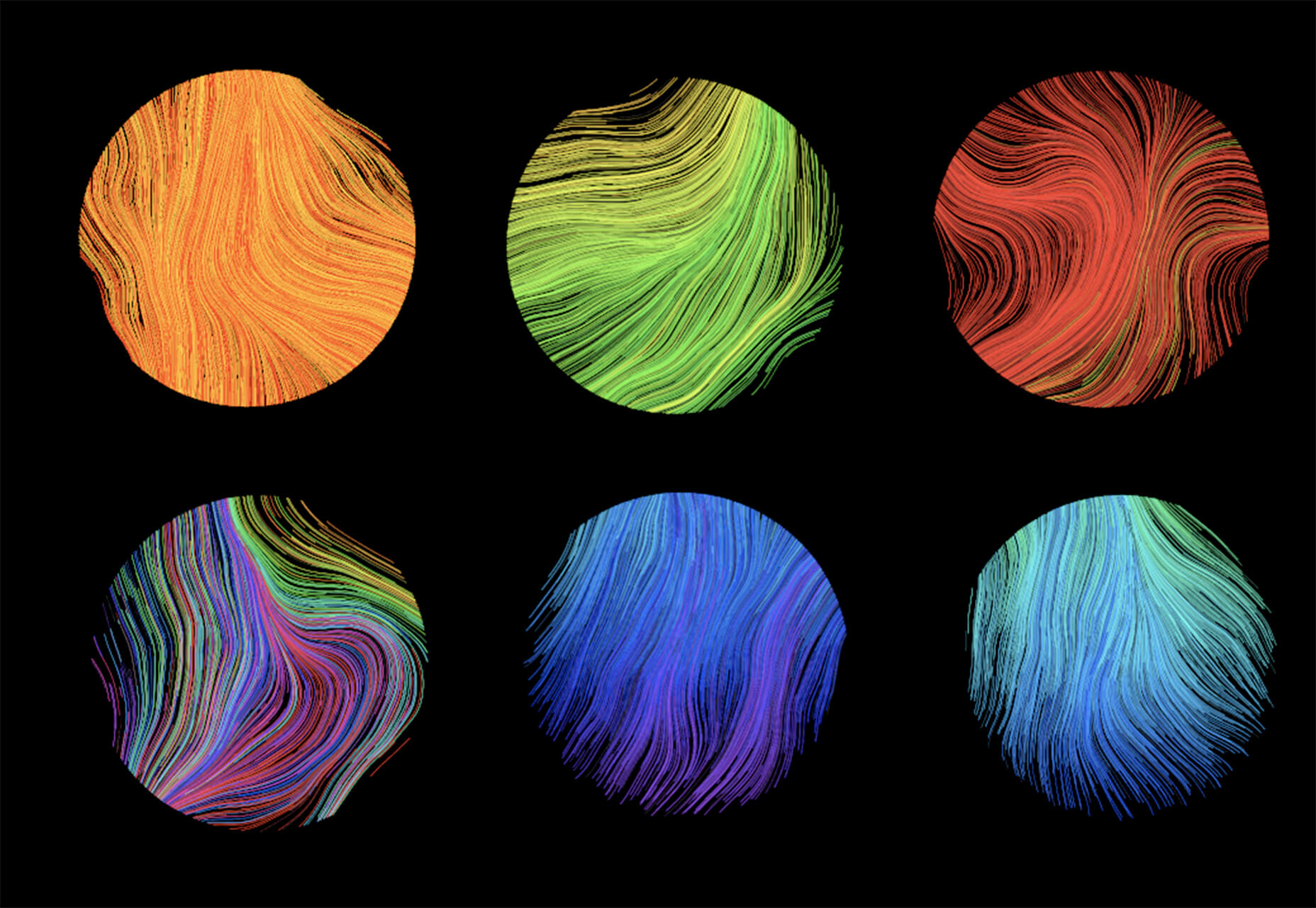
Noise Planets

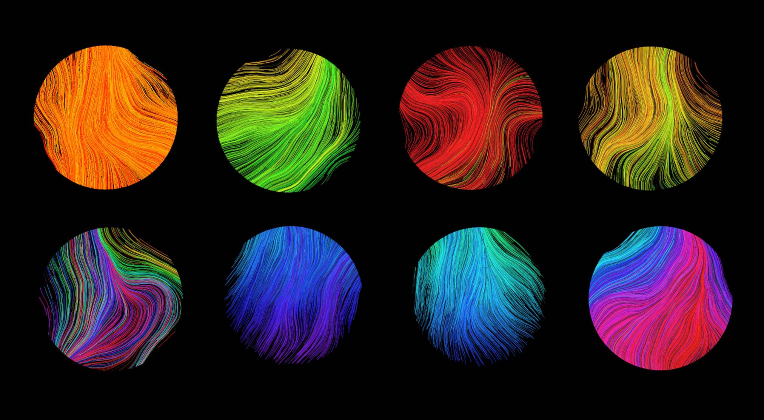
Noise Planets is a fun look at plotting random points in a circle to create amazing art pieces. You can generate fun shapes and textures and even animate your results with the tutorial and code snippets’ help.

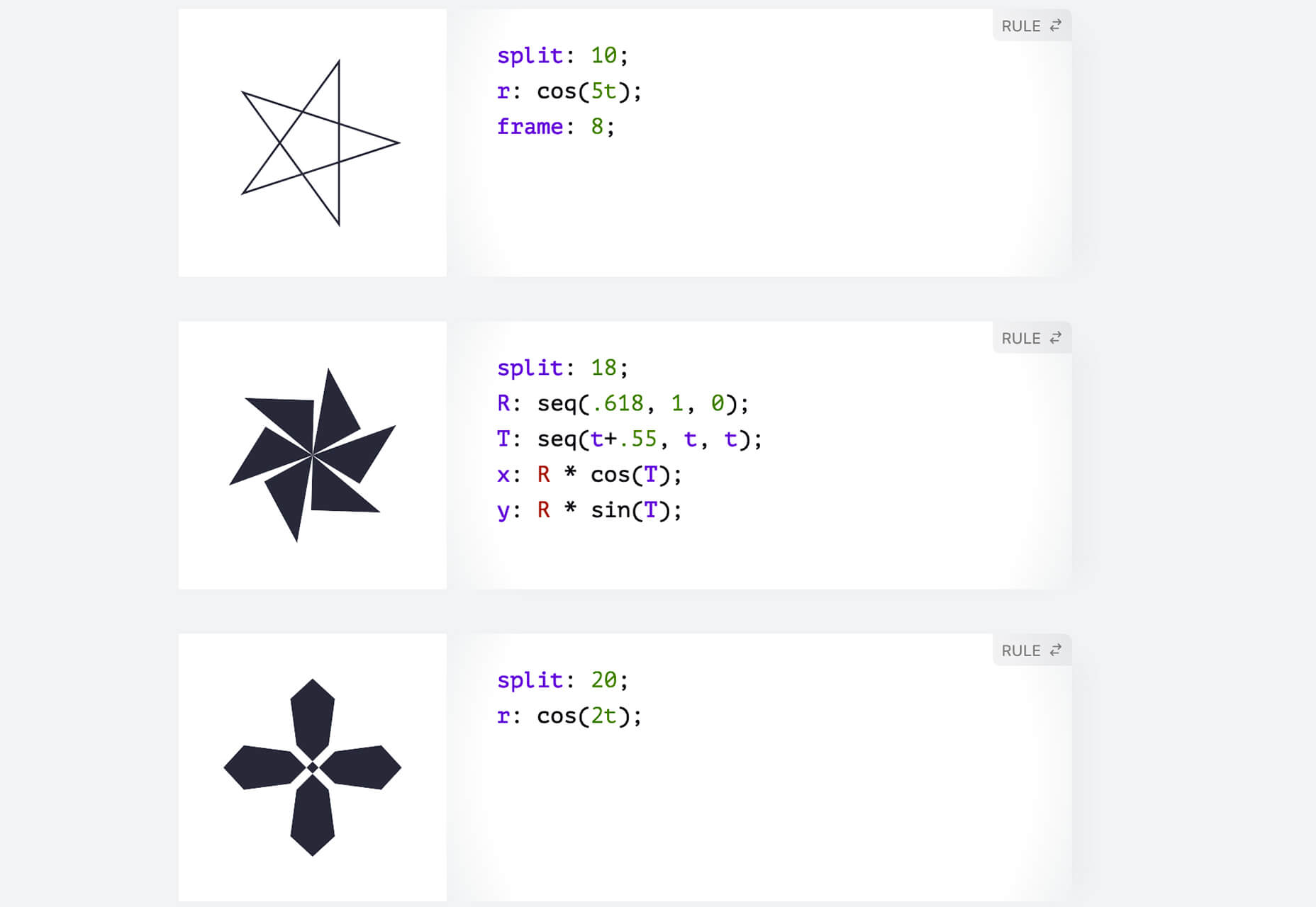
CSS Polygon Shapes

CSS Polygon Shapes are generated using CSS-doodle and clip-path. You can go in and make adjustments to customize shapes further and use them in your website projects.

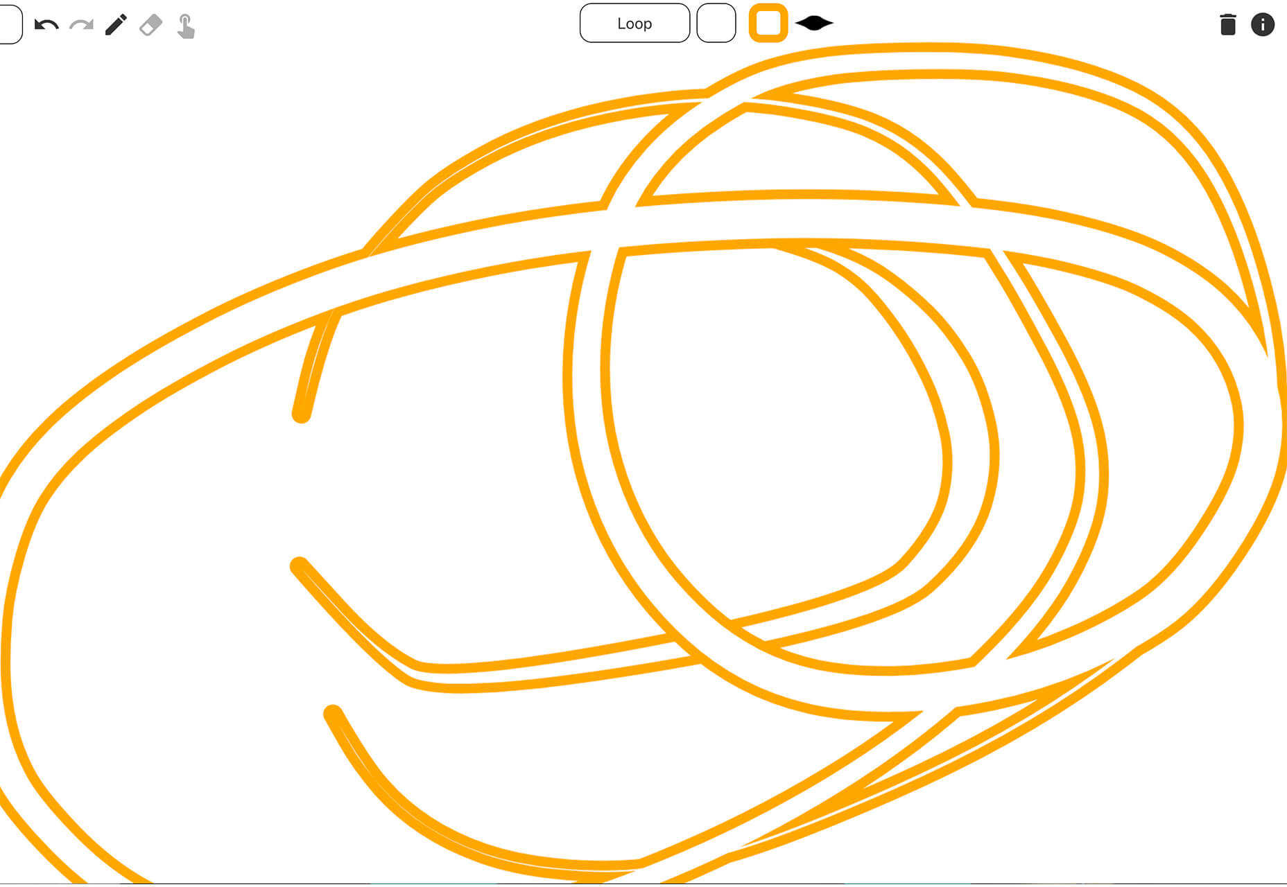
Mutsuacen

Mutsuacen is a little app that lets you create animated and interactive drawings. There’s a lot of potential with this tool if you have some true drawing chops, but it not; it’s just fun to play with. Create a doodle or sketch and export.

5 Fresh Fonts and Text Tools

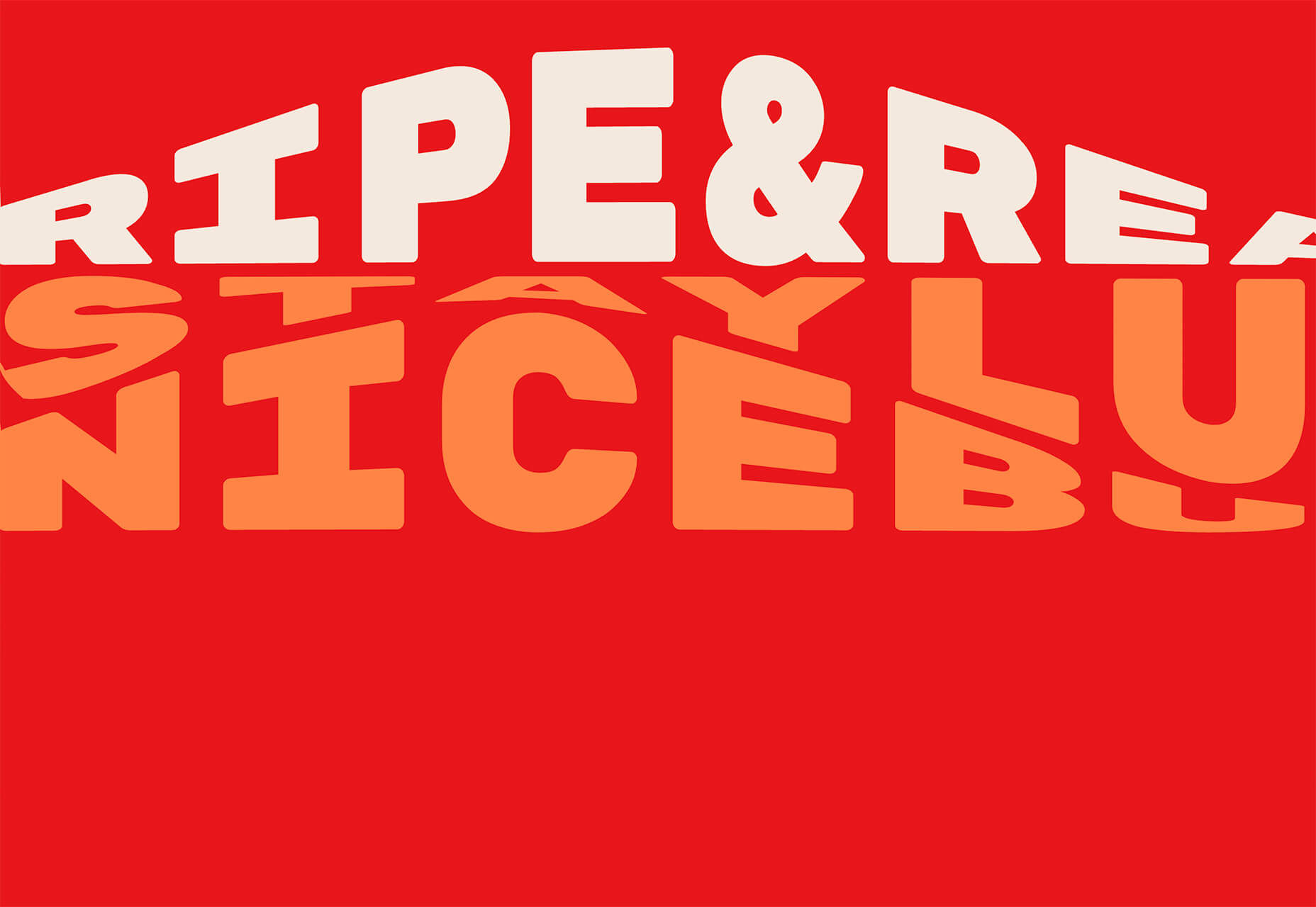
Text Warping – Animated

Text Warping – Animated is a fun effect pen from Lokesh Dhakar. It feels funky while leaving text pretty readable. Play with it for sure.

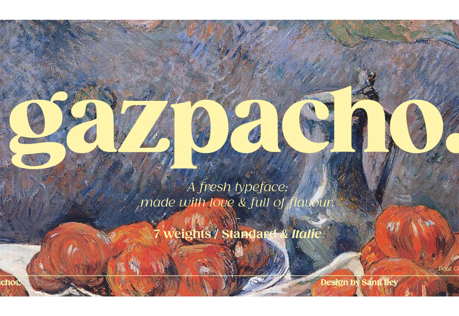
Gazpacho

Gazpacho is a fun and flexible premium font family with 14 styles from thin to heavy italic. It’s a highly readable serif with a wider stance and great curves.

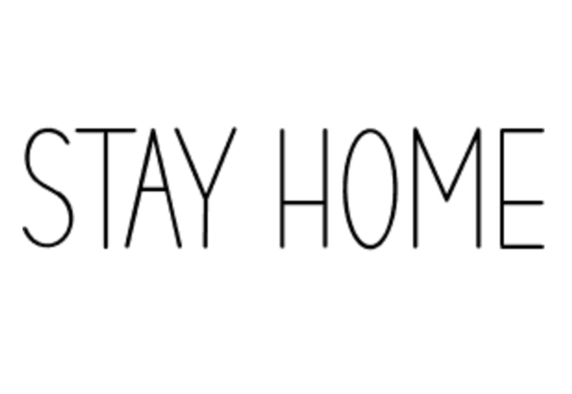
Stay Home

Stay Home is a simple, line-style all caps font. It has a limited character set but could have some fun applications.

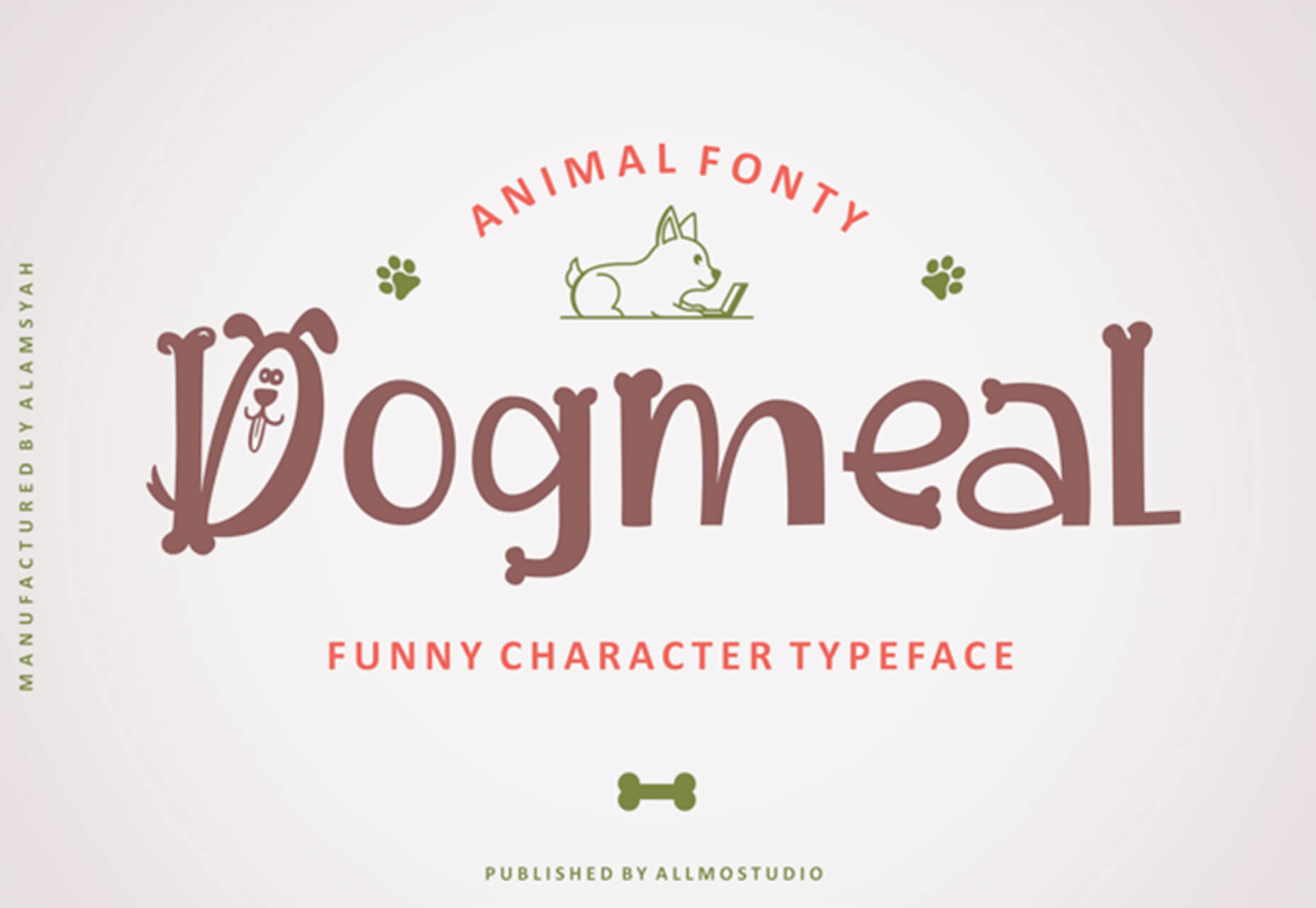
Dogmeal Figure

Dogmeal Figure is an almost silly novelty typeface with dog faces and paw prints in the character set. It might make a fun option for a kids’ project.

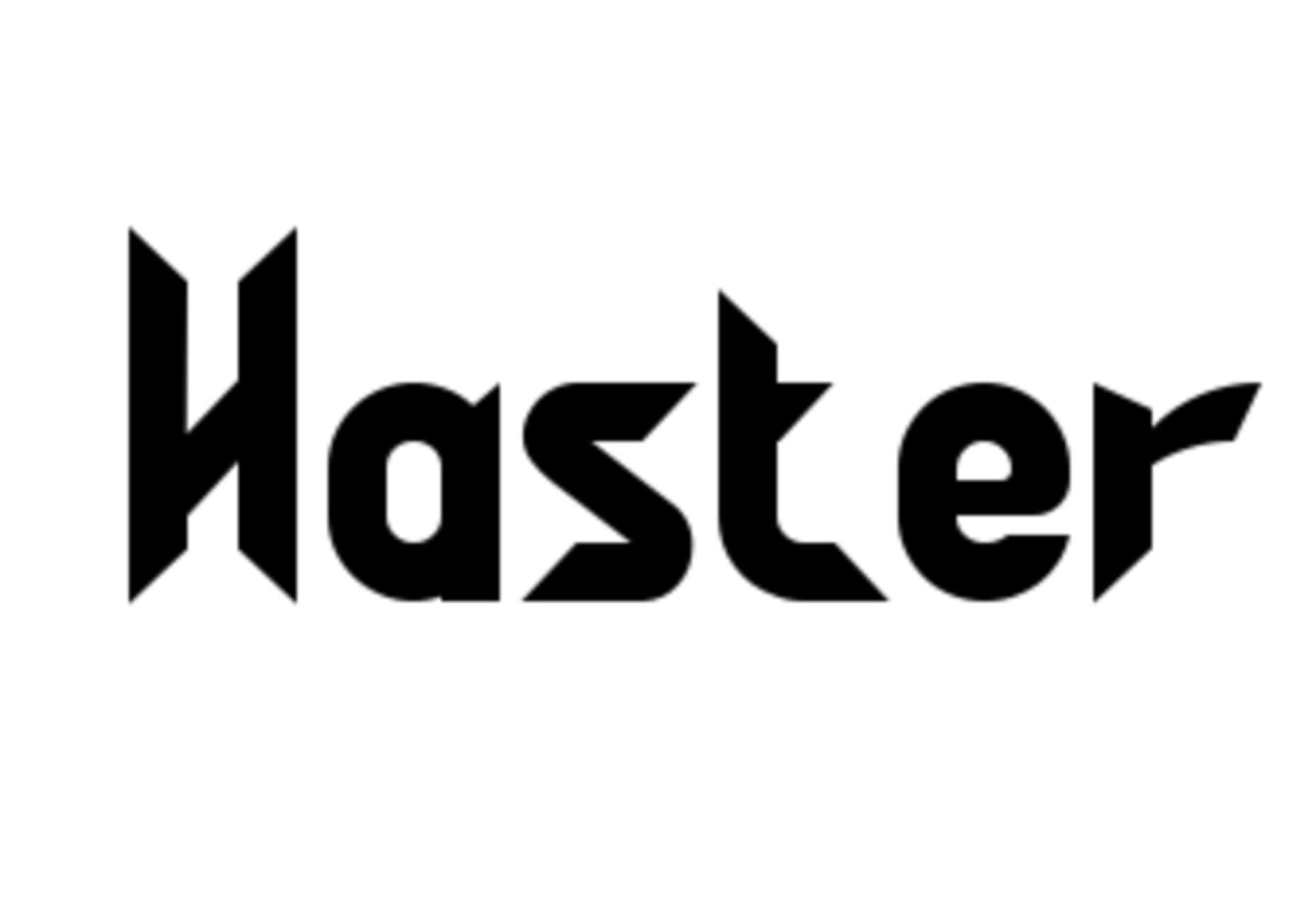
Haster

Haster is a futuristic-style slab with a limited character set. It does have shapes and lines with a lot of impact for display use.

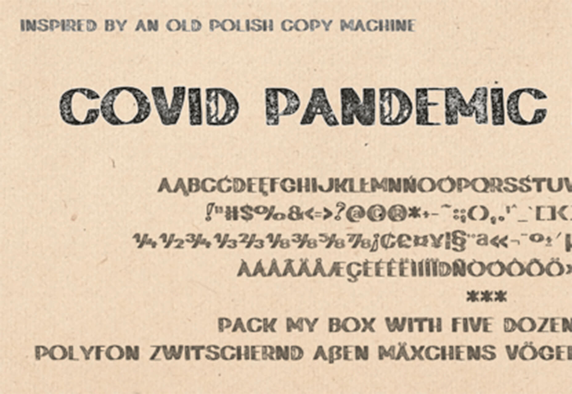
Covid Pandemic Lockdown

Covid Pandemic Lockdown is an interesting novelty font with thick lines and a brush-dot style. While it probably won’t read well small, it could be fun as a display option.

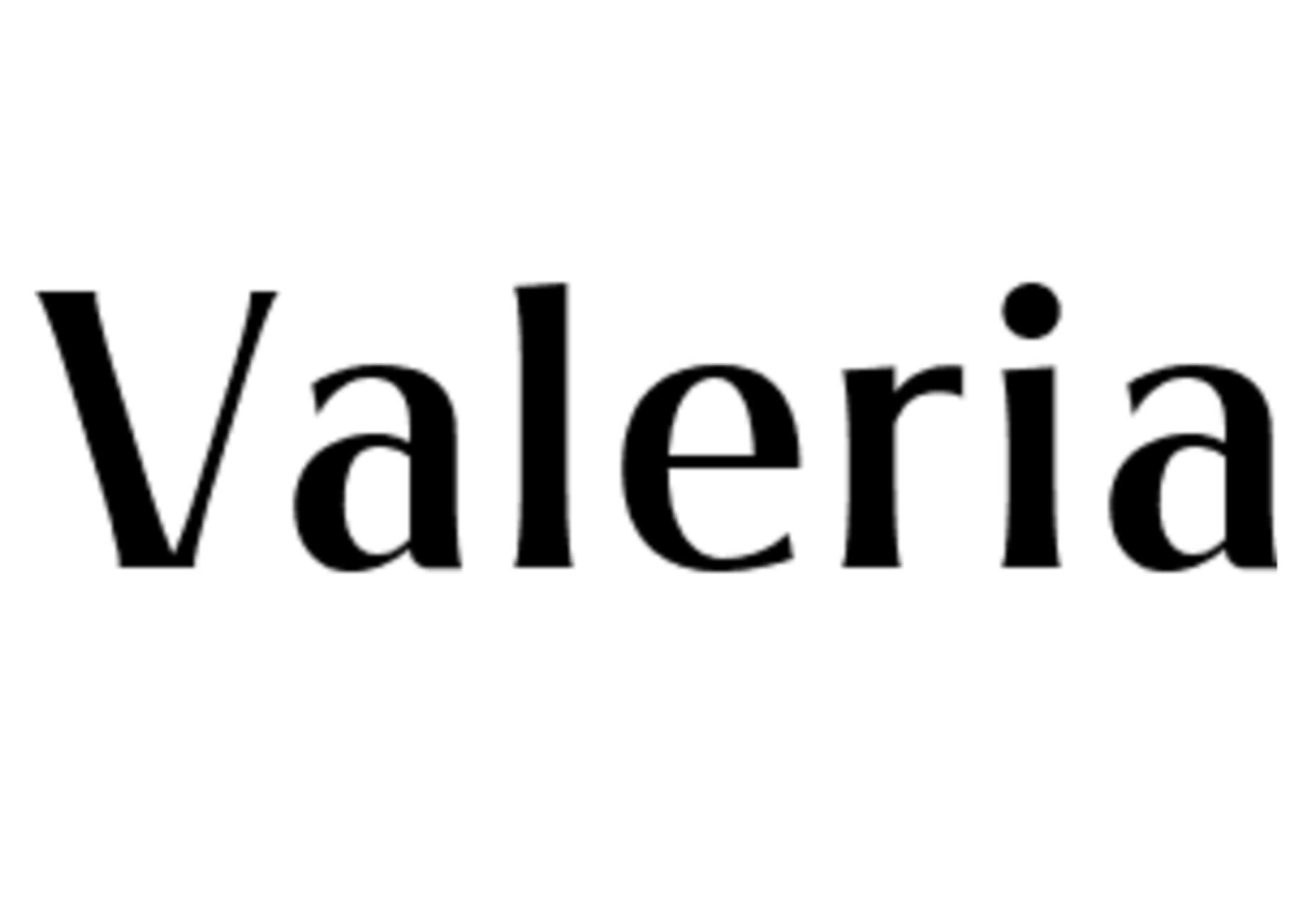
Valeria

Valeria is a simple typeface that’s a little wide but has a nice shape and structure. It includes upper- and lowercase letters.

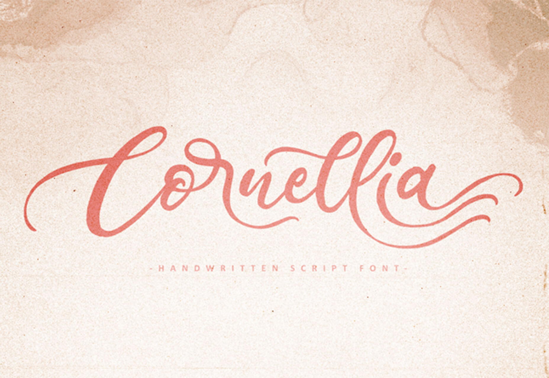
Cornellia

Cornellia is a beautiful script that has amazing letter combinations for use with long swashes and tails. It can add extra elegance to almost any design project instantly.

Source

The post 23 Exciting New Tools for Designers, February 2021 first appeared on Webdesigner Depot.

Source de l’article sur Webdesignerdepot