 Google resembles an iceberg: there’s the part above the water we can see and use everyday; there’s also the part beneath the water, that we don’t see and know little about.
While many of us are concerned about the aspects of Google we don’t see — the parts that threaten our privacy, or monopolize the web — there’s no denying that Google offers some amazing products and tools, many of them free, all from the convenience of a single login.
Today we’re going to take a look at 12 tools from Google that really do bring something positive to the table.
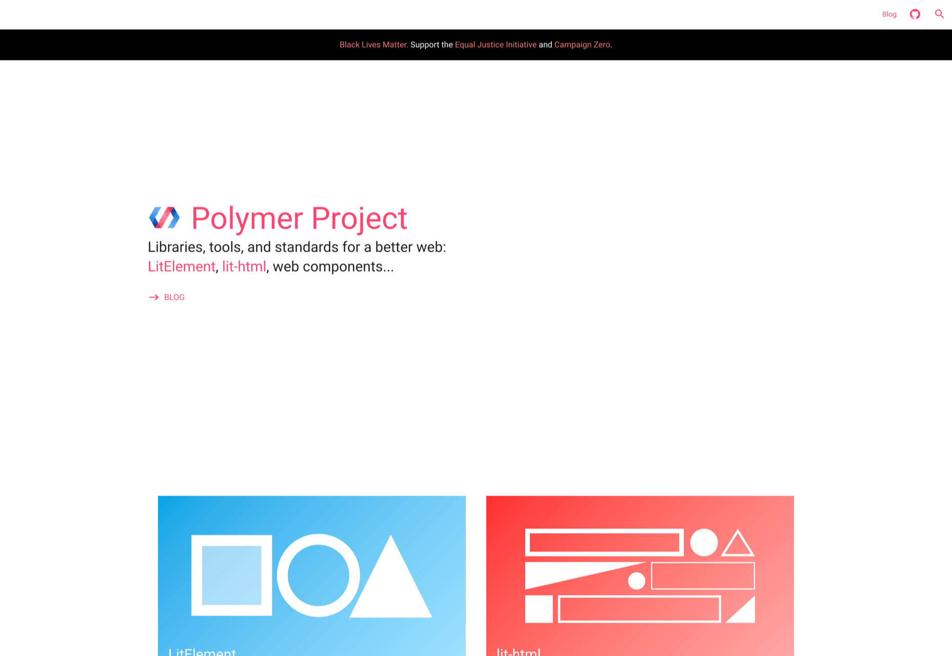
1. Polymer
Polymer is an open-source JavaScript library from Google for building web applications using Web Components. The platform comes with a ton of libraries and tools to help designers and developers unlock the web’s potential by taking advantage of features like HTTP/2, Web Components, and Service Workers.
The main feature of Polymer is Web Components. With Web Components, you can share custom elements to any site, work seamlessly with any browser’s built-in elements, and effectively use frameworks of all kinds. Products like LitElement (a simple base class for creating fast, lightweight web components) and PWA Starter Kit make Polymer easy to use. If you like, you can build your app entirely out of Web Components.
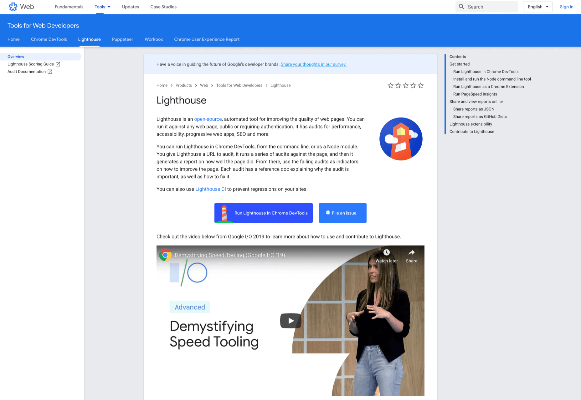
2. Lighthouse
Google Lighthouse is an open-source, automated tool for improving the quality of web pages. The software allows you to audit web pages for performance, SEO, accessibility, and more. You can run Lighthouse using ChromeDevTools, directly from the command line, or as a Node module.
To use Lighthouse in Google Chrome, just go to the URL you want to audit (you can audit any URL on the web), open ChromeDevTools, and click the Audits tab. After you have run the audit, Lighthouse will give you an in-depth report on the web page.
With these reports, you will see which parts of your web page you need to optimize. Each report has a reference doc that explains why that audit is important and also shows you the steps you can take to fix it.
You can also use Lighthouse CL to prevent regression on your sites. Using Lighthouse Viewer, you can view and share reports online. You can also share reports as JSON or GitHub Gists.
Lighthouse also comes with a feature called Stack Packs that allows Lighthouse to detect what platform a site is built on. It also displays specific stack-based recommendations.
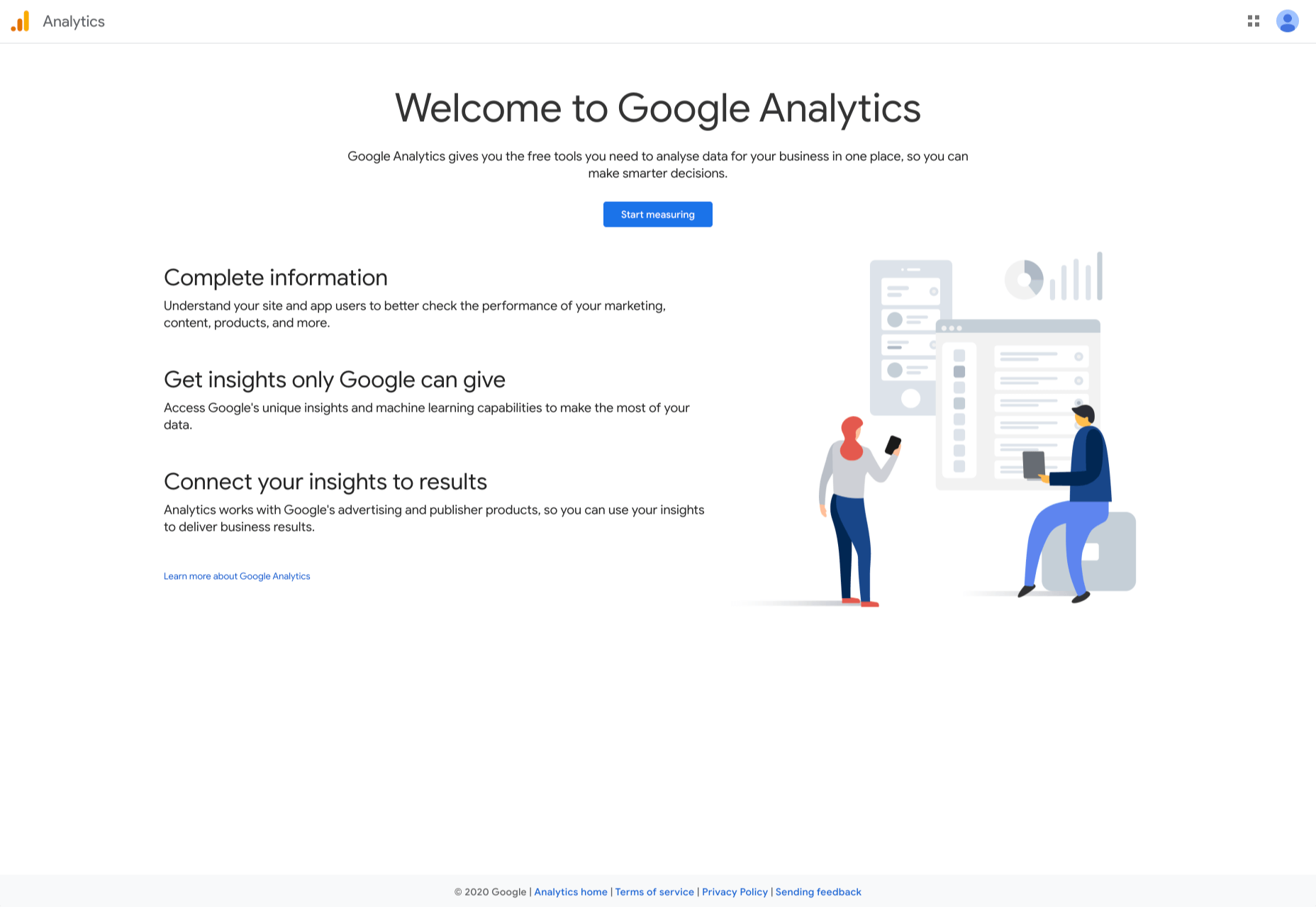
3. Google Analytics
Google Analytics is the gold standard of analytics services. Google analytics can be installed on your site for free with a small amount of JavaScript and allows you to see all kinds of details about your site visitors, like what browser they’re using, and where they’re from.
By using Google Analytics you can make decisions about your site based on science, and therefore be somewhat confident that the decisions you make will result in the outcome you are expecting.
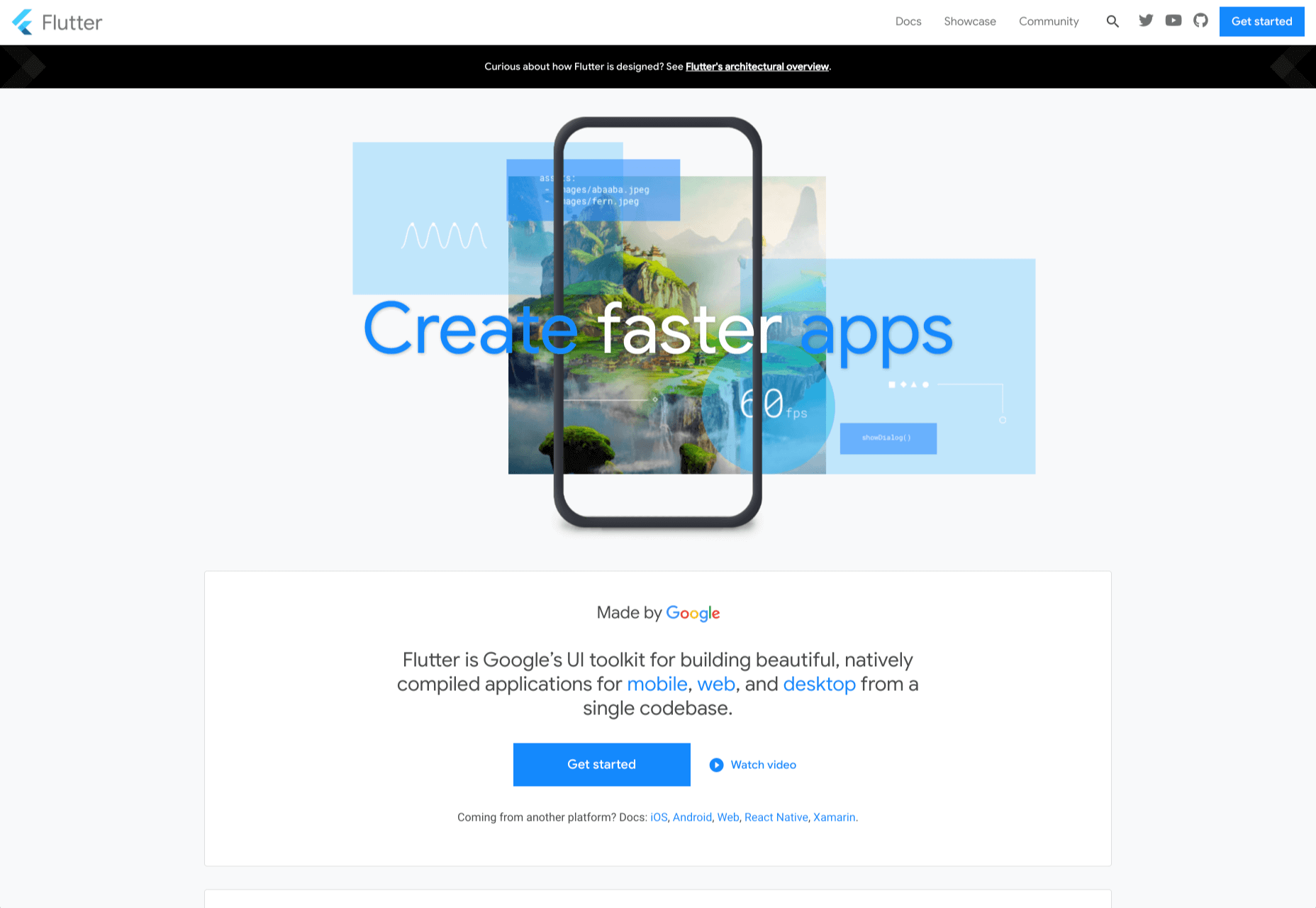
4. Flutter
Flutter is Google’s UI toolkit for building natively compiled applications for mobile, web, and desktop from a single codebase. The toolkit is open source and free to use. The best part of Flutter is that it works with existing code.
The toolkit has a layered architecture that allows for full customization, which results in fast rendering and flexible designs. It also comes with fully-customizable widgets that allow you to build native interfaces in minutes. With these widgets, you will be able to add platform features such as scrolling, navigation, icons, and fonts to provide a full native performance on both iOS and Android.
Flutter also has a feature called hot reload that allows you to easily build UIs, add new features, and fix bugs faster. You can also compile Flutter code to native ARM machine code using Dart native compilers.
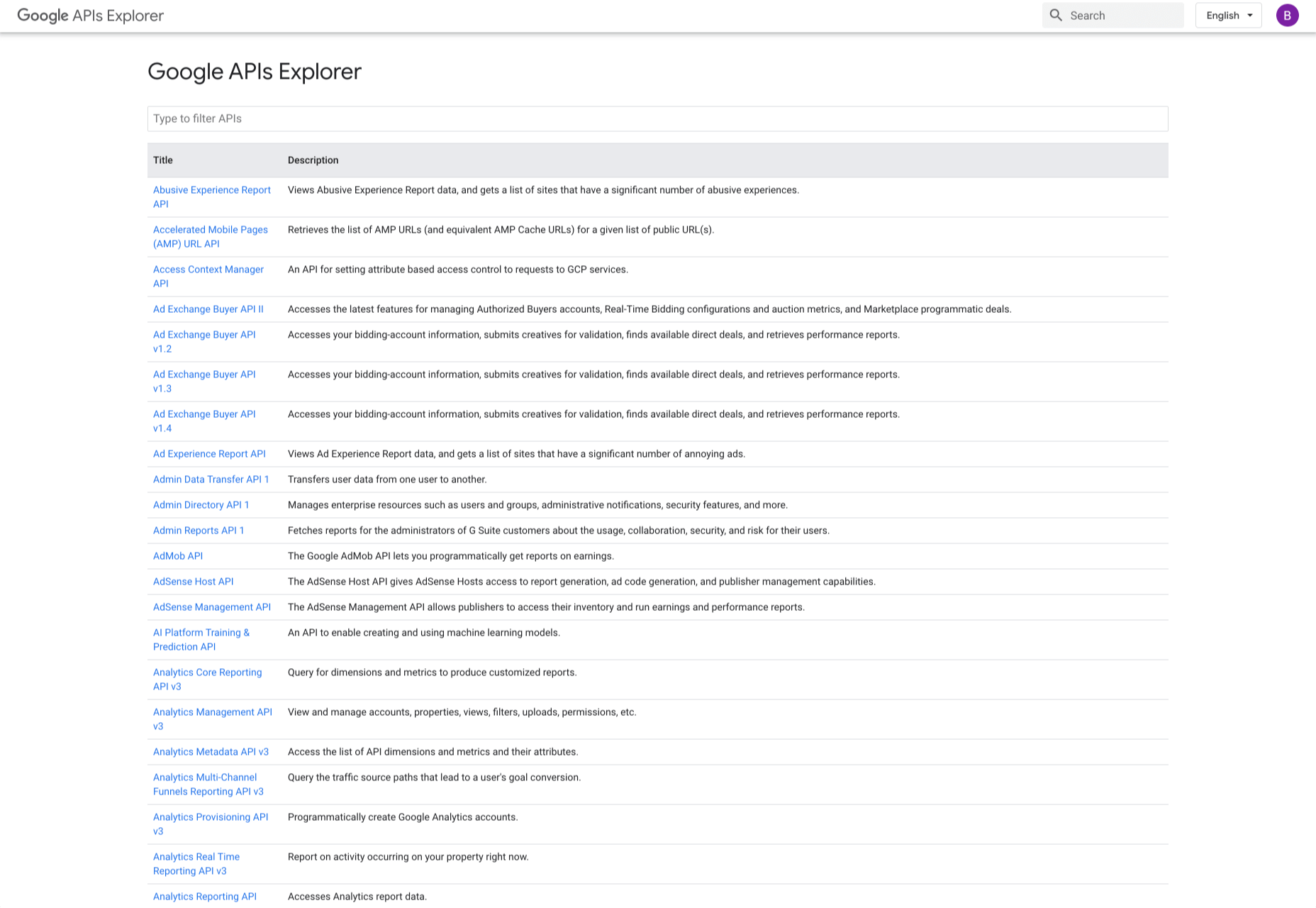
5. Google API Explorer
Google has a huge library of APIs that are available to developers but finding these APIs can be difficult. Google API Explorer makes it easy for developers to locate any API. On the Google API Explorer web page, you will see a complete list of the entire API library. You can easily scroll through the list or use the search box to filter through the API list.
The best part of Google API Explorer is that each link to a reference page comes with more details on how to use the API. API Explorer is an excellent way to try out methods in the Monitoring API without having to write any code.
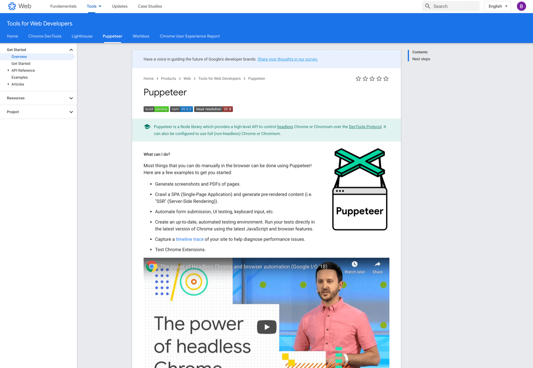
6. Puppeteer
Puppeteer is a project from the Google Chrome team. The platform enables web developers to control a Chrome (or any other Chrome DevTools Protocol based browser) and execute common actions, much like in a real browser. Puppeteer is also a Node library and it provides a high-level API for working with headless Chrome. It is also a useful tool for scraping, testing, and automating web pages.
Here are some things you can do with Puppeteer: generate screenshots and PDFs of pages, UI testing, test Chrome Extensions, automate form submission, generate pre-rendered content, and crawl Single-Page Applications.
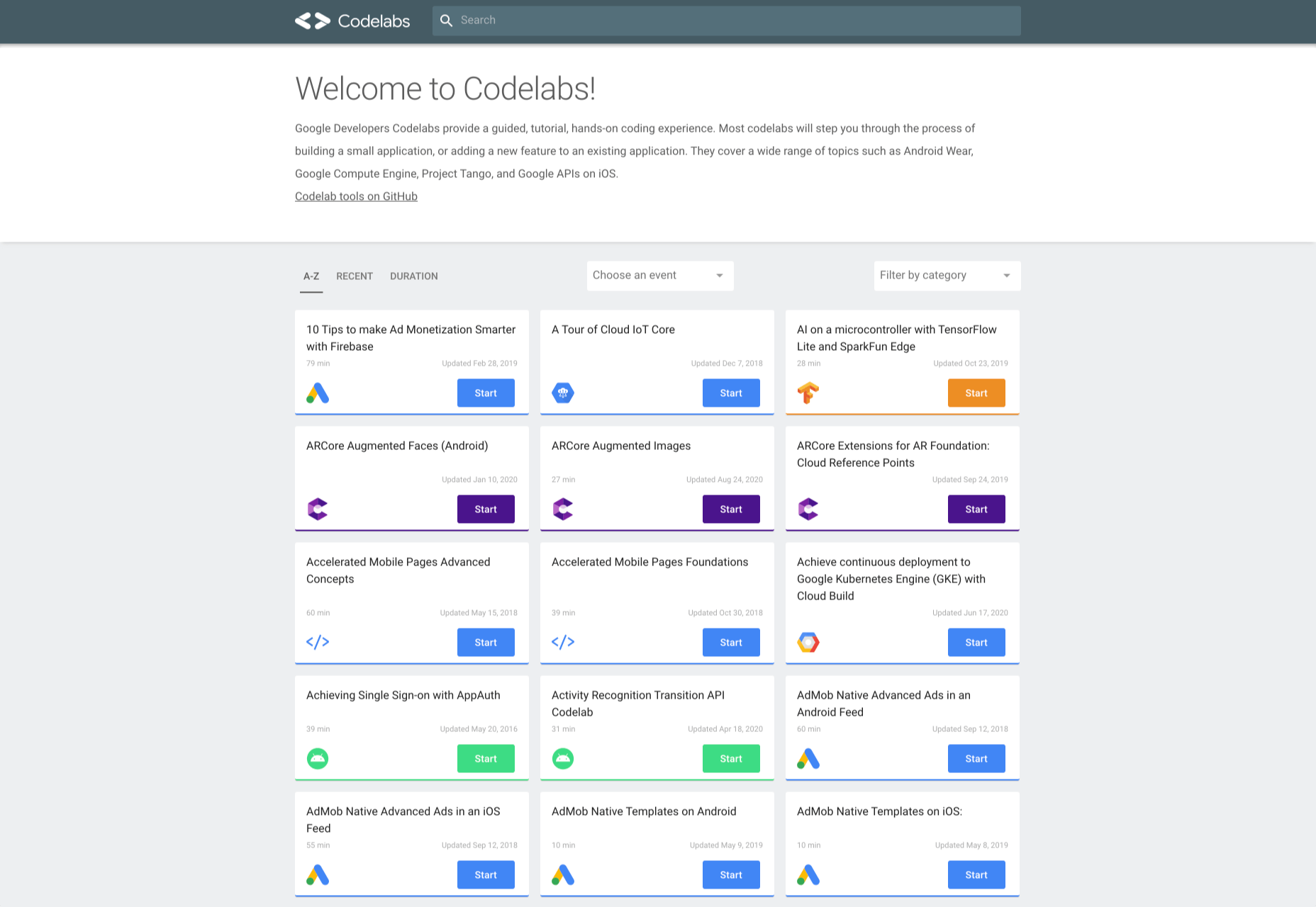
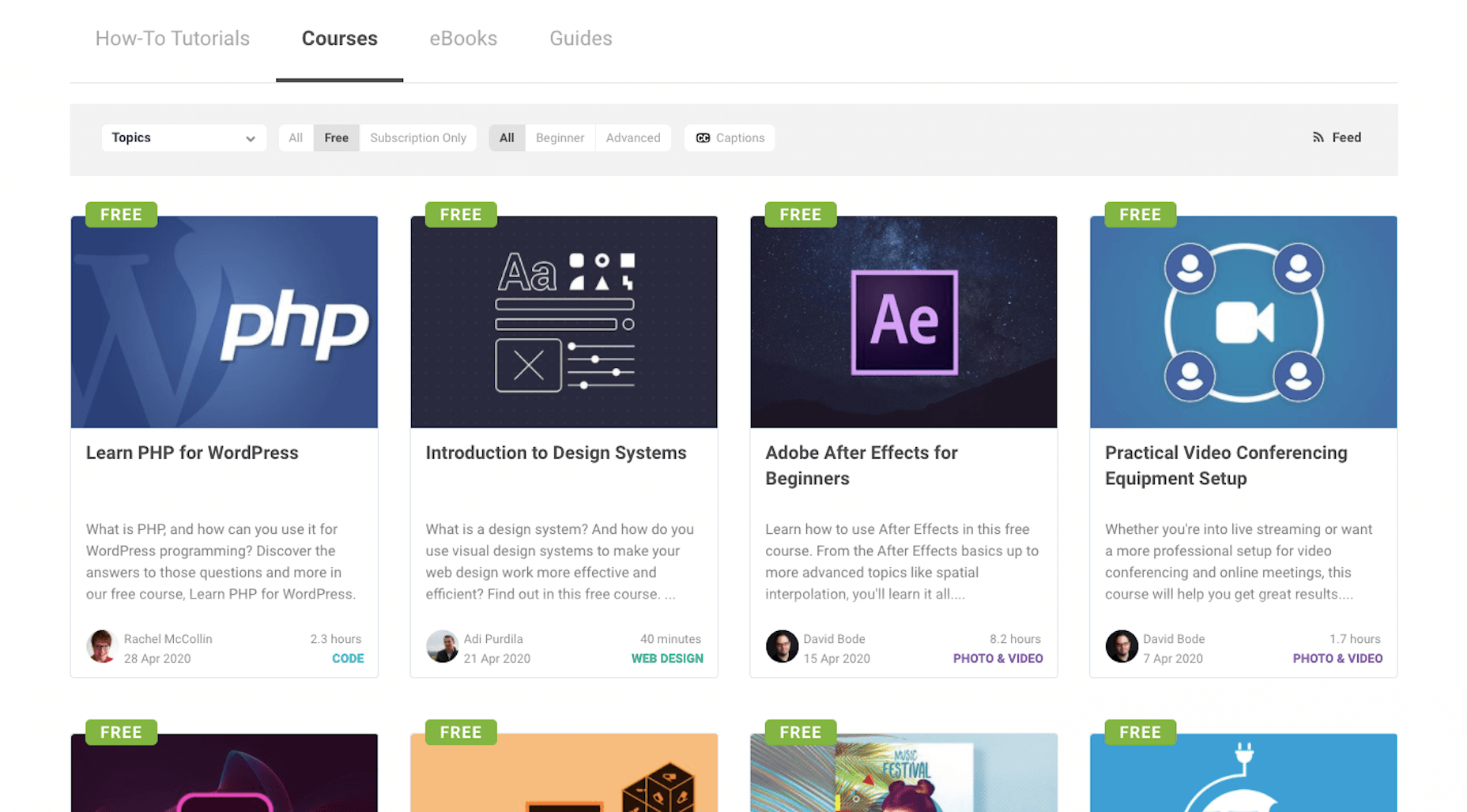
7. Codelabs
Google Developer Codelabs is a handy tool for beginner developers and even advanced developers who want to improve their knowledge. Codelabs provide a guided, tutorial, hands-on coding experience. Codelabs’ site is broken down into several tutorial sessions on different topics.
With the tutorials on Codelabs, you can learn how to build applications from scratch. Some of the tutorial categories include Augmented reality, TensorFlow, Analytics, Virtual Analytics, G Suite, Search, Google Compute Engine, and Google APIs on iOS.
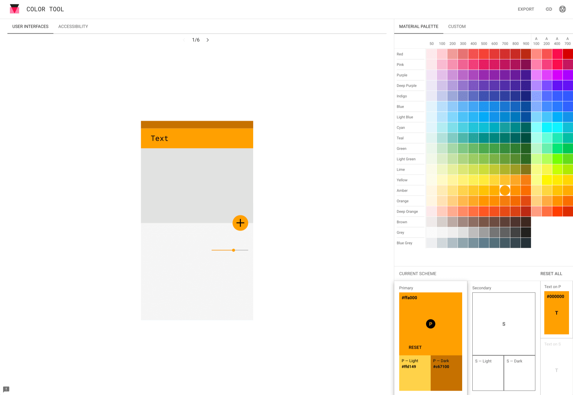
8. Color Tool
Color Tool makes it easy for web designers to create, share, and apply colors to their UI. It also measures the accessibility level for any color combination before exporting to the palette. The tool comes with 6 user interfaces and offers over 250 colors to choose from.
The tool is also very easy to use. All you need to do is pick a color and apply it to the primary color scheme; switch to the secondary color scheme, and pick another color. You can also switch to Custom to pick your own colors. After you have selected all your colors, use the Accessibility feature to check if all is good before exporting it to your palette.
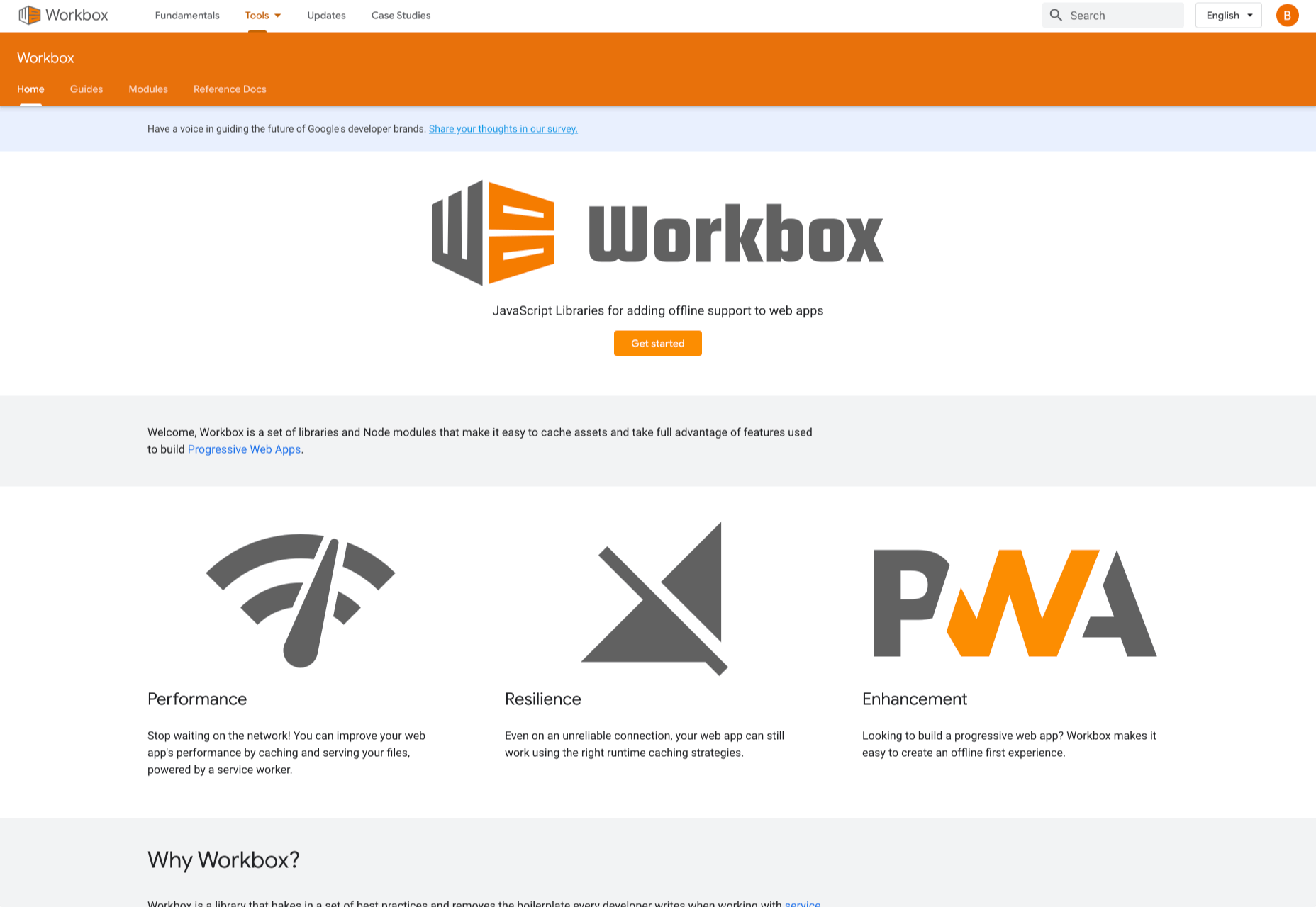
9. Workbox
Workbox is a set of JavaScript libraries and Node modules. The JavaScript libraries make it easy to add offline support to web apps. The Node modules make it easy to cache assets and offer other features to help users build Progressive Web Apps. Some of these features include pre-caching, runtime caching, request routing, background sync, debugging, and greater flexibility than sw-precache and sw-toolbox.
With Workbox, you can add a quick rule that enables you to cache Google fonts, images, JavaScript, and CSS files. Caching these files will make your web page to run faster and also consume less storage. You can also pre-cache your files in your web app using their CLI, Node module, or webpack plugin.
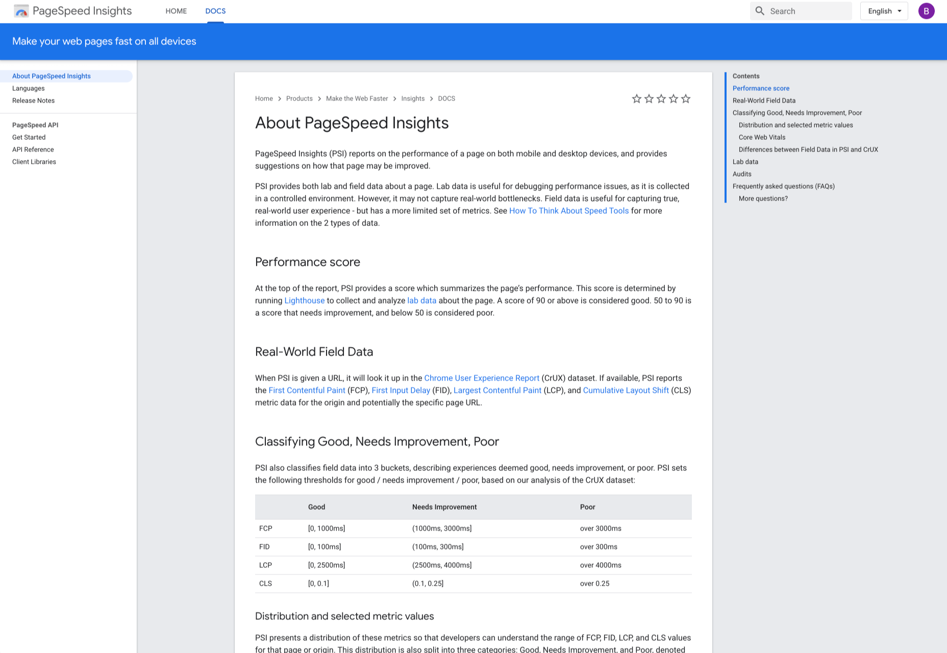
10. PageSpeed Insights
PageSpeed Insights is a handy tool from Google Developers that analyzes the content of a web page, then generates suggestions on how to make the page faster. It gives reports on the performance of a web page on both desktop and mobile devices. At the top of the report, PageSpeed Insights provides a score that summarizes the page’s performance.
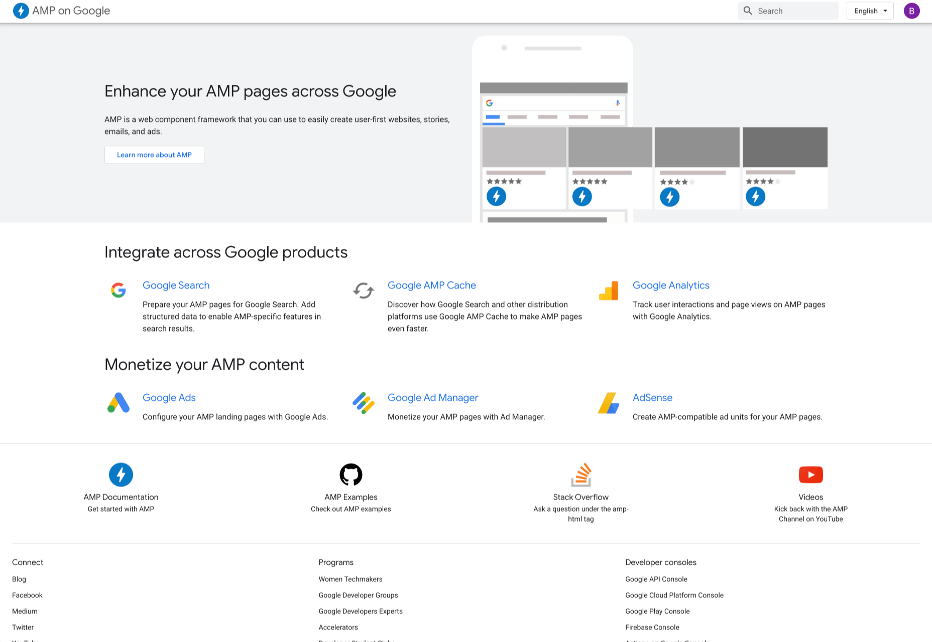
11. AMP on Google
AMP pages load faster and also look better than standard HTML pages on mobile devices. AMP on Google allows you to enhance your AMP pages across Google. It is a web component framework that allows you to create user-first websites, ads, emails, and stories. One benefit of AMP is that it allows your web pages to load almost instantly across all devices and platforms hence improving the user’s experience.
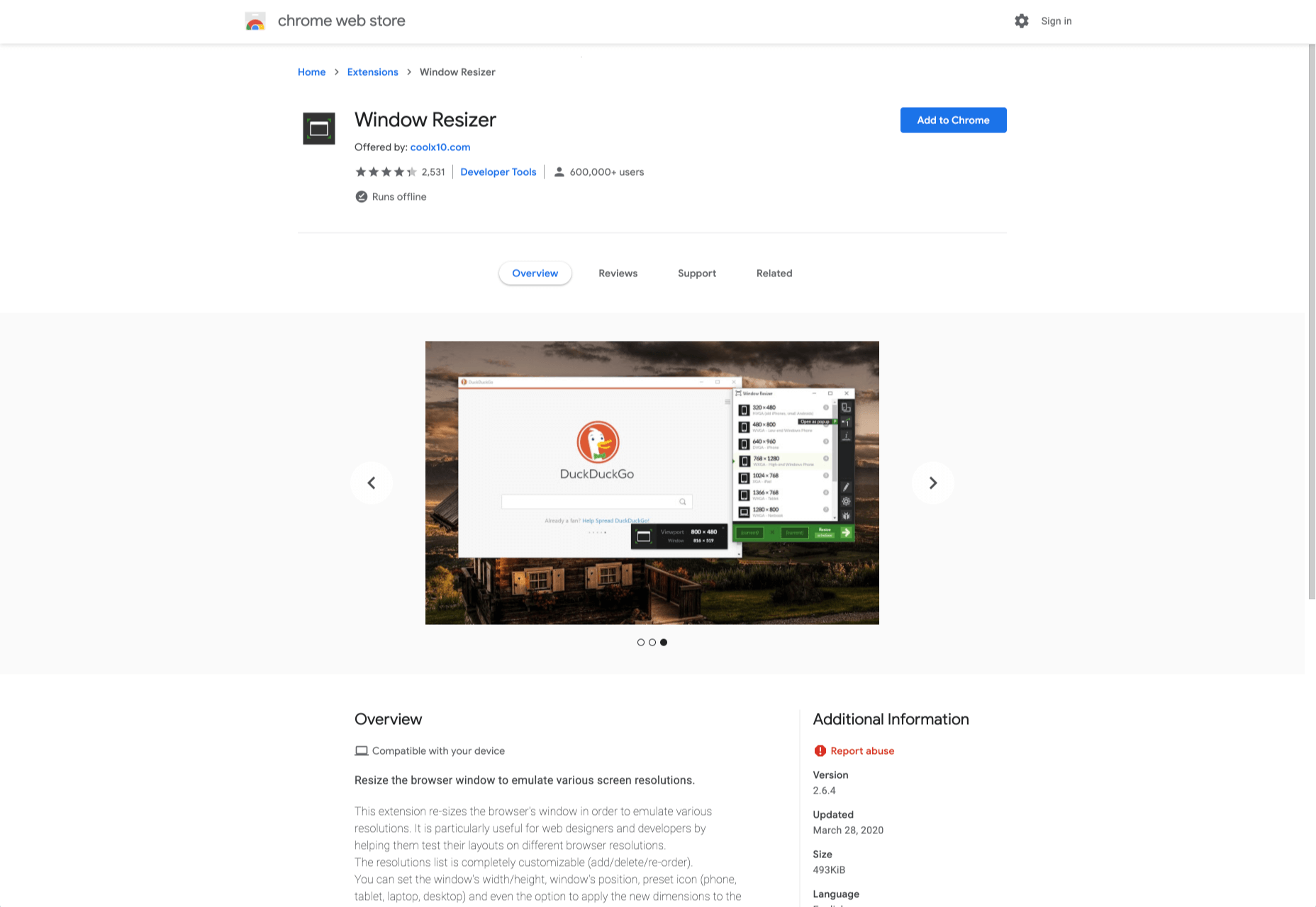
12. Window Resizer
When creating websites, it is important that developers test them for responsive design – this is where Window Resizer comes in. Window Resizer is a Chrome extension that resizes the browser window so that you can test your responsive design on different screen resolutions. The common screen sizes offered are desktop, laptop, and mobile, but you can also add custom screen sizes.
Featured image via Unsplash.
Source

Source de l’article sur Webdesignerdepot


 Designing for emotion in and of itself is not a problem. Websites are bound to elicit an emotional reaction from visitors, even if it’s as simple as them feeling at ease because of the soft, pastel color palette you’ve designed the site with.
 As a freelance web developer, how many clients do you get from your website? If you’re like most, you’re probably lucky to get one client every 2-3 months. Unfortunately, that’s very common.

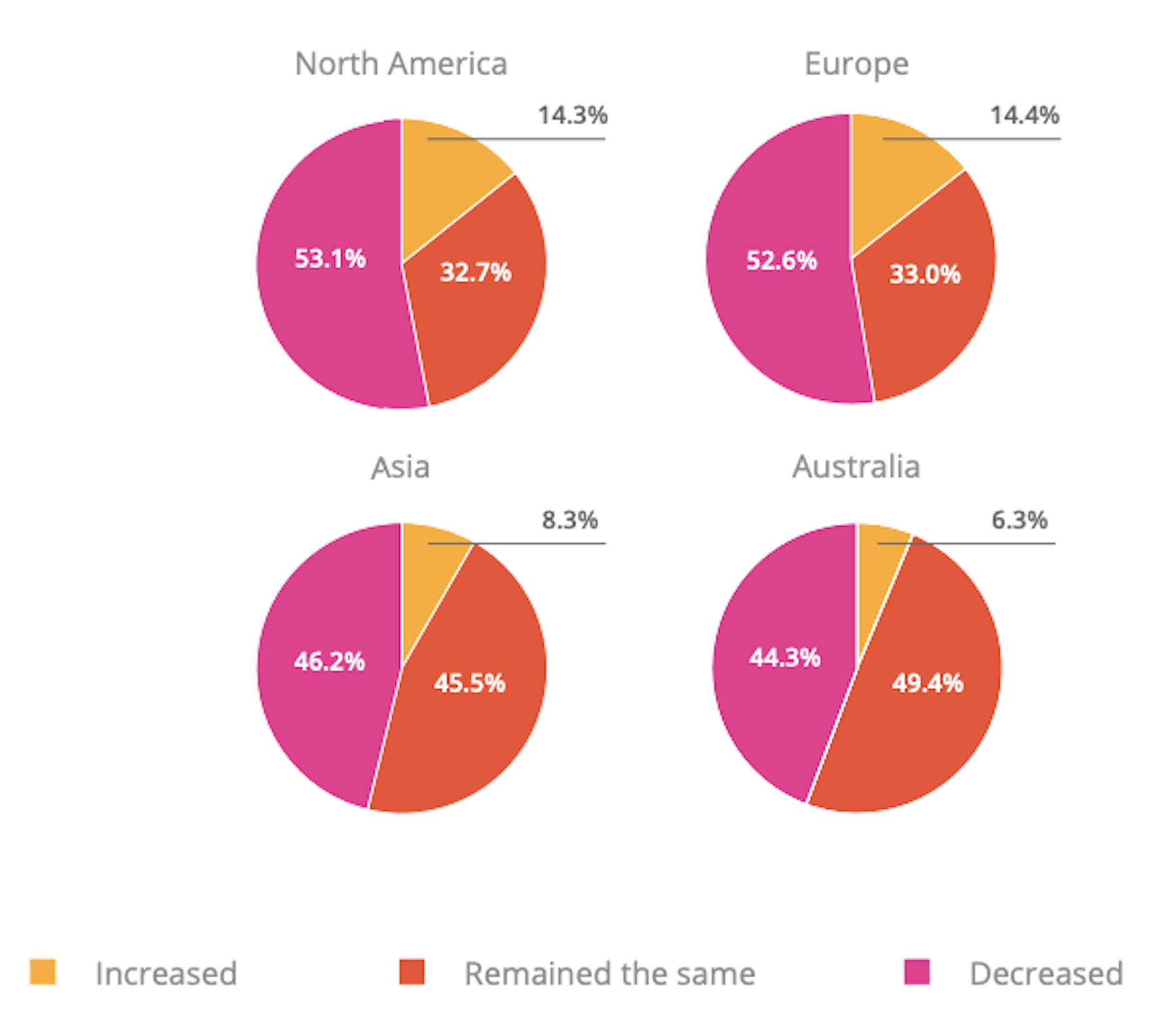
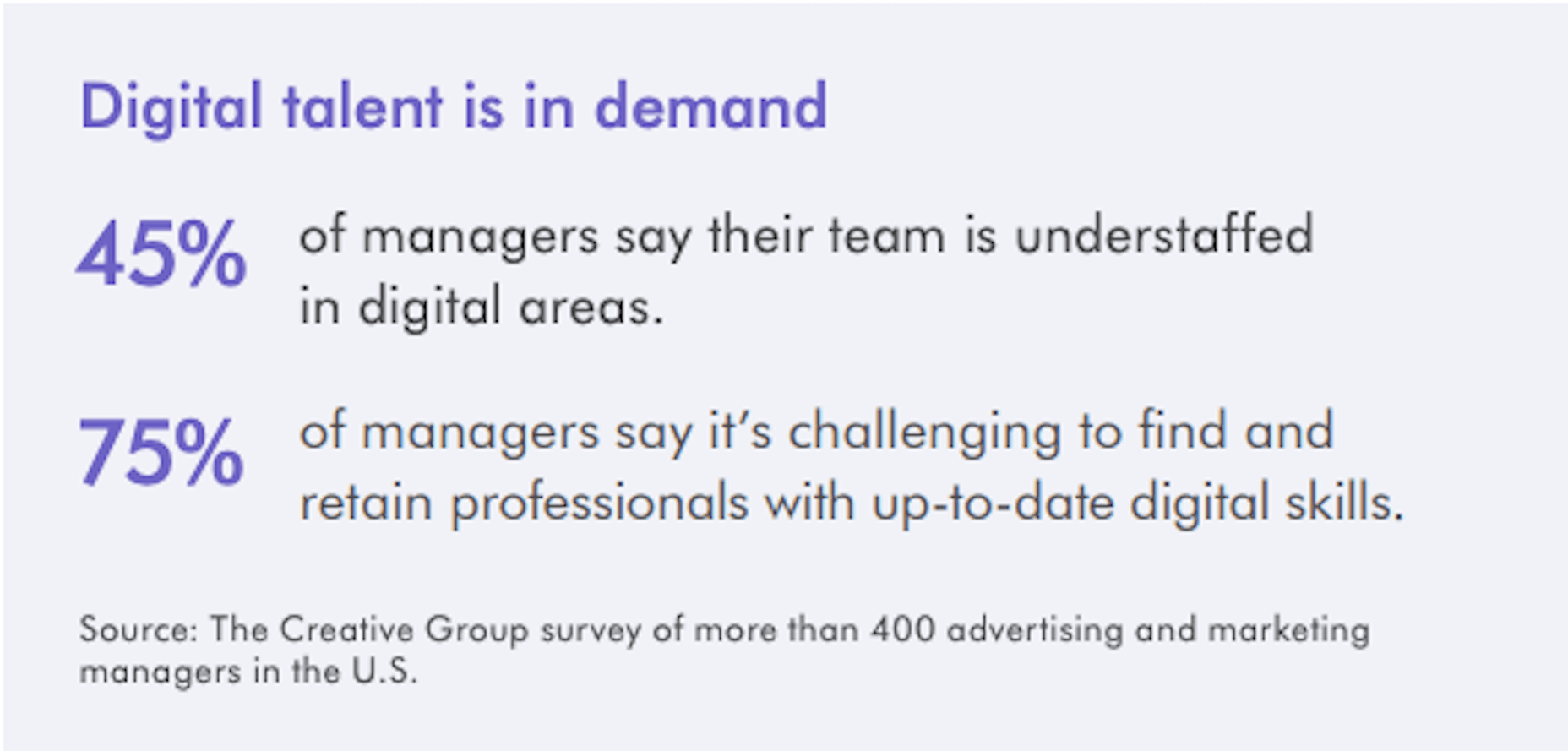
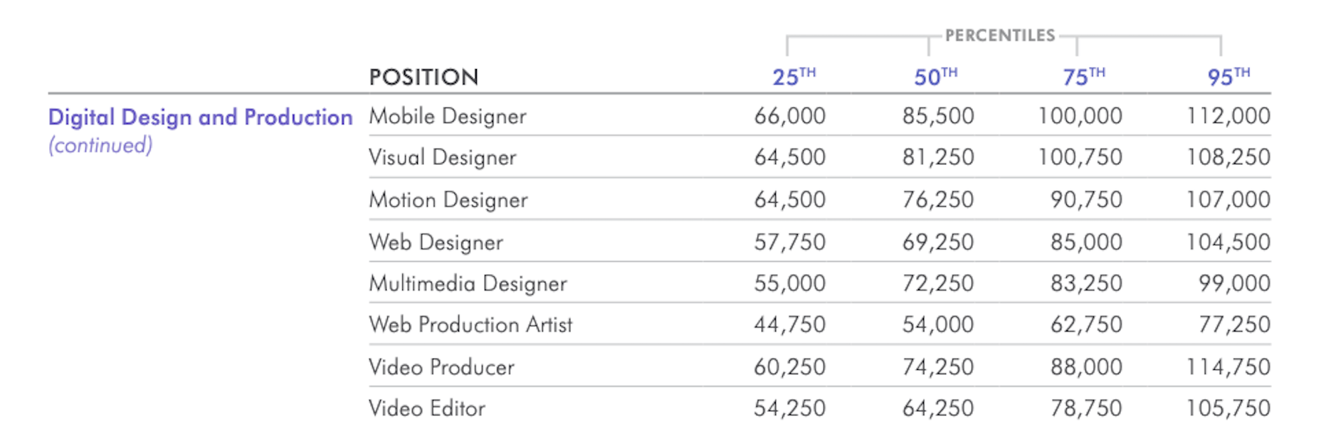
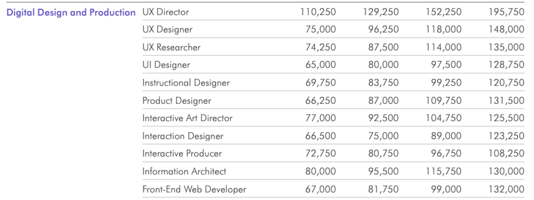
 In today’s look at the latest research for web designers, we’re going to look at studies and reports from Payoneer, Robert Half, Hootsuite, and Contentsquare to see what they have to say about things like:
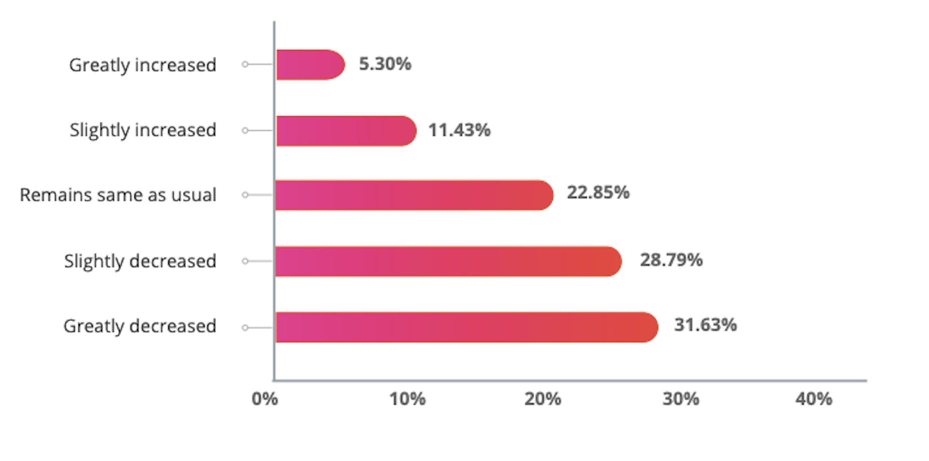


 I often see freelancers on social media asking what the secret is to working fewer hours, making more money, and helping new clients to find them. While those things tend to happen the longer you’ve been freelancing, it doesn’t happen without some effort.


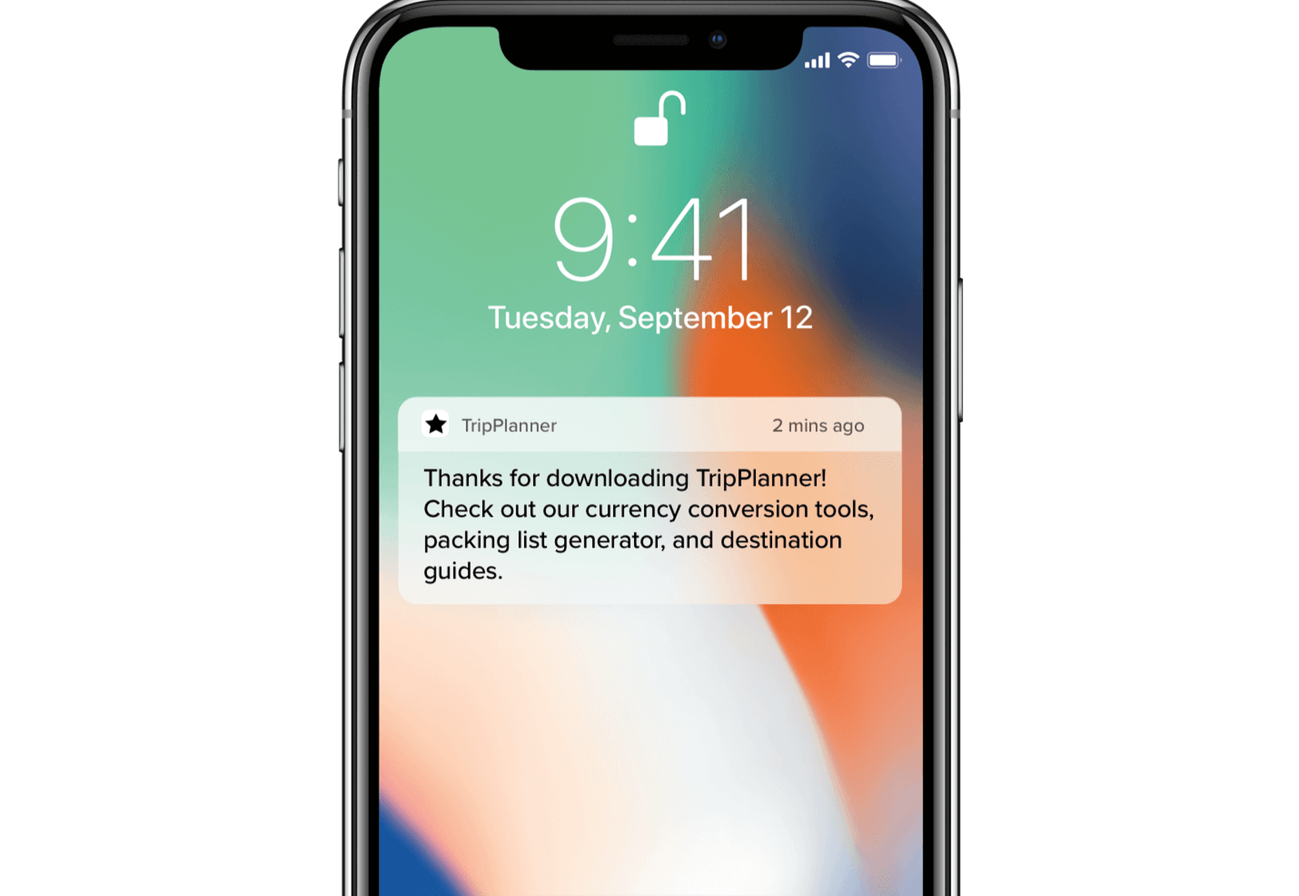
 To understand why user onboarding is such an indispensable tool, we need to empathize with the people using our products; we all come from different backgrounds and cultures, we make different assumptions, and we see the world differently.


 It’s no secret that having a custom domain name is an essential piece of any company’s branding strategy. While there are a myriad of hosting plans available that offer domains like your company.webhost.com, making the shift from one of those to simply yourcompany.com is an important step.