 WordPress is a highly flexible content management system for website creation. A key reason for this flexibility is the wide variety of plugins available. You can add features and other improvements to your site.
The thousands of available useful WordPress plugins cover almost every feature for any type of website. Your website’s niche determines the kind of plugins you should have. There are some great WordPress plugins that every blog site needs; security, speed, SEO, and contact form, to name several.
The most effective WordPress websites create an enjoyable visitor experience. Whether you’re blogging about the latest fashion trends or selling products for your brand, you can enhance your website. Do it with one or more of these ten great WordPress plugins.
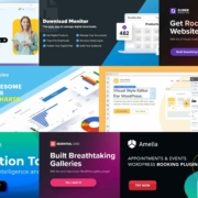
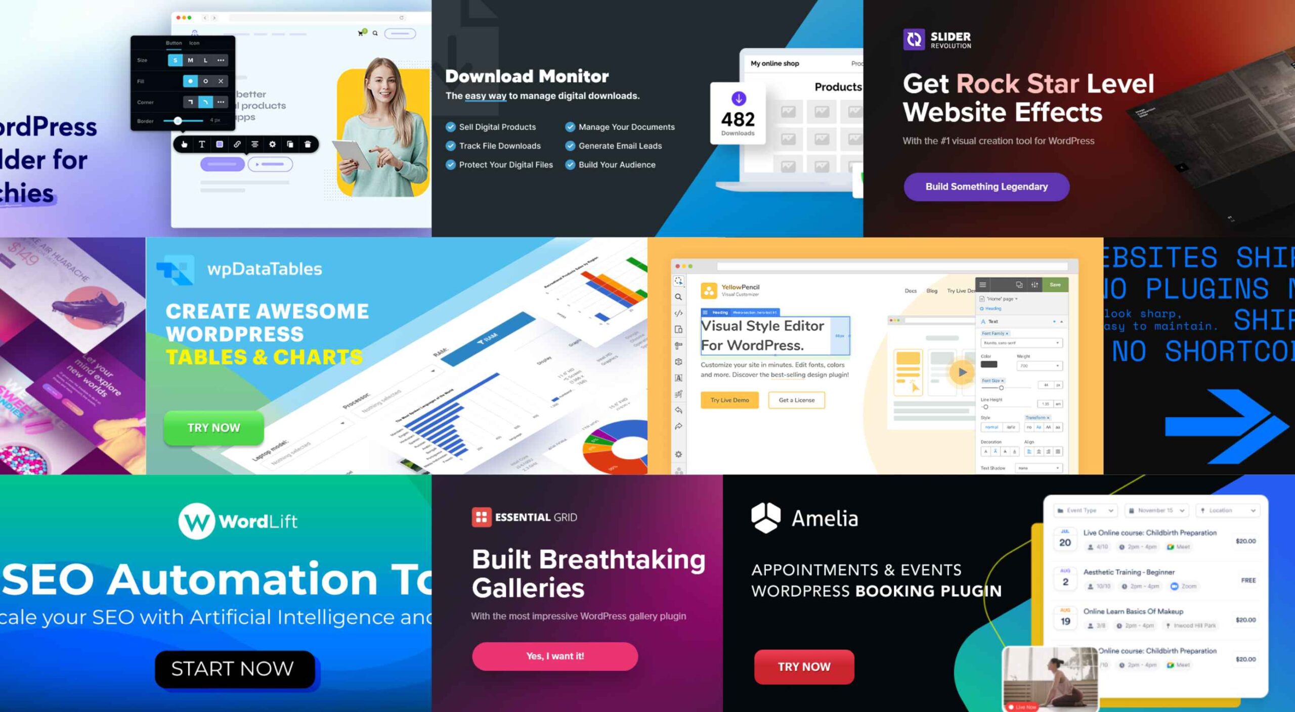
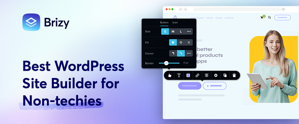
1. Brizy: The Best Website Builder for Non-techies
You might want to approach Brizy with caution because once you start using it, no other website theme builder you might try will ever seem as easy to use. Even better, you can download this WordPress website builder for non-techies (and for techies as well) for Free.
With the Brizy WordPress theme builder at your fingertips, you can –
- build a brand new website or upgrade an existing one;
- create dynamic templates for your blog and archive pages, headers, footers, custom pages, and more;
- enjoy instant access to 150+ customer-friendly pre-made templates;
- build your blog exactly as you envisioned it;
- easily customize your WooCommerce shop site.
Brizy’s Theme Builder, Global Blocks, and Global Styling features are right at your fingertips, and WooCommerce integration is also included.
You can also choose the 100% White Label option if you wish to brand the Brizy Builder as your own. A Pro option is available.
Click on the banner to learn more about Brizy and download it free.
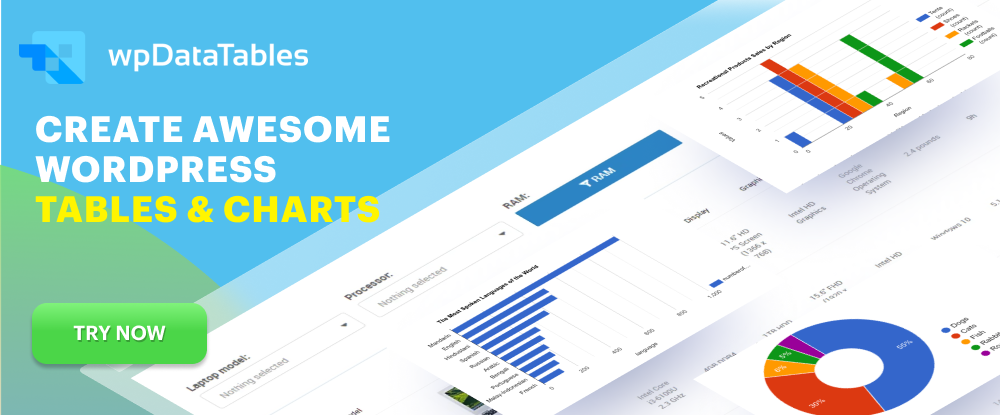
2. WpDataTables – WordPress tables plugin
While there are a host of good reasons for using wpDataTables, the main benefit is that it works with any WordPress theme, it can create a responsive table in minutes, and it requires no coding to use.
With this WordPress tables plugin, you can take advantage of a host of useful features that include –
- four chart-building engines: Google Charts, Highcharts, Chart.js, and the new Apex Charts;
- connecting to multiple database sources, e.g., MYSQL, MS SQL, and PostgreSQL;
- fine-tuning a table or chart to make it responsive or editable and using conditional formatting to highlight critical data;
- the ability to create tables from a nested JSON file;
- and use dynamic single-cell shortcodes in many different options;
- integration with Elementor, Divi, WPBakery, and Avada.
wpDataTables is a robust table and chart-building plugin that’s remarkably straightforward. Just click on the banner to learn more.
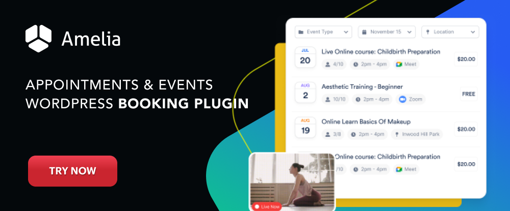
3. Amelia – WordPress booking plugin
Amelia is a WordPress booking plugin that can fully automate and streamline its appointment booking operations when added to a business’s WordPress site. This makes Amelia an excellent choice for beauty, healthcare, fitness, consulting, educational, and similar client-dependent businesses.
The Amelia plugin can –
- manage an unlimited number of appointment bookings at multiple locations, and do so from a single platform and dashboard;
- enable clients to book appointments online 24/7;
- easily manage group appointments, package bookings, and events;
- send notifications and reminders to clients via Email or SMS, and make payments online with PayPal, Stripe, Mollie, or Razor;
- customize booking forms to match its host’s brand.
Click on the banner to find out more about how the Amelia WordPress plugin could be used to upgrade your business’s booking operations.
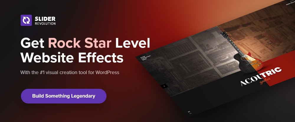
4. Slider Revolution – more than a WordPress slider plugin
Slider Revolution is a WordPress plugin that is more than just a slider plugin. It’s a highly popular plugin that designers rely on to create visuals they know their clients and customers will love.
Slider Revolution features –
- 250+ website and slider templates designed to impress;
- innovative website animation effects and other features that push the boundaries of what is possible in web design.
Slider Revolution is trusted by over 9 million users around the world.
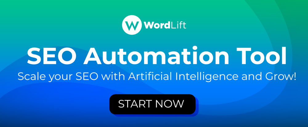
5. WordLift – AI-powered SEO
Structured data helps your website speak the language of Google, and WordLift is the most innovative way to create one.
It is an AI-powered SEO tool that:
- adds structured data to your content;
- creates a Knowledge Graph that makes it easier for Google to understand the relevance of pages, their relationship, and their value;
- build up the expertise, authority, and trustworthiness of your website.
As a result, you get more organic traffic and audience engagement.
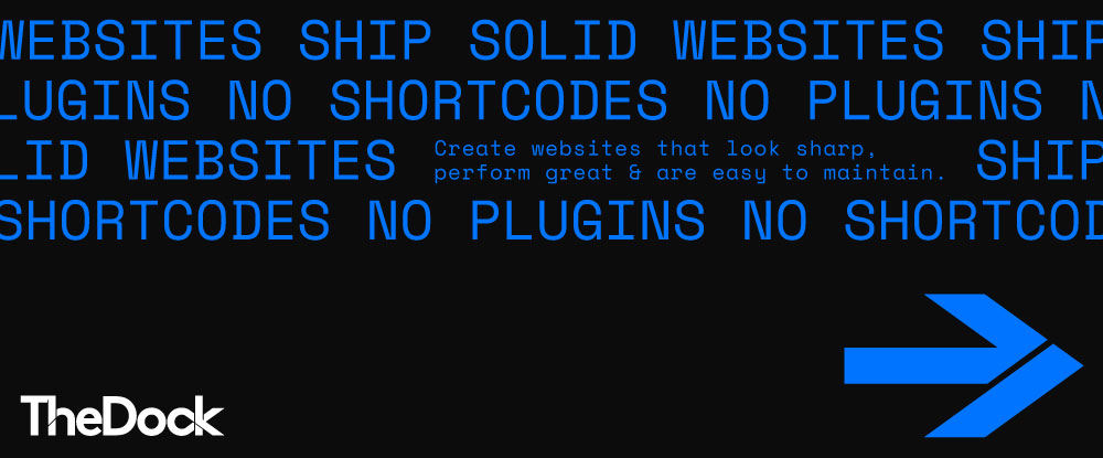
6. TheDock – Ship Solid Websites
TheDock is a design team-oriented WordPress theme builder that supports collaboration, speeds up website design, and helps to create sites that look sharp, perform great, and are easily maintained because of its –
- custom Post Types and Custom Fields;
- speedy page load;
- flexible auto-adjusting layout system with UI components;
- white-label builder for sharing access to TheDock if you want to;
- built-in features that assure excellent security and easy maintenance.
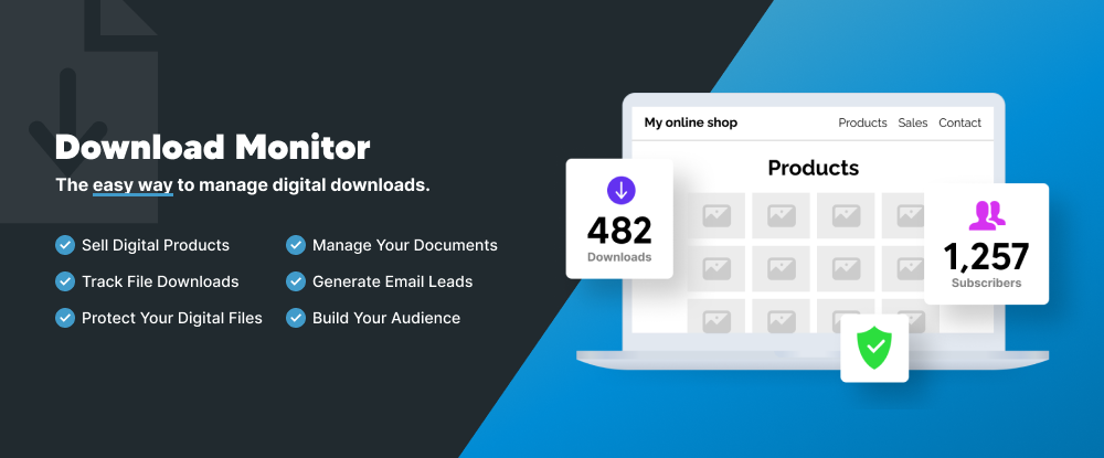
7. Download Monitor – Best WordPress Download Manager
Download Monitor is a WordPress downloads manager that can help you streamline your business operations without having to go through the process of setting up a complicated or costly tracking solution.
With the Download Monitor plugin, you can –
- track any type of file download (ZIP, PPT, XSLX, PDF, etc.);
- assemble aggregated file download statistics about different file download types;
- establish access rules based on user roles and download quotas.
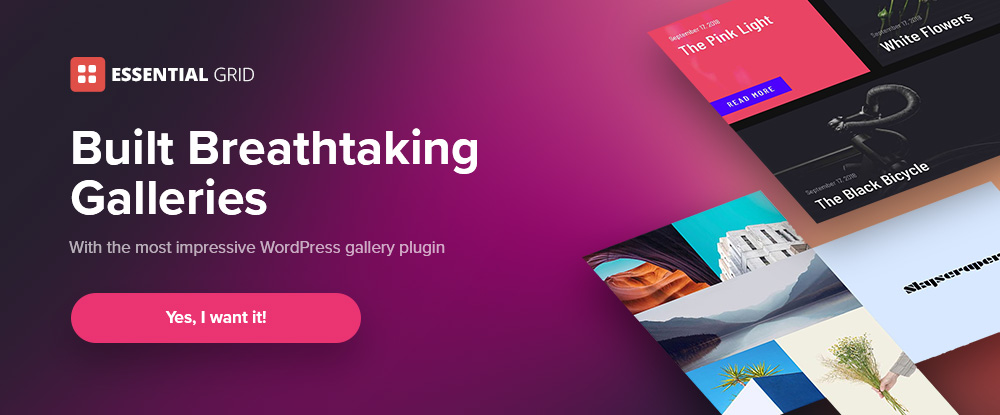
8. Essential Grid – best WordPress grid plugin
Essential Grid is, by all accounts, the best WordPress grid plugin on the market. Essential Grid makes it ever so easy to spice up your websites by using it to create superbly engaging and professional-looking galleries.
This WordPress plugin can give you –
- stunning, fully customizable boxed and full-width to full-screen grid layout options and various grid designs;
- responsive designs that enable you to control grid appearance on various devices;
- access to social media content.
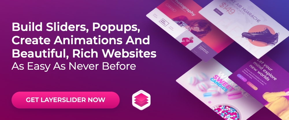
9. LayerSlider – Best WordPress Slider Builder Plugin
LayerSlider is the best WordPress slider plugin, but it is not just for sliders. Create image galleries, popups, landing pages, animated page blocks, parallax and scroll scenes, and even full websites.
LayerSlider –
- will fit your needs and is easy to use;
- can spice up and add flair and style to an otherwise run-of-the-mill website;
- supports any WordPress theme and page builder;
- features 210+ highly customizable websites, slider, and popup templates.
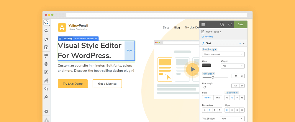
10. YellowPencil – Visual CSS Editor
YellowPencil is a visual CSS editor you can use to customize any WordPress site in minutes.
Key features include –
- a complete visual editing interface that allows you to redesign a page with a few clicks;
- a simple interface that does not require coding;
- the capability to edit any font and any color;
- the capability to visually edit a design element’s size, margin, and padding properties;
- the ability to undo/redo mistakes.
*******
It is almost needless to tell any WordPress user how important plugins are for a website. A good WordPress plugin has the power to boost the success of your business online by adding a range of helpful features and functionality to your website.
In this article, we have shared our expert pick of 10 great WordPress plugins for your websites in 2023.
[– This is a sponsored post on behalf of BAW media –]
The post 10 Great WordPress Plugins in 2023 first appeared on Webdesigner Depot.

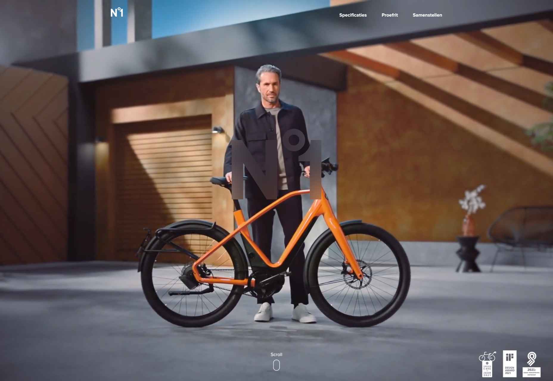
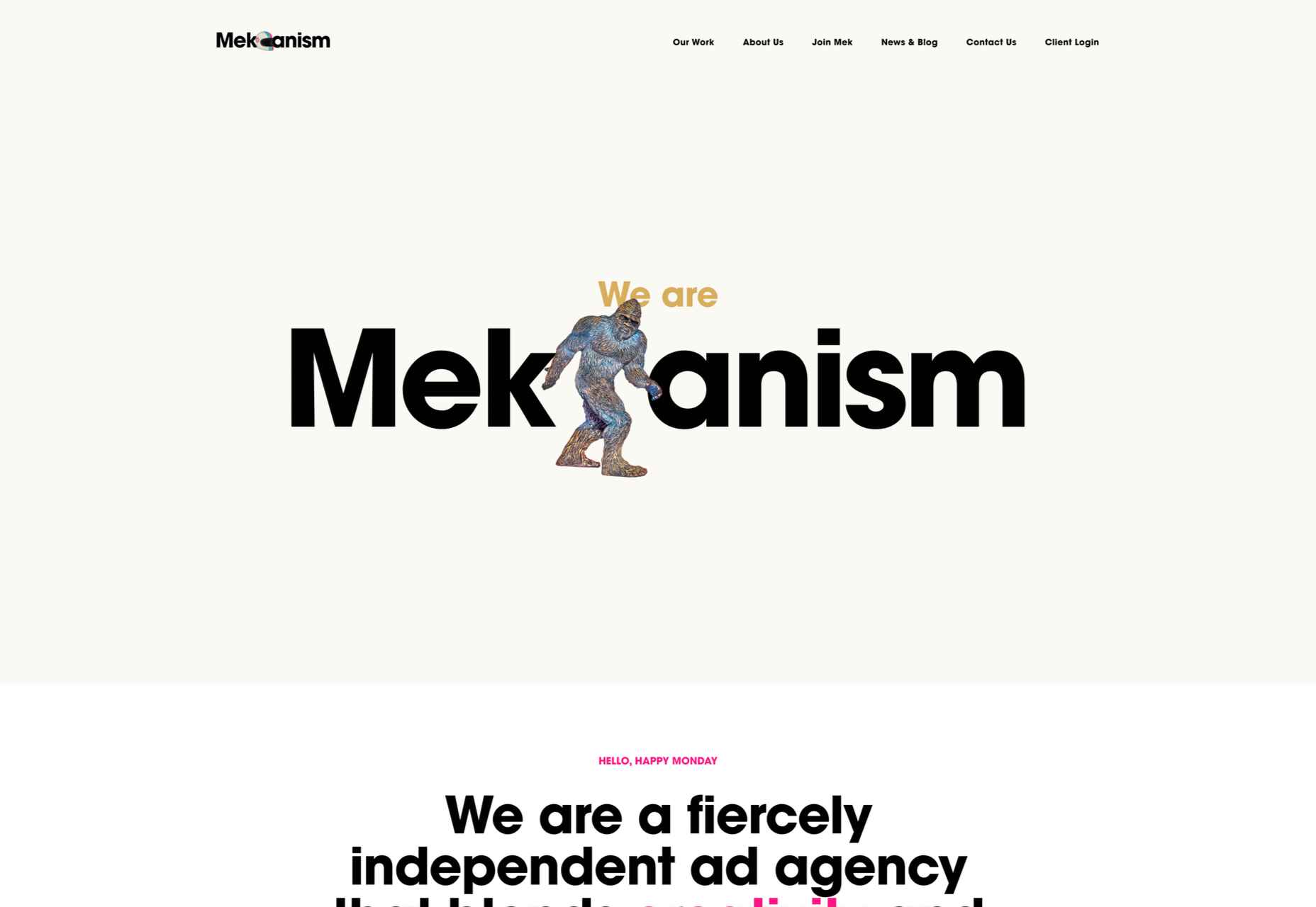
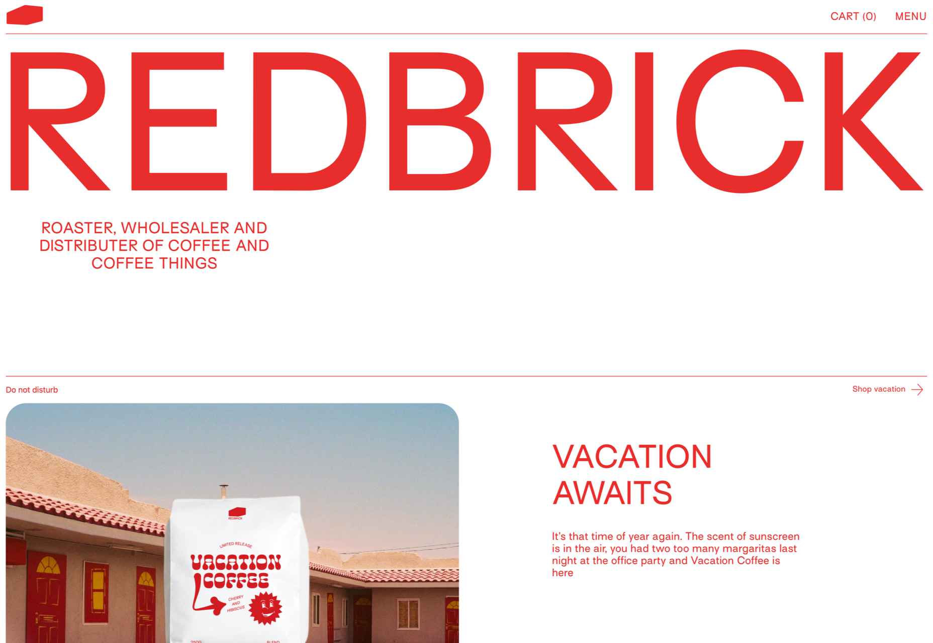
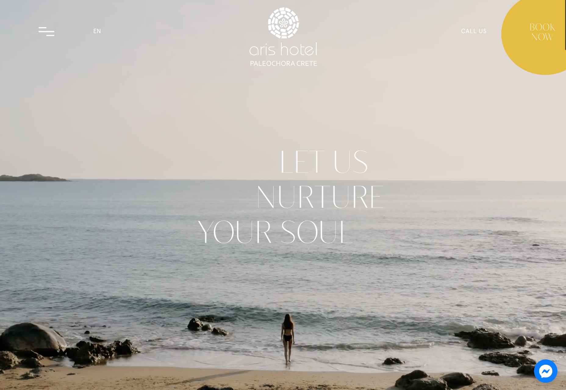
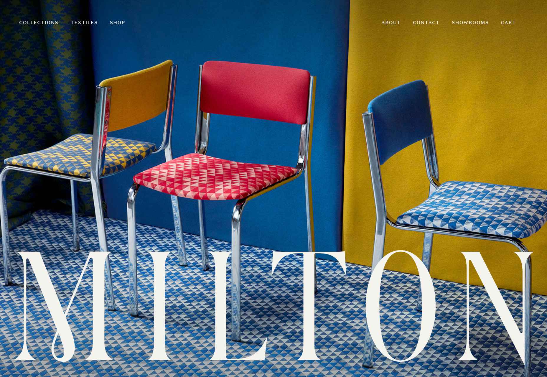
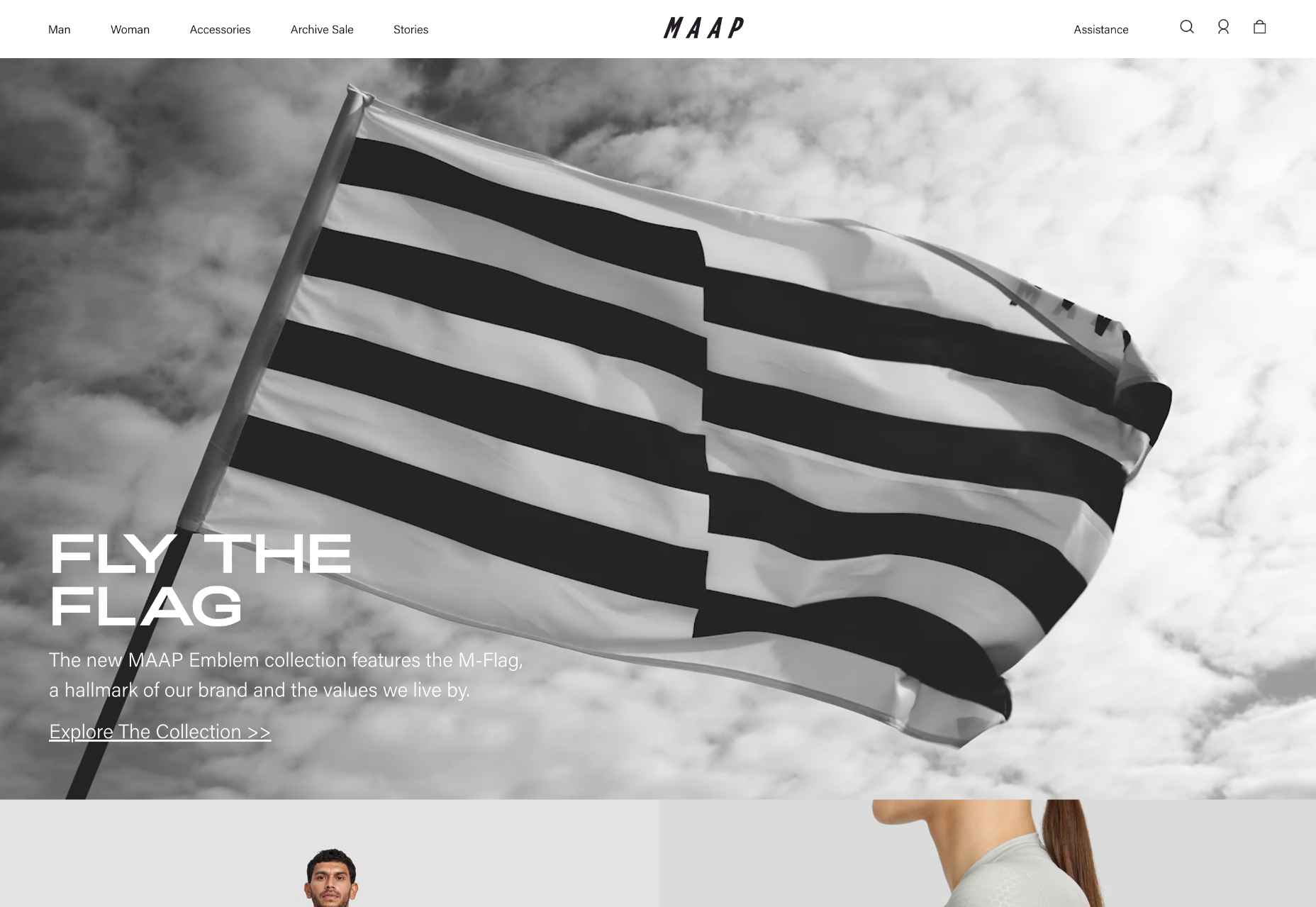
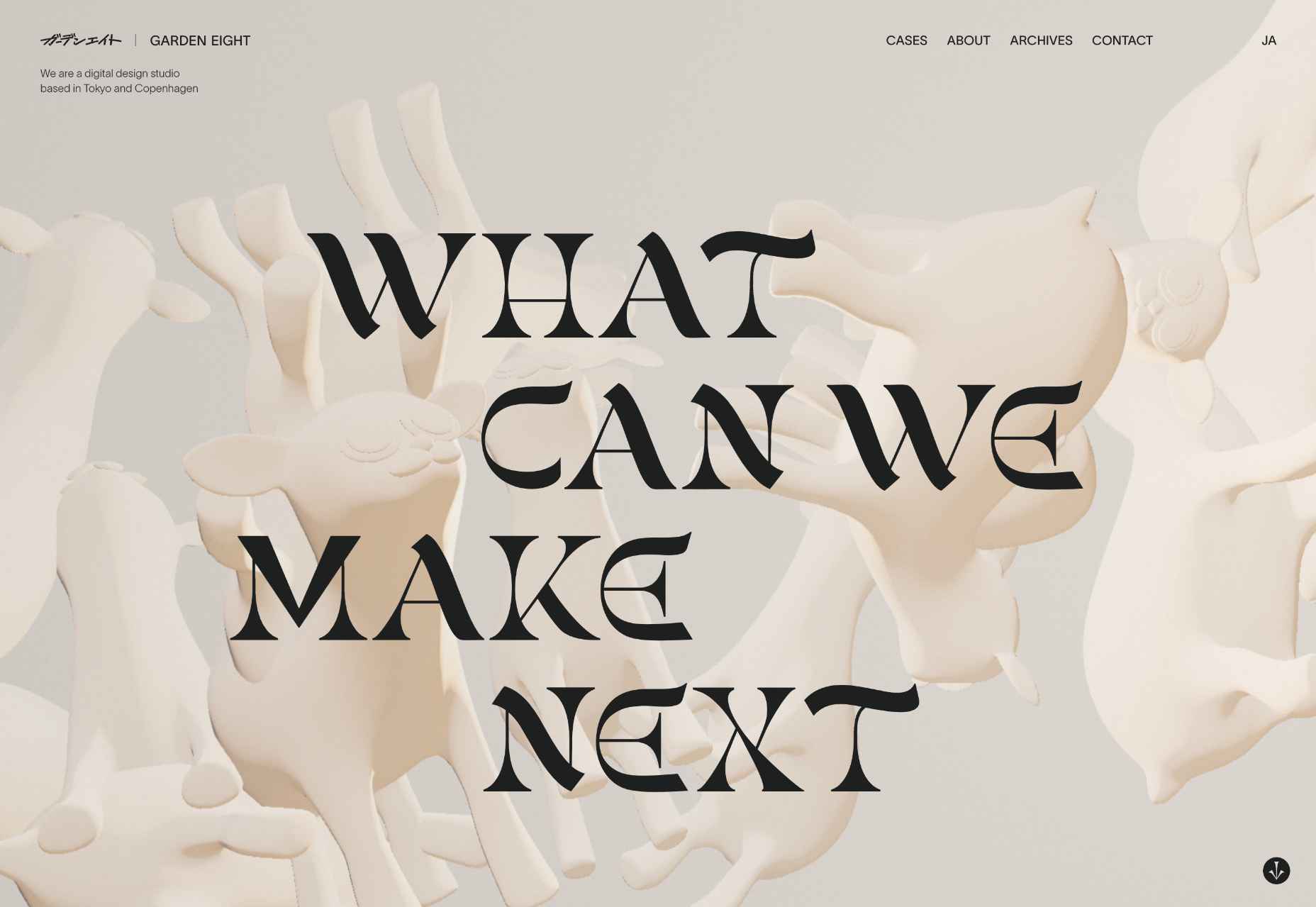
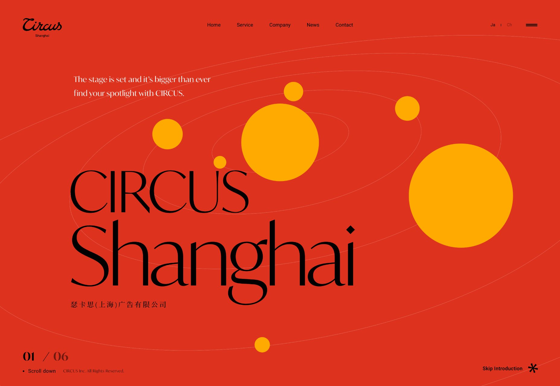
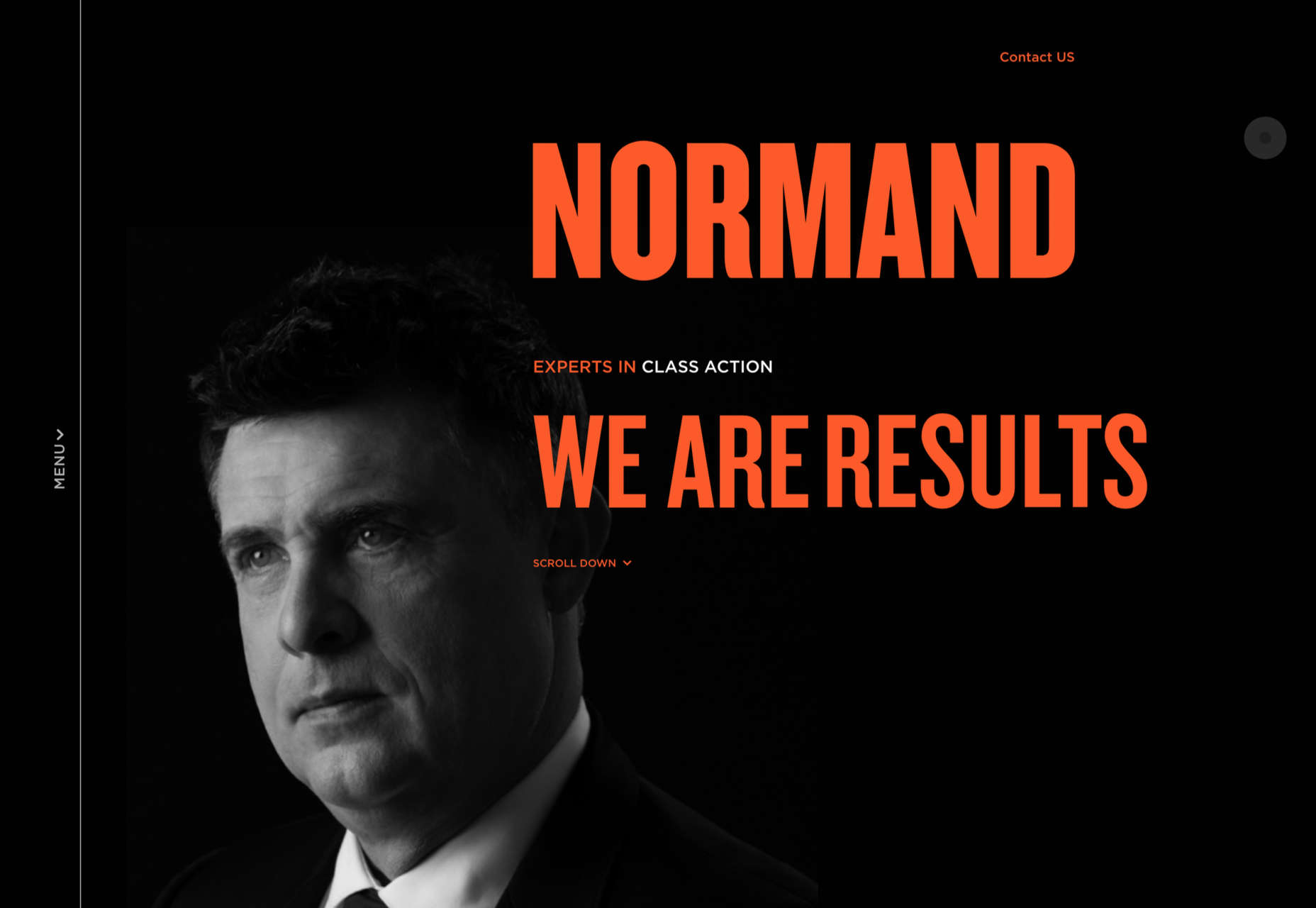
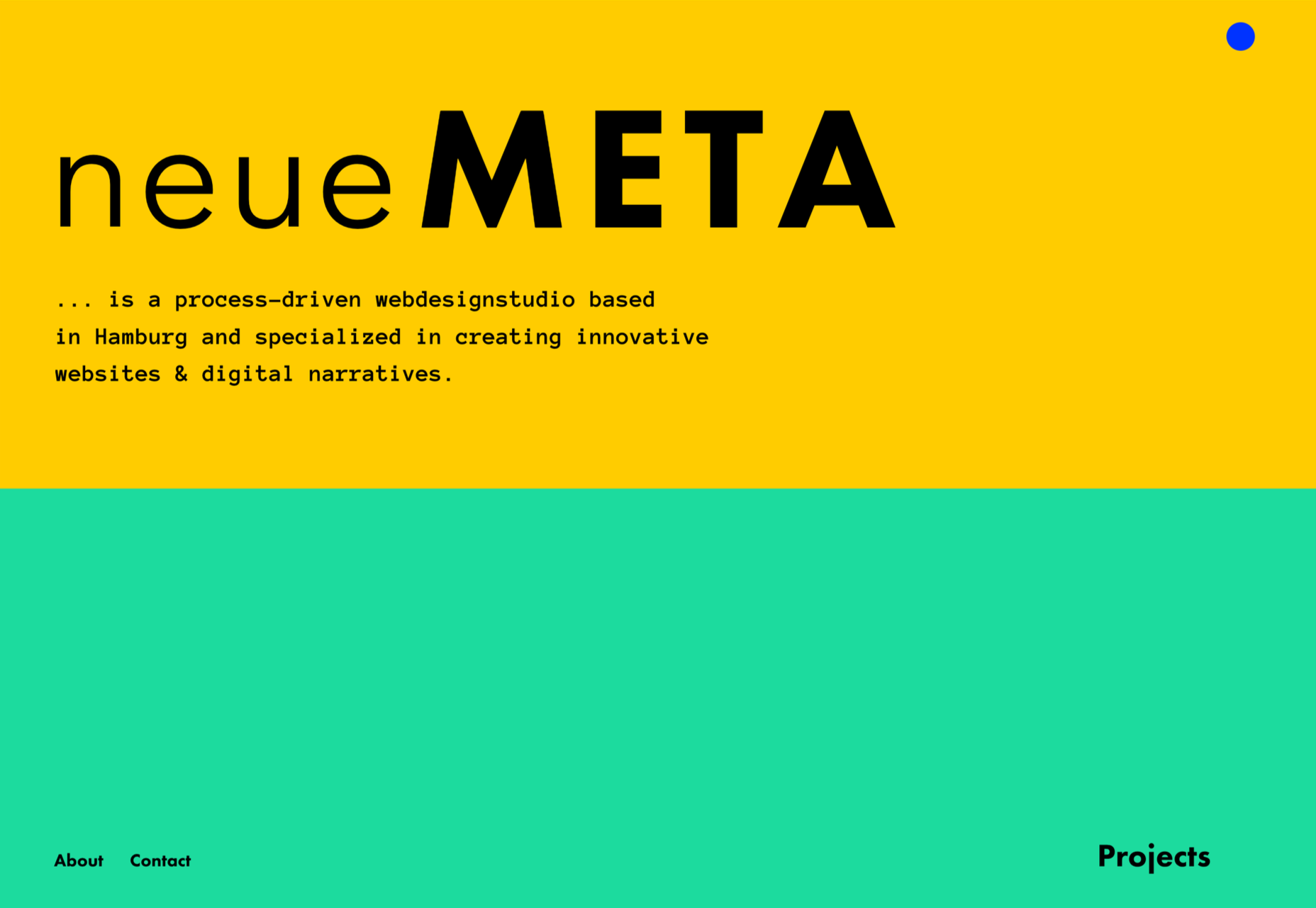
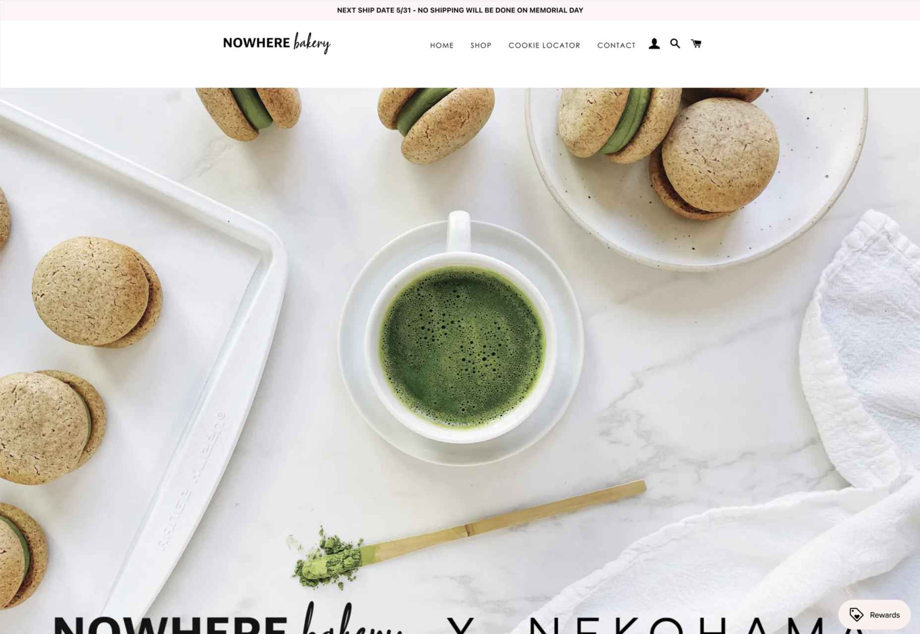
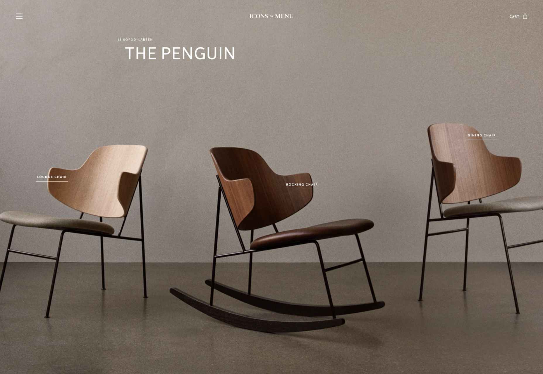
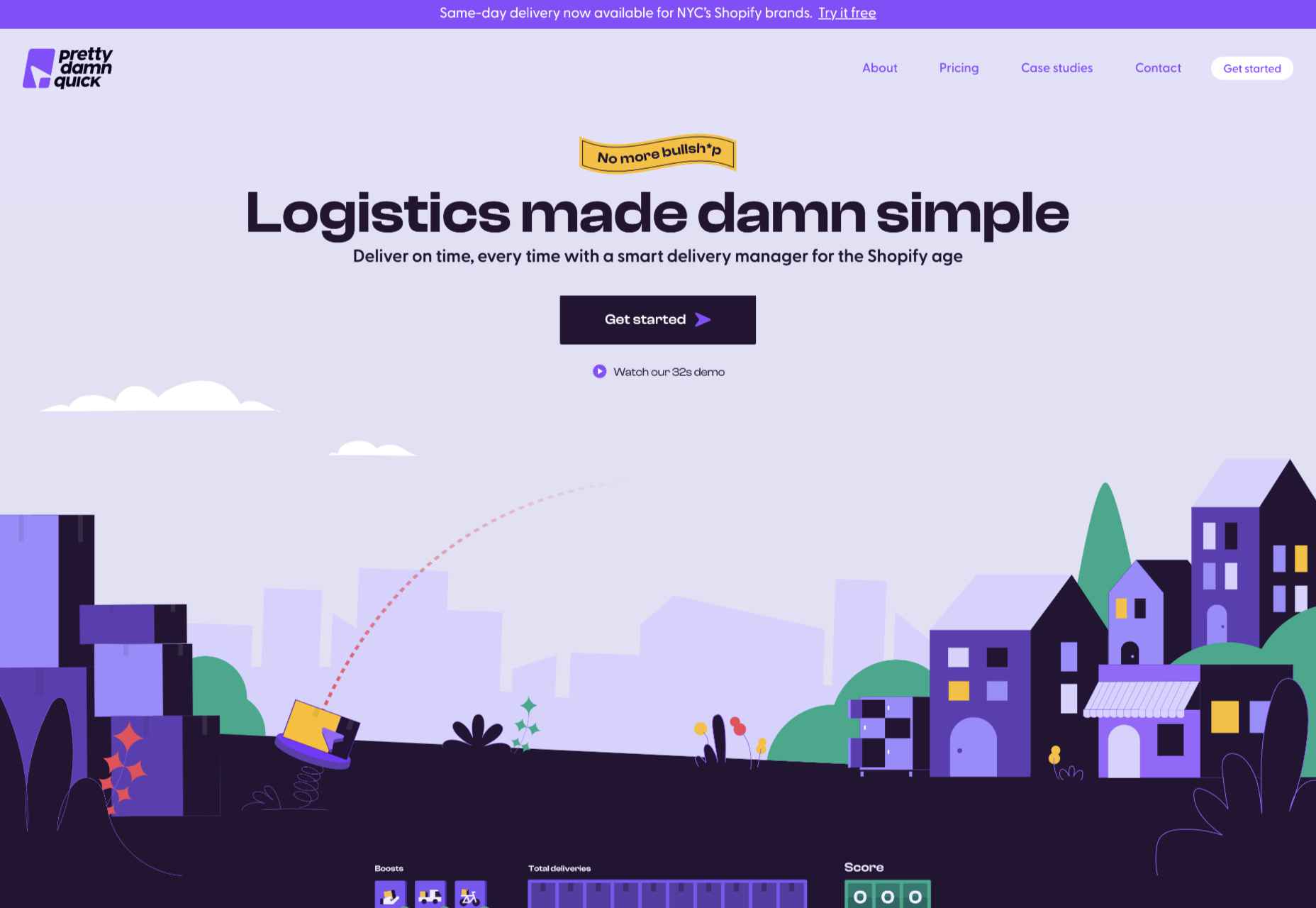
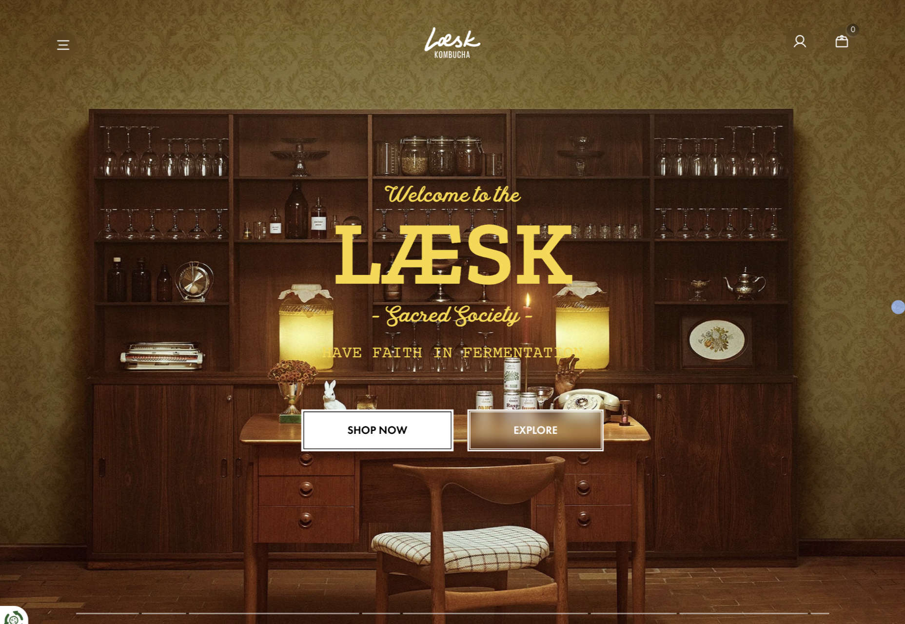
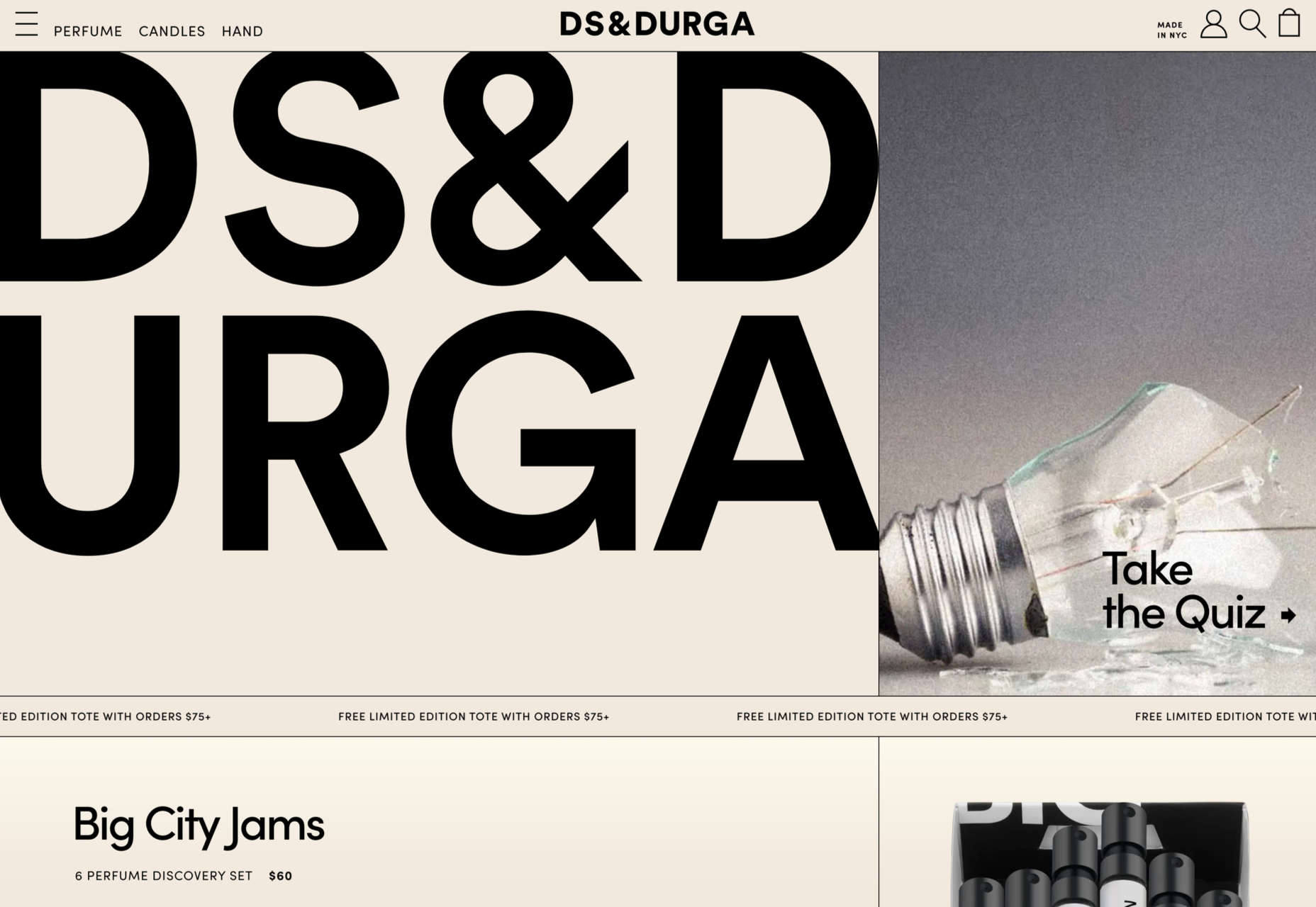
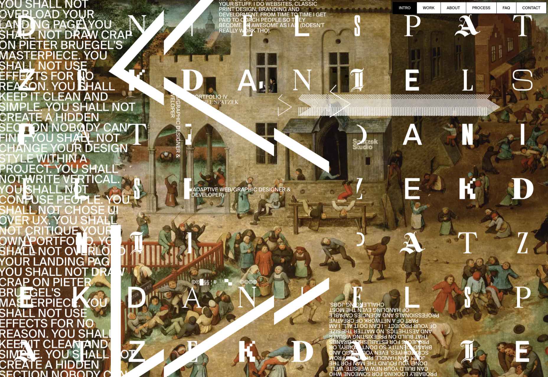
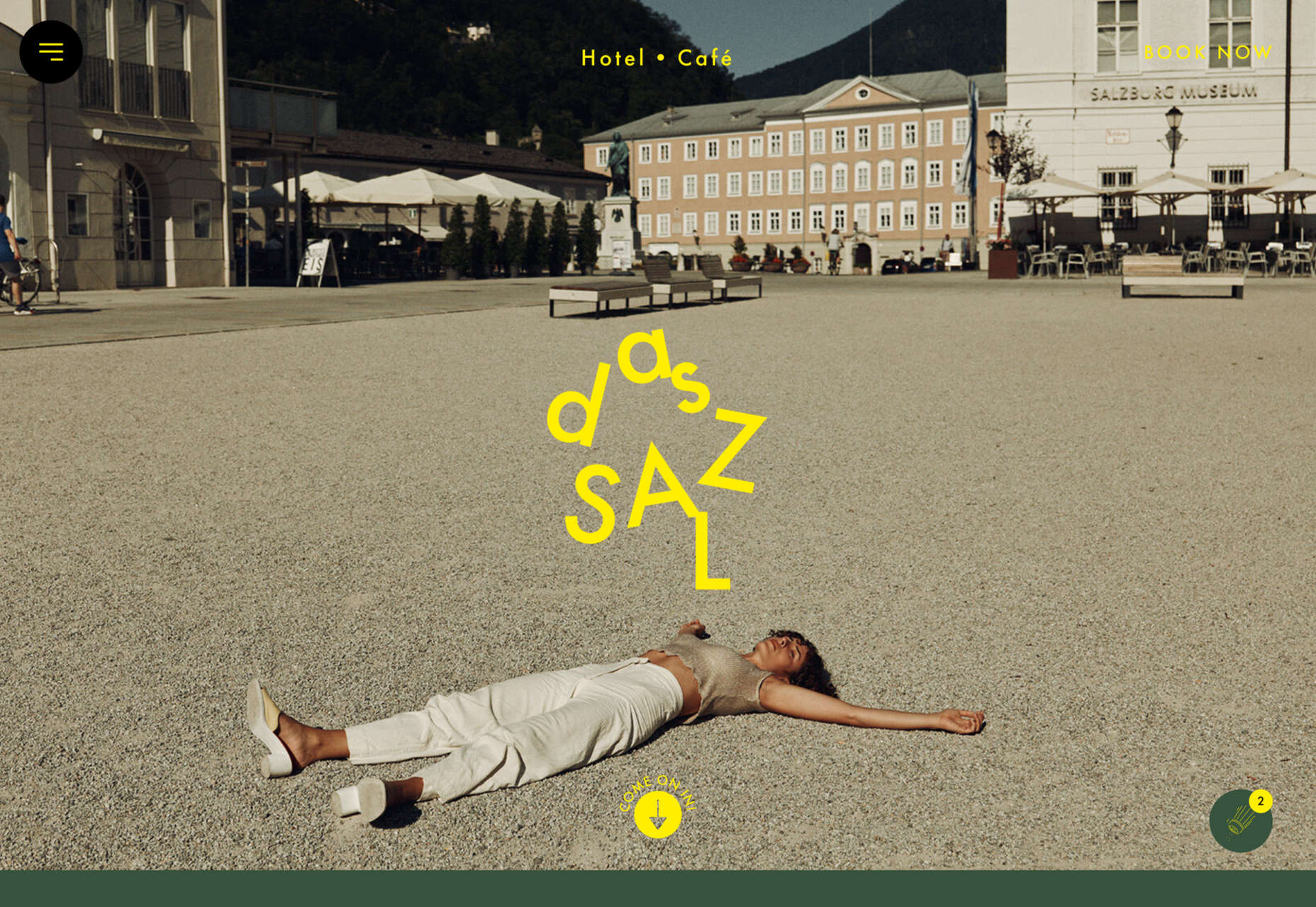
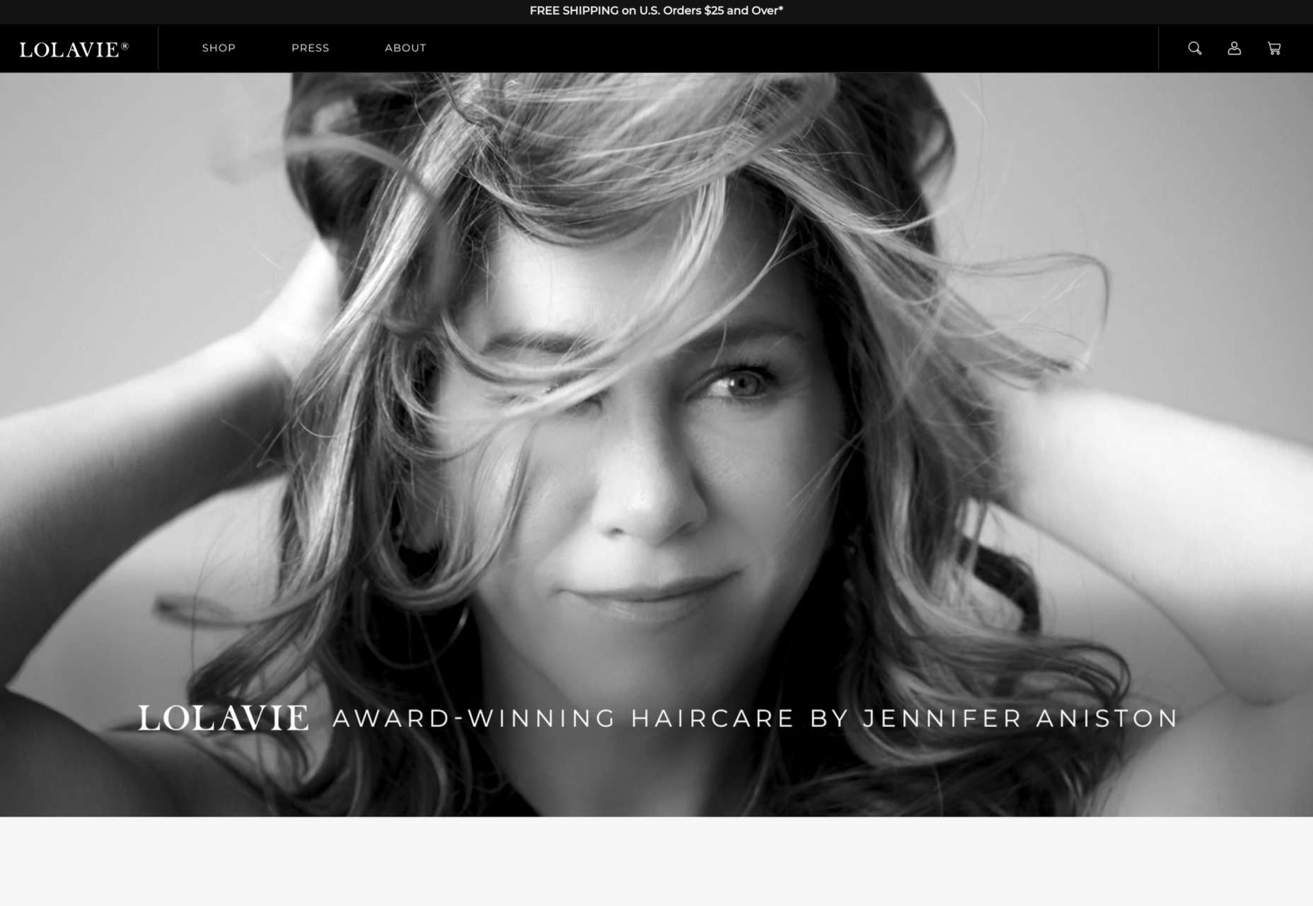
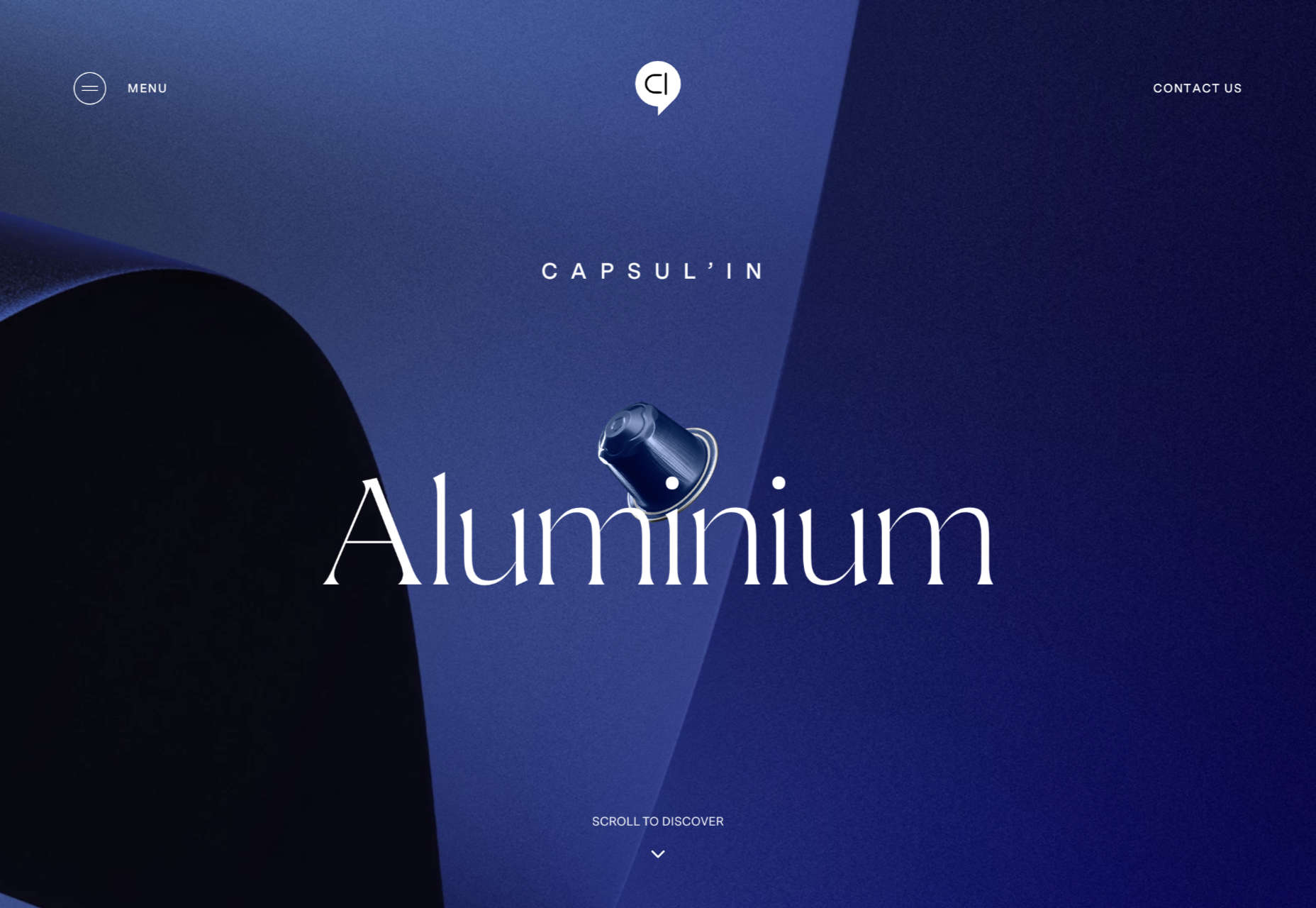
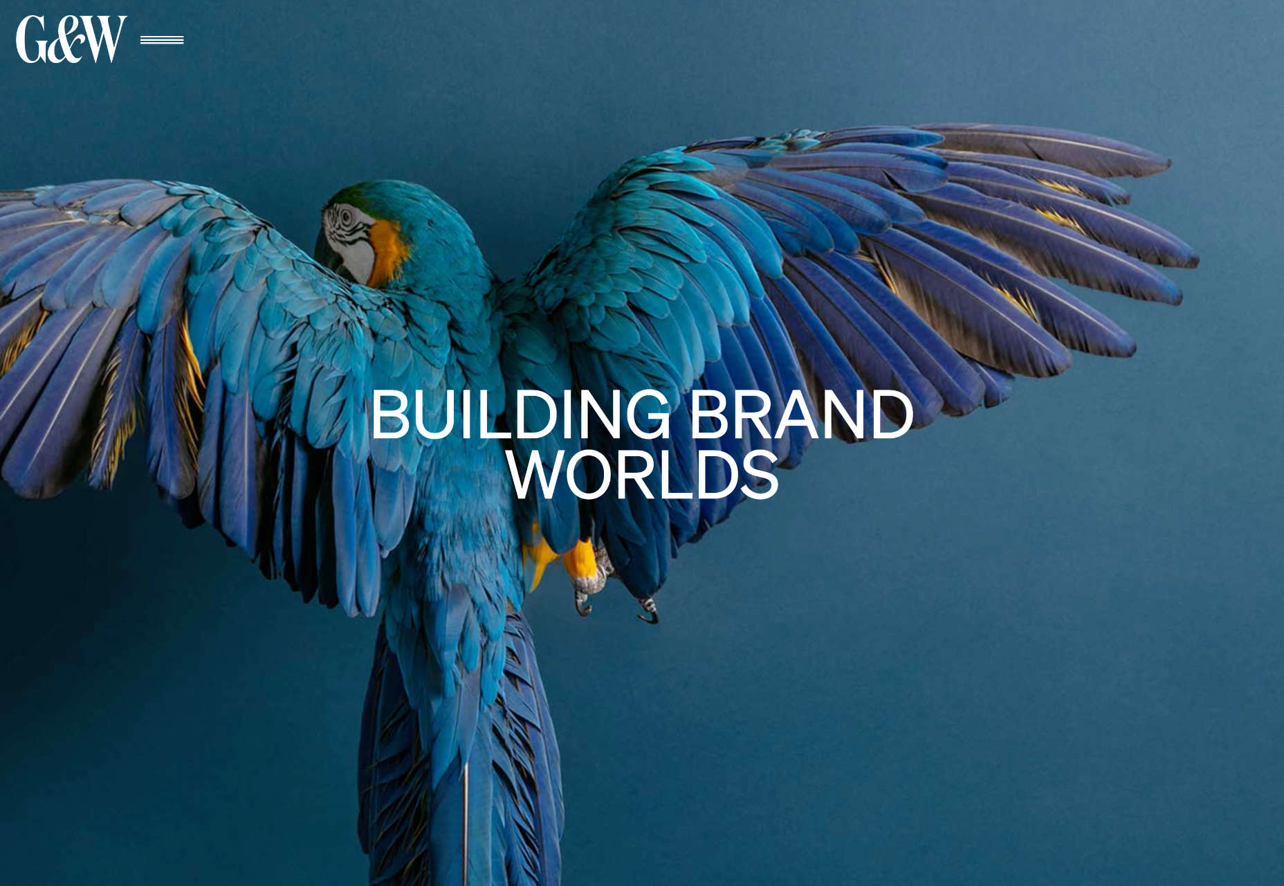
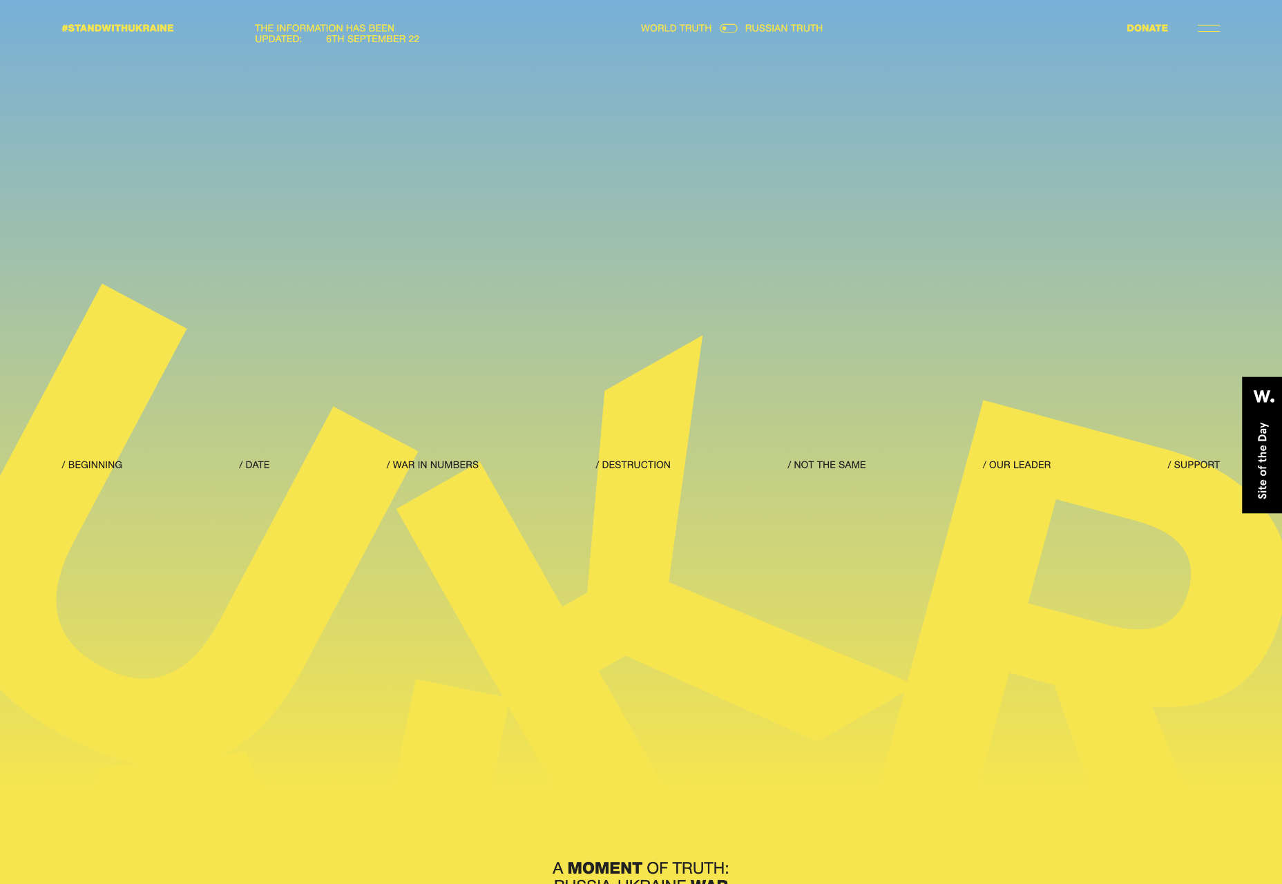
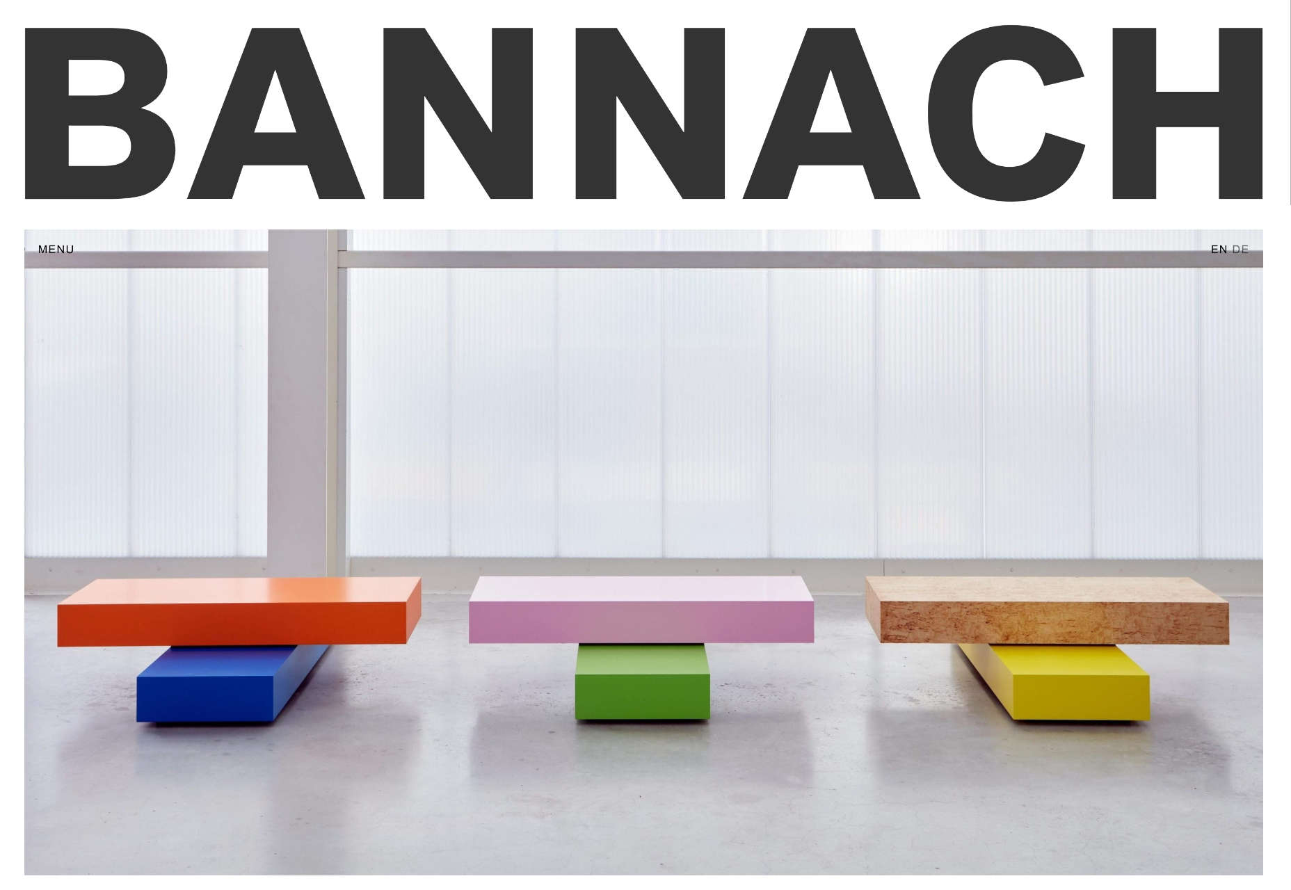
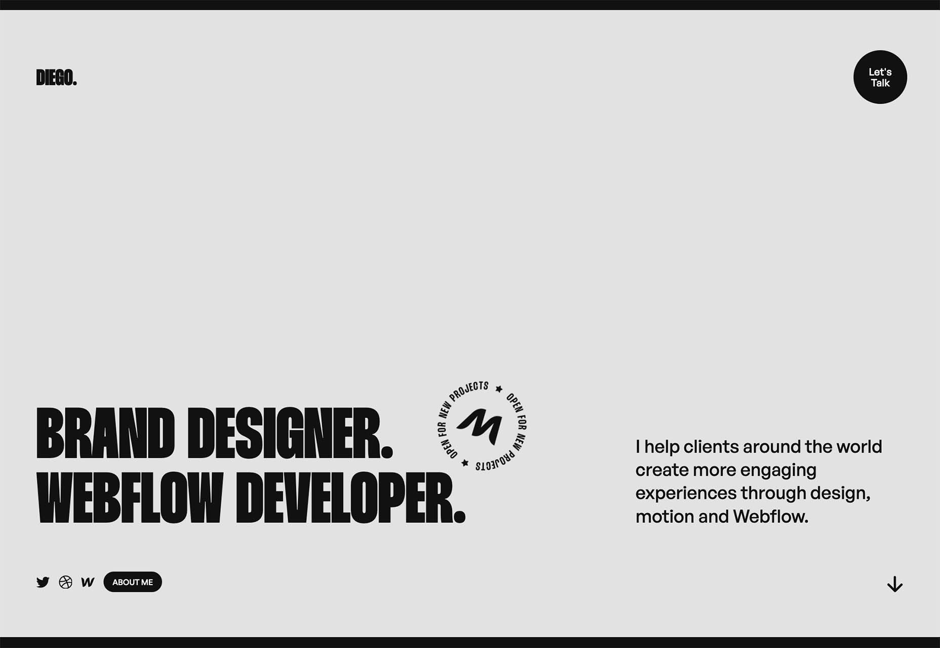
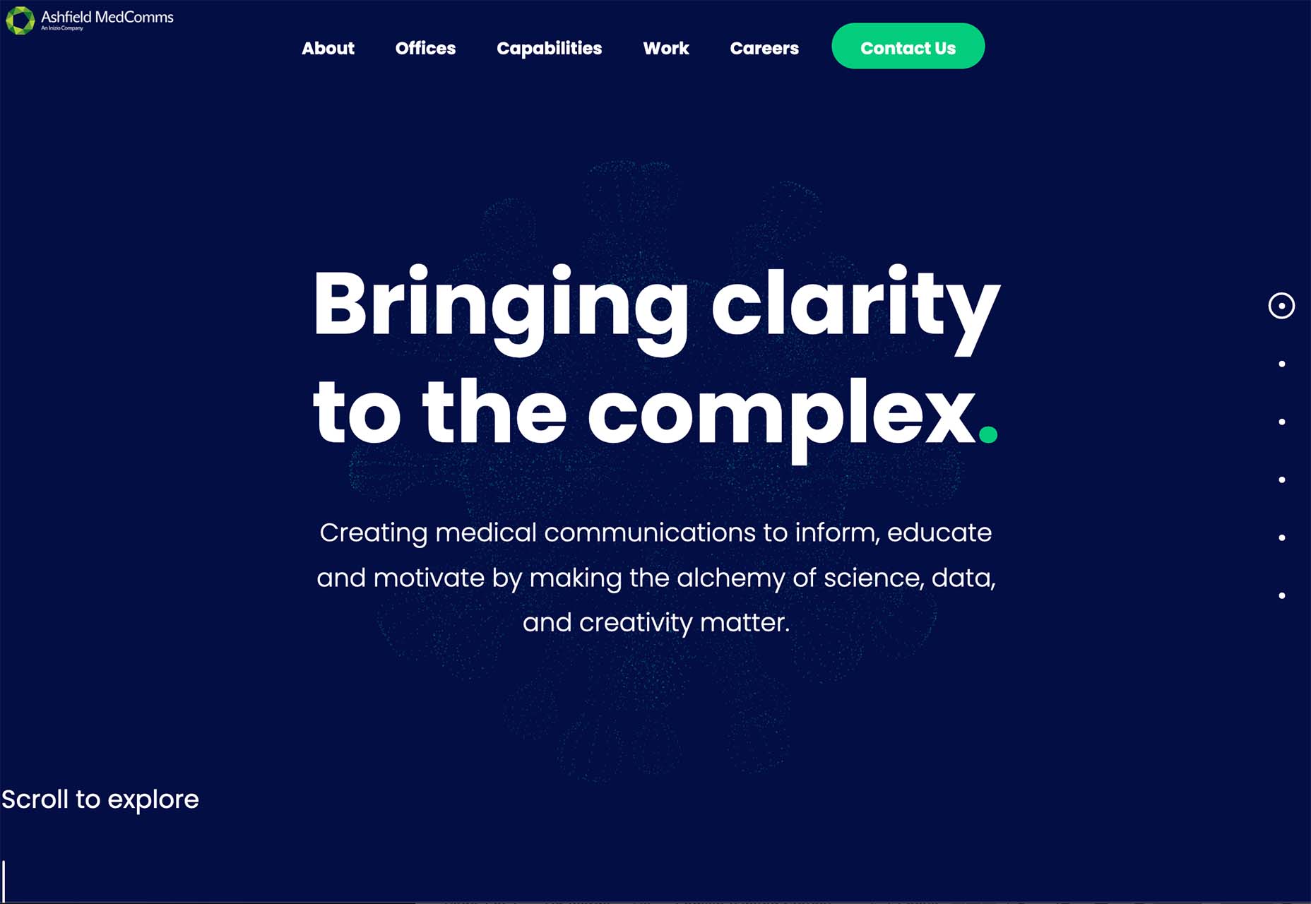
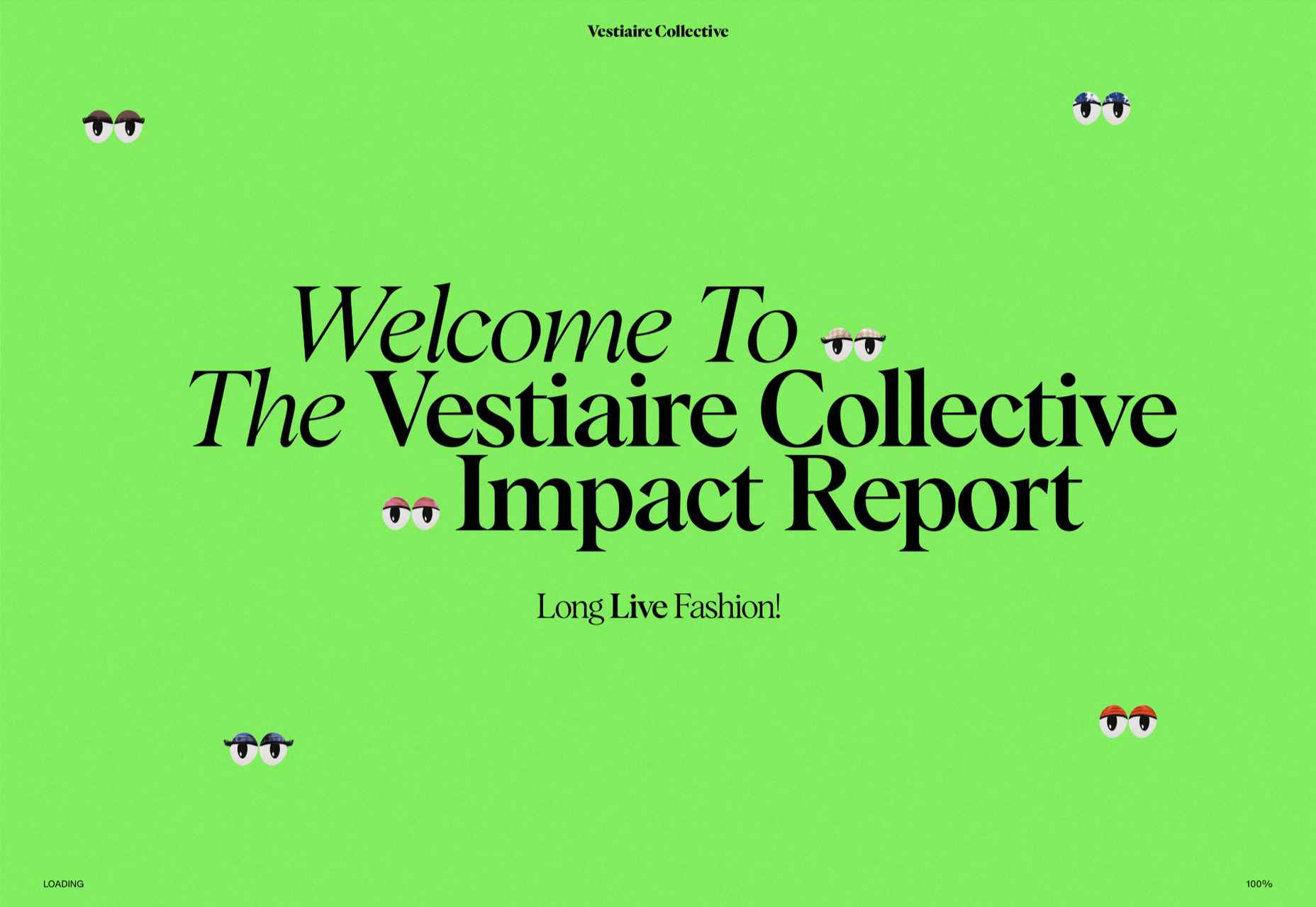
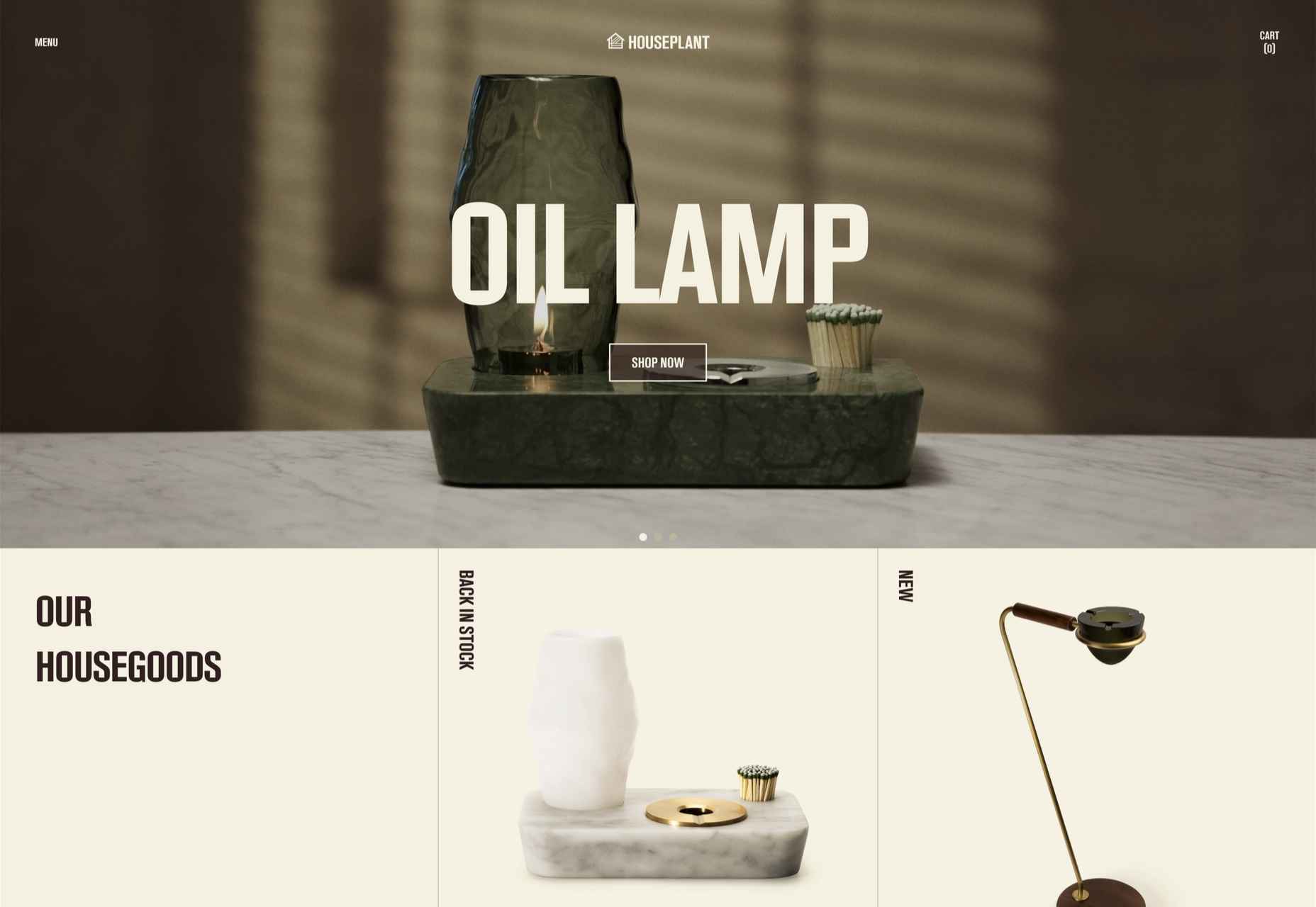
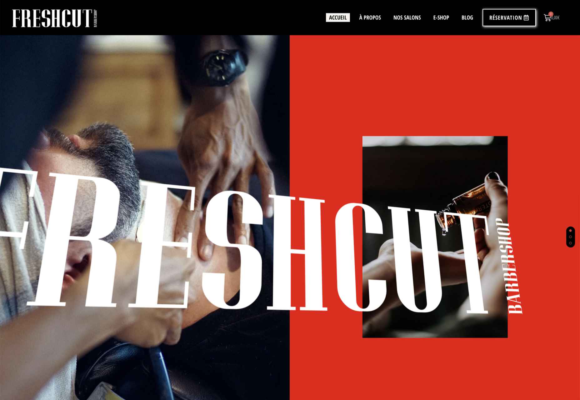
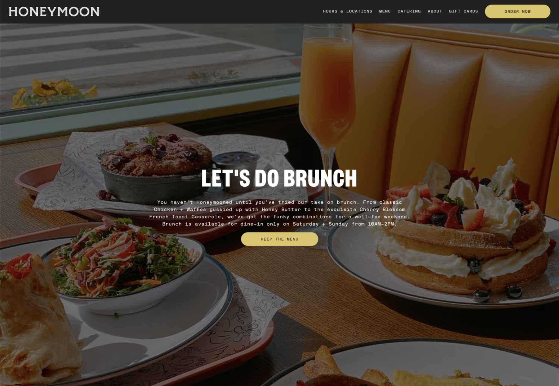
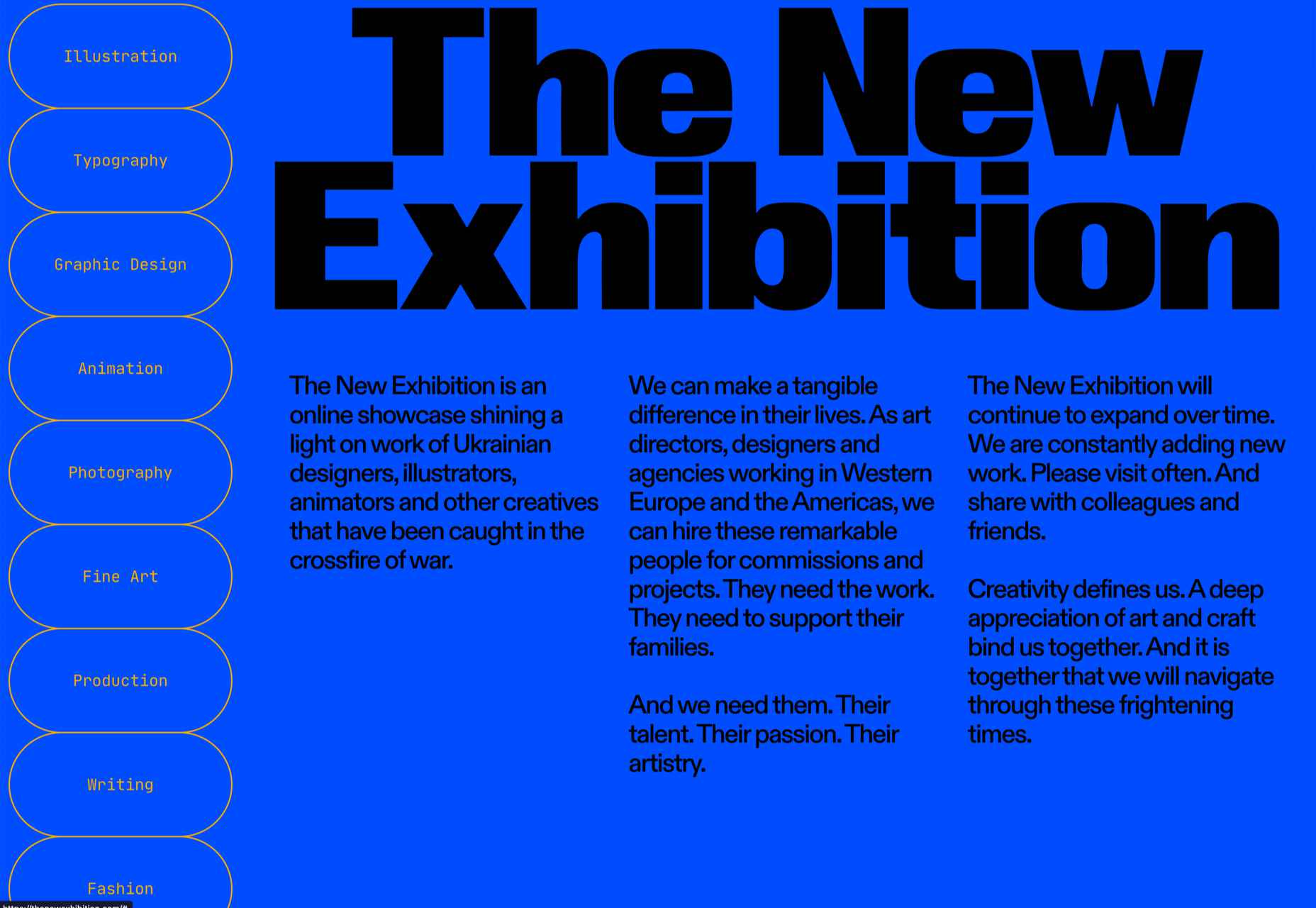
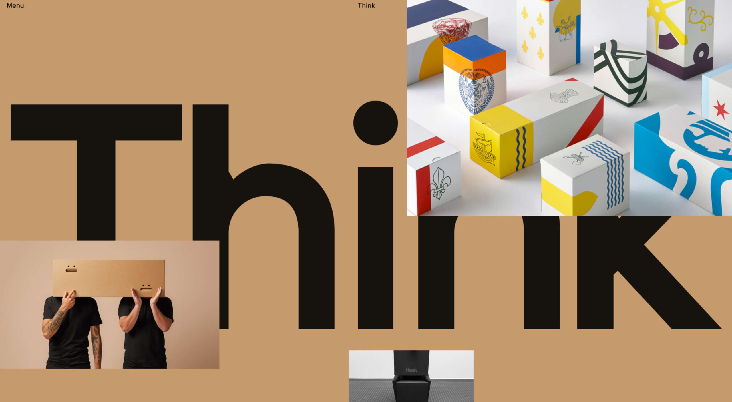
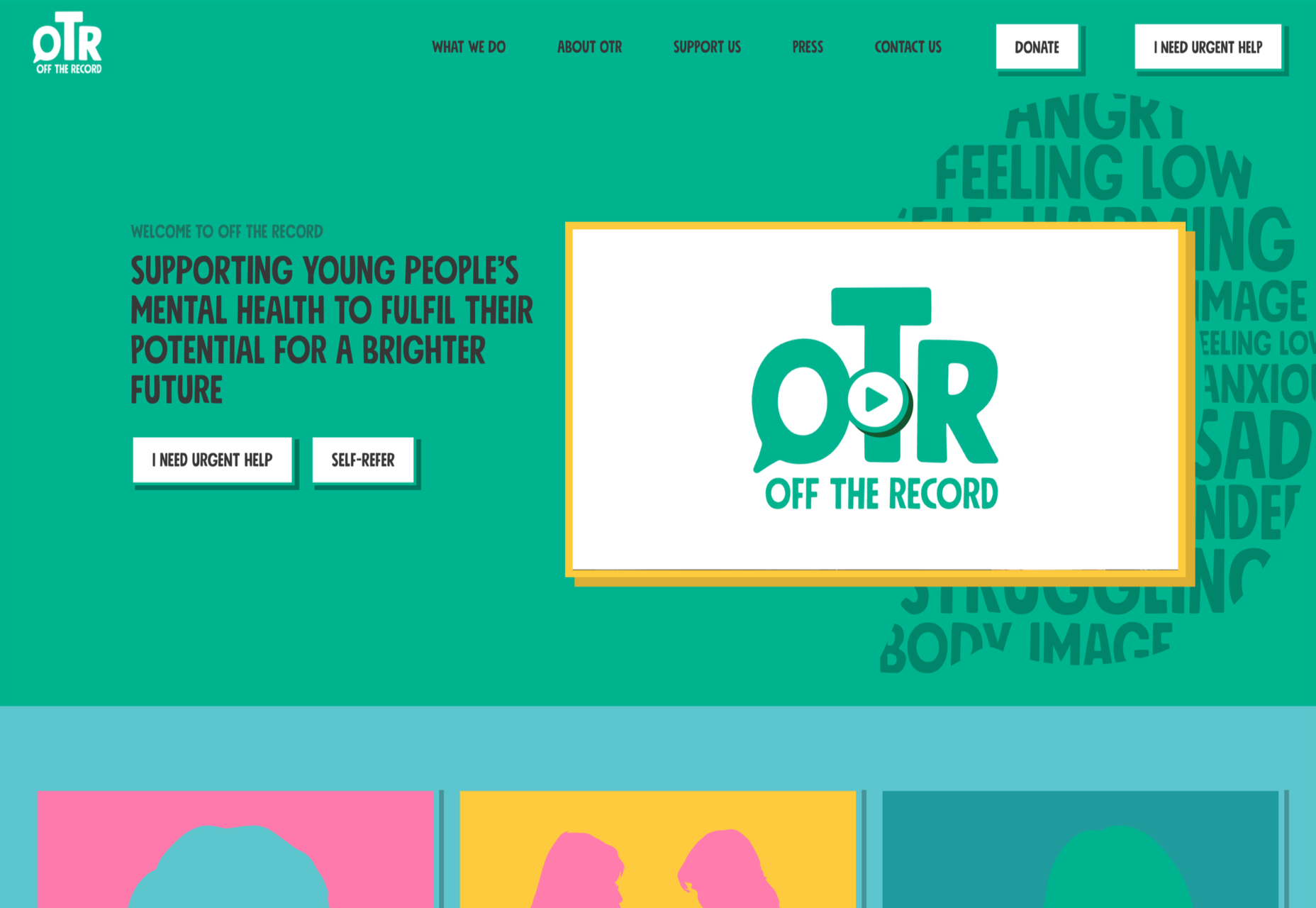
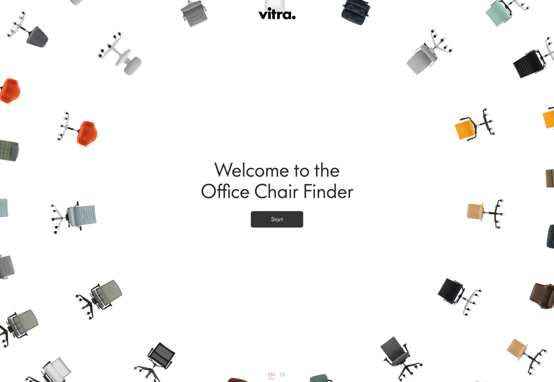
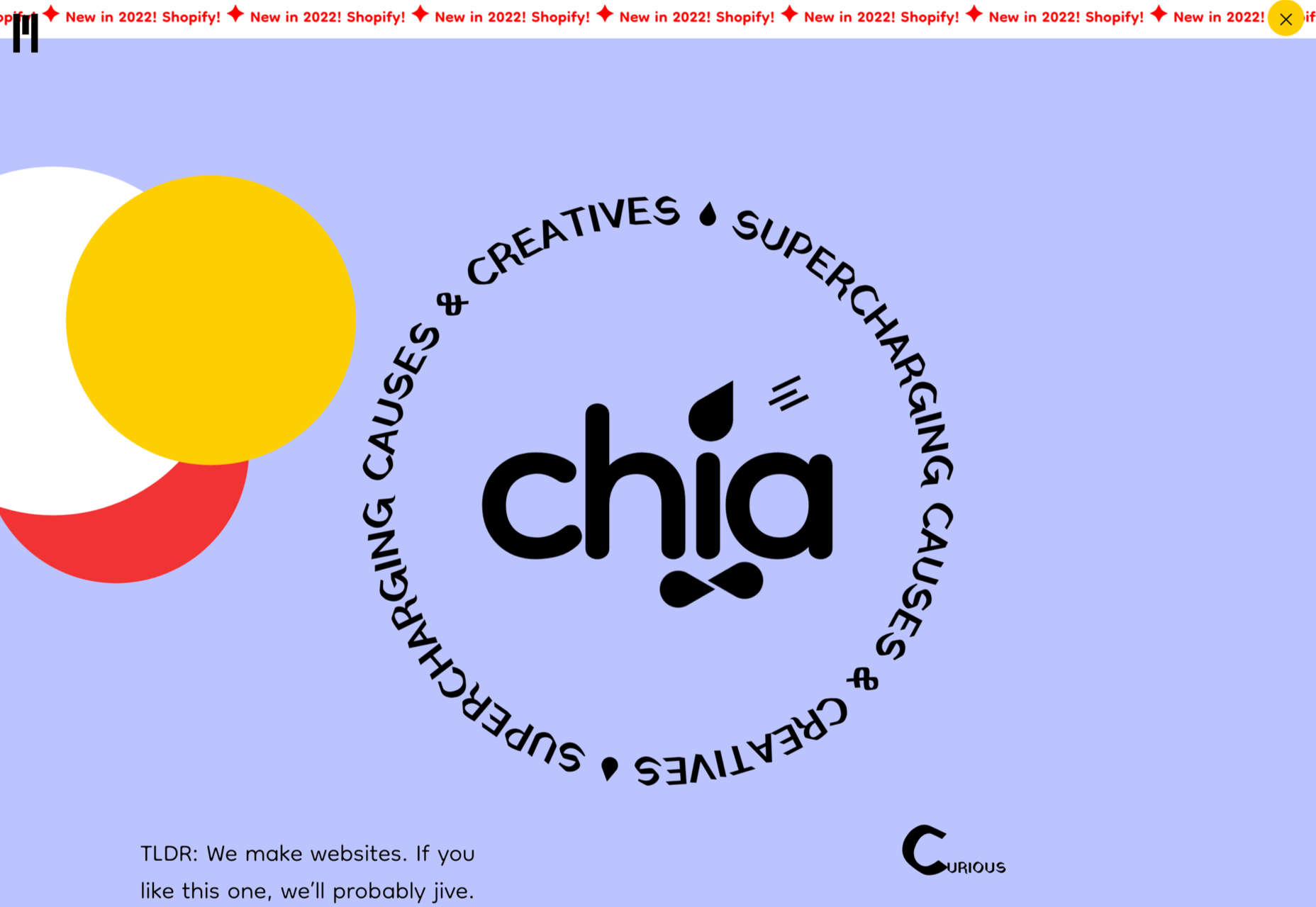
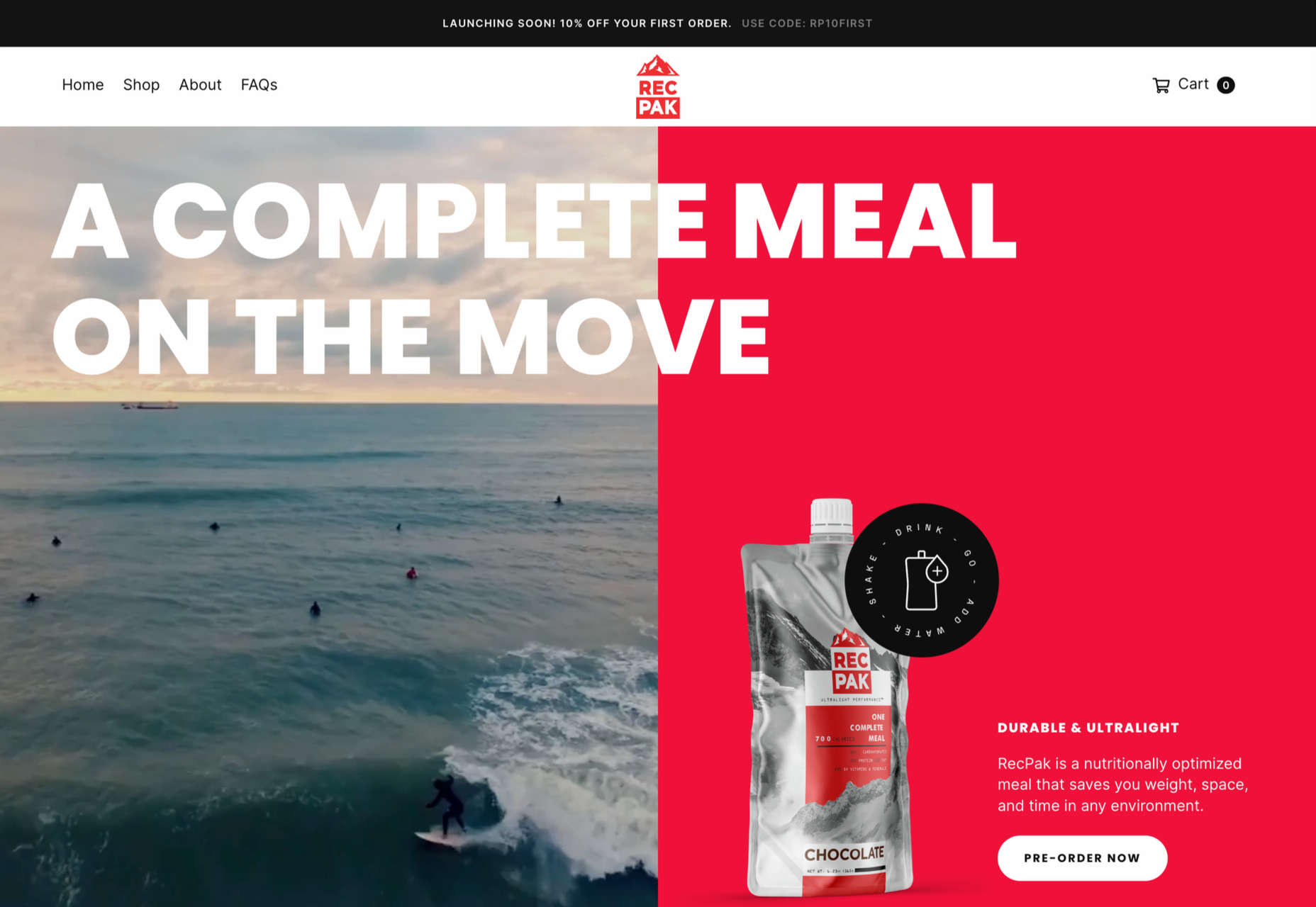
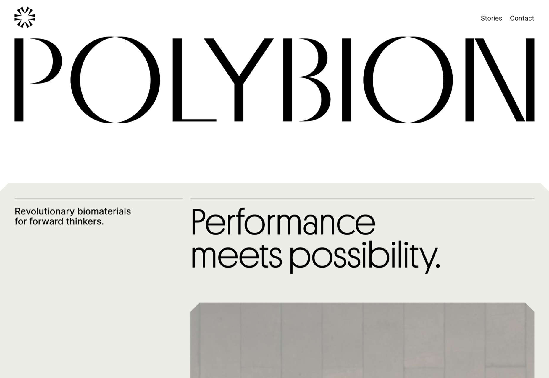
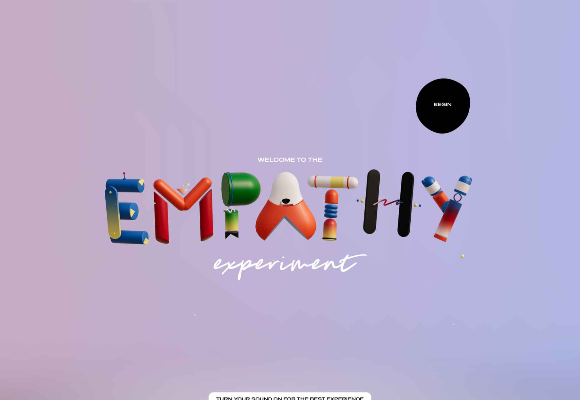
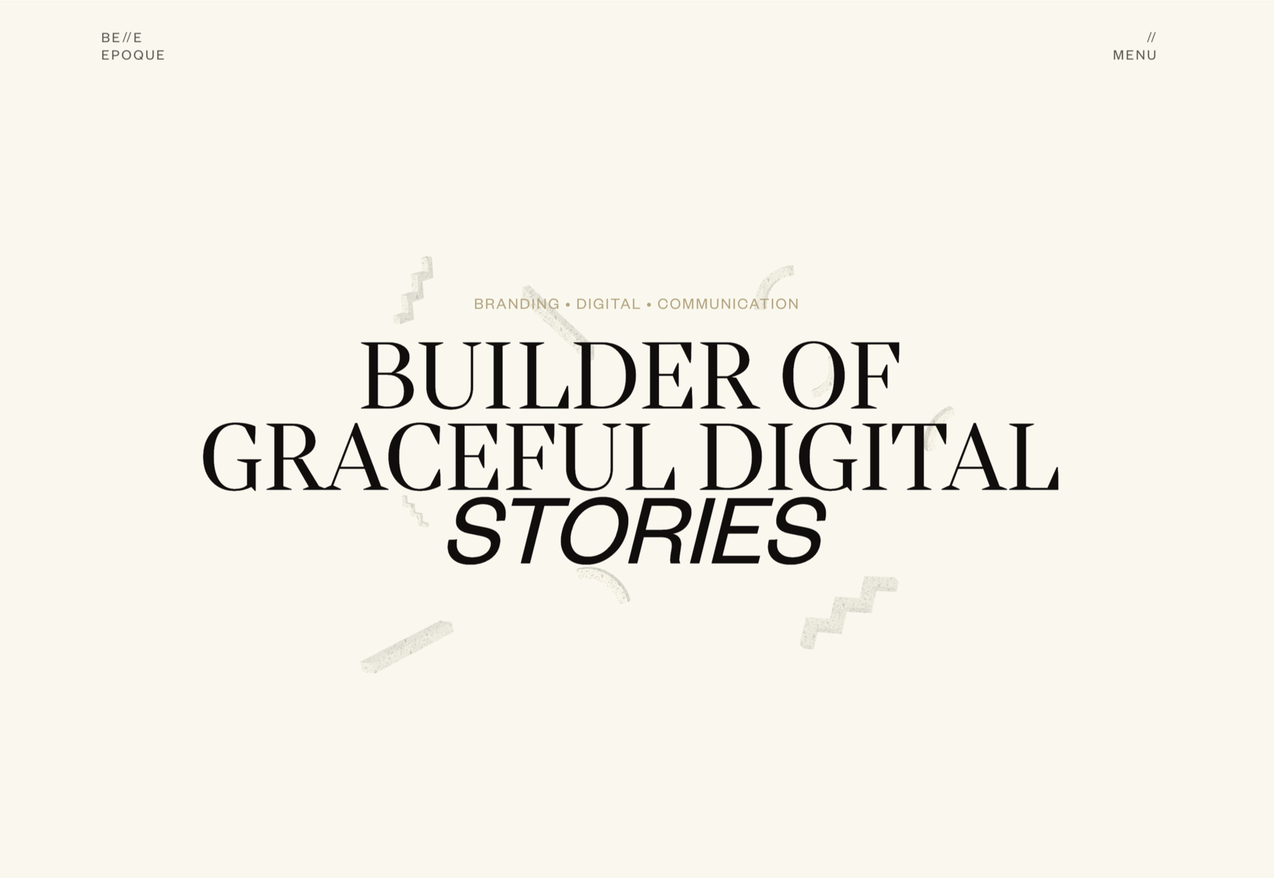
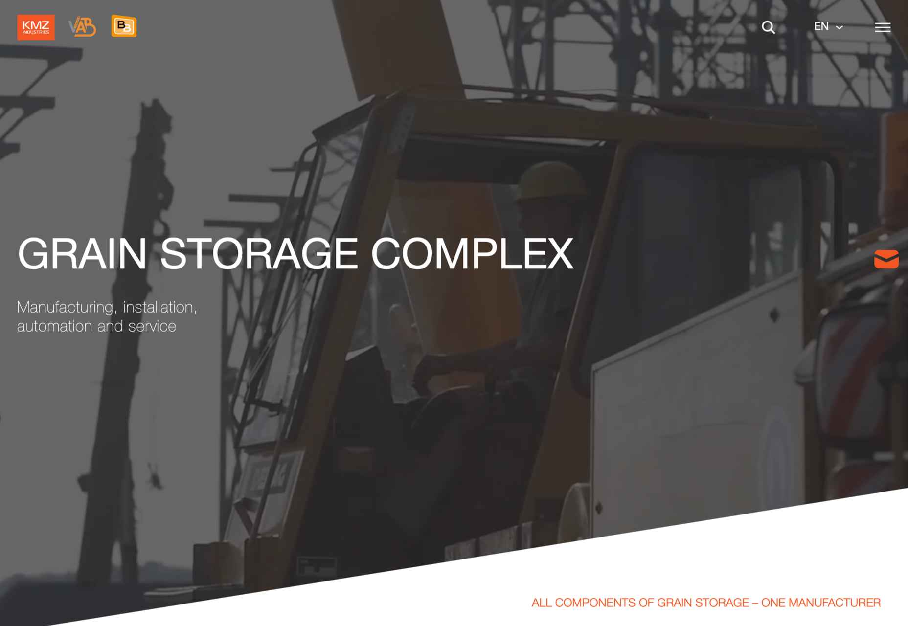
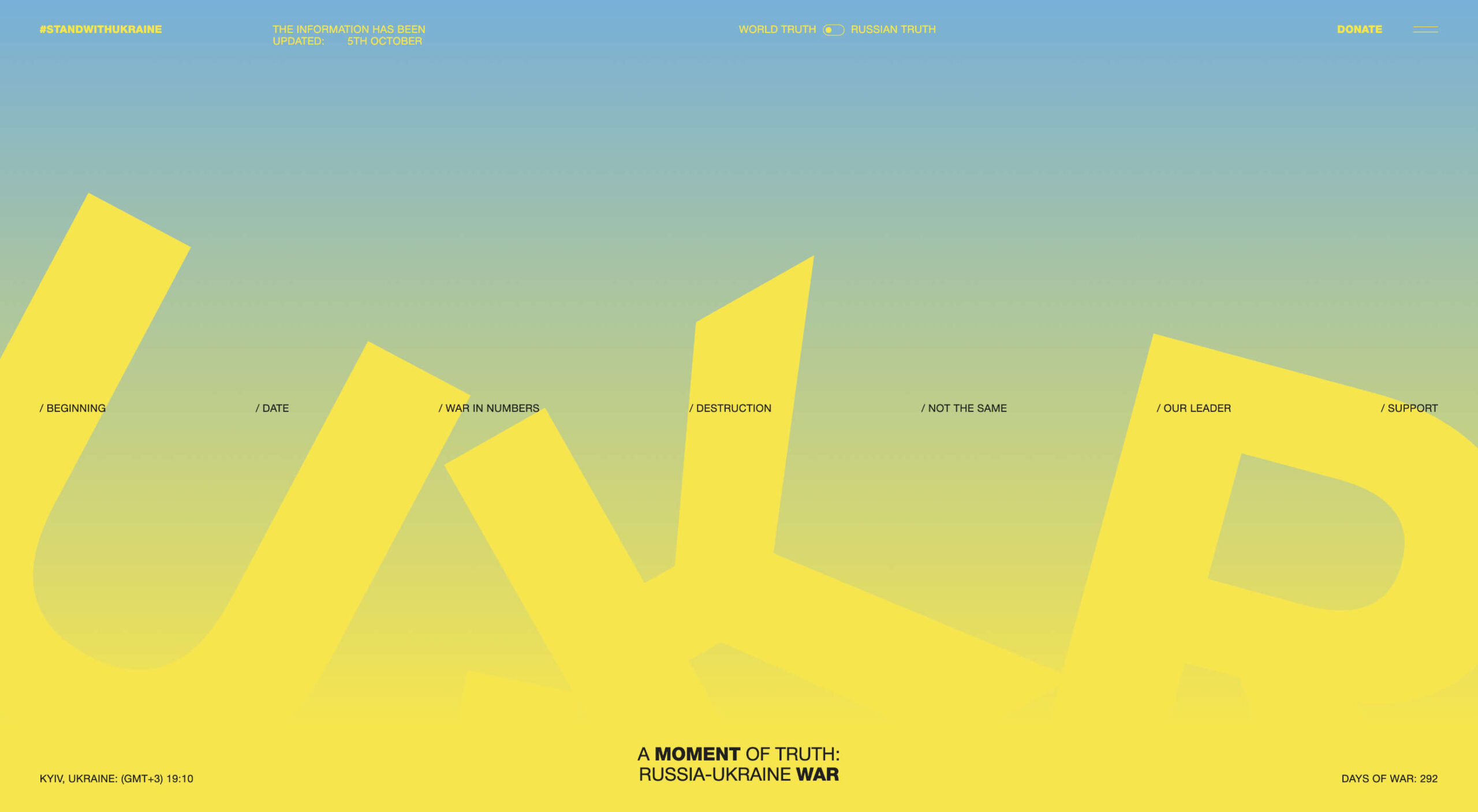 We’ve seen some incredible websites in 2022. There have been more than the usual number of sites with a political mission, and plenty that made us want to travel. The big design trends were brutalism, huge typography, and bold positive color. We’re looking forward to what the web will bring in 2023, but in the meantime, take a look back at the best 50 websites of 2022. Enjoy!
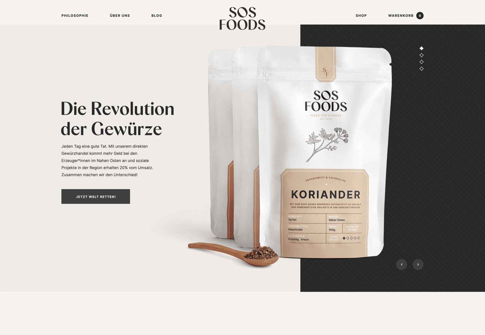
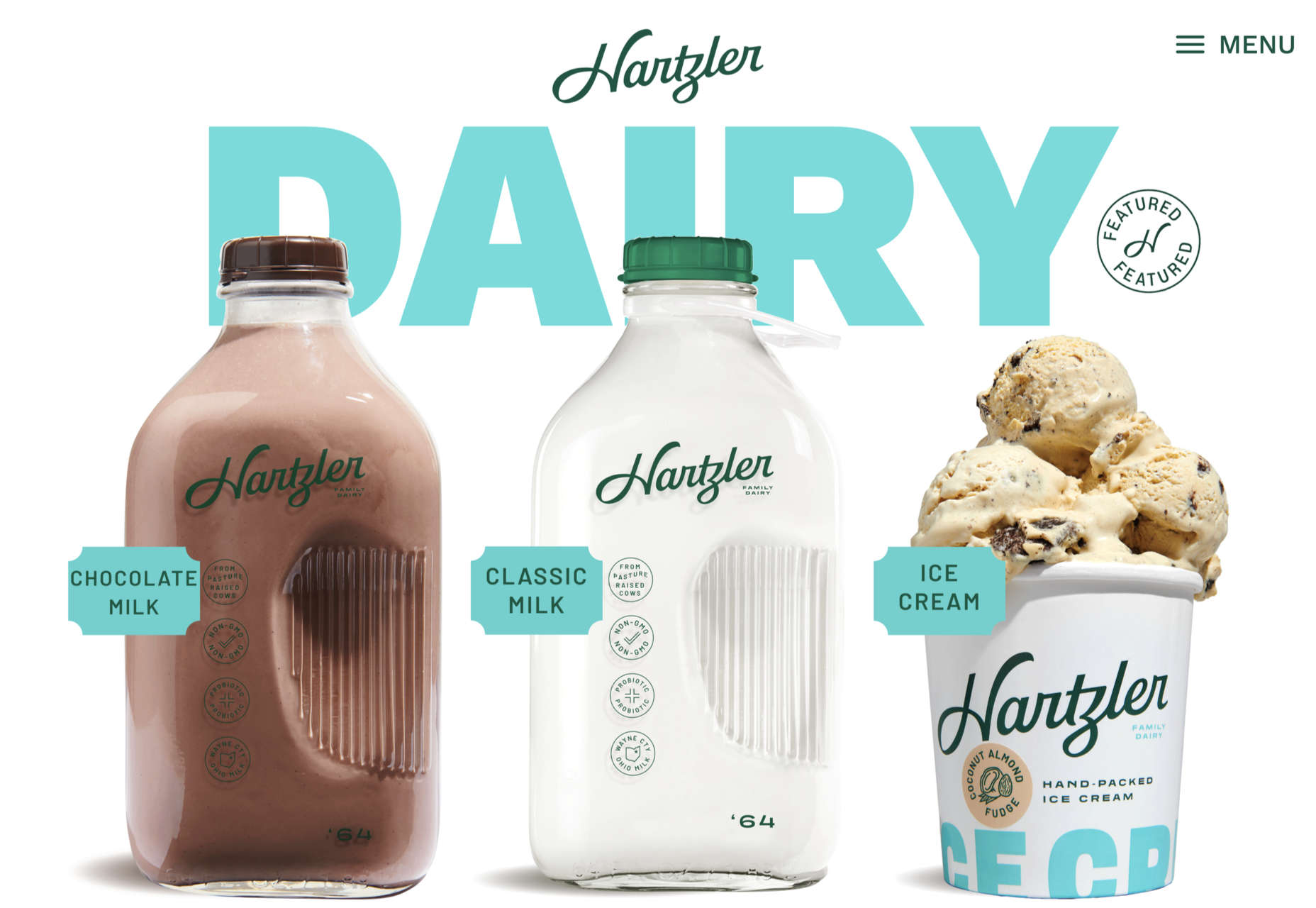


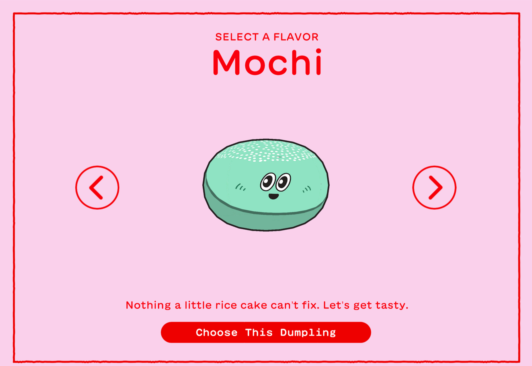


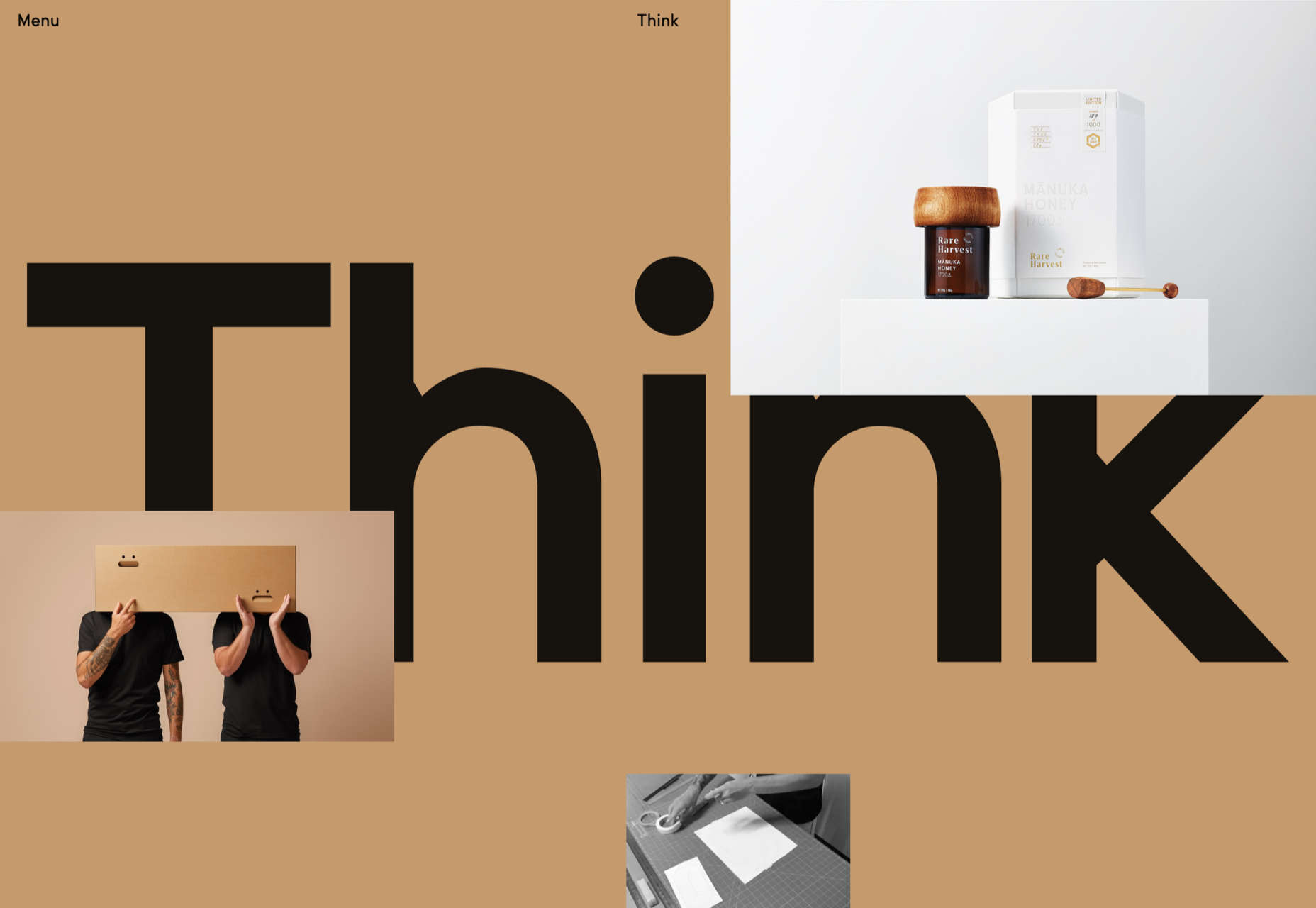

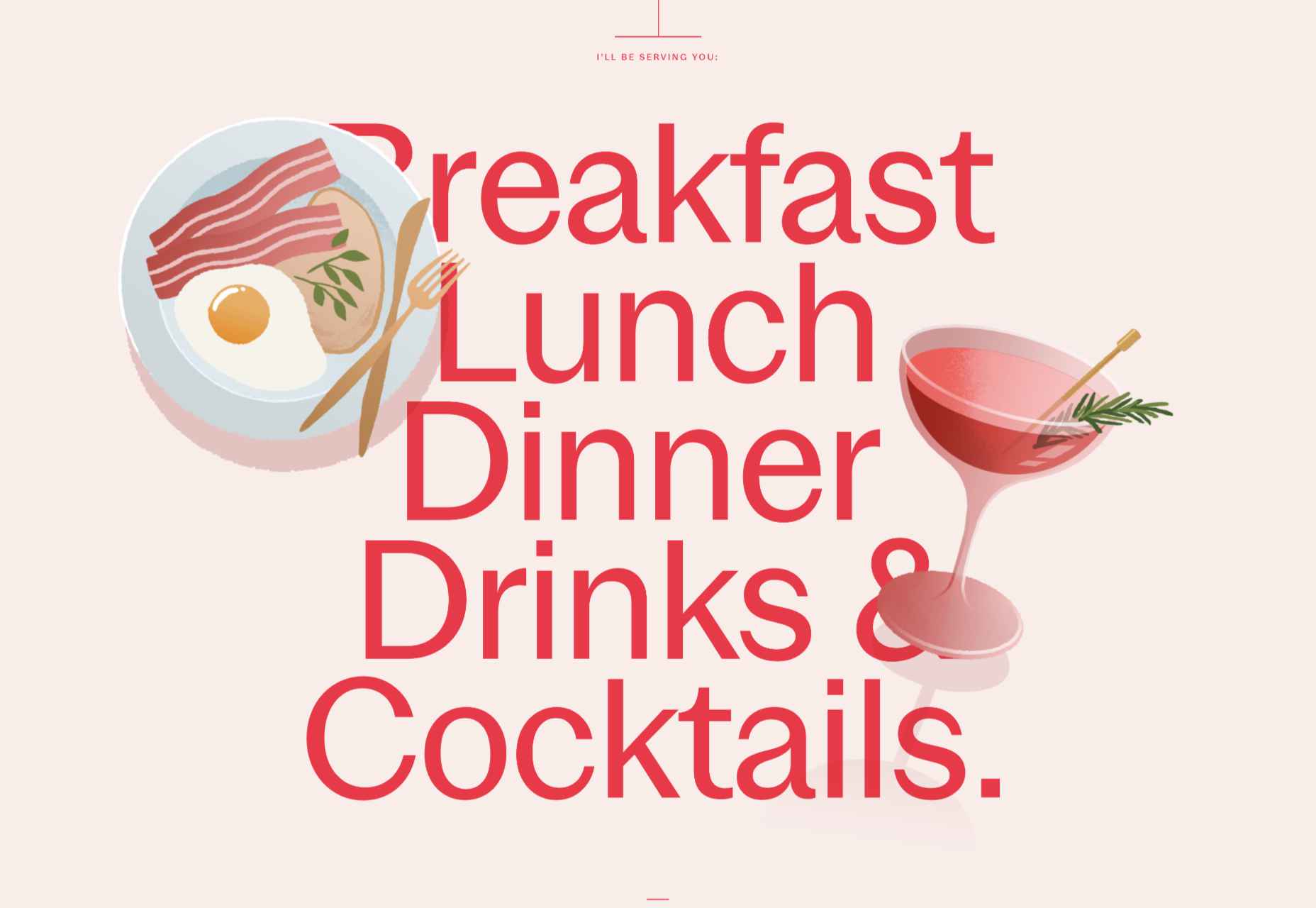


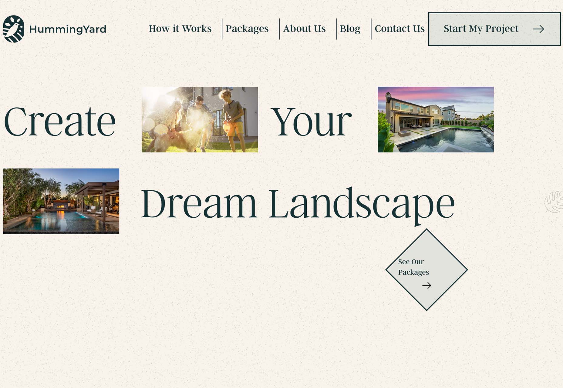
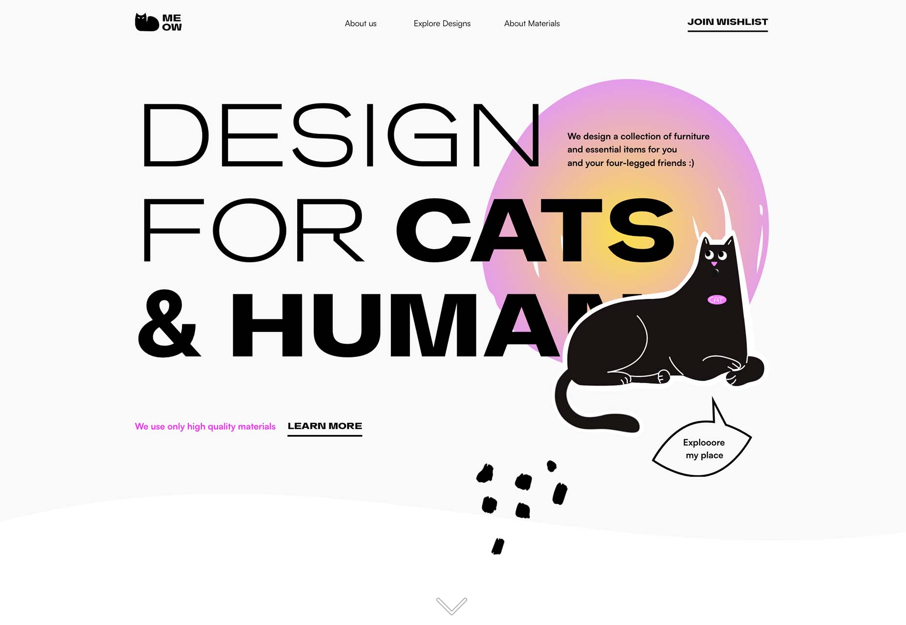
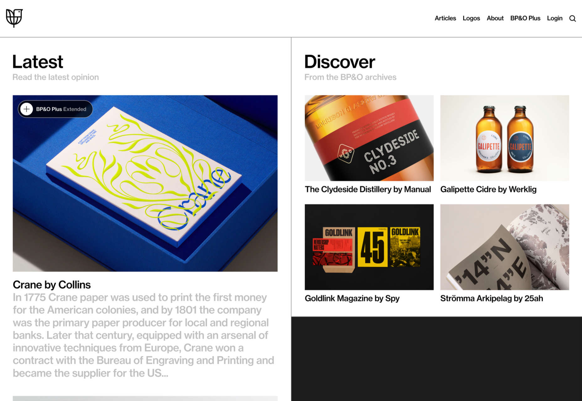
 This month, it’s all about the images. Each of the design trends we spotted has to do with the images you select – or don’t select – for a project and how you use them.
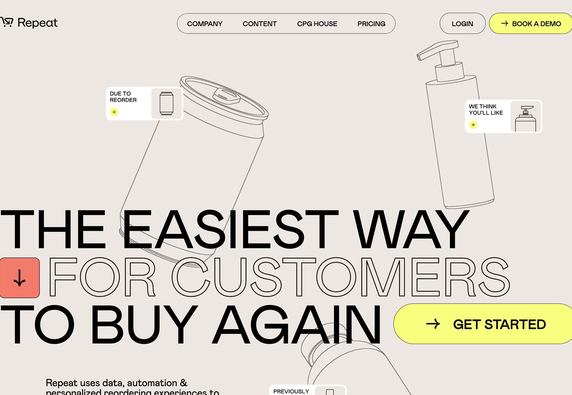


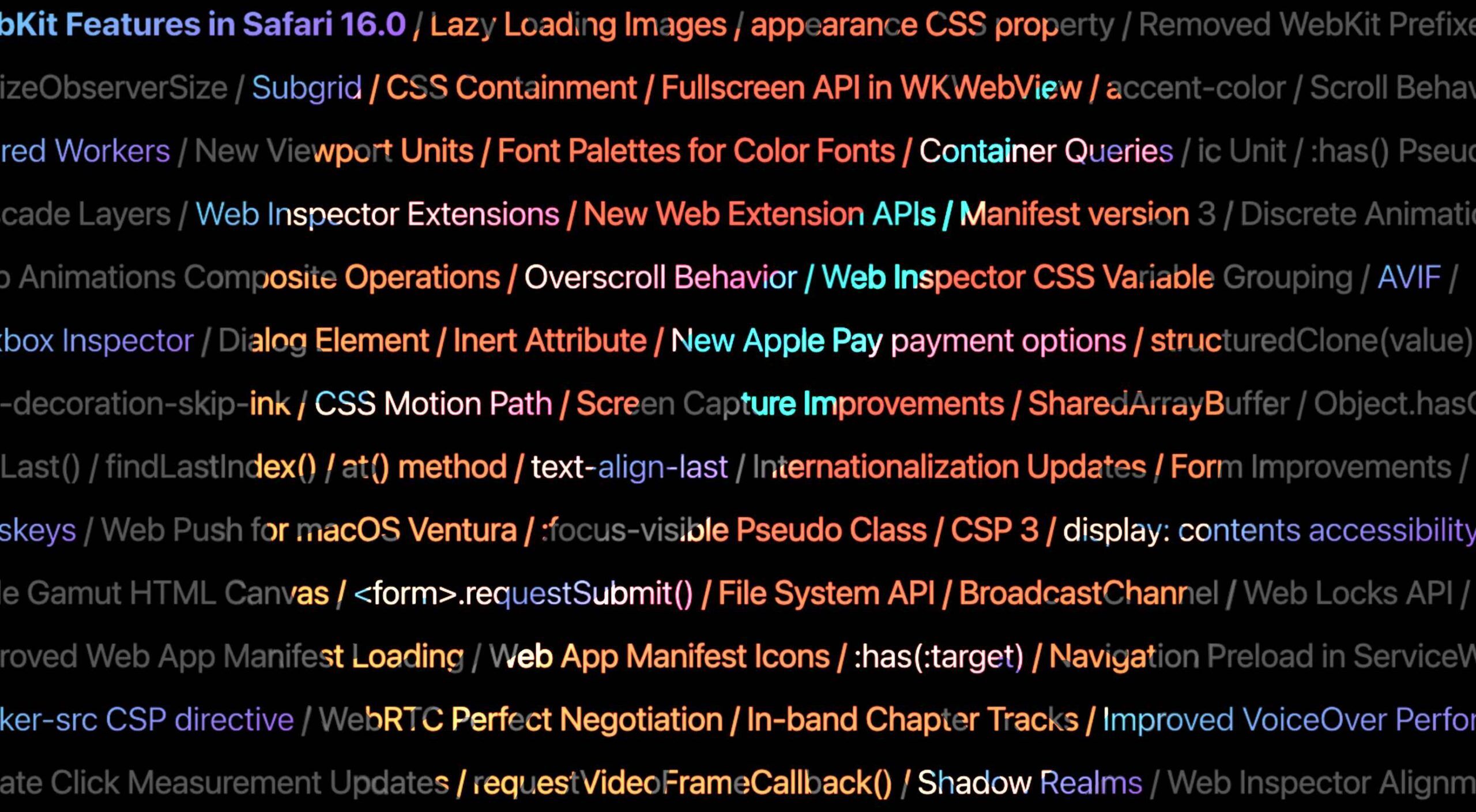 Apple has released an OS update. Packaged in with it is the latest version of Safari, 16.
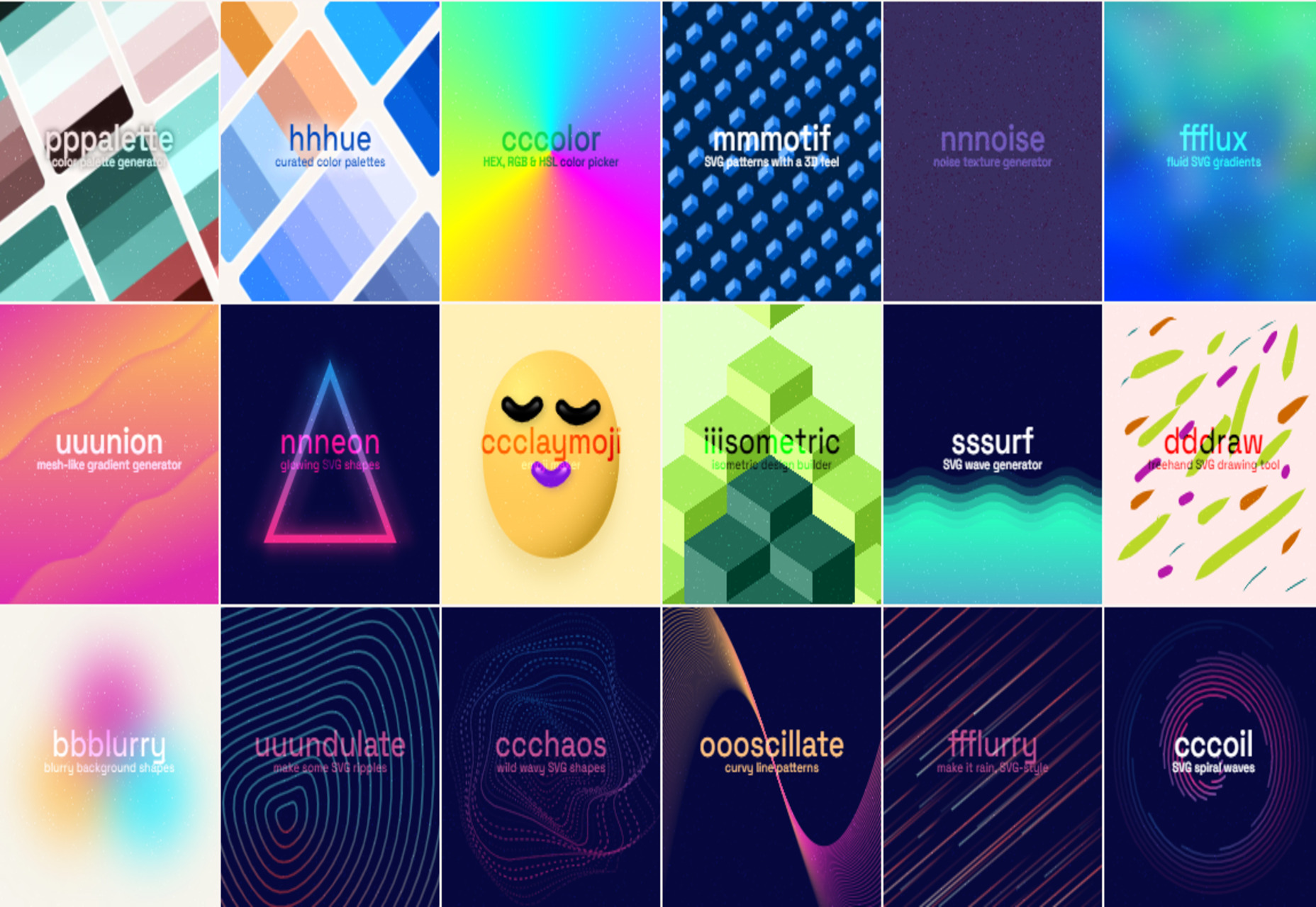
 Every day design fans submit incredible industry stories to our sister-site, Webdesigner News. Our colleagues sift through it, selecting the very best stories from the design, UX, tech, and development worlds and posting them live on the site.


 Every day design fans submit incredible industry stories to our sister-site, Webdesigner News. Our colleagues sift through it, selecting the very best stories from the design, UX, tech, and development worlds and posting them live on the site.


 Websites haven’t always been as adaptable as they are today. For
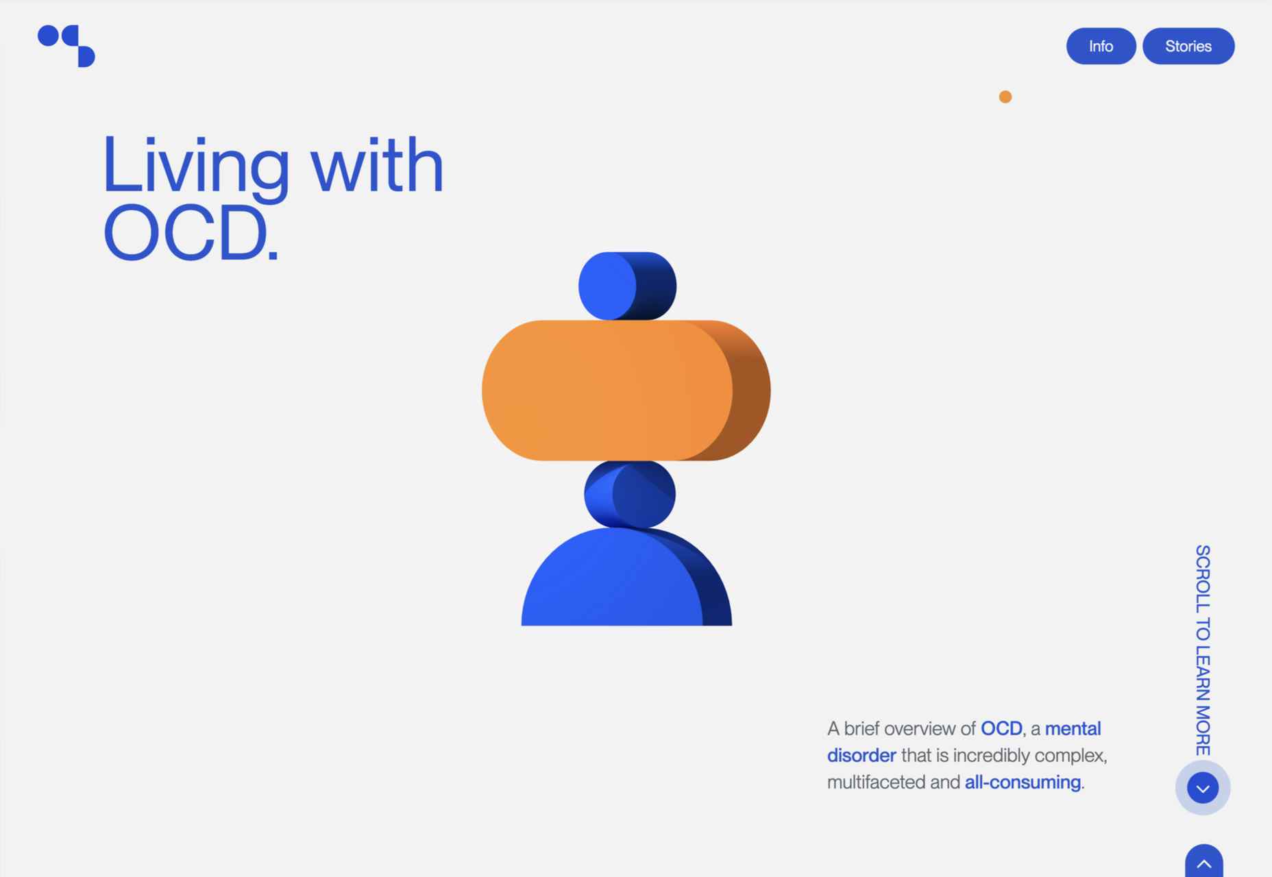
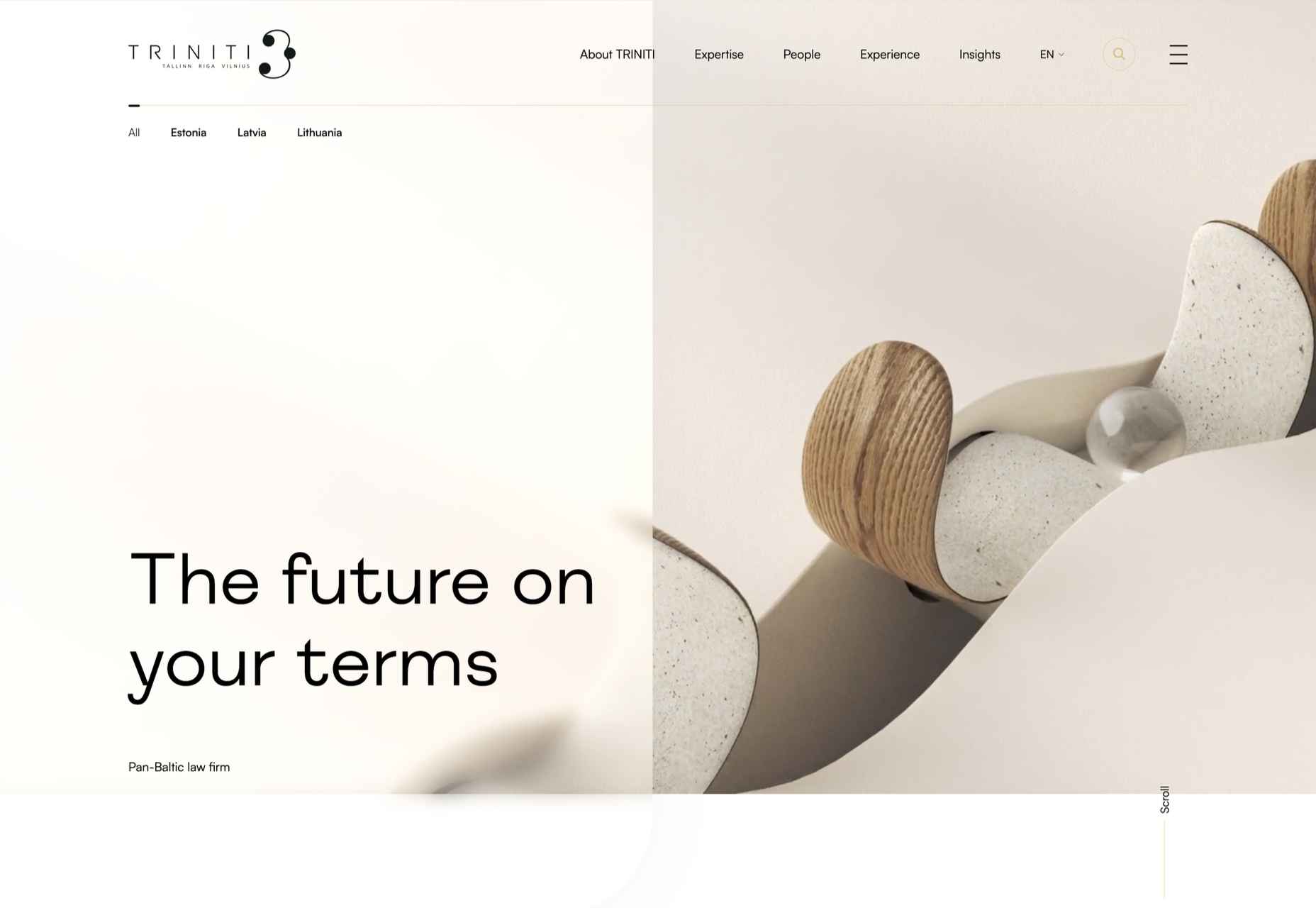
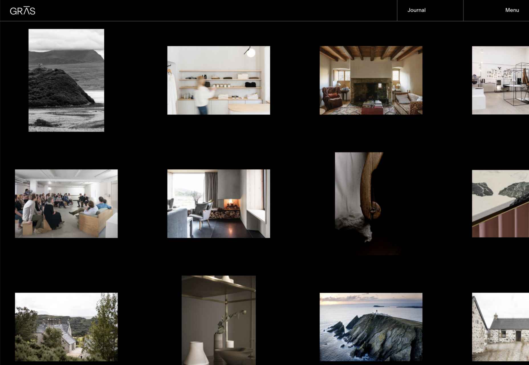
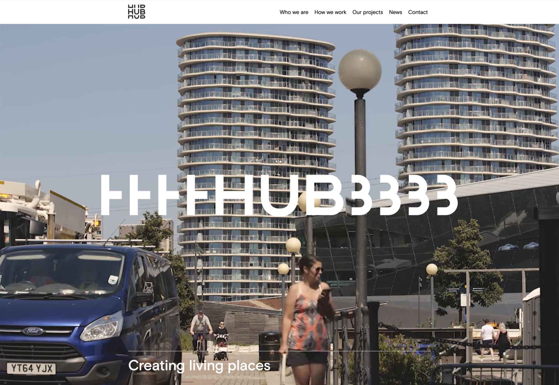
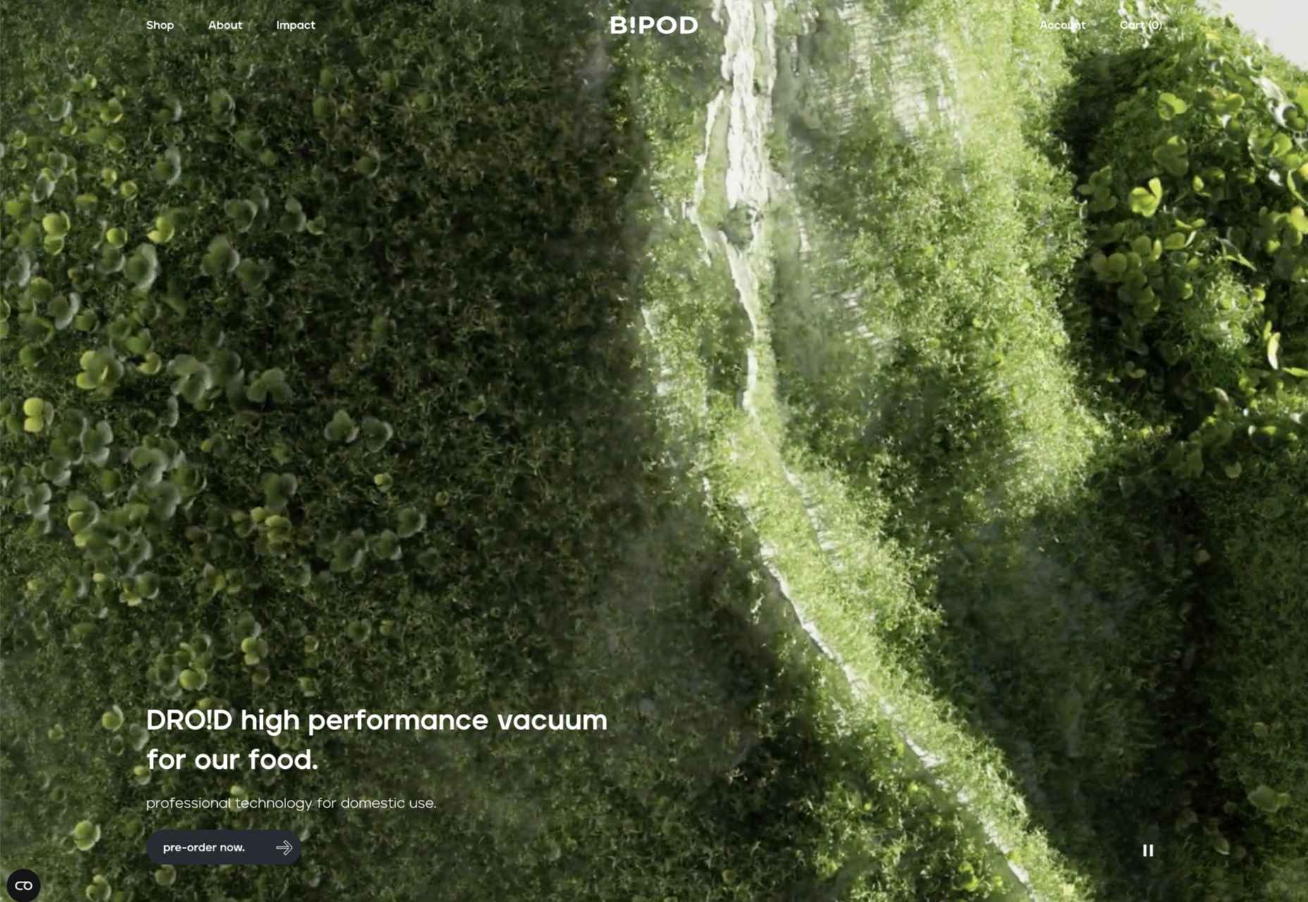
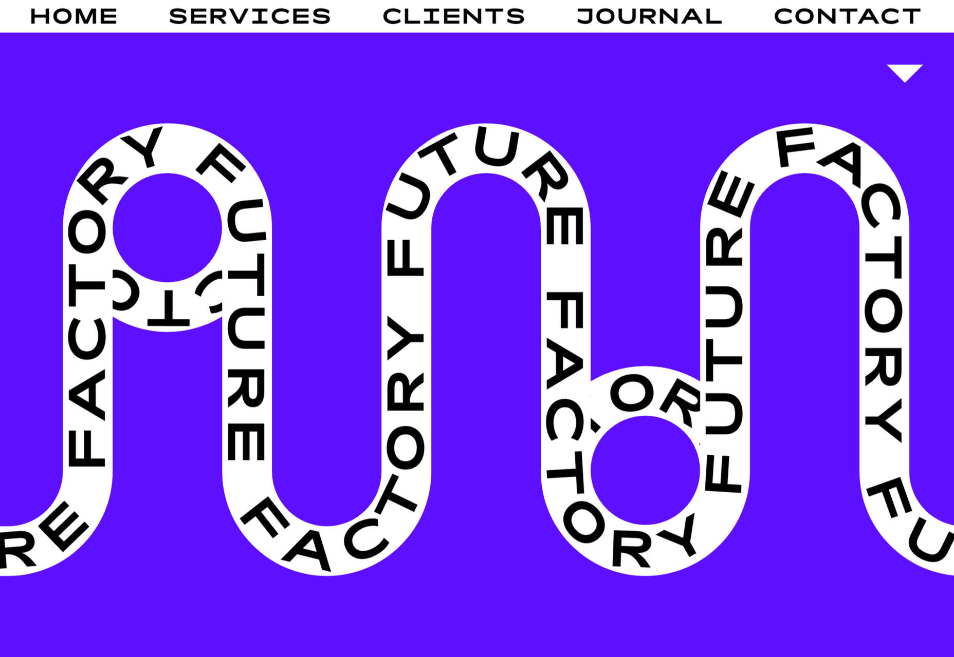
 This month’s collection of the best new sites is a mixed bag. Positivity remains from


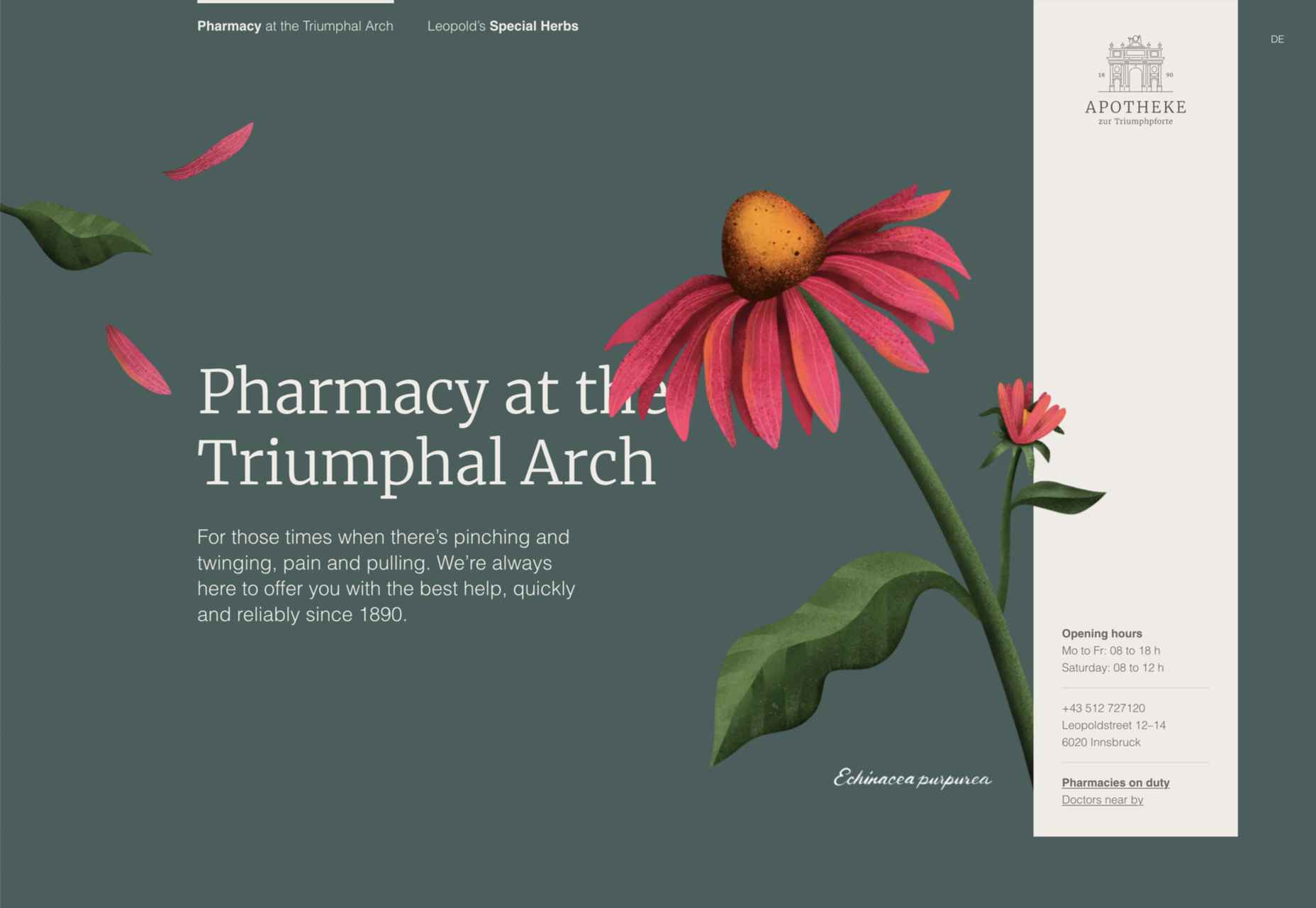
 Sometimes it’s easy to feel like the world is going to pieces all around us, especially when we’re doom scrolling Twitter between news alerts every few minutes. But if we step back a little, things may not seem so bad.
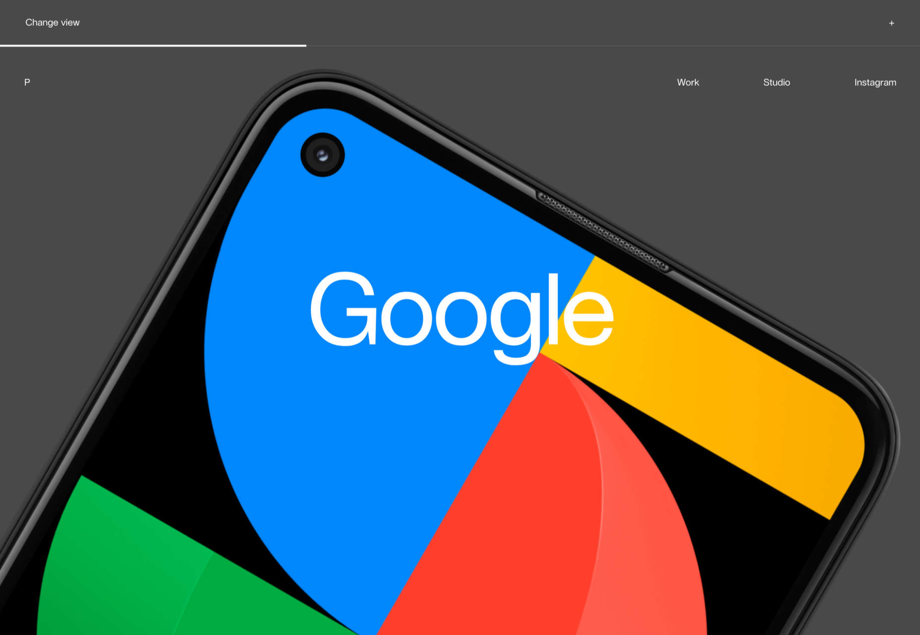


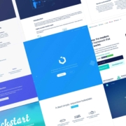
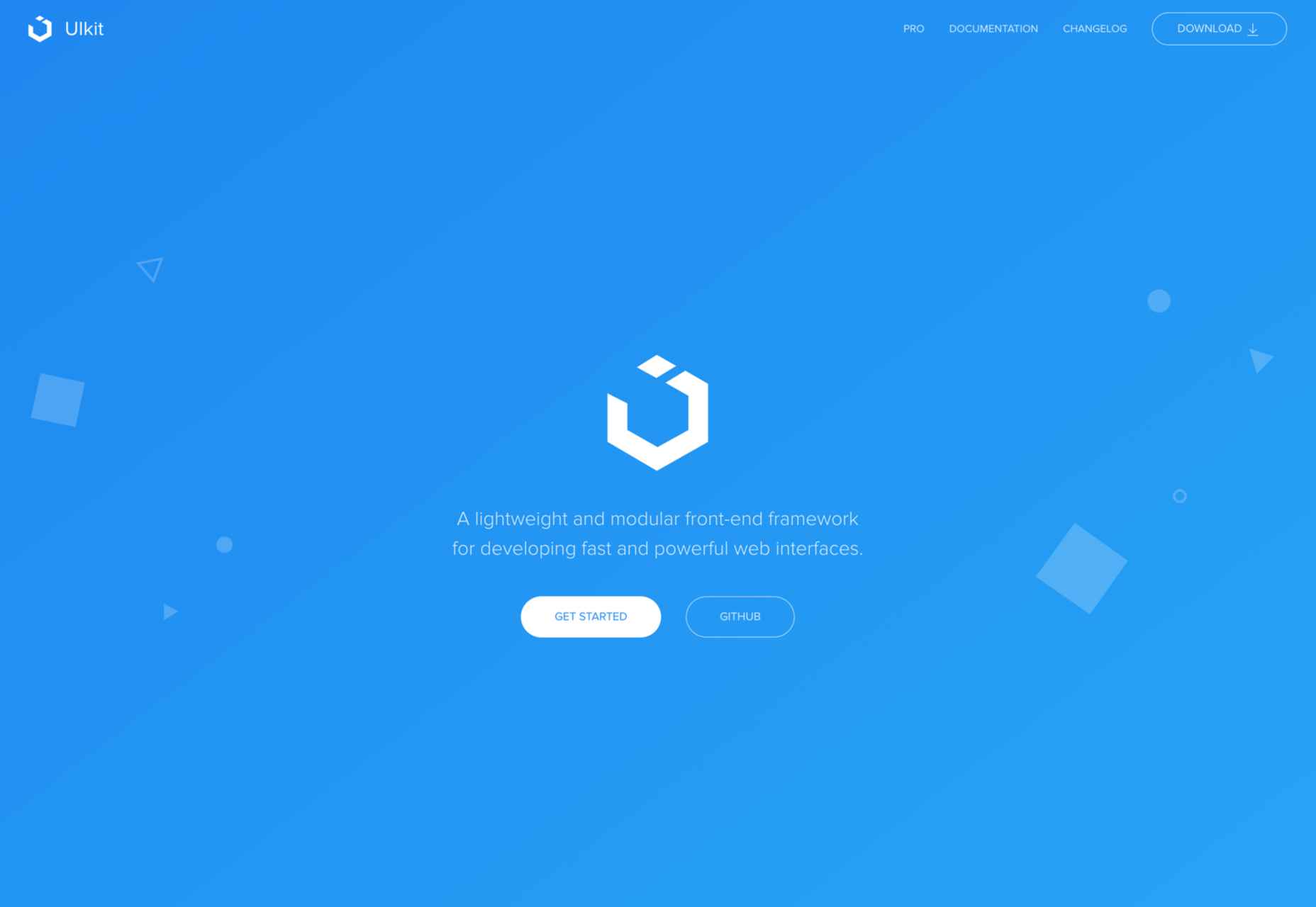
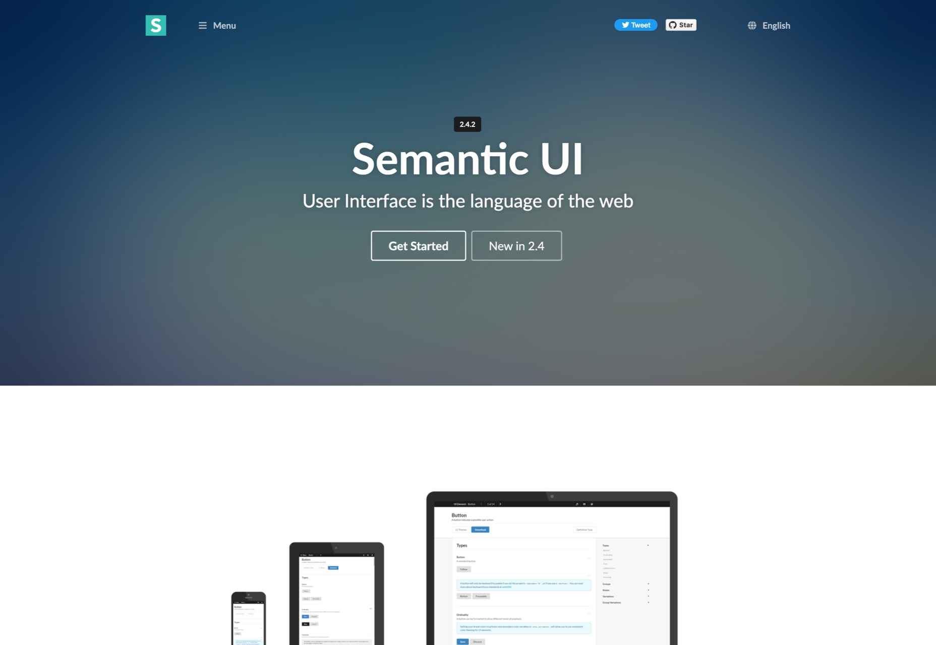
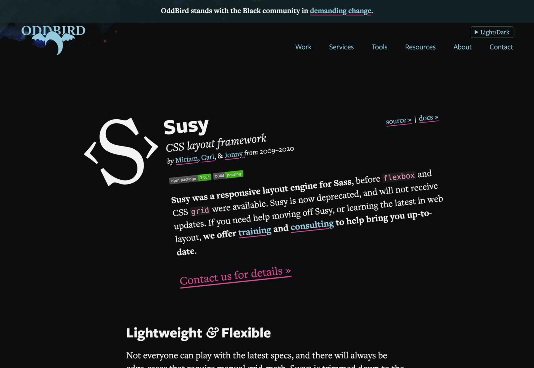
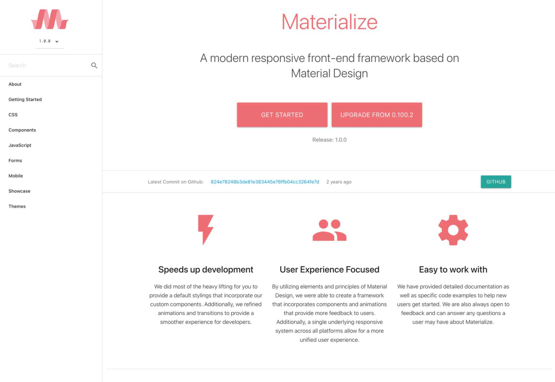
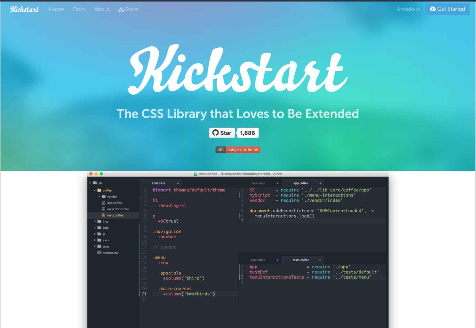
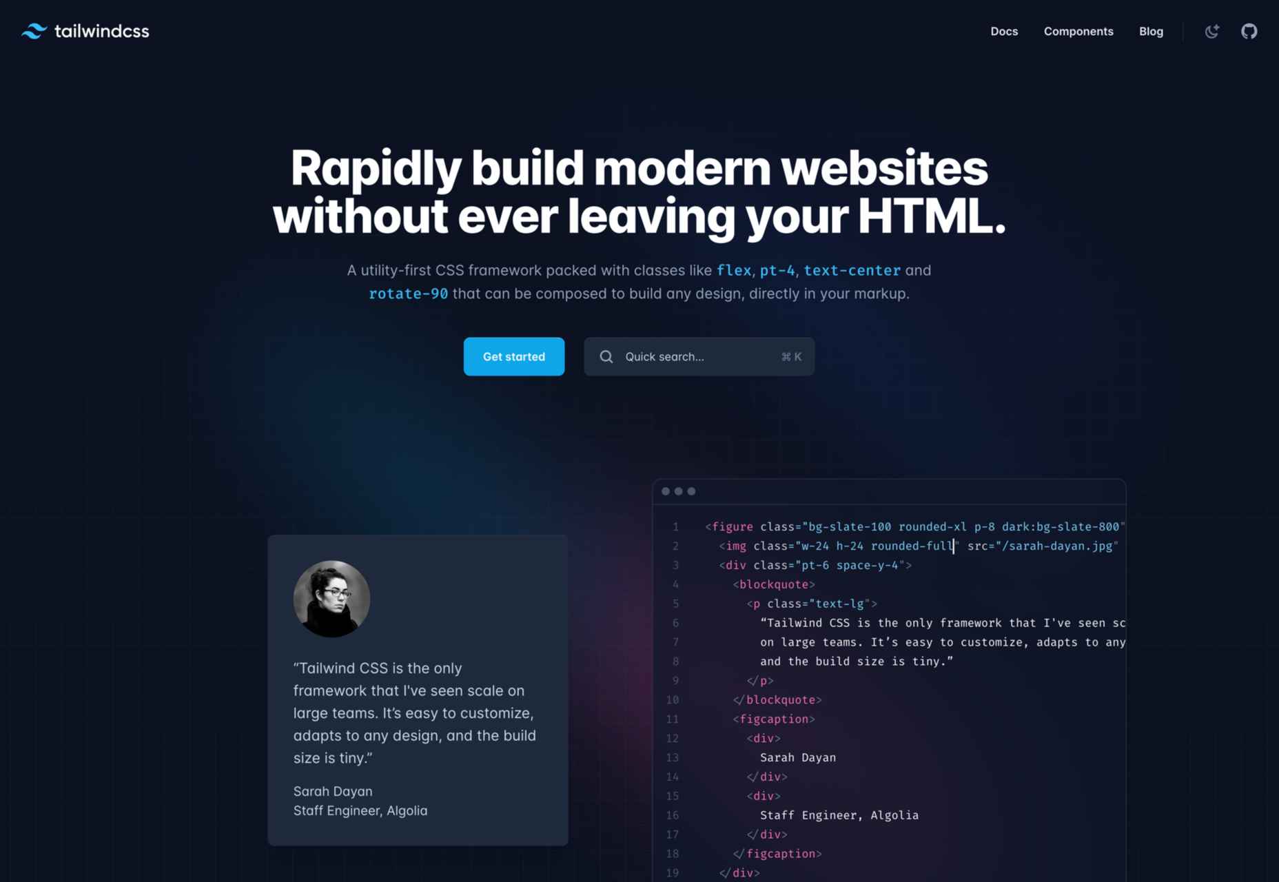
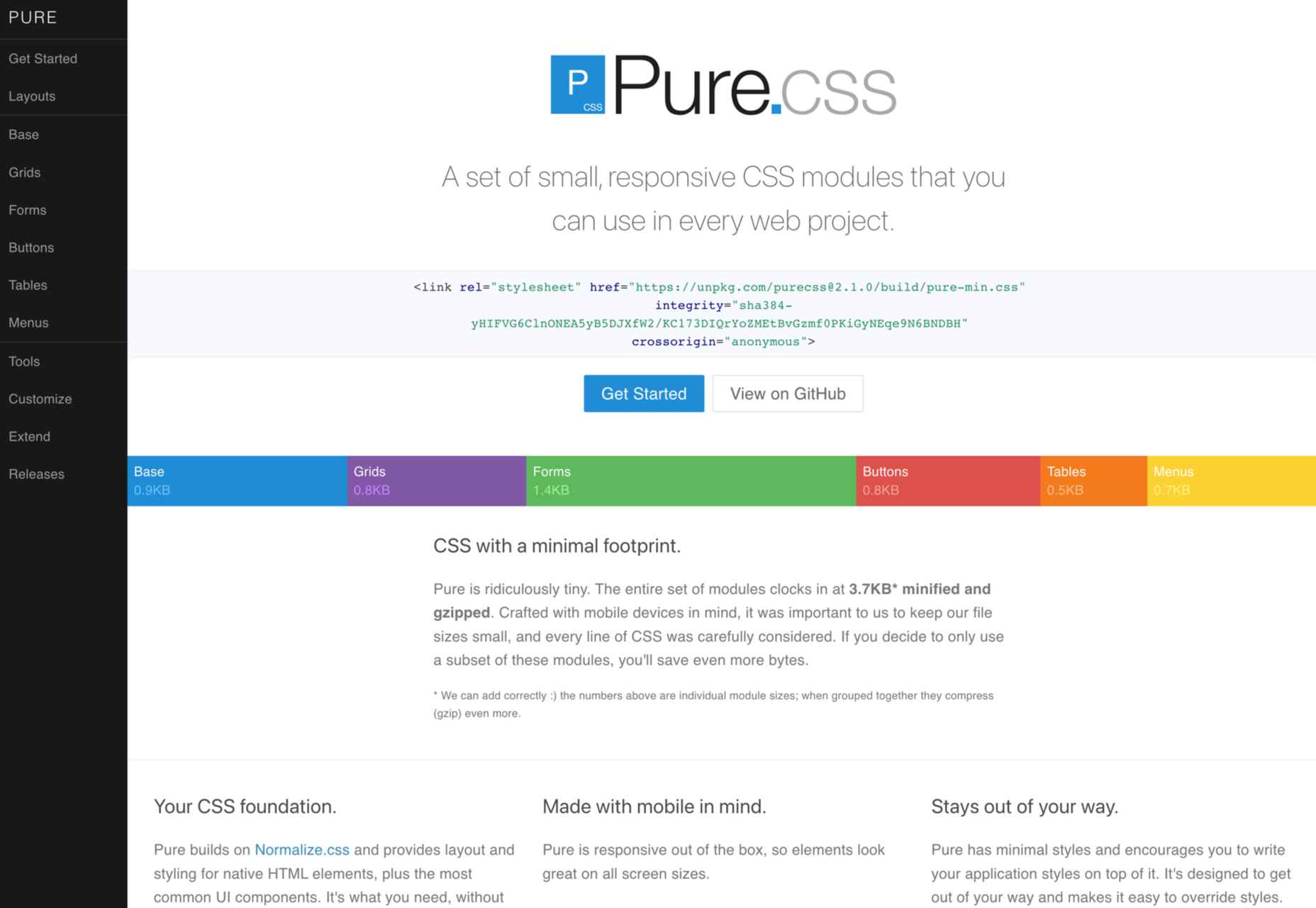
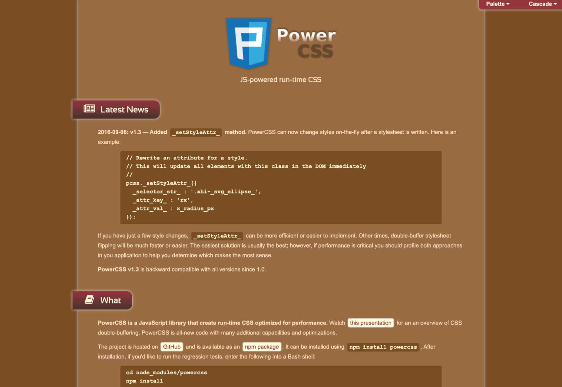
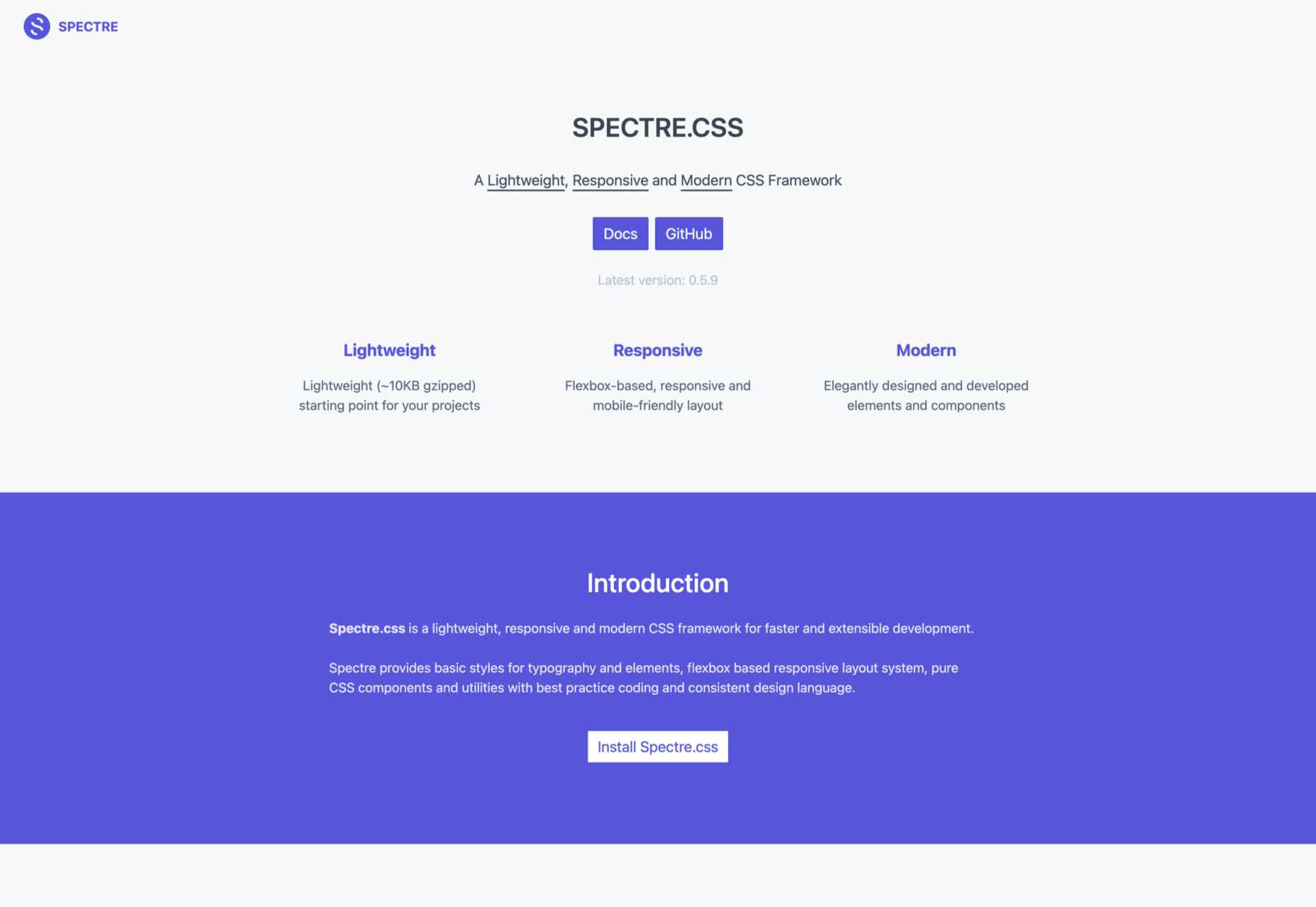
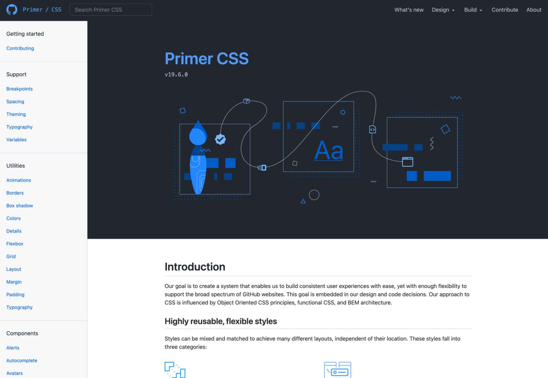
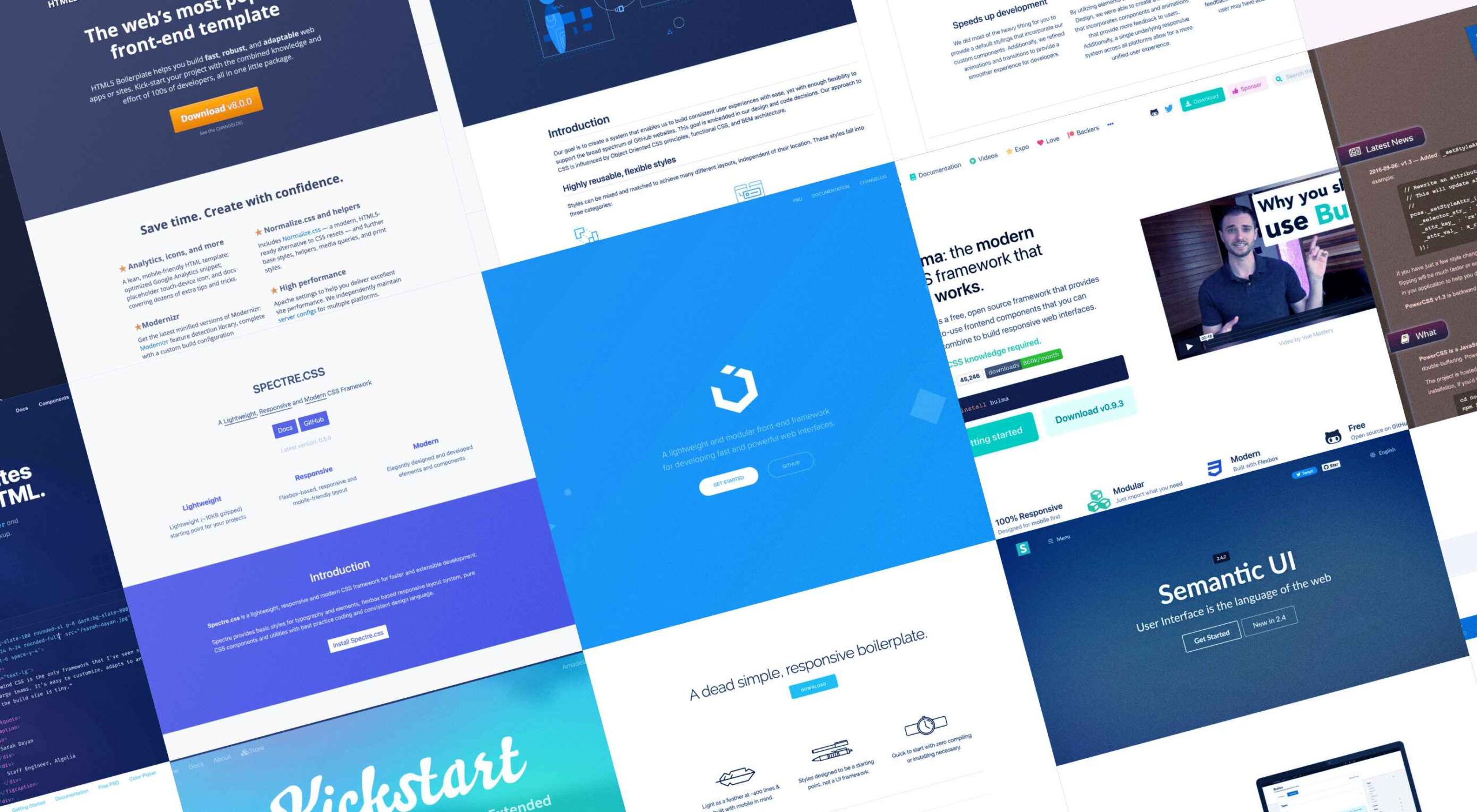 Whether you are a CSS expert or a front-end beginner, using the right CSS framework is crucial for your daily tasks. There are numerous frameworks whose ultimate goal is the same: helping developers target multiple screens, in the simplest possible way.
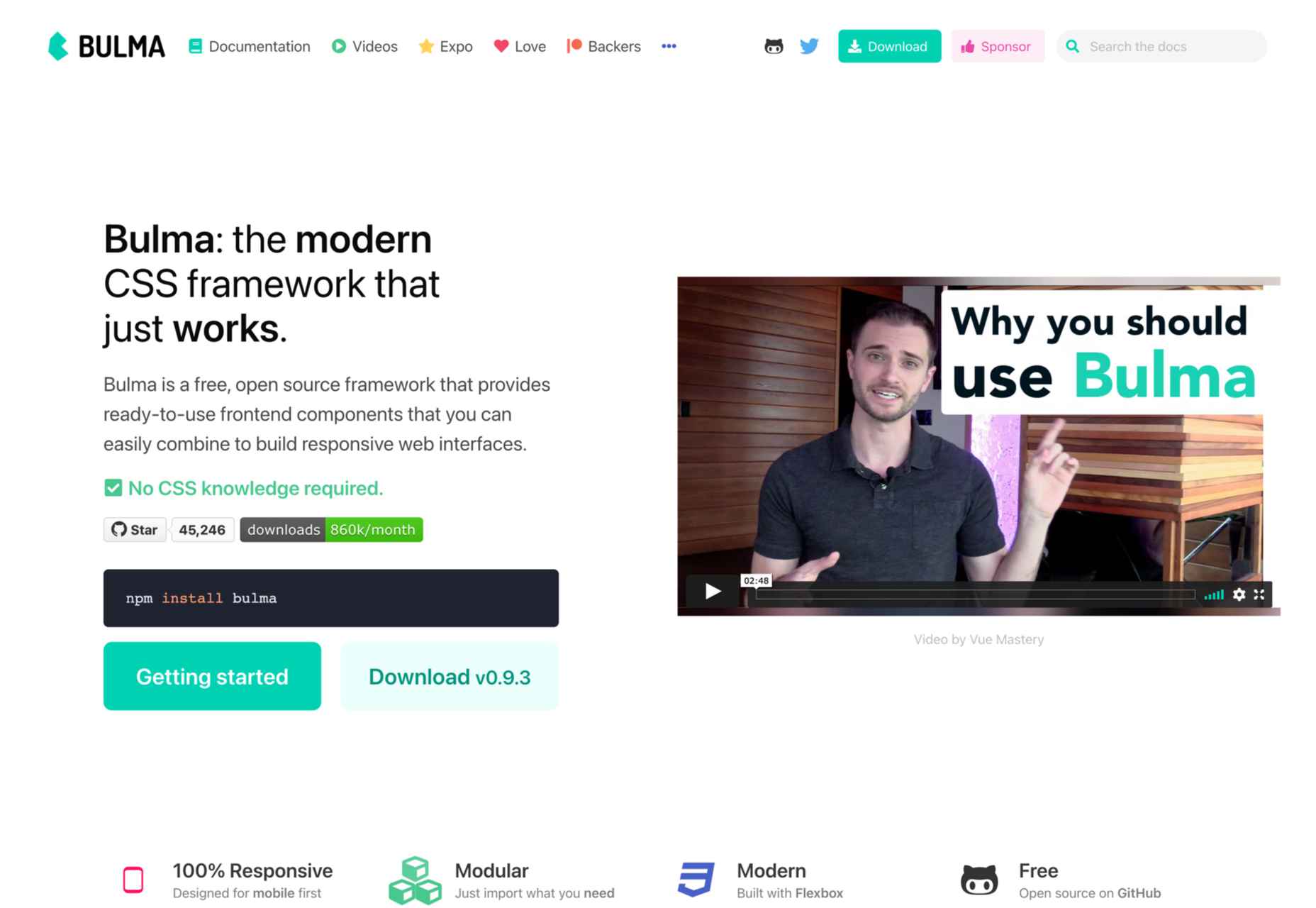