SAP va consacrer 5% de ses dépenses annuelles auprès d’entreprises sociales et de fournisseurs issus de la diversité d’ici 2025, l’équivalent de 60 millions de dollars par an.
SAP invite les entreprises de tout secteur à rejoindre le mouvement et à acheter davantage de biens et de services auprès de ce type d’organisations.
WALLDORF — SAP SE (NYSE : SAP) a annoncé aujourd’hui le lancement de « 5 & 5 by ’25 », une initiative dont l’objectif est de réaliser 5 % de ses dépenses auprès d’entreprises sociales et de fournisseurs issus de la diversité d’ici 2025. En fixant cet objectif, SAP souhaite montrer l’exemple et inciter les entreprises du monde entier à acheter davantage de biens et de services auprès de fournisseurs dont les actions et les valeurs ont du sens, et ainsi de produire un impact collectif positif sur les sociétés dans lesquelles elles mènent leurs activités.
Selon la Banque mondiale, les dépenses consacrées aux achats à travers le monde en 2019 s’élevaient au minimum à 14 000 milliards de dollars. En redirigeant ne serait-ce qu’une petite partie de ces dépenses vers des entreprises sociales agréées et des fournisseurs issus de la diversité, les entreprises ont le pouvoir de s’attaquer à certains des problèmes sociaux et environnementaux les plus préoccupants à l’échelle mondiale.
D’après les premiers projets pilotes effectués sur certains marchés, SAP estime pouvoir consacrer chaque année jusqu’à 60 millions de dollars de ses dépenses mondiales adressables aux entreprises sociales et aux fournisseurs issus de la diversité d’ici 2025. Chez les sociétés de l’indice boursier DAX, ce chiffre est estimé à environ 2,5 milliards d’euros, tandis que pour les sociétés de la liste Fortune 500 aux États-Unis, les estimations s’élèvent à 25 milliards de dollars.
Membre du Conseil d’administration de SAP, à la tête de l’entité Customer Success et récemment nommée Global Buy Social Ambassador de Social Enterprise UK, Adaire Fox-Martin a annoncé l’initiative « 5 & 5 by ’25 » lors de l’événement Procurement Reimagined organisé par SAP à Singapour.
« Toutes les entreprises, dans tous les secteurs, ont besoin de réaliser des achats », a expliqué Mme Fox-Martin. « Nous avons tous besoin de savon dans nos sanitaires, de services d’aménagement pour nos bureaux, de produits alimentaires et de boissons dans nos cafétérias, de services de marketing et de fournitures de bureau. Ces produits et services, parmi tant d’autres, peuvent tous être acquis auprès d’entreprises sociales et de fournisseurs issus de la diversité. Cet argent, nous sommes de toute façon amenés à le dépenser. Pourquoi ne pas l’utiliser auprès de fournisseurs dont les actions ont également un impact sur le plan social ? »
Les entreprises sociales sont des entreprises qui, de par leur culture et leurs opérations, cherchent résolument à changer le monde. Elles sont similaires à d’autres entreprises viables sur le plan commercial, mais présentent trois différences essentielles : elles sont fondées et gouvernées sur la base d’une mission sociale ou environnementale clairement définie ; elles réinvestissent la majorité de leurs bénéfices dans cette mission ; et elles sont contrôlées selon le principe de majorité exclusivement dans l’intérêt de cette mission. Un fournisseur issu de la diversité est une entreprise détenue et exploitée à 51 % ou plus par une personne ou un groupe de personnes issue(s) d’une population traditionnellement sous-représentée ou défavorisée.
« Avec nos clients, nos partenaires, nos fournisseurs issus de la diversité et les entreprises sociales, nous nous sommes fixé pour objectif de développer les achats socialement responsables là où les infrastructures le permettent, et nous avons l’intention de mettre sur pied les infrastructures nécessaires et de renforcer les capacités partout ailleurs », a ajouté Mme Fox-Martin. « Nous invitons toutes nos parties prenantes à en apprendre davantage sur le sujet et à participer avec nous à cette initiative, mais aussi à tracer la voie et à donner l’élan pour concrétiser cette ambition et trouver une meilleure façon de se développer. »
Pour en savoir plus, consultez l’article (en anglais) « Achats socialement responsables :trouver une meilleure façon de se développer » par Adaire Fox-Martin.
À propos de l’initiative « 5 & 5 by ’25 »
L’initiative « 5 & 5 by ’25 » a été développée par SAP pour encourager les entreprises de tous les secteurs à consacrer une plus grande part de leurs dépenses adressables à des fournisseurs socialement engagés et issus de la diversité. En rejoignant cette initiative, les entreprises acceptent de formaliser leur exploration des achats socialement responsables, notamment en établissant des partenariats avec des intermédiaires de premier plan, en adoptant des politiques d’achats socialement responsables, en consommant des biens et des services auprès de fournisseurs dont les actions et les valeurs ont du sens, et en élargissant leur engagement auprès d’autres entreprises sociales et fournisseurs issus de la diversité. L’objectif est de réaliser, d’ici 2025, 5 % des dépenses annuelles d’achats adressables auprès d’entreprises sociales et de fournisseurs issus de la diversité et, ce faisant, d’avoir un impact significatif sur les inégalités sociales et les enjeux environnementaux. « 5 & 5 by ’25 » fait partie du programme One Billion Lives de SAP, qui s’attache à promouvoir une plus grande intégration de l’entrepreneuriat social dans l’économie mondiale. Pour plus d’informations, consultez la page 5 & 5 by ’25.
The post SAP lance 5&5 by ’25 et incite les entreprises à dépenser mieux avec les fournisseurs sociaux et issus de la diversité appeared first on SAP France News.


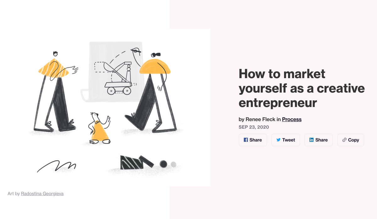
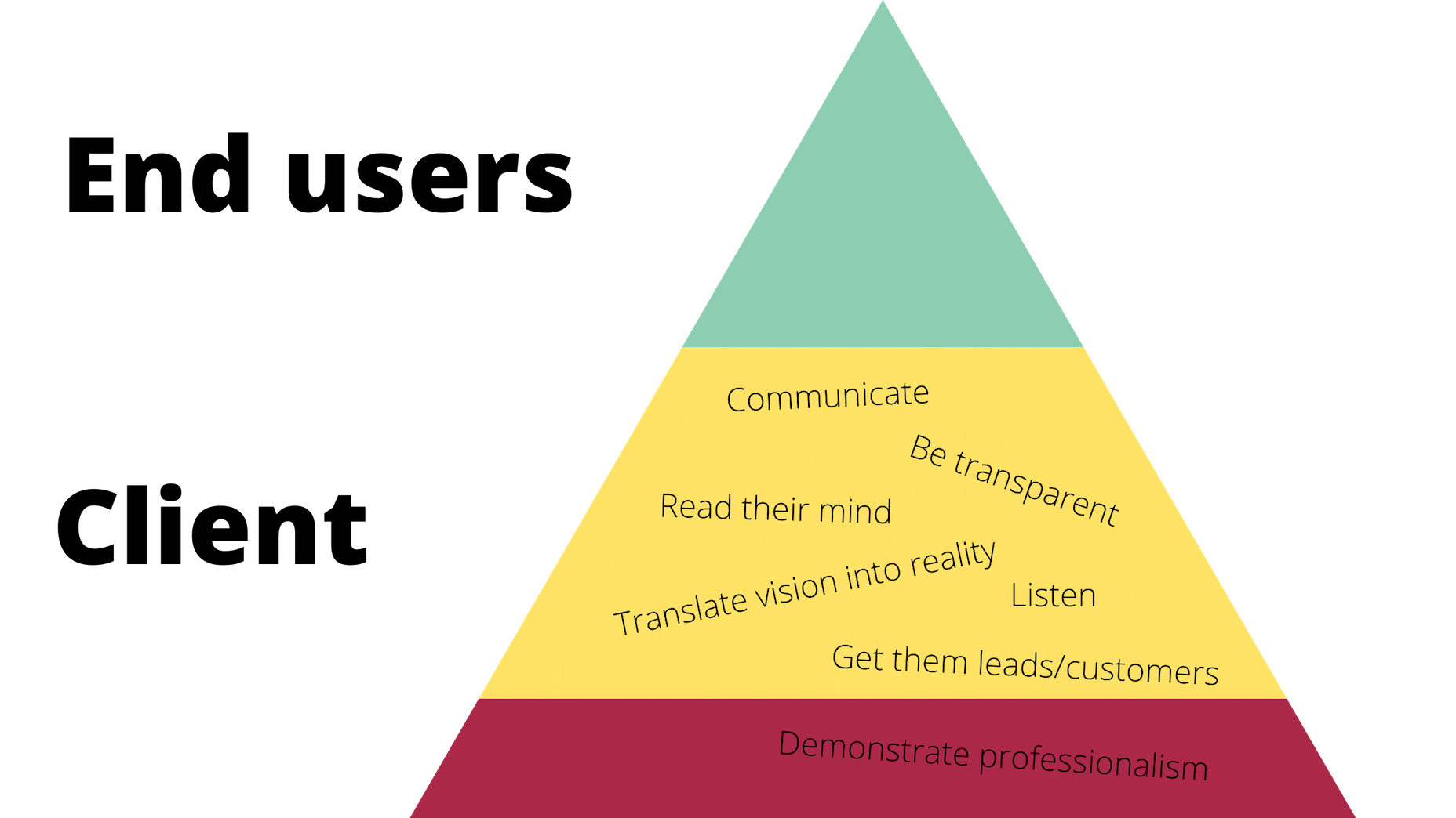
 It would be way too easy to answer this question with: “Whoever pays your bills.” And, honestly, I don’t think you can be a very successful web designer if you’re only driven by what the person paying you tells you to do.
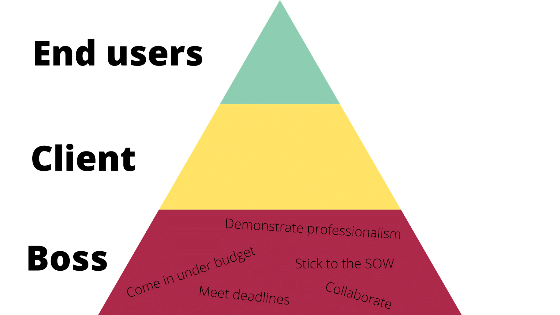

 Design can make a statement. It evokes feeling and can encourage thought and conversation. That’s the common theme among the three trends in website design this month.


 Every week users submit a lot of interesting stuff on our sister site Webdesigner News, highlighting great content from around the web that can be of interest to web designers.


 And it does this 24 hours a day, 7 days a week, 52 weeks a year without ever asking for a pay raise.
 Artificial intelligence. Just hearing the phrase has been a trigger for many in the technology world since that creepy Haley Joel Osment film circa 2001. But more recently, artificial intelligence and machine learning strike fear into the hearts of skilled workers for an entirely different reason: job security, or lack thereof.
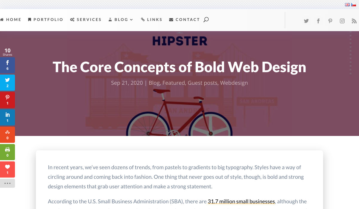
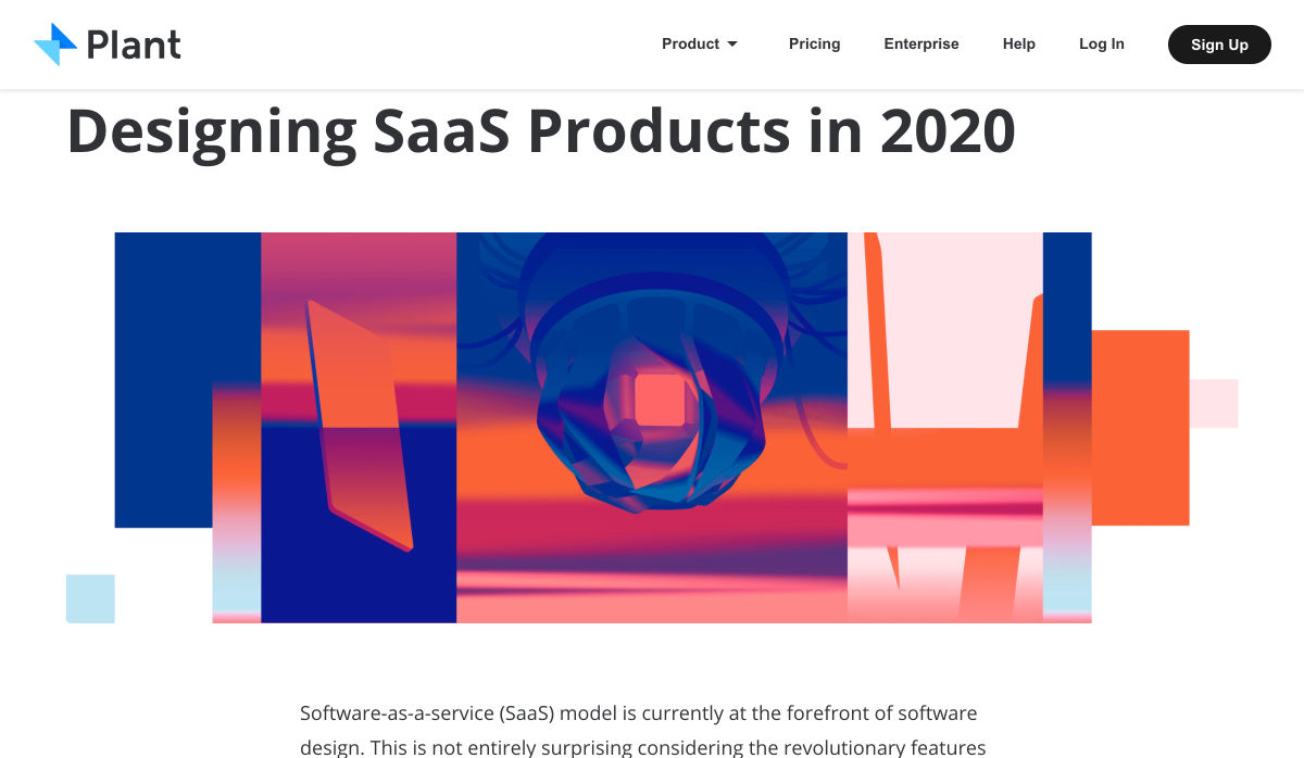
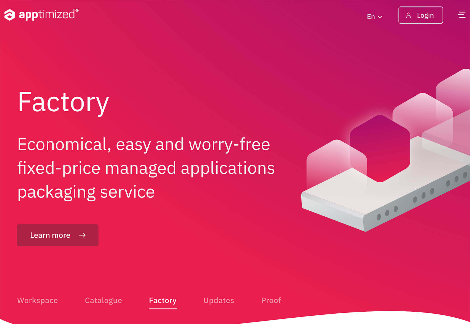
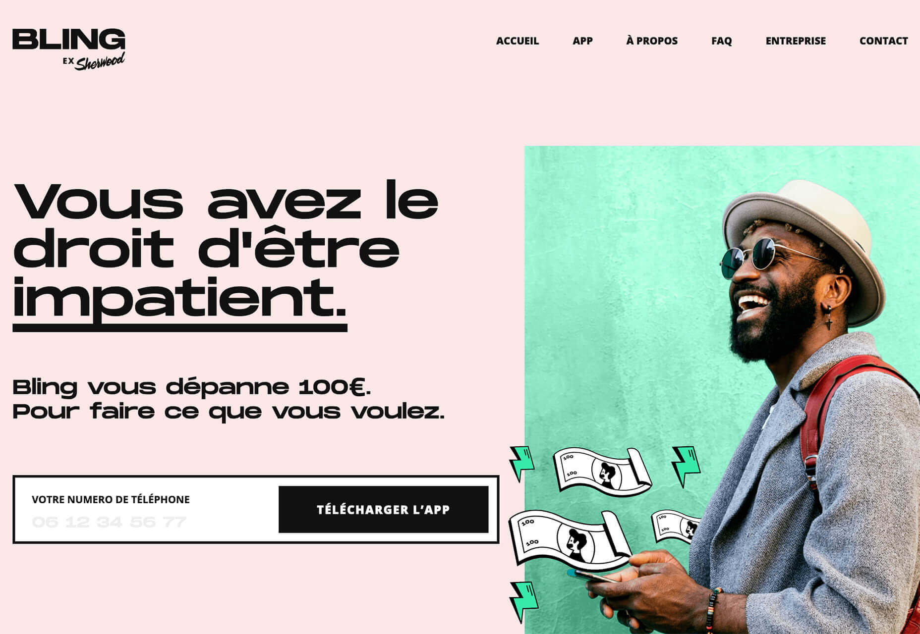
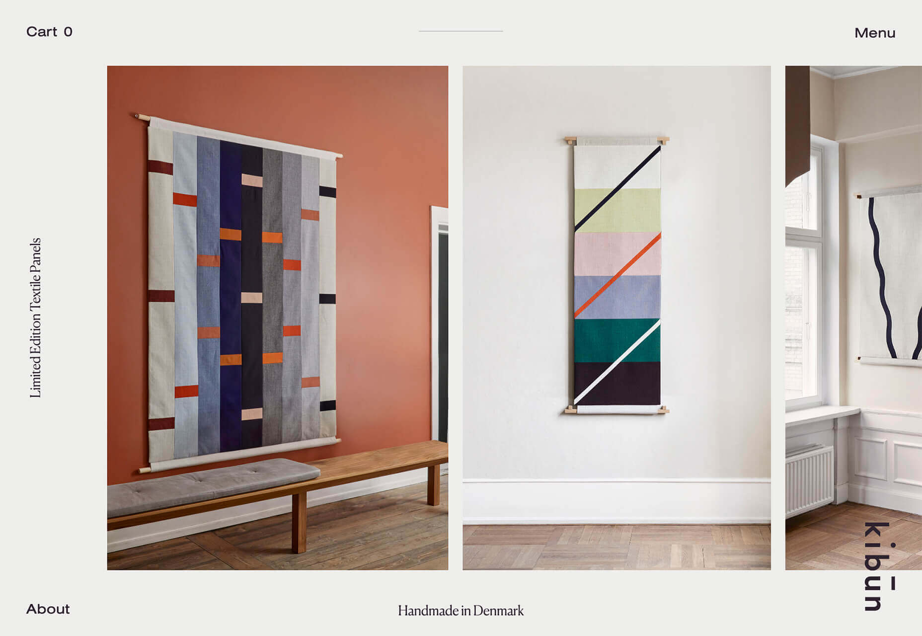
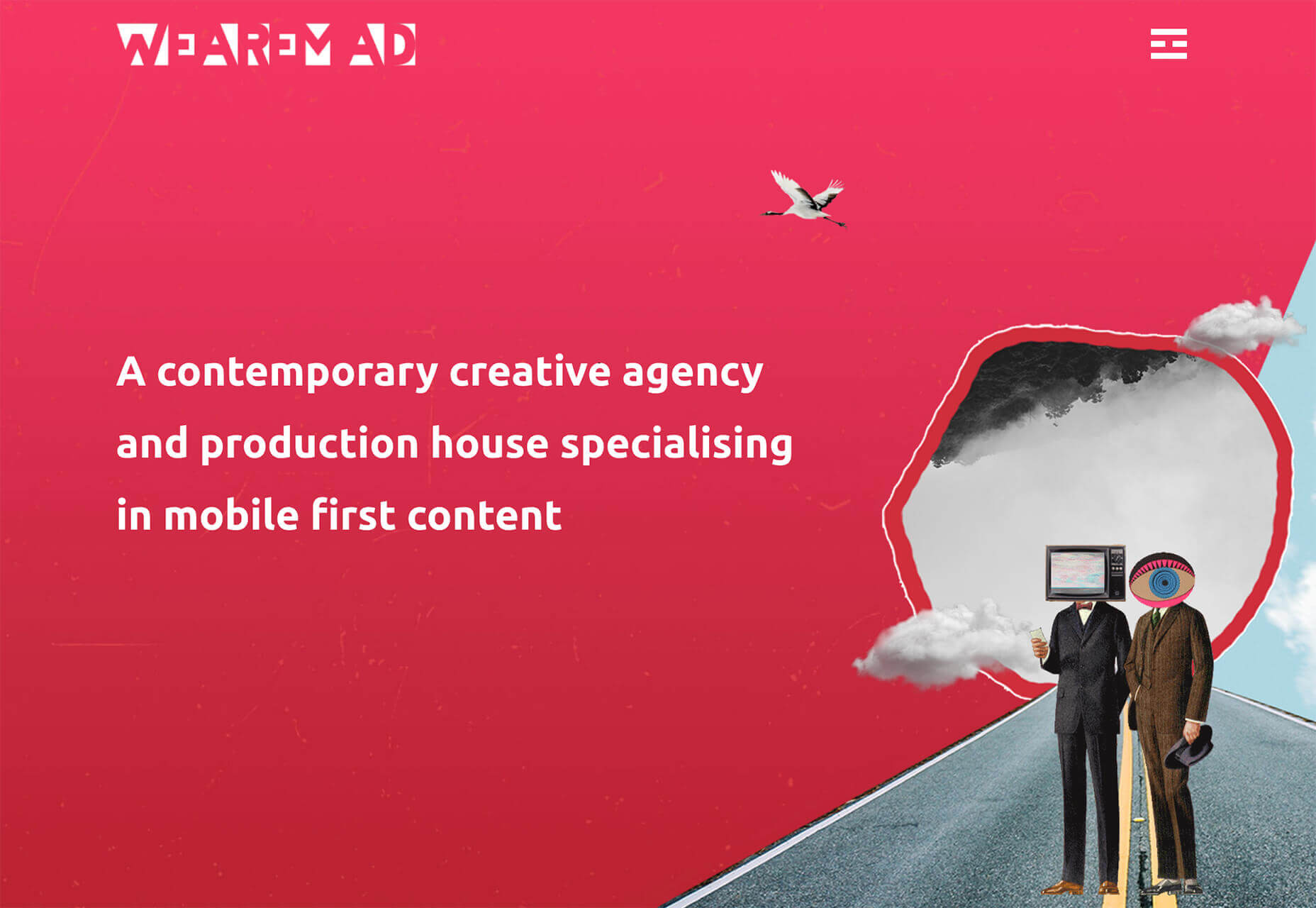
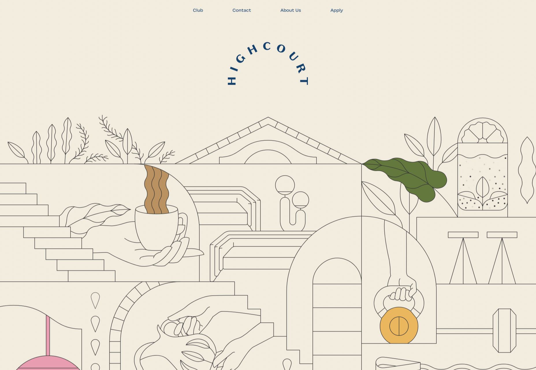
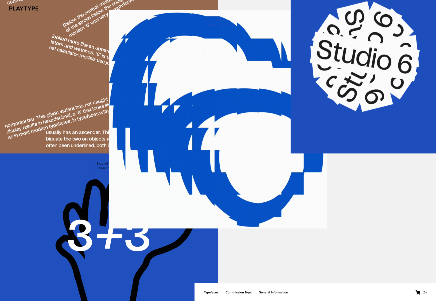
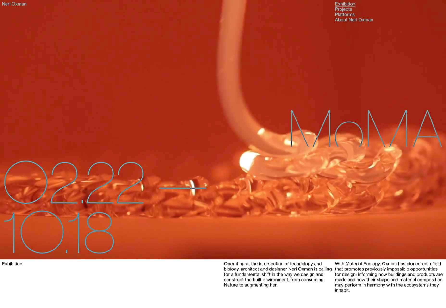
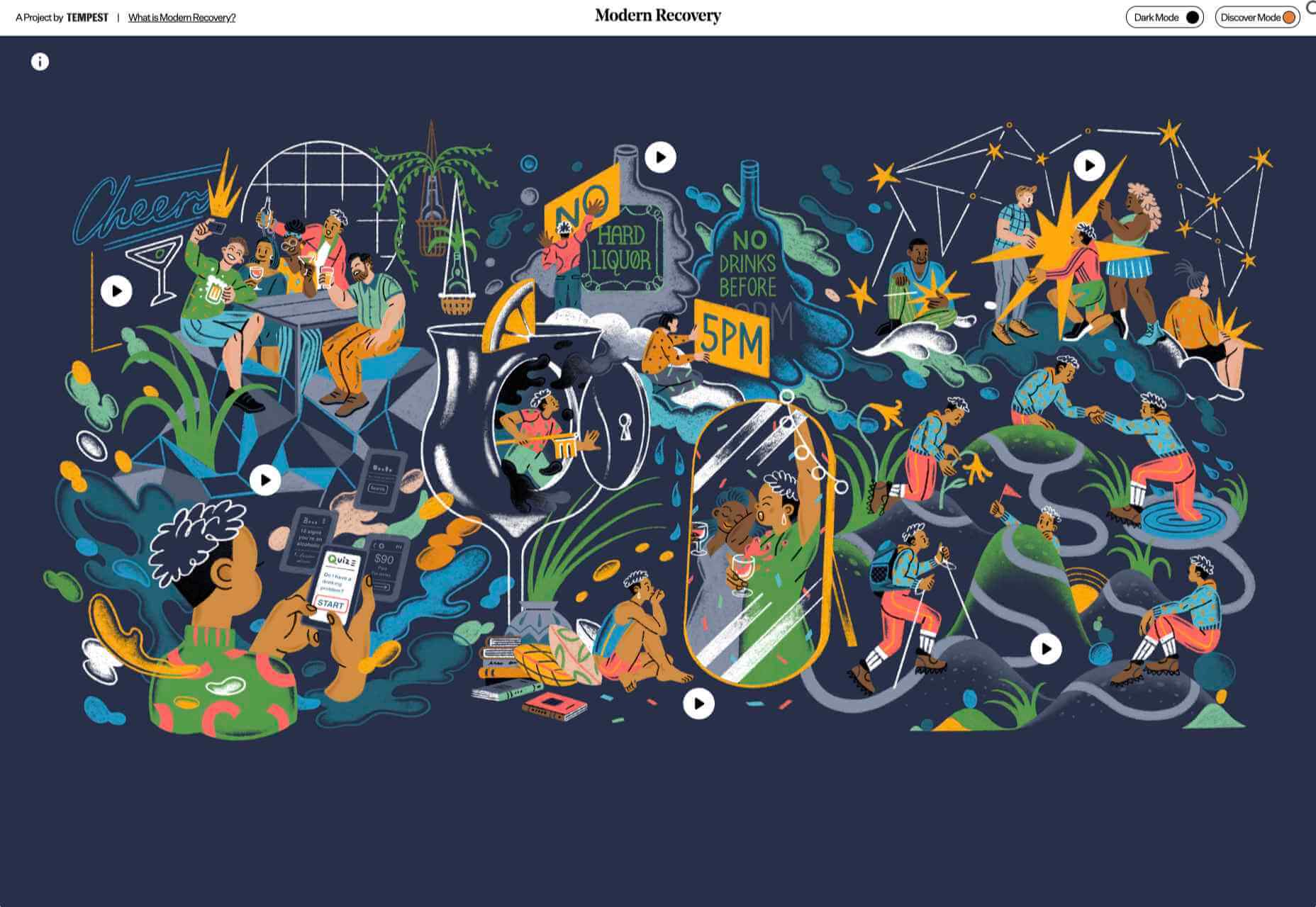
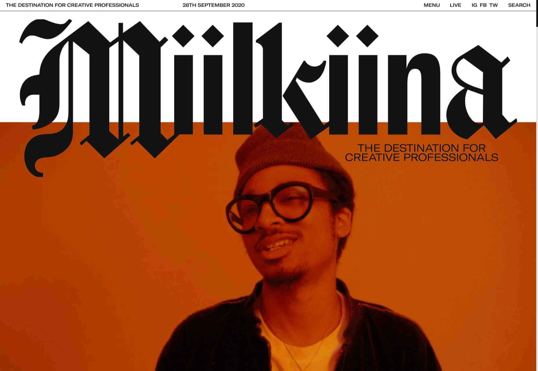
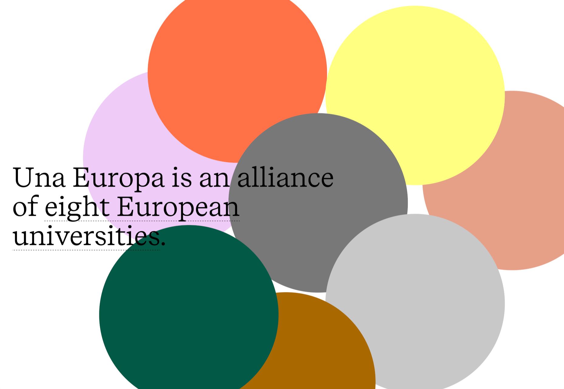
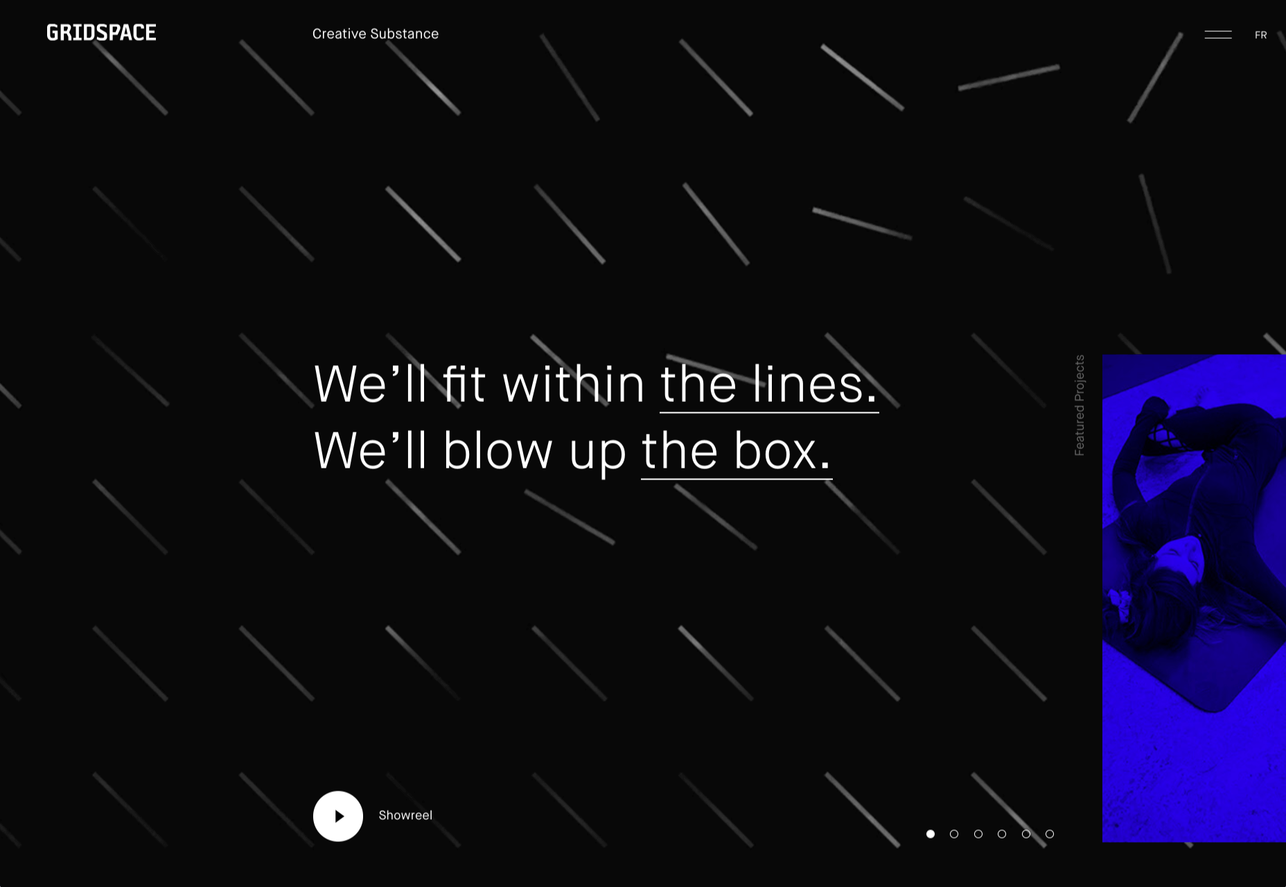
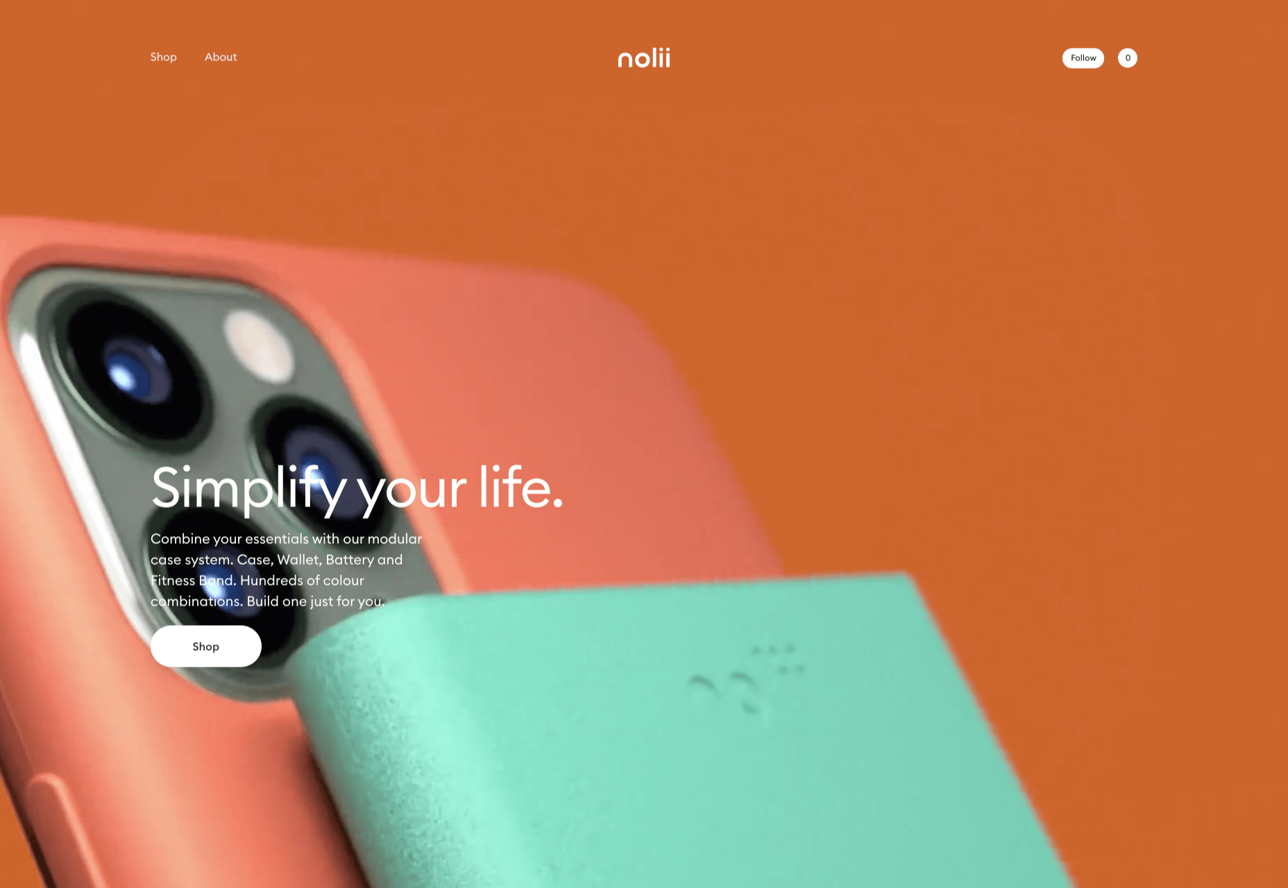
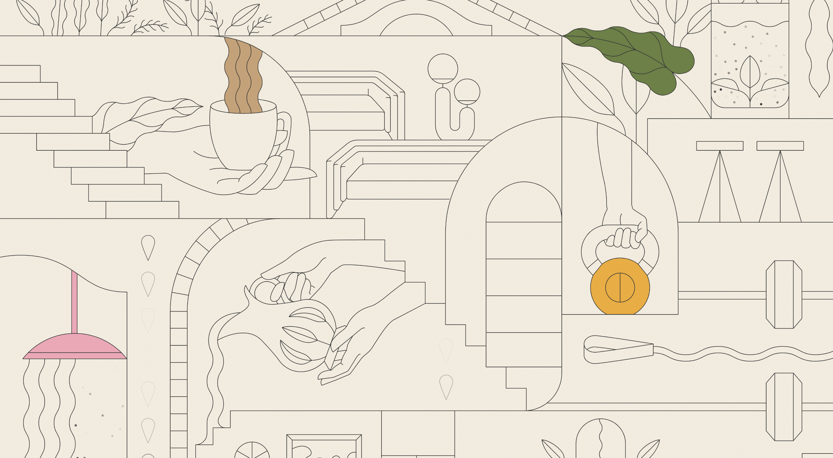 This month we’re going big and bold. Oversized type, strong colors, in-your-face layouts, and little touches of playfulness exude confidence and make a statement. There are some quieter moments too, with thoughtful illustration and more gentle use of color. Animation still features strongly in the details, with circles proving popular in rollover effects. Enjoy.
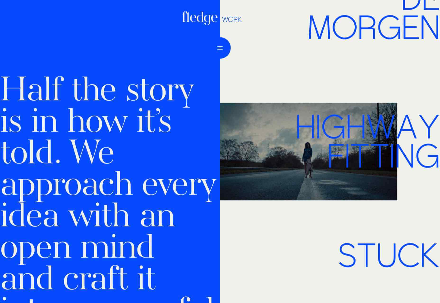


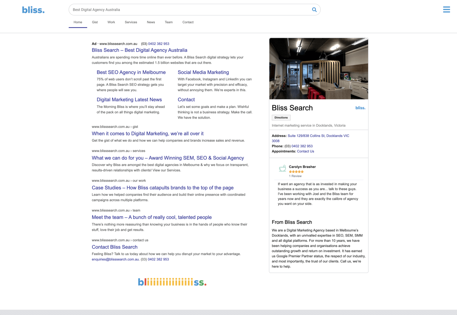


 Every week users submit a lot of interesting stuff on our sister site Webdesigner News, highlighting great content from around the web that can be of interest to web designers.