 Automation is the theme of this month’s collection of exciting new tools for designers and developers. There are tools to make your images better, tools to create illustrations, and tools to make your workflow more efficient. Plus, a whole host of tools that are just plain fun.
Here’s what is new for designers this month…
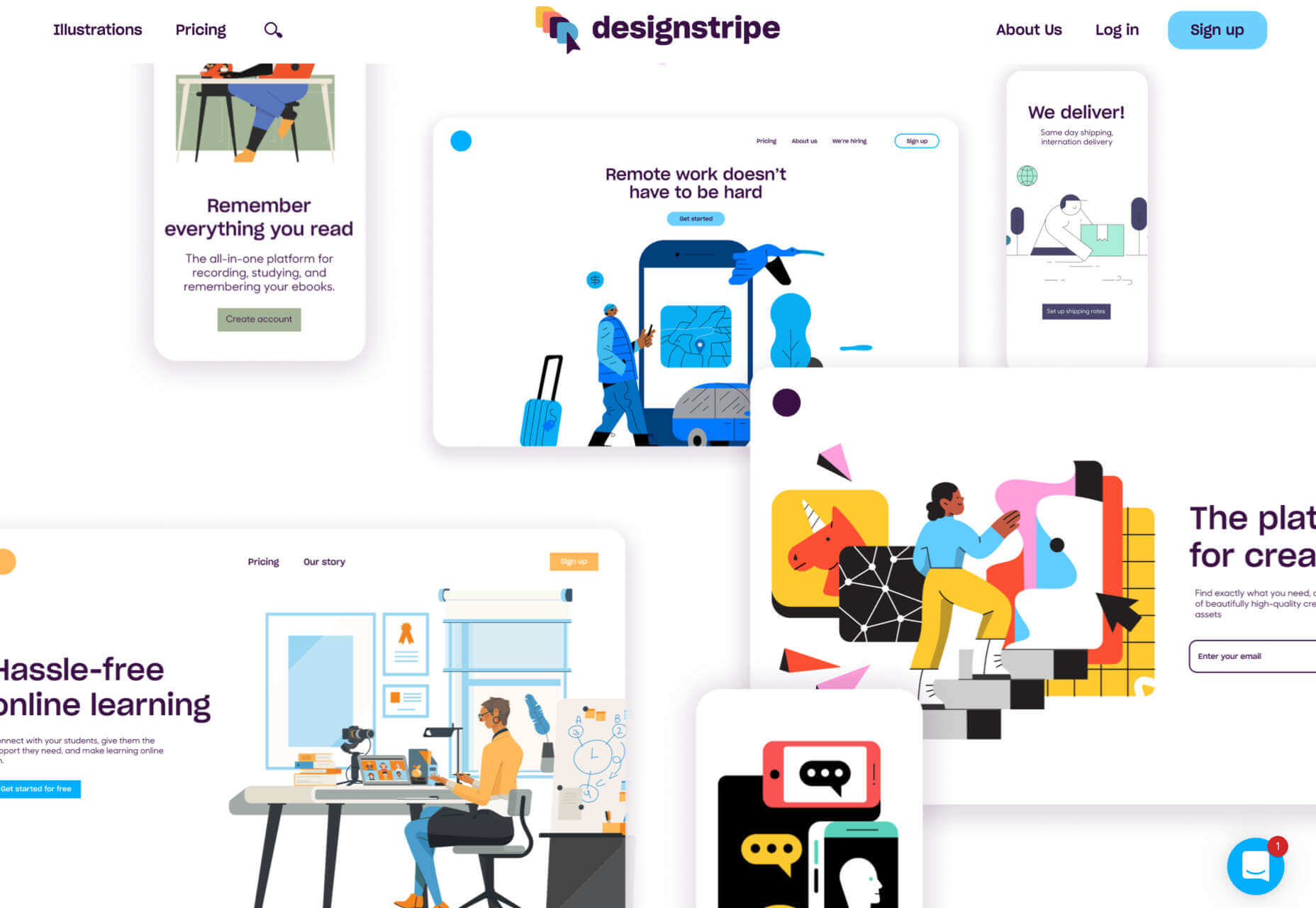
designstripe
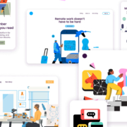
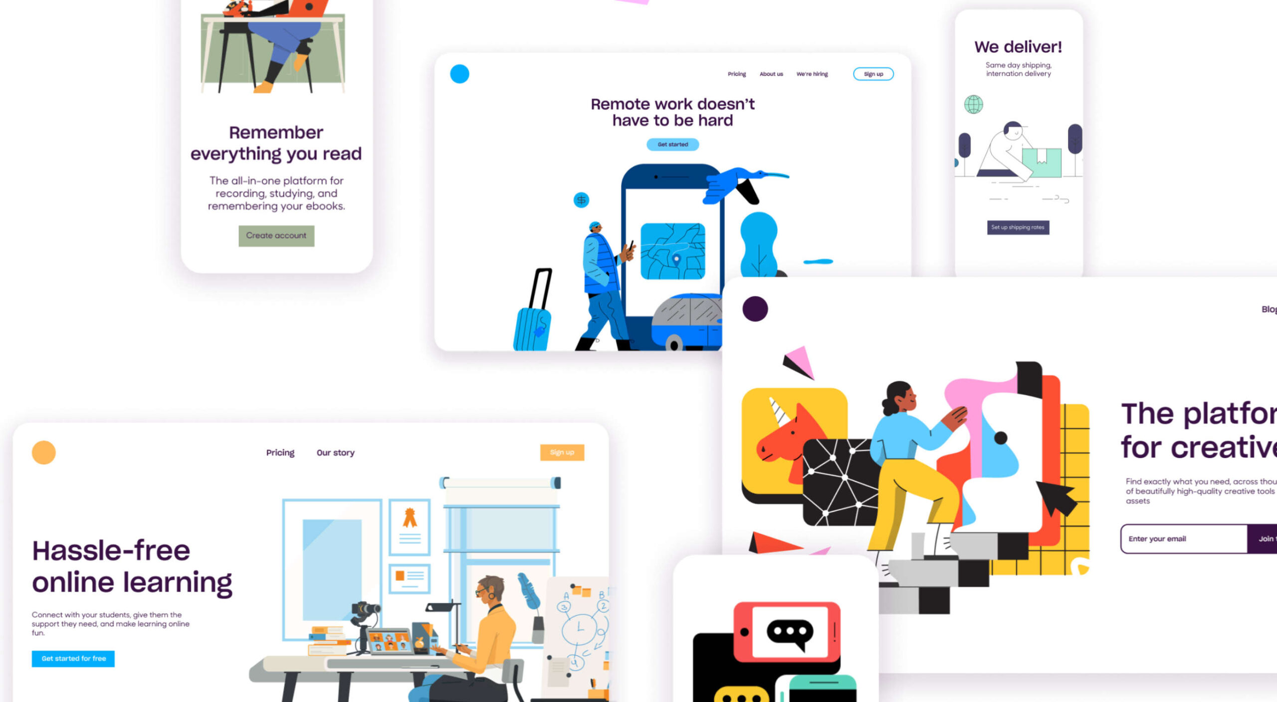
designstripe lets you create beautiful illustrations with no design skills. Drag and drop different elements into place, then customize them for your brand.
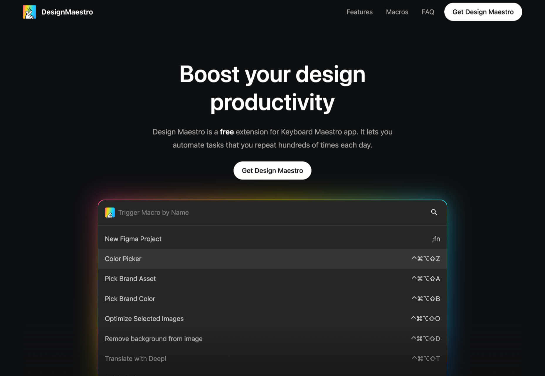
DesignMaestro
DesignMaestro is a free keyboard extension app that lets you automate the tasks you repeat daily. Set up a macro with a keyboard shortcut, and tap the shortcut to perform the action.
Ghost 5.0
Ghost is one of the best personal blogging platforms around, and version 5 enhances it with custom code, support for video, and performance upgrades.
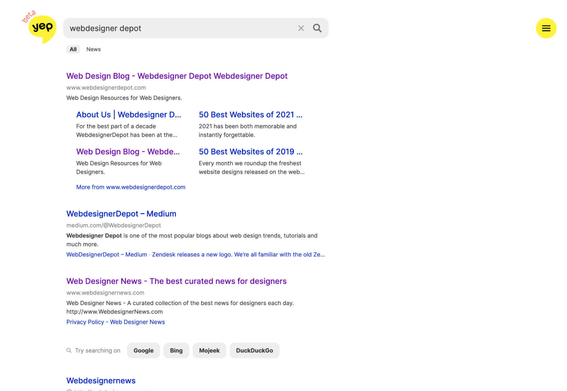
Yep
Yep is a new search engine from the makers of Ahrefs. Built from the ground up, Yep will give 90% of its ad revenue to content creators.
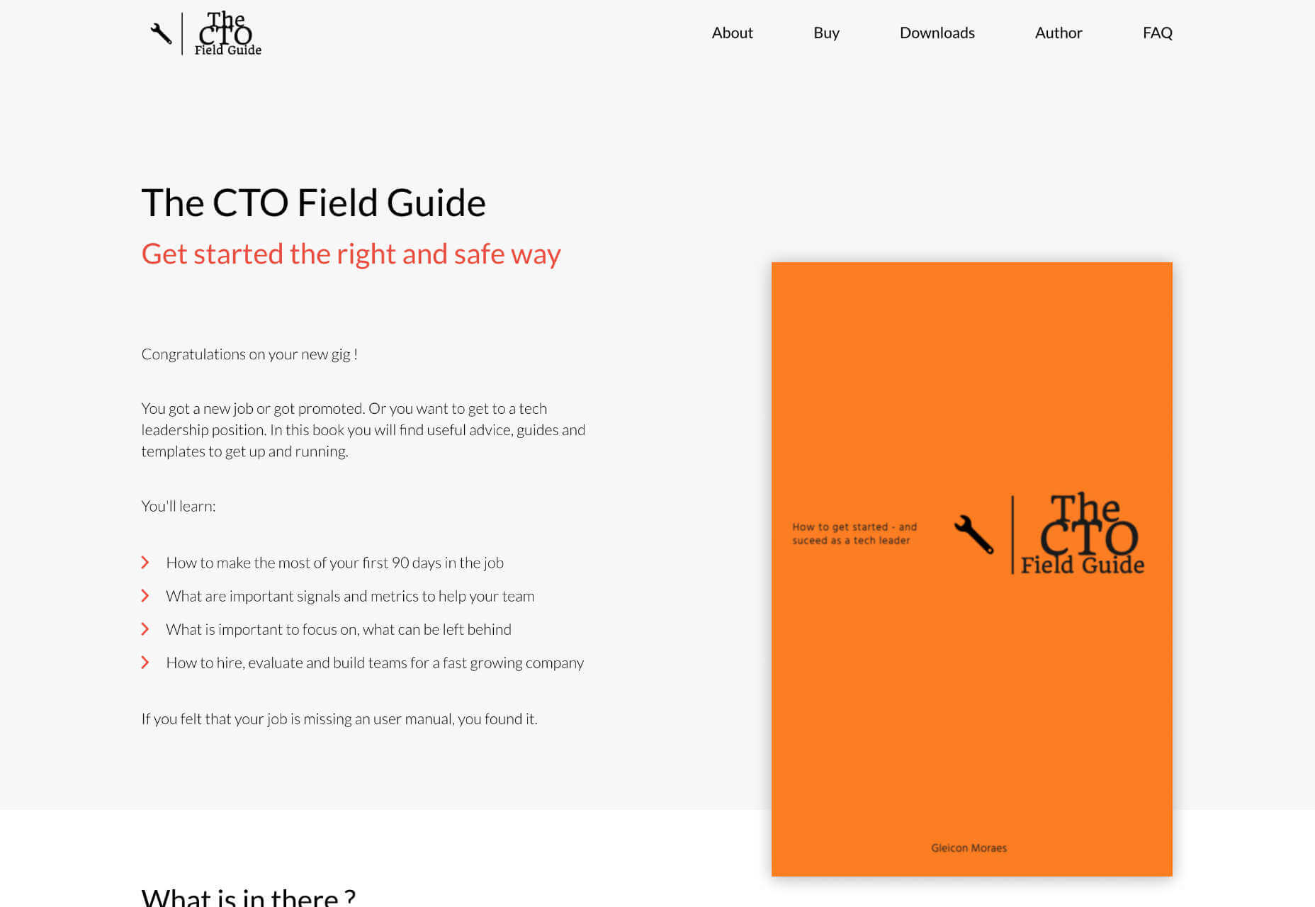
The CTO Field Guide
The CTO Field Guide is a free ebook for anyone newly promoted to a technology officer role or looking for a tech leadership role. It’s a simple guide to making the most of your first 90 days on the job.
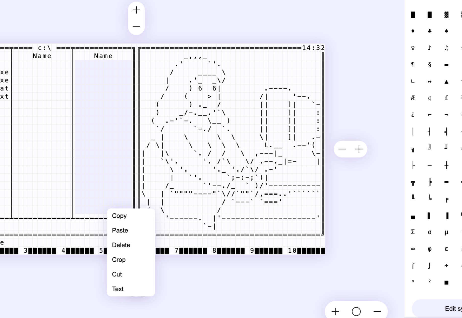
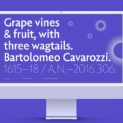
ASCII Art Paint
ASCII Art Paint is a free, open-source web app for creating images made up of text characters and hieroglyphs. It’s a great way to add pictures to text-only formats.
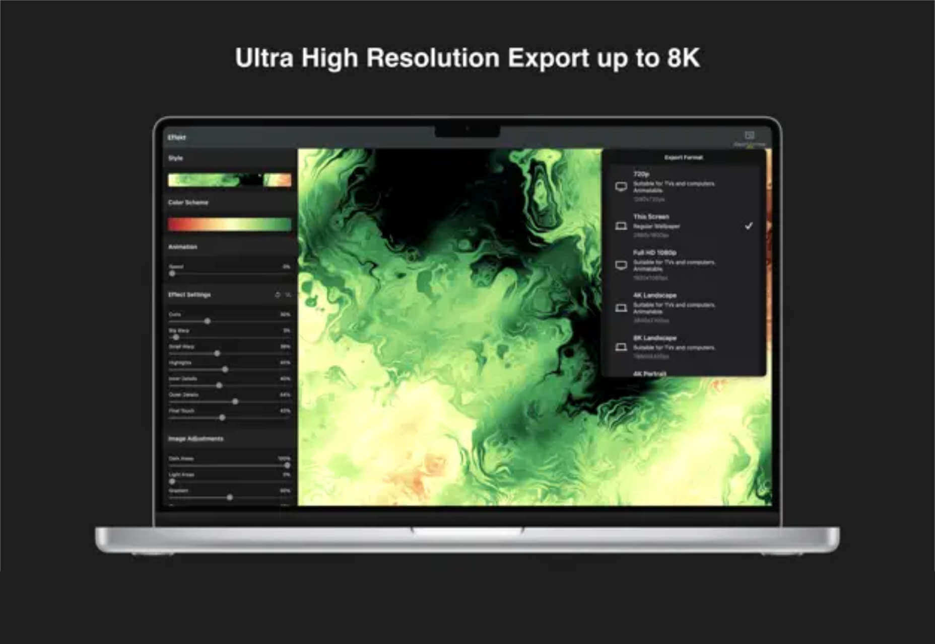
Effekt
Make your own fun, wallpaper art at up to 8k resolution using Effekt, a mix between an image editor and a visual toy.
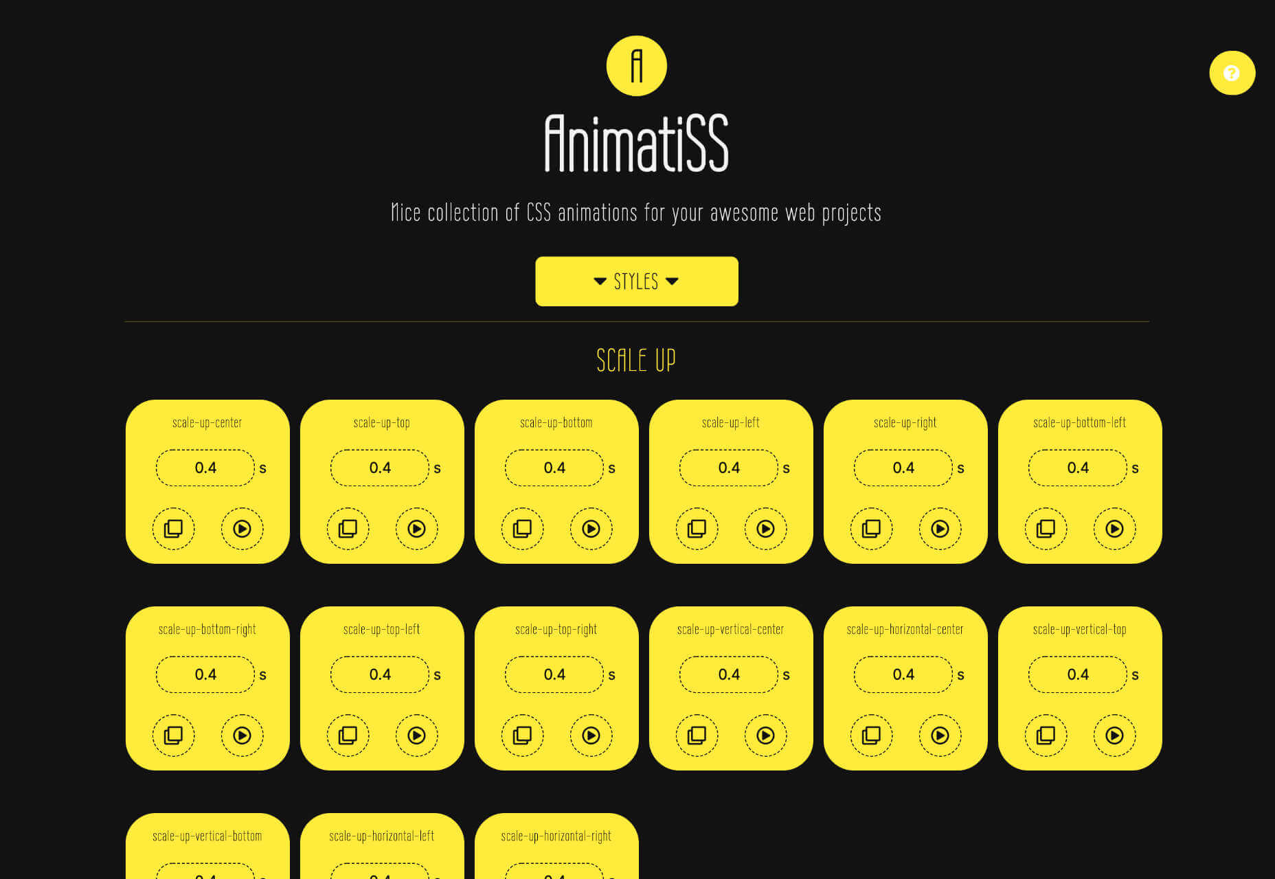
Animatiss
Animatiss is a fantastic collection of CSS animations that you can use for free. Tailor the speed of the animation, preview it, then copy and paste the code into your project.
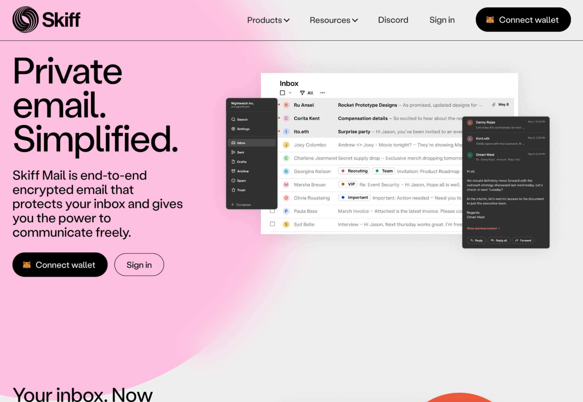
Skiff
Skiff Mail is an email app that features end-to-end encryption. This means your email stays private and secure, so you’re free to discuss sensitive matters.
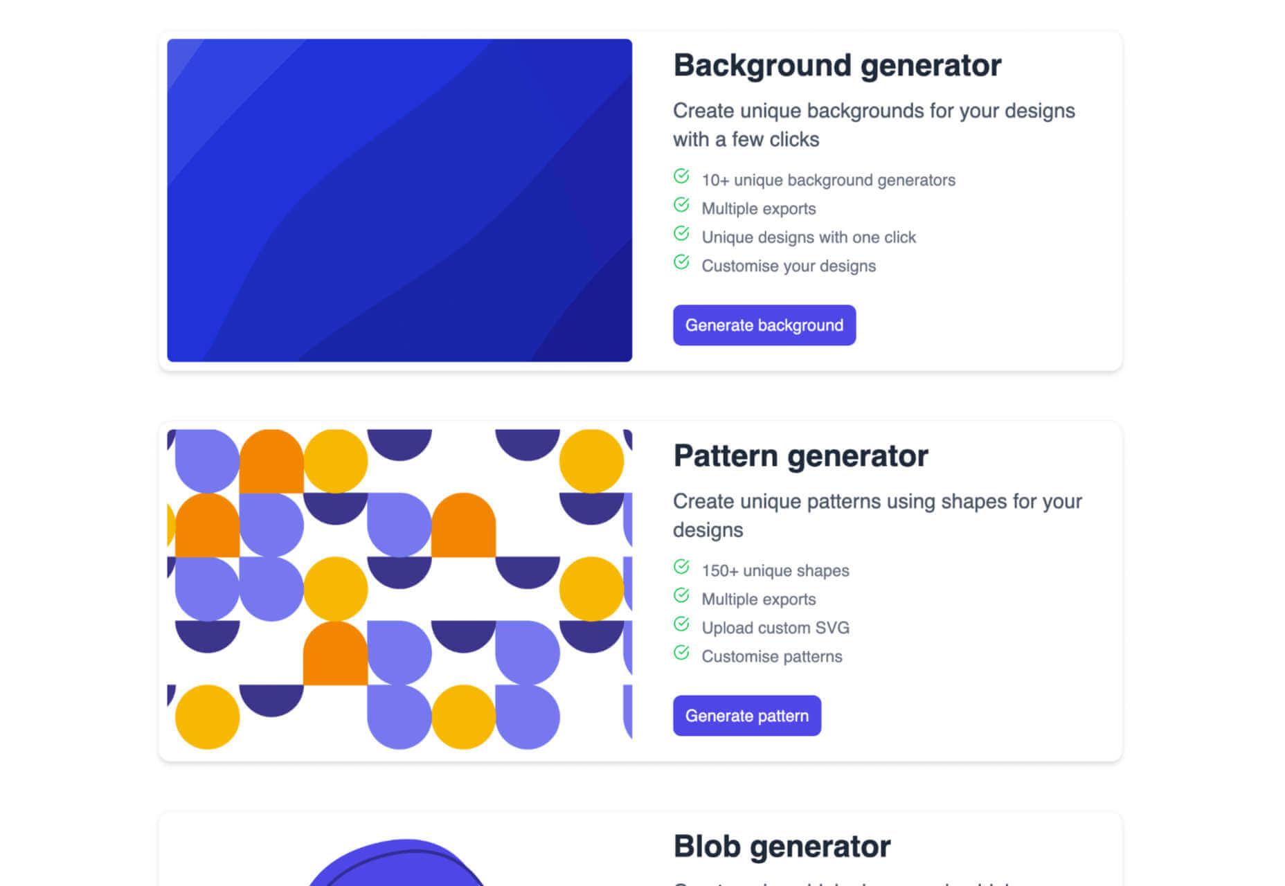
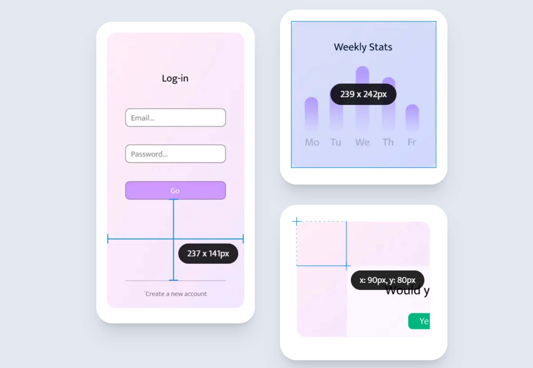
Super Designer Tools
Super Designer is a collection of design tools for performing simple tasks. There’s a background generator, a pattern generator, a blob generator, and more—all free to use.
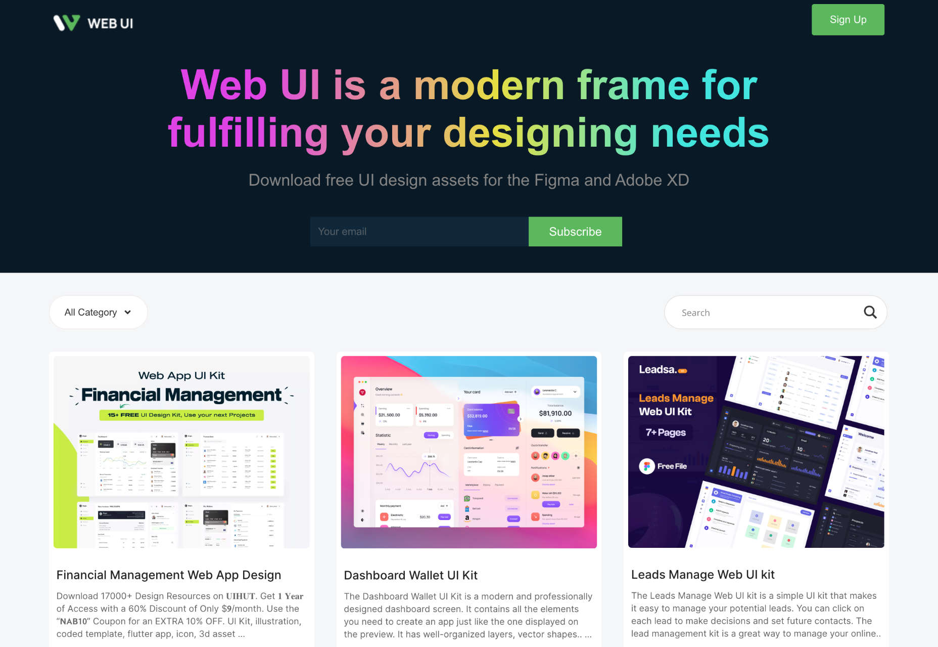
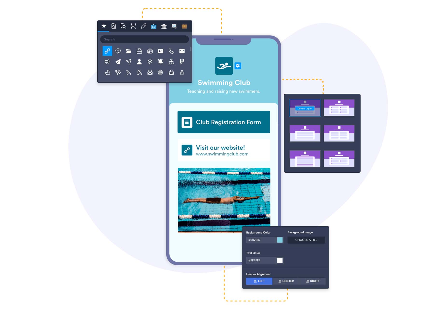
Web UI
Web UI is a collection of UI kits and templates for Figma and Adobe XD. Most designs are free to download and use for projects, and some require payment.
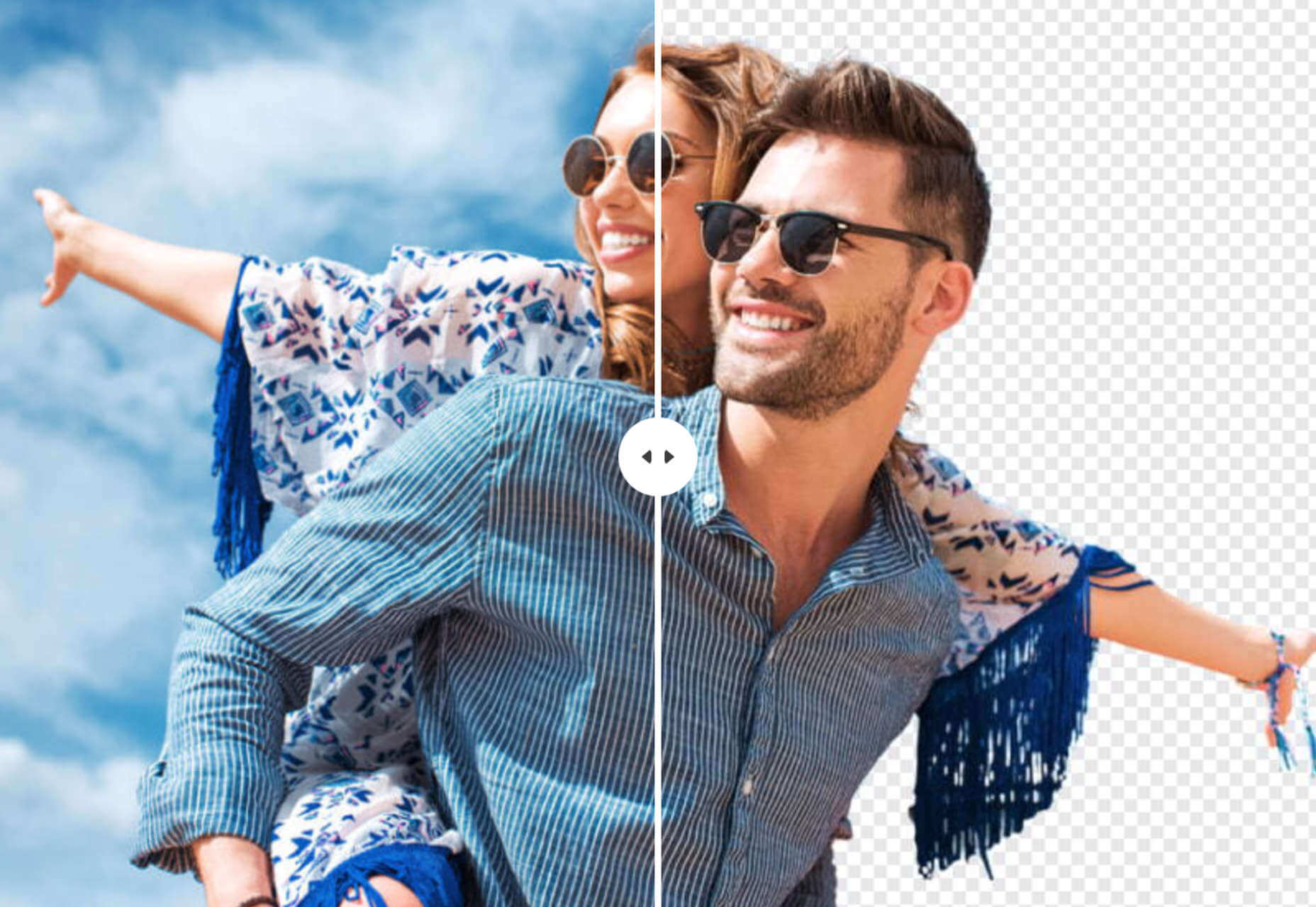
Free Online Background Remover
Use this free online background remover to quickly and easily delete the background of photos, leaving you free to paste the foreground over flat colors, gradients, or even different backgrounds.
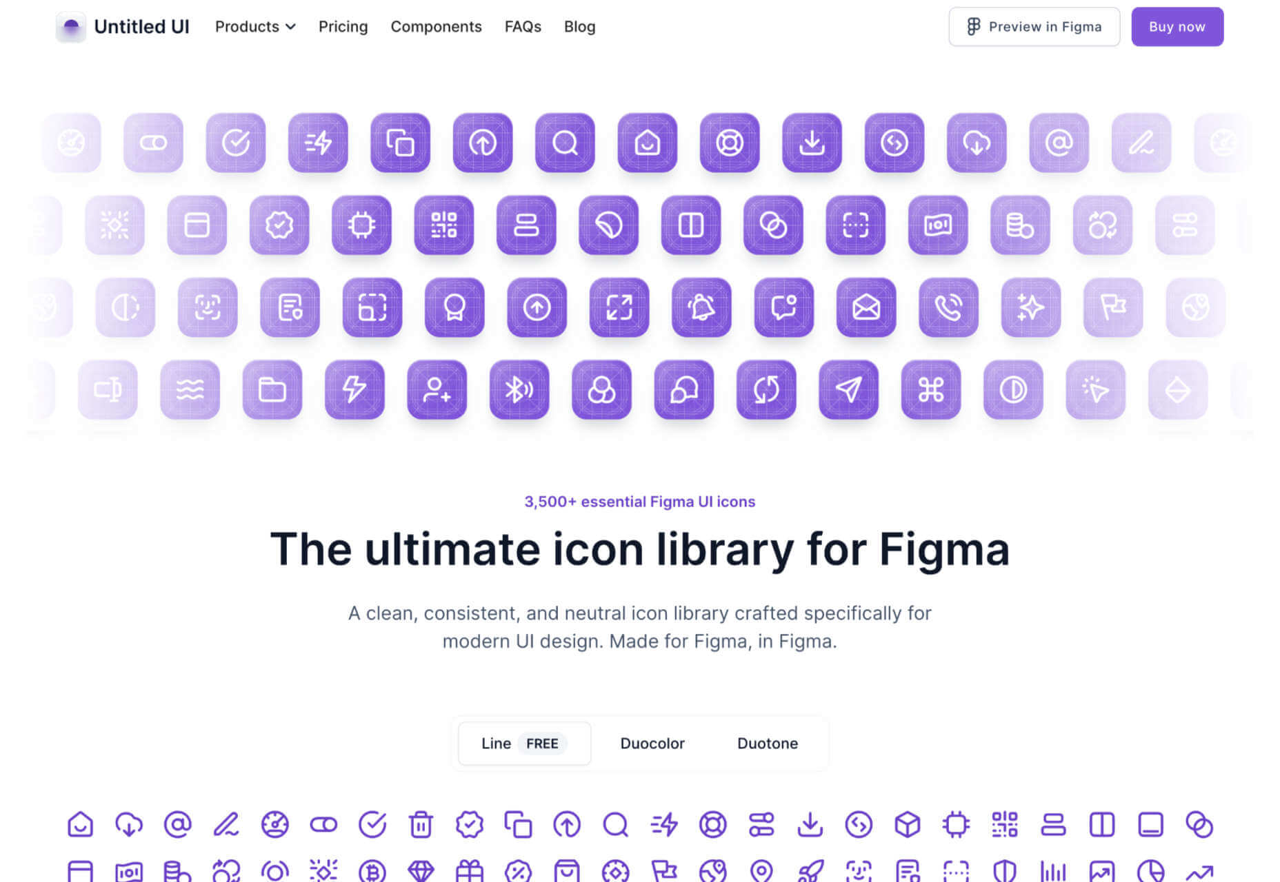
Untitled UI Icons
Untitled UI Icons is a set of clean, consistent, and neutral icons made for Figma in Figma. There are 3,500 icons in total. The line style is free to download.
OS
Turn your Mac or iPhone into an old-school Macintosh with this retro wallpaper and icon set, and transport yourself back to 1984. OS is a premium download.
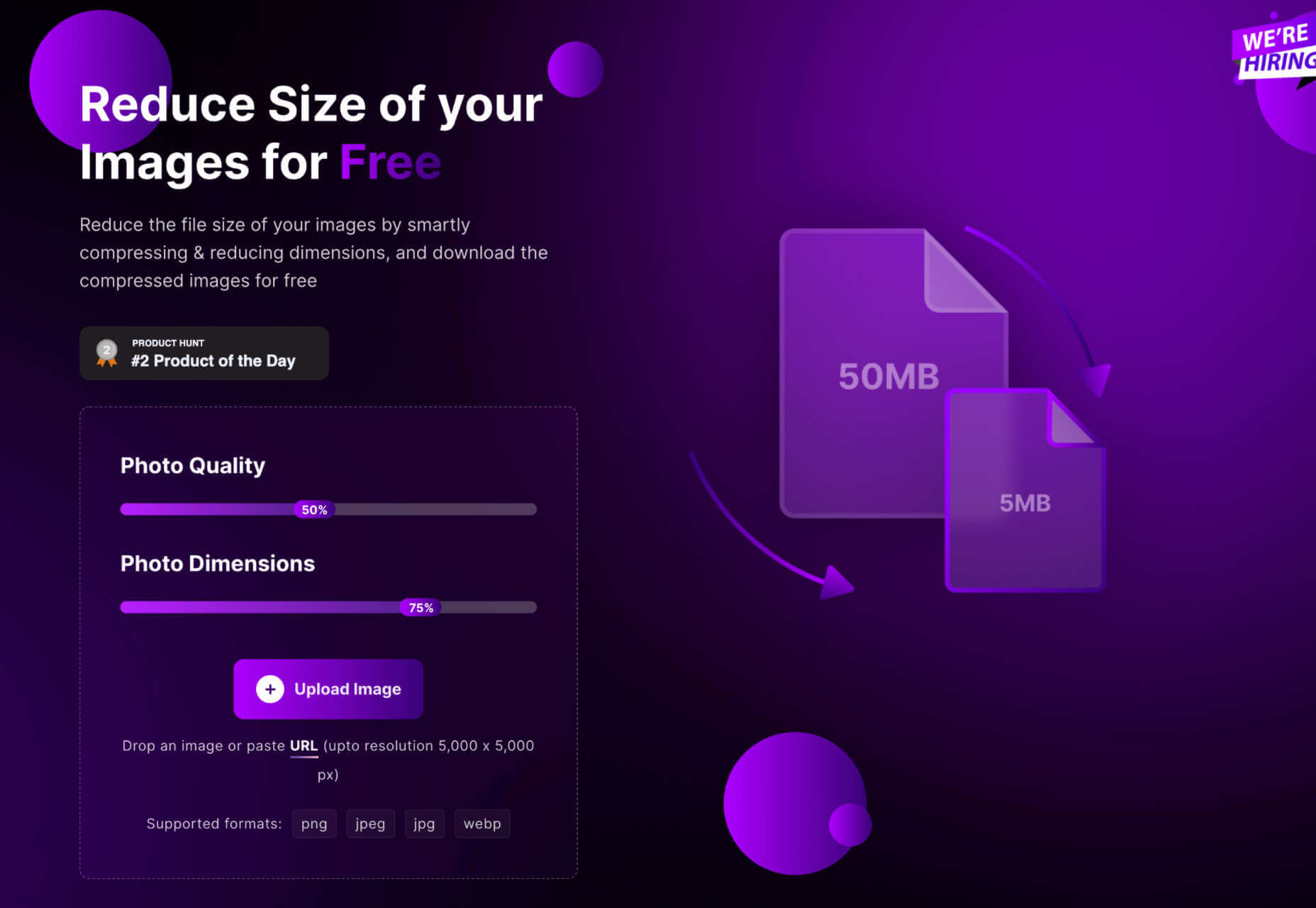
Shrink.media
Shrink.media is a free app for web, iOS, and Android that lets you reduce the size of your image file size and dimensions to reduce its footprint.
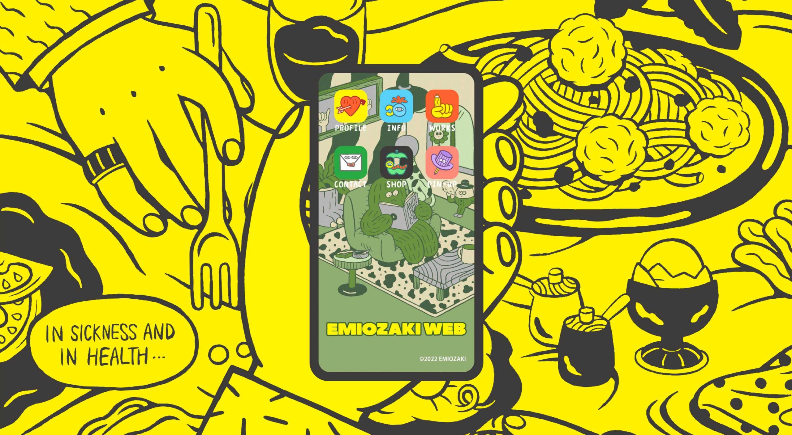
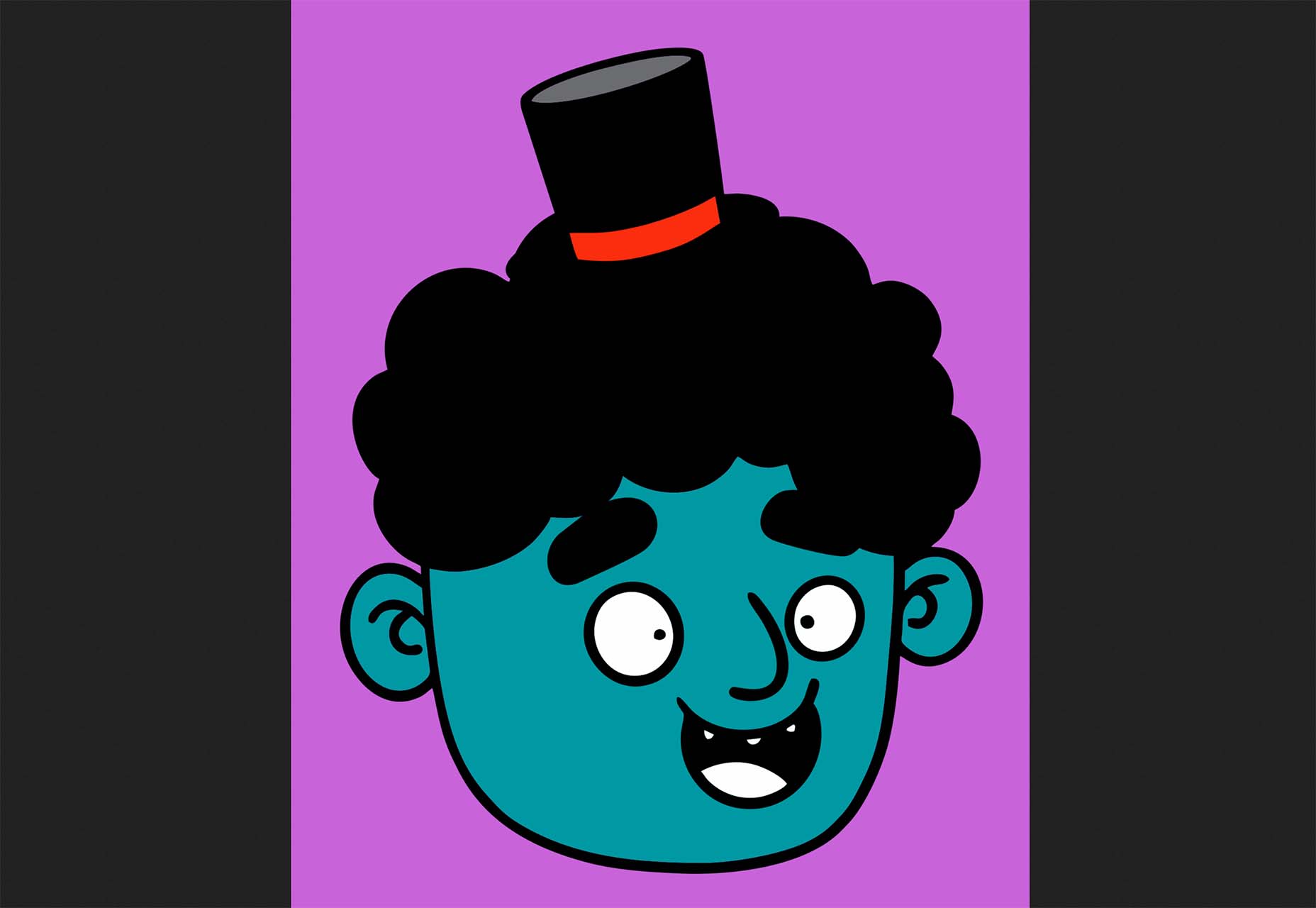
3D Avatars
This big library of 3D avatars is perfect for any project that needs staff images. There are different ethnicities, clothing, facial expressions, and accessories, so you never run out of options.
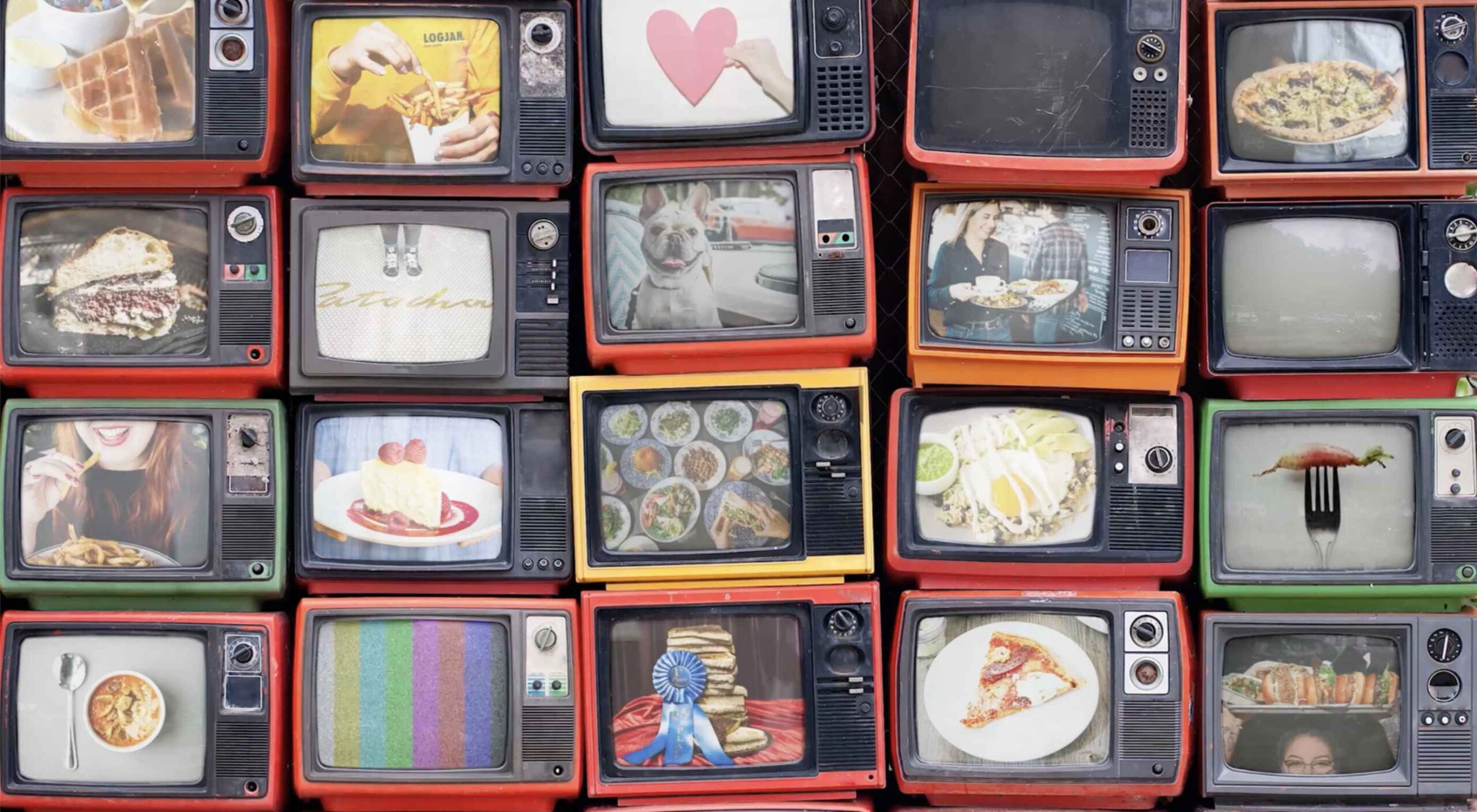
![]()
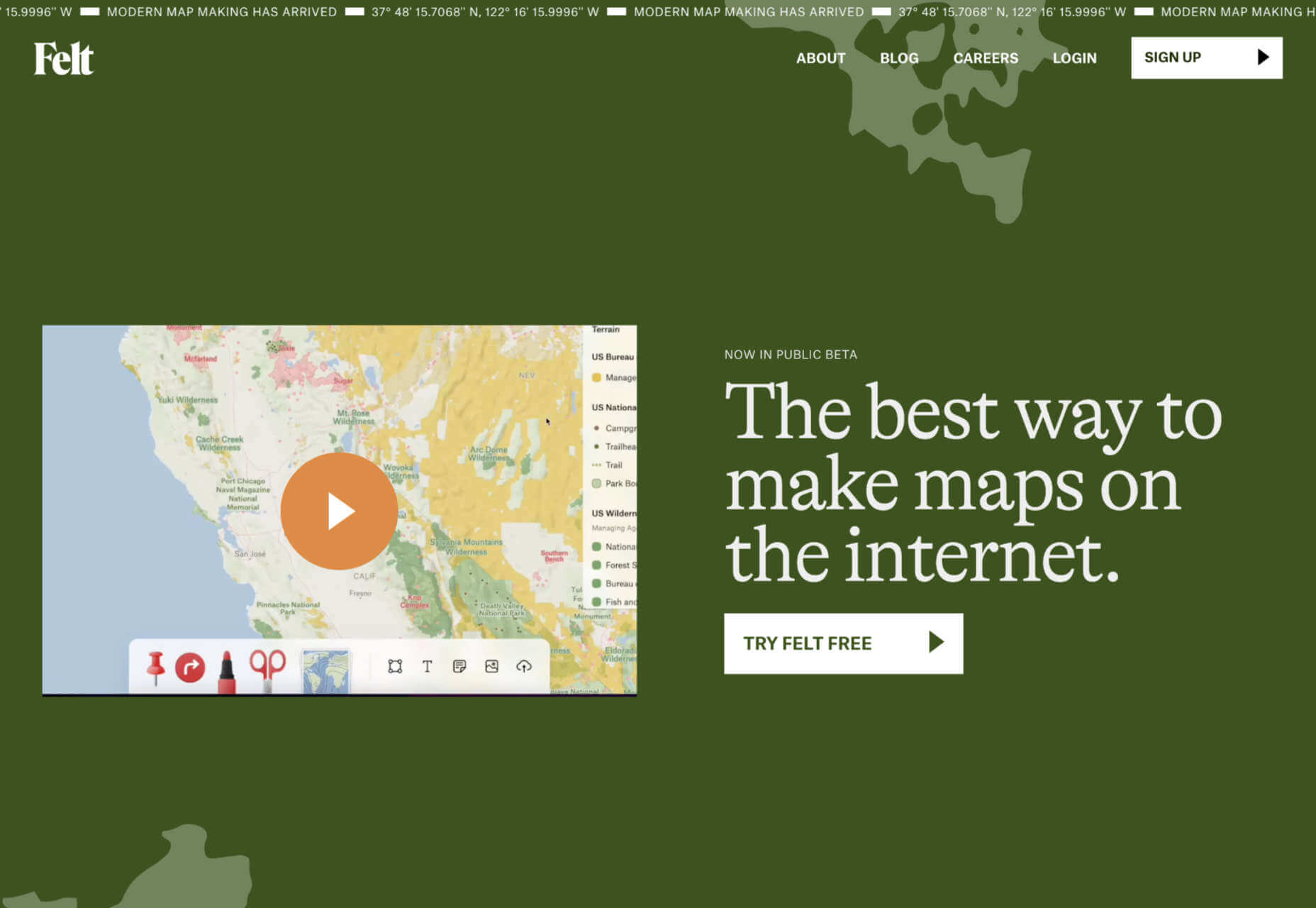
Felt
Felt is a modern map maker for the web that gives you more control, more design options, and easier sharing than Google maps.
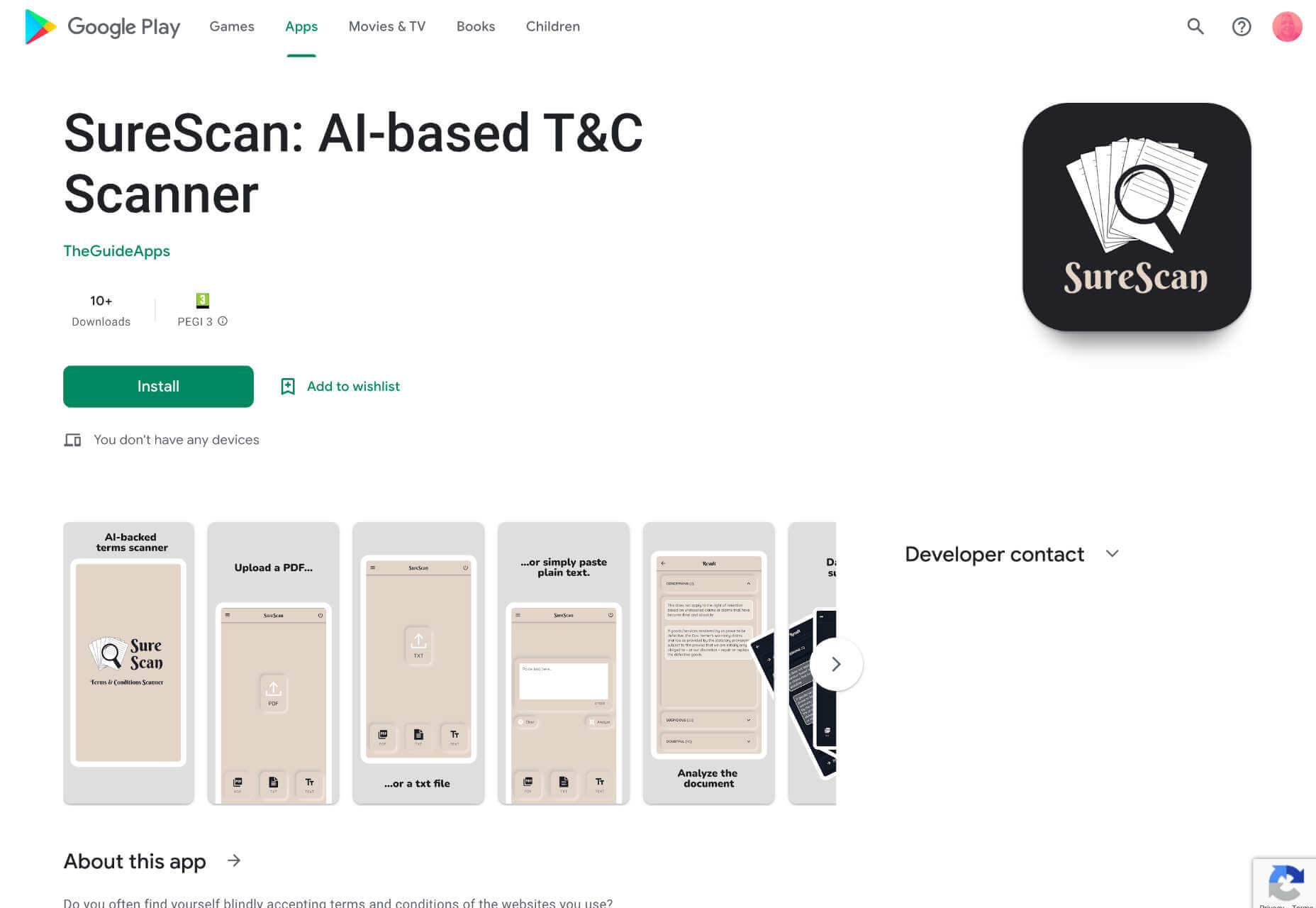
SureScan
SureScan is a helpful app that hunts through terms and conditions for dubious conditions on your behalf, so you can spend your time doing something less boring.
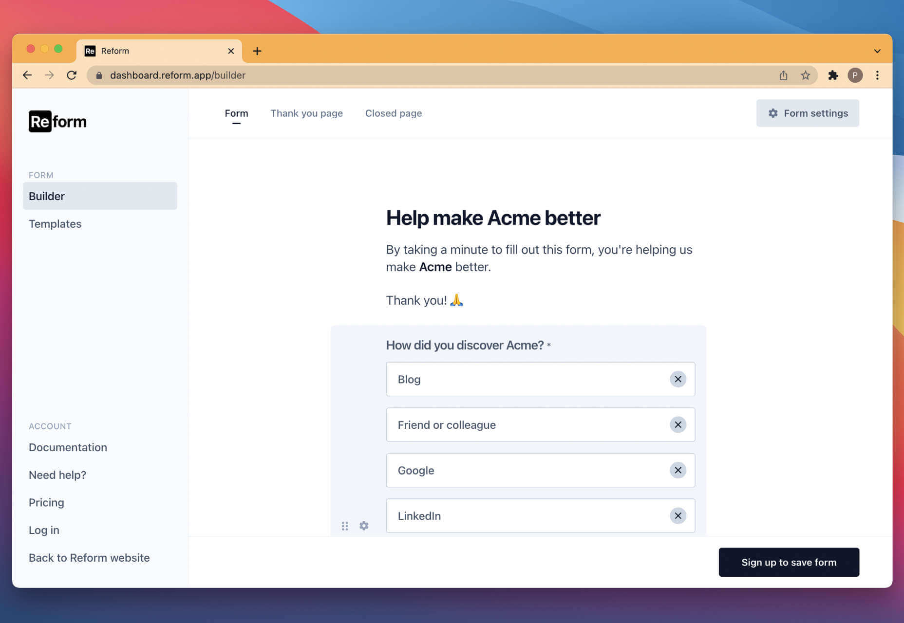
Reform
Reform is a no-code form builder that you can use to create clean, branded forms for your business without any design or code skills.
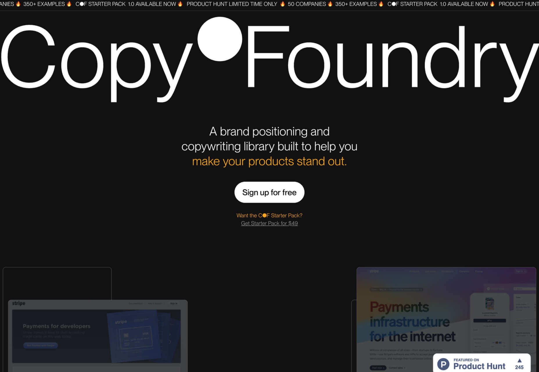
Copy Foundry
Discover how the best brands evolve their messaging over time with Copy Foundry, a brand positioning, and copywriting library to help your products stand out.
The post Exciting New Tools for Designers, June 2022 first appeared on Webdesigner Depot.
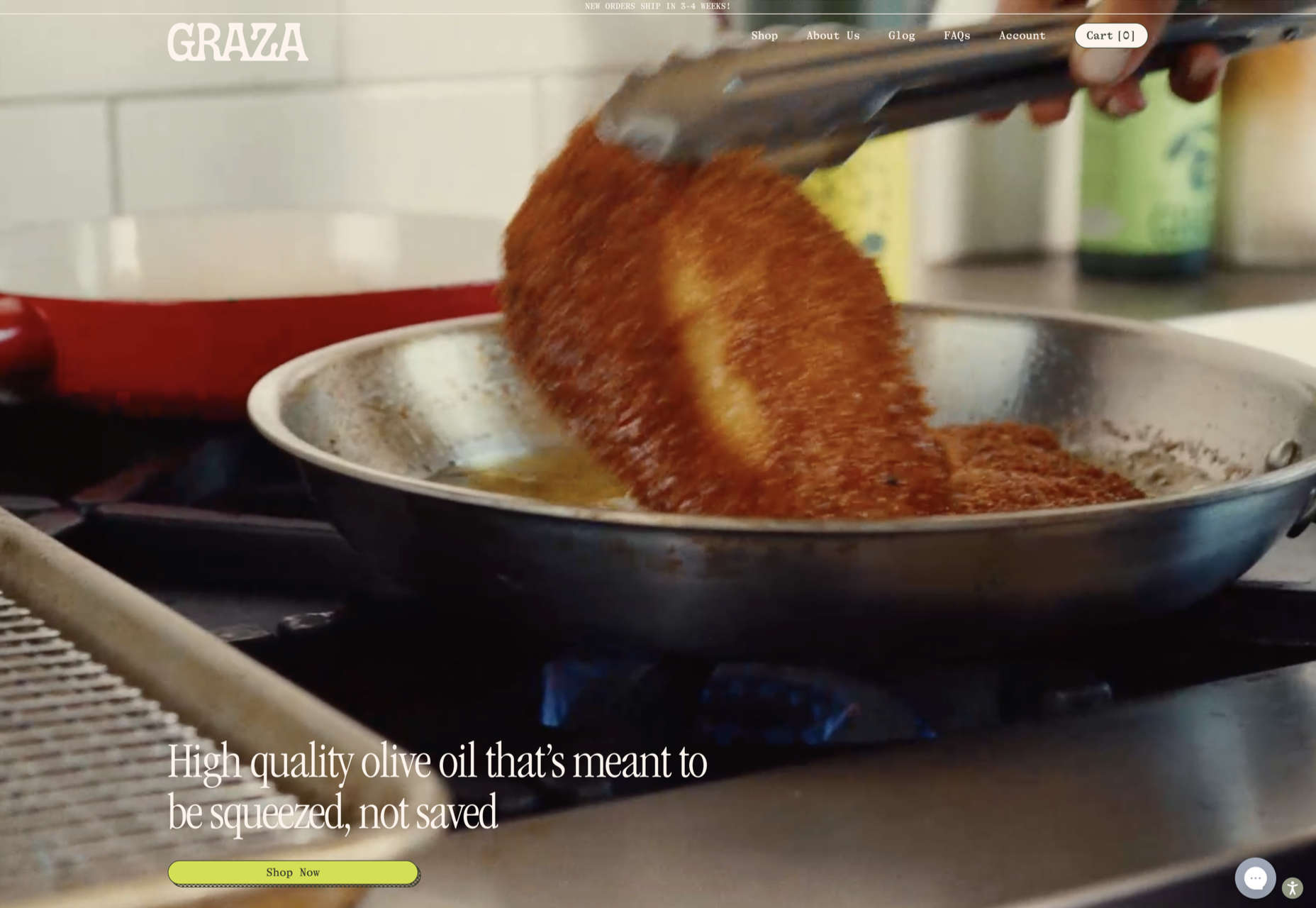
 This month’s collection of the best new sites is a mixed bag. Positivity remains from
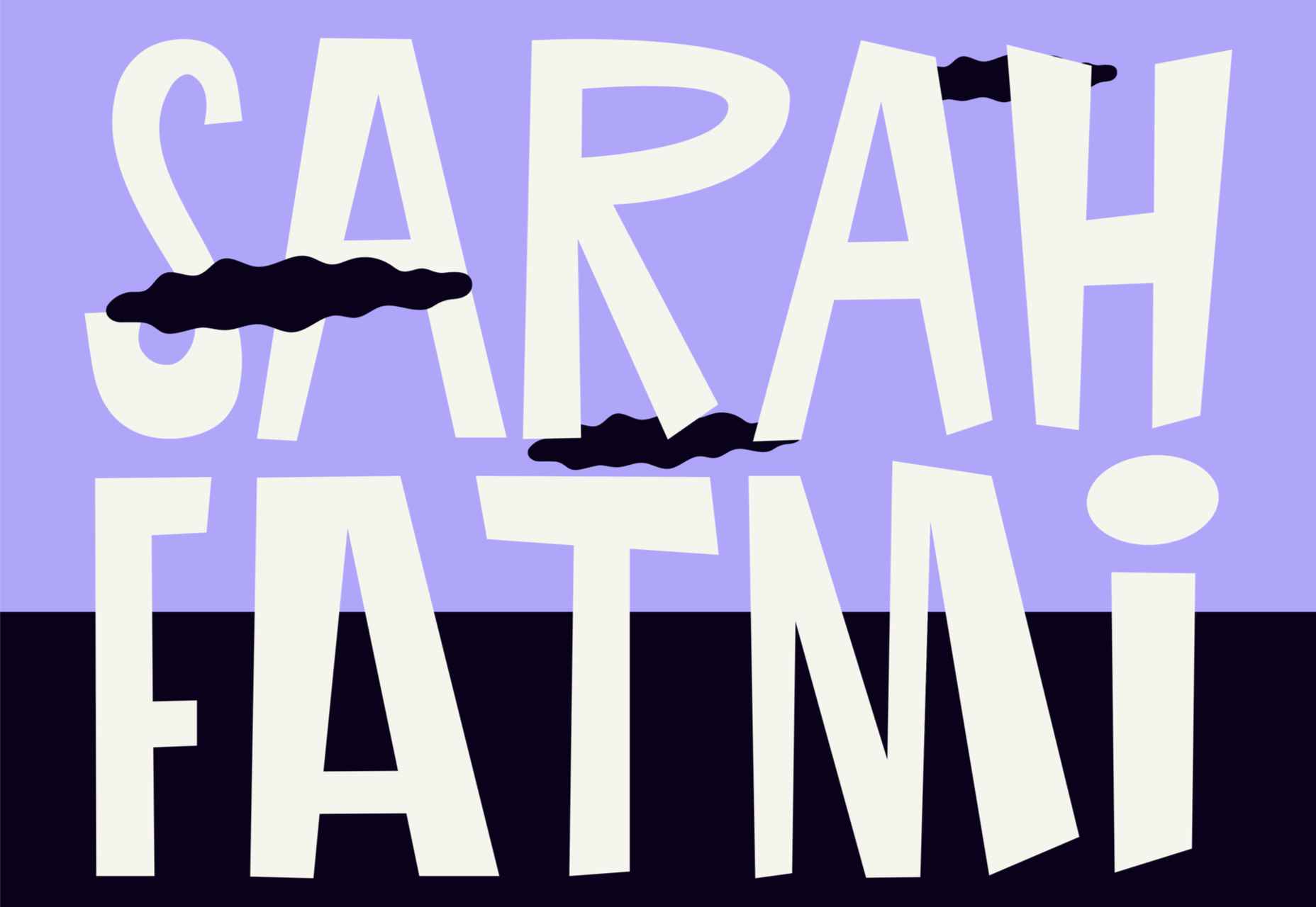

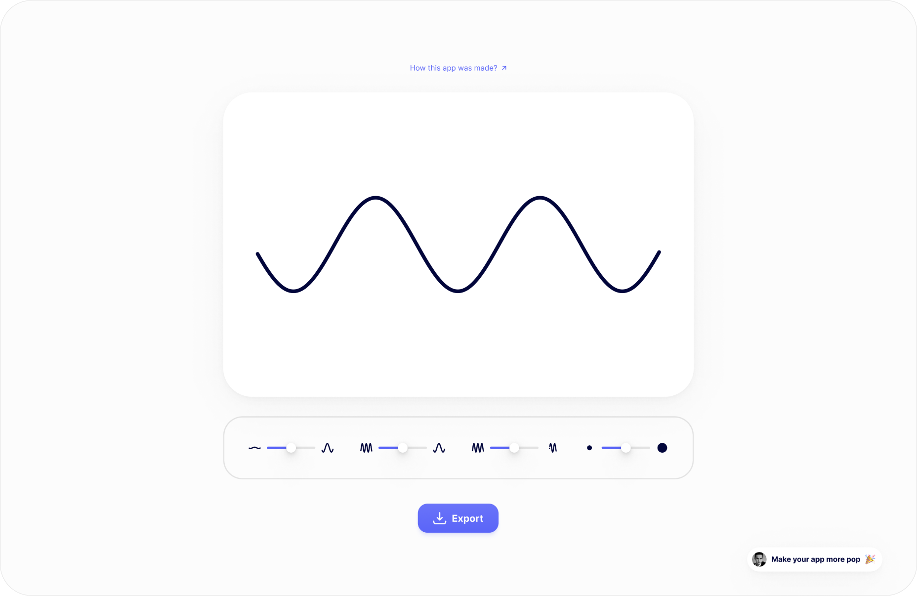
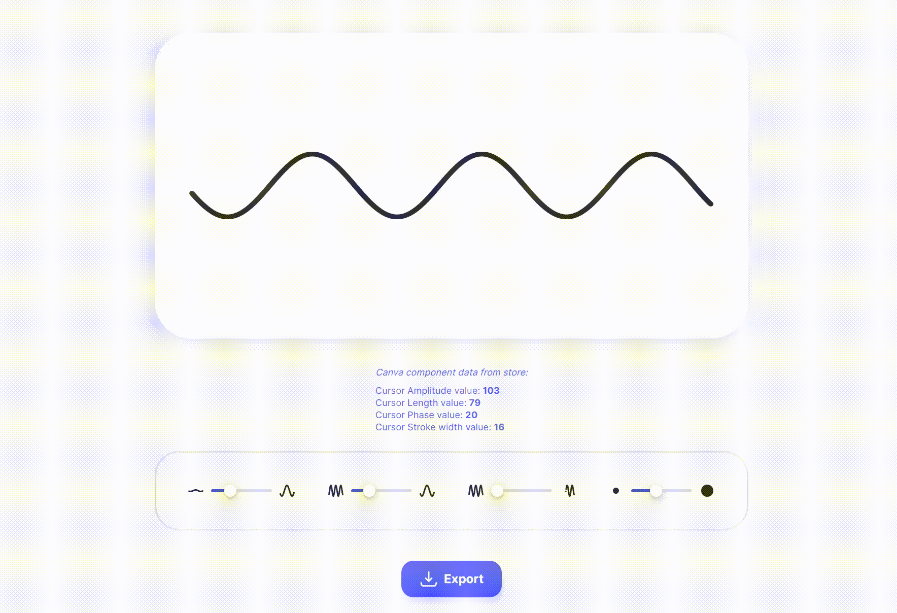
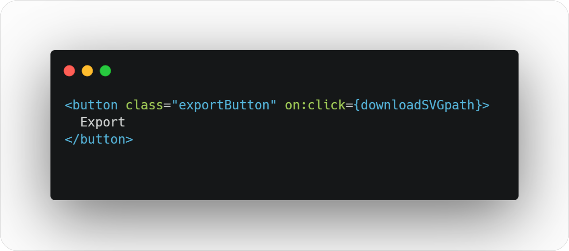
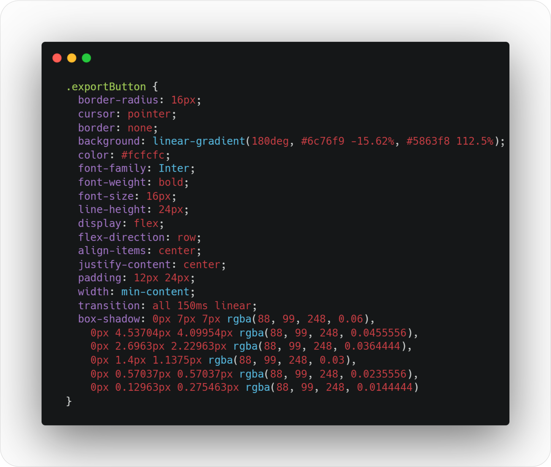
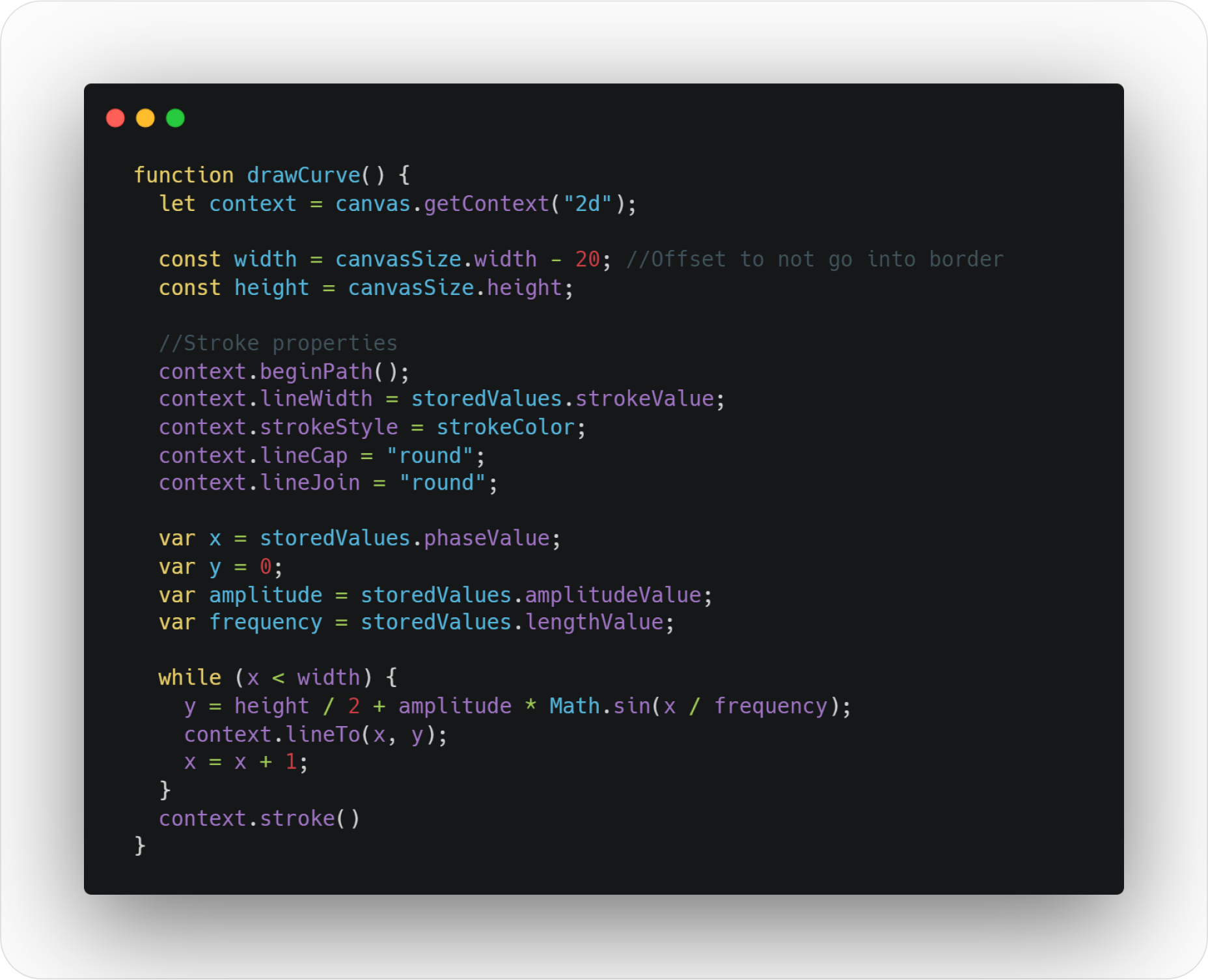
 A breakdown of a simple app, from UI design to deployment, that shows off why coding is a magic tool for designers.
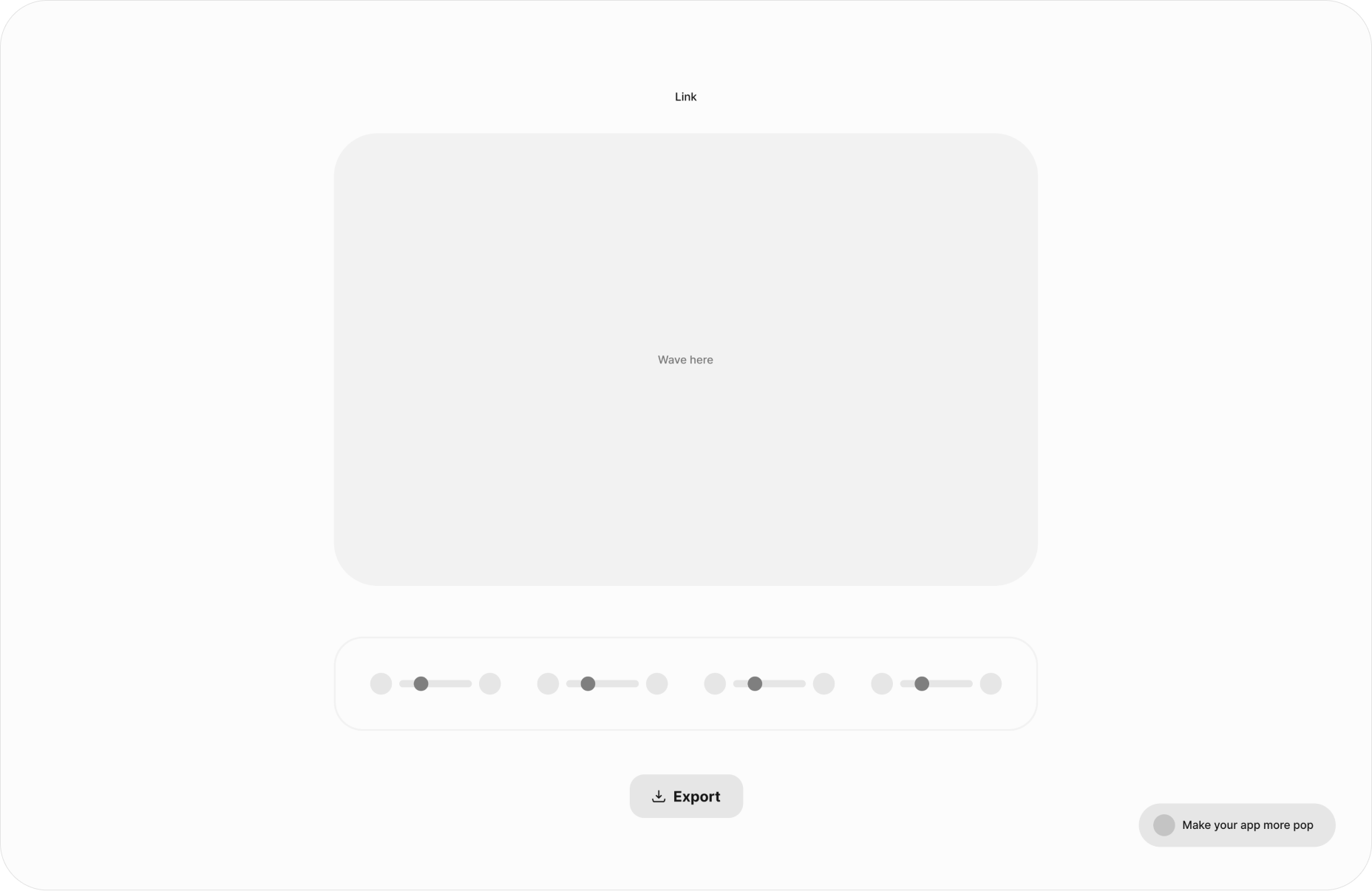
 Sometimes it’s easy to feel like the world is going to pieces all around us, especially when we’re doom scrolling Twitter between news alerts every few minutes. But if we step back a little, things may not seem so bad.
 Bored with the same old design tools? There are plenty of new toys to experiment with, from fun divots to functional design tools that could become your new go-to’s.

 Experienced web designers are always on the lookout for tools or resources that will (1) introduce them to the latest design trends, (2) enable them to incorporate features and functionalities that will make their products more competitive, (3) allow them to improve their workflows or all the above.
 Adobe has launched
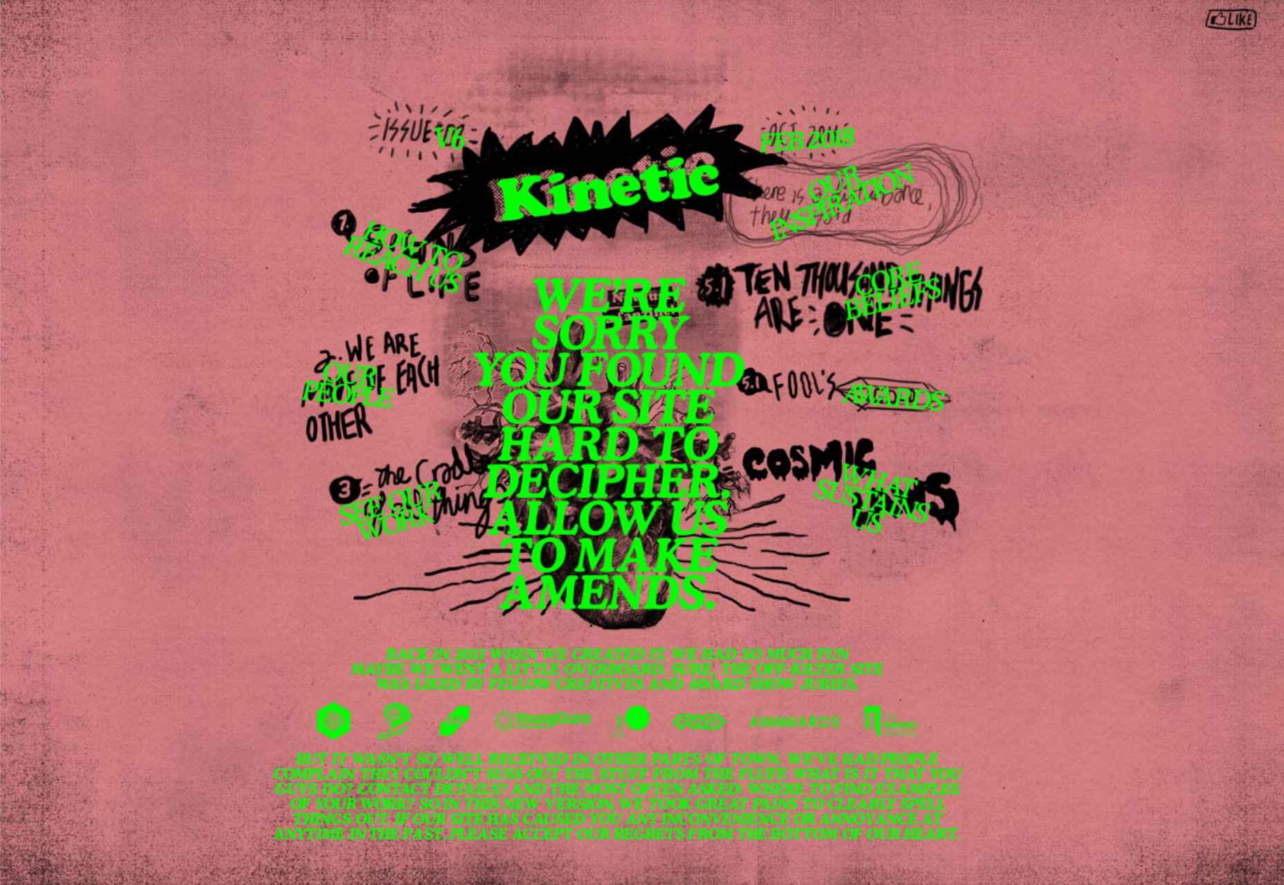
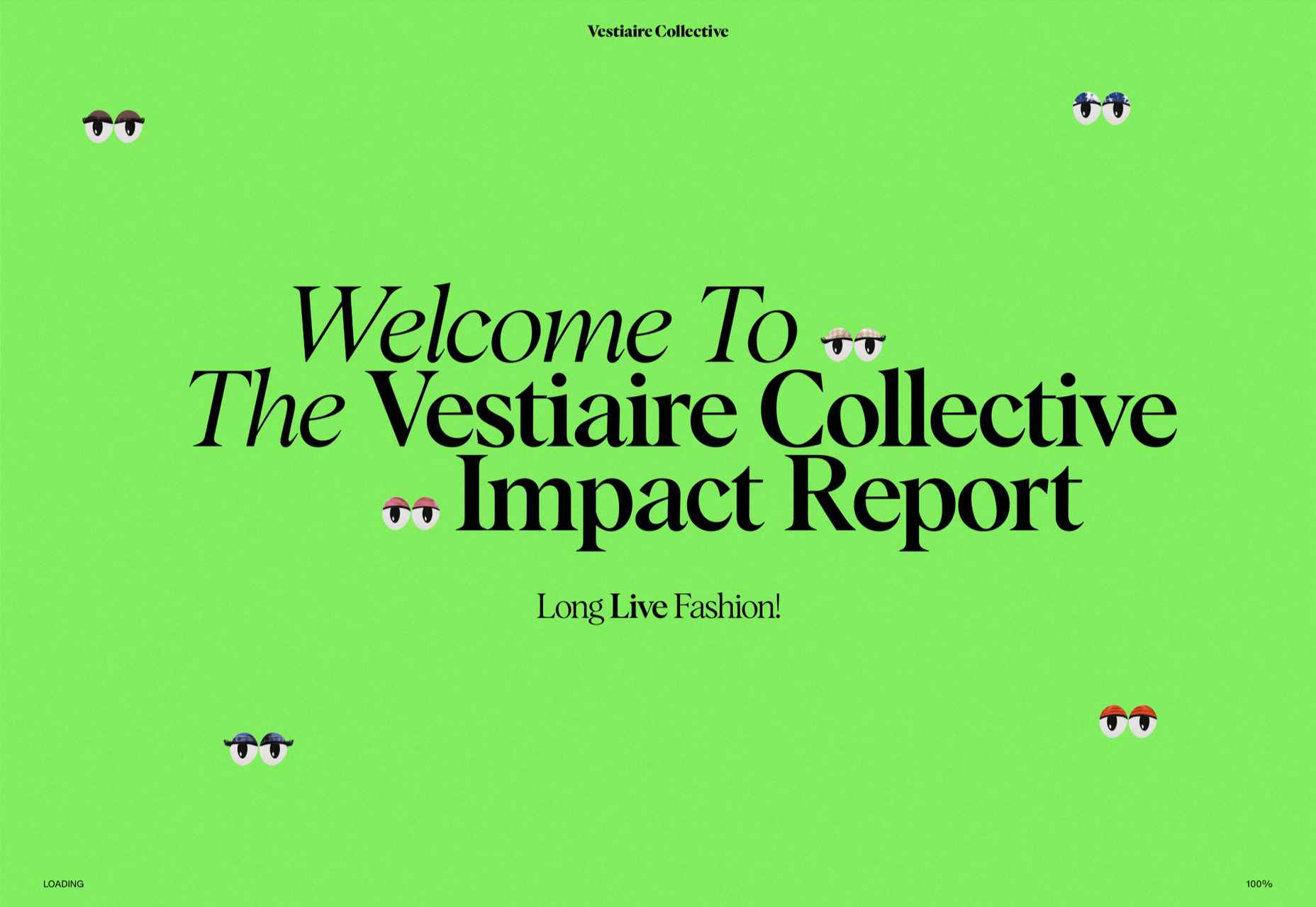
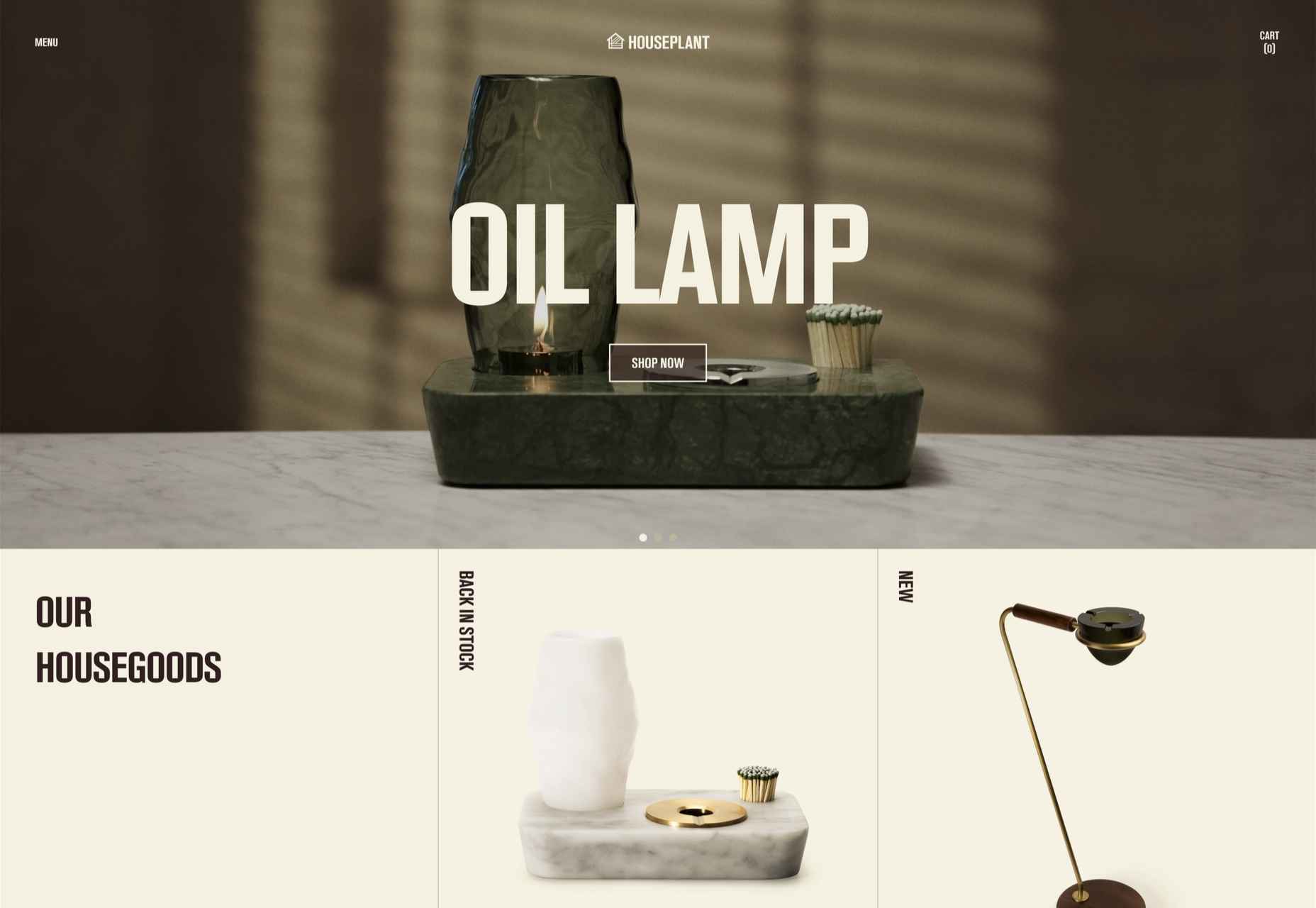
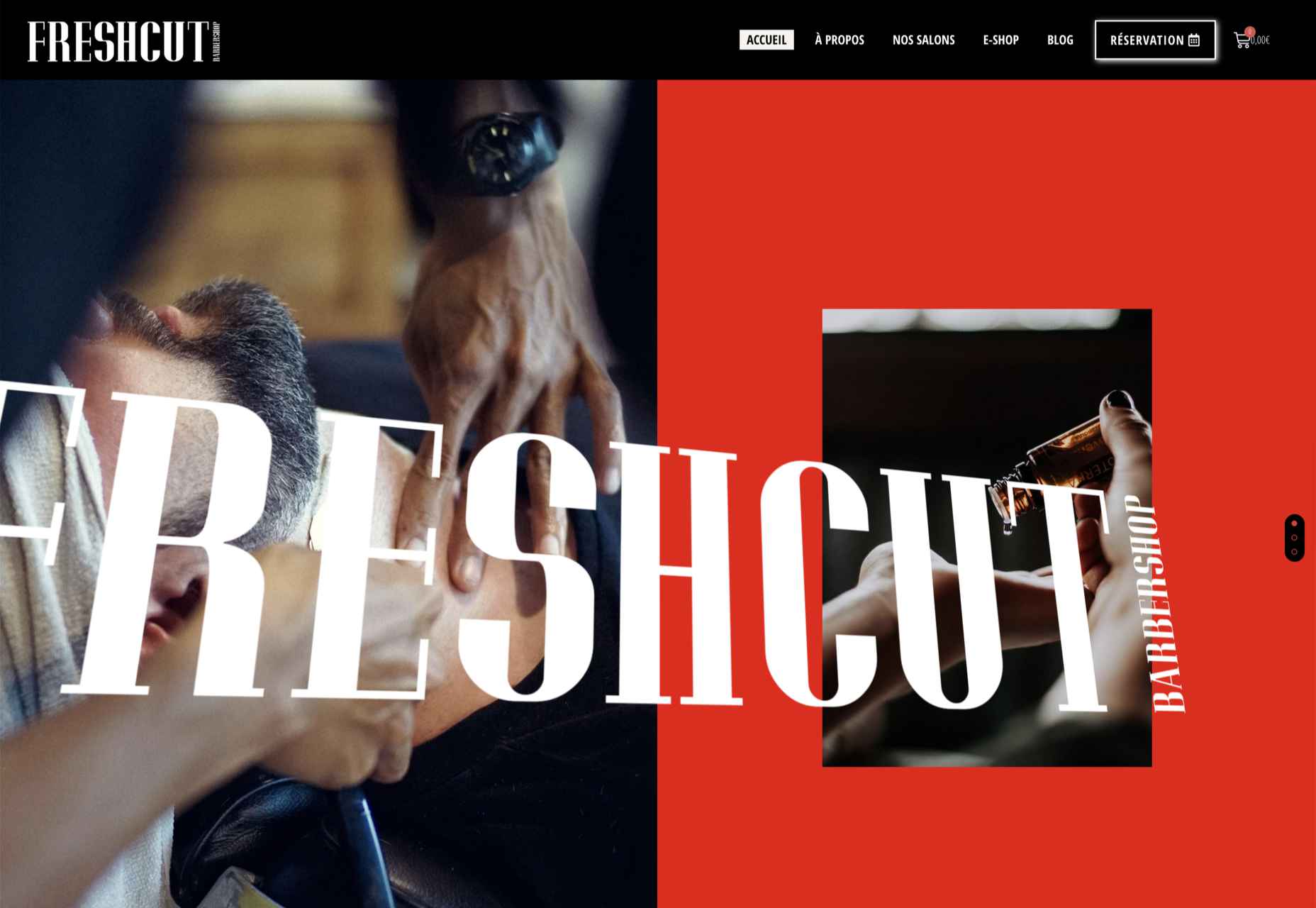
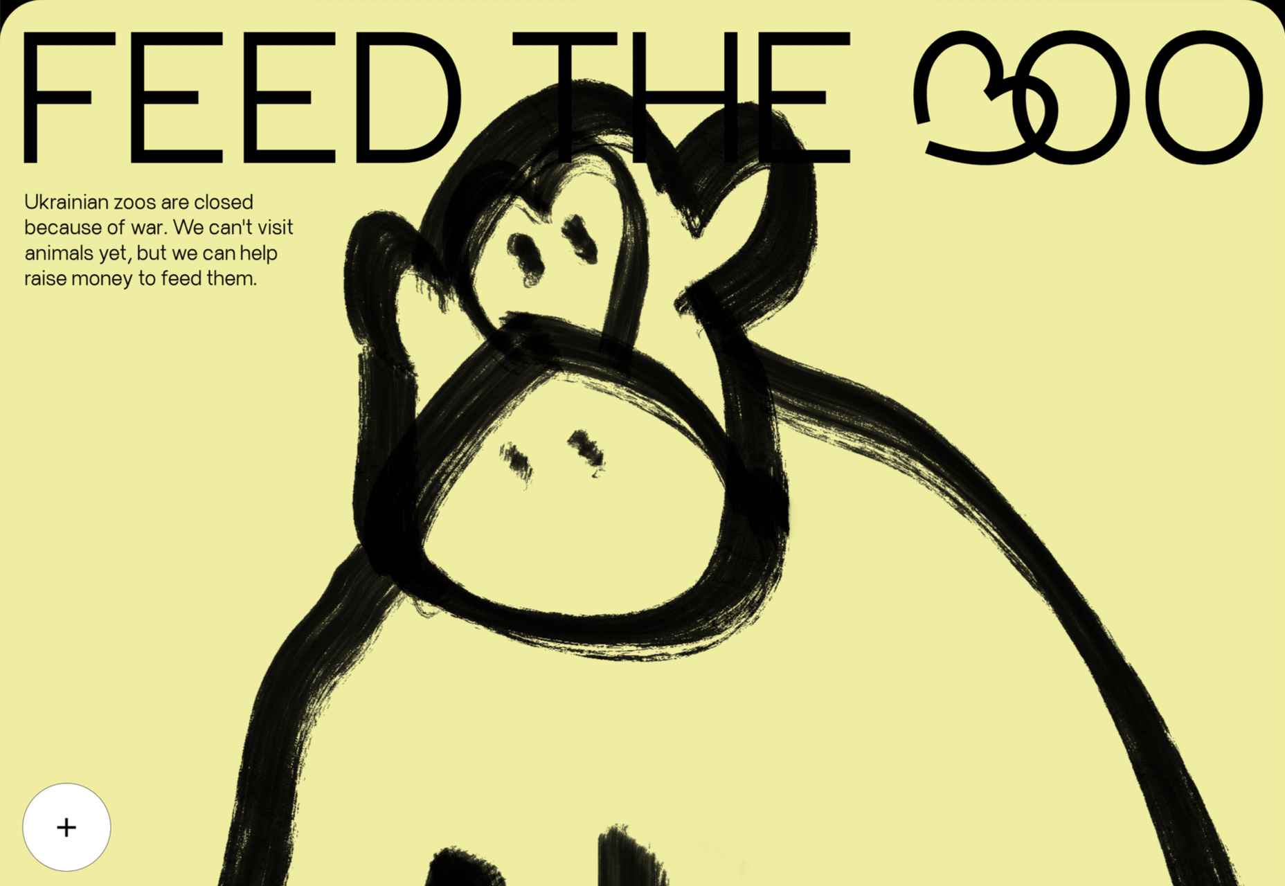
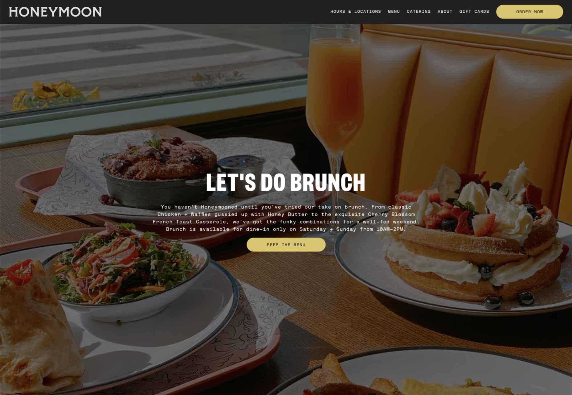
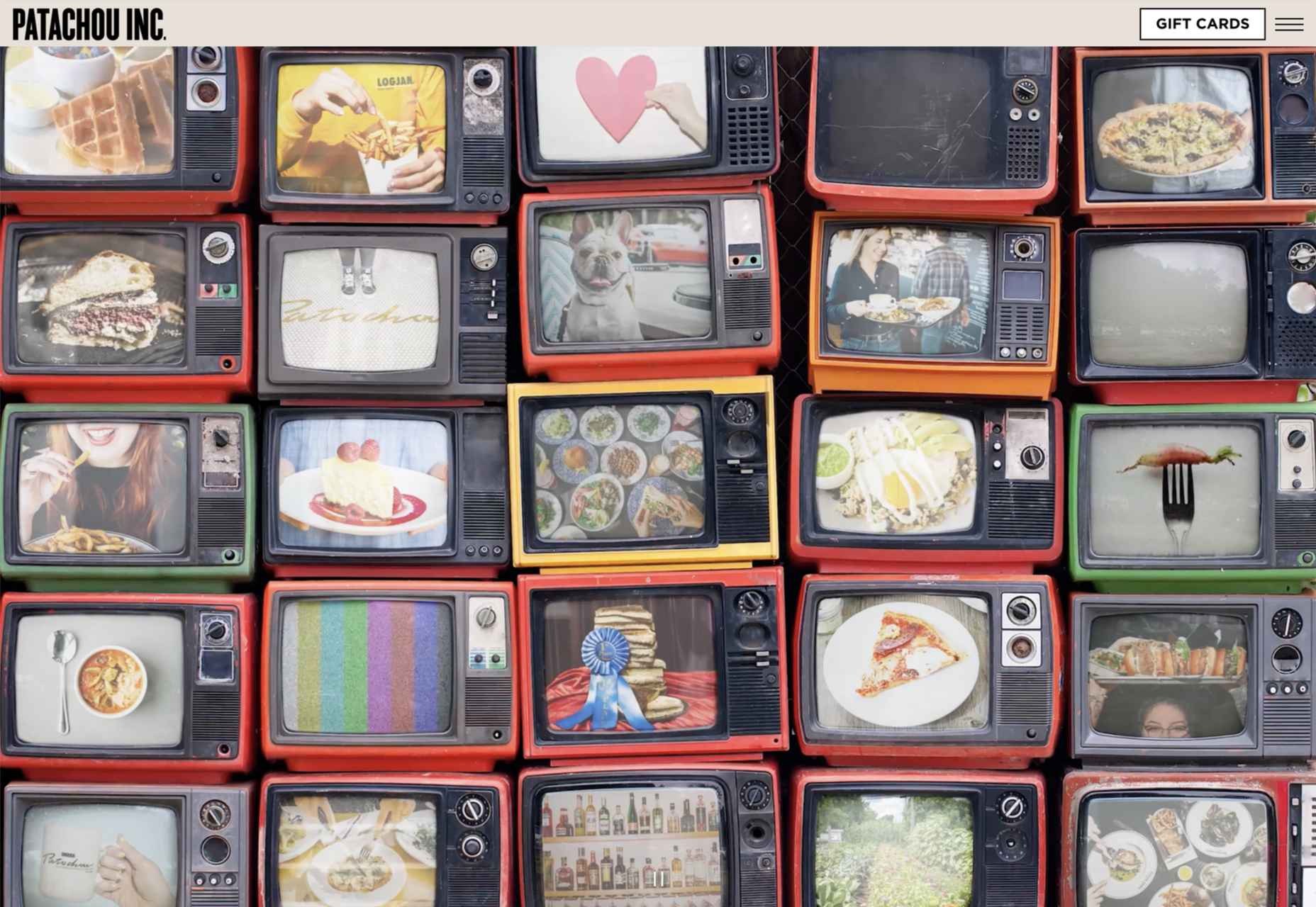
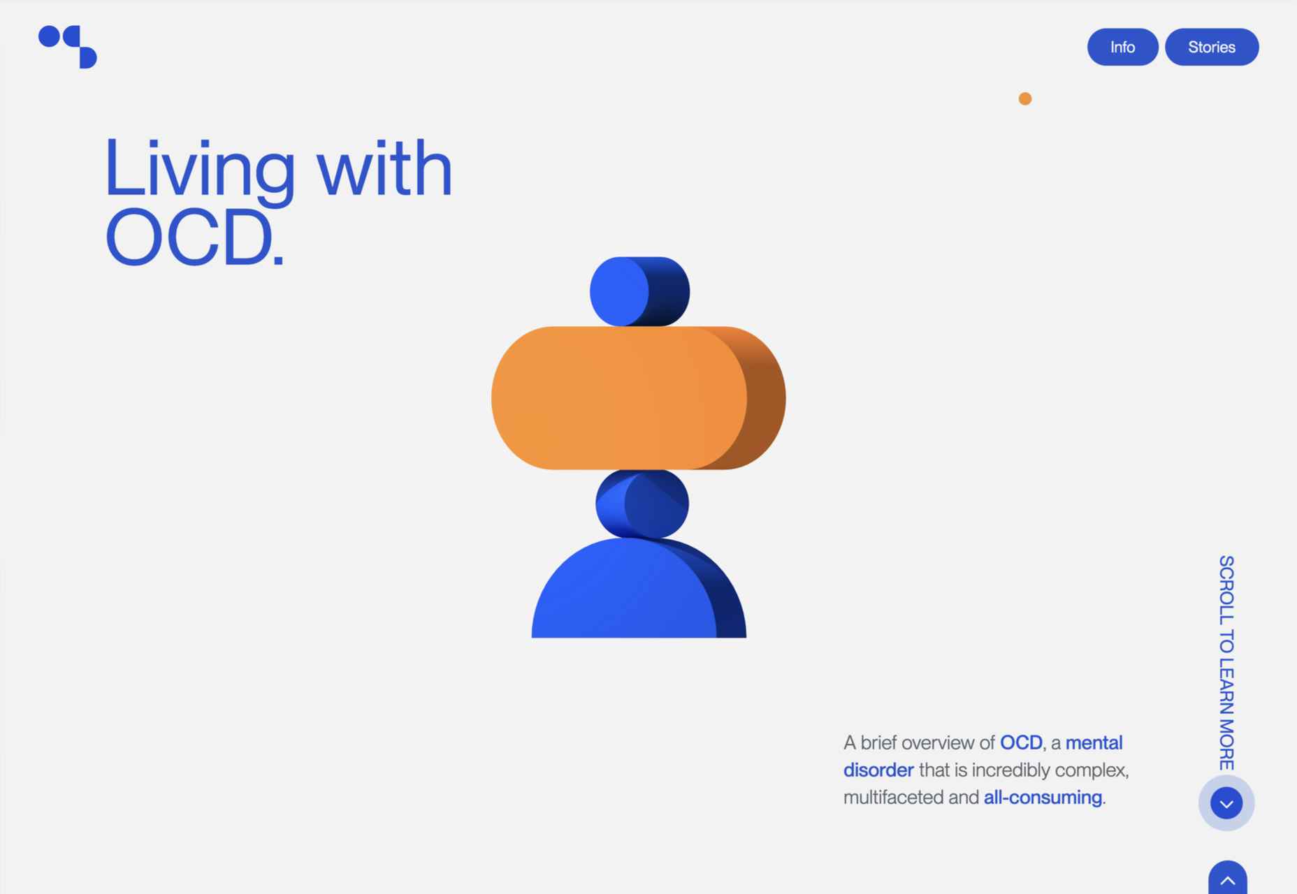
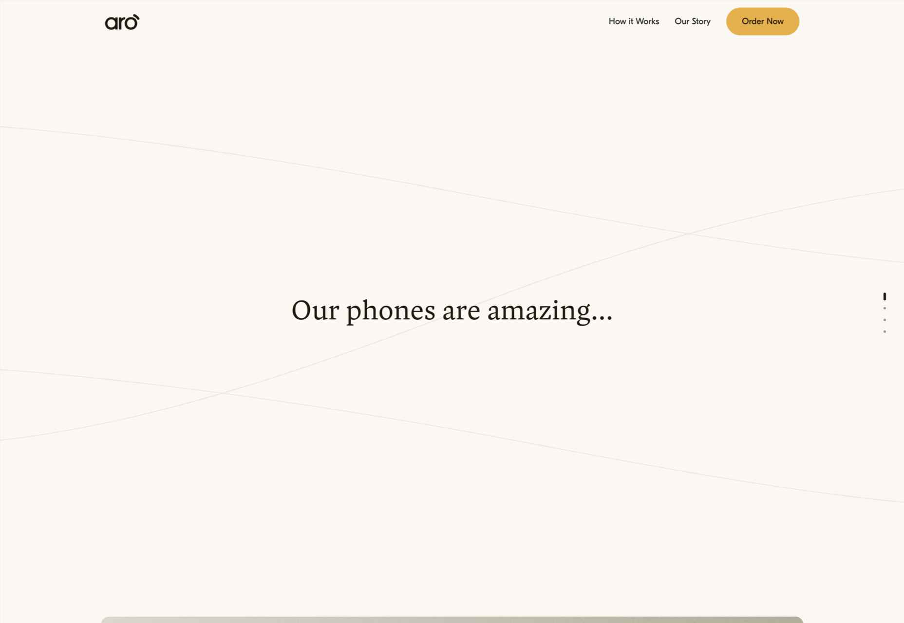
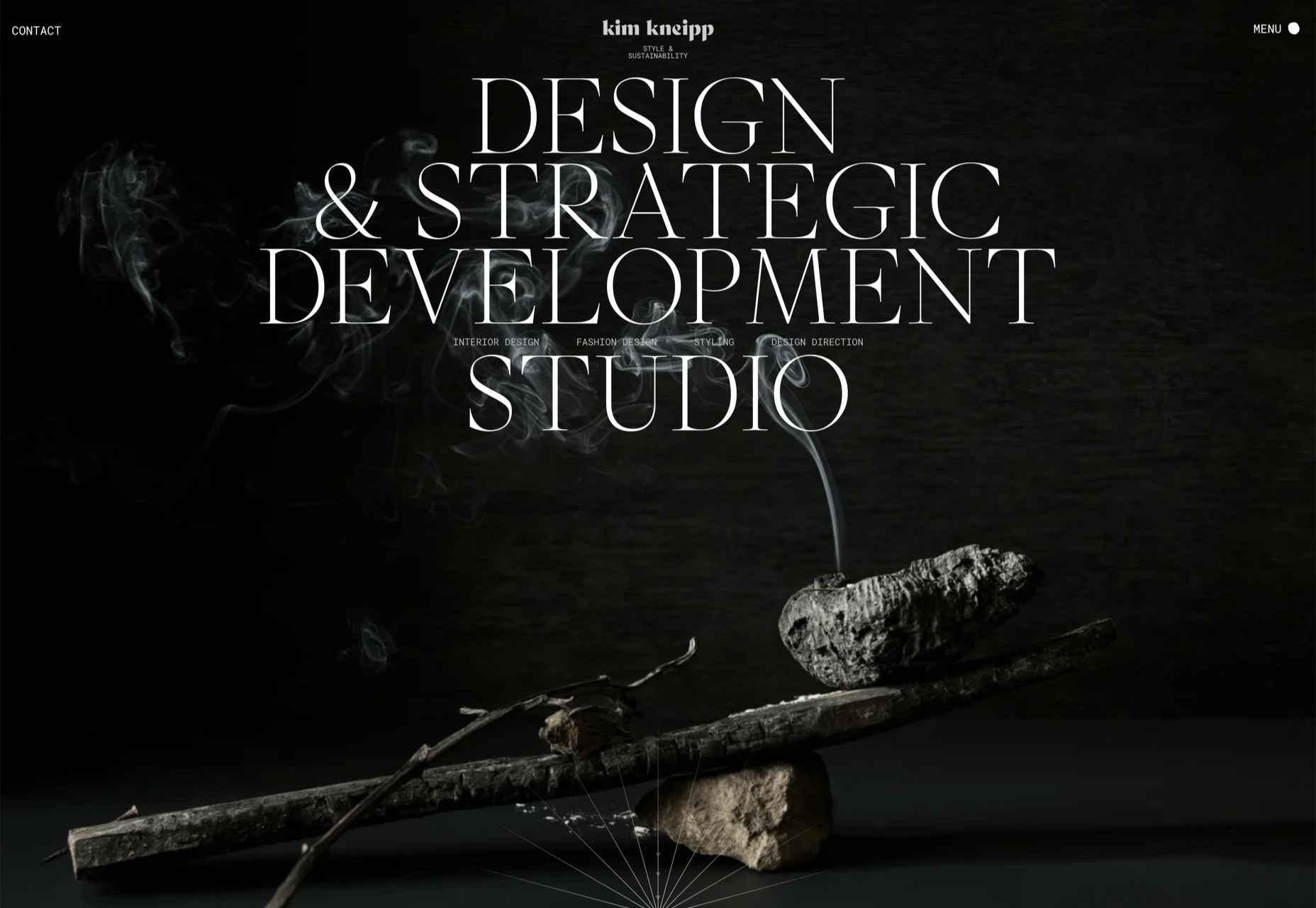
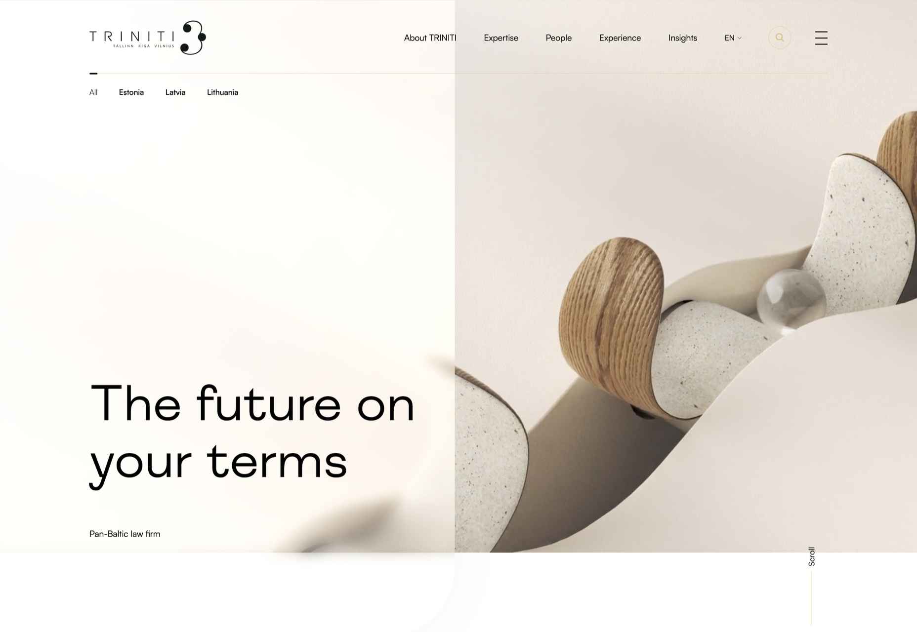
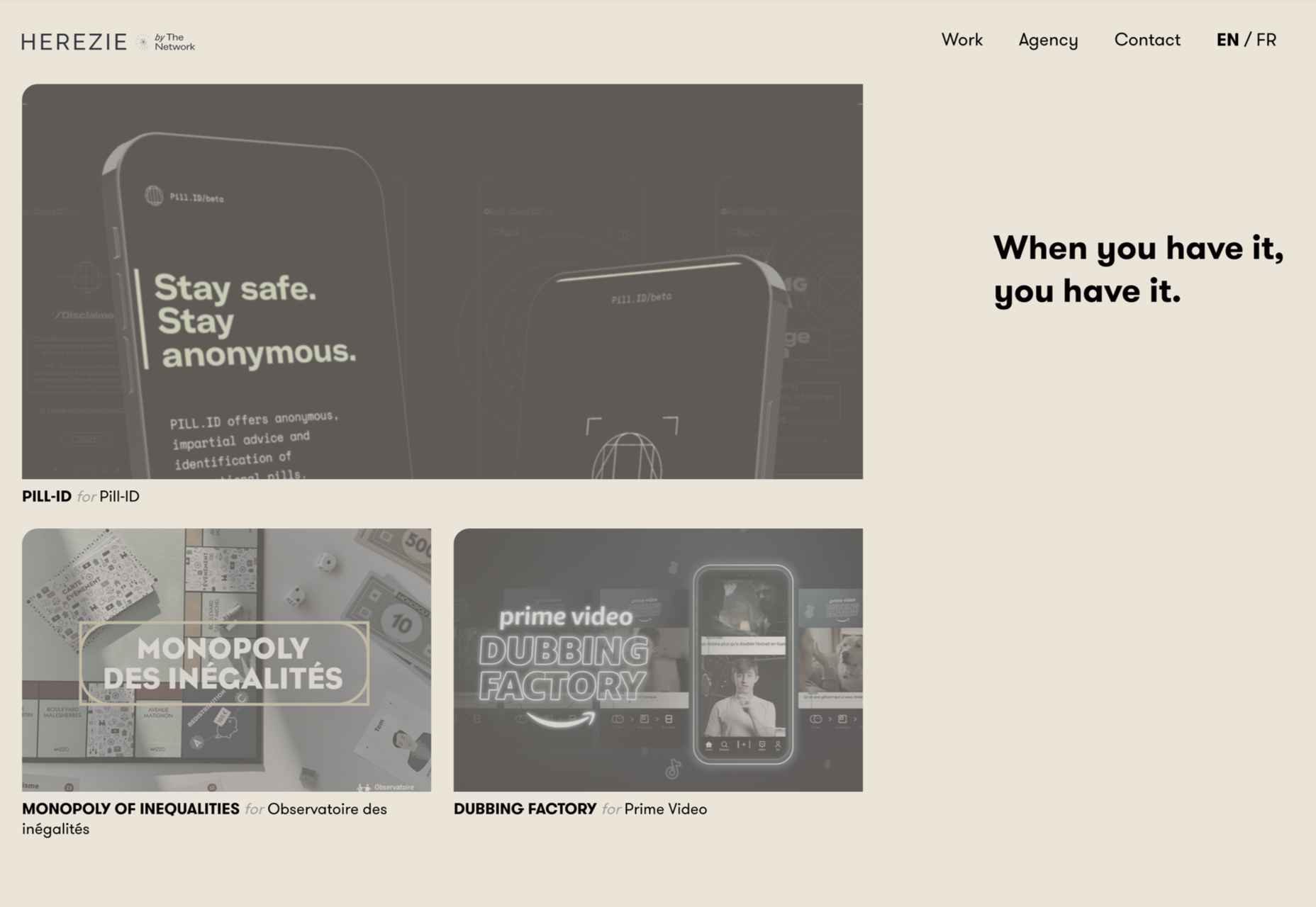
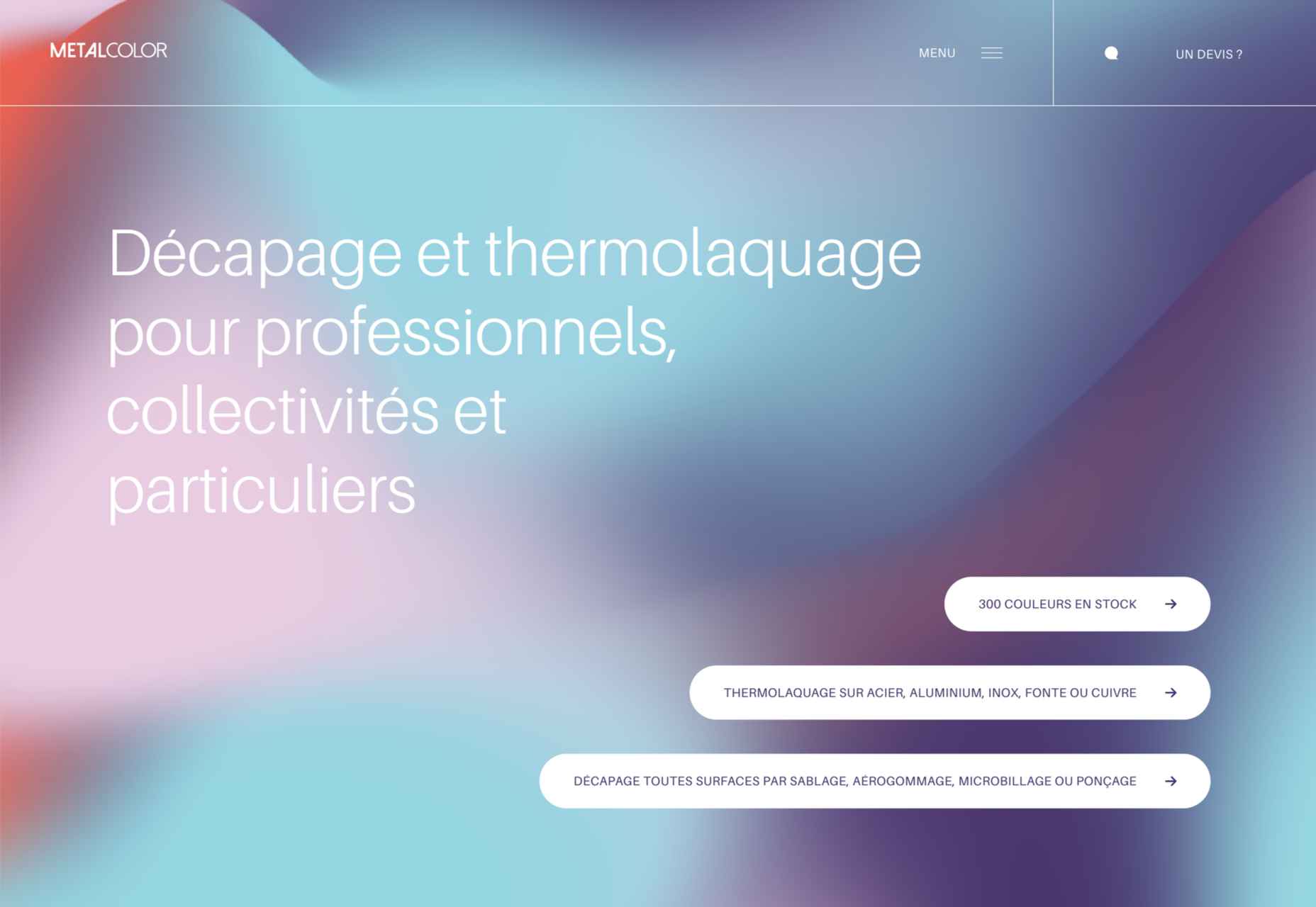
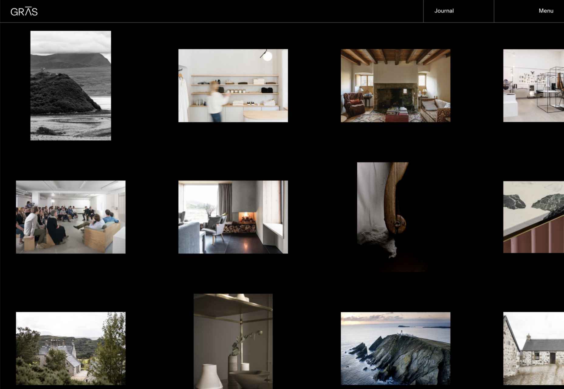
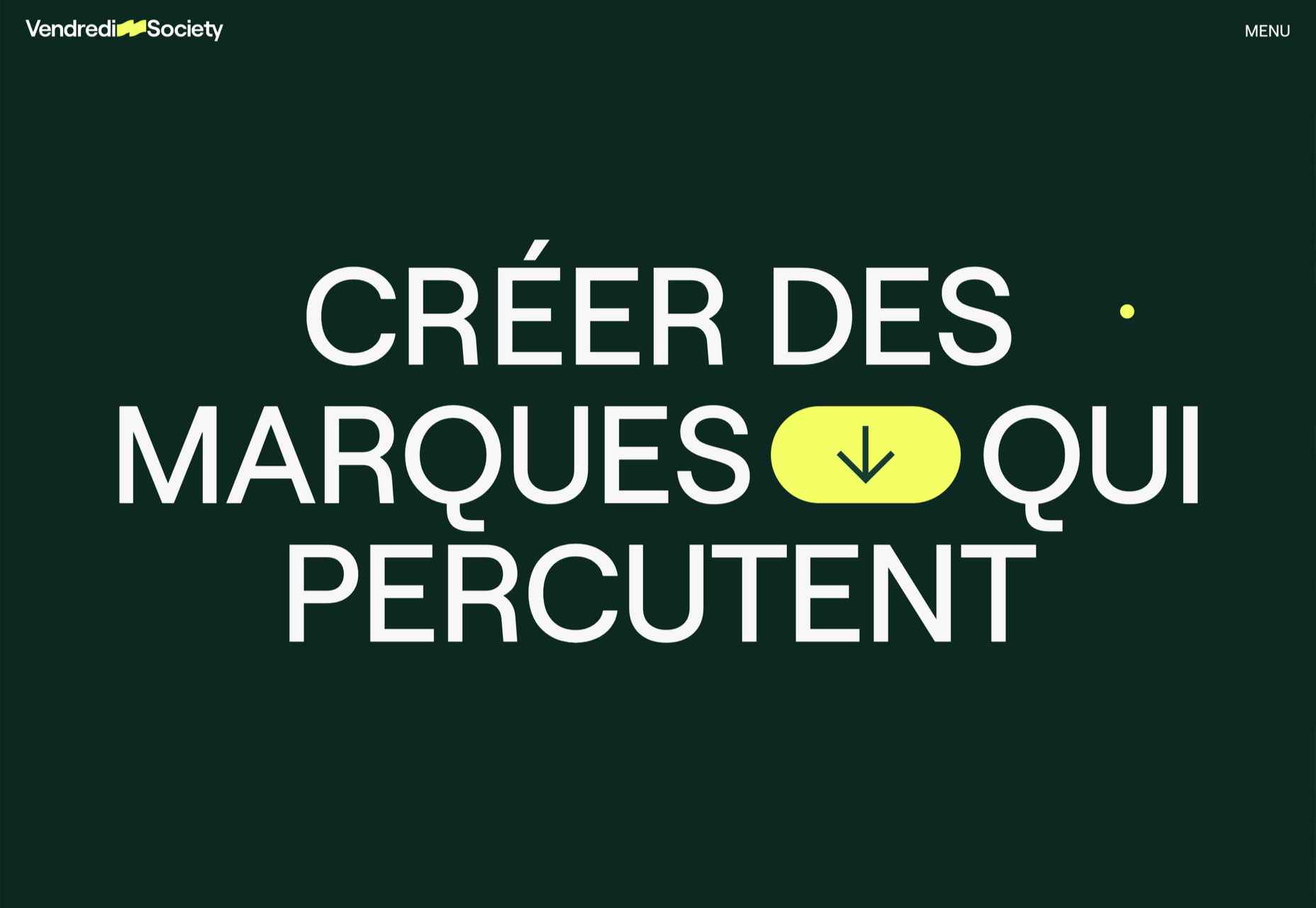
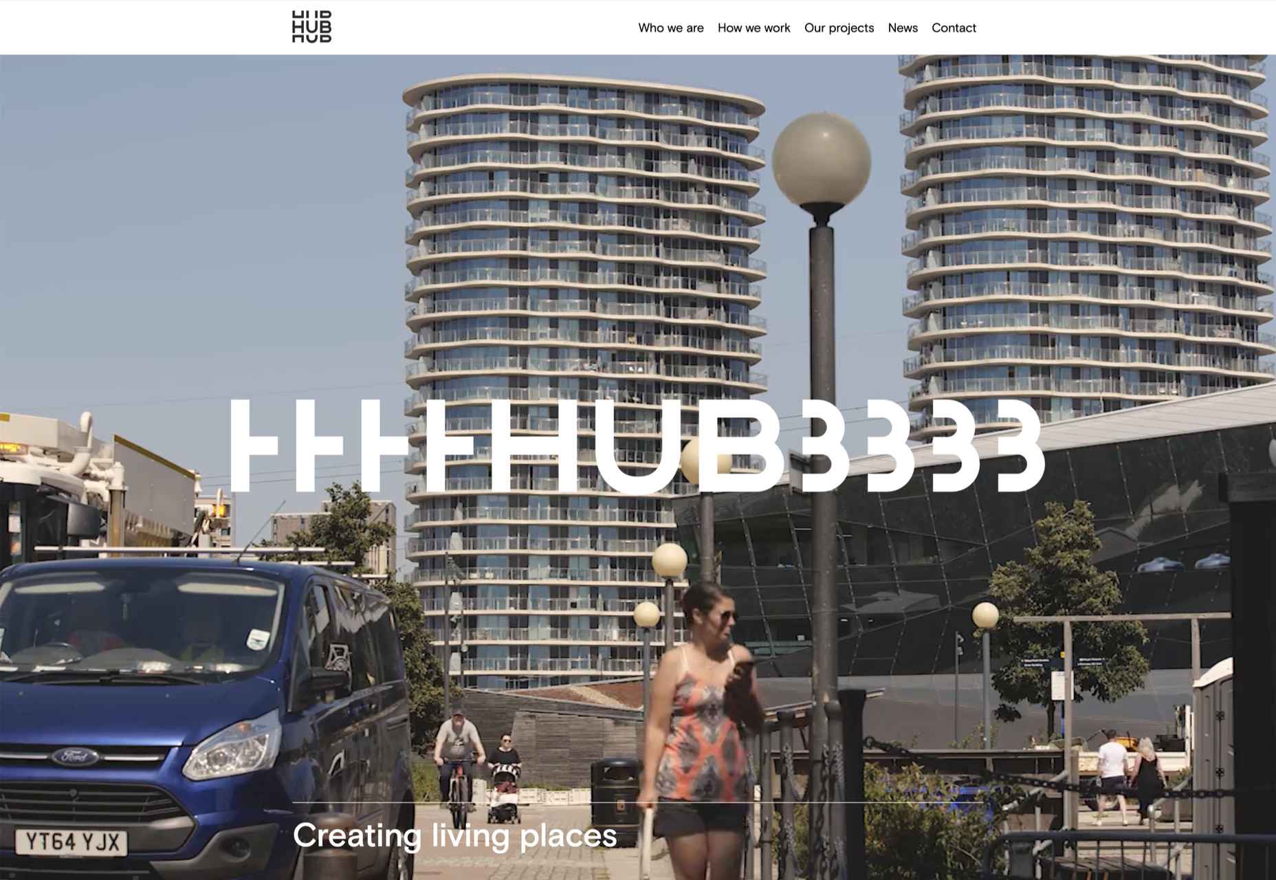
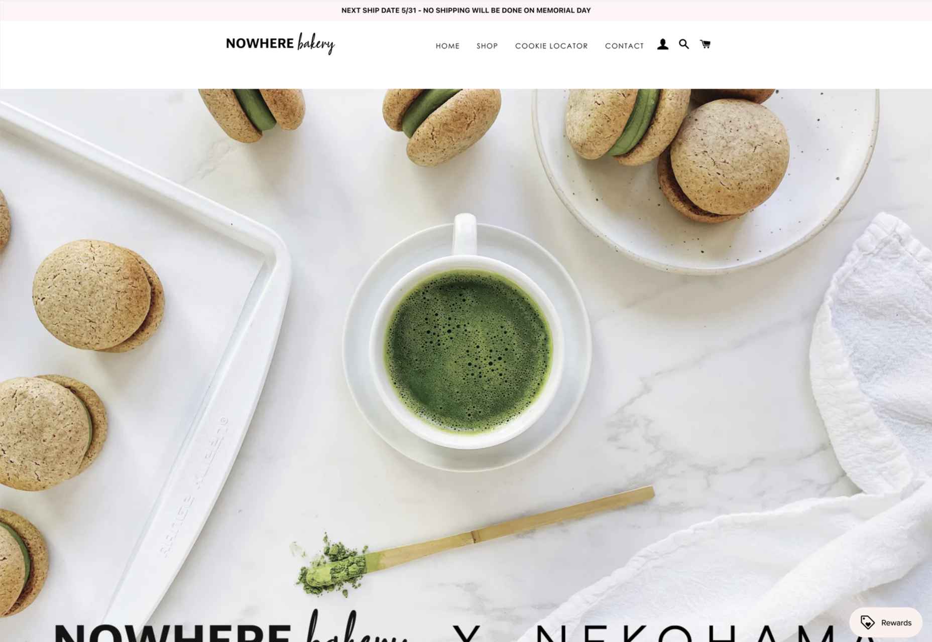
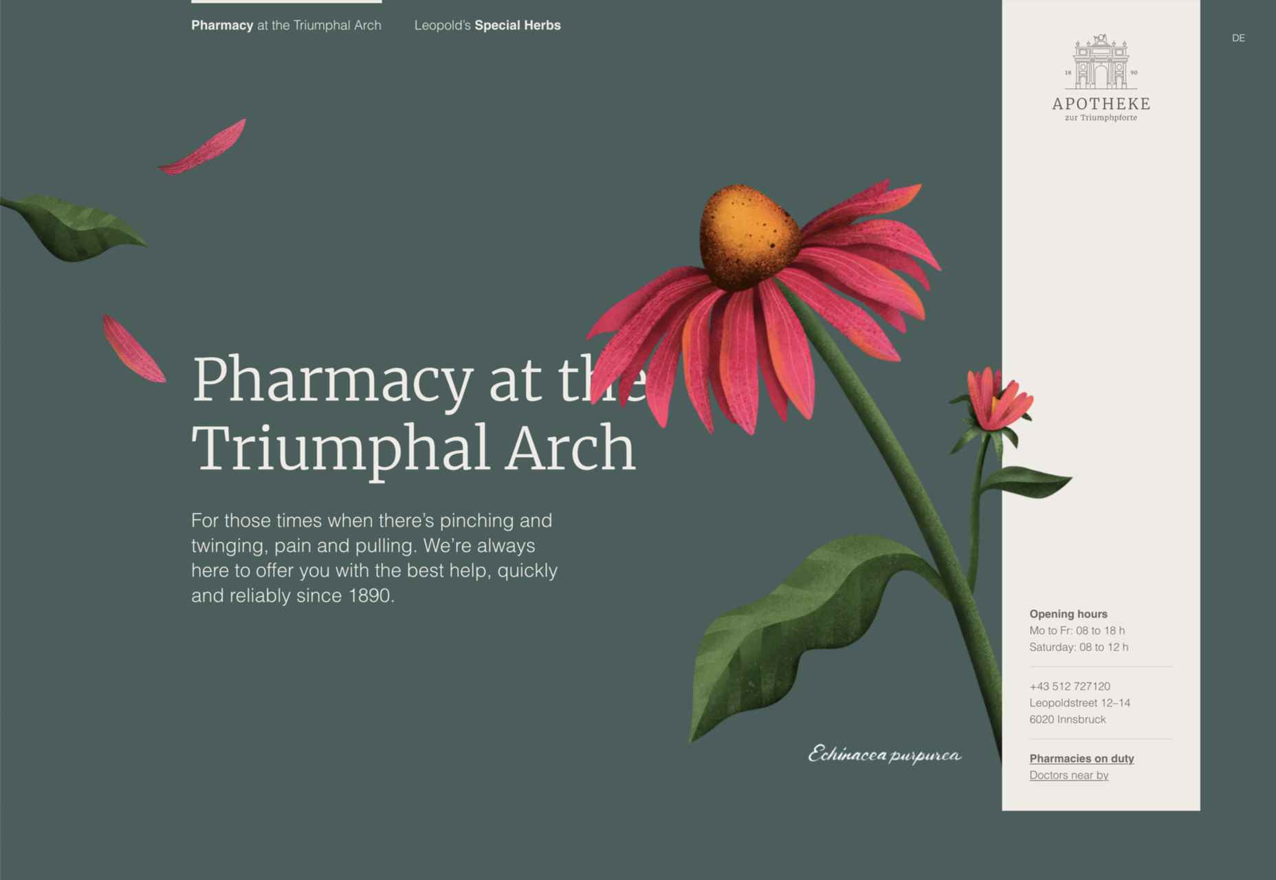
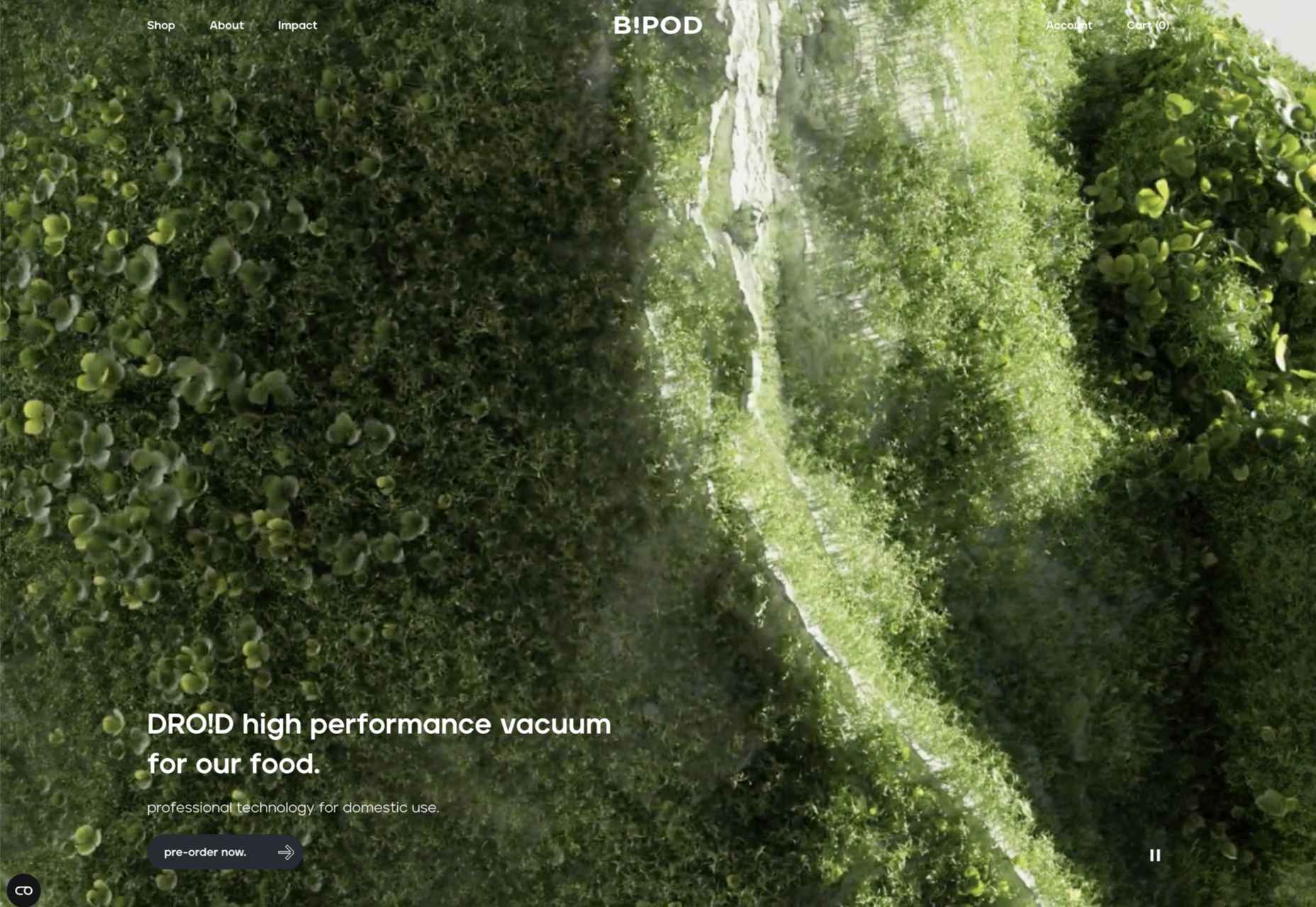
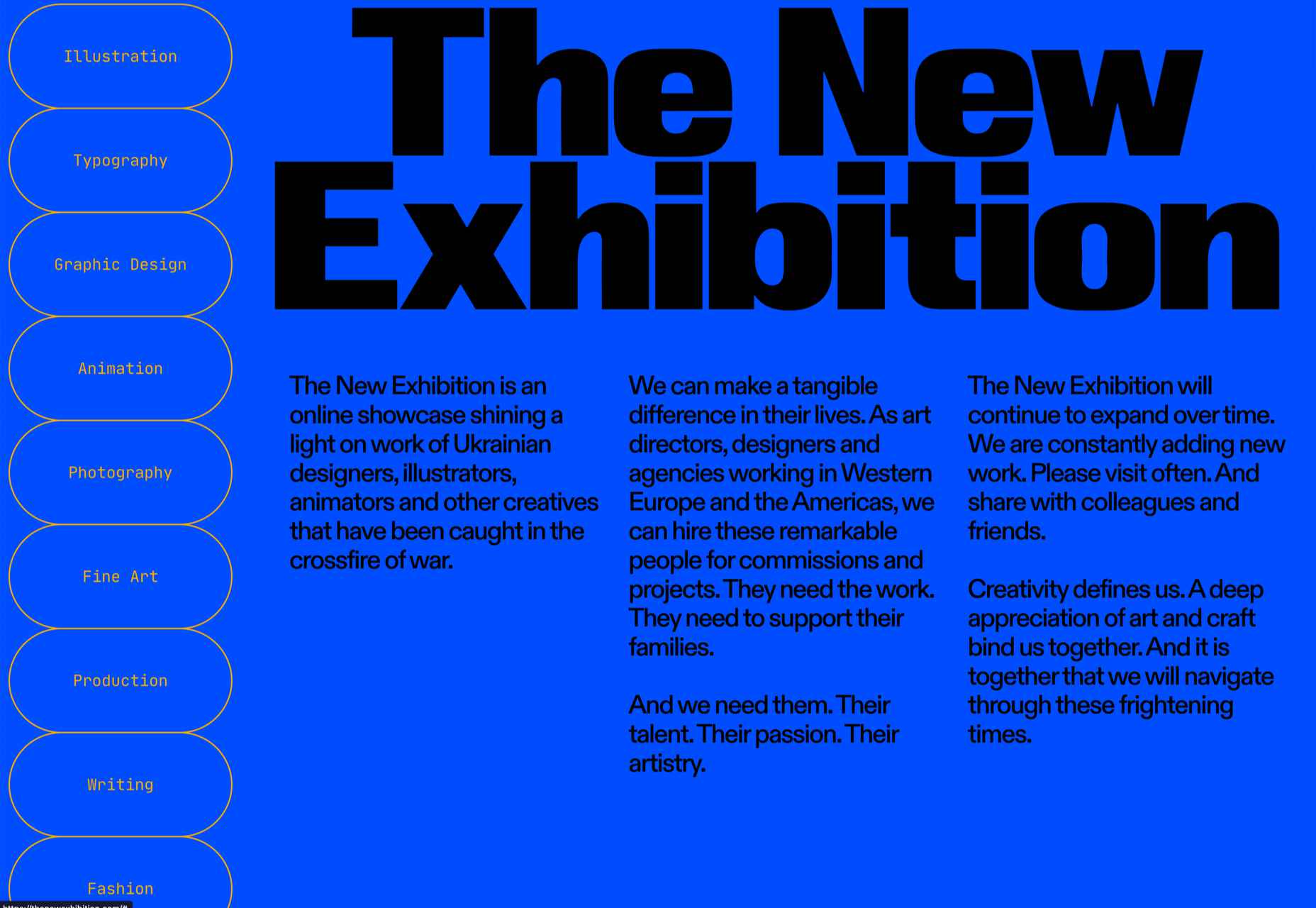
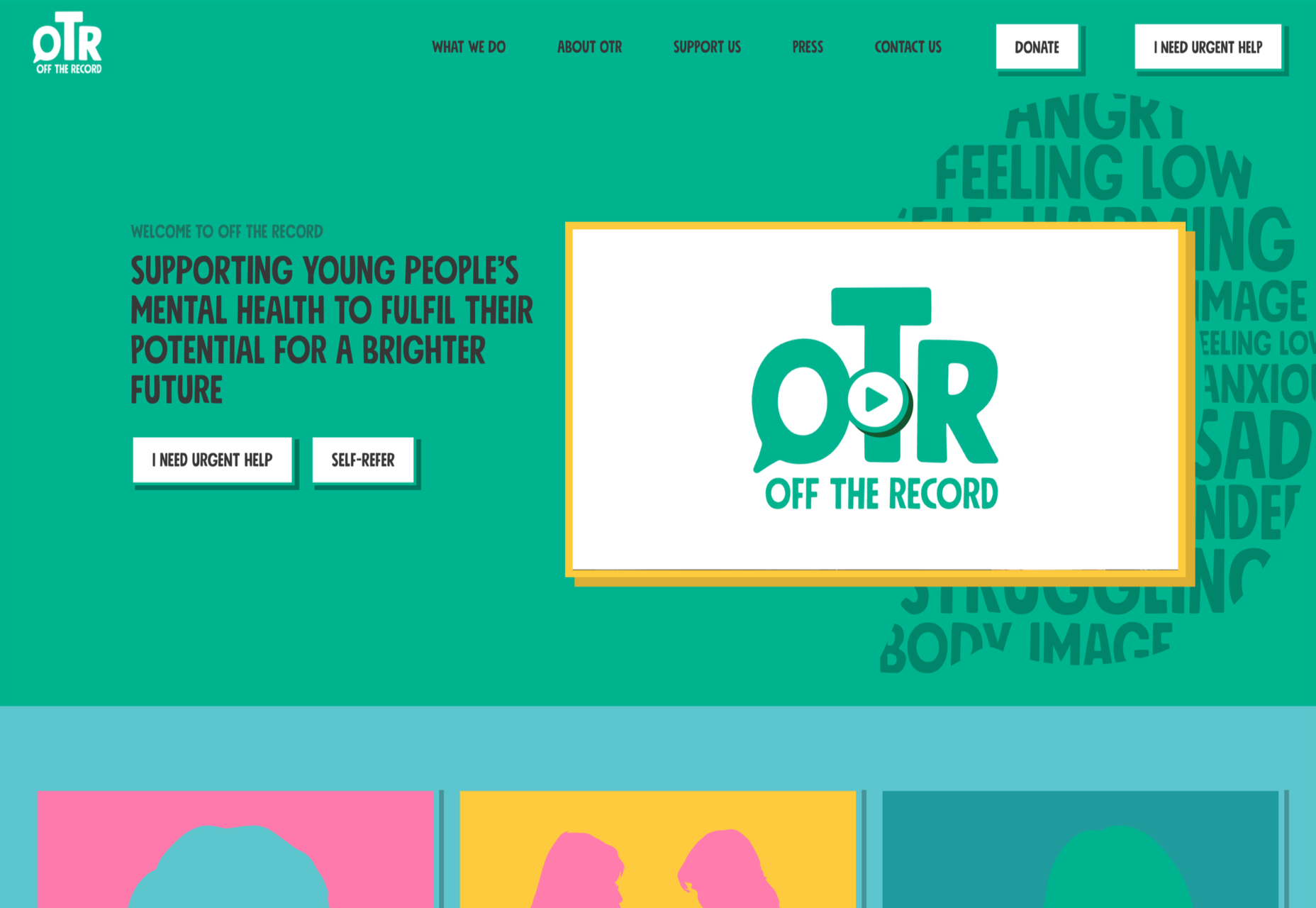
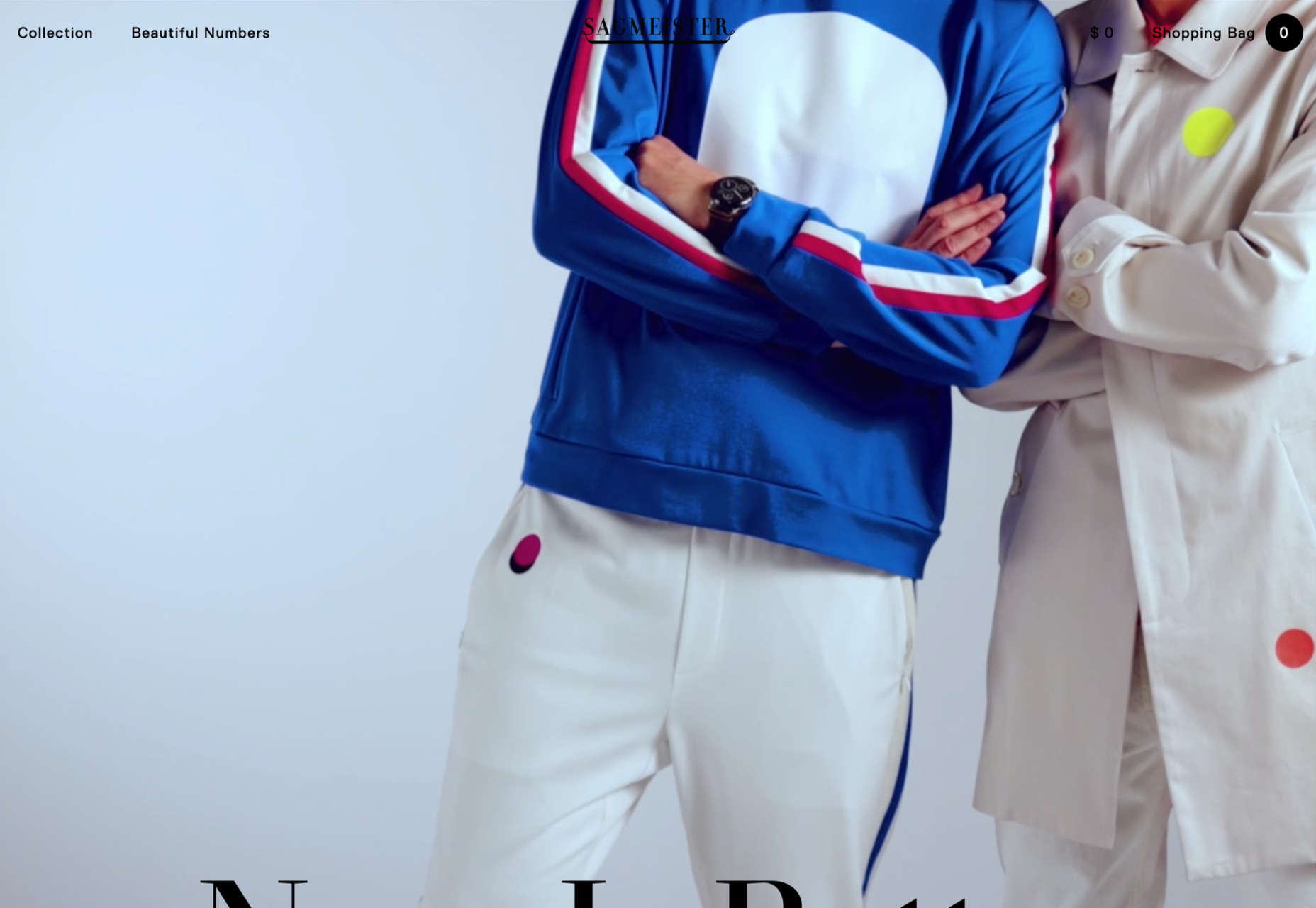
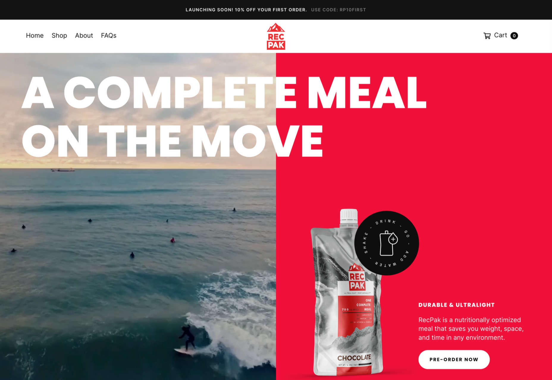
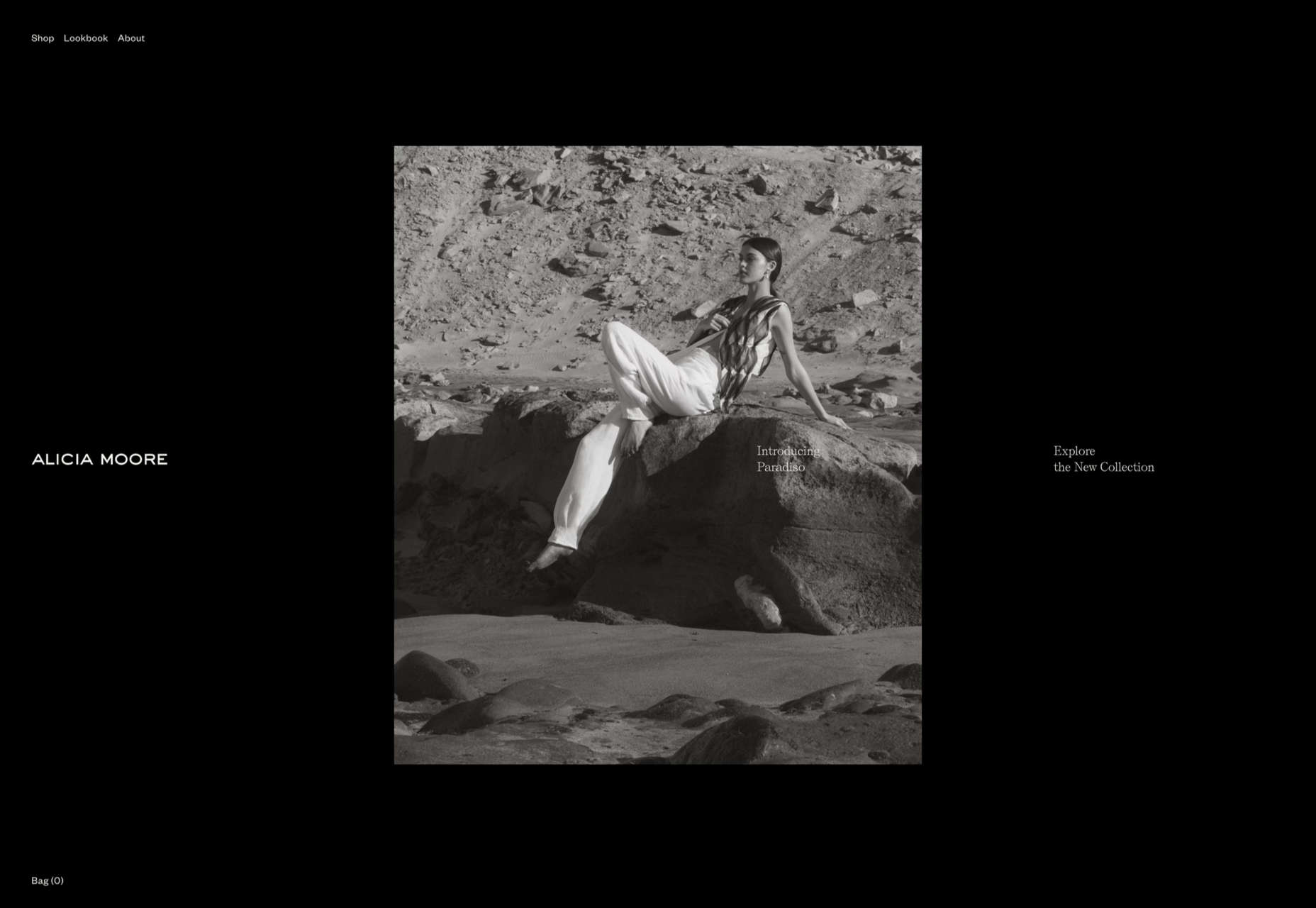
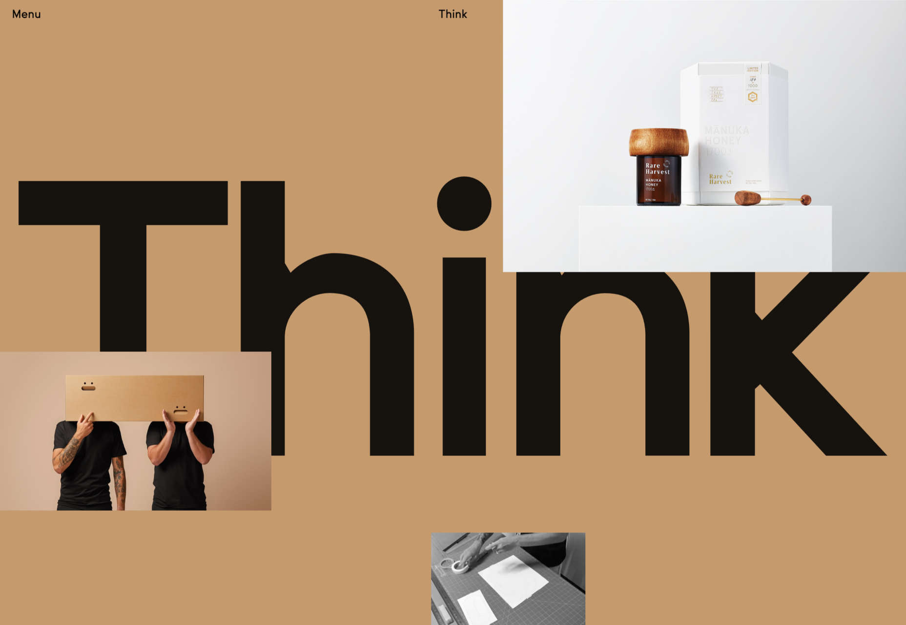
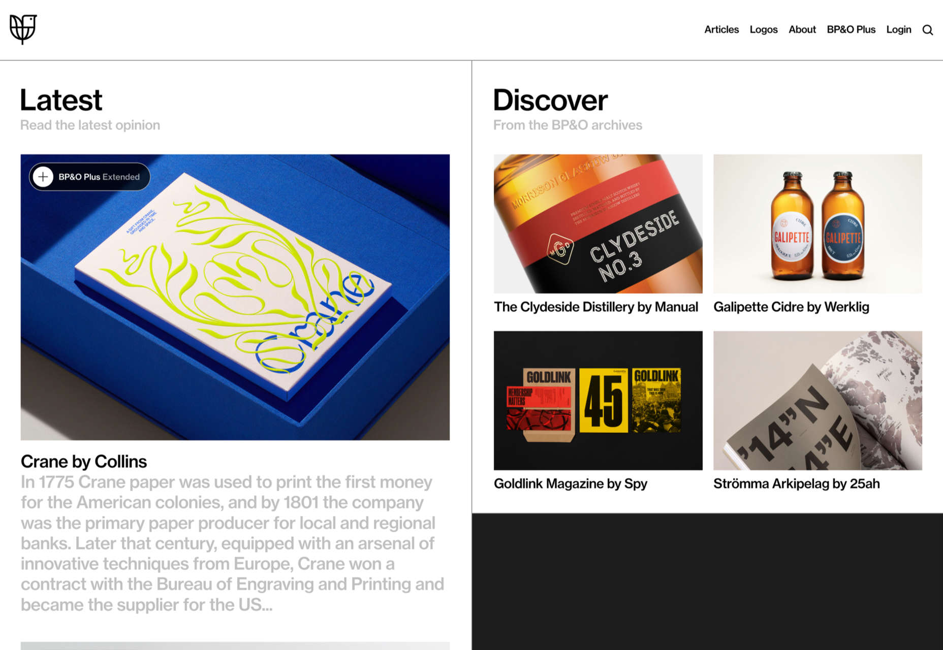
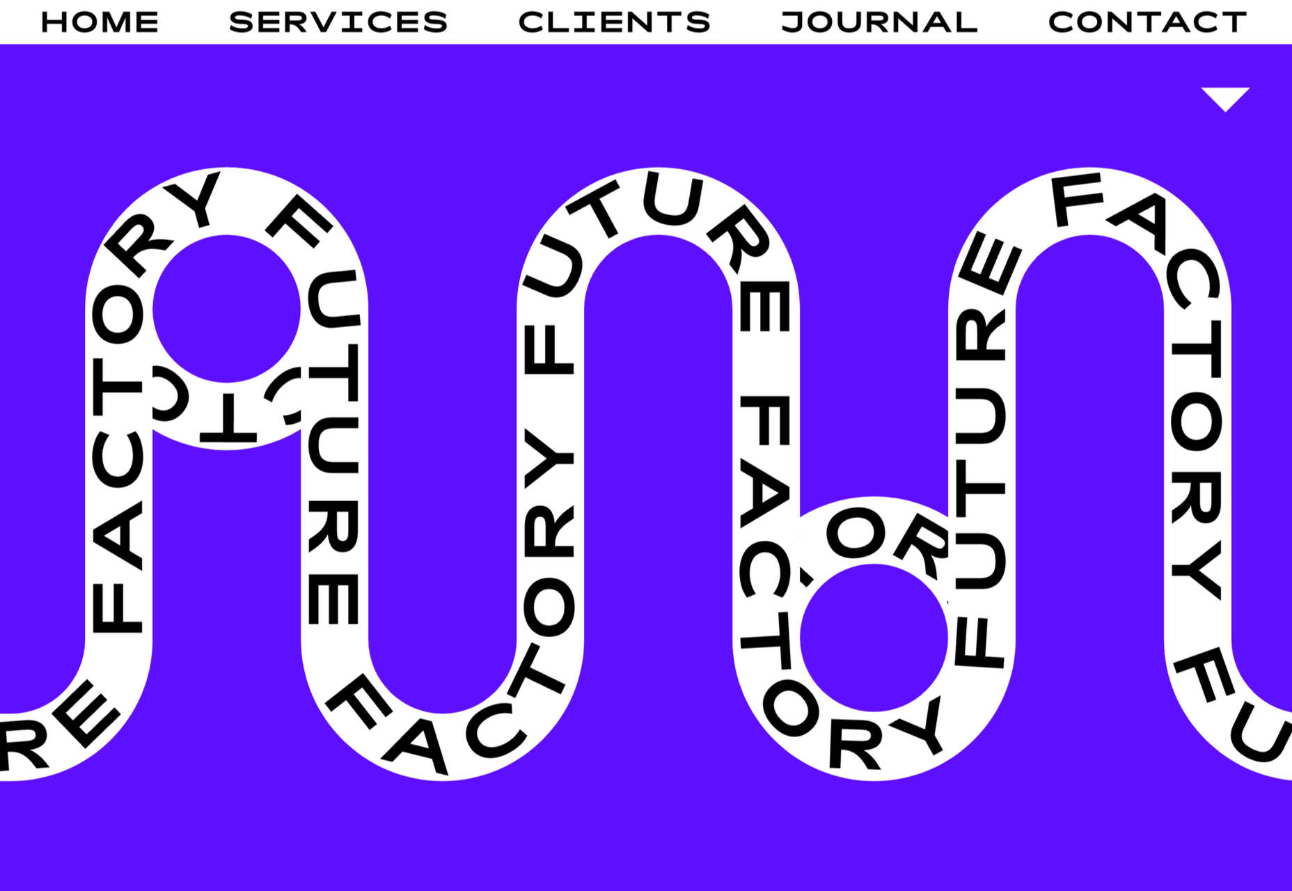
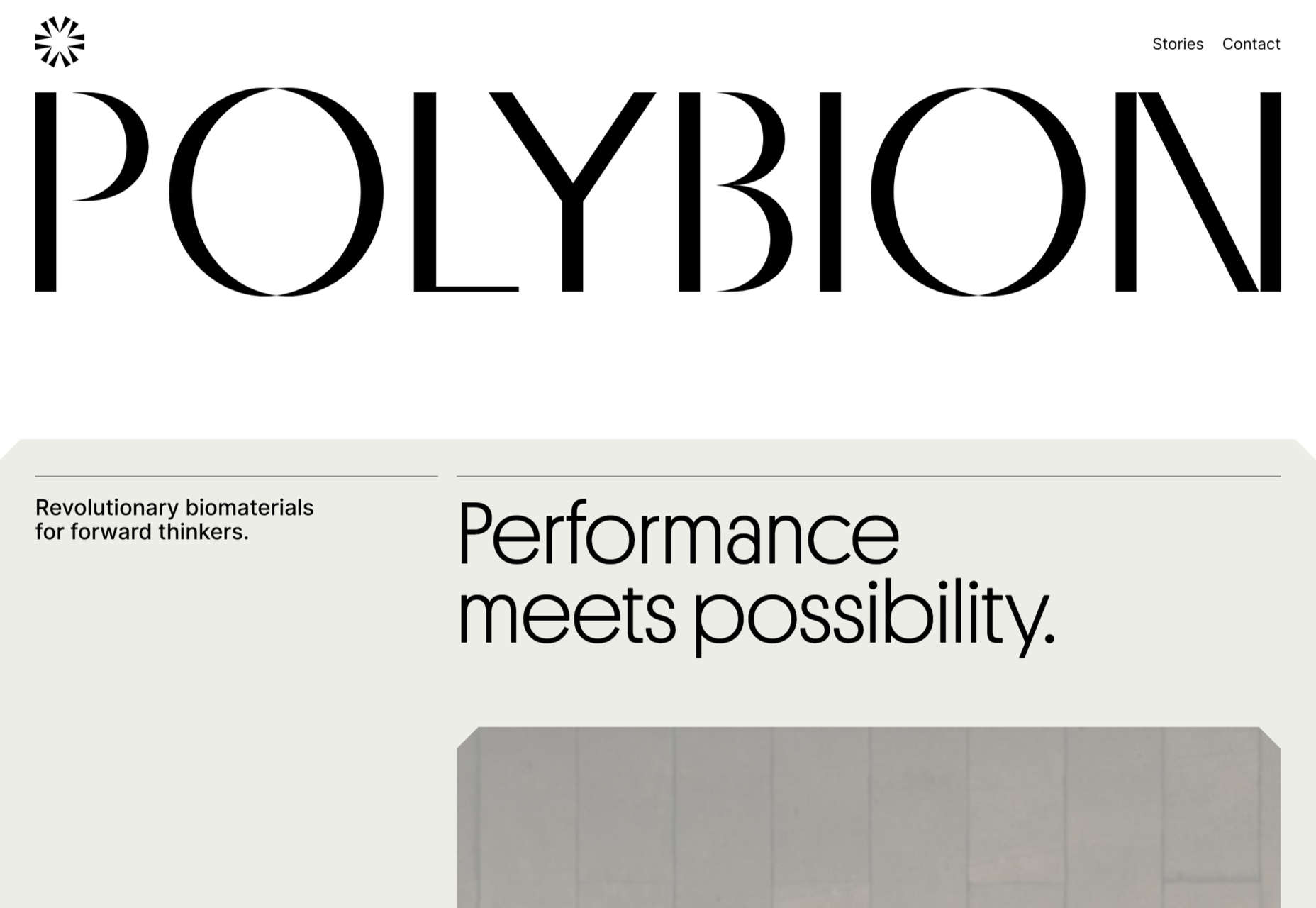
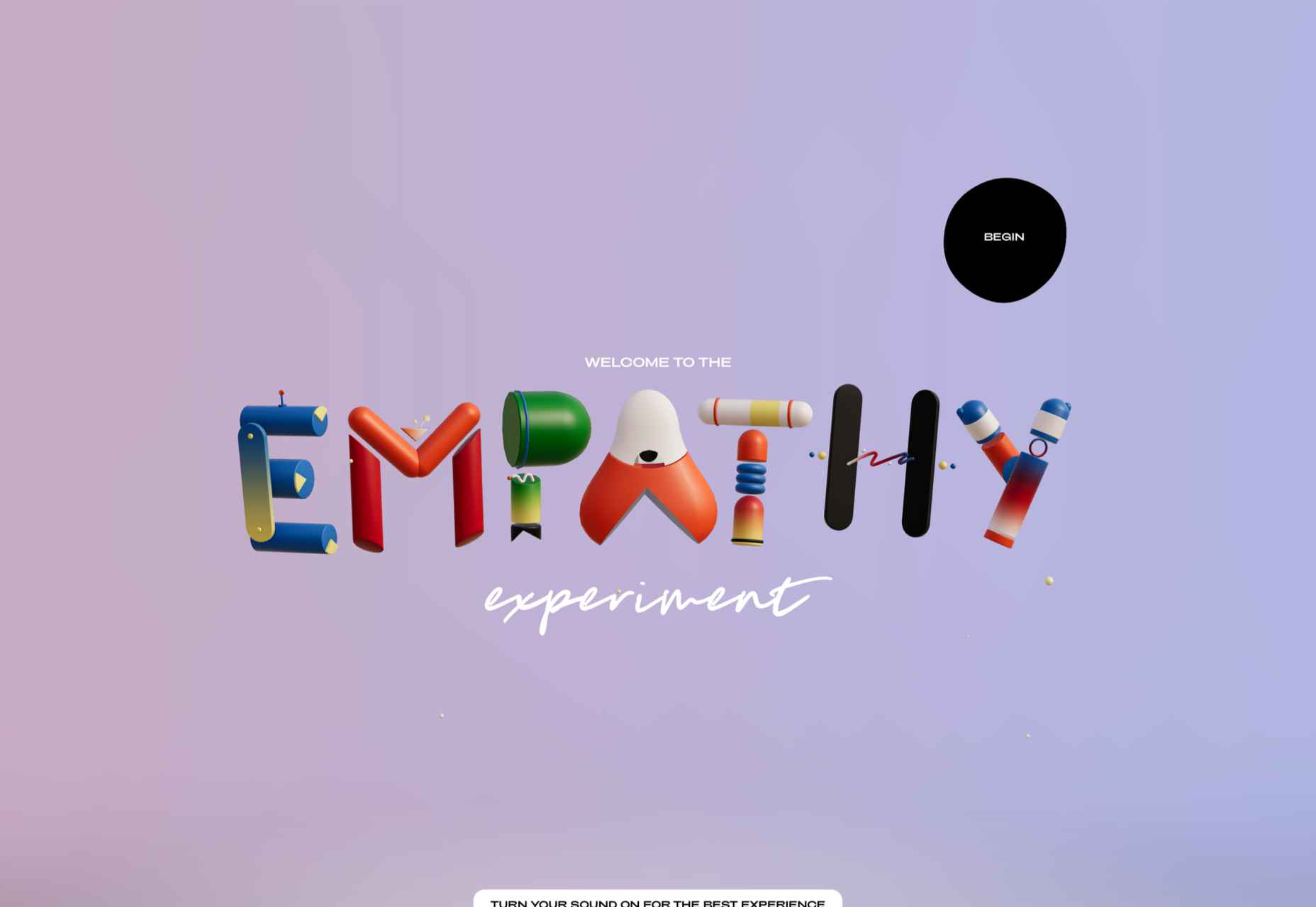
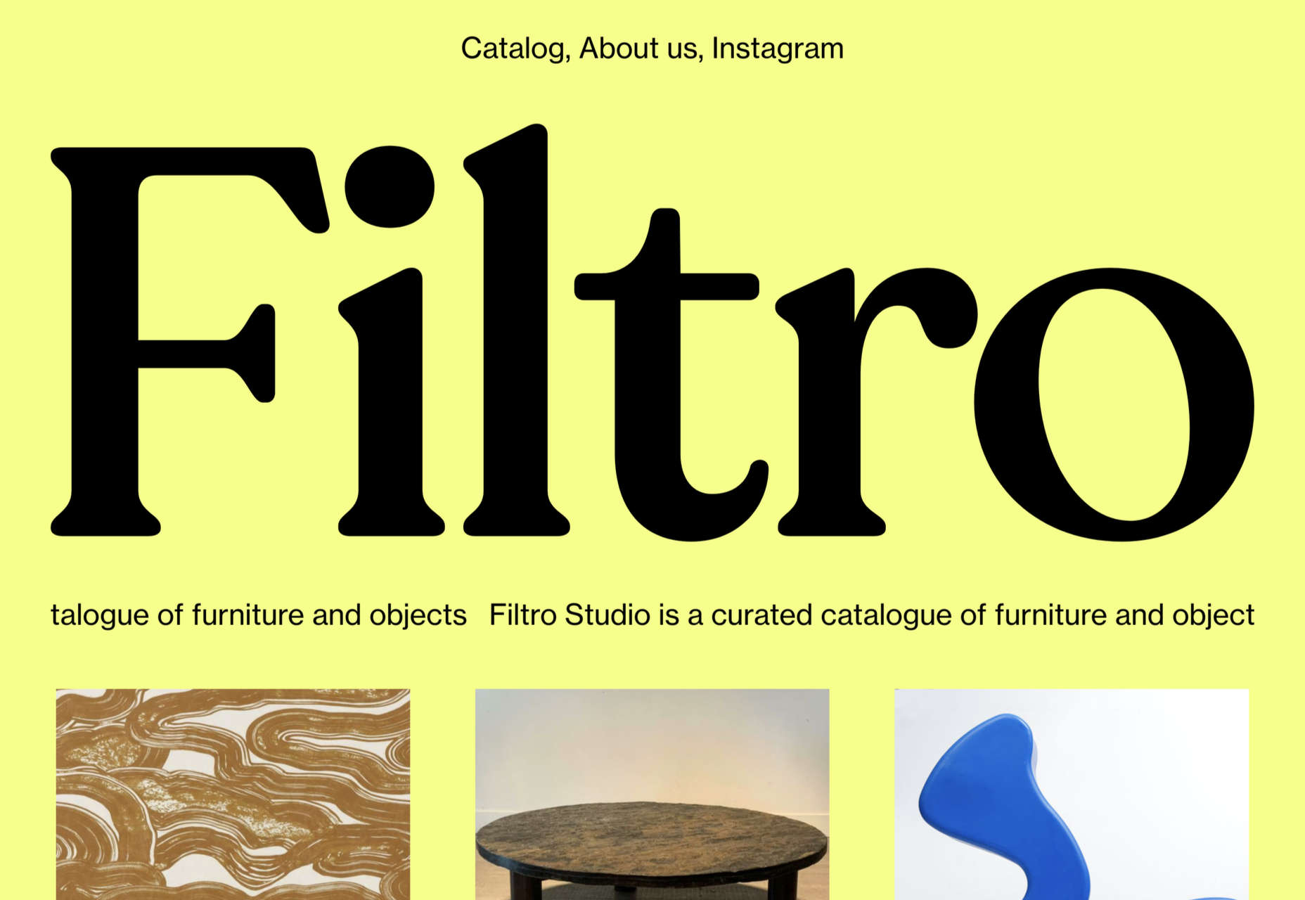
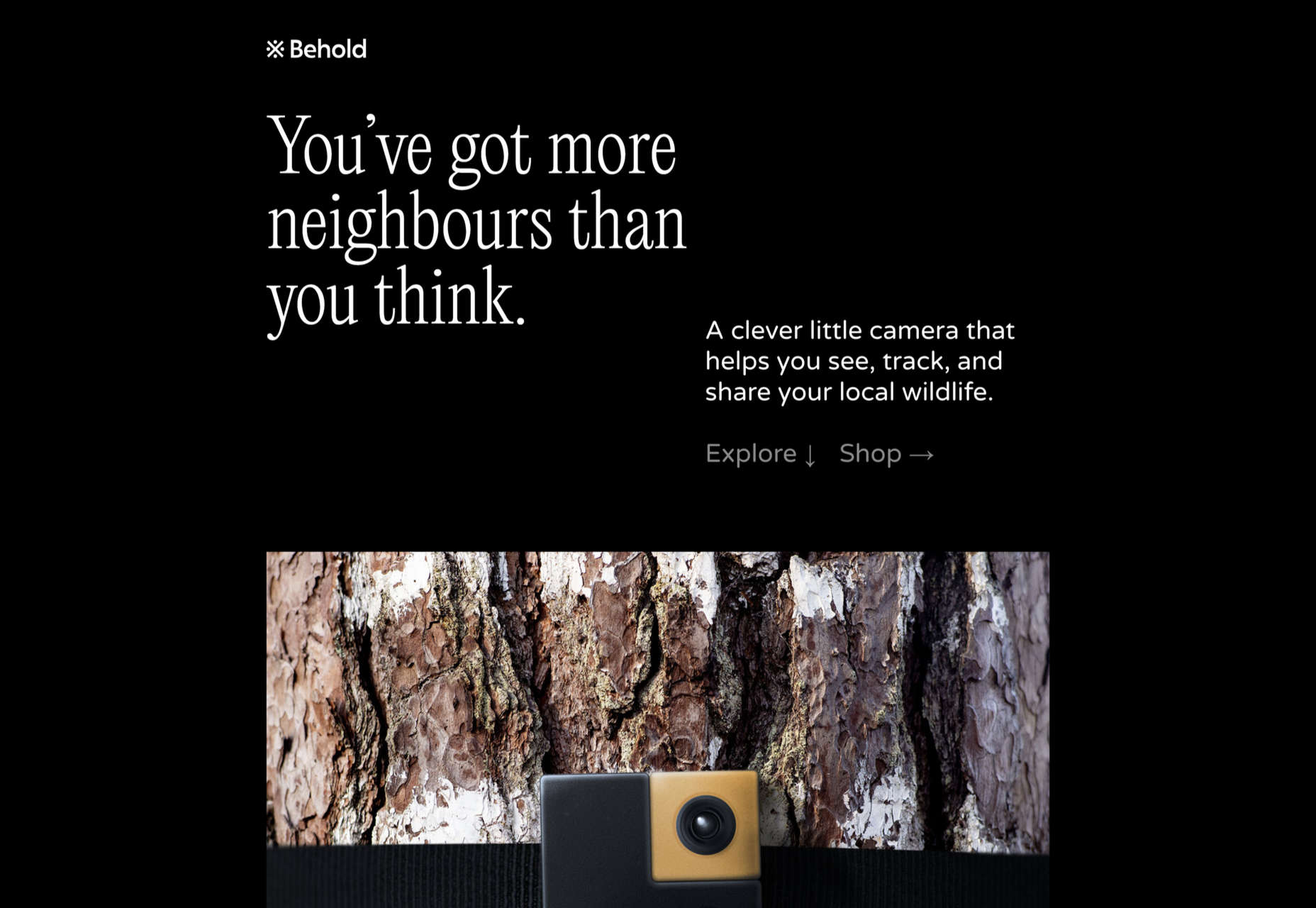
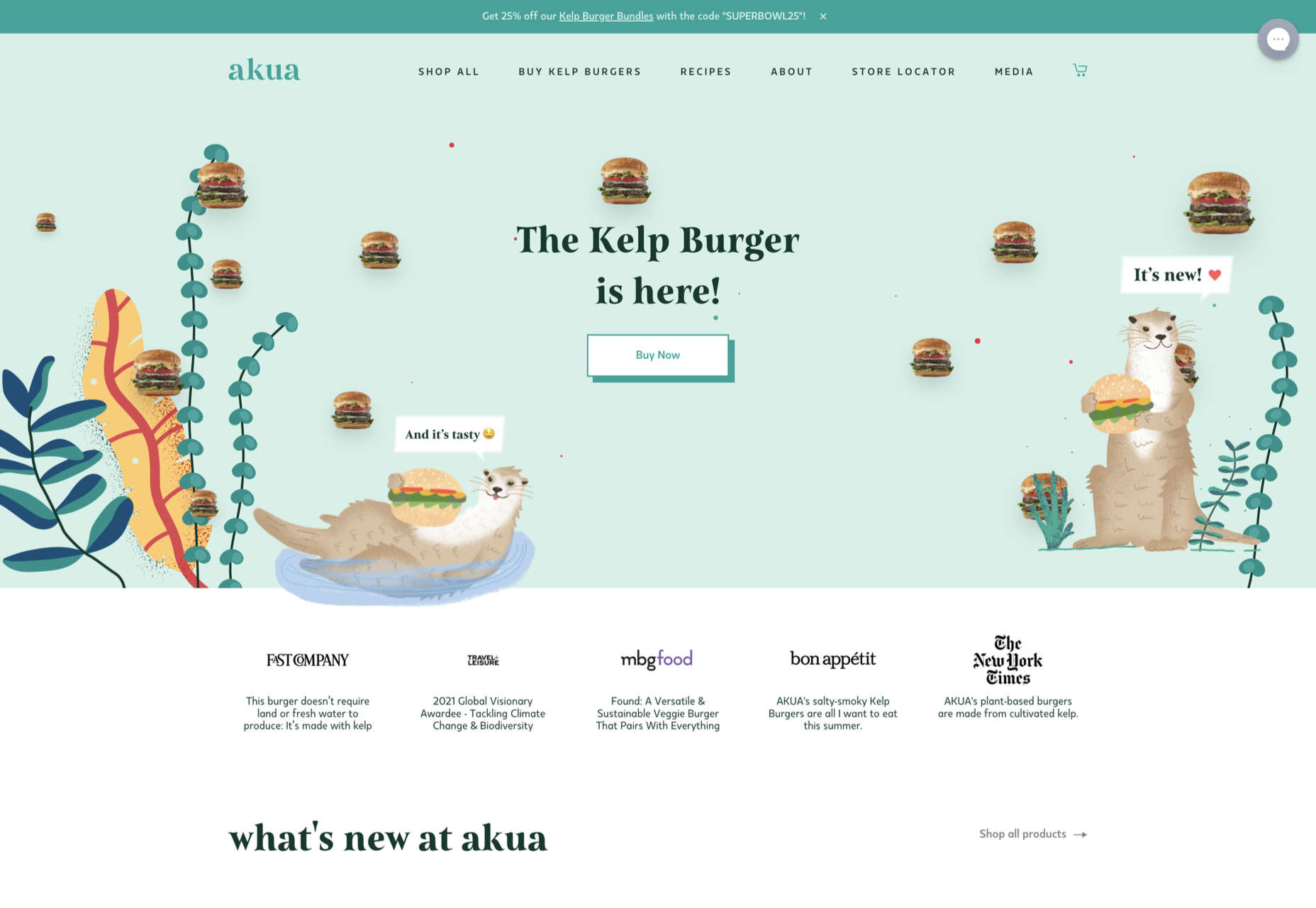
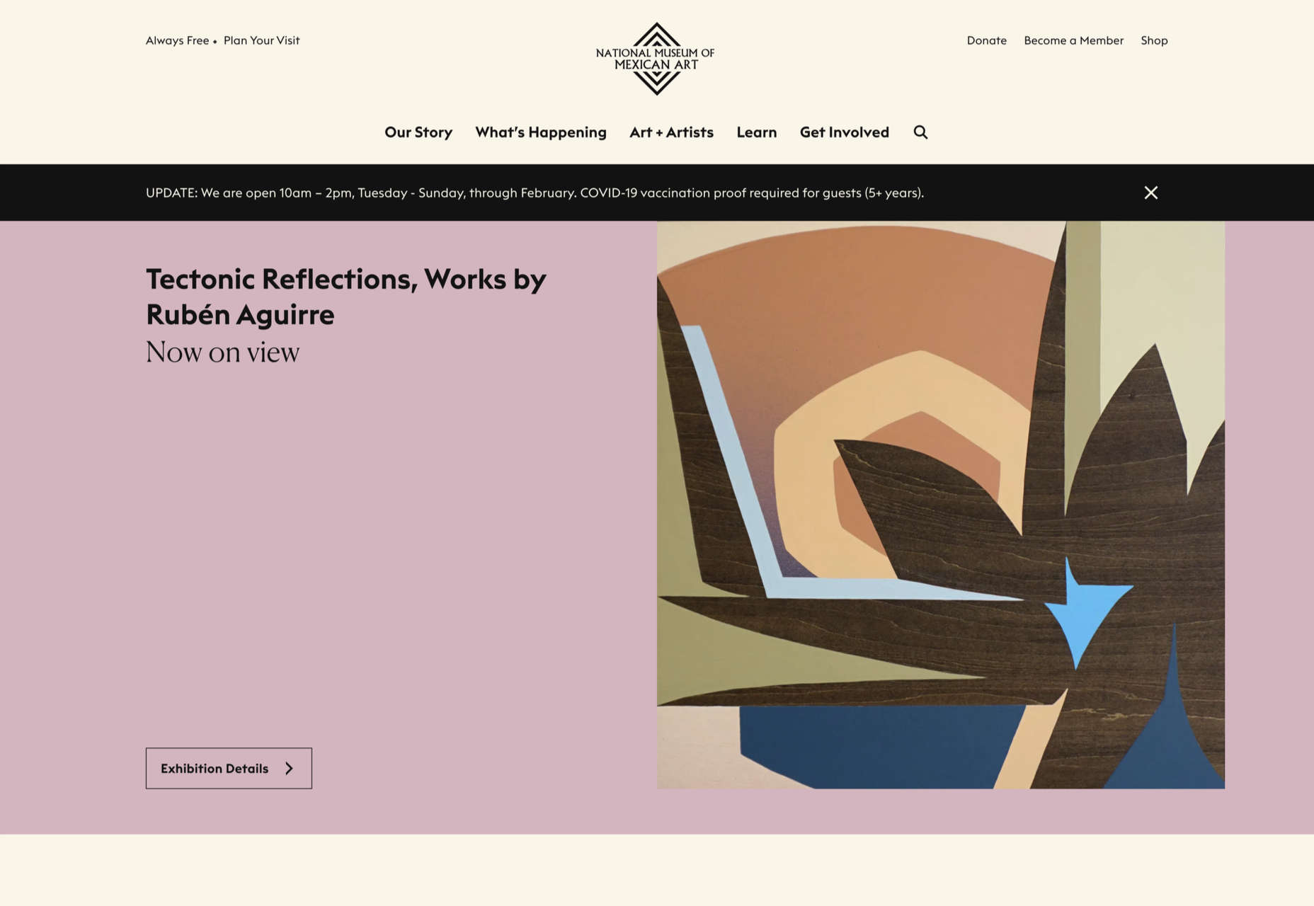
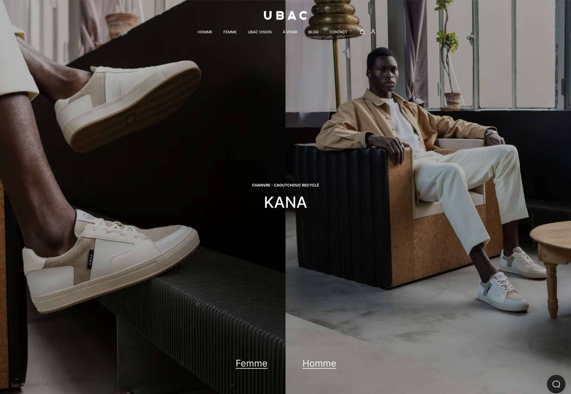
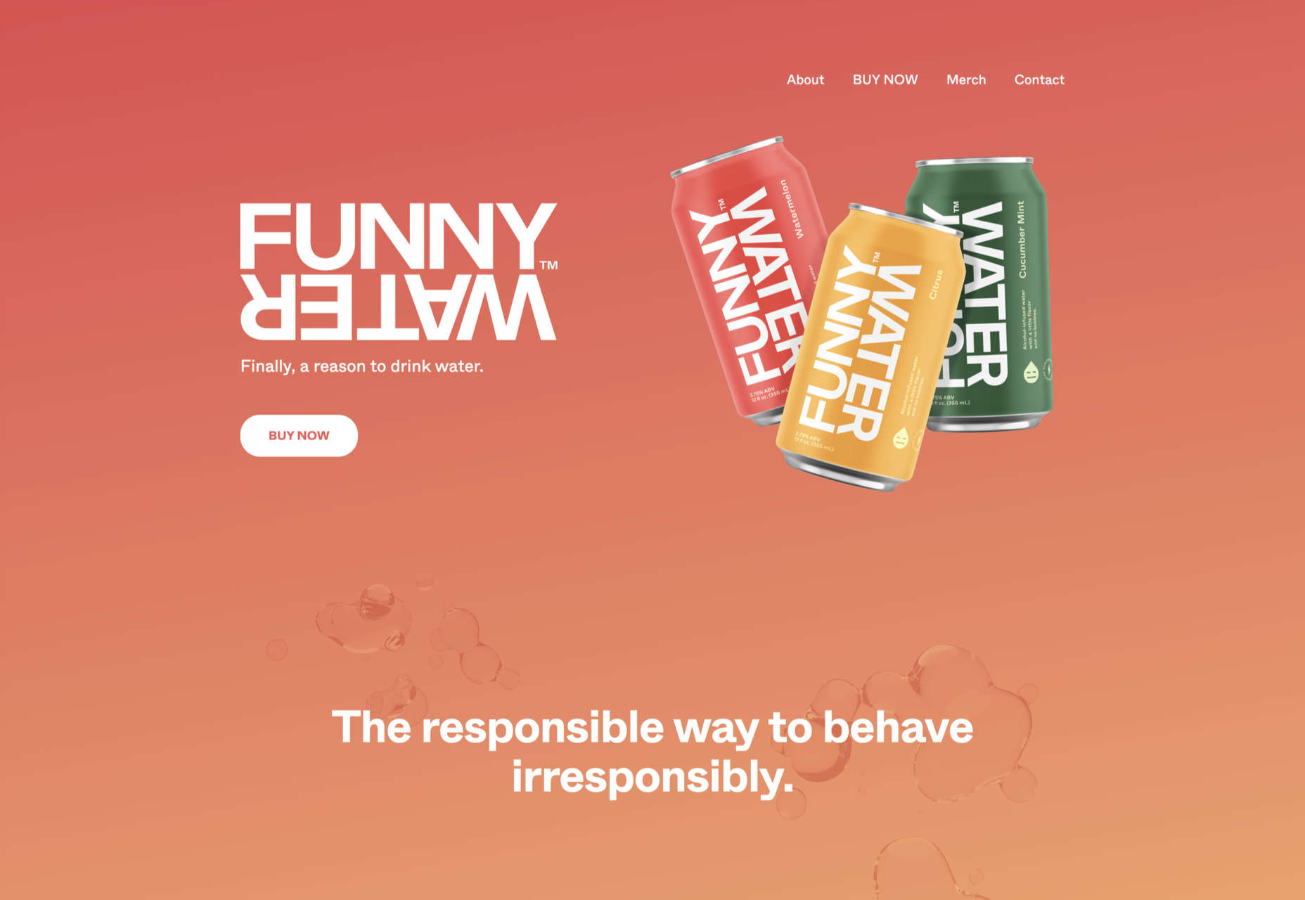
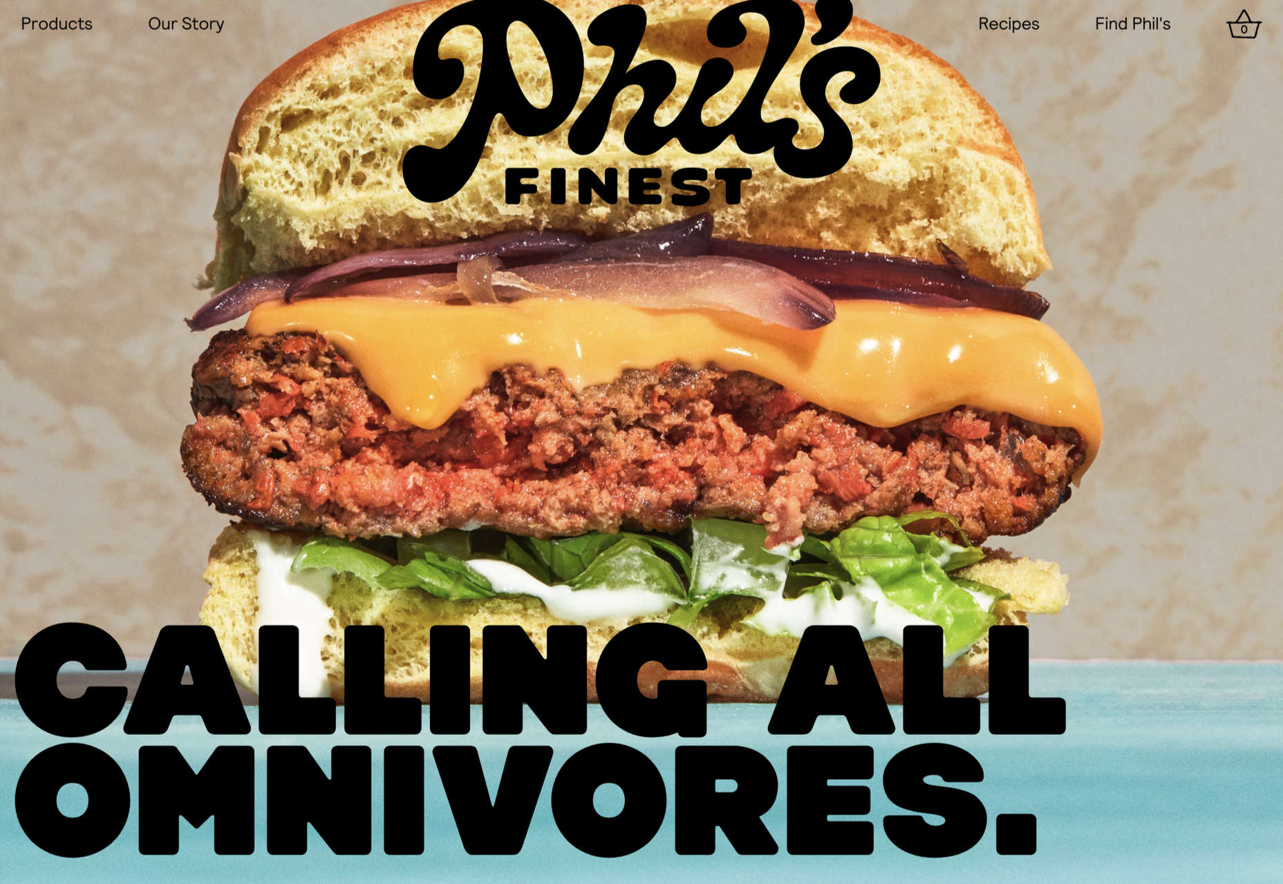
 Welcome to the latest edition of our top 20 sites of the month. In this February’s collection, the overall feel is lighthearted and optimistic, as we are seeing the positivity of a new year persisting across the web.
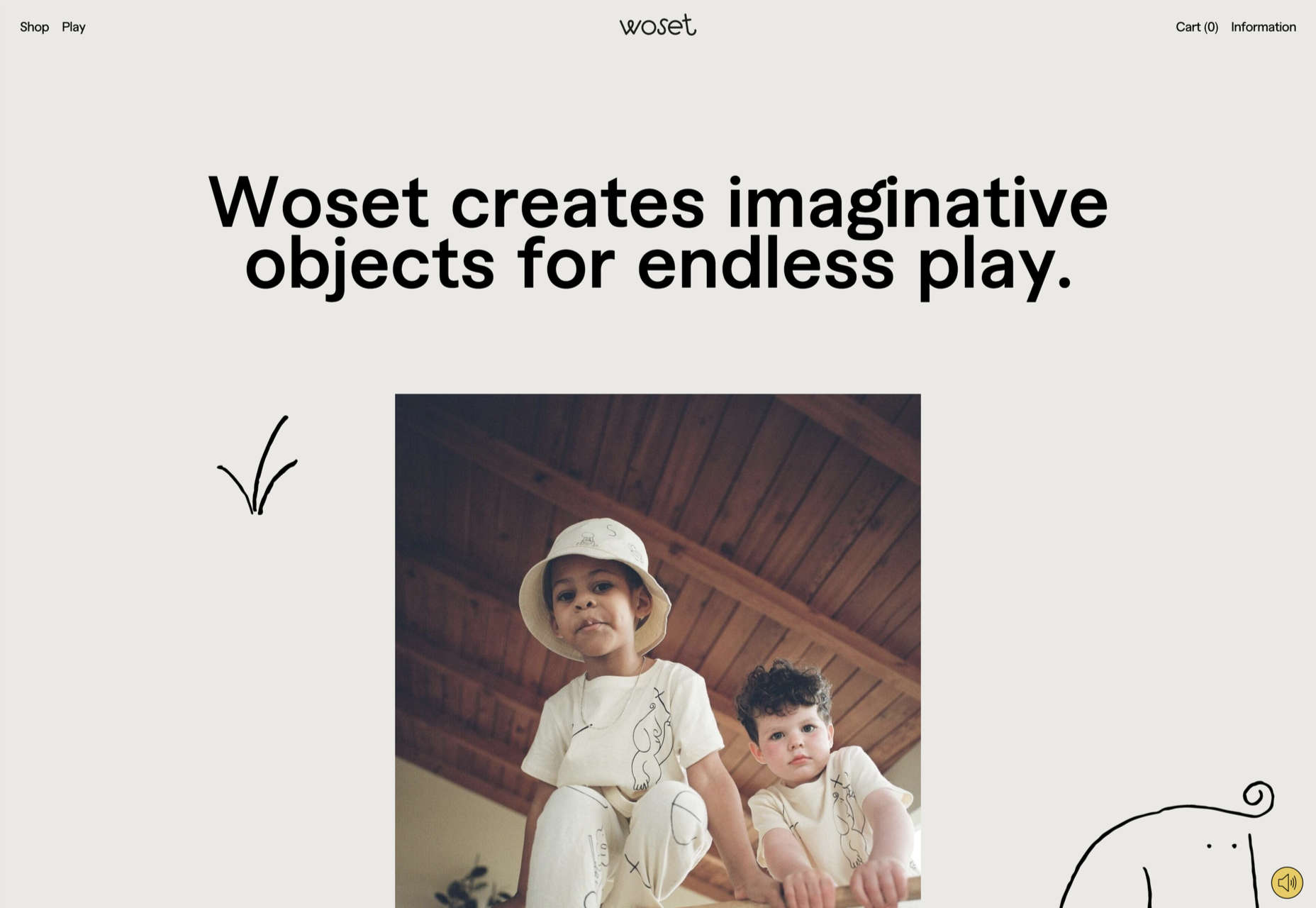

 What stands out as an incredible web design project for you? Do you count your creation as a success if it’s modern,