
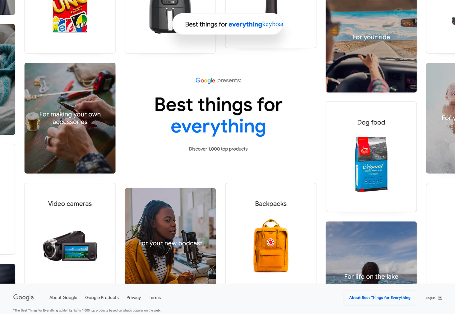
What is GitBook?
GitBook is a collaborative documentation tool that allows anyone to document anything—such as products and APIs—and share knowledge through a user-friendly online platform. According to GitBook, “GitBook is a flexible platform for all kinds of content and collaboration.” It provides a single unified workspace for different users to create, manage and share content without using multiple tools. For example:

 Parallax is a term that is applied loosely and frequently in the world of web design. As a trend, it has been popular and unpopular in equal measures for some time. However, it’s still one of the most valuable tools for animation in the digital world.
Parallax creates an illusion of depth when scrolling, a timeless effect that still has lots of value in the web design world.
Sure, parallax has its issues, from problems with usability, to concerns with mobile responsivity — but it’s also an interesting way to make a website stand out when done correctly.
Let’s take a closer look at some of the ways that parallax scrolling still works in 2021…
1. Parallax Tells A Story
Let’s start simple.
One of the most effective ways to use parallax scrolling in the modern age is to tell a story. Today’s consumers want to have an emotional connection with the brands they buy from – now more than ever. Five years ago, studies showed that around 80% of customers want brands to tell stories, and that trend remains consistent to this day.
In the age of digital consumerism, where people can’t get to know a company in person through face-to-face interactions with its salespeople, companies need new ways to connect with their clients. Telling brand-driven stories is a way to highlight that your company is more than just a faceless entity – it’s something with real soul.
Let’s look at the “Recap After Use” website, a portfolio belonging to the innovative Louie Sellers. This website showcases Louie’s skills with attention-grabbing visuals, including a parallax animation that makes it looks like Louie is drawing the page as you scroll through it.
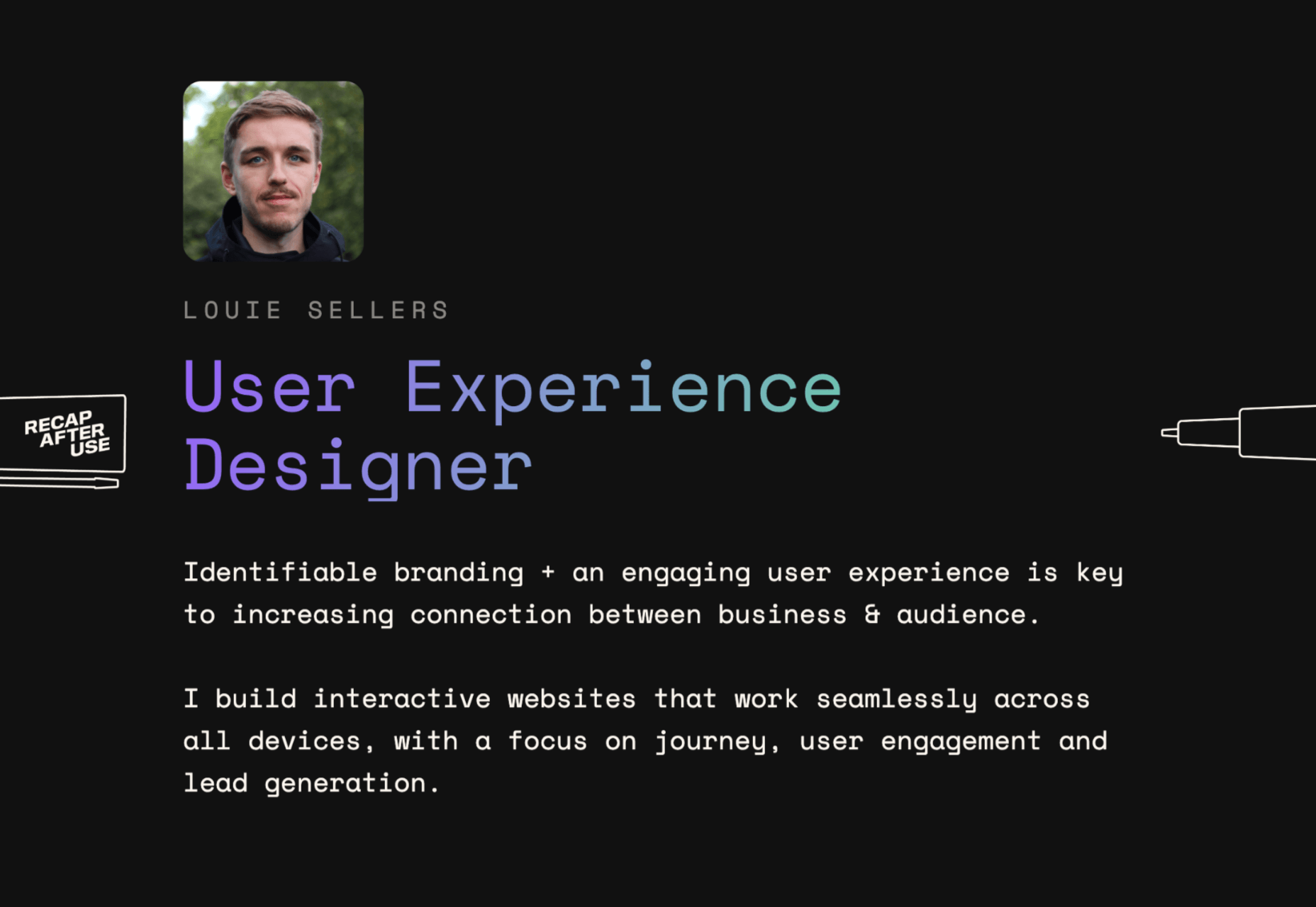
This is the kind of exceptional animation that makes parallax scrolling more compelling. The animation isn’t there to make a visual difference to the page – it tells you something more about the person behind the website and what they can do.
2. Parallax Increases Website Visit Times
If a website effectively tells a story with parallax animation, you can also bet that’s going to keep customers or readers on a page for longer. Reducing bounce rate by increasing engagement is one of the main goals of any web designer. (Bounce rates, of course, refer to the percentage of site visitors that hit the back button after just seeing the first page of your website.)
While some people argue that parallax websites can hurt your SEO rankings if they slow down your site, there’s also the argument that the lack of a visually engaging page can harm SEO. Bounce rates drag down your ranking and make it harder to get audience attention.
A parallax animation that tells a story and engages your audience through carefully delivered information is a great way to keep people around – even just for a little longer than usual. For instance, if you check out Alex Dram’s portfolio page here, you’ll see several shapes coming together during the parallax scrolling animation.

The shapes merge to tell a story about the visual experiences that Alex can create for customers. It’s a way to draw the eye and connect with the viewer without just writing about what you do through text.
3. Parallax Develops Credibility
There’s a reason why both examples of parallax scrolling we’ve looked at so far are from creative portfolios. Parallax scrolling, with its excellent storytelling capabilities, is great for demonstrating your credibility as a digital expert. Basically, it’s a version of “showing” and not “telling” customers about your skills.
You can tell someone that you know how to use tricky techniques like parallax animation correctly, but they’re less likely to believe you that way. If you can show that you have the skills to create something amazing, that’s more engaging.
The OK Alpha team is a great company to reference when it comes to sensational design. This company seems to always be on the cutting edge of the latest trends, whether it’s bold typography or bright colors. To add to the impact of their website, the company has combined parallax effects into the mix to make everything more immersive as you scroll.
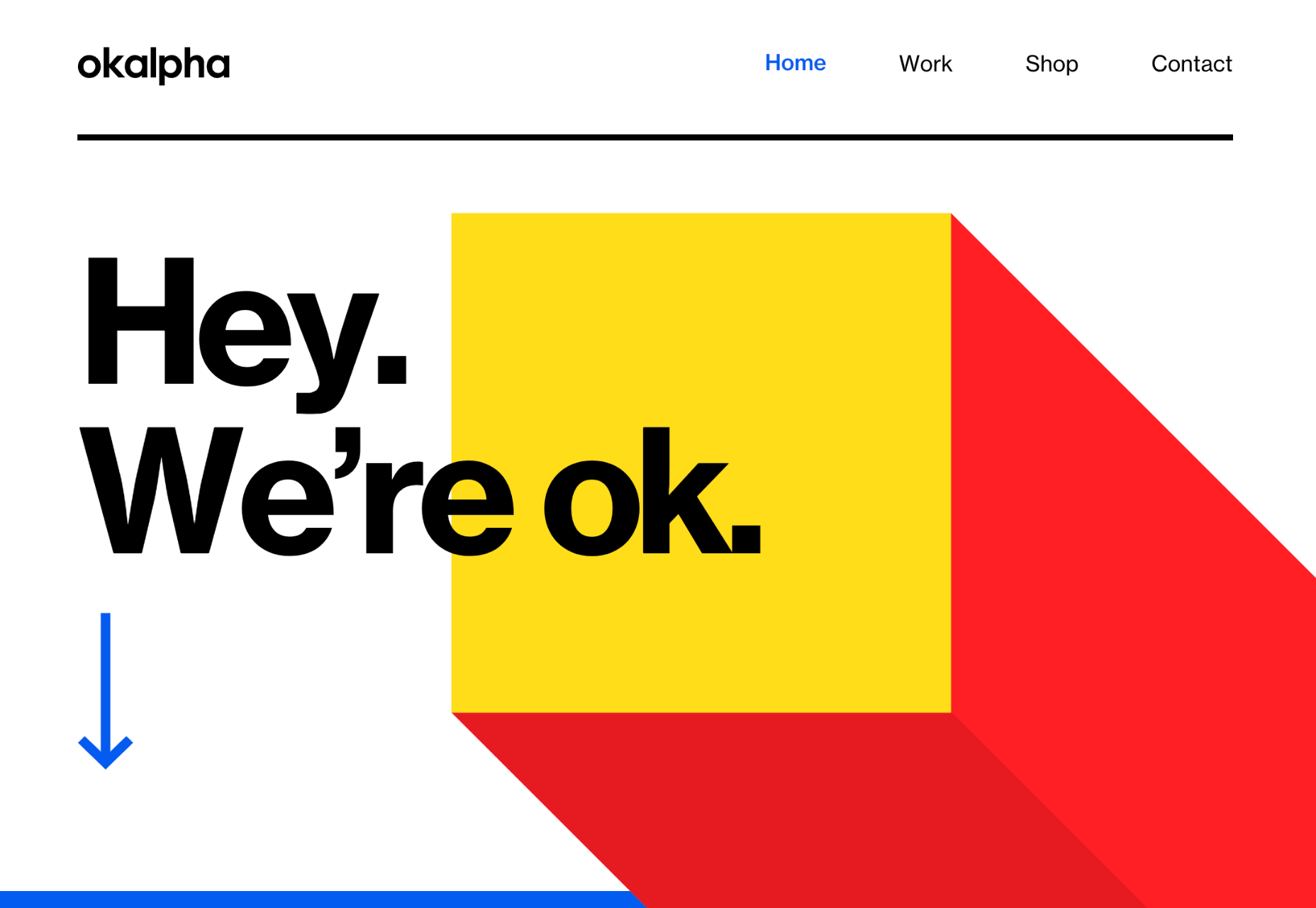
This is a beautiful example of how companies in the design landscape can use techniques like parallax scrolling to show what they’re capable of.
4. Parallax Makes Information More Fun
Most of us are naturally visual learners. We like to consume information in a way that’s refreshingly eye-catching and attractive. That’s why visual content generally earns more social shares and attention than written content. With parallax scrolling, companies that want to deliver valuable information and educational content to their audience can do so effectively.
Rather than just scrolling through a page and seeing lots of text, your customers can see images and graphs come to life alongside the blocks of text they’re reading. It’s like adding video demonstrations next to a textbook to help people better understand what they’re reading about.
Look at the Web Design and Art History microsite from Webflow as an example. The company wants you to understand how web design and art have evolved over the years, but it doesn’t want to deliver that information in a boring format. The bright graphics and parallax animation work together to give you a more contextual, meaningful experience.

5. Parallax Replicates Another Medium
What if you could remind someone of their experience when reading a book or watching a video while telling them about a video or a novel? Parallax scrolling and animation can help with that. It’s a way of making your website feel like a video presentation or slideshow without the added components of implementing video players into your back end.
Parallax scrolling also has another slight benefit over a standard video-based website. On a website that uses a video for a background, the video often plays automatically. This means that your visitors can’t control how quickly the video plays.
On the other hand, parallax animations driven by scrolling action allow your customer to collect information at a pace that suits them. Take a look at the Story of the Goonies website, for instance. This stunning parallax site introduces you to the details you need to know about the movie in a way that makes it feel like the intro to a film.
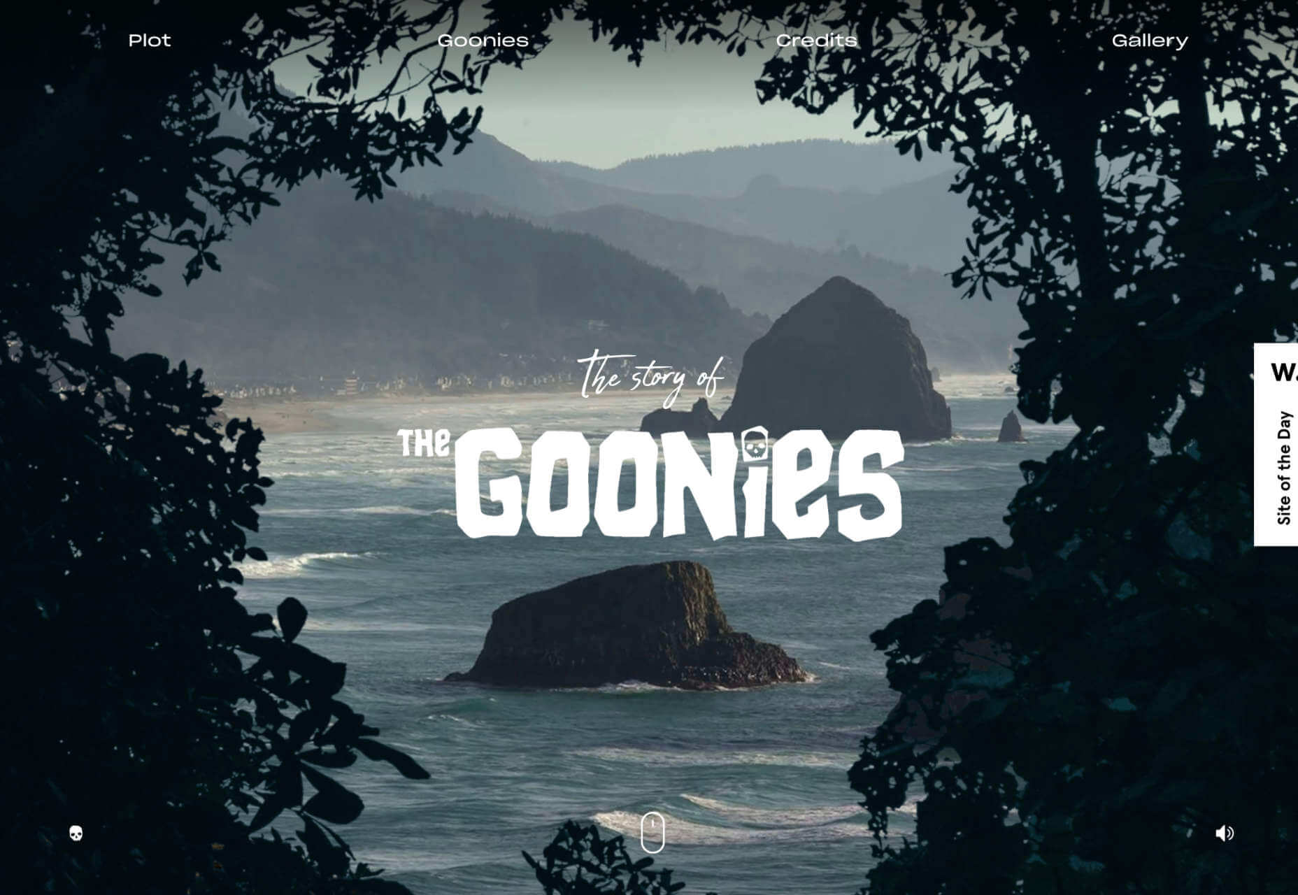
The great thing about the parallax on this site is that the slow video-style design also gives you a dose of nostalgia – which ties in perfectly with the movie.
6. Parallax Is More Memorable
What’s the main reason any designer does anything special to a website? To make it stand out, of course. Web design is all about conveying the unique essence of a brand, business, or entity in a way that’s going to make that client unforgettable. Although parallax isn’t as novel as it once was, it can still be a way to make your site stand out – if it’s used correctly.
The key to success with parallax scrolling for memorability is making it smart. The layout needs to feel simple and intuitive. Everything needs to work well together, from the lightly shifting font to the various parallax effects that work together to draw the viewer’s eye (and attention).
A great example comes from Jomor Design – another designer with a portfolio that really grabs your focus from the first second. The layout is beautifully done, with plenty of mini moments for engagement and interactions throughout. As you scroll through the site, you get a better idea of what the designer is all about. The little moments of animation make the whole experience so much more memorable.
When your site is more memorable and engaging than that of your competition, you can drive many major benefits for your brand, including an improved bounce rate.
What To Remember When Using Parallax
Parallax is just like any other design technique. There are ways you can do it wonderfully, which engage and delight your audience. However, there are also a lot of areas where you can easily go wrong. When using any design element, the main thing to remember is that the primary focus should always be your users’ experiences. Parallax shouldn’t just be a way to show off your design knowledge. It’s just another feature that you can use to create an amazing website.
Remember that user experience and visual appeal need to work perfectly together for parallax to work. If scrolling through the page is practically impossible for people on a mobile device, then you’re not going to get the results you want. If it’s difficult to take in the message you’re trying to send because the content is moving too quickly, again, your users will suffer.
Remember the following tips:
- Simple is better: Reduce the amount of content and visual elements on your page whenever you can. The less information there is to capture your customer’s attention, the less likely it is that you’re going to end up with a problem.
- Compress file sizes: Make sure that you’re not reducing the speed of your website by creating a huge single page with tons of high-quality images. You’re going to need to use the smallest possible file sizes.
- Check responsiveness: Make sure that the parallax effect works just as well on your smartphone or tablet as it would on a desktop. As more people move their browsing experiences into their palms, you can’t afford to ignore responsivity.
- Find the “wow”: Look at these examples of parallax websites. Every one stands out because it does something special with the scrolling effect. If you’re going to be using this strategy with your website, you need to make sure it’s worth the effort. Don’t just follow the same guidelines as everything else. Find the idea that’s going to make people take notice.
The post 6 Ways Parallax Still Works in 2021 first appeared on Webdesigner Depot.

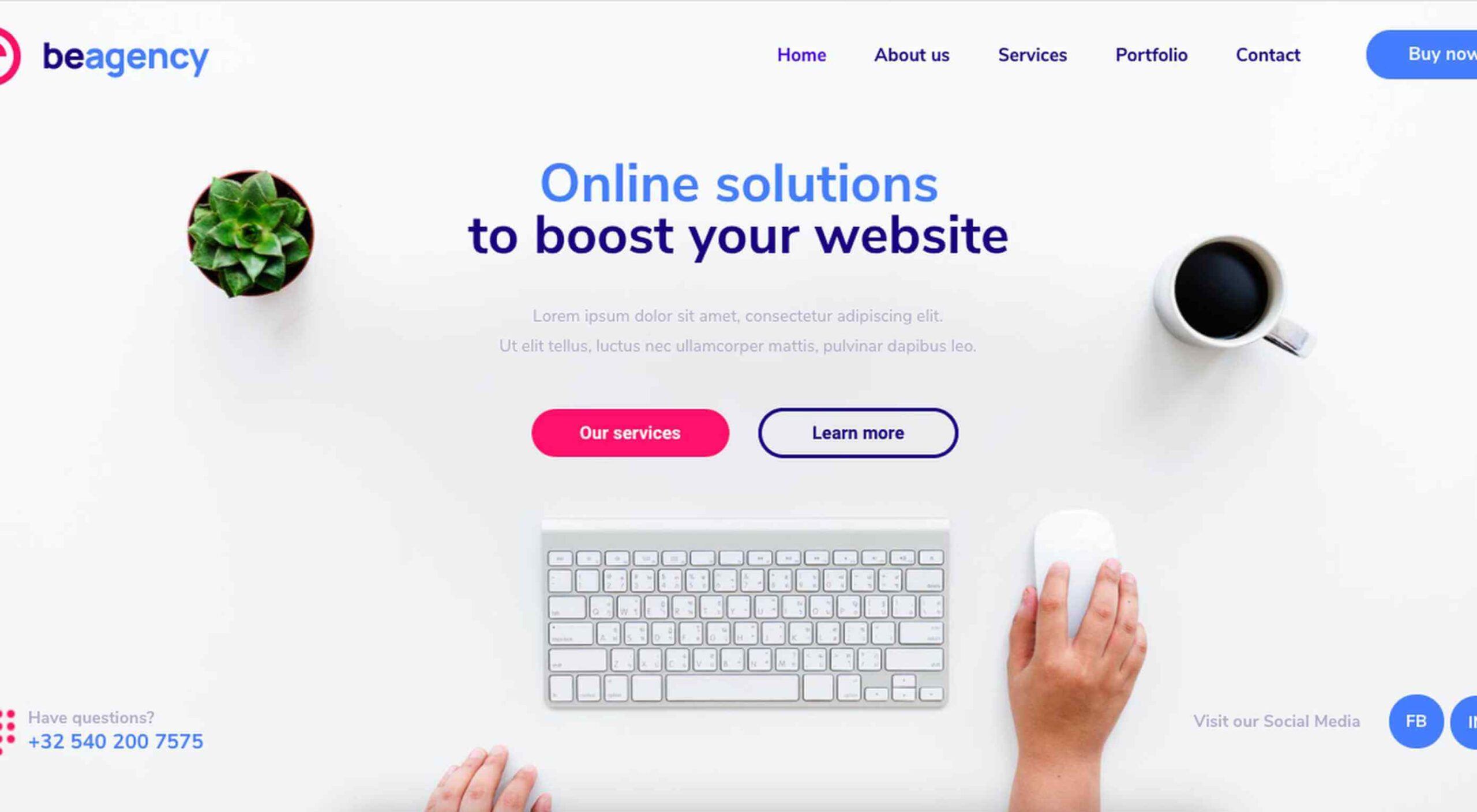 Creatives need a digital space to call their home. A place from which they can show off their best work, and from where people can get in touch with them to buy or hire from them.
You should have a digital space of your own as well, and we’re here to help you do just that.
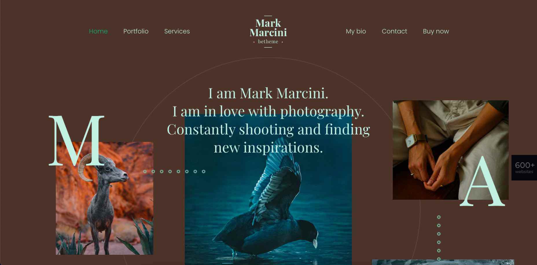
With one of 600+ Be Theme’s pre-built websites at your fingertips you can establish your own digital presence in no time at all. While you’re certain to find one to get started among such a large selection, we’re happy to offer a helping hand. The following 15 top BeTheme pre-built websites were specifically designed with creatives and developers in mind.
Don’t be afraid of choosing one that might not turn out to be the exact best choice. Every one of these 600+ pre-built websites is customizable, and you can always select another example or experiment if you want to.
15 Awesome BeTheme Pre-Built Websites You Can Call Your Own
No matter your choice, you’ll quickly discover that most or all of the heavy lifting involved in creating a website has already been done for you. Customize, add your own content, tweak as necessary, and you’re done!
That said, let’s get started.
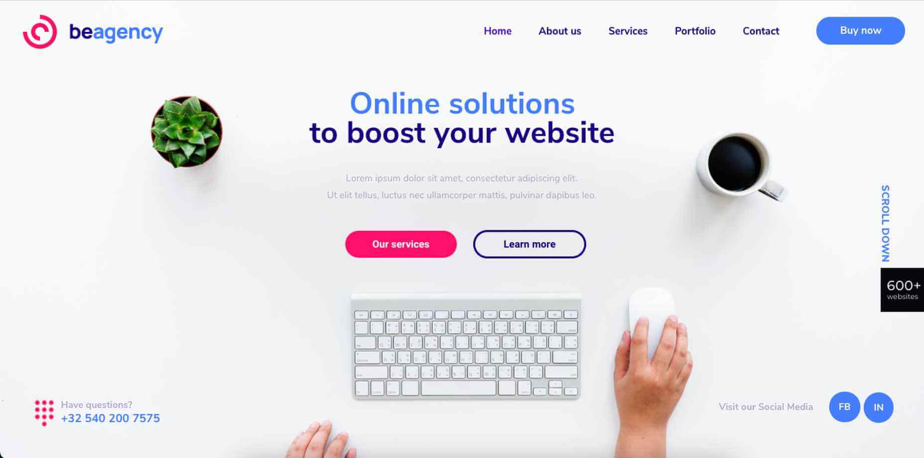
1. BeAgency 4
Whether you prefer to go it alone or dream of someday building your own creative agency, the BeAgency 4 pre-built site would be a great foundation for your site. It oozes professionalism, it’s easy for your visitors to navigate, and you’ll love its clean, modern design.
As an extra feature (and most of these pre-built sites have one or two), BeAgency 4 has a Portfolio page. Swap in your own content and you’re set to go.
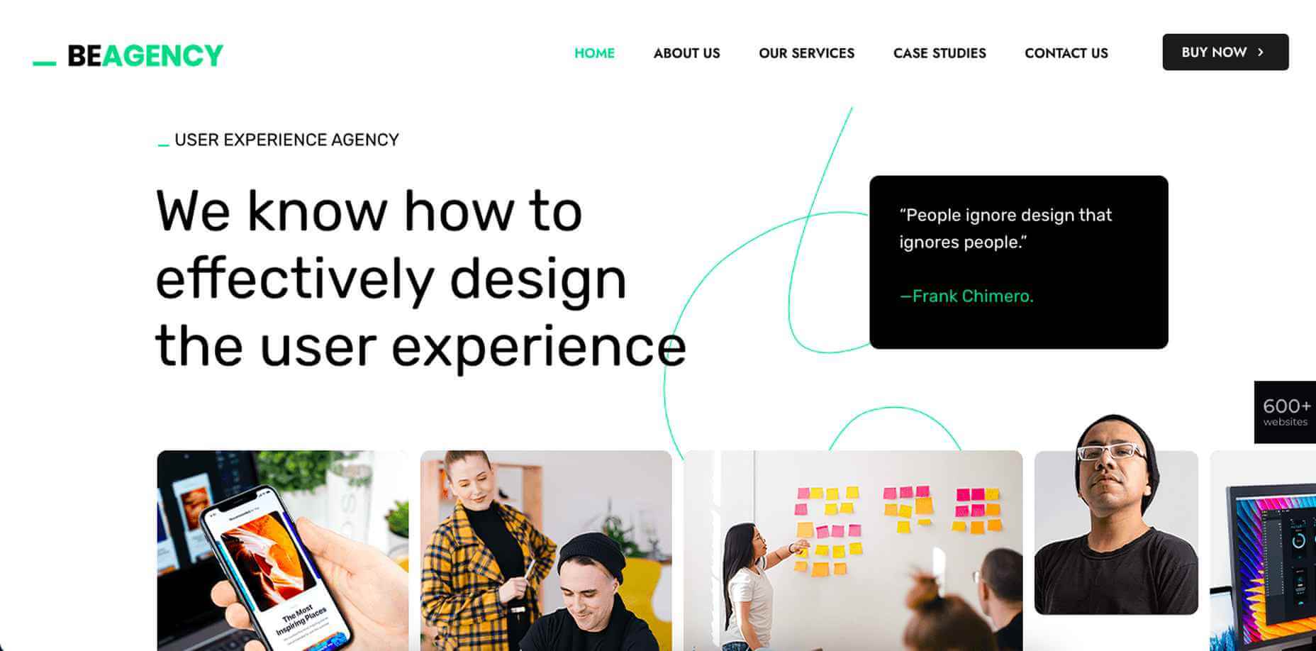
2. BeAgency 5
Like its predecessor, BeAgency 5 offers plenty of flexibility. You might find its completely different style more causal and relaxing, given the hand-drawn elements and small animations sprinkled throughout.
The extra feature here is a premade page for case studies you could use to add context to items in your portfolio.
3. BeArtist 3
Whether you’re a visual artist, photographer, graphic designer, writer, or whatever, the BeArtist 3 pre-built site’s cool design with its unique vibe could be just what the doctor ordered.
It even has a Shop setup you can use to sell your work, or you can convert it to a portfolio if you intend to showcase that.

4. BeBusiness 3
If you would like to create a simple website to market your artistic services BeBusiness 3 would be an excellent choice.
Whether you’re a photographer selling family portraits or wedding packages, a web developer searching for clients, or a graphic designer specializing in logo design, this pre-built site gives you a great starting point.

5. BeCompany 6
If you’re looking for a way to help your company stand out from those that would prefer to play it safe in terms of website design, this BeCompany 6 pre-built site, whose geometric shapes and illustrations give it a particularly artsy vibe, would be an option well worth considering.
Not to forget; among BeCompany 6’s features there’s a page with case studies that can help you highlight your work.

6. BeConsultant
It’s sometimes the case that after creatives have become experts at their game or craft, they branch out into consulting. If you fit into that category, you might find BeConsultant to be the perfect fit for you.
If you’re not a full-time consultant, or not into consulting at all, you could still use this pre-built site as the basis for a website to show off or sell your skills.

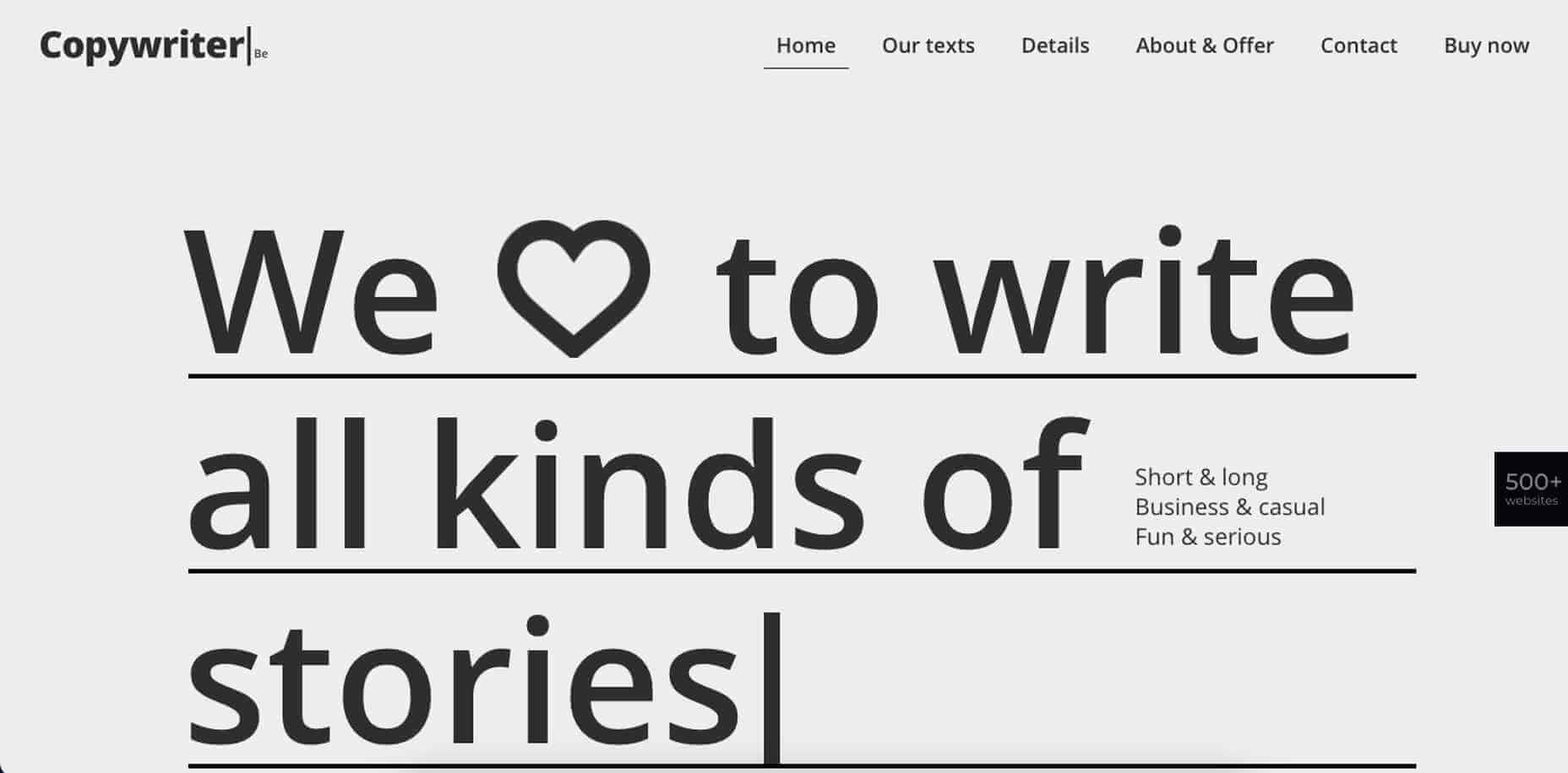
7. BeCopywriter 2
This one’s for writers. If that’s you, and your work is focused on words, it only makes sense to use a pre-built site like Copywriter 2 to beautifully showcase your content.
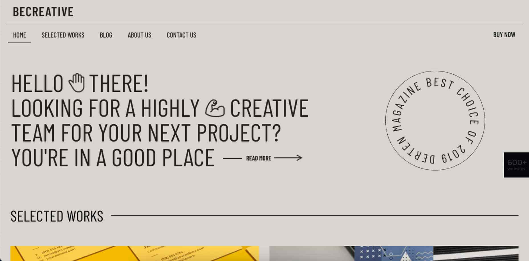
8. BeCreative 4
BeCreative 4 offers a distinctive point of view on what a typical website for creatives should look like.
While it features everything you need, e.g., a portfolio page is included along with a section for sharing testimonials, it offers a few other surprises as well; surprises like its left-aligned navigation for starters.
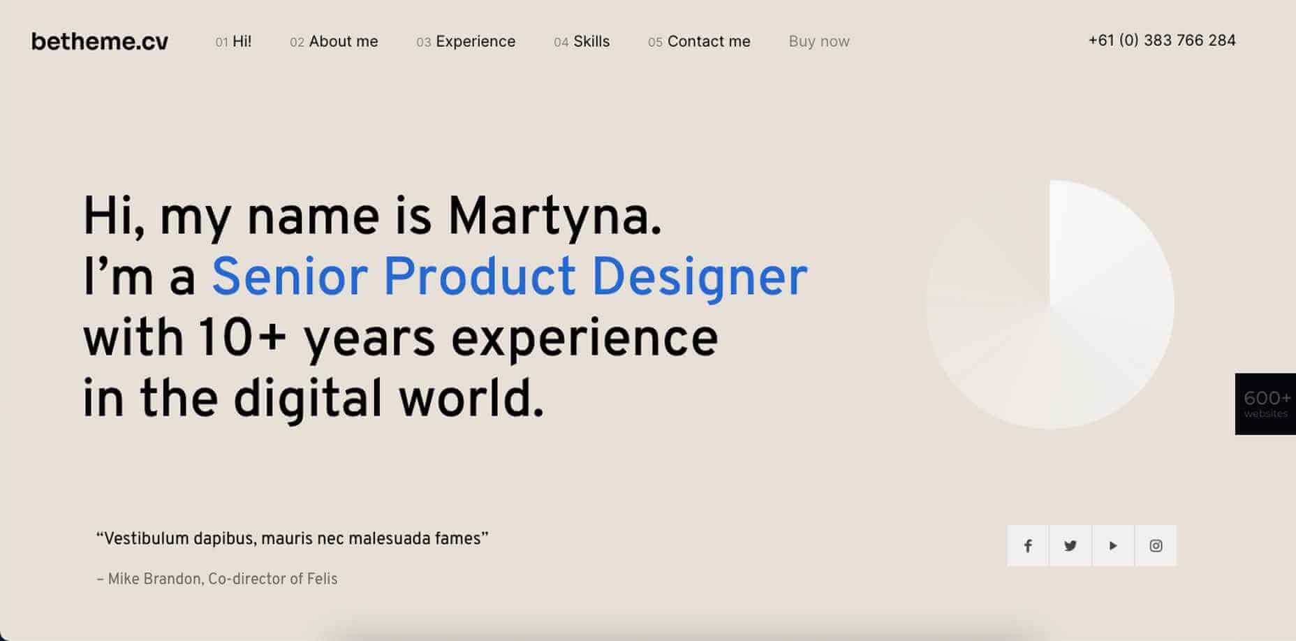
9. BeCV 2
BeCV 2 is not your standard digital CV or resume. Not by any means.
It’s a single page site that will serve as a perfect vehicle for sharing your skills, your experience, and your accomplishments as reflected in your body of work. It also gives prospective employers or clients the opportunity to connect with you directly through your site.
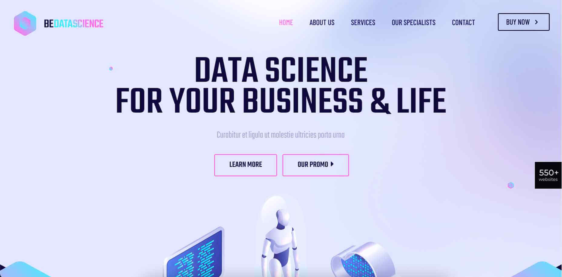
10. BeData
BeData would be a good choice for IT professionals, web developers, and programmers. Its layout, techy design, and cool features can easily be customized to suit your needs.
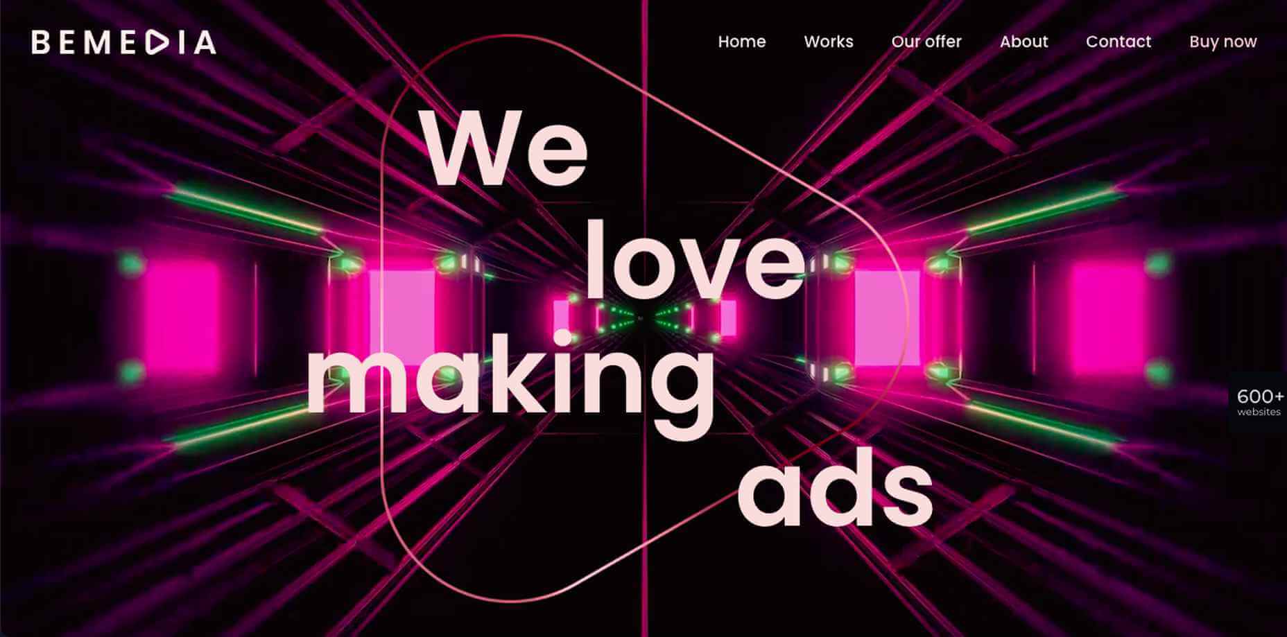
11. BeMedia 2
BeMedia 2 tests the limits of conventional design in a variety of ways, including its asymmetric layouts, outsized images, and its animated background video; all designed to instill a heavy dose of energy into your website and your brand.
12. BePhotography 3
The BePhotography 3 pre-built site isn’t for professional photographers only. If you are a web designer, an illustrator, or any kind of a visual creator, this image-centric pre-built site offers a great way to show off your creative efforts and dazzling works of art.
13. BePortfolio 2
BePortfolio 2 is great way for showing off in the best possible way your work, your experience, your list of clients, and whatever else is of importance to you and your business. For creative professionals it doesn’t get any better than this.
14. BeTheme
A great thing about using BeTheme is you can use it to create a website as simple or as complex as you like, as well as one that will get your message across in the best possible way. BeTheme comes with the building blocks you need, and quite naturally an impressive portfolio page.
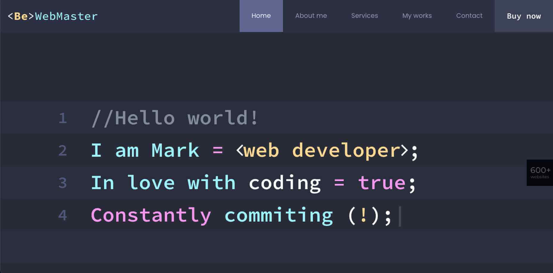
15. Webmaster 2
Programmers and developers. This pre-built website was created just for you.
BeWebmaster 2 gives you a fun way to take your techie language and translate it into something they can relate to.
Build a website you’ll be proud to share with the world.
One of the things users like best about using Be Theme is its huge selection of pre-built websites they can make a choice from (600 and counting to date!).
[– This is a sponsored post on behalf of BeTheme –]
The post 10+ Cool Pre-Built Websites Designed With Creatives and Developers in Mind first appeared on Webdesigner Depot.

 From dev tools to productivity to a little bit of fun with sudoku, this month’s collection of new tools is packed with something for everyone.
Here’s what new for designers this month.
May’s Top Picks
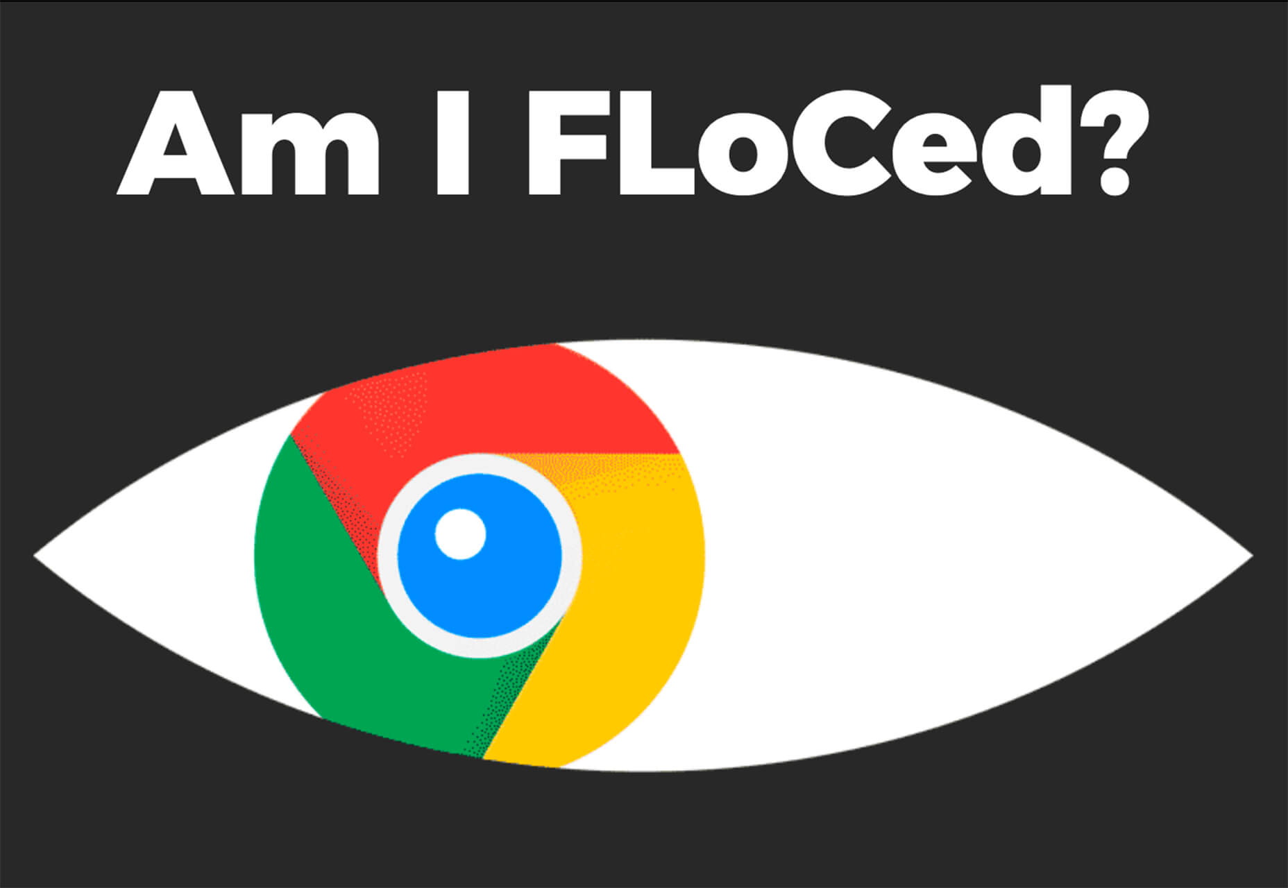
Am I FLoCed?
Am I FLoCed? Is a tool to see if you are part of a Google Chrome origin trial. It tests a new tracking feature called Federated Learning of Cohorts (FLoC). According to Google, the trial currently affects 0.5% of users in selected regions, including Australia, Brazil, Canada, India, Indonesia, Japan, Mexico, New Zealand, the Philippines, and the United States. The page will try to detect whether you’ve been made a guinea pig in Google’s ad-tech experiment.
According to the designers of Am I FloCed: “FLoC runs in your browser. It uses your browsing history from the past week to assign you to a group with other ‘similar’ people around the world. Each group receives a label, called a FLoC ID, which is supposed to capture meaningful information about your habits and interests. FLoC then displays this label to everyone you interact with on the web. This makes it easier to identify you with browser fingerprinting, and it gives trackers a head start on profiling you.”
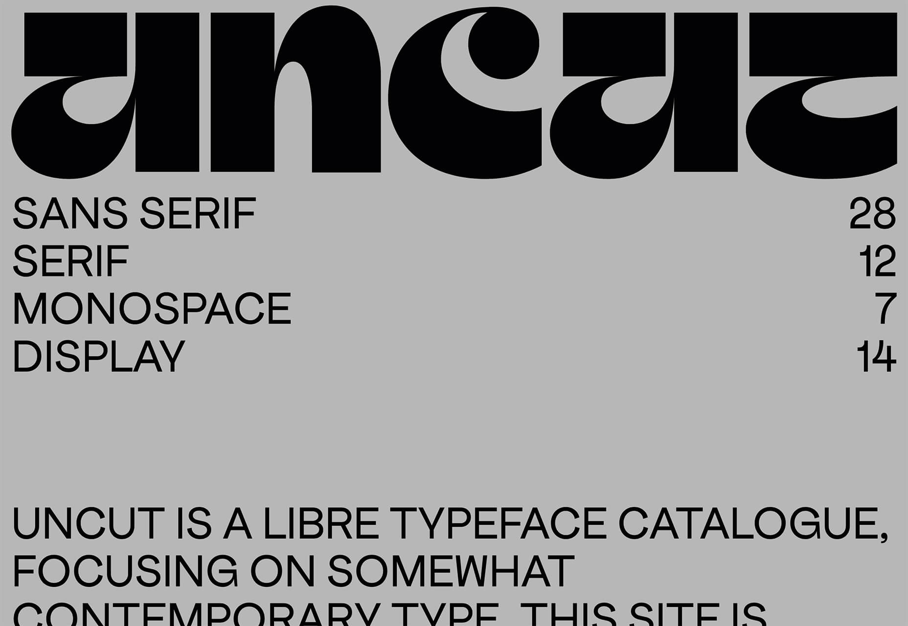
Uncut
Uncut is a Libre typeface catalog that just got started in April. It features contemporary typefaces and styles and is set to be updated regularly. Sort by sans serif, serif, monospace, or display typefaces. Plus, you can submit a typeface for inclusion.
Dashblock
Dashblock allows you to build automations without coding. Use it to create visual automations, or turn blocks into use-cases. (It is a premium tool, but comes with a 14-day free trial to test it out.)
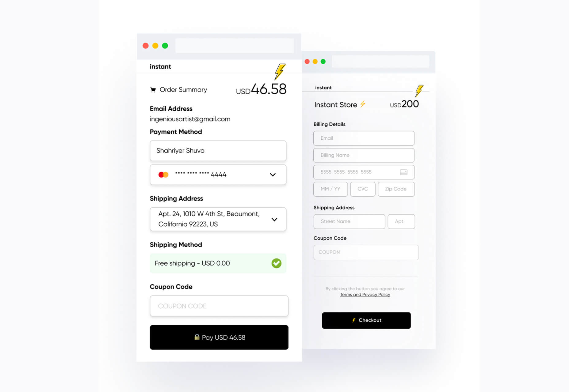
Instant
Instant is a fast and secure one-click checkout tool that works with WooCommerce. Users fill out a short form the first time they shop and then join the network to enable instant, frictionless, 1-click checkouts without passwords. It makes shopping easier and cuts abandoned carts.
5 Image Tools
Triangula
Triangula uses a modified genetic algorithm to triangulate images. It works best with images smaller than 3000px and with fewer than 3000 points, typically producing an optimal result within a couple of minutes. The result is a nifty-looking image.

Content-Aware Image Resizing in Javascript
Content-Aware Image Resizing in Javascript solves that problem with images where you have a photo but it just doesn’t quite fit. A crop doesn’t work because you lose important information. The carver slices and cuts photos to give you the image elements you want in the size you want them. It’s probably a good idea to read through the tutorial before jumping into the open-source code on GitHub.

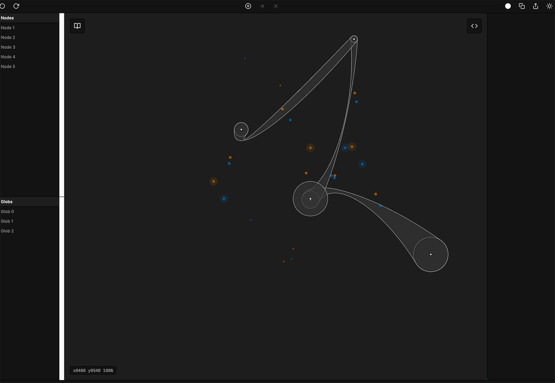
Globs Design
Globs Design uses toggles and drag and drop to help you create funky shapes and fills that you can save in SVG format for projects.
Root Illustrations
Root Illustrations is a stylish set of people-based illustrations that you can customize to create scenes for your projects. Construct a scene and then snag your set of vector graphics that also work with Sketch and Figma. The set includes 24 characters, more than 100 details, and the ability to change colors and styles.

Make Your Photo 16×9
Make Your Photo 16×9 is as simple as it sounds. It is a cropping tool that allows you to upload any shape of photo – even vertical – and pick options to fill the space to make it fit the standard 16×9 aspect ratio.

6 Dev Tools
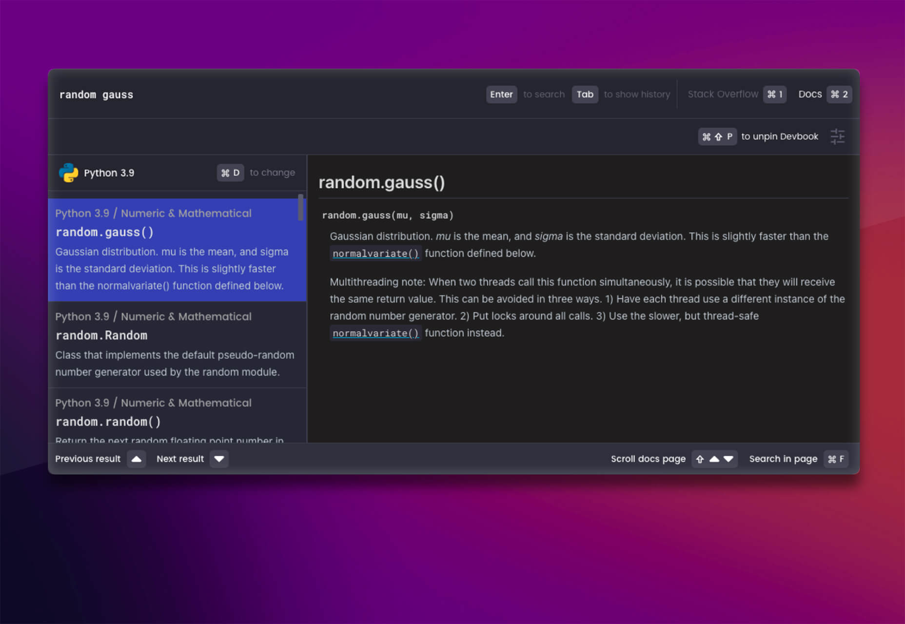
Devbook
Devbook is a search engine for developers that helps them to find the resources they need and answer their questions faster. Fast, accessible right from a code editor, and fully controllable with just a keyboard.
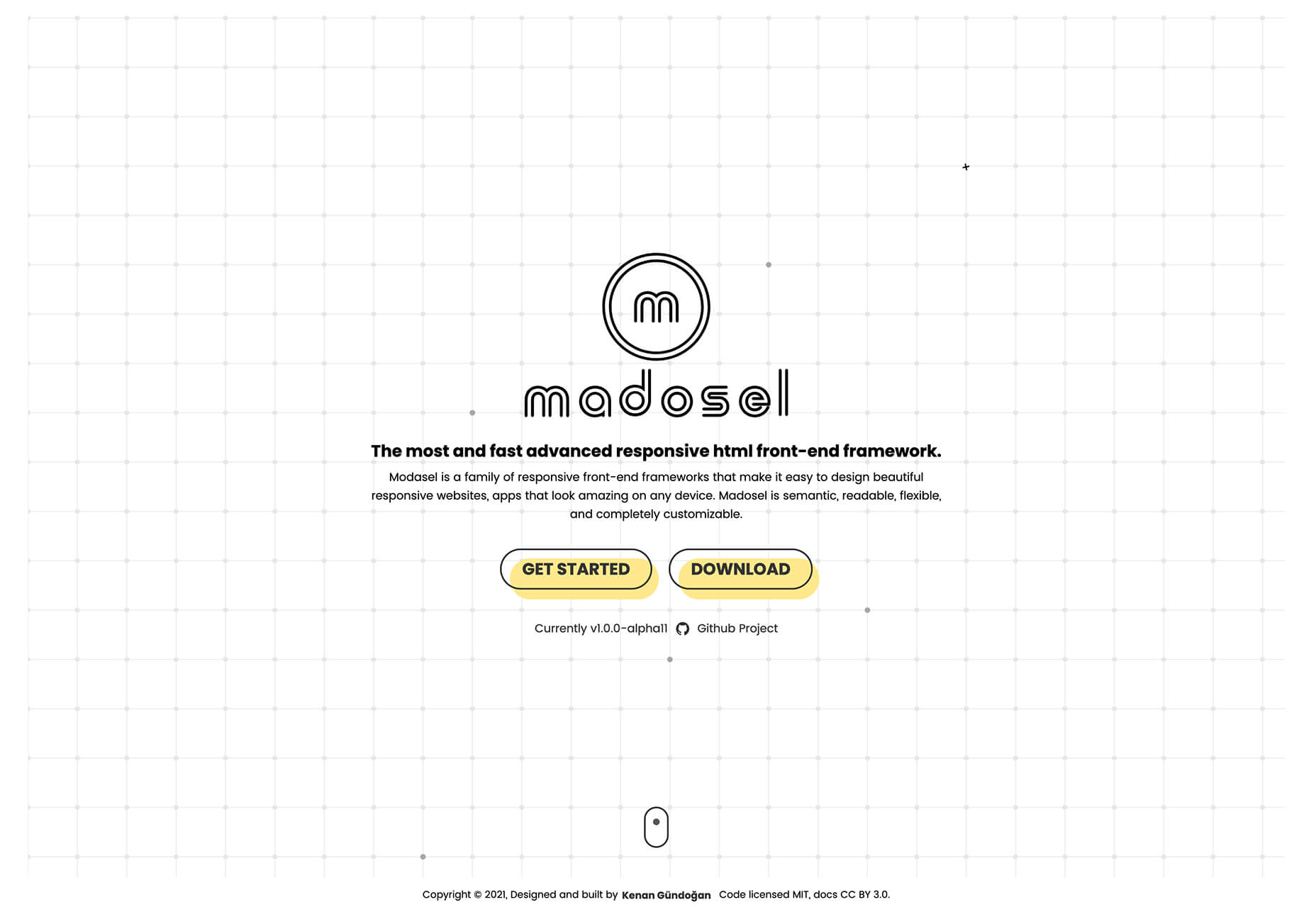
Madosel
Madosel is a fast, advanced responsive HTML front-end framework that’s in an alpha version. The open-source tool is made to create websites and apps that look great on any device. Plus, it is semantic, readable, flexible, and customizable.
Say Hello to CSS Container Queries
Say Hello to CSS Container Queries helps solve a problem with media queries and smart stacking of elements. CSS Container Queries allow you to make a fluid component that adjusts based on the parent element and everything is independent of viewport width. This post takes you through everything you need to do to implement this yourself.
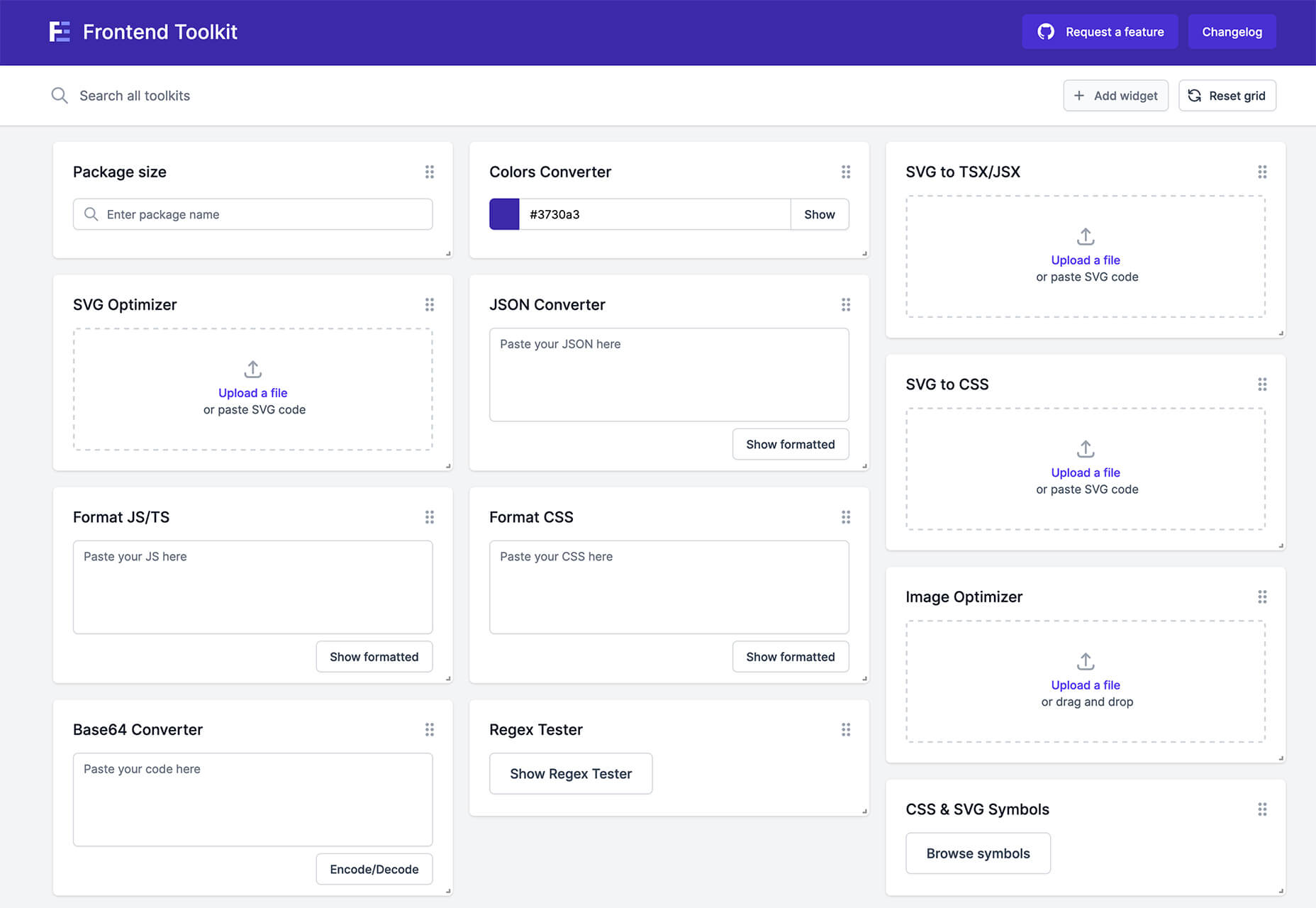
Frontend Toolkit
Frontend Toolkit is a customizable dashboard that you can use to keep up with recurring tasks. It’s one of those little tools that can speed up workflows.
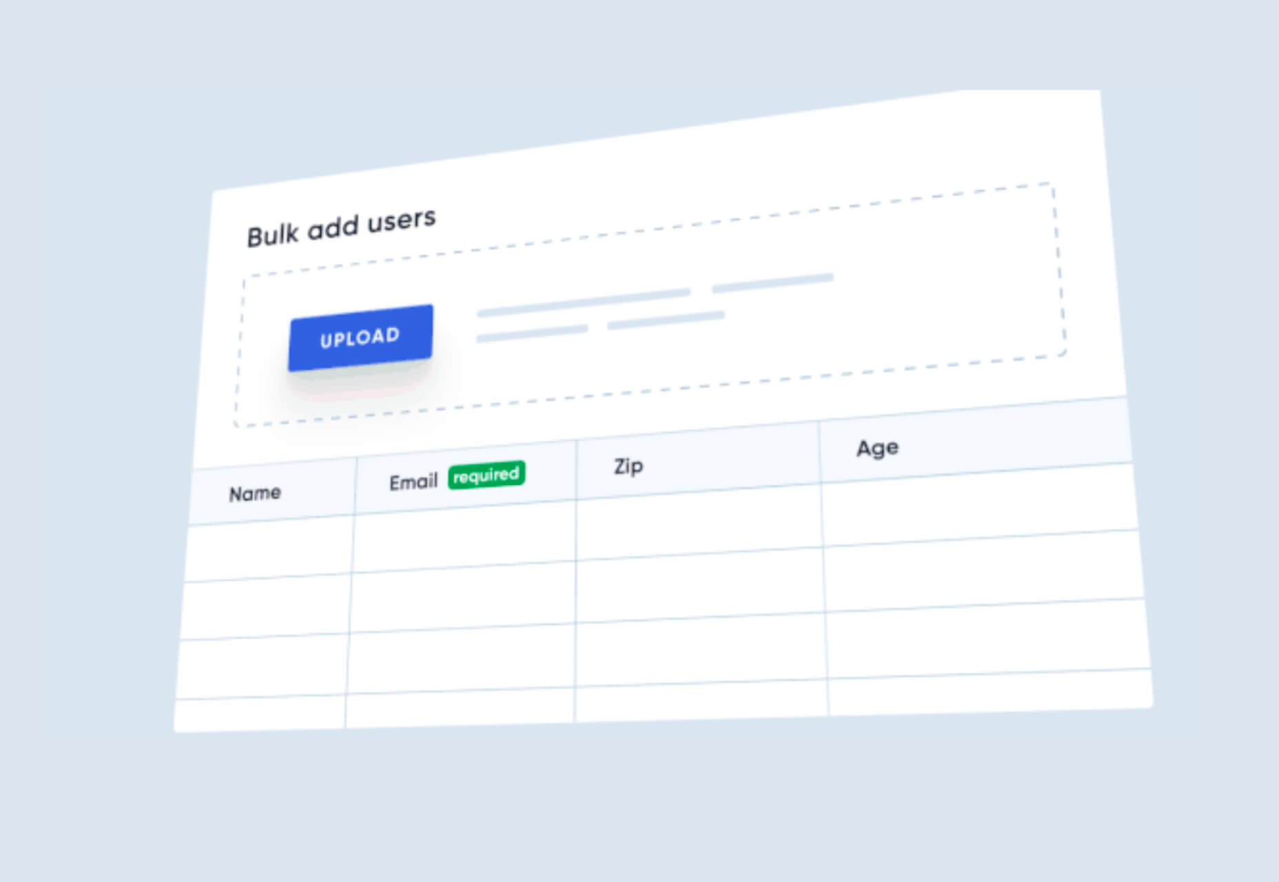
Flatfile
Flatfile is a production-ready importer for SaaS applications. It allows you to auto-format customer spreadsheets without manual cleaning of data and you can do it all without a CSV parser. The tool also includes an elegant UI component to guide users through the process.
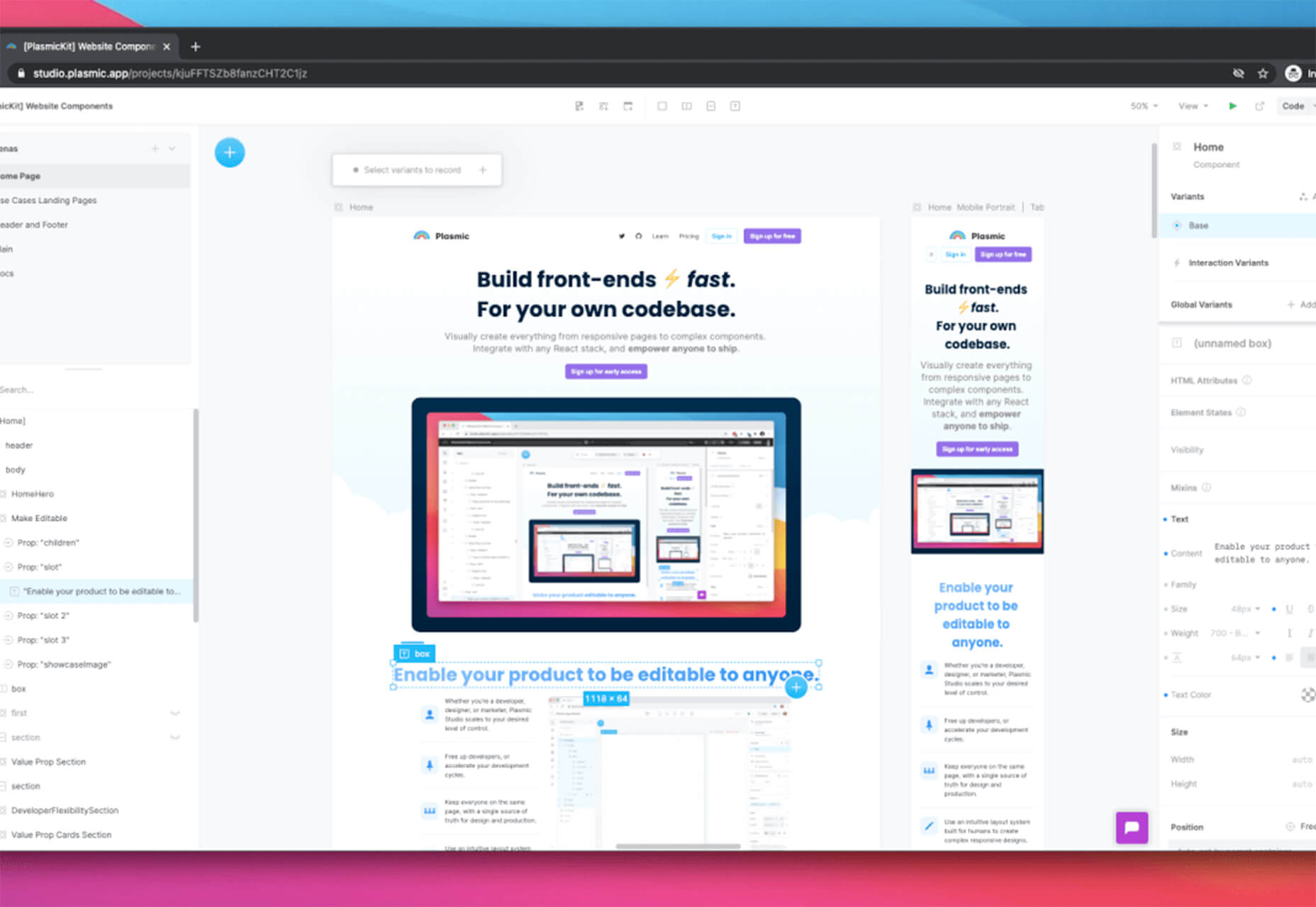
Plasmic
Plasmic is a visual website builder that works with your codebase. It’s designed to speed up development with developers focusing on code (not pixel pushing) and allows non-developers to publish pages and content. The premium tool works with any hosting, CMS, or framework and you can adapt it by the component, section, or page.
2 Productivity Tools
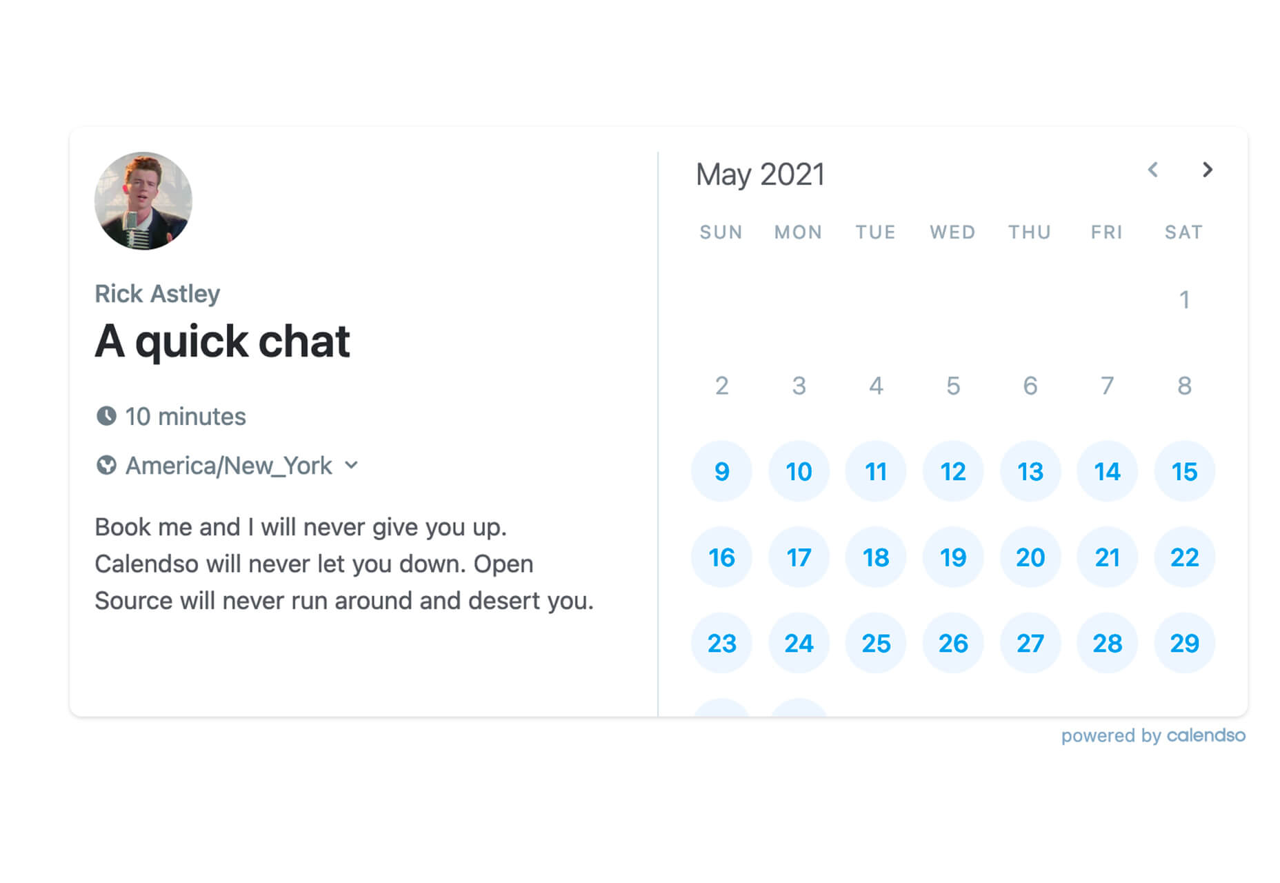
Calendso
Calendso is an open-source calendar scheduling tool. It’s flexible with the ability to host it yourself or with the makers of the calendar. It is API-driven and allows you to control events and information. The interface is simple and sleek and can integrate into your website.
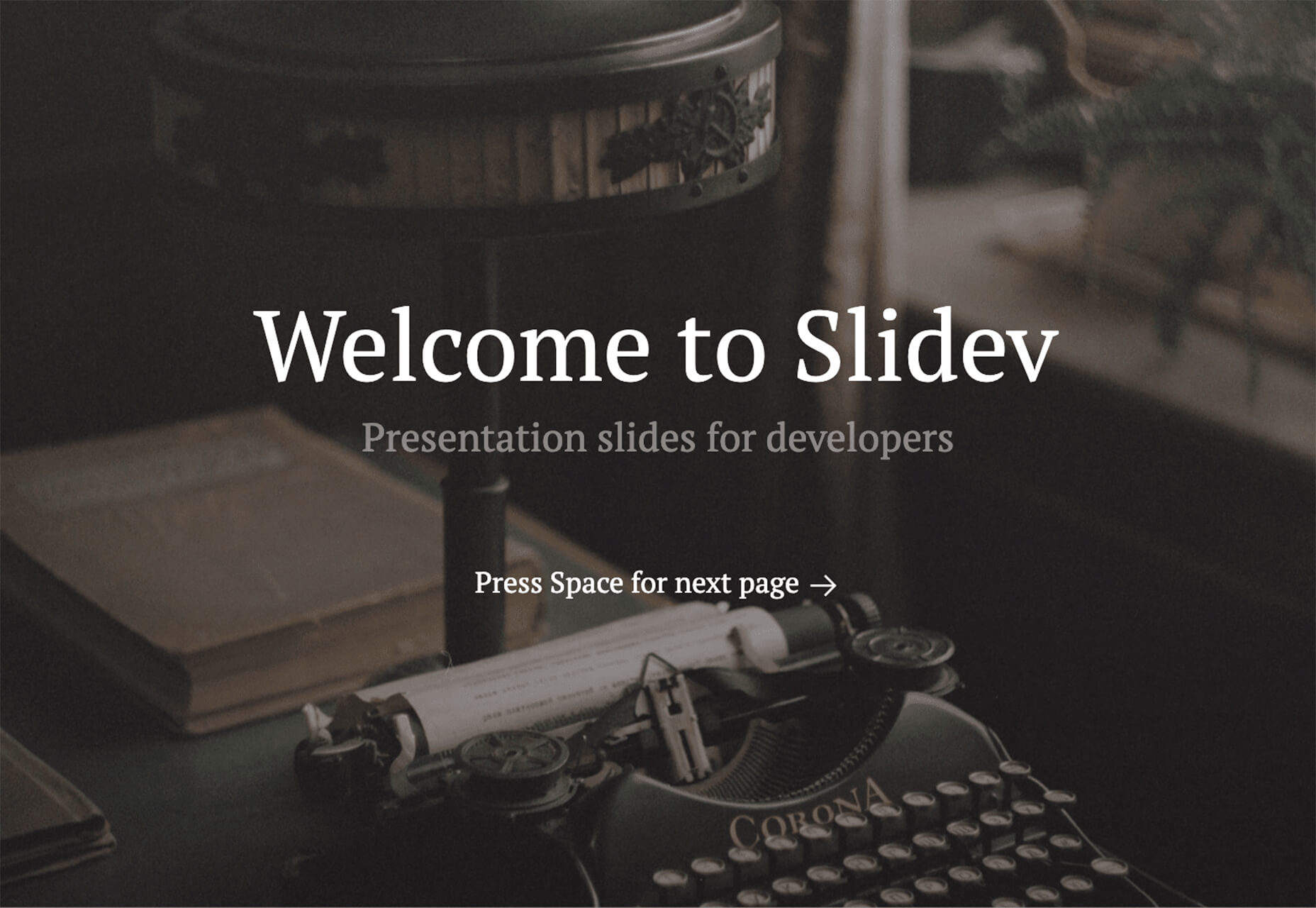
Slidev
Slidev is a set of presentation slides for developers. What’s different about this presentation deck is that you can write slides in a single markdown file with themes, code blocks, and interactive components.
4 Icons and UI Kits
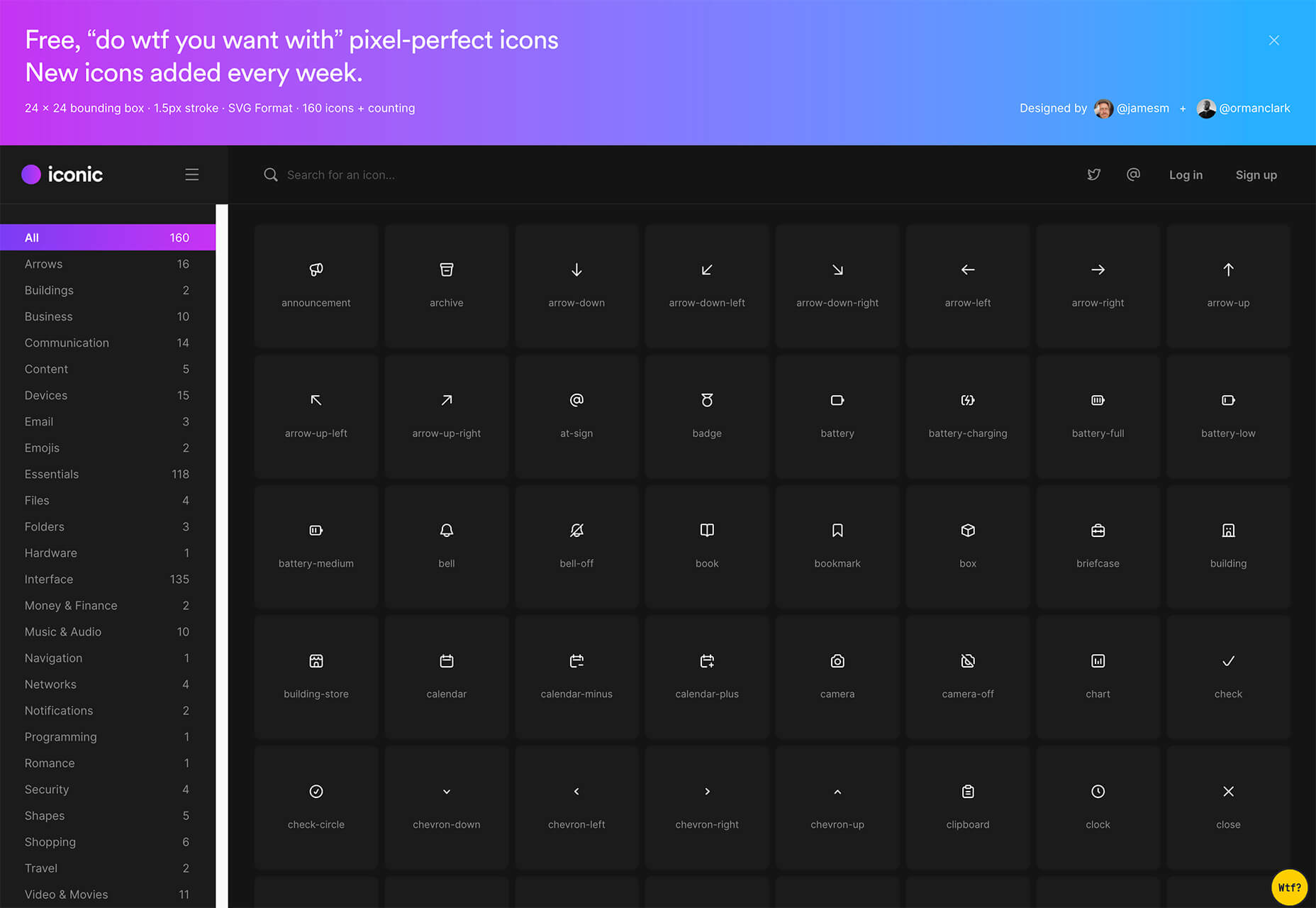
Iconic
Iconic is a set of pixel-perfect icons that gets updated each week. The collection of 24×24 px elements in SVG format contains 160 icons and counting. The simple style is easy to implement and you can search for just what you need by category.
5 Dashboard Templates for Figma
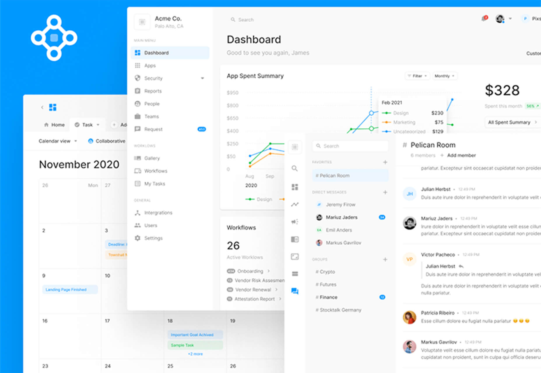
5 Dashboard Templates for Figma is a set of free ready-made screens with light and dark modes for each that you can use with components such as calendars, charts, tables, and more. The free elements are a preview of a larger premium Figma set if you like how they look and work.
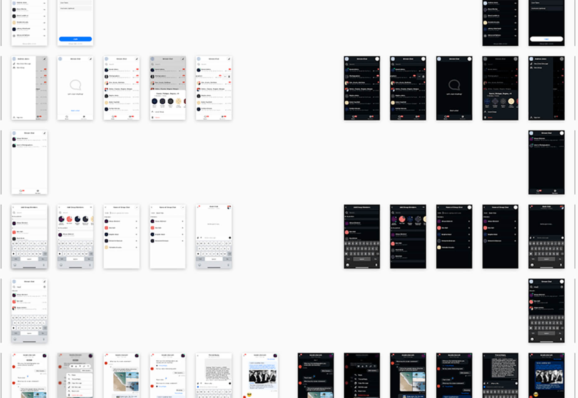
Free Mobile Chat UI Kit
Free Mobile Chat UI Kit is a tool of components for Sketch, Figma, and Adobe XD that includes more than 50 messaging screens with light and dark modes.
Stratum UI Design Kit
Stratum UI Design Kit is a collection of more than 9,000 consistent elements for Figma. It’s packed with elements and tools that make this premium UI kit a tool that gets projects moving quickly.
4 Type Tools and Fresh Fonts
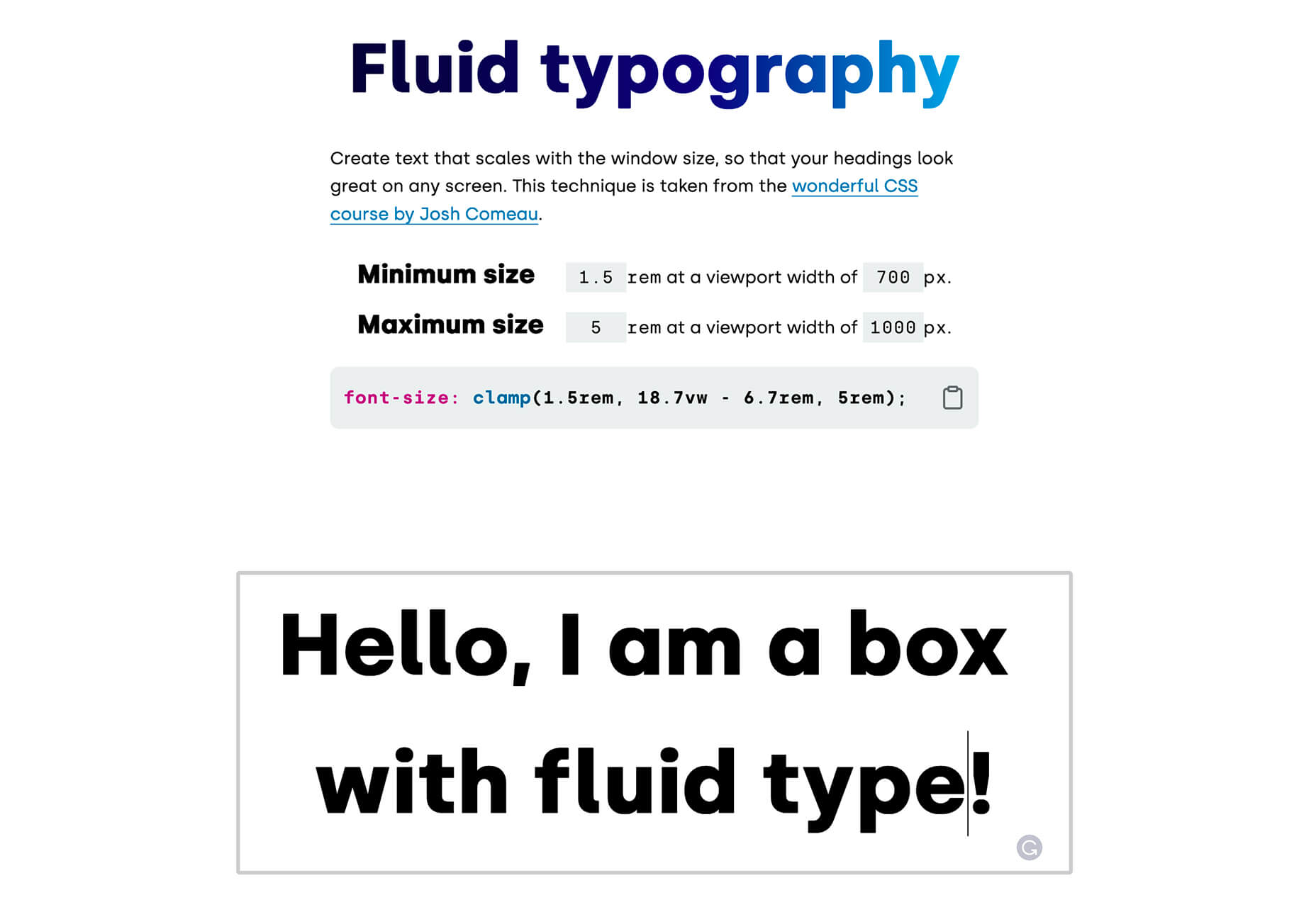
Fluid Typography
Fluid Typography is a nifty tool that allows you to test headings in any size at different viewports to ensure it looks great everywhere. Then you can copy the CSS and use it in your projects.
Eighty-Eight
Eighty-Eight is a funky block-style typeface for display use.

Harmonique
Harmonique is a robust typeface family with lovely serifs and alternates. It’s a type family of two styles that work in harmony together to add distinction and personality to your own typographic compositions. Harmonique’s low contrast forms have the appeal of a humanist sans serif typeface.

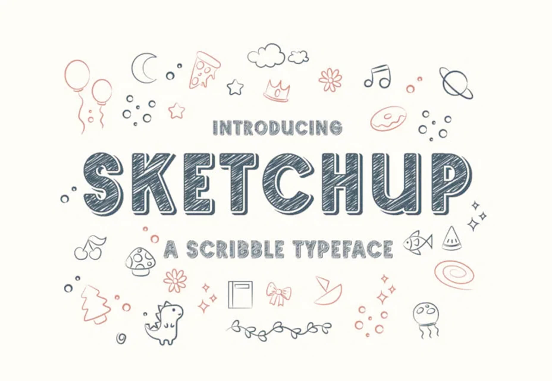
Sketchup
Sketchup is a charming display typeface that has a nice pen style. The free version has a limited character set.
Just for Fun
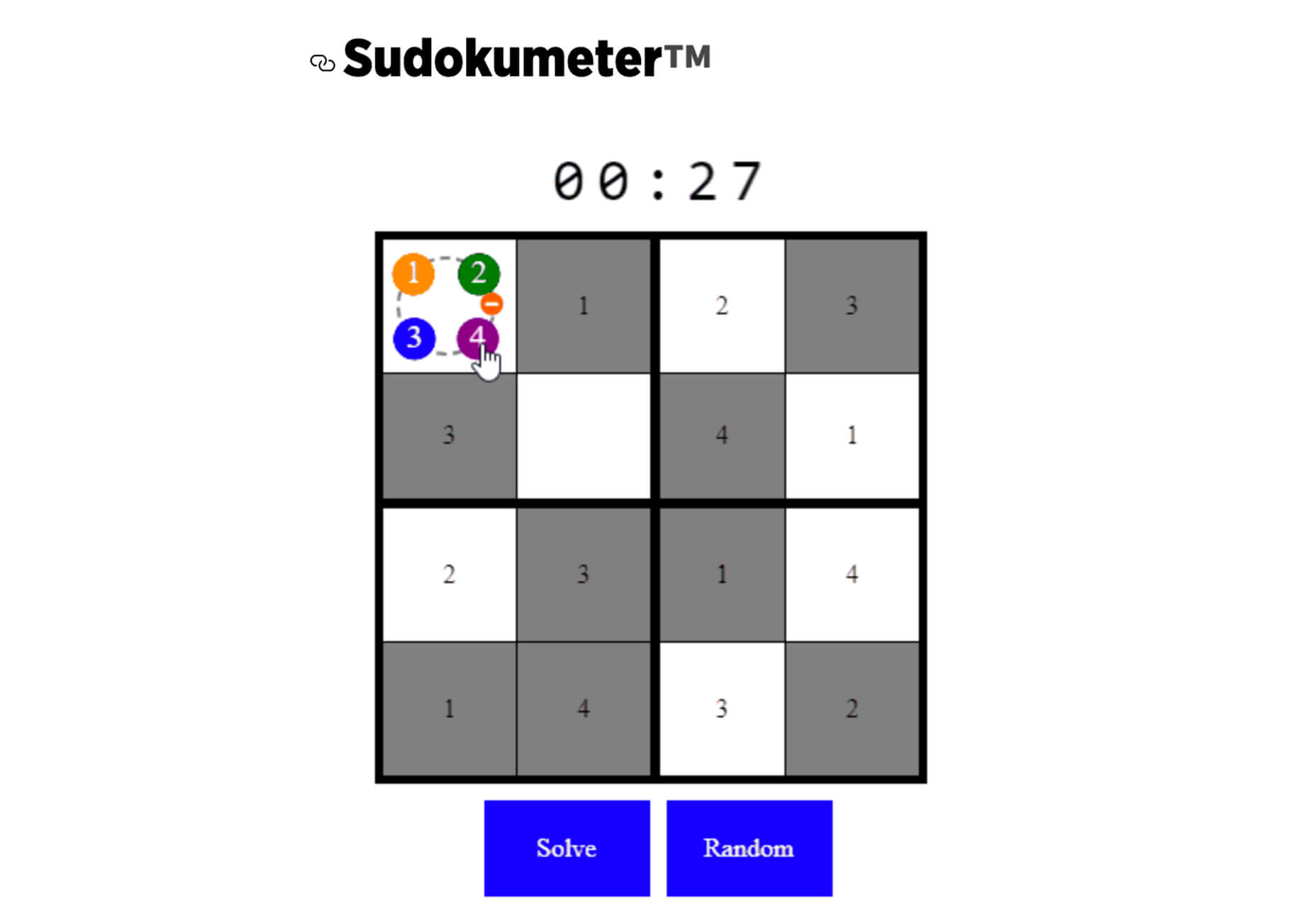
Generating and Solving Sudokus in CSS
Generating and Solving Sudokus in CSS by Lee Meyer for CSS-Tricks is a fun deep dive into using CSS for something you might not expect. It’s a complicated – but fun – look at some of the things CSS can do with plenty of code snippets. The final result is a solvable puzzle with 16 squares.
The post 26 Exciting New Tools For Designers, May 2021 first appeared on Webdesigner Depot.

 WordPress powers nearly 40% of all websites, thanks to its commitment to making publication possible for everyone, for free. Combined with premium plugins and themes, it’s possibly the ultimate tool for building attractive, unique, and feature-rich websites without any coding or design experience.
However, you do pay the price for this experience, with WordPress and its third-party products not always being built for performance – whether it’s page loading times or SEO.
Image optimization is a particularly big concern. Images are one, if not the largest, contributors to page weight, and it’s growing significantly by the year. So, while images are crucial for beautifying your website pages, they are also one of the biggest factors slowing it down.
In terms of image optimization, WordPress+Elementor brings very little to the table. WordPress core now comes with both responsive syntax and lazy-loading. Elementor itself also only comes with responsive syntax out-of-the-box. However, these are baseline techniques for image optimization that will deliver the bare minimum of improvements.
This means that, while Elementor makes it easy to design sweet-looking WordPress pages (with tonnes of creatively utilized images), you will probably pay the price when it comes to performance. But don’t worry. We will show you how to dramatically improve web performance by over 30 points on scoring tools like Google’s PageSpeed Insight.
Why Optimize Your Elementor Images with ImageEngine?
In general, image CDNs use various techniques to get image payloads as small as possible and deliver image content faster, all while minimizing the visual impact. ImageEngine is no different in that regard.
Firstly, ImageEngine, when used in auto mode, will apply all of the following optimizations that web performance tools like Google’s PageSpeed Insight recommend. For example:
- Properly size images – ImageEngine automatically resizes images for optimal size-to-quality ratios depending on the screen size of the user device. ImageEngine supports Retina devices.
- Efficiently encode images – Applies different rates of compression depending on the PPI of the user devices. For example, ImageEngine adapts and more aggressively compresses on higher PPI devices without losing visual quality.
- Next-gen format conversion – Automatically converts images to the optimal next-gen format according to the browser, device, or OS. ImageEngine can convert images to WebP or JPEG-2000 as well as GIFs to MP4 or WebP. AVIF is also available in a manual directive mode.
- Strip unnecessary metadata
While these features are standard for most image CDNs, ImageEngine is unique for its use of WURFL device detection. This gives ImageEngine much deeper insight into the user device accessing a website page and, by extension, its images. Using the screen size, resolution, PPI, etc., ImageEngine can make more intelligent decisions regarding how to reduce image payloads while maintaining visual quality.
This is why ImageEngine brands itself as an “intelligent, device-aware” image CDN and why it can reduce image payloads by as much as 80% (if not more).
ImageEngine also provides a proprietary CDN service to accelerate image delivery. The CDN consists of 20 globally positioned PoPs with the device-aware logic built-in. This allows you to deliver image content faster in different regions while also serving images straight from the cache with a ~98% hit ratio.
ImageEngine also supports Chrome’s save data setting. If someone has a slow connection or has activated this setting, ImageEngine will automatically compress image payloads even more, to provide a better user experience on slower connections.
How to Use ImageEngine with WordPress and Elementor
If you’re using WordPress and Elementor, then chances are you want to spend as little time on development and other technicalities as possible. Luckily, ImageEngine is a highly streamlined tool that requires little to no effort to integrate or maintain with a WordPress site.
Assuming you already have a WordPress website with Elementor, here are the step-by-step instructions to use ImageEngine:
- Go to ImageEngine.io and sign up for a 30-day free trial.
- Provide ImageEngine with the URL of the website you want to optimize.
- Create an account (or sign up with your existing Google, GitHub, or ScientiaMobile account).
- Provide ImageEngine with the current origin where your images are served from. If you upload images to your WordPress website as usual, then that means providing your WordPress website address again.
- Finally, ImageEngine will generate an ImageEngine delivery address for you from where your optimized images will be served. This typically takes the form of: {randomstring}.cdn.imgeng.in. You can change the delivery address to something more meaningful from the dashboard, such as myimages.cdn.imgeng.in.
Now, to set up ImageEngine on your WordPress website:
- Go to the WordPress dashboard and head to Plugins -> Add New.
- Search for the “Image CDN” plugin by ImageEngine. When you find it, install and activate the plugin.
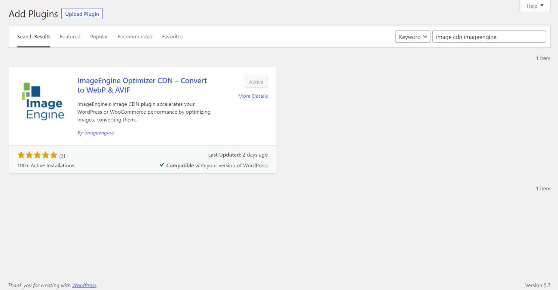
- Go to Settings -> Image CDN. OK, so this is the ImageEngine plugin dashboard. To configure it, all you need to do is:
a. Copy the delivery address you got from ImageEngine above and paste it in the “Delivery Address” field.
b. Tick the “Enable ImageEngine” box.
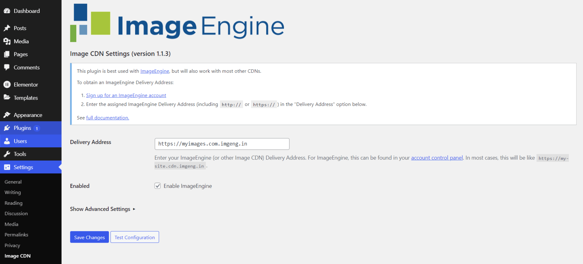
That’s literally it. All images that you use on your WordPress/Elementor pages should now be served via the ImageEngine CDN already optimized.
ImageEngine is largely a “set-it-and-forget-it” tool. It will provide the best results in auto mode with no user input. However, you can override some of ImageEngine’s settings from the dashboard or by using URL directives to manipulate images.
For example, you can resize an image to 300 px width and convert it to WebP by changing the src attribute like this:
<img src="https://myimages.cdn.imgeng.in/wp-content/uploads/2021/03/banner-logo.png?imgeng=/w_300/f_webp">
However, use this only when necessary, as doing so will limit ImageEngine’s adaptability under different conditions.
What Improvement Can You Expect?
Let’s see what results you can expect from using an image CDN to improve your page loading times.
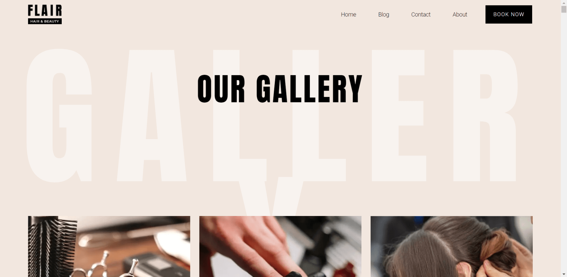
For this, I created two identical WordPress pages using the Elementor theme. The one page purely relied on WordPress and Elementor, while I installed and set up ImageEngine for the other. The page had some galleries as well as full-size images:


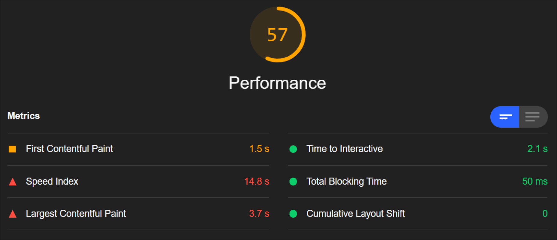
The pages used many high-quality images, as you might expect to find on a professional photography gallery, photography blog, stock photo website, large e-commerce site, etc. I then ran page performance tests using Chrome’s built-in Lighthouse audit tool, choosing scores representing the average results I got for each page.
For thoroughness, I tested both the mobile and desktop performance. However, I focused on the mobile results as these showcase more of the image CDN’s responsive capabilities. Mobile traffic also accounts for the majority share of internet traffic and seems to be the focus for search engines going forward.
So, first of all, let’s see the mobile score for the page without ImageEngine:
As you can see, there was definitely a struggle to deliver the huge amount of image content. Google has shown that 53% of mobile users abandon a page that takes more than 3s to load. So, clearly, this page has major concerns when it comes to user experience and retaining traffic.
The desktop version fared much better, although it still left much to be desired:
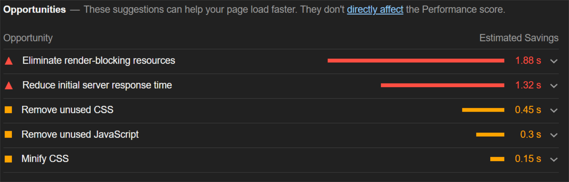
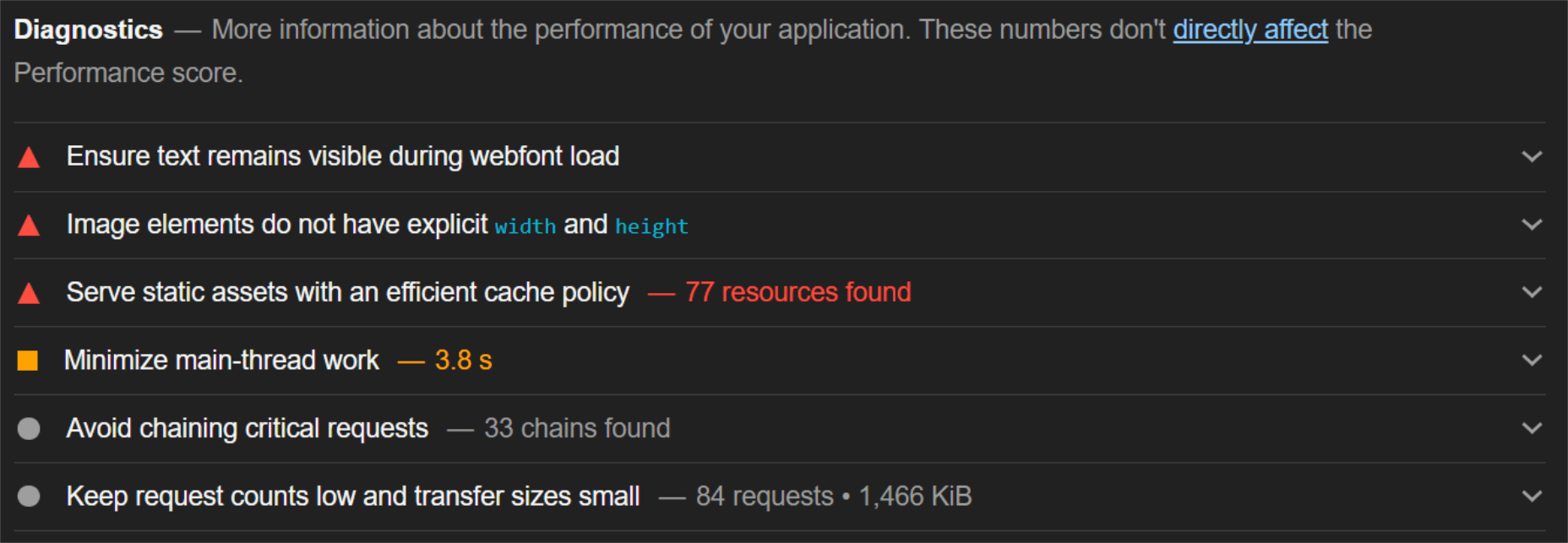
When digging into the reasons behind the slowdown, we can identify the following problems:
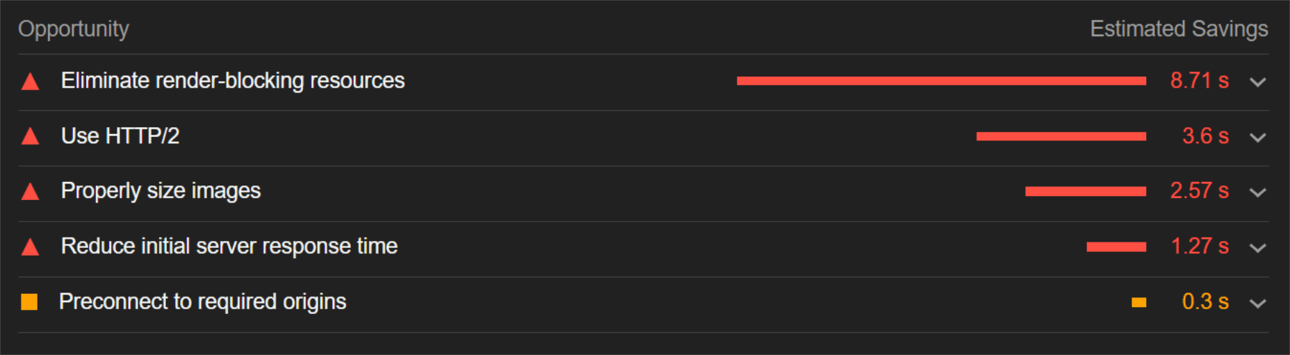
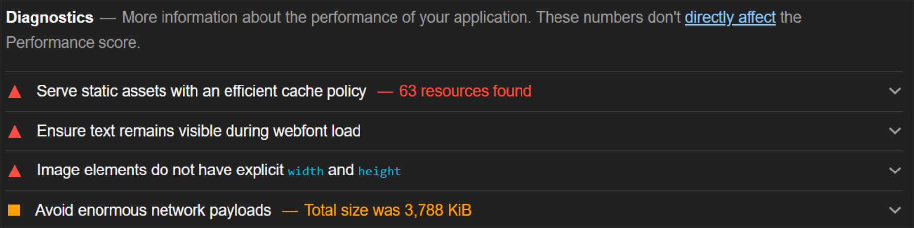
Most of the issues related somehow to the size and weight of the images. As you can see, Lighthouse identified a 3.8 MB payload while the total image payload of the entire page was close to 40 MB.
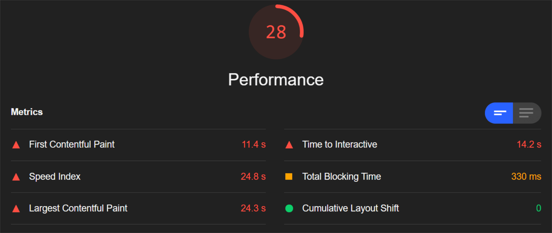
Now, let’s see what kind of improvement ImageEngine can make to these issues by looking at the mobile score first:
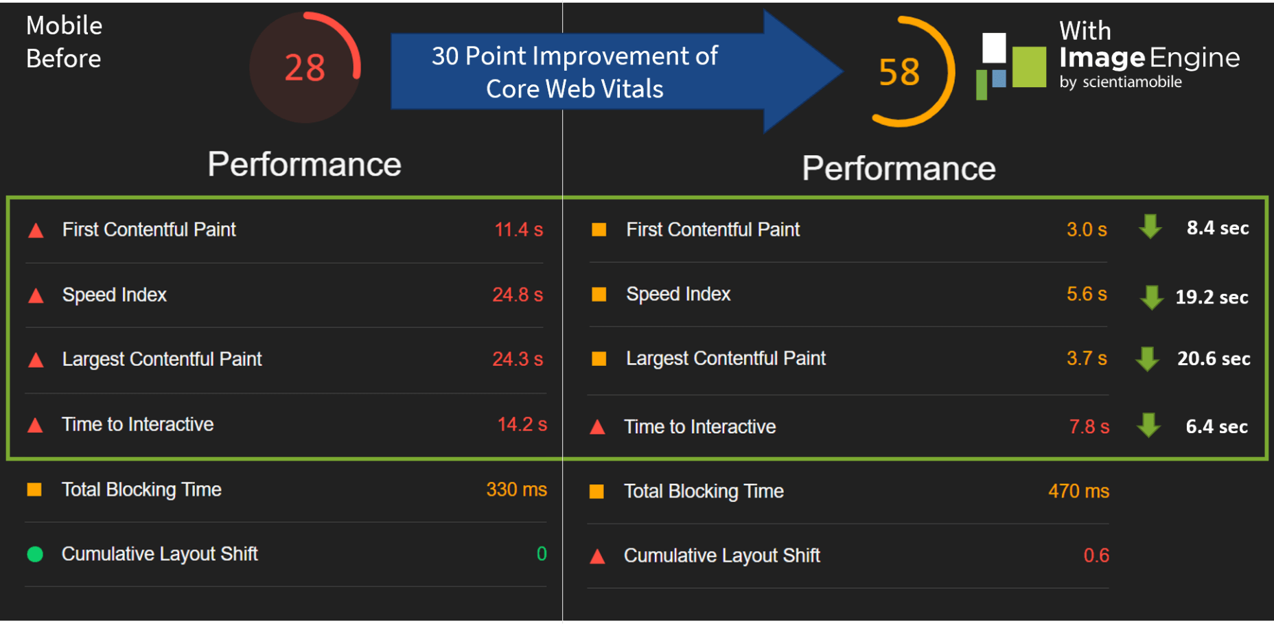
So, as you can see, a major improvement of 30 points over the standard WordPress/Elementor page. The time to load images was cut down by roughly 80% across the key core web vital metrics, such as FCP, LCP, and the overall Speed Index.
In fact, we just reached that critical 3s milestone for the FCP (the largest element on the visible area of the page when it initially loads), which creates the impression that the page has finished loading and will help you retain a lot of mobile traffic.
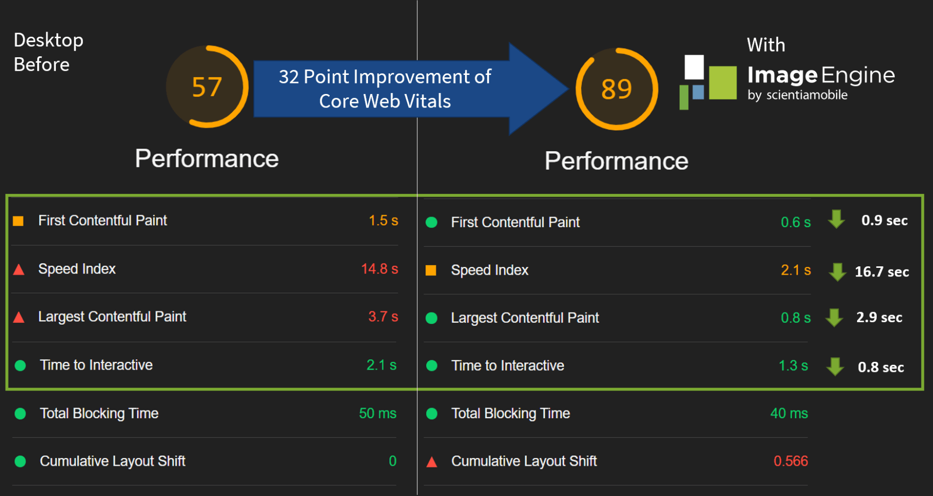
The desktop score was also much higher, and there was further improvement across the key performance metrics.
If we look at the performance problems still present, we see that images are almost completely removed as a concern. We also managed to bring down the initial 3.8 MB payload to around 1.46 MB, which is a ~62% reduction:
An unfortunate side effect of using WordPress and WordPress plugins is that you will almost inevitably face a performance hit due to all the additional JavaScript and CSS. This is part of the reason why we didn’t see even larger improvements. That’s the price you pay for the convenience of using these tools.
That being said, the more images you have on your pages, and the larger their sizes, the more significant the improvement will be.
It’s also worth noting that lazy-loaded images were loaded markedly faster with ImageEngine if you quickly scroll down the page, again making for an improved user experience.
Thanks to its intelligent image compression, there was also no visible loss in image quality, as you can see from this comparison:

Conclusion
So, as you can see, we can achieve significant performance improvements on image-heavy websites by using the ImageEngine image CDN, despite inherent performance issues using a CMS. This will translate to happier users, better search engine rankings, and an overall more successful website.
The best part is that ImageEngine stays true to the key principles of WordPress. You don’t have to worry about any of the nuts and bolts on the inside. And, ImageEngine will automatically adjust automation strategies as needed, future-proofing you against having to occasionally rework images for optimization.
The post Create Beautiful WordPress Pages with Optimized Images Using Elementor and ImageEngine first appeared on Webdesigner Depot.

 Spring and fresh designs are in the air. This month, it’s obvious that designers are feeling creative with new and interesting concepts that range from a new style for cards, homepage experimentation with multiple entry points or calls to action, and risky typography options.
Here’s what’s trending in design this month.
1. “Flat” Cards
Card-style design elements that allow users to click through to other content aren’t new, but the design of these cards is fresh and interesting.
Rather than more heavily designed cards with shadows and layers of content, flat styles are trending. Expect this trend to explode thanks to usage by Google for a shopping experience page.
The Google example below is interesting because Google’s Material Design guidelines are what helped card-style elements grow in popularity previously. However, those cards did include more layers, color options, buttons inside the cards, and shadows.
Today’s trending cards are completely flat. And beautiful.
Each of these websites does it in a slightly different way.
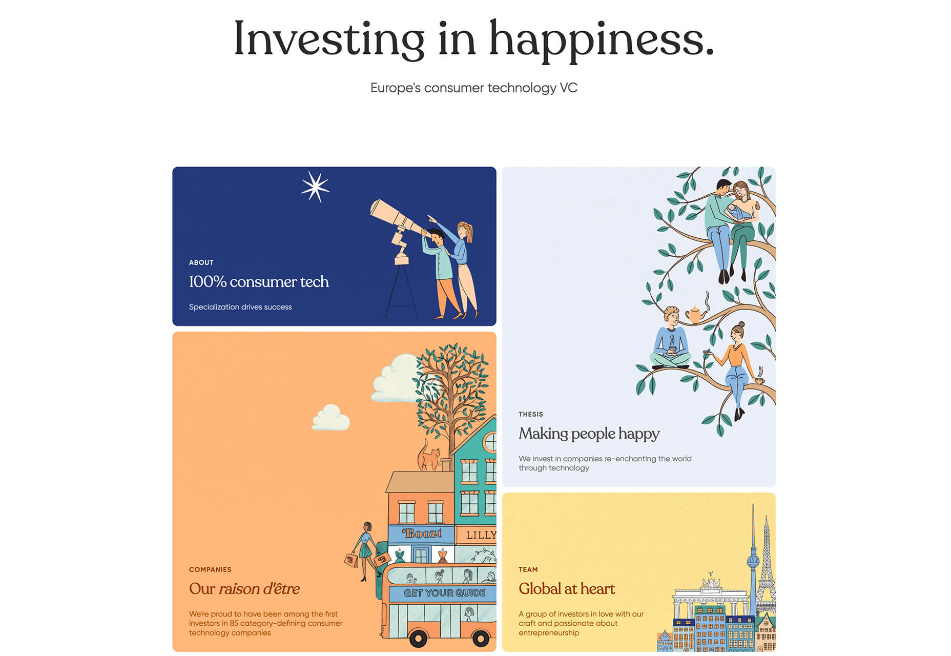
Heartcore, a consumer technology VC company, uses a series of flat cards as a navigation element to help users find their way through the website. Each features a bright color background with an illustration and a simple text block.
Each card has a nice hover state where only the illustration zooms inside the card frame. This is an interesting effect because it is exactly the opposite of the previous iteration of cards, which zoomed the entire card as a hover state.
Google Shopping uses that whole card bounce hover state (plus a not-so-flat shadow) for each card. The initial design is sleek with the pairing of white and image cards with simple text in each. You are enticed to click around to see what happens.
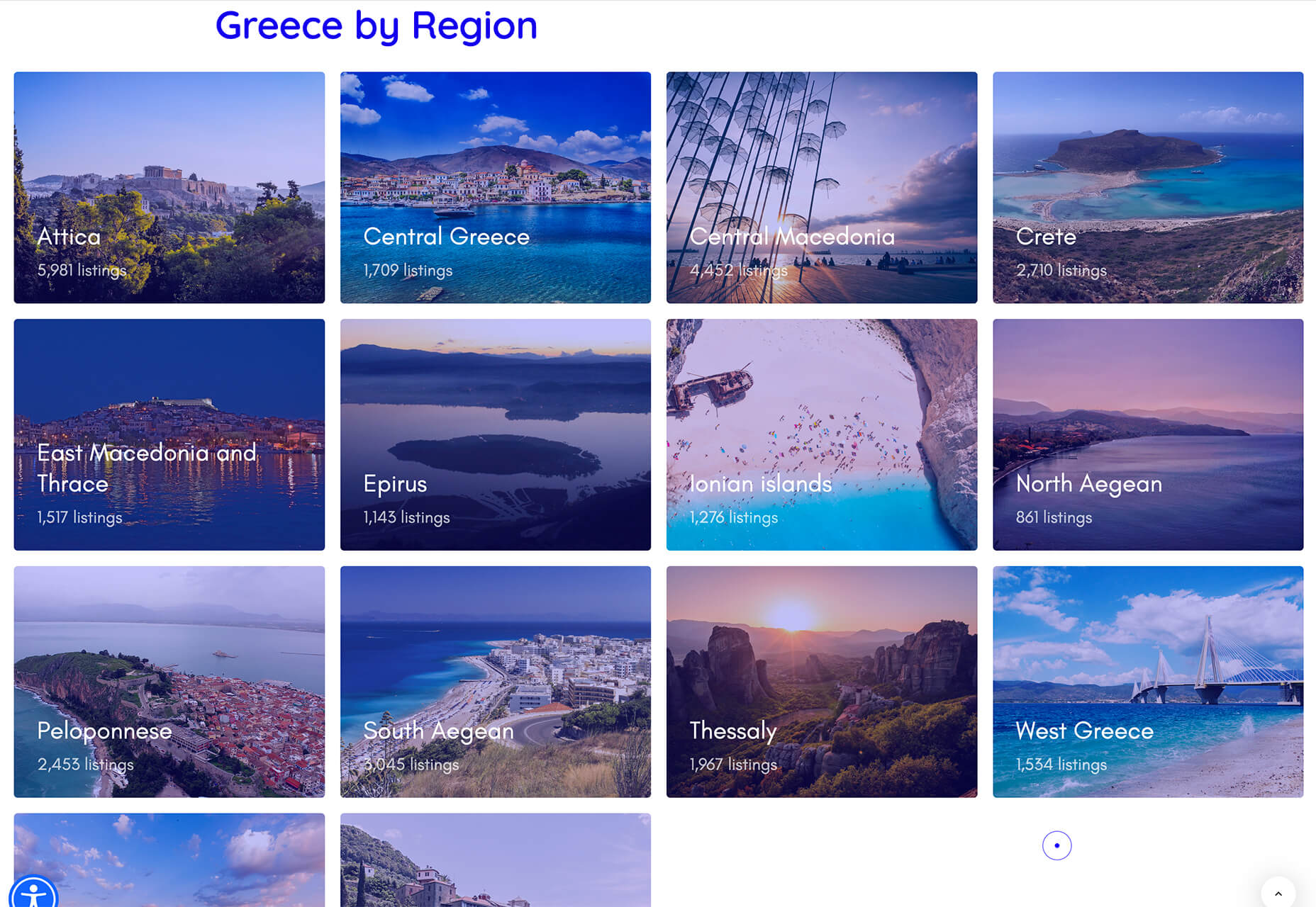
Click on Greece is a travel website design that uses simple cards with a minimal color and text overlay. The consistency of these cards makes the design pop and the beauty of the images draw you in. Each card also has a hover state with a darker color mask to guide navigation and make text elements easier to read.
2. Multiple Homepage Entry Points
For a long time, designers have been working off the philosophy that the homepage should have one direct entry point, creating a direct funnel for the user experience.
These designs throw that idea out the window, with multiple entry points and click elements.
You can think of it as the “create your own adventure” option for these designs.
It can be a risky concept if you are diving into analytics to pay attention to user paths. You want to make sure you know what choices users are making so that you can help them on the journey to the content and information that you want them to get from the visit.
But this type of design scheme does feel somewhat personalized, putting the user in more control.
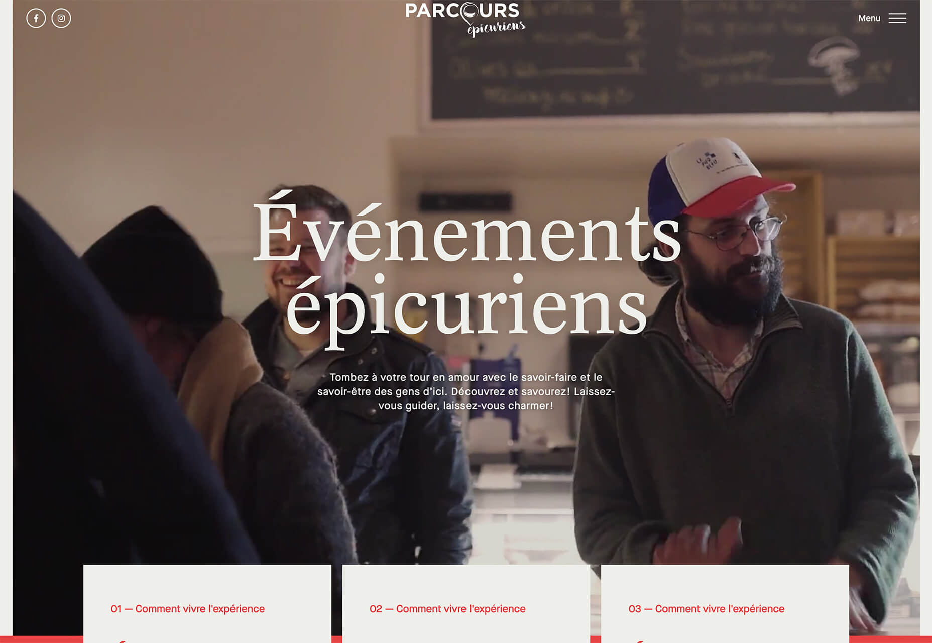
Parcouse Epicuriens uses three flat card-style elements to help users pick what they want to see from the home page. There’s no other button or direct call to action, which is somewhat uncommon in today’s website design landscape. Users have to pick from one of the cards, scroll, or enter using the hamburger menu icon.
Tasty Find uses search options to help users start their journey. What’s interesting here are the choices – search for the food you want, pick something random, or (in the small print) find even more options. Users get three choices to begin their journey with the website.
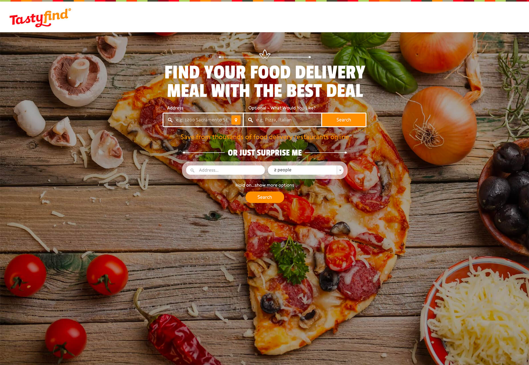
What’s interesting is how simple this complex user journey looks. The design is easy to digest, but so many options could overwhelm users. This is one of those situations where you have to watch return search data and information and weigh the risk versus the reward of so much choice. It’ll be interesting to watch this design over time and see if the options decrease in number.
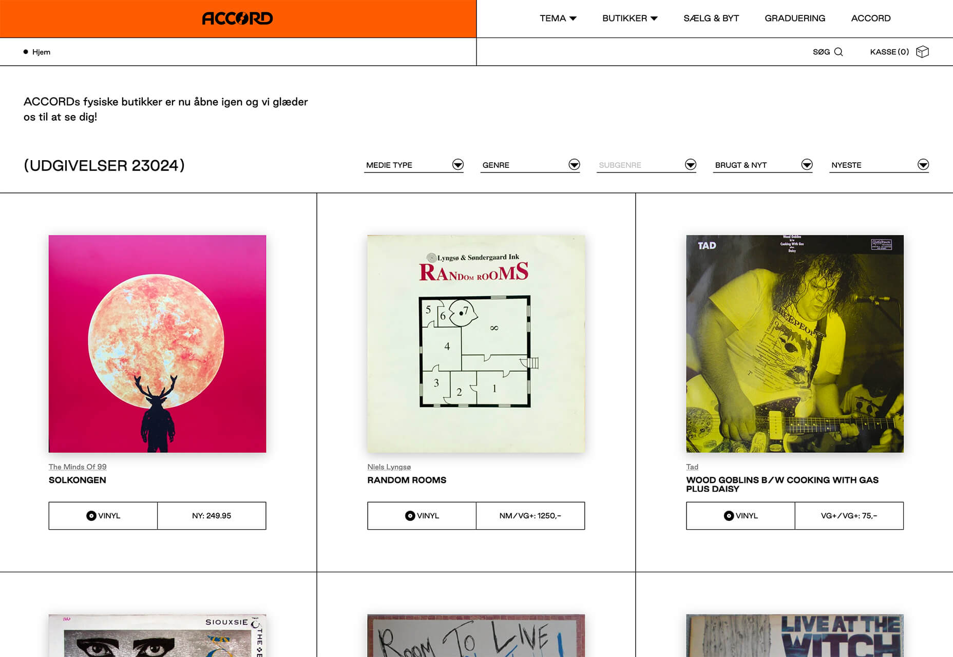
Accord also has several levels of user engagement opportunity. Option 1: Every block contains a click element. Option 2: Use the search at the top to narrow choices. This is an interesting configuration as the homepage for an e-commerce website because they get right to product selection and shopping without a softer sell or introduction.
3. Risky Typography
Typographic risk has been an ongoing theme for a little while. Designers are embracing experimental and novelty typefaces to stand out in the cluttered website space. Sometimes it works beautifully, and other times, it can fall short.
Here, each of these trending website designs uses a risky typography treatment. The risks are a little different for each design, from readability to comprehension to font delivery.
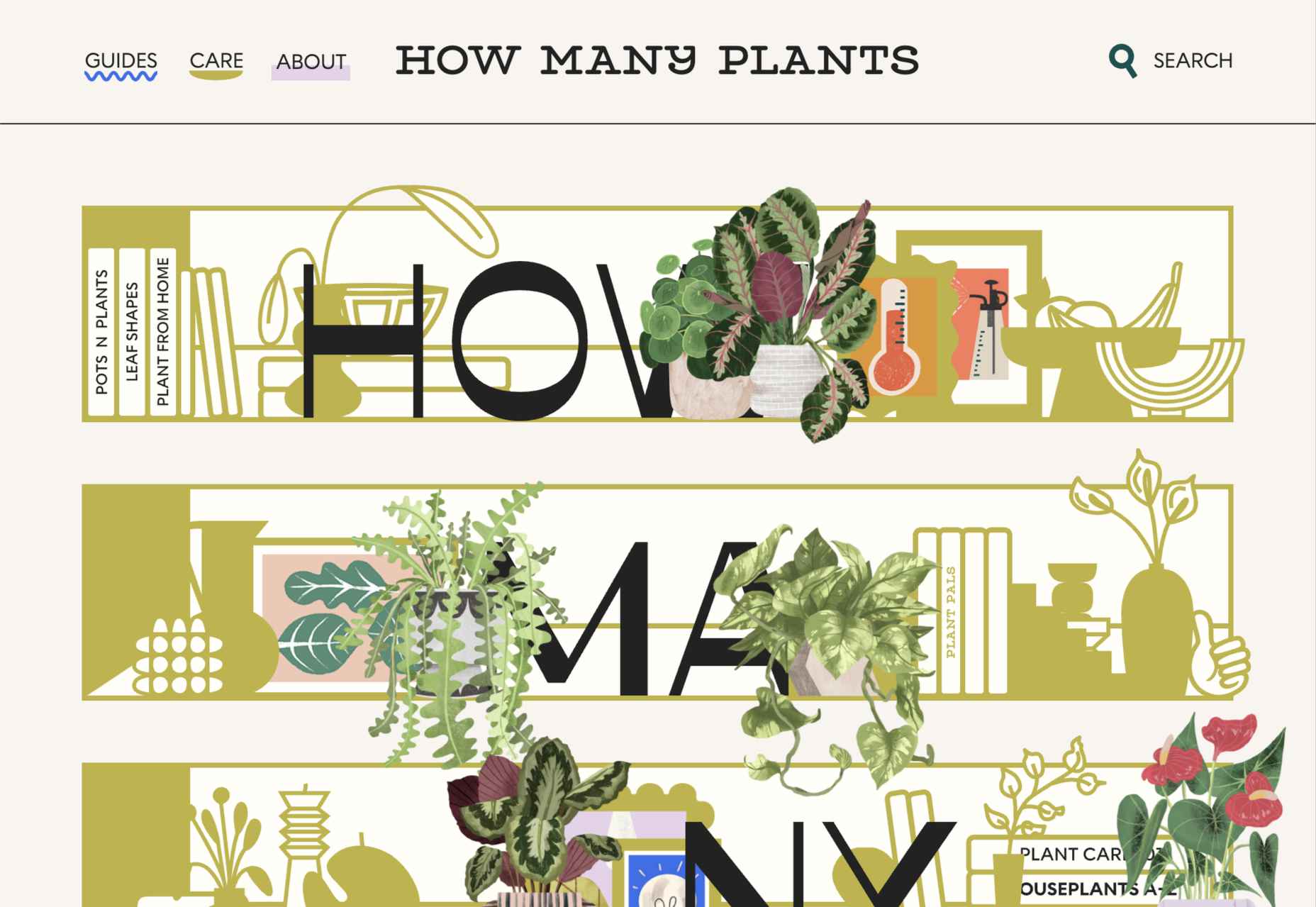
How Many Plants has duel typography risks: A funky typeface paired with odd word breaks. Interestingly enough, readability isn’t as big of a concern as you might think. This is likely because there aren’t many words, and they are short. Plus, the imagery ties in nicely.
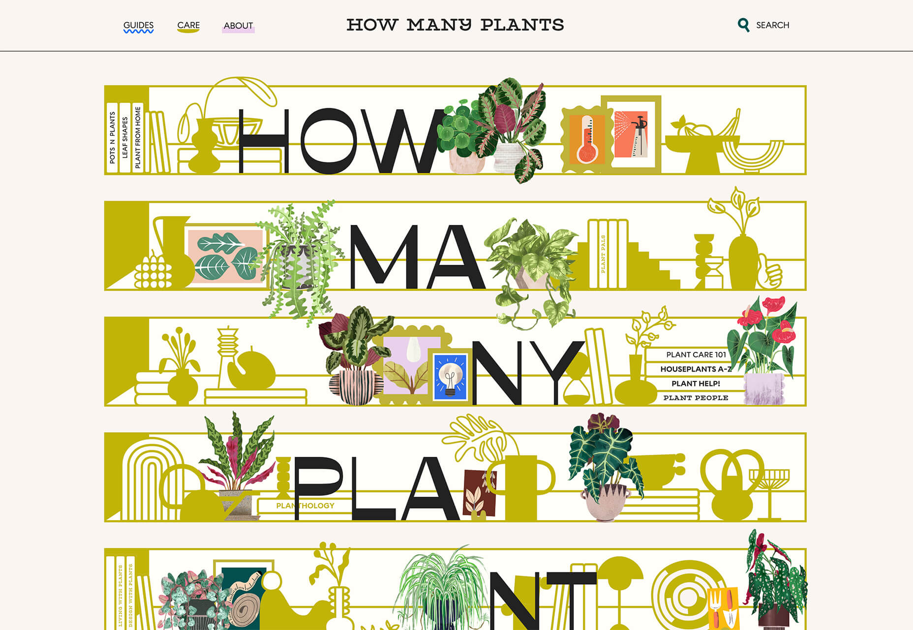
Do you notice a similarity between How Many Plants and The Great Lake? The typography has the same style with a blocky, slab, sans serif with alternating thick and thin strokes. (It’s the same font.)
The risk in the typography design for The Great Lake isn’t in the homepage display, although you might wonder what the design is about. It is carrying this font throughout the design. While it looks great large and with only a few words, it gets a little more difficult the more you see it. This type of mental reading weight can be difficult for visitors over time, creating an element of risk.

Zmaslo uses an interesting typeface with a liquid effect on top of an unusual word. That combination of text elements makes you think hard to read the homepage, despite its neat looks. The risk here is weighing visual interest against comprehension. Depending on the audience, this risk can be worth the chance.

Conclusion
Spring always seems to be that time of year where designers start thinking about new, fresh design elements. That might explain some of the “riskier” design choices and experimentation here.
Regardless of the motivation, it is always fun to see the creative stretch happen. It can be even more interesting to see what elements from these trends continue to grow in the coming months.
The post 3 Essential Design Trends, May 2021 first appeared on Webdesigner Depot.
 Landing pages are central to successful marketing campaigns; they allow you to target particular customers with particular solutions to particular problems.
It’s easy to confuse what a landing page is because users “land” on many pages. When we talk about landing pages, we mean a page that is entirely dedicated to a particular type of customer. In fact, if we could create a unique landing page for each individual user, that would be awesome.
You might think your homepage is a landing page, but it’s not; users reach your landing page in various ways — directly, via organic search, or backlink. A landing page is normally dedicated to a specific marketing campaign. It is accessed from a link in an email, via social media, or most often via a PPC (Pay Per Click) advert.
Here are 10 elements of landing pages that are proven to convert successfully:
1. Use A Single Call To Action
Your potential customers must know how to move forward with your product or service as early in the experience as possible.
Are they signing up for a free trial? Are they signing up for your newsletter? Are they buying a product? Are they contacting you? Whatever you need them to do, make it clear.
The Hick-Hyman law of UX says the more choices you give a user, the less likely they are to make any choice at all; conversely, the fewer choices, the greater the likelihood that they’ll move forward.
Give the user one choice: click the button, or don’t click the button. A single CTA will out-perform multiple options.
2. Keep Forms Simple
Often, your landing page will need a potential customer’s information. They might be creating an account, setting up a trial, or just joining your newsletter.
If the potential customer is signing up for a trial, by all means, ask for their email address. But you don’t need their cell number, their mother’s name, the street they grew up on, their birthday, or any of that other junk that’s used to profile users.
Whatever the purpose, keep your form ultra-simple. That means as few fields as possible. If you really want it, give the user the option to fill it in later as part of an onboarding process — when they’re already invested — but not on the landing page.
3. Make the Headline Punchy
The first thing your potential customer sees on your landing page is the headline, so make it count.
Half a dozen words are usually more than enough. Your goal is to keep it short enough that the potential customer has read the headline before they realize it.
Often, you’ll want to clarify the statement with more information. That’s fine as a sub-heading after you’ve grabbed their interest, but make sure you grab their attention first.
The headline “Coyote Anvils” is best followed by the sub-heading “You’ll be eating roadrunner for dinner!”
Your goal for your headline is to explain your product or service in 2–3 seconds.
4. Center Your Content Around Your Value Proposition
What makes your product or service stand out? What makes it better than the competition? If you’re not sure, spend some time checking out companies in your space.
Creating a value proposition can be one of the toughest challenges a business faces because you need to put yourself in your potential customer’s shoes. But if you get this right, it will carry your marketing. You need to find the benefits within your product or service, not the features.
Value propositions are best when backed by facts. The “World’s Most Accurate Anvils” is best backed by proof: “9/10 coyotes said they were more likely to hit their target than themselves when using our patented AccuAnvil.”
5. Lists, Lists, and More Lists
You’ve got seconds to engage your potential customer, perhaps even less. One way to grab them is with a great headline, but you have to keep them interested beyond the headline.
One great way is bullet lists with short entries. Short-item lists naturally pull our eyes down the page because our eyes take in the whole line in one glance; we don’t need to read to absorb the information.
The longer you can keep someone on the page, the greater the likelihood they’ll keep looking, so pulling them down the page with lists is a great tactic.
6. Exploit the Zeigarnik Effect
The Zeigarnik Effect says that people remember incomplete experiences better than they do completed ones. This is because when a task is seen as completed, it can be filed away as a memory, but if it’s incomplete, then it remains at the front of your mind.
This is a boon for designers creating landing pages because we can create a situation where the potential customer begins an onboarding process and is aware that it hasn’t been completed — they might need to verify their email address, for example.
The lack of completion keeps the landing page and the product or service fresh in the potential customer’s mind. So when they see that onboarding email, they’ll use it.
7. Proof
Anyone can put up a website. It’s easy. And as a result, potential customers don’t necessarily trust you.
One way you can combat this is with some form of proof. That may be in the form of official certifications, or featured testimonials, or just independent reviews.
It rarely occurs to potential customers that you’re cherry-picking the testimonials and reviews you’re choosing to display, so even if only some of your reviews are good, it’s worth including them.
But be careful not to sound too good. If you post nothing but 5* reviews, people will smell a rat; that 3* review may actually do you a favor by making the 5*s seem more genuine.
8. Predictive Images
Potential customers lack imagination, they don’t have all the facts, and unless your product or service is very basic, they may not fully understand what the product does for them.
Use images to quickly show them what life may be like using your product or service. Paint an appealing picture. If they can see themselves in the image, they’ll grant you a little more time to persuade them in the form of further content.

9. Continuity
How did the potential customer arrive at your landing page? Chances are it was via a PPC link, or if you were lucky an organic search link. However they arrived, they were in a certain frame of mind, with a certain problem they wanted to solve; they aren’t going to take kindly to being diverted onto a different train of thought.
Your landing page has to match the tone, style, and value proposition of your adverts. The potential customer’s experience of your organization begins with the advert, not the landing page, so make sure that you don’t break the spell. If your landing page doesn’t match your advert, you could lose the potential customer altogether — and increase your bounce rate while you’re at it.
Remember: the customer was attracted by something in your advert, so give them the same attractive qualities on your landing page.
10. Drop the Nav
Most sites have a single main menu and a rich footer with links to customer service, contact pages, and so forth. These are detrimental on a landing page because you’ll leak traffic to other, less-focused parts of your site.
Your landing page is a streamlined selling machine. The only link you want on the page is your CTA.
It’s fine to keep legal text and even links to privacy policies — users rarely click those anyway. You can also link to your homepage using your logo. But don’t add any navigation that invites a click, or you’ll dilute all the work you’ve put in.
The post 10 Elements of Landing Pages That Convert first appeared on Webdesigner Depot.

 This month’s collection contains a combination of big and bold, and clean and minimal. Although basic minimalism is still trendy, with lots of white space and greyscale type, we are seeing it softened with color. This is implemented differently, ranging from hints of off-whites in images to gentle pastels as section backgrounds.
Playing around with type and using typefaces with a few characteristic quirks is another way minimalism is being tempered without negating the overall effect. Plus, we’ve got some strong examples of type rules being deliberately broken to good effect. Enjoy!
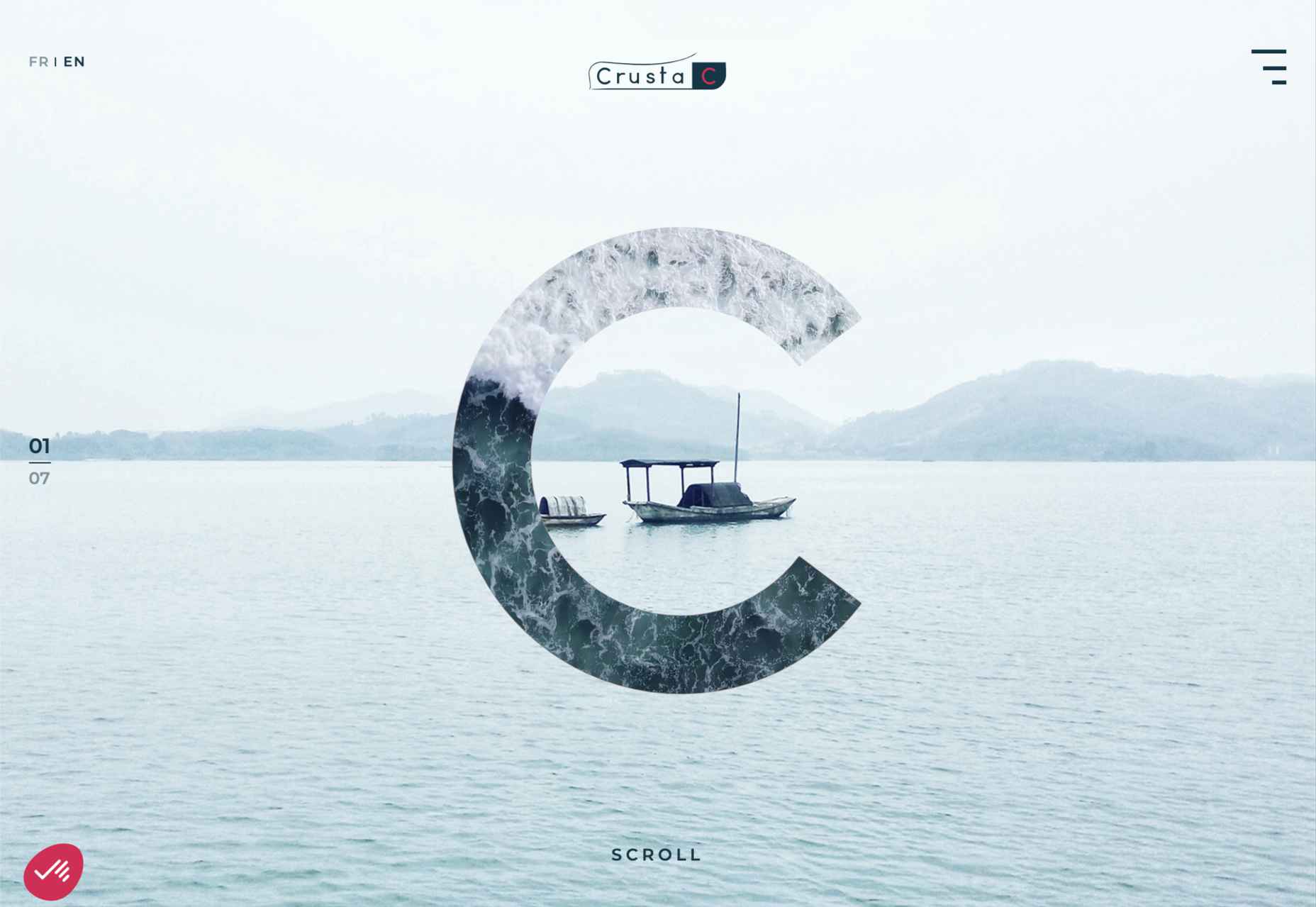
Crusta C
The new website for seafood company Crusta C makes clever use of the company’s simple logo mark ‘C’ with a cutout video effect.
How Many Plants
How Many Plants is a guide to house plants and how to look after them. A good combination of illustration and space gives a friendly but efficient feel.
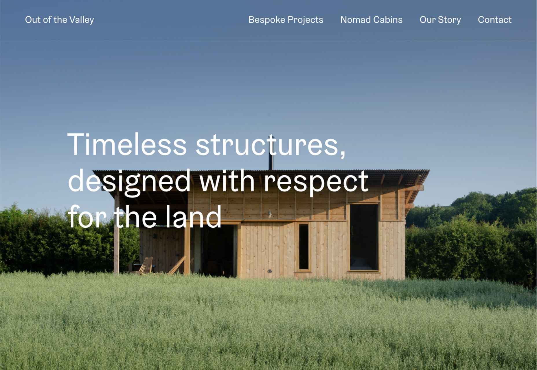
Out of the Valley
Out of the Valley, make bespoke and prefabricated cabins focusing on natural materials and traditional craft. The subtle changes in background color add warmth to the minimal layout.
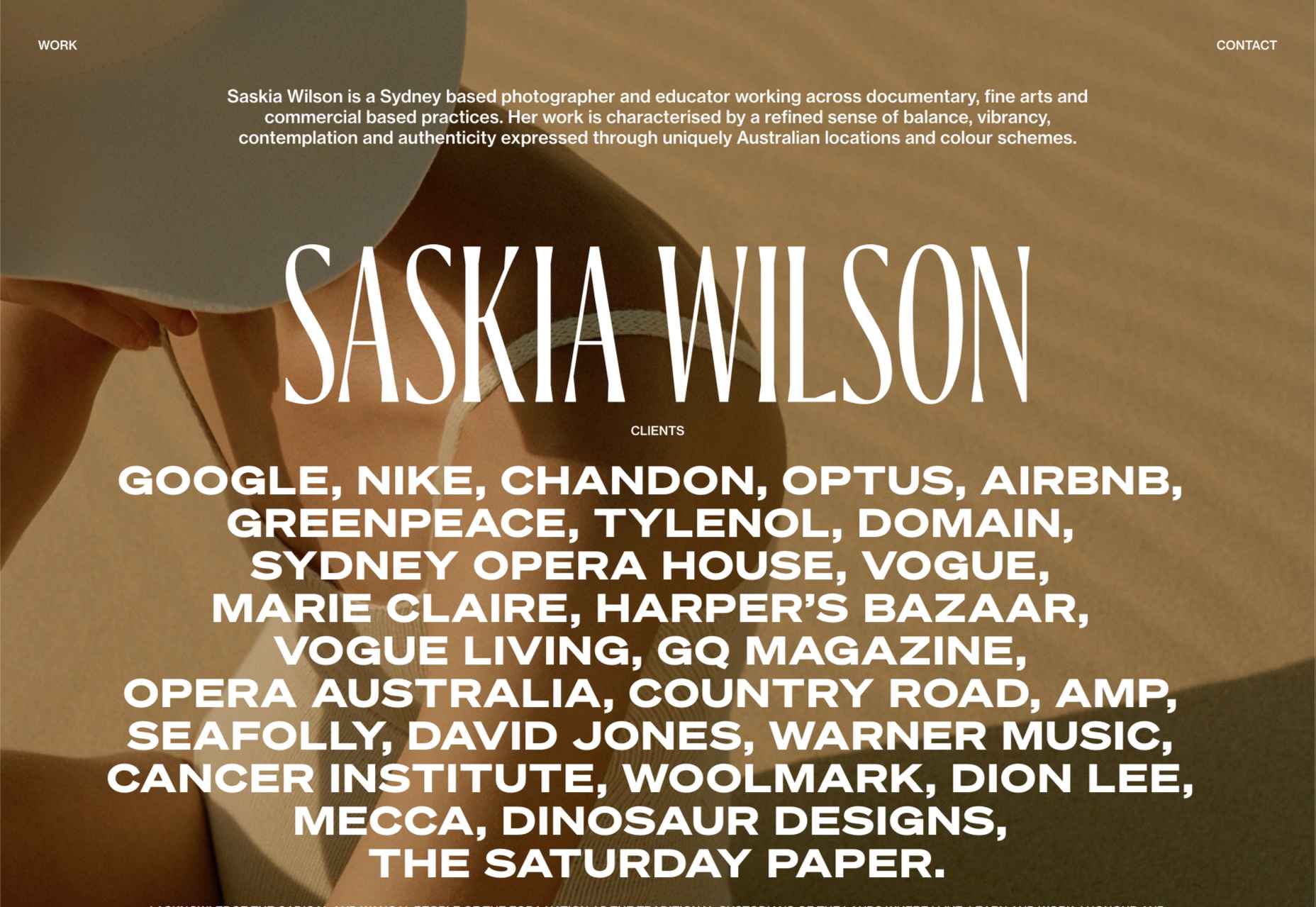
Saskia Wilson
Portfolio site for photographer Saskia Wilson. This is absolute simplicity, with a clear grid and nice, bold type to bare minimum text.
Made Thought
Design studio Made Thought has some pretty prestigious clients; for a designer, it doesn’t get more prestigious than creating a new brand identity for MoMA. Their bold aesthetic and approach explain their success.

The Great Lake
For-fun sites like The Great Lake are a great way for web creatives to show their skills. This one from designer and front-end developer Anna Sherruble is visually appealing and has some informative content.

Acayaba + Rosenberg
Architects Acayaba + Rosenberg use carefully curated photography and subtle scrolling animation to pull the user in and create a pleasing browsing experience.

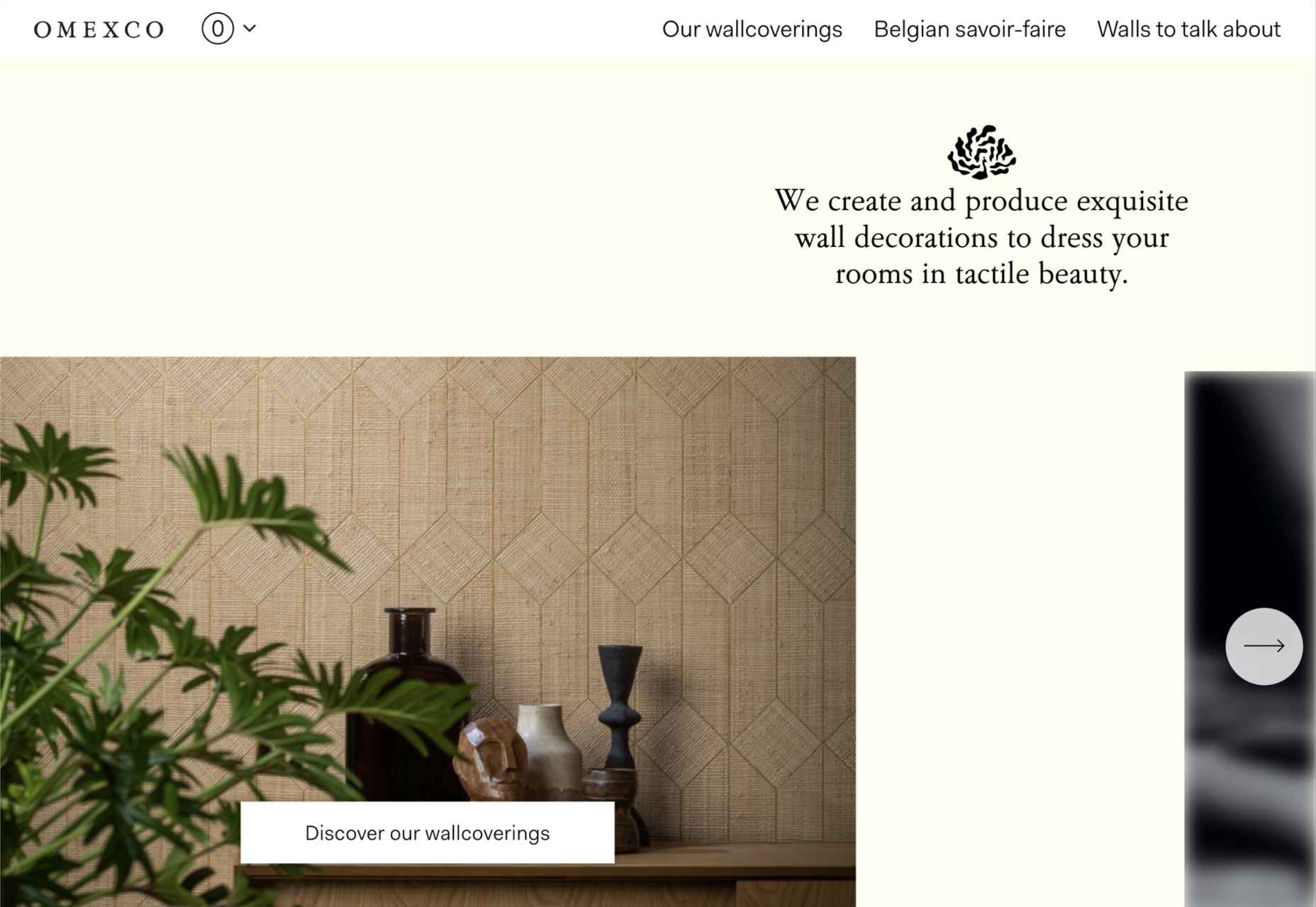
Omexco
Soft colors and a well-ordered grid recreate the feel of a mood board that prevents this site for Omexco from appearing cluttered and overly busy while showcasing multiple products.
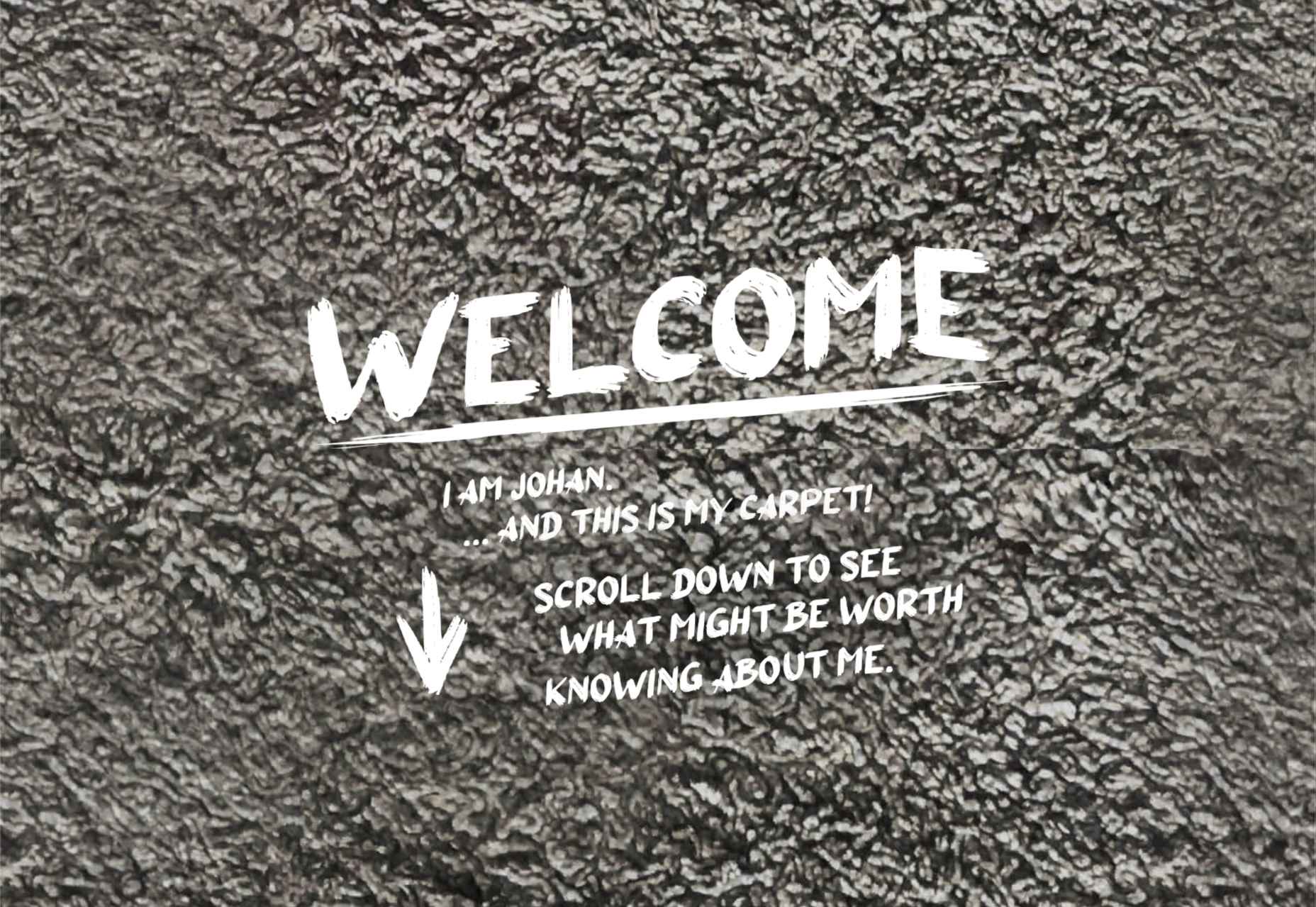
Johan Belin
For his own site, digital creator Johan Belin has opted to show off his skills by creating this single-page site instead of simply showing work. This can be a risky tactic, but it works here.
La Nouvelle
A combination of contrasting and complementary color combinations creates freshness in this site for digital agency La Nouvelle.

Found
Found Studio’s website uses a very basic grid layout to allow the work to stand out; varying the typeface, weight, and style within sections of text creates individuality.

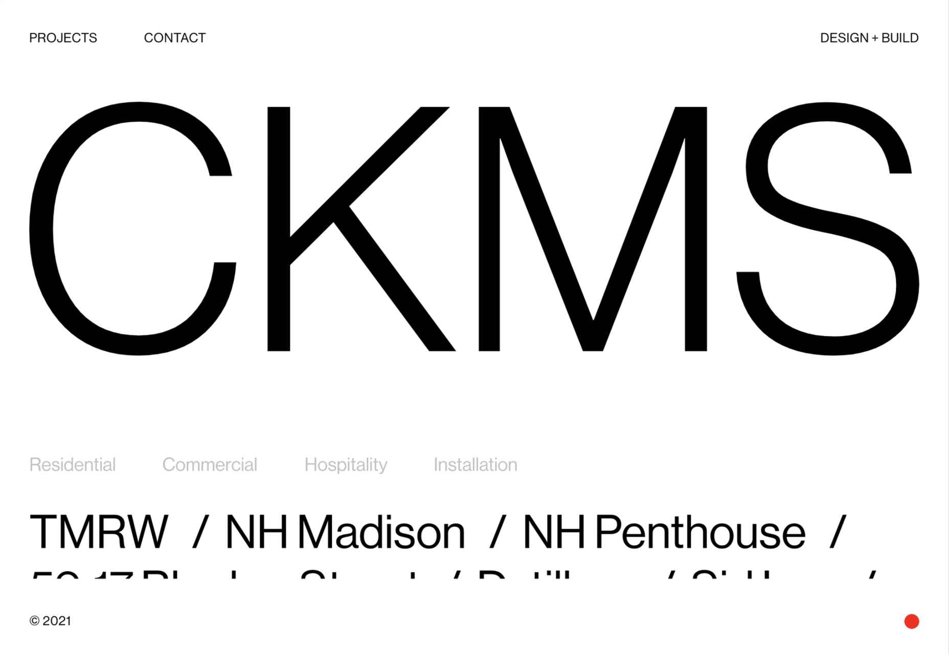
CKMS
CKMS is a design and build company. Their site is minimal but with a few nice little touches, like the background color change button in the bottom right corner.
Slow
Slow is a collective of people–largely artists, designers, artisans–aiming to implement and live by the slow movement principles. The design of their site reflects these aims, creating a sense of calm and deliberation.

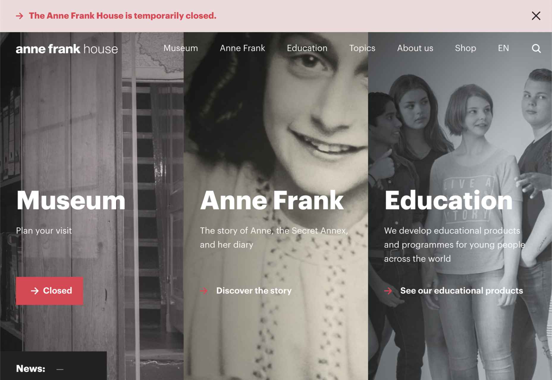
Anne Frank House
Practical information for visiting the Anne Frank House and museum is combined with historical information and educational resources in this thoughtfully structured and visually engaging site.
Runway
Runway is a platform for publishing open-source, pre-trained machine learning models, as well as for training your own models aimed at artists and filmmakers. If this site aims to make the user want to try Runway, it succeeds.
Fat Free
Fat Free video branding agency add warmth to their minimal site with soft color and occasional illustration.

Pinch
The furniture and other interior products produced by Pinch Design aim for a quiet, elegant aesthetic, and their website reflects that with pale grey and generous spacing.

Sentempo
Digital studio Sentempo manages to achieve glossy without being overdone. The star dividers are a nice detail.

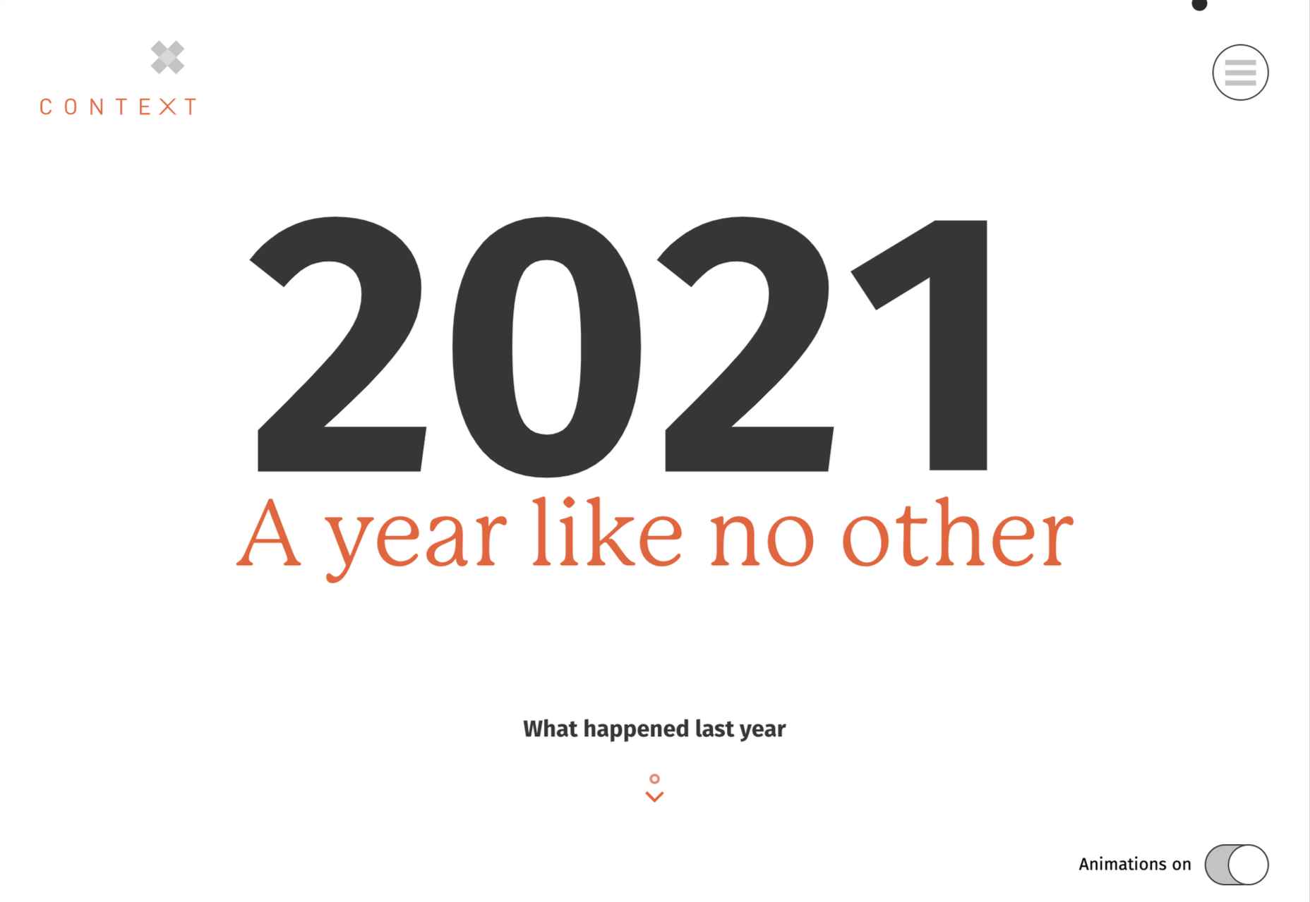
One Year
Many companies, including creative agencies, have come up with ‘what we did/achieved in the last year’ microsites. This one from Context Creative succeeds as a good advert for them.
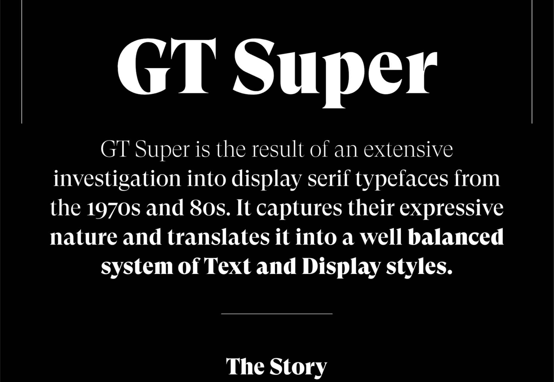
GT Super
This single-page intro to GT Super font has a certain drama in keeping with the font itself and allows you to play around with the size, weight, and style of the font in most sections of the text.
The post 20 Best New Websites, April 2021 first appeared on Webdesigner Depot.
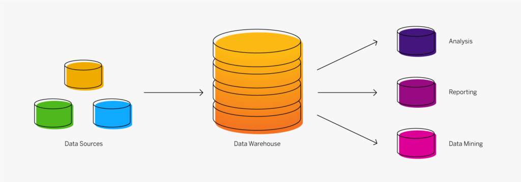
Un data warehouse (entrepôt de données) est un système de stockage numérique qui connecte et harmonise de grandes quantités de données provenant de nombreuses sources différentes. Il a pour but d’alimenter la Business Intelligence (BI), le reporting et l’analyse, ainsi que soutenir la conformité aux exigences réglementaires afin que les entreprises puissent exploiter leurs données et prendre des décisions intelligentes fondées sur les données. Les data warehouse stockent les données actuelles et historiques dans un seul et même endroit et constituent ainsi une source unique de vérité pour une organisation.
Les données sont envoyées vers un data warehouse à partir de systèmes opérationnels (tels qu’un système ERP ou CRM), de bases de données et de sources externes comme les systèmes partenaires, les appareils IoT, les applications météo ou les réseaux sociaux, généralement de manière régulière. L’émergence du cloud computing a changé la donne. Ces dernières années, le stockage des données a été déplacé de l’infrastructure sur site traditionnelle vers de multiples emplacements, y compris sur site, dans le Cloud privé et dans le Cloud public.
Les data warehouse modernes sont conçus pour gérer à la fois les données structurées et les données non structurées, comme les vidéos, les fichiers image et les données de capteurs. Certains utilisent les outils analytiques intégrés et la technologie de base de données in-memory (qui conserve l’ensemble de données dans la mémoire de l’ordinateur plutôt que dans l’espace disque) pour fournir un accès en temps réel à des données fiables et favoriser une prise de décision en toute confiance. Sans entreposage de données, il est très difficile de combiner des données provenant de sources hétérogènes, de s’assurer qu’elles sont au bon format pour les analyses et d’obtenir une vue des données sur le court terme et sur le long terme.
Avantages de l’entreposage de données
Un data warehouse bien conçu constitue la base de tout programme de BI ou d’analyse réussi. Son principal objectif est d’alimenter les rapports, les tableaux de bord et les outils analytiques devenus indispensables aux entreprises d’aujourd’hui. Un entrepôt de données fournit les informations dont vous avez besoin pour prendre des décisions basées sur les données et vous aide à faire les bons choix, que ce soit pour le développement de nouveaux produits ou la gestion des niveaux de stock. Un data warehouse présente de nombreux avantages. En voici quelques-uns :
- Un meilleur reporting analytique : grâce à l’entreposage de données, les décideurs ont accès à des données provenant de plusieurs sources et n’ont plus besoin de prendre des décisions basées sur des informations incomplètes.
- Des requêtes plus rapides : les data warehouse sont spécialement conçus pour permettre l’extraction et l’analyse rapides des données. Avec un entrepôt de données, vous pouvez très rapidement demander de grandes quantités de données consolidées avec peu ou pas d’aide du service informatique.
- Une amélioration de la qualité des données : avant de charger les données dans l’entrepôt de données le système met en place des nettoyages de données afin de garantir que les données sont converties dans un seul et même format dans le but de faciliter les analyses (et les décisions), qui reposent alors sur des données précises et de haute qualité.
- Une visibilité sur les données historiques : en stockant de nombreuses données historiques, un data warehouse permet aux décideurs d’analyser les tendances et les défis passés, de faire des prévisions et d’améliorer l’organisation au quotidien.
Que peut stocker un data warehouse ?
Lorsque les data warehouse sont devenus populaires à la fin des années 1980, ils étaient conçus pour stocker des informations sur les personnes, les produits et les transactions. Ces données, appelées données structurées, étaient bien organisées et mises en forme pour en favoriser l’accès. Cependant, les entreprises ont rapidement voulu stocker, récupérer et analyser des données non structurées, comme des documents, des images, des vidéos, des e-mails, des publications sur les réseaux sociaux et des données brutes issues de capteurs.
Un entrepôt de données moderne peut contenir des données structurées et des données non structurées. En fusionnant ces types de données et en éliminant les silos qui les séparent, les entreprises peuvent obtenir une vue complète et globale sur les informations les plus précieuses.
Termes clés
Il est essentiel de bien comprendre un certain nombre de termes en lien avec les data warehouse. Les plus importants ont été définis ci-dessous. Découvrez d’autres termes et notre FAQ dans notre glossaire.
Data warehouse et base de données
Les bases de données et les data warehouse sont tous deux des systèmes de stockage de données, mais diffèrent de par leurs objectifs. Une base de données stocke généralement des données relatives à un domaine d’activité particulier. Un entrepôt de données stocke les données actuelles et historiques de l’ensemble de l’entreprise et alimente la BI et les outils analytiques. Les data warehouse utilisent un serveur de base de données pour extraire les données présentes dans les bases de données d’une organisation et disposent de fonctionnalités supplémentaires pour la modélisation des données, la gestion du cycle de vie des données, l’intégration des sources de données, etc.
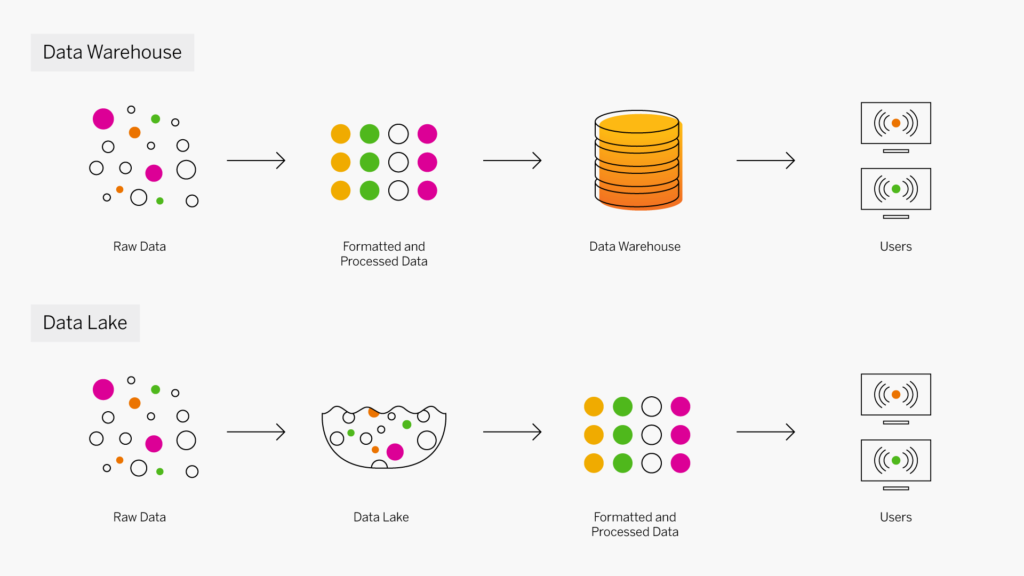
Data warehouse et lac de données
Les data warehouse et les lacs de données sont utilisés pour stocker le Big Data, mais sont des systèmes de stockage très différents. Un data warehouse stocke des données qui ont été formatées dans un but spécifique, tandis qu’un lac de données stocke les données dans leur état brut, non traité, dont l’objectif n’a pas encore été défini. Les entrepôts de données et les lacs de données se complètent souvent. Par exemple, lorsque des données brutes stockées dans un lac s’avèrent utiles pour répondre à une question, elles peuvent être extraites, nettoyées, transformées et utilisées dans un data warehouse à des fins d’analyse. Le volume de données, les performances de la base de données et les coûts du stockage jouent un rôle important dans le choix de la solution de stockage adaptée.
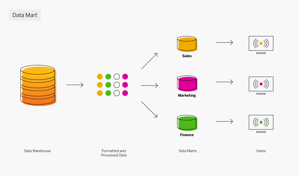
Data warehouse et datamart
Un datamart est une sous-section d’un data warehouse, partitionné spécifiquement pour un service ou un secteur d’activité, comme les ventes, le marketing ou la finance. Certains datamarts sont également créés à des fins opérationnelles autonomes. Alors qu’un data warehouse sert de magasin de données central pour l’ensemble de l’entreprise, un datamart utilise des données pertinentes à un groupe d’utilisateurs désigné. Ces utilisateurs peuvent alors accéder plus facilement aux données, accélérer leurs analyses et contrôler leurs propres données. Plusieurs datamarts sont souvent déployés dans un data warehouse.
Quels sont les composants clés d’un data warehouse ?
Un data warehouse classique comporte quatre composants principaux : une base de données centrale, des outils ETL (extraction, transformation, chargement), des métadonnées et des outils d’accès. Tous ces composants sont conçus pour être rapides afin de vous assurer d’obtenir rapidement des résultats et vous permettre d’analyser les données à la volée.
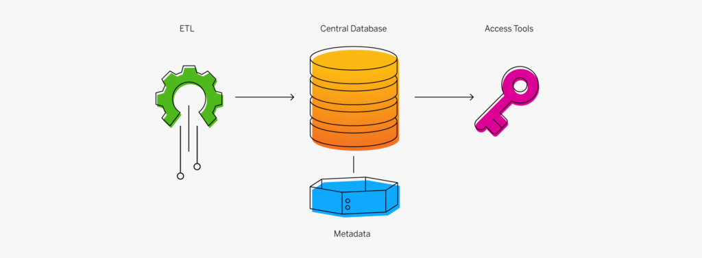
- Base de données centrale : une base de données sert de fondement à votre data warehouse. Depuis le départ, on utilisait essentiellement des bases de données relationnelles standard exécutées sur site ou dans le Cloud. Mais en raison du Big Data, du besoin d’une véritable performance en temps réel et d’une réduction drastique des coûts de la RAM, les bases de données in-memory sont en train de monter en puissance.
- Intégration des données : les données sont extraites des systèmes source et modifiées pour aligner les informations afin qu’elles puissent être rapidement utilisées à des fins analytiques à l’aide de différentes approches d’intégration des données telles que l’ETL (extraction, transformation, chargement) et les services de réplication de données en temps réel, de traitement en masse, de transformation des données et de qualité et d’enrichissement des données.
- Métadonnées : les métadonnées sont des données relatives à vos données. Elles indiquent la source, l’utilisation, les valeurs et d’autres fonctionnalités des ensembles de données présents dans votre data warehouse. Il existe des métadonnées de gestion, qui ajoutent du contexte à vos données, et des métadonnées techniques, qui décrivent comment accéder aux données, définissent leur emplacement ainsi que leur structure.
- Outils d’accès du data warehouse : les outils d’accès permettent aux utilisateurs d’interagir avec les données de votre data warehouse. Exemples d’outils d’accès : outils de requête et de reporting, outils de développement d’applications, outils d’exploration de données et outils OLAP.
Architecture de data warehouse
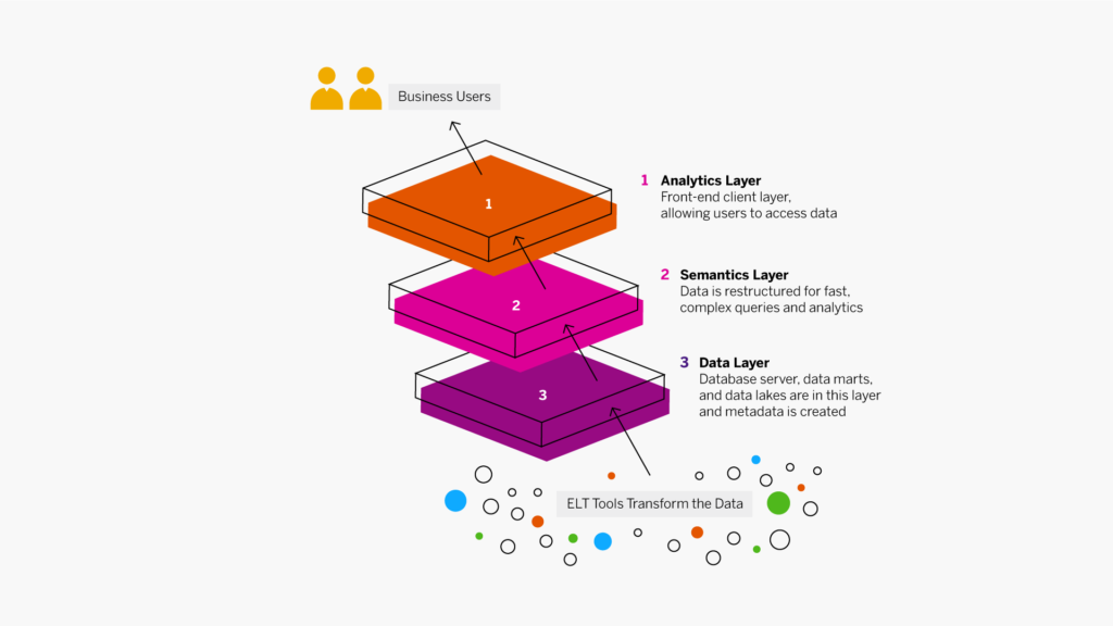
Auparavant, les data warehouse fonctionnaient par couches, lesquelles correspondaient au flux des données de gestion.
|
Couche de données |
Les données sont extraites de vos sources, puis transformées et chargées dans le niveau inférieur à l’aide des outils ETL. Le niveau inférieur comprend votre serveur de base de données, les datamarts et les lacs de données. Les métadonnées sont créées à ce niveau et les outils d’intégration des données, tels que la virtualisation des données, sont utilisés pour combiner et agréger les données en toute transparence. |
|
Couche sémantique |
Au niveau intermédiaire, les serveurs OLAP (Online Analytical Processing) et OLTP (Online Transaction Processing) restructurent les données pour favoriser des requêtes et des analyses rapides et complexes. |
|
Couche analytique |
Le niveau supérieur est la couche du client frontend. Il contient les outils d’accès du data warehouse qui permettent aux utilisateurs d’interagir avec les données, de créer des tableaux de bord et des rapports, de suivre les KPI, d’explorer et d’analyser les données, de créer des applications, etc. Ce niveau inclut souvent un workbench ou une zone de test pour l’exploration des données et le développement de nouveaux modèles de données. |
Un data warehouse standard comprend les trois couches définies ci-dessus. Aujourd’hui, les entrepôts de données modernes combinent OLTP et OLAP dans un seul système.
Les data warehouse, conçus pour faciliter la prise de décision, ont été essentiellement créés et gérés par les équipes informatiques. Néanmoins, ces dernières années, ils ont évolué pour renforcer l’autonomie des utilisateurs fonctionnels, réduisant ainsi leur dépendance aux équipes informatiques pour accéder aux données et obtenir des informations exploitables. Parmi les fonctionnalités clés d’entreposage de données qui ont permis de renforcer l’autonomie des utilisateurs fonctionnels, on retrouve les suivantes :
- La couche sémantique ou de gestion fournit des expressions en langage naturel et permet à tout le monde de comprendre instantanément les données, de définir des relations entre les éléments dans le modèle de données et d’enrichir les zones de données avec de nouvelles informations.
- Les espaces de travail virtuels permettent aux équipes de regrouper les connexions et modèles de données dans un lieu sécurisé et géré, afin de mieux collaborer au sein d’un espace commun, avec un ensemble de données commun.
- Le Cloud a encore amélioré la prise de décision en permettant aux employés de disposer d’un large éventail d’outils et de fonctionnalités pour effectuer facilement des tâches d’analyse des données. Ils peuvent connecter de nouvelles applications et de nouvelles sources de données sans avoir besoin de faire appel aux équipes informatiques.

Kate Wright, responsable de la Business Intelligence augmentée chez SAP, évoque la valeur d’un data warehouse Cloud moderne.
Les 7 principaux avantages d’un data warehouse Cloud
Les data warehouse Cloud gagnent en popularité, à juste titre. Ces entrepôts modernes offrent plusieurs avantages par rapport aux versions sur site traditionnelles. Voici les sept principaux avantages d’un data warehouse Cloud :
- Déploiement rapide : grâce à l’entreposage de données Cloud, vous pouvez acquérir une puissance de calcul et un stockage de données presque illimités en quelques clics seulement, et créer votre propre data warehouse, datamarts et systèmes de test en quelques minutes.
- Faible coût total de possession (TCO) : les modèles de tarification du data warehouse en tant que service (DWaaS) sont établis de sorte que vous payez uniquement les ressources dont vous avez besoin, lorsque vous en avez besoin. Vous n’avez pas besoin de prévoir vos besoins à long terme ou de payer pour d’autres traitements tout au long de l’année. Vous pouvez également éviter les coûts initiaux tels que le matériel coûteux, les salles de serveurs et le personnel de maintenance. Séparer les coûts du stockage des coûts informatiques vous permet également de réduire les dépenses.
- Élasticité : un data warehouse Cloud vous permet d’ajuster vos capacités à la hausse ou à la baisse selon vos besoins. Le Cloud offre un environnement virtualisé et hautement distribué capable de gérer d’immenses volumes de données qui peuvent diminuer ou augmenter.
- Sécurité et restauration après sinistre : dans de nombreux cas, les data warehouse Cloud apportent une sécurité des données et un chiffrage plus forts que les entrepôts sur site. Les données sont également automatiquement dupliquées et sauvegardées, ce qui vous permet de minimiser le risque de perte de données.
- Technologies en temps réel : les data warehouse Cloud basés sur la technologie de base de données in-memory présentent des vitesses de traitement des données extrêmement rapides, offrant ainsi des données en temps réel et une connaissance instantanée de la situation.
- Nouvelles technologies : les data warehouse Cloud vous permettent d’intégrer facilement de nouvelles technologies telles que l’apprentissage automatique, qui peuvent fournir une expérience guidée aux utilisateurs fonctionnels et une aide décisionnelle sous la forme de suggestions de questions à poser, par exemple.
- Plus grande autonomie des utilisateurs fonctionnels : les data warehouse Cloud offrent aux employés, de manière globale et uniforme, une vue unique sur les données issues de nombreuses sources et un vaste ensemble d’outils et de fonctionnalités pour effectuer facilement des tâches d’analyse des données. Ils peuvent connecter de nouvelles applications et de nouvelles sources de données sans avoir besoin de faire appel aux équipes informatiques.
Meilleures pratiques concernant l’entreposage des données
Pour atteindre vos objectifs et économiser du temps et de l’argent, il est recommandé de suivre certaines étapes éprouvées lors de la création d’un data warehouse ou l’ajout de nouvelles applications à un entrepôt existant. Certaines sont axées sur votre activité tandis que d’autres s’inscrivent dans le cadre de votre programme informatique global. Vous pouvez commencer avec la liste de meilleures pratiques ci-dessous, mais vous en découvrirez d’autres au fil de vos collaborations avec vos partenaires technologiques et de services.
|
Meilleures pratiques métier |
Meilleures pratiques informatiques |
|
Définir les informations dont vous avez besoin. Une fois que vous aurez cerné vos besoins initiaux, vous serez en mesure de trouver les sources de données qui vous aideront à les combler. La plupart du temps, les groupes commerciaux, les clients et les fournisseurs auront des recommandations à vous faire. |
Surveiller la performance et la sécurité. Les informations de votre data warehouse sont certes précieuses, mais elles doivent quand même être facilement accessibles pour apporter de la valeur à l’entreprise. Surveillez attentivement l’utilisation du système pour vous assurer que les niveaux de performance sont élevés. |
|
Documenter l’emplacement, la structure et la qualité de vos données actuelles. Vous pouvez ensuite identifier les lacunes en matière de données et les règles de gestion pour transformer les données afin de répondre aux exigences de votre entrepôt. |
Gérer les normes de qualité des données, les métadonnées, la structure et la gouvernance. De nouvelles sources de données précieuses sont régulièrement disponibles, mais nécessitent une gestion cohérente au sein d’un data warehouse. Suivez les procédures de nettoyage des données, de définition des métadonnées et de respect des normes de gouvernance. |
|
Former une équipe. Cette équipe doit comprendre les dirigeants, les responsables et le personnel qui utiliseront et fourniront les informations. Par exemple, identifiez le reporting standard et les KPI dont ils ont besoin pour effectuer leurs tâches. |
Fournir une architecture agile. Plus vos unités d’affaires et d’entreprise utiliseront les données, plus vos besoins en matière de datamarts et d’entrepôts augmenteront. Une plate-forme flexible s’avérera bien plus utile qu’un produit limité et restrictif. |
|
Hiérarchiser vos applications de data warehouse. Sélectionnez un ou deux projets pilotes présentant des exigences raisonnables et une bonne valeur commerciale. |
Automatiser les processus tels que la maintenance. Outre la valeur ajoutée apportée à la Business Intelligence, l’apprentissage automatique peut automatiser les fonctions de gestion technique du data warehouse pour maintenir la vitesse et réduire les coûts d’exploitation. |
|
Choisir un partenaire technologique compétent pour l’entrepôt de données. Ce dernier doit offrir les services d’implémentation et l’expérience dont vous avez besoin pour la réalisation de vos projets. Assurez-vous qu’il puisse répondre à vos besoins en déploiement, y compris les services Cloud et les options sur site. |
Utiliser le Cloud de manière stratégique. Les unités d’affaires et les services ont des besoins en déploiement différents. Utilisez des systèmes sur site si nécessaire et misez sur des data warehouse Cloud pour bénéficier d’une évolutivité, d’une réduction des coûts et d’un accès sur téléphone et tablette. |
|
Développer un bon plan de projet. Travaillez avec votre équipe sur un plan et un calendrier réalistes qui rendent possible les communications et le reporting de statut. |
En résumé
Les data warehouse modernes, et, de plus en plus, les data warehouse Cloud, constitueront un élément clé de toute initiative de transformation numérique pour les entreprises mères et leurs unités d’affaires. Les data warehouse exploitent les systèmes de gestion actuels, en particulier lorsque vous combinez des données issues de plusieurs systèmes internes avec de nouvelles informations importantes provenant d’organisations externes.
Les tableaux de bord, les indicateurs de performance clés, les alertes et le reporting répondent aux exigences des cadres dirigeants, de la direction et du personnel, ainsi qu’aux besoins des clients et des fournisseurs importants. Les data warehouse fournissent également des outils d’exploration et d’analyse de données rapides et complexes, et n’ont pas d’impact sur les performances des autres systèmes de gestion.

Découvrez la solution SAP Data Warehouse Cloud
Unifiez vos données et analyses pour prendre des décisions avisées et obtenir la flexibilité nécessaire pour un contrôle efficace des coûts, notamment grâce à un paiement selon l’utilisation.
Publié en anglais sur insights.sap.com
The post Qu’est-ce qu’un Data Warehouse ? appeared first on SAP France News.

 At the dawn of the web-era, there was much focus on how environmentally friendly websites were: we’d chop down fewer trees, ship fewer products, and travel less for business.
And because the web was small, any negative impact it had was relatively small. But the Internet’s no longer small, and neither is the impact it has on the environment. The average website uses 211,000g of CO2 per year, watching a video online outputs an estimated 0.2g of CO2 per second, and a single email can cost 50g of CO2.
In the next four years, the tech industry as a whole may use up to 20% of the world’s electricity and be responsible for 5.5% of global CO2 emissions.
The good news is that because websites are viewed many times, even small improvements can multiply into real change.
1. Reduce Energy Consumption
Through electricity use, the Internet generates around the same CO2 as most major countries. That carbon comes from two sources: the devices we use to access the Internet and the servers that host our data.
Computers heat up, and when they heat up, they slow down. Servers are especially vulnerable and use extraordinary amounts of energy to keep cool and functional, which is why Microsoft keeps throwing servers into the sea.
Make It Faster
The faster your site, the less data is used to serve it, and the less carbon it’s outputting; it’s that simple.
Reduce the Number of Resources Used
Everything you load on your site has an impact. You might think that a tiny PNG is too small to really impact your carbon footprint, but over thousands of page loads, its impact is multiplied. Anything you can do to reduce the number of actual files requested will reduce your carbon output. You can use sites like Ecograder to estimate your own site’s CO2 output.
Optimize Images
If there’s one thing you can do to reduce the size of your site, the amount of data that needs to be sent over the Internet to serve your site, and the resulting speed, it’s optimizing your images.
Nothing reduces a site’s footprint like optimizing images. It’s easy and free to reduce the size of JPGs and PNGs with a service like TinyPNG. Offer WebP to any browser that will accept them; it will boost your Lighthouse score and improve your CO2 usage.
Lazy Load Images
Lazy loading images means images are loaded as they are required; images at the top of a page always load, images further down only load when the user scrolls to them; if the user doesn’t scroll to the bottom of the page, they don’t load, saving you CO2.
Reduce The Amount Of JavaScript You Use
Yes, JavaScript is awesome. Yes, it can be hugely beneficial to UX. And yes, it munches on energy like it’s candy.
When a web page loads, it’s done, the total cost is in. If JavaScript keeps running in the background, redrawing the screen based on user interaction — as is the case with a parallax site — the web page keeps using up energy on the device.
Choose a Sustainable Hosting Company
You can reduce the power needs of a site, but you can’t eliminate them. One simple step is to opt for a hosting company that gets its electricity from sustainable sources such as wind power or solar.
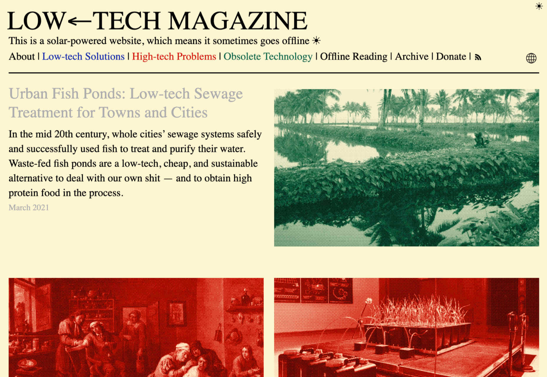
Low←Tech Magazine is powered by a server that runs on solar energy and carries a warning that it may go offline. But it’s possible to host both reliably and sustainably. Many web hosts outsource their actual server management, so they have no control over how those servers are powered, but there are plenty of exceptions that guarantee green web hosting. Google Cloud aims to be the cleanest in the cloud industry. For green web hosting, I always recommend the all-round superb Kualo.
2. Be Inclusive
One of the biggest issues with the EV (Electric Vehicle) movement is that we’re replacing cars earlier than we normally would in a rush to move to “clean” driving.
A new EV certainly outputs less than a gas-powered vehicle when driven the same distance. Combine increased use — because owners think they are driving cleanly — with the fact that a new EV has to be manufactured, the minerals for batteries have to be mined (in horrific conditions), and it then needs to be shipped to you, and EVs are not as friendly as they appear — so go ahead, buy that vintage Porsche it’s probably better for the environment than a Tesla.
Support Legacy Devices
The same issue that applies to cars applies to devices. Every time we rush ahead to support the latest iPhone, we leave older generations behind. A device can and should last longer than two years.
This is not to say that you shouldn’t embrace modern web standards. Technologies like CSS Grid are excellent at reducing markup size and speeding up sites. CSS Grid has been well supported for over four years, and even “legacy” devices can handle it. If you can keep a phone for an extra six months, the environmental cost of that phone is reduced by 20%.
3. Help Users Make Good Choices
More and more people are trying to make good choices. We’re eating a healthier, balanced diet. We’re recycling clothes. We’re traveling by bike, and on foot, instead of by car. People want to do the right thing, and they seek out companies that aid them.
Improve Navigation
Anything that you can do to make your content more findable will mean fewer page loads and therefore consume fewer resources.
By improving your information architecture, improving your search accuracy, and improving on-page signposts like bread crumbs and link text, you help users find content faster.
Feelgood Feedback
When the environmental impact of a user’s actions are quantifiable, let them know. Users who care will appreciate it, and users who don’t will ignore it.
Raileurope.com adds a note to any quotation letting you know how much carbon you’ve saved by traveling by train instead of flying.
Don’t Remove the Shipping Rate
Many ecommerce sites offer free shipping, especially above a certain order value; it’s a good way to encourage higher sales. But absorbing the shipping cost implies that there is no shipping. By highlighting the shipping costs, even if they’re not passed on to the customer, you remind them that there is an environmental cost and a financial cost.
You can absorb the shipping rate without implying there is no cost by adding the shipping and then explicitly deducting it as a discount.
Sustainable Web Design Is Good For Business
The fundamentals of good web design are the fundamentals of sustainable web design.
Make it fast and usable, and you’ll also be making it energy efficient. Make it inclusive, and you’ll help the industry slow the ever-growing tendency to consume. Make it transparent, and you’ll help your users make good choices of their own. All of these things are not only good for the environment, but they also result in improved UX and SEO.
Featured image via Pexels.
The post 3 Effective Ways To Improve Your Site’s Carbon Footprint first appeared on Webdesigner Depot.