 You don’t need an online shop to sell on Pinterest, but owning one can give you the upper hand.
The only problem is that managing an eCommerce store is expensive.
On the other hand, selling on Pinterest has a low entry barrier. So it’s an excellent place to start even if you can’t afford a website.
Plus, Pinterest has many engaged users who are happy to buy your product, craft or offer. This is the only social media network where the most significant users hold the most disposable income in America.
This guide shows you how to sell to these top spenders on Pinterest, whether you own a website or not.
What Pinterest Brings to the Table
Pinterest is not just a visual discovery engine. The social network brings more to the table.
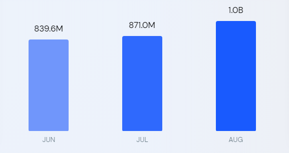
With 433 million monthly active users and over one billion web visits in August 2022, the platform offers businesses new opportunities to reach highly engaged audiences.

Data Source: SimilarWeb
Also, data shows that about 38% of pinners have a college education, whereas Snapchat is 20%, Twitter is 32%, and Reddit stands at 15%, offering you access to a sophisticated market.
The social network enables about two billion monthly searches.
The company’s data revealed that 97% of the searches are unbranded, providing a level playing ground for all competing brands. However, for context, 42% of Google search queries are with branded keywords, meaning many searchers already have a brand in mind before searching.
Also, 80% of pinners said they discovered new products or brands on Pinterest, and 85% buy things they’ve seen from brands. Additionally, pinners are 55% more likely to buy a product after seeing a visual on Pinterest compared to other platforms.
The platform is not all talk and no action.
For instance, nearly nine in ten weekly pinners make buying decisions on Pinterest, and 50% of users have bought after seeing a Promoted Pin.
Pinterest might not be as popular and imposing as Facebook, Twitter, YouTube, LinkedIn, and TikTok, but the user engagement shows the platform can hold its ground against some perennial favorites.
Its numbers are impressive, making Pinterest too good to pass up.
Selling On Pinterest Without a Website
You can sell on Pinterest without a website.
It’s an excellent option for affiliate marketers. A Pinterest business account will work best since it lets you monitor analytics and run ads. You might also need a Facebook page and a Medium account to further your marketing.
When you’re ready, here’s how to start selling on Pinterest without a website.
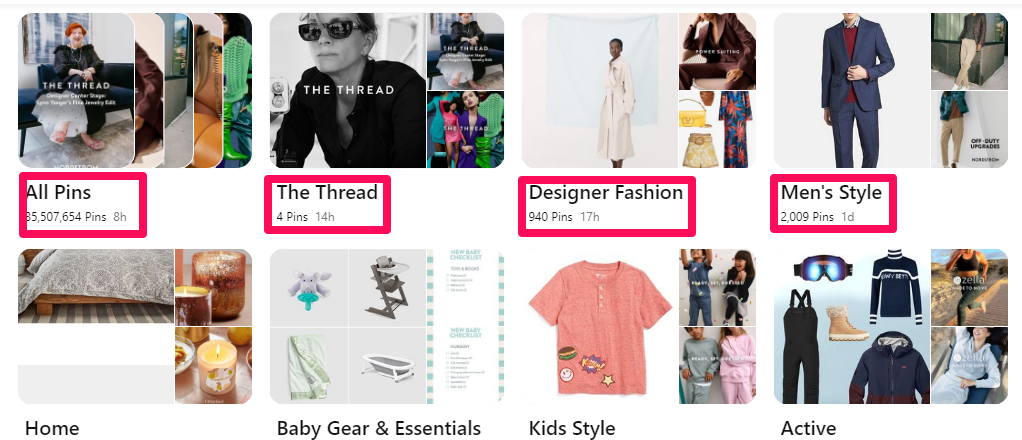
Organize Your Products into Boards
Pinterest Board is a collection of pins.
It lets you stay organized. You can create different boards to categorize your products. For example, having boards for televisions, sound systems, video players, and other products in your catalog will make sense if you deal in electronics. You can further classify the boards into sections, like LG, Samsung, and Sony.
Boards make it easy for shoppers to find your products.

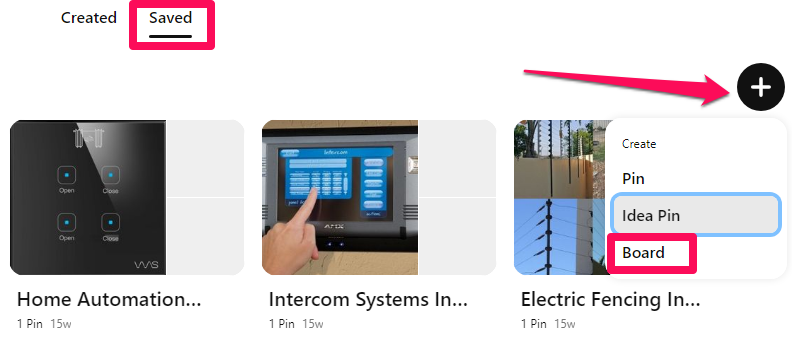
To create one, log in to your profile and click the Saved tab.
Click the + icon to reveal a drop-down menu, then select Board from the options.

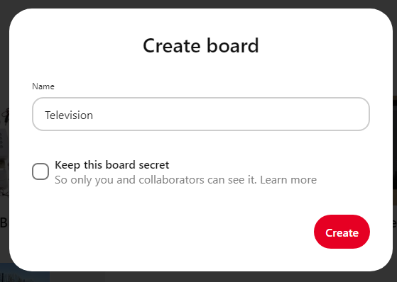
Enter the product category in the name field to create the Board.

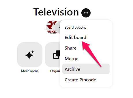
Open the newly created Board, click the ellipsis icon (the three horizontal dots), then the Edit board option to type a befitting description for the Board.

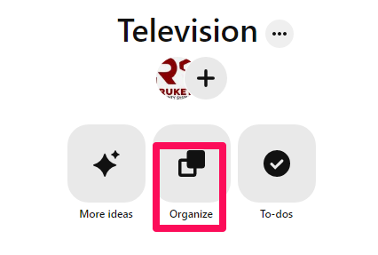
Use the Organize option to create and organize the pins into sections.

Publish Your Products as Pins
Create visually engaging pins to display your products.
One exciting thing about Pinterest is that you can create unlimited pins for the same product using different visuals, titles, and descriptions. And the more pins you create, the greater your chances of increasing your visibility and CTR.
The mistake most brands make is creating a single pin for a product and leaving the rest to fate.
But it doesn’t work that way.
As a visual discovery engine, you’ll need to create a lot of pins to stand out and hold your ground on Pinterest. It also lets you cover most of the keywords pinners use to discover products on the platform, stretching your visibility further.
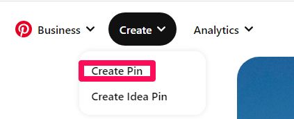
To create pins, head to your profile and select Create Pin from the Create drop-down to begin.

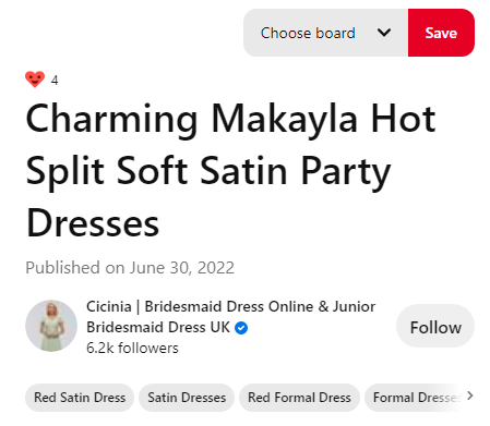
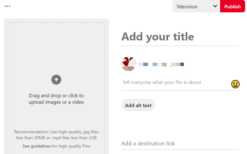
On the next page, select the Board you wish to have the Pin on from the drop-down, then enter the Pin’s title. Of course. Use the keywords people are likely to search for to target Pinterest searchers.
You can see in this Pin that Cicinia, an online retailer of bridal dresses and accessories, uses searchable keywords in the title. But the Pin doesn’t have a description. Don’t make the same mistake.

Write a compelling description to entice users to click your link.
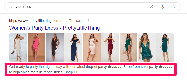
You can search your keywords on Google to see what other brands have as their descriptions if you don’t know what to write. Then, add a discount code to the description if you have any. It supports up to 500 characters, so make the most of it.

Finally, upload your visuals, add your alt text describing the visual you uploaded, then include the destination link, in this case, your affiliate link, and publish the Pin.

Repeat this step for the rest of your products.
Promote Pins on Pinterest
Pinterest comes with a built-in ad manager.
With this tool, you can promote your pins to the perfect audience. It lets you target people based on demographics like age, gender, and location. You may also run campaigns based on their interests or search terms.

Additionally, Pinterest allows advertisers to upload their customer lists for custom targeting. However, it works best for sellers that own a website.
Running ads means you don’t have to compete with the over 240 billion pins for attention. Instead, promoted pins put you on the spot and in front of the right people.
Dimniko, an online advertising agency, helped a client sell over 22,500 products with Pinterest ad campaigns, generating up to 11-times ROAS.
The brand pivoted to Pinterest after experiencing slow sales from other channels. According to them, the client spent around $15,000 daily on Facebook ads, generating $3 million monthly in Shopify; that’s $6 for every $1 spent on ads.
But with Pinterest, they generated $1.29 million with $116,000—$11.12 per $1.
Dimniko advised Pinterest advertisers to kill assets that didn’t meet the KPI in the first seven days and scale the budget of the top performers by 20% every two to three days.
They admitted that half of their sales were due to their retargeting strategy and suggested that new advertisers should start with their existing buyers and ‘actalikes.’
Go Beyond Pinterest
Several opportunities exist for you outside Pinterest.
Depending solely on the channel to reach prospects is a considerable risk. The platform only controls about 450 million of the estimated 4.7 billion global social media users, so there are always more people to reach.
You can do this organically by publicly sharing your pins or boards using trending and relevant Twitter and TikTok hashtags. Also, brands like Bergdorf Goodman use Facebook to promote their pins.
Like them, you can post your pins’ links as updates on your Facebook page.

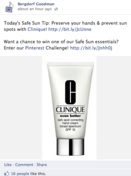
Promote the post to reach more people.
Blog on Medium
Nearly 43% of global internet-enabled persons use ad blockers, meaning there’s little future for intrusive marketing.
So, content marketing is a no-brainer.
It lets you reach prospects through organic search when they are most likely to purchase. Also, creating consistent, valuable, and engaging content helps you answer customers’ questions, build trust, and influence buying decisions.
Studies found that content marketing generates three times more leads than traditional marketing channels. Also, brands that create content have a six times higher conversion rate than non-adopters.
Thankfully, you don’t need a website for content marketing with Medium. It’s a free and intuitive online publishing platform that lets anyone create, share and discover content.
Sign up on the platform. Research keywords and create quality content with them. You can repurpose the article into a video with tools like Lumen5.com and share it on YouTube.
Selling On Pinterest With a Website
A website puts your Pinterest marketing on steroids.
At least you won’t have to upload your products manually. Instead, the platform can automatically pull your products from your online store to Pinterest and update your catalog regularly. It also lets you retarget non-converters and upsell existing buyers, improving conversion and customer lifetime value.
Follow these steps to connect your website to Pinterest and sell on the platform.
Set Up Your Online Store
Create an online store if you don’t have one yet.
Pinterest currently supports Shopify and WooCommerce stores and online shops that can integrate with the following:
- Lengow
- ChannelAdvisor
- GoDataFeed
- Feedonomics
- Products
Next, add the website to your Pinterest business account to claim ownership. Verifying your site allows you to access analytics for the pins you publish from your website and pins other users created from your site and get a verified merchant tag.

You can claim your website by adding a DNS TXT record to your domain host, uploading an HTML file to your website’s web server, or adding an HTML tag to your website code.
Add Your Product Catalog
Upload your catalogs to start selling on the platform.
Catalogs are a feed ingestion tool that lets you connect your eCommerce shop to your Pinterest store. The file lists all your available products and their corresponding attributes, creating a data source for the Pinterest store.
Pinterest ingests the data source every 24 hours to create your product Pins and process up to 20 million products per account. You’ll need to contact Pinterest support if you have more than that number of products.
You can add up to 20 data sources to promote your products across different markets, languages, and currencies. However, uploading your data sources to Pinterest is only available in selected countries. If you’re eligible, the steps here can get you started.
Alternatively, you may use third-party integrations like Shopify’s Pinterest app and Pinterest for WooCommerce plugin to get your products on Pinterest. Tools like Lengow, ChannelAdvisor, GoDataFeed, Feedonomics, and Productsup can also streamline your Pinterest data ingestion.
Create Rich Pins
Rich Pin is a step up for Pinterest pins.
They have extra information like price, product availability, description, and product link, providing pinners with rich shopping experiences. Rich pins encourage higher click-through rates, enabling you to sell more. They also make better ads.

With rich Pins, you don’t need to update your product Pins manually whenever the need arises. Instead, they update automatically each time you change your product titles, description, price, or availability.
Another fantastic thing is that rich Pins require only a one-time, easy setup. Pinterest will convert all your product Pins to rich Pins if you enable the feature for your account, and new Pins will appear as rich Pins.
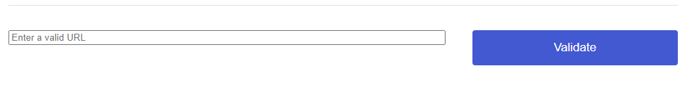
Shopify natively supports Pinterest product-rich Pins, so it doesn’t require manual setup. Open any product page, copy the link and append .oembed to the URL, then validate with the Pinterest Rich Pins Validator.

If your store runs on WooCommerce, install the Yoast SEO plugin and enable Open Graph in the plugin setting. Next, copy any of your product URLs and validate. It’s that easy.
However, you’ll have to roll up your sleeves for custom sites.
It requires you to manually add rich metadata to the header of all your product pages. Pinterest supports Schema.org properties. Use any product schema generator like Merkel Schema Markup Generator to generate the JSON-LD code for each product page.
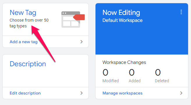
Next, use Google Tag Manager to add the code to the page’s HTML.
To begin, log in to your account and select Add a new tag under the “New Tag” section.

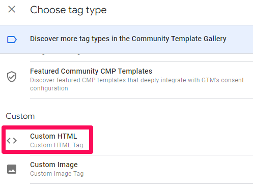
Choose a name for your tag, then select Custom HTML as the tag type.

Scroll down to Triggering to choose a trigger, then click the + icon.

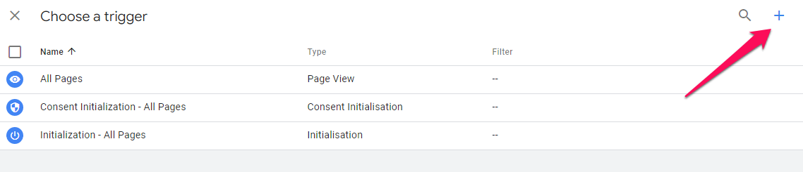
Name your trigger and select Page View as the trigger type. Next, choose Some Page Views under the “This trigger fires on” section.

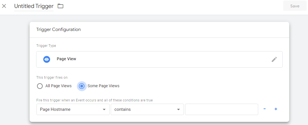
Specify your trigger condition, save and then publish your tag.
Repeat the steps for all your product pages, then validate any URLs to apply for rich Pins.
Stay Organized With Product Groups
Product groups help you manage your inventory.
It also lets you promote a product category instead of individual Pins. You can create a product group manually or leave that for Pinterest to handle if you use Shopify. The app can automatically sync your Shopify collections to create relevant Pinterest product groups.
The auto-created product groups include All Products, Top Sellers, Back In Stock, Best Deals, New Arrivals, and Most Popular.
You can add others manually if you need different product groups like brand, custom label, product type, category, or gender. First, ensure the fields exist in your data source and name the products based on your chosen filters.
Follow these steps to create a product group:
- First, log in to your Pinterest business account from your desktop.
- Click Ads on the top menu and select Catalogs.
- Select View product groups, then Create product group.
- Apply filters to select the products for the group
- Go to the next page and enter a name for the product group.
Prompt With Shopping Ads
A website lets you take your Pinterest ad campaigns to a new level.
For instance, you can retarget non-converting shoppers to recover lost sales or upsell active buyers to improve their lifetime value. You may also create an act alike (equivalent to Facebook’s lookalike) audience to reach your ideal prospects, eliminating guesses from your targeting.
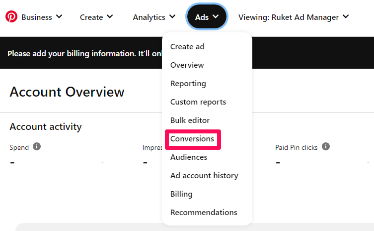
However, the first is to install the Pinterest tracking tag.
It’s a code snippet that lets Pinterest track your store visitors and their actions while on your site. The code helps you measure your campaign performance, optimize your conversion, build a targeting audience and become a verified merchant.
To install the tag, log in to your Pinterest ads account, click the Ads tab on the top menu, select conversion from the drop-down, and follow the rest of the instructions to complete the process.

Create your audience and run shopping and personalized collections ads to promote your products. Also, launch dynamic retargeting campaigns to upsell buyers and retarget shoppers that abandoned their carts. Run these campaigns concurrently for the best results. This resource can guide you in setting up high-converting Pinterest ads.
Also, don’t forget to promote your store outside Pinterest for maximum reach.
Wrapping It Up
So you don’t need to own a website to sell on Pinterest.
With just an affiliate link, you can get started on the platform. That might even change soon. The social network is piloting a feature that lets shoppers checkout and pay for items on Pinterest so that they don’t have to leave the app to complete their purchases.
The in-app checkout will probably redefine social commerce in the coming years, and getting onboard Pinterest and setting up your stores now means you’ll always be ready for the mad rush.
Thankfully, the tips in this article can get you started.
Featured image by rawpixel.com on Freepik
Source
The post How to Sell on Pinterest Without a Website first appeared on Webdesigner Depot.
Source de l’article sur Webdesignerdepot

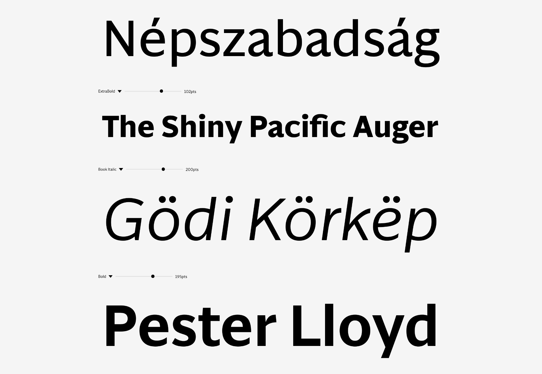
 Choosing the right typefaces for your website can elevate a design from dour to delightful. The right typeface gives personality to your brand voice and can make sure your content gets read.


 User Experience is a crucial consideration for any web developer or designer; the only way to ensure that you’re delivering a successful website is to ensure that the end-user or customer will feel comfortable using it.
 Learning how to design an MVP webpage or website could be one of the best things you can do as a site creator in today’s digital world.
 As a website designer, your professional life revolves around crucial questions that might help you to deliver better results for your clients.


