Articles

Many firms’ design and development decisions are increasingly oriented toward human-centered innovation. Instead of rushing goods to market, these firms are using a user-centered design approach.

Design and development teams build high-performing digital products or websites that uniquely meet customers’ demands by concentrating on the user experience. After all, a good web design is helpful in boosting the business reputation or user experience.

This post will define user-centered design, discuss its fundamental principles, and describe the user-centered design process.

What Is User-Centered Design?

To create an enjoyable solution to a problem, user-centered design is a collection of iterative design processes concentrating on the user’s needs at each step. In UCD, the expectations, objectives, and preferences of the user significantly impact design decisions.

Additionally, users are actively involved in the entire process from start to finish. User-centered design principles encourage designers to create products with users rather than just for them. This strategy typically includes user research, interviews, usability testing, and a massive amount of feedback gathering.

UCD Requires Four Fundamental Components:

  • Visibility: Can people see what your website is about and how to utilize it the moment they land on your page?
  • Availability: Is your website user-friendly? Can they swiftly locate information? They should be able to find call-to-action buttons, menus, filters, and search choices with ease.
  • Legibility: Is the text simple to read for users?
  • Language: Is the language simple to grasp for users? Do you avoid using industry jargon in your UX authoring, which might lead to confusion and hesitation?

What Is The Significance Of UCD?

User experience is important in product design, especially in digital products such as app design, web and interface design, and marketing. Customers want their lives to be simplified. A website, app, or product exists to fulfill a consumer. Hence its success is determined by their interaction with it.

The following are some of the advantages of a user-centered design strategy for a business:

  • Customers keep coming back for more
  • There would be an increase in sales
  • Creating polished, efficient, and widely available goods
  • Understanding challenges thoroughly to provide suitable solutions
  • Customers and teams working together
  • Avoiding typical blunders
  • Enhancing Competitiveness
  • Assisting them in comprehending their market

It offers consumers the following advantages:

  • Making their life easier
  • Fulfilling their desires
  • Companies making them feel heard and understood
  • Making them feel important in the creation of things they use
  • Providing answers to challenges they were unaware they had or could not imagine solutions to

Let’s dig in to learn more about the advantages of UCD.

Businesses can benefit from using the user-centered design approach in various ways. As you incorporate this into your web development, you can enjoy the following four main advantages.

1. Prevent Project Failure

Your company might find it simpler to incorporate improvements and ensure your product is in line with actual user needs if you have a continuous feedback process assessing how customers react to your product, like a website.

Customers feel like their needs are better represented in the finished product, which can increase engagement and strengthen the bond with the company.

2. Improve ROI

This method produces products that more accurately reflect user expectations. The procedure also lessens mistakes made by website users, for instance. When combined, these factors motivate users to convert from leads to paying clients, boosting return on investment.

3. Increase Development Efficiency

In user-centered design, the objectives of the various team members are aligned. This can help clarify the best course of action for all parties involved. A more targeted, goal-oriented development process may be encouraged by the regular evaluation process.

Additionally, businesses can engage stakeholders and explain how their efforts and methodologies will improve customer interactions by using an iterative life cycle during product development.

4. Up The Level Of Competition

Customers will more fully appreciate what you offer, improve their engagement with your product or website, and be more likely to purchase from you if your product is created with their needs and expectations in mind.

As a result, this may increase your ability to compete in your sector.

5. KPIs Are Included

Given your user needs and business objectives, how do you move from the first to the second? You can measure key performance indicators with this in mind once you know what user needs are essential for the overall goals.

For instance, productivity may be the focus of office software, shopper activity may be the focus of sales tools, and retention rates may be the focus of other apps. All of these are necessary steps toward achieving business values like profit and revenue.

Human-Centered Design Versus User-Centered Design

There is a significant difference between humans and users. Simply put, all users are humans; however, not all humans will use your product. Therefore, you must thoroughly understand your target market to produce a successful user-centered design.

Detailed research should be done on the problems and goals of your users. Then, talk to them and give them several chances to offer feedback. By doing this, you’ll create a user persona that is complete and that you can use to determine the priorities for your design.

It’s critical to understand that different user groups may have additional requirements, levels of technical expertise, and expectations for using products like the one you’ve made.

What crucial guidelines or principles should designers consider when adopting a user-centric design?

The Process Of User-Centered Design

Certain fundamental principles underpin user-centered design. While the development process is always iterative, no explicit methods for implementation are specified. The approach can be implemented in either a waterfall or an agile environment.

1. Contextualization

The first step is to analyze the environment in which users will use the product. What are the intended applications of the product for future users? Teams working on projects can get answers by watching and talking to potential users.

2. Outlining The Prerequisites

Specifying the requirements for the new product is the second step. In this step, user requirements are described while considering corporate needs.

3. Design

Once the requirements are established, the actual design process can begin. Designers typically start by producing a straightforward prototype, like one made of paper, then move on to digital wireframes and a finished prototype.

4. Analysis

The project team solicits feedback from potential users after creating a prototype. This is typically done for digital applications through in-depth user testing and qualitative research.

Do surveys and tests evaluate user satisfaction, effectiveness, and efficiency? With the new information, the project team goes back to step 2 or step 3 of the design process to improve the product. Once the user feedback is satisfied, these iterations continue while taking into account corporate frameworks (time and costs).

Top 10 User-Centered Design Principles

Principles of user-centered design attempt to guarantee that usability is the primary priority throughout the development process. These principles, if successfully followed, will ensure that user experience is fulfilled not just during the initial introduction of a product but also during its use.

Furthermore, each of the following principles may be tailored to match the specific requirements and interaction demands of any product.

1. Use Simple Language

Professional Web Designer strives to provide the most readable discourse for the user while creating a product. This involves clarifying vocabulary, eliminating jargon, and simply providing information pertinent to the work.

Presenting users with irrelevant information throughout their use of the product taints its usefulness. Furthermore, basic language helps the user finish the work without being overwhelmed or confused.

2. Feedback

Users expect a reaction to all of their actions. This might involve modifying the look of the screen after completing an activity. If the job is finished after some time, it should display a loading page to notify the user that the task is in process.

Keeping the user informed throughout the process reassures them and keeps them on track with their job.

3. Maintaining Consistency

Keeping the product consistent is essential in ensuring an ideal user experience. Consistency affects how customers approach a product, and the time it takes to learn how to use it.

From the start of the project until its completion, the consistent philosophy underpinning the UCD process should be maintained. If the interface design needs to be updated, it is critical to maintaining consistency across new features to stay beneficial to the user.

4. Give The Complete User Control

Consumers are already aware of their requirements. They should be able to use a product with minimal effort and depend on the product’s help to accomplish the rest.

By removing the effort from the job, the user can do it quickly while keeping control of their activities.

5. Describe The Situation

Before developing a product, the designer must first investigate the ideal user and their wants. The designers can gain a comprehensive sense of some of the issues these people experience by studying their lifestyles.

Many of these observations are conducted through interviews. These interviews provide the designer with information on the exact goals that users want to attain and how they want to achieve them.

6. Examine the Design

Designers undertake usability testing with actual users of their product at this stage in the UCD process. This stage provides designers with insight into how consumers will interact with the product and how to modify it to suit them better.

It is advised that this stage be completed as quickly as feasible. The sooner customers provide input, the faster designers can comprehend their product from the user’s perspective.

7. Create Designs That Are Specific To The Needs Of The User

The design team must examine the distinctive features of their intended demographic as well as frequent real-world activities while beginning the design process. Furthermore, the product should be appropriate for the environment in which it will be utilized the most.

Making a product that needs a lot of work from the user reduces its usability and usefulness, ultimately defeating the objective of UCD.

8. The Design Process Is Iterative

Because user-centered design is based on putting the user first, the product team should constantly be working to improve the user experience. By introducing changes gradually, you will gain a better understanding of your target audience.

9. Adequate Navigational Tools

An essential component of the user experience is the capability to navigate between pages of your website and return to the previous one. Make sure users know where they are on your website and how to leave any pages they don’t want to see.

Customers can better understand how to navigate your page by giving them features like a navigation map, for instance. Make it simple for customers to change their order without leaving the current page if they buy clothing and discover they need a different size once they reach the checkout page.

10. Unflawed System

Customers should find it easy to navigate between your website’s pages and accomplish their goals. If they make a mistake, be there to help them fix it so they can achieve their goal.

The form may ask for specific, essential fields, such as the square footage, and may also include a gentle reminder or an alert that appears if the user accidentally leaves a required field blank.

Customers may feel more comfortable responding to your prompts and participating in a conversation if you ask questions one at a time and offer automated responses for each response.

Wrapping Up

User-centered design is more than just making a good product. It goes further than that. You demonstrate your motivations and intentions by putting your users in the spotlight. You’re demonstrating that it’s not all about meeting deadlines or turning a profit. Instead, you’re telling your users that you understand what they want and prioritize their needs.

It should come as no surprise that the most effective teams are user-centric. Knowing your customer is essential for success in any industry, including design. Create products that put the user first, and you will create products that people will love.

You can build a more robust, user-friendly website that is better equipped to respond to user needs and expectations by incorporating the User Centered Design process into your product design. However, it’s crucial to collaborate with a specialist who can apply these techniques and produce the result you’ve envisioned.


Featured image by pch.vector on Freepik

Source

The post 10 Key Principles of User-Centered Design first appeared on Webdesigner Depot.

Source de l’article sur Webdesignerdepot

Artificial intelligence is the latest buzzword in the tech world. It’s everywhere and has been for a while, but AI-powered writing software is a relatively new concept.

AI Writing Software uses artificial intelligence to write articles, blog posts, and other content in your voice. The goal is to provide a tool that will save you time and energy so you can focus on different aspects of your business or life.

To help you get started, we’ve compiled a list of 20 AI writing software you can use to create content for your website, blog, or social media accounts.
1. Copy.ai 

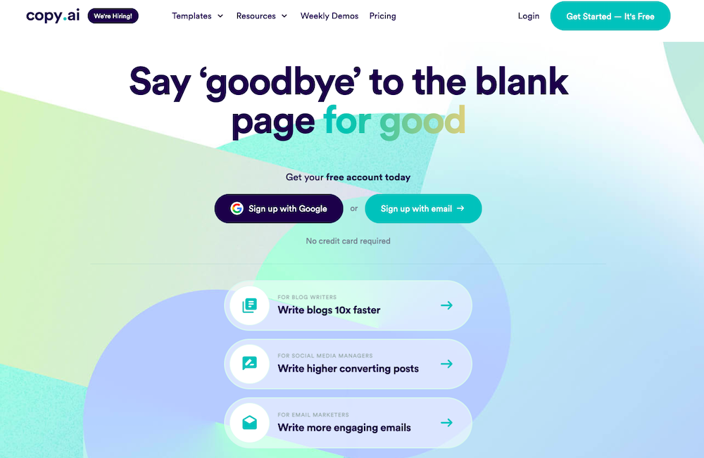
Copy.ai uses Natural Language Processing (NLP) to produce high-quality content for your business, ebooks, blog posts, articles, product descriptions, social media content, and more. It can also be used to rewrite existing content so that you can use it on your website, blog, or social media pages.

Since it uses artificial intelligence to mimic human writing patterns and styles, the copy will be more natural and easier to read than the typical machine-generated text we’re used to seeing.

Copy.ai differs from traditional content creation tools because it doesn’t just offer suggestions on improving your current content; it generates new text based on what it thinks would be most relevant for the topic or audience.

Key Features: 

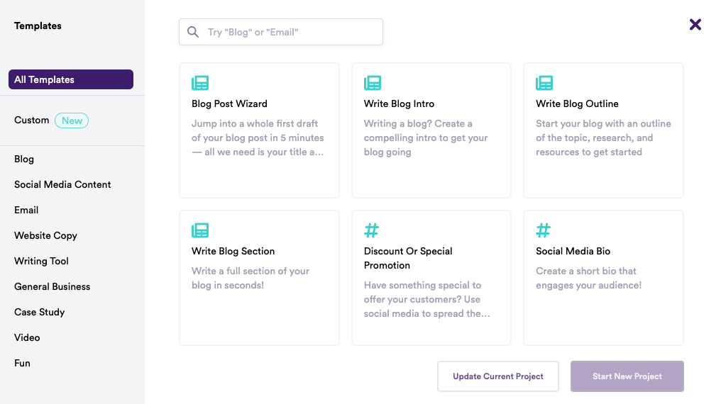
  • Pre-built Templates – Copy.ai has a ton of pre-built templates for different kinds of content. For example, you can see below that it has options for blogs, social media content, video, case studies, and more:
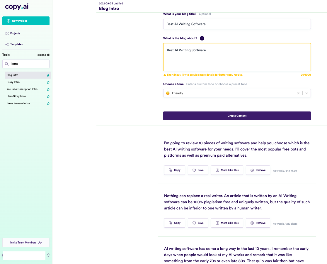
  • Different tones and variations – Get access to tones like friendly, persuasive, professional, luxury, witty, bold, and more to align the content with your writing style. It also creates multiple variations based on your input – you can pick the one you like or make more.

    To illustrate this, here’s a screenshot of the results we got while trying to write the introduction for this article using Copy AI. 

  • Writing and Brainstorming tools – You also get tons of writing tools, brainstorming tools, and personal tools. Writing tools include essay intro, cliffhanger generator, adjective accelerator, passive to active voice, verb booster, and the like. Brainstorming tools have a name generator, startup ideas, viral ideas, and more – while Personal tools include birthday cards, clubhouse bios, cover letters, love letters, and shower thoughts.

    You can save your content and then return to it later if you wish. Plus, the software’s user interface is easy to navigate, and the program is simple. 

Luciano Viterale, Co-founder of Ticker Nerd, also shares his experience with Copy.ai

“I’ve been experimenting with AI copywriting tools since GPT-3 was released. I have explored many of the popular tools. However, my favorite tool by far is Copy AI. They have an outstanding blogging outline feature; the UX is clean and easy to navigate, and the pricing is reasonable.

Copy AI also generated the name of my startup, “Ticker Nerd,” which is an investing newsletter that was recently acquired.”

That said, Viterale suggests that the blog outlines can be repetitive. He says, “one thing I don’t particularly like is that blog outlines include the same point repeatedly but articulated slightly differently, essentially adding no value.” 

Pros: 

  • Copy.ai produces content at least 80% as good as a human writer (and often better). The system continually learns, which means the more you use it, the better it gets. 
  • It has an extensive library of templates available for different requirements. 
  • It supports over 25 languages, including English, French, Spanish, Portuguese, German, Italian, Dutch, Russian, and more. 

Cons: 

  • Not suitable for long-form content. 
  • The content can get a bit repetitive after a while.  
  • The free plan lets you create only 2000 words per month. 

Pricing: 

It starts from $39 per month (if you pay yearly) for up to 40k words per month, unlimited copywriting tools, priority email support, Blog Wizard tool, support for 25+ languages, and five user seats. 

2. Jasper 

Jasper.ai is an AI copywriting tool that uses a combination of artificial intelligence (AI) and natural language processing (NLP) to create content based on user input. 
It helps you generate original content for your blogs, social media, websites, and more. Jasper also knows 10% of what’s on the internet and continues to learn more daily.

Just like Copy.ai, Jasper’s user interface is easy to use and navigate around. With its specific template for blog posts, articles, ebooks, and more, it’s also one of the few AI writing software suitable for long-form content. 

All you have to do is enter the title, your intended audience, tone of voice, and language options, along with the main point of your copy, and voila – Jasper can churn out a high-quality piece of content for you within seconds.
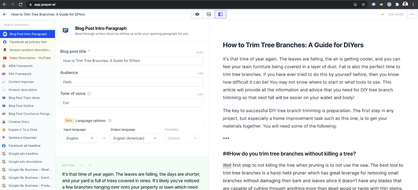
(Jasper Interface

Key Features: 

  • 50+ AI templates – Jasper.ai offers a variety of AI templates, including Blog Posts, Summary, Conclusion, Q&A, Ads, Videos, Social Media, Rewriter, Marketing Frameworks, Articles, and more. Each template has several use cases – for example, a blog has Blog Titles, Content Briefs, and Outlines.
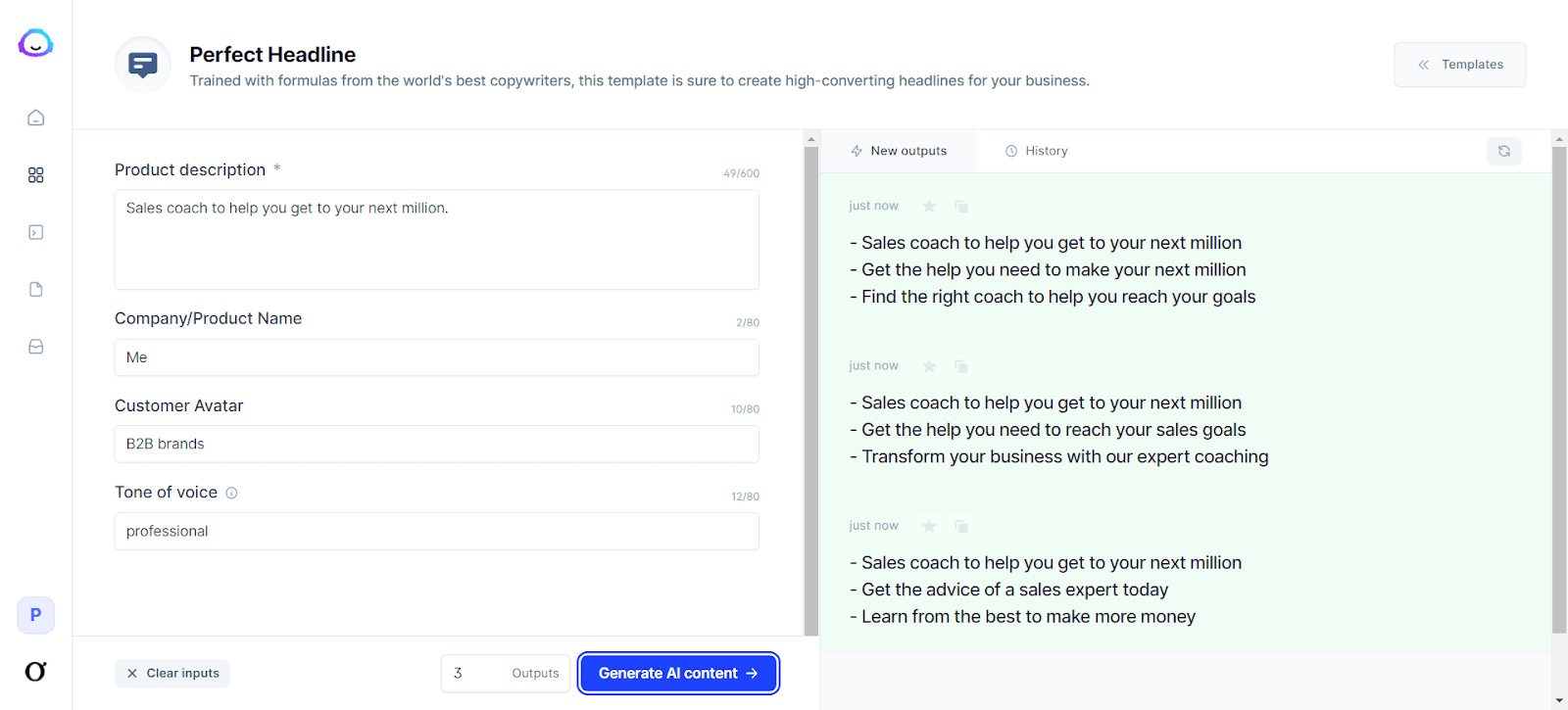
Headline Generator

  • Boss Mode lets you write long-form content such as blog posts, stories, and books. It also allows you to organize your content into projects and find help with priority chat support, Grammarly integration, and plagiarism checks. You can also choose from 25 languages, including English, French, German, Italian, Spanish, Polish, and more.
  • SurferSEO Integration – If you have a Boss Mode plan, you can add SurferSEO to your Jasper account. This integration will enable you to find the best keywords, build a content strategy, create blog outlines, and more.
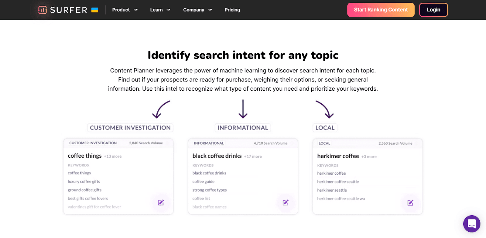
Content production using Surfer SEO Integration

Pros: 

  • No technical assistance is required.
  • Simple, easy-to-use interface.
  • Provides plagiarism-free content every time.
  • It helps you build a content strategy based on high-ranking topics and keywords.
  • Ready-to-use templates cover most of the use cases that a writer or marketer will need.
  • Excellent customer support is provided through live training sessions, live Q&A sessions, blogs, Facebook community, help docs, and emails.

Cons: 

  • Plagiarism-free content doesn’t always mean unique content.
  • Customer support options via chat or email are limited.

Pricing: 

It starts with $40/mo for 35K words, 50+ AI templates, 20+ languages, up to 5 seats, and chat support.

3. Rytr 

Rytr is a content generation tool that uses AI to generate high-quality, human-sounding content for emails, blogs, YouTube videos, and landing pages. 
It also supports multiple languages and tones and uses copywriting frameworks, including AIDA & PAS. And to ensure that your content is free of plagiarism, it comes with a built-in plagiarism checker.

Like Copy.ai. Rytr is also more suitable for short-form content and copywriting than long-form content. 

Key Features: 

  • 30+ languages – Rytr supports many languages, including English, Finnish, French, German, Greek, Italian, Japanese, Korean and Polish. It also uses a proprietary approach to support languages that are not supported by the limitations of GPT3.
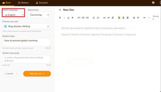
Language Support

  • Use Cases: Rytr offers 40+ use cases, including Blog Section Writing, Blog Ideas & Outline, Brand Name, Business Idea Pitches, Call-to-action, Cover letters, Emails, and more.

    Each use case has a short description of what it’s about below it. Select the use case to write about, give a little context about what you want to write, and then select how many variants you want the AI to write for you (max is 3). 

You can also choose a creativity level by selecting one of 6 options, including Default, Non, Low, Medium, High, or Max.
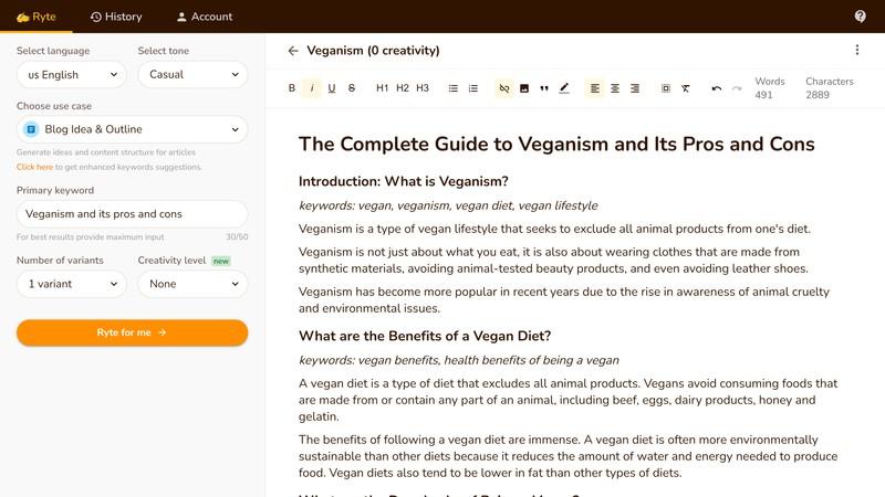
Generating Blog Ideas & Outlines

  • Tone – You can add a personal touch to your content by choosing from over 18 tones, including Formal, Convincing, Inspirational, and more.
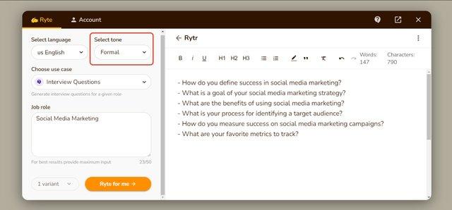
Writing in a formal tone.

Pros: 

  • Simple user interface.
  • Fast live chat support.
  • Using the magic command, you can produce content for poems, letters, and more.
  • Comes with an in-built tool for plagiarism checks.
  • Provides multiple resources for guidance.

Cons: 

  • Tone options are limited.
  • You will receive a small number of credits per month.

Pricing: 

It starts at $9/month for 100K characters per month. There is also a free plan with a 10K characters limit.

4. Writesonic 

Writesonic is a content-creation platform that uses generative artificial intelligence models to write SEO-optimized long-form blogs and articles. 
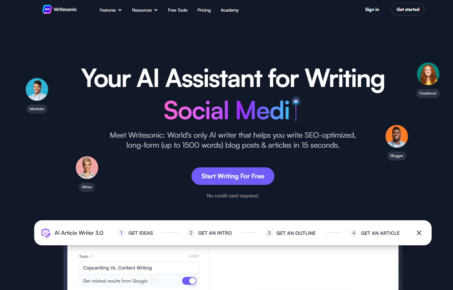
It has 65+ use cases or templates, including Article Writer 3.0, Landing Pages, Tweets, Quora Answers, Facebook Ads, and more.

You can easily create desired content by picking a suitable use case, typing a topic, and adding a paragraph of your own words. You can also set the language and quality level before generating it.
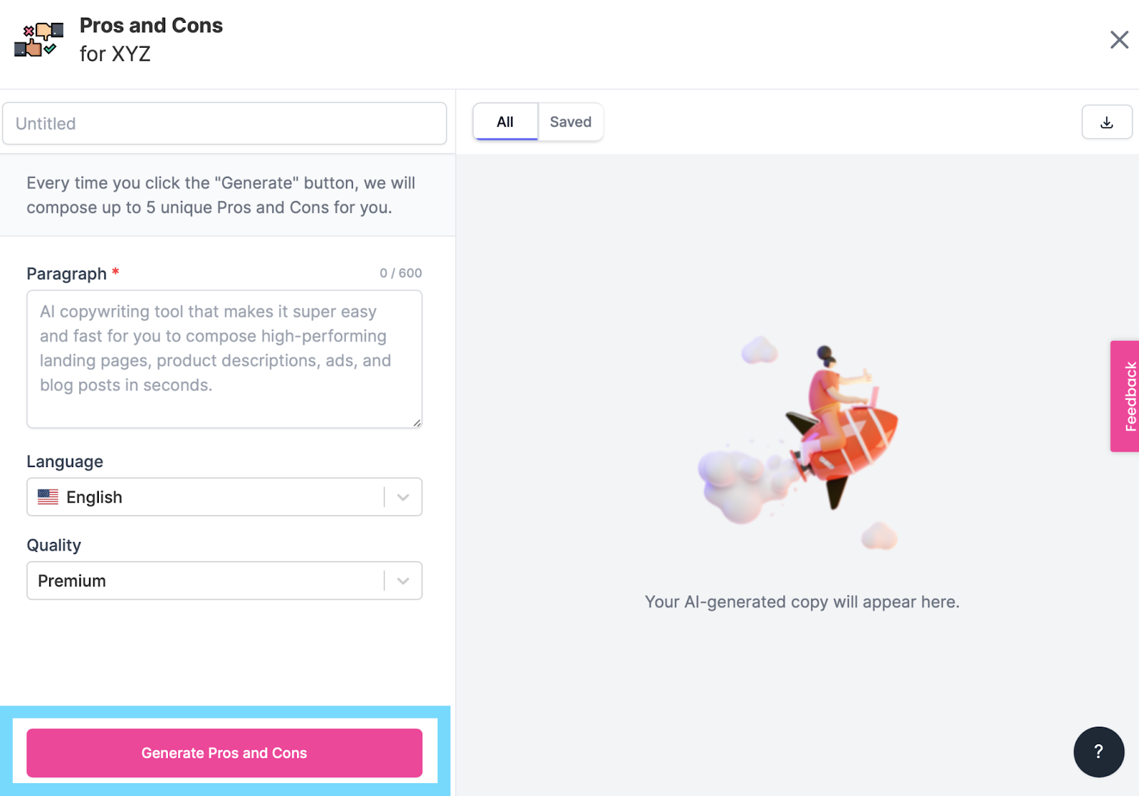
Generating Pros and Cons

Key Features: 

  • 24 Languages: You can produce content in 24 languages, including English, Dutch, French, German, Italian, Russian, Czech, Danish, Greek, Hungarian, and more. They’re also continually adding more language options.
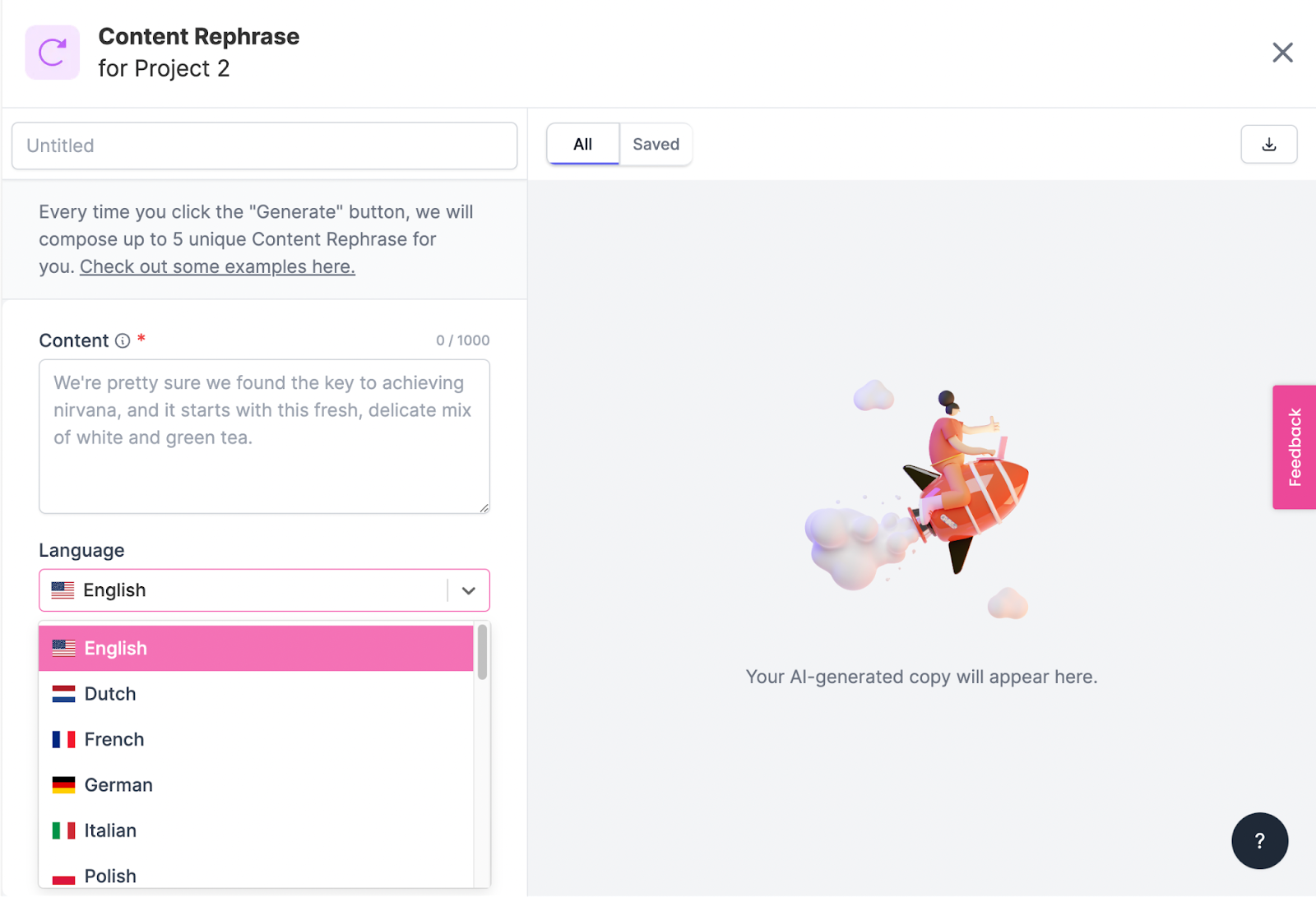
Languages

  • Unconventional Use Cases: It’s got a more comprehensive range of templates, including Sentence Expander, Text Summary, Conclusion Writer, YouTube Outlines, LinkedIn Ad Descriptions, Analogy Maker, Question Generator, Song Lyrics, Definition, and more.
  • SEMrush and WordPress Integrations: Writesonic integrates with SEMrush, Zapier, and WordPress.org. SEMrush helps you optimize your content for search engines, and WordPress.org lets you publish your blog directly from Writesonic. Zapier integration enables you to automate your content from Writesonic.
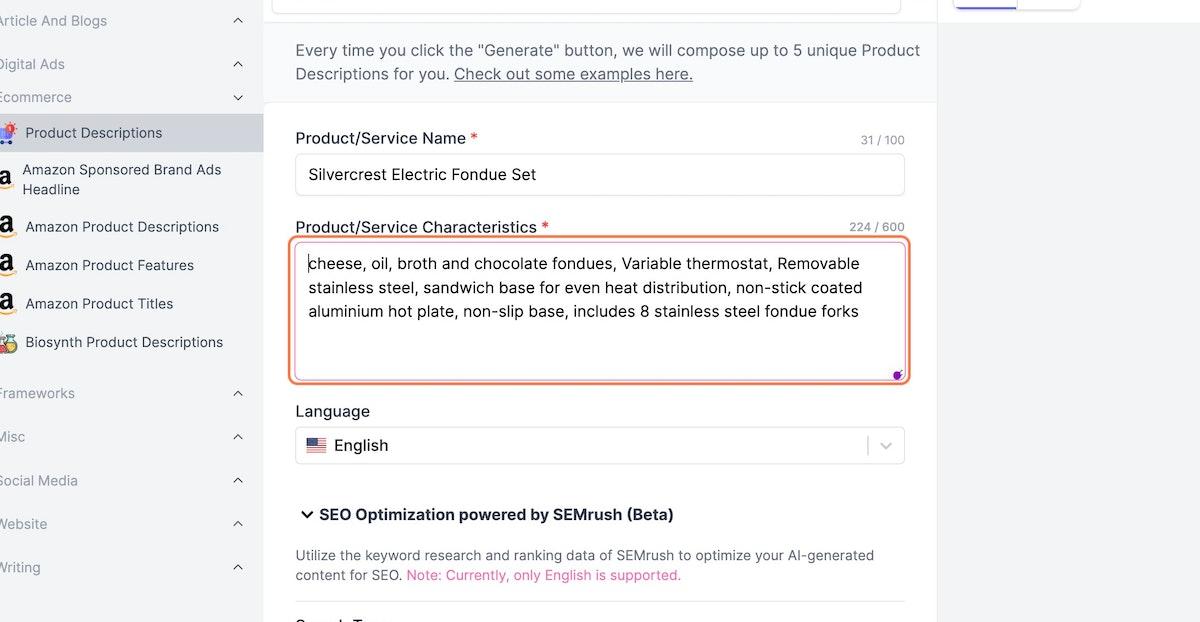
SEMrush Integration

Pros: 

  • Easy to use.
  • The User Interface gives you step-by-step instructions and tips for how to use the tool more efficiently.
  • There are many unique use cases, including a hook generator, pros and cons generator, and landing page creator.
  • Free trial available.

Cons: 

  • Like other tools on this list, the copy may not always be accurate. 

Pricing: 

It starts at $10/month for 12K words, 70+ AI templates, a Landing page generator, a browser extension, Zapier integration, and more.

5. Grammarly Business 

Like most other tools on this list, Grammarly Business isn’t an AI-based content writer per se—it’s more like an AI-based writing assistant. Specifically, it checks your documents for grammar, spelling, plagiarism, and style mistakes.

Grammarly Business also provides feedback on your writing style so that you can improve as a writer over time. 

You can use Grammarly Business to:

  • Get suggestions to improve your writing style, including word choice and sentence structure.
  • Identify common grammatical mistakes and fix them in one click.
  • Improve your email response time by checking emails before they’re sent out.

It’s also ideal for larger teams of writers who need to access the same Grammarly accounts, enabling multiple users to edit documents simultaneously.

One of the best parts about this tool is that it integrates with every online writing space, including Google Docs. This allows you to write and edit simultaneously without waiting for one draft to be finished before making changes to the next.
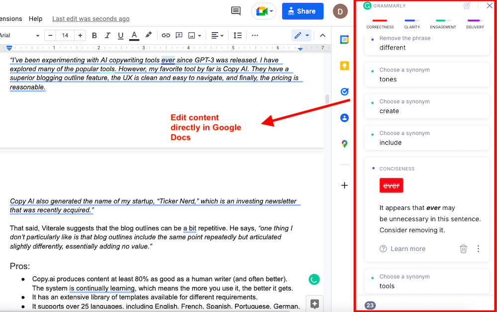
Key Features: 

  • Custom Brand Tone: You can create multiple tone profiles to suit your needs and assign them to different Teams. You’ll also get real-time feedback on your tone and can adjust it while writing. Your tone can be anything from Joyful, Excited, Loving, and Surprised to Curious, Formal, and Cautionary.
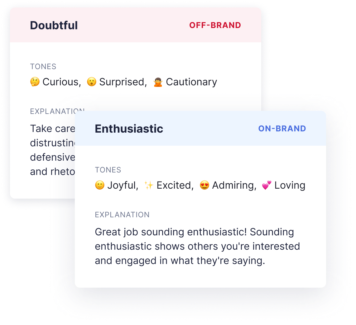
Brand Tone Feedback

  • Grammar Checker: Grammarly gives you feedback on everything that can be improved in your writing – from typos to sentence structure. It also checks for grammar mistakes, spelling errors, and incorrect punctuation.
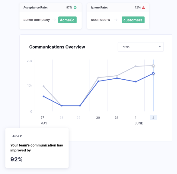
  • Style Guide: Grammarly Style Guide enables you to establish a uniform tone and style across all your teams. You can set a library of words, terms, and phrases that your teams should adhere to.

    You can also prevent them from using complex acronyms or jargon. Lastly, you can get feedback on how the performance has increased with the Style Guide.

Style Guide Analytics

Pros: 

  • Real-time feedback on errors and tone usage.
  • Grammarly gives instant, easy-to-understand feedback and lets you fix mistakes with just one click.
  • You can always add new words to the dictionary.

Cons: 

  • It flags passive voice as an error.
  • Grammarly is good at catching mistakes, but sometimes it corrects things unnecessarily.

Pricing: 

It starts at $15/month for one member, real-time feedback, style guide, snippets, brand tones, admin controls, and more.

6. Peppertype.ai 

Peppertype.ai is another AI-based content generation tool that claims to create content ten times faster, boost Google ranking, and optimize conversions.
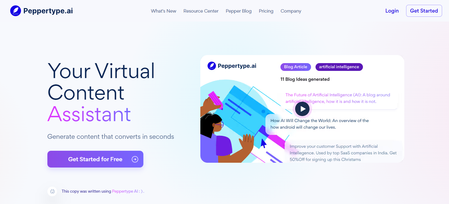
It’s a simple but valuable tool for writers who need help getting started on their next article, email, or blog post.

Some of its use cases include a product review generator, Amazon product descriptions, personal bio, email subject lines, cold emails, paragraph writing, Google Ad copy, Meta descriptions, blog outlines, blog conclusion, and more.

Key Features: 

  • Projects: You can organize your content under Projects, which will group similar types of content so that you have an easier time finding and repurposing the content.
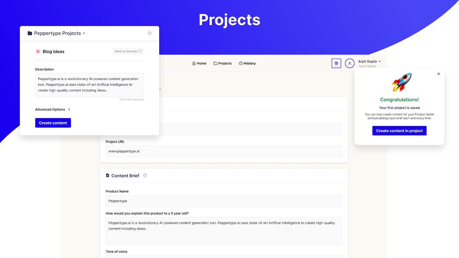
Projects

  • Output personalization: You can like or dislike the output so that the AI behind it can learn your preferences and improve its performance.
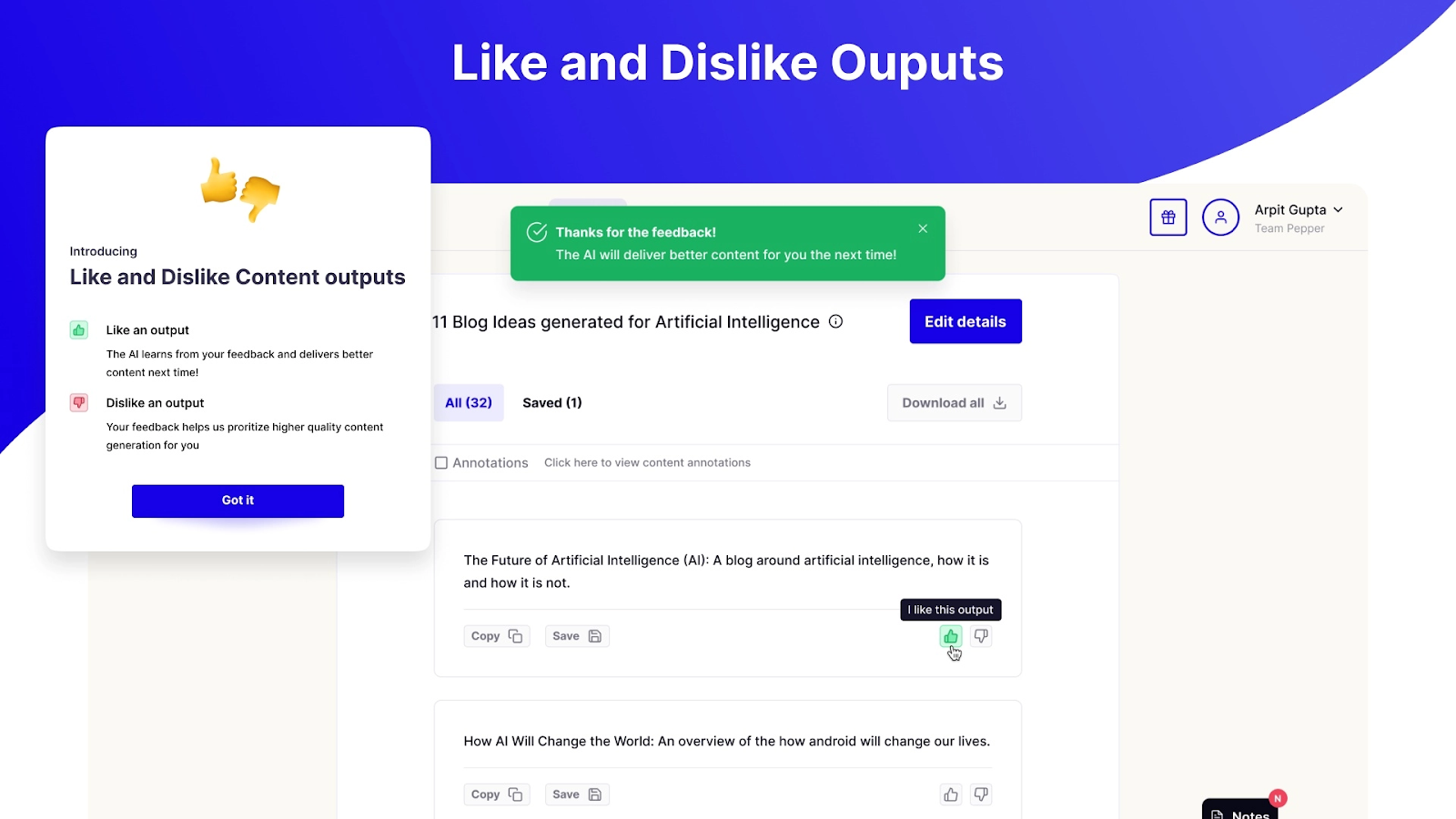
Personalizing output

Pros: 

  • If you invite your friends to use Peppertype.ai, join our community, write them a review, and schedule a training call, they’ll reward you with more word credits.
  • You can create teams, projects, and workspaces.
  • You can filter out unwanted results with annotations.

Cons: 

  • One seat is expensive, and the price increases with each added seat.

Pricing: 

It starts at $35/month for one user, 50K words, 40+ use cases, unlimited projects, customer support, and more.
7. Anyword 

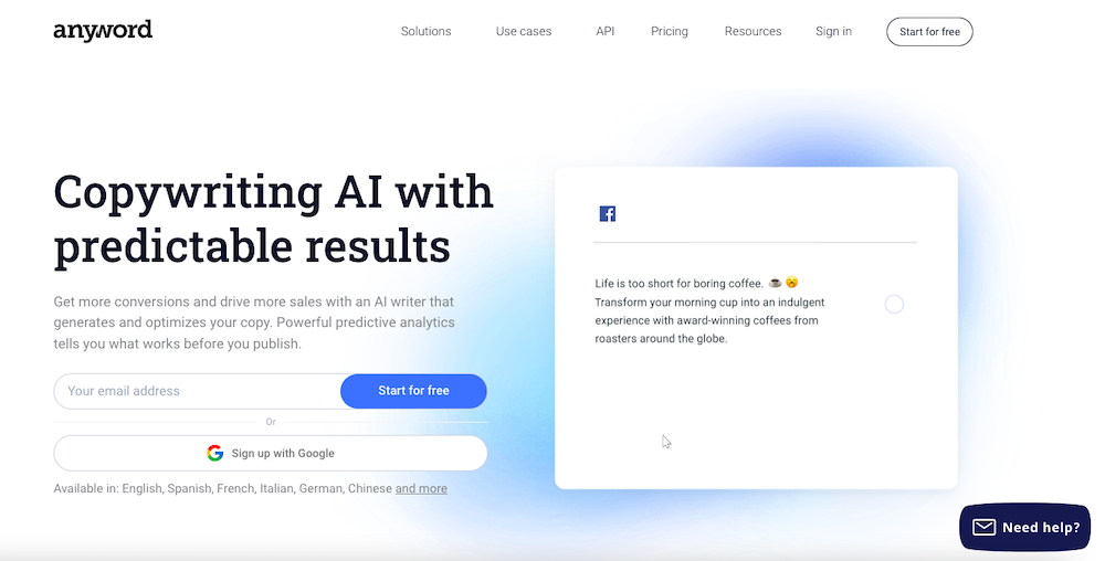
Anyword is a copywriting AI that creates content tailored for your customers and target audiences. 

It has a unique feature – the predictive performance score to predict how well your copy will perform and engage with your audience. This helps you write optimized texts that boost your conversions.

It has 11 major use cases, including a social post generator, Instagram caption generator, sentence rewriter, AI writer tool, meta description generator, Ad copy, landing page, blog, and more. 
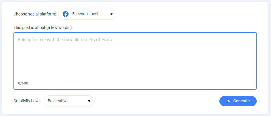
Generating Facebook Post

Although it can create blog post titles and outlines, it’s better suited for writing short-form content like ad copy, product descriptions, and headlines. When writing a blog post, it can generate the title, outline, and introduction before creating body paragraphs.

Key Features: 

  • Predictive Performance Score: This score is given to your copy based on its potential to perform well with your target audience. This can help you immediately improve your copy.
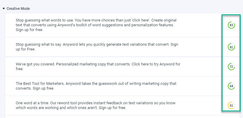
Predictive Performance Score

  • Website Triggered Messages: This feature helps you create and deploy multiple copy variations on your website and apply the best one automatically.

Pros: 

  • It offers a predictive performance score to optimize your copy beforehand.
  • It also offers a free social post generator. No sign-up is required.
  • It automatically creates and runs multiple copy variations to determine the best one.
  • A Freemium plan is available.

Cons: 

  • Limited use cases.
  • A bit expensive for the credits and the number of use cases it offers.

Pricing: 

It costs $24/month for 20K words and one seat.

8. Scalenut 

Scalenut uses Natural Language Processing (NLP) to produce content that ranks higher on search results. It also gives insights into statistics such as word count, grade level, H tags, readability, and the number of images you should use in your content piece. 
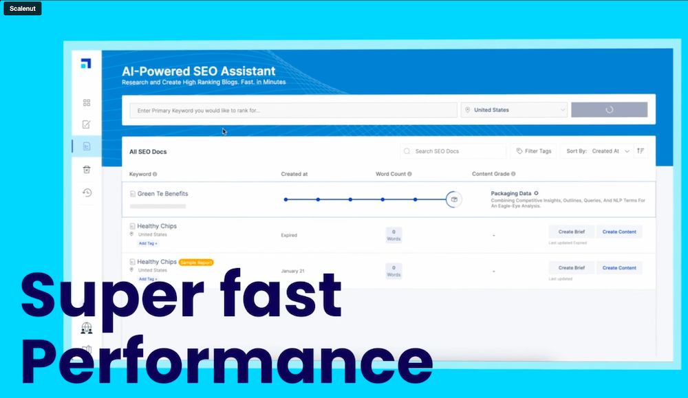
Aside from that, it offers a variety of use cases, including SEO Hub, AI Copywriter, Talent Network, Chrome Extension, Cruise Mode, and more. With these features, you can create content for blog ideas, product descriptions, website copies, blog intros, and more.

Key Features: 

  • Integrations: You can integrate Scalenut with SEMrush for keyword research, cluster boost, and Copyscape to check plagiarism.
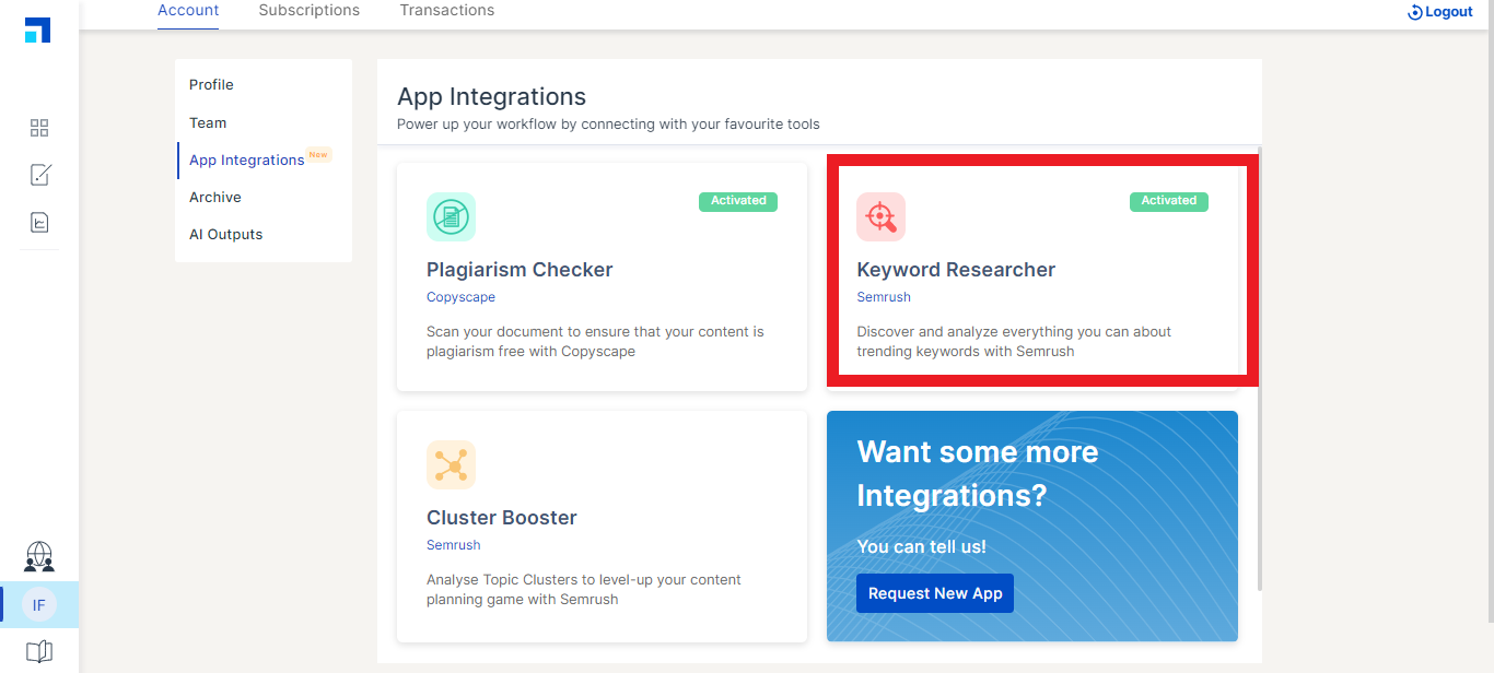
App integrations

  • Cruise Mode: Cruise Mode helps you create blog content in 5 minutes. You just need to provide your blog post’s title, outline, and main points to get your intended content. You’ll also get a real-time quality score that helps you improve your search ranking.

Pros: 

  • It offers a quality score.
  • Affordable plans with a 7-day free trial.
  • 24*7 chat & email support.

Cons: 

  • Limited use cases and features.
  • Content quality is not consistent for all businesses.

Pricing: 

It starts at $12/month for 100K AI words, 5 SEO reports, 24*7 chat and email support, and more.

9. Frase.io 

Frase.io is an all-in-one AI writing tool that helps you, research competitors, develop content briefs, and produce and optimize content.
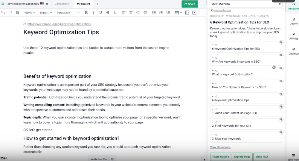
First, you’ll analyze your search competitors using Frase so you can see what your competition is writing about. Next, you can focus on Then, your overall outline or dig deeper by focusing on individual headlines, external links, statistics, etc. 
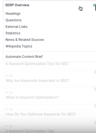
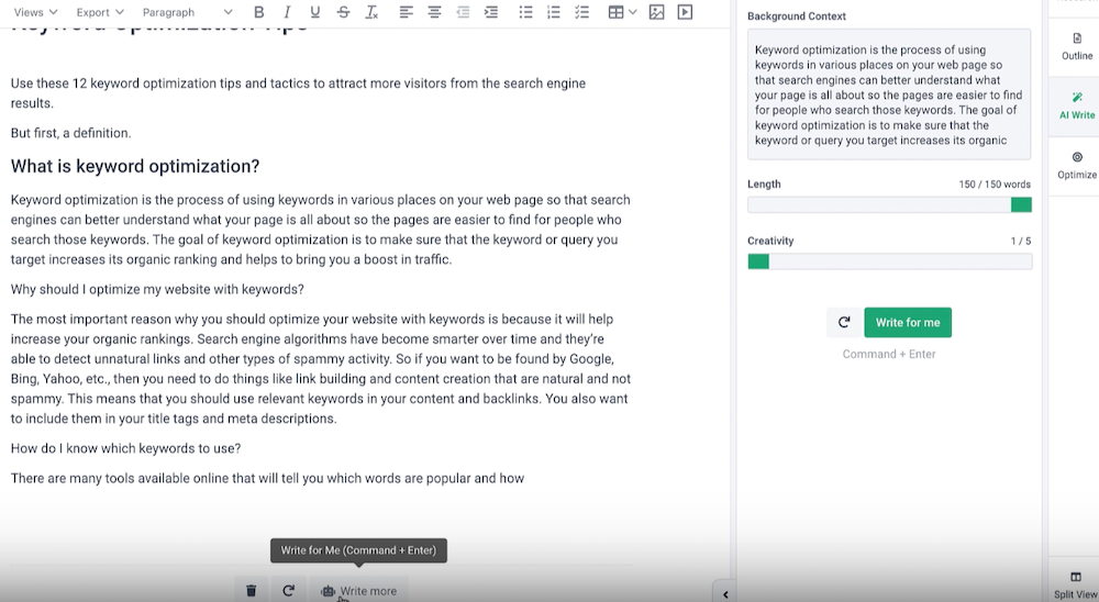
Next, use Frase’s AI writer to finish your draft. You can choose from dozens of use cases to generate content, including product descriptions, blog introductions, and more. You can even automatically expand on what you’re currently writing or rewrite what you’ve already written. 
Finally, you can optimize your draft using recommended keywords and readability scores. Again, Frase provides real-time feedback as you fill in the gaps. 

Key Features: 

  • AI Writing Tools: They include an AI content generator, introduction generator, outline generator, paraphrasing tool, paragraph rewriter, blog title generator, meta description generator, product description generator, slogan generator, summary generator, sentence rewriter, and more. 
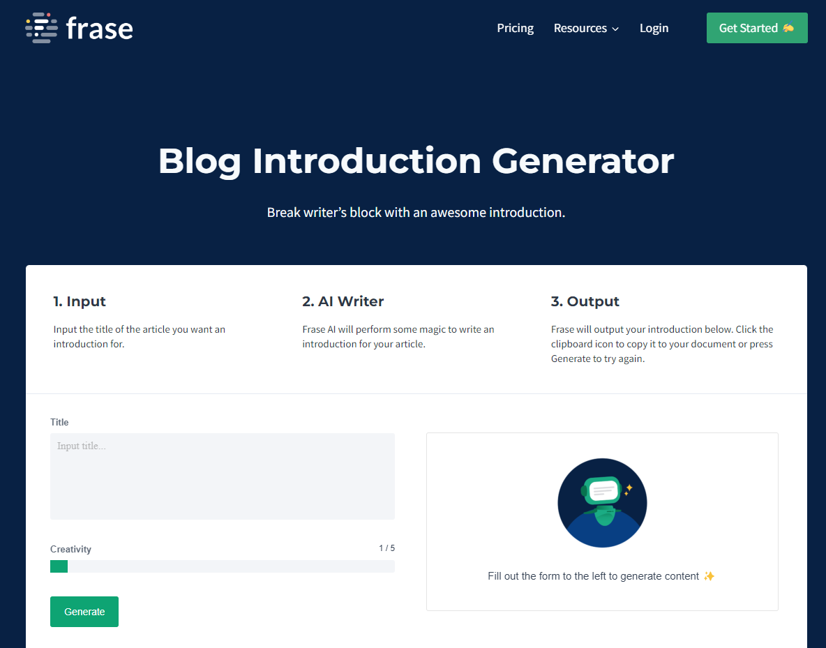
Blog introduction generator

  • Content Analytics: It fetches data from Google Search Console to provide insights into organic growth, content decay, and keyword opportunities.
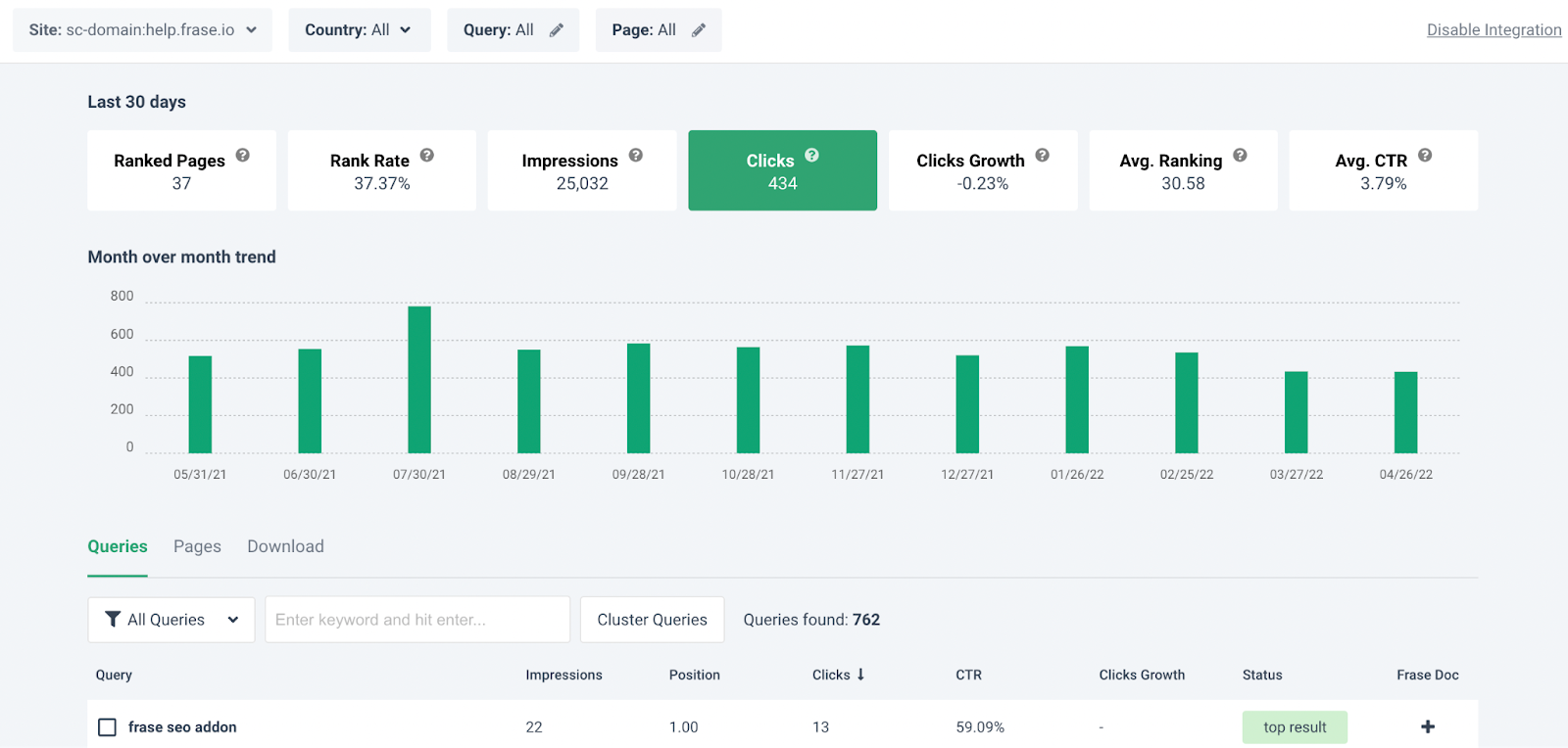
Frase Content Analytics

  • Integrations: It integrates with Google Docs, Google Search Console, and WordPress. It also offers a Chrome extension.
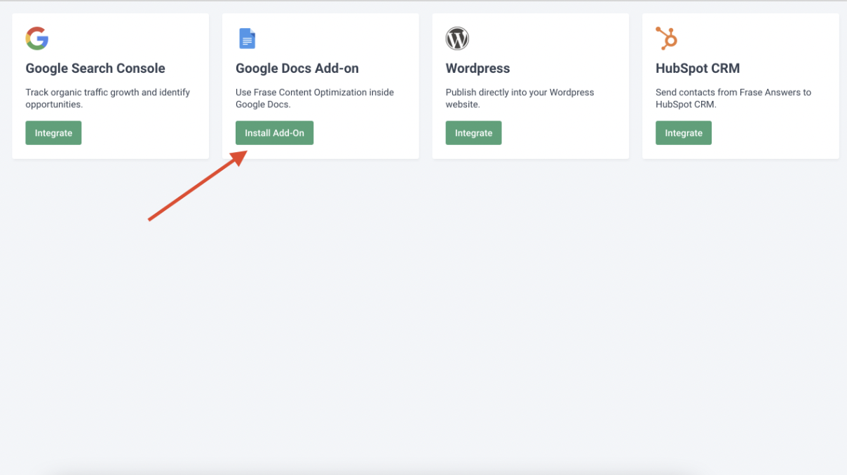
Frase Integrations

Pros: 

  • You can add multiple pages in a single doc.
  • It offers content analytics, allowing you to see which articles are getting the most traction and which ones are not.
  • It enables you to do competitors’ research.

Cons: 

  • Limited word credits in each plan.
  • Max 3 seats available.

Pricing: 

It starts at $14.99/month for one user, 20K AI characters, and four articles (write/optimize) per month. There’s also a 5-day free trial for $1. 

10. Surfer SEO 

Surfer SEO is an SEO tool and AI writing assistance that uses Natural Language Processing (NLP) and machine learning (ML) to help you manage and improve your content strategy.
Rather than creating the body of your copy, it helps you create outlines and optimize the content you write based on that outline. 

It helps you to evaluate your content and find places to improve it using its content score metric, competitor research, SERP analyzer, and keyword recommendations. It also offers a content planner that you can share with your team. 

Key Features: 

  • Outline Builder for Content Editor: The tool generates headlines and paragraphs based on your competitors’ postings. You can use that content as is or edit it by copy-pasting it into the editor. Content paragraphs are available in English, German, French, Polish, Swedish, and Dutch.
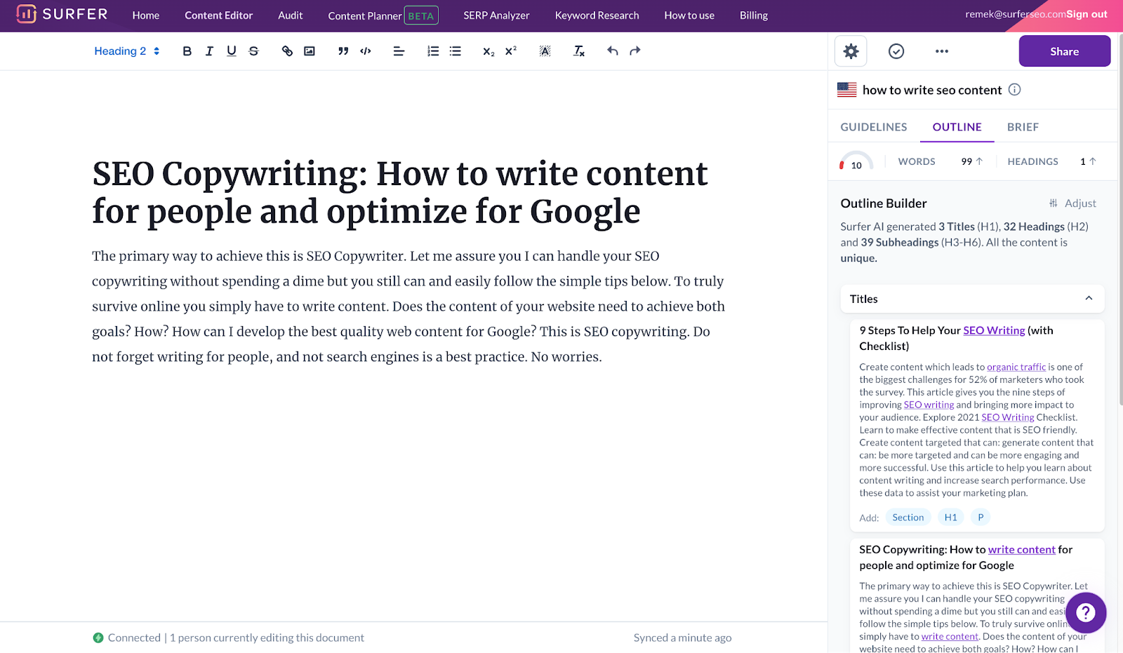
Outline Builder Content Builder

  • SEO Audit Tool: This tool performs step-by-step optimization on your website to improve your Google search results. When you pick an URL to audit, it provides suggestions such as missing backlinks, internal links, word count, and important keywords to use.

Terms to use

  • Content Planner: You can start with your content planner by keyword or domain. Based on your keywords, it comes up with clusters that you can use to create your content topics.

    However, there is a learning curve involved. You will need to understand topic clusters, search intent, and keyword difficulty, among other metrics.
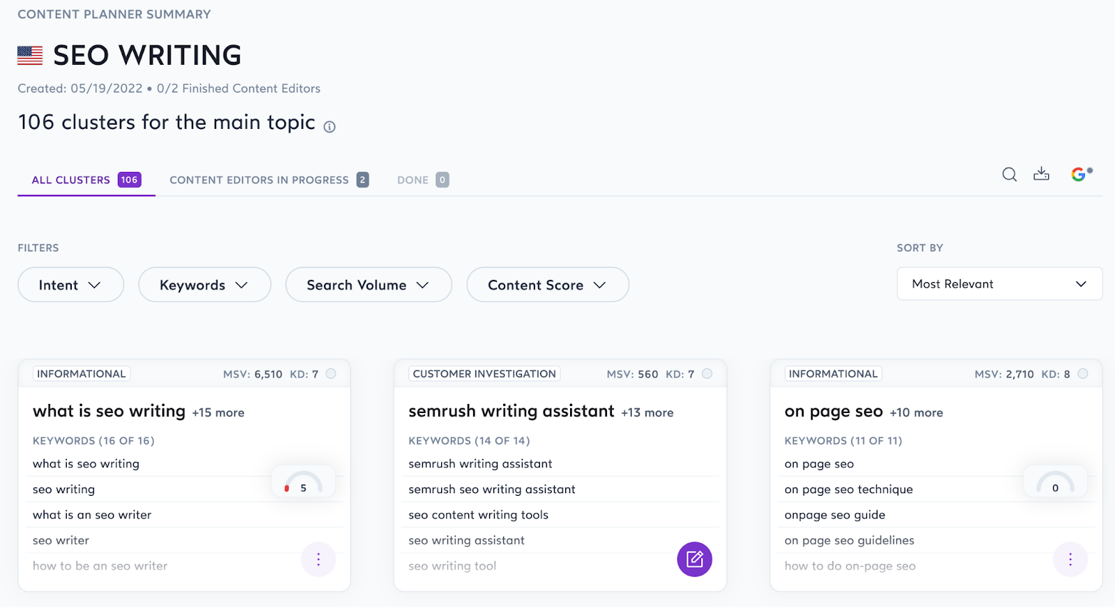
Content Planner

Pros: 

  • Easy to use interface.
  • They offer a 7-day money-back guarantee – if you don’t find it helpful, you get your money back.
  • It identifies keyword stuffing and prevents you from doing so.

Cons: 

  • Each plan offers a limited number of pages that you can audit.

Pricing:

It starts at $49/month for one website tracking and ten articles/month.

11. Copysmith 

Copysmith markets itself as an AI content creation solution for teams. 
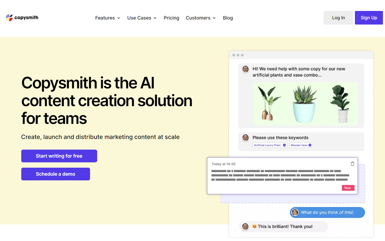
This AI writer is best suited for bulk and short-form content copy like product descriptions, blog templates, social media content, advertising content, and more.

Key Features: 

  • Use cases: It includes product descriptions, content enhancement, ads & social media, blog templates, and brainstorming. With Product descriptions, you can generate descriptions for eCommerce Products, Instagram, Amazon, eBay, Etsy, and Flipkart. Blog templates include blog titles, blog ideas, outlines, intro, Kickstarter, and more.
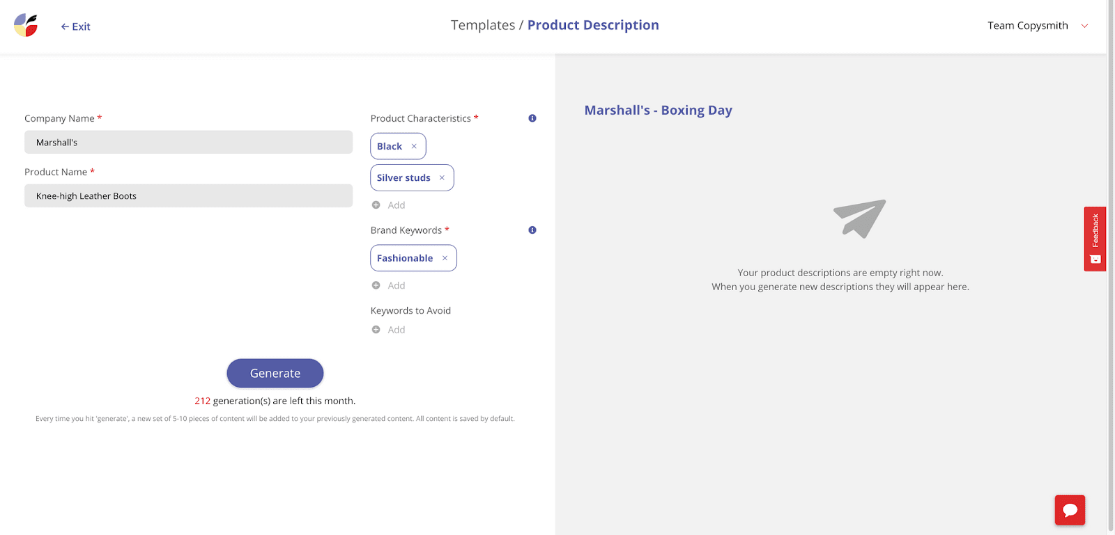
Product Description

  • Campaign Builder: It includes several AI templates to help you generate SEO-optimized product descriptions, Facebook posts, and Google ads in just a few seconds. 
  • Integrations: Copysmith integrates with Frase to use SEO data, Google Ads to publish campaigns, Microsoft Word to produce content, and WooCommerce for products.

Pros: 

  • It’s easy to use and generates SEO-optimized content.
  • It comes with an in-built plagiarism checker.
  • Provides good training material for new users.

Cons: 

  • Not suitable for long-form content. 

Pricing:  

It starts at $19/month for 75 credits, up to 40K words, and up to 20 plagiarism checks.

12. ClosersCopy  

ClosersCopy is an AI writing robot that provides various templates for producing marketing materials, including website content, sales copy, email marketing campaigns, and social media posts. This tool doesn’t require any special skills or training to create engaging text.
Key Features: 

  • Use cases: It includes Facebook & Google Ads, email subject lines, landing pages, sales copies, social media content, and more.
  • LongForm editor: You can create blog posts, articles, sales copies, and email marketing copies.
  • Drag-and-drop builders: The drag-and-drop content builder makes your tasks more manageable by allowing you to drag and drop elements on your copy. The only thing you need to do is provide some context at the time of configuring this builder.

Pros: 

  • Its user interface is easy to use and navigate.
  • You can easily create content with their drag-and-drop builder.
  • The video tutorials provide in-depth, step-by-step instructions for each process.
  • Tone analysis helps you understand the emotions in your writing.

Cons: 

  • No free plan or trial period is available.
  • More expensive than most other AI tools.

Pricing:  

It starts at $49.99/month for two seats, 300 AI runs, 50 SEO Audits, an SEO planner, Email support, and more.

13. LongShot AI

LongShot AI is another writing tool that can help you write SEO-friendly content. It comes with over 30 use cases and a plagiarism checker to ensure your content is original. 
While most of its use cases are for short-form content, you can use templates like the content expander, write more, or bullets to text generator to assist you with your long-form piece. 

Key Features: 

  • Use Cases: It includes content rephrasing, FAQ generator, headline generator, blog ideas generator, meta description generator, text extender, blog insights creator, headline intro generator, product description generator, FAB copywriting framework generator, content readability improver, sales email generator, video description generator, and more.
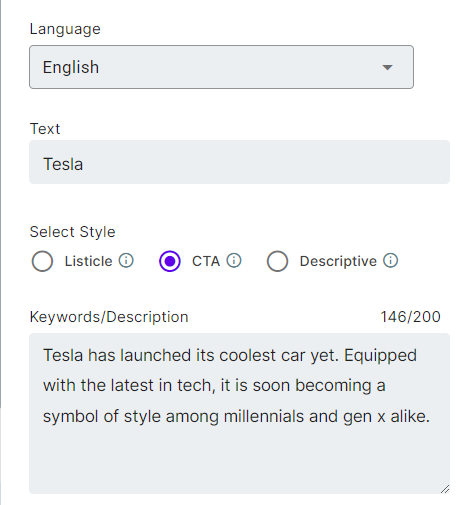
Headline Generator

  • Integrations: It integrates with WordPress to enable you to export AI-generated copies directly to WordPress. Its integration with SEMrush will help you write SEO-friendly content. Apart from these, LongShot AI will also provide integration with Hubspot and Grammarly soon.
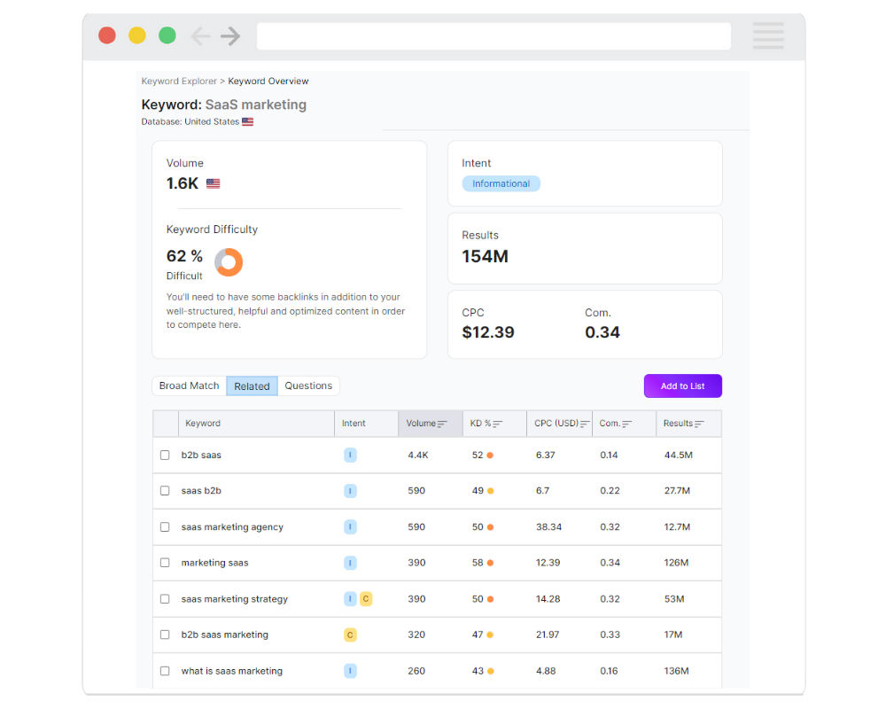
LongShot X SEMrush

  • LongShot AI Community: The LongShot AI Community is a group of researchers and developers working on open artificial intelligence problems. Anyone can join and contribute to the research.

Pros: 

  • The free forever plan offers ten credits daily.
  • Community is a big help for new users.
  • It gives you multiple ways to know more about the product, including blog posts, help videos, customer support, and announcements.

Cons: 

  • Aside from the free plan, it’s costly, especially considering the limited number of use cases and credits.
  • Doesn’t have use cases for social media content.
  • Supports only eight languages.

Pricing: 

It starts at $49/month for 1000 monthly credits, one user, basic integrations, and more.

14. INK Editor

Inky is a suite of content marketing tools that include AI-powered tools: AI Writer, SEO Optimizer, Copy Assistant, and Content Planner. These features can be used individually or collectively, and the price will be adjusted accordingly.
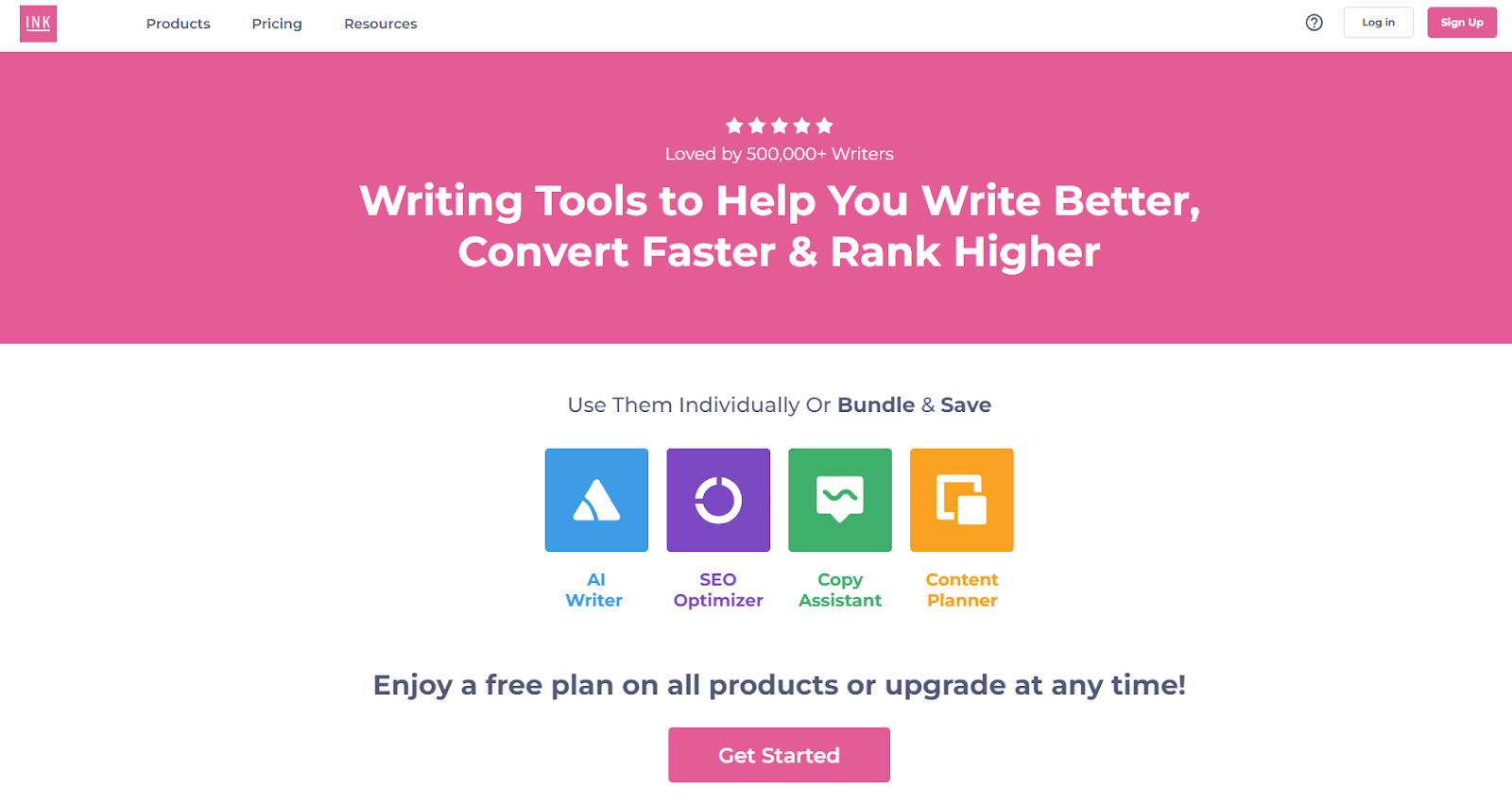
The AI Writer offers unlimited credits and helps you write long-form and short-form content. In addition, you can re-edit the generated copy with a single click as often as you want. The tool also offers WordPress plugin integration and open-source export API.

In addition, you get access to use cases like product descriptions, social media copies, sales copies, blogs, essays, emails, microcopies, product ideas, and more.
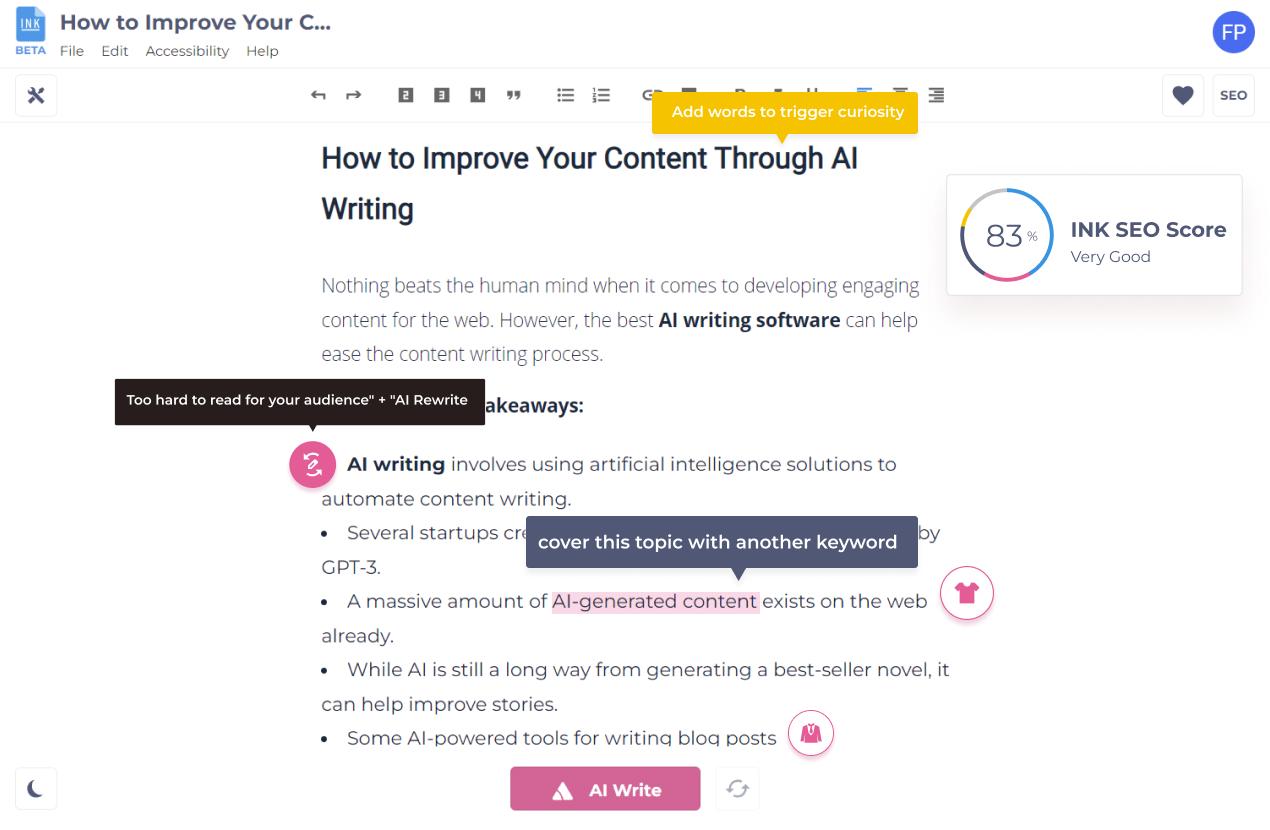
AI Writing Tools

Key Features: 

  • SEO Optimizer: INK’s SEO Optimizer is a natural language optimization tool that can improve your SEO score and increase engagement by providing recommendations on keywords, titles, alt text, and the like. Enter a keyword or phrase, and the INK SEO Optimizer will do the rest.
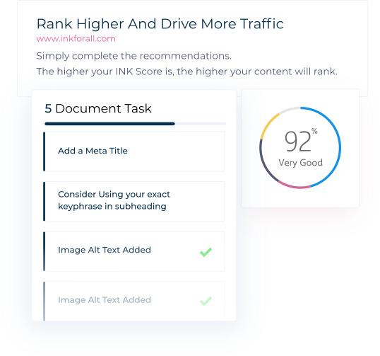
SEO Optimization Score

  • Content Planner: The INK Content Planner helps you group keywords and analyze search intent. You can also import your keywords and download your clusters for further analysis.
  • Copy Assistant: A built-in grammar checker automatically checks your grammar and spelling. It also checks words, tone, and sentence fragments.

Pros: 

  • Easy to use.
  • You can use it as an all-in-one content marketing tool. 
  • Offers unlimited AI text writing even on a free plan.
  • Offers keyword clusters to optimize your SEO strategy.

Cons: 

  • The paid plan is relatively costly for one seat.

Pricing: 

It starts at $50/month for one seat, INK Copy Assistant PRO, INK AI Writer PRO, INK SEO Optimizer PRO, and INK Content Planner PRO with 1,000 Keywords.

15. Articoolo

Articoolo is an AI content generator developed by a group of mathematicians, computer scientists, content writers, and marketing specialists. Thanks to NLP and AI technology, the tool drafts articles in a way that mimics the human brain.

Key Features: 

  • Use Cases: It includes Text Writer, Article Rewriter, Article Summarizer, and Image Scraper. Based on your keyword, Articoolo will also fetch images from royalty-free websites.
  • WordPress Plugin: This will help you export your copies directly to WordPress so you can post faster.
  • Plagiarism Checker: All you have to do is enter your text into the program, and it will scan for instances of plagiarism.

Pros: 

  • It has pay-per-use plans.

Cons: 

  • There’s no official website.
  • Customer support is missing the mark.
  • Not much information about the tool online.

Pricing: 

It starts at $19/month for a ten-article fixed package.

16. NeuralText

NeuralText is a writing tool that offers users keyword reports and cluster credits. It also has an API for developers looking to integrate its services into other programs.
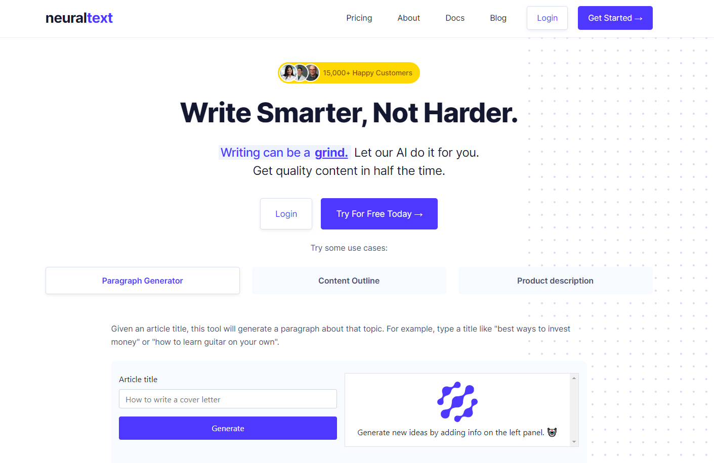
Some of its most prominent use cases include a paragraph generator, content outline, and product description – making it a short-form content-centric tool. 

The best part is that it not only creates content but also creates content briefs and optimizes the content based on keywords and SERP analysis.

Key Features: 

  • AI Writing Assistant: This tool will help you produce text in any format. It also provides text recommendations while you write.
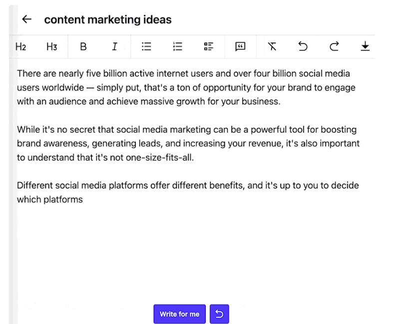
AI Writing Assistant

  • Content Optimization: NeuralText can help make your content more search engine-friendly and improve its score in Google’s search results. It analyzes your word choice and sentence structure to ensure your content is easy to scan and relevant to your topic.
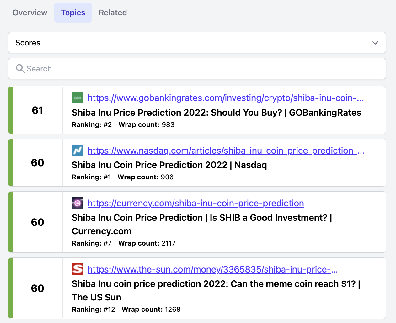
Content Score

  • Content research analysis: It makes content research and studies more accessible, allowing you to see real-time data across SERPs. It also has a Google Docs-style editor, making managing your data points and keeping track of your research effortless.
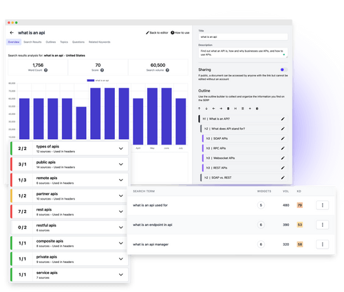
Content research analysis

Pros: 

  • Free plan available.
  • Offers keyword clusters.
  • You can group content into different projects.

Cons: 

  • The community is not active.
  • A bit on the expensive side. 

Pricing: 

It starts at $49/month for one user, unlimited AI text generation, 50 content analyses, and 50 keyword reports.

17. AI Writer

AI Writer helps you create unique, SEO-friendly content that you can publish directly to WordPress. In addition, it offers features like research & write, text rewording, verifiable citations, and source summarizer.
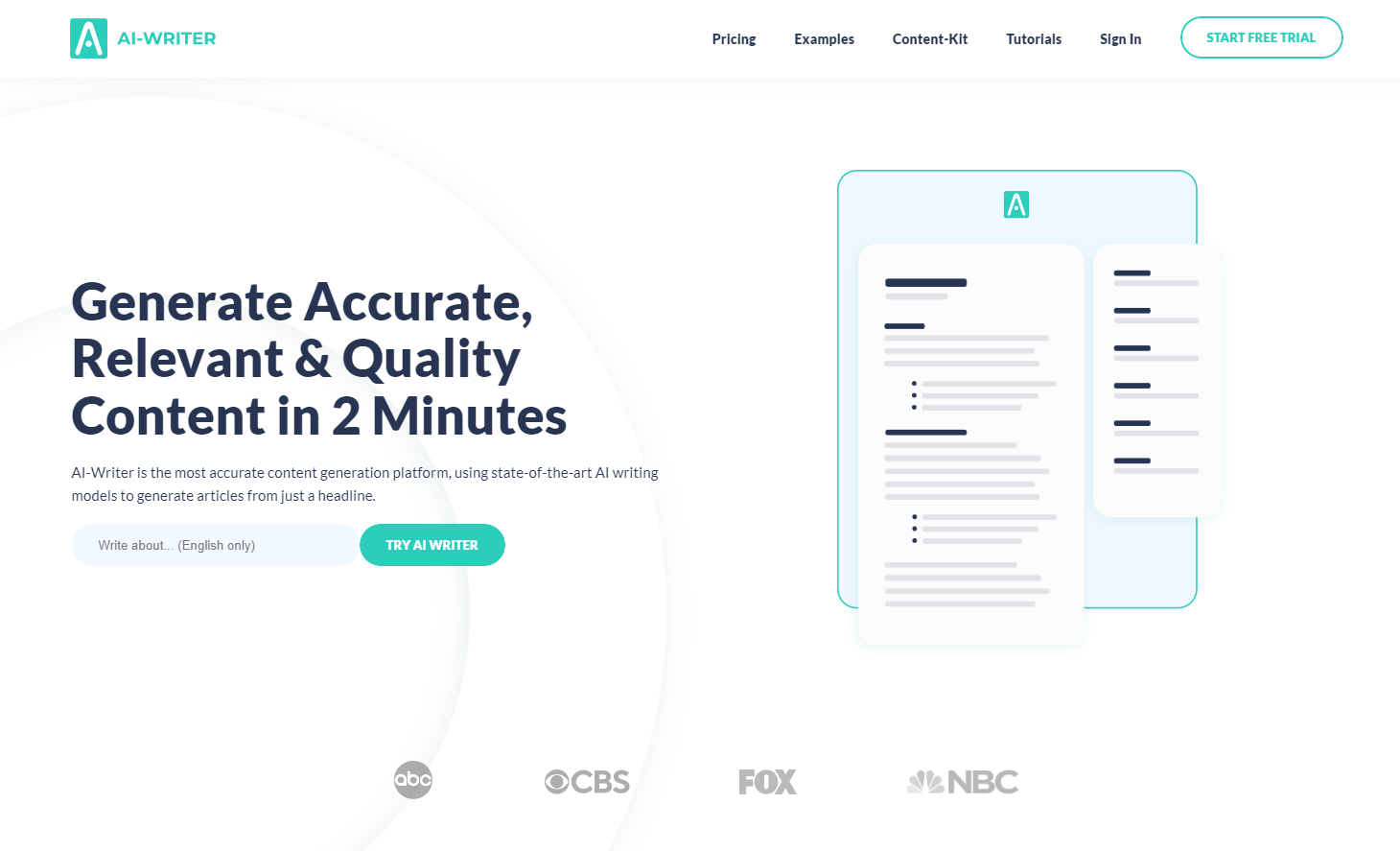
Key Features: 

  • AI-Writer Content Kit: AI Writer uses artificial intelligence to analyze keyword difficulty and ranking opportunities based on the field you enter. It chooses up to 250 keywords and generates one article per keyword, which can be directly published to WordPress.
  • (Sub)Topic Discoverer: It checks to see what other writers have written about and then uses that information to create new topics for you.
  • Verifiable Citations: When it produces content for you, it also provides a list of citations so that you can check the accuracy of the information.

Pros: 

  • It offers a free trial for seven days.
  • One of the few AI writing tools to offer verifiable citations so you can confirm the accuracy of the content.

Cons: 

  • Not enough resources in the knowledge base for new users.
  • Fewer use cases.
  • Does not offer a free version.

Pricing: 

It starts at $29/month for one user and up to 40 articles.

18. Wordtune

Wordtune makes your previously written content clearer, more compelling, and more authentic by bringing out the best.
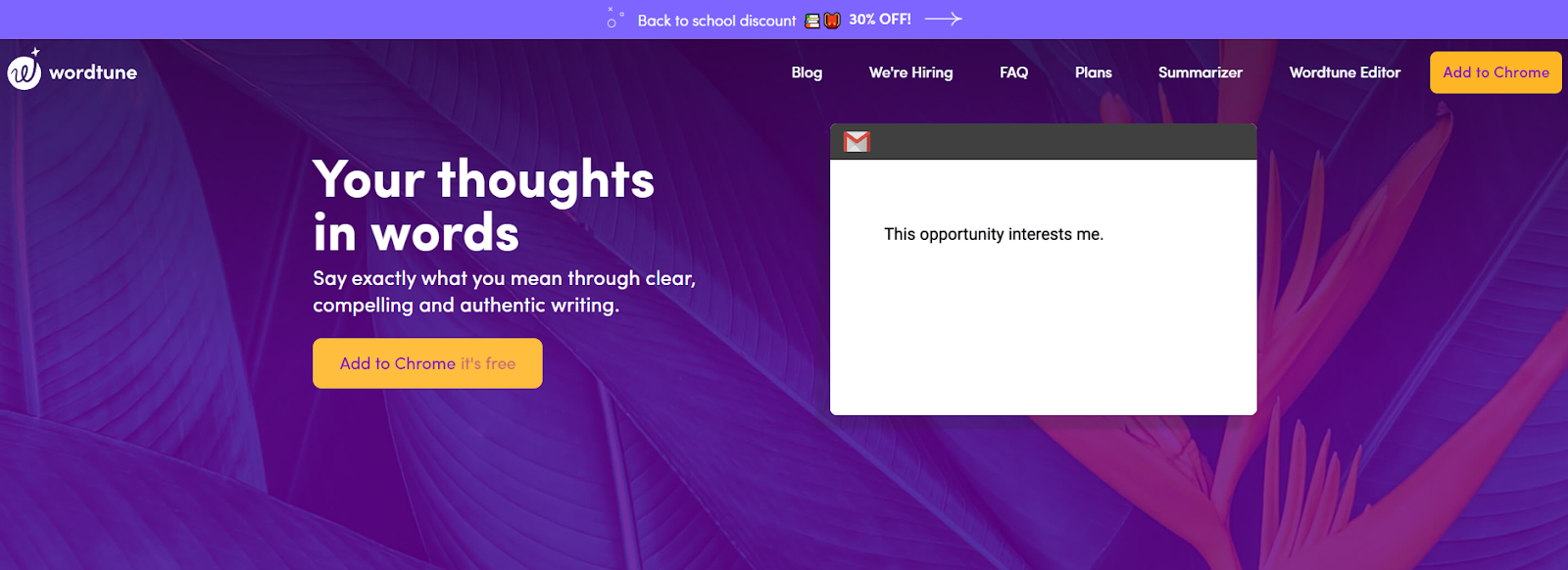
Although this tool doesn’t write content from scratch, it makes your content look more professional. It also integrates with Microsoft Word, so you can edit your work while you write your content.

It provides tools to: 

  • Rewrite your content 
  • Make your content casual 
  • Make your content formal 
  • Shorten your sentences to make them crisp 
  • Expand your sentences to give more detail 

Key Features: 

  • Paragraph Rewriter: Wordtune can rewrite your paragraphs entirely at once, one sentence at a time, and one word at a time. See below for an example.
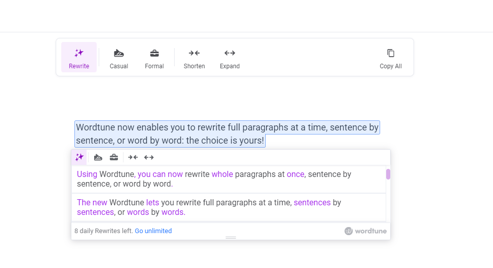
Paragraph Rewriter

  • Tone: You can alter how your content appears by making it more informal or formal. Here’s an example: 
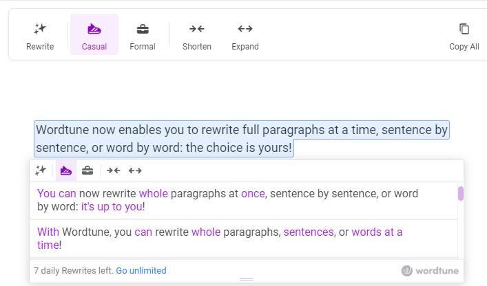
Casual Tone

Pros: 

  • You can make the text longer or shorter.
  • It offers a casual and formal tone.
  • Simple and easy-to-use interface. 

Cons: 

  • It doesn’t offer any other benefits besides rewriting.

Pricing: 

It starts at $9.99/month for unlimited rewrites. 

19. ProWritingAid

Rather than a full-fledged artificial intelligence writer, ProWritingAid is a grammar checker and style editor that’s available online. It helps prevent spelling errors, suggests impactful words, and corrects grammar and punctuation.
It supports general English, British English, US English, Australian English, and Canadian English.

Key Features: 

  • Document type: You can choose from 35+ document types for your content. They include general academic abstract, academic essays, admission letters, book reviews, business books, and more.
  • Reports: ProWritingAid provides three types of reports: real-time reports, summary reports, and style reports.

    Real-time reports show errors and corrections as you write. Summary reports provide an overview of all reports. It contains a spelling score, grammar score, and style score. On the other hand, Style reports identify problems in writing style and readability.
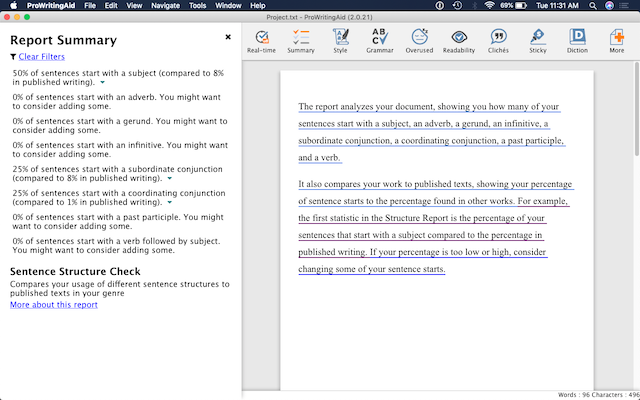
Summary report

Pros: 

  • It offers 20+ reports to track your progress as you improve your writing.
  • There are no limits on the number of words you can use with premium plans.
  • Notifies of style changes and suggests corrections if needed.

Cons: 

  • Only available through the web browser. 

Pricing: 

It starts at $20 per month or $120 per year (if you pay yearly). 

20. Article Forge

Once you provide ArticleForge.com with a keyword, article length, and other custom information, the program creates a 1500+ word article in seconds.
Your content will be checked for plagiarism and uniqueness before being delivered.

Key Features: 

  • Media-rich content: It can automatically find and insert relevant images, videos, titles, and links in your articles. To make it more relevant, ArticleForge also uses LSI keywords.
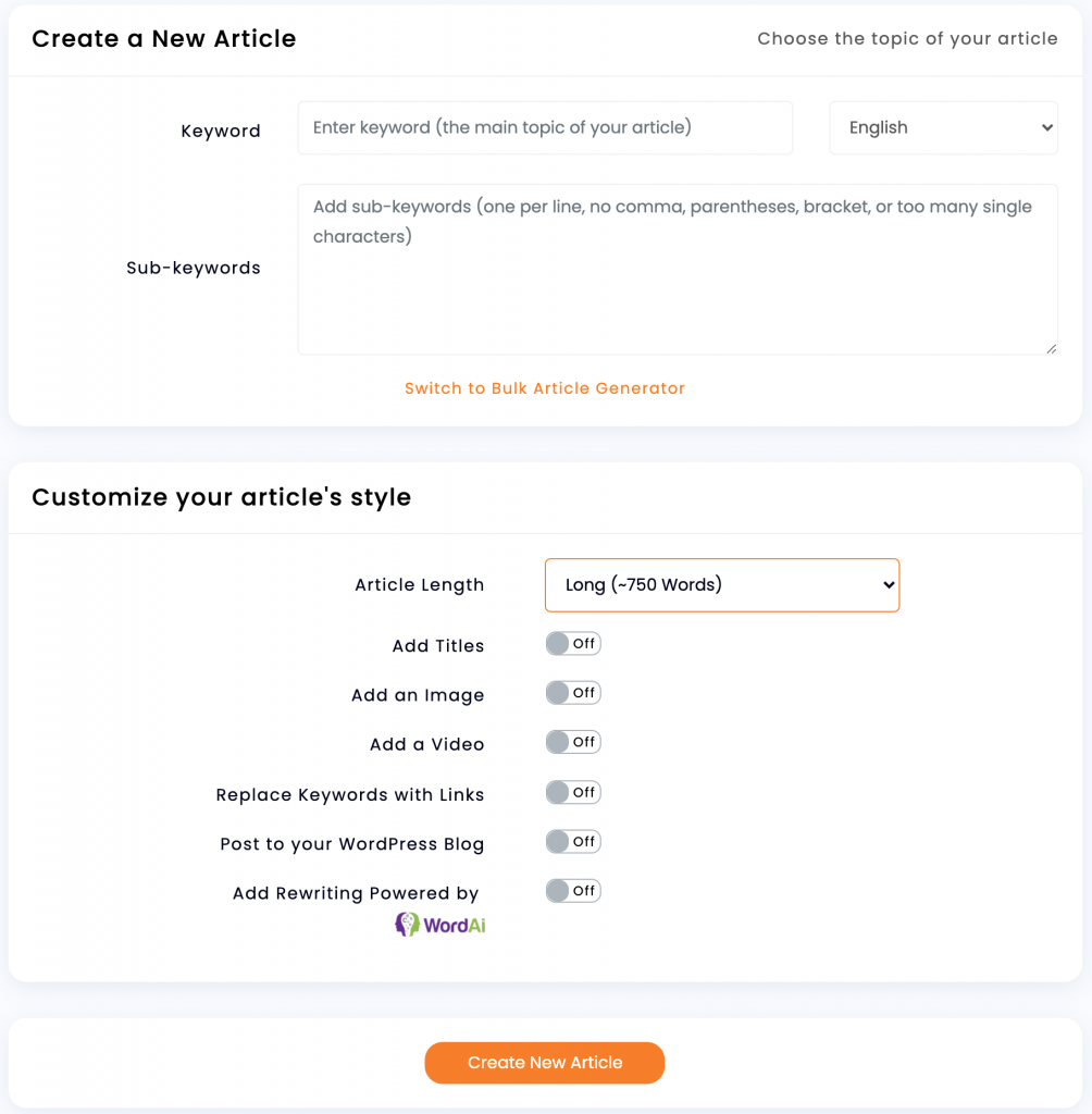
Creating an article

  • SEO Automation: It integrates with WordPress to automate your scheduling and posting of articles.
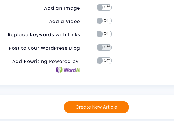
WordPress Integration

  • Interlinking: It can automatically turn URLs into links within your article. You can choose how often to do this for every keyword or just the first occurrence.
  • Languages: It can generate content in English, French, German, Dutch, Portuguese, Spanish, and Italian.

Pros: 

  • Produces SEO-optimized content.
  • Can schedule posts on WordPress automatically.
  • Plagiarism-free content.
  • Automatic keyword linking.

Cons: 

  • The content can be repetitive.
  • You need to check the accuracy of the content before publishing.

Pricing: 

It starts at $13/month for 25K words and the rest of the features.

Frequently asked questions about AI writing software.

1. What is AI Writing Software?

AI writing software is an artificial intelligence program used to write text. It can generate content for websites, blogs, and other fields. The content created by AI writers is often indistinguishable from human-created content. Still, sometimes it has a slightly robotic feel or may include words or phrases that seem out of place in the context of the writing.

2. How does AI Writing Software work?

The software uses an algorithm to mimic the creative process of human writers. It first creates a base text that modifies by adding words and phrases specific to your content. This ensures that you get high-quality original content every time you use it.

3. Who can use AI Writing Software?

Anyone who needs to create texts for their business or website can benefit from using this software. It’s also an excellent option for freelance writers and content marketers facing writer’s block. As it’s easy and fast, even beginners can start using it immediately and see great results within minutes!

4. Can I use AI writers for everything I write?

No — AI writers are best suited for shorter pieces like headlines or product descriptions because they don’t have much time to learn about your company’s brand voice or personality. 

While there are tools to churn out long-form content, you still need the human touch for longer and more research-intensive pieces like blog posts or sales copy. AI algorithms still can’t pick up on nuances like a human can.

5. What are some of the benefits of using AI Writing Software?

There are many benefits to using AI writing software. The most obvious benefit is that you no longer need to spend time creating content yourself. The software will do it for you! 

Another benefit is that AI writing software allows you to create content in any niche or topic you desire. You can even target multiple niches at once! This makes it possible to scale your business quickly and easily by leveraging the power of automation while still keeping your hands on the work itself.

6. How much does it cost?

The pricing depends on the type of service you want to use. Some companies offer free trials or even freemium versions with limited credits so that you can test their services before making a purchase decision. Some companies offer lifetime discounts for repeat customers, so keep an eye out for those offers when making your choice!

7. What’s the difference between AI-powered and human-written content?

While humans are still required for high-quality content creation, AI makes scaling up your content marketing efforts easier. By automating much of the writing process – from keyword research to formatting – AI can help you create more content at a lower cost per article. In addition, this frees your team members to focus on other tasks that require their expertise (like outreach) or simply spend more time enjoying their lives!

8. What is the best AI Writer?

The best AI writer depends on what you want it to do and how much you want to spend. If you’re going to write books or articles, many different programs can help you with this task. Our top pick for long-form would be Jasper

On the other hand, if you only need help with short-form content such as blog posts or press releases, there may not be any need for an AI writer because these documents don’t require as much work or effort from the user. In that case, you might want to use tools like Copy.ai, Rytr, and more. 

9. Can I use AI Writing Software to replace my human writers?

No, AI writing software isn’t meant to replace human writers. It’s designed to work alongside them, helping them create more engaging and relevant content for their audiences. You’ll still need human writers who can add style and personality to your content.

Over to You! 

Do you find writing to be an exhausting activity? If yes, you would want to try one of the AI Writing Software tools we suggested above. These are some of the best AI writing tools specially developed to boost creativity, motivation, and productivity.

There’s room for experimentation with AI-generated content as long as you can recognize where specific tools are lacking and how to incorporate that into your work. Ultimately, the future of AI writing assistant software will mean ever-more versatile tools for writers, so don’t be shy about testing the waters.


Featured image by pch.vector on Freepik.

Source

The post 20 Best AI Writing Apps first appeared on Webdesigner Depot.

Source de l’article sur Webdesignerdepot

When you hear the word “leadership,” do you think of a particular person?

If you’d been asked that question anytime before the 1900s, chances are you’d think of an accomplished politician or a battle-tested general. These were the people leading society for most of recorded history. Today, you might have someone else in mind.

Since the industrial era, the US has birthed a pantheon of founders who’ve arguably led our society as much as any statesman or president. We put Rockefeller and Ford right next to Lincoln and Jefferson. Think about it; these guys haven’t just changed the US; they’ve changed how the entire world lives and does business.

Founders of successful companies today command even larger amounts of capital and power than JD and Henry. With the rise of social media, they are often thrust to the forefront of their brands and the public, whether they like it or not. Some manage the responsibility better than others.

In my opinion, the best businesses use all that capital, manpower, and name recognition to do more than simply make a profit. By leading with authenticity, inspiring positive action, and influencing their brand’s vision for innovation – they try to make a change.

I wanted to take a minute to reflect on some modern founder-led brands I think are doing a killer job of creating unique, world-changing businesses and company cultures. I also want to discuss the lessons I have learned from them.

Elon Musk – Tesla

When talking about founder-led brands of the 21st century, it’s hard to pass over electric vehicle manufacturer Tesla and its outspoken CEO, Elon Musk. Love him or loathe him, he belongs in any conversation on influential founders.

While Musk isn’t technically the founder of Tesla, he is one hundred percent responsible for the company’s direction over the past decade. I think two of the strongest leadership points for Musk are his focus on branding and innovation.

Tesla created showrooms and charging stations long before his business had the sales to justify the expense. People saw the name Tesla everywhere, got curious about it, and now that’s paying off big time. Tesla today is at the forefront of the EV industry while all the other car companies play catch-up.

Behind the scenes, Tesla was also early to create a vertically-integrated supply chain – giving it almost complete control over its product and logistics. That’s another feature with a hefty upfront price tag but paid off when the pandemic hit. Now the biggest automakers in the world are rushing to copy that model.

Musk arguably even convinced China to deregulate foreign ownership of automotive companies. That’s hard to prove. However, China changed its rules around foreign ownership of EV companies shortly after he refused to enter the country.

Arguably, Tesla today is one of the frontrunners in redefining how traditional companies run. Musk is known to hate bureaucracy and traditional hierarchies. He hires other people to take care of bureaucratic processes for him.

Musk is also known for hiring relatively young, hard-working employees into high-power management positions in the company and letting them prove themselves. That inspires extreme loyalty from his employees from an early age. Musk’s focus on efficiency and rejection of traditional hierarchies has sparked a small revolution in tech companies.

Finally, I respect Musk because he has goals beyond showing year-over-year growth to shareholders. That’s hard to do day in and day out.

Sara Blakely – Spanx

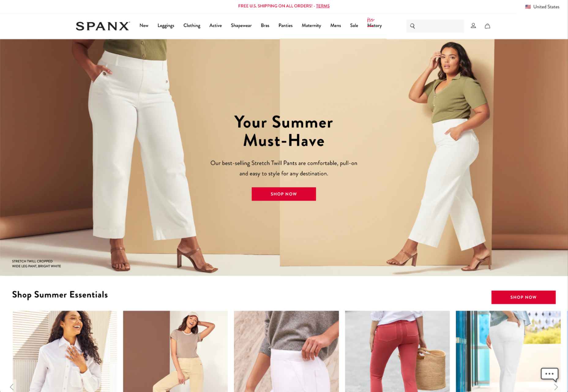
Sara Blakely is an example of a founder with her hands in every part of her business, from product creation to sales. Most importantly, she created an authentic company culture with values she felt the business world lacked.

For those who know her story, Spanx very nearly didn’t happen. Blakely pitched her slimming undergarment to multiple women’s brands run by men. Most told her it would never work.

It might seem silly now, but men used to think they knew women’s fashion better than women. It wasn’t until one executive gave Blakely’s product to his daughters to try out that he agreed to start stocking Spanx. It’s a great example of how businesses can make a lot of money by listening to their customers.

Besides founding a women’s clothing company that sells products women want, Blakely strived to bring “feminine energy” into the workplace. I saw this poignant quote from her in an article:

“Twenty-one years ago when I started Spanx, I ended up in the paper in Atlanta, and I was at a cocktail party and a couple of guys came up to me and they said, ‘Sara, we read about you. Congratulations! We heard you invented something.’ And I said, ‘Yes I did, I’m so excited.’ They said, ‘Business is war,’ and then they pat me on the shoulder and they kind of laughed at each other. I went back home to my apartment that night. I was 29 and I just thought, I’m not going to war. I’m going to do this very differently. I’m going to honor a lot of feminine principles — intuition, empathy, kindness. Just allowing myself to be vulnerable through this process. And of course, a lot of the masculine energy has helped me also — it was a balance. But I wasn’t going to do it by squashing the feminine.”

Blakely worked hard to create a sales-oriented company culture that was purposely welcoming from that point forward. She regularly scheduled “oops meetings” where employees could stand up and say how they messed up and turn it into a funny story. At Spanx, it was okay to make mistakes and learn from them.

Blakely wanted everything about her product to be fun, including the way it was sold. She created a mandatory boot camp for salespeople, which, among other things, requires employees to perform standup comedy. Little things like that resonated with people and made Spanx synonymous with “fun.” Even famous actresses were flashing their Spanx on the red carpet.

The lesson we can all learn from Spanx and Blakely is that fun and positive energy are great marketing tools for any business. Many companies try to push a fun culture publicly without any authentic leadership that genuinely exemplifies that narrative, they won’t have the same effect. Blakely’s story of Spanx is not just a story of the brand but a story of her life and the experiences that shaped her vision and goals.

Jack Dorsey – Block (FKA Square)

While better known for founding Twitter, Jack Dorsey has recently been in the news for his move to solely running payment processing business Block. I admire Dorsey because he radically encourages his teams to think differently about how they work.

Dorsey is known for optimizing ways to stay productive and focused throughout the day. He manages through unconventional tactics like communicating only through voice memos on his phone that he runs through transcription apps. He says this prevents him from being sidetracked by distractions on his computer. I think that kind of mindfulness is necessary now more than ever.

Dorsey tries to bring this level of focus to his interactions with his employees too. I saw a great quote from him in this article discussing computer-less meetings at Block.

“When phones are down and laptops are closed, the team can discuss any issue at hand without distraction. We can actually focus and not just spend an hour together but make that time meaningful — and if that time is 15 minutes, then it’s 15 minutes and then we move on with our lives.”

Besides limiting distractions, Dorsey is known to walk five miles to work daily, theme each day, and create detailed agendas and goals for each team meeting. In his former company, Twitter, the culture was frequently described as a space where employees could speak freely to management about things they wanted to change.

On that subject, Dorsey has been known to push hard for employee control in his companies. Perhaps ironically, he was also quoted saying he wants Twitter to break away from its co-founders’- vision and control, calling founder-led companies “severely limiting.” However, it still seems he has some sort of vision for the world that he wants to bring around via Block.
His business goals are visionary, pushing the boundaries of innovation in the financial world.

Dorsey is a known cryptocurrency enthusiast but had pushback from the Twitter team, including his CFO, about making a crypto-centric product. His move to payments processor, Block, seems to be a bid to follow his passion and exert his vision on the world.

Block has since made headlines for being extremely bullish on cryptocurrencies, while many have expressed doubts. Dorsey even changed the business’s name to Block to better reflect its focus on blockchain and famously purchased $50 million worth of Bitcoin in 2020. All the while, Dorsey has been quietly creating arms of his business in the hopes of improving BTC’s usefulness. That may pay off down the line.
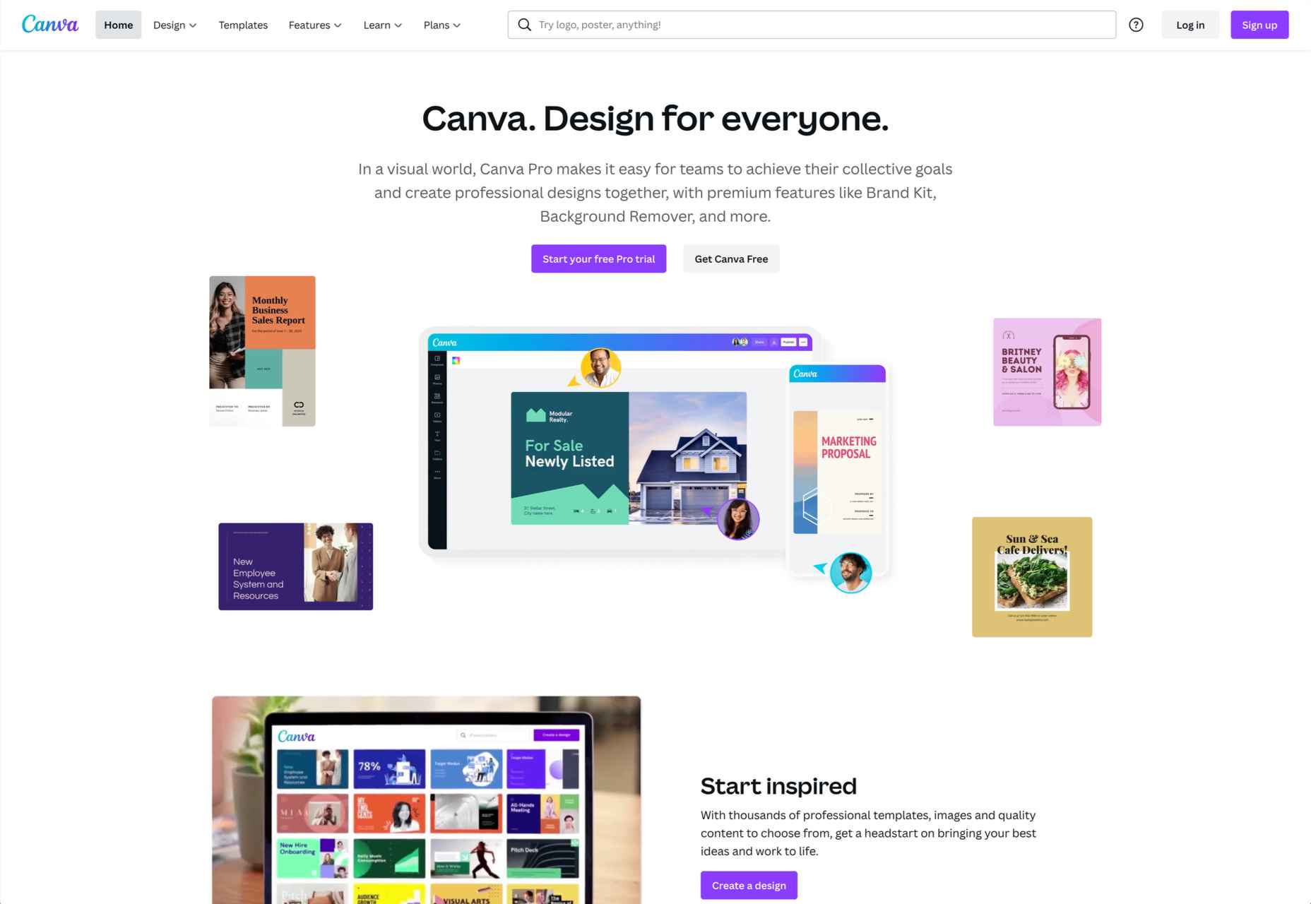
Melanie Perkins – Canva

I identify strongly with Melanie Perkins, co-founder of graphic design SaaS, Canva. Besides being roughly the same age, we both came from nondescript beginnings with no background in entrepreneurship or tech.

Canva is an excellent example of a business created by becoming intimately familiar with a customer problem and executing. Perkins spent years teaching people how to use design platforms like Adobe Creative Suite because they were so complicated. Taking that knowledge, she started a simple product to help customers create high school yearbooks. That expanded into a super app covering every aspect of design.

This super-app has unlocked a way for millions to learn design and produce high-quality content at any skill level. The cost to use Canva is many times lower than anything else on the market.

While Canva is an amazing product, what I like most about Perkins is that she believes business serves a higher purpose than maximizing profits.

When she was suddenly thrust into the limelight with a $40 billion valuation, people were even more impressed by Perkins’ philanthropic goals. She vowed to donate a 30 percent stake in Canva to a charity dedicated to eliminating poverty (about $12 billion). She is also known to regularly fundraise for 25,000 different nonprofits through her app. She doesn’t just inspire people with words, but by actions, she’s actually taking.

Canva is very public about its ethos. I like their values because they are general yet avoid the jargon many companies fall into. They are:

  • To be a force for good and empower others;
  • Pursue excellence;
  • Be a good human;
  • Make complex things simple;
  • Set crazy big goals and make them happen.

Besides revolutionizing how modern businesses design and harness goodwill marketing, Canva was also one of the forerunners of the remote work trend.

Most of Canva’s “Canvanauts” worked from homes worldwide even before the pandemic. Canva showed a lot of tired old businesses that you could still run a successful company without having employees in the office 24/7.

How I Try to Learn From the Best

Finally, I want to talk about what I am trying to contribute to my team and society with my current business, startup acquisition marketplace, MicroAcquire.

As I’ve mentioned, I think it is very much on myself as a founder to set the tone of my business – and that starts with who I hire. When I’m searching for new employees to join the “#Micromafia” I not only look for productive workers, I look for people I genuinely enjoy spending time with. It’s the best feeling in the world to go to meetings where you leave thinking, “That was really fun.”

Besides creating a great team, I’ve tried to address another problem I see again and again at major tech companies: employee burnout. There’s a reason the average tenure of a tech employee is three years.

I love working on startups. It’s like playing a video game for me, and it’s probably why I’m a founder. That said, I know my employees don’t always feel the same way. As CEO, I make sure my team knows I want them to live their lives outside of MicroAcquire.

On the business side of things, I take cues from the best. Like Musk and Dorsey, I want to preemptively create features that I know our customers will love. I knew people wanted an easy way to sell their startups because I wished I’d had one back when I was doing it.

Like Spanx and Tesla, I also strongly believe in the power of innovative branding – and I make sure we spend in areas that will give us significant returns down the line.

For example, we’ve made it easy to get MicroAcquire merchandise online completely free. The extra exposure we get from tech people rocking MicroAcquire t-shirts is more than worth the cost. We also created our own media publication Bootstrappers.com to tell the founder stories we thought major publications had missed. That’s been a huge hit with our customers, who also happen to be founders. These people traditionally have had to spam inboxes and pay for press because they didn’t raise billions in funding.

Finally, like Blakely and Perkins, I also want to actively listen to customer feedback and make sure we create a necessary and desired product. That’s why I make sure we’re constantly engaging with our community both on our website and social media. Many of the features we’ve added are just things we’ve heard mentioned multiple times from customers.

So far, I love the community we’ve created online and in the office. I don’t claim to have the winning formula, but I feel we are making a real difference out there. We’re lucky to live in a world with so many smart people getting their ideas out and making a positive change in the world.


Featured image via Unsplash.

Source

The post 4 Founder-Led Brands That Are Done Right first appeared on Webdesigner Depot.

Source de l’article sur Webdesignerdepot

There are a lot of factors that contribute to a better user experience on a website. Pages need to load quickly to give users peace of mind and efficiency. Navigation must be clear and straightforward, with direct pathways for visitors to follow when finding your contact pages, blog posts, and products. Your colors need to work seamlessly together while providing just enough contrast in the areas that need it most.

Excellent user experience needs to be considered for every part of your website that acts as a touchpoint with a potential customer or user.

One of the most significant touchpoints of all is your forms.

All websites need some form of interactive content to thrive. Users need to be able to do something with the site, whether it’s looking for information with a search bar, contacting a team for a quote, making a booking, or completing a purchase. Forms power the majority of the interactive activities available on websites.

If you know how to master great UX on a form, you can contribute to more meaningful interactions between your brands and their customers. But not all web forms are the same. Here are some of the top types of forms you need to master and how you can optimize them.

The “Opt-In” Form

The Opt-in Form is probably the best-known form in the digital landscape. It’s essentially a form that asks visitors to “opt-in” to a specific offer. Sometimes, this means signing up for a webinar; other times, it’ll be agreeing to an email newsletter or a regular series of blog updates.

Opt-in forms grab attention quickly and ask for something specific from the audience. For instance, this example from HuffPost encourages visitors to “Subscribe to the Morning Email.”

Opt-in forms are all about generating action.

Sometimes, they’re placed at the bottom of a landing page after a company has had a chance to explain precisely what they’re offering. Other times, you’ll find the opt-in form situated on a sidebar of a website, constantly enticing people to “sign up” if they like what they see on a blog post or article.

It’s also common for opt-in forms to appear as pop-ups and exit pop-ups on modern websites. For example, a brightly colored opt-in form that promises an immediate benefit to a customer could encourage them to hand over their details before they abandon your website.

How to Design a Great Opt-In Form

So what kind of best practices go into an excellent opt-in form?

  • Start with simplicity: If you’re asking your visitors to do something, don’t overwhelm them with too big of a request straight away. Keep the form short and simple, so it doesn’t seem like too much extra work for the visitor. Something like “Subscribe to our newsletter” should ask for nothing more than an email. 
  • Highlight the benefits: Most customers won’t want to give you a place in their inbox or the opportunity to interact with them further unless you can offer something in return. Even if you’re asking for something small, like an email address, let the customer know what’s in it for them. In the HuffPost example above, the company highlights that you can wake up to the day’s “most important news.” 
  • Give the visitor the power: Let your visitor know they’re in control here. They want to see that they’re getting exactly what they need from you in exchange for their contact details. This means reassuring them that their email address won’t be used for spam, like H&B Sensors does here: 

The Contact Form 

The Contact Form is another crucial part of building an effective UX for your website – but it’s also an element that web designers and business owners often overlook. When customers decide they want to learn more about a business, they need a quick and easy way to get in touch.

Contact forms need to be easy to find and use on any website. Usually, your user will expect to see a link to the contact form situated somewhere at the bottom of your webpage. It might be called “Contact Us” or “Customer Support.” Avoid anything that would go over the user’s head.

Aside from being easy to track down, your contact form also needs to reassure an audience that they’re making the right decision by getting in touch. Therefore, the content needs to be short, sweet, and authoritative—highlight why the user might contact your company and how they can do so.

Avoid any unnecessary information in the contact form. For example, you don’t need to know your client’s age and their job to answer a question about where their nearest physical branch is. Keep form fields to the point, or you’ll chase customers away.

How to Design a Great Contact Form

Design something personalized but straightforward to make the most of your contact form. Use features like smart content and conditional logic, if possible, to adapt the page to the user’s needs. Dynamic content is becoming increasingly valuable these days. Other best practices include:

  • Set the right expectations: Let your customers know how active you are and how quickly they can expect to hear back from you. Imagery and the right fonts can also set expectations about the kind of communication your audience can expect. For example, this contact page from the Marvel app is fun and playful, like the company itself:

  • Provide multiple options: If your customer doesn’t want to use your contact form, give them another way to get in touch. Ensure the contact page includes information like where to find you on social media and your professional phone number. 
  • Simplify things on your end: To ensure that you can contact your audience as quickly as possible, allow your customers to choose a specific subject that their query is connected to. Allowing them to choose “Sales” or “Order issues” means you can automatically direct the message to the right team member on the back-end. 

The Online Payment Form 

Sometimes, when your customers have seen what you have to offer and they’ve checked out the competition, they decide to go ahead with their purchase. To facilitate this, you’re going to need an online payment form. Online forms ensure that your customers can safely enter their credit or debit card details to purchase whatever you have to offer.

Most payment processing companies like PayPal, Square, and Stripe come with payment forms included, so you can easily embed them into a website in minutes. However, there’s always the option to customize those payment forms.

For instance, ideally, you’ll need a payment form that keeps your customer on the same page, so they don’t have to log into another browser to make their purchase. The fewer transitions your client has to make, the safer they’ll feel.

How to Design a Great Payment Form

When designing any payment form, simplicity and security are the two most important factors. Your customer should be able to enter their information quickly and easily and get through the transaction process without worrying about their details.

Remember to:

  • Keep it simple: The fewer fields the visitor has to fill out, the better. Customers still feel uncomfortable sharing personal information and payment details online. Make the experience as painless as possible. If your client already has an account with your business, you might create a system that automatically fills some of the fields, such as their email address, name, and billing address. 
  • Offer the right integrations: The proper payment forms will integrate with the payment services your customers prefer to use. Options include PayPal, Stripe, Square, Verified by Visa, and Mastercard. Get a developer to integrate the right APIs with your form to give your customers the broadest range of options. 
  • Ensure security: Give customers peace of mind by providing as much security evidence as possible. An SSL certificate that places the padlock on the top of the browser next to the URL is a great way to make customers feel more secure. Integrating verification options so your customers can avoid fraud issues is another significant step. Sometimes just putting logos from the card types you accept on the page will make a customer feel more secure. 

Support Forms

Some companies bundle the contact form and the support form together. Others have a separate support form to get their queries routed directly to the people most capable of helping them. If you want to take the second route, it might be a good idea to design a “help” section on your website where you can locate the support form.

The “Help” section on a site often appears alongside other links on the footer. For instance, it could appear alongside “About” links and “Contact” options. Here’s an example of Hubspot’s Customer Support options:

The best customer support pages come with various ways for clients to help themselves and find answers to their most pressing questions. For example, you might have a search bar where your audience can search for the answers to their queries or a knowledge base full of helpful blogs.

Hubspot allows users to choose between a blog, knowledge base, academy training center, community forum, developer discussion board, and assistance from a certified partner.

How to Design a Great Customer Support Form

Designing a good customer support form is about getting your audience the information they need as quickly as possible. Once again, you’ll need to stick to as few form fields as possible here to avoid angering an already frustrated customer. Also, remember to:

  • Ask for the right information: Find out what the query is about by giving the customer a drop-box menu full of possible topics to choose from. If you need a product reference number or something similar, ask for that at the top of the form, then allow the customer to provide extra information about their query underneath. 
  • Set expectations: Let your customers know when they can expect to get a response to their concerns and provide them with advice on what to do next. For instance, you could invite them to check out your knowledge base while they wait for a response. 
  • Keep it simple: Avoid using technical jargon on your support request forms. Be direct in your requests for summaries of the issue at hand, contact information, and other supplemental data. 

Customer Feedback Forms

According to Microsoft, around 96% of customers say that customer service is crucial in determining their loyalty to a specific brand. Another 52% of global customers believe that companies need to respond to the feedback provided by customers.

To ensure your customer service strategies are on-par with what your customers expect, you need to get feedback from your audience. That’s where a feedback form comes in. Customer feedback forms often appear after a client has finished purchasing on the “thank you” screen. They may also occur after a customer has completed a service interaction online.

Here’s an example of an Apple feedback form:

How to Design a Great Customer Feedback Form

By leaving you feedback, your customer is doing you a massive favor. They’re giving you a chance to learn from your mistakes and improve the service you can give next time around. Feedback is one of the best tools for any business that wants to grow and thrive.

If you want your customers to use your feedback forms, you’ll need to make them as simple as possible. Your customers don’t have time to waste on a complex form.

  • Don’t make any fields mandatory: Don’t stop your customers from submitting a form unless they’ve completed every field. Allow them to enter the information they consider to be the most important, and that’s it. You can even fill some of the form out for your customer, if possible, by entering their name and email address if they’re already a member of your site.
  • Make it mobile responsive: Remember there are around 3.5 billion smartphone users worldwide. You can’t afford to lose feedback because your form isn’t responsive. Every form should look and feel incredible on any device. 
  • Include a rating option: If your customers don’t have much to say about your service, or they’re not wordsmiths, they might prefer a rating option instead. A one-to-five rating system that allows your customer to judge your product or service on a scale of poor to wonderful is a great way to gain quick information. Check out the Uber Engineering example here:

Though you can pre-enter some information on a feedback form to make your customer’s life easier, don’t overstep your bounds. Adding your customer’s email address to the form is fine if they’re already a customer with you. Pre-selecting the “very satisfied” rating above would look presumptuous.

Top Tips to Improve Every Form Design

The online form is an essential part of any web design project, but it’s also frequently overlooked. Unfortunately, without a good set of forms, your customers will struggle to interact with your company in a meaningful way.

When creating any form, remember:

  • Reduce friction: Reduce the friction for your customers by asking as few questions as possible. The less your customer has to answer, the better. If you can pre-populate forms with information like your customer’s name and email address, this could help. 
  • Keep it simple: Make sure that the form is clean and easy to use. Your customers shouldn’t be confused about where to click or how to submit their information. A single-column design is often better than a multi-column option.
  • Be clear in error messages: Don’t just tell your visitors that something has gone wrong. Let them know what they need to do to submit the form successfully. If possible, use inline validation with real-time feedback to let your audience know that you recognize the information they’ve submitted.
  • Keep data secure: Make sure your audience feels safe by letting them know how you will use this information and why you’re asking for it. If you’re asking for an email address, make the benefits of entering that information clear. 
  • Make fields optional: Allow your audience to add more information to a form if they want to – but don’t demand it. Give some freedom to the visitor. 

The better your forms are, the more effective your interactions with customers will be. Remember, it’s not just the face-to-face interactions that your customers judge when making decisions about your business and whether to trust you. Today’s digital world has prompted a new demand for more meaningful virtual experiences.

Your form could be the first interaction you have with a client, whether it’s a contact form, a booking form, or something else entirely. Get that right, and you can improve your chances of your customers coming back to interact with you again later.


Featured image via Pexels.

Source

The post The Top 5 Form Types to Use in Your Web Design  first appeared on Webdesigner Depot.

Source de l’article sur Webdesignerdepot

A press release is one of the most valuable tools in a marketing team’s arsenal. Though press releases have been around for decades, they remain one of the best ways to reach new customers, improve your brand reputation, and generate awareness. 

Press releases are also wonderfully cost-effective. Unless you’re using paid distribution channels, all you have to spend is your time to create your press release.

So, how do you get started?

What is a Press Release?

A Press Release is a short, simple, and compelling news story designed to promote the goods and services of a business. You’ll usually see these pieces of content published on industry websites, news channels, social media platforms, and even on the company’s blogs looking for awareness. 

The idea behind a press release is you provide a publication or group with all of the most valuable facts and insights into your latest newsworthy story. You might use a press release to announce a new product or to tell people about your recent partnership, for instance. 

A press release post then delivers this information to a wider potential audience by distributing the content in a range of different places. 

Why Should My Business Send Press Releases?

Why not simply tell people about your latest products and sales on social media, and leave it at that? The simple answer is Press Releases help you to gain the attention you might not get from your own media channels alone. With a press release, you can:

  • Set the record straight: In the middle of a PR disaster, a Press Release can give people the information they need to make their own decision about who’s right.
  • To improve your brand reputation: Launching press releases through well-known publications immediately boosts your credibility. The right publication shows you’re well-connected and professional. 
  • To gain media coverage: When launching a new product or service, a press release helps attract potential customers to your business and gives you more opportunities for sales.
  • To improve SEO: In the digital world, a press release allows you to earn backlinks from high-authority websites, improving your ranking.
  • To find new customers: Press publications and websites will reach a wider audience than you can find on your own. In addition, publishing press releases gives you new eyes on your business for minimal cost. 

You can send a press release for various reasons, including announcing breaking news, talking about newly launched products, discussing upcoming events, confirming partnerships, and more. It’s also worth creating a press release when new people join your executive team when you receive an award, or even if something bad happens (for crisis management)

What’s Included in a Press Release?

A press release will include different information depending on what you’re trying to accomplish. In general, PR posts feature:

  • A headline: This is where you share the most important info of your story
  • Contact details: How the media can get in touch with you
  • Location: Where you are and where the news event is taking place
  • Body copy: Information about the news event
  • Quotes: It’s common to see quotes in a press release from high-level staff
  • Boilerplate: Insights into what your organization is about

How to Write a Press Release (Step by Step)

Now you know what goes into a press release and why these tools are so valuable, it’s time to start planning your big announcement. 

Here are our top tips for creating an amazing press release.

1. Choose the Right Story

Press releases are focused on sharing valuable news with a specific audience. It would be best if you had something important and new to say, or you risk not getting your story published at all. You can’t just talk about a product or service that’s selling well (unless it’s breaking world, or brand records). 

Think about whether your PR topic is:

  • Timely: Is the event you’re talking about just about to happen, or has it happened recently? If something happened weeks or months ago, press groups aren’t going to be interested. Aside from ensuring your message is timely, make it topical too. Ensure this story is going to give something valuable to your audience. 
  • Relevant: Before you send a press release to anyone, make sure it will be relevant to the audience you’re targeting. Who does the story affect, and why is it important? What kind of benefits or opportunities will it deliver?
  • Unique: What’s unusual or unique about this story? You don’t want to comment on the same things that everyone in your industry is already talking about. 
  • Engaging: What about your story is going to make readers stand up and take notice? Is there any trouble or tension you’re going to overcome? Look at this press release from Target as an example. How can you frame your story in a way that makes people want to learn more about your business?

When asking yourself what your PR story should be about, consider whether you want to publish it if you were a publication leader. From an objective perspective, does this story have value?

2. Answer the Right Questions

A press release doesn’t just provide information. Written correctly, this content will also answer essential questions for your audience. For instance, let’s take a look at the questions you should answer, with an example. 

For this example, we’ll be looking at a social media marketing firm partnering with an SEO brand:

  • Who is doing this? What’s the name of the social media marketing firm and the SEO brand? Where do they come from? Which executives are involved?
  • Who is affected? This news would probably affect the stakeholders and shareholders for the business and the customers by providing access to new services.
  • What have the companies done? They’ve joined forces in a partnership, but which sectors and teams are actually going to be working together?
  • Where is this happening? Which area will these two companies now serve? Who will be able to access the service?
  • When did it happen? When is the partnership going to start when will customers see the first major changes?
  • Why has this happened? In this example, the why might be to offer customers more services and helpful products. 
  • Why does this matter? Why is it so important that this event is taking place for your target audience? How are they going to benefit?
  • How will you be implementing this change? For example, if you’re partnering with a new business, will you change your brand name and leadership team? Will you have a new headquarters?

3. Target the Right Sector

Like most pieces of great copy, a press release should generally be written with a specific audience in mind. The interesting thing about a press release is that you’re not just writing for the people who might be interested in your products and services. You’re also writing for a specific publication, journalist, broadcaster, or editor. 

When you’re writing your content, you’ll need to keep both audiences in mind to ensure that you get your message across. Focus on the kind of crucial messages which will appeal to your end-users and customers but address the preferences and needs of the editor too. Many publications will have guidelines to follow if you want a chance of getting your content on their site. 

If you’re sending your press release to multiple locations, you might need to look into doing several different versions of your press releases, each with slightly different wording and information, based on your target publication.

4. Get the Headline Right

There are few things more important in a press release than an amazing headline. 

A good headline will immediately attract the attention of your publication, as well as anyone who might end up reading your article. The media uses headlines to determine whether stories are worth reading or publishing. This means that you need to get attention quickly. 

Most press release headlines don’t try to be clever. There isn’t a lot of fancy language to worry about. Instead, your focus should be on sharing the main point of the press release fast.

For instance, if you’re announcing the arrival of new security measures in your business to protect hybrid workers, you might have a headline like:

  • [Company] implements end-to-end encryption for hybrid workers
  • [Company] uses new encryption techniques to support hybrid work
  • [Company] invests in encryption technology for hybrid employees

5. Use the Right Structure

Structuring a press release can be tough.

Some companies have specific requests on how your press release should look. For instance, you might have to place the date and time in a specific place. For instance, CNN always puts the date of the release before the headline:

If you don’t have to follow a specific format, you should stick with the inverted pyramid structure. This strategy involves placing the most critical information first and moving down the hierarchy to less important info – like contact details. 

When structuring your press release, make sure the headline immediately tells your customers and readers what the story is about and presents immediate value. The opening paragraph will then summarise the main factors and elements of the story, giving a fuller explanation of what the story is about. For instance, for the “[Company] implements end-to-end encryption for hybrid workers” example, the first paragraph might read:

[Company] recently announced an investment in the latest encryption tools for information at rest and transit for hybrid employees. This new security strategy is rolling out immediately to new and existing customers of [company], with access to extra features available for premium subscribers.

The second paragraph then follows up with contextual insight into why this story is important. For instance, in the example above, the second paragraph might say:

This new investment comes at a time when more employees are moving into the hybrid working model. [Company] believes that higher encryption is crucial for teams working in a cloud environment, even with access to VPNs and other security measures available. 

The third paragraph then presents details on the story, including information on who’s involved, how this story came about, and anything else that business leaders might need to know. If there is an additional paragraph, you might include some quotes from business leaders or industry authorities to add credibility or opinions. 

6. Perfect Your Writing

No matter how short or simple, any press release is an insight into your company and brand. Don’t rely on the publication company you choose to do all the editing for you. Make sure you proofread your content and ensure everything sounds fantastic. It’s also worth double-checking any details to ensure that stats and facts remain accurate. 

When boosting the writing of your press release, remember:

  • Address the topics that your readers will find most interesting: Choose relevant topics with obvious benefits and repercussions for your target audience. Don’t get bogged down in fluff, and don’t be overzealous with patting yourself on the back. It’s best to avoid too many adjectives like “world-leading” and “fantastic” when describing your brand.
  • Write in the third person: Third-person writing is common for press releases, even when you’re talking about yourself. For instance, you might say, “Dell’s marketing team recently shared information on a new computer series.” 
  • Keep it simple: Stick to one focus story per press release and try not to overwhelm your audience with too much information. Press releases are short, focused, and easy to read. If you have extra information to provide, you can make a note at the bottom of the release. The close of your PR is where you can provide contact details, links to products, and backlinks to further articles. 

Remember, a compelling, human quote can really make a difference to your press release too. This is a chance to allow the executive voices in your business to shine through. Make sure you highlight exactly why you’re so excited about the press release in the quote while using emotive language to connect with customers. For instance,

The company CEO said: “We’re proud to be offering our current and new customers access to this new security service. After working with the best encryption professionals in the industry, we’re confident we can reduce data breaches and security concerns for hybrid workers.”

7. Double-Check Your Press Release

Before you send your press releases to anyone, it’s best to do a quick check to ensure that everything sounds great and that you haven’t left any annoying errors unaddressed. Use this quick checklist to examine your content:

  • Is the release date and publishing date correct (make sure you’ve included information on any embargos)
  • Is the contact information correct and in the right-hand corner of the page? This includes the name of the company, phone number, and email address.
  • Does the formatting match the outline requested by the publication?
  • Is the boilerplate at the bottom of the template?
  • Is the headline eye-catching and meaningful?
  • Are all of the relevant details included throughout the press release in order?
  • Are names and information spelled correctly?
  • Is the press release free from any grammatical issues and complex jargon?

Make sure you include information on how to reach out to you if the publication notices anything wrong with your site’s performance. 

Where To Send Your Press Releases

Once you’ve worked through your press release (and double-checked it for quality and accuracy), you can think about where you’re going to send it. For example, you may send multiple versions of your press release to different companies and publications. Ideally, you’ll create an entire press kit, which might include pictures of your team, product, or service, as well as contact details and extra brand information. 

Some companies prefer to approach press relationships by pitching their story to a few carefully selected editors and publications. This is often a good idea if you’re trying to reach a particular audience or you want to improve your reputation by connecting with a certain brand. 

Alternatively, you can use PR wire services to send your information to multiple companies at once. There are various services online to help you get your press announcements to the right people. Options to look into include:

  • Industry publications for specific sectors (like technology or medicine)
  • Local newspapers and online news outlets
  • General news sites like Google News and Apple News
  • Blog sites that attract your target audience
  • Influencers and industry partners

Start small and gradually build a list of contacts to help you get your voice and business out there. Eventually, you’ll find it’s much easier to get publications to accept your press releases. You might even find that people start approaching you to find out if you have any upcoming news. 

Go and Get Published!

Now you’re equipped with everything you need to know to create a fantastic press release and attract new eyes to your business. The only thing to do next is to get out there and start sending your press releases to the right people. Remember, once your press release is published, make sure you promote it through your social channels, email, and website. 


Featured image via Pexels.

Source

The post How to Write a Press Release: The Complete Guide for 2021 first appeared on Webdesigner Depot.


Source de l’article sur Webdesignerdepot

With billions of internet users worldwide spending several hours online each day, the online presence of brands is now a necessary avenue for building, boosting, and maintaining positive value and attracting and interacting with customers. 

This has created increasing pressure for web design agencies when creating and managing websites. This pressure is multiplied by all the projects that web design agencies have to handle at one time. This is because different clients demand different things for their websites, whether it’s a signature feature or specialized functionality. 

Hence, it’s vital that the tools the agencies use to work are simple enough and suited to the tasks they have to accomplish in order to build and maintain these projects. Having the right tools can increase efficiency and effectiveness in managing websites.

Challenges in Modern Web Design

Building a website with all the essentials in mind is always easier said than done. Websites have to be both functional and easy on the eyes to invite traffic, disseminate information, or appeal a product or service to a target audience, and all while having an attractive and convenient interface.

The good news is that it’s perfectly possible to design a quality website and without spending a fortune to do so. Below are some of the challenges that web design agencies face when trying to deliver and reconcile efficient user experience and effective user interface in web design.

1. Appealing User Experience

Designing a good website means ensuring that the user experience is appealing to a general audience, but this is one of the most difficult parts of web design. Agencies must be careful not to turn off users with a confusing user experience. For instance, making important information difficult to find on web pages, using technical jargon that ordinary users wouldn’t understand, and focusing too much on the design rather than the overall experience are a few big mistakes that no designer should ever commit.

Instead, web design agencies should focus not only on making the design look good but also on making the experience smooth and fast for the regular site visitor. This includes improving design elements to make navigation easier as well as optimizing webpage load speeds.

2. Working With a Budget

It’s common for the client and the web design agency’s budgets to not line up at all times. Either the client will find the project quote too high, or the designer will find the client’s budget too low. The cost of a web design project can vary greatly, depending on what needs to be done. 

Although having to build a good website on a budget may be difficult, it’s important for both parties to come up with a set amount before the project even starts. The client should always specify what they want to achieve and how much they’re willing to pay to get it, and the agency should let the client know beforehand if this is possible.

3. Integrating Third-Party Functionality

Sometimes, clients may make requests for third-party functions that may not be easily integrated into the site. To prevent this, web design agencies should always consider integration when building a site. Most businesses and companies now have at least one social media account, so it doesn’t make sense for their site to remain disconnected.

When a website visitor shares an excerpt on a social media site like Facebook, Pinterest, or Twitter, other people who can see their posts may become interested in visiting the original post on the website. Properly integrating third-party applications and functions into a website can get it more online presence and popularity.

4. Suitability to Different Devices

There are many devices that people can use to access the web. From smartphones to desktop computers, from cars to game consoles, and even wristwatches and digital cameras, all of these can be web-enabled as long as there’s an available internet connection. 

Websites nowadays should always be compatible with any of the devices people might use to go to the website. They should look pleasing and load fast regardless of what device a visitor is using.

5. Security of Personal Information

Most websites require personal or financial information, whether for account verification, for website subscription, or something else. Websites should be designed with personal security in mind, which is even more important since hacking has been on the rise since the coronavirus hit.

One of the biggest threats that websites face today is phishing, or when an attacker will pretend to be a trusted contact and attempt to compel you to click a malicious link. Another is ransomware, or where cybercriminals hold customer data for ransom and attempt to extort online business owners. Yet one more is SQL injections, or where hackers will attempt to execute malicious SQL commands in your website’s database. 

The best practices in regards to web design to mitigate these risks include third-party plugins and themes, keeping all of your software up to date, setting your web applications so they run the fewest privileges possible, and utilizing SSL certificates and HTTPS protocols. 

Adopting Site-Building Platforms

Gone are the days where you had to be technologically gifted to design a website from scratch, usually through manual HTML codes. Back then, you had to know your way around the web if you wanted to set-up and manage a site of your own.

Now, there are a lot of good website builders that allow you to create websites in a faster period of time. Even web design agencies now make use of such builders in order to make the job easier and more convenient. Not to mention, it allows agencies to focus on the design alone.

Although these platforms offer predesigned templates based on the most common purposes of websites, they normally allow the user to white label the website into the branding specific to the business or agenda of the website owner. The text styles, colors, and sizes coordinated to the website’s theme, and colors can be designed specifically to match the business or organization’s image and identity. 

Simply put, creating websites through a web builder platform can provide web design agencies with easy-to-understand tools that their teams and members can all uniformly use to more effectively and more efficiently handle all their projects.

With services that allow mobile optimization, site management, and even drag-and-drop editing, web design agencies can now better manage their projects and finish with their tasks more quickly.

Not only that, by using white labelling, services can conserve their time and energy into focusing on creating the best website for their client. With all the website builders currently available on the market today, just picking the right one can give web design agencies the best tools to use when creating, designing, and maintaining websites. 


Featured image via Pexels.

Source


Source de l’article sur Webdesignerdepot

As a freelance web developer, how many clients do you get from your website? If you’re like most, you’re probably lucky to get one client every 2-3 months. Unfortunately, that’s very common.
These days it’s not enough just to be a web developer if you want to make really good money. You have to be able to differentiate yourself in the marketplace to get more opportunities. If you can do this successfully, I’m 100% sure that it will help you win more projects and charge higher rates.

So today I’d like to share with you a little bit of my own story. In the last 4 months, I was able to position myself as a specialist with my personal site that ultimately helped me win more projects and get better clients.

The Importance of Niching Down

The first thing that I would invite you to do is to shift your thinking a little bit.

If you want to be a high-paid professional (especially if you’re a freelancer), you need to learn how to market and sell yourself. And the first rule of marketing is to identify your target audience and the result that you help them achieve.

I can’t over emphasize the importance of this.

You need to know exactly who you help and the outcome that you provide. That is ultimately what you get paid for. So you need to define your ideal client.

My suggestion is to pick a market segment that you would love to work with, that has the money to afford you and (ideally) those that have already done some projects for. Once you have identified your target market, you need to create your positioning statement. Your positioning statement should immediately tell who you help and what results you help them achieve.

Here is a formula that you can use to create your positioning statement:

I help __ (target audience) __ do (build/achieve/overcome) ___ (problem that you help them solve).

For example: I help startup SaaS companies build highly converting websites. You can go even narrower if you want, but this is already much better than just saying, “I’m a web developer.”

If your positioning statement is “I help startup SaaS companies build highly converting websites” it can still be narrowed down and improved. As you gain more experience and work with more clients, you can refine it to something like: “I help healthcare SaaS companies build highly converting websites.”

Now imagine if a SaaS startup founder from a healthcare niche came to your site and saw that positioning statement vs a very generic one like “I’m a web developer”. How much easier would it be for you to differentiate yourself and gain a huge advantage over your competitors in the marketplace?

4 Elements of a Perfect Landing Page

“I am passionate about coding, I have 10+ years of experience, client satisfaction is my main goal…” 

Have you ever seen statements like that on someone’s portfolio site? Or maybe it even says that on your own site. From my experience, statements like that don’t really help you convert site visitors into customers.

If you personally go to a company’s website, what would you like to see yourself as a visitor? Somebody saying how good they are, or to find out if they can be a good fit to solve your problem? I think that most of the time the latter is what you’re after. That’s what other people usually go to your website for; they want to know how you can help them solve their problems.

For instance, take a look at this section from Tom Hirst’s website:

As you can see, this immediately helps the visitors understand if Tom is a good fit for them or not. He doesn’t just boast about how good he is, but rather helps the client understand what problems he can solve for them. Another important part here is that Tom doesn’t use a lot of technical terms. Since a lot of his visitors may be not as tech-savvy as he is, there is no point in confusing them with technical jargon. The more you can speak their language – the easier it will be for you to build trust and connection that will later help you during the sales process.

Let me tell you a bit about the 4 parts of my site that I think have contributed significantly to having me win more projects. The 4 elements are problem, solution, proof, and call to action. Let me go over them 1 by 1 and explain why they’re important.

1. Problem

A good way to start your landing page sales letter is by identifying the problem of the client. If you know their pain points and you mention them, you should be able to hook them into reading your copy. And a well-written copy plays a significant role in persuading your visitors to take the next action.

2. Solution

Once you have mentioned their problem, you need to present them with a solution that you provide. You need to show them how working with you can solve their problems. Whatever their problems are, you have to show them that you understand them and can help solve them.

That’s what UX designer Matt Oplinski is doing on his website is doing. He knows that his clients might need help with 3 types of projects: Digital Products, Marketing Websites or Mobile Apps. For example, the clients who are seeking a redesign of their website may have an issue with their current conversion rates. And that’s exactly what Matthew lists in the middle section under “Custom Marketing Website” headline. I would even argue that he may have been a bit more specific with the solutions that he can offer.

The main takeaway here is that it’s important to be very specific with the result that you can help your clients achieve. The more accurate it is, the better it is going to convert.

3. Social Proof

Social proof plays an extremely important role in converting a lead into a customer. When someone comes to your site, they don’t know if they can trust you. If they were to spend one, two, five, ten or even more thousand dollars – they need to feel comfortable with you. They need to have at least some level of trust. That’s why they want to see as many signs as possible that you’re trustworthy.

Social proof obviously can come in many different forms. The most popular and important ones, in my opinion, are case studies with results that you’ve produced and testimonials. They will be absolutely crucial to persuade your clients and be able to differentiate yourself from others.

Here is a good example from Bill Erickson’s site:

Ideally, your testimonials should showcase a particular business goal that you’ve helped your client to achieve. But even if you don’t have those, you can use ordinary testimonials that your clients give you. That alone is better than no testimonials at all.

4. Call to Action

Last but not least you should have a single call to action on your site. Most likely it will be a button to contact you, or book a call with you.

In my opinion, it’s important to have a single call to action because if you give people too many options they will not be so focused on taking an action that you actually want them to take.

I also suggest that you have a call to action button at least 2-3 times on the page: one on the first screen where you have your positioning statement and/or your offer, and one at the very bottom of the page so that when they finish reading they don’t need to go back to the top to take action. Having another call to action in the middle of your page is also a good idea. My advice would be to add it after you’ve described the problem, your solution and presented yourself as someone who can help your leads with their problems.

Results

I started niching down and created my own website four months ago. Being a member of multiple freelance platforms, I’ve been fortunate enough to get enough leads in my target market to test out my strategy. So far the results are pretty amazing.

It has become a lot easier for me to win projects, get clients that respect my knowledge, and my process. Besides that, I’ve been able to significantly increase my rates for my work. A great thing about working with similar projects every time is that you automate and streamline a lot of things, improve your delivery process and become much more efficient. You can even create a productized service. This is something that is very hard to achieve if you’re constantly working on custom projects that have different requirements and involve different technologies.

To be completely transparent, I’m still in the process of building my authority in the niche, polishing my offer and gaining experience. I still have a long way to go. What I can certainly say today is that it has been one of the best decisions in my professional career.

To become a high paying professional in your industry you have to do things differently. Today I tried to show you one of the ways that you can improve your career or freelancing business fast. It probably won’t happen overnight, but in a matter of a few months you can be so much ahead of your competition if you deploy some of the strategies that I’ve shared with you today.

I really hope that this article has helped you gain some perspective and you will start to consider doing a similar thing that I did to achieve amazing results.


Featured image via Unsplash.

Source


Source de l’article sur Webdesignerdepot

Smart design choices can help reduce the fatigue and frustration people would otherwise feel when using the web.

There are a lot of ways web designers can minimize distractions, information overload, and analysis paralysis. For instance, designing with abundant white space, shorter snippets of text, and calming color palettes all work.

One-page websites might be another design choice worth exploring.

When done right, a single-page website could be very useful in creating a simpler and more welcoming environment for today’s overwhelmed consumers.

With its diminutive structure, it would leave a unique and memorable impression on visitors. What’s more, a well-crafted one-page website would provide visitors with a clean, narrow, and logical pathway to conversion.

For those of you who use BeTheme’s pre-built sites (or are thinking about adopting them for your next site), there’s good news. In addition to the great selection of traditionally structured sites available, Be also has single-page websites for you to work with.

So, the technical aspects you’d need to master to get the one-page formula right are already taken care of.

Let’s have a look at some of the features that make single-page websites shine and how you can design them:

1. Give Visitors a Succinct Journey Through the Website and Brand’s Story

The typical business websites you design include pages like Home, About, and Contact, as well as pages that explain the company’s services or sell their products. Unless you’re building really long sales landing pages, there’s usually about 400 to 600 words on each page.

That’s still a lot of content for your visitors to get through and it can make perusing a single website an overwhelming experience. Imagine how they feel about reading through all that content when they have to do it multiple times when comparing other websites and options.

In some cases, this multi-page website structure is overkill. The information you’d otherwise fill a full page with can easily be edited down to fit a single pane or block on a one-page website and still be as useful.

Like how design and development studio Pixel Lab does it:

Pixel Lab

Notice how all the key points are hit in a concise and visually attractive manner:

  • The Featured Work portfolio
  • The About Us introduction
  • The FAQs
  • The contact form

The BeCV pre-built site is built in a similar manner (and for a similar purpose, too):

BeCV

Just remember to keep a sticky navigation bar present at all times so visitors know exactly how much content there is on the page.

2. Opt For a Non-Traditional Navigation for a Uniquely Memorable Experience

Typically, the rule is that website navigation should follow one of two patterns:

  • Logo on the left, navigation links on the right.
  • Logo on the left, hamburger menu storing the navigation on the right (for mobile or desktop).

There are a number of reasons why this layout is beneficial. Ultimately, it comes down to the predictability and comfort of having a navigation be right where visitors expect it, no matter where they end up on your website.

However, with a single-page website, this is one of those rules you can bend, so long as you have a way to keep the navigation ever-present and easy to use.

There are some great examples of one-page sites that have done this, usually opting for a stylized left-aligned sidebar that contains links to the various parts of the page. Purple Orange is just one of them:

Purple Orange

And you can use a Be pre-built site like BeHairdresser to create a similar navigation for your website:

BeHairdresser

If you’re trying to make a bold brand stand out, this is a neat layout option to experiment with.

3. Tell a More Visually Striking Story

One of the problems with building a website with WordPress is that you always have to worry about how your design decisions affect speed. Even once the code is optimized, images are usually the low-hanging fruit that have to be dealt with.

But when your website only contains one page, this means images aren’t as much of a problem (so long as you compress and resize them). It’s only when you continue to add pages, products, and galleries that you have to scale back your visual content.

So, if your brand has a strong visual identity and you want the website to show that off through images, a one-page website is a great place to do it.

Just remember to keep a good balance between text and images as Vodka A does:

Vodka A

There’s no reason for a liquor distribution company to mince words when the elegant product photos effectively communicate to consumers what it’s all about.

In fact, this image-heavy, single-page style would work well for any vendor selling a small inventory of products: food, beverages, subscription boxes, health and beauty products, etc. And you can use the pre-built BeBistro to carefully craft it:

BeBistro

4. Turn a Complex Business Idea or Offering into Something Simple to Understand

When a company sells a technical or complex solution to consumers, it can be a real struggle to explain what it does and why they should buy it.

But here’s the thing: Consumers don’t really care about all that technical stuff. Even if you were to explain how an app worked or how you use a software like Sketch or WordPress to design a website, their eyes would glaze over.

What matters most to them is that you have an effective and affordable solution that they can trust. So, why bog them down with page after page of technical specs and sales jargon?

A one-page website enables you to simplify even the most complex of solutions.

Take Critical TechWorks, for instance. It offers an advanced technological solution for the automobile industry…and, yet, this is all it needs to explain the technology at work:

Critical Techworks

If your website’s visitors are more concerned with the outcomes rather than the “how”, you’d do well to make the website and content as easy to digest as possible. And you can use a pre-built site like BeCourse to do that:

BeCourse

Notice how both of these sites take visitors through a small handful of sections (pages) before delivering them to the main attraction: the contact or sign-up form.

5. Capture Leads and Sales at Different Stages of the Sales Funnel

Some of your visitors will be brand new to the site and need more information before they pull the trigger. Others will already have a good idea of what they’re getting into and just need one small push to get them to take action.

With a single-page website, you can design each section to cater to the different kinds of leads and prospects that arrive there.

The top sections should be introductory in nature, providing new visitors with information they need to decide if this is an option worth pursuing. The sections further below should drill down into the remaining questions or concerns that interested prospects have.

Regardless of which section they’re looking at, your one-page site will have CTA buttons built in along the way that drive them to conversion the second they’re ready.

This will enable your site to always be prepared to convert leads, whether visitors read the first two sections or make their way through all of them until they reach the conversion point (e.g. a contact form, a checkout page, etc.).

You’ll find a nice example of this on the Cycle website, with CTAs strategically placed along the single-page’s design:

Cycle

BePersonalTrainer is a good pre-built site option if you want to ensure that you include a CTA button at the perfect stopping points throughout your page:

BePersonalTrainer

You won’t find them at the bottom of every section, but that’s okay. You just need them whenever your visitors are seriously thinking about taking action.

What Should You Build: A Multi-Page or One-Page Website?

Although a single-page website won’t work for larger websites (especially in ecommerce), it could work well for business websites that are on the smaller side to begin with.

By centralizing all of that information into a single page, you’ll create a fresh experience that wows visitors with how succinct yet powerful both the message and offering are.

Just be careful. Many single-page websites are poorly done (which is probably why they fell out of fashion for a while).

Remember: This is not your chance to throw web design rules out the window. In fact, this will be an opportunity to clear out the fluff and the clutter that’s accumulated over the years and to return to a more scaled-back and classic approach to design.

And with the help of Be’s pre-built one-page websites, it won’t require much work on your part to make that happen.


[– This is a sponsored post on behalf of BeTheme –]

Source


Source de l’article sur Webdesignerdepot