Articles

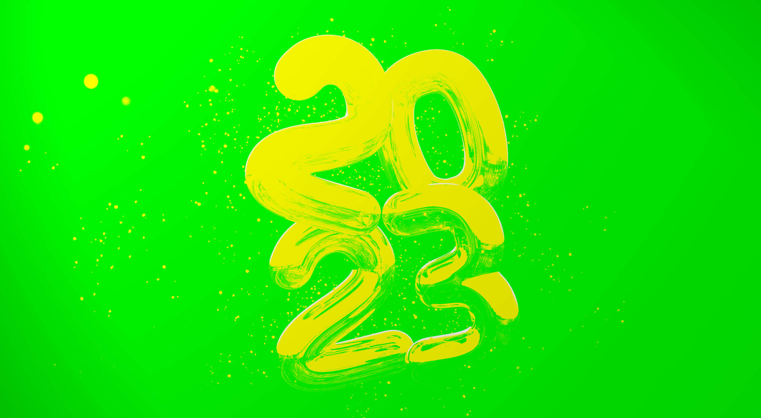
Welcome to our annual guessing game of what the next twelve months will bring.

As ever, the design world isn’t isolated from the world in which it exists, so when events shape our lives, they impact our work, the work clients ask for, and the work that inspires us. According to Collins Dictionary, the word of the year for 2022 was permacrisis. And frankly, 2023 doesn’t look any less turbulent, with some good and some bad things already on the horizon.

Russia seems all but certain to retreat to Crimea and claim its objectives in Ukraine have been achieved; Ukraine may not accept that end, but it will probably be enough to end sanctions against Russia, which will significantly impact the economy worldwide. Brazil may have been forced to watch Argentina lift the FIFA World Cup, but it has a new (old) president and fresh hope for the survival of the Amazon rainforest. Crypto has weathered a series of storms (although there may be more to come), and historical precedence suggests the bear market has run its course; 2023 will see stagnation, with an upward trend taking hold toward the end of the year. The former Pope has died, potentially paving the way for the retirement of the current Pope and the election of a new Pope, bringing with it either renewed liberalism or renewed conservatism to the world’s largest religion. Oh, and the IMF thinks a third of the world will be in recession at some point in 2023; the UK and Russia already are, and policymakers in the US are looking nervous.

And that’s just the obvious. Of course, there will be surprises, too, because there always are.

Against this backdrop, designers must not only navigate a problematic jobs market but produce designs that respond to the needs and desires of their clients’ users.

How Did I Do in 2022?

Before diving into this year’s predictions, let’s take a look at how I thought 2022 would play out.

I predicted that 2022 would be the year of blockchain, with decentralized data storage taking over. Well, I got the decentralized part right, but not so much the blockchain aspect (feel free to tell me I’m wrong on Mastodon because I’m not checking Twitter anymore). I’ll call that half a point.

I said design would be positive, playful, and accessible. I think design did emerge from its obsession with corporate minimalism, but positive and playful? Unfortunately, I’m calling that a miss.

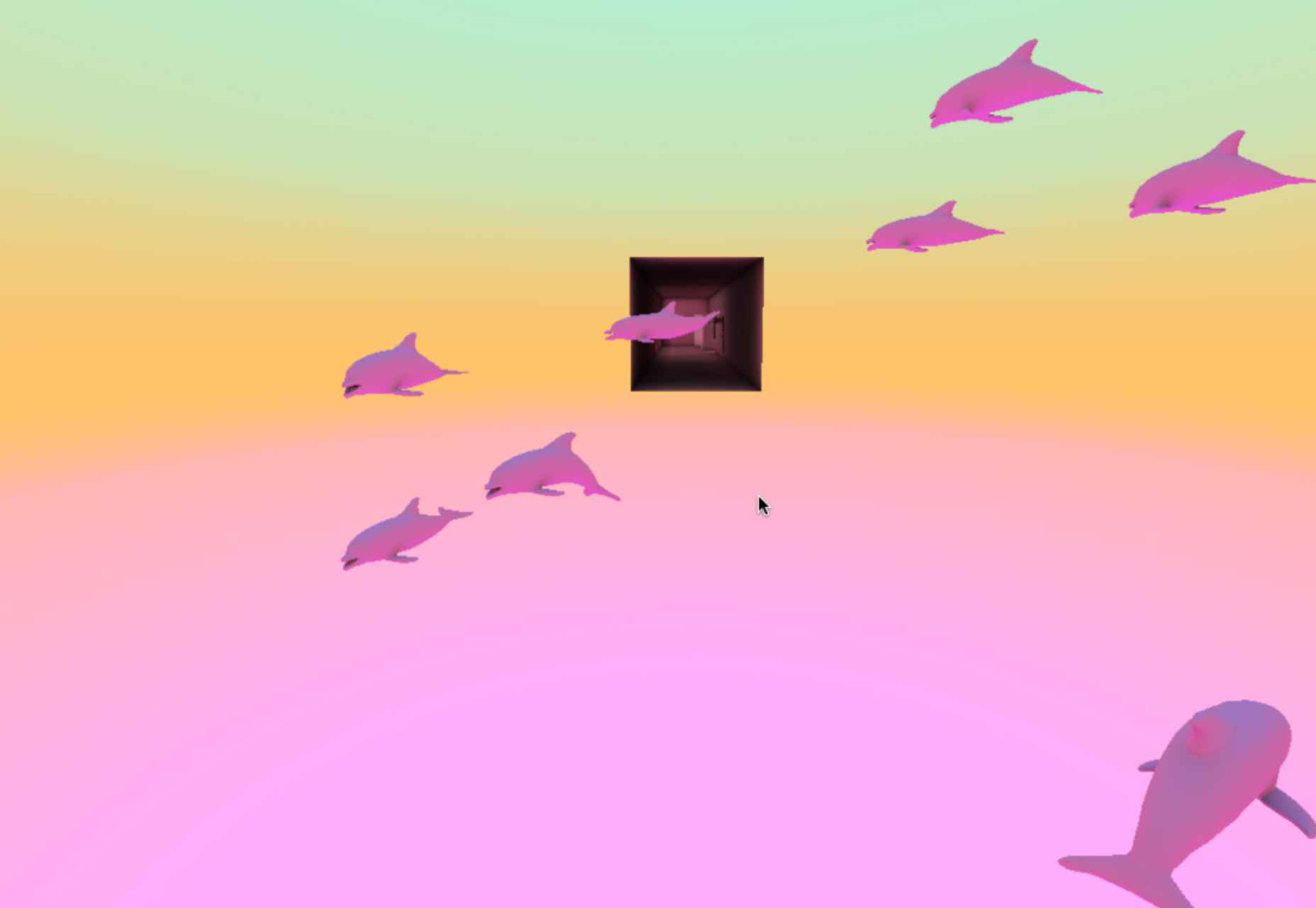
I said everything would be green. Again, that’s a miss. If there was a color for 2022, it was a pink-purple gradient.

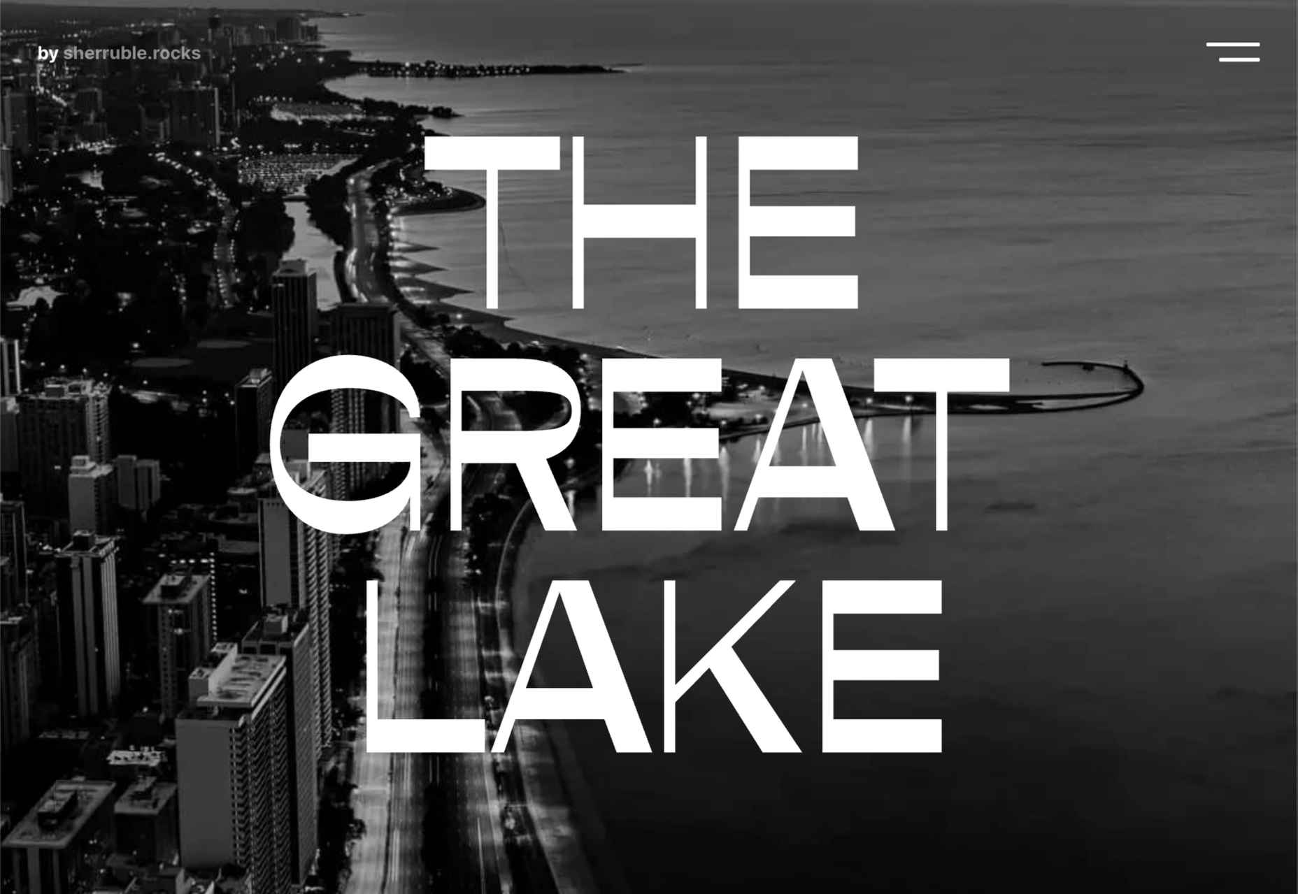
I predicted hero text would replace hero images, and in the third quarter of 2022, that’s exactly the trend we saw; tick.

Finally, I suggested that illustration would adopt a grainy texture. Well, some designers did, but it was hardly a dominant trend, so I’m going to have to call that a miss.

So for my 2022 predictions, I scored 30%. Way worse than last year’s clean sweep. Let’s see if we can’t beat that in 2023…

1. We’ll Stop Freaking Out Over AI

By now, you’ve probably tried AI, freaked out, and Googled how to start a small holding in the mountains.

The truth is that AI is just a tool. And a good one at that. AI is really good at derivative work. But it’s entirely incapable of improvising, holding opinions, having an agenda, or thinking outside the box.

AI will not replace your job — unless your job is deleting the background from photos, in which case it already has. Since when did Stephen King get replaced by a spellchecker?

If you haven’t tried an AI tool yet, I’d encourage you to try it. It does the small repetitive tasks well.

2. We’ll Embrace the Real World

One of the reasons AI can’t be creative is that it doesn’t have the same number of input sensors we have. We can smell, hear, feel, and experience the world in a multitude of different ways.

Most of us spent a year in lockdown working remotely. Then rushed back to the office, only to discover that our teamwork didn’t actually improve. With the worsening economic outlook, big companies are looking to budget, and the simplest way to cut costs is to ask staff to work remotely.

When your commute is a five-second walk to the spare bedroom, you find yourself with more free time. Sure, you could probably learn Python, but wouldn’t you be happier learning to paddleboard?

As we open ourselves to new experiences, our design work will inevitably become more diverse and natural.

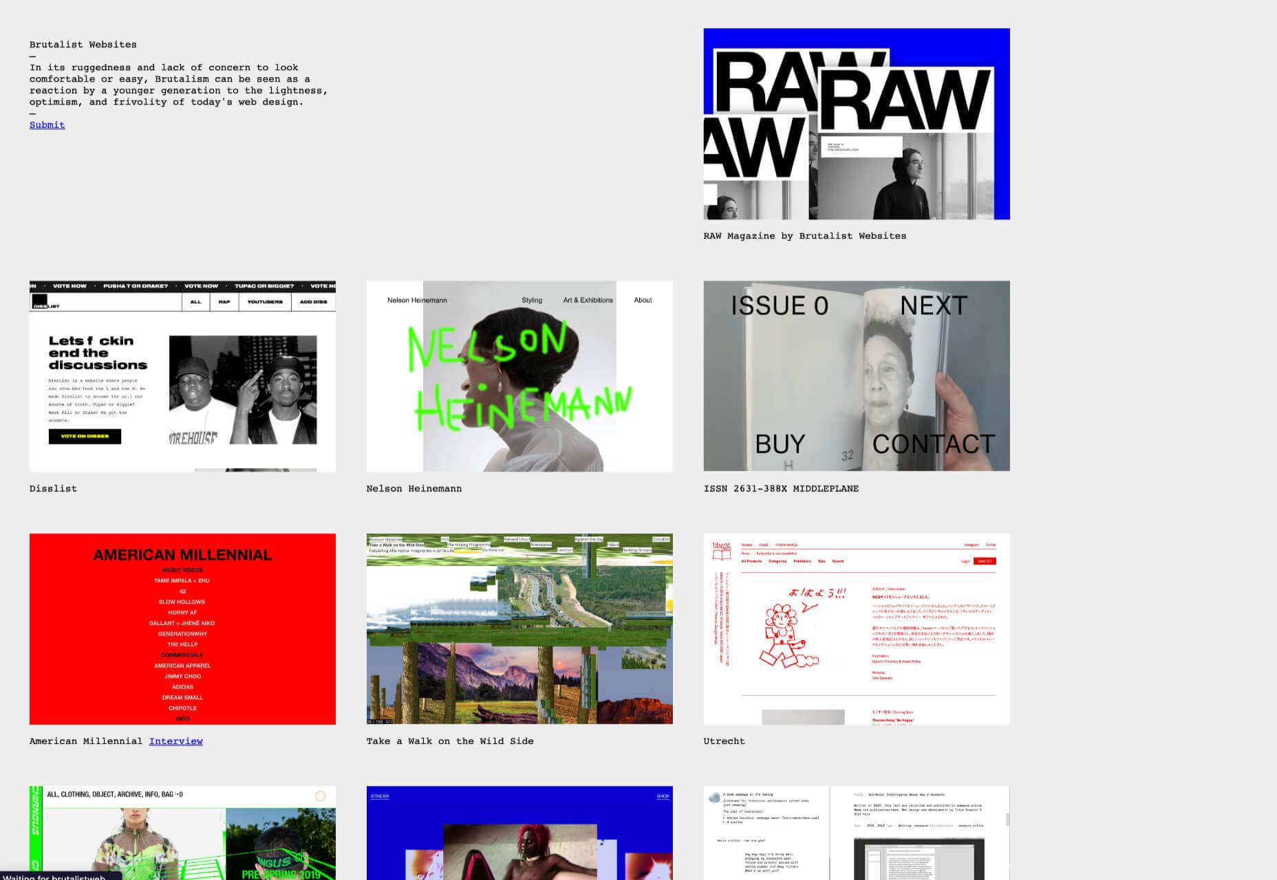
3. We’ll Reject Brutalism

It had a good run, but Brutalism isn’t a good fit for most UI projects. The trend of 2021–22 will vanish as quickly and as unexpectedly as it arrived.

4. We’ll Reject Darkmode

It has had a good run, and dark mode is a perfect fit for most UI projects. But we’re all kinda sick of it.

I hope I’m wrong about this one; not only is dark mode genuinely better for both your eyes and the environment, but the rich, warm blackness is the perfect antidote to sterile white corpo-minimalism.

Dark mode options are built into our OS, so it’s doubtful that it’s going to vanish anytime soon. However, dark mode as a design trend for its own sake is probably on the wane.

Typically trends come and go in symmetrical waves. Dark mode has been a dominant trend for years, so it should take as long to vanish completely.

5. We’ll Embrace Personal Retro

Every year we get the exciting job of guessing which decade the zeitgeist will rip off next. Will 2023 be the year of ’80s retro, ’90s retro, ’00s retro, or maybe (somebody shoot me) ’10s retro?

The retro trends we’ve seen over the last few years have been poor pastiches of their associated decades. If last year’s ’90s retro was inspired by the ’90s, it was a ’90s someone else was living.

In 2023 we’ll move beyond someone else’s ideas of what the past was like, to a personal vision of what came before. One in which the sunbleached colors of eternal Summers in the suburbs dominate.

6. We’ll Fall For Borecore

We’re all guilty of designing with our egos from time to time, and there is a tendency to hit users between the eyes with the biggest type, the loudest gradient, and the flashiest animation.

If you truly want to impress users in 2023, stop inserting pop-ups, adverts, cookie notices, and the other extraneous detritus that stops them from doing whatever it is they arrived on your site for. Impressing users in 2023 means clean typography, low-distraction art direction, and helpful content. Boring design just isn’t as boring as it used to be.

In 2023, the best thing designers can do for their users is get out of the way.

Happy New year! We hope it’s a good one.


Featured image by myriammira on Freepik

Source

The post 6 Predictions for Web Design in 2023 first appeared on Webdesigner Depot.

Source de l’article sur Webdesignerdepot

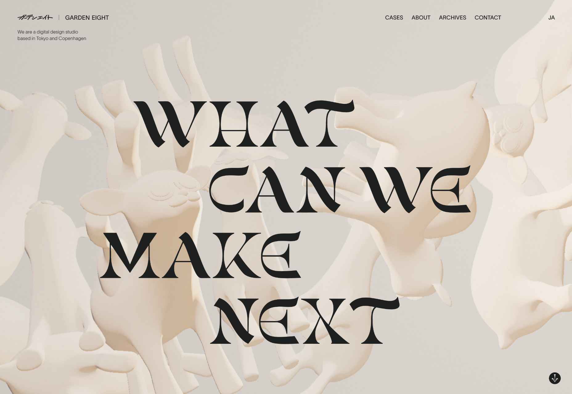
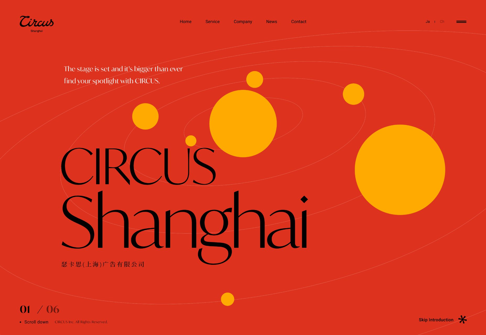
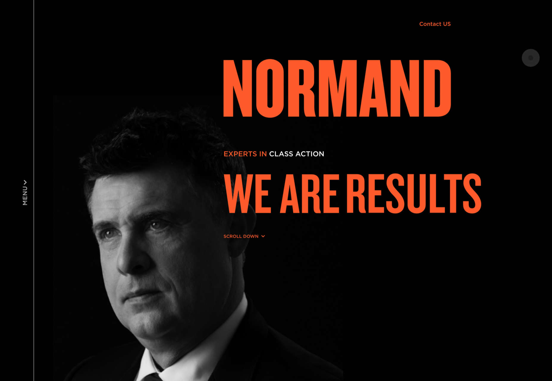
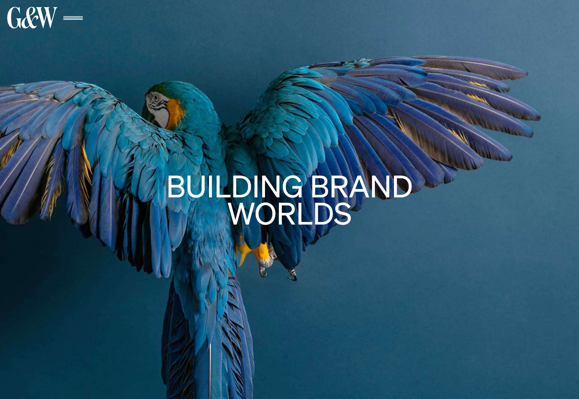
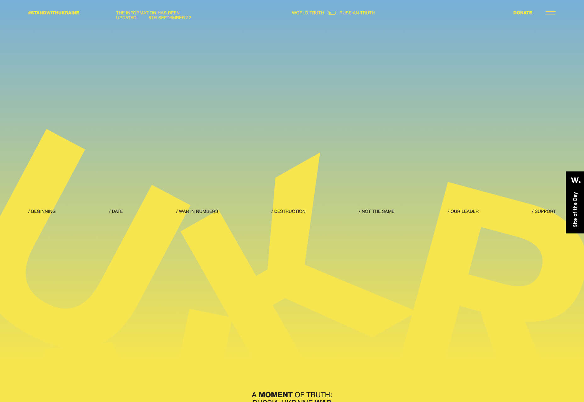
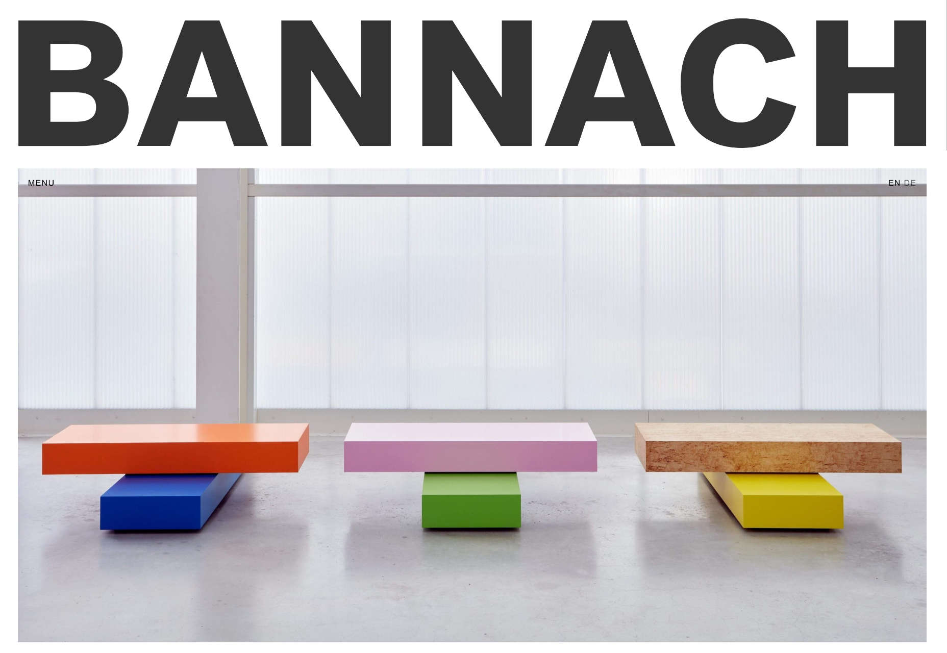
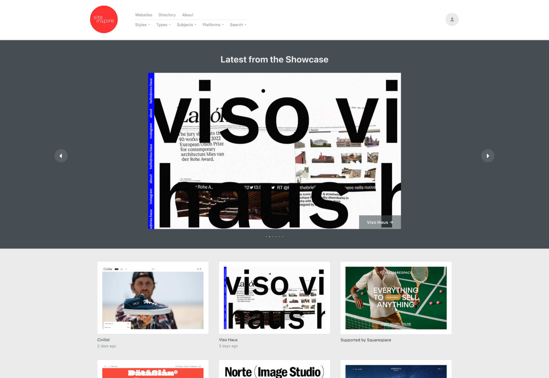
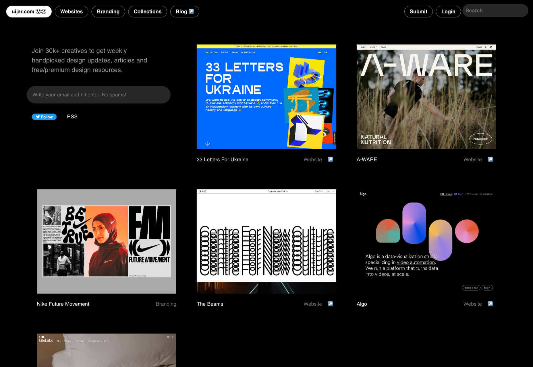
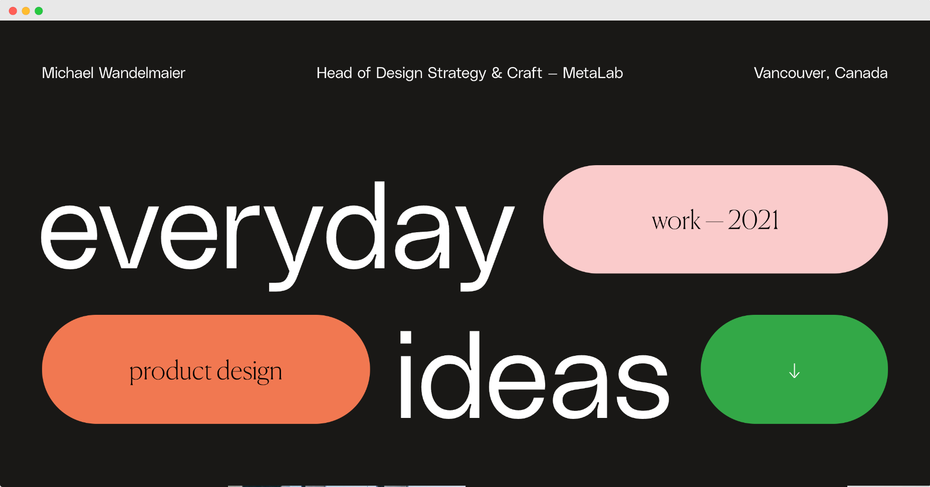
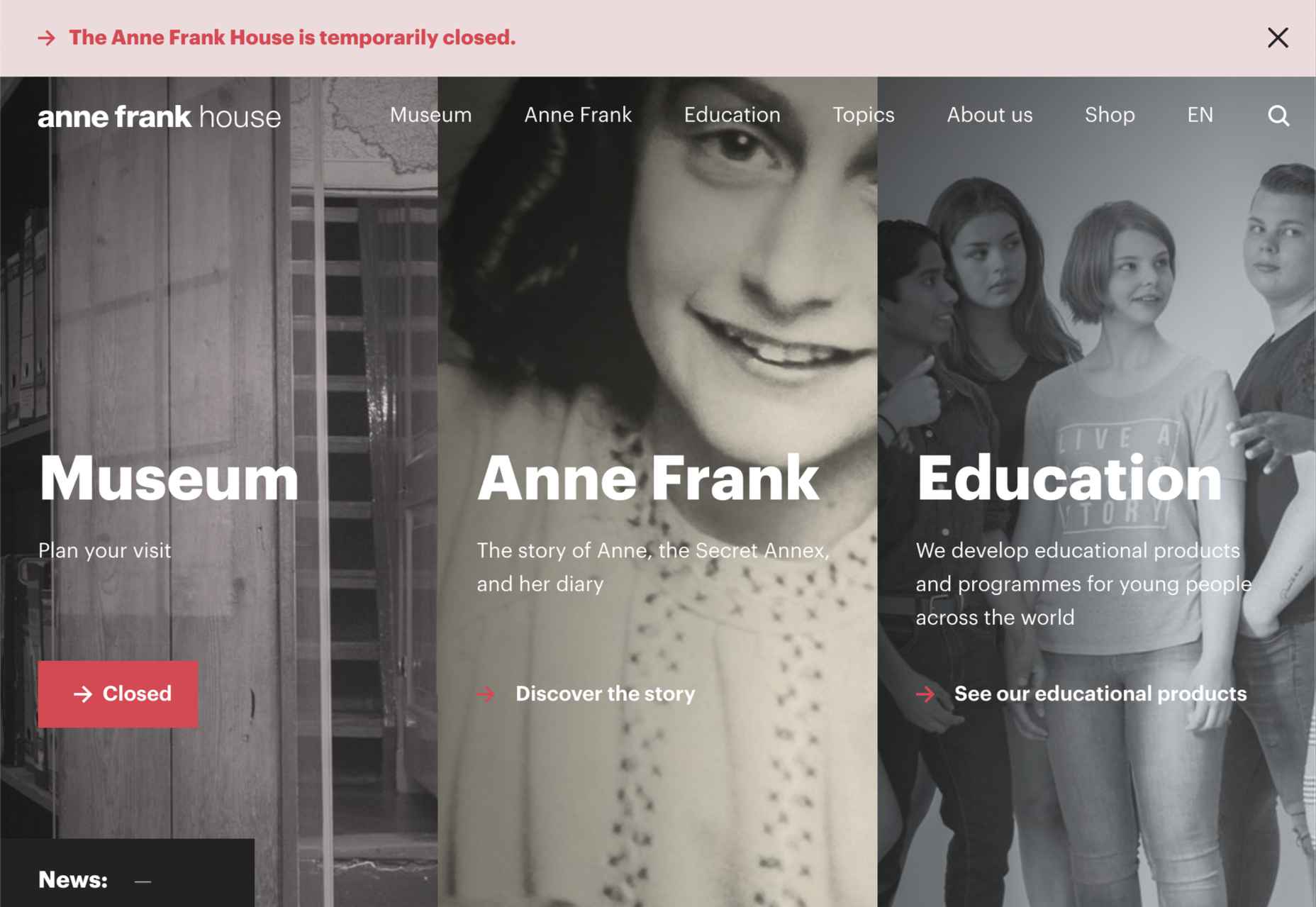
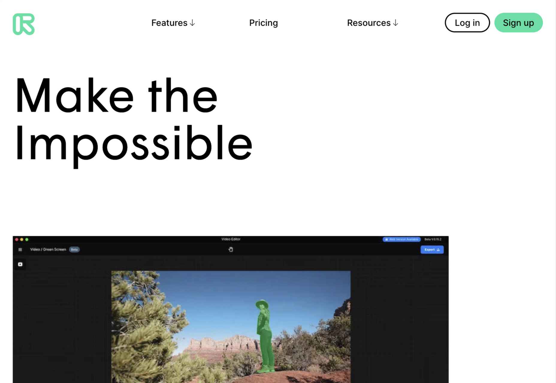
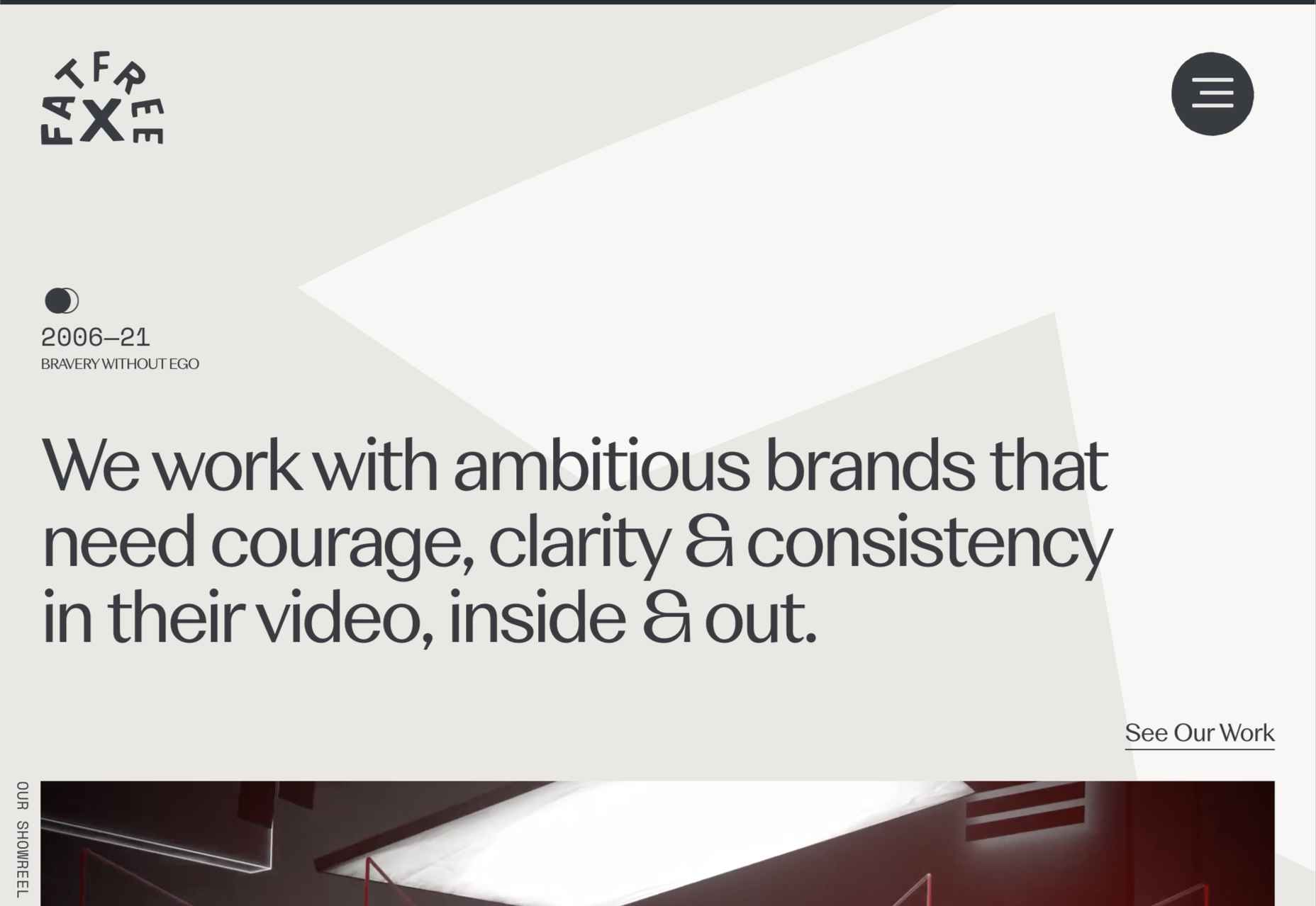
We’ve seen some incredible websites in 2022. There have been more than the usual number of sites with a political mission, and plenty that made us want to travel. The big design trends were brutalism, huge typography, and bold positive color. We’re looking forward to what the web will bring in 2023, but in the meantime, take a look back at the best 50 websites of 2022. Enjoy!

Justice Reskill

Justice Reskill used bright colors and positive, uplifting artwork to create a supportive platform for people who’ve been through the justice system.

Pienso

Bold type and plenty of on-scroll animation made this site for Pienso stand out back in January.

Gazelle No.1

The promotional site for Gazelle No.1 used innovative scroll-activated video to sell the electric bike.

Mekanism

Mekanism’s site was the first agency redesign to impress us in 2022. Super-polished then, super-polished now.

Redbrick

Redbrick was well ahead of the trend for brutalism with a twist when it released this site promoting its coffee.

SOS Foods

Ethical and sustainable goods were top of the sales charts in 2022, and SOS Foods did a great job capitalizing on the style.

Hartzler Dairy

Hartzler Dairy embraced its mid-20th-century branding with a nostalgia-infused site.

Engineered Floors

Even in 2022, designers are still paying mobile short shrift, but this site for Engineered Floors is excellent on mobile.

Emi Ozaki

We loved the quirkiness of Emi Ozaki’s phone-style interface for her portfolio back in February.

I Killed A Cactus

I Killed A Cactus is a beautiful 3D site designed to help people care for houseplants.

Aris Hotel

We were tempted in the direction of Crete by this stunning luxury site for Aris Hotel on the island.

Milton Textiles

Milton Textiles is a big, bold site for a product that is usually an afterthought in the interior design world.

MAAP

The site for MAAP is predictably excellent, modern, and efficient. It encapsulated the apparel brand’s values perfectly.

Garden Eight

The promotional site for Garden Eight, a digital design studio in Tokyo and Copenhagen, was suitably standout eccentric.

Circus Shanghai

Circus Shanghai used a mid-century illustration style to reference the solar system and the Chinese flag.

Normand

Normand took the bold decision to step away from the typical law firm design strategy.

SND

Designing a site for UI sound kits is challenging, but SND pulled it off perfectly with this minimal site.

Polybion

We saw lots of brutalism in 2022, and Polybion’s site was a standout example of how to make the trend work.

neueMeta

Bold block coloring added depth and interest to this portfolio site for design studio neueMeta.

Dumpling Delivery

OK, we confess we spent waaay too much time playing this dumpling delivery game from Mailchimp back in May.

Nowhere Bakery

Nowhere Bakery succeeded in making vegan, paleo, gluten-free cookies seem appealing.

Triniti

We were mesmerized by the perpetual motion video for the pan-Baltic law firm Triniti.

Kim Kniepp

Kim Kniepp’s site impressed us with interconnected navigation and a superbly coded masonry grid.

Feed The 300

Feed The 300 is one of dozens of great sites to combat Russia’s invasion of Ukraine. In this case, it was aimed at feeding zoo animals.

Icons By Menu

Icons By Menu is a stunning minimalist site that is a pleasure to browse.

Museum Of Pink Art

The Museum of Pink Art is an immersive experience celebrating the color pink. It was easy to lose hours wandering around.

BelArosa Chalet

2022 was the year of illustrations, and BelArosa Chalet’s site used them to significant effect to sell a venue still under construction.

WTFFF

Online sexual abuse and harassment are particularly appalling when directed at young people. WTFFF tackled the issue sensitively.

Pretty Damn Quick

Logistics aren’t the most engaging topic, but this friendly, illustrated site for Pretty Damn Quick grabbed us immediately.

Norwegian Soda Co.

This site for the Norwegian Soda Co. uses beautiful photography to create an engaging one-page site.

Fornasetti Profumi

Fornasetti Profumi wowed us with its long-form videos used to emphasize stillness and calm.

Laesk Kombucha

We were convinced this site for Laesk Kombucha had been produced by Wes Anderson.

Cased In Time

Single-product sites are often underwhelming, but this excellent ecommerce site bucks that trend.

DS & Durga

Eschewing the well-trod approach of flowers and pretty models, this perfume site for DS & Durga fully embraces the brutalist trend.

Daniel Spatzek

We loved the way Daniel Spatzek’s portfolio site broke all the rules and still managed to be informative and engaging.

Aro

Aro kept minimalism alive with a simple site that exudes luxury while selling a simple concept.

Think Packaging

Think Packaging took a case study approach to present its products, and it worked really well.

Steffie de Leeuw

Giant typography intertwined with botanical illustrations created a memorable site for Steffie de Leeuw.

Anna Jóna

The prelaunch teaser site for the Ana Jóna café and cinema was elegant and modern and had us eyeing a long weekend in Reykjavik.

Das Salz

More wanderlust courtesy of the fresh, enticing site for the Das Salz hotel and café.

Jono Pandolfi

This simple-to-use site for US tableware and cookware brand Jono Pandolfi sold us on hand-made ceramics.

LolaVie

We still can’t get over the fact that it took until 2022 for Jennifer Aniston to produce a haircare range.

Nathan Riley

Another big trend in 2022 was masonry-style sites, and this portfolio for Nathan Riley was one of our favorites.

Capsul’in Pro

With the excellent application of animation and careful use of color, this site for Capsul’in Pro transformed coffee pods into luxury items.

Seen

Seen is an essential site that explores themes of prejudice and racism in creative fields. It’s a strong approach to a difficult subject.

Glasfurd & Walker

Glasfurd and Walker’s superb portfolio site sets itself apart by over-extending the viewport. It’s a highly original idea.

The Other Side Of Truth

The Other Side of Truth is the standout site of 2022. It used the web expertly to present two interpretations of the facts surrounding the Russian invasion of Ukraine.

Bannach

Back in October, we fell in love with the pixel-block animation loading for the Bannach furniture brand.

Karina Sirqueira

Karina Sirqueira’s portfolio was a joy to browse through. The morphing shapes imposed simplicity on a series of beautifully presented case studies.

Joshua’s World

We were amazed by Joshua’s World, a little island that can be titled and rotated to power the little cyclist along his career.

Source

The post 50 Best Websites of 2022 first appeared on Webdesigner Depot.

Source de l’article sur Webdesignerdepot

The design world fluctuates back and forth, swerving between love and hate for different design trends. Sometimes we see a wide range of approaches, and sometimes designers all hop on the same idea.

This month, the web is dominated by animation. Designers are cramming in motion in unexpected ways. And it’s fun to explore. Here are 20 of the best new sites on the web this month. Enjoy!

Bannach

Bannach is a German furniture brand. Its products are colorful and geometric, so it makes sense that when you scroll down to the collection, the thumbnails begin as pixel blocks and animate into product photography.

Fornasetti Profumi

Fornasetti Profumi takes a different approach to motion. It uses video to emphasize stillness to promote the calming qualities of its candle products.

The Other Side of Truth

The Other Side of Truth is a superb exercise in utilizing the web for a cause. It presents facts on the Russia-Ukraine war, but the standout feature is the toggle switch that, instead of light mode-dark mode, toggles facts and Russian state propaganda.

Glasfurd & Walker

Glasfurd & Walker is a portfolio site for a design agency. So far, so standard. However, it sets itself apart because it’s slightly bigger than the browser and swerves left and right with your mouse movement.

Sirup 5th Anniversary

Sirup is a Japanese singer-songwriter, and to celebrate the fifth anniversary of his first hit single, his record company has put together this awesome maximalist micro-site that uses type, motion, and art direction to capture his style.

Fitzjohn’s

Fitzjohn’s is a slick site for a new apartment complex in the Hampstead area of London. It uses a refreshing modern color palette and calming animation to take the edge off the frankly ludicrous price tag.

Persepolis Reimagined

Persepolis Reimagined is an awe-inspiring WebGL tour through one of the most important cities in ancient Iran. Make sure you tour it on a large screen. It’s hard not to be wide-eyed with wonder.

JaM Cellars

JaM Cellars is a Californian wine brand that’s pitching to bachelorette parties. With names like Butter, and Sugar, it’s not the most sophisticated tipple, but yellow, we love a yellow site.

Danielle Levitt

This portfolio site for film director and photographer Danielle Levitt features samples of her best work scrolling past the viewport. There’s a clever switch of thumbnail and background color when you scroll down to the contact details.

Propel

From total color energy to Apple-levels of minimalism: Propel is a slick, animate-on-scroll site for a marine motor brand selling an outboard and inboard motor. The animated masks on the images are a nice subtle touch.

Standards

Standards is a site for a SaaS that helps organizations create, maintain, and share brand guidelines. It uses subtle animation, video of its UI, and compelling copy to sell its approach.

Chris Carruthers

The portfolio site for Chris Carruthers is deliberately self-indulgent with scrolling text, clipped images, and scroll-jacking, but it’s also delightful to peruse.

Theodore Ellison Designs

We don’t often see colored glass in real life, but the play of light on stained glass is beautiful. This site for Theodore Ellison Designs uses video to bring the effect to the web.

Owomaniya!

The Owomaniya report for 2022 uncovers the state of gender diversity in the Indian entertainment industry. Presented in the style of infographics, the information is brought to life by animation.

Meetings

Meetings is a French events company. Its site uses an animated collage approach to showcase its services, and animated text to pull you into its content.

Blakeney

Blakeney invests in African companies on behalf of institutional investors. Its site is typical of the financial industry, but it uses animation to lift it to a higher level of interest.

Becklyn

Becklyn is a digital design agency. Its portfolio site uses animated text, expanding image masks, and video to guide us through its site and app design approach.

Cabi

Cabi is a brand of Japanese condiments with a typically Japanese feeling site. Bright colors, a slowly scrolling slideshow of dishes, and editorial to pack shot hover effects are a great introduction to the brand.

Slantis

Slantis provides building information modeling to architecture and infrastructure providers. Its site uses animation to showcase the types of content it produces for clients.

July Fund

July Fund is a venture capital project. It takes an entirely different approach than its competitors by adopting a chaotic but enjoyable card-based design.

Source

The post 20 Best New Websites, October 2022 first appeared on Webdesigner Depot.

Source de l’article sur Webdesignerdepot

Web design is often stagnant because designers look at the same work and follow the same trends. Unfortunately, algorithms promote work that is liked, and designers produce content to get likes, which leads to a self-feeding cycle.
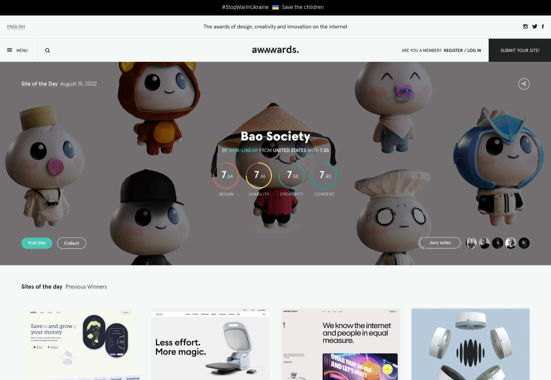
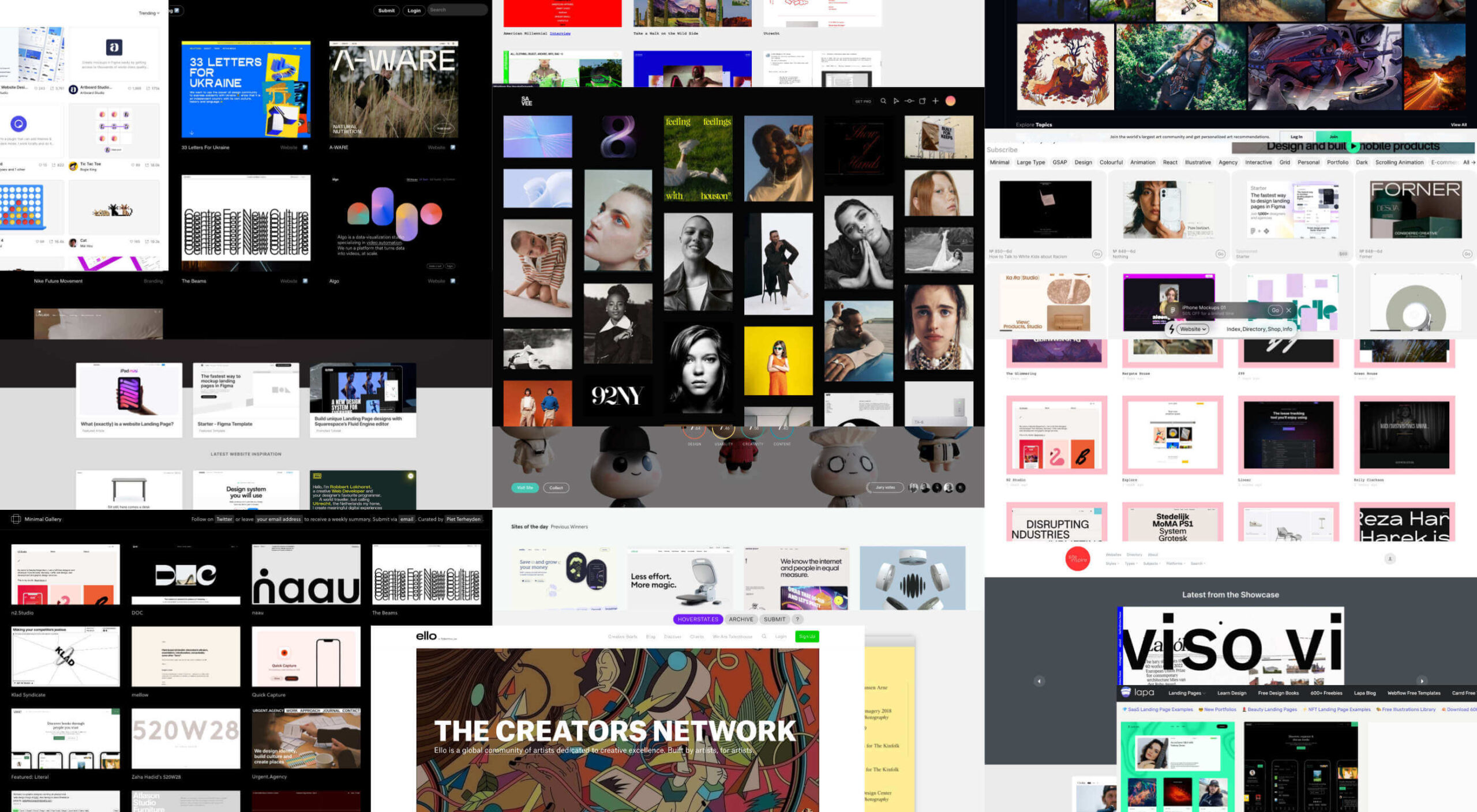
We’ve been talking about the dribbblization of design for years, but Behance is just as guilty of promoting and encouraging homogenous design.

It’s not that Dribbble and Behance don’t have value; they are both excellent resources for designers. But they’re victims of their own success, and it’s healthier for them, designers, and the industry if we broaden our sources of design inspiration.

And so, today, we’re presenting this list of the best places to find design inspiration for web designers that aren’t Dribbble or Behance. (OK, you can check them out too, if you really want to!)

Awwwards

Awwwards is the top site for web design inspiration. The best agencies in the world post here, and a ‘Site of the Day’ award is a coveted accolade. So if you’re looking for design inspiration, this should be your first stop.

Admire The Web

Admire The Web is an excellent collection of curated sites. It’s more selective than sites like Awwwards, so you don’t have to dig through so much to find the best web design.

One Page Love

One Page Love is one of the best resources for designers seeking inspiring new ideas. It’s devoted to one-pagers, which means it leans towards apps, tech start-ups, and smaller independent projects.

Godly

Godly is another excellent collection of web design inspiration. Godley uses animated thumbnails, so you can get a sense of a site before you look at it in detail. As such, it’s perfect for animated landing pages.

Hoverstat.es

Hoverstat.es is a collection of curated websites that often finds little gems other sites miss. Unlike most roundups, it doesn’t go into much detail on each site, and new sites are infrequent, but it’s always worth a browse.

Siteinspire

Siteinspire is one of the most established design inspiration sites. The collection is carefully divided into different styles; if you find your own site listed, you can add your contact details.

Land-book

Land-book is a curated collection of the best sites on the web. The site does a great job of presenting screenshots clearly, and the similar sites feature is great for browsing a particular mood.

Savee

Savee is a fantastic site for browsing all kinds of design inspiration. It’s like Pinterest for designers as it leans towards art direction and photography. It’s easy to scan for mood boards.

UIJar

UIJar is a nicely designed collection of hand-picked websites. Unlike most other sites on this list, UIJar also features a collection of branding that’s great for identity designers.

Brutalist Websites

Brutalist Websites is the perfect inspiration site if you’re a fan of the Brutalist design trend. There are plenty of designs that show why Brutalism is so popular right now, but the site itself is probably short-lived.

Minimal Gallery

Minimal Gallery is a collection of sites that embrace minimalism. Like Brutalist Websites, the quality of the collection is very high, but the site’s lifespan is probably short-lived thanks to being tied to one trend.

Ello

Ello is a platform for showcasing excellent design work. It’s solid on illustration and artwork. There’s also a great deal of photography on show. You’ll also find regular opportunities tied to creative briefs.

DeviantArt

DeviantArt is still the largest, and arguably the best, showcase for illustration, with dozens of styles from Anime to classicism. It’s easy to lose a few hours browsing DeviantArt.

Figma Community

Figma Community is a collection of the best work from the Figma community. But you don’t need to be a Figma user to grab some inspiration from the UI work on show.

Lapa

Lapa is a collection of 5000+ landing pages. The collection is headhunted from around the web, so if you only have time to check out one site, Lapa could be a good choice.

Source

The post 15 Inspiring Alternatives to Dribbble & Behance first appeared on Webdesigner Depot.

Source de l’article sur Webdesignerdepot

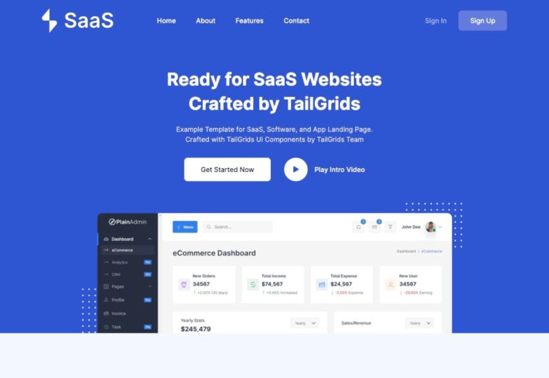
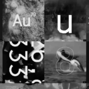
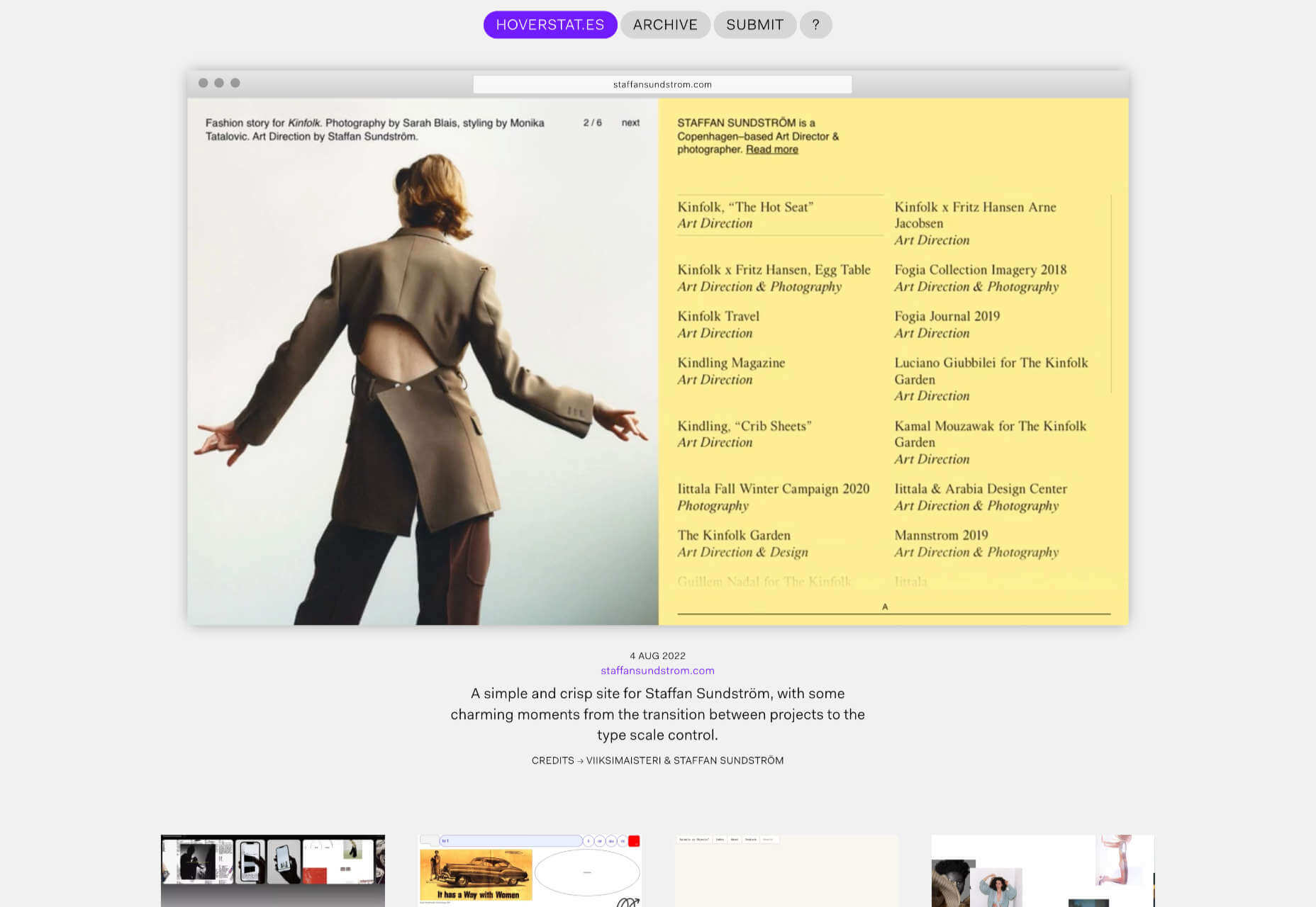
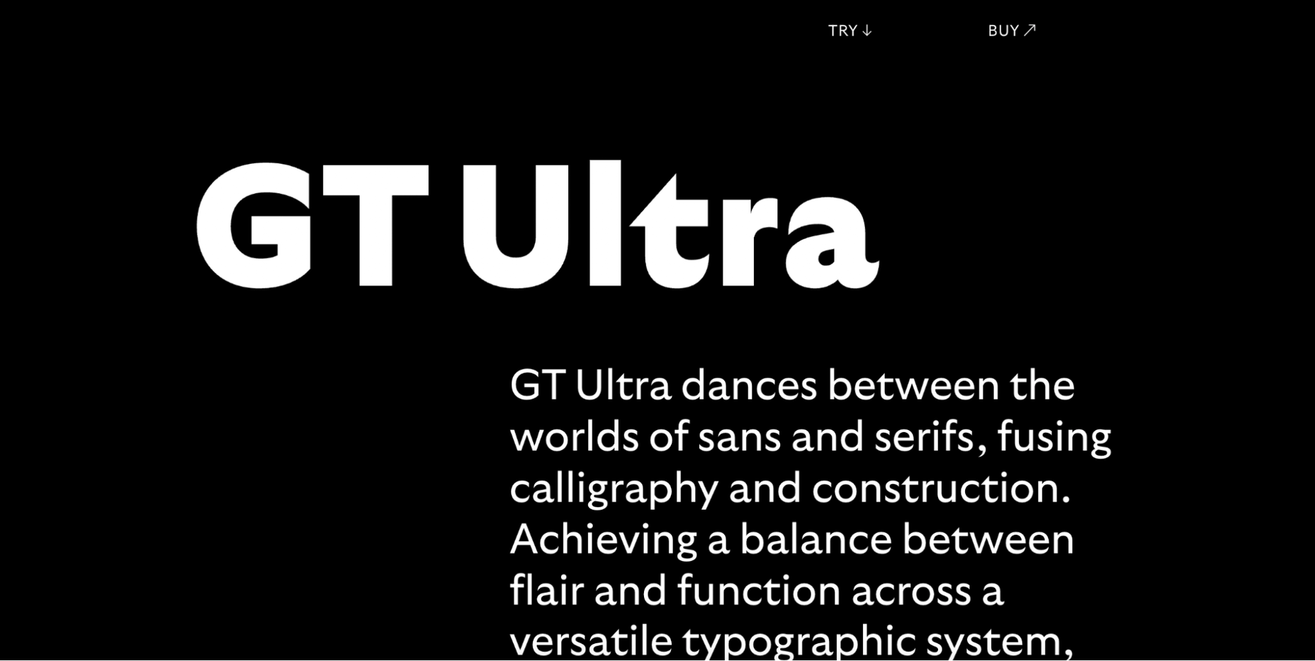
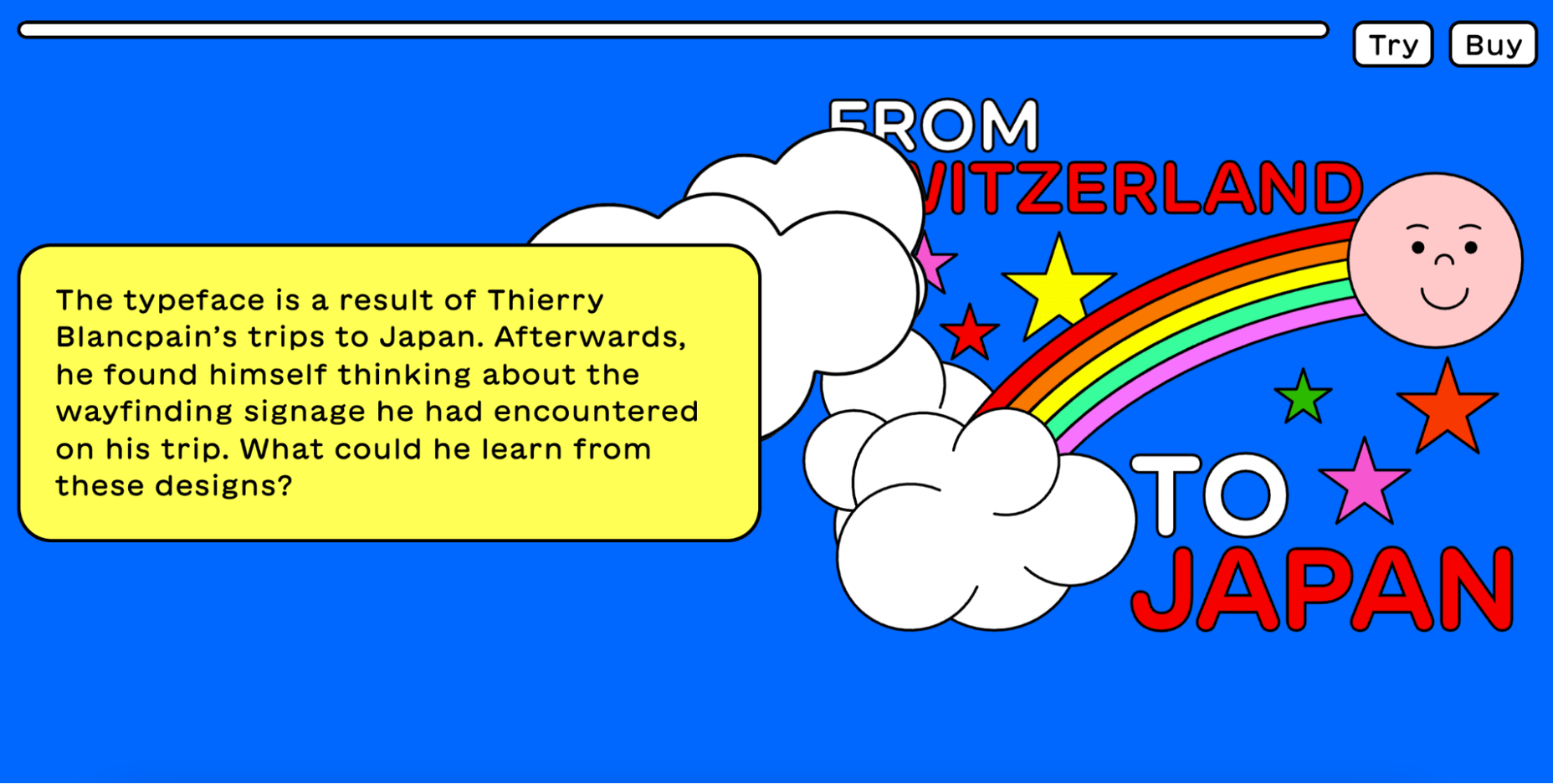
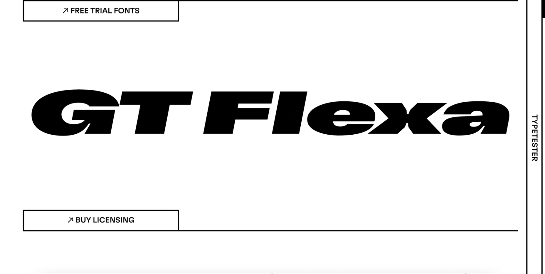
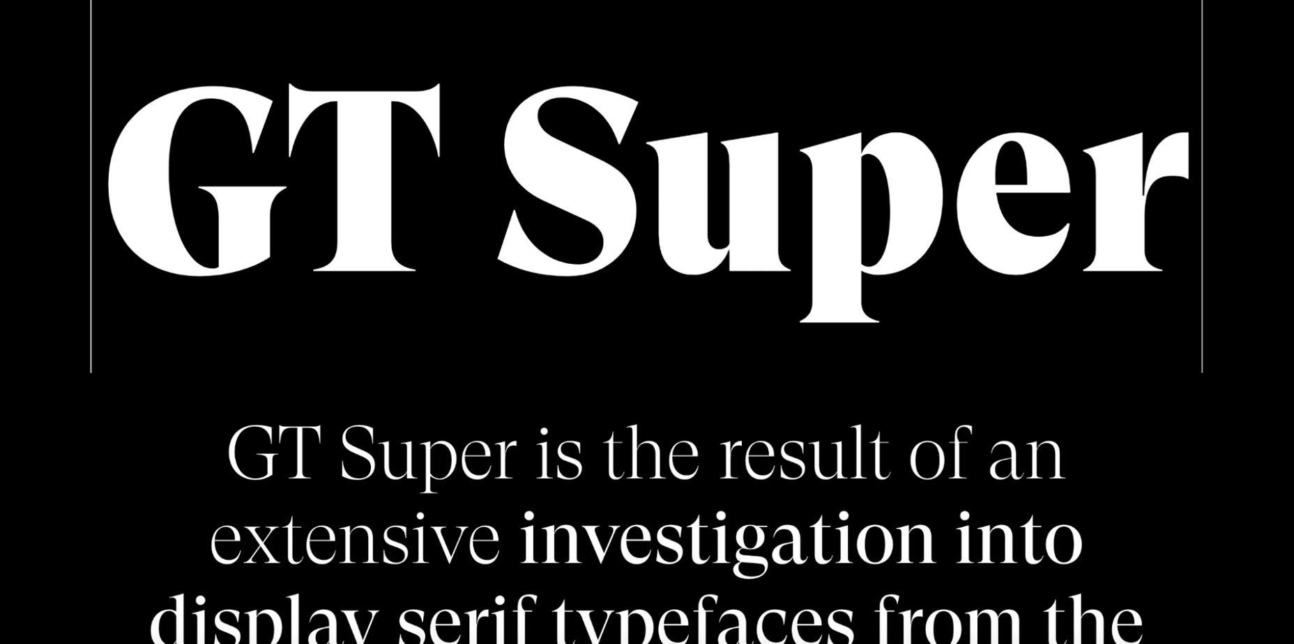
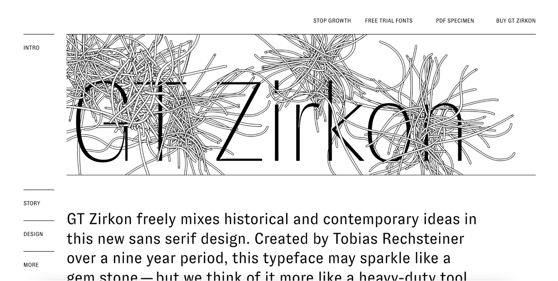
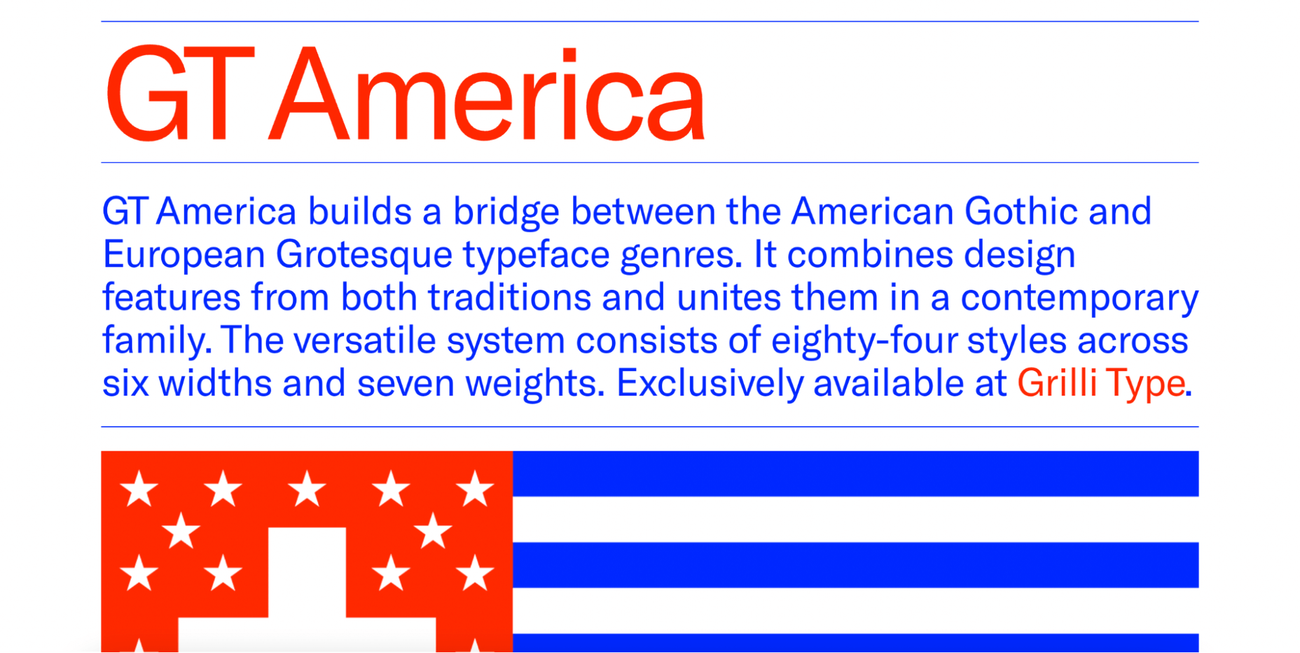
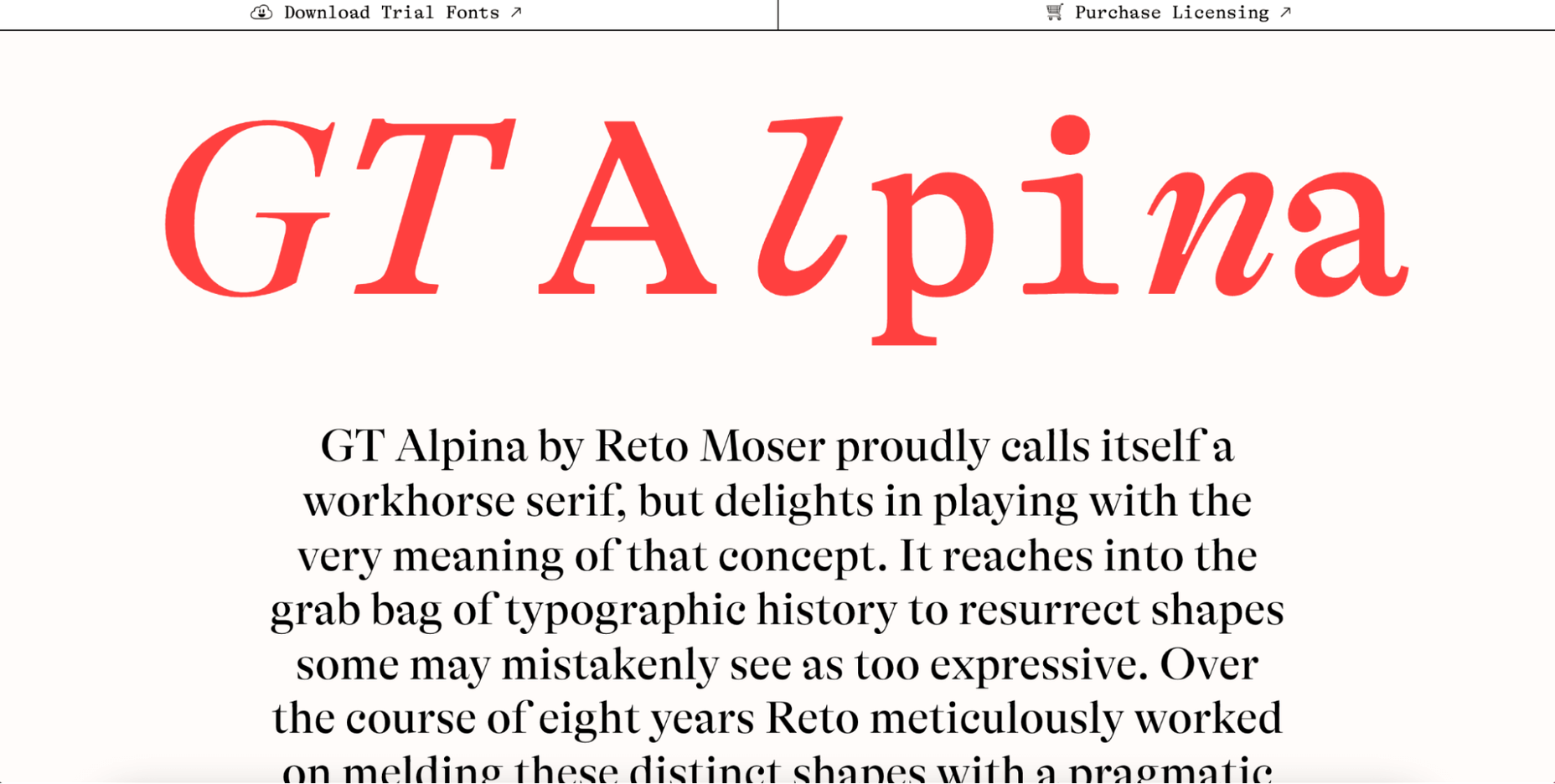
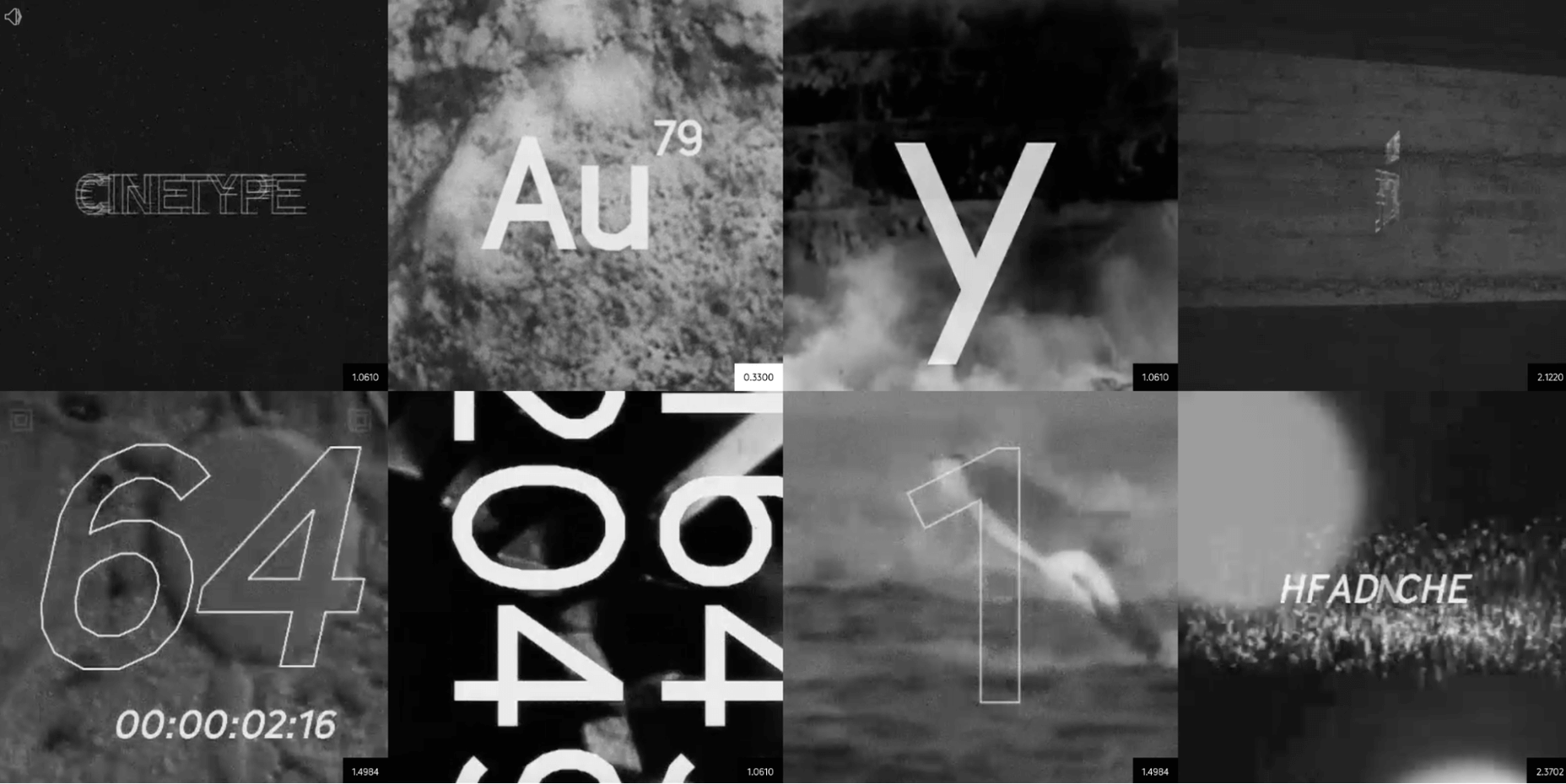
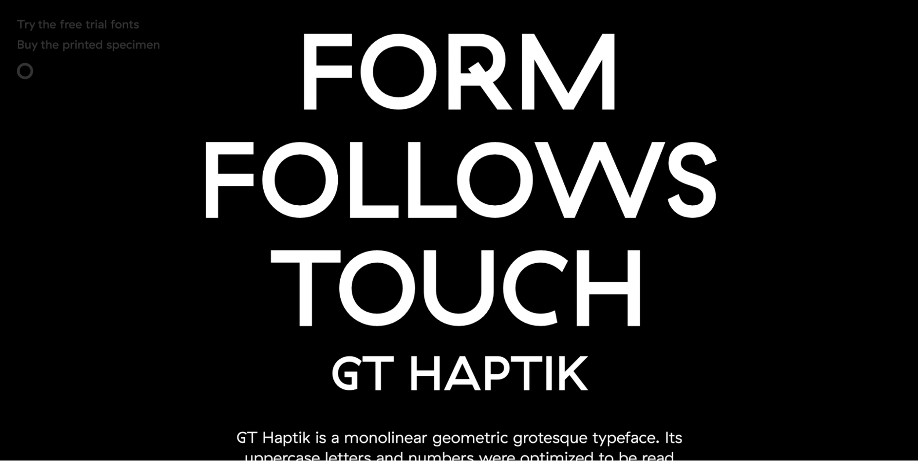
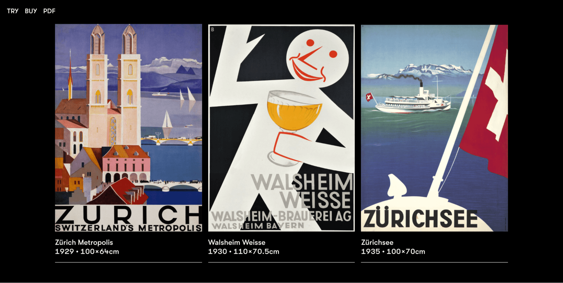
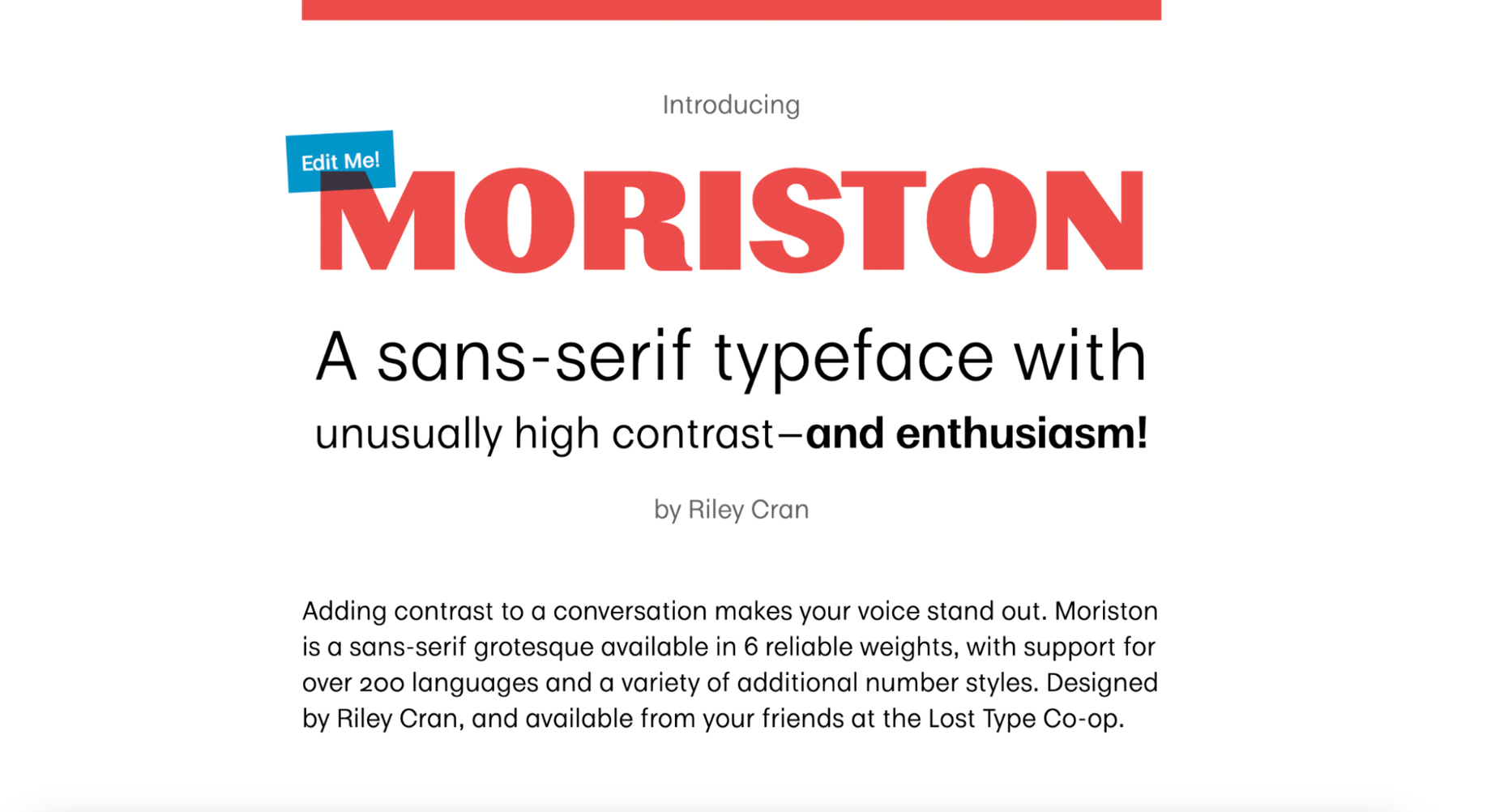
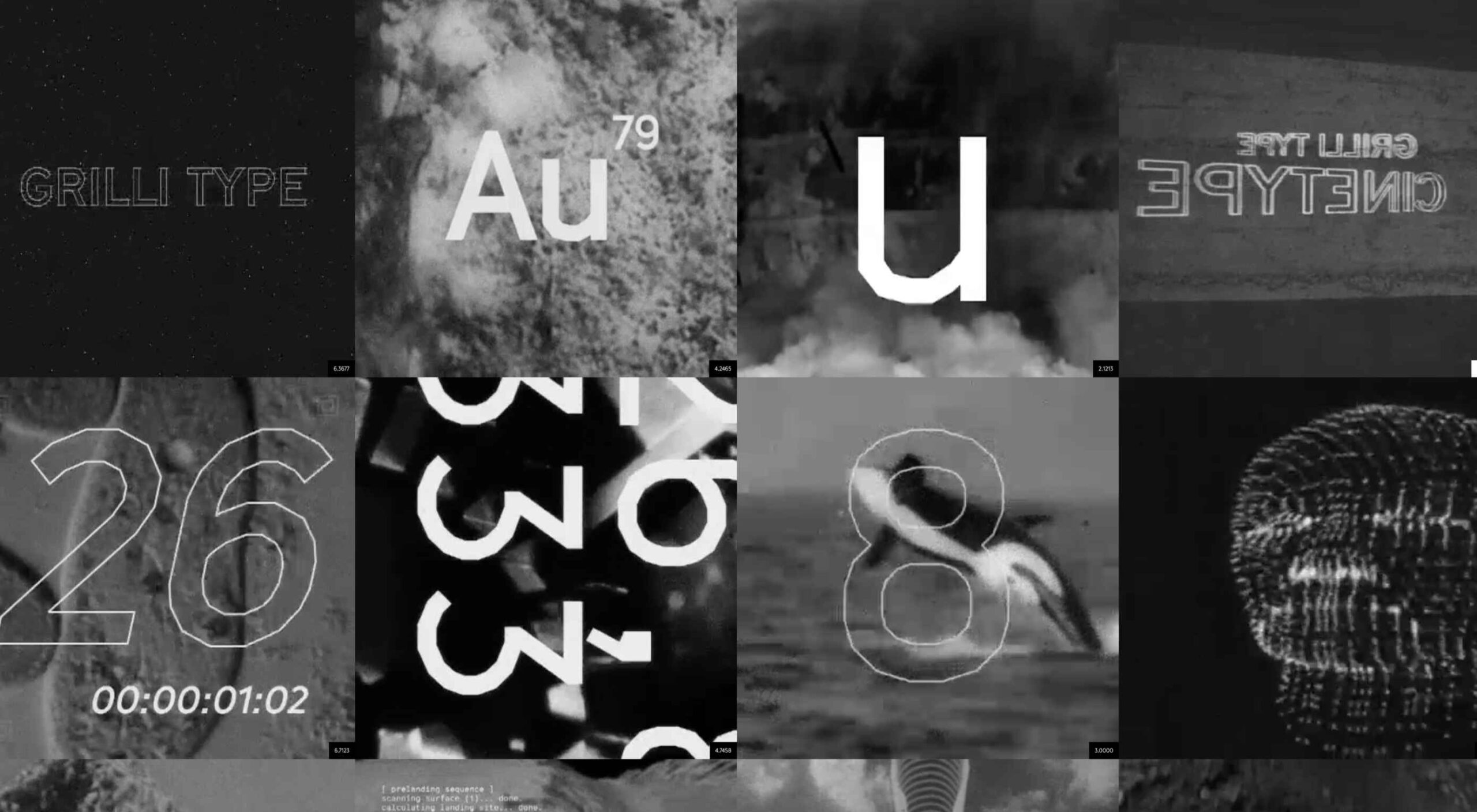
Are you looking for a unique font that will make your next project shine? Or maybe you need a typeface with a beautiful design and rich history behind it. Luckily, mini-sites for fonts allow us to creatively explore a font’s origins and history. We know (from our own experience) how important it is for UI and UX designers to have a variety of fonts for our designs.

Now that 2022 is here, it’s time to expand our font collection. That’s why, after extensive research, we have created the ultimate list of the best 16 creative mini websites for fonts.

Are you ready to take a look at the most creative, cute, and fun font websites available on the market?

1. GT Eesti

This website is about the history of one of the most popular fonts on the market, GT Eesti. As you will notice, the typeface has a long history (more than 80 years) and was recently reborn in Switzerland.

As for the font, GT Eesti is a flexible geometric sans serif that can be used in almost any project. As one of the most creative websites for fonts, full of animations and interesting information, GT Eesti quickly made it onto our list.

2. Ultra Font

Are you looking for a font that combines calligraphy and elegance and sits between the sans and serif styles? 

Then GT Ultra is just what you need. We loved how the creator tells the story and structure of Ultra with beautiful animations on this unique, one-page website.

3. Maru Typeface

Maru is by far the cutest design on this list. The website is a vertical narrative of the typeface’s history. 

The typeface was inspired by the designer’s travels to Japan, and the mini-site fully reflects that. Best of all, Maru also includes a great collection of cute emojis and stickers.

4. GT Flexa

GT Flexa is a very flexible font that you can easily use for a responsive UI design. We enjoyed navigating through the minimalist mini-site and exploring the creation and history of Flexa. 

Flexa also offers a free trial that allows you to try the font before you buy.

5. Super

Super’s mini-site reminded us of earlier decades. GT Super is a vintage typeface inspired by the serif fonts of the 70s and 80s. 

Therefore, it can beautifully frame nostalgic designs. The font was designed by Noel Leu and is available in two styles (text and display).

6. GT Zirkon

GT Zircon is located in a place where creativity meets minimalism. This is one of our favorite mini-sites for fonts. 

The site showcases Zirkon’s history and design process through creative graphics, videos, and animations.

7. America Font 

This mini-site allows you to explore the history, style, and character overview of GT America, a contemporary font family. 

The designer has used elements from American Gothic and European Grotesque to create one of the most flexible typefaces available.

8. Alpina

Reto Moser recently designed one of the most popular GT typefaces, the Alpina “Workhorse” serif. 

This innovative, one-page website tells us the story of Alpina and explains how the designer jazzed up, posed, and flexed the classic book typography to create a wide range of typeface variations.

9. Cinetype

As the name suggests, this mini-site is inspired by classic cinematic movie reels. If you’re looking for a font inspired by the fascinating world of cinemas, Cinetype is simply the best choice. And on this creative website, you will learn all the reasons why.

10. Haptik Typeface

When it comes to monolinear geometric typefaces, Haptik is one of the best. This innovative mini-website tells how the Haptik font came to be and highlights the history of the font. 

The hand gesture gifs at the bottom of this one-page site are some of the most creative mini-videos we have seen in a long time.

11. Walsheim

Walsheim is a typeface designed by Noel Leu. This mini-site explains how the designer was inspired by the fascinating poster designs of Otto Baumberger, a successful Swiss painter of the 20th century (1889-1961). If you like fonts with a deep backstory, Walsheim is a must-have for you.

12. Prospectus

The Prospectus mini-site is specially designed to look like a newspaper. And let us say: the result is extraordinary. 

This one-page website explores the origins, construction phase, and classifieds of the Prospectus typeface, allowing us to experiment in real-time with the weight, height, tracking, and size of the typeface.

13. Mort Modern

Mort Modern is a unique serif typeface designed by Riley Cran in 2018. The mini-site provides information about the typeface in a creative, cartoon-like way. 

We really liked this responsive, one-page website because it is elegant and colorful at the same time. The font is available in 56 (!) styles and promises to beautifully frame any kind of modern design.

14. Tofino

The Tofino mini-site is a creative, one-page portal that allows us to discover one of the most adventurous Swiss-style fonts on the market. 

Tofino is a top choice for any travel-related project and comes in 75 unique styles. When it comes to creating a well-crafted report on a font, there’s nothing better than this.

15. Faction Typeface

We love websites that offer both a dark and light theme. And the Faction mini-site is one of them. 

In this mini-site, you’ll learn how the Faction typeface was created and why it’s one of the most popular display typefaces for modern designs.

16. Moriston

If you’re looking for a unique sans serif font with extended multilingual support, Moriston is the font for you. 

In this one-page mini-site, Riley Cran tells the story behind this typeface and explains why Moriston is the best choice for Risograph posters, monograms, and more. 

Source

The post 16 Best Typeface Micro-Sites first appeared on Webdesigner Depot.

Source de l’article sur Webdesignerdepot

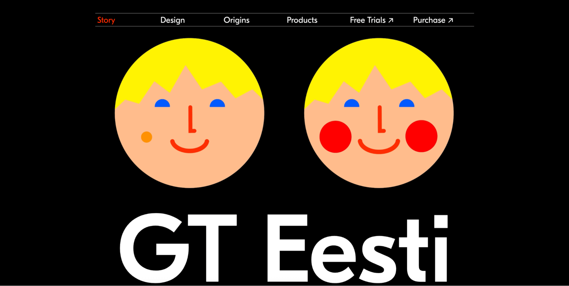
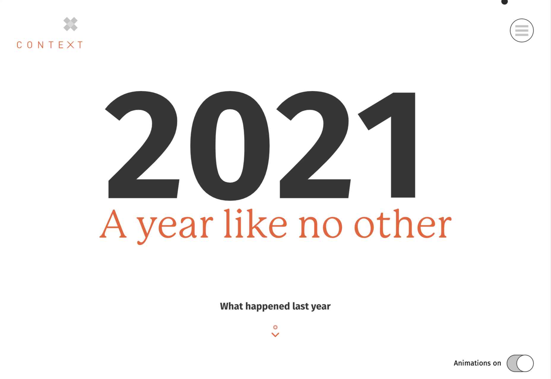
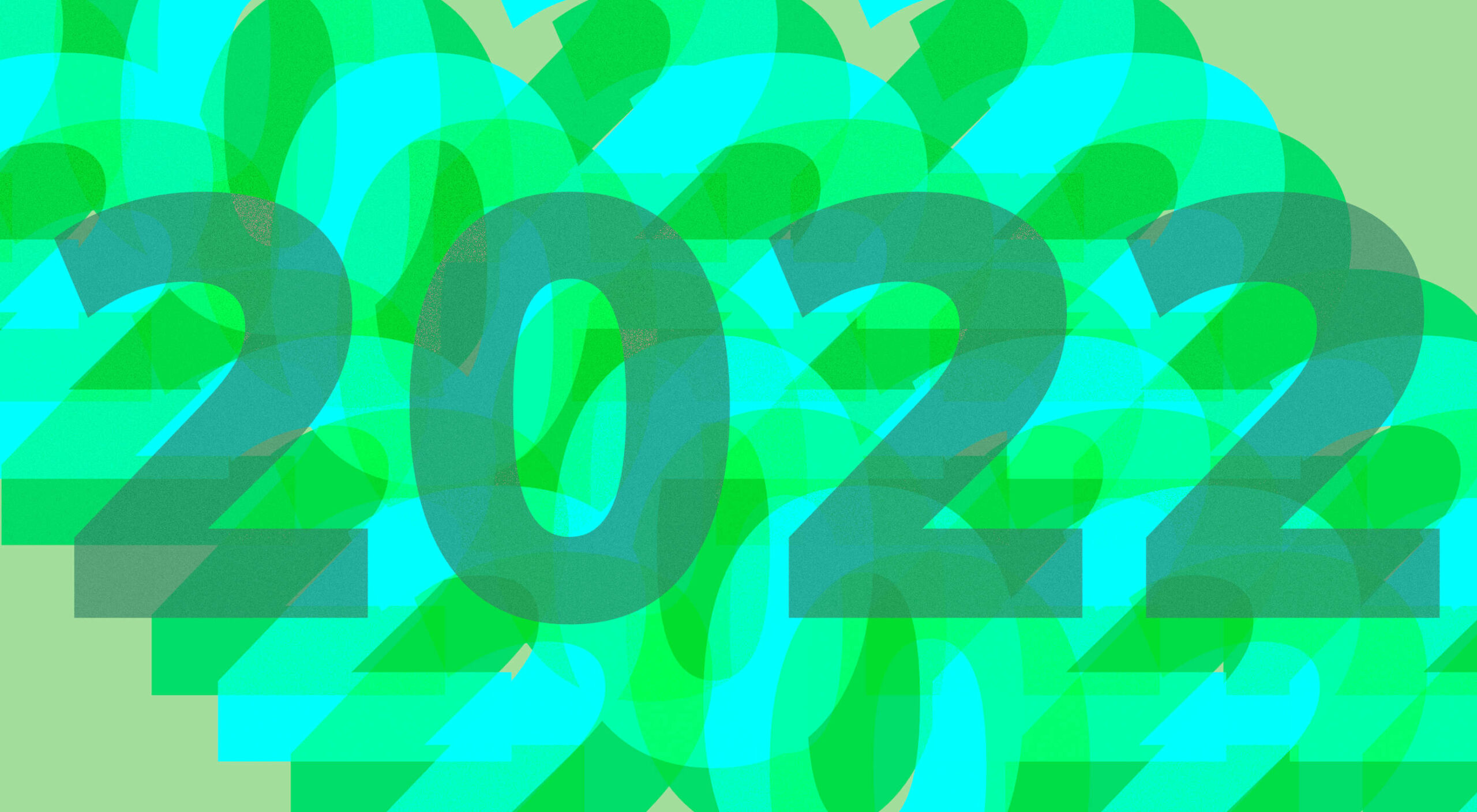
Every year, at this time, blogs like this one like to try and predict what’s going to happen in the year ahead. It’s a way of drawing a line under the archive and starting afresh. A rejuvenation that, as humans, we find life-affirming.
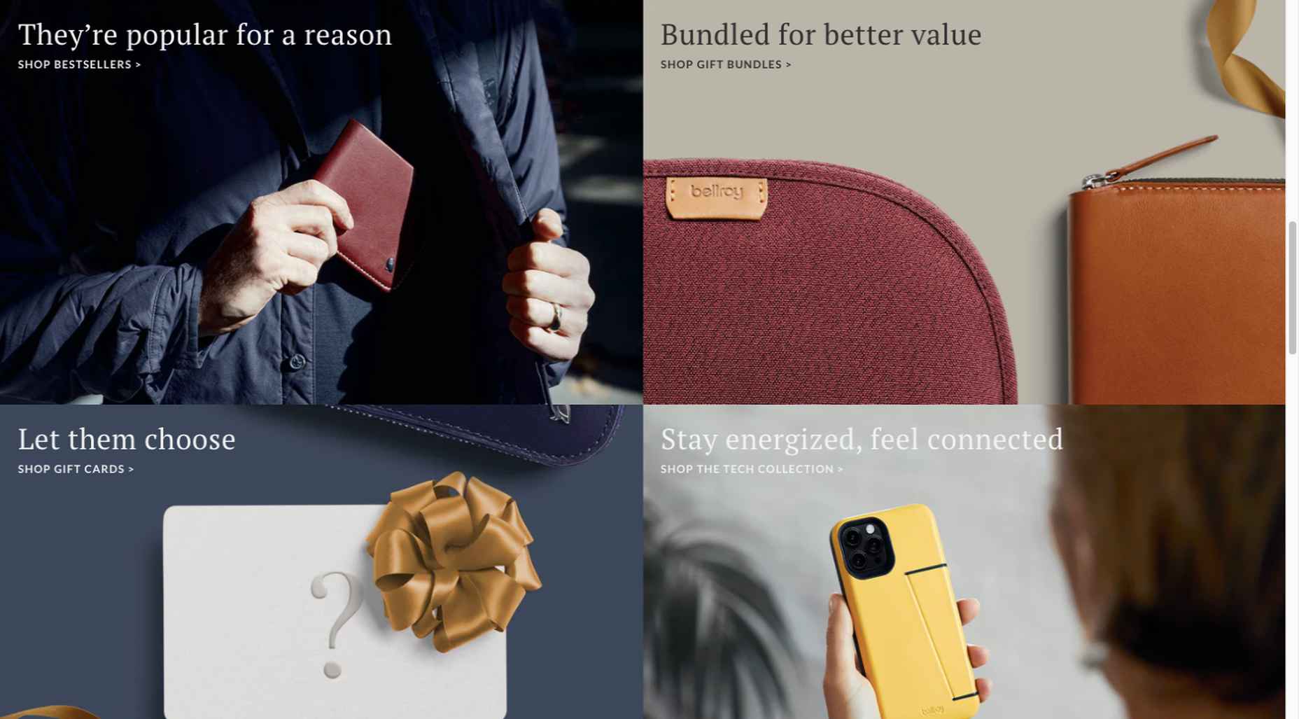
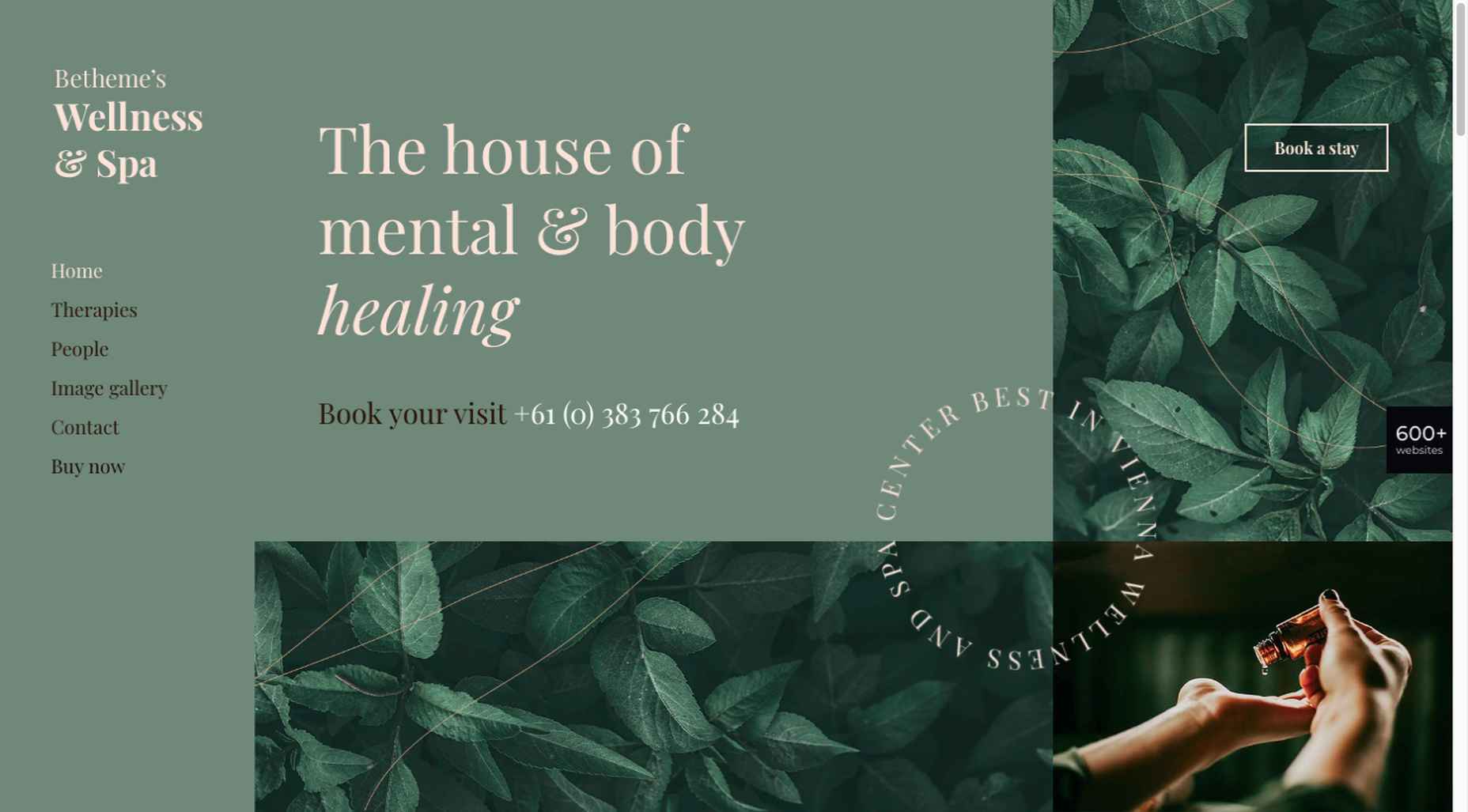
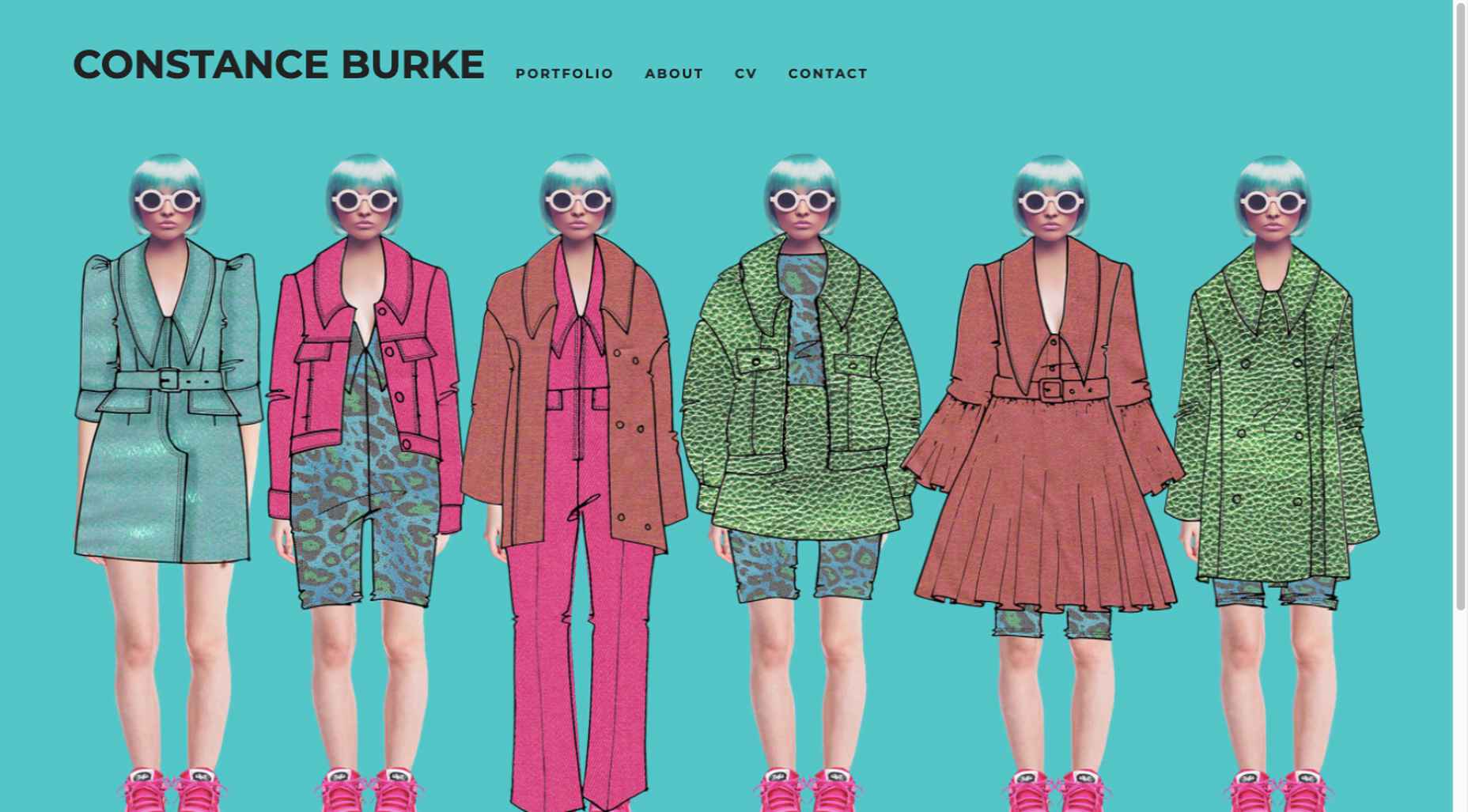
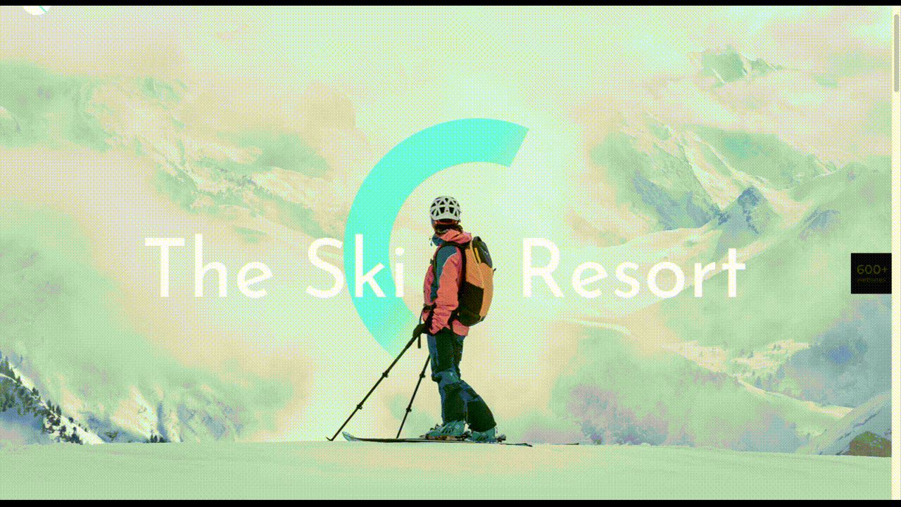
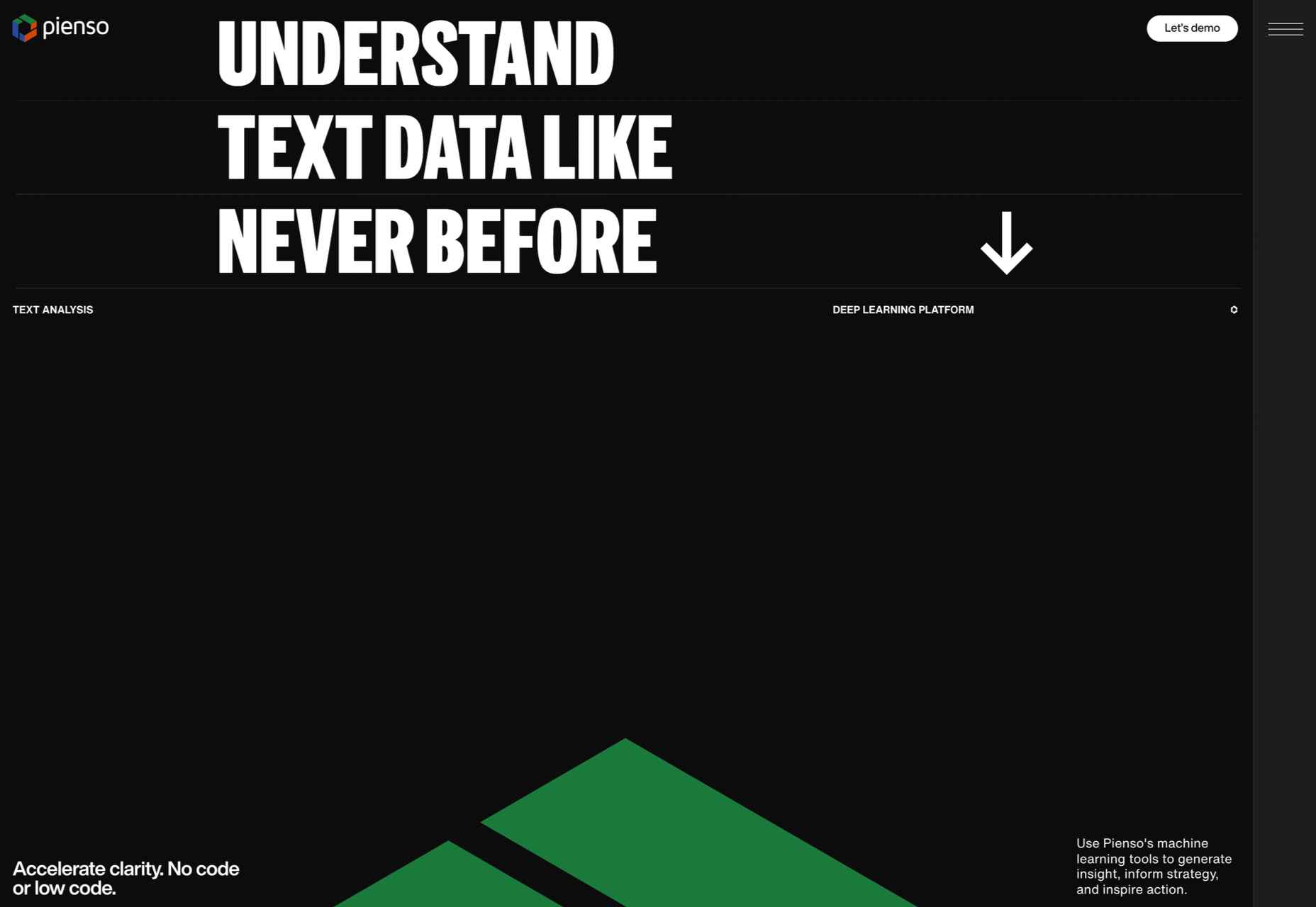
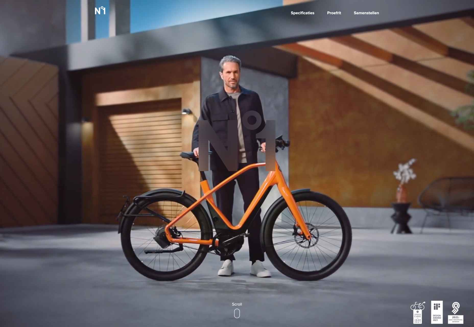
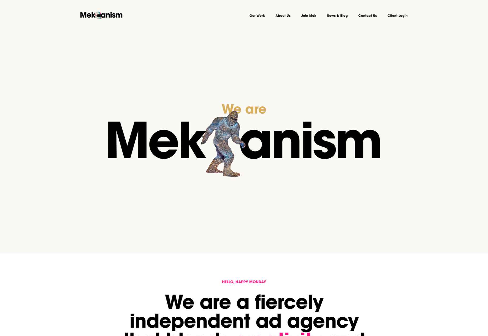
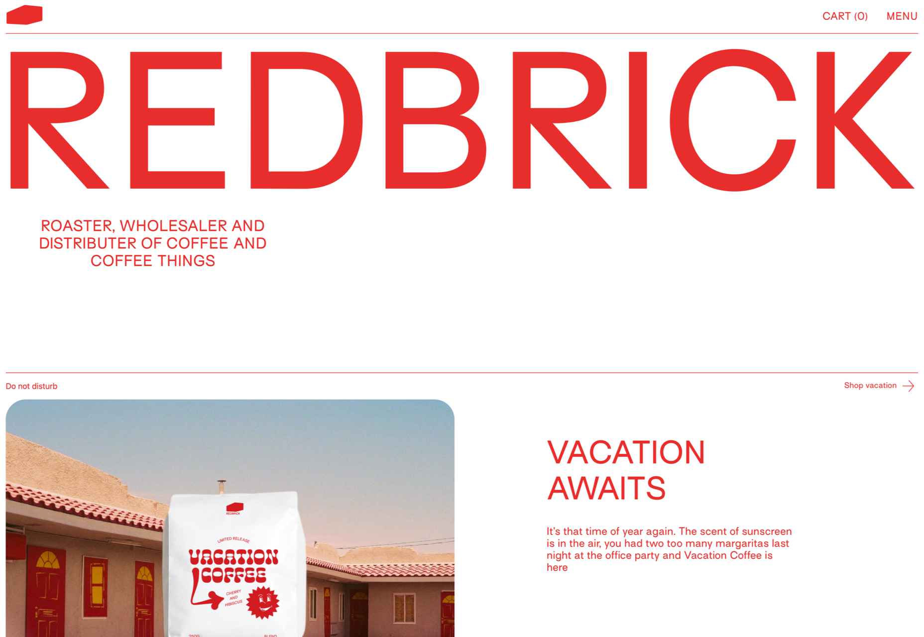
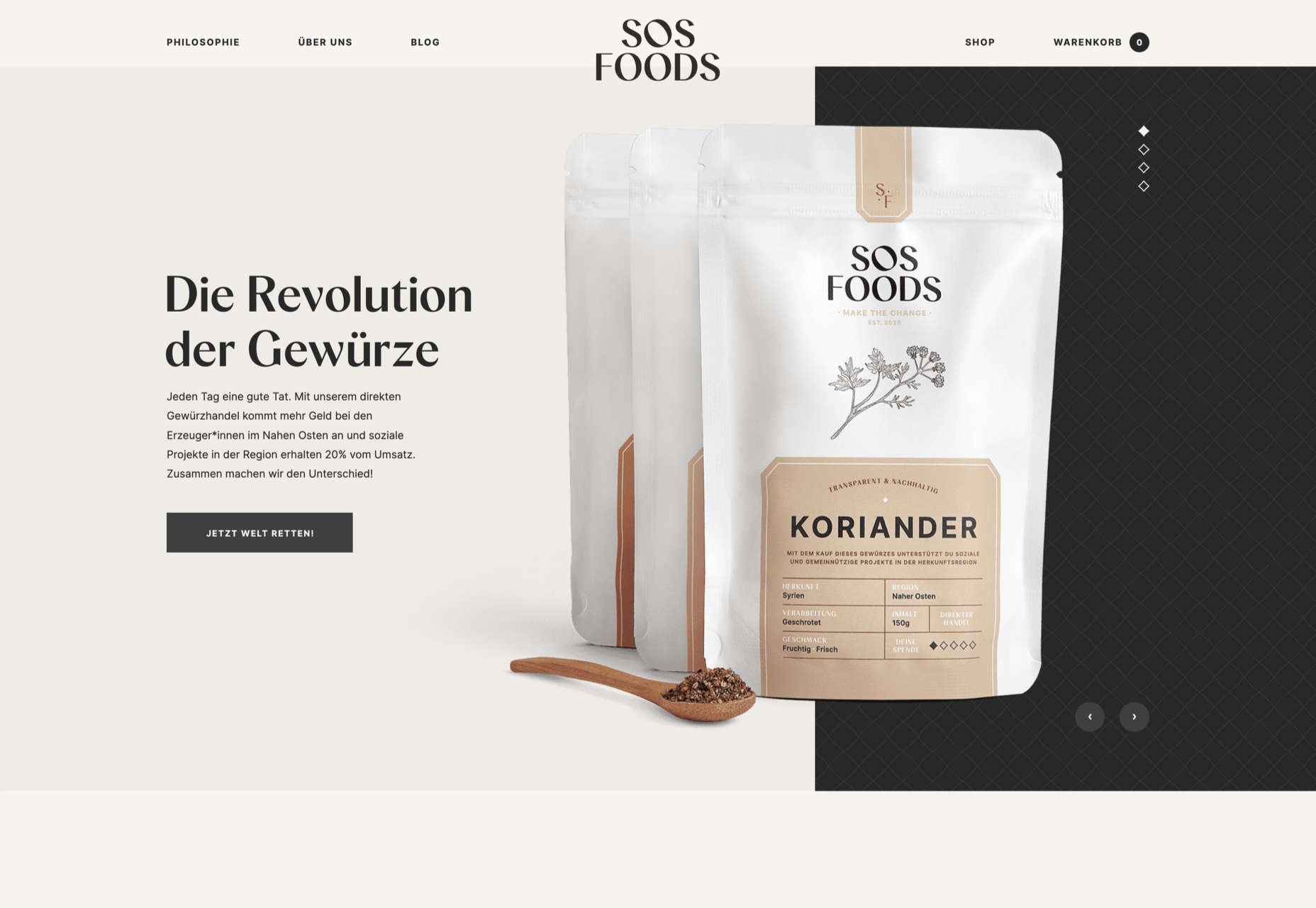
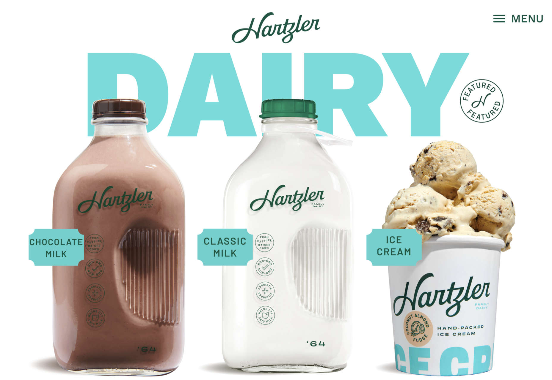
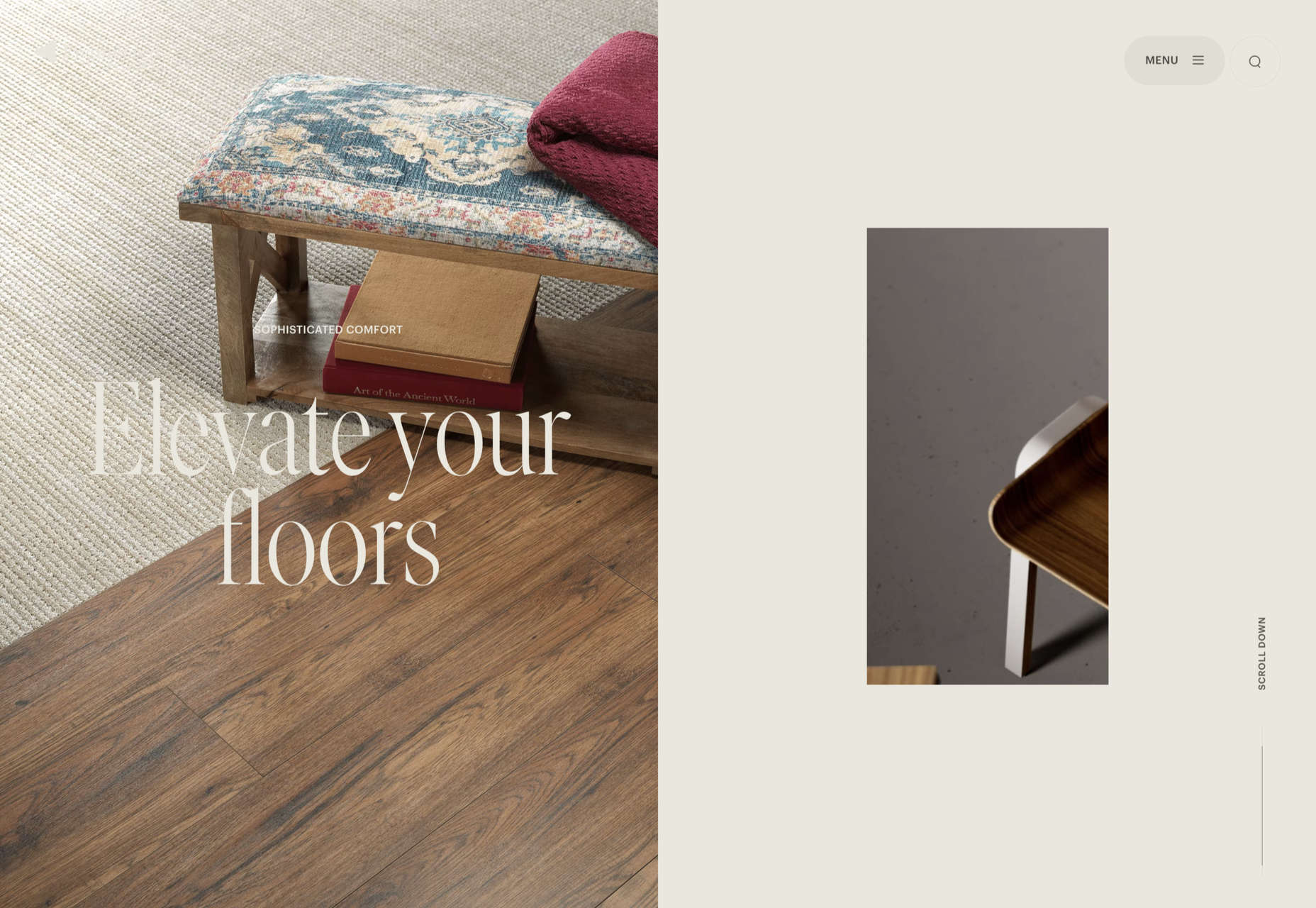
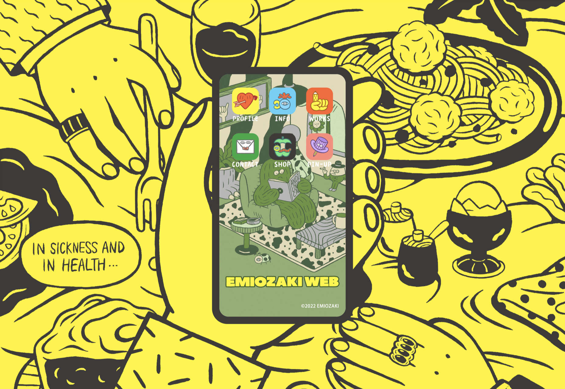
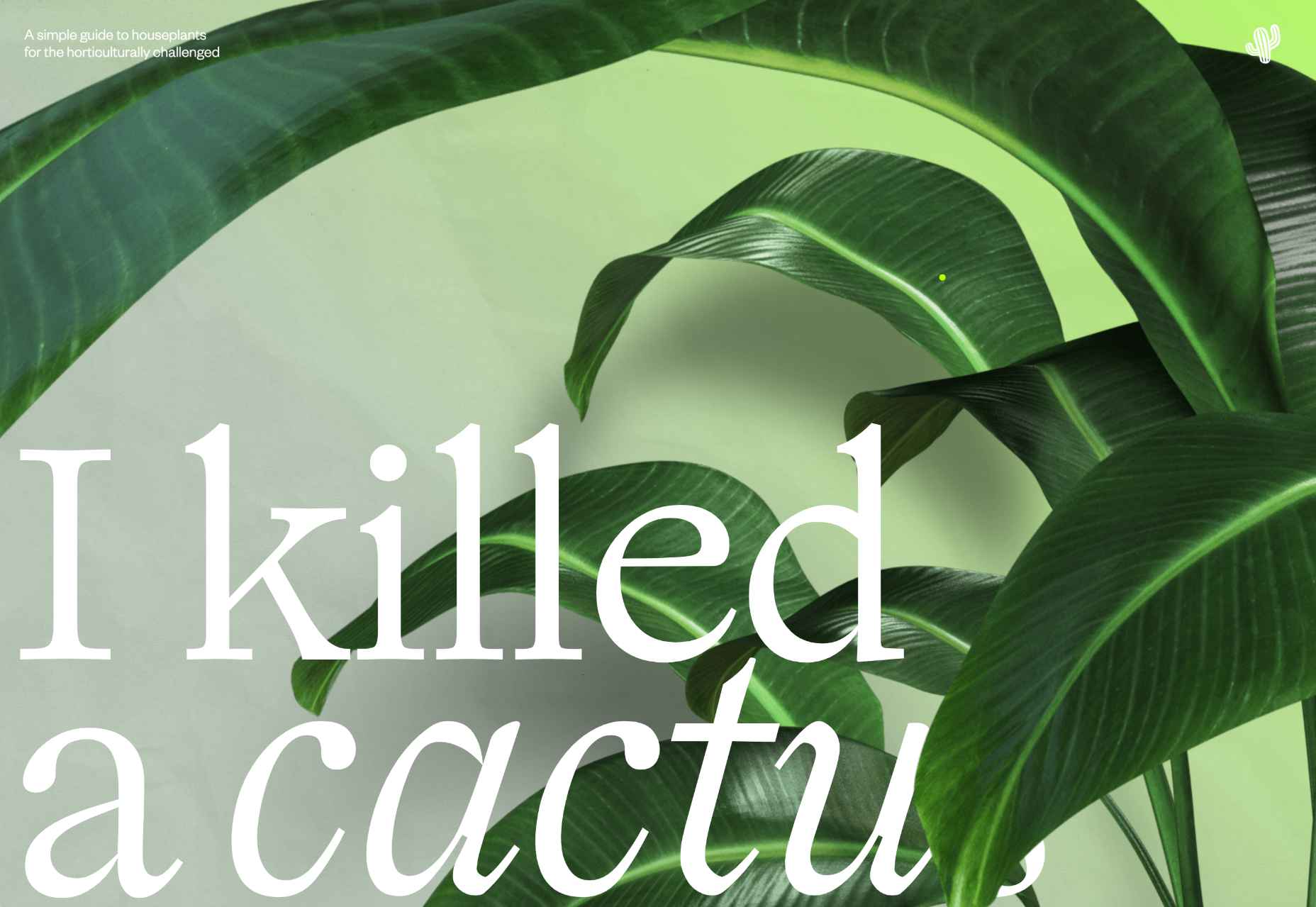
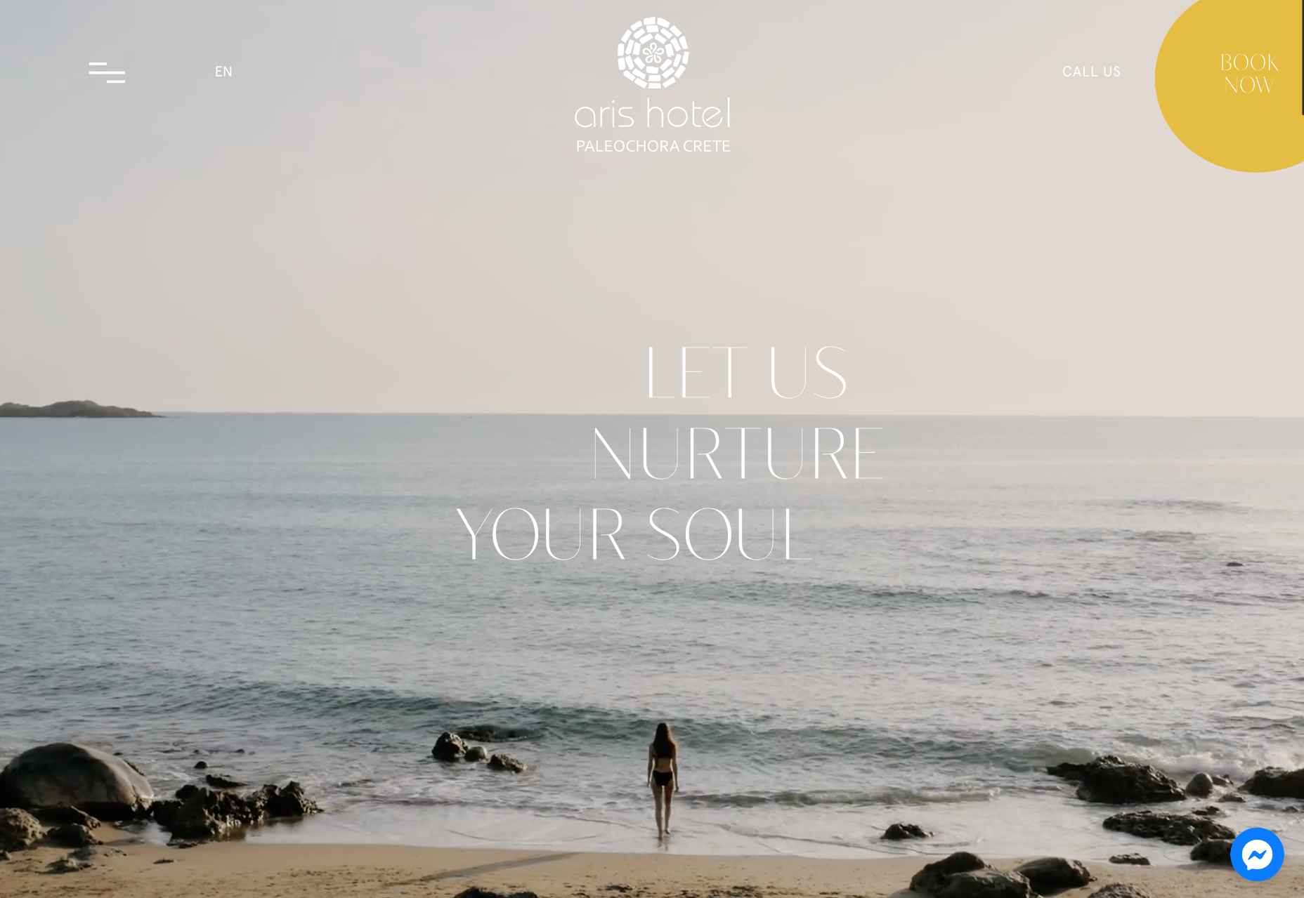
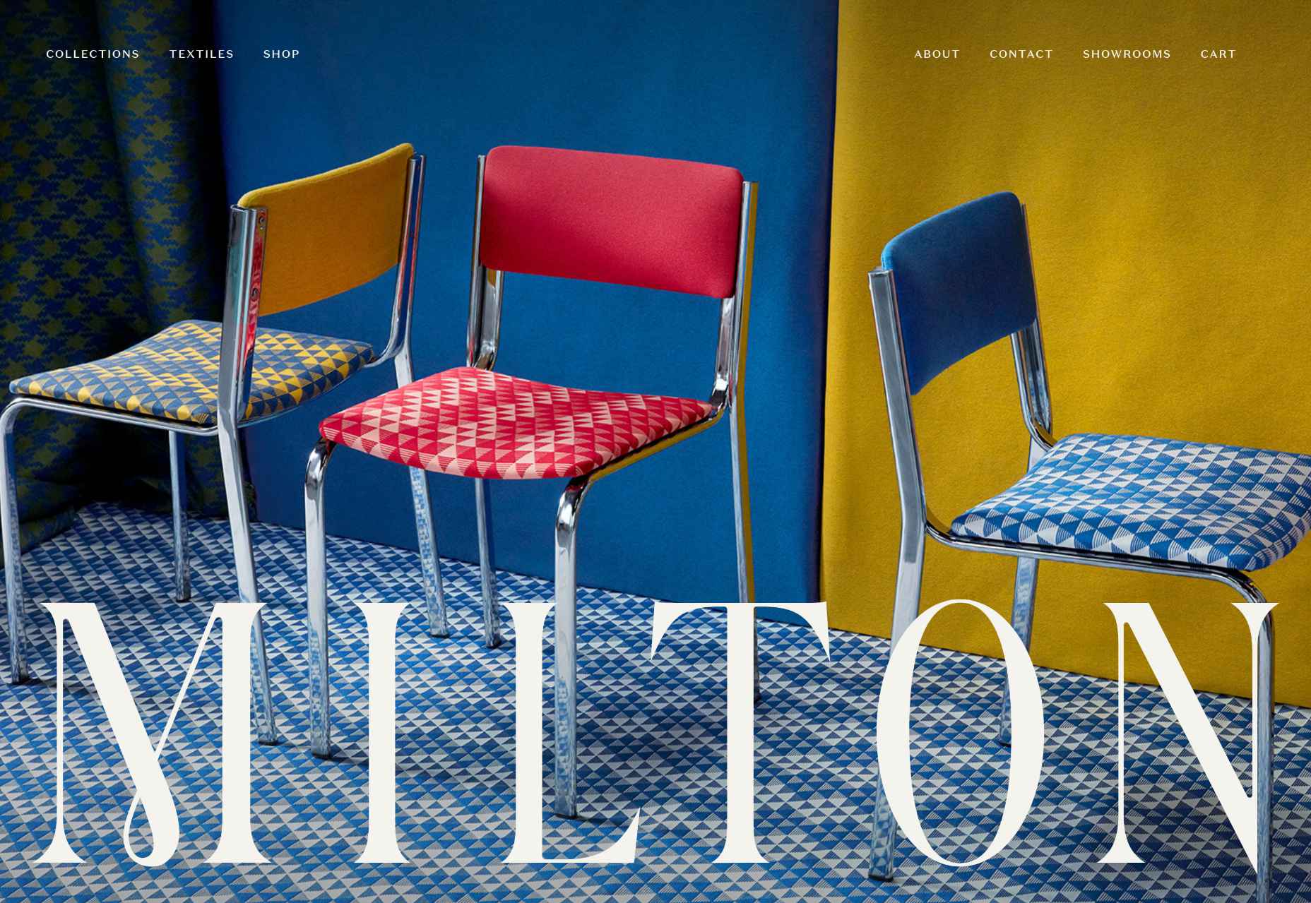
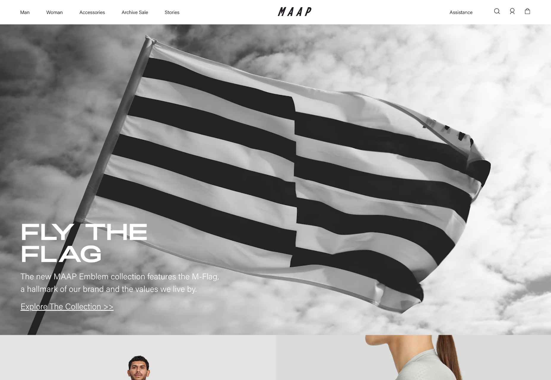
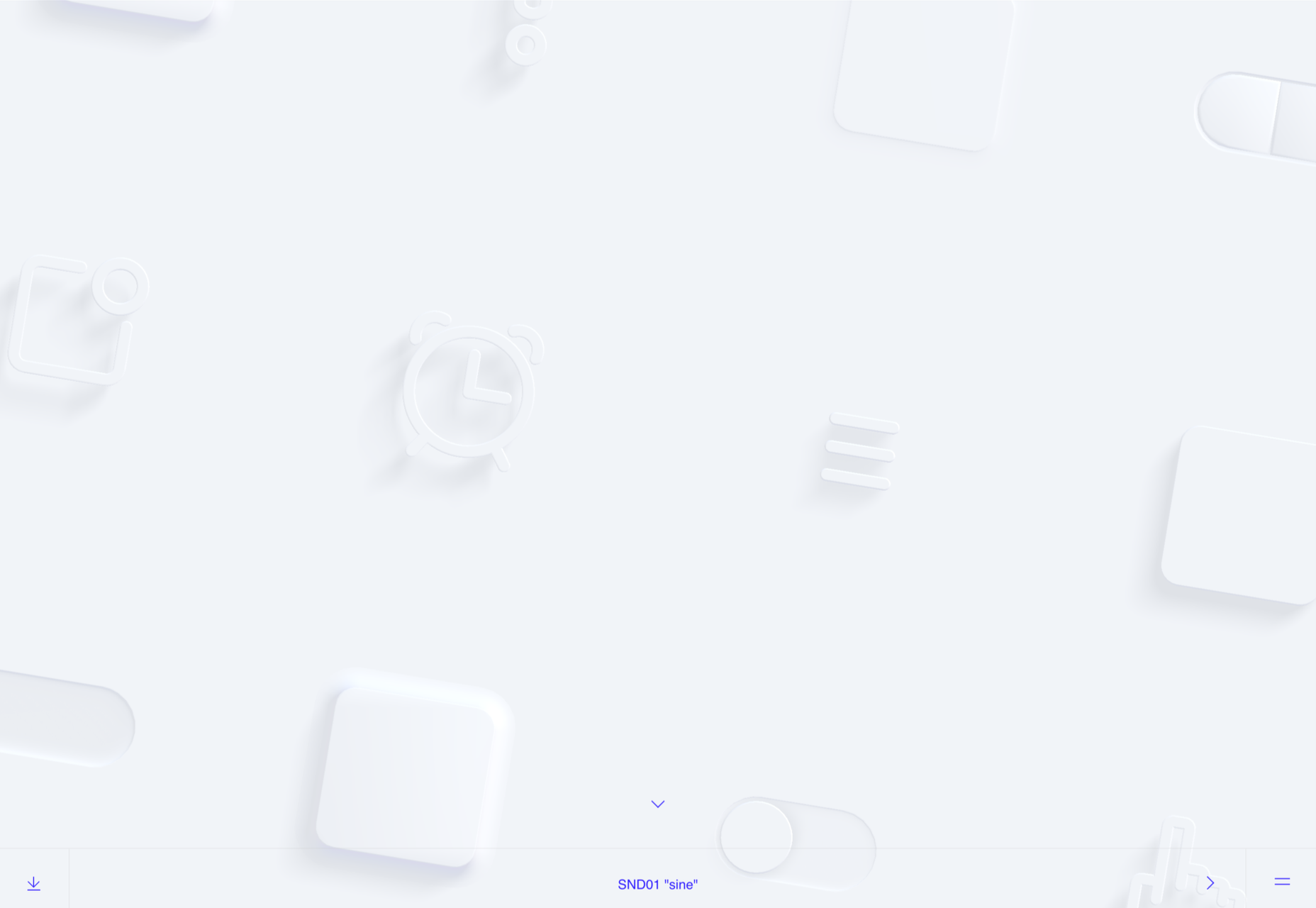
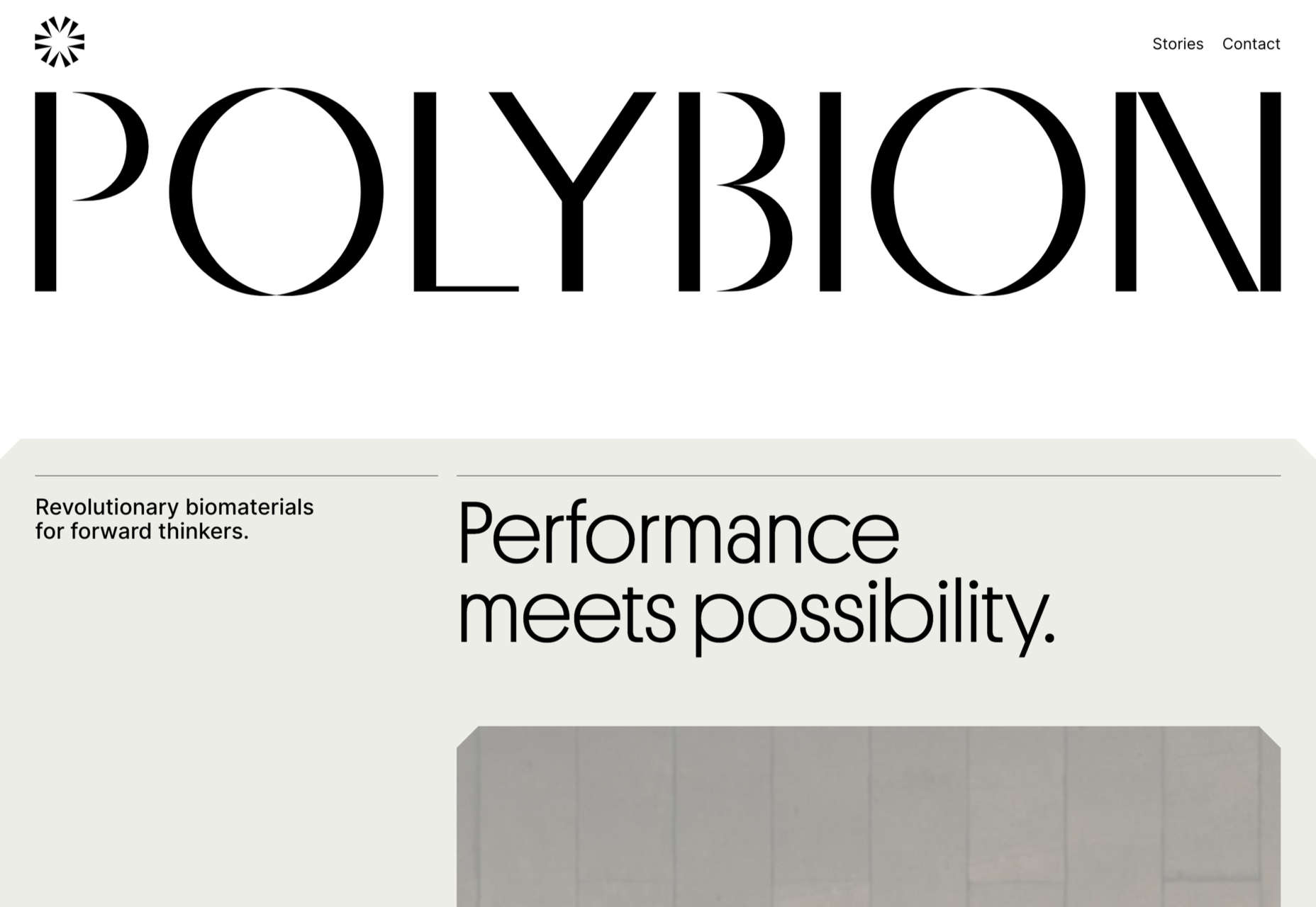
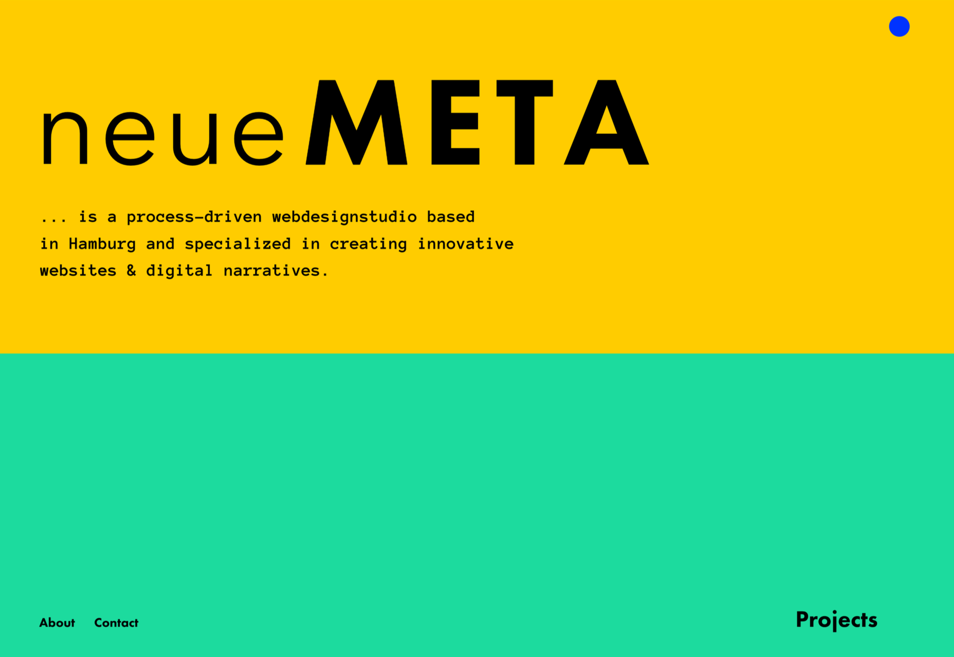
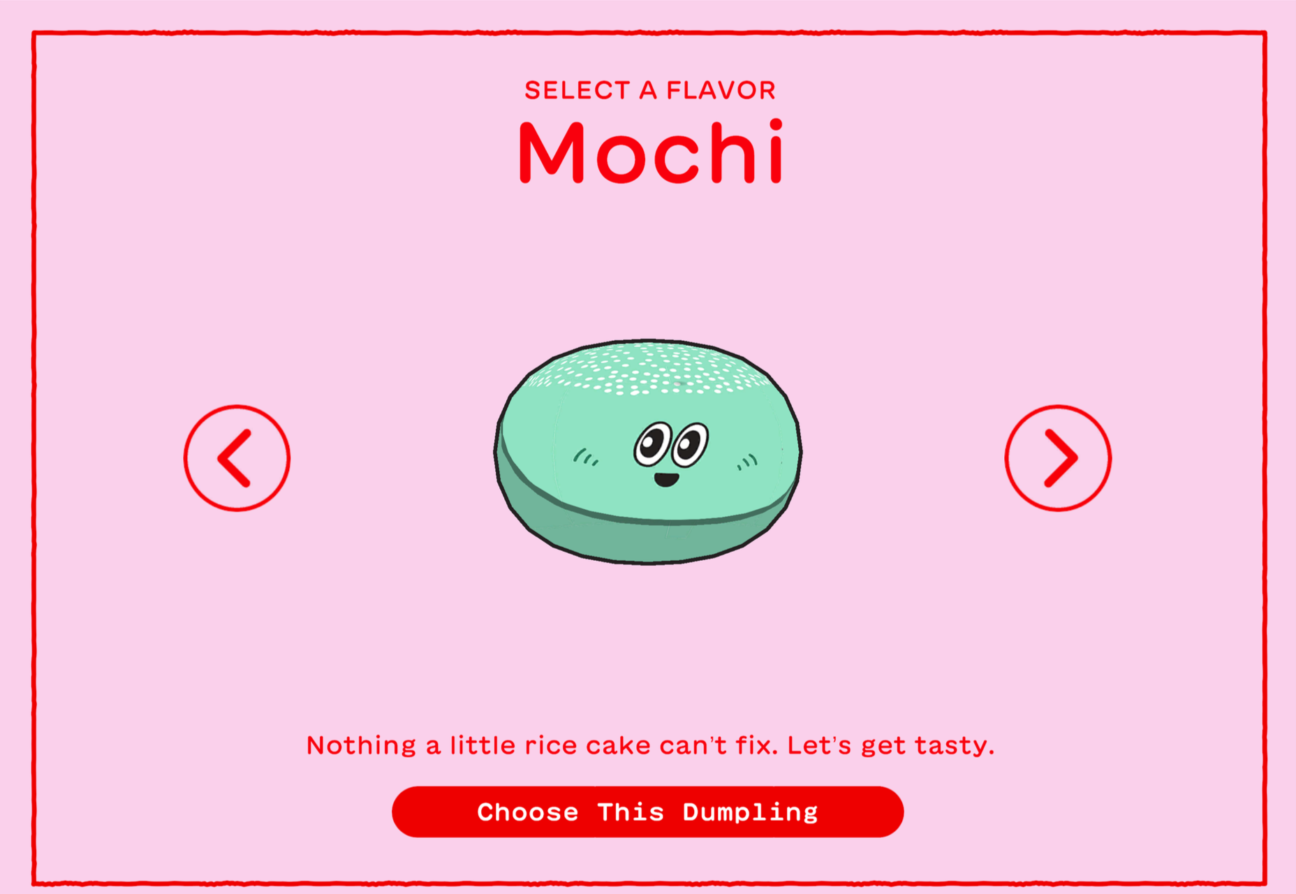
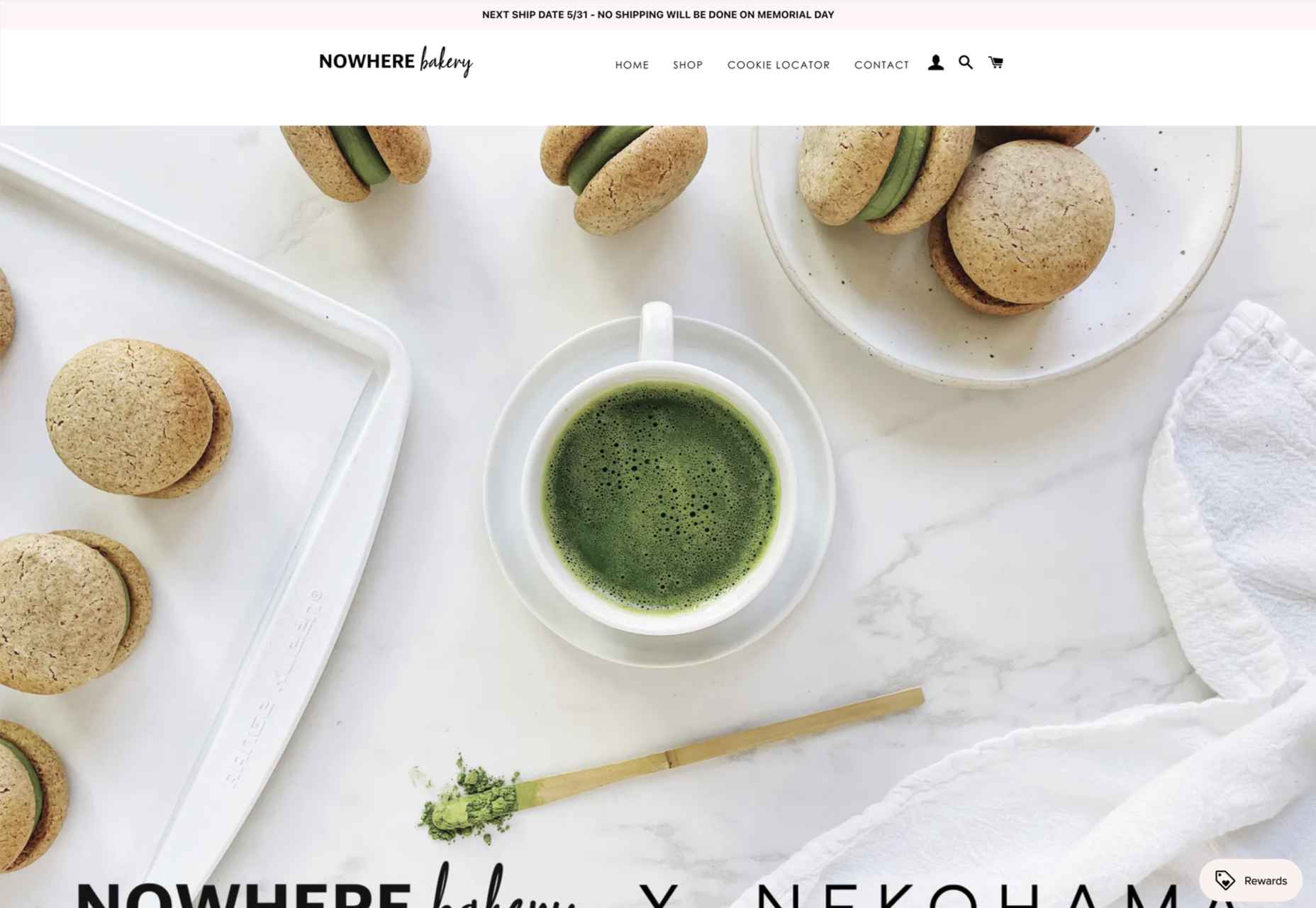
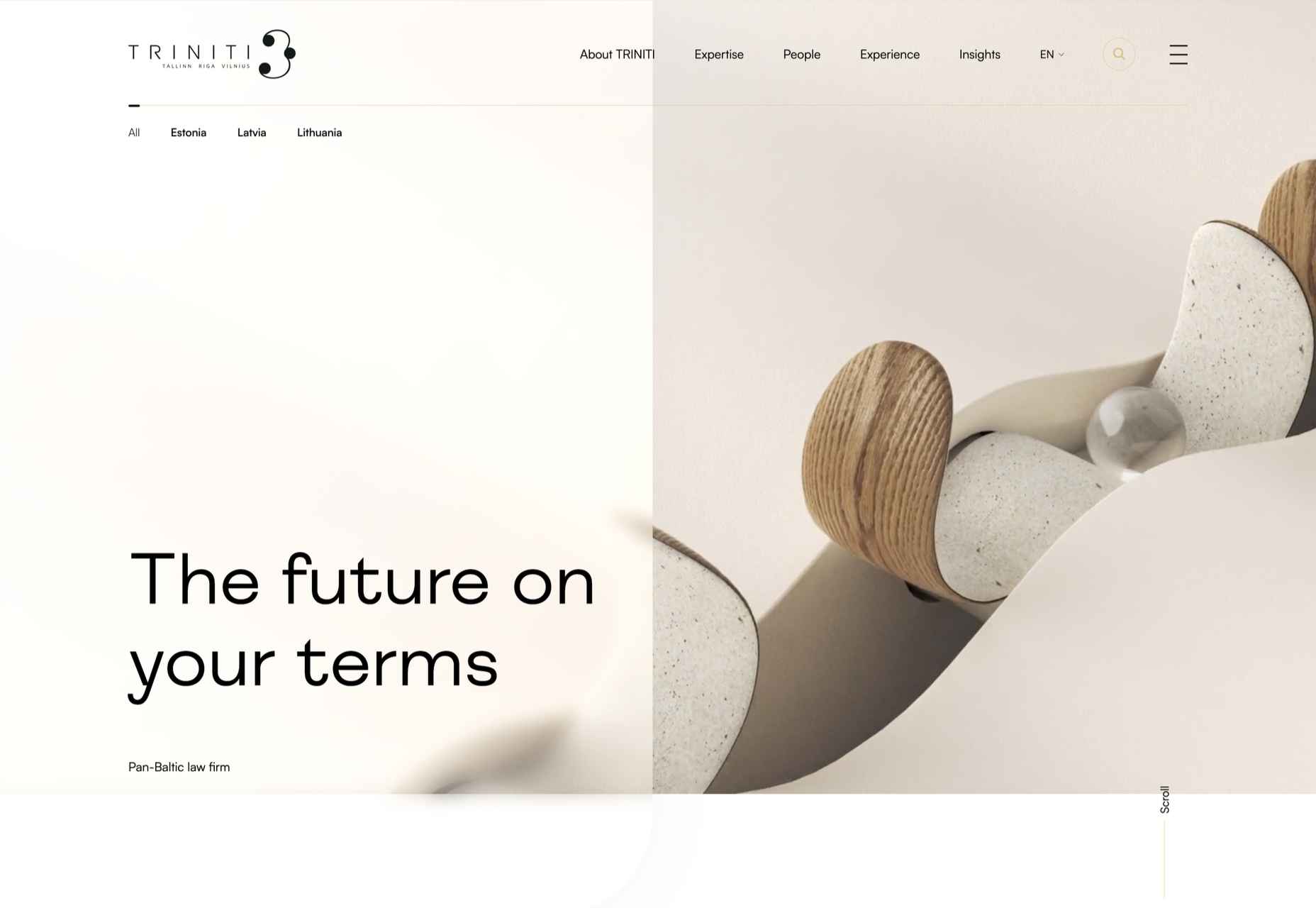
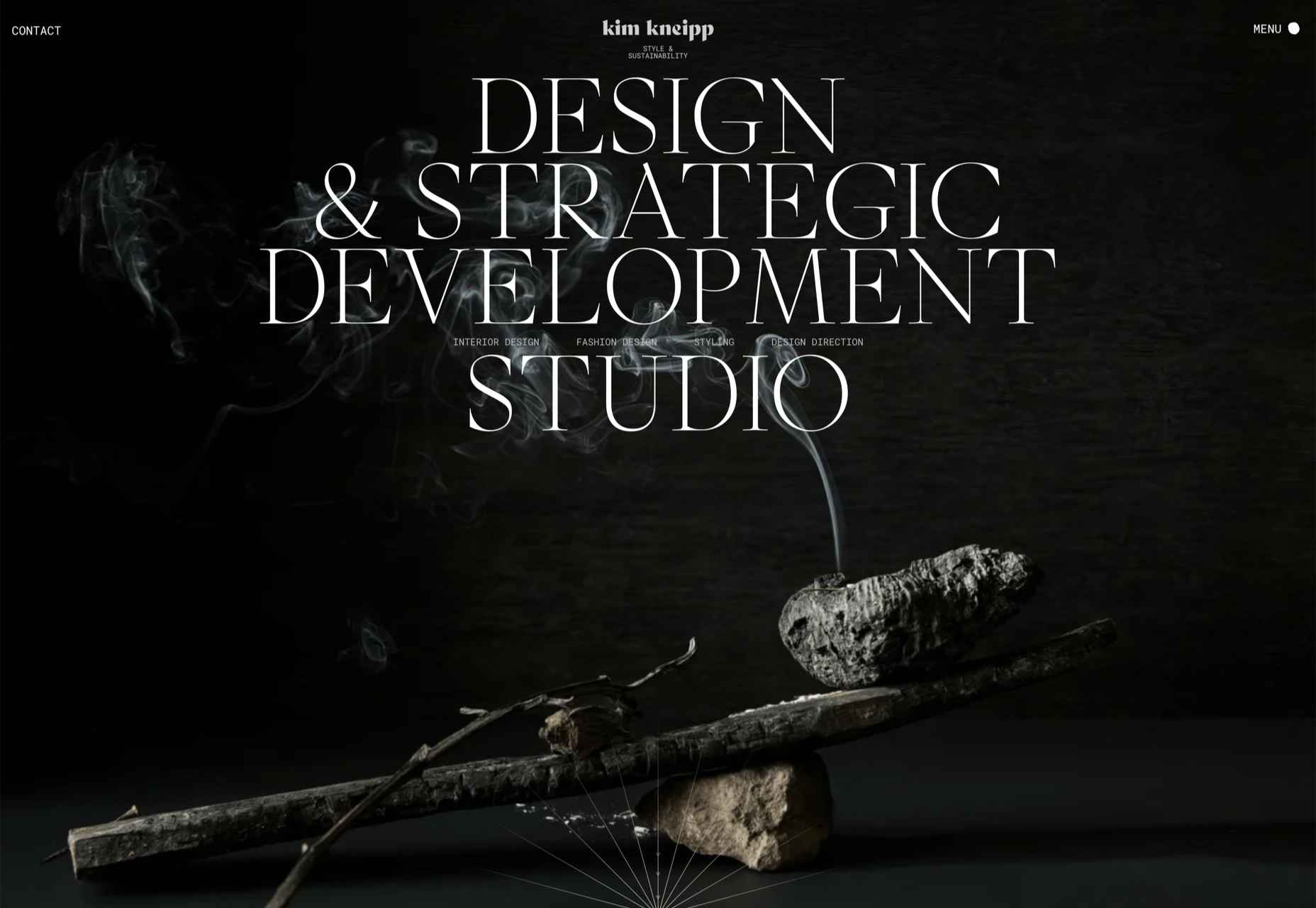
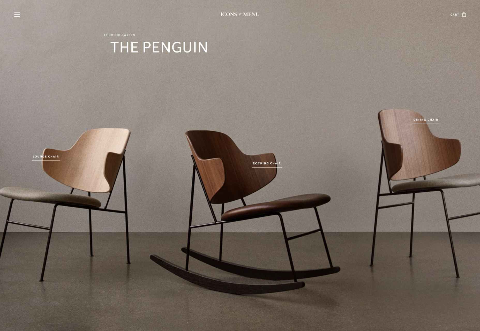
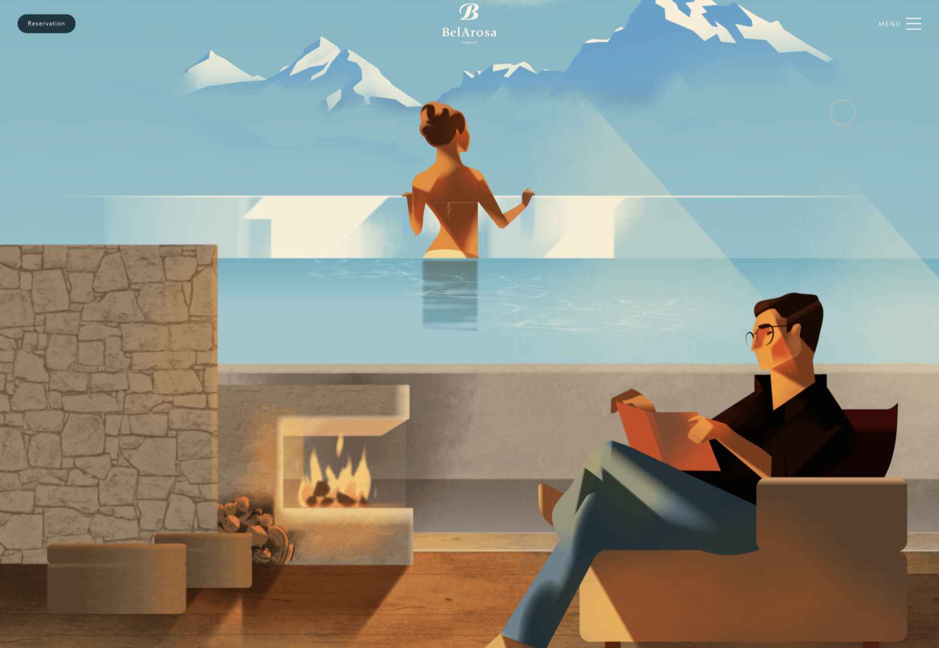
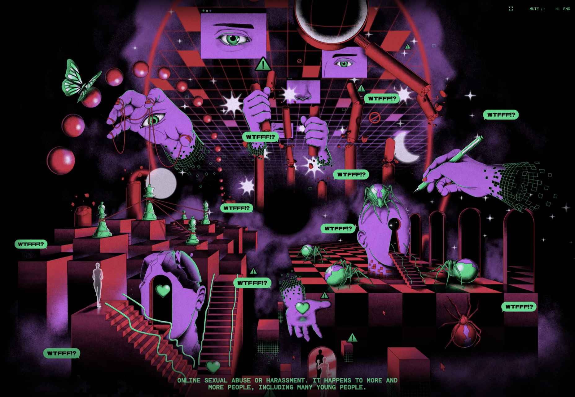
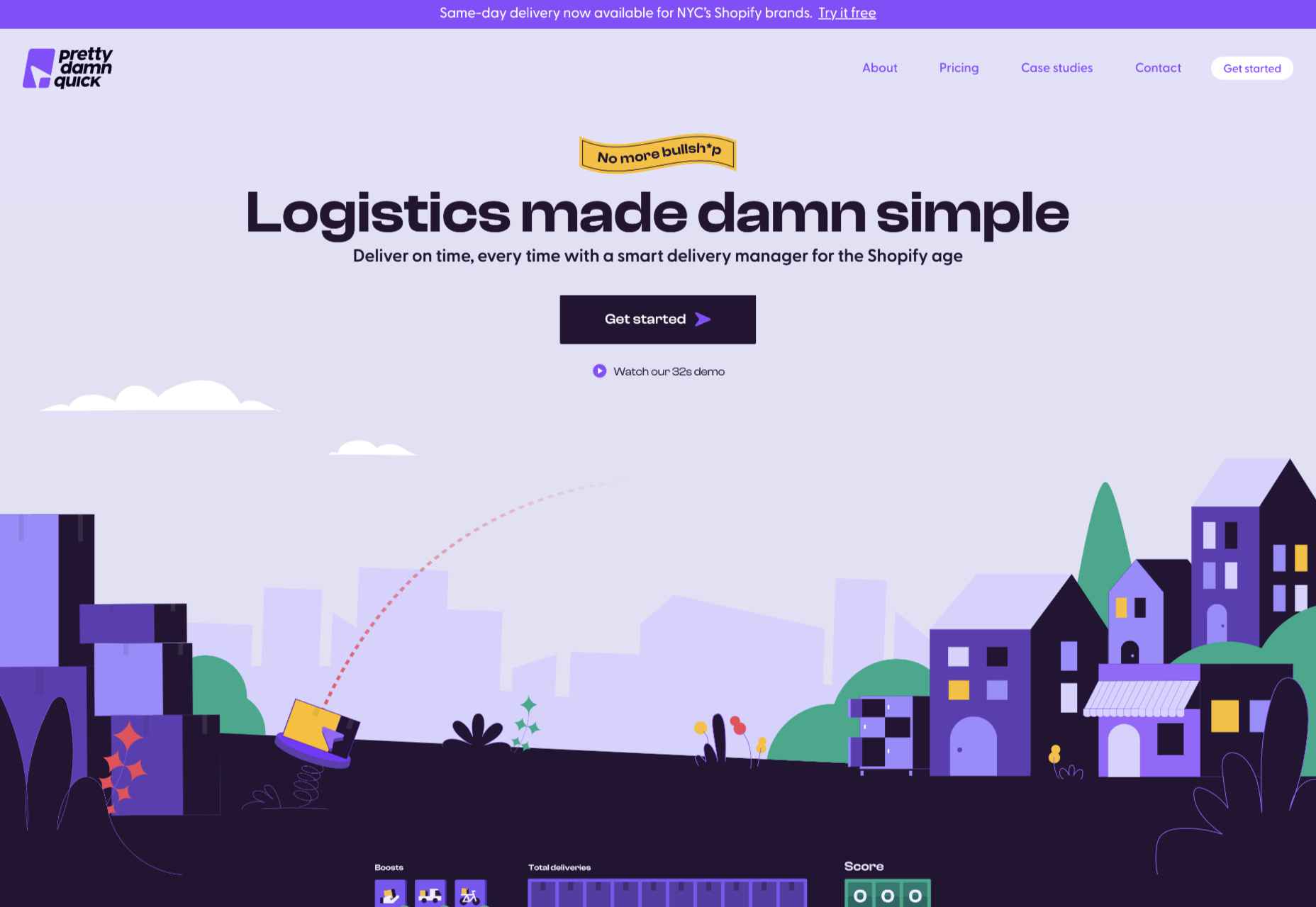
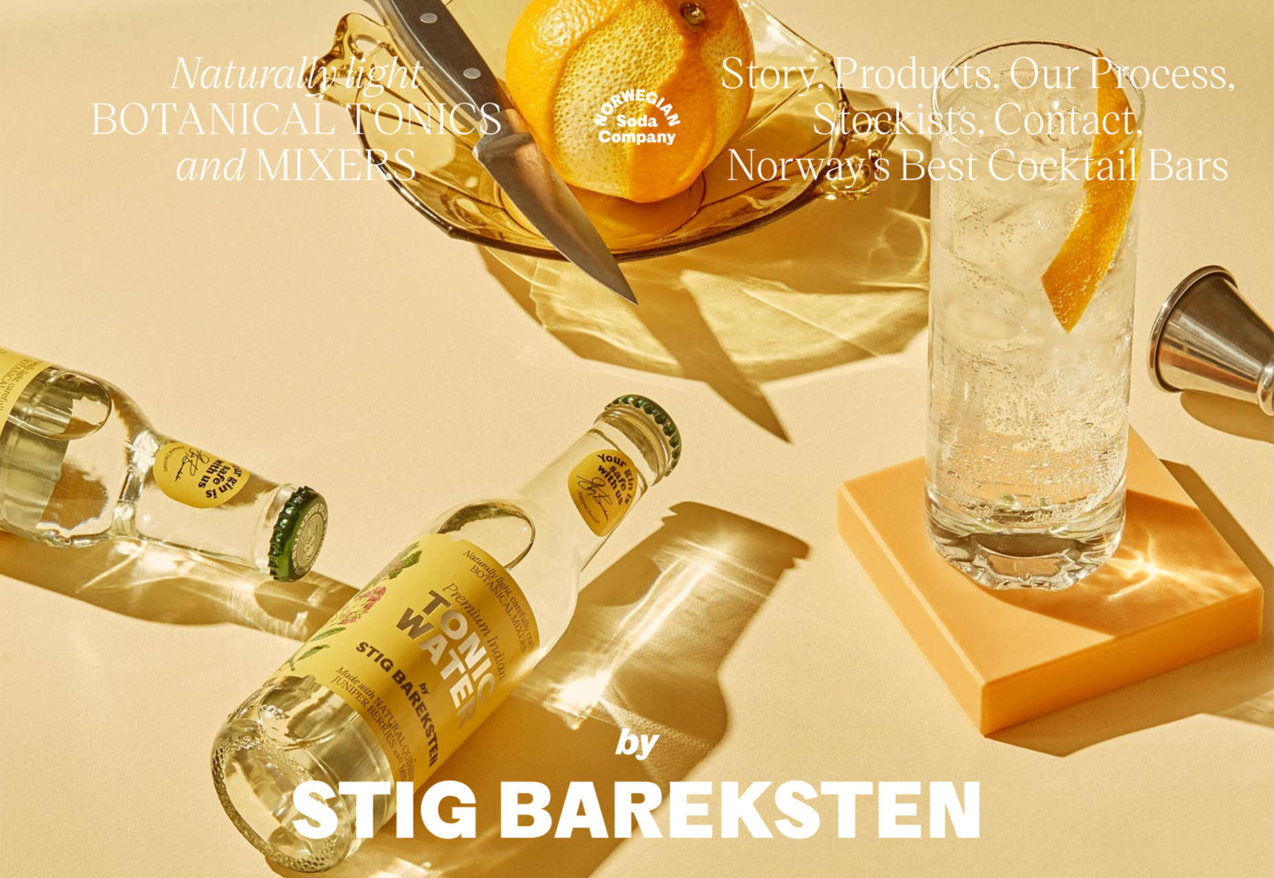
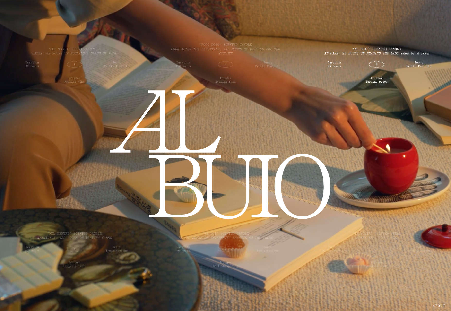
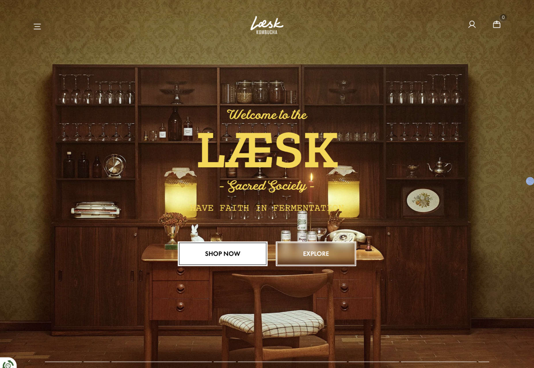
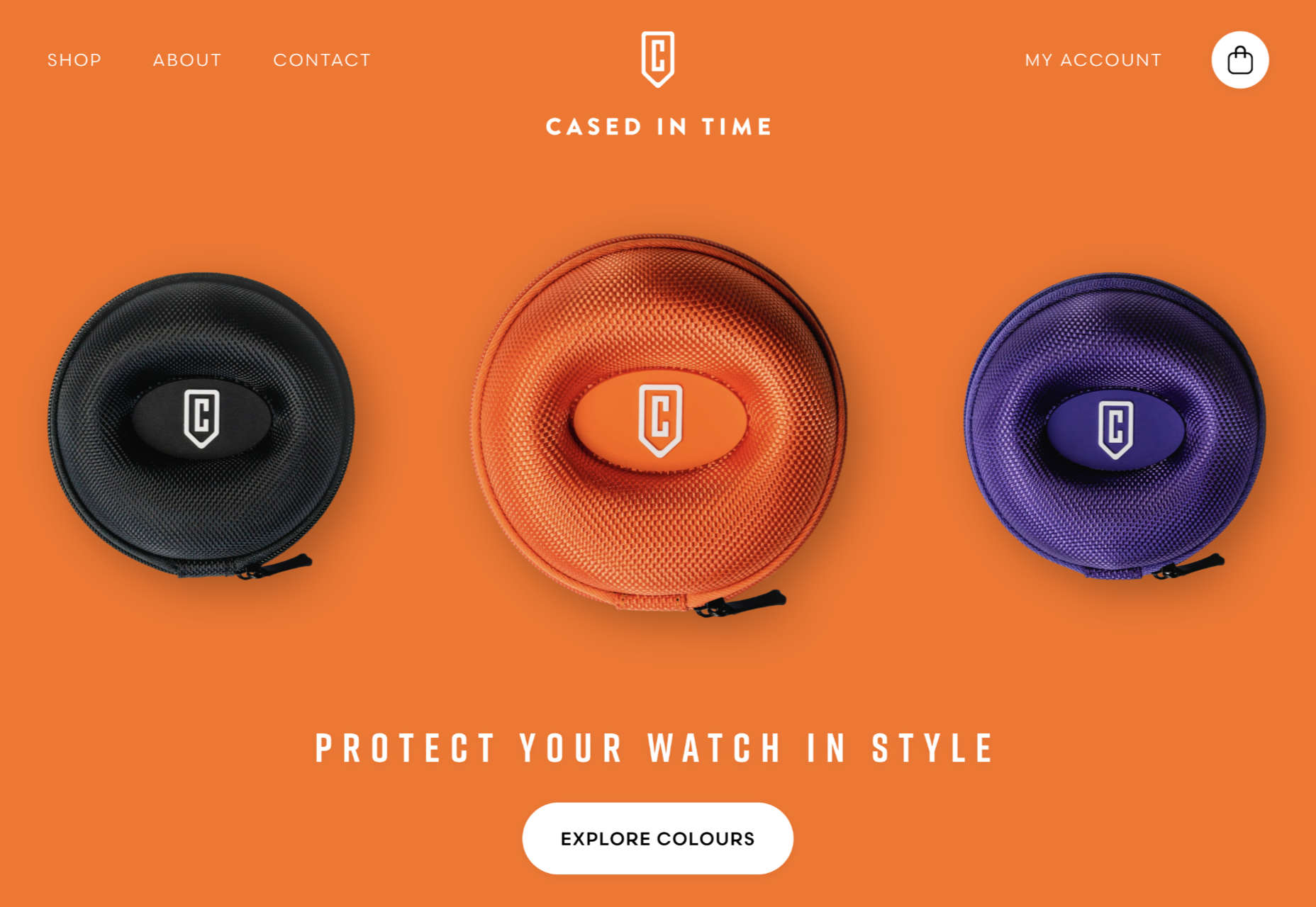
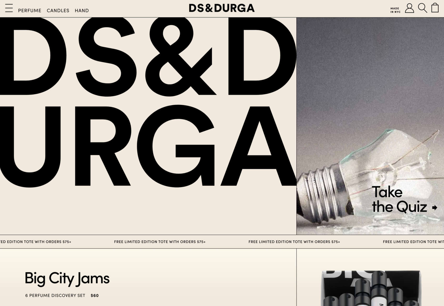
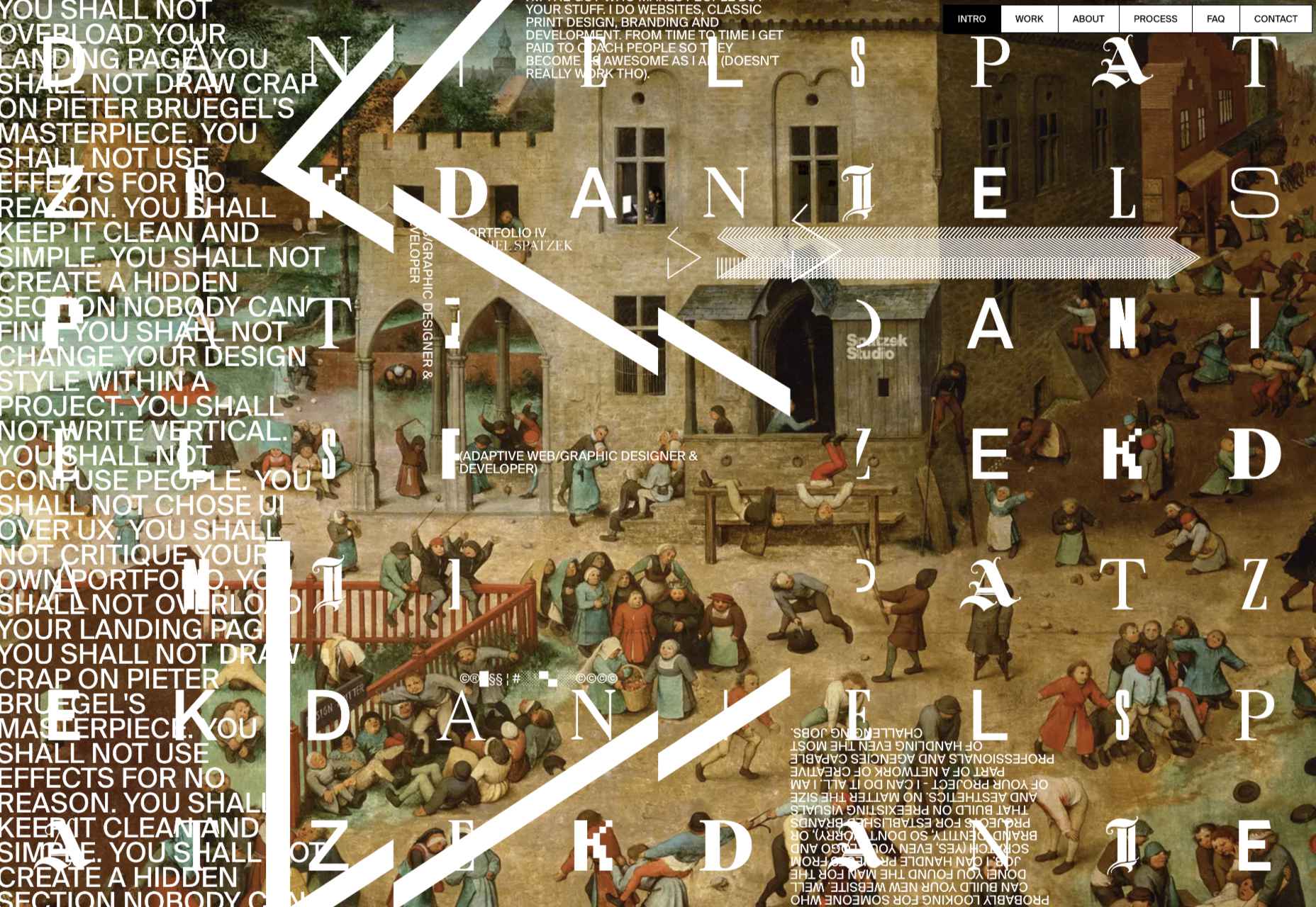
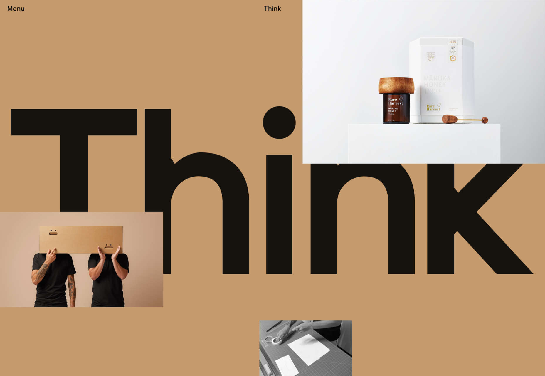
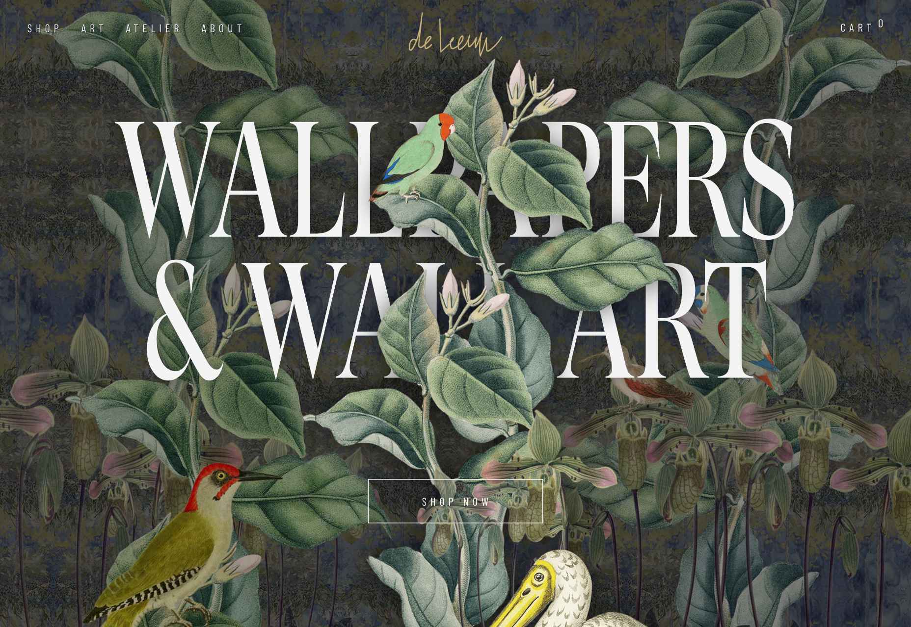
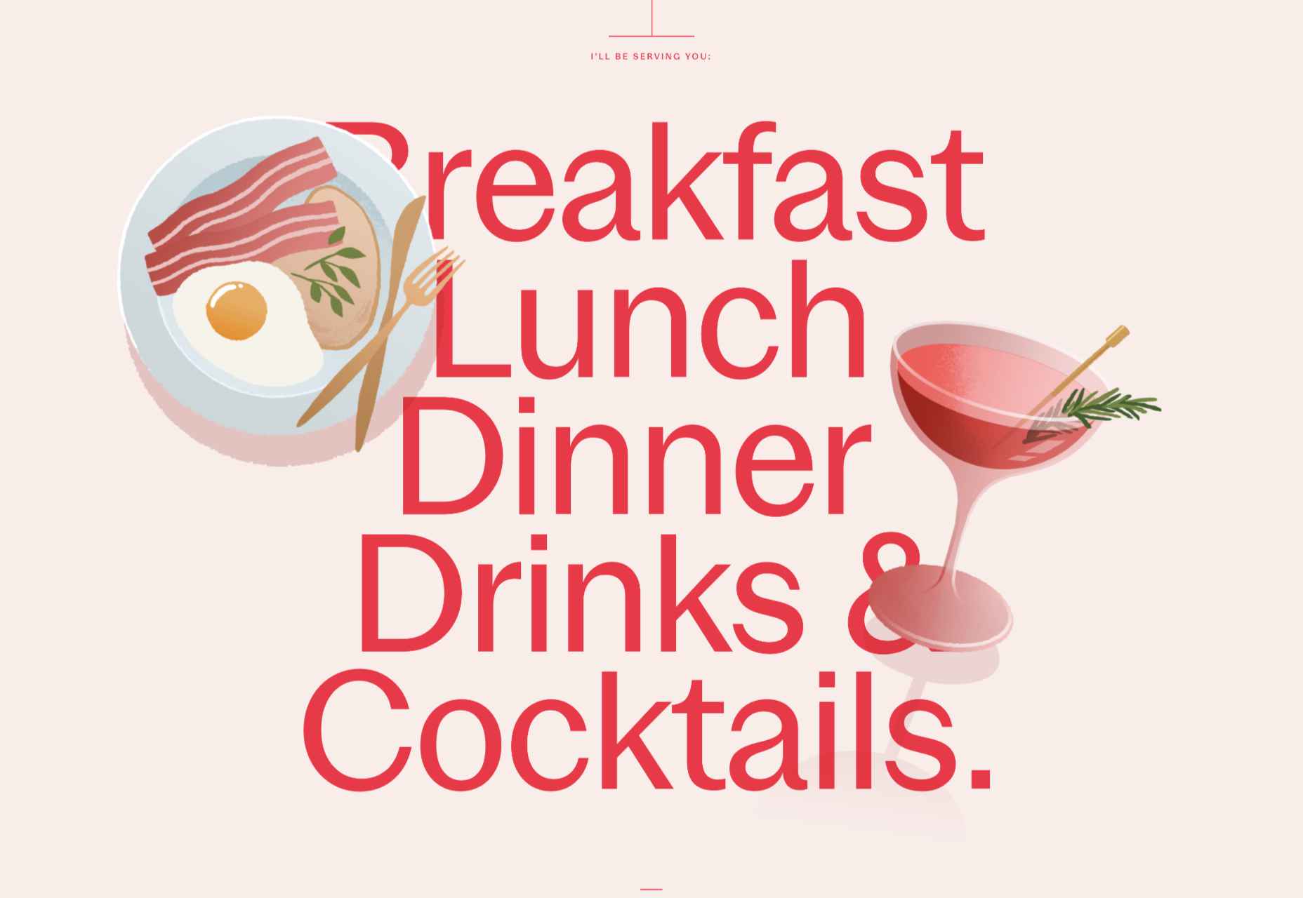
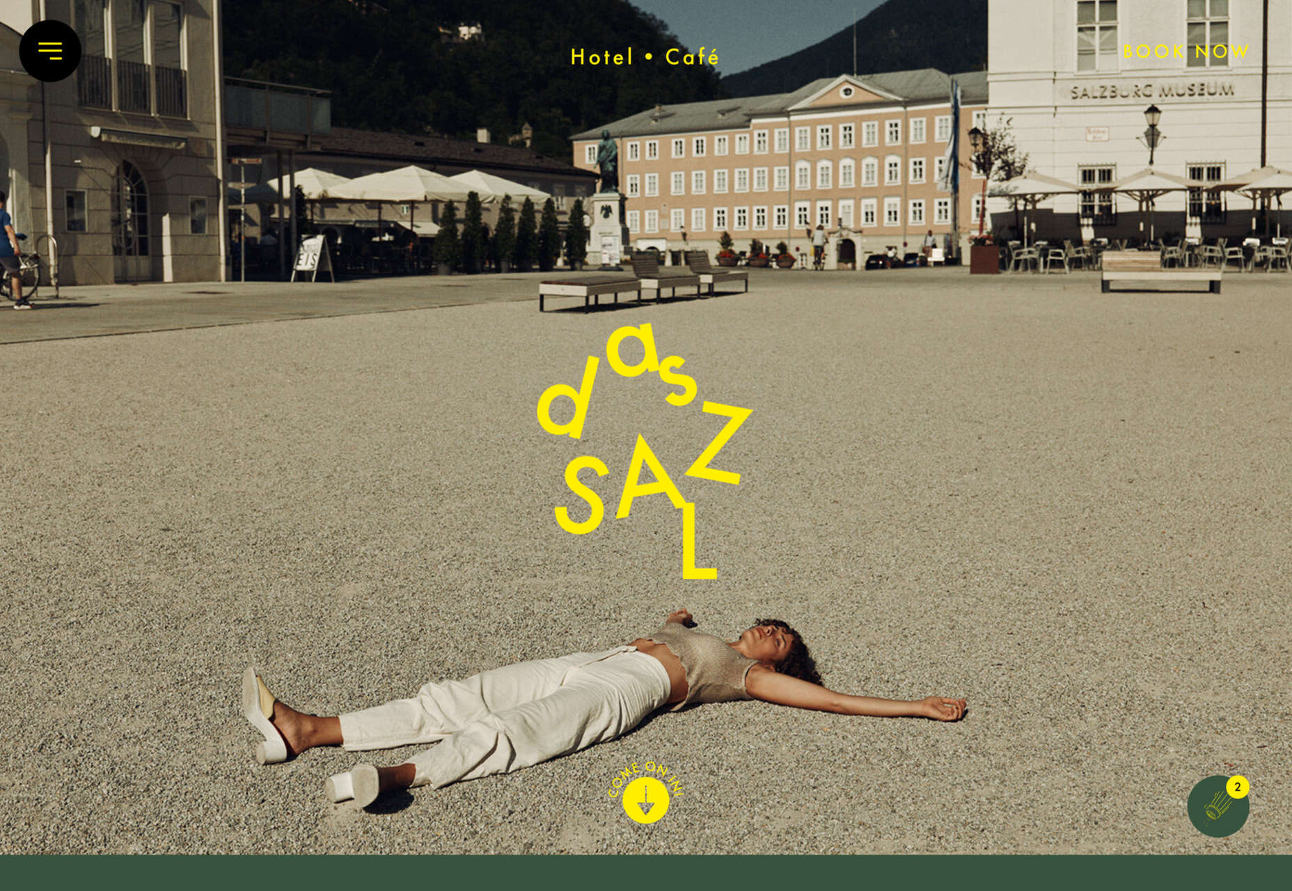
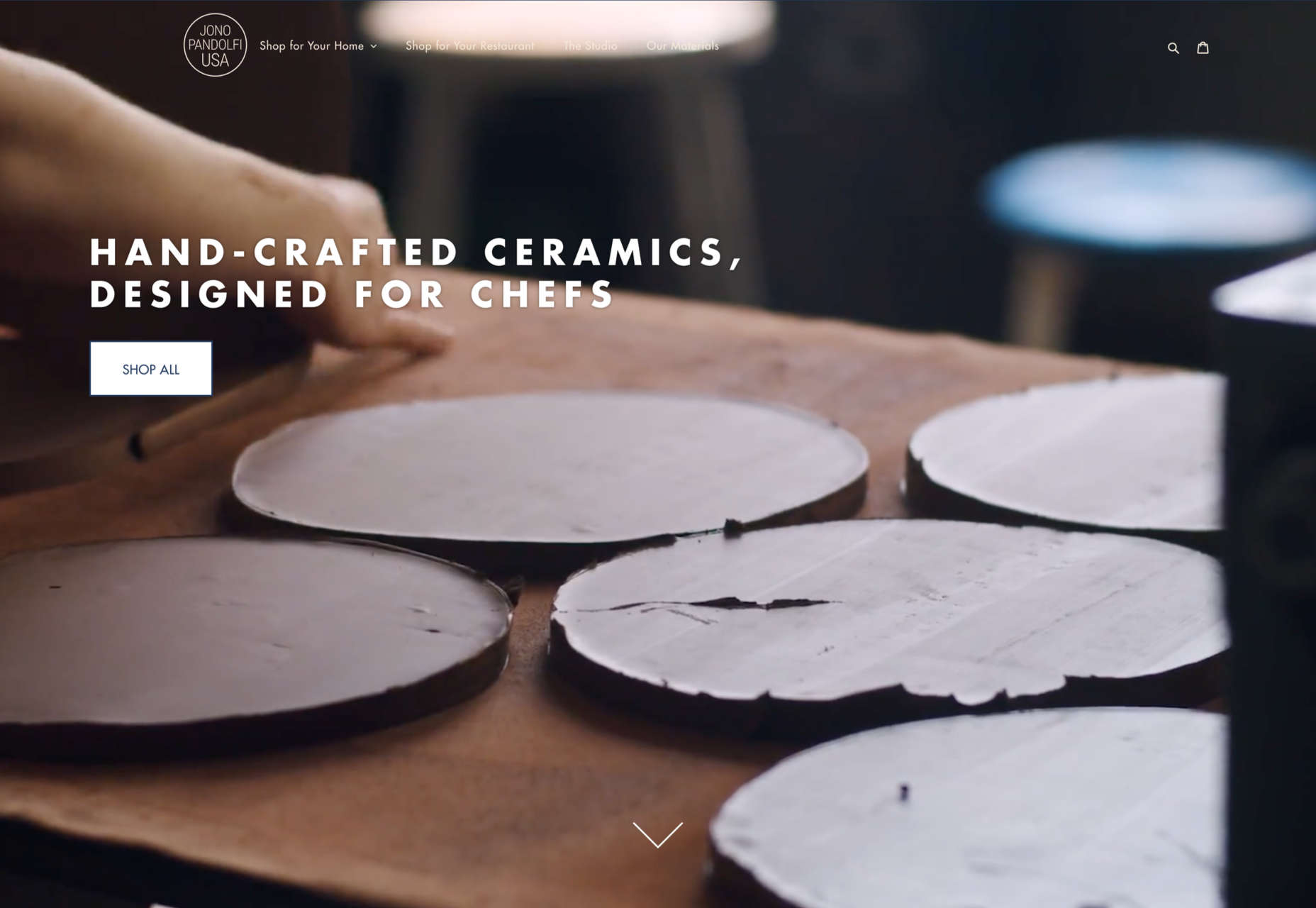
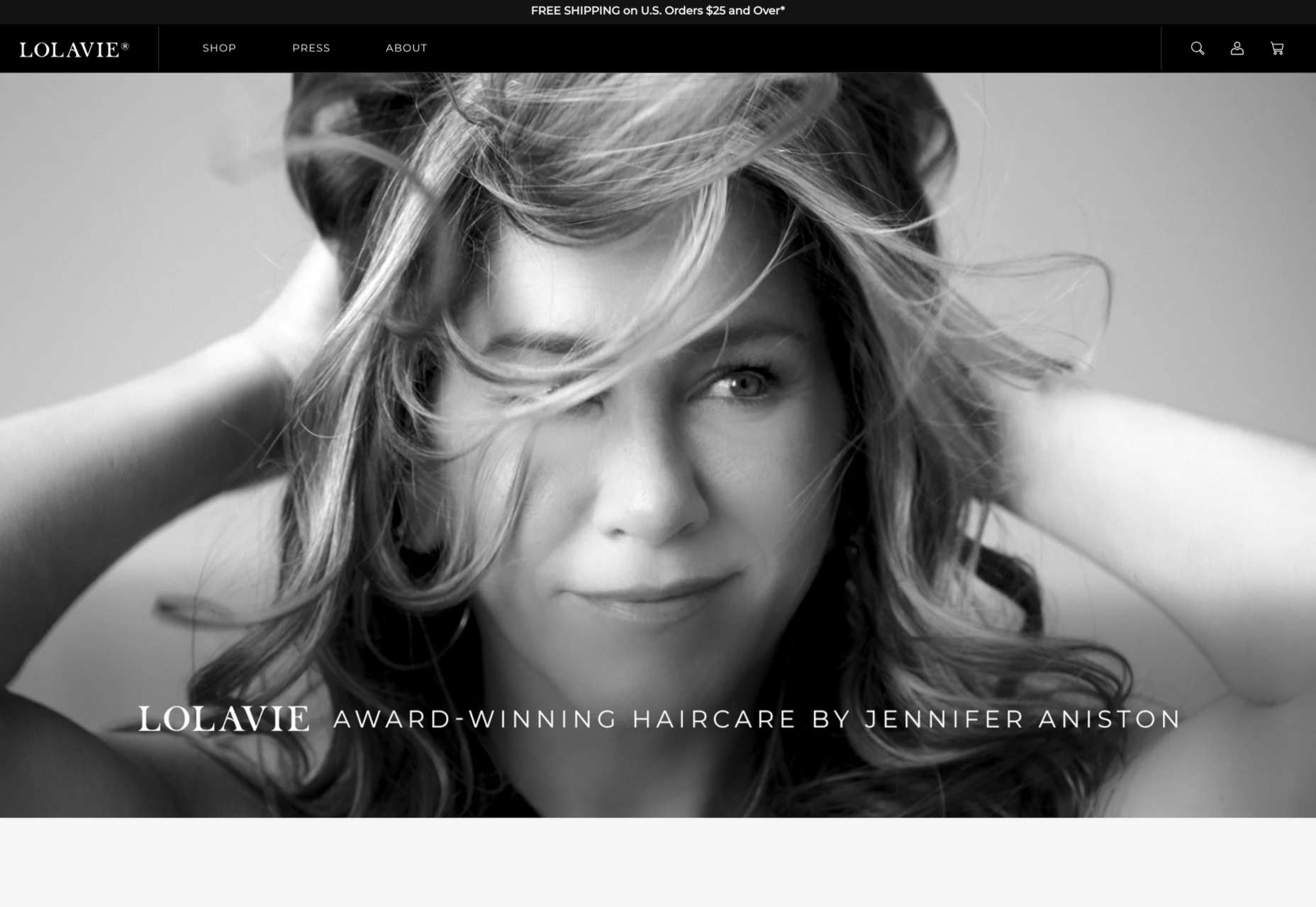
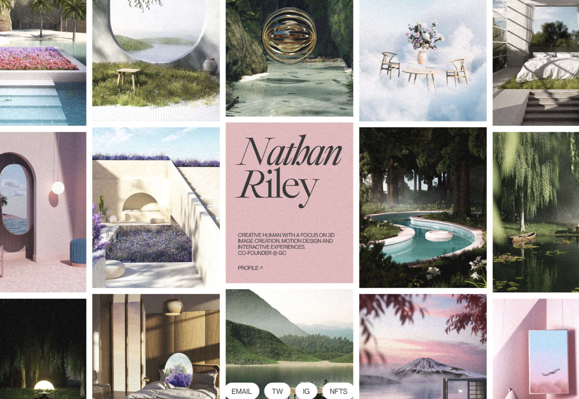
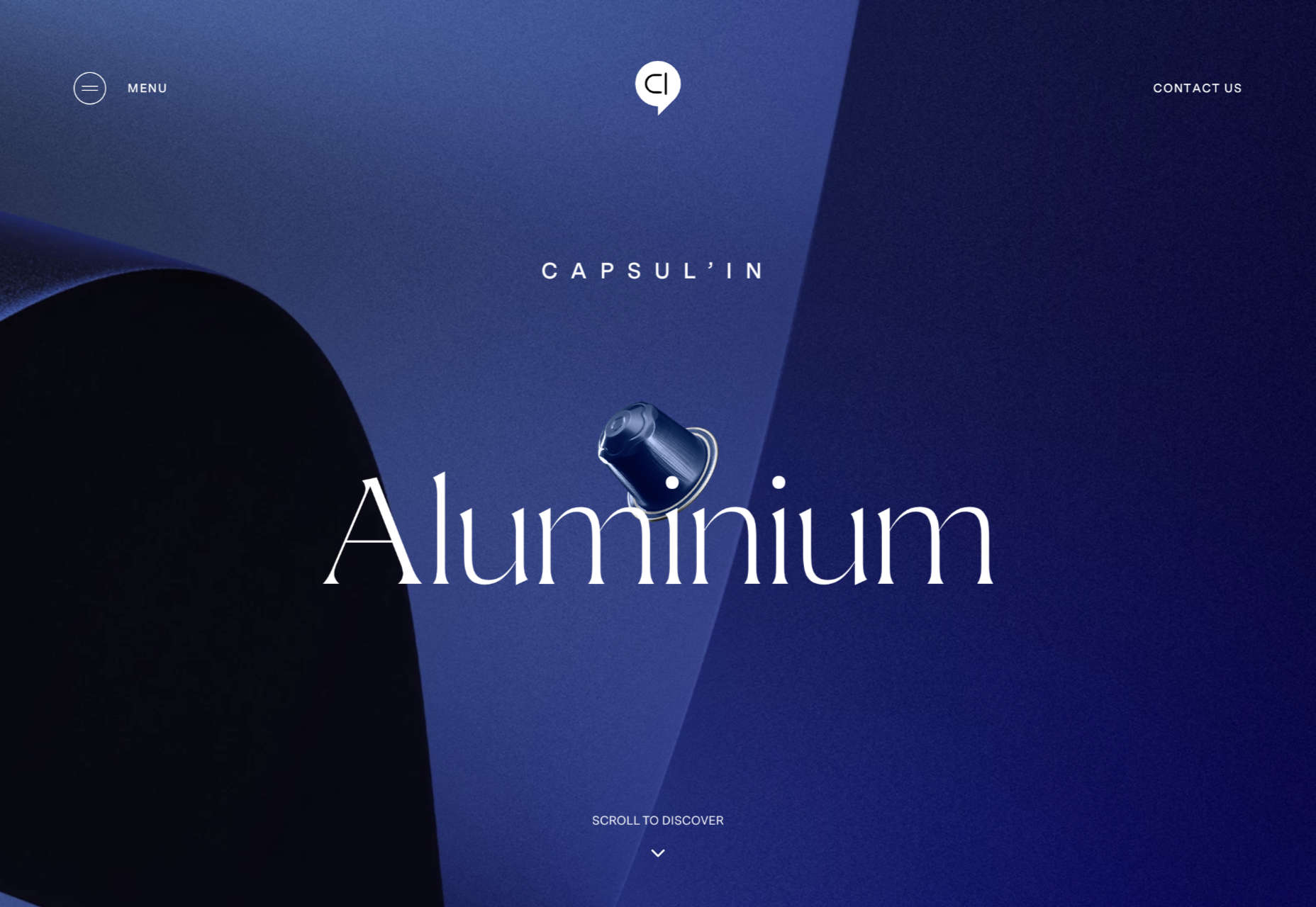
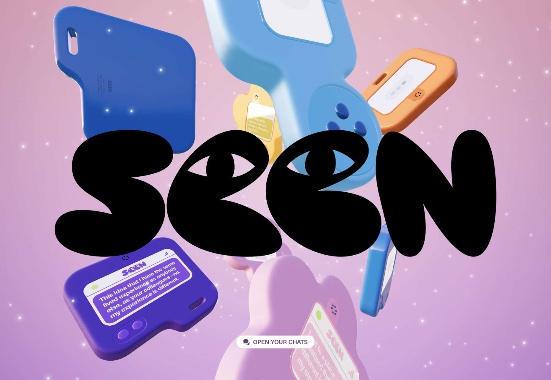
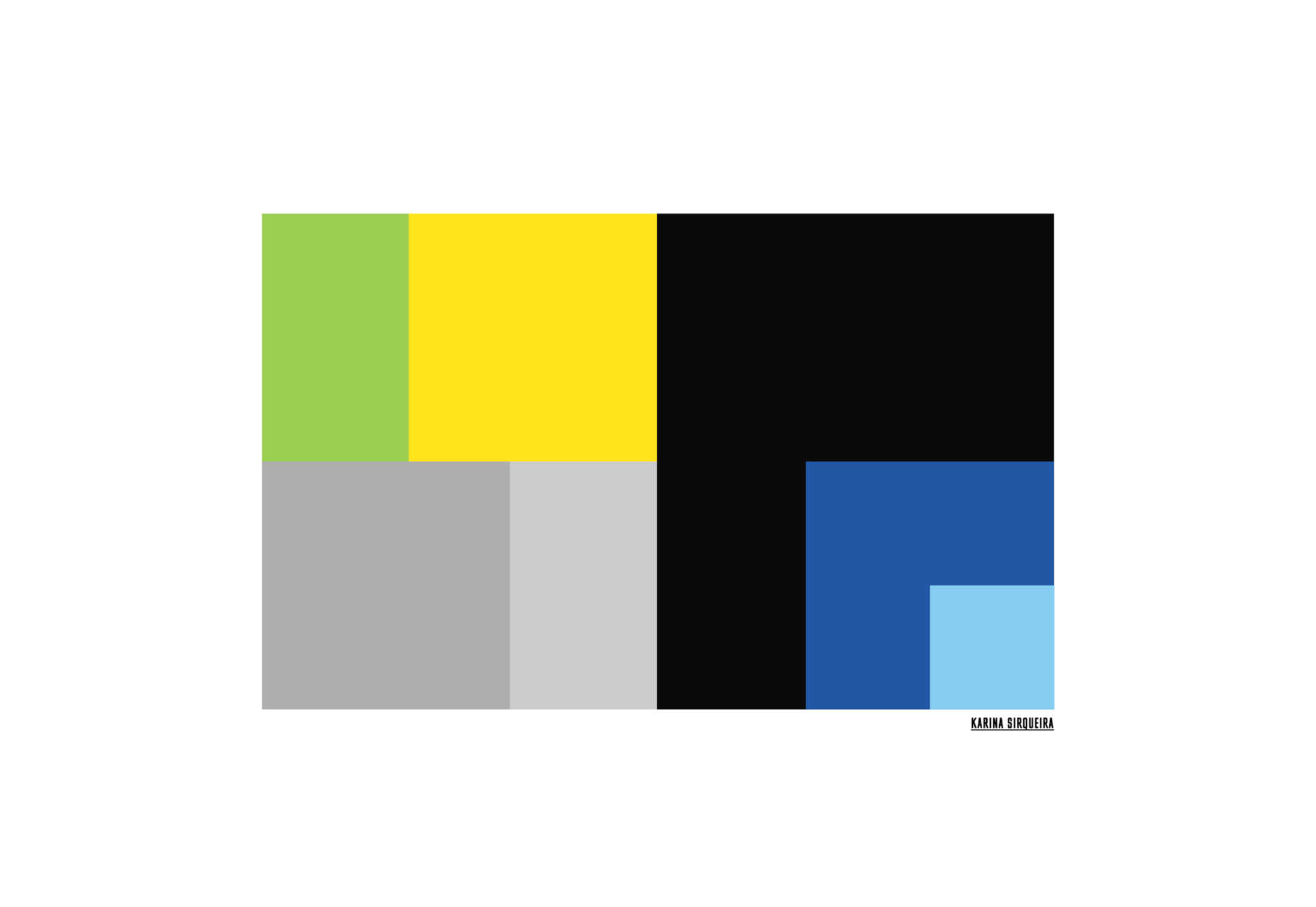
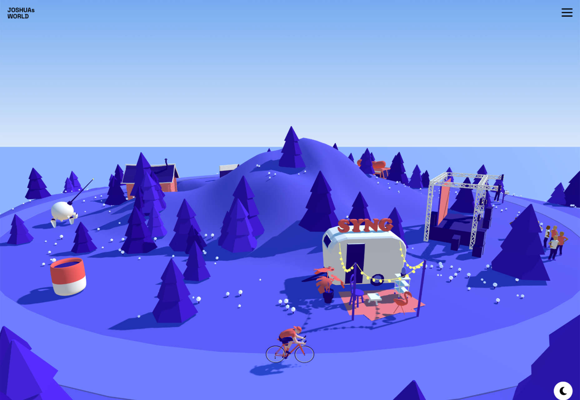
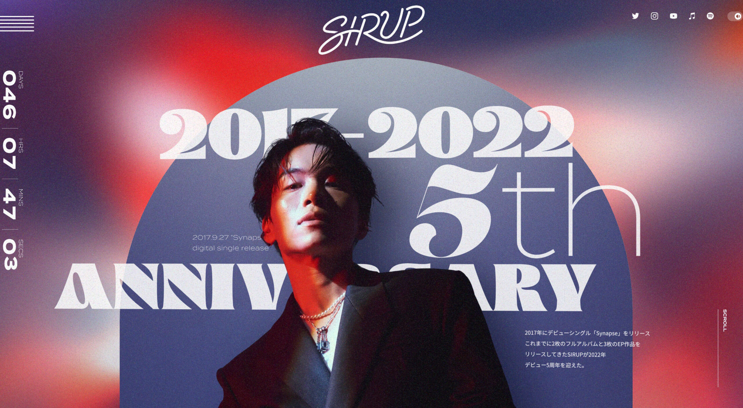
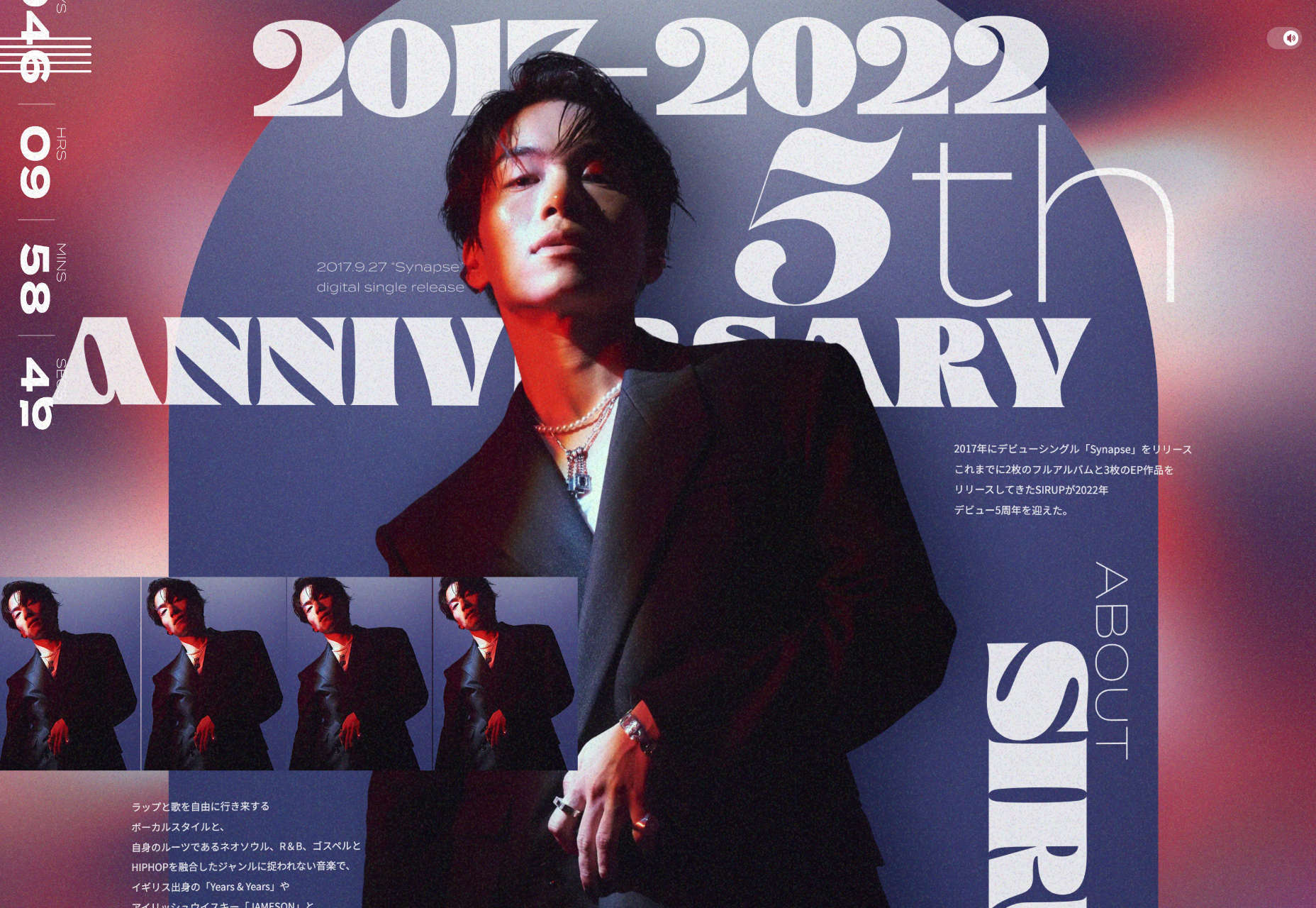
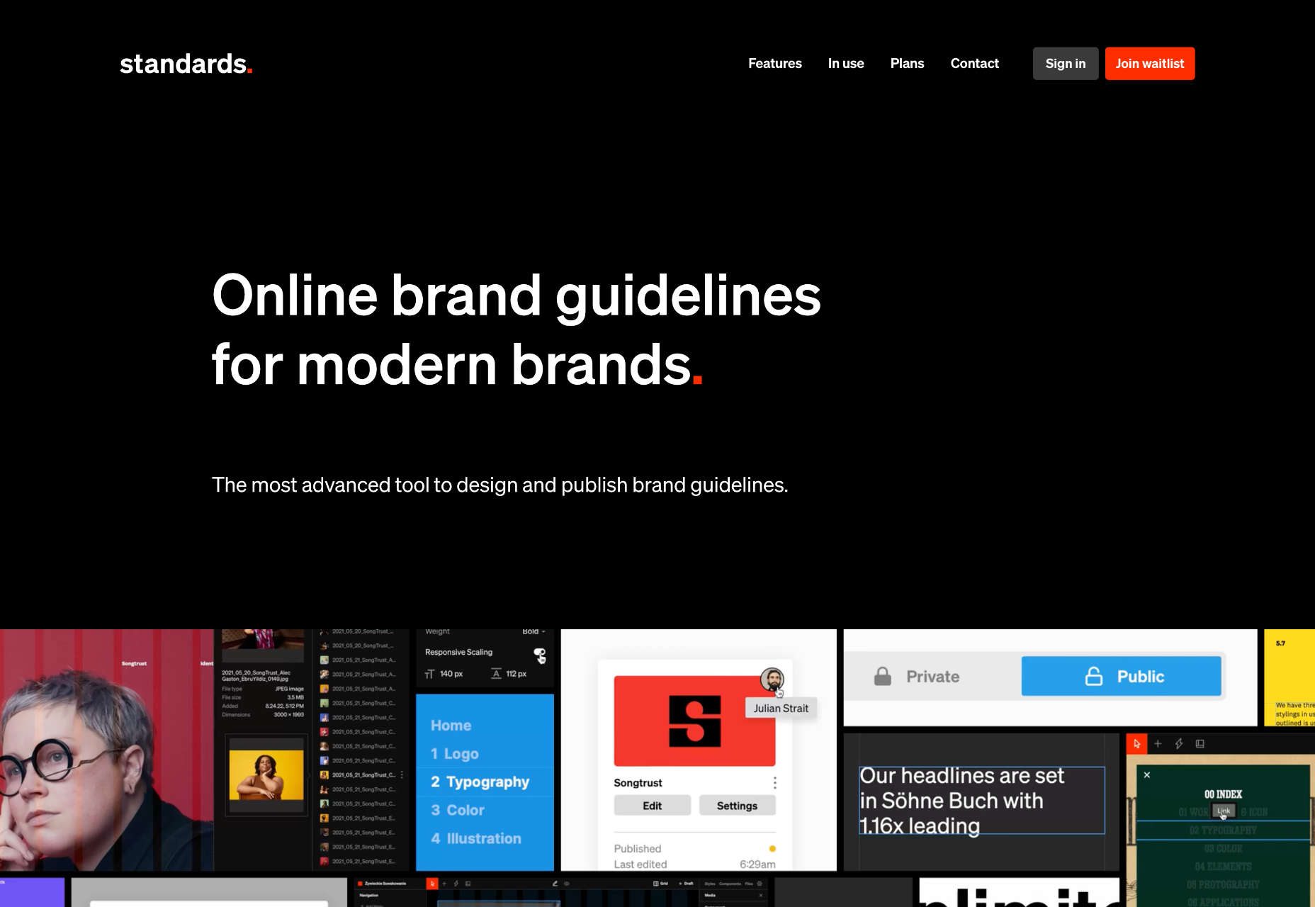
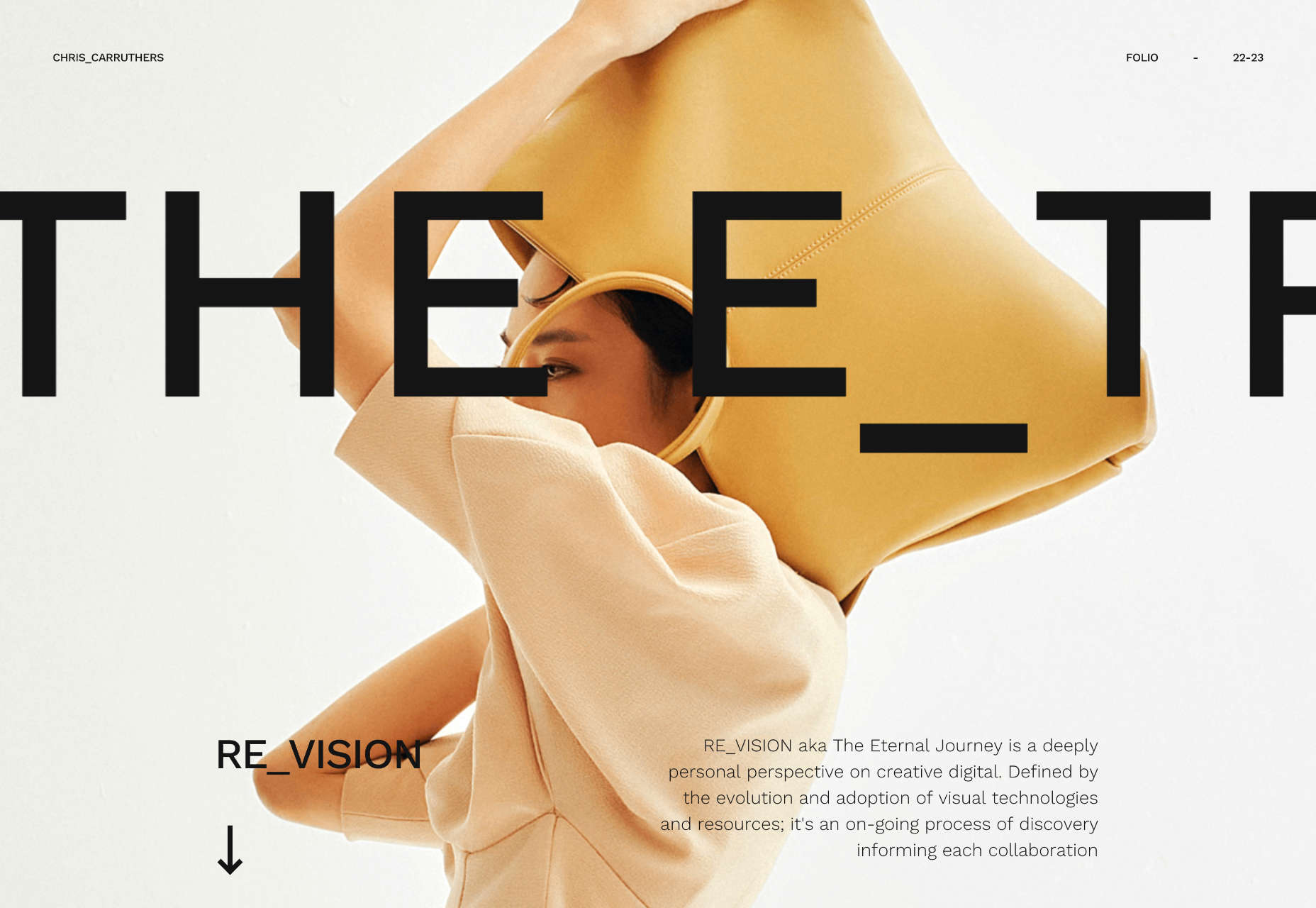
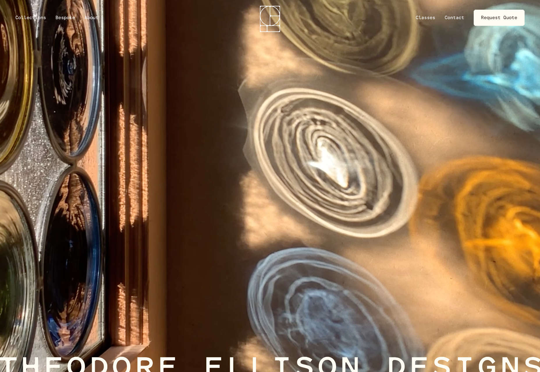
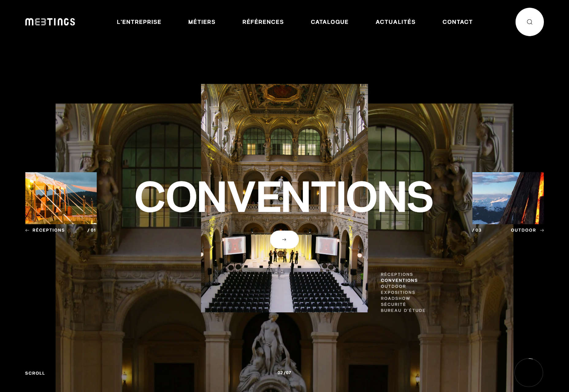
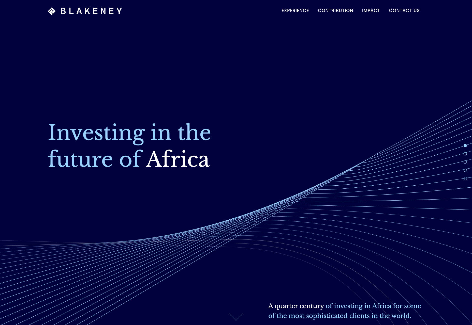
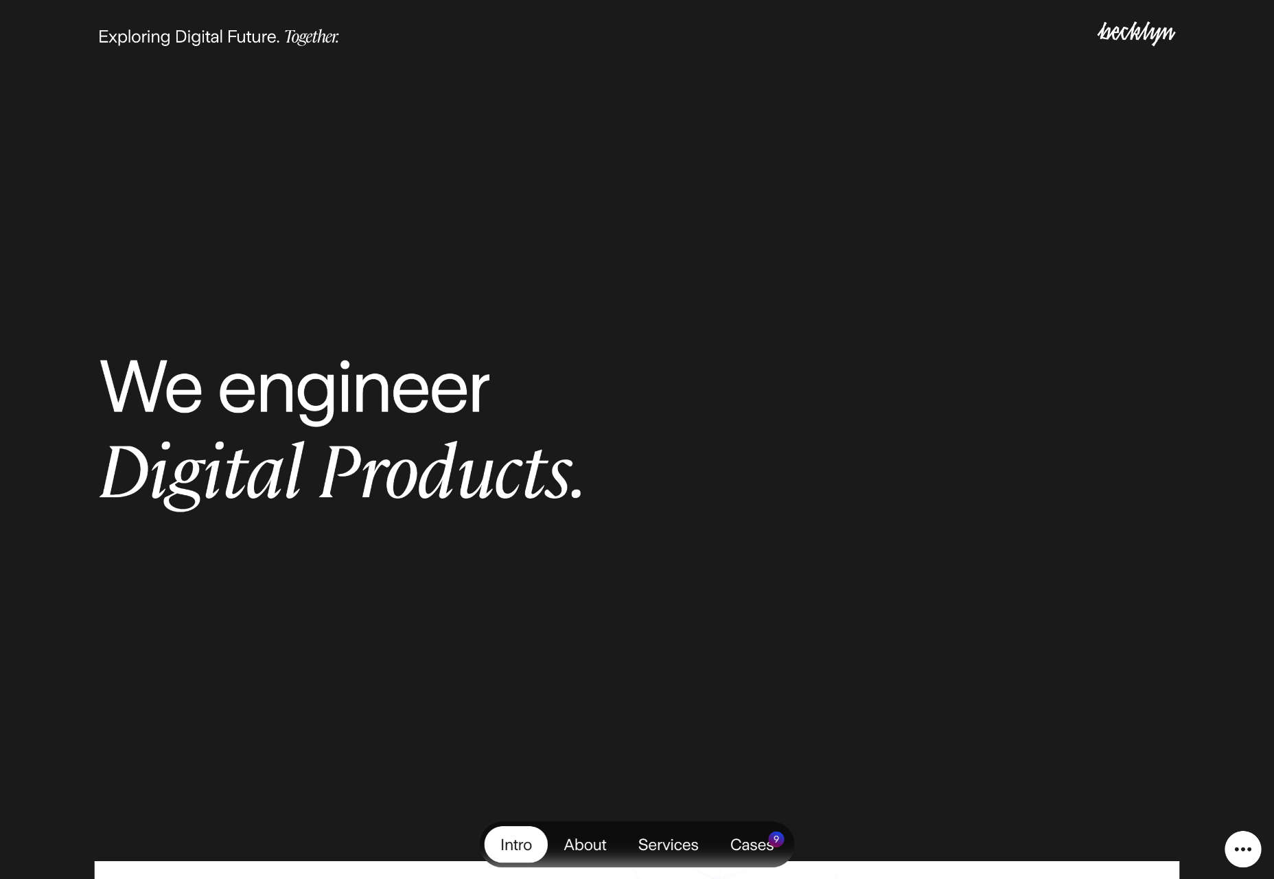
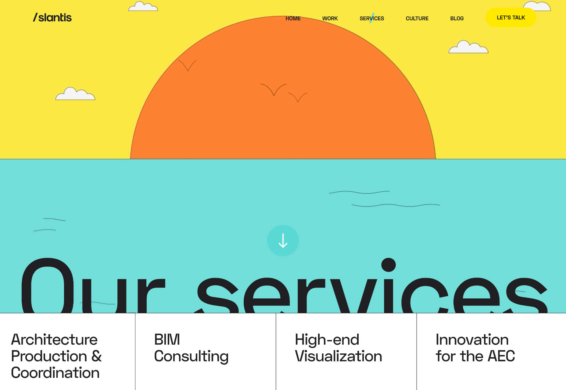
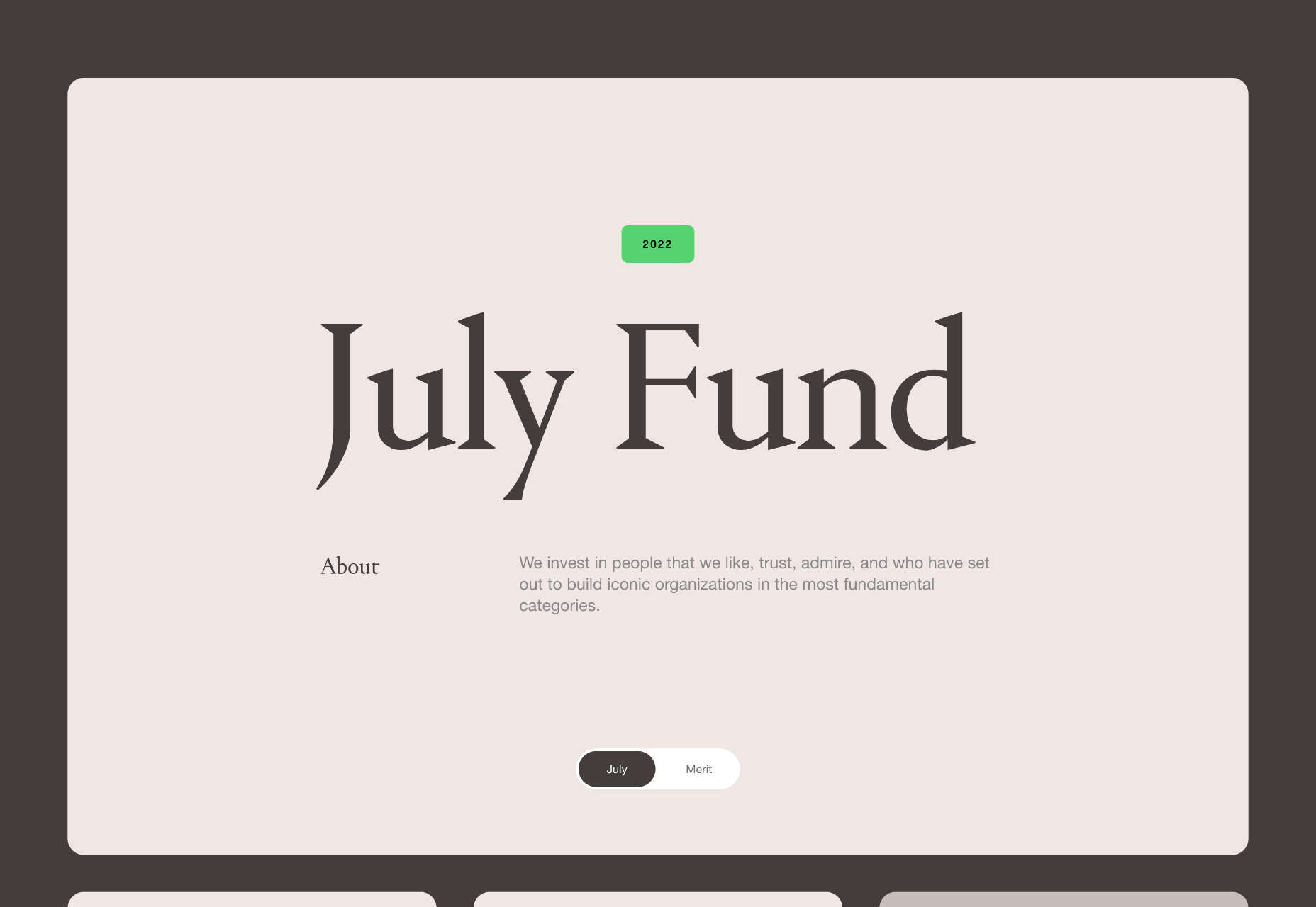
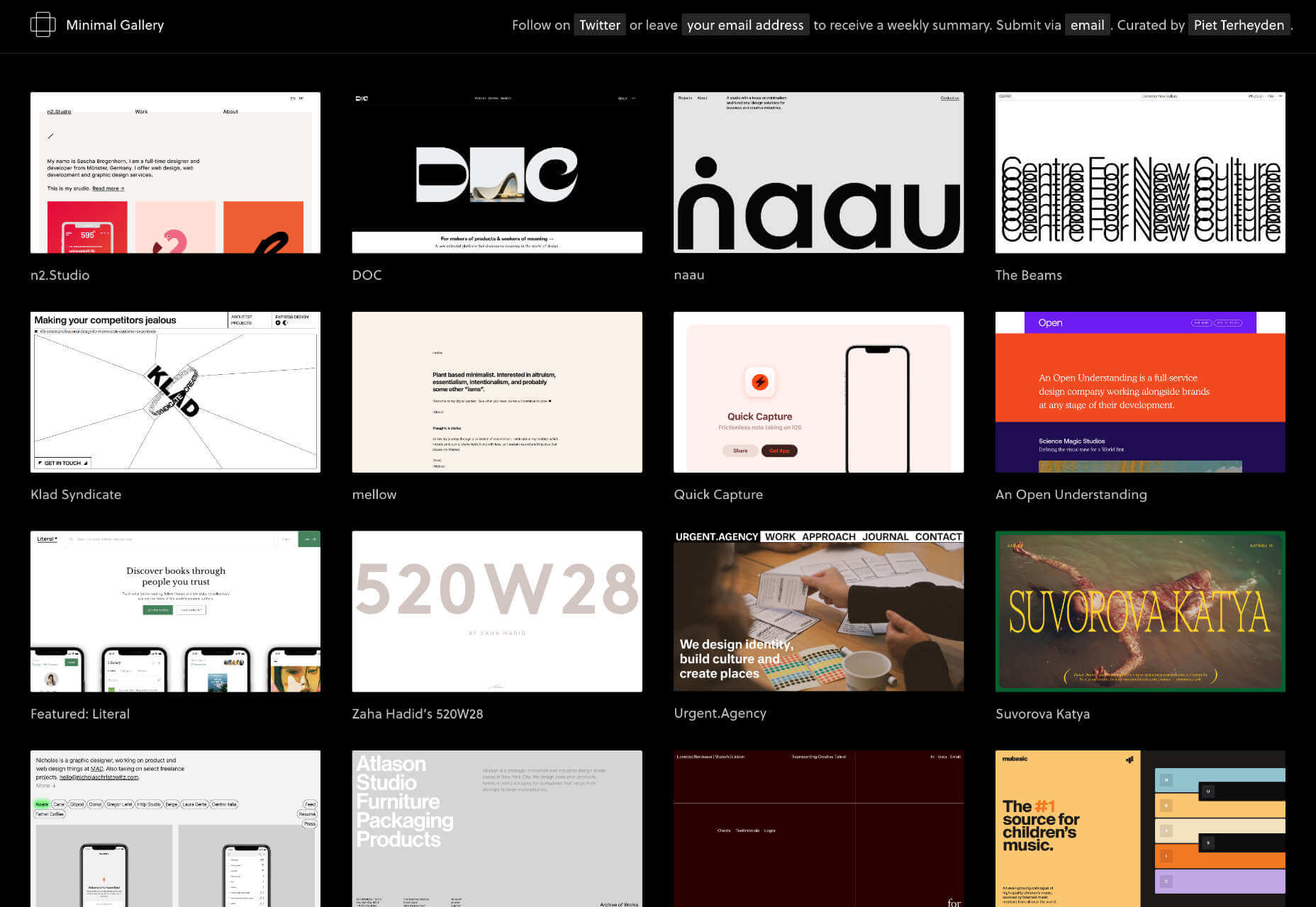
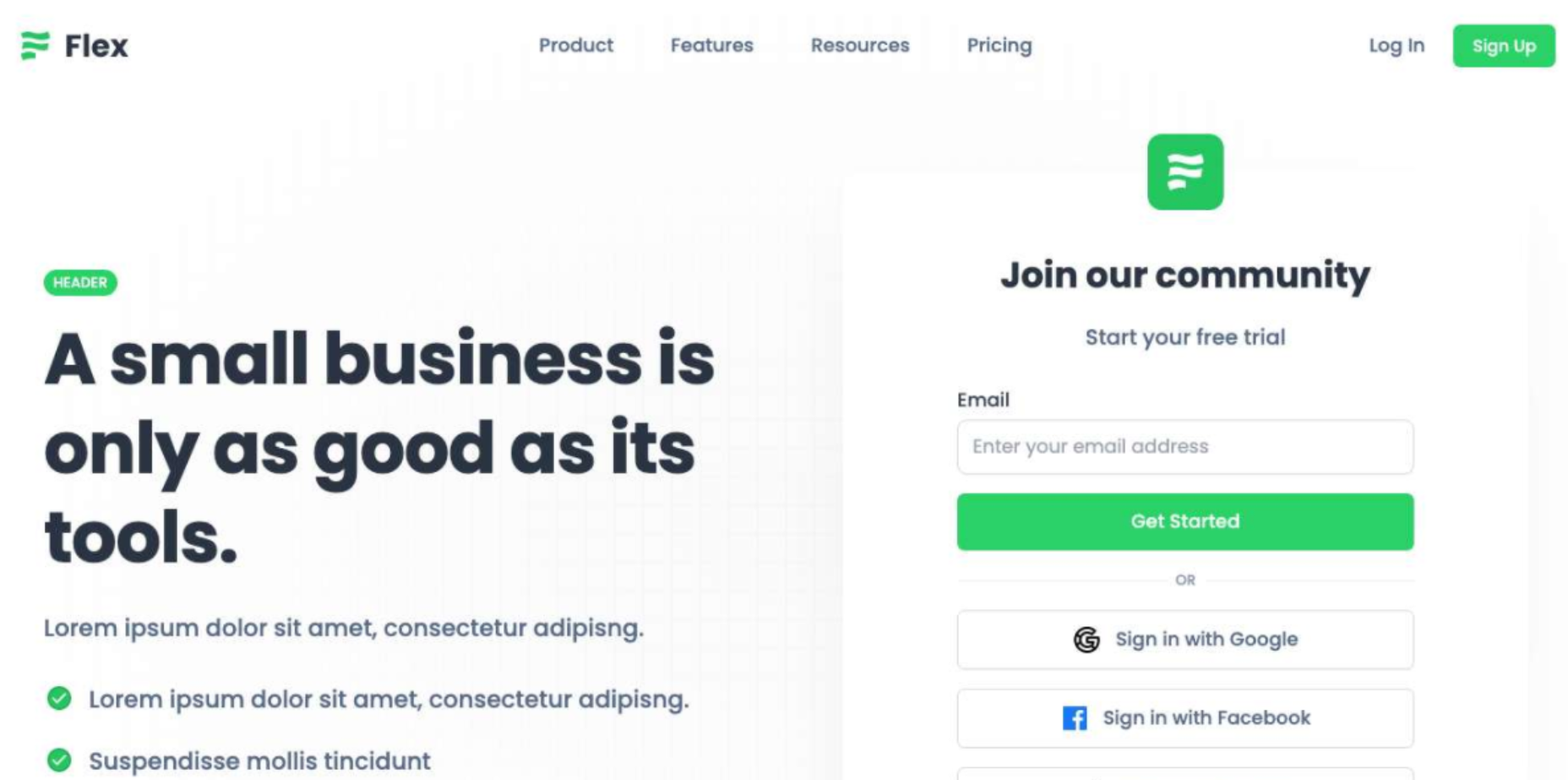
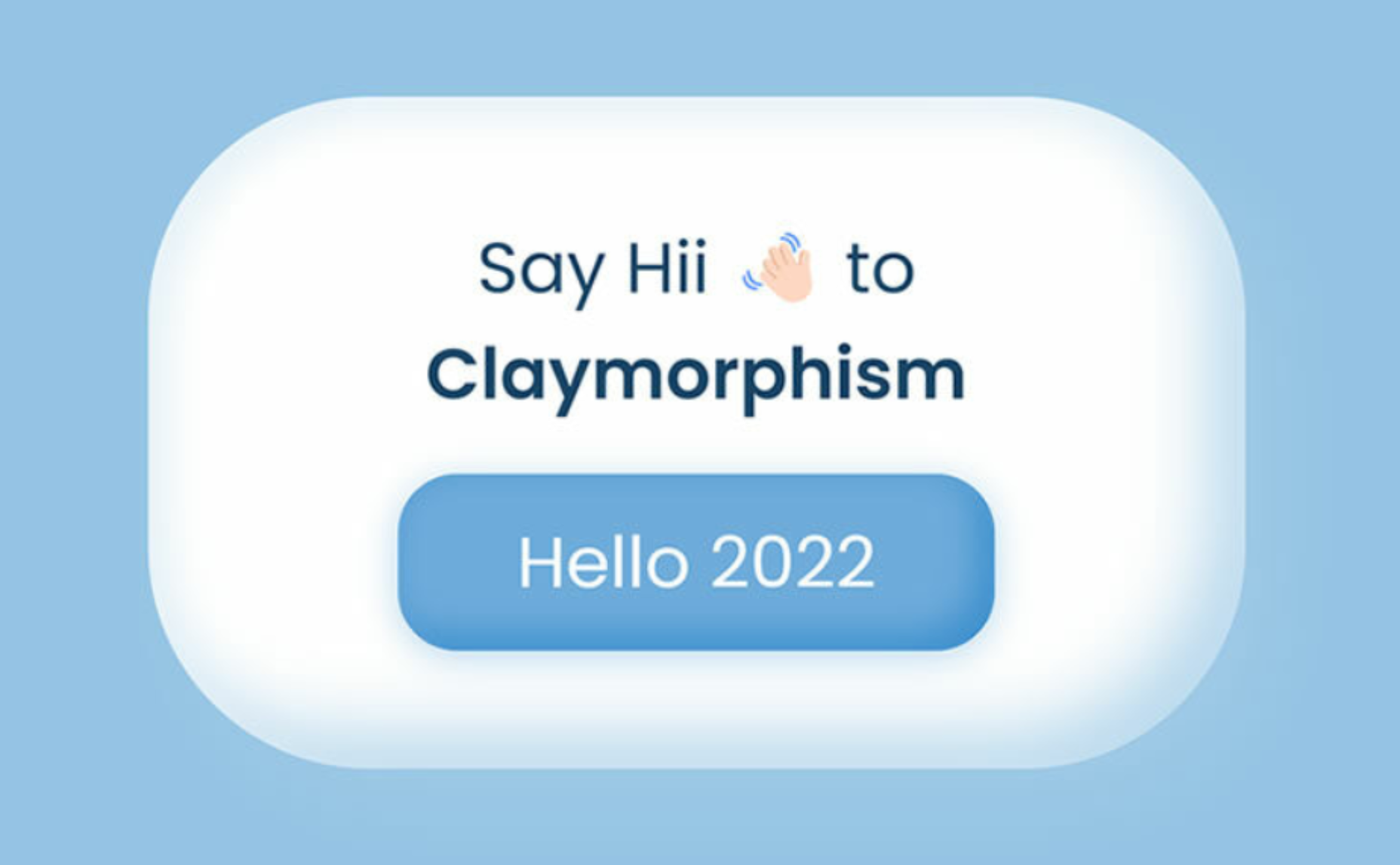
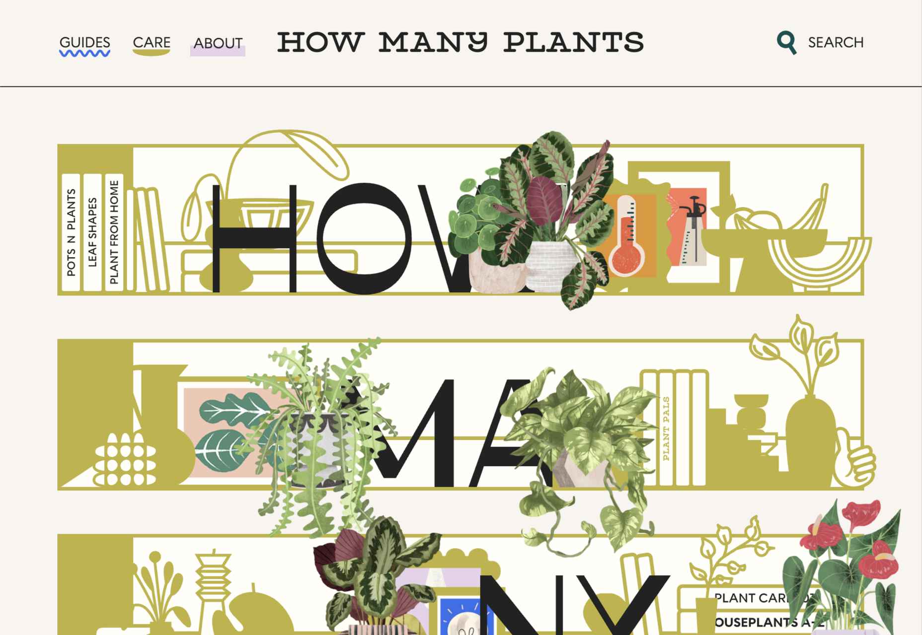
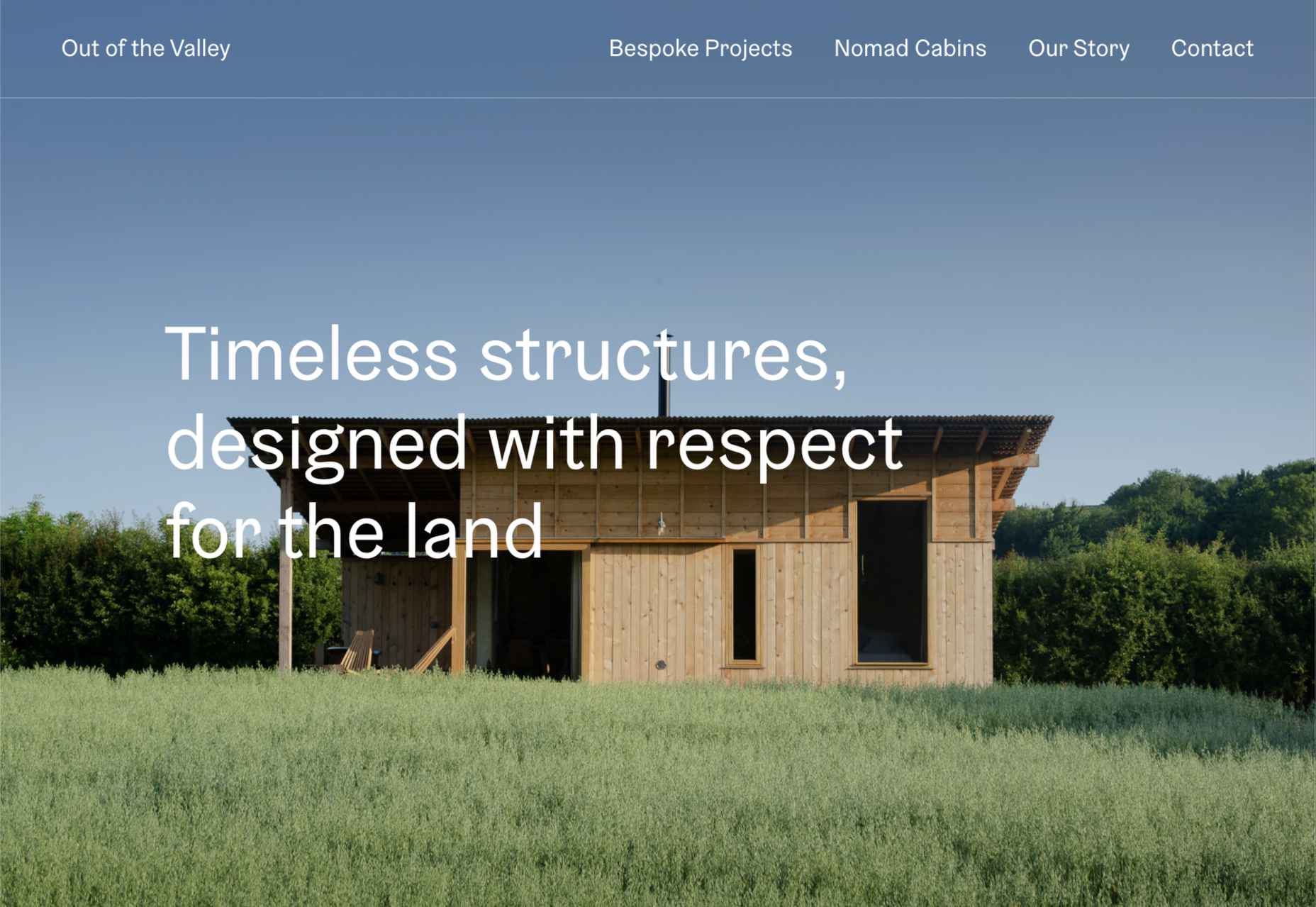
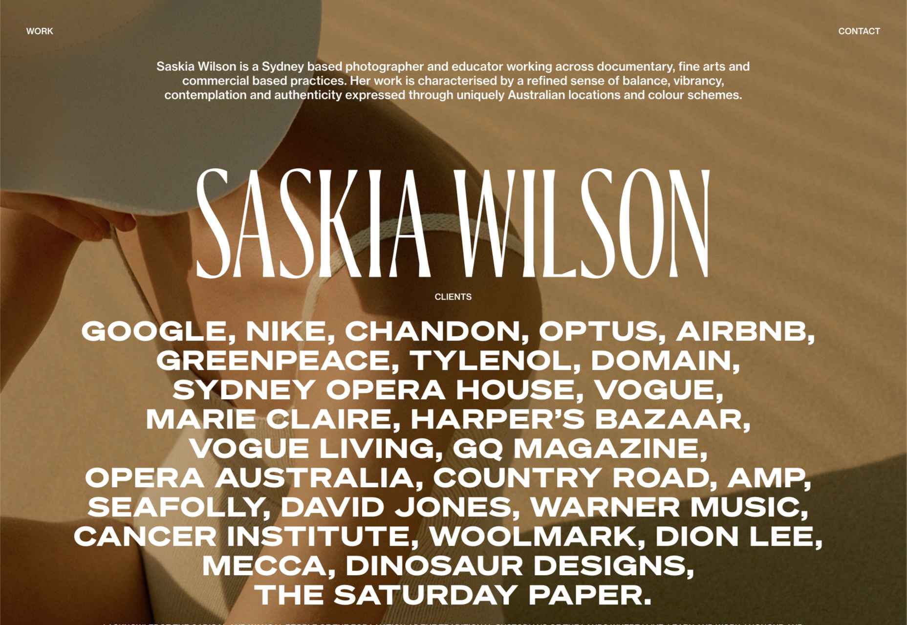
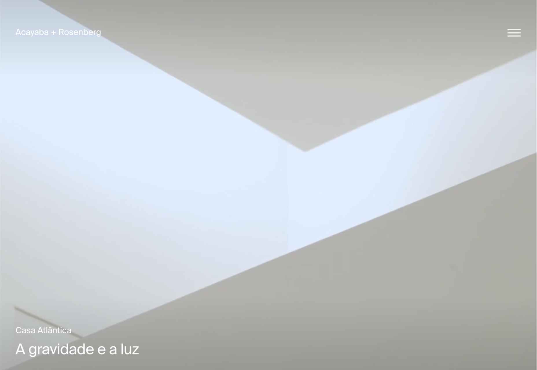
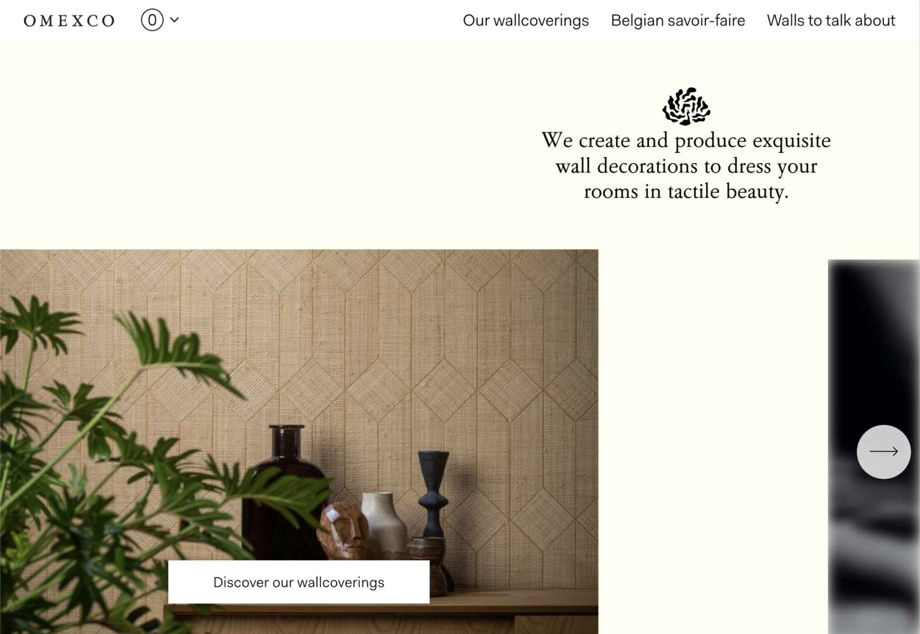
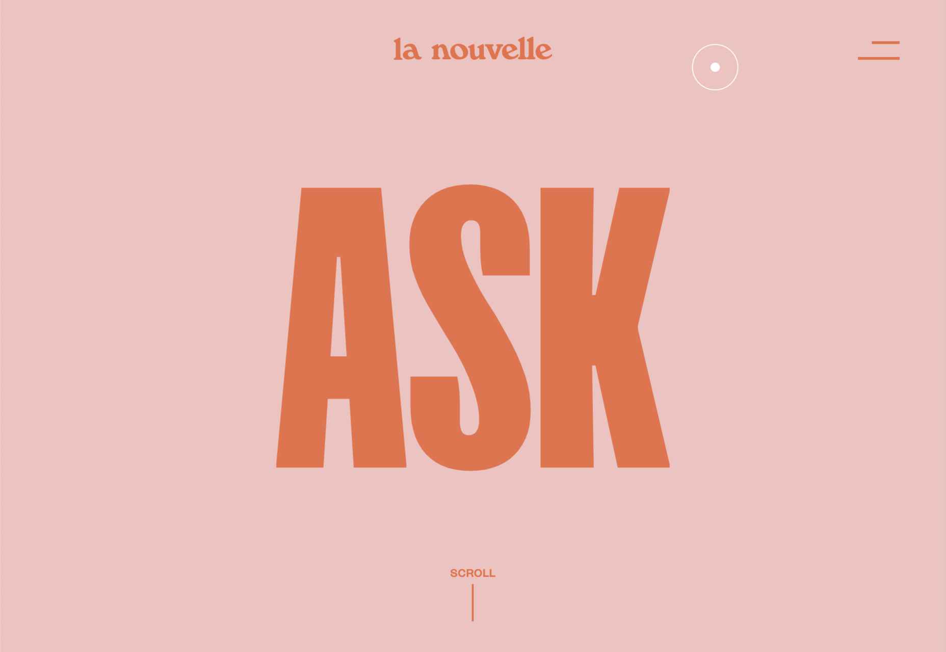
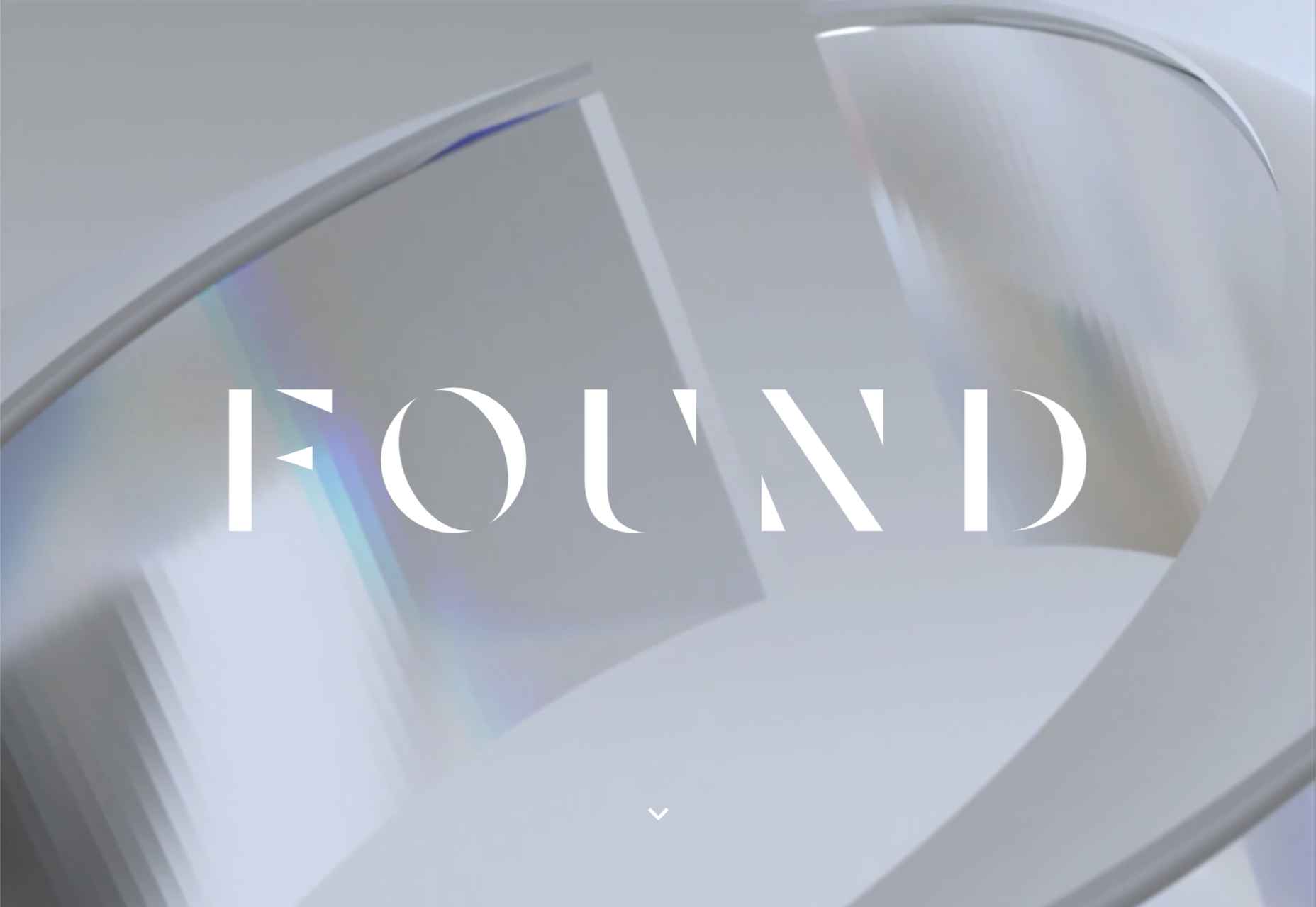
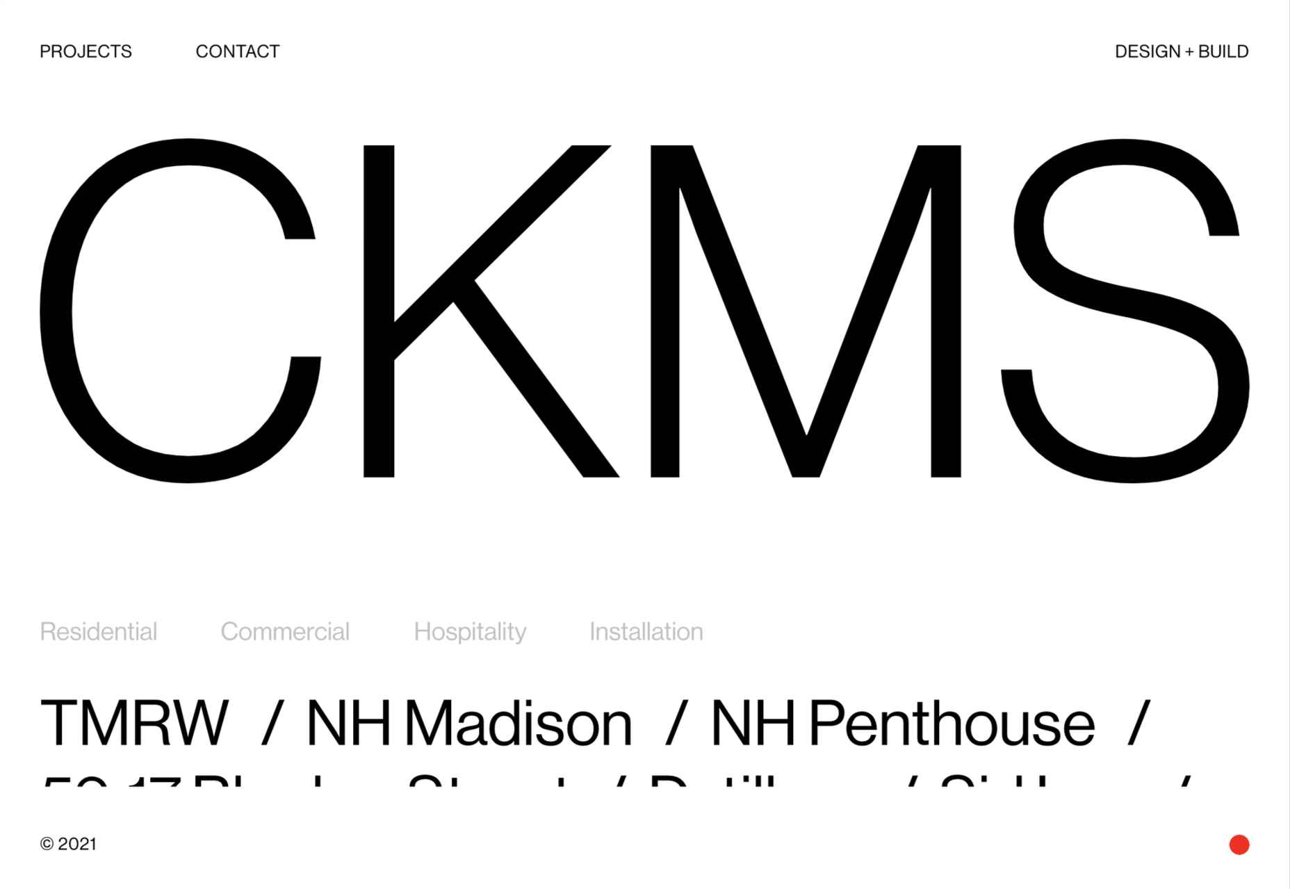
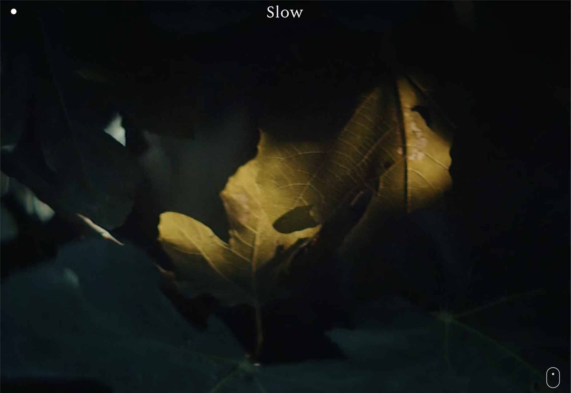
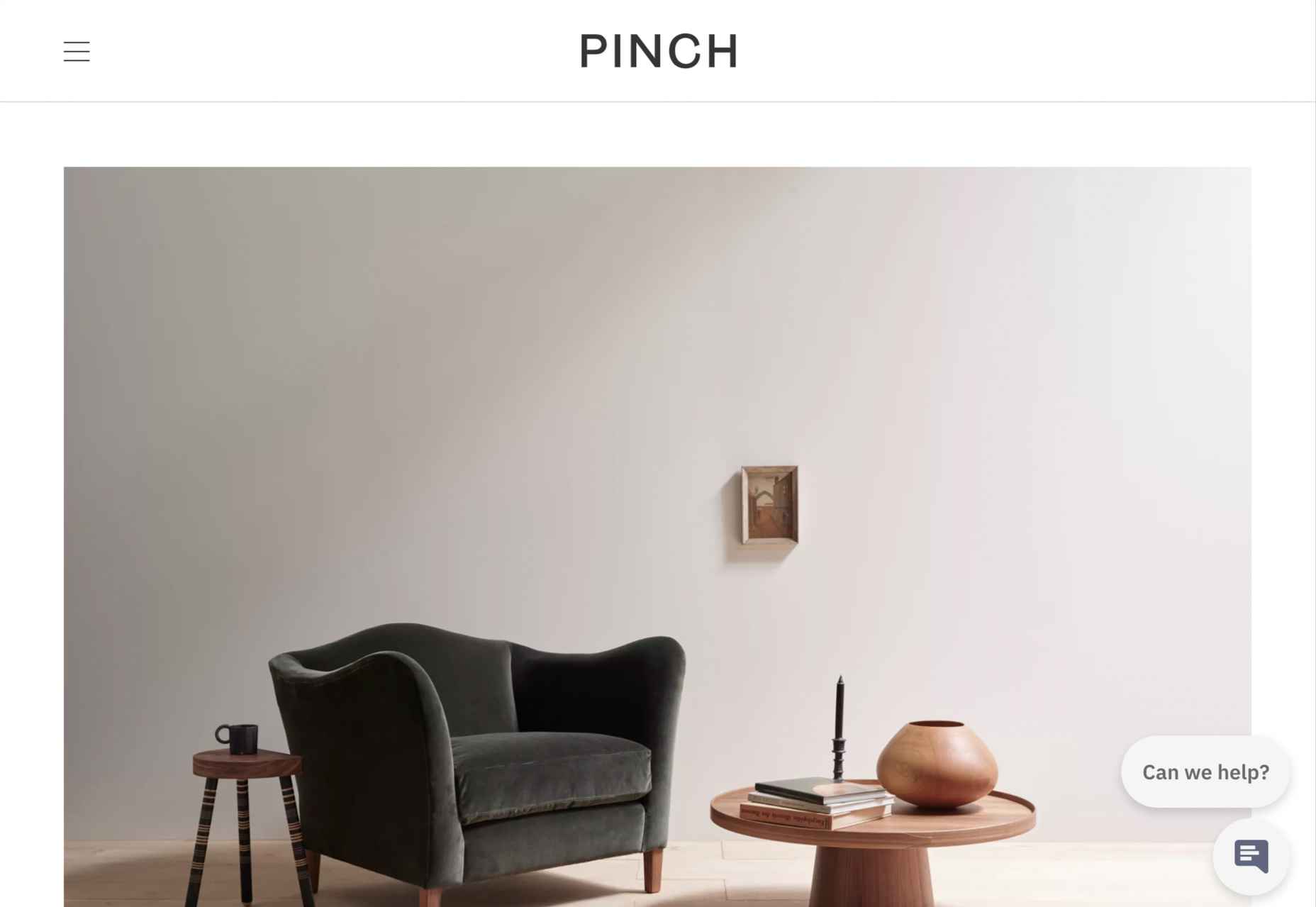
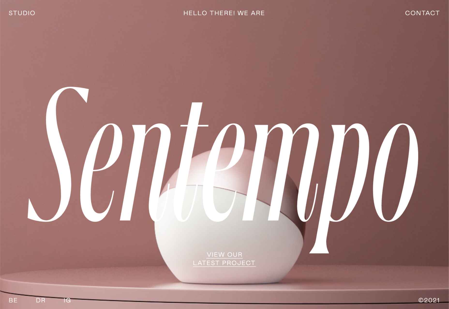
Ten years ago, I would have had high confidence in these predictions — after all I was eventually right about SVG adoption, even if it took a decade. But the last few years have shown that web design is tightly interwoven with the muggle world, and that world is anything but predictable.

So as we look at what might occur in the next year (or five), think of it less as a set of predictions and more as a wishlist.

Last Year’s Predictions

When I write this post every January, I like to keep myself honest by glancing back at the previous year’s predictions to gauge how accurate (or not) my predictions have been.

Last year I predicted the long-term trend for minimalism would end, WordPress would decline, cryptocurrency would go mainstream, and then hedged my bets by saying we’d make both more and fewer video calls.

Gradients, maximalism, and the nineties revival pulled us away from minimalism. It’s still popular, just not as dominant.

WordPress is still the biggest CMS in the world and will continue to be for some time. But the relentless grind of no-code site builders at the low end, and being outperformed by better CMS at the high end, mean that WordPress has passed its peak.

Over-inflated predictions for BitCoin reaching $100k by December 2021 turned out to be a damp squib. In the end, Bitcoin only tripled in value in 2021. However, with micro-tipping and major tech companies moving into the arena, it’s clear digital currency arrived in the public consciousness in 2021.

And how could I be wrong about more but also fewer video calls? So I’m calling that my first clean sweep ever. With that heady boast, let’s take a look at the next twelve months.

What Not to Expect in 2022

Do not expect the Metaverse to be significant in anything but marketing speak. Yes, the hardware is slowly becoming more available, but the Metaverse in 2022 is like playing an MMORPG on PS5: theoretically, great fun, until you discover that absolutely none of your friends can get their hands on a console.

Ignore the blog posts predicting a noughties-era retro trend. All those writers have done is looked at the nineties-era trend and added a decade. Fashions aren’t mathematical; they’re poetic. Retro happens when people find a period that rhymes with present-day hopes and fears. After the last couple of years, if we revisit a decade, it’s likely to be the late-forties.

Finally, don’t expect seismic change. Material design, parallax scrolling, and jQuery are still with us and are still valid choices under the right circumstances. Trends aren’t neat; they don’t start in January and conclude in December.

5 Web Design Predictions for 2022

Predictions tend to be self-fulfilling. So we’ve limited ourselves to five trends that we believe are either positive or, at worst harmless. Of course, there are no guarantees, but if these come to pass, we’ll be in good shape for 2023.

1. The Blockchain is Coming

Underpinning the cryptocurrency industry are blockchains. In simple terms, they’re a set of data that can be appended to but can’t be edited or deleted. Think of it as version control for data.

As with most technology, the first wave has been a way to make a fast buck. However, the exciting development is blockchain technology itself and the transformative nature of the approach. For example, Médecins Sans Frontières reportedly stores refugees’ medical records on the blockchain.

Imagine the Internet as a set of data, editable for a micro-fee, and freely accessed by anyone anywhere. Instead of millions of sites, a single, secure, autonomous source of truth. Someone somewhere’s working on it.

2. Positivity & Playfulness & A11y

Even before world events descended into an endless tirade of grim news, time was running out for dull, corporate, geometric sans-serif design.

We added gradients, we added personality, we embraced humor. And contrary to the established business logic, we still make money. Over the past few years, there have been extraordinary efforts by designers and developers to examine, test, and champion accessibility, and thanks to them, inclusive design is no longer reliant on the lowest common denominator.

In 2022 you can get experimental without obstructing 10%+ of your users.

3. Everything Green

Green is a fascinating color, the primary that isn’t (except in RGB, when it is).

Green has the same visual weight as blue, is substantially more flexible, and yet to date, has been radically underutilized in digital design.

Green has a prominent cultural association with the environment. At a time when tech companies are desperate to emphasize their ethical credentials, marketing companies will inevitably begin promoting a brand color shift to green as a quick fix for all those dumped chemicals, strip mines, and plastic-filled seas.

We’ve already seen earthy hues acquire popular appeal. At the other end of the vibrancy scale, neons are popular. Green spans both approaches with everything from calm sages to acidic neons.

In 2022, if you’re looking for a color to capture the moment, look to green.

4. Hero Text

A picture is supposed to be worth 1000 words, although I’m not sure anyone has actually tried to measure it. The problem is that sites increasingly rely on stock images, so the 1000 words that we’re getting may or may not accurately reflect 100% of our message.

In 2022, a handful of well-chosen words will be worth more than an image, with hero images taking a back seat to large hero text. This is aided by a number of minor trends, the most notable of which is the willingness of businesses to look beyond the geometric sans-serif to a more expressive form of typography.

Reading through the prediction posts on sites other than this, almost everyone agrees on large hero text replacing images, which virtually guarantees it won’t happen. Still, at the start of 2022, this seems to be the direction we’re taking.

5. Bring the Noise

One of the unexpected consequences of the past couple of years has been a renewed connection with nature. The effortless complexity in nature is endlessly engaging.

We’ve already begun to popularise gradients — there are no flat colors in nature — and the next logical step is the addition of noise.

In visual terms, noise is the grainy texture that sits so beautifully in vector illustrations. Noise has dipped in and out of trends for years, hampered a little by the leap in file size it creates. However, with WebP and Avif file types, noise is now usable on production sites.

Designing in 2022, when in doubt, throw some noise at it.


Featured image via Unsplash.

Source

The post 5 Big Web Design Predictions for 2022 first appeared on Webdesigner Depot.

Source de l’article sur Webdesignerdepot

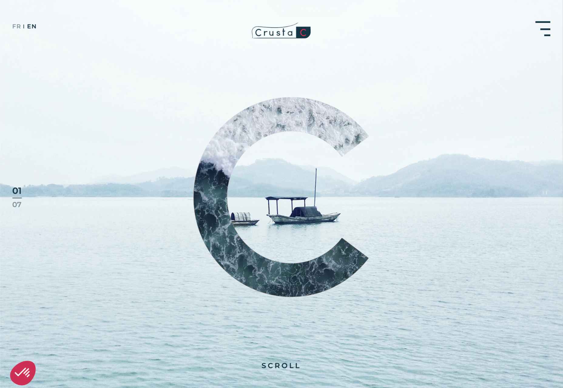
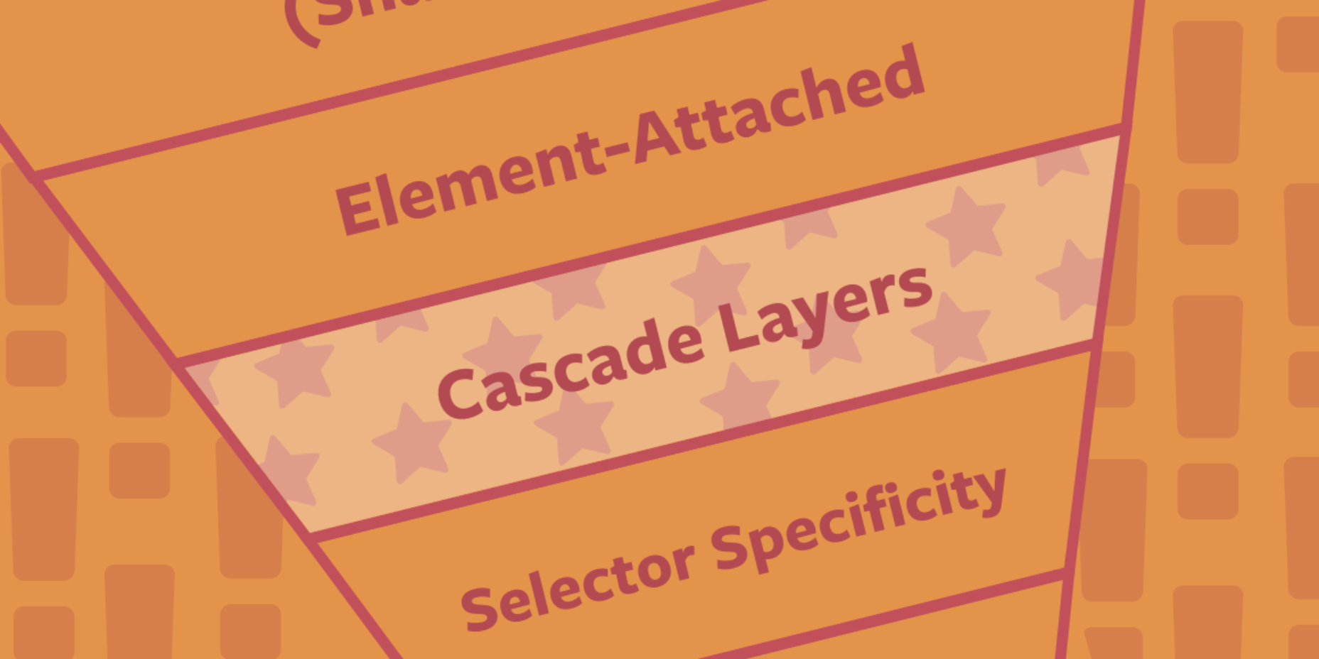
Since the skeuomorphism of the early 00s, the design trend of choice has been minimalism. In fact, minimalism has been de rigueur for substantially longer than that.

You can make a fair case that minimalism was the defining theme of the 20th century. Beginning with the widespread adoption of grotesque typefaces in mass advertising the century before, continuing through the less-is-more philosophies of the middle part of the century, and culminating in the luxury of 80s and 90s consumerism.

Minimalism has been central to the design practice of almost every designer that we recognize as a designer. It underpins the definition of the discipline itself.

With the weight of such illustrious history, it’s no wonder that the fledgling web — and in the scale of history, the web is still a very new phenomenon — adopted minimalism.

And then there’s the fact that a minimalist approach works on the web. Multiple viewports, multiple connection speeds, multiple user journeys, all of these things are so much easier to handle if you reduce the number of visual components that have to adapt to each context.

And yet, despite this, an increasing number of designers are abandoning minimalism in favor of a more flamboyant approach where form is function. It’s clearly happening. What’s not clear is whether this is a short-lived, stylistic fad or something altogether more fundamental. In other words, are designers about to abandon grids, or are they just slapping some gradients on an otherwise minimal design?

Featured image via Pexels.

Source

The post Poll: Is Minimalism a Dead Trend Walking? first appeared on Webdesigner Depot.


Source de l’article sur Webdesignerdepot

One of the few bright spots in 2020 has been the creativity companies and individuals alike have exhibited in dealing with what, at times, seemed to be overwhelming problems.

The world of web design was no different. Designers and agencies had to adapt and implement new color schemes or design new shopping experiences, which made some of the previous design trends not fit for the current design problems.

We’ll take a look at these newest design trends and the rationale behind them. As we do so, we’ll also take a look at some of BeTheme’s 600+ pre-built sites that have already put them to good use.

1. Comforting Color Palettes Lighten the Load

In years past, bolder color schemes were one of the hallmarks of web design trends. Their purpose was to quickly engage a visitor and prompt him or her to respond emotionally.

Given all the drama and turmoil we were subjected to through most of 2020, we’ve come to welcome the use of toned-down colors in marketing instead of the bolder, brasher, and more “in-your-face” color schemes. 

Bellroy’s website puts toned-down colors to good use. This company’s product line of wallets, bags, and the like, are designed to keep people’s belongings organized, safe, and secure. A wild color scheme simply wouldn’t be fitting.

How, then, are brightly-colored products dealt with? Thanks to judicious uses of white space and background photos, this website still emphasizes a toned-down color palette.

The BeSpa pre-built website is another example of a color scheme that almost immediately puts the mind at ease.

Calm and soothing? Yes.

Boring? Definitely not.

Comfort and security are the emotional drivers in this example.

2. Seamlessly Intermingle and Balance Physical and Digital Imagery

People confined to their homes because of Covid-based restrictions spent many more hours looking at their screens in 2020. Online programming began to take on the appearance of a reality show that blurred the boundaries between the real and the digital.

Whereas web designers tended in the past to rely on either photos or illustrations in their designs, these same designers have started to integrate these blurring effects into their designs, with results that range from amusing and quirky to highly informative.

Check out this example from fashion designer Constance Burke

It’s not every day you see real models wearing hand-drawn fashion sketches. But it’s just one example of how the physical can be blended with the digital.

The BeSki pre-built site does the same blending of the two, but in a totally different way:

The sections’ designs switch from predominantly physical to largely digital and back again, an excellent approach that provides a maximum amount of useful information.

It’s also worth noting how snowbanks are effectively used to seamlessly transition from one section to the next.

3. Create Well-Organized and Helpful Shopping Experiences

More people spending more time at home has created a surge in online shopping. As a result, many online store owners are now feeling the effects of increased competition.

Consumers look for brands they believe they can trust. At the same time, they want their online shopping experiences to be as quick and painless as possible. They look for (and expect) quick and effective product search capabilities, helpful and effective product displays, one-page product descriptions, and the like.

Walgreen’s product page design is especially well-suited for 2021 ecommerce shoppers: 

Everything shoppers usually need to know is presented above-the-fold. They can easily proceed to the next step or scroll down for reviews or additional product specifications. 

BePestControl’s pre-built website uses a similar product design approach: 

In this example, the main selling points are up-front and are kept short and sweet. The shopper can either hit the ‘Add to Cart’ button or look below the button for additional information.

In both examples, a visitor doesn’t have to mull over what step to take next since one of the design objectives is to make the shopping experience as easy and as satisfying as possible.

4. Take Advantage of the Benefits of User-Controlled Video Content

Once upon a time, video content was “the thing” to incorporate in a website. Hero background videos proved to be particularly engaging, and “how-to” videos presented much more useful information than illustrations or blocks of text could.

On the other hand, Auto-play videos, those that started on their own, all too often had a tendency to irritate rather than inform, especially when their content didn’t address a visitor’s immediate concern.

Thanks to Zoom and similar video platforms that came into widespread use in 2020 and to website designs that include video “Play” buttons, users have become much more comfortable with the medium. As an example, Shoppers have been given total control over if or when they want to view a given video. 

This is the design approach Payoneer has taken: 

The white “Pay” button is impossible to miss, and while it is designed to encourage a visitor to watch a testimonial, doing so is completely optional.

The BeOptics pre-built website cleverly slips in a video play option as well: 

In this example, when visitors hover over the “See More” button, it lets them know that they have the option to watch the video if they want to learn more.

5. Trust Builders Should be Non-Negotiable Web Design Elements

There are various ways in which products are organized or showcased in brick and mortar businesses to instill trust. Helpful and friendly staff also contribute to instilling trust.

Some of these trust-builders are easily incorporated into eCommerce designs. Others, though more difficult to fit in, can usually be satisfactorily addressed.

Digital trust builders can include.

  • Logos (familiar, whimsical, innovative, engaging)
  • Portfolios and/or product pages
  • Customer reviews, product ratings, and client testimonials
  • Case studies and product or price comparisons
  • Safety and security seals, e.g., Better Business Bureau, PayPal checkout
  • Charts, graphs, counters, and other data visualization techniques
  • Proof of social, charitable, or community-related actions and contributions

Put, trust-building content will beat hard-sell techniques every time, especially if you would like your customer base to include referred and repeat customers.

Omaze, for example, gives people entries for prizes based on their donations while at the same time highlighting the good things it and its donors have brought about.

To help build trust, the site devotes space to highlighting publications that have featured Omaze and the work it has done and is doing.

Plus, it puts data visualization and non-profit testimonials into play to give visitors an added insight into what is going on behind the scenes: 

As you can see, it doesn’t have to be difficult to incorporate genuine trust-building content into your website designs.

BePortfolio is a great example of how you might go about doing this for a portfolio site, whether it’s your own or a site for a client:

The home page alone has plenty of space for including trust-building content:

  • A satisfied customer counter
  • Product usage case studies and testimonial
  • Portfolio highlights
  • Client and partnership logos

And it can only get better as a visitor moves through the site, but only if you’ve chosen to make that happen.

Have You Started to Take These New Web Design Trends to Heart?

We’re not suggesting that you throw the baby out with the bathwater, but some trends will need to be discarded to enable you to adjust to a new normal. Other 2020 design trends, like minimalism and headline topography, are likely to remain popular for years to come.

New trends that incorporate calming color palettes, image blending, more efficient eCommerce UX designs, user-controlled video, and trust-building elements should give your customers the feeling of comfort and security they will be seeking in 2021.

If you want to implement some or all of these new trends in your 2021 website designs, BeTheme’s 600+ pre-built sites make doing so an easy task.


[– This is a sponsored post on behalf of BeTheme –]

Source

The post 5 Web Design Trends and Ideas for 2021 first appeared on Webdesigner Depot.


Source de l’article sur Webdesignerdepot