Articles

In the last post of this multi-part series, we introduced methodologies and technologies for the various compliance personas to collaboratively author compliance artifacts such as regulation catalogs, baselines, profiles, system security plans, etc. These artifacts are automatically translated as code in view of supporting regulated environments enterprise-wide continuous compliance readiness processes in an automated and scalable manner. These artifacts aim to connect the regulatory and standards’ controls with the product vendors and service providers whose products are expected to adhere to those regulations and standards. The compliance as code data model we used is the NIST Open Security Controls Assessment Language (OSCAL) compliance standard framework.

Our compliance context here refers to the full spectrum of conformance from official regulatory compliance standards and laws, to internal enterprise policies and best practices for security, resiliency, and software engineering aspects.

Source de l’article sur DZONE

In part 1 of this multi-part blog series on continuous compliance, we detailed the personas and their role in the compliance processes. We concluded that the key to achieving compliance automation and hence continuous compliance is the compliance artifacts programmatic representation, as code, expressed in generic and standard security language terms.

In this blog post, we introduce Trestle, our open-source implementation of the NIST Open Security Control Assessment Language (OSCAL) standard framework adopted as a workflow automation of compliance artifacts managed as compliance as code. Trestle enables those diverse personas to collaboratively author the compliance artifacts and offers a platform and OSCAL SDK for teams to automate their specific native processes and formats. Trestle implicitly provides a core opinionated workflow driven by its pipeline to allow standardized interlocks with other compliance tooling platforms.

Source de l’article sur DZONE

The purpose of a website is to reach new customers and keep current ones engaged. Therefore, customer-first should be at the top of your list for design features. After all, without your clients, your business won’t grow or succeed.

Customer-first has been a buzzword for a few years now. In a nutshell, it’s easy to imagine what customer-first design means. The needs of consumers come before anything else. However, the concept isn’t quite as simple in practice. A lot of nuances enter the equation.

Just what does it mean to have a customer-first web design? What are the must-haves to reach users on their level and keep their attention for the long haul?

Embracing quality customer experiences has driven loyalty for as long as anyone can remember. However, we now live in a time of uncertainty, and when people leave companies on a dime if they’re dissatisfied with any aspect. So you must hit the high notes on every song – your website is your purest online persona and must engage users and keep them entertained.

Whether you embrace causes that matter to your customers and share information on them or tweak your design to meet accessibility guidelines, many factors come into play with a customer-centric design.

In a recent report, researchers found that about 88% of company leaders feel customer engagement impacts revenue. You can’t control every variable, but you can ensure your website hits all the strong points for a customer-first web design that grabs them and keeps them on your page.

Here are our favorite tips to create a customer-first approach. You may already be doing some of these things. Pick and choose what makes the most sense for your business model. Even small changes can have a big impact.

1. Know Your Customers

Before creating a website centered around your customers’ needs, you must know who they are. What are the demographics of your typical clients? Survey them and find out what their needs and expectations are. How can you best help them?

You may also want to survey them about your website. What’s missing that might help them? Is there anything they love? What do they hate? The more you know, the better your design can match their expectations. Create buyer personas based on their preferences.

At the same time, buyers will sometimes say one thing but actually feel another way. No one is quite sure why people do this when being surveyed. One way around that issue is to do some A/B testing to see how they actually feel about various changes. Do they respond the way you thought? What other adjustments need to be made?

2. Find the Right Color Palette

Different industries trend toward various hues. For example, businesses in the banking industry trend toward blues and occasionally reds. Blue elicits trust from users and has a calming effect. On the other hand, the fashion industry might tap into brighter shades, such as lime green. Think about what colors people expect in your industry, and then find your color palette.

Each hue has its emotional impact. For example, red is a color of power and can elicit excitement in the viewer. Choose your shades accordingly to get the most emotional punch possible.

3. Accept Feedback

One of the best ways to improve your site over time to match the needs and preferences of your audience is by allowing feedback. Add reviews, place a feedback form in your footer, and even send out requests for feedback to your mailing list.

It’s also a good idea to find a mentor who has been successful at running a business. Ask them to look at your site and give you advice. You might also enlist the help of a marketing professional.

4. Stick With the Familiar

Have you heard of Jakob’s Law? The rule of thumb states that people prefer common design patterns they’re most familiar with. So when they see a pattern they know, such as a navigation bar layout, it boosts their mood and improves their memory of the site.

When making edits, don’t make significant changes. Instead, implement minor adjustments over time to give your followers a chance to acclimate to the shift.

5. Cut the Clutter

If you want users to feel wowed by your page and engage, you have to limit their choices. Add in too many options, and they may not know where to go first.

Start by choosing an objective for the page. Cut anything that doesn’t point the user toward the goal. Ideally, you’d have a little info, an image, and a call to action (CTA) button. However, this may vary, depending on where your buyer is in the sales funnel and how much information they need to decide to go from browser to customer.

6. Choose Mobile Friendliness

Recent reports indicate about 90% of people use mobile devices to go online at times. With phones gaining greater capabilities and 5G bringing faster speeds to communities, expect people to use their mobile devices even more frequently for internet browsing.

Making sure your site translates well on smaller screens makes sense for your company and for your customers. Be sure to test everything. Click through all links. Fill in forms. Ensure images and text auto-adjust to the correct size, so people don’t have to scroll endlessly.

7. Make Multiple Landing Pages

Like most businesses, you probably have several buyer personas as you segment your audience. Don’t just create a single home page and expect it to fulfill the purpose of every reader. Instead, create unique pages for each persona to best meet their needs.

Make sure each landing page speaks in the natural language patterns of your specific audience. Think about the unique needs of each group. How do their pain points differ? How can you best meet their needs?

8. Keep Important Info Above the Fold

People are busy. They work, have families, and might visit your site on the 15-minute break they get in the afternoon. Most consumers want the information they need to decide and don’t want to dilly-dally around with other things.

Place the essential headlines and info they need above the fold, so they see it first. Make it as readable as possible by using headings and subheadings. Add in a few bullet points. People also absorb information easier in video format, so add a video highlighting your product’s or service’s main benefits.

You should also place a CTA button above the fold if it makes sense for your overall design. Keep in mind people may have visited and already read some of the information. Some users return just to sign up and want to find the CTA quickly.

Step Into Your Customers’ Shoes

Look at your site through the eyes of your audience. What works well? What needs to be adjusted? Over time, you’ll develop a customer-first web design that speaks to those most likely to buy from you. Then, keep making changes and tweaking your site until it hits the perfect balance for your customers.


Featured image via Freepik.

Source

The post What Customer-First Web Design Looks Like first appeared on Webdesigner Depot.

Source de l’article sur Webdesignerdepot

Every day design fans submit incredible industry stories to our sister-site, Webdesigner News. Our colleagues sift through it, selecting the very best stories from the design, UX, tech, and development worlds and posting them live on the site.

The best way to keep up with the most important stories for web professionals is to subscribe to Webdesigner News or check out the site regularly. However, in case you missed a day this week, here’s a handy compilation of the top curated stories from the last seven days. Enjoy!

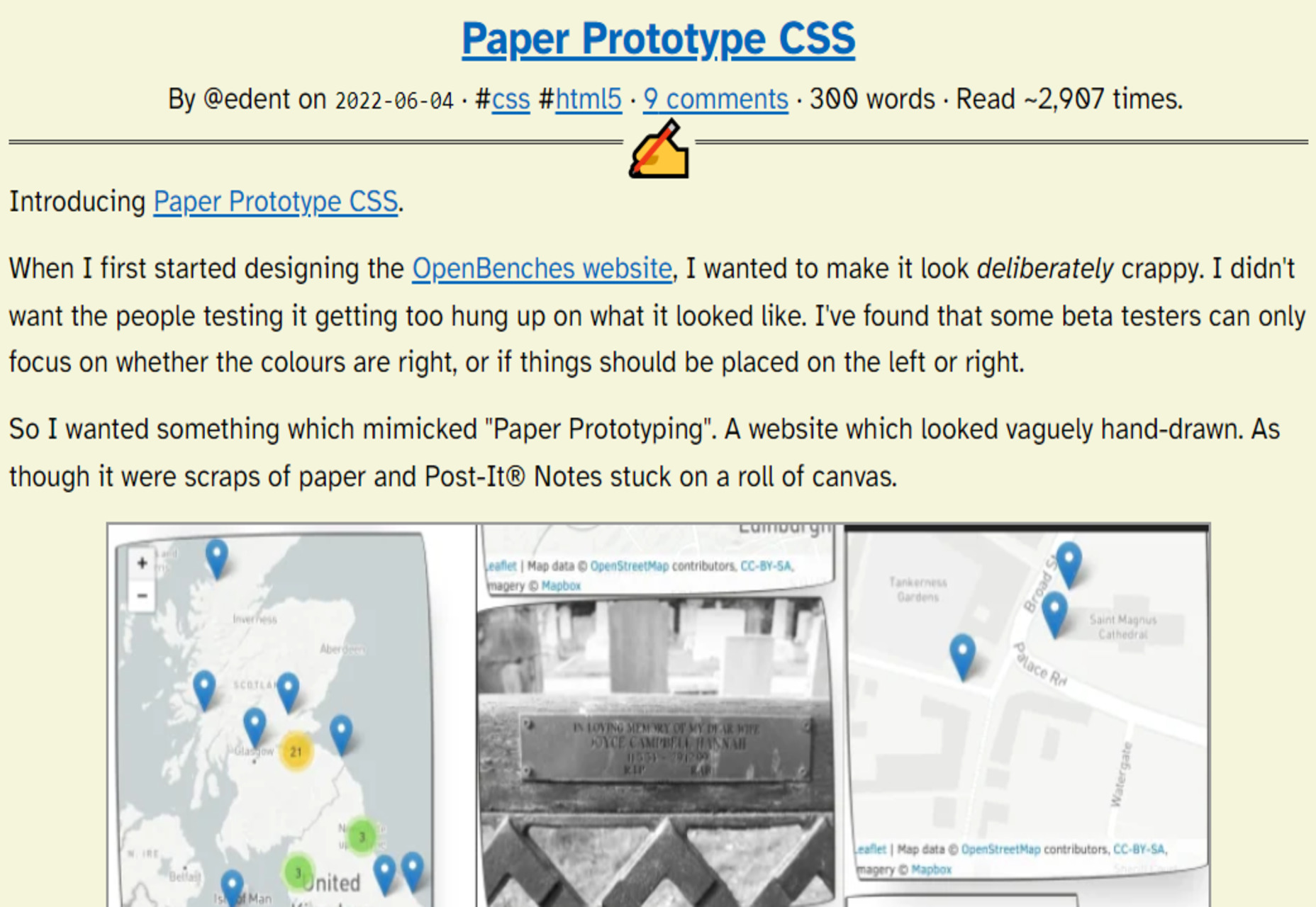
Paper Prototype CSS

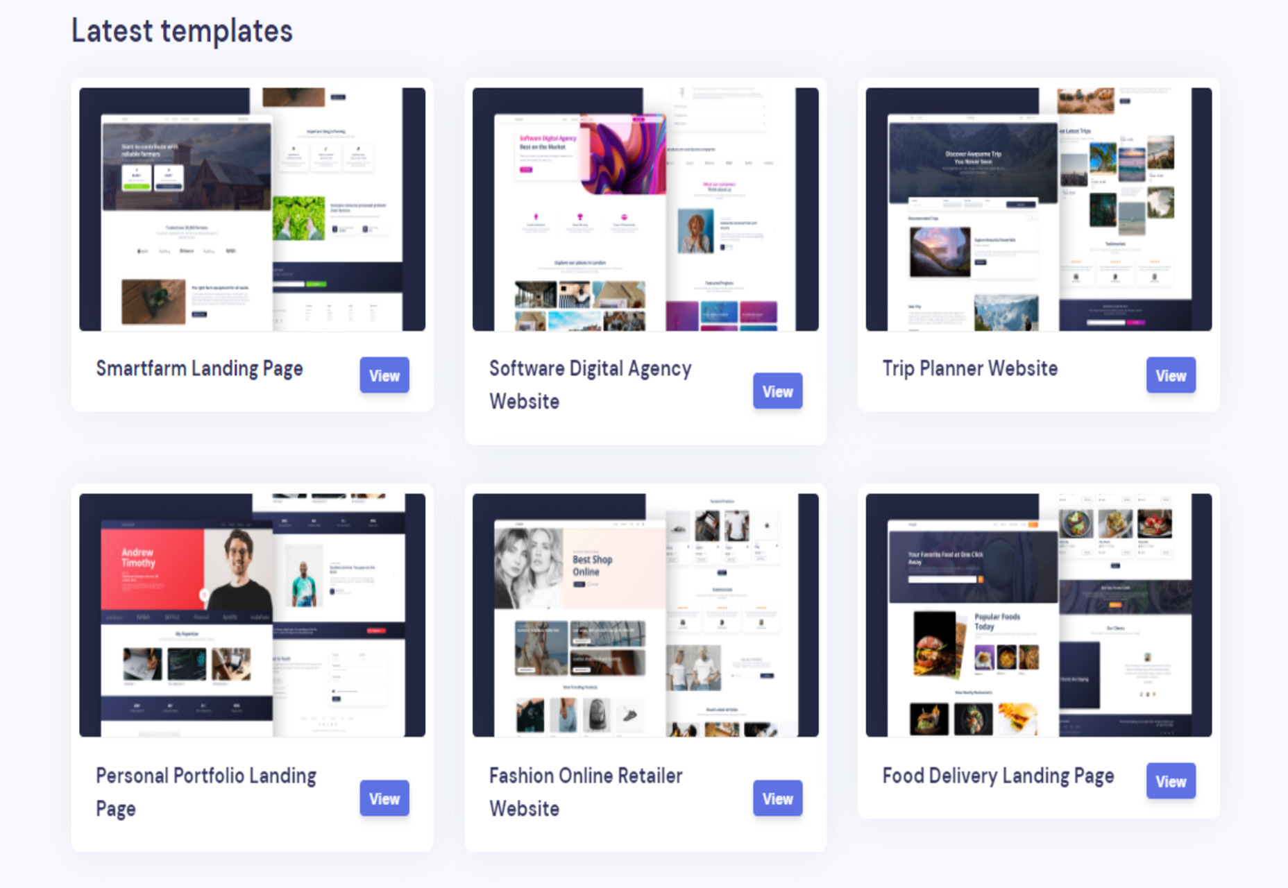
Loopple Landings – 40+ Ready to Use Templates for any Industry

Tips for Handing Off your Website Mockup to a Developer

The Surprising Psychology of Fonts

5 Tips for Writing Cleaner Code

Please Give Me Some Space

Orion – New WebKit Browser for Mac

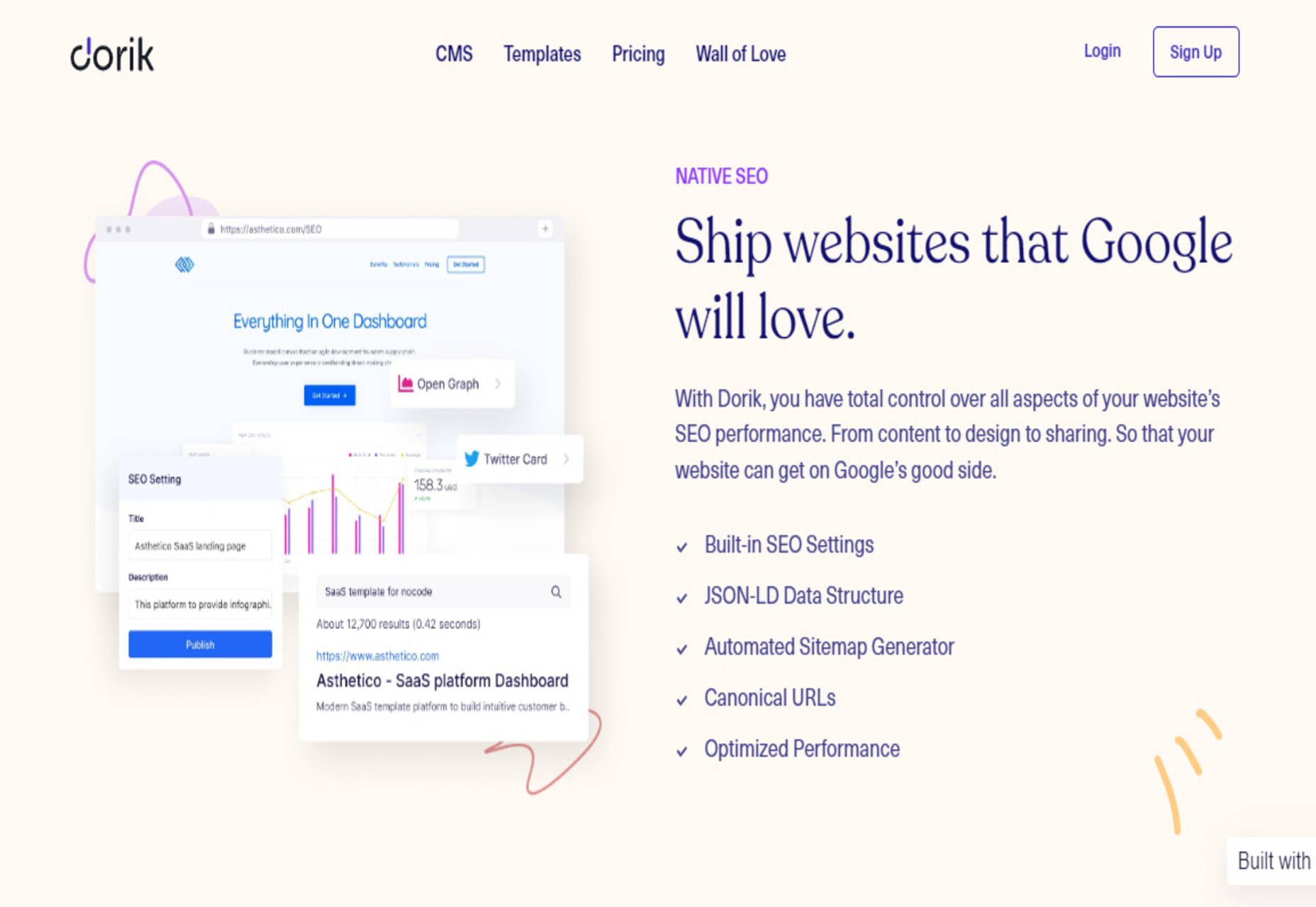
Dorik CMS – Simple, Affordable, and Flexible White-label CMS

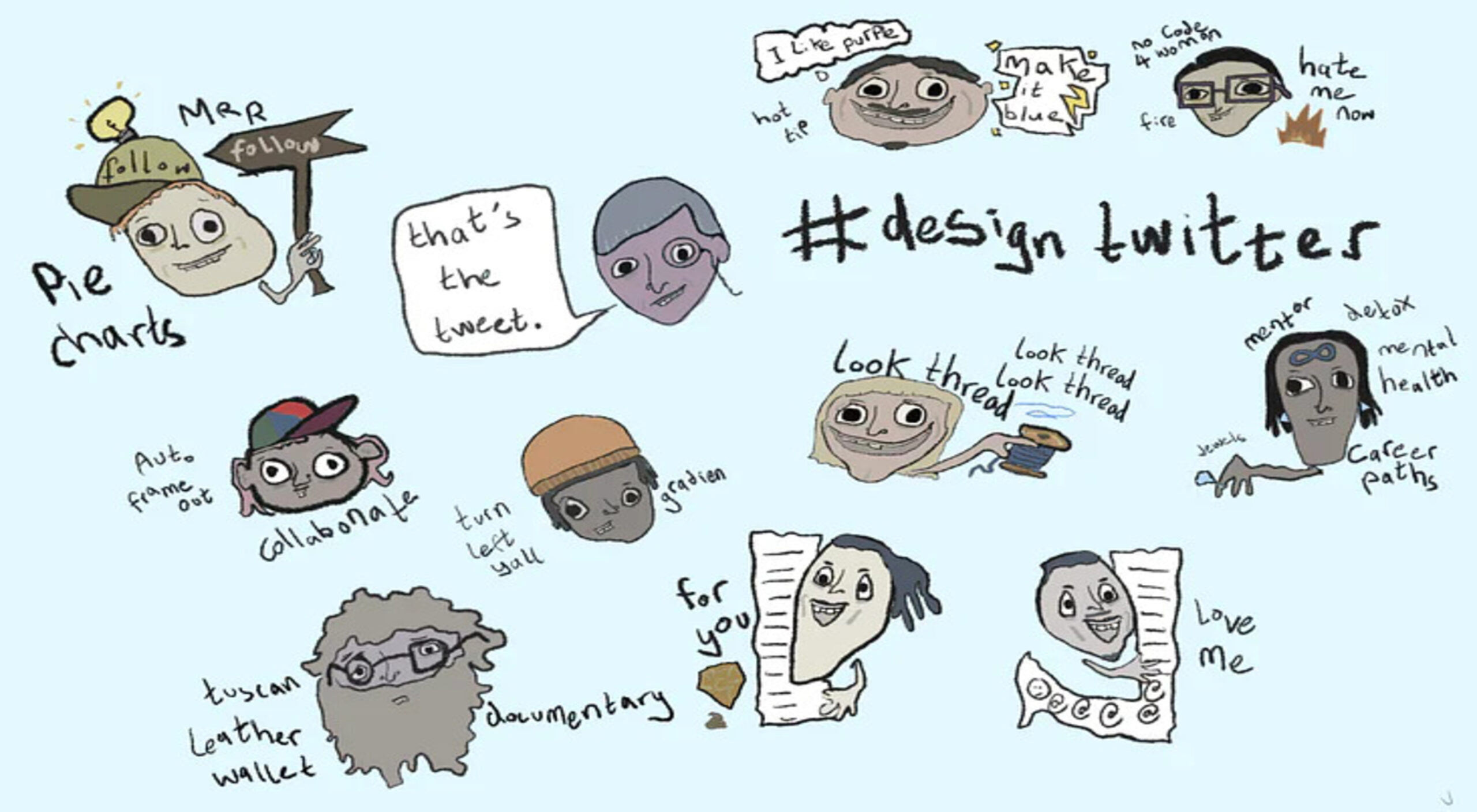
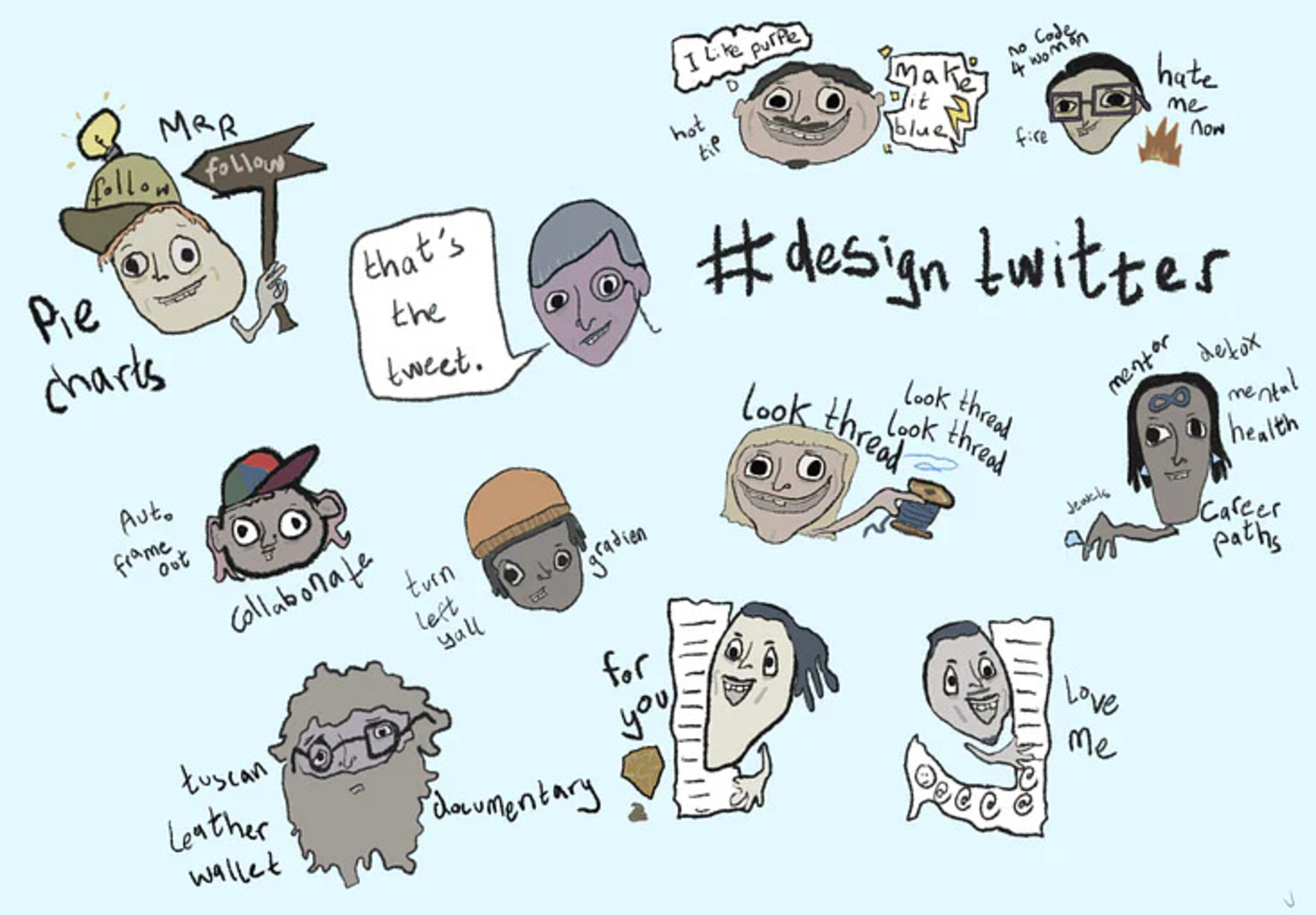
Design Personas for Twitter

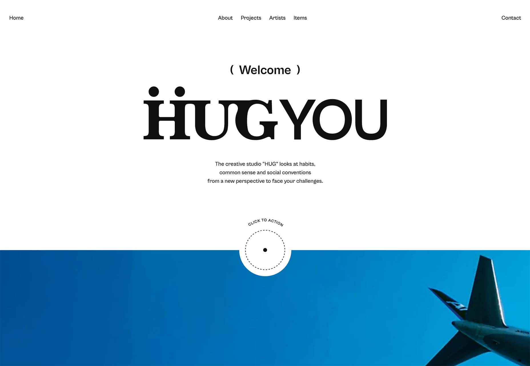
3 Essential Design Trends, June 2022

Source

The post Popular Design News of the Week: June 6, 2022 – June 12, 2022 first appeared on Webdesigner Depot.

Source de l’article sur Webdesignerdepot

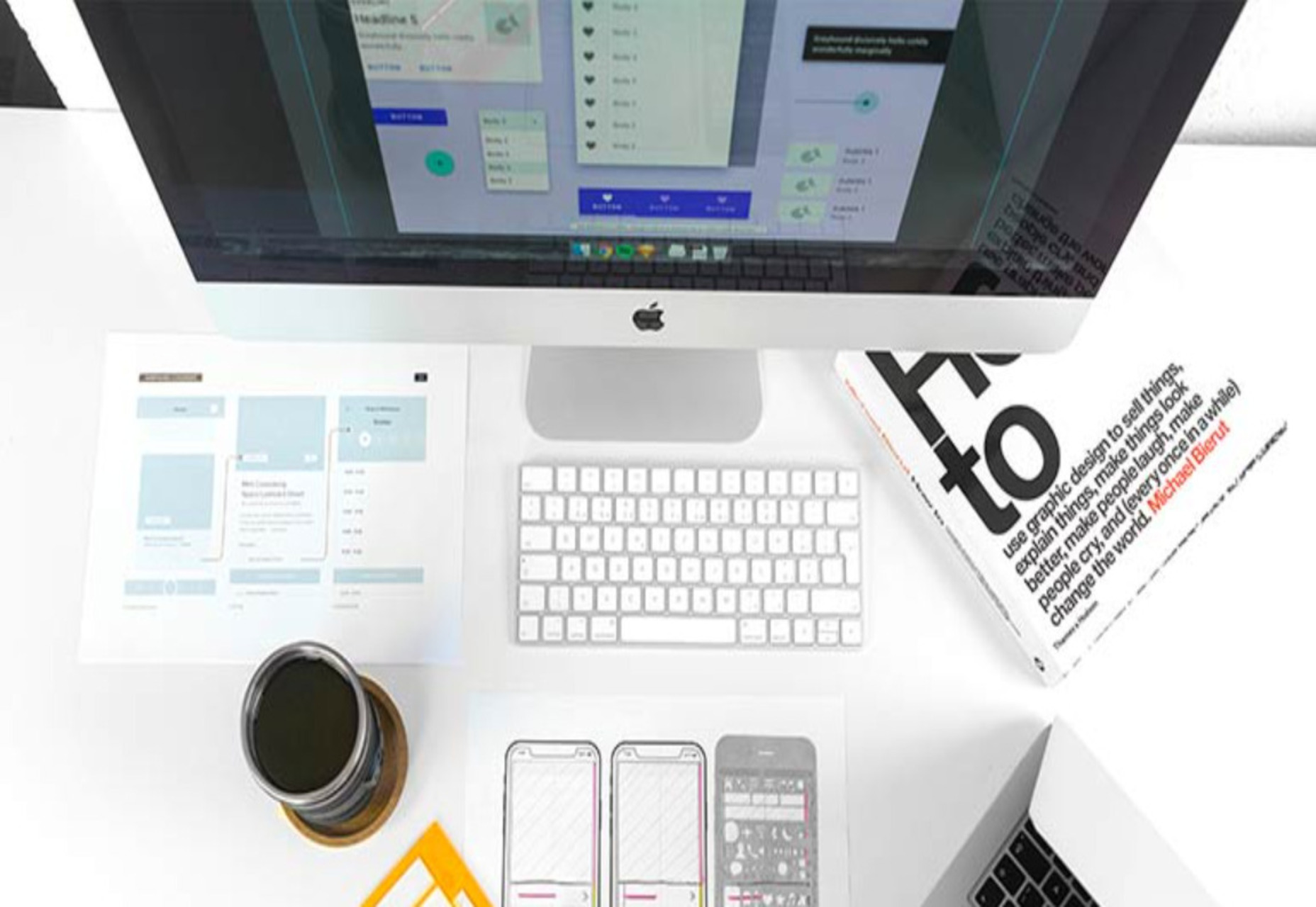
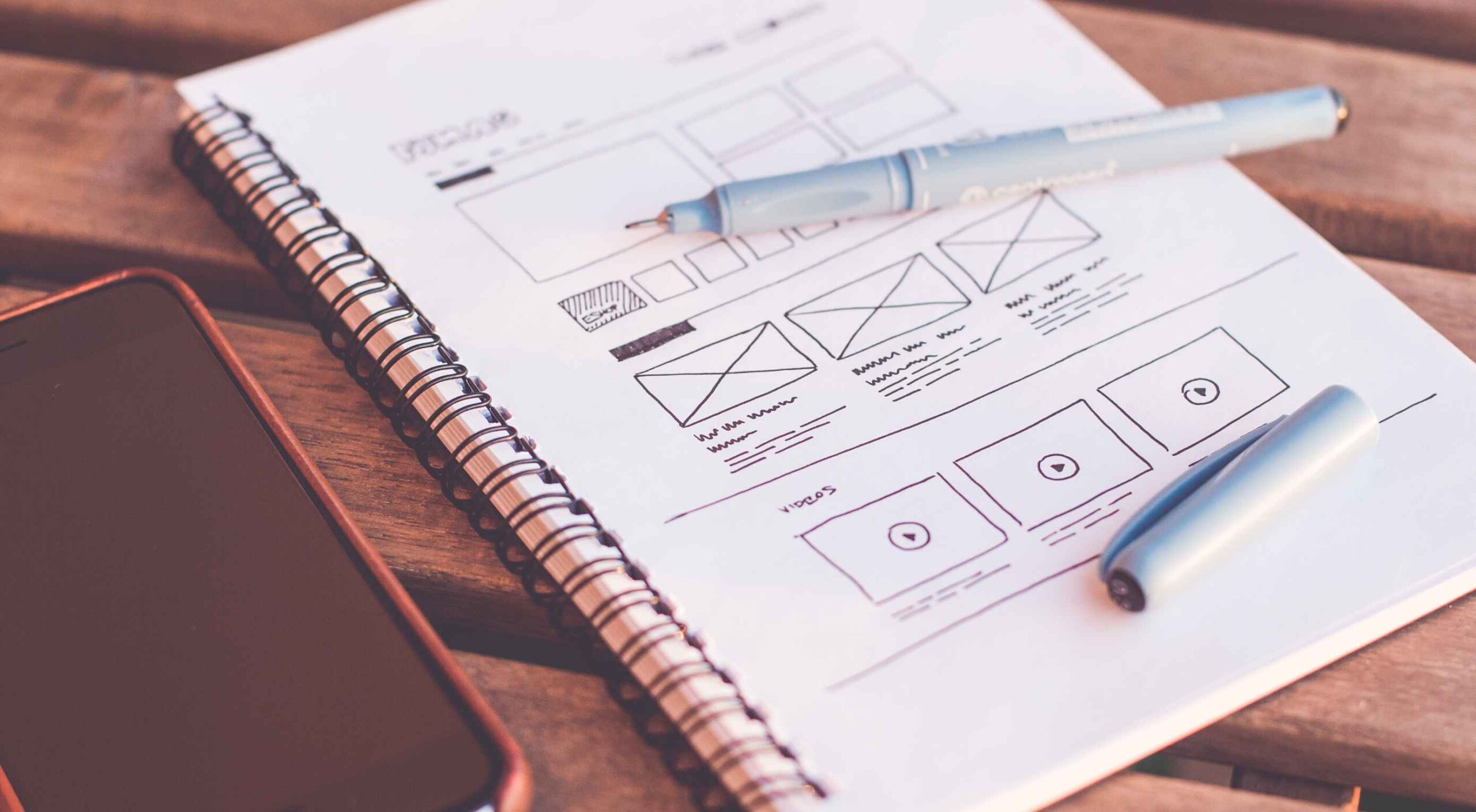
Wireframes are a powerful tool, especially for UX designers; whether you are developing a new app, a website, or anything else, the initial steps of any project can be tackled with this robust approach.

There are many occasions when we get stuck or overwhelmed for hours in front of a new project. This is where creating wireframes can be beneficial. A wireframe is nothing more than a diagram of your ideas for the flow of a project.

This post will analyze what wireframes are, and why they are so crucial for user mapping. Then, we will reveal the steps you need to follow to create an efficient wireframe. Let’s dive in…

What Is A Wireframe?

In a few words, a wireframe is a drawing created in the early stages of a UX project. Wireframes are a brilliant and effortless way to create a blueprint for the structure of a page.

In such a drawing, you can include valuable information about the UI and UX of the page you want to design.

You can think of wireframing as a process of visualizing the initial ideas you have about a project. It does not matter if you are comfortable with drawing; you can design wireframes on paper or digitally.

In either case, drawing a wireframe is not about your artistic skills. Instead, wireframes are about structuring your project and identifying the fundamental interactions you want to build out.

Why Is Wireframing Important For UX Designers? 

If you are an experienced UX designer, you have already come across concepts like user mapping and user journeys. Mapping the entire user experience is crucial. And that’s the main reason why wireframing is a must for a UX project.

Since you need to provide a top-notch user experience, wireframing is a great way to ensure this from the earliest stages of your design. But what is the process you need to follow when designing wireframes?

And how can you ensure that your wireframes are efficient? Let’s find out…

Creating An Effective Wireframe In 5 Simple Steps

Creating a good wireframe will allow you to construct your project. You will think it through, prioritize some fundamental interactions and consider alternatives.

1. Research

Although this is not a wireframing step per se, it is critical to the efficiency of your wireframes. How can you start drafting without doing user research? Well, you can not. That’s why the first thing you need to do is analyze your project.

All you have to do is seek similar products/services and check them out. Look at what your competitors are doing right and what they are doing wrong. This way, you will be ready for the next step.

2. Create Personas

You have already selected the best practices and ruled out other guidelines you believe will not be effective on this project. Now it’s time to think about user flow: How many screens will you put on a page? Where are users coming from, and where do you want them to go after reading this page?

By mapping your user flow, you can create a user persona. Then all you have to do is figure out what information to include. 

Mapping the information correctly is crucial because it will help you ensure that users do not get frustrated or overwhelmed when they visit your final page.

Once you do that, you are good to go. 

3. Start Sketching

It’s time to reach for your fine pen, pencil, eraser, and paper. Visualizing your ideas needs to be quick and efficient. Try to avoid fine details because this step is not about creating a high-fidelity wireframe on paper. 

All you need to do here is sketch out basic features and formats.

Since most of us designers are perfectionists, you can use a timer. Set the timer to 4-5 minutes and force yourself to finish the wireframe by that time. Repeat this step until you have created a few wireframes with which you are happy.

Finally, expand and polish your favorite mockups for a few minutes and prepare for the hard part.

4. Ask for Feedback

There is nothing more important than feedback when it comes to wireframing. Discuss your project with your colleagues. Just let them know how each mockup helps you with the project and what idea it visualizes.

Try to sincerely listen to what they have to say about your designs. Once you have gathered all the information and advice, start modifying the wireframe accordingly.

5. Add Details and Create Prototypes

It’s been a long road, but you are now at the point where you feel most comfortable as a UX designer: prototyping. Plenty of software (Adobe XD, Framer, Proto.io, etc.) can help you with this step. 

Start by turning your low-fidelity sketch into a high-quality prototype. Once you are happy with the result, test your prototype’s screens and see if the result serves the user flow. Platforms like UsabilityHub and Prott can help you with this.

Valuable Tips to Keep in Mind While Creating a Wireframe

Keep your Wireframes Simple: Creating a wireframe is not about fine details; try to manage the time you spend on it well. All you need is a clear and simple visualization of your page. You will have all the time you need for prototyping.

Don’t Worry About Your Artistic Skills: Anyone can draw. It’s as simple as that. You do not have to be an artist to create a clear wireframe to help you visualize your ideas. Be confident and make sure you include all the information you need.

Always Think of the User Personas You Created: Creating a wireframe is a smart way to ensure that the page you create meets the user’s needs. Therefore, you should always keep in mind what users will do when they open this page and whether it meets their needs and goals.

The Bottom Line

Creating a wireframe is not as difficult as you might think. All you need to do is research, find out what users need from this page, and create a map. By following these simple steps, you’ll ensure that the wireframes you design deliver a top-notch user experience.


Featured image via Pexels.

Source

The post 5 Simple Steps To Effective Wireframing first appeared on Webdesigner Depot.

Source de l’article sur Webdesignerdepot


Man working on machine

No-Code

No-code facilitates the reuse of predefined components, typically using a drag and drop interface or a web form. Such platforms always include things like identity and access management, and most importantly don’t require any code to stitch components together, therefore reducing the need for engineers to spend time architecting databases, APIs, or internal workflows. They are always related to one particular task and audience, like web development, spreadsheets, analytics, market automation, etc. Airtable, Zapier, Webflow, Retool, Waylay Digital Twin solution, and similar apps can be found in this category.

Low-Code

On the other hand, low-code has a different set of goals and user personas in mind. The major misconception about low-code is that the “low” in low-code means that a person with hardly any knowledge of coding is the user of such a platform.

Source de l’article sur DZONE

Inclusive design is often mistaken for accessibility, or even used as an interchangeable term, which is a good indication that most designers don’t know what it means.

Accessibility is a process that seeks to mitigate issues in a design that is not sufficiently universal; inclusive design increases the universality of the design. In real-world terms, an accessible building may replace its front steps with a ramp; an inclusive building is constructed at the same level as the sidewalk.

Accessibility is concerned with objective, measurable improvements. It’s a UI concern. Inclusive design is subjective, more difficult to measure, and is a UX concern. By designing inclusively, we extend our designs to the widest possible user group and contribute to a better society. Here are three ways to get started.

1. You’re the Edge Case

When designing, it’s normal to assume that we are normal. After all, we are the center of our experience of the world. Everything from our preferences to our empathy stems from our individual place in time and space.

When we use the term “edge case,” what we’re referring to is a minority experience, a way of using our design that is uncommon or distinct from our own expectations.

But what would happen if we treat ourselves as the edge case? What if all of the experiences that we deem to be minority experiences are actually the core, common user experience of our design?

If we start from the position that we are the one out-of-step with the design, that most people will not think or act as we do, then we’re eliminating thousands of biased decisions about how our design should be.

Draw From Life

It has always surprised me that in Europe’s dark ages — ranging from the decline of the Roman empire to the Proto-Renaissance — it didn’t occur to anyone to draw from life. Artists drew things the way they thought they should look, which is why so many Byzantine icons of the infant Jesus look like a middle-aged blonde man that has been shrunk.

It’s important to draw from real life as much as possible. That means abandoning personas — which are by definition under-representative and frequently loaded with bias — and engaging with actual users. Most of all, it means taking a step back and opening your eyes.

2. Stop Making Inclusive Design Part of Your Practice

Inclusive design cannot be a part of your practice; it’s an all-encompassing attitude. Your design practice must be inclusive. At least, it should aspire to be…

As human beings, we are biased—all of us. The reason for that is that bias — be it racism, misogyny, nationalism, homophobia, or anything else — is cultural. And we all exist within society. We’re all bombarded with information that reinforces those biases every day.

Accept that you have biases and that your biases will pull your design work away from the inclusive solution you aspire to. But equally, accept that by acknowledging your biases you’re limiting the influence they have over your decision-making.

Do Not Require Users to Self-Identify

It’s divisive and abusive to partition users into groups, especially when the act of doing so perpetuates bias.

One of the most encouraging developments of the last decade has been the introduction of the answer “prefer not to say” in response to personal questions about race, gender, status, and so forth. But if “prefer not to say” is a valid option, in other words if you don’t actually need to know, then why ask at all?

Beware Occam’s Razor

Occam’s Razor is an often misquoted idea that (to paraphrase) states that when making a decision, the one with the least assumptions is the correct choice.

The problem is that Occam’s Razor implies that there is a ‘correct’ decision. But in fact, inclusive design benefits most from a flexible UI and a high tolerance for deviation.

If you can identify the assumptions in a design decision sufficiently to count them, then you’re best served by testing, not comparing, those assumptions.

3. Design Flexibility Into Everything

There is no such thing as a “natural normal,” but there is “perceived normal.” Much of our behavior is governed by the experiences we’ve had since we were very young. Despite existing somewhere on a scale of ability and preference, most of us have inched towards what we have been told is a “normal” range all our lives.

However, it is a physiological fact that every characteristic exists somewhere on a spectrum. There are no black and whites; it’s all grey.

When we design a site or app, we tend to silo certain characteristics into one. Someone who is visually impaired is treated to the same ‘solution’ as someone who is blind, even though visual impairment can range from screen reflections on a sunny day to someone who was born without optic nerves.

There are people who have lost their sight through degeneration or accident and will be able to make visual connections based on remembered visuals. Other people have never seen anything and their conscious mental process isn’t figurative at all.

To accommodate the full gamut of possible interactions with our design, we need to design to a scale, not with absolute values. This means thinking less about set colors and sizes and more in terms of contrast and scale.

Avoid Communicating in Color

Few areas are more indicative of a spectrum of experiences than color.

Color is instantly problematic for designers because quite apart from color blindness, color has deeply personal associations.

Over the last couple of decades, it’s been repeatedly proven that it is contrast, not hue, that increases engagement. Green does not always mean go; red does not always mean stop.

Color involves so many biases and assumptions that it’s simply better to work with contrast than select the ‘right’ hue.

Bigger Typography (Sometimes)

In the first draft of this article, I wrote that increasing the scale of your typography was always good.

My rationale was that some users will benefit from larger type, and zero users will be hindered by it. But that’s not true. Larger type means fewer lines per viewport, which means more scrolling; not a problem for some users, but potentially an issue for those with motor control issues.

That was one of my biases right there.

Congratulations, You’re Now An Inclusive Designer

Good design is self-aware in origin and unselfconscious in execution.

Inclusive design isn’t about enabling access for everyone; it’s about designing for a user experience that is welcoming and respectful. Every one of your users should feel not just enabled but validated.

Inclusive design isn’t a series of items on a checklist; it’s an ideal, like harmony or beauty, that we may struggle to achieve but that we should strive for nonetheless.


Image via Pexels.

Source

The post 3 Ways to Design More Inclusively first appeared on Webdesigner Depot.


Source de l’article sur Webdesignerdepot

La plupart des pays industrialisés recyclent leurs déchets depuis déjà des décennies. Nous trions le verre, le plastique, le papier et le textile en les jetant dans les poubelles prévues à cet effet. Mais qu’advient-il ensuite de ces déchets ? En faisons-nous assez ? Et qu’en est-il des régions qui sont devenues des dépotoirs ou qui n’ont pas mis en place de systèmes de recyclage ?

Malgré nos efforts, près de 9 millions de tonnes de plastique sont déversés chaque année dans les océans en raison de notre modèle de consommation linéaire actuel Extraire, Fabriquer, Jeter.

L’entassement des déchets dans les décharges n’arrange rien. Pas moins de 1,3 milliard de tonnes de déchets sont mis en décharge chaque année et ce chiffre devrait grimper à 2,2 milliards de tonnes en 2025. Les dommages causés à l’homme, à la faune sauvage et à l’environnement sont considérables, mais nous pouvons prendre des mesures pour les atténuer.

Le cas des vêtements

Outre les déchets plastiques et électroniques, les textiles, notamment les textiles non biologiques, sont en grande partie responsables du problème. Selon l’Agence de protection de l’environnement des États-Unis (EPA), les Américains jettent 13,1 millions de tonnes de textiles par an, dont 15 % seulement sont recyclés. Cela signifie que plus de 11 millions de tonnes de textiles sont déversés chaque année dans les décharges, libérant dans le sol des colorants et des produits chimiques qui contaminent les eaux souterraines et nuisent à l’environnement. Pire encore, à mesure que les textiles se décomposent, ils libèrent du méthane, un gaz à effet de serre nocif qui contribue de manière significative au réchauffement climatique.

L’industrie textile est la plus polluante après le logement, le transport et l’alimentation. L’apparition des achats en ligne a bouleversé nos habitudes. Aujourd’hui, les consommateurs commandent les articles en plusieurs tailles ou plusieurs couleurs, les essaient et retournent ce qui ne leur convient pas, ce qui crée de nouveaux défis pour les commerçants. De nombreux détaillants sont contraints de jeter plus de 25 % des articles retournés, soit des tonnes de marchandises neuves déversées chaque année dans les décharges.

Dans ce contexte, le secteur de la mode éphémère est soumis à de fortes pressions pour repenser sa stratégie de production et merchandising en vue de réduire les dommages écologiques.

Quatre gestes pour réduire les déchets

La protection de l’environnement relève de la responsabilité collective. Si les gouvernements, les consommateurs, les fabricants et les détaillants font leur part du travail, il est encore possible d’inverser la tendance. En tant que citoyens et consommateurs, nous avons un rôle important à jouer.

Nous pouvons tous refuser d’acheter des articles en plastique à usage unique, des produits vendus dans des emballages superflus ou des vêtements bon marché qui finissent dans des décharges après avoir été portés une ou deux fois.

Nous pouvons réduire les déchets en évitant d’en générer, par exemple en réduisant le volume des marchandises achetées en ligne, puis retournées au vendeur. Pour ce qui est de la réutilisation, cette pratique est en plein essor. Des friperies aux associations caritatives, il existe de nombreux moyens de remettre des textiles, meubles et appareils sur le marché plutôt que de les déverser dans les décharges.

Enfin, le recyclage doit être l’objectif ultime. Il permet non seulement de réduire la dépendance à l’égard des matières premières, mais il crée des emplois et diminue l’impact de notre société de consommation sur l’environnement.

Toutefois, il existe encore un énorme fossé entre ce que nous aspirons à faire en tant que consommateurs et notre comportement au quotidien.

Même si plusieurs études, telles que l’enquête sur les emballages plastiques de 2017 réalisée par l’institut britannique de sondage Populus, confirment la motivation des consommateurs à mieux gérer leur consommation et leurs déchets de matières plastiques, il reste encore beaucoup à faire. Par exemple, les étiquettes d’emballage sont souvent source de confusion et la communication des collectivités locales sur les options de recyclage disponibles n’est pas suffisamment claire.

Une participante à une enquête a donné un excellent exemple de la complexité à laquelle les consommateurs sont confrontés lorsqu’ils tentent d’adopter les bons gestes. « J’ai effectué des recherches sur les couches biodégradables, qui me semblent être une bonne idée », a-t-elle déclaré. « Mais apparemment, ces couches peuvent uniquement être recyclées dans un composteur. Si elles sont mises en décharge, elles produisent du méthane, ce qui est réellement nocif pour l’environnement. »

Le défi de SAP concernant les matières plastiques

S’agissant des matières plastiques et de la pollution qu’elles engendrent, une manière de résoudre le problème serait de les éliminer tout simplement de la chaîne logistique.

L’an passé, l’équipe SAP Leonardo a lancé un projet d’innovation collaborative dans le cadre du UK Plastics Pact de WRAP afin de trouver de nouvelles solutions face au problème de pollution plastique. L’initiative a débuté par une enquête ethnographique visant à déterminer comment les citoyens perçoivent le défi de la pollution plastique. Sur la base des résultats de l’enquête, cinq personas ont été développées pour représenter les attitudes et comportements qui prévalent aujourd’hui dans la société britannique, depuis les sympathisants jusqu’aux ardents défenseurs de l’écologie.

Plusieurs thèmes sont ressortis de cette étude : le devoir de réduire la consommation de matières plastiques, la confusion et les mythes sur le recyclage, la nécessité d’apprendre et de répondre de manière appropriée et, enfin, la nécessité de sensibiliser.

Dans le cadre de la deuxième phase du projet, un marathon de programmation et une session de conception créative organisés sur trois jours ont rassemblé des experts et des innovateurs de SAP et de grandes entreprises internationales comme Unilever, HSBC et Deliveroo. Les équipes ont été invitées à concevoir des prototypes de produits et services autour des cinq thèmes pour les différents personas. Les prototypes sont en cours de développement et de test dans une phase d’incubation. Les solutions visant à éliminer le plastique seront présentées à l’occasion de l’exposition collective Design Frontiers, qui se déroulera au London Design Festival en septembre prochain.

Autres bonnes nouvelles

Pour ce qui est de la gestion des déchets industriels et ménagers, le lot d’efforts déployés varie d’un pays à l’autre. La Suède importe à présent des déchets, car moins de 1 % de ceux générés dans le pays se retrouvent dans des décharges. Le reste est recyclé ou brûlé pour chauffer les maisons. Le processus est tellement efficace que la Suède s’est mise à manquer de déchets et a commencé à en importer auprès de pays voisins pour alimenter son programme national de valorisation énergétique.

L’Allemagne est un autre exemple : sur les 45,9 millions de tonnes de déchets ménagers produites en 2017, seules 0,5 million de tonnes ont été mises en décharge grâce aux directives de l’UE, à des réglementations nationales strictes en matière de gestion des déchets et à des installations de traitement des déchets de pointe. La ville de Heidelberg, par exemple, a ajouté des capteurs intelligents à ces bacs à ordures et les a connectés à la solution SAP Connected Goods. La ville dispose désormais d’une visibilité en temps réel sur l’état des déchets, ce qui réduit le nombre de camions à ordures sur la route, en éliminant le ramassage inutile et le remplissage excessif. Cela a également contribué à la réduction du bruit, du trafic et de la pollution.

On constate aussi des progrès dans le Global Fashion Agenda. À la fin du premier semestre de l’année dernière, l’Engagement 2020 en faveur du système de mode circulaire avait été signé par 94 entreprises représentant 12,5 % du marché mondial de la mode. Ces entreprises se sont engagées à collecter et revendre des vêtements et des chaussures, de même qu’à accroître la part de vêtements et chaussures fabriqués à partir de fibres recyclées. Elles ont également promis de rendre compte des progrès annuels et, plus important encore, de transformer leurs pratiques commerciales linéaires actuelles.

De plus en plus d’entreprises prennent conscience des avantages d’une approche circulaire et de plus en plus de consommateurs réclament des produits et services plus durables. Dès lors, il est encore possible d’inverser la tendance.

Découvrez Isabelle Pierard et son entreprise Soulyé

Click the button below to load the content from YouTube.

Découvrez Isabelle Pierard et son entreprise Soulyé

Publié initialement en anglais sur Forbes dans la catégorie Brandvoice

The post Quatre manières de préserver notre planète appeared first on SAP France News.

Source de l’article sur sap.com

I’ve worked with Developer Relations for many years now, and I think it’s a fascinating topic with many takes on what it is and how to do it! I wanted to share my view on it here, and what I think it encompasses.

Last year I gave a presentation called "Have you tried listening?" at the DevRel Summit which I think outlines a number of the main DevRel concepts and areas, and examples from my personal experiences with them.

Source de l’article sur DZONE