Articles

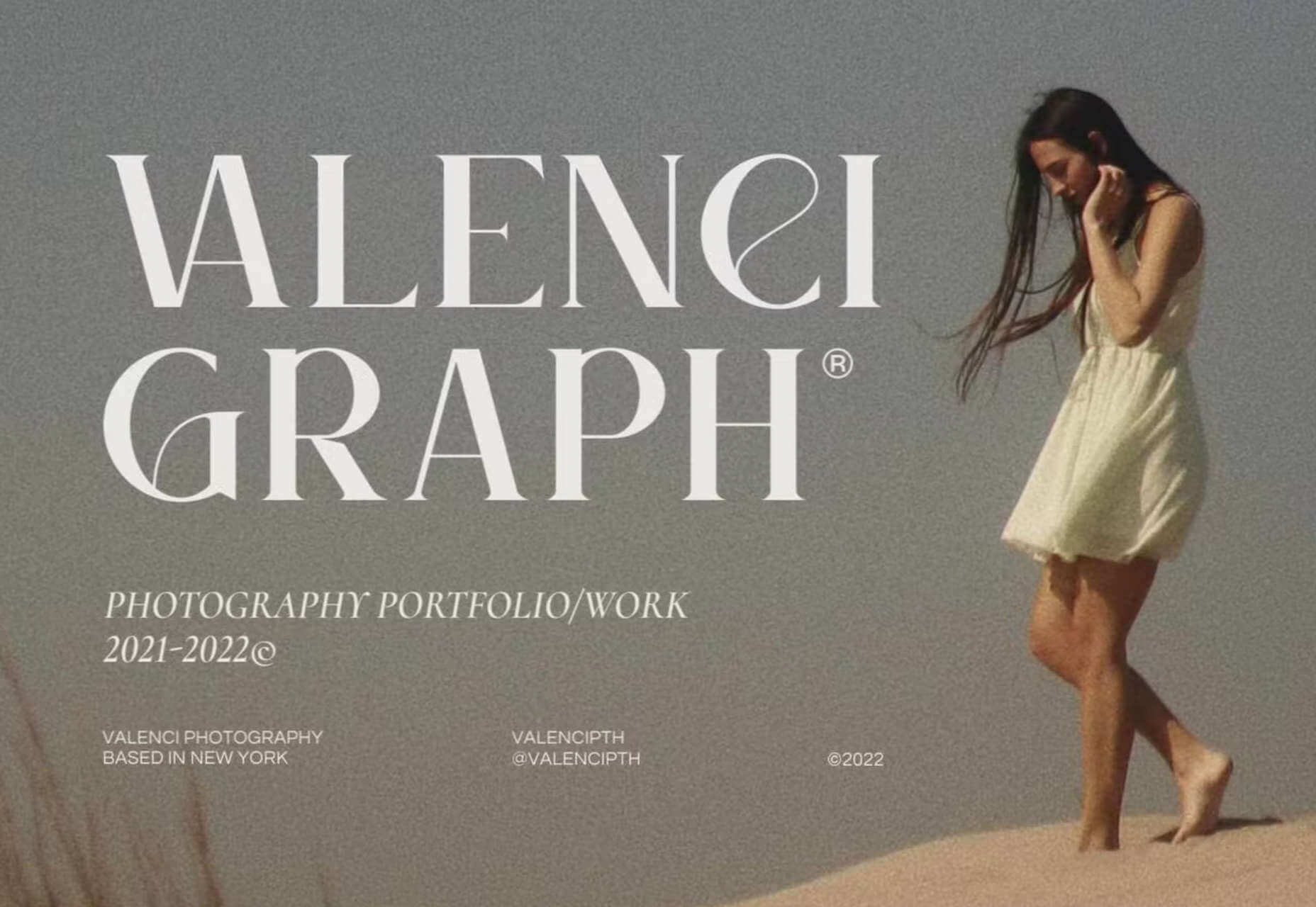
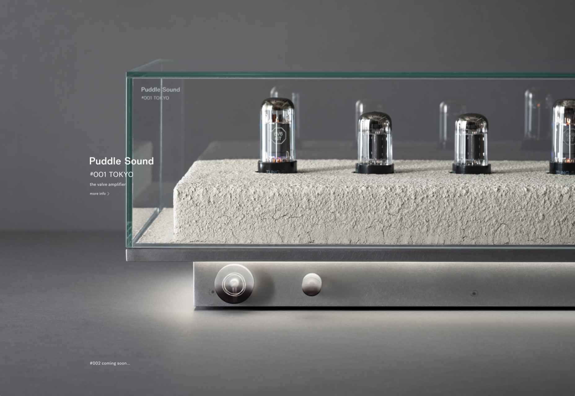
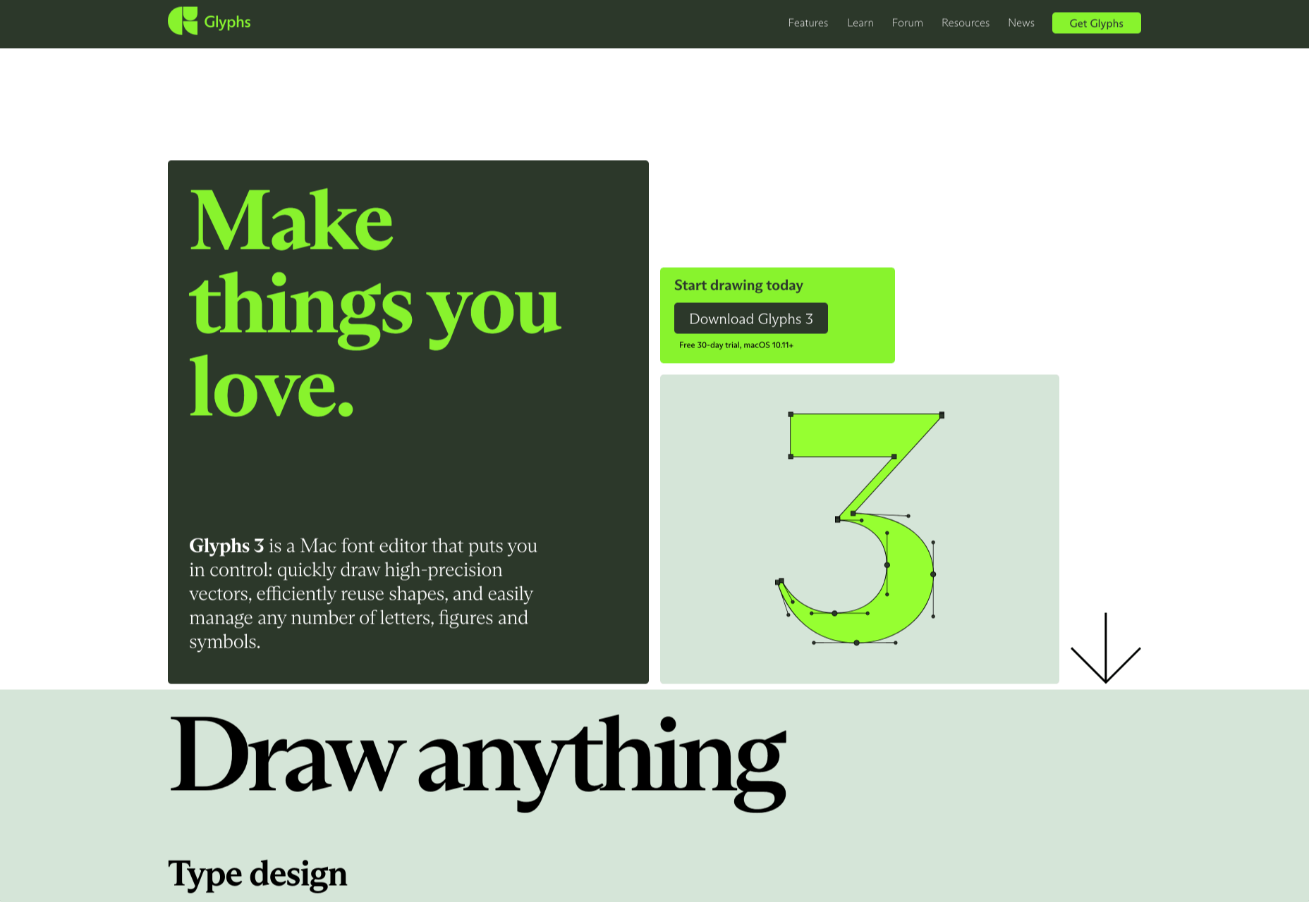
Choosing the right typefaces for your website can elevate a design from dour to delightful. The right typeface gives personality to your brand voice and can make sure your content gets read.

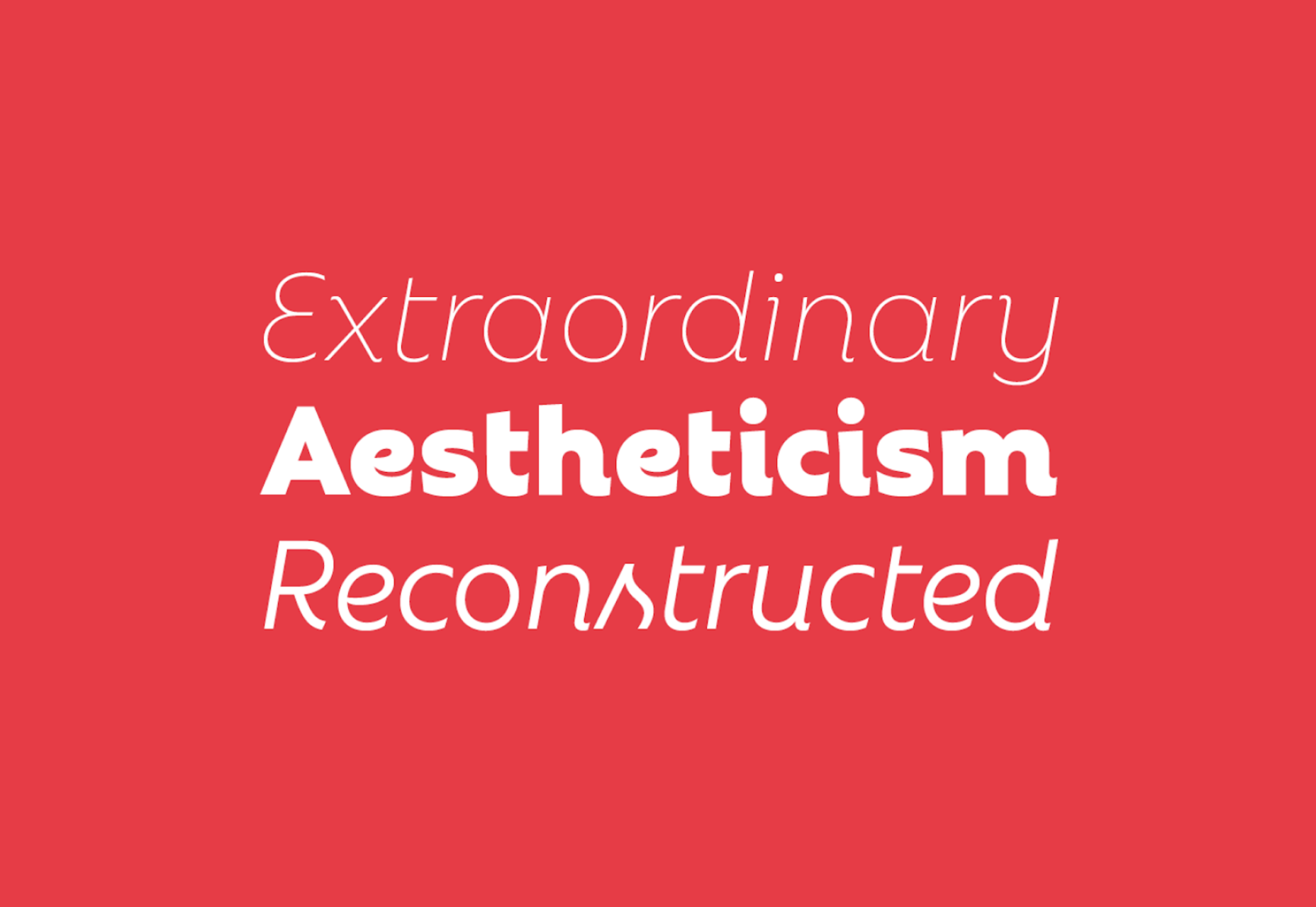
And so, every month, we put together a roundup of the best new fonts for web designers. In this roundup of the year, we look back at the past twelve months and showcase our forty favorite fonts of 2022. Enjoy!
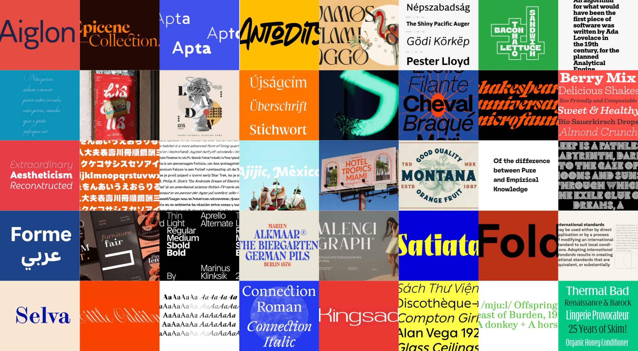
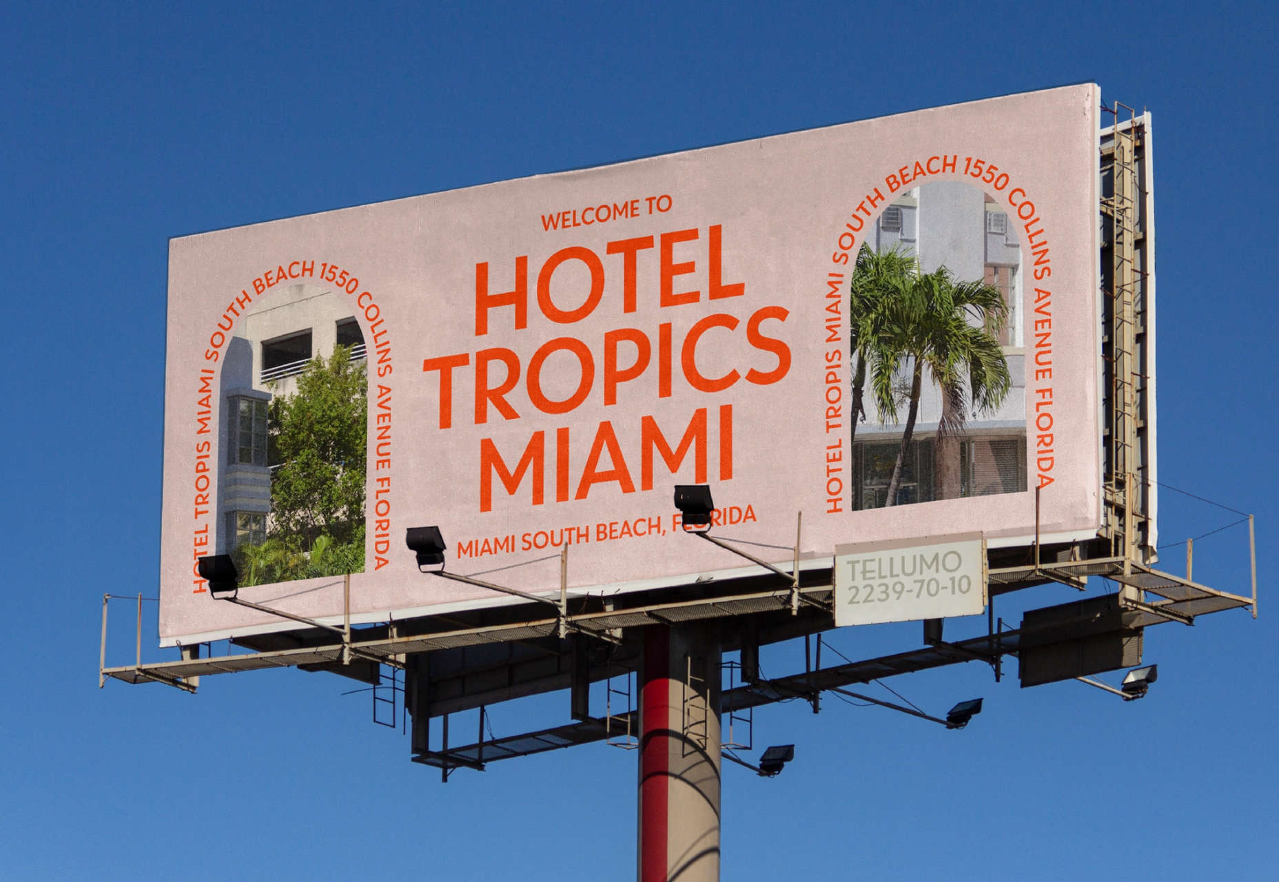
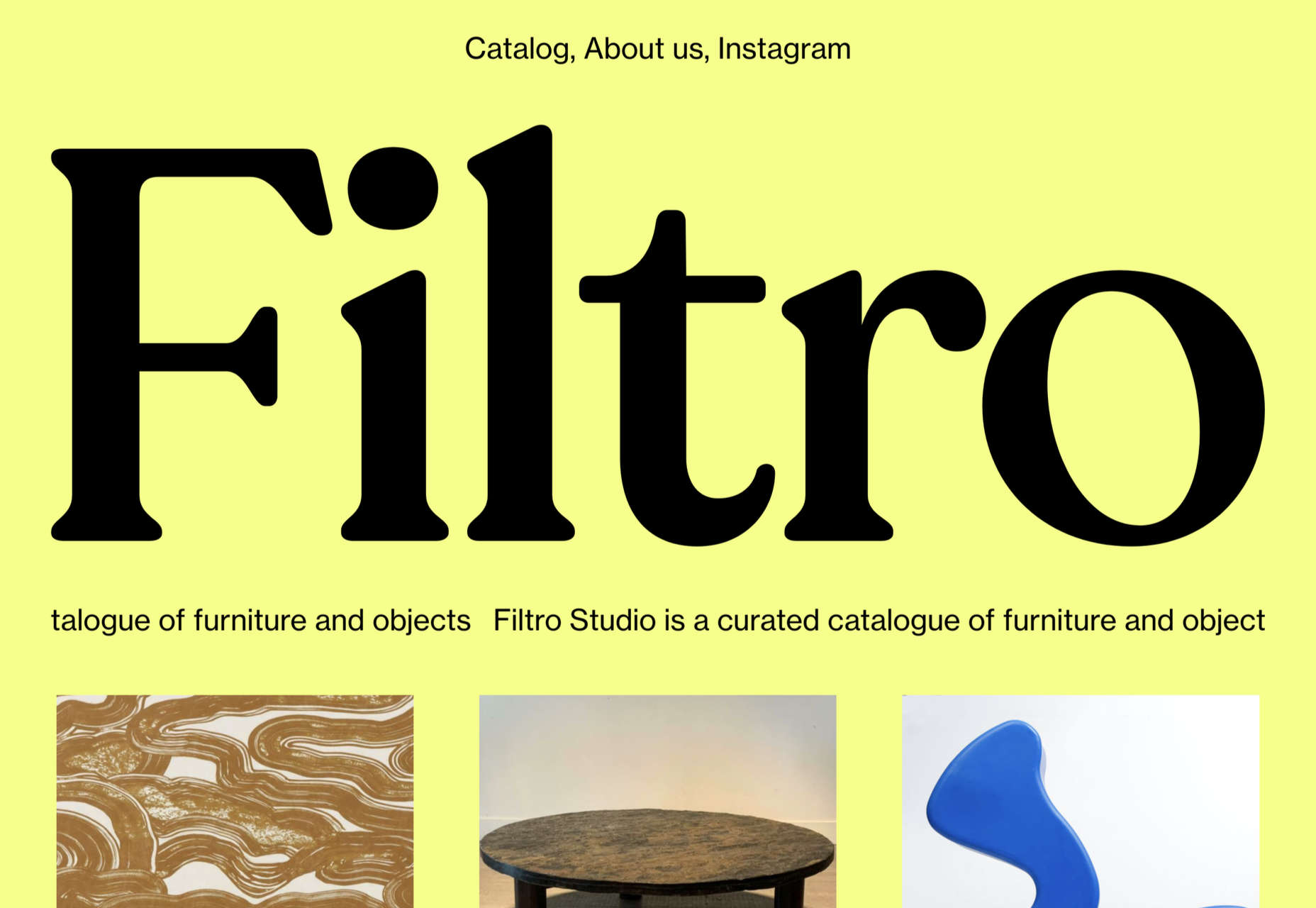
Tellumo

Tellumo is an elegant geometric sans-serif that oozes positivity. It comes with a standard set of caps and an alternative set of swash caps.
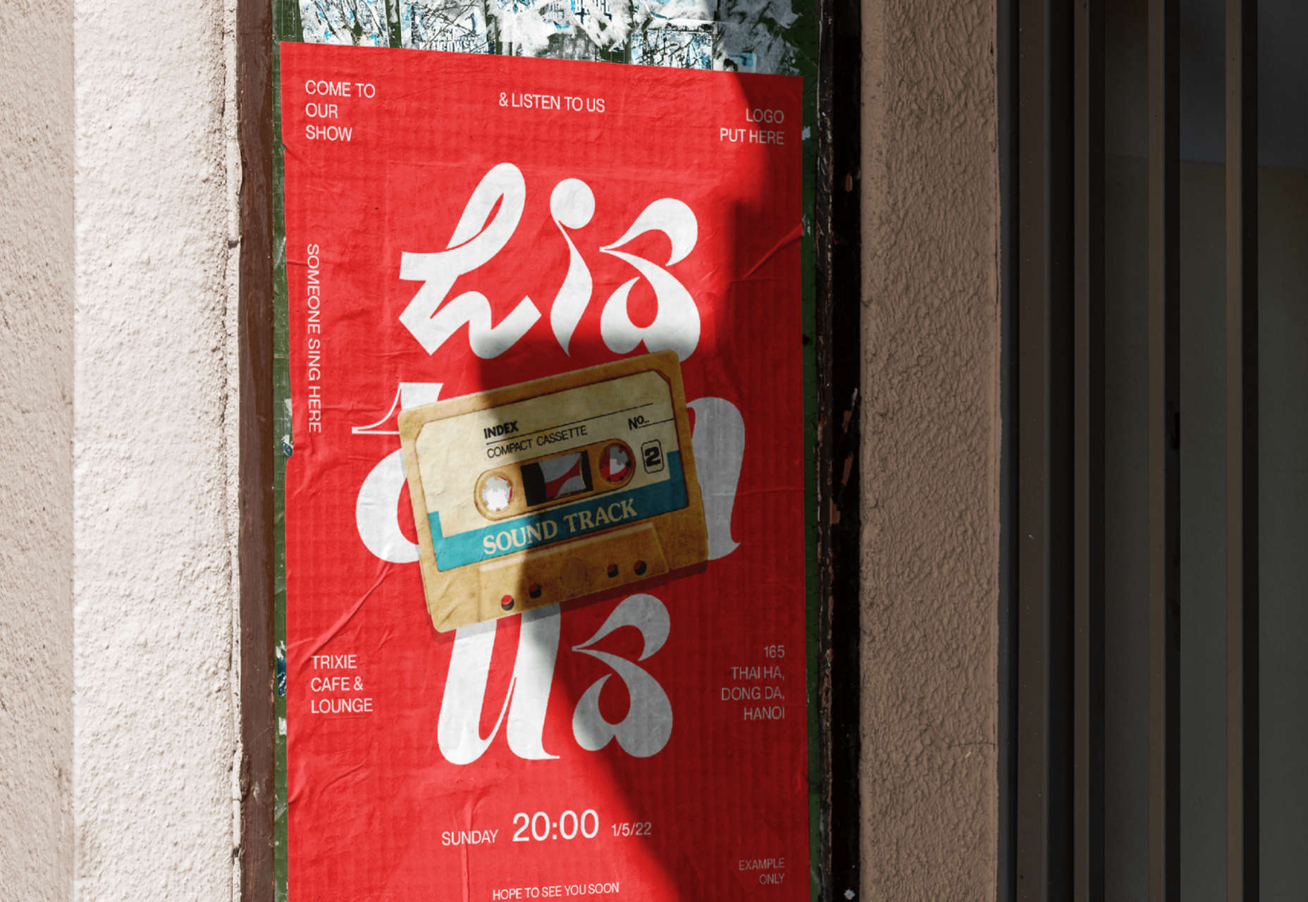
DT Random Display

DT Random Display is an original approach to typeface design. It’s perfect for posters or a branding project with a courageous client.

Rebrand

Rebrand is a sans-serif packed with character. There are display and text versions, each with seven weights.
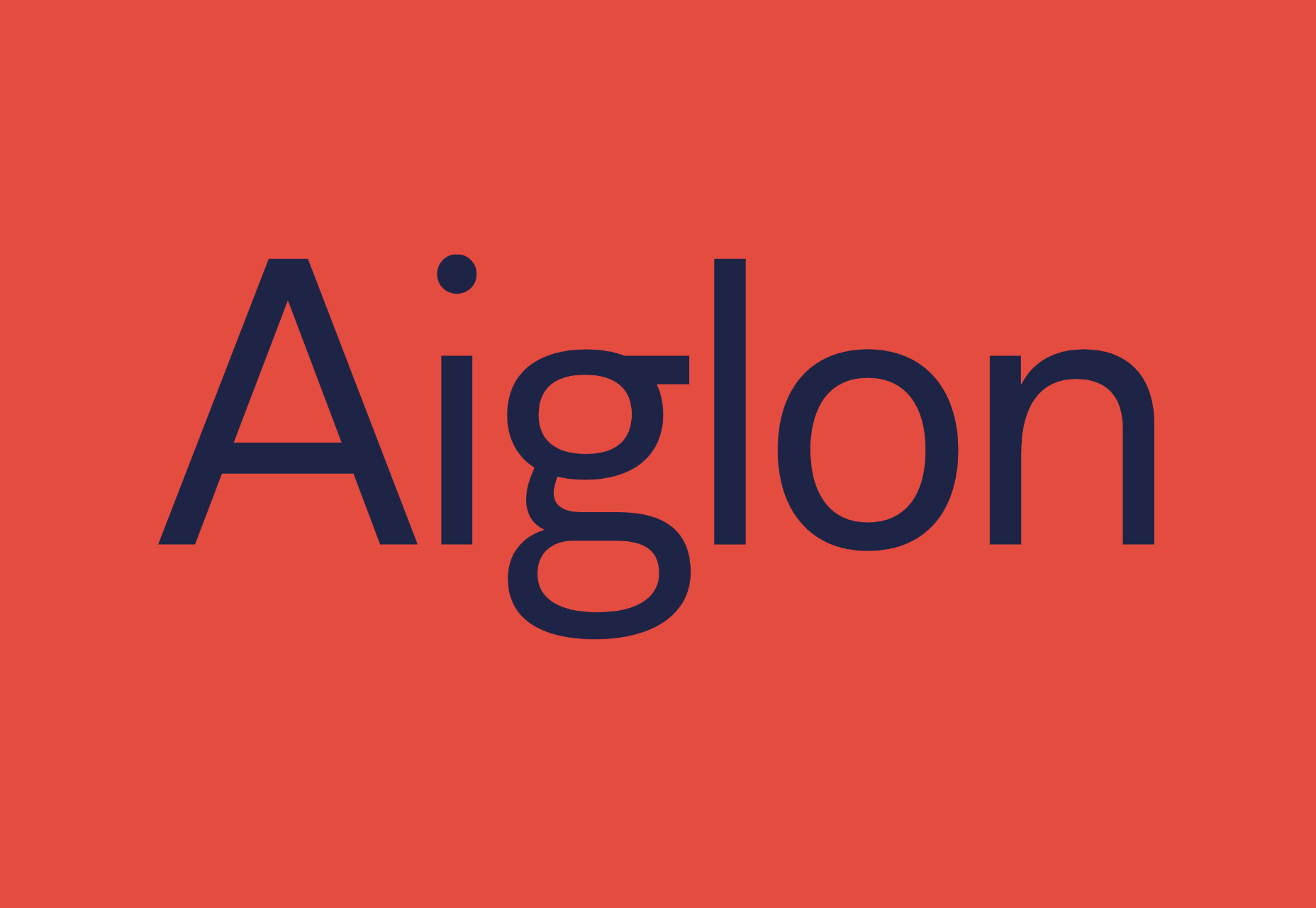
Aiglon

Aiglon is a monolinear semi-geometric sans-serif. It is simple and forthright, without being dull or forgettable.
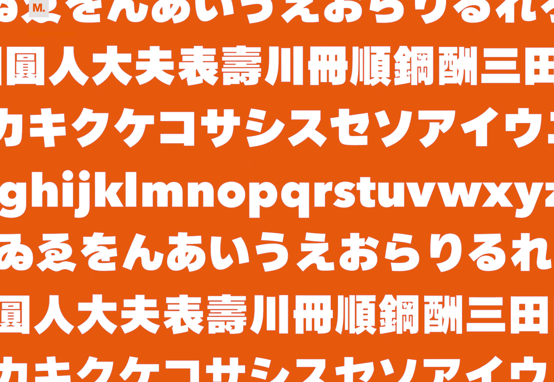
Shorai Sans

Shorai Sans is a blend of geometric sans-serif and calligraphic brushstrokes. As well as Latin glyphs, there’s a complete set of Japanese characters.
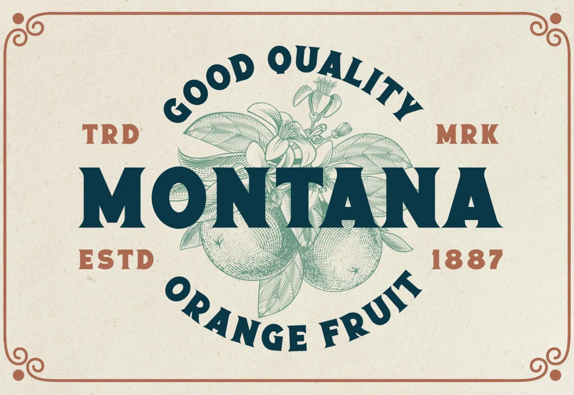
Monden

Monden is a high-contrast serif with a clever little kick on the lowercase h, m, and n that adds richness to body text.

Canora

Canora is a calligraphic typeface with two styles: Frente leans to the right, and Verso leans to the left.
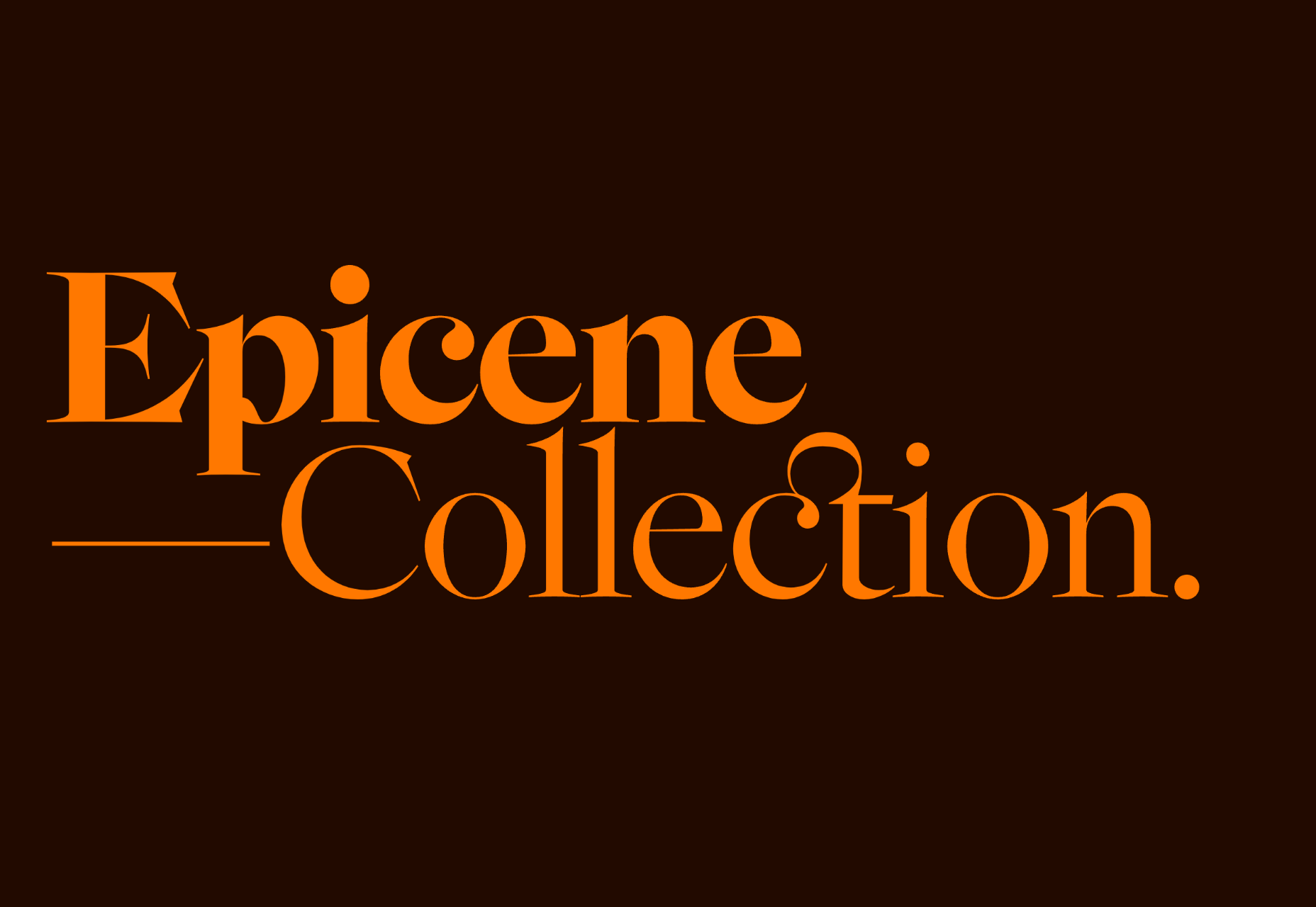
Epicene

Epicene is a beautifully baroque typeface with some intriguing details. There are two families, a display version and a text version.
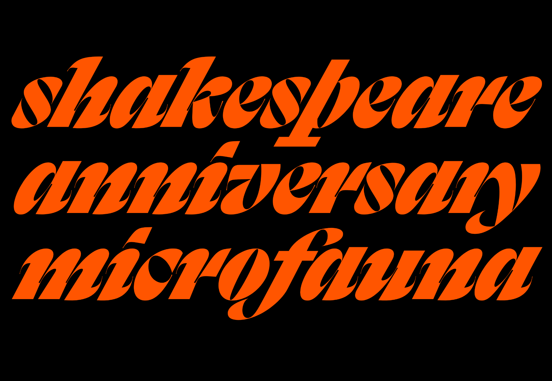
Sangbleu

Sangbleu is a super-family of typefaces with five complementary styles: Empire, Kingdom, Republic, Versailles, and Sunrise.
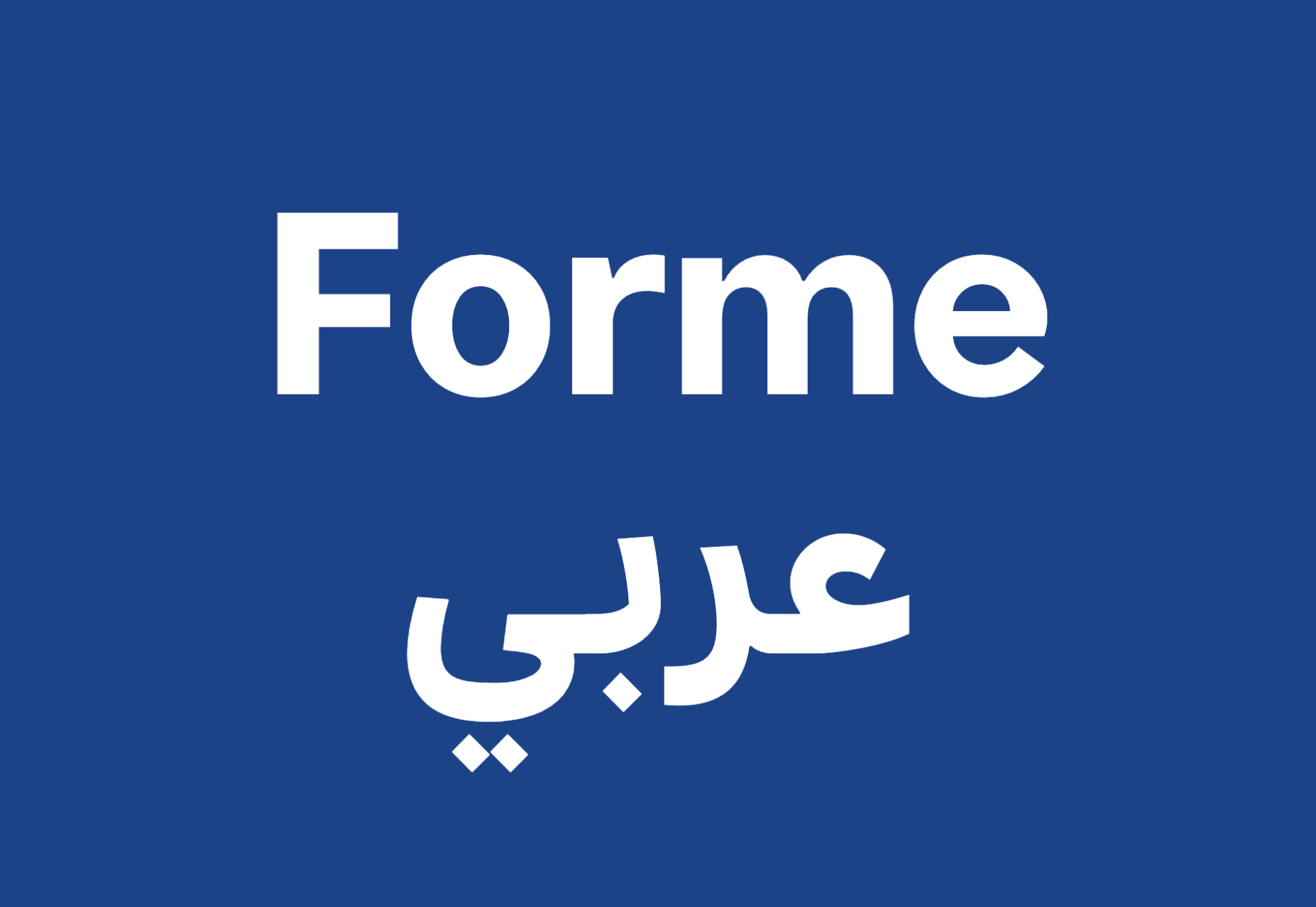
Forme

Forme is a typically British grotesque typeface with the bonus of having an equally functional Arabic sibling.
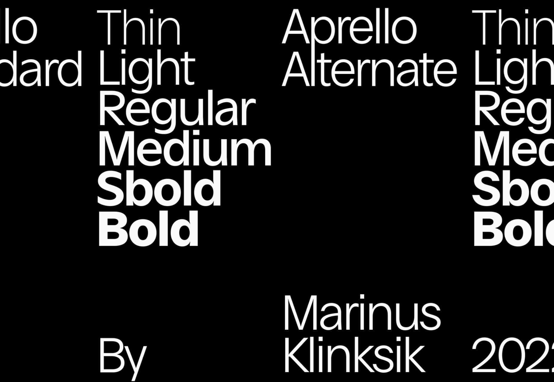
Aprello

Aprello is a robust sans-serif that’s ideal for branding projects. There are six weights, each with an italic and a variable font version.
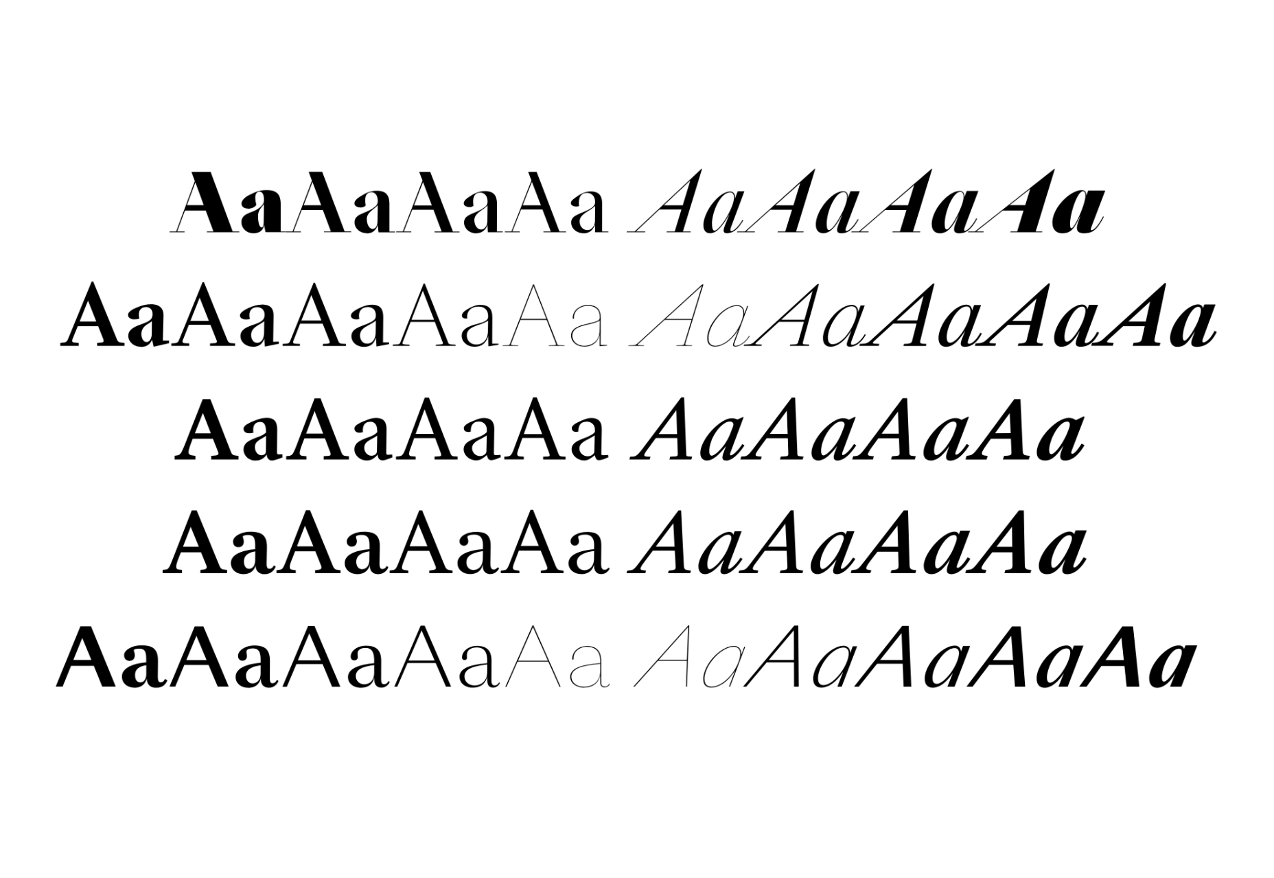
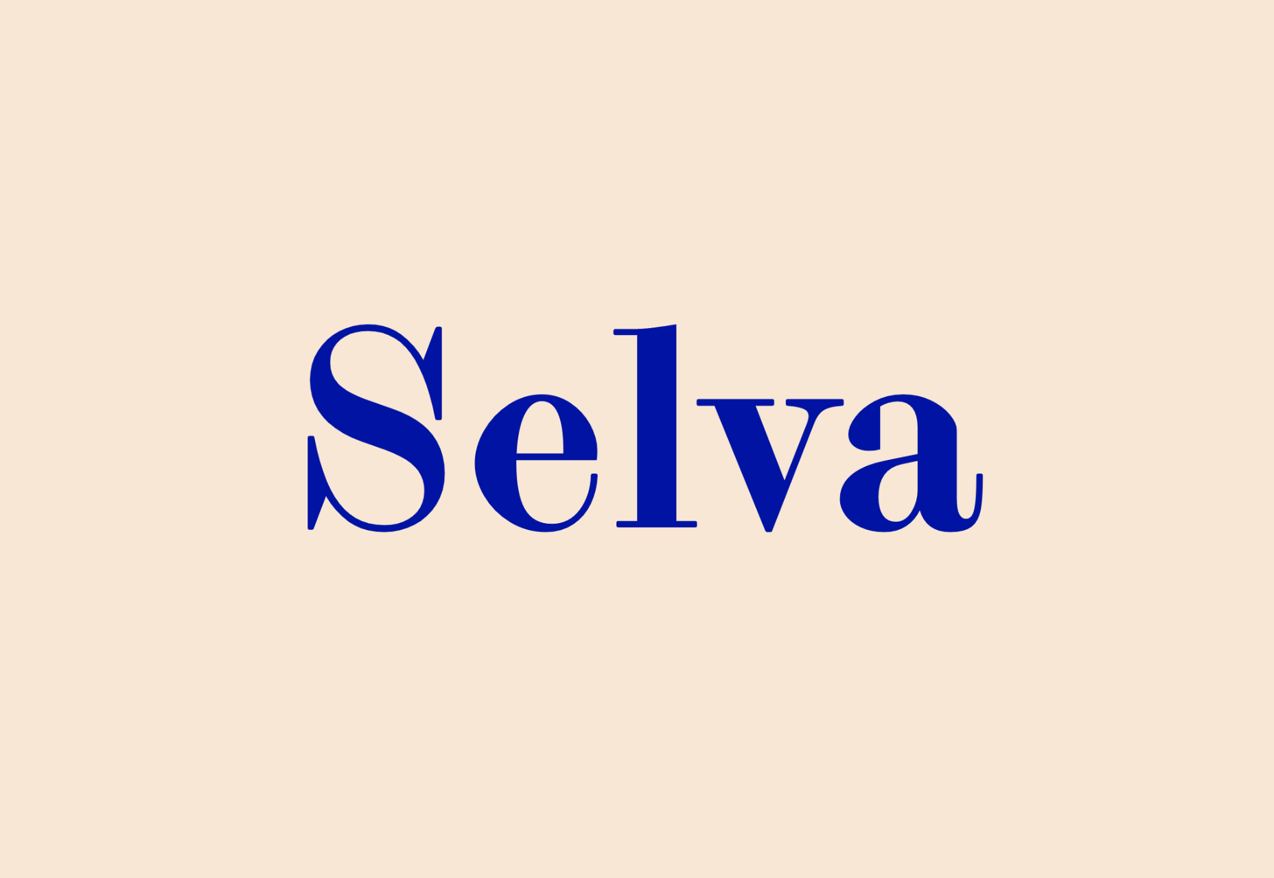
Selva

Selva is an elegant serif typeface in the Scotch tradition. It has a vast number of weights and a particularly attractive italic.
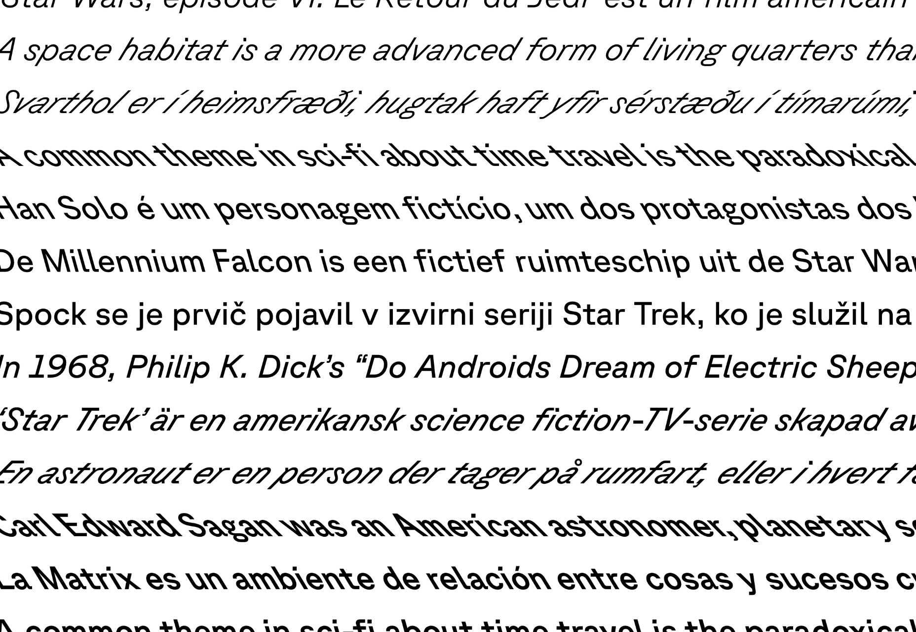
GT Planar

GT Planar is a unique typeface with both italic and retalic styles that slant up to 45 degrees in each direction.
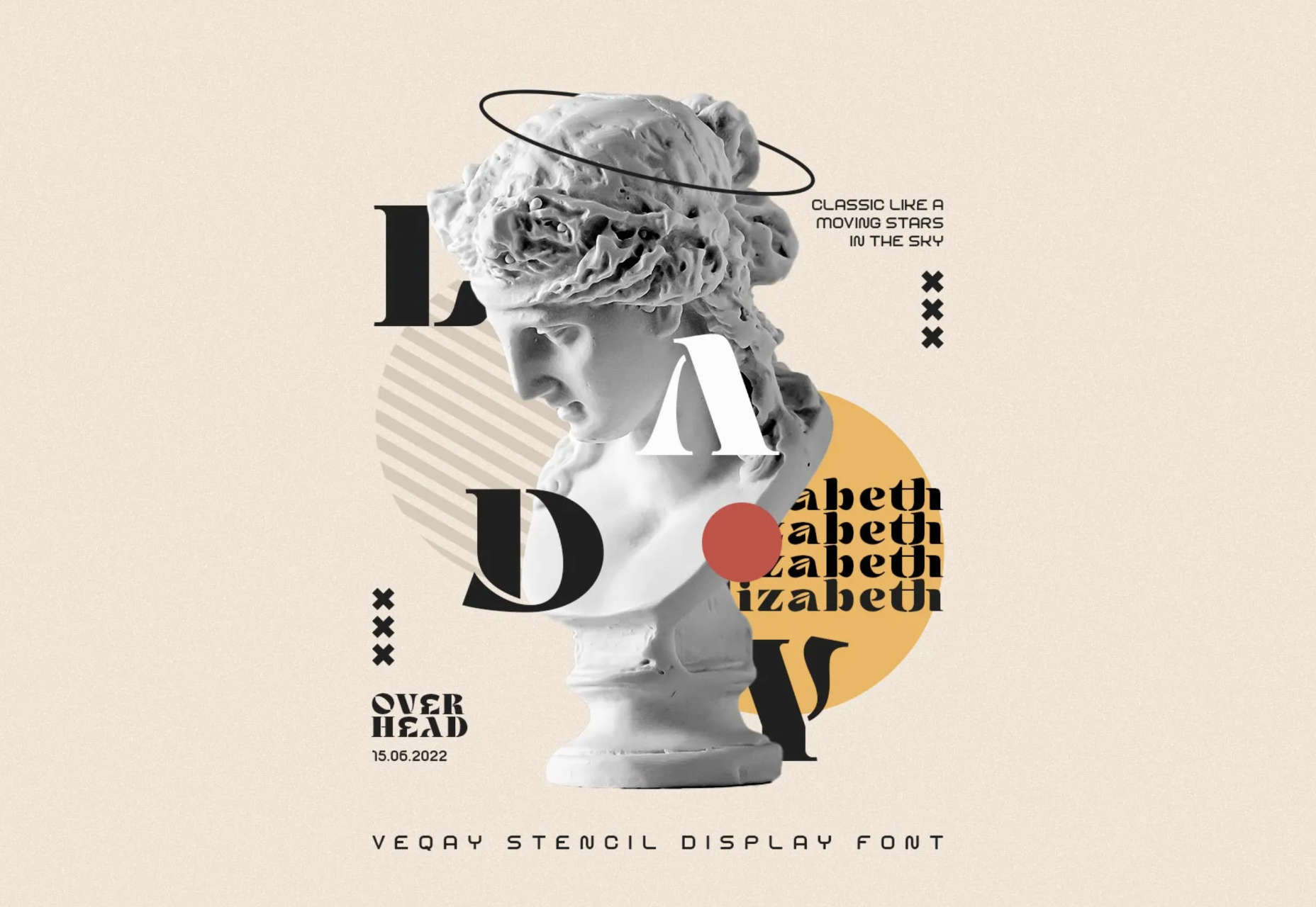
Veqay

Veqay is an elegant stencil typeface with organic shapes, making it ideal for certain branding and editorial design.
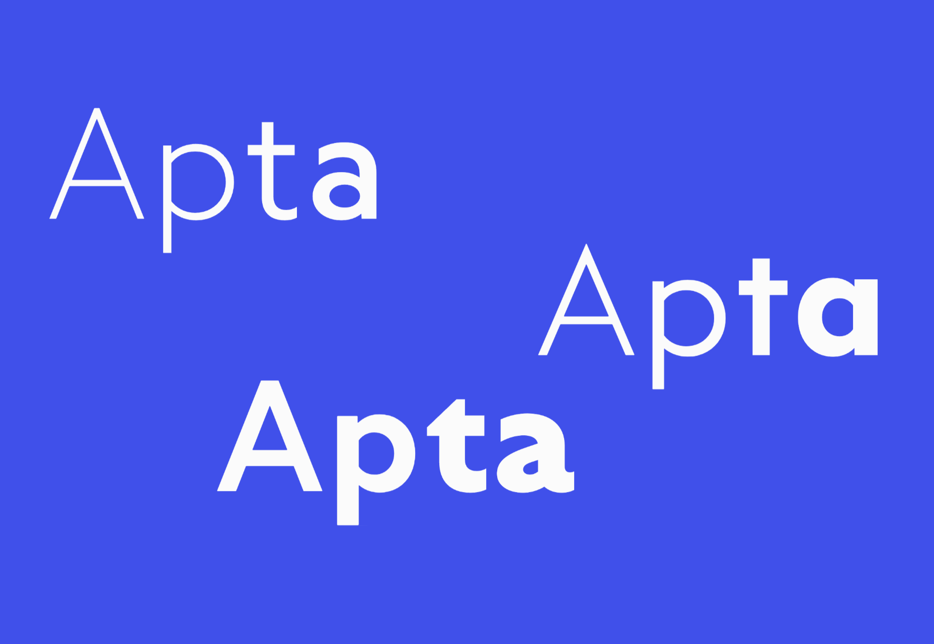
Apta

Apta is a clean sans-serif with excellent proportions. Unusually it comes in three versions, a geometric style, a humanist style, and a combination style.
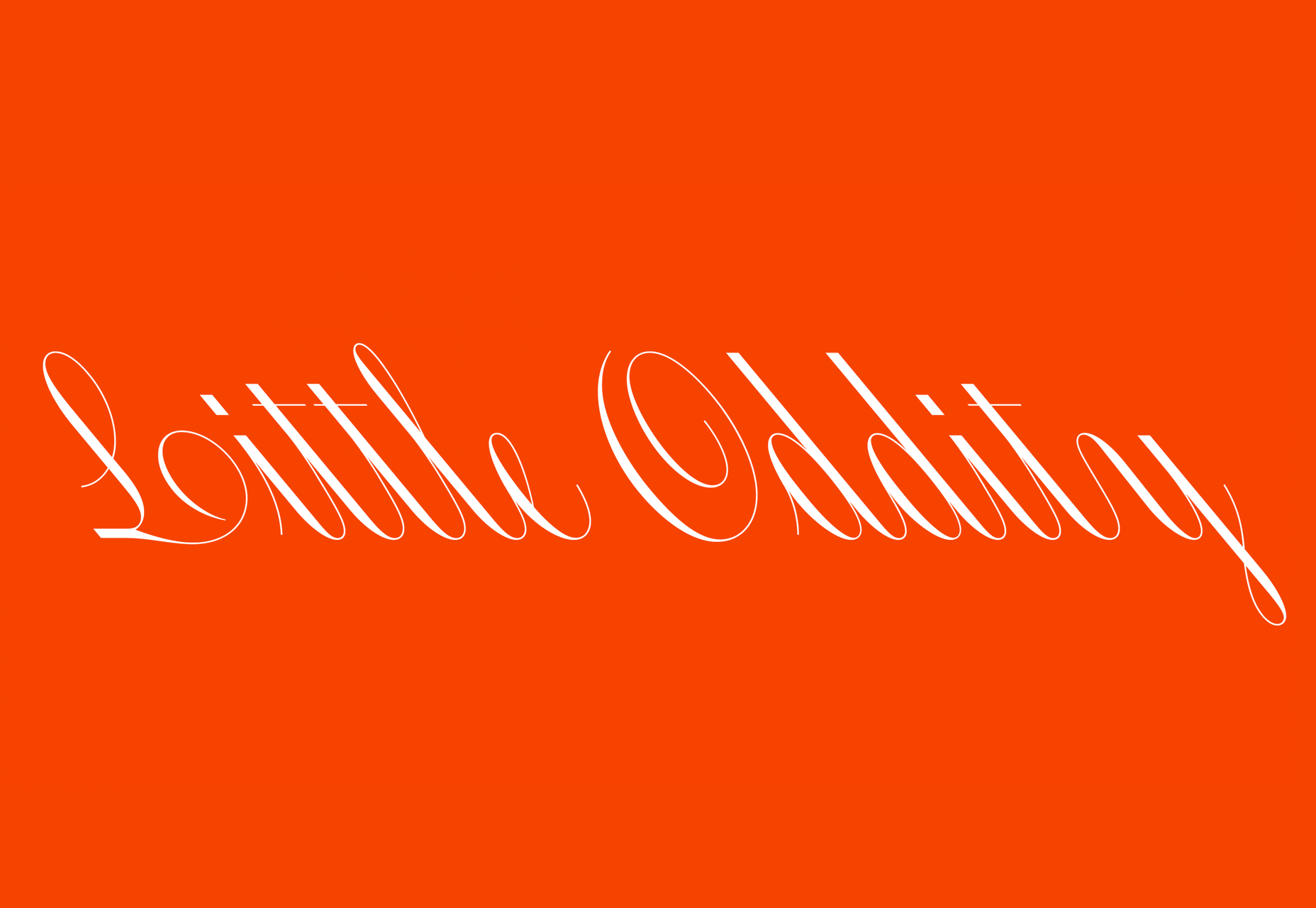
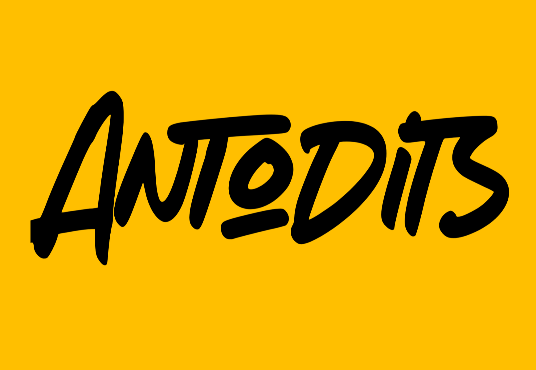
Antodits

Antodits is an energetic script face that has the feel of graffiti. This is a great display font for headlines.

Delvard

Delvard is a family of three typefaces, Display, Subhead, and Text. It’s a beautiful serif with script-like strokes.

Rosales

Rosales integrates a humanist style with geometric forms and calligraphic alternatives to create a unique typeface.

Fisterra

Fisterra is an informal serif with two different styles: Morte, with emphasizes curves, and Fora, which emphasizes sharp lines.
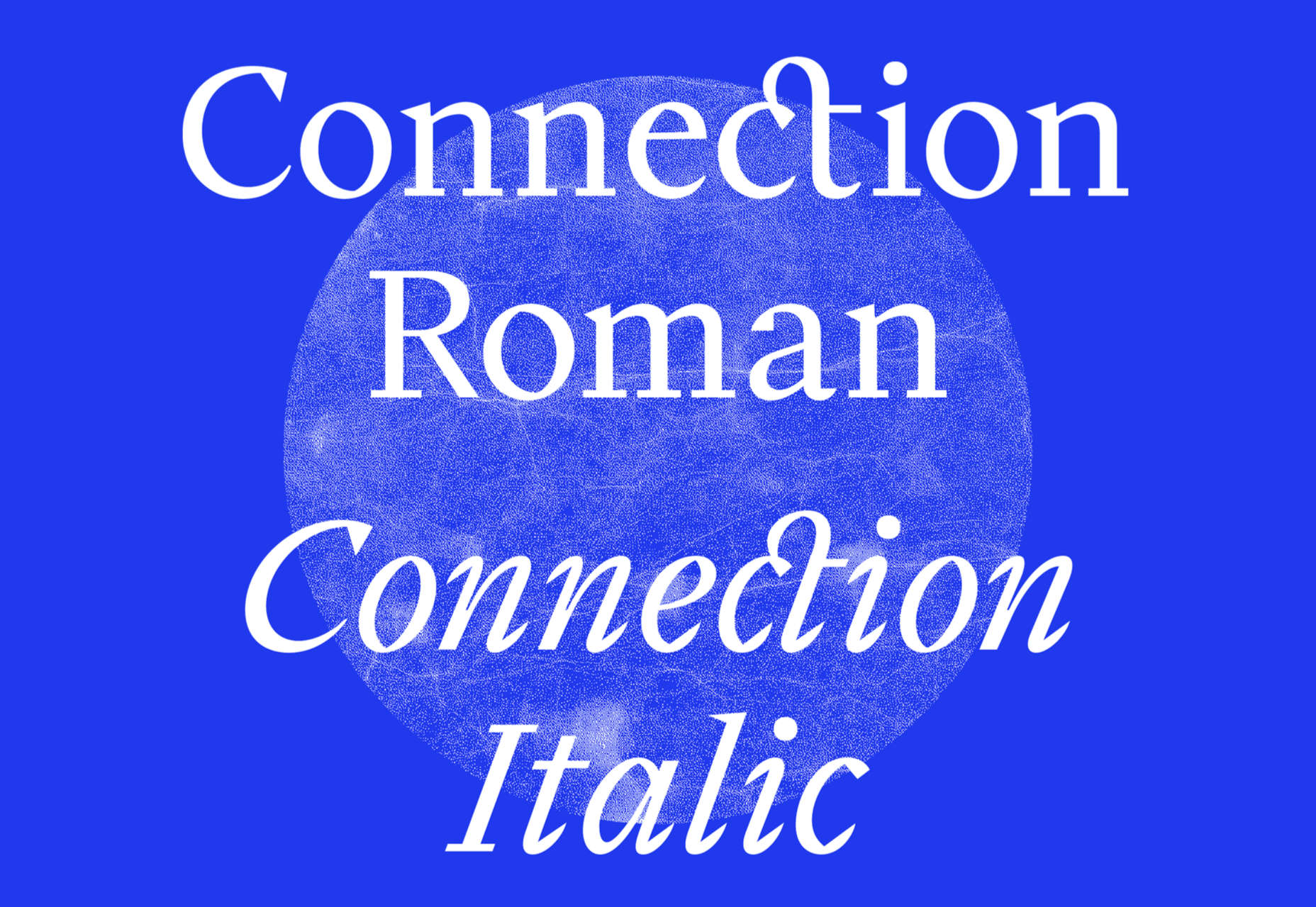
Connection

Connection is a precisely drawn typeface with beautiful detail courtesy of a calligraphic influence.

Ping Round

Ping Round is a simple sans-serif drawn with as few strokes as possible, resulting in some characterful letterforms.
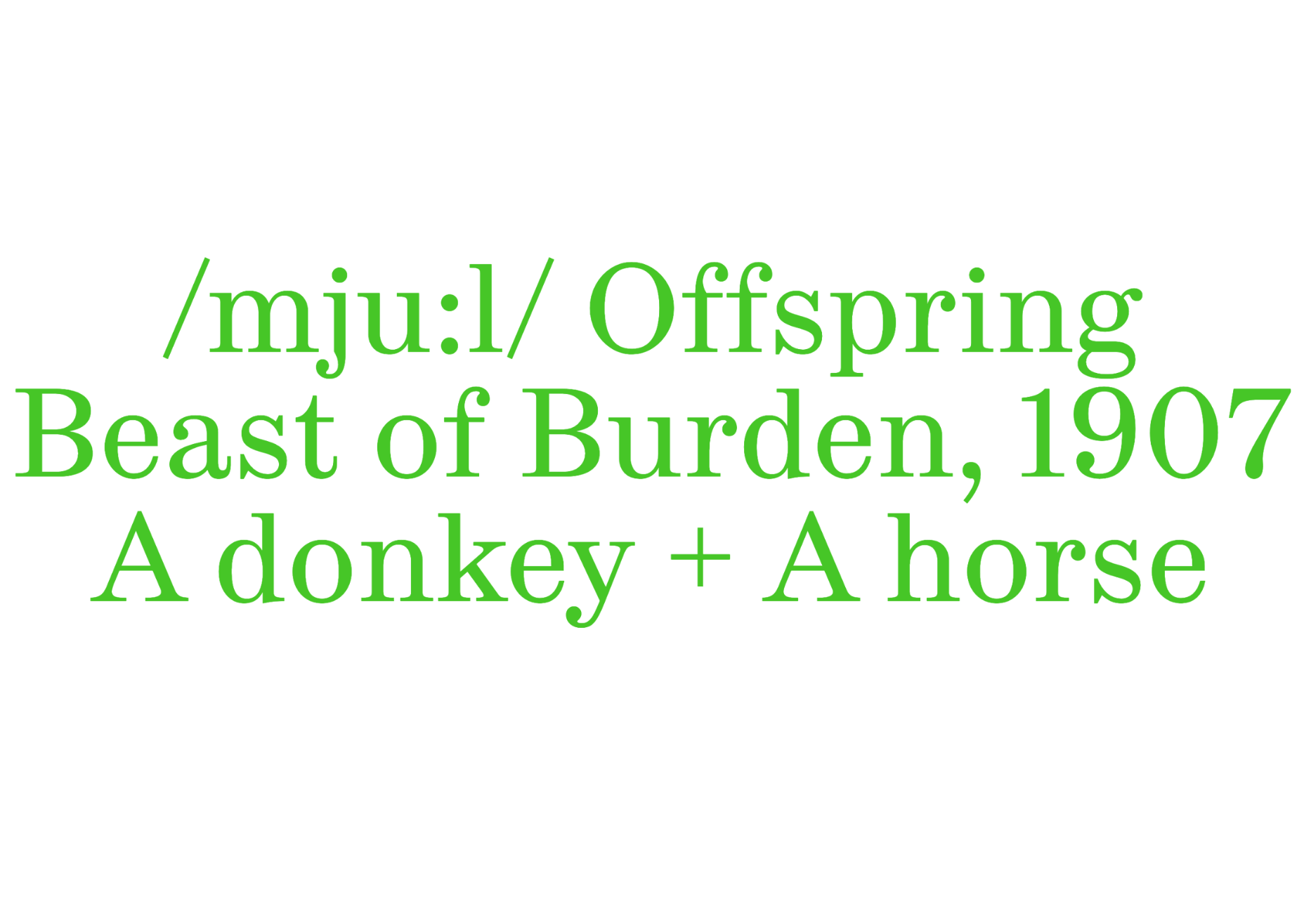
Mule

Mule is a hard-working serif with friendly, engaging letterforms. It has a great rhythm, making it ideal for extended text.

Arnika

Arnika is a contemporary typeface with a large x-height. The flares on its strokes put it mid-way between a serif and a sans-serif.
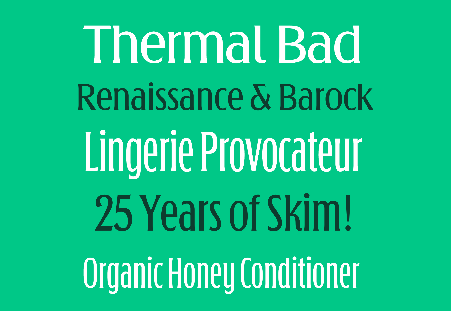
Kingsad

Kingsad is a sans-serif designed for branding. The generous curves and wide letterforms make it best suited to short text.

Apice

Apice is an elegant script font perfect for posters, branding, and editorial design. It’s a variable font with a setting to control stroke contrast.

The Future

The Future is a reworking of the ideas behind Futura. It has a great mix of Western and Japanese typographic traditions.

Mallory

Mallory is an Art Nouveau-inspired display face. It has graceful sweeping curves and strong contrast.
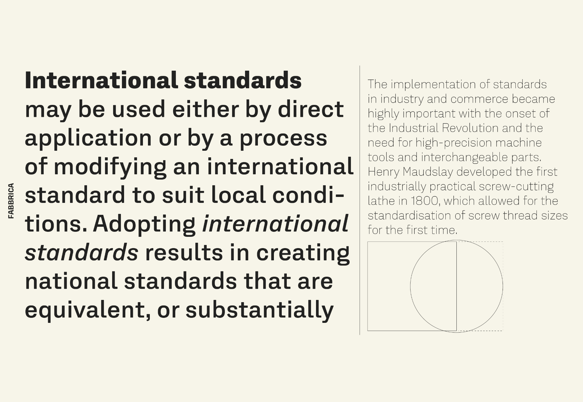
Fabbrica

Fabbrica is a functional sans-serif that performs exceptionally well at small sizes and especially well on screen.

Gills & Co

Gills & Co is another of this year’s crop of Art Nouveau-inspired typefaces. It’s ideal for editorial design.
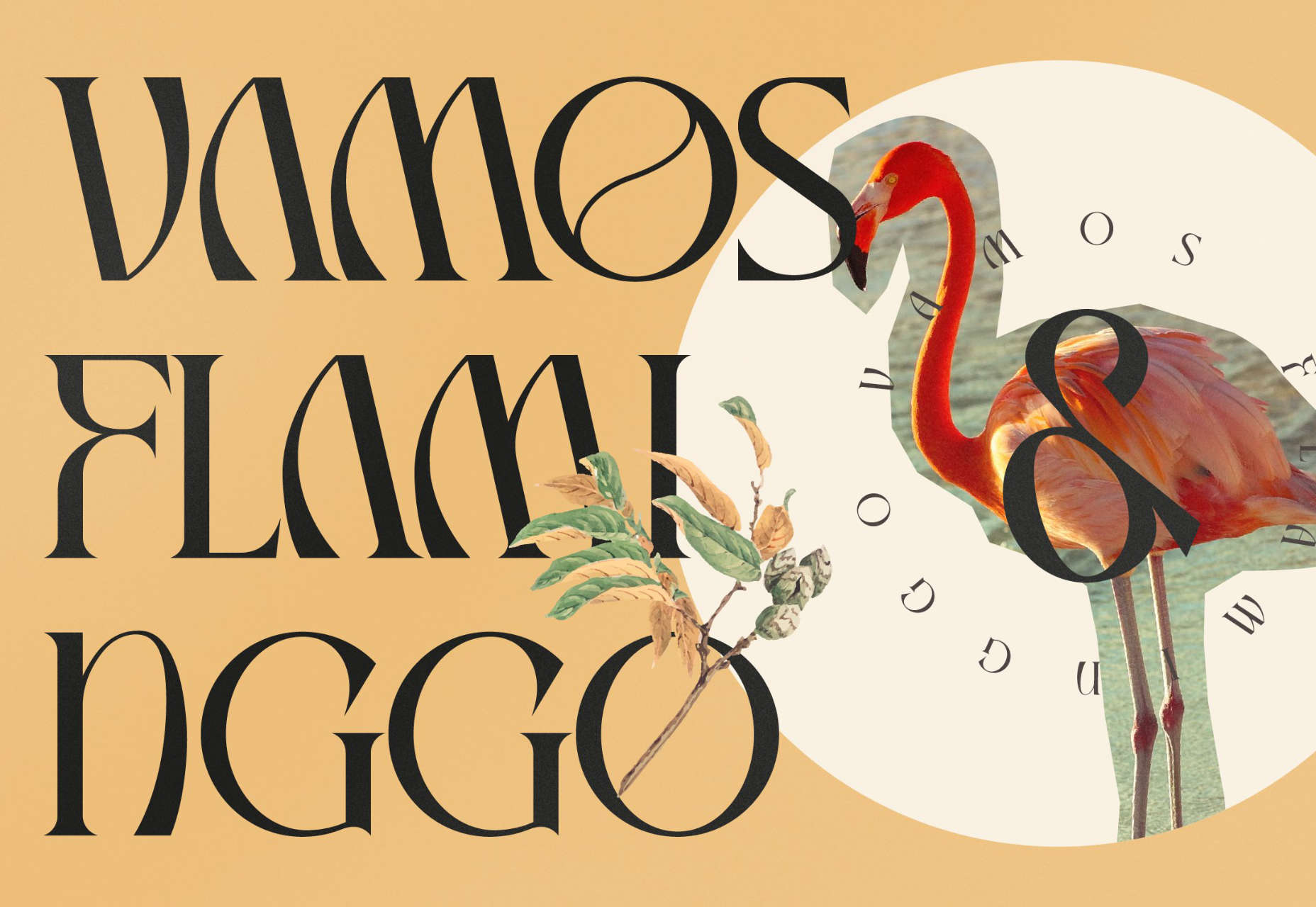
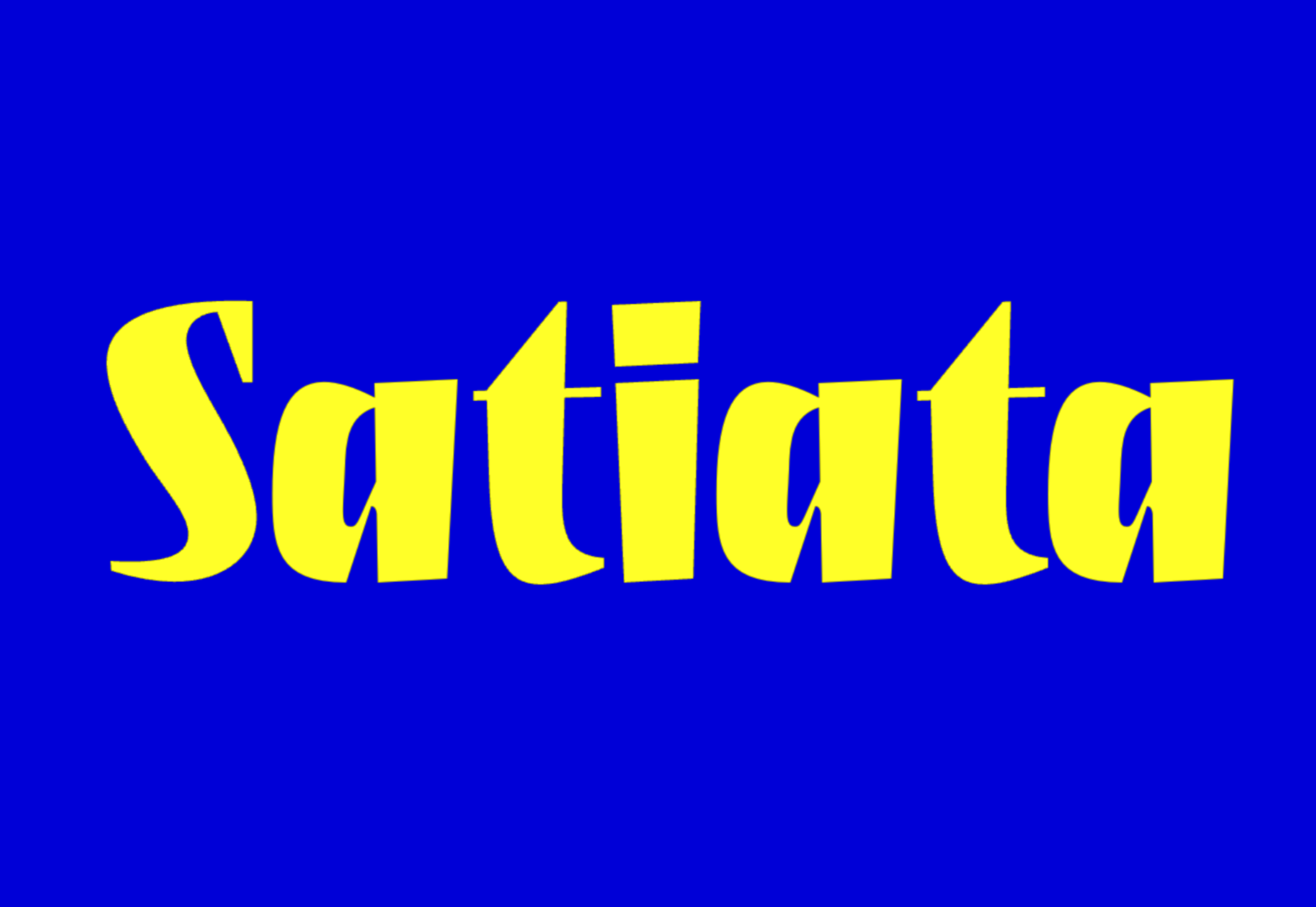
Satiata

Satiata is an energetic typeface that almost dances across the screen. Best used for branding or display type.

Fold

Fold is a no-nonsense sans-serif that’s plan spoken and trustworthy. It has four weights with corresponding italics.

Bells Morten

Bells Morten is a display font inspired by vintage signage. It’s bold and all-caps, with sharp flared serifs.

Mori

Mori is a versatile sans-serif inspired by contemporary Japanese design. It’s ideal for branding and editorial design.

Nitido

Nitido is a humanist sans-serif designed as a companion for the popular Nitida font family. It’s beautifully suited to branding work.
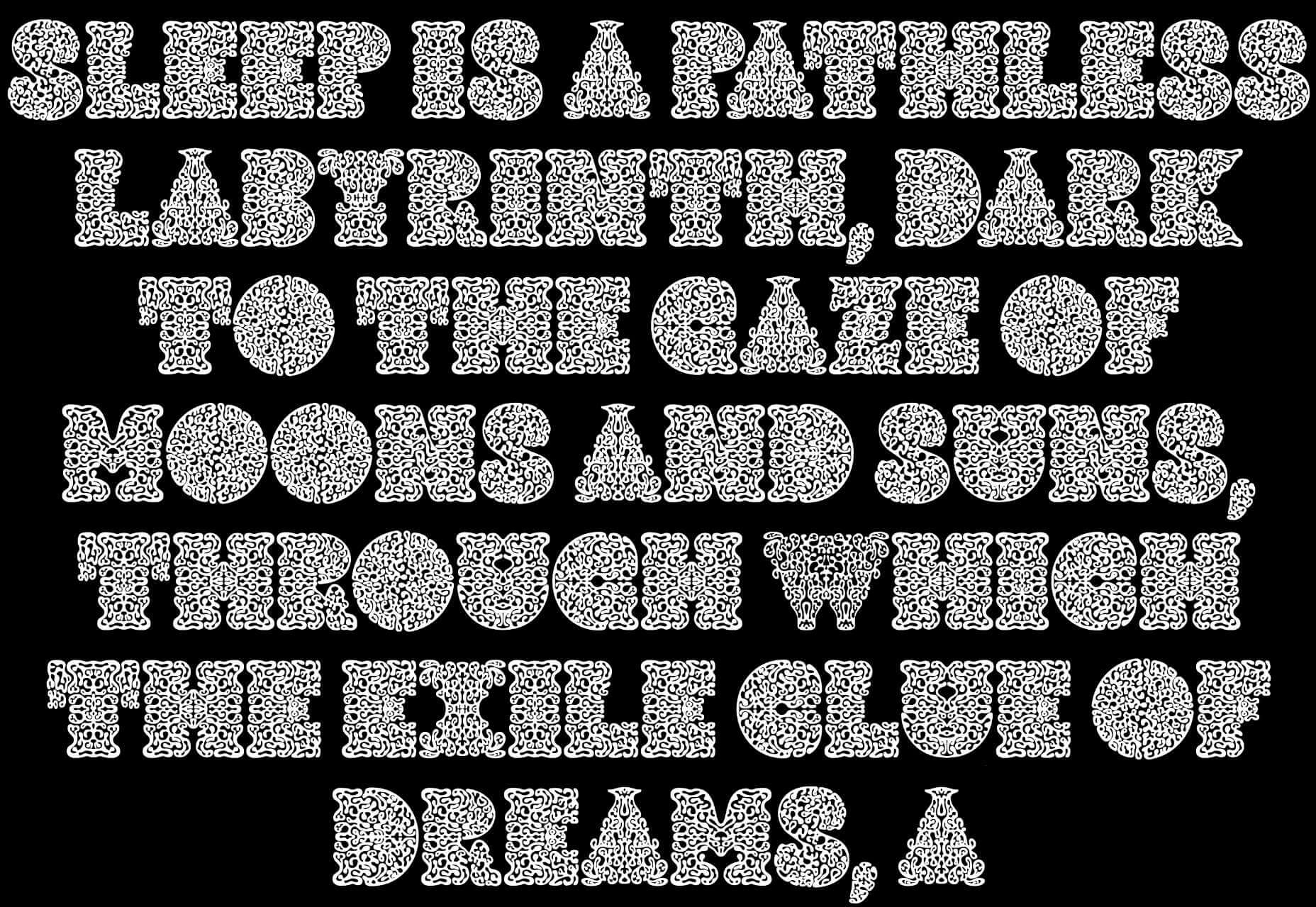
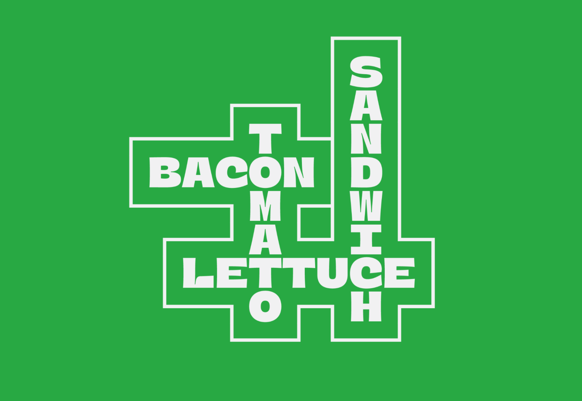
Lithops

Lithops is a fantastic display face for posters, T-shirts, and editorial design, with a pattern making up the letters that’s reminiscent of seaweed.
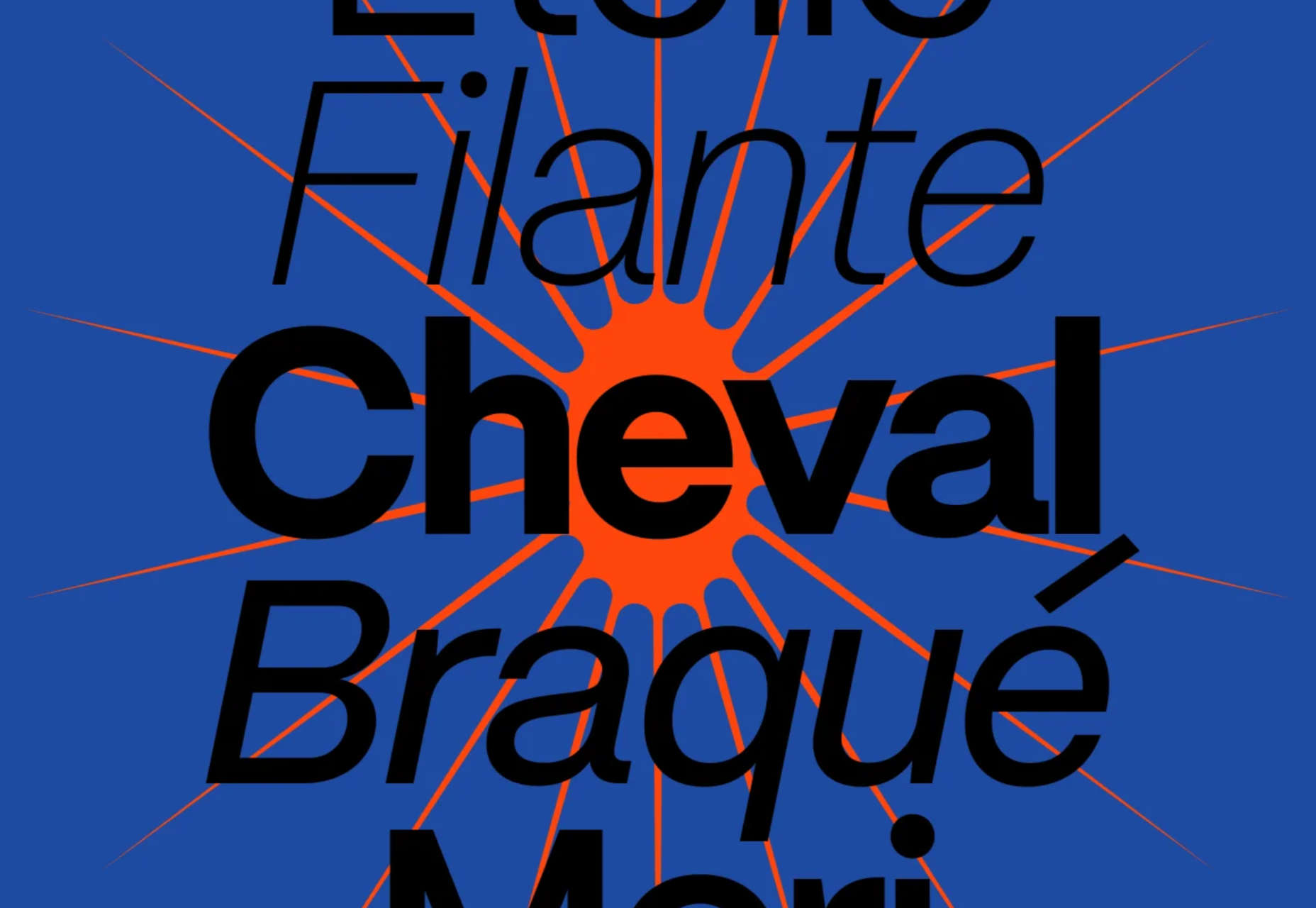
Rapidissima

Rapidissima is a companion typeface to Rapida. While Rapida is a careful usable serif, Rapidissima is an exploration of speed.
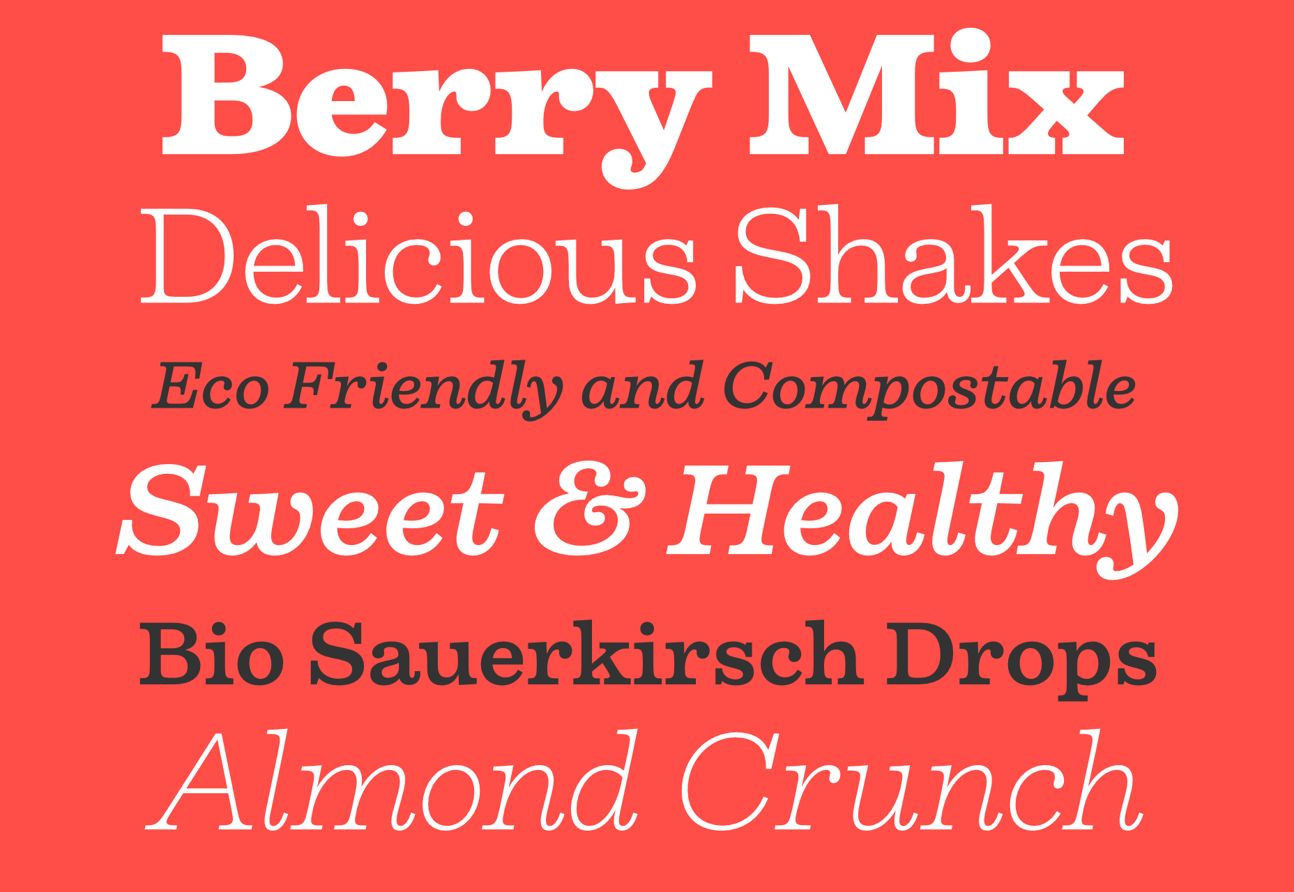
Firelli

Firelli is a warm, contemporary slab serif with a range of weights. It’s an excellent choice for display and body type.

OBO Star

OBO Star is a semi-monospaced typeface, meaning that most of the characters use the same space.
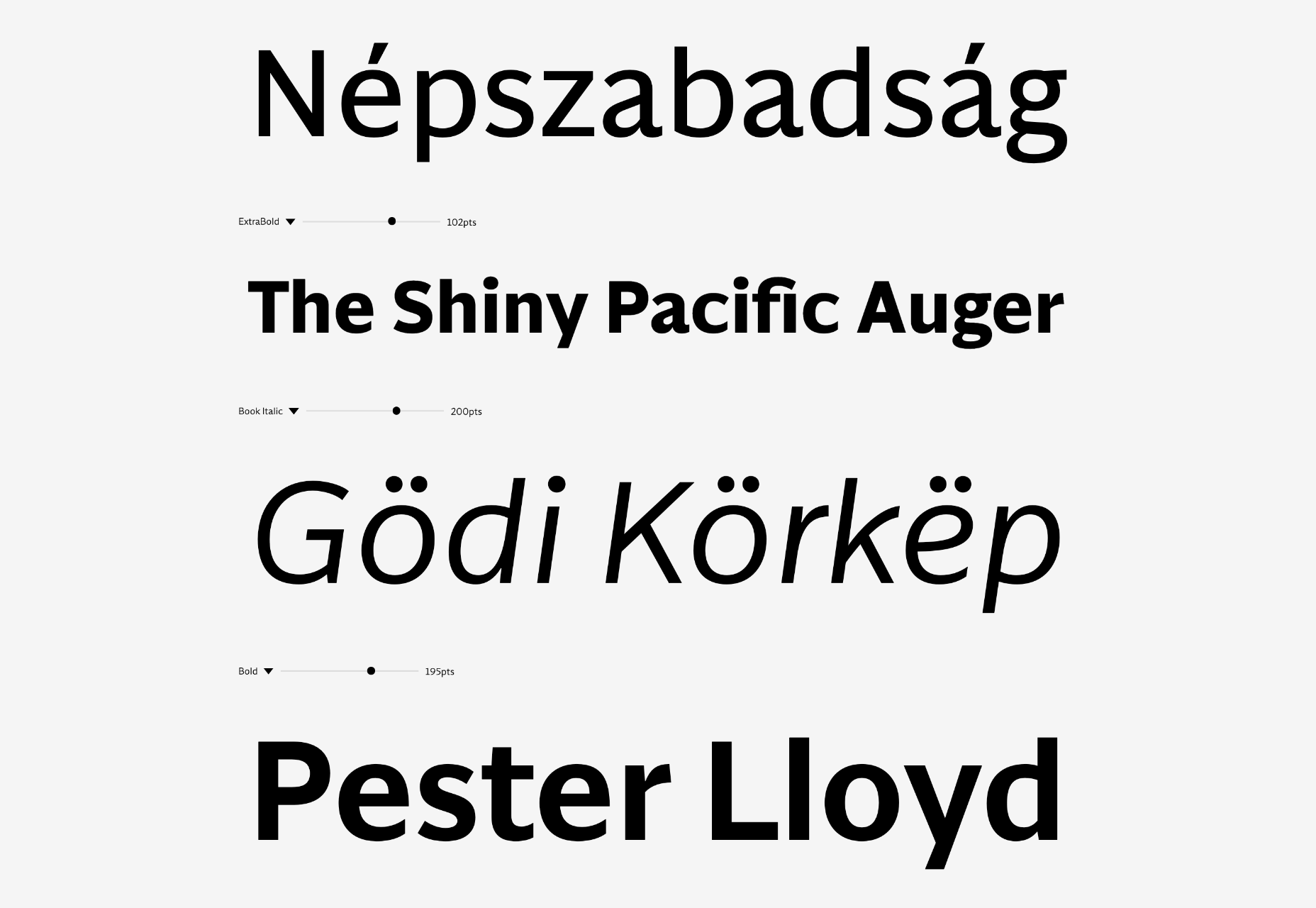
Nagel

Nagel is a uniwidth sans-serif with a low stroke contrast and some bold detailing. It’s ideally suited to short texts and branding.
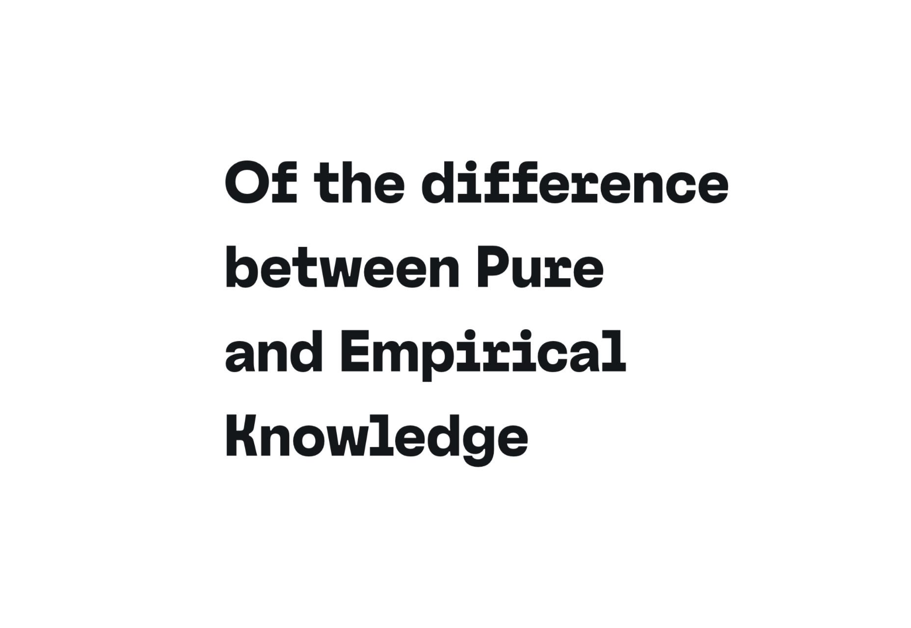
Practico Slab UI

Practico Slab UI is a workhorse slab serif that blends European and American mid-century styles. It’s available as a variable font.

Source

The post 40 Best New Fonts of 2022 first appeared on Webdesigner Depot.

Source de l’article sur Webdesignerdepot

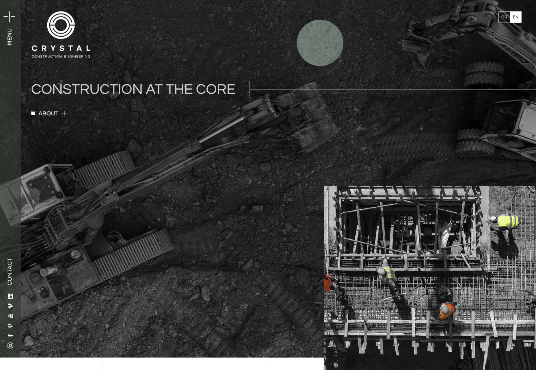
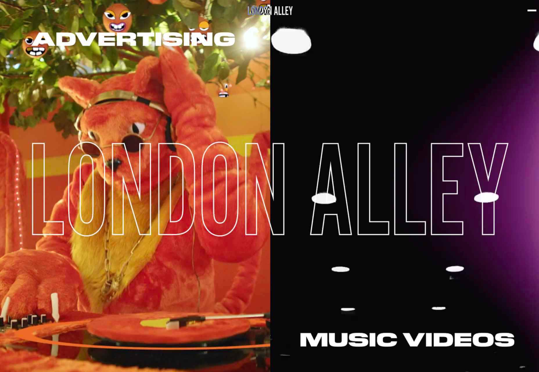
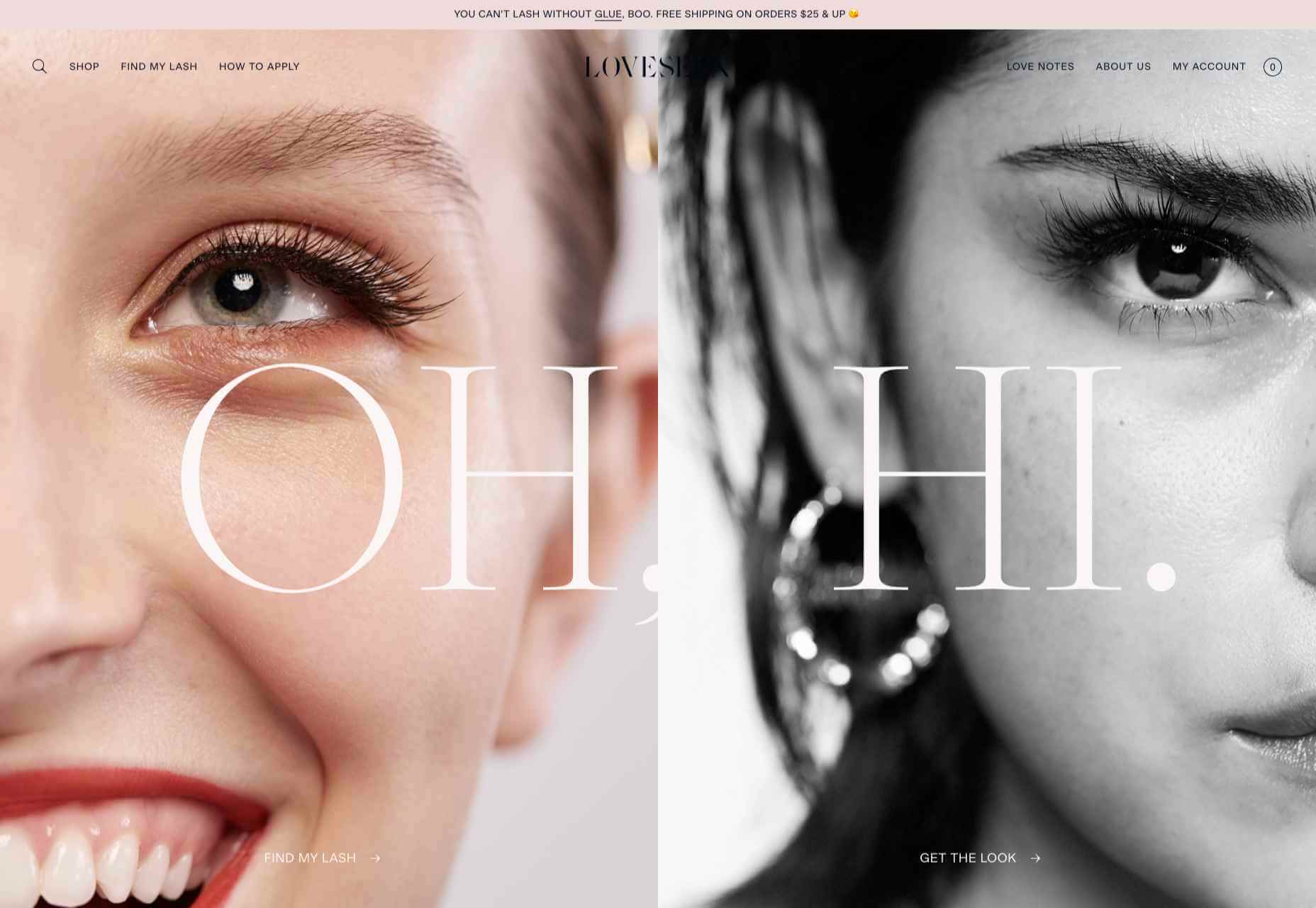
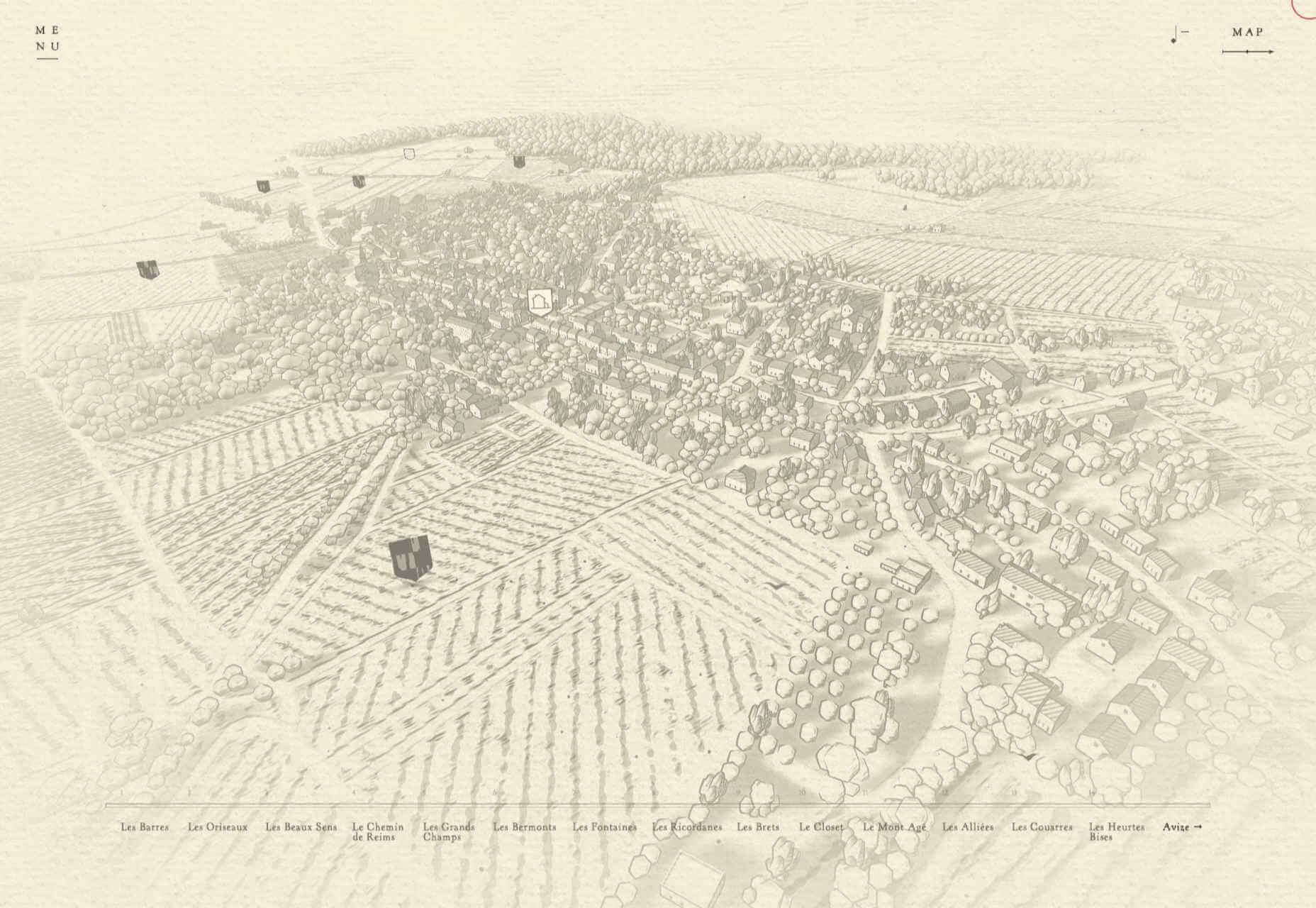
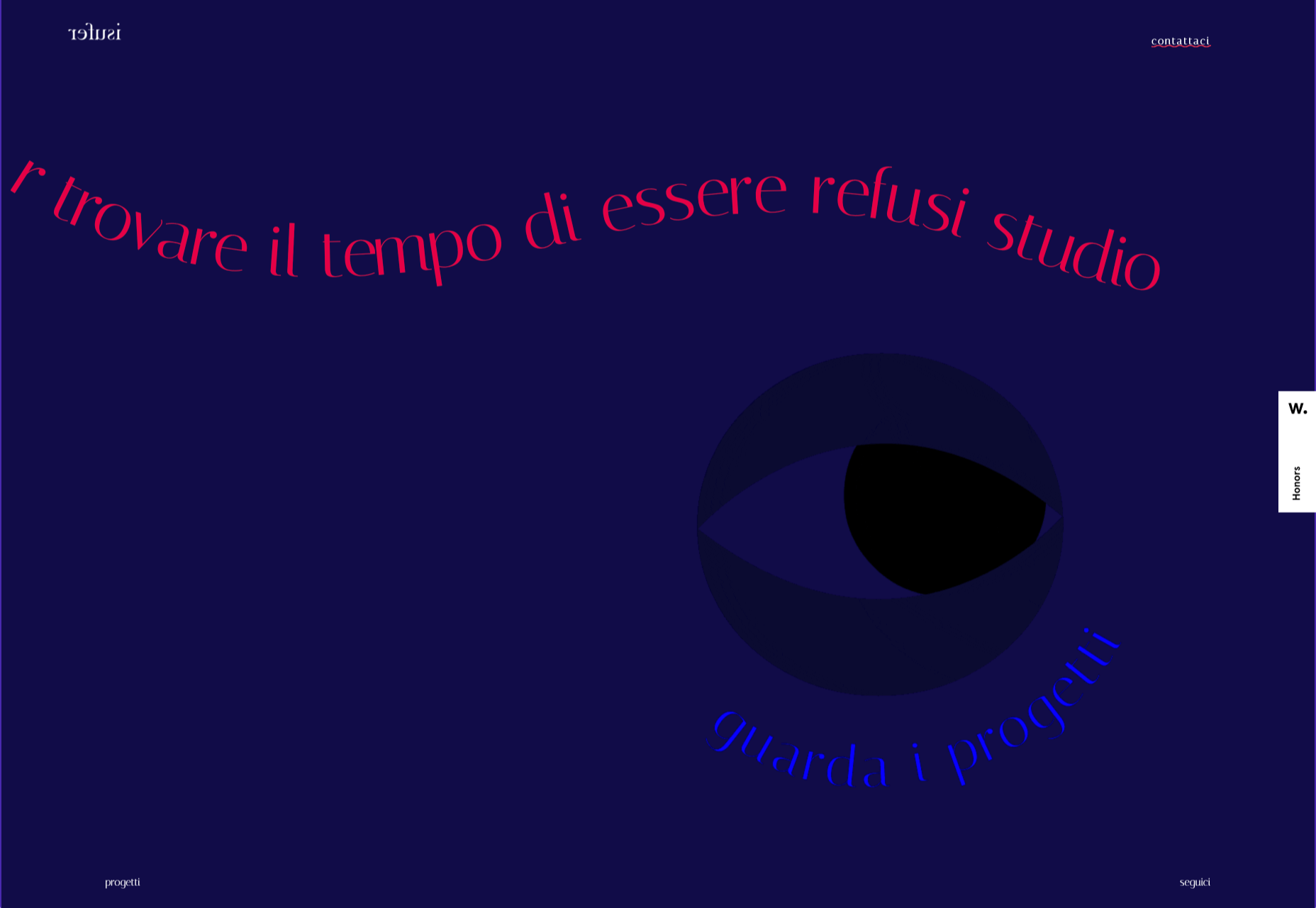
This month’s collection of the best new sites is a mixed bag. Positivity remains from last month’s edition, and what we’re seeing is designers being far more ambitious for the experiences they create.

We have a couple of sites helping to alleviate the damage of war, some unusual approaches to topics that are normally very dour, and some excellent portfolios to be jealous of. Enjoy!

Sarah Fatmi

Characterful illustration and desktop sideways scrolling make this portfolio site for illustrator Sarah Fatmi stand out.

Vestiaire Impact Report

Green is the new black, and fashion resale platform Vestiaire presents its green credentials in an informative and engaging way.

Houseplant

Houseplant is a collection of cannabis-related products designed by Seth Rogen and Evan Goldberg; this site is a lot classier than the average headshop.

FreshCut BarberShop

The site for FreshCut BarberShop is modern, bold, and gets its message across clearly, even if the user doesn’t read French.

Feed The 300

Feed the 300 is an appeal in aid of the animals in Ukraine’s zoos. It is very simple in concept and design, but endearing animated line drawings give it character.

Honeymoon Chicken

Luscious photography combined with surprisingly delicate illustrations makes Honeymoon Chicken very inviting.

Patachou Inc

Patachou Inc operates a group of eateries and the site does a good job of conveying both the very different individual brand identities of each establishment, and the common ethic behind all of them.

Living With OCD

Many design studios do showcase projects, and Living With OCD by designedbyla is one of the more publicly beneficial, and well-executed, examples around.

Aro

Aro is a product with a very simple concept — basically, a box to put away a phone, that also charges it — but this website does a great job of increasing the product’s desirability.

Kim Kniepp

The navigation on this site for Kim Kniepp’s design studio feels very interconnected, an effect heightened by the overlapping masonry grid.

Triniti

There is a calming, reassuring quality to the color used here for Pan-Baltic law firm Triniti. The perpetual motion style hero video adds a confident, soothing touch too.

Herezie

Creative agency Herezie uses saturation and gradual color changes to pleasing effect in this confident, assured website.

MetalColor

The color choices in this site for MetalColor, and how they are used, succeed in evoking what results the company could achieve without focusing on the less glamorous parts of the process.

Gras

Architecture and design studio Gras goes for a clean feel with an irregular grid layout and carefully curated images. The blog sidebar works well too.

Vendredi Society

Dark green and bright yellow make a strong statement in this portfolio site for brand strategists Vendredi Society.

HUB

HUB describes itself as a progressive property developer and this site does a great job of leaving behind the corporate image usually associated with property developers.

Nowhere Bakery

Nowhere Bakery makes vegan, paleo, gluten-free cookies, which don’t sound all that appealing on paper. This site manages to make them seem both really tasty and healthy.

Apotheke zur Triumphpforte

The botanical illustration style images on Apotheke zur Triumphpforte’s site help create an approachable brand identity while adding visual interest.

B!POD

A good balance of images, animation, and illustration combine to create an impactful presence for B!pod’s first product, a food vacuum storage system.

The New Exhibition

The New Exhibition is a showcase platform for Ukrainian creatives — type designers, illustrators, graphic designers, photographers, and others — whose ability to get work has been affected by war.

Source

The post 20 Best New Sites, June 2022 first appeared on Webdesigner Depot.

Source de l’article sur Webdesignerdepot

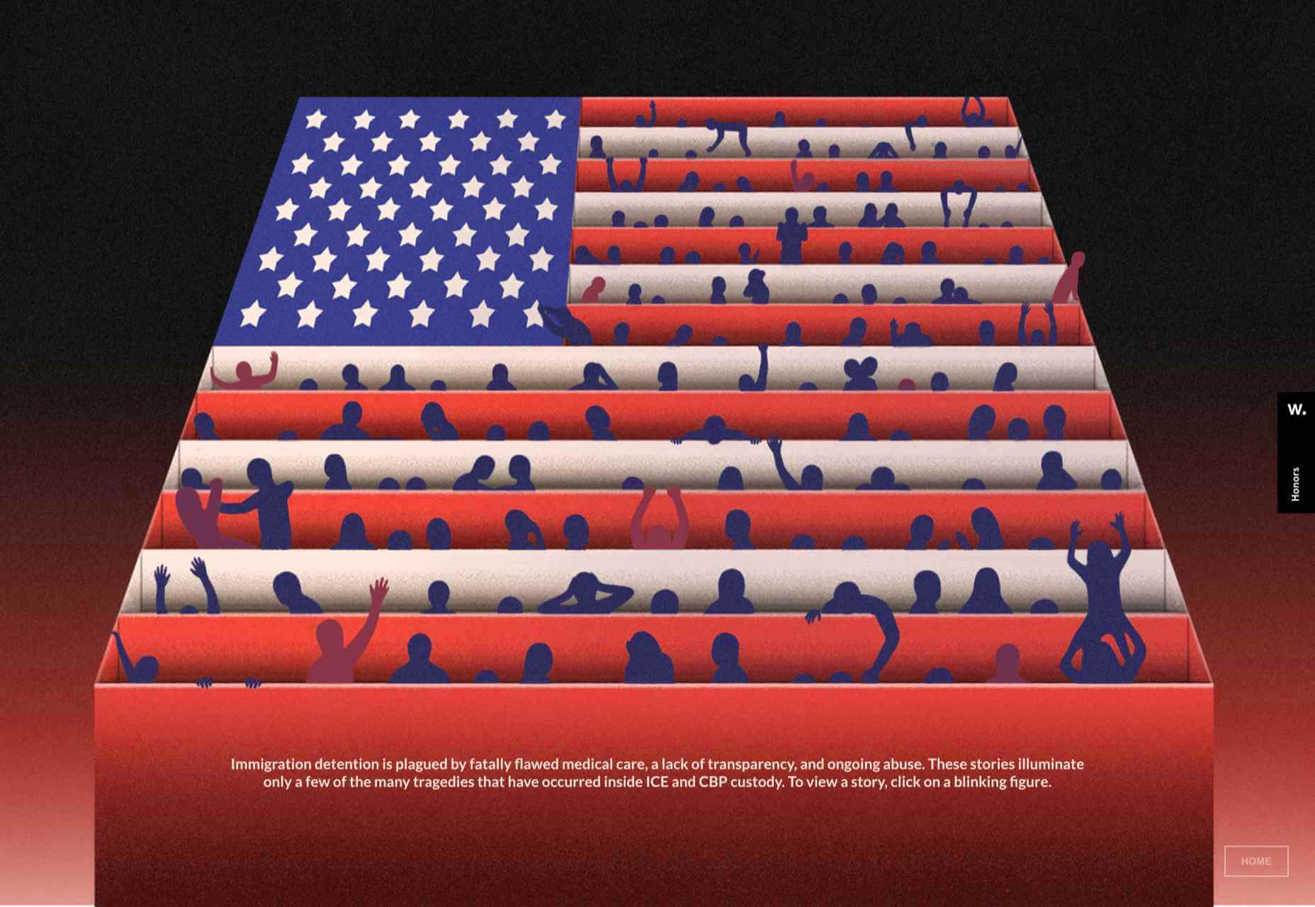
Sometimes it’s easy to feel like the world is going to pieces all around us, especially when we’re doom scrolling Twitter between news alerts every few minutes. But if we step back a little, things may not seem so bad.

On the web, we see companies and individuals taking a positive stand, making changes, and carrying on despite challenging circumstances. So in this month’s collection, we celebrate confidence and accentuate the positive, as the song says. Enjoy!

Plastic Bionic

The ‘change view’ option is well used in this portfolio site for Plasticbionic design studio. The grid view is especially pleasing.

Fabricca

Creative agency Fabricca has gone for a simple look, with some appealing illustrations and custom icons.

Normand

The color scheme and display font choice (Knockout) make a strong statement here for law firm Normand.

Dumpling Delivery

We all need some bored-on-a-slow-friday-afternoon distraction from time to time, and Mailchimp delivers the goods here.

OTR

OTR is a mental health service for young people aged 11-25. The site does a great job of feeling approachable and friendly to younger users while not being condescending, cutesy, or childish.

neueMeta

Good use of block color adds extra depth to this otherwise brutalist portfolio site for neueMeta design studio.

Vitra Chair Finder

This interactive questionnaire helps the customer identify the best chair for their needs. The animation is done well here, and a page of swirling Vitra chairs is a lovely thing to see.

Chia Studios

A good balance here of serious and fun in Chia Studio’s portfolio site, professional but friendly.

Sagmeister 123

The concept behind this limited clothing range designed by Stefan Sagmeister is that, taking the long-term view, the world is actually getting better. As such, the Sagmeister 123 site has an overall feeling of quiet positivity. And a koala.

RecPak

RecPak is a meal replacement shake designed for taking during outdoor activities. The site has an active, dynamic feel that works well to convey a sense of rugged outdoor adventure.

Alicia Moore

This site for Alicia Moore clothing brand oozes style and sophistication with soft colors and beautiful fashion photography.

Think Packaging

Think Packaging’s website has a bright, bold, fun feel. Case studies are well presented visually but keep text to a minimum.

BP&O

Brand design and packaging blog BP&O has added extended content for subscribers, and their new site is a pleasure to browse.

The Future Factory

The Future Factory is a business lead generation agency, which doesn’t sound, well, a bit dull. But, some funky animation and slightly quirky type certainly do not convey dullness.

Polybion

Polybion’s new website has a spacious feel with a rich color scheme adding a sense of confidence and brand maturity.

The Empathy Experiment

The Empathy Experiment is an interactive ‘game’ from digital agency media.monks that examines empathy and inclusivity in the workplace while at the same time showcasing some technical skills.

Belle Epoque

The opening scroll on Belle Epoque’s site is really pleasing, and the random floating shapes are intriguing.

Richard Ekwonye

Richard Ekwonye’s portfolio site is clean and straightforward. Skills are on display, but without intruding on the content.

SND

SND has created UI sound kits. The site is as simple as it could possibly be, and yet it is impossible not to investigate all the sounds and start imagining where you could use them.

KMZ Industries

Regular readers will know how much we like technical/industrial-made-interesting sites, and this one for KMZ grain storage systems is a perfect example.

Source

The post 20 Best New Sites, May 2022 first appeared on Webdesigner Depot.

Source de l’article sur Webdesignerdepot

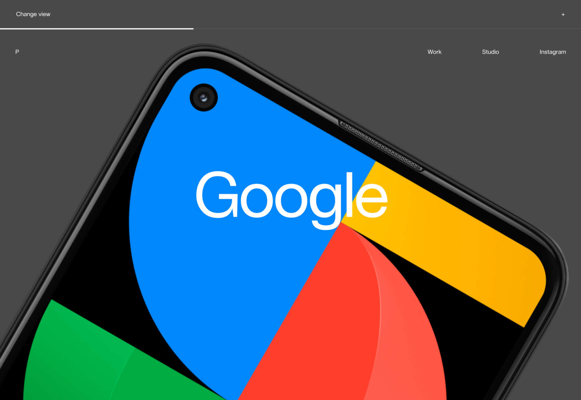
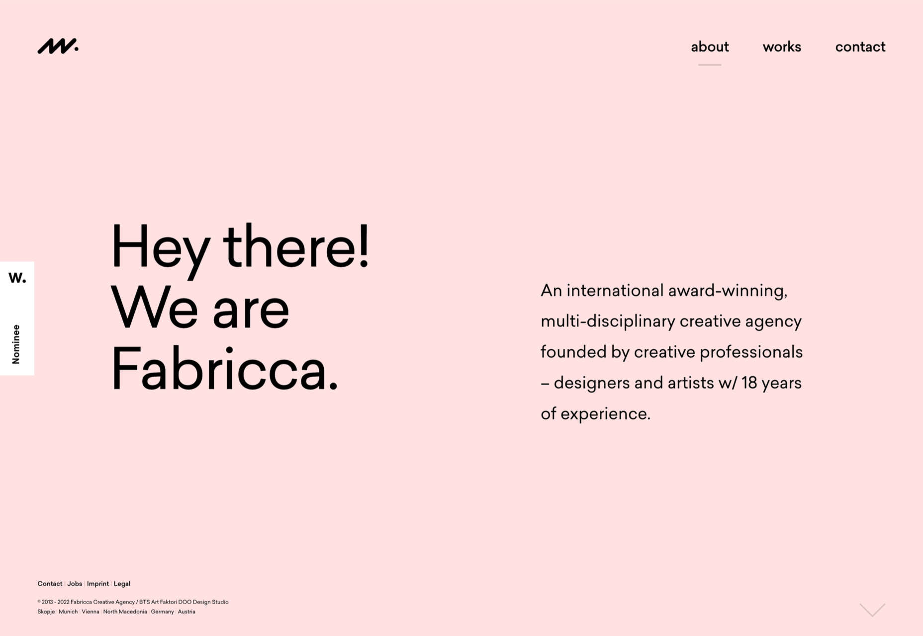
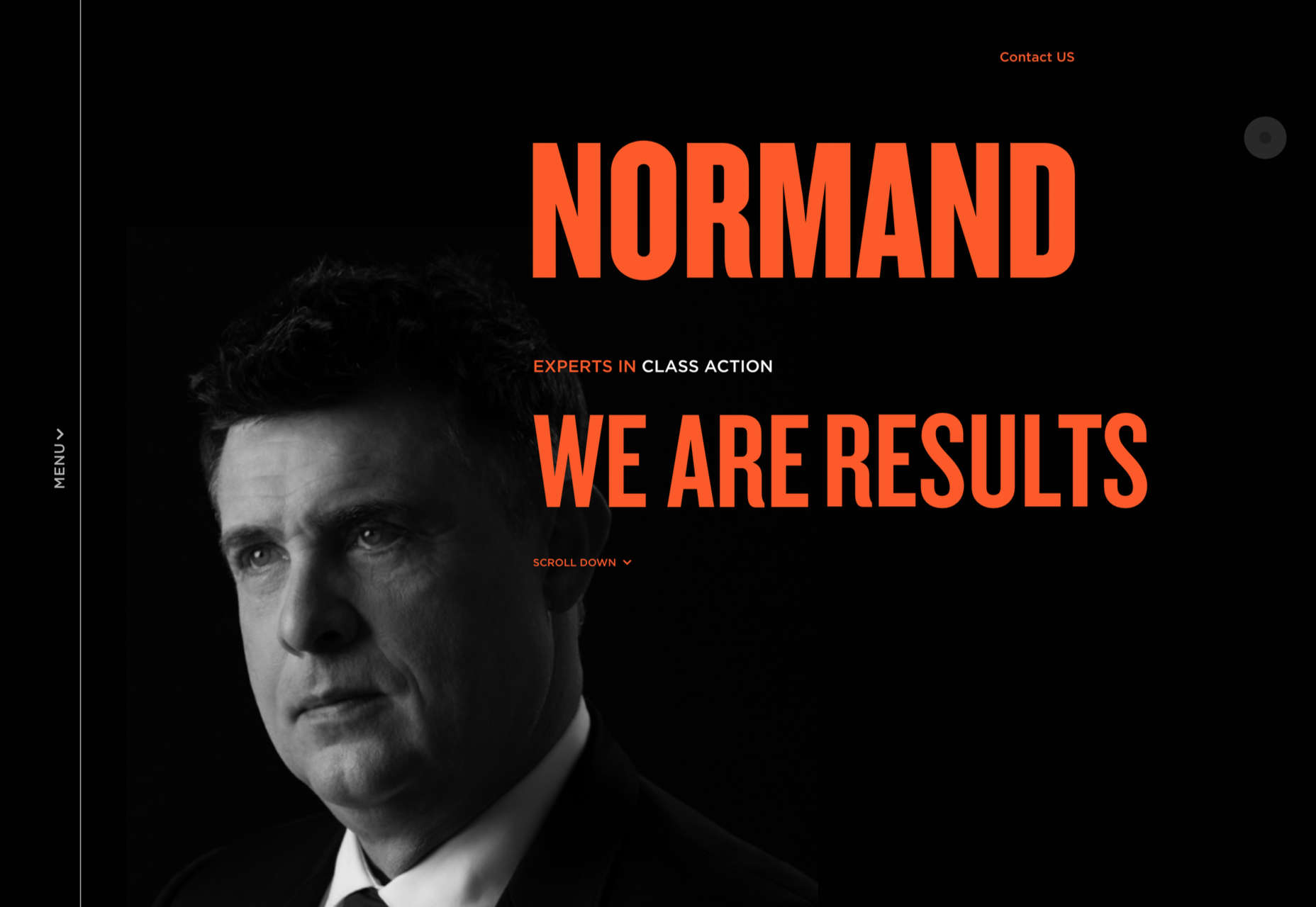
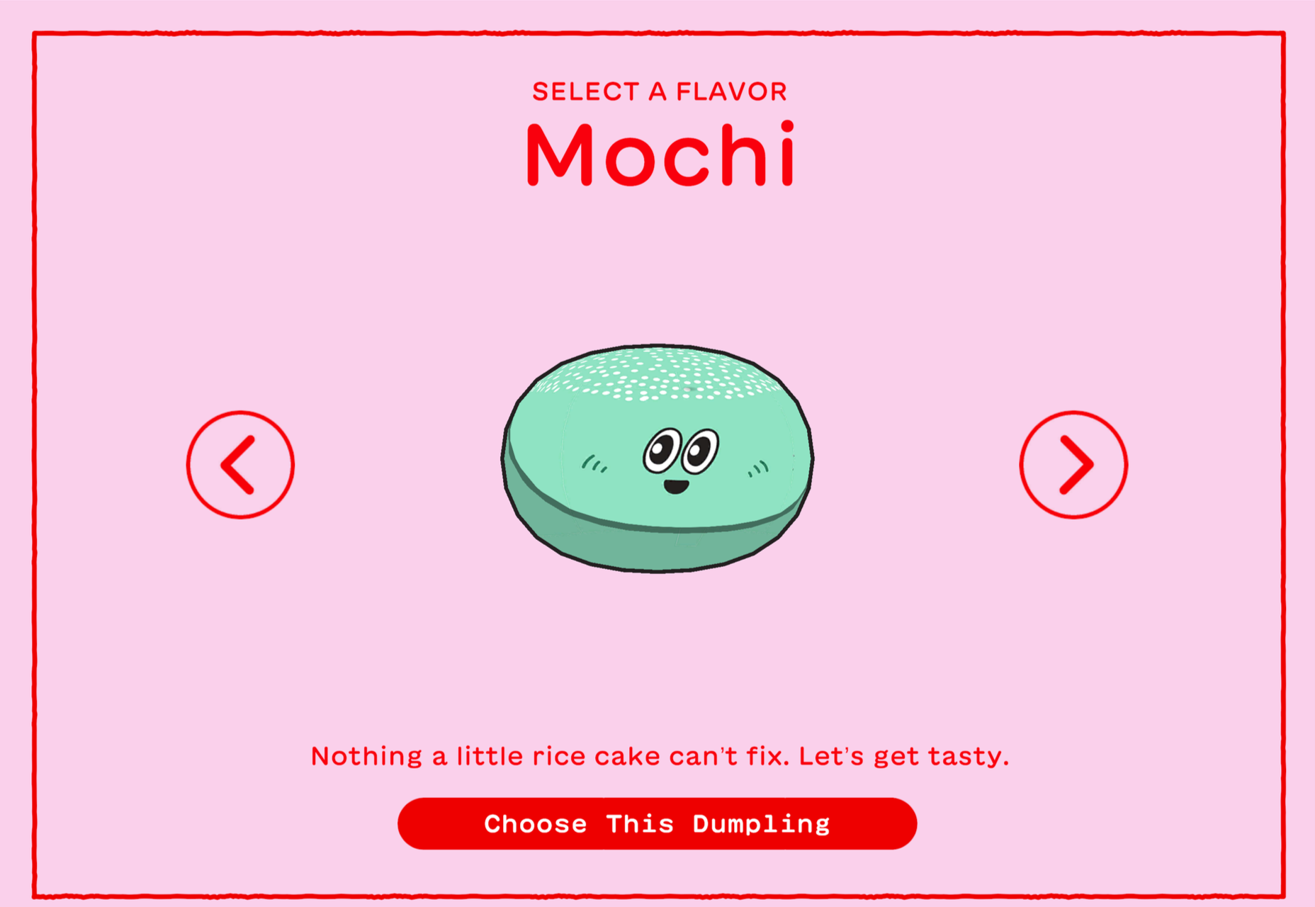
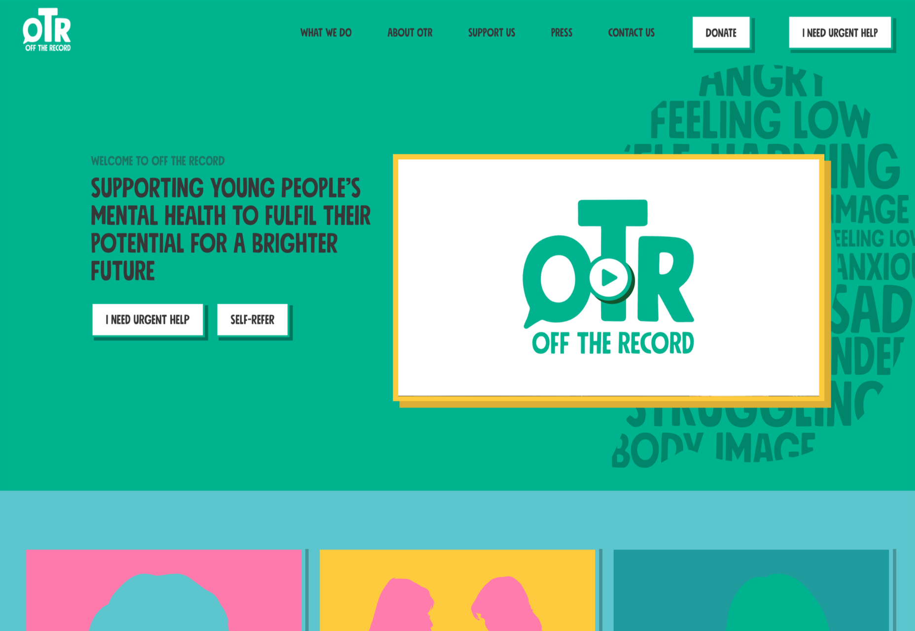
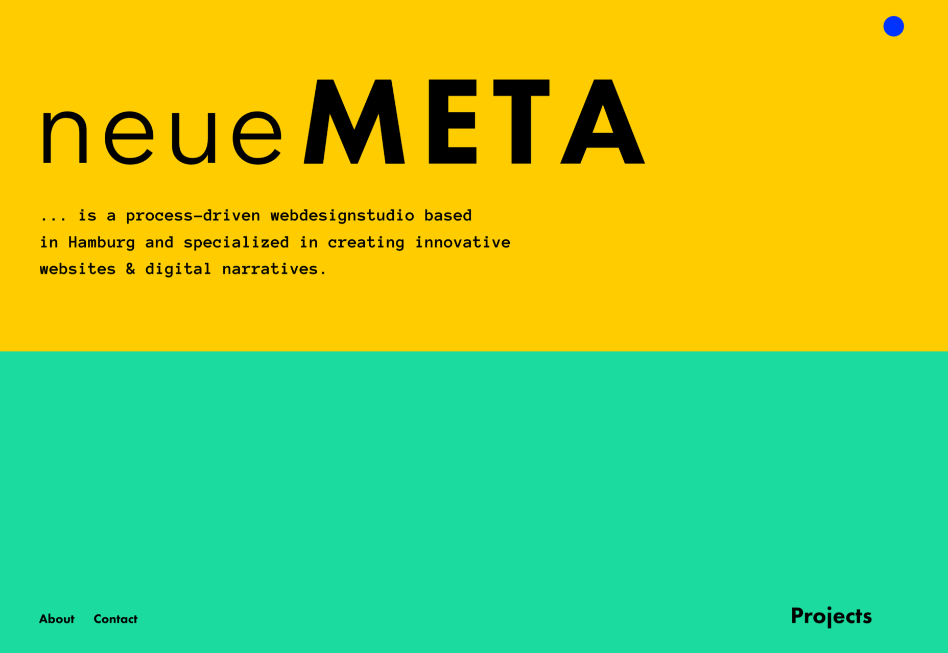
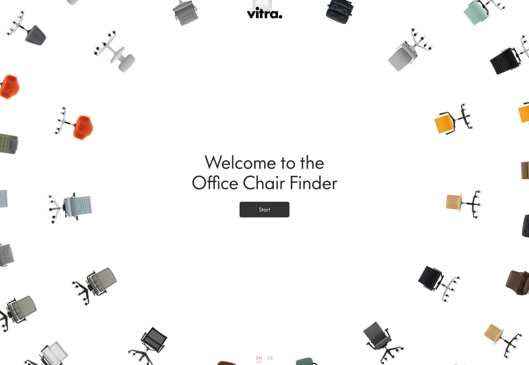
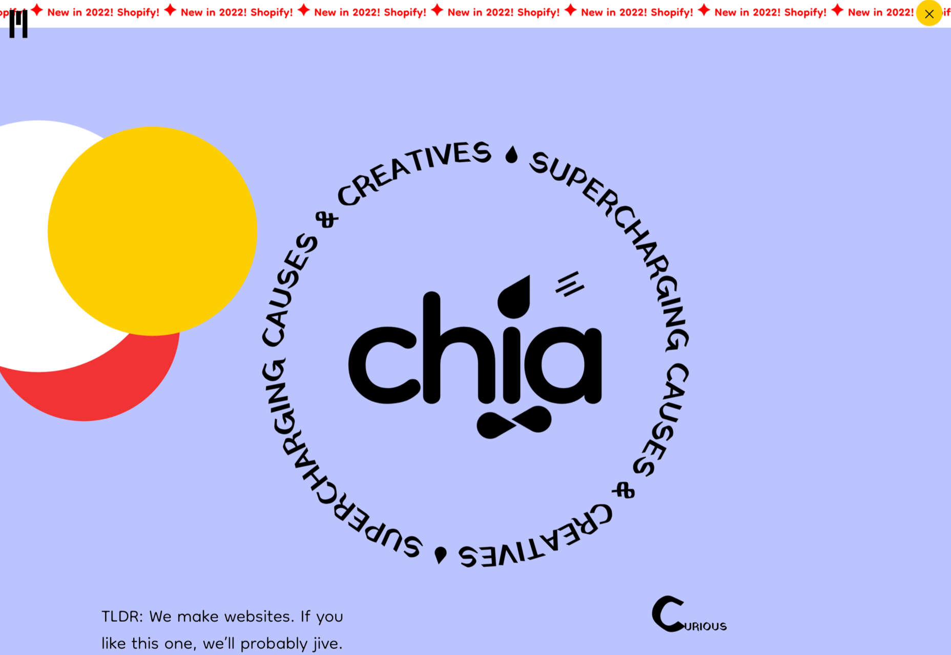
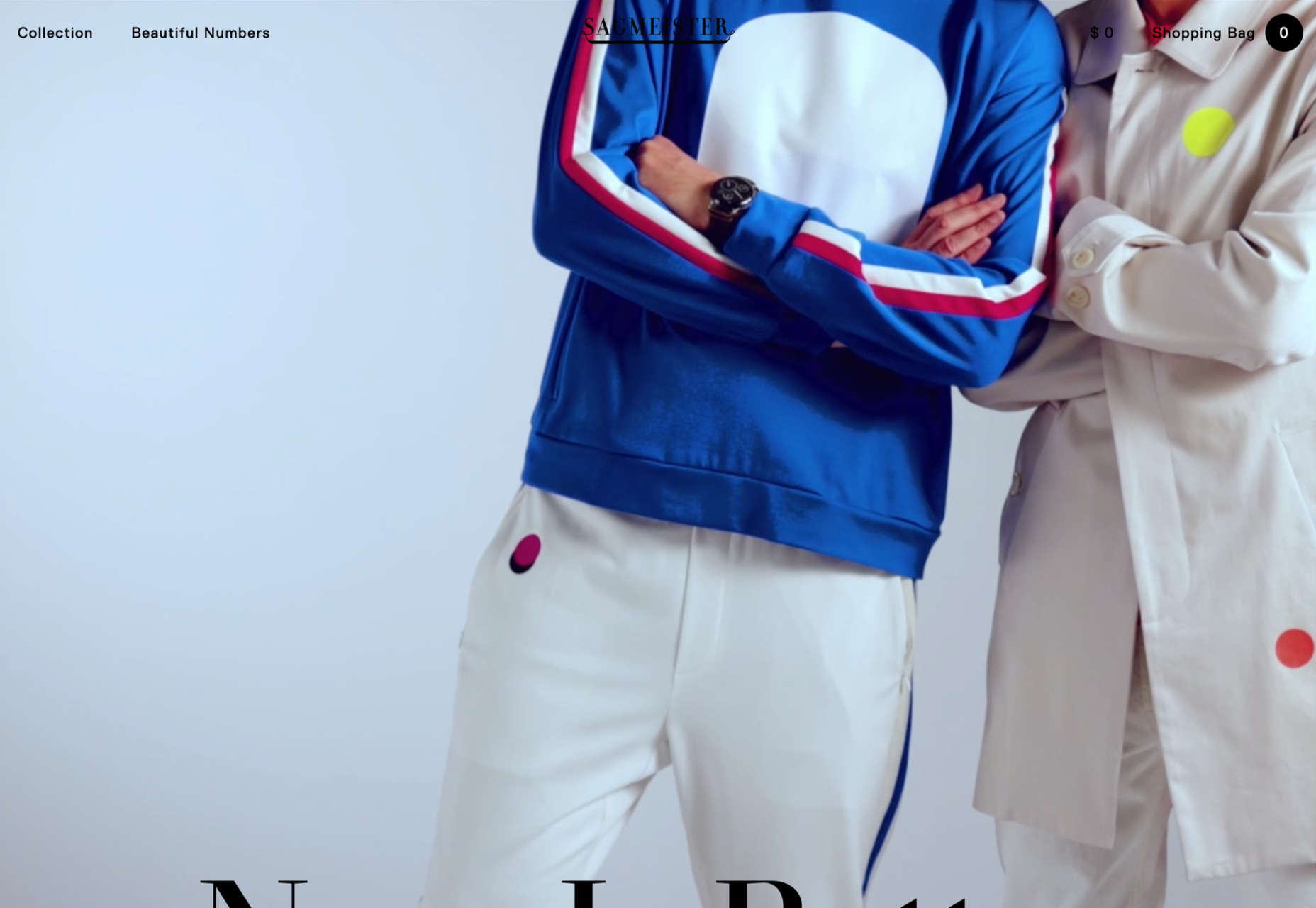
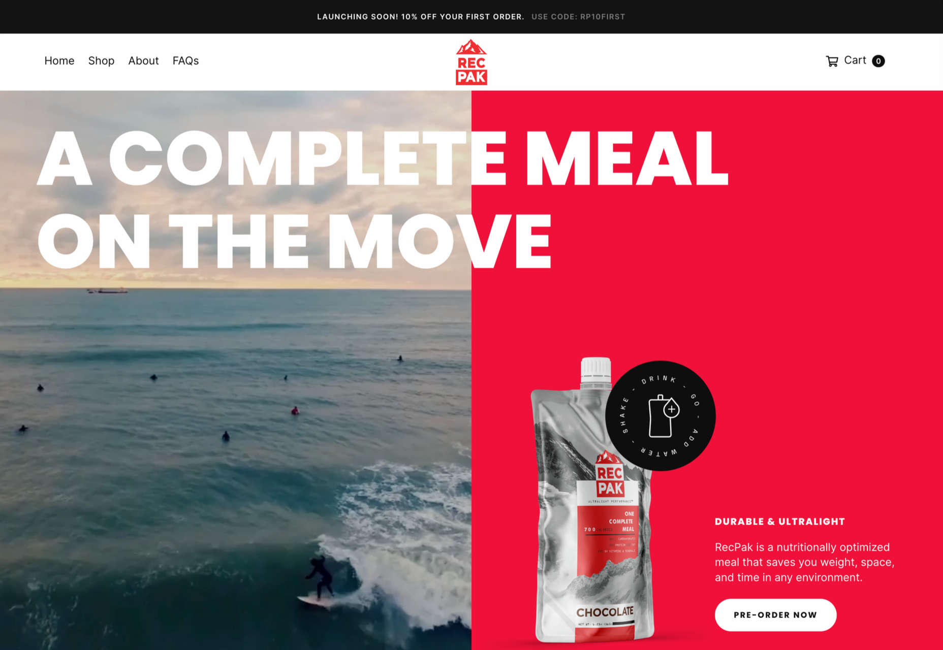
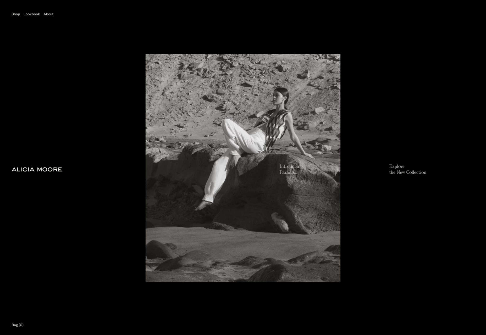
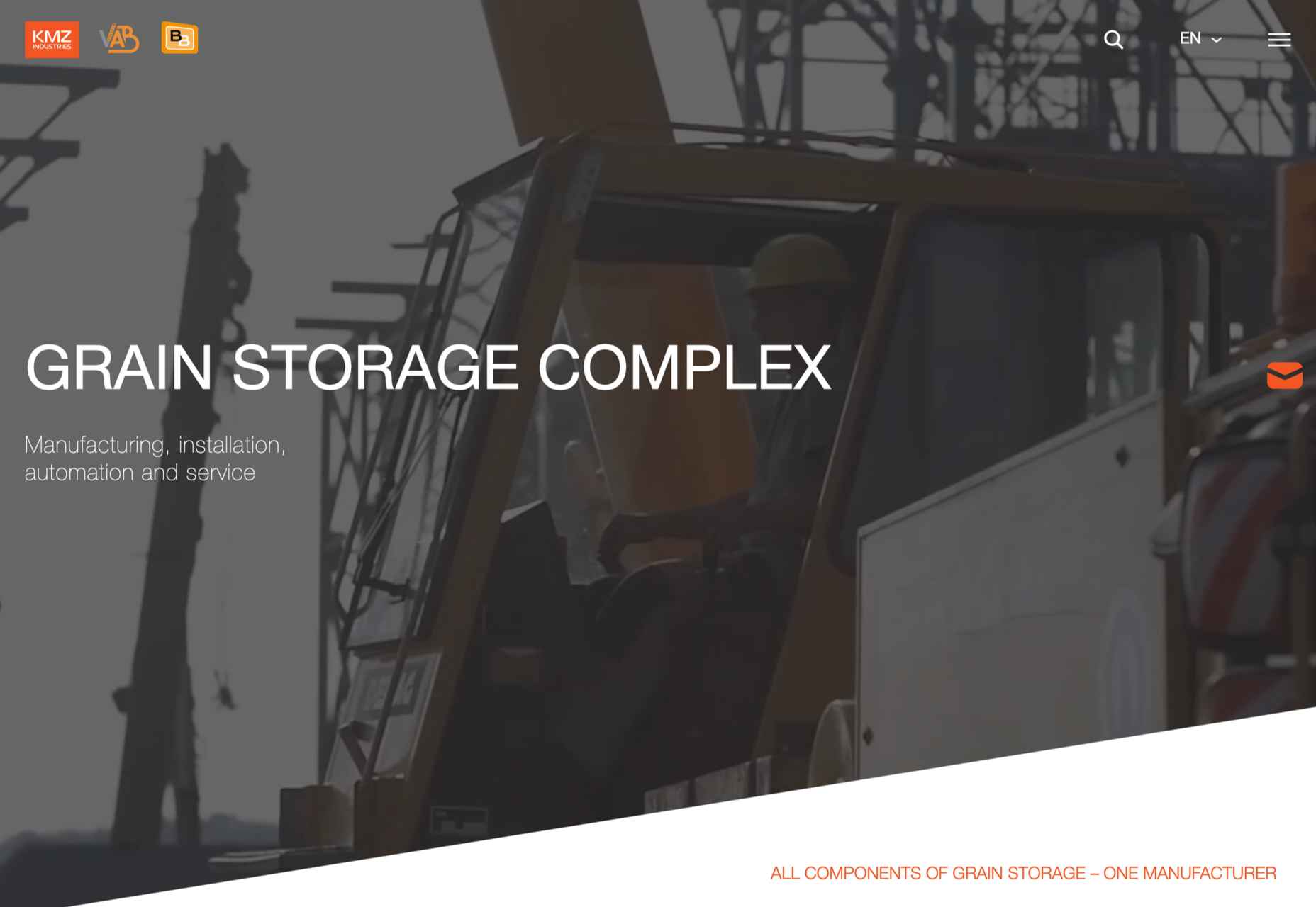
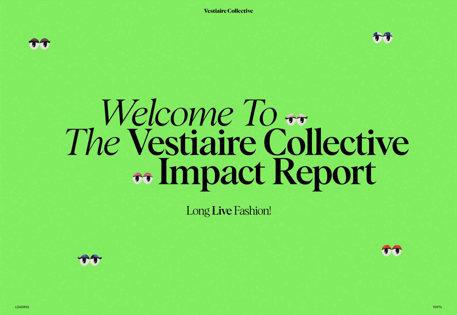
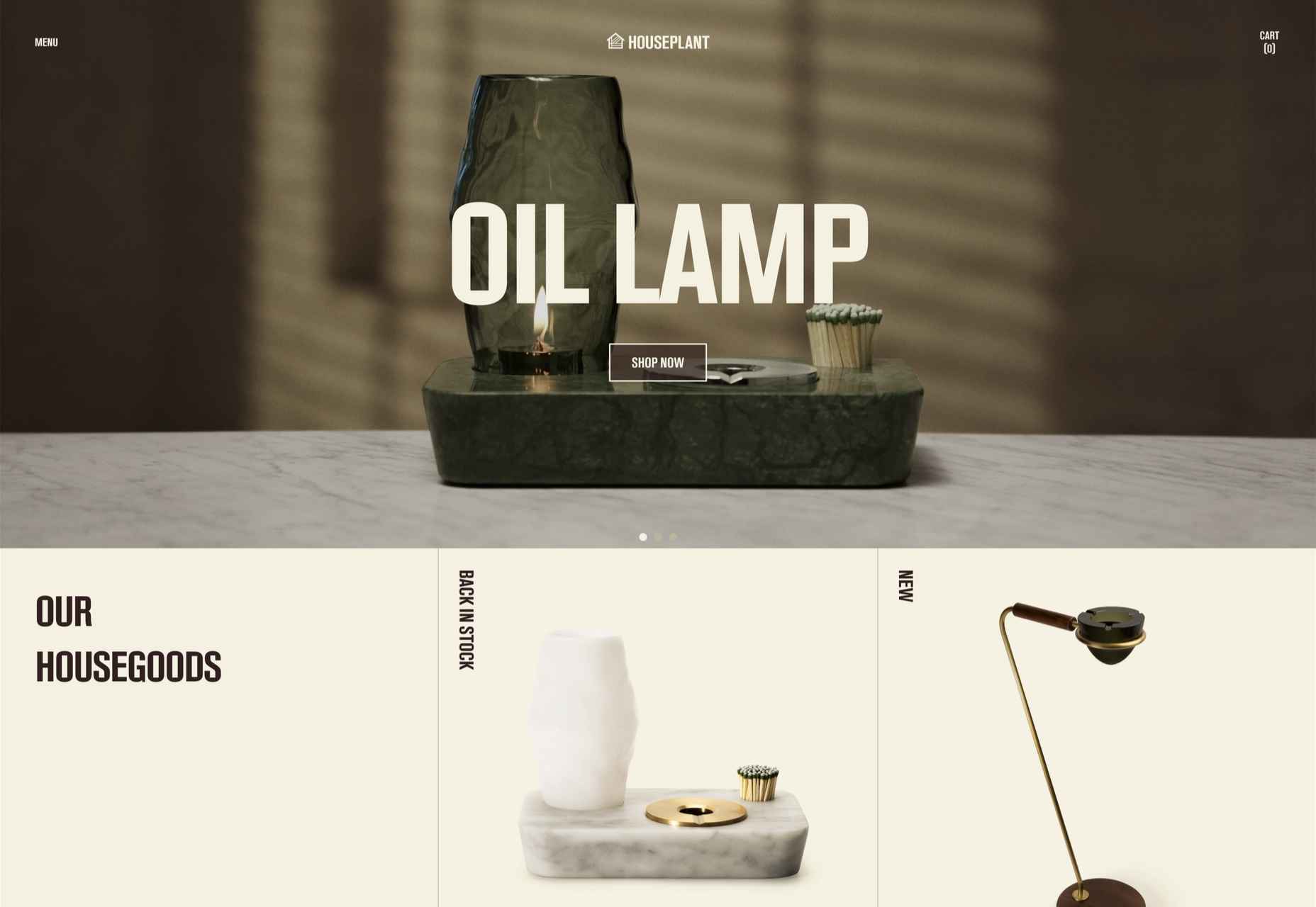
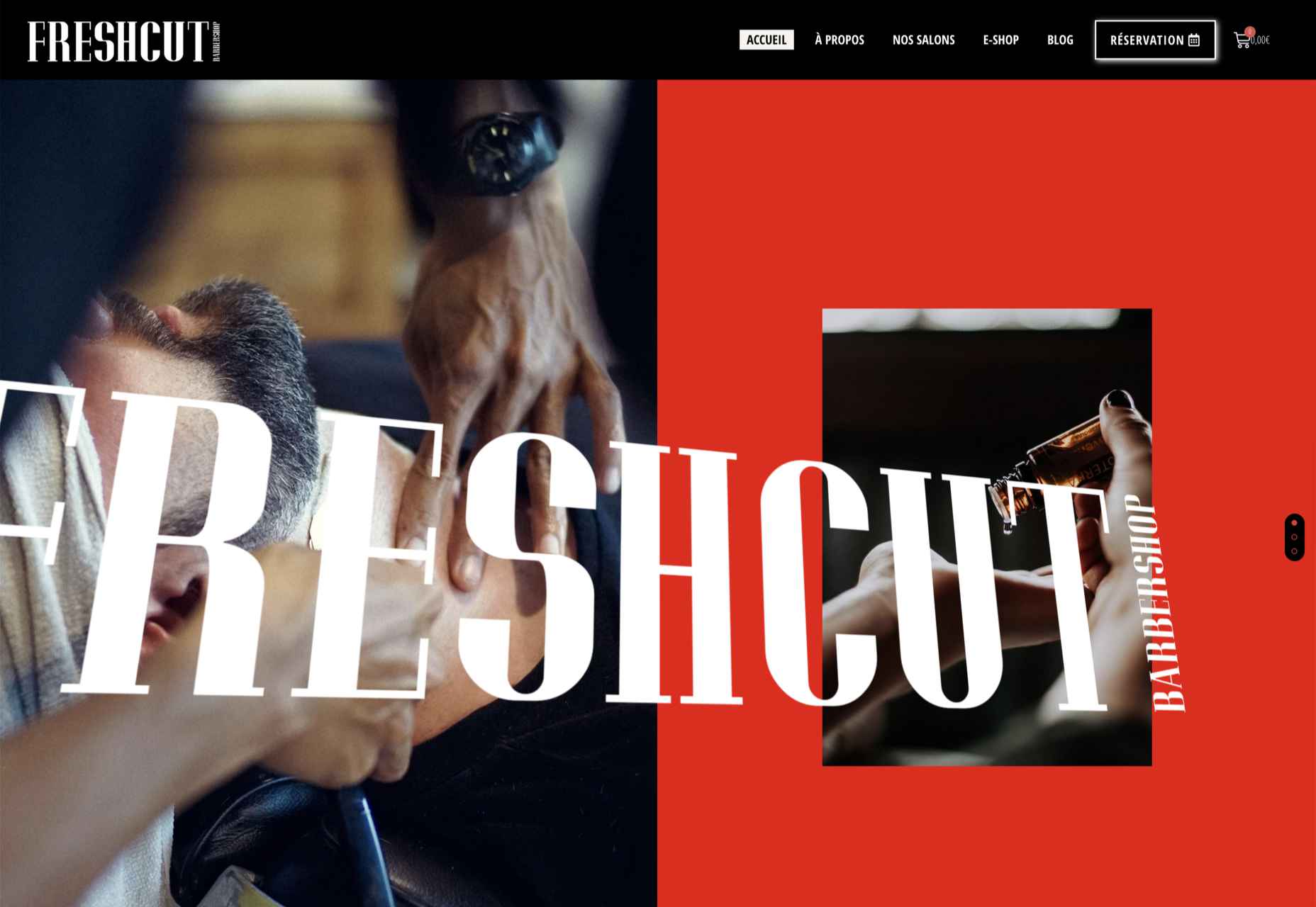
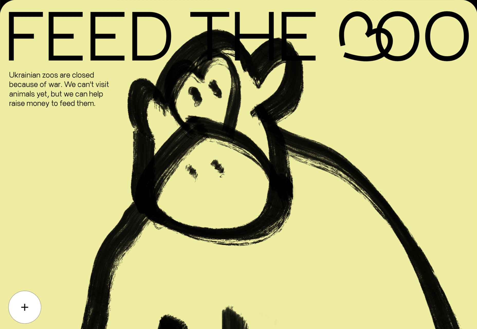
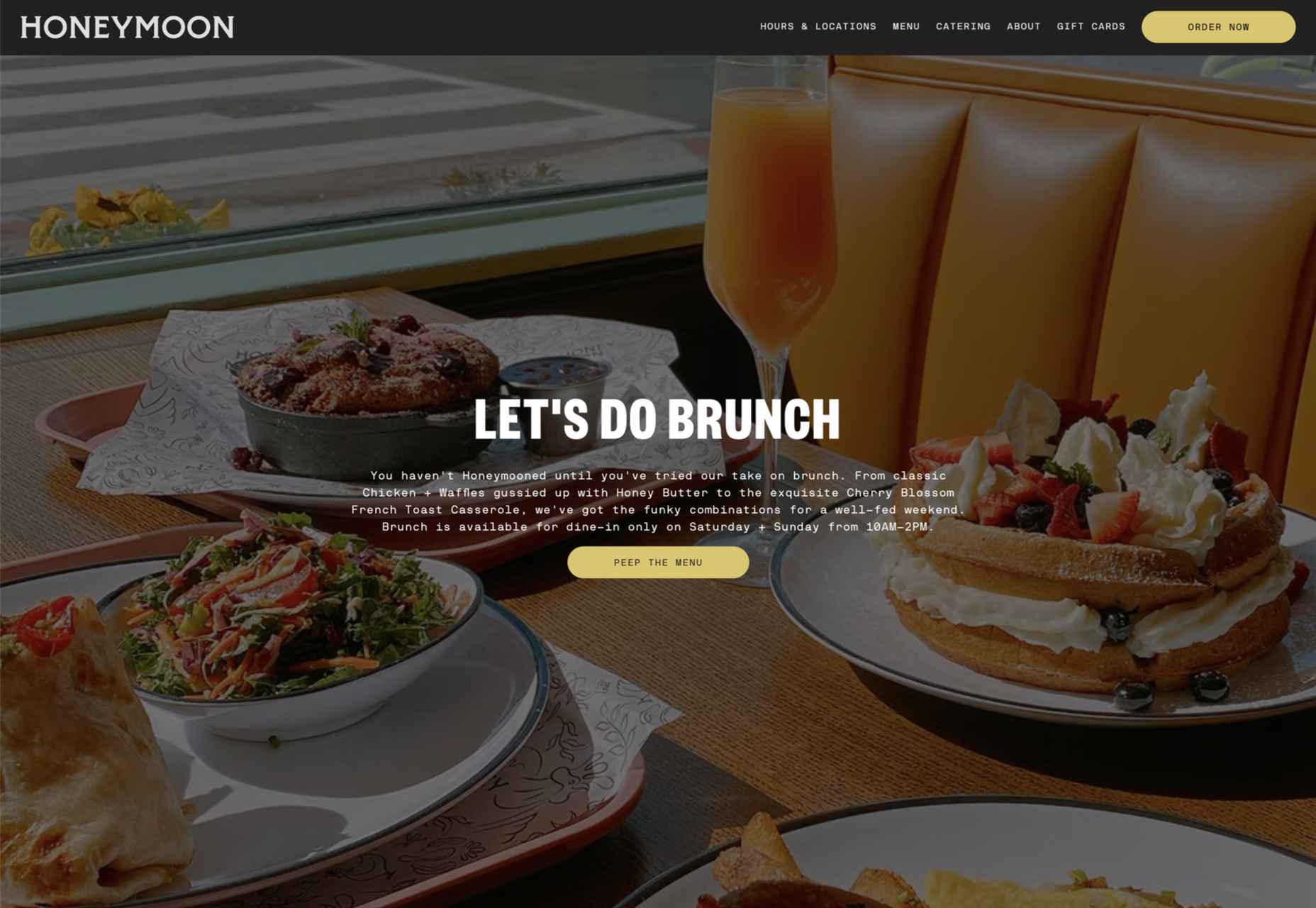
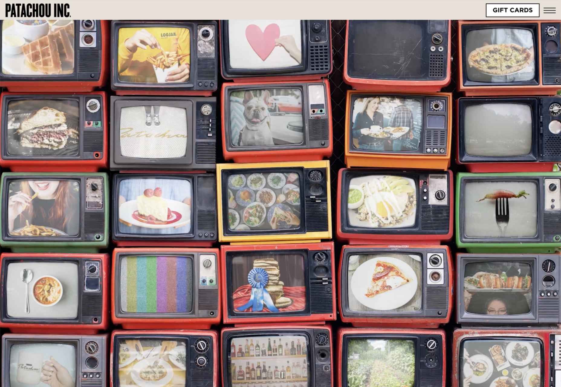
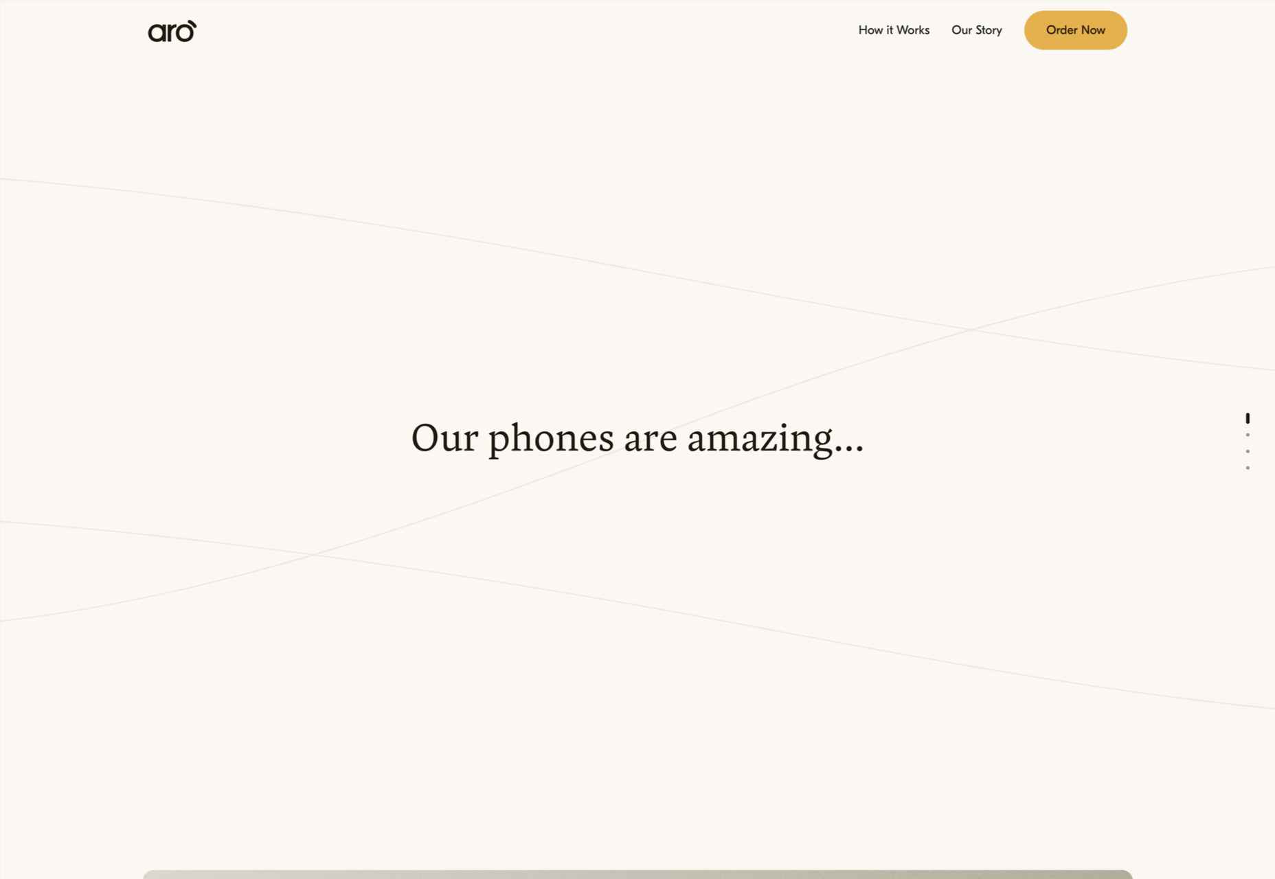
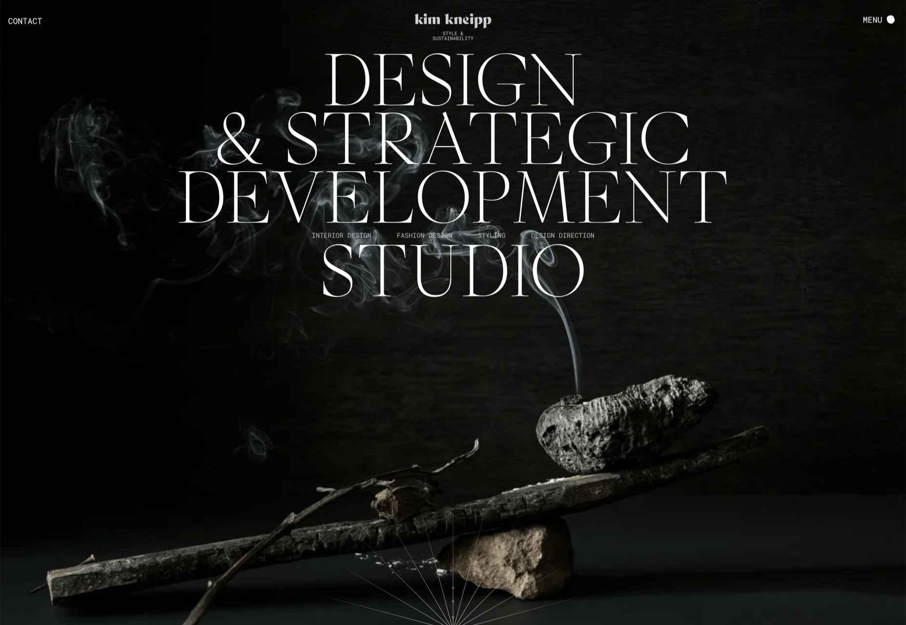
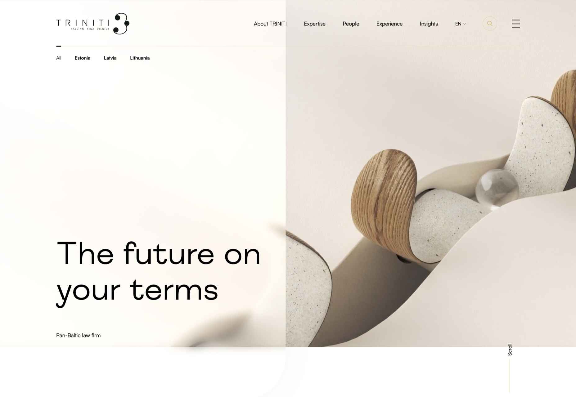
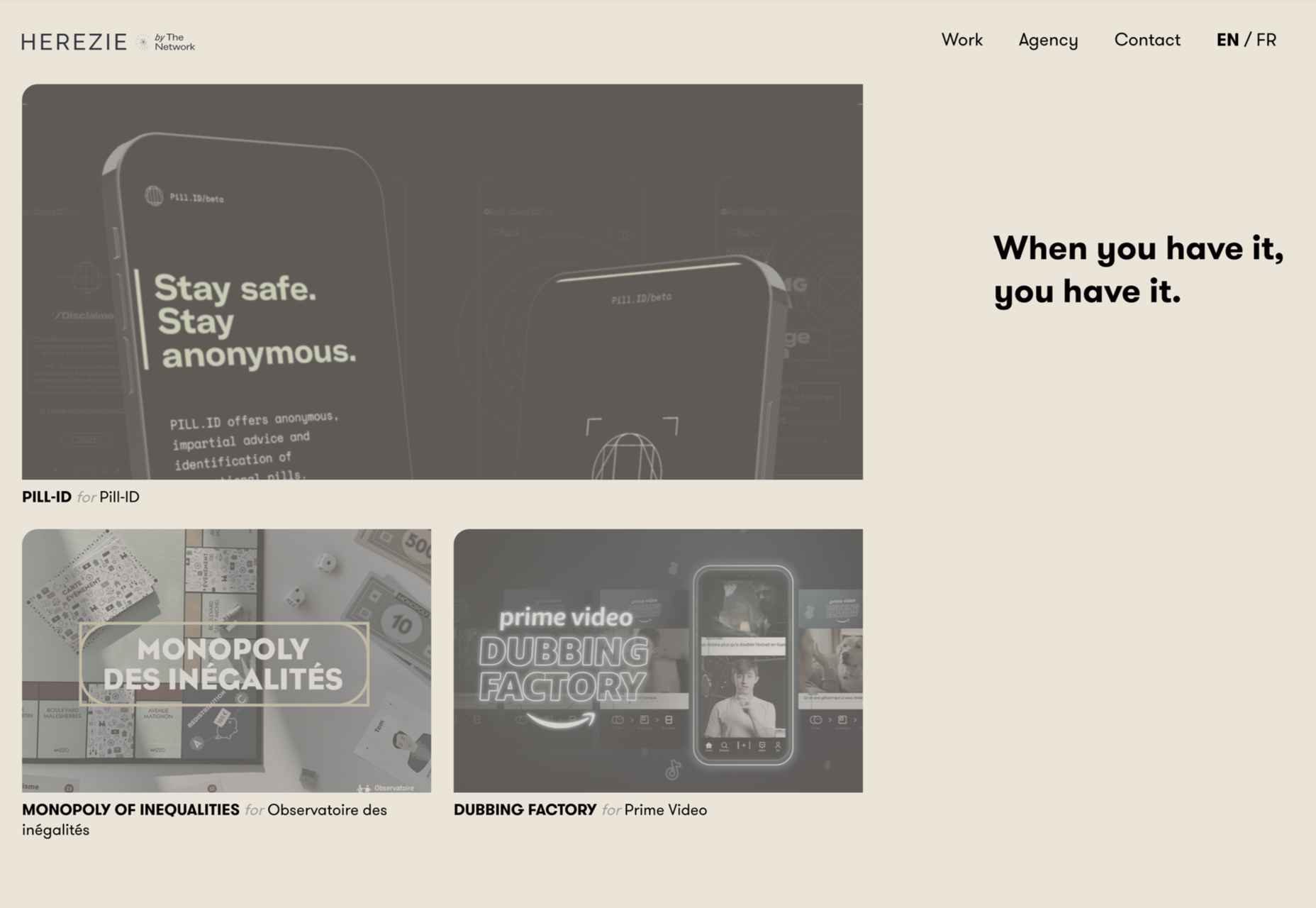
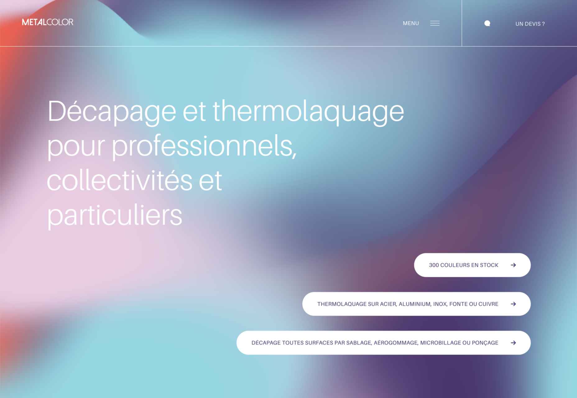
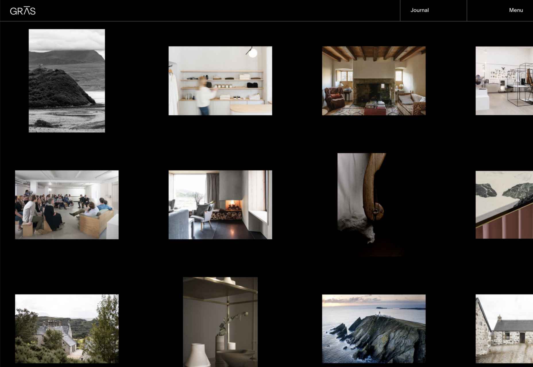
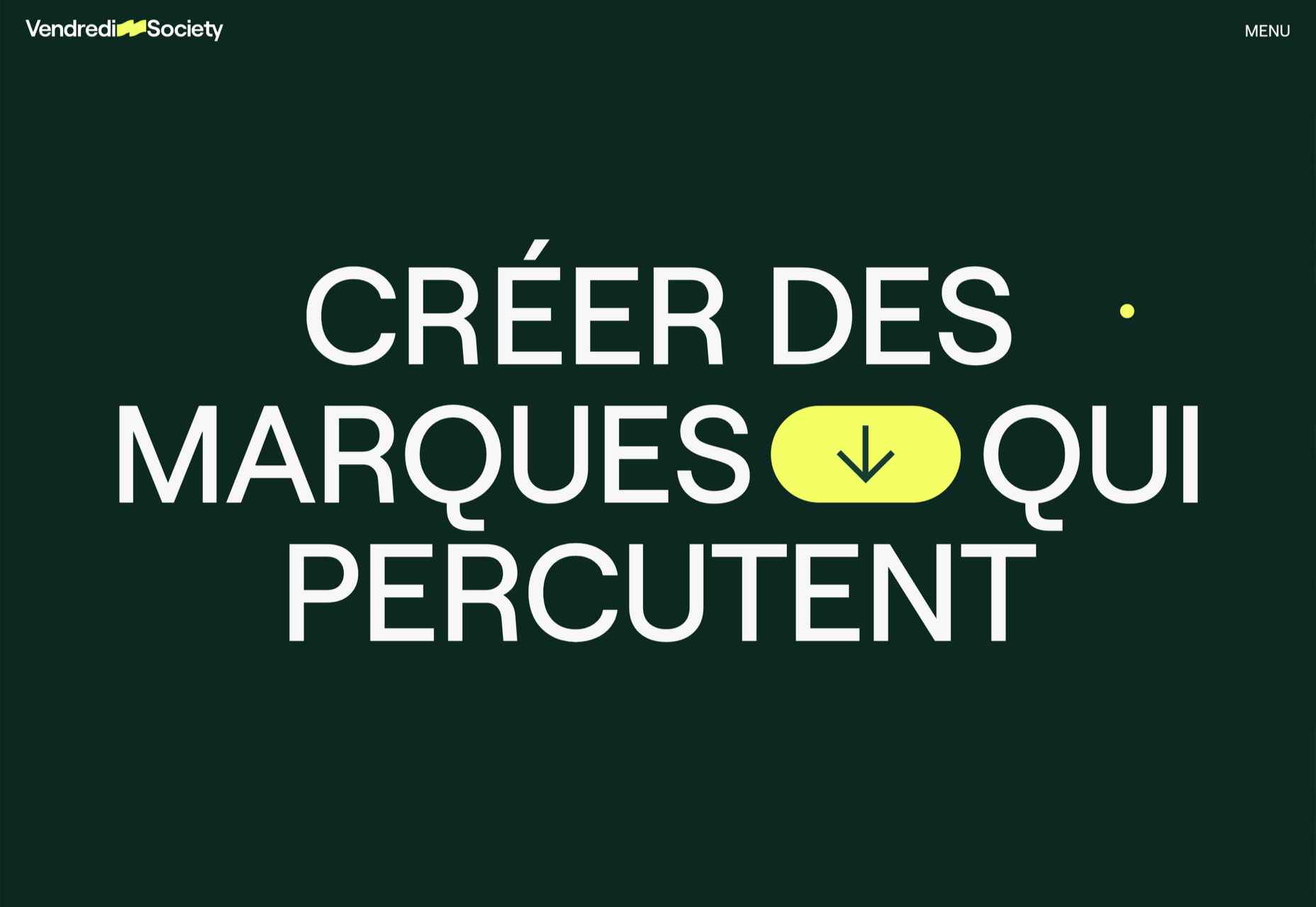
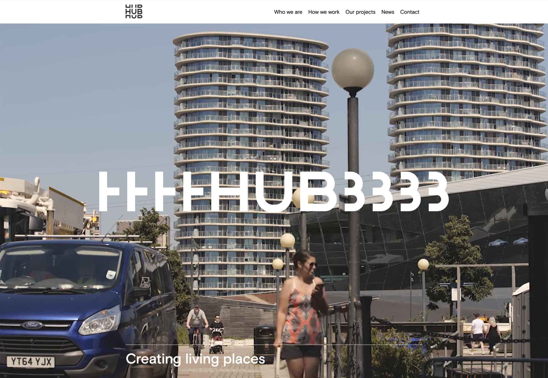
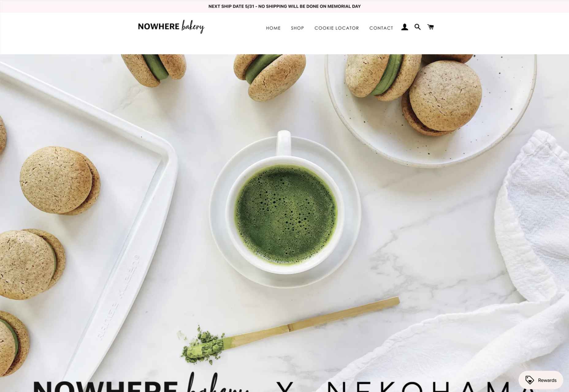
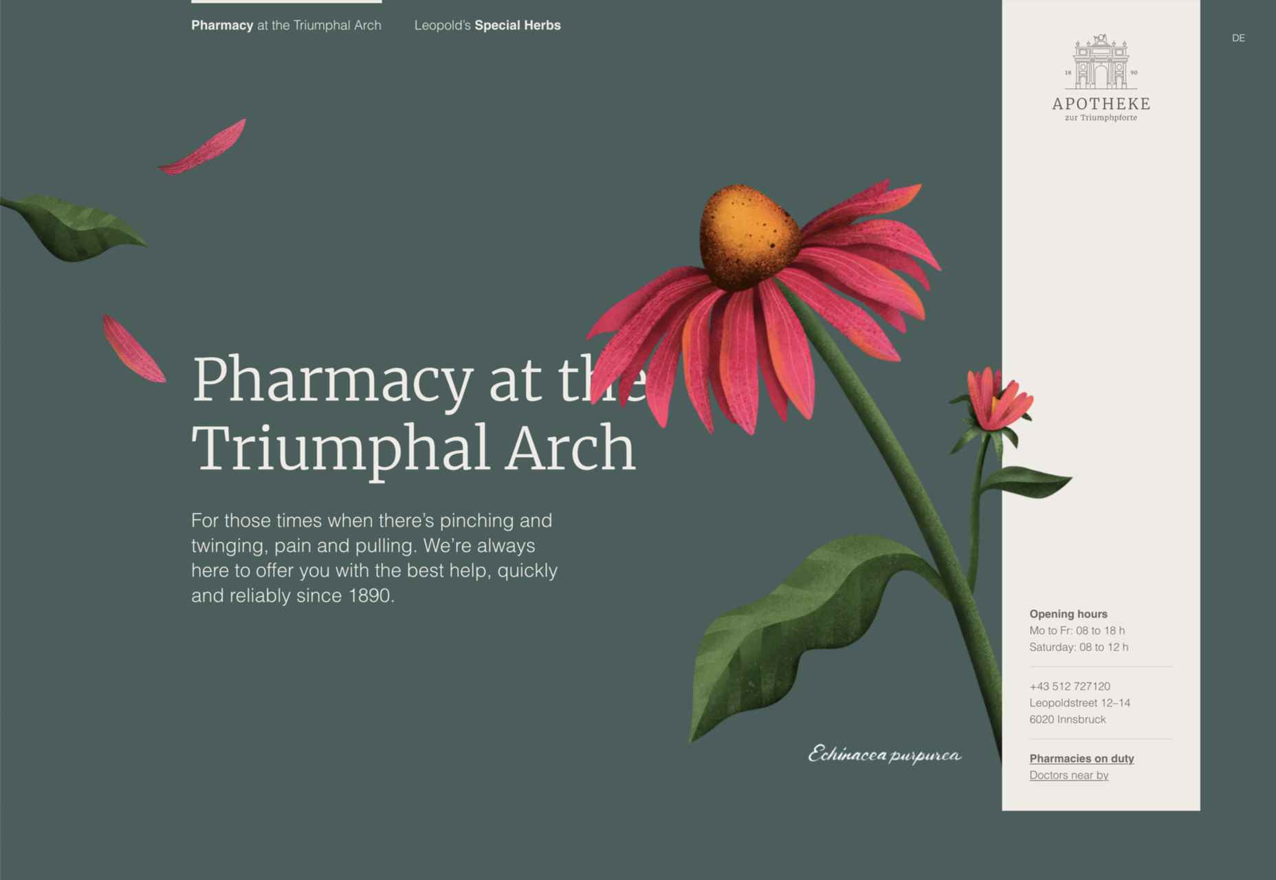
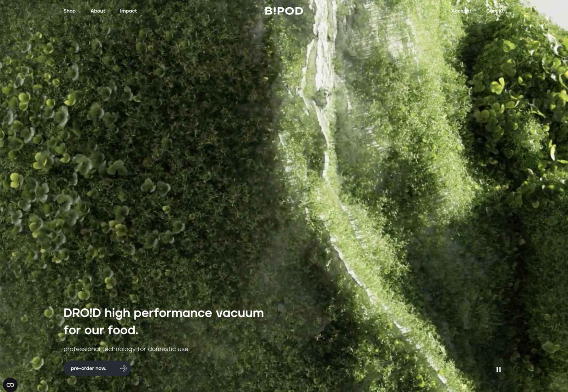
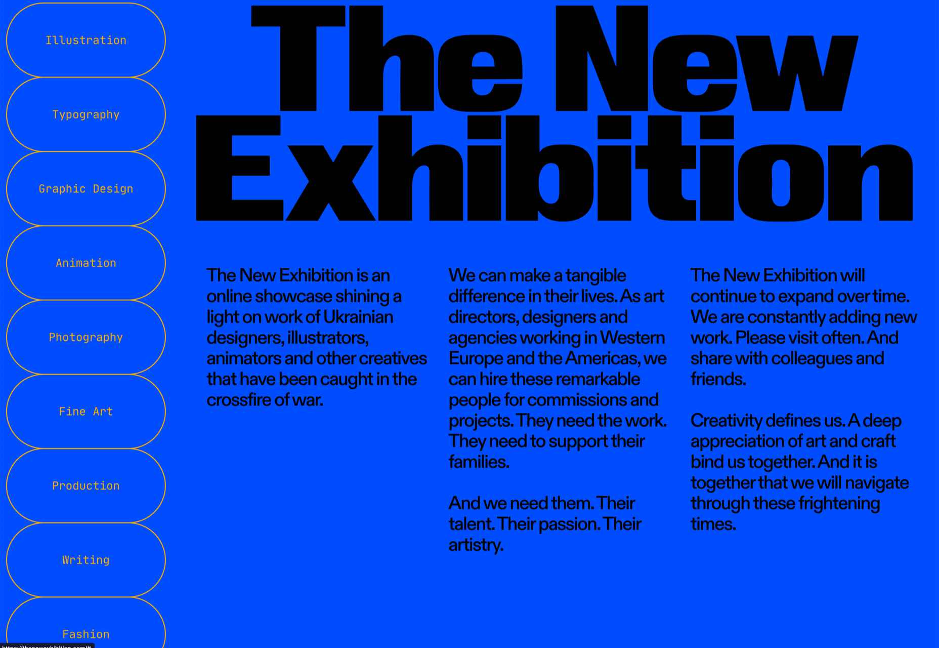
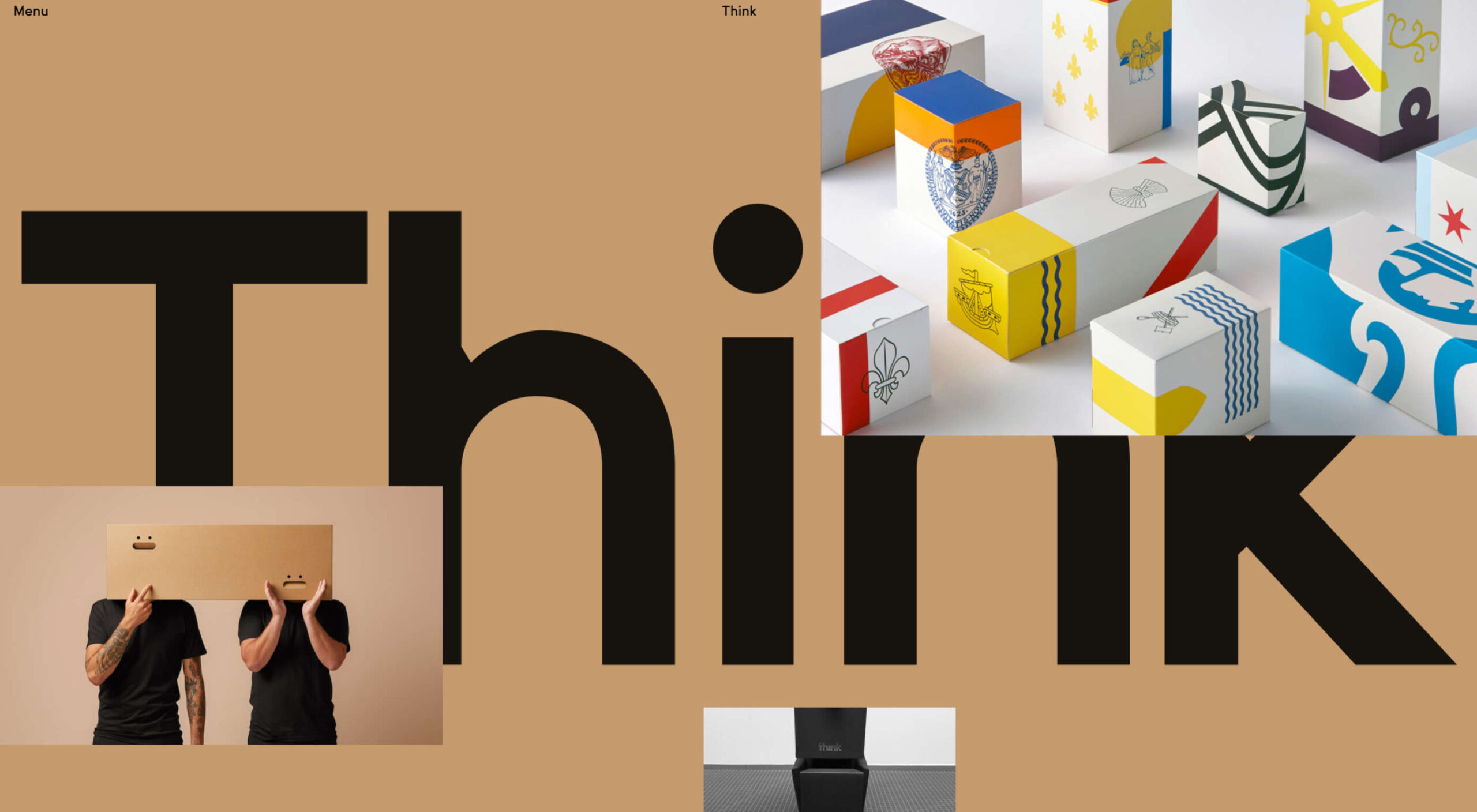
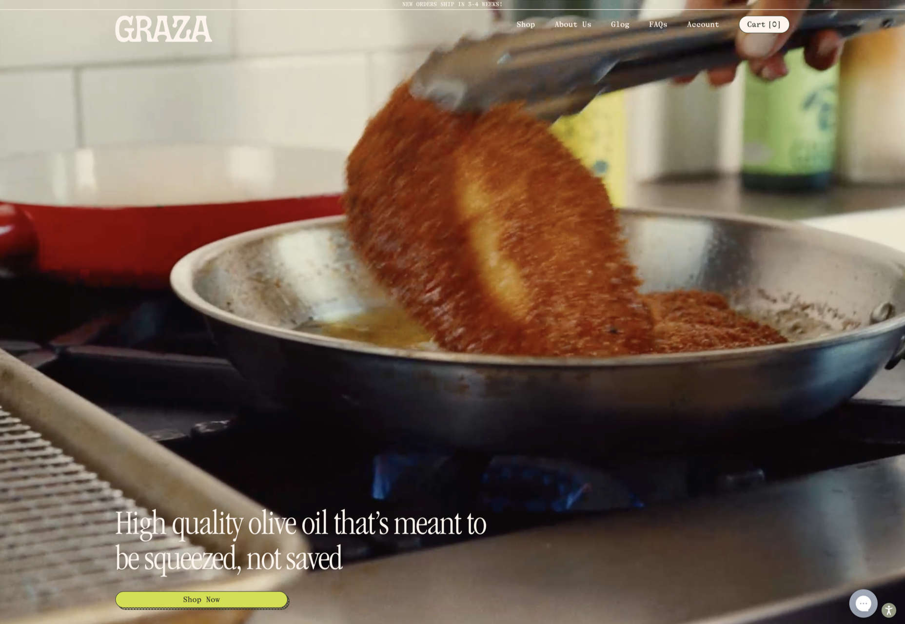
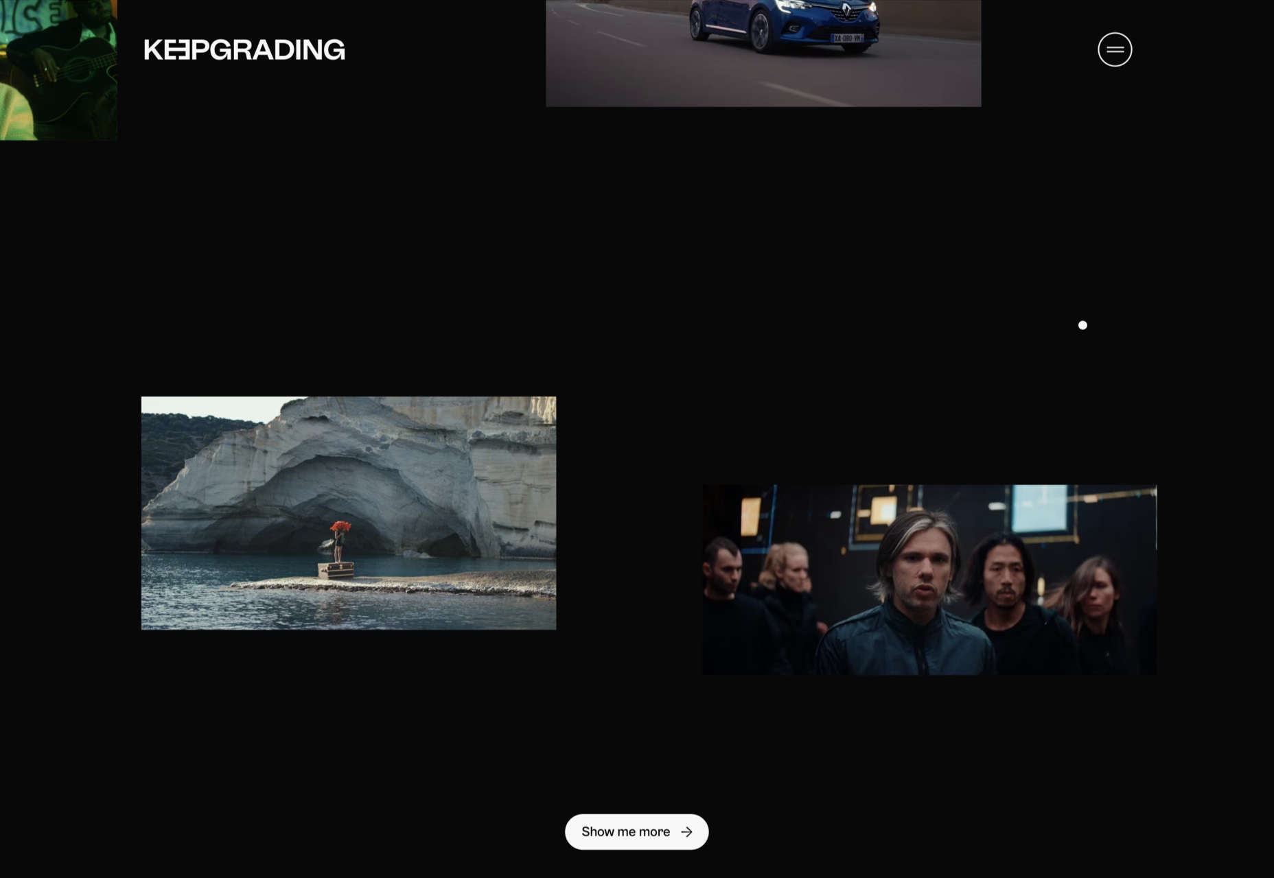
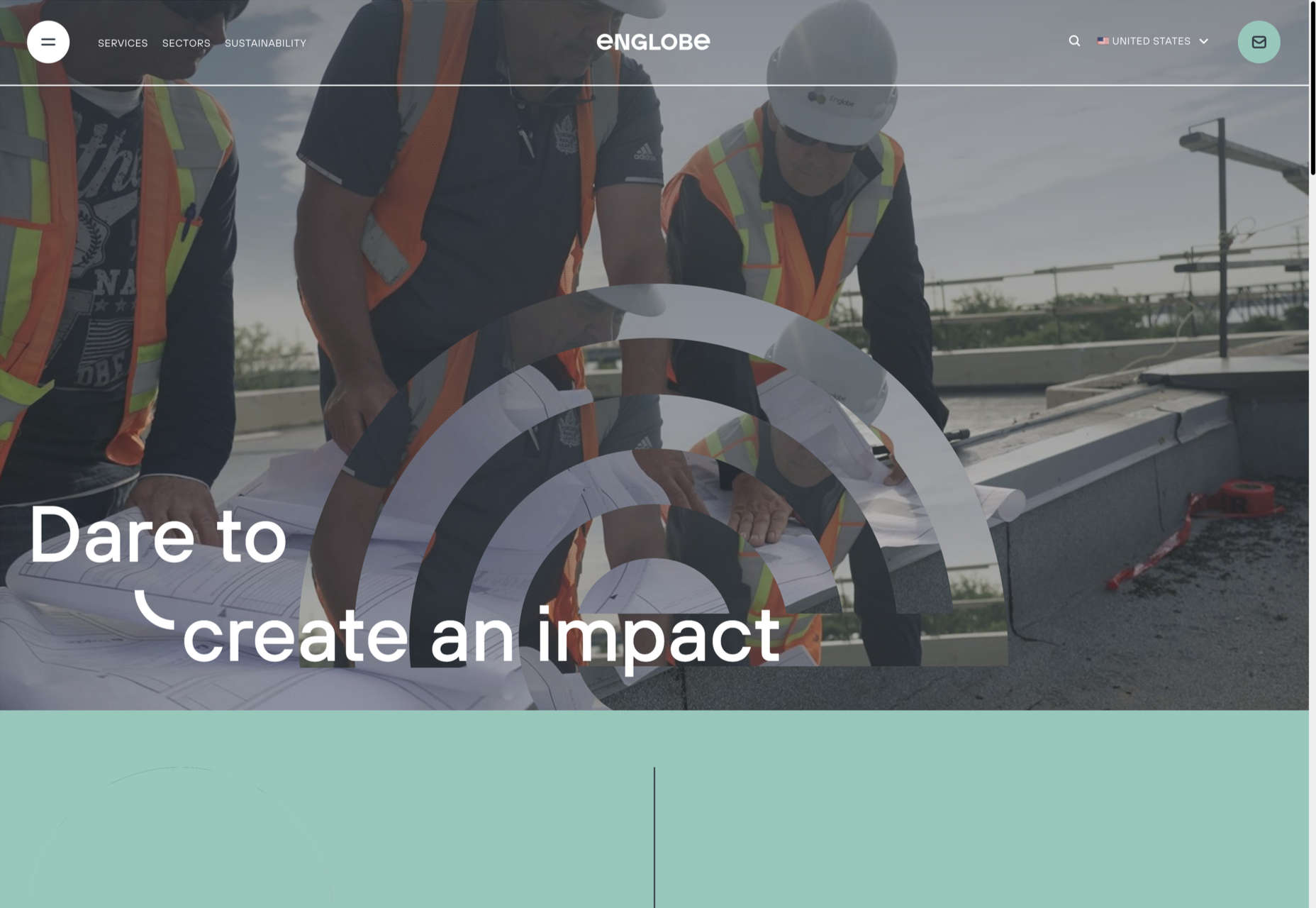
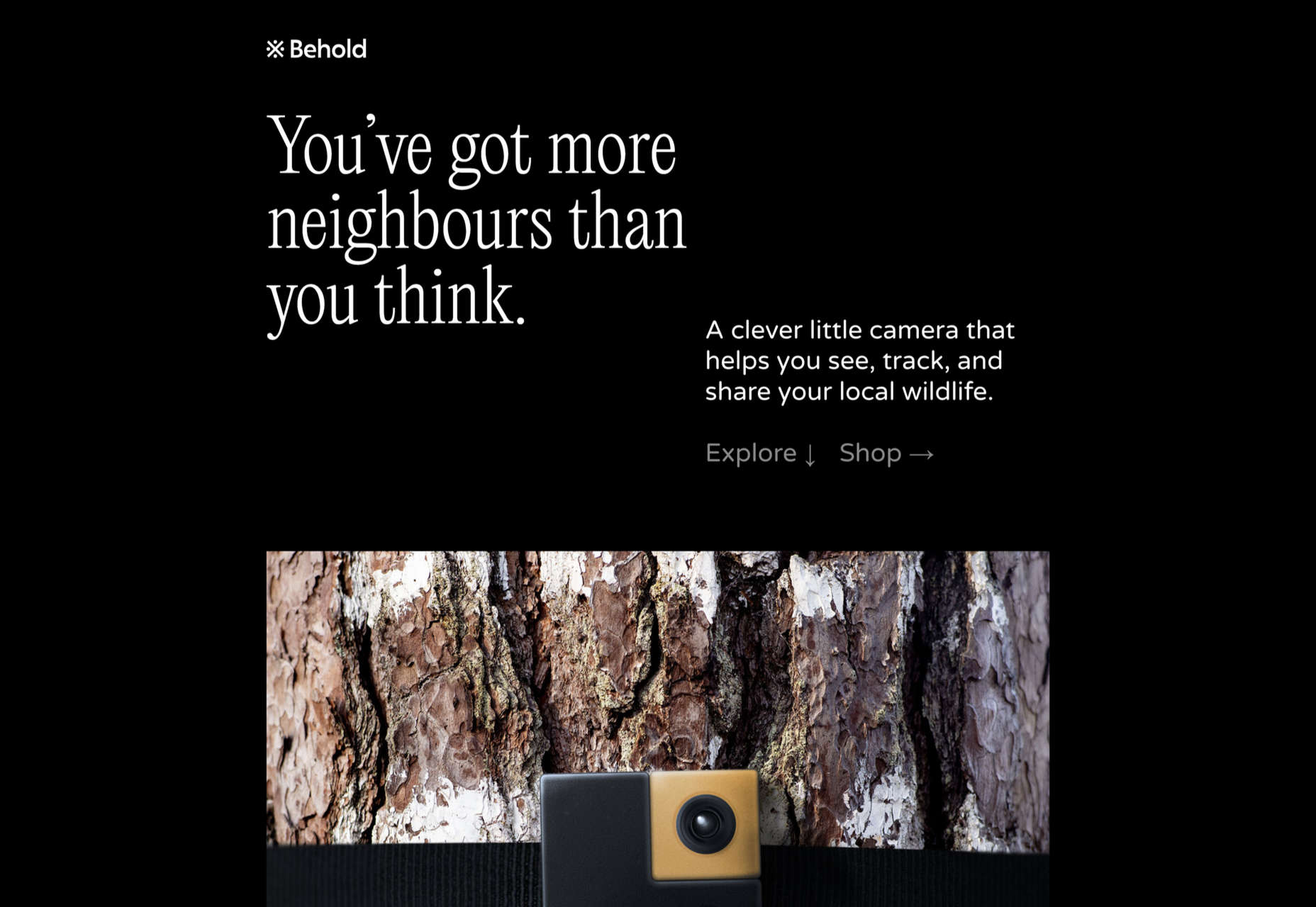
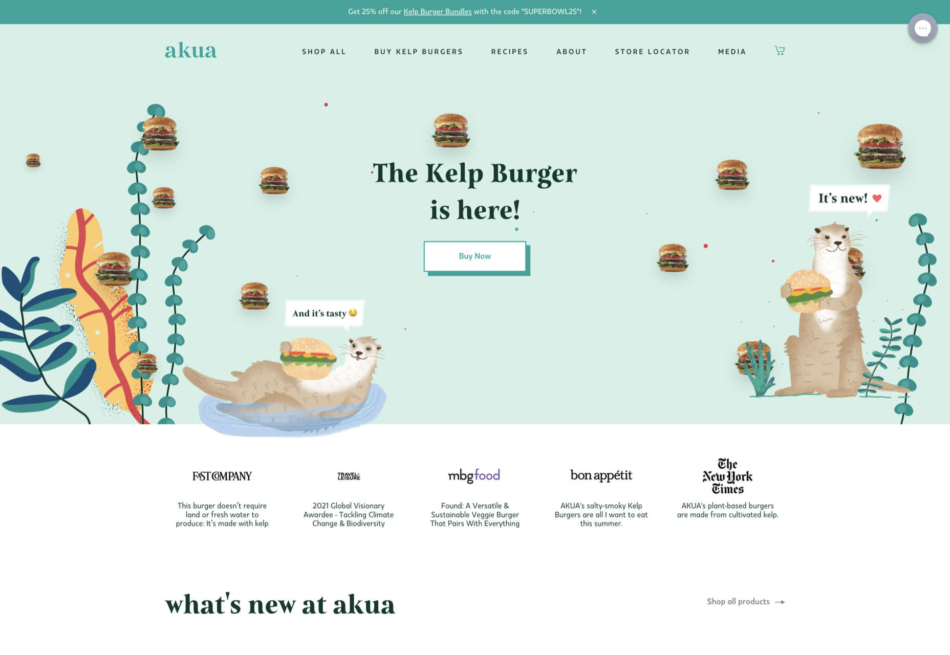
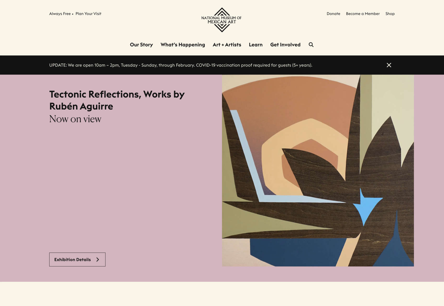
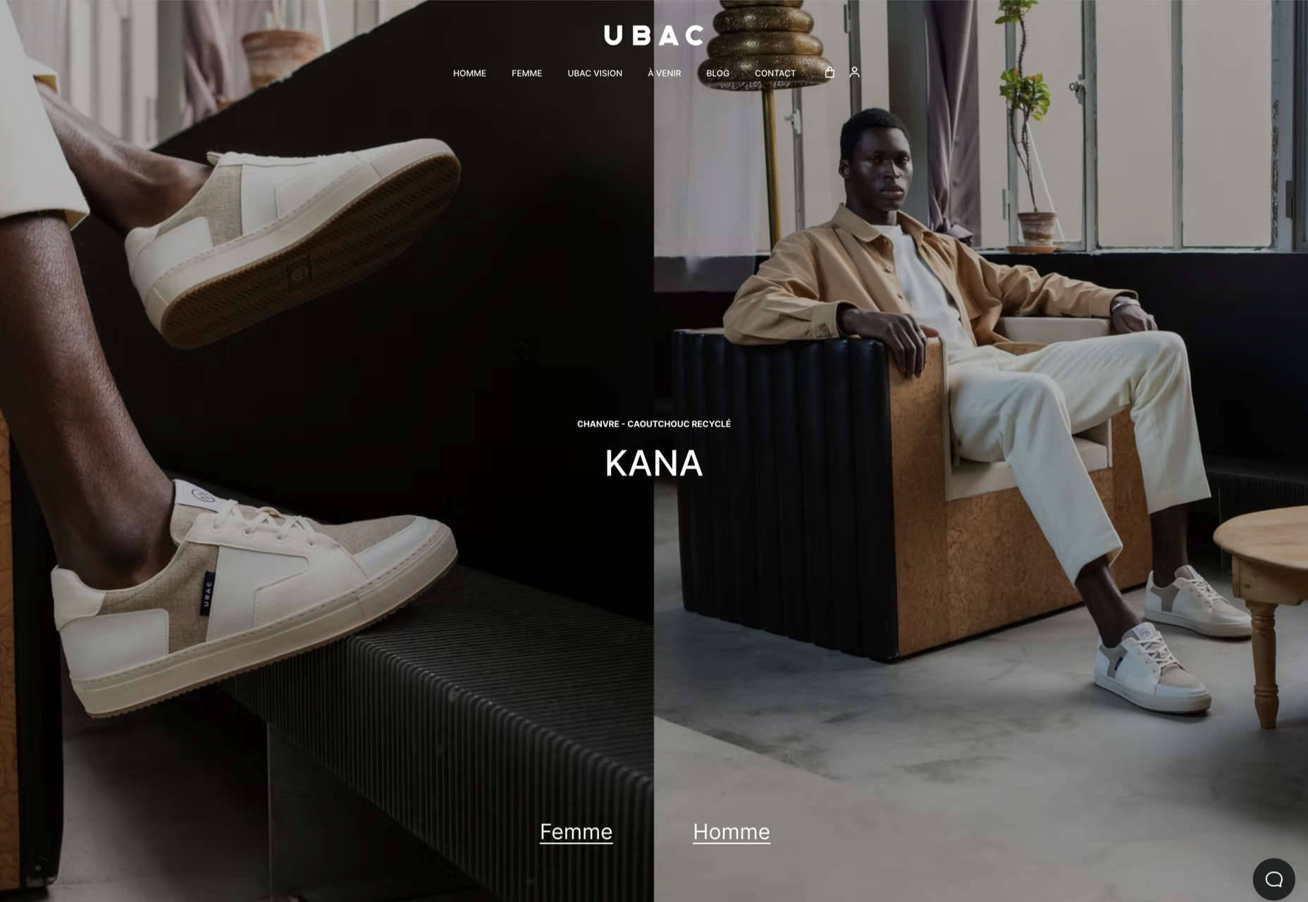
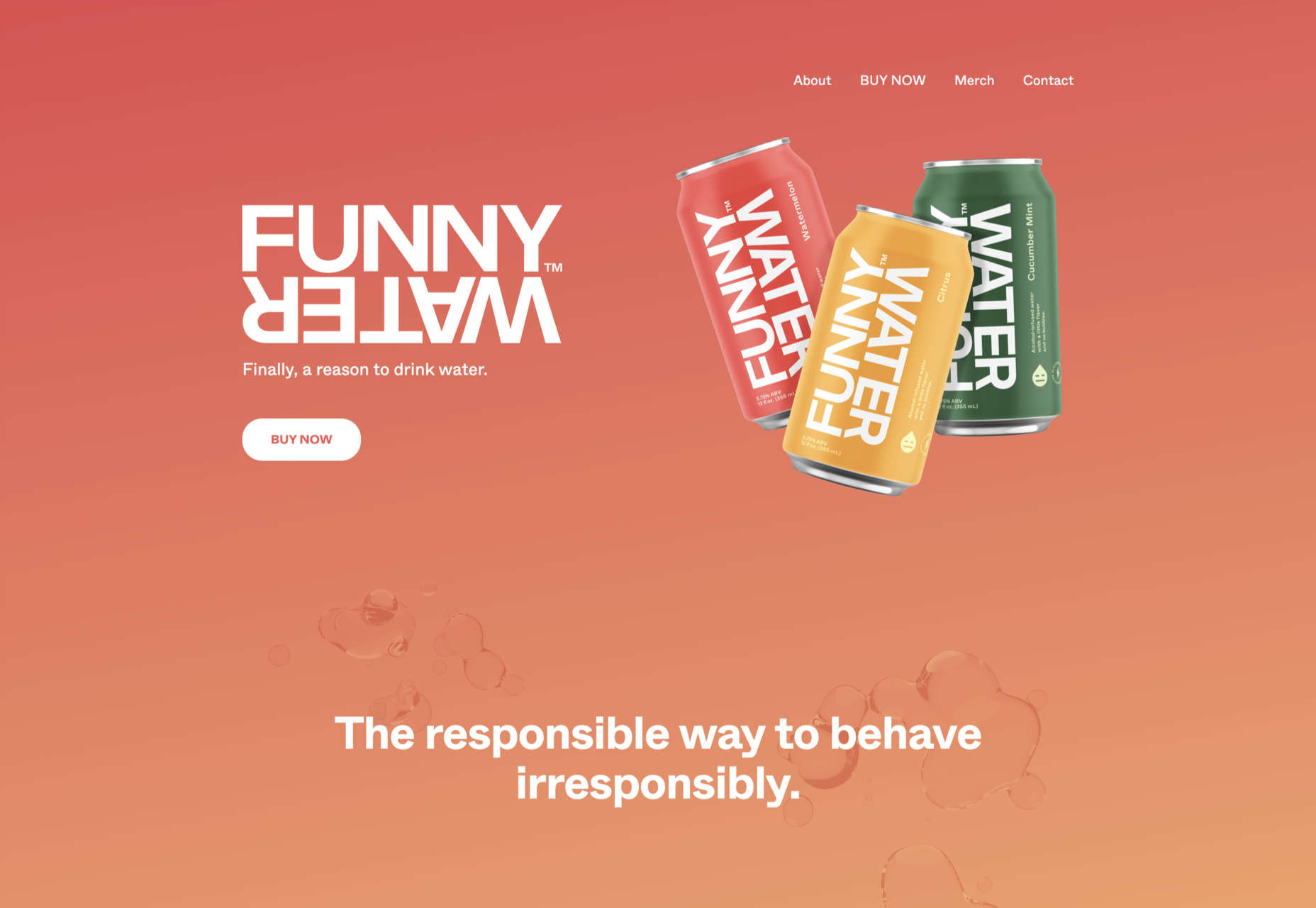
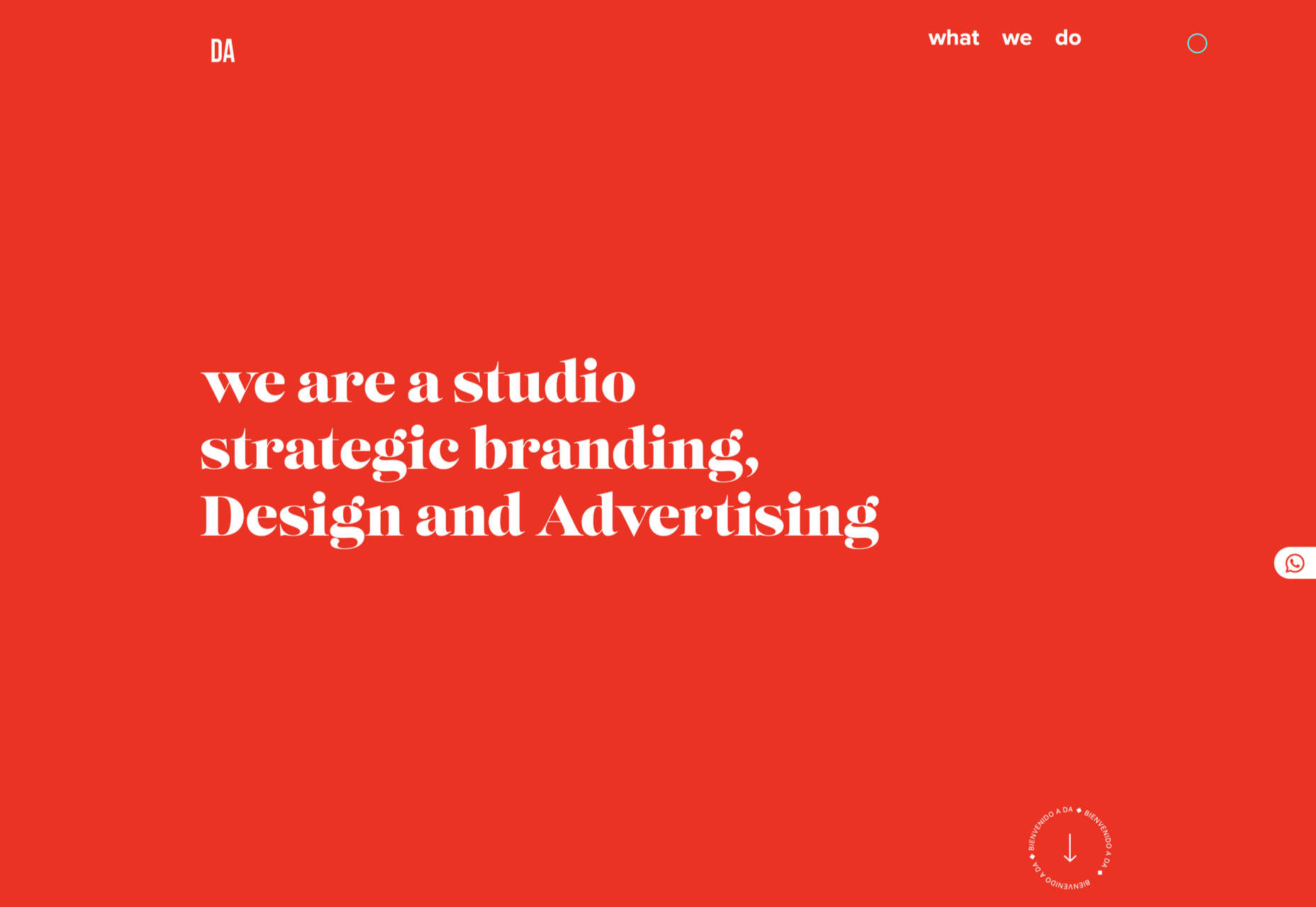
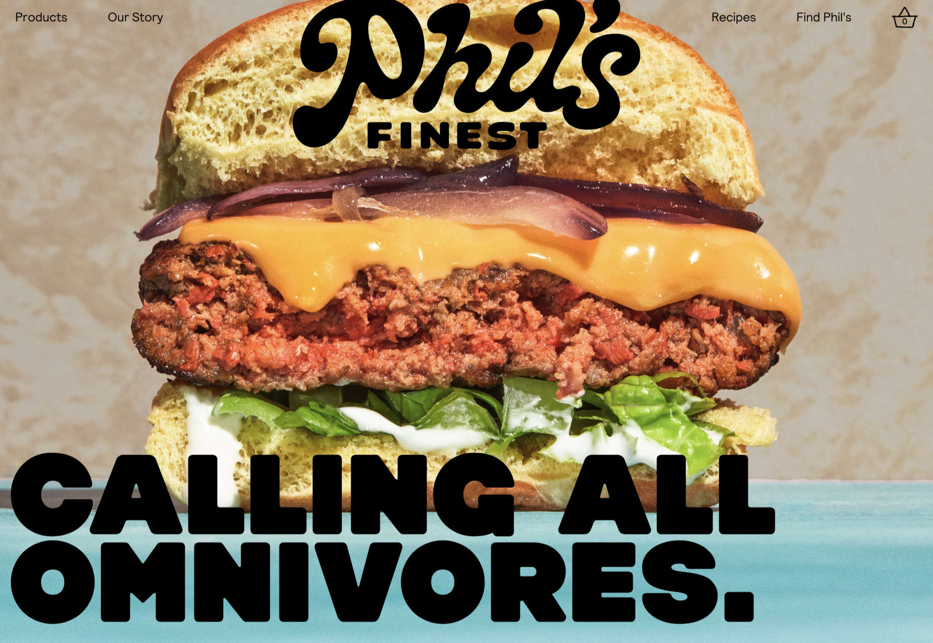
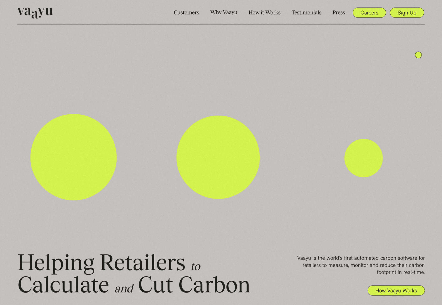
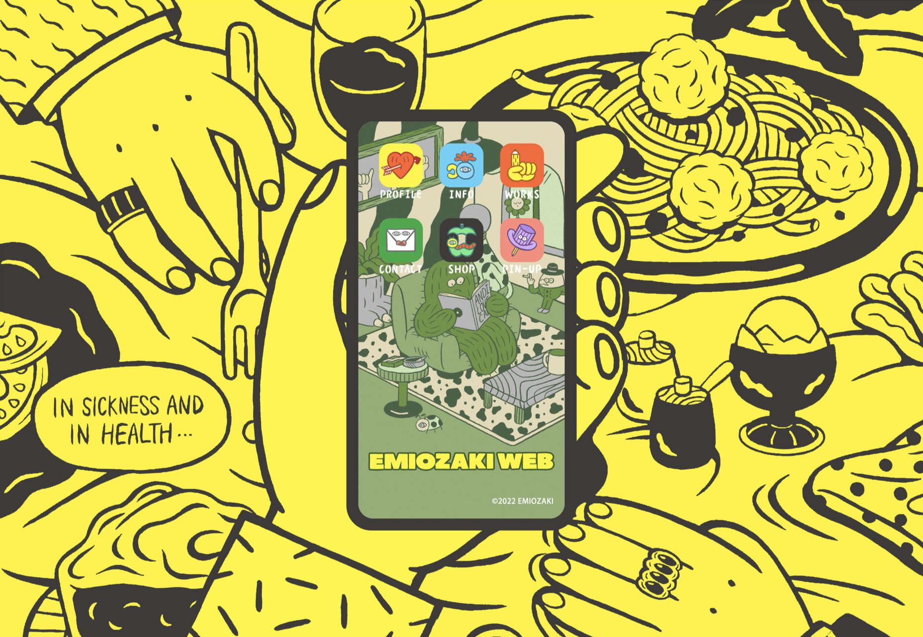
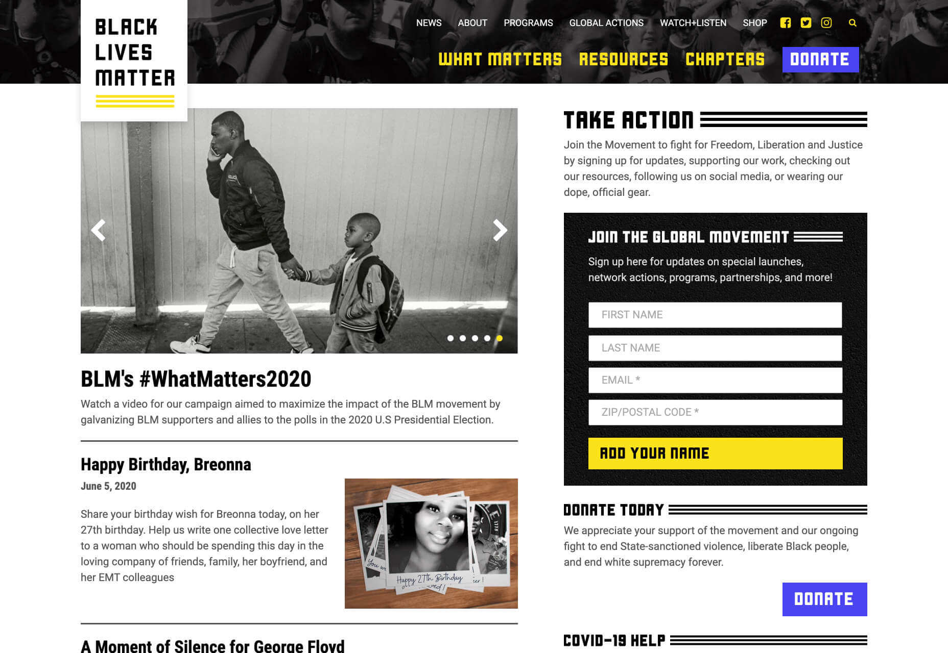
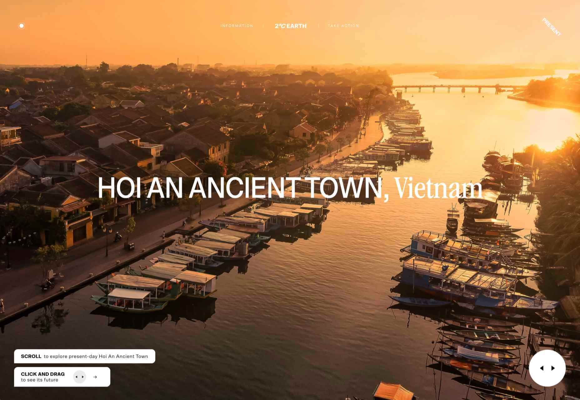
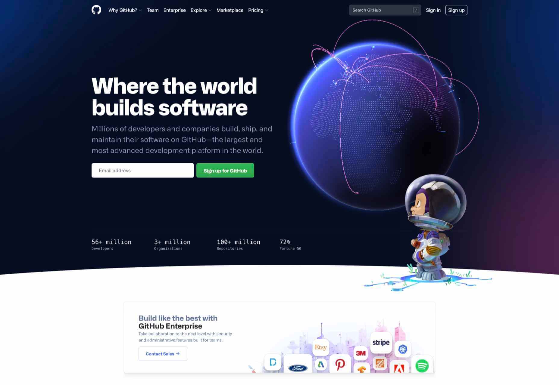
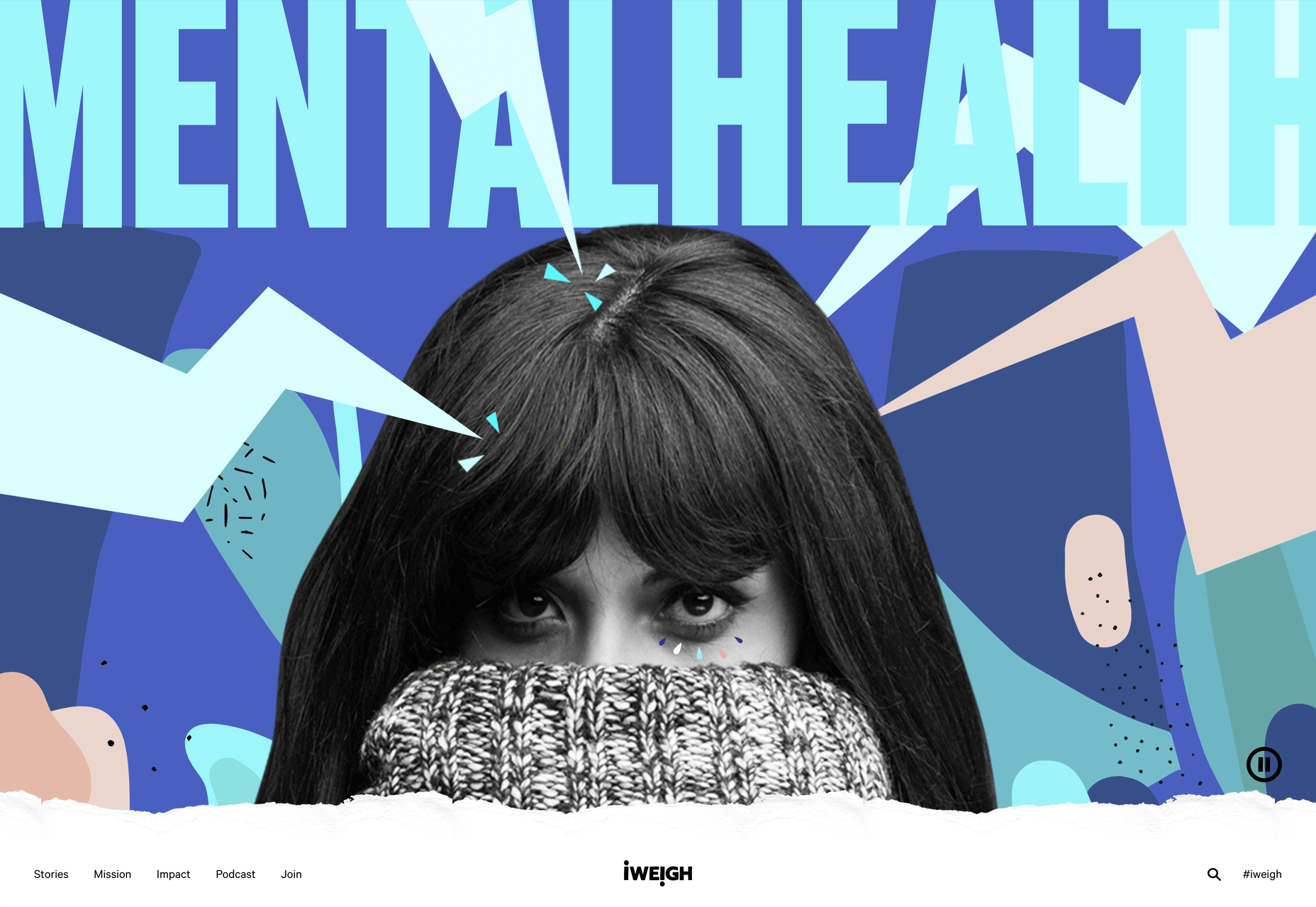
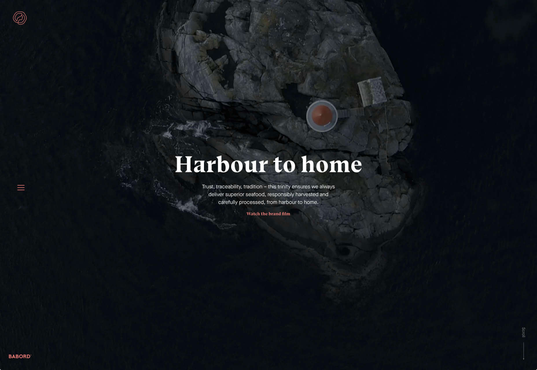
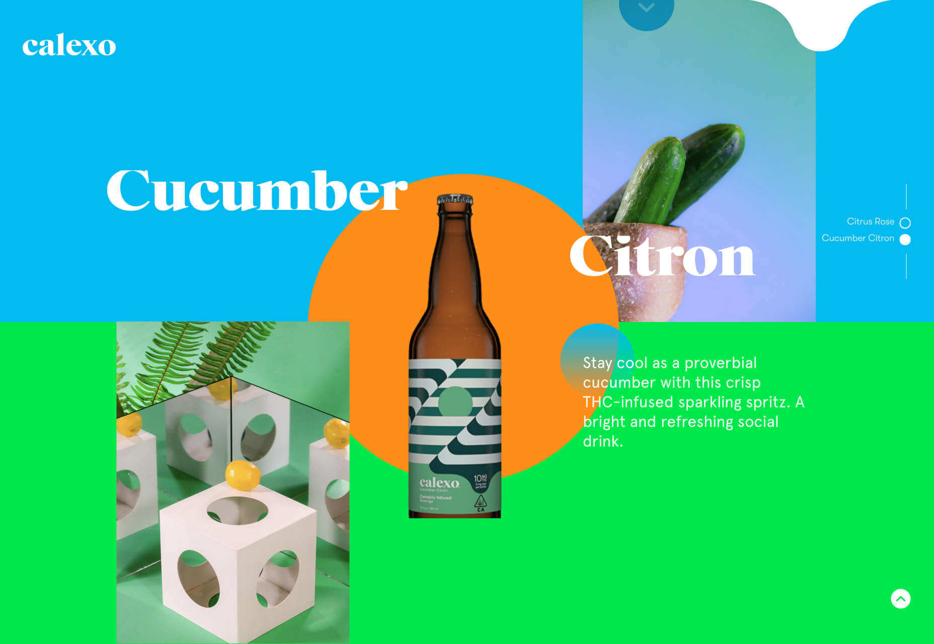
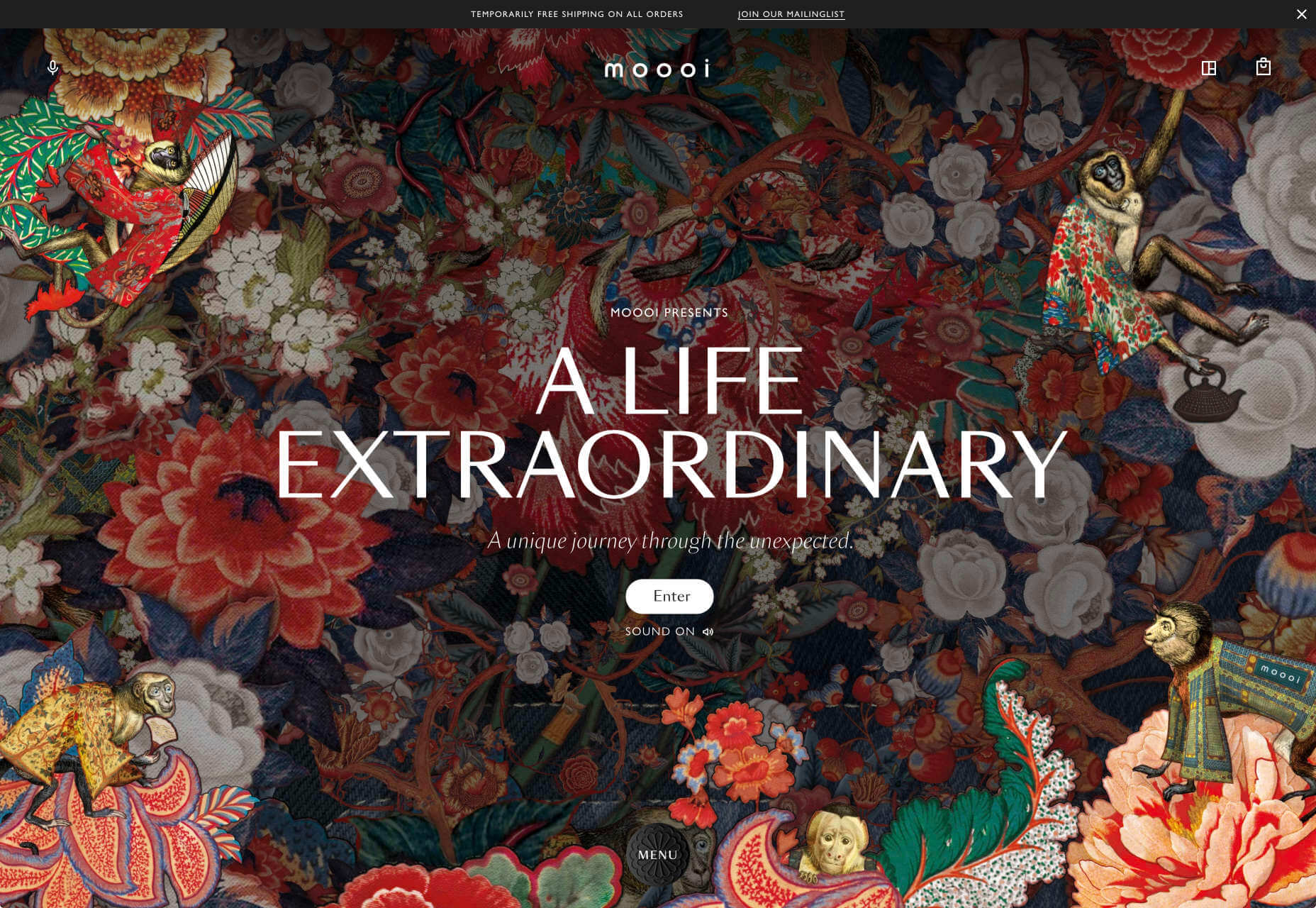
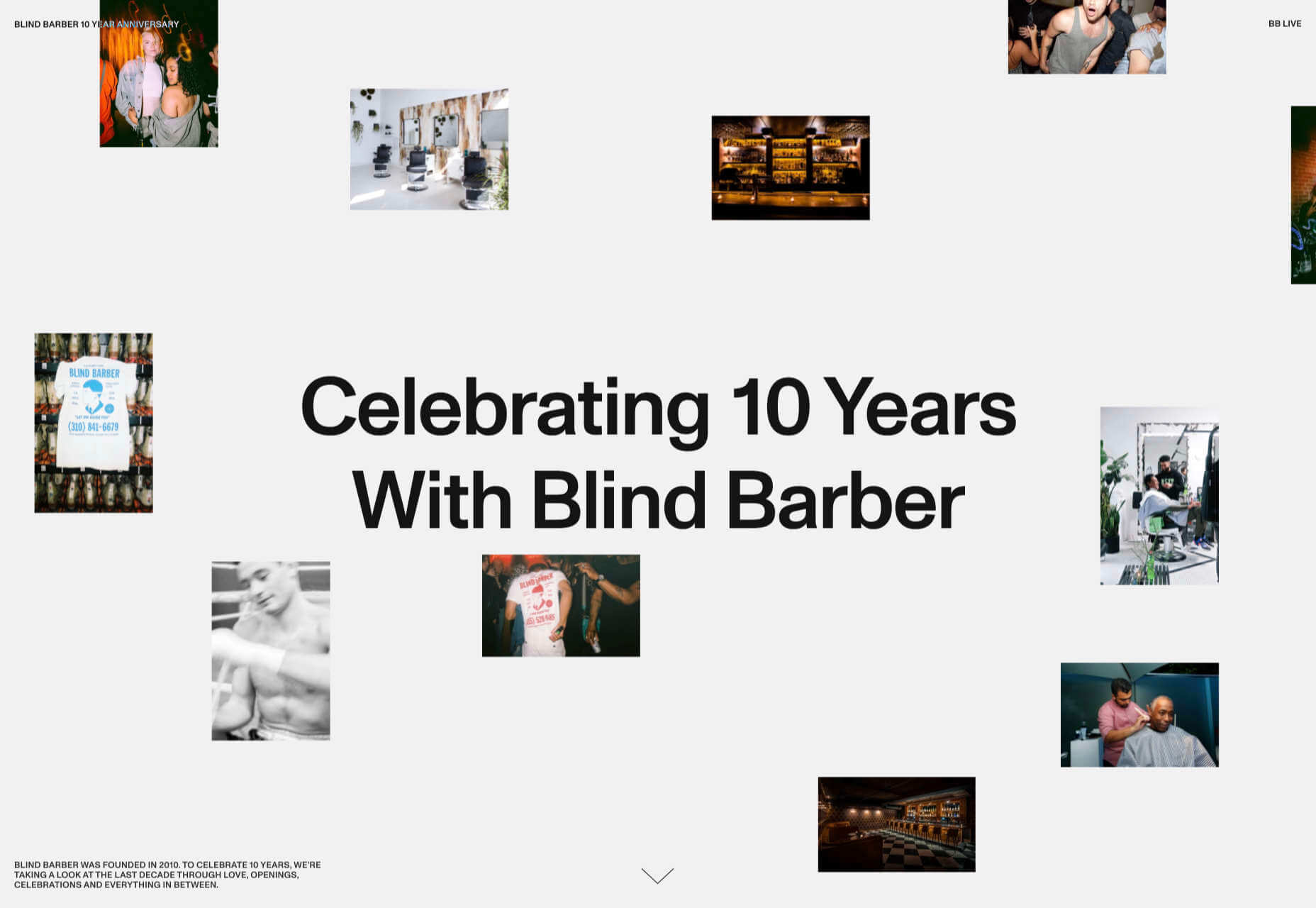
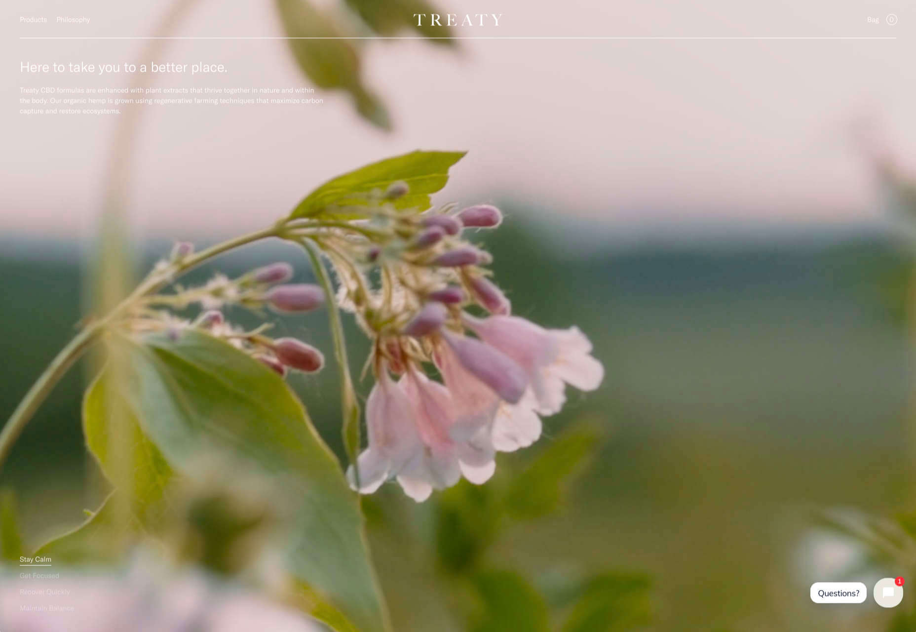
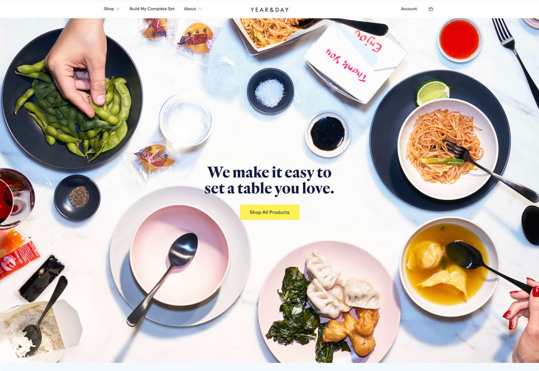
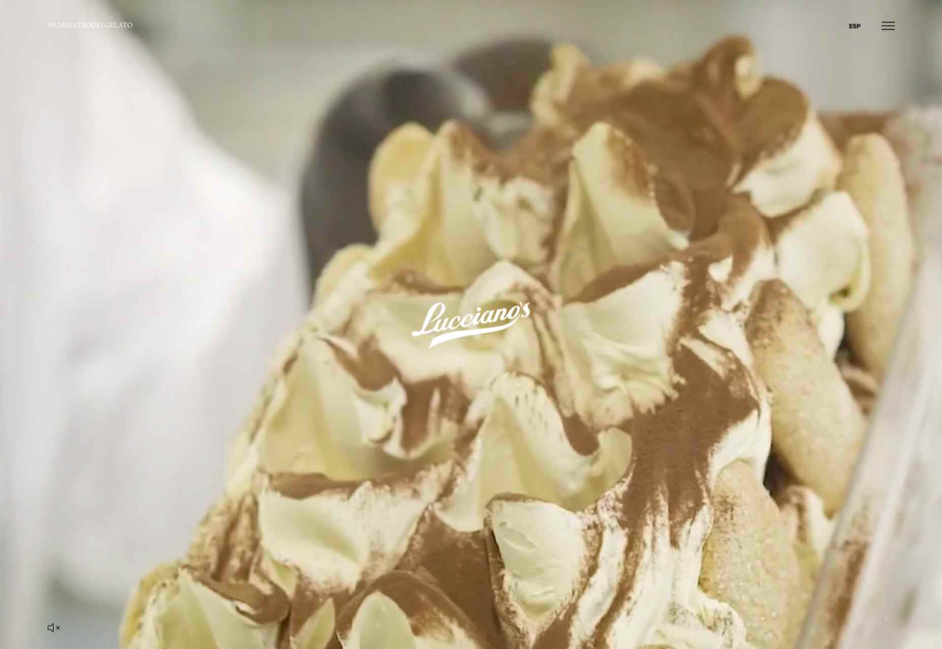
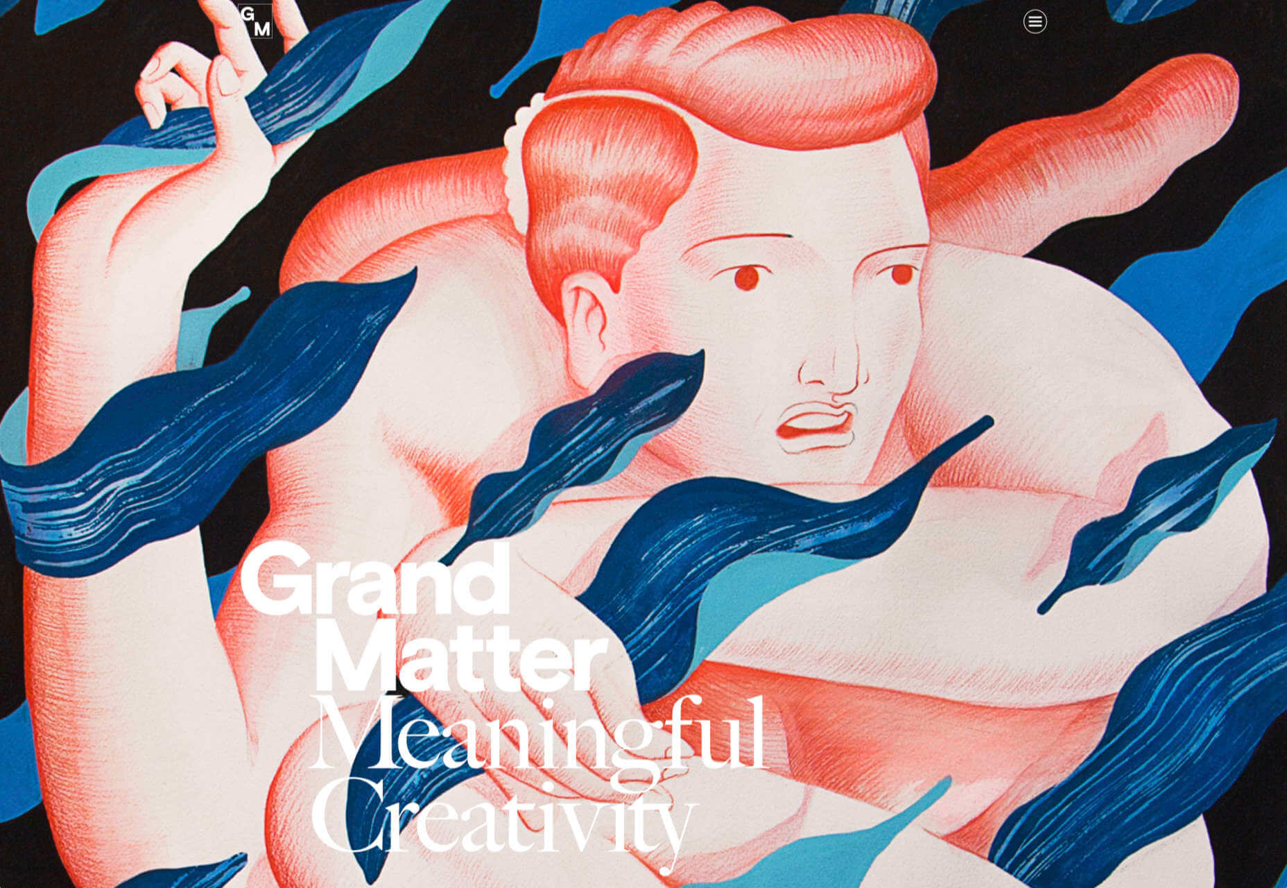
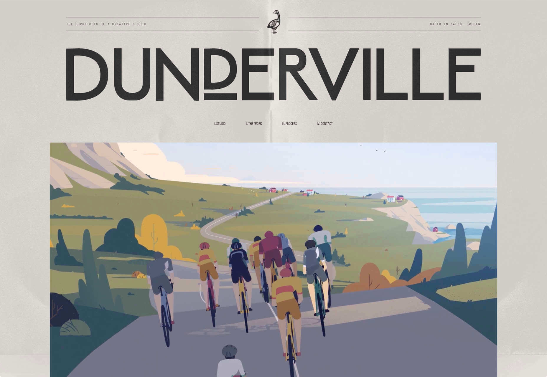
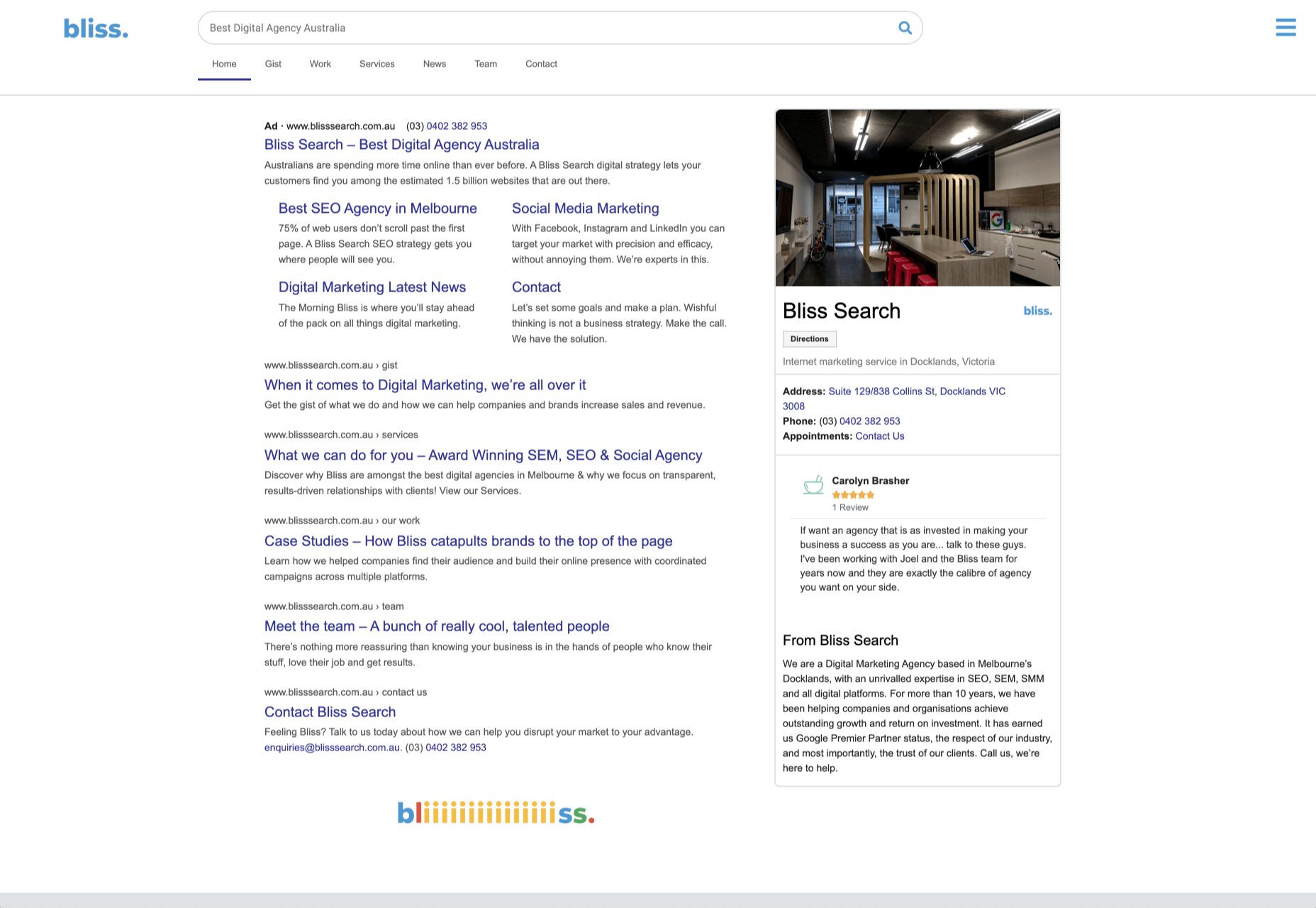
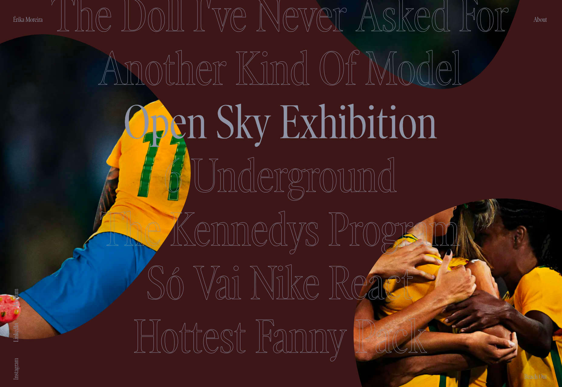
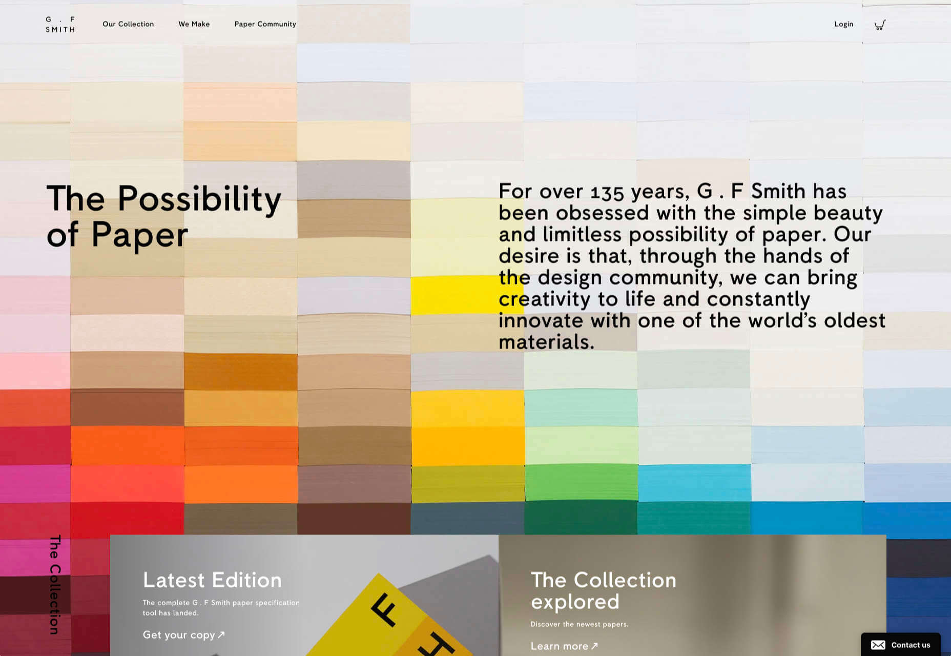
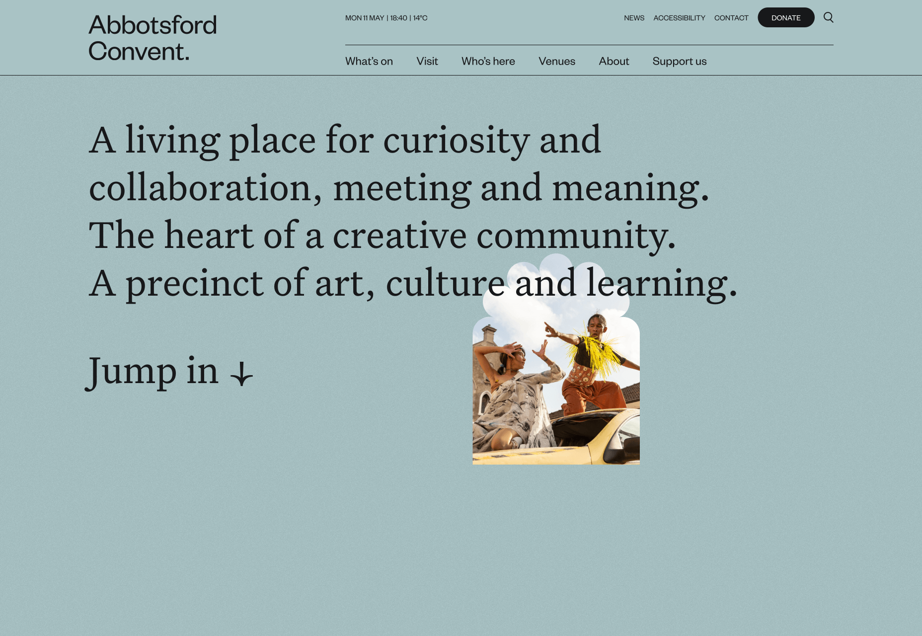
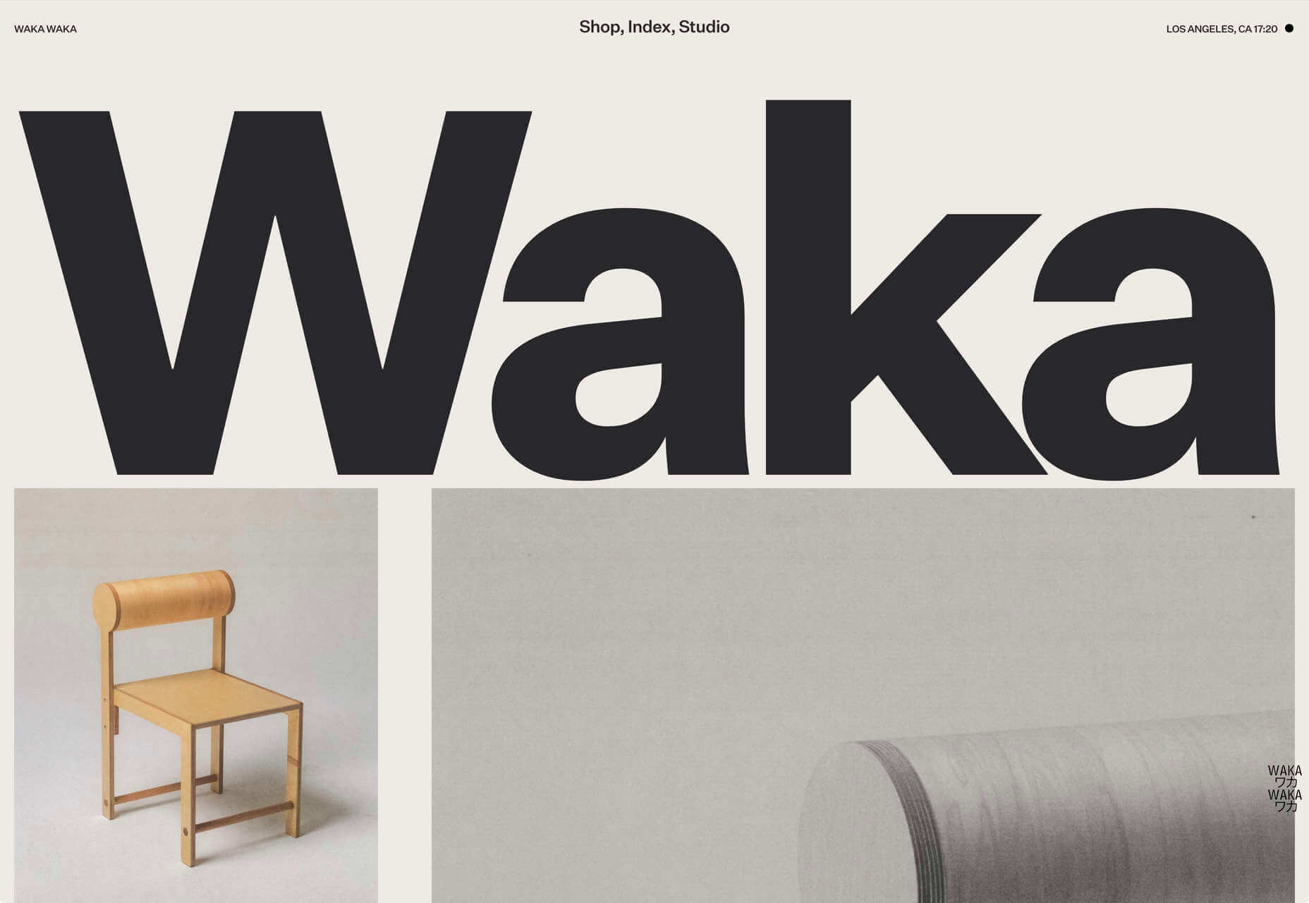
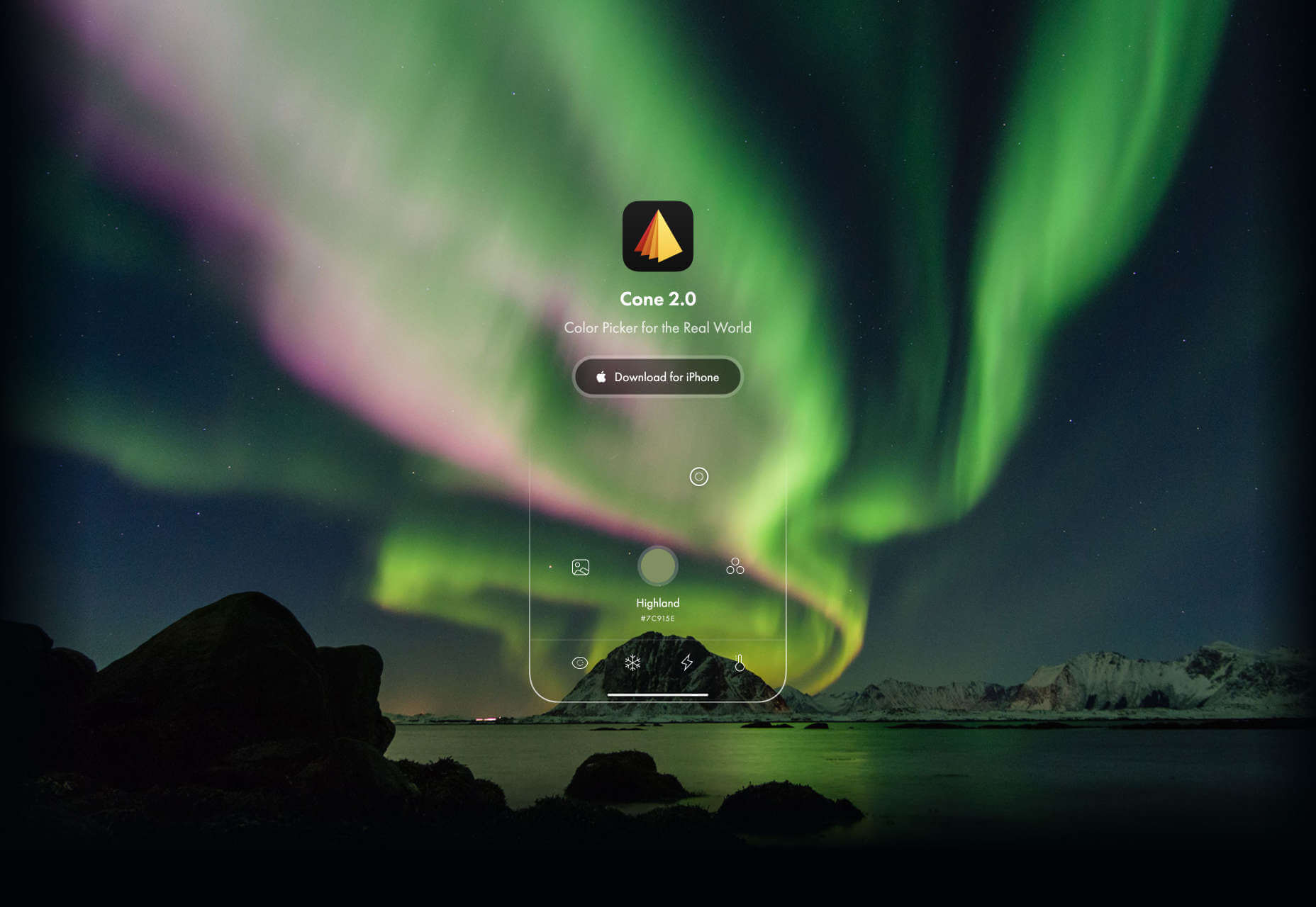
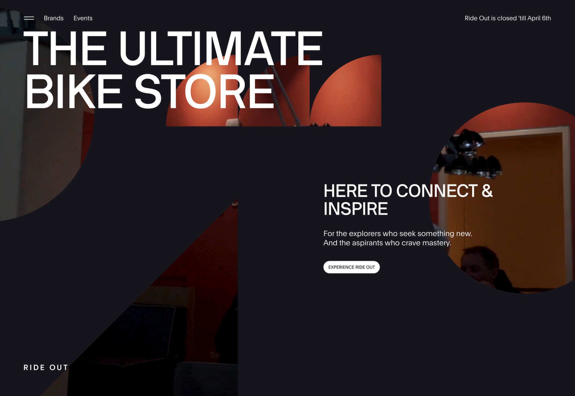
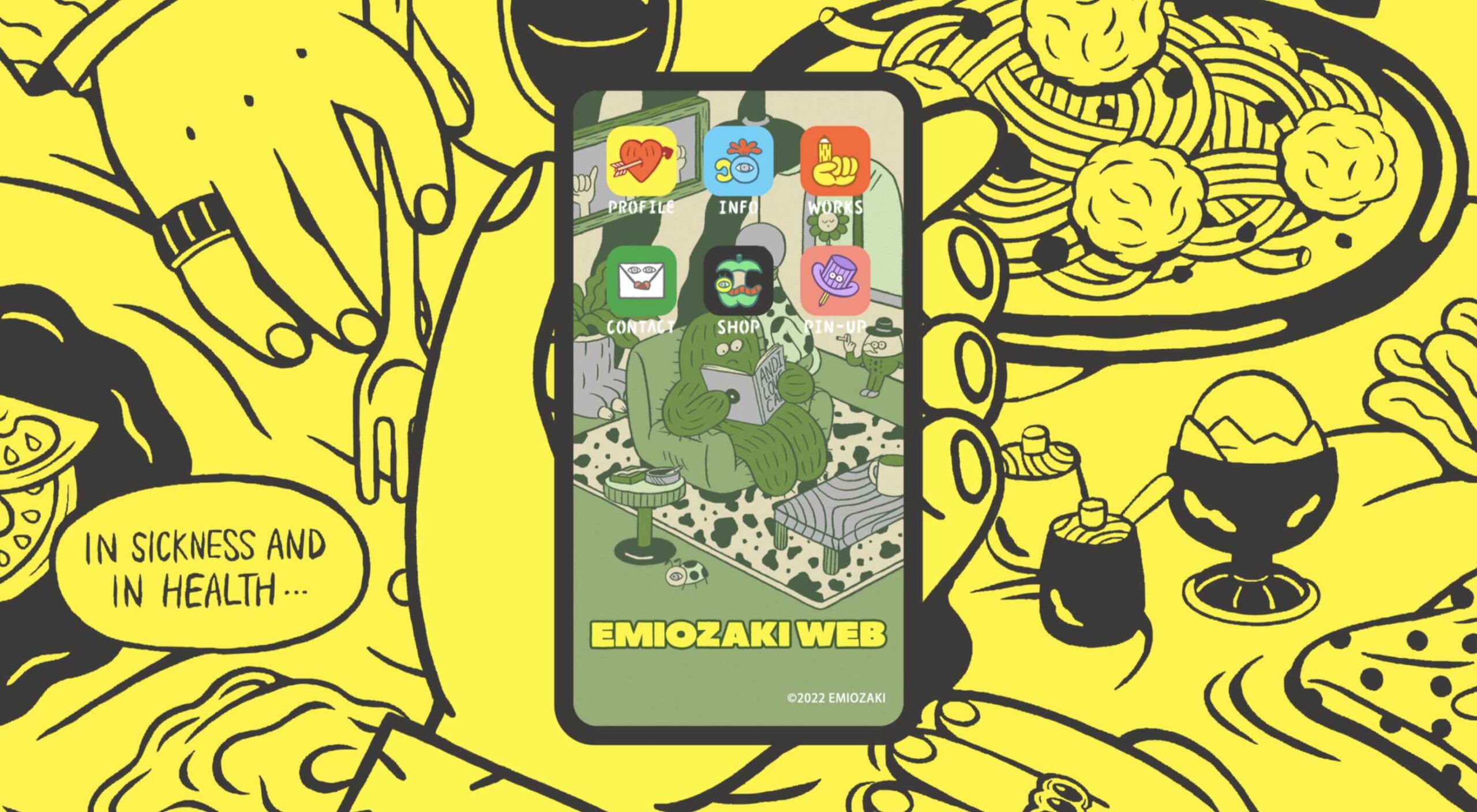
Welcome to the latest edition of our top 20 sites of the month. In this February’s collection, the overall feel is lighthearted and optimistic, as we are seeing the positivity of a new year persisting across the web.

There is a continued inclination towards warmth and personableness and away from a more corporate, impersonal feel. We see this most in the color palettes used and in the use of illustrations as accents to add character and charm. Of course, as always, type plays a big part too. Enjoy!

Woset

Woset has a simple aesthetic and features a charming illustration style on this site for its creative toys. The interactive ‘play’ section is a nice touch.

Graza

This site for Graza olive oil has a fun feel, with comic style illustration and bright splashes of color while making a serious sales pitch.

KeepGrading 

KeepGrading is a post-production color studio. Their portfolio site showcases a lot of work but keeps it well organized and pleasing to navigate.

Englobe

By using soft colors and slightly rounded type, Englobe has managed to portray a warm, friendly, and human aspect with this website, despite being a huge company.

Filtro

Filtro’s design is about as basic as it gets, and yet it has a certain charm to it.

Behold

Behold is a wildlife camera that is currently in development. This landing page does an excellent job of creating interest with just enough information.

Akua

Some rather sweet illustration work creates a good balance with technical information on this site for Akua kelp burgers.

National Museum of Mexican Art

A color scheme of warm, earthy tones and a carefully thought-out type pairing create an inviting presence for the National Museum of Mexican Art.

Ubac

This site for Ubac trainers feels clean and modern with some nice and mostly functional, scroll-activated animation.

Funny Water

The background gradient is really nicely done on Funny Water’s otherwise very minimal site.

DA

DA is a strategic branding, design, and advertising studio, and this site is a good, polished example of a site for such an agency. What stands out is the clever menu text.

Phil’s Finest

Phil’s Finest makes good use of color, oversized type, and occasional illustration mixed in among the well-styled photography.

Vaayu 

Grey and black are enlivened by neon yellow in Vaayu’s minimalist, single-page presentation.

Emi Ozaki

Artist and illustrator Emi Ozaki has created a stylized phone interface for her portfolio site, which showcases her illustration aesthetic.

Engineered Floors 

The home page scrolling is the centerpiece of Engineered Floors’ site, and it works especially well on mobile.

Hartzler Dairy

Hartzler Dairy goes for a nostalgic feel to match the company’s classic mid-20th century style branding.

Chubby Snacks

Chubby Snacks is PB&J in your pocket; it sells itself! Having said that, the site is pretty appealing in its own right.

Branded

Market research company Branded goes down the flat design road for this site, which could feel a little dated but actually works quite nicely here.

SOS Foods 

SOS Foods is an excellent example of a responsible/sustainable goods site, with a design aesthetic aimed at the ethical consumer.

Crystal Construction Engineering

Some nice use of masonry-style layout and overlapping elements create space, but also a pleasing flow in this site for Crystal Construction Engineering.

Source

The post 20 Best New Websites, February 2022 first appeared on Webdesigner Depot.

Source de l’article sur Webdesignerdepot

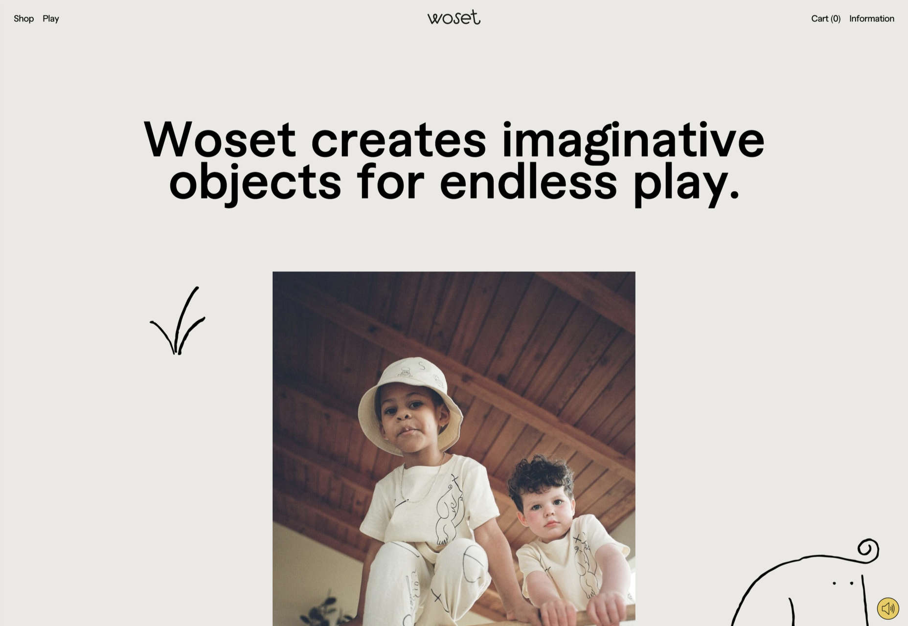
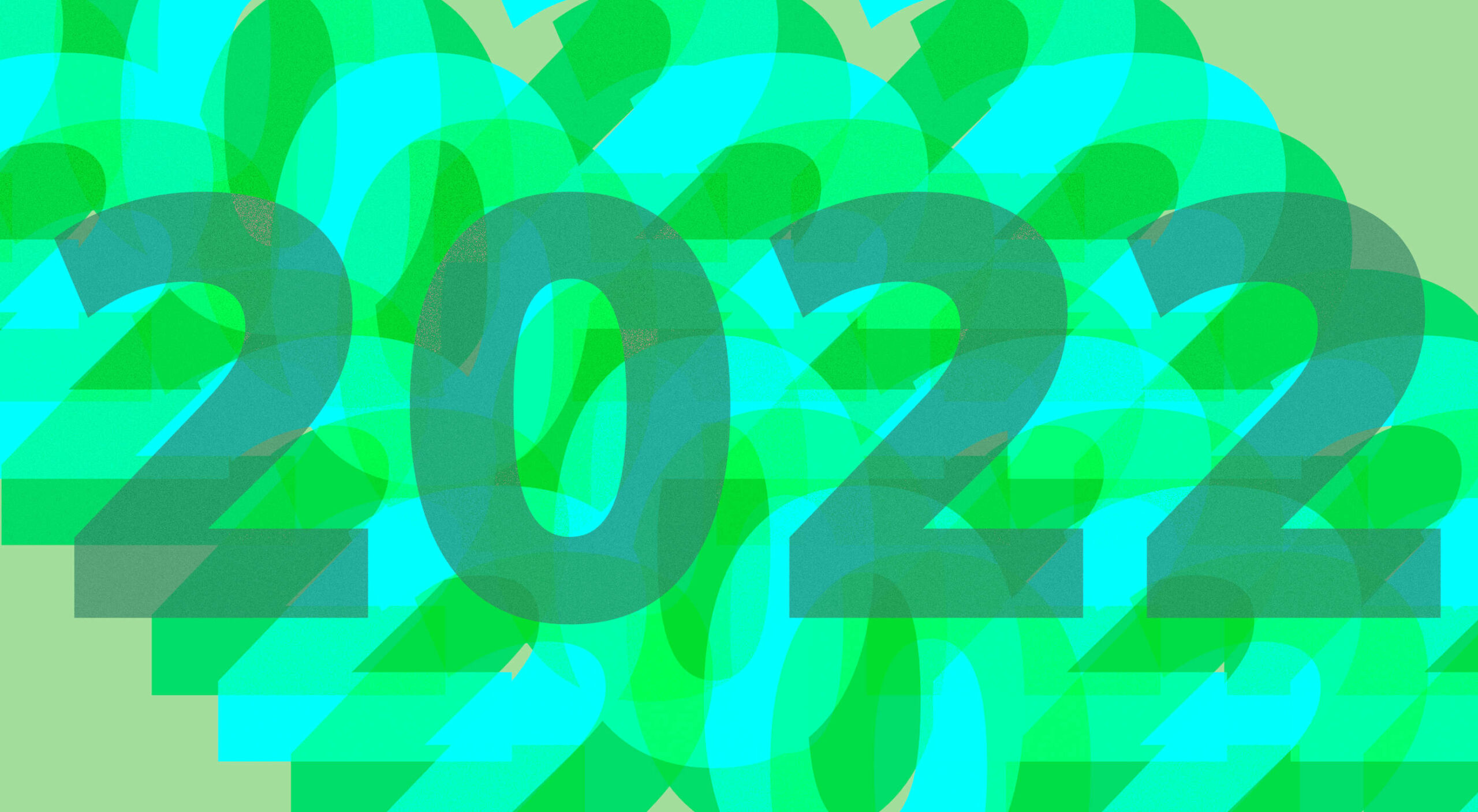
Every year, at this time, blogs like this one like to try and predict what’s going to happen in the year ahead. It’s a way of drawing a line under the archive and starting afresh. A rejuvenation that, as humans, we find life-affirming.

Ten years ago, I would have had high confidence in these predictions — after all I was eventually right about SVG adoption, even if it took a decade. But the last few years have shown that web design is tightly interwoven with the muggle world, and that world is anything but predictable.

So as we look at what might occur in the next year (or five), think of it less as a set of predictions and more as a wishlist.

Last Year’s Predictions

When I write this post every January, I like to keep myself honest by glancing back at the previous year’s predictions to gauge how accurate (or not) my predictions have been.

Last year I predicted the long-term trend for minimalism would end, WordPress would decline, cryptocurrency would go mainstream, and then hedged my bets by saying we’d make both more and fewer video calls.

Gradients, maximalism, and the nineties revival pulled us away from minimalism. It’s still popular, just not as dominant.

WordPress is still the biggest CMS in the world and will continue to be for some time. But the relentless grind of no-code site builders at the low end, and being outperformed by better CMS at the high end, mean that WordPress has passed its peak.

Over-inflated predictions for BitCoin reaching $100k by December 2021 turned out to be a damp squib. In the end, Bitcoin only tripled in value in 2021. However, with micro-tipping and major tech companies moving into the arena, it’s clear digital currency arrived in the public consciousness in 2021.

And how could I be wrong about more but also fewer video calls? So I’m calling that my first clean sweep ever. With that heady boast, let’s take a look at the next twelve months.

What Not to Expect in 2022

Do not expect the Metaverse to be significant in anything but marketing speak. Yes, the hardware is slowly becoming more available, but the Metaverse in 2022 is like playing an MMORPG on PS5: theoretically, great fun, until you discover that absolutely none of your friends can get their hands on a console.

Ignore the blog posts predicting a noughties-era retro trend. All those writers have done is looked at the nineties-era trend and added a decade. Fashions aren’t mathematical; they’re poetic. Retro happens when people find a period that rhymes with present-day hopes and fears. After the last couple of years, if we revisit a decade, it’s likely to be the late-forties.

Finally, don’t expect seismic change. Material design, parallax scrolling, and jQuery are still with us and are still valid choices under the right circumstances. Trends aren’t neat; they don’t start in January and conclude in December.

5 Web Design Predictions for 2022

Predictions tend to be self-fulfilling. So we’ve limited ourselves to five trends that we believe are either positive or, at worst harmless. Of course, there are no guarantees, but if these come to pass, we’ll be in good shape for 2023.

1. The Blockchain is Coming

Underpinning the cryptocurrency industry are blockchains. In simple terms, they’re a set of data that can be appended to but can’t be edited or deleted. Think of it as version control for data.

As with most technology, the first wave has been a way to make a fast buck. However, the exciting development is blockchain technology itself and the transformative nature of the approach. For example, Médecins Sans Frontières reportedly stores refugees’ medical records on the blockchain.

Imagine the Internet as a set of data, editable for a micro-fee, and freely accessed by anyone anywhere. Instead of millions of sites, a single, secure, autonomous source of truth. Someone somewhere’s working on it.

2. Positivity & Playfulness & A11y

Even before world events descended into an endless tirade of grim news, time was running out for dull, corporate, geometric sans-serif design.

We added gradients, we added personality, we embraced humor. And contrary to the established business logic, we still make money. Over the past few years, there have been extraordinary efforts by designers and developers to examine, test, and champion accessibility, and thanks to them, inclusive design is no longer reliant on the lowest common denominator.

In 2022 you can get experimental without obstructing 10%+ of your users.

3. Everything Green

Green is a fascinating color, the primary that isn’t (except in RGB, when it is).

Green has the same visual weight as blue, is substantially more flexible, and yet to date, has been radically underutilized in digital design.

Green has a prominent cultural association with the environment. At a time when tech companies are desperate to emphasize their ethical credentials, marketing companies will inevitably begin promoting a brand color shift to green as a quick fix for all those dumped chemicals, strip mines, and plastic-filled seas.

We’ve already seen earthy hues acquire popular appeal. At the other end of the vibrancy scale, neons are popular. Green spans both approaches with everything from calm sages to acidic neons.

In 2022, if you’re looking for a color to capture the moment, look to green.

4. Hero Text

A picture is supposed to be worth 1000 words, although I’m not sure anyone has actually tried to measure it. The problem is that sites increasingly rely on stock images, so the 1000 words that we’re getting may or may not accurately reflect 100% of our message.

In 2022, a handful of well-chosen words will be worth more than an image, with hero images taking a back seat to large hero text. This is aided by a number of minor trends, the most notable of which is the willingness of businesses to look beyond the geometric sans-serif to a more expressive form of typography.

Reading through the prediction posts on sites other than this, almost everyone agrees on large hero text replacing images, which virtually guarantees it won’t happen. Still, at the start of 2022, this seems to be the direction we’re taking.

5. Bring the Noise

One of the unexpected consequences of the past couple of years has been a renewed connection with nature. The effortless complexity in nature is endlessly engaging.

We’ve already begun to popularise gradients — there are no flat colors in nature — and the next logical step is the addition of noise.

In visual terms, noise is the grainy texture that sits so beautifully in vector illustrations. Noise has dipped in and out of trends for years, hampered a little by the leap in file size it creates. However, with WebP and Avif file types, noise is now usable on production sites.

Designing in 2022, when in doubt, throw some noise at it.


Featured image via Unsplash.

Source

The post 5 Big Web Design Predictions for 2022 first appeared on Webdesigner Depot.

Source de l’article sur Webdesignerdepot

2020 has been one of the most memorable years in our history. Few of us have been alive long enough to experience a more turbulent time. But throughout the year, we saw design respond to challenging events with positivity, color, and a desire to elevate those people and projects working to make the world better.

As we head into 2021, there’s no denying that 2020 has changed our outlook on life and marked a major turning point in web design trends.

Here’s a collection of the websites we loved the most this year. Enjoy!

Looks Like You Need Iceland

On Looks Like You Need Iceland, you are invited to record a scream, which will then be broadcast into the Icelandic wilderness. It’s meant as a form of therapy. The idea is that you will one day visit Iceland in person. That might still be some way off for most of us, but we could certainly use a good therapeutic scream.

Black Lives Matter

Across 2020 there were major protests around the world in support of Black Lives Matter. The movement’s website is a central hub for news, resources, and civil rights information in 38 countries.

2º Earth

2ºC Earth takes the user to 5 locations worldwide and shows what will happen there if global temperatures rise by 2ºc. Sound is used really well here to create an immersive experience, along with some beautiful photography.

Github

Along with some new features announced earlier this month, GitHub has a glossy new homepage. It has a clean feel, with some nice scrolling animation and sparing but effective use of illustration.

I Weigh Community

Political and social initiatives were big in 2020, and non-profit activism initiative I Weigh Community is the brainchild of actress Jameela Jamil. It’s devoted to radical inclusivity, communicated with bold, expressive graphics.

UNREAL

Back in January, we clicked around UNREAL’s site for hours, enjoying the sharp transitions. The Swiss agency produced a wonderfully chaotic love letter to web animation.

Delassus

Delassus grows fruit, from citrus to avocados. The Moroccan company employs a cornucopia of 3D design to make its site bold, fun, and practical.

Lynn Fisher

We loved everything about Lynn Fisher’s site back in May. The homepage illustration was awesome. It was a humorous approach to RWD that we really appreciated. The site has since changed, with tons more to explore.

Minervo

The Minervo site feels distinctly Latin, with the hot pinks and sun-blasted desaturation feeling suitably South American. We love the cropping on the custom typeface.

Babord

Norwegians have an almost mystical connection with the sea, which is evident in the site for Babord, a Norwegian seafood supplier. We loved the brand font too.

Calexo

Calexo makes THC-infused beverages, and back in April, we loved the color and positivity of the site. The animated hamburger menu was a hit too.

Moooi

Moooi’s site layers illustration with a maximal effect that makes you feel like you’re chasing a white rabbit. There are tons of great UI details here, especially the bar that reveals the product videos.

Blind Barber Anniversary

The Blind Barber celebrates 10 years of success with this microsite. A deconstructed grid and an entirely black and white design, but with color photos, create energy and a sense of joy.

Zand Harirchi Architects

Zand Harirchi is an architecture firm based in Tehran, Iran. Its site features subtle references to architecture, like the delightful thumbnails reminiscent of small windows.

WFN

The WFN (Women’s Funding Network) is an international alliance supporting women’s foundations and gender justice funders. The sophisticated color palette and clean type are both confident and feminine.

Nathan Taylor

We loved exploring Nathan Taylor’s playful site all the way back in January. The different lighting modes were a firm favorite.

Käthe Kollwitz Memorial

A tribute to the life and work of Käthe Kollwitz, an Expressionist printmaker. There’s a catalog of her work, presented alongside large type and splashy color transitions.

Emotive Feels

Emotive Feels is a design manifesto from the Emotive Brand agency that illustrates an A–Z of potential brand emotions with simple animations that we likened to a Blue Note release.

A. N Other

A.N Other’s site for perfume highlights quality ingredients, materials, simplicity, craftsmanship, and the environment; in the process, it cleverly invokes a sense of luxury.

Playtype

Danish type foundry Playtype’s site fits its name perfectly. The playful site with bright blocks of color and the occasional animation shows off some pretty nice typefaces.

Feijoo Montenegro

All-text sites are always a thrill, and back in June, we were treated to this simple one-pager by Feijoo. Details like the numerals being replaced by words are delightful.

Wavering Stripes

Although this site’s subject matter is harrowing, it is presented in a very beautiful, thoughtful manner.

The Oyster & Fish House

Sophisticated typography, the wave textures, the nostalgic feel of the photography, and even the cookie notice’s on-brand styling all show attention to detail, which gives this site its appeal.

Who Cares

Find and ‘photograph’ the endangered species to learn about them in this delightfully illustrated game.

Curbed

When Curbed came under the umbrella of New York magazine earlier this year, it got a makeover. Neon highlights and a distorted grid give an edge to the classic magazine layout.

Yolélé

The carousel of fonio (it’s a West African grain) products on Yolélé’s landing page is a good example of horizontal scrolling that works well. There are some great page transitions too.

Pantheone Audio

Pantheone Audio’s site employs elegant scrolling to enable seamless navigation of an extremely luxurious site, underpinned by a complex grid.

Aelfie

Bright color, an irregular grid, illustrations, and a display type that feels almost hand-drawn perfectly captures the aesthetic of this NY-based home furnishing brand.

Highcourt

This site for private membership leisure club Highcourt uses subtle background color changes and simple line illustrations to create a sense of calm. Black and white are softened to dark blue and ivory, and gentle animation adds interest.

Kate Jackling

Kate Jackling’s site takes a step back and allows the content to bask in the glow of attention, placing her photography at center stage.

Treaty

While there is less hustle and bustle outside than we were used to pre-pandemic, we could certainly all use some calm. Treaty’s site for CBD oils reflects that calm with a combination of video, whitespace, and botanical drawings.

Ukrainian Railroad Ladies

Ukrainian Railroad Ladies is a book of photographs of women, and some men, who work on the Ukrainian railways. The site is basic, even brutalist, but it has charm, and the photographer’s fascination with his subject comes through.

Year & Day

Year & Day is an ecommerce site that sells tableware, from glassware to ceramics. The colorful collection is designed to complement different types of food, and the site’s color scheme reflects that perfectly.

Juan Mora

Juan Mora’s ‘under construction’ holding page has probably been crafted with more care than many full-blown sites. This showcase cleverly manages to demonstrate its subject’s skills without showing a single piece of work.

Lucciano’s

Lucciano’s homepage hero video alone will have your mouth watering for some of their gelato. Much of the appeal of food is visual, and the photography here does not disappoint. Circular text boxes in ice cream colors complement the product shots nicely.

Bored Solutions

Back in April, we were already a little weary of lockdown — if only we’d known how long it would last! The amazing color blobbing of bored.solutions was the ideal distraction.

Grand Matter

Grand Matter is an artist agency representing illustrators. There is a wealth of talent on show here and a broad enough range of styles to keep the web interesting for a good while.

Dunderville

This site for Dunderville motion design studio features a paper fold detail, which adds tactility to the virtual. Some superb type and vector animations showcase an impressive portfolio.

Album Colors of the Year

Album Colors has taken the covers from 150 albums released this year and arranged them by dominant color. The hex code for each color is provided if you want to copy it.

Mammut Expedition Baikal

Mammut uses stunning photography and a strong narrative to present its Eiger Extreme outdoor clothing. Longing for the great outdoors will either be alleviated or exacerbated by this one.

808303

808303.studio is a virtual Roland TR-808 drum machine and TB 303 bass synthesizer. You can program, record, and share your very own 80s techno masterpiece.

Bliss

Humor can be hard to get right, especially when you want to be taken seriously at the same time. Here, it works, and the result is a memorable site, oozing with confidence.

Jazz Keys

Type your message into Jazz Keys, and you’ll hear it in sound. You can send the message to anyone and let them hear your words — the web lives for side-projects like this.

Érika Moreira

The fabulous, simple site for Sao Paulo-based Érika Moreira has some awesome big type and creative case studies. It’s an excellent example of a non-visual portfolio.

G.F Smith

Earlier this year, the site for leading paper supplier G.F Smith got a redesign. It is a simpler design than the previous site and keeps the visual focus on the products and the colors.

Abbotsford Convent

Abbotsford Convent is a creative arts venue in Melbourne, Australia, based in a former convent. The UI for its site blends architectural forms to acknowledge the building’s heritage.

Waka Waka

Waka Waka designs and builds wooden furniture. The mid-century typography and the noise textures transport the site to the last century’s radical graphic design. There’s some clever disruption to the typical thumbnail approach.

Cone

Sites advertising apps always seem to want to box the design into a hastily de-branded mock-up. Cone takes a daringly refreshing approach by depicting a more expansive mobile experience.

Ride Out

Amsterdam’s Ride Out bike store teases the content with an intriguingly masked video. Plus, we love the wheel-inspired spinning links.

Puddle Sound

This site is a model of minimalism. Beautiful photographs and very little text, there is nothing to distract from the product on display.

Source


Source de l’article sur Webdesignerdepot

It’s that time again: the self-fulfilling prophecy that is the Pantone Color of the Year has been announced for 2021.

For 2021, we’re getting two colors of the year. The colors selected to grace museum gift shops, and end-of-year blog posts are Ultimate Gray (a mid-range gray somewhere around #939597) and Illuminating (a citrus yellow that’s approximately #F5DF4D).

A marriage of color conveying a message of strength and hopefulness that is both enduring and uplifting.

The last time Pantone selected two colors was Rose Quartz & Serenity in 2016, and we all know what a tranquil, serene year that was; so 2021 will presumably unleash the curse of an ancient mummy on the world, or see us collide with the Sun.

2020’s color, “Classic Blue”, probably wasn’t much of a color of the year unless it happens to be the color you painted your home office. If the company had genuine foresight, it might have opted for the blandest beige it could find — in fact in the Summer paint brand Dulux almost opted for that for 2021, naming “Brave Ground” its color for next year, but for beige’s “resilient” qualities rather than any lockdown boredom.

Perhaps that’s why Pantone’s PR department opted for two colors in 2021: a nondescript grey to keep us going until we’re all vaccinated, and a wildly luminous yellow for the latter part of the year.

In fairness to Pantone, its color choices aren’t predictions as is often reported, rather aspirations. Pantone believes the pairing “expresses a message of positivity supported by fortitude” which may be just what the world needs right now.

A combination of colors is much more sensible than a single color, with so much about color dependent on context. But the actual color treatment of 2021 is much more likely to be multi-color gradients.

You can try out Pantone’s colors for 2021 on Instagram, or on Pantone Connect.

Source


Source de l’article sur Webdesignerdepot

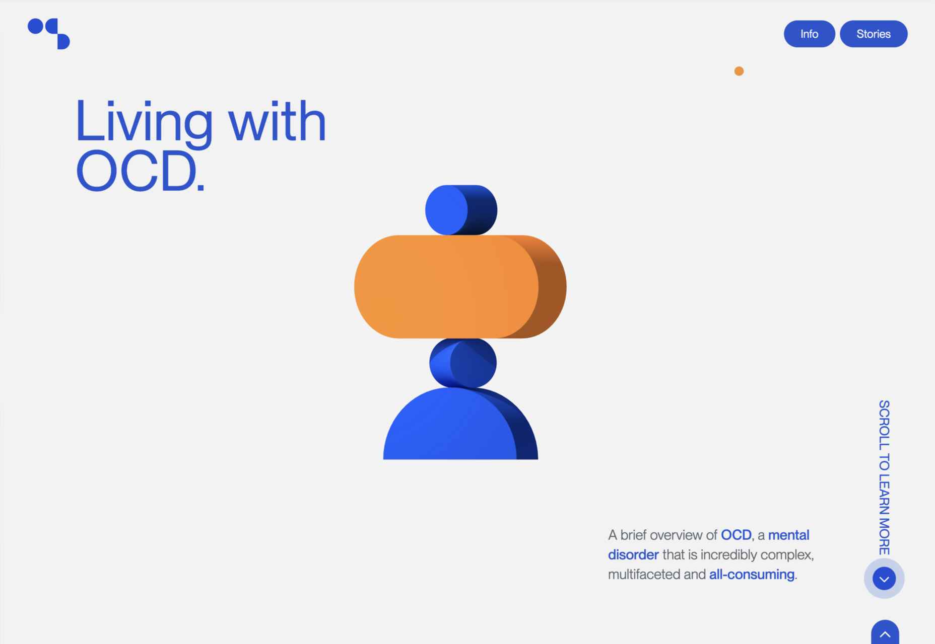
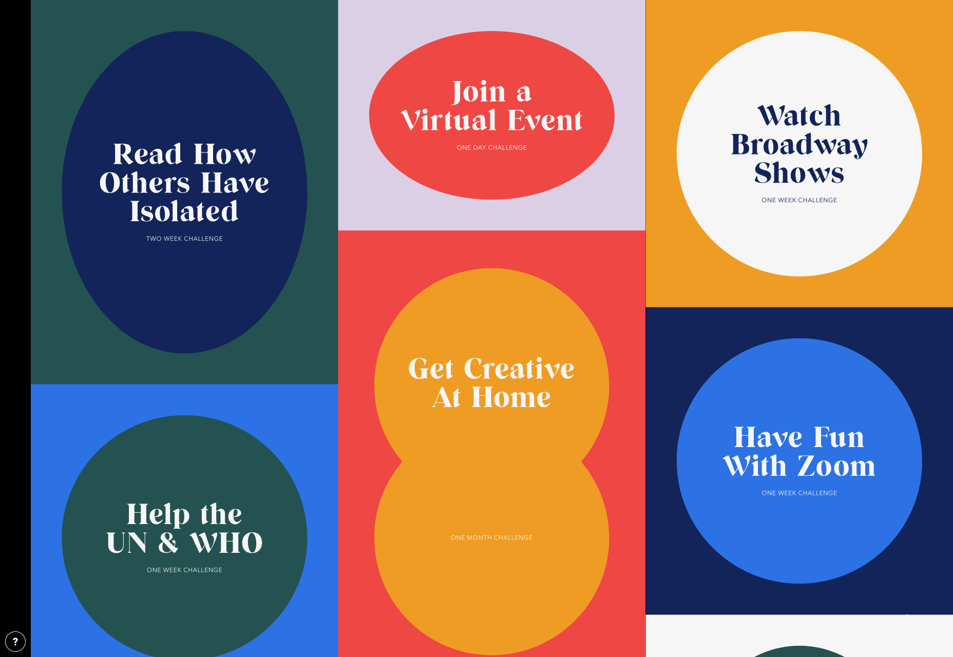
As we approach our first winter holiday season since the pandemic set in, the world could feel like a very scary place; there is a great deal of uncertainty about the future for businesses, for young people in education, for jobs, for travel. Celebrations are certainly going to be a lot quieter this year.

And yet, the web is far from showing doom and gloom. We’re seeing confidence and positivity in designs across the board. As businesses and people adapt to the demands of social distancing and WFH, we’re seeing a focus on simplifying, appreciating quality over quantity, taking better care of ourselves and our world, and making the most of our time. And this is reflected through design in a variety of ways: visually minimal style, pared down content, fresh colors, statement type, great photography, illustration.

There is confidence in abundance on the web. Enjoy…

Mammut Expedition Baikal

Mammut make outdoor clothing and equipment, and this microsite is for its Eiger Extreme collection. Stunning photographs of Swiss speed climber Dani Arnold climbing at Lake Baikal in Siberia are cleverly interspersed with details of the company’s products he can be seen wearing, along with links to buy. It feels natural, rather than forced.

Wavering Stripes

This a beautifully made site highlighting the experiences of people held in immigration detention centers in the US. The illustrations belie the grimness of the stories told — on the landing page there is a warning as to the nature of the content.

Juan Mora

Proof that holding pages don’t have to be boring, this ‘under construction’ site for interface designer Juan Mora is a far cry from the warning-barrier and stick-figures-at-work gifs of the web’s early days.

Cafecrema

Cafecrema’s simple, one page site creates the atmosphere of 1950s coffee shops through its illustration style, a jazz soundtrack, and a very mid-century modern color palette.

A N Other

Perfume brand A. N Other prioritises quality ingredients and materials, simplicity, craftsmanship, and the environment. Its website captures this perfectly, and invokes a sense of luxury as the result.

Puddle Sound

Puddle is an architectural and interior design company, who also do product and furniture design. For a Tokyo hotel project they created a vacuum tube amplifier, that is the subject of this site. It is as simple as can be with only the barest essential information, and with all attention focused on the product shots.

Hous

Hous Luxe Woningen are a Dutch company who build luxury homes. The high quality images, muted color scheme and generous use of white space in its website reflects this sense of luxury perfectly.

Who Cares?

Who Cares? is an interactive game designed to raise public awareness of endangered animal species. The illustration style is very pleasing, and there are some lovely little details in the animation and sound.

Ugly

This site for sparkling water company Ugly, uses bold, cartoonish typography and illustrated characters to add a lot of character to, well, water.

Glyphs

Glyphs font editor version 3 was released on 16th November. The accompanying site has a fresh feel, mainly due to its striking color scheme. The on scroll animation showcasing variable fonts is a nice touch.

Ruler Agency

Ruler Digital Agency uses color only in the images of work on its own site. Everything else is grayscale, even the images, which can be a really effective technique when it is used well, as it is here.

Zoë Pepper

Zoë Pepper is a collective of freelance brand strategists who work with early stage startups. The site is minimal without feeling empty, and utilises quirky illustration and scrolling animation to good effect.

Karst

Karst make notebooks using paper made from stone, and woodless pencils. Its site has a simple, clean feel with a muted, neutral color scheme that complements the colors of its notebook covers.

London Alley

London Alley is a production company who concentrate on music videos and advertising. Its site is simple and striking with plenty of video, and effective use of split screen.

LoveSeen

LoveSeen makes false eyelashes, and nothing else. The site has a fun, inclusive feel — more girl(and boy)friends together than glossy, high fashion magazine. It’s appealing and persuasive.

Chartogne-Taillet

This site for wine-growers Chartogne-Taillet uses illustration and an animated, ‘hand’ drawn map to create a sense of heritage, appropriate for a family with a long history of making wine in the Champagne region. It is reminiscent of a label on a good bottle of wine.

Refusi Studio

Refusi Studio is a design agency from Italy. This portfolio site is simple, with strong colors and big, statement typography. And a giant cartoon eye.

Yesterday, Today, Tomorrow

Yesterday, Today, Tomorrow is an interactive project from the National Film Board of Canada. It uses tweets to trace emotional ‘waves’ throughout the Covid-19 pandemic.

Boost

Boost is a gummy (chew) vitamin supplement for the immune system. Big type, big graphics and lots of orange and purple — the colors associated with vitamin C and antioxidants — make vitamins cool.

Philiber

Philiber is a meal delivery subscription service, available in urban centers in Quebec. The site is clean and modern, with a comforting color scheme and a nice mix of photography and flat style illustrations.

Source


Source de l’article sur Webdesignerdepot

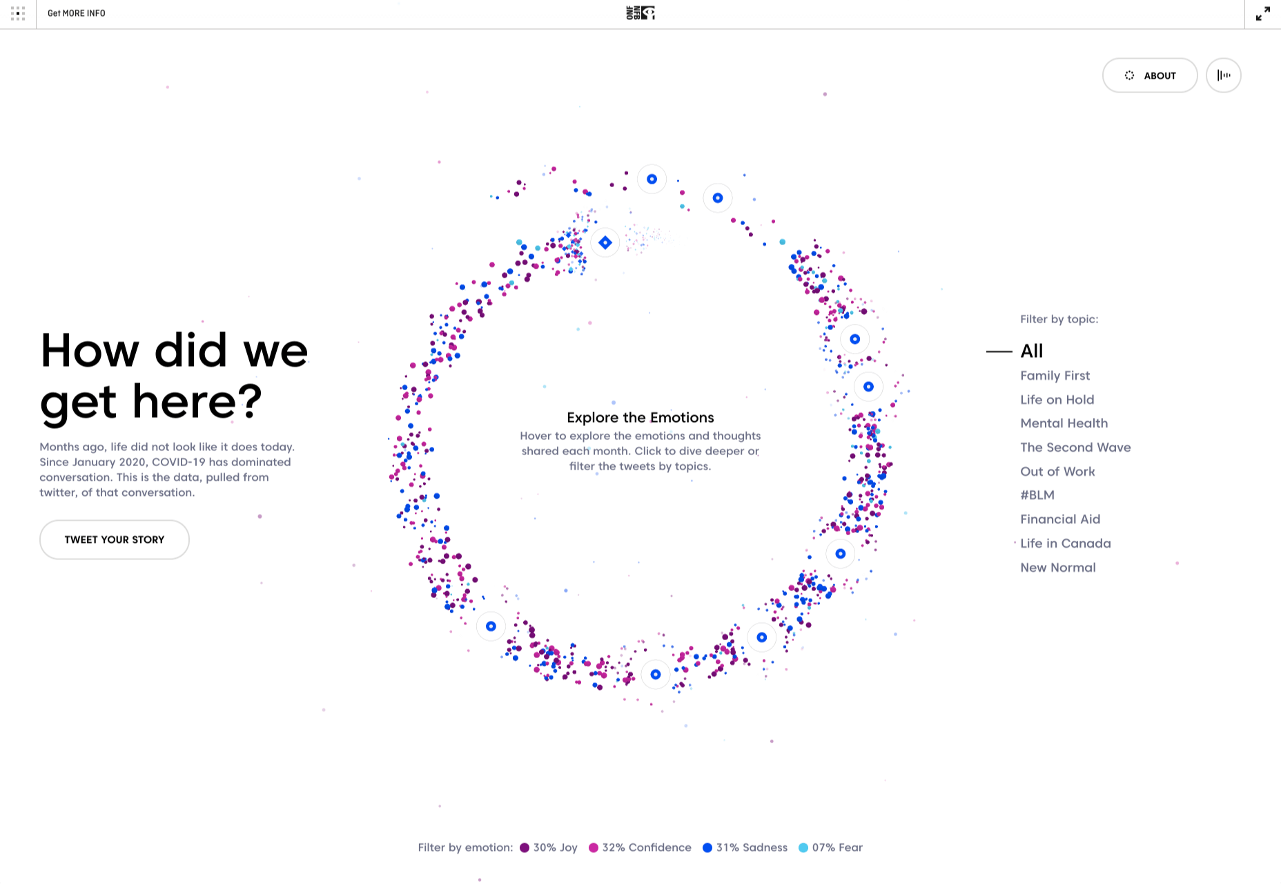
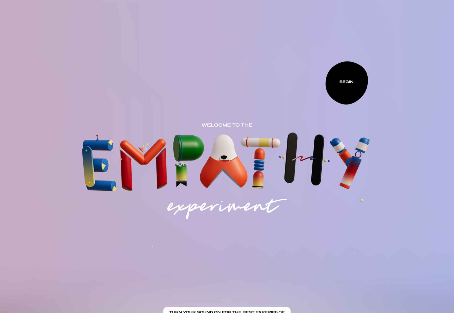
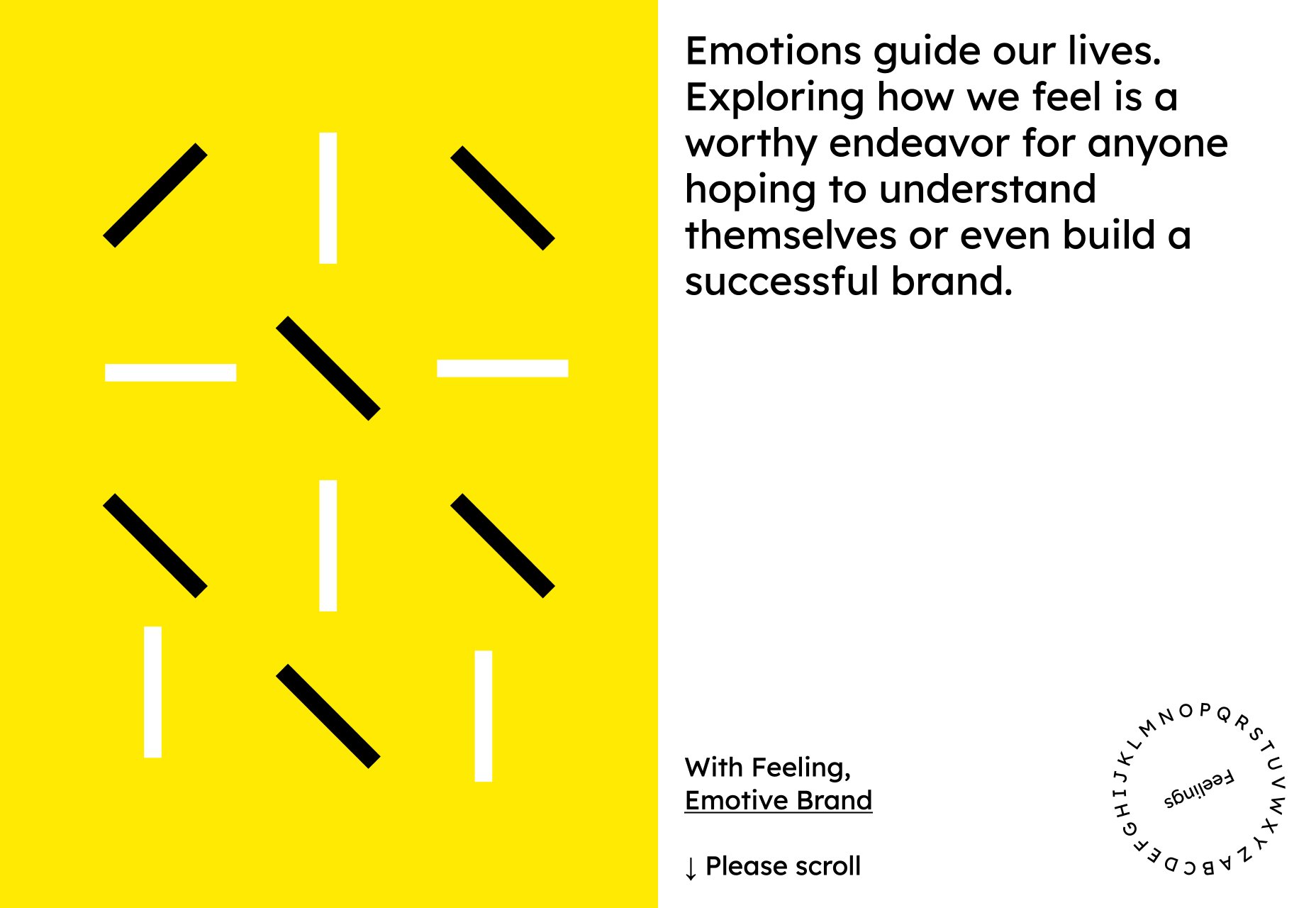
Designing for emotion in and of itself is not a problem. Websites are bound to elicit an emotional reaction from visitors, even if it’s as simple as them feeling at ease because of the soft, pastel color palette you’ve designed the site with.

I don’t want to outright villainize emotional design. Unless there is some form of unethical manipulation at play, designing for your visitors’ emotions can actually provide them with a more positive experience.

So, here’s what I’d like to look at today:

  1. What is emotional design?
  2. When does emotional design cross a line?
  3. What’s the right way to design for emotions?

1. What Is Emotional Design?

When we look at emotional design in the context of a website, we’re focused on three types of emotional reactions:

a. Visceral Reactions

Visceral reactions are instinctive ones. Usually, visitors experience these as their first impressions of a website or web page. For instance, a cluttered or otherwise poorly designed homepage might leave visitors feeling overwhelmed, hesitant, or wanting to flea.

A minimally designed homepage interface, on the other hand, might have visitors not feeling much of a reaction at all. In this case, no feeling is a good feeling.

Like Irene Au said:

b. Behavioral Reactions

Behavioral reactions stem from the usability of a website. There’s a lot that can stir up negative emotions here, like:

  • Extra-long contact forms
  • Confusing menus
  • Error-ridden content
  • Slow-loading pages
  • And more

Again, if a website is easy to get through and attractively designed, visitors aren’t likely going to “ooh” and “aah” with every step they take on the site. And that’s a good thing. If they’re focusing more on how the design looks, they’re not paying attention to the brand’s actual offer.

c. Reflective Reactions

Reflective reactions are the third type of emotions we design for.

This is complicated because there’s a lot wrapped up in how visitors feel about a website after the fact. Sometimes the most well-designed interfaces and experiences can’t save them from a bad experience, whether they realized too late that the products were overpriced or they were treated poorly by a live chat representative.

As a web designer, all you can really do is to make sure you’re working with reputable companies and then aligning the designs of their sites with their values.

When Does Emotional Design Cross a Line?

There’s already enough social pressure online; your website doesn’t need to be one of those places, too

Emotional design shouldn’t be about manipulating consumers’ emotions. In most cases, emotional design is about controlling the environment of the website so that emotions don’t go spinning wildly out of control — in either direction.

It’s when we take what we know about influencing someone’s emotional state to monetarily benefit from it that emotional design becomes problematic.

Here are some ways in which you might negatively impact the emotions of your visitors through design:

FOMO

The fear-of-missing-out isn’t always a bad marketing strategy. However, when FOMO is used for the purposes of rushing consumers to take action now and without time to really think it through, it definitely can be.

Chances are good they’ll feel badly no matter what. Either because they regret the rushed (and probably unnecessary, or expensive) decision or they blame themselves for missing out on an opportunity to be like everyone else.

There’s already enough social pressure online; your website doesn’t need to be one of those places, too. So, be careful with how you present customers with limits (on time, on products, etc.) or how you frame the call-to-action (“If you don’t buy this now, expect to fail/be miserable/suffer even more”).

Analysis Paralysis

It doesn’t matter why people specifically seek out your website. They have a problem or a hole in their life, and they’re looking for something to fix it.

Now, you can’t help it if the website has too much to offer in the way of options or solutions. Companies have to provide every possible solution/option so their users don’t feel like they have to go somewhere else to get what they need. However, the way you design these options can lead to a negative emotional state if you’re not careful.

For instance, your visitors might experience analysis paralysis, where there are so many options that it becomes impossible to take action. Similar to FOMO, this can lead to regret either with the decision they made or the one they were incapable of making.

By simplifying how many choices are presented at once, or designing a clear and supportive pathway to the right option of many, your website will leave visitors feeling much more positively about the whole experience.

Trendy Nostalgia

Nostalgia can be a great way to play upon the positive associations and emotions consumers feel towards an era gone by or a place they once knew. But, again, it depends on how you design with it.

For example, if you design a vintage website for an agency launched in 2019 and run by a group of 20-somethings, it might come off feeling disingenuous once customers start to catch on.

For a restaurant known as the oldest bar in the state, that would be a different story. That nostalgically designed website would be a real part of its story; not just done as a sales gimmick. As a result, customers would likely embrace those warm feelings for the “good ol’ days” they get from the website.

Also, think about how quickly nostalgia fades if it’s done to align with a trend. Unless you’re committed to redesigning a website the second that nostalgic feeling falls out of favor, you could be condemning your client to an outdated website mere months after launch.

What’s the Right Way to Design for Emotions?

Like I said before, there’s nothing wrong with designing for emotions. You just have to make sure your website visitors don’t feel manipulated and that they welcome the pleasant feelings the site gives them.

make sure your website visitors don’t feel manipulated

It might seem harmless at the time. After all, what are they doing on the site if they weren’t interested in the first place? And it’s not like they were bullied into spending their money, right?

But if they sense in any way that their response was driven by an emotion they wouldn’t have otherwise felt, they’re not going to be happy. While it might not be enough for them to cancel their subscription or services, or to return products they bought, it will definitely leave a bad taste in their mouth. And, ultimately, it can cost your website loyal visitors and customers.

So, if you’re going to use emotional design on a website, do it to improve their experience, not to put more money into your clients’ pockets. That means your emotional design choices need to be honest, transparent, and focused on eliciting naturally positive emotions like:

  • Satisfaction
  • Feeling impressed
  • Trust
  • Calm
  • Feeling valued

Go back to the three emotional reactions I brought up earlier. If you can design a website to give off a positive first impression, and to be pain-free and usable, you can spend the rest of your time injecting small bits of happiness and positivity into the website with color choices, friendly micro-interactions, personalized content, and more.


Featured image via Unsplash.

Source


Source de l’article sur Webdesignerdepot