Articles

Websites haven’t always been as adaptable as they are today. For modern designers, “responsivity” is one of the most significant defining factors of a good design. After all, we’re now catering to a host of users who frequently jump between mobile and desktop devices with varying screen sizes. 

However, the shift to responsive design didn’t happen overnight. For years, we’ve been tweaking the concept of “responsive web design” to eventually reach the stage we’re at today. 

Today, we’re going to take a closer look at the history of responsive web design.

Where Did Web Design Begin?

When the first websites were initially created, no one was worried about responsivity across a range of screens. All sites were designed to fit the same templates, and developers didn’t spend a lot of time on concepts like design, layout, and typography.  

Even when the wider adoption of CSS technology began, most developers didn’t have to worry much about adapting content to different screen sizes. However, they still found a few ways to work with different monitor and browser sizes.

Liquid Layouts

The main two layout options available to developers in the early days were fixed-width, or liquid layout. 

With fixed-width layouts, the design was more likely to break if your monitor wasn’t the exact same resolution as the one the site was designed on. You can see an example here

Alternatively, liquid layouts, coined by Glenn Davis, were considered one of the first revolutionary examples of responsive web design. 

Liquid layouts could adapt to different monitor resolutions and browser sizes. However, content could also overflow, and text would frequently break on smaller screens. 

Resolution-Dependent Layouts

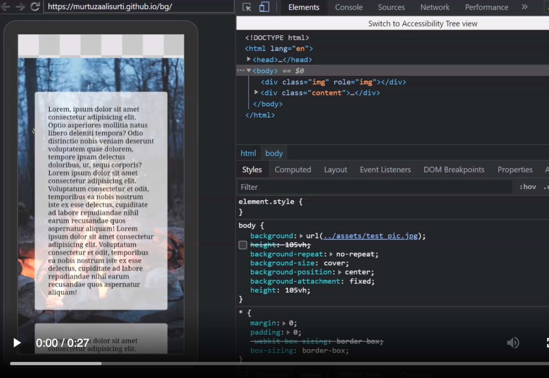
In 2004, a blog post by Cameron Adams introduced a new method of using JavaScript to swap out stylesheets based on a browser window size. This technique became known as “resolution-dependent layouts”. Even though they required more work from developers, resolution-dependent layouts allowed for more fine-grained control over the site’s design. 

The resolution-dependent layout basically functioned as an early version of CSS breakpoints, before they were a thing. The downside was developers had to create different stylesheets for each target resolution and ensure JavaScript worked across all browsers.

With so many browsers to consider at the time, jQuery became increasingly popular as a way to abstract the differences between browser options away.

The Rise of Mobile Subdomains

The introduction of concepts like resolution-dependent designs was happening at about the same time when many mobile devices were becoming more internet-enabled. Companies were creating browsers for their smartphones, and developers suddenly needed to account for these too.

Though mobile subdomains aimed to offer users the exact same functions they’d get from a desktop site on a smartphone, they were entirely separate applications. 

Having a mobile subdomain, though complex, did have some benefits, such as allowing developers to specifically target SEO to mobile devices, and drive more traffic to mobile site variations. However, at the same time, developers then needed to manage two variations of the same website.

Back at the time when Apple had only just introduced its first iPad, countless web designers were still reliant on this old-fashioned and clunky strategy for enabling access to a website on every device. In the late 2000s, developers were often reliant on a number of tricks to make mobile sites more accessible. For instance, even simple layouts used the max-width: 100% trick for flexible images.

Fortunately, everything began to change when Ethan Marcotte coined the term “Responsive Web Design” on A List Apart. This article drew attention to John Allsopp’s exploration of web design architectural principles, and paved the way for all-in-one websites, capable of performing just as well on any device. 

A New Age of Responsive Web Design

Marcotte’s article introduced three crucial components developers would need to consider when creating a responsive website: fluid grids, media queries, and flexible images. 

Fluid Grids

The concept of fluid grids introduced the idea that websites should be able to adopt a variety of flexible columns that grow or shrink depending on the current size of the screen. 

On mobile devices, this meant introducing one or two flexible content columns, while desktop devices could usually show more columns (due to greater space). 

Flexible Images

Flexible images introduced the idea that, like content, images should be able to grow or shrink alongside the fluid grid they’re located in. As mentioned above, previously, developers used something called the “max-width” trick to enable this. 

If you were holding an image in a container, then it could easily overflow, particularly if the container was responsive. However, if you set the “max-width” to 100%, the image just resizes with its parent container. 

Media Queries

The idea of “media queries” referred to the CSS media queries, introduced in 2010 but not widely adopted until officially released as a W3 recommendation 2 years later. Media queries are essentially CSS rules triggered based on options like media type (print, screen, etc), and media features (height, width, etc). 

Though they were simpler at the time, these queries allowed developers to essentially implement a simple kind of breakpoint – the kind of tools used in responsive design today.  Breakpoints refer to when websites change their layout or style based on the browser window or device width.

Viewport Meta tags need to be used in most cases to ensure media queries work in the way today’s developers expect. 

The Rise of Mobile-First Design

Since Marcotte’s introduction of Responsive Web Design, developers have been working on new ways to implement the idea as effectively as possible. Most developers now split into two categories, based on whether they consider the needs of the desktop device user first, or the needs of the mobile device user. The trend is increasingly accelerating towards the latter. 

When designing a website from scratch in an age of mobile-first browsing, most developers believe that mobile-first is the best option. Mobile designs are often much simpler, and more minimalist, which matches a lot of the trends of current web design.

Taking the mobile first route means assessing the needs of the website from a mobile perspective first. You’d write your styles normally, using breakpoints once you start creating desktop and tablet layouts. Alternatively, if you took the desktop-first approach, you would need to constantly adapt it to smaller devices with your breakpoint choices.

Exploring the Future of Responsive Web Design

Responsive web design still isn’t perfect. There are countless sites out there that still fail to deliver the same incredible experience across all devices. What’s more, new challenges continue to emerge all the time, like figuring out how to design for new devices like AR headsets and smartwatches. 

However, it’s fair to say we’ve come a long way since the early days of web design. 


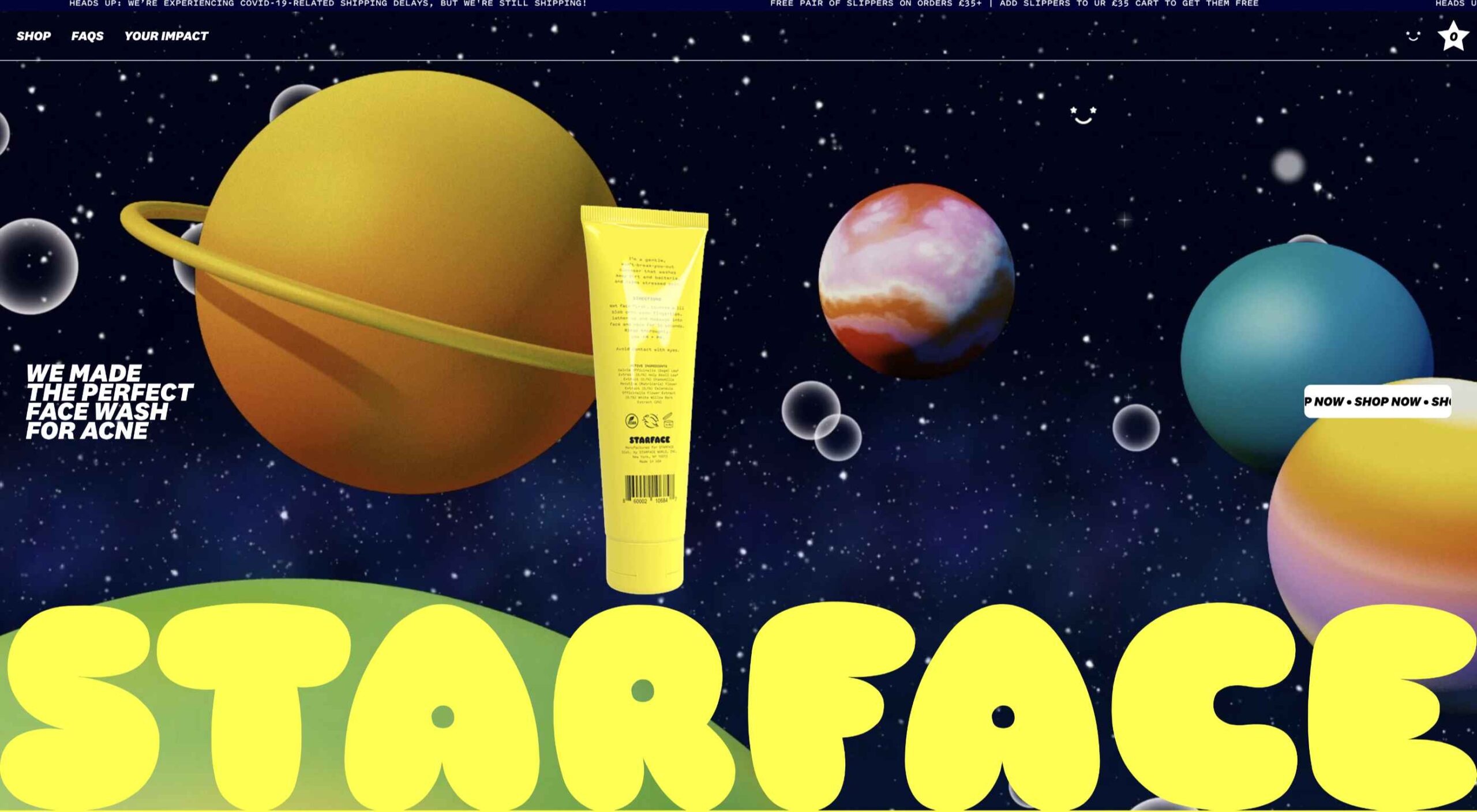
Featured image via Pexels.

Source

The post A Brief History of Responsive Web Design first appeared on Webdesigner Depot.

Source de l’article sur Webdesignerdepot

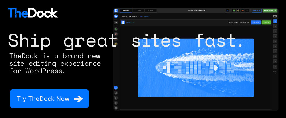
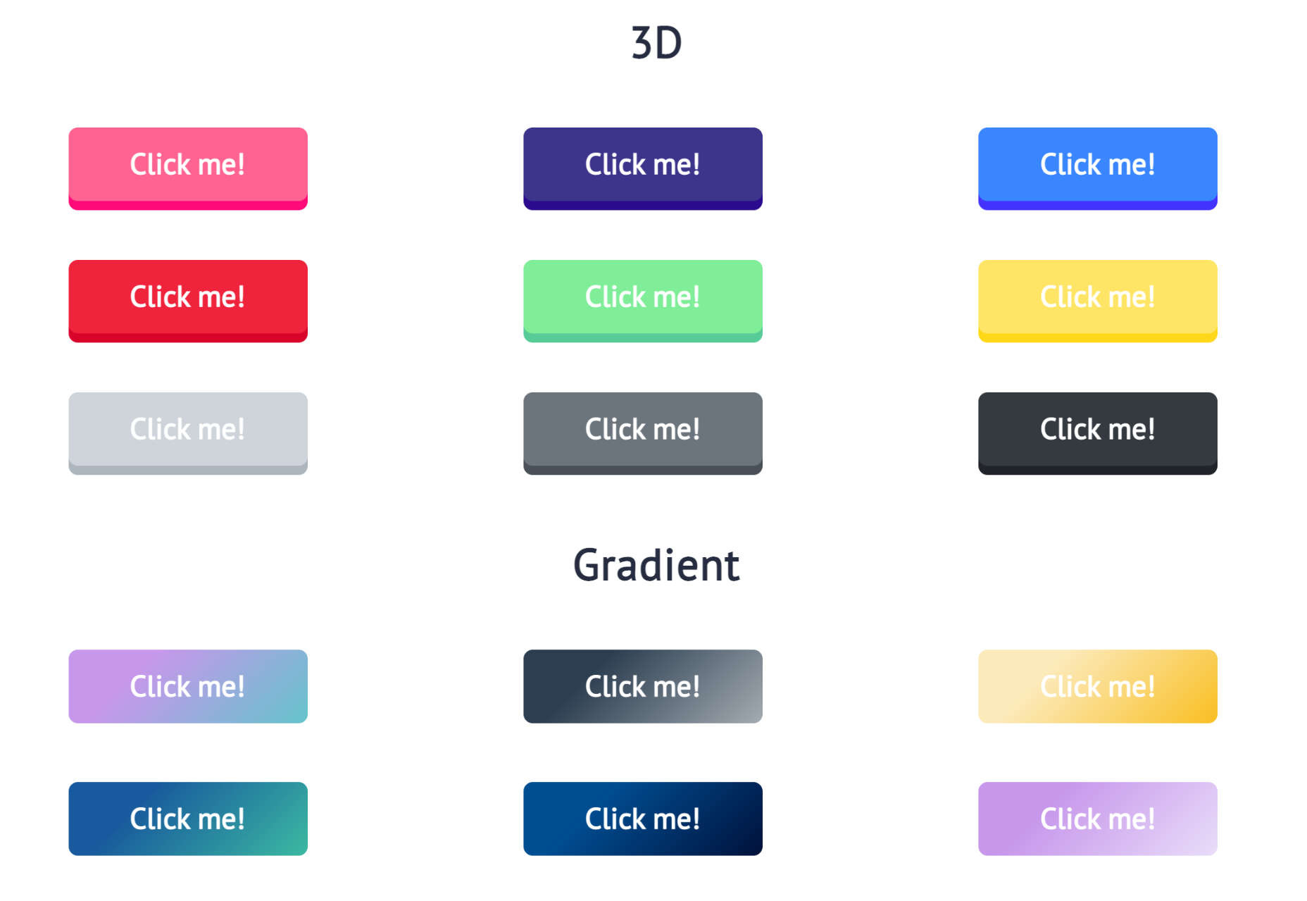
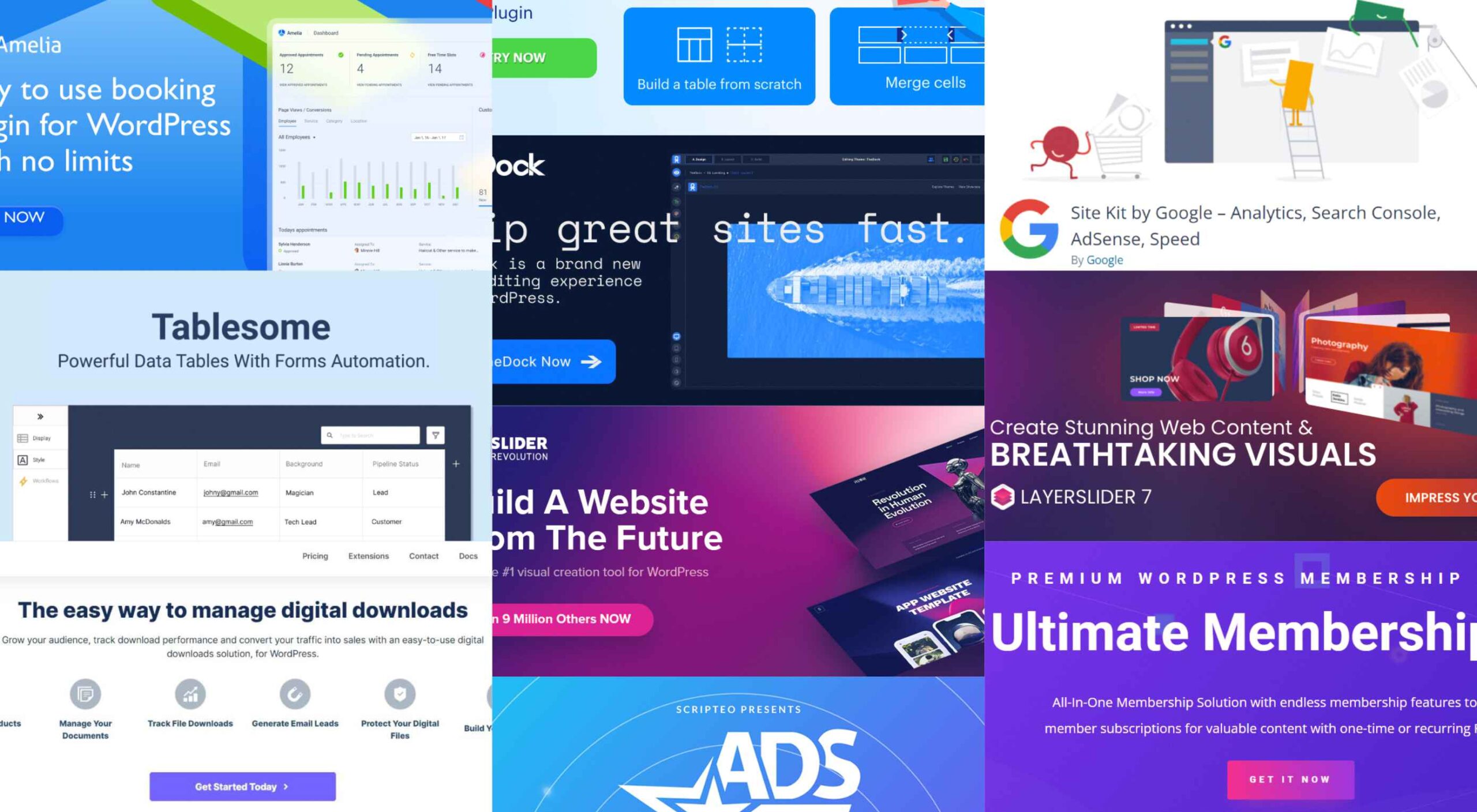
Having the right WordPress plugins on hand can do wonders for your business or online presence. WordPress offers a vast collection to choose from.

There are so many of them. However, finding those that get the best reviews and can do the most for you can be a challenge.

A plugin can give you additional functionality. It could otherwise be difficult or overly expensive to realize with your website by itself. A glance at the 10 top WordPress plugins described below can provide a powerful case in point.

Your website’s purpose or niche will usually dictate the types of essential WordPress plugins you would do well to invest in. The right ones can make your website a genuine powerhouse and, by extension, your business as well.

1. Amelia

Amelia is an excellent choice for beauty, healthcare, fitness, consulting, and businesses that might be saddled down with a manual or semi-manual booking system by saving them and their clients time while eliminating booking mistakes that often occur in those manual systems.

  • Clients can book appointments online 24/7, change or cancel their appointments, and receive reminders of upcoming appointments and other notifications via SMS or email.
  • Amelia enables business owners or department managers to track and manage employee schedules and time off.
  • Amelia can manage bookings for appointments, book tickets for events, and manage group bookings, all at multiple locations. There are no limits on the number of appointments that can be managed.
  • Booking forms can be customized to best serve a business’s needs and match its brand.

Amelia fully supports WooCommerce with PayPal, Stripe, Mollie, and RazorPay payments. Click on the banner to learn more about this time and money-saving plugin.

2. wpDataTables

wpDataTables is a premier WordPress table and chart building plugin that features virtually everything you are apt to need to build any table or chart you want.

Creating a table that is by any definition complex often requires tools that may not necessarily be easy to come by. wpDataTables uses four chart-building engines, one or more of which should suit you perfectly.

They are:

  • Google Charts
  • Highcharts
  • Charts.js
  • Apex Charts

For both table and chart building, wpDataTables can connect you to multiple database sources, including –

  • MySQL
  • MS SQL
  • PostgreSQL

wpDataTables can process data that exists in the commonly used formats and features various sorting and filtering options that allow you to create a host of different table types.

Both tables and charts are editable and responsive and, thanks to the wpDataTables conditional formatting feature, can highlight and color-code critical information.

Click to learn more.

3. Site Kit by Google

While your website’s performance might exceed your wildest dreams, it is more likely that there are areas that need improvement before your wishes can be met. 

Determining those areas can be a challenge, but Site Kit offers a one-stop solution to deploy, manage, and get insights from critical Google tools to make your site a success by making those critical tools available to WordPress.

They provide:

  • stats displayed on your WordPress dashboard from multiple Google tools
  • quick Google tool setup without your having to edit your site’s source code  
  • key metrics and insights for your entire site and individual posts, and
  • easy-to-manage, granular permissions across WordPress and different Google products

Site Kit shows you how many people have found your site, how users navigate it, etc.

Click on the banner to learn more about what Site Kit could do for you.

4. Tablesome –  WordPress Table Plugin With Form Automation

Tablesome is a WordPress form database and form automation plugin that you can use to store entries from WordPress forms to a database. It can be integrated with popular forms – Contact Form 7 DB, WPForms entries, Forminator database, Elementor Form submissions, etc.

After saving, you can:

  • Edit, auto-delete, and export entries to tools such as MailChimp, Google Sheets, Salesforce, etc.,
  • Display WordPress form entries on frontend pages
  • Automatically export contact data using the Mailchimp WordPress Integration

5. TheDock

TheDock eliminates the need to search for just the right WordPress theme by enabling you to create your own – which can be more fun anyway.

Among TheDock’s many features, a few key ones include –

  • A comprehensive, option-rich Design System
  • A responsive design system that ensures your site looks great on all screens.
  • Designer, developer, and editing collaboration support. 
  • Clean, readable code.

6. Slider Revolution

Beginners and mid-level designers can sometimes have difficulty finding ways to WOW their clients with professional-level visuals.

Slider Revolution changes all that by bridging the gap between what clients want and what you can provide with its –

  • 200 designed-to-impress website and slider templates
  • 25+ powerful addons and brand new WebGL slide animations
  • ability to import dynamic content from WooCommerce and social media outlets.

7. LayerSlider

More than a simple slider-builder, LayerSlider is an animation and website-building tool you can use to improve any website’s look and feel through eye-catching animations, contemporary graphics, and interactive features.

This is made possible in part through the use of –

  • 160+ website, slider, and popup templates
  • LayerSlider’s modern and intuitive editing interface

Plus, you can count on professional one-on-one customer support.

8. Download Monitor

The Download Monitor plugin helps you sell your digital products by offering a ready solution for tracking file downloads, gating content to generate leads, build your audience, and ask users for personal information in exchange for valuable content.

Download Monitor lets you –

  • add any type of file you need to your website
  • link a page to all your channels and promote your social media networks
  • place ads – and more.

9. Ads Pro – Multi-Purpose WordPress Ad Manager

The biggest ad manager for WordPress, Ads Pro gives you everything necessary to manage and sell ads.

Ads Pro’s admin panel makes managing ads straightforward for you and your users.

  • Key ad features include 25+ ad templates and 20+ ad display options.
  • CPC, CPM, CPD billing and PayPal, Stripe, and bank transfer payment methods are built-in.
  • Geo-Targeting lets you show/hide ad spaces based on countries, provinces, cities, and Zip Codes.

10. Ultimate Membership Pro

If selling content is your objective, Ultimate Membership Pro is the tool you’ll want to take your website and convert it into a powerful content selling platform.

The Ultimate Membership Pro plugin enables you to –

  • Create unlimited subscription levels, including free, trial, and paid member subscriptions
  • Control customer access to content based on their subscriptions
  • Send emails to welcome new members and send notifications and reminders to regular subscribers.

The WordPress plugin directory is already stuffed with almost 60,000 plugins. This guide has been published to narrow things down to 10 top WordPress plugins for your use.

We consulted with experts to create this list of excellent plugins for WordPress. It can help you with content strategy, SEO, site security, and even social media marketing.

Installing plugins and getting the functionality they provide can add immense value to your use of WordPress.


[- This is a sponsored post on behalf of BAW Media -]

Source

The post 10 Terrific WordPress Plugins You Should Be Using in 2022 first appeared on Webdesigner Depot.

Source de l’article sur Webdesignerdepot

Every day design fans submit incredible industry stories to our sister-site, Webdesigner News. Our colleagues sift through it, selecting the very best stories from the design, UX, tech, and development worlds and posting them live on the site.

The best way to keep up with the most important stories for web professionals is to subscribe to Webdesigner News or check out the site regularly. However, in case you missed a day this week, here’s a handy compilation of the top curated stories from the last seven days. Enjoy!

Next.js and Drupal Go Together Like PB & Jelly

Couleur.io – Harmonizing Color Palettes for Your Web Projects

11 Open-Source Static Site Generators You Can Use to Build Your Website

Buttons Generator – 100+ Buttons You Can Use In Your Project

3 Essential Design Trends, September 2021

12 CSS Box Shadow Examples

The Fixed Background Attachment Hack

The Internet ‘Died’ Five Years Ago

Media Queries in Responsive Design: A Complete Guide (2021)

The 7 Core Design Principles

Source

The post Popular Design News of the Week: August 30 2021 – September 5, 2021 first appeared on Webdesigner Depot.


Source de l’article sur Webdesignerdepot

The dog days of summer are here. From vacations to pool time, you might not be thinking about work that much. But there are still plenty of new tools and resources popping up to help you become a better or more efficient designer.

Here’s what new for designers this month.

Haikei

Haikei is a web app that you can use to generate SVG shapes, backgrounds, and patterns in a web-based editor that you can use with any design tool or workflow process. Everything is customizable and it is free with access to 15 generator functions. (Additional templates and generators will be available when the pro plan is released later.)

Pixelhunter

Pixelhunter is a smart image resizer for social media platforms. It recognizes objects and crops pictures automatically. It supports 102 sizes and is free to use.

Compo

Compo is an Apple app that allows you to play with shapes and colors and create compositions on your own. You can see shapes and colors like the Bauhaus masters, creating from a blank canvas or shuffling in more creative ways. You can move, rotate, copy, overlap, and adjust shapes and colors to suit your style. Available for iPad and iPhone.

Backlight

Backlight is an all-in-one design system platform that allows you to build code and reference sites in a space where designers and developers can work together. It has a series of “starter kits” to help you with the technology you use from React to Chakra to Tailwindcss. It’s designed to be collaborative with everything in one place and integrates into your workflows. The tool is just launching and you can request early access to learn more.

Multi Color Text With CSS

Multi Color Text With CSS is pure fun. Check out the pen by Shireen Taj.

Mega Creator

Mega Creator is an online graphic design tool that helps you create images, icons, illustrations, backgrounds, and more for a number of uses. It has templates that are sized for common uses such as social media. You can upload your own elements to work with (free) or use including graphic assets for a fee.

Noloco

Noloco is a no-code solution for designers to build web apps. You can start building for free and design almost anything you can dream up from a set of drag-and-drop ready-made blocks. (And it will work across all screen sizes.)

Tinter

Tinter is a tiny web tool to generate color variations of images. The tool also generates monochrome colors of images with multiple variants, without hampering the quality of the image.

Radix Colors

Radix Colors is an accessible, open-source color system for designing gorgeous websites and apps. It includes 28 color scales with 12 steps each and includes support for dark mode as well as matching transparencies.

WP Cost Calculator

WP Cost Calculator is a smart, simple tool that allows you to easily create price estimation forms. It’s perfect for a number of industries that use online pricing.

TraveledMap

TraveledMap allows you to create customizable maps thanks to the use of markers, routes, and photos, which you can share or add to your website or blog. This tool is made for travelers and tourism pros.

Glyph Neue Icons

Glyph Neue Icons is a collection of 1,500 icons in SVG and PNG format. (They are free with a link.) Icons come in plenty of categories and styles for all types of use.

Streamline Icons

Streamline Icons is a set of thousands of icons in 12 different styles and themes that you can use for projects. They work through the Streamline app or a plugin for Figma, Sketch, or Adobe XD.

Health Icons

Health Icons is a set of free, open-source health icons for personal or commercial projects. They include filled and outline styles that are editable. There are more than 800 icons in the collection.

OMG, SVG Favicons FTW!

OMG, SVG Favicons FTW! Is a look at the benefits of using SVG favicons in web projects. It also examines some of the challenges – such as browsers support – with code snippets to help you get started.

Aspect Ratio in CSS

Aspect Ratio in CSS explores a design concept we talk about a lot in other places, but not so much with CSS. This piece by Ahmad Shadeed takes a look at how you can go beyond the “padding hack” and use native aspect ratio support in CSS to maintain image height and width ratios in responsive design.

Fight Kick

Fight Kick is a bold font with a lot of personality. The free demo version has 249 characters and is for personal use only.

Glow Better

Glow Better is a beautiful premium typeface with a pair of options – a serif and script. Both contain letterforms with swashes and tails that are delightful.

Huggable Hedgehogs

Huggable Hedgehogs is a playful font that’s perfect for children’s projects. Everything has a mono-height in the all uppercase typeface.

Monice

Monice is a rounded sans serif with thick lines and high readability. It includes bold, regular, and italic styles with free (demo, personal) and commercial options.

Rustica

Rustica is a robust premium typeface with 20 styles and family options. It has slim curves and an easy-to-read character set that would work for almost any use. It also supports 219 languages.

Source

The post Exciting New Tools for Designers, July 2021 first appeared on Webdesigner Depot.


Source de l’article sur Webdesignerdepot

With the widespread acceptance of web standards, and the resulting deprecation of browser prefixes, there has been a noticeable change in the browser market. Where once browser manufacturers would try to lure users in with promises of feature support, now the focus is on privacy, speed, and developer tools.

When it comes to web development, you should really be testing on every browser and device you can lay your hands on; you’re probably already doing so using an app like LambdaTest, or BrowserStack.

When quality assurance testing, you probably work by market share: starting with Safari on mobile, Chrome on desktop, and working your way down to Opera and (if you’re a glutton for punishment) Yandax; naturally, when testing, it’s the largest number of users that concerns us the most.

But before you reach the QA stage, there are a number of browsers designed to assist development. Browsers that offer tools, especially for front-end developers, that assist with code and speed up development. Here are the best browsers for web development in 2021:

1. LT Browser

LT Browser is an app for web developers from LambdaTest. Like many of the apps in this class, it offers side-by-side comparisons of a site in different viewports. Additionally, LT Browser has a number of features that make it stand out.

As well as previewing web pages, LT Browser offers developer tools to rival Chrome, which is handy if you want to see how changes across different devices affect your Lighthouse scores. LT Browser also supports hot-reloading, which means when you make a change to your code, you don’t have to hit ‘refresh,’ the viewports simply reload — it’s surprising how much of a time-saver that simple addition is.

LT Browser requires a LambdaTest account, there is a free plan, and paid plans start at $15/month.

2. Firefox Developer

The best conventional browser for web development in 2021 is the developer edition of Mozilla’s Firefox.

The standard edition of Firefox is an excellent browser, packed with features, and privacy-focused. The developer edition adds to this with a suite of tools aimed at developers. The CSS and JavaScript debugging tools are superb, and the Grid tools are unparalleled for coding layouts with CSS Grid.

Firefox Developer is free to download.

3. Polypane

Polypane is one of the new generation of web browsers that are firmly intended as development aids rather than browsers. Polypane allows you to compare different viewports and platforms by placing them side by side. Interactions like scrolling are synced.

Polypane takes a step further than many browser apps in this class by showing social media previews. It even has a suite of accessibility tools, including some handy color blindness simulators.

Polypane has a 14-day free trial, and plans start at $8/month.

4. Blisk

Blisk is another browser for developers that allows you to line up a collection of viewports in a single app. URL and scrolling are synced, making testing interactions and animations effortless.

Blisk is awesome fun to play with and delivers a great preview of a responsive design. But be warned, synced viewports can be addictive, and it’s easy to line up browsers and become hypnotized by the synchronized movement; you’ll need a very large screen to get the most out of Blisk.

Blisk plans start at $9.99/month.

5. Sizzy

Sizzy is another app that allows you to view multiple viewports at once. It also has synchronized interactions, and like many competing apps, Sizzy allows you to screenshot different views.

Sizzy also includes a very clever synchronized inspect tool, so you can focus on individual elements across different viewports. It’s an excellent option for debugging, particularly if you’re digging into someone else’s code.

Sizzy has a 14-day free trial, and paid plans start at $7.15/month.

6. Brave

Brave is a privacy-focused browser that runs up to three times faster than Chrome. If you’re someone who balks at rendering speeds on most sites, Brave could be for you.

Brave’s main benefit for developers is that it supports Chrome extensions while maintaining privacy — it can even access the Web using Tor if simple privacy mode isn’t enough for you. There are hundreds of useful Chrome extensions, and if you avoid Chrome due to privacy concerns, then Brave solves your problem.

Brave is also pioneering a new system for monetizing site revenue, allowing viewers to tip sites, and soon, to control how advertising revenue is distributed.

Brave is free to download.

7. Chrome

Boring it may be, but Chrome is still the world’s most popular browser from the US to mainland China. Where once sites were “best viewed in IE,” Chrome is now the Web’s default.

No matter the site you’re designing, it has to work well in Chrome, and no simulator is as good as the real thing.

In addition to being the benchmark for page rendering, Chrome developer tools are the simplest way to access your Lighthouse scores, which helps you track down issues that may be holding you back in Google’s search results.

Chrome is free to download.

Source

The post 7 Best Browsers for Developers in 2021 first appeared on Webdesigner Depot.


Source de l’article sur Webdesignerdepot

So, really, you’re in the business of designing websites for your clients’ audiences.

But how do you ensure you get it right? You could take what your client tells you at face value, but that’s only going to scrape the surface of who their audience is.

What you need to do is figure out how consumers think and why they respond to websites the way they do. A lot of this is already explained to us by psychology principles.

Once you memorize them, you’ll be able to design user journeys that get visitors to respond exactly as you and your client want them to.

15 Psychology Principles to Use in Web Design

We as humans think certain ways, and your design should cater to those underlying thought processes and natural responses.

Below are 15 psychology principles that’ll help you design better, more intuitive digital experiences for your end-users:

1. Aesthetics-Usability Effect

The Aesthetics-Usability Effect suggests that people equate more attractive interfaces with more usable ones. In other words, a good, modern, responsive design should always be your starting point.

2. Color Psychology

Color psychology tells us about color’s influence over how something is perceived. With color so strongly tied to emotion, you can do a lot to affect how visitors perceive a website and the brand behind it.

3. Psychology of Shapes

Just as a color has the ability to affect someone’s perception of a brand or the content they’re looking at, so too do individual shapes used within an interface. Each shape — circles, squares, triangles, hexagons, and polygons — has a unique psychological association.

4. Gestalt Principles

Gestalt Principles are a way for humans to make sense of chaotic data presented to them. So, rather than see a bunch of text, images, and space, the human brain recognizes patterns to simplify complexity.

About half a dozen principles are associated with this theory, and they’re related to factors like symmetry, similarity, and proximity.

5. Mere-Exposure Effect / Jakob’s Law

The Mere-Exposure Effect, or Familiarity Principle, suggests that people are more likely to prefer things that seem familiar.

Jakob’s Law applies this psychology specifically to the internet user experience. It suggests that users expect your website to work the same way as the other sites they spend their time on.

6. Von Restorff Effect

The Von Restorff Effect, or Isolation Effect, describes what happens when someone is exposed to identical stimuli, and then a unique element is introduced to the fold. It’s the outlier that will most effectively grab their attention.

7. Selective Disregard

Selective disregard is a type of “blindness” users develop to anything seemingly irrelevant to their main goal. This often occurs when a design or marketing trend grows stale — like websites that use the exact same cookie consent banner.

8. Hick’s Law

Hick’s Law states that the number of choices a person has to make will increase the amount of time it takes to make a decision.

This is a fundamental principle to pay attention to on ecommerce sites as you want to speed up the decision-making process, not slow it down.

9. Loss Aversion

Loss Aversion states that decision-making is more commonly driven by avoiding losses than acquiring gains.

If your website or the content within it gives visitors any reason not to trust it or feel confident in taking action, you’re more likely to see high abandonment rates than conversions.

10. Paradox of Choice

The Paradox of Choice is a response to the problem posited by Hick’s Law. It suggests that the reduction of choices makes consumers feel less anxious, which, in turn, increases confidence and satisfaction with purchases.

If your site suffers from high cart abandonment or product returns, the paradox of choice would be a useful principle to leverage.

11. Miller’s Law

Miller’s Law, also referred to as Cognitive Load Theory, has to do with memory capacity. On average, people can only have about seven items stored in their working memory at any given time.

This psychology principle encourages the reduction of options and the general reduction of content to improve focus and decision-making capabilities.

12. Feedback

Feedback is one of the principles of learning and plays a big part in interaction design.

Feedback is what designers use to tell people when they’ve made progress towards a goal or achieved it. You can also use it to teach visitors how a website will respond to their actions, which encourages faster and more confident engagements with your website.

13. Extrinsic Motivation

There are two types of motivation. Intrinsic motivation is an internal one, whereas extrinsic is external.

It’s Extrinsic Motivation that plays a role in getting users to complete more tasks online. As a designer, you have to make sure these kinds of “rewards” are obvious.

14. Social Proof

Not so much a psychological principle as it is a psychological phenomenon, Social Proof or Influence, suggests that people will copy the actions of the masses. It also refers to the assumption that the truth lies with the majority.

This is why customer reviews, client testimonials, and user-generated content have become so useful on websites.

15. Peak-End Rule

The Peak-End Rule states that people will judge an experience based on their very first and last impressions of it. This is somewhat related to the Serial Position Effect, whereby people will remember the first and last items in a group.

So, this is something to remember when you build out the top and bottom of each page as well as the start and expected end to the user journey.

Wrap-Up

Want to build better websites? Then, you need to design from the end users’ perspective.

The best place to start is with psychology principles, as they’ll tell you how most consumers think and what motivates them to respond. If you understand this inherent cause-and-effect relationship, you can design websites that elicit the right kind of response from your visitors.

Source

The post 15 Psychology Principles Every Designer Should Know first appeared on Webdesigner Depot.


Source de l’article sur Webdesignerdepot

There are some interesting shake-ups on the horizon for ecommerce: Experiential shopping, Virt-ical worlds, Au naturale models.

We’re starting to see signs of them already — many of them spurred on thanks to the events of 2020. Below, we’re going to explore what’s going on with these new ecommerce trends and technologies and take a look at a bunch of sites that are setting really cool examples for each.

1. Experiential Shopping

With many stores, either closed to in-person shopping during the pandemic or their capacities severely limited, online shopping and BOPIS became much more attractive options for consumers.

That said, buying something like a pair of jeans or a new pair of glasses is much different than the pack of toilet paper someone’s bought for years. There are just some things you have to try to know if you’re going to like it and make sure it fits.

Augmented reality and other immersive shopping tools are bringing those “try-on” capabilities to people’s homes.

There are a number of technologies built specifically for this purpose:

Obsess is a particularly noteworthy one. It’s an ecommerce platform that enables retailers to build virtually immersive shopping experiences. Charlotte Tilbury is one such retailer that is taking advantage of it.

Obsess, the augmented reality and immersive shopping experience platform

At the end of 2020, Obsess announced that it had received $3.4 million in seed funding, so expect to see more Obsess-powered ecommerce sites and apps.

ByondXR is another platform that empowers brands to design immersive experiences for online shoppers:

ByondXR helps brands create experiential shopping

Retailers like Lancome, Procter & Gamble, and Calvin Klein have used ByondXR’s immersive commerce technology.

Another option is offered by Matterport:

Matterport's virtual shopping experiences and 3D store mapping tech

This technology is interesting as you’re not just creating a virtual store. You can also design a 3D model of a brick-and-mortar shop that in-store shoppers can use to get in and out quickly.

2. Virt-ical Worlds

There’s a new trend brewing, and we see it most commonly on websites for fresh and youthful brands. I wouldn’t say it’s nostalgic design, per se, though there are certainly some elements reminiscent of the bold, in-your-face style of the web in the late ‘90s and early ‘00s.

No, I think what we see here is a creative reimagining of our world.

With so many people having spent time in their homes and with their faces glued to screens, there’s been a blurring between our VIRTual and physICAL worlds. This new web design trend is one I’m going to call the Virt-ical World. While parts of these sites look like the websites we’ve designed in years past, there are motion, color, and sizing elements that feel more like a trippy virtual simulation.

Let’s look at some examples.

Starface is a company that creates acne-fighting products.

Starface's in-your-face website design

This is one of the more experimental designs in this set of examples. Still, it’s one that shows us how far the boundaries can be pushed without totally compromising the online shopping experience.

Billie is another company having fun with this trend. I’d say this is on the opposite end of the spectrum.

Billie has a fun, candy-colored website design

For the most part, this ecommerce site looks similar to other small retailer sites. However, the fun, candy-colored palette, the bobbing products, and the color shifts add a somewhat surreal element to the design.

Catching THEO is another ecommerce brand playing around with this Virt-ical World.

Catching THEO mixes nostalgia and modern design

See what I mean by this style feeling somewhat nostalgic? Thankfully, this site commits to today’s good, clean, responsive design while only using some of the more fun and quirky elements from the past.

Au Naturale Models

When I talk about au naturale models, I’m really referring to the makeup-less faces, relaxed hairstyles, and casual apparel that we’re seeing ecommerce models don these days.

I think it’s safe to say we have the pandemic to thank for this. And it’s not just because many of us took a more casual approach to getting dressed during the week. It’s also because the pandemic wiped away the glitz and glamour from many of our lives.

I don’t know about you, but it was kind of nice seeing fewer Instagram influencers flaunting their luxurious lifestyles and more real people rocking their matching pajama sets. I think brands have sensed this change in mood over the last year, and they’re now putting forward their own simple and casual styles for us to connect to.

There are tons of ecommerce websites we’re seeing this on in 2021.

Here’s Dove’s homepage, where they specifically call attention to the lack of digital distortion in the photo:

Thinx also uses more natural and realistic-looking models to show off its undergarment products:

Madison Reed takes a unique approach with this trend:

Madison Reed shows off some of the real faces of its customers

While the hair color brand does a great job of using diverse models around the site, it also has this scrolling bar showing off its customers’ very natural and real faces.

Wrap-Up

It feels like ecommerce trends and technologies are changing at a rapid pace these days. To help you stay on top of what’s new in ecommerce, stay tuned to this blog for more interesting news and changes to the landscape.

Source

The post What’s New in Ecommerce, February 2021 first appeared on Webdesigner Depot.


Source de l’article sur Webdesignerdepot

Every week users submit a lot of interesting stuff on our sister site Webdesigner News, highlighting great content from around the web that can be of interest to web designers.

The best way to keep track of all the great stories and news being posted is simply to check out the Webdesigner News site, however, in case you missed some here’s a quick and useful compilation of the most popular designer news that we curated from the past week.

UI Design Trends for 2021


10 White Label Tools for Web Designers


12 Content Marketing Trends to Keep an Eye in 2021


We Can do Better than Signal


I Wasted $40k on a Fantastic Startup Idea


Mnm – An Open Source Project to Replace Email and SMTP


Shuffle – An Online Editor for Busy Developers


New in Chrome 88: Aspect-ratio


Everything About React Server Components


8 Examples of Icon-Based Navigation, Enhanced with CSS and JavaScript


Amazing Free UI Illustrations and How to Use Them


Is it Time We Start Designing for Deviant Users?


7 B2B Web Design Tips to Craft an Eye-Catching Website


Legendaria Font


16 Things not to do While Designing Dashboards


How to Train your Design Dragon


Enterprise UX is Amazing


7 Visual Design Lessons from Dmitry Novikoff Based on Big Sur Icons


DIY UX Audit – Uncover 90% of the Usability Issues on your Website


Vector Pattern Generator – Customize Seamless Patterns for the Web


The Year in Illustration 2020


Design Trends Predictions for 2021


Twenty Twenty-One Theme Review: Well-Designed & Cutting-Edge


9 Best Code Editors for Editing WordPress Files


The State of Design in 2021


Want more? No problem! Keep track of top design news from around the web with Webdesigner News.

Source

The post Popular Design News of the Week: January 18, 2021 – January 24, 2021 first appeared on Webdesigner Depot.


Source de l’article sur Webdesignerdepot