Articles

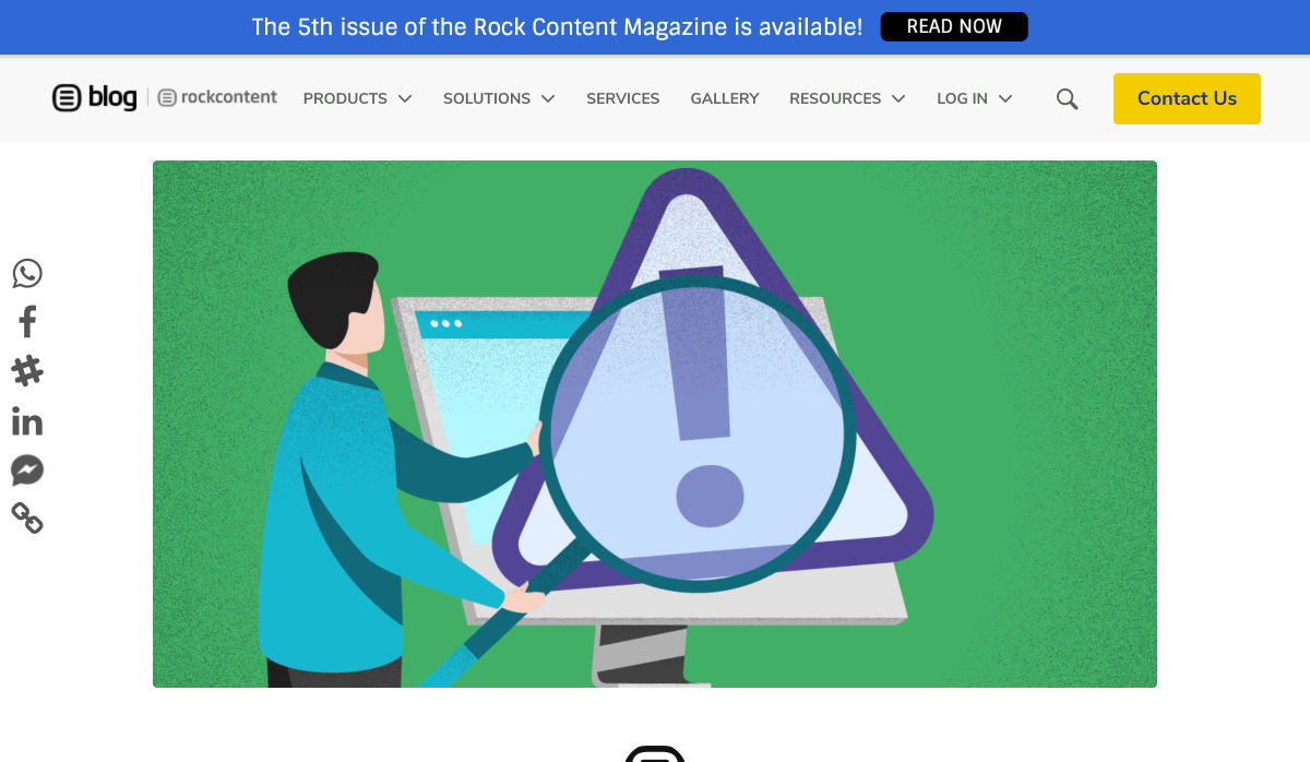
What an extraordinary year 2020 has been for the news! From the ongoing coronavirus crisis, to a turbulent US election, to the unrelenting march of Bitcoin, this year like no other we’ve been glued to our phones micro-analyzing every tidbit of news.

Which makes this the perfect time for mediastack, an awesome REST API that allows you to embed a customizable news feed, sourced from the world’s top news agencies, and updated by the minute, right on your site.

Integrating Global News with Your Site

News is the beating pulse of so many global industries. From political decisions that affect stock prices, to natural disasters that interrupt goods and services, to the whims of celebrities who overnight transform brands from unknown to must-have.

Whether you’re building a site for a non-profit in Louisiana that cares deeply about both Washington politics, and hurricanes in the Caribbean; or you’re building an app for a golf course in Halkidiki that’s focused on both local news, and golf around the world; delivering real-time news content to those users elevates UX.

Tightly integrating the news with your site makes it a hub for users hungry for that very news. The only limit is your creativity.

Display Up-to-Date News on Your Site

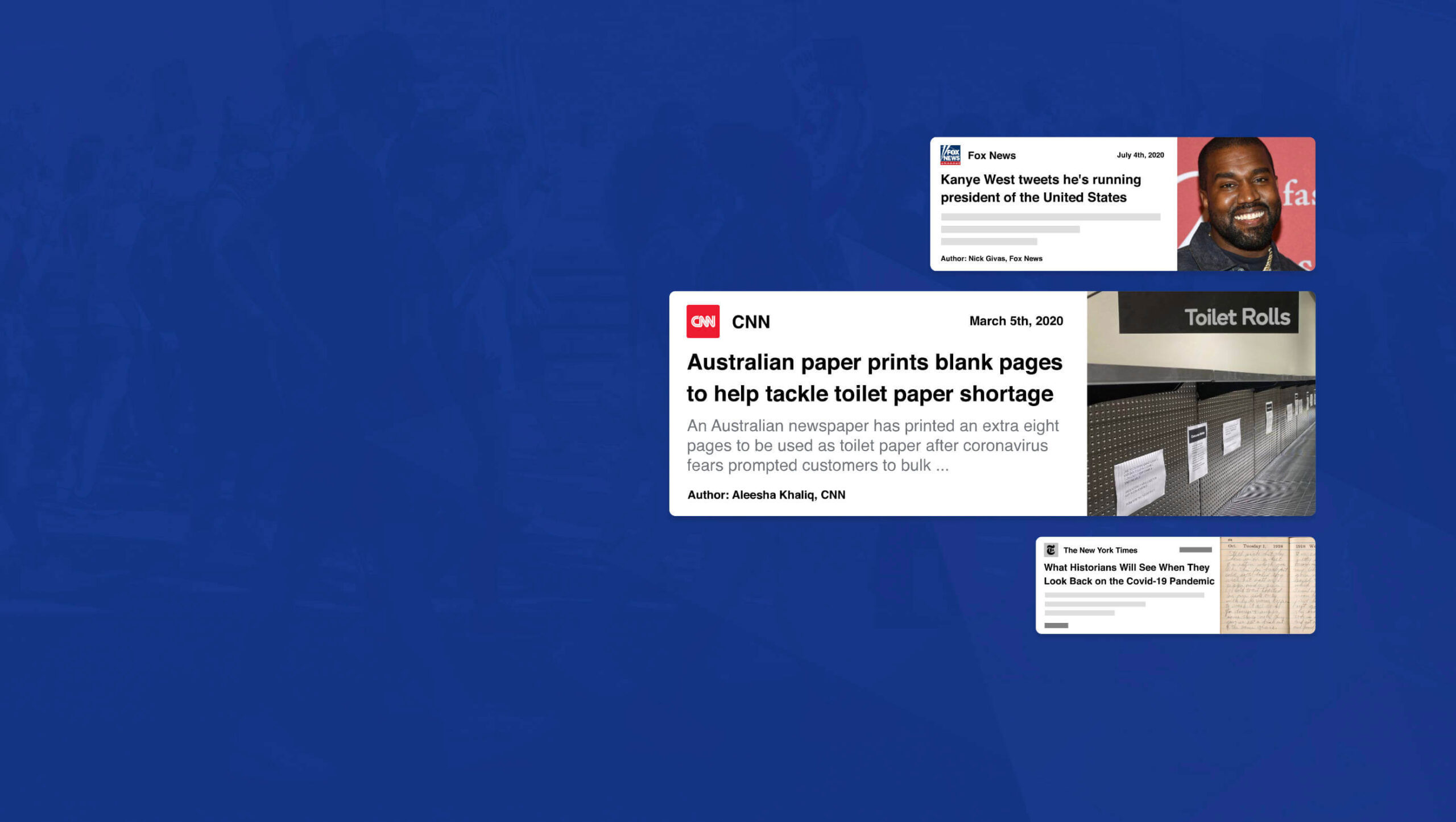
When news breaks around the world the top networks scramble to catch up; they simply can’t maintain correspondents in every town and city in the world, and so they rely on affiliates. mediastack pulls in news from over 7,500 different sources in over 50 countries worldwide, giving you access to exactly the same affiliates frequently used by big news organizations like CNN, MSNBC, BBC, or ABC.

When it’s one of the big players in news that breaks a story first, mediastack still has you covered because as will as covering smaller, lesser-known sources mediastack delivers real-time news from CBS, Sky News, The Guardian, Al Jazeera, USA Today, and a host of trusted names across the industry.

If your site targets users that are only interested in certain types of story — like sports, or Hollywood celebrities — then you can even pull in stories from ESPN, TMZ, or Fox News.

Get Started Quickly with mediastack

Getting started with mediastack couldn’t be simpler, and there’s a free plan that’s more than enough to prototype your project.

Full documentation is provided with code examples for PHP, Python, jQuery, Go, and Ruby. To start integrating all you need to do is register for a free access key.

Once you have your free access key, you connect to the API, then customize the results you receive with simple parameters. You can specify the types of news, the precise sources (including omitting sources), languages, countries, and most importantly your keywords.

For example here’s how you’d request science news from CNN, but not TMZ:

https://api.mediastack.com/v1/news
?access_key=[ INSERT YOUR ACCESS KEY HERE ]
&categories=science
&sources=cnn,-tmz

Let’s say you want to display Spanish language crypto news on your site, it couldn’t be easier:

https://api.mediastack.com/v1/news
?access_key=[ INSERT YOUR ACCESS KEY HERE ]
&categories=business,technology
&languages=es
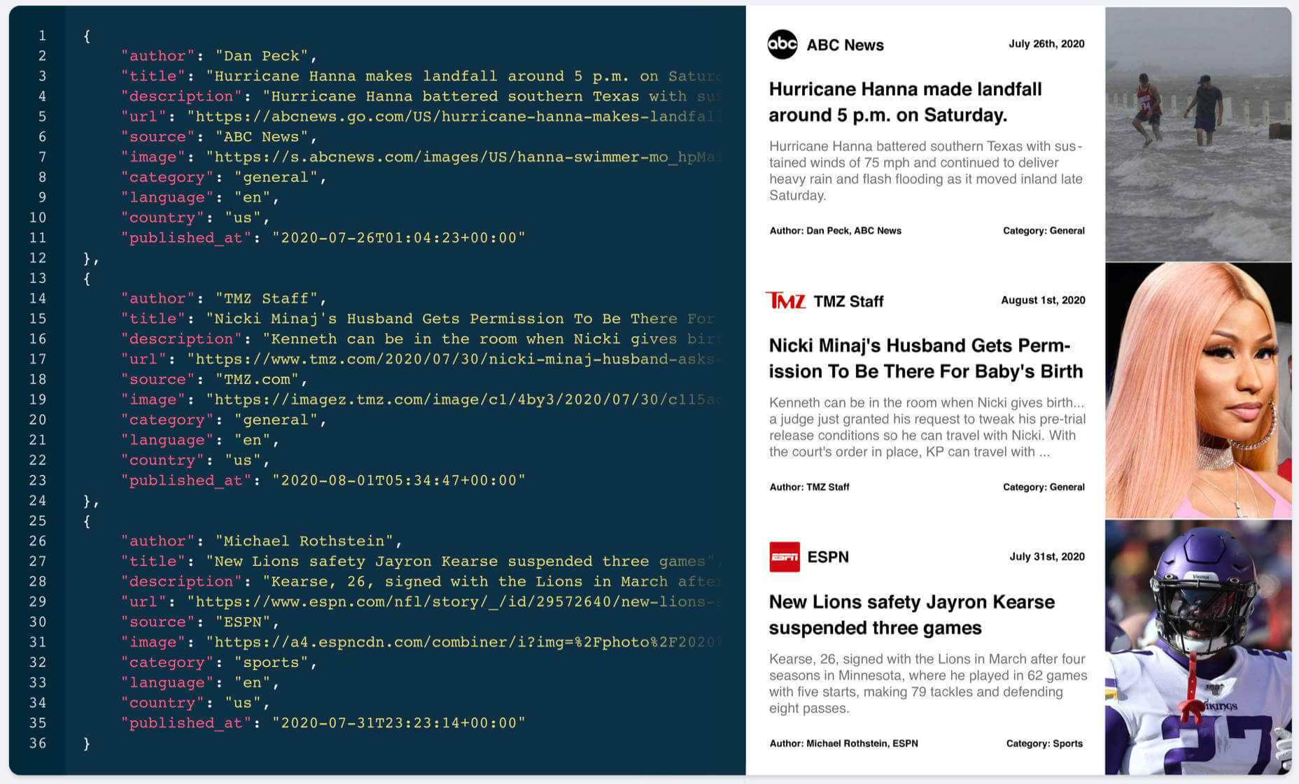
&search=crypto,bitcoin,btc,xrp,ripple,etherium,altcoin

The API sends back simple JSON data that’s easy to run through. Each news item includes the author, title, description, url, source, image, category, language, country, and a published_at timestamp that records when the story was posted.

Once the feed is setup, sit back and relax. It’s all automated from now on.

The Best Source of News for Your Website

mediastack is delivered by apilayer, quite rightly one of the most trusted names in APIs, and is capable of handling millions of requests simultaneously.

Fast, updated by the minute, highly customizable, reliable, and sourced from the biggest names in the news industry, mediastack is an amazing API.

There’s a free-forever plan that allows you to use the API without charge, for up to 500 API calls per month, that’s perfect for trying it out.

For commercial use, plans start at just $19.99/month, and can handle up to 250,000 calls per month. Commercial plans also include HTTPS encryption, live news delivery, access to historical data, and — should you ever need it — technical support.

Head over to mediastack today, to prepare your site for whatever events 2021 throws at us.


[– This is a sponsored post on behalf of mediastack –]

Source


Source de l’article sur Webdesignerdepot

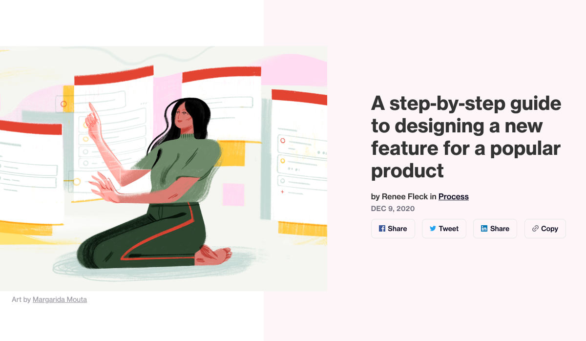
Every week users submit a lot of interesting stuff on our sister site Webdesigner News, highlighting great content from around the web that can be of interest to web designers.

The best way to keep track of all the great stories and news being posted is simply to check out the Webdesigner News site, however, in case you missed some here’s a quick and useful compilation of the most popular designer news that we curated from the past week.

Web Typography Rules: What You Need to Know


How Microsoft Crushed Slack


Graphic Design Trends for Social Media in 2021


UX Christmas


Traxr – Monitor Links with 100% Accuracy


Hexometer 2.0: Monitor Website Issues and Performance Actively


Designing Data Science Tools at Spotify


Cow Pilot – The Deadline Driven To-Do List


Roy – A Simple & Delightful Color Picker for Designers


5 New SEO Tools for Marketers


21 Unique Web Design Trends for 2021


Newsletter Spy – A Database of 20,000+ Substack Newsletters


Visme 2.0 – All-in-one Design Platform


2020 Year in Review


How to Build a Web App: Key Steps for Starters


How to Create a Style Guide to Enhance your Brand’s UX


WordPress 5.6: New Features, Changes, and What Else to Expect


The Dos and Don’ts of Creating your Product Roadmap


Pantone Reveals Two Choices for its Colour of the Year 2021


Headlime 2.0 – Professional Marketing Copy for Anyone


Design for Sales: 10 Creative UI Designs for Ecommerce


How to Build a Strong Mobile App Brand


10 New Rules of Design


Remake 2.0: Make Web Apps with Just HTML and CSS


A Step-by-step Guide to Designing a New Feature for a Popular Product


Want more? No problem! Keep track of top design news from around the web with Webdesigner News.

Source


Source de l’article sur Webdesignerdepot

In the spirit of fall feasts, this month’s collection of tools and resources is a smorgasbord of sorts. You’ll find everything from web tools to icon libraries to animation tools to great free fonts. Let’s dig in.

Here’s what new for designers this month.

The Good Line-Height

The Good Line-Height is the tool you won’t be able to live without after using it a few times. The tool calculates the ideal line-height for every text size in a typographic scale so that everything always fits the baseline grid. Set the font size, multiplier, and grid row height to get started.

Link-to-QR

Link-to-QR makes creating quick codes a breeze. Paste in your link and the tool creates an immediate QR code that you can download or share. Pick a color and transparency, plus size, and you are done.

Quarkly

Quarkly allows you to create websites and web apps both using a mouse and typing code – you get all the pros of responsive editing, but can also open the code editor at any time and manually edit anything and it all synchronizes. The tool is built for design control and is in beta.

UnSpam.email

Unspam.email is an online spam tester tool for emails. Improve deliverability with the free email tester. The service analyzes the main aspects of an email and returns a spam score and predicts results with a heat map of your email newsletter.

Filmstrip

Filmstrip allows you to create or import keyframe animations, make adjustments, and export them for web playback. It’s a quick and easy tool for modern web animation.

CSS Background Patterns

CSS Background Patterns is packed with groovy designs that you can adjust and turn into just the right background for your web project. Set the colors, opacity, and spacing; then pick a pattern; preview it right on the screen; and then snag the CSS. You can also submit your own patterns.

Neonpad

Neonpad is a simple – but fun – plain text editor in neon colors. Switch hues for a different writing experience. Use it small or expand to full browser size.

Link Hover Animation

Link Hover Animation is a nifty twist on a hover state. The animation draws a circle around the link!

Tint and Shade Generator

Tint and Shade Generator helps you make the most of any hex color. Start with a base color palette and use it to generate complementary colors for gradients, borders, backgrounds, or shadows.

Pure CSS Product Card

Pure CSS Product Card by Adam Kuhn is a lovely example of an e-commerce design that you can learn from. The card is appealing and functional.

Free Favicon Maker

Free Favicon Maker allows you to create a simple SVG or PNG favicon in a few clicks. You can set a style that includes a letter or emoji, font and size, color, and edge type and you are ready to snag the HTML or download the SVG or PNG file.

Ultimate Free iOS Icon Pack

The Ultimate Free iOS Icon Pack is a collection of 100 minimal icons in an Apple style. With black and white version of each icon and original PSD files, you can create sleek icons for your iPhone screen in minutes. And it’s completely free! No email address or registration required.

Phosphor Icon Family

Phosphor is a flexible icon family for all the things you need icons for including diagrams and presentations. There are plenty of arrows, chats, circles, clocks, office elements, lists, business logos, and more. Everything is in a line style, filled, or with duotone color. Everything is free but donations are accepted.

3,000 Hands

3,000 Hands is a kit of hands that includes plenty of gestures and style in six skin tones and with 10 angles of every gesture. They have a 3D-ish shape and are in an easy to use PNG format. This kit has everything you need from a set of hand icons.

Radix Icons

Radix Icons is a set of 15px by 15px icons for tiny spaces. They are in a line style and are available in a variety of formats including Figma, Sketch, iconJar, SVG, npm installation, or GitHub.

Deepnote

Deepnote is a new kind of data science notebook. It is Jupyter-compatible with real-time collaboration and running in the cloud and designed for data science teams.

ZzFXM Tiny JavaScript Music Generator

ZzFXM is a tiny JavaScript function that generates stereo music tracks from patterns of note and instrument data. Instrument samples are created using a modified version of the super-tiny ZzFX sound generator by Frank Force. It is designed for size-limited productions.

Image Tiles Scroll Animation

Image Tiles Scroll Animation is a different type of scrolling pattern using Locomotive Scroll. The grid creates a smooth animation in a fun and modern style.

Bubbles

Bubbles is a Chrome extension that allows you to collaborate by clicking anywhere on your screen and then dropping a comment to start a conversation with anyone. This is a nice option for work from home teams.

Tyrus

Tyrus is a toolkit from the design team at Airbnb to help illustrators make the most out of their design businesses. It is broken into sections to help you with design briefs, originality, deadlines, and feedback.

PatchGirl

PatchGirl is an automated QA tool for developers. You can combine SQL and HTTP queries to build any possible state of your database.

Apparel

Apparel is a beautiful premium typeface family with plenty of versatility in a modern serif style. It is a contemporary, classy, and fresh serif typeface with a laid-back. Its medium-large x-height makes it ideal for headlines and brand identity design.

Christmas Story

Christmas Story is a nice solution if you are already starting to think ahead to holiday projects or cards. The long swashes and tails are elaborate and fun.

Nafta

Nafta is a fun handwriting style font that has a marker-style stroke. It’s a modern take on the popular Sharpie font. It includes all uppercase letters.

Safira

Safira is a wide and modern sans with ligatures and a stylish feel. The rounded ball terminals are especially elegant.

Shine Brighter Sans

Shine Brighter Sans is a super-thin sans-serif with a light attitude. The limited character set combined with its light weight is best for display use.

Source


Source de l’article sur Webdesignerdepot

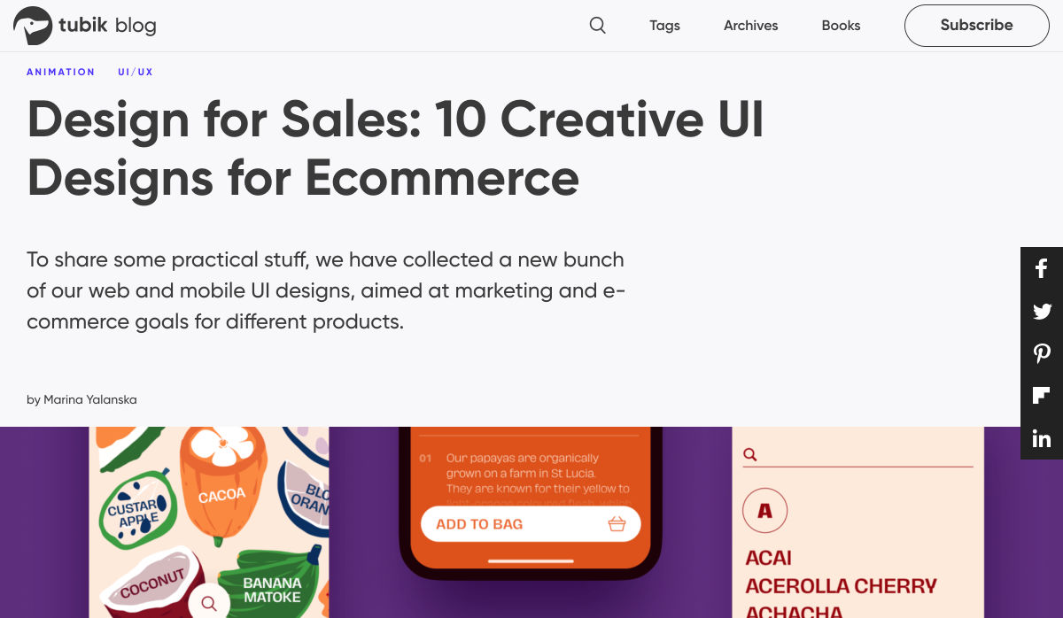
The digital world is a place of constant change. Just as you get used to a new design trend, another one appears, forcing you to rethink the way that you approach each client project. 

As a web designer, it’s up to you to make sure that you have your finger on the pulse on the latest transformations in the industry. However, it can be challenging to know for sure which trends you should be taking seriously, and which you can simply ignore. 

One option to refine and enhance your design journey is to pay attention to influencers. 

Influencers aren’t just there to guide customers into making purchasing decisions. These people are thought-leaders in their field. They spend all of their time tracking down ideas and concepts that really work. That way, they can maintain a successful reputation online.

Sourcing information and motivation from the following UX influencers could help you to create some truly amazing websites in 2020: 

1. Andrew Kucheriavy 

Andrew Kucheriavy is the phenomenal co-founder and CEO of a company named Intechnic. Andrew was one of the first people in the world to be given the “Master in User Experience” award. This means that he’s an excellent person to pay attention to if you want help understanding the ins and outs of user experience design

As one of the leading visionaries in UX, business strategy, and inbound marketing, Andrew has a lot of useful information to offer professionals and learners alike. Andrew is particularly active on Twitter, where he’s constantly sharing insights on design and marketing. You can also find input from Andrew on the Intechnic blog. 

2. Jeff Veen 

Another must-follow for designers who want to learn more about understanding their audience and their position in the marketplace, Jeff Veen is a leader in UX and product design. Veen got his start with the founding team for Wired, before he created the Adaptive Path company for UX consulting. Jeff Veen is also known for being responsible for various aspects of Google Analytics. 

Over the years, Jeff has expanded his knowledge in the design space, and mentored various companies, from WordPress to Medium. He also has a fantastic podcast that you can listen to for guidance when you’re on the go. 

3. Jared Spool 

Jared Spool has been tackling the most common issues of user experience since before the term “UX” was even a thing. Excelling in the design world since 1978, Jared has become one of the biggest and most recognizable names in the user experience environment. He’s the founder of the User Interface Engineering consulting firm. The company concentrates on helping companies to improve their site and product usability. 

Jared offers plenty of handy information to stock up on in his Twitter feed. Additionally, you can find plenty of helpful links to blogs and articles that he has published around the web on Twitter too. He’s followed by Hubgets, PICUS, and many other leading brands. Make sure that you check out his collection of industry-leading talks on UIE. 

4. Jen Romano Bergstrom

An experimental psychologist, User Experience Research coach, and UX specialist, Jen is one of the most impressive women in the web design world. She helped to create the unique experiences that customers can access on Instagram and Facebook. Additionally, she has a specialist knowledge of eye-tracking on the web. You can even check out Jen’s books on eye-tracking and usability testing

When she’s not writing books or researching user experience, Jen is blogging and tweeting about usability and researching new strategies in the web design space. It’s definitely worth keeping up with Jen on Twitter, particularly if you want to be the first to know about her upcoming seminars and learning sessions. 

5. Katie Dill 

Katie Dill is the former Director of Experience for Airbnb, so you know that she knows her way around some unique experiences. With an expertise in working with companies that harness new technologies and UX design, Katie Dill is at the forefront of the user experience landscape. Dill attends various UX conferences throughout the year, and publishes a range of fantastic videos on YouTube. 

You can find blogs and articles from Katie published on the web; however, you’ll be able to get the most input from her by following Katie on her Twitter account. 

6. Khoi Vinh 

Khoi Vinh is one of the most friendly and unique UX bloggers and influencers on the market today. He knows how to talk to people in a way that’s interesting and engaging – even about more complicated topics in UX design. Vinh is a principle designer at Adobe, and he has his own podcast called Wireframe. However, he still finds time to keep his followers engaged on Twitter. 

Over the years, Khoi has worked as a Design Director for Etsy and the New York Times. Vinh also wrote a book called “Ordering Disorder” which examines grid principles in web design. According to Fast Company, he’s one of the most influential designers in America. Additionally, Khoi has a brilliant blog where you can check out all of his latest insights into UX design. 

7. Cory Lebson

Cory Lebson is a veteran in the world of web design and user experience. With more than 2 decades of experience in the landscape, Cory has his own dedicated UX consulting firm named Lebsontech. Lebson and his company concentrate on offering UX training, mentoring, and user experience strategy support to customers. Cory also regularly speaks on topics regarding UX career development, user experience, information architecture and more. 

Cory is an excellent influencer to follow on Twitter, where you’ll find him sharing various UX tricks and tips. You can also check out Cory’s handbook on UX careers, or find him publishing content on the Lebsontech blog too. 

8. Lizzie Dyson

Another amazing woman in the industry of UX, Lizzie Dyson is changing the experience landscape as we know it. Although she’s a relatively new figure in the web design world, she’s recognized world-wide for her amazing insights into the world of web development. Lizzie also helped to create a new group specifically for women that want to get involved in web design. 

The Ladies that UX monthly meet-up welcomes a community of women into the digital landscape, helping them to learn and expand their skills. Lizzie regularly publishes content online as part of Ladies that UX. Additionally, she appears on the Talk UX feed – an annual design and tech conference held for women around the world. 

9. Chris Messina 

Chris Messina is a product designer and a technical master who understands what it takes to avoid disappointing your users. With more than a decade of experience in the UX design landscape, Messina has worked for a variety of big-name brands, including Google and Uber. He is best known as the inventor of the hashtag!

Chris is a highly skilled individual who understands the unique elements that engage customers and keep people coming back for more on a website. You can see Chris speaking at a selection of leading conferences around the world. Check out some of his talks on YouTube or track down his schedule of upcoming talks here. Chris also has a variety of fantastic articles on Medium to read too. 

10. Elizabeth Churchill

Last, but definitely not least, Elizabeth Churchill is a UX leader with an outstanding background in psychology, research science, psychology, artificial intelligence, cognitive science, human interaction with computers and more. She knows her way around everything from cognitive economics, to everyday web design. Churchill also acts as the director of UX for Google Material Design. 

A powerhouse of innovation and information, Churchill has more than 50 patents to her name. She’s also the vice president of the Association for Computing Machinery too. When she’s not sharing information on Twitter, Elizabeth also has a regular column that you can tune into on the ACM Interactions magazine. 

Who Are You Following in 2020?

Whether you’re looking for inspiration, guidance, or information, the right influencers can deliver some excellent insights into the world of web design. There are plenty of thought leaders out there in the realm of user experience that can transform the way that you approach your client projects. You might even discover a new favourite podcast to listen to, or an amazing series of videos that help you to harness new talents. 

Influencers are more than just tools for digital marketing; they’re an excellent source of guidance for growing UX designers too.


Featured image via Pexels.

Source


Source de l’article sur Webdesignerdepot

And it does this 24 hours a day, 7 days a week, 52 weeks a year without ever asking for a pay raise.

But this is true only if your website landing page is designed well, maintained, and optimized to the gills. The art and science of a flawless landing page is beyond the scope of a single article, but we can start with helping you spot seven of the most common – and damaging – trouble spots.

1. Unclear Value Statement

Typically, new visitors to your page will only stay on it 3 to 15 seconds before they get distracted. In that span of time, you must offer a clear and visible reason to stick around and interact with the page.

That reason is your value statement. What value do your readers get in exchange for the time you ask them to spend? High-quality content is a must (and hopefully a given), but you also need to pull them in so they experience that content.

Does your landing page do that? If yes, great! If no, you should fix that. If you’re not sure, ask yourself:

  • Is there a compelling, visible headline that expresses the end benefits clearly and succinctly?
  • Is there a subheadline explaining your offering in more detail?
  • Are there supporting graphics that pull the eye toward your headline and subheadline?

If there aren’t, add them now.

2. Poor Signposting

Your landing page isn’t just there to be pretty. It’s meant to convince people to take action. If you don’t make it easy to find your call to action, most viewers won’t look for it.

deliver enough value to make it worth the hassle

You must make it clear — in as succinct and efficient terms as possible — why the action you want a reader to take will deliver enough value to make it worth the hassle. Tell them, in words that stand out from the rest of the page, what you want them to do next and what they’ll receive for doing so.

Improving your signposting stats by asking yourself the following questions:

  • Do you have a clear understanding of what the next step in a visitor’s customer journey should be?
  • Is it easy to find and take that step on your website?
  • Does your copy make a clear and compelling argument in favor of taking that step?

If you can answer yes to all three questions, your signposting is likely good (or at least good enough for now). If not, now you know what you have to do to improve it.

3. Slow Loading Time

Remember that 3 to 15-second maximum time limit we mentioned earlier? That span includes time spent waiting for your landing page to load, and every microsecond of that wait increases a reader’s likelihood of bailing on the whole thing. You must get your loading time to be as quick as possible.

Viewers who exit your landing page early – including while still waiting for it to load – increase your site’s bounce rate. Higher bounce rates reduce your rankings on Google and other search engines, meaning a page that loads too slowly not only impresses fewer viewers, but it also gets fewer viewers overall.

Improving your loading time is usually a job for your tech team or whoever in the office is responsible for overseeing your hosting service. That said, here are a few of the most important ways to optimize this important factor:

  • Optimize image size, file format, and compression;
  • Clean up your database by deleting saved drafts, old revisions, unused plugins, and similar virtual detritus;
  • Confirm that your WordPress theme (if applicable) is optimized for quick loading;
  • Use a content distribution network for file storage;
  • Analyze server response time with your hosting service, and work with them to reduce it;
  • Install tools that leverage browser caching;
  • Fix all your broken links;
  • Remove all render-blocking from JavaScript;
  • Reduce the number of redirects necessary to reach your page;
  • Optimize your code, especially in CSS, JavaScript, and HTML;
  • Enable file compression — except for on images;
  • Replace all PHP content with HTML wherever possible.

This is technical, detailed work, but it’s important. If you don’t have team members up to these tasks, it can be worth hiring an outside consulting company to do it for you.

4. Only One Landing Page

You have a good idea of your ideal customer’s hopes, fears, pain points, demographics, likes and dislikes, and other important information. If you have several different types of customers, you can’t use the same landing page for each of your customer groups. Each group has different characteristics that will prompt them to follow your call to action, so you don’t want to offer just one landing page.

Similarly, you also probably have more than one product or set of content and offerings to generate sales. Having only one landing page can lose leads because the page is only optimized for one of those products or content sets.

Ideally, you should have a unique landing page with a tailored offer for each of your customer models that would send those individuals to each of the products and content sets. An ad for professionals in their 30s making over $50,000 a year would lead to a landing page built for them, while an ad for heads of households working from home would lead to a landing page built for them.

Yes, that means a company with three profiles and four content sets would need 12 landing pages. And yes, it’s worth that kind of effort.

5. Insufficient Visuals

“A picture is worth 1,000 words” is ancient wisdom, but it’s far from true in the internet world – it’s actually worth more. A quick look at social media and blog performance will tell you many people will look at, enjoy, and share a photo or video, but not many will read an entire 1,000-word post on the same topic.

How well your landing page performs depends on the images you use and how you present them. Does your page’s layout conform to the best practices of visual web design:

  • Including images that emotionally reinforce the value expressions of your product’s core benefits;
  • Containing sufficient white space to not be intimidating;
  • Providing data images to indicate the worth of what you do;
  • Using visual design cues to lead the eye toward your conversion points;
  • Applying color gradients to highlight offers and your call to action;
  • Using infographics to replace the dreaded “wall of text”.

If you can say yes for half of these things, carry on. If not, this point may be among the better places to start with a landing page redesign.

6. Asking For Too Much, Too Soon

Craft a custom calls to action that meet all levels of interest, need, and desire

Not every landing page visitor is created equal. Some are hardcore fans and experts in what you do, ready for a 10,000-word white paper that dives deeply into the research supporting your use case. Others might have heard about your industry on an Instagram page and want to know the basics of what you do.

There’s nothing worse than going to a website and being asked for all of your personal information right away. If your call to action requires too much knowledge, too deep a commitment, or even too much personal information, consider scaling back. Otherwise, you risk turning away potential customers.

Better yet, go back to No. 5 above and build a new landing page for beginners and early-stage leads. Craft a custom calls to action that meet all levels of interest, need, and desire.

7. No Trust Elements

Offering some type of authentic customer referral or testimonial is important. It all boils down to the same thing: telling those who read your landing page that other people already like what you do and how you do it.

Examples of effective modern trust elements include:

  • Quotes from positive reviews next to a photo of the reviewer;
  • Screenshots of social media posts praising your company or product;
  • Short video interviews of happy clients;
  • Blurbs for industry thought leaders approving of you;
  • Images portraying business credentials and certifications;
  • Links to positive press coverage;
  • Logos of known business customers who buy and trust your brand.

Final Thought: What’s Next?

There isn’t one guaranteed way to turn a landing page from something full of holes into something perfect. But first, run an audit of your landing page using this list as a guide. Note which errors are there. Next, sort them in order of what takes the least time to fix to what takes the most time to fix.

Then, fix them in that order. We find that getting the quick fixes done builds excitement and momentum, whereas starting with a harder fix can mire down the whole process.

If none of these errors exist on your landing page, congratulations. There’s still lots of work to do on your website and content marketing, but it’s not among these rookie mistakes.


Featured image via Pexels.

Source


Source de l’article sur Webdesignerdepot

A data scientist extracts manipulate and generate insights from humongous data. To leverage the power of data science, data scientists apply statistics, programming languages, data visualization, databases, etc.

So, when we observe the required skills for a data scientist in any job description, we understand that data science is mainly associated with Python, SQL, and R. The common skills and knowledge expected from a data scientist in the data science industry includes – Probability, Statistics, Calculus, Algebra, Programming, data visualization, machine learning, deep learning, and cloud computing. Also, they expect non-technical skills like business acumen, communication, and intellectual curiosity.

Source de l’article sur DZONE

Bridge Design Pattern is a Structural Design Pattern used to decouple a class into two parts — abstraction and it’s implementation — so that both can be developed independently. This promotes the loose coupling between class abstraction and its implementation. You get this decoupling by adding one more level of indirection i.e. an interface that acts as a bridge between your original class and functionality. Insulation is another name of the Bridge Design Pattern in the C++ world.

"All problems in computer science can be solved by another level of indirection." — David Wheeler

Source de l’article sur DZONE

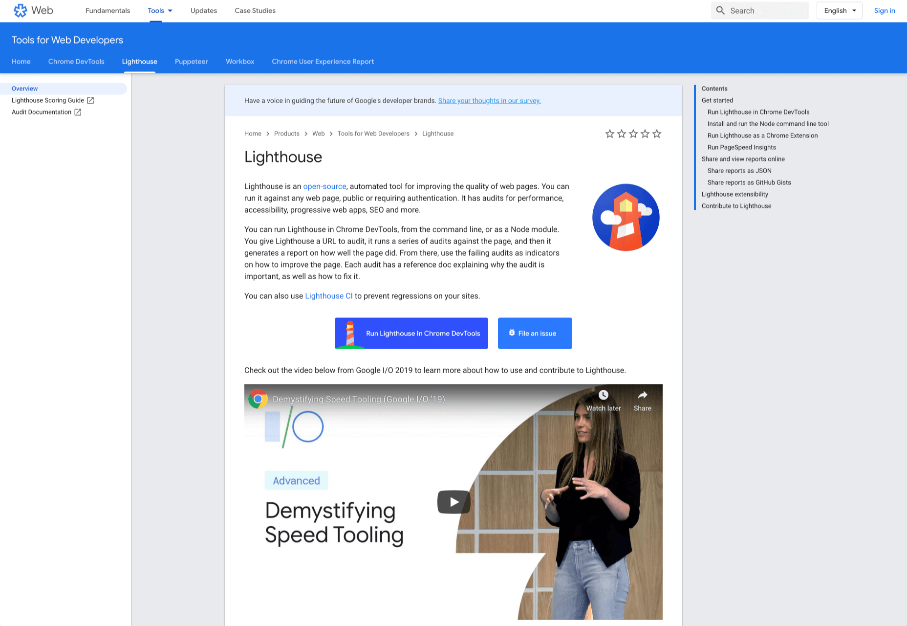
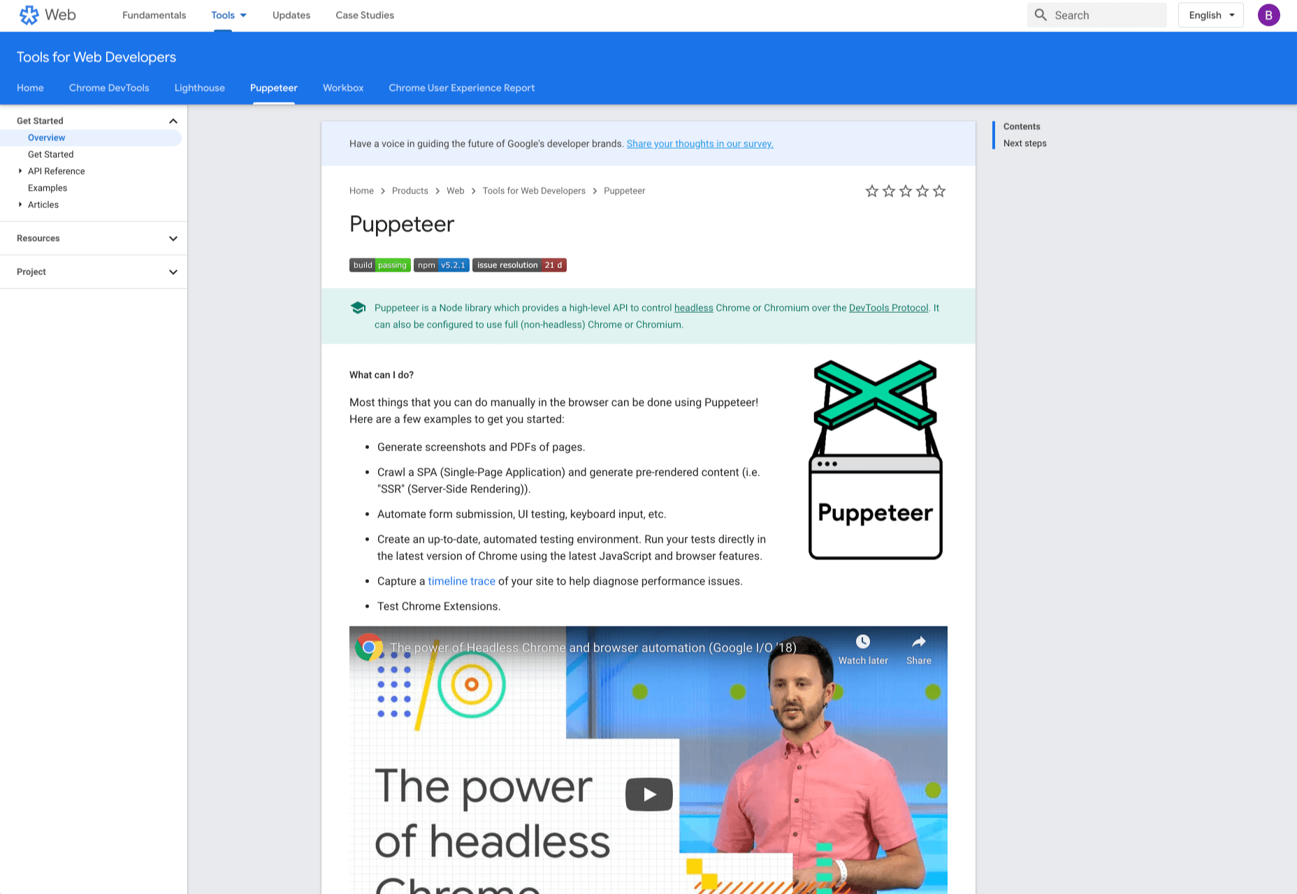
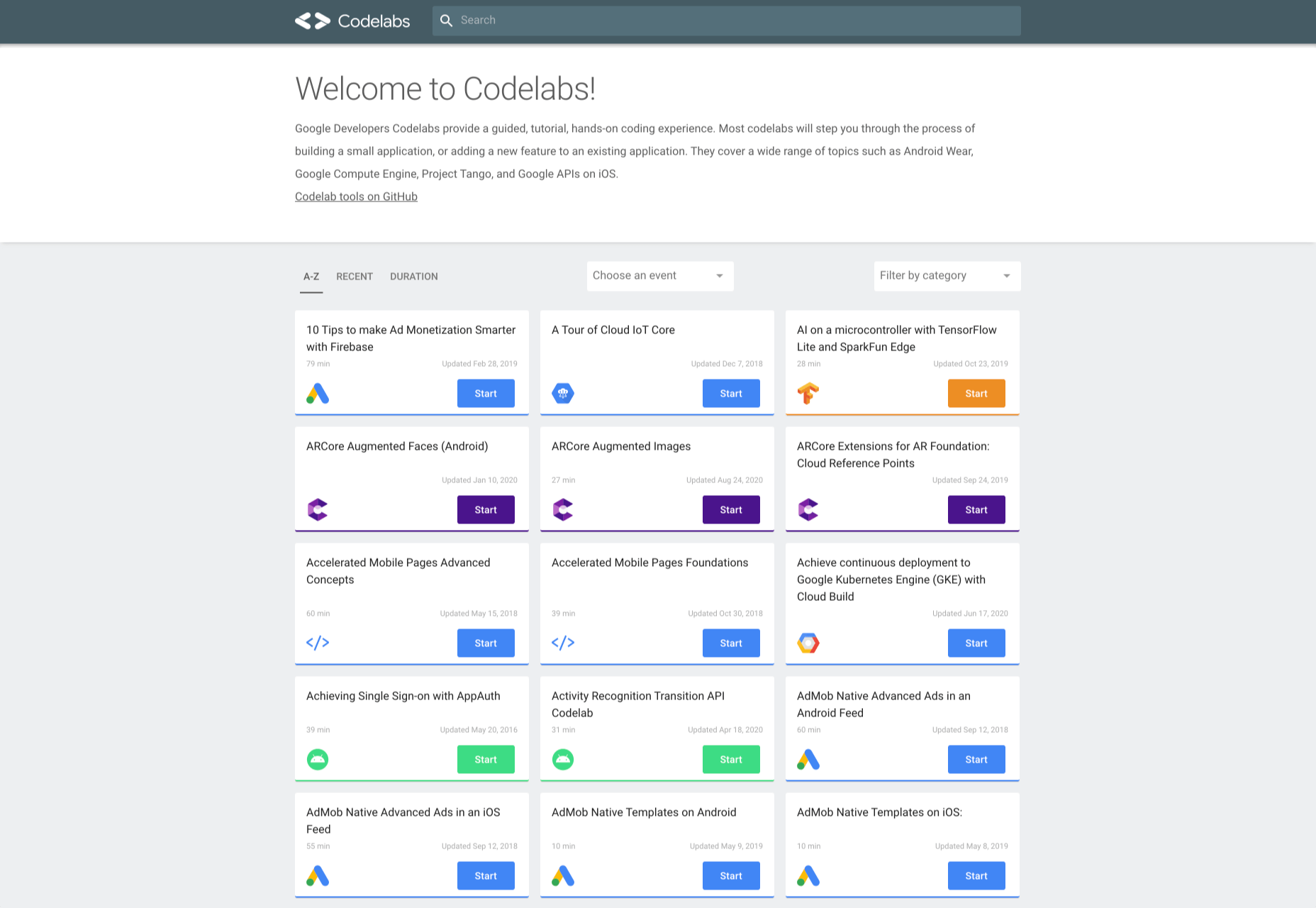
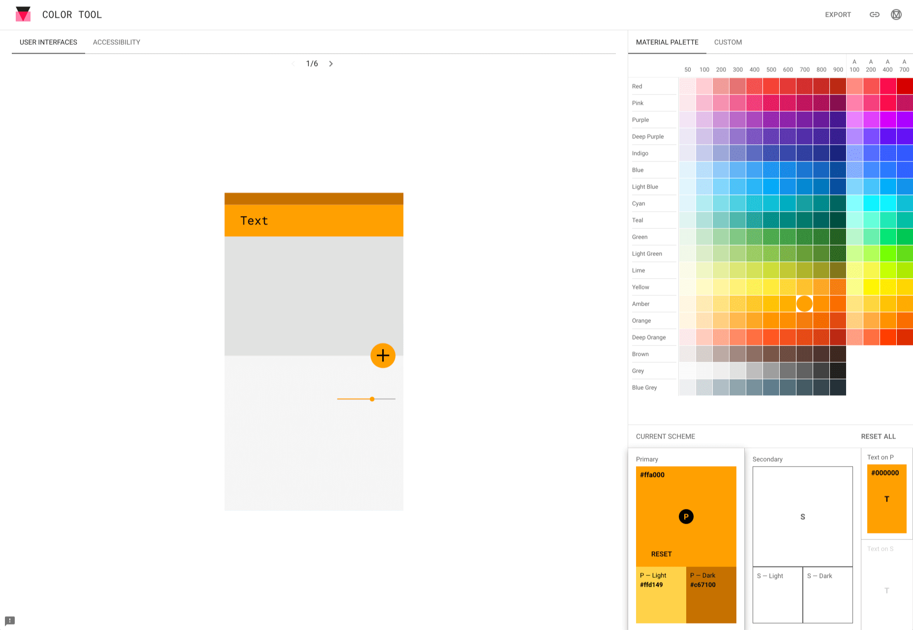
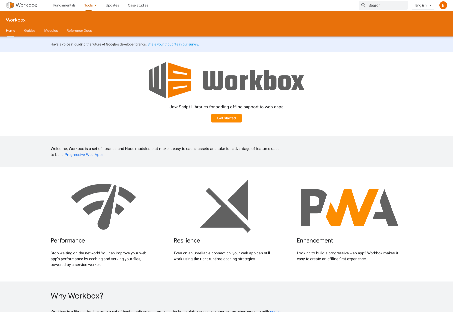
Google resembles an iceberg: there’s the part above the water we can see and use everyday; there’s also the part beneath the water, that we don’t see and know little about.

While many of us are concerned about the aspects of Google we don’t see — the parts that threaten our privacy, or monopolize the web — there’s no denying that Google offers some amazing products and tools, many of them free, all from the convenience of a single login.

Today we’re going to take a look at 12 tools from Google that really do bring something positive to the table.

1. Polymer

Polymer is an open-source JavaScript library from Google for building web applications using Web Components. The platform comes with a ton of libraries and tools to help designers and developers unlock the web’s potential by taking advantage of features like HTTP/2, Web Components, and Service Workers. 

The main feature of Polymer is Web Components. With Web Components, you can share custom elements to any site, work seamlessly with any browser’s built-in elements, and effectively use frameworks of all kinds. Products like LitElement (a simple base class for creating fast, lightweight web components) and PWA Starter Kit make Polymer easy to use. If you like, you can build your app entirely out of Web Components.

2. Lighthouse

Google Lighthouse is an open-source, automated tool for improving the quality of web pages. The software allows you to audit web pages for performance, SEO, accessibility, and more. You can run Lighthouse using ChromeDevTools, directly from the command line, or as a Node module. 

To use Lighthouse in Google Chrome, just go to the URL you want to audit (you can audit any URL on the web), open ChromeDevTools, and click the Audits tab. After you have run the audit, Lighthouse will give you an in-depth report on the web page. 

With these reports, you will see which parts of your web page you need to optimize. Each report has a reference doc that explains why that audit is important and also shows you the steps you can take to fix it. 

You can also use Lighthouse CL to prevent regression on your sites. Using Lighthouse Viewer, you can view and share reports online. You can also share reports as JSON or GitHub Gists. 

Lighthouse also comes with a feature called Stack Packs that allows Lighthouse to detect what platform a site is built on. It also displays specific stack-based recommendations.

3. Google Analytics

Google Analytics is the gold standard of analytics services. Google analytics can be installed on your site for free with a small amount of JavaScript and allows you to see all kinds of details about your site visitors, like what browser they’re using, and where they’re from.

By using Google Analytics you can make decisions about your site based on science, and therefore be somewhat confident that the decisions you make will result in the outcome you are expecting.

4. Flutter

Flutter is Google’s UI toolkit for building natively compiled applications for mobile, web, and desktop from a single codebase. The toolkit is open source and free to use. The best part of Flutter is that it works with existing code. 

The toolkit has a layered architecture that allows for full customization, which results in fast rendering and flexible designs. It also comes with fully-customizable widgets that allow you to build native interfaces in minutes. With these widgets, you will be able to add platform features such as scrolling, navigation, icons, and fonts to provide a full native performance on both iOS and Android.

Flutter also has a feature called hot reload that allows you to easily build UIs, add new features, and fix bugs faster. You can also compile Flutter code to native ARM machine code using Dart native compilers. 

5. Google API Explorer

Google has a huge library of APIs that are available to developers but finding these APIs can be difficult. Google API Explorer makes it easy for developers to locate any API. On the Google API Explorer web page, you will see a complete list of the entire API library. You can easily scroll through the list or use the search box to filter through the API list. 

The best part of Google API Explorer is that each link to a reference page comes with more details on how to use the API. API Explorer is an excellent way to try out methods in the Monitoring API without having to write any code.

6. Puppeteer

Puppeteer is a project from the Google Chrome team. The platform enables web developers to control a Chrome (or any other Chrome DevTools Protocol based browser) and execute common actions, much like in a real browser. Puppeteer is also a Node library and it provides a high-level API for working with headless Chrome. It is also a useful tool for scraping, testing, and automating web pages. 

Here are some things you can do with Puppeteer: generate screenshots and PDFs of pages, UI testing, test Chrome Extensions, automate form submission, generate pre-rendered content, and crawl Single-Page Applications. 

7. Codelabs

Google Developer Codelabs is a handy tool for beginner developers and even advanced developers who want to improve their knowledge. Codelabs provide a guided, tutorial, hands-on coding experience. Codelabs’ site is broken down into several tutorial sessions on different topics. 

With the tutorials on Codelabs, you can learn how to build applications from scratch. Some of the tutorial categories include Augmented reality, TensorFlow, Analytics, Virtual Analytics, G Suite, Search, Google Compute Engine, and Google APIs on iOS. 

8. Color Tool

Color Tool makes it easy for web designers to create, share, and apply colors to their UI. It also measures the accessibility level for any color combination before exporting to the palette. The tool comes with 6 user interfaces and offers over 250 colors to choose from. 

The tool is also very easy to use. All you need to do is pick a color and apply it to the primary color scheme; switch to the secondary color scheme, and pick another color. You can also switch to Custom to pick your own colors. After you have selected all your colors, use the Accessibility feature to check if all is good before exporting it to your palette. 

9. Workbox

Workbox is a set of JavaScript libraries and Node modules. The JavaScript libraries make it easy to add offline support to web apps. The Node modules make it easy to cache assets and offer other features to help users build Progressive Web Apps. Some of these features include pre-caching, runtime caching, request routing, background sync, debugging, and greater flexibility than sw-precache and sw-toolbox. 

With Workbox, you can add a quick rule that enables you to cache Google fonts, images, JavaScript, and CSS files. Caching these files will make your web page to run faster and also consume less storage. You can also pre-cache your files in your web app using their CLI, Node module, or webpack plugin. 

10. PageSpeed Insights

PageSpeed Insights is a handy tool from Google Developers that analyzes the content of a web page, then generates suggestions on how to make the page faster. It gives reports on the performance of a web page on both desktop and mobile devices. At the top of the report, PageSpeed Insights provides a score that summarizes the page’s performance. 

11. AMP on Google

AMP pages load faster and also look better than standard HTML pages on mobile devices. AMP on Google allows you to enhance your AMP pages across Google. It is a web component framework that allows you to create user-first websites, ads, emails, and stories. One benefit of AMP is that it allows your web pages to load almost instantly across all devices and platforms hence improving the user’s experience. 

12. Window Resizer

When creating websites, it is important that developers test them for responsive design – this is where Window Resizer comes in. Window Resizer is a Chrome extension that resizes the browser window so that you can test your responsive design on different screen resolutions. The common screen sizes offered are desktop, laptop, and mobile, but you can also add custom screen sizes. 


Featured image via Unsplash.

Source


Source de l’article sur Webdesignerdepot

Alors que le confinement – mis en place pour ne par faire de nouvelles victimes – se poursuit, le terme Folding @ home fait le tour des cercles scientifiques.

Il ne s’agit pas d’une nouvelle façon de s’attaquer à cette « pile de linge » qui semble grossir de semaine en semaine ; c’est une approche technologique fascinante pour aider les scientifiques à découvrir un remède contre le COVID-19.

Selon les scientifiques, les protéines sont constituées d’une chaîne linéaire de substances chimiques – les acides aminés – qui, si elles sont efficaces, se « plient » en structures compactes et fonctionnelles. La façon dont les composants d’une protéine s’arrangent et se déplacent détermine sa fonction. Les virus ont également des protéines, qui sont utilisées pour supprimer notre système immunitaire et se reproduire.

Pour aider à lutter contre le coronavirus, les scientifiques et les médecins doivent comprendre comment la protéine virale fonctionne, ou «se replie», s’ils veulent trouver des moyens de l’arrêter.

C’est là que le Big Data rencontre l’épidémiologie. En exécutant des simulations informatiques qui les aident à comprendre les parties mobiles des protéines, les chercheurs pensent que les données qu’ils collectent les rapprocheront d’un remède.

«Il n’y a jamais eu plus d’experts réunis pour se concentrer sur un seul et même sujet», déclare Michael Schmidt, architecte de Converged Cloud chez SAP.

Cependant, l’exécution des innombrables simulations nécessaires requiert une puissance de calcul énorme. C’est là que les entreprises et le grand public entrent en jeu. Le don de la puissance de calcul inutilisée peut accélérer la vitesse d’exécution de ces simulations, ce qui peut nous rapprocher d’un remède.

Big Data Meets Epidemiology

Click the button below to load the content from YouTube.

Big Data Meets Epidemiology


L’initiative a eu un grand coup de pouce lorsque NVIDIA a lancé un appel aux joueurs du monde entier, leur demandant de rejoindre le combat.

« Les ordinateurs de jeu sont des machines extrêmement puissantes », explique M. Schmidt. Avant cette crise, les joueurs utilisaient souvent leur capacité de réserve pour « miner » des cryptomonnaies et gagner un peu d’argent en parallèle. Mais maintenant, ils font don de la puissance de leur unité de traitement graphique (GPU) à la science ».

SAP s’est joint à cet effort. Pour que cela démarre rapidement, l’équipe DevOps de Schmidt a automatisé sa contribution en capacité, en augmentant la capacité de calcul de réserve existante. Cette capacité est située sur la plateforme d’édition d’entreprise convergente en nuage de la société, la même plateforme qui héberge un grand nombre de clients de SAP. Lorsque la crise COVID-19 a frappé, l’équipe a envisagé d’utiliser cette première mise en œuvre pour programmer et faire évoluer dynamiquement une unité centrale de traitement (CPU) et un GPU Folding@home à partir de la plateforme, en les augmentant lorsque les systèmes sont inactifs et en les réduisant lorsque d’autres charges utiles en ont besoin.

«L’une des choses que notre cloud fait vraiment bien est de répartir la charge sur les nombreux ordinateurs que nous avons dans nos centres de données», explique Schmidt. «Nous pouvons mesurer en temps réel la pression que nous mettons dans le système et réduire automatiquement la capacité que nous accordons à Folding @ home si nécessaire, en nous assurant vraiment qu’aucune charge utile productive n’est affectée.»

De plus, comme SAP maintient toujours une capacité de réserve pour ses clients, quelques nœuds GPU de rechange ont été ajoutés au projet. Bien que ces serveurs dédiés soient peu nombreux, ils peuvent calculer des unités de travail étendues qui donnent une très grande puissance de traitement pour des charges de travail très lourdes. L’équipe a ensuite augmenté sa contribution au projet Folding@home, en fournissant une moyenne de 19 pétaflops – ce qui équivaut à environ 50 000 CPU et GPU supplémentaires par rapport à sa capacité de réserve normale dans le cloud.

La charge de travail est répartie sur trois continents et neuf régions. L’équipe SAP se classe actuellement parmi les 200 premiers contributeurs, plus que les autres entreprises de logiciels. M. Schmidt se dit ravi des résultats, mais se souvient qu’il ne s’agit pas vraiment d’une compétition. « Nous sommes tous dans le même bateau, et je suis heureux que les autres entreprises donnent aussi beaucoup ».

En savoir plus sur l’objectif et la promesse de SAP: https://www.sap.com/corporate/en/purpose.html

Article publié pour la première fois en anglais sur news.sap.com

The post Quand le Big Data rencontre l’épidémiologie appeared first on SAP France News.

Source de l’article sur sap.com

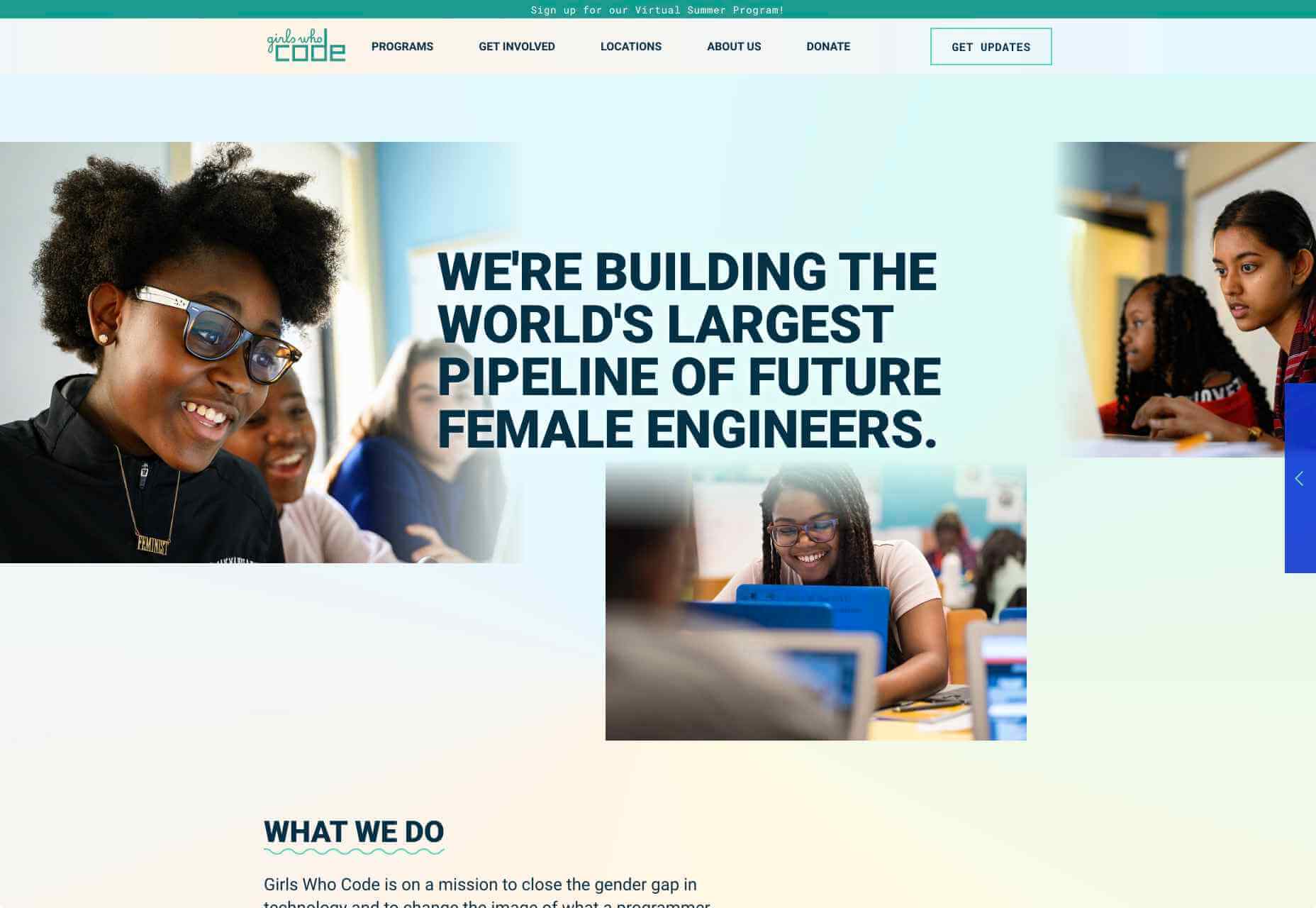
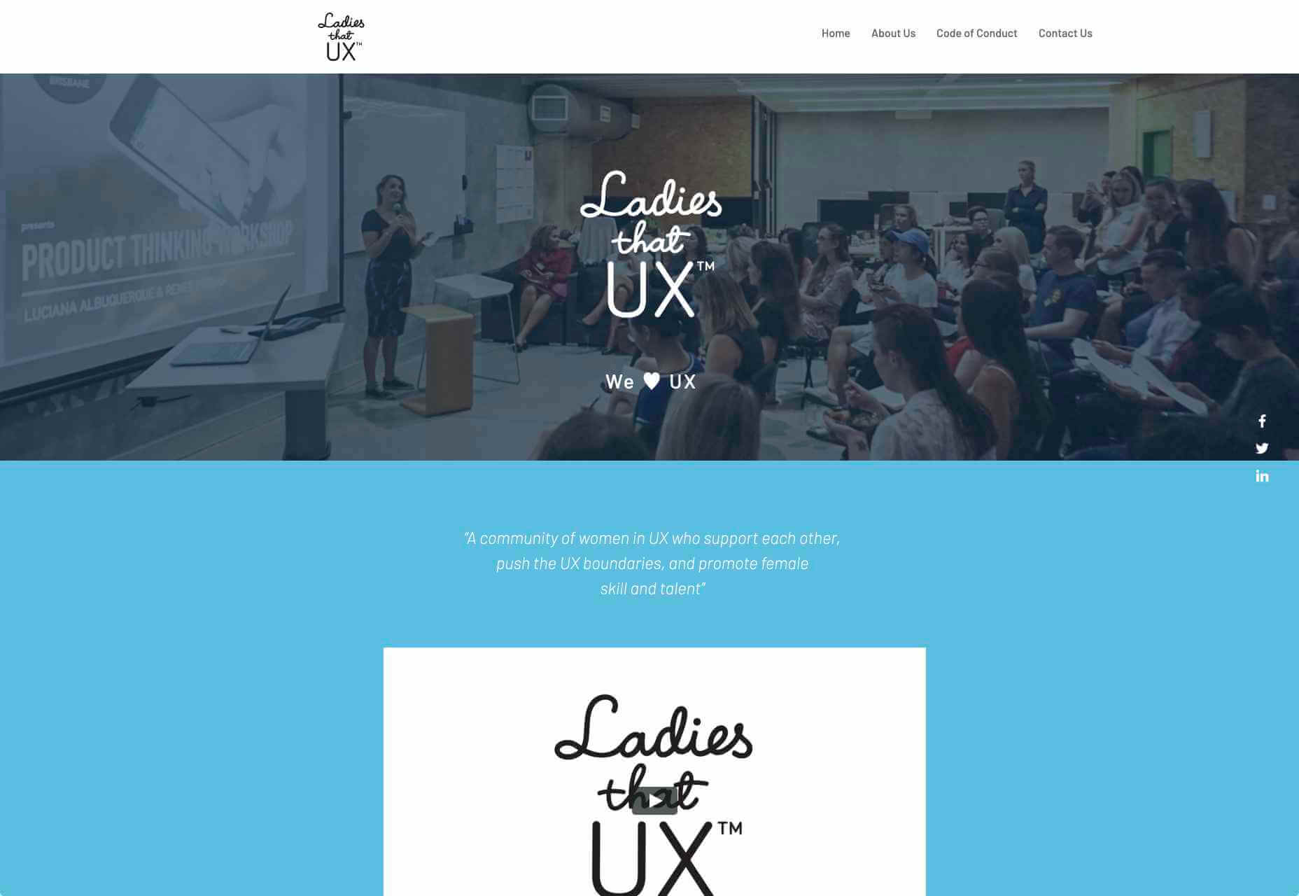
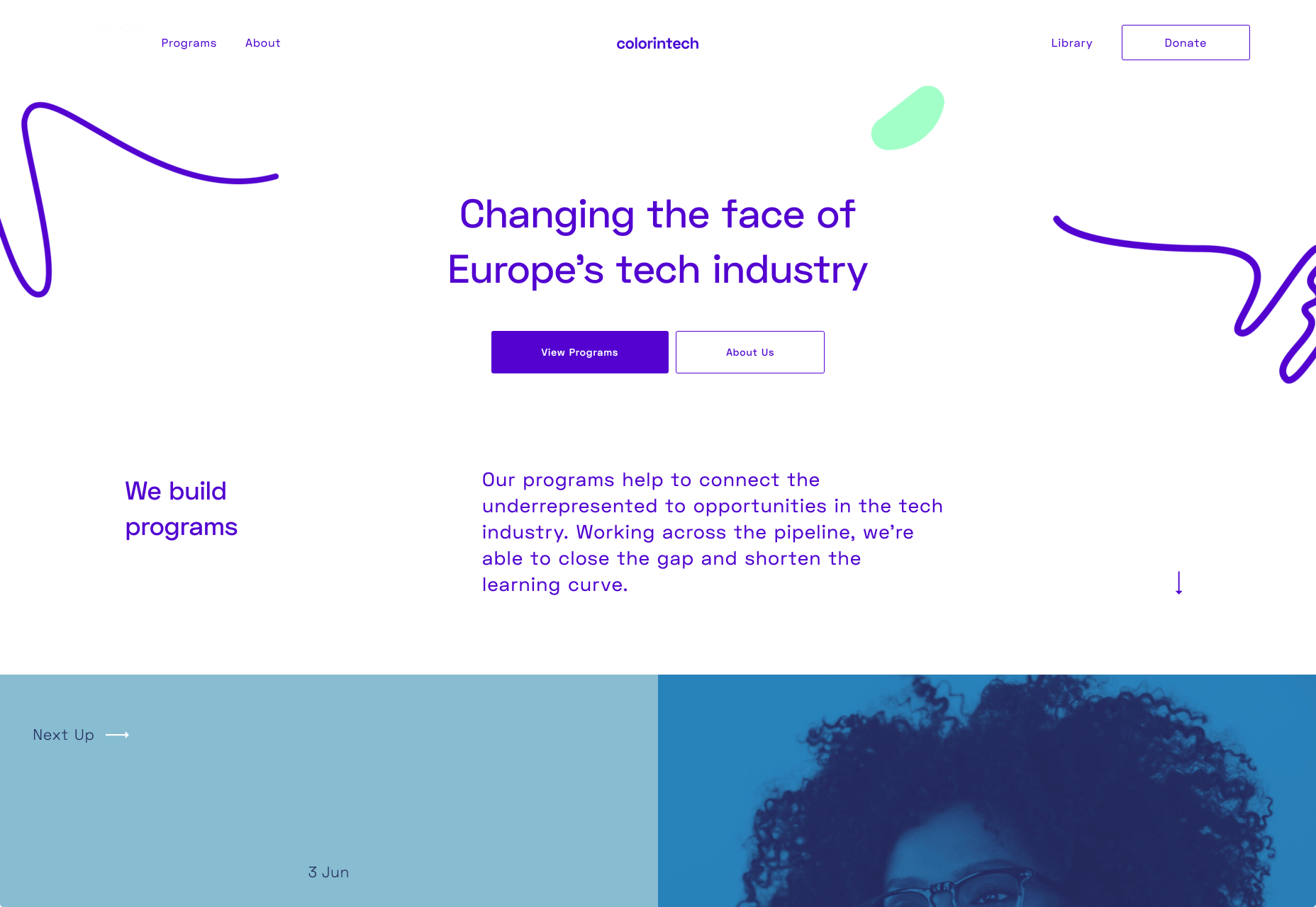
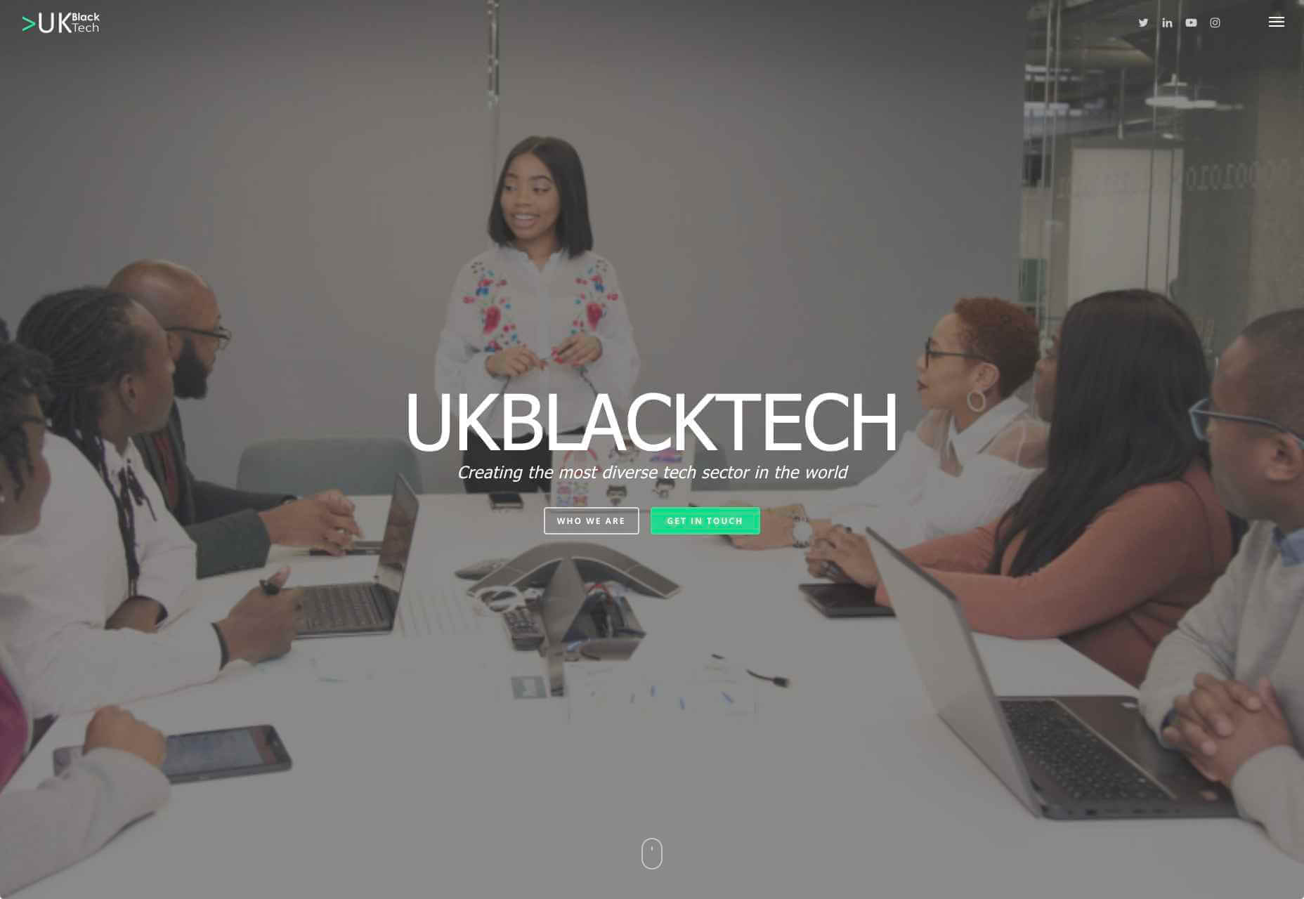
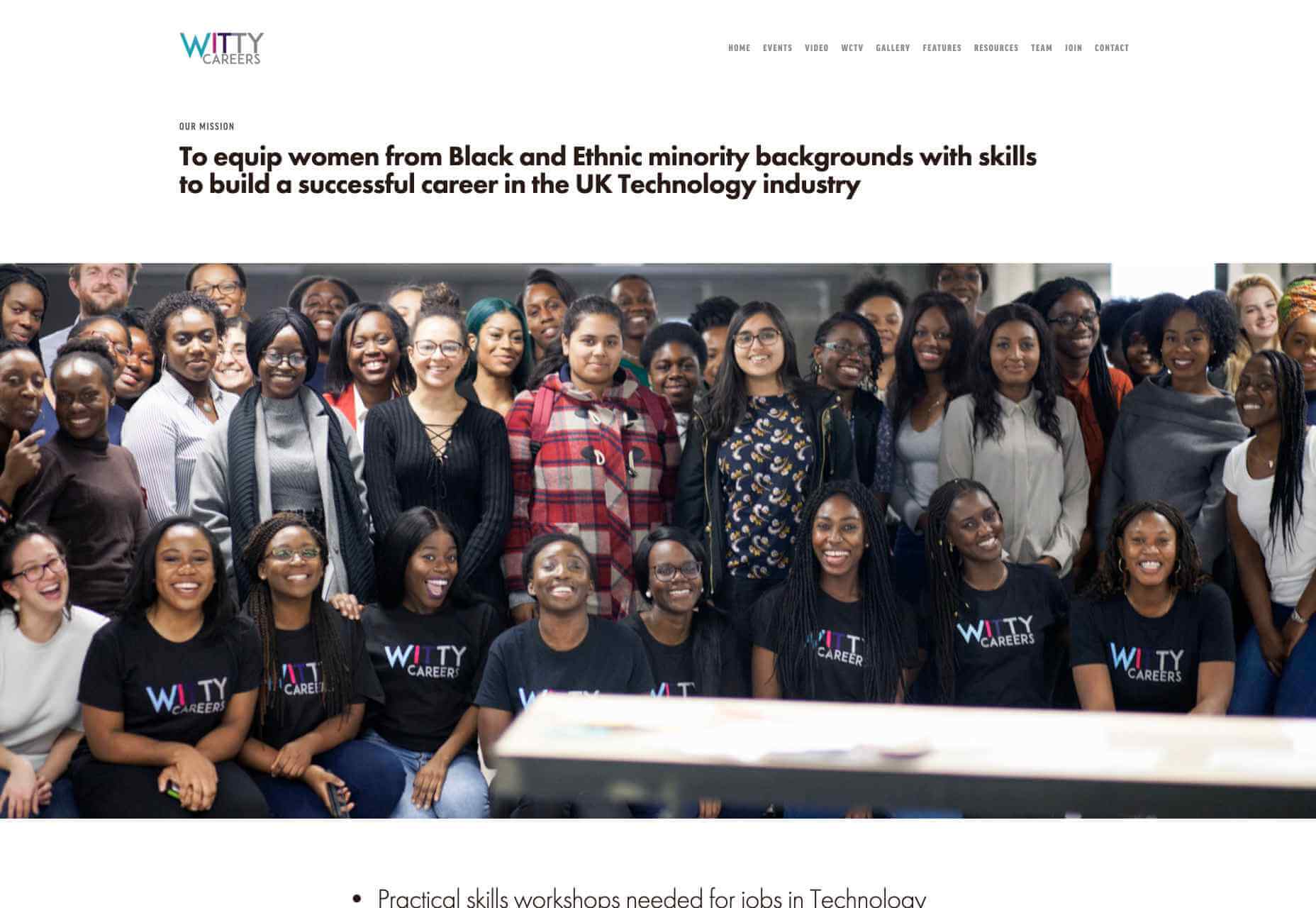
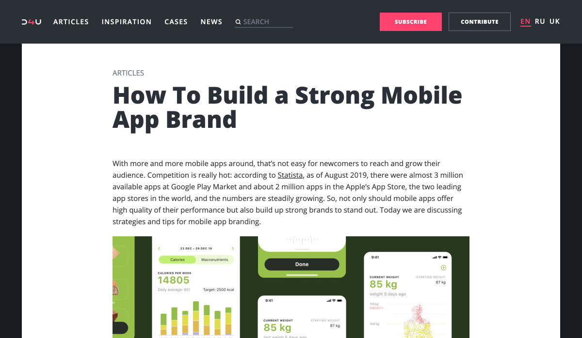
Web developers have been the bedrock of any company’s business strategy for some time, and the industry is continuing to thrive and grow at a rapid pace. This is why it’s surprising that it is so lacklustre when it comes to diversity.

A recent study revealed 80% of those in the design industry are male, and more specifically 79% within the field of web design. According to WISE, just 23% of the people working in STEM roles (Science, Technology, Engineering and Maths) are female and women currently account for just 15.8% of the UK’s current generation of engineering and technology graduates.

Why the Lack of Diversity in Web Design?

The main reason for this, as cited by the Organisation for Economic Co-operation and Development (OECD) found that women still lack the confidence to pursue these careers, despite their school results being as good as (or better) than their male counterparts. Research has found that the professional and technical services sector has the fourth-highest gender pay gap of all UK industries. If more women were to join these higher-paid sectors it could help reduce the gender pay gap as a whole, as well as help female economic empowerment.

This division is seen in ethnic minority groups too. The numbers for BAME (Black, Asian, Minority Ethnic) employees in the British tech industry are unknown but is estimated by the British Computer Society to be at 1-2%, a ridiculously low number in this day and age. This is why groups and organisations are cropping up designed to promote an industry that reflects all of society rather than one part of it. Here are some of the organisations to pay attention to who are bridging the diversity gaps in web design.

Girls Who Code

Girls Who Code are working to create opportunities for women within tech, aiming to deepen their computer science skills and confidence. They run a range of programs designed to equip women with the necessary computing skills to pursue opportunities in the field and to give chances that are often shunned due to society. Founder Saujani states that women are socialized to seek perfection, and this is something that needs to be overcome. One way to break that mentality at an early age, she says, is coding:

[Girls] walk into these classrooms and they feel like they will never be good at it, and when they learn how to create something, whether it’s a website or app, it changes their mindset and they stop giving up

Adobe Design Circle

Adobe Design Circle is another initiative aiming to introduce all members of society to design. They want to create more visibility for design as a viable career path for anyone that might be considering it, and to help with youth entering the field. This is opening the opportunities of working in tech and web to aspiring designers at a young age who aren’t necessarily yet conditioned by the pressures of society and showing them it can be a realistic career path.

They have their own scholarships and mentoring initiative to support these goals too. The faces behind the team of Adobe Design Circle range through multiple ethnicities and have a fairly even male-female divide. This equal representation alone is inspiring. One of Adobe’s core missions is to offer youth the opportunity to learn and express themselves through creativity and technology, regardless of their economic or cultural backgrounds. With this they specifically encourage applicants of all backgrounds to apply and offer many other opportunities from mentoring to internships.

Ladies that UX

Ladies that UX are a collaborative community of women in UX aiming to “support each other, push the UX boundaries and promote female skill and talent.” It is a European-based initiative where each city involved runs slightly different events and groups decide together what they would like to get from their meetups. They assist each other with UX challenges, discuss topics, and brainstorm ideas. Ladies that UX was created in 2013 by Georgie Bottomley and Lizzie Dyson with the aim of bringing together women in the industry, offering support and creating connections around the world.

Xuntos

Xuntos is aiming to create the largest community of ambitious and talented individuals from under-represented groups in the technology industry. It works to nurture university students and recent graduates that are often overlooked in the tech industry by the means of educational workshops, university hubs, events and an active community. The very name “Xuntos” is a Galician word which means “together” and this is their most important factor. They want people to realise they are not alone and just because the representation isn’t there, doesn’t mean their capabilities aren’t.

Colorintech

Colorintech is a non-profit organisation that was founded in 2016. It aims to close the gap and shorten the learning curve, with a strong community designed to help each other. The company was founded by Silicon Valley tech executive Dion McKenzie and ex-Googler Ashleigh Ainsley after they became frustrated at the few black individuals in the field. Since its inception 30,000 students, professionals, volunteers and tech companies have been impacted by their work, and over 450 minorities graduated from their programs in 2019 alone.

UKBlackTech

UKBlackTech are on a mission to create the most diverse tech sector in the world. Their aim is to encourage more ethnic minorities to enter the UK’s technology workforce and make an impact. To help with this, they design and implement different initiatives to help them get employed and retain employment, put on bespoke events that target aspects such as specific job roles or tech topics and promote different opportunities for members to apply to.

Witty Careers

Witty Careers was created with the aim to support women from black and ethnic minority backgrounds in the UK and equip them with the skills to build a career in the tech industry. They run different practical skills workshops and events which in the past have included visits to a Microsoft store, Uber, and Pivotal. They open doors for communications, networking and future career prospects for those in the minority. They also have a handy range of resources designed to help you get into the career you want. From CV writing advice to industry insights, they are all free of charge.

Featured image via Unsplash.

Source

p img {display:inline-block; margin-right:10px;}
.alignleft {float:left;}
p.showcase {clear:both;}
body#browserfriendly p, body#podcast p, div#emailbody p{margin:0;}


Source de l’article sur