Articles

Concevoir et réaliser des tests numériques pour applications mobiles

Je suis passionné par la conception et la réalisation de tests numériques pour les applications mobiles. Je vais partager mes connaissances et mes techniques pour vous aider à améliorer vos tests.

H2: L’écosystème des expériences numériques à venir est propulsé par le mobile

Avec l’environnement numérique de plus en plus complexe, les marques doivent s’adapter aux besoins de leurs clients à travers divers appareils, plateformes et canaux. Cependant, avec des ressources limitées, les marques ont tendance à choisir des emplacements établis pour servir leurs clients. Selon une enquête de Forrester, les dirigeants développent des expériences personnalisées pour les appareils les plus populaires des consommateurs, donnant la priorité aux canaux plus établis tels que les sites Web et les applications mobiles. Les marques optimisent également leurs sites Web pour une utilisation mobile, tandis que les applications mobiles offrent une occasion d’engagement plus fréquente avec les clients. Malgré la disponibilité de nombreux produits numériques, les entreprises mettent toujours l’accent sur les expériences numériques Web et mobiles. Pour offrir une expérience mobile supérieure et bien servir vos clients mobiles, il est nécessaire de procéder à des tests numériques pour les applications mobiles. Dans ce blog, nous expliquerons pourquoi les tests numériques sont essentiels pour les applications mobiles, comment ils diffèrent des applications Web et comment concevoir et effectuer des tests numériques pour les applications mobiles.

Le mobile est le moteur de l’avenir des écosystèmes d’expérience numérique

Les appareils mobiles sont devenus un élément familier de la vie quotidienne pour des millions de personnes. Dans le monde entier, des appareils dotés d’une connexion Web tels que les smartphones et les tablettes sont devenus des outils essentiels pour la communication, l’information et le divertissement. Selon Statista, en 2022, le nombre d’utilisateurs uniques d’Internet mobile était de cinq milliards, ce qui indique que plus de 60 % de la population mondiale d’Internet utilise un appareil mobile pour se connecter en ligne. La possession et l’utilisation d’Internet mobile sont prévues pour continuer à croître dans le futur car les technologies mobiles deviennent plus abordables et accessibles que jamais. Cette tendance à la hausse de l’adoption d’Internet mobile est évidente dans les marchés numériques en développement où les réseaux mobiles sont le principal moyen d’accès à Internet. Le trafic Internet mobile représente environ 60 % du trafic Web. En revanche, dans les marchés axés sur le mobile comme l’Asie et l’Afrique, les connexions mobiles représentent une part encore plus importante des pages Web consultées.

L’architecture mobile est essentielle pour fournir une expérience numérique optimale

L’architecture mobile est essentielle pour fournir une expérience numérique optimale. Les entreprises doivent comprendre comment leurs clients interagissent avec leurs produits et services à travers leurs appareils mobiles et comment ces interactions peuvent être améliorées. Les marques doivent s’assurer que leurs applications mobiles sont conçues pour fonctionner correctement sur différents appareils et systèmes d’exploitation. Une architecture mobile réussie implique une stratégie de conception cohérente et cohérente qui tient compte des différents facteurs tels que la taille de l’appareil, la résolution, la connectivité et la plate-forme cible. Les entreprises doivent également prendre en compte la vitesse et la fiabilité du réseau lorsqu’elles développent des applications mobiles afin de garantir une

Source de l’article sur DZONE

Déboguer des sites web avec les outils de développeur Safari

Déboguer des sites web peut être une tâche difficile, mais en utilisant les outils de développeur Safari, cela devient plus facile et plus rapide !

Safari : le navigateur par défaut sur les iPads, Macbooks et iPhones

Je suis un scientifique excité qui vient de faire une découverte sensationnelle : Safari est le navigateur par défaut sur les iPads, Macbooks et iPhones. Il se classe deuxième dans les préférences des navigateurs, juste après Chrome. Ses plus de 250 fonctionnalités offrent aux utilisateurs des avantages remarquables qui le distinguent des autres navigateurs les plus populaires tels que Chrome et Firefox. De plus, la popularité de l’iPhone a entraîné une part de marché mondiale des smartphones de 53,6 % pour Safari.

L’année dernière, le nombre d’appareils actifs d’Apple a connu une augmentation significative à 1,5 milliard. Puisque la base d’utilisateurs continue de croître, Apple s’assure constamment d’une expérience utilisateur presque parfaite et d’une performance optimisée sur tous ses appareils.

Pour répondre à ces exigences, Apple a mis en place une base de données qui stocke des informations sur les performances et les préférences des utilisateurs. La base de données est mise à jour en permanence pour s’adapter aux changements des appareils et des systèmes d’exploitation. Elle permet également aux développeurs de créer des applications plus rapides et plus fiables qui s’adaptent aux besoins des utilisateurs. La base de données est également utilisée pour surveiller les performances des applications et des services afin de garantir une expérience optimale pour les utilisateurs.

Grâce à cette base de données, Apple est en mesure d’offrir une expérience utilisateur exceptionnelle et une performance optimale sur tous ses appareils. Les développeurs peuvent également créer des applications plus rapides et plus fiables qui s’adaptent aux besoins des utilisateurs. La base de données est donc un outil essentiel pour Apple pour offrir une expérience utilisateur optimale à ses utilisateurs.

Source de l’article sur DZONE

Websites haven’t always been as adaptable as they are today. For modern designers, “responsivity” is one of the most significant defining factors of a good design. After all, we’re now catering to a host of users who frequently jump between mobile and desktop devices with varying screen sizes. 

However, the shift to responsive design didn’t happen overnight. For years, we’ve been tweaking the concept of “responsive web design” to eventually reach the stage we’re at today. 

Today, we’re going to take a closer look at the history of responsive web design.

Where Did Web Design Begin?

When the first websites were initially created, no one was worried about responsivity across a range of screens. All sites were designed to fit the same templates, and developers didn’t spend a lot of time on concepts like design, layout, and typography.  

Even when the wider adoption of CSS technology began, most developers didn’t have to worry much about adapting content to different screen sizes. However, they still found a few ways to work with different monitor and browser sizes.

Liquid Layouts

The main two layout options available to developers in the early days were fixed-width, or liquid layout. 

With fixed-width layouts, the design was more likely to break if your monitor wasn’t the exact same resolution as the one the site was designed on. You can see an example here

Alternatively, liquid layouts, coined by Glenn Davis, were considered one of the first revolutionary examples of responsive web design. 

Liquid layouts could adapt to different monitor resolutions and browser sizes. However, content could also overflow, and text would frequently break on smaller screens. 

Resolution-Dependent Layouts

In 2004, a blog post by Cameron Adams introduced a new method of using JavaScript to swap out stylesheets based on a browser window size. This technique became known as “resolution-dependent layouts”. Even though they required more work from developers, resolution-dependent layouts allowed for more fine-grained control over the site’s design. 

The resolution-dependent layout basically functioned as an early version of CSS breakpoints, before they were a thing. The downside was developers had to create different stylesheets for each target resolution and ensure JavaScript worked across all browsers.

With so many browsers to consider at the time, jQuery became increasingly popular as a way to abstract the differences between browser options away.

The Rise of Mobile Subdomains

The introduction of concepts like resolution-dependent designs was happening at about the same time when many mobile devices were becoming more internet-enabled. Companies were creating browsers for their smartphones, and developers suddenly needed to account for these too.

Though mobile subdomains aimed to offer users the exact same functions they’d get from a desktop site on a smartphone, they were entirely separate applications. 

Having a mobile subdomain, though complex, did have some benefits, such as allowing developers to specifically target SEO to mobile devices, and drive more traffic to mobile site variations. However, at the same time, developers then needed to manage two variations of the same website.

Back at the time when Apple had only just introduced its first iPad, countless web designers were still reliant on this old-fashioned and clunky strategy for enabling access to a website on every device. In the late 2000s, developers were often reliant on a number of tricks to make mobile sites more accessible. For instance, even simple layouts used the max-width: 100% trick for flexible images.

Fortunately, everything began to change when Ethan Marcotte coined the term “Responsive Web Design” on A List Apart. This article drew attention to John Allsopp’s exploration of web design architectural principles, and paved the way for all-in-one websites, capable of performing just as well on any device. 

A New Age of Responsive Web Design

Marcotte’s article introduced three crucial components developers would need to consider when creating a responsive website: fluid grids, media queries, and flexible images. 

Fluid Grids

The concept of fluid grids introduced the idea that websites should be able to adopt a variety of flexible columns that grow or shrink depending on the current size of the screen. 

On mobile devices, this meant introducing one or two flexible content columns, while desktop devices could usually show more columns (due to greater space). 

Flexible Images

Flexible images introduced the idea that, like content, images should be able to grow or shrink alongside the fluid grid they’re located in. As mentioned above, previously, developers used something called the “max-width” trick to enable this. 

If you were holding an image in a container, then it could easily overflow, particularly if the container was responsive. However, if you set the “max-width” to 100%, the image just resizes with its parent container. 

Media Queries

The idea of “media queries” referred to the CSS media queries, introduced in 2010 but not widely adopted until officially released as a W3 recommendation 2 years later. Media queries are essentially CSS rules triggered based on options like media type (print, screen, etc), and media features (height, width, etc). 

Though they were simpler at the time, these queries allowed developers to essentially implement a simple kind of breakpoint – the kind of tools used in responsive design today.  Breakpoints refer to when websites change their layout or style based on the browser window or device width.

Viewport Meta tags need to be used in most cases to ensure media queries work in the way today’s developers expect. 

The Rise of Mobile-First Design

Since Marcotte’s introduction of Responsive Web Design, developers have been working on new ways to implement the idea as effectively as possible. Most developers now split into two categories, based on whether they consider the needs of the desktop device user first, or the needs of the mobile device user. The trend is increasingly accelerating towards the latter. 

When designing a website from scratch in an age of mobile-first browsing, most developers believe that mobile-first is the best option. Mobile designs are often much simpler, and more minimalist, which matches a lot of the trends of current web design.

Taking the mobile first route means assessing the needs of the website from a mobile perspective first. You’d write your styles normally, using breakpoints once you start creating desktop and tablet layouts. Alternatively, if you took the desktop-first approach, you would need to constantly adapt it to smaller devices with your breakpoint choices.

Exploring the Future of Responsive Web Design

Responsive web design still isn’t perfect. There are countless sites out there that still fail to deliver the same incredible experience across all devices. What’s more, new challenges continue to emerge all the time, like figuring out how to design for new devices like AR headsets and smartwatches. 

However, it’s fair to say we’ve come a long way since the early days of web design. 


Featured image via Pexels.

Source

The post A Brief History of Responsive Web Design first appeared on Webdesigner Depot.

Source de l’article sur Webdesignerdepot

The term “web design” refers to the process of planning, organizing, and editing content online. On the surface, it seems like a simple enough concept. However, the reality is what we consider “web design” can change over time, influenced by our perception of the “web.” 

In 2022, a professional web designer might create custom websites from scratch, but they may also be responsible for: 

  • UX Design: Creating elements focused on user experience
  • App design: Building digital components of a website or online experience.
  • Theme design: Creating visual tools for supplementing web design. 

Web design isn’t just about making a site look attractive anymore. The definition goes beyond the aesthetic to include a complete consideration of the functionality, performance, and abilities of countless assets we engage within the digital world.

What is Web Design? The Definition Today

Web design is the practice responsible for creating a website’s overall look and feel or web asset (such as web and mobile apps). It involves the process of planning and building elements of your project, from structure and layout choices to graphics and presentation. 

Web design has various components that work together to create the final “experience” of a website, including graphic design, interface design, user experience design, search engine optimization, content creation, etc. These elements determine how a web asset looks, feels and performs on various devices. 

Though the definition of web design in 2022 has evolved, it’s still different from web development, which refers to the actual coding which makes a website work. When you’re building a website, you’ll need web design and web development. 

Elements of Web Design in 2022 

When designing a website, modern designers need to consider two overlapping concepts: the overall appearance of the website and its functionality. The proper connection between these elements will maximize the site’s overall performance and usability, and make a design more memorable (for all of the right reasons). 

Let’s break down the elements of web design into its visual and functional components.

Visual Elements of Web Design

Visual elements of web design influence how a design looks. The various visual components of a design should still follow the basic principles of graphic design. In other words, designers should be thinking about contrast, balance, unity, and alignment simultaneously. The visual elements of web design include: 

  • Written copy and fonts: A website’s appearance and the text on the site often go hand in hand. Designers need to work together with content writers to ensure written copy makes sense structurally and uses the correct fonts for legibility. 
  • Colors: Colors for web design are usually chosen based on factors like color psychology, which demonstrates a color’s ability to affect how someone feels, and branding. Most brands have specific colors they use consistently throughout their visual assets; this helps create a sense of cohesion and unity in designs.
  • Layout and spacing: Layout and spacing influence how content is arranged in an app, website, or another visual asset. The right layout helps to create a visual hierarchy, guiding a viewer through a page and drawing their attention to the correct information in order. Spacing helps to separate components on a page and create legibility. 
  • Images, icons, and shapes: Images, icons, and shapes help convey significant amounts of information. The right ideas and icons can strengthen a brand message, direct a customer’s attention using a web app, and bring context to a design. 
  • Videos and animations: Videos and animations are becoming increasingly common in today’s web design strategies. Videos can include 360-degree videos, which help immerse someone in a space, video streams, and short content clips.

Functional Elements of Web Design

Functional elements in web design are the practical components designers need to consider to ensure websites and assets work as they’re supposed to. A website, app, or any other web asset needs to function correctly to be accessible to users.

Functional elements of web design may include:

  • Navigation: The navigation elements of a website or app are among the main components determining whether a site is functioning properly and ensuring a good user experience. Audiences need to be able to move around the app or website quickly. 
  • User interactions: Your site visitors may have multiple ways of communicating with your web app or website, depending on their device. You’ll need to make sure people can scroll and swipe on smartphones and tablets and click on desktops. If your website has VR or AR elements, you’ll also need to consider these immersive components in your design.
  • Speed and performance: While web development elements can also influence a web design’s speed or performance, it’s also essential for a designer to show elements of the composition don’t weigh down the functionality. Designs need to load quickly and correspond with the demands of browsers on various devices.
  • Structure: A website’s structure plays a critical role in user experience and SEO requirements. Users need to easily navigate through a website without encountering any issues like getting lost or ending up on broken pages.
  • Compatibility: A good design should look perfect on all devices, from a wide range of browsers to the various devices users might leverage today. 

What Does Good Web Design Look Like in 2022?

More than ever, achieving high-quality web design is crucial to success in any industry or landscape. More than half of the world’s population is active online. If you’re not appealing to this audience correctly, you’re missing out on endless opportunities.

Notably, while elements of good web design can be subjective, such as which themes or colors someone might prefer for their website, the underlying foundations of strong web design are the same for everyone in 2022.  

Good web design is any design that looks good, performs as it should, and delivers the best possible experience to your target audience. Effective web design should include components like:

  • Effective use of white space for organization and structure.
  • Clearly presented choices and navigation options for the user.
  • Clear calls to action to drive user activities from one page to another.
  • Limited distractions and a straightforward user journey. 
  • No clutter or unnecessary components irrelevant to the needs of the user. 
  • Responsive, flexible design accessible on any browser or device.
  • High-quality content and images are designed to hook a reader’s attention.
  • Appropriately sized fonts and legible typography.
  • A good balance between images and text on a page. 

Other elements like eye-catching imagery and professional photography can help your web design stand out. Using the right building blocks, like a strong color palette and the right shapes or icons in your design is helpful. 

Of course, there is some scope for variation in good web design. A web designer in 2022 needs to be able to adapt their use of the various essential elements of design to suit a specific target audience or the unique identity of a brand.

What Doesn’t Work for Web Design in 2022?

Just as web design elements seem to appear consistently in all excellent examples, there are also parts of web design we’ve left behind over the years. Simpler, more straightforward designs have replaced cluttered spaces, flashing images, and endless animations. 

The focus in 2022 is on creating an experience that’s simple, engaging, and intuitive, capable of speaking to the right audience without confusion or being visually overwhelming. In most cases, some of the top components to avoid include:

  • Clunky performance: Non-responsive website design, slow pages, and other examples of clunky functionality are a no-go in 2022. Websites need to be quick and responsive.
  • Distracting content: Flashing images, animations, and complex backgrounds are a thing of the past for a good reason. Websites today need to be clean, simple, and clear. Any elements which don’t add to the value of the design should be removed.
  • Generic content: Filler text, irrelevant stock photos, unclear buttons, and links can be removed from today’s website designs. A web design should be specific to the audience’s needs and the brand’s identity. Generic components don’t work.

Creating Web Designs in 2022

Today, the underlying definition of web design has a lot of similarities to the definition we’ve known for several years already. Creating a great website or web asset still requires focusing on user experience, aesthetic appeal, and functionality. However, today’s web designers generally have more components and different devices. 

Web design in 2022 is about creating high-quality experiences for customers that can support various environments and devices. The best web designs are aesthetically appealing, functionally reliable, and capable of adhering to the latest trends in web creation, like augmented reality, 360-degree video, and ultra-high resolution. 


Featured image via Pexels.

Source

The post What Even Is Web Design in 2022? first appeared on Webdesigner Depot.

Source de l’article sur Webdesignerdepot

The email channel is known for multiple advantages. It is convenient to implement practically, offers many options, and has a fantastic ROI of up to 4200%.

But we also face problems, the most disappointing of which is people ignore emails, not performing the desired action, or worst of all unsubscribing. Why does it happen?

The web is constantly progressing. It offers many tools like modern HTML template builders, ESP services, and other digital assistants that help us at all stages. But even the best tools are not enough; the secret of success still rests with us.

In this post we’ll cover the 7 cardinal sins of email marketing, to help you avoid them.

1. Being Too Late

I can define this mistake as probably the worst. It’s worse than broken links, incorrect dates, or prices. Even more harmful than ugly design.

We lose a lot when postponing email strategy implementation. Beginners often focus all their attention on the content, social media activities, SEO issues… All that is important, right. But ignoring email campaigns is a hard fail.

Thousands of visitors never come again to your website. In other words, they leave the very first levels of the marketing funnel. While regular emailing keeps them engaged and prevents churn.

So delays here are only profitable for competitors. Don’t wait until you collect “enough” contacts. Start as soon as possible. 

Frequency matters too. Don’t bomb people with emails; it annoys and causes unsubscribes. Email frequency is an individual parameter depending on many factors.

2. Disregarding Clients’ Expectations

A fundamental axiom: people unsubscribe when emails are irrelevant. The same goes for neglected expectations. Even the best content with next-gen features won’t save the situation.

I mentioned the email frequency a bit above. Notice that if you announce the weekly emails but send them every day, this is an example of ignoring expectations. Be honest with readers.

Another typical issue is off-topic. If your subscribers are waiting for content related to smartphones, send them newsletters about smartphones, not dresses or domestic turtles :)

But in some cases, getting off-topic can be good. It all depends on the target audience, actual situation, and communication style. 

3. Bad Segmentation 

Once again, relevance is vital. So we must avoid generic emails. Instead, especially if your contact list is extensive enough, apply all the possible parameters: age, gender, location, customers history, etc.

Where to get the respective data? A typical solution is to use update preferences forms in emails or on the website. Let clients choose the topics that are interesting for them.

Use surveys, sign-in forms, AI-based techniques of segmentation… Smart algorithms are great helpers that track clients’ behavior and then process the data for segmentation purposes. 

The better we know our subscribers, the deeper we segment the contact list. It allows sending precisely targeted newsletters to respective segments.

4. Insufficient Personalization 

As Hubspot stats say, personalized emails’ open rate is 26% higher, and their click-through rate is 14% better. But even besides index data, poor personalization is just nonsense today.

Clients are looking for content that matches their preferences, so marketers have to consider these expectations. Segmentation and dynamic range are essential here, but they are not the only techniques.

Everything is much more sophisticated here, in addition to personalized subjects and content. Another solution is to generate recommendations that include the previously browsed products.

AI-powered automation comes to help. Machines will upgrade the classical personalization to the next level called hyper-personalization.

5. Underestimating Mobile-Friendliness 

It’s simply unacceptable to send non-responsive emails today. With so many people opening email on different devices, this is a huge fail.

The modern world is full of gadgets and devices. Email has been opened on smartphones more frequently than on desktop PCs and notebooks in recent years. Up to 70% of readers will read messages on mobiles very soon. No wonder that responsivity turned into a mobile priority.

Regarding layout and design, there are no problems: modern template editors are featured with automated responsivity. But mobile-first means not only layout/design adjustment for mobiles, full-width buttons, or larger fonts. We have to work with content too. Don’t overwrite text remember that recipients read inbox emails on the run. 

Just imagine yourself reading emails in the cafe or cab. And ask yourself: is everything convenient? Would you take the desired action on the run?

6. Non-Professional Approach 

People are quite skeptical of new brands. We need to do our best to attract them. So everything must be done professionally.

The best solution: be a perfectionist. If newsletters look amateurish, they are likely to repel.  

Being amateurish will also ruin your brand identity and reduce customers’ trust. Pay close attention to design, stick to your corporate style, analyze each detail in the context of overall harmony.

7. Overlooking Tests and Improvements 

Testing is vital. Before sending an email campaign, check it via Litmus or Email on Acid to be sure that message looks just as planned. These tools allow testing email rendering by +90 combinations of email clients, devices, and OS.

Knowledge is power. Always try and test your marketing strategies. Are you satisfied with your actual performance? Run A/B tests and focus on the most significant wins and failures. 

Summing Up

Of course, threats are not limited to these seven failures. The last piece of advice: never ignore trends. 

Accessibility? Don’t forget about clients with special requirements. Get whitelisted and incorporate these technologies in your campaigns.

And constantly strive for perfection. With this doctrine, you’ll win!


Featured image via Pexels.

Source

The post 7 Worst Fails in Email Marketing first appeared on Webdesigner Depot.

Source de l’article sur Webdesignerdepot

Websites as we know them are going to change very soon. The days of text, images, and basic interactions in a 2D browser window have served us well, but virtual, augmented, and mixed reality experiences are getting better all the time. Developers and designers need to think beyond the browser window and prepare for an immersive future.

Many have been very skeptical about VR and AR in the past because despite grand promises about what they would achieve, they’ve mostly failed to deliver on the scale that the industry hoped for.

But it’s different this time: industry leaders like Meta, Apple, and Microsoft are pursuing a range of different mixed reality projects; they see the opportunity and are dropping hints about what’s next.

In a survey from Perkins Coie LLP and the XR Association, nearly 9 in 10 respondents said that by the year 2025, immersive technologies—including augmented reality, virtual reality, and mixed reality — will be as ubiquitous as mobile devices.

That’s a bold prediction, but it could be our new reality.

Use Cases

VR and AR aren’t a logical fit for every website, and that’s fine. There’s no need to force an immersive experience on something better suited to a standard viewing experience.

But when they’re done right, 3D experiences can add a lot to your website. Check out the demo experience from Mozilla, the 3D tours from Matterport, and the immersive storytelling from Within.

Here are a few areas where these technologies shine:

  • Retail – VR can be used to provide a virtual showroom where customers browse through products. AR can even bring the products into your home by showing you how a piece of furniture will fit in your room, what a painting will look like on your wall, or in Apple’s case, how a product will look on your desk.
  • News – Coverage of events can be enriched by providing a 360-degree view and placing viewers in the center of the story.
  • Training – AR can generate virtual overlays over physical equipment so employees can have hands-on training that’s more effective.

Define Your Platform

Adding immersive experiences to your website will require various skills based on what you’re trying to create. Whether you’re new to web development or are a seasoned developer with many years of experience, the main difference from classic web development is that you’re switching from a 2D to a 3D experience. Development in VR/AR is much closer to developing 3D video games than creating web applications.

First of all, you need to decide on the hardware that you’re building for. Are your viewers mainly using computers, smartphones, or a headset like the Oculus Quest? Each hardware category offers a different set of capabilities for what’s possible.

Next, when we look at 3D engines and frameworks on the market, some big names like Unity, Unreal Engine, and CRYENGINE stand out. Most of these engines were spun out of game development and are based on programming languages like C, C++, or C#. While very powerful, they’re overkill for anyone trying to create a basic immersive web experience.

The good news for web developers is that the WebXR Device API is an open standard specified by the W3C with a JavaScript API that makes immersive experiences possible in the browser. So if you already have a background in web development, you can use your knowledge of JavaScript to get started.

There are some useful frameworks and platforms that make working with WebXR more convenient:

  • A-Frame – A web framework for building 3D experiences.
  • React 360 – A framework for the creation of interactive 360-degree experiences that run in the web browser. As the name already suggests, it builds on React and reuses the concepts you already know.
  • Amazon Sumerian – A managed service that lets you create and run 3D, AR, and VR applications. Since it’s integrated into the AWS ecosystem, it’s also possible to add AI-enabled elements into your generated world.

Create Your Content

No one wants to read long blocks of text in 3D. Since we’re talking about visual experiences, it’s logical that the emphasis should be on creating content that is pleasing to the eye and interesting to look at. What works on a normal website probably isn’t going to feel natural in a 3D environment, so you need to decide what visuals you should create to suit the format.

What high-resolution images and assets do you need? Can you add videos? How about 360-degree videos? Will viewers just be looking at something, or will they be able to interact with it?

You also can’t forget about sound because it’s a critical part of immersive experiences. What music and sounds should you create to make the content come alive?

Not everyone is going to have the latest and greatest device or 5G coverage. The requirements for bandwidth and transmission quality are much higher with 3D content. A few milliseconds of latency can go unnoticed on a typical website, but in a VR/AR setting, it can make the experience laggy or unusable.

Try to optimize your content to be the highest quality it can be within a reasonable file size. If the experience starts to suffer from too many assets downloading at the same time, it’s better to create a more streamlined experience that maintains a high performance rate.

It’s important to consider your hosting infrastructure, as well. This shouldn’t be a big problem, but it is worth mentioning that you need to add new content types to your configurations, and your CDN needs to support these new types, too.

Make Your Content Flexible

When we’re talking about getting your website ready for immersive experiences, we’re not just talking about having people scroll through your regular website in VR. That isn’t compelling for your audience.

The idea is to take some content that’s already on your website and separate it from the presentation layer so you can use it in a 3D environment or any other platform that you want. Classic content management takes place in silos, which means you cannot easily reuse the content from your website.

This separation can be achieved by using a classic database, but if you want developers and content teams to collaborate, a headless CMS is front-end agnostic and more user friendly.

Start Experimenting Today

Building 3D content experiences may seem intimidating, but as we’ve seen, you likely already have the web development skills necessary to get started and try out some different ideas.

What you build today will prepare you for the 3D future of tomorrow.


Featured image via Pexels.

Source

The post How to Prepare for the Immersive Web first appeared on Webdesigner Depot.

Source de l’article sur Webdesignerdepot

Tilda website builder combines everything we liked so much about constructors when we were kids – you can experiment, test out and build myriads of new creative ideas out of ready-to-use blocks. Tilda is that type of constructor that allows you to own your creative process and create pretty much any website: landing page, business website, online store, online course with members area, blog, portfolio, or event promo page.

Founded seven years ago, Tilda is a website builder that completely revamped the way we create websites. Tilda has been the first website builder to introduce block mechanics that allows users to create websites out of pre-designed pieces. This breakthrough technology allowed all users – not only designers – to create professional-looking websites. Just like in kid constructors, you can drag-and-drop and mix-and-match blocks on Tilda to let your creativity flow and build a dazzling website, at extraordinary speed. 

When you ask designers why they love Tilda, they usually say it’s because the platform provides the ultimate balance between choosing from templates and being able to fully customize and create from scratch to bring any creative idea to life. Here’s what else they say:

Tilda has been a game-changer for us. It allows our team to quickly spin up new web pages, make edits, and ship new programs. We left WordPress for Tilda and after being with Tilda for 2 years, I don’t ever want to go back.

~ Andy Page, Executive Director, Forge.

I built my first website in 2001. Since then I’ve used countless platforms and website builders for customer websites and my own business. Tilda is the perfect combination of ease of use with powerful features at an unbeatable value.

~ Robby Fowler, Branding and Marketing Strategist, robbyf.com & The Brand ED Podcast.

Let’s dive deeper into core functionalities you can leverage on Tilda. 

#1 Cut Corners With 550+ Pre-Designed Blocks And 210+ Ready-Made Templates

The beauty of Tilda is that it provides 550+ blocks in the ever-growing Block Library designed by professional designers. Thus, you can quickly build a website out of pre-designed blocks that encompass virtually all elements you might need for your website: menu, about us page, features, contact, pricing, etc. 

Customizing each block is a breeze with Tilda: You can drag-and-drop images, edit text right in the layout, alter block height, background color, padding, select the style of buttons, use custom fonts, and assign ready-made animation effects to specific parts of it. Also, Tilda provides a built-in free image library with 600K+ images, so you can find images that are just right for you without leaving Tilda, add them to your website with just one click, and use them for free.

Finally, all blocks fit together so well that it’s almost impossible to create a bad design on Tilda – even if you are a stranger to website building.

For a quick take-off, you can use 210+ ready-made templates for different kinds of websites and projects: online stores, landing pages, webinar promo pages, multimedia articles, blogs, and more. Each template is a sample of modern web design and consists of blocks. It means that templates don’t limit your creativity: you can modify them to your liking by playing with settings, adding extra or removing existing blocks, and embedding images and text. 

Each of the templates and blocks covers over 90% of use cases you’ll ever require and is mobile-ready, meaning that your website will look great on desktop computers, tablets, and smartphones by default.

#2 Jazz Up Your Site With Zero Block: Professional Editor For Web Designers 

To better meet the demands of a creative brief and unleash your creativity, you can use Tilda’s secret weapon called Zero Block. It is a tool for creating uniquely designed blocks on Tilda.

You can control each element of the block, including text, image, button, or background, and decide on their position, size, and screen resolution on which they’ll appear. For example, you can work with layers to create depth with overlay and opacity techniques or set a transparency level on any element and shadow effects below them. Additionally, you can also insert HTML code to add more complex elements, such as calendars, paywall, comments, social media posts, and so much more.  

Finally, Zero Block allows you to fool around with basic and more advanced step-by-step animation for a more individual look. Here’re some animation examples that you can make on Tilda:

Animation on scroll (position of elements is changing on scroll).

Trigger animation (animation is triggered when pointing at or clicking on an object).

Infinite scrolling text.

#3 Import Designs From Figma To Tilda In Minutes

Creators love using Figma for prototyping, but when you have to transfer every element and rebuild your website design from scratch – that’s what’s killing the party. With Tilda, you can easily turn your static designs into an interactive website in no time. 

All it takes is to prepare your Figma design for import with a few easy steps, paste the Figma API token and your layout URL to Tilda, click import and let the magic happen. Once your design is imported, you can bring your project online just by clicking publish.

#4. Make Search Engines Love Your Website With Built-In SEO Optimization

Thanks to the consecutive positioning of blocks on the page, websites designed on Tilda are automatically indexed well by search engines. There is also a set of SEO parameters you can fine-tune right inside the platform to ensure that your web pages rank high even if you don’t have an SEO specialist in-house. These parameters include the title tag, description and keywords meta tags, reader-friendly URLs, H1, H2, and H3 header tags, alt text for images, and easily customizable social media snippets. 

As an additional value, Tilda provides an SEO Assistant that will show you what errors are affecting the indexing of your website and will help test the website for compliance with the search engines’ main recommendations.

#5. Turn Visitors Into Clients

Tilda gives you the power to set up data capture forms and integrate them with 20+ data capture services, such as Google Sheets, Trello, Notion, Salesforce, Monday.com, etc., to ensure seamless lead generation.

For more fun, Tilda developed its CRM to manage your leads better and keep your business organized right inside of a website builder. This is a very easy-to-use tool that automatically adds leads from forms and allows you to manually add leads you captured outside of the website. There is a kanban board that gives you an overall view of how leads are moving through your sales funnel and allows you to move leads between stages easily.

#6. Build A Powerful Online Store In One Day

Tilda provides a set of convenient features to create a remarkable online shopping experience. The platform gives you the power to sell online using ready-made templates or build an online store completely from scratch, add a shopping cart and connect a payment system of choice — Stripe, PayPal, 2Checkout, etc. — to accept online payments in any currency.

If you are looking to run a large ecommerce business, you should also consider Tilda. Thanks to the built-in Product Catalog, you can add up to 5000 items, import and export products in CSV files, easily manage stock, orders, and keep track of store stats.

And thanks to adaptive design, your store will look good across all devices, including tablets and smartphones. 

#7. Bring Your Project Online For Free

Tilda offers three subscription plans: Free, Personal ($10/month with annual subscription), and Business ($20/month with annual subscription). When you sign up for Tilda, you get a lifetime free account. It allows you to publish a website with a free subdomain and gives you access to a selection of blocks and a limited number of features that offer enough to create an impressive website. 

Personal and Business tariffs allow more advanced options, such as connecting custom domains, adding HTML code, receiving payments, and embedding data collection forms. The business plan also allows users to export their website and create five websites (while personal and free plans allow one website per account). 

To discover all features and templates on Tilda, activate a two-week free trial – no credit card required.

Source

The post Tilda – The Website Builder That Disrupted The Way We Create Websites first appeared on Webdesigner Depot.


Source de l’article sur Webdesignerdepot

Not so long ago, customers only had a couple of ways to interact with brands. 

If you had an issue with a product or service, you could reach out through the customer service phone number or send an email. Occasionally, sites would introduce dedicated forms on their website that allowed consumers to send support tickets straight to the service desk – but that was it.

The problem with this kind of service was all the waiting. 

Send an email or ticket, and you have no idea when the company is going to get back to you. Customers end up refreshing their inbox all day, waiting for a response. Call the company, and 9 times out of 10, you’ll be placed on hold. You can’t exactly do much when you’re stuck listening to hold music, so customers are gradually getting more frustrated as they wait for a response. 

Fortunately, the evolving digital age has introduced a new solution: live chat.

Transforming Your CX With Live Chat

Live chat is a quick and convenient way for your customers to contact your business and get a response immediately. The result is happier clients, better customer satisfaction scores, and even opportunities for bigger sales. 

More than 41% of customers say they expect to see live chat on a site. 

Even if you don’t have an agent on hand to answer a chat message immediately, you can create an automated system that notifies your customer when someone is available. That means they can go and do other things while they’re waiting for a response. Live chat solutions with bots can even allow your customers to fix problems for themselves. That’s pretty convenient!

Widgets equipped with answers to commonly asked questions can automatically deal with customer queries or help them find solutions to their problems before passing them over to an agent. This means that your customer gets a solution faster, and your agents don’t have as much pressure to deal with. It’s a win-win – as long as you get it right. 

Unfortunately, a lot of companies don’t know how to implement live chat experiences correctly. 

Kayako’s study into 400 customers found that 47% couldn’t remember the last time they’d had a positive experience through a live chat tool.  

How to Upgrade Live Chat CX

The evidence shows that customers love the idea of live chat, but the reality of how businesses implement this technology isn’t always ideal. 

However, since 86% of customers say they’re willing to spend more on a better customer experience, it’s worth figuring out what separates a good live chat interaction from a bad one. 

1. Set Expectations Instantly

Setting the right expectations is crucial if you want to generate better satisfaction for your customers at a later date. When customers know what to expect from your live chat strategy, they can also make more informed decisions about which support channels they’re going to use, and whether they want to hang around for someone to answer their messages. 

The first thing you should do is showcase your agent’s availability. In this example from Help Scout, you can see whether the team is active, online, and ready to talk. The company also sets expectations for how quickly you can get an email response if you don’t want to chat.

Other ways to set expectations include:

  • Showing your opening hours: List when team members are usually available to answer questions if you’re not currently online. 
  • Topics: Offer your customers some topics that they can ask about or use the welcome message on your chat tool to direct your customers to an FAQ page. 
  • Restrictions: If there’s anything you can’t deal with over live chat, like changing a customer’s password, let them know in advance so they don’t waste time.

2. Leverage Pre-Chat Forms

Pre-chat forms are some of the most important parts of the live chat experience. They ask your customer to explain their issue to your chatbot so that they can be directed towards the right agent. Using these forms correctly ensures that your agent has all the information they need to solve a problem fast. 

You can even set up automated systems that direct customers to different agents and teams based on their needs. For instance, the live chat app on Outgrow.co gives customers the option to fill out different forms depending on whether they want answers to a question, a demo, or something else.

The button you click on dictates which professional you’ll get through to. Although filling out a form can seem like an extra friction point for your customer at first, it helps to streamline the customer journey. After all, if you can direct the customer to the right agent the first time, there are fewer chances that they’ll need to explain their issue to various different people. 

Here are a few things you can ask for in the live chat form to make it more effective:

  • The customer’s name: This will help to personalize the conversation. It could also be an opportunity to track down any background information you have about an existing customer and the orders that they may want to speak to you about.
  • An email address: Having an email address will allow you to bring up a customer’s record on your CRM. It also means that you can send any information that the customer needs to their email inbox at the end of the conversation.
  • A brief explanation: Ask your customers to share what they’re reaching out to you about and use keywords in their message to assign the chat to the right agent or professional. You could even add a drop-down menu of topics for them to choose from. 

Remember, don’t ask for too much information straight away, or you’ll risk your clients feeling that the service experience is too complicated. 

3. Make Sure It Works Everywhere

We’ve reached the point now where every customer expects a brand’s website to be responsive on any device. Most web-building templates automatically work on mobile tablets and smartphones. Additionally, it’s becoming increasingly easy for companies to transform their website and online store experiences into dedicated apps too. 

However, while most businesses know that their site needs to be responsive, they often forget about the mobile element when it comes to live chat. If your live chat function is only available on the web browser version of your website, then this is going to end up making your mobile customers pretty unhappy. They don’t want to have to stop browsing on their phone just to connect with you. 

Ideally, you’ll want to create a separate component for your mobile app where your customers can easily access the same live chat functions they’d have on your browser-based site.

If you’re just offering live chat through a mobile version of your website, make sure that it’s easy for your customer to click into the chat section and send messages without accidentally ending up on a different tab or page. It might also be worth setting up functions that allow your chat app to send push notifications to your customer’s phone whenever they get a new message. 

Being able to put their smartphone down or switch to another app while they wait for a response will provide a much more intuitive experience for your audience. 

4. Make Sure You Support All the Right Languages

You’d think that this CX tip for live chat would be obvious, but it’s shocking how many companies fail to offer support for all the languages that their customers might use. If you’re selling your products throughout the world, and you know you have customers in China, then it doesn’t make much sense to only offer live chat in English. 

Some of the available live chat apps on the market today come with features that allow you to automatically translate languages when your agents are talking to foreign customers. For instance, LiveChat currently supports 45 languages

If you’re creating your own chat app from scratch, then you’re going to need to work with your developer or designer to make sure that the right languages are supported. Remember, you don’t have to cover everything, but at least make sure that you can connect with the most common groups of customers in your CRM. 

Ensure that if you are using multiple languages, your customers know how to switch to their preferred option too. Usually, the best way to do this is with a drop-down menu. You could also use little flag icons of the countries that you support. 

5. Find Ways to Reduce First Response Time

Speed is probably one of the biggest advantages of live chat, and the main reason that customers like it so much. According to the CMO council, fast response time is the number one thing that a customer looks at when measuring satisfaction. 

While you might not be able to have someone on-hand to answer your customers 24/7, you can improve the way they perceive your load times in a variety of ways. For instance, start by making it clear when your people are online to talk to your customers. Setting expectations on when you’ll be available to immediately respond should help to avoid frustration.

  • Keep all chats in the same place for agents: Having a combined contact center solution on the back-end makes responding to queries much easier for your agents. If they can see all of your brand’s live chat, social, and email conversations in one place, they don’t have to waste time jumping between different platforms and tabs. 
  • Set routing queues: Use an automated system to send every message you get to the most appropriate agent available. You can intelligently route conversations based on the issues that your customers have or the things they want to discuss. It’s also worth ensuring that your system prioritizes routing conversations to the first agent available. 
  • Send notifications: Make sure that you set your live chat system up to send push notifications to agents when a new message is waiting. It’s also with notifying your customer when they have a response, just in case they’ve switched to another tab. 

The notifications you send to your agents could come with access to a customer’s CRM file, so that your agent can go into a conversation with the context they need. Agents that instantly get context on a conversation don’t have to waste as much time tracking down the right information. Giving your agents context also means that they don’t have to ask repetitive questions, which could annoy your customer. 

6. Make the Chat Experience On-Brand

Every company wants to give their customer a slick experience with live chat. The solution you build needs to be easy to use, and responsive across every device. However, it also needs to be something that your customer associates with your brand. 

Companies generally have a lot of options for how a live chat window can look. You can adjust the appearance to suit your brand by picking specific colors, tweaking button shapes, and even changing the available fonts. 

Working the visual elements of your brand into the design of the live chat experience is the best way to make your customers feel comfortable and confident that they’re dealing with your company. For instance, Hubspot uses matching colors, rounded edges on chat bubbles, and even a fun illustration to make their chat experience more “branded.”

Remember, when you’re creating a Live Chat experience that’s “on brand”, it’s also a good idea to think about things like voice and tone. Infusing live chat with the unique personality of your brand will make the experience more memorable. 

If you usually stick with informal language and use a lot of slang, then it makes sense to continue that in live chat – even when you’re sending automated messages. To make sure your brand identity really shines through:

  • Write scripts for your automated messages in your brand’s tone of voice
  • Write guidance scripts for employees that highlight your tone for agents
  • Provide training on brand tone of voice for your support team
  • Encourage support agents to connect with customers on a personal level
  • Remember to set guidelines on how to use things like gifs, slang, and emojis too!

7. Make a Checklist For Security and Tech Issues

One of the most significant things that will affect the experience your customer has with your live chat service, is technical and security issues. Choose the right developer or designer to help with your app, and the risk of problems dwindle. You can also address the issue of having to constantly maintain, check, and update your live chat experience by using a pre-existing solution, like Intercom.

No matter how you choose to approach live chat, these are the things you’ll need to check for most:

  • Page load times: Page load times are crucial for user experience and SEO, so you should be taking them seriously already. Check your web chat software isn’t dragging down the performance of your page or causing unnecessary problems.
  • Cross-channel conversations: If your website has various subdomains, make sure that moving through these in chat won’t mean you lose the session. Customers don’t want to have to repeat themselves!
  • Functionality with browsers: Your chat app needs to work just as well on every browser and operating system – including mobile devices. 
  • Data management: Under things like GDPR, you need to ensure that you’re controlling user information safely. Ensure you have a DPA in place, and make sure that your web channel doesn’t affect any PCI-DSS compliance systems you have in place. Your chat solution may need to automatically mask credit card information, for instance.

Time to Enhance Your Live Chat Strategy

Ultimately, whether you like it or not, your customers love live chat technology, and they’re not going to stop looking for it on your website. Today’s consumers expect you to serve their interests by delivering customer support on the channels that they choose. Unfortunately, most companies just aren’t living up to expectations.

Following the tips above could help you to transform the way that you interact with your clients and improve your chances of better satisfaction overall.

Source

The post 7 Tips for Transforming CX with Live Chat first appeared on Webdesigner Depot.


Source de l’article sur Webdesignerdepot

We all want a little more fun and games in our lives. So, why not add some gamification to your next interactive content campaign?

By 2025, the gamification market is expected to witness a massive 30.1% growth rate, with global sales revenue reaching around $32 billion

That’s because gamification adds more entertainment to the website experience and gets audiences engaged. The idea behind gamification is to bring game mechanics into the design of a website or piece of content. There are many different ways to do this. 

Some companies add hidden achievements and bonuses to their blogs that customers can collect by visiting every page and reading their content. Others allow readers to collect points for leaving comments or play games to win potential prizes. 

Used correctly, gamification is a fantastic way to connect with your audience and increase engagement levels. So, how can you use gamification in interactive content?

The Evolution of Gamification 

Elements of gamification have appeared in everything from marketing campaigns to web design and even eCommerce strategies. 

In 2014, an Apple App Store review of more than 100 health apps even found that gamification elements in applications led to greater participation and higher user ratings. In other words, customers are more likely to get involved with an activity that includes gamification components. 

While gamification can take on many different forms, the aim for most companies is to create an environment where customers can feel more invested in their interactions with the website. For example, if you win a point every time you comment on a blog post, and you can trade those points in for prizes, you have more of a desire to keep commenting. 

The promise of being able to “accomplish” things with pieces of interactive content and websites also appeals to the competitive part of our psychology that pushes us to keep doing things in exchange for the promise of a kind of reward. 

Many companies have generated a lot of enthusiasm for their brands through leaderboards, time events, and similar experiences. For example, just look at how popular McDonalds becomes each year when the monopoly game rolls out as part of the purchasing experience. 

People buy more items than they usually would during McDonald’s Monopoly just for the opportunity to win. This same boost in engagement benefits your content strategy too. 

6 Ways to Add Gamification to Your Content

There’s no one right way to gamify your website or your marketing content. The method you choose will depend heavily on your audience and the kind of experience they respond best to. 

The key to success is finding a way to grab your customer’s attention and hold onto it. Here are some of the tried and tested strategies to explore:

1. Create an Actual Game Experience 

When it comes to incorporating gamification into your website design and content, you don’t necessarily need to be clever. You can be extremely straightforward and just design an actual game. For instance, to help attract more people to the American Army, the US created a war simulator that potential applicants could play on Steam. 

The game aimed to introduce young people who might consider a career in the military to what that job might be like. If the kids liked what they saw on Steam, they could visit the military website and learn more. 

For companies who can’t afford to build an entire fully-featured game, something a little smaller can be just as engaging. For instance, rather than using a standard pop-up with a discount code to entice customers to buy the rental service, Gwynnie Bee created a scratch card. People could scratch the spaces using their smartphone or computer cursor and win money off. 

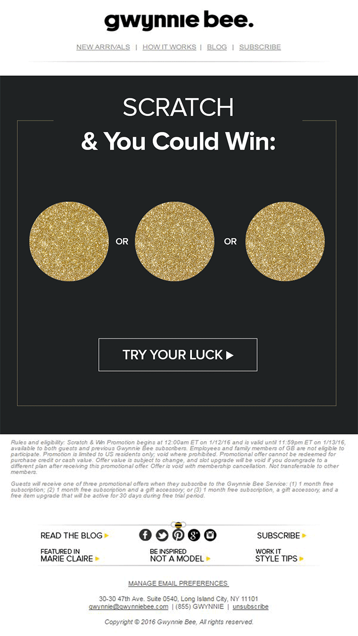
The great thing about the interactive content from Gwynnie Bee is that it encouraged potential visitors to connect with the business in a lucrative way. To use the scratch card, you first had to give your email address. This meant the company could build its email list while delighting consumers. 

When designing a game experience for your marketing campaign, remember:

  • Get the right support: Designing a great game is tough, particularly if you want something more complicated than a scratch card. Don’t take the risk of creating something that doesn’t work properly; hire a developer. 
  • Promote the experience: Make sure everyone knows about your new game. Share screenshots on social media and talk about it in your email campaigns. 
  • Focus on fun: Remember, games are supposed to be fun. Measure the reactions of your audience to ensure they’re having a good time. 

2. Design a Loyalty or Reward Program

Loyalty is one of the most valuable things your audience can give you. So why not reward them for it? Loyalty programs are fantastic tools for business growth and engagement. They give you a way to turn one-off clients into repeat customers and advocates for your brand. 

How you choose to reward your customers (and when) is up to you. Some companies might give customers points every time they share a post on social media or comment on a blog. This encourages more engagement with your brand. 

On the other hand, you might just let your customers earn rewards for every purchase they make. This is a strategy that Starbucks uses with its reward program.

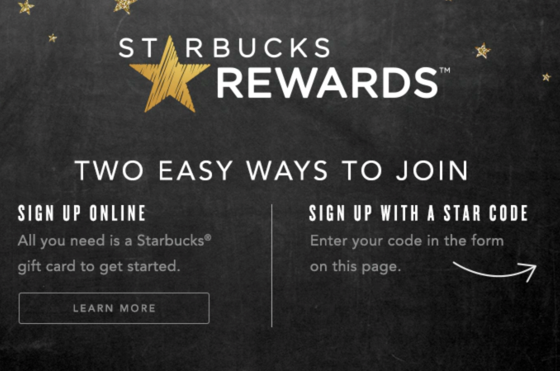
As customers increase their spending with Starbucks, they get the reward of extra points that they can put towards future purchases. This keeps customers coming back for more and may even entice some clients to buy Starbucks when they otherwise wouldn’t. 

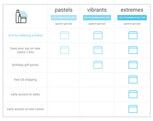
The oVertone company is another excellent example of a brand using gamified rewards with its marketing strategy. The loyalty program breaks down into tiers, where users can see how much they need to spend to ascend to the next level. New rewards and perks appear with each level. 

Remember, when building a loyalty program:

  • Make your customers feel special: Ensure that your audience feels good about being one of the lucky few in your loyalty program. Give discounts and offers they can’t get elsewhere.
  • Keep them informed: Make it easy for your customers to see what they need to do to get their next reward, so they keep coming back for more. 
  • Mix things up sometimes: To stop the experience from getting boring, roll out things like “double points” days and bonuses for your most active customers. 

3. Encourage Customer Interaction

The biggest benefit of gamification is that it encourages and increases customer interaction. You can give rewards to participants that comment on your blog posts, for instance, or share your posts on social. The customer benefits from the reward, while you get the advantage of a better business presence. 

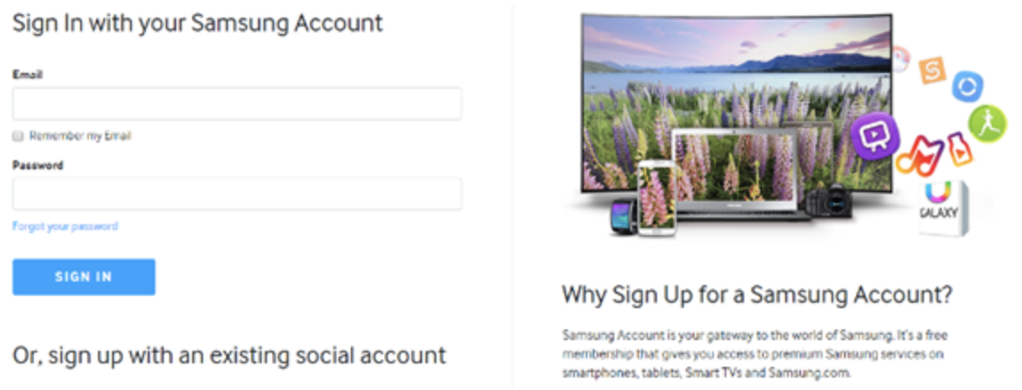
Samsung drives interaction with gamification with a function on its website that allows customers to discuss issues and watch videos. The most active participants get a badge for their efforts. 

If your business structure requires a lot of engagement from your audience, then using gamification elements can encourage them to stick with you for longer rather than losing interest. For instance, language learning software Duolingo has a four-point gamification strategy for its users.

Duolingo knows that learning a new language takes a lot of time, so it asks users to set small specific goals instead. The smaller tasks bring users back regularly, and consistent users gain rewards. There’s even a progress bar to help you track your progress compared to other customers. 

Gamification gives your customers another reason to keep coming back and connecting with your brand. That makes a lot of sense for companies that rely on long-term relationships with customers, like Duolingo and other teaching brands, for instance. Remember:

  • Make it simple: People will only want to interact with your brand if it’s easy to do so. Make it clear what you want your customer to do and what they need to do next. 
  • Reward every action: Keep people coming back for more by rewarding them for their actions, even if it’s just with a gold star or digital sticker. 
  • Nudge inactive customers: If a client gets involved in your interactive content, then stops participating, send an email reminding them why they should come back. 

4. Run Contests and Offer Prizes

Probably one of the easiest ways to use gamification in your advertising campaigns is with a competition. Contests and competitions have been around since the dawn of business. They’re a useful way for companies to collect information from customers, particularly if you ask your clients to sign up to your site with an email address to get involved. 

Competitions are also a way to push your audience into doing positive things for your company. For instance, you could run a competition where consumers share a social media post and tag a friend to enter. Or you could have a competition that asks your clients to refer a friend to get involved. 

When KIND, a healthy snack company, wanted to connect with its customers and create a new product, it didn’t just do market research. Instead, the company created the “Raise the Bar” contest to let customers cast a vote for which flavor they wanted to see next.

When 123ContactForm wanted to engage its audience, it gave people the chance to win one of three platinum subscriptions for 6 months. 

Contests are naturally exciting and fun to take part in. They’re an opportunity to get your audience excited, and you don’t need to give anything huge away either. Just make sure that the prize you offer is something that your audience will be interested in. 

A few more pro tips include:

  • Generate hype first: Don’t just launch a contest out of nowhere; get people excited about the idea with announcement blogs, social media posts, and emails. 
  • Give people a lot of ways to get involved: If people can’t take part in the competition on social media, let them do something on your website instead. 
  • Follow up after the win: When someone does win something from your website, follow up with that winner and post pictures in the form of a blog/case study. This will generate more hype for your brand and get people excited about the next event. 

5. Get Your Audience Feeling Competitive

No matter how much they might deny it, most people are at least a little competitive. So when you’re implementing a gamification campaign into your content and marketing efforts, it pays to tap into that sense of competition. All you need to do is find a way to encourage your followers to compete. 

The best example of a company that did this particularly well is Nike. Nike and the Run Club app teamed up to motivate people to get involved with healthy activities. The app allowed users to customize and build their ideal training program based on their athletic level. 

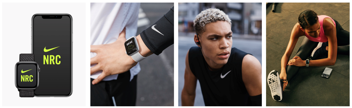
At the same time, you could also win badges and trophies to share with your running community. The more you took part in challenges on the app, the more you could potentially win. 

The Fitbit application has a similar way of keeping customers engaged. When you download Fitbit, you can access information about your exercise strategies and potentially track your progress towards your goals. However, there are also measurable achievements to earn – like a badge when you first walk 500 miles. 

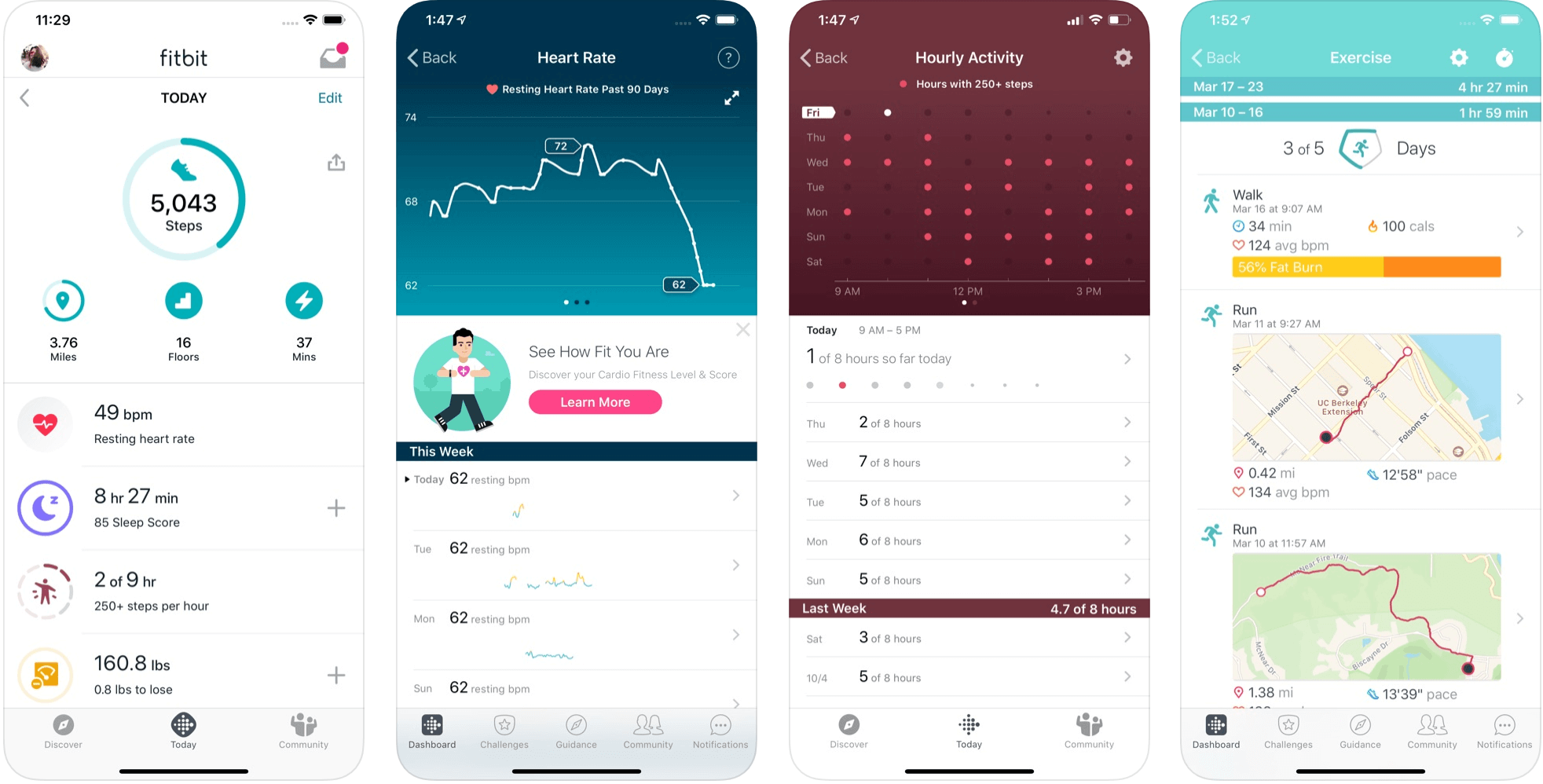
Users on Fitbit can also find their friends using the same app and compete with them in various challenges. 

To successfully add a competition to your gamification strategy, remember:

  • It needs to be social: People will be more inclined to get involved if they show off their achievements. So make sure that people can showcase their accomplishments. 
  • Make people want to win: There needs to be a reason to get to the top of the leaderboard. You might offer people discounts or exclusive prizes if they accomplish certain goals. 
  • Show progress: Prompt people to keep working on reaching their targets by showing them how close they are to success. 

6. Make Boring Content Seem More Interesting

Some content is naturally more engaging than others. If you want to showcase some important information or data, you might create a whitepaper or a report. Unfortunately, the result can be a relatively bland piece of content.

With elements of gamification, you can make the experience a lot more engaging and interesting. Sites like Daytum.com allow users to turn personal stats and information into charts that showcase information in engaging ways. You can allow your users to track their progress through the report and rack up points as they go. 

Adding subtle elements to otherwise clinical and less interesting information is a wonderful way to make the experience more exciting. The more enticed your customers are by your content, the more likely it is that you’ll sell them on your business. 

Gamify Your Marketing Strategy

Gamification isn’t a new concept, but it’s one that many companies and designers can begin to take advantage of these days. Thanks to more advanced browsers and smartphones, customers can more fully enjoy the interactive elements of websites and content campaigns. 

As your audience dives deeper into the digital world, they expect more unique experiences from you. Gamification can make any website or marketing experience more memorable. It’s time to take advantage. 

Source

The post 7 Ways to Use Gamification in Marketing Campaigns  first appeared on Webdesigner Depot.


Source de l’article sur Webdesignerdepot

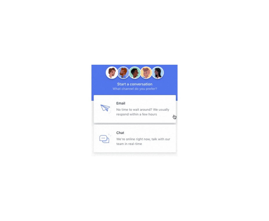
In the information age, time is a valuable commodity and something people don’t want to spend too much of. As a result, the average visitor only reads about 20% of the content of a page

For web designers and developers, that means a few things: first, you need to ensure that the web pages you create are as engaging as possible; secondly, you need to find a way of making the critical information on any page stand out; thirdly, every modern designer needs to create assets that are easy for today’s fast-paced customers to use. 

Making websites more scannable is how you do your part as a designer to ensure that the customers who come to a page get the quick and convenient experiences they need. 

So, how do designers embrace scannability?

Designing for Scannability: An Introduction

At first glance, the concept of creating a website for scannability is strange. 

Most designers start their projects with the aim of making customers stay on a page for as long as possible. So it’s odd to think that you would want to make it simple for end-users to skip from one page to another on a website in a matter of seconds. 

However, scannability isn’t just about delivering information and getting users off a page. When sites are scannable, they make it quicker and easier for customers to slide down the purchasing funnel. A quicker and more convenient customer journey leads to a stronger user experience and more conversions. 

Look at Netflix, for instance. It doesn’t give interested users a ton of information on its homepage. Instead, the key USPs of the product are laid out bright and bold in the middle of the screen, along with one simple call to action: Get Started.

Designing for scannability means making it easy for users on a page to glance at a screen and instantly access all the information they need to take the next step in their buyer journey. 

There’s no needless scrolling or wondering what to do next. 

According to analyst Jacob Nielsen, scannability is essential because people look for specific things on every page they visit. 

Customers don’t read through web pages word by word. Instead, they scan through the content, plucking information out that serves their requirements. 

Questions to Ask When Designing for Scannability

So, how do you know if your web pages are scannable?

Start by asking the following questions:

  • What’s the intent of the people who arrive on this page?
  • What kind of information needs to be conveyed instantly?
  • Can the visitor see the next step in their journey immediately?

For instance, when someone arrives on the Evernote homepage, you can assume that they want to:

  • Find out about Evernote
  • Learn how to sign up
  • Jump to other pages to find out about features, and contact details

That’s why the designer behind the Evernote website placed an immediate piece of useful information at the top of the page: “Tame your work, organize your life” tells customers exactly what the entire product is all about. The brief paragraph of information underneath can provide a few more details if customers need it, then there’s an immediate call to action: Sign up for free. 

Not only does the call to action tell users what to do next, but it tells them the most important information they need straight away: it’s free. 

Scannable pages like this are useful because:

  • They help users complete their tasks quicker: Whether you want to sign up or learn more about the product, everything you need is available instantly, with no scrolling required. 
  • The bounce rate is reduced. Customers don’t get confused and hit the back button. That’s good for your client’s SEO and their bottom line. 
  • The website looks and feels more credible: Because customers get all the answers to their questions immediately, they’re more likely to trust the website. 

So, what are some of the best things you can do to make your sites as scannable as possible?

Use Visual Hierarchy

Visual hierarchy is a way of organizing the content on your website in a way that adheres to how people use the website. For instance, if you land on a blog page, you expect to see the headline first, maybe some information about the writer, and any other essential information, followed by the body content. 

Although it’s tempting for designers to try and surprise users with new visual strategies, the best way to make your content more scannable is to give end-users precisely what they expect. 

If you’re not sure what a page should look like, try checking out the competition. 

One of the most obvious visual hierarchy rules is that the main navigation should always go at the top of the page. 

Customers will expect to look at the top of the page to find navigation. They don’t want to have to scroll through your website, searching for a way to get to another page. If you want to make it as easy as possible for end-users to jump from one page to another, you can pin the navigation bar to the page so that it stays with users as they scroll. 

Maintain Negative Space

White space, negative space, or whatever you call it – is the part of your design that’s left empty. 

White space is crucial because it gives all of the objects on your page some much-needed breathing room. Without enough negative space on your pages, it’s impossible to embrace scannability because there’s too much information for a customer to take in at once. 

For instance, notice how there are big gaps of space between every element on a Forbes website post. A proper amount of negative space on your site ensures that users can quickly take in chunks of information and use that information to decide what to do next. 

To ensure there’s enough negative space on your website pages, ask yourself what the key elements visitors will notice when they come to a website. The essential items should be:

  • A title or header to confirm that the user is in the right place
  • A CTA that shows your user what to do next
  • A navigation header or menu
  • Critical information includes an introduction to what a page is about or an excerpt from the blog post they’re about to read. 
  • A visual component: A picture or image that gives context to the page. 

Anything else can usually be removed. So, for instance, if Forbes wanted to make the page above more scannable, they could easily remove the ads and social media sharing buttons.

Make the Next Step Obvious

Every page on a website exists in a hierarchy within the customer journey. 

A homepage leads customers to product pages, which leads to a checkout page, which connects to a thank-you page that sends the visitor back to another product page, and so on. 

When designing for scannability, it’s crucial to make the next step in the journey as obvious as possible. Usually, this means placing the call to action “above the fold,” where the customer can see it immediately.

Ideally, scannable pages should have just one CTA. This will stop your audience members from being confused or overwhelmed by choice. 

However, if you’ve got multiple CTAs, think about the average customer’s journey and what they’ll want access to first.

If those buttons don’t appeal to the customer, they can scroll a little further and see other “next step” options, like shopping for “self-isolation essentials” or browsing other popular product categories:

Test Every Page

Testing for scannability means examining every page and making sure that it’s as easy as possible for customers to move through the buying process as fast as they want to. 

Visit each page you design in a buyer journey and ask how quickly it would take end-users to get from point A to point B and beyond. Here are some of the common issues that might slow the customer’s journey and harm scannability:

  • Readability: Is the font legible? Is it large enough to read on all screens, including mobile devices? Legibility in the design world measures how quickly and intuitively your users can distinguish what’s going on any page. Remember that the color of the background, the amount of negative space around copy blocks, and even font pairing can impact the readability of the content. Show your pages to multiple people and time how long it takes for them to grasp the message that you’re trying to convey. 
  • Fluff: Fluff and extra features can make your pages more intriguing, but they can also slow users down. For instance, one picture at the top of a blog page can add context to the article. A slideshow of pictures stops the customer from progressing and keeps them stuck at the top of the page for longer. 
  • Words instead of numbers: According to Nielsen, eye-tracking studies show that numerals often stop the wandering eye. Numbers are compact and more regularly associated with statistics and facts, so they’re more likely to grab attention. If you want to get important points across to end users fast, use numbers, not words. 

Creating Scannable Pages

Scannability is becoming an increasingly important concept in today’s busy landscape. 

Now that more customers are browsing websites from their smartphones or checking out products on the move, designers need to think more carefully about adjusting to this agile environment. 

Scannable pages that move visitors along the buying cycle and into the next stage of the funnel will deliver better results for your clients, and therefore better outcomes for you. 

Source

The post Quick Ways to Make a Webpage More Scannable first appeared on Webdesigner Depot.


Source de l’article sur Webdesignerdepot