 A robust email marketing strategy is a great way to reach your target audience directly.
But your email marketing campaign success rests on whether you used the best email marketing services.
No two email marketing services are equal. So you must choose carefully. We created this guide and ranked the 12 best email marketing services for you.
How to Choose the Best Email Marketing Services
Although we ranked these best email marketing services in this list from number one to eleven, we also understand that everyone’s need is unique. So we identified where each email marketing tool performs best.
Here’s what to keep in mind to find a good email marketing service:
- Your business goals
- Growth stage of the business
- The audience your business targets
Please read on for the best email marketing services in the market today.
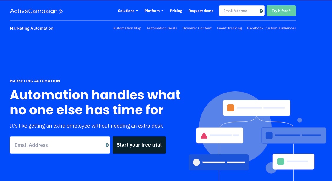
1. ActiveCampaign: Best Advanced Email Automation
If your goal is to deliver timely, personalized, and unique email experiences to your customers, try ActiveCampaign. As the best email marketing service for putting your marketing on autopilot, this tool offers a built-in email automation system, a campaign tracker, and a CRM.
- Unique Feature: Customer experience automation (CXA)
- Target Users: eCommerce, B2B, B2C, SMEs, bloggers, and influencers
- Pricing: $29 per month.
Features
ActiveCampaign offers users loads of beginner-friendly advanced automation features. Here are a few:
1. Automated Marketing
You can focus on other important business pursuits and let ActiveCampaign’s marketing automation send welcome emails, track contact tags, monitor sales analytics, and fetch performance reports.
This feature empowers users to launch automatic email marketing campaigns or follow up on customers who abandoned their carts or disengaged from their content.
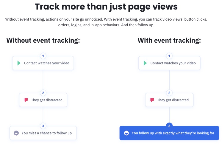
2. Site and Event Tracking
ActiveCampaign records your site visitors’ consumer behavior and demographic information in real-time. So you can segment your email list better and target your audience with messages that resonate with them.
Gathering visitor data can help you engage with them emotionally or during memorable events like anniversaries, birthdays, and other milestones.
3. Free Migration
ActiveCampaign offers a seamless move from your previous automated marketing service provider.
Best part? Migrating to ActiveCampaign comes at no cost to you.
Simply request for migration by filling out a quick form. And you’re on your way to a better email marketing experience.
4. Segmentation
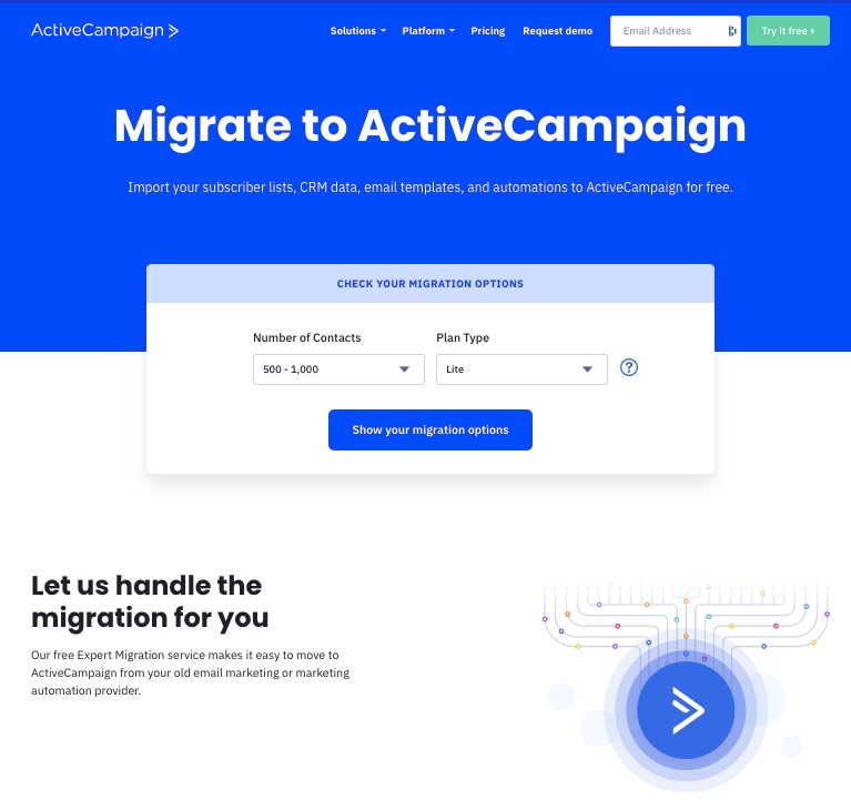

Image Credit: ActiveCampaign
ActiveCampaign groups your email contacts into different categories to enable you to make sense of the data.
You can segment a contact list by name, date, location, subscription status, tags, and other metadata.
Segmented data helps you target the most conversion-ready audience for the particular campaign.
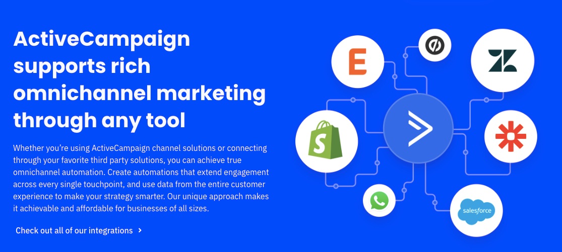
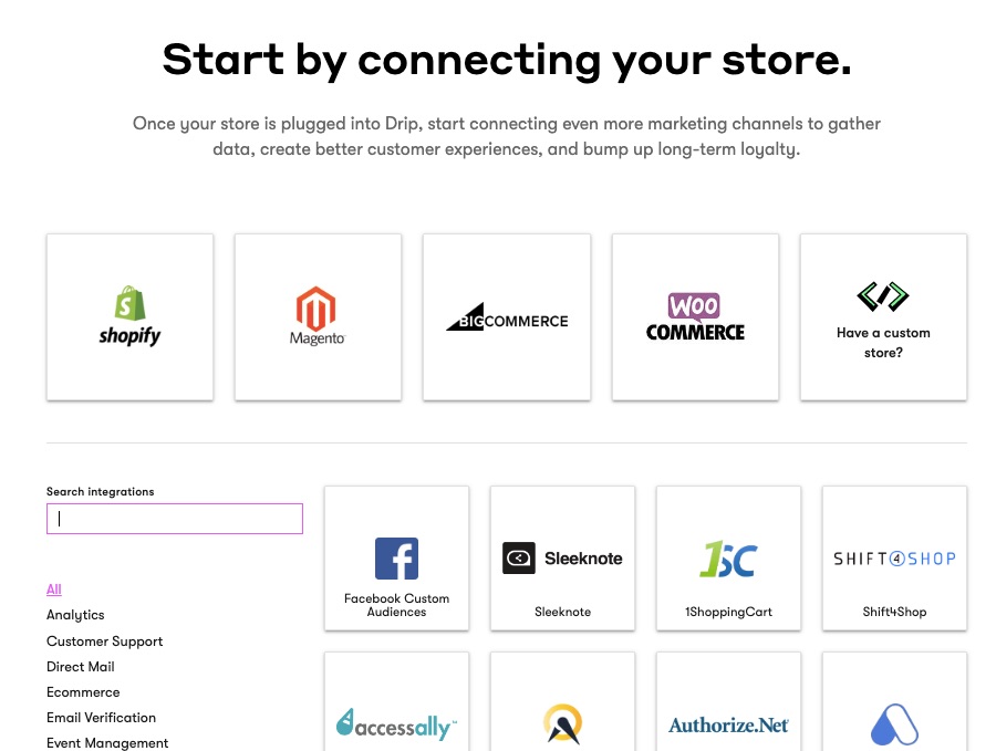
5. Third-Party Integrations
You’re free to link your favorite apps with ActiveCampaign if it enhances your business growth.
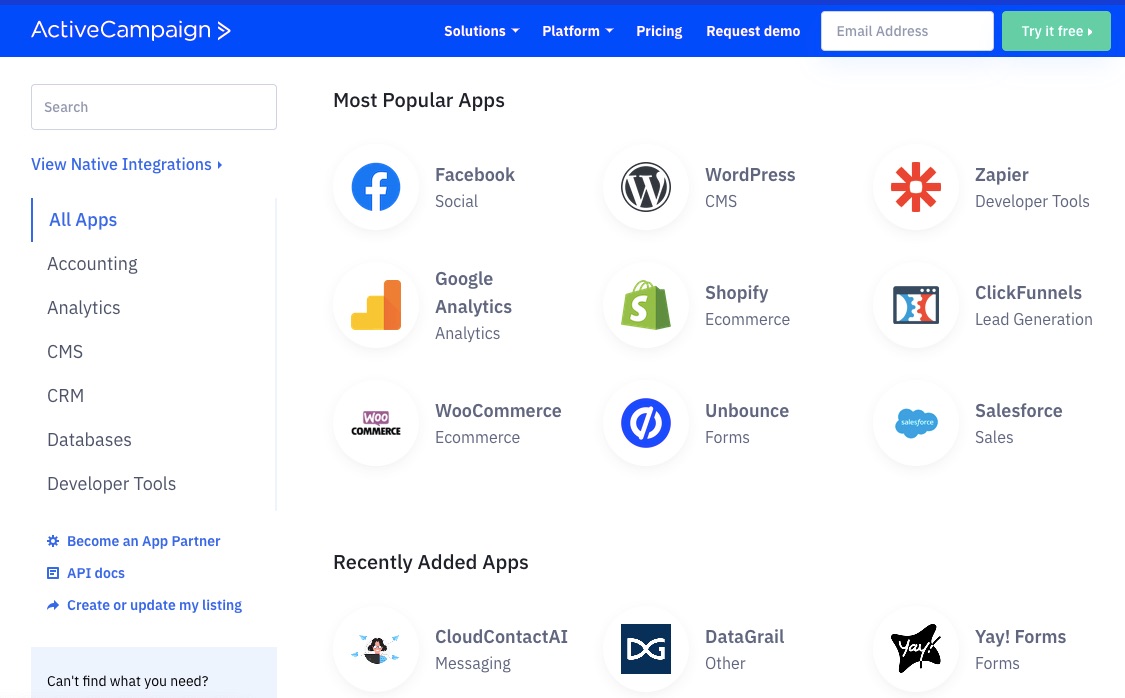
So you can integrate your account with third-party apps like
- Facebook to pull ad or public user data
- Shopify to pull sales and shop data
- Google Sheets for spreadsheet operations
- WooCommerce for eCommerce performance data
You don’t need to move contacts across email marketing platforms to access or manage your data. ActiveCampaign lets you keep your data on the platform you wish to use and then use integrations to extract the benefits of having those contacts.
6. Performance Reporting
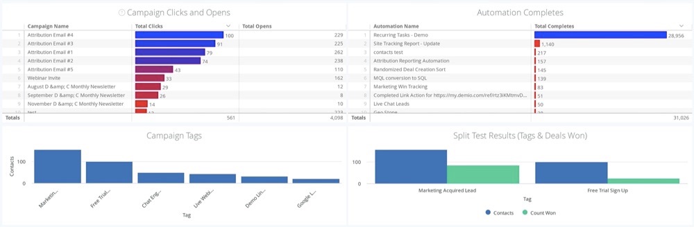
Get real-time reports on your deals and sales activities using ActiveCampaign. The reports feature lets you know your campaign’s performance across these indicators:
- Subscriptions
- Subscriber engagement
- Automation reports
- Sales rep deal pipelines
- Revenue generation
- Customer attribution reports
ActiveCampaign lets you track your competitors by providing reports of users who switched to competitors.
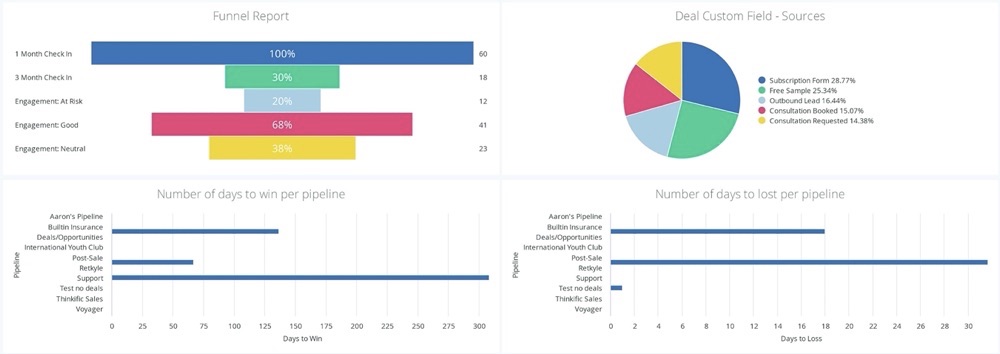
You also get a funnel report to see how well your email marketing effort converts engaged audiences to buyers.
7. One-on-one Messaging
ActiveCampaign lets you start and manage conversations with current and prospective customers across multiple channels.
Send and receive instant direct messages, which you can also automate in full.
Customers will quickly reach you with questions and orders without losing their messages in your email pile.
More Features
- Automation templates
- Email Templates
- Email drag-and-drop builder
- Branded Forms
- Tags
- Split Automations
Pros
ActiveCampaign is feature rich. You can fully integrate other applications on the platform without losing vital leads and data.
This email marketing software positions itself (and rightly so) as a leading email marketing solution that encompasses other parts of marketing and your CRM needs.
You can enjoy its free email marketing service offering for 14 days.
Cons
Although ActiveCampaign promises many features, most of them are exclusive to users who subscribe to paid plans. Sadly, this email marketing tool doesn’t offer a free plan.
Also, the workflows and features are sophisticated. So this email service provider will demand a learning curve.
Pricing
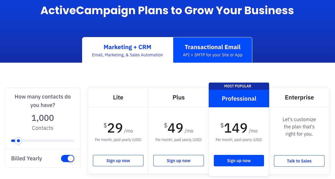
ActiveCampaign offers four paid plans—Lite, Plus, Professional and Enterprise. The enterprise plan is customizable to meet the peculiar needs of big businesses.
Each plan is billed monthly at:
Lite: $29 per month
Plus: $49 per month
Professional: $149 per month
Enterprise: Customized rate
2. Sendinblue: Best Free Plan and Instant Messaging
Sendinblue provides users with instant messaging features, sales enablement software, and email marketing tools to grow their businesses.
If you’re looking to engage users more instantly through SMS and chats along with your email campaigns, then Sendinblue is the solution. As the best email marketing software for instant messaging, Sendinblue has personalization features to help you engage better with your target audience.
- Unique Feature: Email and SMS marketing
- Target Users: Retailers and CPG, SaaS, media, publishing, public sector, NGOs, and hospitality industry
- Pricing: Starts at $25 per month
Features
1. Email Templates
Sendinblue offers over 40 responsive and professional pre-made email templates from which to choose.
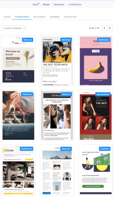
If those are not enough, you can create bespoke email templates. Again, you’ll find the platform intuitive. In addition, you can use templates on multiple devices for the best results.
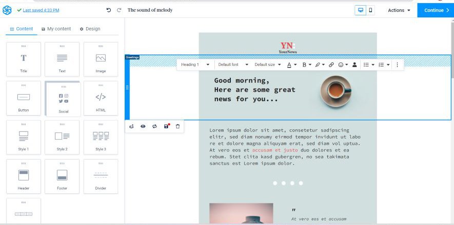
2. Drag and Drop Email Editor
Modify emails to your taste by simply dragging and dropping items on the campaign template.
Sendinblue is one of the most advanced email marketing services today. For example, it takes personalization seriously. So you can craft the content of your emails to appeal to your target audience better.
3. Email Tracking
If you wish to measure campaign performance rate or monitor engagement on certain emails, Sendinblue provides the option of turning on your Google Analytics tracker.
Google Analytics generates insights by drawing your customer information from all over the internet, including their behavior on social media.
4. Live Chat

Sendinblue lets you initiate instant communication with your site visitors through chat. Live chat is a handy email for engaging your leads at critical moments.
You can install this feature in seconds, assign conversations to your team, and customize the chat feature for your brand.
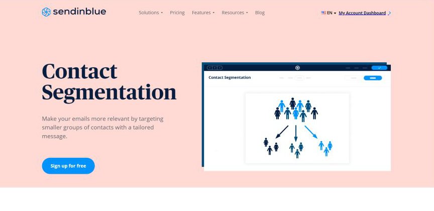
5. Contact Segmentation
Every contact is different and often has unique preferences.
Target the right audience with the most suitable message by exploring Sendinblue’s segmentation; this categorizes contacts and helps you determine, create and push a tailor-made campaign to a ready market.
6. SMS and Whatsapp Marketing
Sendinblue allows you to send your desired SMS volume to any chosen destination for a token.
You can also reach numerous contacts on your Whatsapp with customized messages about your business.
A recent report says that 69% of internet users use Whatsapp. So, you want to get your message to this audience.
7. Shared Inbox
Does managing all your conversations from a single place appeal to you?
With Sendinblue inbox, you can navigate smoothly between chats from your linked Gmail, Yahoo, or Outlook accounts.

Keep your team and customers updated simultaneously with a simple inbox setup.
This Shared Inbox feature enhances organization.
More Features
- Schedule send
- CRM automation
- Editable signup form
- Push notifications
Pros
Sendinblue’s free email marketing software offers advanced features for startups and supports unlimited contacts. Except you need to do more, you can function solely on the free plan.
As the best email marketing software for initiating instant communication with leads, this email marketing tool promises a simple user interface and instant account setup.
Also, Sendinblue is relatively cheaper compared to similar email marketing providers.
Cons
You can only send 300 emails daily on the free version of Sendinblue. A paid subscription is required to remove the Sendinblue logo from your emails.
Pricing

Apart from the free plan, Sendinblue offers three other monthly plans—Starter Plan at $25, Business Plan at $65 per month, and Enterprise Plan at $1000 per month.
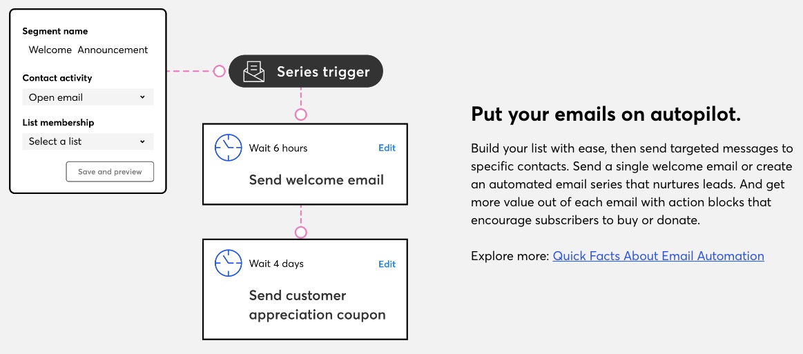
3. Drip: Best for Pre-Built Email Workflows
Drip is a personalized email, SMS, and automation service provider trusted by thousands of brands globally. It provides a seamless email workflow for businesses of all sizes.
-
- Unique Feature: pre-built email and SMS workflows
- Target Users: eCommerce industry
- Pricing: starts at $39 per month
Features
1. Pre-built Playbooks
Handling every marketing operation by yourself is overwhelming.
Save precious business time by using any pre-designed Drip templates.
The playbooks with heart-melting welcome series and abandoned cart reminders are ideal for growing your revenue.
Choose a suitable visual workflow and automate it fully.

2. Email Builder
If you like your emails deeply personalized and right on target, you’ll find Drip’s HTML builder useful.
Create 100 percent original content from scratch.
Personalized emails prove to your customers that you go the extra length and they’re special to you.
3. Drag and Drop Editor
Customize emails to capture your brand image using its ultra-easy drag-and-drop email editor.
People and businesses exchange over 306 billion email messages daily. Your audience is already getting tons of messages. Stand out with branded emails.
The visual interface is vibrant and can help boost your creativity.

4. Pop-up Notifications
Get access to form templates that your on and off-site visitors can easily fill out on Drip.
You can redirect, engage, sponsor specific actions, offer discounts to customers and grow your audience with targeted pop-up notifications and forms.
Pop-ups and signup forms convert about 3.09% of site visitors.

5. Real-Time Business Insights
Gain insights on your growth, audience, revenue, and overall campaign performance with Drip analytics and benchmark.
That’s not all.
Drip supports users with personalized guides to help them make informed decisions using these data that lead to business growth.
6. Marketing Automation
Your emails and SMS can run on autopilot without taking on the stress of maintaining correspondence with new and existing customers.
Simply set up revenue-targeted workflows and relax.
Since Drip comes with pre-built workflows, you don’t have to start your automation process from scratch.
7. Single Click Integration
Are you a new or an existing business owner? Drip supports your business on multiple channels.
Fully merge or connect your online store like Shopify, Magento, and other eCommerce tools to your Drip account with just one click. Easy breezy.
You can start conversations on your e-store and finish in your inbox.
More Features
- Segmentation
- Email support
- A/B testing
Pros
Apart from unlimited email sends, Drip lets you access its advanced features and all the tools on its platform during your 14 days free trial.
Users get tailored assistance and live support when they need them. In addition, Drip simplifies the scaling process for businesses.
Cons
Although you get unlimited emails, this plan doesn’t support unlimited contacts and doesn’t offer a free plan. However, you have unlimited features access. But Drip limits usage by the number of contacts.
Pricing

More than ten paid plans starting at $39 up to more than $1,899 and billed monthly. Email contacts vary by plan, but you can send unlimited emails and email support for all paid plans.
4. Constant Contact: Best for Educators, Small Businesses, and Event Organizers
Constant Contact simplifies email marketing for event marketers and small businesses as one of the best email marketing providers. This email marketing solution helps users benefit from their email marketing effort without the typical steep learning curve of complicated email marketing software.
- Unique Feature: Event management tools
- Target Users: Small businesses and event organizers
- Pricing: Starts at $9.99 per month
Features
1. Marketing Automation
Constant Contact empowers small businesses to put their email marketing on autopilot. You can segment your lists automatically and initiate campaigns without manual effort. You can also set drip campaigns and automation to trigger based on your audience behavior, data, or events.
You can resend messages under different subject lines to contacts who didn’t open them the first time.
2. List Building and Management tools
You can access a range of list-building tools on Constant Contact to help you attract and keep leads. In addition, you can access a landing page builder, form builder, text message signup FTW, and a contact management system.
3. Event Management
One of this email marketing service’s biggest selling points is its event management tools. Users can create signup forms for their events, build unlimited landing pages, create email follow-ups, and collect payments using tools available on Constant Contact.
4. Email Templates
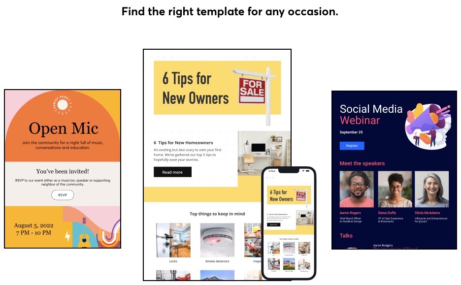
Users can find more than 100 mobile-friendly, drag-and-drop email templates on Constant Contact that match different business types and brands. So you will find the appropriate template for the occasion regardless of industry, market, design preference, holiday, event, or other needs.
5. Surveys and Feedback Tools
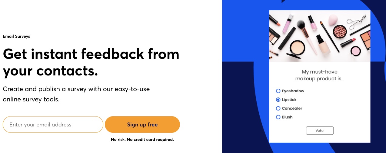
Constant Contact understands that customer feedback and extra data can improve your marketing performance. You can consider Constant Contact the best email marketing service for getting feedback through surveys and polls.
You can customize these surveys with your branding and logo on your Constant Contact dashboard.
6. Responsive Email Editor
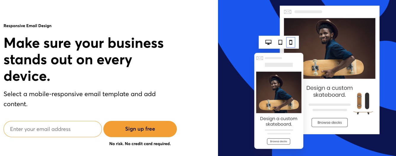
Constant Contact makes email editing a breeze for users with smart columns, undo-redo, an image library, color customizations, fonts, backgrounds, and more. In addition, its preview function lets you see what your email would look like across devices, so you can adjust your design or message to your heart’s content before sending it out.
7. Marketing Calendar
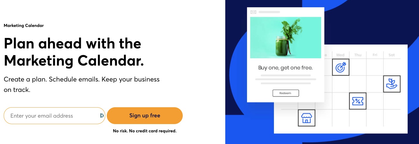
Unlike most email service providers, Constant Contact offers marketing calendars. The feature helps plan your marketing. Marketers can create their messages, schedule them, send, and track them with the help of a marketing planner.
More Features
- Error Checker
- A/B testing
- Landing page builder
- Reporting
- Agency tools
- Signup Forms
Pros
Constant Contact’s focus on small businesses means they’ve designed this email marketing platform with simplicity in mind. And they haven’t limited users’ who need more advanced email marketing automation features.
Its error checker is a good feature to catch bad links and fix issues that might lower conversion. Constant Contact is a great email marketing software for educators, event organizers, and small businesses.
Cons
Constant Contact doesn’t offer a free plan. Although it has simple pricing, this email marketing tool overcompensates higher-paying Plus users and leaves its Core plan users with limited functionalities.
Pricing

Constant Contact offers two paid plans to accommodate two audiences:
- Getting started — $9.99 per month
- Advanced features— $45 per month
However, for more advanced automation features, you’ll need the $449 per month marketing automation offer.
These paid plans come with 30-day money-back guarantees so that any small business can test-drive the tool without commitments.
5. MailChimp: Best Email Design and Marketing AI
Mailchimp is one of the most popular email marketing software available online. It integrates email marketing automation features and creative tools to deliver result-oriented email marketing.
- Unique Feature: Email marketing automation features
- Target Users: Freelancers, agencies, and developers
- Pricing: Starts at $11 per month
Features
1. AI-Powered Design
Mailchimp is an artificial intelligence-enabled creative assistant to automate and personalize your email and newsletter design for your businesses.

The creative assistant uses AI to study your brand and create beautiful, professional designs tailored to your needs.
These AI-powered designs are useful across multiple channels.
2. Subject Line Assistant
Your email subject lines are crucial to your campaign’s success. Barilliance reported that 64% of email recipients open messages based on the subject line.

Thinking and drafting the perfect email subject line to drive customer engagement is often difficult. But not anymore.
Mailchimp’s subject line helper provides real-time feedback and suggestions to guide you.
3. Audience Segmentation
Is your email marketing effort not yielding the desired results? You might be targeting the right audience with the wrong campaign.
Mailchimp helps to categorize your email list according to shared characteristics.
This ensures you send the right message to the right audience for better results.
4. Pre-built Templates
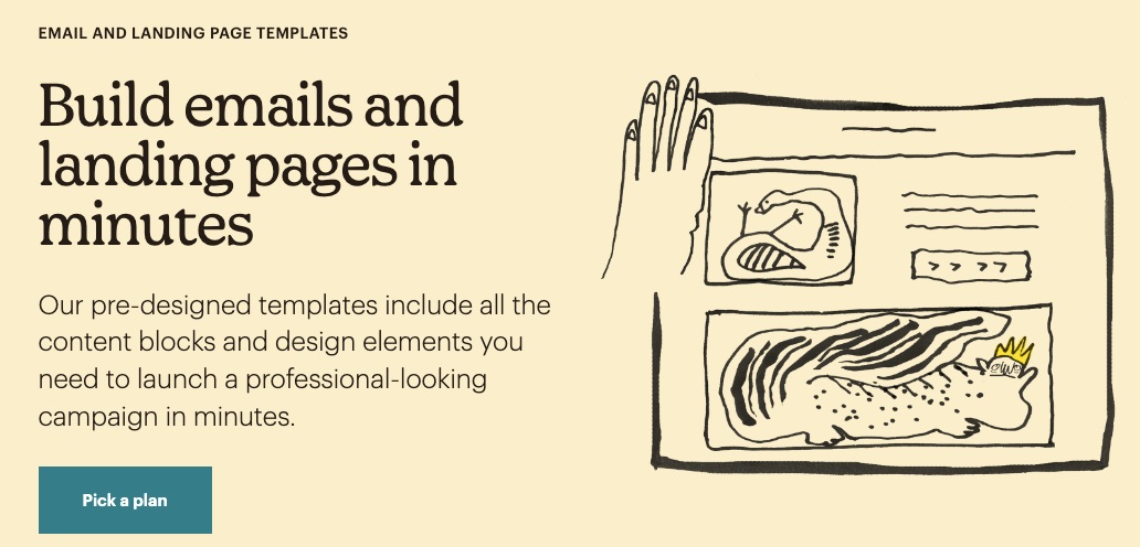
Create professional-looking emails and landing pages in minutes using any of over 100 template designs on Mailchimp.
Campaign templates incorporate content blocks and exciting design elements for your exploration.
5. Smart Predictions
Save yourself the cost of hiring a data analyst using available insight predictions on Mailchimp to analyze data.

Get demographic information about your past, present and prospective customers at your fingertips. These predictions help you make better decisions that affect your brand.
6. Marketing Automation Features
Automate your brand marketing workflows and drip campaigns to get the work done in just a few clicks. Set up the processes new email subscribers will go through before conversion.
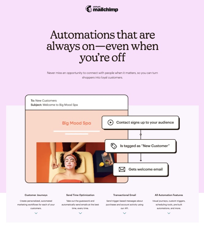
Send automated welcome notes, product notifications, abandoned cart reminders, and other vital information about your brand.
7. Image and File Editor
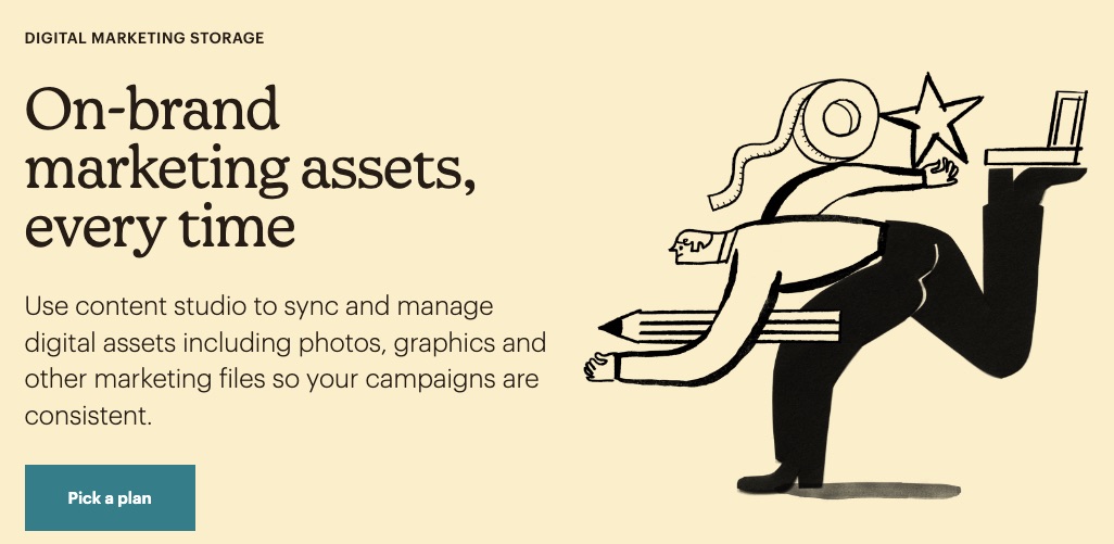
Alter, sync, and save your images or files with Mailchimp’s robust content studio.
8. Website Builder
Create a unique search-engine optimized website with Mailchimp’s free website builder.
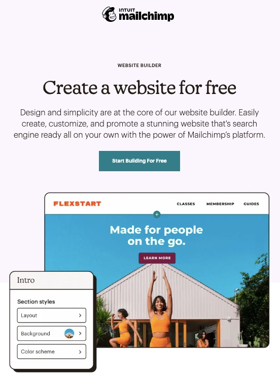
No special coding or website design experience is needed. Instead, get right into it with your domain name and a clear idea of what you hope to achieve.
More Features
- Pop-up form
- Marketing CRM
- A/B testing
- Analytics
- Integrations
- Appointment scheduler
Pros
Mailchimp is easy to use, and its creative assistant takes away the mental hassle of creating original content regularly. Apart from its free plan, this email marketing service offers unlimited contacts on its Premium plan.
Cons
The free version only allows 500 contacts, and Mailchimp’s monthly email sends are limited across all paid plans.
Pricing

Apart from MailChimp’s free plan, paid plans start from $11 per month, and the Premium plan starts is $299 per month.
6. Klaviyo: Best eCommerce Marketing Automation
Klaviyo is an eCommerce-centered email marketing platform that pools data to create workflows and enhance business growth.
Klaviyo promises users an experience, a unified database, and a learning platform guaranteed to launch their businesses to new heights.
- Unique Feature: Personalized benchmarks
- Target Users: eCommerce
- Pricing: Starts at $45 per month
Features
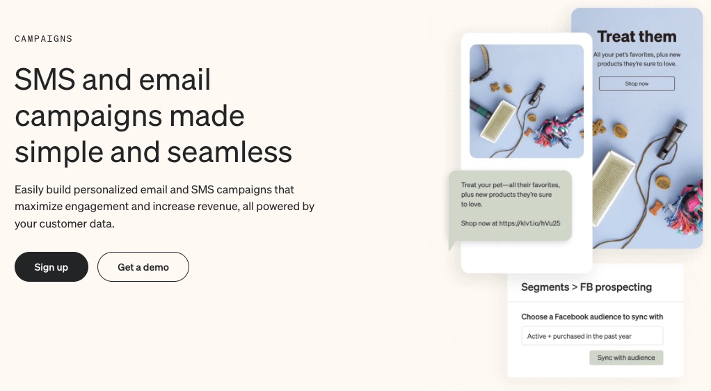
1. Email Marketing
Develop, personalize and automate your emails to portray your brand essence with Klaviyo.
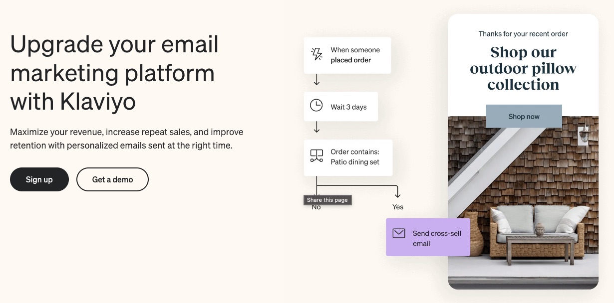
This email marketing platform promises to help users maximize revenue, improve repeat sales, and increase customer retention using well-timed personalized email messages.
Klaviyo uses customer behaviors like these to target your messages better:
- Abandoning carts
- Items they ordered
- Recently viewed products
And also incorporates group behaviors like these:
- Bestsellers
- Newest products
- Most viewed products
So, whether customers appreciate group behavior or tend to repeat a behavior, Klaviyo picks up on that signal to improve your sales.
2. Precise Segmentation
Klaviyo automatically syncs customers’ data from their first interaction with your brand. Segmentation is swift, specific, and happens in real-time.
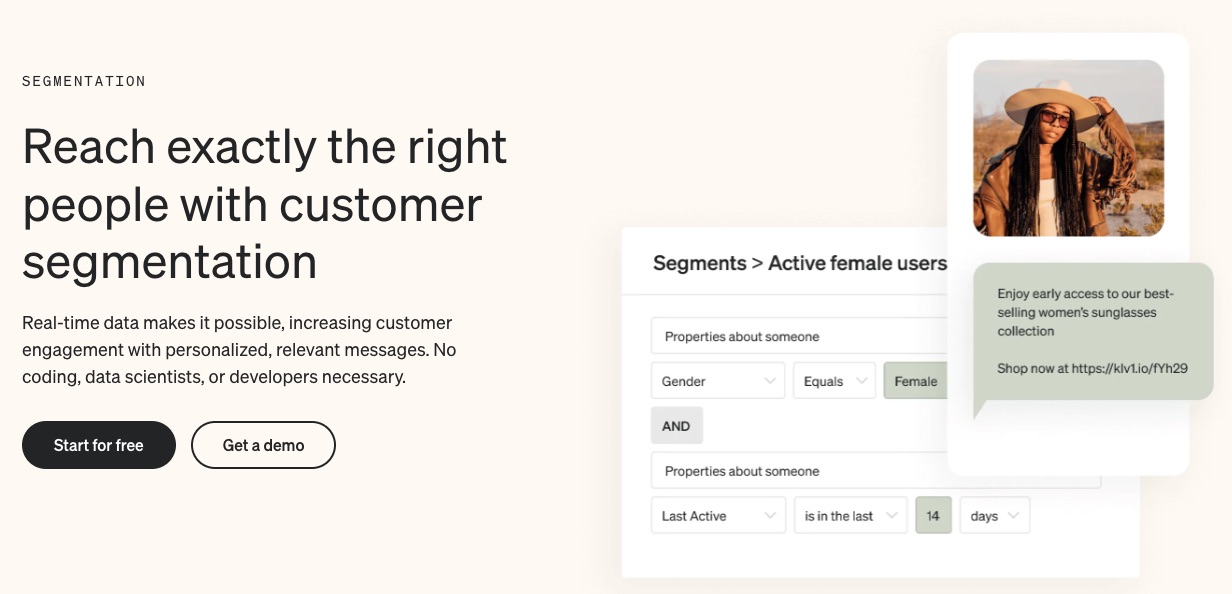
Categorize customers in similar demographics or those with shared traits together. This will ensure they get appropriate email messages guaranteed to trigger recipients.
3. In-built Signup Forms
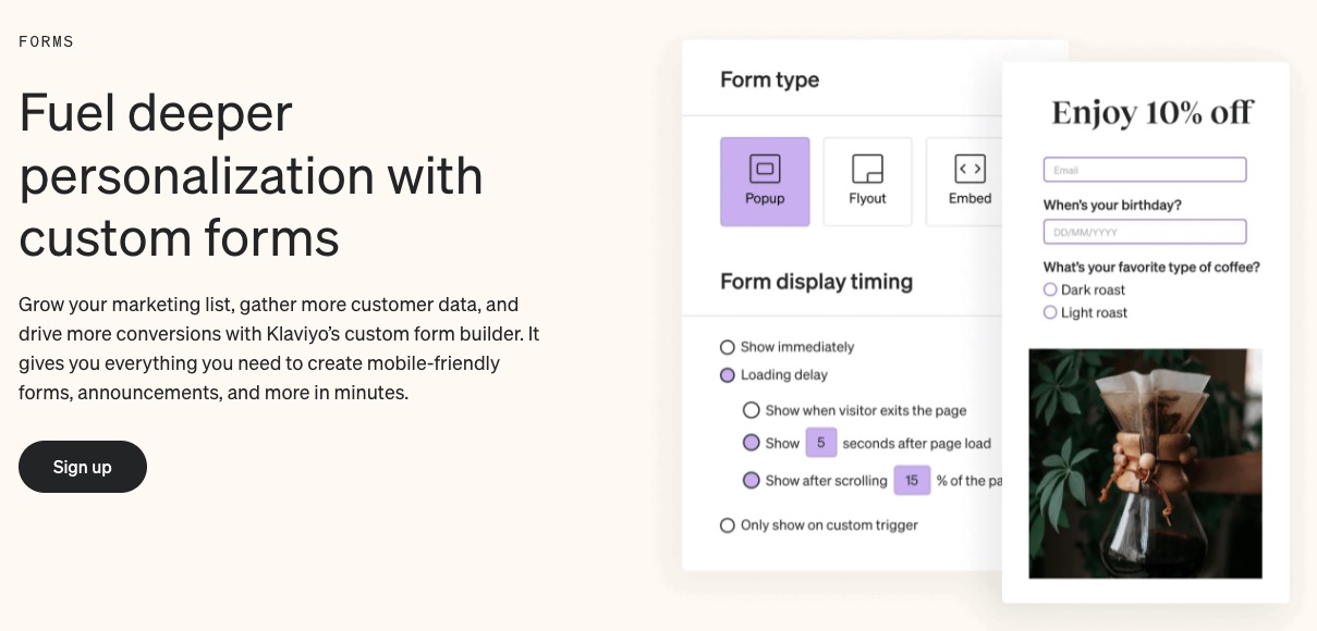
Get to know your customers better and build your email subscriber list with pre-built forms. Klaviyo forms can be embedded in the content or pop up when visitors land on your page.
4. Professional Templates
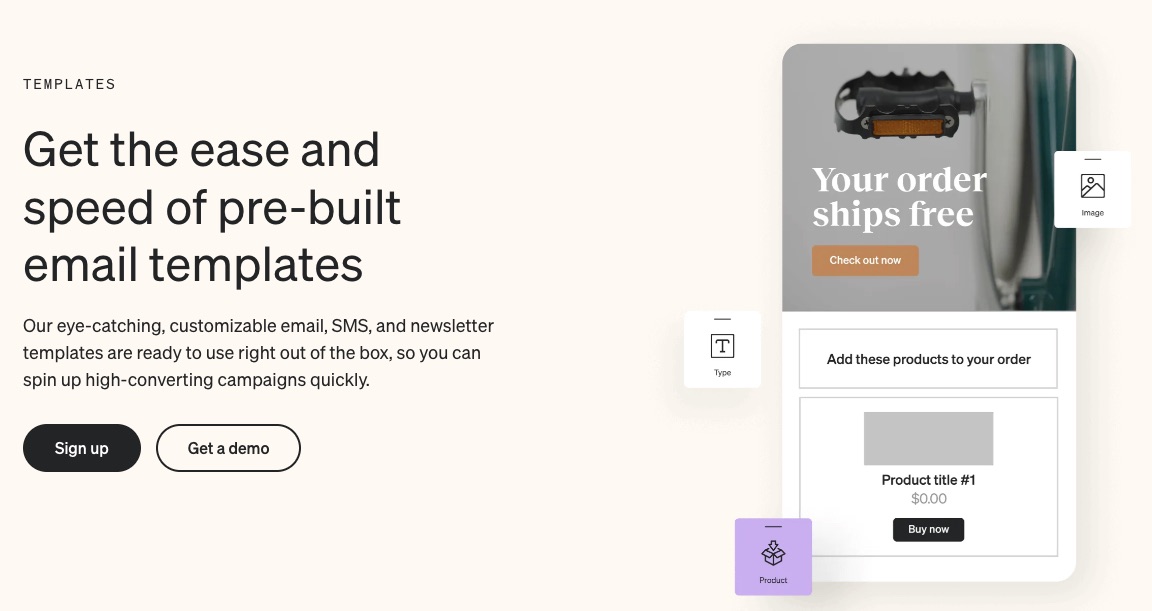
Klaviyo provides over 100 SMS marketing and email templates to suit your brand. You don’t have to rack your brain trying to come up with authentic messages all the time. Pick expertly crafted
5. Integrations
Klaviyo lets you move data across apps without a hitch.
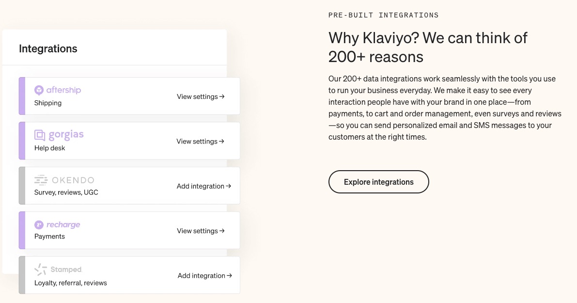
This email marketing solution supports over 220 platforms that cater to eCommerce functions like payments and order management.
6. Benchmarks
The eCommerce sector is highly competitive. So stay ahead of your peers. Catch market, industry, and emerging trends on time. And compare your growth with businesses selling similar products.
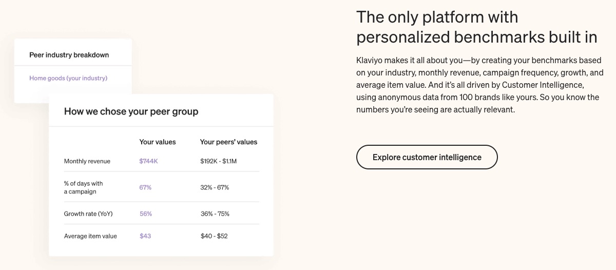
Benchmark helps you know where you stand in the grand scheme and what others are doing differently to achieve better results in your field.
7. SMS Chats
Scale your business with direct SMS messages to old and prospective customers.

SMS makes communication easier, faster, and less formal. So you can talk to customers around the globe on the go.
8. Broadcast Newsletter
Create the perfect newsletters about your brand and distribute them to your audience through their most preferred channel (email or SMS).
Broadcasts are one-off messages you can easily design without professional help. Klaviyo makes the process faster with send time automation.
More Features
- Drag and drop email editor
- A/B Testing
- Multichannel attribution
- Custom reporting
Pros
Klaviyo targets eCommerce brands squarely. This targeting helps users of this email marketing platform optimize for result-driven marketing automation. Users can get a free plan on this email software.
Klaviyo is feature packed and specializes in increasing revenues for businesses.
Cons
The free version has limitations. And Klaviyo allows only a few integrations compared to other email marketing service providers. So, this email marketing solution is only good if you won’t be heavy on integrations.
Pricing
Klaviyo offers a free plan for starters. After that, the email plan starts at $45 per month, and you pay $60 per month to access all the tools in the email and SMS marketing plans.
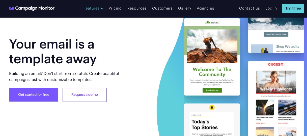
7. Campaign Monitor: Best for Transactional Emails and Autoresponders
Campaign Monitor prioritizes ease and efficiency in delivering email marketing services to businesses.
The platform assures users of helping them to create memorable emails that convert and drive engagement.
- Unique Feature: Expert email marketing
- Target Users: Tech brands, media agencies, marketers, and charities
- Pricing: starts at $9 per month
Features
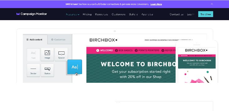
1. Email Templates
As a business owner who is always on the go, creating an email from scratch is time-consuming. This email platform offers free brandable email templates.
Freely choose from the stash of professional templates and save yourself the stress and time it takes to design.
2. Custom Emails
This email platform harnesses customers’ data from your website, apps, and eCommerce tools to enable you to craft and deliver personalized emails to them.

A Campaign Monitor report shows marketers record a 20% sales increase and 26% more open rates when they send personalized campaigns.
As the best email marketing software for transactional messages and autoresponder, this tool lets you deliver personalized experiences to your customers for as low as $9.
3. Transactional Emails
Sending messages that trigger specific actions from recipients has never been easier.
This email software allows you to create, modify and enhance your communication with customers using bespoke transactional emails.
4. Actionable Analytics
As one of the best email marketing platforms, this popular email marketing service offers actionable email analytics you can access in just a few clicks. So you can rest assured of practical insights into your business performance.
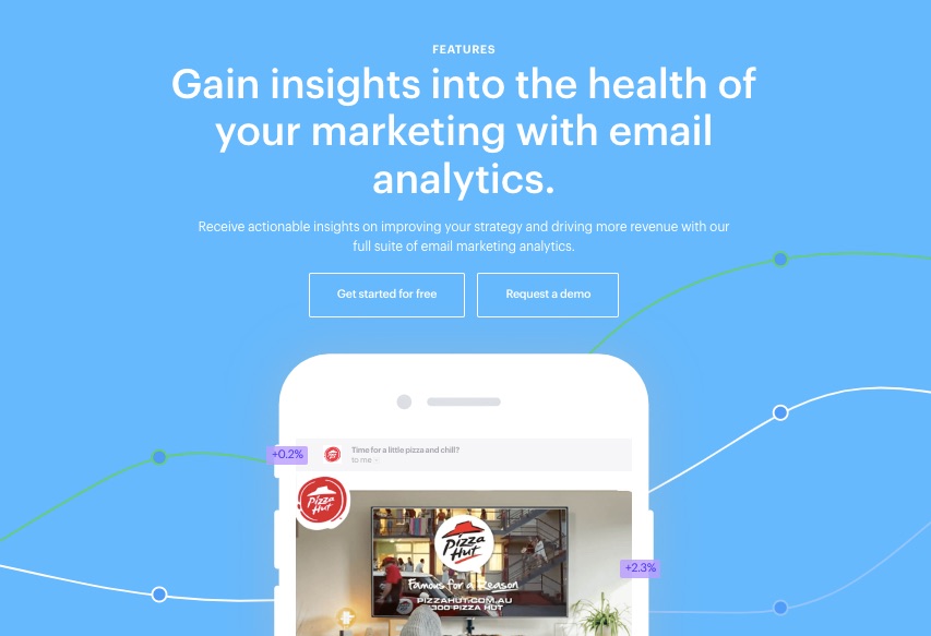
Popular email marketing services like this email software gives you access to an interactive dashboard to measure results across metrics like these:
- Email campaigns
- Automated journeys
- Transactional emails
And others.
As one of the best email marketing platforms, this email software provides actionable insights from your top-performing campaigns that you can deploy across other campaigns.
5. Email Experts
Enjoy round-the-clock professional support services from one of the best email service providers.
If you run into technical problems, you can count on Campaign Monitor’s expert team at any time. From funnel to deliverability experts, you can get all the helps you need for your email marketing campaign with this feature.
6. Email broken link review

As one of the best email marketing providers, this tool helps you find and fix broken links that might hurt your campaign efforts. The Link Review tools work in this capacity.
This tool scans your messages, flags any missing or broken links, and validates them.
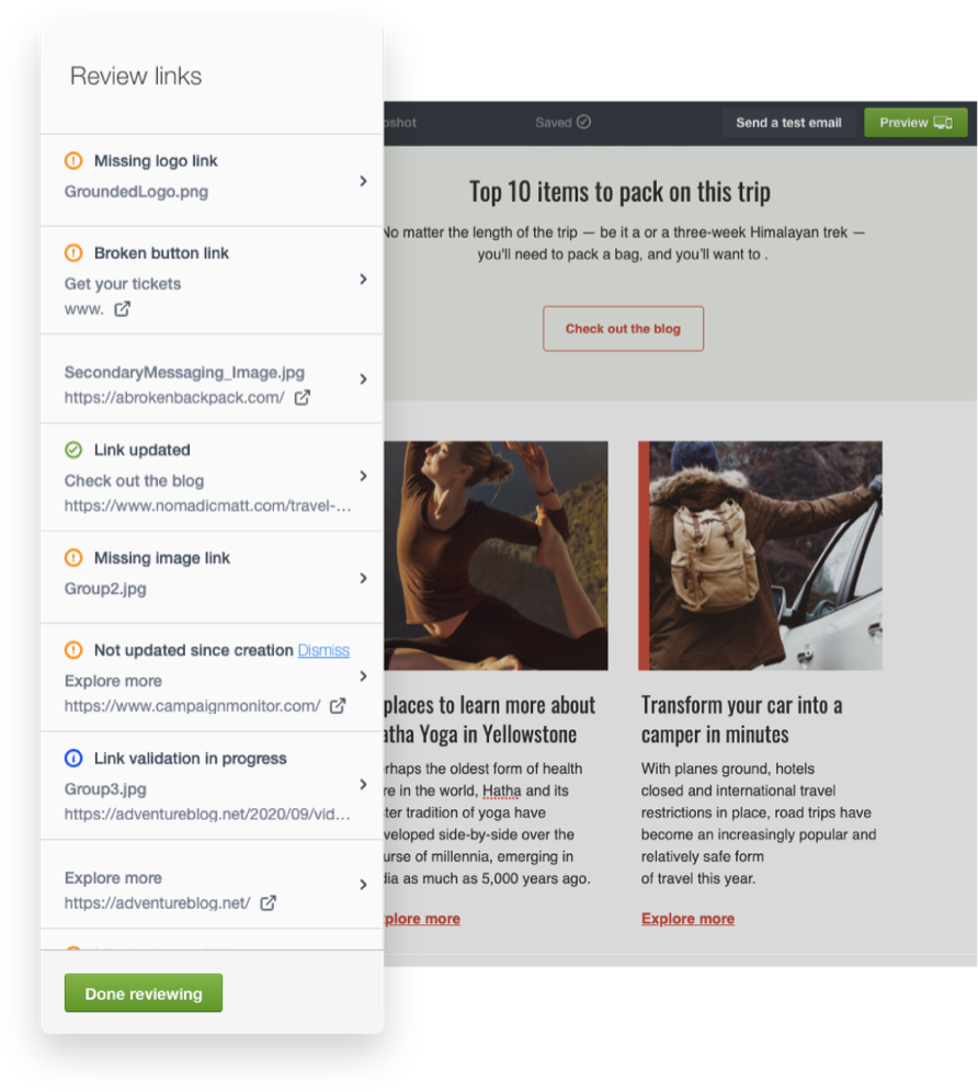
Image Credit: Campaign Monitor
7. Customizable Signup Forms
A signup form is a helpful tool that persuades customers to take the extra step into your business.
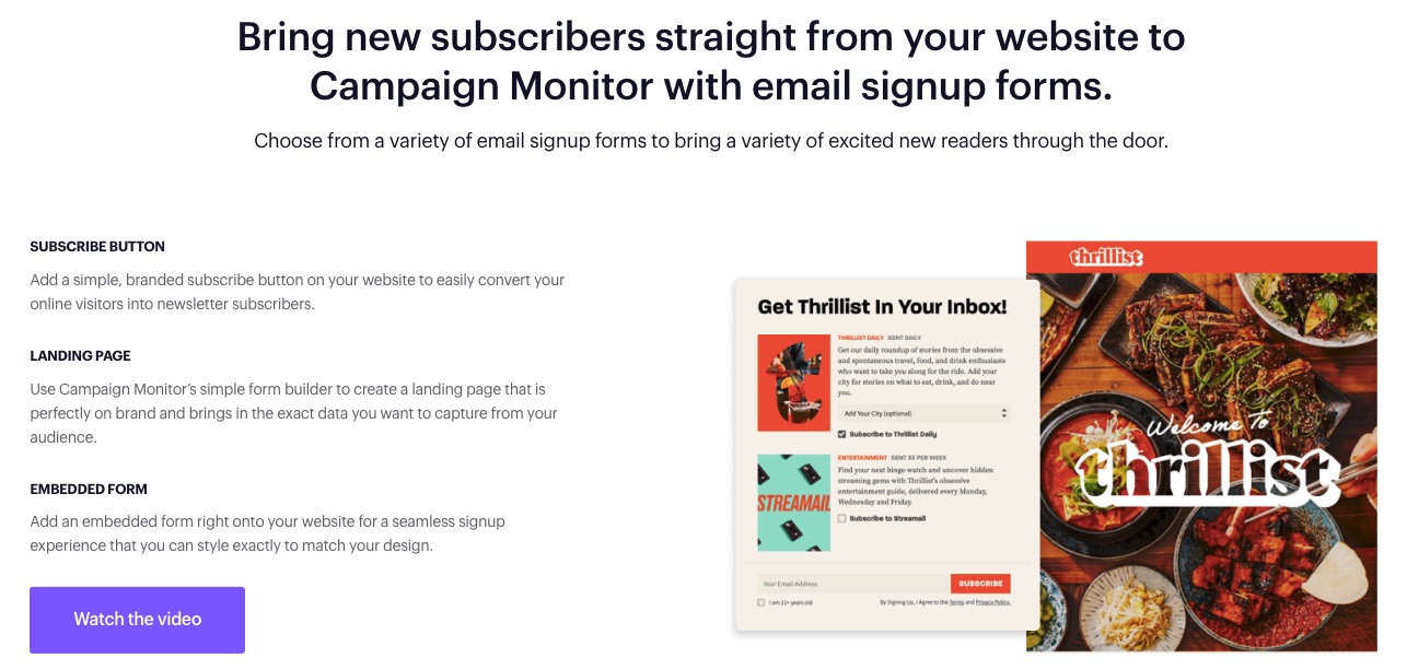
Direct the ideal audience to the right section of your business with editable signup forms.
You can also add a subscribe icon on your website’s landing pages.
More Features
- SMS marketing
- Segmentation tools
- A/B testing
- Image Gallery
- Campaign tags
- Email broken link review
- Integrations
Pros
Campaign Monitor is easy to use and offers affordable feature-loaded paid plans for all business sizes.
Cons
The SMS feature on Campaign Monitor is only available to contracted customers sending texts to the USA, and it doesn’t offer a free plan.
Pricing

Three paid plans are billed monthly with prices starting as follows:
- Basic: $9 per month
- Unlimited: $29 per month
- Premier: $149 per month
This email service provider’s prices changes per plan as your list grows, but you can send unlimited emails on the Unlimited and Premier plans.
8. Moosend: Best Value for Unlimited Emails
If you’re looking for pocket-friendly email marketing services that deliver results, try Moosend.
Moosend is designed for small and big businesses seeking impressive emails that resonate with their audience.
You can send a limitless amount of emails to suit your business needs.
- Unique Feature: Weather-based personalization and evergreen campaigns
- Target Users: Saas, publishers, eCommerce, non-profit, travel, and agencies
- Pricing: Starts at $9 per month
Features
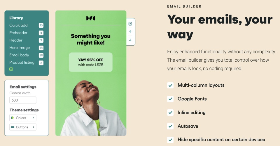
1. Drag and Drop Email Editor

Whatever inspiration you have when recreating an email campaign, simply drag and drop it with Moosend’s powerful email builder.
You can also design your email campaigns with HTLM—you have full control over how MooSend works for you.
2. CRM Automation Features
Build lasting and rewarding relationships with customers by automating basic CRM functions.
Handling every customer’s need is tedious and time-consuming. But you must make each customer feel special to ensure continuous patronage.
Automate basic CRM operations and focus on bigger tasks.
3. Landing Pages
Your website landing pages help you convert visitors better—MooSend lets you create responsive and catchy landing pages to increase your site’s conversions.
4. Ready-to-use Templates
MooSend lets you save time with pre-built subscription forms, landing pages, and newsletter templates.
Simply flip, personalize and use your most preferred template from this email marketing service provider.
5. AI-Powered eCommerce
Moosend provides eCommerce email marketing solutions to users, from abandoned cart reminders to product recommendations.
Like other best email marketing services on this list, MooSend uses artificial intelligence to help your business make more sales with email.
6. Forms
Design lead-generating subscription forms for onsite visitors.
When your landing pages receive visitors, they receive your pop-up or embedded forms immediately. Information from these forms goes to segment, retarget, and drive customer engagements.
7. Integrations
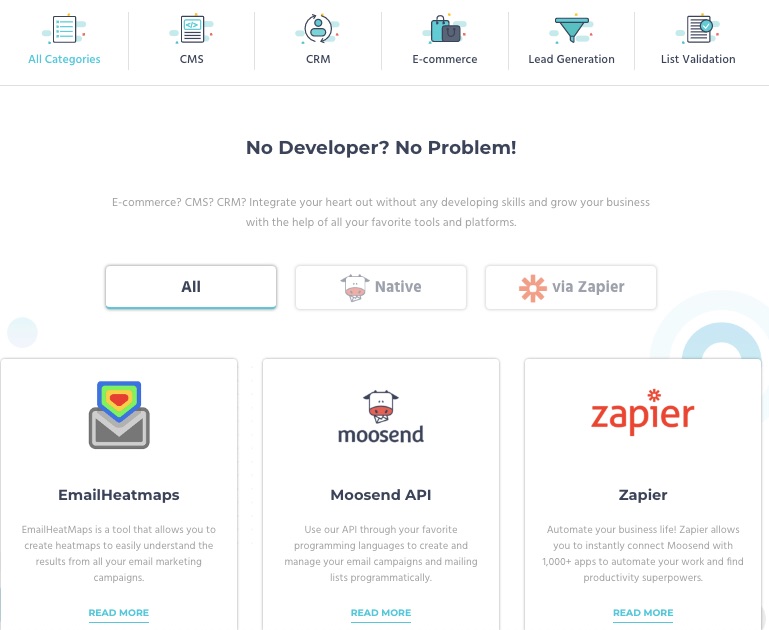
You don’t have to let go of your best CRM, CMS, and eCommerce tools when moving to MooSend.
Bring your marketing tools or apps and integrate them into your MooSend account. This email service provider lets you connect your integrations without a developer’s help.
More Features
- Custom reports
- Site tracking
- Segmentation
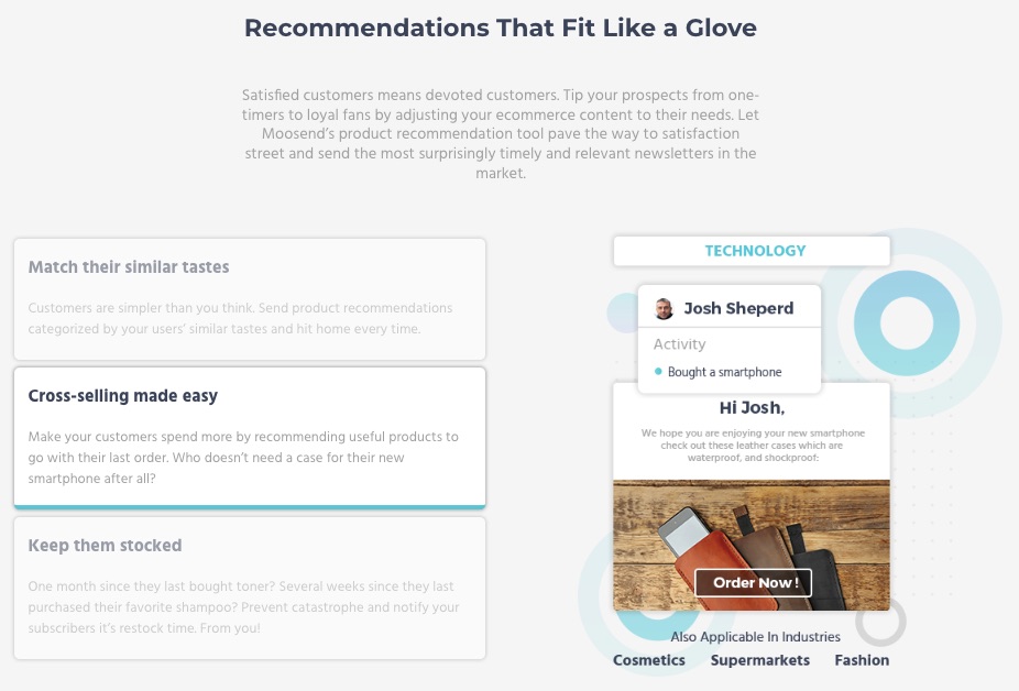
- Product recommendation
- Transactional emails
Pros
Moosend affords you access to powerful email marketing tools at a relatively cheaper rate.
Cons
The basic paid plan excludes account managers who provide expert support to users. Moosend also limits the number of email subscribers by payment plan.
Transactional emails are available to pro and enterprise subscribers, and no free plan exists.
Pricing
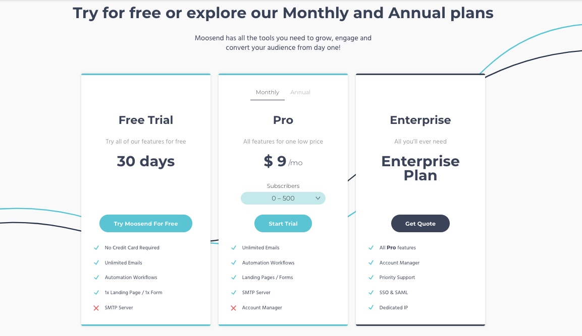
MooSend offers a 30-day free trial. But its pricing starts from $9 per month.
9. Omnisend: Best Email Marketing Service for Shopify
Omnisend is the best email marketing tool with eCommerce optimizations and pre-designed workflows.
This email marketing service reduces the work involved in running a thriving eCommerce business by relying on automation.
- Unique Feature: eCommerce email and SMS automation
- Target Users: eCommerce, startups, and SMEs
- Pricing: Starts at $16 per month
Features
1. Drag and Drop Editor for Content Creation
Your emails and campaigns must be consistent with your brand identity and message. The drag-and-drop email content editor lets you modify in-built templates to suit you.
2. Automated Push Notifications
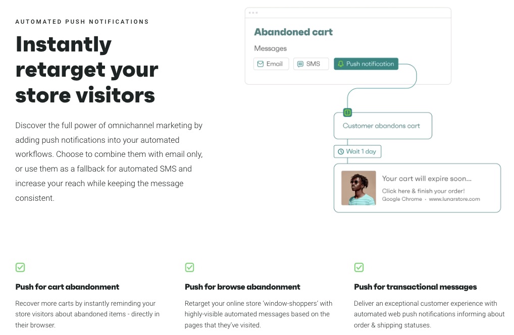
Attract, retarget and convert web visitors with personalized push notifications. Set automated reminders for cart or browse abandonment and transactional emails beyond just offering a basic email marketing service.
3. Audience Synchronization
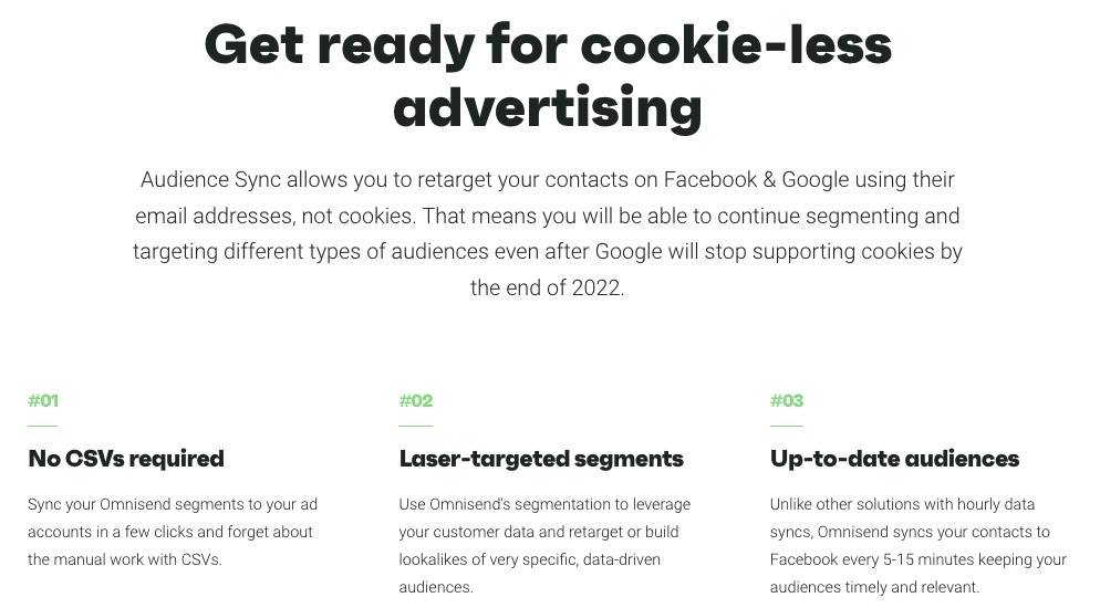
Integrate contacts into your Facebook and Google for better and on-target ads. Omnisend harmonizes your contact every 5-15 minutes, keeping you up-to-date. It also supports cookie-less advertising, which is good for when Google deactivates cookies on Chrome.
4. SMS Marketing
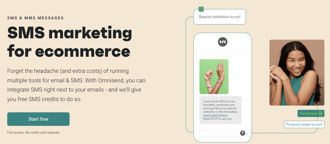
You want to handle all your SMS and emails on a single email marketing service to keep you abreast of customer conversations.
Also, you can automate SMS by including it in your marketing workflow, so customers get timely and thoughtful messages.
Onmisend boasts a 47.7% higher conversion rate in users who combine SMS and email marketing.
5. Migration
Omnisend makes the switch to their email marketing service easy and seamless for users, specifically eCommerce brands.
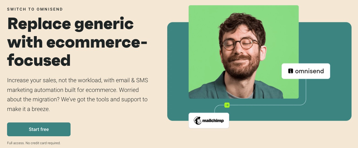
As a popular email marketing service, Omnisend integrates with eCommerce platforms like Shopify, WooCommerce, and BigCommerce.
6. Hyper Segmentation
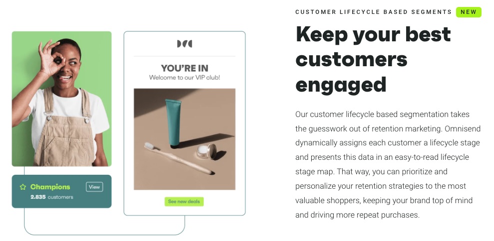
Omnisend’s intuitive segmentation helps you understand your audience better to serve them better.
Increase your sales and campaign by targeting an audience based on purchase behavior and their unique journeys on your website.
Also, monitor customer lifecycle phases to develop and execute a better retention strategy.
7. Multichannel eCommerce Marketing
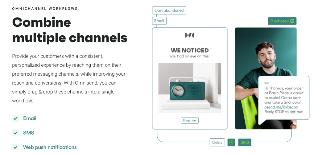
Omnisend engages your eCommerce customers from different channels in one place. All your marketing activities, email campaigns, ads, and sales happen on the Omnisend platform.
You can finally keep an eye on all your important data and audience.
More Features
- Live support
- Forms
- Campaign builder
- Sales report
- MMS
Pros
Omnisend is purpose-built for eCommerce businesses and integrated with 100+ eCommerce stores like Shopify and wooCommerce. So, you only need one click to start your eCommerce journey.
Plus, you can start exploring this email marketing software on a free plan.
Cons
Omnisend targets eCommerce users and offers limited features for other industries. But you can use the free plan to test drive it.
Pricing
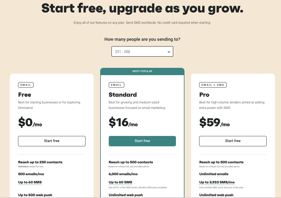
The free plan is available for 250 contacts, but you can upgrade to paid plan starting at $16 per month to enjoy premium offerings.
10. Mailerlite: Best for Email Campaign Tracking
Mailerlite is an affordable email marketing service that offers growth-focused email solutions to customers.
It integrates your e-store with most email marketing tools to increase conversion. Mailerlite also incorporates ultra-tracking technology to deliver the most accurate insights on your marketing campaigns.
- Unique Feature: Auto resend campaign
- Target Users: Marketers, writers, publishers, eCommerce
- Pricing: Starts at $9 per month
Features
1. Newsletter Editor

Newsletters are a great way to keep customers informed and updated about your product and services. Create outstanding newsletters from scratch or touch up existing beautiful designs.
2. Website Designer
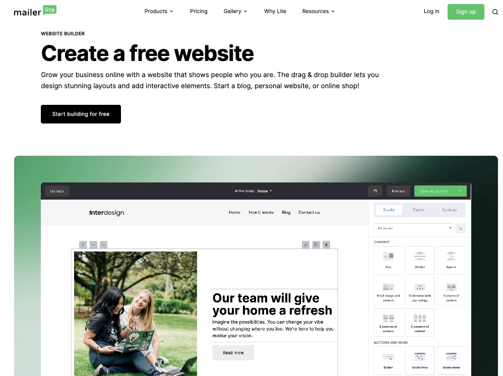
Every business needs a responsive and attractive website where prospective customers can interact with their brands—most email signups happen on your website anyway.
Utilize Mailerlite’s drag-and-drop website builder to design your business’s lively and engaging website layout.
3. Email Automation Features
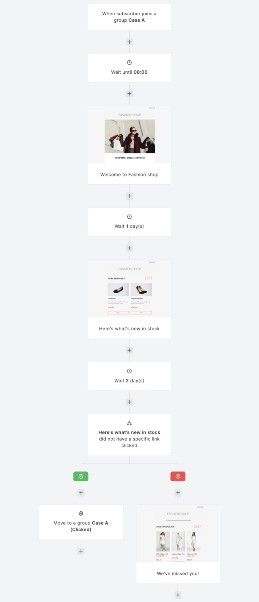
Image Credit: Mailerlite
Monitor email clicks, customer behavior, and response to your emails to enable you to strategize. Automated emails handle follow-ups, email resends, and action prompts based on analyzed data.
4. Email Verifier
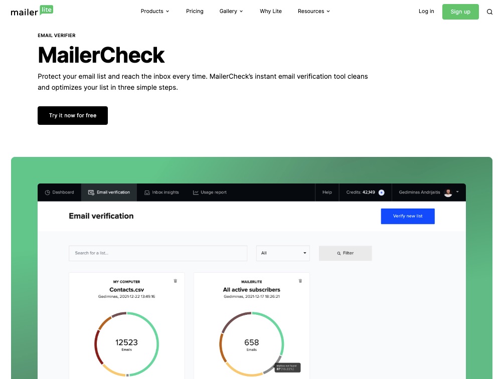
Mailerlite performs routine checks and deep cleaning on your email list to weed out inactive subscribers, dormant accounts, and spammy contacts.
Enjoy a fully optimized email list 24/7.
5. Blog Creator
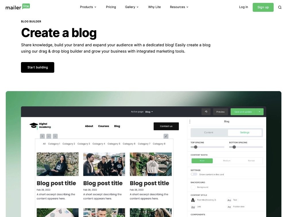
Use its drag-and-drop builder to craft attention-grabbing blog posts to build your audience and share your unique ideas with your community.
Blogs are an important marketing strategy to adopt for your business. According to statistics, 77% of internet users read blogs.
Leverage the power of blogs and increase your site clicks.
6. Landing Page Gallery
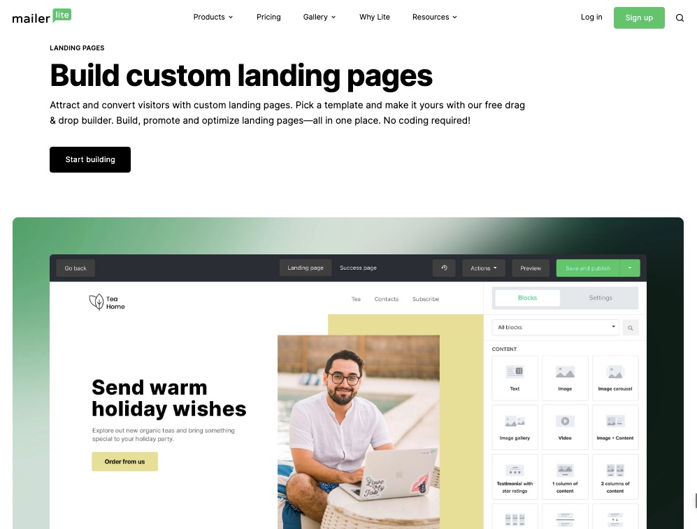
Your prospective customers need an online location to interact with your business. This could be a landing page.
Choose from a range of templates for a mobile-friendly landing page. So you have one less thing to worry about in building your email marketing campaign.
7. Digital Products Marketing
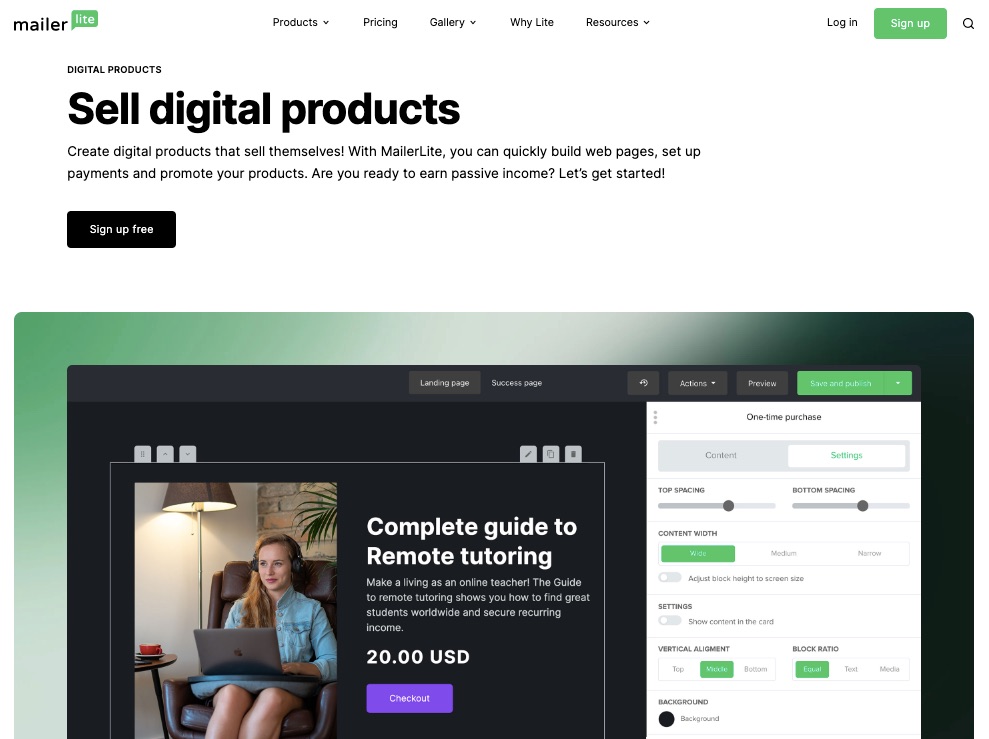
Mailerlite offers an avenue for users to sell virtual products like ebooks, online courses, or other digital services.
Set up websites and include a payment gateway for easy patronage.
You can equally promote your digital products on Mailerlite.
More Features
- Signup forms
- Email automation
- Newsletter subscription
- Analytics and tracking
- Facebook integrations
Pros
Mailerlite is simplified for even beginners to understand. Also, the email marketing service integrates with Shopify.
Pricing is fair, and you can enjoy up to 30 days free trial period for all paid plans to decide if you want to continue or not.
Cons
The free version is only open to one user and has limited functions and features.
Pricing
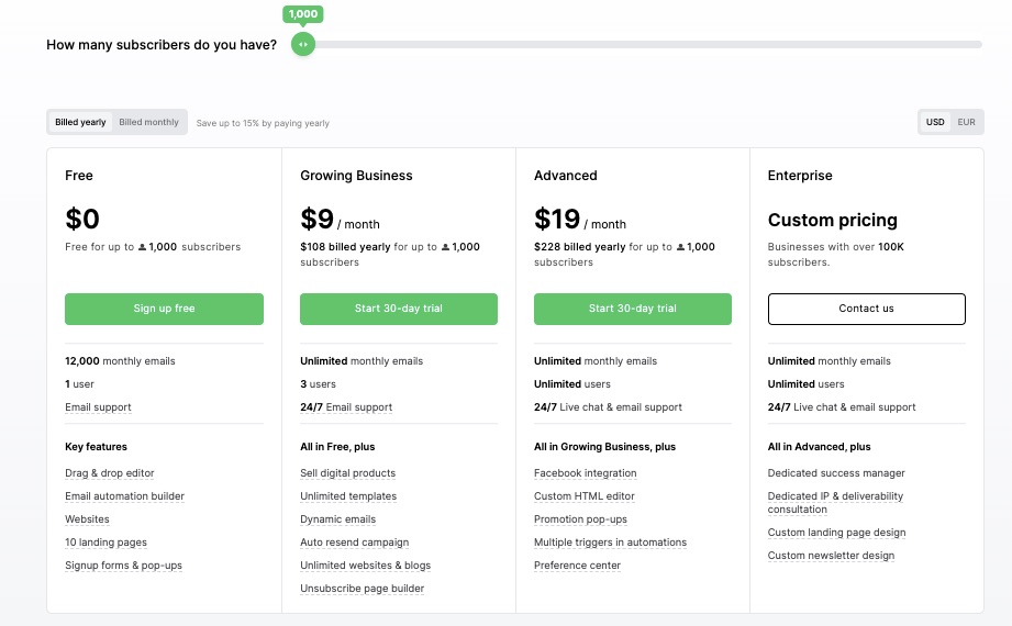
Free for up to 1000 subscribers. Monthly billing based on their annual plan:
- Growing Business: $9 per month
- Advanced: $19 per month
- Enterprise: Custom pricing
11. ConvertKit: Best for Creators
ConvertKit targets creators and builds its features around their needs to attract, engage and monetize their audience. As a result, users can build, manage, and earn a living from your audience on a single platform.
- Unique Feature: Creator pro
- Target Users: Creators (authors, musicians, coaches)
- Pricing: Starts at $9 per month
Features
1. Automated Email Marketing
ConvertKit lets you breeze through the email writing process by automating every stage. For example, schedule email sends, deliver welcome messages, and group subscribers automatically.
2. Advanced Creator
ConvertKit’s creator pro takes the creator business a notch higher. This feature allows subscriber scoring, newsletter referrals, timely support, and teamwork and provides deliverability reports.
This is the best email marketing tool for mainstream creators.
3. Email Design
Create, edit, and optimize your emails to convert faster. ConvertKit makes email designing easy and more fun.
You can choose from previous templates and flawlessly modify the font, color, or body of your emails.
4. Email Opt-In Forms
Whether you want to choose from numerous form templates or create a customized form yourself, ConvertKit got you covered.
Access free signup forms to retarget your audience.
5. Commerce
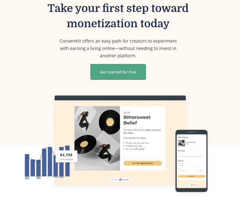
Turn your passion into a source of income with ConvertKit’s eCommerce channel, which enables you to sell or buy digital products easily.
Package and monetize your knowledge as ebooks, online courses, newsletters, music, or presets and sell to a willing audience.
6. Third-party Integrations
Integrate your ConvertKit to your most preferred third-party apps. You can access eCommerce, lead capture, ads, CRM, and many other third-party integrations.
7. Paid Newsletter
If you have rich content and a list of loyal readers who enjoy them, ConvertKit can help you earn from newsletters.
Create customized newsletters targeted at the right audience and put a price on your knowledge.
Mailerlite provides free newsletter templates.
More Features
- Audience tag
- Advanced Reporting
- Community support
- Broadcasts
- Automation builder
Pros
ConvertKit promotes the creator business and is positioned to help creatives sell their products.
The free plan supports 300 subscribers with unlimited emails, forms, landing pages, and other email marketing features.
What’s more?
You get two months of free email marketing services when you opt for annual billing.
Cons
Features on ConvertKit are purpose-built specifically for creatives making the email marketing service a poor choice for other industries.
Migration to ConvertKit from any other email marketing tool is unavailable on the free version. Also, the creator plan only allows for a single team member addition.
Pricing
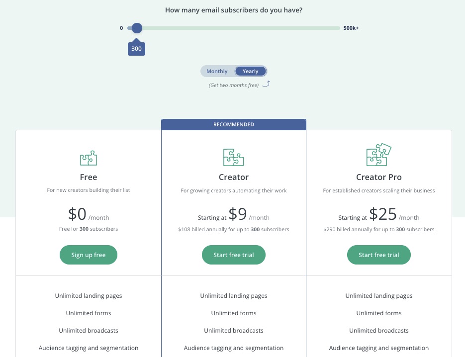
Free for up to 300 subscribers. Monthly billing begins at $9 per month for Creator and $25 per month for Creator Pro.
12. Sendy: Best Low Budget and Self-Hosted Solution
Sendy uses Amazon Simple Email Service (SES) to deliver the best email marketing software for users who would like a solution that’s 100x cheaper than competitors.
Sendy is one of the most affordable email marketing services in the market.
Users don’t need to pay monthly subscriptions as this self-hosted email marketing service bills only the number of emails sent. However, you’ll need to buy, install, and update the Sendy email marketing software.
- Unique Feature: Low-budget email sends
- Target Users: eCommerce, SMEs
- Pricing: Pay as you use
Features
1. Cheap Email Sends
Sendy offers the lowest low-price email send rate in the market. For example, you pay only $1 for every 10,000 email messages.
The affordability doesn’t affect deliverability and speed as it uses the widely trusted Amazon SES. So, you can achieve your email marketing goals on a low budget.
2. Email Campaign Reports
Get timely reports on your campaign performance and other marketing activities on the platform.
Reports give updated insights on your site activities to help you focus your energy on marketing efforts that produce the most results.
Reports are organized into beautiful visual representations like charts to simplify data.
3. Autoresponders
You can’t determine when customers will visit your site or indicate interest in your product.
But with auto response in place, you can rest assured that you’ll miss nothing.
Follow up on email subscribers without being present around the clock. Set marketing automation to answer inquiries, provide feedback, and engage customers while you’re away.
4. Email Clean Up
Sendy’s Housekeeping ensures your email list stays clean and relevant so you can channel your marketing efforts to the right audience.
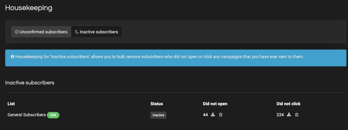
Prune out redundant contacts, uninterested subscribers, and wrong email addresses, clogging your sales progress wheel.
5. Integrations and Zapier
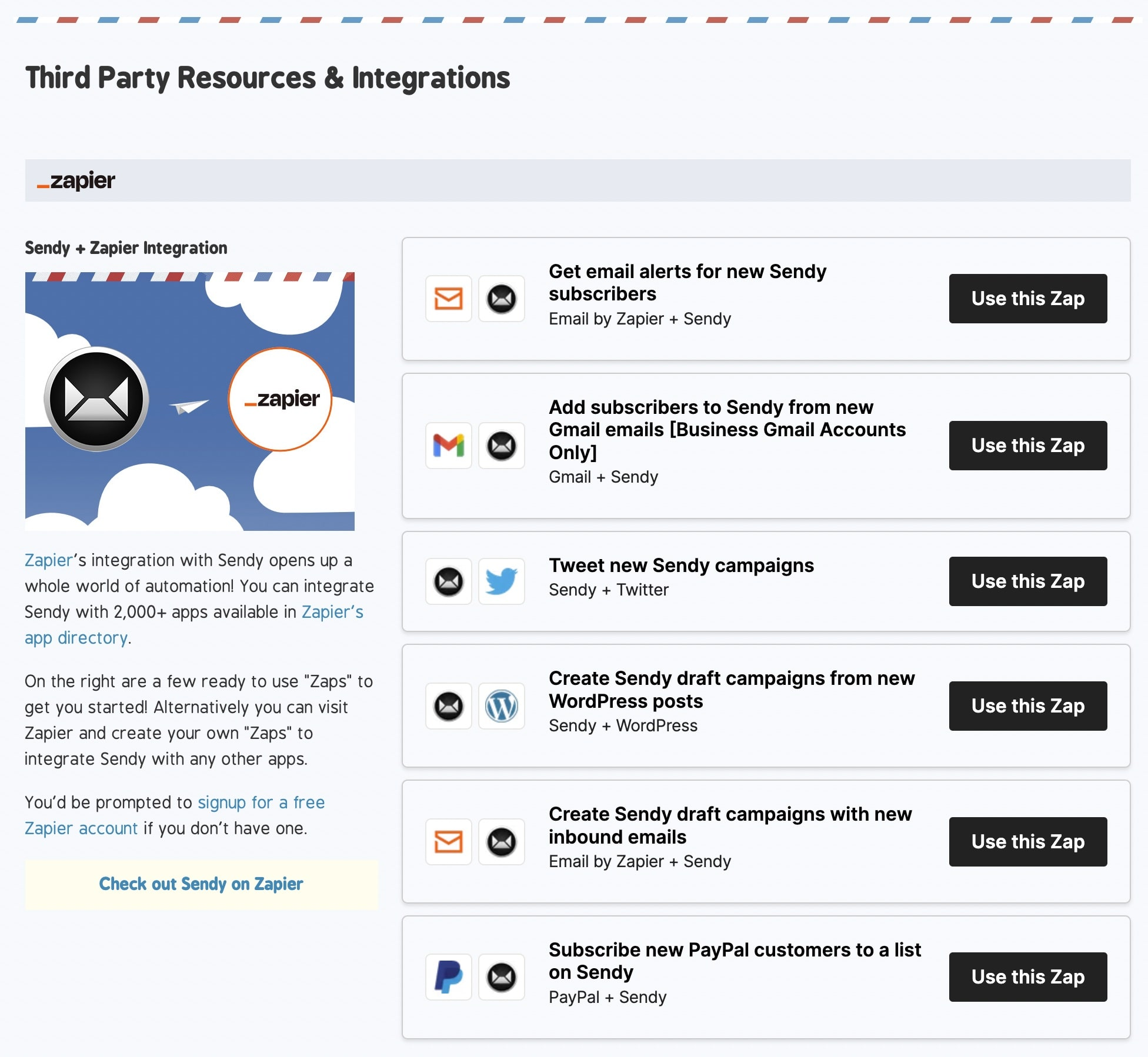
Image Credit: Sendy
Explore many third-party apps like WordPress and thousands of marketing tools on Zapier by integrating Sendy with them.
The integration process is easy, but if you need expert support, the Sendy community is there to assist you at no cost. However, Sendy may charge a fee if you need them to help you install their email marketing software on your hosting server
6. Personalized Domains and Brands
Create your branded domain to increase brand awareness and customer trust. Let your URL capture your brand.
7. Personalized Fields
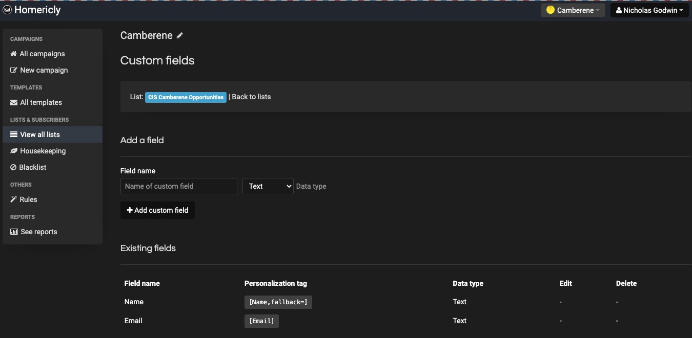
Save information about your subscribers on your created custom field. Stored data ranges from names to emails and demography.
Information from Sendy’s custom fields is useful in segmentation and audience tags when designing newsletters.
More Features
- Subscription forms
- Subscriber segmentation
- Webhooks
- Google Analytics integration
- Personalized tags
Pros
Sendy is feature-rich for a low-budget email marketing platform.
Users only pay for emails sent. And the one-time fee required to use Sendy is refundable if you don’t get desired results—but this is case-by-case.
You can install Sendy on one domain but host emails for multiple domain names.
Cons
Sendy runs on your web server and requires a license to set up. Requires updating to newer versions from time to time. Unfortunately, this tool doesn’t support a free plan.
Pricing
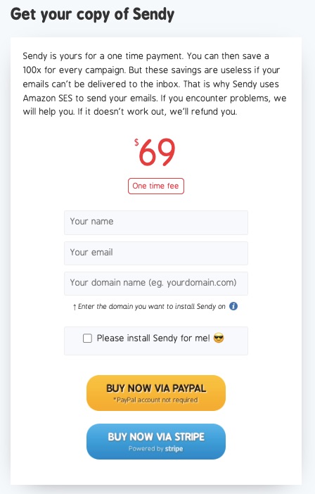
No monthly payment plan.
- One-off $69 is to buy this email marketing software
- Pay $1 for every 10,000 emails sent.
FAQs
What is the best email marketing software to choose?
Choosing an email marketing platform is tough. But you can make it slightly easier with a checklist.
Use this checklist to make your decision easier:
- Understand the nature and purpose of the emails you intend to send.
- Decide on the most important features your ideal email marketing software must possess.
- Prepare your testing team
- Develop a shortlist of productive apps.
- Carefully assess each shortlisted app with your team.
- Start exploring any free email marketing service you can access.
What are the categories of marketing emails?
- Email Newsletters: they’re newsletters that contain vital brand information.
- Transactional Emails: facilitates or updates commercial transactions, e.g., order confirmation email.
- Behavioral Emails: on-target messages based on user behavior to previous messages on your site or third-party tracking sources.
What is B2B email marketing service?
B2B email marketing involves sending messages and email campaigns to businesses rather than individuals.
In a B2B marketing scenario, the communication link is between your business and another business.
Your targeting, product, and marketing activities are channeled toward converting other businesses to loyal customers.
How often should you send out marketing emails?
Frequent emails can turn customers off and make them unsubscribe from your list quickly. Ideally, you should drastically increase emails from twice monthly to once weekly.
Research shows that 33.3% of businesses send out emails weekly.
Whatever you decide, ensure to analyze progress reports and use insight to determine whether to increase or reduce the number of emails sent.
What is the importance of email marketing?
Email marketing helps businesses gather, manage and engage new site visitors. You can also keep existing customers updated on your latest offerings.
It costs 500% more to gain new customers than to retain an existing one. So, use email marketing to keep your loyal customers engaged.
What is the average ROI for email marketing?
Email marketing gives a significantly higher return than other types of marketing, like digital or traditional marketing.
You gain $42 per $1 invested in email marketing campaigns. This makes email marketing the most preferred digital marketing strategy for businesses.
Does email marketing increase sales?
Email marketing is an efficient and cost-effective approach to marketing across different industries.
Consumers who receive email offers are 138% more likely to patronize a business because of email marketing campaigns than those who don’t.
Hence, email marketing increases sales, lead generation, and overall brand engagement.
Summary
The email marketing space is rife with email marketing services built to meet different user needs.
So, choosing the right email marketing service from the pool of options can be tasking.
But we’ve highlighted the top email marketing services and features you should consider when migrating your email service to a different platform. Of course, Active Campaign would be the best email marketing service on this list if we must choose one.
Explore any of the best email marketing software mentioned above, and let us know if you need help.
Featured image by storyset on Freepik
Source
The post 12 Best Email Marketing Services for 2022 (Ranked) first appeared on Webdesigner Depot.
Source de l’article sur Webdesignerdepot
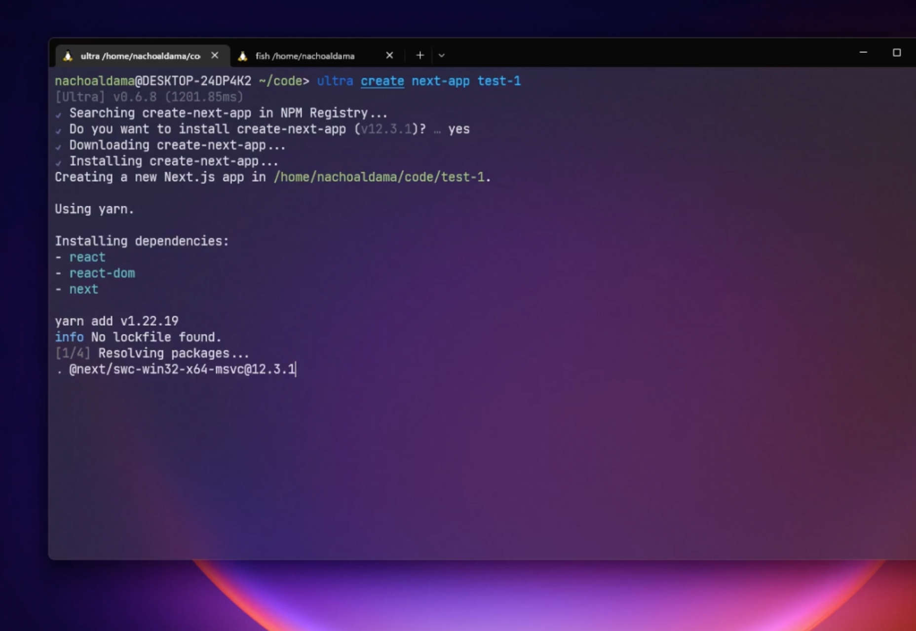
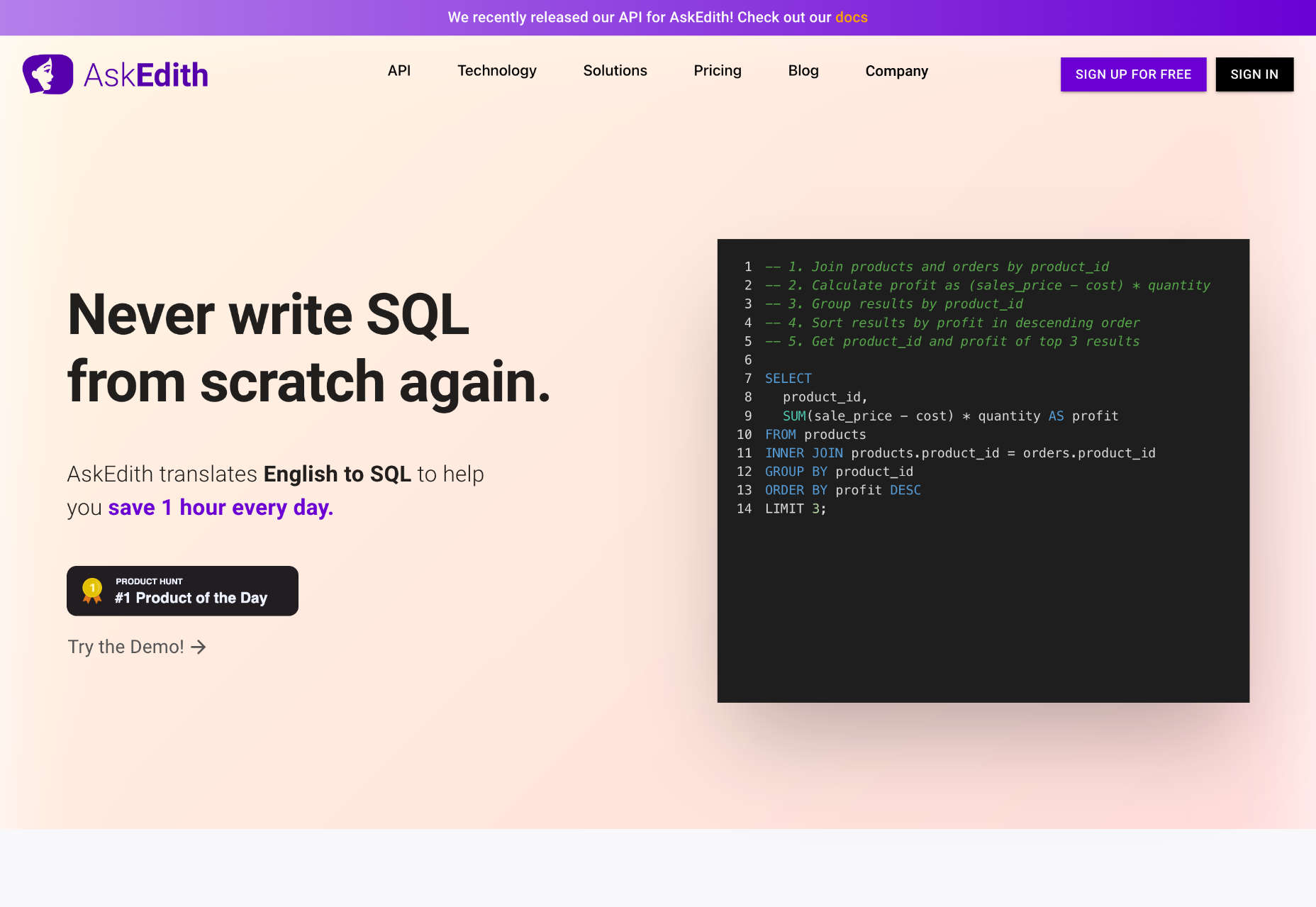
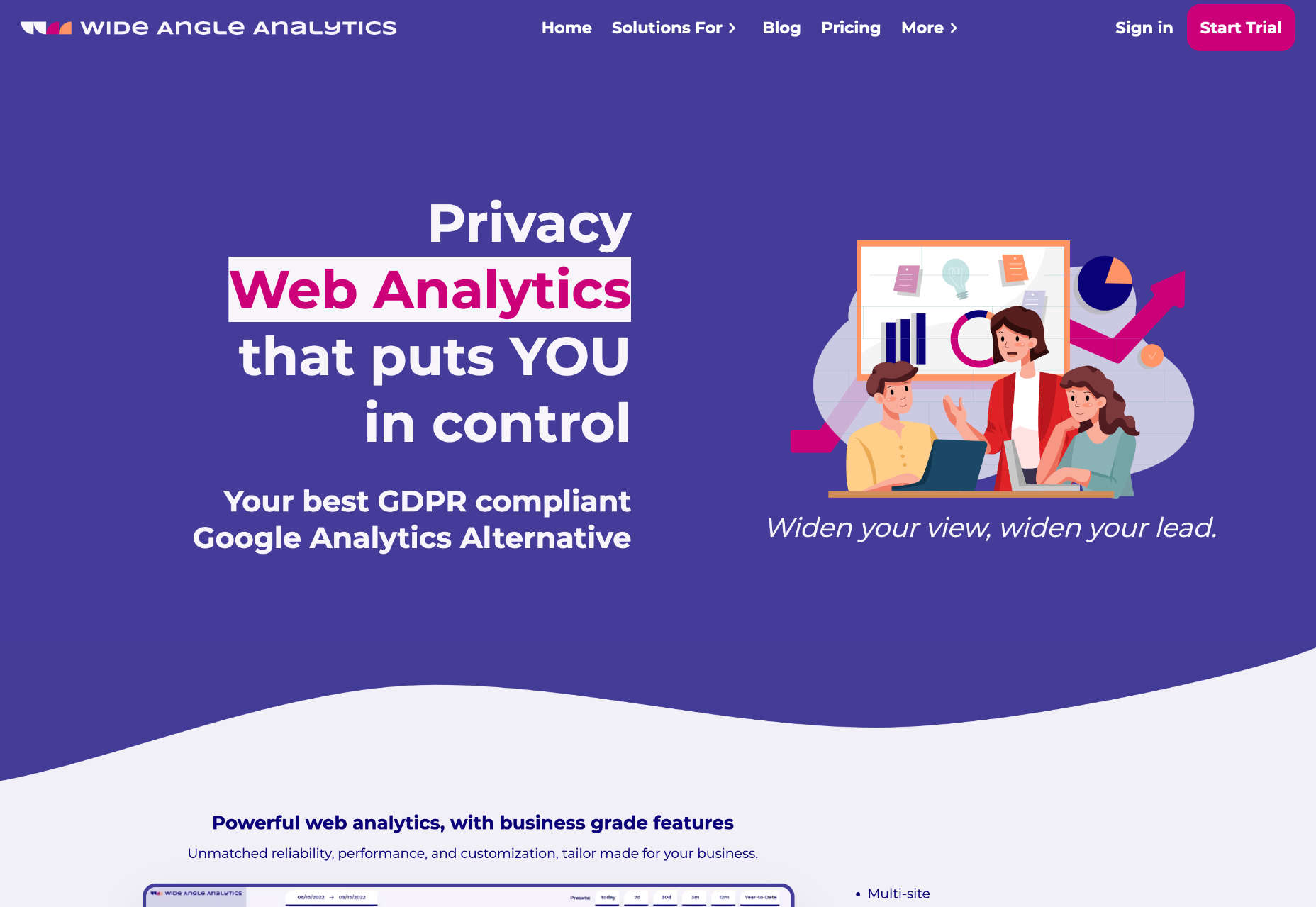
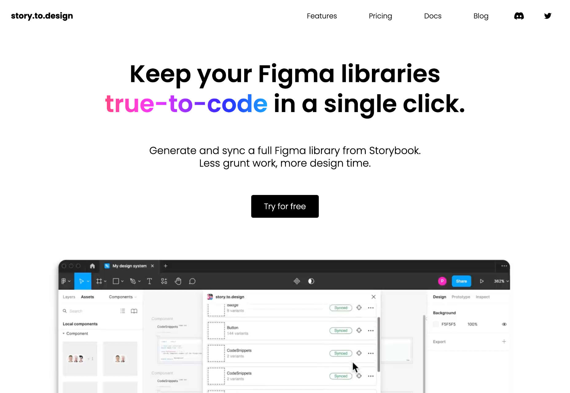
 We write this guide to the best new tools for designers and developers each month. For October, we’ve sought out tools to make you a better website builder, some handy utilities to make you more productive, and a spooky font for the end of the month. Enjoy!


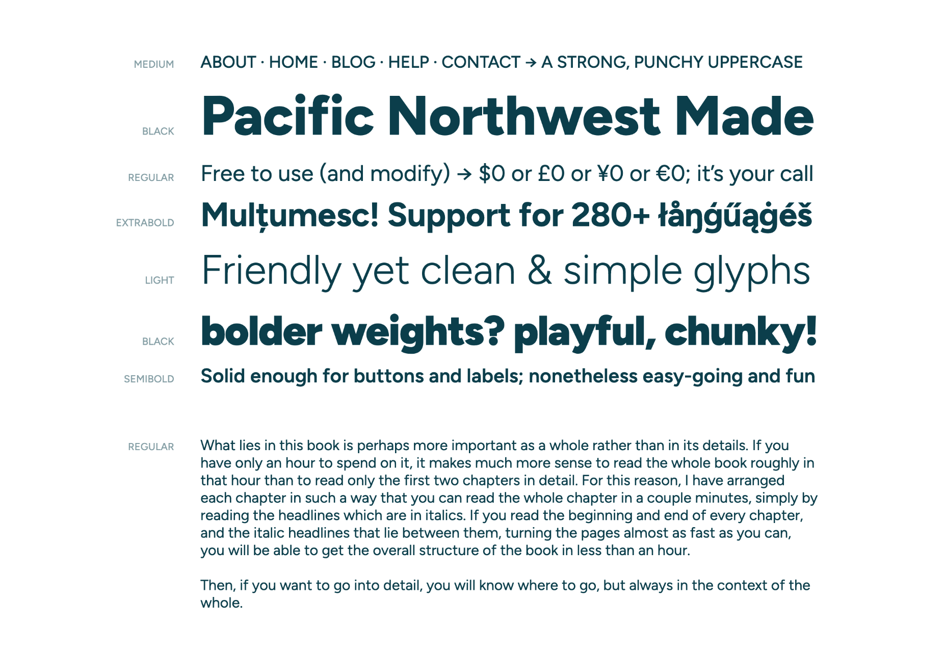
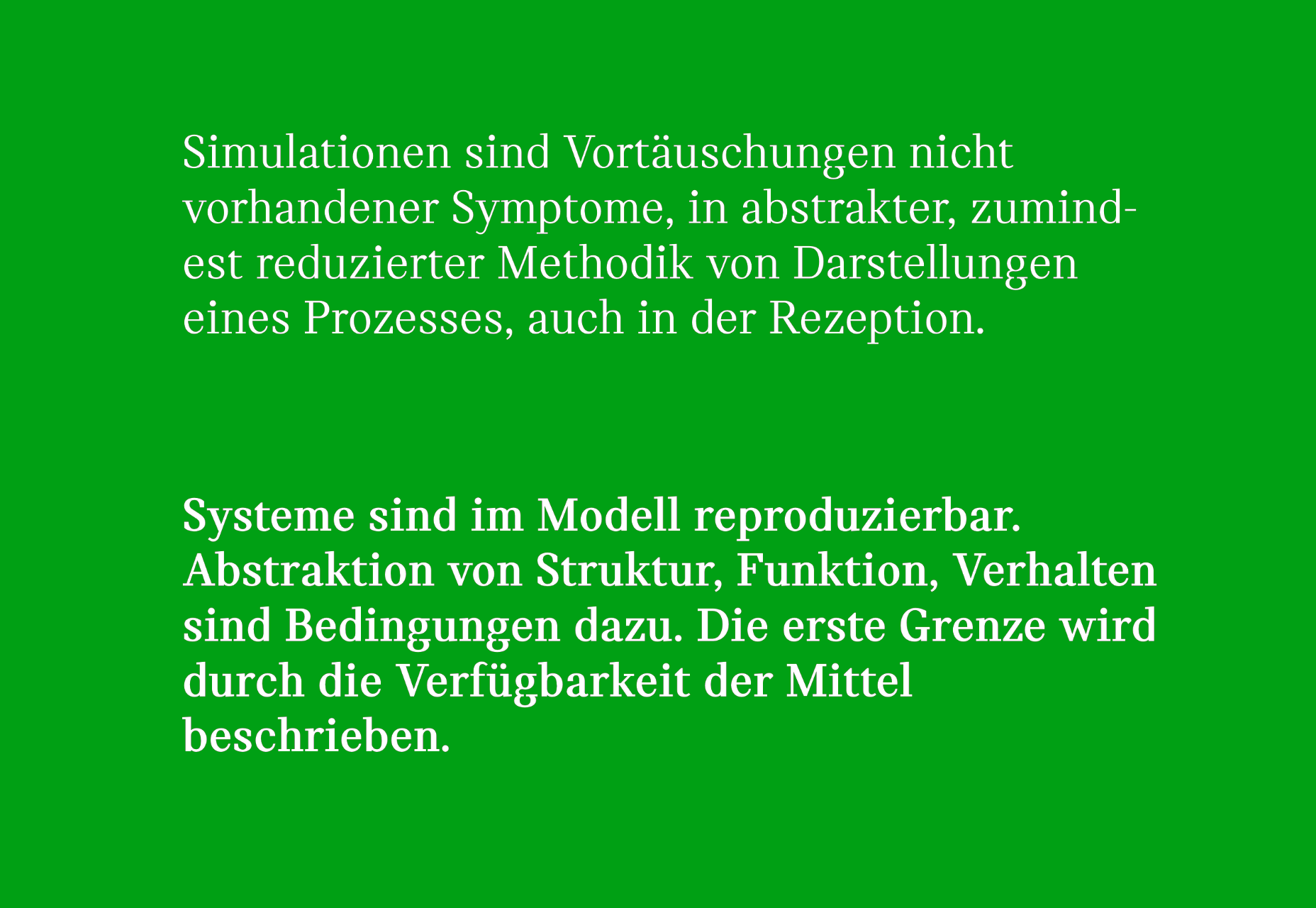
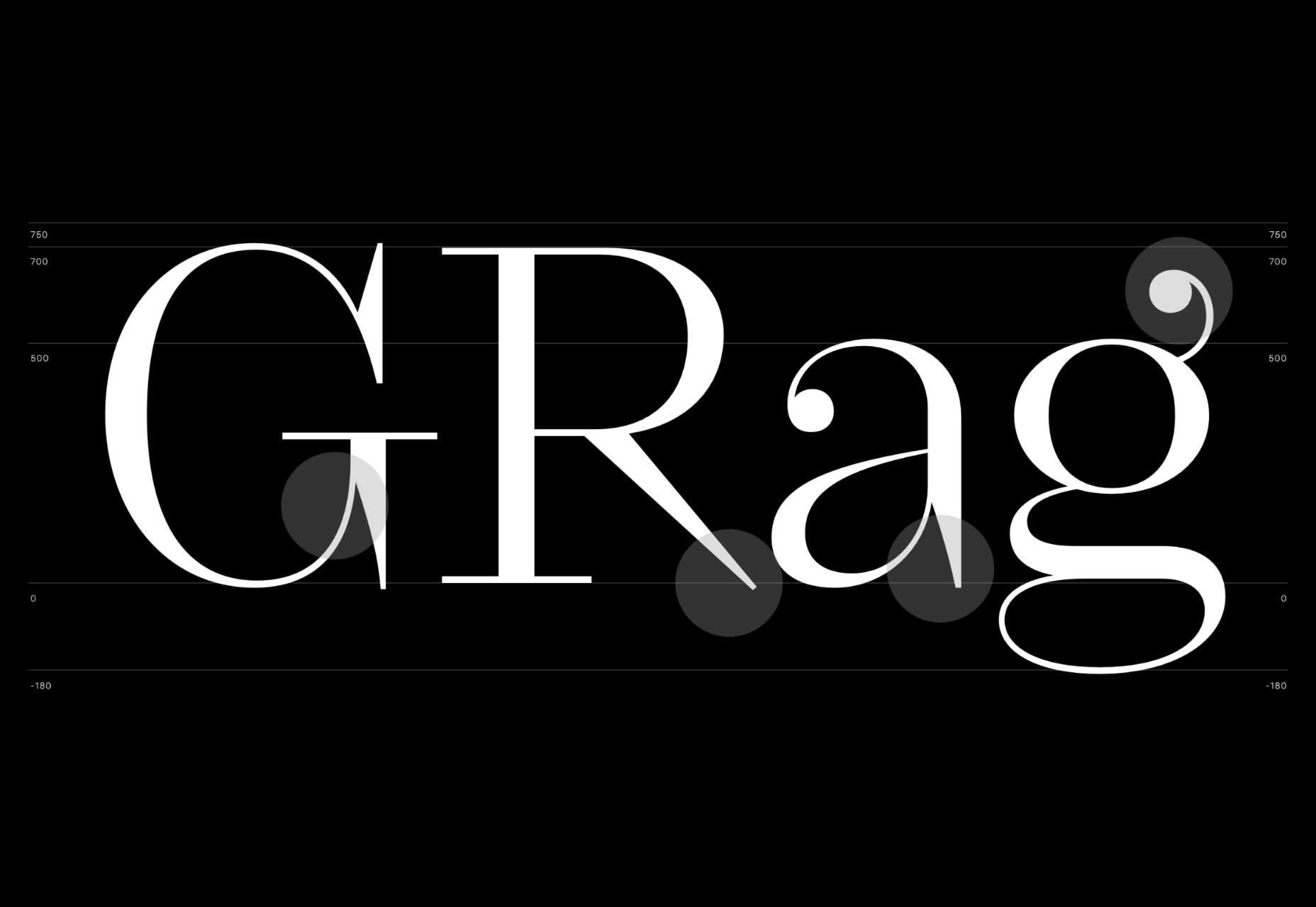
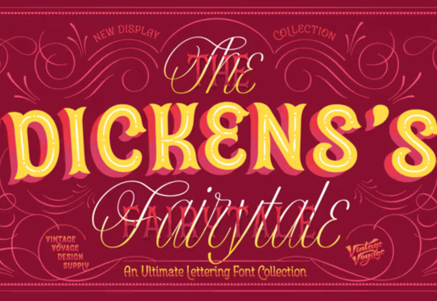
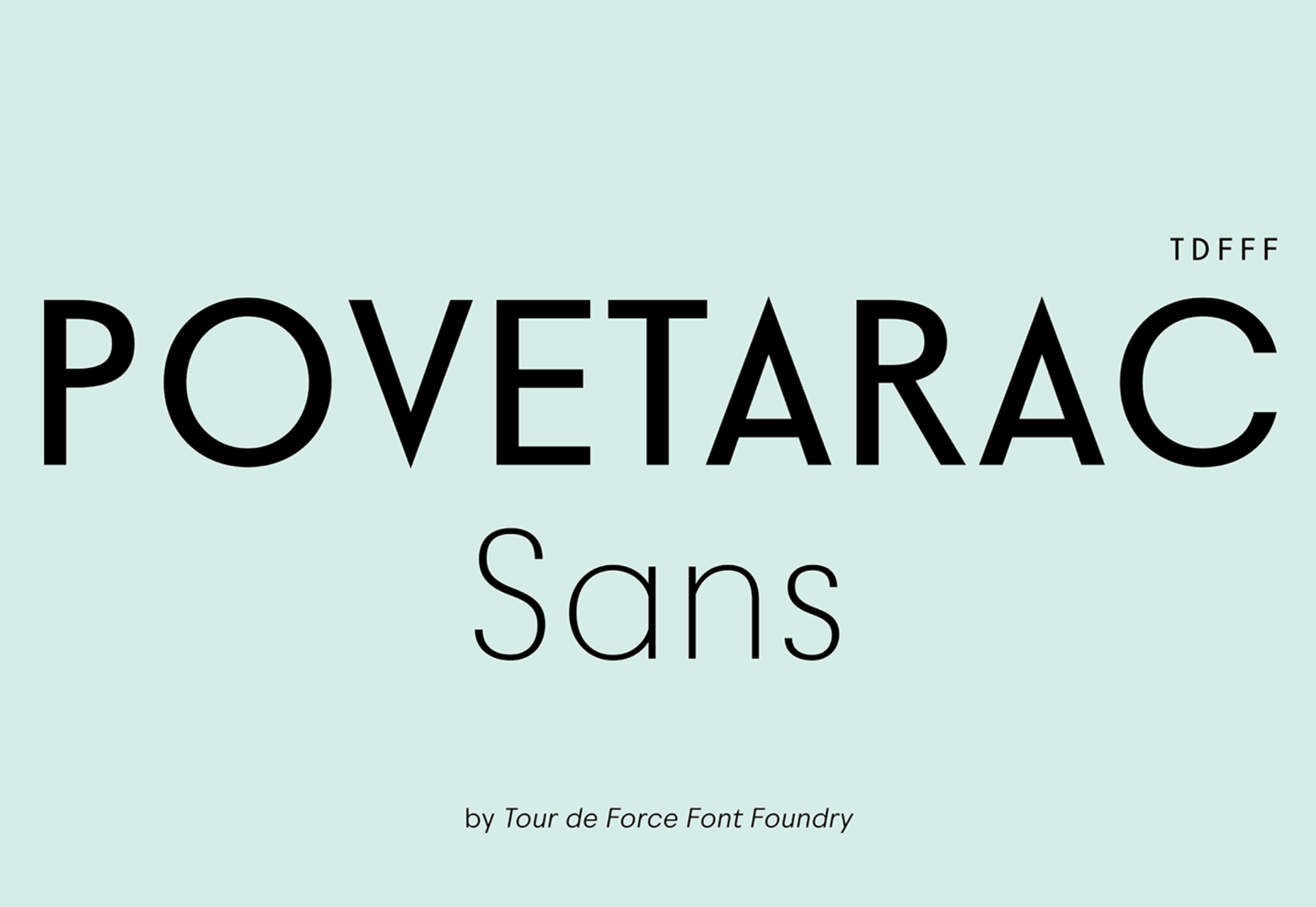
 Each month we publish this roundup of the best new fonts for designers to help you find new ways of packing personality into your designs.


 Jakob Nielsen’s


 User Experience is a crucial consideration for any web developer or designer; the only way to ensure that you’re delivering a successful website is to ensure that the end-user or customer will feel comfortable using it.
 The Summer’s over, and we’re back at our desks to discover that the web’s best app builders, font designers, asset creators, and developers have been hard at work to deliver this bumper collection of exciting new tools for designers and developers.


 Three weeks ago,
 Users expect websites to load quickly. As a result, companies like Amazon and Target spend millions of dollars optimizing their sites to make them load as fast as possible because there is a direct correlation between site speed and conversions.
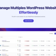
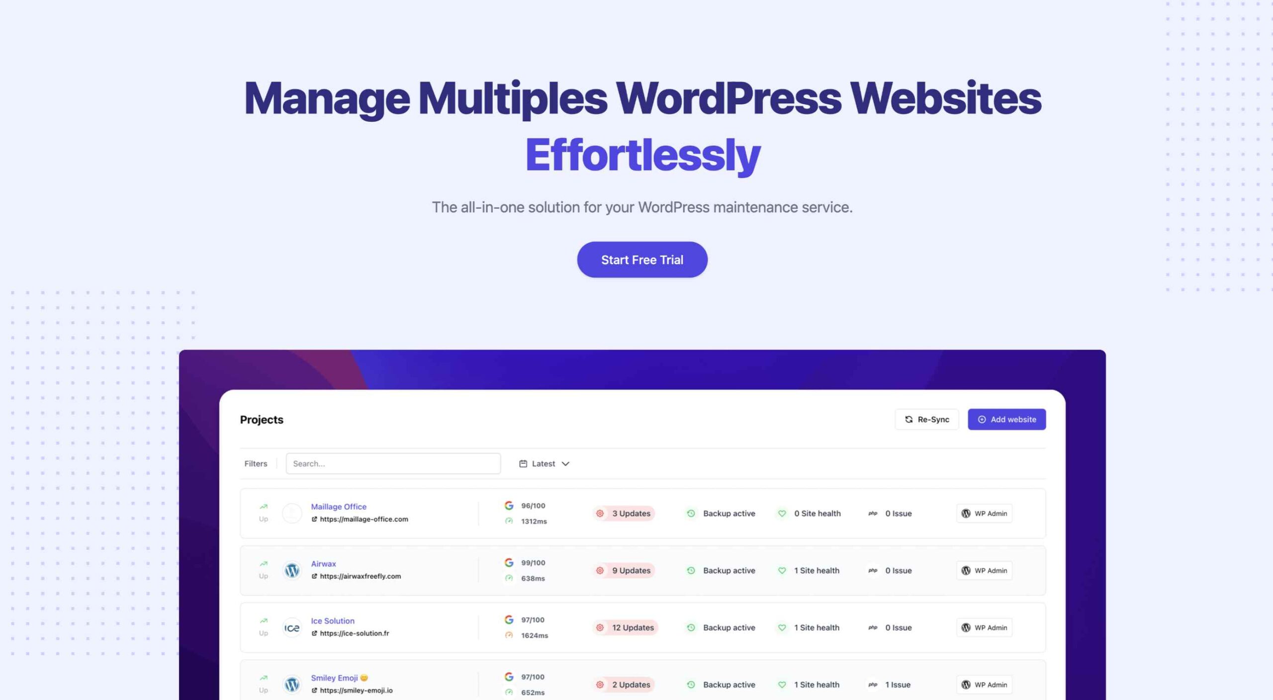 An unreliable, semi-broken and unresponsive website is an excellent way to lose leads and visitors — regardless of how aesthetically pleasing or well-designed, the visual elements are.
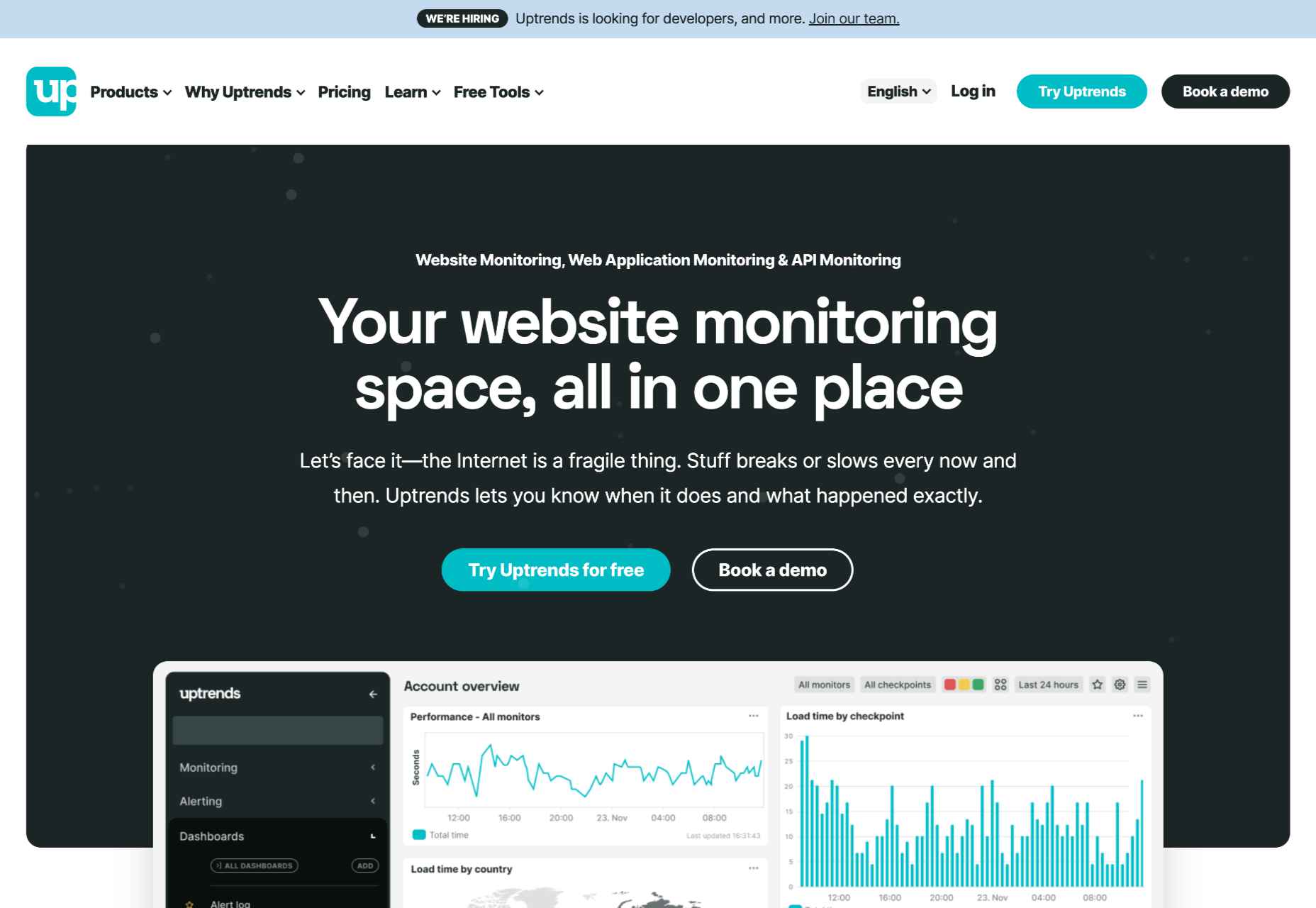