 We are gathered here today….
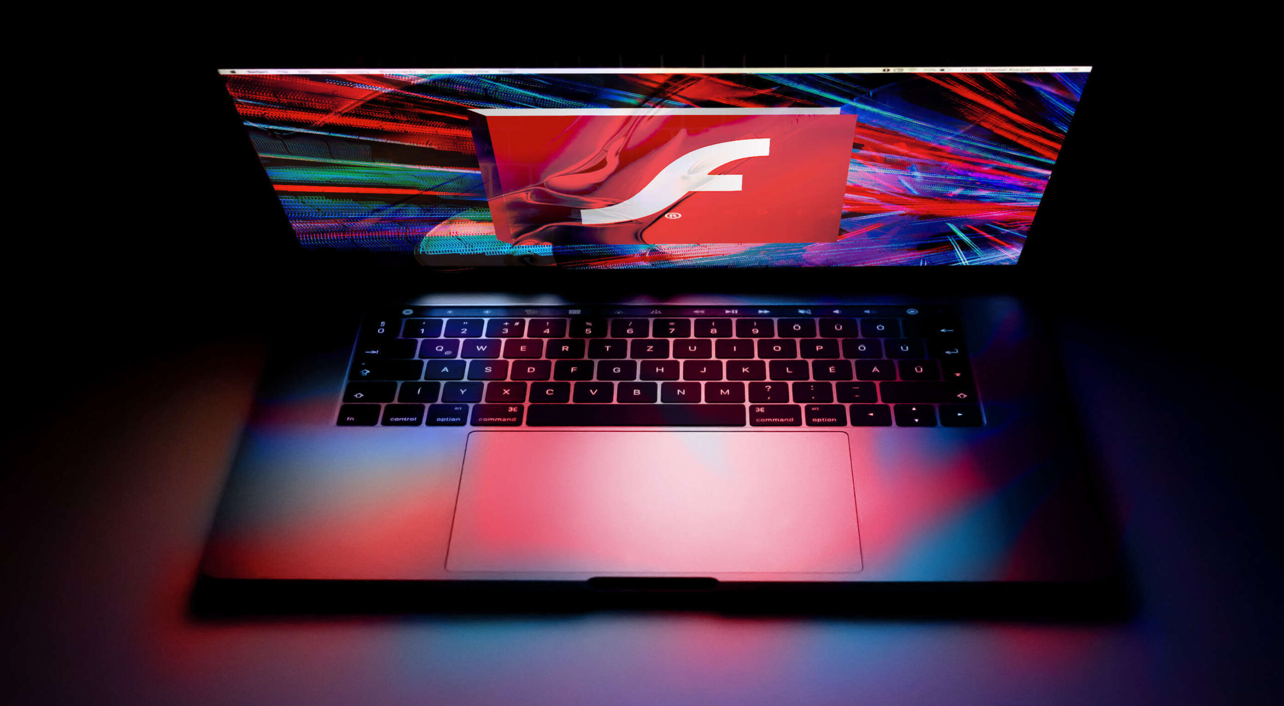
Today I write in memory of Adobe Flash (née Macromedia), something that a bunch of people are actually too young to remember. I write this with love, longing, and a palpable sense of relief that it’s all over. I have come to praise Flash, to curse it, and finally to bury it.
We’ve been hearing about the death of Flash for a long time. We know it’s coming. December 2020 has been announced as the official timeframe for removal, but let’s be real about this: it’s dead. It’s super-dead. It’s people-are-selling-Flash-game-archives-on-Steam dead.
That last bit actually makes me happy, because Flash games were a huge part of my childhood, and the archives must be preserved. Before I’d ever heard of video cards, frames per second, and “git gud”, I was whiling away many an hour on disney.com, cartoonnetwork.com, MiniClip, Kongregate, and other sites, looking for games.
I think we’ve established in my previous work that even as a missionary kid, I did not have a social life.
The Internet itself gave me a way to reach out and see beyond my house, my city, and my world, and it was wonderful. Flash was a part of that era when the Internet felt new, fresh, and loaded with potential. Flash never sent anyone abuse, or death threats. Flash was for silly animations, and games that my parent’s computer could just barely handle, after half an hour of downloading.
I even built my first animated navigation menus in Flash, because I didn’t know any better. At all. But those menus looked exactly like the ones I’d designed in Photoshop, so that’s what mattered to me, young as I was.
That was a part of Flash’s charm, really.
What Flash Got Right
Flash Brought Online Multimedia into the Mainstream
Funny story, JavaScript was only about a year old when Flash was released. While HTML5 and JS are the de-facto technologies for getting things done now, Flash was, for many, the better option at launch. JS had inconsistent support across browsers, and didn’t come with a handy application that would let you draw and animate whatever you wanted.
It was (in part) Flash that opened up a world of online business possibilities, that made people realize the Internet had potential rivalling that of television. It brought a wave of financial and social investment that wouldn’t be seen again until the advent of mainstream social networks like MySpace.
The Internet was already big business, but Flash design became an industry unto itself.
Flash Was Responsive
Yeah, Flash websites could be reliably responsive (and still fancy!) before purely HTML-based sites pulled it off. Of course, it was called by other names back then, names like “Liquid Design”, or “Flex Design”. But you could reliably build a website in Flash, and you knew it would look good on everything from 800×600 monitors, to the devastatingly huge 1024×768 screens.
You know, before those darned kids with their “wide screens” took over. Even then, Flash still looked good, even if a bunch of people suddenly had to stop making their sites with a square-ish aspect ratio.
Flash Was Browser-Agnostic
On top of being pseudo-responsive, the plugin-based Flash player was almost guaranteed to work the same in every major browser. Back in a time when Netscape and Internet Explorer didn’t have anything that remotely resembled feature parity, the ability to guarantee a consistent website experience was to be treasured. When FireFox and Chrome came out, with IE lagging further behind, that didn’t change.
While the CSS Working Group and others fought long and hard for the web to become something usable, Flash skated by on its sheer convenience. If your site was built in Flash, you didn’t have to care which browsers supported the <marquee> tag, or whatever other ill-conceived gimmick was new and trendy.
Flash Popularized Streaming Video
Remember when YouTube had a Flash-based video player? Long before YouTube, pretty much every site with video was using Flash to play videos online. It started with some sites I probably shouldn’t mention around the kids, and then everyone was doing it.
Some of my fondest memories are of watching cartoon clips as a teenager. I’d never gotten to watch Gargoyles or Batman: The Animated Series as a young kid, those experience came via the Internet, and yes… Flash. Flash video players brought me Avatar: The Last Airbender, which never ever had a live action adaptation.
Anyway, my point: Flash made online video streaming happen. If you’ve ever loved a Netflix or Prime original show (bring back The Tick!), you can thank Macromedia.
What Flash Got Wrong
Obviously, not everything was rosy and golden. If it was, we’d have never moved on to bigger, better things. Flash had problems that ultimately killed it, giving me the chance, nay, the responsibility of eulogizing one of the Internet’s most important formative technologies.
Firstly, it was buggy and insecure: This is not necessarily a deal-breaker in the tech world, and Microsoft is doing just fine, thank you. Still, as Flash matured and the code-base expanded, the bugs became more pronounced. The fact that it was prone to myriad security issues made it a hard sell to any company that wanted to make money.
Which is, you know, all of them.
Secondly, it was SEO-unfriendly: Here was a more serious problem, sales-wise. While we’re mostly past the era when everyone and their dog was running a shady SEO company, search engines are still the lifeblood of most online businesses. Having a site that Google can’t index is just a no-go. By the time Google had managed to index SWF files, it was already too late.
Thirdly, its performance steadily got worse: With an expanding set of features and code, the Flash plugin just took more and more resources to run. Pair it with Chrome during that browser’s worst RAM-devouring days, and you have a problem.
Then, while desktops were getting more and more powerful just (I assume) to keep up with Flash, Apple went and introduced the iPhone. Flash. Sucked. On. Mobile. Even the vendors that went out of their way to include a Flash implementation on their smartphones almost never did it well.
It was so much of a hassle that when Apple officially dropped Flash support, the entire world said, “Okay, yeah, that’s fair.”
Side note: Flash always sucked on Linux. I’m just saying.
Ashes to Ashes…
Flash was, for its time, a good thing for the Internet as a whole. We’ve outgrown it now, but it would be reckless of us to ignore the good things it brought to the world. Like the creativity of a million amateur animators, and especially that one cartoon called “End of Ze World”.
Goodbye Flash, you sucked. And you were great. Rest in peace. Rest in pieces. Good riddance. I’ll miss you.
Featured image via Fabio Ballasina and Daniel Korpai.
Source

Source de l’article sur Webdesignerdepot


 When creating a website, it’s vital to remember that not only does it need to work and look great on the device you are creating it on, but on all the other devices, it might be used on too.


 L’ANFR précise que 3.000 mesures d’exposition du public aux ondes radioélectriques ont été réalisés l’an passé. L’étude montre que 90 % des niveaux mesurés sont inférieurs à 1,4 V/m.