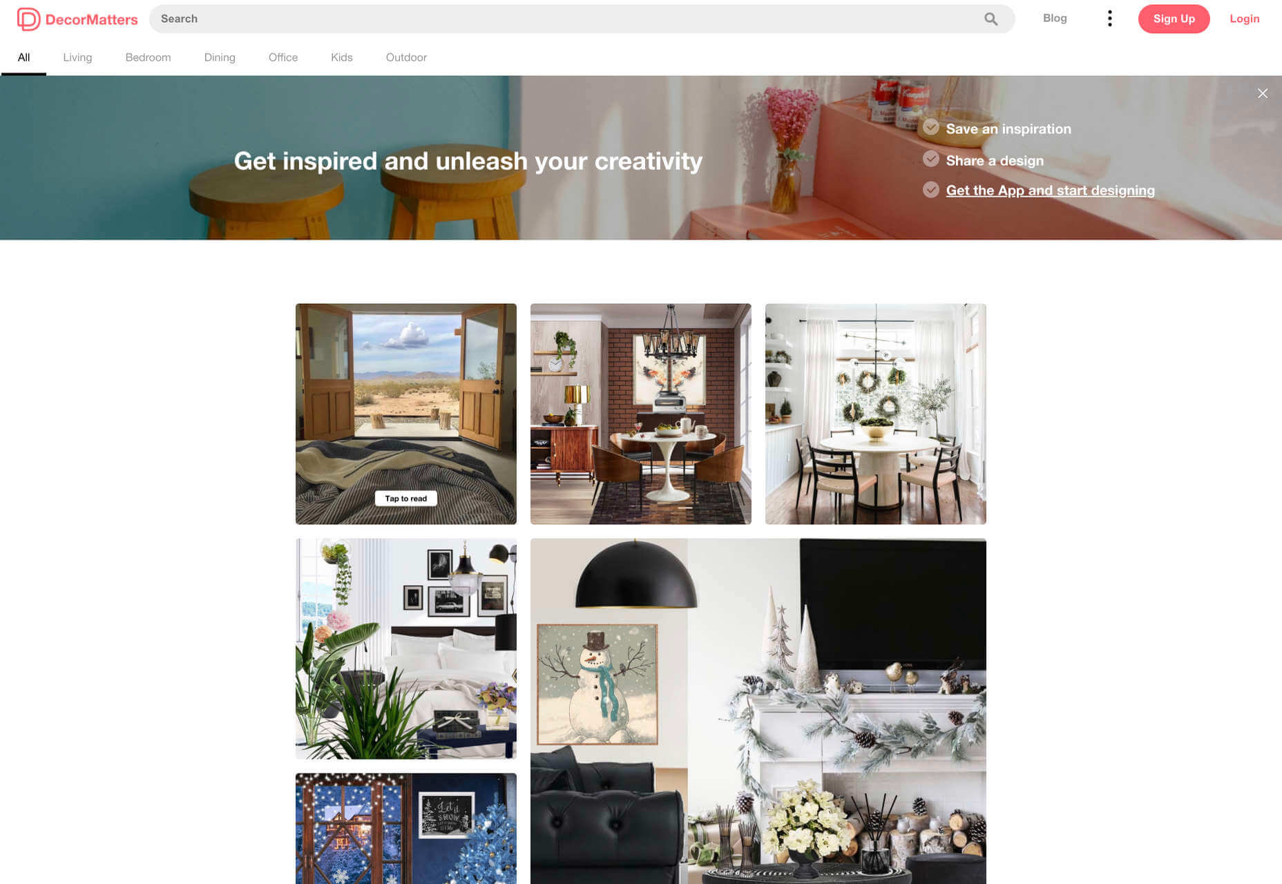
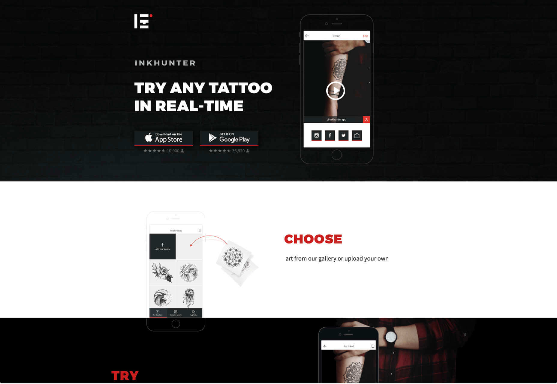
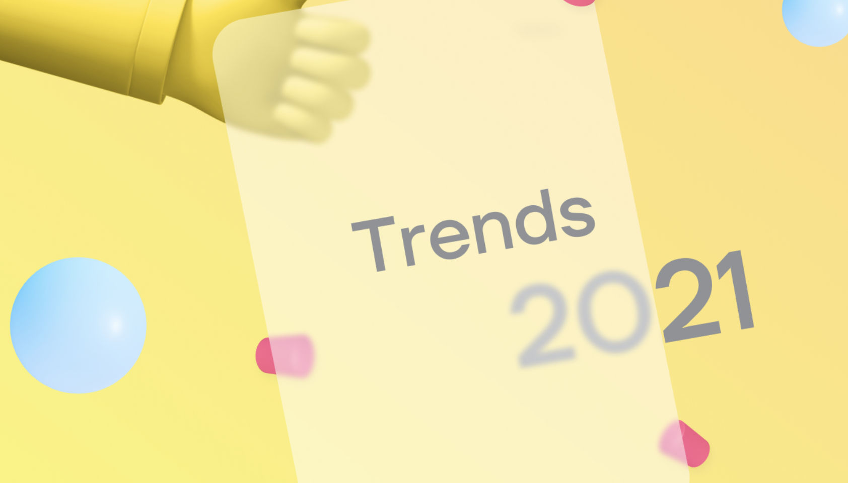
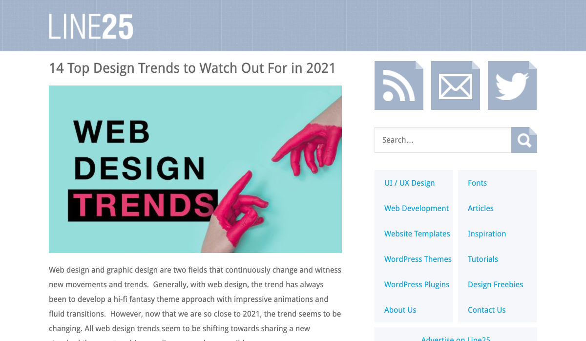
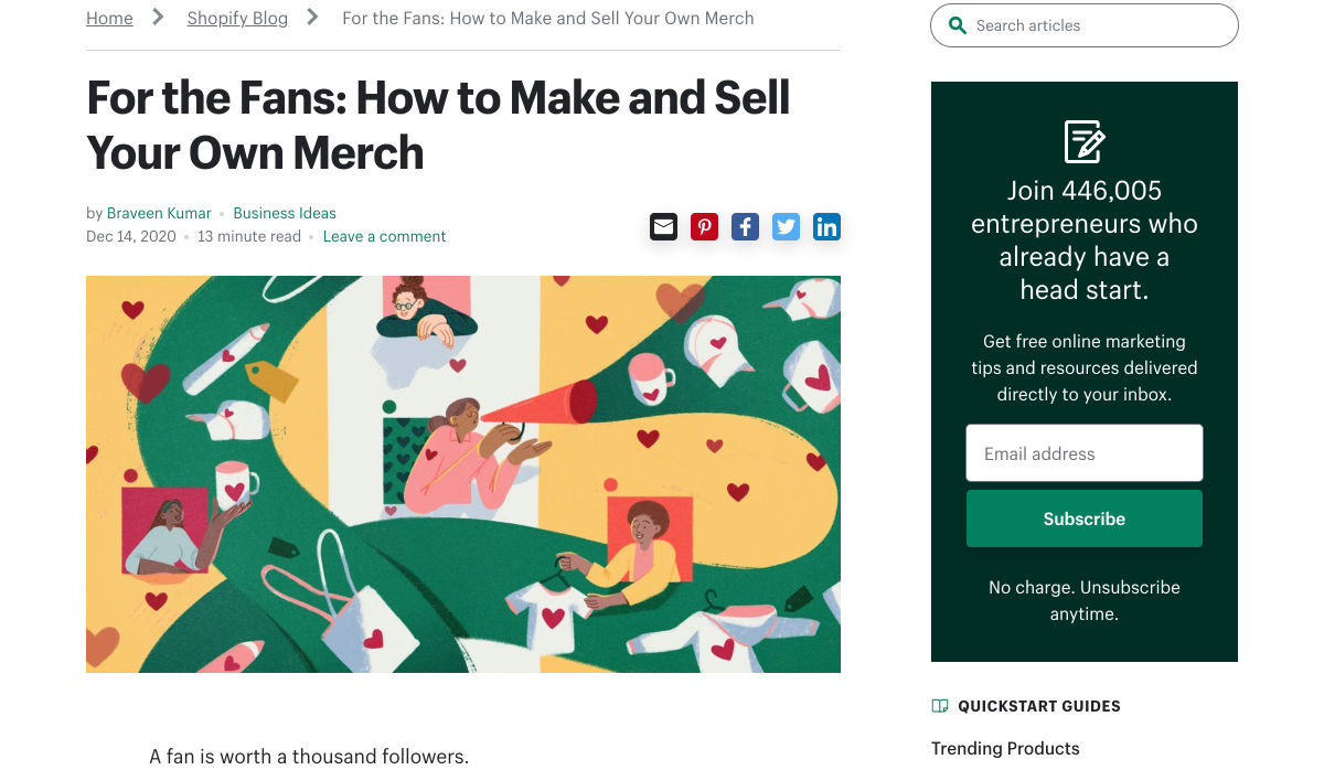
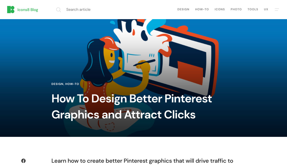
 The new year is often packed with resolutions. Make the most of those goals and resolve to design better, faster, and more efficiently with some of these new tools and resources.
Here’s what new for designers this month.
Radix UI
Radix UI is an open-source UI component library for building high-quality, accessible design systems and web apps. It includes examples and guidelines for all kinds of user interface elements that provide guidance and really make you think about accessible website design. (And everything is usable!)

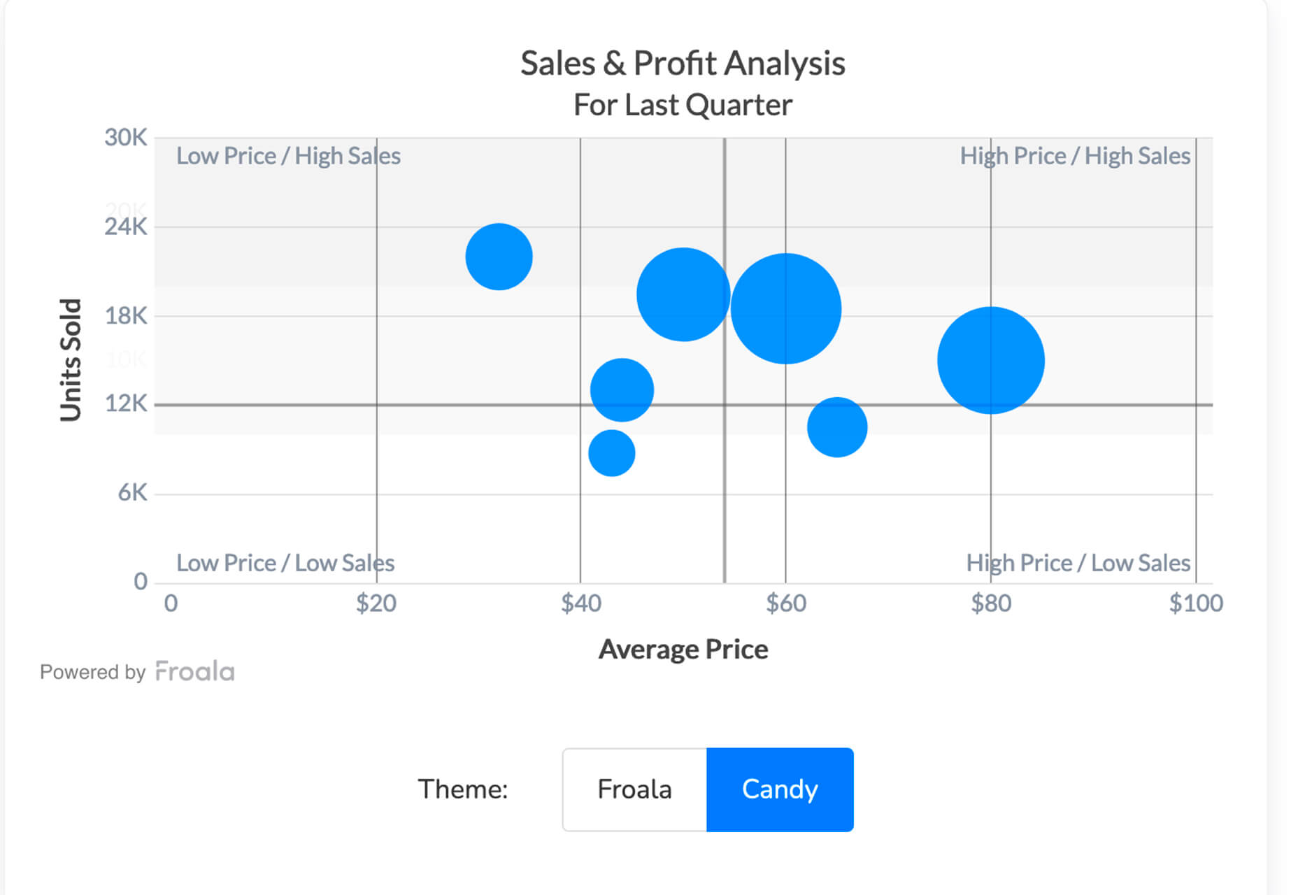
Froala Charts
Froala Charts is made to help you create data visualizations for web or mobile apps. Build any chart you can imagine – bar, line, area, heat map, sankey, radar, time series, and more. Plus, you can customize anything and everything, so it all matches your brand. This premium tool is enterprise-level and comes with a one-time license fee.
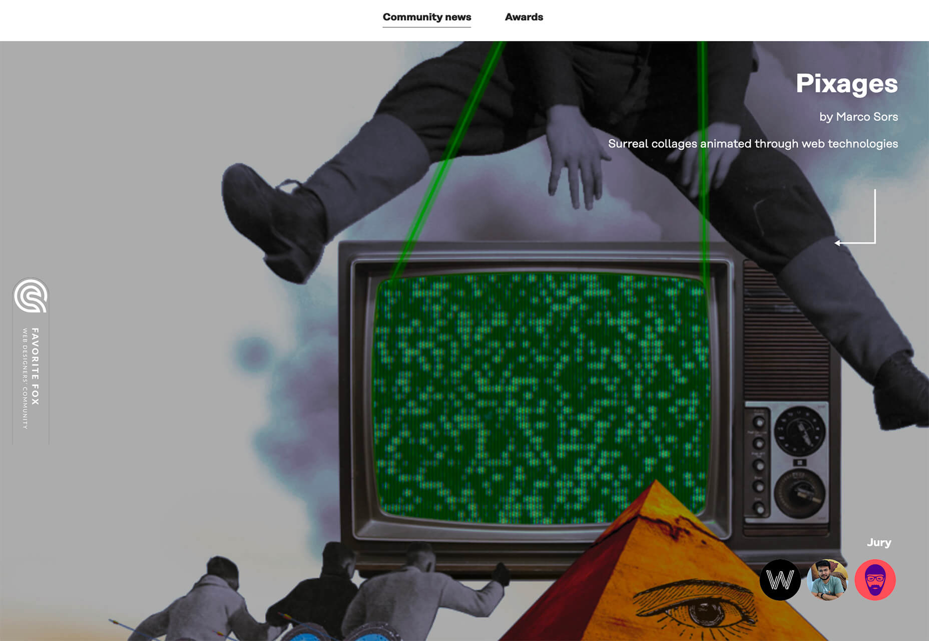
CSSfox
CSSfox is a collection of designs that you can use for inspiration. The curated community project includes posts, reviews, and award nominees and winners.
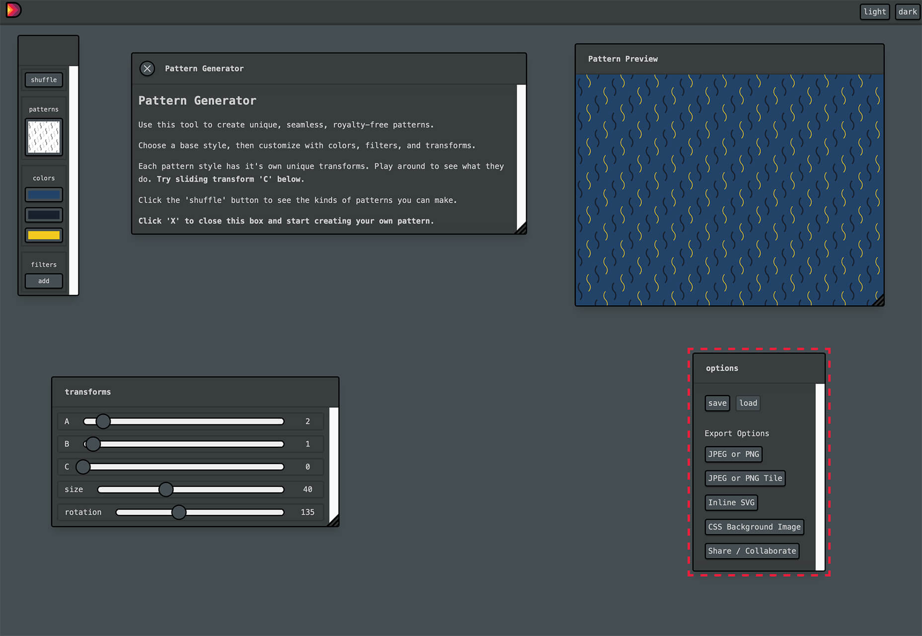
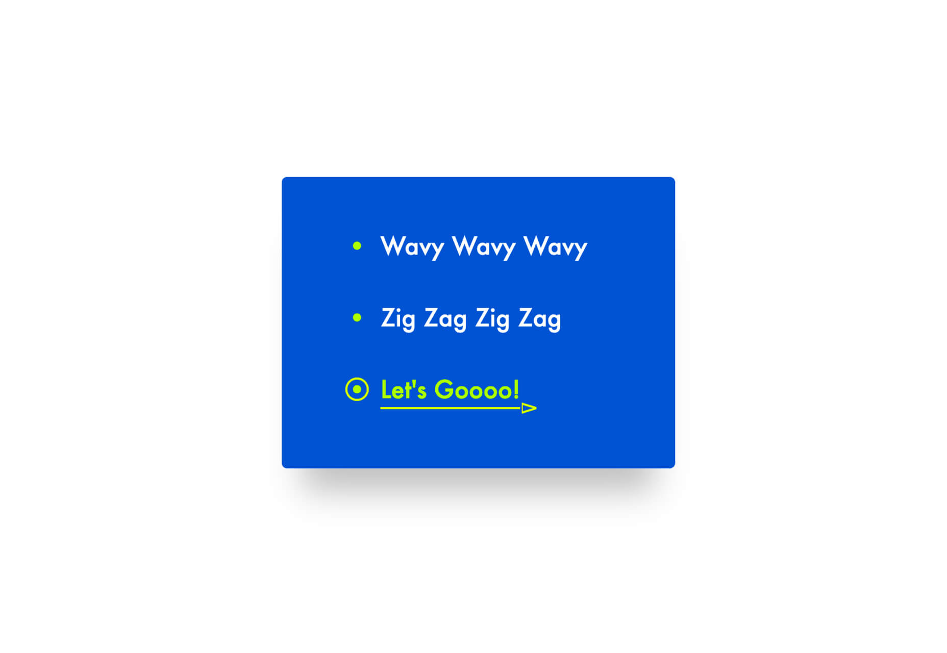
Pattern Generator
Pattern Generator is a tool to create seamless and royalty-free patterns that you can use in projects. Almost every element of the pattern design is customizable, and you can “shuffle” to get new style inspiration. Design a pattern you like and export it for use as a JPG, PNG, SVG, or CSS.
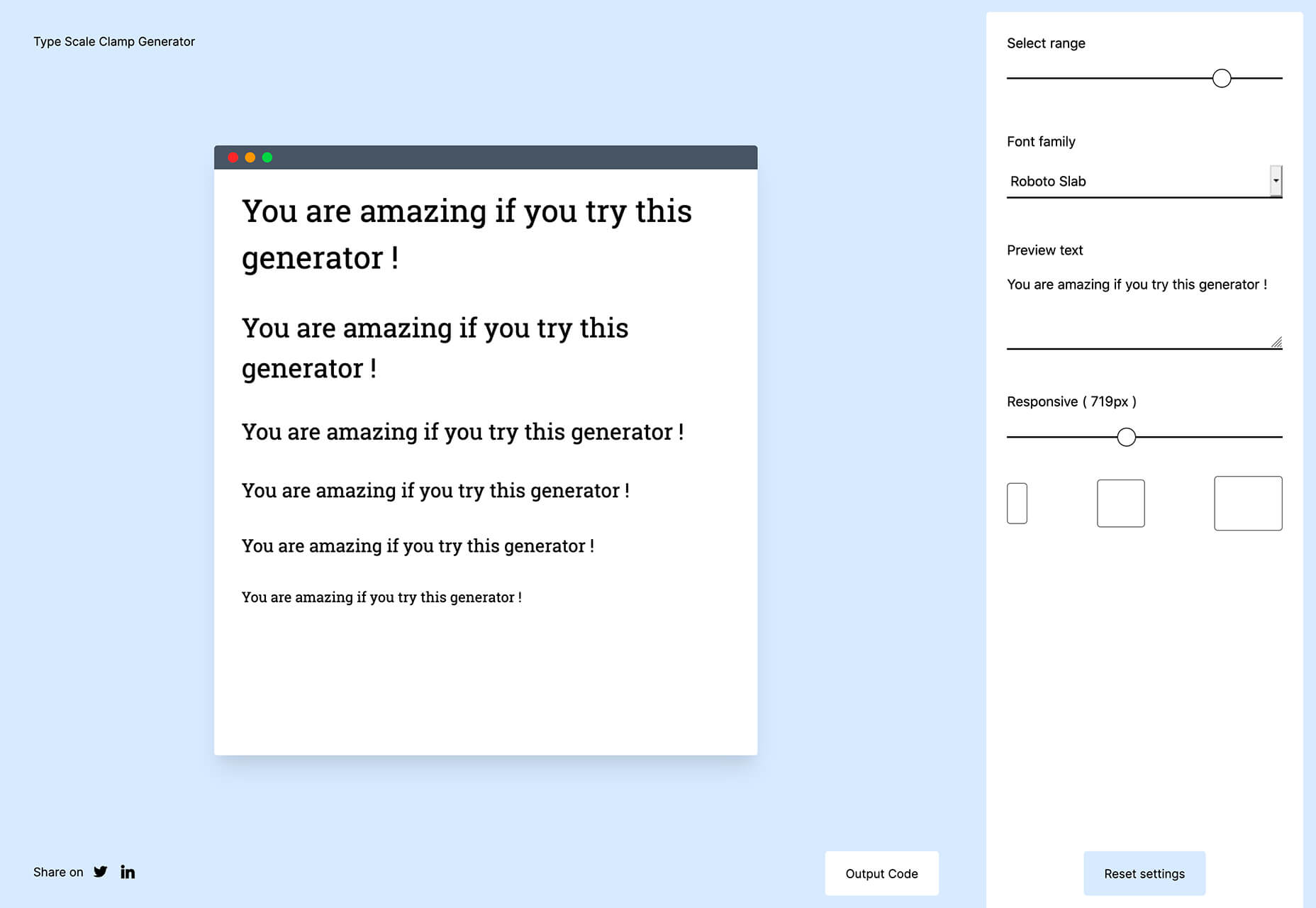
Type Scale Clamp Generator
Type Style Clamp Generator helps you create a visualize a typographic scale for web projects. Pick a font and determine a few other settings and see the scale right on the screen. You can even put in your own words to see how they would look. Then, flip to see how sizes appear on different devices. Find a scale you like and snag the code with a click.
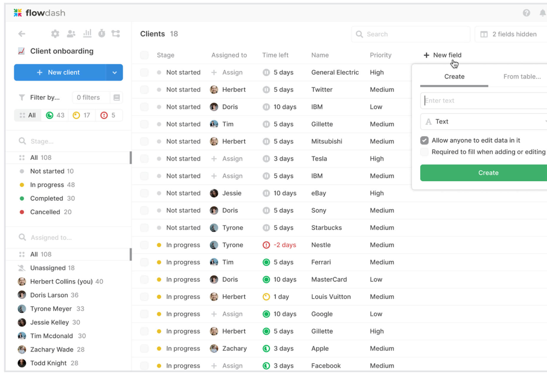
Flowdash
Flowdash is a premium app that helps you build custom tools, data sets and streamline your business operations with one tool. Manage data and processes without code. The tool combines a spreadsheet’s familiarity with a visual workflow builder, plus built-in integrations to automate repetitive tasks so your team can focus on what matters.
Scale
Scale is a website that provides new and open-source illustrations that you can use for projects. Maybe the illustration generator’s neatest part is that you can change the color with just a click to match your brand. Then download the image as an SVG or PNG.
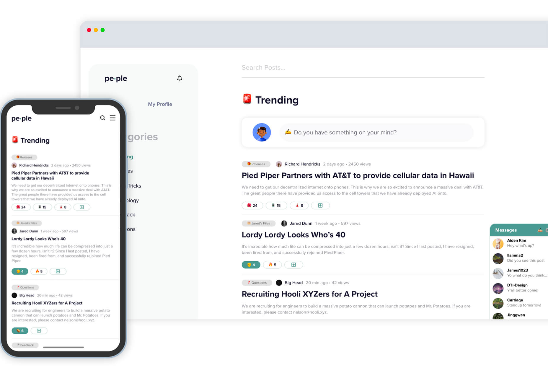
Pe•ple
Pe•ple is a tool that adds a “customizable community” to any website to help grow your fanbase and provide a boost to SEO. It allows you to integrate chat, commenting, emojis, and passwordless login, among other things.
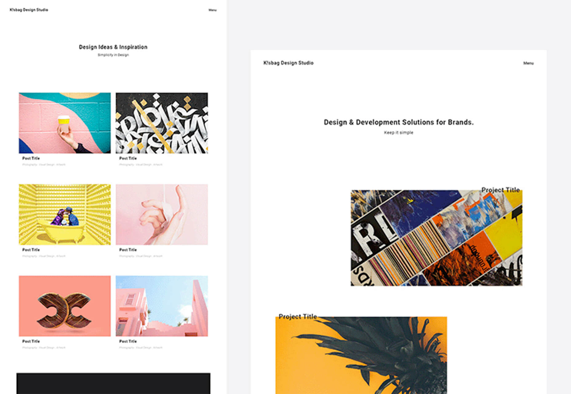
K!sbag: Free Minimal Portfolio Template
K!sbag is a free minimal website template that’s made for portfolio sites. (Did you resolve to update yours in 2021?) It includes 6 pages in a ready-made HTML format and PSD.
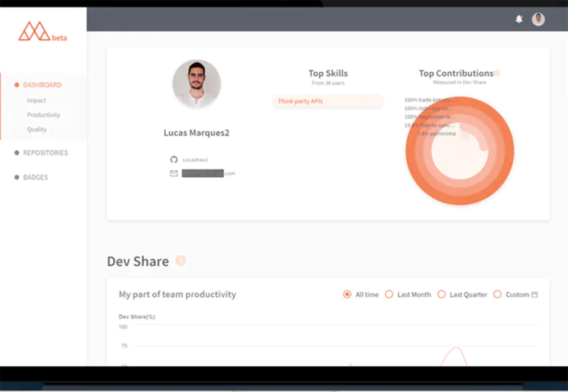
Merico Build
Merico Build is like a fitness tracker for code. It uses contribution analytics to empower developers with insight dashboards and badges focused on self-improvement and career growth. Sign up with tools you already use – Github or Gitlab.
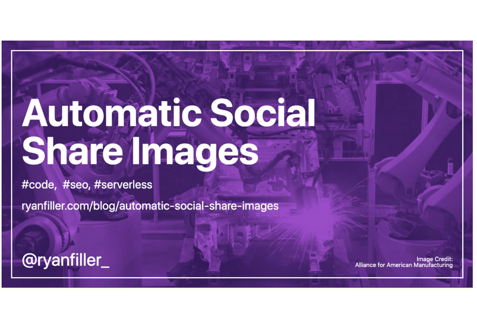
Automatic Social Share Images
Automatic Social Share Images solves a common website problem: Missing or broken images when posts or pages are shared on social media. This tutorial walks you through the code needed to create the right meta tags so that popular social media channels pick up the image you want for posts. The best part is this code helps you create a dynamic preview image, so you don’t have to make something special every single time.
Animated SVG Links
Animated SVG Links can add a little something special to your design. This pen is from Adam Kuhn and includes three different link styles.
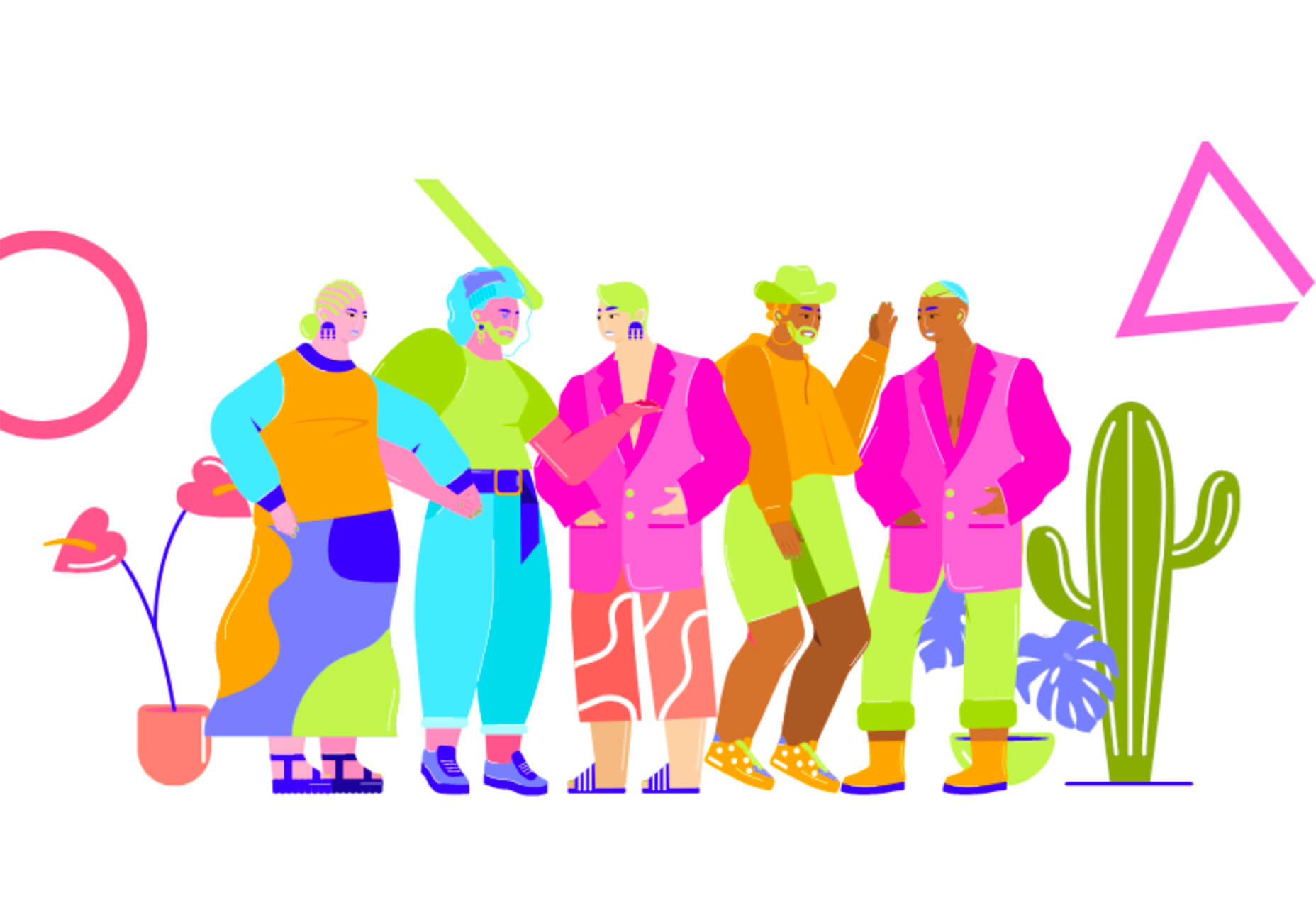
Blush
Blush helps you create illustrations. With collections made by artists across the globe, there’s something for everyone and every project. All art is customizable, so you can play with variations to create something unique.
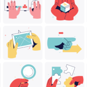
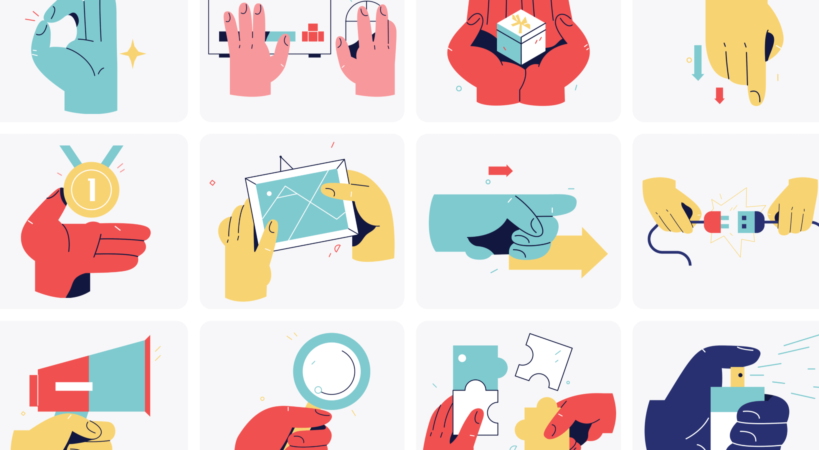
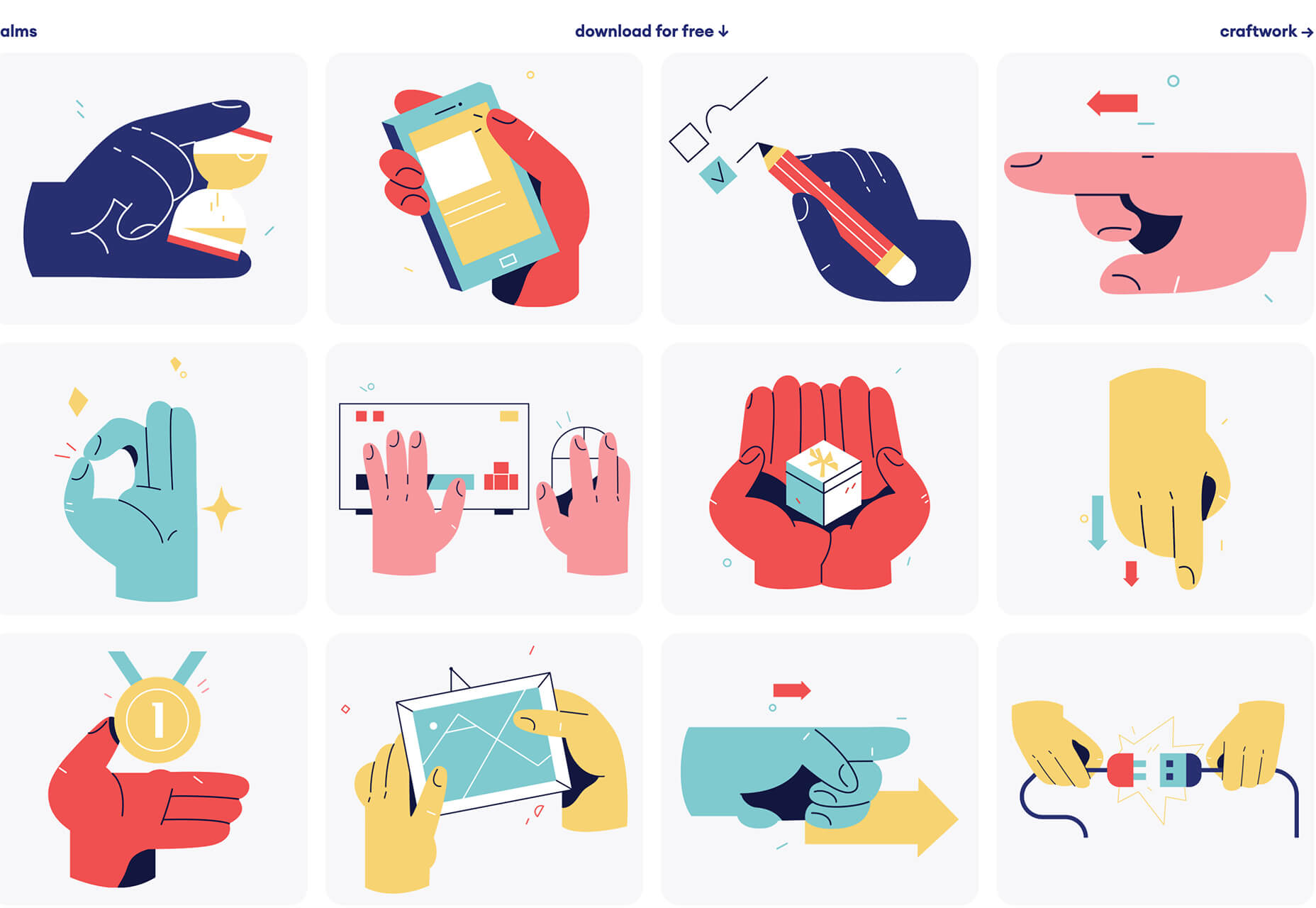
Palms
Palms is a set of 43 sets of hands to help illustrate projects. Each illustration is in a vector format and ready to use.
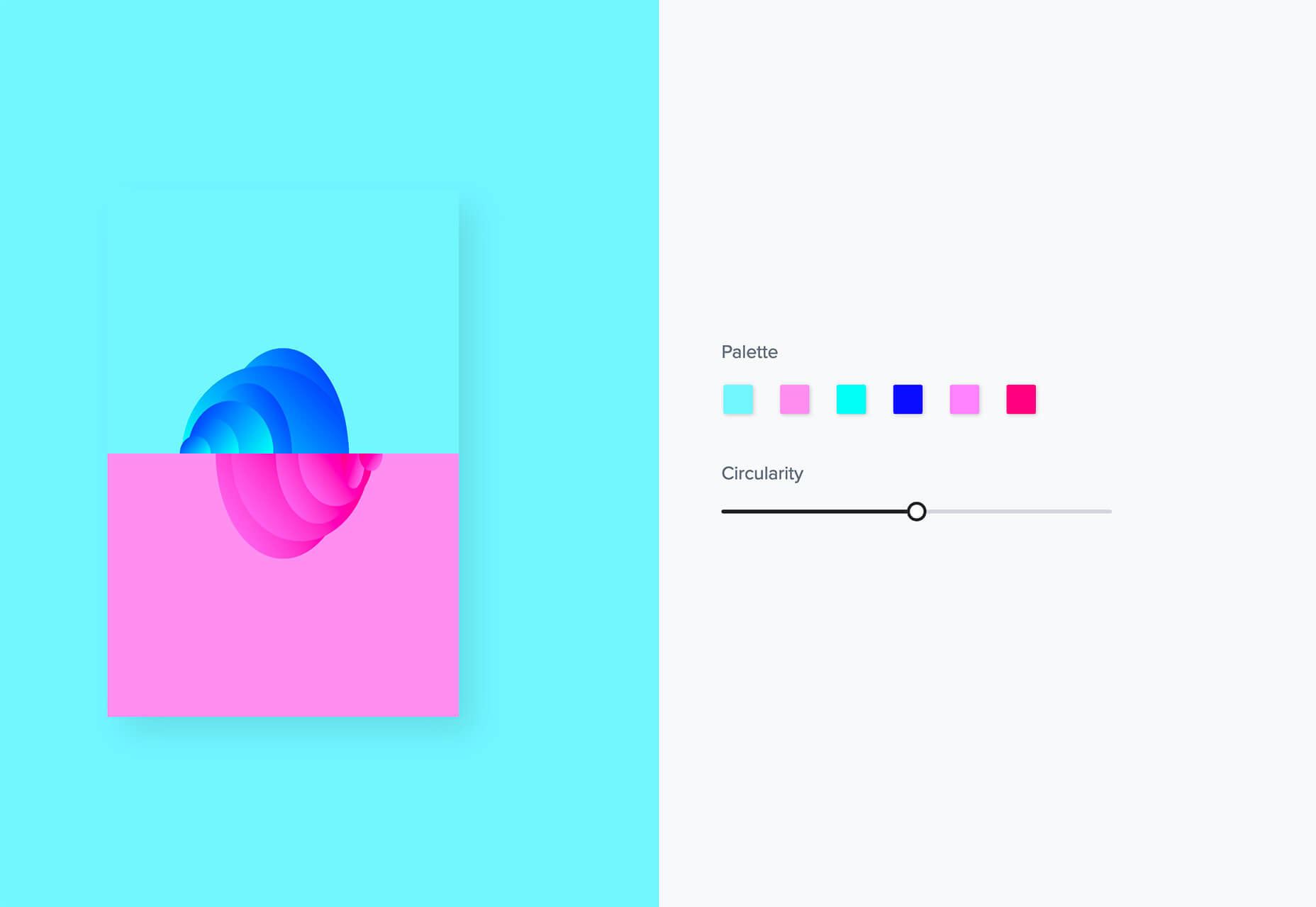
Tabbied
Tabbied allows you to create and customize patterns or artwork in a minimal style for various projects or backgrounds. Tinker with your artwork and patterns and then download a free, high-resolution version.
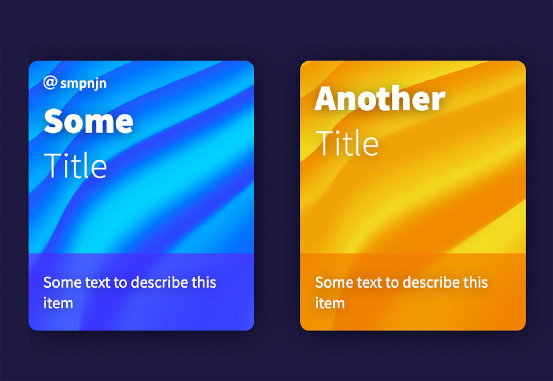
How to Create Animated Cards
How to Create Animated Cards is a great little tutorial by Johnny Simpson that uses WebGL and Three.js to create a style like those on Apple Music. The result is a stylish modern card style that you can follow along with the CodePen demo.
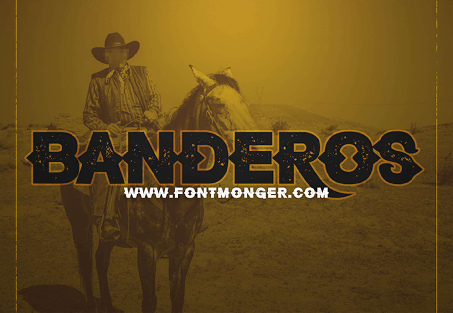
Bandero
Bandero is a fun slab with a rough texture and interesting letterforms. The character set is a little limited and is best-suited for display use.
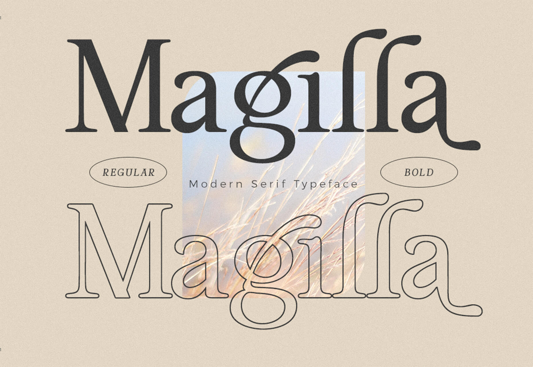
Magilla
Magilla is a stunning modern serif with great lines and strokes. The premium typeface family has six styles, including an outline option.
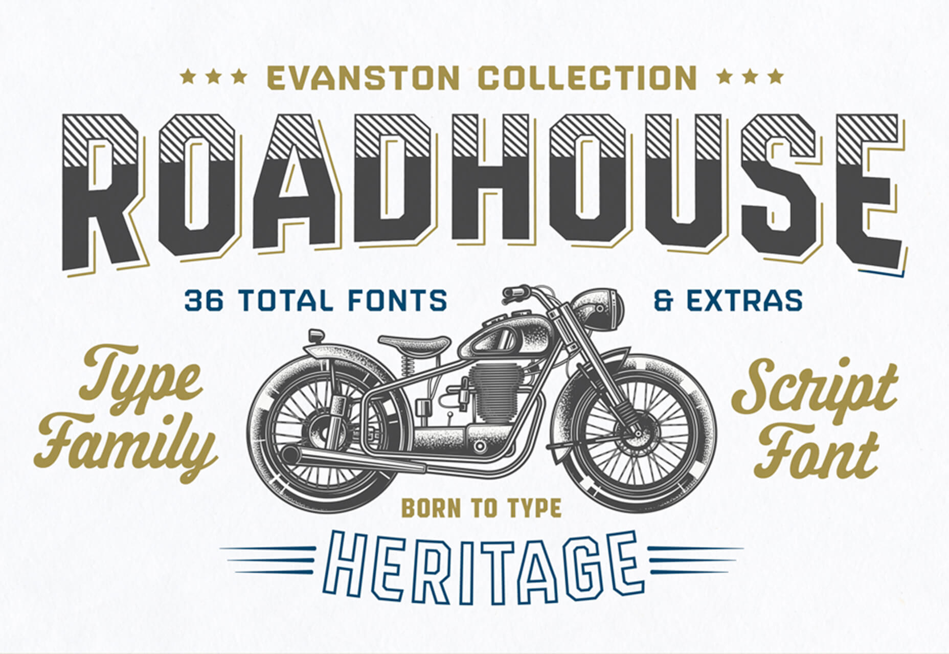
Roadhouse
Roadhouse is one of those slab fonts that almost screams branding design. The type designer must have had this in mind, too, with stripe, bevel, inline, half fill, outline, drop extrude, and script options included. (This family is quite robust, or you can snag just one style.)
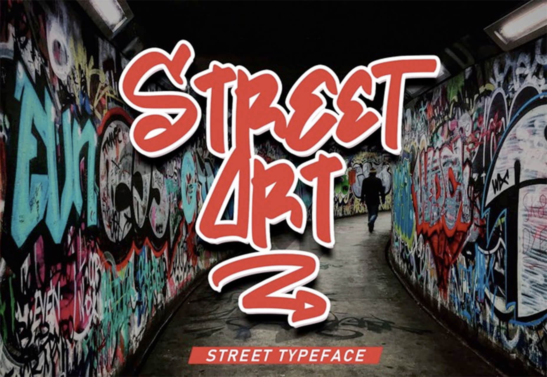
Street Art
Street Art is for those times when a graffiti style is all that will do. What’s nice about this option – free for personal use – is that the characters are highly readable.
The post Exciting New Tools for Designers, January 2021 first appeared on Webdesigner Depot.

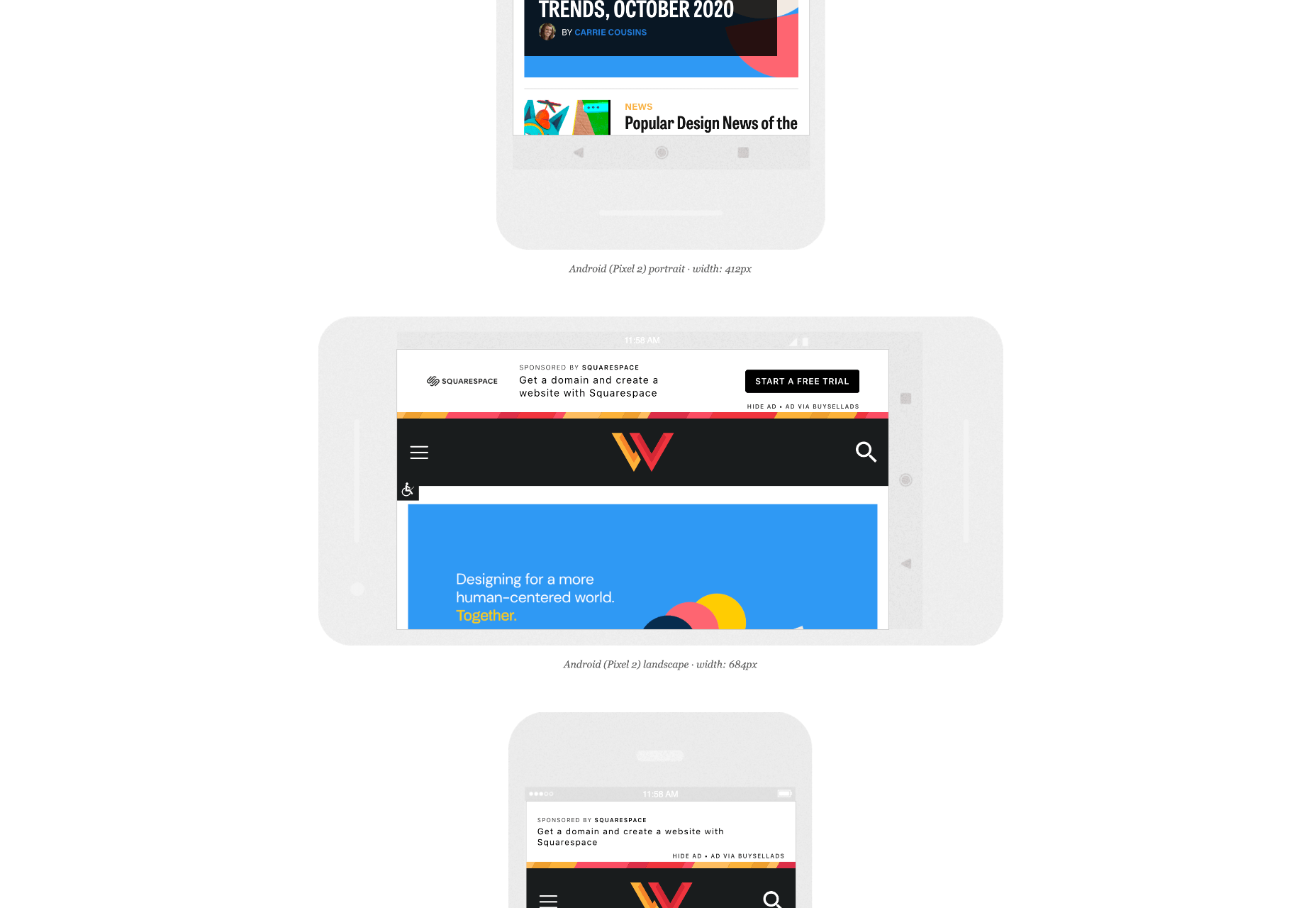
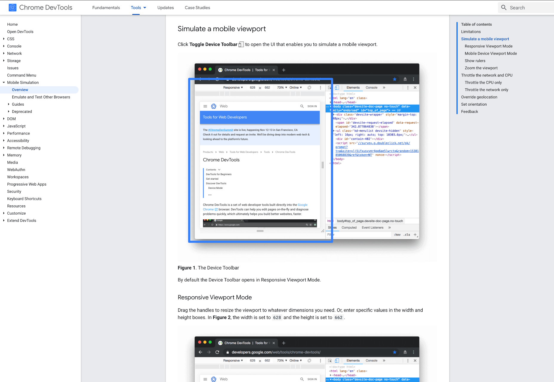
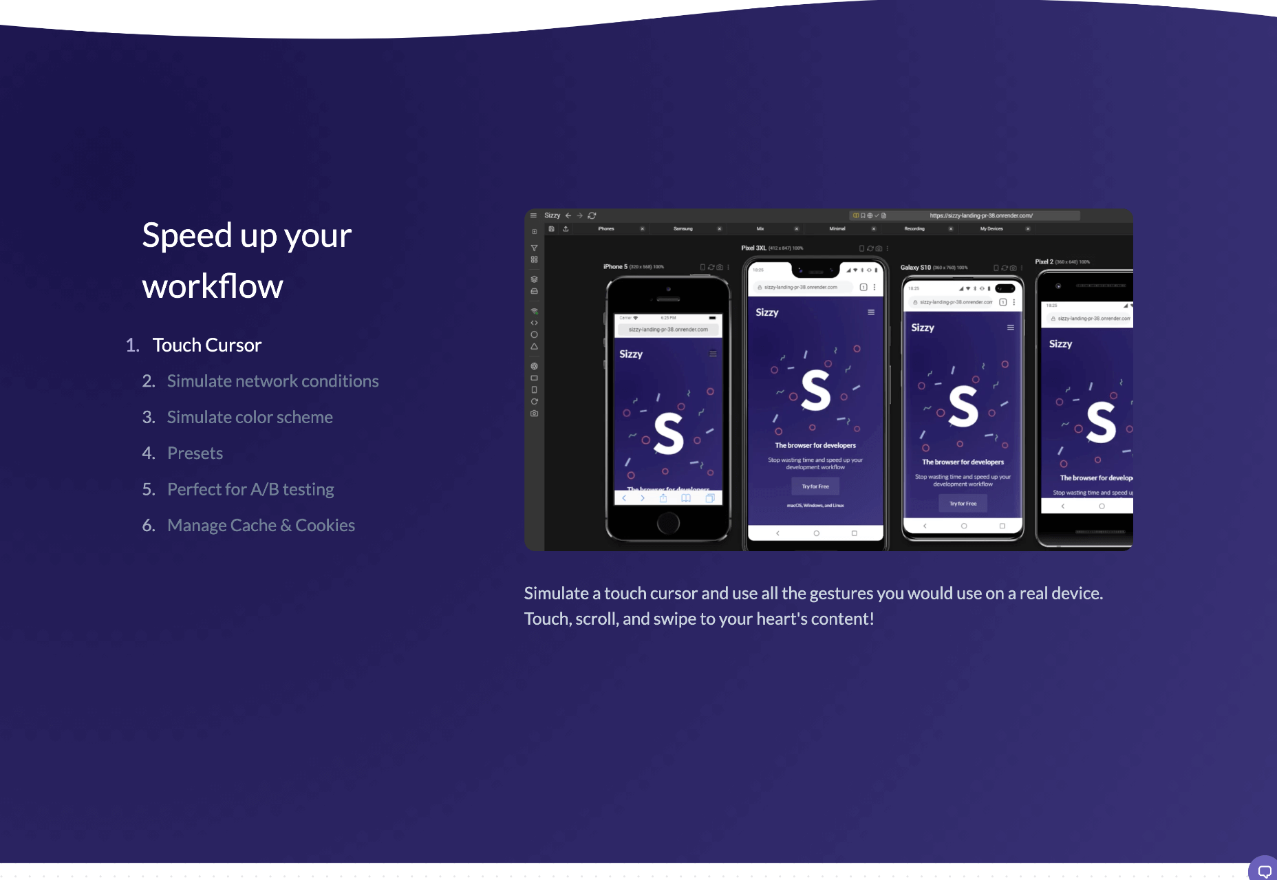
 When creating a website, it’s vital to remember that not only does it need to work and look great on the device you are creating it on, but on all the other devices, it might be used on too.
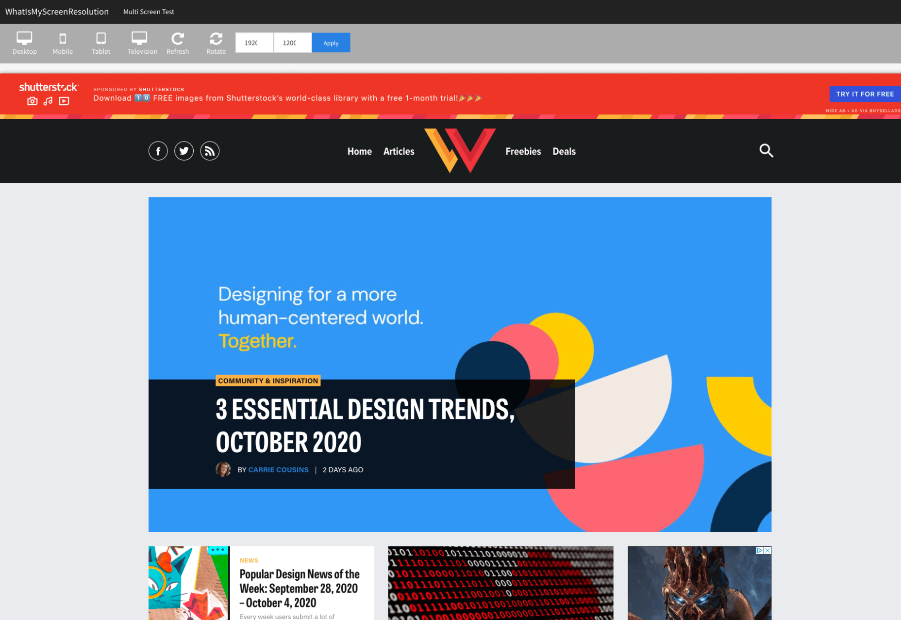
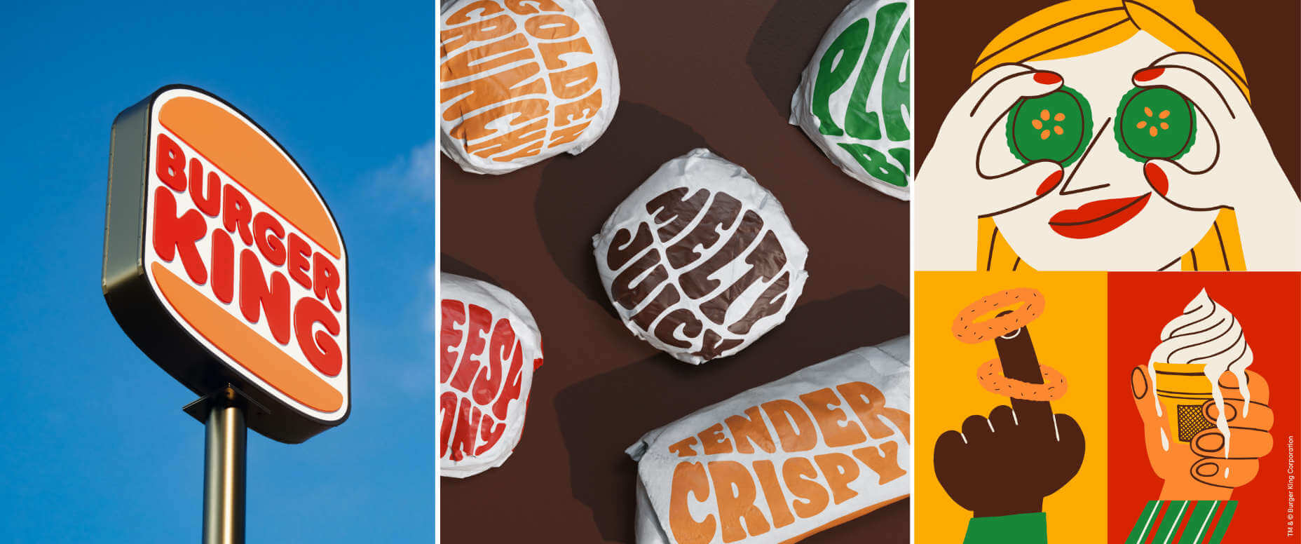
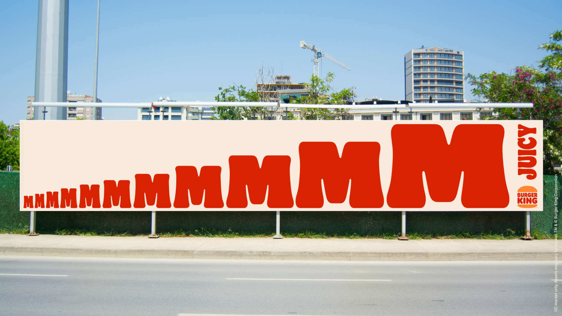
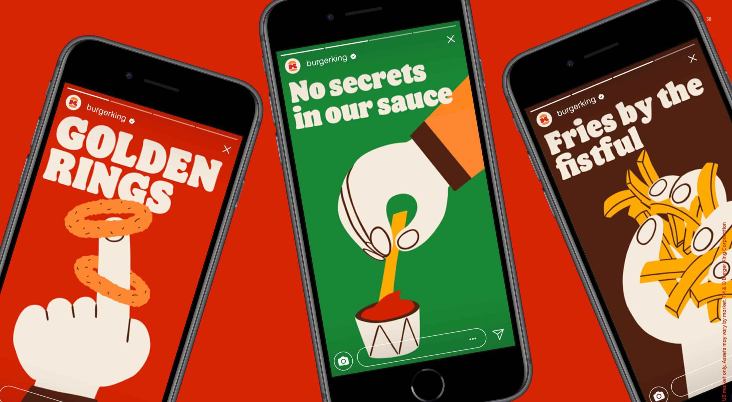 Burger King, the globally recognized food chain with 19,000 restaurants worldwide, has unveiled a redesigned set of brand assets.
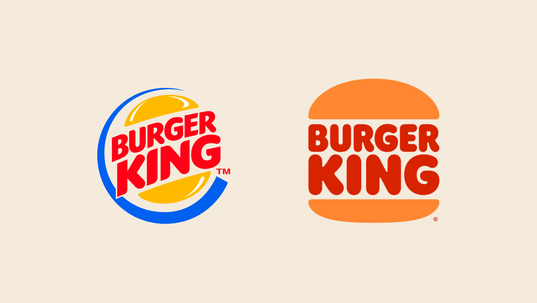

 Every week users submit a lot of interesting stuff on our sister site Webdesigner News, highlighting great content from around the web that can be of interest to web designers.

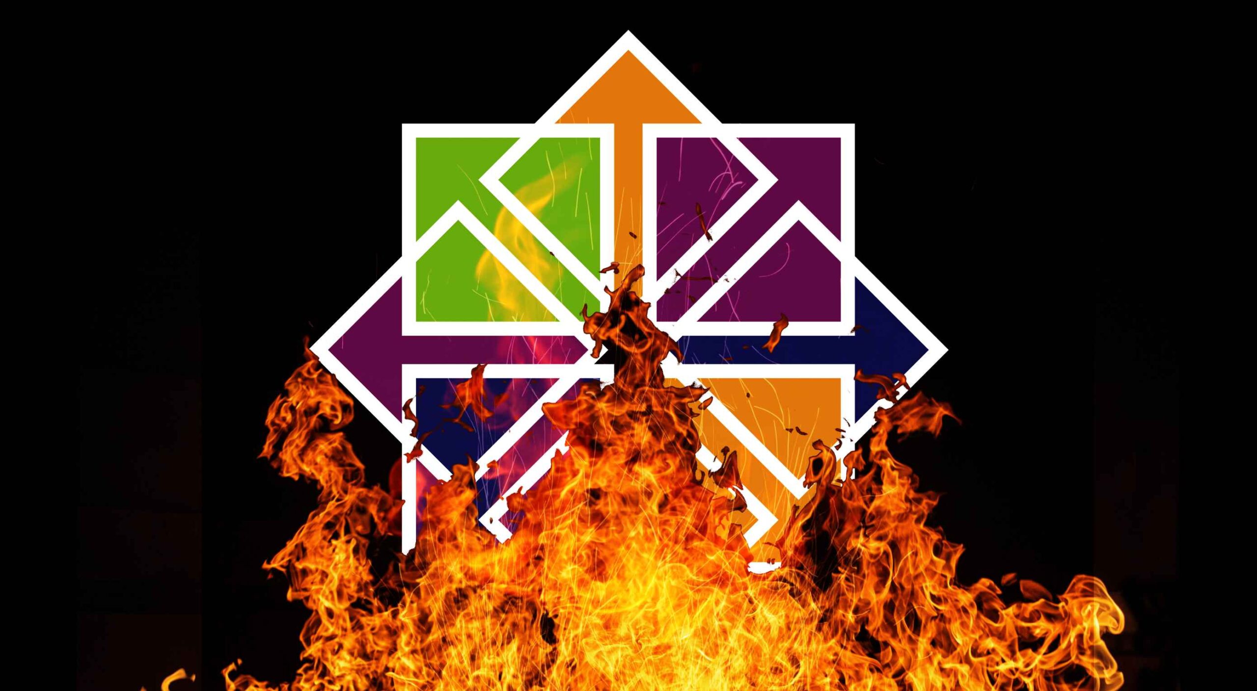 If you were paying close attention to your IT department around the 8th of December, you might have heard some quiet sobbing and the occasional wail of, “Why? Why?! WHY?!” Now, it was the year 2020, so this might have seemed normal to you, but it’s actually something of a problem that could affect your business: CentOS is pretty much dead.
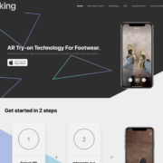
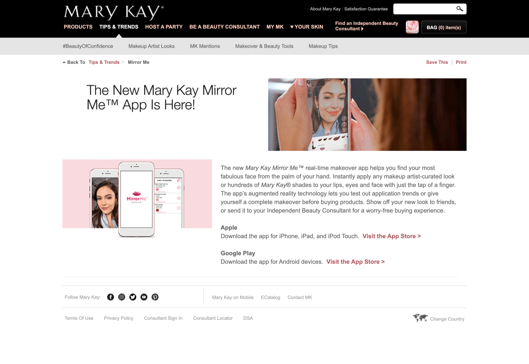
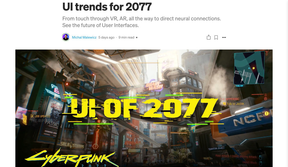
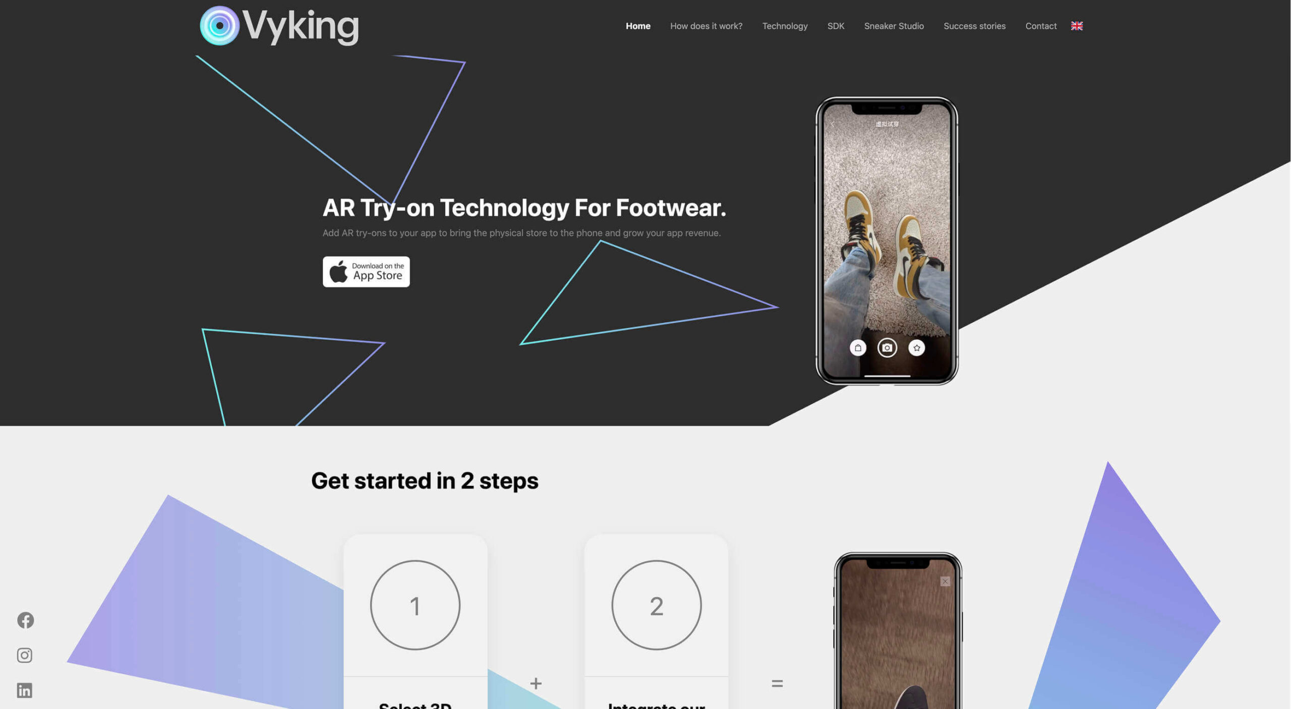 Over the years, experts have repeatedly discussed the possible impact of mixed realities on web design. Concepts like AR and VR are expected to have the potential to change the way that we interact with websites on a fundamental level.
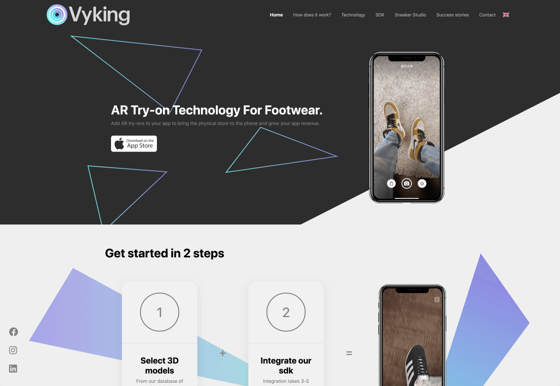
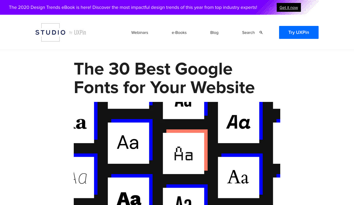
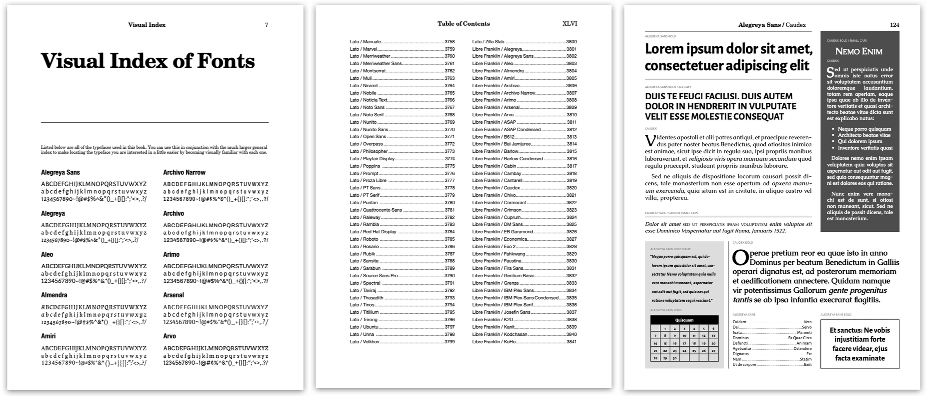
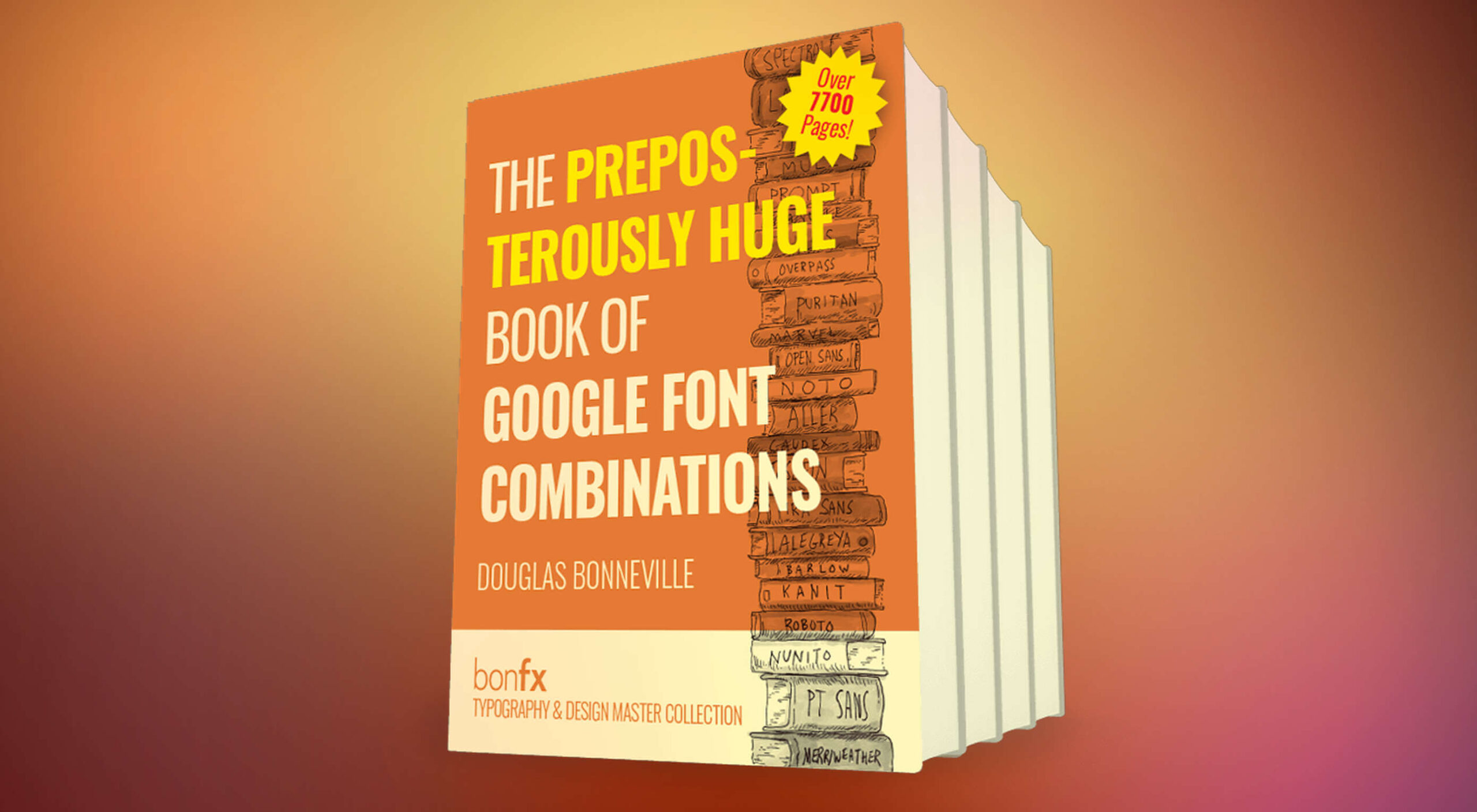 Google Fonts is one of the most useful tools designers have, with hundreds of amazing fonts provided for free. But if you just grab one of the top ten suggestions, you’re missing out on a vast wealth of typographic gems.
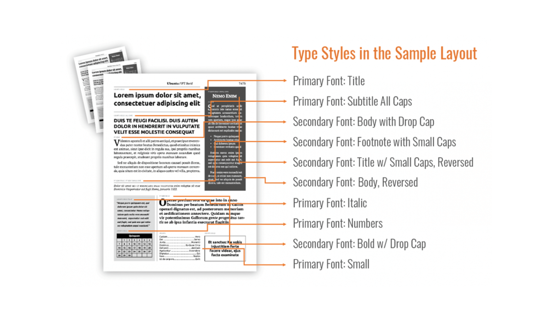
 Every week users submit a lot of interesting stuff on our sister site Webdesigner News, highlighting great content from around the web that can be of interest to web designers.
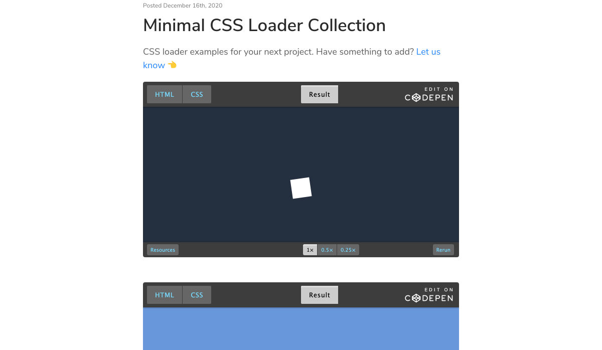
 Every week users submit a lot of interesting stuff on our sister site Webdesigner News, highlighting great content from around the web that can be of interest to web designers.