 Welcome to this month’s round up of what has caught our eye on the web. As it’s November we’re going to help chase those winter blues away with some color.
Color does so much of the heavy lifting in visual design. It can create a mood, reinforce a brand identity, establish a hierarchy, differentiate sections, highlight type or reduce it; color even makes a statement by its absence.
Good use of color isn’t just about getting the most appropriate color scheme for the subject, it’s also about how much color to use, and where to use it. In this collection we’ve included a range of use examples from bright and full of color, to restrained with subtle tones. Enjoy!
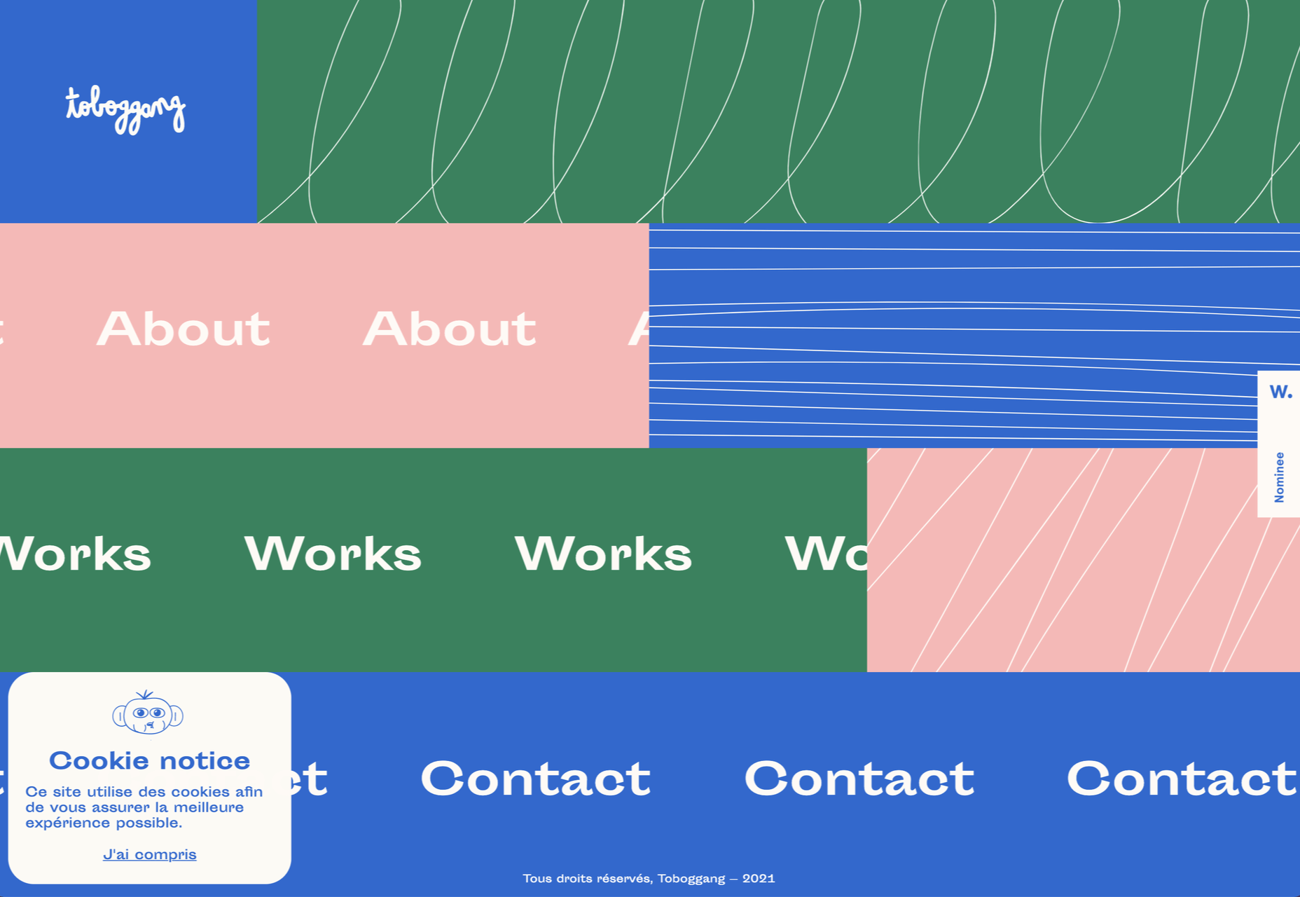
Toboggang
There’s a pleasing UPA cartoon feel to the colors and type in this compact portfolio site.
On
On digital technology studio keep things simple with a black on light blue, and infinite scrolling.
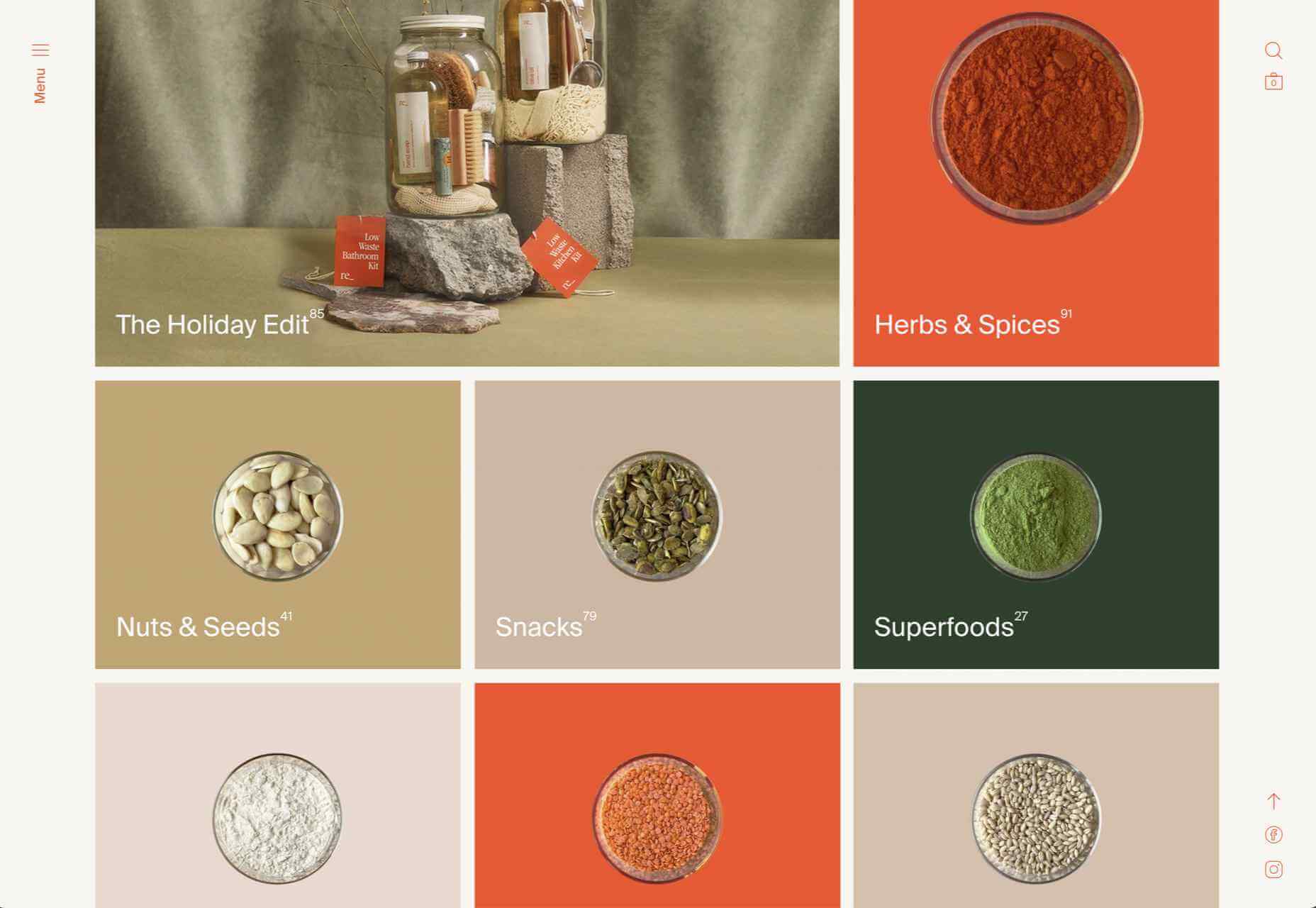
re_
A pleasing mix of reds, greens, pinks, and golds liven up a simple grid layout for re_ package free grocery store.
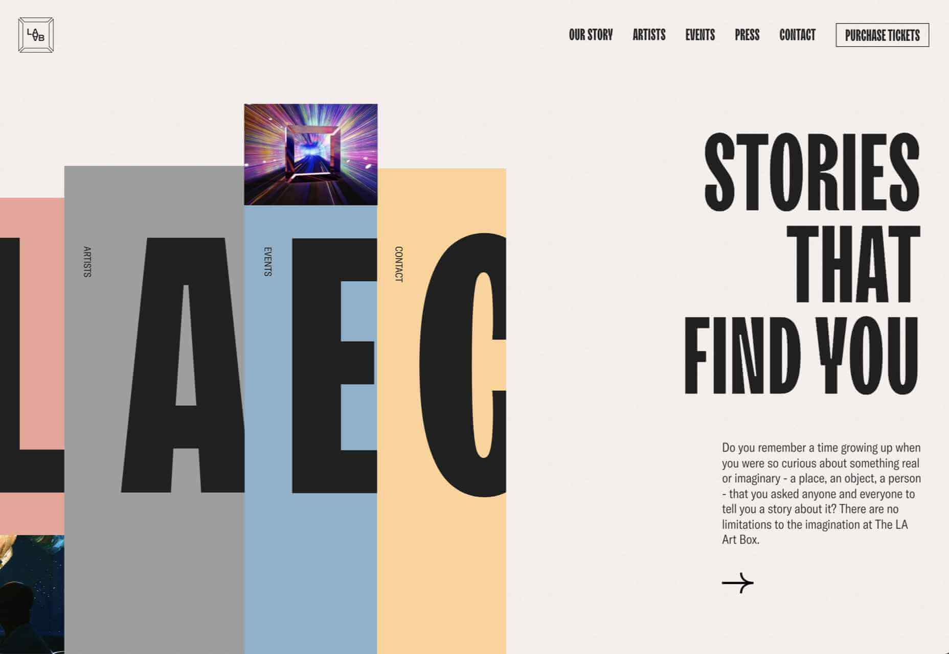
LA Art Box
This site for LA Art Box makes great use of horizontal scrolling and animated transitions.
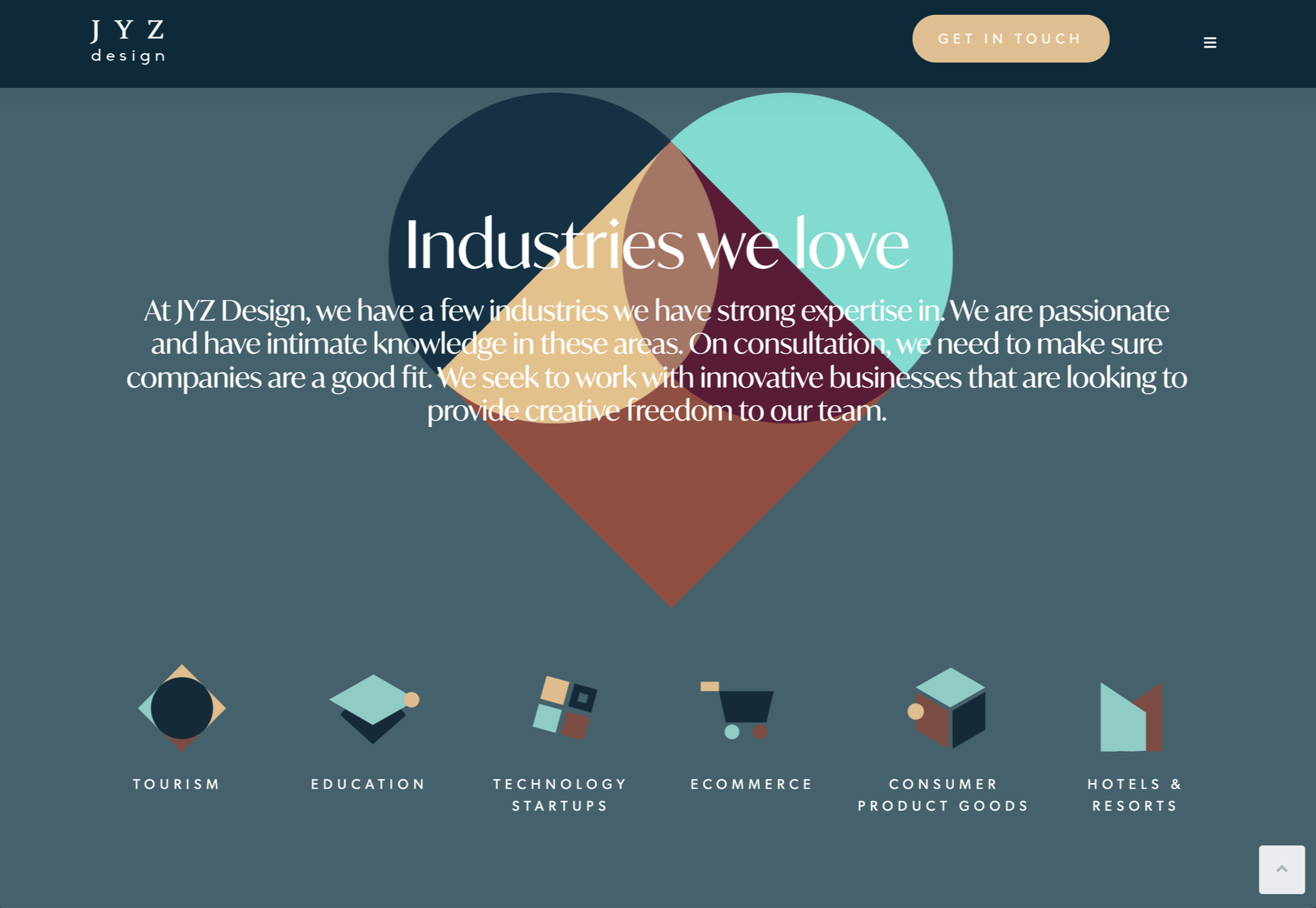
JYZ Design
Strong color and geometric shapes create a vibrant feel for JYZ Design’s company site.
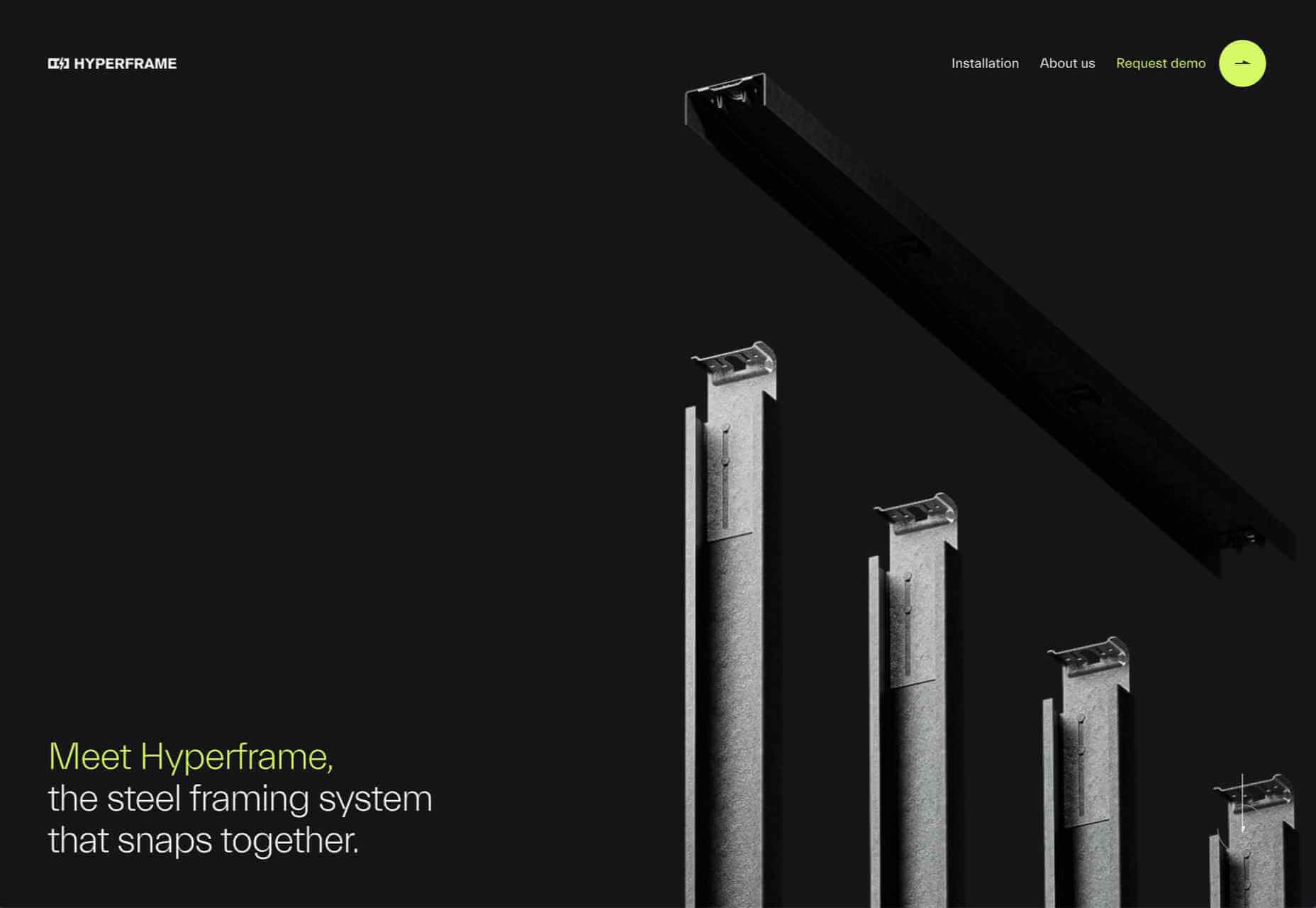
Hyperframe
Hyperframe’s site takes on board the ‘show, don’t tell’ theory by cleverly using on scroll animation to demonstrate its product’s major selling point.
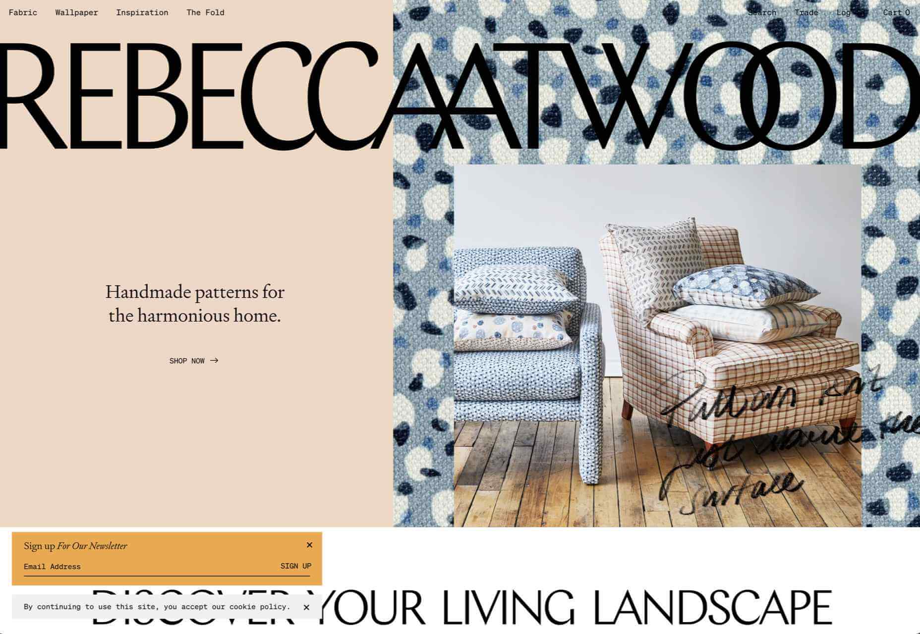
Rebecca Atwood
Rebecca Atwood’s site combines product shots with a color scheme that reflects the aesthetic of her designs.
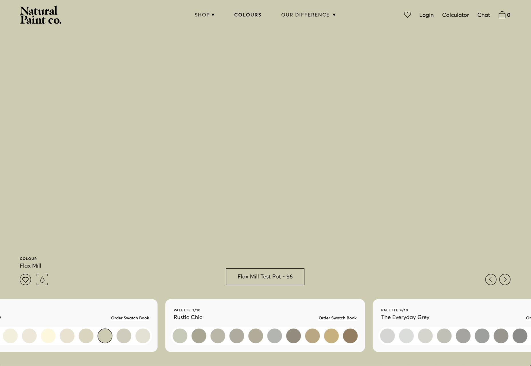
Natural Paint Co.
For any paint company, displaying the available colors is a central function of their site. Natural Paint Co. do a really nice job of this with an interactive picker that changes the background color of the window.
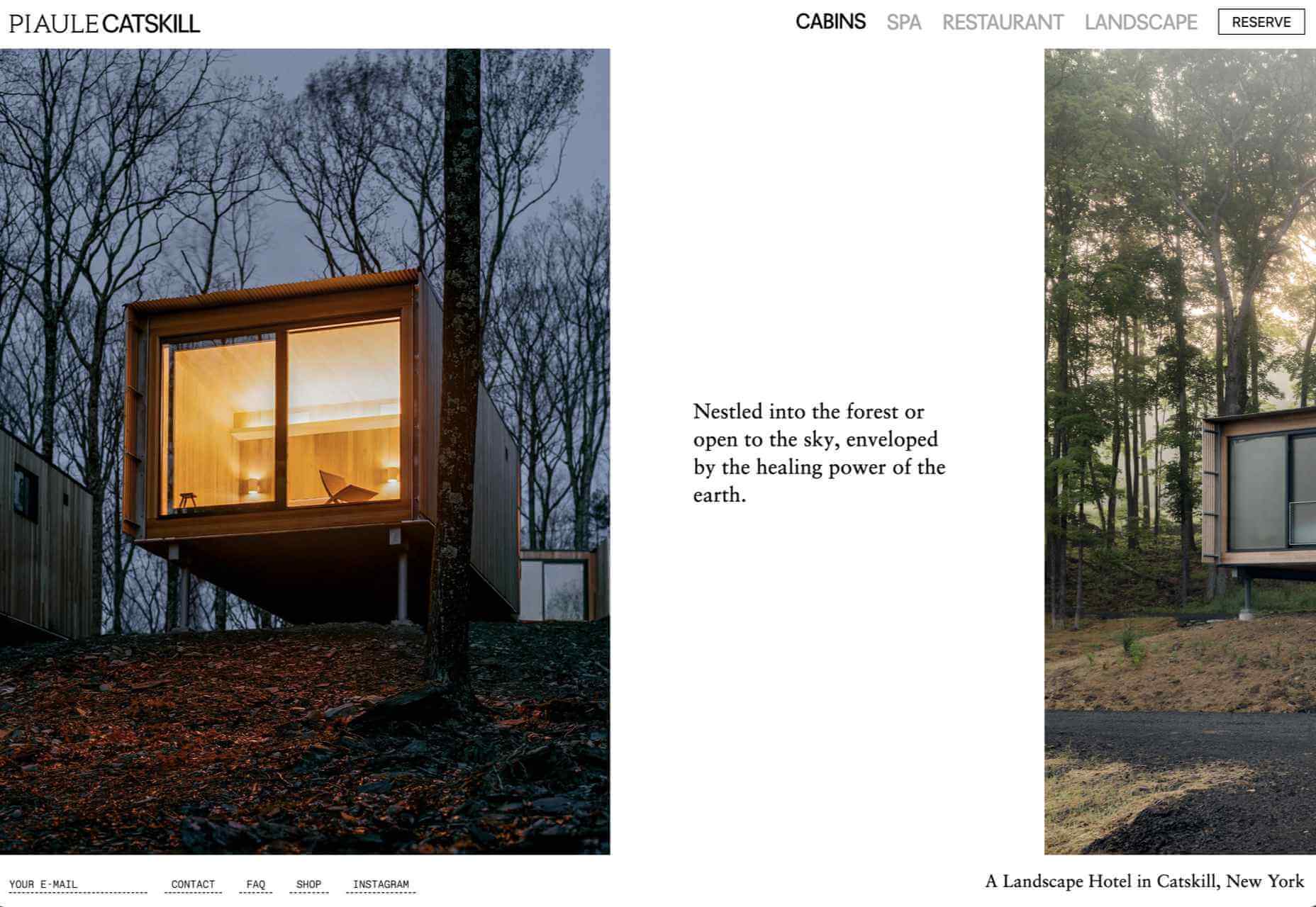
Piaule Catskill
Beautiful photography and minimal text do a great job of selling the experience of Piaule Catskill cabins, and the horizontal scrolling on desktop adds extra focus. I found myself looking up flights to New York…
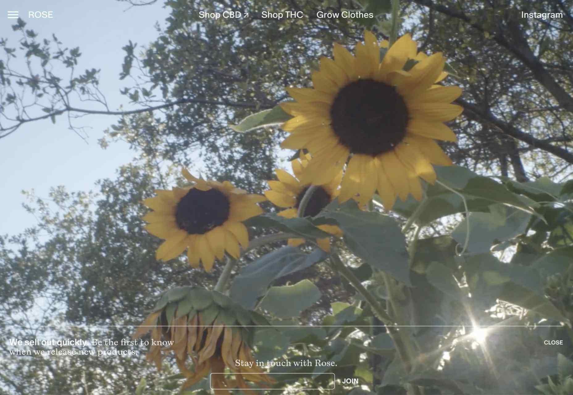
Rose Delights
There is a vintage, hand made quality to the mix of video and photographs on Rose’s home page, that creates a sense of warmth. The transparent mail list sign up is nicely non-invasive.
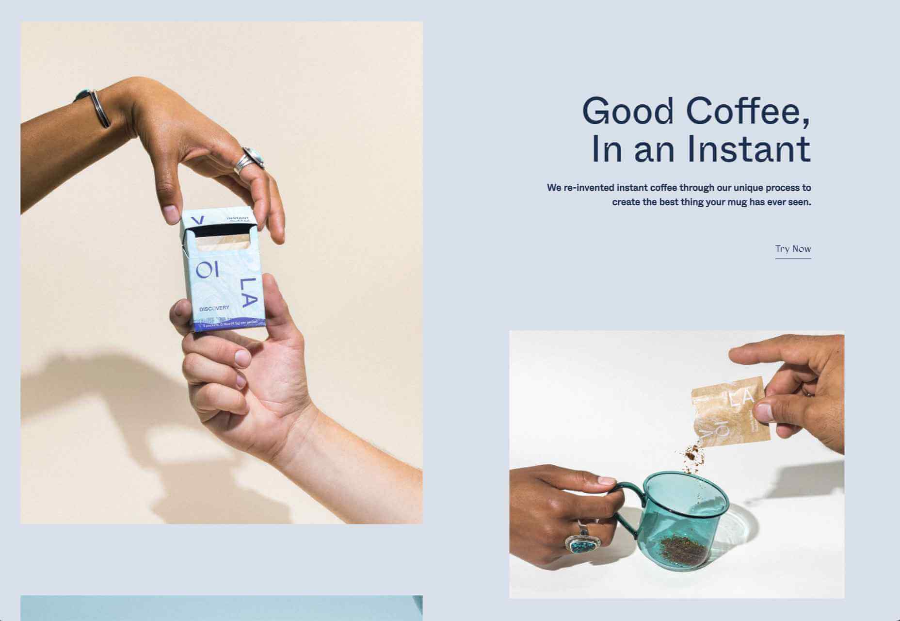
Voila
This site for Voila instant coffee creates a modern feel with fresh pastel colors balanced by a grounding dark blue.
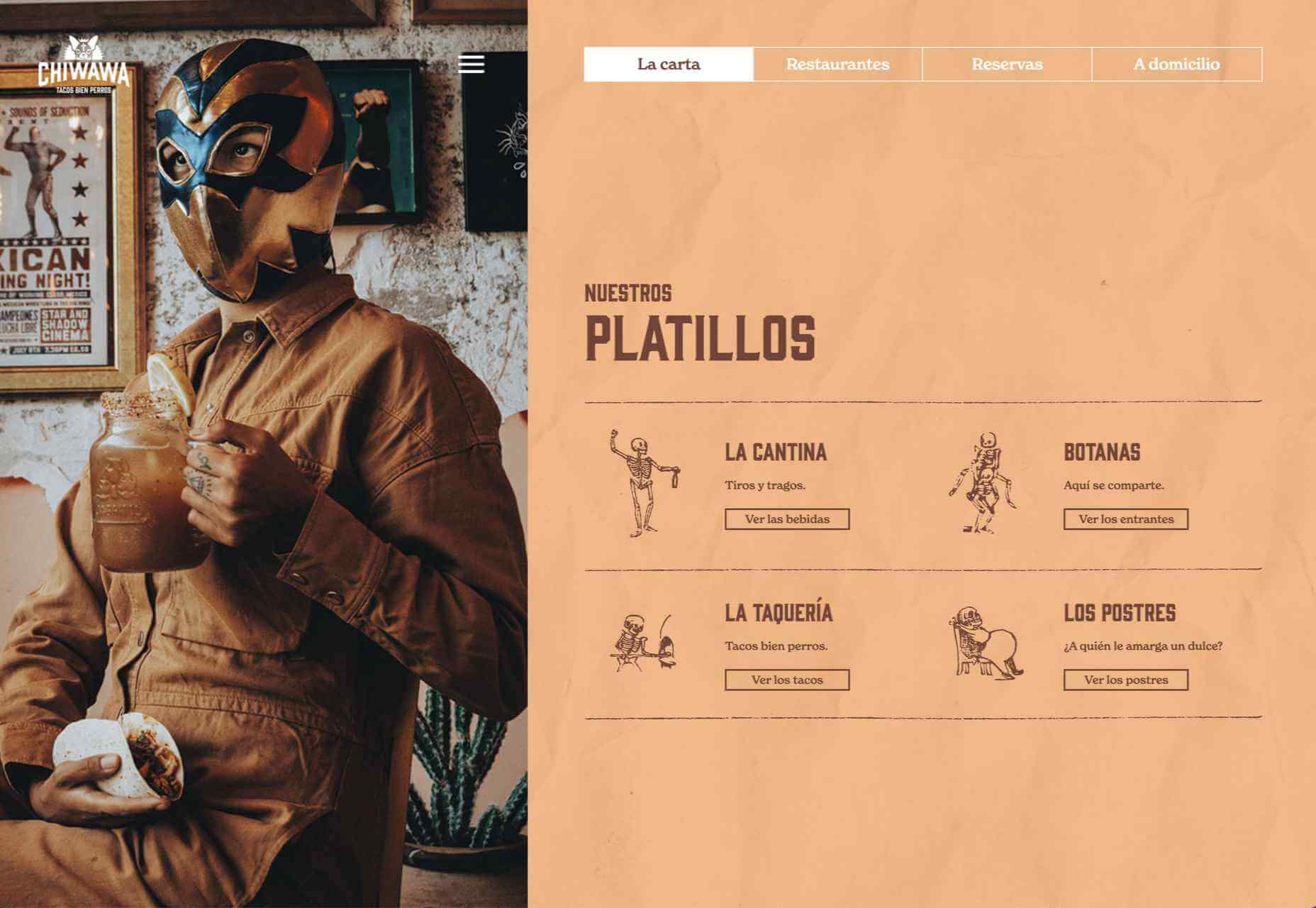
Chiwawa
Wrestling masks, skeletons and lots of tone on tone color makes this a lively and appealing site for Chiwawa cantina.
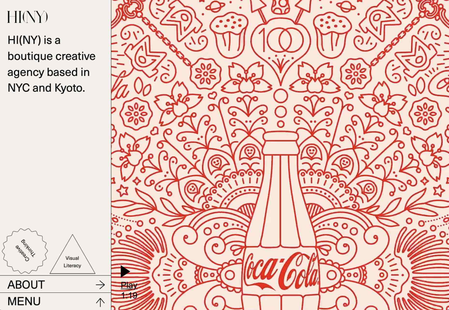
HI(NY)
Keeping the rest of the design elements minimal here allows the movement of content areas not become cluttered and fussy feeling.
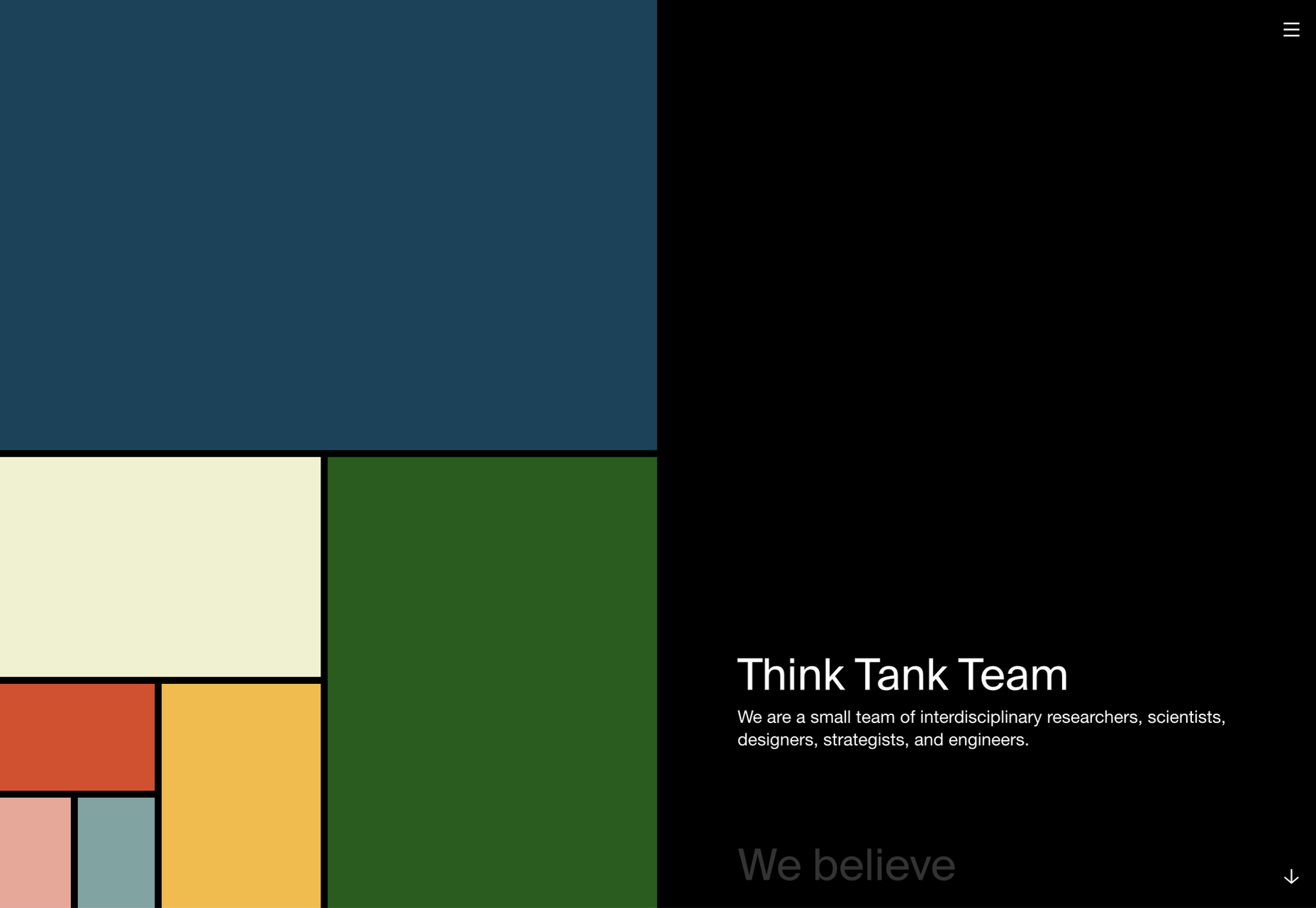
Think Tank Team
The divided square motif on the Think Tank Team homepage is a nice visual metaphor for building blocks coming together to create a whole.
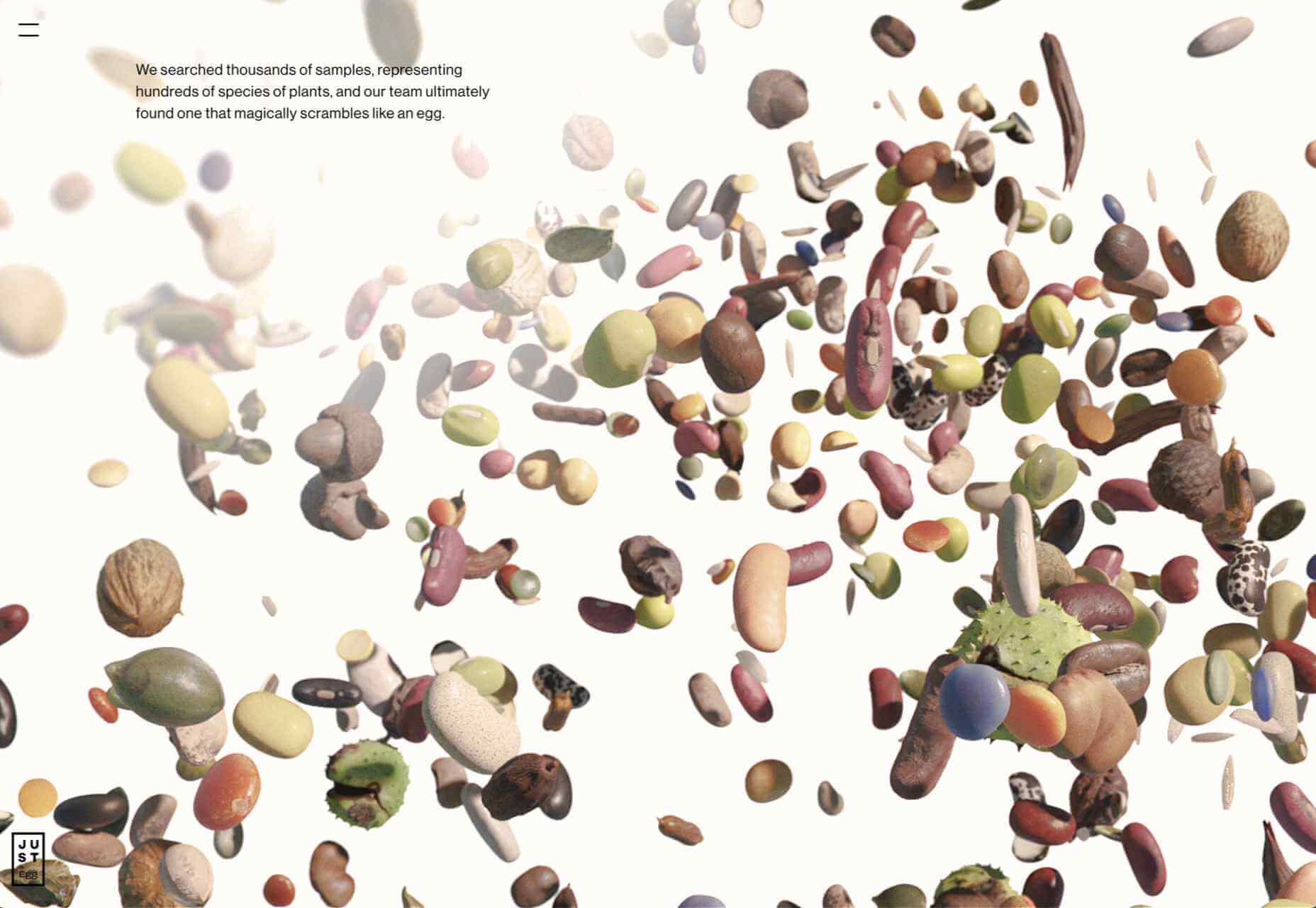
Just Egg
Lots of yellow, and food close ups in the what part of Just Egg’s site is bold and confident. But the how section with its scrolling animation is the really good bit.
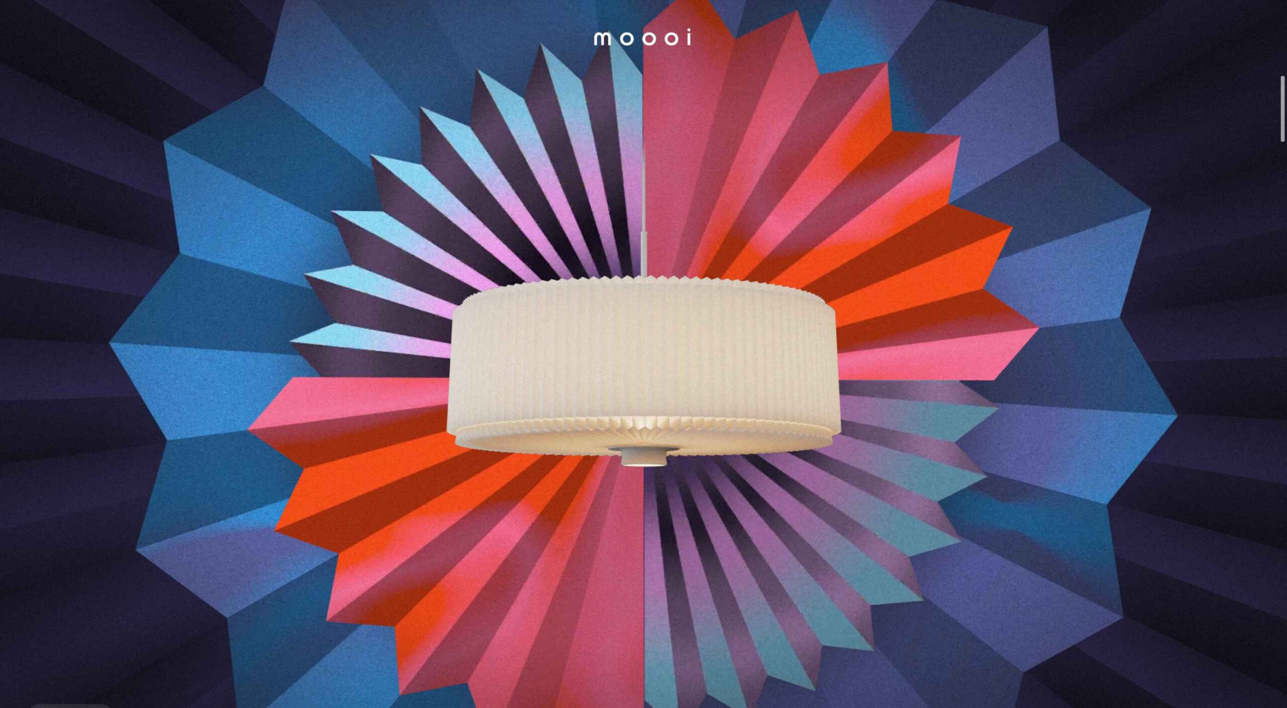
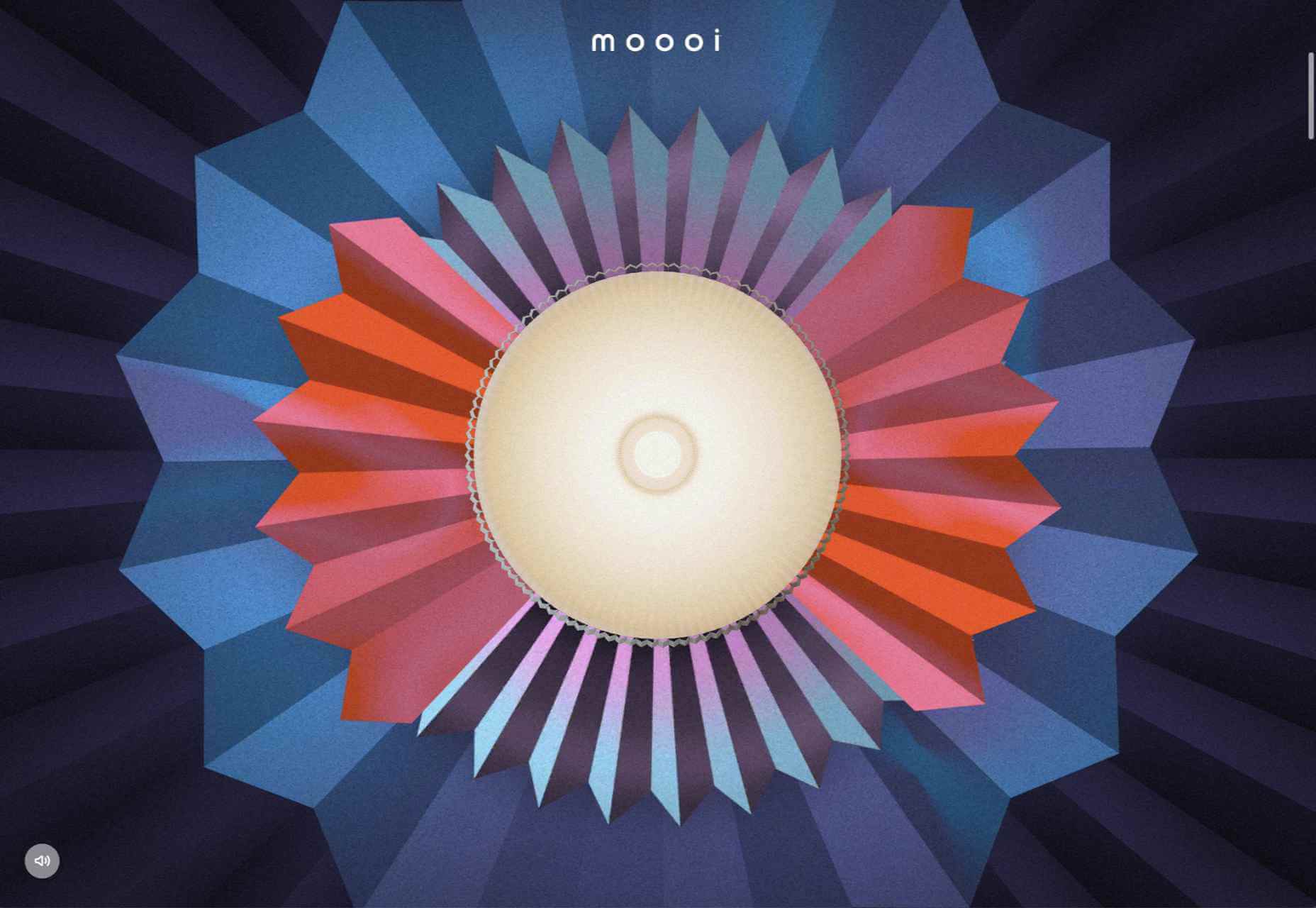
Moooi Paper Play
Although not a standalone site, this is a very pleasing animation centred around a particular product from Moooi.
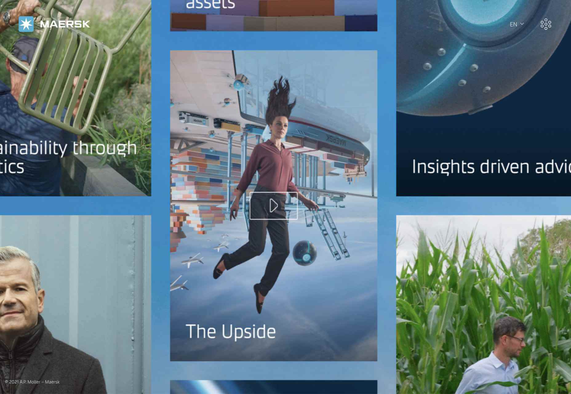
Maersk Upside
Logistics giant Maersk have added a more user-friendly and visually engaging section to their corporate site, with use cases and real case studies.
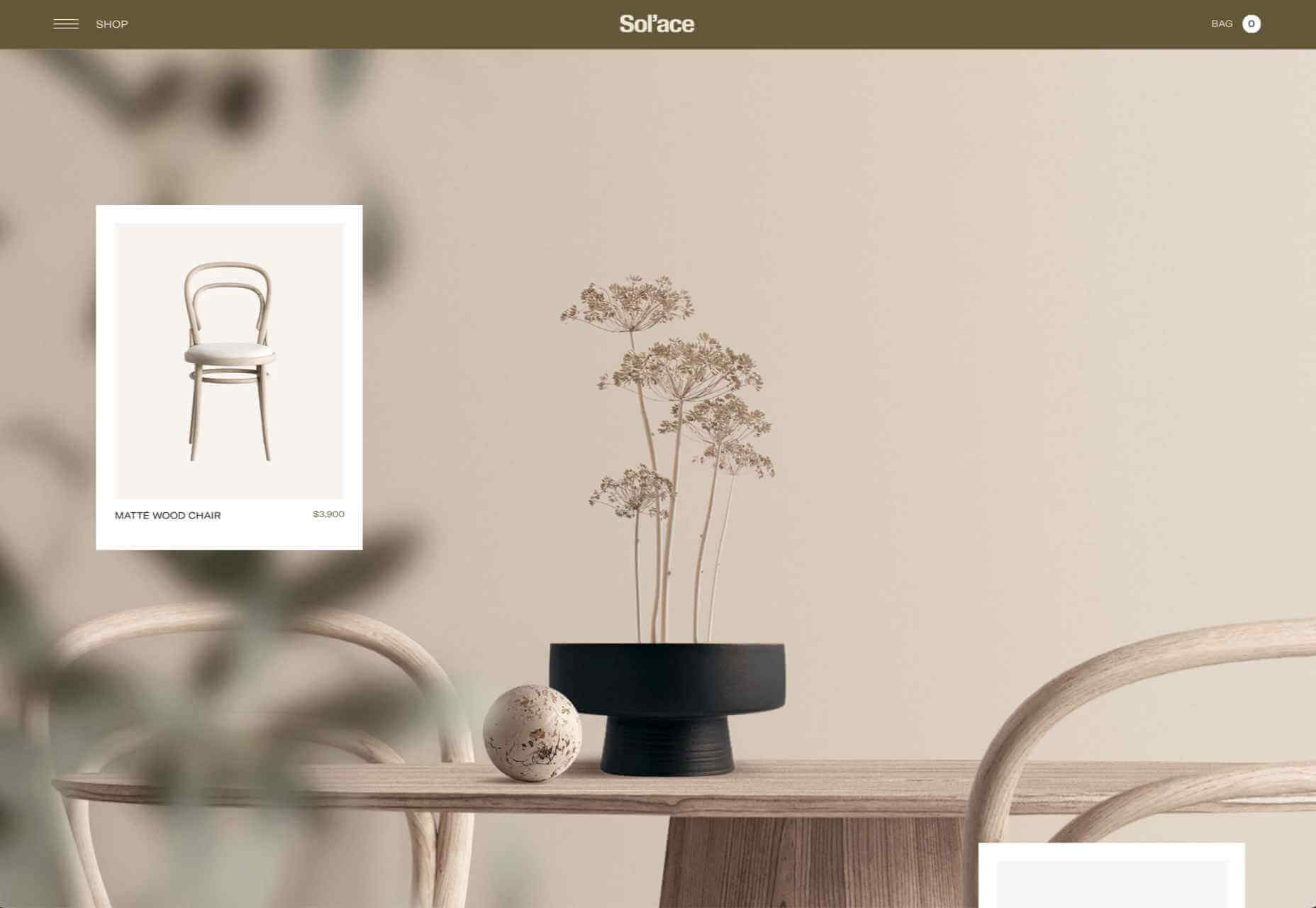
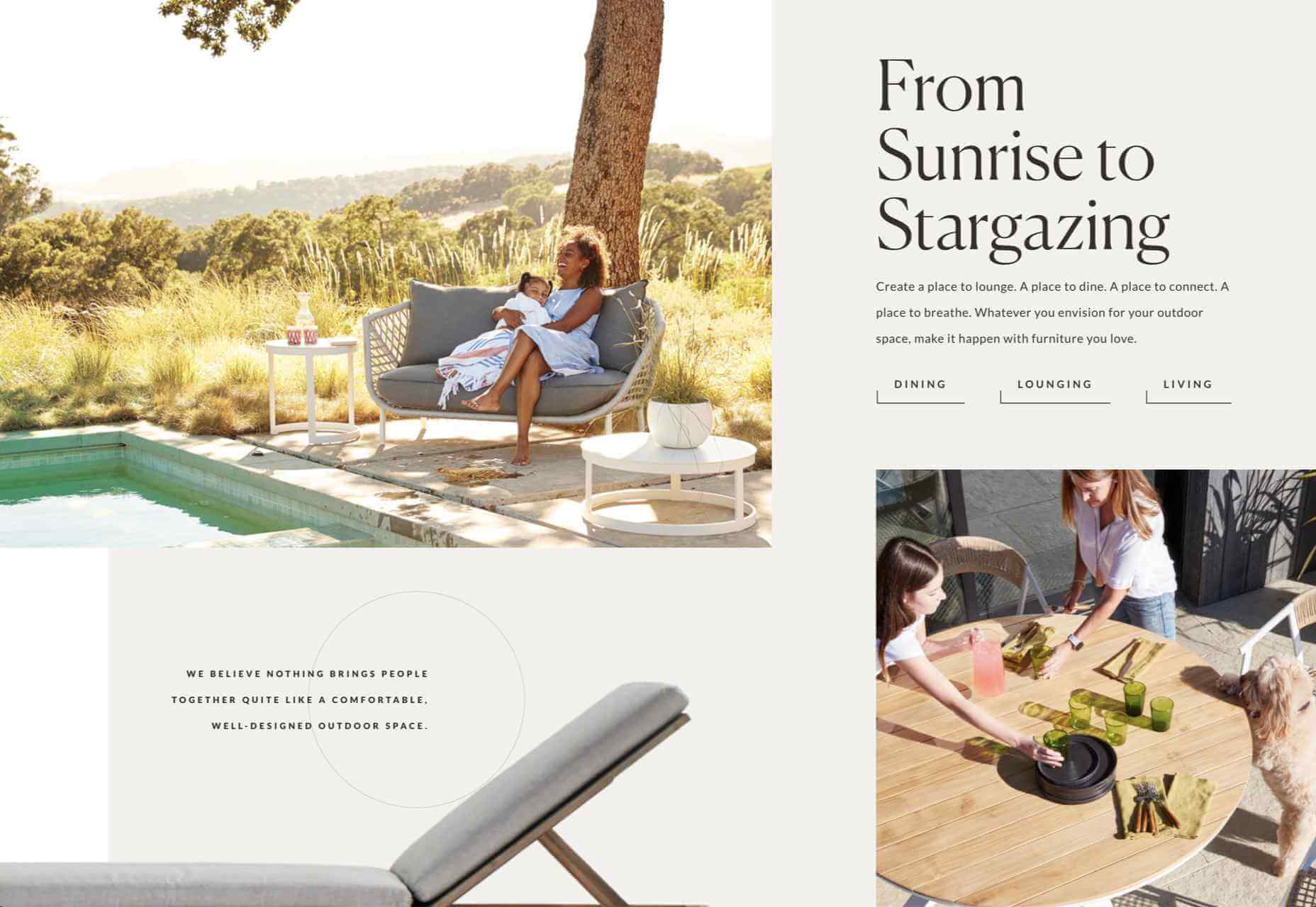
Sol’ace
The color palette for Sol’ace furniture is has been carefully chosen to reflect the idea of luxury and natural materials.
Terra
A good mixture of standalone product shots and styled photographs works well here. The navigation options–shop by type, material or collection–have been well thought out too.
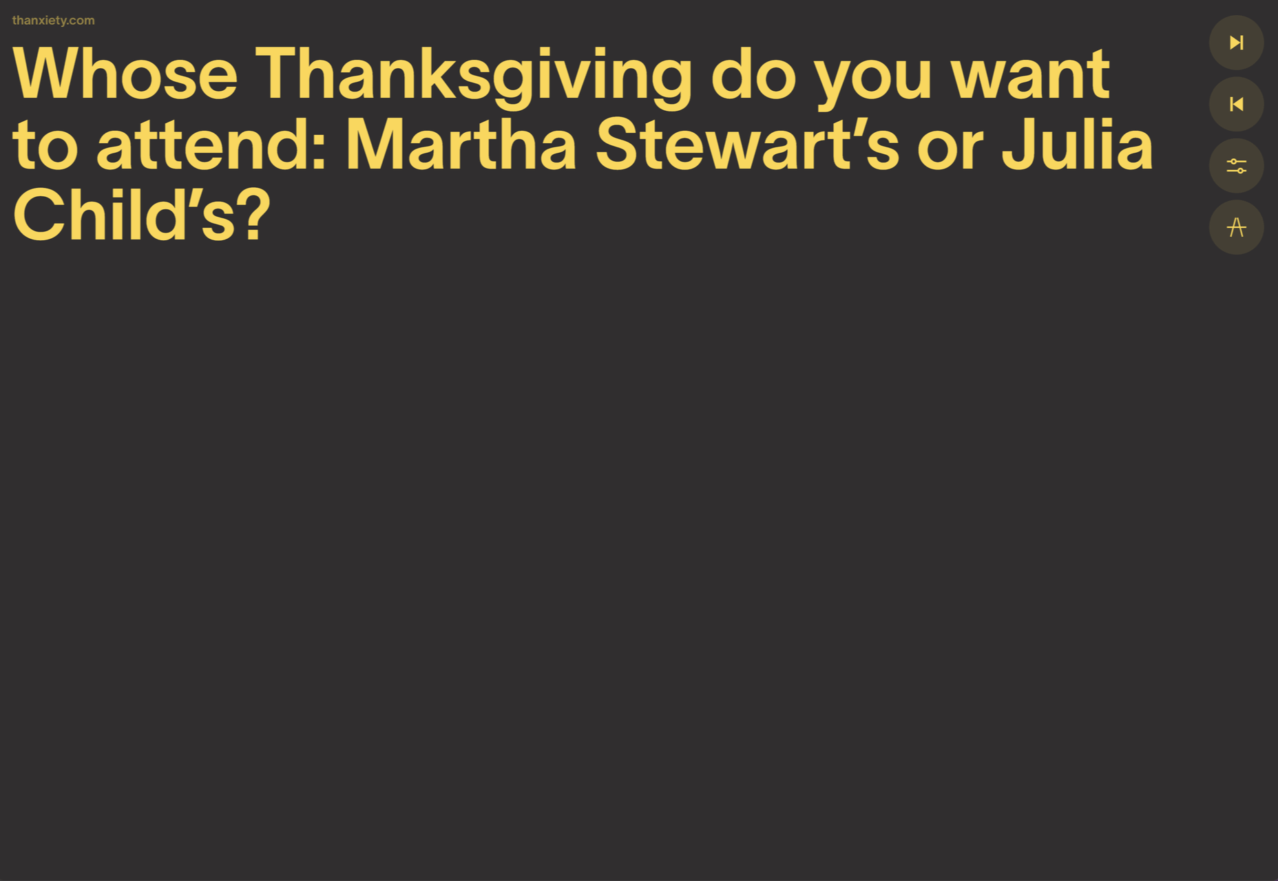
Thanxiety
And finally, for our readers in the US, Thanxiety is a carefully chosen collection of conversation topics to help avoid any uncomfortable silences, or family rows, around the dinner table at Thanksgiving. (And maybe the rest of us could use it on other holidays…)
The post 20 Best New Websites, November 2021 first appeared on Webdesigner Depot.

 This month we have several examples of brutalism used to good effect as a foil to showcase products and/or work. By contrast, at the other end of the scale, we have brands who have chosen to go more of an immersive experience route, using full-screen images, sound, animation, and even VR.