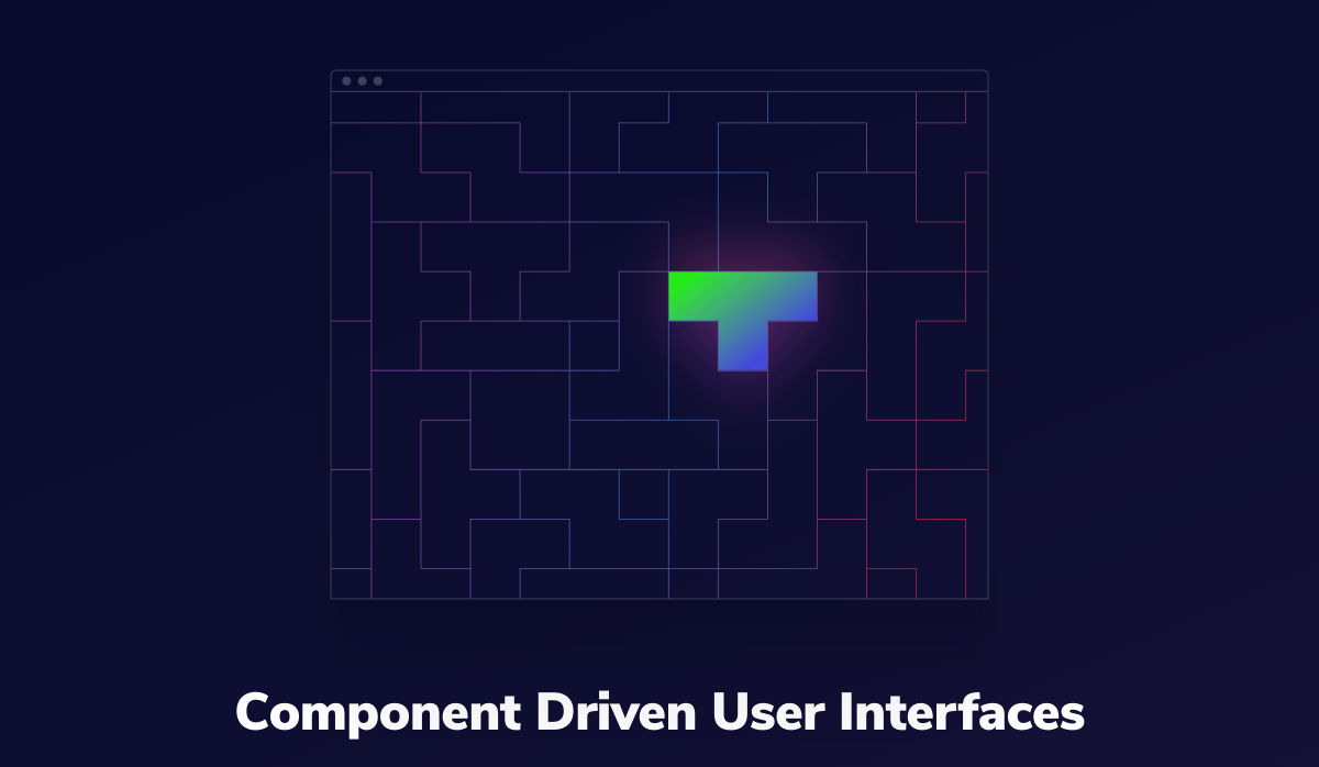
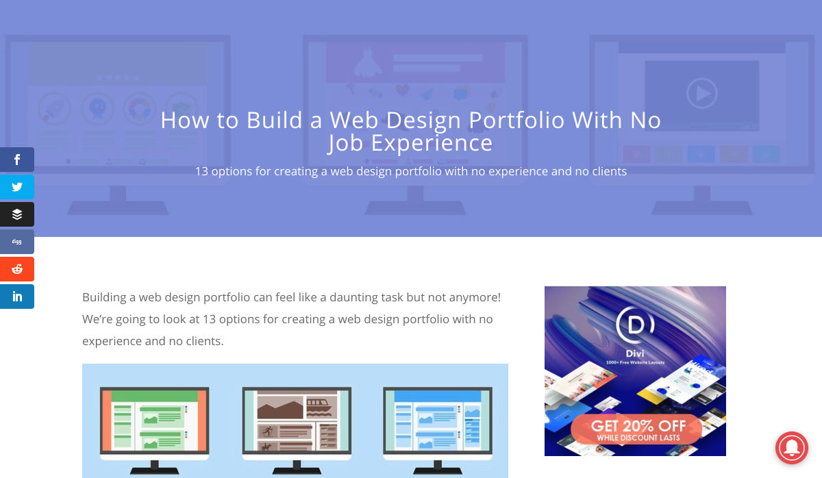
 A seasonal change is on the horizon and that always has me looking to refresh projects. This month’s design trends provide a few different ways to do that without ripping up your entire website.
Here’s what’s trending in design this month.
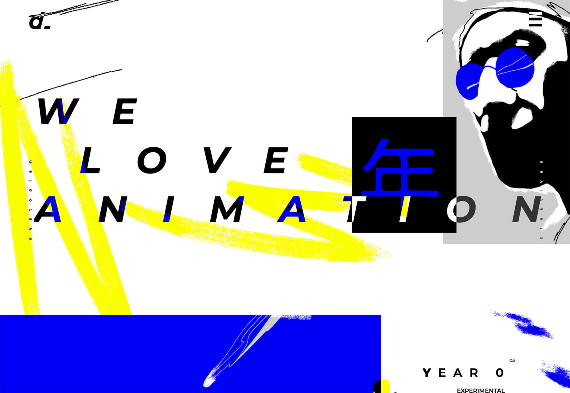
Animated Heroes (That Aren’t Video)
Hero headers and screens that feature video animation have been popular for a while, but more website designers are experimenting with other types of full-screen moving graphics.
What’s cool about this trend is that it can take on plenty of different forms and look a lot of different ways, meaning that no two websites are identical in this regard.
The other bonus to this trend is that you can add a full-screen animation to almost any style of design without a complete overhaul of the website. You may need a few small tweaks to create a seamless transition from one screen to the next, but it’s a quick, modern design element that you can deploy rather quickly.
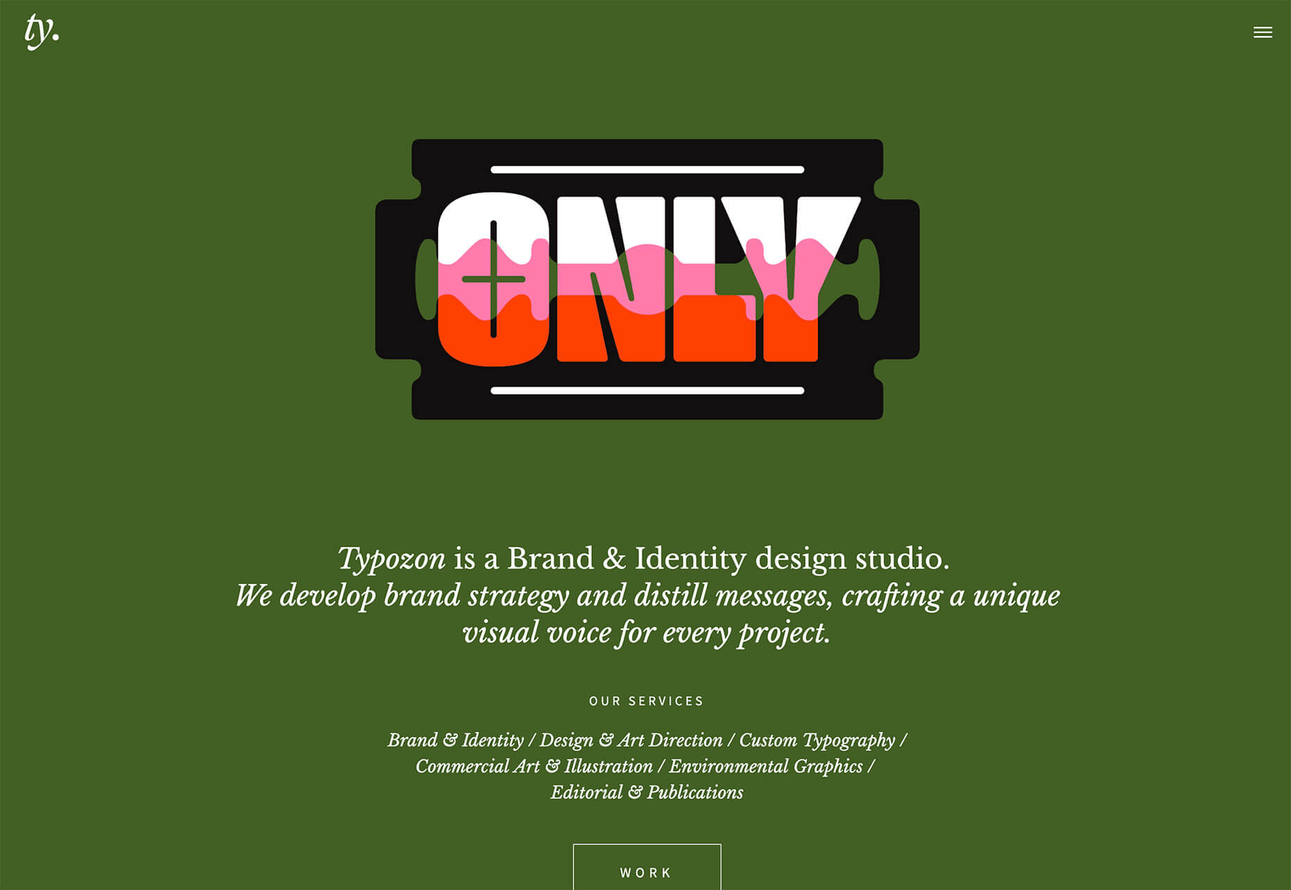
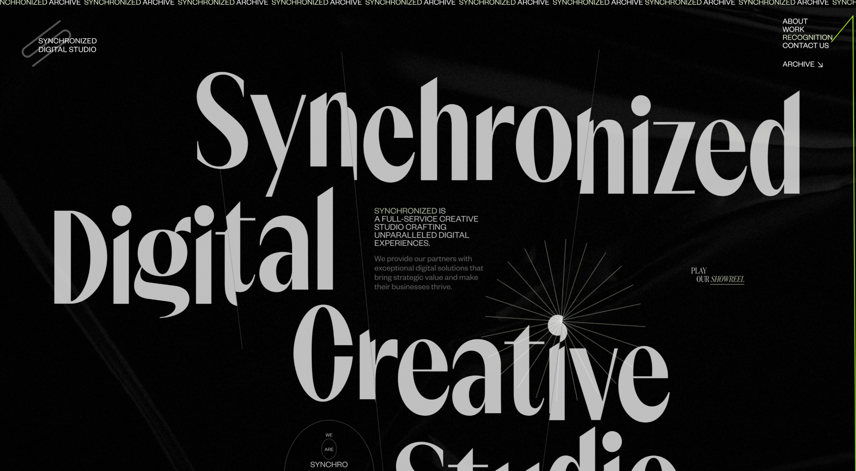
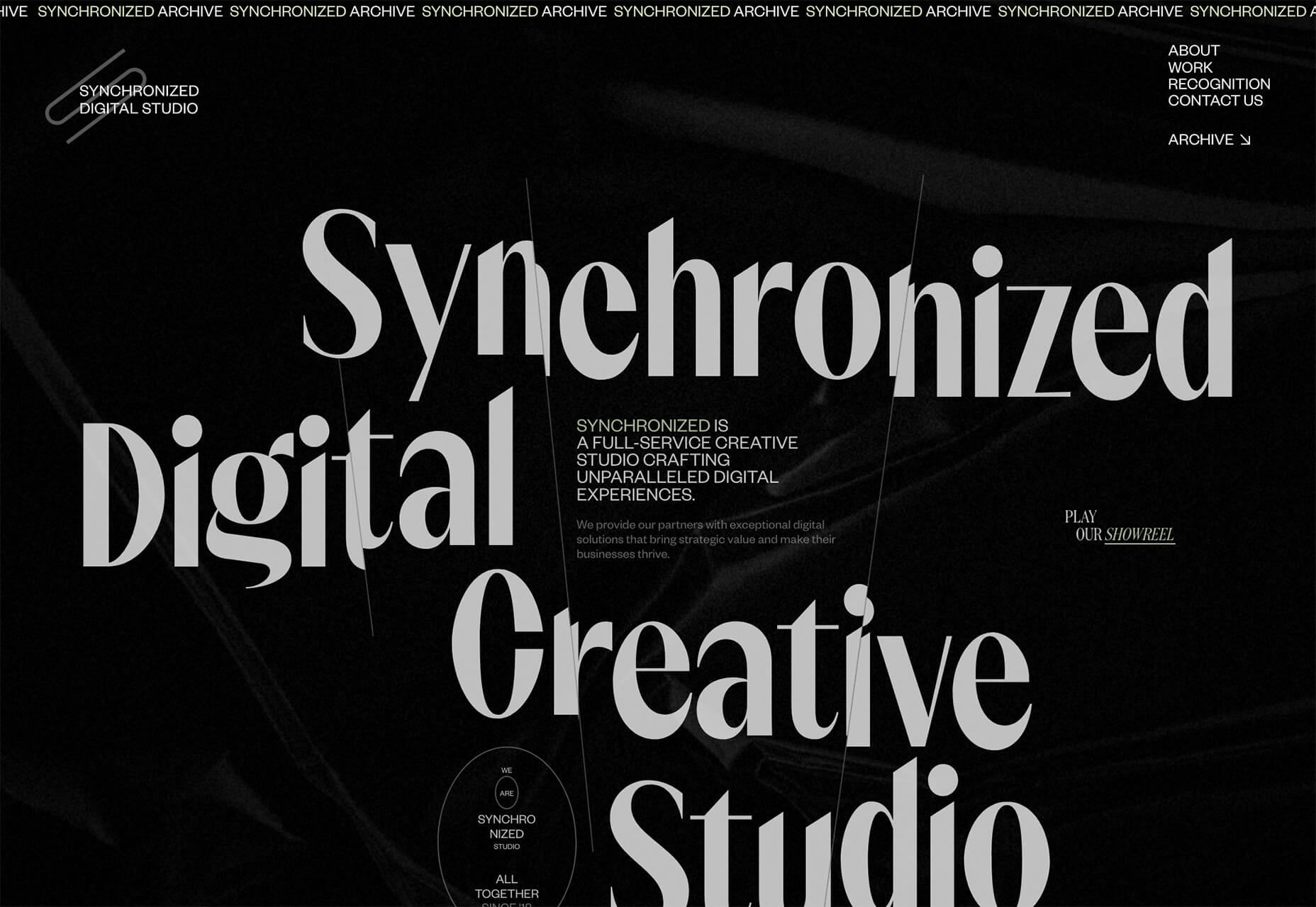
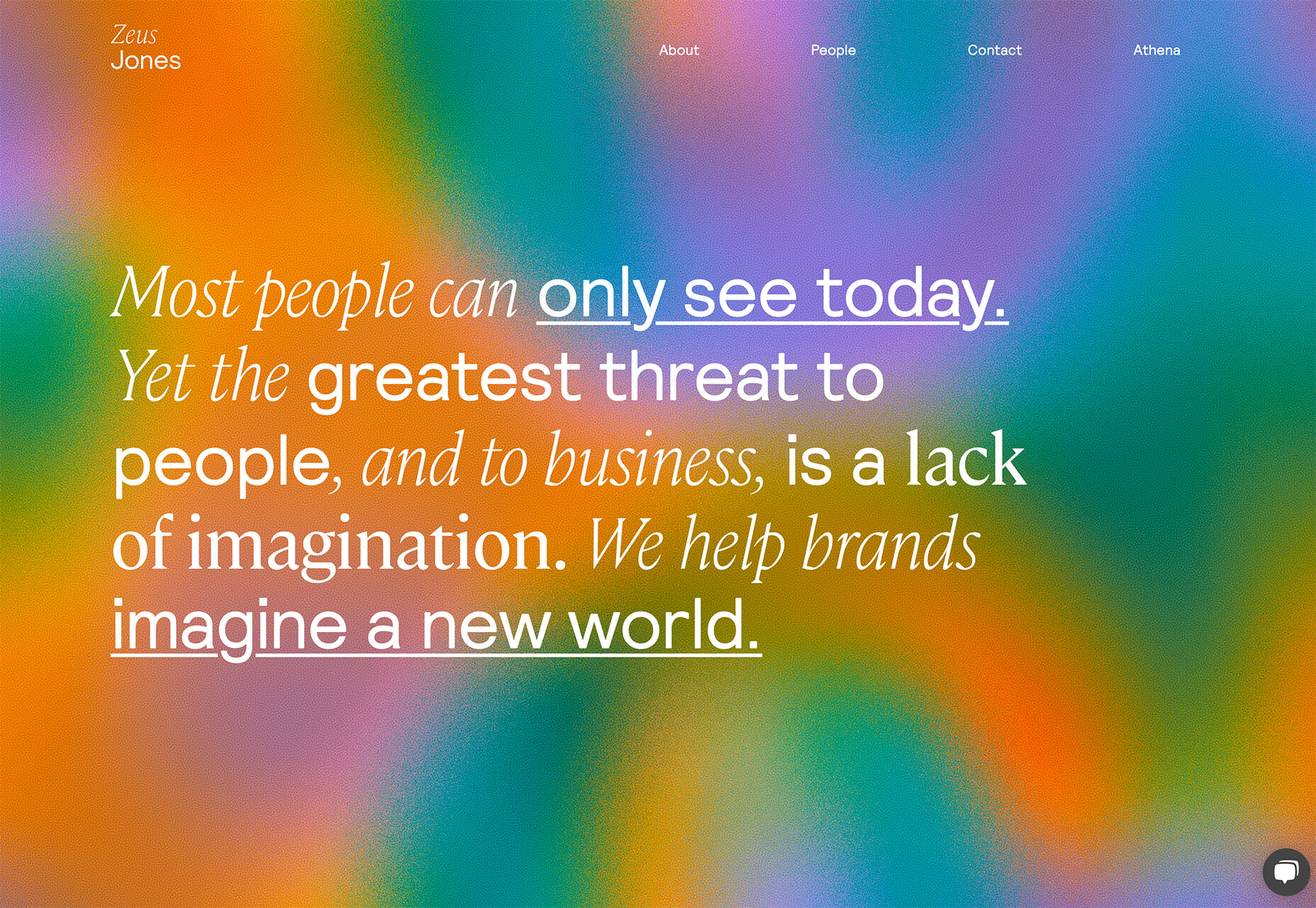
Typozon uses a quick motion graphic with plenty of different brand marks to tell the story of their brand identity work. Admittedly, the animation can get a little dizzying if you look at it too long, but the bright colors on the olive background are attention-getting for sure.
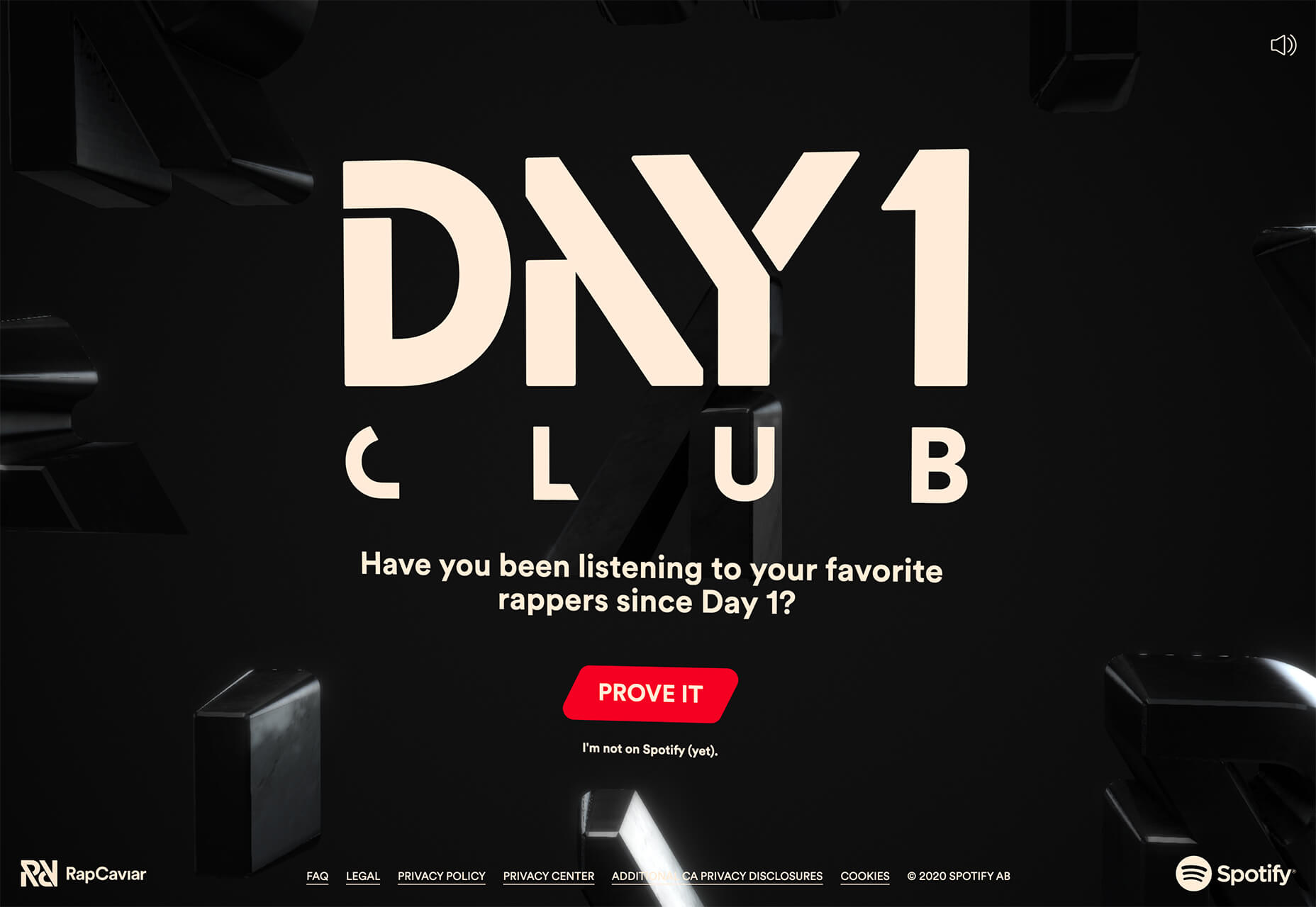
Day 1 Club by Spotify opens with a lot of motion in the setup and then settles into subtle motion behind the primary call to action. Shades of black and soft movement bring everything together and help you focus on the bright red button and text overlay.
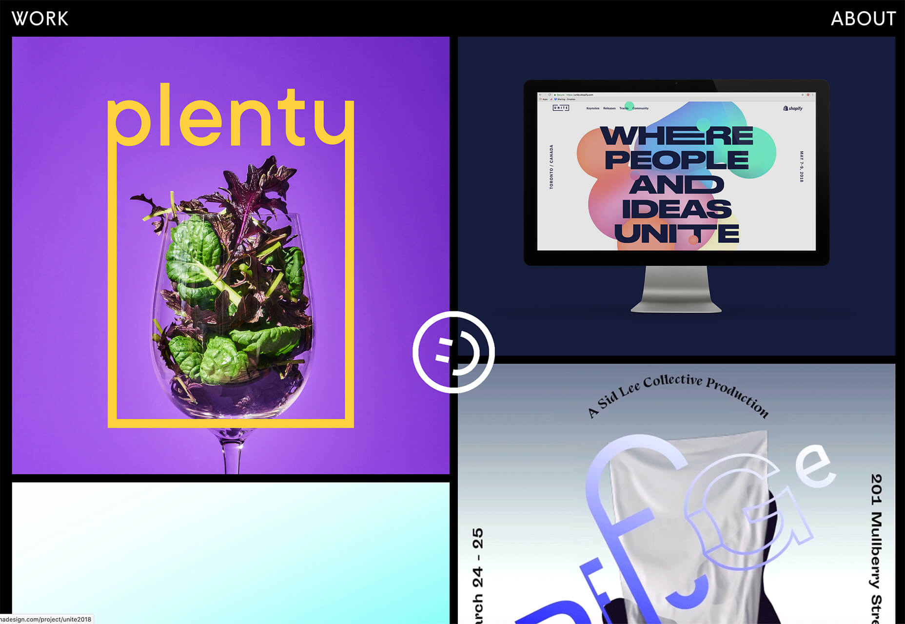
Kieran Baybutt uses multiple animations for this portfolio website. The most interesting might be on the “second screen.” A couple of things are happening here. The words change with mouse movements as does the background image. There’s also a cool hover pointer featuring portfolio elements that’s in constant motion. There’s a lot going on here, but it makes you want to click around.
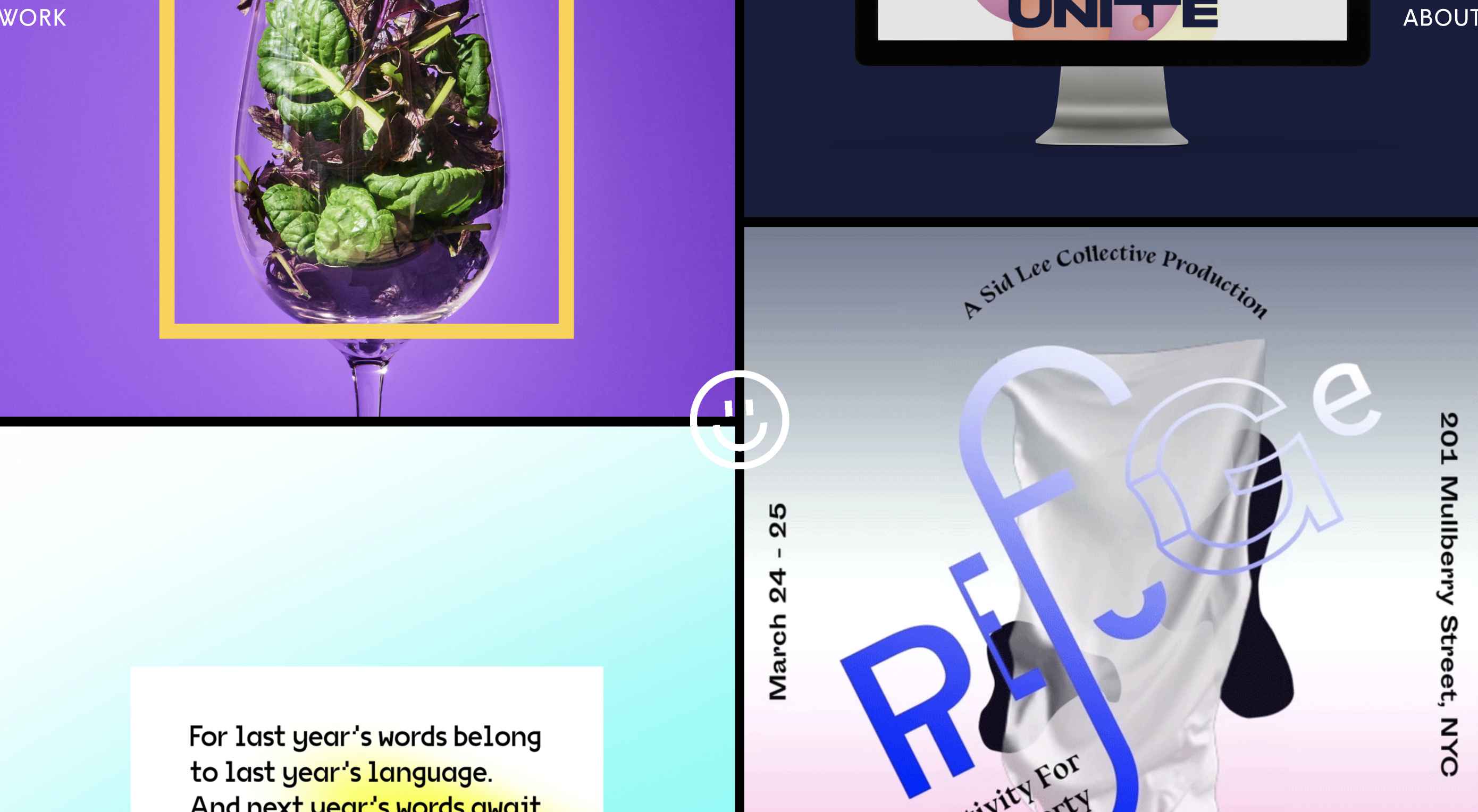
Animated or Floating Circles
Circles might be one of the hottest design trends of 2020. They are in all kinds of projects and keep evolving in different ways.
Maybe part of the reason is because of the message that designers are trying to convey in these projects. Circles are associated with harmony and protection. They are used to represent unity, community, and commitment. In motion, circles can also spark feelings of motion or movement with speed determining how chaotic (or not) that movement may be.
This month’s iteration of circle trends is animated. Some circles animate in place, while others seem to float in space on the canvas.
The circles in each example have something in common though – they bring you into the design and encourage interaction with it. (That might be why this website design trend is increasing in popularity all the time.)
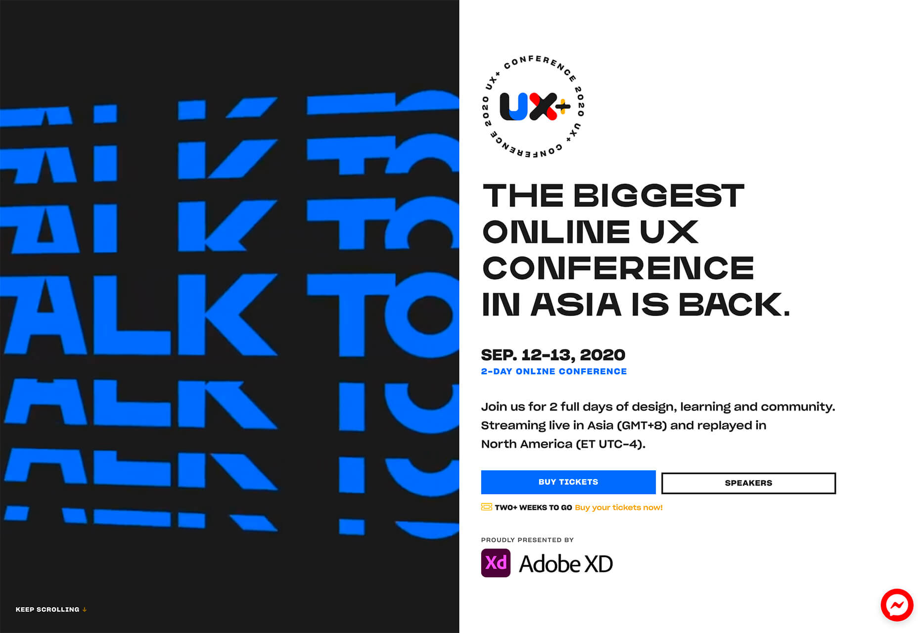
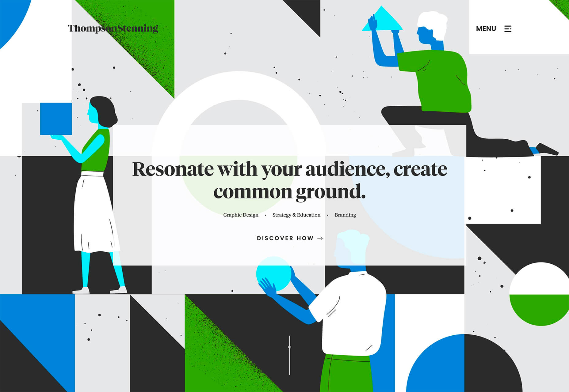
The circular motion for the UX+ logo actually helps draw the eye away from all the almost overwhelming animation on the left side of the split-screen design. With plenty of white space surrounding it, the constant movement is just enough to pull attention to the logo and then down the screen to important information about the event.
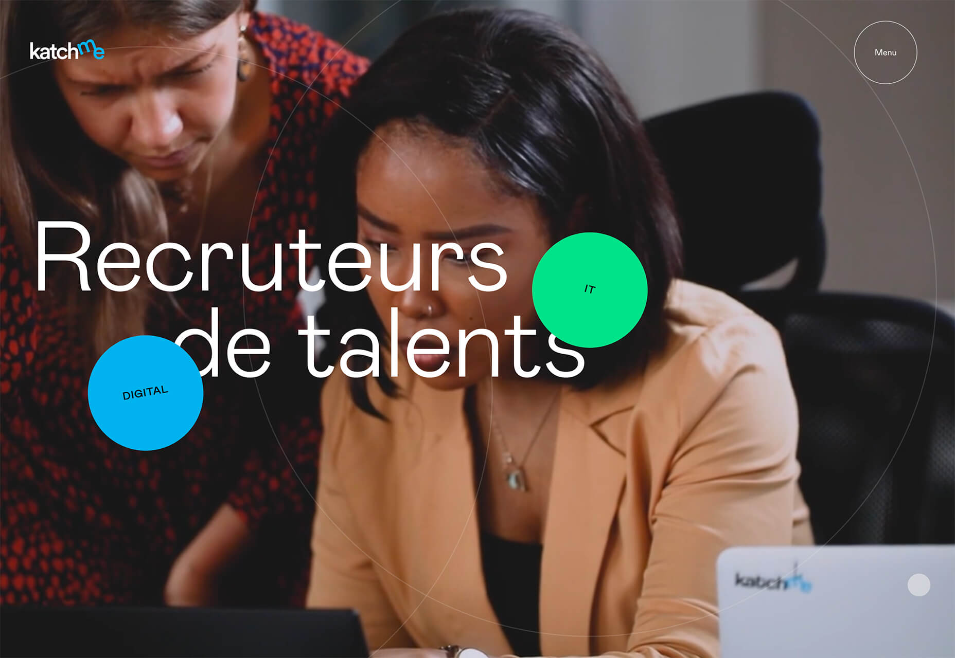
Katch Me uses circles that seem to float over the background video with a soft “bounce” in place. The animation changes when the mouse hovers over each circle with an expanded action and the ability to move the circle in a larger space. The circles here are actually the call-to-action buttons.
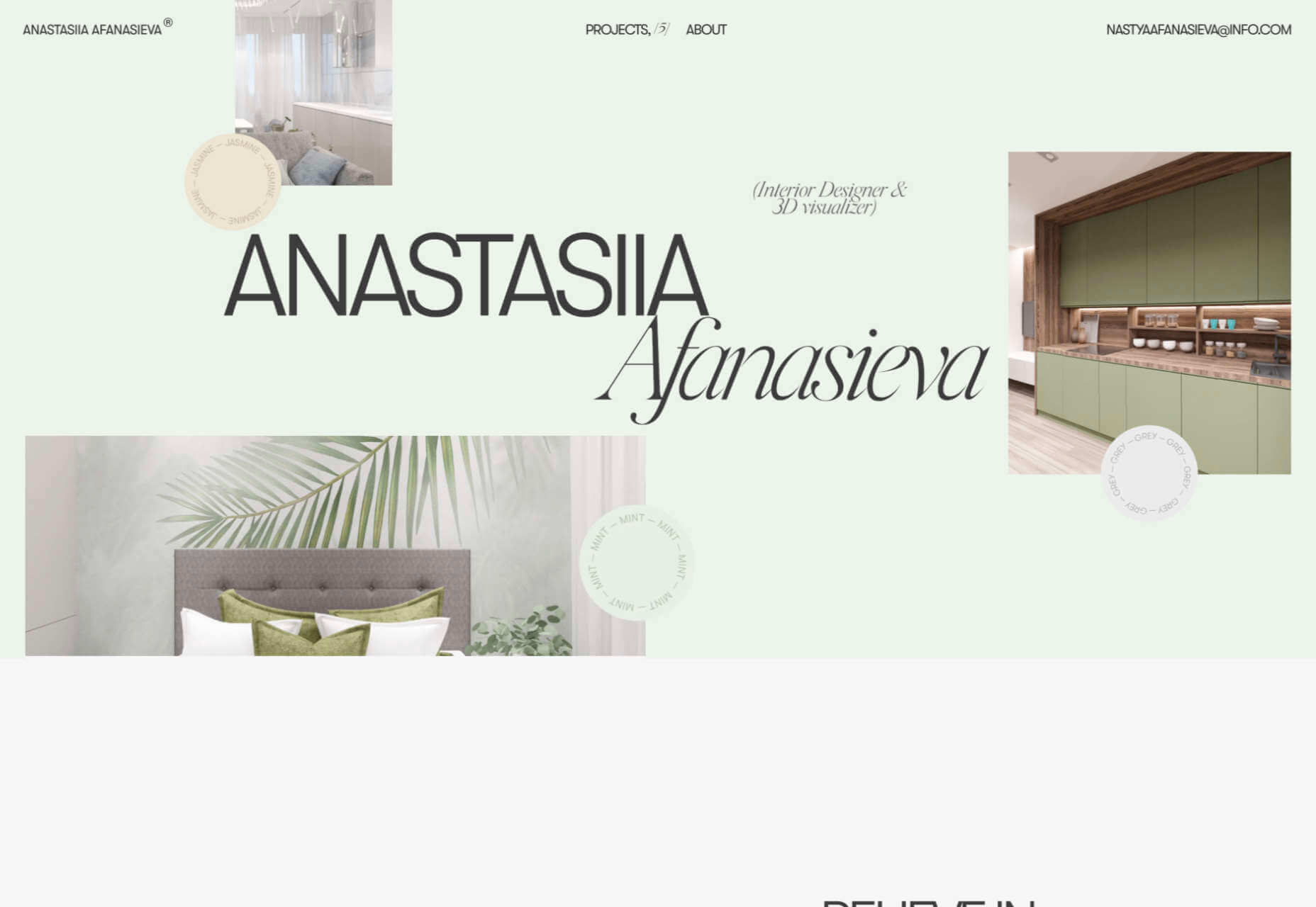
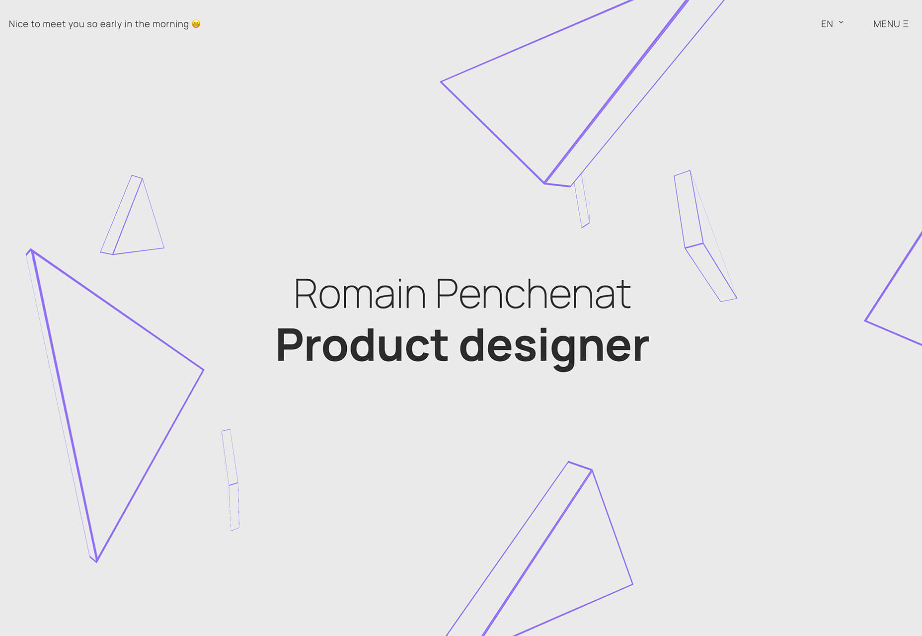
Visually, the circles for Anastasiia Afanasieva’s website look like a mashup of the above examples. There’s a rotating animation for circles that seem to float in space. You have to click through this design though to see the real brilliance in it. Each circle has a hover state that changes the background color of the website (and images in each box) to match the color displayed.
Bright Yellow Coloring
Another website design trend that might be a reflection of the state of the world is in the use of the color yellow. With a global health pandemic, design projects are leaning in to brighter, more cheerful tones to help offset the stress of the world.
For many, yellow can shine just a bit of hope and optimism into gloomier times.
While most of the projects using bright yellow as an eye-popping accent, others are going all in.
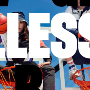
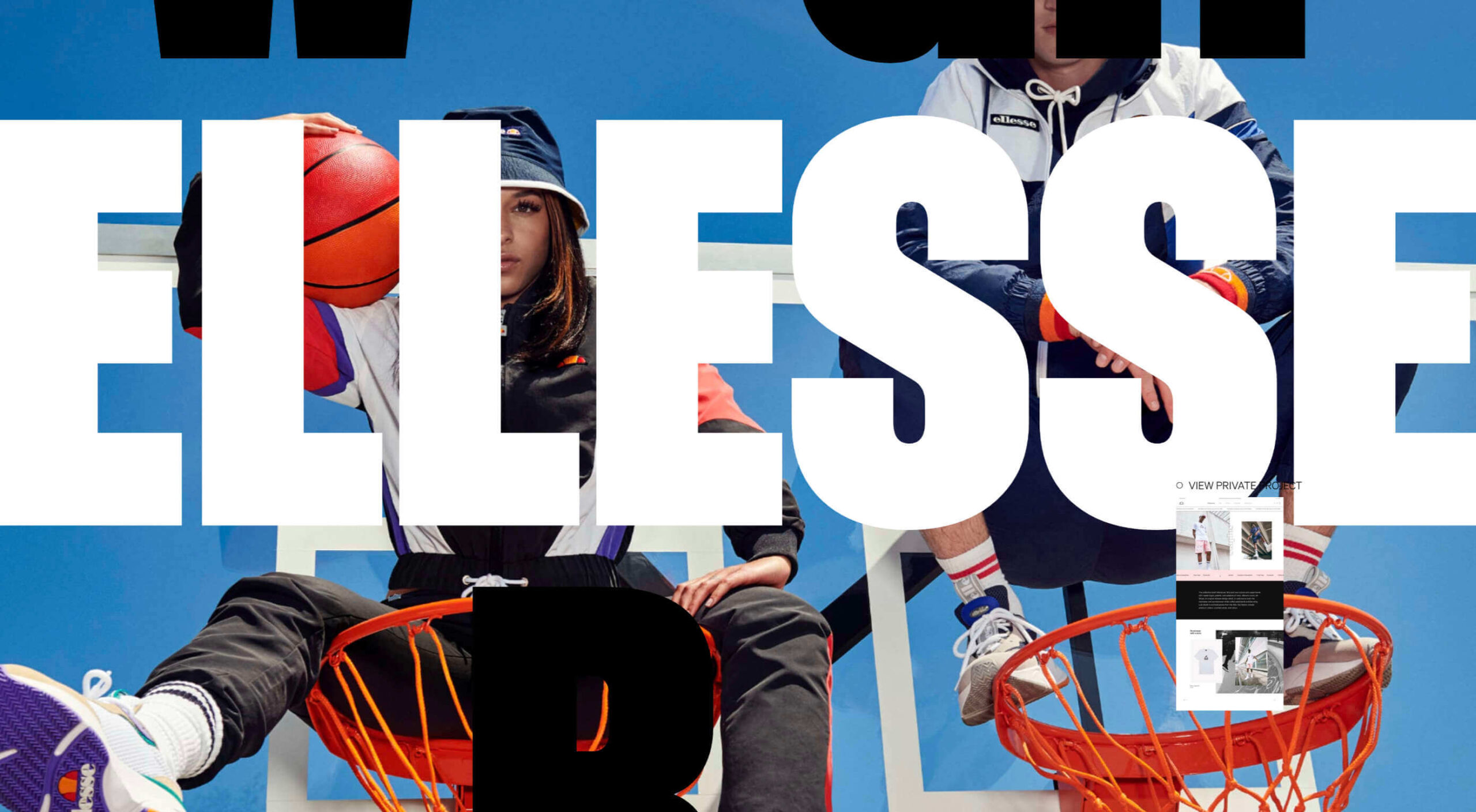
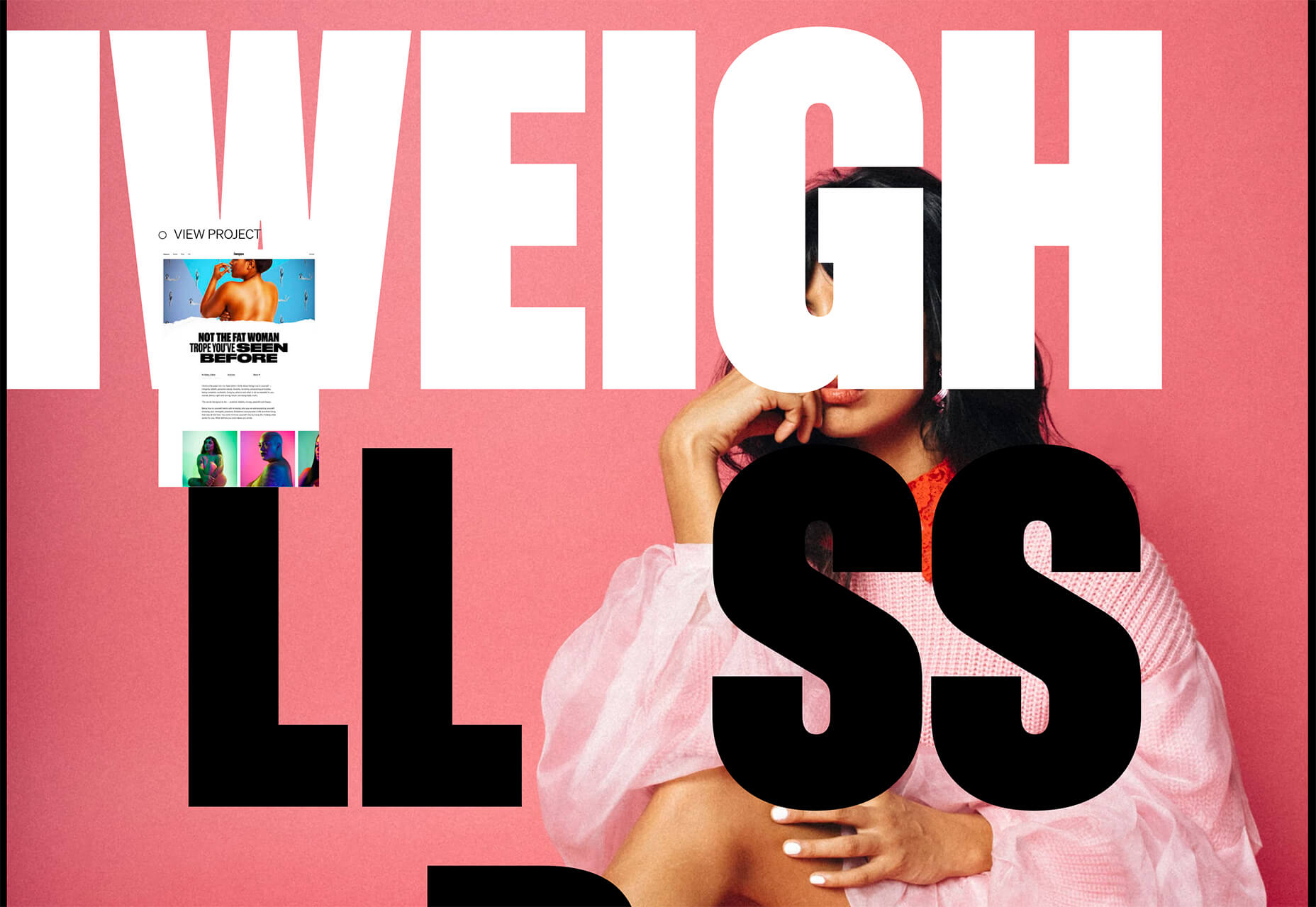
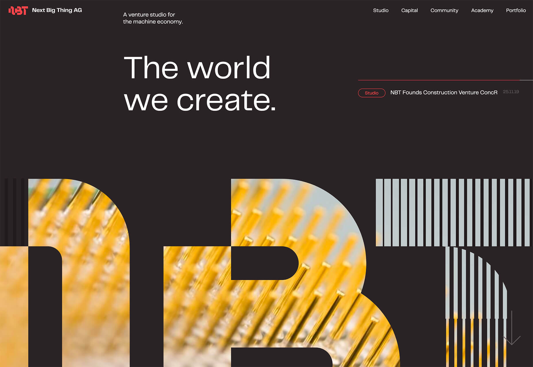
Next Big Thing AG uses yellow imagery inside of oversized cutout lettering (another website design trend this year) on a dark background. Even with the darker overall palette, the design feels bright and enticing. You almost want to dive deeper into the design to see what the image behind the letters is and what else the site contains.
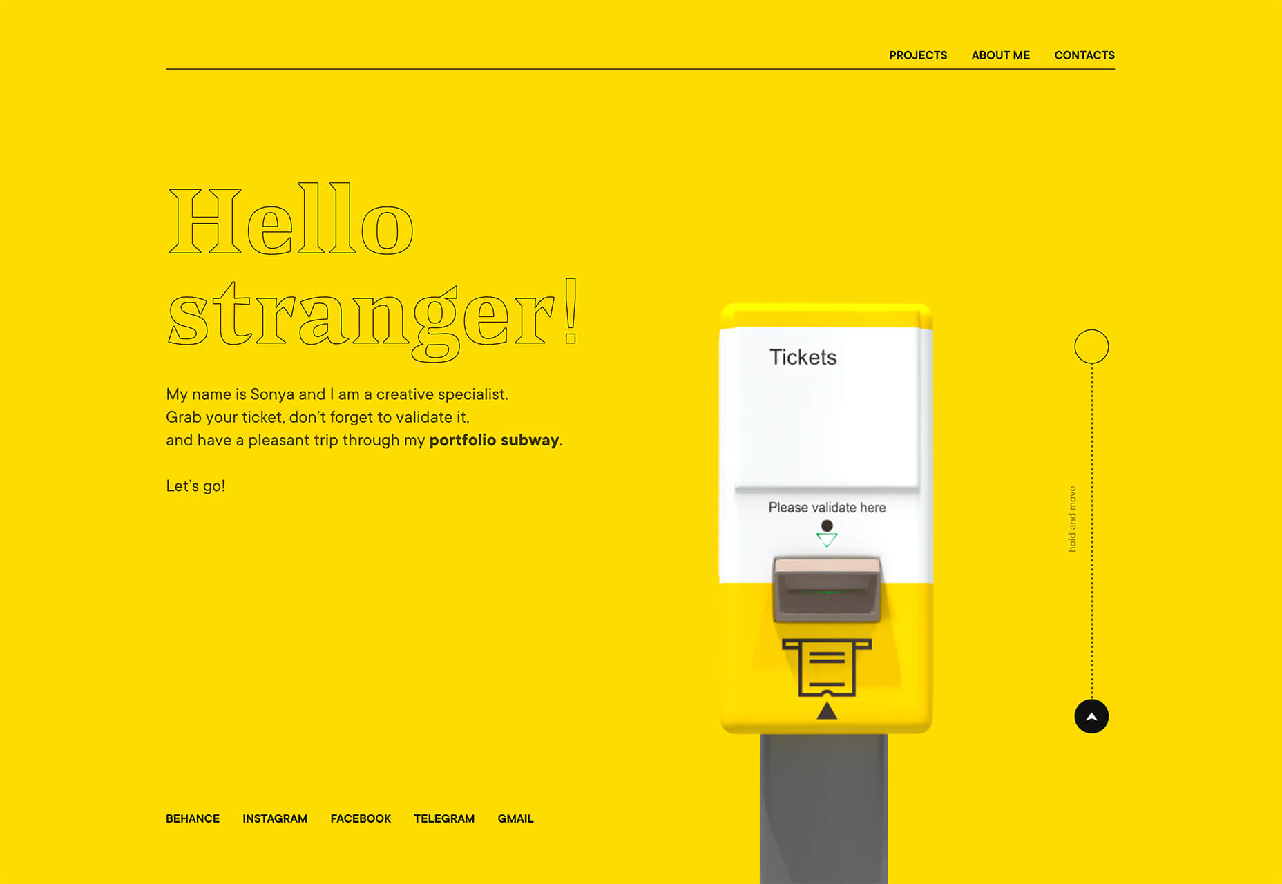
Sonya Mudvex uses a full yellow background on her portfolio homepage to stop visitors in their tracks. The rest of the design features a soft gray background and plenty of yellow accents. In addition to great use of color here, there are plenty of other UX tricks in this design, including some geolocation tools if you interact with the ticket validation graphic on the screen.
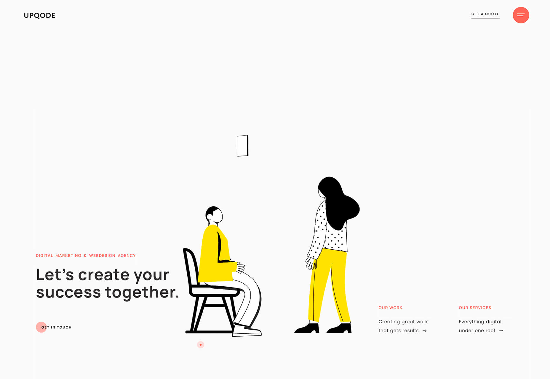
Upqode uses yellow with a peachy color palette to stand out. The illustrated animations are much more lively thanks to bright coloring. The overall color palette is a bit unexpected, and that’s what makes it interesting.
Conclusion
If this month’s website design trends tell you anything, it’s that interactive elements and animation are a growing part of the conversation. Are you already using these techniques in projects? (If not, it is probably time to think about it.)
You can also see how the influence of what’s happening in the world around us impacts design as well. It can counter other emotions to create a better mental space or mirror what’s happening in the world around us.
 Every week users submit a lot of interesting stuff on our sister site Webdesigner News, highlighting great content from around the web that can be of interest to web designers.

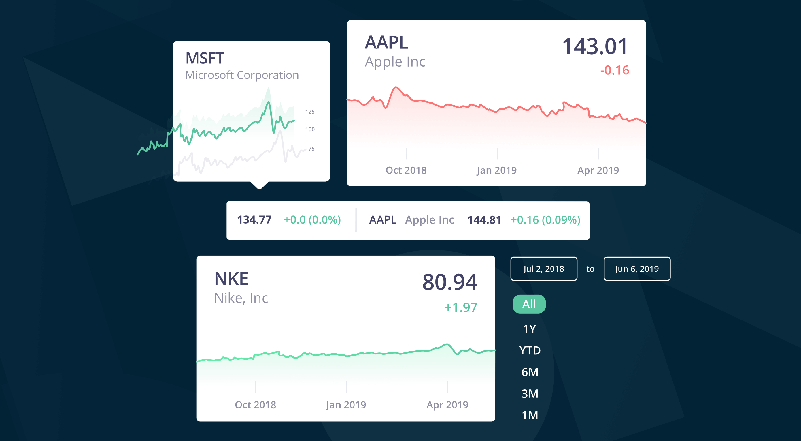 In this time of global economic turmoil, it’s more important than it’s ever been that your financial decisions are based on accurate, up-to-date, market information.
 Every week users submit a lot of interesting stuff on our sister site Webdesigner News, highlighting great content from around the web that can be of interest to web designers.
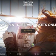
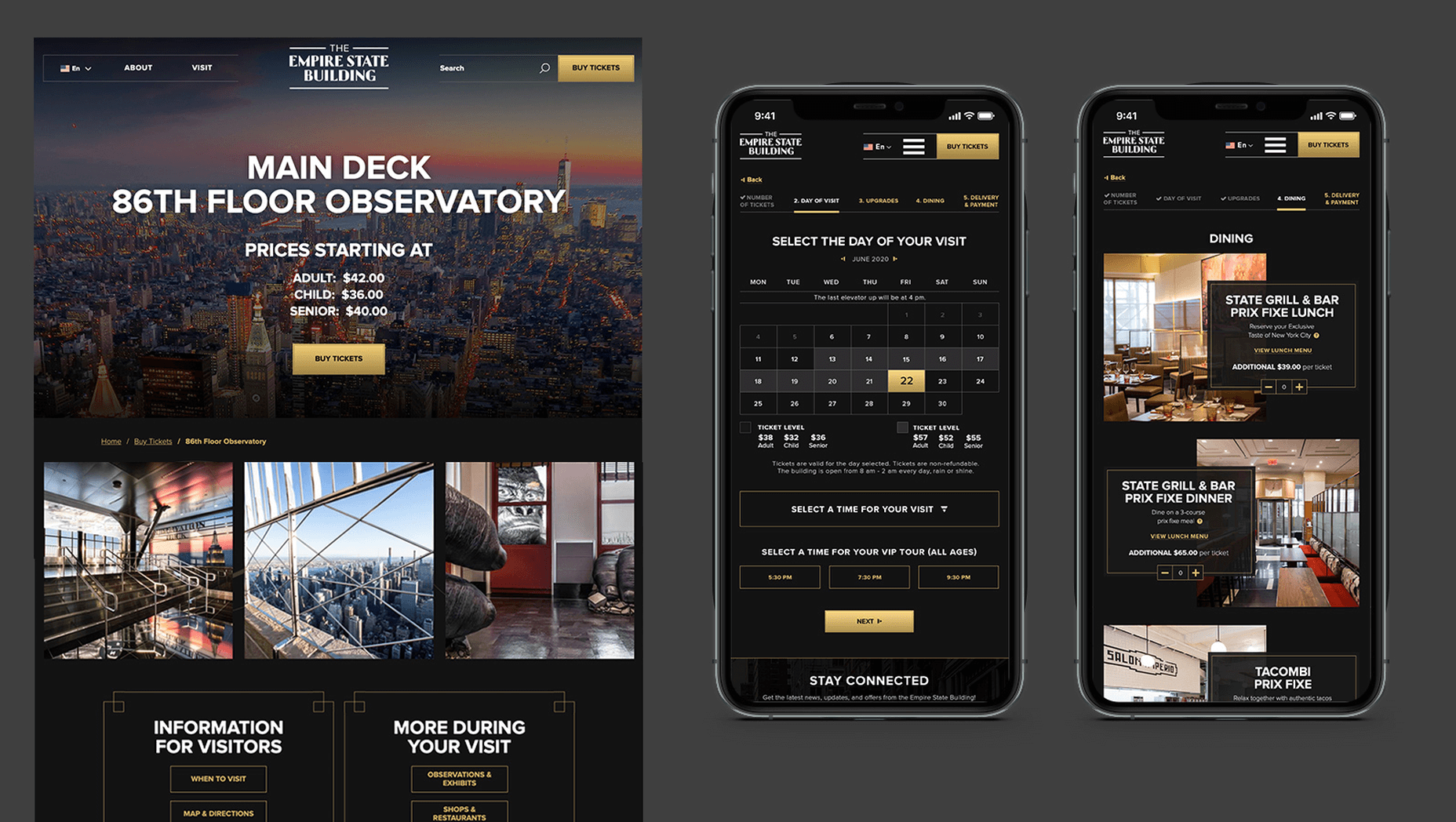
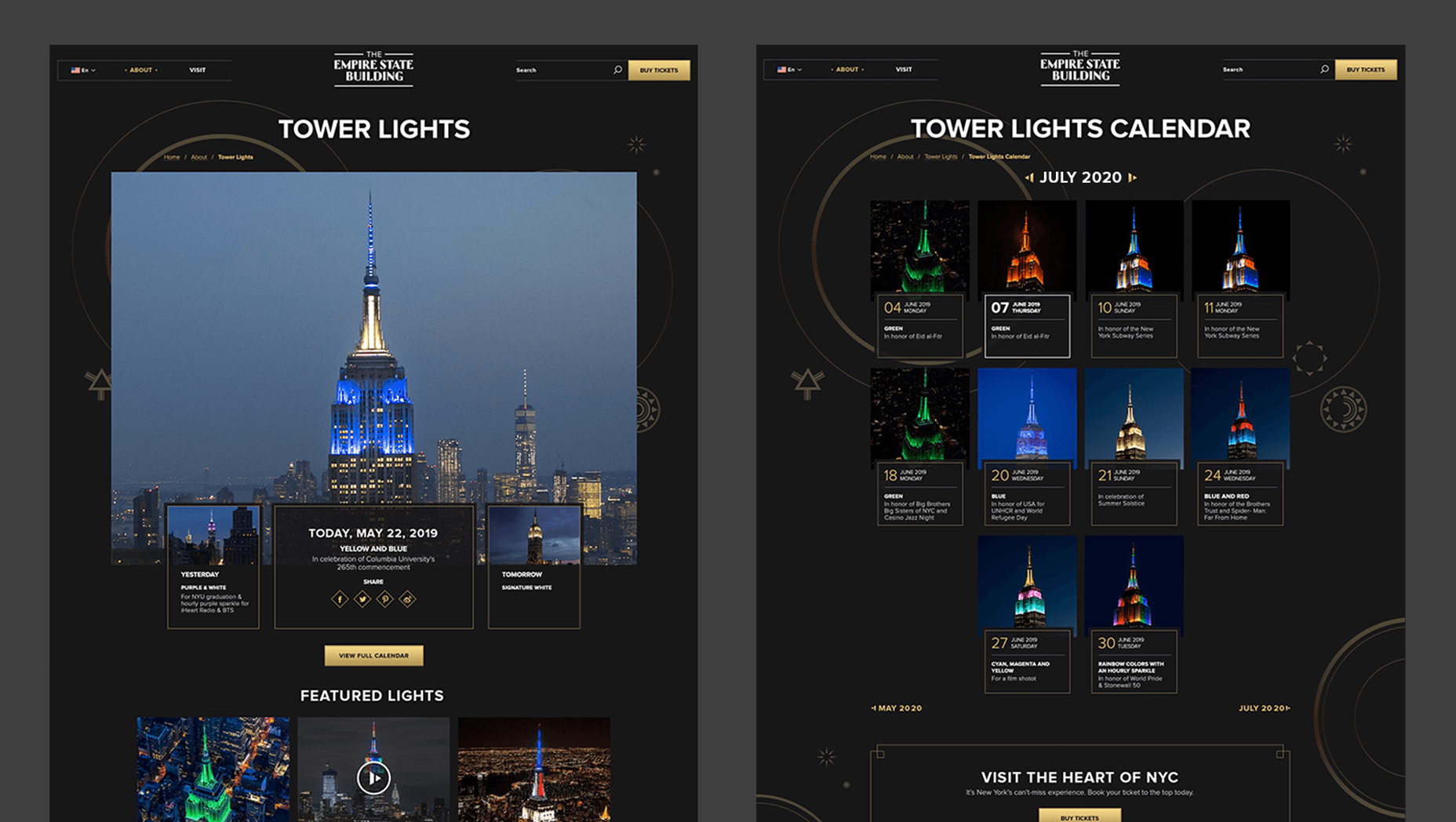
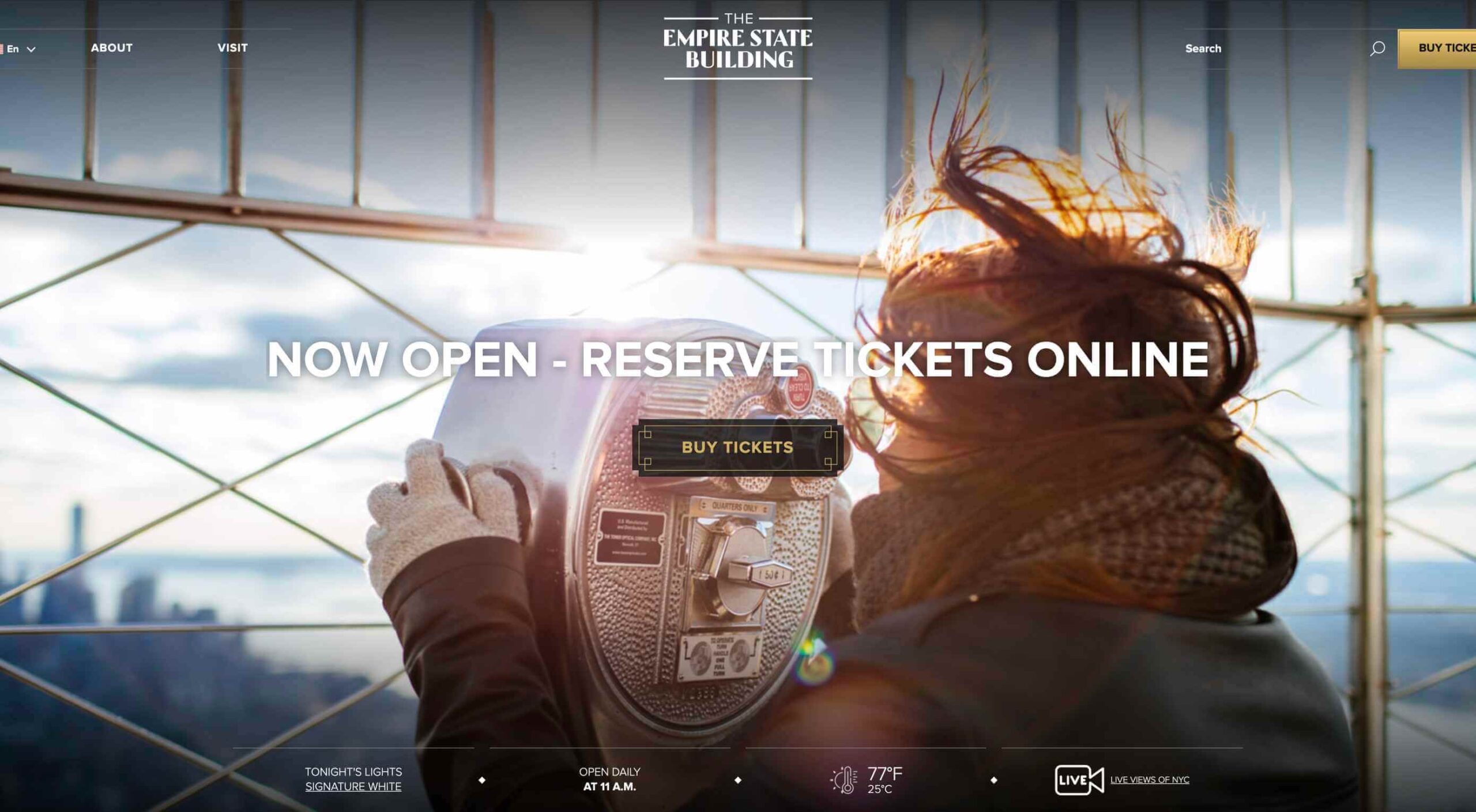 In 2019, to keep pace with an interior redesign of its visitor experience, the
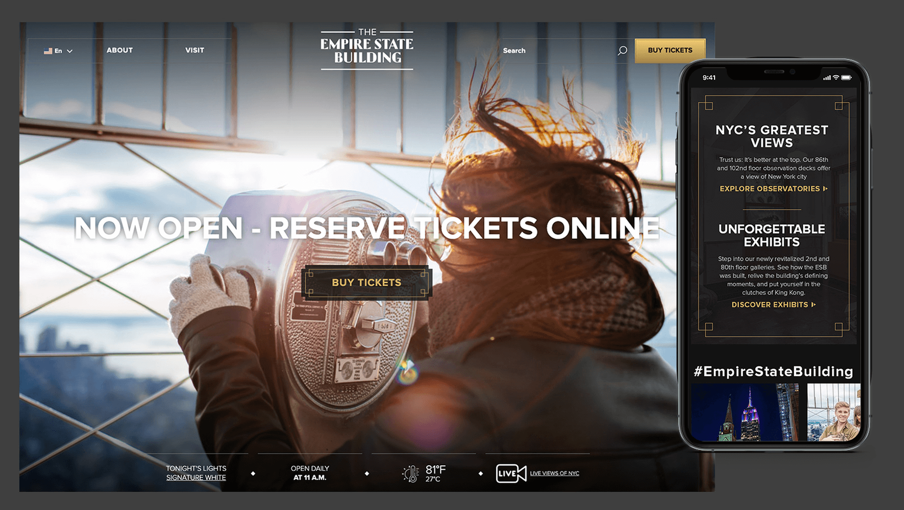
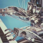
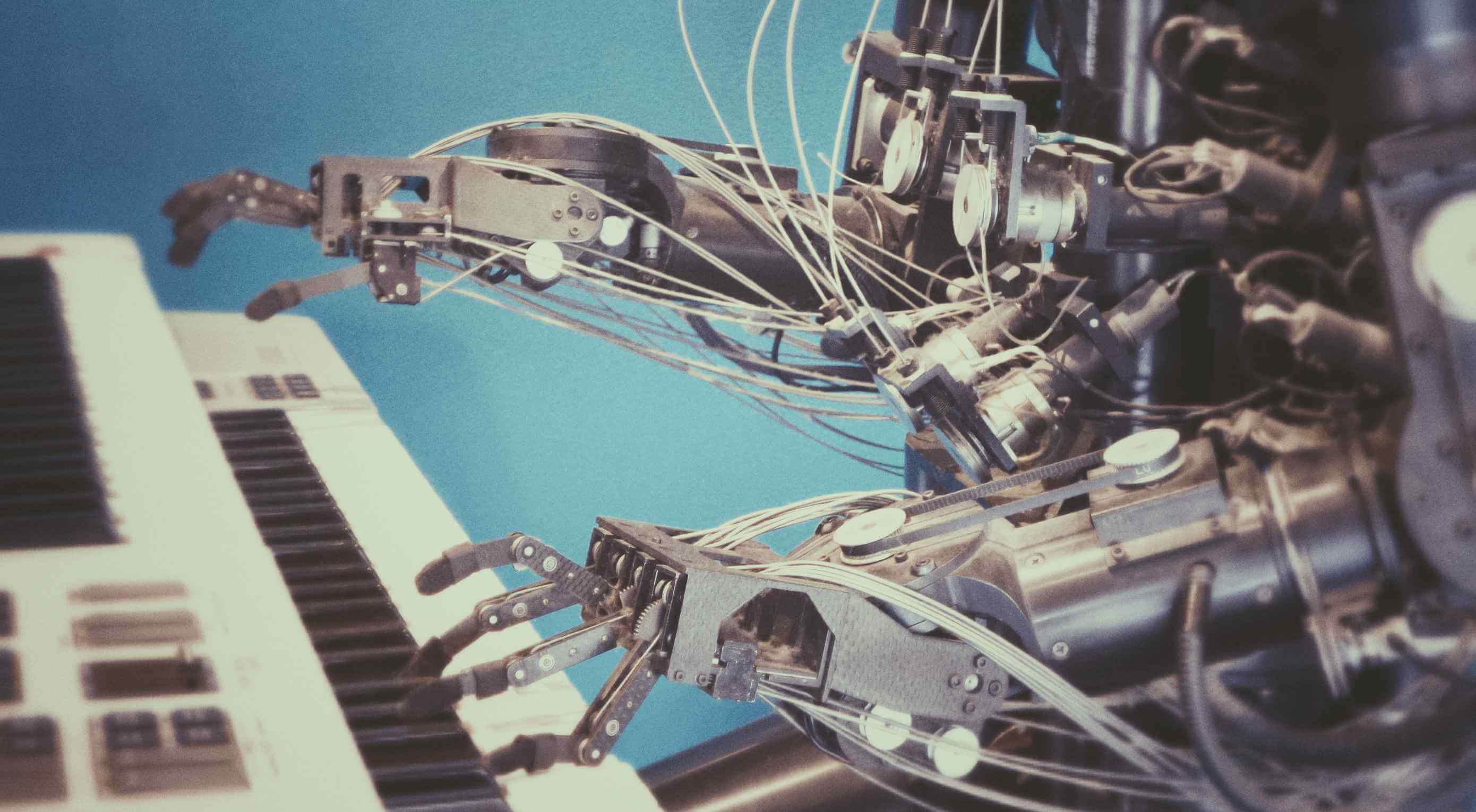 Artificial Intelligence is the use of computers or machines that have been created to work and react like humans. Some of the computers that have AI, are designed to include speech recognition, and learn user behaviours so they can predict activities or decisions before they happen.
 Do the lazy days have you longing for a new design technique to try? You are in luck.

 Every week users submit a lot of interesting stuff on our sister site Webdesigner News, highlighting great content from around the web that can be of interest to web designers.
 If we don’t question this kind of design homogenization, do we put ourselves at risk of perpetuating the same mistakes in the years to come? Or is it even a mistake to begin with?
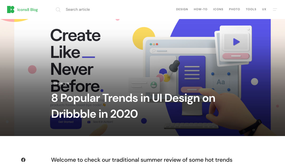
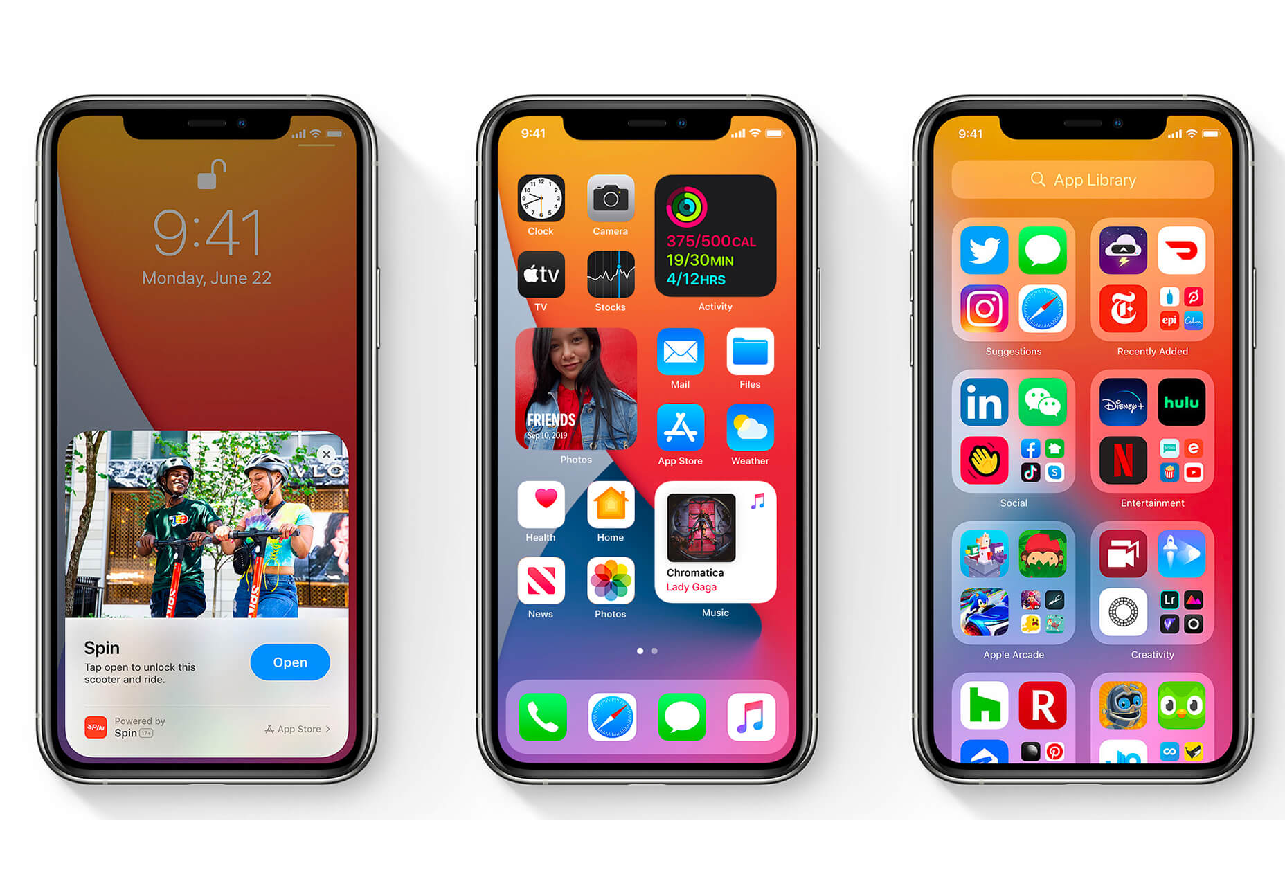
 The biggest trend we’re talking about this month started at WWDC as Apple provided a glimpse of what’s coming next for their operating systems. This time around there’s a distinct design element. Did you catch it?