Articles

SuperTokens is an open-source project which enables you to add auth to your app quickly. It gives you a pre-built auth UI and backend APIs for an end-to-end integration experience.

Before we dive into the code, let’s discuss the overall architecture.

Source de l’article sur DZONE

Web design is often stagnant because designers look at the same work and follow the same trends. Unfortunately, algorithms promote work that is liked, and designers produce content to get likes, which leads to a self-feeding cycle.

We’ve been talking about the dribbblization of design for years, but Behance is just as guilty of promoting and encouraging homogenous design.

It’s not that Dribbble and Behance don’t have value; they are both excellent resources for designers. But they’re victims of their own success, and it’s healthier for them, designers, and the industry if we broaden our sources of design inspiration.

And so, today, we’re presenting this list of the best places to find design inspiration for web designers that aren’t Dribbble or Behance. (OK, you can check them out too, if you really want to!)

Awwwards

Awwwards is the top site for web design inspiration. The best agencies in the world post here, and a ‘Site of the Day’ award is a coveted accolade. So if you’re looking for design inspiration, this should be your first stop.

Admire The Web

Admire The Web is an excellent collection of curated sites. It’s more selective than sites like Awwwards, so you don’t have to dig through so much to find the best web design.

One Page Love

One Page Love is one of the best resources for designers seeking inspiring new ideas. It’s devoted to one-pagers, which means it leans towards apps, tech start-ups, and smaller independent projects.

Godly

Godly is another excellent collection of web design inspiration. Godley uses animated thumbnails, so you can get a sense of a site before you look at it in detail. As such, it’s perfect for animated landing pages.

Hoverstat.es

Hoverstat.es is a collection of curated websites that often finds little gems other sites miss. Unlike most roundups, it doesn’t go into much detail on each site, and new sites are infrequent, but it’s always worth a browse.

Siteinspire

Siteinspire is one of the most established design inspiration sites. The collection is carefully divided into different styles; if you find your own site listed, you can add your contact details.

Land-book

Land-book is a curated collection of the best sites on the web. The site does a great job of presenting screenshots clearly, and the similar sites feature is great for browsing a particular mood.

Savee

Savee is a fantastic site for browsing all kinds of design inspiration. It’s like Pinterest for designers as it leans towards art direction and photography. It’s easy to scan for mood boards.

UIJar

UIJar is a nicely designed collection of hand-picked websites. Unlike most other sites on this list, UIJar also features a collection of branding that’s great for identity designers.

Brutalist Websites

Brutalist Websites is the perfect inspiration site if you’re a fan of the Brutalist design trend. There are plenty of designs that show why Brutalism is so popular right now, but the site itself is probably short-lived.

Minimal Gallery

Minimal Gallery is a collection of sites that embrace minimalism. Like Brutalist Websites, the quality of the collection is very high, but the site’s lifespan is probably short-lived thanks to being tied to one trend.

Ello

Ello is a platform for showcasing excellent design work. It’s solid on illustration and artwork. There’s also a great deal of photography on show. You’ll also find regular opportunities tied to creative briefs.

DeviantArt

DeviantArt is still the largest, and arguably the best, showcase for illustration, with dozens of styles from Anime to classicism. It’s easy to lose a few hours browsing DeviantArt.

Figma Community

Figma Community is a collection of the best work from the Figma community. But you don’t need to be a Figma user to grab some inspiration from the UI work on show.

Lapa

Lapa is a collection of 5000+ landing pages. The collection is headhunted from around the web, so if you only have time to check out one site, Lapa could be a good choice.

Source

The post 15 Inspiring Alternatives to Dribbble & Behance first appeared on Webdesigner Depot.

Source de l’article sur Webdesignerdepot

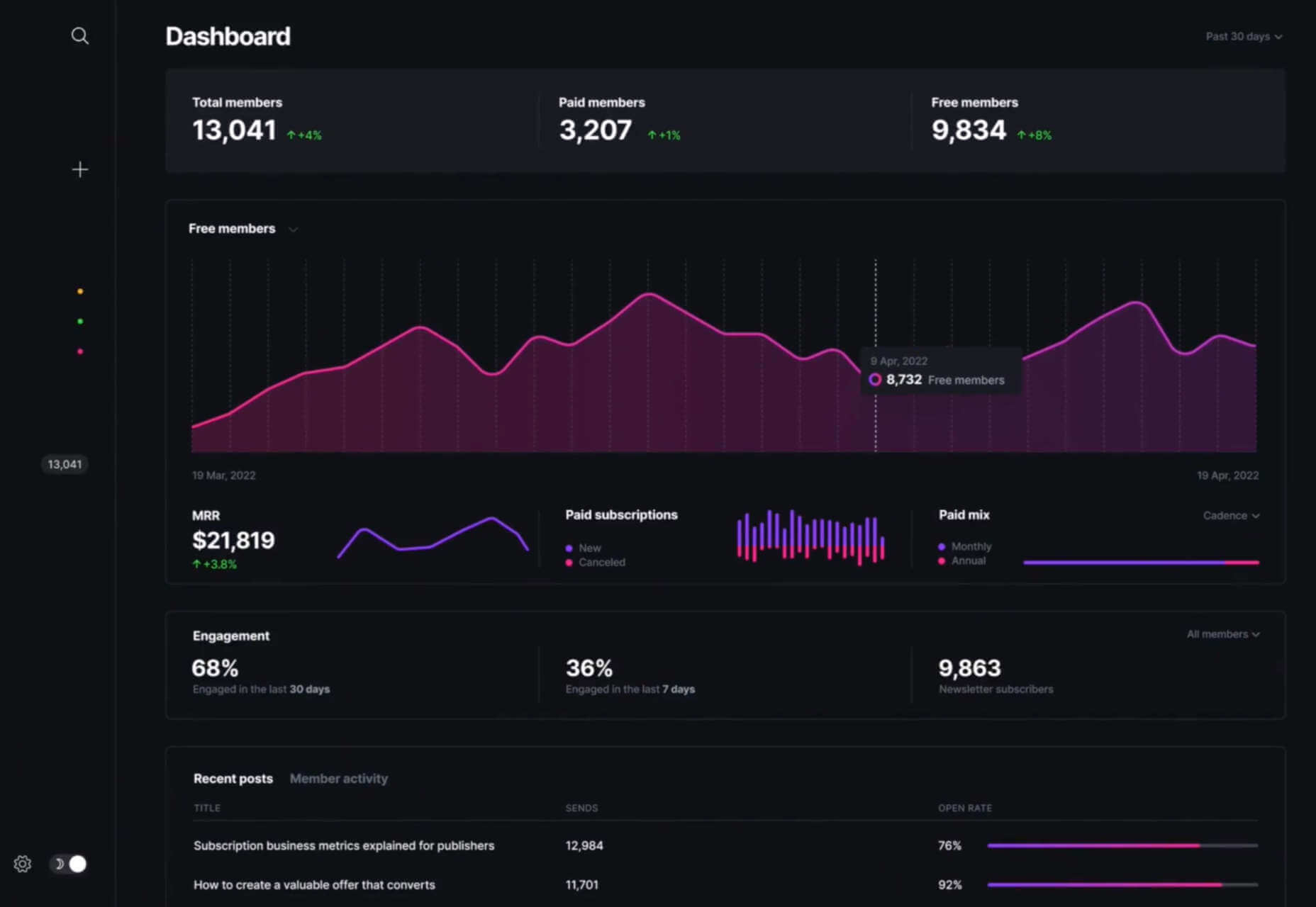
Live chat is one of the most powerful tools for customer experience in the current marketplace. 

In a world where customers are constantly connected to the online world, online chat is a reliable way of getting quick solutions to common problems. 

Today’s consumers prefer talking to an agent over chat to calling a contact center, and they often feel that live chat is less frustrating than waiting for the right person to answer the phone. 

Of course, like any digital tool, live chat is only effective when using it correctly. Today, we’re going to show you the crucial KPIs you need to consider if you want to ensure that your chat strategy is delivering a tangible return on investment. 

The Most Important Metrics to Measure for Live Chat

These days, implementing live chat tools is easier than ever. 

You don’t necessarily need to hire a professional developer unless you want a specialist widget with specific functions and unique branding. Many plugins and tools for sites built on Shopify and WooCommerce allow you to instantly access chat functions. 

However, just because implementing live chat is easy doesn’t mean that there aren’t countless ways for your strategy to go wrong. Keeping an eye on these crucial KPIs and metrics ensures you’re making the right impression with your chat strategy. 

1. First Response Time

First response time is a crucial live chat metric. This measures how long customers need to wait before someone responds to them. Technically, this metric only refers to how quickly an actual agent responds to your customer, so automated “thanks for getting in touch” messages don’t count. However, immediately responding with one of those messages can convince your audience to stick around for a little longer. 

The faster your agents can respond to messages and solve problems, the better your brand reputation becomes. The good news is that a good live chat strategy can lead to pretty quick response times. The average time for an agent to see a live chat message is around 2 minutes and 40 seconds.

To improve your FRT statistics, make sure you:

  • Invest in chatbots: AI chatbots can support customers 24/7 with handy, self-service functionality. These tools will also filter out the customers waiting for an agent who can find a solution to their problem on your FAQ page.
  • Prepare canned responses: Quick responses to common queries can help you to address a problem much faster. In addition, preparing canned responses will ensure that your team members can quickly respond to more customers. 
  • Increase your resources: Ensure you have the right hand and enough agents to handle peak demand.

2. Average Resolution Time

The first response rate only looks at how quickly someone responds to a customer’s message for the first time. However, it doesn’t show how rapidly you deal with client problems. Average Resolution Time is the metric that helps to measure customer satisfaction by seeing how long it takes to get to a point where your customer can close the chat. 

If it takes too long for your employees to solve problems, there’s an increased risk of your customers becoming annoyed and frustrated. Additionally, the longer agents take dealing with each individual chat, the more other consumers will have to wait for someone to become available. Finally, the longer it takes to resolve an issue, the more customer satisfaction decreases.

The key to success is ensuring that the right agent deals with the correct customer and that everyone on your team is empowered with the appropriate tools and information. Boost resolution time by:

  • Giving customers a quick self-service solution: For common questions, make sure that you have an FAQ section that you can direct your customers to. In addition, a chatbot that can offer quick canned responses to regular queries can save time. Plus, they’re great for reducing the pressure on your agents’ shoulders. 
  • Integrate CRM tools with live chat: Make sure your agents have access to information about each customer as soon as they start the conversation. This information should include the customer’s name, what they’ve purchased before, and if they’ve issued any support tickets. Integrating with the CRM makes it easier for agents to jump straight into the action without needing the customer to explain everything first. 
  • Keep resources handy: Your team members should have instant access to all the information they need to answer customer questions. Ensure that searchable data repositories are available for everyone on your live chat team. 

Remember, routing tools that automatically send customers to the agent with the proper knowledge or skills will also improve response times and reduce the number of times a customer needs to repeat themselves. 

3. Chat to Conversion Rate 

Live chat tools aren’t just an avenue for problem resolution. Although customers can get excellent service through live chat, they also look to chat to collect information before a potential purchase. Around 38% of customers say that they end up purchasing a positive live chat experience. 

The live chat app on your website can provide real-time assistance for sales queries, converting leads, and maximizing your return on investment. However, to determine how successful your chat system is at encouraging sales, you must look at the chat to conversion rate metric. 

Essentially, you measure the number of chats your company has been involved in, then compare that number to the total number of conversions from those customers. It might be helpful to narrow down your results here by using your data and analytics tools to separate your total number of live chats into those intended for sales information and those requiring assistance. 

If your chat to conversion rate isn’t as high as you would like, there are lots of things you can do to start making a positive impact:

  • Automatically launch a chat: As soon as someone comes to your website, launch a chat window with a bot that asks whether you can help your customer. You can even include a list of commonly asked questions so your customer can get help faster. 
  • Follow up on chat conversations: Make sure you follow up on any questions that customers ask on your chat widget with an email. This is a great way to reach out to customers that may have been distracted and ended up abandoning their cart.
  • Personalize suggestions: Use AI insights and information from your customer management tools to determine which products are most likely to appeal to each customer, then suggest those items. Remember to ensure that your tone of voice in the chat matches your brand too. 

Remember, the faster you can answer customer queries and address their concerns with your live chat strategy, the more likely the chat will lead to a sale. Ultimately, customers are convinced to purchase when they believe they can trust your business to deliver excellent experiences. 

4. Customer Satisfaction Score

The customer satisfaction score is probably one of the most critical metrics in any customer experience strategy. It directly measures customer satisfaction levels and gives you an insight into how well you’re doing from the perspective of your target audience. 

The best way to measure CSAT through live chat is to add a survey to the end of the chat session. For instance, you could ask, “How would you rate this session on a scale of 1 to 10”. Then, based on the score, you’d calculate a “Net Promotion Score.” Each score falls into one of three categories: “Detractors 0-6”, “Passives 6-8,” and “Promotors 9-10”.

The more information you collect about your CSAT score, the easier it will be to determine where you’re going wrong with your live chat strategy. On the other hand, if the score is pretty good after a chat session, you’re probably on the right track. To improve your overall score:

  • Encourage feedback: Getting people to leave feedback, even on a live chat app, can be difficult. Offering customers the chance to win something in exchange for their insights could help you to get more data. 
  • Follow up: Connect with your “detractors” to find out what you did wrong. Follow up in the live chat session by asking if they’d like to leave a more comprehensive review. Alternatively, you can send an email asking for additional information. 
  • Reach out to promotors: Connect with the people who give you the most favorable scores to ask them for their insights. Find out what they enjoyed most about the experience and request a review that you can place on your website for social proof. 

5. Missed Opportunities

The longer someone waits for you to answer their question in a live chat or respond to their initial message, the more likely they’ll give up on the conversation. Unfortunately, this means that your company ends up with missed opportunities. You lose the chance to potentially make a sale, delight a customer, and strengthen your brand reputation.

While you might assume that your customers will know you can’t be available to answer all of their questions immediately, that’s not the case. INC tells us that 51% of consumers believe a business should always be open. So every missed chat is another negative mark against your reputation. 

If you discover that your team is missing a lot of chat chances, this could be a sign that you don’t have enough resources available in this area. However, there are a few ways that you can reduce your chances of missed opportunities, such as:

  • Hiring more team members: If you know that there are times of the year or week when you have peaks in demand, ensure that you have the correct number of staff members available. 
  • Using chatbots: Chatbots won’t be able to answer all customer questions, but they can deliver quick responses to commonly asked queries and reduce the risk of lost opportunities.
  • Provide alternative forms of communication: if your customer can’t reach you on live chat, make sure that there are other options available, like a phone number and email address or a form where your customer can automatically submit a ticket. 

6. Total Number of Chats and Tickets

Keeping track of the total number of tickets your customers submit, alongside the number of chats your employees engage in, will give you helpful information. First, the total number of conversations shows how many customers are taking advantage of your live chat function on the website. 

You’ll also be able to compare your total number of chats to the number of resolved problems you deal with for your customers. For example, comparing your total number of chats to an unlimited number of tickets shows you how many customers have been left to rely on other sources of communication. You can also see how good your employees are at following up with tickets issued by customers. 

When you’re analyzing your number of tickets and chat sessions, you might notice that many of the queries you dealt with were connected to specific questions or topics. If that’s the case, you might be able to create a new FAQ page for your customers or provide your chatbot with extra information that it can use. 

If you’re getting more support tickets through alternative means than live chat, it might be time to ask yourself what’s wrong with your live chat performance and why your customers choose not to use it. 

Improving Live Chat CX for Your Business

Live chat can be a powerful tool for improving customer experience and an excellent way to strengthen your relationship with existing and potential clients.

Step into the shoes of your customer and discover what it feels like to walk through the whole live chat experience, from the moment that you send a request to the live chat team to the moment when you close down the chat with a solution to your problem. Other quick tips include:

  • Getting the software right: Make sure your live chat app is easy for your end customers and your employees. The chat app you use should be convenient and suit your brand. It also needs to collect information effectively without causing problems like GDPR and regulations. Get a developer involved if you think you have a problem with your chat functionality. 
  • Guide your team: Remember that your team needs to know how to use the live chat tools available effectively if they’re going to deliver the best results to your customers. Make sure you give your employees scripts to deal with problems if needed. In addition, chatbots that can quickly grab information from integrated CRM tools and other solutions could make your agents’ lives much more manageable. 
  • Pay attention to feedback: Ask your customers for feedback on their live chat experiences whenever you can. Ensure you pay attention to what they say they like and dislike about the encounter. If you can listen to your customer’s opinions, they’ll give you a lot of helpful information to work with when you’re enhancing and optimizing your live chat strategy. In addition, listening to your audience shows that you have their best interests at heart.

Remember, as well as customer feedback; you might be able to ask your employees for their insights into how you can improve live chat performance too. Employees also work with these tools regularly, so they know which features are more problematic than others. 

Measuring and Improving Live Chat

Live chat functionality isn’t something that you implement into your website and forget about. Instead, like any form of customer service or engagement tool, your live chat solution should be something you test regularly and constantly update to suit your customers’ needs. 

Knowing which metrics to measure when examining live chat functionality and performance will boost the experience you can give your audience and even open the door for better relationships with clients in the long term.

Source

The post How to Measure Live Chat Performance first appeared on Webdesigner Depot.

Source de l’article sur Webdesignerdepot

There’s nothing like a new font or two to breathe new life into your designs. And so, every month, we put together this collection of the fonts that have caught our eye in the past few weeks.

This month we’ve got traditional slab-serifs, some original scripts, a couple of workhorses, and plenty of characterful display faces. Enjoy!

Canora

There are plenty of calligraphic typefaces available, but Canora is a little different. Alongside Canora Frente, which leans to the right, Canora Verso leans to the left for an original look.

Fisterra

Fisterra is an informal serif in two styles. Morte emphasizes the pair’s curves, and Fora accentuates the sharp lines; both share the same elegant skeleton.

King of August

King of August is a single-weight script that’s packed with energy. The extra cut beneath the stroke on characters like the lowercase s and p add a delightful wet-paint feel.

Lithops

This poster-worthy font is Lithops. The pattern forming the letter shapes is reminiscent of seaweed, fine jewelry, and acid flashbacks. Just don’t try setting body text in it.

Sangbleu

Sangbleu is a super-family of typefaces with five complementary voices: Empire, Kingdom, Republic, Versailles, and Sunrise. It’s ideal for demanding editorial work.

Kohinoor One

Kohinoor One claims to be the thinnest font ever produced, with strokes just one unit thick. It’s perfect for those occasions when you need light typographic color at extra large sizes.

Firelli

Firelli is a warm, contemporary slab serif with a range of weights from thin up to a chunky, retro-feeling Black. It works amazingly for both headlines and body text.

UCity

Ideal for signage, branding, and headline text, UCity Pro is a geometric sans-serif with ten styles and a variable font version.

Artex

Artex is an excellent sans-serif with simplified forms that work best when embracing its vast number of styles and weights. It’s also available as a variable font.

Colroy

Colroy is an excellent early-style slab-serif that is superb for setting large runs of text. It was begun in 2009, released in 2014, and has just been re-released with new weights and a variable font.

Fabbrica

Fabbrica is a solid, functional sans-serif that performs exceptionally well at small sizes, including on screen. It has rounded and sharp variations and different weights.

Mule

As the name suggests, Mule is a flexible, hard-working serif with mixed lineage. Its round shapes are friendly and engaging, and its vertical rhythm makes it ideal for extended text passages.

Romano

Romano is a distinctly Roman font. Subtle flares and abrupt angles call to mind carved letterforms and the formal scripts of the renaissance.

Kosmos

Kosmos is an experimental typeface in which multiple horizontal shapes make up the letters. The finest weights are barely visible, and the thicker weights overlap the shapes to create cloud-like forms.

Precise Sans

Precise Sans is an excellent font for dashboards and other complex UI designs. It is clean and modern with simplified shapes. It’s currently in beta.

Source

The post 15 Best New Fonts, Aug 2022 first appeared on Webdesigner Depot.

Source de l’article sur Webdesignerdepot

An unreliable, semi-broken and unresponsive website is an excellent way to lose leads and visitors — regardless of how aesthetically pleasing or well-designed, the visual elements are.

Over the past decade, we’ve seen more initiative to deliver faster internet to regions of the world that were previously devoid of it. With online communities expanding and more people becoming receptive to online shopping, ensuring your site’s dependability is now more important than ever. 

One way to achieve this is by employing uptime and downtime monitoring tools. This guide will examine the best ways to get alerts when something goes wrong and your website falters.

Why Is Website Uptime Monitoring Important?

Downtime is bound to occur occasionally. Nonetheless, the goal is to minimize it. The longer the downtime occurs, the more traffic and potential clients you lose. A dysfunctional website is also detrimental to your credibility and reputation. People may associate your website’s unreliability with your real-world products or services.

With web developers charging an average of $200 per hour, high-quality websites can be expensive to build and maintain. Nevertheless, it’s often worth the investment. However, an unreliable website can backfire on you. Instead of attracting more customers, it could potentially repel them. This can result in lost revenue.

An uptime monitoring solution can help you prevent or reduce these losses. It verifies if your website is up and functional and notifies you if it’s not. This allows you to troubleshoot the issue and get your website back up and running as soon as you’re alerted. The most common issues behind your website’s downtime include: 

  • Server faults;
  • Network outages;
  • Power outage;
  • Traffic spikes;
  • Cyberattacks;
  • Domain name issues;
  • An erroneous web application deployment;
  • Increased server loads;
  • DNS Resolve issues;
  • Human error.

Thus, you must employ a dependable tool that detects downtime or any interruptions related to your website as soon as they occur. They are must-have tools for web designers, developers, and network administrators. However, not all of them are built the same. So how do you identify the best uptime monitoring tools?

Essential Features of Uptime Monitoring Tools

Uptime monitoring tools typically detect interruptions by running network tests such as pings and trace routes. You could practically monitor your website’s uptime by constantly running these tests yourself. 

However, this isn’t an efficient way to monitor your website’s uptime. A comprehensive uptime monitoring tool will automatically monitor your website’s uptime in the background. It will then alert you through various channels as soon as it senses that your website may be down. 

Furthermore, high-quality uptime monitoring solutions tend to offer additional information regarding your website’s uptime/downtime and its performance. These tools commonly feature dashboards, status pages, badges, exportable records, etc., to help you keep track of your site’s overall health.

9 Best Features of an Uptime Monitoring Solution

The ideal uptime monitoring tool or service should feature: 

  1. Website security features that notify of and repel potential cyber attacks;
  2. 24/7 uninterrupted background website monitoring;
  3. Multi-channel alerts (email, SMS, push notifications, instant messages, social media, etc.);
  4. Report generation;
  5. 24/7 customer support available through different channels (email, phone, chat, etc.);
  6. Be capable of monitoring multiple websites and proxies at the same time;
  7. Offer insights and suggestions to improve your website’s performance;
  8. Be affordable;
  9. High customizability should allow you to choose which features to enable and disable.

Another optional feature to look out for is public status pages that your clients can access to determine if all your services are up and running. GetWeave is an excellent example of this. The website features a well-organized systems status page where customers can check if all of Weave’s services are functional. 

Nevertheless, you can use the above information as a buying guide when assessing potential uptime monitoring tools. The rest of this guide will supply a few suggestions as to which tools you should use for your website.

3 Best Website Uptime Monitoring Tools 

Some of the best uptime monitoring tools for website downtime alerts include:

1. Uptrends

Uptrends isn’t just a downtime detection tool; it’s a complete web performance monitoring solution. It will notify you as soon as it detects any disturbance in your website’s performance. It features highly customizable checks. For instance, you can set performance check limits for load times. Uptrends will notify you instantly if your website takes too long to load.

You can also configure from which locations you want it to monitor your website. Uptrends will then point you to where your website usually suffers performance dips in the real world. 

The service uses multiple communication channels to send users notifications: email, phone calls, and SMS. Alternatively, you can download one of Uptrend’s mobile applications and receive push notifications. Additionally, you can integrate Uptrends with messaging and communication applications such as PagerDuty, Slack, and Microsoft Teams.   

Another impressive Uptrend feature is its ability to emulate your website’s performance on different browsers. It runs Google Chrome, Mozilla Firefox, and Microsoft Edge on its servers. Thus, you can compare how your website runs on these web browsers without installing them on your servers or computer. 

Uptrends supplies users with various charts, reports, and graphs to help identify sudden spikes or dips. Waterfall reports display the complete page-load from the initial request to the last download. This allows you to compare the history of your website’s performance element by element. It comes with three price plans whose costs depend on the number of monitors you would like. Starting at $16.21 (at the time of writing) the Starter Plan is the most affordable.

2. Oh Dear

Oh Dear is a slightly cheaper option than Uptrends, with the most affordable plan starting at $12 per month (at the time of writing). However, while Uptrends offers a 30-day free trial, Oh Dear only provides a 12-day trial period. Nevertheless, Oh Dear’s interface is a lot cleaner and more minimal. 

Since Oh Dear runs servers in different locations across the globe, it can track how your website performs in various regions. Oh Dear will scan through your website and index all the pages. If it detects any issues, it will alert you immediately. 

Oh Dear also features a continuous certificate monitoring function. Site owners who are concerned with their website’s security may find this feature to be especially useful. It will verify your SSL certificate expiration dates and alert you of any changes.  

Oh Dear’s public status page enables your clients to keep track of your website’s availability.

Oh Dear uses email and SMS text messages to alert site owners of any issues. It also features integrations with communications and social media applications such as Telegram, Discord, Slack, Microsoft Teams, etc. Oh Dear ensures that messages are as detailed and user-friendly. This makes it easier to troubleshoot and find the origin of your problem. Oh Dear is more than a worthy alternative to Uptrends. 

3. WP Umbrella

WP Umbrella is a little different from the previous entries. It’s intended to help users manage and monitor multiple WordPress sites. Thus, it is far more particularized in its approach to website uptime monitoring. Again, as is the primary function of the uptime monitoring tool, it offers a real-time alert system that will contact you through email, SMS, Slack, etc. 

WP Umbrella employs a simple minimal UI. Its main screen consists of a dashboard that allows you to view all your WordPress websites. By default, this dashboard features four columns: Site, Uptime, Speed, and Issues.

WP Umbrella will alert you of any outdated or erroneous plugins or themes. While it doesn’t offer dedicated public status pages, it does have a client report generation feature. You can automatically send these reports to your various subscribers or clients when your website is down. 

WP Umbrella is the most affordable option on this list. Users are charged $1.99 per month (at the time of writing) for each website monitored. In addition, WP Umbrella offers a 14-day trial and does not require your credit card details. It’s an excellent option for anyone running a WordPress website or two.

Conclusion

This guide has only explored three possible uptime monitoring solutions. They won’t only assist you in detecting downtimes, they can also help you find the reason your site may be slow.

These solutions are an excellent place to start. But there are many other options coming to market all the time. You may find that this is the first step to converting more leads and reducing your bounce rate. 

Source

The post 3 Best Website Uptime Monitoring Tools  first appeared on Webdesigner Depot.

Source de l’article sur Webdesignerdepot

UX laws are an invaluable tool, providing guidelines for designers that ensure we don’t have to continually reinvent the wheel when crafting experiences for the web.

However, UX laws tend to be devised by scientists and psychologists — people who are more than comfortable with the exceptions and allowances of academic language. By the time they filter down to us in the trenches, the language has invariably been over-simplified, and the wisdom behind the idea diluted.

Today we’re going to look at seven well-known and commonly cited rules of UX design that too many designers get wrong.

1. Jakob’s Law

Jakob’s Law, named for the UX researcher Jakob Nielsen, states that users spend most of their time on other sites and as a result prefer sites that work the same way as the sites they already know.

Jakob’s Law has often been used to limit experimentation and encourage the adoption of common design patterns in the name of usability.

However, the word ‘prefer’ is hugely loaded. While it’s true that a user will more easily understand a familiar design pattern, they do not necessarily prefer familiar experiences.

It has been widely proved that new experiences boost our mood and that new experiences improve our memory. If your goal is a memorable site that leaves users with a positive impression, introducing novelty is a sound decision.

2. Goal Gradient Hypothesis

The Goal Gradient Hypothesis assumes that the closer users are to their goal, the more likely they are to complete it.

It’s an attractive theory, especially in e-commerce, where it is often used to justify simplifying the initial purchase process and postponing complexity to move users along the funnel — a typical example is leaving shipping charges until the final step.

However, anyone who has studied e-commerce analytics will know that cart abandonment is a huge issue. In North America, shopping cart abandonment is as high as 74%.

We don’t always know what the user’s goals are, and they may not match ours. It may be that users are treating your shopping cart as a bookmark feature, it may be that they have a last-minute change of heart, or they may be horrified by the shipping charges.

While providing a user with an indication of their progress is demonstrably helpful, artificially inflating their proximity to your preferred goal may actually hinder conversions.

3. Miller’s Law

Never in the whole of human history has any scientific statement been as misunderstood as Miller’s Law.

Miller’s Law states that an average person can only hold seven, plus or minus two (i.e., 5–9) items in their working memory. This has frequently been used to restrict UI navigation to no more than five items.

However, Miller’s Law does not apply to items being displayed. While it’s true that too many options can lead to choice paralysis, a human being is capable of considering more than nine different items.

Miller’s Law only applies to UI elements like carousels, which have been widely discredited for other reasons.

4. Aesthetic-Usability Effect

Edmund Burke once said, “Beauty is the promise of happiness.” That belief is central to the Aesthetic-Usability Effect, which posits that users expect aesthetically pleasing designs to be more usable.

Designers often use this as a justification for grey-on-grey text, slick animations, and minimal navigation.

Critical to understanding this is that just because users expect a design to be usable does not mean that it is or that they will find it so. Expectations can quickly be dashed, and disappointment often compounds negative experiences.

5. Peak-End Rule

The Peak-End Rule states that users judge an experience based on how they felt at the peak and the end, rather than an average of the experience.

Designers commonly use the Peak-End Rule to focus design resources on the primary goal of each experience (e.g. adding an item to a cart) and the closing experience (e.g. paying for the item).

However, while the Peak-End Law is perfectly valid, it cannot apply to open experiences like websites when it is impossible to identify a user’s starting or ending point.

Additionally, it is easy to see every interaction on a website as a peak and even easier to make assumptions as to which peak is most important. As such, while designing for peaks is attractive, it’s more important to design for exceptions.

6. Fitts’ Law

In the 1950s, Paul Fitts demonstrated that the distance to, and size of a target, affect the error rate of selecting that target. In other words, it’s harder to tap a small button and exponentially harder to tap a small button that is further away.

UX designers commonly apply this law when considering mobile breakpoints due to the relatively small viewport. However, mobile viewports tend not to be large enough for any distance to affect tap accuracy.

Fitts’ Law can be applied to desktop breakpoints, as the distances on a large monitor can be enough to have an impact. However, the majority of large viewports use a mouse, which allows for positional corrections before tapping.

Tappable targets should be large enough to be easily selected, spaced sufficiently, and tab-selection should be enabled. But distance has minimal impact on web design.

7. Occam’s Razor

No collection of UX laws would be complete without Occam’s Razor; unfortunately, this is another law that is commonly misapplied.

Occam’s Razor states that given any choice, the option with the least assumptions (note: not necessarily the simplest, as it is often misquoted) is the correct choice.

In an industry in which we have numerous options to test, measure, and analyze our user interfaces, you shouldn’t need to make assumptions. Even when we don’t need extensive UX testing, we can make decisions based on other designers’ findings.

Occam’s Razor is a classic design trap: the key to avoiding it is to recognize that it’s not your assumptions that matter, it’s the users’. As such, Occam’s Razor applies to a user’s experience, not a design process.

Source

The post 7 UX Laws You’Re Probably Getting Wrong first appeared on Webdesigner Depot.

Source de l’article sur Webdesignerdepot

Automation is the theme of this month’s collection of exciting new tools for designers and developers. There are tools to make your images better, tools to create illustrations, and tools to make your workflow more efficient. Plus, a whole host of tools that are just plain fun.

Here’s what is new for designers this month…

designstripe

designstripe lets you create beautiful illustrations with no design skills. Drag and drop different elements into place, then customize them for your brand.

DesignMaestro

DesignMaestro is a free keyboard extension app that lets you automate the tasks you repeat daily. Set up a macro with a keyboard shortcut, and tap the shortcut to perform the action.

Ghost 5.0

Ghost is one of the best personal blogging platforms around, and version 5 enhances it with custom code, support for video, and performance upgrades.

Yep

Yep is a new search engine from the makers of Ahrefs. Built from the ground up, Yep will give 90% of its ad revenue to content creators.

The CTO Field Guide

The CTO Field Guide is a free ebook for anyone newly promoted to a technology officer role or looking for a tech leadership role. It’s a simple guide to making the most of your first 90 days on the job.

ASCII Art Paint

ASCII Art Paint is a free, open-source web app for creating images made up of text characters and hieroglyphs. It’s a great way to add pictures to text-only formats.

Effekt

Make your own fun, wallpaper art at up to 8k resolution using Effekt, a mix between an image editor and a visual toy.

Animatiss

Animatiss is a fantastic collection of CSS animations that you can use for free. Tailor the speed of the animation, preview it, then copy and paste the code into your project.

Skiff

Skiff Mail is an email app that features end-to-end encryption. This means your email stays private and secure, so you’re free to discuss sensitive matters.

Super Designer Tools

Super Designer is a collection of design tools for performing simple tasks. There’s a background generator, a pattern generator, a blob generator, and more—all free to use.

Web UI

Web UI is a collection of UI kits and templates for Figma and Adobe XD. Most designs are free to download and use for projects, and some require payment.

Free Online Background Remover

Use this free online background remover to quickly and easily delete the background of photos, leaving you free to paste the foreground over flat colors, gradients, or even different backgrounds.

Untitled UI Icons

Untitled UI Icons is a set of clean, consistent, and neutral icons made for Figma in Figma. There are 3,500 icons in total. The line style is free to download.

OS

Turn your Mac or iPhone into an old-school Macintosh with this retro wallpaper and icon set, and transport yourself back to 1984. OS is a premium download.

Shrink.media

Shrink.media is a free app for web, iOS, and Android that lets you reduce the size of your image file size and dimensions to reduce its footprint.

3D Avatars

This big library of 3D avatars is perfect for any project that needs staff images. There are different ethnicities, clothing, facial expressions, and accessories, so you never run out of options.

Felt

Felt is a modern map maker for the web that gives you more control, more design options, and easier sharing than Google maps.

SureScan

SureScan is a helpful app that hunts through terms and conditions for dubious conditions on your behalf, so you can spend your time doing something less boring.

Reform

Reform is a no-code form builder that you can use to create clean, branded forms for your business without any design or code skills.

Copy Foundry

Discover how the best brands evolve their messaging over time with Copy Foundry, a brand positioning, and copywriting library to help your products stand out.

Source

The post Exciting New Tools for Designers, June 2022 first appeared on Webdesigner Depot.

Source de l’article sur Webdesignerdepot

As a website designer, your professional life revolves around crucial questions that might help you to deliver better results for your clients.

Which widgets are essential to driving conversions? What kind of checkout page elements do you need to include? Should there be a video or slideshow on that product page?

One of the biggest queries that we face when building landing pages to encourage sales is whether a CTA (call to action) button needs to be above or below the fold. 

Answering the question: “Where should the CTA go?” correctly could make or break your client’s chances of a sale. Unfortunately, this particular concern has been the source of a raging debate for many years now. Everyone has their own opinion about CTAs and where they belong.

Today, we’re going to cover the benefits and issues with placing a CTA above the fold.

Should You Place a CTA Above the Fold? 

Starting with a quick refresher, the term “above the fold” refers to any area of a website seen on a screen when a user arrives on a webpage. The content that appears above and below the fold may differ depending on the device you’re visiting a website with. 

Experts in the design and digital marketing world have frequently claimed that if you want to get the best results with a CTA, you need to place it above the fold. 

This strategy makes a lot of sense. If your CTA is above the fold, then your chances of it being seen are significantly higher. Some customers might not want to scroll to the bottom of a page to find out what they need to do next in their buyer journey. 

Additionally, according to the NN group, the 100 pixels that appeared above the fold were seen 102% more often than the pixels underneath the fold. Eye-tracking technology learned that more often than not, you’ll get more engagement above the fold. 

Just look at this landing page from Lyft, for instance, you immediately see what you need to do next:

It’s not just a single study that has touted the benefits of an above-the-fold CTA, either. 

Another report into the “importance of being seen” found that above-the-fold ads and CTAs had a 73% rate of visibility compared to only 44% for those below the fold

So, with stats like that to think about, why would you ever consider using a below-the-fold CTA? 

When to Place a CTA Below the Fold

As with most things in web design, there is an exception to the rule. 

Yes, above the fold, CTAs will be better for you most of the time. However, there are times when you might need to think outside of the box. 

Most people think that placing a CTA below the fold practically guarantees that it won’t be seen. However, if you’re creating a website page or landing page that includes a lot of vital information, your audience will need to scroll. 

For instance, if you’re creating a page where someone can download an app to engage with a business they already know about, it makes sense to speed the journey along with an above-the-fold CTA. However, if you’re trying to convince someone to sign up for your webinar, you might need to tell them what that webinar is all about first. That’s where a below-the-fold CTA comes in handy. 

Customers might not have a lot of time in their busy schedules for scrolling these days. However, they still need the right information before they can make a decision about what to do next with your brand. According to Marketing Experiments, below the fold, CTA buttons can result in a 20% increase in conversions. However, this conversion boost only happens when you’re providing valuable, engaging, and persuasive content.

Check out this example from the Boston Globe, for instance:

The Fold Isn’t Everything in Web Design

The fold is often an essential consideration in web design. 

However, it’s not all you need to think about when you’re deciding where to place sign-up forms and valuable CTA buttons. 

According to the Nielsen Norman group, the content that appears at the top of the page will always influence user experience. However, that doesn’t mean that you need to place your CTA there. What you do need to do is ensure that whatever you have above the fold is promising enough to engage your visitor and make them scroll. 

Put simply, what’s above and below the fold does matter, but your focus should be on taking advantage of customer motivation, rather than worrying exclusively about an imaginary line. 

When deciding where a CTA belongs, you need to think about motivation. 

How motivated is your prospect to click on a button? How desirable is your offering at that time, and how much does your visitor already know about the thing they’re being offered?

If you’re going to need to provide more information before your customer wants to convert, then a below-the-fold CTA makes more sense. 

If you’ve already provided all the information that your customer needs and a prospect is visiting from an advertisement or another page on the website, then above the fold should be exceptional. 

The Truth About Designing for The Fold

The reality for web designers today is that achieving higher conversion rates doesn’t really have that much to do with whether a CTA is above or below the fold.

What’s important is whether your buttons come under the right amount of copy that answers the correct questions for an audience. 

Remember, when visitors come to a website, they’re looking for different things. There are visitors that:

  • Already know your brand and value your offering: These people are often clicking into your landing pages from other marketing campaigns where they’ve learned about the brand or offer. You can give these prospects a CTA immediately so they can continue down the buyer’s funnel as fast as possible. 
  • Are uncertain about your offering and need to know a bit more: These people need some extra information. They might have a concern that needs to be addressed before they’re willing to spend their money. You might not need much copy here, which means that a CTA may still appear above the fold. 
  • Are brand new to your website: These prospects need a reasonable amount of copy. They don’t know what you’re offering or why it’s valuable to them. Because of this, you may need to wait to push them into action until you’ve delivered the right copy. 

In some cases, you may even place multiple CTAs on the same page. Some people will have a general understanding of the technology and what it does. This means that they’ll be happy to click on the button at the top of the fold. 

On the other hand, there could also be visitors arriving on the same page that don’t understand what the benefits of real-time personalization are. This means that you need to elaborate a little on what you have to offer. A simple one-line explanation isn’t enough here.  

Figuring Out Where to Place a CTA

Deciding where to place different elements of a website is a common challenge for web designers. Despite tons of blogs out there, that claim “above the fold” is always the best option for any conversion rate optimization, the truth is a little more complicated. 

The critical thing to remember as a web designer is that a CTA button asks a customer for commitment. Even if the CTA allows someone to download a free demo or sign-up for a newsletter without spending any money, it requires a customer to start a relationship with a brand. 

In a world where customers are less trusting of companies than ever, it doesn’t make sense to push them into a relationship too quickly. Asking for a commitment from a target audience before they’ve had the chance to see what’s “in it for them” is not a good idea. 

Jump in too quickly, and you’re likely to rub people the wrong way. 

Go Out and Master the Fold

The issue for today’s designers isn’t figuring out whether a button needs to be visible from the moment someone arrives on a page. Instead, you need to think about whether visitors are finding the CTA at a time when they’re ready to take action. 

You can only answer the question “where should the CTA go?” after you’ve carefully analyzed the project that you’re working on. 

Remember, above the fold isn’t always the answer. 


Featured image via Pexels.

Source

The post Perfect CTA Placement: Above-The-Fold Vs. Below-The-Fold first appeared on Webdesigner Depot.

Source de l’article sur Webdesignerdepot

WordPress 6.0 has been released, and another niche jazz musician will be enjoying extra Spotify royalties next month.

WordPress 6, named for latin-jazz musician Arturo O’Farrill, is the realization of a change of direction the WordPress Foundation adopted several years ago.

All versions of WordPress now power around 42% of the web. That’s approximately 810,000,000 sites. If you looked at each site for a single second, without pausing to blink, it would take you over 25 years to see the home page of each one — of course, if you factor in how long a typical WordPress site takes to load it would take well over a century.

Some people (i.e., me) have been predicting the decline of WordPress for so long that sooner or later, we were bound to be correct. And, despite its astonishing reach, there are some signs that its market share may now be in decline. Even the W3C abandoned it in favor of Craft.

Of the 1,930,000,000 sites that currently make up the web, only around 400,000,000 are active. WordPress’s long-term dominance, coupled with a stalling market share, means that a disproportionate number of abandoned sites are WordPress. With site builders like Wix, Squarespace, and Shopify taking huge chunks of WordPress’ share of new sites, WordPress is facing something of a cliff edge.

What the ill-informed naysayers (i.e., me) hadn’t counted on was that WordPress had already seen the writing on the wall and formulated a plan…

WordPress’s problem has always been its legacy code; supporting out-of-date ideas and a spaghetti-like codebase has meant a great deal of work to do anything new. As a result, the last few releases have seen great ideas stifled by labored implementation. Even the most loyal WordPress user has to admit that Gutenberg, while filled with potential, doesn’t work the way it should. However, with WordPress 6, all the work may be starting to pay off.

With version 6, the block editor in WordPress is starting to feel like a design tool that, if not perfect, is at least usable. Editing content no longer feels like you’re fighting against the UI. Most importantly, the bar for creating a site is much, much lower. WordPress 6 also offers improved performance and accessibility, both areas that have traditionally been lacking. Security is still something of an issue, but that is mainly due to the ROI for hackers that massive market shares generate.

WordPress, it seems, has arrived at two conclusions: its main competition isn’t other CMS but other site builders. To maintain its market dominance, it needs to cater not to professionals but to amateurs.

Don’t get me wrong; the WordPress ecosystem will benefit from WordPress 6, at least reputationally. New sites run by amateurs eventually become established sites run by, if not professionals, then at least knowledgeable amateurs.

OK, so WordPress probably isn’t a good choice for enterprise sites. And there are certainly better options for ecommerce. And as for SEO, well, probably best not mentioned.

But in WordPress 6, we have a free, open-source site builder that lowers the bar for making a new site. It’s a credit to the community that has persevered to produce it.

Source

The post WordPress 6.0 Lives Up To The Hype first appeared on Webdesigner Depot.

Source de l’article sur Webdesignerdepot