Articles

Over the years, experts have repeatedly discussed the possible impact of mixed realities on web design. Concepts like AR and VR are expected to have the potential to change the way that we interact with websites on a fundamental level.

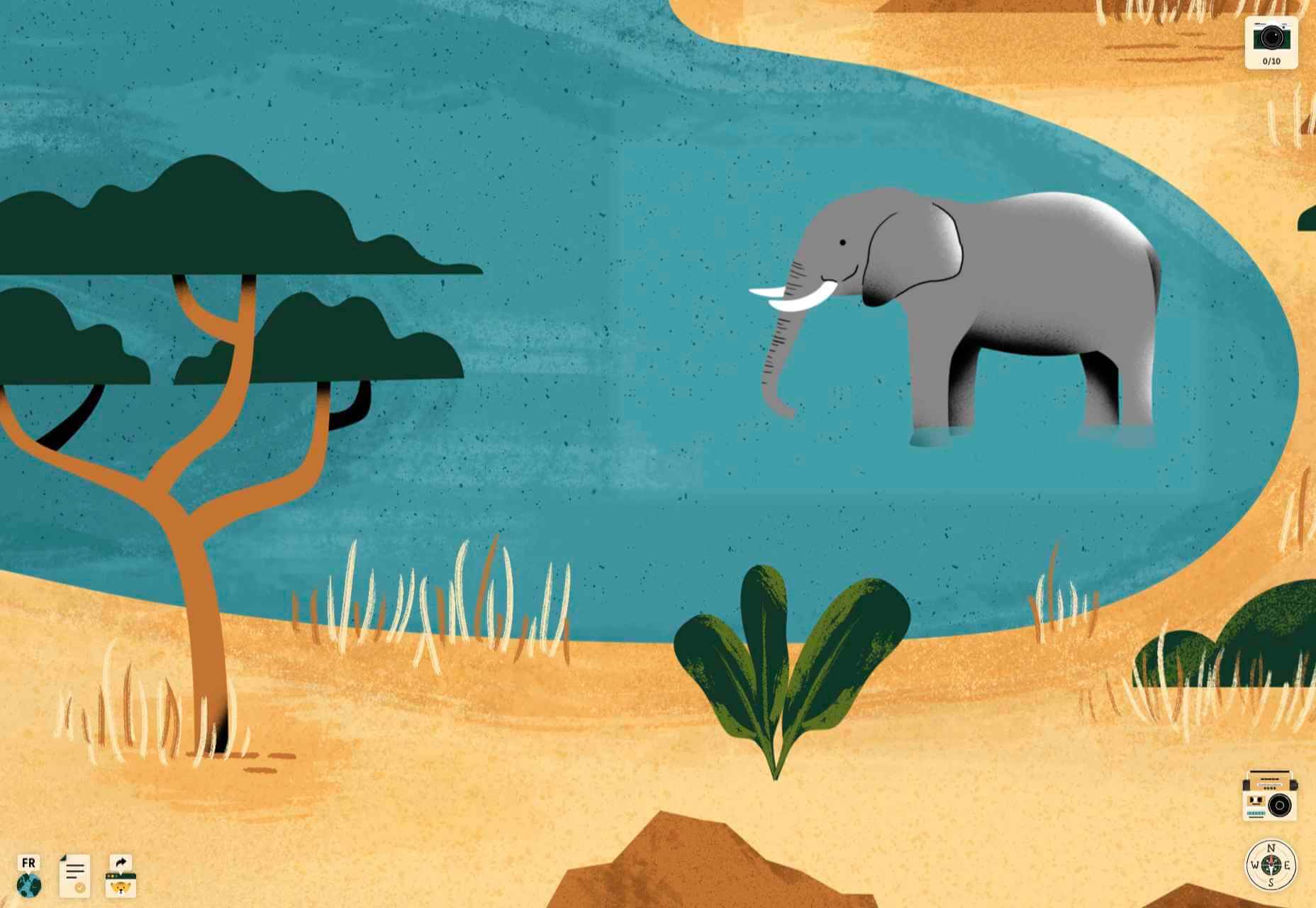
Now that we’re in the year 2021, however, discussions about AR aren’t just observational anymore. The age of mixed-reality interfaces is here, in everything from Pokémon Go, to Snapchat filters.

The question is, how do web designers create incredible user experiences in a world where there are now multiple digital realities to consider?

The Benefits of Experimenting with AR

Before we look at some of the steps that web designers can take to enhance their projects with AR, it’s worth examining the benefits of interacting with augmented reality in the first place. 

While virtual reality replaces the typical world around us completely with digital components, AR augments it. This means that developers and designers need to learn how to thrive in an environment where the real world and the digital one work together. 

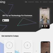
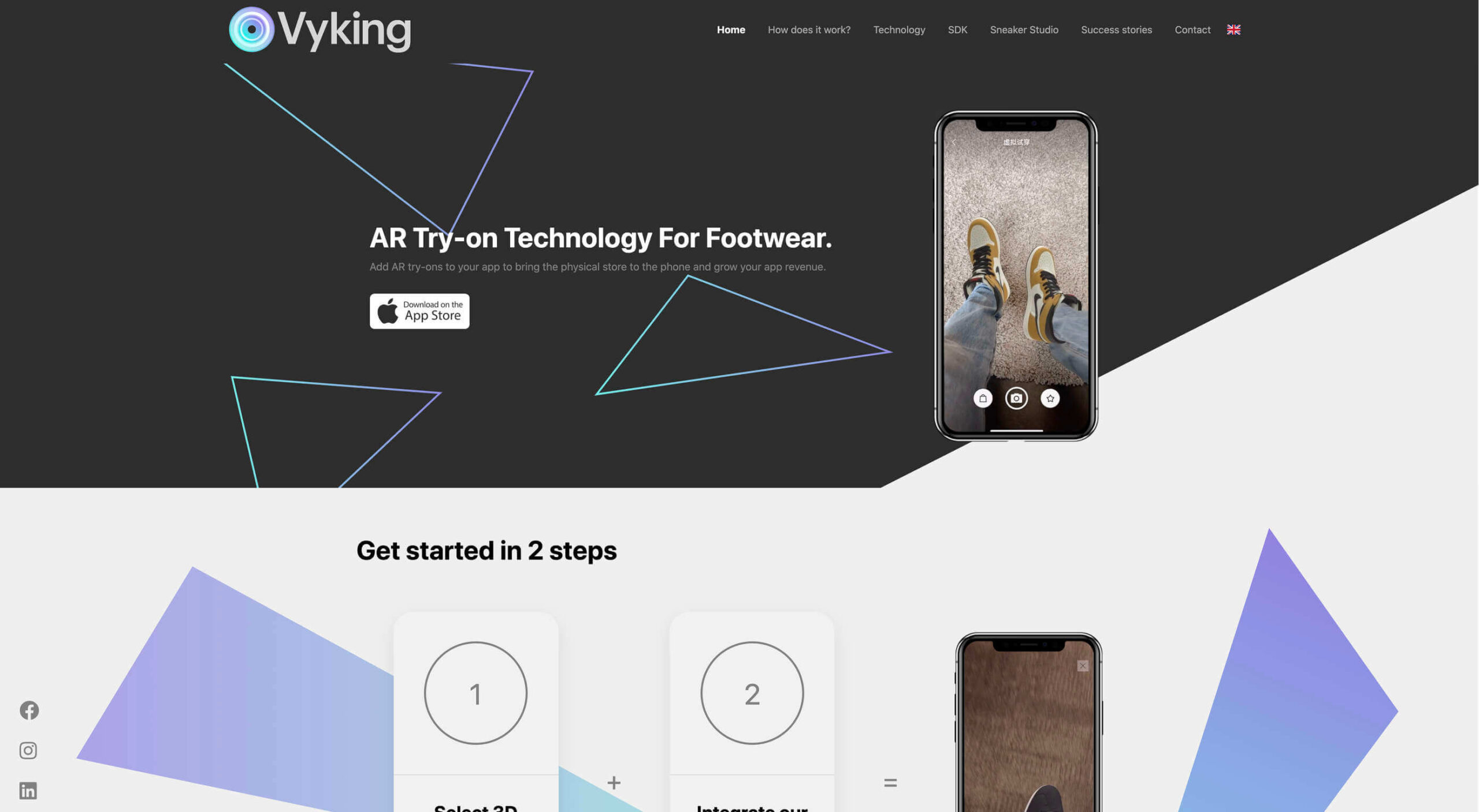
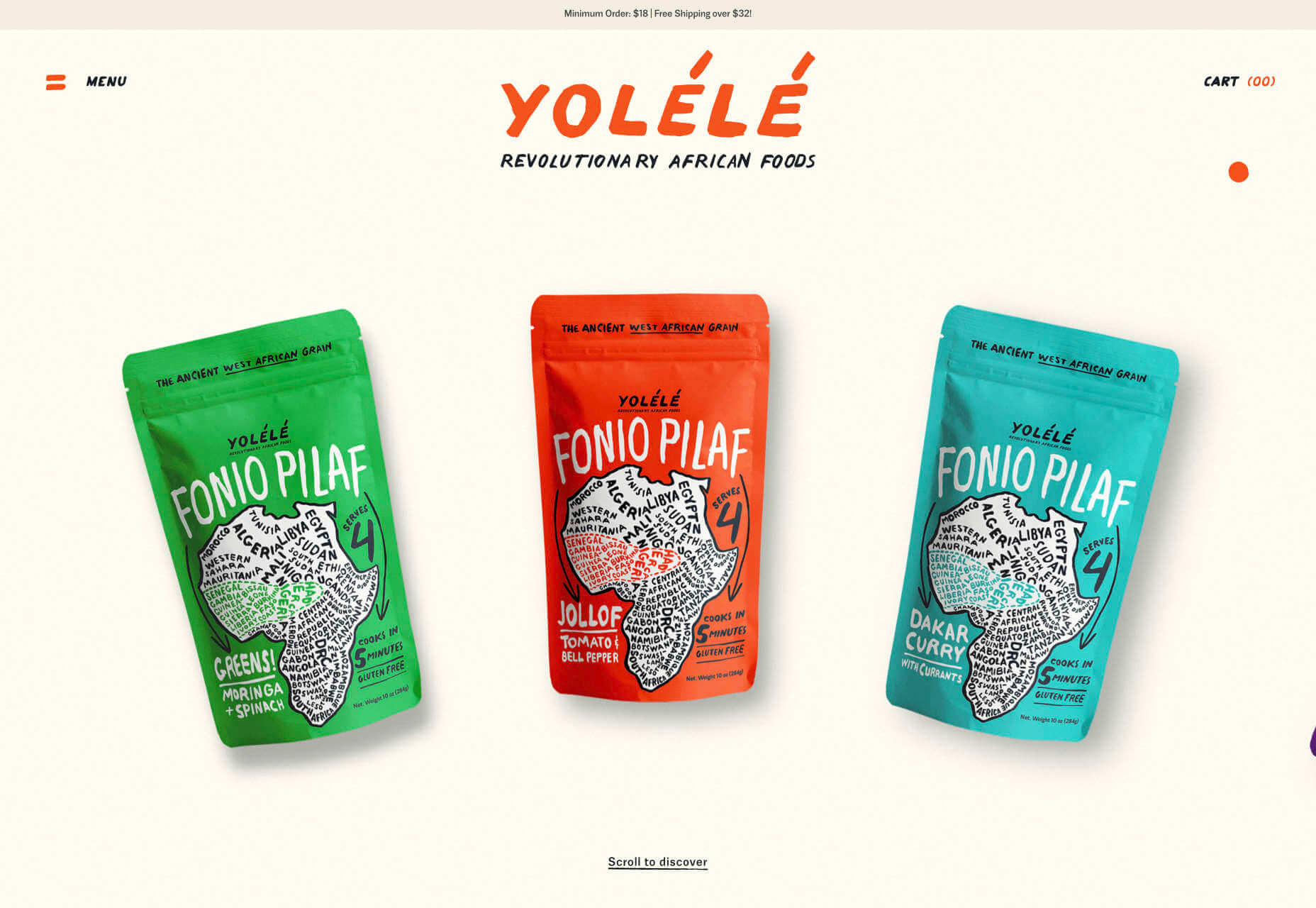
The most common AR application for website owners is to provide a solution for real-time and remote product visualization. Imagine being able to try on a pair of shoes before you buy them online. That’s a service that the Vyking brand can deliver by creating technology that “reinvents” the digital shopping experience. 

This test functionality plays a massive role in purchasing decisions. In a world where people can’t see a shade of make-up in person when they’re shopping online, or check how an item of furniture looks in their home, AR has a crucial role to play. 

In simple terms, AR helps shoppers to make more informed purchases. 

Here’s how you can use augmented reality to deliver incredible UX. 

1. Focus on Real-Time Feedback

Augmented reality is all about connecting the real world to the virtual world. 

Doing this provides users a unique experience – one that’s filled with real-time feedback that can deliver crucial and insightful information. For instance, an augmented reality system in a GPS app can calculate the average time before reaching a destination based on previous trips.

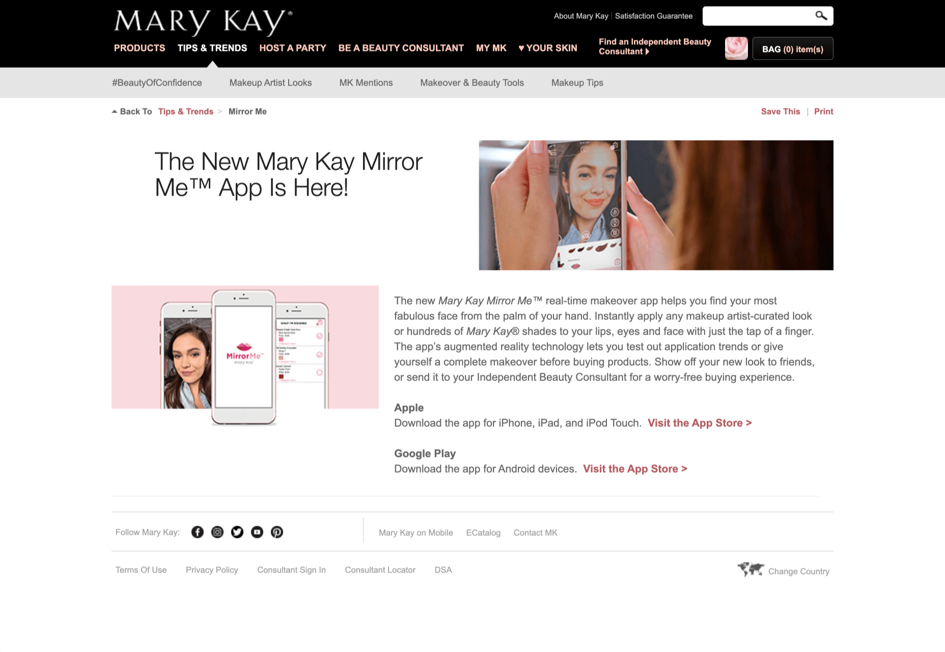
Another option is for an augmented reality to use solutions like face-mapping to help customers determine how a certain makeup product will look before they buy it. For instance, that’s the case for the Mary Kay Mirror Me app, which simplifies the process of shopping for make-up. 

When designing for AR, experts need to consider how they can provide customers with real-time information that they can use to make better purchasing decisions. 

2. Define input and output

Although you’ve probably performed similar exercises when designing for traditional websites and applications in the past, defining inputs and outputs of UX in AR environments can be tough.

Defining inputs and outputs allows you to determine which elements of an interface your user can actually interact with, in your interface. This gives you a better idea of what to “augment.” For instance, you might decide that physical gestures like a swipe of the hand will be essential for AR inputs. However, you’ll also need to consider how each mobile device offers different input possibilities. 

Outputs are a little simpler. For instance, you could offer a three-dimensional model of a product that your customers are interested in. Once you have that output, you can think about how the customer will interact with it by changing colors or position.

3. Embrace Customer-Friendly Performance

Another feature at the heart of AR applications is interactivity. 

Good designs in the augmented reality world need to be simple to access and use, otherwise customers will end up avoiding them. For instance, 60% of customers say they want to use AR when they’re shopping for furniture. However, they’re only going to use your app if it actually works. 

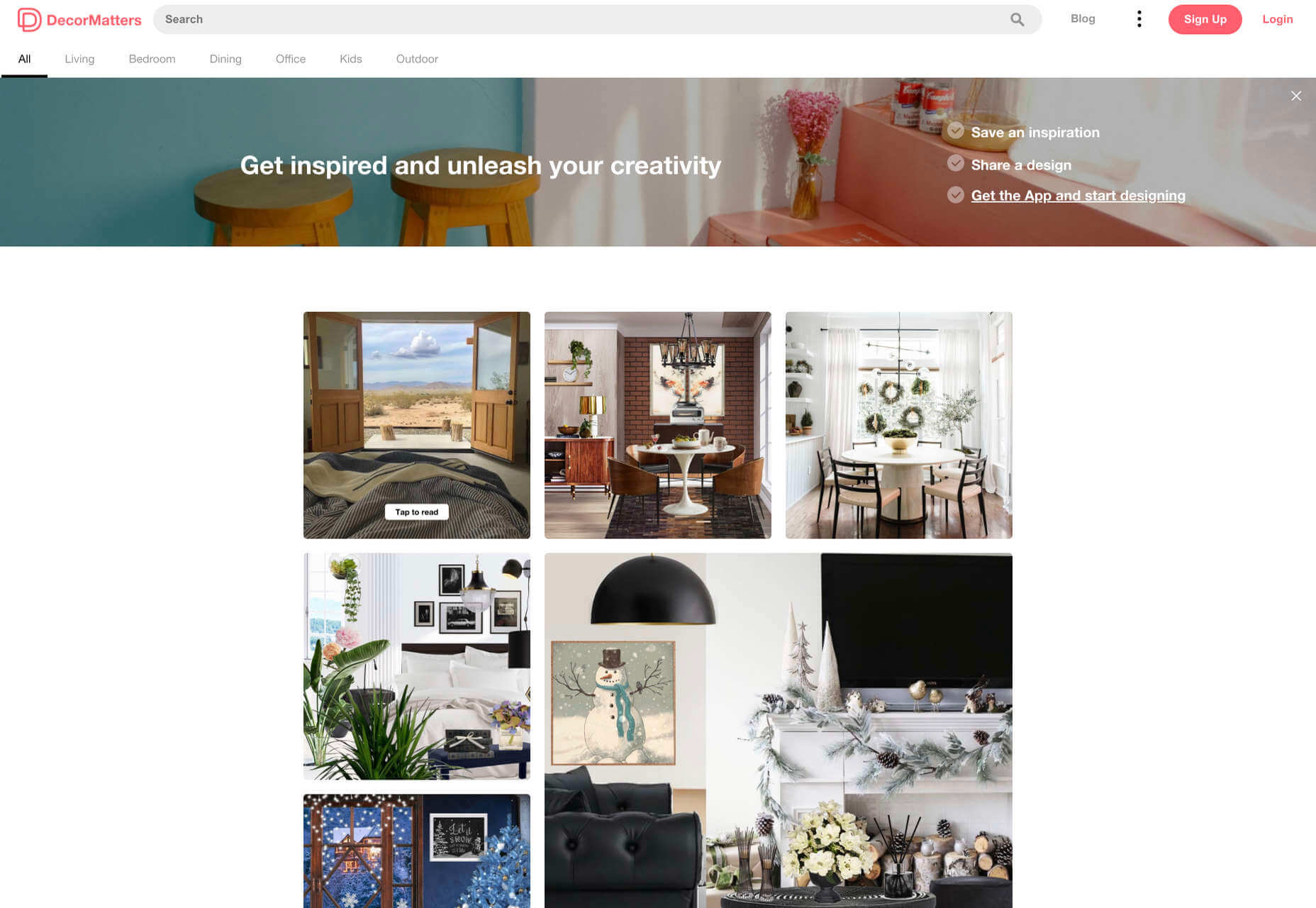
The Décor Matters website and app mix gamification with home decorating features that help customers get a better view of the home goods they’re planning on buying. The website even has inspiration pages available to help users find and try new design options with their AR technology. 

When designing for AR, think about how you can make your applications or technology as simple to use as possible, so customers actually want to interact with it. 

4. Address the Environment

In augmented and virtual reality applications, it’s important to remember that interfaces aren’t bound by physical screens. The viewport will move with the user, shifting perspectives in response. Most AR designers will use four different signifiers to describe AR environments:

  • Public environment: The entire body of the user is involved as a controller, like with the Xbox Kinect or Nintendo Wii;
  • Intimate environment: Where a user can be seated – often in a desktop environment;
  • Personal environment: AR on smartphones, mobile devices, and tablets, like Pokémon Go;
  • Private environments: Completely private spaces, such as with wearable technology like the Google Glass solution.

The environment that you’re designing for will be crucial for your project outcomes. Remember, spatial considerations need to be carefully considered when accounting for how users will interact with objects in a frame. 

5. Remember User Fatigue

Another thing to keep in mind when designing for AR technology is that user fatigue is likely to be a much more significant consideration. After all, people interact with websites and applications in a much more intimate and in-depth way when AR is involved. 

AR applications can often use the entire body of a customer as a controller. Because of this, designers need to be careful about exhausting interactions. High-effort and repetitive interactions could tire the user out mentally and physically, causing them to give up on the interaction. 

When designing, you’ll need to consider how you might over-stimulate the user with too many interaction-focused elements at once. Keep it simple.

6. Remember the Essential Principles of UX Design

Remember, just because you’re tapping into a relatively new technology doesn’t mean that you should abandon all the basic tenets of user experience design that you’ve come to understand over the years. Although UX is constantly evolving and changing, it’s always going to keep a few fundamental principles in mind. 

For instance, you’ll always strive to give users the best digital experience in exchange for the lowest amount of effort on their part. Additionally, you’ll need to think about how you can make end-users as comfortable as possible when they’re interacting with new types of technology on websites and apps. 

For instance, since AR is most commonly associated with gaming in the current environment, it might be a good idea to implement gamification concepts into your AR design. What can you do to make sure your customers are having fun?

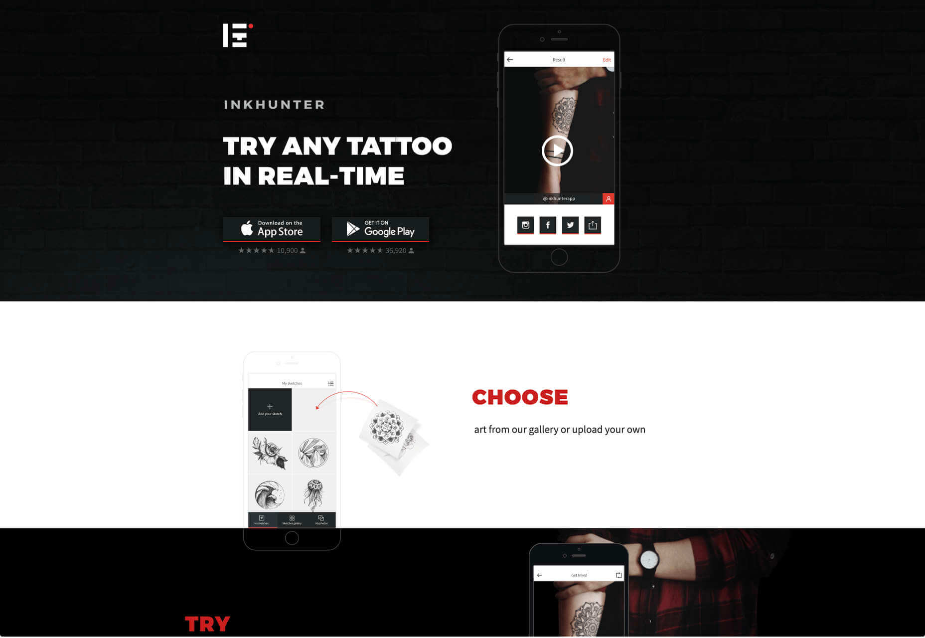
For instance, Inkhunter is an app that allows users to try on tattoos just like using a filter on Snapchat. The experience feels familiar, comfortable, and exciting.

Unlocking the Potential of AR Web Design

Augmented Reality technology has come a long way over the years. Today, developers and designers can access simple plug-in tools like WordPress VR, allowing designers to upload 360-degree videos into WordPress sites and other unique web extensions. 

Augmented reality is becoming much more readily available on sites and apps of all shapes and sizes. Additionally, customers are accessing more ways to unlock AR’s power through everything from headsets to mobile interfaces. 

However, just like any new technology in the web design world, designers need to think carefully about how they will overcome the challenges in user experience that AR can present. For instance, though AR can offer more information for a customer and help them make purchasing decisions faster, there are also risks. For instance, add too many interactive features to a single website or application, and you could scare users off with too much information. 

In the short-term, web designers need to explore the new tools that are available to them and think about the customers they’re designing for. Only this way will we be able to make any considerable advances in the possibilities of AR. 

Are You Ready to Embrace AR?

Designing for augmented reality applications and websites can be an intimidating concept – even for seasoned designers. However, this is just another technology that creatives can use to drive better experiences for end-users. 

Learn how the latest technology works and get an insight into your customers’ needs, and you’ll be amazed at what you can accomplish in the AR world.

Source


Source de l’article sur Webdesignerdepot

2020 has been one of the most memorable years in our history. Few of us have been alive long enough to experience a more turbulent time. But throughout the year, we saw design respond to challenging events with positivity, color, and a desire to elevate those people and projects working to make the world better.

As we head into 2021, there’s no denying that 2020 has changed our outlook on life and marked a major turning point in web design trends.

Here’s a collection of the websites we loved the most this year. Enjoy!

Looks Like You Need Iceland

On Looks Like You Need Iceland, you are invited to record a scream, which will then be broadcast into the Icelandic wilderness. It’s meant as a form of therapy. The idea is that you will one day visit Iceland in person. That might still be some way off for most of us, but we could certainly use a good therapeutic scream.

Black Lives Matter

Across 2020 there were major protests around the world in support of Black Lives Matter. The movement’s website is a central hub for news, resources, and civil rights information in 38 countries.

2º Earth

2ºC Earth takes the user to 5 locations worldwide and shows what will happen there if global temperatures rise by 2ºc. Sound is used really well here to create an immersive experience, along with some beautiful photography.

Github

Along with some new features announced earlier this month, GitHub has a glossy new homepage. It has a clean feel, with some nice scrolling animation and sparing but effective use of illustration.

I Weigh Community

Political and social initiatives were big in 2020, and non-profit activism initiative I Weigh Community is the brainchild of actress Jameela Jamil. It’s devoted to radical inclusivity, communicated with bold, expressive graphics.

UNREAL

Back in January, we clicked around UNREAL’s site for hours, enjoying the sharp transitions. The Swiss agency produced a wonderfully chaotic love letter to web animation.

Delassus

Delassus grows fruit, from citrus to avocados. The Moroccan company employs a cornucopia of 3D design to make its site bold, fun, and practical.

Lynn Fisher

We loved everything about Lynn Fisher’s site back in May. The homepage illustration was awesome. It was a humorous approach to RWD that we really appreciated. The site has since changed, with tons more to explore.

Minervo

The Minervo site feels distinctly Latin, with the hot pinks and sun-blasted desaturation feeling suitably South American. We love the cropping on the custom typeface.

Babord

Norwegians have an almost mystical connection with the sea, which is evident in the site for Babord, a Norwegian seafood supplier. We loved the brand font too.

Calexo

Calexo makes THC-infused beverages, and back in April, we loved the color and positivity of the site. The animated hamburger menu was a hit too.

Moooi

Moooi’s site layers illustration with a maximal effect that makes you feel like you’re chasing a white rabbit. There are tons of great UI details here, especially the bar that reveals the product videos.

Blind Barber Anniversary

The Blind Barber celebrates 10 years of success with this microsite. A deconstructed grid and an entirely black and white design, but with color photos, create energy and a sense of joy.

Zand Harirchi Architects

Zand Harirchi is an architecture firm based in Tehran, Iran. Its site features subtle references to architecture, like the delightful thumbnails reminiscent of small windows.

WFN

The WFN (Women’s Funding Network) is an international alliance supporting women’s foundations and gender justice funders. The sophisticated color palette and clean type are both confident and feminine.

Nathan Taylor

We loved exploring Nathan Taylor’s playful site all the way back in January. The different lighting modes were a firm favorite.

Käthe Kollwitz Memorial

A tribute to the life and work of Käthe Kollwitz, an Expressionist printmaker. There’s a catalog of her work, presented alongside large type and splashy color transitions.

Emotive Feels

Emotive Feels is a design manifesto from the Emotive Brand agency that illustrates an A–Z of potential brand emotions with simple animations that we likened to a Blue Note release.

A. N Other

A.N Other’s site for perfume highlights quality ingredients, materials, simplicity, craftsmanship, and the environment; in the process, it cleverly invokes a sense of luxury.

Playtype

Danish type foundry Playtype’s site fits its name perfectly. The playful site with bright blocks of color and the occasional animation shows off some pretty nice typefaces.

Feijoo Montenegro

All-text sites are always a thrill, and back in June, we were treated to this simple one-pager by Feijoo. Details like the numerals being replaced by words are delightful.

Wavering Stripes

Although this site’s subject matter is harrowing, it is presented in a very beautiful, thoughtful manner.

The Oyster & Fish House

Sophisticated typography, the wave textures, the nostalgic feel of the photography, and even the cookie notice’s on-brand styling all show attention to detail, which gives this site its appeal.

Who Cares

Find and ‘photograph’ the endangered species to learn about them in this delightfully illustrated game.

Curbed

When Curbed came under the umbrella of New York magazine earlier this year, it got a makeover. Neon highlights and a distorted grid give an edge to the classic magazine layout.

Yolélé

The carousel of fonio (it’s a West African grain) products on Yolélé’s landing page is a good example of horizontal scrolling that works well. There are some great page transitions too.

Pantheone Audio

Pantheone Audio’s site employs elegant scrolling to enable seamless navigation of an extremely luxurious site, underpinned by a complex grid.

Aelfie

Bright color, an irregular grid, illustrations, and a display type that feels almost hand-drawn perfectly captures the aesthetic of this NY-based home furnishing brand.

Highcourt

This site for private membership leisure club Highcourt uses subtle background color changes and simple line illustrations to create a sense of calm. Black and white are softened to dark blue and ivory, and gentle animation adds interest.

Kate Jackling

Kate Jackling’s site takes a step back and allows the content to bask in the glow of attention, placing her photography at center stage.

Treaty

While there is less hustle and bustle outside than we were used to pre-pandemic, we could certainly all use some calm. Treaty’s site for CBD oils reflects that calm with a combination of video, whitespace, and botanical drawings.

Ukrainian Railroad Ladies

Ukrainian Railroad Ladies is a book of photographs of women, and some men, who work on the Ukrainian railways. The site is basic, even brutalist, but it has charm, and the photographer’s fascination with his subject comes through.

Year & Day

Year & Day is an ecommerce site that sells tableware, from glassware to ceramics. The colorful collection is designed to complement different types of food, and the site’s color scheme reflects that perfectly.

Juan Mora

Juan Mora’s ‘under construction’ holding page has probably been crafted with more care than many full-blown sites. This showcase cleverly manages to demonstrate its subject’s skills without showing a single piece of work.

Lucciano’s

Lucciano’s homepage hero video alone will have your mouth watering for some of their gelato. Much of the appeal of food is visual, and the photography here does not disappoint. Circular text boxes in ice cream colors complement the product shots nicely.

Bored Solutions

Back in April, we were already a little weary of lockdown — if only we’d known how long it would last! The amazing color blobbing of bored.solutions was the ideal distraction.

Grand Matter

Grand Matter is an artist agency representing illustrators. There is a wealth of talent on show here and a broad enough range of styles to keep the web interesting for a good while.

Dunderville

This site for Dunderville motion design studio features a paper fold detail, which adds tactility to the virtual. Some superb type and vector animations showcase an impressive portfolio.

Album Colors of the Year

Album Colors has taken the covers from 150 albums released this year and arranged them by dominant color. The hex code for each color is provided if you want to copy it.

Mammut Expedition Baikal

Mammut uses stunning photography and a strong narrative to present its Eiger Extreme outdoor clothing. Longing for the great outdoors will either be alleviated or exacerbated by this one.

808303

808303.studio is a virtual Roland TR-808 drum machine and TB 303 bass synthesizer. You can program, record, and share your very own 80s techno masterpiece.

Bliss

Humor can be hard to get right, especially when you want to be taken seriously at the same time. Here, it works, and the result is a memorable site, oozing with confidence.

Jazz Keys

Type your message into Jazz Keys, and you’ll hear it in sound. You can send the message to anyone and let them hear your words — the web lives for side-projects like this.

Érika Moreira

The fabulous, simple site for Sao Paulo-based Érika Moreira has some awesome big type and creative case studies. It’s an excellent example of a non-visual portfolio.

G.F Smith

Earlier this year, the site for leading paper supplier G.F Smith got a redesign. It is a simpler design than the previous site and keeps the visual focus on the products and the colors.

Abbotsford Convent

Abbotsford Convent is a creative arts venue in Melbourne, Australia, based in a former convent. The UI for its site blends architectural forms to acknowledge the building’s heritage.

Waka Waka

Waka Waka designs and builds wooden furniture. The mid-century typography and the noise textures transport the site to the last century’s radical graphic design. There’s some clever disruption to the typical thumbnail approach.

Cone

Sites advertising apps always seem to want to box the design into a hastily de-branded mock-up. Cone takes a daringly refreshing approach by depicting a more expansive mobile experience.

Ride Out

Amsterdam’s Ride Out bike store teases the content with an intriguingly masked video. Plus, we love the wheel-inspired spinning links.

Puddle Sound

This site is a model of minimalism. Beautiful photographs and very little text, there is nothing to distract from the product on display.

Source


Source de l’article sur Webdesignerdepot

Every week users submit a lot of interesting stuff on our sister site Webdesigner News, highlighting great content from around the web that can be of interest to web designers.

The best way to keep track of all the great stories and news being posted is simply to check out the Webdesigner News site, however, in case you missed some here’s a quick and useful compilation of the most popular designer news that we curated from the past week.

Minimal CSS Loader Collection


Webdesign Toolbox: Find the Perfect Web Development Tools


Facebook: Free as in Bullsh*t


New Year Edition: Top UX/UI Design Trends Rushing to Us In 2021


Our 50 Favorite CSS Libraries, Frameworks and Tools from 2020


404 Page Inspiration – The Best 404 Pages from Around the Web


7 Best Instagram Tools for Designers in 2021


HTML New Tab for Chrome – Design your own New Tab Page


48 Incredible Ways Designers Responded to COVID-19


QR.New – Make a New QR Code with Text


Hotwire – HTML Over the Wire


Entry.dev – Entry-level Developer Jobs


The Dribbble Shots that Defined 2020


Convert Web Pages into PDFs with Puppeteer and NodeJS


Best Practices for Building Offline Apps


Axel – Powerful Rituals to Drive your Team to Success


Sorry, but We are not all Designers


Zecoda – The Easiest Way to Build Websites Without Code


Nebula – A Fully Featured Particle System Designer for the Web


Write Code. Not Too Much. Mostly Functions


How to Favicon in 2021: Six Files that Fit Most Needs


5 Years of Design – Time Travel Through Handpicked, Beautiful Designs


How the Web is Really Built


How to Be a 10x Developer


Why this Forgotten Punctuation Mark Should Be Revived for 2021


Want more? No problem! Keep track of top design news from around the web with Webdesigner News.

Source


Source de l’article sur Webdesignerdepot

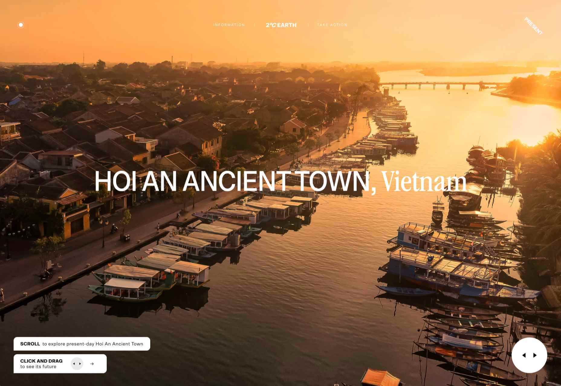
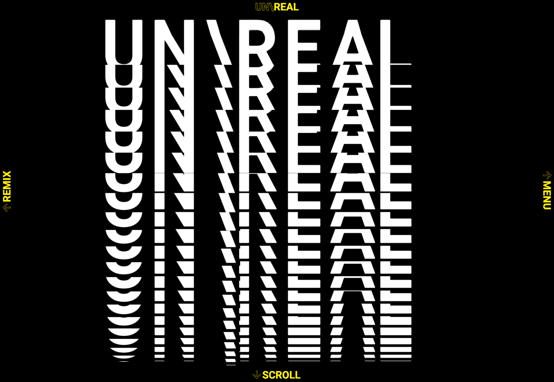
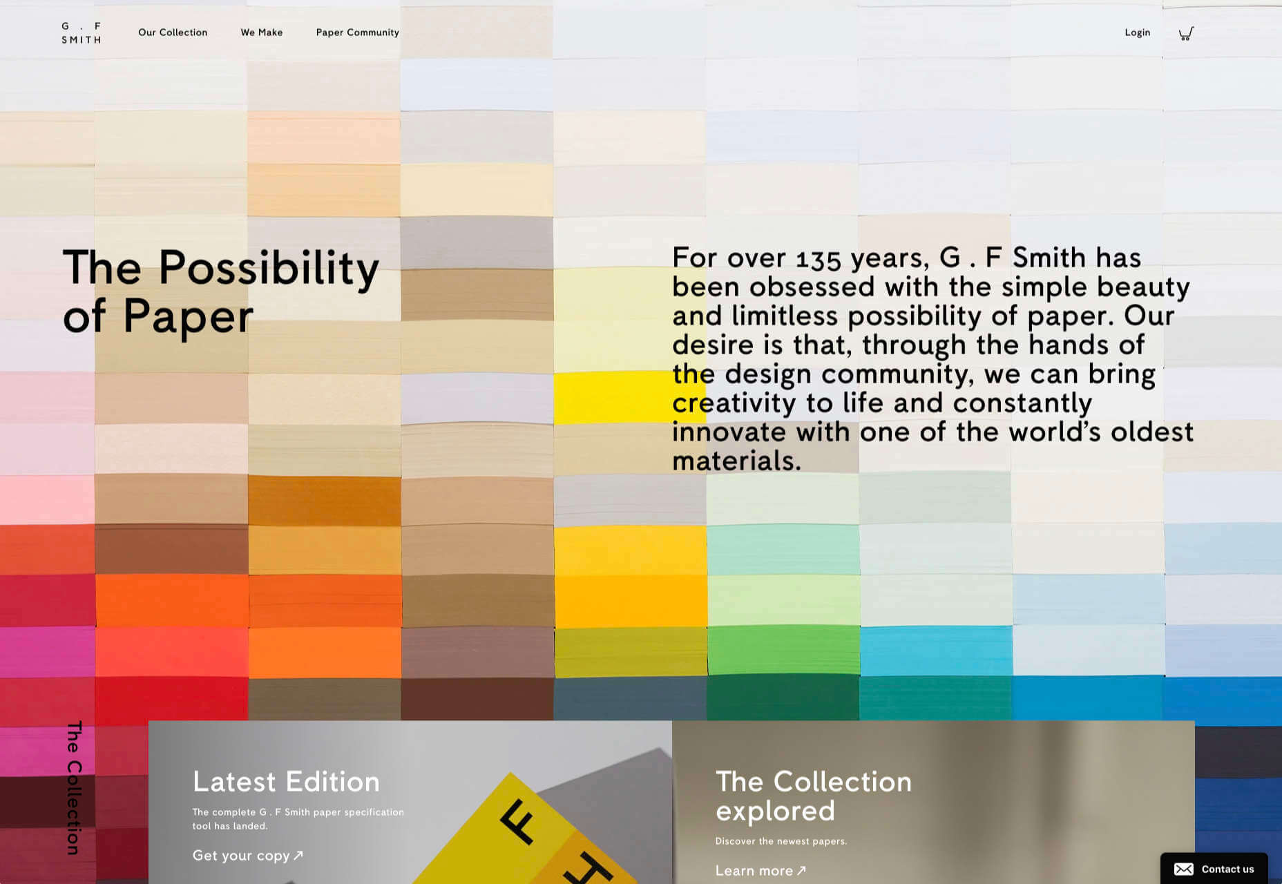
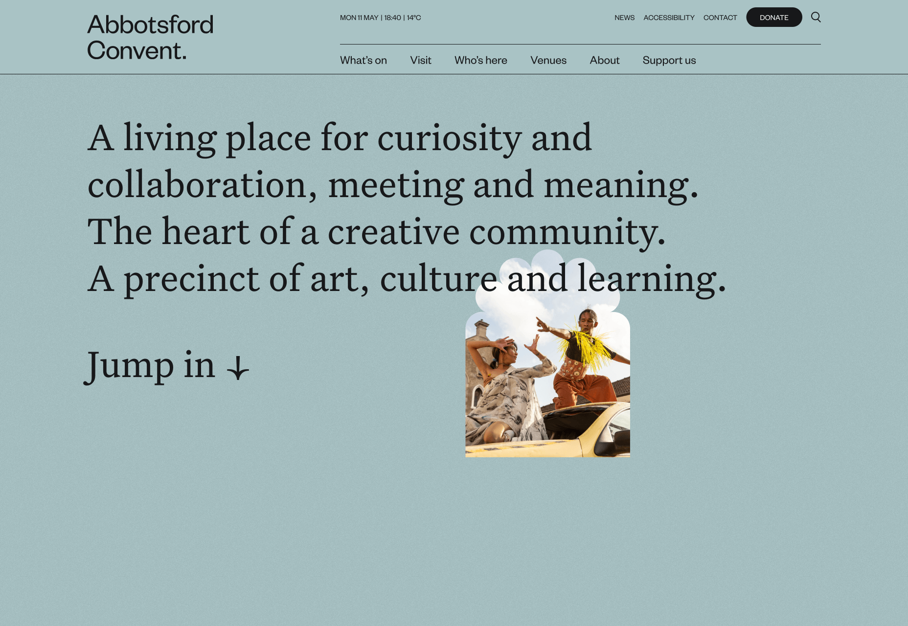
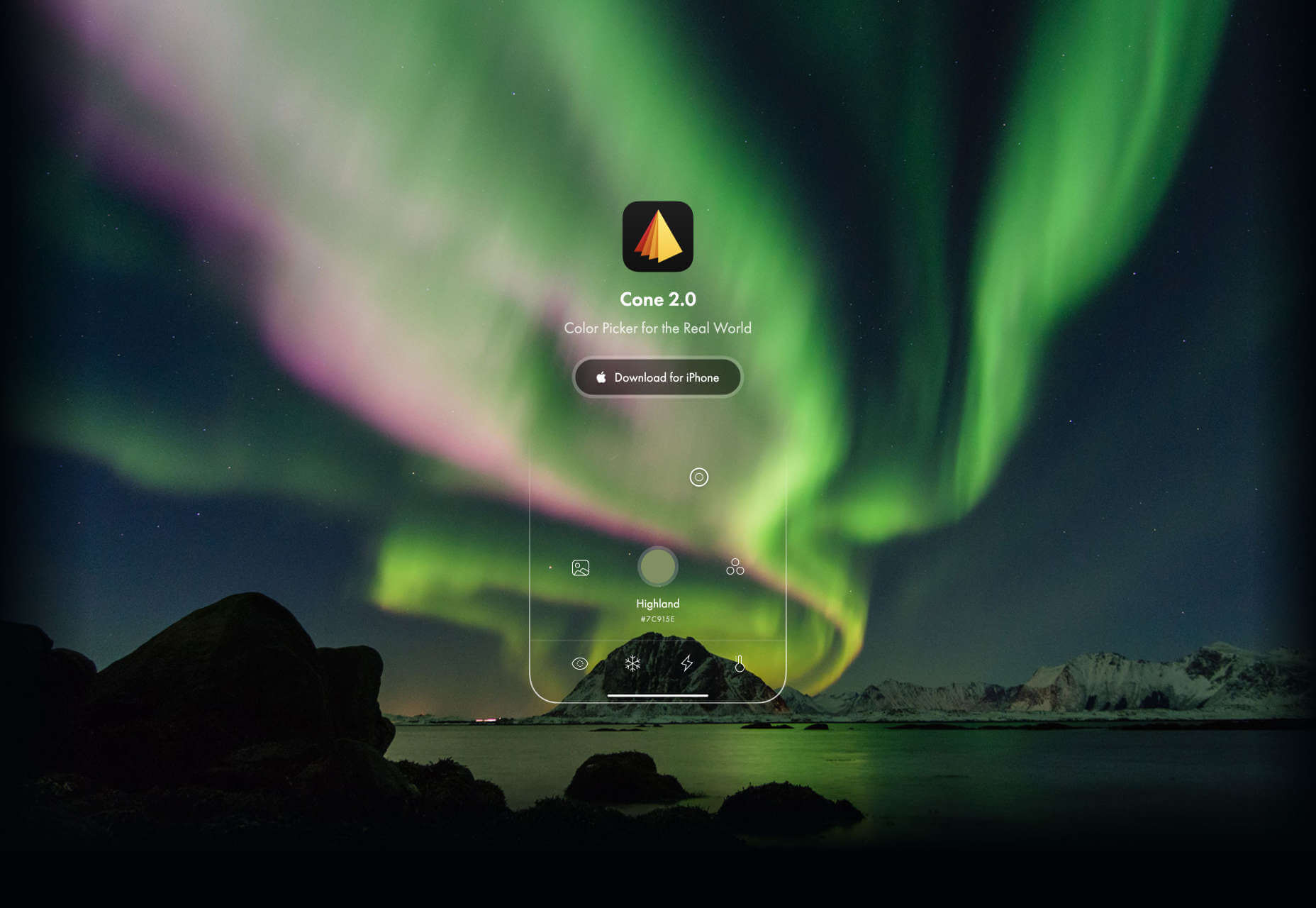
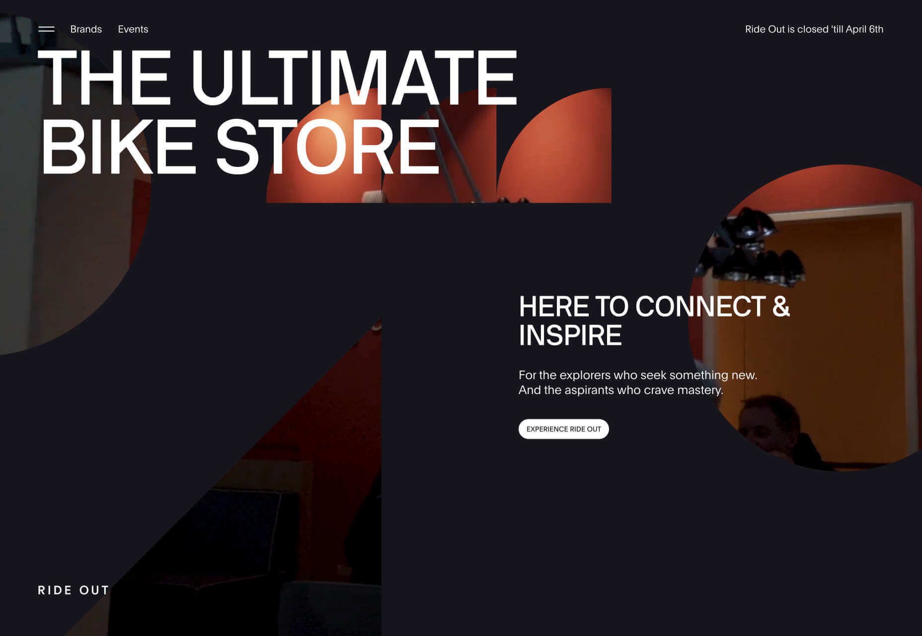
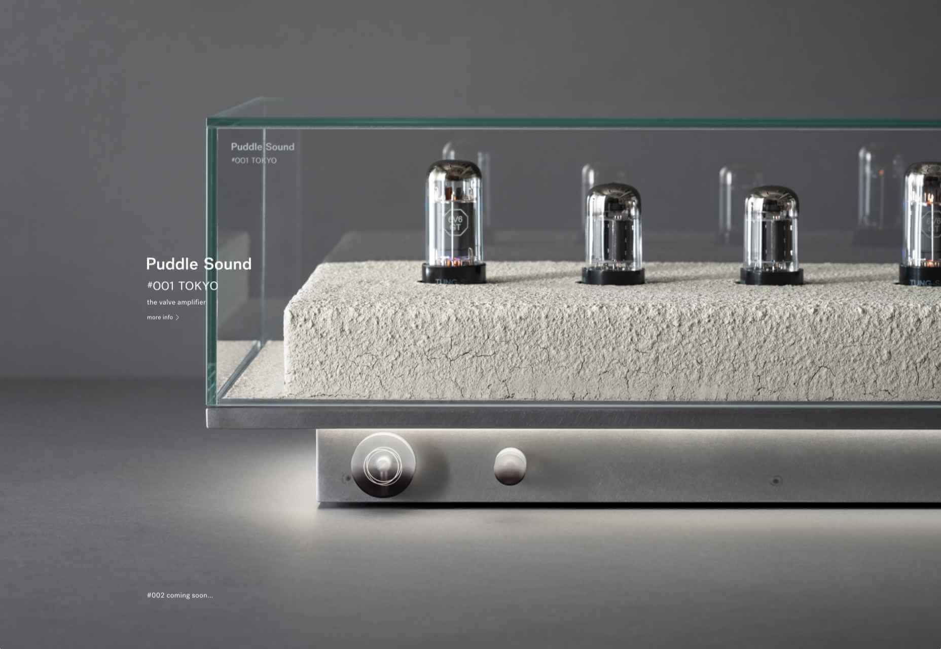
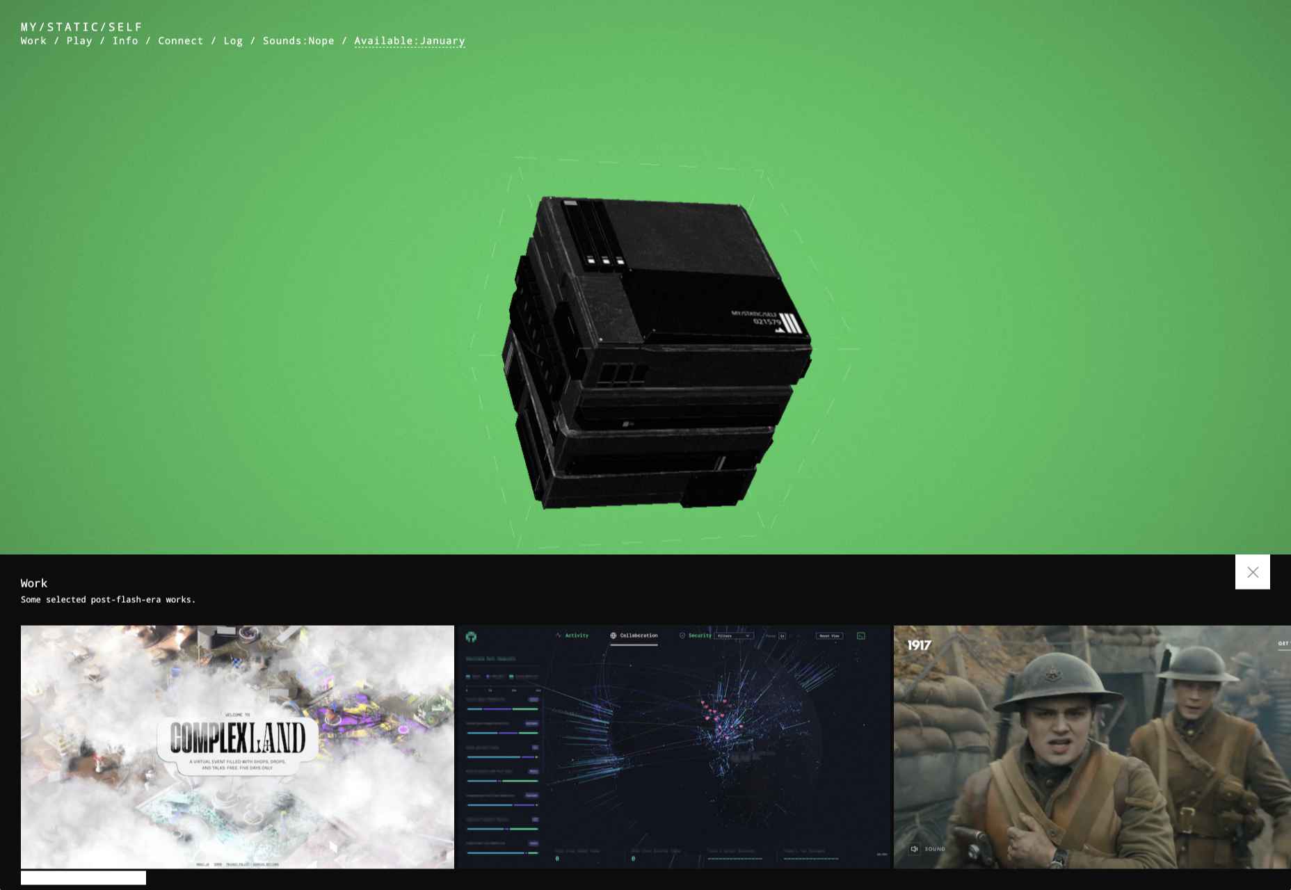
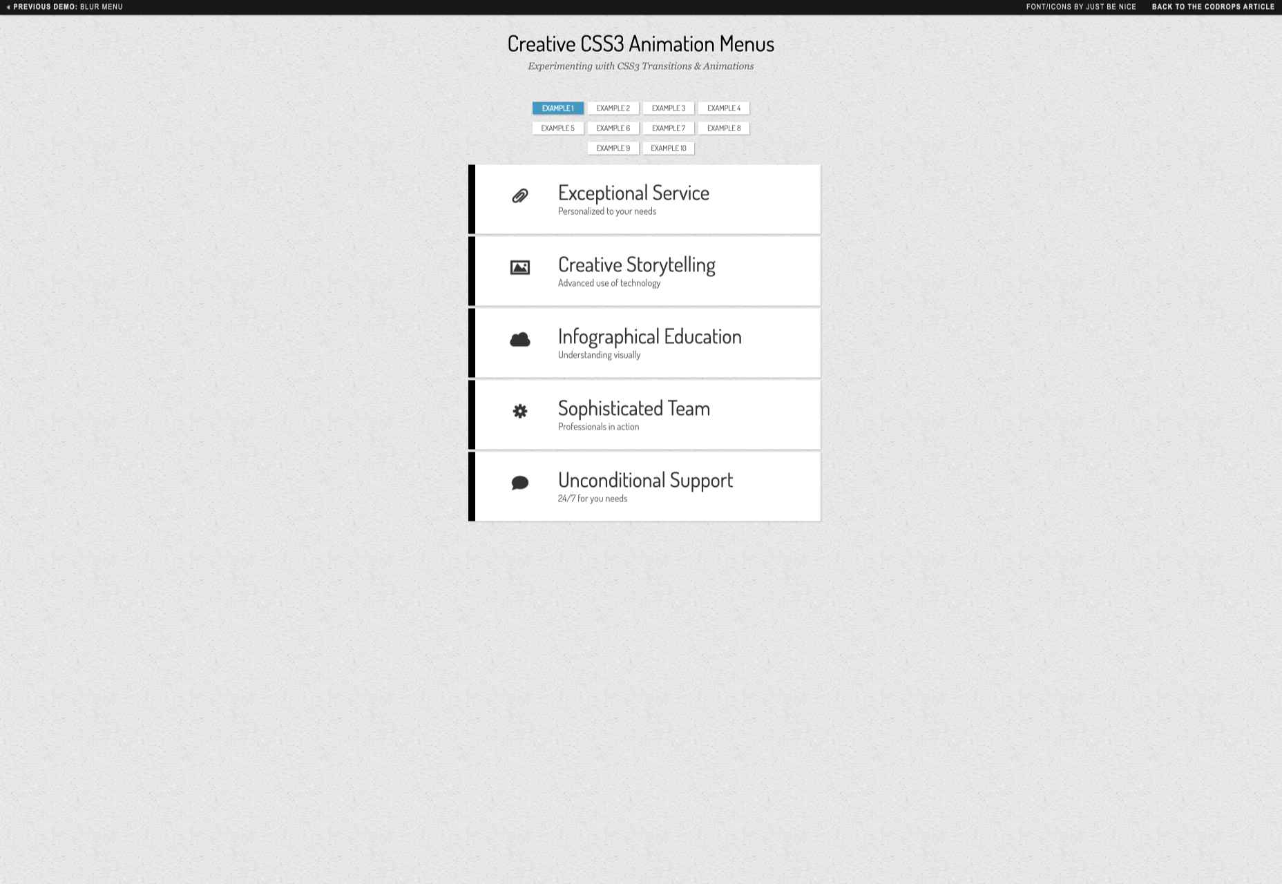
Animation is a fun and interesting way to bring life to a website. Used correctly, it can capture audience attention, make your website more engaging, and even improve your chances of delivering conversions for your clients.

Unfortunately, like many things in the web design world, it’s also easy to get too carried away with animation. As professional designers and developers, it’s up to us to find the line between making the most of animation on our website projects and creating a site that’s overwhelmed with too much activity.

Fortunately, by the time you’ve finished reading this article, you’ll have a deeper insight into how you can use animation in web design, without going too over the top.

Introducing Animation in Web Design

Animations are virtually everywhere on the web today.

In the past, when designers first discovered that they could embed movement into their websites, the amount of animation we saw was often higher than it needed to be. It wasn’t uncommon to find some websites running entirely on Flash, where every element could be animated.

Fortunately, the trends of modern web design have left those practices behind. These days, it’s a lot more common to make animation a part of the overall user experience, rather than focusing on them as a centerpiece attraction. For instance, you’ve probably noticed plenty of animated sliders showing off pictures in a gallery, or transition animations when people hover over a button.

Since it’s entirely possible to construct an entire website with no animations at all, the key to creating an engaging website today is making sure that every animation you use serves a specific purpose. Your animations should make a website more attractive, easier to use, and better for navigation. Add too many, and you could even risk slowing down a site.

So, where does it make sense to use animation for web design?

1. Loading Animations

One of the best ways to use animations in a website is to distract and delight users as a page loads. You can use the animation to deliver a unique experience, or even just highlight the playful nature of your brand. For instance, just check out this classic load animation called “Tightrope.”

You can also use things like particle animations to capture a customer’s attention and help your visitors relax when they visit a website. Particle animations can be interactive or non-interactive, and they’re a great way to stop visitors from feeling frustrated when a page takes too long to load.

A website by Edan Kwan called “Particle Love” shows you exactly what kind of experience you can create with real-time animations.

The more you can delight visitors with experiences that keep them engaged while the information they need is loading, the less likely people will be to hit the “back” button.

2. Microinteraction Animations

Microinteractions are quick and simple animations that come with specific use cases. Usually, this animation works to provide visual feedback and information when you interact with a specific element.

For instance, this microinteraction design from Colin Garven encourages users to enter their email address and password into a login field:

Ideally, the best way to use microinteractions is to make them as subtle as possible. These tools aren’t here to steal the spotlight from other information on the page. However, they can sometimes encourage your viewers to take the next stage in their conversion journey.

Animated microinteractions can be as complex or as basic as you choose. For instance, you could use them when:

  • Highlighting if a feature is switched on or off;
  • Letting users know when actions were successful (like sending a message in a contact form);
  • Showcasing important information, like prices on a table;
  • Animating icons on your site to encourage action;
  • Depending on your experience with animations, you can even find themes and plugins that come with options already built-in.

3. Dynamic Backgrounds

An animated background can be an excellent way to make your website stand out from the crowd. However, it’s important to remember that excessive animation has a habit of making your site slower and more clunky than it needs to be.

The animated background on the mystaticself.com website is fantastic for introducing customers to new information with a handy dynamic menu.

Often, the only reason that you should create your own dynamic background for a website, is if it’s going to improve your customer’s experience in some way.

Remember, ensure that the animations that you’re using on your website aren’t going to make any aspect of your site more difficult to use. Animated backgrounds need to offer a compliment to your existing website, rather than distracting customers from what they want to do.

Before you go all-in with your background animations, focus on animating small sections of an image, one piece at a time. You can also animate components with very small motions too.

4. Reveal Hidden Messages

Another excellent way to use animation in web design is to harness it for showcasing important information. For instance, a navigation menu is an important component in your website design, but it can also take up a lot of valuable space.

In some cases, a hidden menu that appears when a customer scrolls over a small box or icon could make a lot of sense. You can also think about animated drop-down menus if you’re working with a website that has a large number of pages.

Check out this fun example of an animated CSS3 menu:

The sections change color and move as you hover over them, making it easier to see exactly where you’re clicking.

It’s up to you exactly how creative you want to be when you’re playing with animated menus. The easiest option is often just to have a component that changes color or shape with a hover effect. However, you can also expose hidden menus and extra information too.

For instance, with some websites, you can create pictures that turn over to show information on the other side. That means that you could create an about page with pictures of team members, which flip to show biography information.

Just make sure that everything works smoothly, both on desktop and mobile.

5. Try Carousels

Finally, we come to perhaps the simplest and most popular way of using animation in web design. Carousels are a common component of almost every theme on the web today. They’re great for showing off useful information, such as what a website has to offer, or which deals are available.

When creating a carousel, you can either give your users control over how quickly an image transitions, or you can implement automatic movement. On the heathfield.co.uk website, the designer has added buttons to let you flip backwards and forwards between photos, while also ensuring that the animation is automatic.

Without the animation to show you the pictures sliding into space, the transitions between each picture would be instant – which is a little more jarring for viewers.

Sliders are such a common component of web design today that customers almost expect to see them on many websites. That means that you can enjoy a very effective experience if you want to avoid doing anything too dramatic with your websites.

You can use sliders for everything from showing off products, to displaying testimonials from customers and more. It’s a great way to compress a lot of useful information into one small space on a site.

Use Website Animation Carefully

The most important thing for most designers to remember with animation and web design is that it’s entirely possible to have too much of a good thing. When it comes to creating amazing designs for your clients, you can take advantage of animation to encourage more engagement and a unique experience. However, you shouldn’t allow yourself to go too over the top.

Rather than animating every aspect of a page to constantly grab visitor attention, think about how you can make the visitor experience more compelling with the right animation choices. If an entire page of animation on the background isn’t right for your target audience, perhaps custom animations on a navigation bar or a slider would be a good option instead.

At the same time, remember to make the most of the latest technologies on the market for adding animation to web design. A good combination of CSS3, JavaScript, and HTML5 often makes it easier to create more immersive, high-quality animations that users can interact with on desktop and mobile alike.

Source


Source de l’article sur Webdesignerdepot

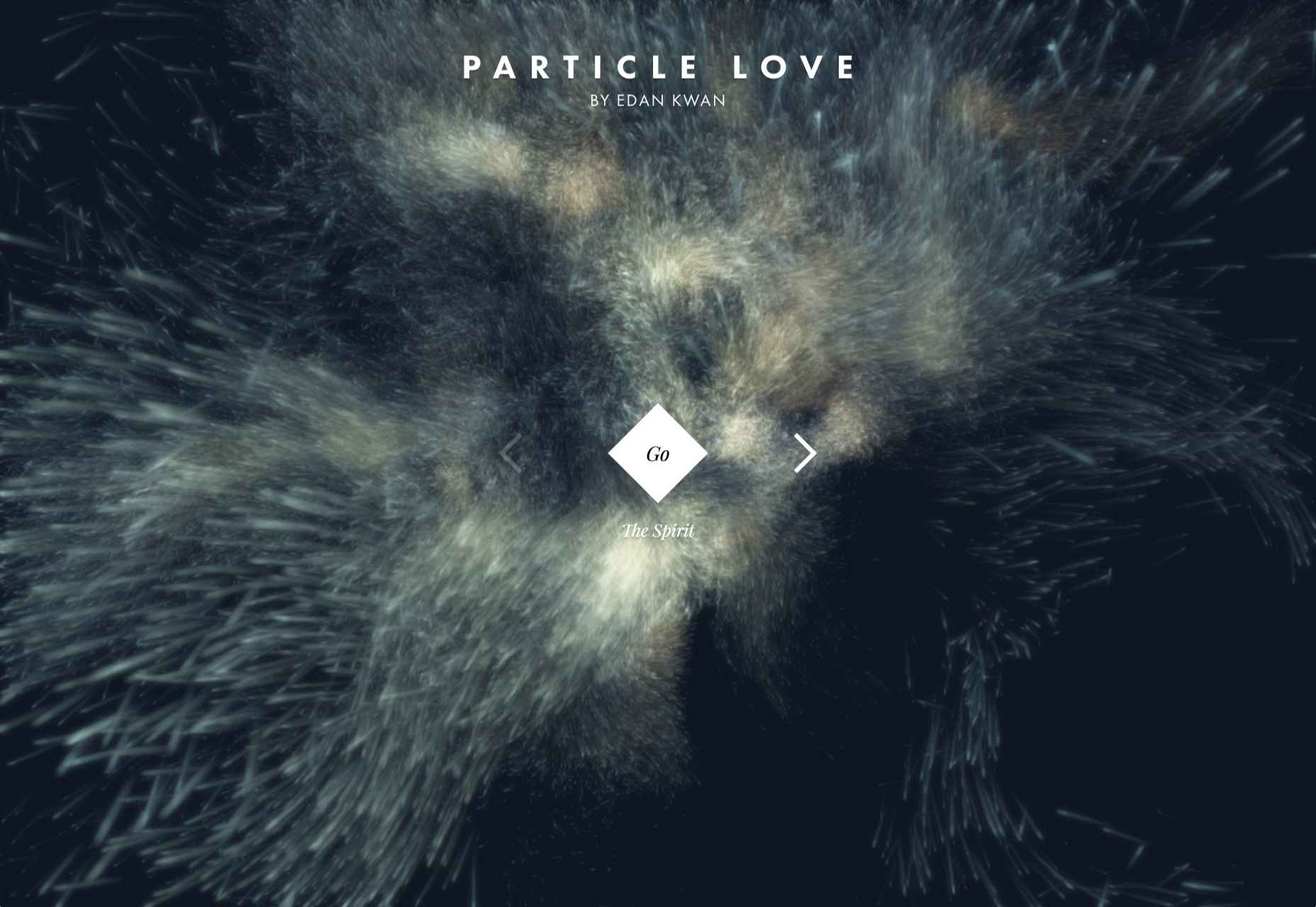
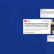
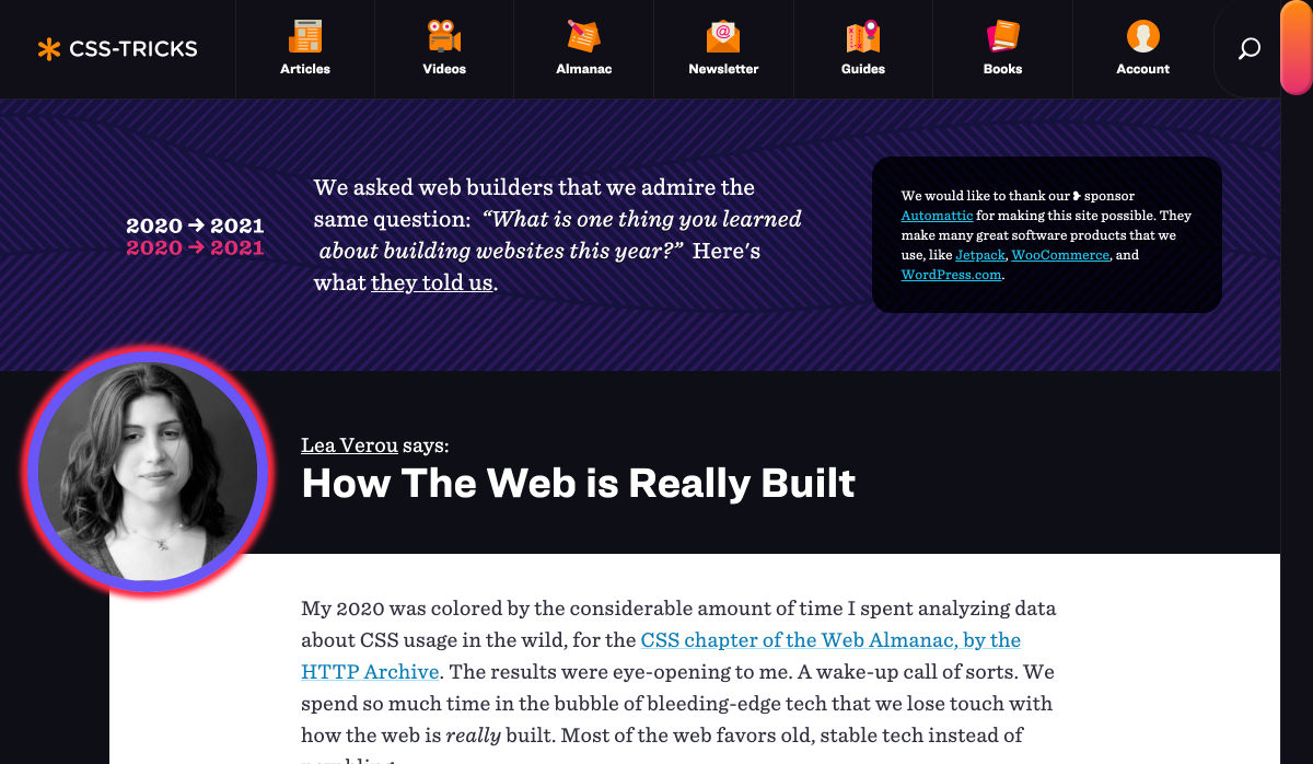
What an extraordinary year 2020 has been for the news! From the ongoing coronavirus crisis, to a turbulent US election, to the unrelenting march of Bitcoin, this year like no other we’ve been glued to our phones micro-analyzing every tidbit of news.

Which makes this the perfect time for mediastack, an awesome REST API that allows you to embed a customizable news feed, sourced from the world’s top news agencies, and updated by the minute, right on your site.

Integrating Global News with Your Site

News is the beating pulse of so many global industries. From political decisions that affect stock prices, to natural disasters that interrupt goods and services, to the whims of celebrities who overnight transform brands from unknown to must-have.

Whether you’re building a site for a non-profit in Louisiana that cares deeply about both Washington politics, and hurricanes in the Caribbean; or you’re building an app for a golf course in Halkidiki that’s focused on both local news, and golf around the world; delivering real-time news content to those users elevates UX.

Tightly integrating the news with your site makes it a hub for users hungry for that very news. The only limit is your creativity.

Display Up-to-Date News on Your Site

When news breaks around the world the top networks scramble to catch up; they simply can’t maintain correspondents in every town and city in the world, and so they rely on affiliates. mediastack pulls in news from over 7,500 different sources in over 50 countries worldwide, giving you access to exactly the same affiliates frequently used by big news organizations like CNN, MSNBC, BBC, or ABC.

When it’s one of the big players in news that breaks a story first, mediastack still has you covered because as will as covering smaller, lesser-known sources mediastack delivers real-time news from CBS, Sky News, The Guardian, Al Jazeera, USA Today, and a host of trusted names across the industry.

If your site targets users that are only interested in certain types of story — like sports, or Hollywood celebrities — then you can even pull in stories from ESPN, TMZ, or Fox News.

Get Started Quickly with mediastack

Getting started with mediastack couldn’t be simpler, and there’s a free plan that’s more than enough to prototype your project.

Full documentation is provided with code examples for PHP, Python, jQuery, Go, and Ruby. To start integrating all you need to do is register for a free access key.

Once you have your free access key, you connect to the API, then customize the results you receive with simple parameters. You can specify the types of news, the precise sources (including omitting sources), languages, countries, and most importantly your keywords.

For example here’s how you’d request science news from CNN, but not TMZ:

https://api.mediastack.com/v1/news
?access_key=[ INSERT YOUR ACCESS KEY HERE ]
&categories=science
&sources=cnn,-tmz

Let’s say you want to display Spanish language crypto news on your site, it couldn’t be easier:

https://api.mediastack.com/v1/news
?access_key=[ INSERT YOUR ACCESS KEY HERE ]
&categories=business,technology
&languages=es
&search=crypto,bitcoin,btc,xrp,ripple,etherium,altcoin

The API sends back simple JSON data that’s easy to run through. Each news item includes the author, title, description, url, source, image, category, language, country, and a published_at timestamp that records when the story was posted.

Once the feed is setup, sit back and relax. It’s all automated from now on.

The Best Source of News for Your Website

mediastack is delivered by apilayer, quite rightly one of the most trusted names in APIs, and is capable of handling millions of requests simultaneously.

Fast, updated by the minute, highly customizable, reliable, and sourced from the biggest names in the news industry, mediastack is an amazing API.

There’s a free-forever plan that allows you to use the API without charge, for up to 500 API calls per month, that’s perfect for trying it out.

For commercial use, plans start at just $19.99/month, and can handle up to 250,000 calls per month. Commercial plans also include HTTPS encryption, live news delivery, access to historical data, and — should you ever need it — technical support.

Head over to mediastack today, to prepare your site for whatever events 2021 throws at us.


[– This is a sponsored post on behalf of mediastack –]

Source


Source de l’article sur Webdesignerdepot

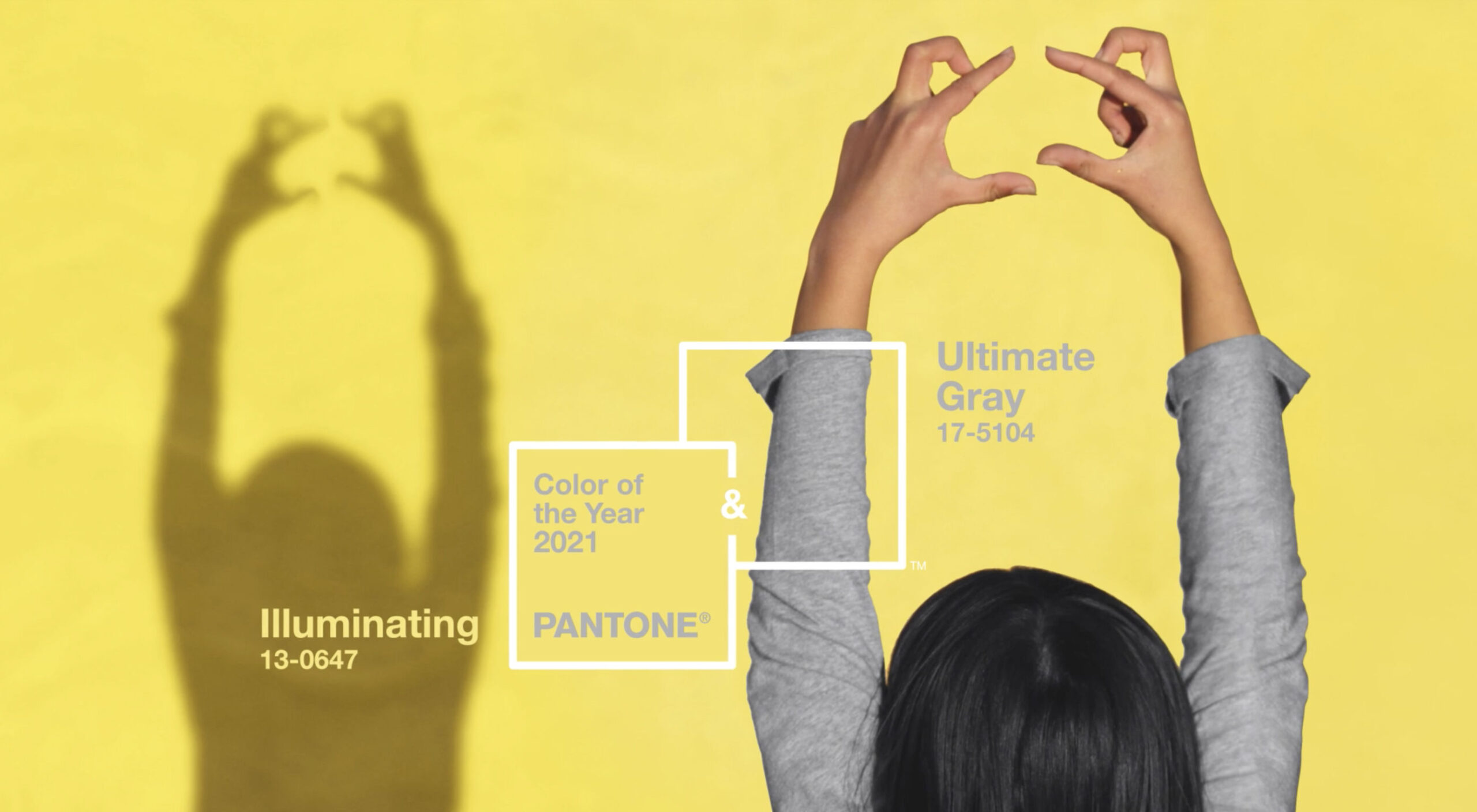
It’s that time again: the self-fulfilling prophecy that is the Pantone Color of the Year has been announced for 2021.

For 2021, we’re getting two colors of the year. The colors selected to grace museum gift shops, and end-of-year blog posts are Ultimate Gray (a mid-range gray somewhere around #939597) and Illuminating (a citrus yellow that’s approximately #F5DF4D).

A marriage of color conveying a message of strength and hopefulness that is both enduring and uplifting.

The last time Pantone selected two colors was Rose Quartz & Serenity in 2016, and we all know what a tranquil, serene year that was; so 2021 will presumably unleash the curse of an ancient mummy on the world, or see us collide with the Sun.

2020’s color, “Classic Blue”, probably wasn’t much of a color of the year unless it happens to be the color you painted your home office. If the company had genuine foresight, it might have opted for the blandest beige it could find — in fact in the Summer paint brand Dulux almost opted for that for 2021, naming “Brave Ground” its color for next year, but for beige’s “resilient” qualities rather than any lockdown boredom.

Perhaps that’s why Pantone’s PR department opted for two colors in 2021: a nondescript grey to keep us going until we’re all vaccinated, and a wildly luminous yellow for the latter part of the year.

In fairness to Pantone, its color choices aren’t predictions as is often reported, rather aspirations. Pantone believes the pairing “expresses a message of positivity supported by fortitude” which may be just what the world needs right now.

A combination of colors is much more sensible than a single color, with so much about color dependent on context. But the actual color treatment of 2021 is much more likely to be multi-color gradients.

You can try out Pantone’s colors for 2021 on Instagram, or on Pantone Connect.

Source


Source de l’article sur Webdesignerdepot

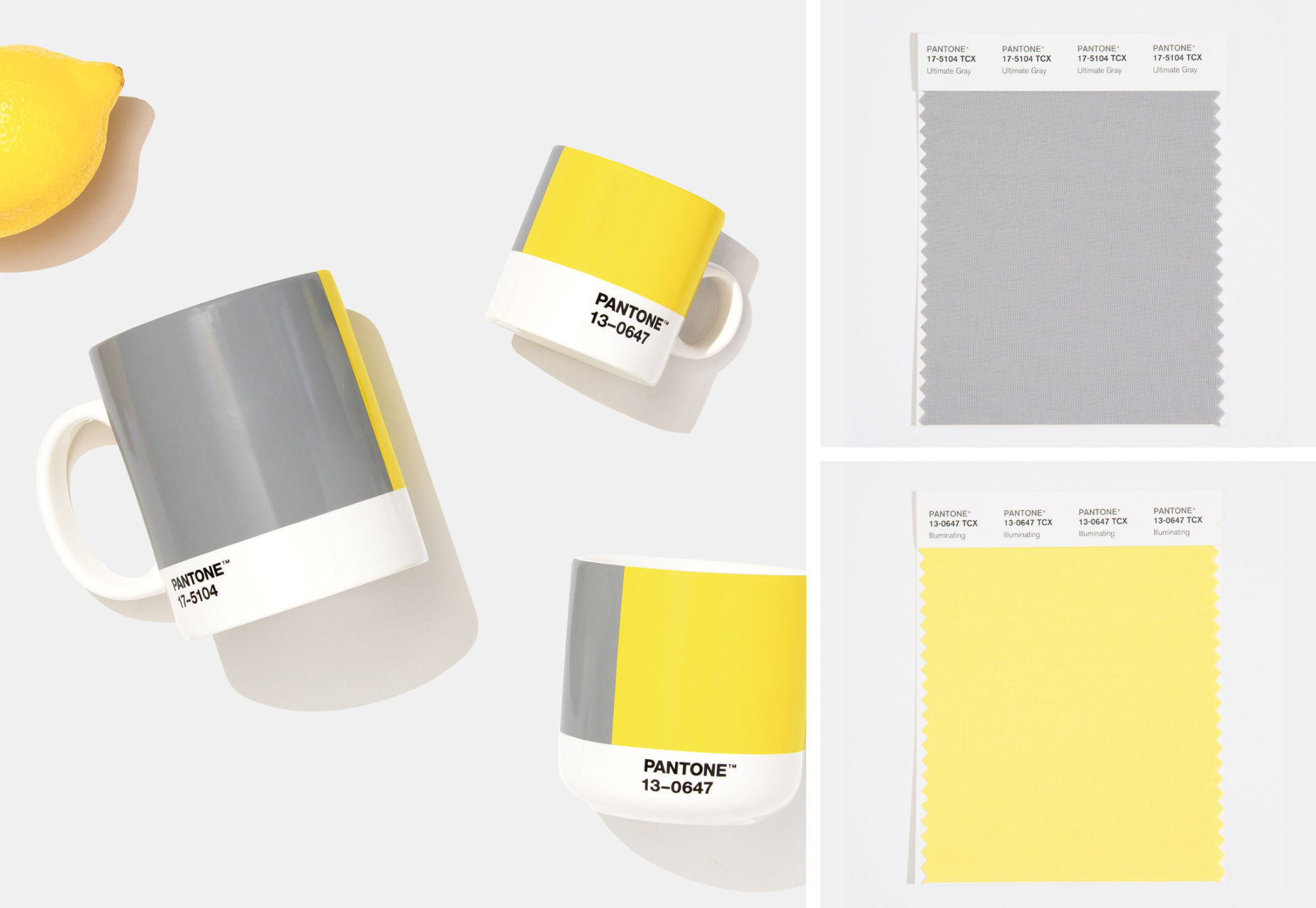
By the end of the year, the number of global smartphone users is expected to reach 3.5 billion. That’s a significant 9.3% increase over the last 12 months.

In a world where everyone is constantly connected to their mobile devices, it makes sense that web developers and designers would need to consider new rules for how they create engaging experiences. After all, most of us find browsing from our smartphones to be much more convenient than sitting down at a laptop each day.

With a little luck, you’re already taking steps to mobile optimize your website but standards are changing all the time. To make sure your website is up to scratch, here’s your guide to prioritizing your site for mobile, ready for the new year.

Understanding Mobile-First Design

The first step in updating your web design and development principles, is understanding the concept of mobile first design, and how it’s changed.

With a responsive website, you create something that adjusts to the screen size of any device; with a mobile-first site, you’re focusing first-and-foremost on the user experience that people get when they’re on mobile, taking that as your starting point, and building from there. Instead of building your website for the desktop and using mobile as an afterthought, you start with a consideration of mobile.

Even Google is highlighting the demand for this process lately, with the mobile-first indexing algorithm. If you can’t design for mobile-first, then you could risk your clients being unable to rise up the search engine ranks.

So, how do you get started?

1. Start With the Right Tools

Web developers and designers are nothing without a great toolkit.

The good news is that there are solutions out there that can help you to master the right skills for a mobile-focused user experience. For instance, Skeleton is excellent for small-scale projects that require fluid grids and minimal compiling.

Alternatively, Bootstrap can offer a one-size-fits-all solution for the front-end development for mobile devices. There’s a default grid system available, plenty of components, and JavaScript plugins to work with.

With the right tools, you can minimize and prioritize the content that’s most valuable for your website projects. This is crucial for maximizing website speed and creating clarity when it comes to content and imagery.

For instance, check out the ESPN website; it’s split into very easy-to-follow categories of content that are perfect for scrolling on a smartphone. The grid of videos makes it feel like you’re using a tool like YouTube.

2. Prioritize Mobile-First Elements

Once you have the right tools to assist you, it’s time to begin building your mobile-first website from the ground up. Rather than jumping straight into considerations of the latest design trends, it’s important to start with the foundations.

For instance, navigation within a mobile page is usually hidden under a hamburger button. However, you can take this concept to the next level too. For example, the Shojin mobile website only demonstrates the most important website options within the navigation bar to avoid overwhelming users.

The key here is to keep things as simple as possible, without restricting what your audience can do when they visit your website. Although you want to keep the number of interactive elements on your site small, you also need to ensure that those elements are easy to find and use.

All buttons and CTAs should be clear and tappable. Fonts need to be large enough to read from any screen, and your navigation system needs to be 100% simple, without slowing anything down.

On average, we recommend making all clickable elements at least 48 pixels in height.

3. Use Responsive Imagery and SVGs

Images are a crucial part of any website. They add context and appeal to your design. However, they can also seriously slow down your website if you’re not careful.

Remember, different devices have different demands when it comes to imagery. A desktop page may need a 1200px wide image, while a mobile-only needs the image to be 400px wide at most. The old way of making your images work was to load a large resolution image and use the same file on every platform. Unfortunately, this slows downloading time significantly.

Instead, it’s better to have at least two different versions of the same image for your mobile and desktop solutions. You can also consider SVG.

SVGs are incredibly scalable – more so than bitmaps. With SVG, you can ensure any icon or graphic continues to look sharp and clickable across all devices. Because these files are often smaller, your site loads quicker too! Hubspot is great at using SVGs.

Intricate illustrations are a massive component of HubSpot’s brand. If those images were saved as PNGs or other alternative files, then they would take forever to load. Because they’re all SVGs, you can enjoy the same consistent experience across desktop and mobile.

4. Get the Typography Right

It’s not just the big graphics and images that make a huge difference to your website when it comes to mobile-first design. You also need to think about the legibility and clarity of your website across all devices and platforms. If people can’t read the value proposition of the company that you’re designing for, you’re going to have a major problem.

Focus on making your content as easy to read as possible. Look into the typefaces that seem most appealing on a range of devices.

Remember to balance the body and heading font sizes for the device size too. You’ll need to ensure that the experience feels consistent and smooth as your users scroll through each page. Just take a look at the mobile version of the IMPACT website, for instance.

The headings aren’t as huge as they are on the desktop version of the website, and they’re displayed below, rather than above the featured image. However, this helps to give a more immediately eye-catching and structured experience to mobile users.

There’s even a handy “Search Engine Optimization” tag included, that users can click on if they want to find more related articles.

When it comes to typography, remember that it’s not just size and clarity that matter, but how things are structured throughout your website too. Your type should naturally guide your visitors along the page.

5. Master Available Device Features

Finally, on smartphones, you can accomplish a range of amazing things that you might not be able to do when using a desktop device. Your users can make calls, open apps, send messages, and more, all from within their mobile browser. They can also move their smartphone around a room, taking advantage of concepts like AR and VR.

Taking advantage of the unique capabilities that smartphone design can offer gives you a chance to get unique with your user experience.

Making the most of the mobile experience can be much simpler than you’d think. For instance, on a desktop site, you could list your phone number on a contact page. On a mobile site, the number can begin a call when clicked. You can also take the same approach with email addresses, and social media icons too.

Depending on how experimental you feel, there’s also plenty of opportunities to go above and beyond with your mobile features. You may decide to create a mobile app version of a website that your customers can download onto their phones.

Alternatively, you can look into things like AR technology. This could allow your users to practice placing items of furniture that they may be thinking of buying from an online retailer into their house, so they can see how well they work with their other interior design choices.

Making the Most of Mobile-First Design

Ultimately, having a responsive website that works on both mobile and desktop devices is mandatory in the modern world. However, going above and beyond with mobile-first design is a great way to get ahead of the game.

If you can focus on building a website that puts the experiences of mobile users first, then you can create something that’s much more likely to grab audience attention and deliver amazing experiences.

If nothing else, showing your clients that you have what it takes to design for mobile is an excellent way to ensure that you can gain as many new project opportunities as possible.

Source


Source de l’article sur Webdesignerdepot

Using the Prometheus Operator has become a common choice when it comes to running Prometheus in a Kubernetes cluster. It can manage Prometheus and Alertmanager for us with the help of CRDs in Kubernetes. The kube-prometheus-stack Helm chart (formerly known as prometheus-operator) comes with Grafana, node_exporter, and more out of the box.

In a previous blog post about Prometheus, we took a look at setting up Prometheus and Grafana using manifest files. We also explored a few of the metrics exposed by YugabyteDB. In this post, we will be setting up Prometheus and Grafana using the kube-prometheus-stack chart. And we will configure Prometheus to scrape YugabyteDB pods. At the end, we will take a look at the YugabyteDB Grafana dashboard that can be used to visualize all the collected metrics.

Source de l’article sur DZONE

As human beings, we like to think that we’re rational creatures.

We tell ourselves that we make our decisions based on fact and logic. However, that’s rarely the full truth. As much as we try to make choices guided by rationality, the truth is that we’re often highly emotional people, driven by the way that things make us feel.

So, what does that mean for a website designer?

Though designing a functional and logical website is important, it’s crucial not to forget about the emotional impact of each interaction that your customer has with the sites that you build.

Sites that don’t elicit any kind of emotional response aren’t just boring; they’re forgettable.

A forgettable website is poison to any website designer’s portfolio.

That’s why we’re going to introduce you to some easy ways to use emotion in your designs this year.

Getting to the Bottom of Emotion in Web Design

First, you need to understand the part that emotion plays in user decisions.

Don Norman’s book Emotional Design says that there are many things that designers can do to make their designs more emotional. Even something as simple as focusing on the aesthetic impact of your website can make it more likely that you’ll reach your audience on an emotional level.

One important thing to remember about emotional design, is that it’s not just about making your customers feel good. Emotion can be both positive and negative. Sometimes negative emotion is more impactful than positive feelings – it all depends on the kind of site you’re trying to create.

A website selling health products to customers needs to make that audience feel comfortable and confident that they’re buying a trustworthy item. However, it may also need to trigger small feelings of worry or concern in the audience about what might happen if they don’t buy.

Knowing how to walk that balance between positive and negative feelings is how a designer takes a simple website design and turns it into something incredible.

So, where do you get started?

Step 1: Use Visual Elements to Trigger Emotion

Visual elements are one of the easiest points to get started with when you’re designing for emotion. That’s because visuals are fantastic at drawing out feelings.

An animation can create an emotional connection with your audience by helping them to understand how your product works or making them laugh when they land on your page. A genuine photograph of your team working together can inspire trust and feelings of affinity.

One of the most common visual elements used to trigger emotion is color.

Shades like blue and green in the digital design world are more likely to drive feelings of calmness and comfort. On the other hand, red and yellow often encourage feelings of enthusiasm and happiness.

The way that you use color can make a massive difference to how users feel when they arrive on a website. For instance, the Barclay’s website would have been pretty boring if it was just a basic black and white screen. However, a banking site can’t afford to go over the top with animations or illustrations in most cases, as this can detract from its professional image.

Adding small patches of blue in a way that complements the brand’s color palette is a great way to generate feelings of trust. Combined with the image of a genuine real-life person, and calm tones, the bank instantly presents itself as something approachable and honest.

At the same time, the clear hierarchical layout of the bank’s website, with an easy-to-follow navigation bar, easy-to-read font, and clear headings and buttons comfort the customer. Users get exactly what they expect when they come to a financial website, and that makes users feel as though they’re in the right place.

Step 2: Create Engaging and Emotional Interactions

Visual elements are a great way to embed emotion into digital design. However, they’re just the first step. The emotional aspects of your web design choices should also appear throughout the interactions that customers have with the website.

A good interaction on a website or app needs to be simple and straightforward enough that users feel comfortable taking the next step in their journey. However, it also needs to drive the right emotional response from users too.

For instance, when you sign up for a free account trial from Box.com, you don’t just get a form full of information that you need to fill out.

Next to the form, you also get information about what you’re signing up for, complete with small checks next to each of the free features you’re getting. This helps to put the customer’s mind at ease and remind them that they’re in the right place.

The use of a box, including discount information next to the sign-up form also helps to make the interaction more emotional, by reminding customers that they’re getting something for free.

Every time a customer interacts with a website, there’s another opportunity to engage them on an emotional level. On the Firebox website, when a customer adds something to their cart, there’s a small animation on the cart icon that informs them that something is waiting for them.

When they click through to the checkout, they get instant information, including what they can do to “gift wrap” their item, and buttons showing the various payment options available.

Whenever you’re designing a page for a website, whether it’s the checkout page, a product page, or something else entirely, think about the interaction that the visitor is having at that moment. How can you ensure that each customer feels more comfortable, delighted, informed, or engaged?

Step 3: Leverage Microcopy and Detail to Express Emotions

Visuals are an excellent way to express emotions.

However, they’re not the only option.

As a designer, you’ll need to think about how you can combine web design with the use of microcopy to connect with customers on a deeper level.

Rather than drawing attention to tedious, dull, or impersonal instructions, notifications, and error messages on a site, how you can you make sure that everything on the website delivers the same emotional impact?

The simple addition of a tiny illustration is enough to provide a much more emotional experience to customers. Compelling micro copy and illustrations on 404 pages can also strengthen the connections that customers have with the sites they visit.

Just look at how Google added a dinosaur game to the page that customers are sent to when they don’t have an internet connection.

The right micro copy and interactions can instantly transform even a negative experience, like not being able to connect to the internet, into something emotionally engaging and positive.

When it comes to making an emotional connection between your customer and their end users, web designers need to remember that often the smallest details can make the biggest differences. Little extra features, like implementing a way for customers to have fun when their internet connections aren’t working, are the things that make websites more memorable from an emotional perspective.

Don’t Choose Emotion Over Functionality

Although emotional impact can be an essential aspect of a fantastic website design, it’s important not to get carried away. Adding too much to a website in the form of little extra graphics and unique interactions could end up weighing down a site and making it slow to load.

Although it’s valuable to think about how every interaction an end-user has with a website will make them feel, it’s important not to overlook the basics of web design when you’re at it. You’ll still need to ensure that the finishing design is easy to use, engaging, and attractive.

Pay attention to the basics of user experience design, and make sure that the extra emotional elements you’re infusing into your sites aren’t going to damage the experience that end-users get.

If you can get the blend right between emotional impact and functionality, then you could create the kind of website that audiences will never forget.

It pays to implement emotion into your design portfolio.

Source


Source de l’article sur Webdesignerdepot