Articles

Micro-interactions effectively communicate brand identity and ethos while strengthening ties with the customer. These habit-forming tools make for a fun and seamless user experience. Facebook’s ‘likes’ and Tinder’s ‘swipes’ are two classic examples. 

Micro-interactions originated with the need to guide customers who had hit a snag while using a service or a product. The goal was to ease customers into being more product-savvy via subtle reassurance and feedback. Micro-interactions are now employed by everything from washing machines, to coffee makers.

Along with feedback, prompts, and recommendations, they can also present customers with an appealing visual reward upon finishing a task. When used optimally, micro-interactions drastically enhance the navigation and simplify how users interact with sites and apps.

How Micro-Interactions Work

Here are the four structural elements to a simple micro-interaction: triggers, rules, feedback, and loops. Every micro-interaction has a significant component to organize the operational cycle. It lets you control feedback and runs, so the users understand the consequences of their performance and feel motivated to follow through.

Triggers

This feature begins micro-interactions of both the user-initiated (prompted by user) and system-initiated (driven by the system) kind. For example, a click, scroll, swipe, tap, and pull are common triggers that users carry out. So making a payment, booking a cab, and clicking or tapping on the hamburger menu all fall under this category. On the flip side, the user’s alert prompt upon entering a wrong password is a classic system-generated trigger. 

Rules

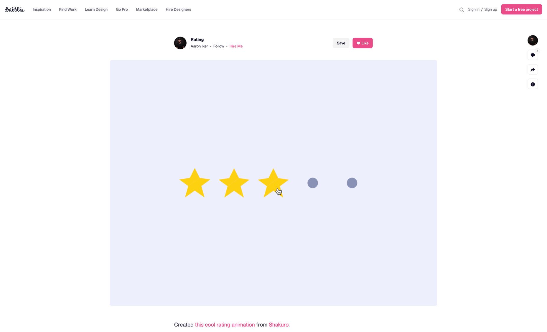
This element determines what happens after the user sets a prompt into motion via tapping, clicking, scrolling, or swiping. Rules refer to the fact that apps decide the triggers that users employ — Tinder’s ‘swipe’ feature illustrates this point. These rules gradually become a habit-forming action that users get accustomed to while regularly engaging with an app.

Feedback

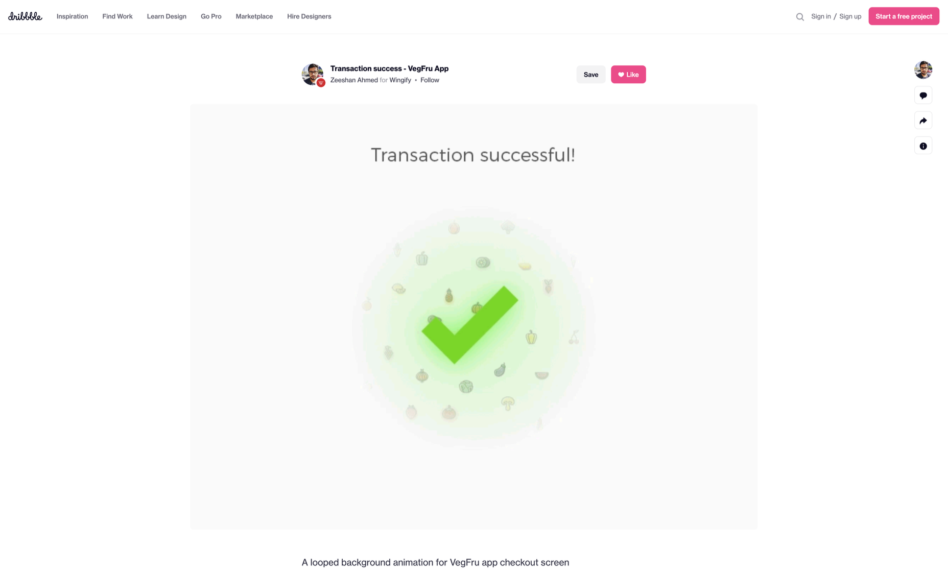
During this process stage, the system informs the user via auditory, visual, or haptic cues. It engages the users and encourages them to proceed further in their process. For example, the progress bar of a download, the visual representation of steps cleared in a circle, or the visual, aural, and tactile indication upon the success or failure of payment are all a part of the feedback mechanism.

Loop/Modes

This final stage entails tiny meta-rules of the process and determines the frequency and duration. A classic example from an ecommerce app is the ‘Buy Now’ transformed to ‘Buy Another’ Before the user loses interest in the app, the app typically uses such a loop to get them to re-engage with the app. 

How to Use Micro-Interactions

We’ve established that micro-interactions are fabulous, but not every UX interaction on your app or site needs one throughout the wireframe. Overusing this tool could saturate the overall creative experience your design may want to offer. Worse, it might even end up confusing the information hierarchy. It undermines the design and unbalances the user experience of discomfort and irritability. So it’s crucial to know when exactly to use them.

Let’s find out how few quick tips on micro-interactions can elevate and humanize your mobile user experience:

  • Swipe right or left: A signature move made entirely on swiping micro-interaction featured in the famous Tinder app. Swiping is an easier action than clicking or tapping.
  • Call-to-action:  As part of the last step during payment or order, place a ‘Confirm Order’ or ‘Book Now’ prompt, which gives the task a sense of urgency. As a result, having acted on it feels like a minor achievement. 
  • System status: Your app user wants to know what’s happening. System status lets them know they are moving in the right direction and helps avoid confusion. Sometimes, users even run out of patience while uploading a picture, downloading a file, or filling up the registration form.
  • Classic notifications: Users need a quick reminder of products selected/wishlist in their abandoned cart with a reduced attention span. A simple notification can nudge them toward finalizing the purchase. 
  • Button animation: Animated buttons are not only cute, but they also help users navigate the mobile app swiftly. Try out attractive colors, fonts, sizes, shapes, and clipart elements corresponding to the animation and create that cool button to pop up when tapped or hovered on. 
  • Animated text inputs:  A simple process of a likable element like zooming in while entering data into a form or filling up card details for payment can enhance the user experience.
  • Reward an achievement:  Especially true for educational and health apps, micro-interactions celebrating big and small milestones with a badge or a compliment of encouragement can strengthen a user’s engagement with the app. 

Benefits of Micro-Interactions

  • Brand communication: A successful brand ensures that the transmission to the buyer is engaging, positive, and hassle-free. When micro-interactions show a process status clearly, it creates and reinforces a positive image for your brand.
  • Higher user engagement: Experts say micro-interactions engage users better. These tiny elements subconsciously create the urge to keep interacting with your app. For example, each push or nudge notification acts toward redirecting your customers back to your app.
  • Enhanced user experience: From shopping to banking to traveling to learning to staying healthy, there’s an app for everything. A wide range of activities elevates the overall user experience and stays ahead in the game. Micro-interactions can work that magic for your brand. 
  • Prompt feedback: It’s frustrating not to know what’s happening behind the blank screen, especially during a purchase. Instant feedback via visual, sound, or vibrating notifications makes for a pleasant user experience. 
  • Visual harmony: Micro-interactions initiated even with a tap, swipe, typing, or scrolling are all a part of the UX design’s overall appeal. The trick is to keep all the interface elements in perfect sync with the app’s visual features.

Micro-Interaction Best Practices

Here are a few basic principles you should follow when you introduce a micro-interaction to the user experience.

1. Keep it simple, stupid (KISS)

KISS is a famous design principle that becomes even more important in the case of micro-interactions. The goal is to make the user journey delightful and not be a distraction.

2. Keep it Short

It has ‘micro’ in the name itself. But, again, micro-interactions aren’t supposed to be show stars, and a lengthy micro-interaction only distracts the user. 

3. Pick the Right Place

You should always consider the options carefully before choosing the spot for any micro-interaction. The widely used user-interaction designs are popular for a reason. Many people have already approved them, so you can safely continue with them. The use of micro-interaction should also sit well with your brand image. 

See also if the placement of a micro-interaction is reaching your ideal customer or not. And even consider whether you need a micro-interaction to begin with. 

And That’s a Wrap!

As UX designers, we can profoundly impact the overall design of sites and apps, the user’s journey, their interactions with our product/service, their connection with the brand, and the ease of doing a transaction.

We want customers to connect to our brand, love our products, and experience our exceptional customer service. But most of all, we want to earn their trust and loyalty.


Featured image via Pexels.

Source

The post Using Micro-Interactions to Drive UX first appeared on Webdesigner Depot.

Source de l’article sur Webdesignerdepot

It’s normal to pull up sharp in front of a problem; after all, if there was a known solution, it wouldn’t be a problem. But knowing that it’s normal, doesn’t make encountering problems any less frustrating. So how do we avoid sitting in front of a UX problem for hours, achieving nothing?

That’s what creative problem solving is all about.

In this post, we’ll explore creative problem solving, and how it can help you as a UX designer. Then we’ll analyze how you can solve UX problems in a few, easy-to-remember steps. By the end of this article, you’ll have all the tips you need for UX problem-solving.

What is Creative Problem Solving?

Creative problem solving is a term developed by Alex Osborn, the founder of the Creative Education Foundation. In a nutshell, this term is about overcoming challenges in our work lives through innovative solutions. But, of course, such solutions vary by profession.

For UX designers, creative problem solving is about solving UX problems with efficient tactics, that work. And that’s precisely why UX problem solving is so essential because following a specific method can help us avoid getting stuck.

Whether you are a newbie or an experienced designer, you are probably focused on projects that require you to solve problems. If you have never had a problem before, you must be a superhero; for us mere mortals, here are the steps we need to follow to solve a UX problem:

UX Problem Solving in 5 Easy Steps

Delivering a great UX solution is influenced by two key parameters: user research and creative problem-solving. Suppose you have done your user research and are currently looking for an original solution to a problem. In this case, the methodology below will be handy:

1. Identify the UX Problem

I know this may sound obvious, but think about it. How many times have we lost days because we didn’t identify the real problem? If you are solving the wrong problem, it does not matter if your solution is original and innovative.

That’s why the first thing you need to do is think about the problem. Ask yourself what the real problem is, and then get to work solving it. Identifying the problem may take some time, but it will prove beneficial to your project in the long run.

2. Clarify the UX Problem

Now that you have identified the UX problem, it’s time to demystify it. In this step, you could create a user journey plan. It does not have to be perfect; some low-fidelity sketches are more than enough.

Set a timer and start visualizing your solution on paper. Remember, sketching is not about perfection or fine details. Once you have created a customer journey you are happy with, it’s time to move on to the next step.

3. Use Analytics

UX design isn’t about design per se. It’s also about numbers and data. This is why analytics are critical to UX problem-solving. Once you have gathered some data from users and competitors, it’s time to create patterns. This will help you better understand the problem and change your drafts accordingly.

Numbers and data alone can help you a lot if you combine them with an original idea. However, facts alone are not enough, and your original story will not be compelling without them. So what’s better than combining them?

4. Use Your Feedback

So you have come up with an innovative solution to the UX problem. You have successfully combined this idea with essential data. Unfortunately, your work is not yet done. 

The next step is equally important. Once you have polished your ideas, you should share them with colleagues and/or customers.

It’s not easy to get feedback for your UX mapping, but it’s very constructive and will ultimately make you a better designer.

5. Solve the Problem

The last step is also the most fun. Once you have listened to people’s feedback, you can redesign your original solution. Then you are just one step away from solving the UX problem. Now it’s time to digitally redesign your idea.

This is the step where fine details matter. Creating a high-fidelity wireframe is not easy, but most UX designers have the knowledge and tools to get it done.

UX Problem Solving: Useful Tips and Tricks

Be Methodical

In my opinion, this is the most useful tip when it comes to UX problem-solving. You do not always have to be in a hurry. In the early stages of a project, try not to get distracted by other problems. Focus on finding the real problem.

Once you are sure you have found it, you can move on to finding the best solution. Then move on to the next step and so on. It becomes clear that being methodical is a brilliant tactic.

UX Problem Solving is All about the Ecosystem

UX problem solving is not about fine details. So try to care less about the design and more about the ecosystem you want to create. That will help you gather all the data you need, from user opinions to analytics.

Low-Fidelity vs. High-Fidelity Wireframes

Starting with sketches and low-fidelity wireframes is a brilliant thing to do. Whenever I have tried to start a project directly with high-fidelity wireframes, I have gotten bogged down in details.

For this reason, pen and paper should be your best friends in UX problem-solving. Sketches help you explore different approaches and get the feedback you need.

Explore Different Tools/Approaches

When it comes to solving a UX problem, there is usually one efficient solution. But that is not always the case. In most cases, we have to consider different alternatives and identify more than one critical interaction.

For this reason, feedback is also crucial for UX problem-solving. Your colleagues and customers will help you find the best method. Try to accept criticism and be open when listening to feedback. This way, you will ensure that you will find the best possible solution.

Wrap Up

Solving a UX problem is not easy. However, if you identify the real problem and illustrate different approaches, you will be on the right track. Also, do not neglect to use the data and feedback you collect. The more tools you have in hand, the better UX designer you will be.


Featured image via Unsplash.

Source

The post Creative Problem Solving for UX Designers first appeared on Webdesigner Depot.

Source de l’article sur Webdesignerdepot

Every week users submit a lot of interesting stuff on our sister site Webdesigner News, highlighting great content from around the web that can be of interest to web designers.

The best way to keep track of all the great stories and news being posted is simply to check out the Webdesigner News site, however, in case you missed some here’s a quick and useful compilation of the most popular designer news that we curated from the past week.

Google’s Next Big Chrome Update Will Rewrite the Rules of the Web

10 Best Alternatives to Google Analytics in 2021

Gamification in UX Design: Designing Fun Experiences for Serious

UI Design Trends for Web and Mobile We Start 2021 With

Getting The Most Out Of Git

Appreciating the Unsung Heroes of WordPress

Simple CSS Line Hover Animations for Links

How to Kill a Unicorn

Animating a CSS Gradient Border

Color Spark – A Color Scheme Plugin for Figma

QuickLens – Inspect the UI Like a Pro

6 Important WordPress Gutenberg Updates to Be Aware Of

23 Exciting New Tools for Designers, February 2021

A UX Guide to Optimize Conversions

13 UX Tips That Will Improve Your Website’s SEO

Don’t Offer a Free Plan

The 25 Best Single Page Web Designs

Illustration Kit – Premium Open Source Illustrations Updated Daily

DesignOps: Just a New Buzzword?

Bilgge – a Privacy-paranoid Free Service for your Notes and Secrets

How to Deal With Designers in 10 Easy Steps

Website Optimization Checklist: Your Go-To Guide to SEO

JavaScript Minification Benchmarks

Framer is Dead · A Love Letter to my Prototyping Tool of Choice

The Differences in Web Hosting (Go with the Happy Path)

Pixelplace.io – One Giant Pixel Canvas That Anyone Can Draw On

Source

The post Popular Design News of the Week: February 8, 2021 – February 14, 2021 first appeared on Webdesigner Depot.


Source de l’article sur Webdesignerdepot

User experience is one of the most important aspects of web design, but many experts overlook that UX doesn’t just apply to web pages. User experience as a concept encompasses all aspects of end-user interaction with a company.

That means you need to discover the right UX strategies for everything from your homepage to your email marketing and even your listings on Google.

Today, we’re going to explore some of how you can apply UX principles to your client’s image on search engines.

Why Your Search Engine Listing Matters

Let’s start with the basics: 89% of customers start their purchasing process with a search engine. That means that whether you’re creating a portfolio to sell your services or building a website for a client, the first connection a customer has with your design isn’t on the homepage.

Most of the time, you’re driving a specific experience for an end-user before you even realize it. Before you can wow an audience with a beautiful site design or an amazing CTA offer, you need to convince them to click on your Google link.

When you invest in user experience, you think carefully about the journey that an end-user goes through when interacting with a brand. This often means considering things like the user’s intent, their needs, and their pain points.

Those same principles apply to create an impressive search engine listing.

UX on a website is all about giving your audience what they need in an informed, and strategic manner; UX in the search engine results works the same way.

How to Make Your Search Listing Stand Out with UX

So, how do you begin to apply the principles of UX to your Google Search results?

It’s much easier than you’d think.

Step 1: Show Immediate Value

Delivering an excellent experience on a website often means providing end-users with the information they need as quickly as possible. Imagine designing a landing page; you wouldn’t want your audience to scroll forever to find what they need. Instead, you’d make sure that the value of the page was immediately obvious.

When creating an image for your search engine listing, you’ll need to take the same approach. This often means thinking carefully about two things: your headline and your meta description.

Around 8 out of 10 users say that they’ll click a title if it’s compelling. That means that before you do anything else to improve your SEO strategy, you need to make sure that your web page’s title is going to grab your audience’s attention.

The best titles deliver instant value. These titles tell the audience exactly what they’re going to get when they click onto the page. The promise drives action, while clarity highlights the informed nature of the brand.

The great thing about using an excellent title for a page is that it doesn’t matter where you’re ranked on the search results. Whether you’re number 2 or number 5, your customers will click if they find something they want.

It’s just like using a CTA on a landing page. Make sure your titles are:

  • Informative — show your audience value immediately;
  • Optimized for mobile — remember, your audience might not see your full title on some screens; this means that you need to make the initial words count;
  • Easy to read — keep it short, simple, and clear, speak the end-users’ language.

Step 2: Build Trust with Your URLs

Trust factors are another essential part of good UX.

When you’re designing a website for a new brand, you know that it’s your job to make visitors feel at ease. Even in today’s digital world, many customers won’t feel comfortable giving their money or details to a new company.

Within the website that you design, you can implement trust symbols, reviews, and testimonials to enhance brand credibility. On search engines, it all starts with your URL.

Search-friendly URLs that highlight the nature of the page will put your audience’s mind at ease. When they click on a page about “What is SEO” in the SERPs, they want to see an URL that matches, not a bunch of numbers and symbols

Use search-friendly permalink structures to make your listing seem more authoritative. This will increase the chances of your customer clicking through to a page and make them more likely to share the link with friends.

Once you decide on a link structure, make sure that it stays consistent throughout the entire site. If a link doesn’t appear to match the rest of the URLs that your audience sees for your website, they may think they’re on the wrong page. That increases your bounce rate.

Step 3: Be Informative with Your Meta Description

To deliver excellent UX on a website, you ensure that your visitor can find all of the answers to their most pressing questions as quickly as possible. This includes providing the right information on each page and using the correct navigational structure to support a visitor’s journey.

In the SERPs, you can deliver that same informative experience with a meta description. Although meta descriptions often get ignored, they can provide a lot of value and help you or your client make the right first impression.

To master your meta descriptions:

  • Use the full 160 characters — make the most of your meta description by providing as much useful information as you can within that small space;
  • Include a CTA — just as CTAs help to guide customers through the pages on a website, they can assist with pulling in clicks on the SERPS; a call to action like “read about the” or “click here” makes sense when you’re boosting your search image;
  • Focus on value — concentrate on providing your customers with an insight into what’s in it for them if they click on your listing.

Don’t forget that adding keywords to your meta description is often helpful too. Keywords will boost your chances of a higher ranking, but they’ll also show your audience that they’re looking at the right result.

Step 4: Draw the Eye with Rich Snippets

You’ve probably noticed that the search engine result pages have changed quite a bit in the last couple of years. As Google strives to make results more relevant and informative, we’ve seen the rise of things like rich snippets. Rich snippets are excellent for telling your audience where to look.

On a website, you would use design elements, like contrasting colors and animation, to pull your audience’s attention to a specific space. On search engines, rich snippets can drive the same outcomes. The difference is that instead of telling a visitor what to do next on a page, you’re telling them to click on your site, not a competitor’s.

When Google introduced rich snippets, it wanted to provide administrators with a way of showcasing their best content. Rich snippets are most commonly used today on product pages and contact pages because they can show off reviews.

Install a rich snippet plugin into your site if you’re a WordPress user or your client is. When you enter the content that you need into the website, use the drop-down menu in your Rich snippet tool to configure the snippet.

Ideally, you’ll want to aim for the full, rich snippet if you want to stand out at the top of the search results. Most featured snippets have both text and an image. It would help if you aimed to access both of these by writing great content and combining it with a relevant image.

Step 5: Provide Diversity (Take Up More of the Results)

As a website designer or developer, you’ll know that different people on a website will often be drawn to different things. Some of your visitors might immediately see a set of bullet-points and use them to search for the answer to their question. Other visitors will want pictures or videos to guide them. So, how do you deliver that kind of diversity in the SERPS?

The easiest option is to aim to take up more of the search result pages. Google now delivers a bunch of different ways for customers to get the answers they crave. When you search for “How to use Google my Business” on Google, you’ll see links to blogs, as well as a list of YouTube Videos and the “People Also Ask” section.

Making sure that you or a client has different content ranking pieces for the same keywords can significantly improve the experience any customer has on the search engines. Often, the process of spreading your image out across the SERPs is as simple as creating some different kinds of content.

To access the video’s benefits, ask your client to create YouTube videos for some of their most commonly asked questions or most covered topics. If you’re helping with SEO marketing for your client, then make sure they have an FAQ page or a way of answering questions quickly and concisely on articles, so they’re more likely to appear in “People Also Ask”:

Step 6: Add Authority with Google My Business

Speaking of Google My Business, that’s another excellent tool that’s perfect for improving UX in the search results. GMB is a free tool provided by Google. It allows business owners to manage how information appears in the search results.

With this service, you can manage a company’s position on Google maps, the Knowledge Graph, and online reviews. Establishing a company’s location is one of the most important things you can do to help audiences quickly find a business. Remember, half of the customers that do a local search on a smartphone end up visiting the store within the same day.

Start by setting up the Google Business listing for yourself or your client. All you need to do is hit the “Start Now” button and fill out every relevant field offered by Google. The more information you can add to Google My Business, the more your listing will stand out. Make sure you:

  • Choose a category for a business, like “Grocery store”;
  • Load up high-quality and high-resolution images;
  • Ensure your information matches on every platform;
  • Use a local number for contact;
  • Encourage reviews to give your listing a five-star rating.

Taking advantage of a Google My Business listing will ensure that your audience has all the information they need to make an informed decision about your company before they click through to the site. This means that you or your client get more warm leads and fewer people stumbling onto your website that might not want to buy from you.

Step 7: Use Structured Data Markup to Answer Questions

If you’re already using things like rich snippets in your Google listings, you should also have a structured schema markup plan. Schema markup on Google tells the search engines what your data means. This means that you can add extra information to your listings that will guide your customers more accurately to the support they need.

Providing additional schema markup information to your listings gives them an extra finishing touch to ensure that they stand out from the competition. You might add something like a “product price” to a product page or information about the product’s availability.

Alternatively, you could provide the people who see a search result with other options. This could be an excellent option if you’re concerned that some of the people who might come across your listing might need slightly different information. For instance, you can ask Google to list other pages along with your search results that customers can “jump to” if they need additional insights.

Baking structured data into your design process when you’re working on a website does several positive things. It makes the search engine’s job easier so that you can ensure that you or your client ranks higher. Additionally, it means that your web listings will be more thorough and useful.

Since UX is all about giving your audience the best possible experience with a brand, that starts with making sure they get the information they need in the search results.

Constantly Improve and Experiment

Remember, as you begin to embed UX elements into your search engine listings, it’s important to be aware of relevant evolutions. Ultimately, the needs of any audience can change very rapidly. Paying attention to your customers and what kind of links they click on the most will provide you with lots of valuable data. You can use things like Google analytics to A/B test things like titles, pictures, featured snippets, and other things that may affect UX.

At the same time, it’s worth noting that the Google search algorithms are always changing. Running split tests on different pages will give you an insight into what your customers want. However, you’ll need to keep an eye on the latest documentation about Google Search if you want to avoid falling behind the competition.

Like most exceptional UX aspects, mastering your SERP position isn’t a set it and forget it strategy. You’ll need to constantly expand your knowledge if you want to show clients that you can combine UX and SEO effectively.

It’s easy to forget that there’s more to UX than making your buttons clickable on mobile devices or ensuring that scrolling feels smooth. For a designer or developer to deliver wonderful UX for a brand, they need to consider every interaction that a company and customer have. Most of the time, this means starting with the way a website appears when it’s listed on the search engines. Getting your SEO listing right doesn’t just boost your chances of a good ranking. This strategy also improves your reputation with your audience and delivers more meaningful moments in the buyer journey.


Featured image via Unsplash.

Source


Source de l’article sur Webdesignerdepot

Personalization; it’s probably one of the most important design trends to emerge in recent years.

As consumers in all industries become more demanding, they’re increasingly searching for online experiences that are customized to suit their individual needs and expectations.

Today, personalization exists in virtually every digital interaction, from adverts on social media to PPC campaigns and email marketing efforts.

Used correctly, the manipulation of demographic, behavioral, and other in-depth user-data can help designers to create dynamic, highly customized content for each website user. At the same time, these unique websites ensure that designers really make an impact on behalf of their clients, outshining the competition and driving amazing results.

What is Hyper-Personalization?

Basic personalization in web design involves making changes to a design based on what you know about your client’s target audience.

For instance, if you knew that you were designing for an audience that spends more time on their smartphone than their computer, you’d concentrate on building hyper-responsive experiences for small screens. For instance, the Canals-Amsterdam.nl website is specifically designed to support people using smartphones to swipe, tap, and scroll.

If you’re aware that your customer’s target market is other businesses, you might put more testimonials, free demo CTAs and other enticing components on the website to encourage investment.

Hyper-Personalization is an emerging trend for 2020 that focuses on going beyond the basic understanding of a target audience, to look at genuine customer data. Hyper-personalization is all about leveraging in-depth omnichannel data to drive more advanced customer experiences on every page of a website.

For hyper-personalization to be genuinely effective, designers need access to virtually unlimited data, from CMS systems, sales teams, marketing experts, and more. When you have that data handy, you can use it to:

  • Design websites that showcase dynamic CTAs, featuring content relevant to each user;
  • Implement sign-in screens for customers vs. demo requests for new leads on home pages;
  • Showcase products similar to past pages when repeat customers return to a site.

Why is Hyper-Personalization Important?

Personalized experiences have always been important to the sales journey.

However, in an era where companies are constantly competing to grab user attention, you can’t just cater to your site designs to a group of people anymore. Increasingly, users are expecting specific interactive moments on websites, made just for them.

Amazon is an obvious example to consider here. As one of the world’s leading online shopping sites, Amazon’s efforts with website personalization are incredible. The Amazon website uses tools integrated into the back-end of the marketplace to watch everything a customer does on its platform.

As users browse through the website, the site jots down each category that you look at, and which items interest you. Thanks to this, Amazon can suggest which products you may be most interested in.

Websites like Madebyhusk also offer an incredible insight into hyper-personalization, allowing users to browse for the products that appeal to them based on in-depth filters like edging and color.

The result is a higher chance of conversion.

When customers feel as though they have complete control over their buyer journey, and that each step on that journey is tailored to them, they’re more likely to buy.

Better Converting CTAs

A call to action is an excellent way to move things along when you’re encouraging the buying process with your target audience.

Used correctly, your CTAs can encourage more than just cart conversions. They can also convince people to sign up for your newsletter via a subscription form, take a survey, or begin a free demo.

Regardless of the CTAs that you choose to implement, personalization will quickly make your requests more effective. According to studies, CTAs that are personalized are 202% more effective than generic alternatives.

For instance, Byhumankind.com uses a crucial statement: “Great personal care products don’t have to come at earth’s expense.” Followed by an engaging CTA to drive positive action from their audience. The company knows that they’re appealing to a customer interested in saving the planet, so they make the benefits of “Getting Started” obvious immediately.

Using data provided by clients, designers can figure out exactly how to position CTAs and offers for customers. For instance, notice that Humankind has a green colored CTA button.

Most buttons take advantage of bold colors like red and orange, but the green shade for Humankind further highlights the nature-driven personality of the brand.

Relevant Product Recommendations

Repeat customers are infinitely more valuable than people who purchase just one item from your site.

However, convincing a standard customer to become a repeat client isn’t easy. Sometimes, clients need a push to determine what they want to buy next.

Fortunately, as a website designer, you can help with that. Using dynamic modules in the product pages of your customer’s website, you can show individual end-users what they might want to purchase next from a specific brand.

These dynamic modules can use information about what each customer has purchased in the past, to suggest a new product or service. Amazon do particularly well in this regard, leveraging a vast marketplace and treasure trove of information to make quality recommendations. But you don’t need to be designing a considerable website for a global business like Amazon to take advantage of dynamic suggestions. Any business with a focus on hyper-personalization can benefit from this strategy.

Increased Time on Site

Any form of personalization on a website can significantly improve the amount of time a customer spends in that digital environment.

Imagine walking into a restaurant that seems as though it was designed specifically for you. The décor, the seating arrangements, and even the menu are customized to your taste. You’re more likely to spend your time and money there than on any generic food place you find on the street.

The same rules apply to website design. The more hyper-personalized you can get with your client’s design, based on what you know about their customers, the easier it will be to keep customers engaged.

For instance, the WarnerMusic.no website entices visitors with various high-quality images of popular bands and artists, before providing them with endless information about the brand and what it does. The designer of this site knew that it needed to appeal to the visual demands of the audience first, before offering useful information like featured artist lists, News, and blog posts to keep the users on site.

Hyper personalization is all about figuring out what kind of end-user you’re designing for, so you can build the digital environment that’s more engaging and compelling to them. Some designers even create dynamic pages that change depending on whether a customer is a repeat client or a new visitor.

Improved Loyalty and Affinity

Finally, it’s human nature that we all want to spend time with the people that treat us best.

We all value excellent customer service, which is why customer experience is the most significant differentiating factor for any organization today.

Web-based personalization works in a similar way. When you use your design tools to make the site experience that you give to each visitor warm, individualized, and welcoming, then your clients are sure to see a boost in customer loyalty.

Around 89% of consumers say that they’ll only consider buying from brands that care about them. As a designer, you can convince every website visitor that they’re going to get the experience they deserve. Just look at how TheHappyHero.com instantly lets clients know that they can expect a fun and friendly interaction on every page.

Accessing useful data from the companies that you’re working with before you begin developing and designing a website could be the key to creating happier customers and higher conversions.

The more delighted end-users are with the experience that a website gives them, the happier that your client will be with you – increasing the impact of your design portfolio.

If you can create customer loyalty and affinity for your client, then you will be able to develop the same feelings between yourself and your client. This could mean that you earn more recommendations as a designer and build your position as a leader in the industry.

Hyper-Personalization is Crucial for 2021

As companies continue to worry about how they can safely use data without crossing the line when it comes to customer privacy, hyper-personalization has stayed just out of the mainstream. While it may be a while before we see every website designer starting their process with piles of in-depth data, it seems that we are heading in that direction.

Customers in 2021 and beyond will undoubtedly want a more advanced and customized experience from the brands that they interact with – particularly in an era where it’s becoming much easier to deliver meaningful moments online.

Source

Source de l’article sur Webdesignerdepot

Autre source / On the same theme