
 While a lot of the research for web designers that’s come out this year has to do with COVID-19, we’re starting to see a light at the end of the tunnel. Many of these reports aren’t just looking at the effects of the pandemic on business and marketing today. They’re now looking at what consumers plan to do once the pandemic is gone.
So, I have some very interesting research for you here today. Three of the reports have to do with coronavirus side effects — pertaining to ecommerce, market research, and freelancing — and one of them is just a really great argument against using PDFs on websites.
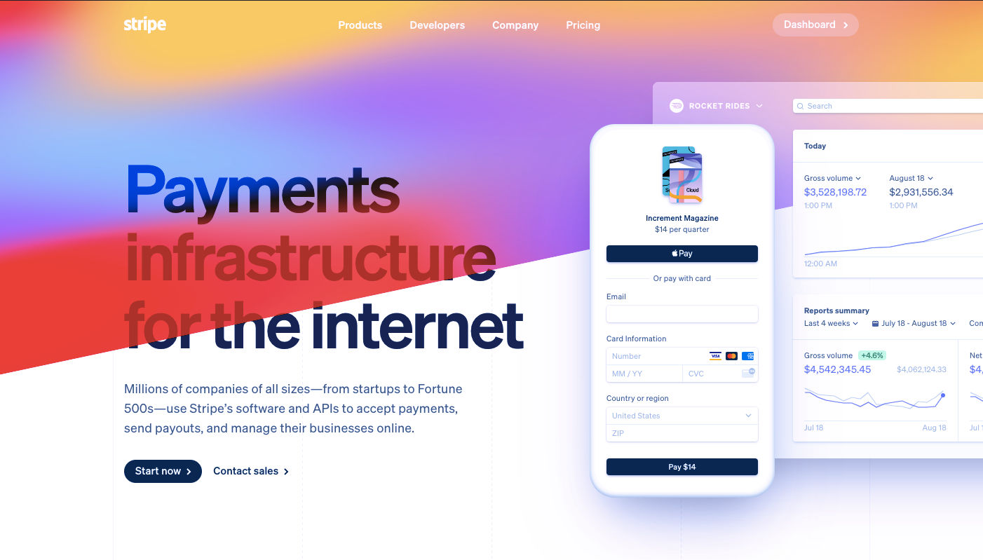
1. The Digital 2020 Survey Says Ecommerce Growth Will Continue Post-Coronavirus
Obviously, everyone is paying close attention to COVID-19’s impact on the world. For the purposes of the work you do as a web designer, you should be clued into what it’s doing to the business and marketing fields. Because, if those opportunities dry up or companies begin to pivot, you need to be ready to adapt.
The Digital 2020, a joint monthly report from we are social and HootSuite, brings interesting news about the state of ecommerce thanks to COVID-19.
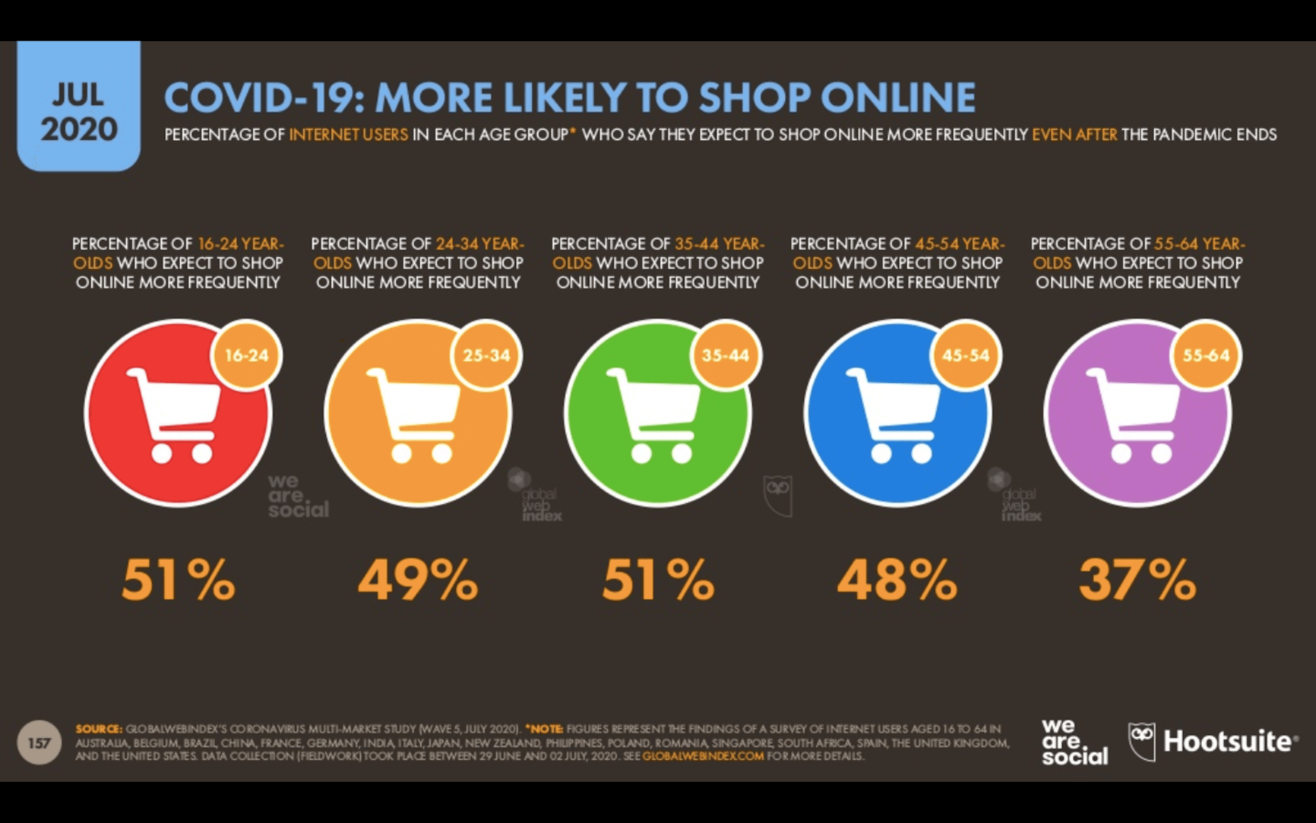
Because the pandemic has forced consumers indoors, online shopping has increased. But, according to about half of those surveyed for this report, this isn’t some temporary solution. They plan on doing more online shopping even after the pandemic ends.
This means that web designers are sitting in an enviable position now and for the foreseeable future. If you’re not already helping businesses sell through their websites, now is the time to do so as more and more businesses are going to need reliable online stores to sell their offerings through.
2. eMarketer Shares Data on Social Listening
When conducting research at the beginning of a design project, what kinds of sources do you turn to for quick and reliable information? Your client provides you with information on their business, industry, and the competition, of course, but what else?
You can conduct user surveys and interviews, but those take time and resources. It also usually means working with clients who have existing businesses and user bases to tap into. Unless you’re working as a UX designer where that’s a big part of the work you do, you might not have the ability to do that level of research.
As reported by Gartner (via eMarketer), leading marketers are now learning about their target audiences through the following channels:
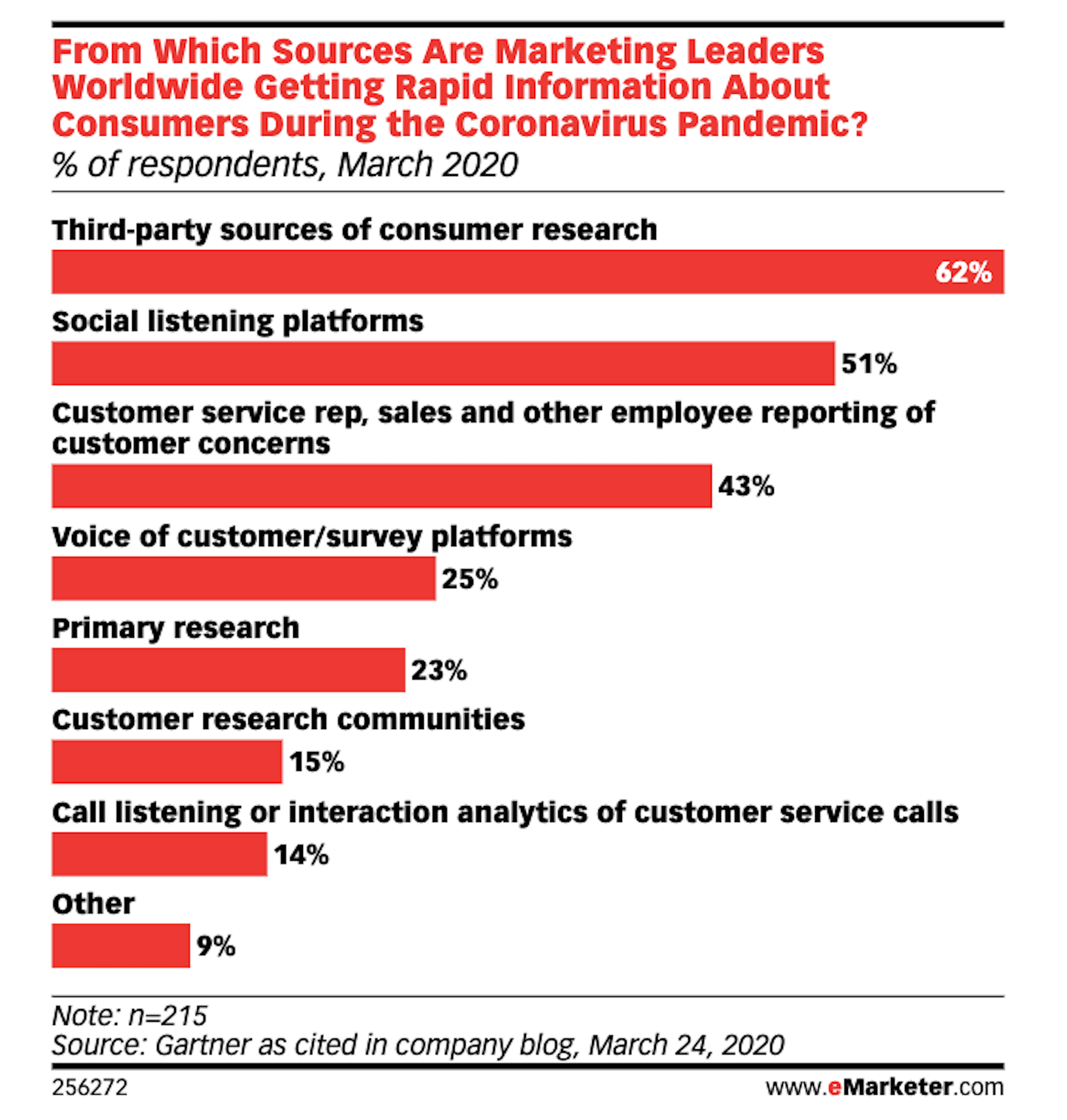
Thanks to the surge of traffic online right now, social listening platforms have become really useful resources for learning about one’s users, with 51% of marketing leaders using them.
If you feel as though your initial research and planning phases could use a boost, I’d recommend taking advantage of one of these social listening tools now.
If you build websites for a specific niche, you can set up keywords/hashtags that are universally relevant to (most of) your clients. By listening in on these conversations regularly, you can become more attuned to what the visitors of your websites actually need and you can proactively build better experiences for them as a result.
3. Upwork Reports Increasing Numbers of Freelancers Entering the Market
The main focus of the Upwork 2020 Future Workforce Report is on how employers are changing their approaches to hiring now and in the near future. And the basic premise is this:
- It’s long been predicted that more and more of the workforce would be allowed to work remotely.
- COVID-19 has escalated those predictions to the point where most of the workforce is remote right now.
- Businesses see the value in remote work arrangements, especially if it enables them to get work done more quickly and cost-effectively by freelancers.
While this is certainly great news for web designers looking for new clients, the report also provides us with this data:
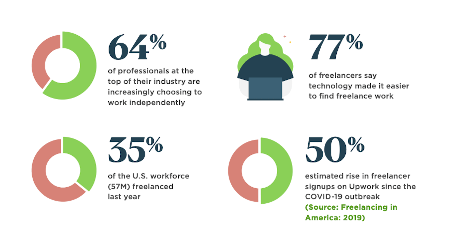
64% of professionals in the top of their field work independently. That statistic alone means you’re up against some tough competition. But there’s also the 50% rise in signups on freelancer marketplaces that should have you worried.
Even though business demand for freelance talent is growing, this unprecedented rise in freelance competition may pose some problems. So, if you’re not already doing everything you can to position yourself as the web designer in your niche, get going on that now so you don’t get drowned out by the rising number of competitors.
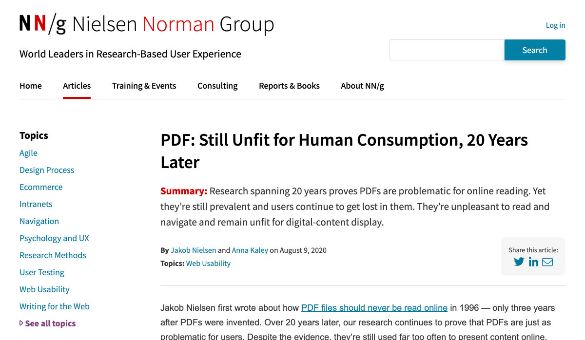
4. NNG Says That PDFs Are Unsuitable for the Web
While I don’t have statistics to share with you from the Nielsen Norman Group’s post on why the PDF is “Still Unfit for Human Consumption”, I do have a ton of usability arguments against them that are worth summing up here:
- PDFs are written in the style of print documents, which means that strategies we use to design content on websites — like making a page scannable and accessible — don’t apply.
- They’re not designed to be as concise or attractive as a web page.
- They don’t operate like a website, which disrupts the seamless experience you’ve worked so hard to create when one is opened up from your site.
- The website navigation disappears and any sense of orientation (besides the browser “Back” button) goes out the window.
- There’s no way to build an internal navigation in a PDF document, save for internal linking or a table of contents.
- If they’re formatted for paper sizes, scrolling through them can be difficult for mobile users.
- They load more slowly the bigger they get, so unless it’s something like a small and optimized menu, expect visitors to wait for the download to appear.
And those are just the arguments that came from NNG’s researchers. Take some time to read through real user complaints about PDFs and you’ll never want to include one on a client’s website again.
Wrap-Up
Thankfully, the research for web designers and marketers is finally starting to move away from the confusion and speculation we saw a lot of earlier this year.
Just as with anything we do on the web, the more time you give it, the more data you can collect. And, luckily for us, the data suggests that there’s a pretty positive outlook for web designers if they position themselves the right way now.
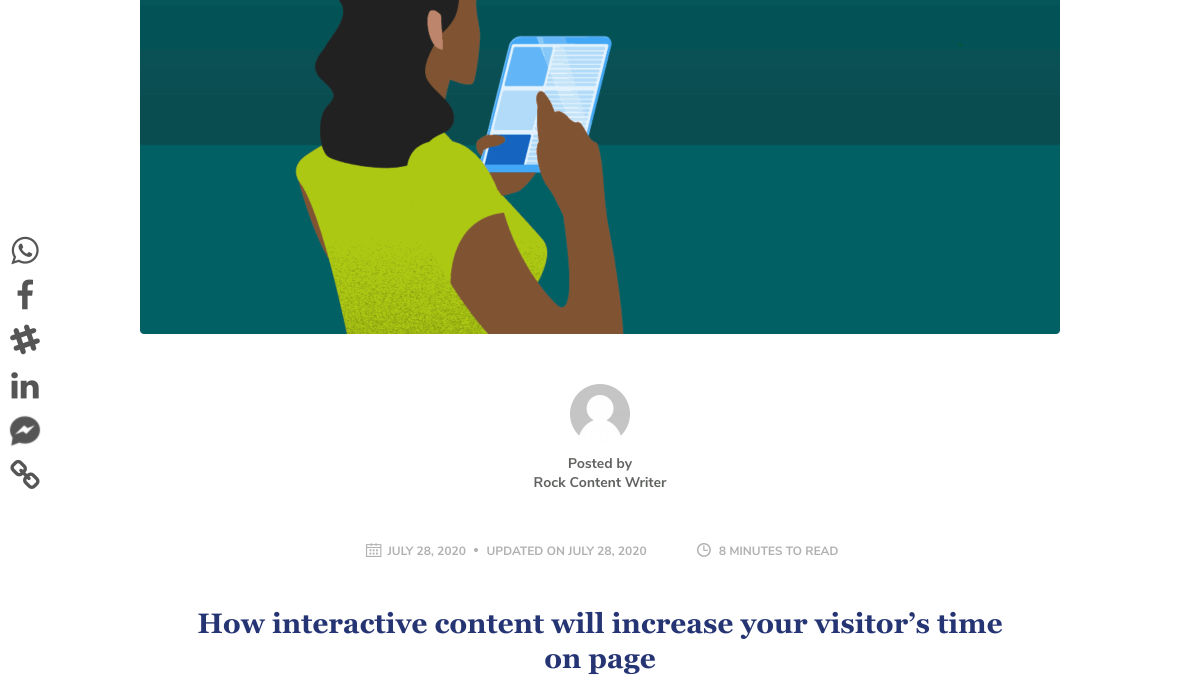
Featured image via Unsplash.

 Every week users submit a lot of interesting stuff on our sister site Webdesigner News, highlighting great content from around the web that can be of interest to web designers.


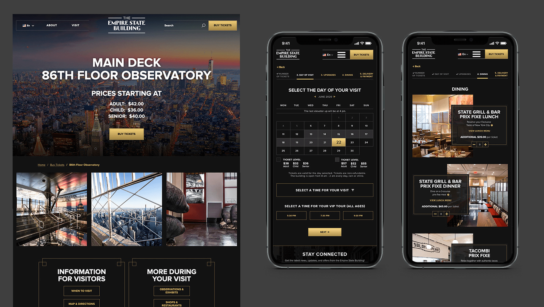
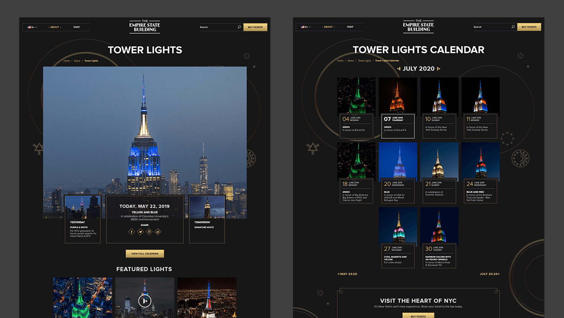
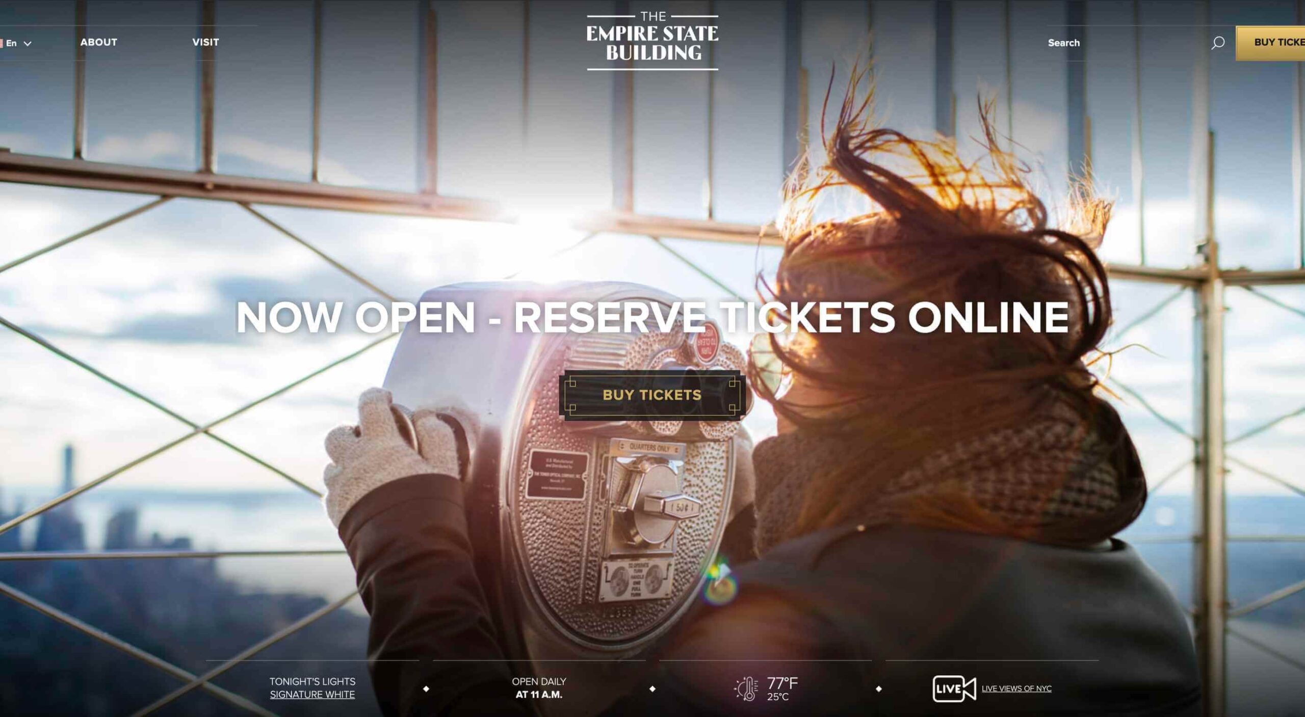 In 2019, to keep pace with an interior redesign of its visitor experience, the
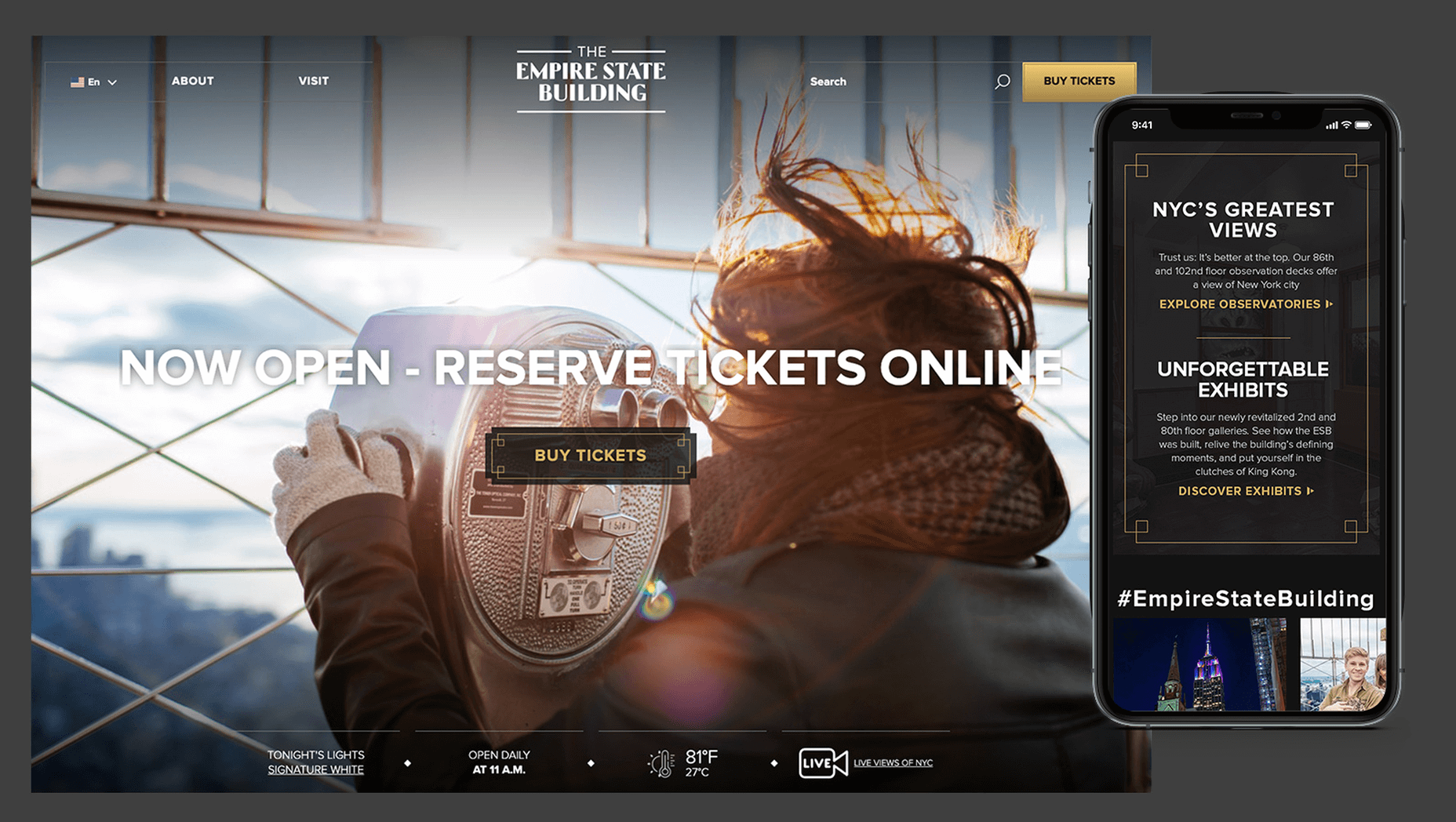

 Many people dream of a career in web design, but it may actually be more attainable than you think.
 Every week users submit a lot of interesting stuff on our sister site Webdesigner News, highlighting great content from around the web that can be of interest to web designers.


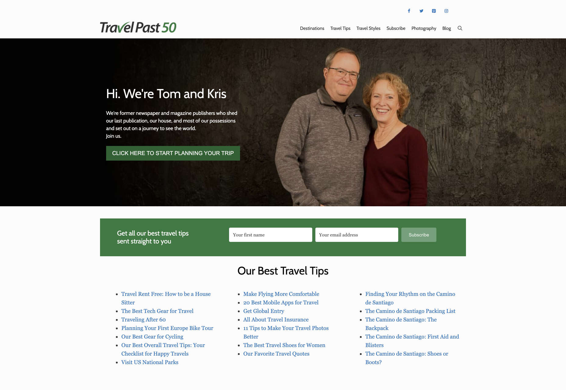
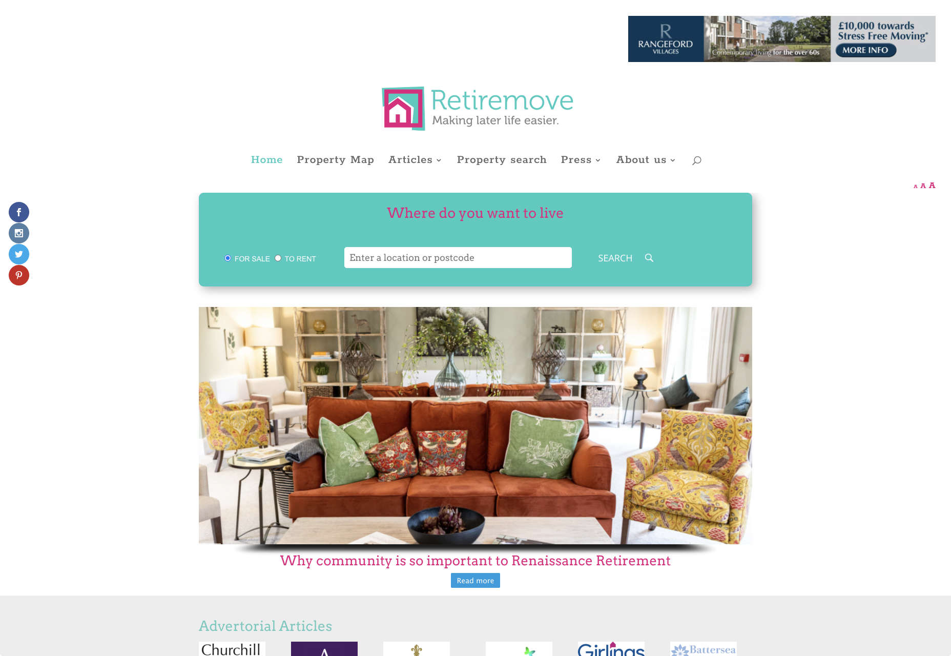
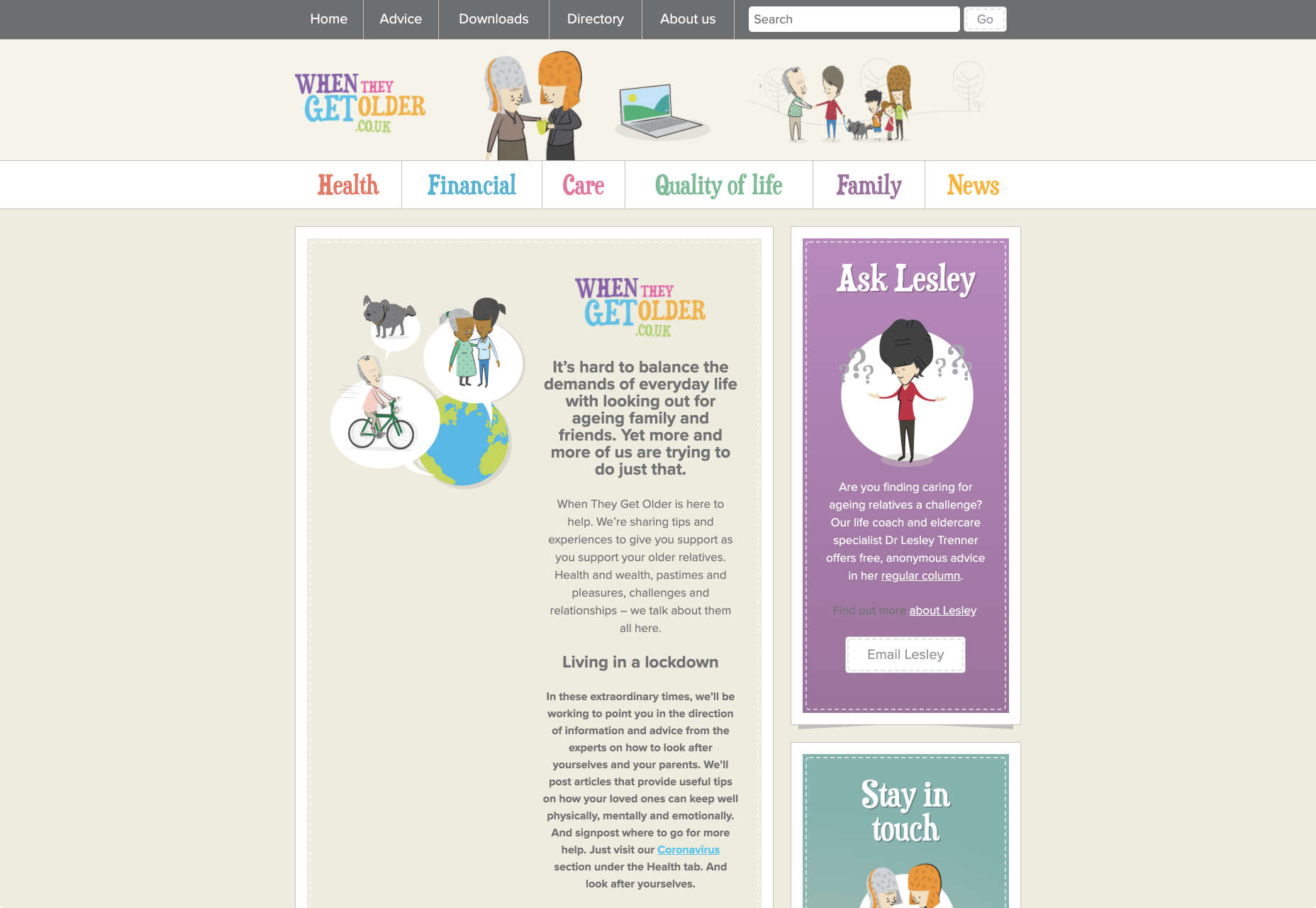
 It’s no secret that the senior population is growing. By 2030, people over the age of 65 are predicted to make up
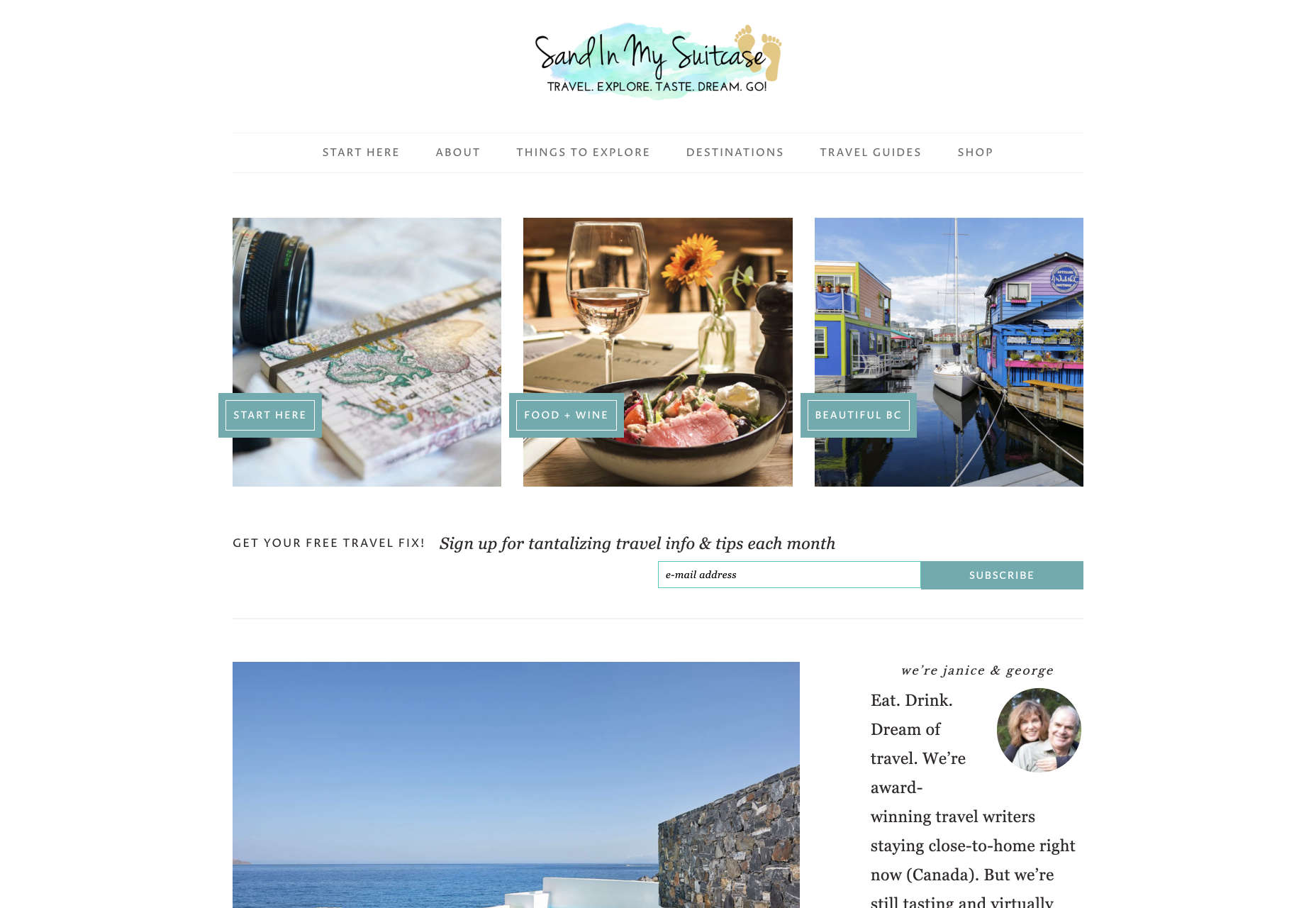

 Every week users submit a lot of interesting stuff on our sister site Webdesigner News, highlighting great content from around the web that can be of interest to web designers.


 Every week users submit a lot of interesting stuff on our sister site Webdesigner News, highlighting great content from around the web that can be of interest to web designers.


 Every week users submit a lot of interesting stuff on our sister site Webdesigner News, highlighting great content from around the web that can be of interest to web designers.
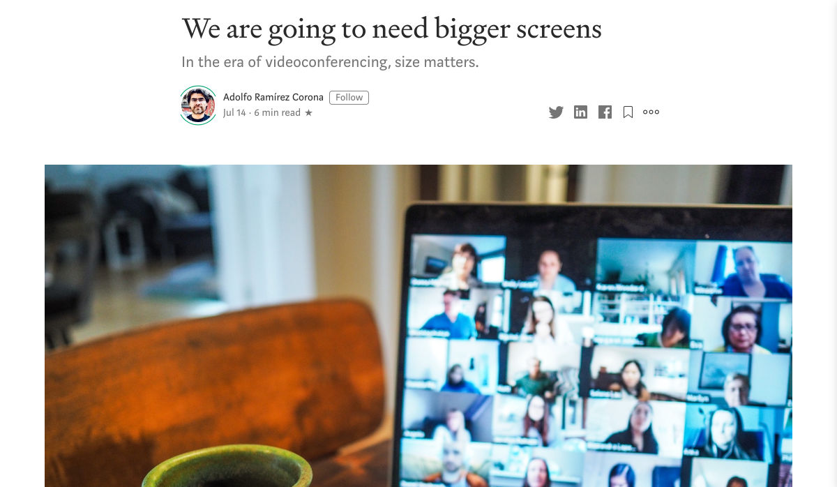


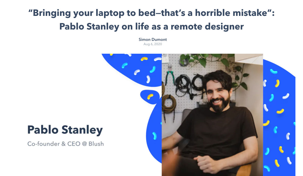
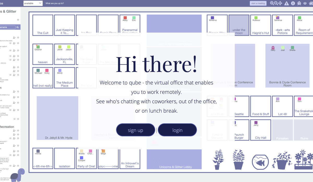
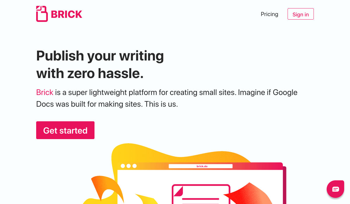
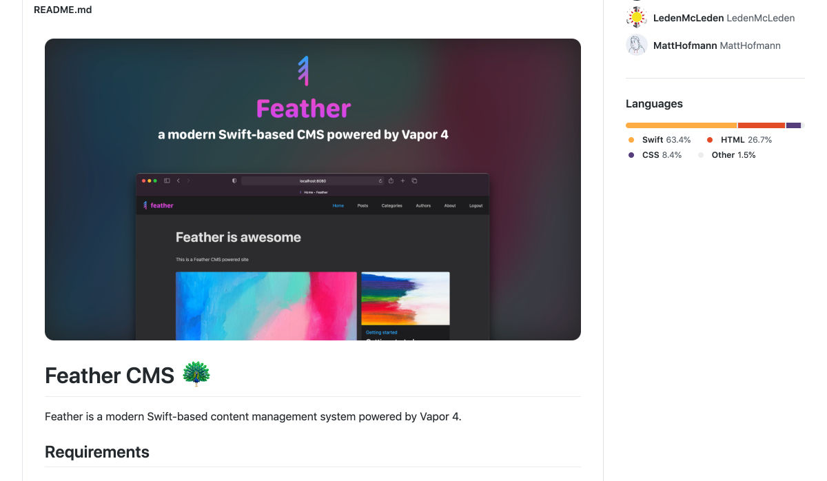
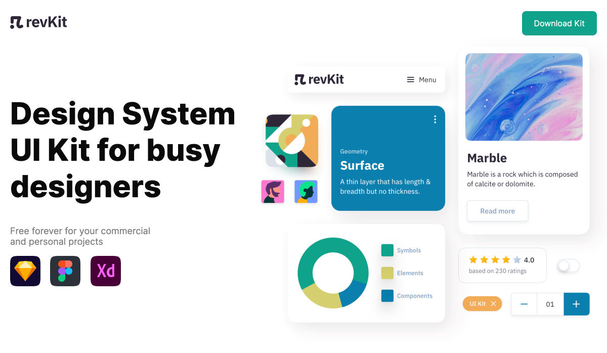
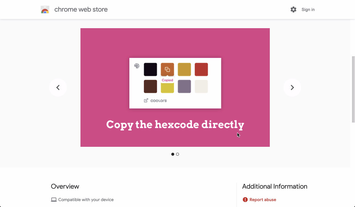
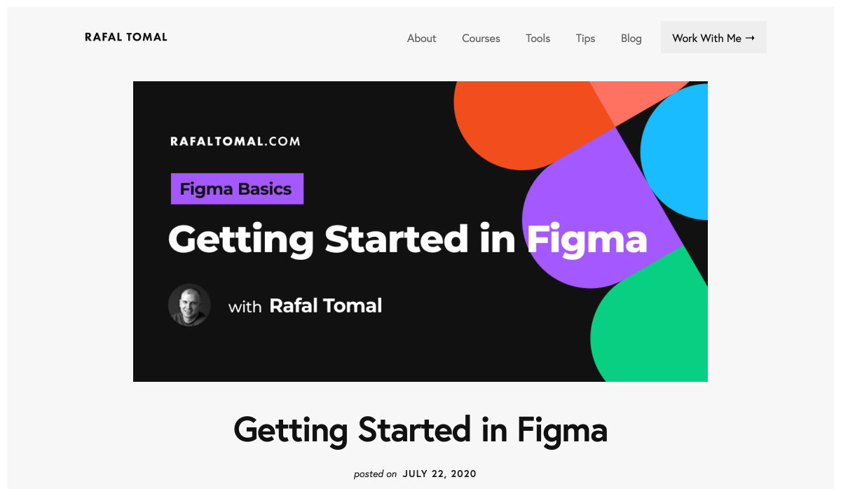
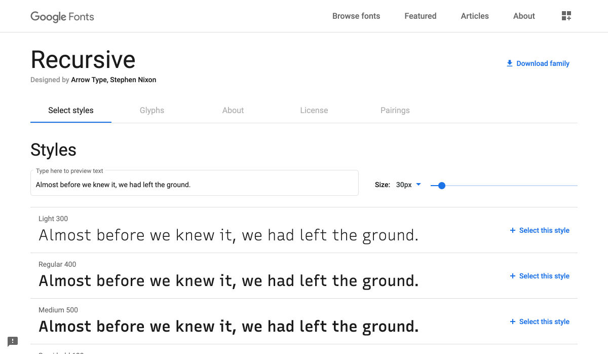
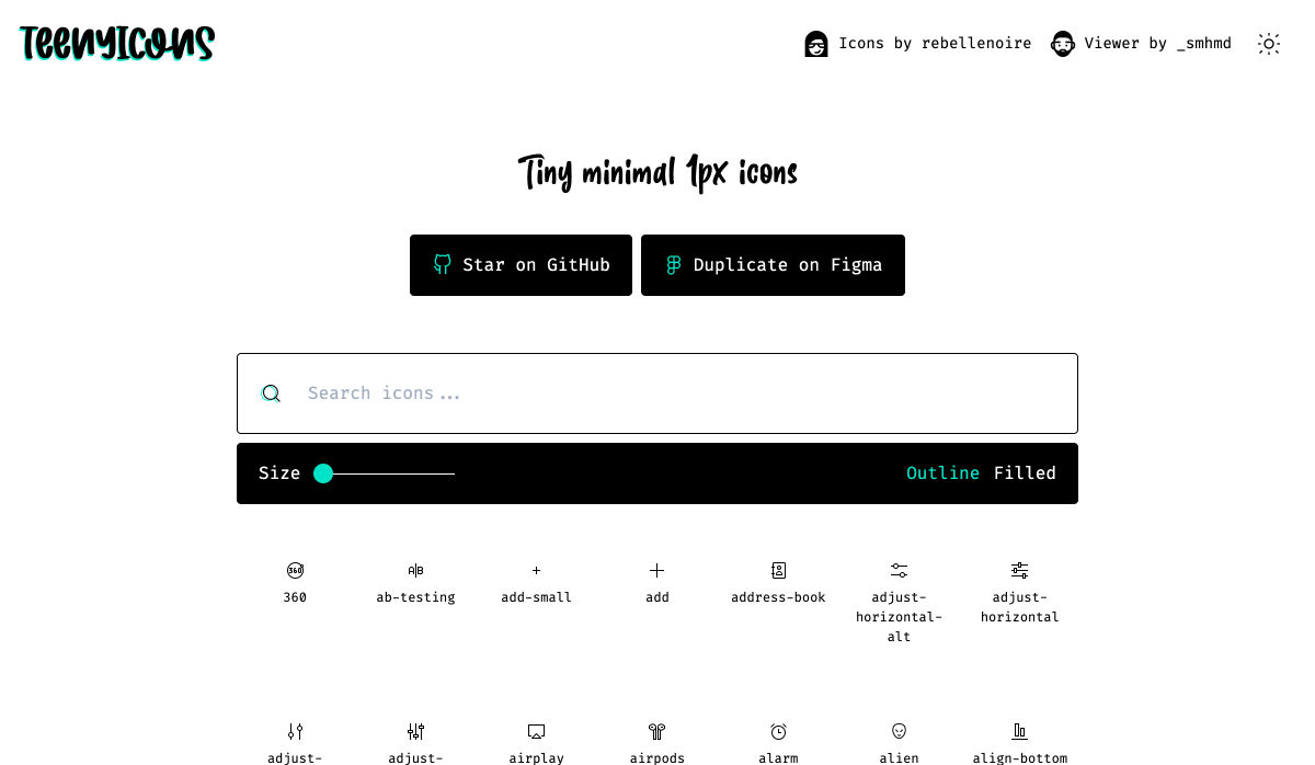
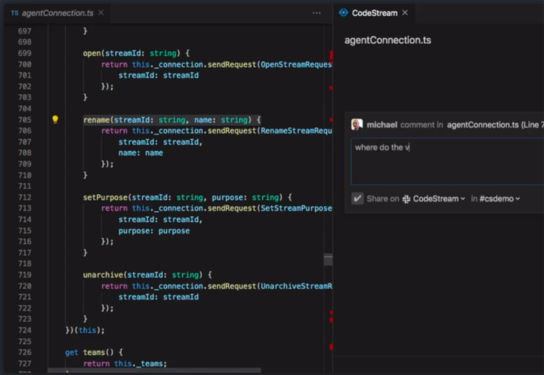
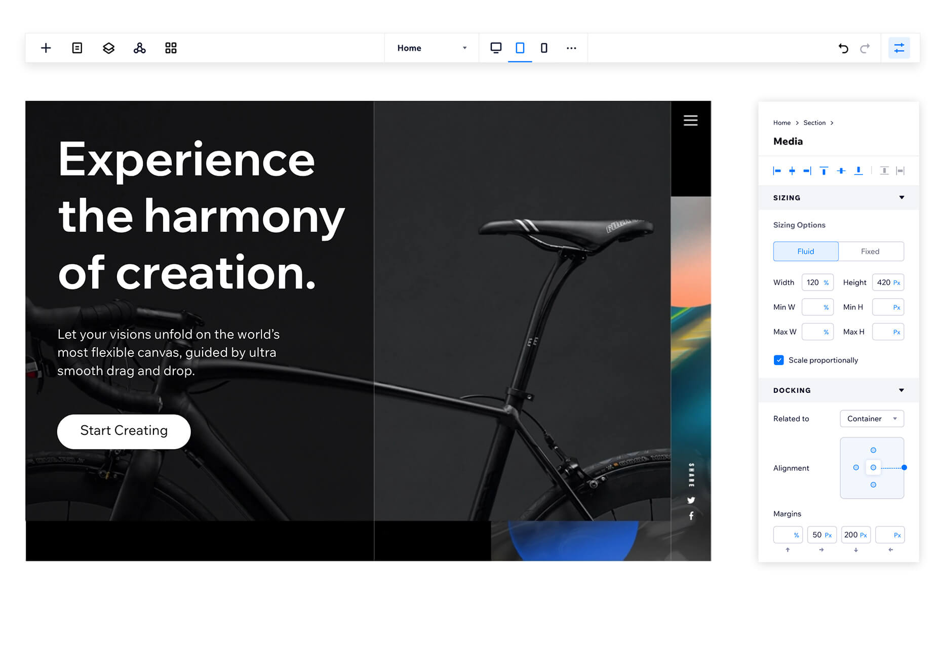
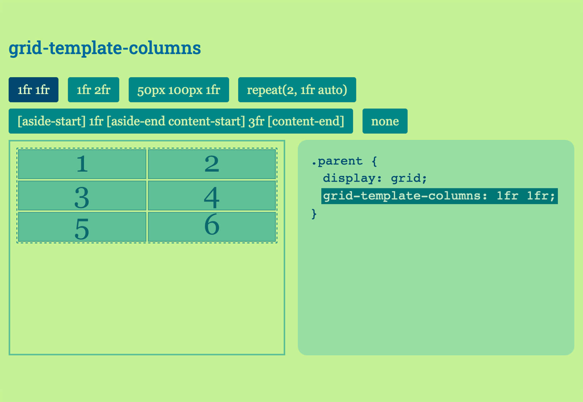
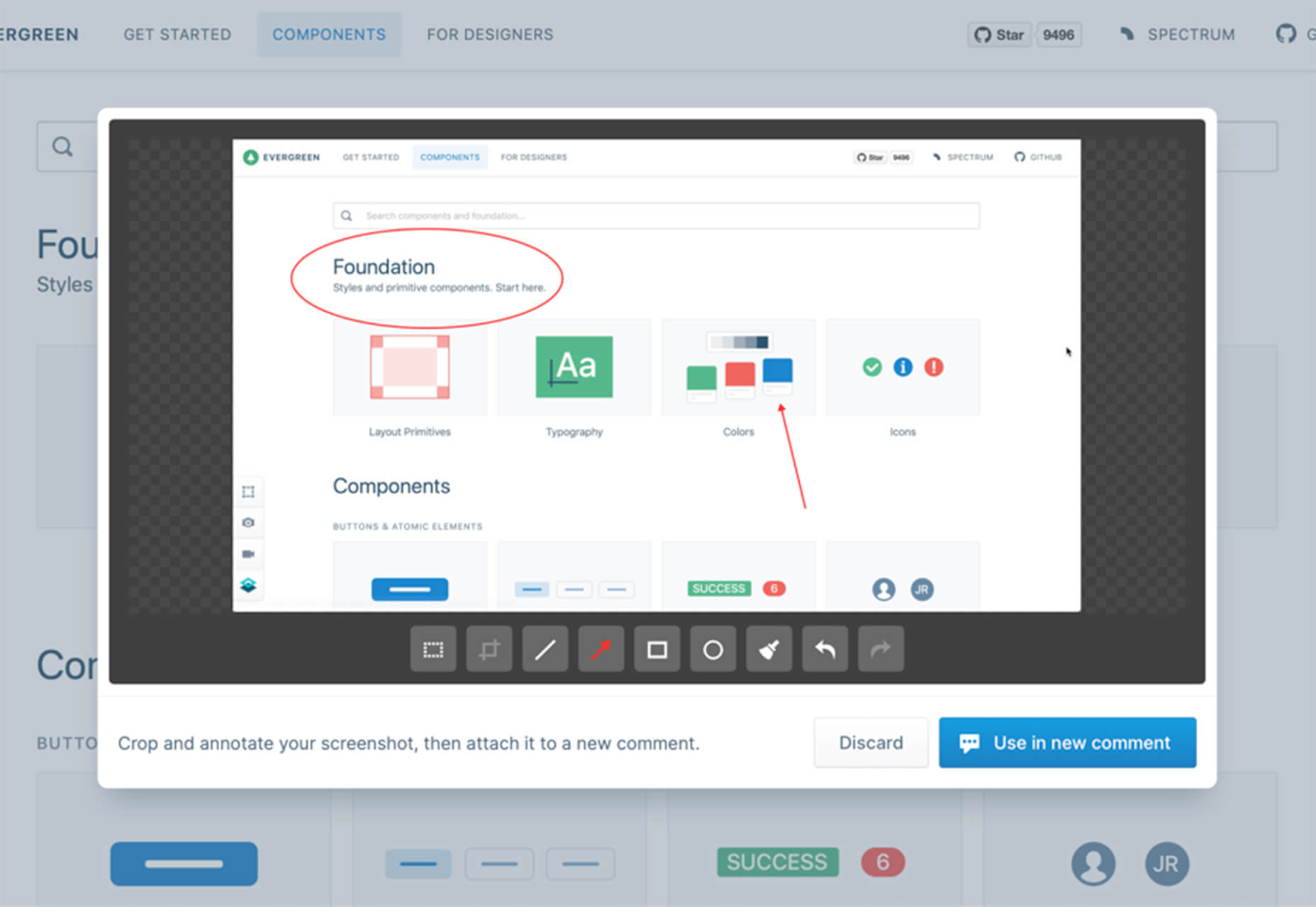
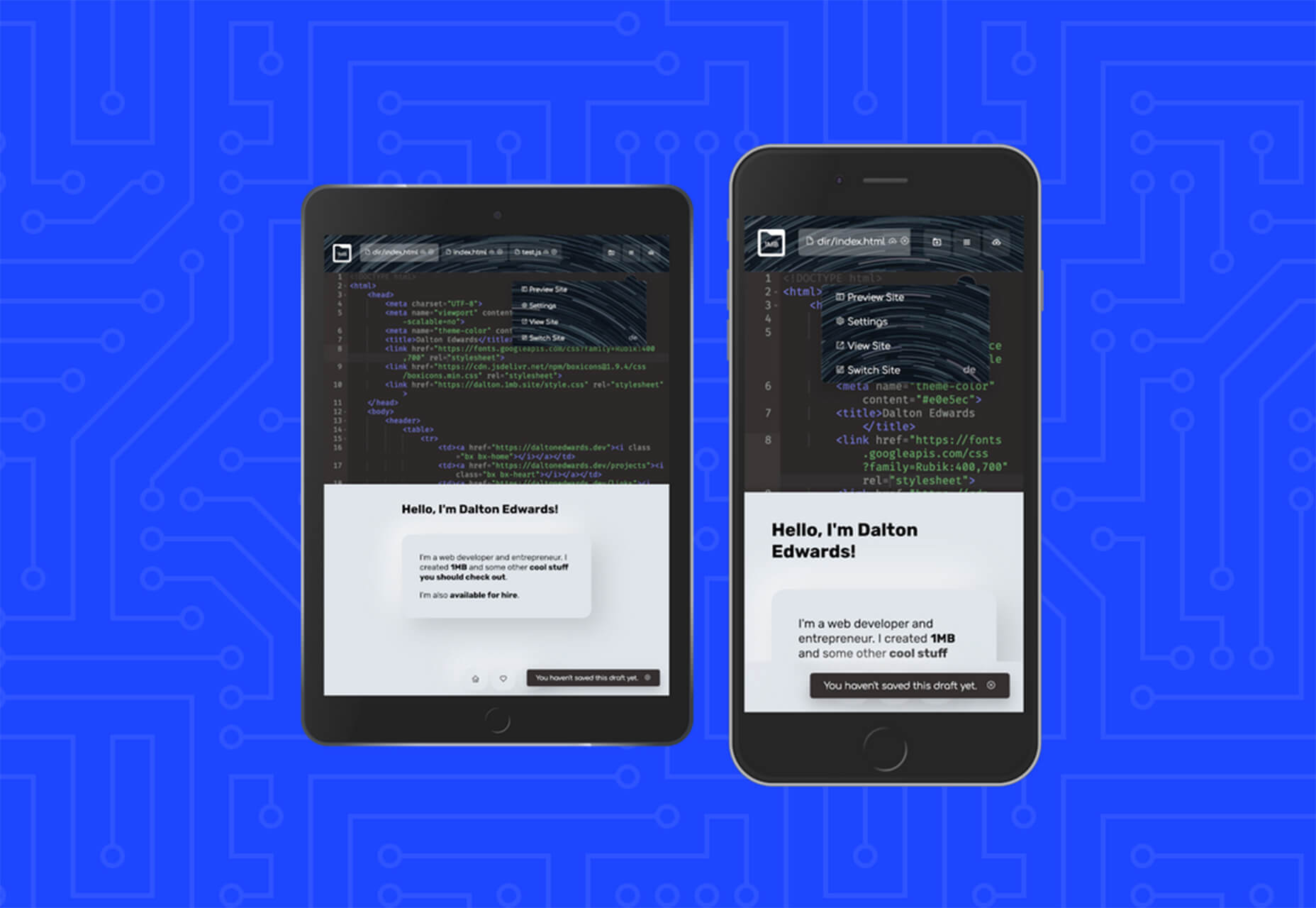
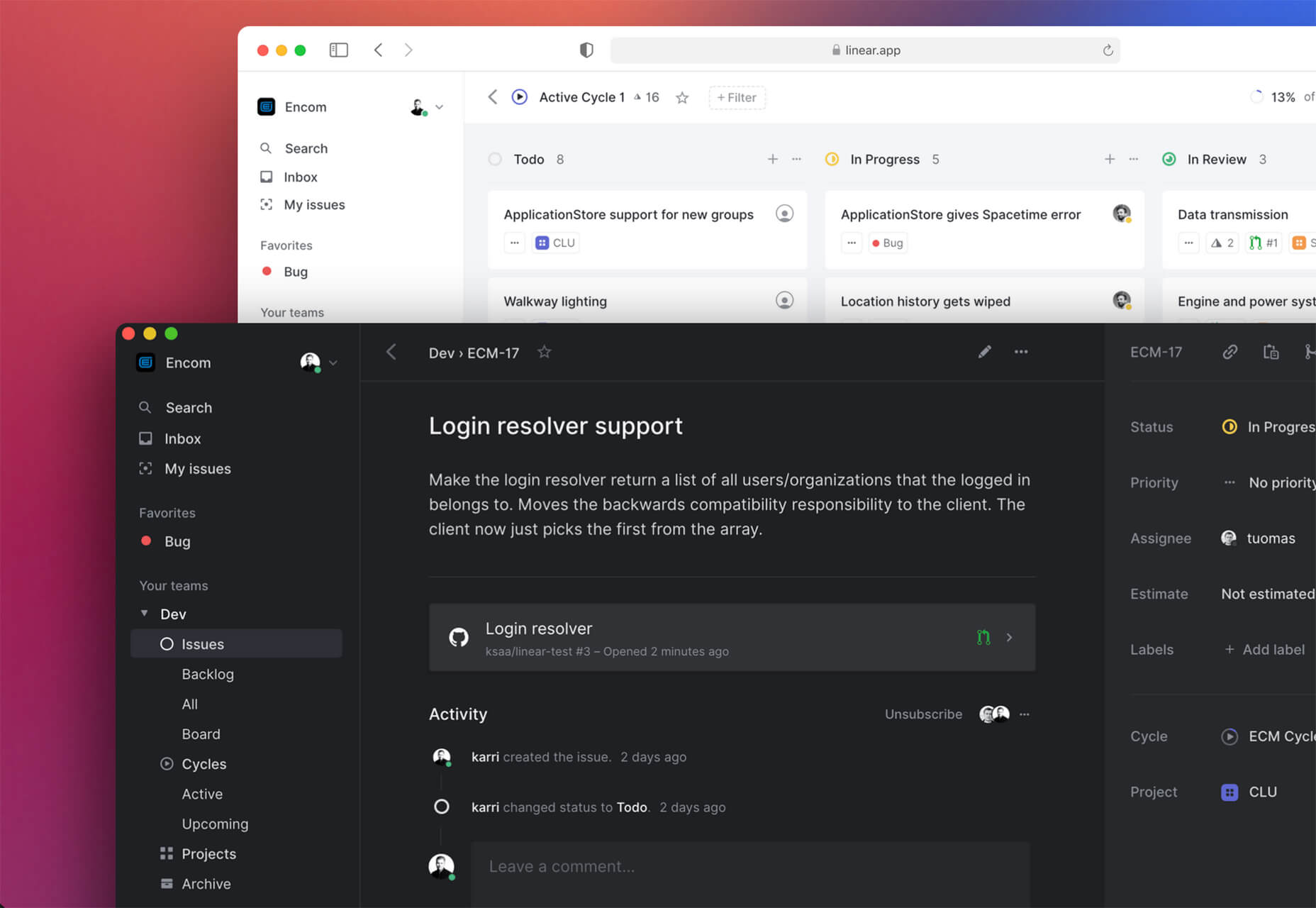
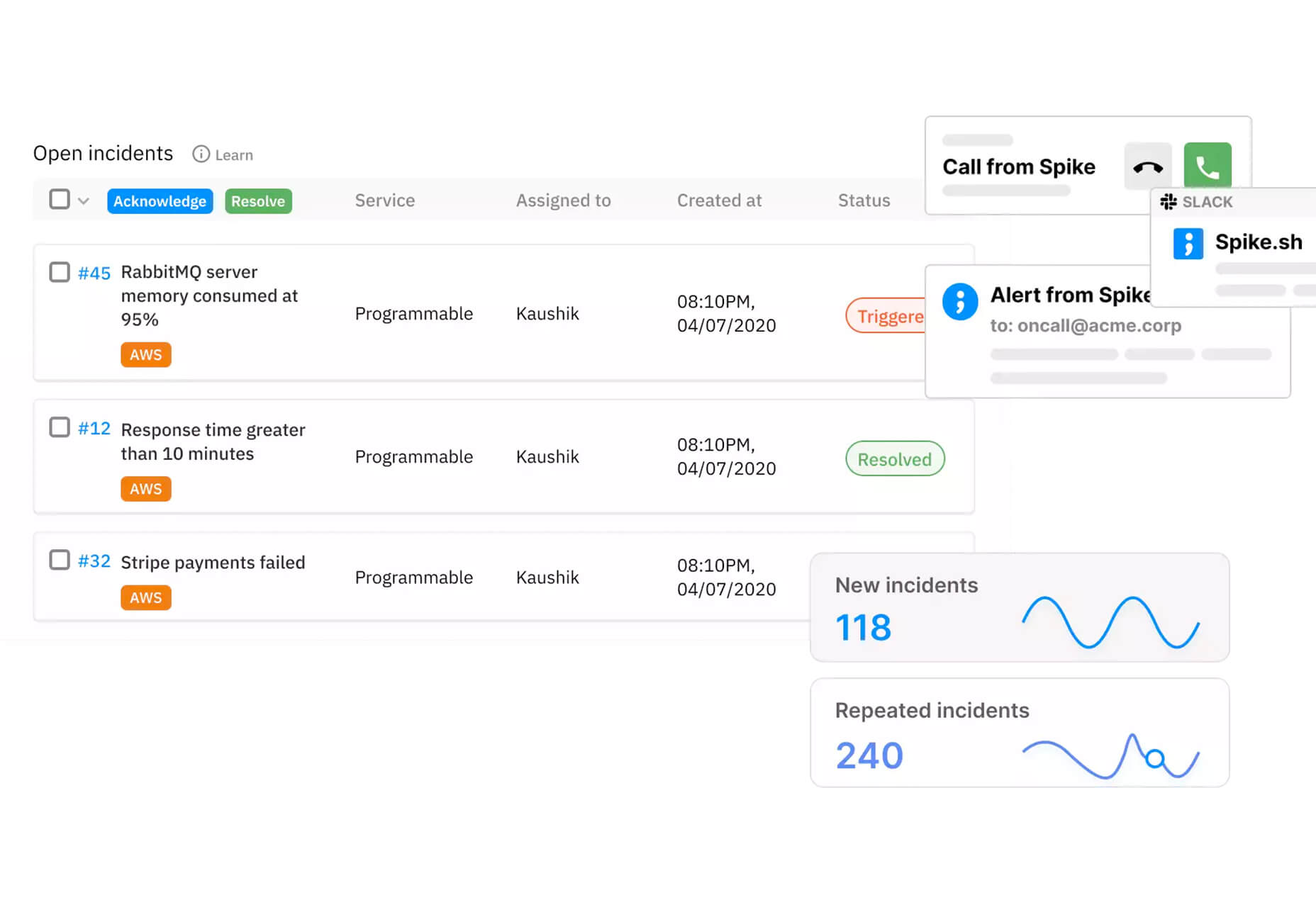
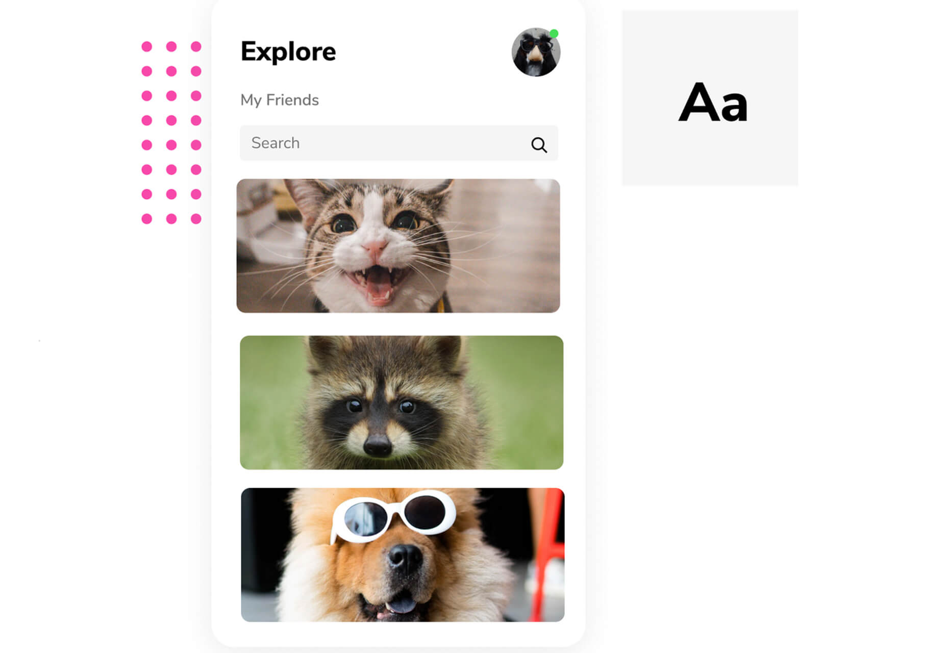
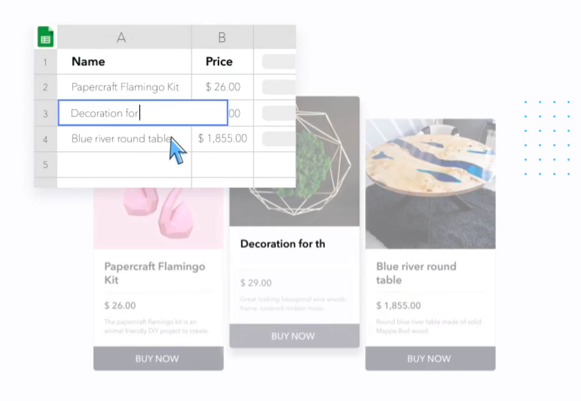
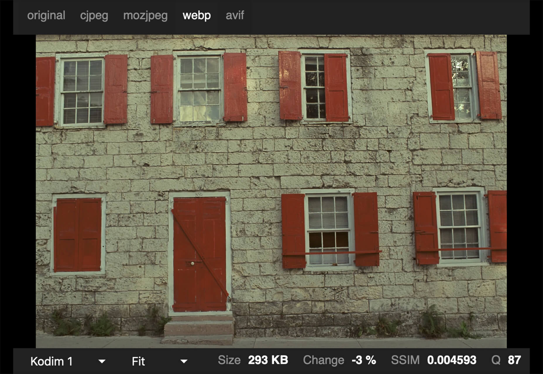
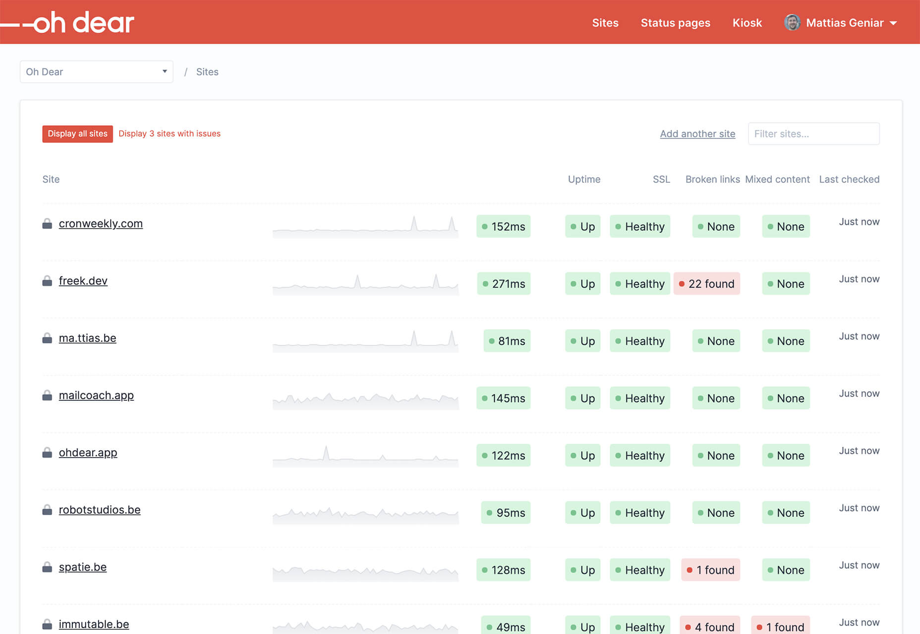
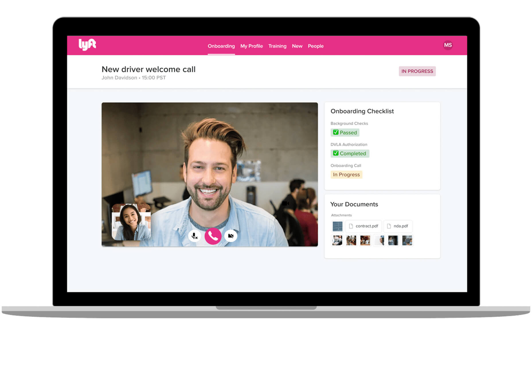
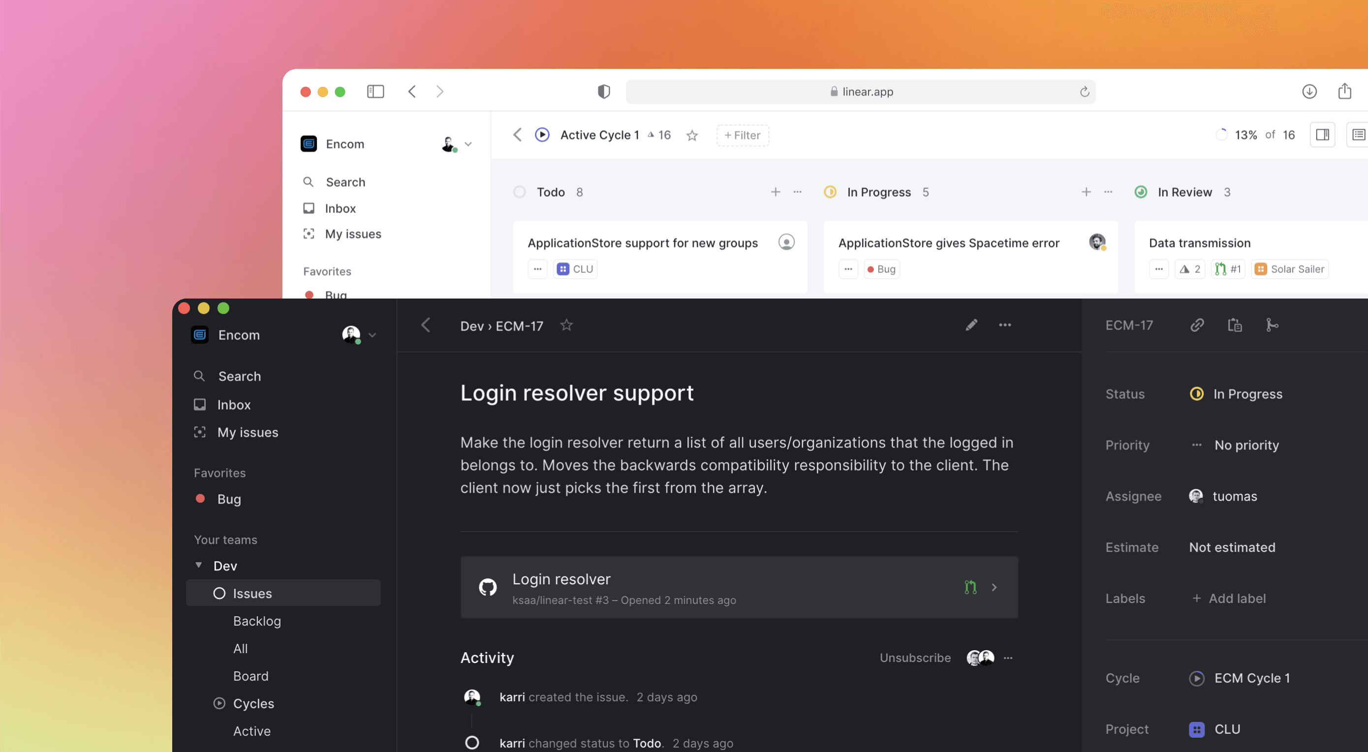 Some of the changes we are seeing with where we work are starting to pop up in the type of new tools made for designers and developers. More tools with remote collaboration as a key feature are increasing in popularity. (You’ll find a few of those here.)


