Articles

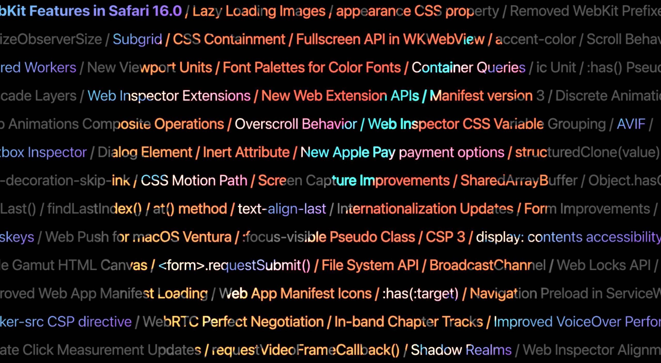
Apple has released an OS update. Packaged in with it is the latest version of Safari, 16.

Expected to be released ahead of next month’s macOS 13, Safari 16 is packed with updates, making it one of the most capable browsers available.

For web designers, the significance is the forward momentum in web technologies that enable freer design work and fewer hacks to achieve complex layouts. Little by little, CSS recommendations are being implemented to the point that using JavaScript for layout is rapidly becoming as unnecessary as it is disliked.

Some of this was announced in June in the Safari 16 beta. But a lot has been added in the last couple of months. So here’s what’s new in Safari 16 today.

CSS Container Queries

The most exciting addition to Safari 16 is CSS Container Queries.

It is hard to understate how in-demand this feature has been; if you imagine an edit button on Twitter that gifted you crypto every time you corrected a typo, you’d be getting close to how popular this feature is.

Until now, media queries have detected the whole viewport. And so, if you have an element like a card, for example, that needs to change at smaller viewports, you need to calculate the available space and adapt the element’s design accordingly. Unfortunately, this frequently gets out of sync with edge cases causing more than a few headaches for front-end developers.

Media queries are severely restrictive to modern layout methods like Grid that wrap elements automatically because there is no way to detect how the elements are laid out.

Container Queries solve this by allowing you to define styles based on the size of the actual containing element; if a div is 300px wide, the contents can have one design, and if it’s 400px wide, they can have a different design—all without caring what size the whole viewport is.

This is dangerously close to OOP (Object Orientated Programming) principles and almost elevates CSS to an actual programming language. (All we need is conditional logic, and we’re there.)

The latest versions of Chrome, Edge, and now Safari (including mobile) support CSS Grid. Even discounting the rapid decline of Twitter, this is way more exciting than any edit button.

CSS Subgrid

Speaking of Grid, if you’ve built a site with it (and if you haven’t, where have you been?), you’ll know that matching elements in complex HTML structures often results in nesting grids. Matching those grids requires careful management, CSS variables, or both. With CSS Subgrid, grids can inherit grid definitions from a grid defined higher up the hierarchy.

CSS Subgrid has been supported by Firefox for a while but is not yet part of Chrome or Edge. Until there’s wider support, it’s not a practical solution, and using a fallback negates any benefit of using Subgrid. However, its introduction in Safari will surely herald rapid adoption by Google and Microsoft and moves the web forward considerably.

CSS Subgrid is likely to be a practical solution within 18 months.

AVIF Support

AVIF is an exceptionally compact image format that beats even WebP in many instances. It even allows for sequences, creating what is essentially an animated GIF but smaller, and for bitmaps.

AVIF is already supported by Chrome, with partial support in Firefox. Safari now joins them.

AVIF support is one of the more valuable additions to Safari 16 because you’re probably already serving different images inside a picture element. If so, your Safari 16 users will begin receiving a smaller payload automatically, speeding up your site and boosting UX and SEO.

Enhanced Animation

Safari 16 introduces some significant improvements in animation, but the one that catches the eye is that you can now animate CSS Grid.

Yes, let that sink in. Combine Container Queries and animation. The possibilities for hover states on elements are tantalizing.

Safari 16 also supports CSS Offset Path — known initially as CSS Motion Path — which allows you to animate elements along any defined path. This enables the kind of animated effect that previously needed JavaScript (or Flash!) to accomplish.

Chrome, Edge, and Firefox all support CSS Offset Path; the addition of Safari means it’s now a practical solution that can be deployed in the wild.

Web Inspector Extensions

Announced as part of the beta release, Web Inspector Extensions allow web developers to create extensions for Safari, just as they would for Chrome.

Web Inspector Extensions — or Safari Extensions as they’re destined to be known — can be built in HTML, CSS, and JS, so the learning curve is shallow. It’s a good route into app development for web designers.

Because the underlying technology is the same as other browser extensions, anyone who has made a Chrome, Edge, or Firefox extension will be able to port it to Safari 16+ relatively easily. As a result, there should be a rapid expansion of the available extensions.

Improved Accessibility

Accessibility is key to an effective and inclusive web. Be like Bosch: everybody counts, or nobody counts.

When testing a design for accessibility, emulators don’t cut it. In my experience, Safari has some of the most reliable accessibility settings, especially when it comes to Media Queries like prefers-reduced-movement.

Further gains in this field mean that Safari continues to be an essential tool for QA tests.

Reduced Resets

Finally, I want to throw up my hands to celebrate the reduced number of non-standard CSS appearance settings.

For years we’ve been prefacing our style sheets with elaborate resets like Normalize, designed to undo all the assumptions browser developers make about design and the UI preferences of their engineers.

Safari 16 has reportedly “Removed most non-standard CSS appearance values.” How effective this is and how much we can rely on it given the other browsers on the market remains to be seen. However, like many of Safari 16’s changes, it’s a step towards a browser that’s on the developers’ side instead of an obstacle to overcome.

Source

The post Exciting New Features in Safari 16 first appeared on Webdesigner Depot.

Source de l’article sur Webdesignerdepot

Modals, a nifty little feature that allows you to display different messages at the top of your website, have been touted as extremely useful. Some even claim that they are helpful enough to completely replace the banner ads we all hate so much. But are modals in web design a UX disaster?

If you are unfamiliar with the term, a modal is a dialogue window appearing when a visitor clicks on a hyperlink or hover image.

Suppose you want to collect on-site subscribers or you want visitors to sign up for a freebie. In that case, you can use modals.

However, many web designers – and some website visitors – are against using modals in web design. The main argument is that it affects the user experience. But are modals in web design a UX disaster? Read on to find out.

What Do Modals Do?

Modals often appear as pop-up windows on a web page, requesting a visitor to take action. Most times, they appear following a click on a page element.

Also known as lightboxes, modals isolate the page’s main content. The user will have to complete the action requested by the modal or close it before reassessing the page.

Web designers use modals to capture a visitor’s attention. Since other page contents are inaccessible, a visitor must interact with the modal.

Cons Of Modals In UX

While there are different cons of modals in UX, they all sum up to one con – interruption. When modals appear, they interrupt whatever the user is doing.

Unlike regular pop-ups, users cannot simply ignore the modal and continue browsing. As a result, modals demand immediate attention. 

A user may be interested and decide to interact with the modal. However, if the modal’s content differs from the page’s, the user could forget what they were doing after interacting with the modal.

Furthermore, sometimes modals require action related to information on the page. For example, suppose the user wants to review the information before taking action. In that case, they’ll have to close the modal since the main page is inaccessible.

Statistics show that up to 82% of users dislike pop-ups. Most website visitors aren’t knowledgeable about the technicalities of web design. As a result, they won’t be able to differentiate between regular pop-ups and modals.

After all, modals are a type of pop-up. Some users may consider modals worse since they darken the page’s primary content, making it inaccessible.

Furthermore, people want to visit a website and get what they want immediately. Hence, time is significant. Therefore, modals that require actions that take time can make a website lose visitors.

With all of these cons, you can understand why many web designers say modals are a UX disaster in web design.

Can Modals Be Useful in UX?

In some situations, modals are helpful, and they can improve UX. Many web designers swear on the usefulness of modals, and it’s not difficult to understand why.

Firstly, modals can help simplify a website’s content. For example, a user can immediately exit the page if your website is relatively complex, with lots of content and elements.

You can use a modal to explain the content on the page so that the user doesn’t get confused. Perhaps the modal can display when the user clicks on the back button. The modal can highlight the most critical content on the page and tell the user what to do next.

Secondly, modals are invaluable if you must capture your user’s attention. For example, perhaps you want to display a warning or pass any crucial information that users must know before they continue browsing.

As mentioned before, a user can easily ignore a pop-up, especially if it opens in a new window. However, with modals, the user must at least view the content before they proceed.

Thirdly, a modal can make a web page easier to navigate. It sounds ironic considering the cons, but it’s true if properly implemented. Rather than packing different elements on a web page, you can set some to display as modals.

For example, you can have a page with just text to improve readability. Then, users can click to view visual elements like images and videos as modals.

How To Use Modals the Right Way

Using modals correctly is key to ensuring they don’t negatively affect UX. Here are some ideal situations when you can use modals:

1. Display Warnings

Using modals to give users crucial warnings is ideal, especially if their subsequent actions have serious consequences.

For example, most websites display modals when users click the delete button. Deletion is always critical because, in most cases, it’s irreversible.

A practical example would be an eCommerce website where a user opts to delete items from their cart. You can use a modal to ask the user to confirm before deleting.

2. Input or Collect Information

Modals are effective in prompting users to input information. Sometimes, users must enter specific details before they continue browsing.

A practical example would be a review site where a user wants to submit a review. Before submitting the review, you can use a modal to request the user’s name and other necessary information.

3. Simplify Navigation

As mentioned before, modals can simplify a complex website. In addition, it will help a user navigate better, which is a UX boost.

A practical example would be a news site with many stories and updates. You can use a modal to highlight the day’s trending news stories so that users can visit the web pages with one click.

Conclusion: Are Modals a Disaster in UX?

In conclusion, modals affect a site’s user experience since visitors must interact with them. However, it doesn’t always have to be a negative effect.

Modals become a UX disaster in web design when wrongly used. However, if you follow good practices, modals can improve your website’s user experience.

Generally, only use modals when necessary and in a way that won’t frustrate the users.


Featured image by Freepik.

Source

The post Are Modals In Web Design A UX Disaster? first appeared on Webdesigner Depot.

Source de l’article sur Webdesignerdepot

The purpose of a website is to reach new customers and keep current ones engaged. Therefore, customer-first should be at the top of your list for design features. After all, without your clients, your business won’t grow or succeed.

Customer-first has been a buzzword for a few years now. In a nutshell, it’s easy to imagine what customer-first design means. The needs of consumers come before anything else. However, the concept isn’t quite as simple in practice. A lot of nuances enter the equation.

Just what does it mean to have a customer-first web design? What are the must-haves to reach users on their level and keep their attention for the long haul?

Embracing quality customer experiences has driven loyalty for as long as anyone can remember. However, we now live in a time of uncertainty, and when people leave companies on a dime if they’re dissatisfied with any aspect. So you must hit the high notes on every song – your website is your purest online persona and must engage users and keep them entertained.

Whether you embrace causes that matter to your customers and share information on them or tweak your design to meet accessibility guidelines, many factors come into play with a customer-centric design.

In a recent report, researchers found that about 88% of company leaders feel customer engagement impacts revenue. You can’t control every variable, but you can ensure your website hits all the strong points for a customer-first web design that grabs them and keeps them on your page.

Here are our favorite tips to create a customer-first approach. You may already be doing some of these things. Pick and choose what makes the most sense for your business model. Even small changes can have a big impact.

1. Know Your Customers

Before creating a website centered around your customers’ needs, you must know who they are. What are the demographics of your typical clients? Survey them and find out what their needs and expectations are. How can you best help them?

You may also want to survey them about your website. What’s missing that might help them? Is there anything they love? What do they hate? The more you know, the better your design can match their expectations. Create buyer personas based on their preferences.

At the same time, buyers will sometimes say one thing but actually feel another way. No one is quite sure why people do this when being surveyed. One way around that issue is to do some A/B testing to see how they actually feel about various changes. Do they respond the way you thought? What other adjustments need to be made?

2. Find the Right Color Palette

Different industries trend toward various hues. For example, businesses in the banking industry trend toward blues and occasionally reds. Blue elicits trust from users and has a calming effect. On the other hand, the fashion industry might tap into brighter shades, such as lime green. Think about what colors people expect in your industry, and then find your color palette.

Each hue has its emotional impact. For example, red is a color of power and can elicit excitement in the viewer. Choose your shades accordingly to get the most emotional punch possible.

3. Accept Feedback

One of the best ways to improve your site over time to match the needs and preferences of your audience is by allowing feedback. Add reviews, place a feedback form in your footer, and even send out requests for feedback to your mailing list.

It’s also a good idea to find a mentor who has been successful at running a business. Ask them to look at your site and give you advice. You might also enlist the help of a marketing professional.

4. Stick With the Familiar

Have you heard of Jakob’s Law? The rule of thumb states that people prefer common design patterns they’re most familiar with. So when they see a pattern they know, such as a navigation bar layout, it boosts their mood and improves their memory of the site.

When making edits, don’t make significant changes. Instead, implement minor adjustments over time to give your followers a chance to acclimate to the shift.

5. Cut the Clutter

If you want users to feel wowed by your page and engage, you have to limit their choices. Add in too many options, and they may not know where to go first.

Start by choosing an objective for the page. Cut anything that doesn’t point the user toward the goal. Ideally, you’d have a little info, an image, and a call to action (CTA) button. However, this may vary, depending on where your buyer is in the sales funnel and how much information they need to decide to go from browser to customer.

6. Choose Mobile Friendliness

Recent reports indicate about 90% of people use mobile devices to go online at times. With phones gaining greater capabilities and 5G bringing faster speeds to communities, expect people to use their mobile devices even more frequently for internet browsing.

Making sure your site translates well on smaller screens makes sense for your company and for your customers. Be sure to test everything. Click through all links. Fill in forms. Ensure images and text auto-adjust to the correct size, so people don’t have to scroll endlessly.

7. Make Multiple Landing Pages

Like most businesses, you probably have several buyer personas as you segment your audience. Don’t just create a single home page and expect it to fulfill the purpose of every reader. Instead, create unique pages for each persona to best meet their needs.

Make sure each landing page speaks in the natural language patterns of your specific audience. Think about the unique needs of each group. How do their pain points differ? How can you best meet their needs?

8. Keep Important Info Above the Fold

People are busy. They work, have families, and might visit your site on the 15-minute break they get in the afternoon. Most consumers want the information they need to decide and don’t want to dilly-dally around with other things.

Place the essential headlines and info they need above the fold, so they see it first. Make it as readable as possible by using headings and subheadings. Add in a few bullet points. People also absorb information easier in video format, so add a video highlighting your product’s or service’s main benefits.

You should also place a CTA button above the fold if it makes sense for your overall design. Keep in mind people may have visited and already read some of the information. Some users return just to sign up and want to find the CTA quickly.

Step Into Your Customers’ Shoes

Look at your site through the eyes of your audience. What works well? What needs to be adjusted? Over time, you’ll develop a customer-first web design that speaks to those most likely to buy from you. Then, keep making changes and tweaking your site until it hits the perfect balance for your customers.


Featured image via Freepik.

Source

The post What Customer-First Web Design Looks Like first appeared on Webdesigner Depot.

Source de l’article sur Webdesignerdepot

Every day design fans submit incredible industry stories to our sister-site, Webdesigner News. Our colleagues sift through it, selecting the very best stories from the design, UX, tech, and development worlds and posting them live on the site.

The best way to keep up with the most important stories for web professionals is to subscribe to Webdesigner News or check out the site regularly. However, in case you missed a day this week, here’s a handy compilation of the top curated stories from the last seven days. Enjoy!

Advanced CSS Tricks that You Have to Know

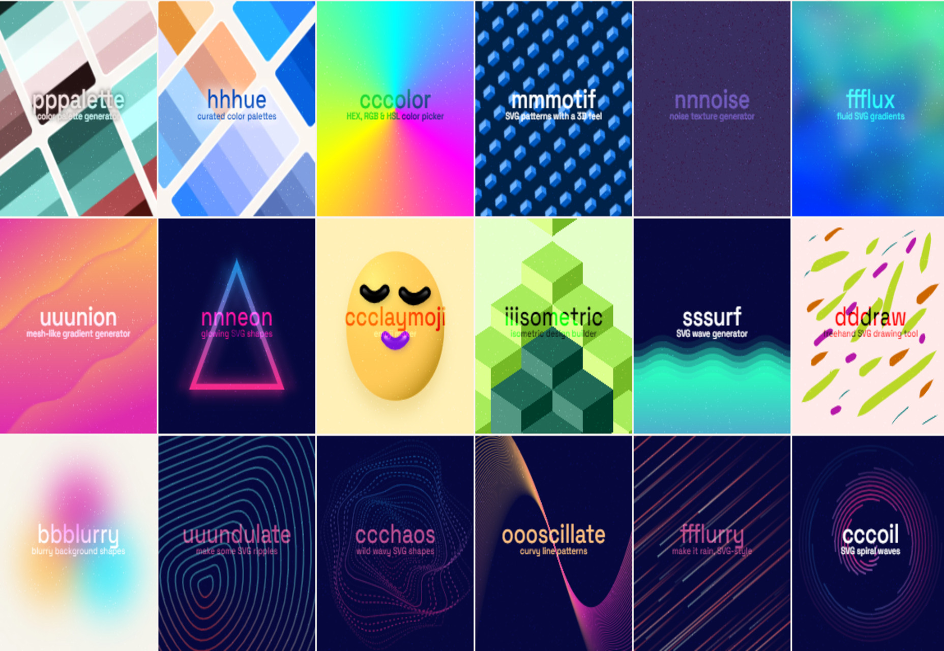
Nnneon – SVG Generator for Futuristic-looking Glowing Shapes

The Best New CSS Features for 2022

Avatarg – Generate Beautiful Types of Avatar in One Click

I Just Spent $35,000 on a Domain. Here is Why!

10 Useful CSS Layout Generators (Grid & Flexbox)

Fffuel – A Mighty Collection of SVG Generators

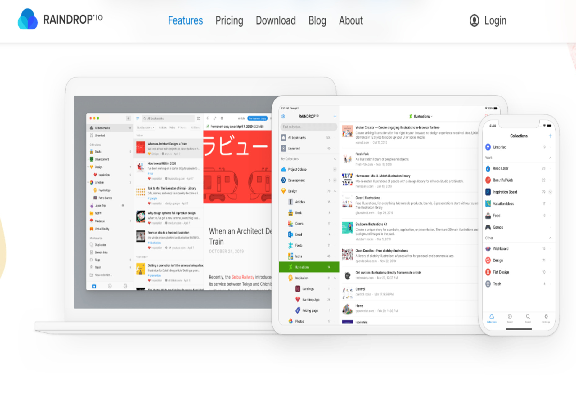
Raindrop.io — All in One Bookmark Manager

My Wonderful HTML Email Workflow

3 Essential Design Trends, July 2022

My Dumbest CSS Mistakes

Source

The post Popular Design News of the Week: June 27, 2022 – July 3, 2022 first appeared on Webdesigner Depot.

Source de l’article sur Webdesignerdepot

Personalized marketing is when you attune your marketing efforts based on customer data. This data can be anything from the first and last name to purchase intent, concerns, and history.

Personalized marketing has revolutionized the way businesses market their product and service to their audience. It brings value to people’s lives, spiking the sales graph for brands and businesses. So it’s a win-win situation for both the company and the consumer.

Even big companies do this for their campaigns. They do so because it gives them great results and ROI for their marketing initiatives. If these multinational businesses do this, it’s a good idea to incorporate this strategy and learn from a top resource on digital marketing.

This article aims to explain every nook and cranny of personalized marketing. By the end of this 5-minute read, you will know the impact of personalized marketing on our lives. And how you can integrate this into your marketing strategy to benefit your business.

What Is Personalized Marketing?

Have you ever encountered a business that knows what you’re going through? Or did you see an ad online that you closely relate to? Chances are, you were one of the target markets of those marketing materials. And if you could associate yourself with the ad, their marketing strategy worked.

That is what personalized marketing does to your audience, market, or particular demographic. This style of advertising leverages personalization in your marketing materials. The details of your marketing content are tailored to a specific audience and address the issues or real-time problems of a particular segment in your market.

Personalized marketing has become popular because more people demand it from businesses. Once the people have experienced what it felt like, they want to feel more of it.

To objectively see the demand for personalization, here are some statistics to back it up.

Accenture reported that 91% of consumers are likelier to shop with businesses that offer them relevant content. This shows that the right product recommendations can increase the chances of shopping with you.

Salesforce mentioned that 66% of consumers expect companies to understand their individual needs. This statement proves that a generalized way of marketing isn’t as effective as before. The consumer mindset has already developed, and they demand more personalization from businesses.

A striking piece of data from Statista showed that 90% of consumers in the US find the idea of personalization appealing. If that figure is accurate, almost all businesses should start incorporating this into their strategies. There’s no reason for them not to try this out.

Given the high positive demand for personalized marketing, it’s no secret why more and more businesses are doing this. However, not every company out there is doing this right. A wrong way of doing this can bring a loss of clients and a negative ROI.

To help you go on the right track of using personalization in your marketing, read up on the next section of this article.

Know These 6 Tips To Correctly Do Personalized Marketing

You’d agree that knowing your customer’s first and last name is essential. But with the dynamically changing strategies, personalized marketing is going beyond that. It’s actually about understanding what your targeted consumers need, merging with a way to convey the message that your business is the solution.

To help you achieve this, take note of the things below:

1. Leverage Your Customer Data

The foundation of personalized marketing is laid on customer data. The best marketing professionals and strategists emphasize gathering relevant data if you want to scale. Excellent digital marketing courses will teach you that customer data will help you build a solid foundation for your content and campaigns.

Consumer behavior has always been the most important detail for target marketing. With every click, it has become easier to gather data about individual customers, their interests, hobbies, purchase history, buying behavior, and more.

You’ll be able to get this information if you’ve practiced data management and collecting customer data throughout the years of your operation. However, it’s not too late to begin if you haven’t started with this yet. There is a lot of marketing automation software that aids marketing teams in doing this. For example, many businesses use lead scoring software to gain insight into their clients’ needs and categorize them appropriately.

For your personalization efforts, you can use questionnaires, surveys, and feedback forms to capture personal data on the internet. A customer will happily fill out a survey form if a reward in return entices him. This reward can be in any form– a voucher, a first buy discount, free shipping, or more.

This initiative will help you get more data in a shorter time frame.

2. Understand Your Customer’s Needs

Hoarding data will be a complete waste of marketing efforts, capital, and efficiency if you do not extract consumer behavior from it. When you have access to a rich set of data, you have the privilege to understand your customers’ trending needs deeply. After gaining insights from the data, create a marketing strategy based on those findings to target your audience.

Doing this doesn’t just apply to B2C; it also works for B2B companies, which is why the demand for custom software development, tailored services, personalized packages, and B2B data providers have been on the rise in these recent years.

It is a two-way road. While you are on the lookout for your target market, at the same time, the customers expect businesses to know what they need. The market you’re currently serving expects you to know what products or services are fit for them.

So this is where it gets crucial: you have to dig deeper into your niche and find the specs of your audience’s needs. Having a general idea about the needs of your target audience and personalized marketing usually don’t go harmoniously.

Planning a better-personalized marketing strategy will not be a piece of cake but will be much more rewarding for every aspect of your business. May it be sales, return on investments, customer relationships, or personalized marketing campaigns.

3. Personalize Every Stage Of The Customer Journey

The first rule of business is convincing the customer that you are their best friend. Now that you know what they want, you pledge to provide them with whatever best you can. Limiting personalization to marketing is not the solution. You have to be vigilant in meeting these individual requirements at every stage. And remember that consistency is the name of the game. That is how you bring your business into the running.

You can integrate CRM automation, email marketing tools and deploy other content marketing strategies to help make this process a lot simpler. Personalized live chat and chatbots, such as those offered by ThriveDesk, allow businesses to personalize their offerings and build their brand reputation.

As a customer, my requirement would be reading content, browsing, and experiencing products that would hit home. A personalized experience is what every consumer demands. And this is what makes them want to go back and do business with you again.

By creating helpful and relevant content, recommending the right products to them, and giving out convenient payment options, you are setting your business apart from the rest. Doing this allows you to have personalized every touchpoint that your customers do with your business.

4. Present In An Engaging Way

Consider customer engagement as absolutely necessary. Having the best data set and knowing what your customers want is not enough. In the competitive space of business and marketing, everyone is trying to get the attention of one another. And this is what you are supposed to do. This helps in building consumer-brand relations.

When a consumer engages, meaningful things happen. Engaging content pushes the consumer through the funnel and hence promotes conversions. Your content should be creative and eye-catching.

Engaging content blended with personalization boosts the brand experience. Increased loyalty, trust-building, and improved customer experience enhance the conversion and sales speed.

A great way to use personalization in an engaging manner that most businesses overlook would be through exit-intent popups.

5. Be Where Your Customers Are

This is an element that some businesses miss out on. They have created excellent social media marketing content but only distributed it on the wrong channel. For personalized marketing to be effective, it needs to be seen by people.

Are you questioning your marketing techniques because all you see is stagnancy? You have set up an engaging online store on Shopify or Wix, collected all the relevant data, your content is engaging enough, and your marketing strategy is top-notch. But you are still unable to reach your clientele.

You start wondering what you are missing out on. Your content and your strategies will not be prolific if you are on the wrong channel. Remember: the message of your content has to reach the right people for it to be effective.

Should you be on social media? If so, which one? Do you get more traction with email campaigns? Or do you have more engagements on forums?

Find out where your market is, then spend your focus there. Now the next step is how to know where they spend most of their time?

This is where we go back in the loop. And hence we again emphasize that data collection is the foundation of any great marketing strategy.

6. Improve Marketing Content

Don’t rest on your laurels when you’ve gotten everything down to a tee and have attained your desired marketing analytics behind your personalized marketing content. Always think of ways how you can improve.

Evolving at every step will keep you in the running. Don’t be misguided into thinking that your work is done if you feel like you have reached the pinnacle. Keep looking for ways to get better. Set bigger goals and status for your business.

Always go back to the drawing board and brainstorm with your team on how you can change and strive with the dynamically changing world and mindsets. In the end, all you want is to build better relationships with your customers, new and existing.

For enhanced productivity, your marketing team should always look for new strategies. This is how fresh and great marketing ideas are made.

See How You Can Benefit From Personalized Marketing

Irrelevant information can waste energy and time for both customers and the business. Personalized marketing hits the bull’s eye 99% of the time. It brings immeasurable value to the company as well as the customer.

Here are some of the top benefits of personalized marketing:

1. Better Engagement

The first target personalized marketing aims at is grabbing an individual’s attention. And this results in better engagement eventually. If you are presenting your customer with something that wows them, needless to say, it will grab their attention.

This will help bridge the gap between your customer and your brand. Identifying customers’ needs and then giving them what they want will help improve customer interaction with your brand.

It can even be enough for them to follow your call to action. The next thing you know, they will be checking your website, signing up for a list, or even purchasing a product right then and there.

2. Higher Conversions

Are you there for your customer at the right time and place? One-on-one marketing provides easy solutions to customers because you hit them with just what they are looking for at the right time.

When potential customers realize that you understand what they’re going through and provide the solution, most won’t hesitate to try your business out.

Personalization isn’t just focused on content. It can also be integrated into your processes. This results in aiding the increase of higher conversion rates.

3. Improved Customer Experience

Offering personalization will significantly improve the user experience. Once you provide the products, services, and content that meet their needs, their opinion of your business automatically improves.

Considering the statistics about personalized experiences, it is evident that consumers demand personalization strategies from companies. And if you offer such an experience, you increase the chance of making them do more business with you. Personalization helps businesses in reducing cart abandonment rates, better customer journey, increased customer satisfaction, and many more.

4. Customer Retention

Retaining persisting customers is equally important to your business as bringing new ones. Most businesses face low customer retention. It’s also a factor that some companies overlook. You must understand that it’s not all about converting prospects into paying customers. Your focus should also be on retaining those customers to make them loyal advocates of your brand.

One of the major benefits of consistent personalization is an improved customer retention rate. Consumers tend to stay with a business that understands their needs and provides solutions to their problems.

Once you can transfer a customer to a loyal advocate, you can also receive a ton of benefits. These are people that are going to defend your brand from critics. These are the same people who will give you free marketing via word of mouth and positive reviews.

5. Better Customer Relationships

Personalized experience leads to customer retention, eventually building better relationships with your nurtured customers. These entities are connected in a loop.

Customer relationships are an aspect of business that significantly helps with scalability and higher revenue. So connecting with your customers and building a relationship with them is as important as the product you are selling. This is why strengthening customer relationships should be a top priority for businesses.

Personalization makes you an expert on your target market trends. You get to know your audience deeper, which helps you build a foundation for creating a great customer relationship. And this requires marketing and customer experience teams to work together in a symphony.

For this, you can use team collaboration software which aids in the optimization of content and your approach toward the market. You’ll have a better strategy in getting their attention, providing what they want, and recommending things they’ll be interested in.

All of these things help in building customer rapport. When a customer feels that you treat them as more than just a paying customer, their customer loyalty goes to your business.

Best Examples Personalization Marketing

To inspire you to integrate this marketing strategy into your operations, below are different personalization marketing campaigns done exceptionally by various businesses. Grab inspiration, ideas, and motivation from these examples.

1. Coca-Cola

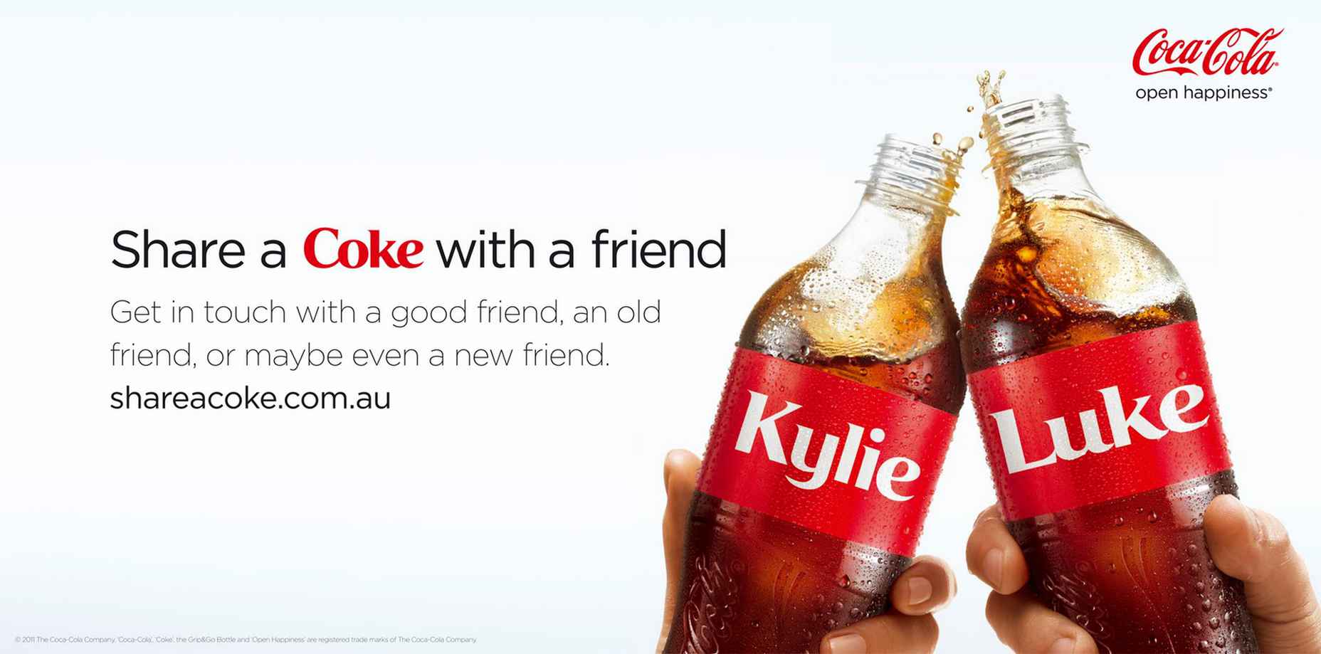
We all know the most basic form of personalization is addressing your customers’ names, but Coca-Cola took this simple idea into a massive global campaign. Their “Share a Coke” campaign started in 2011, wherein they printed different popular names on their Coke bottles and cans.

It seemed like a regular campaign at first, but it started getting traction as more customers wanted to get the name of their family, friends, and themselves. Coca-Cola said the campaign’s purpose was “to create a more personal relationship with consumers and inspire shared moments of happiness.”

The soft drinks giant used personalization and tied such a strategy with its mission: to bring memories and happiness to its consumers. You, too, can do the same – combine your mission and personalization strategy to create a unique campaign.
2. Spotify

Spotify leverages user data in its marketing strategy. They have several campaigns that make users want to use their application more often because it gives out a more tailored experience.

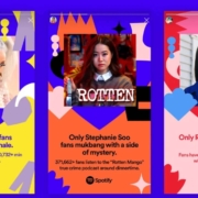
Other than their year-end campaign( #spotifywrapped), where they show the most played songs and podcasts their users listen to (which was a viral hit), they now also have an #OnlyYou campaign that shows your unique listening taste partnered with a musical astrology reading.
3. Nike

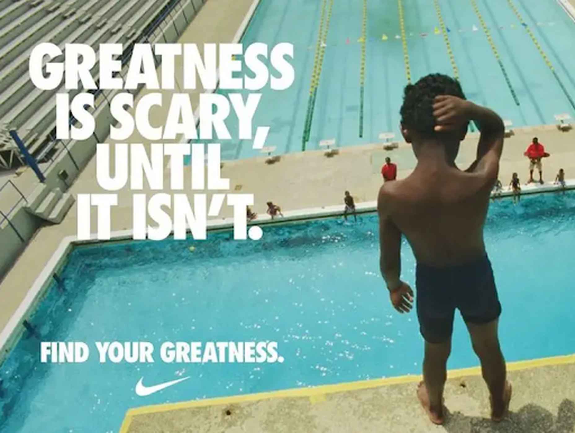
Nike has consistently been recognized for authentic, personalized, and heartfelt ad campaigns. This personalization always makes them capture an audience who can relate and those who start connecting to the brand. So Nike isn’t new to personalization. Their aim is robust community engagement.

Their highly inspirational campaigns with real-life heroes induce inspiration in their audience. Nike is great at converting people because of its excellent storytelling ability while adding personalization to the mix.

Nike’s just launched a new app that offers personalized content and rewards for committed fans. They tackle challenges and issues head-on, but they always make their marketing messages relatable to their audience. That is why they “just do it.”
Conclusion

Personalized marketing is the secret sauce to thriving businesses in the world today. However, incorporating this marketing strategy and finding success is not as simple as you might think. You will face challenges, but with enough perseverance and brainstorming, you can surpass them and successfully create a great campaign.

Remember, this marketing approach can be a hit or a miss. The first step to making it a success is relevant data collection followed by judicious implementation. This isn’t an overnight activity that you can do. It requires months of diligence in the right direction with the proper guidance. And you can gain valuable insights into this guidance via the content marketing strategies outlined in this article. But remember, once you start rolling, there is no looking back.

Source

The post The Complete Guide To Personalized Marketing first appeared on Webdesigner Depot.

Source de l’article sur Webdesignerdepot
Every day design fans submit incredible industry stories to our sister-site, Webdesigner News. Our colleagues sift through it, selecting the very best stories from the design, UX, tech, and development worlds and posting them live on the site.
The best way to keep up with the most important stories for web professionals is to subscribe to Webdesigner News or check out the site regularly. However, in case you missed a day this week, here’s a handy compilation of the top curated stories from the last seven days. Enjoy!

How to Create Simple CSS Grid System

Why are You Running?

15+ VS Code Extensions for Web Developers

10 of the Biggest SEO Mistakes [Infographic]

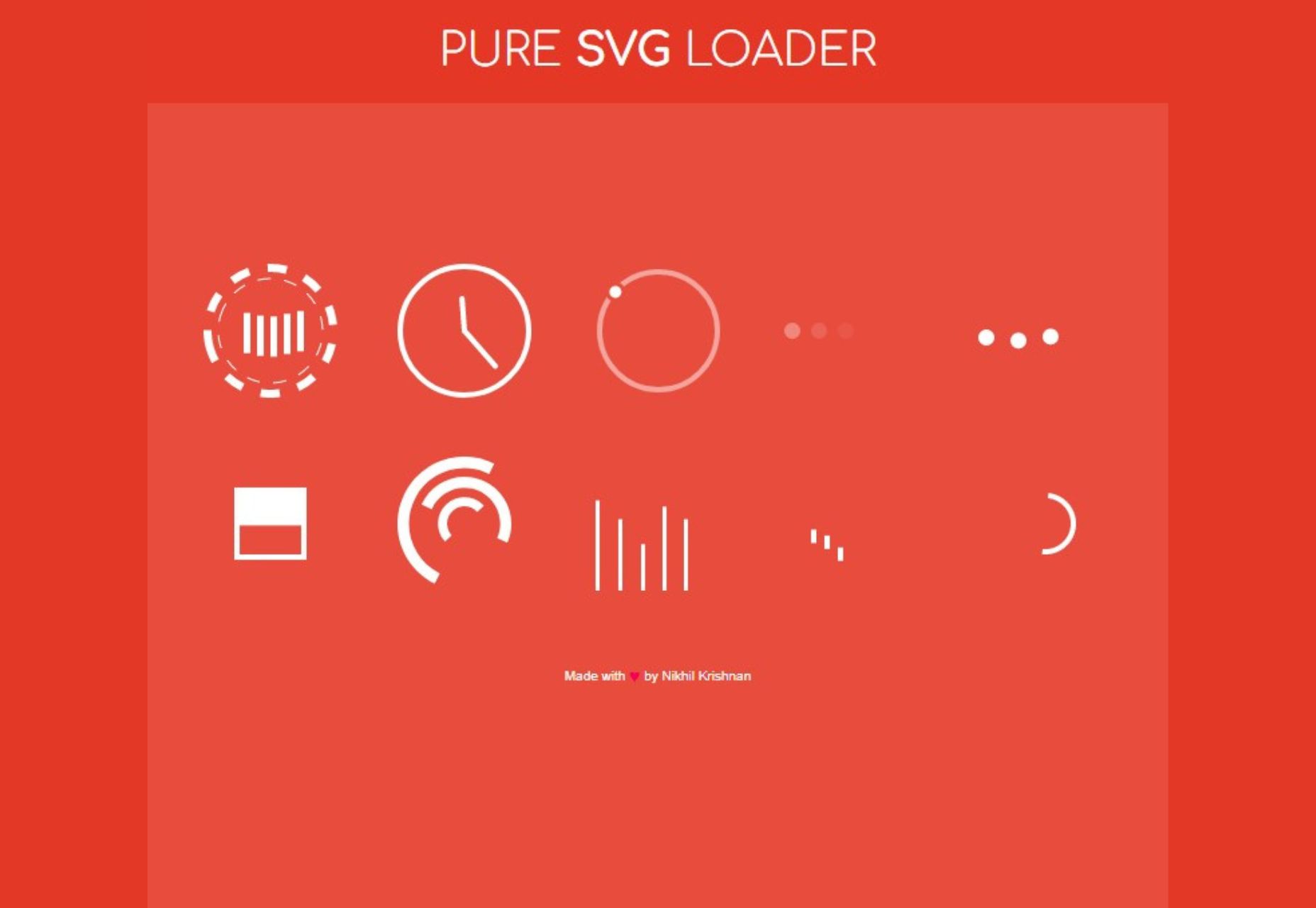
SVG Loading Animations

AI Pixel Art Human Face

VSLook – Customize the Look of your VSCode

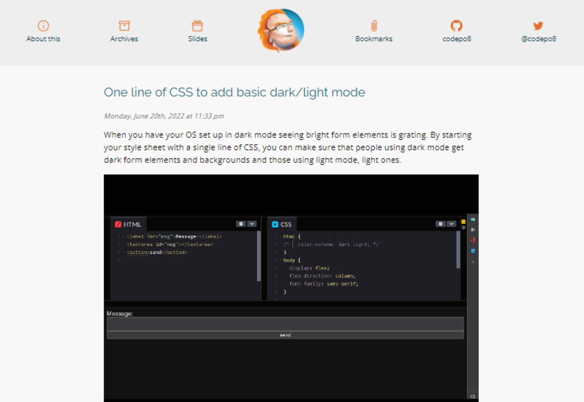
One Line of CSS to Add Basic Dark/light Mode

Basicons – Basic Icons for Product Design & Development

Touch-first Cursor: Round Pointers Vs Mouse Arrows

7 UX Laws You’re Probably Getting Wrong

“Google” Programmers – How One Idiot Hired a Couple More Idiots

Bunny Fonts – Privacy Respecting Drop-in Replacement for Google Fonts

Source

The post Popular Design News of the Week: June 20, 2022 – June 26, 2022 first appeared on Webdesigner Depot.

Source de l’article sur Webdesignerdepot

UX laws are an invaluable tool, providing guidelines for designers that ensure we don’t have to continually reinvent the wheel when crafting experiences for the web.

However, UX laws tend to be devised by scientists and psychologists — people who are more than comfortable with the exceptions and allowances of academic language. By the time they filter down to us in the trenches, the language has invariably been over-simplified, and the wisdom behind the idea diluted.

Today we’re going to look at seven well-known and commonly cited rules of UX design that too many designers get wrong.

1. Jakob’s Law

Jakob’s Law, named for the UX researcher Jakob Nielsen, states that users spend most of their time on other sites and as a result prefer sites that work the same way as the sites they already know.

Jakob’s Law has often been used to limit experimentation and encourage the adoption of common design patterns in the name of usability.

However, the word ‘prefer’ is hugely loaded. While it’s true that a user will more easily understand a familiar design pattern, they do not necessarily prefer familiar experiences.

It has been widely proved that new experiences boost our mood and that new experiences improve our memory. If your goal is a memorable site that leaves users with a positive impression, introducing novelty is a sound decision.

2. Goal Gradient Hypothesis

The Goal Gradient Hypothesis assumes that the closer users are to their goal, the more likely they are to complete it.

It’s an attractive theory, especially in e-commerce, where it is often used to justify simplifying the initial purchase process and postponing complexity to move users along the funnel — a typical example is leaving shipping charges until the final step.

However, anyone who has studied e-commerce analytics will know that cart abandonment is a huge issue. In North America, shopping cart abandonment is as high as 74%.

We don’t always know what the user’s goals are, and they may not match ours. It may be that users are treating your shopping cart as a bookmark feature, it may be that they have a last-minute change of heart, or they may be horrified by the shipping charges.

While providing a user with an indication of their progress is demonstrably helpful, artificially inflating their proximity to your preferred goal may actually hinder conversions.

3. Miller’s Law

Never in the whole of human history has any scientific statement been as misunderstood as Miller’s Law.

Miller’s Law states that an average person can only hold seven, plus or minus two (i.e., 5–9) items in their working memory. This has frequently been used to restrict UI navigation to no more than five items.

However, Miller’s Law does not apply to items being displayed. While it’s true that too many options can lead to choice paralysis, a human being is capable of considering more than nine different items.

Miller’s Law only applies to UI elements like carousels, which have been widely discredited for other reasons.

4. Aesthetic-Usability Effect

Edmund Burke once said, “Beauty is the promise of happiness.” That belief is central to the Aesthetic-Usability Effect, which posits that users expect aesthetically pleasing designs to be more usable.

Designers often use this as a justification for grey-on-grey text, slick animations, and minimal navigation.

Critical to understanding this is that just because users expect a design to be usable does not mean that it is or that they will find it so. Expectations can quickly be dashed, and disappointment often compounds negative experiences.

5. Peak-End Rule

The Peak-End Rule states that users judge an experience based on how they felt at the peak and the end, rather than an average of the experience.

Designers commonly use the Peak-End Rule to focus design resources on the primary goal of each experience (e.g. adding an item to a cart) and the closing experience (e.g. paying for the item).

However, while the Peak-End Law is perfectly valid, it cannot apply to open experiences like websites when it is impossible to identify a user’s starting or ending point.

Additionally, it is easy to see every interaction on a website as a peak and even easier to make assumptions as to which peak is most important. As such, while designing for peaks is attractive, it’s more important to design for exceptions.

6. Fitts’ Law

In the 1950s, Paul Fitts demonstrated that the distance to, and size of a target, affect the error rate of selecting that target. In other words, it’s harder to tap a small button and exponentially harder to tap a small button that is further away.

UX designers commonly apply this law when considering mobile breakpoints due to the relatively small viewport. However, mobile viewports tend not to be large enough for any distance to affect tap accuracy.

Fitts’ Law can be applied to desktop breakpoints, as the distances on a large monitor can be enough to have an impact. However, the majority of large viewports use a mouse, which allows for positional corrections before tapping.

Tappable targets should be large enough to be easily selected, spaced sufficiently, and tab-selection should be enabled. But distance has minimal impact on web design.

7. Occam’s Razor

No collection of UX laws would be complete without Occam’s Razor; unfortunately, this is another law that is commonly misapplied.

Occam’s Razor states that given any choice, the option with the least assumptions (note: not necessarily the simplest, as it is often misquoted) is the correct choice.

In an industry in which we have numerous options to test, measure, and analyze our user interfaces, you shouldn’t need to make assumptions. Even when we don’t need extensive UX testing, we can make decisions based on other designers’ findings.

Occam’s Razor is a classic design trap: the key to avoiding it is to recognize that it’s not your assumptions that matter, it’s the users’. As such, Occam’s Razor applies to a user’s experience, not a design process.

Source

The post 7 UX Laws You’Re Probably Getting Wrong first appeared on Webdesigner Depot.

Source de l’article sur Webdesignerdepot

Every day design fans submit incredible industry stories to our sister-site, Webdesigner News. Our colleagues sift through it, selecting the very best stories from the design, UX, tech, and development worlds and posting them live on the site.

The best way to keep up with the most important stories for web professionals is to subscribe to Webdesigner News or check out the site regularly. However, in case you missed a day this week, here’s a handy compilation of the top curated stories from the last seven days. Enjoy!

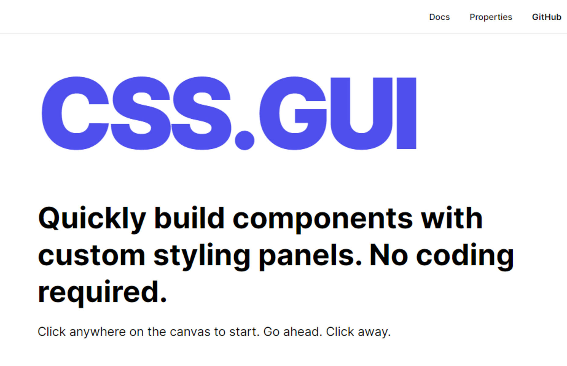
CSS.GUI – Open Source Visual Editor for CSS

Meet Web Push

Mobile-First CSS: Is it Time for a Rethink?

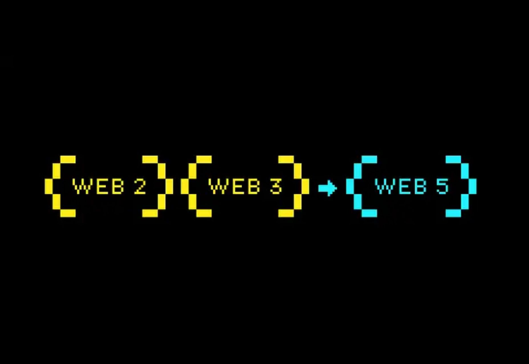
Web5 Is Here, Goodbye Web3? TBD

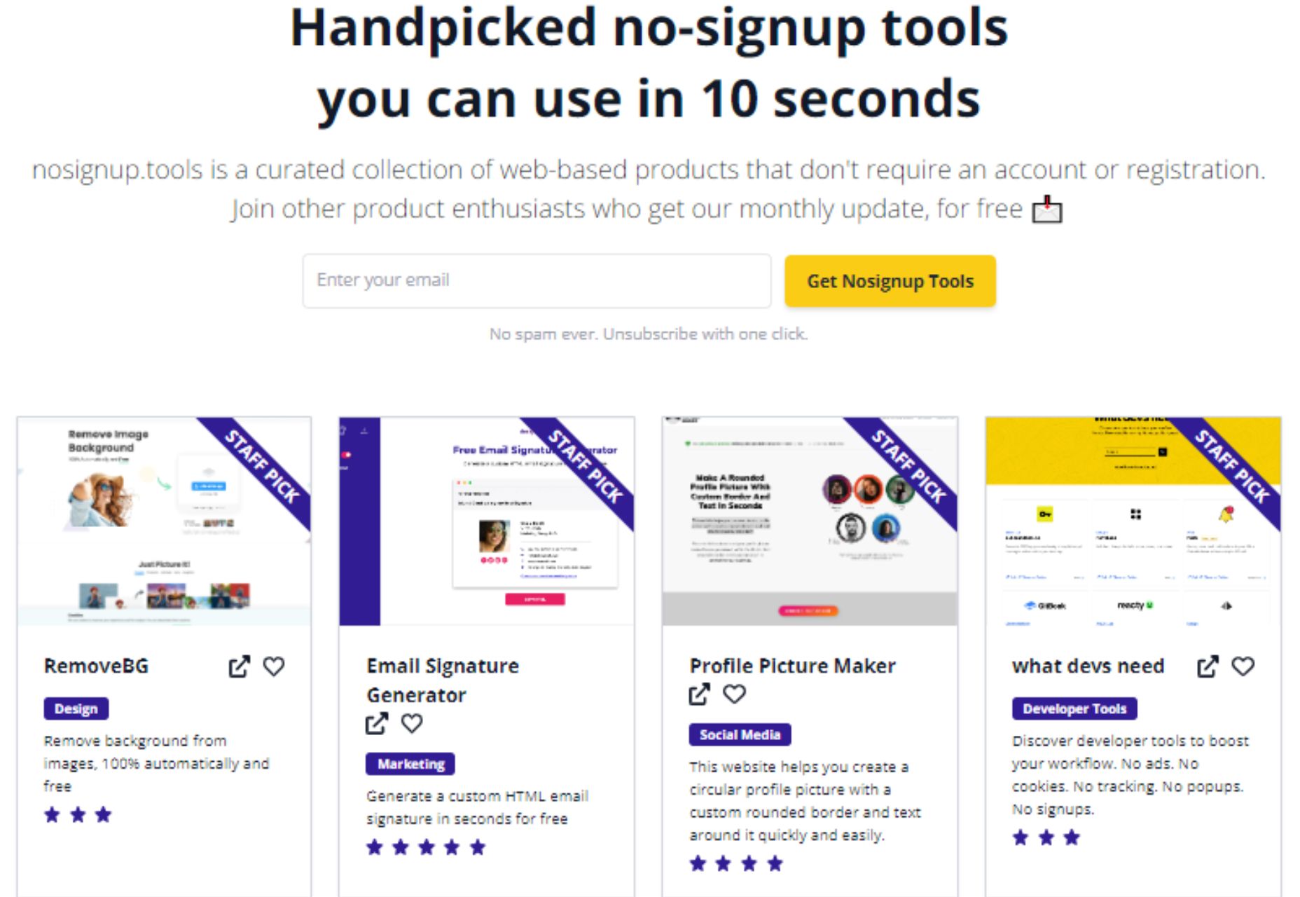
Nosignup.tools – Free Web Apps that Don’t Require Signup

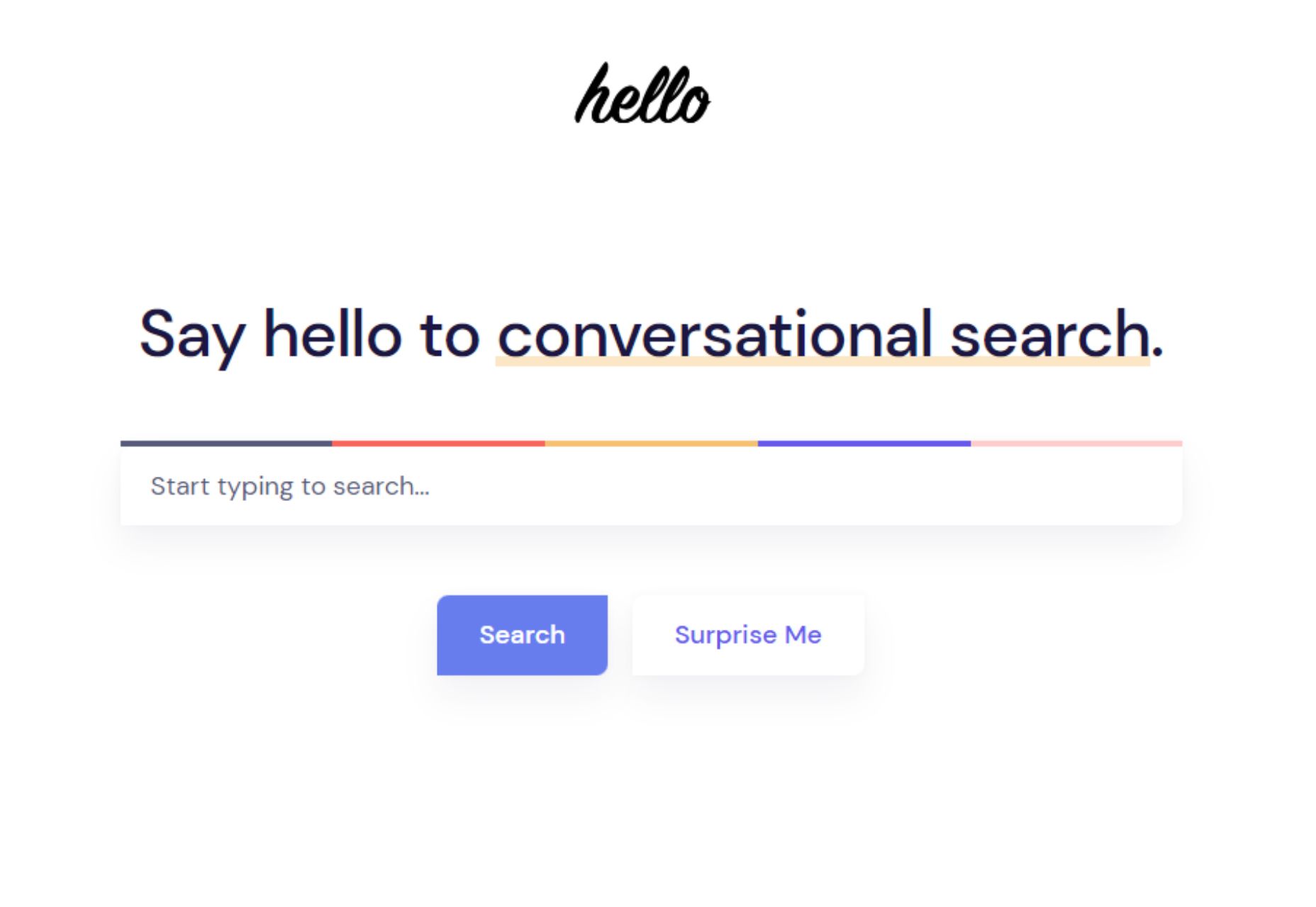
Hello – The Best Search Engine for Software Developers

Exciting New Tools for Designers, June 2022

Adobe Plans to Make Photoshop on the Web Free to Everyone

8 CSS Snippets that Demonstrate the Power of Shadow Effects

Tango 2.0 – Automatically Generate Step-by-step Guides for your Team

Understanding the Template Element in HTML

Random Emoji Generator – Have Fun with Emojis

Source

The post Popular Design News of the Week: June 13, 2022 – June 19, 2022 first appeared on Webdesigner Depot.

Source de l’article sur Webdesignerdepot

Every day design fans submit incredible industry stories to our sister-site, Webdesigner News. Our colleagues sift through it, selecting the very best stories from the design, UX, tech, and development worlds and posting them live on the site.

The best way to keep up with the most important stories for web professionals is to subscribe to Webdesigner News or check out the site regularly. However, in case you missed a day this week, here’s a handy compilation of the top curated stories from the last seven days. Enjoy!

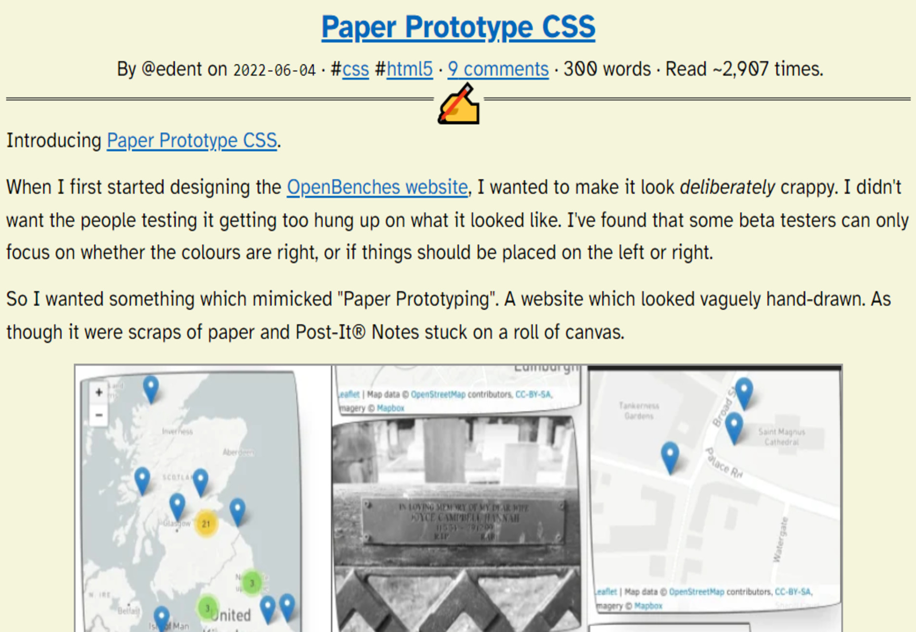
Paper Prototype CSS

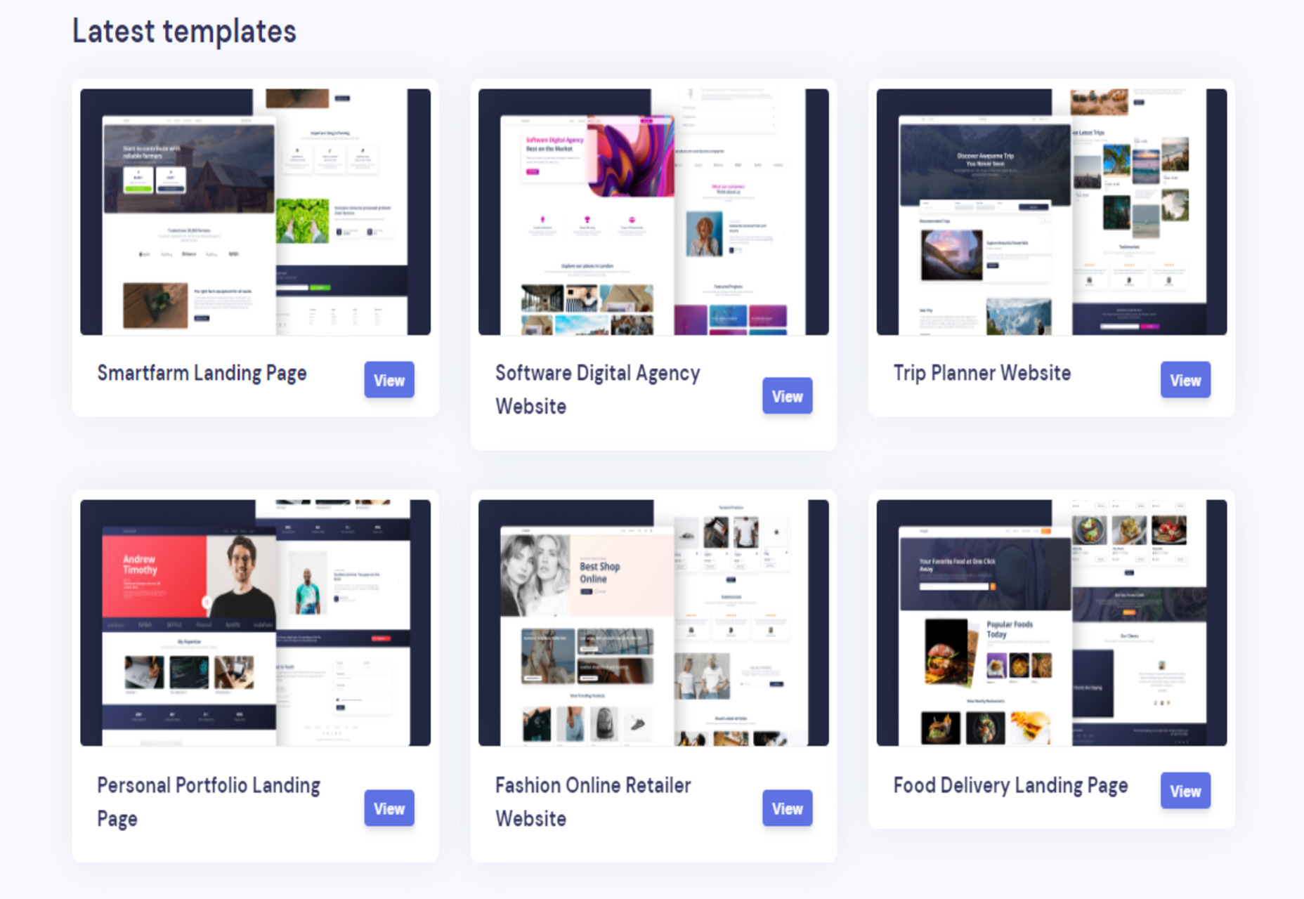
Loopple Landings – 40+ Ready to Use Templates for any Industry

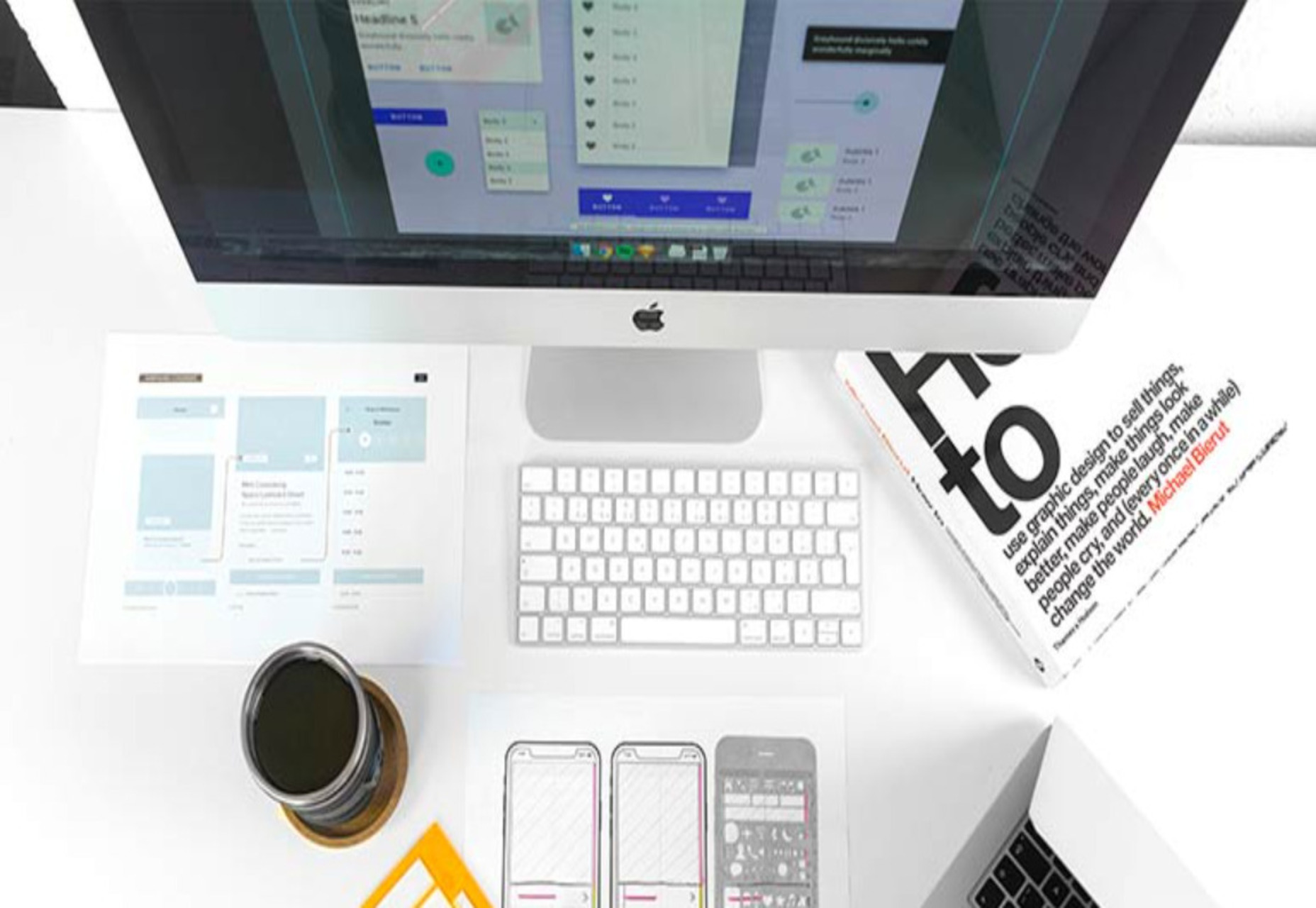
Tips for Handing Off your Website Mockup to a Developer

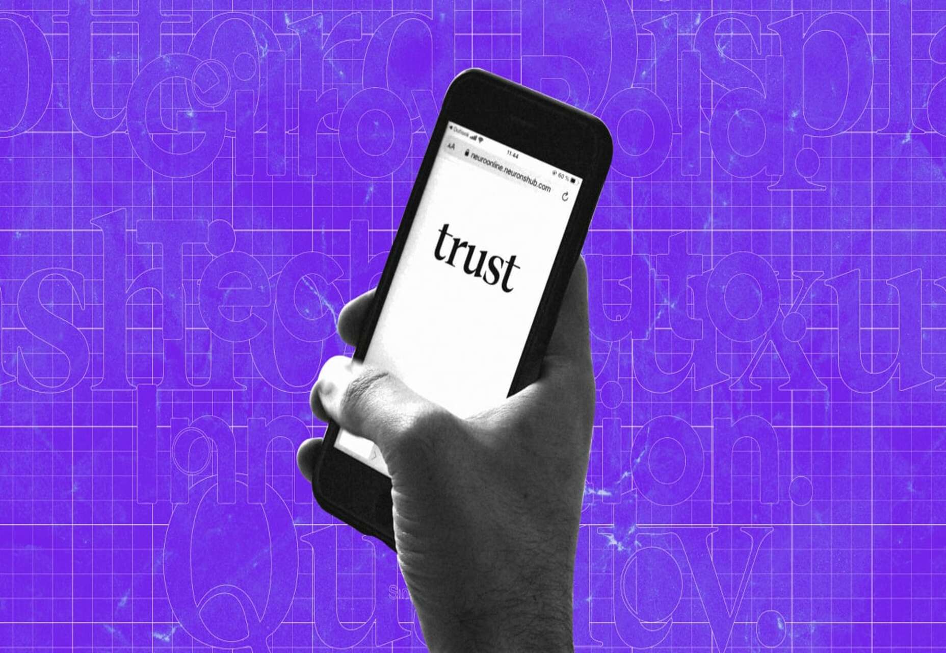
The Surprising Psychology of Fonts

5 Tips for Writing Cleaner Code

Please Give Me Some Space

Orion – New WebKit Browser for Mac

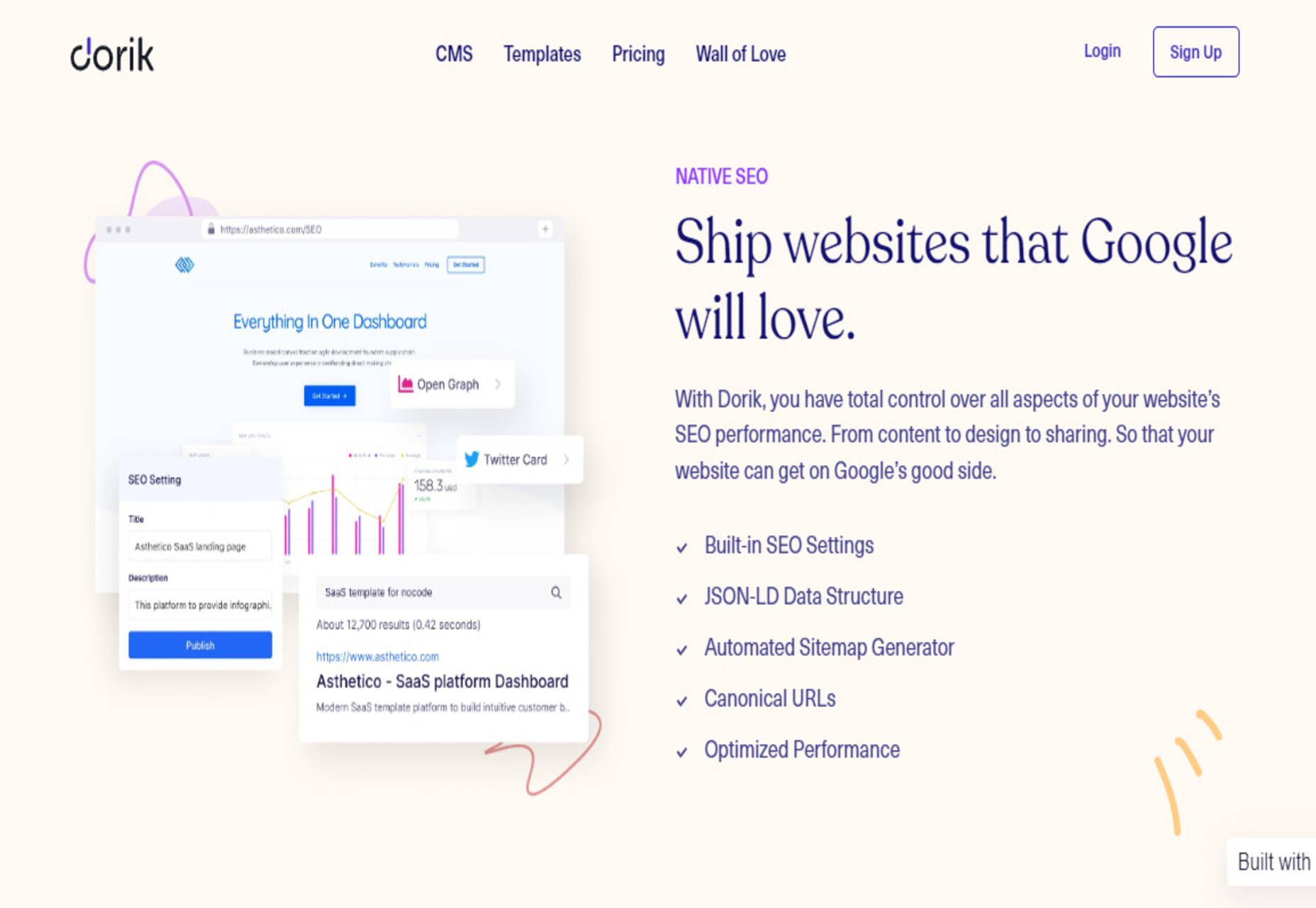
Dorik CMS – Simple, Affordable, and Flexible White-label CMS

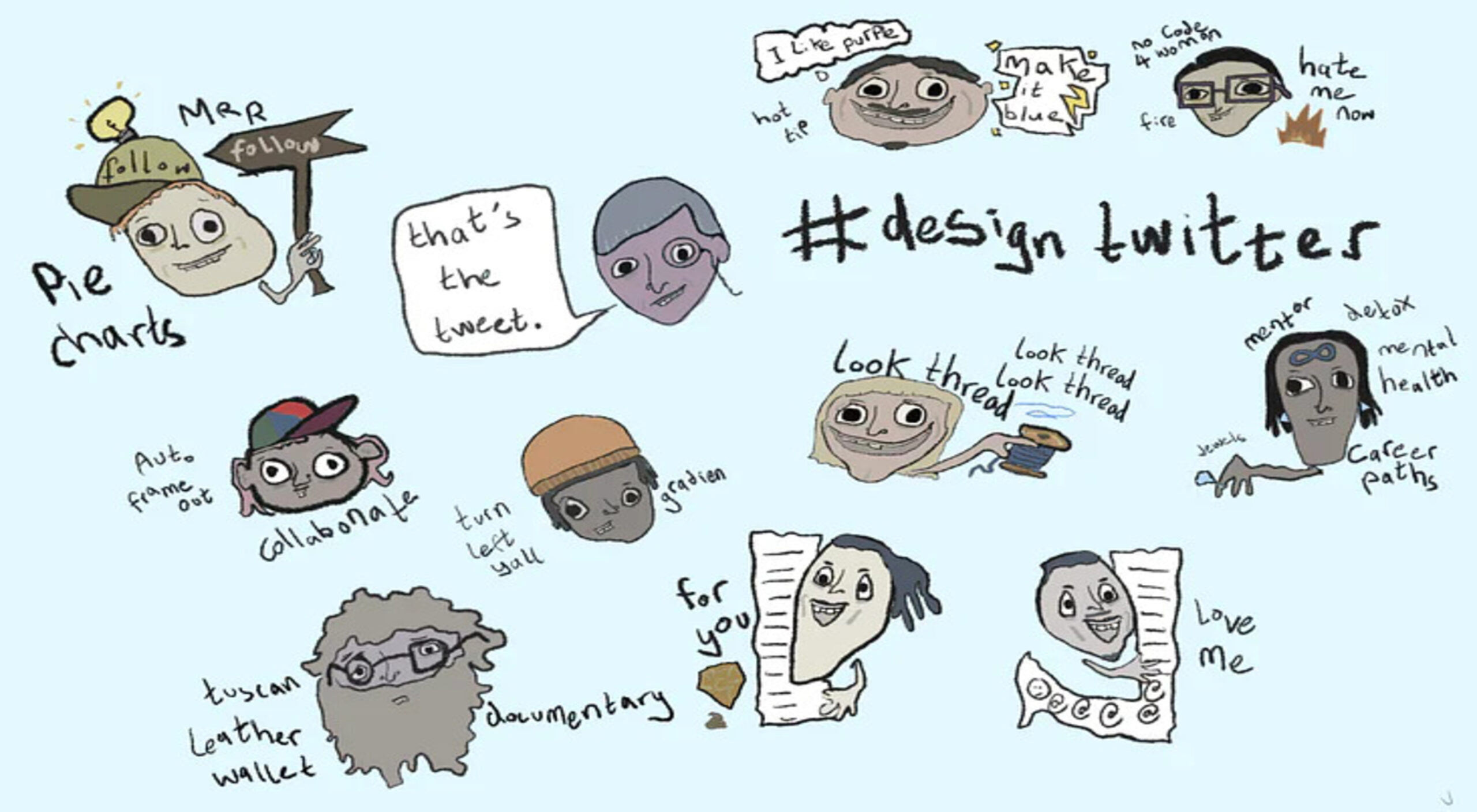
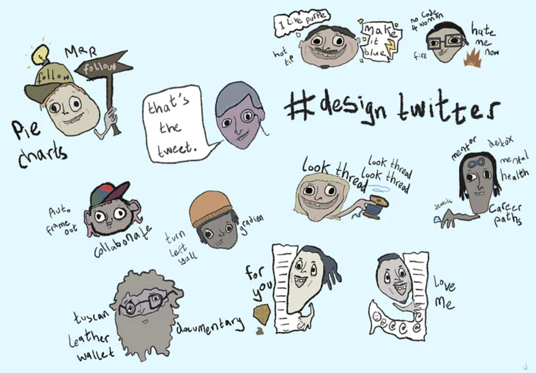
Design Personas for Twitter

3 Essential Design Trends, June 2022

Source

The post Popular Design News of the Week: June 6, 2022 – June 12, 2022 first appeared on Webdesigner Depot.

Source de l’article sur Webdesignerdepot