Articles

HTML is one of the foundational building blocks of the Web. But just as web design best practices and techniques change over time, so does the code we use. As HTML evolves, some of its older markup has been deprecated while other parts have been repurposed.

Does that create more problems for us, though? Would we be better off starting over so we can make sure we’re all working from the same language rather than trying to edit out the bits we don’t want or need?

Problems With Holding Onto Legacy HTML

Let’s take a look at what happens when we amend the rules of HTML over time and how it impacts the Web:

1. It’s Risky to Leave Deprecated HTML Behind

Whether certain features have become outdated and need to go, or browsers have stopped supporting certain tags altogether, deprecated code eventually becomes a problem.

You’ll find a long list of deprecated HTML on the HTML.com website:

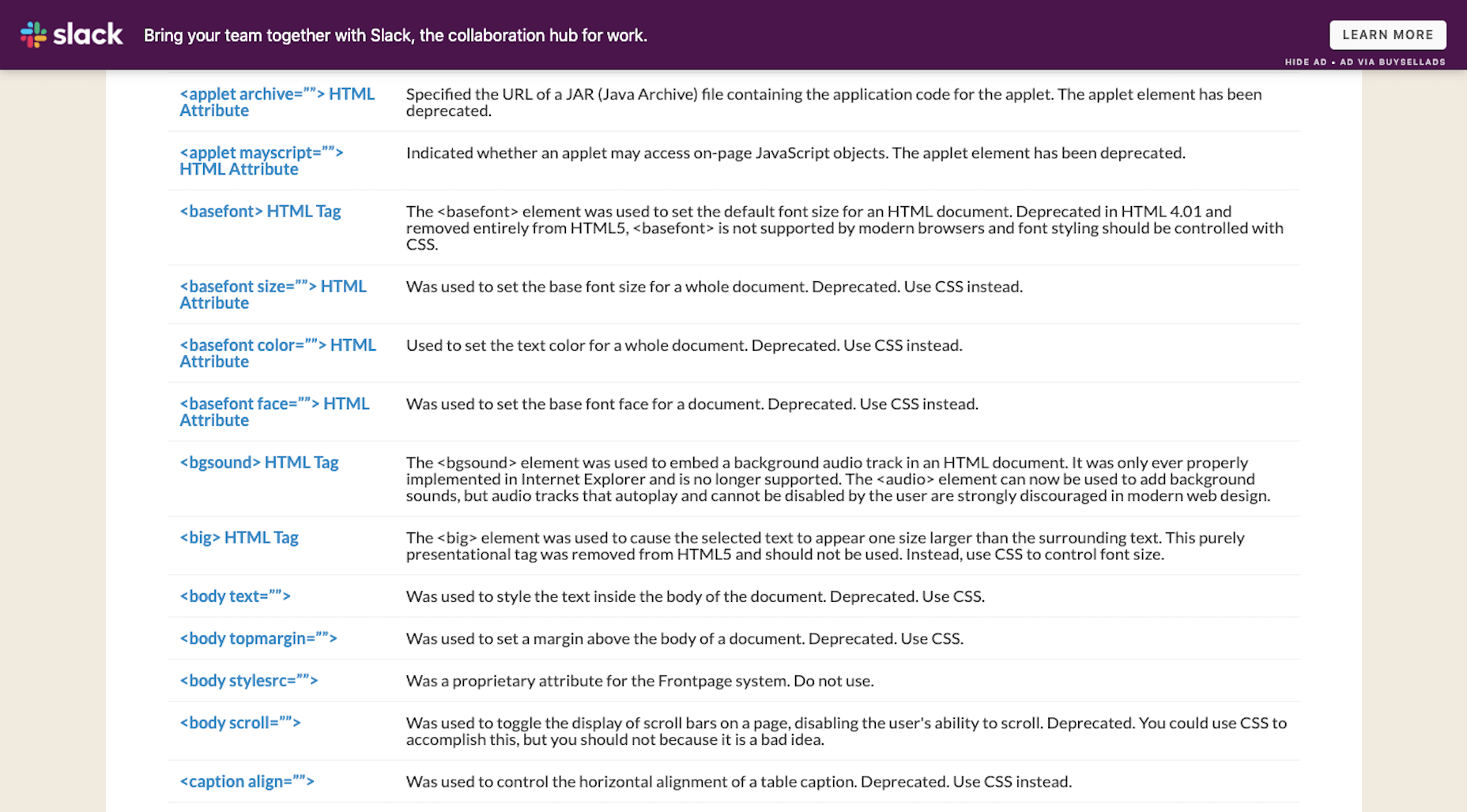
For many of these, HTML tags and attributes have been replaced by more efficient CSS styling. There are also examples of HTML deprecation because the features have become outdated (like frames).

Yet, there are still websites out there that contain deprecated HTML.

In some cases, the HTML sits silently on the other side of the website. If there’s enough of this errant code hanging around, though, those extra characters and directives could slow down your server’s processing time and render pages more slowly than usual.

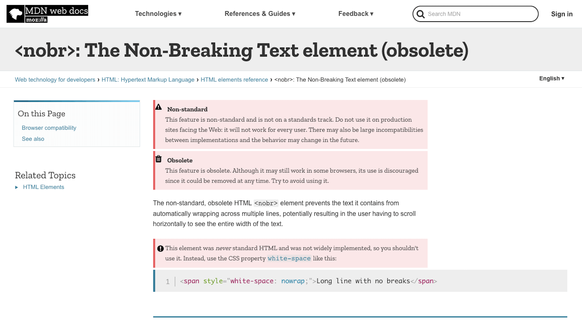
In other cases, the HTML breaks features on the front-end of a website. Take, for instance, this warning from Mozilla regarding the <nobr> tag:

Using deprecated code can create inconsistent and poor experiences on the front-end. And when all browsers finally get on board and decide not to support an HTML tag anymore, all visitors will be left with a broken UI.

So, while it’s great that HTML5 has deprecated legacy HTML that’s no longer useful or necessary, that’s not to stop everyone from using it or leaving it behind on older websites. 

2. Legacy Code Focuses on Style; Not Semantics

As I mentioned, a lot of deprecated HTML has been phased out and replaced by CSS styling. And that’s a good thing.

Let me give you a simple example of this…

My favorite book is <i>The Stand</i> by Stephen King. The first time I read it, I didn’t sleep for <i>three days</i>. Thankfully, when I revisit it every year, I have fewer nightmares and can more greatly appreciate the storytelling aspect of it.

In the above paragraph, I’ve used the <i> tag to italicize several words.

In the early days of HTML,<i> stood for “italics” (the way<b> stood for “bold”). With HTML5, however,<i> will still render as italics, but its semantic meaning isn’t as broad. It’s been repurposed to indicate a stylistic change, which is important for things like book and film names, foreign words, and so on. To express emphasis, we use the <em> tag instead. 

Keeping the legacy <i> and <b> tags can lead to issues, though. 

In the statement above, I’ve italicized the name of the book (The Stand) as well as the number of sleepless nights I had (three days) with<i>. Whether the designer decides today, tomorrow or ten months down the road that they want to change the way literary or cinematic references are styled, my choice of HTML will stand in their way.

Because all of my italic text is indicated by <i>, styles can’t universally be applied to specific content (like book references). Instead, the designer would have to go through and clean up my code so that it looks like this:

My favorite book is <i>The Stand</i> by Stephen King. The first time I read it, I didn’t sleep for <em>three days</em>. Thankfully, when I inevitably revisit it every year, I have fewer nightmares and can more greatly appreciate the storytelling aspect of it.

This would then allow the semantically italicized content to remain intact while the designer or developer adjusts the styles of the book title here and across the site. (Though, really, the first italicized phrase should be surrounded by <cite> as it would be more semantically accurate.)

While it’s great that we’ve created guidelines for using legacy HTML today, keeping old code around can confuse writers, designers, and others who are familiar with the previous way of formatting content. By resetting HTML, throwing out old styles, and creating one language we use consistently across the web, we won’t create more work for ourselves later on.

3. Deprecated Code Hinders Accessibility

Another big reason why repurposed and deprecated HTML is a problem is because of accessibility.

For starters, when you leave deprecated and unsupported code behind, it’s likely to cause issues for screen readers, search engines, and browsers that use HTML for clues about the content.

Header tags (e.g.<h1><h2><h3>), for instance, aren’t just used to visibly break up large chunks of text. Header tags and, more specifically their hierarchy, present important information about the relationship between subjects on a page — and this is the kind of thing that screen readers and search engines pick up on.

That’s why we need to be very careful about the code we leave behind the scenes, even if readers on the front end can’t visibly see it. Let’s look at an example of how this can affect accessibility:

Is there an <i>à la carte</i> menu or is it just <i>prix fixe</i> tonight?

If a screen reader were to read over this sentence, the French phrases would be said with the same emphasis as any other italicized words on the page.

This is why HTML5 encourages semantic coding instead of purely stylistic.

The proper way to write HTML in the line above would be:

Is there an <i lang="fr">à la carte</i> menu or is it just <i lang="fr">prix fixe</i> tonight?

There are two reasons to do this:

  1. To indicate to screen readers that there’s a language change.
  2. To make it easier for designers or developers to create a custom style for foreign phrases.

Semantic coding is essential for designers that work on multilingual websites.

As the World Wide Web Consortium explains, languages like Japanese don’t use italicization or bolding for emphasis — at least not the way English speakers do.

So, to properly translate a page from English, a Japanese designer would need to remove the italics or bolding and add surrounding brackets to the words. However, if everything is coded with <i> and <b>, or there’s a mix of <i> and <em> and<b> and <strong>, it’s going to be really difficult to Find-and-Replace the correct HTML with ease.

So, if accessibility or internationalization are concerns for you at all, getting clear on the HTML you write with is going to be really important.

Wrap-Up

The fact of the matter is, it requires a lot of work to have the rules of HTML rewritten. So while it would be great to reset HTML, I don’t know that it’s all that practical.

All we can really do is stay abreast of what’s happening with the language, edit out legacy code from our websites the second it becomes deprecated, and always use tags and attributes that are supported. By playing around with deprecated or repurposed code, we only put the website visitors’ experience in jeopardy, so it’s best to take the time to clear out the old any chance we get.

If we can all get on the same page about this, problematic legacy HTML will eventually disappear from our websites and memories.


Featured image via Unsplash.

Source

The post Is It Time to Reset HTML? first appeared on Webdesigner Depot.


Source de l’article sur Webdesignerdepot

And it does this 24 hours a day, 7 days a week, 52 weeks a year without ever asking for a pay raise.

But this is true only if your website landing page is designed well, maintained, and optimized to the gills. The art and science of a flawless landing page is beyond the scope of a single article, but we can start with helping you spot seven of the most common – and damaging – trouble spots.

1. Unclear Value Statement

Typically, new visitors to your page will only stay on it 3 to 15 seconds before they get distracted. In that span of time, you must offer a clear and visible reason to stick around and interact with the page.

That reason is your value statement. What value do your readers get in exchange for the time you ask them to spend? High-quality content is a must (and hopefully a given), but you also need to pull them in so they experience that content.

Does your landing page do that? If yes, great! If no, you should fix that. If you’re not sure, ask yourself:

  • Is there a compelling, visible headline that expresses the end benefits clearly and succinctly?
  • Is there a subheadline explaining your offering in more detail?
  • Are there supporting graphics that pull the eye toward your headline and subheadline?

If there aren’t, add them now.

2. Poor Signposting

Your landing page isn’t just there to be pretty. It’s meant to convince people to take action. If you don’t make it easy to find your call to action, most viewers won’t look for it.

deliver enough value to make it worth the hassle

You must make it clear — in as succinct and efficient terms as possible — why the action you want a reader to take will deliver enough value to make it worth the hassle. Tell them, in words that stand out from the rest of the page, what you want them to do next and what they’ll receive for doing so.

Improving your signposting stats by asking yourself the following questions:

  • Do you have a clear understanding of what the next step in a visitor’s customer journey should be?
  • Is it easy to find and take that step on your website?
  • Does your copy make a clear and compelling argument in favor of taking that step?

If you can answer yes to all three questions, your signposting is likely good (or at least good enough for now). If not, now you know what you have to do to improve it.

3. Slow Loading Time

Remember that 3 to 15-second maximum time limit we mentioned earlier? That span includes time spent waiting for your landing page to load, and every microsecond of that wait increases a reader’s likelihood of bailing on the whole thing. You must get your loading time to be as quick as possible.

Viewers who exit your landing page early – including while still waiting for it to load – increase your site’s bounce rate. Higher bounce rates reduce your rankings on Google and other search engines, meaning a page that loads too slowly not only impresses fewer viewers, but it also gets fewer viewers overall.

Improving your loading time is usually a job for your tech team or whoever in the office is responsible for overseeing your hosting service. That said, here are a few of the most important ways to optimize this important factor:

  • Optimize image size, file format, and compression;
  • Clean up your database by deleting saved drafts, old revisions, unused plugins, and similar virtual detritus;
  • Confirm that your WordPress theme (if applicable) is optimized for quick loading;
  • Use a content distribution network for file storage;
  • Analyze server response time with your hosting service, and work with them to reduce it;
  • Install tools that leverage browser caching;
  • Fix all your broken links;
  • Remove all render-blocking from JavaScript;
  • Reduce the number of redirects necessary to reach your page;
  • Optimize your code, especially in CSS, JavaScript, and HTML;
  • Enable file compression — except for on images;
  • Replace all PHP content with HTML wherever possible.

This is technical, detailed work, but it’s important. If you don’t have team members up to these tasks, it can be worth hiring an outside consulting company to do it for you.

4. Only One Landing Page

You have a good idea of your ideal customer’s hopes, fears, pain points, demographics, likes and dislikes, and other important information. If you have several different types of customers, you can’t use the same landing page for each of your customer groups. Each group has different characteristics that will prompt them to follow your call to action, so you don’t want to offer just one landing page.

Similarly, you also probably have more than one product or set of content and offerings to generate sales. Having only one landing page can lose leads because the page is only optimized for one of those products or content sets.

Ideally, you should have a unique landing page with a tailored offer for each of your customer models that would send those individuals to each of the products and content sets. An ad for professionals in their 30s making over $50,000 a year would lead to a landing page built for them, while an ad for heads of households working from home would lead to a landing page built for them.

Yes, that means a company with three profiles and four content sets would need 12 landing pages. And yes, it’s worth that kind of effort.

5. Insufficient Visuals

“A picture is worth 1,000 words” is ancient wisdom, but it’s far from true in the internet world – it’s actually worth more. A quick look at social media and blog performance will tell you many people will look at, enjoy, and share a photo or video, but not many will read an entire 1,000-word post on the same topic.

How well your landing page performs depends on the images you use and how you present them. Does your page’s layout conform to the best practices of visual web design:

  • Including images that emotionally reinforce the value expressions of your product’s core benefits;
  • Containing sufficient white space to not be intimidating;
  • Providing data images to indicate the worth of what you do;
  • Using visual design cues to lead the eye toward your conversion points;
  • Applying color gradients to highlight offers and your call to action;
  • Using infographics to replace the dreaded “wall of text”.

If you can say yes for half of these things, carry on. If not, this point may be among the better places to start with a landing page redesign.

6. Asking For Too Much, Too Soon

Craft a custom calls to action that meet all levels of interest, need, and desire

Not every landing page visitor is created equal. Some are hardcore fans and experts in what you do, ready for a 10,000-word white paper that dives deeply into the research supporting your use case. Others might have heard about your industry on an Instagram page and want to know the basics of what you do.

There’s nothing worse than going to a website and being asked for all of your personal information right away. If your call to action requires too much knowledge, too deep a commitment, or even too much personal information, consider scaling back. Otherwise, you risk turning away potential customers.

Better yet, go back to No. 5 above and build a new landing page for beginners and early-stage leads. Craft a custom calls to action that meet all levels of interest, need, and desire.

7. No Trust Elements

Offering some type of authentic customer referral or testimonial is important. It all boils down to the same thing: telling those who read your landing page that other people already like what you do and how you do it.

Examples of effective modern trust elements include:

  • Quotes from positive reviews next to a photo of the reviewer;
  • Screenshots of social media posts praising your company or product;
  • Short video interviews of happy clients;
  • Blurbs for industry thought leaders approving of you;
  • Images portraying business credentials and certifications;
  • Links to positive press coverage;
  • Logos of known business customers who buy and trust your brand.

Final Thought: What’s Next?

There isn’t one guaranteed way to turn a landing page from something full of holes into something perfect. But first, run an audit of your landing page using this list as a guide. Note which errors are there. Next, sort them in order of what takes the least time to fix to what takes the most time to fix.

Then, fix them in that order. We find that getting the quick fixes done builds excitement and momentum, whereas starting with a harder fix can mire down the whole process.

If none of these errors exist on your landing page, congratulations. There’s still lots of work to do on your website and content marketing, but it’s not among these rookie mistakes.


Featured image via Pexels.

Source


Source de l’article sur Webdesignerdepot